Earlier this year, a man drove his car into a lake after following directions from a smartphone app that helps drivers navigate by issuing turn-by-turn directions. Unfortunately, the app’s programming did not include instructions to avoid roads that turn into boat launches.
From the perspective of the app, it did exactly what it was programmed to do, i.e. to find the most optimal route from point A to point B given the information made available to it. From the perspective of the man, it failed him by not taking the real world into account.
The same principle applies for accessibility testing.
Designing For Accessibility And Inclusion
The more inclusive you are to the needs of your users, the more accessible your design is. Let’s take a closer look at the different lenses of accessibility through which you can refine your designs. Read article →
Automated Accessibility Testing
I am going to assume that you’re reading this article because you’re interested in learning how to test your websites and web apps to ensure they’re accessible. If you want to learn more about why accessibility is necessary, the topic has been covered extensively elsewhere.
Automated accessibility testing is a process where you use a series of scripts to test for the presence, or lack of certain conditions in code. These conditions are dictated by the Web Content Accessibility Guidelines (WCAG), a standard by the W3C that outlines how to make digital experiences accessible.
For example, an automated accessibility test might check to see if the tabindex attribute is present and if its value is greater than0. The pseudocode would be something like:
Failures can then be collected and used to generate reports that disclose the number, and severity of accessibility issues. Certain automated accessibility products can also integrate as a Continuous Integration or Continuous Deployment (CI/CD) tool, presenting just-in-time warnings to developers when they attempt to add code to a central repository.
These automated programs are incredible resources. Modern websites and web apps are complicated things that involve hundreds of states, thousands of lines of code, and complicated multi-screen interactions. It’d be absurd to expect a human (or a team of humans) to mind all the code controlling every possible permutation of the site, to say nothing of things like regressions, software rot, and A/B tests.
Automation really shines here. It can repeatedly and tirelessly pour over these details with perfect memory, at a rate far faster than any human is capable of.
However…
Automated accessibility tests aren’t a turnkey solution, nor are they a silver bullet. There are some limitations to keep in mind when using them.
Thinking To Think Of Things
One of both the best and worst aspects of the web is that there are many different ways to implement a solution to a problem. While this flexibility has kept the web robust and adaptable and ensured it outlived other competing technologies, it also means that you’ll sometimes see code that is, um, creatively implemented.
The test suite is only as good as what its author thought to check for. A naïve developer might only write tests for the happy path, where everyone writes semantic HTML, fault-tolerant JavaScript, and well-scoped CSS. However, this is the real world. We need to acknowledge that things like tight deadlines, unfamiliarity with the programming language, atypical user input, and sketchy 3rd party scripts exist.
For example, the automated accessibility testing site Tenon.io wisely includes a rule that checks to see if a form element has both a label element and an aria-label associated with it, and if the text strings for both declarations differ. If they do, it will flag it as an issue, as the visible label may be different than what someone would hear if they were navigating using a screen reader.
If you’re not using a testing service that includes this rule, it won’t be reported. The code will still “pass”, but it’s passing by omission, not because it’s actually accessible.
State
Some automated accessibility tests cannot parse the various states of interactive content. Critical parts of the user interface are effectively invisible to automation unless the test is run when the content is in an active, selected, or disabled state.
By interactive content, I mean things that the user has yet to take action on, or aren’t present when the page loads. Unopened modals, collapsed accordions, hidden tab content and carousel slides are all examples.
It takes sophisticated software to automatically test the various states of every component within a single screen, let alone across an entire web app or website. While it is possible to augment testing software with automated accessibility checks, it is very resource-intensive, usually requiring a dedicated team of engineers to set up and maintain.
Just having the presence of ARIA does not guarantee that it will automatically make something accessible. Unfortunately, and in spite of its first rule of use, ARIA is commonly misunderstood, and consequently abused. A lot of off-the-shelf code has this problem, perpetuating the issue.
For example, certain ARIA attributes and values can only be applied to certain elements. If incorrectly applied, assistive technology will ignore or misreport the declaration. Certain roles, known as Abstract Roles, only exist to set up the overall taxonomy and should never be placed in markup.
<button role="command">Save</button>

<!-- Never do this -->
To further complicate the issue, support for ARIA is varied across browsers. While an attribute may be used appropriately, the browser may not communicate the declared role, property, or state to assistive technology.
There is also the scenario where ARIA can be applied to an element and be valid from a technical standpoint, yet be unusable from an assistive technology perspective. For example:
<h1 aria-hidden=“true”>
  Tired of unevenly cooked asparagus? Try this tip from the world’s oldest cookbook.
</h1>
Headings — especially first-level headings — are vital in communicating the purpose of a page. If a person is using assistive technology to navigate, the aria-hidden declaration applied to the h1 element will make it difficult for them to quickly determine the page’s purpose. It will force them to navigate around the rest of the page to gain context, an annoying and labor-intensive process.
Some automated accessibility tests may scan the code and not report an error since the syntax itself is valid. The automation has no way of knowing the greater context of the declaration’s use.
This isn’t to say you should completely avoid using ARIA! When authored with care and deliberation, ARIA can fix the gaps in accessibility that sometimes plague complicated interactions; it provides some much-needed context to the people who rely on assistive technology.
Much-Needed Context
As the soggy car demonstrates, computers are awful at understanding the overall situation of the outside world. It’s up to us humans to be the ultimate arbiters in determining if what the computer spits out is useful or not.
Debunking
Before we discuss how to provide appropriate context, there are a few common misunderstandings about accessibility work that need to be addressed:
Second, accessibility is more than just screen readers. The rules outlined in the Web Content Accessibility Guidelines ensure that the largest number of people can read and operate technology, regardless of ability or circumstance.
For example, the rule that stipulates a website or web app needs to be able to work regardless of device orientation benefits everyone. Some people may need to mount their device in a fixed location in a specific orientation, such as in landscape mode on the arm of a wheelchair. Others might want to lie in bed and watch a movie, or better investigate a product photo (pinch and pull zooming will also be helpful to have here).
Third, disabilities can be conditional and can be brought about by your environment. It can be a short-term thing, like rain on your glasses, sleep deprivation, or an allergies-induced migraine. It can also be longer-term, such as a debilitating illness, broken limb, or a depressive episode. Multiple, compounding conditions can (and do) affect individuals.
That all being said, many accessibility fixes that help screen readers work properly also benefit other assistive technologies.
Get Your Feet Wet
Knowing where to begin can be overwhelming. Consider Michiel Bijl’s great advice:
“Before you release a website, tab through it. If you cannot see where you are on the page after each tab; you're not finished yet. #a11y
Tab through a few of the main user flows on your website or web app to determine if all interactive components’ focus states are visually apparent, and if they can be activated via keyboard input. If there’s something you can click or tap on that isn’t getting highlighted when receiving keyboard focus, take note of it. Also pay attention to the order interactive components are highlighted when focused — it should match the reading order of the site.
If you need a baseline to compare your testing to, Dave Rupert has an excellent project called A11Y Nutrition Cards, which outlines expected behavior for common interactive components. In addition, Scott O’Hara maintains a project called a11y Styled Form Controls. This project provides examples of components such as switches, checkboxes, and radio buttons that have well-tested and documented support for assistive technology. A clever reader might use one of these resources to help them try out the other!
With that out of the way, I’m going to share a fourth myth with you: not every assistive technology user is a power user. Like with any other piece of software, there’s a learning curve involved.
In her post about Aaptiv’s redesign, Lisa Zhu discovers that their initial accessibility fix wasn’t intuitive. While their first implementation was “technically” correct, it didn’t line up with how people who rely on VoiceOver actually use their devices. A second solution simplified the interaction to better align with their expectations.
Don’t assume that just because something hypothetically functions that it’s actually usable. Trust your gut: if it feels especially awkward, cumbersome, or tedious to operate for you, chances are it’ll be for others.
Dive Right In
While not every accessibility issue is a screen reader issue, you should still get in the habit of testing your site with one. Not an emulator, simulator, or some other proxy solution.
If you find yourself struggling to operate a complicated interactive component using basic screen reader commands, it’s probably a sign that the component needs to be simplified. Chances are that the simplification will help non-assistive technology users as well. Good design benefits everyone!
The same goes for navigation. If it’s difficult to move around the website or web app, it’s probably a sign that you need to update your heading structure and landmark roles. Both of these features are used by assistive technology to quickly and efficiently navigate.
Both of these are sidebars, but only one of them is semantically described as such. A computer doesn't know what a sidebar is, so it's up to you to tell it.
Another good thing to review is the text content used to describe your links. Hopping from link to link is another common assistive technology navigation technique; some screen readers can even generate a list of all link content on the page:
“Think before you link! Your "helpful" click here links look like this to a screen reader user. ALT = JAWS links list”
When navigating using an ordered list devoid of the surrounding non-link content, avoiding ambiguous terms like “click here” or “more info” can go a long way to ensuring a person can understand the overall meaning of the page. As a bonus, it’ll help alleviate cognitive concerns for everyone, as you are more accurately explaining what a user should expect after activating a link.
How To Test
Each screen reader has a different approach to how it announces content. This is intentional. It’s a balancing act between the product’s features, the operating system it is installed on, the form factor it is available in, and the types of input it can receive.
The Browser Wars taught us the folly of developing for only one browser. Similarly, we should not cater to a single screen reader. It is important to note that many people rely exclusively on a specific screen reader and browser combination — by circumstance, preference, or necessity’making this all the more important. However, there is a caveat: each screen reader works better when used with a specific browser, typically the one that allows it access to the greatest amount of accessibility API information.
All of these screen readers can be used for free, provided you have the hardware. You can also virtualize that hardware, either for free or on the cheap.
Automate
Automated accessibility tests should be your first line of defense. They will help you catch a great deal of nitpicky, easily-preventable errors before they get committed. Repeated errors may also signal problems in template logic, where one upstream tweak can fix multiple pages. Identifying and resolving these issues allows you to spend your valuable manual testing time much more wisely.
It may also be helpful to log accessibility issues in a place where people can collaborate, such as Google Sheets. Quantifying the frequency and severity of errors can lead to good things like updated documentation, opportunities for lunch and learn education, and other healthy changes to organizational workflow.
The two most popular screen readers on Windows are JAWS and NVDA.
JAWS
JAWS (Job Access With Speech) is the most popular and feature-rich screen reader on the market. It works best with Firefox and Chrome, with concessions for supporting Internet Explorer. Although it is pay software, it can be operated in full in demo mode for 40 minutes at a time (this should be more than sufficient to perform basic testing).
Windows comes bundled with a built-in screen reader called Narrator. It works well with Edge, but has difficulty interfacing with other browsers.
Apple
macOS
VoiceOver is a powerful screen reader that comes bundled with macOS. Use it in conjunction with Safari, first making sure that full keyboard access is enabled.
iOS
VoiceOver is also included in iOS, and is the most popular mobile screen reader. Much like its desktop counterpart, it works best with Safari. An interesting note here is that according to the 2017 WebAIM screen reader survey, a not-insignificant amount of respondents augment their phone with external hardware keyboards.
Android
Google recently folded TalkBack, their mobile screen reader, into a larger collection of accessibility services called the Android Accessibility Suite. It works best with Mobile Chrome. While many Android apps are notoriously inaccessible, it is still worth testing on this platform. Android’s growing presence in emerging markets, as well as increasing internet use amongst elderly and lower-income demographics, should give pause for consideration.
If you do not require the use of assistive technology on a frequent basis then you do not fully understand how the people who do interact with the web.
Much like traditional user testing, being too close to the thing you created may cloud your judgment. Empathy exercises are a good way to become aware of the problem space, but you should not use yourself as a litmus test for whether the entire experience is truly accessible. You are not the expert.
If your product serves a huge population of users, if its core base of users trends towards having a higher probability of disability conditions (specialized product, elderly populations, foreign language speakers, etc.), and/or if it is required to be compliant by law, I would strongly encourage allocating a portion of your budget for testing by people with disabilities.
“At what point does your organisation stop supporting a browser in terms of % usage? 18% of the global pop. have an #Accessibility requirement, 2% people have a colour vision deficient. But you consider 2% IE usage support more important? Support everyone be inclusive.”
This isn’t to say you should completely delegate the responsibility to these testers. Much as how automated accessibility testing can detect smaller issues to remove, a first round of basic manual testing helps professional testers focus their efforts on the complicated interactions you need an expert’s opinion on. In addition to optimizing the value of their time, it helps to get you more comfortable triaging. It is also a professional courtesy, plain and simple.
There are a few companies that perform manual testing by people with disabilities:
We also need to acknowledge the other large barrier to accessible sites that can’t be automated away: poor user experience.
User experience can make or break a product. Your code can compile perfectly, your time to first paint can be lightning quick, and your Webpack setup can be beyond reproach. All this is irrelevant if the end result is unusable. User experience encompasses all users, including those who navigate with the aid of assistive technology.
If a person cannot operate your website or web app, they’ll abandon it and not think twice. If they are forced to use your site to get a service unavailable by other means, there’s a growing precedent for taking legal action (and rightly so).
As a discipline, user experience can be roughly divided into two parts: how something looks and how it behaves They’re intrinsically interlinked concepts — work on either may affect both. While accessible design is a topic unto itself, there are some big-picture things we can keep in mind when approaching accessible user experiences from a testing perspective:
How It Looks
The WCAG does a great job covering a lot of the basics of good design. Color contrast, font size, user-facing state: a lot of these things can be targeted by automation. What you should pay attention to is all the atomic, difficult to quantify bits that compound to create your designs. Things like the words you choose, the fonts you use to display them, the spacing between things, affordances for interaction, the way you handle your breakpoints, etc.
“A good font should tell you: the difference between m and rn the difference between I and l the difference between O and 0.”
It’s one of those “an ounce of prevention is worth a pound of cure” situations. Smart, accessible defaults can save countless time and money down the line. Lean and mean startups all the way up to multinational conglomerates value efficient use of resources, and this is one of those places where you can really capitalize on that. Put your basic design patterns — say collected in something like a mood board or living style guide — in front of people early and often to see if your designed intent is clear.
How It Behaves
An enticing color palette and collection of thoughtfully-curated stock photography only go so far. Eventually, you’re going to have to synthesize all your design decisions to create something that addresses a need.
Behavior can be as small as a microinteraction, or as large as finding a product and purchasing it. What’s important here is to make sure that all the barriers to a person trying to accomplish the task at hand are removed.
If you’re using personas, don’t create a separate persona for a user with a disability. Instead, blend accessibility considerations into your existing ones. As a persona is an abstracted representation of the types of users you want to cater to, you want to make sure the kinds of conditions they may be experiencing are included. Disability conditions aren’t limited to just physical impairments, either. Things like a metered data plan, non-native language, or anxiety are all worth integrating.
“When looking at your site's analytics, remember that if you don't see many users on lower end phones or from more remote areas, it's not because they aren't a target for your product or service. It is because your mobile experience sucks. As a developer, it's your job to fix it.”
User testing, ideally simulating conditions as close to what a person would be doing in the real world (including their individual device preferences and presence of assistive technology), is also key. Verifying that people are actually able to make the logical leaps necessary to operate your interface addresses a lot of cognitive concerns, a difficult-to-quantify yet vital thing to accommodate.
We Shape Our Tools, Our Tools Shape Us
Our tool use corresponds to the kind of work we do: Carpenters drive nails with hammers, chefs cook using skillets, surgeons cut with scalpels. It’s a self-reinforcing phenomenon, and it tends to lead to over-categorization.
Sometimes this over-categorization gets in the way of us remembering to consider the real world. A surgeon might have a carpentry hobby; a chef might be a retired veterinarian. It’s important to understand that accessibility is everyone’s responsibility, and there are many paths to making our websites and web apps the best they can be for everyone. To paraphrase Mikey Ilagan, accessibility is a holistic practice, essential to some but useful to all.
Used with discretion, ARIA is a very good tool to have at our disposal. We shouldn’t shy away from using it, provided we understand the how and why behind why they work.
The same goes for automated accessibility tests, as well as GPS apps. They’re great tools to have, just get to know the terrain a little bit first.
The concept of a progressive webapp (PWA) is simple. Developers create websites that behave like native applications for all environments. These work like hybrid site-app combos where you have “webapps” that can run natively on a mobile device and just as well on a desktop web browser.
If you’re looking for some examples of PWAs then this collection is sure to please.
Your Web Designer Toolbox Unlimited Downloads: 500,000+ Web Templates, Icon Sets, Themes & Design Assets
English Accents Map
The English Accents Map site is one of the strangest yet most interesting progressive webapps I’ve found. It features pin markers for different accents in regions across the UK and the US.
Each marker links to a set of videos from YouTube. These videos have been created by people with that local accent, so you can listen and study how certain areas of the world speak English.
Really cool PWA and definitely one of the coolest concepts I’ve seen for a website.
React HN
The React.js craze isn’t slowing down anytime soon and it’s certainly a staple for building any progressive webapp.
One example is the React HN site that pulls data from Hacker News and loads it all into a neat React.js webapp.
This is designed just like the HN homepage but it can operate like a native app on mobile devices. It doesn’t support account logins but you can do pretty much everything else, and it’s got a real snappy interface to boot.
Currency-X
Looking for a free currency exchange rate app for your iPhone? Currency-X has you covered.
This free PWA works around a handful of currencies and runs with live data from APIs. This way the currency conversion rates are accurate and you can test them against pretty much every country from Kenya to Vietnam.
I do think the UX is lacking a bit and could be improved for mobile. But on the whole, this is one of the more impressive apps considering how much data it pulls.
Pokedex.org
All you Pokemon fans are gonna love Pokedex.org for its simplicity and ease of use.
This webapp behaves like a literal Pokedex where you can search for monsters and get all their stats quickly. Data comes from the Pokeapi along with Wiki pages to ensure total accuracy.
And while this doesn’t distinguish between the different games it’s still an impressive webapp for the amazing price of free. Perfect for Pokemon players who want quick access to quick data.
GitHub Explorer
Web developers love GitHub for its massive curation of free resources. The site has become a go-to resource for code snippets and now with GitHub Explorer you can dig into those code samples yourself.
The site is still a work in progress but it lets you browse through two methods: users and repos.
You can search by username or by repo name and pull up data fast. This includes the full readme file, all directories, and recent updates. However the search feature doesn’t include every repo so it’s more like a demo app showcasing what PWAs can offer.
Flipkart
Believe it or not there are entire eCommerce shops that support PWA features. Flipkart is the only one I know of but their website is absolutely massive.
This India-based eCommerce site offers complete support as a native mobile application. You can search, browse products, and use your account to purchase items all with a native feel.
I’d argue this is the most complex PWA on the web and it deserves an award as one of the best UX’s I’ve seen all year.
Expense Manager
If you want to track some quick expenses on your phone then the Expense Manager app is a nice place to start.
This thing behaves more like a simple calculator but it can save data for the long term. The demo account clears data after one hour but you can try the Vaadin framework yourself if you want a longterm solution.
The Expense Manager is mostly used to help sell this framework and bring attention to the company. And for that I’d say it gets the job done with plenty of “wow” factor to go around.
Offline Wikipedia
Here’s another cool demo app that I think should actually be built into the core of Wikipedia.
Offline Wikipedia is a PWA site created by Jake Archibald. It’s fully compliant with all the ideas of progressive webapps so it works on smartphones, tablets, laptops and desktops alike.
The interface is also pretty snappy so it’s easy searching and finding Wiki articles. Probably one of the few PWAs that I think really could add value to the main site.
Splittypie
Never worry about splitting the bill again with Splittypie.
This app is fantastic and for the price of free you can’t beat it. You just visit the site in your browser and you create new “events” for tracking prices.
Whether you’re splitting a meal or the price of a ball game this app works for any device at the click (or tap) of a button.
Also the source code is freely available on GitHub if you want to use this as a base for your own PWA.
FT App
The massive publishing giant Financial Times surprisingly has their own PWA and it works really well.
Their app runs just like a news site except it’s fully responsive to touch. This means it behaves exactly like a native application where you don’t see new pages load, they just slide into view.
I’d like to think the future of publishing is full of websites like this. We’re already seeing this with Google AMP but that’s only a small step towards full PWAs.
Get Kana!
Last but certainly not least is the Get Kana app. What’s cool is this site actually has a full application in the Android and iOS app stores.
But this progressive webapp is the next best thing for anyone who wants to try it out in their browser. It’s a Japanese learning app where you can learn the syllabaries for katakana & hiragana through flash cards.
Not something that everyone will find useful but absolutely one of the cleanest PWAs I’ve used. And best of all their code is freely available on GitHub if you want to dig into that too.
Hostinger is counted amongst the world’s most affordable website hosting platforms. The company started its journey in 2004 under the name ‘Hosting Media’ as a small organization, yet today they offer hosting solutions in 178...
WordPress is an excellent platform both for seasoned professionals and those just starting out in the world of blogging and running their own website. This CMS offers convenience and ease, but you really get the...
There aren’t many things online that are as infuriating as a website which takes forever to load. Nowadays, people are not going to have the patience to wait more than a few seconds before they...
Today we’re reviewing the new VMagazine theme for WordPress. If there is any one theme that is super fast, easy and adequately powerful to create an ideal blog or magazine website, then its this one. In...
Yes, people are lazy. Not all, but I’d say it’s fair to call most readers in a typical audience lazy.
But still, some of those lazy people should take action, right? And most of the rest of your audience should take action too, right?
So, why aren’t they? The most likely reason is that your content isn’t actionable enough.
Content marketers talk about storytelling, copywriting formulas, and other tactics to make better content. And all of that is important.
But actionability is a concept that’s rarely talked about, and it’s enormously underrated. Actionable content is almost always great content, and it’s one of the main things you should be striving to create.
Why actionable content is difficult—but crucial—to make: The reason why it’s hard to make your content actionable comes from your inability to fully empathize with your readers.
You might write something that seems obvious to you, but it won’t be to someone with less experience in your niche.
As soon as you do that once, a reader can’t fully follow the rest of your content.
And there are a few really big consequences of this:
Your reader can’t take action because they don’t know what to do. Figuring it out might be possible, but it’s quite difficult to figure out some things without some guidance.
Your reader loses interest. If it’s not clear how to apply some of your advice in your content, then there’s really no point for the reader to pay close attention.
To put it simply, content that isn’t actionable is not good for the reader.
But it also sucks for you too. You put in a lot of effort to create your content, and you want readers to get the full value of what you made.
It’s disappointing when your work has no real impact.
That’s why I’m going to show the six ways you can make your posts more actionable.
If you implement most of these on a regular basis, you’ll see some great things.
All of a sudden, you’ll get comments from readers telling you how your advice helped them improve their lives in a big way. And it’s going to be one of the most rewarding parts of creating content for you.
Pay close attention, and then actually apply the tactics I’m about to show you. I made them really actionable so that you can implement them right away.
1. Use this one phrase as often as possible…
If there’s one instant change that you can implement to make your content more actionable, it’s this:
Whenever you finish giving a piece of advice, follow it up with a sentence that starts with “For example,…”
If you’ve read my posts in the past, you know that I use this phrase all the time:
At first, this will take a conscious effort to do. Eventually, it will become your second nature.
The reason why it’s so powerful is because it makes it next to impossible to miss anything that requires further explanation.
For example (see what I did here?), pretend you are writing a post on building a website.
One major topic that you would include is picking a CMS.
Here’s what a snippet of your content might look like:
To make managing your website and its contents easier, you can use a simple content management system (CMS).
Next, you will need to pick a theme…
It might be obvious to you how to choose a CMS, but to someone new to the topic, it isn’t.
Let’s try that again, using our new phrase:
To make managing your website and its contents easier, you can use a simple content management system (CMS).
For example, you could choose from:
WordPress
Joomla
Drupal
Next, you will need to pick a theme…
I think it’d be good to go into more detail on each of the platforms, but this is already much more actionable for a reader.
Instead of having to read up on what a CMS is and what the different options are, the reader now has three good options to start with.
This quick example also illustrates that what comes after the “for example” phrase also matters. But don’t worry, I’m about to show you a few different ways you can make sure it’s as useful as possible.
2. Visuals are usually better than text
Earlier, I mentioned two main reasons why your readers don’t take action.
Some are just lazy, so you can’t really worry about them.
But the other ones just don’t have all the knowledge and guidance they need to take action. And that’s something you can fix.
To do that, we have to look at different ways readers might be missing information.
The first is they simply don’t understand what you wrote. Some things are very difficult to explain clearly in text.
Often, though, they are easy to explain with pictures.
The best example of this can be found in articles about building or baking something—anything to do with a procedure.
A simple picture can illustrate exactly what you’re talking about, like this picture in a pie recipe:
If you just explained the step in writing, maybe half of your readers would know for certain what they’re trying to do here.
But with the picture (and text), I’m sure just about everyone would understand what they need to do.
Add up that difference for the 10+ steps in the recipe, and you can see how having pictures to accompany each step makes the content as a whole much more actionable.
There’s no more guessing or uncertainty about whether the procedure would work because a reader can follow along your example.
The takeaway:
Any time you describe how to use a tool or item of any kind, include a picture demonstrating the procedure.
This is another way to make your content instantly more actionable, and it doesn’t take any special kind of genius, just an extra bit of effort.
You can create the pictures yourself or try to find some online (always give credit).
3. How is just as important as What
Any advice you give in your posts revolves around what to do.
You tell your reader what they should do to achieve certain results.
For example, I’m showing you different tactics that you can use to make your posts more actionable.
But as we talked about earlier, not all readers will be able to implement your advice just based on the “what.”
If they don’t have the prior experience and knowledge, your advice isn’t going to be all that useful.
The solution is to always provide detailed procedures of “how” to do things or to illustrate concepts.
The image tactic from the previous section may fall into this category, but there are other ways to clearly demonstrate procedures. You can use:
screenshots
gifs
videos
drawings
They all have their best uses, depending on a particular situation.
Screenshots are great for showing readers how to do a particular step on their computer.
I use screenshots all the time. Here’s an example of one I included in a past article where I was showing you how to create goals in Google Analytics:
In another post I wrote, I explained how to create great explainer videos because my readers might not have much experience with video marketing.
An example of a great video would help them know what to expect and what a great video looks like. I embedded it right into the content:
Videos are better when you’re trying to illustrate more than just a few things; otherwise, images are easier.
The great news is that it’s really easy to embed videos.
You can find high quality video tutorials or examples of concepts for just about everything on YouTube.
Once you found a suitable video, scroll underneath it, click the “Share” button, and then click the “Embed” tab:
This will give you a simple iframe HTML code that you can copy and paste into your content.
Finally, there are animated gifs (small clips of video without sound).
Gifs are great for a few different purposes. First of all, they’re entertaining and can make your content a lot more fun to read.
But since we’re focusing on actionability, know that gifs can be used in place of videos. At times, you might want to show a small part of a video as an example without having to embed the whole thing.
I’m going to show you in a second how you can clip a part of a video and make it into an animated gif.
Actually, I’m going to show you a few tools right now that will make creating any of these much easier.
Tool #1 – Techsmith Snagit (for screenshots and video): As I mentioned, in almost every article I write, I include annotated screenshots for the reasons we went over above.
This tool is a simple browser plugin that makes creating screenshots really easy.
To use it, click the icon on your browser (once you’ve installed the tool), which will trigger a black sidebar to pop up on the right.
From here, you have four different options. In most cases, you’ll pick “region,” which allows you to take a screenshot of a certain part of the screen only:
If you pick the “region” option, you simply drag a box around a part of your current browser screen that you want to capture. You can drag the corners to resize the box if you mess up on your first try:
When it looks good, click the camera icon below the box.
That will capture your selection and open a new tab with it. Here, you can add arrows, boxes, circles, and text.
The only downside is that you have a limited number of colors to choose from, but that’s not usually a big deal.
Once you’re done annotating the image, you click the blue button in the bottom right to download the picture or get a link to it.
If you’re trying to explain a multi-step procedure, a video might be better than several pictures. In that case, choose the video option from the original black sidebar. It will capture your screen as a video until you stop it.
Tool #2 – Evernote Web Clipper/Skitch (for screenshots): Snagit is typically the simplest option when it comes to annotated screenshots. However, sometimes it’s not enough.
Sometimes, you will want a more attractive screenshot, or you want to take a screenshot of something not in your browser (like your desktop or a folder).
That’s where this second option, made by Evernote, is better.
The web clipper is again a browser plugin. When you click its icon, you’ll get a pop-up, just like with Snagit:
These are the same options, just with different names.
Mostly, you’ll be using the “screenshot” option, which allows you to select a part of the screen.
One drawback is that once you select a part of the screen, you can’t adjust it. If you mess it up, you’ll have to do it again.
After you get what you like, it’ll open in a new tab where you can annotate it.
This tool has two main advantages over Snagit:
More options – In addition to having all the basic options, you can add labels, draw, and even blur parts of the picture.
More attractive – In my opinion, the arrows and other annotations look better.
Then, you can save the picture to your Evernote account and use it whenever you need it.
Sometimes, you’ll want to add annotations to pictures that aren’t in your browser. In that case, you’ll want to use Skitch, which is simply the offline equivalent for the web clipper that you install on your computer.
It has all the same options plus a few extra (like more colors):
Tool #3 – Giphy Gif Maker (to make animated gifs): Very few marketers use gifs, and even fewer know how to make them.
This tool makes it easy to create gifs, and it allows you to make them straight from YouTube videos.
Let me quickly walk you through the steps.
First, you input the URL of the YouTube video (or URL from Vimeo or Vine):
For this example, let’s use that video I showed you earlier in the article, the Dollar Shave Club ad.
Once you put in the URL, it will automatically load a preview of the video with a few key options:
start time – the timestamp in the video where you want the gif to start
duration – how long you want the gif to go for (from the start time)
caption – any text you want to display on the gif
When it looks good, scroll down and click the “advanced” tab. From there, click the download button to save a copy of the gif.
Finally, just upload it into your content like you would with a normal image, and voilà:
You can also use Giphy as a gif search engine. Instead of making your own gif, you might one already made by someone else. Just search a few keywords.
If there is a gif, you’ll likely find it.
4. Make the right things actionable
This is where things get a bit tricky…
There is a such thing as having too much actionability.
If you, by default, explain how to do every single thing you mention, your content is going to be filled with some very useful stuff and some very useless things.
While too actionable is better than notactionable enough, you want to find the sweet spot.
Let me give you a few examples of where it would be a bad idea to expand.
First, consider my example of baking a pie that I gave you earlier that illustrated how effective images can be.
Imagine if I had included a full tutorial on baking a pie. Would that add any value to my post?
No, of course not.
You don’t need to know how to bake a pie in order to understand how images can improve actionability.
That’s an extreme example so that you get what I’m talking about in general.
For example, here’s a tutorial of how to use the sharing function in Google docs:
But Google docs has tons of features. There are probably hundreds—if you really dug in.
Should I give a tutorial for each and every one?
What about how to make tables, or format a page, or create custom bullets?
The simple answer is no, I don’t need to include tutorials for those.
That’s because only a minority of my readers would find those useful.
Even if I mention in my post that a table can be useful, that doesn’t mean I need to provide a tutorial on tables to make the post more actionable.
You want to focus on making the essential concepts you are explaining actionable, not the secondary ones.
You will have to make some judgement calls.
When you’re not sure if you should expand on a concept, ask yourself: “Do my readers need to know how to do this in order to put my advice into action?”
In the case of the Google Docs tool article, readers would have to know how to share articles with their co-workers, but they wouldn’t necessarily need to know how to create tables.
That’s the difference.
5. Calls to action can be powerful motivators
We’ve already looked at some reasons why people don’t take action when they read your content even if it has a valuable message.
One of them was not knowing what to do. But once they know that, it becomes a question of when to do it.
As you might know from firsthand experience, if we don’t do something right away, it’s very easy to forget about it and never do it.
That’s why so many readers simply bookmark articles and tell themselves that they’ll come back later and take action. Most never do.
This means that your goal is to get them to take action right then and there, while they’re reading your post (or immediately after).
To do this, you have to call out your audience. You need to explicitly tell your readers to take action and do something at a specific time.
There are two general ways to do this.
The first is to include these call-outs as instructions throughout your content.
In posts about step-by-step strategies, this works very well.
In that sentence that I put in a box, I explicitly tell the reader to take action. They’re supposed to apply the advice I just gave them about naming their audience and then take action by writing it down.
What you’ll find is that if you make that first step easy to do, you can get a lot of readers to start taking action. Then, they build the momentum, and it’ll be increasingly easier to get them to continue taking action as you move them through the steps.
Later in that article, I again urge the reader to write down a list of their readers’ problems:
Before that point, I’ve given them all the advice they need to take that action easily.
I’m not going to go through them all, but throughout that post, I’ve broken down overall big actions into small, manageable steps at the right times.
The second approach is to put a call to action at the end of the post, in a conclusion.
This is useful for posts that aren’t necessarily step-by-step or for those cases when you need to understand all of the material before you can apply any of it effectively.
In most of my conclusions, I give next steps a reader can take:
In the post I am using as an example, I specifically tell the reader to make their own list of points to include in their content and then to use it.
It’s not complicated, but it basically singles out the reader and makes it clear that the time to take action is now.
One final thing to keep in mind is that you don’t want to ask too much of your reader.
If you tell them to create a website from scratch, that’s a lot of work, and most readers won’t have time for that.
If the takeaway advice from your content is a big ask, then give them a way to make it easier.
Either tell them to start with one small piece of it, or give them a tool that helps them do it faster.
For example, in that same post, I offered a printable sheet of my 11-point content framework:
I knew it would be easier for the readers to create their plans based on my summary rather than start from scratch using the full article as their knowledge base.
6. Engaged audiences are more likely to take action
This final way of making your posts more actionable addresses the elephant in the room:
Readers are lazy.
According to the 1% rule, only about 1% of forum users actually post regularly; most of them will only read, passively lurking around:
The same is true for most blogs. Most readers will skim posts but never take action.
I told you it’s difficult to get lazy people to do anything, and it’s true, but there is something you can do to encourage even lazy people to take action.
The solution is to get them to engage with the content.
That means to get them to the point when they are actively reading it, thinking about what you wrote, and taking some sort of action throughout the content.
Creating engaging content is actually pretty hard. Surveys have shown that up to 58% of marketers struggle to produce engaging content:
But don’t worry, I have a few easy solutions for you.
The first is a big one, and it’s using interactive content wherever possible. Interactive content describes any content with which the user can interact (shocking, I know). This might mean clicking, typing something in, etc.
They looked at different teaching methods and found that the teachers who used interactive teaching methods had an engagement rate that was double the norm and had an attendance rate 20% higher than normal.
So, on top of getting your readers focused on your content while creating some momentum so that they apply your advice, you’re also going to attract more readers in the first place.
Pretty cool, right?
The main way you can do this is to embed social media. This breaks up the content with something different and allows the reader to take action and engage with it, leading to all those other benefits.
Embedding social media in posts: In most cases, you’ll stick to embedding tweets and Facebook posts.
While Twitter has some native embed options, I suggest using a plugin such as TweetDis, which allows you to insert attractive tweets in seconds.
If you buy TweetDis, once you install it, you’ll see an icon in all of your post editors:
In order to use it, highlight the text you want to be tweetable, and then click the icon.
The resulting pop-up has a few simple options.
The first menu, “Add,” lets you pick the type of tweet you want. A “box” tweet looks like one that you’d see on Twitter itself, while a “hint” simply adds a highlighted link to your content that readers can tweet.
The hint is shown below:
Getting the reader to switch from a passive consumption mode to an active mode (of sharing in this case) is a great way to boost engagement.
I haven’t come across any great options to embed Facebook posts, so you’ll have to do that the hard way.
If you make a post that you want to embed (or find someone else’s), you can click the drop-down arrow in the corner and choose the “Embed Post” option:
That will give you an HTML code that you can paste into your content. Then, it will show up just like a Facebook post in your content:
Your readers will be able to like, comment on, and share it right from that embedded post.
Ask questions frequently in your content: The other way to engage readers in your content is to simply ask questions.
Don’t let them just read your statements; ask them questions that make them stop and think a little bit.
I do this all the time in my posts:
Overall, it makes the content feel much more like a conversation rather than a one-sided lecture.
Finally, there are two important things to keep in mind when you ask your questions:
Don’t ask stupid questions – Readers will feel that the questions are out of place.
Always answer your own questions – Even if most of your readers might know the answer, not all will. Answering the question yourself ensures that everyone stays on the same page.
Conclusion
If you want your content to have a big impact on your readers’ lives, you need those readers to take action.
Not only is it good for them but it’s also good for your content marketing results. Readers who experience good results from your advice will become loyal fans and, often, customers.
I’ve shown you six different ways to make your posts more actionable.
Start with one or two tactics, and once you are comfortable with them, come back and apply the rest.
I’d love it if you shared the results you’ve had from implementing any of these methods. Leave your thoughts in a comment below.
Animated page elements are super common on landing pages and startup websites. But they’re not always talked about in design circles because the idea of “animate on view” isn’t covered a lot.
I use the phrase scroll-to-view because it seems like an accurate description. Basically as you scroll down the page new animated elements come into view.
It’s not a technique that works for every website but it does add a nice touch into certain layouts. And I’ve curated some of my favorites here to showcase how these scroll-to-view animations work and why you might try using them yourself.
1. Tomorrow Sleep
On the Tomorrow Sleep website you’ll notice a few fairly benign animated effects. These fade different pieces of text and CTAs into view all around the layout.
What’s interesting is how most of the images and background areas are fully visible even on first scroll. Many websites use fading animation to display images and screenshots while keeping the text visible.
This minor difference helps draw attention to the text as it fades into view. A great way to capture attention from visitors browsing along.
2. Twist
Another technique I often see is targeting most of the page’s content for on-scroll animations.
For example the Twist app homepage includes varying page segments and blocks of text that animate in & out of view on scroll. These have a very soft fading effect so they’re noticeable yet not too harsh.
Some visitors may be annoyed by the delay but I don’t think it’s too long. Plus it only animates one time so if you hit the bottom of the page all animations are done.
3. Yarn App
For much more complex animations check out the Yarn App lander. This one has multi-part animations and even elements that come into view from different angles.
Some of the screenshot demo images animate upwards while the accompanying text/BG patterns animate down into view. This alternating style is pretty unique and not something I see often.
However the landing page is also incredibly simple and there isn’t much else here to grab attention. In this case varying animations work nicely.
4. DashFlow
Out of all these examples I think DashFlow uses the most common animation techniques.
This lander animates images and text into view all in one sitting. It’s real simple and uses a single-column layout so all content flows straight down in a linear path.
Nothing inherently special about this design beyond the very clear-cut method of animating items on scroll. A great style if you have a similar website and want to keep the animations simple.
5. Quuu Promote
Quuu Promote keeps animations to the bare minimum and only uses them in CTA areas.
I can’t say if this increases conversions but that does seem to be the goal. When you first load the page the very top header animates into view with a tilting animation on the CTA.
As you scroll down you’ll notice the rest of the page is pretty static. But at the bottom there’s one final CTA above the footer that also animates & runs the same tilting animation.
Goes to show you can have on-scroll animation effects that don’t run across the entire page.
6. Qonto
The homepage for Qonto has an interesting take on scroll-to-view animation. It uses the same type of animation across the entire website and animates individual items into view from the side.
For the majority of the page this includes icon sections that have a small graphic above some content explaining the app’s features. Not too subtle yet not overly overt either.
Plus you can find a few other animation styles in the header along with some BG images that fade into view. This page is just a gorgeous example of what web animation can do.
7. Hike
For an example of subtle animations check out Hike.
Their page alternates between animated elements and fixed elements. But the animation effects are fast so you don’t feel annoyed waiting for viewable content.
This is my preference for any scroll-to-animation effect. It’s always a beautiful technique but the timing needs to be quick and to the point. Nobody wants to wait around for content to come into view and Hike clearly understands this.
8. Project Fi
If there’s anyone who knows great UX it’s Google. And across all their products they have a ton of landing pages, Project Fi being one example with some fantastic animations.
These only apply to icons and they don’t fade into view, but rather pop up from lower on the page. As you scroll you’ll find icons that slide up into view for each small section.
It’s a pretty subtle effect but it adds some life into the design. And it’s based solely on the viewer’s position on the page so if you scroll to the top & move back down you’ll be greeted by the same animation effects.
9. Base
The Base CRM homepage is an excellent example of simple animation at work. This site uses custom animation effects to move images up and into the viewer’s eye line.
Based on the number of landing pages I see daily this is very typical of what I expect. It’s not really a complex animation to recreate and it doesn’t affect the experience too much either.
One thing I wish is that the animations would load a bit faster. But beyond that I think this is a prime example of animating images on scroll with a very clean layout to boot.
10. AnyList
All the best mobile applications have their own websites for promotion. And the best ones usually have some pretty snazzy animation styles.
AnyList mixes a few different techniques together on one page. Their header image animates up from beneath the cut-off area but it’s the only “moving” animation on the page.
Everything else just fades into view and it all uses a pretty quick load time for the animation. These techniques are used elsewhere on the site which gives it a more cohesive feel.
11. Ernest
The page style for Ernest is a little different than other landing pages I’ve covered.
These vary based on the direction you’re scrolling whether you move up or down, and at what speed. They also vary with intensity based on the different sections of the page.
You can navigate using the side dot navigation menu and this quickly jumps around the page to different areas. It’s one of the few techniques you’ll often see on parallax pages and it certainly helps Ernest stand out from the crowd.
12. TaxiNet
To catch a glimpse of full-page animations in action take a look at the TaxiNet website.
It’s a smorgasbord of scroll-based animation effects tied to icons, text, images, and even background styles. Individual page background colors animate into view with the user, definitely not a typical technique but certainly an interesting one.
If you like this style you could absolutely apply a similar approach to your own landing page. Just make sure you keep the animations snappy and quick because nobody wants to wait around for your neat animations to load.
But if you do ‘em right these scroll-to-view elements add a nice effect to any landing page.
You know those the little notification windows that pop up in the top right (Mac) or bottom right (Windows) corner when, for example, a new article on our favorite blog or a new video on YouTube was uploaded? Those are push notifications.
Part of the magic of these notifications is that they can appear even when we're not currently on that website to give us that information (after you've approved it). On mobile devices, where supported, you can even close the browser and still get them.
Article Series:
Setting Up & Firebase (You are here!)
The Back End (Coming soon!)
Push notification on a Mac in Chrome
A notification consists of the browser logo so the user knows from which software it comes from, a title, the website URL it was sent from, a short description, and a custom icon.
We are going to explore how to implement push notifications. Since it relies on Service Workers, check out these starting points if you are not familiar with it or the general functionality of the Push API:
You are free to choose the back-end system which suits you best. I went with Firebase since it offers a special API which makes implementing a push notification service relatively easy.
In this part, we'll only focus on the front end, including the Service Worker and manifest, but to use Firebase, you will also need to register and create a new project.
Implementing Subscription Logic
HTML
We have a button to subscribe which gets enabled if 'serviceWorker' in navigator. Below that, a simple form and a list of posts:
Now we can initialize Firebase using the credentials given under Project Settings → General. The sender ID can be found under Project Settings → Cloud Messaging. The settings are hidden behind the cog icon in the top left corner.
Firebase offers its own service worker setup by creating a file called `firebase-messaging-sw.js` which holds all the functionality to handle push notifications. But usually, you need your Service Worker to do more than just that. So with the useServiceWorker method we can tell Firebase to use our own `service-worker.js` file as well.
Now we can create a userToken and a isSubscribed variable which will be used later on.
Notice the function initializePush() after the Service Worker registration. It checks if the current user is already subscribed by looking up a token in localStorage. If there is a token, it changes the button text and saves the token in a variable.
Here we also handle the click event on the subscription button. We disable the button on click to avoid multiple triggers of it.
Update the Subscription Button
To reflect the current subscription state, we need to adjust the button's text and style. We can also check if the user did not allow push notifications when prompted.
Let's say the user visits us for the first time in a modern browser, so he is not yet subscribed. Plus, Service Workers and Push API are supported. When he clicks the button, the subscribeUser() function is fired.
Here we ask permission to send push notifications to the user by writing messaging.requestPermission().
The browser asking permission to send push notifications.
If the user blocks this request, the button is adjusted the way we implemented it in the updateBtn() function. If the user allows this request, a new token is generated, saved in a variable as well as in localStorage. The token is being saved in our database by updateSubscriptionOnServer().
Save Subscription in our Database
If the user was already subscribed, we target the right database reference where we saved the tokens (in this case device_ids), look for the token the user already has provided before, and remove it.
Otherwise, we want to save the token. With .once('value'), we receive the key values and can check if the token is already there. This serves as second protection to the lookup in localStorage in initializePush() since the token might get deleted from there due to various reasons. We don't want the user to receive multiple notifications with the same content.
function updateSubscriptionOnServer(token) {

    if (isSubscribed) {
        return database.ref('device_ids')
                .equalTo(token)
                .on('child_added', snapshot => snapshot.ref.remove())
    }

    database.ref('device_ids').once('value')
        .then(snapshots => {
            let deviceExists = false

            snapshots.forEach(childSnapshot => {
                if (childSnapshot.val() === token) {
                    deviceExists = true
                    return console.log('Device already registered.');
                }

            })

            if (!deviceExists) {
                console.log('Device subscribed');
                return database.ref('device_ids').push(token)
            }
        })
}
Unsubscribe User
If the user clicks the button after subscribing again, their token gets deleted. We reset our userToken and isSubscribed variables as well as remove the token from localStorage and update our button again.
Below that we add all events around handling the notification window. In this example, we close the notification and open a website after clicking on it.
Another example would be synchronizing data in the background. Read Google's article about that.
Show Messages when on Site
When we are subscribed to notifications of new posts but are already visiting the blog at the same moment a new post is published, we don't receive a notification.
A way to solve this is by showing a different kind of message on the site itself like a little snackbar at the bottom.
To intercept the payload of the message, we call the onMessage method on Firebase Messaging.
The last step for this part of the series is adding the Google Cloud Messaging Sender ID to the `manifest.json` file. This ID makes sure Firebase is allowed to send messages to our app. If you don't already have a manifest, create one and add the following. Do not change the value.
{
  "gcm_sender_id": "103953800507"
}
Now we are all set up on the front end. What's left is creating our actual database and the functions to watch database changes in the next article.
Launching a new website can be exciting and nerve-wracking at the same time. You want to show off what you’ve been building, what you’ve learned, and the creative solutions you’ve come up with. You can already taste that first celebratory taco. You go live.
At first, you get a lot of comments from your friends saying, “Hey, that looks great!” Then the bug reports come in. A feature isn’t working as intended. A bit of CSS is playing merry hell with the live content in ways you couldn’t foresee. A link is broken. And worst of all: you have typos. So many typos.
Okay, most of the time, it won’t be as bad as all that. Veteran designers and developers usually have processes in place to reduce the amount of errors that go live. New designers usually build smaller sites, so the number of errors is reduced in any case. Still, if you’re new to web design, and you want to spend as little time fixing things post-launch as possible, we can help.
1. Follow a Checklist
As you are the designer and/or developer, you are the first and last line of defense against mistakes. However, even the best of us can just plain forget things. One of the easiest ways to avoid this is to use a pre-launch checklist for every website you build. The checklist would include things like making sure all of the links work, making sure the contact forms work as intended, making sure your hosting is set up right, and so on.
You can write your own checklist, and as you develop your own way of working through projects, you might want to. In the meantime, you can adapt any number of pre-made checklists to your projects. Here are a couple to get you started:
For clarity’s sake (and because this is the Internet) these eyeballs should remain attached to their original owners. What you want to do is get some people who aren’t experts in computing, be they relatives, friends, or passing salesmen, and direct their eyeballs at your design, before you launch. Get some basic user testing in by asking these people to perform basic tasks on your site.
This has the double benefit of providing you with some usability testing data, as well as an easy way to find out if anything important is broken. After they’ve followed the main calls to action, ask them to click around on anything they find interesting, to help you check other links.
3. Hire Professional Eyeballs
This may not be feasible for projects with smaller budgets, but if you have the money, it couldn’t hurt to hire a professional or two. For example, you could hire another designer to check for common bugs, peek at the source, and so on. Have them test how the layout handles on their devices, and give you feedback.
If you want to take this further, there are services that will test your site under myriad conditions, in all sorts of browsers, on all sorts of devices. Given that most of us lack a browser testing lab, and these services generally aren’t expensive, they can be worth it.
Here are some of the more popular options (as defined by Google search results):
Lastly, consider hiring a proofreader and/or editor, if your website is text-heavy. They can drastically help you to improve the quality and clarity of your writing, as well as help you to avoid the dreaded typos.
4. Take a Break Before Launch
One of the biggest contributors to screwing up is stress. Launching websites can be stressful, especially if you’ve been working on the same thing, day in and day out. For future projects, it might be a good idea to schedule in a break before launch time. And I mean a proper break, as in one day as a bare minimum. Giving your brain time to think about other things is a known and proven tactic for creativity, but it also works for spotting mistakes.
Take that time off, come back, and run through your pre-flight checklist when you’re rested, and can think straight. Your brain, your heart, your users, and your clients will thank you.
5. Validation and Linting
If you’re developing the site yourself, you can take advantage of services that help you clean up, or “lint”, your code by pointing out problems in your HTML, CSS, or JavaScript. How you do this will depend on what text editor you’re using. Just about every major text editor (Sublime Text, Atom, Brackets, etc.) has a number of plugins to help you with this. There’s no one right tool for this job, so you’re going to have to do some Googling.
You should also run your HTML and CSS through the validating services provided by the W3C. These services won’t catch every bug, but they can help point out potential problems in your markup.
Conclusion
So what happens if you do all of these things, and still miss a few things at launch? Realistically, the world just keeps on turning. We’re imperfect creatures, and we’ll never get everything right, all of the time. And that’s fine. When mistakes are inevitably spotted in your newly-launched site, fix them fast and move on.
Constant perfection will have to wait until our robot overlords get here.
The split screen technique has long been known in the film industry, with early examples dating back to the silent movies days of the early 20th century, and it is still a popular device in by film and tv today.
A split-screen layout is in use when full-screen elements are divided into two or more vertical parts. A scene from the film “Scott Pilgrim vs the World”
However, this is a relatively new technique for the web design industry. Split screens only became popular around mid-2016 and now we have more and more websites which use this design pattern. There are a few reasons why this design pattern became so popular:
It has a nice aesthetic quality. When executed correctly it can offer users a wonderful viewing experience.
It’s a good choice for responsive frameworks. Split-screen design can be adapted for a variety of screens, even small ones. When it comes to smaller screens, such as mobile displays, the panels can be stacked.
It helps guide navigation. Using simple design techniques, you can draw the user’s attention to a specific part of the screen or encourage them to click.
When Split Screen Works The Best
Split-screen is especially good when you have two things to promote. For example, when a site offers two entirely opposite variations. This approach allows designers to give prominence to both things and allow the user to quickly select between them.
One screen, two messages in Dropbox Guides
When You Should Avoid Split Screen
Split-screen designs don’t expand well as the content grows, therefore it is not recommended to apply them to content-heavy layouts. It’s important to keep the screens simple because complex split screens make the UI look overloaded with information. That’s why split-screen layout would be a perfect fit for minimalist website designs.
How to Decide if Split Screen is Good For You
If you’re considering a split-screen technique for your website, I advise you to ask yourself a few questions:
Is it suitable for your content?
Will there be enough negative space to make the layout work?
Will your users appreciate the layout or it will confuse them?
Will it be OK to split your users’ attention in half?
The most important thing to keep in mind that content is king and split-screen should be a simple way to deliver your message to people.
Design Techniques For Split Screens
1. Pair Vibrant Color and Dramatic Typography
Thanks to Flat and Material Design, vibrant colors and dramatic typography are big trends now. Vibrant colors are visually stimulating and dramatic typography enhances the text content. Simply combine the two and you will create a visually interesting design. Baesman has done this masterfully. They gave equal importance to both elements while, at the same time, allowing the user to choose between them quickly.
Bright colors and interesting typography pairs can add interest
2. Draw User Attention to the CTA Button
Much more than a simple graphic trend, splitting the screen into two distinct parts provides an original way to guide the user through your site. It’s a great option when you want to create a bigger focal point for calls to action. In the example below, you can see how negative space creates a vertical divide to give equal weighting to two different options.
Vertical divide allows emphasis on two different CTAs without favoring either
3. Create Visual Flow Between “Screens”
When split screen represents a single object, it’s important to establish a connection between content containers. One possible way to do that is by using a color. Simply duplicate a distinct color to establish visual flow between two screens. This works particularly well with a brand color or hue with a lot of contrast. Using color it’s possible to communicate a stronger connection between two pieces of content.
Another possible way to create a strong connection is layering a single element such as text copy across screens:
Overlapping text connects two screens
Last but not least you can use a colored overlay for this purpose:
Consider the left part of the screen
4. Use Animation To Encourage Users To Act
Fine animation and interactive effects encourage users to click. Look at the design used for the “Chekhov is Alive” site below. The design begs you to click to find your character.
Conclusion
It takes approximately three seconds for a visitor to make a decision regarding your website. Consequently, your layouts should always be visitor-friendly if you want to reduce bounce rates. Split-screen technique can help you with that. Split-screen designs are a fun, functional, and responsive way to create an engaging design.
Once upon a time, I was sitting in my office looking over data for one our new clients and reviewing the conversion project roadmap. The phone rang and on the other end was the VP of marketing for a multi-billion-dollar company. It is very unusual to get an unannounced call from someone at his level, but he had an urgent problem to solve. A good number of his website visitors were not converting.
His problem did not surprise me. We deal with conversion rates optimization every day.
He invited me to meet with his team to discuss the problem further. The account would be a huge win for Invesp, so we agreed on a time that worked for both us. When the day came, our team went to the company’s location.
We started the discussion, and things did NOT go as I expected. The VP, who led the meeting, said, “we have a conversion problem.”
“First-time visitors to our website convert at a rate of 48%. Repeat visitors convert at 80%!”
I was puzzled.
Not sure what exactly puzzled me. Was it the high conversion numbers or was it the fact that the VP was not happy with them. He wanted more.
I thought he had his conversion numbers wrong. But nope. We looked at his analytics, and he was correct. The numbers were simply amazing by all standards. The VP, however, had a different mindset. The company runs thousands of stores around the US. When someone picks up the phone and calls them, they convert callers at a 90% rate. He was expecting the same conversion rate for his online store.
Let’s face it. A typical e-commerce store converts at an average of 3%. Few websites are able to get to anywhere from 10 to 18%. These are considered the stars of the world of conversion rates.
The sad truth about a website with 15% conversion rate is that 85% of the visitors simply leave without converting. Money left on the table, cash the store will not be able to capture. Whatever way you think about it, we can agree that there is a huge opportunity, but it is also a very difficult one to conquer.
The Problem with Conversion Optimization
Most companies jump into conversion optimization with a lot of excitement. As you talk to teams conducting conversion optimization, you notice a common thread. They take different pages of the website and run tests on them. Some tests produce results; others do not. After a while, the teams run out of ideas. The managers run out of excitement.
The approach of randomly running tests on different pages sees conversion rate optimization in a linear fashion. The real problem is that no one shops online in a linear fashion. We do not follow a linear path when we navigate from one area of the website to the next. Humans most of the time are random, or, at least, they appear random.
What does that mean?
The right approach to increase conversion rates needs to be systematical, because it deals with irrational and random human behavior.
So, how do you do this?
The Four Steps to Breaking to Double Digits Conversion Rates
After ten years of doing conversion optimization at Invesp, I can claim that we have a process that works for many online businesses. The truth is that it continues to be a work in progress.
These are the four steps you should follow to achieve your desired conversion rate:
Create Personas for Your Website
I could never stop talking about personas and the impact they have on your website. While most companies talk about their target market, personas help you translate your generalized and somewhat abstract target market data into a personalizedexperience that impacts your website design, copy and layout.
Let’s take the example of a consulting company that targets “e-commerce companies with a revenue of 10 million dollars or more.” There are two problems with this statement:
The statement is too general about the target market (no verticals and no geography, for example)
I am not sure how to translate this statement into actionable items on my website or marketing activity
You should first think about the actual person who would hire the services of this consulting company. Most likely, the sales take place to:
A business owner for a company with annual revenue from 10 to 20 million dollars.
A marketing director for a company with annual revenue from 20 to 50 million dollars.
A VP of marketing for a company with annual revenue over 50 million dollars.
Now, translate each of these three different cases into a persona.
So, instead of talking about a business owner for a company that is generating annual revenue from 10 to 20 million dollars, we will talk about:
John Riley, 43 years old, completed his B.A. in physics from the University of Michigan-Ann Arbor. He is a happy father of three. He started the company in 2007 and financed it from his own pocket. His company generated 13.5 million dollars of revenue in 2014 and expects to see a modest 7% increase in sales in 2015. John is highly competitive, but he also cares about his customers and thinks of them as an extended family. He would like to find a way to increase this year’s revenue by 18%, but he is not sure how to do so. He is conservative when it comes to using new marketing techniques. In general, John does not trust consultants and thinks of them as overpaid.
This is an oversimplification of the persona creation process and its final product. But you get the picture. If you are the consulting company that targets John, then what type of website design, copy and visitor flow would you use to persuade him to do business with you?
What data points do you use to create personas for your website? I would start with this:
A website or a business should typically target four to seven personas.
Add Traffic Sources
So, you have the personas. These personas should impact your design, copy and visitor flow.
But how?
Let’s start by looking at analytics data. Look for a period of six months to one year and see the top traffic sources/mediums. If your website has been online for a while, then you will probably have hundreds of different sources. Start with your top 10 traffic sources/medium and create a matrix for each of the personas/traffic source/landing pages:
Now, your job is to evaluate each top landing page for each traffic source through the eyes of your website personas. For each page, you will answer eight questions.
The persona questions: Eight questions to ask
What type of information would persona “x” need to see to click on to the next page on the website?
What would be the top concerns persona “x” have looking at the page?
What kind of copy does persona “x” need to see?
What type of trigger words are important to include on the page for persona “x”?
What words should I avoid for persona “x”?
What kind of headline should I use to persuade persona “x” to stay on my website?
What kind of images should I use to capture persona “x” attention?
What elements on the page could distract persona “x”?
As you answer these questions for each of the personas, you will end up with a large set of answers and actions. The challenge and the art will be to combine all these and make the same landing page work for all different personas. This is not a small task, but this is where the fun begins.
Consider the Buying Stages
You thought the previous work was complex? Well, you haven’t seen anything just yet!
Not every visitor who lands on your website is ready to buy. Visitors come to your website in different buying stages, and only 15-20% are in the action stage. The sequential buying stages of a visitor are:
Awareness stage (top of the sales funnel)
Research stage
Evaluating alternatives
Action stage
Post action
A typical buying funnel looks like this:
How does that translate into actionable items on your website?
In the previous exercise, we created a list of changes on different screens or sections of your website based on the different personas. Now, we are going to think about each persona landing on the website in one of the first four buying stages.
Instead of thinking of how to adjust a particular screen for John Riley, now you think of a new scenario:
Persona “x” is in the “evaluating alternatives” stage of the buying funnel. He lands on a particular landing page. What do I need to adjust in the website design and copy to persuade persona “x” to convert?
Our previous table looks like this now:
Next, answer all eight persona-questions again, based on the different buying stages.
Test your different scenarios
This goes without saying; you should NEVER introduce changes to your website without actually testing them. You can find plenty of blogs and books out there on how to conduct testing correctly if you are interested in learning more about AB testing and multivariate testing.
For a start, keep the five No’s of AB testing in mind:
1. No to “Large and complex tests”
Your goal is NOT to conduct large AB or multivariate tests. Your goal is to discover what elements on the page cause visitors to act a specific way. Break complex tests into smaller ones. The more you can isolate the changes to one or two elements, the easier it will be to understand the impact of different design and copy elements on visitors’ actions.
2. No to “Tests without a hypothesis”
I can never say it enough. A test without a good hypothesis is a gambling exercise. A hypothesis is a predictive statement about a problem or set of problems on your page and the impact of solving these problems on visitor behavior.
3. No to “Polluted data”
Do not run tests for less than seven days or longer than four weeks. In both scenarios, you are leaving yourself open to the chance of inconsistent and polluted data. When you run a test for less than seven days, website data inconsistencies you are not aware of may affect your results. So, give the test results a chance to stabilize. If you run a test for more than four weeks, you are allowing external factors to have a larger impact on your results.
4. No to “Quick fixes”
Human psychology is complex. Conversion optimization is about understanding visitor behavior and adjusting website design, copy and process to persuade these visitors to convert. Conversion optimization is not a light switch you turn on and off. It is a long-term commitment. Some tests will produce results and some will not. Increases in conversion rates are great but what you are looking for is a window to visitor behavior.
5. No to “Tests without marketing insights”
Call it whatever you like: forensic analysis, posttest analysis, test results assessment. You should learn actionable marketing insights from the test to deploy across channels and verticals. The real power of any testing program lays beyond the results.
If you follow the steps outlined in this blog, you will have a lot to do.
So, happy testing!
About the author: This guide was written by Khalid Saleh. He is the CEO of Invesp, a conversion optimization software and services firm with clients in 11 different countries.
This is a guest contribution from Adam Connell, blogger at Bloggingwizard.com.
If you write or publish a blog, you’ll inevitably experience the gut-wrenching feeling of content theft at some point in the life of your blog. It’s not fair but it’s now just part of the world of online content.
What can you do to protect the content you slaved over?
There is no 100% fool-proof way to protect your content, but you can make it more difficult for content thieves to steal your work and to punish them when they do.
I’m going to share some ways you can protect your content from theft and give you some resources to use to defend it against thieves and scrapers.
How Do You Know If Your Content Has Been Stolen?
Posting a copyright notice on your blog is a deterrent, albeit a small one. A copyright notice lets would-be content thieves know that you understand your rights to the fruits of your labor and that you intend to protect them. Nevertheless, not everyone is going to be deterred by your copyright notice.
The following online tools can be used to discover whether your content has been stolen or not. What you do after that is another story.
Google Alerts
Google Alerts are simple e-mail alerts you can establish by notifying Google that you want to keep tabs on certain keywords or phrases. Copy a unique phrase in your blog post or the title of your post and ask Google to send you an e-mail any time it is published elsewhere on the Web.
Use a plagiarism checker
There are several plagiarism checkers online. All of them have their benefits. Grammarly is a proofreading service and grammar checker, but it will also check your text against plagiarism. Plagium is another one. However, unlike Grammarly, you can check an entire URL to see if your content has been plagiarized.
While Grammarly and Plagium both are good services, Copyscape is more recognized. Like Plagium, you can check an entire URL for plagiarism, and you can put a “Protected By Copyscape” notice on your blog, which should scare away a few content scrapers.
All three services have a free service level and a premium paid service for high volume users.
Small Steps To Protecting Your Content From Theft
While Google Alerts and plagiarism checkers can tell you that someone has used your content without your permission, there are other things you can do to protect your content.
These are small steps that help you maintain a little control over your content and ensure that you at least get attribution should someone use your content without your approval.
WordPress SEO by Yoast
This WordPress plugin is useful if you are using the standalone WordPress software. The plugin has a feature that allows you to add some code to your RSS feed so that if your post is republished elsewhere, then an automatic link will be inserted pointing back to your website.
Some blogs use scraper software to automatically republish content from around the Web. No human is looking at these posts. If your blog is included among the URLs added to the scraper script, then you’ll at least get a link back. Don’t count on that link being very valuable, but it is there.
Tynt
Tynt is a service that provides code for you to insert into your web pages and will also tell you how many times your content has been copied and pasted. When someone copies and pastes your content, Tynt will add a link back to your website.
Google Authorship
Google Authorship is a content marketing strategy that associates your name or brand with your content in Google’s search index. By implementing Google Authorship you are increasing your chances of retaining control over your content by having your photo image appear next to your content in the search rankings.
While that won’t stop content thieves from scraping your content, it will make it easier to prove the content is yours and it will be easier to have stolen content removed when you file a DMCA (Digital Millennium Copyright Act) complaint. Learn more about Google Authorship here.
What You Should Do If Your Content Has Been Stolen
It is not always necessary to confront a content thief. You have to determine if there’s any real damage to your content being stolen.
First, ask yourself if the person is profiting from your content. If they are, then that’s a red flag. Secondly, ask if your reputation may be damaged by someone claiming that content. And thirdly, ask if it’s worth your trouble to pursue the content thief. Sometimes it is and sometimes it isn’t.
So let’s say that you determine you want to pursue the content thief and have them remove your content. Your first step should be to send them a friendly letter by e-mail, or by using their contact form, and asking them to remove your content. Alternatively, you can ask them to link back to your website.
If that doesn’t work, then you’ll have to take other measures.
You can start by finding out where their website is being hosted and contact the hosting company. Let the hosting company know that they are hosting a website that is stealing content. Under the Digital Millennium Copyright Act, the hosting company is obligated to prevent access to websites that have infringed on someone’s copyright.
WhoIsHostingThis.com
You need to find out who is hosting the website that stole your content. That’s where Who Is Hosting This comes in. Once you know who is hosting the website, you can then send a DMCA request to the hosting company to have the website taken down.
One Final Step To Combatting Plagiarism: Creative Commons
As I noted earlier, copyright notices are small deterrents. The same goes for Creative Commons.
However, Creative Commons licenses are becoming more acceptable and more popular. If people know that you don’t mind them using your content for benevolent purposes, they are more likely to respect your right to that content and its privileges.
Be diligent in protecting your content and you will reap the benefits of it for a long time to come.
What sort of experiences have you had with content theft? Whether you have successfully stopped people from stealing your content or not, we’d love to hear about it.
Adam Connell is an internet marketing and SEO nut from the UK. He can be found blogging over at Bloggingwizard.com, where he talks about marketing, social media, SEO and a few other topics. Follow him on Twitter @adamjayc.
10 Tools To Help Protect Your Blog From Content Theft http://www.problogger.net/archives/2013/07/24/10-tools-to-help-protect-your-blog-from-content-theft/ http://www.problogger.net/archives/category/miscellaneous-blog-tips/feed/ @ProBlogger» Miscellaneous Blog Tips Blog Tips to Help You Make Money Blogging – ProBlogger http://www.problogger.net/wp-content/plugins/podpress/images/powered_by_podpress_large.jpg
I love the points author Nicholas Whitmore made in the post but I wanted to give a few thoughts, based on my own experience, on developing great content and promoting your blog.
Nicholas wrote some great arguments for focusing your energy on writing great content as the central way of growing your blog. He writes:
“When you write and publish awesome content on your blog, good things will come your way.”
I completely agree with this sentiment. As a blogger your #1 focus needs to be on producing content that is useful, engaging and of as high a quality as possible. Without it, all the marketing you might do will be wasted as you’ll just be directing people to something that is of no value to them.
As Nicholas goes on to write:
“When you write and publish boring content then spend hours on end building links to it, trying to force people to your website, good things will never come.”
Again, I agree with the sentiment expressed here.
However, on Twitter a discussion among some of my followers highlighted that some bloggers differ quite a bit on how much effort should be put into promoting a blog vs developing content for it.
On one hand, there were certainly people who felt that if you build a great blog that it markets itself.
On the other hand, there were people who felt that if you didn’t get out there and market your blog you ran the risk of all your hard work in developing great content going completely unseen.
While I think we all agree that the content on your blog needs to be of a very high focus, I’m also of the belief that if a blogger wants to grow their readership they also need to put effort into promoting that blog.
I like the idea of the marketing being taken care of by your visitors, if you have good enough blog post. In my experience, there are things you can do to promote your blog to help speed the process up, without compromising the quality of your posts.
In the early days of my own current blogs (here on ProBlogger and at dPS) I estimate I probably spent almost as much time writing content as I did working on growing the readership. In fact, I’m sure there were some weeks where I did spend considerably more time promoting my blog than writing content!
In short, I don’t see marketing and creating content as mutually exclusive – both are really important to me.
How did I grow my readership (or market my blogs)?
I recorded a webinar last year on this very topic with a load of tips in it. You can listen to it and see the slides here so I won’t rehash all of that but here’s a summary slide of the points I talked through.
You can see that my process actually talks about the content that you develop as being a part of finding readers for your blog (both in points 2 and 8). But by getting off your blog to promote what you do you are certainly able to significantly grow your blog.
For me, I’d say that the balance of creating content and promoting has changed over the life of my blogs over the years. This is probably partly because the life cycle of a blog but also due to my own personal circumstances and how much time I have available to work.
That said , I would always prioritise both on a daily basis… and would probably also add in that I prioritise other things too such as ‘engaging with readers/building community’ and also a focus upon ‘monetization’ (without which I can’t sustain what I do).
Where is the Balance of Promotion and Content Creation for You?
I’d love to hear how others get this balance right in your blogging?
Content Creation vs Content Promotion: Where is the Balance? http://www.problogger.net/archives/2013/06/19/content-creation-vs-content-promotion-where-is-the-balance/ http://www.problogger.net/archives/category/miscellaneous-blog-tips/feed/ @ProBlogger» Miscellaneous Blog Tips Blog Tips to Help You Make Money Blogging – ProBlogger http://www.problogger.net/wp-content/plugins/podpress/images/powered_by_podpress_large.jpg
Back in 2013, Google officially announced1 that it would begin to penalize websites that provide a faulty user experience on mobile devices. Specific examples included redirecting inner URLs to a home page when viewed in a mobile version of a website, as well as showing 404 errors to people attempting to access pages on mobile.
Toward the end of 2014, a Google spokesperson hinted that the mobile user experience would become a ranking factor2. In January 2015, a number of website owners received messages warning about mobile usability issues on their websites, linking to a section of Webmaster Tools where they could review the problems.
3Mobile usability warning sent to owners of websites registered with Webmaster Tools. (View large version4)
In this article, we’ll review how to flag mobile issues in Webmaster Tools, explain the most common issues and learn how to assess mobile usability problems on your website based on these flags. Because mobile usability has become a greater priority in Google’s ranking algorithm, ensuring an optimal mobile experience on every website has become more important than ever. See the search results below, where Google has marked a dedicated mobile website (DP Review) and a responsive website (CNET) as being mobile-friendly. The result for PC Magazine lacks this label.
Taking a look at each URL shows us clear reasons why DP Review and CNET earned mobile-friendly labels and why PC Magazine did not and ranks below the others. Not only does the PC Mag link not go to the proper mobile version of the website (which does exist), but it also delivers a popup promotion with a tiny close button that’s awkward to tap on mobile.
7Mobile pages for each search result from the previous image. (View large version8)
Setting aside the legitimate mobile issues, not only will people drop off of your website after a poor experience, but also your organic search traffic might decline because rankings can suffer in mobile search results. On the flip side, when you do improve a problematic website, you could see a vast improvement in organic search traffic, as we’ll see in the following example.
My agency built a new website to replace one that had many of the mobile problems we’ll review in this article. The original website contained a number of Flash elements, lacked any viewport configuration, and contained tiny text and touch elements when viewed on a mobile screen. The new website was built in a responsive format, eliminating these issues. Within two months of relaunching, the website saw a 44% increase in new users from organic Google searches on mobile devices, twice the increase seen on desktop. While a number of other factors certainly played a role, such as content refinement, the fact that mobile showed such a significant increase reflects the value Google ascribes to mobile usability.
Finding Mobile Problems In Webmaster Tools
In order to review mobile issues flagged on your website, you’ll first need to install Google Webmaster Tools. While many websites already run Webmaster Tools, some do not, and so here are brief instructions to set up. Navigate to the Webmaster Tools9 page, and log in with your Google account. You’ll see a field to enter your URL. Then, select “Add a Site.”
Next, you’ll need to verify the website. Webmaster Tools will show the various methods of doing so, including uploading an HTML file to your website, adding a meta tag or signing into your domain name’s provider. You can also verify via Google Analytics or Google Tag Manager if either code is in place on your website and you have access to the account. If you’re running a WordPress website, a plugin such as Yoast’s WordPress SEO will allow you to verify Webmaster Tools easily by copying and pasting a number from the meta tag into a field in the plugin.
After setting up Webmaster Tools on your website, you might not see any data in the interface for a few days. Submitting a site map10 could speed up the process of crawling and indexing your website.
You’ll find the “Mobile Usability” section under “Search Traffic” in the left navigation bar. This will show you what errors, if any, have been found on your website. Click any of the error categories to see specific URLs flagged for each.
Google shows mobile issues in six main categories:
Flash usage,
viewport not configured,
fixed-width viewport,
content not sized to viewport,
small font size,
touch elements too close.
To fix these issues, look at the flagged URLs and determine what edits need to be made.
Regarding “Flash usage,” any Flash elements will not render properly on most mobile devices. For example, when I try to access We Choose the Moon13 from an iPhone, it prompts me to download Flash to experience the website. Well, I obviously can’t install Flash on my iPhone, so I can’t experience this website at all on mobile.
14This website contains Flash features that are unviewable on a mobile device. (View large version15)
Fixing this problem simply means restructuring the website to not include any Flash when served on a mobile device.
“Viewport not configured” means that the website is not scaling properly to the device’s size. See the website below, parts of which are cut off in small browsers.
Use the meta viewport tag to ensure that the height and width of the website change based on the size of the phone or tablet’s screen. Inserting the following code into the head of the website will cause it to resize and rearrange elements to fit various screen sizes.
In this code, width=device-width will automatically size the width of the website to the size of the window in which it is being viewed. And initial-scale=1 will set the zoom level of the website to 100%, scaling the website to fill the window regardless of the screen’s size. With this attribute in place, content will reflow when the phone or tablet is flipped from vertical to horizontal orientation.
“Fixed-width viewport” refers to pages that are set up to show at a specific pixel width. This is problematic when a website does not properly scale to an unexpected screen size. So, utilizing device-width in the viewport meta tag, as in the previous example, will enable the website to scale based on any device’s screen size.
For instance, note how the navigation cuts off on the right side of Anthem’s website, shown in the screenshot above. This website includes the viewport meta tag but uses it to define a specific width.
<meta name="viewport" content="width=1100" />
Replacing width=1100 with device-width would cause the website to scale to the width of the browser, fixing the issue. Of course, the developer would likely want to address issues with how elements on the website adapt to changes in size, as well.
“Content not sized to viewport” indicates that the users with small browsers need to scroll from side to side to view elements (as in both the fitness and Anthem examples). This can prove annoying, especially on a phone. Replacing absolute positioning with relative positioning in the CSS would likely help to fix this problem. For example, note how elements in the website below are side by side in a larger browser but stack on top of each other when the browser is smaller.
20Scaling the placement of elements on a responsive website based on screen size. (View large version21)
“Small font size” flags text too small to easily read on a page. This can occur both from fonts that are too small as well as from insufficient vertical spacing between text. To avoid this, Google recommends22 starting with a base size of 16 CSS pixels and modifying up or down from there.
23This website with a small font size is practically illegible on an iPhone without zooming. (View large version24)
“Touch elements too close” indicates that a user might have trouble tapping a specific button, navigation element or form field if it’s too small and jammed next to other clickable elements. This problem can cause frustration because a user might select a different button than intended. For example, see how several links in the following image are stacked close together, making it difficult to select a particular one on a phone.
To fix this problem, put enough space between buttons and links so that even on the smallest devices users will not have trouble selecting one. Adequate spacing is least at least 7 millimeters or 48 CSS pixels27 for these elements. Tweak this spacing to ensure that users do not encounter annoyances on a mobile device. In addition, think about what elements you will actually need to show phone users. In the example shown above, these users likely wouldn’t need to see all of the links and could have a much simpler experience with a few important links.
Beware Of False Flags
In the example shown earlier, I took a closer look at URLs flagged for “Flash usage.” I found that several of these pages include blog posts with embedded YouTube videos, whose content is served within an iframe (via the default embedding code). While these videos do show up as Flash at times, such as when viewed on a desktop page, they appear in HTML5 format on phones, playing with no problem. Ironically, even though it owns YouTube, Google has not picked up on the fact that YouTube changes the format of videos served when embedded on websites, depending on the device.
So, be sure to actually check the flagged pages to see whether issues are indeed legitimate. Keep in mind that Google’s automated crawling might not always show 100% accurate results. Although you can’t keep warnings about these pages from showing up, you could select an issue and choose to recheck the live version. Over time, Google will likely refine its methods for testing to filter out false flags.
Don’t Rely Completely On Google
On the other hand, don’t expect Google to pick up all potential problems with mobile usability. Just because you don’t see any errors, your website might not necessarily appear perfectly on all mobile devices. Test your website thoroughly across multiple devices and browsers to ensure a positive experience with website speed, appearance and interactivity.
Keep an eye on mobile metrics in Google Analytics to find potential usability issues. A key report to watch is found in “Audience” → “Mobile” → “Overview,” showing data for mobile, tablet and desktop traffic and engagement. For example, watch to see whether a high percentage of users on mobile devices are bouncing, especially if this number is much higher than for the desktop. Also, look at the average session duration for mobile devices to see whether the experience seems abnormally short or long. Overly brief or lengthy time spent on a website could indicate that people are either leaving right away out of frustration or are confused, taking too long to find what they wanted.
In addition, use heatmapping tools such as CrazyEgg28 and HotJar29 to analyze website usage beyond what Google’s tools can tell you. All of these tools show how users interact with mobile specifically, including data such as where they click and how far they scroll. This data could reveal problems, such as users not scrolling all the way to the bottom on a long mobile page or not clicking buttons that appear too small on a mobile device.
For instance, based on heatmap data, we discovered that few users on phones were scrolling down to a form on a particular landing page. We then added functionality to allow users to tap a button at the top, causing the page to immediately scroll to the form. Afterward, we experienced an increase in form submissions.
Google Webmaster Tools is a helpful starting point for analyzing mobile issues on your website. If you receive warnings, don’t ignore them. Take time to look at the problems and identify opportunities to improve your website’s mobile usability. Ultimately, your goal is to make the website the best experience possible for mobile users, not just to obsess over your rankings in Google. However, Google will reward positive user experiences.
Assessing Mobile Usability With Google Webmaster Tools http://www.smashingmagazine.com/2015/03/25/assessing-mobile-usability-google-webmaster-tools/ http://www.smashingmagazine.com/feed/?# Smashing Magazine For Professional Web Designers and Developers
One of the great things about WordPress is that it never stands still. The platform is constantly evolving beyond its blogging roots, with more great features being added every year.
WordPress used to release small updates frequently, but at the end of 2009 they changed this policy. They now aim to release three major updates every year, with small infrequent updates in between to address security issues.
The three major releases in 2011 were 3.1 (February 2011) and 3.2 (July 2011) and 3.3 (December 2011).
Today I’d like to walk you through the new features which were introduced in 2012, in WordPress 3.4 and 3.5.
I’ll be focusing on the features that are most relevant to bloggers and explaining how they can help you.
New features in WordPress 3.4
Released in June, WordPress 3.4 was a solid release that is best remembered for introducing the new theme customizer.
It also included a lot of other great new features such as Twitter embedding, HTML in captions, and flexible header images.
New feature: Live preview
Live preview enables you to preview themes before they are activated on your blog.
Browsing and installing themes and plugins directly from the WordPress admin area is one of WordPress’s greatest strengths. It’s amazing that you can modify your blog so much without even leaving your blog’s Admin area.
In the past, clicking on the Preview link for a theme would load up an overlay which displayed the theme over the current page.
But the process of browsing WordPress designs changed in WordPress 3.4. In the past, the design was listed with Install and Preview links, and a full description.
Descriptions are now hidden by default, though you can view the description of a theme by clicking on the new Description link. This may seem like a small change, but it made browsing for designs within the Admin area much more user friendly.
Themes are now previewed on their own dedicated Preview page. The page shows the theme on the right-hand side. On the left side, the theme name, thumbnail, rating and description are shown. To save you from having to click the Back button, themes can now be installed via this new Preview area.
Once a theme has been installed on your WordPress blog, the Preview option becomes much more useful as it loads up the new theme customizer and lets you see how this design will look on your live website. This enables you to preview the theme using your menus, posts, pages and more.
Being able to see how themes will look with your existing content has greatly improved the process of installing WordPress designs via your Admin area, and changed the way bloggers choose their themes.
New feature: Theme customizer
This feature allows you to configure your theme via a user-friendly Options area.
The WordPress customizer allows users to configure many different areas of their design, such as the header, background and navigation via a dedicated Options area. Older WordPress themes do not support the customizer but can be modified appropriately with a few simple edits to the theme functions.php file.
The Customize link can be found via the Themes link in the Appearance menu of your WordPress Admin area. Clicking on the link will take you directly to the theme customizer Options area.
The options available to you in the customizer will depend on the theme itself. The default WordPress themes only had five or six different options, however over the last six months we have seen WordPress designers incorporate other options in their designs. Common options include site title and tagline, colors, background image, navigation menus, and whether posts or a static page were displayed on your home page.
One of the reasons the theme customizer was so well received within the WordPress community was because changes can be seen in real time. Whenever you change your site name or adjust some colors, these are reflected in the theme preview. The changes are, however, only applied to your website after you have clicked the Save & Publish button.
The theme customizer has made it possible for beginners to modify how their website looks without editing any templates. It’s very straightforward to use and since the release of WordPress 3.4, many designers have made sure their themes are compatible with it.
New feature: Twitter embedding
Now you can embed Twitter statuses directly into your blog posts and pages by simply entering the Twitter status URL.
Twitter is one of the most powerful tools available to bloggers. In addition to self promotion and networking, many bloggers use Twitter as a source of inspiration for their articles. The new Twitter embedding feature makes quoting Twitter statues simple and removes the need for taking screenshots or installing plugins to display a quote.
For example, simply enter this within your blog post:
The corresponding Twitter status will be displayed:
The beauty of this new feature is its simplicity. There are no shortcodes to remember or buttons to click: you simply enter the URL of the Twitter status to embed it.
New feature: HTML in captions
This feature lets you add HTML directly to your image captions.
Captions have always been a great way of describing photographs and images to your readers. Being able to add HTML to captions has improved this considerably as you can now include links to photo credits, relevant articles, and websites directly inside the caption.
Those who are using old WordPress themes may find that the new way WordPress adds captions has broken older image captions on your website. Upgrading to a new theme is recommended, though you could fix these issues manually by searching for posts with captions through your WordPress post area and updating the code.
New feature: Improved features for international users
Improved support is now offered for international WordPress users so that many locale-specific configurations can be modified from the core WordPress files.
As a native English speaker, localization is not something I ever have to deal with, so it’s easy to forget that around 44% of all websites are written in a language other than English.
WordPress 3.4 focused heavily on making WordPress more international. Some of the most important new features introduced for non-English users include:
Localizing commas: Many Asian and Middle Eastern languages do not use the comma (,). This causes a lot of problems for those users, as WordPress uses the comma as a delimiter for tags, quick edits and bulk edits. From 3.4, the comma can be translated to another character for languages where a comma isn’t used.
Translatable spellchecker language: The TinyMCE WYSIWYG editor can now be translated into any language.
Specify default time zone: Previously, the default timezone for all WordPress installations was set to GMT. This can now be modified so that the timezone does not have to be adjusted during the installation process.
Feed language: The language of your feed can now be set using the bloginfo_rss template tag.
Specifying start of week: You can now easily define the day the week starts.
If you don’t blog in English, many of these new features should make it easier for you to use WordPress in your native language.
New feature: Flexible header images
Header images are now responsive.
Custom headers were added to WordPress way back in 2007 (version 2.1). Previously WordPress allowed you to set the width and height of a header image, but all header images which were uploaded had to be cropped to fit these dimensions.
Now all images will resize dynamically to match the width of your header.
With so many people viewing blogs on mobile devices, flexible headers have made it easier for designs to accommodate any resolution. Check out Creating a responsive header in WordPress 3.4 at WebmasterDepot for a complete walkthrough of this new feature.
New feature: Login shortcodes
WordPress now offers more user-friendly login URLs.
WordPress users can log in using www.yoursite.com/wp-login.php and access the Admin area via www.yoursite.com/wp-admin/. Since version 3.4, you can log in using the more user-friendly URL www.yoursite.com/login. The Admin area can also be viewed by entering www.yoursite.com/admin or www.yoursite.com/dashboard.
There’s no denying that this is a small addition to WordPress, but I always welcome small things like this that make daily tasks such as logging in quicker and easier.
New feature: Comment via the post editor
Comments can now be added via the Post and Page editor pages.
For years the Post editing page has shown all the comments that were left on a post or page. In addition to viewing comments, there is now an option to leave a comment directly on a post from the post editor area. This saves you from having to load up the article in order to leave a comment.
New feature: Improved touch support
WordPress now offers vastly improved touch support in the user interface.
WordPress aimed to improve site usability on tablet devices such as the Apple iPad and Kindle Fire. Specifically, they added support for drag-and-drop functionality. This allows you to more easily customize the mobile user interface simply by moving things around.
New feature: Child themes added to the theme repository
The official WordPress themes directory now accepts child themes of WordPress themes that are already listed within the directory.
Child themes will be accepted within the theme directory if they can demonstrate sufficient difference from the parent theme to warrant inclusion.
I was particularly pleased with this feature, as it allows designers to take existing designs and modify them for different users. For example, designers will now be able to take a magazine-based theme and make it more blog-orientated, or remove features from designs that are too bloated.
The theme installer supports child themes too. The great thing about this is that WordPress will automatically install a child theme’s parent theme if it isn’t already installed.
New feature: Scroll to top of Admin bar
Now, we can scroll to the top of the page by simply clicking the Admin bar.
This simple feature was missed by a lot of bloggers but it’s something that I’ve found myself using every day. Since WordPress 3.4, you can scroll to the top of the page by clicking in the empty area in the Admin bar. Simple but effective!
Other features added to WordPress 3.4
Since we’re short on space, here are some of the other great features that were added to WordPress 3.4:
The dashboard is now ready for high-resolution displays such as Apple’s retina display.
Multi-site improvements were made, such as auto-complete for adding new users and an increase in the default upload limit from 10mb to 100mb.
The Recent Comments widget had some small improvements.
Custom post types can now use the Distraction-free Editing mode (also known as Zen mode).
XML-RPC was improved to let WordPress interact with other applications more easily.
A full list of features added to WordPress in version 3.4 can be found in the WordPress codex.
That’s it for WordPress 3.4! Which of these features are you using, and which are your favorites? Let us know in the comments … and don’t miss Part 2 in this series, where I explain the handy new features available in WordPress 3.5.
Michael Scott has been working with WordPress themes and websites in varying capacities since 2007. It was mainly as a project manager where he quickly developed a love for their simplicity and scalability. As a strong advocate of all things WordPress, he enjoys any opportunity to promote its use across the Interweb and on WPHub.com .
The post WordPress Feature Review: New Features You Missed in 2012, Part 1 appeared first on ProBlogger.
WordPress Feature Review: New Features You Missed in 2012, Part 1 https://problogger.com/wordpress-feature-review-new-features-you-missed-in-2012-part-1/ http://www.problogger.net/archives/category/blog-networks/feed/ Blog Networks – ProBlogger Blog Tips to Help You Make Money Blogging – ProBlogger https://problogger.com/wp-content/uploads/powerpress/problogger_podcast-891.jpg
You’ve put a lot of thought, time and effort into creating great content, and you want users to have a great experience with your content. While you might have created the best content in the world, you don’t get to choose how users access it. That’s why it’s important to make sure your content works beautifully on every platform and device, desktop, mobile or something else entirely.
Before you panic, I’m not advocating that you create individual content strategies for each device or network that your content is published to. That would be crazy, and it wouldn’t necessarily work better for your users.
It’s not because you wouldn’t do a good job — it’s because it would be impossible to plan and keep up with special content strategies for every device that exists now (not to mention ones that haven’t been invented yet).
While there’s no magic bullet to make sure your content is publishable and useful on every device, you can change the way you think about, plan for and create content so that it can go anywhere it needs to go.
Developing a mobile content strategy isn’t just about making content look as good on phones and tablets as it does on the desktop. It’s about creating portable, flexible content structures that go wherever your users are, without sacrificing quality. It’s an intimidating task, but not impossible. We’ll start with an example, then cover some of the things you can do to make your content more flexible and accessible.
First, An Example: How NPR Learned To COPE
National Public Radio’s (NPR) core product has long been high-quality audio journalism. But because audiences don’t solely rely on their radio for news, NPR needed a content strategy that would allow it to reach a larger audience by publishing stories to multiple platforms. It needed a way to expand its radio stories with photos, videos, audio and text and get them to readers, no matter what devices they were using. They also needed to be efficient and cost-effective and make it easy for journalists to publish their stories. So, it developed a content strategy that would ensure that its stories would work well on every device without their having to create new publishing platforms for each type of device or having to duplicate every story for each platform.
The key to the strategy was to create “display-agnostic” content structures that allow journalists to COPE — create once, publish everywhere1. In NPR’s new strategy, journalists file their stories once to a CMS. Each story published to the CMS has common elements — titles, categories, tags, captions, etc. — that can be shown or hidden depending on the device and that is distributed via an API. This way, NPR’s designers can change the content’s presentation for each platform without sacrificing quality or requiring the editorial team to publish stories multiple times.
Here’s a small example of how it works. Check out one story about Downton Abbey from NPR’s Monkey See blog. The story was written, edited and then published to NPR’s CMS. But because of NPR’s COPE model and APIs, it displays a little differently on different screen sizes.
Here’s how the story’s excerpt was displayed on NPR’s home page on the desktop:
2 This is how the story appears on NPR’s home page on the desktop. (View large version3)
Looks good, right? Let’s break it down by the elements in the desktop excerpt:
categorization (of the Monkey See section)
headline
excerpt
a few links to related tags (to the right)
image
image caption (hidden behind that blue button)
image credits (also hidden behind the blue button)
Now, here’s how that same story’s excerpt looks on the mobile version of NPR’s home page:
4 This is how the story appears on NPR’s home page on mobile. (View large version5)
You’ll notice it’s pretty much the same, but with a few small differences:
While the category is still there, the related tags aren’t used.
The image credit is visible right below the image, while the caption is still hidden behind the button.
So, the journalist published the story once, and the same content is presented, but some of its elements are left out or rearranged to accommodate for the smaller screen.
In order to create a content strategy that works for you and that goes wherever your users are, you have to stop thinking about devices. Instead, start working to create content that has structure, even as it takes on different forms.
Content Modeling: A Difficult, Time-Consuming And Incredibly Necessary Process
Before you can build an effective content strategy, mobile or otherwise, you have to know exactly what you’re working with. That’s where content models come in — they’re a way to give your content an organizational structure without defining its form, and they’re very important to your strategy’s success.
Trust me, content modeling is something you want — no, need — to do, not because it’s a fun time necessarily, but because doing it early has the potential to save you a ton of time, money and heartache later. Doing content modeling early, before you get into the design and development process, is much better.
Raise your hand if your design team has ever spent weeks or months on a really lovely design for desktop and mobile, only to show it to the client for review and realize that you haven’t accounted for content types that need images or video or some other crucial element. That’s the worst, right? By spending a little time on content modeling, you’re reducing the risk of that happening, while also making your designers and developers’ lives easier. Content modeling isn’t difficult, but it takes some time and effort.
Let’s say you’re working on a website geared to home cooks. Your team is ready to start working on a new mobile content strategy. Before diving into your strategy, though, you need to get your team together for a content modeling session.
A content modeling session is easy to set up. You’ll just need to get a few key stakeholders together around a whiteboard for an hour or two (though, don’t be surprised if it takes longer). There’s no limit to how many people you should invite to the content modelling session, but don’t let it get too big. Include a few of the people who will be creating the content — they’re the ones who will be dealing with the content the most — as well as anyone charged with setting standards, goals and direction for the brand.
Start by looking at the website’s existing content types. What kinds of stories, blog posts or other content types are being created? List each content type and the elements it includes, like photos, captions, body copy, headlines, etc. Don’t forget to include things like newsletters, podcasts, listings and events — the point here isn’t to do this quickly, but to be thorough. For our cooking website, two of the website’s content types might be recipes and ingredients.
Once you’ve got a list of content types, break them down by element. You’ve established that two of the content types are recipes and ingredients. These two content types are related (recipes consist of ingredients, and ingredients can be tied to specific recipes), but each includes its own unique set of elements.
6 This is an example of what the content model for recipes and ingredients might look like. The diagonal lines show the relationships between content elements and content types. (View large version7)
After you’ve listed each existing content type and its elements, think about what content types you’d like to be able to create in future. For example, do you want to go beyond recipes and ingredients and create sets of seasonal dishes? Or is your business model shifting to include notable chefs or contributors, who will need to be featured. Nothing is off limits — think about your business goals, editorial goals and audience’s needs.
Once You’ve Got Models, Start Building Them Out in the CMS
Once you’ve got your content model in place, start setting up a CMS that will help you COPE.
Every CMS is a little different, but in most cases you won’t need to create an entirely custom CMS to support your new content strategy. In most cases, you can bend your existing CMS to your will by creating page types, post types, custom fields and field sets that make it easier to create and display content. You can tie field sets to page and post types, which will make it easier for your content creators to add all of the necessary information.
For example, you might set up a page type in your CMS for each recipe and include these fields:
ingredients list (linking each ingredient to its ingredient page);
cooking time;
categories (like season or course — think appetizers, desserts, etc.);
introductory copy about the recipe;
recipe instructions;
tags;
author (which could possibly include fields for the author’s name, a head shot and a short bio).
Once you know which elements make up each content type and have accounted for them in your CMS, you’ll be able to COPE. You’ll have a flexible content structure that allows you to publish each recipe or ingredient once, even though it might be presented differently on each platform. You can then work with your designers and developers to figure out which elements should appear when.
Understand How Your Content Will Be Used
Ultimately, we don’t get to choose when someone decides to use the content we create or which platform they use it on (but, oh, the world would be a much simpler, if less interesting place, if we did). So, why think about use cases? Because our job is to make our content accessible and useful to all users, no matter when or where it’s being used.
People use every device in every location, in every context. They use mobile handsets in restaurants and on the sofa. They use tablets with a focused determination in meetings and in a lazy Sunday morning haze in bed. They use laptops with fat pipes of employer-provided connectivity and with a thin trickle of data siphoned through expensive hotel Wi-Fi. They use desktop workstations on the beach—okay, they really only use traditional desktop machines at desks. You’ve got me on that one.
Going back to the recipe website, it has a ton of possible use cases. You may have users who:
spend time browsing the website for recipes on their desktops and planning their menu before going to the grocery store;
pick up an interesting ingredient at the store and pull up your website on their phone to learn more about it and to see what recipes it could be used in;
call on Google Glass to find a recipe on their way to the store;
prop their tablets up in the kitchen like a cookbook;
ask an audio interface to read a recipe to them step by step.
What do all of these users have in common? Each one of them deserves to have a great, complete experience with your content.
“But wait!” you might say. “We’ve got a ton of data showing that our users use our website in this particular way on this particular device.” That may be mostly true, but you can’t always be absolutely positive. That’s why the best solution is to make all of your content available and easily accessible across all platforms.
Such accessibility doesn’t mean sacrificing the user experience, though, nor does it mean that the presentation of your content must be identical on phones, desktops and tablets.
Each device has its own considerations for design and user experience that your content can work within. Let’s consider some examples.
You might choose to highlight specific content elements on different platforms, while placing others behind a menu.
Or you could opt for a more visual presentation on large screens, using larger images that might not work as well on smaller screens. (For example, you might hide each section of a recipe behind a tappable button on a phone, so that users can quickly see and access the information they need.)
On desktop displays, you might choose to immediately show more photos of recipes associated with an ingredient to encourage further browsing.
The point is that while your content’s presentation may change, users should be able to access the same amount and quality of content from any platform.
Adapt Your Editorial Process To Your Strategy
Once you’ve done the hard work of modeling your content and thinking about use cases, you should have a pretty good idea of the content you’re working with and where it needs to go.
Before running off and firing up your CMS, you need to consider one more thing: the editorial process. Remember that content strategy is not just about structuring content for the reader, but also about making the process of creating content efficient, thoughtful and sensitive to the content’s mobility.
Your editorial team and its process are crucial to implementing your new content strategy. Your content creators are the ones who will be dealing with the new structure the most, so it’s important to understand their existing processes, any pain points they may have and any changes they’d like to see. Even if you feel pretty good about the editorial process, this is a good time to check in with the content creators to see whether they need anything to make their work easier.
Creating and implementing a flexible content strategy could also mean making some changes to the way your content is published. In a perfect world, it’ll make things easier. When you don’t have to worry about publishing each piece of content to its own platform, you’ll probably be able to streamline the editorial process. Instead of content creators having to create content in more than one place and editors having to edit for each platform, a COPE model allows the editors to edit each piece only once.
During content modeling, you may have added a few new content types or elements to the content’s structure. Don’t forget that these new pieces will need to be brought into your editorial policy. Here are a few things to consider:
Who is responsible for creating each piece of content? The writer, the editor or someone else?
Who publishes the content once it has been edited? Does the editor publish it, or do they inform the writer that it’s ready to go?
Who is responsible for categorizing and tagging content? Will your writers do that or your editors?
How will the content be created? Will the writers create content directly in the CMS, copy and paste from a document, or submit a document to an editor for publication? Given that many CMS’ allow writers to save unpublished drafts, asking your writers to create their stories in the CMS instead of in a document might not be a bad idea. This will reduce the number of steps each story goes through and will make formatting and editing easier.
Additionally, the new content structure could require changes to your editorial standards. You’ll likely have to put new guidelines in place for any new content elements you have added. This is also a good time to review existing editorial guidelines to make sure they still make sense. Think about things like the following:
Who will choose the photos that go with posts? Who will write the captions? Do photos have to have captions?
If you’ve added any new content types (for example, “chefs”), who is responsible for creating those new pieces?
How many categories and tags should be assigned to each piece of content? Does the writer or editor choose them? Also, who determines when it’s time to add a new post category or tag? (Personally, I recommend that editors set them in order to keep things consistent and to make sure you’re not doubling up on tags. This is especially important in content structures such as in the recipe example, which require posts to be in certain categories in order to be found.)
Before implementing your new device-agnostic content strategy, you may need to revisit your guidelines to account for things that might display differently on small screens. Headline lengths may have to be adjusted so that they don’t completely take over small screens. Also, you might have to change the guidelines on image sizes to make sure that a photo attached to a story looks just as good on large monitors as it does on tablets.
Finally, even if you feel pretty good about the editorial process, this is a good time to check in with the editorial team to see whether they need anything or whether you could implement new processes as part of your strategy to make content creation easier.
Final Thoughts
Remember that any new strategy is partly a learning process. And content is messy — it’s human and it’s vital, and ensuring that its creation, distribution and use go smoothly requires a lot of time, effort and coordination. As long as you’re working to make sure that every user has a great experience with your content, you’re fighting the good fight.
Use content models to understand each type of content you’re publishing and the elements it includes. Then, use post types, page types and custom fields to account for each element in your CMS. Study your users to learn how they interact with your content. Try to address their most common needs while making sure the content works well across all platforms. Adapt the process of creating content to your new strategy. Train your content creators to use the new content structures you’ve created, and put editorial guidelines and practices in place to ensure that the strategy will be implemented.
By taking the time to create content structures that can go anywhere, as well as considering use cases and tightening up your editorial strategy, you’ll be confident that the content will work, no matter who’s using it or where.
If you’ve got stories about creating mobile or device-agnostic content strategies that you’d like to share, please leave them in the comments.
Help Your Content Go Anywhere With A Mobile Content Strategy http://www.smashingmagazine.com/2015/03/23/content-mobile-content-strategy/ http://www.smashingmagazine.com/feed/?# Smashing Magazine For Professional Web Designers and Developers
The WordPress platform is a magnet for those who want to take matters into their own hands, who want complete control over their websites and want to be independent in running them. WordPress does make it really easily to completely customize a website. If you have a bit of knowledge of HTMl, CSS and/or PHP, there is nothing you can’t change.
I mean, just compare the default themes, Twenty Fifteen and Twenty Fourteen. Hard to believe they are running on the same platform, isn’t it? Therefore, it is only natural for you to want to adapt the look of your website to fit your vision. I doubt there are many WordPress users out there who don’t constantly think about what to implement next. However, a problem arises.


 (rb, ra, yk, il)


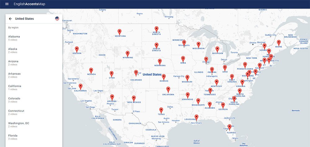
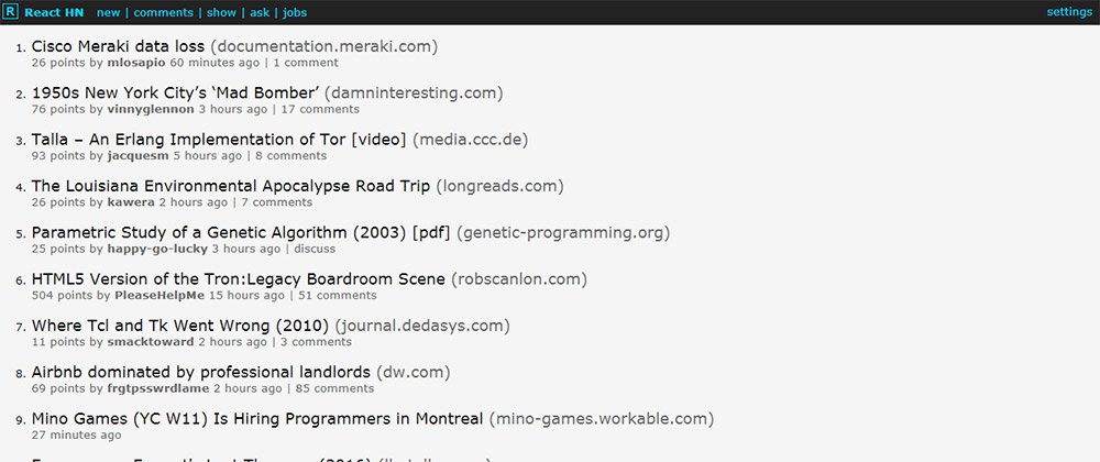
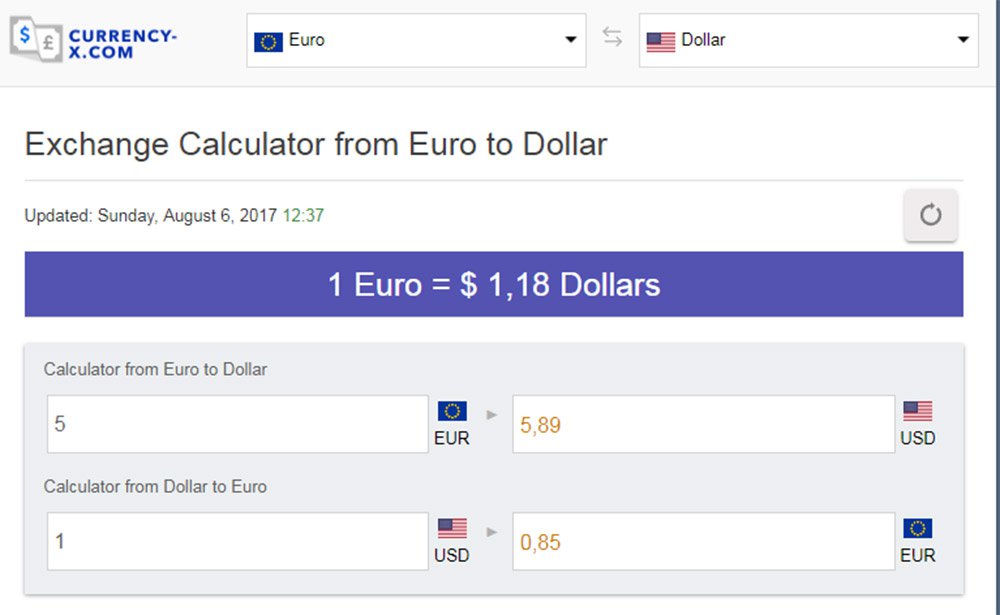
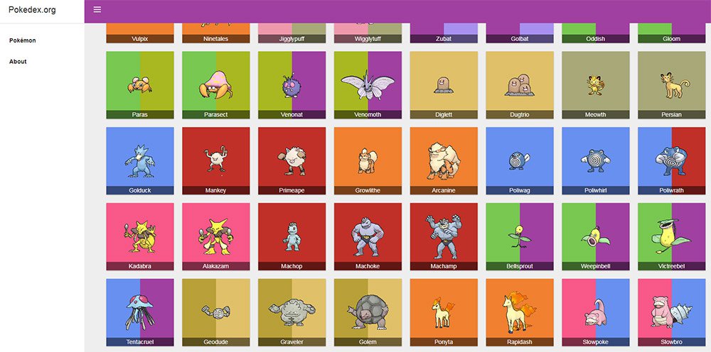
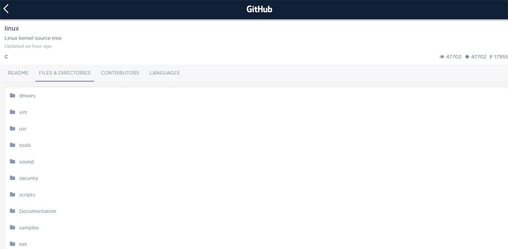
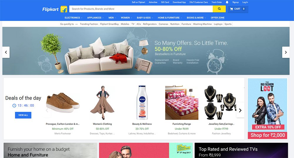
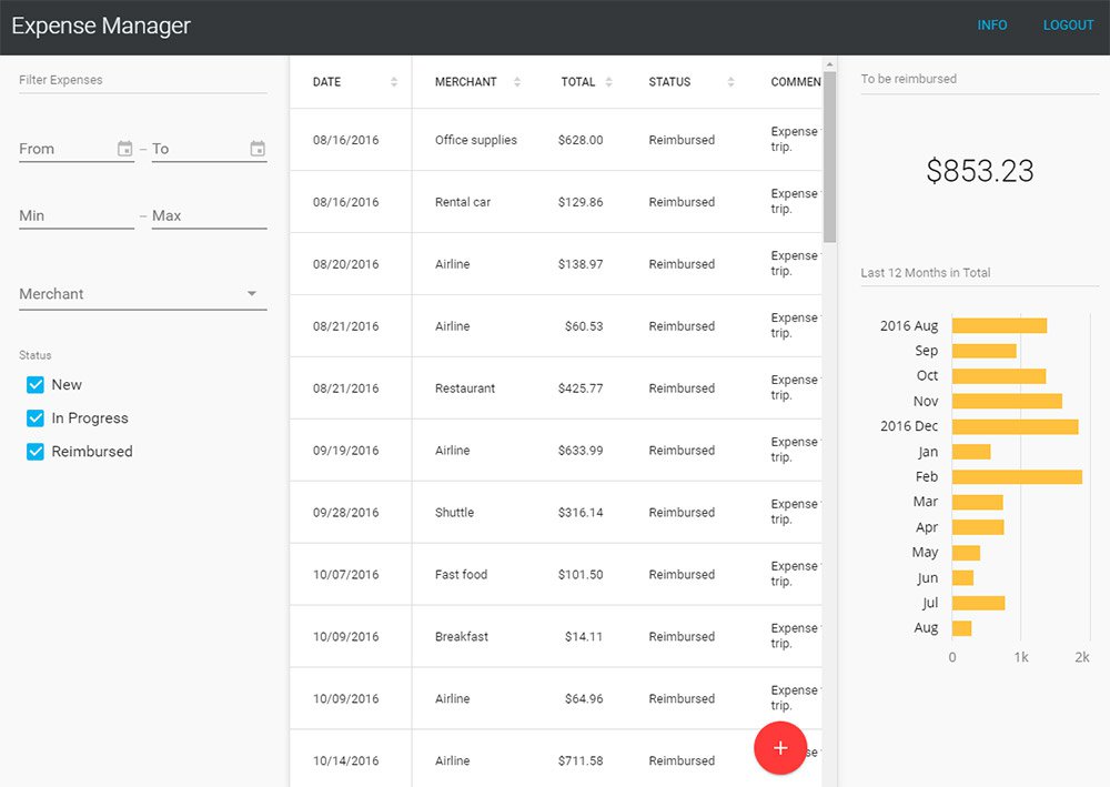
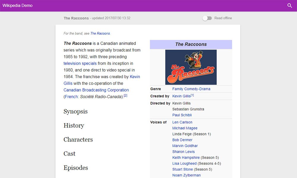
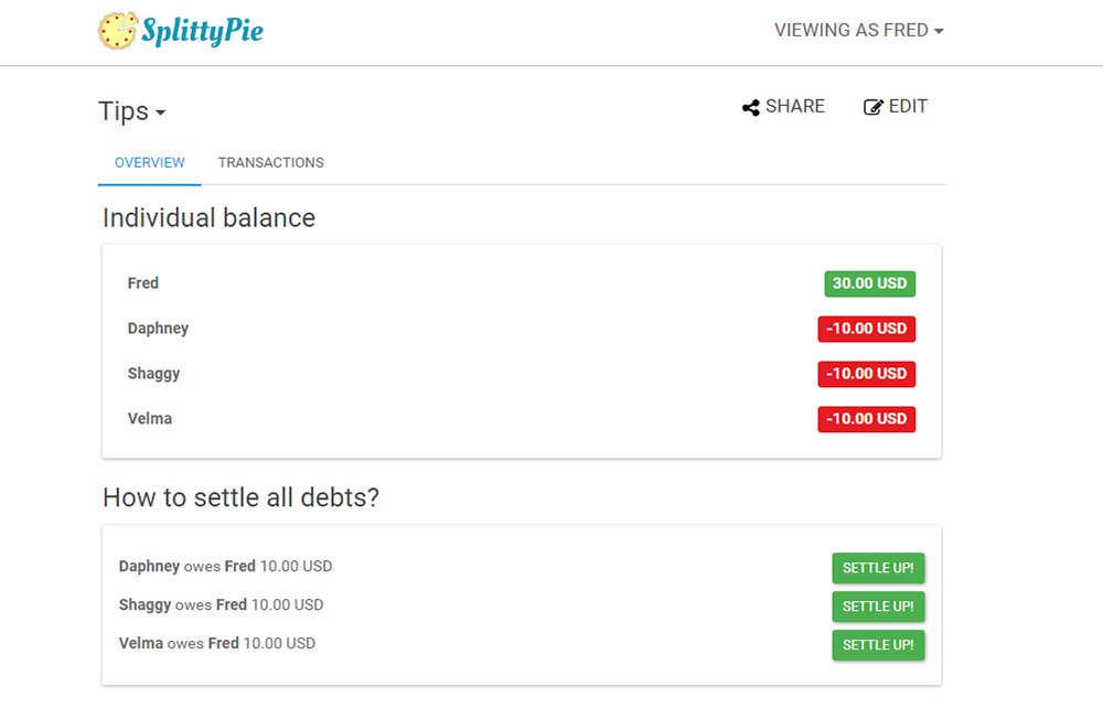
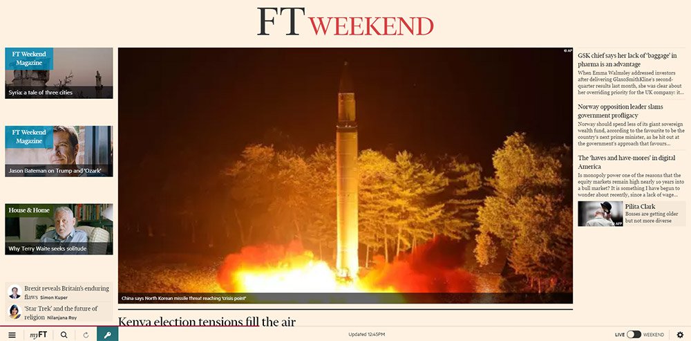
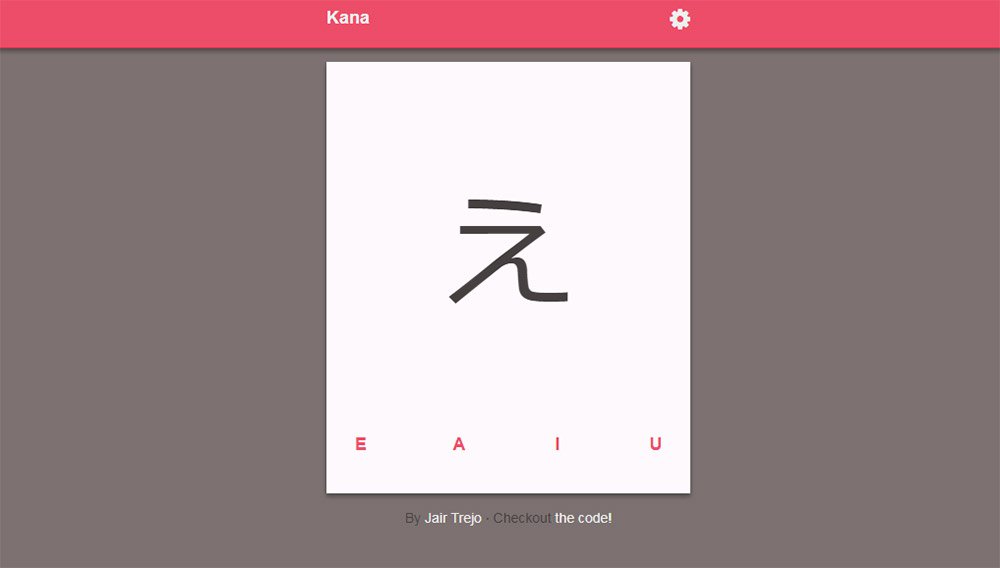


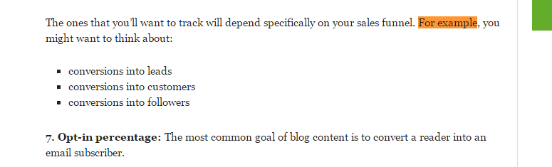
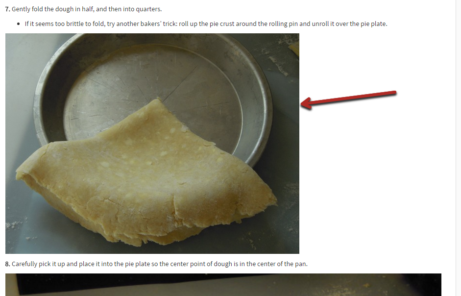
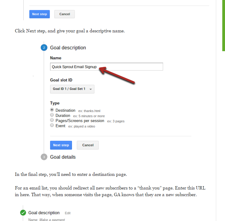

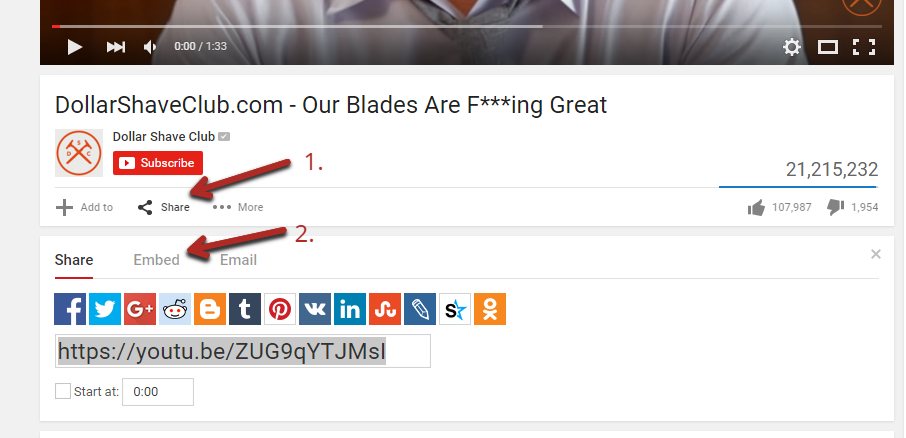

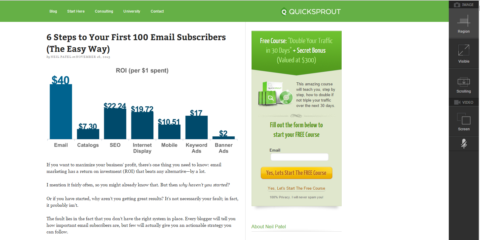
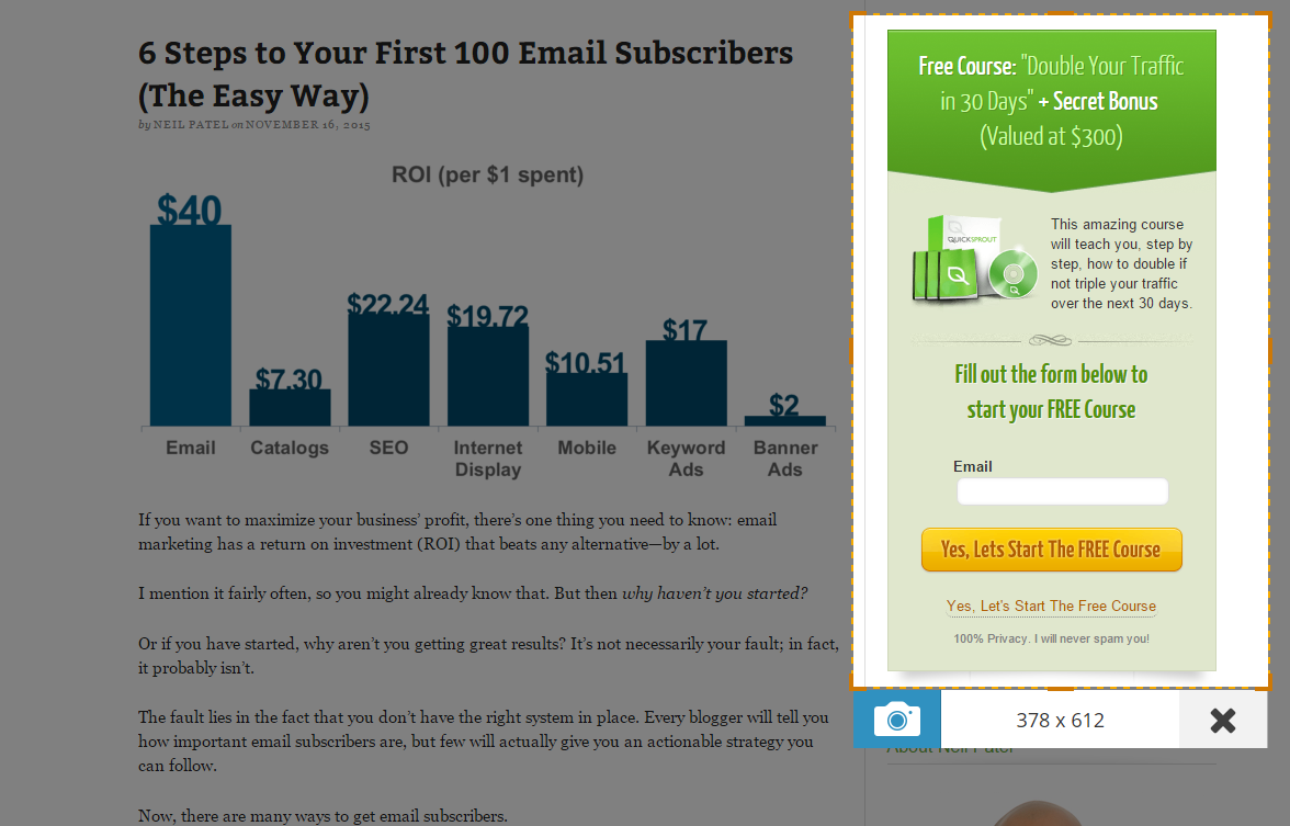
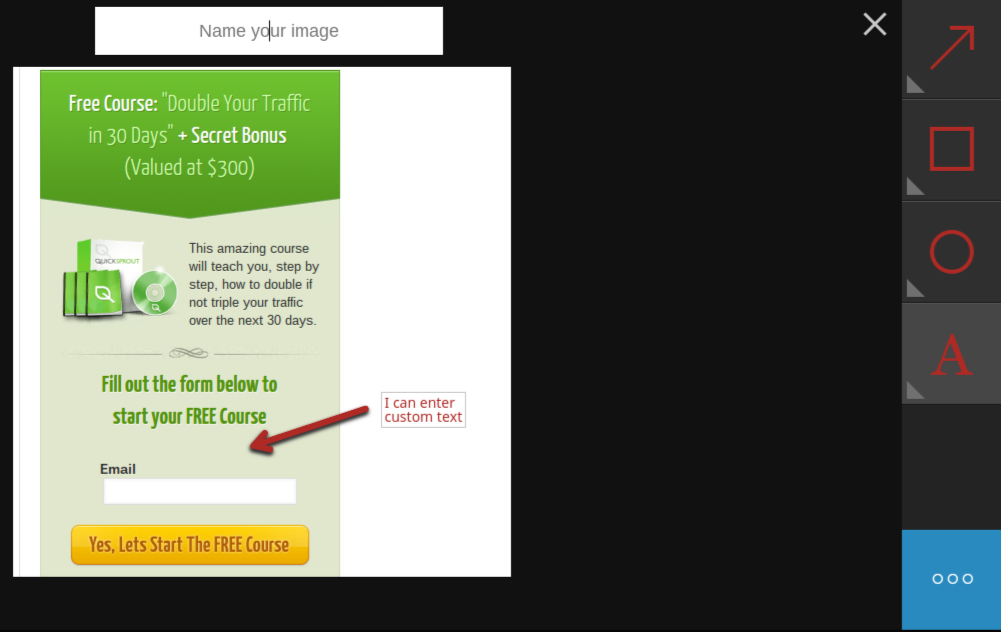
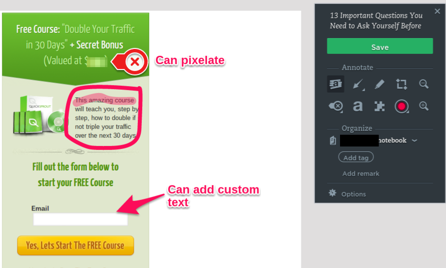
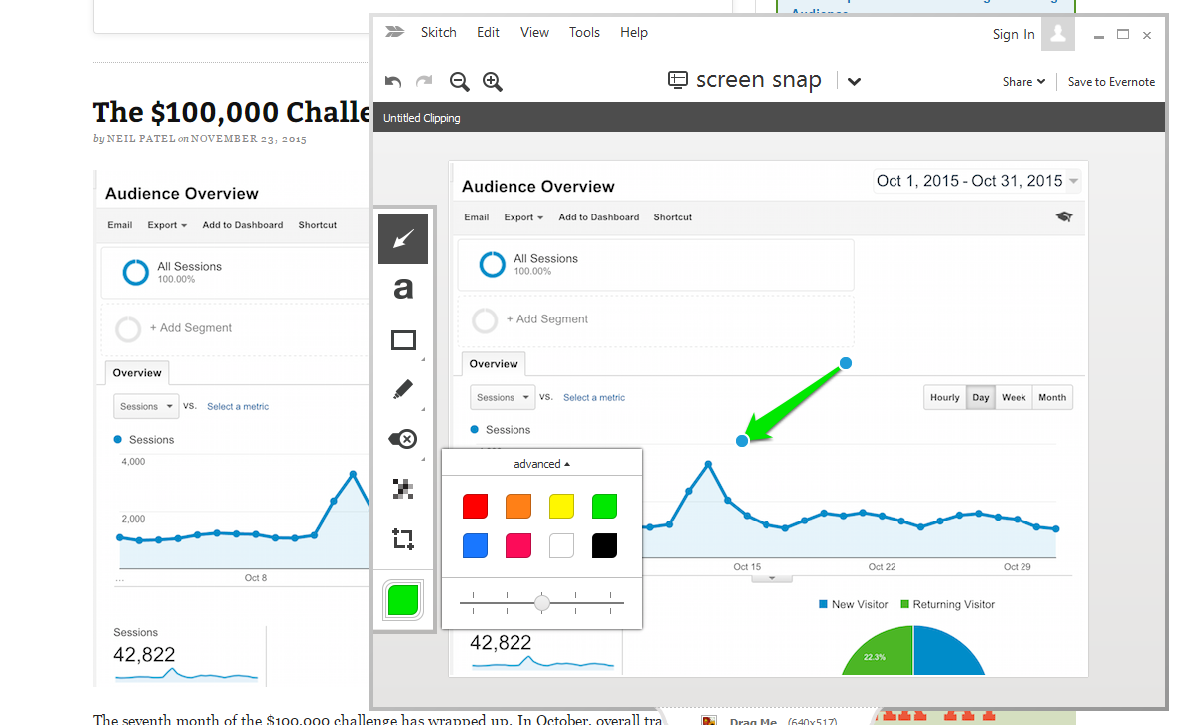
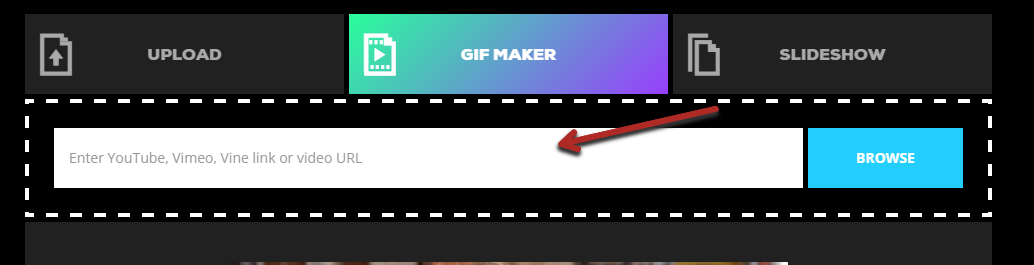
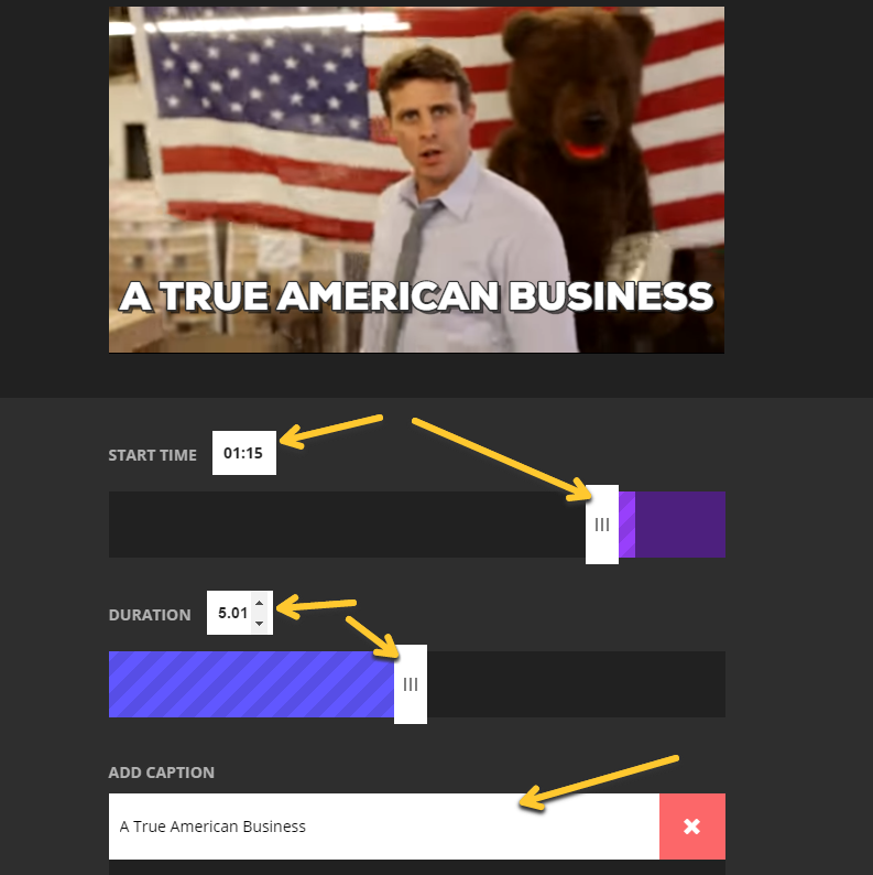
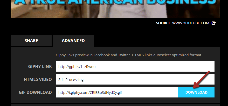

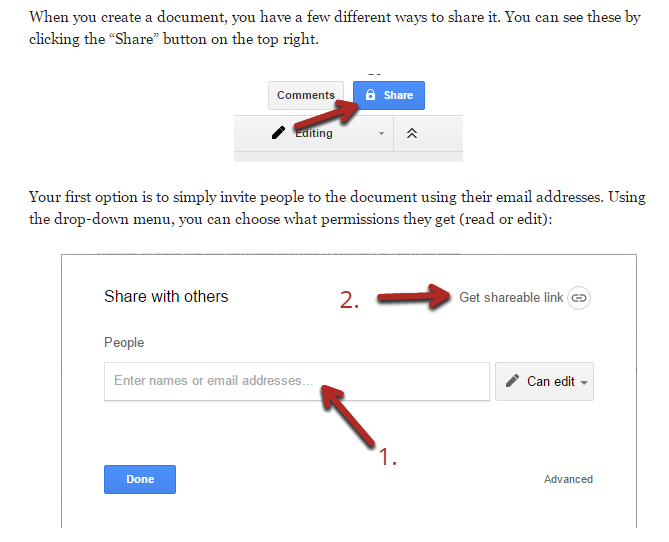
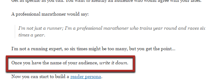
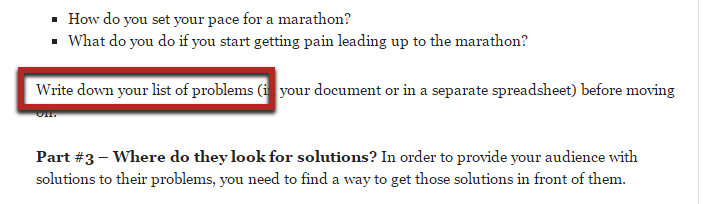
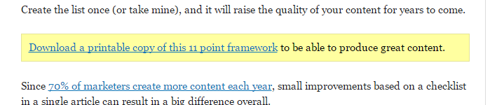
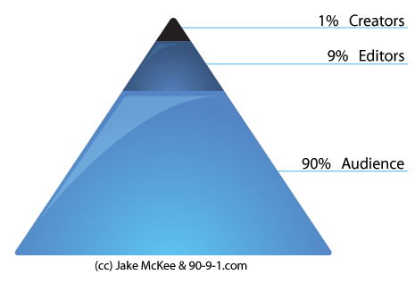
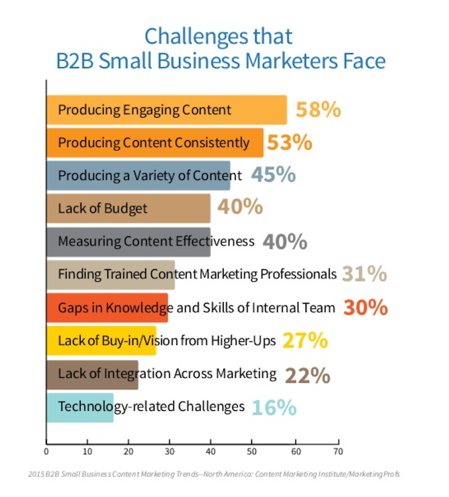

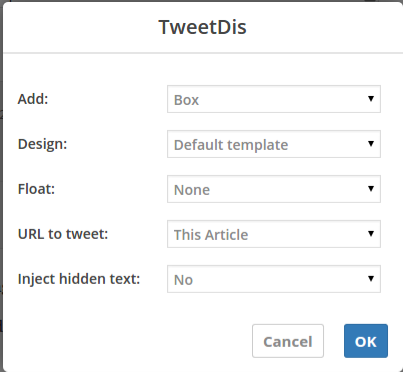
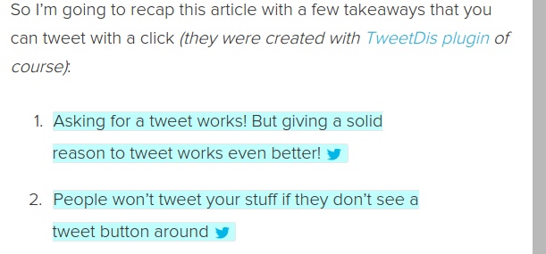
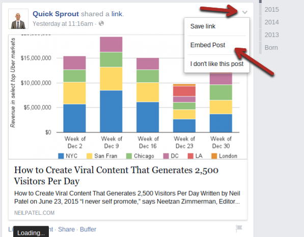
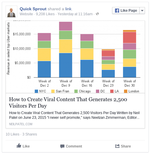
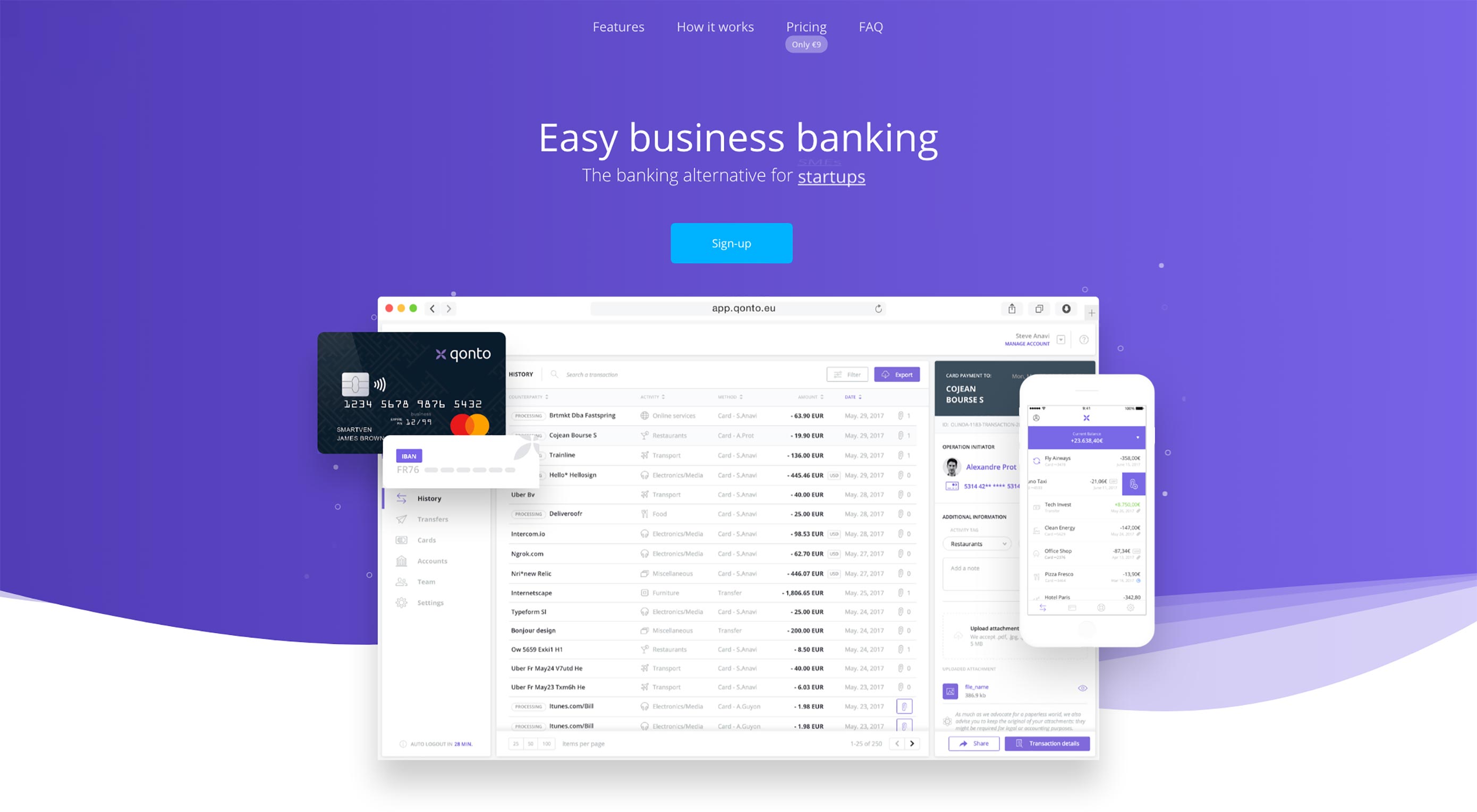 Animated page elements are super common on landing pages and startup websites. But they’re not always talked about in design circles because the idea of “animate on view” isn’t covered a lot.
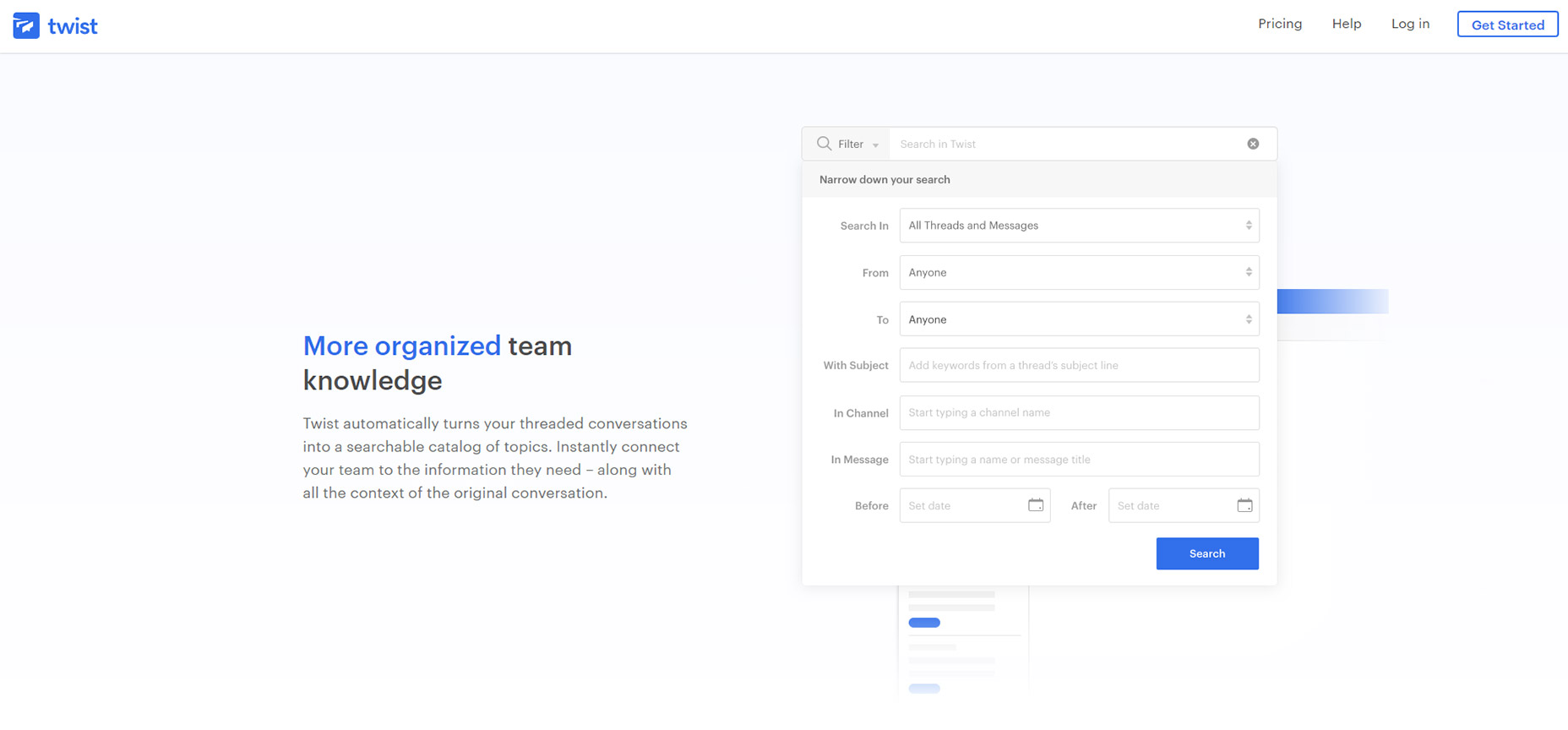
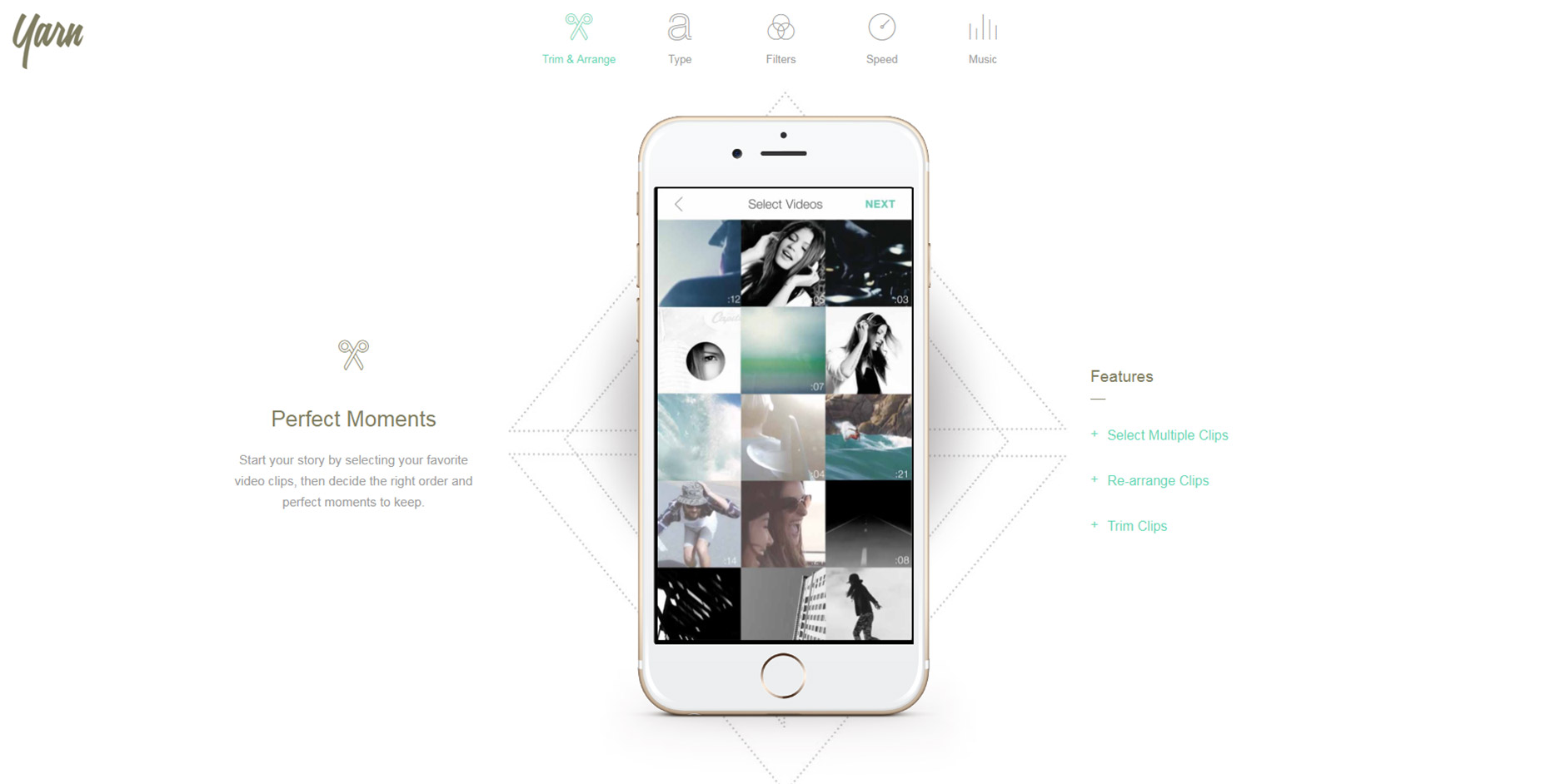
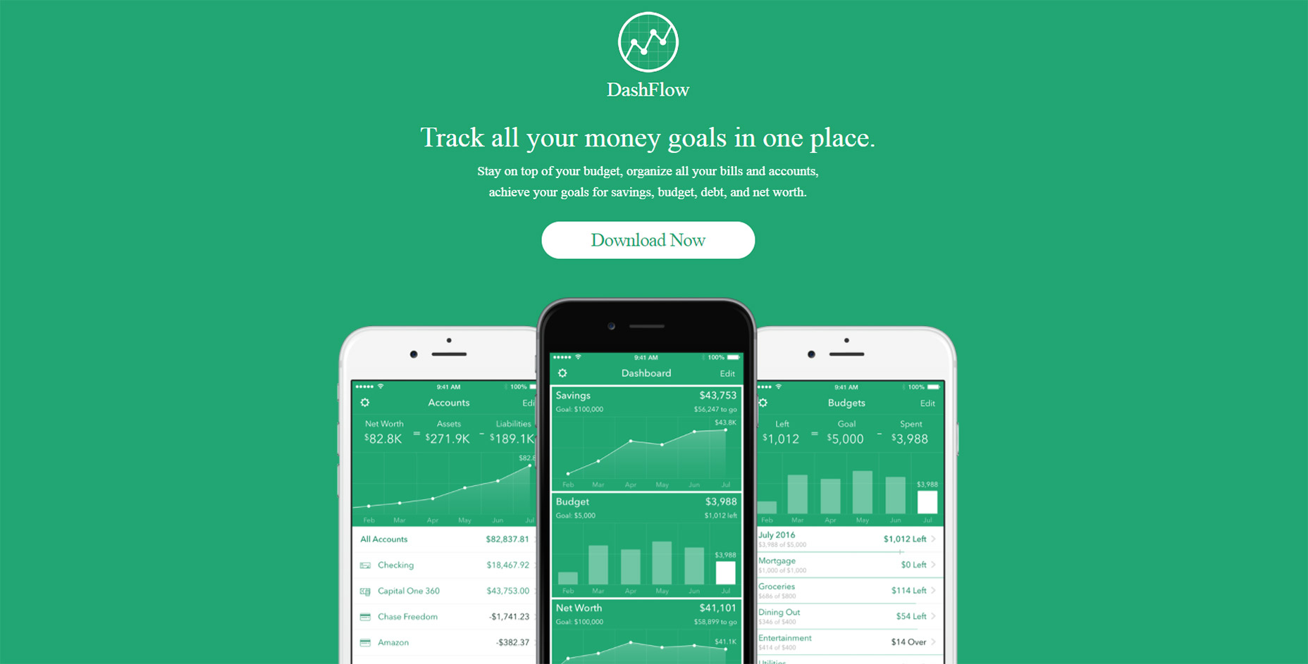

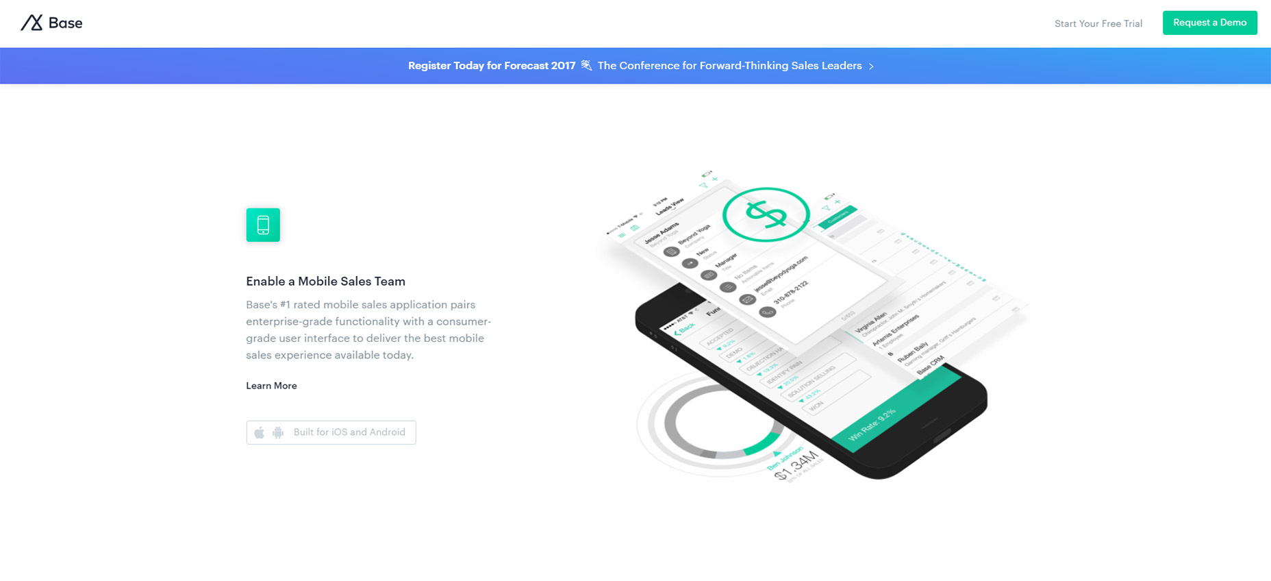
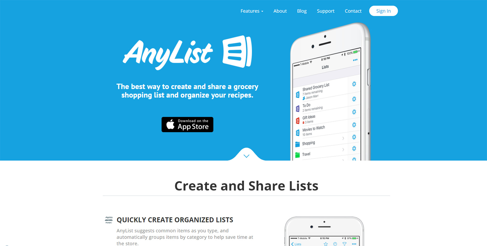
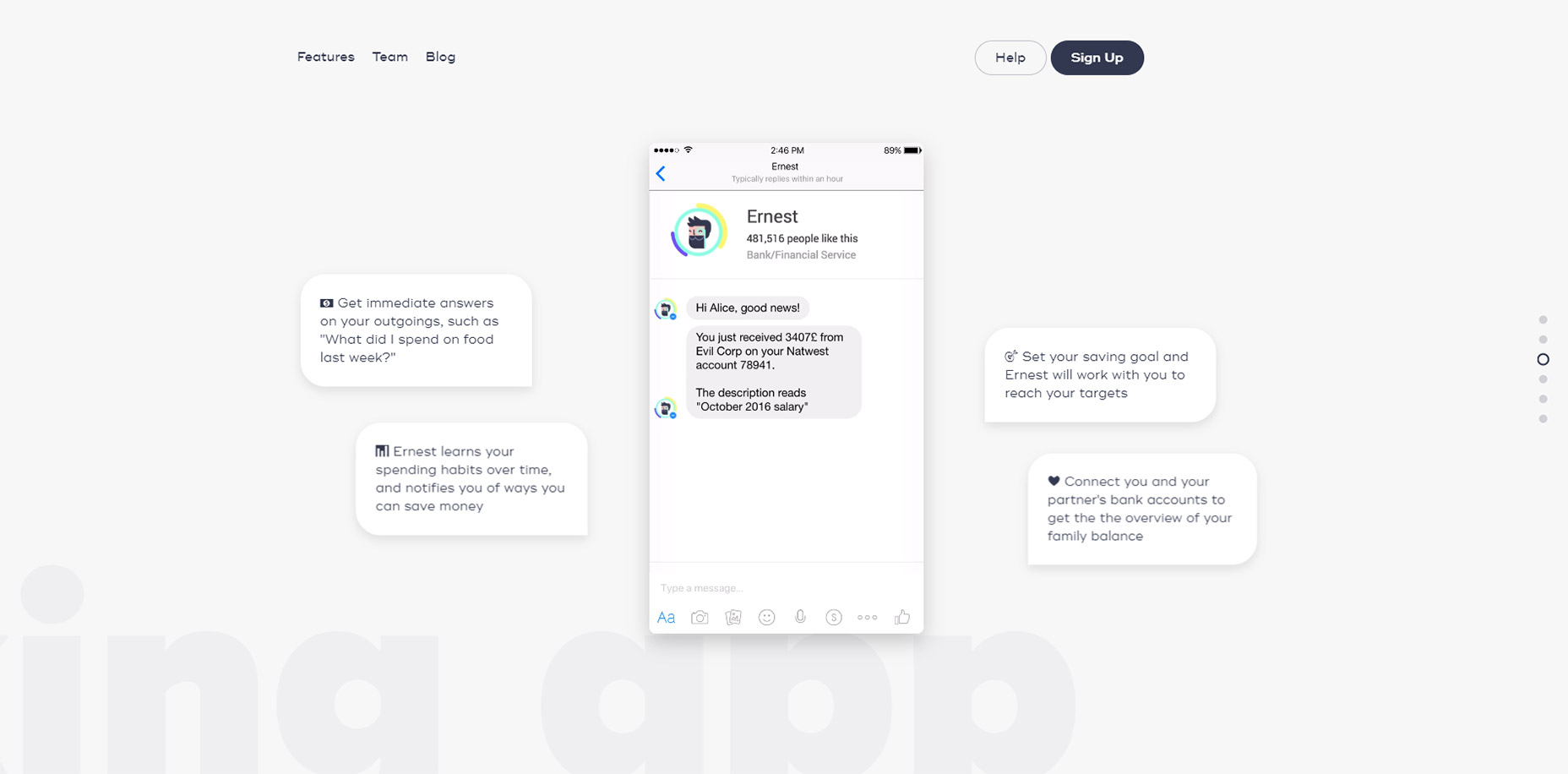
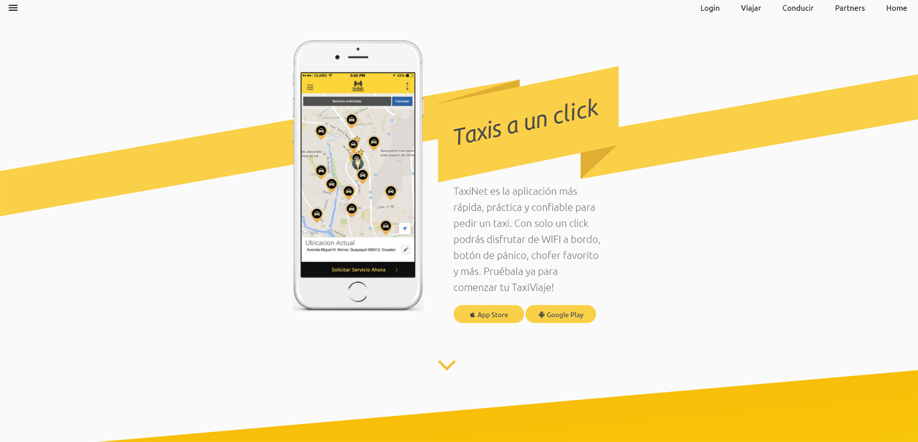


 Launching a new website can be exciting and nerve-wracking at the same time. You want to show off what you’ve been building, what you’ve learned, and the creative solutions you’ve come up with. You can already taste that first celebratory taco. You go live.
 One screen divided in two.
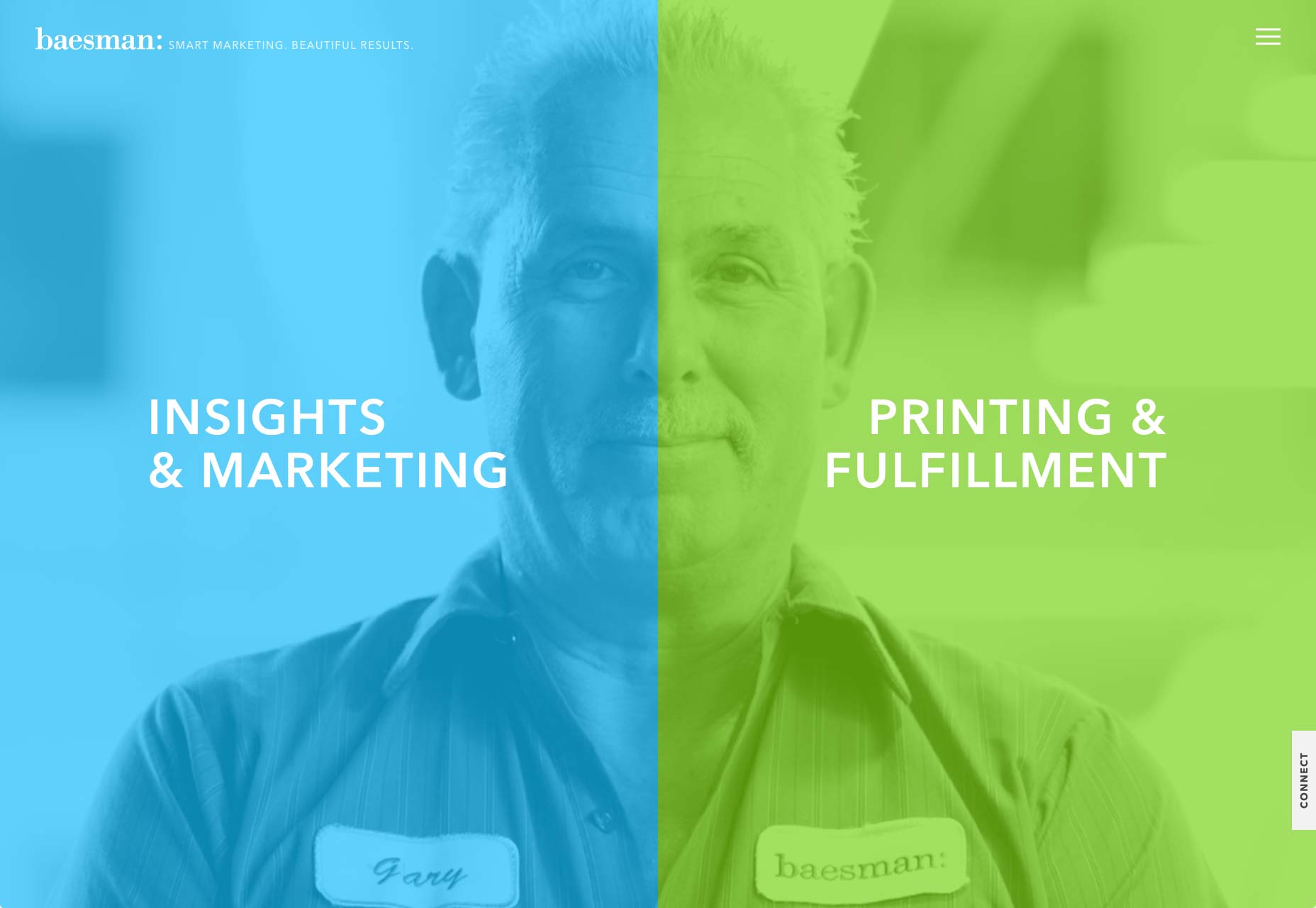

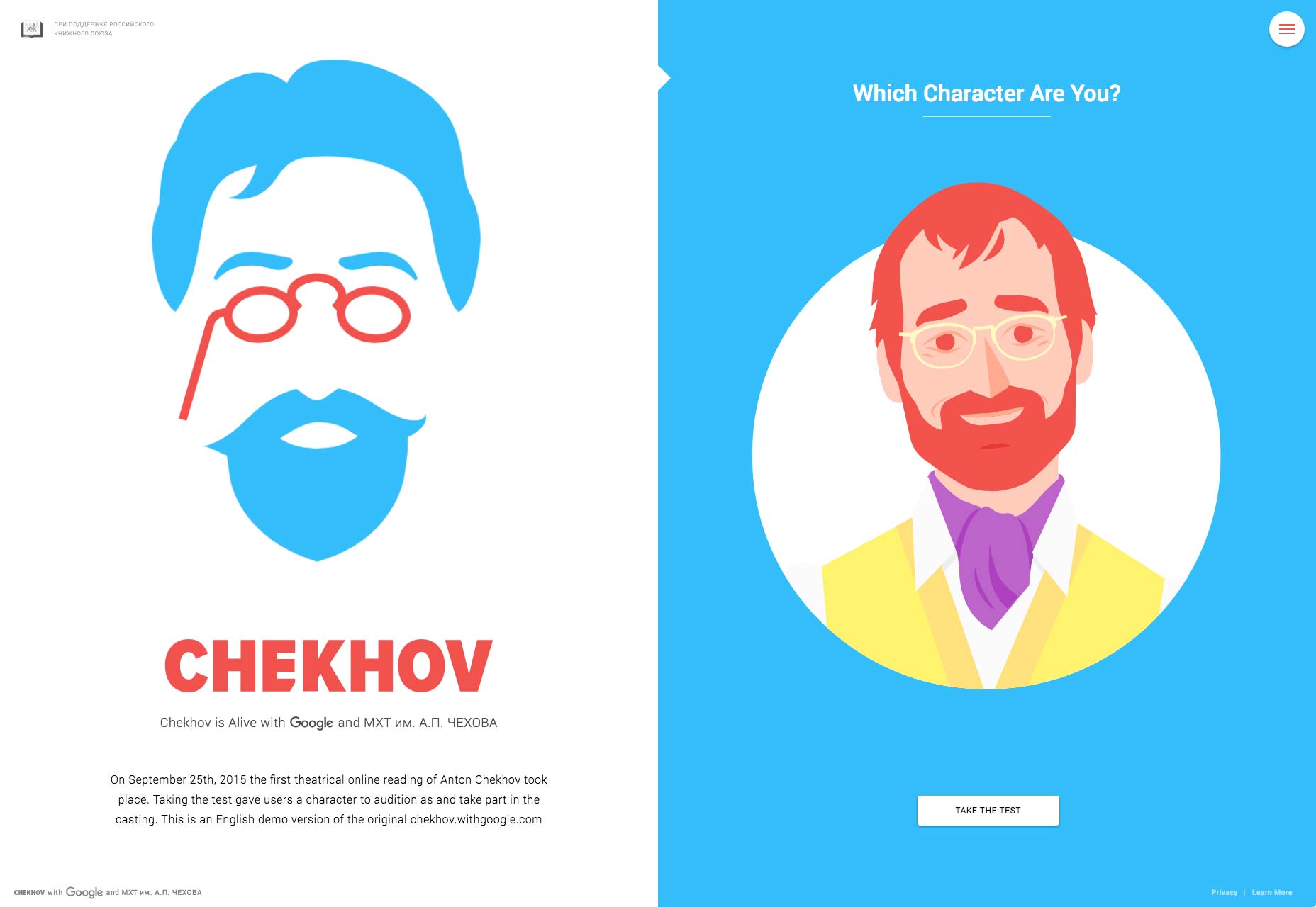


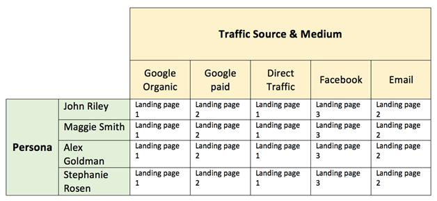

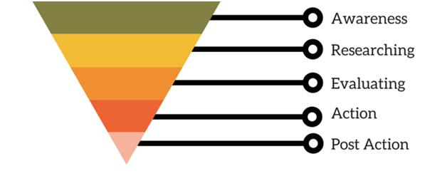


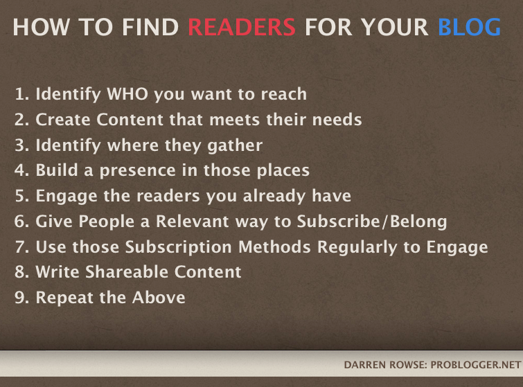


