While traffic to a blog is usually top of mind for a blogger, the real gold is when you create recurring traffic from loyal and engaged fans. It’s all very well and good to have lots of numbers in your stats, but if nobody is interacting or sticking around, it actually doesn’t get you very far at all.
With this end goal in mind, you’ll find that it’s creating content that creates memories in your audience that’s important. And it’s important for a few reasons – your content becomes your brand, it’s what you become known for, and it’s what others tell about you when they share your content or your blog with their friends and family.
I find that when I go to conferences and blogging events, there is always someone who will come up and tell me about a piece of content I shared that resonated with them. It means that I’ve made a connection in some way, a left a lasting impression on a reader who has carried that impression with them as the kind of blog I have and the kind of content I provide.
In today’s episode of the ProBlogger podcast, I want to talk about all the ways you can make this kind of impression on the people who come to your blog. Whether they’ve searched for key terms, found you on Pinterest, were recommended your post by a friend, it doesn’t matter. What you want is for them to hang around.
The posts that people come up to me at conferences and remind me about are:
story posts
playful posts
emotive posts
inspirational posts
opinion pieces
personal posts
vulnerable posts
The times when I’ve opened up and shared something are usually the times when it strikes a chord in the reader and they feel as though they’re not alone.
The impact of most of these kinds of posts is that they hit the heart, not just the head. It makes the reader feel something, and you’ve succeeded in making a connection. It makes you human. It makes you relatable.
This is what people remember.
You can find today’s show notes on ProBlogger.com, and I’d love to hear – what posts do people remember on your blog? What have you written or shared that has struck a chord?
Further Reading:
Why My First Blog Failed … and What You Can Learn from My Mistakes
Hey Bloggers! Is it Time to Focus a little Less on Your Blog and A Little More on YOU?
ProBlogger Podcast 39: What is Your Why?
How to Write in a More Personal and Engaging Tone
ProBlogger Podcast: Turn Blog Surfers into Loyal Readers by Building a Sticky Blog
The post How to Create Blog Posts That People Remember appeared first on ProBlogger.
How to Create Blog Posts That People Remember http://www.problogger.net/archives/2016/03/01/how-to-create-blog-posts-that-people-remember/ http://www.problogger.net/archives/category/blog-promotion/feed/ Blog Promotion – ProBlogger Blog Tips to Help You Make Money Blogging – ProBlogger http://www.problogger.net/wp-content/plugins/podpress/images/powered_by_podpress_large.jpg
For many of us as bloggers, the ultimate goal is to build an audience of readers who feel engaged with our brand, who show up on a loyal and regular basis, and who eventually feel so much a part of what we do that they naturally want to share it with their own friends, family and networks.
Last week I sat down and put together a short presentation on how to do just that with your blog and shared it on my Periscope account. It contains a short exercise that for me helps to get into the mind of a reader and to analyse the journey that they might need to take to get fully engaged.
I’ve included the full presentation below for those who would like to watch rather than read but the exercise in brief is….
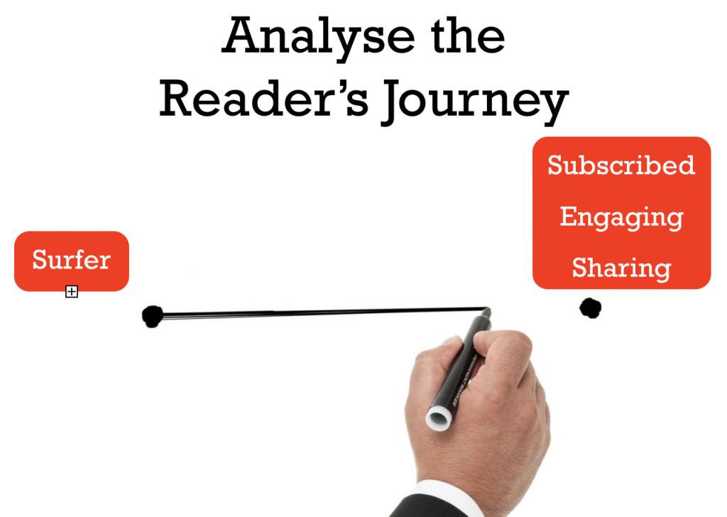
Grab a pen and paper and draw a line horizontally across the page.
On one side put ‘surfer’ and the other describe what you want them to become. For me it’s about helping them to go from being a ‘surfer’ to being ‘engaged, subscribed and sharing’ (and a customer).
Your page might look like this:
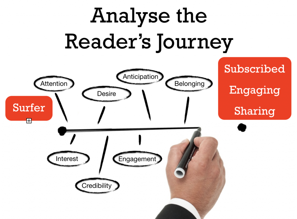
Now that you’ve got the starting and ending positions – what needs to happen to get them from point A to point B?
When I did this exercise I came up with a variety of things that need to happen. I jotted down a few words for each thing:
I need to grab their attention
I need to pique their interest
They need to feel some desire about what I’m doing
They need to feel I’m a credible source
They need to start to feel engaged
They should feel some sense of anticipation that something is coming that gives them a reason to subscribe
They should feel a sense of belonging
Your list might be similar – or it could have other milestones that might get them to your ultimate goal.
Your page probably looks something like this:
With this little roadmap of the journey of one of your readers it’s now time to ask yourself what would move a reader along this process?
There are a number of things that can help but as bloggers I want to suggest that the content we produce is the primary vehicle that drives people along this journey.
Every piece of content you publish whether on your blog, in an email, in social media updates has the potential to move people along this process but different types of content will achieve different things so it can be well worth mixing up the types of content that you produce to help with this.
I go into more detail of the types of content that help at different points in the journey in the video below (it starts at about the 6:35 minute mark if you want to start there).
On my photography blog:
Content that gets attention might include humorous content, infographics, list posts
Content that gets interest and builds desire can include our ‘image collections’ (aspirational content)
Content that builds credibility includes some of our longer form very comprehensive tutorials
Content that builds anticipation includes some of our series of posts that come out over a week or month
Content that builds engagement and gives a sense of belonging might include our weekly challenges
Of course here I’m just talking about blog content but the same goes for your content on social media and if you really want to ramp it up – your email autoresponders can be a brilliant way to move people through this type of sequence of content.
There’s lots more if you have about 25 minutes to watch the presentation below, but if not I hope some of the above also gives you a few ideas of how to get in your readers shoes and create content that moves them intentionally towards engagement rather than just hoping it happens.
Here’s the full recording of the presentation.
The post How to get your Readers to become more Engaged, Loyal and to Share your Content appeared first on ProBlogger.
How to get your Readers to become more Engaged, Loyal and to Share your Content http://www.problogger.net/archives/2016/02/23/how-to-get-your-readers-to-become-more-engaged-loyal-and-to-share-your-content/ http://www.problogger.net/archives/category/blog-promotion/feed/ Blog Promotion – ProBlogger Blog Tips to Help You Make Money Blogging – ProBlogger http://www.problogger.net/wp-content/plugins/podpress/images/powered_by_podpress_large.jpg
These days, agencies tend to get caught up in near-constant talk of creativity, innovation, and disruption. But all that noise can drown out the real reason you’re in this business: to make money.
The truth is that you’re trying to make a living — for yourself, your family, and your employees. And no matter how hard you work to serve clients, when you don’t make money, it’s pretty tough to sustain enthusiasm.
Even when you are making money, this is a tough business. That’s why it’s crucial to avoid certain catastrophic mistakes agencies make every day.
Draining Water From Your Own Pool
Even smart agency owners make some of these painful mistakes. They don’t willfully sabotage their own efforts, but they fail to realize the long-term impact these seemingly innocuous decisions carry.
You might even recognize yourself in these five financially draining errors — and not realize how harmful they are to your bottom line.
5 Mistakes That Will Bankrupt Your Agency
1) Your pricing is too basic.
Nine times out of ten, agencies present clients with a single price and package. However, when you do this, nine times out of ten, they’ll push back.
Instead, always give them three options. Build the middle option first because this is the one they’re likely going to choose. This option should be your ideal sale and what’s really best for the client. According to a study on the center-stage effect, consumers feel that options put at the center of a range of options are the most liked.
Once you’ve constructed your “middle” option, strip some of those deliverables away to create a first option. This bare-bones option is priced about 20 percent to 25 percent lower than the middle option.
As for the third option, add some bells and whistles — not ones that are meaningless to the client, but factors that take things above and beyond the minimum standard. Price it about 30 percent to 35 percent higher than the second option.
When you present these three options, more often than not, clients will talk themselves into the second option. What’s beautiful about it is that they feel like they have control over their budgets and over the work.
2) You give it away for free.
Virtually all agencies have a gaping hole called scope creep: allowing the scope of a project to get larger without the price rising accordingly. If we could control it, we would all be driving nicer cars and taking better vacations.
I’m not suggesting you nickel-and-dime your clients to death, but you do have to plug that hole. Of course, we can look at our clients and be frustrated that they keep asking for more and more. But the truth is that the blame sits squarely with us.
Often, your scope documents are too vague, failing to define deliverables in a way that leaves no room for interpretation. Or maybe they’re too broad, without any boundaries.
If you have account people managing client project budgets, they may not understand agency math. You expect them to be good stewards of your profitability, but they don’t understand the game they’re playing — no one has taught them the rules.
In most agencies, leaders never take the time to teach employees how an agency makes money. Thus, they fail to understand that everyone, every single day, either makes the agency money or costs it money by over-servicing clients or not negotiating better with vendors.
When employees don’t understand that, they believe their jobs are not to make money, but to keep clients happy. Naturally, the easiest, fastest way to do that is by over-servicing clients. Voilà: scope creep.
Don’t take my word for it: It turns out that by overservicing just once a week, an agency can give away a whopping seven figures of essentially free work.
3) You let clients slowly pick you to death.
When your scope documents are too vague, you’ll get clients exceeding them in no time at all, asking for the 12th or 13th revision. Yet chances are good that no one will issue a change order. This is especially true if your scope documents are loose because you know you’re standing on shaky ground.
However, the biggest reason is that by the time you’re far enough along to consider a change order, your account executive is thinking, “The client wants to make a minor change. By the time I calculate the change order costs, write up a document, send it to the client, and get him to sign off on it, we could have just made the change. So why waste more time and irritate the client by issuing this change order? Screw it. I’m just going to make the change.”
Here’s the easy fix: In all of your scope documents, include language that describes a flat fee for changes beyond the number of changes allowed. Clearly define the deliverables and the timetable.
If, for instance, you’re working on a brochure for a client and you’re going to give the client four revisions, include this: “With this estimate, you are going to be granted four revisions. Any revisions after the fourth revision will cost a flat $250.”
4) You put out small fires at the expense of the raging inferno.
You’re so busy running around with a fire extinguisher, chasing after the drama of the day, that you don’t really have a vision for how you want to move your agency forward. How do you want it to be different a year from now?
If you really do want to grow your business — not necessarily in the number of bodies, but in fulfilling your vision for your agency — it won’t happen without planning.
5) Your new business plan sucks.
Have you ever caught yourself saying any of these phrases? “Well, we grow based on referrals.” “We’re going to hire a guy.” “We’re just too busy taking care of clients to chase after clients.” “We’re really lucky the phone is still ringing.”
If so, you don’t have a plan. Sure, all of that may be true today, but if you’ve been in business for any length of time, you know it ebbs and flows. That’s why you need a consistent new business program to keep your sales funnel full. It’s getting tougher and tougher to find great client prospects, and the time period between meeting them and signing them is stretching out.
If you don’t drum up new business now, chances are you won’t start until the minute you get the sense that your most valuable client — your gorilla — is unhappy. Or, even worse, the dread will strike the minute you get the phone call that he or she is done. By then, it’s too late. New business is a muscle you exercise every single day, no matter how busy you are.
If you’re the agency owner, new business should be your primary responsibility, taking up 40 percent to 60 percent of your time. You’re not always out pitching or calling on prospects; maybe you’re writing content. But not spending time on new business is a big money-sucking mistake agencies make every day.
If a Shark Stops Swimming, It Dies
Above all, make sure you’re constantly evolving, growing, and refining. Even at the best and most profitable agencies, there’s room for growth and improvement. Whatever solutions you’re using now, different options will exist a year from now. Our world is changing too fast for us not to keep up with it. And that doesn’t happen without a plan.
What’s going on in the industry? What new techniques have emerged recently? What insights, tools, tips and tricks is the web design community talking about? Anselm Hannemann is collecting everything that popped up over the last week in his web development reading list so that you don’t miss out on anything. The result is a carefully curated list of articles and resources that are worth taking a closer look at. — Ed.
You probably haven’t bought your Christmas presents yet. Usually we feel the need to buy a gift for friends and family. It often lets us buy random stuff that is often of no real value. Turning this around, I started to enjoy the evening with a hand-made dinner, small hand-made gifts and enough time for the loved ones. So far, this worked way better than any gift I’ve ever bought in a store. So don’t stress yourself if you haven’t found anything yet — time, attention and doing things together can also be a great gift. Have a nice weekend!
Having the ability to set legible body copy is an absolute must, and we’ve come a long way with web typography since the dawn of web design. However, I feel like we have allowed the lack of variety prior to the rise of web fonts to dampen our creativity now that thousands of web fonts are at our disposal. Have usability conventions and the web’s universality steered us away from proper art direction? Have we forgotten about art direction altogether? I believe so.
As designers, we can achieve much more with type, and with just a little more thought and creativity, we can finally start to take full advantage of the type systems available. Let’s look at ways we can push typographic design on the web further, beyond the status quo of today.
The Benton Modern brochure website3 (a project I was involved in) is a perfect example for showcasing how a large type family can be utilized to improve legibility and readability across breakpoints, while at the same time evoking emotion and providing a pleasant experience. We shall explore the ideas introduced to push the boundaries of typographic design on the web and get practical, too, with a key focus on responsive web typography.
First, The Basics Of Responsive Web Typography
You’re probably aware of responsive web typography by now and how it can solve challenges outside of core responsive web design. However, as the focus of this article isn’t on the ins and outs of responsive web typography, we shall not be exploring it in any great detail.
If you’re interested in learning more about general typesetting for the web and how to approach certain issues, many4 resources exist5 to help you.
Furthermore, my “Responsive Typography6” talk and chapter in Smashing Book 47, in which I propose reusing “traditional” typography rules and translating them to the language of CSS, should help kickstart any aspiring web typographer to improve their typography game.
To also help you on your way, here’s a quick rundown of some of the methods I’ve been advocating in recent years, methods that were applied to the Benton project, too:
Provide different font sizes for different reading distances, currently achievable by detecting a device’s form factor using @media queries. Long term, this is probably not ideal — that is, until reading distance-detection techniques8 become more feasible. In the meantime, use Size Calculator9 by Nick Sherman10 and Chris Lewis11 to calculate the physical or perceived font size when factoring in reading distance.
Maintain perfect proportions in a paragraph with letter spacing, word spacing and line height properties for each breakpoint. Universal Typography’s demo12 by Tim Brown13 of Nice Web Type14 is a very useful tool that can help you experiment with and adjust your paragraph proportions accordingly.
Establish hierarchy using either a typographic scale (Modular Scale15 is a useful tool by Tim Brown and Scott Kellum16) or different styles at the same font size — for instance, uppercase for h2, small caps for h3 and italics for h4 subheads. For more options and ideas on styling subheads, may I suggest you read “Setting Subheads With CSS17” and explore examples of subheads set with CSS18.
For small screens, indent paragraphs and separate page sections with white space. For large screens, use block paragraphs and separate page sections with graphical elements (lines, shapes, color).
Use graded fonts to normalize rendering across different pixel densities. Font grades are very subtle font weights used to compensate for different ink and paper qualities, as well as for different pixel densities on screen. This method is explained in detail in iA19’s article “New Site With Responsive Typography20.” In short, lighter grades are used for low-DPI screens and heavier grades for high-DPI screens, while graded fonts will also compensate for different sub-pixels’ direction between portrait and landscape mode on mobile and tablet devices.
Look for type families that have multiple optical sizes21, and use appropriate styles for body copy, tiny text and display sizes. For instance, Font Bureau22, the company behind the Benton Modern family, makes many families like this with a wide stylistic palette.
Use different font widths according to the width of the screen (see what happens with the subheads on the Benton website23 when you resize the browser window). For instance, use a condensed font for small screens and a wider font for larger desktop screens, just like on the brochure website for Input24 (again, resize the window). In the case of the Benton project, we set different font widths manually for each breakpoint, but there’s also a solution for automatic swapping using Font-To-Width25 (by Sherman and Lewis) that takes advantage of multiple-width type families to fit pieces of text snugly within their containers.
Here’s another tip: If you intend to use Georgia or Verdana on large screens, replace them with Georgia Pro Condensed or Verdana Pro Condensed26 on mobile screens. The reason why Georgia Pro and Verdana Pro’s condensed widths work well at small sizes is because they aren’t extremely condensed and, hence, can still be read comfortably.
With this basic primer on responsive web typography out of the way, let me walk you through the process of designing a web page that is meant not only to inform, but to amaze!
Show, Don’t Tell
Webtype27 commissioned us to build a brochure website for Benton Modern soon after Indra Kupferschmid28 had seen my talk on responsive web typography at Smashing Conference in Oxford. The brief was to showcase what could be achieved typographically with a versatile type family coupled with responsive web typography using as many responsive techniques as possible, essentially putting into practice the elements presented and demonstrated in my talk. With Indra Kupferschmid as the chief type savant and Nick Sherman as the onboard quality assurance director, there was certainly to be no trouble with experimenting and pushing the boundaries.
From the very start, we wanted the user to experience the type family through the design and not just through a full page of body copy. That being said, in searching for the right metaphor to use, we eventually settled on creating two distinctive designs — the formal29 and the expressive30. Both are fully responsive, utilizing the same HTML, and for all intents and purposes showcase the benefits of separating structure from presentation, so don’t forget to resize your browser and inspect the HTML and CSS.
Learning About The Typeface
Indra’s elaborate copy was a good starting point to get to know the typeface. When you receive content up front, as was the case in this project, it’s so much easier to create semantic HTML and to explore different styles. Here’s how we started our investigative testing, bearing in mind that Benton Modern comprises 48 styles in total:
First, we tested all of the styles at large and small sizes, stretching and squeezing every which way possible. We used Reading Edge optical sizes31 (designed for 9- to 14-pixel font sizes) as subheads, and display optical sizes (designed for headlines) for body copy. We wanted to see what could go wrong and challenge the intended use for each style. However, the solution that we settled on was still pretty much in line with the intended use for each optical size.
Next, we tested how different styles behave in narrow columns versus wider blocks of text. Hyphenated and justified verus left-aligned. Tightly spaced versus loosely spaced.
Lastly, we analyzed all of the glyphs one by one, searching for little hidden gems. Apart from the ampersand — which is always an obvious choice — another good candidate was the uppercase R.
From there, the next step was to apply some basic styles to the page. One of the early ideas was to adopt a traditional newspaper column layout, which we tried. With the exception of this high-level concept, we still didn’t have a definitive layout concept by this point.
Indented paragraphs in columns were too narrow to be justified and hyphenated34 properly, so we just kept the hyphenation to improve the texture a little bit.
.columns p {
   -webkit-hyphens: auto;
   -moz-hyphens: auto;
   hyphens: auto;
}
.columns p + p {
   text-indent: 1.5rem;
}
We used columns only when there was enough horizontal space. But we also wanted to avoid columns bleeding out of the screen vertically, because that would require scrolling up and down during reading when moving from column to column. That’s why we introduced another @media query to test the height of the screen before applying columns.
@media only screen and (min-height: 25em) {

   @media only screen and (min-width: 40em) and (max-width: 59.9375em) {
      -webkit-columns: 2;
      -moz-columns: 2;
      columns: 2;
      -webkit-column-gap: 2.7em;
      -moz-column-gap: 2.7em;
      column-gap: 2.7em;
   }

   @media only screen and (min-width: 60em) {
      -webkit-columns: 3;
      -moz-columns: 3;
      columns: 3;
      -webkit-column-gap: 2.7em;
      -moz-column-gap: 2.7em;
      column-gap: 2.7em;
   }
}
Designing Content
The next step was to analyze the content in more detail. That way, we were able to establish what the different sections were and adjust the details as we went along.
The formal version was the first to be developed. We created a huge headline to reflect newspaper headlines and added the year that the series started. The deck was the obvious element to style next. We experimented with a condensed version, and to our surprise it worked immediately. At that stage, the page navigation still didn’t exist and was only included much later on to improve overall usability, as well as to demonstrate the use of brackets as graphic elements.
The sections were a little dull, though. The hierarchy and arrangement of subhead, intro paragraph and columns were quickly established using the rules explained previously, but something was still missing. After some trial and error, we decided to separate the different sections with dotted borders to further emphasize the fine detail in the design of the Benton Modern series, and we introduced the section sign § (Alt + 6 on a Mac) to mark the sections. However, that still wasn’t good enough, so we again previewed numerous glyphs to find suitable candidates for other sections. We ended up using § for “About,” • for “Optical Sizes,” an italic i for “How to Use,” + for “Bonus Features” and * for “Pairings.” Some of these characters are rarely used in web design, so introducing them as decorations felt natural.
At this point the design was pretty solid, but we still needed to highlight the most impressive facts to showcase to the reader the inherent versatility of the family. So we established a no-nonsense look and feel by enlarging the important numbers: 3 optical sizes, 48 styles to choose from, and 4 widths in display styles.
The first version of pairing swatches was set in Pinterest37-inspired columns, as with the rest of the sections. Yet we had a need to change it — at least slightly — because this section was not about Benton Modern, but about its companions. Benton Modern RE fonts38 are really great at small sizes, so introducing the pairs as contrasting large headlines made sense. Indra’s selection of pairings worked very well without many additional adjustments. The only areas that required special attention were the custom sizes for each headline, especially if we wanted the headlines to resize with the screen.
Viewport Width For Smooth Type Scaling
The only CSS units that support smooth scaling are vw (1% of the viewport’s width), vh (1% of the viewport’s height), vmax (1% of the longest side) and vmin (1% of the shortest side). The resulting CSS for one headline is composed of three font-size declarations — values in pixels, root ems39 (rems) and viewport widths — one for each flexible breakpoint (small to medium screens) that covers older browsers, too:
#swatch-benton-sans h1 {
   @include rem(font-size, #{208/16});
}
@media only screen and (max-width: 29.9375em) {
   #swatch-benton-sans h1 {
      @include rem(font-size, #{57/16});
      font-size: 18.75vw;
   }
}
@media only screen and (min-width: 30em) and (max-width: 61.9375em) {
   #swatch-benton-sans h1 {
      @include rem(font-size, #{86/16});
      font-size: 20vw;
   }
}
As you can see, we’re using a Sass mixin here. It returns the given property with values in pixels, as well as in root em units.
Whenever you need to showcase important details within the content — in this case, OpenType features such as the alternate R, the ligatures and the small caps — it’s always good to highlight these features in an interesting way. We didn’t want to use CSS images for graphic details, so we simply enlarged the type and brought the details to focus. The difference between ligatures and default glyphs is clear, and comparing small caps with uppercase and lowercase counterparts is easy.
There’s one piece of bad news. Safari on both Mac and iOS support OpenType features but ignores any assigned value46. The safest way to use alternate characters or small caps in Safari is by loading subset fonts (subset fonts contain only a subset of glyphs from the full font file). For the Benton Modern project, we decided to test browser capabilities with @support before applying small caps, and we provided a fallback for browsers that don’t support font-feature-settings:
The Formal newspaper-inspired style looked really great. It was well organized, with plenty of small details. But we wanted to push the design a little further. How about creating a magazine-inspired design? We retained the same emphasis on elements as in the formal version but fed the opening section and all section subheads with steroids using pseudo-elements (for example, the R and the asterisk on the “cover” page), and we created a specific arrangement for each subhead by repositioning each word in a subhead in a Lubalinesque47 manner.
Drop caps can be achieved simply by floating the first character. But vertical metrics complexities54 as well as cross-browser inconsistency make it virtually impossible to get drop caps right. Luckily, Adobe engineers wrote dropcap.js55, a small script that solves that problem. The setup is very straightforward, and it’s easy to adjust positioning by specifying the number of lines the drop cap should span, as well as the height of the drop cap itself. There’s a bonus: The script doesn’t require any external JavaScript libraries.
var dropcaps = document.querySelectorAll(‘.drop-cap’);

if (window.innerWidth < 600) {
   window.Dropcap.layout(dropcaps, 3);
} else {
   window.Dropcap.layout(dropcaps, 5, 3);
}
All elements that needed special treatment were wrapped in their respective spans and given dedicated class names. This meant adding non-semantic markup, but there was no other way around it, especially if we wanted to take full control over the presentation.
We flipped parts of the pairings section subhead with the transform: scale rule. The great thing is that if the transform property is not supported by the browser, nothing will happen.
The same applies to the O in the “Bonus Features,” which we rotated with the transform: rotate rule. When rotating letters, you might want to readjust the positioning after rotation (watch out for the aforementioned vertical metrics issues). The values will vary from typeface to typeface and glyph to glyph, so there’s no generic rule.
Elements inside the container can be repositioned either absolutely or using negative margins. If you’re using absolute positioning, then it’s best to fix the aspect ratio of the h1, thus retaining proportions. If you’re fixing the aspect ratio, you can also use percentages instead of ems, because now you have a height reference for vertical properties in place.
Now you hopefully see how far we can take typography on the web. To take full advantage of the methods discussed in this article, look for type families with multiple font styles and optical sizes. The only reason we were able to make all of these responsive adjustments is that the Benton Modern is such a versatile typeface family with so many variants.
View the HTML and CSS source on Benton Modern65, use those techniques to improve typography in your own projects, and let us know if you come up with something different. Setting type on the web still involves a lot of manual labor, especially for the smaller, more delicate details, but typographic tools are emerging66 to speed up the process. Until then, don’t be intimidated because there is always a solution to a given problem. The next time you are offered a challenging project, bite the bullet, test like crazy, and do whatever it takes.
Benton Modern, A Case Study On Art-Directed Responsive Web Typography http://www.smashingmagazine.com/2015/05/27/benton-modern-typography-case-study/ http://www.smashingmagazine.com/feed/?# Smashing Magazine For Professional Web Designers and Developers
Editor’s Note: This article contains many video examples that show functional animation. Therefore, it may take longer to load on slow connections.
A good UX designer can easily explain the logic behind each decision in a design concept. This includes the information architecture, the hierarchy of page content, the flow and the assumptions made.
Sooner or later, animation will be introduced to the wireframe concept, and then making design decisions or explaining them becomes harder. Reasons such as “It will be cool!” or “It’s trendy” or ”exciting” are exactly the areas where a design starts to lose its strength. Animations deserve a far better ground in our design considerations. We should be justified in defining animations and explaining their purpose — just the same way that we explain all other elements in a design.
What Is Functional Animation?
Functional animation is subtle animation that we embed in a user interface design as part of our process.
Unlike animation made by Disney Studios or animation made for computer games, functional animation has a clear, logical purpose. Their purpose is to serve a design concept by supporting the solution we are trying to convey. Functional animation is yet another tool in our UX design arsenal.
In a perfect world, we should be able to validate functional animation against a well-defined set of logical purposes. If a certain animation in our design follows a logical purpose, then it is a valid functional animation and its existence in our design is probably justified. But if it fits no purpose, then it might be redundant and need to be reconsidered.
In the past year or so, while working on various projects, I’ve collected a family of nine logical purposes that today help me validate functional animation. I’ve realized that by examining a well-defined animation, I can easily fit it in one or more groups in this family.
It also works the other way around: When an animation doesn’t fit a functional purpose, it usually also feels awkward or annoying. Below are the family groups I have collected so far. I hope you find them useful in validating your own design animation.
Orientation
Direction illuminates structure. In this group, we find animation that plays a role in our navigation, casting light on the website’s information architecture. The logic behind this type of animation is to maintain the user’s sense of orientation and to help the user comprehend the change that has just happened in the page’s layout, what has triggered the change and how to initiate the change again later on if needed.
A classic example is a button that toggles hidden content. When you click it, a hidden panel appears. And when you close the panel, it shrinks back into the action button.
The first time, a user cannot really predict an interaction that is about to happen. The opening animation of the hidden panel growing in size helps the user stay oriented and not feel that they have left the page or that content has suddenly vanished. They remain in control of everything that is happening. The closing animation helps the user associate the shrinking panel with the action button — so, the next time they will remember how to open the panel again.
Logical purpose: Avoid a surprising transition, and orient the user.
Example Videos
Same Location, New Action
A well-known usability rule is to be consistent in both the design and content of a website. A consistent website is predictable and, therefore, learnable. This rule applies to action buttons, among other things.
In certain cases, we are forced to design an action button whose functionality changes under certain conditions. We usually see this in designs where overall space is limited. Thus, a user who has learned the functionality of an action button may need to learn new functionality.
“Save” and ”Edit” buttons are probably the most common example of switchable buttons. But this is an easy case because, while the actions are contradictory, they have the same context. In other situations, when the two actions have no immediately apparent relationship, we face a usability challenge. That’s where functional animation can help.
Logical purpose: Emphasize a functional change in an action button.
Example Videos
Zoom In
The third family has some similarities with the orientation group we saw earlier. In these animations, the user selects an item in a list to zoom into its detailed view (which overtakes the list view) and is able to go back to the full list view.
We commonly see this in image galleries, cards and item selectors. A user will select an item and will immediately see the detailed screen that is associated with that selection.
The challenge here is to make sure the user feels they are still in control and remain in the given context. Functional animation is usually a must in this situation.
In examining numerous functional animations in this family group, I’ve noticed a common pattern that, when implemented accurately, enhances the animation’s effectiveness:
The initial state is the original list of items.
Each item is designated with a unique visual cue, such as a dominant color, a symbol, a bold title or a thumbnail image.
When the user makes a selection, a new page is created and the selected visual cue is relocated to a prominent, dominant position. For example, the entire page might be colored with an item’s unique color; the item’s symbol would expand and be positioned in the page’s title; the item’s name would get bigger and appear in the page’s title.
A noticeable action button to dismiss appears in the new page, such as “Cancel,” “Close,” “Back” or “x.”
Logical purpose: Associate a thumbnail with its detailed view.
Example Videos
Visual Hint
Visual hints assist users to better understand how to interact with a product’s interface. It is especially needed in designs that contain an unconventional object or a unique navigation method.
This kind of functional animation is easily detected when we open a page and a quick one-time animation is suddenly triggered that demonstrates how certain functionality in the design operates.
Logical purpose: Hint to exhibit unconventional functionality or a hidden action.
This family group assists users in those unfortunate situations when there is a need to rise above a noisy layout.
Designers usually strive to avoid noisy layouts, which load the screen with various pieces of textual and visual content that compete with each other for the user’s attention.
One way to minimize noise in an interface is by removing clutter. However, sometimes this task is not so trivial. Consider a news website whose owners want to remove pieces of textual news or images from the home page.
Motion, by its nature, has the highest level of prominence in a user interface. Neither text paragraphs nor static images can compete with motion. We can take advantage of this with this functional animation group. Remember, though, that increasing interface noise by adding an object with a higher level of prominence is a slippery slope.
In the animation sample below, we see that the addition of an item to the shopping cart is not noticeable enough due to the crowded background. So, animation is needed.
Logical purpose: Grab the user’s attention, and rise above a noisy layout.
Sometimes during design analysis and user interviews, we find that users have a need that we can address only with a tailored simulation.
For these special cases, we would create a customized functional animation. In the example below, soccer analytics are presented in a way that figures, numbers, tables and graphs could never compete with. In the second example, the user can monitor temperatures on a map according to time and geography — a particular use case that could hardly be addressed any other way.
Logical purpose: Simulate topics that are otherwise hard to convey.
Visual feedback is extremely important in user interface design. In real life, buttons, controls and objects respond to our interaction, and this is how people expect things to work.
But remember that functional animation in this family group needs to be very subtle and should be designed responsively. Button feedback is extensively used in every interface, so using functional animation where it is not really needed will cause more harm than good. On touch devices, functional animation can be most beneficial as a substitute for rollover effects.
This group is all about control. For the user, control means knowing and understanding their current context in the system at any given time.
Functional animation provides real-time monitoring of system status, enabling the user to quickly understand when an action began, the time remaining and exactly when it has ended. Perhaps the very first functional animation that served this role in HTML websites is the spinner GIF, which is still being used in many interfaces to indicate an action in progress.
Effective functional animations in this family group usually follow this pattern:
Show clear feedback to indicate that the process has initiated.
Present ongoing feedback while the process is in progress.
Estimate the completion of the process (a step, by the way, where spinners fail).
Show clear feedback that the process has terminated.
A well-known animation in this group is “pull down to refresh,” which initiates a process of content updates on mobile devices. Examine the implementation of these animations in various applications, and you will soon notice that animations that do not fully comply with the four steps laid out above feel wrong. For example, uncertainty arising from the lack of clear feedback that a process has terminated could prompt the user to initiate the refresh action again.
Logical purpose: Impart a sense of control in a linear process.
This group is all about control — and it’s got some fun animations! Whereas the previous eight groups in our family of animations are quite logical, this one is full of emotions!
Suppose we need to indicate a product’s behavior, highlight a particular feature, promote a unique capability or even bundle a brand’s values and style into a product.
In any of these scenarios, an animation might serve the company’s marketing strategy well. The approach might not be clearly user-centered, but it definitely has a functional purpose.
Logical purpose: Support a company’s brand values or highlight a product’s strengths.
When it comes to providing pleasure or delight in our websites and apps, animations contribute a lot. But always remember that they must be functional first.
Aarron Walter of MailChimp writes about the hierarchy of user needs in his book Designing for Emotion. It’s similar to Maslow’s hierarchy of needs, but rather than describing our personal needs, Aarron describes our needs as users. Walter’s hierarchy positions the functional need as the base of the pyramid, while the need for pleasure is up on top — and applicable only if the base has been fulfilled. In this article, I’ve dealt only with this functional base, without going into aspects of pleasure and delight, which deserve an article of their own.
So far, I’ve compiled a family of nine rules. These nine rules map well to every animation I’ve encountered so far. They help me to assess animations that I see in interfaces, and they are a strong set of guiding principles in deciding how to add animations to a wireframe design. I hope they serve you in your design process in the same way they serve me.
However, this research is in progress. So, the next time you come across a functional animation, go ahead and test it against one of these nine groups. If it doesn’t neatly fit any of them and the animation has a clear purpose, share it with us. You may have found a tenth member of the family!
Functional Animation In UX Design http://www.smashingmagazine.com/2015/05/14/functional-ux-design-animations/ http://www.smashingmagazine.com/feed/?# Smashing Magazine For Professional Web Designers and Developers
What’s going on in the industry? What new techniques have emerged recently? What insights, tools, tips and tricks is the web design community talking about? Anselm Hannemann is collecting everything that popped up over the last week in his web development reading list so that you don’t miss out on anything. The result is a carefully curated list of articles and resources that are worth taking a closer look at. — Ed.
Today is the Christmas day for many of us around the world and I hope you’re already enjoying the day with your family or friends. This time is often a rare opportunity to relax a bit, avoid emails for a couple of days and not to be disturbed by daily routine, as other people aren’t working either. Before the new year comes up next, there’s a yet another web development reading list, so you won’t get bored over the next few days! 😉
Internet Marketing. Need more leads for your business? http://mymarketingsecrets.org/?t=internet-marketing1 Tired of chasing friends and family around pitchi…
In just under 2 weeks I’ll be standing on this stage at the beautiful Arlene Schnitzer Concert Hall in Portland, giving a keynote at World Domination Summit in front of just under 3000 people.
It is an incredible honour to be invited to speak at this event and I’m very grateful to Chris for the invitation – but honestly – the thought of standing in front of 3000 to give a 45 minute talk make me a little nervous!
As a result, you can imagine that over the last few months I’ve been putting considerable time into preparation!
I have:
Filled many pages in notebooks with ideas and notes
Mind-mapped the talk many times, on whiteboards in my office
Spent hours fine tuning my keynote/powerpoint presentation
Talked with family and friends many times about the points I’m sharing
Read many articles, books and watched many videos on the topic I’m talking about
Started practicing the talk and honing how it flows. This is something I’ll do a lot more of.
I’ve already put 50+ hours into preparing for this 45 minute keynote and I’ll put more in over the next couple of weeks.
Yesterday, as I was working on the talk I found myself comparing the preparation of this talk for 3000 people to the process I go through when writing a blog post. There are some definite similarities (and I’ll cover them in a future post) but there is one difference that hit me like a tonne of bricks.
I spend considerably less time on blog posts, despite the fact that they have the potential to reach a lot more people.
Here on ProBlogger this blog receives around 20,000 visitors a day.
While a single blog post doesn’t get read by all of them… over its lifetime it has the potential to be read by many, many more.
However, I’ve never ever spent 50+ hours on a blog post!
A blog post certainly is different to a keynote. For starters, there is a lot less content. I have written some long posts in my time but none would take 45 minutes to read! Even so, I can’t help but wonder what would happen if we put as much effort into crafting each blog post as preparing for a public presentation.
What do you think?
What If We Put As Much Effort into Writing Blog Posts as Public Speaking? http://www.problogger.net/archives/2013/06/25/what-would-happen-if-we-put-as-much-effort-into-writing-blog-posts-as-public-speaking/ http://www.problogger.net/archives/category/writing-content/feed/ @ProBlogger» Writing Content Blog Tips to Help You Make Money Blogging – ProBlogger http://www.problogger.net/wp-content/plugins/podpress/images/powered_by_podpress_large.jpg


