Smashing Book 6 Is Here: New Frontiers In Web Design
Smashing Book 6 Is Here: New Frontiers In Web Design
Vitaly Friedman
Imagine you were living in a perfect world. A world where everybody has fast, stable and unthrottled connections, reliable and powerful devices, exquisite screens, and capable, resilient browsers. The screens are diverse in size and pixel density, yet our interfaces adapt to varying conditions swiftly and seamlessly. What a glorious time for all of us — designers, developers, senior Webpack configurators and everybody in-between — to be alive, wouldn’t you agree?
Well, we all know that the reality is slightly more nuanced and complicated than that. That’s why we created Smashing Book 6, our shiny new book that explores uncharted territories and seeks to discover new reliable front-end and UX techniques. And now, after 10 months of work, the book is ready, and it's shipping. Jump to table of contents and get the book right away.
Finding your way through front-end and UX these days is challenging and time-consuming. But frankly, we all just don’t have time to afford betting on a wrong strategy. Smashing Book 6 sheds some light on new challenges and opportunities, but also uncovers new traps and pitfalls in this brave new front-end world of ours.
Our books aren't concerned with short-living trends, and our new book isn't an exception. Smashing Book 6 is focused on real challenges and real front-end solutions in the real world: from accessible apps to performance to CSS Grid Layout to advanced service workers to responsive art direction. No chit-chat or theory. Things that worked, in actual projects. Jump to table of contents.
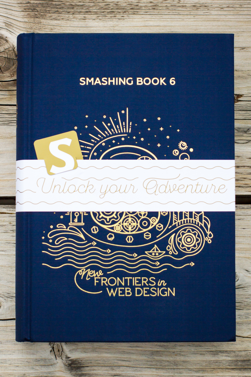
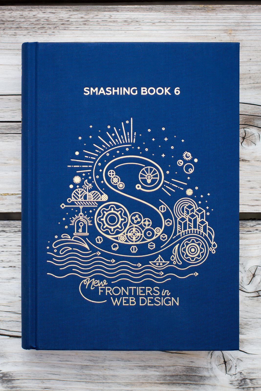
The Smashing Book 6, with 536 pages on real-life challenges and opportunities on the web. Photo by our dear friend Marc Thiele. (Large preview)
In the book, Laura and Marcy explore strategies for maintainable design systems and accessible single-page apps with React, Angular etc. Mike, Rachel and Lyza share insights on using CSS Custom Properties and CSS Grid in production today. Yoav and Lyza take a dive deep into performance patterns and service workers in times of Progressive Web Apps and HTTP/2.
Ada, Adrian and Greg explore how to design for watches and new form factors, as well as AR/VR/XR, chatbots and conversational UIs. The last chapter will guide you through some practical strategies to break out of generic, predictable, and soulless interfaces — with dozens of examples of responsive art direction. But most importantly: it’s the book dedicated to headaches and solutions in the fragile, inconsistent, fragmented and wonderfully diverse web we find ourselves in today.
Table Of Contents
Want to peek inside? Download a free PDF sample (PDF, ca. 21 MB) with a chapter on bringing personality back to the web by yours truly. Overall, the book contains 10 chapters:
Making Design Systems Work In Real-Life by Laura Elizabeth
Accessibility In Times Of Single-Page Applications by Marcy Sutton
Production-Ready CSS Grid Layouts by Rachel Andrew
Strategic Guide To CSS Custom Properties by Mike Riethmueller
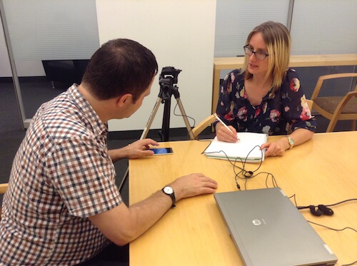
Building An Advanced Service Worker by Lyza Gardner
Loading Assets On The Web by Yoav Weiss
Conversation Interface Design Patterns by Adrian Zumbrunnen
Building Chatbots And Designing For Watches by Greg Nudelman
Cross Reality And The Web (AR/VR) by Ada Rose Cannon
The cover was designed with love from Italy by one-and-only Chiara Aliotta. She founded the design studio Until Sunday and has directed the overall artistic look and feel of different tech companies and not-for-profit organizations around the world. We’re very happy that she gave Smashing Book 6 that special, magical touch.
Behind The Scenes Of The Design Process
We asked Chiara to share some insights into the design process of the cover and the interior design and she was very kind to share some thoughts with us:
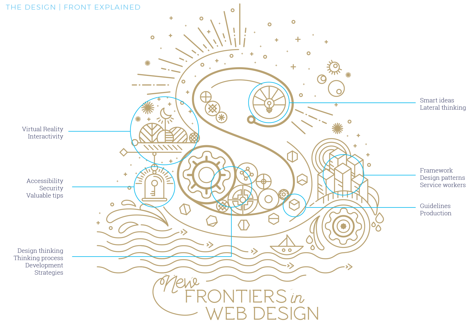
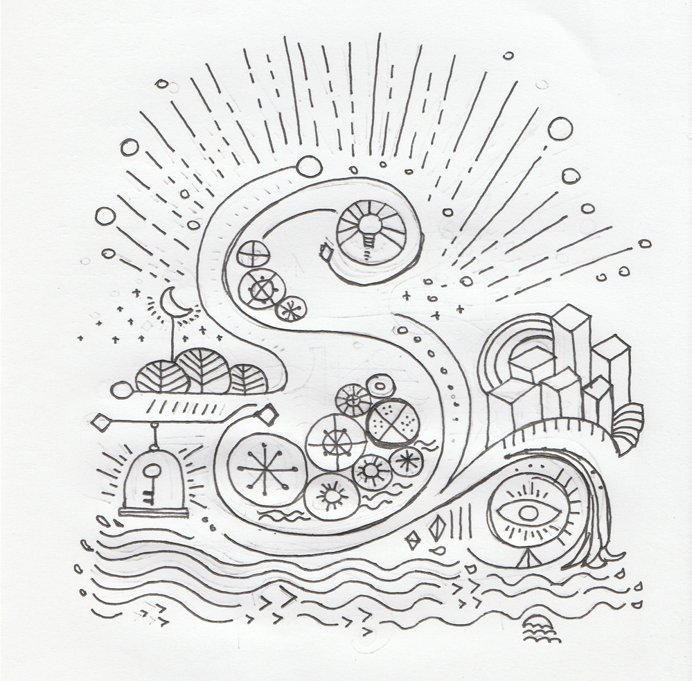
"It all started with a few exchanges of emails and a Skype meeting where Vitaly shared his idea of the book and the general content. I had a lot of freedom, which is always exciting and scary at the same time. The only bond (if we want to call it like this) was that the "S" of Smashing Magazine should be the main protagonist of the cover, reinvented and creatively presented as per all the other previous Smashing Books.
I worked around few keywords that Vitaly was using to describe the book during our meetings and then developed an idea around classical novels of adventure where the main hero leaves home, encounters great hazards, risks, and then eventually returns wiser and/or richer than he/she was before.
So I thought of Smashing Book 6 as a way to propose this basic and mythic structure under a new light: through the articles of this book, the modern web designer will be experiencing true and deep adventures.
I imagined the "S" as an engine, the starting point of this experience, from where different worlds were creating and expanding. So the cover was the map of these uncharted territories that the book explores.
Every element on the cover has a particular meaning that constructs the S. Large view.
I am a person who judges books by its cover and having read some of the chapters and knowing some of the well-established writers, I wanted to honour its content and their work by creating a gorgeous cover and chapter illustrations.
For this edition of Smashing Book, I imagined a textile cover in deep blue, where the graphic is printed using a very old technique, the hot gold foil stamping.
Together with Markus, part of the Smashing Magazine team and responsible for the publishing of all the Smashing Books, we worked closely to choose the final details of the binding and guarantee an elegant and sophisticated result, adding a touch of glam to the book.
Smashing Book 6 comes wrapped with a little bookmark. Photo by our dear friend Marc Thiele.
As a final touch, I added a paper wrap around the book that invites the readers to "unlock their adventure", suggesting a physical action: the reader needs to tear off the paper before starting reading the book.
And for this only version, we introduced a customise Smashing Magazine bookmark, also in printed on gold paper. Few more reasons to prefer the paperback version over the digital ones!"
A huge round of applause to Chiara for her wonderful work and sharing the thoughts with us. We were remarkably happy with everything from design to content. But what did readers think? Well, I’m glad that you asked!
We've sent the shiny new book to over 200 people to peek through and read, and we were able to gather some first insights. We'd love to hear your thoughts, too!
“Web design is getting pretty darned complicated. The new book from SmashingMag aims to bring the learning curve down to an accessible level.”
“Just got the new Smashing Book 6 by SmashingMag. What a blast! From CSS Grid Layout, CSS Custom Properties and service workers all the way to the HTTP/2 and conversational interfaces and many more. I recommend it to all the people who build interfaces.”
“The books published by SmashingMag and team are getting better each time. I was thrilled to be able to preview it... EVERY CHAPTER IS GOOD! Having focused on a11y for much of my career, Marcy Sutton’s chapter is a personal favorite.”
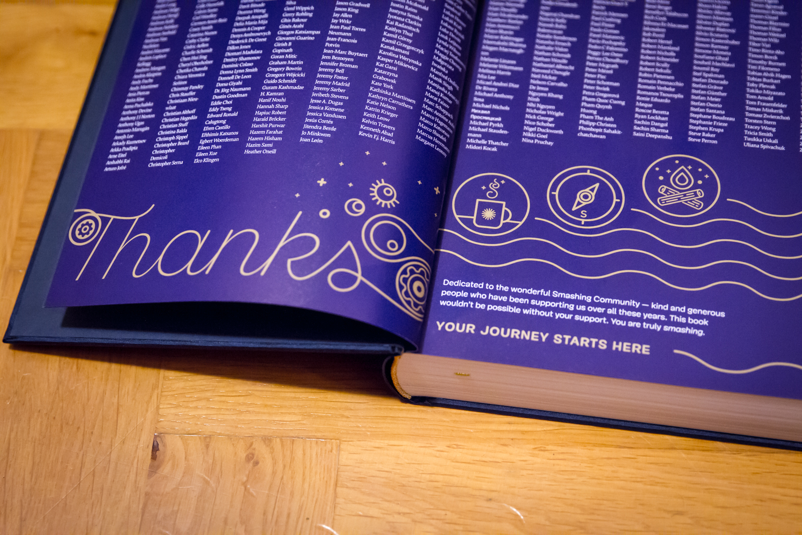
The Smashing Book 6, with 536 pages on real-life challenges and solutions for the web. Huge thank-you note to the smashing community for supporting the book and out little magazine all these years. (Large preview)
Thank You For Your Support!
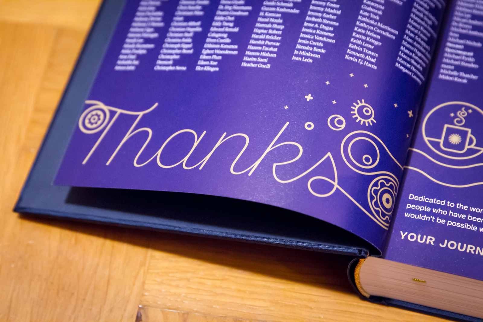
We’re very honored and proud to have worked with wonderful people from the industry who shared what they’ve learned in their work. We kindly thank all the hard-working people involved in making this book reality. We kindly thank you for your ongoing support of the book and our little magazine as well. It would be wonderful if you could mention the book by any chance as well in your social circles and perhaps link to this very post.
We’ve also prepared a little media kit .zip with a few photos and illustrations that you could use if you wanted to — just sayin’!
We can’t wait to hear your thoughts about the book! Happy reading, and we hope that you’ll find the book as useful as we do. Just have a cup of coffee (or tea) ready before you start reading, of course, stay smashing and... meow!
The most inspirational things are often right in front of us. It might be the typography on a book cover, the colors of your favorite music album, the opening titles in that movie you saw yesterday. To celebrate all those little moments of inspiration, we have compiled some resources for you which honor the beauty of graphic design and the ideas behind it. Perfect to squeeze into a short coffee break. Enjoy!
We learned not to judge a book by its cover, but, honestly, there is nothing quite like browsing through a bookstore, soaking up covers, their colors, their typefaces, their layouts, every little detail. The variety is endless, and sometimes you’re lucky and find a little piece of art shining through the sheer mass.
When technical performance optimizations reach certain limits, psychology and perception management might help us to push the limits further. Waiting can consist of active and passive phases; for the user to perceive a wait as a shorter one, we increase the active phase and reduce the passive phase of the wait. But what do we do when the event is a purely passive wait, with no active phase at all? Can we push the limits even further?
Waits without an active phase happen quite often in the offline world: waiting in a checkout line to the till, waiting for a bus, queuing in an amusement park, and so on. It is widely accepted that the longer the user has to wait, the more negative the reaction to the wait. User reaction to a wait online is no different from that in the offline world. Studies based on the analysis of more than a thousand cases identify 14 distinct types of waiting situations on the web. Being dependent on our users’ loyalty, we cannot leave them facing a passive wait.
Flexbox has become one of the most popular tools for creating website layouts. Susy is another layout tool that has gained popularity with the Sass community over the last few years.
Many developers I’ve spoken with are unsure which tool is best for creating layouts for their websites. Some feel that flexbox is powerful enough to handle all of their layout problems. However, they are unsure whether to learn it because of its confusing syntax. Others feel that Susy is much simpler and prefer its simplicity to flexbox.
Mark Zuckerberg once said, “The biggest mistake that we made, as a company, is betting too much on HTML5 as opposed to native… because it just wasn’t there. And it’s not that HTML5 is bad. I’m actually, long term, really excited about it.” And who wouldn’t be excited by the prospect of a single code base that works across multiple platforms?
Unfortunately, Facebook felt that HTML5 didn’t offer the experience it was looking to build, and that’s what it’s really about: the experience. I believe what Mark was really trying to say was that their biggest mistake was making a technology-driven decision instead of a user experience-driven decision. At the end of the day, we should be making decisions that deliver value to our customers, and sticking to a particular technology is generally not the best way to achieve that.
Many of us struggle silently with mental health problems and many more are affected by them, either directly or indirectly. It’s {Geek} Mental Help Week and we would like to help raise awareness with a couple of articles exploring these issues. – Ed.
We’ve all experienced that burnout moment. It’s that moment when we’ve got nothing left to give but keep trying anyway, when we’re left without much more than a shell to live in and motions to go through.
We’re fried and broken and wish desperately for our work to make sense, for our energy to come back, for things to be fun and as they were. In such moments all we want is for our work to feel like our work and not like torture.
Dealing With Loud And Silent Burnout http://www.smashingmagazine.com/2015/10/dealing-with-loud-silent-burnout/ http://rss1.smashingmagazine.com/feed/ Smashing Magazine For Professional Web Designers and Developers
“Get out of the deliverables business” has become quite a mantra in the lean startup and UX movements. There’s much to love in that sentiment — after all, for every wireframe you make, you’re not shipping code to customers.
But I’m worried that, just like with the concept of a minimum viable product, we’ve taken this sound advice to an extreme that’s actually hurtful to the creation of good products. What follows is an account of my own journey in navigating these stormy design seas together with the community.
While the growing adoption of responsive images cannot be ignored, it can be very difficult to employ the functionality under the constraints of a large CMS like WordPress. Although it is entirely possible to write the feature into your theme on your own, doing so is a challenging and time-consuming endeavour.
Thankfully, with the launch of WordPress 4.4, theme developers and maintainers will find it much easier to introduce responsive image functionality into their themes. In this recent launch, the RICG Responsive Images plugin has been merged into WordPress core, which means that responsive image support now comes as a default part of WordPress. Let’s take a look at how the feature works, and how you can use it to get the best support for your WordPress site.
Visual effects in games define their overall look and feel, and gameplay. Players are attracted to high visual quality, which generate more traffic and reach. It’s key for creating successful games and providing a lot of fun for players.
In this article I want to present a few ideas of how to implement different visual effects in <canvas>-based HTML5 games. These examples will be based on effects we made in our game, Skytte. I will explain the basic ideas supporting them and provide the effects used in our work.
Principles Of HTML5 Game Design http://www.smashingmagazine.com/2015/09/principles-of-html5-game-design/ http://rss1.smashingmagazine.com/feed/ Smashing Magazine For Professional Web Designers and Developers
In the past year, adoption of Sketch at Google, where I work at, has taken off and is now a widely preferred tool. The more tools in our belts, the better, so here’s my take on why Sketch and the new material design1 system are a great match.
Tools are an extension of our hands, and as such, they should be versatile, quick and intuitive. A lot has changed between the print era of offset presses and the digital era of cross-platform screens. Developers have attempted to adapt our tools, but Sketch is perhaps the most successful app in this regard — its creators have removed the bloat, started afresh and presented a smaller, fit-for-purpose feature set. What may seem on the surface to be a simple drawing tool in fact nails the core workflows of digital design.
2 Sketch 3.2 comes ready with a material design sticker sheet to give you a jumpstart on new projects. (View large version3)
The latest version of Sketch (3.2) ships with something special for those interested in Google’s latest visual design language: the material design sticker sheet. In this tutorial, we’ll design a test app with the help of Sketch and the material design sticker sheet.
Let’s Create a Notes App!
In this article, we’re going to make a very simple app — a notes app. Luckily for us, all of the components we need are already available in the latest Sketch app. These are the screens we’ll create:
You can also download the Sketch file6 (ZIP) that was used to make this notes app prototype; it could help you along in the tutorial.
The Template
In our template — File → New from Template → Material Design — you’ll see a wide set of components, icons and layouts. The sheet itself was designed by the hardworking material design team at Google and has been ported with the love and care of Amar Sagoo and myself. The groups and objects are named, styled and organized in a truly Sketch-friendly way.
It All Starts With an Artboard
With your new document open — File → New (or Command + N) — press the A key (which is a shortcut for the Artboard tool). You can draw an artboard just as you would draw a shape, a slice or any other object. That’s because Sketch has a simple set of objects that all work the same way (more on that later). When the Artboard tool is selected, you can see on the right side a list of artboard sizes, including — you guessed it — all of the material design sizes. Click on the “Mobile Portrait” size and a white box should appear.
7 Sketch 3.2 provides the material design sizes within the new Artboard tool. (View large version8)
Note: Material design is defined using density-independent pixels9. As the Android Developers page explains10, a density-independent pixel (DP) unit corresponds to the physical size of a pixel at 160 DPI. Though we’ll be using pixel units11 (px) in this Sketch tutorial, these are really density-independent pixels because you can scale them up or down upon exporting.
In today’s world, you can’t depend on the same pixel density, so DP units allow us to talk the same language when dealing with different device layouts. Sometimes you may be compelled to work at double or triple pixel size because you want to match the pixel size of your surface — don’t go down that route.
Stay at 1x pixels and then just export at the upscaled sizes. Sketch makes that as easy as a simple drag and drop. You’ll see a panel in the bottom left showing you the sizes slotted for exports, and you can even add your own suffix conventions for file names. When you do an “Export All” operation (Command + Shift + E), you’ll see that artboard, and Sketch will export all versions of the bitmap.
12 Always work at 1× pixels. You can easily scale up or down in the “Export” panel. (View large version13)
Now, head to the sticker sheet template and select the “mobile global elements” artboard. Only the important stuff there is selectable, so just click on that artboard and copy and paste into your document. You now have the basic layout of a mobile material design app. As you can see in the Layers panel, you have a group named “screen”. You’ll only need the contents of that group, so just go ahead and ungroup (Command + Shift + G) the “screen” group. You’ll now see four layers:
14 In the sticker sheet, you’ll find some ready-made artboards that you can copy and paste directly into your sketch file. (View large version15)
navbar
This is a symbol (symbols in the Layers panel are marked with purple color), which means it will be the same everywhere, and if you change the contents of the symbol, it will change everywhere in the file.
status bar
This is the top bar on the screen with Wi-Fi, time and status information.
app bar
This is your main navigation header, which displays the name of the current page and a button to go up or open the drawer.
screen bg
This is a background color, but it’s also a mask. You can delete this because your artboard will act as the mask for your screen.
Masks in Sketch Work… Upward!
In Sketch, masks work upward, meaning that layers above a masking object are cropped by that object. In Adobe Illustrator, however, you would place a shape on top of other layers to create a clipping mask; this threw me off at first. For more on masks, check Bohemian Coding’s documentation16.
If you move these layers around within an artboard, you’ll see that they are masked by that artboard. That’s the only case when an object that is higher in the Layers panel masks the objects below. Artboards always mask their contents and also house the coordinate space; so, an x value of 0 and a y value of 0 would mean the top-left corner.
17 Cards are a standard pattern and work well for heterogenous information. (View large version18)
Let’s go back to the sticker sheet. Let’s grab the half-width card components19 and paste them in our composition. The suggested margins for these cards is 8 pixels, so go ahead and space them out.
Sketch’s Killer Feature #2: Hover Guides
One of Sketch’s most useful features has to do with spacing: Select an object, hold down Alt, and then mouse around to see distances from your selection to other objects. And holding down Command + Alt and mousing around will measure objects that are deep within the hierarchy relative to other objects contained in groups.
20 The floating action button is a unique component in material design. (View large version21)
Finally, let’s get the floating action button from our buttons components and put that in. It should be 16 pixels from the navbar and 16 pixels from the right side.
Great! So, we’ve got the composition for our first Material app. It’s a scrolling card view.
The Navigation Drawer
22 Navigation drawers provide navigation to primary sections within the app and global functions such as account switching and configuration. (View large version23)
To get around the various areas of our app, we’ll make use of the navigation drawer component. Let’s duplicate our original artboard: Click on the artboard in the Layers panel list or on the title of the artboard on the page, then press Command + D. This will duplicate the artboard and move the new artboard 100 pixels to the right. You can continue your flow simply by duplicating and modifying, which is what we’ll do now.
Grab the navigation drawer from the mobile artboard — the layer is called “side nav.” Paste it onto your new artboard. You can change the categories in the navigation, but the top area is reserved for switching user accounts.
Material Forms
24 Forms in material design morph. Depending on their state, placeholder text becomes labels. (View large version25)
What happens when you tap that big plus button? Well, you should probably be able to make a note. Let’s grab some of the form’s components in the sticker sheet and make a new artboard for them. Here, we can make use of the keyboard, which is a symbol that can be placed whenever we need it. We’ll use the dark one to fit our dark app.
Reusing Artboards
Of course, after you’ve created a note, you should see it added to the card view. Let’s duplicate the first screen and add in our new note. Just click on the name of the artboard right above the artboard itself. Now that the artboard is selected, press Command + D. That will duplicate the artboard and move it 100 pixels to the right, perfect for quickly mocking up a flow.
26 You can duplicate artboards and they’ll move to the right side of your flow. (View large version27)
Sketch’s Killer Feature #3: The Color Picker
Sketch provides a powerful color picker. Just press Control + C to select a color anywhere on the screen. Combining this with Command + click to click through to any element, you can easily recolor any object in no time.
28 The color picker is quick and accurate and can be used on anything on the screen. (View large version29)
Covering The Tabs
Tabs are a great way to show different sets of content. In our app, we will have notes of importance and notes shared with others. Let’s make some tabs for “saved” and “shared” notes, with our current view being “all” notes. Jump back to the sticker sheet and click on the “tabs” component. Copy and paste that and position it next to the app bar. If you’ve grabbed the whole “app bar” tab from the sticker sheet, you’ll notice that it’s the wrong color. So, change the background color: Click through (Command + click) to the background of the tabs, and change the color to our main color. Move the tabs to the top, and you’re set.
When copying components from the sticker sheet, you can take any level of elements. This means you can take a whole screen, just the components within or even just the icons. The tabs, as well as other components, have been prepared with a transparent background. Move within the “app bar” group and you’ll be able to copy the “tabs” group and paste onto any existing background. The advantage of a transparent background is that you will get the proper spacing around the component, but you can quickly place it on top of an existing background or toolbar.
Making A List
You’ll use lists a lot. They’re a fundamental component to any app, and material design gives us a number of options. We’ll have our “shared” tab contain a list view.
Copy the “three-line item” list from the sticker sheet and paste it in a new artboard. Ungroup the list and then just Alt + drag to duplicate an item, a set of items or a group. Do this until you have a full page of rows.
You’ll notice a box on the right side of the list. This box is a secondary action. Tapping anywhere to the right of this action would open up that list item; but for quick actions (such as calling a contact or opening information about a document) you can use the secondary action. We’ll replace this placeholder box with a heart so that the user can quickly save notes.
In the sticker sheet you’ll find a small set of icons in the top left under “typography.” Grab the heart icon and paste it where the gray box is located. The icon should be in a group containing the heart icon and a transparent 24 × 24 box. This box helps with spacing, so make sure to grab the whole group.
34 Symbols allow us to quickly manipulate many instances of the same icon, component or even layout. (View large version35)
Sketch’s Killer Feature #4: Shared Symbols And Styles
Now, let’s make the row group into a symbol. This will allow us to edit its contents in many places at once. When you select a group, you’ll see a field in the toolbar that says “No symbol.” Click on this field and select “Create new symbol.” The name will default to the selected group’s name: “row.” Now you’ve got a symbol!
36 Symbols allow us to quickly manipulate many instances of the same icon, component or even layout. (View large version37)
Select each of the other row groups you’ve positioned on the artboard and, once again, click on the area that says “No symbol.” This time you’ll see your row symbol available for use; select it. Now that you’ve got a bunch of rows using the row symbol, when you change one, they will all change. Just like that, you have an interconnected set of elements.
Using our newfound power, let’s replace the heart with an overflow icon. The overflow icon is a set of three vertically stacked dots and indicates that more than one action is available. All you have to do is copy the “overflow icon” group (along with the padding) from the sticker sheet and paste it right beside the existing heart icon. Line it up with the heart icon, and then delete the heart icon. As you’re doing this, you should see the other rows automatically update. Yay for symbols!
With Sketch’s symbols, there is no editing mode. Symbols act just like groups and update immediately. This makes it easy to change symbols. Watch out, though: You may be editing a symbol in one place only to find that it has also changed in many other places across the canvas!
38 Symbols allows us to quickly switch out icons or whole compositions. But be careful: A change in one place will be reflected everywhere, even on other pages. (View large version39)
Bottom Sheets
40 In material design, bottom sheets display a set of actions without covering the screen. These sheets emerge from the bottom of the screen, then drop back down when dismissed. (View large version41)
In material design, bottom sheets are a great way for the user to take action without leaving the current context. These enter from the bottom of the screen and display a set of actions. In our app, the bottom sheet will be invoked when the user taps the forward icon in the top right.
Let’s grab the bottom sheet from the sticker sheet and paste it in a new artboard. Also, grab the scrim (semitransparent background) from the previous navigation drawer artboard and paste it behind the bottom sheet.
Dialogs When Needed
42 Dialogs can be used for stopping actions, but use them sparingly because they could be unnecessary roadblocks for repeated flows. (View large version43)
As a last step, we’ll add in a dialog. This will be invoked when the user selects the delete action from the bottom sheet. In this case, we want to be really really sure that they want to delete this note. And finally, speaking of deleting, I encourage you to start fresh with your own designs. Sketch is such a quick program and material design is such an enabling guide that you can think big and different about how to delight users in your app. So, happy sketching!
Quick Start With Sketch Resources
Here’s a list of material design resources built for Sketch to get you up and running quickly:
Material design sticker sheet44
This is the latest sticker sheet. It holds a good set of components and styles, and it is easy to copy and paste in your new compositions.
Conclusion: Keep The Principle In Mind With The Tool In Hand
Thanks for walking through material design in Sketch with me and making an awesome notes app. We have not only learned a new tool, but also started on our way to a new design system.
One final note of caution: Sometime we focus on existing components and miss an opportunity to address our users’ needs in a new way. You can always check your designs against material design’s principles49:
Material is the metaphor
A material metaphor is the unifying theory of a rationalized space and a system of motion. The material is grounded in tactile reality, inspired by the study of paper and ink, yet technologically advanced and open to imagination and magic.
Bold, graphic, intentional
The foundational elements of print-based design — typography, grids, space, scale, color, and use of imagery — guide visual treatments. These elements do far more than please the eye. They create hierarchy, meaning, and focus.
Motion provides meaning
Motion respects and reinforces the user as the prime mover. Primary user actions are inflection points that initiate motion, transforming the whole design.
Remember, no matter how good it looks, the greater focus is not on the pixels, but on the user. If your sight is true, all else will follow.
Sketch With Material Design http://www.smashingmagazine.com/2015/05/15/sketch-with-material-design/ http://www.smashingmagazine.com/feed/?# Smashing Magazine For Professional Web Designers and Developers
Every now and then we see discussions proclaiming a profound change in the way we design and build websites. Be it progressive enhancement1, the role of CSS2 or, most recently, web design itself being dead3. All these articles raise valid points, but I’d argue that they often lack objectivity and balance, preferring one side of the argument over another one.
These discussions are great for testing the boundaries of what we think is (or is not) possible, and they challenge how we approach our craft, but they don’t help us as a community to evolve together. They divide us into groups and sometimes even isolate us in small camps. Chris Coyier has published a fantastic post4 recently covering the debate on the role of CSS in light of growing popularity of React.js, extensively and objectively. That’s the quality discussions we need, and that’s what keeps us evolving as a growing and maturing community.
Web technologies are fantastic — we all agree on this. Our tools, libraries, techniques and methodologies are quite fantastic, too. Sometimes they are very different and even contradictory, but they are created with the best intentions in mind, and often serve their purpose well in the specific situations they were designed for. Sometimes they contain mistakes, but we can fix them due to the nature of open source. We can submit a patch or point out solutions. It’s more difficult, but it’s much more effective.
There are a lot of unknowns to design and build for, but if we embrace unpredictability5 and if we pick a strategy to create more cohesive, consistent design systems6, we can tackle any level of complexity — in fact, we do it every single day. We solve complex problems by seeking solutions, and as we do, we make hundreds of decisions along the way. Yet sometimes we fall into the trap of choosing a solution based on our subjective preferences, not objective reasoning.
Web technologies are fantastic, and so are our tools. However, we might be focusing too much on discussions about tools instead of art direction we do when we design the web. Image source: empty_quarter7.
We tend to put things into buckets, and we tend to think in absolutes. Pro carousels or anti carousels; pro React.js or anti-React.js; for progressive enhancement or against it. But the web isn’t black and white — it’s diverse, versatile, tangled, and it requires pragmatism. We are forced to find reasonable compromises within given constraints, coming from both business and UX perspectives.
Tools aren’t good or evil; they just either fit a context or they don’t. Carousels can have their place when providing enough context to engage users (as Amazon does). React.js modules can be lazy-loaded for better performance, and progressive enhancement is foundational for making responsive websites really8, really9 fast. And even if you have extremely heavy, rich imagery, more weight doesn’t have to mean more wait10; it’s a matter of setting the right priorities, or loading priorities, to be precise.
No, web design isn’t dead. Generic solutions are dead.11 Soulless theming and quick skinning are dead. Our solutions have to be better and smarter. Fewer templates, frameworks and trends, and more storytelling, personality and character. Users crave good stories and good photography; they’re eager for good visuals and interesting layouts; they can’t wait for distinctive and remarkably delightful user experiences. This exactly should be our strategy to create websites that stand out.
There are far too many badly designed experiences out there, and there is so much work for us to do. No wonder that we are so busy with our ongoing and upcoming projects. Proclaiming our craft to be dead is counter-productive, because we’ve shown ourselves and everybody out there what we are capable of. The last fifteen years of web design were nothing if not outstanding in innovation and experimentation. And it’s not about to stop; that’s just not who we are.
If we can’t produce anything but generic work, other creatives will. The web will get better and it’s our job to make it better. It won’t be easy, but if we don’t adapt our practices and techniques, we’ll have to give way to people who can get it done better than we can — but web design itself isn’t going anywhere any time soon.
It’s up to us to decide whether we keep separating ourselves into small camps, or build the web together, seeking pragmatic solutions that work well within given contexts. We might not end up with a perfect solution every time, but we’ll have a great solution still; and more often than not it’ll be much, much better than the solution our client came to us for in the first place.
“Web Design Is Dead.” No, It Isn’t. http://www.smashingmagazine.com/2015/07/08/web-design-is-dead-no-it-isnt/ http://rss1.smashingmagazine.com/feed/ Smashing Magazine For Professional Web Designers and Developers
The internet is a wonderful place (mostly). An unprecedented revolution in communication, it continues to empower more people to publish and share their knowledge than any other phenomenon in history. It is a limitless playground of ideas and unbridled creativity. Or is it?
In 2014, Elliot Jay Stocks declared that designers have stopped dreaming. That we’ve stopped being creative. That every site looks the same. A crazy notion, considering the magnitude of tools and resources we have at our disposal. But Elliot’s been right before, and he’s not alone either.
The days of floats and margin trickery are finally behind us, as CSS furnishes developers with new and improved properties perfect for those delicate layouts. Layout features such as vertical alignment, evenly distributed spacing, source-order control and other patterns such as “sticky” footers are quite effortless to achieve with flexbox.
In this article, we’ll discuss layout patterns well suited to flexbox, using the interface from the Tracks application, which also takes advantage of atomic design principles. I’ll share how flexbox proved useful and note the pitfalls of pairing it with particular layout patterns. We’ll look at those patterns that caused concern, provide suggestions for fallbacks and share additional tactics to start using this CSS property immediately.
Apps and devices designed to improve people’s health are becoming more pervasive. I serve as VP, Director of User Experience, in the New York office of a global agency with both healthcare and consumer clients. During my 13 years of working in the healthcare space I have never before had such a rich opportunity to directly affect health behavior.
In this article I’ll guide you through best practices when designing consumer-facing healthcare apps. (We’re not covering medical devices that need to be approved by authorities.) We’ll explore how to plan and conduct research, design moments of delight, integrate data from third-party devices and develop a messaging matrix. We’ll also look at examples of apps live in the wild that have been designed for delight at every moment of interaction.
There’s no shortage of boosterism or excitement about the fledgling service worker API, now shipping in some popular browsers. There are cookbooks and blog posts, code snippets and tools. But I find that when I want to learn a new web concept thoroughly, rolling up my proverbial sleeves, diving in and building something from scratch is often ideal.
The bumps and bruises, gotchas and bugs I ran into this time have benefits: Now I understand service workers a lot better, and with any luck I can help you avoid some of the headaches I encountered when working with the new API.
In WordPress, a navigation menu, a list of categories or pages, and a list of comments all share one common characteristic: They are the visual representation of tree-like data structures. This means that a relationship of superordination and subordination exists among the elements of each data tree.
There will be elements that are parents of other elements and, conversely, elements that are children of other elements. A reply to a comment depends logically on its parent, in the same way that a submenu item depends logically on the root element of the tree (or subtree).
Customizing Tree-Like Data Structures In WordPress With The Walker Class http://www.smashingmagazine.com/2015/10/customize-tree-like-data-structures-wordpress-walker-class/ http://rss1.smashingmagazine.com/feed/ Smashing Magazine For Professional Web Designers and Developers
Transitions can be painful. It is in our nature to resist change, even when the possibility of doing something new and different may be exciting. Changing your workflow can be a real challenge if you don’t know where to start or understand how to embark on the change.
I’ve met with many designers (graphic, interaction, UI, etc.) who stick to old software because they are familiar and in their comfort zone, or because they are too scared to take the “leap of faith” and try something new (even when they know their old software does not allow them to work efficiently and effectively enough).
Switching From Adobe Fireworks To Sketch: Ten Tips And Tricks http://www.smashingmagazine.com/2015/10/switching-adobe-fireworks-sketch-10-tips-tricks/ http://rss1.smashingmagazine.com/feed/ Smashing Magazine For Professional Web Designers and Developers
The WordPress platform is a magnet for those who want to take matters into their own hands, who want complete control over their websites and want to be independent in running them. WordPress does make it really easily to completely customize a website. If you have a bit of knowledge of HTMl, CSS and/or PHP, there is nothing you can’t change.
I mean, just compare the default themes, Twenty Fifteen and Twenty Fourteen. Hard to believe they are running on the same platform, isn’t it? Therefore, it is only natural for you to want to adapt the look of your website to fit your vision. I doubt there are many WordPress users out there who don’t constantly think about what to implement next. However, a problem arises.


 The cover was designed with love from Italy by one-and-only Chiara Aliotta. She founded the design studio Until Sunday and has directed the overall artistic look and feel of different tech companies and not-for-profit organizations around the world. We’re very happy that she gave Smashing Book 6 that special, magical touch.

 (ra, il)


