Introducing Trashy.css

It began, as many things do, with a silly conversation. In this case, I was talking with our Front End Technology Competency Director (aka "boss man") Mundi Morgado.

It went something like this…

Mundi Morgado I want you to build a visual screen reader.

Nathan Smith Who what now?

Mundi Morgado I want a CSS library that allows you to see the structure of a document. It shouldn't use class so that you're forced to focus on semantics. Also, make it theme-able.

Nathan Smith Sure, let me see what I can come up with.

Fast-forward a week, and we've got what we are now calling:

Trashy.css: The throwaway CSS library with no class

Why throwaway? Well, it's not really meant to be a fully fledged, production-ready style framework. Rather, it's like training wheels for document semantics, with some bumper lanes (think: bowling) to keep you on the right track.

It's part of our ongoing effort at TandemSeven to promote code literacy throughout our organization. As more of our UX designers are beginning to share responsibility for the accessibility and semantics of a project, it makes sense that we would build in such a way that allows UX and development to be more collaborative.

There are four main aspects to Trashy.

Trashy: "Basic"

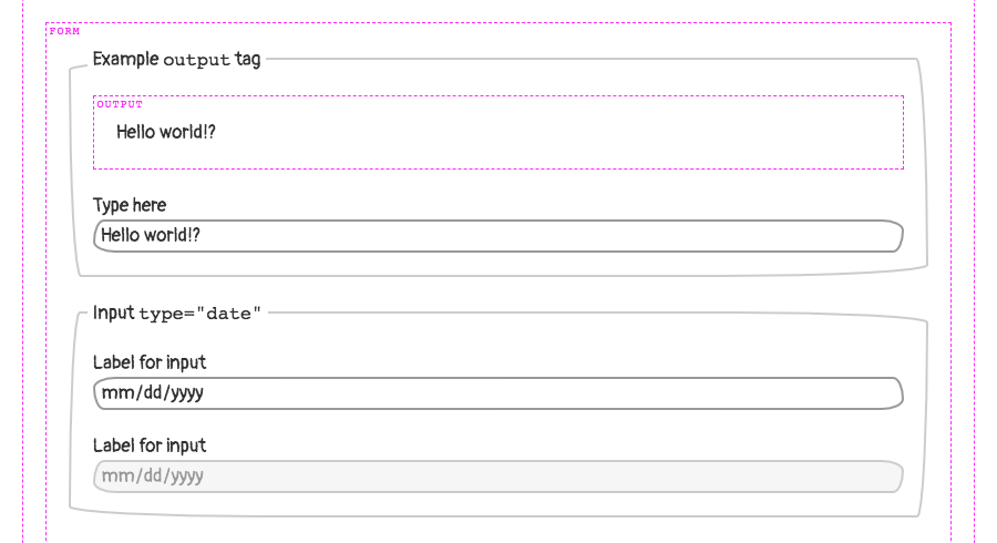
First is the base trashy.css file, which applies a passably basic look and feel to the majority of common HTML elements. Check out this example of a basic page.

Trashy: "Boxes"

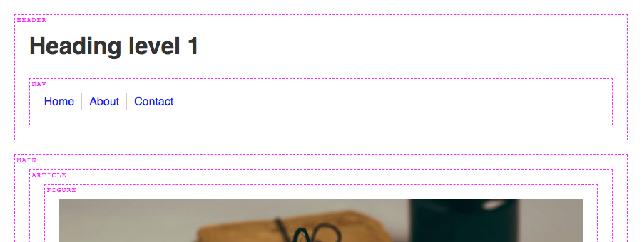
Second, there is trashy.boxes.css. This visually distinguishes otherwise invisible semantic elements, such as: header, main, nav, etc. That way, one can see where those elements are (or aren't) as a page is being authored. Here’s a page with semantic boxes outlined.

Trashy: "Theme"

Thirdly, theming is possible via trashy.theme.css. This is mostly just an example — inspired by PaperCSS) — of how to make UI look "hand drawn," to prevent observers from being too fixated on the look and feel, rather than the semantics of a document. Here’s the example theme in action.

Trashy: "Debug"

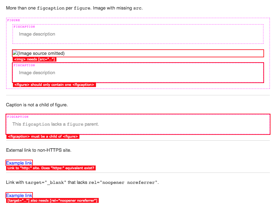
Lastly, there is a trashy.debug.css file that highlights and calls out invalid and/or problematic markup. Here’s a gnarly example of "everything" going wrong on a single HTML page. This was inspired by a11y.css, though it diverges in what is considered noteworthy.

For instance, we call out "div-itis" when multiple div:only-child have been nested within one another. We're also opinionated about type="checkbox" being contained inside of a <label>. This is for maximum click-ability within an otherwise dead whitespace gap, between a checkbox (or radio) and its textual label.

Any or all of these CSS files can be applied individually or in conjunction with one another. There is also a bookmarklet (labeled "GET TRASHY!") on the Trashy home page you can use to get results for any webpage.

The bookmarklet will remotely pull in:

  • sanitize.css
  • trashy.css
  • trashy.boxes.css
  • trashy.debug.css

Our "reset" - Sanitize.css

A quick word on Santitize.css: It was created by my coworker Jonathan Neal (author of Normalize.css), as a way to have a semi-opinionated CSS "reset." Meaning, it puts in a lot of defaults that we find ourselves writing as developers anyway, so it makes for a good starting point.

Technically speaking

Okay, so now that we’ve covered the "why," let’s dig into the "how."

Basically, it all revolves around using (abusing?) the ::before and ::after pseudo elements. For instance, to show the name of a block level tag, we’re using this CSS.

Semantic tags (using ::before)

Here is an abbreviated version of the trashy.boxes.css file, for succinctness. It causes the <section> tag to have a dashed border, and to have its tag named displayed the top left corner.

section {
  border: 1px dashed #f0f;
  display: block;
  margin-bottom: 2rem; /* 20px. */
  padding: 2rem; /* 20px. */
  position: relative;
}

section > :last-child {
  margin-bottom: 0;
}

section::before {
  background: #fff;
  color: #f0f;
  content: "section";
  font-family: "Courier", monospace;
  font-size: 1rem; /* 10px. */
  letter-spacing: 0.1rem; /* 1px. */
  line-height: 1.3;
  text-transform: uppercase;
  position: absolute;
  top: 0;
  left: 0.3rem; /* 3px. */
}

Warning messages (using ::after)

Likewise, here’s a snippet of code from the trashy.debug.css file that drives the markup warning messages. This particular example causes <script> tags to be displayed, which may be further optimized or need the developer’s attention: inline JavaScript and/or external src without async.

In the case of inline JS, we set the font-size and line-height to 0 because we’re making the element visible. We yank the text off the page via text-indent: -99999px just to make sure it doesn’t show up. We wouldn’t want that random JS code displayed alongside legit page content.

(Please don’t ever do this for "real" content. It’s just a hack, mkay?)

To get our error message to show up though, we have to set the font-size and line-height back to non-zero values, and remove our text-indent. Then, with a bit more absolute positioning, we ensure the message is visible. This lets us see, amidst the rest of the page content, whereabouts to check (via DOM inspector) for the <script> insertion point.

script:not([src]),
script[src]:not([async]),
script[src^="http:"] {
  color: transparent;
  display: block;
  font-size: 0;
  height: 2rem; /* 20px. */
  line-height: 0;
  margin-bottom: 2rem; /* 20px. */
  position: relative;
  text-indent: -99999px;
  width: 100%;
}

script:not([src])::after,
script[src]:not([async])::after,
script[src^="http:"]::after {
  background: #f00;
  color: #fff;
  display: inline-block;
  font-family: Verdana, sans-serif;
  font-size: 1.1rem; /* 11px. */
  font-weight: normal;
  left: 0;
  line-height: 1.5;
  padding-left: 0.5rem; /* 5px. */
  padding-right: 0.5rem; /* 5px. */
  pointer-events: none;
  position: absolute;
  text-decoration: none;
  text-indent: 0;
  top: 100%;
  white-space: nowrap;
  z-index: 1;
}

body script:not([src])::after,
body script[src]:not([async])::after,
body script[src^="http:"]::after {
  top: 0;
}

script:not([src])::after {
  content:
    'Move inline <script> to external *.js file'
  ;
}

script[src]:not([async])::after {
  content:
    'Consider [async] for <script> with [src="…"]'
  ;
}

script[src]:not([src=""]):not([async])::after {
  content:
    'Consider [async] for <script> with [src="' attr(src) '"]'
  ;
}

script[src^="http:"]::after {
  content:
    'Consider "https:" for <script> with [src="' attr(src) '"]'
  ;
}

Note: Some scripts do need to be loaded synchronously. You wouldn’t want your "app" code to load before your "framework" code. Heck, some inline JS is probably fine too, especially if you’re doing some super speed optimization for the critical rendering path. These warnings are "dumb" in the sense that they match only via CSS selectors. Take ‘em with a grain of salt, your mileage may vary, etc.

JS bookmarklet

The aforementioned JS bookmarklet finds all <link rel="stylesheet"> and <style> tags in the page, and causes them to be ineffective. This allows us to add in our own CSS to take over, so that the only styles applied are those provided directly via Trashy.

The magic is accomplished by setting rel="stylesheet" to rel="". If an external stylesheet is not identified as such, even if it’s cached, the browser will not apply its styles to the page. Similarly, we destroy the contents of any inline <style> tags by setting the innerHTML to an empty string.

This leaves us with the tags themselves still intact, because we still want to validate that no <link> or <style> tags are present within <body>.

We also check that there aren’t too many <style> tags being used in the <head>. We allow for one, since it could be used for the critical rendering path. If there’s a build process to generate a page with consolidated inline styles, then it’s likely they’re being emitted through a single tag.

<a href="javascript:(
  function (d) {
    var f = Array.prototype.forEach;
    var linkTags = d.querySelectorAll('[rel=\'stylesheet\']');
    var styleTags = d.querySelectorAll('style');

    f.call(linkTags, function (x) {
      x.rel = '';
    });

    f.call(styleTags, function (x) {
      x.innerHTML = '';
    });

    var newLink = d.createElement('link');

    newLink.rel = 'stylesheet';

    newLink.href =
      'https://t7.github.io/trashy.css/css/bookmarklet.css';

    d.head.appendChild(newLink);
  }
)(document);">
  GET TRASHY!
</a>

Go forth, get Trashy!

Get Trashy

That pretty much covers it. It's a simple drop-in to help you visualize your document semantics and debug possibly problematic markup.

I have also found it to be super fun to use. A quick click of the bookmarklet on any given site usually yields lots of things that could be improved upon.

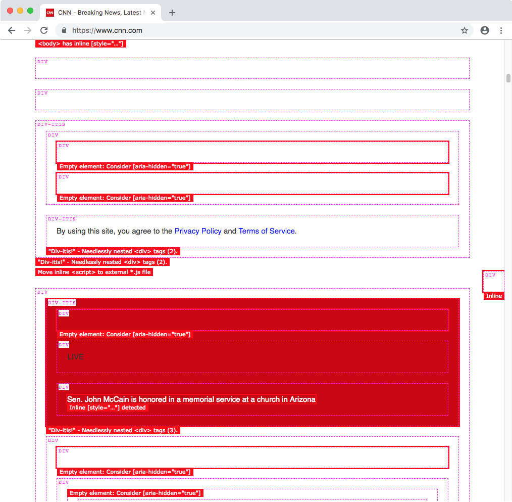
For instance, here's what CNN's site looks like with Trashy applied…

P.S. Call security!

If you try this with Twitter’s site, you might wonder why it doesn’t work. We were initially perplexed by this, too. It has to do with the site's Content Security Policy (CSP). This can be used to disallow CSS and/or JavaScript from being loaded externally, and can whitelist safe domains.

This can be set either at the server level, or by a <meta> tag in the <head>.

<meta http-equiv="Content-Security-Policy" content="…" />

Read more about CSP here.

I know what you’re thinking...

Can’t you just destroy that meta tag with JS?

In the case of Twitter, it’s emitted from the server. Even if it were in the HTML, destroying it has no effect on the actual browser behavior. It’s locked in.

Okay, so...

Can’t you insert your own security meta tag and override it?

You’d think so. But, thankfully, no. Once a CSP been accepted by the browser for that page, it cannot be overridden. That’s probably a good thing, even though it ruins our fun.

I suppose that’d be like wishing for more wishes. It’s against the genie rules!

The post Introducing Trashy.css appeared first on CSS-Tricks.

Designing A Textbox, Unabridged

Designing A Textbox, Unabridged

Designing A Textbox, Unabridged

Shane Hudson

Ever spent an hour (or even a day) working on something just to throw the whole lot away and redo it in five minutes? That isn’t just a beginner’s code mistake; it is a real-world situation that you can easily find yourself in especially if the problem you’re trying to solve isn’t well understood to begin with.

This is why I’m such a big proponent of upfront design, user research, and creating often multiple prototypes — also known as the old adage of “You don’t know what you don’t know.” At the same time, it is very easy to look at something someone else has made, which may have taken them quite a lot of time, and think it is extremely easy because you have the benefit of hindsight by seeing a finished product.

This idea that simple is easy was summed up nicely by Jen Simmons while speaking about CSS Grid and Piet Mondrian’s paintings:

“I feel like these paintings, you know, if you look at them with the sense of like ‘Why’s that important? I could have done that.’ It's like, well yeah, you could paint that today because we’re so used to this kind of thinking, but would you have painted this when everything around you was Victorian — when everything around you was this other style?”

I feel this sums up the feeling I have about seeing websites and design systems that make complete sense; it’s almost as if the fact they make sense means they were easy to make. Of course, it is usually the opposite; writing the code is the simple bit, but it’s the thinking and process that goes into it that takes the most effort.

With that in mind, I’m going to explore building a text box, in an exaggeration of situations many of us often find ourselves in. Hopefully, by the end of this article, we can all feel more emphatic to how the journey from start to finish is rarely linear.

A Comprehensive Guide To User Testing

So you think you’ve designed something that’s perfect, but your test tells you otherwise. Let’s explore the importance of user testing. Read more →

Brief

We all know that careful planning and understanding of the user need is important to a successful project of any size. We also all know that all too often we feel to need to rush to quickly design and develop new features. That can often mean our common sense and best practices are forgotten as we slog away to quickly get onto the next task on the everlasting to-do list. Rinse and repeat.

Today our task is to build a text box. Simple enough, it needs to allow a user to type in some text. In fact, it is so simple that we leave the task to last because there is so much other important stuff to do. Then, just before we pack up to go home, we smirk and write:

<input type="text">

There we go!

Oh wait, we probably need to hook that up to send data to the backend when the form is submitted, like so:

<input type="text" name="our_textbox">

That’s better. Done. Time to go home.

How Do You Add A New Line?

The issue with using a simple text box is it is pretty useless if you want to type a lot of text. For a name or title it works fine, but quite often a user will type more text than you expect. Trust me when I say if you leave a textbox for long enough without strict validation, someone will paste the entire of War and Peace. In many cases, this can be prevented by having a maximum amount of characters.

In this situation though, we have found out that our laziness (or bad prioritization) of leaving it to the last minute meant we didn’t consider the real requirements. We just wanted to do another task on that everlasting to-do list and get home. This text box needs to be reusable; examples of its usage include as a content entry box, a Twitter-style note box, and a user feedback box. In all of those cases, the user is likely to type a lot of text, and a basic text box would just scroll sideways. Sometimes that may be okay, but generally, that’s an awful experience.

Thankfully for us, that simple mistake doesn’t take long to fix:

<textarea name="our_textbox"></textarea>

Now, let’s take a moment to consider that line. A <textarea>: as simple as it can get without removing the name. Isn’t it interesting, or is it just my pedantic mind that we need to use a completely different element to add a new line? It isn’t a type of input, or an attribute used to add multi-line to an input. Also, the <textarea> element is not self-closing but an input is? Strange.

This “moment to consider” sent me time traveling back to October 1993, trawling through the depths of the www-talk mailing list. There was clearly much discussion about the future of the web and what “HTML+” should contain. This was 1993 and they were discussing ideas such as <input type="range"> which wasn’t available until HTML5, and Jim Davis said:

“Well, it's far-fetched I suppose, but you might use HTML forms as part of a game playing interface.”

This really does show that the web wasn’t just intended to be about documents as is widely believed. Marc Andreessen suggested to have <input type="textarea"> instead of allowing new lines in the single-line text type, [saying]: (http://1997.webhistory.org/www.lists/www-talk.1993q4/0200.html)

“Makes the browser code cleaner — they have to be handled differently internally.”

That’s a fair reason to have <textarea> separate to text, but that’s still not what we ended up with. So why is <textarea> its own element?

I didn’t find any decision in the mailing list archives, but by the following month, the HTML+ Discussion Document had the <textarea> element and a note saying:

“In the initial design for forms, multi-line text fields were supported by the INPUT element with TYPE=TEXT. Unfortunately, this causes problems for fields with long text values as SGML limits the length of attributea literals. The HTML+ DTD allows for up to 1024 characters (the SGML default is only 240 characters!)”

Ah, so that’s why the text goes within the element and cannot be self-closing; they were not able to use an attribute for long text. In 1994, the <textarea> element was included, along with many others from HTML+ such as <option> in the HTML 2 spec.

Okay, that’s enough. I could easily explore the archives further but back to the task.

Styling A <textarea>

So we’ve got a default <textarea>. If you rarely use them or haven’t seen the browser defaults in a long time, then you may be surprised. A <textarea> (made almost purely for multi-line text) looks very similar to a normal text input except most browser defaults style the border darker, the box slightly larger, and there are lines in the bottom right. Those lines are the resize handle; they aren’t actually part of the spec so browsers all handle (pun absolutely intended) it in their own way. That generally means that the resize handle cannot be restyled, though you can disable resizing by setting resize: none to the <textarea>. It is possible to create a custom handle or use browser specific pseudo elements such as ::-webkit-resizer.

The default <code>&lt;textarea&gt;</code> looks very small with a grey border and three lines as a resize handle.
A default textarea with no styling (Large preview)

It’s important to understand the defaults, especially because of the resizing ability. It’s a very unique behavior; the user is able to drag to change the size of the element by default. If you don’t override the minimum and maximum sizes then the size could be as small as 9px × 9px (when I checked Chrome) or as large as they have patience to drag it. That’s something that could cause mayhem with the rest of the site’s layout if it’s not considered. Imagine a grid where <textarea> is in one column and a blue box is in another; the size of the blue box is purely decided by the size of the <textarea>.

Other than that, we can approach styling a <textarea> much the same as any other input. Want to change the grey around the edge into thick green dashes? Sure here you go: border: 5px dashed green;. Want to restyle the focus in which a lot of browsers have a slightly blurred box shadow? Change the outline — responsibly though, you know, that’s important for accessibility. You can even add a background image to your <textarea> if that interests you (I can think of a few ideas that would have been popular when skeuomorphic design was more celebrated).

Scope Creep

We’ve all experienced scope creep in our work, whether it is a client that doesn’t think the final version matches their idea or you just try to squeeze in a tiny tweak and end up taking forever to finish it. So I ( enjoying creating the persona of an exaggerated project manager telling us what we need to build) have decided that our <textarea> just is not good enough. Yes, it is now multi-line, and that’s great, and yes it even ‘pops’ a bit more with its new styling. Yet, it just doesn’t fit the very vague user need that I’ve pretty much just thought of now after we thought we were almost done.

What happens if the user puts in thousands of words? Or drags the resize handle so far it breaks the layout? It needs to be reusable, as we have already mentioned, but in some of the situations (such as a ‘Twittereqsue’ note taking box), we will need a limit. So the next task is to add a character limit. The user needs to be able to see how many characters they have left.

In the same way we started with <input> instead of <textarea>, it is very easy to think that adding the maxlength attribute would solve our issue. That is one way to limit the amount of characters the user types, it uses the browser’s built-in validation, but it is not able to display how many characters are left.

We started with the HTML, then added the CSS, now it is time for some JavaScript. As we’ve seen, charging along like a bull in a china shop without stopping to consider the right approaches can really slow us down in the long run. Especially in situations where there is a large refactor required to change it. So let’s think about this counter; it needs to update as the user types, so we need to trigger an event when the user types. It then needs to check if the amount of text is already at the maximum length.

So which event handler should we choose?

  • change
    Intuitively, it may make sense to choose the change event. It works on <textarea> and does what it says on the tin. Except, it only triggers when the element loses focus so it wouldn’t update while typing.
  • keypress
    The keypress event is triggered when typing any character, which is a good start. But it does not trigger when characters are deleted, so the counter wouldn’t update after pressing backspace. It also doesn’t trigger after a copy/paste.
  • keyup
    This one gets quite close, it is triggered whenever a key has been pressed (including the backspace button). So it does trigger when deleting characters, but still not after a copy/paste.
  • input
    This is the one we want. This triggers whenever a character is added, deleted or pasted.

This is another good example of how using our intuition just isn’t enough sometimes. There are so many quirks (especially in JavaScript!) that are all important to consider before getting started. So the code to add a counter that updates needs to update a counter (which we’ve done with a span that has a class called counter) by adding an input event handler to the <textarea>. The maximum amount of characters is set in a variable called maxLength and added to the HTML, so if the value is changed it is changed in only one place.

var textEl = document.querySelector('textarea')
var counterEl = document.querySelector('.counter')
var maxLength = 200
    
textEl.setAttribute('maxlength', maxLength)
textEl.addEventListener('input', (val) => {
var count = textEl.value.length
counterEl.innerHTML = ${count}/${maxLength}
})

Browser Compatibility And Progressive Enhancement

Progressive enhancement is a mindset in which we understand that we have no control over what the user exactly sees on their screen, and instead, we try to guide the browser. Responsive Web Design is a good example, where we build a website that adjusts to suit the content on the particular size viewport without manually setting what each size would look like. It means that on the one hand, we strongly care that a website works across all browsers and devices, but on the other hand, we don’t care that they look exactly the same.

Currently, we are missing a trick. We haven’t set a sensible default for the counter. The default is currently “0/200” if 200 were the maximum length; this kind of makes sense but has two downsides. The first, it doesn’t really make sense at first glance. You need to start typing before it is obvious the 0 updates as you type. The other downside is that the 0 updates as you type, meaning if the JavaScript event doesn’t trigger properly (maybe the script did not download correctly or uses JavaScript that an old browser doesn’t support such as the double arrow in the code above) then it won’t do anything. A better way would be to think carefully beforehand. How would we go about making it useful when it is both working and when it isn’t?

In this case, we could make the default text be “200 character limit.” This would mean that without any JavaScript at all, the user would always see the character limit but it just wouldn’t feedback about how close they are to the limit. However, when the JavaScript is working, it would update as they type and could say “200 characters remaining” instead. It is a very subtle change but means that although two users could get different experiences, neither are getting an experience that feels broken.

Another default that we could set is the maxlength on the element itself rather than afterwards with JavaScript. Without doing this, the baseline version (the one without JS) would be able to type past the limit.

User Testing

It’s all very well testing on various browsers and thinking about the various permutations of how devices could serve the website in a different way, but are users able to use it?

Generally speaking, no. I’m consistently shocked by user testing; people never use a site how you expect them to. This means that user testing is crucial.

It’s quite hard to simulate a user test session in an article, so for the purposes of this article, I’m going to just focus on one point that I’ve seen users struggle with on various projects.

The user is happily writing away, gets to 0 characters remaining, and then gets stuck. They forget what they were writing, or they don’t notice that it had stopped typing.

This happens because there is nothing telling the user that something has changed; if they are typing away without paying much attention, then they can hit the maximum length without noticing. This is a frustrating experience.

One way to solve this issue is to allow overtyping, so the maximum length still counts for it to be valid when submitted but it allows the user to type as much as they want and then edit it before submission. This is a good solution as it gives the control back to the user.

Okay, so how do we implement overtyping? Instead of jumping into the code, let’s step through in theory. maxlength doesn’t allow overtyping, it just stops allowing input once it hits the limit. So we need to remove maxlength and write a JS equivalent. We can use the input event handler as we did before, as we know that works on paste, etc. So in that event, the handler would check if the user has typed more than the limit, and if so, the counter text could change to say “10 characters too many.” The baseline version (without the JS) would no longer have a limit at all, so a useful middle ground could be to add the maxlength to the element in the HTML and remove the attribute using JavaScript.

That way, the user would see that they are over the limit without being cut off while typing. There would still need to be validation to make sure it isn’t submitted, but that is worth the extra small bit of work to make the user experience far better.

An example showing “17 characters too many” in red text next to a <code>&lt;textarea&gt;</code>.
Allowing the user to overtype (Large preview)

Designing The Overtype

This gets us to quite a solid position: the user is now able to use any device and get a decent experience. If they type too much it is not going to cut them off; instead, it will just allow it and encourage them to edit it down.

There’s a variety of ways this could be designed differently, so let’s look at how Twitter handles it:

A screenshot from Twitter showing their textarea with overtyped text with a red background.
Twitter's <textarea> (Large preview)

Twitter has been iterating its main tweet <textarea> since they started the company. The current version uses a lot of techniques that we could consider using.

As you type on Twitter, there is a circle that completes once you get to the character limit of 280. Interestingly, it doesn’t say how many characters are available until you are 20 characters away from the limit. At that point, the incomplete circle turns orange. Once you have 0 characters remaining, it turns red. After the 0 characters, the countdown goes negative; it doesn’t appear to have a limit on how far you can overtype (I tried as far as 4,000 characters remaining) but the tweet button is disabled while overtyping.

So this works the same way as our <textarea> does, with the main difference being the characters represented by a circle that updates and shows the number of characters remaining after 260 characters. We could implement this by removing the text and replacing it with an SVG circle.

The other thing that Twitter does is add a red background behind the overtyped text. This makes it completely obvious that the user is going to need to edit or remove some of the text to publish the tweet. It is a really nice part of the design. So how would we implement that? We would start again from the beginning.

You remember the part where we realized that a basic input text box would not give us multiline? And that a maxlength attribute would not give us the ability to overtype? This is one of those cases. As far as I know, there is nothing in CSS that gives us the ability to style parts of the text inside a <textarea>. This is the point where some people would suggest web components, as what we would need is a pretend <textarea>. We would need some kind of element — probably a div — with contenteditable on it and in JS we would need to wrap the overtyped text in a span that is styled with CSS.

What would the baseline non-JS version look like then? Well, it wouldn’t work at all because while contenteditable will work without JS, we would have no way to actually do anything with it. So we would need to have a <textarea> by default and remove that if JS is available. We would also need to do a lot of accessibility testing because while we can trust a <textarea> to be accessible relying on browser features is a much safer bet than building your own components. How does Twitter handle it? You may have seen it; if you are on a train and your JavaScript doesn’t load while going into a tunnel then you get chucked into a decade-old legacy version of Twitter where there is no character limit at all.

What happens then if you tweet over the character limit? Twitter reloads the page with an error message saying “Your Tweet was over the character limit. You’ll have to be more clever.” No, Twitter. You need to be more clever.

Retro

The only way to conclude this dramatization is a retrospective. What went well? What did we learn? What would we do differently next time or what would we change completely?

We started very simple with a basic textbox; in some ways, this is good because it can be all too easy to overcomplicate things from the beginning and an MVP approach is good. However, as time went on, we realized how important it is to have some critical thinking and to consider what we are doing. We should have known a basic textbox wouldn’t be enough and that a way of setting a maximum length would be useful. It is even possible that if we have conducted or sat in on user research sessions in the past that we could have anticipated the need to allow overtyping. As for the browser compatibility and user experiences across devices, considering progressive enhancement from the beginning would have caught most of those potential issues.

So one change we could make is to be much more proactive about the thinking process instead of jumping straight into the task, thinking that the code is easy when actually the code is the least important part.

On a similar vein to that, we had the “scope creep” of maxlength, and while we could possibly have anticipated that, we would rather not have any scope creep at all. So everybody involved from the beginning would be very useful, as a diverse multidisciplinary approach to even small tasks like this can seriously reduce the time it takes to figure out and fix all the unexpected tweaks.

Back To The Real World

Okay, so I can get quite deep into this made-up project, but I think it demonstrates well how complicated the most seemingly simple tasks can be. Being user-focussed, having a progressive enhancement mindset, and thinking things through from the beginning can have a real impact on both the speed and quality of delivery. And I didn’t even mention testing!

I went into some detail about the history of the <textarea> and which event listeners to use, some of this can seem overkill, but I find it fascinating to gain a real understanding of the subtleties of the web, and it can often help demystify issues we will face in the future.

Smashing Editorial (ra, il)

5 Techniques for Spotting Mistaks Before They Go Live

Launching a new website can be exciting and nerve-wracking at the same time. You want to show off what you’ve been building, what you’ve learned, and the creative solutions you’ve come up with. You can already taste that first celebratory taco. You go live.

At first, you get a lot of comments from your friends saying, “Hey, that looks great!” Then the bug reports come in. A feature isn’t working as intended. A bit of CSS is playing merry hell with the live content in ways you couldn’t foresee. A link is broken. And worst of all: you have typos. So many typos.

Okay, most of the time, it won’t be as bad as all that. Veteran designers and developers usually have processes in place to reduce the amount of errors that go live. New designers usually build smaller sites, so the number of errors is reduced in any case. Still, if you’re new to web design, and you want to spend as little time fixing things post-launch as possible, we can help.

1. Follow a Checklist

As you are the designer and/or developer, you are the first and last line of defense against mistakes. However, even the best of us can just plain forget things. One of the easiest ways to avoid this is to use a pre-launch checklist for every website you build. The checklist would include things like making sure all of the links work, making sure the contact forms work as intended, making sure your hosting is set up right, and so on.

You can write your own checklist, and as you develop your own way of working through projects, you might want to. In the meantime, you can adapt any number of pre-made checklists to your projects. Here are a couple to get you started:

And there are a few more here: 45 Incredibly Useful Web Design Checklists and Questionnaires

2. Get More Eyeballs

For clarity’s sake (and because this is the Internet) these eyeballs should remain attached to their original owners. What you want to do is get some people who aren’t experts in computing, be they relatives, friends, or passing salesmen, and direct their eyeballs at your design, before you launch. Get some basic user testing in by asking these people to perform basic tasks on your site.

This has the double benefit of providing you with some usability testing data, as well as an easy way to find out if anything important is broken. After they’ve followed the main calls to action, ask them to click around on anything they find interesting, to help you check other links.

3. Hire Professional Eyeballs

This may not be feasible for projects with smaller budgets, but if you have the money, it couldn’t hurt to hire a professional or two. For example, you could hire another designer to check for common bugs, peek at the source, and so on. Have them test how the layout handles on their devices, and give you feedback.

If you want to take this further, there are services that will test your site under myriad conditions, in all sorts of browsers, on all sorts of devices. Given that most of us lack a browser testing lab, and these services generally aren’t expensive, they can be worth it.

Here are some of the more popular options (as defined by Google search results):

Lastly, consider hiring a proofreader and/or editor, if your website is text-heavy. They can drastically help you to improve the quality and clarity of your writing, as well as help you to avoid the dreaded typos.

4. Take a Break Before Launch

One of the biggest contributors to screwing up is stress. Launching websites can be stressful, especially if you’ve been working on the same thing, day in and day out. For future projects, it might be a good idea to schedule in a break before launch time. And I mean a proper break, as in one day as a bare minimum. Giving your brain time to think about other things is a known and proven tactic for creativity, but it also works for spotting mistakes.

Take that time off, come back, and run through your pre-flight checklist when you’re rested, and can think straight. Your brain, your heart, your users, and your clients will thank you.

5. Validation and Linting

If you’re developing the site yourself, you can take advantage of services that help you clean up, or “lint”, your code by pointing out problems in your HTML, CSS, or JavaScript. How you do this will depend on what text editor you’re using. Just about every major text editor (Sublime Text, Atom, Brackets, etc.) has a number of plugins to help you with this. There’s no one right tool for this job, so you’re going to have to do some Googling.

You should also run your HTML and CSS through the validating services provided by the W3C. These services won’t catch every bug, but they can help point out potential problems in your markup.

Conclusion

So what happens if you do all of these things, and still miss a few things at launch? Realistically, the world just keeps on turning. We’re imperfect creatures, and we’ll never get everything right, all of the time. And that’s fine. When mistakes are inevitably spotted in your newly-launched site, fix them fast and move on.

Constant perfection will have to wait until our robot overlords get here.

LAST DAY: Zelda – A Beautiful and Classy Script Font – only $7!

Source

WordPress Feature Review: New Features You Missed in 2012, Part 1

This guest post is by Michael Scott of WPHub.com.

One of the great things about WordPress is that it never stands still. The platform is constantly evolving beyond its blogging roots, with more great features being added every year.

WordPress used to release small updates frequently, but at the end of 2009 they changed this policy. They now aim to release three major updates every year, with small infrequent updates in between to address security issues.

The three major releases in 2011 were 3.1 (February 2011) and 3.2 (July 2011) and 3.3 (December 2011).

Today I’d like to walk you through the new features which were introduced in 2012, in WordPress 3.4 and 3.5.

I’ll be focusing on the features that are most relevant to bloggers and explaining how they can help you.

New features in WordPress 3.4

Released in June, WordPress 3.4 was a solid release that is best remembered for introducing the new theme customizer.

It also included a lot of other great new features such as Twitter embedding, HTML in captions, and flexible header images.

New feature: Live preview

Live preview enables you to preview themes before they are activated on your blog.

Browsing and installing themes and plugins directly from the WordPress admin area is one of WordPress’s greatest strengths. It’s amazing that you can modify your blog so much without even leaving your blog’s Admin area.

In the past, clicking on the Preview link for a theme would load up an overlay which displayed the theme over the current page.

live-preview-old

But the process of browsing WordPress designs changed in WordPress 3.4. In the past, the design was listed with Install and Preview links, and a full description.

Descriptions are now hidden by default, though you can view the description of a theme by clicking on the new Description link. This may seem like a small change, but it made browsing for designs within the Admin area much more user friendly.

live-preview-1

Themes are now previewed on their own dedicated Preview page. The page shows the theme on the right-hand side. On the left side, the theme name, thumbnail, rating and description are shown. To save you from having to click the Back button, themes can now be installed via this new Preview area.

live-preview-2

Once a theme has been installed on your WordPress blog, the Preview option becomes much more useful as it loads up the new theme customizer and lets you see how this design will look on your live website. This enables you to preview the theme using your menus, posts, pages and more.

live-preview-3

Being able to see how themes will look with your existing content has greatly improved the process of installing WordPress designs via your Admin area, and changed the way bloggers choose their themes.

New feature: Theme customizer

This feature allows you to configure your theme via a user-friendly Options area.

The WordPress customizer allows users to configure many different areas of their design, such as the header, background and navigation via a dedicated Options area. Older WordPress themes do not support the customizer but can be modified appropriately with a few simple edits to the theme functions.php file.

The Customize link can be found via the Themes link in the Appearance menu of your WordPress Admin area. Clicking on the link will take you directly to the theme customizer Options area.

theme-customizer-1

The options available to you in the customizer will depend on the theme itself. The default WordPress themes only had five or six different options, however over the last six months we have seen WordPress designers incorporate other options in their designs. Common options include site title and tagline, colors, background image, navigation menus, and whether posts or a static page were displayed on your home page.

theme-customizer-2

One of the reasons the theme customizer was so well received within the WordPress community was because changes can be seen in real time. Whenever you change your site name or adjust some colors, these are reflected in the theme preview. The changes are, however, only applied to your website after you have clicked the Save & Publish button.

theme-customizer-3

The theme customizer has made it possible for beginners to modify how their website looks without editing any templates. It’s very straightforward to use and since the release of WordPress 3.4, many designers have made sure their themes are compatible with it.

New feature: Twitter embedding

Now you can embed Twitter statuses directly into your blog posts and pages by simply entering the Twitter status URL.

Twitter is one of the most powerful tools available to bloggers. In addition to self promotion and networking, many bloggers use Twitter as a source of inspiration for their articles. The new Twitter embedding feature makes quoting Twitter statues simple and removes the need for taking screenshots or installing plugins to display a quote.

For example, simply enter this within your blog post:

https://twitter.com/problogger/status/271764815607898112

The corresponding Twitter status will be displayed:

twitter-embeds

The beauty of this new feature is its simplicity. There are no shortcodes to remember or buttons to click: you simply enter the URL of the Twitter status to embed it.

New feature: HTML in captions

This feature lets you add HTML directly to your image captions.

Captions have always been a great way of describing photographs and images to your readers. Being able to add HTML to captions has improved this considerably as you can now include links to photo credits, relevant articles, and websites directly inside the caption.

html-captions

Those who are using old WordPress themes may find that the new way WordPress adds captions has broken older image captions on your website. Upgrading to a new theme is recommended, though you could fix these issues manually by searching for posts with captions through your WordPress post area and updating the code.

New feature: Improved features for international users

Improved support is now offered for international WordPress users so that many locale-specific configurations can be modified from the core WordPress files.

As a native English speaker, localization is not something I ever have to deal with, so it’s easy to forget that around 44% of all websites are written in a language other than English.

WordPress 3.4 focused heavily on making WordPress more international. Some of the most important new features introduced for non-English users include:

  • Localizing commas: Many Asian and Middle Eastern languages do not use the comma (,). This causes a lot of problems for those users, as WordPress uses the comma as a delimiter for tags, quick edits and bulk edits. From 3.4, the comma can be translated to another character for languages where a comma isn’t used.
  • Translatable spellchecker language: The TinyMCE WYSIWYG editor can now be translated into any language.
  • Specify default time zone: Previously, the default timezone for all WordPress installations was set to GMT. This can now be modified so that the timezone does not have to be adjusted during the installation process.
  • Feed language: The language of your feed can now be set using the bloginfo_rss template tag.
  • Specifying start of week: You can now easily define the day the week starts.

If you don’t blog in English, many of these new features should make it easier for you to use WordPress in your native language.

New feature: Flexible header images

Header images are now responsive.

Custom headers were added to WordPress way back in 2007 (version 2.1). Previously WordPress allowed you to set the width and height of a header image, but all header images which were uploaded had to be cropped to fit these dimensions.

Now all images will resize dynamically to match the width of your header.

With so many people viewing blogs on mobile devices, flexible headers have made it easier for designs to accommodate any resolution. Check out Creating a responsive header in WordPress 3.4 at WebmasterDepot for a complete walkthrough of this new feature.

New feature: Login shortcodes

WordPress now offers more user-friendly login URLs.

WordPress users can log in using www.yoursite.com/wp-login.php and access the Admin area via www.yoursite.com/wp-admin/. Since version 3.4, you can log in using the more user-friendly URL www.yoursite.com/login. The Admin area can also be viewed by entering www.yoursite.com/admin or www.yoursite.com/dashboard.

There’s no denying that this is a small addition to WordPress, but I always welcome small things like this that make daily tasks such as logging in quicker and easier.

New feature: Comment via the post editor

Comments can now be added via the Post and Page editor pages.

For years the Post editing page has shown all the comments that were left on a post or page. In addition to viewing comments, there is now an option to leave a comment directly on a post from the post editor area. This saves you from having to load up the article in order to leave a comment.

add-comment-post-screen

New feature: Improved touch support

WordPress now offers vastly improved touch support in the user interface.

WordPress aimed to improve site usability on tablet devices such as the Apple iPad and Kindle Fire. Specifically, they added support for drag-and-drop functionality. This allows you to more easily customize the mobile user interface simply by moving things around.

New feature: Child themes added to the theme repository

The official WordPress themes directory now accepts child themes of WordPress themes that are already listed within the directory.

Child themes will be accepted within the theme directory if they can demonstrate sufficient difference from the parent theme to warrant inclusion.

I was particularly pleased with this feature, as it allows designers to take existing designs and modify them for different users. For example, designers will now be able to take a magazine-based theme and make it more blog-orientated, or remove features from designs that are too bloated.

child-themes

The theme installer supports child themes too. The great thing about this is that WordPress will automatically install a child theme’s parent theme if it isn’t already installed.

New feature: Scroll to top of Admin bar

Now, we can scroll to the top of the page by simply clicking the Admin bar.

This simple feature was missed by a lot of bloggers but it’s something that I’ve found myself using every day. Since WordPress 3.4, you can scroll to the top of the page by clicking in the empty area in the Admin bar. Simple but effective!

scroll-to-top

Other features added to WordPress 3.4

Since we’re short on space, here are some of the other great features that were added to WordPress 3.4:

  • The dashboard is now ready for high-resolution displays such as Apple’s retina display.
  • Multi-site improvements were made, such as auto-complete for adding new users and an increase in the default upload limit from 10mb to 100mb.
  • The Recent Comments widget had some small improvements.
  • Custom post types can now use the Distraction-free Editing mode (also known as Zen mode).
  • XML-RPC was improved to let WordPress interact with other applications more easily.

A full list of features added to WordPress in version 3.4 can be found in the WordPress codex.

That’s it for WordPress 3.4! Which of these features are you using, and which are your favorites? Let us know in the comments … and don’t miss Part 2 in this series, where I explain the handy new features available in WordPress 3.5.

Michael Scott has been working with WordPress themes and websites in varying capacities since 2007. It was mainly as a project manager where he quickly developed a love for their simplicity and scalability. As a strong advocate of all things WordPress, he enjoys any opportunity to promote its use across the Interweb and on WPHub.com .

The post WordPress Feature Review: New Features You Missed in 2012, Part 1 appeared first on ProBlogger.

WordPress Feature Review: New Features You Missed in 2012, Part 1
https://problogger.com/wordpress-feature-review-new-features-you-missed-in-2012-part-1/
http://www.problogger.net/archives/category/blog-networks/feed/
Blog Networks – ProBlogger
Blog Tips to Help You Make Money Blogging – ProBlogger
https://problogger.com/wp-content/uploads/powerpress/problogger_podcast-891.jpg

Powered by WPeMatico

Web Development Reading List #121: The Illusion Of Completeness, Client Hints, CSS Subgrids


Over the last two weeks, I had the chance to review about eighty job applications for a front-end position. The position requires strong JavaScript knowledge, but it also requires HTML and CSS. And here’s a thing: nearly no one could show off substantial markup skills, not to talk about accessibility.

Anatomy of a web app attack.

Although I only had the chance to review their personal websites or GitHub profiles and this might of course not be a full show-off of their knowledge, it assured my lately developed opinion on web developers. Many are not able to choose the right HTML elements, to explain why and how a clearfix works, or what ARIA roles are for, but they can use React and Angular. If you got some spare time over the next weeks, learn semantics and re-read the basics (or specs if you like the challenge) of HTML and CSS from time to time.

The post Web Development Reading List #121: The Illusion Of Completeness, Client Hints, CSS Subgrids appeared first on Smashing Magazine.

Powered by WPeMatico

Form Inputs: The Browser Support Issue You Didn’t Know You Had

The lowly form input. It’s been a part of HTML for as long as HTML has had a formal specification1; but before HTML5, developers were hamstrung by its limited types and attributes. As the use of smartphones and their on-screen keyboards has flourished, however, inputs have taken on a new and incredibly important role — but they’re also riddled with browser and device inconsistencies.

The eight original input types were brilliant in their simplicity. (Well, OK, maybe <input type="image"> hasn’t aged very well.)

Think about it: By inserting a single element in your markup, you can tell any web browser to render an interaction control, and you can completely modify that interaction – from a text field to a checkbox to a radio button – by simply changing a keyword. Now imagine a world where creating these interactions means also creating custom interaction controls, and you begin to realize how taken for granted inputs really are.

Unfortunately, even Tim Berners-Lee and Co. couldn’t have anticipated the strain that mobile devices and interaction-hungry web applications would place on these original concepts for user input.

That’s what the HTML 5.0 specification2 was intended to solve, by expanding the concept of the text input to allow for specific data types, such as numbers and email addresses, as well as rich interactions, such as task-specific on-screen keyboards and date- and color-pickers. Most were designed with graceful degradation at their core, adding enhancements to supported browsers while falling back nicely to basic text inputs in older ones.

Or at least that was the intention. In the real world, many of these new inputs and attributes — even seemingly innocuous types like <input type="number"> — don’t always behave as you might expect.

Identifying The Problem

While not as fierce as battles of yore, input types are the cause of a new small-scale browser war. Despite the existence of standards, browser and device manufacturers have cherry-picked input feature support and taken different approaches to implementing these enhanced interactions.

Take date. Using <input type="date"> is a godsend to any front-end developer who has ever had to add a JavaScript-based date-picker to a website… or at least it would be if all browsers supported it. Desktop versions of Chrome and most mobile browsers display a native date-picker:

Native date-pickers shown when using the date input type in Chrome for iOS and Mac3
Native date-pickers shown when using the date input type in Chrome for iOS and Mac (View large version4)

However, as of Firefox 36 and Internet Explorer (IE) 11, that same input type defaults to a plain ol’ text field, forcing developers to use polyfills5 or to continue building JavaScript-based date-picker solutions instead.

The date input type defaults to a plain text field in Firefox 36.6
The date input type defaults to a plain text field in Firefox 36. (View large version7)

The lack of date input support in Firefox seems at odds with the vendor’s overall support for these more visually and functionally advanced input types. For example, the range input type (<input type="range">), which emerged from the same crop of proposed features as date, has been supported since Firefox 23 and IE 108.

Firefox has supported the range input type since version 23.9
Firefox has supported the range input type since version 23. (View large version10)

In fact, IE’s implementation, although not the most visually attractive, has some added utility, allowing you to see incremental divisions within the range, as well as its current numeric value on mouse drag.

Internet Explorer 10+’s implementation of the range input type shows incremental divisions and its current numeric value on mouse drag.11
IE 10+’s implementation of the range input type shows incremental divisions and its current numeric value on mouse drag. (View large version12)

We’re used to dealing with mixed browser support for emerging features. But when it comes to inputs, there’s a bigger problem: Even when an input feature is supported, it’s not always implemented in the same way across browsers or mobile platforms. Developers now have to take all of the following aspects of an input into account:

  • type
    Does the input’s type reflect the data that’s being entered (for semantic and validation purposes), and does it also trigger the correct keyboard in Android?
  • validation pattern
    Does your pattern allow for the correct characters to be entered, and does it also trigger the correct keyboard in iOS?
  • step attribute
    In certain browsers, do the small up and down arrows associated with a number input allow the user to increment or decrement their input in the correct steps?
  • required attribute
    If an input is required, do its type, pattern and step values all contribute to the format you’re expecting, and is this true across all browsers on mobile and desktop?

Imagine a situation in which you need to add a required input field for currency, and you want to display the best possible keyboard experience across all devices. “Simple,” you think, adding <input type="number" required> to your form. This works great for Android:

An appropriate keyboard is displayed to Android users for the numberinput type.13
An appropriate keyboard is displayed to Android users for the number input type. (View large version14)

In iOS, your keyboard would be improved (the top row will show numbers):

In iOS, the keyboard displayed in response to the number input type contains the number keys.15
In iOS, the keyboard displayed in response to the number input type contains the number keys. (View large version16)

But that’s still not the fancy 10-key keyboard Android gives you. To achieve something similar in iOS, you need to set a pattern attribute with a value of [0-9]*:

<input type="number" pattern="[0-9]*" required>

In iOS, this combination gives us this:

Setting the pattern attribute to [0-9]* prompts iOS to display a number pad.17
Setting the pattern attribute to [0-9]* prompts iOS to display a number pad. (View large version18)

I believe this implementation to be a fundamentally shortsighted decision on Apple’s part. Not only does it ignore the input’s type altogether, it’s also based on a pattern that’s hardcoded into the OS, which means that if you alter that pattern in any way, you will lose the keyboard enhancement entirely in iOS.

In our currency example, this creates a problem, but not where you might expect. A required input with a number type and a pattern of [0-9]* will give us great results across mobile, but it’s easy to forget that these decisions also affect desktop browsers. On desktop, we can’t control the user’s keyboard, and if they enter a special character (such as a comma or dollar sign, which are both plausible for currency), both the type and the pattern will cause it to fail client-side validation. (In older versions of Chrome, decimals also cause validation errors, although adding step="any" solves this issue.) You can see the problem here:

06-number-pattern-desktop-example-opt-small19
Characters that don’t match the specified pattern will throw errors in desktop browsers, where keyboards cannot be controlled. (View large version20)

This leaves developers in a bit of a lurch. We can choose to enhance one mobile OS experience at the expense of the other, enhance both of our mobile experiences at the expense of desktop, or enhance our desktop experience at the expense of mobile. And none of these options would make our stakeholders very happy.

Zip It Up

Although currency is one of the most illustrative examples, almost any input that needs to allow for alphanumeric content with special characters can cause some of the heartburn that comes with using these new input types and patterns. This includes social security numbers, phone numbers or any number that could be entered in an unknown format, such as a bank account number. For this next example, let’s examine one that’s often overlooked: US ZIP codes.

Without giving them much thought, ZIP codes seem relatively simple: most people immediately think of them as a five-digit number. So, we can just use <input type="number">, right? Wrong, for two reasons.

The more obvious reason is the extended US ZIP code format (i.e. 12345-6789). Although it may be less common, allowing our users to enter it this way is still important. And we also need to keep non-US users in mind, because several countries (including Canada and the UK) use letters and other special symbols in their postal code formats. Semantically, ZIP codes aren’t numbers: They’re numerical codes — you’d never refer to a certain ’90s teen television drama as “Beverly Hills Ninety Thousand Two Hundred Ten.”

The second reason is a little subtler: some ZIP codes on the far east coast of the US begin with a zero.

If you’re validating these fields, special characters will immediately cause a validation issue, and in many browsers (including old versions of Chrome), so will that leading zero. That means not being able to use a number input type and, therefore, no enhanced keyboard for Android.

Android users may be out of luck, but can we still enhance for iOS? If you want to validate the field, the answer again is no, caused in large part by Apple’s decision to base its enhanced keyboard on a single hardcoded validation pattern. If we want to use <input type="text" pattern="[0-9]*"> (the hardcoded pattern that triggers iOS’s 10-key keypad), our users won’t be able to enter special characters or letters. Even if you disregard non-US users and use a pattern that allows for extended ZIP codes, such as <input type="text" pattern="(d{5}([-]d{4})?)">, you’re still not going to get back that enhanced iOS experience that would benefit users.

These currency and postal code examples also don’t take into account support for other attributes that can be slapped on form inputs, such as autocapitalize, autocomplete and autocorrect. Autocapitalize and autocorrect are features created by Apple that work in iOS and Safari but aren’t officially part of the HTML specification and will fail W3C validation. Autocomplete, on the other hand, is part of the official specification, but as of version 34, Chrome ignores and overrides this attribute by default21 to support its built-in form autofill functionality.

It probably goes without saying, but also very little can be done to support users who install third-party keyboards on their devices. After all, if your user’s on-screen keyboard looks like two video-game joysticks or a rotary telephone22, then you will very likely be unable to reliably control how it responds to advanced input types and attributes.

Send In The Hacks

As with most standards issues, there are workarounds, and there are problems with the workarounds. The one I’ve seen advocated most frequently for dealing with numbers and currency is the use of <input type="tel">, which creates the closest thing we’ve got to a cross-platform 10-key keyboard solution:

Setting an input’s type to tel will display a 10-key keypad on both iOS and Android.23
Setting an input’s type to tel will display a 10-key keypad on both iOS and Android. (View large version24)

This does produce a 10-key keypad on Android and iOS, without enforcing a pattern on desktop. But as you can see by this keyboard’s secondary screen, it’s also clearly not a best practice:

Unfortunately, the tel input type’s secondary keyboard is telephone-specific.25
Unfortunately, the tel input type’s secondary keyboard is telephone-specific. (View large version26)

Do we really want to present users with a phone keypad that includes keys for “pause” and “wait” when they aren’t actually entering a phone number? And what happens to our websites if mobile platforms and browsers change the way telephone inputs are handled?

The second most common solution I’ve seen is to use JavaScript to strip special characters from inputs27 as our users enter content into them. This will get the job done, but it’s arguably not a good user experience. Users might be confused when the text they enter doesn’t appear on screen, or appears momentarily and then disappears.

Common Sense And Communication Are Key

Both of these solutions hark back to the days of using star and underscore CSS hacks28 to sidestep odd behaviors in old browsers (especially IE 6) — and we shouldn’t go there again. These hacks are a conscious decision to sidestep standards and best practices to complete the task at hand, without giving much thought to what will happen to our code base as browser support matures and feature implementations evolve.

Another solution may be on the horizon in the form of the WHATWG’s proposed inputmode attribute29. By using this attribute, developers could declare a specific state that hints at which input mechanism would be most helpful, with a predefined fallback state. For example, <input inputmode="tel"> would fall back to a numeric state if a device’s keyboard doesn’t support telephone input, and <input inputmode="numeric"> would display a number keyboard but also allow for negative numbers and a thousands separator. Unfortunately, support for this proposed attribute is still extremely limited30, and just like input types and patterns, we’ll have to wait and see if it’s implemented consistently across all browsers and devices.

For now, adhere to each input type’s intended purpose if you want to future-proof as much as possible. Assume that the rules for what triggers specific keyboards and behaviors on all platforms and browsers can — and will — change.

If you do use these newfangled input types and patterns, then test, test and test again, on as many devices as you can get your hands on. I created Input Type Sandbox31, a utility for trying out different combinations of types, patterns and attributes, for exactly this purpose.

Not shying away from discussing this up front with stakeholders is also important. It’s willful ignorance to think they’ve never used an enhanced keyboard on their mobile device and that they wouldn’t want the same experience on their own website. I can say from personal experience that if your website’s forms are lengthy, you’ll save hours of explanation and rework if stakeholders are made aware of the possibilities and limitations of form inputs from the beginning.

A Call To Action For Platforms And Browsers

The real issue here has nothing to do with the wonderful new abilities that HTML5 inputs give to us developers; the patchwork of support and implementation are the problem.

The only true solution is for all browser vendors and device manufacturers to operate from the same playbook. Specifically, we need to demand the following:

  1. Browser vendors need to support all standards-based input types as soon as possible. A powerful new feature on one platform isn’t truly powerful until it’s commonplace enough for us to confidently use in the real world.
  2. All mobile platforms should follow the same rules for what invokes a particular on-screen keyboard. Personally, I think Android has the right idea in using type and not the validation pattern, as iOS does. But what matters is not the method, but consistency.
  3. Client-side validation needs to work consistently across all browsers and platforms, and soon.

Tracking every browser vendor and device manufacturer’s plans for supporting this patchwork of types and patterns is tricky, although we can glean some information from their bug-tracking and support websites. For example, Microsoft says <input type="date"> will be supported32 in its upcoming Spartan browser. This leaves Firefox as the lone holdout, despite a Bugzilla ticket33 that’s been open since 2012. I can’t find any official comment on whether Mozilla plans to add support anytime soon.

I also wasn’t able to find any information on Apple’s plan to enhance or alter its keyboard inputs for iOS, although its “Text Programming Guide for iOS34” still recommends (inaccurately, I believe) using its notorious hardcoded <[0-9]*> pattern for ZIP codes.

In the near future, I expect most of these inconsistencies will be resolved, and we can once again start taking these glorious form inputs for granted all over again. But until that happens, let’s all agree to stick to the standards and best practices that have gotten us so far in the first place.

(og, al, ml, il)

Footnotes

  1. 1 http://www.w3.org/MarkUp/html-spec/
  2. 2 http://www.w3.org/html/wg/drafts/html/CR/
  3. 3 http://www.smashingmagazine.com/wp-content/uploads/2015/04/01-date-input-example-opt-small.jpg
  4. 4 http://www.smashingmagazine.com/wp-content/uploads/2015/04/01-date-input-example-opt-small.jpg
  5. 5 http://chemerisuk.github.io/better-dateinput-polyfill/
  6. 6 http://www.smashingmagazine.com/wp-content/uploads/2015/04/02-date-firefox-example-opt-small.jpg
  7. 7 http://www.smashingmagazine.com/wp-content/uploads/2015/04/02-date-firefox-example-opt-small.jpg
  8. 8 https://html.spec.whatwg.org/#range-state-(type=range)
  9. 9 http://www.smashingmagazine.com/wp-content/uploads/2015/04/02a_range-firefox-example-opt.jpg
  10. 10 http://www.smashingmagazine.com/wp-content/uploads/2015/04/02a_range-firefox-example-opt.jpg
  11. 11 http://www.smashingmagazine.com/wp-content/uploads/2015/04/02b-range-ie-example-opt.jpg
  12. 12 http://www.smashingmagazine.com/wp-content/uploads/2015/04/02b-range-ie-example-opt.jpg
  13. 13 http://www.smashingmagazine.com/wp-content/uploads/2015/04/03-number-nopattern-android-example-opt-small.jpg
  14. 14 http://www.smashingmagazine.com/wp-content/uploads/2015/04/03-number-nopattern-android-example-opt-small.jpg
  15. 15 http://www.smashingmagazine.com/wp-content/uploads/2015/04/04-number-nopattern-ios-example-opt-small.jpg
  16. 16 http://www.smashingmagazine.com/wp-content/uploads/2015/04/04-number-nopattern-ios-example-opt-small.jpg
  17. 17 http://www.smashingmagazine.com/wp-content/uploads/2015/04/05-number-pattern-ios-example-opt-small.jpg
  18. 18 http://www.smashingmagazine.com/wp-content/uploads/2015/04/05-number-pattern-ios-example-opt-small.jpg
  19. 19 http://www.smashingmagazine.com/wp-content/uploads/2015/04/06-number-pattern-desktop-example-opt-small.jpg
  20. 20 http://www.smashingmagazine.com/wp-content/uploads/2015/04/06-number-pattern-desktop-example-opt-small.jpg
  21. 21 http://webscripts.softpedia.com/blog/Chrome-34-Seeks-to-Save-All-Your-Passwords-436693.shtml
  22. 22 http://gizmodo.com/12-smartphone-keyboards-that-are-trying-to-reinvent-mob-1695151919
  23. 23 http://www.smashingmagazine.com/wp-content/uploads/2015/04/07-tel-nopattern-iosandroid-example-opt-small.jpg
  24. 24 http://www.smashingmagazine.com/wp-content/uploads/2015/04/07-tel-nopattern-iosandroid-example-opt-small.jpg
  25. 25 http://www.smashingmagazine.com/wp-content/uploads/2015/04/08-tel2-nopattern-iosandroid-example-opt-small.jpg
  26. 26 http://www.smashingmagazine.com/wp-content/uploads/2015/04/08-tel2-nopattern-iosandroid-example-opt-small.jpg
  27. 27 http://www.google.com/url?q=http%3A%2F%2Fcodepen.io%2Faladage%2Fpen%2FyyRyXw&sa=D&sntz=1&usg=AFQjCNEsQeFSoaqKI7-sOMnjsPyrv6ZdEQ
  28. 28 http://browserhacks.com/
  29. 29 https://html.spec.whatwg.org/multipage/forms.html#input-modalities:-the-inputmode-attribute
  30. 30 http://www.wufoo.com/html5/attributes/23-inputmode.html
  31. 31 http://inputtypes.com
  32. 32 https://status.modern.ie/daterelatedinputtypes?term=date%20related
  33. 33 https://bugzilla.mozilla.org/show_bug.cgi?id=825294
  34. 34 https://developer.apple.com/library/ios/documentation/StringsTextFonts/Conceptual/TextAndWebiPhoneOS/KeyboardManagement/KeyboardManagement.html#//apple_ref/doc/uid/TP40009542-CH5-SW12

The post Form Inputs: The Browser Support Issue You Didn’t Know You Had appeared first on Smashing Magazine.

Form Inputs: The Browser Support Issue You Didn’t Know You Had
http://www.smashingmagazine.com/2015/05/05/form-inputs-browser-support-issue/
http://www.smashingmagazine.com/feed/?#
Smashing Magazine
For Professional Web Designers and Developers

Powered by WPeMatico

Automatically Art-Directed Responsive Images? Here You Go.


In many projects, responsive images aren’t a technical issue but a strategic concern. Delivering different images to different screens is technically possible with srcset and sizes and <picture> element and Picturefill (or a similar) polyfill; but all of those variants of images have to be created, adjusted and baked into the logic of the existing CMS. And that’s not easy.

Smartcrop.js

On top of that, responsive images markup has to be generated and added into HTML as well, and if a new image variant comes into play at some point (e.g. a file format like WebP or a large landscape/portrait variant), the markup has to be updated. The amount of extra work required often causes trouble — so if you have a perfect product shot, you need to either manually create variants for mobile and portrait and landscape and larger views, or build plugins and extensions to somehow automate the process.

The post Automatically Art-Directed Responsive Images? Here You Go. appeared first on Smashing Magazine.

Powered by WPeMatico

Extending In Sass Without Creating A Mess

The @extend directive in Sass is a powerful directive that facilitates the sharing of rules and relationships between selectors. However, it can produce undesirable side effects if it is not carefully implemented. Thankfully, there are many strategies for using @extend effectively that can prevent these side effects and produce clean, organized CSS.

By examining @extend in detail and exploring these various strategies, you can:

  • accurately predict exactly what happens when you use @extend,
  • and make more informed decisions about when to use a @mixin and when to use @extend, to ensure optimal organization and to restrict unused styles in your style sheets.

What Happens When You Use @extend?

Sass’ @extend directive1 does much more than group extended selectors together, as the documentation suggests. Two main things happen when you @extend a selector:

  • the target “simple selector2 is identified;
  • constraints are formed on the target selector using:
    • the selector that’s doing the extending,
    • and the selector that’s being extended.

Let’s break this down with an example. Consider the following code:

.foo.bar { color: green; }

.ancestor .descendant { @extend .bar; } // .bar is being extended
  • The target simple selector is identified as .descendant.
  • Two constraints are formed:
    • .bar (and whatever extends it) must have the class .foo to be green,
    • .descendant must be a descendant of .ancestor.

Using this information, the @extend directive produces this ruleset:

.foo.bar, .ancestor .foo.descendant { color: green; }

The target selector .descendant now fulfills the constraint requirements: It has a class of .foo, and it is an ancestor of .ancestor.

Some common @extend scenarios are listed below. Notice the constraints (requirements) implicitly placed on the target selector and how these constraints are fulfilled in the outputted CSS:

// Extending a selector with an ancestor
.first { color: green; }
.second { @extend .first; }
.ancestor .first { background: white; }

// CSS
.first, .second { color: green; }
.ancestor .first, .ancestor .second { background: white; }

// Extending a selector with a descendant
.first .descendant { color: green; }
.second { @extend .first; }

// CSS
.first .descendant, .second .descendant { color: green; }


// Extending a selector within a compound selector
.one.two { color: green; }
.three { @extend .one; }

// CSS
.one.two, .two.three { color: green; } 


// Extending a selector using a complex selector
.foo.bar { color: green; }
.complex .selector { @extend .bar; }

// CSS
.foo.bar, .complex .foo.selector { color: green; }

// Alternating ancestors
.ancestor-1 .foo { color: green; }
.ancestor-2 .bar { @extend .foo; }

// CSS
// Notice how the ancestors switch places to 
// maintain the general ancestral constraints
.ancestor-1 .foo,
.ancestor-1 .ancestor-2 .bar,
.ancestor-2 .ancestor-1 .bar {
  color: green;
}

// Combinator with common ancestor
.foo.bar + .sibling { color: green; }
.foo .descendant { @extend .sibling; }

// CSS
// Notice how .foo is repeated to preserve
// constraint of .foo.bar
.foo.bar + .sibling,
.foo .foo.bar + .descendant {
  color: green;
}

There are a few takeaways from the examples above:

  • Extending obeys selector constraints.
    In the last example, .descendant is a sibling of .foo.bar, not .foo. It’s also a descendant of .foo, and since .foo can’t be both an ancestor and a sibling, it is outputted twice to maintain those respective constraints.
  • Ancestor and descendant selectors are prone to permutation explosion.
    Ancestors (in the form of .ancestor .descendant) can be anything from parents to grandparents and beyond. When selectors with ancestors extend other selectors with ancestors, all of these permutations must be accounted for.
  • Extending is a one-way operation.
    When .bar extends .foo, .bar is intimately aware of the relationships between .foo and its selectors, but not the other way around. And yes, selectors can reciprocally @extend each other.

Why Use @extend?

The @extend and @mixin directives are not exactly the same. Whereas a @mixin outputs rules that can be copied for multiple selectors and customized via parameters, @extend uses the mechanism described above for rule-sharing that allows it to serve three main purposes:

  • inheritance of rulesets between selectors that can be overridden by the extending selector;
  • traits, or shareable rulesets;
  • relationships between selectors that are maintained when a selector with a defined relationship is extended via combinators (for example, >, +, ~, etc.).

Strategies And Guidelines For @extend

Now that we know how to use @extend and what exactly causes selector explosion, let’s look at some strategies we can implement to properly share styles across selectors.

Use and Extend %placeholder Selectors.

Sass includes a special type of selector called the placeholder selector that is quite literally meant to be used with @extend3. These are very versatile selectors in that they:

  • can be extended, of course;
  • are ignored in CSS output, which can prevent unnecessary output;
  • can be dynamically declared just like any other selector in Sass, meaning you can %do-#{$this}, which gives it a leg up on non-dynamic mixins.

When you @extend %placeholders, the explosive side effects are lessened because you have one less shared selector to combine with in the final CSS output.

Extend a Selector as Few Times as Possible.

Consider the following example of inheritance by extending a parent (placeholder) selector:

// Don't do this:

%button {
  // … parent button styles
}

.button {
  @extend %button;
  // … button styles
}

.button-primary {
  @extend %button;
  // … primary button styles
}

.button-secondary {
  @extend %button;
  // … secondary button styles
}

// CSS - we want to avoid this:
.button, .button-primary, .button-secondary {
  // button styles
}

.button-primary { /* … */ }
.button-secondary { /* … */ }

When extending the same selector multiple times, ask yourself, What do all these extending selectors have in common? Then, you can limit how often a selector is extended by refactoring using a common selector, such as .button.primary, instead of .button-primary, so that the only extension is .button { @extend %button; }.

Extend Traits Selectively, and Consider Mixins for Short Traits.

The previous strategy can be difficult to accomplish with traits, which by definition can be shared among many selectors that are otherwise unrelated. Traits, in general, do not have hierarchical constraints; that is, they (usually) are agnostic to the relationship between the selector using it and other selectors. Therefore, they can be used with @extend or @mixin.

I would (personally) choose to @extend a trait with many rules. The outputted CSS will group unrelated selectors with the trait ruleset, although this isn’t a huge concern — style sheet maintenance occurs in your .sass or .scss files, not your .css files, and there are few performance trade-offs, in general.

On the other hand, I would use @mixin for rulesets that are terse and frequently used, such as clearfix. Extending it would cause the CSS to output a large number of selectors for this small trait. Using it as a mixin will make the outputted CSS much more readable, and repetition is OK because the ruleset is small.

So, here are some general guidelines for using traits:

  • Extend traits that have long rulesets or are infrequently used.
    This keeps your outputted CSS DRY and helps to group rulesets in your CSS for increased clarity in browser debugging.
  • Mixin traits that are more generalized, short and frequently used.
    You can @extend these types of traits, but you’re more at risk of selector explosion.
  • Stick repeated rulesets in a %placeholder trait or a @mixin.
    This is just a general good practice to keep your SCSS as DRY as possible.

Use @extend for Relationships.

This is one of the most important uses of @extend. Relationships between selectors in your style sheets can get quite complex, and @extend is the perfect tool for the job — you cannot express relationships with @mixin alone. A relationship between selectors is expressed with a combinator4, such as >, +, ~ or the white space ancestor combinator. Many different types of relationship can exist in CSS, even not-so-obvious ones:

  • .parent > .child
  • .ancestor .descendant
  • .sibling ~ .sibling
  • .sibling + .adjacent-sibling
  • .sibling + * ~ .non-adjacent-sibling
  • .parent > * > .grandchild
  • .parent > * .non-child-descendant
  • .uncle ~ * > .nephew
  • * + *, the any-adjacent-sibling relationship, or the lobotomized owl selector5

CSS enables us to define styles for selectors based on their relationships with other selectors. These relationship-defining selectors that use combinators are called complex selectors, and they have higher specificity than their standalone simple or compound selector parts. Styles defined as a relationship, therefore, have greater prevalence than styles defined in standalone selectors.

The following strategies address how to extend with relationships in depth.

Define Relationships via Placeholders, Not Classes.

Remember what happens when you have two ancestral relationships (such as .foo .bar {…} .baz .qux { @extend .bar; })? Being aware that multiple extended ancestral relationships are prone to selector explosion, we should always define our relationships once, and keep them one-sided. And what better place to define relationships than in %placeholder selectors, to reduce CSS output?

Let’s say you want buttons to be styled a little differently in modals, and you want a little space between adjacent buttons. Here’s how that relationship would look like using placeholders:

%button {
  // … button styles

  + %button {
    margin-left: 1rem;
  }
}

%modal {
  // … modal styles
  
  %button {
    // … modal-specific button styles
  }
}

// "Exported" classes
.button { @extend %button; }
.modal { @extend %modal; }

Notice that two relationships are defined: the sibling %button + %button relationship and the ancestral %modal %button relationship. These relationships are defined only once in the placeholders, and the outputted CSS is exactly what we’d expect:

.button { /* … button styles */ }
.button + .button { margin-left: 1rem; }

.modal { /* … modal styles */ }
.modal .button { /* … modal-specific button styles */ }

Represent One Selector Per Placeholder in Relationships.

This follows the first strategy: Extend a selector as few times as possible. When writing markup and CSS selectors, having as few selectors represent an entity as possible will prevent selector explosion, even if it means you have to add a semantic class to the markup to eliminate selectors.

%button { // … button styles }

// Avoid this:
button, input[type="button"], input[type="submit"], .button {
  @extend %button;
}

// Try this instead, and add the class .button
// for every type of button in the HTML
.button {
  @extend %button;
}

Be Wary of Descendant and General Sibling Combinators.

These two combinators — .ancestor .descendant and .sibling ~ .general-sibling, respectively — are the most prone to selector explosion. Why? Their constraints are less strict than other combinators. A descendant can be a child, grandchild, etc. A general sibling can be adjacent, one ahead, two ahead, etc.

If two complex selectors both have descendant or general sibling combinators, then all possibilities must be accounted for in the outputted CSS. That’s why you should make sure that only the extendee or extender has a descendant or general sibling combinator, not both. Following the guidelines above on extending only from %placeholders is a good way to enforce this.

%modal {
  // … modal styles
  
  // Relationship: a %button that is a descendant of %modal
  %button { /* … modal-button styles */ }
}

// Don't do this!
.modal {
  @extend %modal;

  // This is unnecessary - the relationship
  // is already defined!
  .button { @extend %button; }
}

// Do this - keep it simple!
.modal { @extend %modal; }
.button { @extend %button; }

Have Separate Placeholders for Modifiers.

By having separate %placeholders to represent modified components, you can extend without the risk of confounding compound and/or complex selectors. For example, @extend %button%active; is risky, but @extend %button-active; is not.

%button {
  // … button styles

  &-active { // same as %button-active
    // … active button styles
  }

  &-disabled {
    // … disabled button styles
  }
}

.button {
  @extend %button;

  &.active { @extend %button-active; }
  &:disabled { @extend %button-disabled; }
}

Use @extend Inside Similar Media Queries.

You’re probably thinking, “I thought that using @extend in media queries is currently not possible.” This is partially true, but also slightly misleading. The truth is that you can only extend a selector in the same media query, and, for all intents and purposes, this is sufficient.

What is important, however, is that your selectors are meaningful, in that you can declare them with proper intent. If you are trying to extend an outside selector inside a media query, that’s a clear conflict of interests — one selector’s intent is to be generally applied, while the other’s intent is to be applied only within the current media context.

For instance, the SCSS below will not work because of the media query restriction and, more importantly, because the intent is not clear:

%panel {
  display: block;
  float: left;
  width: 100%;
  // … other panel styles
}

%panel-half { width: 50%; }

.panel {
  @extend %panel;

  &.half { @extend %panel-half; }
}

// This will NOT work and will throw this error:
// You may not @extend an outer selector from within @media.
// You may only @extend selectors within the same directive.
@media (max-width: 700px) {
  .panel-mobile {
    @extend %panel;

    &.half { @extend %panel-half; }
  }
}

So, what went wrong here? In defining %panel, the intent was, “This panel should have this styling in general,” whereas we were trying to export .panel-mobile as “This panel should have this styling only in this media query context.” This is a clear miscommunication.

The solution to this is to match extendee intent with extender intent, especially regarding @media queries. In other words, if you want an extender to carry certain styling only for a specific media query, it should extend only within the same @media query or, alternatively, break out of the @media query with @at-root.

Let’s see how we can revise our code with the above two suggestions:

// Solution 1: Extend within the same media query
%panel { /* … */ }
%panel-half { /* … */ }

// Define extendees with the same intent as extenders
@media (max-width: 700px) {
  %panel-mobile { /* … */ }
  %panel-mobile-half { /* … */ }
}

.panel {
  @extend %panel; 

  &.half { @extend %panel-half; }

  // This WILL work!
  @media (max-width: 700px) {
    &-mobile {
      @extend %panel-mobile;

      &.half { @extend %panel-mobile-half; }
    }
  }
}
// Solution 2: Break out of '@media' with '@at-root'
%panel {
  display: block;
  float: left;
  // … other panel styles
}

// Separation of intent
%panel-full { width: 100%; }
%panel-half { width: 50%; }

@media (max-width: 700px) {
  %panel-mobile-full { width: 100%; }
  %panel-mobile-half { width: 50%; }
}

.panel {
  @extend %panel;

  &.half { @extend %panel-half; }

  @media (max-width: 700px) {
    &-mobile, &-mobile-half {
      // General panel styling intent is maintained
      @at-root (without: media) { @extend %panel; }
    }

    &-mobile {
      @extend %panel-mobile-full;

      &.half { @extend %panel-mobile-half; }
    }
  }
} 

Use @extend With :matches() in the Future.

Sometimes, it’s difficult to adhere to the guideline that you should @extend a selector as few times as possible. Take the HTML headings, for instance: h1, h2, h3, h4, h5, h6. There are six of them, and they all can’t be selected with a single simple selector. One solution would be to give them all a class of .heading, but if you’re building for the future, there’s a better way.

Enter CSS 4’s :matches() pseudoselector6. This selector allows you to somewhat mimic @extend functionality in native CSS, without the selector explosion (which we’ve learned how to avoid). The best part is, Sass plays nicely with :matches() and related pseudoselectors. Let’s style our headings to demonstrate:

// With :matches()
:matches(%heading) {
  // … heading styles
}

// Relationship: any heading that is a descendant of %section-foo
%section-foo :matches(%heading) { /* … */ }

h1, h2, h3, h4, h5, h6 {
  @extend %heading;
}

.section-foo { @extend %section-foo; }

// CSS output - much better than this selector explosion:
// .section-foo h1, .section-foo h2, .section-foo h3, .section-foo h4, .section-foo h5, .section-foo h6
.section-foo :matches(h1, h2, h3, h4, h5, h6) {
  // … section-foo heading style
}

Today, you’ll have to use :-webkit-any() and :moz-any() in place of :matches() in WebKit browsers and Firefox, respectively, until they natively support :matches(). With Internet Explorer, you’re out of luck (no surprise there). This is a good guideline to keep in the back of your mind until CSS 4 is implemented in all modern browsers.

Conclusion

The @extend directive is nothing to fear, and it’s very versatile. Understanding how @extend works and keeping the guidelines above in mind will enable you to use @extend to its full advantage — reducing CSS output and keeping relationships intact, no matter what exported selectors (classes, attributes, etc.) you use. Make wise use of both the @mixin and @extend directives — they’re meant to coexist in your well-organized style sheets.

(rb, al, ml)

Footnotes

  1. 1 http://sass-lang.com/documentation/file.SASS_REFERENCE.html#extend
  2. 2 http://dev.w3.org/csswg/selectors-4/#simple
  3. 3 http://sass-lang.com/documentation/file.SASS_REFERENCE.html#placeholder_selectors_
  4. 4 http://dev.w3.org/csswg/selectors-4/#combinator
  5. 5 http://alistapart.com/article/axiomatic-css-and-lobotomized-owls
  6. 6 http://dev.w3.org/csswg/selectors-4/#matches-pseudo

The post Extending In Sass Without Creating A Mess appeared first on Smashing Magazine.

Extending In Sass Without Creating A Mess
http://www.smashingmagazine.com/2015/05/04/extending-in-sass-without-mess/
http://www.smashingmagazine.com/feed/?#
Smashing Magazine
For Professional Web Designers and Developers

Powered by WPeMatico

Designers And Developers: No Longer A House Divided

As the web continues the evolve at a breakneck, Moore’s-law pace, the divisions between traditional design and development are increasingly shifting. The “learn to code” movement is also gaining momentum among designers, but you’d be hard pressed to find a similarly strong movement for other disciplines within a team. Perhaps there should be.

We should all be striving to learn, but the question remains, what exactly should we learn? Maybe it isn’t as simple as “learn to develop” or “learn to design,” but is about learning to communicate and collaborate, to respect the nuances of each other’s craft — and the artistry and reason that they both demand in equal measure — without attempting to master it for oneself.

The editor’s draft of CSS 41 arrived in early February, and while the possibilities are exciting and plentiful, it’s very easy to be overwhelmed by them. We’re still fully exploring the fringes of CSS3; for those just starting in the coding world, just knowing where to start can be akin to finding a needle in a haystack. This growth and progress is both a blessing and a curse, and it raises questions about the lines between design, development, creativity and logic, how the disciplines fit together and where we fit in.

Design and code: not altogether different.

These days, both design and development are fragmenting into more and more specialized, nuanced disciplines. There is almost no such thing as a web designer anymore; one is an interaction designer, a visual designer, a user experience designer or something else entirely. The word “developer” ceases to carry meaning, too. What kind of developer? Back end, front end, full stack, iOS, Android, web or something else entirely? Job titles have become more specific, and yet skill sets are expected to broaden.

Developers needs to understand design, and vice versa, but neither wants to give up what they love most about their own discipline. It’s easy to fall behind, to feel pressured to keep a foot in each world. We might want to learn to code or design, but code what? Design what? Each framework or design principle has its own unique dependencies, an entirely separate set of balls to juggle while we learn. Furthermore, without a way to practically apply it — within our work or outside of it — that knowledge is easily lost. A designer or developer looking to learn the other discipline can easily become intimidated and confused about where to begin, no matter how many initiatives and resources are out there.

Cameron Moll tweeted about this feeling2 in early January, capturing very well the expectation of designers and the emotions that come with it. It also begs the question, why is there no similar expectation of developers, of teams, managers, project managers or any other member of the team? Why is the emphasis not being placed on teamwork and collaboration, on fostering a shared understanding based not on technical knowledge, but on interpersonal knowledge? Surely, strengthening interdisciplinary collaboration would create far more effective teams than teaching designers a coding language or teaching developers the ins and outs of Illustrator.

Then…

Four years ago, way back in 2010, Elliot Jay Stocks tweeted his surprise3 that web designers still exist who can’t code their own designs. Treehouse cited that tweet in its article “5 Good Reasons Why Designers Should Code4” and in the context of the time, it made sense. CSS3 hadn’t happened yet. HTML5 was still a twinkle in the W3C’s eye, reaching its first public working draft only in 2008. The term “responsive web design” would be coined only four months later5.

While it was an exciting time, the idea of a designer learning to code wasn’t entirely overwhelming, at least in retrospect, and it was about to become the norm. But the expectation was clear: “Learn to code” meant “learn HTML and CSS,” or learn enough of it to bring designs to life. Similarly, “design” was restricted to the Adobe suite and creating flat comps of website designs. There was a solid line between disciplines, but that is no longer the case.

… And Now

Things have changed, and quickly. The landscape of learning is shifting, too. Along with the aforementioned CSS 4 specification, which offers even greater control of styles, a whole host of resources are now popping up that are encouraging designers to learn how to code — and code everything. It’s not just about bringing a static web page design to life anymore. There are courses for iOS development6 and prototyping7, and places such as Fast Company offer guides on how to get started, in case you’re at a loss. There’s Ruby on Rails, too, and the data visualization movement is continuing to gain traction.

It’s not just about turning PSD to HTML anymore, but about developing for iOS and creating web applications in Ruby or AngularJS or whatever else your company or customer is using. Design and code blur into one another with exciting concepts such as SVG animation8 and the various data visualization libraries. But this is just a drop in the ocean of possibility, and we can’t possibly be expected to traverse it all. Susan Robertson writes on A List Apart9 about being overwhelmed by code, by “the constant pressure to learn new things and keep up with all the latest ideas.”


With so many options, how do we choose what to learn?

This pressure isn’t surprising, but it is avoidable. To make sure that what we learn will be useful to us, we have to ask ourselves why the learn-to-code movement exists in the first place. It exists to foster inter-departmental communication, to make the process of creating a product that much smoother. So, perhaps, rather than focusing on understanding the mechanics of each other’s work (coding languages and Photoshop etiquette), we should focus on softer skills, on improving collaboration and communication from a holistic perspective. Learning each other’s discipline is only a part of this.

Finding A Common Foundation

As a starting point, we need to balance the expectations on both sides. Yes, designers should understand the workflows of development, but the same is true of developers (and project managers and whoever else is involved in a project). They don’t need to learn the details of Photoshop or Sketch or color theory, but knowledge of general design principles and processes is useful and will ease collaboration and communication. We can only become better designers and developers by learning to communicate better with one another.

Stephen Caver at Happy Cog agrees10, saying that developers need to acquire an eye for design and encourage this empathy among teams. Stephen made the transition from design to development himself and offers the perspective of someone who has been on both sides of the fence, and he understands that the fence needs to be torn down. Similarly, Sam Hernandez, also a developer at Happy Cog, acknowledges the unique communication challenges of developers in particular, but he also says that star developers do not avoid them; rather, they find ways to communicate and collaborate with the non-technical team. These developers are empathetic not just towards design, but towards the product and client as well. They see beyond the minimum viable product.

Meanwhile, the design world is now seeing movements such as Brad Frost’s atomic design — design initiatives that borrow concepts from object-oriented programming. Designers can (and should) leverage tools such as Zeplin and Specctr to better communicate their designs to developers. Smashing Magazine offers a guide on creating design specifications that would be useful to the developer but not too time-consuming for the designer. The co-creation of style guides is an exercise that helps both designer and developer and that promotes understanding of each other’s discipline. The act of creating the style guide together is what is most valuable to this relationship between designer and developer, not necessarily the end product.

We forget sometimes how similar design and development are, both of which boast creativity as their foundation. Great designers and developers see creativity as a key part of their craft, but the connection between the two is rarely made. The term “creative” is used exclusively (and erroneously) to mean “designer.” Great code is its own form of artistry, and it is expressive and beautifully elegant when done well. In my opinion, a great solution to a development challenge shows ingenuity and imagination just as much as a design challenge shows logic and science.


Specialize and generalize in equal measure.

Developers look at designers and see artists, while designers look at developers and see mathematicians or scientists. While this may be true at the surface, it does both professions a disservice. During a project, an excuse of “I’m not artistic” is accepted from a developer who isn’t interested in design, while “I’m not a coder” is not accepted from a designer. These excuses are reductive and unnecessary; creativity is an undercurrent of both disciplines, and the sooner we appreciate this, the better.

Mindsets, Not Technical Details

So, once we scratch the surface, we begin to realize that the learn-to-code movement, despite its ubiquity, is a small cog in a much larger collaborative machine. Picking up a language or grasping the basics of Photoshop is arguably easier than learning effective collaboration and communication. It is more quantifiable, more discrete, with a beginning and an end, but it might not always be useful. The emphasis should be on empathy, collaboration and shared understanding — softer skills that aren’t quantifiable, but far more wide-ranging.

Paul Lloyd states, “Instead of viewing ourselves in terms of discrete roles, we should instead look to emphasise our range of abilities, and work with others whose skills are complementary.” We should bring developers into kick-off meetings, and designers to backlog meetings. Brad Frost reminds us, “The modern web design process requires intense collaboration between designers and front-end developers,” and though he advocates for HTML and CSS specifically, this can be expanded to other languages and frameworks, as projects require them.

This communication and cross-disciplinary empathy are just as important as the techniques, methods and development frameworks used to take apart a problem. If a designer learns FramerJS to better communicate their ideas to developers, or if a developer jumps into Photoshop or Invision or CodePen to illustrate why a particular solution would or wouldn’t work, this is an example of using the tools around us to expand not just our own internal knowledge, but our knowledge of others. We focus so much on technique and method that we sometimes forget to remember and to internalize what was learned from the process on a human level, rather than a technical one.

We want to demystify development for designers, and vice versa, build bridges rather than burn them, get rid of the reductive excuses and gain an appreciation for the alchemy of creativity and logic that both designers and developers are products of. This is the kind of learning I want to see in the future. So, let’s learn not how to code or design, but how to communicate. Let’s meet each other halfway.11

Meeting Halfway And Moving Forward

In this environment, becoming overwhelmed is easy. It’s difficult to choose what to spend our spare time learning, to make sure that our career benefits in the long run. Designers should learn as much code as they’re interested in learning. The same goes for developers with design: Grasp just enough to foster a relationship, not to be a great designer — you don’t have to be. Mastering each other’s discipline doesn’t matter as much as learning each other’s process and quirks. There is also no guarantee that the coding or design we learn for one project will be useful (or even relevant) in the next, which can be disheartening. There’s no need for a designer to go through a full course on Ruby if none of their forthcoming projects would benefit from that expertise.

Make no mistake, however, the efforts required to better collaborate and empathize are hard. An interpersonal learning effort is just as (if not more) difficult than taking a class on development or design. We don’t finish it with a project or an app prototype, something that is easily evaluated. It is continuous, but just as important. Designers and developers share so much — creativity, passion, a genuine motivation to create great digital experiences, apps and interfaces — and we have spent too long creating a cultural divide between us. We should work next to each other and share wins as well as losses, share processes and mindsets, ask questions in order to learn our coworkers’ quirks, strengths and curiosities. Balance12 specialization and generalization.

Personally, I’ve been afraid to specialize. The favor exhibited towards jack-of-all-trades, particularly in job postings, is implicit and is often overwhelming. I wasn’t sure what would be most useful to learn, and it all takes time — I didn’t want to make the wrong choice of language, paradigm or framework. Learning interpersonal skills wasn’t even on the agenda; it should have been.


How realistic is the “unicorn,” and should we aspire to it?

Having arrived at Myplanet13, I’ve found the sprint retrospective to be an incredibly useful guide for my own development, be it in code, interaction design or interpersonal relationships — I can ensure that I’m improving in areas that matter. Within our retros, we discuss what’s gone well and how to build on it, what hasn’t gone well and ways to improve. This kind of constant adaptation was new to me, but it was exactly what I was looking for. In this way, I’ve learned that whatever skills I develop are of practical use, and I’ve found myself worrying far less compulsively about specialization, generalization and the myth of the unicorn. Whatever I learn on the side, I learn because I want to, not because I feel I have to.

For example, as a result of retros, our team has co-located in order to facilitate communication. I brought up some worries I had about the technical side of a project, and as a result got the opportunity to learn more about Drupal. I also know which method of communication to use (verbal, email, Skype, NERF gun), according to whether my developer colleague has headphones on or what time of day it is. This seems obvious, but it’s the kind of information that we don’t get unless we ask for it, and I find it just as valuable as learning to code. Retrospectives aren’t always easy, and they’re just one example, but whatever technique we use, learning that empathy is important.

As the industry fragments further and further into specialization, unicorns no longer exist, and nobody should aspire to be one. Instead, specialize in what you love, and learn what sparks your creativity and curiosity. Learn whatever helps you to execute your vision or opens up a world of possibilities. Foster appreciation for each other’s craft, rather than attempt to learn something you don’t care for. Resources crop up every day: Bret Victor’s Learnable Programming14 and Dynamic Pictures15, as well as iulang16, HackDesign17 and many others. Use them to get to know your team, to collaborate with them, rather than mirror them.

This personal knowledge is far more transferable than any one programming language or design principle. Learn how your colleagues think and why they indent code the way they do or why they choose certain typefaces over others. This is the kind of learning that is invaluable, the kind of personal improvement that I believe makes us far more accomplished than learning the intricacies of coding frameworks or typographic differences when the person next to us already knows that. Learn collaboration and appreciation, and we’ll all be the better for it.

(ds, il, al)

Footnotes

  1. 1 http://dev.w3.org/csswg/selectors-4/
  2. 2 https://twitter.com/cameronmoll/status/554641024640098304
  3. 3 https://twitter.com/elliotjaystocks/status/9227592793
  4. 4 http://blog.teamtreehouse.com/5-good-reasons-why-designers-should-code
  5. 5 http://alistapart.com/article/responsive-web-design
  6. 6 https://designcode.io/
  7. 7 http://framerjs.com/
  8. 8 http://tympanus.net/codrops/2013/11/05/animated-svg-icons-with-snap-svg/
  9. 9 http://alistapart.com/blog/post/overwhelmed-by-code
  10. 10 http://cognition.happycog.com/article/why-developers-need-to-learn-design
  11. 11 http://blog.godynamo.com/post/75583162679/if-designers-should-learn-to-code-shouldnt
  12. 12 http://alistapart.com/article/the-specialist-generalist-balance
  13. 13 http://www.myplanet.com
  14. 14 http://worrydream.com/LearnableProgramming/
  15. 15 http://worrydream.com/DynamicPicturesMotivation/
  16. 16 http://uilang.com/
  17. 17 https://hackdesign.org/

The post Designers And Developers: No Longer A House Divided appeared first on Smashing Magazine.

Designers And Developers: No Longer A House Divided
http://www.smashingmagazine.com/2015/05/08/designers-and-developers-no-longer-a-house-divided/
http://www.smashingmagazine.com/feed/?#
Smashing Magazine
For Professional Web Designers and Developers

Powered by WPeMatico

A Responsive Material Design App With Polymer Starter Kit


One upcoming technology that represents a big leap forward in making the web a mature application platform is web components. From a high-level perspective, web components will enable better composability, reusability and interoperability of front-end web application elements by providing a common way to write components in HTML.

A Responsive Material Design App With Polymer 1.0 Starter Kit

The goal of this article is to show you why this will be such an important step, by showing off what can be accomplished right now using Polymer. Polymer is currently the most advanced and (self-proclaimed) production-ready library based on web components.

The post A Responsive Material Design App With Polymer Starter Kit appeared first on Smashing Magazine.

A Responsive Material Design App With Polymer Starter Kit
http://www.smashingmagazine.com/2015/10/responsive-material-design-app-with-polymer-starter-kit/
http://rss1.smashingmagazine.com/feed/
Smashing Magazine
For Professional Web Designers and Developers

Powered by WPeMatico

Smarter Grids With Sass And Susy


If you’re a designer, you’ll know that grids are your friends. More often than not, they’re the vital architecture that holds a beautiful design together; they create rhythm, structure your page, lead the eye, and prevent the whole thing collapsing in a sloppy mess.

Smarter Grids With Sass And Susy

I’m a firm advocate for designing with the browser: prototyping with HTML and CSS has many clear advantages over static Photoshop comps, which have less value for the responsive web. Unfortunately, HTML, CSS and grids aren’t natural bedfellows: the progression of web standards over the years has been lacking in this area, meaning we have to grapple with floats (which were never designed to be used this way) and clearfixes — not ideal when you want to spend less time debugging layout and more time crafting experiences.

The post Smarter Grids With Sass And Susy appeared first on Smashing Magazine.

Smarter Grids With Sass And Susy
http://www.smashingmagazine.com/2015/07/20/smarter-grids-with-sass-and-susy/
http://rss1.smashingmagazine.com/feed/
Smashing Magazine
For Professional Web Designers and Developers

Powered by WPeMatico

Understanding Critical CSS


The web is slow, yet there are a few simple strategies to make websites faster. One of them is inlining critical CSS into the <head> of your pages, yet how exactly do you do it if your site contains hundreds of pages, or even worse, hundreds of different templates? You can’t do it manually. Dean Hume explains an easy way to get it done. If you’re a seasoned web developer, you might find the article obvious and self-explanatory, but it’s a good piece to show to your clients and junior developers for sure. — Ed.

Understanding Critical CSS

Delivering a fast, smooth web experience is an important part of building websites today. Most of the time, we develop websites without understanding what the browser is actually doing under the hood. How exactly does the browser render our web pages from the HTML, CSS and JavaScript that we create? How can we use this knowledge to speed up the rendering of our web pages?

The post Understanding Critical CSS appeared first on Smashing Magazine.

Understanding Critical CSS
http://www.smashingmagazine.com/2015/08/understanding-critical-css/
http://rss1.smashingmagazine.com/feed/
Smashing Magazine
For Professional Web Designers and Developers

Powered by WPeMatico

The Art Of The SVG Filter And Why It Is Awesome

After almost 20 years of evolution, today’s web typography, with its high-density displays and support for OpenType features, is just a step away from the typographic quality of the offline world. But there’s still one field of graphic design where we still constantly fall back to bitmap replacements instead of using native text: display typography, the art of staging letters in illustrative, gorgeous, dramatic, playful, experimental or unexpected ways.

A filter that creates a liquid effect.1
Liquid type effect (demo2)

A Case For Display Text In HTML

Sure, we’re able choose from thousands of web fonts and use CSS effects for type, some with wide browser support (like drop-shadows and 3D transforms) and others that are more experimental (like background-clip and text-stroke), but that’s basically it. If we want really outstanding display typography on our websites, we’ll usually embed it as an image.

Woodtype style, created purely with SVG filters.3
Woodtype, a style created purely with SVG filters (demo4)

The disadvantages of using images for type on the web are obvious: file size, lack of feasibility for frequently altered or user-generated content, accessibility, time-consuming production of assets, etc.

Wouldn’t it be great if we could style letters the same way we usually style text with CSS? Apply multiple borders with different colors? Add inner and outer bevels? Add patterns, textures and 3D-effects? Give type a used look? Use multiple colors and distorted type? Give type a distressed look?

Sophisticated SVG Filters: CSS For Type

Most of this is already possible: The trick is to unleash the magic of SVG filters. SVG filters (and CSS filters) are usually considered a way to spice up bitmaps via blur effects or color manipulation. But they are much more. Like CSS rules, an SVG filter can be a set of directives to add another visual layer on top of conventional text. With the CSS filter property, these effects can be used outside of SVG and be applied directly to HTML content.

A 3D vintage effect5
3D vintage effect (demo6)

Talking about filters in CSS and SVG can be a bit confusing: SVG filters are defined in an SVG filter element and are usually applied within an SVG document. CSS filters can be applied to any HTML element via the filter property. CSS filters such as blur, contrast and hue-rotate are shortcuts for predefined, frequently used SVG filter effects. Beyond that, the specification7 allows us to reference user-defined filters from within an SVG. A further point of confusion is the proprietary -ms- filter tag, which was deprecated in Internet Explorer (IE) 9 and removed when IE 10 was released.

This article mostly deals with the first case: SVG filters used in an SVG document embedded on an HTML page, but later we’ll experiment with SVG filters applied to HTML content.

Using feImage to fill text with a repeating pattern8
Using feImage to fill text with a repeating pattern (demo9)

The illustrations in this article are taken from demos of SVG filter effects applied to text. Click on any one of them to see the original (modern, SVG-capable browsers only). I call them “sophisticated” SVG filters because under the hood these filters are crafted by combining multiple effects into one output. And even though the appearance of the letters has been altered dramatically, under the hood the text is still crawlable and accessible and can be selected and copied. Because SVG filters are supported in every modern browser, these effects can be displayed in browsers beginning from IE 10.

Applying a sketch effect to text10
A sketchy text effect (demo11)

Understanding SVG filters is challenging. Even simple effects like drop-shadows require a complicated, verbose syntax. Some filers, such as feColorMatrix and feComposite, are difficult to grasp without a thorough understanding of math and color theory. This article will not be a tutorial on learning SVG filters. Instead I will describe a set of standard building blocks to achieve certain effects, but I will keep explanations to the bare minimum, focusing on documenting the individual steps that make up an effect. You will mostly read about the how; for those who want to know the why, I’ve put a reading list at the end of this article.

Variations of posterized text effects12
Some variations of posterized text effects (demo13)

Constructing A Filter

Below is a sophisticated SVG fiter in action. The output of this filter is a weathered text effect, and we will use this for a step-by-step walkthrough:

Making text look grungy14
A grungy wall painting (demo15)

Let’s break down this effect into its building blocks:

  1. green text;
  2. red extrusion;
  3. text and extrusion are separated by a transparent gap;
  4. text has a grungy, weathered look.

Our SVG filter effect will be constructed by combining multiple small modules, so-called “filter primitives.” Every building block is constructed from a set of one or more primitives that are then combined into a unified output. This process is easier to understand when shown as a graph:

Image of an SVG filter graph
The processing steps that make up a sophisticated filter are illustrated best in a graph.

Adding A Filter

We’ll start with a boilerplate SVG that contains an empty filter and text:

<svg version="1.1" id="Ebene_1" xmlns="http://www.w3.org/2000/svg" xmlns:xlink="http://www.w3.org/1999/xlink">
  <defs>
    <style type="text/css">
      <![CDATA[
        .filtered{
          filter: url(#myfilter);
          …
        }
      ]]>
    </style>

    <filter id="myfilter">
      <!-- filter stuff happening here -->
    </filter>
  </defs>

  <g class="filtered">
    <text x="0" y="200" transform="rotate(-12)">Petrol</text>
  </g>
</svg>

The filter Element

We have to start somewhere, and the filter tag is the element to begin with. Between its start and end tag, we will put all of the rules for transformation, color, bitmap manipulation, etc. The filter can then be applied to a target as an attribute or via CSS. The target will usually be an element inside an SVG, but later on we will learn about another exciting option: applying SVG filters to HTML elements.

A handful of attributes exist to control the filter element:

  • x and y positions (default -10%);
  • width and height (default 120%);
  • an ID, which is necessary to refer to later on;
  • filterRes, which predefines a resolution (deprecated with the “Filter Effects Module Level 116” specification);
  • relative (objectBoundingBox is the default) or absolute (userSpaceOnUse) filterUnits.

A Word on Filter Primitives

As we’ve learned, filter primitives are the building blocks of SVG filters. To have any effect, an SVG filter should contain at least one primitive. A primitive usually has one or two inputs (in, in2) and one output (result). Primitives exist for blurring, moving, filling, combining or distorting inputs.

The specification allows us to take several attributes of the filtered element as an input source. Because most of these do not work reliably across browsers anyway, in this article we will stick with SourceGraphic (the unfiltered source element with colors, strokes, fill patterns, etc.) and SourceAlpha (the opaque area of the alpha channel — think of it as the source graphic filled black), which do have very good browser support.

How To Thicken The Input Text

The first filter primitive we will get to know is feMorphology, a primitive meant to extend (operator="dilate") or thin (operator="erode") an input — therefore, perfectly suited to creating outlines and borders.

Here is how we would fatten the SourceAlpha by four pixels:

Source fattened by 4 pixels
Source fattened by four pixels
<feMorphology operator="dilate" radius="4" in="SourceAlpha" result="BEVEL_10" />

Creating an Extrusion

The next step is to create a 3D extrusion of the result from the last primitive. Meet feConvolveMatrix. This filter primitive is one of the mightiest and most difficult to grasp. Its main purpose is to enable you to create your own filter. In short, you would define a pixel raster (a kernel matrix) that alters a pixel according to the values of its neighbouring pixels. This way, it becomes possible to create your own filter effects, such as a blur or a sharpening filter, or to create an extrusion.

Here is the feConvolveMatrix to create a 45-degree, 3-pixel deep extrusion. The order attribute defines a width and a height, so that the primitive knows whether to apply a 3×3 or a 9×1 matrix:

Using feConvolveMatrix to create an extrusion on the fattened input
<feConvolveMatrix order="3,3" kernelMatrix=
   "1 0 0 
   0 1 0
   0 0 1" in="BEVEL_10" result="BEVEL_20" />

Be aware that IE 11 and Microsoft Edge (at the time of writing) cannot handle matrices with an order greater than 8×8 pixels, and they do not cope well with multiline matrix notation, so removing all carriage returns before deploying this code would be best.

The primitive will be applied equally to the left, top, right and bottom. Because we want it to extrude only to the right and bottom, we must offset the result. Two attributes define the starting point of the effect, targetX and targetY. Unfortunately, IE interprets them contrary to all other browsers. Therefore, to maintain compatibility across browsers, we will handle offsetting with another filter primitive, feOffset.

Offsetting

As the name implies, feOffset takes an input and, well, offsets it:

<feOffset dx="4" dy="4" in="BEVEL_20" result="BEVEL_30"/>

Cutting Off the Extruded Part

feComposite is one of the few filter primitives that take two inputs. It then combines them by applying a method for composing two images called Porter-Duff compositing. feComposite can be used to mask or cut elements. Here’s how to subtract the output of feMorphology from the output of feConvolveMatrix:

Cutting off the fattened 1st primitive from the extrusion
Cutting off the fattened first primitive from the extrusion
<feComposite operator="out" in="BEVEL_20" in2="BEVEL_10" result="BEVEL_30"/>

Coloring the Extrusion

This is a two-step process:

First, we create a colored area with feFlood. This primitive will simply output a rectangle the size of the filter region in a color we define:

<feFlood flood-color="#582D1B" result="COLOR-red" />

We then cut off the transparent part of BEVEL_30 with one more feComposite:

Coloring the extrusion
<feComposite in="COLOR-red" in2="BEVEL_30" operator="in" result="BEVEL_40" />

Mixing Bevel and Source Into One Output

feMerge does just that, mix bevel and source into one output:

Bevel and source graphic mixed into one output
<feMerge result="BEVEL_50">
   <feMergeNode in="BEVEL_40" />
   <feMergeNode in="SourceGraphic" />
</feMerge>

Looks pretty much like the desired result. Let’s make it a little more realistic by giving it a weathered look.

Adding a Fractal Texture

feTurbulence is one of the most fun primitives to play with. However, it can melt your multicore CPU and make your fans rotate like the turbojet engines of a Boeing 747. Use it wisely, especially on a mobile device, because this primitive can have a really, really bad effect on rendering performance.

Like feFlood, feTurbulence outputs a filled rectangle but uses a noisy, unstructured texture.

We have several values on hand to alter the appearance and rhythm of the texture. This way, we can create surfaces that look like wood, sand, watercolor or cracked concrete. These settings have a direct influence on the performance of the filter, so test thoroughly. Here’s how to create a pattern that resembles paint strokes:

<feTurbulence baseFrequency=".05,.004" width="200%" height="200%" top="-50%" type="fractalNoise" numOctaves="4" seed="0" result="FRACTAL-TEXTURE_10" />

By default, feTurbulence outputs a colored texture — not exactly what we want. We need a grayscale alpha map; a bit more contrast would be nice, too. Let’s run it through an feColorMatrix to increase the contrast and convert it to grayscale at the same time:

Finally adding a fractal texture to the result
Finally, adding a fractal texture to the result
<feColorMatrix type="matrix" values=
   "0 0 0 0 0,
   0 0 0 0 0,
   0 0 0 0 0,
   0 0 0 -1.2 1.1"
   in="FRACTAL-TEXTURE_10" result="FRACTAL-TEXTURE_20" />

The last thing to do is compose the textured alpha into the letterforms with our old friend feComposite:

<feComposite in="BEVEL_50" in2="FRACTAL-TEXTURE_20" operator="in"/>

Done!

How To Apply SVG Filters To SVG Content

There are two methods of applying SVG filters to an SVG text element:

1. Via CSS

.filtered {
   filter: url(#filter);
}

2. Via Attribute

<text filter="url(#filter)">Some text</text>

Applying SVG Filters To HTML Content

One of the most exciting features of filters is that it’s possible to embed an SVG, define a filter in it and then apply it to any HTML element with CSS:

filter: url(#mySVGfilter);

At the time of writing, Blink and WebKit require it to be prefixed:

-webkit-filter: url(#mySVGfilter);

As easy as it sounds in theory, this process is a dark art in the real world:

  • SVG filters on HTML content are currently supported in WebKit, Firefox and Blink. IE and Microsoft Edge will display the unfiltered element, so make sure that the default look is good enough.
  • The SVG that contains the filter may not be set to display: none. However, you can set it to visibility: hidden.
  • Sometimes the size of the SVG has a direct influence on how much of the target element is filtered.
  • Did I say that WebKit, Blink and Firefox understand this syntax? Well, Safari (and its little brother mobile Safari) is a special case. You can get most of these demos working in Safari, but you will pull your hair out and bite pieces out of your desk in the process. At the time of writing, I can’t recommend using SVG filters on HTML content in the current version of Safari (8.0.6). Results are unpredictable, and the technique is not bulletproof. To make things worse, if Safari fails to render your filter for some reason, it will not display the HTML target at all, an accessibility nightmare. As a rule of thumb, you increase your chances of getting Safari to display your filter with absolute positioning and fixed sizing of your target. As a proof of concept, I’ve set up a “pop” filter effect, optimized for desktop Safari17. Applying feImage to HTML elements seems to be impossible in Safari.

Previous Demos, Applied To HTML Content

In these demos, the wrappers are set to contenteditable = "true for convenient text editing. (Be aware that these demos are experimental and will not work in Safari, IE or Edge.)

Structuring A Filter

Depending on its complexity, a filter can quickly become a messy thing. During authoring, you could be adding and removing rules and changing their order and values, and soon you’re lost. Here are some rules I’ve made for myself that help me keep track of what’s going on. People and projects vary; what seems logical and structured for me might be chaotic and incomprehensible for you, so take these recommendations with a grain of salt.

Grouping

I group my filter primitives into modules depending on their functionality — for example, “border,” “fill,” “bevel,” etc. At the start and end of a module, I put a comment with the name of this group.

Naming

A good naming convention will help you structure your filter and keep track of what’s going in and outside of a primitive. After experimenting with BEM-like schemas25, I finally settled on a very simple naming structure:

NAME-OF-GROUP_order-number

For example, you would have BEVEL_10, BEVEL_20, OUTLINE_10 and so on. I start with 10 and increment by 10 to make it easier to change the order of primitives or to add a primitive in between or to the beginning of a group. I prefer full caps because they stand out and help me to scan the source faster.

Always Declare Input and Result

Though not necessary, I always declare an “in” and a “result.” (If omitted, the output of a primitive will be the input of its successor.)

Some Building Blocks

Let’s look at some single techniques to achieve certain effects. By combining these building blocks, we can create new sophisticated filter effects.

Text Stroke

SVG filter outline26
<!-- 1. Thicken the input with feMorphology: -->

<feMorphology operator="dilate" radius="2" 
in="SourceAlpha" result="thickened" />

<!-- 2. Cut off the SourceAlpha -->

<feComposite operator="out" in="SourceAlpha" in2="thickened" />

This method is not guaranteed to look good. Especially when you apply dilate in conjunction with big values for radius, the result can look worse than the geometry created via stroke-width. Depending on the situation, a better alternative would be to store the text in a symbol element, and then insert it when needed via use, and thicken the instance with CSS’ stroke-width property. Be aware that stroke-width cannot be applied to HTML content, though.

Torn Look

Torn look27
<!-- 1. create an feTurbulence fractal fill -->

<feTurbulence result="TURBULENCE" baseFrequency="0.08"
numOctaves="1" seed="1" />

<!-- 2. create a displacement map that takes the fractal fill as an input to distort the target: -->

<feDisplacementMap in="SourceGraphic" in2="TURBULENCE" scale="9" />

Color Fill

Tornout look28
<!-- 1. Create a colored filled area -->

<feFlood flood-color="#F79308" result="COLOR" />

<!-- 2. Cut off the SourceAlpha -->

<feComposite operator="in" in="COLOR" in2="SourceAlpha" />

It should be mentioned that, besides feFlood, feColorMatrix is another method of altering the source input’s color, even though that concept is more difficult to grasp.

Offsetting

Offsetting the filtered element29
<!-- Offset the input graphic by the amount defined in its "dx" and "dy" attributes: -->

<feOffset in="SourceGraphic" dx="10" dy="10" />

Extrusion

Extrude the target30
<!-- Define a convolve matrix that applies a bevel. -->

<!-- Order defines the depth of the extrusion; angle is defined by the position of "1" in the matrix. Here we see a 45-degree, 4-pixel deep extrusion: -->

<feConvolveMatrix order="4,4" 
   kernelMatrix="
   1 0 0 0
   0 1 0 0
   0 0 1 0 
   0 0 0 1" in="SourceAlpha" result="BEVEL" />

<!-- offset extrusion: -->

<feOffset dx="2" dy ="2" in="BEVEL" result="OFFSET" />

<!-- merge offset with Source: -->

<feMerge>
   <feMergeNode in="OFFSET" />
   <feMergeNode in="SourceGraphic" />
</feMerge>

Noise Fill

Create a noise fill31

The feTurbulence filter primitive will create a noisy texture by applying the so-called Perlin noise algorithm (invented by Ken Perlin during his work on TRON in 1981). This will generate a rectangle filled with noise that looks like what you could see on old TV sets late at night before cable TV was invented.

The appearance of the noise structure can be modified by several parameters:

  • type in its default state will produce a liquid texture.
  • type can be set to fractalNoise instead, which will output a sandy result.
  • baseFrequency is there to control x and y pattern repetition.
  • numOctaves will increase the level of detail and should have a low value if performance is an issue.
  • The number to start randomization with is determined by seed.
<feTurbulence type="fractalNoise" baseFrequency="0.1" numOctaves="5" seed="2" />

Image Fill

Fill target with an image32

feImage‘s purpose is to fill the target with a texture. If we want to apply a repeating pattern, it must be used in conjunction with feTile.

<!-- The following code will create a 100 × 200-pixel square filled with "myfill.svg": -->

<feImage xlink:href="myfill.svg" x="0" y="0" width="100" height="200" result="IMAGEFILL"/>

<!-- We then use this fill as an input for feTile, creating a repeating pattern this way: -->

<feTile in="IMAGEFILL" resulte="TILEPATTERN"/>

<!-- Now we will use feComposite to "cut off" SourceAlpha's transparent areas from the fill: -->

<feComposite operator="in" in="TILEPATTERN" in2="SourceAlpha" />

The cool thing about this filter is that the specification allows us to use any SVG element as an input and to create a pattern fill from it. So, in theory, you could create pattern fills from symbols, groups and fragments within your SVG and then apply them as a texture, even to HTML elements. Unfortunately, because of an old bug33, Firefox accepts only external resources as input. If you prefer to keep things self-contained and want to avoid the additional HTTP request, there’s hope: Embed the pattern fill as an UTF-8 data URI:

<feImage xlink:href='data:image/svg+xml;charset=utf-8,<svg width="100" height="100"><rect width="50" height="50 /></svg>' />

Some browsers do not understand UTF-8 data URIs when they aren’t URL-encoded, so make URL encoding34 a default:

<feImage xlink:href='data:image/svg+xml;charset=utf-8,%3Csvg%20width%3D%22100%22%20height%3D%22100%22%3E%3Crect%20width%3D%2250%22%20height%3D%2250%20%2F%3E%3C%2Fsvg%3E' />

If you want to apply feImage to HTML content, be aware that size matters. The SVG that contains the filter must cover the area where it is being applied. The easiest way to achieve this is by making it an absolutely positioned child within the block element it is being applied to:

<style>
  h1{
    position: relative;
    filter: url(#myImageFilter);
  }
  h1 svg{
    position: absolute;
    visibility: hidden;
    width: 100%;
    height: 100%;
    left: 0;
    top: 0;
  }
</style>
<h1>
  My Filtered Text
  <svg>
    <filter id="myImageFilter">…</filter>
  </svg>
</h1>

Lighting Effect

3D Bevel35

This is one “Wow” effect that quickly becomes boring when used too often. This filter has a serious effect on performance, so use it wisely.

<!--We create a heightmap by blurring the source: -->

<feGaussianBlur stdDeviation="5" in="SourceAlpha" result="BLUR"/>

<!-- We then define a lighting effect with a point light that is positioned at virtual 3D coordinates x: 40px, y: -30px, z: 200px: -->

<feSpecularLighting surfaceScale="6" specularConstant="1" specularExponent="30" lighting-color="#white" in="BLUR" result="SPECULAR">
    <fePointLight x="40" y="-30" z="200" />
</feSpecularLighting>

<!-- We cut off the parts that overlap the source graphic… -->

<feComposite operator="in" in="SPECULAR" in2="SourceAlpha" result="COMPOSITE"/>

<!-- … and then merge source graphic and lighting effect: -->

<feMerge>
    <feMergeNode in="SourceGraphic" />
    <feMergeNode in="COMPOSITE"/>
</feMerge>

Conclusion

There is a gap between pure CSS layout and custom design elements created in software such as Photoshop or Illustrator. External assets embedded as background images, icon sprites and SVG symbols will always have their place in the design of websites. But sophisticated SVG filters give us more independence from third-party design tools and bridge this gap by enabling us to create visual styles directly in the browser.

In this article we’ve seen how SVG filters help us to create playful, decorative web typography. But nothing says we have to stop here. Soon, browser support will be good enough for us to use these effects on every HTML element as easily as we use CSS today. Even though the effects behave differently from native CSS techniques (an SVG filter will affect not only an element but all its children), it will be exciting to see how inventive web designers use these techniques in the near future.

Resources From This Article

Reading List

(ds, al)

Footnotes

  1. 1 http://media.mediatemple.netdna-cdn.com/wp-content/uploads/2015/05/splash-svg.html
  2. 2 http://media.mediatemple.netdna-cdn.com/wp-content/uploads/2015/05/splash-svg.html
  3. 3 http://media.mediatemple.netdna-cdn.com/wp-content/uploads/2015/05/extruded-svg.html
  4. 4 http://media.mediatemple.netdna-cdn.com/wp-content/uploads/2015/05/extruded-svg.html
  5. 5 http://media.mediatemple.netdna-cdn.com/wp-content/uploads/2015/05/3dneon-svg.html
  6. 6 http://media.mediatemple.netdna-cdn.com/wp-content/uploads/2015/05/3dneon-svg.html
  7. 7 http://www.w3.org/TR/filter-effects/
  8. 8 http://media.mediatemple.netdna-cdn.com/wp-content/uploads/2015/05/copperplate-svg.html
  9. 9 http://media.mediatemple.netdna-cdn.com/wp-content/uploads/2015/05/copperplate-svg.html
  10. 10 http://media.mediatemple.netdna-cdn.com/wp-content/uploads/2015/05/sketchy-svg.html
  11. 11 http://media.mediatemple.netdna-cdn.com/wp-content/uploads/2015/05/sketchy-svg.html
  12. 12 http://media.mediatemple.netdna-cdn.com/wp-content/uploads/2015/05/pop-svg.html
  13. 13 http://media.mediatemple.netdna-cdn.com/wp-content/uploads/2015/05/pop-svg.html
  14. 14 http://media.mediatemple.netdna-cdn.com/wp-content/uploads/2015/05/weathered-svg.html
  15. 15 http://media.mediatemple.netdna-cdn.com/wp-content/uploads/2015/05/weathered-svg.html
  16. 16 http://www.w3.org/TR/filter-effects/
  17. 17 http://media.mediatemple.netdna-cdn.com/wp-content/uploads/2015/05/pop-safari.html
  18. 18 http://media.mediatemple.netdna-cdn.com/wp-content/uploads/2015/05/copperplate-html.html
  19. 19 http://media.mediatemple.netdna-cdn.com/wp-content/uploads/2015/05/extruded-html.html
  20. 20 http://media.mediatemple.netdna-cdn.com/wp-content/uploads/2015/05/3dneon-html.html
  21. 21 http://media.mediatemple.netdna-cdn.com/wp-content/uploads/2015/05/weathered-html.html
  22. 22 http://media.mediatemple.netdna-cdn.com/wp-content/uploads/2015/05/splash-html.html
  23. 23 http://media.mediatemple.netdna-cdn.com/wp-content/uploads/2015/05/pop-html.html
  24. 24 http://media.mediatemple.netdna-cdn.com/wp-content/uploads/2015/05/sketchy-html.html
  25. 25 https://en.bem.info/method/
  26. 26 http://media.mediatemple.netdna-cdn.com/wp-content/uploads/2015/05/outline.svg
  27. 27 http://media.mediatemple.netdna-cdn.com/wp-content/uploads/2015/05/tornout.svg
  28. 28 http://media.mediatemple.netdna-cdn.com/wp-content/uploads/2015/05/colorfill.svg
  29. 29 http://media.mediatemple.netdna-cdn.com/wp-content/uploads/2015/05/offset.svg
  30. 30 http://media.mediatemple.netdna-cdn.com/wp-content/uploads/2015/05/extrude.svg
  31. 31 http://media.mediatemple.netdna-cdn.com/wp-content/uploads/2015/05/noisefill.svg
  32. 32 http://media.mediatemple.netdna-cdn.com/wp-content/uploads/2015/05/imagefill.svg
  33. 33 https://bugzilla.mozilla.org/show_bug.cgi?id=455986
  34. 34 http://meyerweb.com/eric/tools/dencoder/
  35. 35 http://media.mediatemple.netdna-cdn.com/wp-content/uploads/2015/05/lighting.svg
  36. 36 https://github.com/dirkweber/svg-filter-typeeffects
  37. 37 http://codepen.io/collection/ArxmyO/
  38. 38 http://www.w3.org/TR/filter-effects/
  39. 39 https://docs.webplatform.org/wiki/svg/tutorials/smarter_svg_filters
  40. 40 http://srufaculty.sru.edu/david.dailey/svg/SVGOpen2010/filters2.htm
  41. 41 http://tutorials.jenkov.com/svg/filters.html
  42. 42 https://pythonhosted.org/svgwrite/classes/filter_primitive.html
  43. 43 http://www.svgbasics.com/filters1.html
  44. 44 http://apike.ca/prog_svg_filters.html
  45. 45 http://de.slideshare.net/mullany1/cirque-du-filter-cssdevconf-2013
  46. 46 http://www.creativebloq.com/netmag/how-go-beyond-basics-svg-filters-71412280
  47. 47 http://ssp.impulsetrain.com/porterduff.html
  48. 48 http://graficaobscura.com/matrix/index.html
  49. 49 http://williamson-labs.com/convolution-2d.htm
  50. 50 http://matlabtricks.com/post-5/3×3-convolution-kernels-with-online-demo#demo
  51. 51 http://webstaff.itn.liu.se/~stegu/TNM022-2005/perlinnoiselinks/perlin-noise-math-faq.html
  52. 52 https://css-tricks.com/look-svg-light-source-filters/

The post The Art Of The SVG Filter And Why It Is Awesome appeared first on Smashing Magazine.

The Art Of The SVG Filter And Why It Is Awesome
http://www.smashingmagazine.com/2015/05/26/why-the-svg-filter-is-awesome/
http://www.smashingmagazine.com/feed/?#
Smashing Magazine
For Professional Web Designers and Developers

Powered by WPeMatico

React To The Future With Isomorphic Apps

Things often come full circle in software engineering. The web in particular started with servers delivering content down to the client. Recently, with the creation of modern web frameworks such as AngularJS and Ember, we’ve seen a push to render on the client and only use a server for an API. We’re now seeing a possible return or, rather, more of a combination of both architectures happening.

What Is React?

React is, according to the official website1:

“A JavaScript library for building user interfaces.”

It is a way to create reusable front-end components. Plain and simple, that is the goal of React.

What Makes It Different?

React has quickly risen to immense popularity in the JavaScript community. There are a number of reasons for its success. One is that Facebook created it and uses it. This means that many developers at Facebook work with it, fixing bugs, suggesting features and so on.

React To The Future With Isomorphic Apps

Another reason for its quick popularity is that it’s different. It’s unlike AngularJS2, Backbone.js3, Ember4, Knockout5 and pretty much any of the other popular MV* JavaScript frameworks that have come out during the JavaScript revolution in the last few years. Most of these other frameworks operate on the idea of two-way binding to the DOM and updating it based on events. They also all require the DOM to be present; so, when you’re working with one of these frameworks and you want any of your markup to be rendered on the server, you have to use something like PhantomJS.

Virtual DOM

React is often described as the “V” in an MVC application. But it does the V quite differently than other MV* frameworks. It’s different from things like Handlebars, Underscore templates and AngularJS templates. React operates on the concept of a “virtual DOM.” It maintains this virtual DOM in memory, and any time a change is made to the DOM, React does a quick diff of the changes, batches them all into one update and hits the actual DOM all at once.

This has huge ramifications. First and foremost, performance-wise, you’re not constantly doing DOM updates, as with many of the other JavaScript frameworks. The DOM is a huge bottleneck with front-end performance. The second ramification is that React can render on the server just as easily as it can on the client.

React exposes a method called React.renderToString(). This method enables you to pass in a component, which in turn renders it and any child components it uses, and simply returns a string. You can then take that string of HTML and simply send it down to the client.

Example

These components are built with a syntax called JSX. At first, JSX looks like a weird HTML-JavaScript hybrid:

var HelloWorld = React.createClass({
    displayName: "HelloWorld",
    render() {
        return (
            <h1>Hello {this.props.message}</h1>
        );
    }
});

React.render(<HelloWorld message="world" />, document.body);

What you do with this .jsx format is pass it through (or “transpile”) webpack, grunt, gulp, or your “renderer” of choice and then spit out JavaScript that looks like this:

var HelloWorld = React.createClass({
  displayName: "HelloWorld",
  render: function() {
    return (
        React.createElement("h1", null, "Hello ", this.props.message)
    );
  }
});

React.render(React.createElement(HelloWorld, {message: "world"}), document.body);

That’s what our HelloWorld.jsx component transpiles to — nothing more than simple JavaScript. Some would consider this a violation of the separation of concerns by mixing JavaScript with HTML. At first, this seems like exactly what we’re doing. However, after working with React for a while, you realize that the close proximity of your component’s markup to the JavaScript enables you to develop more quickly and to maintain it longer because you’re not jumping back and forth between HTML and JavaScript files. All the code for a given component lives in one place.

React.render attaches your <HelloWorld> component to the body. Naturally, that could be any element there. This causes the component’s render method to fire, and the result is added to the DOM inside the <body> tag.

With a React component, whatever you pass in as attributes — say, <HelloWorld message="world" /> — you have access to in the component’s this.props. So, in the <HelloWorld> component, this.props.message is world. Also, look a bit closer at the JSX part of the code:

return (
    <h1>Hello {this.props.message}</h1>
);

You’ll notice first that you have to wrap the HTML in parentheses. Secondly, this.props.message is wrapped in braces. The braces give you access to the component via this.

Each component also has access to its “state.” With React, each component manages its state with a few simple API methods, getState and setState, as well as getInitialState for when the component first loads. Whenever the state changes, the render method simply re-renders the component. For example:

var Search = React.createClass({
    getInitialState() {
        return {
            search: ""
        };
    },
    render() {
        return (
            <div className="search-component">
                <input type="text" onChange={this.changeSearch} />
                <span>You are searching for: {this.state.search}</span>
            </div>
        );
    },
    changeSearch(event) {
        var text = event.target.value;

        this.setState({
            search: text
        });
    }
});

React.render(<Search />, document.body);

In this example, the getInitialState function simply returns an object literal containing the initial state of the component.

The render function returns JSX for our elements — so, an input and a span, both wrapped in a div. Keep in mind that only one element can ever be returned in JSX as a parent. In other words, you can’t return <div></div><div></div>; you can only return one element with multiple children.

Notice the onChange={this.changeSearch}. This tells the component to fire the changeSearch function when the change event fires on the input.

The changeSearch function receives the event fired from the DOM event and can grab the current text of the input. Then, we call setState and pass in the text. This causes render to fire again, and the {this.state.search} will reflect the new change.

Many other APIs in React are available to work with, but at a high level, what we did above is as easy as it gets for creating a simple React component.

Isomorphic JavaScript

With React, we can build “isomorphic” apps.

i·so·mor·phic: “corresponding or similar in form and relations”

This has already become a buzzword in 2015. Basically, it just means that we get to use the same code on the client and on the server.

This approach has many benefits.

Eliminate the FOUC

With AngularJS, Ember (for now) and SPA-type architecture, when a user first hits the page, all of the assets have to download. With SPA applications, this can take a second, and most users these days expect a loading time of less than two seconds. While content is loading, the page is unrendered. This is called the “flash of unstyled content” (FOUC). One benefit of an isomorphic approach to building applications is that you get the speed benefits of rendering on the server, and you can still render components after the page loads on the client.

The job of an isomorphic app is not to replace the traditional server API, but merely to help eliminate FOUC and to give users the better, faster experience that they are growing accustomed to.

Shared Code

One big benefit is being able to use the same code on the client and on the server. Simply create your components, and they will work in both places. In most systems, such as Rails6, ASP.NET MVC7, you will typically have erb or cshtml views for rendering on the server. You then have to have client-side templates, such as Handlebars or Hogan.js, which often duplicate logic. With React, the same components work in both places.

Progressive Enhancement

Server rendering allows you to send down the barebones HTML that a client needs to display a website. You can then enhance the experience or render more components in the client.

Delivering a nice experience to a user on a flip phone in Africa, as well as an enhanced experience to a user on a 15-inch MacBook Pro with Retina Display, hooked up to the new 4K monitor, is normally a rather tedious task.

React goes above and beyond just sharing components. When you render React components on the server and ship the HTML down to the client, React on the client side notices that the HTML already exists. It simply attaches event handlers to the existing elements, and you’re ready to go.

This means that you can ship down only the HTML needed to render the page; then, any additional things can be pulled in and rendered on the client as needed. You get the benefit of fast page loading by server rendering, and you can reuse the components.

Creating An Isomorphic Express App

Express138 is one of the most popular Node.js web servers. Getting up and running with rendering React with Express is very easy.

Adding React rendering to an Express app takes just a few steps. First, add node-jsx and react to your project with this:


npm install node-jsx --save
npm install react --save

Let’s create a basic app.jsx file in the public/javascripts/components directory, which requires our Search component from earlier:

var React = require("react"),
    Search = require("./search");

var App = React.createClass({
    render() {
        return (
            <Search />
        );
    }
});

module.exports = App;

Here, we are requiring react and our Search.jsx component. In the App render method, we can simply use the component with <Search />.

Then, add the following to one of your routers where you’re planning on rendering with React:

require("node-jsx").install({
    harmony: true,
    extension: ".jsx"
});

All this does is allow us to actually use require to grab .jsx files. Otherwise, Node.js wouldn’t know how to parse them. The harmony option allows for ECMAScript 6-style components.

Next, require in your component and pass it to React.createFactory, which will return a function that you can call to invoke the component:

var React = require("react"),
    App = React.createFactory(require("../public/javascripts/components/app")),
    express = require("express"),
    router = express.Router();

Then, in a route, simply call React.renderToString and pass it your component:

router.get("/", function(req, res) {
    var markup = React.renderToString(
        App()
    );

    res.render("index", {
        markup: markup
    });
});

Finally, in your view, simply output the markup:


<body>
    <div id="content">
        {{{markup}}}
    </div>
</body>

That’s it for the server code. Let’s look at what’s necessary on the client side.

Webpack

Webpack9 is a JavaScript bundler. It bundles all of your static assets, including JavaScript, images, CSS and more, into a single file. It also enables you to process the files through different types of loaders. You could write your JavaScript with CommonJS or AMD modules syntax.

For React .jsx files, you’ll just need to configure your webpack.config file a bit in order to compile all of your jsx components.

Getting started with Webpack is easy:


npm install webpack -g # Install webpack globally
npm install jsx-loader --save # Install the jsx loader for webpack

Next, create a webpack.config.js file.

var path = require("path");

module.exports = [{
    context: path.join(__dirname, "public", "javascripts"),
    entry: "app",
    output: {
        path: path.join(__dirname, "public", "javascripts"),
        filename: "bundle.js"
    },
    module: {
        loaders: [
            { test: /.jsx$/, loader: "jsx-loader?harmony"}
        ]
    },
    resolve: {
        // You can now require('file') instead of require('file.coffee')
        extensions: ["", ".js", ".jsx"],
        root: [path.join(__dirname, "public", "javascripts")],
        modulesDirectories: ["node_modules"]
    }
}];

Let’s break this down:

  • context
    This is the root of your JavaScript files.
  • entry
    This is the main file that will load your other files using CommonJS’ require syntax by default.
  • output
    This tells Webpack to output the code in a bundle, with a path of public/javascripts/bundle.js.

The module object is where you set up “loaders.” A loader simply enables you to test for a file extension and then pass that file through a loader. Many loaders exist for things like CSS, Sass, HTML, CoffeeScript and JSX. Here, we just have the one, jsx-loader?harmony. You can append options as a “query string” to the loader’s name. Here, ?harmony enables us to use ECMAScript 6 syntax in our modules. The test tells Webpack to pass any file with .jsx at the end to jsx-loader.

In resolve we see a few other options. First, extensions tells Webpack to omit the extensions of certain file types when we require files. This allows us just to do require("./file"), rather than require("./file.js"). We’re also going to set a root, which is simply the root of where our files will be required from. Finally, we’ll allow Webpack to pull modules from the node_modules directory with the modulesDirectories option. This enables us to install something like Handlebars with npm install handlebars and simply require("handlebars"), as you would in a Node.js app.

Client-Side Code

In public/javascripts/app.js, we’ll require in the same App component that we required in Express:

var React = require("react"),
    App = React.createFactory(require("components/app"));

if (typeof window !== "undefined") {
    window.onload = function() {
        React.render(App(), document.getElementById("content"));
    };
}

We’re going to check that we’re in the browser with the typeof window !== "undefined". Then, we’ll attach to the onload event of the window, and we’ll call React.render and pass in our App(). The second argument we need here is a DOM element to mount to. This needs to be the same element in which we rendered the React markup on the server — in this case, the #content element.

The Search component in the example above was rendered on the server and shipped down to the client. The client-side React sees the rendered markup and attaches only the event handlers! This means we’ll get to see an initial page while the JavaScript loads.

All of the code above is available on GitHub10.

Conclusion

Web architecture definitely goes through cycles. We started out rendering everything on the server and shipping it down to the client. Then, JavaScript came along, and we started using it for simple page interactions. At some point, JavaScript grew up and we realized it could be used to build large applications that render all on the client and that use the server to retrieve data through an API.

In 2015, we’re starting to realize that we have these powerful servers, with tons of memory and CPU, and that they do a darn good job of rendering stuff for us. This isomorphic approach to building applications might just give us the best of both worlds: using JavaScript in both places, and delivering to the user a good experience by sending down something they can see quickly and then building on that with client-side JavaScript.

React is one of the first of what are sure to be many frameworks that enable this type of behavior. Ember’s developers are already working on isomorphic-style applications as well. Seeing how this all works out is definitely going to be fun!

Resources

(rb, al, il)

Footnotes

  1. 1 http://facebook.github.io/react/
  2. 2 https://angularjs.org/
  3. 3 http://backbonejs.org
  4. 4 http://emberjs.com/
  5. 5 http://knockoutjs.com
  6. 6 http://rubyonrails.org/
  7. 7 http://asp.net/mvc
  8. 8 http://expressjs.com/
  9. 9 http://webpack.github.io/
  10. 10 https://github.com/jcreamer898/expressiso
  11. 11 http://facebook.github.io/react/
  12. 12 https://egghead.io/technologies/react
  13. 13 http://expressjs.com/
  14. 14 http://react.rocks/tag/Isomorphic
  15. 15 http://webpack.github.io
  16. 16 https://github.com/petehunt/jsx-loader

The post React To The Future With Isomorphic Apps appeared first on Smashing Magazine.

React To The Future With Isomorphic Apps
http://www.smashingmagazine.com/2015/04/21/react-to-the-future-with-isomorphic-apps/
http://www.smashingmagazine.com/feed/?#
Smashing Magazine
For Professional Web Designers and Developers

Powered by WPeMatico

How To: Customize HTML of New Getty Images for Your WordPress Blog

How To: Customize HTML of New Getty Images for Your WordPress Blog
http://feedproxy.google.com/~r/ProbloggerHelpingBloggersEarnMoney/~3/BYJhugZvEqc/
http://www.problogger.net/search/affiliate+marketing/feed/rss2/
@ProBlogger
Blog Tips to Help You Make Money Blogging – ProBlogger
http://www.problogger.net/wp-content/plugins/podpress/images/powered_by_podpress_large.jpg