The concept of a progressive webapp (PWA) is simple. Developers create websites that behave like native applications for all environments. These work like hybrid site-app combos where you have “webapps” that can run natively on a mobile device and just as well on a desktop web browser.
If you’re looking for some examples of PWAs then this collection is sure to please.
Your Web Designer Toolbox Unlimited Downloads: 500,000+ Web Templates, Icon Sets, Themes & Design Assets
English Accents Map
The English Accents Map site is one of the strangest yet most interesting progressive webapps I’ve found. It features pin markers for different accents in regions across the UK and the US.
Each marker links to a set of videos from YouTube. These videos have been created by people with that local accent, so you can listen and study how certain areas of the world speak English.
Really cool PWA and definitely one of the coolest concepts I’ve seen for a website.
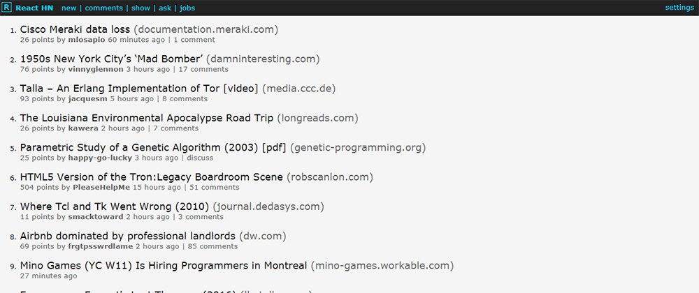
React HN
The React.js craze isn’t slowing down anytime soon and it’s certainly a staple for building any progressive webapp.
One example is the React HN site that pulls data from Hacker News and loads it all into a neat React.js webapp.
This is designed just like the HN homepage but it can operate like a native app on mobile devices. It doesn’t support account logins but you can do pretty much everything else, and it’s got a real snappy interface to boot.
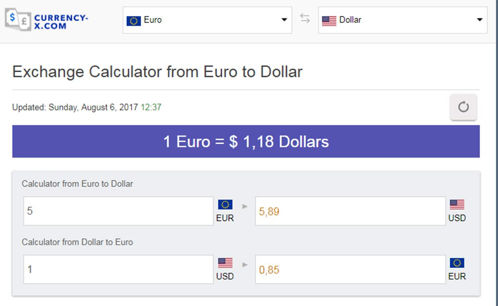
Currency-X
Looking for a free currency exchange rate app for your iPhone? Currency-X has you covered.
This free PWA works around a handful of currencies and runs with live data from APIs. This way the currency conversion rates are accurate and you can test them against pretty much every country from Kenya to Vietnam.
I do think the UX is lacking a bit and could be improved for mobile. But on the whole, this is one of the more impressive apps considering how much data it pulls.
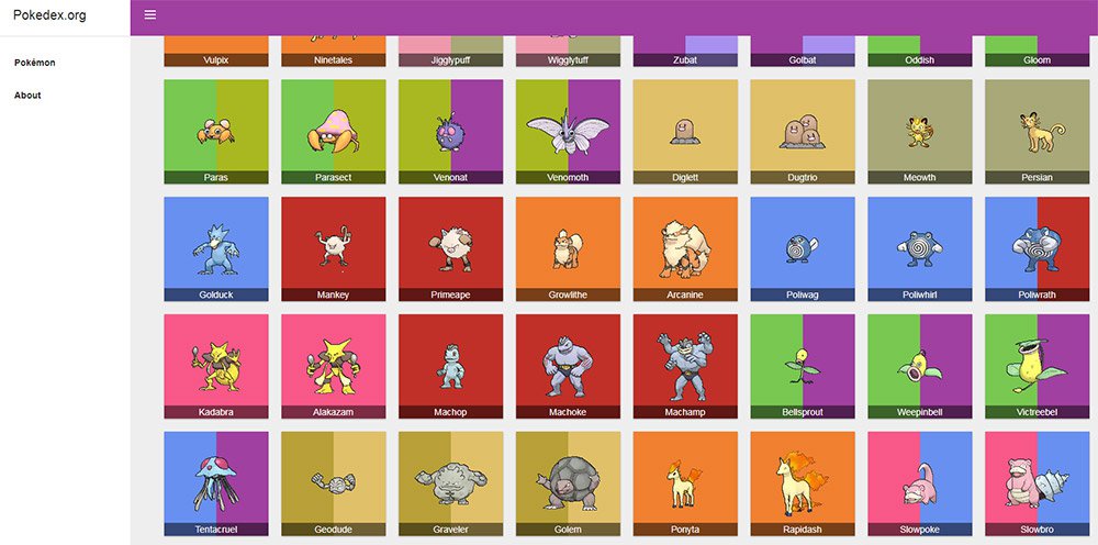
Pokedex.org
All you Pokemon fans are gonna love Pokedex.org for its simplicity and ease of use.
This webapp behaves like a literal Pokedex where you can search for monsters and get all their stats quickly. Data comes from the Pokeapi along with Wiki pages to ensure total accuracy.
And while this doesn’t distinguish between the different games it’s still an impressive webapp for the amazing price of free. Perfect for Pokemon players who want quick access to quick data.
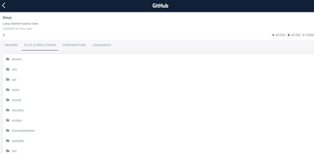
GitHub Explorer
Web developers love GitHub for its massive curation of free resources. The site has become a go-to resource for code snippets and now with GitHub Explorer you can dig into those code samples yourself.
The site is still a work in progress but it lets you browse through two methods: users and repos.
You can search by username or by repo name and pull up data fast. This includes the full readme file, all directories, and recent updates. However the search feature doesn’t include every repo so it’s more like a demo app showcasing what PWAs can offer.
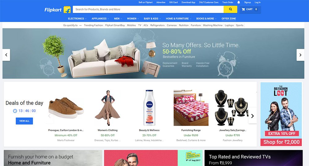
Flipkart
Believe it or not there are entire eCommerce shops that support PWA features. Flipkart is the only one I know of but their website is absolutely massive.
This India-based eCommerce site offers complete support as a native mobile application. You can search, browse products, and use your account to purchase items all with a native feel.
I’d argue this is the most complex PWA on the web and it deserves an award as one of the best UX’s I’ve seen all year.
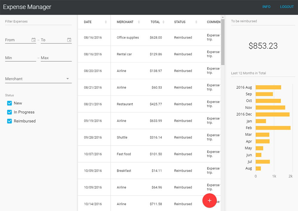
Expense Manager
If you want to track some quick expenses on your phone then the Expense Manager app is a nice place to start.
This thing behaves more like a simple calculator but it can save data for the long term. The demo account clears data after one hour but you can try the Vaadin framework yourself if you want a longterm solution.
The Expense Manager is mostly used to help sell this framework and bring attention to the company. And for that I’d say it gets the job done with plenty of “wow” factor to go around.
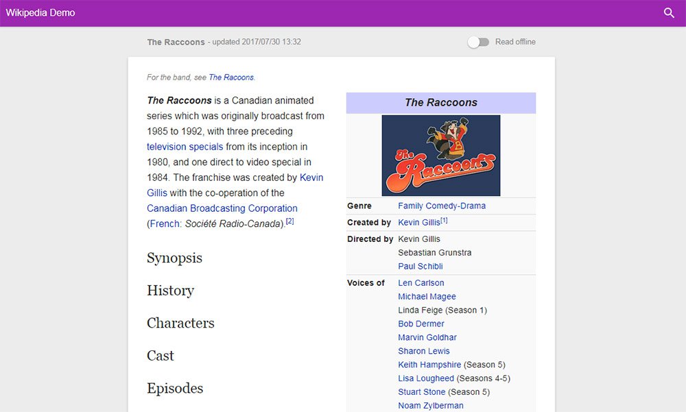
Offline Wikipedia
Here’s another cool demo app that I think should actually be built into the core of Wikipedia.
Offline Wikipedia is a PWA site created by Jake Archibald. It’s fully compliant with all the ideas of progressive webapps so it works on smartphones, tablets, laptops and desktops alike.
The interface is also pretty snappy so it’s easy searching and finding Wiki articles. Probably one of the few PWAs that I think really could add value to the main site.
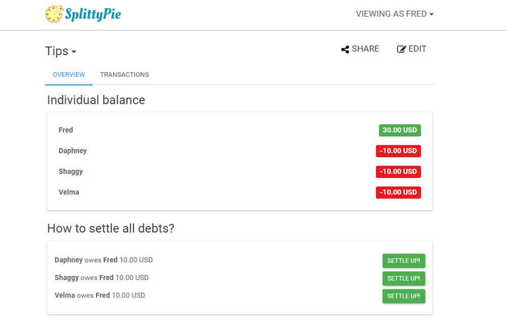
Splittypie
Never worry about splitting the bill again with Splittypie.
This app is fantastic and for the price of free you can’t beat it. You just visit the site in your browser and you create new “events” for tracking prices.
Whether you’re splitting a meal or the price of a ball game this app works for any device at the click (or tap) of a button.
Also the source code is freely available on GitHub if you want to use this as a base for your own PWA.
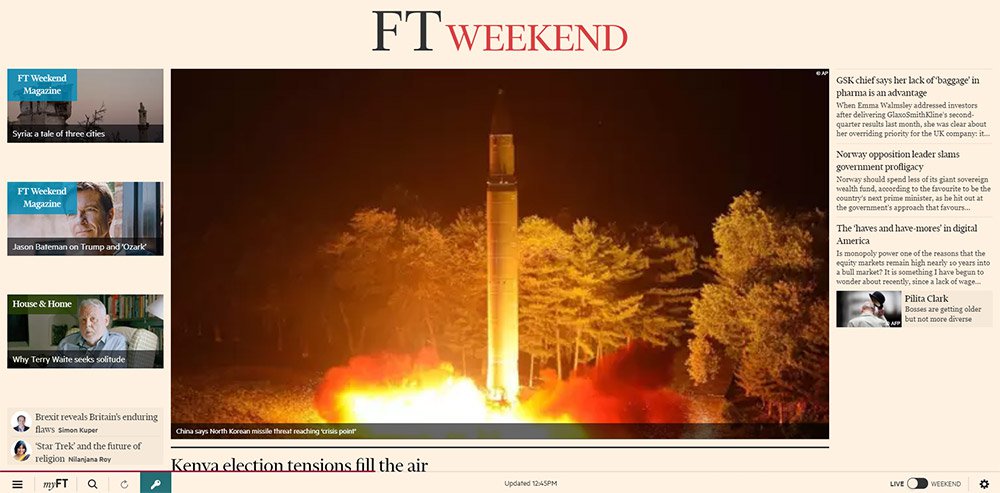
FT App
The massive publishing giant Financial Times surprisingly has their own PWA and it works really well.
Their app runs just like a news site except it’s fully responsive to touch. This means it behaves exactly like a native application where you don’t see new pages load, they just slide into view.
I’d like to think the future of publishing is full of websites like this. We’re already seeing this with Google AMP but that’s only a small step towards full PWAs.
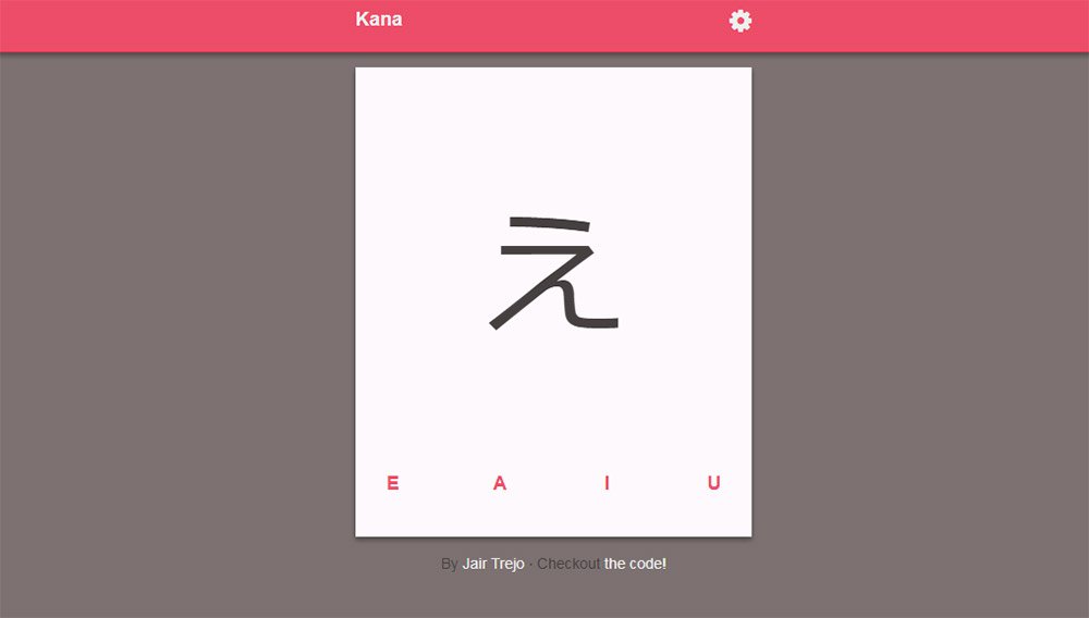
Get Kana!
Last but certainly not least is the Get Kana app. What’s cool is this site actually has a full application in the Android and iOS app stores.
But this progressive webapp is the next best thing for anyone who wants to try it out in their browser. It’s a Japanese learning app where you can learn the syllabaries for katakana & hiragana through flash cards.
Not something that everyone will find useful but absolutely one of the cleanest PWAs I’ve used. And best of all their code is freely available on GitHub if you want to dig into that too.
Screen space is a precious resource on mobile. To meet the challenge of small screen space while still making navigation accessible, designers often rely on hiding navigation behind the hamburger icon, a prime example of hidden navigation. In this article, we’ll see why hidden navigation creates bad UX and what alternatives are available for designers.
Why the Hamburger Menu Is Bad For UX
On mobile, visible navigation is used 1.5x more than hamburger
If you’re working on digital products, you’ve probably already read dozens of articles describing how the hamburger menu on mobile hurts UX metrics. The main downside is its low discoverability, and this is backed up by actual numbers. In qualitative studies, NNGroup found that hidden navigation is less discoverable than visible or partially visible navigation. This means that when navigation is hidden, users are less likely to use navigation. Hamburger menus drive engagement down, slow down exploration and confuse people.
So What Should We Use Instead?
While there is no hard-and-fast rule for mobile apps and websites, a general recommendation is to use either visible—the main navigation options are shown in a visible navigation bar—or combo navigation, where some of the main navigation options are visible and some are hidden under an interactive element.
1. Tab Bar
If you have a limited number of top-level destinations in your website or app, a tabbed navigation might be the solution. When a menu is visible at the top or bottom, it’s basically advertising that a navigation is there and people are able to see the navigation options right from the start.
Tabs seem to be the simplest navigation pattern. However, a few things should be considered when designing this type of navigation:
Tab bar allows 5 or fewer navigation options to display.
One of the options should always be active and should be visually highlighted by, for example, using a contrasting color.
The first tab has to be the home page and the order of the tabs should relate to their priority or logical order in the user flow.
It’s better to use icons together with labels for each navigation option. Icons without labels work only for common actions, like a magnifying glass icon for search, and for interfaces that the users use frequently (e.g. Instagram).
Tip: In order to save screen space, the navigation bar could be hidden/revealed on downward and upward scrolling.
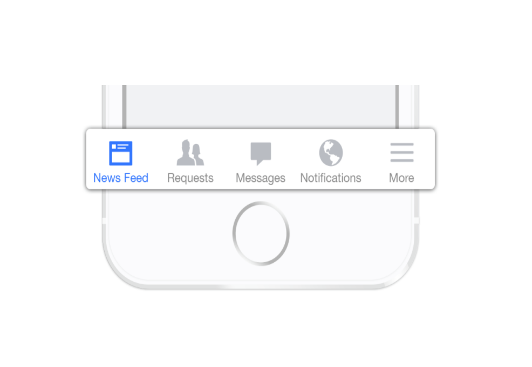
2. Tab Bar With “More” Option
When you have more than 5 top-level destinations, a practical solution might be to show the 4 prioritized sections and have a 5th element as a list of remaining options.
The design principles for this solution are basically the same as for Tab bar. There’s just one exception: the last element is the ‘more’ item.
The ‘more’ item can work as a dropdown menu or even link to a separate navigation page with the remaining sections. From the first glance this solution isn’t much better than the hamburger menu, since it also hides content and its label doesn’t say too much about what’s hidden behind it. If you correctly prioritize navigation options, however, a majority of your users will have 4 or 5 visible top-priority navigation options on the screen all the time so the navigation experience for them will be improved.
3. Progressively Collapsing Menu
Progressively collapsing menu, also known as the “Priority+” pattern, is a menu that adapts to the screen width. It shows as much of the navigation as possible and puts everything else under a “more” button. Basically, this pattern is a sophisticated version of the ‘Tab bar + more’ navigation where the number of navigation options hidden behind the “more” menu depends on the available screen space. The flexibility of this solution provides a better user experience than a ‘static’ ‘Tab bar + more’.
Similar to the previous two patterns, this is another approach for longer lists. If you have a number of navigation options without a big distinction in priorities, for example music genres, you can list all the items in a scrollable view. By making the list scrollable you allow users to move from side-to-side.
The downside of this solution is that still only the top few items are visible without scrolling and all the remaining ones are out of the sight. This is, however, an acceptable solution when the users are expected to explore the content, for example news categories, music categories or in an online store.
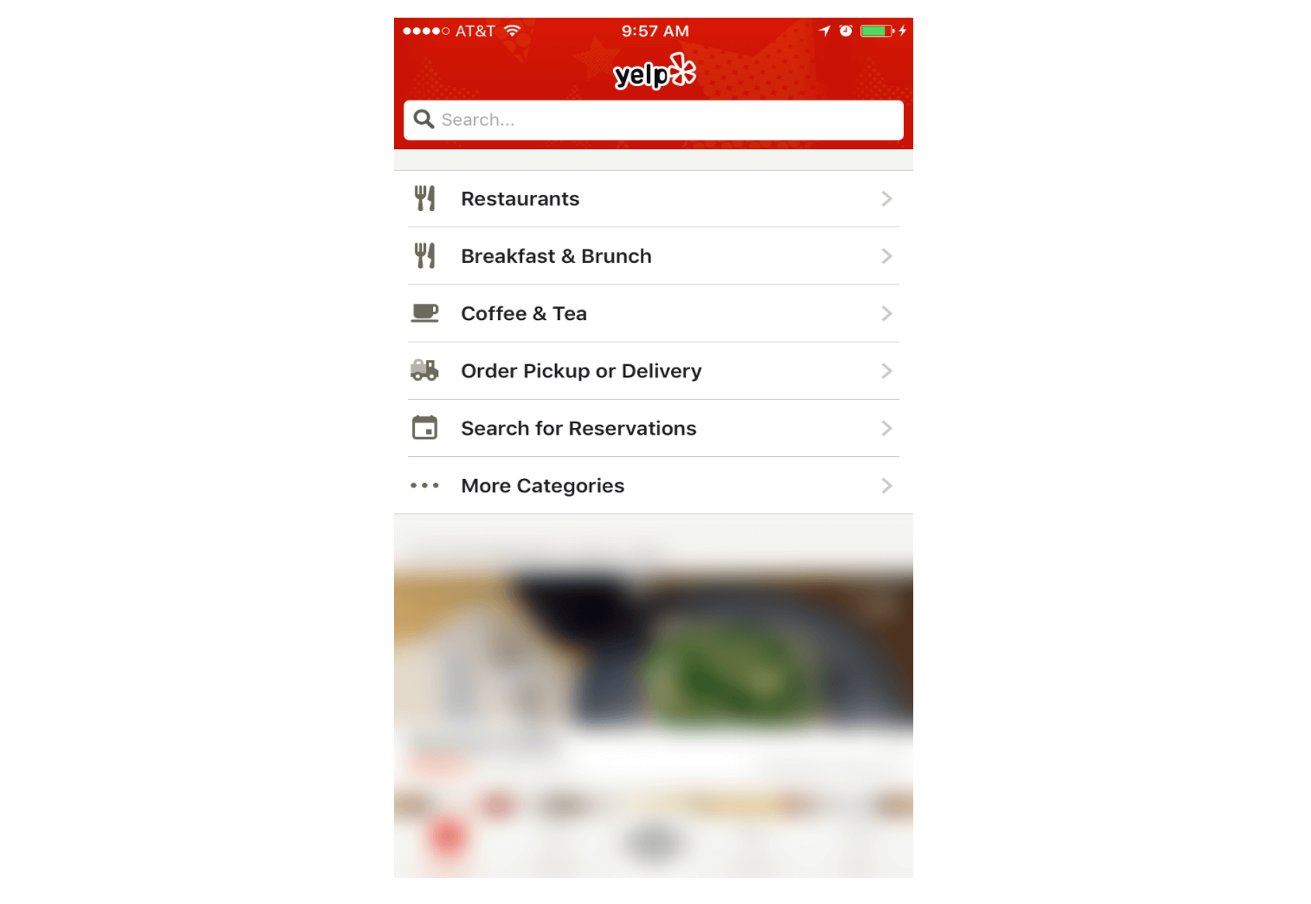
5. Full-Screen Navigation
While with other patterns mentioned in this article, the struggle is to minimize the space that the navigation systems take up, the full-screen pattern takes the exact opposite approach. This approach usually devotes the home page exclusively to navigation. Users incrementally tap or swipe to reveal additional menu options as they scroll up and down.
This pattern works well in task-based and direction-based websites and apps, especially when users tend to limit themselves to only one branch of the navigation hierarchy during a single session. Funnelling users from broad overview pages to detail pages helps them to home in on what they’re looking for and to focus on content within an individual section.
Full-screen navigation in Yelp
Using full-screen navigation, designers can organize large chunks of information in a coherent manner and reveal information without overwhelming the user. Once the user makes their decision about where to go, then you can dedicate the entire screen space to content.
Conclusion
With navigation patterns for mobile, there isn’t a one-size-fits-all solution; it always depends on your product, on your users, and on the context. However, the foundation of every well-designed navigation is information architecture: clear structure, priorities, and labels based on your users’ needs. Helping users navigate should be a top priority for every app designer. Both first-time and returning users should be able to figure out how to move through your app with ease.
“Get out of the deliverables business” has become quite a mantra in the lean startup and UX movements. There’s much to love in that sentiment — after all, for every wireframe you make, you’re not shipping code to customers.
But I’m worried that, just like with the concept of a minimum viable product, we’ve taken this sound advice to an extreme that’s actually hurtful to the creation of good products. What follows is an account of my own journey in navigating these stormy design seas together with the community.
Every now and then we see discussions proclaiming a profound change in the way we design and build websites. Be it progressive enhancement1, the role of CSS2 or, most recently, web design itself being dead3. All these articles raise valid points, but I’d argue that they often lack objectivity and balance, preferring one side of the argument over another one.
These discussions are great for testing the boundaries of what we think is (or is not) possible, and they challenge how we approach our craft, but they don’t help us as a community to evolve together. They divide us into groups and sometimes even isolate us in small camps. Chris Coyier has published a fantastic post4 recently covering the debate on the role of CSS in light of growing popularity of React.js, extensively and objectively. That’s the quality discussions we need, and that’s what keeps us evolving as a growing and maturing community.
Web technologies are fantastic — we all agree on this. Our tools, libraries, techniques and methodologies are quite fantastic, too. Sometimes they are very different and even contradictory, but they are created with the best intentions in mind, and often serve their purpose well in the specific situations they were designed for. Sometimes they contain mistakes, but we can fix them due to the nature of open source. We can submit a patch or point out solutions. It’s more difficult, but it’s much more effective.
There are a lot of unknowns to design and build for, but if we embrace unpredictability5 and if we pick a strategy to create more cohesive, consistent design systems6, we can tackle any level of complexity — in fact, we do it every single day. We solve complex problems by seeking solutions, and as we do, we make hundreds of decisions along the way. Yet sometimes we fall into the trap of choosing a solution based on our subjective preferences, not objective reasoning.
Web technologies are fantastic, and so are our tools. However, we might be focusing too much on discussions about tools instead of art direction we do when we design the web. Image source: empty_quarter7.
We tend to put things into buckets, and we tend to think in absolutes. Pro carousels or anti carousels; pro React.js or anti-React.js; for progressive enhancement or against it. But the web isn’t black and white — it’s diverse, versatile, tangled, and it requires pragmatism. We are forced to find reasonable compromises within given constraints, coming from both business and UX perspectives.
Tools aren’t good or evil; they just either fit a context or they don’t. Carousels can have their place when providing enough context to engage users (as Amazon does). React.js modules can be lazy-loaded for better performance, and progressive enhancement is foundational for making responsive websites really8, really9 fast. And even if you have extremely heavy, rich imagery, more weight doesn’t have to mean more wait10; it’s a matter of setting the right priorities, or loading priorities, to be precise.
No, web design isn’t dead. Generic solutions are dead.11 Soulless theming and quick skinning are dead. Our solutions have to be better and smarter. Fewer templates, frameworks and trends, and more storytelling, personality and character. Users crave good stories and good photography; they’re eager for good visuals and interesting layouts; they can’t wait for distinctive and remarkably delightful user experiences. This exactly should be our strategy to create websites that stand out.
There are far too many badly designed experiences out there, and there is so much work for us to do. No wonder that we are so busy with our ongoing and upcoming projects. Proclaiming our craft to be dead is counter-productive, because we’ve shown ourselves and everybody out there what we are capable of. The last fifteen years of web design were nothing if not outstanding in innovation and experimentation. And it’s not about to stop; that’s just not who we are.
If we can’t produce anything but generic work, other creatives will. The web will get better and it’s our job to make it better. It won’t be easy, but if we don’t adapt our practices and techniques, we’ll have to give way to people who can get it done better than we can — but web design itself isn’t going anywhere any time soon.
It’s up to us to decide whether we keep separating ourselves into small camps, or build the web together, seeking pragmatic solutions that work well within given contexts. We might not end up with a perfect solution every time, but we’ll have a great solution still; and more often than not it’ll be much, much better than the solution our client came to us for in the first place.
“Web Design Is Dead.” No, It Isn’t. http://www.smashingmagazine.com/2015/07/08/web-design-is-dead-no-it-isnt/ http://rss1.smashingmagazine.com/feed/ Smashing Magazine For Professional Web Designers and Developers
Hear, hear! SmashingConf NYC 2016 is coming! A spectacular performance about failures, successes and superpowers in front-end and UX — now on Broadway! A flabbergasting show on fascinating endeavours in web design, with busted myths, horror design stories and wisdom gained from daunting real-life struggles! Don’t miss the most remarkable show of the year!
Can you dispel the truth from the lies? Honesty from deception? Myths from heartbreaking real-life experience? Have you figured out responsive design, mobile, pattern libraries, SVG, flexbox, performance, HTTP/2 — and all of the other mischievous, erratic facets of designing for the web today?
There is no winner in the battle between iOS and Android, and we all know that. If a product succeeds on one platform, it will undoubtedly be ported to the other. Sometimes app developers don’t even bother waiting, and release apps for both platforms simultaneously. For designers this means only one thing — they will have to adapt an application’s UI and UX to another platform while ensuring a consistent design language across the product.
There are three different scenarios for UI multiplatform adaptation: retaining brand consistency; aligning with the conventions specific to the platform; and seeking a balance between the two. We decided to analyze these three approaches by looking at the most popular apps out there so that you get some insight into what method might work best for you.
Approaches For Multiplatform UI Design Adaptation: A Case Study http://www.smashingmagazine.com/2015/09/approaches-for-multiplatform-ui-design-adaptation/ http://rss1.smashingmagazine.com/feed/ Smashing Magazine For Professional Web Designers and Developers
Noah was concerned. He was the “UX guy” for the corporate office of a regional Quick Service Restaurant (a fast food chain) that was in the process of creating a mobile app to allow patrons to customize their meals, place orders and earn rewards.
Note: This is an experiment in a slightly different format for Smashing Magazine – using a storytelling approach to convey the same lessons learned that a traditional article would have provided.
We love organizing events that deliver value and leave a long-lasting impression. SmashingConf Oxford is taking place again next year, on March 15–16th 2016. The conference will be packed with smart real-life solutions and techniques, ranging from front end to design to UX — and a few delightful surprises along the way. Two days, one track, 14 brilliant speakers and 350 fantastic attendees. Tickets are now on sale.
Discussions about design trends and visual style are often very subjective and they rarely provide actionable, valuable takeaways. Nothing beats a conversation about what worked and what didn’t work in actual real-life projects and what decisions were made along the way. That’s exactly what we’re setting off to explore in Oxford — accompanied by a lot of learning and networking in the beautiful pathways and gardens of legendary Oxford.
SmashingConf Oxford 2016: Just Your Cup Of Tea http://www.smashingmagazine.com/2015/10/smashingconf-oxford-2016-just-your-cup-of-tea/ http://rss1.smashingmagazine.com/feed/ Smashing Magazine For Professional Web Designers and Developers
In UX design, few things are more intricate than time and personal time management — only a good arsenal of mobile design patterns and information architecture principles can save you. This is the story of redesigning the UX for a popular calenda tool on Android: Business Calendar. We’ll cover designing systems, interaction design problems, scaling across screens and platforms, research, and big business decisions and their outcomes.
Business Calendar started out as a side project, a one-man show, and is now run by a team of eight in Berlin. The app was very successful right from the time Android entered the mainstream market, and it now has an active user base of 2 million. But instead of modernizing the design and usability regularly, the developers focused on implementing user requests and customization options.
Making Time: Redesigning A Calendar Experience For Android http://www.smashingmagazine.com/2015/07/redesigning-a-calendar-experience-for-android/ http://rss1.smashingmagazine.com/feed/ Smashing Magazine For Professional Web Designers and Developers
So, do you like challenges? Now, this one is going to smash you alright. Meet SmashingConf San Francisco 2016, packed with smart front-end and UX techniques — CSS/JavaScript architecture, SVG, Flexbox, pattern libraries, performance, UX, interface design, content strategy — to challenge everything about how you design and code — and how to touch someone’s heart with design.
So you know what’s going on in front-end. You’ve been working with pattern libraries and atomic design and Gulp and SMCSS and BEM and HTTP/2 and Flexbox and SVG. What you might not know though is what pitfalls and traps other web designers have encountered in practice — to prevent issues creeping out down the road.
“This One Is Going To Be A Game Changer.” Meet SmashingConf San Francisco 2016 http://www.smashingmagazine.com/2015/10/the-journey-of-your-life-time-meet-smashingconf-san-francisco-2016/ http://rss1.smashingmagazine.com/feed/ Smashing Magazine For Professional Web Designers and Developers
If you’re a UX designer, you’ve probably designed a lot of forms and web (or app) pages in which the user needs to choose between options. And as a designer, you’re likely familiar with best practices for designing forms. Certainly, much has been written and discussed about this topic. So, you probably know all about how best to label and position form fields and so on for optimal usability.
But have you thought about how the design of a form affects the user’s decision-making? Have you ever considered to what extent the design itself affects the choices people make? As always in design, there are a variety of ways to design a form or web page.
For example, let’s say you’re designing a system in which the user needs to indicate whether they would like to sign up for a particular preventive medical procedure, like a flu shot. You could design the form in a number of ways. For example, you could provide a checkbox where the user either opts in or out. Alternatively, you could design it so that the user is required to explicitly choose between two options (via radio buttons).
Examples of these two approaches are shown below:
Would it matter which way you design it? Would the user make the same choice regardless of which design they encounter? Or could the user potentially be led to make a different choice merely as a result of how the choice is presented or designed?
The Power Of Defaults
One key difference between these two designs is that the checkbox requires a default state. That is, upon display, the checkbox will appear either checked or unchecked, as opposed to the radio buttons, which do not require a default selection. In the second example, even if the user does nothing, a “choice” has already been made, via the default.
A robust body of research1 has shown that when a default choice is offered, most people do not deviate from it. For example, if the box is checked by default, many don’t uncheck it (and vice versa). Making an explicit decision requires effort, after all. Time, thought and consideration are often required to determine the best choice. It turns out that people are remarkably sensitive (and averse) to the amount of effort that making a choice demands.
People are also remarkably sensitive to any possibility of incurring a “loss” that might then subsequently trigger feelings of regret. Especially when one is unsure how to choose, not making a choice (by simply accepting the default) feels better than actively making a choice that might end up being the “wrong” choice. Because people often have an unrealistic expectation that they will have more time in the future to make a more informed decision, procrastination also works2 in favor of acceptance of the default. Deviating from the default requires an explicit action, which people delay in taking. In many ways, defaults make decisions feel easier and less risky.
Designing For An Explicit Choice
The judicious use of defaults, then, has proven to be a key driver in the choices that people ultimately end up with, in large part because many people simply go with the default option. But one problem with passive decision-making3 is that it’s less likely to engender the kind of committed follow-up that is often essential to implementation of the decision, such as in the earlier example of the flu shot. Wouldn’t those who actively decide to opt for a flu shot be more apt to actually get one than those who passively accept the default?
Might there be a way to design for explicit decision-making that encourages people to feel better about actively making a choice? With this question in mind, researchers conducted a study to test how the design for an explicit choice might affect decision outcomes. Specifically, they were interested in comparing the outcomes of two approaches to obtaining an explicit choice from users regarding enrollment in a 401(k) plan (an employer-sponsored retirement plan), as shown below.
Example 1 provides two options:
“I want to enroll in a 401(k) plan.”
“I don’t want to enroll in a 401(k) plan.”
Example 2 also provides two options:
“I want to enroll in a 401(k) plan and take advantage of the employer match.”
“I don’t want to enroll in a 401(k) plan and don’t want to take advantage of the employer match.”
Would actual choice outcomes be influenced by which design users interacted with? In example 1, the two choices are weighted equally. That is, if the user doesn’t have a specific or compelling reason to choose one over the other, chances are that they may feel conflicted about which one to choose. Neither necessarily feels better or worse than the other. Example 2, on the other hand, is explicit about what the user will potentially gain or give up as a result of choosing an option.
Results of the research study4 show that enrollment in a program increased when options were “enhanced” with explicit mention of the implications of each choice, and levels of commitment and participation in the program also increased. But why would the wording of example 2 make such a difference in people’s choice? From a design perspective, stating what seems obvious about the implications of each option might seem unnecessary.
But it turns out that, because people are generally unlikely to seek out information to inform their decision, the additional wording makes a difference. Proactively seeking out information is work, after all, and research consistently reveals people’s considerable sensitivity to and avoidance of almost any amount of effort. Because of this, providing information within the options themselves can have a powerful impact on decision outcomes.
Aversion To Potential Loss
For many people who are not enrolled in a 401(k) plan, maintaining the status quo of being unenrolled doesn’t seem to incur any negative emotion, risk or “loss.” Life seems to roll on normally when one is not enrolled. Most people are aware, however, that participation in a 401(k) plan involves regular contributions to the plan — money that is no longer available for daily household expenses or other regular uses. And inherent to the act of investing is the potential for market downturns and losses incurred over the course of an investment. For these reasons, taking the step of enrolling in the plan (and potentially losing one’s investment) might feel a lot riskier than maintaining the status quo by not enrolling.
But when the costs associated with maintaining the status quo (for example, by remaining unenrolled in the plan) are made apparent and are framed as a loss (for example, loss of the employer match), then the decision to enroll in the plan feels more compelling and motivating. People are much more motivated by ways to avoid loss than to realize gains.
Consider what might happen if example 2 were framed differently:
“I want to enroll in a 401(k) plan.”
“I don’t want to enroll in a 401(k) plan and don’t want to take advantage of the employer match.”
Framing the options in this way does not remind users that they have something to gain by enrolling, only that they have something to lose by not enrolling. I suspect that users would still feel strongly motivated to enroll, simply because people give disproportionately greater weight to loss than to gain.
Real-World Examples
Research has demonstrated the power of design in enhancing explicit choices, but what about examples from the real world? One example we can look to is the US pharmaceutical company CVS/caremark5, which enjoyed greater rates of enrollment for its automatic prescription-refilling program when users were required to choose between two options:
“I prefer to order my own refills.”
“I want to enroll in the ReadyFill@Mail (automatic prescription refill program).”
The first option reminds users that not enrolling for the auto-refill program incurs a cost — the cost of having to do the work of ordering one’s own refills. It turns out that 21.9% of users decided to enroll in the program with this design of explicit choices, compared to only 12.3% of those who encountered an opt-in design. And customers who encountered the explicit choice also ended up filling more prescriptions than those in the opt-in design. It seems that preference for the program was actually enhanced once people made a commitment to joining.
Examples From The Retail World
Enhanced explicit choice is effective because it reminds people what they will gain or lose as a result of making a certain choice. Some online shopping websites are leveraging the power of such “reminders.”
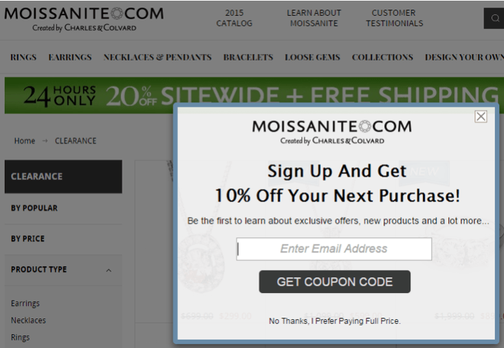
Moissanite6 is one such example. After a short time on its website, the user is presented with a modal requesting their email address in exchange for a 10% discount on their next purchase. Providing one’s email address, of course, incurs the “cost” of potentially getting unwanted email, etc. But at the bottom of the modal is a reminder of the cost of not signing up: “No thanks, I prefer paying full price.” Paying full price, of course, implies loss because the user could instead be enjoying a discounted price.
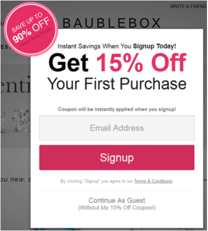
Consider another example, Bauble Box8, which takes this concept a step further. After a short time on the website, the user is presented with the following modal, offering a 15% discount on one’s first purchase in exchange for an email address.
Noteworthy is the fact that there is no obvious way to close this box — for example, no “X” or “Close” (which would normally be located in the upper-right corner). To dismiss the box, the user must click the “Continue as guest” link towards the bottom of the box. And it might not be immediately apparent that this is a link.
The design seems to leverage these usability issues by forcing the user to hunt around for a way to dismiss the box, until they finally discover the “Continue as guest” link. Although this design risks user frustration, it nevertheless forces more time and attention towards the content of the box than users would ordinarily spend, increasing the likelihood that they will also notice the parenthetical text under the link, “(Without my 15% off coupon!)”
This design raises some interesting questions about how users perceive the experience and, consequently, whether this is a website they want to give their business to. To what extent might user frustration with the (intentional) usability issues adversely affect their perception of the company and the brand? At what point does the design cross the line to the dark side? These are important considerations, especially for companies that want to establish long-term relationships with their customers built on trust and delight.
Final Thoughts
We’ve covered a lot of ground in this article. We’ve seen that defaults are powerful because they provide a way for users to passively decide, thereby easing the difficulty and effort associated with decision-making. But we also know that, for a variety of reasons, providing a default option is not always appropriate. Sometimes, it’s better for users to make an explicit choice — especially when they are more likely to follow through with a decision and be more committed to taking action on it.
A primary lesson from this article is that merely reminding people what they stand to gain or lose as a result of making a particular choice can have a powerful impact on how they choose. And depending on the type of decision, how they choose can have significant implications for their lives. We’ve seen, too, that designing for explicit choice can manifest itself in different ways, depending on the subject matter and context of the experience.
It’s imperative to understand that the design matters. UX design professionals have a responsibility to understand how design itself influences — and sometimes even drives — user perception and behavior and, therefore, decision outcomes. To this end, the decisions we make as designers matter.
Designing For Explicit Choice http://www.smashingmagazine.com/2015/05/25/designing-for-explicit-choice/ http://www.smashingmagazine.com/feed/?# Smashing Magazine For Professional Web Designers and Developers
What is the best UX pattern to display products on an e-commerce website: pagination, a “Load more” button or infinite scrolling? At Baymard Institute, we’ve conducted several year-long large-scale usability studies of more than 50+ leading e-commerce websites. We tested (among other things) these three design patterns for loading products, both on desktop and mobile.
Pagination is still the most popular way to load new items on a website because it ships by default in almost every single e-commerce platform. However, our usability test sessions found “Load more” buttons combined with lazy-loading to be a superior implementation, resulting in a more seamless user experience. We found that infinite scrolling can be downright harmful to usability — in particular, for search results and on mobile. However, it’s not black and white, because the performance of each method varies according to the context of the page.
The incredible growth of mobile and the proliferation of mobile devices has made the UX designer’s job more challenging and interesting. It also means that user-testing mobile apps and websites is an essential component of the UX toolkit.
But unlike the desktop environment, no out-of-the-box software packages such as Silverback or Camtasia are specifically designed to record mobile usability tests. Even if you’re not developing a mobile app, chances are that a large proportion of your website traffic is coming from mobile. Running regular mobile usability tests is the only way to gauge how well this channel is working for your customers.
Relaunching a large-scale website is always quite an undertaking, especially if the task involves a huge political entity with content accumulated over a dozen years. In this article, we look behind the scenes of the responsive redesign of Kremlin.ru, Russia’s most prominent government website.
We had an opportunity to talk with Artyom Geller, one of the creative minds responsible for the design and UX of the project. We talked about the design process, the challenges and constraints, creative front-end solutions, as well as unusual budgets and stakeholders. —Ed.
From Russia With Love: Behind The Responsive Redesign of Kremlin.ru http://www.smashingmagazine.com/2015/08/from-russia-with-love-behind-the-scenes-of-the-kremlin-ru-responsive-redesign/ http://rss1.smashingmagazine.com/feed/ Smashing Magazine For Professional Web Designers and Developers


 Screen space is a precious resource on mobile. To meet the challenge of small screen space while still making navigation accessible, designers often rely on hiding navigation behind the hamburger icon, a prime example of hidden navigation. In this article, we’ll see why hidden navigation creates bad UX and what alternatives are available for designers.
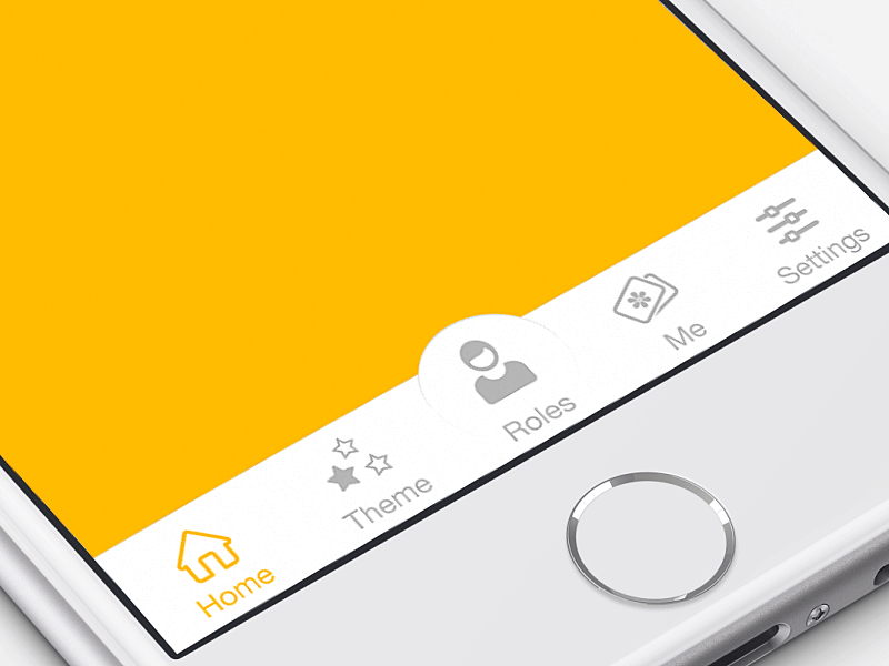

