Glassmorphism is a term used to describe UI design that emphasizes light or dark objects, placed on top of colorful backgrounds. A background-blur is placed on the objects which allows the background to shine through – giving it the impression of frosted glass.
In this post we’ve collected 10 stunning examples of this design trend from Codepen. Have a look and see how you could possibly use this effect in your upcoming projects!
Your Web Designer Toolbox Unlimited Downloads: 500,000+ Web Templates, Icon Sets, Themes & Design Assets
It began, as many things do, with a silly conversation. In this case, I was talking with our Front End Technology Competency Director (aka "boss man") Mundi Morgado.
It went something like this…
Mundi Morgado I want you to build a visual screen reader.
Nathan Smith Who what now?
Mundi Morgado I want a CSS library that allows you to see the structure of a document. It shouldn't use class so that you're forced to focus on semantics. Also, make it theme-able.
Nathan Smith Sure, let me see what I can come up with.
Fast-forward a week, and we've got what we are now calling:
Trashy.css: The throwaway CSS library with no class
Why throwaway? Well, it's not really meant to be a fully fledged, production-ready style framework. Rather, it's like training wheels for document semantics, with some bumper lanes (think: bowling) to keep you on the right track.
It's part of our ongoing effort at TandemSeven to promote code literacy throughout our organization. As more of our UX designers are beginning to share responsibility for the accessibility and semantics of a project, it makes sense that we would build in such a way that allows UX and development to be more collaborative.
There are four main aspects to Trashy.
Trashy: "Basic"
First is the base trashy.css file, which applies a passably basic look and feel to the majority of common HTML elements. Check out this example of a basic page.
Trashy: "Boxes"
Second, there is trashy.boxes.css. This visually distinguishes otherwise invisible semantic elements, such as: header, main, nav, etc. That way, one can see where those elements are (or aren't) as a page is being authored. Here’s a page with semantic boxes outlined.
Trashy: "Theme"
Thirdly, theming is possible via trashy.theme.css. This is mostly just an example — inspired by PaperCSS) — of how to make UI look "hand drawn," to prevent observers from being too fixated on the look and feel, rather than the semantics of a document. Here’s the example theme in action.
Trashy: "Debug"
Lastly, there is a trashy.debug.css file that highlights and calls out invalid and/or problematic markup. Here’s a gnarly example of "everything" going wrong on a single HTML page. This was inspired by a11y.css, though it diverges in what is considered noteworthy.
For instance, we call out "div-itis" when multiple div:only-child have been nested within one another. We're also opinionated about type="checkbox" being contained inside of a <label>. This is for maximum click-ability within an otherwise dead whitespace gap, between a checkbox (or radio) and its textual label.
Any or all of these CSS files can be applied individually or in conjunction with one another. There is also a bookmarklet (labeled "GET TRASHY!") on the Trashy home page you can use to get results for any webpage.
The bookmarklet will remotely pull in:
sanitize.css
trashy.css
trashy.boxes.css
trashy.debug.css
Our "reset" - Sanitize.css
A quick word on Santitize.css: It was created by my coworker Jonathan Neal (author of Normalize.css), as a way to have a semi-opinionated CSS "reset." Meaning, it puts in a lot of defaults that we find ourselves writing as developers anyway, so it makes for a good starting point.
Technically speaking
Okay, so now that we’ve covered the "why," let’s dig into the "how."
Basically, it all revolves around using (abusing?) the ::before and ::after pseudo elements. For instance, to show the name of a block level tag, we’re using this CSS.
Semantic tags (using ::before)
Here is an abbreviated version of the trashy.boxes.css file, for succinctness. It causes the <section> tag to have a dashed border, and to have its tag named displayed the top left corner.
Likewise, here’s a snippet of code from the trashy.debug.css file that drives the markup warning messages. This particular example causes <script> tags to be displayed, which may be further optimized or need the developer’s attention: inline JavaScript and/or external src without async.
In the case of inline JS, we set the font-size and line-height to 0 because we’re making the element visible. We yank the text off the page via text-indent: -99999px just to make sure it doesn’t show up. We wouldn’t want that random JS code displayed alongside legit page content.
(Please don’t ever do this for "real" content. It’s just a hack, mkay?)
To get our error message to show up though, we have to set the font-size and line-height back to non-zero values, and remove our text-indent. Then, with a bit more absolute positioning, we ensure the message is visible. This lets us see, amidst the rest of the page content, whereabouts to check (via DOM inspector) for the <script> insertion point.
Note: Some scripts do need to be loaded synchronously. You wouldn’t want your "app" code to load before your "framework" code. Heck, some inline JS is probably fine too, especially if you’re doing some super speed optimization for the critical rendering path. These warnings are "dumb" in the sense that they match only via CSS selectors. Take ‘em with a grain of salt, your mileage may vary, etc.
JS bookmarklet
The aforementioned JS bookmarklet finds all <link rel="stylesheet"> and <style> tags in the page, and causes them to be ineffective. This allows us to add in our own CSS to take over, so that the only styles applied are those provided directly via Trashy.
The magic is accomplished by setting rel="stylesheet" to rel="". If an external stylesheet is not identified as such, even if it’s cached, the browser will not apply its styles to the page. Similarly, we destroy the contents of any inline <style> tags by setting the innerHTML to an empty string.
This leaves us with the tags themselves still intact, because we still want to validate that no <link> or <style> tags are present within <body>.
We also check that there aren’t too many <style> tags being used in the <head>. We allow for one, since it could be used for the critical rendering path. If there’s a build process to generate a page with consolidated inline styles, then it’s likely they’re being emitted through a single tag.
<a href="javascript:(
  function (d) {
    var f = Array.prototype.forEach;
    var linkTags = d.querySelectorAll('[rel=\'stylesheet\']');
    var styleTags = d.querySelectorAll('style');

    f.call(linkTags, function (x) {
      x.rel = '';
    });

    f.call(styleTags, function (x) {
      x.innerHTML = '';
    });

    var newLink = d.createElement('link');

    newLink.rel = 'stylesheet';

    newLink.href =
      'https://t7.github.io/trashy.css/css/bookmarklet.css';

    d.head.appendChild(newLink);
  }
)(document);">
  GET TRASHY!
</a>
That pretty much covers it. It's a simple drop-in to help you visualize your document semantics and debug possibly problematic markup.
I have also found it to be super fun to use. A quick click of the bookmarklet on any given site usually yields lots of things that could be improved upon.
For instance, here's what CNN's site looks like with Trashy applied…
P.S. Call security!
If you try this with Twitter’s site, you might wonder why it doesn’t work. We were initially perplexed by this, too. It has to do with the site's Content Security Policy (CSP). This can be used to disallow CSS and/or JavaScript from being loaded externally, and can whitelist safe domains.
This can be set either at the server level, or by a <meta> tag in the <head>.
In the case of Twitter, it’s emitted from the server. Even if it were in the HTML, destroying it has no effect on the actual browser behavior. It’s locked in.
Okay, so...
Can’t you insert your own security meta tag and override it?
You’d think so. But, thankfully, no. Once a CSP been accepted by the browser for that page, it cannot be overridden. That’s probably a good thing, even though it ruins our fun.
I suppose that’d be like wishing for more wishes. It’s against the genie rules!
CSS Shapes Level 1 has been available in Chrome and Safari for a number of years, however, this week it ships in a production version of Firefox with the release of Firefox 62 — along with a very nice addition to the Firefox DevTools to help us work with Shapes. In this article, I’ll take a look at some of the things you can do with CSS Shapes. Perhaps it’s time to consider adding some curves to your designs?
What Are CSS Shapes?
The CSS Shapes specification Level 1 defines three new properties:
shape-outside
shape-image-threshold
shape-margin
The purpose of this specification is to allow content to flow around a non-rectangular shape, something which is quite unusual on our boxy web. There are a few different ways to create shapes, which we will have a look at in this tutorial. We will also have a look at the Shape Path Editor, available in Firefox, as it can help you to easily understand the shapes on your page and work with them.
In the current specification, shapes can only be applied to a float, so any shapes example needs to start with a floated element. In the example below, I have a PNG image with a transparent background in which I have floated the image left. The text that follows the image now flows around the right and bottom of my image.
What I would like to happen is for my content to follow the shape of the opaque part of the image, rather than follow the line of the physical image file. To do this, I use the shape-outside property, with the value being the URL of my image. I’m using the actual image file to create a path for the content to flow around.
Note that your image needs to be CORS compatible, so hosted on the same server as the rest of your content or sending the correct headers if hosted on a CDN. Browser DevTools will usually tell you if your image is being blocked due to CORS.
This method of creating shapes uses the alpha channel of the image to create the shape, as we have a shape with a fully transparent area, then all we need do is pass the URL of the image to shape-outside and the shape path follows the line of the fully opaque area.
Creating A Margin
To push the line of the text away from the image we can use the shape-margin property. This creates a margin between the line of the shape and the content running alongside it.
In the case above, we have the image displayed on the page and then the text curved around it. However, you could also use an image as the path for the shape in order to create a curved text effect without also including the image on the page. You still need something to float, however, and so for this, we can use Generated Content.
In this example, we have inserted some generated content, floated it left, given it a width and a height and then used shape-outside with our image just as before. We then get a curved line against the whitespace, but no visible image.
Using A Gradient For Our Shape
A CSS gradient is just like an image, which means we can use a gradient to create a shape, which can make for some interesting effects. In this next example, I have created a gradient which goes from blue to transparent; your gradient will need to have a transparent or semi-transparent area in order to use shapes. Once again, I have used generated content to add the gradient and am then using the gradient in the value for shape-outside.
Once the gradient becomes fully transparent, then the shape comes into play, and the content runs along the edge of the gradient.
Using shape-image-threshold To Position Text Over A Semi-Opaque Image
So far we have looked at using a completely transparent part of an image or of a gradient in order to create our shape, however, the third property defined in the CSS Shapes specification means that we can use images or gradients with semi-opaque areas by setting a threshold. A value for shape-image-threshold of 1 means fully opaque while 0 means fully transparent.
A gradient like our example above is a great way to see this in action as we can change the shape-image-threshold value and move the line along which the text falls to more opaque areas or more transparent areas. This property works in exactly the same way with an image that has an alpha channel yet is not fully transparent.
This method of creating shapes from images and gradients is — I think — the most straightforward way of creating a shape. You can create a shape as complex as you need it to be, in the comfort of a graphics application and then use that to define the shape on your page. That said, there is another way to create our shapes, and that’s by using Basic Shapes.
CSS Shapes With Basic Shapes
The Basic Shapes are a set of predefined shapes which cover a lot of different types of shapes you might want to create. To use a basic shape, you use the basic shape type as a value for shape-outside. This type uses functional notation, so we have the name of the shape followed by brackets (inside which are some values for our shape).
The options that you have are the following:
inset()
circle()
ellipse()
polygon()
We will take a look at the circle() type first as we can use this to understand some useful things which apply to all shapes which use the basic shape type. We will also have a look at the new tools in Firefox for inspecting these shapes.
In the example below, I am creating the most simple of shapes: a circle using shape-outside: circle(50%). I’m using generated content again, and I have given the box a background color, and also added a margin, border, and padding to help highlight some of the concepts of using CSS Shapes. You can see in the example that the circle is created centered on the box; this is because I have given the circle a value of 50%. That value is the <shape-radius> which can be a length or a percentage. I’ve used a percentage so that the radius is half of the size of my box.
This is a really good to time have a look at the shape that has been created using the Firefox Shape Path Editor. You can inspect the shape by clicking on the generated content and then clicking the little shape icon next to the property shape-outside; your shape will now highlight.
The Shape Path Editor highlights the circle shape (Large preview)
You can see how the circle extends to the edge of the margin on our box. This is because the initial reference box used by our shape is margin-box. You already know something of reference boxes if you have ever added box-sizing: border-box to your CSS. When you do this, you are asking CSS to use the border-box and not the default content-box as the size of elements. In Shapes, we can also change which reference box is used. After any basic shape, add border-box to use the border to define the shape or content-box to use the edge of the content (inside the padding). For example:
You will see the circle appear to become much smaller. It is now using the width of the content — in this case the width of the box at 150px — rather than the margin box which includes the padding, border, and margin.
The content-box is the edge of the content of the square we created with our generated content (Large preview)
Inspecting your element in Firefox DevTools will also show you the reference boxes so you can choose which might give you the best result with your particular shape.
Reference boxes highlighted in Firefox (Large preview)
The Position Value
A second value can be passed to circle() which is a position; if you do not pass this value, it defaults to center. However, you can use this value to pull your circle around. In the next example, I have positioned the circle by using shape-outside(50% at 30%); this changes where the center of the circle is positioned.
Something useful to know is that the same <basic-shape> values can be used as a value for clip-path. This means that after creating a shape, you can clip away the image or background color that extends outside of the shape. In the example below, I am going to do this with our example gradient background, so that we end up with a circle that has text curved around from our square box.
All of the above concepts can be applied to our other basic shapes. Now let’s have a quick look at how they work.
inset()
The inset() value defines a rectangle. This might not seem very useful as a float is a rectangle, however, this value means that you can inset the content wrapping your shape. It takes four values for top, right, bottom, and left plus a final value which defines a border radius.
In the example below, I am using the values to inset the content on the right and bottom of the floated image, plus adding a border radius around which my content will wrap using shape-outside: inset(0 30px 100px 0 round 40px). You can see how the content is now over the background color of the box:
An ellipse is a squashed circle and as such needs two radii for x and y (in that order). You can then push the ellipse around just as with circle using the position value. In the example below, I am creating an ellipse and then using clip-path with the same values to remove the content outside of my shape.
In the above example, I also used shape-margin to demonstrate how we can use this property as with our image generated shapes to push the content away.
polygon()
Creating polygon shapes gives us the most flexibility, as our shapes can be created with three or more points. The value passed to the polygon needs to be three or more pairs of values which represent coordinates.
It is here where the Firefox tools become really useful as we can use them to help create our polygon. In the below example, I have created a polygon with four points. In the Firefox DevTools, you can double-click on any line to create a new point, and double-click again to remove it. Once you have created a polygon that you are happy with, you can then copy the value out of DevTools for your CSS.
As CSS Shapes are applied to a float, in many cases the fallback is that instead of seeing the content wrap around a shape, the content will wrap around a floated element (in the way that content has always wrapped around floats). Browsers ignore properties they do not understand, so if they don’t understand Shapes, it doesn’t matter that the shape-outside property is there.
Where you should take care would be in any situation where not having shapes could mean that content overlaid an area which made it difficult to read. Perhaps you are using Shapes to push content away from a busy area of a background image, for example. In that case, you should first make sure that your content is usable for the non-Shapes people, then use Feature Queries to check for support of shape-outside and overwrite that CSS and apply the shape. For example, you could use a margin to push the content away for non-Shapes visitors and remove the margin inside your feature query.
.content {
    margin-left: 120px;
}

@supports (shape-outside: circle()) {
    .content {
        margin-left: 0;
        /* add the rest of your shapes CSS here */
    }

}
With Firefox releasing their support we now only have one main browser without support for Shapes — Edge. If you want to see Shapes support across the board you could go and vote for the feature here, and see if we can encourage the implementation of the feature in Edge.
Find Out More About CSS Shapes
In this article, I’ve tried to give a quick overview of some of the interesting things that are possible with CSS Shapes. For a more in-depth look at each feature, check out the Guides to CSS Shapes over at MDN. You can also read a guide to the Shape Path Editor in Firefox.
Why reinvent the wheel designing elements that already have free designs online? Blockquotes remain a staple of text-heavy websites and they come in so many distinct styles.
I’ve curated my top picks for the best free blockquotes you can find. Every one of these designs uses pure CSS code so they’re easy to replicate.
It rests on a bright orange background so this may not be practical for your typical layout. But with some minor color adjustments it would look nice on a white background regardless of the layout.
The most spectacular part is that every element is created with pure CSS including the rounded circle pattern. It’s a truly pragmatic blockquote that also pushes the boundaries of CSS.
This again relies purely on CSS3 with different classes for each blockquote. The last of the 3 has the footer element to cite the quote source. It’s an optional feature that some people like, certainly not necessary for a simple website though.
It goes to show how much you can achieve with unique fonts and some minor CSS tweaks.
Notepaper
It might be hard to believe but this notepaper blockquote is created entirely with CSS3 code. No background images, no vectors, just CSS gradients and transforms.
I can’t say how many people would find this design useful. It’s a fantastic notecard that really does replicate the style of paper. But regardless of how it can be used, this design is beyond incredible and it proves how far CSS has come.
The HTML is fully semantic with modern blockquotes and this should work in all modern browsers. A magical use of web technology if I’ve ever seen it.
Classy Blockquotes
Sometimes it makes sense to include a photo of the person being quoted. This may sound tough but you can clone these blockquotes by Andrew Wright to get this effect on your site.
Andrew’s pen uses placeholders for images so they do look a little… basic. But there’s nothing to stop you from changing some colors, updating the fonts, and adding a photo to spice up your quotes.
A very simple design and pretty easy to restyle on your own.
Simple Block
This is by far my favorite blockquote because it really can work on any website. Developer Harm Putman uses the cite attribute from the blockquote to populate a citation at the bottom.
I really like the dividing bars that clearly separate the blockquote from the rest of the content. This includes a small quotation mark icon fixed in the middle to let the user know this is a clearly a quote.
Sleek, elegant, and simple. Three traits that work well in any website.
Greyed Block
For a darker approach check out this greyed blockquote that can double as a pullquote if resized.
It has a pretty clean design using Font Awesome blockquotes and lively text. I think it’d look a lot better with a stronger font but it’s certainly legible with anything you use.
I consider this as a solid “base” for building on top of and styling your own blockquote from there.
Automatic Quotes
This design by Luke Watts is more of a pullquote than a blockquote. The quoted text pulls to the side of the body text, but it still draws attention with bright colors and quotation marks.
It’s called an automatic quote because it adds the quote marks into the design via CSS. So you can just wrap your text in the proper tag and it’ll automatically style it with quotations. Pretty sweet!
However as a blockquote this would be fairly basic. I think this works best as a pull quote and does its job well.
Raised Blockquote
You can do a lot with CSS box shadows to create depth and clarity. This raised blockquote by Lukas Dietrich is pretty simple and real easy to clone.
It has one background color and a pretty clear box shadow near the bottom. This also uses a custom Google font called Bitter for the upright quotation marks.
If you have a darker layout or if you’re willing to adjust the drop shadow a bit then this quote style can fit almost any web project.
Alternating Quotes
These alternating quotes by Tommy Hodgins prove that you don’t need much to create fantastic blockquotes.
By adding a small grey border to one side you separate the text from the rest of the page. It will clearly stand out against the page body which and makes browsing any page a whole lot easier.
Plus the alternating styles let you add these with any orientation you like.
The background icon is what really makes this stand out and feel like a true blockquote. I do think the font color is a tad light, but this can always be adjusted for use in your own website.
This is the coolest material-style blockquote you’ll find and it’s totally free.
All of these blockquote styles are fantastic but certainly not the only ones. You can find many more online with lots of variety to pick from. So if you’re looking to browse more check out the blockquote tag on CodePen to see what else is out there.
FullStory helps you build incredible online experiences by capturing every click, swipe, and scroll, then replaying sessions with pixel-perfect clarity.
Cboard is an augmentative and alternative communication (AAC) web application, allowing users with speech and language impairments (autism, cerebral palsy) to communicate by symbols and text-to-speech. By Shay Cojocaru.
A Node queue API for generating PDFs using headless Chrome. Comes with a CLI, S3 storage and webhooks for notifying subscribers about generated PDFs. By Esben Petersen.
Chrome Beta and Chrome Dev can now be installed on the same Windows computer as stable Chrome and run simultaneously, allowing developers to more easily test their site across multiple versions of Chrome.
A tutorial by Per Harald Borgen where he shows how to create and train a neural network using Synaptic.js, which allows you to do deep learning in Node.js and the browser.
Samer Buna’s practical introduction to the fundamentals of React.js for those who are already familiar with JavaScript and know the basics of the DOM API.
Puppeteer is a Node library which provides a high-level API to control headless Chrome over the DevTools Protocol. It can also be configured to use full (non-headless) Chrome.
Alla Kholmatova writes about the challenges of creating a cohesive system and ensuring consistency when it comes to integrating animations into a design.
Launching a new website can be exciting and nerve-wracking at the same time. You want to show off what you’ve been building, what you’ve learned, and the creative solutions you’ve come up with. You can already taste that first celebratory taco. You go live.
At first, you get a lot of comments from your friends saying, “Hey, that looks great!” Then the bug reports come in. A feature isn’t working as intended. A bit of CSS is playing merry hell with the live content in ways you couldn’t foresee. A link is broken. And worst of all: you have typos. So many typos.
Okay, most of the time, it won’t be as bad as all that. Veteran designers and developers usually have processes in place to reduce the amount of errors that go live. New designers usually build smaller sites, so the number of errors is reduced in any case. Still, if you’re new to web design, and you want to spend as little time fixing things post-launch as possible, we can help.
1. Follow a Checklist
As you are the designer and/or developer, you are the first and last line of defense against mistakes. However, even the best of us can just plain forget things. One of the easiest ways to avoid this is to use a pre-launch checklist for every website you build. The checklist would include things like making sure all of the links work, making sure the contact forms work as intended, making sure your hosting is set up right, and so on.
You can write your own checklist, and as you develop your own way of working through projects, you might want to. In the meantime, you can adapt any number of pre-made checklists to your projects. Here are a couple to get you started:
For clarity’s sake (and because this is the Internet) these eyeballs should remain attached to their original owners. What you want to do is get some people who aren’t experts in computing, be they relatives, friends, or passing salesmen, and direct their eyeballs at your design, before you launch. Get some basic user testing in by asking these people to perform basic tasks on your site.
This has the double benefit of providing you with some usability testing data, as well as an easy way to find out if anything important is broken. After they’ve followed the main calls to action, ask them to click around on anything they find interesting, to help you check other links.
3. Hire Professional Eyeballs
This may not be feasible for projects with smaller budgets, but if you have the money, it couldn’t hurt to hire a professional or two. For example, you could hire another designer to check for common bugs, peek at the source, and so on. Have them test how the layout handles on their devices, and give you feedback.
If you want to take this further, there are services that will test your site under myriad conditions, in all sorts of browsers, on all sorts of devices. Given that most of us lack a browser testing lab, and these services generally aren’t expensive, they can be worth it.
Here are some of the more popular options (as defined by Google search results):
Lastly, consider hiring a proofreader and/or editor, if your website is text-heavy. They can drastically help you to improve the quality and clarity of your writing, as well as help you to avoid the dreaded typos.
4. Take a Break Before Launch
One of the biggest contributors to screwing up is stress. Launching websites can be stressful, especially if you’ve been working on the same thing, day in and day out. For future projects, it might be a good idea to schedule in a break before launch time. And I mean a proper break, as in one day as a bare minimum. Giving your brain time to think about other things is a known and proven tactic for creativity, but it also works for spotting mistakes.
Take that time off, come back, and run through your pre-flight checklist when you’re rested, and can think straight. Your brain, your heart, your users, and your clients will thank you.
5. Validation and Linting
If you’re developing the site yourself, you can take advantage of services that help you clean up, or “lint”, your code by pointing out problems in your HTML, CSS, or JavaScript. How you do this will depend on what text editor you’re using. Just about every major text editor (Sublime Text, Atom, Brackets, etc.) has a number of plugins to help you with this. There’s no one right tool for this job, so you’re going to have to do some Googling.
You should also run your HTML and CSS through the validating services provided by the W3C. These services won’t catch every bug, but they can help point out potential problems in your markup.
Conclusion
So what happens if you do all of these things, and still miss a few things at launch? Realistically, the world just keeps on turning. We’re imperfect creatures, and we’ll never get everything right, all of the time. And that’s fine. When mistakes are inevitably spotted in your newly-launched site, fix them fast and move on.
Constant perfection will have to wait until our robot overlords get here.
Deeplearn.js is an open source hardware-accelerated JavaScript library for machine intelligence allowing you to train neural networks in a browser or run pre-trained models in inference mode.
John-David Dalton announces the release of standard/esm, an opt-in, spec-compliant, ECMAScript (ES) module loader that enables a smooth transition between Node and ES module formats with near built-in performance.
FullStory helps you build incredible online experiences by capturing every click, swipe, and scroll, then replaying sessions with pixel-perfect clarity.
Share your biggest pain points or challenges you have with stock photos and images in this survey by the folks of Unsplash, the free high-res photography library.
Back in 2013, Google officially announced1 that it would begin to penalize websites that provide a faulty user experience on mobile devices. Specific examples included redirecting inner URLs to a home page when viewed in a mobile version of a website, as well as showing 404 errors to people attempting to access pages on mobile.
Toward the end of 2014, a Google spokesperson hinted that the mobile user experience would become a ranking factor2. In January 2015, a number of website owners received messages warning about mobile usability issues on their websites, linking to a section of Webmaster Tools where they could review the problems.
3Mobile usability warning sent to owners of websites registered with Webmaster Tools. (View large version4)
In this article, we’ll review how to flag mobile issues in Webmaster Tools, explain the most common issues and learn how to assess mobile usability problems on your website based on these flags. Because mobile usability has become a greater priority in Google’s ranking algorithm, ensuring an optimal mobile experience on every website has become more important than ever. See the search results below, where Google has marked a dedicated mobile website (DP Review) and a responsive website (CNET) as being mobile-friendly. The result for PC Magazine lacks this label.
Taking a look at each URL shows us clear reasons why DP Review and CNET earned mobile-friendly labels and why PC Magazine did not and ranks below the others. Not only does the PC Mag link not go to the proper mobile version of the website (which does exist), but it also delivers a popup promotion with a tiny close button that’s awkward to tap on mobile.
7Mobile pages for each search result from the previous image. (View large version8)
Setting aside the legitimate mobile issues, not only will people drop off of your website after a poor experience, but also your organic search traffic might decline because rankings can suffer in mobile search results. On the flip side, when you do improve a problematic website, you could see a vast improvement in organic search traffic, as we’ll see in the following example.
My agency built a new website to replace one that had many of the mobile problems we’ll review in this article. The original website contained a number of Flash elements, lacked any viewport configuration, and contained tiny text and touch elements when viewed on a mobile screen. The new website was built in a responsive format, eliminating these issues. Within two months of relaunching, the website saw a 44% increase in new users from organic Google searches on mobile devices, twice the increase seen on desktop. While a number of other factors certainly played a role, such as content refinement, the fact that mobile showed such a significant increase reflects the value Google ascribes to mobile usability.
Finding Mobile Problems In Webmaster Tools
In order to review mobile issues flagged on your website, you’ll first need to install Google Webmaster Tools. While many websites already run Webmaster Tools, some do not, and so here are brief instructions to set up. Navigate to the Webmaster Tools9 page, and log in with your Google account. You’ll see a field to enter your URL. Then, select “Add a Site.”
Next, you’ll need to verify the website. Webmaster Tools will show the various methods of doing so, including uploading an HTML file to your website, adding a meta tag or signing into your domain name’s provider. You can also verify via Google Analytics or Google Tag Manager if either code is in place on your website and you have access to the account. If you’re running a WordPress website, a plugin such as Yoast’s WordPress SEO will allow you to verify Webmaster Tools easily by copying and pasting a number from the meta tag into a field in the plugin.
After setting up Webmaster Tools on your website, you might not see any data in the interface for a few days. Submitting a site map10 could speed up the process of crawling and indexing your website.
You’ll find the “Mobile Usability” section under “Search Traffic” in the left navigation bar. This will show you what errors, if any, have been found on your website. Click any of the error categories to see specific URLs flagged for each.
Google shows mobile issues in six main categories:
Flash usage,
viewport not configured,
fixed-width viewport,
content not sized to viewport,
small font size,
touch elements too close.
To fix these issues, look at the flagged URLs and determine what edits need to be made.
Regarding “Flash usage,” any Flash elements will not render properly on most mobile devices. For example, when I try to access We Choose the Moon13 from an iPhone, it prompts me to download Flash to experience the website. Well, I obviously can’t install Flash on my iPhone, so I can’t experience this website at all on mobile.
14This website contains Flash features that are unviewable on a mobile device. (View large version15)
Fixing this problem simply means restructuring the website to not include any Flash when served on a mobile device.
“Viewport not configured” means that the website is not scaling properly to the device’s size. See the website below, parts of which are cut off in small browsers.
Use the meta viewport tag to ensure that the height and width of the website change based on the size of the phone or tablet’s screen. Inserting the following code into the head of the website will cause it to resize and rearrange elements to fit various screen sizes.
In this code, width=device-width will automatically size the width of the website to the size of the window in which it is being viewed. And initial-scale=1 will set the zoom level of the website to 100%, scaling the website to fill the window regardless of the screen’s size. With this attribute in place, content will reflow when the phone or tablet is flipped from vertical to horizontal orientation.
“Fixed-width viewport” refers to pages that are set up to show at a specific pixel width. This is problematic when a website does not properly scale to an unexpected screen size. So, utilizing device-width in the viewport meta tag, as in the previous example, will enable the website to scale based on any device’s screen size.
For instance, note how the navigation cuts off on the right side of Anthem’s website, shown in the screenshot above. This website includes the viewport meta tag but uses it to define a specific width.
<meta name="viewport" content="width=1100" />
Replacing width=1100 with device-width would cause the website to scale to the width of the browser, fixing the issue. Of course, the developer would likely want to address issues with how elements on the website adapt to changes in size, as well.
“Content not sized to viewport” indicates that the users with small browsers need to scroll from side to side to view elements (as in both the fitness and Anthem examples). This can prove annoying, especially on a phone. Replacing absolute positioning with relative positioning in the CSS would likely help to fix this problem. For example, note how elements in the website below are side by side in a larger browser but stack on top of each other when the browser is smaller.
20Scaling the placement of elements on a responsive website based on screen size. (View large version21)
“Small font size” flags text too small to easily read on a page. This can occur both from fonts that are too small as well as from insufficient vertical spacing between text. To avoid this, Google recommends22 starting with a base size of 16 CSS pixels and modifying up or down from there.
23This website with a small font size is practically illegible on an iPhone without zooming. (View large version24)
“Touch elements too close” indicates that a user might have trouble tapping a specific button, navigation element or form field if it’s too small and jammed next to other clickable elements. This problem can cause frustration because a user might select a different button than intended. For example, see how several links in the following image are stacked close together, making it difficult to select a particular one on a phone.
To fix this problem, put enough space between buttons and links so that even on the smallest devices users will not have trouble selecting one. Adequate spacing is least at least 7 millimeters or 48 CSS pixels27 for these elements. Tweak this spacing to ensure that users do not encounter annoyances on a mobile device. In addition, think about what elements you will actually need to show phone users. In the example shown above, these users likely wouldn’t need to see all of the links and could have a much simpler experience with a few important links.
Beware Of False Flags
In the example shown earlier, I took a closer look at URLs flagged for “Flash usage.” I found that several of these pages include blog posts with embedded YouTube videos, whose content is served within an iframe (via the default embedding code). While these videos do show up as Flash at times, such as when viewed on a desktop page, they appear in HTML5 format on phones, playing with no problem. Ironically, even though it owns YouTube, Google has not picked up on the fact that YouTube changes the format of videos served when embedded on websites, depending on the device.
So, be sure to actually check the flagged pages to see whether issues are indeed legitimate. Keep in mind that Google’s automated crawling might not always show 100% accurate results. Although you can’t keep warnings about these pages from showing up, you could select an issue and choose to recheck the live version. Over time, Google will likely refine its methods for testing to filter out false flags.
Don’t Rely Completely On Google
On the other hand, don’t expect Google to pick up all potential problems with mobile usability. Just because you don’t see any errors, your website might not necessarily appear perfectly on all mobile devices. Test your website thoroughly across multiple devices and browsers to ensure a positive experience with website speed, appearance and interactivity.
Keep an eye on mobile metrics in Google Analytics to find potential usability issues. A key report to watch is found in “Audience” → “Mobile” → “Overview,” showing data for mobile, tablet and desktop traffic and engagement. For example, watch to see whether a high percentage of users on mobile devices are bouncing, especially if this number is much higher than for the desktop. Also, look at the average session duration for mobile devices to see whether the experience seems abnormally short or long. Overly brief or lengthy time spent on a website could indicate that people are either leaving right away out of frustration or are confused, taking too long to find what they wanted.
In addition, use heatmapping tools such as CrazyEgg28 and HotJar29 to analyze website usage beyond what Google’s tools can tell you. All of these tools show how users interact with mobile specifically, including data such as where they click and how far they scroll. This data could reveal problems, such as users not scrolling all the way to the bottom on a long mobile page or not clicking buttons that appear too small on a mobile device.
For instance, based on heatmap data, we discovered that few users on phones were scrolling down to a form on a particular landing page. We then added functionality to allow users to tap a button at the top, causing the page to immediately scroll to the form. Afterward, we experienced an increase in form submissions.
Google Webmaster Tools is a helpful starting point for analyzing mobile issues on your website. If you receive warnings, don’t ignore them. Take time to look at the problems and identify opportunities to improve your website’s mobile usability. Ultimately, your goal is to make the website the best experience possible for mobile users, not just to obsess over your rankings in Google. However, Google will reward positive user experiences.
Assessing Mobile Usability With Google Webmaster Tools http://www.smashingmagazine.com/2015/03/25/assessing-mobile-usability-google-webmaster-tools/ http://www.smashingmagazine.com/feed/?# Smashing Magazine For Professional Web Designers and Developers
The days of floats and margin trickery are finally behind us, as CSS furnishes developers with new and improved properties perfect for those delicate layouts. Layout features such as vertical alignment, evenly distributed spacing, source-order control and other patterns such as “sticky” footers are quite effortless to achieve with flexbox.
In this article, we’ll discuss layout patterns well suited to flexbox, using the interface from the Tracks application, which also takes advantage of atomic design principles. I’ll share how flexbox proved useful and note the pitfalls of pairing it with particular layout patterns. We’ll look at those patterns that caused concern, provide suggestions for fallbacks and share additional tactics to start using this CSS property immediately.
The WordPress platform is a magnet for those who want to take matters into their own hands, who want complete control over their websites and want to be independent in running them. WordPress does make it really easily to completely customize a website. If you have a bit of knowledge of HTMl, CSS and/or PHP, there is nothing you can’t change.
I mean, just compare the default themes, Twenty Fifteen and Twenty Fourteen. Hard to believe they are running on the same platform, isn’t it? Therefore, it is only natural for you to want to adapt the look of your website to fit your vision. I doubt there are many WordPress users out there who don’t constantly think about what to implement next. However, a problem arises.
Over the last two weeks, I had the chance to review about eighty job applications for a front-end position. The position requires strong JavaScript knowledge, but it also requires HTML and CSS. And here’s a thing: nearly no one could show off substantial markup skills, not to talk about accessibility.
Although I only had the chance to review their personal websites or GitHub profiles and this might of course not be a full show-off of their knowledge, it assured my lately developed opinion on web developers. Many are not able to choose the right HTML elements, to explain why and how a clearfix works, or what ARIA roles are for, but they can use React and Angular. If you got some spare time over the next weeks, learn semantics and re-read the basics (or specs if you like the challenge) of HTML and CSS from time to time.
CSS’ clip-path property is your ticket to shape-shifting the monotonous, boxy layouts traditionally associated with flat, responsive design. You will begin to think outside the box, literally, and hexagons, stars and octagons will begin to take form on your web pages. Once you get your hands dirty with clip-path, there’s no end to the shapes you can generate, simply by tweaking a few values.
While the focus of this article is on clip-path using polygons with CSS, all of the demos provide a reference to an inline SVG, in order to gain additional support on Firefox. Generating a responsive SVG clipped shape is trivial once you have created a responsive shape with CSS’ clip-path. We’ll look at this in detail later.
Clip-Path, In A Nutshell
Clipping, with the clip-path property, is akin to cutting a shape (like a circle or a pentagon) from a rectangular piece of paper. The property belongs to the “CSS Masking Module Level 1731” specification. The spec states, “CSS masking provides two means for partially or fully hiding portions of visual elements: masking and clipping”.
The first part, i.e. masking, has to do with using a graphical element, such as a PNG image, CSS gradient or SVG element, as a mask to conceal sections of another element.
The second part, i.e. clip-path, involves a closed vector path, which could be a basic shape defined in CSS or an SVG using the clipPath tag. The region inside this path is displayed, and everything beyond or outside it is clipped out.
Note: Masking is beyond the scope of this article, but CSS-Tricks2 and HTML5 Rocks3 have more information.
Below is a simple visualization of how clip-path works:
Articles about clipping that use the deprecated syntax feature code that looks like this:
.element {
  clip: rect(30px, 30px, 20px, 20px);
}
Support For Clip-Path
In August 2014, the “CSS Masking Module” was published as a “Candidate Recommendation,” which is a step up from the earlier “Last Call Working Draft” stage. Before we look at browser support, it’s important to consider the multiple ways in which clip-path can be applied to an element, because browser support varies for each method.
There are two ways to use clip-path:
with CSS
Basic shapes from the “CSS Shapes Module9” provide a convenient way to use clip-path. The different shapes available are polygon, circle, ellipse and inset; inset is for rectangular shapes.
with SVG
One can, alternatively, create a shape using SVG and then clip an element to this shape via the URL syntax. There are two ways to do this:
with a reference to an inline SVG (i.e. the SVG markup exists on the page itself),
with a reference to an external SVG document.
In both cases, the clipPath element within the SVG is used to wrap the element that determines the clipping path, be it a circle, polygon, path or other element. Compare the demo below in Firefox and in a WebKit or Blink browser such as Chrome to spot the differences. Square images imply a lack of browser support.
Note: The third image does not show up in Safari. Despite extensive debugging, I’m unable to resolve the issue. I’d appreciate a note in the comments section if you come across the solution.
As you may have gathered from observing the demo above in different browsers, support for clipping paths13 is quirky and currently depends on the means by which you choose to clip an element:
with CSS: Chrome 24+, Safari 7+, Opera 15+, iOS 7.1+, Android 4.4+, Opera Mobile 24+
(Note that all supported browsers currently require the -webkit vendor prefix.)
with SVG: all of the browsers listed above and Firefox 3.5+
The clip-path property is not yet supported in Internet Explorer but is currently under consideration14 as part of the “Masking Module.”
Note: There is a caveat with support for SVG clipping path. Modern WebKit and Blink browsers support clipping paths with SVGs only if they are declared inline (i.e. within the document). References to external SVGs are supported only in Firefox, as evidenced in the demo above. The Chromium project is tracking this bug15.
Let’s examine the advantages of CSS versus SVG with clip-path.
Advantages of CSS
The lucid syntax is easy to grasp due to the relative simplicity of basic shapes.
Responsiveness is easily achieved with relative units, such as percentages.
Advantages of SVG
Browser support is better, with the addition of Firefox.
You can clip with complex shapes, multiple shapes and text.
While CSS offers a background-clip property that provides us with some options (including a non-standard way to clip text), neither background-clip nor CSS’ clip-path match what SVG clipping can achieve in modern browsers. Getting acquainted with clip-path via CSS, however, is less intimidating (especially if you aren’t familiar with manipulating SVGs) and will prepare you for the intricacies of clipping paths with SVG, as well as the “CSS Shapes Module16,” where content aligns itself to the shape of an element.
Note: If you can’t wait to delve into the matrix of clipping with SVG, Sara Soueidan’s overview17 is a good starting point.
Let’s look at the pros and cons of using clip-path to progressively enhance our designs.
Pros
Browsers that don’t support the clip-path property will ignore it. If you use it with care, users on non-supporting browsers won’t suspect a thing!
Once a clipping-path shape is generated, the specification states that pointer events must not be dispatched outside the clipping area (which is ideal). So, the click event is restricted to the shape and its outer boundary18. We will look at this in the demos below.
You can use percentages or any length unit, such as pixels or ems, to define your coordinates with basic shapes using CSS. Fluid units such as percentages can be used to create responsive shapes, perfect for adaptive layouts.
The specification has not yet reached the “Recommendation” stage, so there’s always a chance that the syntax will change in the interim.
A few bugs have been reported with clip-path and 3D transforms, transitions and opacity, which are covered in the demos below. Be aware of these, and avoid combining properties that replicate these bugs.
Clip-Path With Polygons: Usage And Syntax
The demos below focus on using different kinds of polygons in a design. The syntax for the other basic shapes (i.e. inset, circle and ellipse) is quite simple, and you can go only so far with them. Polygons, however, open the door to a practically infinite numbers of shapes.
You can create a responsive SVG clipping path in the following manner:
Set the width and height of the SVG to 0.
Set an ID on the clipPath element inside the SVG, which can then be referenced with CSS. You can use inline or external SVG, keeping in mind the browser support mentioned above.
Reuse the percentage coordinate values of the polygon defined with CSS clip-path. Just divide them by 100 and add as unitless polygon points to the SVG.
Set the value of the clipPathUnits attribute to objectBoundingBox, so that the clipping path honors the boundaries of the HTML element that references it.
Let’s look at a demo to understand how to plot coordinates for a polygon.
Below we have an image that is clipped. The background color represents the dimensions of the original image. The black boxes with the coordinates are simply absolutely positioned divs whose locations match the polygon’s vertices in percentages. You will see that they maintain their positions, even if you resize your browser window to a narrow width (for example, 400 pixels or greater).
Note: Every demo in this article uses clip-path with CSS but also has inline SVG in the markup with a class of clip-svg, which simply resets the width and height of the SVG to 0. You could, alternatively, remove the class and set the width and height attributes directly in the SVG markup.
Example 1: Clip An Image to Various Polygon Shapes
In case you need a quick definition of a polygon, it’s a 2D shape that’s closed and consists of straight lines.
Therefore, a shape cannot be a polygon if it has curves, is open or has fewer than three lines. Some famous polygons in history are triangles, quadrilaterals, pentagons and hexagons. Even star shapes are polygons, since the boundaries of a polygon can cross each other.
Note: The images in the demo are responsive. By using the good ol’ responsive image solution of img { max-width: 100%; height: auto; } and adaptive clipping paths via CSS and SVG, we make our polygons blissfully scale up and down.
This demo is the result of an exercise to understand plotting coordinates to make polygon shapes. I’ve added several shapes that you can use for your designs in the demo below. On hovering over each image, you will see the aspect ratio of the original image.
Nothing beats the exceptional Clippy7727, a GUI tool by Bennett Feely to visualize shapes. All coordinates for all of the existing shapes are provided in percentages, and there’s also a custom polygon option. This one’s a game-changer. You can use Clippy to generate clipped shapes and create SVGs for yourself based on them, for better browser support.
The reason for this is explained in Sara Soueidan’s article on animating CSS shapes34: “The number of points defining the final shape must be the same as the number of points defining the initial shape.” Makes perfect sense!
Because a hexagon has six pairs of coordinate points, let’s add two pairs through duplication to make them eight, to match the number of pairs for an octagon. These duplicated pairs won’t affect the shape of the hexagon.
This is the declaration for a hexagon in the form of a default polygon with six pairs of coordinate points:
Now the transition will be smooth as the shapes transform, as seen in the demo below.
Note: For browsers that support clipping paths only with SVG (currently Firefox), we need to add a SMIL animation to obtain a seamless transition on hover. According to the SMIL specification, declarative animations can be used to animate paths and polygon points in SVG, which is currently impossible with CSS.
In the demo below (background image courtesy of morgueFile37), you can see that we have animated the polygon points between the mouseover and mouseout events over a duration of 0.2 seconds. Look for the <animate> tag in the SVG markup.
To make a long story short, borders, outlines and box-shadows that lie outside the clipping region are removed.
I was a little saddened by this, and I pinged the W3C members on the working group for CSS. However, the conclusion is that there’s no way to do this when you’re using basic shapes. Dirk Schulze41 responded to my query: “Yes, all drawing operations belonging to the element get clipped. This includes outlines and borders.”
See the demo below. Hover over the rhomboid with a partial border to see the original, unclipped version with the entire border.
Of course, we can always use a CSS hack to get a border, which is what I finally resorted to — good ol’ generated content.
The demo below creates a copy of the element via a pseudo-element (content:after) and absolutely positions it. This creates the illusion of a border, enabling us to simulate interesting effects, such as the gradient border seen in the second octagon and the inset box-shadow via a CSS filter on the third one (not very pretty, but functional). Note that CSS filters currently work only in Firefox and in WebKit and Blink browsers.
The actual size of the image is 600 × 600 pixels. Thus, let’s start with four empty divs of 300 pixels each and apply the same background image to them. Let’s add a parent wrapper of 604 pixels and lay out the images with the inline-block property.
Finally, we will use negative margins to push up the second and third rows, so that they are laid out as in the final demo below. We can remove the width value of 604 pixels on the parent wrapper, and we can structure our media query so that the four diamond boxes move from a stacked layout on small screens to inline blocks on larger ones.
While working on this demo, I noticed a bug in Chrome with pointer events being dispatched outside the clipped region, which violates the specification63: “By default, pointer events must not be dispatched on the clipped-out (non-visible) regions of a shape.” I have filed the bug64. The issue with this demo was solved by using the pointer-events property with a value of none on the overlay. Alternatively, you could apply the same clip-path value to the overlay to resolve the issue.
Due to the negative margins applied, this demo would look odd in browsers that don’t support clip-path. You would have to use some sort of feature detection to apply the margins (although I haven’t experimented with this) or the @supports CSS feature query, although I wouldn’t recommend the latter in production code.
Example 5: Create a Dummy Profile Page With Hexagons
We’ll start by adding a background image of hexagon tiles to the body (the image courtesy of Subtle Patterns67).
The hexagon clip-path values can be obtained from one of the demos above or with the Clippy tool.
The first hexagon uses a background image (because we’re blending a dull maroon into the background using the background-blend-mode property). Using generated content, an absolutely positioned overlay is clipped to a maroon triangle shape, which you can see on the bottom. It disappears on hover.
The second hexagon, with the word “work,” simply has a dark grey background that changes on hover.
The third hexagon has a gradient border, similar to the one in the demo on creating borders with clip-path.
The hexagons stack on small screens and are vertically centered on larger ones. I’ve used a combination of display: table and the absolute centering transforms hack — of course, you could use flexbox, floats or whatever else floats your layouting boat.
I discovered a bug71 with clip-path while creating this demo. Altering the value of opacity in combination with the CSS transition causes a flicker and artifacts on the page. Be aware of this if you’re using clip-path to progressively enhance a design.
There is also a bug with clip-path and the backface-visibility property when set to hidden. This bug is documented in Chromium72’s issue tracker and I have been able to replicate it using the basic shape syntax in Chrome on Linux. Keep this in mind if you’re using a clip-path shape to do a cool 3D flip or anything that uses CSS 3D transforms.
While clipping with SVG wins hands down for its flexibility and options, nothing beats the ease with which elements can be clipped with CSS. In fact, the same polygon coordinates can be effortlessly recycled to create responsive SVG for even better browser support. With clip-path, you can dramatically alter the look and feel of a page, without having to worry much about non-supporting browsers, where it will gracefully degrade. If you choose to use clip-path for design enhancements, keep an eye on the specification as it advances towards “Recommendation” status.
“Clipping in CSS and SVG: The clip-path Property and <clipPath> Element74,” Sara Soueidan
Soueidan has the definitive guide to clipping paths. While the focus is largely on SVG, this article is a fantastic introduction, with plenty of information for both intermediate and advanced readers.
“clip-path75,” Sara Soueidan, Codrops
Soueidan’s well-researched and comprehensive article over on Codrops breaks down a fairly complicated module into something that is easy to understand and assimilate.
“Clipping and Masking in CSS76,” Chris Coyier, CSS-Tricks
Coyier’s article, peppered with several helpful demos, explains both clipping and masking.
Clippy7727
Bennett Feely’s fab clip-path maker can generate a plethora of predefined and custom polygon shapes, circles and ellipses for CSS’ clip-path. All values are in percentages and, hence, useful for responsive layouts.
Clip Path Generator78
CSS Plant offers a rather comprehensive graphical interface to clip or mask an element. Cross-browser support is provided for Firefox, Chrome, Safari and old iOS. Clips are in pixels, not percentages.
Species in Pieces79
So breathtaking it borders on the spiritual, this showcase of 30 endangered species was crafted entirely with CSS’ clip-path, without a hint of canvas or WebGL. View it in a WebKit or Blink browser until the other ones catch up.
Creating Responsive Shapes With Clip-Path And Breaking Out Of The Box http://www.smashingmagazine.com/2015/05/11/creating-responsive-shapes-with-clip-path/ http://www.smashingmagazine.com/feed/?# Smashing Magazine For Professional Web Designers and Developers
I’ve been a web developer for 15 years, but I’d never looked into accessibility. I didn’t know enough people with (serious) disabilities to properly understand the need for accessible applications and no customer has ever required me to know what ARIA is. But I got involved with accessibility anyway – and that’s the story I’d like to share with you today.
At the Fronteers Conference in October 2014 I saw Heydon Pickering give a talk called “Getting nowhere with CSS best practices”. Among other things, he made a case for using WAI-ARIA attributes like aria-disabled="true" instead of classes like .is-disabled to express application state. It struck me then and there that I was missing out on a few well-prepared standards, simply because ARIA belongs to that accessibility space that I had no idea of.
When you first start looking at building your own blog, you are going to be inundated by the different options that are out there. After considering all your options, hopefully you’ll come to your senses and realize that WordPress is your best option.
As a reward for all this deliberating you are now presented with one more decision. Do you choose .org or .com? And we’re not talking about your domain name. You, along with many others, might be surprised to find out that there are actually two different kinds of WordPress.
WordPress.com is a version of WordPress that is hosted by Automattic, the development team behind WordPress. WordPress.org is often referred to the self-hosted version of WordPress. The two are very similar but there are a few differences that you need to be aware of before you finally get down to work on your blog.
WordPress.com
WordPress.com is the safest way to go, as there are a lot of mechanisms in place to make sure that you don’t accidentally break it or prevent it from working the way it was intended to.
This means that it is nearly impossible for a beginner to render their site unusable. It also means that you are unable to really make use of some of the more advanced, and fun, features of WordPress. I’ll get to those below, but let’s take a closer look at what WordPress.com has to offer first.
The biggest selling feature of WordPress.com is the fact that everything is free and easy to use. You can head over there right now, sign up for a free account, and be blogging before you know it. You won’t even need to invest in a domain name if you don’t want to. Without any expense, you are able to have a website of your own at a domain like yourname.wordpress.com.
That’s right: you don’t even have to purchase a domain name to get started. However, going from a yourname.wordpress.com domain to yourname.com in the future is going to hurt your search engine rankings. This is something that you might want to consider before going the totally free route.
In the event that you are even remotely serious about creating a blog, you’re best to start off with your own domain. You can have your own domain name at WordPress.com for an extra $12 per year plus the cost of the domain itself.
On November 29, 2011 WordPress announced WordAds. Only WordPress.com hosted sites with custom domains and “moderate to high traffic and appropriate content” are eligible to apply for the WordAds program. WordAds appears to be a viable monetizing option for WordPress hosted sites that have established audiences. This does not appear to be an option for new WordPress.com sites.
The barrier to entry is extremely low here so it can be very appealing to the less technically inclined. For hobbyists or people interested in just kicking the tires, WordPress.com is a good starting point. However, if you are at all serious about moving forward with your blog, you’re going to quickly run into the limitations of WordPress.com.
WordPress.org
WordPress.org is the version of WordPress that you have to host yourself. This means that if you use wordpress.org, you have to go out and find a web hosting company to host your blog. This may result in you having to paying for services before you even hit Publish on your fist post.
The good thing is that some hosting companies may give you a short grace period to try out their service before you get your first bill. Then, after you get going, you’ll be looking at a cost of anywhere from a $5 to $10 per month for a shared host.
You’ll also have to buy your own domain to use with your blog—you won’t even have the option not to. Again, some hosts will give you one domain for free when you signup. This also means that you can add additional domains for just the cost of the domain, since you already have the host.
After you have decided on a shared host of your choice, you are going to have to install WordPress in your hosting account. Don’t fret: most shared hosts worth using will have a “one-click install” for WordPress, so it’s not too complicated to get WordPress installed. In the event that you do have any problems, most good shared hosts will help you out.
Once this has been completed, you will have free rein to do whatever you wish with your shiny new WordPress installation. This also means that you get access to two of the best features of WordPress that I alluded to above: plugins and custom themes.
Themes are what control the look and feel of your blog, colours, layouts, fonts, etc. Yes, it’s true that you are able to pick a theme while using WordPress.com but there is a limited selection and you are not able to do much customization to the theme itself. If you know your way around CSS, you can pay an additional $30 per year to have the ability to modify the CSS.
Even if you get to the CSS of your WordPress.com site, you still have a limited selection of themes to choose from. At least with WordPress.org, you have the choice of using the same out-of-the-box free themes as on WordPress.com or to pay a bit extra for a premium or custom theme.
But the killer feature of WordPress.org has got to be the ability to add plugins, which are not available with WordPress.com. Plugins are add-ons that expand the core functionality of WordPress. As an example, if you want to be able to scan your entire site to make sure there are no broken links, there is a plugin for that. There are countless other plugins for WordPress that will:
compress images
enhance SEO
create contact forms
lightbox images
and much, much more!
Initially, having FTP access to your blog might not matter to you, but as you grow into your blog, you might want to have the ability to modify and move files around on your web host’s server. This is something that you get with a self-hosted site running WordPress, that you can’t ever get with a WordPress.com blog.
Probably the most important feature of using WordPress.org is you get to make money with your blog. You’re free to use anything from Adsense to affiliate promotions. You’ll even have the option of creating and selling your own products through your site. And if the need arises, you can turn a WordPress.org site into a full-blown ecommerce solution.
That said, it’s not all roses with a self-hosted blog. There are two major things missing with WordPress.org that you get with WordPress.com: backups and protection from extreme traffic spikes.
There aren’t many safety nets with a self-hosted site, so make sure you back it up often. WordPress.com takes care of this for you. A good web host usually performs regular backups, but most will tell you that they don’t guarantee anything. So whatever you do, make sure that you perform your own WordPress backups frequently.
In the event that your blog does get popular overnight, it could buckle under the added traffic. Don’t worry: the stability of your site can be beefed up through the use of a good caching plugin, like W3 total cache. Also, it isn’t too difficult to upgrade your hosting at some point in the future when your site starts getting massive traffic. This would be a good problem to have!
Wrapping it up
I have to admit that after being so accustomed to the flexibility of WordPress.org, I would have a hard time being happy with a WordPress.com blog. If you have any aspirations of taking your blog past the hobby stage, you should just start out with a self-hosted site.
It is possible to move a WordPress.com hosted site to a self-hosted site later on. However, presuming that you might consider starting with a WordPress.com site and moving to a self-hosted site later on, you’re best to just start out with a self-hosted site.
That said, if you are comfortable living within the limitations of WordPress.com, and you want to never have to deal with the technical details of a blog, then a WordPress.com hosted blog might be all that you need.
WordPress.com is great if you are looking to keep an online journal or for small clubs and the like. Due to the fact that you are reading this site, I expect you’re interested in making a business out of your blog. On that note, at some point in the future you will end up with a WordPress.org website. Save yourself the fuss and the hassle of trying to transition your site later on. You’ll be happy you did.
The initially-free option of WordPress.com could actually result in higher costs down the road. After you start piling on extra fees for a custom domain, ad removal, extra storage space (you only get 3GBs to start), plus the ability to use custom CSS in your blog design, you really aren’t saving much, if any, money on WordPress.com, and you have to deal with its limitations.
Finally, and this is a big “finally”, you don’t own a WordPress.com website. After you’ve spent all that time to build a blog and an audience, do you really want to wake up one morning and find out that WordPress.com didn’t like your site so they deleted it? There isn’t a strong chance of this happening, but you should be aware that it could.
Have you been trying to decide between WordPress.com and WordPress.org? What challenges are you facing?
Matthew Hooper helps individuals, small businesses and organizations build an internet presence. You can get his free guide on building an internet presence or check out his online WordPress course full of step-by-step videos so that you can learn WordPress in a single weekend.
The post WordPress.com or WordPress.org? Which One’s Right for You? appeared first on ProBlogger.
WordPress.com or WordPress.org? Which One’s Right for You? https://problogger.com/wordpress-com-or-wordpress-org-which-ones-right-for-you/ http://www.problogger.net/archives/category/blog-networks/feed/ Blog Networks – ProBlogger Blog Tips to Help You Make Money Blogging – ProBlogger https://problogger.com/wp-content/uploads/powerpress/problogger_podcast-891.jpg
As the web continues the evolve at a breakneck, Moore’s-law pace, the divisions between traditional design and development are increasingly shifting. The “learn to code” movement is also gaining momentum among designers, but you’d be hard pressed to find a similarly strong movement for other disciplines within a team. Perhaps there should be.
We should all be striving to learn, but the question remains, what exactly should we learn? Maybe it isn’t as simple as “learn to develop” or “learn to design,” but is about learning to communicate and collaborate, to respect the nuances of each other’s craft — and the artistry and reason that they both demand in equal measure — without attempting to master it for oneself.
The editor’s draft of CSS 41 arrived in early February, and while the possibilities are exciting and plentiful, it’s very easy to be overwhelmed by them. We’re still fully exploring the fringes of CSS3; for those just starting in the coding world, just knowing where to start can be akin to finding a needle in a haystack. This growth and progress is both a blessing and a curse, and it raises questions about the lines between design, development, creativity and logic, how the disciplines fit together and where we fit in.
Design and code: not altogether different.
These days, both design and development are fragmenting into more and more specialized, nuanced disciplines. There is almost no such thing as a web designer anymore; one is an interaction designer, a visual designer, a user experience designer or something else entirely. The word “developer” ceases to carry meaning, too. What kind of developer? Back end, front end, full stack, iOS, Android, web or something else entirely? Job titles have become more specific, and yet skill sets are expected to broaden.
Developers needs to understand design, and vice versa, but neither wants to give up what they love most about their own discipline. It’s easy to fall behind, to feel pressured to keep a foot in each world. We might want to learn to code or design, but code what? Design what? Each framework or design principle has its own unique dependencies, an entirely separate set of balls to juggle while we learn. Furthermore, without a way to practically apply it — within our work or outside of it — that knowledge is easily lost. A designer or developer looking to learn the other discipline can easily become intimidated and confused about where to begin, no matter how many initiatives and resources are out there.
Cameron Moll tweeted about this feeling2 in early January, capturing very well the expectation of designers and the emotions that come with it. It also begs the question, why is there no similar expectation of developers, of teams, managers, project managers or any other member of the team? Why is the emphasis not being placed on teamwork and collaboration, on fostering a shared understanding based not on technical knowledge, but on interpersonal knowledge? Surely, strengthening interdisciplinary collaboration would create far more effective teams than teaching designers a coding language or teaching developers the ins and outs of Illustrator.
Then…
Four years ago, way back in 2010, Elliot Jay Stocks tweeted his surprise3 that web designers still exist who can’t code their own designs. Treehouse cited that tweet in its article “5 Good Reasons Why Designers Should Code4” and in the context of the time, it made sense. CSS3 hadn’t happened yet. HTML5 was still a twinkle in the W3C’s eye, reaching its first public working draft only in 2008. The term “responsive web design” would be coined only four months later5.
While it was an exciting time, the idea of a designer learning to code wasn’t entirely overwhelming, at least in retrospect, and it was about to become the norm. But the expectation was clear: “Learn to code” meant “learn HTML and CSS,” or learn enough of it to bring designs to life. Similarly, “design” was restricted to the Adobe suite and creating flat comps of website designs. There was a solid line between disciplines, but that is no longer the case.
… And Now
Things have changed, and quickly. The landscape of learning is shifting, too. Along with the aforementioned CSS 4 specification, which offers even greater control of styles, a whole host of resources are now popping up that are encouraging designers to learn how to code — and code everything. It’s not just about bringing a static web page design to life anymore. There are courses for iOS development6 and prototyping7, and places such as Fast Company offer guides on how to get started, in case you’re at a loss. There’s Ruby on Rails, too, and the data visualization movement is continuing to gain traction.
It’s not just about turning PSD to HTML anymore, but about developing for iOS and creating web applications in Ruby or AngularJS or whatever else your company or customer is using. Design and code blur into one another with exciting concepts such as SVG animation8 and the various data visualization libraries. But this is just a drop in the ocean of possibility, and we can’t possibly be expected to traverse it all. Susan Robertson writes on A List Apart9 about being overwhelmed by code, by “the constant pressure to learn new things and keep up with all the latest ideas.”
With so many options, how do we choose what to learn?
This pressure isn’t surprising, but it is avoidable. To make sure that what we learn will be useful to us, we have to ask ourselves why the learn-to-code movement exists in the first place. It exists to foster inter-departmental communication, to make the process of creating a product that much smoother. So, perhaps, rather than focusing on understanding the mechanics of each other’s work (coding languages and Photoshop etiquette), we should focus on softer skills, on improving collaboration and communication from a holistic perspective. Learning each other’s discipline is only a part of this.
Finding A Common Foundation
As a starting point, we need to balance the expectations on both sides. Yes, designers should understand the workflows of development, but the same is true of developers (and project managers and whoever else is involved in a project). They don’t need to learn the details of Photoshop or Sketch or color theory, but knowledge of general design principles and processes is useful and will ease collaboration and communication. We can only become better designers and developers by learning to communicate better with one another.
Stephen Caver at Happy Cog agrees10, saying that developers need to acquire an eye for design and encourage this empathy among teams. Stephen made the transition from design to development himself and offers the perspective of someone who has been on both sides of the fence, and he understands that the fence needs to be torn down. Similarly, Sam Hernandez, also a developer at Happy Cog, acknowledges the unique communication challenges of developers in particular, but he also says that star developers do not avoid them; rather, they find ways to communicate and collaborate with the non-technical team. These developers are empathetic not just towards design, but towards the product and client as well. They see beyond the minimum viable product.
Meanwhile, the design world is now seeing movements such as Brad Frost’s atomic design — design initiatives that borrow concepts from object-oriented programming. Designers can (and should) leverage tools such as Zeplin and Specctr to better communicate their designs to developers. Smashing Magazine offers a guide on creating design specifications that would be useful to the developer but not too time-consuming for the designer. The co-creation of style guides is an exercise that helps both designer and developer and that promotes understanding of each other’s discipline. The act of creating the style guide together is what is most valuable to this relationship between designer and developer, not necessarily the end product.
We forget sometimes how similar design and development are, both of which boast creativity as their foundation. Great designers and developers see creativity as a key part of their craft, but the connection between the two is rarely made. The term “creative” is used exclusively (and erroneously) to mean “designer.” Great code is its own form of artistry, and it is expressive and beautifully elegant when done well. In my opinion, a great solution to a development challenge shows ingenuity and imagination just as much as a design challenge shows logic and science.
Specialize and generalize in equal measure.
Developers look at designers and see artists, while designers look at developers and see mathematicians or scientists. While this may be true at the surface, it does both professions a disservice. During a project, an excuse of “I’m not artistic” is accepted from a developer who isn’t interested in design, while “I’m not a coder” is not accepted from a designer. These excuses are reductive and unnecessary; creativity is an undercurrent of both disciplines, and the sooner we appreciate this, the better.
Mindsets, Not Technical Details
So, once we scratch the surface, we begin to realize that the learn-to-code movement, despite its ubiquity, is a small cog in a much larger collaborative machine. Picking up a language or grasping the basics of Photoshop is arguably easier than learning effective collaboration and communication. It is more quantifiable, more discrete, with a beginning and an end, but it might not always be useful. The emphasis should be on empathy, collaboration and shared understanding — softer skills that aren’t quantifiable, but far more wide-ranging.
Paul Lloyd states, “Instead of viewing ourselves in terms of discrete roles, we should instead look to emphasise our range of abilities, and work with others whose skills are complementary.” We should bring developers into kick-off meetings, and designers to backlog meetings. Brad Frost reminds us, “The modern web design process requires intense collaboration between designers and front-end developers,” and though he advocates for HTML and CSS specifically, this can be expanded to other languages and frameworks, as projects require them.
This communication and cross-disciplinary empathy are just as important as the techniques, methods and development frameworks used to take apart a problem. If a designer learns FramerJS to better communicate their ideas to developers, or if a developer jumps into Photoshop or Invision or CodePen to illustrate why a particular solution would or wouldn’t work, this is an example of using the tools around us to expand not just our own internal knowledge, but our knowledge of others. We focus so much on technique and method that we sometimes forget to remember and to internalize what was learned from the process on a human level, rather than a technical one.
We want to demystify development for designers, and vice versa, build bridges rather than burn them, get rid of the reductive excuses and gain an appreciation for the alchemy of creativity and logic that both designers and developers are products of. This is the kind of learning I want to see in the future. So, let’s learn not how to code or design, but how to communicate. Let’s meet each other halfway.11
Meeting Halfway And Moving Forward
In this environment, becoming overwhelmed is easy. It’s difficult to choose what to spend our spare time learning, to make sure that our career benefits in the long run. Designers should learn as much code as they’re interested in learning. The same goes for developers with design: Grasp just enough to foster a relationship, not to be a great designer — you don’t have to be. Mastering each other’s discipline doesn’t matter as much as learning each other’s process and quirks. There is also no guarantee that the coding or design we learn for one project will be useful (or even relevant) in the next, which can be disheartening. There’s no need for a designer to go through a full course on Ruby if none of their forthcoming projects would benefit from that expertise.
Make no mistake, however, the efforts required to better collaborate and empathize are hard. An interpersonal learning effort is just as (if not more) difficult than taking a class on development or design. We don’t finish it with a project or an app prototype, something that is easily evaluated. It is continuous, but just as important. Designers and developers share so much — creativity, passion, a genuine motivation to create great digital experiences, apps and interfaces — and we have spent too long creating a cultural divide between us. We should work next to each other and share wins as well as losses, share processes and mindsets, ask questions in order to learn our coworkers’ quirks, strengths and curiosities. Balance12 specialization and generalization.
Personally, I’ve been afraid to specialize. The favor exhibited towards jack-of-all-trades, particularly in job postings, is implicit and is often overwhelming. I wasn’t sure what would be most useful to learn, and it all takes time — I didn’t want to make the wrong choice of language, paradigm or framework. Learning interpersonal skills wasn’t even on the agenda; it should have been.
How realistic is the “unicorn,” and should we aspire to it?
Having arrived at Myplanet13, I’ve found the sprint retrospective to be an incredibly useful guide for my own development, be it in code, interaction design or interpersonal relationships — I can ensure that I’m improving in areas that matter. Within our retros, we discuss what’s gone well and how to build on it, what hasn’t gone well and ways to improve. This kind of constant adaptation was new to me, but it was exactly what I was looking for. In this way, I’ve learned that whatever skills I develop are of practical use, and I’ve found myself worrying far less compulsively about specialization, generalization and the myth of the unicorn. Whatever I learn on the side, I learn because I want to, not because I feel I have to.
For example, as a result of retros, our team has co-located in order to facilitate communication. I brought up some worries I had about the technical side of a project, and as a result got the opportunity to learn more about Drupal. I also know which method of communication to use (verbal, email, Skype, NERF gun), according to whether my developer colleague has headphones on or what time of day it is. This seems obvious, but it’s the kind of information that we don’t get unless we ask for it, and I find it just as valuable as learning to code. Retrospectives aren’t always easy, and they’re just one example, but whatever technique we use, learning that empathy is important.
As the industry fragments further and further into specialization, unicorns no longer exist, and nobody should aspire to be one. Instead, specialize in what you love, and learn what sparks your creativity and curiosity. Learn whatever helps you to execute your vision or opens up a world of possibilities. Foster appreciation for each other’s craft, rather than attempt to learn something you don’t care for. Resources crop up every day: Bret Victor’s Learnable Programming14 and Dynamic Pictures15, as well as iulang16, HackDesign17 and many others. Use them to get to know your team, to collaborate with them, rather than mirror them.
This personal knowledge is far more transferable than any one programming language or design principle. Learn how your colleagues think and why they indent code the way they do or why they choose certain typefaces over others. This is the kind of learning that is invaluable, the kind of personal improvement that I believe makes us far more accomplished than learning the intricacies of coding frameworks or typographic differences when the person next to us already knows that. Learn collaboration and appreciation, and we’ll all be the better for it.
Designers And Developers: No Longer A House Divided http://www.smashingmagazine.com/2015/05/08/designers-and-developers-no-longer-a-house-divided/ http://www.smashingmagazine.com/feed/?# Smashing Magazine For Professional Web Designers and Developers


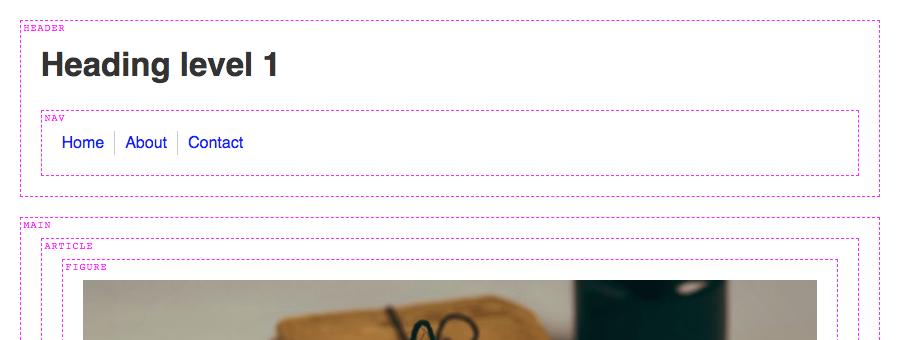
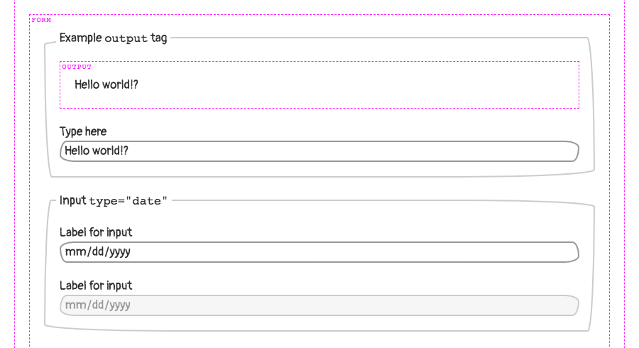
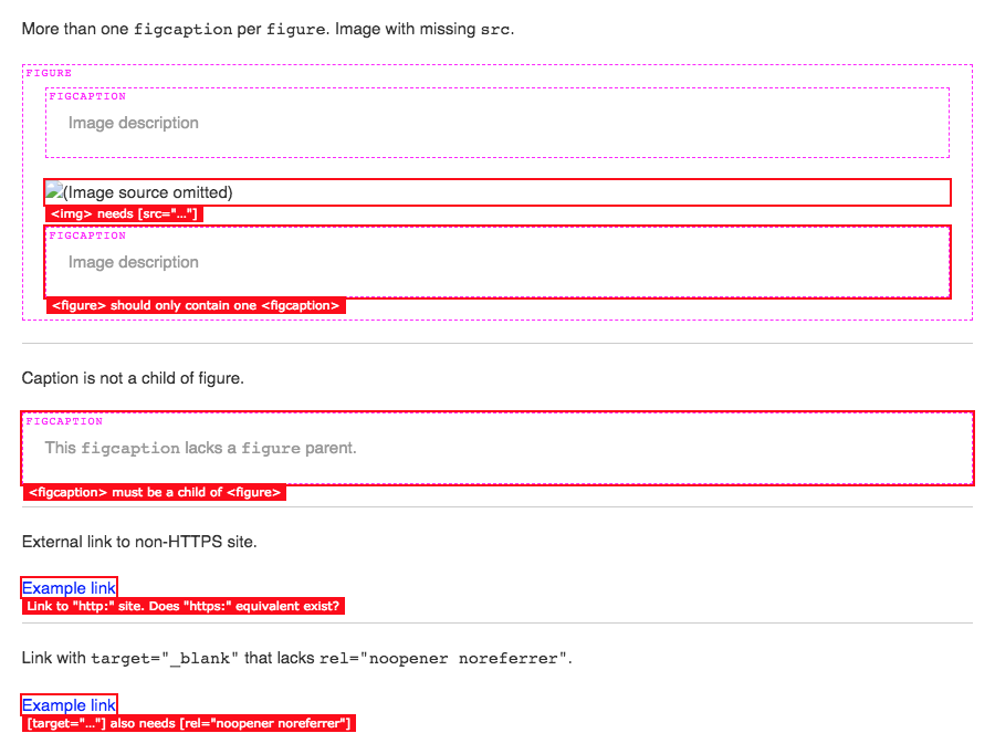
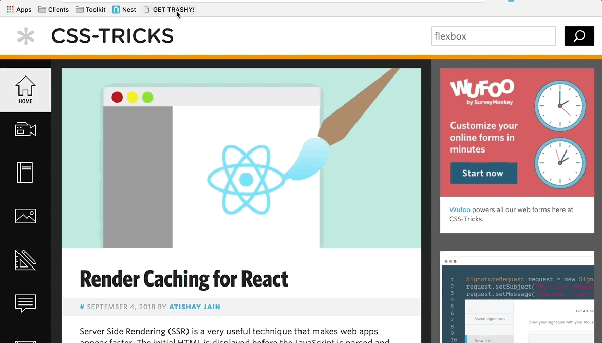
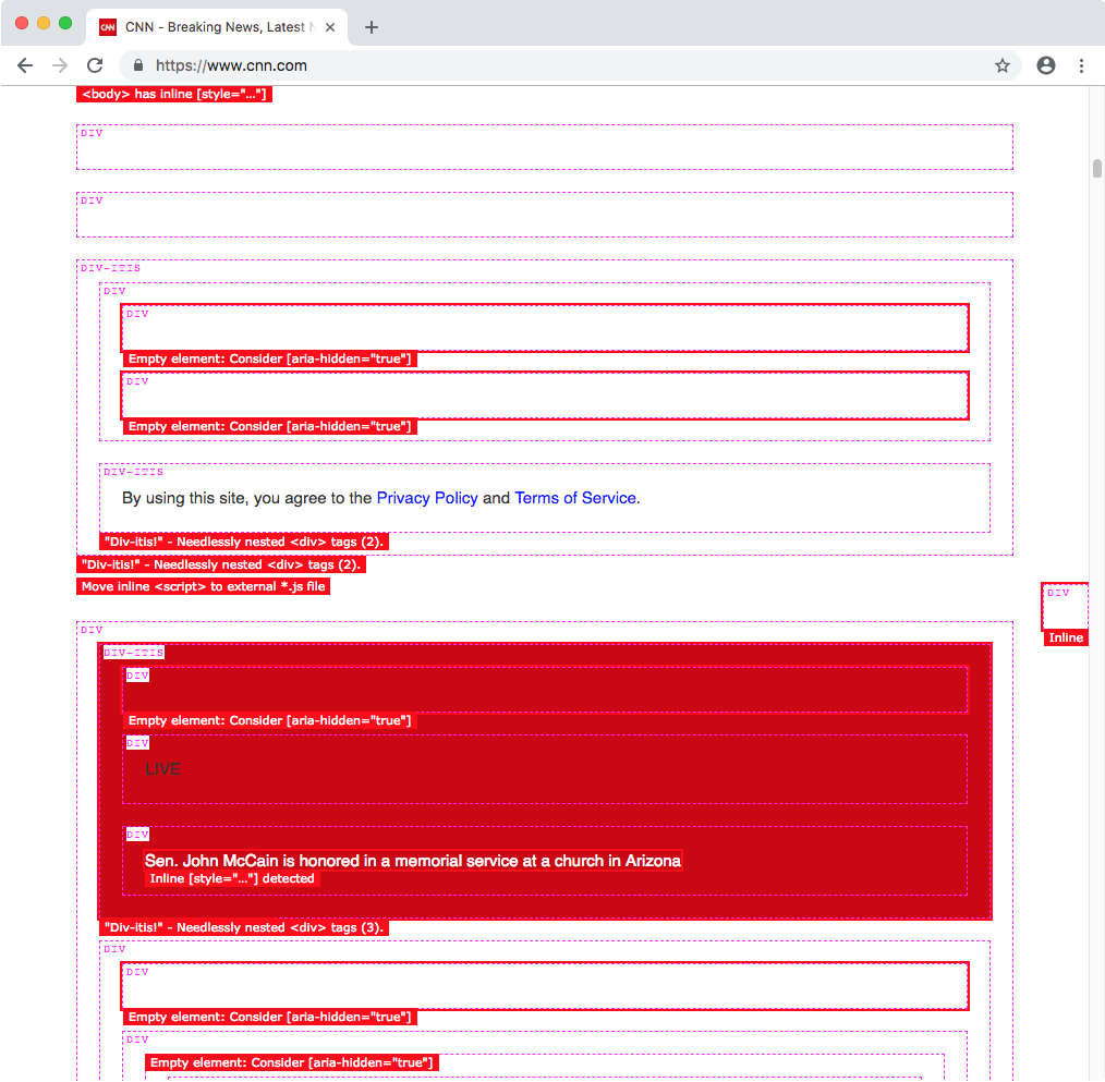
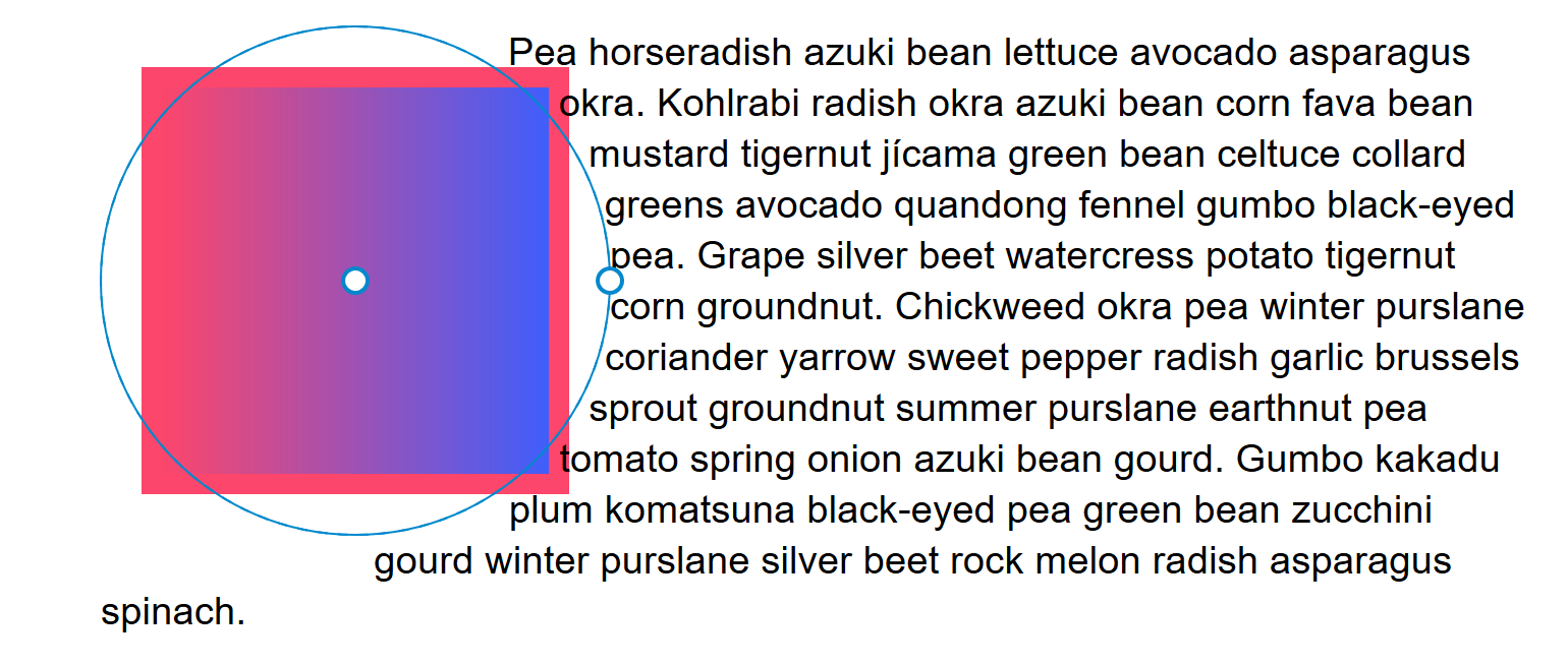

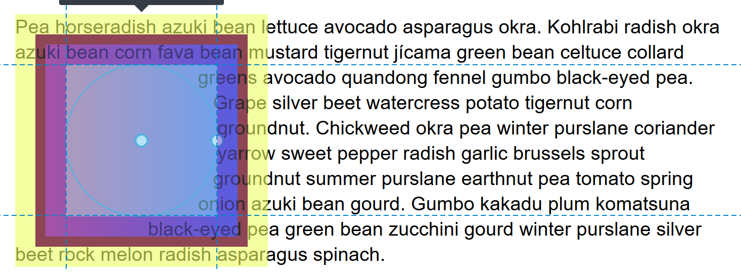


 Launching a new website can be exciting and nerve-wracking at the same time. You want to show off what you’ve been building, what you’ve learned, and the creative solutions you’ve come up with. You can already taste that first celebratory taco. You go live.


