Here’s a nifty post by Chen Hui Jing where she walks us through her process for making radio buttons accessible via keyboard. I particularly enjoyed this bit where she discusses the four options that are available to us to hide the radio input and replace them with a selection of cards that act like toggles instead:
Most of us mess up the keyboard navigation portion of things when we hide the input element. There are several ways to make something invisible or hidden:
clip-path: polygon(0 0)
display: none
opacity: 0
visibility: hidden
For custom radios (or checkboxes), option 2 and 4 are not recommended because screen readers won’t be able to read the default radio element. This also prevents us from using the :focus pseudo-element on the hidden input, so those are out of the picture.
Which leaves us with option 1 and option 3. I sort of like option 1, because clip-path is fun. Clip-path creates a clipping region which defines what portion of an element is visible. This clipping region can be a basic shape or a url referencing a clipping path element.
In 2016, Apple announced a new extension that will allow developers to better customize their push and local notifications called the UNNotificationContentExtension. The extension gets triggered when a user long presses or 3D touches on a notification whenever it is delivered to the phone or from the lock/home screen. In the content extension, developers can use a view controller to structure the UI of their notification, but there was no user interaction enabled within the view controller — until now. With the release of iOS 12 and XCode 10, the view controller in the content extension now enables user interaction which means notifications will become even more powerful and customizable.
At WWDC 2018, Apple also announced several changes to notification settings and how they appear on the home screen. In an effort to make users more aware of how they are using apps and allowing more user control of their app usage, there is a new notification setting called “Deliver Quietly.” Users can set your app to Delivery Quietly from the Notification Center, which means they will not receive banners or sound notifications from your app, but they will appear in the Notification Center. Apple using an in-house algorithm, which presumably tracks often you interact with notifications, will also ask users if they still want to receive notifications from particular apps and encourage you to turn on Deliver Quietly or turn them off completely.
Notifications are getting a big refresh in iOS 12, and I’ve only scratched the surface. In the rest of this article, we’ll go over the rest of the new notification features coming to iOS 12 and how you can implement them in your own app.
There are two ways to send push notifications to a device: remotely or locally. To send notifications remotely, you need a server that can send JSON payloads to Apple’s Push Notification Service. Along with a payload, you also need to send the device token and any other authentication certificate or tokens that verify your server is allowed to send the push notification through Apple. For this article, we focus on local notifications which do not need a separate server. Local notifications are requested and sent through the UNUserNotificationCenter. We’ll go over later how specifically to make the request for a local notification.
In order to send a notification, you first need to get permission from the user on whether or not they want you to send them notifications. With the release of iOS 12, there are a lot of changes to notification settings and permissions so let’s break it down. To test out any of the code yourself, make sure you have the Xcode 10 beta installed.
Notification Settings And Permissions
Deliver Quietly
Delivery Quietly is Apple’s attempt to allow users more control over the noise they may receive from notifications. Instead of going into the settings app and looking for the app whose notification settings you want to change, you can now change the setting directly from the notification. This means that a lot more users may turn off notifications for your app or just delivery them quietly which means the app will get badged and notifications only show up in the Notification Center. If your app has its own custom notification settings, Apple is allowing you to link directly to that screen from the settings management view pictured below.
In order to link to your custom notification setting screen, you must set providesAppNotificationSettings as a UNAuthorizationOption when you are requesting notification permissions in the app delegate.
In didFinishLaunchingWithOptions, add the following code:
When you do this, you’ll now see your custom notification settings in two places:
If the user selects Turn Off when they go to manage settings directly from the notification;
In the notification settings within the system’s Settings app.
Deep link to to custom notification settings for NotificationTester from notification in the Notification Center. (Large preview)
Deep link to custom notification settings for NotificationTester from system’s Settings app. (Large preview)
You also have to make sure to handle the callback for when the user selects on either way to get to your notification settings. Your app delegate or an extension of your app delegate has to conform to the protocol UNUserNotificationCenterDelegate so you can then implement the following callback method:
Another new UNAuthorizationOption is provisional authorization. If you don’t mind your notifications being delivered quietly, you can set add .provisional to your authorization options as shown below. This means that you don’t have to prompt the user to allow notifications — the notifications will still show up in the Notification Center.
So now that you’ve determined how to request permission from the user to deliver notifications and how to navigate users to your own customized settings view, let’s go more into more detail about the actual notifications.
Sending Grouped Notifications
Before we get into the customization of the UI of a notification, let’s go over how to make the request for a local notification. First, you have to register any UNNotificationCategory, which are like templates for the notifications you want to send. Any notification set to a particular category will inherit any actions or options that were registered with that category. After you’ve requested permission to send notifications in didFinishLaunchingWithOptions, you can register your categories in the same method.
let hiddenPreviewsPlaceholder = "%u new podcast episodes available"
let summaryFormat = "%u more episodes of %@"
let podcastCategory = UNNotificationCategory(identifier: "podcast", actions: [], intentIdentifiers: [], hiddenPreviewsBodyPlaceholder: hiddenPreviewsPlaceholder, categorySummaryFormat: summaryFormat, options: [])
UNUserNotificationCenter.current().setNotificationCategories([podcastCategory])
In the above code, I start by initiating two variables:
hiddenPreviewsPlaceholder
This placeholder is used in case the user has “Show Previews” off for your app; if we don’t have a placeholder there, your notification will show with only “Notification” also the text.
summaryFormat
This string is new for iOS 12 and coincides with the new feature called “Group Notifications” that will help the Notification Center look a lot cleaner. All notifications will show up in stacks which will be either representing all notifications from the app or specific groups that the developer has set for there app.
The code below shows how we associate a notification with a group.
@objc func sendPodcastNotification(for podcastName: String) {
let content = UNMutableNotificationContent()
content.body = "Introducing Season 7"
content.title = "New episode of \(podcastName):"
content.threadIdentifier = podcastName.lowercased()
content.summaryArgument = podcastName
content.categoryIdentifier = NotificationCategoryType.podcast.rawValue
sendNotification(with: content)
}
For now, I’ve hardcoded the text of the notification just for the example. The threadIdentifier is what creates the groups that we show as stacks in the Notification Center. In this example, I want the notifications grouped by podcast so each notification you get is separated by what podcast it’s associated with. The summaryArgument matches back to our categorySummaryFormat we set in the app delegate. In this case, we want the string for the format: "%u more episodes of %@" to be the podcast name. Lastly, we have to set the category identifier to ensure the notification has the template we set in the app delegate.
func sendNotification(for category: String, with content: UNNotificationContent) {
let uuid = UUID().uuidString
let trigger = UNTimeIntervalNotificationTrigger(timeInterval: 5, repeats: false)
let request = UNNotificationRequest(identifier: uuid, content: content, trigger: trigger)
UNUserNotificationCenter.current().add(request, withCompletionHandler: nil)
}
The above method is how we request the notification to be sent to the device. The identifier for the request is just a random unique string; the content is passed in and we create the content in our sendPodcastNotification method, and lastly, the trigger is when you want the notification to send. If you want the notification to send immediately, you can set that parameter to nil.
Grouped notifications for NotificationTester. (Large preview)
Notification grouped with previews turned off. (Large preview)
Using the methods we’ve described above, here’s the result on the simulator. I have a button that has the sendPodcastNotification method as a target. I tapped the button three times to have the notifications sent to the device. In the first photo, I have “Show Previews” set to “Always” so I see the podcast and the name of the new episodes along with the summary that shows I have two more new episodes to check out. When “Show Previews” is set to “Never,” the result is the second image above. The user won’t see which podcast it is to respect the “No Preview” setting, but they can still see that I have three new episodes to check out.
Notification Content Extension
Now that we understand how to set our notification categories and make the request for them to be sent, we can go over how to customize the look of the notification using the Notification Service and Notification Content extensions. The Notification Service extension allows you to edit the notification content and download any attachments in your notification like images, audio or video files. The Notification Content extension contains a view controller and storyboard that allows you to customize the look of your notification as well as handle any user interaction within the view controller or taps on notification actions.
To add these extensions to your app go File → New → Target.
Adding new target to app for the Notification Content Extension. (Large preview)
You can only add them one at a time, so name your extension and repeat the process to add the other. If a pop-up appears asking you to activate your new scheme, click the “Activate” button to set it up for debugging.
For the purpose of this tutorial, we will be focusing on the Notification Content Extension. For local notifications, we can include the attachments in the request, which we’ll go over later.
First, go to the Info.plist file in the Notification Content Extension target.
Info.plist for the Notification Content Extension. (Large preview)
The following attributes are required:
UNNotificationExtensionCategory
A string value equal to the notification category which we created and set in the app delegate. This will let the content extension know which notification you want to have custom UI for.
UNNotificationExtensionInitialContentSizeRatio
A number between 0 and 1 which determines the aspect ratio of your UI. The default value is 1 which will allow your interface to have its total height equal to its width.
I’ve also set UNNotificationExtensionDefaultContentHidden to “YES” so that the default notification does not show when the content extension is running.
You can use the storyboard to set up your view or create the UI programmatically in the view controller. For this example I’ve set up my storyboard with an image view which will show the podcast logo, two labels for the title and body of the notification content, and a “Like” button which will show a heart image.
Now, in order to get the image showing for the podcast logo and the button, we need to go back to our notification request:
For each image, we get the file path and use that to create a UNNotificationAttachment. Added that to our notification content allows us to access the images in the Notification Content Extension in the didReceive method shown below.
func didReceive(_ notification: UNNotification) {
self.newEpisodeLabel.text = notification.request.content.title
self.episodeNameLabel.text = notification.request.content.body

let imgAttachment = notification.request.content.attachments[0]
let buttonNormalStateAtt = notification.request.content.attachments[1]
let buttonHighlightStateAtt = notification.request.content.attachments[2]

guard let imageData = NSData(contentsOf: imgAttachment.url), let buttonNormalStateImgData = NSData(contentsOf: buttonNormalStateAtt.url), let buttonHighlightStateImgData = NSData(contentsOf: buttonHighlightStateAtt.url) else { return }

let image = UIImage(data: imageData as Data)
let buttonNormalStateImg = UIImage(data: buttonNormalStateImgData as Data)?.withRenderingMode(.alwaysOriginal)
let buttonHighlightStateImg = UIImage(data: buttonHighlightStateImgData as Data)?.withRenderingMode(.alwaysOriginal)

imageView.image = image
likeButton.setImage(buttonNormalStateImg, for: .normal)
likeButton.setImage(buttonHighlightStateImg, for: .selected)
}
Now we can use the file path URLs we set in the request to grab the data for the URL and turn them into images. Notice that I have two different images for the different button states which will allow us to update the UI for user interaction. When I run the app and send the request, here’s what the notification looks like:
Content extension loaded for NotificationTester app. (Large preview)
Everything I’ve mentioned so far in relation to the content extension isn’t new in iOS 12, so let’s dig into the two new features: User Interaction and Dynamic Actions. When the content extension was first added in iOS 10, there was no ability to capture user touch within a notification, but now we can register UIControl events and respond when the user interacts with a UI element.
For this example, we want to show the user that the “Like” button has been selected or unselected. We already set the images for the .normal and .selected states, so now we just need to add a target for the UIButton so we can update the selected state.
override func viewDidLoad() {
super.viewDidLoad()
// Do any required interface initialization here.
likeButton.addTarget(self, action: #selector(likeButtonTapped(sender:)), for: .touchUpInside)
}
Now with the above code we get the following behavior:
Selecting like button within notification. (Large preview)
In the selector method likeButtonTapped, we could also add any logic for saving the liked state in User Defaults or the Keychain, so we have access to it in our main application.
Notification actions have existed since iOS 10, but once you click on them, usually the user will be rerouted to the main application or the content extension is dismissed. Now in iOS 12, we can update the list of notification actions that are shown in response to which action the user selects.
First, let’s go back to our app delegate where we create our notification categories so we can add some actions to our podcast category.
When the user selects “Play,” we want the action to be updated to “Pause.” If they select “Queue Next,” we want that action to be updated to “Remove from Queue.” We can do this in our didReceive method in the Notification Content Extension’s view controller.
func didReceive(_ response: UNNotificationResponse, completionHandler completion:
(UNNotificationContentExtensionResponseOption) -> Void) {
guard let currentActions = extensionContext?.notificationActions else { return }

if response.actionIdentifier == "play-action" {
let pauseAction = UNNotificationAction(identifier: "pause-action", title: "Pause", options: [])
let otherAction = currentActions[1]
let newActions = [pauseAction, otherAction]
extensionContext?.notificationActions = newActions

} else if response.actionIdentifier == "queue-action" {
let removeAction = UNNotificationAction(identifier: "remove-action", title: "Remove from Queue", options: [])
let otherAction = currentActions[0]
let newActions = [otherAction, removeAction]
extensionContext?.notificationActions = newActions

}  else if response.actionIdentifier == "pause-action" {
let playAction = UNNotificationAction(identifier: "play-action", title: "Play", options: [])
let otherAction = currentActions[1]
let newActions = [playAction, otherAction]
extensionContext?.notificationActions = newActions

} else if response.actionIdentifier == "remove-action" {
let queueAction = UNNotificationAction(identifier: "queue-action", title: "Queue Next", options: [])
let otherAction = currentActions[0]
let newActions = [otherAction, queueAction]
extensionContext?.notificationActions = newActions
}
completion(.doNotDismiss)
}
By resetting the extensionContext?.notificationActions list to contain the updated actions, it allows us to change the actions every time the user selects one. The behavior is shown below:
There’s a lot to do before iOS 12 launches to make sure your notifications are ready. The steps vary in complexity and you don’t have to implement them all. Make sure to first download XCode 10 beta so you can try out the features we’ve gone over. If you want to play around with the demo app I’ve referenced throughout the article, check it out on Github.
For Your Notification Permissions Request And Settings, You’ll Need To:
Determine whether or not you want to enable provisional authorization and add it to your authorization options.
If you have already have a customized notification settings view in your app, add providesAppNotificationSettings to your authorization options as well as implement the call back in your app delegate or whichever class conforms to UNUserNotificationCenterDelegate.
For Notification Grouping:
Add a thread identifier to your remote and local notifications so your notifications are correctly grouped in the Notification Center.
When registering your notification categories, add the category summary parameter if you want your grouped notification to be more descriptive than “more notifications.”
If you want to customize the summary text even more, then add a summary identifier to match whichever formatting you added for the category summary.
For Customized Rich Notifications:
Add the Notification Content extension target to your app to create rich notifications.
Design and implement the view controller to contain whichever elements you want in your notification.
Consider which interactive elements would be useful to you, i.e. buttons, table view, switches, etc.
Update the didReceive method in the view controller to respond to selected actions and update the list of actions if necessary.
Further Reading
“Notifications,” Apple’s list of various documentation regarding user notifications
Website Launch Day. How it Goes, Every.. Single.. Time..
Day 1. Your site is now live. It is the best thing ever. Install Google Analytics. Remember to write a privacy page and disclaimer page about Analytics and cookies. Sit glued to your Analytics account for the rest of the day tweaking every aspect in the Analytics console. Oh yeah, while we’re at it, don’t forget to add the site to Google search console too. Great. Done. Sit back and relax. Have a beer. You have done well young Padawan.
Day 2. Enthusiastically dive into your Analytics account. “Hmm, not many views today. Ok I will give it some time.”
Day 3. Open Analytics. “Oh I have a couple of clicks. No, wait – those were me. Doh.” Hound a bit on social media about how great your site is… Check back on Analytics.
Day 4. WHY YOU NO VISIT MY SITE?!?!?!?
Day 5. Distress, sadness, and an overwhelming feeling of failure. “Maybe I’m not cut out for this web design lark?”
The Freelance Designer Toolbox Unlimited Downloads: 500,000+ Web Templates, Icon Sets, Themes & Design Assets
Newsflash
You are in this for the long haul and I am afraid to say there are no easy routes to success here. I am here to tell you it’s going to be tough. Perhaps tougher than you think. Have you got what it takes to succeed? Good! I admire your determination. Now, read on and find out about tried and tested ways to get traction for your website.
I hate to say this, but without visitors your website is dead
No matter how innovative the product or service is, or how asthetically pleasing the design, if people are not visiting your website the simple fact is – it is a dead website. The thing is though, you think your site is brilliant, and do you know what? It probably is! But who cares?! Who knows about it? Why should a perfect stranger be interested in it?
You could use social media or send out press releases, but with so many brands clamouring for attention, those messages can often have little effect.
Without Good Content Your Website is Dead
Again, it could be visually the best thing ever, but if there is no content, nothing of real substance, it is a dead website. Content is everything. Think carefully about headlines for page articles. Keyword research will help you a little here but use it as a guide only.
If your site is not primarily a blog, think about adding a blog section. It can be tough and hard work, but a blog is very important . Write at least 1 or 2 articles about your field every week. Let the world know you are an expert in your field. If you are not an expert, give them another reason to visit. Matthew Inman gets visitors by making people laugh. It might not work for everybody, but it sure worked for him. (5 million monthly views).
Give people what they want. Make your ‘about page’ about the visitor, not about you, i.e. written with them in mind. Enlist the help of a skilled copywriter if you feel out of your comfort zone. Most web designers probably are in this regard. They can make a site work well and look nice, analysing the code in depth. As for writing about themselves and their business in a compelling and engaging way, that’s another matter entirely.
First Things to do After Your Site is Launched
Get your site indexed. Submit your url to Google. You should also consider submitting it to Bing and Yahoo as well. You don’t necessarily have to do this as the search engines will pick up your website in time. However, this step will often speed up the process. (We give Google particular attention as they are the biggest player with over 70% of the world’s market share of search.)
Submit a sitemap in the Google search console and check that there are no issues with the site and that your site has a robots.txt file.
Keep calm. Frantically changing things around too soon won’t do you any favours in the search results, especially if it is a newly registered domain. Give it some time. Keep drip feeding new, quality articles periodically over the next couple of weeks.
Pitfalls to Avoid
1) Write for your users, not for robots. It’s ok to listen to SEO advice but if you are not careful your articles will lose their appeal and become spammy and your readers will not appreciate it. This has been said before, and many so called SEO experts that have fixated on certain things are having to constantly re-evaluate their approach.
If you want your site to do well in the long term, filling your page and site with spam is not going to work. Google is constantly looking at this. Do it right and you will be rewarded. Write content for your user first, and for search engines second.
2) Avoid any tool that says it is easy, quick, or cheap. Anyone making you promises in that regard will only do you harm in the long run.
Tried and Tested Tips that Work
Here are some top tips from people at the top of their game who have either tried this or witnessed first hand what happens when people do. These are not just my words, they are things that have been proven to work.
“If there’s one thing every startup should invest in, it should be a short, aesthetically pleasing video that explains exactly how its product works. As a journalist covering startups, I guarantee no amount of selling a concept over the phone is as effective as a well-produced video that clearly communicates the benefit of the app or software. If there’s a good video, I almost always embed it in my article. Bonus points if it’s funny.” Omar Akhtar is the senior editor for The Hub, based in San Francisco
2) Write an article for a popular online resource in a similar field. Often you will get a credit and link to your website.
3) Offer something for FREE: Like an ebook, website template or plugin (maybe you have some code for a project that never saw the light of day) and then aggressively promote it. It will definitely attract a lot of new visitors. For web designers, try to get a free theme featured on WordPress.org and make sure to link to your website, or create a free theme in a niche that people are looking for and feature it prominently directly on your site. It will help immensely.
4) Submit your page to StumbleUpon. Be prepared to expect a high bounce rate, but it can create interest (sometimes a lot of interest at once). That said, it can be very hit and miss, so there are no guarantees here. People have also reported success with their paid results, but here we are particularly looking at organic methods.
Other Tips
Performance. Look at page speed (or site speed). Yes Google has made page speed part of its search algoritm, so it’s going to affect your search engine results (to what degree I am not sure, but it’s a fact). However, more importantly, people aren’t likely to stick around or come back for more if your page takes an eternity to load. This applies even more so to mobile. Start with your theme, keep it clean and functional. Don’t do with an image that could be done with css. Optimise images (especially for small screen widths). Look carefully at your typography and ensure it reads well on all devices.
HTTPS? Regarding search engine results, the jury is still out on this one for many people. Clearly if you are selling online or passing sensitive information an SSL is a must. Since you are just starting out you won’t have the worry of losing your position in Google so it’s probably a good idea to start with HTTPS from the off rather than have to switch down the line. The web is certainly moving that way, and it will show that you value your visitors security, which is always a good thing, and can go a long way to building trust.
Link building. Just to be clear here, we are talking about building meaningful relationships with other website owners and working to build a meaningful brand online. This takes time. We are not talking about artificial manipulation of the search engines with spammy link building campaigns.
Get social. Love it or loathe it, you cannot really afford to ignore social media. Promote your website on Twitter and Facebook. Whilst you may want to utilise some automated tools for sharing your articles (time is precious after all) remember to keep the human element, engaging with your followers whenever possible.
Learn from your mistakes. Of course, success comes from doing things “right”, but when you are just starting out you will likely make many mistakes. Don’t let fear of failure stop you. Successful people have often made a lot of mistakes, but the key thing is that they don’t quit. They keep moving until they arrive at their goal.
Above all else – Be patient, be persistent and keep positive.
Let’s face it, there are not many overnight sensations when it comes to a website. There may be the odd exception of course, but if you are like the vast majority of us, it is going to take time. Try to avoid the temptation to take shortcuts – to the dark side you will stray!
Ok, there is nothing new here. It has all been said before many times, but it is worth repeating. Be determined, and your hard work will pay off. 3-6 months of following the above advice and your site is bound to be getting relevant traffic and traction.
205: 5 Obstacles Bloggers Face (And How to Get Over Them)
How to Overcome 5 Blogger Obstacles
As I record this, I’m just home from our first ProBlogger event of the year in Brisbane and am preparing for our next one in the coming days in Melbourne.
The Brisbane event was really worthwhile. We heard from Pat Flynn, Jadah Sellner, James Schramko, Kelly Exeter, Shayne Tilley and Laney Galligan and had a couple of days of great teaching and inspiration – including a day with a small group masterminding their businesses.
Each year at our events, I open the event with a keynote. This year I spoke about evolving your blog rather than getting into a ‘revolving’ pattern (or going in circles). I will share more on that topic on the podcast in the future but as we’re very much focused this week on our events and serving our attendees I wanted to give you another taste of what we do at our events and share with you the opening keynote from a previous year as this week’s episode.
I did this in the last episode too and got a lot of positive feedback and hope you’ll enjoy this one too. It’s from 4 years ago but I think it’s spot on in terms of a message for today too. Continue reading “205: 5 Obstacles Bloggers Face (And How to Get Over Them)”
How to Connect With Influencers in Your Niche
Today I want to share some teaching on how to approach influencers and other well known people in your niche (or outside it too).
One of the most powerful ways to grow your profile, audience and brand is to connect with others in your niche. The benefits of doing it can be many and varied – the opportunities that flow from these interactions can be pretty cool for the growth of your blog…. Continue reading “203: How to Approach Influencers in Your Niche”
201: The Secret to Building a Blog with Big Traffic and Profit
How to Build Traffic and Profit into Your Blog
On today’s episode I want to talk about a key to creating a blog with lots of traffic and profit.
The topic comes from a conversation I had this morning with a new blogger who was asking me about how to create content that would go viral and as I look back at the growth of my own blogs I think it’s an important lesson to my own business’s growth.
Links and Resources on The Secret to Building a Blog with Big Traffic and Profit
Facebook group
ProBlogger Success Incubator
ProBlogger Event
4 Techniques to Get More Eyeballs on Your Blog
31 Days to Build a Better Blog
10 Things You Can Do Today that Will Pay Off On Your Blog Forever Continue reading “201: The Secret to Building a Blog with Big Traffic and Profit”
200: What I’ve Learned About Podcasting in My First 200 Episodes
Lessons Learned in 200 Episodes of Podcasting
Today’s episode is #200, and while it’s a podcast about blogging, today I want to talk about podcasting and share some of the big lessons I’ve learned about this medium since starting this podcast 2 years ago. Continue reading “200: What I’ve Learned About Podcasting in My First 200 Episodes”
Screen space is a precious resource on mobile. To meet the challenge of small screen space while still making navigation accessible, designers often rely on hiding navigation behind the hamburger icon, a prime example of hidden navigation. In this article, we’ll see why hidden navigation creates bad UX and what alternatives are available for designers.
Why the Hamburger Menu Is Bad For UX
On mobile, visible navigation is used 1.5x more than hamburger
If you’re working on digital products, you’ve probably already read dozens of articles describing how the hamburger menu on mobile hurts UX metrics. The main downside is its low discoverability, and this is backed up by actual numbers. In qualitative studies, NNGroup found that hidden navigation is less discoverable than visible or partially visible navigation. This means that when navigation is hidden, users are less likely to use navigation. Hamburger menus drive engagement down, slow down exploration and confuse people.
So What Should We Use Instead?
While there is no hard-and-fast rule for mobile apps and websites, a general recommendation is to use either visible—the main navigation options are shown in a visible navigation bar—or combo navigation, where some of the main navigation options are visible and some are hidden under an interactive element.
1. Tab Bar
If you have a limited number of top-level destinations in your website or app, a tabbed navigation might be the solution. When a menu is visible at the top or bottom, it’s basically advertising that a navigation is there and people are able to see the navigation options right from the start.
Tabs seem to be the simplest navigation pattern. However, a few things should be considered when designing this type of navigation:
Tab bar allows 5 or fewer navigation options to display.
One of the options should always be active and should be visually highlighted by, for example, using a contrasting color.
The first tab has to be the home page and the order of the tabs should relate to their priority or logical order in the user flow.
It’s better to use icons together with labels for each navigation option. Icons without labels work only for common actions, like a magnifying glass icon for search, and for interfaces that the users use frequently (e.g. Instagram).
Tip: In order to save screen space, the navigation bar could be hidden/revealed on downward and upward scrolling.
2. Tab Bar With “More” Option
When you have more than 5 top-level destinations, a practical solution might be to show the 4 prioritized sections and have a 5th element as a list of remaining options.
The design principles for this solution are basically the same as for Tab bar. There’s just one exception: the last element is the ‘more’ item.
The ‘more’ item can work as a dropdown menu or even link to a separate navigation page with the remaining sections. From the first glance this solution isn’t much better than the hamburger menu, since it also hides content and its label doesn’t say too much about what’s hidden behind it. If you correctly prioritize navigation options, however, a majority of your users will have 4 or 5 visible top-priority navigation options on the screen all the time so the navigation experience for them will be improved.
3. Progressively Collapsing Menu
Progressively collapsing menu, also known as the “Priority+” pattern, is a menu that adapts to the screen width. It shows as much of the navigation as possible and puts everything else under a “more” button. Basically, this pattern is a sophisticated version of the ‘Tab bar + more’ navigation where the number of navigation options hidden behind the “more” menu depends on the available screen space. The flexibility of this solution provides a better user experience than a ‘static’ ‘Tab bar + more’.
Similar to the previous two patterns, this is another approach for longer lists. If you have a number of navigation options without a big distinction in priorities, for example music genres, you can list all the items in a scrollable view. By making the list scrollable you allow users to move from side-to-side.
The downside of this solution is that still only the top few items are visible without scrolling and all the remaining ones are out of the sight. This is, however, an acceptable solution when the users are expected to explore the content, for example news categories, music categories or in an online store.
5. Full-Screen Navigation
While with other patterns mentioned in this article, the struggle is to minimize the space that the navigation systems take up, the full-screen pattern takes the exact opposite approach. This approach usually devotes the home page exclusively to navigation. Users incrementally tap or swipe to reveal additional menu options as they scroll up and down.
This pattern works well in task-based and direction-based websites and apps, especially when users tend to limit themselves to only one branch of the navigation hierarchy during a single session. Funnelling users from broad overview pages to detail pages helps them to home in on what they’re looking for and to focus on content within an individual section.
Full-screen navigation in Yelp
Using full-screen navigation, designers can organize large chunks of information in a coherent manner and reveal information without overwhelming the user. Once the user makes their decision about where to go, then you can dedicate the entire screen space to content.
Conclusion
With navigation patterns for mobile, there isn’t a one-size-fits-all solution; it always depends on your product, on your users, and on the context. However, the foundation of every well-designed navigation is information architecture: clear structure, priorities, and labels based on your users’ needs. Helping users navigate should be a top priority for every app designer. Both first-time and returning users should be able to figure out how to move through your app with ease.
“I have hundreds of readers coming to my blog every day – but nobody ever subscribes to my newsletter. Help!?!”
This request came in via email today and I thought I’d share my reply with the 3 suggestions I offered.
—–
Thanks for the question – I suspect you’re not alone with this problem. While a lot can probably be written on the topic, let me suggest 3 things I’ve found helpful increasing subscriber numbers.
This sounds a little too simple to be effective but I’m amazed how many people do subscribe once you mention you’ve got a newsletter. I’m also amazed how many of our regular and loyal readers don’t know we even have a newsletter, despite it being promoted around the blog.
Some semi-regular calls to subscribe can be very effective.
You can do this in a number of ways, including:
Writing a dedicated blog post, every now and again, explaining you have a newsletter and the benefits of subscribing.
Mentioning your newsletter in passing in your blog posts. I don’t mean every single post, but a mention now and then will work wonders.
Promoting your newsletter across social media. I regularly mention our newsletters on Twitter, when I’m writing a newsletter and when it goes out.
The key to remember, when mentioning your newsletter regularly, is to find fresh ways to talk about it. Don’t just have the same tweet to subscribe every 2nd day.
Mention something that is in the next newsletter, that you won’t get anywhere else.
Mention that you’ve just hit a milestone number of subscribers to build social proof.
Mention that it’s a milestone newsletter. We recently sent out 250th on dPS and made a bit of a big deal about it.
2. Start a Series
Announce that you’re going to be doing a series of posts, on your blog, on a topic that you know will really be useful to your readers.
I remember the first time I announced that I was going to run the 31 Days to Build a Better Blog series (the series that later became the eBook by the same name) I was amazed at how many people subscribed to my blog over the next 24 hours.
I was signalling to readers that I was going to do something that would serve them and in doing so, created anticipation among my readers. This anticipation (as I’ve written about in the past) is a key reason people will subscribe to your blog.
3. Place Calls to Subscribe in ‘Hot Zones’
One last tip is to identify some ‘hot zones’ on your blog, to place calls to subscribe. These zones are either places that your readers will be looking or pages that they’ll be visiting.
Let me suggest a couple:
1. Under Posts
I’m not currently doing this on my blogs, as I use the space under my blog posts for other things, but I’ve found over the years that the area under your blog post (and directly above comments) is a ‘hot zone’ where readers often look for what to do next.
Put yourself in the position of a reader. You’ve read the post and have found it useful. This is the perfect time to ask readers to subscribe because they’re hopefully feeling satisfied, stimulated and helped in some way.
A bold call to subscribe can work wonders here.
2. On Hot Posts
Dig into your blogs analytics package and identify which posts are the most read posts on your blog.
You’ll probably find that these posts are receiving traffic from search engines and are likely being read by first time readers to your blog – people that are often quick to leave again once they’ve got what they’re searching for.
These posts are a real opportunity to make your blog a little more sticky and to hopefully call some of those first time readers to subscribe.
You can do this either by adding a call to subscribe directly to the posts – or you might like to link from these posts to a ‘sneeze page’ (see below).
This page is a page in which I link to 33 of the best articles in our archives for beginner photographers. It is a page that ‘sneezes’ readers deep into our archives to good quality content.
It is a great page for driving traffic and getting readers deep into the site but you’ll also note we have a couple of strong calls to subscribe on that page. People click those calls to action like crazy because they can see on the page that we’ve created a heap of useful content.
We link to this sneeze page prominently in the navigation areas all around the site to drive traffic to it and regularly promote the page on social media (as I write this it has received over 90,000 ‘pins’ on Pinterest for example).
Take home lesson – create a sneeze page with a strong call to action to subscribe and drive as much traffic to it as you can!
I have barely scratched the surface here on how to increase subscribers to a blog and would love to hear your suggestions and experiences on the topic in comments below.
What has worked for you?
3 Ways to Get More Subscribers for Your Blog http://www.problogger.net/archives/2013/06/21/3-ways-to-get-more-subscribers-for-your-blog/ http://www.problogger.net/archives/category/miscellaneous-blog-tips/feed/ @ProBlogger» Miscellaneous Blog Tips Blog Tips to Help You Make Money Blogging – ProBlogger http://www.problogger.net/wp-content/plugins/podpress/images/powered_by_podpress_large.jpg
But back to today which is another writing challenge, which by the end of the month, should help you define what kinds of posts you like to write and what appeals to your readers.
Today’s challenge is very simple – a link post. But in this episode, I go into more detail about the types of link posts that do well (I talk about the six ways to write a link post), how to expand upon them, and of course – why I think these types of posts are important.
Things have changed since the early days when I favoured link posts, so there’s also tips to ensure your posts will be successful in today’s new online environment.
Don’t forget to share on social media how you’ve enjoyed your first week. What have been the hits and misses for you? What have you learned?
31DBBB Podcast Challenge: Write a Link Post (And Why You Should!) http://www.problogger.net/archives/2015/07/07/31dbbb-podcast-challenge-write-a-link-post-and-why-you-should/ http://www.problogger.net/archives/category/31-days-to-building-a-better-blog/feed/ @ProBlogger » 31 Days to Building a Better Blog Blog Tips to Help You Make Money Blogging – ProBlogger http://www.problogger.net/wp-content/plugins/podpress/images/powered_by_podpress_large.jpg
StackBlitz is an online VS code IDE for Angular & React for creating, sharing and embedding live projects. Read more about it in this article by creator Eric Simons.
A very interesting article by Akar Sumset that explains how gamification can work by showing the relationship between gamification, UX design, and BJ Fogg’s modern persuasion phenomenon, “mass interpersonal persuasion.”
Music Blocks is an interactive web based music application built in HTML5 Canvas. The application utilizes the MIDI.js library to create music sequencing in the browser. By Ariel Scott and Mike Aikins.
This guest post is by Ayelet Weisz of All Colores.
Yesterday, I started the convoluted process of swapping my blog from WordPress.com to WordPress.org. As you may remember, I’d finally got to the point where I was ready to import the files of my blog. Everything seemed to be okay, until….
Big Deal #4: The import keeps getting stuck
You see that white screen? That’s how it stayed.
At first, I was happy. The little circle on my browser was turning. I assumed it would take a lot of time. Even though my blog was obviously smaller (2.9 megabytes) than the maximum allowed file (64 megabytes), I figured it would take time to import eight months worth of blogging with almost 2000 photographs.
So I let it be.
When I returned to my computer, I found out that the import process had got stuck. Remember, my blog crashed for almost 48 hours. I was sure that was the reason of my current technical challenge. After my blog returned to life and I was able to work again, I repeated the process explained above. While my blog hasn’t crashed since (and it was in late February), after a short moment of importing, nothing was circling anymore: the white screen of the import remained white.
Big Deal #5: Challenges with the blog file
I decided to open the file I had exported from WordPress.com. This is what it looked like:
I learned that there were two errors in the file:
Error on line 149 at column 32: Namespace prefix atom on link is not defined.
Error on line 150 at column 29: Namespace prefix atom on link is not defined.
I Googled it and found various discussions on the matter. I looked for ways to fix the file, yet found no help in simple language. I tried exporting the file from WordPress.com and importing to WordPress.org various times, and kept hitting the same error, only in different lines and columns each time.
As I kept searching the web, more and more answers seemed to lead to one solution, but one that sounded too simple—and to be honest, too frustrating—to be true.
The advice said, refresh the page.
I exported the file once more. Imported it once more. And then refreshed it an unbelievable number of times.
Each time, more and more files appeared to be added. Sometimes only a few files were added when I hit Refresh; sometimes there were many at a time.
Either way, the list of files kept growing.
At the end of every file line, it said “already exists”. For example, “Media ‘DSCF1372’ already exists”. Also, I didn’t see all my posts and pages on the list. I was concerned that some aspects of the blog were being imported multiple times and some not at all.
Then I got some good news.
“All Done. Have Fun!” WordPress.Org wrote to me.
Could it all really be done? Could I now actually stop dealing with technicalities and return to writing?
I logged in to my new URL: www.AllColores.com—no “WordPress” between my blog’s name and the dot-com—and I saw my blog! It was an exciting moment.
Until I noticed something was not okay.
Big Deal #6: My photos weren’t included
All was well with the posts and the comments on my blog, but no photos appeared in the posts. Let me remind you, we are talking about almost 2000 photos, which I made sure to include in the export and import processes.
After some digging in my dashboard, it turned out I’d actually done things well. The photos were indeed imported to the new blog … most of them just weren’t “attached” to any blog post.
The solution? Take a deep breath!
On the left-hand sidebar of your dashboard you will find the word “media”. Click on it. You will reach your media library, where all your photos are listed. I had 1856 media files, all of which were photos, and 1847 of them were unattached. That means that only nine photos were attached.
As you will see in the above photo, in each line beside the media file, you will find a column named “author”. Next to it, there will be a column called “attached to”. If the photo is unattached, an Attach button will be available. Click on that button to attach the picture to the post.
An image will pop up, asking you to search for a post or a page. You can type the beginning of a post title, or choose from a list offered by WordPress by clicking on the right post, then click on Select.
If you, too, have many media files and don’t feel like spending hours “attaching” them to countless posts, you can Google for plugins that might do it for you. From the various message board discussions I read, these actually had helped several people. I tried a couple of options, but they did nothing for me. It was back to manual work.
How do you remember which media file belongs in which post?
That’s where not deleting your WordPress.com blog comes in handy. Keep one window open on your WordPress.org dashboard, and log back in to your WordPress.com dashboard on another. Go to your media library. In your WordPres.com dashboard, files are attached to posts. Follow what it says there as you attach photos on your WordPress.org dashboard.
And, as it turns out, there’s a way to hurry up the process after all.
On any given page, mark all the photos related to a single post and only then click Attach on one of the photos. You will select a post the same way, yet when you click Select, up to twenty photos will be attached at the same time.
Once I was done attaching, I verified that all photos were transferred and attached well.
The end result
Here is a part of my post “More Photos from Bariloche”, which I published while in Argentina in September 2011 to let everyone back home know I’d been doing well and enjoying the snow.
Here is part of that post as it appeared on my new WordPress.org blog in late February 2012:
At last, I could breathe a sigh of true relief. I would have preferred to start with WordPress.org, yet accomplishing this triumph gave me a new boost of energy as I returned to do what I love most: writing.
Have you encountered any other technical challenges while transferring your blog from WordPress.com to WordPress.org? Share your tips and tricks with us in the comments.
Ayelet Weisz is an enthusiastic writer and translator from Israel. She celebrates the everyday and extraordinaire joys of life through travel on her travel blog, All Colores. Follow her adventures onTwitter and sign up to her RSS Feed.
The post Transfer Your Blog From WordPress.com to WordPress.org Part 2 appeared first on ProBlogger.
Transfer Your Blog From WordPress.com to WordPress.org Part 2 https://problogger.com/transfer-your-blog-from-wordpress-com-to-wordpress-org-part-2/ http://www.problogger.net/archives/category/blog-networks/feed/ Blog Networks – ProBlogger Blog Tips to Help You Make Money Blogging – ProBlogger https://problogger.com/wp-content/uploads/powerpress/problogger_podcast-891.jpg
Today we’d like to share some menu hover effects with you. We hope this set inspires you and gives you some ideas for your next project. The effects are either powered by CSS only or with the help of anime.js. Some also use Charming, for individual letter effects.
The first style is a recreation of the link hover effect seen on The Feebles with a slight adaption. The effect “Dustu” got inspired by the link hover effect seen on Flambette.
Attention: We are using some modern CSS techniques and properties for the demos (grid, flexbox) so please view them in a modern browser.
The structure for the menus depends on the effect but let’s have a look at the one that was inspired by the beautiful The Feebles website. We call it “Adsila”:
We have added a slight variation to the effect by moving the label a bit and showing a line left to the label. As you can see, we don’t use different colors for each item but rather, we distinguish the even and the odd ones.
We hope you enjoy these styles and find them inspirational.
Today I want to set us all a little homework – a challenge of sorts – to update your blogs ‘About Page’.
This challenge evolves out of the embarrassing realisation that my own about page here on ProBlogger was dated and in need of a refresh.
It had been well over 12 months since I’d last looked at it – in that time I’d ended some projects mentioned on the page but also started new things like the ProBlogger Event – embarrassing!
It is particularly embarrassing because a blog’s About Page is often one of the first places a new visitor to a blog goes to check out what the blog is about, who is behind it and to make a decision whether it’s a blog that they want to subscribe to!
Many bloggers I speak with report that their About Page is one of their most read pages on their blog – get it wrong and you could be losing readers, hurting your brand or just looking dated.
So today I did a quick update of the page to fix the obvious problems and have put a fuller rewrite on the cards for the next week.
I also thought if my about page was dated – there must be a lot of others out there with similar issues so lets do a group challenge of sorts and all refresh out pages together!
There is no right or wrong way to write your about page but if you’re looking for a bit of inspiration check out this previous post on the topic – How Your About Page Can Make or Break Your Blog which gives some practical tips including:
Introduce yourself
Remember the mantra: What’s In It For Me?
Sharing Who the Blog is For
Being Personal – but not too personal
Determine the goal of your About page
Always end with a call to action
Once you’ve updated your About Page – please link to it below in comments so we can see the approach you’ve taken (I’m sure we could all learn a lot about creating great About Pages through seeing how each other does it).
Challenge: Update Your Blog’s About Page http://www.problogger.net/archives/2013/06/12/challenge-update-your-blogs-about-page/ http://www.problogger.net/archives/category/miscellaneous-blog-tips/feed/ @ProBlogger» Miscellaneous Blog Tips Blog Tips to Help You Make Money Blogging – ProBlogger http://www.problogger.net/wp-content/plugins/podpress/images/powered_by_podpress_large.jpg
Yesterday, we started our tour of new features added to WordPress in version 3.4.
Today we continue the tour with a look at helpful new features available in version 3.5.
New features added to WordPress 3.5
Released late last year, WordPress 3.5 was the second and final major WordPress release of 2012.
This was the first release to include the new default design Twenty Twelve. It comes with a cool new feature that lets you install plugins you marked as a favorite on WordPress.org directly from your dashboard. However, many bloggers were surprised that the link manager has been removed from the default version of WordPress (though most agree removing this was a good decision).
Let’s take a look at the features.
New feature: Install favorite plugins
Now you can install your favorite plugins directly from your WordPress dashboard.
If you are logged in at WordPress.org, you will see a new option to favorite a plugin. You simply need to click on the link in order to add a plugin to your favorites.
As you can see, a new link for favorites has been added to the WordPress plugin area.
After you enter your WordPress.org username, you will see a list of all the plugins you have added as favorites. You can then install your chosen plugin easily.
Most WordPress users tend to use the same plugins on each of their WordPress websites. In the past, most people would bookmark their favorite plugins or keep a list of useful plugins so that they didn’t forget them. Saving important plugins at WordPress.org will allow you to quickly install frequently used plugins on every website you own very easily.
The way this new feature is set up, you don’t have to log in to your WordPress.org account on your blog, you only need to enter your username. This means you can see which plugins have been marked as favorites by any user on WordPress. You can share your favorites list with friends simply by telling them your username.
Also, if you know the WordPress username a website owner uses, you could enter their username into the plugin area to get a sneaky look into their favorite plugins (though there is no guarantee they are using a certain plugin on any given website).
New feature: Link manager removed
The Link Manager is no longer part of the core WordPress install.
The WordPress link manager, more commonly known as the Blogroll, was once one of the most popular features with bloggers and was used to display links on millions of blog sidebars. Thankfully, WordPress isn’t too sentimental—they know that the link manager is now only used by a small percentage of users.
The removal of the link manager follows the policy to remove non-essential items from the WordPress core to make the default version of WordPress quicker and leave additional functionality to plugins and themes.
Those who upgrade to WordPress 3.5 will no longer see the link manager in the WordPress menu if you haven’t used it before.
If you used your blogroll before you upgrade, the links manager will not be removed. It’s only removed on installations where no links were added (i.e. only the default links to WordPress-related websites were in your database). The link manager is available via an official plugin for anyone who wants to add the functionality back to their WordPress website.
New feature: New default design Twenty Twelve
The default design for WordPress has been released with this new version.
Twenty Twelve was originally planned to be part of WordPress 3.4 but was delayed. It was later released in the official WordPress theme directory in between the release of 3.4 and 3.5.
WordPress 3.5 is the first official release that includes this new theme (Twenty Ten and Twenty Eleven are included, too).
Some WordPress users have voiced their disappointment in Twenty Twelve’s minimal design, however most WordPress designers have been pleased with the evolutionary steps in this new official theme. The theme was clearly made with child themes in mind, and with the inclusion of child themes being introduced six months before, I imagine we are going to see a lot of varied designs being created from this base.
As before, the design can be modified using the theme customizer. Small differences are apparent—no header image is set by default, and no sidebar is shown if no sidebar widgets are present. In addition to the sidebar widget, the static home page also comes with two widget areas (each takes up 50% of the screen width). This makes creating a corporate-style home page very straightforward.
Like Twenty Eleven, Twenty Twelve supports post formats. Each of the additional post formats have a different design to distinguish them from other formats.
You’ll find that there isn’t much difference in styling between some post formats. There’s a content template for each one, so these designs can easily be changed with just a few small edits.
Twenty Twelve has a responsive design, so it looks the same on any browser and any device. It has beautiful typography too which makes reading a joy. If you know a little coding, you should be able to design some interesting websites using Twenty Twelve.
New feature: New Welcome screen
WordPress have improved the Welcome screen in 3.5.
Previously, the Welcome screen had an introduction and three columns of links.
The new Welcome screen looks much cleaner. The introductory description is gone, as is the description for each section. There are fewer links to choose from, and the link fonts have increased in size too. It’s much easier to use because of these changes.
New feature: New color picker
Slight improvements have been made to the color picker.
The color picker for the built-in theme customizer has had a small visual improvement. Previously WordPress used the popular color wheel.
The new color picker looks much more modern. Common colors are displayed at the bottom and there is a new Default button which lets you return to the default color for the property instantly.
New feature: Media interface improved
The WordPress media interface has been vastly improved.
The media interface has had a much-needed overhaul. The old Upload/Insert text above your TinyMCE WYSIWYG editor has been replaced with a more prominent Add media button.
Clicking on the Add media button will bring up the new media interface. The old interface used to appear in an overlay that covered approximately 40% of the page (centered). The new overlay covers around 95% of the page. The same three options are available as before: Upload Files, Media Library and Embed from URL.
The media library not only looks better, it works better too. All items are shown in the center panel, with details of any selected item being shown on the right panel. Previously, items were shown vertically using a list and you had to click a Show link in order to see more details.
You can show all items, items uploaded to the post you are modifying, images, audio, and video. You can enter search terms to filter results, too.
Multiple items can now be selected at once. Not only can you modify details of uploaded items more quickly, you can now insert multiple images, audio files, and videos directly into posts. This saves you a huge amount of time. The days of bloggers inserting dozens of images into blog posts one by one are over.
If you select more than one item, you will have the option of inserting them into a post together. You will also see an option to Create a new gallery. In the past, media items were always grouped together with the post or page they were uploaded from. This new system means you can group items together at any time and insert them anywhere you want.
The new media interface is arguably the most important new feature for WordPress bloggers. Images, videos, and audio are so important to us. The new interface really speeds up the process of inserting these assets into your blog posts.
New feature: XML-RPC enabled by default
XML-RPC is now enabled by default.
XML-RPC needs to be enabled in WordPress so that external applications can connect to WordPress. Historically, this setting has always been disabled by default.
When XML-RPC is enabled, WordPress can be used through a host of different mobile applications and you can use third-party blog editors such as Windows Live Writer, BlogDesk and Post2Blog.
New feature: Dashboard now supports all-HiDPI
The WordPress dashboard now supports retina display,
Those who have shiny new high-resolution retina display devices will be pleased to know that the WordPress dashboard is fully compatible with HiDPI.
Other features added to WordPress 3.4
Below is a list of some of the other features that were added to WordPress 3.5:
improved support for keyboard navigation and screen reading
search for comments of a particular status
external libraries for scripts such as TinyMCE, SimplePie, jQuery 1.8.2 and jQuery UI have all been updated. Backbone and Underscore have also been added.
A full list of features added to WordPress in version 3.5 can be found in the WordPress codex.
WordPress for the future
Each year the WordPress platform evolves and 2012 was no different. Features such as the theme customizer, live preview, and favorite plugins install option have made using WordPress easier for both beginners and veterans.
Whilst WordPress has moved beyond its humble blogging roots somewhat, it is still the best blogging platform available. The Link Manager has been downgraded, however new features such as inserting multiple media items, Twitter embeds and continued support for micro blogging post formats such as asides, quotes, and links, have ensured that WordPress remains number one in the blogging world.
WordPress have ensured they are keeping up with user habits, too. The Admin interface supports retina display, the new default design is responsive and they continue to improve their mobile applications. In short, WordPress is a mobile-friendly platform.
I hope you have enjoyed this review of the new features introduced to WordPress in 2012. Let us know what your favorite new feature is and why!
Michael Scott has been working with WordPress themes and websites in varying capacities since 2007. It was mainly as a project manager where he quickly developed a love for their simplicity and scalability. As a strong advocate of all things WordPress, he enjoys any opportunity to promote its use across the Interweb and on WPHub.com.
The post WordPress Feature Review: New Features You Missed in 2012, Part 2 appeared first on ProBlogger.
WordPress Feature Review: New Features You Missed in 2012, Part 2 https://problogger.com/wordpress-feature-review-new-features-you-missed-in-2012-part-2/ http://www.problogger.net/archives/category/blog-networks/feed/ Blog Networks – ProBlogger Blog Tips to Help You Make Money Blogging – ProBlogger https://problogger.com/wp-content/uploads/powerpress/problogger_podcast-891.jpg
Long gone are the days of the old publish-and-pray method of content distribution. And even if it ever did work — it was far from effective.
Today, planning the actual distribution of the content you’ve spent so many hours and resources expertly creating is just as critical to your marketing strategy as the quality of the content itself.
Unfortunately — for audiences and marketers alike — too many would-be content marketing rockstars give themselves a nice pat on the back for sharing content on Twitter and Facebook and calling it a day. So before you toast to your status as a progressive marketer who also publishes on LinkedIn and posts on Reddit, consider this: There are dozens, if not hundreds, of methods for content distribution beyond social that you might be overlooking.
But we’re not about to leave you empty-handed. Below you’ll find 10 creative ways to distribute your content — with a little bit of background to set the stage.
The Content Distribution Strategy Experiment
A few months ago, my team — the marketing department at Influence & Co. — sat down for a meeting to accomplish one mission: to come up with more than 50 ways to distribute one piece of content, which was our latest industry research report, “The State of Digital Media.”
We spent a lot of time surveying editors. We analyzed millions of pieces of published content and pored over the results, before we created, designed, and edited this report. We knew our findings were valuable to our audience, so the last thing we wanted to do was publish this report, share it on Twitter a few times, and let it collect dust.
So we gave ourselves one hour, four cups of coffee, and a huge whiteboard — and got to work brainstorming creative ways to distribute this content.
First, we divided our distribution tactics into different categories, based on the departments they benefited, the goals they achieved, and the extra resources they required. For example, the tactics that leveraged our publication relationships would fall under marketing and sales enablement categories. Those with a more educational perspective, on the other hand, were a better fit for HR, because they complemented that department’s recruiting and training efforts.
With a whiteboard full of over 50 ideas, we began executing our new distribution strategy — and just four months after the launch of the report, we already saw impressive results. When we compared that to the performance of a whitepaper we previously published, we found that this experiment resulted in a nearly 150% increase in page views, and a nearly 40% increase in submissions.
To help you get more creative — and effective — in your content distribution, here are 10 unique ways to distribute content, broken down by department.
10 Ways to Distribute Content Beyond Social Shares
Marketing
As marketers, many of us frequently think about content distribution tactics that fit within — and give a boost to — our marketing goals. Among them are the obvious and necessary tactics like social sharing, but there are others that can help you achieve greater brand awareness, influencer relationships, industry leadership, audience engagement, and more.
1) Personalized emails
Segment your email list down to the exact audience that would benefit most from your piece of content. Write a custom email to each of these audience members to add a level of personalization to your message. Explain what the content is, and why you think he or she will enjoy it. Personalized emails have shown a 6.2% higher open rate than those that aren’t.
2) Guest posting
Write an article that discusses — in a non-promotional way — the key findings or points within your content, and send it to the editor of an online publication that reaches your target audience. But be strategic about it. Make sure the publication not only helps you achieve your own reach goals, but also, has something to gain by sharing your insights, from your particular brand.
3) Influencer outreach
Reach out to relevant influencers in your industry for quotes to include in your content, and send them the piece once it’s published for them to share with their networks. Remember, personalization plays a role here, too — being able to personalize and segment emails is one of the most effective tactics for about 50% of marketing influencers.
Sales Enablement
The Influence & Co. sales team uses content just about as much as — if not more than — our marketing department. Our reps use it at every stage of the buyer’s journey to educate, nurture, and engage leads, and overcome objections with prospective clients. Use one of these distribution methods to do the same for your team.
4) Follow-up emails
Encourage your sales team to include a link to your content in their follow-up emails to prospective clients, to answer their questions and position your company as a resource they can trust. Note: This tactic works best when the content you create is educational and addresses specific questions or concerns your leads have — and is actionable enough for them to immediately apply it to their own plans or strategies.
5) Lead interviews
Work with your sales reps to identify prospective clients you can interview for your content. Include a quote in your content, and share it with them once it’s published. Not only can that keep your leads engaged over time, but they’ll appreciate the opportunity to be featured — and you benefit from the additional exposure to their networks when the content is shared with that audience.
6) Proposal references
The best proposals are often supported with relevant data that corroborates the solutions you’re suggesting to a prospect. And while we suggest citing a variety of authentic, reliable sources — otherwise, you might look biased — referencing your own research content can be effective. Not only is it another way to distribute your work, but also, it illustrates the time and thought your company has invested in this school of thought.
That said, some prospective clients like proposals to be brief. In these cases, if you preemptively anticipate additional questions, you can amend your proposal with a link to the content as a source of further reading and information.
Client Retention
Marketers who overlook their current customers in favor of prospective ones risk missing out on a major opportunity. Keeping in touch with your current clients and helping your customer service teams do the same can have a positive impact on both the customer lifetime and the potential for referrals — so don’t forget these internal distribution methods.
7) Client drip campaigns
If your content is related to your clients’ respective industries, or products and services, sharing it with them can enhance your collaborations and further nurture that relationship. Remember, it’s called client retention for a reason — you want to continue being a valued resource and partner for your existing customers. Consider creating something like an email campaign that uses your content, to continually educate and engage your clients.
8) Email signatures
Encourage your customer service reps or account management teams to feature your content in their email signatures. That can help to keep those cornerstone pieces of content top of mind for both current and prospective clients each time they receive an email from someone on your team.
Recruitment
People want to work with trustworthy companies that are true leaders within their industries. Content can communicate expertise and build trust. In fact, we used content to hire more than 30 people in one year.
But for many teams, unfortunately, content is often most underutilized in the areas of employer branding and recruitment marketing. Take advantage of content in HR with these tactics.
9) Content-rich job listings
Include your content in job postings. HubSpot, for example, links to its Culture Code at the end of every job description. By providing educational content up front, applicants can gain a more comprehensive understanding of your industry and how your company approaches it — directly from you.
10) Interview materials
When a job candidate progresses to the next step in the hiring process, share your content with her prior to the following interview, and ask her to come prepared to discuss it. That helps to get your content in front of qualified people in your industry — plus, it gives you the chance to talk in-depth about the concepts and ideas behind your marketing strategy. Even better: It can help you weed out candidates who don’t follow directions.
Whatever tactics your team uses, the most important thing to remember is that content distribution shouldn’t be an afterthought. With the right distribution strategy in place from the beginning, your team can more effectively put your content to work for you, reach more of the right audiences, and drive results for your company.
A recent blog post by Arik Hanson, that looked at seven trends impacting every blogger, caught my attention the other week.
I’ve read Arik’s blog for a good few years now, and his content is always informative, and not afraid to poke the bear and challenge standard thinking when it comes to content. This blogging trends post was no different.
It covered topics like RSS being retired soon (which I agree with), the changing face of content presentation, and social sharing losing traction, amongst other things.
One trend that stood out, though, was Arik’s belief that blog comments were “officially dead”.
Based on the examples of Copyblogger and others, Arik feels that we’ll see even more content creators and blogs switch off comments in the months ahead.
That may be indeed be true – but as anyone that’s read this blog for a while will know, it’s not something I buy into, and an approach I wouldn’t recommend for one simple reason.
You Care, But You Don’t Really
Imagine you go to an event where there’s a guest speaker. You pay your dollars to attend, and you allocate a certain amount of time to be at the event.
The speaker is entertaining, the topic is something you’re interested in, and the speech gets your mind buzzing with so many follow-up ideas.
Ideas that need answers.
Ideas that only questions to the speaker can answer.
So, you wait in line after the event so you can meet the speaker, thank them for their work, and ask your follow-up question that would expand the speaker’s talk.
Finally, you get your chance to ask a question, and…. silence. A blank stare. A look that acknowledges your presence, but nothing more.
Undeterred, you ask another question. Equally undeterred, the speaker offers the same response as before.
Suddenly, you realize that it’s not just you that’s being ignored – everyone is.
Everyone that wanted to publicly thank the speaker is being ignored. Everyone who wanted to add to the topic is being ignored.
Instead, there are various rooms that are roped off where you can go instead, with the vague promise that there may be an answer or two there.
Sound familiar?
Time is Investment Too
We have a lot of distractions. Both as content creators and content consumers, there’s a hell of a lot of competition vying for our attention.
Because of that, the readers that choose to visit your little part of the web are investing in you. Sure, they may not be financially investing – but they’re investing nonetheless.
That time that could be spent elsewhere. The exchange of knowledge that could be shared elsewhere. The referral of other readers in search of somewhere they can invest too.
All of that comes from comments.
Yes, the content attracts. Yes, the content educates. Yes, the content sparks ideas.
But the content eventually draws a blank – because it’s a finite resource.
If the content on display doesn’t quite satiate the reader’s appetite, the comments after the post can. And usually do.
Because now you’re not just tied to the one-directional broadcast of the content creator – now you have the years of experience, wisdom and questioning viewpoints of other attendees.
Because of that, your investment is rewarded. You leave wiser, and you help others leave wiser too.
Whether the wisdom comes from extra knowledge about the topic at hand, or a new mindset about an offshoot of the topic you’d never considered, it’s return for your investment in that part of the web.
Spend Your Money Wisely
The kicker for many of the blogs that have switched off comments is the invitation to “continue the conversation elsewhere”.
This is followed by a link to that content creator’s Facebook page, or Google+ community, or Twitter stream, etc.
All well and good – after all, they’re not saying they don’t value your opinion, they just want to have it elsewhere (after all, that’s where all the cool chat is happening).
But then you land on one of these other channels, and the two-way dialogue is equally non-existent.
Instead, it’s a broadcast-fest of links to their content. You know – the very content they don’t want to talk to you about, but come to this channel you’re on now to continue the conversation…
Look, I get it. As I mentioned earlier in this post, time is a commodity we have increasingly little of.
So I get that you don’t want to spend that time talking when you could just as easily be broadcasting.
Just be honest about it.
If you want to be a broadcast channel (whether that’s your blog, social network, email blast or whatever), go ahead and knock yourself out.
But let’s not pretend that blog comments are being switched off to “offer a better experience more attuned to the reader’s choice.”
Instead, if you really care about the thoughts of your readers, and the discussions they want to have, it’s a simple decision – leave the blog comments on.
And if you’re a reader/commenter, choose better places to spend your investments – there are enough of them about.
And they really do care about your investment – you can trust me on that.
You’ve created awesome content. You have students, alumni, and faculty all contributing. Is anyone reading it? Can anyone find it? The Internet is a crowded and noisy place. With all your effort in creating outstanding content, don’t let it go to waste. Don’t overlook search engine optimization (SEO).
Well, we’re not going to let you. Here’s an 8-point checklist you can use to review your school’s SEO quality.
1) Review your Current Content
The best starting place is to optimize the content you’ve already published. Do a review of both on- and off-page SEO. Some of the on-page elements you want to review are:
Page Titles and Meta Descriptions: Visitors see this when your link comes up in search results and on social media. It’s why they’ll click on your link instead of others’ in the search results (or not).
Meta tags and body copy: Don’t stuff these with keywords. Google doesn’t like that anymore and it could hurt you. Focus on your primary keyword in the meta tag. Your body copy should be easily read by a human and not feel stilted or forced because of your keyword usage. Tip: Read it aloud. If it sounds odd, it’s probably stuffed with keywords and could do with some quick editing to simplify the language.
Image alt-text: Google can’t read pictures. The alt-text describes the image so Google can index it. (It’s also important for assisted-learning devices, so that voice-recognition systems can read what that image is to the blind.)
Off-page SEO means high-authority backlinks. Write top-notch content that answers the most pressing questions. Then other sites will link back to it. Also remember to link to your own content. Your blog is helpful here.
2) Research Keywords
Don’t make assumptions about what topics are important to potential students and their parents. Research what they’re searching for. Here’s a great step-by-step process for researching keywords.
Keep in mind that using keywords for ranking isn’t what it used to be. Mindless repetition of a keyword won’t help your ranking. In fact, it will hurt it. Google knows what you’re up to.
Optimizing around a keyword means using related terms as well. An information page on accelerated programs will necessarily include terms like “real-world experience” and “translate to course credit,” or similar phrases. If the page repeats “accelerated program,” Google doesn’t think it has anything substantive to say.
We always emphasize: write for humans. For example, if you’re writing a post on how students can use their past professional experience to speed up their degree, use valuable terms related to the keyword that are human-friendly such as “past work experience,” “course credit,” and “academic transfer credit.”
3) Create Pillar Content
Pillar content is evergreen, core content around which you build your SEO. These are your program pages, history of the institution, and its values pages. Pages you can link back to from your other content. They’re high traffic pages with several meaningful conversion points.
Each page of pillar content should be optimized around one keyword. While these pages are evergreen, do freshen them up. Google doesn’t like stale content.
4) Update or Redirect Old Pages
You can update pillar content by adding some new, relevant information. Perhaps have a section of each program page share the latest information — e.g. a new hire or new course.
Some pages will just be old and inaccurate. Perhaps you no longer run a program. Or a teacher has left, so their bio page should be taken down. Don’t take the old bio or program page down. Instead, redirect the link to fresh, current content such as the new teacher who is teaching that class or subject. You can do that with a permanent 301 Redirect.
5) Use Social Media as an SEO Tool
Because it is. More social media content is getting indexed by Google, so it can turn up in search results. High social sharing also impacts the trust and authority factor of the page, which affects ranking. Last, people search in social media directly. Hashtags, keywords. According to Search Engine Land: “YouTube is arguably the second largest search engine on the Web.”
Make sure all your school’s social profiles are complete and include relevant keywords. Review your content for share-ability. Do your headlines stand out? Are the images sized right?
6) Have a Plan for Mobile Optimization
More search is happening on mobile devices than on computers. While prospective parents may be searching from a desktop, your prospective students certainly aren’t. Google has started marking sites as “mobile friendly” in its mobile search results. How will it see your pages? You can test it out here.
Keep your mobile content short. Use clean layouts that are easy to scan. HubSpot users can use our Smart Content to keep the mobile screen clean. It can remove extraneous content and options.
7) Create a Great User Experience
Visitors will leave your site quickly, i.e. “bounce,” if they can’t find what they’re looking for. Or if they just don’t like how it looks. Or find it hard to read. Having a high bounce rate on your pages kills your SEO.
When visitors spend a lot of time on a page, Google reads that as a sign of trust and authority. And that means good things for your ranking.
So pay attention to your website design. Are the navigation options clear? Do they take you where intended? How many clicks does it take for someone to get to the content they want? Use your personas to create clear areas that appeal to each. Separate out content by area of study, or grade level, so people find what’s interesting to them quickly.
Website design also includes the visuals. Mobile or computer – make your pages clean and easy to read. Images and subheadlines can break up text and make the reading experience much more enjoyable.
8) Reassess It All
Alright. You’ve gone through the whole checklist. Now test, analyze, and adjust to see if the results are there. Compare the SEO performance for different program pages. Analyze how they differ and why. What can you learn from your best performing pages to use on those that need a boost?
Look at bounce rates, time on page, number of inbound links, how many pages a visitor looks at. How fast do different pages load?
Here is a list of tools we put together to help you analyze your website’s SEO metrics.
Like content publishing, SEO is an on-going process. It goes much easier once you get the production process and performance reports in place. Your SEO process helps ensure that content gets created and published with SEO optimization in mind. The performance reports will tell you how that’s going.
Good SEO makes sure your content is getting in front of the people looking for it. After all, new students can’t enroll if they won’t read your content.


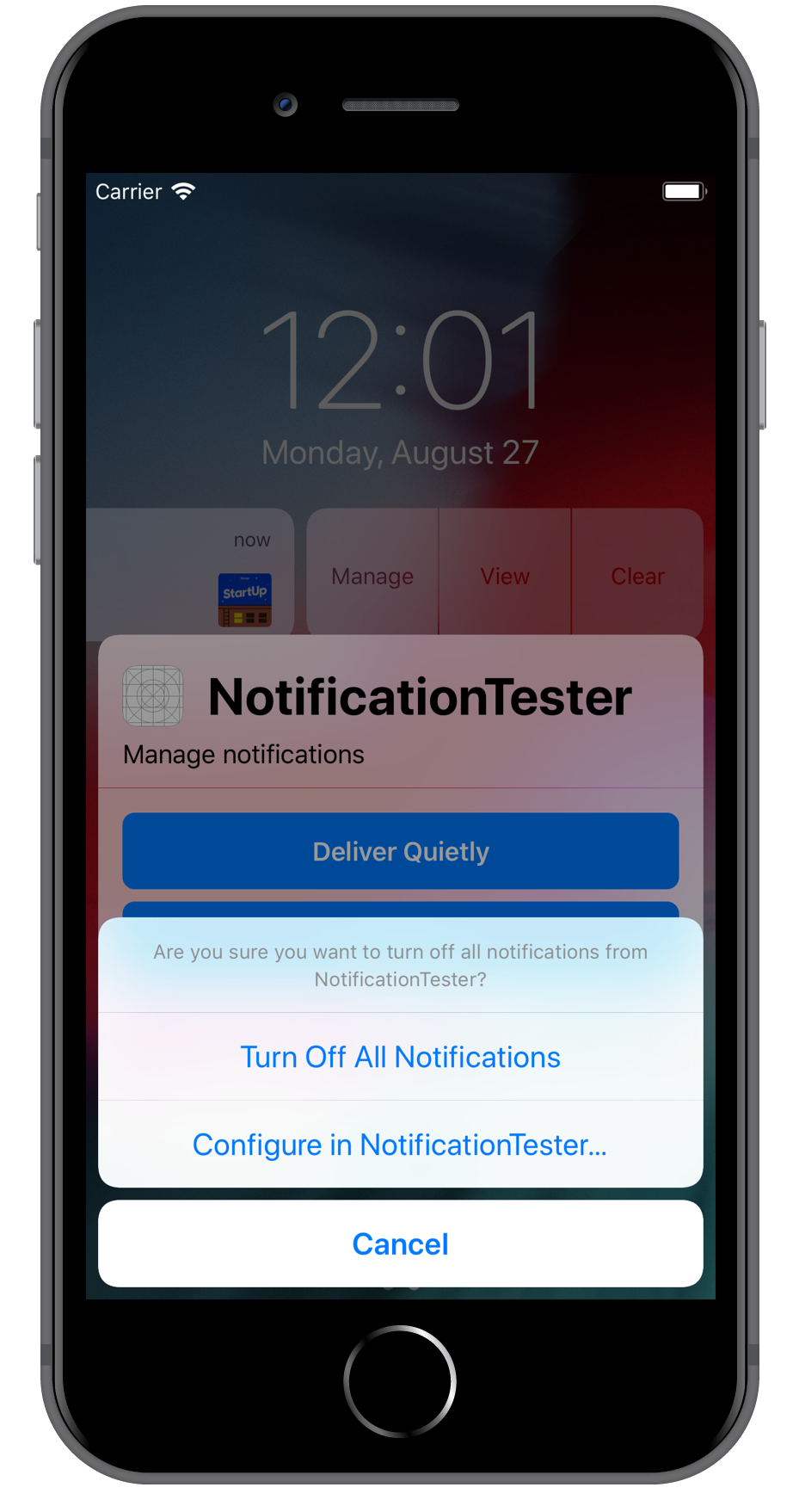
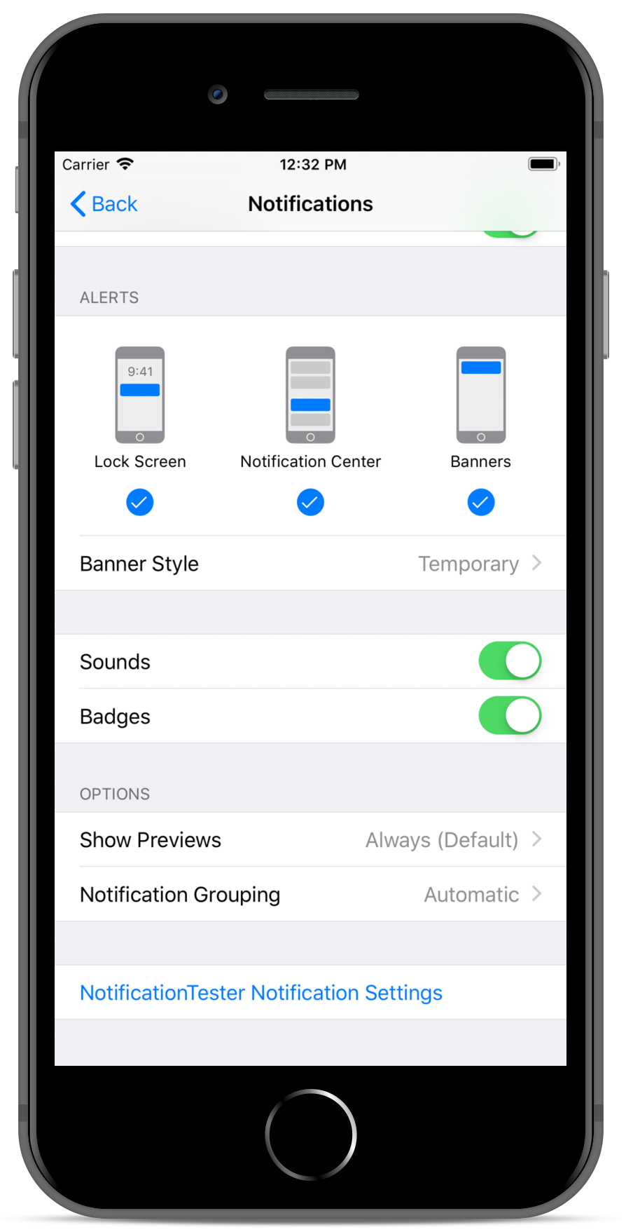


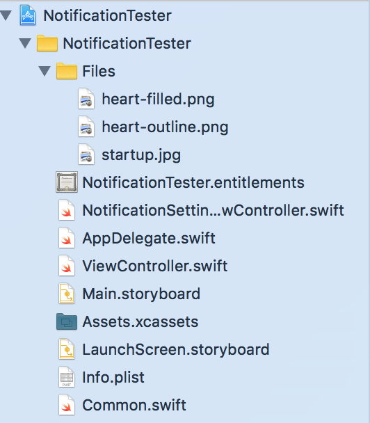


 Screen space is a precious resource on mobile. To meet the challenge of small screen space while still making navigation accessible, designers often rely on hiding navigation behind the hamburger icon, a prime example of hidden navigation. In this article, we’ll see why hidden navigation creates bad UX and what alternatives are available for designers.

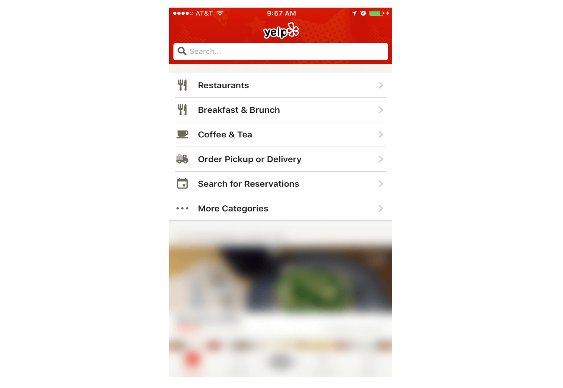

 Let me show you a page on dPS, which is a page that generates a large number of subscribers. It is our