Today we’d like to share a simple morphing page transition effect with you. The idea is to morph an SVG path while moving an intro page up, creating an interesting, flowy look. For the animations we use anime.js and for some letter effects we use Charming. In the demos we use an “intro transition” in order to showcase the effect, but that’s of course only one of the many use cases for this kind of page transition.
This demo is kindly sponsored by PageCloud, the website builder you’ll love to use. If you would like to become a demo sponsor, you can find out more here.
Attention: For the demos use some modern properties like CSS Flexbox and CSS variables without a fallback, so please view them in a up-to-date browser.
The structure that allows us to move the shape along with the intro content, looks as follows:
The fixed content lies beneath the intro content, and once we move the intro content up, it gets revealed. At the same time we morph the SVG path into the one defined in the pathdata:id. When creating the two paths, one needs to make sure that they both have the same amount of points so that the morphing happens smoothly.
We hope you enjoy this little effect and find it useful!
Hear, hear! SmashingConf NYC 2016 is coming! A spectacular performance about failures, successes and superpowers in front-end and UX — now on Broadway! A flabbergasting show on fascinating endeavours in web design, with busted myths, horror design stories and wisdom gained from daunting real-life struggles! Don’t miss the most remarkable show of the year!
Can you dispel the truth from the lies? Honesty from deception? Myths from heartbreaking real-life experience? Have you figured out responsive design, mobile, pattern libraries, SVG, flexbox, performance, HTTP/2 — and all of the other mischievous, erratic facets of designing for the web today?
What if I told you there was an image format like GIF, but it worked with vectors? What if I said it was possible to reverse the direction of its animation? What if you could take one base image and animate different parts of it separately, at different speeds? Well, the image format, SVG, already exists. It just needs a little gentle encouragement.
In this article, I’ll be mixing old with new, taking a somewhat primitive art and breathing new life into it. With the help of Sass, I’ll be streamlining the necessary workflow and hopefully demonstrating that automation can, sometimes, be a friend to creativity.
Creating Cel Animations With SVG http://www.smashingmagazine.com/2015/09/creating-cel-animations-with-svg/ http://rss1.smashingmagazine.com/feed/ Smashing Magazine For Professional Web Designers and Developers
CSS’ clip-path property is your ticket to shape-shifting the monotonous, boxy layouts traditionally associated with flat, responsive design. You will begin to think outside the box, literally, and hexagons, stars and octagons will begin to take form on your web pages. Once you get your hands dirty with clip-path, there’s no end to the shapes you can generate, simply by tweaking a few values.
While the focus of this article is on clip-path using polygons with CSS, all of the demos provide a reference to an inline SVG, in order to gain additional support on Firefox. Generating a responsive SVG clipped shape is trivial once you have created a responsive shape with CSS’ clip-path. We’ll look at this in detail later.
Clip-Path, In A Nutshell
Clipping, with the clip-path property, is akin to cutting a shape (like a circle or a pentagon) from a rectangular piece of paper. The property belongs to the “CSS Masking Module Level 1731” specification. The spec states, “CSS masking provides two means for partially or fully hiding portions of visual elements: masking and clipping”.
The first part, i.e. masking, has to do with using a graphical element, such as a PNG image, CSS gradient or SVG element, as a mask to conceal sections of another element.
The second part, i.e. clip-path, involves a closed vector path, which could be a basic shape defined in CSS or an SVG using the clipPath tag. The region inside this path is displayed, and everything beyond or outside it is clipped out.
Note: Masking is beyond the scope of this article, but CSS-Tricks2 and HTML5 Rocks3 have more information.
Below is a simple visualization of how clip-path works:
Articles about clipping that use the deprecated syntax feature code that looks like this:
.element {
  clip: rect(30px, 30px, 20px, 20px);
}
Support For Clip-Path
In August 2014, the “CSS Masking Module” was published as a “Candidate Recommendation,” which is a step up from the earlier “Last Call Working Draft” stage. Before we look at browser support, it’s important to consider the multiple ways in which clip-path can be applied to an element, because browser support varies for each method.
There are two ways to use clip-path:
with CSS
Basic shapes from the “CSS Shapes Module9” provide a convenient way to use clip-path. The different shapes available are polygon, circle, ellipse and inset; inset is for rectangular shapes.
with SVG
One can, alternatively, create a shape using SVG and then clip an element to this shape via the URL syntax. There are two ways to do this:
with a reference to an inline SVG (i.e. the SVG markup exists on the page itself),
with a reference to an external SVG document.
In both cases, the clipPath element within the SVG is used to wrap the element that determines the clipping path, be it a circle, polygon, path or other element. Compare the demo below in Firefox and in a WebKit or Blink browser such as Chrome to spot the differences. Square images imply a lack of browser support.
Note: The third image does not show up in Safari. Despite extensive debugging, I’m unable to resolve the issue. I’d appreciate a note in the comments section if you come across the solution.
As you may have gathered from observing the demo above in different browsers, support for clipping paths13 is quirky and currently depends on the means by which you choose to clip an element:
with CSS: Chrome 24+, Safari 7+, Opera 15+, iOS 7.1+, Android 4.4+, Opera Mobile 24+
(Note that all supported browsers currently require the -webkit vendor prefix.)
with SVG: all of the browsers listed above and Firefox 3.5+
The clip-path property is not yet supported in Internet Explorer but is currently under consideration14 as part of the “Masking Module.”
Note: There is a caveat with support for SVG clipping path. Modern WebKit and Blink browsers support clipping paths with SVGs only if they are declared inline (i.e. within the document). References to external SVGs are supported only in Firefox, as evidenced in the demo above. The Chromium project is tracking this bug15.
Let’s examine the advantages of CSS versus SVG with clip-path.
Advantages of CSS
The lucid syntax is easy to grasp due to the relative simplicity of basic shapes.
Responsiveness is easily achieved with relative units, such as percentages.
Advantages of SVG
Browser support is better, with the addition of Firefox.
You can clip with complex shapes, multiple shapes and text.
While CSS offers a background-clip property that provides us with some options (including a non-standard way to clip text), neither background-clip nor CSS’ clip-path match what SVG clipping can achieve in modern browsers. Getting acquainted with clip-path via CSS, however, is less intimidating (especially if you aren’t familiar with manipulating SVGs) and will prepare you for the intricacies of clipping paths with SVG, as well as the “CSS Shapes Module16,” where content aligns itself to the shape of an element.
Note: If you can’t wait to delve into the matrix of clipping with SVG, Sara Soueidan’s overview17 is a good starting point.
Let’s look at the pros and cons of using clip-path to progressively enhance our designs.
Pros
Browsers that don’t support the clip-path property will ignore it. If you use it with care, users on non-supporting browsers won’t suspect a thing!
Once a clipping-path shape is generated, the specification states that pointer events must not be dispatched outside the clipping area (which is ideal). So, the click event is restricted to the shape and its outer boundary18. We will look at this in the demos below.
You can use percentages or any length unit, such as pixels or ems, to define your coordinates with basic shapes using CSS. Fluid units such as percentages can be used to create responsive shapes, perfect for adaptive layouts.
The specification has not yet reached the “Recommendation” stage, so there’s always a chance that the syntax will change in the interim.
A few bugs have been reported with clip-path and 3D transforms, transitions and opacity, which are covered in the demos below. Be aware of these, and avoid combining properties that replicate these bugs.
Clip-Path With Polygons: Usage And Syntax
The demos below focus on using different kinds of polygons in a design. The syntax for the other basic shapes (i.e. inset, circle and ellipse) is quite simple, and you can go only so far with them. Polygons, however, open the door to a practically infinite numbers of shapes.
You can create a responsive SVG clipping path in the following manner:
Set the width and height of the SVG to 0.
Set an ID on the clipPath element inside the SVG, which can then be referenced with CSS. You can use inline or external SVG, keeping in mind the browser support mentioned above.
Reuse the percentage coordinate values of the polygon defined with CSS clip-path. Just divide them by 100 and add as unitless polygon points to the SVG.
Set the value of the clipPathUnits attribute to objectBoundingBox, so that the clipping path honors the boundaries of the HTML element that references it.
Let’s look at a demo to understand how to plot coordinates for a polygon.
Below we have an image that is clipped. The background color represents the dimensions of the original image. The black boxes with the coordinates are simply absolutely positioned divs whose locations match the polygon’s vertices in percentages. You will see that they maintain their positions, even if you resize your browser window to a narrow width (for example, 400 pixels or greater).
Note: Every demo in this article uses clip-path with CSS but also has inline SVG in the markup with a class of clip-svg, which simply resets the width and height of the SVG to 0. You could, alternatively, remove the class and set the width and height attributes directly in the SVG markup.
Example 1: Clip An Image to Various Polygon Shapes
In case you need a quick definition of a polygon, it’s a 2D shape that’s closed and consists of straight lines.
Therefore, a shape cannot be a polygon if it has curves, is open or has fewer than three lines. Some famous polygons in history are triangles, quadrilaterals, pentagons and hexagons. Even star shapes are polygons, since the boundaries of a polygon can cross each other.
Note: The images in the demo are responsive. By using the good ol’ responsive image solution of img { max-width: 100%; height: auto; } and adaptive clipping paths via CSS and SVG, we make our polygons blissfully scale up and down.
This demo is the result of an exercise to understand plotting coordinates to make polygon shapes. I’ve added several shapes that you can use for your designs in the demo below. On hovering over each image, you will see the aspect ratio of the original image.
Nothing beats the exceptional Clippy7727, a GUI tool by Bennett Feely to visualize shapes. All coordinates for all of the existing shapes are provided in percentages, and there’s also a custom polygon option. This one’s a game-changer. You can use Clippy to generate clipped shapes and create SVGs for yourself based on them, for better browser support.
The reason for this is explained in Sara Soueidan’s article on animating CSS shapes34: “The number of points defining the final shape must be the same as the number of points defining the initial shape.” Makes perfect sense!
Because a hexagon has six pairs of coordinate points, let’s add two pairs through duplication to make them eight, to match the number of pairs for an octagon. These duplicated pairs won’t affect the shape of the hexagon.
This is the declaration for a hexagon in the form of a default polygon with six pairs of coordinate points:
Now the transition will be smooth as the shapes transform, as seen in the demo below.
Note: For browsers that support clipping paths only with SVG (currently Firefox), we need to add a SMIL animation to obtain a seamless transition on hover. According to the SMIL specification, declarative animations can be used to animate paths and polygon points in SVG, which is currently impossible with CSS.
In the demo below (background image courtesy of morgueFile37), you can see that we have animated the polygon points between the mouseover and mouseout events over a duration of 0.2 seconds. Look for the <animate> tag in the SVG markup.
To make a long story short, borders, outlines and box-shadows that lie outside the clipping region are removed.
I was a little saddened by this, and I pinged the W3C members on the working group for CSS. However, the conclusion is that there’s no way to do this when you’re using basic shapes. Dirk Schulze41 responded to my query: “Yes, all drawing operations belonging to the element get clipped. This includes outlines and borders.”
See the demo below. Hover over the rhomboid with a partial border to see the original, unclipped version with the entire border.
Of course, we can always use a CSS hack to get a border, which is what I finally resorted to — good ol’ generated content.
The demo below creates a copy of the element via a pseudo-element (content:after) and absolutely positions it. This creates the illusion of a border, enabling us to simulate interesting effects, such as the gradient border seen in the second octagon and the inset box-shadow via a CSS filter on the third one (not very pretty, but functional). Note that CSS filters currently work only in Firefox and in WebKit and Blink browsers.
The actual size of the image is 600 × 600 pixels. Thus, let’s start with four empty divs of 300 pixels each and apply the same background image to them. Let’s add a parent wrapper of 604 pixels and lay out the images with the inline-block property.
Finally, we will use negative margins to push up the second and third rows, so that they are laid out as in the final demo below. We can remove the width value of 604 pixels on the parent wrapper, and we can structure our media query so that the four diamond boxes move from a stacked layout on small screens to inline blocks on larger ones.
While working on this demo, I noticed a bug in Chrome with pointer events being dispatched outside the clipped region, which violates the specification63: “By default, pointer events must not be dispatched on the clipped-out (non-visible) regions of a shape.” I have filed the bug64. The issue with this demo was solved by using the pointer-events property with a value of none on the overlay. Alternatively, you could apply the same clip-path value to the overlay to resolve the issue.
Due to the negative margins applied, this demo would look odd in browsers that don’t support clip-path. You would have to use some sort of feature detection to apply the margins (although I haven’t experimented with this) or the @supports CSS feature query, although I wouldn’t recommend the latter in production code.
Example 5: Create a Dummy Profile Page With Hexagons
We’ll start by adding a background image of hexagon tiles to the body (the image courtesy of Subtle Patterns67).
The hexagon clip-path values can be obtained from one of the demos above or with the Clippy tool.
The first hexagon uses a background image (because we’re blending a dull maroon into the background using the background-blend-mode property). Using generated content, an absolutely positioned overlay is clipped to a maroon triangle shape, which you can see on the bottom. It disappears on hover.
The second hexagon, with the word “work,” simply has a dark grey background that changes on hover.
The third hexagon has a gradient border, similar to the one in the demo on creating borders with clip-path.
The hexagons stack on small screens and are vertically centered on larger ones. I’ve used a combination of display: table and the absolute centering transforms hack — of course, you could use flexbox, floats or whatever else floats your layouting boat.
I discovered a bug71 with clip-path while creating this demo. Altering the value of opacity in combination with the CSS transition causes a flicker and artifacts on the page. Be aware of this if you’re using clip-path to progressively enhance a design.
There is also a bug with clip-path and the backface-visibility property when set to hidden. This bug is documented in Chromium72’s issue tracker and I have been able to replicate it using the basic shape syntax in Chrome on Linux. Keep this in mind if you’re using a clip-path shape to do a cool 3D flip or anything that uses CSS 3D transforms.
While clipping with SVG wins hands down for its flexibility and options, nothing beats the ease with which elements can be clipped with CSS. In fact, the same polygon coordinates can be effortlessly recycled to create responsive SVG for even better browser support. With clip-path, you can dramatically alter the look and feel of a page, without having to worry much about non-supporting browsers, where it will gracefully degrade. If you choose to use clip-path for design enhancements, keep an eye on the specification as it advances towards “Recommendation” status.
“Clipping in CSS and SVG: The clip-path Property and <clipPath> Element74,” Sara Soueidan
Soueidan has the definitive guide to clipping paths. While the focus is largely on SVG, this article is a fantastic introduction, with plenty of information for both intermediate and advanced readers.
“clip-path75,” Sara Soueidan, Codrops
Soueidan’s well-researched and comprehensive article over on Codrops breaks down a fairly complicated module into something that is easy to understand and assimilate.
“Clipping and Masking in CSS76,” Chris Coyier, CSS-Tricks
Coyier’s article, peppered with several helpful demos, explains both clipping and masking.
Clippy7727
Bennett Feely’s fab clip-path maker can generate a plethora of predefined and custom polygon shapes, circles and ellipses for CSS’ clip-path. All values are in percentages and, hence, useful for responsive layouts.
Clip Path Generator78
CSS Plant offers a rather comprehensive graphical interface to clip or mask an element. Cross-browser support is provided for Firefox, Chrome, Safari and old iOS. Clips are in pixels, not percentages.
Species in Pieces79
So breathtaking it borders on the spiritual, this showcase of 30 endangered species was crafted entirely with CSS’ clip-path, without a hint of canvas or WebGL. View it in a WebKit or Blink browser until the other ones catch up.
Creating Responsive Shapes With Clip-Path And Breaking Out Of The Box http://www.smashingmagazine.com/2015/05/11/creating-responsive-shapes-with-clip-path/ http://www.smashingmagazine.com/feed/?# Smashing Magazine For Professional Web Designers and Developers
React is one of today’s most popular ways to create a component-based UI. It helps to organize an application into small, human-digestible chunks. With its “re-render the whole world” approach, you can avoid any complex internal interactions between small components, while your application continues to be blazingly fast due to the DOM-diffing that React does under the hood (i.e. updating only the parts of the DOM that need to be updated).
But can we apply the same techniques to web graphics — SVG in particular? Yes! I don’t know about you, but for me SVG code becomes messy pretty fast. Trying to grasp what’s wrong with a graph or visualization just by looking at SVG generator templates (or the SVG source itself) is often overwhelming, and attempts to maintain internal structure or separation of concerns are often complex and tedious.
One of the most exciting things of my job here at WDS is getting to spearhead our internal starter theme: wd_s. It has come a long way since its inception (a fork of Automattic’s Underscores) and it’s a thrill to help mold it into something that our agency uses on every project. Though it hasn’t always been that way…
In the spring of 2013, WDS started to take on more enterprise level clients. Internally, WDS was also hiring more and more developers to match the workload. Our internal project workflow was also pretty fluid. Developers were assigned to projects based on individual availability. The first person to start a project would generally spin up a Genesis child-theme, or use our own premium theme Startbox, or maybe even choose a theme they were familiar with.
Shortly after I was hired, we kicked off a build for Securelist. Based on my availability, it was up to me to choose a theme. Naturally, I asked around to see how everyone felt. Because of some recent hires, not everyone was familiar with Genesis or Startbox. Given the size and scope of this project, we decided against Genesis and instead I opted for TwentyThirteen.
Deconstruction Can Sometimes Inhibit Construction
Let me set the record straight: Genesis is fantastic. It’s stable, secure, and mature. I’ve contributed to the codebase, have been known to champion it in a blog post or two, and even have a Sass version on Github. However, for large, 100% custom builds, working with an opinionated hook system instead of actual template files can get pretty awkward. As rock solid as Genesis is, it doesn’t exactly follow what WordPress considers “the standard” way to build a theme either. By choosing TwentyThirteen, we were able to get a bunch of real template files that adhere to WordPress theming standards. This was important, since there would be a few us working on this together, and we needed to maintain the code for an extended period of time; and potentially with a bunch of new hires.
If you’ve ever worked on a single build with a group, you know how important standards are. It’s really hard to work (together) if there isn’t a baseline set of rules. That is exactly what frameworks like Genesis, Bootstrap, Foundation, jQuery, etc… provide: opinions and standards which are there to help you get things “done” faster. When a development team is familiar with these standards, you maximize profits. However, too many opinions and rules can also inhibit construction and, frankly, get in the way.
Growing Pains
By the fall of 2013, Underscores was really gaining traction in the WordPress community. It’s an unopinated “bare bones” theme, built specifically to help you and I get a theme up and running quickly. What’s more is, it’s built upon WordPress theming and code standards. It’s also maintained by engineers from Automattic. For all intents and purposes, it’s the “official development theme” of WordPress.
We took notice here, and wondered what it would look like to combine the best things of Underscores with our own premium theme framework, Startbox. Brian Richards and I spent a few weeks that winter trying to create a product that would be both unopinionated and provide developers with an excellent starting point for projects. Brian integrated an amazing collection of template tags, the Theme Alliance hooks, and I converted all the CSS to Sass and added support for Grunt. Just reading the changelog is making me all kinds of nostalgic!
During StartBox’s development, WDS was still growing rapidly. 2014 would be here soon, and some huge projects were coming along with it. Even though we had made significant progress on StartBox, it was decided that StartBox would be shelved. Startbox wasn’t the only WDS premium product to be shelved, WDS simply did not have the bandwidth to maintain some of our premium products in the face of client work. The math just didn’t add up.
Gettin’ Sassy
Undeterred, we immediately decided to take another look at using Underscores. Having worked with it while trying to get the best parts into Startbox, plus all of my experience with Sass, I created a (very basic) Sass template which we would use with fresh clones of Underscores.
In February of 2014, we were frustrated with having to apply this Sass template over and over for new builds. I decided to submit a pull request which include a (very basic) Sass implementation. This pull request sparked a 5 month long discussion. After much debate, Sass was finally added in July of 2014.
While this was a huge win, it just took too long. While I believe it is paramount that WDS use what I call “the official development theme” of WordPress, we simply could not wait for development tools like Sass and Grunt. We decided to fork Underscores.
WDemocracy
One of the other things I love about working here is the democracy. We have a weekly call with just the Front-End Developers where we talk about all kinds of things front-end related. We also discuss the features, pain points and the roadmap for wd_s. Just scroll through the Github issues and you’ll see the democracy at its finest. Before we forked Underscores, we set a couple of rules:
We would try to stay as current as possible with Underscores.
No versioning, releases, milestones, or tags.
No opinions outside the tools necessary to do our jobs.
Once we forked, we immediately got busy doing cool things with Grunt, like adding support for sprites, javascript concatenation, minification, and SVGs. We added support for Livereload, PostCSS, Bourbon and Neat too.
More Than A Starter Theme
Having all these front-end tools available has it made spinning up a new project efficient . It’s become a teaching tool too. Many of the people here who’ve contributed to it, had never contributed to an open source project before. It’s also become a testing ground for front-end theory. We’re able to play with the latest front-end trends like SVG sprites and PostCSS – and really put these workflows through their paces.
Not every new “trendy” thing ends up staying in the theme, we dropped Font Awesome in favor for SVG icons after clients complain about Font Awesome icons looking terrible at small sizes. Because there’s no versioning (or worry about legacy support), my favorite “feature” of wd_s, is how fast we can adapt and adopt to keep pace with how rapid front-end development moves.
Join Us
wd_s is about eighteen months old and is it perfect? Nope. But it’s also not opinionated either and has just enough rules to allow for agile development. wd_s provides an excellent starting point for developers to spin up a new project. We invite you to fork our starter theme. Kick the tires, poke it with a stick, make a pull request of your own, and join the democracy! We’d love to have you: https://github.com/WebDevStudios/wd_s
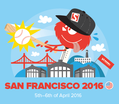
So, do you like challenges? Now, this one is going to smash you alright. Meet SmashingConf San Francisco 2016, packed with smart front-end and UX techniques — CSS/JavaScript architecture, SVG, Flexbox, pattern libraries, performance, UX, interface design, content strategy — to challenge everything about how you design and code — and how to touch someone’s heart with design.
So you know what’s going on in front-end. You’ve been working with pattern libraries and atomic design and Gulp and SMCSS and BEM and HTTP/2 and Flexbox and SVG. What you might not know though is what pitfalls and traps other web designers have encountered in practice — to prevent issues creeping out down the road.
“This One Is Going To Be A Game Changer.” Meet SmashingConf San Francisco 2016 http://www.smashingmagazine.com/2015/10/the-journey-of-your-life-time-meet-smashingconf-san-francisco-2016/ http://rss1.smashingmagazine.com/feed/ Smashing Magazine For Professional Web Designers and Developers
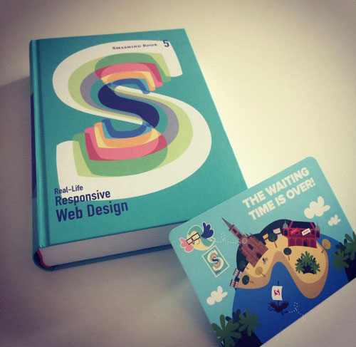
The waiting is over. Smashing Book #5 is here, it’s smashing, and it’s shipping worldwide — in fact, all pre-orders have just been dispatched. Think of it as a reliable playbook to master all the tricky hurdles of responsive design, well-tested in real-life projects by respected designers and developers. Ah, sure, you can get the book right away.
Now, a standalone release post would be boring and predictable, so how about bringing another perspective to the magazine instead? Below you’ll find some insights about the writing process by one of the authors of the book, Sara Soueidan, who has contributed an 80-page long compendium of useful techniques, tricks and strategies for dealing with SVG. — Ed.
Finally: Smashing Book #5 Is Here, And It’s Hot Like Smoking Barrels. http://www.smashingmagazine.com/2015/07/finally-smashing-book-5-is-here-and-its-hot-like-smoking-barrels/ http://rss1.smashingmagazine.com/feed/ Smashing Magazine For Professional Web Designers and Developers
Interactive maps are a fantastic way to present geographic data to your visitors. Libraries like Google Maps and Open Street Maps are a popular choice to do this and they excel at visualizing street-level data. However, for small-scale maps, SVG maps are often a better option. They are lightweight, fully customizable and are not encumbered by any licensing restrictions.
It’s possible to find a number of SVG maps released under permissible licenses in the Wikimedia Commons. Unfortunately, it’s likely that you will eventually find these options lacking. The map you need may not exist, may be out of date (as borders change), or may not be well-formatted for web use. This article will explain how to create your own SVG maps using Natural Earth data and open source tools. You will then be able to create SVG maps of any area of the world, using any projection, at any resolution. As an illustration, we will create an SVG world map.
A Guide To Building SVG Maps From Natural Earth Data http://www.smashingmagazine.com/2015/09/making-svg-maps-from-natural-earth-data/ http://rss1.smashingmagazine.com/feed/ Smashing Magazine For Professional Web Designers and Developers
When it comes to CSS techniques, nobody is more stubborn and smart enough to find solutions to any problems than Lea Verou. Recently, Lea has written, designed and published CSS Secrets, a truly fantastic book on the little CSS tricks and techniques for solving everyday problems. If you thought that you know CSS fairly well, think again: you will be surprised. In this article, we publish a few nuggets from the book, which were also presented in Lea’s recent talk at SmashingConf New York — on designing simple pie charts, with CSS. Please notice that some demos might not work as expected due to limited support in browsers. —Ed.
Pie charts, even in their simplest two-color form, have traditionally been anything but simple to create with web technologies, despite being incredibly common for information ranging from simple stats to progress indicators and timers. Implementations usually involved either using an external image editor to create multiple images for multiple values of the pie chart, or large JavaScript frameworks designed for much more complex charts.
Designing Flexible, Maintainable Pie Charts With CSS and SVG http://www.smashingmagazine.com/2015/07/designing-simple-pie-charts-with-css/ http://rss1.smashingmagazine.com/feed/ Smashing Magazine For Professional Web Designers and Developers
Scalable Vector Graphics (or SVG) lend developers an incredible ability to display crisp, beautiful graphics at any size or resolution. SVG can also be animated using various techniques. In combination with clipping paths, interesting effects can be achieved.
This article explains the difference between an SVGclipPathand a CSSclip-path, including examples to guide and inform you through this journey. Finally, I’ll share a few demos both personal and in the wild to help you better understand clipPath animation and inspire your visions.
After almost 20 years of evolution, today’s web typography, with its high-density displays and support for OpenType features, is just a step away from the typographic quality of the offline world. But there’s still one field of graphic design where we still constantly fall back to bitmap replacements instead of using native text: display typography, the art of staging letters in illustrative, gorgeous, dramatic, playful, experimental or unexpected ways.
Sure, we’re able choose from thousands of web fonts and use CSS effects for type, some with wide browser support (like drop-shadows and 3D transforms) and others that are more experimental (like background-clip and text-stroke), but that’s basically it. If we want really outstanding display typography on our websites, we’ll usually embed it as an image.
3 Woodtype, a style created purely with SVG filters (demo4)
The disadvantages of using images for type on the web are obvious: file size, lack of feasibility for frequently altered or user-generated content, accessibility, time-consuming production of assets, etc.
Wouldn’t it be great if we could style letters the same way we usually style text with CSS? Apply multiple borders with different colors? Add inner and outer bevels? Add patterns, textures and 3D-effects? Give type a used look? Use multiple colors and distorted type? Give type a distressed look?
Sophisticated SVG Filters: CSS For Type
Most of this is already possible: The trick is to unleash the magic of SVG filters. SVG filters (and CSS filters) are usually considered a way to spice up bitmaps via blur effects or color manipulation. But they are much more. Like CSS rules, an SVG filter can be a set of directives to add another visual layer on top of conventional text. With the CSS filter property, these effects can be used outside of SVG and be applied directly to HTML content.
Talking about filters in CSS and SVG can be a bit confusing: SVG filters are defined in an SVG filter element and are usually applied within an SVG document. CSS filters can be applied to any HTML element via the filter property. CSS filters such as blur, contrast and hue-rotate are shortcuts for predefined, frequently used SVG filter effects. Beyond that, the specification7 allows us to reference user-defined filters from within an SVG. A further point of confusion is the proprietary -ms-filter tag, which was deprecated in Internet Explorer (IE) 9 and removed when IE 10 was released.
This article mostly deals with the first case: SVG filters used in an SVG document embedded on an HTML page, but later we’ll experiment with SVG filters applied to HTML content.
8 Using feImage to fill text with a repeating pattern (demo9)
The illustrations in this article are taken from demos of SVG filter effects applied to text. Click on any one of them to see the original (modern, SVG-capable browsers only). I call them “sophisticated” SVG filters because under the hood these filters are crafted by combining multiple effects into one output. And even though the appearance of the letters has been altered dramatically, under the hood the text is still crawlable and accessible and can be selected and copied. Because SVG filters are supported in every modern browser, these effects can be displayed in browsers beginning from IE 10.
Understanding SVG filters is challenging. Even simple effects like drop-shadows require a complicated, verbose syntax. Some filers, such as feColorMatrix and feComposite, are difficult to grasp without a thorough understanding of math and color theory. This article will not be a tutorial on learning SVG filters. Instead I will describe a set of standard building blocks to achieve certain effects, but I will keep explanations to the bare minimum, focusing on documenting the individual steps that make up an effect. You will mostly read about the how; for those who want to know the why, I’ve put a reading list at the end of this article.
12 Some variations of posterized text effects (demo13)
Constructing A Filter
Below is a sophisticated SVG fiter in action. The output of this filter is a weathered text effect, and we will use this for a step-by-step walkthrough:
Let’s break down this effect into its building blocks:
green text;
red extrusion;
text and extrusion are separated by a transparent gap;
text has a grungy, weathered look.
Our SVG filter effect will be constructed by combining multiple small modules, so-called “filter primitives.” Every building block is constructed from a set of one or more primitives that are then combined into a unified output. This process is easier to understand when shown as a graph:
The processing steps that make up a sophisticated filter are illustrated best in a graph.
Adding A Filter
We’ll start with a boilerplate SVG that contains an empty filter and text:
We have to start somewhere, and the filter tag is the element to begin with. Between its start and end tag, we will put all of the rules for transformation, color, bitmap manipulation, etc. The filter can then be applied to a target as an attribute or via CSS. The target will usually be an element inside an SVG, but later on we will learn about another exciting option: applying SVG filters to HTML elements.
A handful of attributes exist to control the filter element:
relative (objectBoundingBox is the default) or absolute (userSpaceOnUse) filterUnits.
A Word on Filter Primitives
As we’ve learned, filter primitives are the building blocks of SVG filters. To have any effect, an SVG filter should contain at least one primitive. A primitive usually has one or two inputs (in, in2) and one output (result). Primitives exist for blurring, moving, filling, combining or distorting inputs.
The specification allows us to take several attributes of the filtered element as an input source. Because most of these do not work reliably across browsers anyway, in this article we will stick with SourceGraphic (the unfiltered source element with colors, strokes, fill patterns, etc.) and SourceAlpha (the opaque area of the alpha channel — think of it as the source graphic filled black), which do have very good browser support.
How To Thicken The Input Text
The first filter primitive we will get to know is feMorphology, a primitive meant to extend (operator="dilate") or thin (operator="erode") an input — therefore, perfectly suited to creating outlines and borders.
Here is how we would fatten the SourceAlpha by four pixels:
The next step is to create a 3D extrusion of the result from the last primitive. Meet feConvolveMatrix. This filter primitive is one of the mightiest and most difficult to grasp. Its main purpose is to enable you to create your own filter. In short, you would define a pixel raster (a kernel matrix) that alters a pixel according to the values of its neighbouring pixels. This way, it becomes possible to create your own filter effects, such as a blur or a sharpening filter, or to create an extrusion.
Here is the feConvolveMatrix to create a 45-degree, 3-pixel deep extrusion. The order attribute defines a width and a height, so that the primitive knows whether to apply a 3×3 or a 9×1 matrix:
Using feConvolveMatrix to create an extrusion on the fattened input
Be aware that IE 11 and Microsoft Edge (at the time of writing) cannot handle matrices with an order greater than 8×8 pixels, and they do not cope well with multiline matrix notation, so removing all carriage returns before deploying this code would be best.
The primitive will be applied equally to the left, top, right and bottom. Because we want it to extrude only to the right and bottom, we must offset the result. Two attributes define the starting point of the effect, targetX and targetY. Unfortunately, IE interprets them contrary to all other browsers. Therefore, to maintain compatibility across browsers, we will handle offsetting with another filter primitive, feOffset.
Offsetting
As the name implies, feOffset takes an input and, well, offsets it:
feComposite is one of the few filter primitives that take two inputs. It then combines them by applying a method for composing two images called Porter-Duff compositing. feComposite can be used to mask or cut elements. Here’s how to subtract the output of feMorphology from the output of feConvolveMatrix:
Cutting off the fattened first primitive from the extrusion
Looks pretty much like the desired result. Let’s make it a little more realistic by giving it a weathered look.
Adding a Fractal Texture
feTurbulence is one of the most fun primitives to play with. However, it can melt your multicore CPU and make your fans rotate like the turbojet engines of a Boeing 747. Use it wisely, especially on a mobile device, because this primitive can have a really, really bad effect on rendering performance.
Like feFlood, feTurbulence outputs a filled rectangle but uses a noisy, unstructured texture.
We have several values on hand to alter the appearance and rhythm of the texture. This way, we can create surfaces that look like wood, sand, watercolor or cracked concrete. These settings have a direct influence on the performance of the filter, so test thoroughly. Here’s how to create a pattern that resembles paint strokes:
By default, feTurbulence outputs a colored texture — not exactly what we want. We need a grayscale alpha map; a bit more contrast would be nice, too. Let’s run it through an feColorMatrix to increase the contrast and convert it to grayscale at the same time:
There are two methods of applying SVG filters to an SVG text element:
1. Via CSS
.filtered {
   filter: url(#filter);
}
2. Via Attribute
<text filter="url(#filter)">Some text</text>
Applying SVG Filters To HTML Content
One of the most exciting features of filters is that it’s possible to embed an SVG, define a filter in it and then apply it to any HTML element with CSS:
filter: url(#mySVGfilter);
At the time of writing, Blink and WebKit require it to be prefixed:
-webkit-filter: url(#mySVGfilter);
As easy as it sounds in theory, this process is a dark art in the real world:
SVG filters on HTML content are currently supported in WebKit, Firefox and Blink. IE and Microsoft Edge will display the unfiltered element, so make sure that the default look is good enough.
The SVG that contains the filter may not be set to display: none. However, you can set it to visibility: hidden.
Sometimes the size of the SVG has a direct influence on how much of the target element is filtered.
Did I say that WebKit, Blink and Firefox understand this syntax? Well, Safari (and its little brother mobile Safari) is a special case. You can get most of these demos working in Safari, but you will pull your hair out and bite pieces out of your desk in the process. At the time of writing, I can’t recommend using SVG filters on HTML content in the current version of Safari (8.0.6). Results are unpredictable, and the technique is not bulletproof. To make things worse, if Safari fails to render your filter for some reason, it will not display the HTML target at all, an accessibility nightmare. As a rule of thumb, you increase your chances of getting Safari to display your filter with absolute positioning and fixed sizing of your target. As a proof of concept, I’ve set up a “pop” filter effect, optimized for desktop Safari17. Applying feImage to HTML elements seems to be impossible in Safari.
Previous Demos, Applied To HTML Content
In these demos, the wrappers are set to contenteditable = "true for convenient text editing. (Be aware that these demos are experimental and will not work in Safari, IE or Edge.)
Depending on its complexity, a filter can quickly become a messy thing. During authoring, you could be adding and removing rules and changing their order and values, and soon you’re lost. Here are some rules I’ve made for myself that help me keep track of what’s going on. People and projects vary; what seems logical and structured for me might be chaotic and incomprehensible for you, so take these recommendations with a grain of salt.
Grouping
I group my filter primitives into modules depending on their functionality — for example, “border,” “fill,” “bevel,” etc. At the start and end of a module, I put a comment with the name of this group.
Naming
A good naming convention will help you structure your filter and keep track of what’s going in and outside of a primitive. After experimenting with BEM-like schemas25, I finally settled on a very simple naming structure:
NAME-OF-GROUP_order-number
For example, you would have BEVEL_10, BEVEL_20, OUTLINE_10 and so on. I start with 10 and increment by 10 to make it easier to change the order of primitives or to add a primitive in between or to the beginning of a group. I prefer full caps because they stand out and help me to scan the source faster.
Always Declare Input and Result
Though not necessary, I always declare an “in” and a “result.” (If omitted, the output of a primitive will be the input of its successor.)
Some Building Blocks
Let’s look at some single techniques to achieve certain effects. By combining these building blocks, we can create new sophisticated filter effects.
<!-- 1. Thicken the input with feMorphology: -->

<feMorphology operator="dilate" radius="2"
in="SourceAlpha" result="thickened" />

<!-- 2. Cut off the SourceAlpha -->

<feComposite operator="out" in="SourceAlpha" in2="thickened" />
This method is not guaranteed to look good. Especially when you apply dilate in conjunction with big values for radius, the result can look worse than the geometry created via stroke-width. Depending on the situation, a better alternative would be to store the text in a symbol element, and then insert it when needed via use, and thicken the instance with CSS’ stroke-width property. Be aware that stroke-width cannot be applied to HTML content, though.
<!-- 1. create an feTurbulence fractal fill -->

<feTurbulence result="TURBULENCE" baseFrequency="0.08"
numOctaves="1" seed="1" />

<!-- 2. create a displacement map that takes the fractal fill as an input to distort the target: -->

<feDisplacementMap in="SourceGraphic" in2="TURBULENCE" scale="9" />
<!-- 1. Create a colored filled area -->

<feFlood flood-color="#F79308" result="COLOR" />

<!-- 2. Cut off the SourceAlpha -->

<feComposite operator="in" in="COLOR" in2="SourceAlpha" />
It should be mentioned that, besides feFlood, feColorMatrix is another method of altering the source input’s color, even though that concept is more difficult to grasp.
<!-- Define a convolve matrix that applies a bevel. -->

<!-- Order defines the depth of the extrusion; angle is defined by the position of "1" in the matrix. Here we see a 45-degree, 4-pixel deep extrusion: -->

<feConvolveMatrix order="4,4"
   kernelMatrix="
   1 0 0 0
   0 1 0 0
   0 0 1 0
   0 0 0 1" in="SourceAlpha" result="BEVEL" />

<!-- offset extrusion: -->

<feOffset dx="2" dy ="2" in="BEVEL" result="OFFSET" />

<!-- merge offset with Source: -->

<feMerge>
   <feMergeNode in="OFFSET" />
   <feMergeNode in="SourceGraphic" />
</feMerge>
The feTurbulence filter primitive will create a noisy texture by applying the so-called Perlin noise algorithm (invented by Ken Perlin during his work on TRON in 1981). This will generate a rectangle filled with noise that looks like what you could see on old TV sets late at night before cable TV was invented.
The appearance of the noise structure can be modified by several parameters:
type in its default state will produce a liquid texture.
type can be set to fractalNoise instead, which will output a sandy result.
baseFrequency is there to control x and y pattern repetition.
numOctaves will increase the level of detail and should have a low value if performance is an issue.
The number to start randomization with is determined by seed.
feImage‘s purpose is to fill the target with a texture. If we want to apply a repeating pattern, it must be used in conjunction with feTile.
<!-- The following code will create a 100 × 200-pixel square filled with "myfill.svg": -->

<feImage xlink:href="myfill.svg" x="0" y="0" width="100" height="200" result="IMAGEFILL"/>

<!-- We then use this fill as an input for feTile, creating a repeating pattern this way: -->

<feTile in="IMAGEFILL" resulte="TILEPATTERN"/>

<!-- Now we will use feComposite to "cut off" SourceAlpha's transparent areas from the fill: -->

<feComposite operator="in" in="TILEPATTERN" in2="SourceAlpha" />
The cool thing about this filter is that the specification allows us to use any SVG element as an input and to create a pattern fill from it. So, in theory, you could create pattern fills from symbols, groups and fragments within your SVG and then apply them as a texture, even to HTML elements. Unfortunately, because of an old bug33, Firefox accepts only external resources as input. If you prefer to keep things self-contained and want to avoid the additional HTTP request, there’s hope: Embed the pattern fill as an UTF-8 data URI:
If you want to apply feImage to HTML content, be aware that size matters. The SVG that contains the filter must cover the area where it is being applied. The easiest way to achieve this is by making it an absolutely positioned child within the block element it is being applied to:
This is one “Wow” effect that quickly becomes boring when used too often. This filter has a serious effect on performance, so use it wisely.
<!--We create a heightmap by blurring the source: -->

<feGaussianBlur stdDeviation="5" in="SourceAlpha" result="BLUR"/>

<!-- We then define a lighting effect with a point light that is positioned at virtual 3D coordinates x: 40px, y: -30px, z: 200px: -->

<feSpecularLighting surfaceScale="6" specularConstant="1" specularExponent="30" lighting-color="#white" in="BLUR" result="SPECULAR">
    <fePointLight x="40" y="-30" z="200" />
</feSpecularLighting>

<!-- We cut off the parts that overlap the source graphic… -->

<feComposite operator="in" in="SPECULAR" in2="SourceAlpha" result="COMPOSITE"/>

<!-- … and then merge source graphic and lighting effect: -->

<feMerge>
    <feMergeNode in="SourceGraphic" />
    <feMergeNode in="COMPOSITE"/>
</feMerge>
Conclusion
There is a gap between pure CSS layout and custom design elements created in software such as Photoshop or Illustrator. External assets embedded as background images, icon sprites and SVG symbols will always have their place in the design of websites. But sophisticated SVG filters give us more independence from third-party design tools and bridge this gap by enabling us to create visual styles directly in the browser.
In this article we’ve seen how SVG filters help us to create playful, decorative web typography. But nothing says we have to stop here. Soon, browser support will be good enough for us to use these effects on every HTML element as easily as we use CSS today. Even though the effects behave differently from native CSS techniques (an SVG filter will affect not only an element but all its children), it will be exciting to see how inventive web designers use these techniques in the near future.
The Art Of The SVG Filter And Why It Is Awesome http://www.smashingmagazine.com/2015/05/26/why-the-svg-filter-is-awesome/ http://www.smashingmagazine.com/feed/?# Smashing Magazine For Professional Web Designers and Developers