Seeing a headline like “How to Install a WordPress Theme” on ProBlogger might seem strange at first. This doesn’t sound like a “pro”-thing at all, right? If you’ve been dealing with WordPress for a while then this is probably even more than obvious to you.
However, everyone starts somewhere, and there are plenty of experienced bloggers who haven’t ever installed a WordPress theme—but would like to give it a try. Maybe you’re installing your first theme right now, and you’re searching for a quick guide on how to do it.
Where can you get a good WordPress theme?
This is tricky. You see, when you’re installing a plugin the best place to go is the official directory at wordpress.org. When you’re installing a theme, however, the official theme directory is not the best place to go, I’m afraid.
Of course, you can find some interesting themes there, but you’re more likely to make your search much more fruitful if you just go to Google.
The thing with the official directory is that it only contains 1,490 themes or so. This is by no means the total number of themes available on the internet. There’s much much more interesting stuff out there, and settling for what you can find in the official directory would not be a wise thing to do.
Yesterday, I described how to select a theme that’s perfect for you and your blog. So here I will just assume that you already know which theme you want to use.
Step 1. Download the theme
Once you find a theme you like, you’ll need to download it to your computer before you can do anything else with it.
The package containing your theme can consist of many various elements. Depending on the license you’ve selected, you might find some PSD files, additional bonuses, documents, and so on. Of course, the theme files themselves will be present as well. Most of the time, all the contents of a theme are delivered as a ZIP archive.
2. Extract the files
Next, you have to extract the archive somewhere—onto your desktop, for example. If the archive contains more elements than just the theme (like the bonuses I mentioned above), open the archive’s readme file to locate the main theme’s directory.
As an example, here’s what you’ll find inside a ThemeFuse theme archive:
Once you’ve successfully identified the main theme directory, you can proceed to the next step.
3. Upload the theme to your WordPress blog
This step will require FTP access to your hosting account, and a piece of FTP software. You can try FileZilla—it’s good, and it’s free.
The theme’s main directory is the one you’ll be uploading to your blog. Connect to your site via FTP (the FTP tool’s help documentation will explain how to do this if you’re not sure) and navigate to the wp-content/themes directory of your site. This is where you upload your theme’s main directory.
Here’s the default look of the directory when it contains only one theme—the default theme TwentyEleven:
The next step in the process takes place in your WordPress Admin panel.
4. Activate your new theme
Log in to your WordPress Admin panel using your Admin account details.
Installing new themes requires Admin access rights; it can’t be done through other types of accounts.
Go to Appearance > Themes, as shown here:
Your new theme should be visible among all the others. The only thing left for you to do now is activate it:
If everything goes well, your new theme will be marked as the Current Theme, and your blog will have an entirely new look.
5. All done!
This is where the guide ends. There’s nothing more for you to do now other than enjoy your new theme! Of course, you could make some final adjustments to make your blog look truly unique, for instance, adding branding elements such as your logo, pictures, and so on. Or, if you’re ready to install a WordPress plugin, we have a guide to that, too!
Have you installed a WordPress theme yet? Share your tips with us in the comments.
Karol K. is a 20-something year old web 2.0 entrepreneur from Poland and a writer at ThemeFuse.com, where he shares various WordPress advice. Currently, he’s working on a new e-book titled “WordPress Startup Guide – little known things worth doing when creating a WordPress site.” The e-book launches soon, and now the best part … it’s free. Also, don’t forget to visit ThemeFuse to get your hands on some premium WordPress themes.
The post Install Your First WordPress Theme appeared first on ProBlogger.
Install Your First WordPress Theme https://problogger.com/install-your-first-wordpress-theme/ http://www.problogger.net/archives/category/blog-networks/feed/ Blog Networks – ProBlogger Blog Tips to Help You Make Money Blogging – ProBlogger https://problogger.com/wp-content/uploads/powerpress/problogger_podcast-891.jpg
Recently, I had a project in which I needed to produce high-fidelity screens for a tablet. I was to present these screens on the device and also produce a clickable prototype. They needed to be pixel-perfect. The timeline was tight (as always), so I went with my go-to tool, Photoshop. I’ve been using it for over ten years, and it gives me the fastest high-quality output.
Are you designing at “Retina” resolution in Photoshop? If the answer is yes, then this article is for you. I will walk you through the problems I faced in creating Retina mockups to be displayed on a tablet device. I will then explain a way to work that is easier and gives you better performance. This is about my experience with Photoshop, but it could be applied to Illustrator and other software.
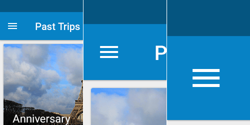
Here are a few designs for the tablet application.
Throughout this article, I will use the @2x and @3x notation. These represent the Retina buckets for iOS. A great example is the app’s icons. For the original iPhone, it would be 60 × 60 pixels (@1x). For the iPhone 4, it would be exactly double, 120 × 120 pixels (@2x). Now, the latest devices are dipping into triple territory. For the iPhone 6 Plus, the icon would be 180 × 180 (@3x). When talking about @2x or @3x, I am referring to using double or triple the pixel dimensions. All should become clear as you read on.
The Problems
Now, let’s get into the design of this tablet application. Like many other designers, I had been told that one must design at Retina resolution. The general consensus is @2x or @3x. So, I set out on my merry way, designing @2x. The design would be presented on a Nexus 9 with a 4:3 ratio, so my Photoshop canvas was set up to 2048 × 1536 pixels. After creating a few screens, I realized in practice this doesn’t work well at all. Let’s work through the issues I found.
Zoom Factor
At first, this is no big deal. Zoom out to 50% or 33% to see your design at roughly 1:1. But at the same time, it’s a bit ridiculous, right?
You can quickly see the resolution getting out of control. Shown is the corner of a design at @1x to @3x.
Why should you have to zoom in and out constantly to see what’s going on? It also completely ruins pixel-snapping1, which works best at 100%. It’s almost impossible to know whether a pixel is aligned when you are zoomed at 33% or 50%! Suffice it to say, I got pretty fed up zooming in and out like a maniac to get things aligned pixel-perfectly.
Performance
This is a big one. Let’s use a tablet with a 4:3 ratio as an example. I set up a blank PSD @1x (which is 1024 × 768 pixels) and another @2x (2048 × 1536) and a third @3x (3072 × 2304). I then did some comparisons.
Table showing number of pixels, size on disk and memory for @1x to @3x blank PSDs.
First, I looked at the number of pixels in the PSDs. The @2x PSD has four times as many pixels. The @3x has nine times as many. This directly affects memory usage, which itself goes up by four times and nine times! For our blank PSD, this went from 2.25M to 9M @2x, and then 20M for @3x.
Last but not least, it also needs to store all of these extra pixels. So, your file size increases as well. The size on disk went up by 280% for the @2x, and up by 590% for the @3x. Now, in our blank PSD this is only an increase from 60 to 358 KB. But once you’ve got some serious smart objects and layers going on, watch out! Let’s take the example of a PSD that is 100 MB. The @3x could be 590 MB. Then, multiply this by the 20 to 30 documents in your project!
From a performance standpoint, it’s very clear that working at Retina is going to cost you some serious RAM, CPU and disk usage.
Font Size
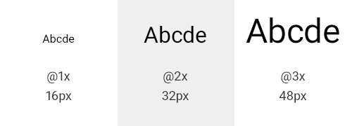
This issue becomes obvious pretty quickly when you’re working @2x or @3x. Suppose you’ve set out to make a text box with the font set to 16 pixels. But @2x this is 32 pixels, and @3x it’s 48 pixels! Not ideal, is it, having to constantly multiply by two or three? I don’t know about you, but I could do without the constant math. When I design, I want to know that 16 pixels is 16 pixels!
Font sizes become a game of multiplication when working at Retina scale.
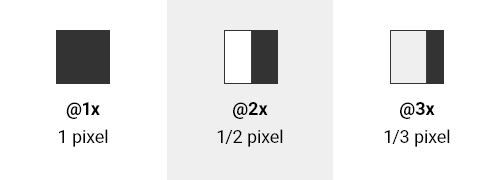
Whole Pixels
Here’s another gotcha. What happens when you use 1px at @2x Retina? You guessed it, it becomes 0.5 pixels! And @3x it would be even worse, 0.33 pixels! So, you also have to constantly be aware that your sizes must be divisible by 2 or 3 when working in Retina. Another consideration comes into play if you ever use @2x with an odd pixel value. Let’s say you have a box that is 33 pixels wide; when converted back to @1x for build, this becomes 16.5 pixels! Yet another brain drain from working with Retina.
Illustration of how 1px would fall back from @1x to @3x.
Specs
This is another issue I’ve seen in the workplace: designers who have been working @2x or @3x and then begin to spec their design for developers. This usually involves documenting padding, widths, heights, font sizes and so on to ensure that the design is built well. But they forget they are at double or triple the resolution. So, the poor old developers get a complete spec in which they need to divide everything by 2 or 3! Not great, is it? Why make their life harder?
The other option is that the designer could save a new PSD at 50% or 33%, and then spec from that. But Retina-land looks like a one-way street. It’s hard to see through those blinkers.
The Good News
Don’t worry. After all the bad news, there is good news. While working on exporting icons for Android from Illustrator2, I discovered the world of density-independent pixels (DP). You can read a big long explanation on Android Developers about “Supporting Multiple Screens3,” or I can break it down for you real quick.
Basically a DP is the @1x pixel dimension or, in Android terms, the baseline density that is medium (MDPI). A density-independent pixel is the same as 1 physical pixel on a 160 DPI screen. The conversion is DP = pixel ÷ (DPI ÷ 160).
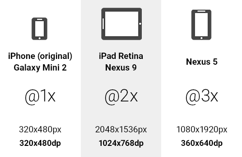
Let’s use our tablet example with a display of 2048 × 1536 pixels and 320 DPI. Running through the equation above, for the width we get 1024 DP, and for the height, 768 DP. This becomes our baseline resolution. And we also need to know the scale factor for image assets. That equation is: scale factor = DP × (DPI ÷ 160).
Using the width of 1024 DP and the device’s 320 DPI, if we run through this equation, we’d get a scale factor of 2. This means we’d need to output @2x assets for display on this device. It’s also pretty straightforward to see that 2048 ÷ 1024 = 2. So, don’t stress about the equations!
As another quick example, let’s take the Nexus 5. With its resolution of 1920 × 1080 pixels and 480 DPI, the DP units work out to be 640 × 360. Then, the scale factor comes out as @3x. So, now you know your DP dimensions and scale factor for assets.
Example of @1x to @3x DP units on various devices.
Once you have the DP dimensions, those become your PSD canvas size at 72 DPI. So, the answer to this mystery is to design @1x or in DP.
Some other devices don’t fit quite as nicely in these buckets, but you get the idea. The point here is that you are reducing to the baseline DP units and that you know the scale for exporting images.
“But I’m Stuck With @1x Images!”
Correct. And a @1x PNG would look horrible on a Retina device. What I needed was a way to work at @1x and with DP units, but export to @2x or @3x to preview on a device. My clients would accept nothing less. So, using my knowledge of exporting icons to various DPIs for Android, which I’ve covered elsewhere4, I applied the same technique to Photoshop.
The solution to my problem was a Photoshop script that exports any canvas to a @2x or @3x PNG for previewing on a device. Thus, one can keep working @1x and in DP and get all of the performance benefits and still get good-quality screens. Have your cake and eat it too, if you will.
Export Scripts
Here’s a quick rundown on how the script works:
Your Photoshop canvas is resized to 200% or 300%.
It creates a new folder named retina, where you PSD is saved.
Then, it saves a PNG as <documentname>_2x.png or <documentname>_3x.png.
It also clears and purges the history (“Undo”).
Then, it saves the document exactly how it was before the script ran.
The scripts are very easy to modify. If you want to rename the folder or file name, you would just change the variables shown below:
var scale = "200%";
var folderName = "retina";
var extensionName = "_2x.png";
Once they’re downloaded and unzipped, copy the scripts and paste them into Photoshop’s Scripts folder: on Windows, Program FilesAdobeAdobe Photoshop CC 2014PresetsScripts, and on Mac, ApplicationsAdobePhotoshop CCPresetsScripts.
Please be aware this will vary according to your Photoshop version and operating system.
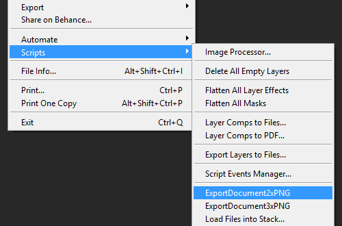
You’re almost done. Restart Photoshop, and the scripts will be ready to go. Now, anytime you want to export a PNG @2x or @3x, just click “File” → “Scripts” → “ExportDocument2xPNG” or “File” → “Scripts” → “ExportDocument3xPNG”:
Click “File.”Go into “Scripts” and click “ExportDocument2xPNG” or “ExportDocument3xPNG.”
You are now left with Retina images @2x or @3x, ready to put on the device.
Tips
Keep in mind a few things if you go for this approach. Use shapes and vectors wherever possible. They scale up perfectly, as do layer styles. Always use smart objects for any bitmaps. Keep in mind they will still need to be @2x or @3x inside.
Using this approach with Photoshop’s generator7 also works great. Any layers or layer groups can be exported @2x and @3x. And you will know they are pixel-perfect.
After producing the designs, I needed to create a clickable prototype for the client. I found that the exported PNGs work great with Marvel8. Marvel allows you to upload your images to Dropbox or through its own system. Once they’re uploaded, you can create hotspots and link to other screens. Then, you can view on a device to see your designs in action. The other bonus was that I used up less bandwidth and Dropbox space! Retina PSDs would have been superheavy!
Illustrator
If you use Illustrator, you can also work @1x and in DP. Make sure your document is set up for the web at 72 DPI. Then, you can manually export @2x and @3x PNG images by clicking “File” → “Export…” and selecting “PNG.” Click “Export.” Then, use the “Resolution” dropdown menu, click “Other” and input 144 PPI for @2x or 216 PPI for @3x. As with the Photoshop scripts, this can also be configured to be just one click!
Sketch
Your other option is to use the increasingly popular app Sketch9. It comes all set up and ready to go @1x with a vector-based workflow. There is built-in support for exporting @2x and @3x from layers and slices. Just note the requirement of operating system. The creator, Bohemian Coding, is proud to develop exclusively for Mac, with no plans to support Windows or Linux (according to its FAQ10). It’s a great program if your workflow and business support it.
Thanks For Reading
Well, I hope this has been of use to you. It certainly has improved my workflow. Now I get superlight and fast PSDs that can be exported to Retina scale for viewing on a device. And the best part is that I am no longer maniacally zooming in and out or multiplying and dividing my pixels!
A Better Way To Design For Retina In Photoshop http://www.smashingmagazine.com/2015/05/18/retina-design-in-photoshop/ http://www.smashingmagazine.com/feed/?# Smashing Magazine For Professional Web Designers and Developers


