This Week In Web Design – June 25, 2021

…

Tips, Expertise, Articles and Advice from the Pro's for Your Website or Blog to Succeed
Glassmorphism is a term used to describe UI design that emphasizes light or dark objects, placed on top of colorful backgrounds. A background-blur is placed on the objects which allows the background to shine through – giving it the impression of frosted glass.
In this post we’ve collected 10 stunning examples of this design trend from Codepen. Have a look and see how you could possibly use this effect in your upcoming projects!
See the Pen Glassmorphism by Albert (@walickialbert) on CodePen.light
See the Pen Glassmorphism Creative Cloud App Redesign by Aysenur Turk (@TurkAysenur) on CodePen.light
See the Pen Glassmorphic Sign in Form by Shounak Das (@dasshounak) on CodePen.light
See the Pen Glassmorphism Credit/Debit Card (pure CSS) by Shounak Das (@dasshounak) on CodePen.light
See the Pen Glassmorphism by Jayasree (@Jayasree_0708) on CodePen.light
See the Pen Glassmorphism by Vihanga nivarthana (@vihanga) on CodePen.light
See the Pen Glassmorphism by Supriya (@omeal) on CodePen.light
See the Pen Glassmorphism vs Neumorphism Cards | CSS, Js & VanillaTilt by Quentin Feret (@quentin-feret) on CodePen.light
See the Pen Glassmorphism Animated by jSpilka95 (@jspilka95) on CodePen.light
See the Pen Glassmorphism Post grid by Vinothkanna (@vinocrazy) on CodePen.light
 Launching a new website can be exciting and nerve-wracking at the same time. You want to show off what you’ve been building, what you’ve learned, and the creative solutions you’ve come up with. You can already taste that first celebratory taco. You go live.
At first, you get a lot of comments from your friends saying, “Hey, that looks great!” Then the bug reports come in. A feature isn’t working as intended. A bit of CSS is playing merry hell with the live content in ways you couldn’t foresee. A link is broken. And worst of all: you have typos. So many typos.
Okay, most of the time, it won’t be as bad as all that. Veteran designers and developers usually have processes in place to reduce the amount of errors that go live. New designers usually build smaller sites, so the number of errors is reduced in any case. Still, if you’re new to web design, and you want to spend as little time fixing things post-launch as possible, we can help.
As you are the designer and/or developer, you are the first and last line of defense against mistakes. However, even the best of us can just plain forget things. One of the easiest ways to avoid this is to use a pre-launch checklist for every website you build. The checklist would include things like making sure all of the links work, making sure the contact forms work as intended, making sure your hosting is set up right, and so on.
You can write your own checklist, and as you develop your own way of working through projects, you might want to. In the meantime, you can adapt any number of pre-made checklists to your projects. Here are a couple to get you started:
And there are a few more here: 45 Incredibly Useful Web Design Checklists and Questionnaires
For clarity’s sake (and because this is the Internet) these eyeballs should remain attached to their original owners. What you want to do is get some people who aren’t experts in computing, be they relatives, friends, or passing salesmen, and direct their eyeballs at your design, before you launch. Get some basic user testing in by asking these people to perform basic tasks on your site.
This has the double benefit of providing you with some usability testing data, as well as an easy way to find out if anything important is broken. After they’ve followed the main calls to action, ask them to click around on anything they find interesting, to help you check other links.
This may not be feasible for projects with smaller budgets, but if you have the money, it couldn’t hurt to hire a professional or two. For example, you could hire another designer to check for common bugs, peek at the source, and so on. Have them test how the layout handles on their devices, and give you feedback.
If you want to take this further, there are services that will test your site under myriad conditions, in all sorts of browsers, on all sorts of devices. Given that most of us lack a browser testing lab, and these services generally aren’t expensive, they can be worth it.
Here are some of the more popular options (as defined by Google search results):
Lastly, consider hiring a proofreader and/or editor, if your website is text-heavy. They can drastically help you to improve the quality and clarity of your writing, as well as help you to avoid the dreaded typos.
One of the biggest contributors to screwing up is stress. Launching websites can be stressful, especially if you’ve been working on the same thing, day in and day out. For future projects, it might be a good idea to schedule in a break before launch time. And I mean a proper break, as in one day as a bare minimum. Giving your brain time to think about other things is a known and proven tactic for creativity, but it also works for spotting mistakes.
Take that time off, come back, and run through your pre-flight checklist when you’re rested, and can think straight. Your brain, your heart, your users, and your clients will thank you.
If you’re developing the site yourself, you can take advantage of services that help you clean up, or “lint”, your code by pointing out problems in your HTML, CSS, or JavaScript. How you do this will depend on what text editor you’re using. Just about every major text editor (Sublime Text, Atom, Brackets, etc.) has a number of plugins to help you with this. There’s no one right tool for this job, so you’re going to have to do some Googling.
You should also run your HTML and CSS through the validating services provided by the W3C. These services won’t catch every bug, but they can help point out potential problems in your markup.
So what happens if you do all of these things, and still miss a few things at launch? Realistically, the world just keeps on turning. We’re imperfect creatures, and we’ll never get everything right, all of the time. And that’s fine. When mistakes are inevitably spotted in your newly-launched site, fix them fast and move on.
Constant perfection will have to wait until our robot overlords get here.
| LAST DAY: Zelda – A Beautiful and Classy Script Font – only $7! |
 |
 One screen divided in two.
The split screen technique has long been known in the film industry, with early examples dating back to the silent movies days of the early 20th century, and it is still a popular device in by film and tv today.

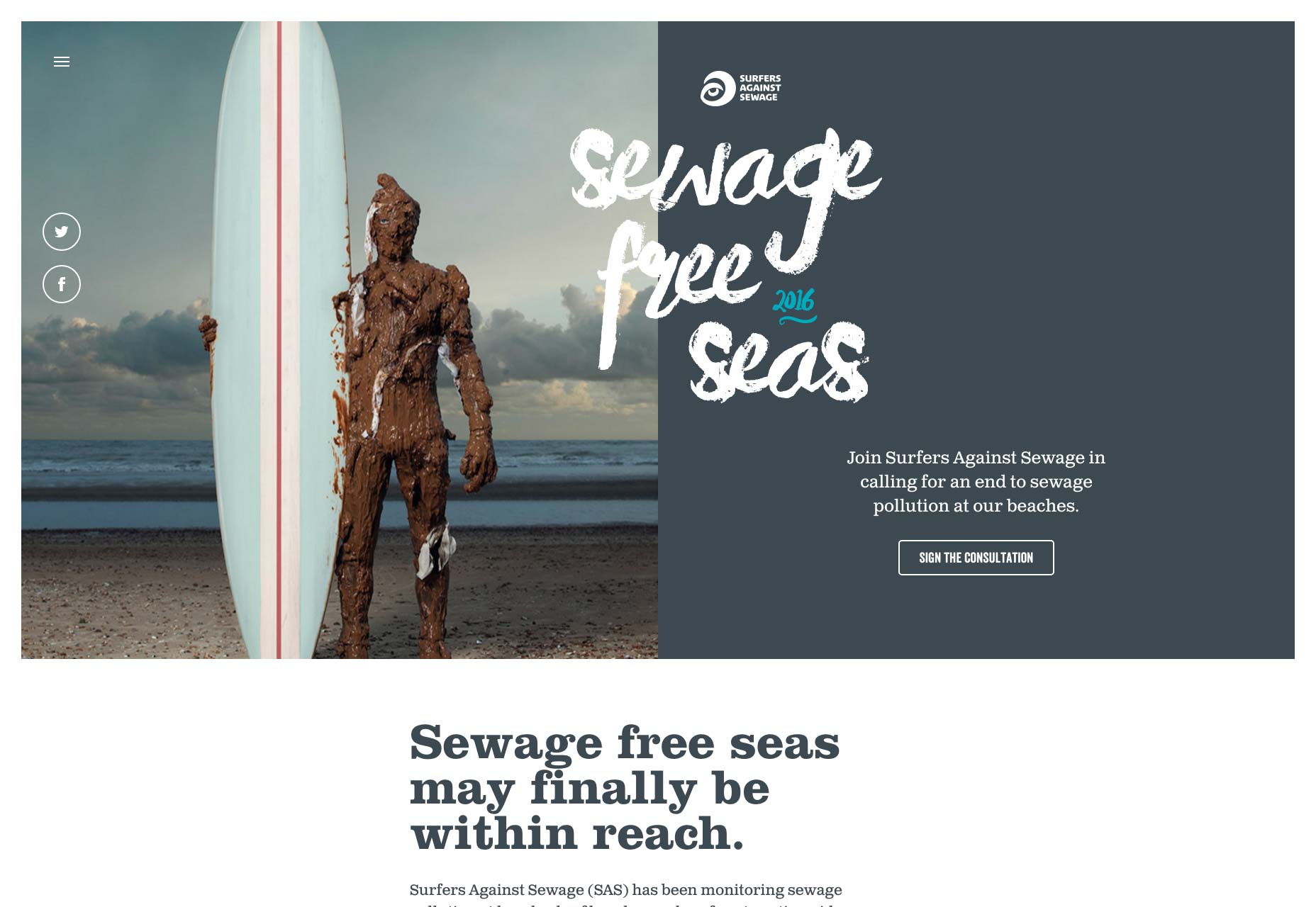
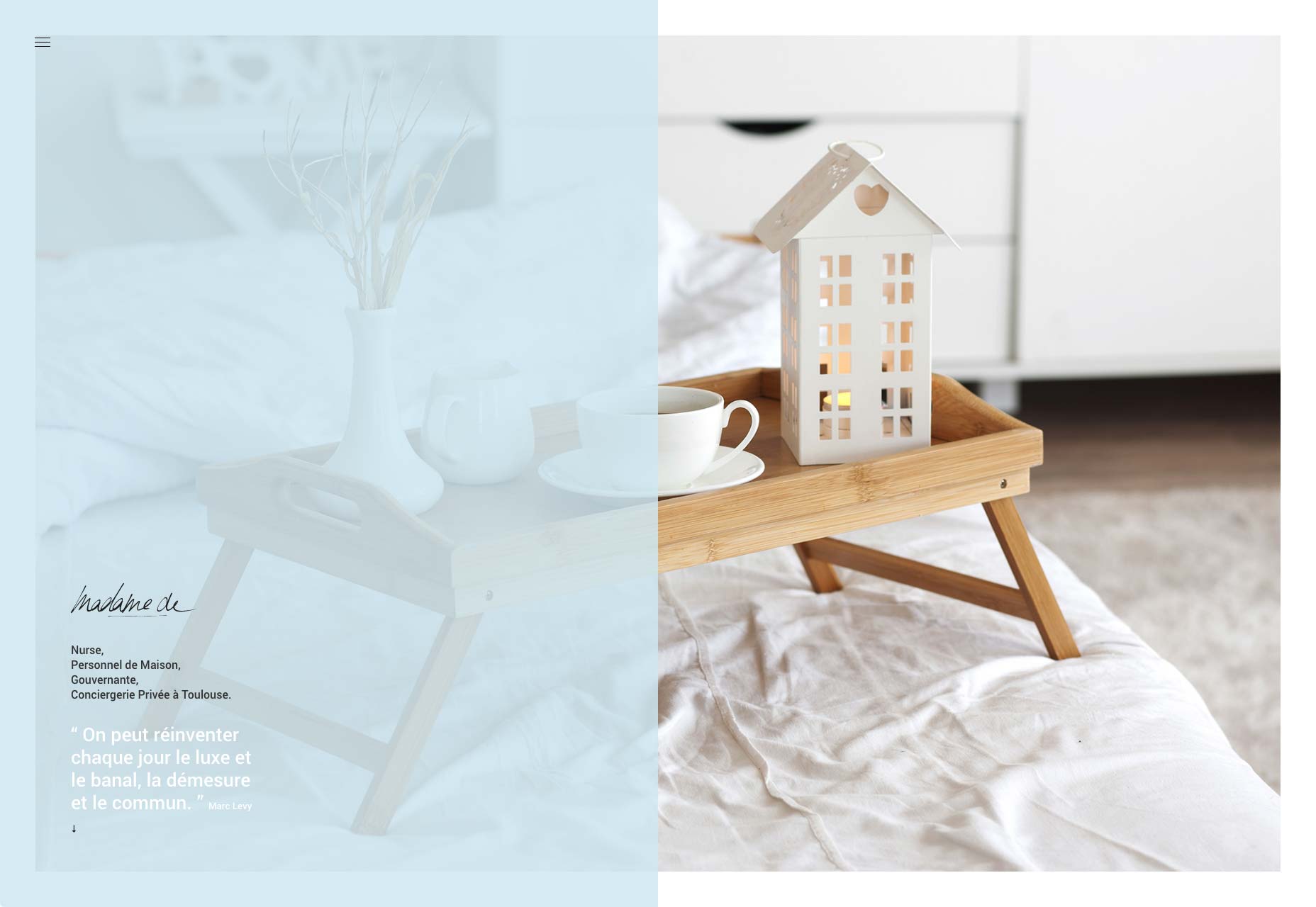
A split-screen layout is in use when full-screen elements are divided into two or more vertical parts. A scene from the film “Scott Pilgrim vs the World”
However, this is a relatively new technique for the web design industry. Split screens only became popular around mid-2016 and now we have more and more websites which use this design pattern. There are a few reasons why this design pattern became so popular:
Split-screen is especially good when you have two things to promote. For example, when a site offers two entirely opposite variations. This approach allows designers to give prominence to both things and allow the user to quickly select between them.
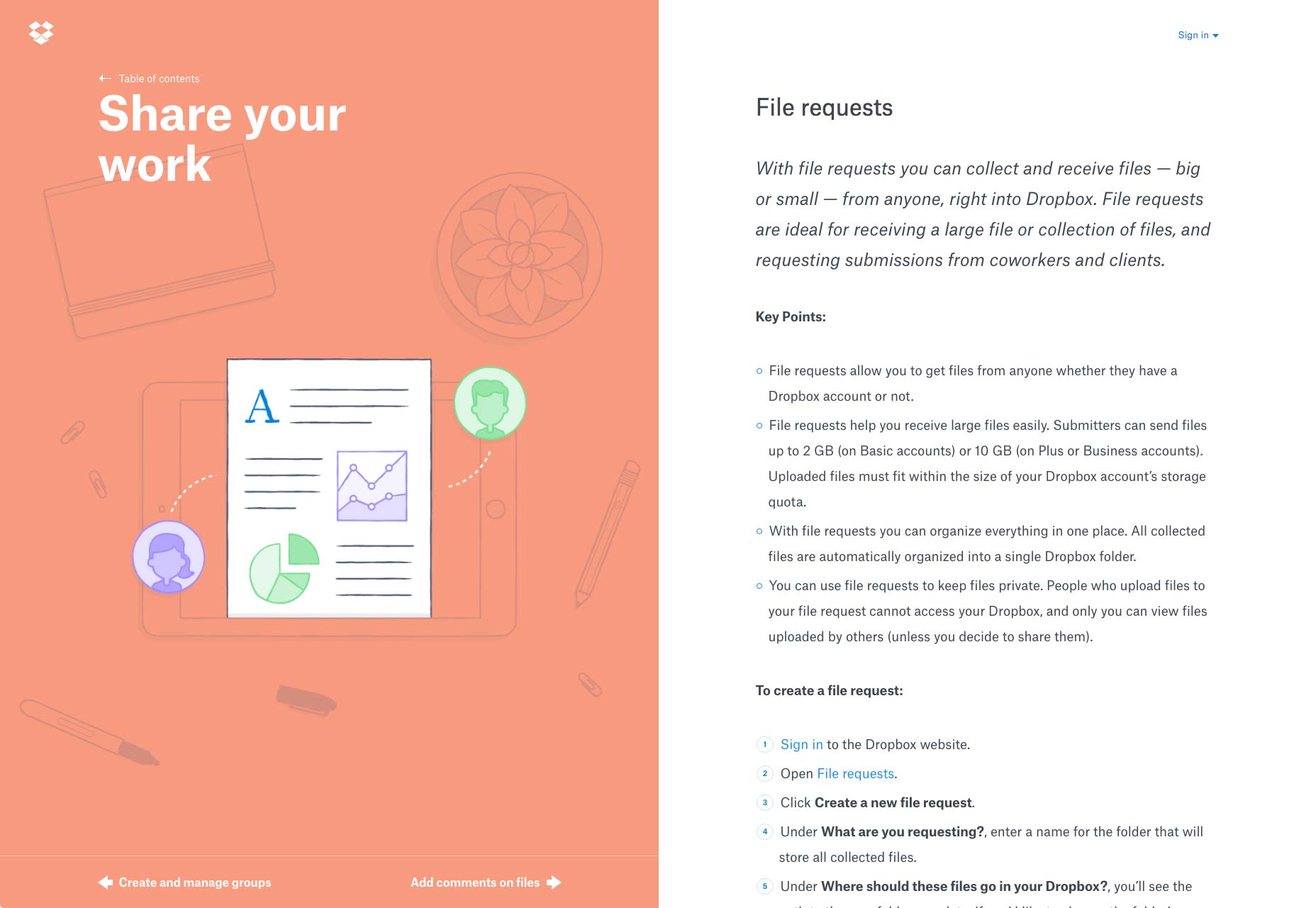
One screen, two messages in Dropbox Guides
Split-screen designs don’t expand well as the content grows, therefore it is not recommended to apply them to content-heavy layouts. It’s important to keep the screens simple because complex split screens make the UI look overloaded with information. That’s why split-screen layout would be a perfect fit for minimalist website designs.
If you’re considering a split-screen technique for your website, I advise you to ask yourself a few questions:
The most important thing to keep in mind that content is king and split-screen should be a simple way to deliver your message to people.
Thanks to Flat and Material Design, vibrant colors and dramatic typography are big trends now. Vibrant colors are visually stimulating and dramatic typography enhances the text content. Simply combine the two and you will create a visually interesting design. Baesman has done this masterfully. They gave equal importance to both elements while, at the same time, allowing the user to choose between them quickly.
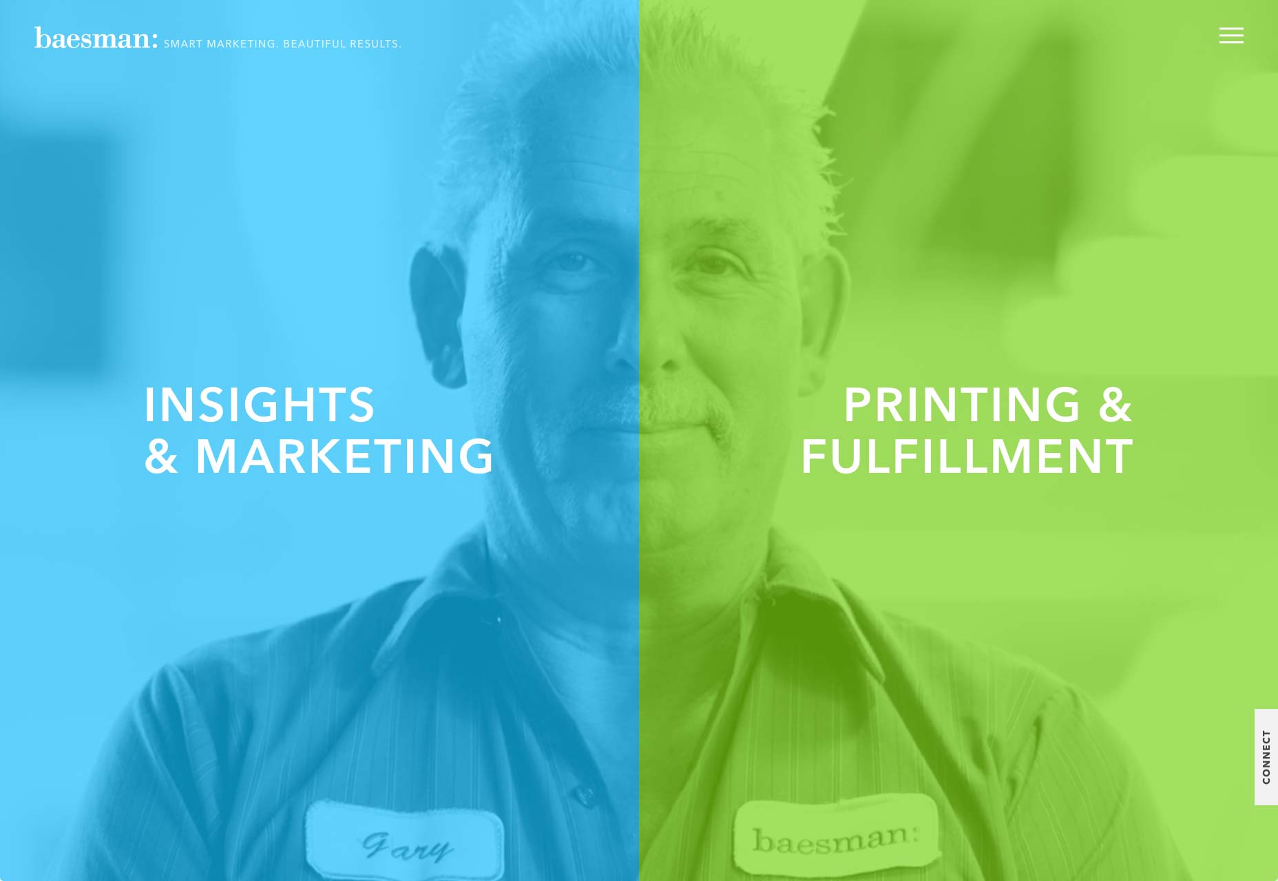
Bright colors and interesting typography pairs can add interest
Much more than a simple graphic trend, splitting the screen into two distinct parts provides an original way to guide the user through your site. It’s a great option when you want to create a bigger focal point for calls to action. In the example below, you can see how negative space creates a vertical divide to give equal weighting to two different options.
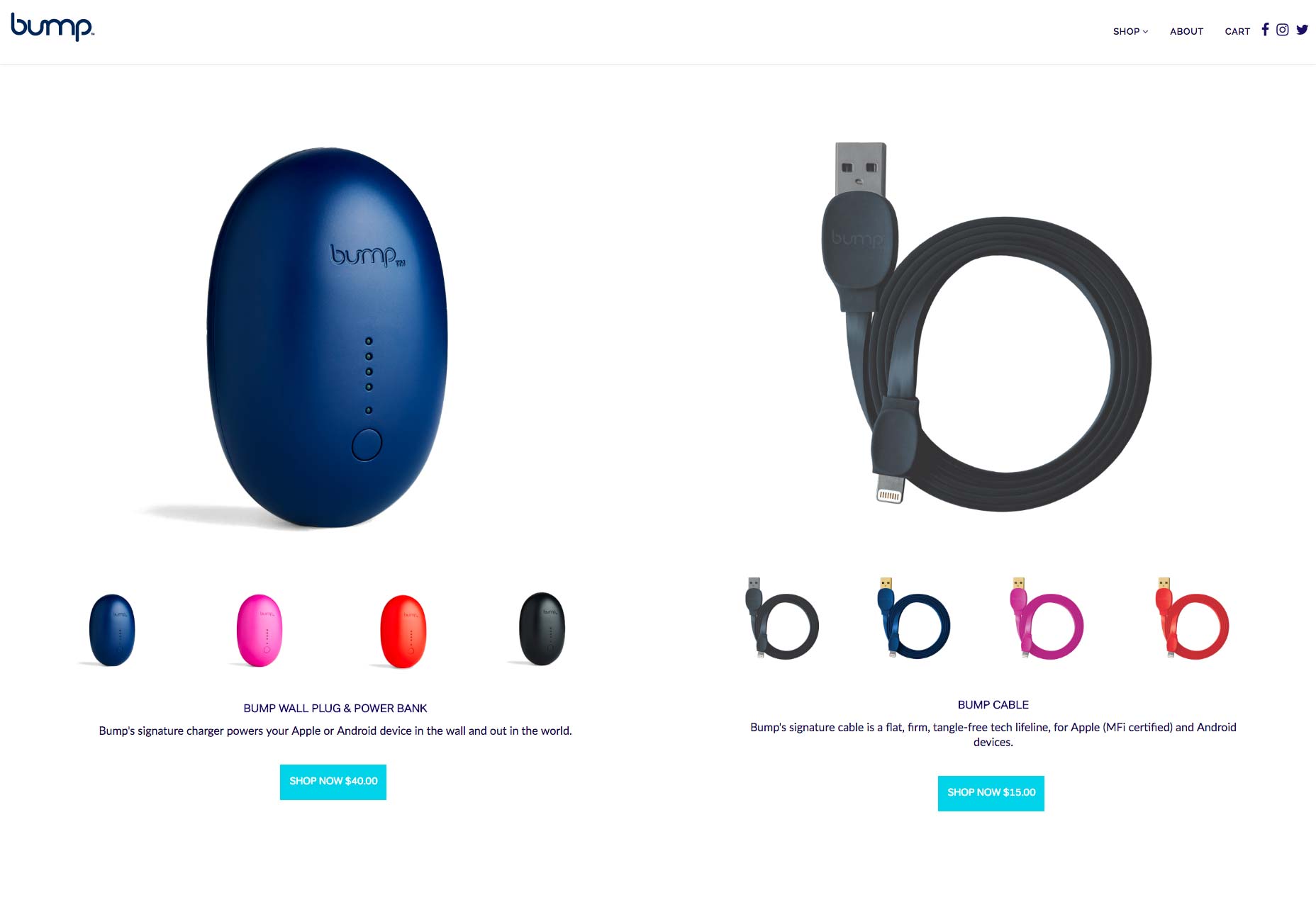
Vertical divide allows emphasis on two different CTAs without favoring either
When split screen represents a single object, it’s important to establish a connection between content containers. One possible way to do that is by using a color. Simply duplicate a distinct color to establish visual flow between two screens. This works particularly well with a brand color or hue with a lot of contrast. Using color it’s possible to communicate a stronger connection between two pieces of content.
Another possible way to create a strong connection is layering a single element such as text copy across screens:
Overlapping text connects two screens
Last but not least you can use a colored overlay for this purpose:
Consider the left part of the screen
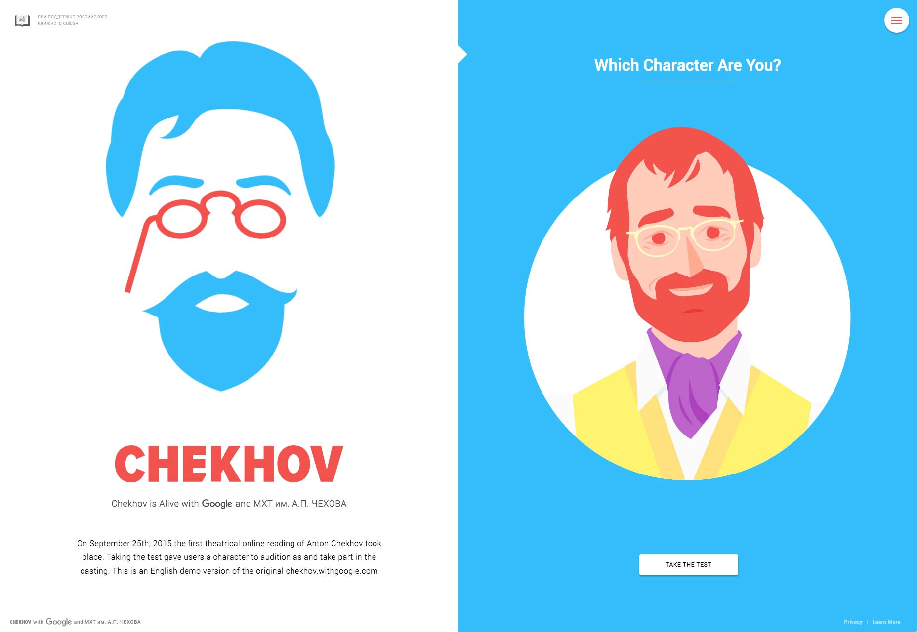
Fine animation and interactive effects encourage users to click. Look at the design used for the “Chekhov is Alive” site below. The design begs you to click to find your character.
It takes approximately three seconds for a visitor to make a decision regarding your website. Consequently, your layouts should always be visitor-friendly if you want to reduce bounce rates. Split-screen technique can help you with that. Split-screen designs are a fun, functional, and responsive way to create an engaging design.
| LAST DAY: Zelda – A Beautiful and Classy Script Font – only $7! |
|
