While the growing adoption of responsive images cannot be ignored, it can be very difficult to employ the functionality under the constraints of a large CMS like WordPress. Although it is entirely possible to write the feature into your theme on your own, doing so is a challenging and time-consuming endeavour.
Thankfully, with the launch of WordPress 4.4, theme developers and maintainers will find it much easier to introduce responsive image functionality into their themes. In this recent launch, the RICG Responsive Images plugin has been merged into WordPress core, which means that responsive image support now comes as a default part of WordPress. Let’s take a look at how the feature works, and how you can use it to get the best support for your WordPress site.
Every now and then we see discussions proclaiming a profound change in the way we design and build websites. Be it progressive enhancement1, the role of CSS2 or, most recently, web design itself being dead3. All these articles raise valid points, but I’d argue that they often lack objectivity and balance, preferring one side of the argument over another one.
These discussions are great for testing the boundaries of what we think is (or is not) possible, and they challenge how we approach our craft, but they don’t help us as a community to evolve together. They divide us into groups and sometimes even isolate us in small camps. Chris Coyier has published a fantastic post4 recently covering the debate on the role of CSS in light of growing popularity of React.js, extensively and objectively. That’s the quality discussions we need, and that’s what keeps us evolving as a growing and maturing community.
Web technologies are fantastic — we all agree on this. Our tools, libraries, techniques and methodologies are quite fantastic, too. Sometimes they are very different and even contradictory, but they are created with the best intentions in mind, and often serve their purpose well in the specific situations they were designed for. Sometimes they contain mistakes, but we can fix them due to the nature of open source. We can submit a patch or point out solutions. It’s more difficult, but it’s much more effective.
There are a lot of unknowns to design and build for, but if we embrace unpredictability5 and if we pick a strategy to create more cohesive, consistent design systems6, we can tackle any level of complexity — in fact, we do it every single day. We solve complex problems by seeking solutions, and as we do, we make hundreds of decisions along the way. Yet sometimes we fall into the trap of choosing a solution based on our subjective preferences, not objective reasoning.
Web technologies are fantastic, and so are our tools. However, we might be focusing too much on discussions about tools instead of art direction we do when we design the web. Image source: empty_quarter7.
We tend to put things into buckets, and we tend to think in absolutes. Pro carousels or anti carousels; pro React.js or anti-React.js; for progressive enhancement or against it. But the web isn’t black and white — it’s diverse, versatile, tangled, and it requires pragmatism. We are forced to find reasonable compromises within given constraints, coming from both business and UX perspectives.
Tools aren’t good or evil; they just either fit a context or they don’t. Carousels can have their place when providing enough context to engage users (as Amazon does). React.js modules can be lazy-loaded for better performance, and progressive enhancement is foundational for making responsive websites really8, really9 fast. And even if you have extremely heavy, rich imagery, more weight doesn’t have to mean more wait10; it’s a matter of setting the right priorities, or loading priorities, to be precise.
No, web design isn’t dead. Generic solutions are dead.11 Soulless theming and quick skinning are dead. Our solutions have to be better and smarter. Fewer templates, frameworks and trends, and more storytelling, personality and character. Users crave good stories and good photography; they’re eager for good visuals and interesting layouts; they can’t wait for distinctive and remarkably delightful user experiences. This exactly should be our strategy to create websites that stand out.
There are far too many badly designed experiences out there, and there is so much work for us to do. No wonder that we are so busy with our ongoing and upcoming projects. Proclaiming our craft to be dead is counter-productive, because we’ve shown ourselves and everybody out there what we are capable of. The last fifteen years of web design were nothing if not outstanding in innovation and experimentation. And it’s not about to stop; that’s just not who we are.
If we can’t produce anything but generic work, other creatives will. The web will get better and it’s our job to make it better. It won’t be easy, but if we don’t adapt our practices and techniques, we’ll have to give way to people who can get it done better than we can — but web design itself isn’t going anywhere any time soon.
It’s up to us to decide whether we keep separating ourselves into small camps, or build the web together, seeking pragmatic solutions that work well within given contexts. We might not end up with a perfect solution every time, but we’ll have a great solution still; and more often than not it’ll be much, much better than the solution our client came to us for in the first place.
“Web Design Is Dead.” No, It Isn’t. http://www.smashingmagazine.com/2015/07/08/web-design-is-dead-no-it-isnt/ http://rss1.smashingmagazine.com/feed/ Smashing Magazine For Professional Web Designers and Developers
Hear, hear! SmashingConf NYC 2016 is coming! A spectacular performance about failures, successes and superpowers in front-end and UX — now on Broadway! A flabbergasting show on fascinating endeavours in web design, with busted myths, horror design stories and wisdom gained from daunting real-life struggles! Don’t miss the most remarkable show of the year!
Can you dispel the truth from the lies? Honesty from deception? Myths from heartbreaking real-life experience? Have you figured out responsive design, mobile, pattern libraries, SVG, flexbox, performance, HTTP/2 — and all of the other mischievous, erratic facets of designing for the web today?
When someone lands on a page of your site what do you want that person to do? Where do you want them to look? What information do you want your visitors to notice and in what order?
Ideally, you want people to see your most important information first and your next most important information second. You want potential customers to see the copy that will convince them to buy before they see the “Buy Now” button. You want people to be presented with the right information at the right time, and one way to do that is to control the flow of your composition1.
Compositional flow determines how the eye is led through a design: where it looks first, where it looks next, where the eye pauses, and how long it stays.
Note: This is the sixth post in a series on design principles. You can find the first five posts in the series here:
A couple of articles back in this series I talked about visual direction7 and I mentioned Rudolph Arnheim’s structural net. You should read that post for details, but the general idea is that in a rectangular canvas the center and the four corners of the canvas act as magnets to pull the eye. Along with these natural focal points, there are axes running between them and your eye moves along them from focal point to focal point.
Arnheim’s structural net is not the only pattern that suggests where and how the eye naturally moves through a composition. The Gutenberg diagram, the F-pattern layout, and Z-pattern layout all suggest how a viewer’s eye will move and they assume a natural flow to a design.
Note: These patterns are described for languages that are read left to right. Adjust for other reading directions.
Gutenberg diagram: In this pattern the eye generally sweeps from the top-left to the bottom-right, passing through Arnheim’s optical center. Less attention is paid to the other corners which are called fallow areas. Since the eye movesto the right as it moves down, the top-right corner is a strong fallow area, while the bottom-left corner is mostly ignored.
F-pattern layout: In this pattern the eye starts in the top-left and moves across the page to the right before moving down a little and repeating the movement across the page. The general pattern follows the shape of the letter F.
Z-pattern layout: The eye starts in the top-left and moves right. At the top-right corner it moves down and to the left in a diagonal before moving once again to the right. Overall it follows the shape of the letter Z and repeats the pattern down the page until it reaches the bottom-right.
I’m sure you’ve seen eye tracking studies and discussions of the above patterns before. What rarely gets mentioned is how these patterns describe text-heavy pages10. They describe how our eye moves through columns of text.
The F-pattern is often mentioned in combination with search results pages. Why is that? It’s because search results pages are text-heavy pages presented as lists of bite-sized information to scan. An F-pattern is a natural way to scan these pages.
11 Reading patterns on text-heavy and design-light pages often follow an F or Z path. (View large version12)
Add hierarchy, direction, movement and rhythm, and the flow through your design won’t follow the patterns above. The patterns fall away in the presence of design.
They’re still useful because you can take advantage of the patterns and place important information where the eye would naturally fall to increase the visual prominence of the information. You can take advantage of these natural patterns, but do understand they describe text-heavy pages only.
A viewer’s eye will move through a composition in some way regardless of whether or not you control the movement. You might as well control the movement.
Compositional Flow
You might have seen the word “storytelling” appear more and more often in discussions about design and conversion optimization. Compositional flow can help you tell your story by presenting information in the right order.
Flow is about movement and direction, and leading the eye from one part of a composition to another in the direction you want it to move. You create flow through a combination of visual weight and visual direction.
Elements of greater visual weight (focal points) pull the eye and become resting places. Other elements impart direction and move your eye from one point to another through visual cues such as arrows and lines.
Flow starts with your dominant element, which should be the entry point into your composition. From there you provide directional cues for the eye to follow through your design.
The most obvious directional cue is an arrow pointing at something. An image of a face looking in one direction is another strong and easy directional cue. Others include.
Repetition of elements
Rhythm
Implied action
Diagonal lines
Gestural lines
Directional lines
Perspective
Subject matter of elements
Gradation
You’ll notice lines feature in the list above. Showing direction is one of the primary characteristics of lines. Lines can also be used to cut off motion in one direction by being perpendicular to that motion. When this happens they act as barriers, stopping or possibly reversing the path the eye was following.
Create direction and movement through the items mentioned above. Add elements that serve as barriers to change the direction the eye is moving. Create open paths in empty space to allow easy movement through and between your positive design elements.
Flow And Harmony
On a micro level you want the path the eye follows to align well with whatever action you want someone to take. For example, it makes sense to place the button to search after the form field, because the natural process is to fill in the field and then click the button. Placing the button first would move your visitor in one direction until the end, when they have to move all the way back to the start.
It makes more sense to have arrows point to the thing you want someone to look at instead of away from that thing. You’re creating flow even when the arrows point away, but not a flow that makes any sense to achieve the goals of the site.
Movement is closely related to direction. Motion implies a direction and direction implies movement. If you want someone to look to the right, one way is to have something on the page move to the right. The eye will follow it.
There are several types of movement.
Literal (physical) movement: occurs when some physical activity is present.
Static movement: occurs when the eye jumps around from point to point in the hierarchy.
Compositional movement: occurs when design elements lead the viewer’s eye from one point to another through a composition.
Animation can be used to create literal movement on the page. Dominance, focal points and hierarchy create static movement. When elements that impart direction and movement are added between focal points you create compositional flow.
The same list of directional cues I presented earlier are used to show movement through a composition.
Rhythm
Rhythm can help control the pace of flow in a composition; it’s patterned movement. Rhythmic patterns are built from elements and the intervals between them, and just as your ear will follow along with the rhythm of a song, your eye will follow rhythm created visually.
A pattern and a rhythm will exist as soon as you add multiple elements to the page. Two of anything implies a structure. It’s going to be there no matter what you do so, again, you should learn to control it.
Repetition creates flow and rhythm through the repeated elements. When the eye sees a red circle it notices other red circles in the composition and seeks to establish a pattern. In addition to repetition you can use alternation and gradation to create rhythm.
Repetition: creates patterns through predictability.
Alternation: creates patterns through contrasting pairs.
Gradation: creates patterns through a progression of regular steps.
Rhythm is created both through the elements the eye follows and the intervals between them. Changes to either alter the pattern. Variations in the pattern add interest. Emphasis of something in the pattern can break the rhythm and pause the flow momentarily.
There are three primary types of rhythm:
Regular rhythm: occurs when the intervals between elements are predictable, or the elements themselves are similar in size and length. Placing repeating elements at regular intervals would be an example.
Flowing rhythm: occurs when the elements or intervals are organic. This creates natural patterns that evoke a feeling of organic movement. Stripes on a tiger or zebra are good examples.
Progressive rhythm: occurs when the sequence of forms or shapes is shown through progressive steps. Some characteristics of elements might have stepped changes, or the interval might have stepped changes. This gradual increase or decrease in sequence creates movement. A color gradient is a good example.
Any of the above types of rhythm can be used to create movement and compositional flow. Which you would choose depends on the specifics of your design: if the design is trying to communicate consistency, a regular rhythm is probably best; if the design is trying to communicate something more natural and organic, a flowing rhythm would likely be preferred.
Flow And Gestalt
The further along we get in this series, the more gestalt principles contribute to the design principles we’re looking at.
Dominance and focal points create areas in your design that pull the eye. Similarity and contrast are used to create pattern and rhythm.
All the gestalt principles that connect or show commonality among elements will help lead the eye from one element in the group to the others.
Uniform connectedness leads the eye through the thing that connects the elements. Elements with a common fate appear to move in the same direction carrying the eye along with them. The principle of continuation is specifically about continuing to move in one direction.
Examples
Let’s take a look at screenshots from a few sites and think about how their designs flow and move, and what kind of rhythm they might have.
As I’ve mentioned previously in the series, this is my opinion. You might look at these same screenshots and see a different flow and rhythm than I do. That’s fine. It’s more important for both of us to think critically about the designs we see than it is for us to agree about what we think.
Dorigati
When I look at the Dorigati home page19 my eye is quickly drawn to the hero image of wine barrels at the top of the page. It doesn’t take long to be pulled from here to focal points like the site logo and the image of the wine bottle to the right.
There’s a strong implied diagonal flow between the logo and bottle, and your eye likely flows back and forth between them. Think how quickly that connects the company name with the products the site offers.
The curve at the bottom of the logo appears to point downward leading your eye to the name of the wine being presented. Notice that the heading to the left and the name of the wine are the same blue and similar to the blue in the logo. The repetition of color creates a rhythm and flow through all three items.
The rhythm of color is used again with the gold headings down the page and the decorative flourishes to the left. A similar color is used for the dates. While the interval can vary depending on the length of the text in each entry, it’s fairly predictable and a regular rhythm.
The wine bottle also serves to connect the header with the main content, creating a vertical flow through the hero image and serving as a bridge across it. Without the image of the wine bottle it requires more effort for your eye to cross the horizontal lines that create barriers to movement.
Dress Responsively
There’s a strong horizontal flow at the top of the Dress Responsively home page22. The navigation and text both lead your eye horizontally and make it very easy to scan left and right across the header.
23 Screenshot from the home page of the Dress Responsively website. (View large version24)
My eye tends to start with the “YOU DECIDE” text and easily moves right and left where it can take in the logo, navigation, and the remaining text in the header.
Notice at the end of “YOU DECIDE” your eye is also pulled down. There’s a repetition of rectangular and orange shapes that creates a vertical rhythm. The shape of the “WTH?” button is echoed in the mostly rectangular “548 votes” shape and the “SEE DETAILS” button below the text. This vertical flow is strengthened by a strong vertical line that’s created by aligning the left edge of these shapes with the text between them.
The orange color repeats itself as text in both the header and also further down the page (not shown in the screenshot). Having encountered the color repetition at the top of the page, your eye follows it down the page increasing the vertical flow.
Incredible Types
The header of the Incredible Types home page25 also has a horizontal flow due to the shape of the lines and block of text. The light grid lines create a subtle pull down and also create a regular rhythm horizontally across the page.
26 Screenshot from the home page of the Incredible Types website. (View large version27)
Below the header is a grid of images. Notice how the gutters (both horizontal and vertical) between images provide a channel for your eye to move through. They help your eye flow from image to image in either direction. They also create a regular rhythm in both directions.
28 Screenshot of the footer from the home page of the Incredible Types website. (View large version29)
In the footer, text is grouped into two rows and four columns once again creating both horizontal and vertical flow and rhythm. I think the horizontal flow stronger than the vertical and so my eye tends to move left and right more than up and down, but the flow exists in both directions.
The pink in the left column draws my eye and creates vertical flow through its shape. Note how the site name is rotated so it too creates a vertical flow. The contrast in color with the menu next to it creates a strong vertical line where the two meet.
The text at the bottom of this column repeats, creating a vertical rhythm as you read one block then the one below it. However, the horizontal nature of the lines changes the flow to horizontal and moves your eye to the right.
The dark background behind the current menu items creates an even stronger horizontal flow because your eye is drawn to the contrast. The triangle it displays at its top-right corner points to the right.
On the right, in the main content, the color and size of the dates creates a regular vertical rhythm through repetition. The screenshot only shows two of these, but they continue further down the page. The pink headlines work to reinforce the rhythm created by the repeating blue dates.
The horizontal lines between each entry stop the vertical flow momentarily, keeping you in each entry a little longer. The rhythm of the repeating colors in the dates and headlines pulls you further down the page once you’re ready to cross the horizontal line and move to another entry.
The images naturally change with each entry, but the one in this screenshot directs your eye down and to the left diagonally.
Summary
You have a lot of control over where people look when they’re viewing a webpage you’ve designed. On a text-heavy and graphic-light page, a visitor’s eye likely follows something like a Z-pattern or F-pattern across and down the page.
However, as soon as you design page elements and add graphics, those patterns no longer apply. Your visitor’s eye will follow the flow, movement and rhythm you create.
Think about the priority of the information you’re communicating. Think if it would be more useful when seen in a specific order. Think about where on the page you want someone to look first, second, and third.
Then create visual cues to lead them through the page in the order you think best. Add a line for someone to follow, or create one by aligning various elements. Repeat a color or text size to create a rhythm for the eye to follow. Present images of moving objects to direct the eye.
Don’t leave it to a default pattern to lead your visitor’s eye. Create compositional flow through the page and lead them yourself.
There’s one last topic I want to share with you in this series on design principles, and that’s balance. I’ll talk about compositional balance in general and then walk you through the four different types of balance (symmetrical, asymmetrical, radial and mosaic) you can create.
Design Principles: Compositional Flow And Rhythm http://www.smashingmagazine.com/2015/04/29/design-principles-compositional-flow-and-rhythm/ http://www.smashingmagazine.com/feed/?# Smashing Magazine For Professional Web Designers and Developers
In many projects, responsive images aren’t a technical issue but a strategic concern. Delivering different images to different screens is technically possible with srcset and sizes and <picture> element and Picturefill (or a similar) polyfill; but all of those variants of images have to be created, adjusted and baked into the logic of the existing CMS. And that’s not easy.
On top of that, responsive images markuphas to be generated and added into HTML as well, and if a new image variant comes into play at some point (e.g. a file format like WebP or a large landscape/portrait variant), the markup has to be updated. The amount of extra work required often causes trouble — so if you have a perfect product shot, you need to either manually create variants for mobile and portrait and landscape and larger views, or build plugins and extensions to somehow automate the process.
CSS’ clip-path property is your ticket to shape-shifting the monotonous, boxy layouts traditionally associated with flat, responsive design. You will begin to think outside the box, literally, and hexagons, stars and octagons will begin to take form on your web pages. Once you get your hands dirty with clip-path, there’s no end to the shapes you can generate, simply by tweaking a few values.
While the focus of this article is on clip-path using polygons with CSS, all of the demos provide a reference to an inline SVG, in order to gain additional support on Firefox. Generating a responsive SVG clipped shape is trivial once you have created a responsive shape with CSS’ clip-path. We’ll look at this in detail later.
Clip-Path, In A Nutshell
Clipping, with the clip-path property, is akin to cutting a shape (like a circle or a pentagon) from a rectangular piece of paper. The property belongs to the “CSS Masking Module Level 1731” specification. The spec states, “CSS masking provides two means for partially or fully hiding portions of visual elements: masking and clipping”.
The first part, i.e. masking, has to do with using a graphical element, such as a PNG image, CSS gradient or SVG element, as a mask to conceal sections of another element.
The second part, i.e. clip-path, involves a closed vector path, which could be a basic shape defined in CSS or an SVG using the clipPath tag. The region inside this path is displayed, and everything beyond or outside it is clipped out.
Note: Masking is beyond the scope of this article, but CSS-Tricks2 and HTML5 Rocks3 have more information.
Below is a simple visualization of how clip-path works:
Articles about clipping that use the deprecated syntax feature code that looks like this:
.element {
  clip: rect(30px, 30px, 20px, 20px);
}
Support For Clip-Path
In August 2014, the “CSS Masking Module” was published as a “Candidate Recommendation,” which is a step up from the earlier “Last Call Working Draft” stage. Before we look at browser support, it’s important to consider the multiple ways in which clip-path can be applied to an element, because browser support varies for each method.
There are two ways to use clip-path:
with CSS
Basic shapes from the “CSS Shapes Module9” provide a convenient way to use clip-path. The different shapes available are polygon, circle, ellipse and inset; inset is for rectangular shapes.
with SVG
One can, alternatively, create a shape using SVG and then clip an element to this shape via the URL syntax. There are two ways to do this:
with a reference to an inline SVG (i.e. the SVG markup exists on the page itself),
with a reference to an external SVG document.
In both cases, the clipPath element within the SVG is used to wrap the element that determines the clipping path, be it a circle, polygon, path or other element. Compare the demo below in Firefox and in a WebKit or Blink browser such as Chrome to spot the differences. Square images imply a lack of browser support.
Note: The third image does not show up in Safari. Despite extensive debugging, I’m unable to resolve the issue. I’d appreciate a note in the comments section if you come across the solution.
As you may have gathered from observing the demo above in different browsers, support for clipping paths13 is quirky and currently depends on the means by which you choose to clip an element:
with CSS: Chrome 24+, Safari 7+, Opera 15+, iOS 7.1+, Android 4.4+, Opera Mobile 24+
(Note that all supported browsers currently require the -webkit vendor prefix.)
with SVG: all of the browsers listed above and Firefox 3.5+
The clip-path property is not yet supported in Internet Explorer but is currently under consideration14 as part of the “Masking Module.”
Note: There is a caveat with support for SVG clipping path. Modern WebKit and Blink browsers support clipping paths with SVGs only if they are declared inline (i.e. within the document). References to external SVGs are supported only in Firefox, as evidenced in the demo above. The Chromium project is tracking this bug15.
Let’s examine the advantages of CSS versus SVG with clip-path.
Advantages of CSS
The lucid syntax is easy to grasp due to the relative simplicity of basic shapes.
Responsiveness is easily achieved with relative units, such as percentages.
Advantages of SVG
Browser support is better, with the addition of Firefox.
You can clip with complex shapes, multiple shapes and text.
While CSS offers a background-clip property that provides us with some options (including a non-standard way to clip text), neither background-clip nor CSS’ clip-path match what SVG clipping can achieve in modern browsers. Getting acquainted with clip-path via CSS, however, is less intimidating (especially if you aren’t familiar with manipulating SVGs) and will prepare you for the intricacies of clipping paths with SVG, as well as the “CSS Shapes Module16,” where content aligns itself to the shape of an element.
Note: If you can’t wait to delve into the matrix of clipping with SVG, Sara Soueidan’s overview17 is a good starting point.
Let’s look at the pros and cons of using clip-path to progressively enhance our designs.
Pros
Browsers that don’t support the clip-path property will ignore it. If you use it with care, users on non-supporting browsers won’t suspect a thing!
Once a clipping-path shape is generated, the specification states that pointer events must not be dispatched outside the clipping area (which is ideal). So, the click event is restricted to the shape and its outer boundary18. We will look at this in the demos below.
You can use percentages or any length unit, such as pixels or ems, to define your coordinates with basic shapes using CSS. Fluid units such as percentages can be used to create responsive shapes, perfect for adaptive layouts.
The specification has not yet reached the “Recommendation” stage, so there’s always a chance that the syntax will change in the interim.
A few bugs have been reported with clip-path and 3D transforms, transitions and opacity, which are covered in the demos below. Be aware of these, and avoid combining properties that replicate these bugs.
Clip-Path With Polygons: Usage And Syntax
The demos below focus on using different kinds of polygons in a design. The syntax for the other basic shapes (i.e. inset, circle and ellipse) is quite simple, and you can go only so far with them. Polygons, however, open the door to a practically infinite numbers of shapes.
You can create a responsive SVG clipping path in the following manner:
Set the width and height of the SVG to 0.
Set an ID on the clipPath element inside the SVG, which can then be referenced with CSS. You can use inline or external SVG, keeping in mind the browser support mentioned above.
Reuse the percentage coordinate values of the polygon defined with CSS clip-path. Just divide them by 100 and add as unitless polygon points to the SVG.
Set the value of the clipPathUnits attribute to objectBoundingBox, so that the clipping path honors the boundaries of the HTML element that references it.
Let’s look at a demo to understand how to plot coordinates for a polygon.
Below we have an image that is clipped. The background color represents the dimensions of the original image. The black boxes with the coordinates are simply absolutely positioned divs whose locations match the polygon’s vertices in percentages. You will see that they maintain their positions, even if you resize your browser window to a narrow width (for example, 400 pixels or greater).
Note: Every demo in this article uses clip-path with CSS but also has inline SVG in the markup with a class of clip-svg, which simply resets the width and height of the SVG to 0. You could, alternatively, remove the class and set the width and height attributes directly in the SVG markup.
Example 1: Clip An Image to Various Polygon Shapes
In case you need a quick definition of a polygon, it’s a 2D shape that’s closed and consists of straight lines.
Therefore, a shape cannot be a polygon if it has curves, is open or has fewer than three lines. Some famous polygons in history are triangles, quadrilaterals, pentagons and hexagons. Even star shapes are polygons, since the boundaries of a polygon can cross each other.
Note: The images in the demo are responsive. By using the good ol’ responsive image solution of img { max-width: 100%; height: auto; } and adaptive clipping paths via CSS and SVG, we make our polygons blissfully scale up and down.
This demo is the result of an exercise to understand plotting coordinates to make polygon shapes. I’ve added several shapes that you can use for your designs in the demo below. On hovering over each image, you will see the aspect ratio of the original image.
Nothing beats the exceptional Clippy7727, a GUI tool by Bennett Feely to visualize shapes. All coordinates for all of the existing shapes are provided in percentages, and there’s also a custom polygon option. This one’s a game-changer. You can use Clippy to generate clipped shapes and create SVGs for yourself based on them, for better browser support.
The reason for this is explained in Sara Soueidan’s article on animating CSS shapes34: “The number of points defining the final shape must be the same as the number of points defining the initial shape.” Makes perfect sense!
Because a hexagon has six pairs of coordinate points, let’s add two pairs through duplication to make them eight, to match the number of pairs for an octagon. These duplicated pairs won’t affect the shape of the hexagon.
This is the declaration for a hexagon in the form of a default polygon with six pairs of coordinate points:
Now the transition will be smooth as the shapes transform, as seen in the demo below.
Note: For browsers that support clipping paths only with SVG (currently Firefox), we need to add a SMIL animation to obtain a seamless transition on hover. According to the SMIL specification, declarative animations can be used to animate paths and polygon points in SVG, which is currently impossible with CSS.
In the demo below (background image courtesy of morgueFile37), you can see that we have animated the polygon points between the mouseover and mouseout events over a duration of 0.2 seconds. Look for the <animate> tag in the SVG markup.
To make a long story short, borders, outlines and box-shadows that lie outside the clipping region are removed.
I was a little saddened by this, and I pinged the W3C members on the working group for CSS. However, the conclusion is that there’s no way to do this when you’re using basic shapes. Dirk Schulze41 responded to my query: “Yes, all drawing operations belonging to the element get clipped. This includes outlines and borders.”
See the demo below. Hover over the rhomboid with a partial border to see the original, unclipped version with the entire border.
Of course, we can always use a CSS hack to get a border, which is what I finally resorted to — good ol’ generated content.
The demo below creates a copy of the element via a pseudo-element (content:after) and absolutely positions it. This creates the illusion of a border, enabling us to simulate interesting effects, such as the gradient border seen in the second octagon and the inset box-shadow via a CSS filter on the third one (not very pretty, but functional). Note that CSS filters currently work only in Firefox and in WebKit and Blink browsers.
The actual size of the image is 600 × 600 pixels. Thus, let’s start with four empty divs of 300 pixels each and apply the same background image to them. Let’s add a parent wrapper of 604 pixels and lay out the images with the inline-block property.
Finally, we will use negative margins to push up the second and third rows, so that they are laid out as in the final demo below. We can remove the width value of 604 pixels on the parent wrapper, and we can structure our media query so that the four diamond boxes move from a stacked layout on small screens to inline blocks on larger ones.
While working on this demo, I noticed a bug in Chrome with pointer events being dispatched outside the clipped region, which violates the specification63: “By default, pointer events must not be dispatched on the clipped-out (non-visible) regions of a shape.” I have filed the bug64. The issue with this demo was solved by using the pointer-events property with a value of none on the overlay. Alternatively, you could apply the same clip-path value to the overlay to resolve the issue.
Due to the negative margins applied, this demo would look odd in browsers that don’t support clip-path. You would have to use some sort of feature detection to apply the margins (although I haven’t experimented with this) or the @supports CSS feature query, although I wouldn’t recommend the latter in production code.
Example 5: Create a Dummy Profile Page With Hexagons
We’ll start by adding a background image of hexagon tiles to the body (the image courtesy of Subtle Patterns67).
The hexagon clip-path values can be obtained from one of the demos above or with the Clippy tool.
The first hexagon uses a background image (because we’re blending a dull maroon into the background using the background-blend-mode property). Using generated content, an absolutely positioned overlay is clipped to a maroon triangle shape, which you can see on the bottom. It disappears on hover.
The second hexagon, with the word “work,” simply has a dark grey background that changes on hover.
The third hexagon has a gradient border, similar to the one in the demo on creating borders with clip-path.
The hexagons stack on small screens and are vertically centered on larger ones. I’ve used a combination of display: table and the absolute centering transforms hack — of course, you could use flexbox, floats or whatever else floats your layouting boat.
I discovered a bug71 with clip-path while creating this demo. Altering the value of opacity in combination with the CSS transition causes a flicker and artifacts on the page. Be aware of this if you’re using clip-path to progressively enhance a design.
There is also a bug with clip-path and the backface-visibility property when set to hidden. This bug is documented in Chromium72’s issue tracker and I have been able to replicate it using the basic shape syntax in Chrome on Linux. Keep this in mind if you’re using a clip-path shape to do a cool 3D flip or anything that uses CSS 3D transforms.
While clipping with SVG wins hands down for its flexibility and options, nothing beats the ease with which elements can be clipped with CSS. In fact, the same polygon coordinates can be effortlessly recycled to create responsive SVG for even better browser support. With clip-path, you can dramatically alter the look and feel of a page, without having to worry much about non-supporting browsers, where it will gracefully degrade. If you choose to use clip-path for design enhancements, keep an eye on the specification as it advances towards “Recommendation” status.
“Clipping in CSS and SVG: The clip-path Property and <clipPath> Element74,” Sara Soueidan
Soueidan has the definitive guide to clipping paths. While the focus is largely on SVG, this article is a fantastic introduction, with plenty of information for both intermediate and advanced readers.
“clip-path75,” Sara Soueidan, Codrops
Soueidan’s well-researched and comprehensive article over on Codrops breaks down a fairly complicated module into something that is easy to understand and assimilate.
“Clipping and Masking in CSS76,” Chris Coyier, CSS-Tricks
Coyier’s article, peppered with several helpful demos, explains both clipping and masking.
Clippy7727
Bennett Feely’s fab clip-path maker can generate a plethora of predefined and custom polygon shapes, circles and ellipses for CSS’ clip-path. All values are in percentages and, hence, useful for responsive layouts.
Clip Path Generator78
CSS Plant offers a rather comprehensive graphical interface to clip or mask an element. Cross-browser support is provided for Firefox, Chrome, Safari and old iOS. Clips are in pixels, not percentages.
Species in Pieces79
So breathtaking it borders on the spiritual, this showcase of 30 endangered species was crafted entirely with CSS’ clip-path, without a hint of canvas or WebGL. View it in a WebKit or Blink browser until the other ones catch up.
Creating Responsive Shapes With Clip-Path And Breaking Out Of The Box http://www.smashingmagazine.com/2015/05/11/creating-responsive-shapes-with-clip-path/ http://www.smashingmagazine.com/feed/?# Smashing Magazine For Professional Web Designers and Developers
One upcoming technology that represents a big leap forward in making the web a mature application platform is web components. From a high-level perspective, web components will enable better composability, reusability and interoperability of front-end web application elements by providing a common way to write components in HTML.
The goal of this article is to show you why this will be such an important step, by showing off what can be accomplished right now using Polymer. Polymer is currently the most advanced and (self-proclaimed) production-ready library based on web components.
A Responsive Material Design App With Polymer Starter Kit http://www.smashingmagazine.com/2015/10/responsive-material-design-app-with-polymer-starter-kit/ http://rss1.smashingmagazine.com/feed/ Smashing Magazine For Professional Web Designers and Developers
If you’re a designer, you’ll know that grids are your friends. More often than not, they’re the vital architecture that holds a beautiful design together; they create rhythm, structure your page, lead the eye, and prevent the whole thing collapsing in a sloppy mess.
I’m a firm advocate for designing with the browser: prototyping with HTML and CSS has many clear advantages over static Photoshop comps, which have less value for the responsive web. Unfortunately, HTML, CSS and grids aren’t natural bedfellows: the progression of web standards over the years has been lacking in this area, meaning we have to grapple with floats (which were never designed to be used this way) and clearfixes — not ideal when you want to spend less time debugging layout and more time crafting experiences.
Smarter Grids With Sass And Susy http://www.smashingmagazine.com/2015/07/20/smarter-grids-with-sass-and-susy/ http://rss1.smashingmagazine.com/feed/ Smashing Magazine For Professional Web Designers and Developers
What’s your responsive design process like? Do you feel that it’s efficient? The following article is an excerpt from Ben Callahan’s chapter “Responsive Process,” first published in the Smashing Book 5 (table of contents). We’ve collected some useful techniques and practices from real-life responsive projects in the book — and you can get your hard copy or grab the eBook today. You will not be disappointed, you know. —Ed.
“The successful respondent to this RFP will provide three static design options for our team to evaluate.” I’ve never been a huge fan of taking a multi-option design approach, but I get it — sometimes a client needs this. “Each of these options will provide design for three unique layouts: home page, listing page, detail page.” All right. Now, we’re up to nine static design files. This is getting a bit out of hand.
Responsive images have been around long enough for most of us to have taken them for a spin, or at least to have learned from the experiences of those who have. Beyond doubt, the responsive images specification is a great win for the web. However, quite a few reports from the front lines suggest that responsive images can become pretty ugly.
The good news is that there is a fix! No, not throwing JavaScript at the challenge, but by asking the web server for a helping hand. Enter Client Hints, an initiative spearheaded by Google that is already available in browsers (Chrome and Opera) and that is super-simple to use. Let’s see how Client Hints can reduce both image size and verbosity of the responsive images markup.
Responsive1images2 have been keeping us on our toes for quite some time, and now that they are getting traction in browsers3, they come with a scary problem: the need to efficiently resize all our image assets. The way responsive images work is that an appropriately sized image is sent to each user — small versions for users on small screens, big versions for users on big screens.
It’s fantastic for web performance, but we have to face the grim reality that serving different sizes of images to different users means that we first need to create all of those different files, and that can be a huge pain4.
Many tools out there automate image resizing, but too often they create large files that cancel out the performance benefits that responsive images are supposed to deliver. In this article, we’ll see how we can use ImageMagick145 — an open-source command-line graphics editor — to quickly resize your images, while maintaining great visual quality and really tiny file sizes.
Big Images == Big Problem
The average web page is about 2 MB6 in size, and about two thirds of that weight is from images. At the same time, millions of people are accessing the Internet on 3G-or-worse connections that make a 2 MB website a horror show to use. Even on a fast connection, a 2 MB website can wreak havoc on your users’ data plans and cost them real money7. Improving web performance and giving a better experience to our users is our job as developers and designers.
Responsive images11 to the rescue! Right? Well, yes, but first we have to generate our responsive image assets, and we have to make sure those assets look good and have a small enough footprint to improve the website’s performance.
For a very small website, saving a few different sizes of each image directly in our image editor is trivial — Photoshop even provides a handy “Save for Web” option that keeps file sizes low. But what about a large website with a lot of images? An online store, for example, might have hundreds or thousands of image assets, and having to create different sizes of each of these is an enormous task.
ImageMagick
This is where automated image resizing comes in handy. A bunch of tools out there do this, including GD12 and GraphicsMagick13, but ImageMagick145 strikes a good balance between power and availability in hosting environments. ImageMagick has been around for almost 25 years and is a full-fledged command-line image editor. It is widely supported by content management systems (CMS) such as WordPress7115 and Drupal7616, integrated with task runners such as Grunt8317, and used on its own to automate image editing — including resizing.
It’s also available on desktop systems (Mac, Windows and Linux). If you use Homebrew18 on a Mac, you can install it like this:
ImageMagick provides a fast, simple way to automate image resizing. Unfortunately, with the default settings, the resized files it outputs are often really big — sometimes bigger than the inputted image, even though the output has fewer pixels. These big files completely negate the performance gains you’d expect to get from responsive images and, in fact, can make things worse for your users than if you’d simply loaded the huge unshrunk assets.
Below, I’ll describe why this problem exists and show you how to change ImageMagick’s default settings to solve this problem and get small, great-looking images.
How Image Resizing Works
The best way to solve the problem is to understand why it’s happening, and that means understanding the basics of how image resizing works.
By definition, when a computer resizes an image, the number of pixels in that image will change. If the image is being enlarged, the output will have more pixels than the input; if the image is being shrunk, the output will have fewer pixels than the input. The challenge is in figuring out the best way to store the original image’s content in this different number of pixels. In other words, we need to figure out the best way to add or remove pixels without changing what the image looks like.
Although not as common a use case, image upsampling (i.e. making images larger) can be a little easier to visualize, so let’s start with that. Consider an image of a blue 4 × 4 pixel square that we want to double in size to 8 × 8 pixels. What we’re doing is taking the same image and applying it to a new pixel grid; this is called resampling and is usually what we mean when we talk about resizing images. To resample our 4 × 4 blue square to 8 × 8 pixels, we need to add 48 extra pixels somewhere. Those pixels will need some color value, and the process of determining that color value is called interpolation. When you’re resampling, the algorithm for determining how the interpolation works is called a resampling filter.
20 How do we resample a 4 × 4 pixel square to an 8 × 8 pixel grid? (View large version21)
We could use all sorts of resampling filters and interpolation methods to figure out those 48 extra pixels. The absolute simplest thing we could do is to add four more rows and four more columns of pixels in some arbitrary color — say, red. This is called background interpolation, because the empty pixels are simply exposing a background color (red). This is what you’re doing in Photoshop when you resize using “Image” → “Canvas Size,” instead of “Image” → “Image Size.”
This, of course, is a terrible outcome when we want to resize an image: we don’t perceive the new outputted image to really look like the original inputted image at all; the original square is blue, the new one is blue and red. Background interpolation is only possible when adding pixels (i.e. when making the image bigger or when upsampling), and even then it is essentially useless for resizing, except as a means to show where the new pixels are.
Another very simple interpolation method is to make our new pixels the same color as their neighboring pixels; this is called nearest-neighbor interpolation. This produces a much better result than background interpolation, especially for a simple square like this.
Downsampling (i.e. making the image smaller) with nearest-neighbor interpolation is not as intuitive as upsampling, but it helps to remember that the math involved is OK with fractional pixels. First, the new pixel grid gets applied to the orignal image. Because there are fewer pixels to store the image information, some of the pixels in this new grid will contain multiple colors; in the example below, some pixels contain both blue and white.
Outputting the image in this way to the physical pixels in the real world isn’t possible, though — each pixel can be only one color. The final color of each pixel in the new grid is determined by the color at its center point. In other words, that center point is sampled to determine the final color, which is why nearest-neighbor interpolation is sometimes called point sampling.
For anything more complicated than a line or square, nearest-neighbor interpolation produces very jagged, blocky images. It’s fast and creates small files but doesn’t look very good.
Most resampling filters use some sort of variation on nearest-neighbor interpolation — they sample multiple points to determine the color of a pixel and use math to try to come up with a smart compromise for those values. Bilinear interpolation, for example, creates a weighted average of colors. It produces much nicer results than nearest-neighbor interpolation.
One way that resampling — and the specific resampling filter used — can affect file size is by affecting the colors in the image. Bilinear interpolation gives the circle smooth edges, but that means giving the image more colors. The original blue circle has two colors, blue and white. The resized circle has more — some pixels are a pale bluey-white. All else being equal, more colors in an image will make the file size bigger. This is one reason why resizing an image to have fewer pixels sometimes gives it more bytes.
What All This Means for Us
In order to make our outputted images smaller, we’ll want to look at ways to reduce the number of colors without sacrificing quality. Choosing an appropriate resampling filter has one of the biggest effects, but other settings can affect the number of colors in the output as well. I’ll also discuss settings that control file compression and quality and that eliminate extraneous data.
Two main ImageMagick settings are of interest to us, convert and mogrify. Both of these perform similar operations, but mogrify is intended to be used with multiple files at once, while convert handles only one image at a time.
A simple ImageMagick operation might look like this:
convert input.jpg -resize 300 output.jpg
This says that we want ImageMagick’s convert function to take input.jpg and resize it to 300 pixels wide, and then save that to output.jpg. The -resize 300 part is an example of one of ImageMagick’s many built-in functions. Each function uses the same format: -functionName option.
Using mogrify is similar, but with the syntax reordered a bit:
mogrify -path output/ -resize 300 *.jpg
This says that we want ImageMagick’s mogrify function to take all JPEG files in the current directory (*.jpg), resize them to 300 pixels wide and then save them in the output directory.
Functions can be combined for more complex results:
As before, this resizes input.jpg to 300 pixels wide, but this time it also sets the JPEG quality to 75 before saving it to output.jpg.
I’ve performed hundreds of tests31 to see which combinations of functions and options produce the smallest results at an acceptable quality.
Testing and Results
I wanted to keep the file size as low as possible but keep the quality high — indistinguishable from Photoshop’s “Save for Web.” To do this, I used both a subjective quality measure — my own opinion on whether the output looks good — and an objective quality measure — structural dissimilarity32 (DSSIM). DSSIM compares two images — in this case, my test image and a control generated by Photoshop’s “Save for Web” — and generates a score. The lower the score, the more the images resemble each other; a score of zero means they are identical. To make sure test images look the same as Photoshop’s output, I wanted a mean DSSIM score of 0.0075 or lower. In research released last year33, RadWare34 found that image pairs with a DSSIM score of 0.015 were indistinguishable to their test users.
To make sure the results weren’t biased by outliers, I tested on 40 images that are a mixture of JPEGs and PNGs; photos, drawings and line art; color and monochrome; transparent and opaque. I also tested at three output sizes (300, 600 and 1200 pixels wide) from a variety of input sizes. Finally, I tested both with and without image optimization.
From my tests, running ImageMagick with the following settings produced the smallest results, while generally being visually indistinguishable from Photoshop’s output:
That’s a lot to take in, so let’s go through each bit and see what it means.
Mogrify vs. Convert
As mentioned, ImageMagick provides two similar tools for manipulating images: convert is the basic image editor and works on one image at a time; mogrify is mostly used for batch image manipulation. In an ideal world, these two tools would produce identical results; unfortunately, that’s not the case — converthas a bug35 that makes it ignore one of the settings I recommend using (the -define jpeg:fancy-upsampling=off setting, discussed below), so using mogrify is better.
Resampling
Choosing a resampling filter in ImageMagick is surprisingly complicated. There are three ways you can do this:
with the resizing function you choose,
with the -filter setting,
or with the -interpolate setting.
36 One of these things just doesn’t belong here, but the rest look pretty much the same, which is why I used an objective quality measure. (Image: Richard Fisher6249464337) (View large version38)
The most obvious resizing function to use is -resize, but it creates files that are too large. I looked at 11 different functions and found that -thumbnail does the best job of optimizing quality and file size. In most cases, the -thumbnail function uses a three-step process to resize images:
It resizes the image to five times the output size using the -sample function, which has its own built-in resampling filter that’s similar to the nearest-neighbor approach discussed above.
It resizes the image to its final output size using the basic -resize filter.
It strips meta data from the image.
This means that if we were resizing an image to be 500 pixels wide, -thumbnail would first resize it to 2,500 pixels wide using -sample; the result might be blocky and pixelated, as we saw in the examples above, but the operation would be fast and would produce a result with a small file size. Then, ImageMagick would resize this image from 2,500 pixels wide to 500 pixels wide using -resize. This smooths out the blockiness, but the file size stays pretty low. Finally, ImageMagick would remove meta data to get an even smaller file.
The second way to choose a resampling filter in ImageMagick is with the -filter setting. Some resizing functions (such as -sample) have a built-in resampling function that’s always used, but others (such as -resize) have defaults that can be overridden with -filter. The -filter setting gets used in -thumbnail’s second step, because that step uses -resize.
I tested 31 different settings for -filter and got the best results with Triangle. The Triangle resampling filter is also known as bilinear interpolation, which I discussed above. It determines pixel color by looking at a support area of neighboring pixels and produces a weighted average of their colors. I found it best to specify this support area at two pixels using the -define filter:support=2 setting.
The third way to choose a resampling filter, the -interpolate setting, is ignored by -thumbnail, so it’s not needed here.
In addition to the settings above, by default ImageMagick also uses something called JPEG fancy upsampling39, an algorithm that tries to produce better-looking JPEGs. I’ve found that it produces larger files and that the quality difference is negligible, so I recommend turning it off with -define jpeg:fancy-upsampling=off.
Sharpening
Images pretty often get a little blurry when resized, so programs such as Photoshop will often apply some sharpening afterwards to make the images a little crisper. I recommend using an unsharp filter — which, despite its name, actually does sharpen the image — with the setting -unsharp 0.25x0.25+8+0.065.
Unsharp filters work by first applying a Gaussian blur40 to the image. The first two values for the unsharp filter are the radius and sigma, respectively — in this case, both have a value of 0.25 pixels. These values are often the same and, combined, tell ImageMagick how much to blur the image. After the blur is applied, the filter compares the blurred version to the original, and in any areas where their brightness differs by more than a given threshold (the last value, 0.065), a certain amount of sharpening is applied (the third value, 8). The exact meanings of the threshold and numerical amounts aren’t very important; just remember that a higher threshold value means that sharpening will be applied less often, and a higher numerical amount means that the sharpening will be more intense wherever it is applied.
Color Reduction
I mentioned that one of the biggest reasons why resized images get bloated is because of all the extra colors in them. So, try to reduce the number of colors — but not so much that the quality suffers.
One way to reduce colors is with posterization, a process in which gradients are reduced to bands of solid color. Posterization reduces colors to a certain number of color levels — that is, the number of colors available in each of the red, green and blue color channels that images use. The total number of colors in the final image will be a combination of the colors in these three channels.
Posterization can drastically reduce file size, but can also drastically change how an image looks. With only a few color levels, it creates an effect like what you might see in 1970s rock posters41, with a few discrete bands of color. With many color levels — for example, 136, as I’m suggesting — you get a smaller file without losing much image quality.
Dithering is a process that is intended to mitigate color banding by adding noise into the color bands to create the illusion that the image has more colors. In theory, dithering seems like a good idea when you posterize; it helps the viewer perceive the result as looking more like the original.
Unfortunately, ImageMagick has a bug that ruins images with transparency when dithering is used like this. So, it’s best to turn dithering off with -dither None. Luckily, even without dithering, the posterized images still look good.
While not strictly a matter of color reduction, setting an image’s color space is a related concept. The color space defines what colors are available for an image. The image below shows that the ProPhoto RGB color space contains more colors than the Adobe RGB color space, which in turn contains more colors than the sRGB color space. All of these contain fewer colors than are visible to the human eye.
sRGB was created to be the one true king of color spaces on the Internet. It has been endorsed by the W3C and other standards bodies; it is the required color space in the CSS Color Module Level 357 and the SVG specification58 and is the assumed color space of the WebP59 specification; and it is explicitly referenced in the PNG specification60. It’s also the default color space in Photoshop. In short, sRGB is the color space of choice for the web platform, and, assuming you want your images to render predictably, using it is probably a good idea.
Quality and Compression
With lossy image formats such as JPEG, quality and compression go hand in hand: the higher the compression, the lower the quality and the lower the file size. We could drastically reduce file size by setting a high JPEG compression factor, but this would also drastically reduce quality. A balance is needed.
When I was doing my tests, the control images I created with Photoshop had a JPEG quality setting of high, or 60. I’ve found that this setting works well for me and strikes the right balance between quality and file size. However, in my ImageMagick settings, I’m recommending -quality 82. Why?
It turns out that JPEG quality scales are not defined in a specification or standard, and they are not uniform across encoders. A quality of 60 in Photoshop might be the same as a quality of 40 in one program, quality B+ in another and quality fantastico in a third. In my tests, I found that Photoshop’s 60 is closest to -quality 82 in ImageMagick.
For non-lossy image formats, such as PNG, quality and compression are not related at all. High compression doesn’t change how an image looks at all and only comes at the expense of processing load (in terms of CPU usage, memory usage and processing time). Assuming that our computers can handle this load, there’s no reason not to max out PNG compression.
PNG compression in ImageMagick can be configured with three settings, -define png:compression-filter, -define png:compression-level and -define png:compression-strategy. Compression filtering61 is a pre-compression step that reorganizes the image’s data so that the actual compression is more efficient; I got the best results using adaptive filtering (-define png:compression-filter=5). Compression level is the amount of compression that gets applied; I recommend maxing this out to 9 (-define png:compression-level=9). Finally, the compression strategy setting determines the actual algorithm that’s used to compress the files; I got the best result with the default compression strategy (-define png:compression-strategy=1).
Meta Data
In addition to the actual image data, image files can contain meta data: information about the image, such as when it was created and the device that created it. This extra information could take up space without providing any benefit to our users and should usually be removed. Above, when describing the -thumbnail function that handles the actual resizing of the image, I mentioned that its third step involves stripping meta data. Even though that’s true, -thumbnail doesn’t remove all of the meta data, and there are gains to be had by using -strip and -define png:exclude-chunk=all as well. Neither of these should affect quality at all.
Progressive Rendering
JPEGs and PNGs can be saved to use either progressive or sequential rendering. Sequential rendering is usually the default: The image will load pixels row by row from top to bottom. Progressive rendering means the image is delivered and rendered in stages.
For JPEGs, progressive rendering can happen in any number of stages, as determined when the file is saved. The first stage will be a very low-resolution version of the full image; at each subsequent stage, a higher-resolution version is delivered until, in the last stage, the full-quality version is rendered.
PNGs use a type of progressive rendering called Adam7 interlacing63, in which the pixels of the image are delivered in seven stages based on an 8 × 8 pixel grid.
Both types of progressive rendering can be controlled in ImageMagick using the -interlace setting. But should progressive rendering be turned on or not?
For both JPEGs and PNGs, progressive rendering increases the file size, but for a long time conventional wisdom held that it was worth turning on65 because it delivered a better experience to the user. The idea is that even if the full, perfect image doesn’t load quite as quickly, users would be able to see something earlier, and that something is probably better than nothing.
Last year, though, Radware66 released research on progressive JPEGs67 that shows users actually tend to prefer sequential image rendering. This is just one study (and one that hasn’t gone through a formal peer review process), but the results are interesting. Radware’s results, combined with the fact that sequential images have smaller file sizes, lead me to recommend the -interlace none setting in ImageMagick.
Image Optimization
I mentioned above that I ran tests both with and without image optimization. All of the settings I’ve described so far are what I’d recommend if you’re not optimizing your images. If you can optimize them, though, my recommendations would change slightly: I found that slightly different -unsharp settings work better (-unsharp 0.25x0.08+8.3+0.045 versus -unsharp 0.25x0.25+8+0.065 without optimization) and that there’s no need to use -strip.
A lot of different image optimizers are out there. I tested image_optim68, picopt69 and ImageOptim70, all of which run images through a battery of different optimization steps. I tested these tools both individually and in combination, and I found that the best results come from running files through all three, in the order listed above. That said, there are diminishing returns: After the first round of optimization with image_optim, the extra compression that picopt and ImageOptim achieve is quite small. Unless you have a lot of time and processing power, using multiple image optimizers is probably overkill.
The Results (Or, Is This Even Worth It?)
The settings I’m recommending are, admittedly, complicated, but they are absolutely worthwhile for your users. When I set out to do these tests, I did so hoping that I’d be able to drastically reduce file size without sacrificing image quality. I’m happy to report that, using the settings described above, I was successful.
On average, my recommended settings and optimizations reduced file sizes by 35% compared to Photoshop’s “Save for Web”:
Savings compared to Photoshop Creative Cloud
Condition
File size: mean
File size: % difference
My settings, with optimization
218,274 bytes
My settings, without optimization
259,852 bytes
19.05%
Photoshop CC, with optimization
260,305 bytes
19.28%
Photoshop CC, without optimization
299,710 bytes
35.26%
My settings without optimization even beat Photoshop’s output with optimization!
Compared to ImageMagick’s default image resizing, my recommendations resulted in file sizes that were 82% smaller on average:
Savings compared to ImageMagick defaults
Condition
File size: mean
File size: % difference</th
My settings, with optimization
218,274 bytes
My settings, without optimization
259,852 bytes
19.05%
-resize
397,588 bytes
82.15%
Compared to WordPress’s default image resizing (which uses ImageMagick under the hood), my recommendations resulted in file sizes that were 77% smaller on average:
* Simulation using ImageMagick with the settings that these CMS’ use by default. The specific settings used can be found in the GitHub repository for these tests8072.
Compared to other CMS’ and tools that use ImageMagick, my recommendations resulted in file sizes that were up to 144% smaller:
* Simulation using ImageMagick with the settings that these CMS’ use by default. The specific settings used can be found in the GitHub repository for these tests8072.
And remember, this is all with the images being visually indistinguishable from the Photoshop output, on average.
Using the settings I described above can get you huge file size savings without hurting quality. This can be a huge boon to your website’s performance!
How To Implement This In Your Projects
I hope the benefits of using this technique are obvious. Luckily for you, the hard part — figuring all of this out — is all done. Despite the apparent complexity of the recommended settings, implementing this in your own projects can be fairly quick and easy. Although running this whopper of a command from the terminal every time you want to resize an image may be inconvenient, there are simpler options that require very little muss or fuss.
bash shell
Most command-line shells allow you to setup aliases and functions for complicated commands. If you use a bash shell, you can add a function to your .bash_aliases (or .bashrc) file that acts as an alias for my recommended command:
An npm package called, unsurprisingly, imagemagick81 allows you to use ImageMagick via Node.js82. If you’re using this module, you can add resizing using my recommended settings like this:
var im = require('imagemagick');

var inputPath = 'path/to/input';
var outputPath = 'path/to/output';
var width = 300; // output width in pixels

var args = [
   inputPath,
   '-filter',
   'Triangle',
   '-define',
   'filter:support=2',
   '-thumbnail',
   width,
   '-unsharp 0.25x0.25+8+0.065',
   '-dither None',
   '-posterize 136',
   '-quality 82',
   '-define jpeg:fancy-upsampling=off',
   '-define png:compression-filter=5',
   '-define png:compression-level=9',
   '-define png:compression-strategy=1',
   '-define png:exclude-chunk=all',
   '-interlace none',
   '-colorspace sRGB',
   '-strip',
   outputPath
];

im.convert(args, function(err, stdout, stderr) {
   // do stuff
});
Grunt
If you use Grunt8317 as a task runner, good news: I’ve built a Grunt task named grunt-respimg9384 (npm85) that handles everything I’ve described above. You can include it in your projects by running:
npm install grunt-respimg --save-dev
Then, you can run it in your Grunt file like this:
PHP86 has ImageMagick integration called Imagick87 that makes it relatively easy to run ImageMagick operations from within your PHP scripts. Unfortunately, Imagick is a bit limited and doesn’t let you do some things that I recommend, like setting a resampling filter to be used with the thumbnail function.
But, again, you’re in luck: I’ve created a composer package called php-respimg9488 (packagist89) that handles everything described above. You can include it in your projects with Composer90 by running:
composer require nwtn/php-respimg
Then, you can resize your images like this:
require_once('vendor/autoload.php');
use nwtnRespimg as Respimg;
$image = new Respimg($input_filename);
$image->smartResize($output_width, 0, false);
$image->writeImage($output_filename);
Content Management Systems
If you use a CMS, you might want to take advantage of these savings for the thumbnails and other resized images that get generated when users upload images. A few options are available to you.
If your CMS is built on PHP, you could bake the PHP stuff above into a theme or plugin. However, if your PHP-based CMS happens to be WordPress, then there’s no need for you to do that work: This is now integrated into the Responsive Issues Community Group’s plugin RICG Responsive Images9591 as an experimental feature. After you install the plugin, all you’ll need to do to activate these ImageMagick settings is add the following lines to your functions.php file:
If you don’t use WordPress and don’t want to try to hack this into your CMS, most CMS’ include some way to modify image defaults (especially for quality). You might be able to get a lot of these benefits with a few simple changes to your CMS’ configuration. Check out the documentation and see what options are available to you.
Performance
The settings I’m recommending are obviously far more complex than simply using -resize, and this complexity brings a performance hit with it. Using my recommendations will take longer and use more resources on your computer or server. In my tests, I found that memory and CPU usage peaks were comparable but that my settings took an average of 2.25 times longer to render an image than from just using -resize alone.
Conclusion
As designers and developers, we have an enormous amount of power to shape how — and how well — the web works. One of the biggest impacts we can have is to make our websites more performant, which will improve our users’ experiences and even make our content available to whole new markets92. Cutting image weight is a relatively simple and hugely impactful way to increase performance, and I hope the information outlined above helps you make a difference to your users.
Efficient Image Resizing With ImageMagick http://www.smashingmagazine.com/2015/06/25/efficient-image-resizing-with-imagemagick/ http://rss1.smashingmagazine.com/feed/ Smashing Magazine For Professional Web Designers and Developers
There are plenty more features packed into iOS 8 which will cause champagne corks to be popped in email marketing departments everywhere but remember to use these features wisely, not just to show off what you can do!Related Articles
On Monday, we published an article on Picturefill 2.0, a perfect polyfill for responsive images. Today’s article complements Tim Wright’s article and explains exactly how we can use the upcoming <picture> element and srcset, with simple fallbacks for legacy browsers. There is no reason to wait for responsive images; we can actually have them very, very soon. — Ed.
“Everything I’ve said so far could be summarized as: make pages which are adaptable.… Designing adaptable pages is designing accessible pages. And perhaps the great promise of the web, far from fulfilled as yet, is accessibility, regardless of difficulties, to information.”
Images are some of the mostimportantpieces of information on the web, but over the web’s 25-year history, they haven’t been very adaptable at all. Everything about them has been stubbornly fixed: their size, format and crop, all set in stone by a single src.
HTML authors began to really feel these limitations when high-resolution screens and responsive layouts hit the web like a one-two punch. Authors — wanting their images to look crisp in huge layouts and on high-resolution screens — began sending larger and larger sources to everyone; the average size of an image file ballooned; very smart people called responsive web design “unworkably slow“.
Images have been the number one obstacle to implementing truly adaptable and performant responsive pages — pages that scale both up and down, efficiently tailoring themselves to both the constraints and the affordances of the browsing context at hand.
That is about to change.
The latest specification of the <picture> element is the result of years (years!) of debate on how to make images adapt. It gives authors semantic ways to group multiple versions of the same image, each version having technical characteristics that make it more or less suitable for a particular user. The new specification has achieved broad consensus and is being implemented in Chrome, Opera and Firefox (maybe even Internet Explorer!) as I type.
The time to start learning this stuff is now!
Before we get to any of the (shiny! new!) markup, let’s look at the relevant ways in which browsing environments vary, i.e. the ways in which we want our images to adapt.
Our images need to be able to render crisply at different device-pixel-ratios. We want high-resolution screens to get high-resolution images, but we don’t want to send those images to users who wouldn’t see all of those extra pixels. Let’s call this the device-pixel-ratio use case.
If our layout is fluid (i.e. responsive), then our images will need to squish and stretch to fit it. We’ll call this fluid-image use case.
Note that these two use cases are closely related: To solve both, we’ll want our images to be available in multiple resolutions so that they scale efficiently. We’ll call tackling both problems simultaneously the variable-sized-image use case
Sometimes we’ll want to adapt our images in ways that go beyond simple scaling. We might want to crop the images or even subtly alter their content. We’ll call this the art-direction use case.
Finally, different browsers support different image formats. We might want to send a fancy new format such as WebP to browsers that can render it, and fall back to trusty old JPEGs in browsers that don’t. We’ll call this the type-switching use case.
The new <picture> specification includes features for all of these cases. Let’s look at them one by one.
Rearranging images across various resolutions is relatively easy, however, loading different images (and only them) depending on the user’s resolution is quite difficult. Well, not any more. (Image credit)
The device-pixel-ratio Use Case
Let’s start simply, with a fixed-width image that we want to adapt to varying device-pixel-ratios. To do this, we’ll use the first tool that the new specification gives us for grouping and describing image sources: the srcset attribute.
Say we have two versions of an image:
small.jpg (320 × 240 pixels)
large.jpg (640 × 480 pixels)
We want to send large.jpg only to users with high-resolution screens. Using srcset, we’d mark up our image like so:
<img srcset="small.jpg 1x, large.jpg 2x"
   src="small.jpg"
   alt="A rad wolf" />
The srcset attribute takes a comma-separated list of image URLs, each with an x descriptor stating the device-pixel-ratio that that file is intended for.
The src is there for browsers that don’t understand srcset. The alt, of course, is included for browsers that don’t render images at all. One element and three attributes gets us an image that looks crisp on high-resolution devices and efficiently degrades all the way down to text. Not too shabby!
The Fluid- And Variable-Sized-Image Use Cases
What that markup won’t do is efficiently squish and stretch our image in a fluid layout. Before addressing this fluid-image use case, we need a little background on how browsers work.
Image preloading is, according to Steve Souders, “the single biggest performance improvement browsers have ever made.” Images are often the heaviest elements on a page; loading them ASAP is in everyone’s best interest. Thus, the first thing a browser will do with a page is scan the HTML for image URLs and begin loading them. The browser does this long before it has constructed a DOM, loaded external CSS or painted a layout. Solving the fluid-image use case is tricky, then; we need the browser to pick a source before it knows the image’s rendered size.
What a browser does know at all times is the environment it’s rendering in: the size of the viewport, the resolution of the user’s screen, that sort of thing. We use this information when we use media queries, which tailor our layouts to fit particular browsing environments.
Thus, to get around the preloading problem, the first proposals for fluid-image features suggested attaching media queries to sources. We would base our source-picking mechanism on the size of the viewport, which the browser knows at picking-time, not on the final rendered size of the image, which it doesn’t.
Dealing with responsive images turned out to be quite a nightmare. A better way to provide the browser with details about its environment is by simply telling the browser the rendered size of the image. Kind of obvious, really. (Image credit)
As it turns out, that’s a bad idea. While it’s technically workable, calculating the media queries needed is tedious and error-prone. A better idea is to simply tell the browser the rendered size of the image!
Once we tell the browser how many pixels it needs (via a new attribute, sizes) and how many pixels each of the sources has (via w descriptors in srcset), picking a source becomes trivial. The browser picks the smallest source that will still look reasonably crisp within its container.
Let’s make this concrete by developing our previous example. Suppose we now have three versions of our image:
large.jpg (1024 × 768 pixels)
medium.jpg (640 × 480 pixels)
small.jpg (320 × 240 pixels)
And we want to place these in a flexible grid — a grid that starts out as a single column but switches to three columns in larger viewports, like this:
We’re using srcset again, but instead of x descriptors, we’re attaching w descriptors to our sources. These describe the actual width, in pixels, of the referenced file. So, if you “Save for Web…” at 1024 × 768 pixels, then mark up that source in srcset as 1024w.
You’ll note that we’re specifying only image widths. Why not heights, too? The images in our layout are width-constrained; their widths are set explicitly by the CSS, but their heights are not. The vast majority of responsive images in the wild are width-constrained, too, so the specification keeps things simple by dealing only in widths. There are some goodreasons for including heights, too — but not yet.
So, that’s w in srcset, which describes how many pixels each of our sources has. Next up, the sizes attribute. The sizes attribute tells the browser how many pixels it needs by describing the final rendered width of our image. Think of sizes as a way to give the browser a bit of information about the page’s layout a little ahead of time, so that it can pick a source before it has parsed or rendered any of the page’s CSS.
We do this by passing the browser a CSS length that describes the image’s rendered width. CSS lengths can be either absolute (for example, 99px or 16em) or relative to the viewport (33.3vw, as in our example). That “relative to the viewport” part is what enables images to flex.
If our image occupies a third of the viewport, then our sizes attribute should look like this:
sizes="33.3vw"
Our example isn’t quite so simple. Our layout has a breakpoint at 36 ems. When the viewport is narrower than 36 ems, the layout changes. Below that breakpoint, the image will fill 100% of the viewport’s width. How do we encode that information in our sizes attribute?
The browser goes over each media query until it finds one that matches and then uses the matching query’s paired length. If no media queries match, then the browser uses the “default” length, i.e. any length it comes across that doesn’t have a paired query.
With both a sizes length and a set of sources with w descriptors in srcset to choose from, the browser has everything it needs to efficiently load an image in a fluid, responsive layout.
Wonderfully, sizes and w in srcset also give the browser enough information to adapt the image to varying device-pixel-ratios. Converting the CSS length, we give it in sizes to CSS pixels; and, multiplying that by the user’s device-pixel-ratio, the browser knows the number of device pixels it needs to fill — no matter what the user’s device-pixel-ratio is.
So, while the example in our device-pixel-ratio use case works only for fixed-width images and covers only 1x and 2x screens, this srcset and sizes example not only covers the fluid-image use case, but also adapts to arbitrary screen densities.
We’ve solved both problems at once. In the parlance set out at the beginning of this article, w in srcset and sizes covers the variable-sized-image use case.
Even more wonderfully, this markup also gives the browser some wiggle room. Attaching specific browsing conditions to sources means that the browser does its picking based on a strict set of conditions. “If the screen is high-resolution,” we say to the browser, “then you must use this source.” By simply describing the resources’ dimensions with w in srcset and the area they’ll be occupying with sizes, we enable the browser to apply its wealth of additional knowledge about a given user’s environment to the source-picking problem. The specification allows browsers to, say, optionally load smaller sources when bandwidth is slow or expensive.
One more thing. In our example, the size of the image is always a simple percentage of the viewport’s width. What if our layout combined both absolute and relative lengths by, say, adding a fixed 12-em sidebar to the three-column layout, like this?
A layout combines absolute and relative lengths. (See the demo)
Now we’re cooking with gas! We’ve learned how to mark up varible-sized images that scale up and down efficiently, rendering crisply on any and all layouts, viewports and screens.
But what if we wanted to go further? What if we wanted to adapt more?
When Apple introduced the iPad Air last year, its website featured a huge image of the device. This might sound rather unremarkable, unless you — as web design geeks are wont to do — compulsively resized your browser window. When the viewport was short enough, the iPad did a remarkable thing: it rotated to better fit the viewport!
We call this sort of thing “art direction.”
Apple art-directed its image by abusing HTML and CSS: marking up its image — which was clearly content — as an empty div and switching its background-image with CSS. The new <picture> specification allows authors to do this sort of breakpoint-based art direction entirely in HTML.
The specification facilitates this by layering another method of source grouping on top of srcset: <picture> and source.
Let’s get back to our example. Suppose that instead of letting our image fill the full width of the viewport on small screens, we crop the image square, zooming in on the most important part of the subject, and present that small square crop at a fixed size floated off to the left, leaving a lot of space for descriptive text, like this:
An example with images combined with descriptive text. (See the demo)
To achieve this, we’ll need a couple of additional image sources:
This example is as complex as it gets, using every feature that we’ve covered so far. Let’s break it down.
The <picture> element contains two sources and an img. The sources represent the two separate art-directed versions of the image (the square crop and the full crop). The (required) img serves as our fallback. As we’ll soon discover, it does much of the actual work behind the scenes.
First, let’s take a close look at that first source:
This source represents the full uncropped version of our image. We want to show the full image only in the three-column layout — that is, when the viewport is wider than 36 ems. The first attribute here, media="(min-width: 36em)", makes that happen. If a query in a media attribute evaluates to true, then the browser must use that source; otherwise, it’s skipped.
The source’s other two attributes — srcset and sizes — are mostly copied from our previous variable-sized-image example. One difference: Because this source will be chosen only for the three-column layout, our sizes attribute only needs a single length, 33.3vw.
When the viewport is narrower than 36 ems, the first source’s media query will evaluate to false, and we’d proceed to the second:
This represents our small square crop. This version is displayed at a fixed width, but we still want it to render crisply on high-resolution screens. Thus, we’ve supplied both 1x and 2x versions and marked them up with simple x descriptors.
Lastly, we come to the surprisingly important (indeed, required!) img.
Any child of an audio or video element that isn’t a source is treated as fallback content and hidden in supporting browsers. You might, therefore, assume the same thing about the img here. Wrong! Users actually see the img element when we use <picture>. Without img, there’s no image; <picture> and all of its sources are just there to feed it a source.
Why? One of the main complaints about the first <picture> specification was that it reinvented the wheel, propsing an entirely new HTML media element, along the lines of audio and video, that mostly duplicated the functionality of img. Duplicated functionality means duplicated implementation and maintenance work — work that browser vendors weren’t keen to undertake.
Thus, the new specification’s reuse of img. The <picture> itself is invisible, a bit like a magical span. Its sources are just there for the browser to draw alternate versions of the image from. Once a source URL is chosen, that URL is fed to the img. Practically speaking, this means that any styles that you want to apply to your rendered image (like, say, max-width: 100%) need to be applied to img, not to <picture>.
OK, on to our last feature.
The Type-Switching Use Case
Let’s say that, instead of doing all of this squishing, stretching and adapting to myriad viewport conditions, we simply want to give a new file format a spin and provide a fallback for non-supporting browsers. For this, we follow the pattern established by audio and video: source type.
If the browser doesn’t understand the image/svgmedia type, then it skips the first source; if it can’t make heads or tails of image/png, then it falls back to img and the GIF.
During the extremely painful GIF-to-PNG transition period, web designers would have killed for such a feature. The <picture> element gives it to us, setting the stage for new image formats to be easily adopted in the years to come.
That’s It!
That’s everything: every feature in the new <picture> specification and the rationale behind each. All in all, srcset, x, w, sizes, <picture>, source, media and type give us a rich set of tools with which to make images truly adaptable — images that can (finally!) flow efficiently in flexible layouts and a wide range of devices.
The specification is not yet final. The first implementations are in progress and are being staged behind experimental flags; its implementors and authors are working together to hash out the specification’s finer details on a daily basis. All of this is happening under the umbrella of the Responsive Images Community Group. If you’re interested in following along, join the group, drop in on the IRC channel, weigh in on a GitHub issue or file a new one, sign up for the newsletter, or follow the RICG on Twitter.
Responsive Images Done Right: A Guide To <picture> And srcset http://feedproxy.google.com/~r/SmashingMagazine/~3/bjzM9QshILY/ http://feeds.feedburner.com/SmashingMagazine Smashing Magazine For Professional Web Designers and Developers
If you haven’t seen Joe Harrison’s responsive icons technique yet, you’ll most probably be impressed as much as I was when I first discovered it. In this article, I’d like to explore what we can do with SVG beyond “traditional” scalable vector graphics that are used to replace bitmap PNGs. In fact, we can see SVG as an independent module that encapsulates CSS for the customization of views as well as the responsive behavior that also encapsulates JavaScript for the interaction logic.
Now, let’s dig a bit deeper into this technique.
Responsive SVG: The Hobo’s Method
Harrison’s Responsive Icons website is implemented pretty simply. It follows a well-known technique, image sprites. If you’re not familiar with sprites, let me explain. Image spriting is a technique that was previously used only for raster images to combat poor network performance. The idea is to combine a lot of small images into a single file, so that the client has to download only a single image from the server.
You would also use CSS to shift the image around and display only the part that you need for a particular element, saving the user the overhead of having to download every image individually. (Read more about sprites on CSS-Tricks.)
Harrison’s technique does the same thing, except with SVG instead of PNGs. This is what all of his icons combined into a single file would look like:
All Icons combined in a single SVG file. Large View.
This file, then, would be set as the background of a container in which one of these icon would need to be displayed:
The example above is simple enough but has some problems. The solution is not portable enough. In fact, two parts are needed to make the method work: external CSS and an SVG sprite.
Responsive SVG: The Poor Man’s Method
Because CSS can be defined within SVG itself, let’s revise the example above to encapsulate the icon and to make it portable.
First, let’s remove all of the spatial shifts of the icons in the sprite. Of course, that leaves us with a layered mess of icons:
Then, let’s rearrange all of the shapes and group them by icon, adding an .icon class to each group, as well as numbers to be able to identify each one we want (so, #home_icon_0, #home_icon_1 and up to #home_icon_8):
Now, we’re ready to add media queries, so that we can select the icon in the SVG file that we want to display. For this purpose, writing the CSS directly in the <svg> tag is possible using <defs> tags.
<svg>
	<defs>
		<style>
		/* Hide all of the icons first. */
		.icon {
			display: none;
		}

		/* Display the first one. */
		#home_icon_0 {
			display: block;
		}

		/* Display the desired icon and hide the others according to the viewport's size. */
		@media screen and (min-width: 25em) {

			#home_icon_0 {
				display: none;
			}

			#home_icon_1 {
				display: block;
			}
		}

		@media screen and (min-width: 30em) {
			#home_icon_1 {
				display: none;
			}

			#home_icon_2 {
				display: block;
			}
		}

		/* And so on */

		</style>
	</defs>

<!-- Icon groups go here -->

</svg>
As a result, the same icon now adapts to the viewport’s size — except now, the CSS rules, media queries and SVG shapes are all encapsulated in the SVG file itself. Resize your browser to see how the example below works:
The example above looks better than the first one, but questions remain:
Could the responsive SVG be delivered in a better way?
Is following a responsive approach for laying out the icons and customizing elements possible, rather than just hiding and showing parts of the file?
Looking to the content choreography and layout restructuring tricks that we rely on for responsive Web design on a daily basis, we can improve our prototype even still. We’ll use responsive design, shape restructuring and transformations to adapt the icons to different viewport sizes.
First, let’s redraw the biggest and most detailed house icon in our SVG sprite file, splitting all of the paths and joined shapes into elemental shapes. The result is much more readable, and applying any transformations to any part of the icon is now possible:
Our redrawn icon looks the same as the biggest one from the sprite but contains many more shapes and takes up a bit more space. The magic is that we’ll add media queries and transformations to the new variant, transforming the shapes of the icon itself to get the same result as the SVG sprite:
Once we’ve added a bit of transformation magic, the icon will behave just like Joe Harrison’s SVG sprite but will contain all of the logic within itself. Open the example below in a new window and resize it to see all of the icon variants.
One more thing. Making the icon respond to changes in its parent container (at least the width and height) is possible, too.
To do this, first, I tried to load the SVG file in an img element, wrapped in a div. But not even one media query in the SVG file seemed to work.
My second attempt was to load the icon in the flexible object element, wrapped in a div. Doing that made all of the media queries work. And making an object fill the space of its parent is now possible, too. (Don’t forget to set the width and height attributes of the svg element to 100% or to remove them completely.)
As for other ways to embed SVG with media queries and transforms, you could use SVG as a background image for any block element. Inline SVG is allowed as well, but the media queries would respond to the viewport.
The example below demonstrates how the icon responds to different container sizes. The media queries in the SVG handle how the icon is drawn, according to the dimensions that the SVG is to be rendered in. Here are eight blocks with different sizes, embedded with one and the same SVG file.
More good news! The SVG file may encapsulate not only CSS, but JavaScript, too. In essence, we can regard an included SVG file as an independent module to which any old markup language may be applied.
JavaScript in SVG will work perfectly when embedded inline in the <object> element. Such a wonderful world, huh?
Browser Support
This last and most complex method of using SVG with media queries and transformations behaves perfectly in the following browser versions:
Internet Explorer 9+
Firefox 17+
Chrome 17+
Opera 15+
Safari 6.0+
Safari on iOS 6.0+
Android browser on Android 3.0+
The technique might work in the old versions of browsers, but some transformations, such as scaling, wouldn’t be applied.
Conclusion
Responsive SVG icons can be used in a lot of ways, including the following:
responsive advertisements (the ad content would occupy the space given to it by the document, and considering that CSS and JavaScript are allowed, most of the action would be contained to a single SVG file per ad);
logos;
application icons.
I should state that nothing is wrong with the sprites technique proposed by Joe Harrison. It works, and it’s necessary for some purposes!
Thoughts? Feedback? I look forward to your input in the comments section below.
Rethinking Responsive SVG http://feedproxy.google.com/~r/SmashingMagazine/~3/zlFKi7J6N5I/ http://feeds.feedburner.com/SmashingMagazine Smashing Magazine Feed For Professional Web Designers and Developers
Responsive images have been, and are, one of the hardest problems in responsive Web design right now. Until browser vendors give us a native solution, we have to think on the fly and come up with our own solutions. “Retina” images are especially a challenge because if you have sized your layout with ems or percentages (as you should!), then you cannot be sure of the exact pixel dimensions of each image being displayed.
In this article, we’ll look at one solution to the problem that we implemented on our portfolio website at Etch, where you can see an early working version in the wild.
Requirements
We used a content-first approach on Etch. We knew we wanted to use a lot of images to quickly convey the atmosphere of the company. These would be accompanied by small snippets, or “soundbites,” of text.
The next decision was on image sizes and aspect ratios. To get maximum control over the design, we knew we needed maximum control over the images. We decided to use Instagram as the base for our imagery for the following reasons:
The aspect ratio is fixed.
Most employees here already use it.
Those lovely filters.
Instagram allows for a maximum image size of 600 pixels, so we now had our first set of content constraints to work with: images with a 1:1 aspect ratio, and a maximum image size of 600 × 600. Having constraints on the content side made the design process easier because they limited our options, thus forcing decisions.
When the content was completed, we began looking at the design. Again, to keep maximum control, we decided on an adaptive design style with fixed column sizes. We used grid block elements that match our maximum image size. Each grid block would either be 600 × 600 or 300 × 300, which also conveniently fit our rough plan of a minimum width of 320 pixels for the viewport on the website.
During the rest of the design process, we noticed that we needed two other image sizes: thumbnails at 100 × 100, and hero images that stretch the full width of the content (300, 600, 900, 1200, 1600, 1800). All images would also need to be “Retina” ready — or, to put it another way, compatible with displays with high pixel densities. This gave us the final set of requirements for a responsive images solution for the website:
Potential image widths (in pixels) of 100, 300, 600, 900, 1200, 1600, 1800
Retina ready
Must be crisp with minimal resizing (some people notice a drop in quality with even downsized images)
Having to resize that many images manually, even using a Photoshop script, seemed like too much work. Anything like that should be automated, so that you can focus on fun and interesting coding instead. Automation also removes the chance for human error, like forgetting to do it. The ideal solution would be for us to add an image file once and forget about it.
Common Solutions
Before going over our solution, let’s look at some common solutions currently being used. To keep up with currently popular methods and the work that the Web community is doing to find a solution to responsive images, head over to the W3C Responsive Images Community Group.
Picture Element
First up, the picture element. While this doesn’t currently have native support and browser vendors are still deciding on picture versus srcset versus whatever else is up for discussion, we can use it with a polyfill.
The picture element is great if you want to serve images with a different shape, focal point or other feature beyond just resizing. However, you’ll have to presize all of the different images to be ready to go straight in the HTML. This solution also couples HTML with media queries, and we know that coupling CSS to HTML is bad for maintenance. This solution also doesn’t cover high-definition displays
For this project, the picture element required too much configuration and manual creation and storage of the different image sizes and their file paths.
srcset
Another popular solution, srcset, has recently been made available natively in some WebKit-based browsers. At the time of creating our plugin, this wasn’t available, and it looks like we’ll be waiting a while longer until cross-browser compatibility is good enough to use it without a JavaScript fallback. At the time of writing, srcset is usable only in the Chrome and Safari nightly builds.
The snippet above shows srcset in use. Again, we see what essentially amounts to media queries embedded in HTML, which really bugs me. We’d also need to create different image sizes before runtime, which means either setting up a script or manually doing it, a tiresome job.
Server-Side Sniffing
If you’d rather not use JavaScript to decide which image to serve, you could try sniffing out the user agent server-side and automatically send an appropriately sized image. As a blanket rule, we almost always say don’t rely on server-side sniffing. It’s very unreliable, and many browsers contain inaccurate UA strings. On top of that, the sheer number of new devices and screen sizes coming out every month will lead you to maintenance hell.
Other Solutions in the Wild
We chose to make our own plugin because including layout code in the HTML seemed undesirable and having to create different image sizes beforehand was not enticing.
If you’d like to explore other common solutions to decide which is best for your project, several great articles and examples are available on the Web, including one on this very website.
“Choosing a Responsive Image Solution,” Sherri Alexander, Smashing Magazine
Alexander looks at the high-level requirements for responsive images, and then dissects the variety of solutions currently available in the wild.
Adaptive Images
A solution very similar to Etch’s in its implementation. It uses a PHP script to size and serve the appropriate images. Unfortunately, this wasn’t available when we were coding the website.
Picturefill
This is a JavaScript replacement for markup in the style of the picture element.
“Responsive Images Using Cookies,” Keith Clark
Clark uses a cookie to store the screen’s size, and then images are requested via a PHP script. Again, it’s similar to our solution but wasn’t available at the time.
Onto our solution.
Our Solution
With both picture and srcset HTML syntaxes seeming like too much effort in the wrong places, we looked for a simpler solution. We wanted to be able to add a single image path and let the CSS, JavaScript and PHP deal with serving the correct image — instead of the HTML, which should simply have the correct information in place.
At the time of developing the website, no obvious solution matched our requirements. Most centered on emulating picture or srcset, which we had already determined weren’t right for our needs.
The Etch website is very image-heavy, which would make manually resizing each image a lengthy process and prone to human error. Even running an automated Photoshop script was deemed to require too much maintenance.
Our solution was to find the display width of the image with JavaScript at page-loading time, and then pass the src and width to a PHP script, which would resize and cache the images on the fly before inserting them back into the DOM.
We’ll look at an abstracted example of the code, written in HTML, JavaScript, PHP and LESS. You can find a working demo on my website. If you’d like to grab the files for the demo, they can be found on GitHub.
Markup
The markup for the demo can be found in the index.htmlfile on GitHub.
We wrap the highest-resolution version of an image in noscript tags, for browsers with JavaScript turned off. The reason is that, if we think of performance as a feature and JavaScript as an enhancement, then non-JavaScript users would still receive the content, just not an optimized experience of that content. These noscript elements are then wrapped in a div element, with the image’s src and alt properties as data attributes. This provides the information that the JavaScript needs to send to the server.
The background of the image wrapper is set as a loading GIF, to show that the images are still loading and not just broken.
An alternative (which we used in one of our side projects, PhoSho) is to use the lowest-resolution size of the image that you will be displaying (if known), instead of the loading GIF. This takes slightly more bandwidth because more than one image is being loaded, but it has an appearance similar to that of progressive JPEGs as the page is loading. As always, see what your requirements dictate.
The JavaScript communicates for us between the HTML and the server. It fetches an array of images from the DOM, with their corresponding widths, and retrieves the appropriate cached image file from the server.
Our original plugin sent one request to the server per image, but this caused a lot of extra requests. By bundling our images together as an array, we cut down the requests and kept the server happy.
You can find the JavaScript plugin in /js/resize.js in the GitHub repository.
First, we set an array of breakpoints in the plugin that are the same as the breakpoints in the CSS where the image sizes change. We used em values for the breakpoints because they are based on the display font size. This is a good practice because visually impaired users might change their display’s default font size. This also makes it easier to match our CSS breakpoints with the JavaScript ones. If you prefer, the plugin works just fine with pixel-based breakpoints.
breakpoints: [
    "32em"
    "48em"
    "62em"
    "76em"
]
As we pass each of these breakpoints, we need to check the images to make sure they are the correct size. At page-loading time, we first set the current breakpoint being displayed to the user using the JavaScript matchMedia function. If you need to support old browsers (Internet Explorer 7, 8 and 9), you might require the matchMedia polyfill by Paul Irish.
getCurrentBreakpoint: function() {
      var bp, breakpoint, _fn, _i, _len, _ref,
        _this = this;

      bp = this.breakpoints[0];

      _ref = this.breakpoints;

      _fn = function(breakpoint) {
        // Check if the breakpoint passes
        if (window.matchMedia && window.matchMedia("all and (min-width: " + breakpoint + ")").matches) {
          return bp = breakpoint;
        }
      };

      for (_i = 0, _len = _ref.length; _i
After setting the current breakpoint, we gather the images to be resized from the DOM by looping through them and adding them to the plugin’s images array.
gather: function() {
      var el, els, _i, _len;

      els = $(this.els);

      this.images = [];

      for (_i = 0, _len = els.length; _i
The PHP script on the server needs the image’s src and current width in order to resize it correctly, so we created some serialized POST data to send to the server. We use jQuery’s param method to quickly convert the image into a usable query string.
The images are then sent via an AJAX request to the server to be resized. Note the single request, to minimize server load.
grabFromServer: function() {
      var data,
        _this = this;

      data = this.buildQuery();

      $.get("resize.php", data, function(data) {
          var image, _i, _len;
          for (_i = 0, _len = data.length; _i
Once we have retrieved the images from the server, we can add them to the DOM or replace the image already in place if it has changed. If it’s the same image, then nothing happens and the image won’t need to be redownloaded because it’s already in the browser’s cache.
loadImage: function(image) {
      var el, img,
        _this = this;

      el = $("[data-src='" + image.og_src + "']");

      img = $("");

      img.attr("src", image.src).attr("alt", el.attr("data-alt"));

      if (el.children("img").length) {
        el.children("img").attr("src", image.src);
      } else {
        img.load(function() {
          el.append(img);
          el.addClass('img-loaded');
        });
      }
    }
PHP
With the JavaScript simply requesting an array of images at different sizes, the PHP is where the bulk of the action happens.
We use two scripts. One is a resize class (found in /php/lib/resize-class.php in the demo), which creates cached versions of the image at the sizes we need. The other script sits in the Web root, calculates the most appropriate size to display, and acts as an interface between the JavaScript and the resizer.
Starting with the sizing and interface script, we first set an array of pixel sizes of the images that we expect to display, as well as the path to the cached images folder. The image sizes are in pixels because the server doesn’t know anything about the user’s current text-zoom level, only what the physical image sizes being served are.
Next, we create a small function that returns the image size closest to the current display size.
function closest($search, $arr) {
    $closest = null;
    foreach($arr as $item) {
        // distance from image width -> current closest entry is greater than distance from
        if ($closest == null || abs($search - $closest) > abs($item - $search)) {
            $closest = $item;
        }
    }
    $closest = ($closest == null) ? $closest = $search : $closest;
    return $closest;
}
Finally, we can loop through the image paths posted to the script and pass them to the resize class to get the path to the cached image file (and create that file, if necessary).
$crispy = new resize($image,$width,$cache);
$newSrc = $crispy->resizeImage();
We return the original image path in order to find the image again in the DOM and the path to the correctly sized cached image file. All of the image paths are sent back as an array so that we can loop through them and add them to the HTML.
In the resize class, we initially need to gather some information about the image for the resizing process. We use Exif to determine the type of image because the file could possibly have an incorrect extension or no extension at all.
function __construct($fileName, $width, $cache) {

    $this->src = $fileName;
    $this->newWidth = $width;
    $this->cache = $cache;
    $this->path = $this->setPath($width);

    $this->imageType = exif_imagetype($fileName);

    switch($this->imageType)
    {
        case IMAGETYPE_JPEG:
            $this->path .= '.jpg';
            break;

        case IMAGETYPE_GIF:
            $this->path .= '.gif';
            break;

        case IMAGETYPE_PNG:
            $this->path .= '.png';
            break;

        default:
            // *** Not recognized
            break;
    }
}
The $this->path property above, containing the cached image path, is set using a combination of the display width, a hash of the file’s last modified time and src, and the original file name.
Upon calling the resizeImage method, we check to see whether the path set in $this->path already exists and, if so, we just return the cached file path.
If the file does not exist, then we open the image with GD to be resized.
Once it’s ready for use, we calculate the width-to-height ratio of the original image and use that to give us the height of the cached image after having been resized to the required width.
This plugin enables us to have one single batch of images for the website. We don’t have to think about how to resize images because the process is automated. This makes maintenance and updates much easier, and it removes a layer of thinking that is better devoted to more important tasks. Plug it in once and forget about it.
TL;DR? Let’s summarize the functionality once more for good measure.
In our markup, we provide an image wrapper that contains a <noscript> fallback. This wrapper has a data attribute of our original high-resolution image for a reference. We use JavaScript to send an AJAX request to a PHP file on the server, asking for the correctly sized version of this image. The PHP file either resizes the image and delivers the path of the correctly sized image or just returns the path if the image has already been created. Once the AJAX request has been completed, we append the new image to the DOM, or we just update the src if one has already been added. If the user resizes their browser, then we check again to see whether a better image size should be used.
Pros And Cons
All responsive image solutions have their pros and cons, and you should investigate several before choosing one for your project. Ours happens to work for our very specific set of requirements, and it wouldn’t be our default solution. As far as we can tell, there is no default solution at the moment, so we’d recommend trying out as many as possible.
How does this solution weigh up?
Pros
Fast initial page download due to lower image weight
Easy to use once set up
Low maintenance
Fast once cached files have been created
Serves image at correct pixel size (within tolerance)
Serves new image when display size changes (within tolerance)
Cons
Unable to choose image focus area
Requires PHP and JavaScript for full functionality
Can’t cover all possible image sizes if fluid images are used
Might not be compatible with some content management systems
Resizing all images with one request means that, with an empty cache, you have to wait for all to be resized, rather than just one image
The PHP script is tied to breakpoints, so it can’t be dropped in without tweaking
Responsive image solutions have come a long way in recent months, and if we had to do this again, we’d probably look at something like the adaptive images solution because it removes even more non-semantic HTML from the page by modifying .htaccess.
Wrapping Up
Until we have a native solution for responsive images, there will be no “right” way. Always investigate several options before settling on one for your project. The example here works well for websites with a few common display sizes for images across breakpoints, but it is by no means the definitive solution. Until then, why not have a go at creating your own solution, or play around with this one on GitHub?
One Solution To Responsive Images http://feedproxy.google.com/~r/SmashingMagazine/~3/qvRyDPCZ3Bw/ http://feeds.feedburner.com/SmashingMagazine Smashing Magazine Feed For Professional Web Designers and Developers


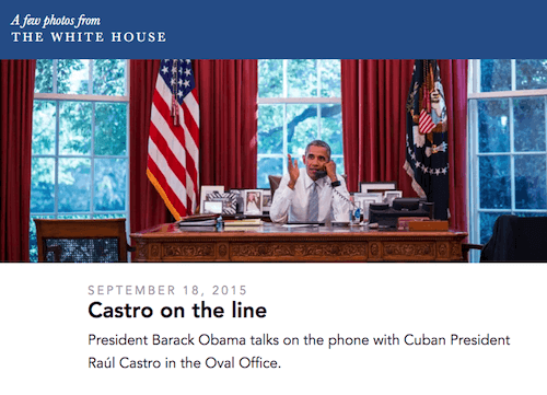


