10 Beautiful Glassmorphism Examples

Glassmorphism is a term used to describe UI design that emphasizes light or dark objects, placed on top of colorful backgrounds. A background-blur is placed on the objects which allows the background to shine through – giving it the impression of frosted glass.

In this post we’ve collected 10 stunning examples of this design trend from Codepen. Have a look and see how you could possibly use this effect in your upcoming projects!

Your Web Designer Toolbox
Unlimited Downloads: 500,000+ Web Templates, Icon Sets, Themes & Design Assets


Glassmorphism Example

See the Pen Glassmorphism by Albert (@walickialbert) on CodePen.light

Glassmorphism Creative Cloud App Redesign

See the Pen Glassmorphism Creative Cloud App Redesign by Aysenur Turk (@TurkAysenur) on CodePen.light

Glassmorphic Sign in Form

See the Pen Glassmorphic Sign in Form by Shounak Das (@dasshounak) on CodePen.light

Glassmorphism Credit/Debit Card (pure CSS)

See the Pen Glassmorphism Credit/Debit Card (pure CSS) by Shounak Das (@dasshounak) on CodePen.light

Glassmorphism Page

See the Pen Glassmorphism by Jayasree (@Jayasree_0708) on CodePen.light

Glassmorphism Hello

See the Pen Glassmorphism by Vihanga nivarthana (@vihanga) on CodePen.light

Simple Glassmorphism Example

See the Pen Glassmorphism by Supriya (@omeal) on CodePen.light

Glassmorphism vs Neumorphism Cards

See the Pen Glassmorphism vs Neumorphism Cards | CSS, Js & VanillaTilt by Quentin Feret (@quentin-feret) on CodePen.light

Glassmorphism Animated

See the Pen Glassmorphism Animated by jSpilka95 (@jspilka95) on CodePen.light

Glassmorphism Post grid

See the Pen Glassmorphism Post grid by Vinothkanna (@vinocrazy) on CodePen.light

10 Fantastic Examples of Progressive Webapps

The concept of a progressive webapp (PWA) is simple. Developers create websites that behave like native applications for all environments. These work like hybrid site-app combos where you have “webapps” that can run natively on a mobile device and just as well on a desktop web browser.

If you’re looking for some examples of PWAs then this collection is sure to please.

Your Web Designer Toolbox
Unlimited Downloads: 500,000+ Web Templates, Icon Sets, Themes & Design Assets


English Accents Map

english accents map

The English Accents Map site is one of the strangest yet most interesting progressive webapps I’ve found. It features pin markers for different accents in regions across the UK and the US.

Each marker links to a set of videos from YouTube. These videos have been created by people with that local accent, so you can listen and study how certain areas of the world speak English.

Really cool PWA and definitely one of the coolest concepts I’ve seen for a website.

React HN

react hn webapp

The React.js craze isn’t slowing down anytime soon and it’s certainly a staple for building any progressive webapp.

One example is the React HN site that pulls data from Hacker News and loads it all into a neat React.js webapp.

This is designed just like the HN homepage but it can operate like a native app on mobile devices. It doesn’t support account logins but you can do pretty much everything else, and it’s got a real snappy interface to boot.

Currency-X

currencyx converter

Looking for a free currency exchange rate app for your iPhone? Currency-X has you covered.

This free PWA works around a handful of currencies and runs with live data from APIs. This way the currency conversion rates are accurate and you can test them against pretty much every country from Kenya to Vietnam.

I do think the UX is lacking a bit and could be improved for mobile. But on the whole, this is one of the more impressive apps considering how much data it pulls.

Pokedex.org

pokedex org webapp

All you Pokemon fans are gonna love Pokedex.org for its simplicity and ease of use.

This webapp behaves like a literal Pokedex where you can search for monsters and get all their stats quickly. Data comes from the Pokeapi along with Wiki pages to ensure total accuracy.

And while this doesn’t distinguish between the different games it’s still an impressive webapp for the amazing price of free. Perfect for Pokemon players who want quick access to quick data.

GitHub Explorer

github explorer pwa

Web developers love GitHub for its massive curation of free resources. The site has become a go-to resource for code snippets and now with GitHub Explorer you can dig into those code samples yourself.

The site is still a work in progress but it lets you browse through two methods: users and repos.

You can search by username or by repo name and pull up data fast. This includes the full readme file, all directories, and recent updates. However the search feature doesn’t include every repo so it’s more like a demo app showcasing what PWAs can offer.

Flipkart

flipkart ecommerce

Believe it or not there are entire eCommerce shops that support PWA features. Flipkart is the only one I know of but their website is absolutely massive.

This India-based eCommerce site offers complete support as a native mobile application. You can search, browse products, and use your account to purchase items all with a native feel.

I’d argue this is the most complex PWA on the web and it deserves an award as one of the best UX’s I’ve seen all year.

Expense Manager

expense manager pwa

If you want to track some quick expenses on your phone then the Expense Manager app is a nice place to start.

This thing behaves more like a simple calculator but it can save data for the long term. The demo account clears data after one hour but you can try the Vaadin framework yourself if you want a longterm solution.

The Expense Manager is mostly used to help sell this framework and bring attention to the company. And for that I’d say it gets the job done with plenty of “wow” factor to go around.

Offline Wikipedia

offline wikipedia

Here’s another cool demo app that I think should actually be built into the core of Wikipedia.

Offline Wikipedia is a PWA site created by Jake Archibald. It’s fully compliant with all the ideas of progressive webapps so it works on smartphones, tablets, laptops and desktops alike.

The interface is also pretty snappy so it’s easy searching and finding Wiki articles. Probably one of the few PWAs that I think really could add value to the main site.

Splittypie

splittypie expenses

Never worry about splitting the bill again with Splittypie.

This app is fantastic and for the price of free you can’t beat it. You just visit the site in your browser and you create new “events” for tracking prices.

Whether you’re splitting a meal or the price of a ball game this app works for any device at the click (or tap) of a button.

Also the source code is freely available on GitHub if you want to use this as a base for your own PWA.

FT App

financial times pwa

The massive publishing giant Financial Times surprisingly has their own PWA and it works really well.

Their app runs just like a news site except it’s fully responsive to touch. This means it behaves exactly like a native application where you don’t see new pages load, they just slide into view.

I’d like to think the future of publishing is full of websites like this. We’re already seeing this with Google AMP but that’s only a small step towards full PWAs.

Get Kana!

get kana training webapp

Last but certainly not least is the Get Kana app. What’s cool is this site actually has a full application in the Android and iOS app stores.

But this progressive webapp is the next best thing for anyone who wants to try it out in their browser. It’s a Japanese learning app where you can learn the syllabaries for katakana & hiragana through flash cards.

Not something that everyone will find useful but absolutely one of the cleanest PWAs I’ve used. And best of all their code is freely available on GitHub if you want to dig into that too.

12 Essential Scroll-To-View Animation Trends

Animated page elements are super common on landing pages and startup websites. But they’re not always talked about in design circles because the idea of “animate on view” isn’t covered a lot.

I use the phrase scroll-to-view because it seems like an accurate description. Basically as you scroll down the page new animated elements come into view.

It’s not a technique that works for every website but it does add a nice touch into certain layouts. And I’ve curated some of my favorites here to showcase how these scroll-to-view animations work and why you might try using them yourself.
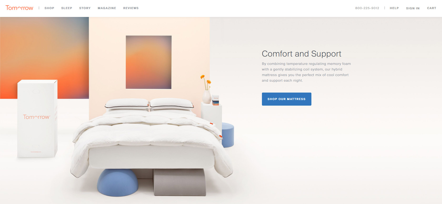
1. Tomorrow Sleep

On the Tomorrow Sleep website you’ll notice a few fairly benign animated effects. These fade different pieces of text and CTAs into view all around the layout.

What’s interesting is how most of the images and background areas are fully visible even on first scroll. Many websites use fading animation to display images and screenshots while keeping the text visible.

This minor difference helps draw attention to the text as it fades into view. A great way to capture attention from visitors browsing along.
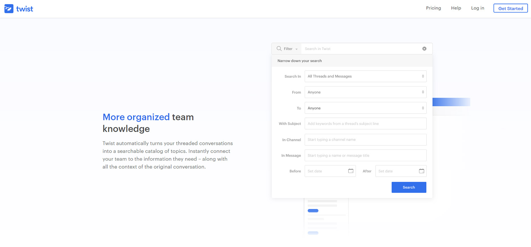
2. Twist

Another technique I often see is targeting most of the page’s content for on-scroll animations.

For example the Twist app homepage includes varying page segments and blocks of text that animate in & out of view on scroll. These have a very soft fading effect so they’re noticeable yet not too harsh.

Some visitors may be annoyed by the delay but I don’t think it’s too long. Plus it only animates one time so if you hit the bottom of the page all animations are done.
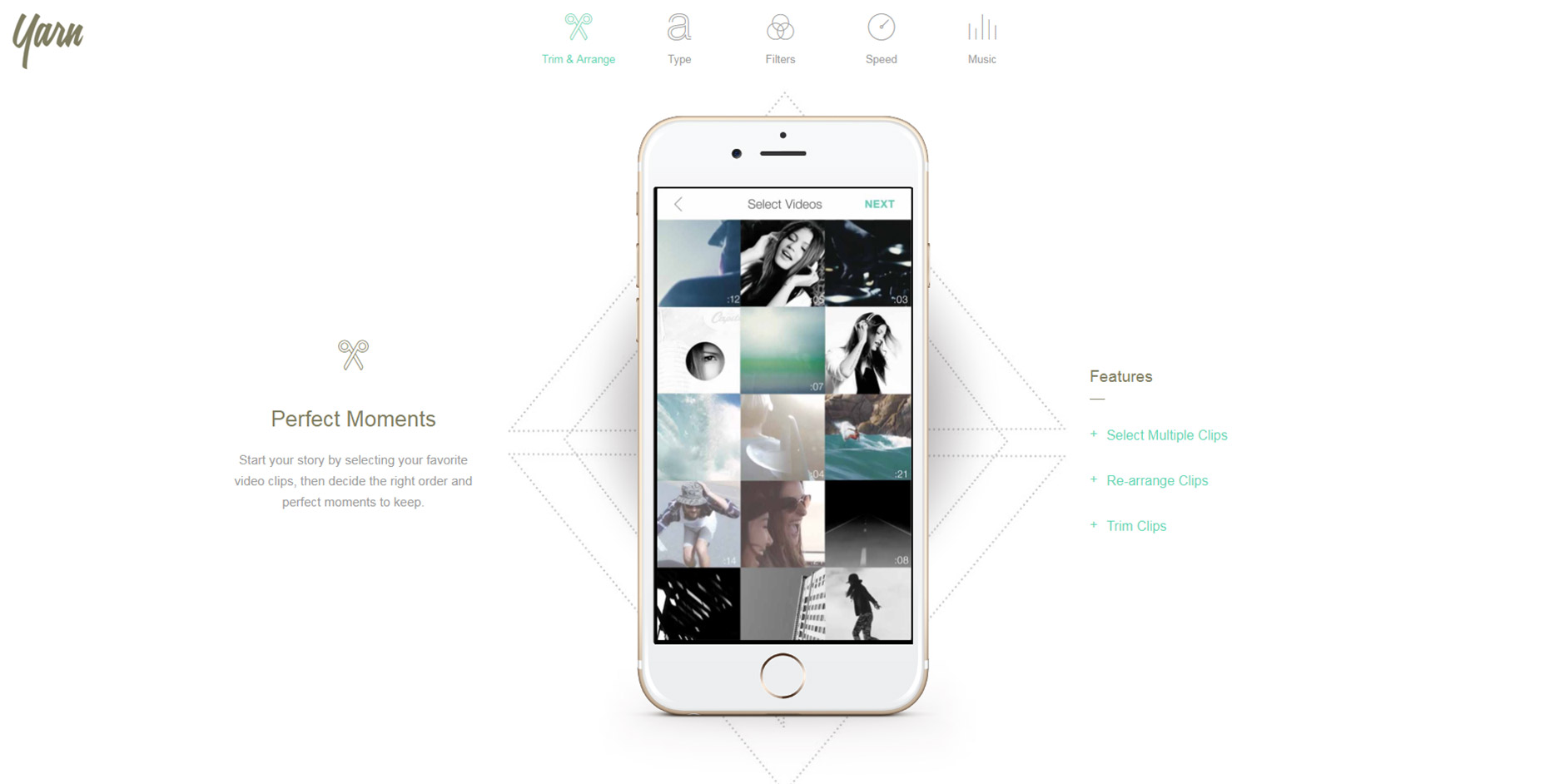
3. Yarn App

For much more complex animations check out the Yarn App lander. This one has multi-part animations and even elements that come into view from different angles.

Some of the screenshot demo images animate upwards while the accompanying text/BG patterns animate down into view. This alternating style is pretty unique and not something I see often.

However the landing page is also incredibly simple and there isn’t much else here to grab attention. In this case varying animations work nicely.
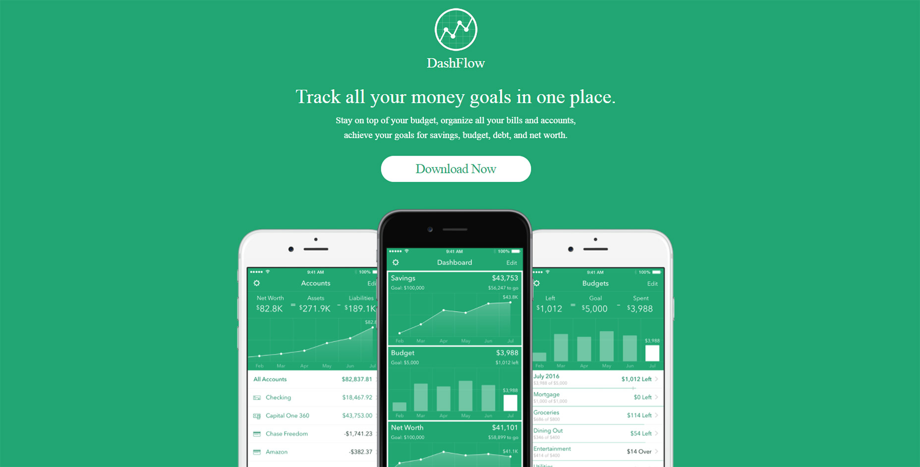
4. DashFlow

Out of all these examples I think DashFlow uses the most common animation techniques.

This lander animates images and text into view all in one sitting. It’s real simple and uses a single-column layout so all content flows straight down in a linear path.

Nothing inherently special about this design beyond the very clear-cut method of animating items on scroll. A great style if you have a similar website and want to keep the animations simple.
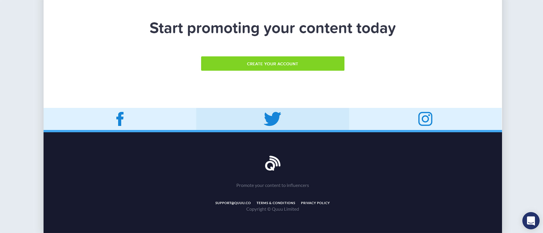
5. Quuu Promote

Quuu Promote keeps animations to the bare minimum and only uses them in CTA areas.

I can’t say if this increases conversions but that does seem to be the goal. When you first load the page the very top header animates into view with a tilting animation on the CTA.

As you scroll down you’ll notice the rest of the page is pretty static. But at the bottom there’s one final CTA above the footer that also animates & runs the same tilting animation.

Goes to show you can have on-scroll animation effects that don’t run across the entire page.
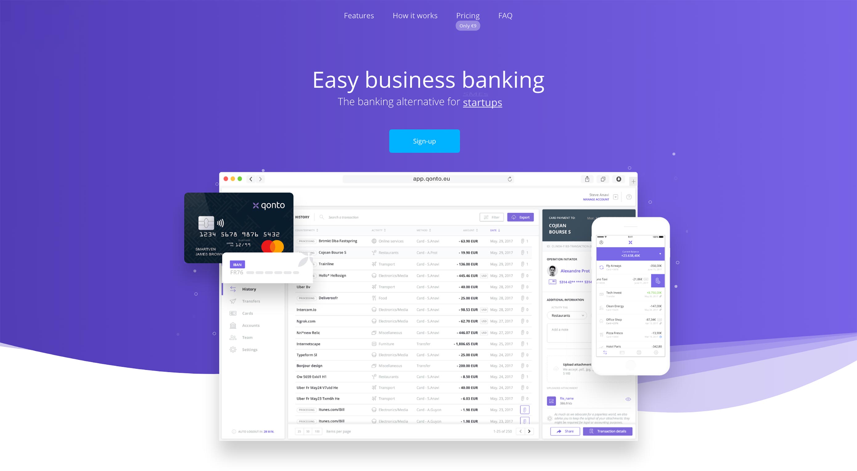
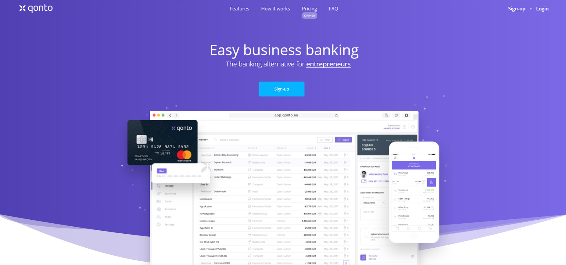
6. Qonto

The homepage for Qonto has an interesting take on scroll-to-view animation. It uses the same type of animation across the entire website and animates individual items into view from the side.

For the majority of the page this includes icon sections that have a small graphic above some content explaining the app’s features. Not too subtle yet not overly overt either.

Plus you can find a few other animation styles in the header along with some BG images that fade into view. This page is just a gorgeous example of what web animation can do.
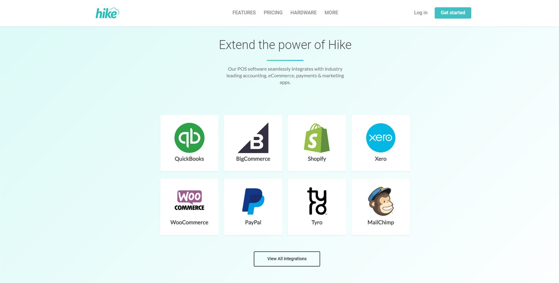
7. Hike

For an example of subtle animations check out Hike.

Their page alternates between animated elements and fixed elements. But the animation effects are fast so you don’t feel annoyed waiting for viewable content.

This is my preference for any scroll-to-animation effect. It’s always a beautiful technique but the timing needs to be quick and to the point. Nobody wants to wait around for content to come into view and Hike clearly understands this.
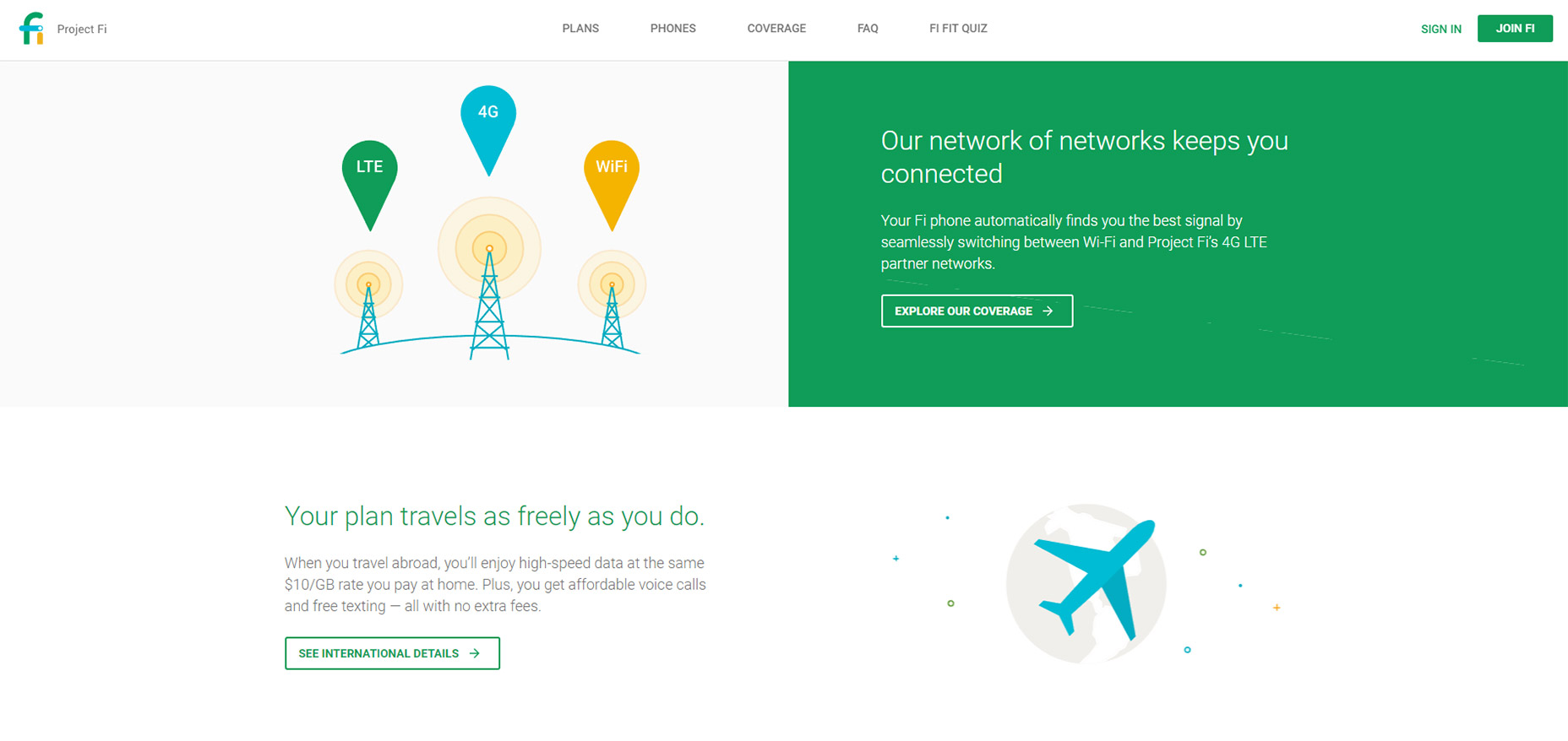
8. Project Fi

If there’s anyone who knows great UX it’s Google. And across all their products they have a ton of landing pages, Project Fi being one example with some fantastic animations.

These only apply to icons and they don’t fade into view, but rather pop up from lower on the page. As you scroll you’ll find icons that slide up into view for each small section.

It’s a pretty subtle effect but it adds some life into the design. And it’s based solely on the viewer’s position on the page so if you scroll to the top & move back down you’ll be greeted by the same animation effects.
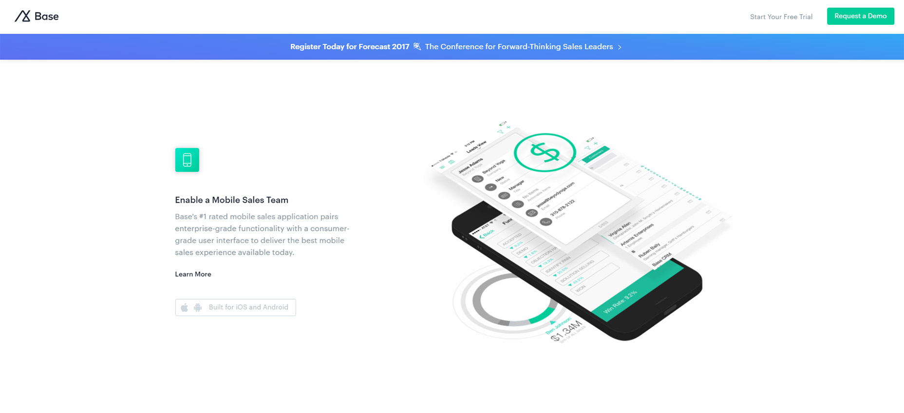
9. Base

The Base CRM homepage is an excellent example of simple animation at work. This site uses custom animation effects to move images up and into the viewer’s eye line.

Based on the number of landing pages I see daily this is very typical of what I expect. It’s not really a complex animation to recreate and it doesn’t affect the experience too much either.

One thing I wish is that the animations would load a bit faster. But beyond that I think this is a prime example of animating images on scroll with a very clean layout to boot.
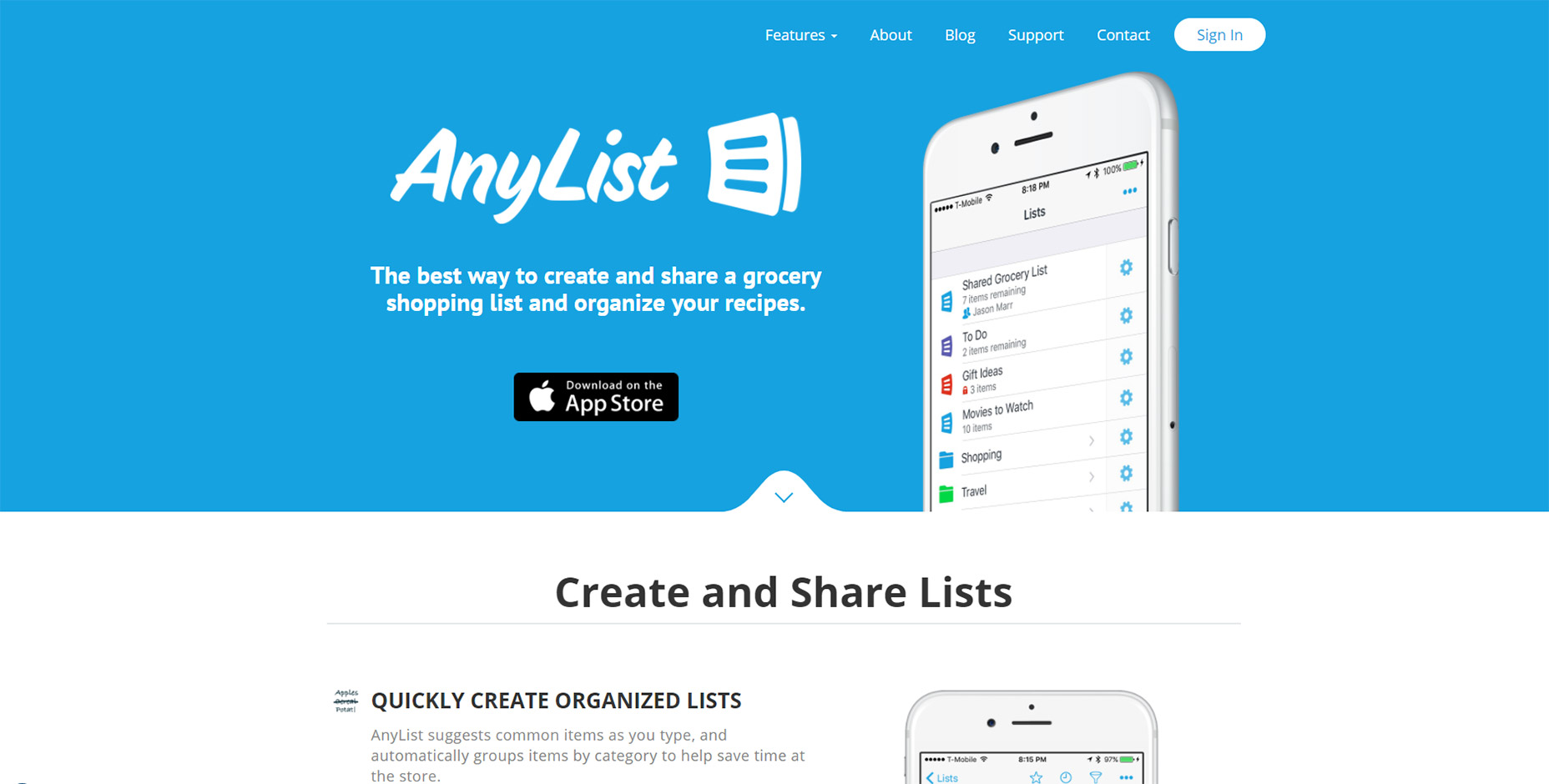
10. AnyList

All the best mobile applications have their own websites for promotion. And the best ones usually have some pretty snazzy animation styles.

AnyList mixes a few different techniques together on one page. Their header image animates up from beneath the cut-off area but it’s the only “moving” animation on the page.

Everything else just fades into view and it all uses a pretty quick load time for the animation. These techniques are used elsewhere on the site which gives it a more cohesive feel.
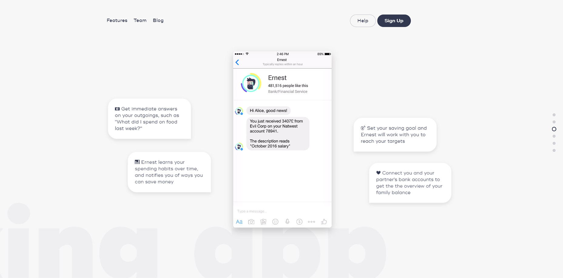
11. Ernest

The page style for Ernest is a little different than other landing pages I’ve covered.

It uses parallax scrolling animations to create motion on a single page layout with different sections.

These vary based on the direction you’re scrolling whether you move up or down, and at what speed. They also vary with intensity based on the different sections of the page.

You can navigate using the side dot navigation menu and this quickly jumps around the page to different areas. It’s one of the few techniques you’ll often see on parallax pages and it certainly helps Ernest stand out from the crowd.
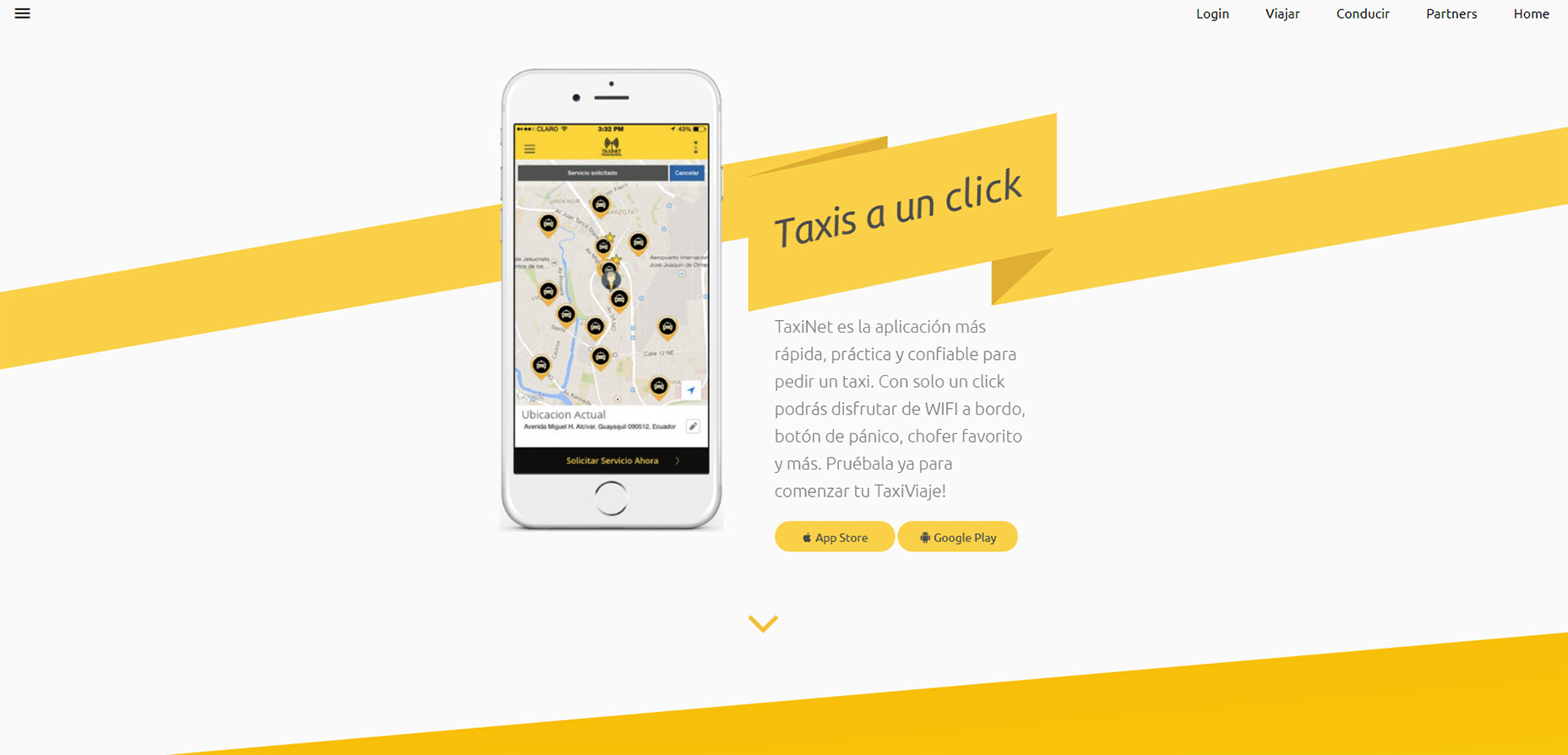
12. TaxiNet

To catch a glimpse of full-page animations in action take a look at the TaxiNet website.

It’s a smorgasbord of scroll-based animation effects tied to icons, text, images, and even background styles. Individual page background colors animate into view with the user, definitely not a typical technique but certainly an interesting one.

If you like this style you could absolutely apply a similar approach to your own landing page. Just make sure you keep the animations snappy and quick because nobody wants to wait around for your neat animations to load.

But if you do ‘em right these scroll-to-view elements add a nice effect to any landing page.

LAST DAY: Zelda – A Beautiful and Classy Script Font – only $7!

Source