Creating A Multi-Author Blog With Next.js

In this article, we are going to build a blog with Next.js that supports two or more authors. We will attribute each post to an author and show their name and picture with their posts. Each author also gets a profile page, which lists all posts they contributed. It will look something like this:

We are going to keep all information in files on the local filesystem. The two types of content, posts and authors, will use different types of files. The text-heavy posts will use Markdown, allowing for an easier editing process. Because the information on authors is lighter, we will keep that in JSON files. Helper functions will make reading different file types and combining their content easier.

Next.js lets us read data from different sources and of different types effortlessly. Thanks to its dynamic routing and next/link, we can quickly build and navigate to our site’s various pages. We also get image optimization for free with the next/image package.

By picking the “batteries included” Next.js, we can focus on our application itself. We don’t have to spend any time on the repetitive groundwork new projects often come with. Instead of building everything by hand, we can rely on the tested and proven framework. The large and active community behind Next.js makes it easy to get help if we run into issues along the way.

After reading this article, you will be able to add many kinds of content to a single Next.js project. You will also be able to create relationships between them. That allows you to link things like authors and posts, courses and lessons, or actors and movies.

This article assumes basic familiarity with Next.js. If you have not used it before, you might want to read up on how it handles pages and fetches data for them first.

We won’t cover styling in this article and focus on making it all work instead. You can get the result on GitHub. There is also a stylesheet you can drop into your project if you want to follow along with this article. To get the same frame, including the navigation, replace your pages/_app.js with this file.

Setup

We begin by setting up a new project using create-next-app and changing to its directory:

$ npx create-next-app multiauthor-blog
$ cd multiauthor-blog

We will need to read Markdown files later. To make this easier, we also add a few more dependencies before getting started.

multiauthor-blog$ yarn add gray-matter remark remark-html

Once the installation is complete, we can run the dev script to start our project:

multiauthor-blog$ yarn dev

We can now explore our site. In your browser, open http://localhost:3000. You should see the default page added by create-next-app.

In a bit, we’ll need a navigation to reach our pages. We can add them in pages/_app.js even before the pages exist.

import Link from 'next/link'

import '../styles/globals.css'

export default function App({ Component, pageProps }) {
  return (
    <>
      <header>
        <nav>
          <ul>
            <li>
              <Link href="/">
                <a>Home</a>
              </Link>
            </li>

            <li>
              <Link href="/posts">
                <a>Posts</a>
              </Link>
            </li>

            <li>
              <Link href="/authors">
                <a>Authors</a>
              </Link>
            </li>
          </ul>
        </nav>
      </header>

      <main>
        <Component {...pageProps} />
      </main>
    </>
  )
}

Throughout this article, we’ll add these missing pages the navigation points to. Let’s first add some posts so we have something to work with on a blog overview page.

Creating Posts

To keep our content separate from the code, we’ll put our posts in a directory called _posts/. To make writing and editing easier, we’ll create each post as a Markdown file. Each post’s filename will serve as the slug in our routes later. The file _posts/hello-world.md will be accessible under /posts/hello-world, for example.

Some information, like the full title and a short excerpt, goes in the frontmatter at the beginning of the file.

---
title: "Hello World!"
excerpt: "This is my first blog post."
createdAt: "2021-05-03"
---
Hey, how are you doing? Welcome to my blog. In this post, …

Add a few more files like this so the blog doesn’t start out empty:

multi-author-blog/
├─ _posts/
│  ├─ hello-world.md
│  ├─ multi-author-blog-in-nextjs.md
│  ├─ styling-react-with-tailwind.md
│  └─ ten-hidden-gems-in-javascript.md
└─ pages/
   └─ …
 

You can add your own or grab these sample posts from the GitHub repository.

Listing All Posts

Now that we have a few posts, we need a way to get them onto our blog. Let’s start by adding a page that lists them all, serving as the index of our blog.

In Next.js, a file created under pages/posts/index.js will be accessible as /posts on our site. The file must export a function that will serve as that page’s body. Its first version looks something like this:

export default function Posts() {
  return (
    <div className="posts">
      <h1>Posts</h1>

      {/* TODO: render posts */}
    </div>
  )
}

We don’t get very far because we don’t have a way to read the Markdown files yet. We can already navigate to http://localhost:3000/posts, but we only see the heading.

We now need a way to get our posts on there. Next.js uses a function called getStaticProps() to pass data to a page component. The function passes the props in the returned object to the component as props.

From getStaticProps(), we are going to pass the posts to the component as a prop called posts. We’ll hardcode two placeholder posts in this first step. By starting this way, we define what format we later want to receive the real posts in. If a helper function returns them in this format, we can switch over to it without changing the component.

The post overview won’t show the full text of the posts. For this page, the title, excerpt, permalink, and date of each post are enough.

 export default function Posts() { … }

+export function getStaticProps() {
+  return {
+    props: {
+      posts: [
+        {
+          title: "My first post",
+          createdAt: "2021-05-01",
+          excerpt: "A short excerpt summarizing the post.",
+          permalink: "/posts/my-first-post",
+          slug: "my-first-post",
+        }, {
+          title: "My second post",
+          createdAt: "2021-05-04",
+          excerpt: "Another summary that is short.",
+          permalink: "/posts/my-second-post",
+          slug: "my-second-post",
+        }
+      ]
+    }
+  }
+}

To check the connection, we can grab the posts from the props and show them in the Posts component. We’ll include the title, date of creation, excerpt, and a link to the post. For now, that link won’t lead anywhere yet.

+import Link from 'next/link'

-export default function Posts() {
+export default function Posts({ posts }) {
   return (
     <div className="posts">
       <h1>Posts</h1>

-      {/ TODO: render posts /}
+      {posts.map(post => {
+        const prettyDate = new Date(post.createdAt).toLocaleString('en-US', {
+          month: 'short',
+          day: '2-digit',
+          year: 'numeric',
+        })
+
+        return (
+          <article key={post.slug}>
+            <h2>
+              <Link href={post.permalink}>
+                <a>{post.title}</a>
+              </Link>
+            </h2>
+
+            <time dateTime={post.createdAt}>{prettyDate}</time>
+
+            <p>{post.excerpt}</p>
+
+            <Link href={post.permalink}>
+              <a>Read more →</a>
+            </Link>
+          </article>
+        )
+      })}
     </div>
   )
 }

 export function getStaticProps() { … }

After reloading the page in the browser, it now shows these two posts:

We don’t want to hardcode all our blog posts in getStaticProps() forever. After all, that is why we created all these files in the _posts/ directory earlier. We now need a way to read those files and pass their content to the page component.

There are a few ways we could do that. We could read the files right in getStaticProps(). Because this function runs on the server and not the client, we have access to native Node.js modules like fs in it. We could read, transform, and even manipulate local files in the same file we keep the page component.

To keep the file short and focused on one task, we’re going to move that functionality to a separate file instead. That way, the Posts component only needs to display the data, without also having to read that data itself. This adds some separation and organization to our project.

By convention, we are going to put functions reading data in a file called lib/api.js. That file will hold all functions that grab our content for the components that display it.

For the posts overview page, we want a function that reads, processes, and returns all posts. We’ll call it getAllPosts(). In it, we first use path.join() to build the path to the _posts/ directory. We then use fs.readdirSync() to read that directory, which gives us the names of all files in it. Mapping over these names, we then read each file in turn.

import fs from 'fs'
import path from 'path'

export function getAllPosts() {
  const postsDirectory = path.join(process.cwd(), '_posts')
  const filenames = fs.readdirSync(postsDirectory)

  return filenames.map(filename => {
    const file = fs.readFileSync(path.join(process.cwd(), '_posts', filename), 'utf8')

    // TODO: transform and return file
  })
}

After reading the file, we get its contents as a long string. To separate the frontmatter from the text of the post, we run that string through gray-matter. We’re also going to grab each post’s slug by removing the .md from the end of its filename. We need that slug to build the URL from which the post will be accessible later. Since we don’t need the Markdown body of the posts for this function, we can ignore the remaining content.

import fs from 'fs'
 import path from 'path'
+import matter from 'gray-matter'

 export function getAllPosts() {
   const postsDirectory = path.join(process.cwd(), '_posts')
   const filenames = fs.readdirSync(postsDirectory)

   return filenames.map(filename => {
     const file = fs.readFileSync(path.join(process.cwd(), '_posts', filename), 'utf8')

-    // TODO: transform and return file
+    // get frontmatter
+    const { data } = matter(file)
+
+    // get slug from filename
+    const slug = filename.replace(/.md$/, '')
+
+    // return combined frontmatter and slug; build permalink
+    return {
+      ...data,
+      slug,
+      permalink: /posts/${slug},
+    }
   })
 }

Note how we spread ...data into the returned object here. That lets us access values from its frontmatter as {post.title} instead of {post.data.title} later.

Back in our posts overview page, we can now replace the placeholder posts with this new function.

+import { getAllPosts } from '../../lib/api'

 export default function Posts({ posts }) { … }

 export function getStaticProps() {
   return {
     props: {
-      posts: [
-        {
-          title: "My first post",
-          createdAt: "2021-05-01",
-          excerpt: "A short excerpt summarizing the post.",
-          permalink: "/posts/my-first-post",
-          slug: "my-first-post",
-        }, {
-          title: "My second post",
-          createdAt: "2021-05-04",
-          excerpt: "Another summary that is short.",
-          permalink: "/posts/my-second-post",
-          slug: "my-second-post",
-        }
-      ]
+      posts: getAllPosts(),
     }
   }
 }

After reloading the browser, we now see our real posts instead of the placeholders we had before.

Adding Individual Post Pages

The links we added to each post don’t lead anywhere yet. There is no page that responds to URLs like /posts/hello-world yet. With dynamic routing, we can add a page that matches all paths like this.

A file created as pages/posts/[slug].js will match all URLs that look like /posts/abc. The value that appears instead of [slug] in the URL will be available to the page as a query parameter. We can use that in the corresponding page’s getStaticProps() as params.slug to call a helper function.

As a counterpart to getAllPosts(), we’ll call that helper function getPostBySlug(slug). Instead of all posts, it will return a single post that matches the slug we pass it. On a post’s page, we also need to show the underlying file’s Markdown content.

The page for individual posts looks like the one for the post overview. Instead of passing posts to the page in getStaticProps(), we only pass a single post. Let’s do the general setup first before we look at how to transform the post’s Markdown body to usable HTML. We’re going to skip the placeholder post here, using the helper function we’ll add in the next step immediately.

import { getPostBySlug } from '../../lib/api'

export default function Post({ post }) {
  const prettyDate = new Date(post.createdAt).toLocaleString('en-US', {
    month: 'short',
    day: '2-digit',
    year: 'numeric',
  })

  return (
    <div className="post">
      <h1>{post.title}</h1>

      <time dateTime={post.createdAt}>{prettyDate}</time>

      {/ TODO: render body /}
    </div>
  )
}

export function getStaticProps({ params }) {
  return {
    props: {
      post: getPostBySlug(params.slug),
    },
  }
}

We now have to add the function getPostBySlug(slug) to our helper file lib/api.js. It is like getAllPosts(), with a few notable differences. Because we can get the post’s filename from the slug, we don’t need to read the entire directory first. If the slug is 'hello-world', we are going to read a file called _posts/hello-world.md. If that file doesn’t exist, Next.js will show a 404 error page.

Another difference to getAllPosts() is that this time, we also need to read the post’s Markdown content. We can return it as render-ready HTML instead of raw Markdown by processing it with remark first.

 import fs from 'fs'
 import path from 'path'
 import matter from 'gray-matter'
+import remark from 'remark'
+import html from 'remark-html'

 export function getAllPosts() { … }

+export function getPostBySlug(slug) {
+  const file = fs.readFileSync(path.join(process.cwd(), '_posts', ${slug}.md), 'utf8')
+
+  const {
+    content,
+    data,
+  } = matter(file)
+
+  const body = remark().use(html).processSync(content).toString()
+
+  return {
+    ...data,
+    body,
+  }
+}

In theory, we could use the function getAllPosts() inside getPostBySlug(slug). We’d first get all posts with it, which we could then search for one that matches the given slug. That would mean we would always need to read all posts before we could get a single one, which is unnecessary work. getAllPosts() also doesn’t return the posts’ Markdown content. We could update it to do that, in which case it would do more work than it currently needs to.

Because the two helper functions do different things, we are going to keep them separate. That way, we can focus the functions on exactly and only the job we need each of them to do.

Pages that use dynamic routing can provide a getStaticPaths() next to their getStaticProps(). This function tells Next.js what values of the dynamic path segments to build pages for. We can provide those by using getAllPosts() and returning a list of objects that define each post’s slug.

-import { getPostBySlug } from '../../lib/api'
+import { getAllPosts, getPostBySlug } from '../../lib/api'

 export default function Post({ post }) { … }

 export function getStaticProps({ params }) { … }

+export function getStaticPaths() {
+  return {
+    fallback: false,
+    paths: getAllPosts().map(post => ({
+      params: {
+        slug: post.slug,
+      },
+    })),
+  }
+}

Since we parse the Markdown content in getPostBySlug(slug), we can render it on the page now. We need to use dangerouslySetInnerHTML for this step so Next.js can render the HTML behind post.body. Despite its name, it is safe to use the property in this scenario. Because we have full control over our posts, it is unlikely they are going to inject unsafe scripts.

 import { getAllPosts, getPostBySlug } from '../../lib/api'

 export default function Post({ post }) {
  const prettyDate = new Date(post.createdAt).toLocaleString('en-US', {
    month: 'short',
    day: '2-digit',
    year: 'numeric',
  })

   return (
     <div className="post">
       <h1>{post.title}</h1>

       <time dateTime={post.createdAt}>{prettyDate}</time>

-      {/ TODO: render body /}
+      <div dangerouslySetInnerHTML={{ __html: post.body }} />
     </div>
   )
 }

 export function getStaticProps({ params }) { … }

 export function getStaticPaths() { … }

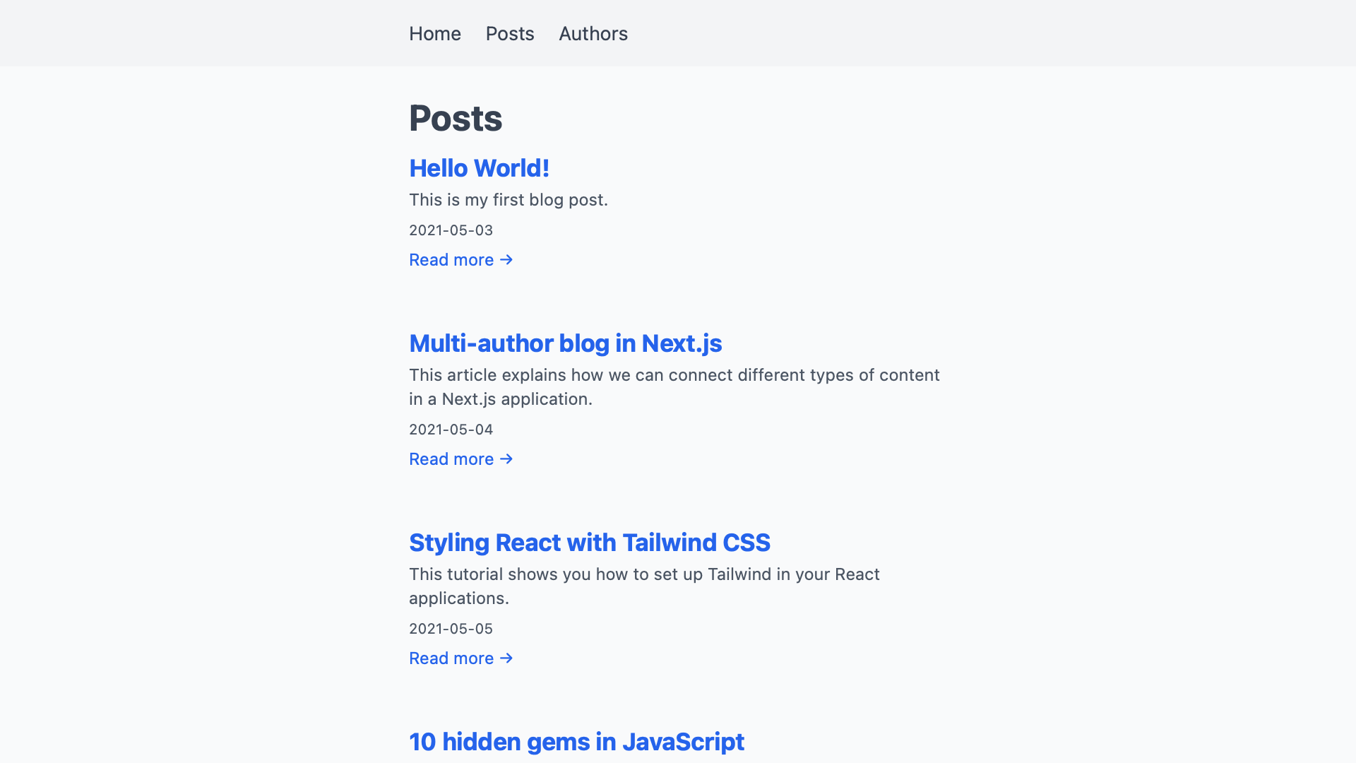
If we follow one of the links from the post overview, we now get to that post’s own page.

Adding Authors

Now that we have posts wired up, we need to repeat the same steps for our authors. This time, we’ll use JSON instead of Markdown to describe them. We can mix different types of files in the same project like this whenever it makes sense. The helper functions we use to read the files take care of any differences for us. Pages can use these functions without knowing what format we store our content in.

First, create a directory called _authors/ and add a few author files to it. As we did with posts, name the files by each author’s slug. We’ll use that to look up authors later. In each file, we specify an author’s full name in a JSON object.

{
  "name": "Adrian Webber"
}

For now, having two authors in our project is enough.

To give them some more personality, let’s also add a profile picture for each author. We’ll put those static files in the public/ directory. By naming the files by the same slug, we can connect them using the implied convention alone. We could add the path of the picture to each author’s JSON file to link the two. By naming all files by the slugs, we can manage this connection without having to write it out. The JSON objects only need to hold information we can’t build with code.

When you’re done, your project directory should look something like this.

multi-author-blog/
├─ _authors/
│  ├─ adrian-webber.json
│  └─ megan-carter.json
├─ _posts/
│  └─ …
├─ pages/
│  └─ …
└─ public/
   ├─ adrian-webber.jpg
   └─ megan-carter.jpg
 

Same as with the posts, we now need helper functions to read all authors and get individual authors. The new functions getAllAuthors() and getAuthorBySlug(slug) also go in lib/api.js. They do almost exactly the same as their post counterparts. Because we use JSON to describe authors, we don’t need to parse any Markdown with remark here. We also don’t need gray-matter to parse frontmatter. Instead, we can use JavaScript’s built-in JSON.parse() to read the text contents of our files into objects.

const contents = fs.readFileSync(somePath, 'utf8')
// ⇒ looks like an object, but is a string
//   e.g. '{ "name": "John Doe" }'

const json = JSON.parse(contents)
// ⇒ a real JavaScript object we can do things with
//   e.g. { name: "John Doe" }

With that knowledge, our helper functions look like this:

 export function getAllPosts() { … }

 export function getPostBySlug(slug) { … }

+export function getAllAuthors() {
+  const authorsDirectory = path.join(process.cwd(), '_authors')
+  const filenames = fs.readdirSync(authorsDirectory)
+
+  return filenames.map(filename => {
+    const file = fs.readFileSync(path.join(process.cwd(), '_authors', filename), 'utf8')
+
+    // get data
+    const data = JSON.parse(file)
+
+    // get slug from filename
+    const slug = filename.replace(/.json/, '')
+
+    // return combined frontmatter and slug; build permalink
+    return {
+      ...data,
+      slug,
+      permalink: /authors/${slug},
+      profilePictureUrl: ${slug}.jpg,
+    }
+  })
+}
+
+export function getAuthorBySlug(slug) {
+  const file = fs.readFileSync(path.join(process.cwd(), '_authors', ${slug}.json), 'utf8')
+
+  const data = JSON.parse(file)
+
+  return {
+    ...data,
+    permalink: /authors/${slug},
+    profilePictureUrl: /${slug}.jpg,
+    slug,
+  }
+}

With a way to read authors into our application, we can now add a page that lists them all. Creating a new page under pages/authors/index.js gives us an /authors page on our site.

The helper functions take care of reading the files for us. This page component does not need to know authors are JSON files in the filesystem. It can use getAllAuthors() without knowing where or how it gets its data. The format does not matter as long as our helper functions return their data in a format we can work with. Abstractions like this let us mix different types of content across our application.

The index page for authors looks a lot like the one for posts. We get all authors in getStaticProps(), which passes them to the Authors component. That component maps over each author and lists some information about them. We don’t need to build any other links or URLs from the slug. The helper function already returns the authors in a usable format.

import Image from 'next/image'
import Link from 'next/link'

import { getAllAuthors } from '../../lib/api/authors'

export default function Authors({ authors }) {
  return (
    <div className="authors">
      <h1>Authors</h1>

      {authors.map(author => (
        <div key={author.slug}>
          <h2>
            <Link href={author.permalink}>
              <a>{author.name}</a>
            </Link>
          </h2>

          <Image alt={author.name} src={author.profilePictureUrl} height="40" width="40" />

          <Link href={author.permalink}>
            <a>Go to profile →</a>
          </Link>
        </div>
      ))}
    </div>
  )
}

export function getStaticProps() {
  return {
    props: {
      authors: getAllAuthors(),
    },
  }
}

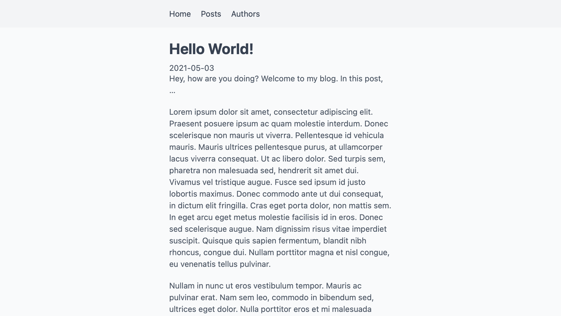
If we visit /authors on our site, we see a list of all authors with their names and pictures.

The links to the authors’ profiles don’t lead anywhere yet. To add the profile pages, we create a file under pages/authors/[slug].js. Because authors don’t have any text content, all we can add for now are their names and profile pictures. We also need another getStaticPaths() to tell Next.js what slugs to build pages for.

import Image from 'next/image'

import { getAllAuthors, getAuthorBySlug } from '../../lib/api'

export default function Author({ author }) {
  return (
    <div className="author">
      <h1>{author.name}</h1>

      <Image alt={author.name} src={author.profilePictureUrl} height="80" width="80" />
    </div>
  )
}

export function getStaticProps({ params }) {
  return {
    props: {
      author: getAuthorBySlug(params.slug),
    },
  }
}

export function getStaticPaths() {
  return {
    fallback: false,
    paths: getAllAuthors().map(author => ({
      params: {
        slug: author.slug,
      },
    })),
  }
}

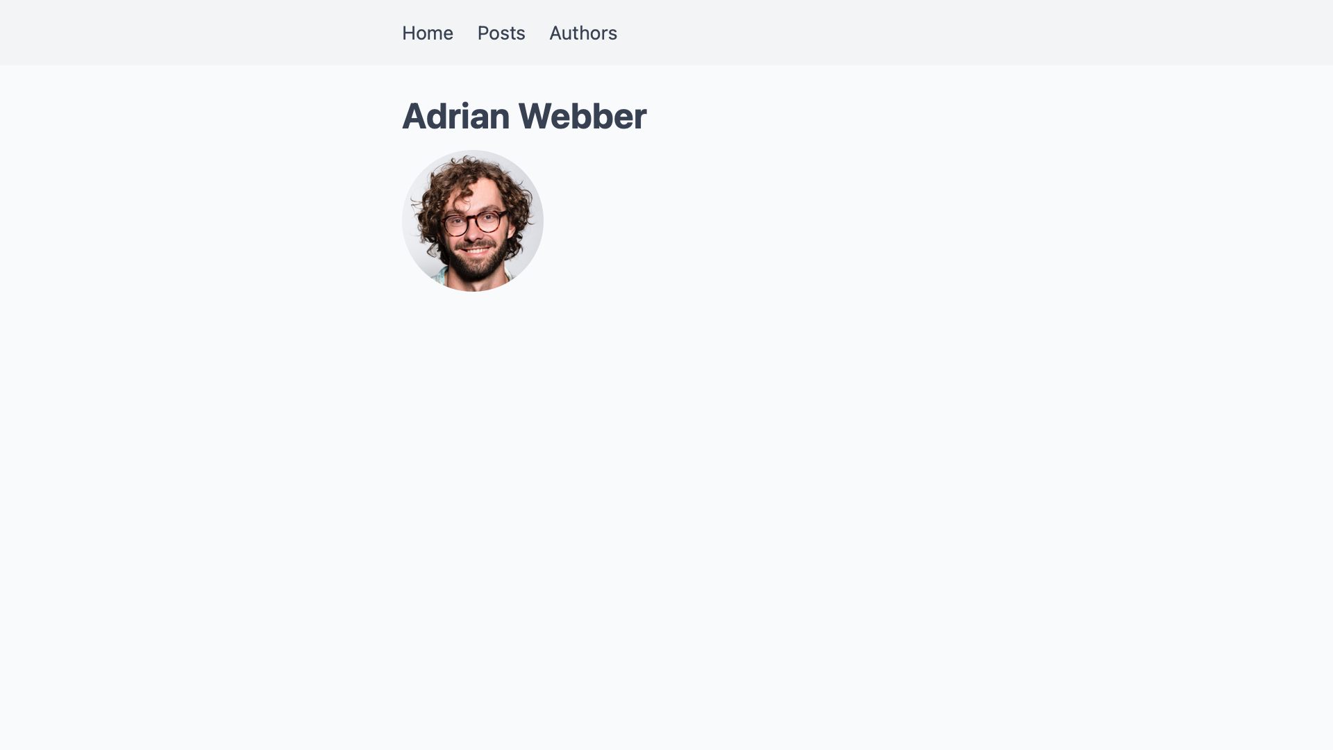
With this, we now have a basic author profile page that is very light on information.

At this point, authors and posts are not connected yet. We’ll build that bridge next so we can add a list of each authors’ posts to their profile pages.

Connecting Posts And Authors

To connect two pieces of content, we need to reference one in the other. Since we already identify posts and authors by their slugs, we’ll reference them with that. We could add authors to posts and posts to authors, but one direction is enough to link them. Since we want to attribute posts to authors, we are going to add the author’s slug to each post’s frontmatter.

 ---
 title: "Hello World!"
 excerpt: "This is my first blog post."
 createdAt: "2021-05-03"
+author: adrian-webber
 ---
 Hey, how are you doing? Welcome to my blog. In this post, …

If we keep it at that, running the post through gray-matter adds the author field to the post as a string:

const post = getPostBySlug("hello-world")
const author = post.author

console.log(author)
// "adrian-webber"

To get the object representing the author, we can use that slug and call getAuthorBySlug(slug) with it.

 const post = getPostBySlug("hello-world")
-const author = post.author
+const author = getAuthorBySlug(post.author)

 console.log(author)
 // {
 //   name: "Adrian Webber",
 //   slug: "adrian-webber",
 //   profilePictureUrl: "/adrian-webber.jpg",
 //   permalink: "/authors/adrian-webber"
 // }

To add the author to a single post’s page, we need to call getAuthorBySlug(slug) once in getStaticProps().

+import Image from 'next/image'
+import Link from 'next/link'

-import { getPostBySlug } from '../../lib/api'
+import { getAuthorBySlug, getPostBySlug } from '../../lib/api'

 export default function Post({ post }) {
   const prettyDate = new Date(post.createdAt).toLocaleString('en-US', {
     month: 'short',
     day: '2-digit',
     year: 'numeric',
   })

   return (
     <div className="post">
       <h1>{post.title}</h1>

       <time dateTime={post.createdAt}>{prettyDate}</time>

+      <div>
+        <Image alt={post.author.name} src={post.author.profilePictureUrl} height="40" width="40" />
+
+        <Link href={post.author.permalink}>
+          <a>
+            {post.author.name}
+          </a>
+        </Link>
+      </div>

       <div dangerouslySetInnerHTML={{ __html: post.body }}>
     </div>
   )
 }

 export function getStaticProps({ params }) {
+  const post = getPostBySlug(params.slug)

   return {
     props: {
-      post: getPostBySlug(params.slug),
+      post: {
+        ...post,
+        author: getAuthorBySlug(post.author),
+      },
     },
   }
 }

Note how we spread ...post into an object also called post in getStaticProps(). By placing author after that line, we end up replacing the string version of the author with its full object. That lets us access an author’s properties through post.author.name in the Post component.

With that change, we now get a link to the author’s profile page, complete with their name and picture, on a post’s page.

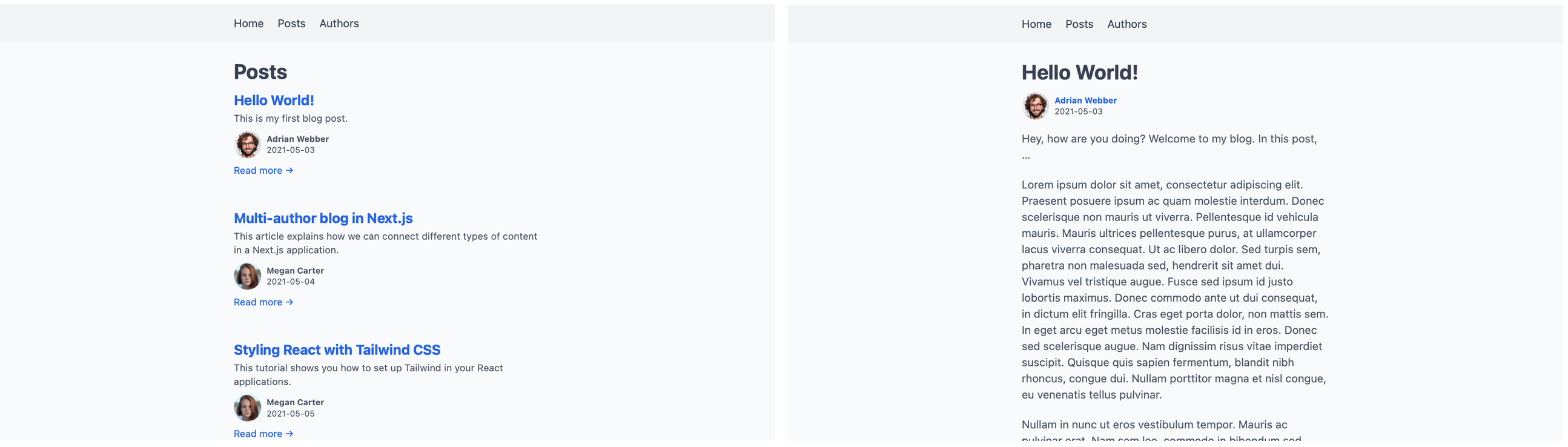
Adding authors to the post overview page requires a similar change. Instead of calling getAuthorBySlug(slug) once, we need to map over all posts and call it for each one of them.

+import Image from 'next/image'
+import Link from 'next/link'

-import { getAllPosts } from '../../lib/api'
+import { getAllPosts, getAuthorBySlug } from '../../lib/api'

 export default function Posts({ posts }) {
   return (
     <div className="posts">
       <h1>Posts</h1>

       {posts.map(post => {
         const prettyDate = new Date(post.createdAt).toLocaleString('en-US', {
           month: 'short',
           day: '2-digit',
           year: 'numeric',
         })

         return (
           <article key={post.slug}>
             <h2>
               <Link href={post.permalink}>
                 <a>{post.title}</a>
               </Link>
             </h2>

             <time dateTime={post.createdAt}>{prettyDate}</time>

+            <div>
+              <Image alt={post.author.name} src={post.author.profilePictureUrl} height="40" width="40" />
+
+              <span>{post.author.name}</span>
+            </div>

             <p>{post.excerpt}</p>

             <Link href={post.permalink}>
               <a>Read more →</a>
             </Link>
           </article>
         )
       })}
     </div>
   )
 }

 export function getStaticProps() {
   return {
     props: {
-      posts: getAllPosts(),
+      posts: getAllPosts().map(post => ({
+        ...post,
+        author: getAuthorBySlug(post.author),
+      })),
    }
  }
}

That adds the authors to each post in the post overview:

We don’t need to add a list of an author’s posts to their JSON file. On their profile pages, we first get all posts with getAllPosts(). We can then filter the full list for the ones attributed to this author.

import Image from 'next/image'
+import Link from 'next/link'

-import { getAllAuthors, getAuthorBySlug } from '../../lib/api'
+import { getAllAuthors, getAllPosts, getAuthorBySlug } from '../../lib/api'

 export default function Author({ author }) {
   return (
     <div className="author">
       <h1>{author.name}</h1>

       <Image alt={author.name} src={author.profilePictureUrl} height="40" width="40" />

+      <h2>Posts</h2>
+
+      <ul>
+        {author.posts.map(post => (
+          <li>
+            <Link href={post.permalink}>
+              <a>
+                {post.title}
+              </a>
+            </Link>
+          </li>
+        ))}
+      </ul>
     </div>
   )
 }

 export function getStaticProps({ params }) {
   const author = getAuthorBySlug(params.slug)

   return {
     props: {
-      author: getAuthorBySlug(params.slug),
+      author: {
+        ...author,
+        posts: getAllPosts().filter(post => post.author === author.slug),
+      },
     },
   }
 }

 export function getStaticPaths() { … }

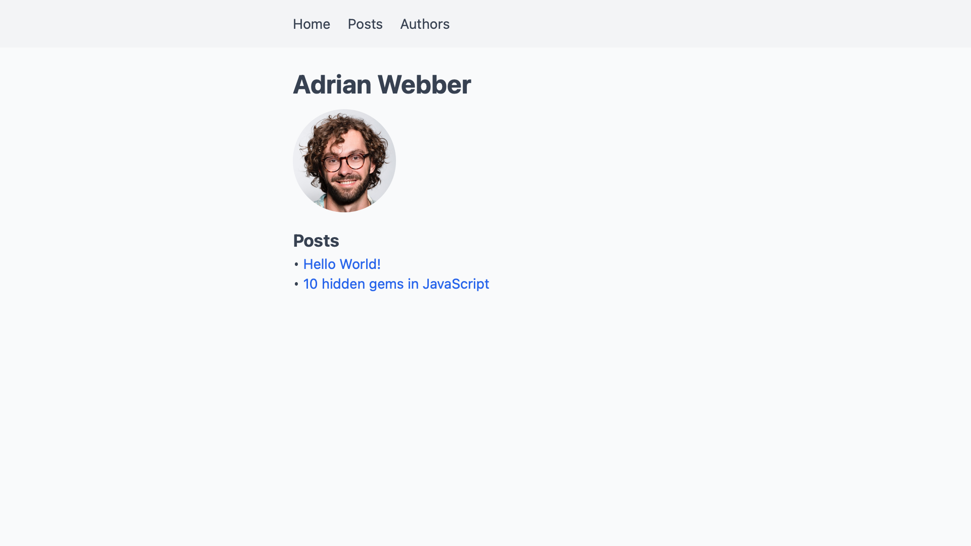
This gives us a list of articles on every author’s profile page.

On the author overview page, we’ll only add how many posts they have written to not clutter the interface.

import Image from 'next/image'
import Link from 'next/link'

-import { getAllAuthors } from '../../lib/api'
+import { getAllAuthors, getAllPosts } from '../../lib/api'

 export default function Authors({ authors }) {
   return (
     <div className="authors">
       <h1>Authors</h1>

       {authors.map(author => (
         <div key={author.slug}>
           <h2>
             <Link href={author.permalink}>
               <a>
                 {author.name}
               </a>
             </Link>
           </h2>

           <Image alt={author.name} src={author.profilePictureUrl} height="40" width="40" />

+         <p>{author.posts.length} post(s)</p>

           <Link href={author.permalink}>
             <a>Go to profile →</a>
           </Link>
         </div>
       ))}
     </div>
   )
 }

 export function getStaticProps() {
   return {
     props: {
-      authors: getAllAuthors(),
+      authors: getAllAuthors().map(author => ({
+        ...author,
+        posts: getAllPosts().filter(post => post.author === author.slug),
+      })),
     }
   }
 }

With that, the Authors overview page shows how many posts each author has contributed.

And that’s it! Posts and authors are completely linked up now. We can get from a post to an author’s profile page, and from there to their other posts.

Summary And Outlook

In this article, we connected two related types of content through their unique slugs. Defining the relationship from post to author enabled a variety of scenarios. We can now show the author on each post and list their posts on their profile pages.

With this technique, we can add many other kinds of relationships. Each post might have a reviewer on top of an author. We can set that up by adding a reviewer field to a post’s frontmatter.

 ---
 title: "Hello World!"
 excerpt: "This is my first blog post."
 createdAt: "2021-05-03"
 author: adrian-webber
+reviewer: megan-carter
 ---
 Hey, how are you doing? Welcome to my blog. In this post, …

On the filesystem, the reviewer is another author from the _authors/ directory. We can use getAuthorBySlug(slug) to get their information as well.

 export function getStaticProps({ params }) {
   const post = getPostBySlug(params.slug)

   return {
     props: {
       post: {
         ...post,
         author: getAuthorBySlug(post.author),
+        reviewer: getAuthorBySlug(post.reviewer),
       },
     },
   }
 }

We could even support co-authors by naming two or more authors on a post instead of only a single person.

 ---
 title: "Hello World!"
 excerpt: "This is my first blog post."
 createdAt: "2021-05-03"
-author: adrian-webber
+authors:
+  - adrian-webber
+  - megan-carter
 ---
 Hey, how are you doing? Welcome to my blog. In this post, …

In this scenario, we could no longer look up a single author in a post’s getStaticProps(). Instead, we would map over this array of authors to get them all.

 export function getStaticProps({ params }) {
   const post = getPostBySlug(params.slug)

   return {
     props: {
       post: {
         ...post,
-        author: getAuthorBySlug(post.author),
+        authors: post.authors.map(getAuthorBySlug),
       },
     },
   }
 }

We can also produce other kinds of scenarios with this technique. It enables any kind of one-to-one, one-to-many, or even many-to-many relationship. If your project also features newsletters and case studies, you can add authors to each of them as well.

On a site all about the Marvel universe, we could connect characters and the movies they appear in. In sports, we could connect players and the teams they currently play for.

Because helper functions hide the data source, content could come from different systems. We could read articles from the filesystem, comments from an API, and merge them into our code. If some piece of content relates to another type of content, we can connect them with this pattern.

Further Resources

Next.js offers more background on the functions we used in their page on Data Fetching. It includes links to sample projects that fetch data from different types of sources.

If you want to take this starter project further, check out these articles:

How To Run A UX Audit For A Major EdTech Platform (Case Study)

The business world today is obsessed with user experience (UX) design. And for good reason: Every dollar invested in UX brings $100 in return. So, having some free time in quarantine, I decided to check whether one of the most evolving industries right now, education technology (EdTech), uses this potential of UX.

My plan was to choose one EdTech platform, audit its UX, and, if necessary, redesign it. I first looked at some major EdTech platforms (such as edX, Khan Academy, and Udemy), read user feedback about them, and then narrowed my scope to edX. Why did I choose edX? Simply because:

  • it’s non-profit,
  • it has more than 20 million users,
  • its UX has a lot of negative reviews.

Even from my quick UX check, I got an overview of the UX principles and UI solutions followed by global EdTech platforms right now (in my case, edX).

Overall, this UX audit and redesign concept would be of great use to UX designers, business owners, and marketing people because it presents a way to audit and fix a product’s most obvious usability issues. So, welcome to my edX audit.

Audit Structure

This audit consists of two parts. First, I surveyed edX users, learned their needs, and checked whether the platform meets them. In the second stage, I weighed edX’s website against the 10 usability heuristics identified by Jacob Nielsen. These heuristics are well-recognized UX guidelines — the bible, if you will, for any UX designer.

Ideally, a full-fledged UX audit would take weeks. I had a fixed scope, so I checked the platform’s home page, user profile, and search page. These are the most important pages for users. Just analyzing these few pages gave me more than enough insight for my redesign concept.

Part 1: Audit for User Needs

Good UX translates into satisfied users.

That’s where I started: identifying user needs. First, I analyzed statistical data about the platform. For this, you can use such well-known tools as Semrush and SimilarWeb and reviews from Trustpilot, Google Play, and Apple’s App Store.

Take SimilarWeb. The tool analyzes edX’s rank, traffic sources, advertising, and audience interests. “Computer Electronics” and “Technology” appear to be the most popular course categories among edX students.

For user feedback on edX, I went to Trustpilot (Google Play and the App Store are relevant only for analyzing mobile apps). I found that most users praise edX’s courses for their useful content, but complain about the platform’s UX — most often about the hard and time-consuming verification process and poor customer support.

Done with the analytical check, I moved on to user interviews. I went to design communities on Facebook and LinkedIn, looking for students of online courses, asking them to answer some of my quick questions. To everyone who responded, I sent a simple Google Form to capture their basic needs and what they value most when choosing an education platform.

Having received the answers, I created two user profiles for edX: potential user and long-time user. Here’s a quick illustration of these two types:

I identified these two kinds of users based on my survey. According to my findings, there are two common scenarios for how users select an educational course.

Learner 1 is mainly focused on choosing between different education platforms. This user type doesn’t need a specific course. They are visiting various websites, looking for a course that grabs their attention.

The second kind of learner knows exactly what course they want to take. Supposing they’ve chosen edX, they would need an effective search function to help them locate the course they need, and they’d need a convenient profile page to keep track of their progress.

Based on the edX user profiles, their needs, and the statistical data I gathered, I have outlined the five most common problems that the platform’s customers might face.

Problem 1: “Can I Trust This Website?”

Numerous factors determine a website’s credibility and trustworthiness: the logo, reviews, feedback, displayed prices, etc. Nielsen Norman Group covers the theory of it. Let’s focus on the practice.

So, what do we have here? edX’s current home page displays the logos of its university partners, which are visible at first glance and add credibility to the platform.

At the same time, the home page doesn’t highlight benefits of the platform or user feedback. This is often a deciding factor for users in choosing a platform.

Other approaches

It’s good to learn from competitors. Another EdTech platform, Khan Academy, demonstrates quite a different approach to website design. Its home page introduces the platform, talks about its benefits, and shows user feedback:

Problem 2: “Do I Have All of the Information I Need to Choose a Course?

Many a time, users just want to quickly scan the list of courses and then choose the best one based on the description.

edX’s course cards display the course name, institution, and certificate level. Yet, they could also provide essentials such as pricing, course rating, how many students are enrolled, start date, etc.

Proper description of elements is an essential part of UX, as mentioned in Jacob Nielsen’s sixth heuristic. The heuristic states that all information valuable to a user should always be available.

Other approaches

Looking at another EdTech platform, Udemy’s course cards display the course name, instructor, rating, number of reviews, and price.

Problem 3: “Can I Sign Up Easily?”

According to a study by Mirjam Seckler, completion time decreases significantly if a signup form follows basic usability guidelines. Users are almost twice as likely to sign up in their first try if there are no errors.

So, let’s have a deeper look at edX’s forms:

  1. They do not let you type your country’s name or your date of birth. Instead, you have to scroll through all of the options. (I am in the Ukraine, which is pretty far down the list.)
  2. They do not display the password you’ve inputted, even by request.
  3. They do not send an email to verify the address you’ve entered.
  4. They do not indicate with an asterisk which fields are required.

Speeding up the registration process is yet another crucial UX principle. To read more about it, look at Nielsen Norman Group’s usability guidelines for website forms.

Other approaches

Many websites let users enter data manually to speed up the application process. Another EdTech website, Udemy, has an option to show and hide the inputted password by request:

Problem 4: “Is On-Site Search Helpful?”

Search is one of the most used website features. Thus, it should be helpful, simple to use, and fast. Numerous usability studies show the importance of helpful search for massive online open courses (MOOCs).

In this regard, I’ve analyzed edX’s search. I started from page loading. Below is a screenshot from Google PageSpeed, which shows that the platform’s search speed has a grade of 12 out of 100.

Let’s now move to searching in a specific category. In its current design, edX has no filtering. After choosing a category (for example, electronics courses), users need to scroll through the list to find what they want. And some categories have more than 100 items.

Other approaches

EdTech platform Coursera has visible filtering on its website, displaying all of the options to filter from in a category:

Problem 5: “Should I Finish This Course?”

Researchers don’t stop stressing that EdTech platforms have, on average, higher retention rates than other websites. Therefore, tracking user progress and motivation is critical for online courses. These principles are pretty simple yet effective.

That is what edX’s user profile looks like:

Other approaches

Khan Academy’s user profile displays various statistics, such as join date, points earned, and longest learning streak. It might motivate the user to continue learning and to track their success.

Part 2: Audit for 10 Usability Heuristics

We’ve finished analyzing the most common user needs on edX. It’s time to move to the 10 usability criteria identified by Nielsen Norman Group, a UX research and consulting firm trusted by leading organizations worldwide.

You can do a basic UX checkup of your website using the 10 heuristics even if you aren’t a UX designer. Nielsen Norman Group’s website gives a lot of examples, videos, and instructions for each heuristic. This Notion checklist makes it even more convenient. It includes vital usability criteria required for any website. It’s a tool used internally at Fulcrum (where I work), but I thought it would be good to share it with the Smashing Magazine audience. It includes over a hundred criteria, and because it’s in Notion, you can edit it and customize it however you want.

Heuristic 1: Visibility of System Status

The first heuristic is to always keep users informed. Simply put, a website should provide users with feedback whenever an action is completed. For example, you will often see a “Success” message when downloading a file on a website.

In this regard, edX’s current course cards could be enhanced. Right now, a card does not tell users whether the course is available. Users have to click on the card to find out.

Possible approach

If some courses aren’t available, indicate that from the start. You could use bright labels with “available”/“not available” messages.

Heuristic 2: Match Between System and the Real World

The system should speak the user’s language. It should use words, phrases, and symbols that are familiar to the average visitor. And the information should appear in a logical order.

This is the second criterion of Jacob Nielsen. edX’s website pretty much follows this principle, using common language, generally accepted symbols, and familiar signs.

Possible approach

Another good practice would be to break down courses by sections, and add easy-to-understand icons.

Heuristic 3: User Control and Freedom

This heuristic stresses that users always should have a clear way out when they do something by mistake, something like an undo or return option.

edX makes it impossible to change your username once it’s been set up. Many websites limit the options for changing a username for security reasons. Still, it might be more user-friendly to make it changeable.

Possible approach

Some websites allow users to save data, a status, or a change whenever they want. A good practice would be to offer customers alternative options, like to add or remove a course or to save or edit their profile.

Heuristic 4: Consistency and Standards

According to this fourth UX criterion, design elements should be consistent and predictable. For example, symbols and images should be unified across the UI design of a platform.

Broadly speaking, there are two types of consistencies: internal and external. Internal consistency refers to staying in sync with a product (or a family of products). External consistency refers to adhering to the standards within an industry (for example, shopping carts having the same logic across e-commerce websites).

edX sometimes breaks internal consistency. Case in point just below: The “Explore” button looks different. Two different-looking buttons (or any other elements) that perform the same function might add visual noise and worsen the user experience. This issue might not be critical, but it contributes to the overall UX of the website.

Heuristic 5: Error Prevention

Good design prevents user error. By helping users avoid errors, designers save them time and prevent frustration.

For instance, on edX, if you make a typo in your email address, it’s visible only after you try to verify it.

Possible approach

Granted, live validation is not always good for UX. Some designers consider it problematic, arguing that it distracts users and causes confusion. Others believe that live validation has a place in UX design.

In any case, whether you’re validating live or after the “Submit” button has been clicked, keep your users and their goals in mind. Your task is to make their experience as smooth as possible.

Heuristic 6: Recognition Rather Than Recall

Users should not have to memorize information you’ve shown them before. That’s another UX guideline from Nielsen Norman Group. Colors and icons (like arrows) help users process information better.

edX’s home page displays university logos, but not the universities’ full names, which illustrates this point. Also, the user profile page doesn’t tell you which courses you’ve completed.

Possible approach

The platform’s UX could be improved by showing courses that users have already done and recommending similar ones.

Heuristic 7: Flexibility and Efficiency of Use

According to this UX principle, speed up interaction wherever possible by using elements called accelerators. Basically, use any options or actions that speed up the whole process.

edX doesn’t provide filtering when users search for a course. Its absence could increase the time and effort users take to find the course they need.

Possible approach

Search is one of the critical stages of user conversion. If users can find what they want, they will be much closer to becoming customers. So, use filters to help users find courses more quickly and easily.

Heuristic 8: Aesthetic and Minimalist Design

This heuristic tells us to “remove unnecessary elements from the user interface and to maximize the signal-to-noise ratio of the design” (the signal being information relevant to the user, and the noise being irrelevant information).

Simply put, every element should tell a story, like a mosaic. Designers communicate, not decorate.

Comparing the current design of edX’s home page to the previous one, we can see a huge improvement. The main photo is now much more relevant to the platform’s mission. edX also added insights into how many users and courses it has.

Heuristic 9: Help Users Recognize, Diagnose, and Recover From Errors

This heuristic states that errors should be expressed in simple, explanatory language to the user. It’s also good to clearly explain why an error occurred in the first place.

edX’s 404 page serves its purpose overall. First, it explains to the user the problem (“We can’t seem to find the page you’re looking for”) and suggests a solution (giving links to the home page, search function, and course list). It also recommends popular courses.

Heuristic 10: Help and Documentation

This last heuristic is about the necessity of support and documentation on any website. There are many forms of help and documentation, such as onboarding pages, walkthroughs, tooltips, chats, and chatbots.

edX has links to a help center hidden in the footer. It’s divided into sections, and users can use a search bar to find information. The search does a good job of auto-suggesting topics that might be useful.

Unfortunately, users can’t go back to the home page from the help center by clicking the logo. There is no direct way to get back to the home page from there.

Possible approach

Enable users to return to the home page wherever they want on the website.

eDX Redesign Concept

Based on my UX findings, I resdesigned the platform, focusing on the home page, user profiles, and search results page. You can see full images of the redesign in Figma.

Home Page

1. Signal-to-Noise Ratio

First things first: To meet usability heuristic 8, I’ve made the whole page more minimalist and added space between its elements.

edX has the grand mission of “education for everyone, everywhere”, so I decided to put this on the home page, plain and bold.

I also switched the images to better reflect the story presented in the text. I expressed the mission with these new illustrations:

2. Course Cards

The “New Courses” section below highlights the latest courses.

I also added some details that edX’s cards currently do not display. This made the cards more descriptive, showing essential information about each course.

I also used icons to show the most popular subjects.

3. Credibility and Trust

I added a fact sheet to show the platform’s credibility and authority:

In addition, I freshened up the footer, reshaping the languages bar to be more visible to users.

Helpful Search

1. Search Process

In edX’s current design, users don’t see the options available while searching. So, I designed a search function with auto-suggestion. Now, users just need to type a keyword and choose the most relevant option.

2. Search Filters

I added a left sidebar to make it easy to filter results. I also updated the UI and made the course cards more descriptive.

User Profile

As mentioned in the audit section, it’s essential to motivate users to continue studying. Inspired by Khan Academy, I added a progress bar to user profiles. Now, a profile shows how many lessons are left before the user completes a course.

I put the navigation above so that it can be easily seen. Also, I updated the user profile settings, leaving the functionality but modifying the colors.

Conclusion

A UX audit is a simple and efficient way to check whether design elements are performing their function. It’s also a good way to look at an existing design from a fresh perspective.

This case presented me with several lessons. First, I see that the websites in one of the most topical industries right now could have their UX updated. Learning something new is hard, but without proper UX design, it’s even harder.

The audit also showed why it’s crucial to understand, analyze, and meet user needs. Happy users are devoted users.

The Rise Of Design Thinking As A Problem Solving Strategy

Having spent the last 20 years in the world of educational technology working on products for educators and students, I have learned to understand teachers and administrators as designers themselves, who use a wide set of tools and techniques to craft learning experiences for students. I have come to believe that by extending this model and framing all users as designers, we are able to mine our own experiences to gain a deeper empathy for their struggles. In doing so, we can develop strategies to set our user-designers up to successfully deal with change and uncertainty.

If you are a designer, or if you have worked with designers any time in the last decade, you are probably familiar with the term “design thinking.” Typically, design thinking is represented by a series of steps that looks something like this:

There are many variations of this diagram, reflective of the multitude of ways that the process can be implemented. It is typically a months-long undertaking that begins with empathy: we get to know a group of people by immersing ourselves in a specific context to understand their tasks, pain points, and motivations. From there, we take stock of our observations, looking for patterns, themes, and opportunities, solidifying the definition of the problem we wish to solve. Then, we iteratively ideate, prototype, and test solutions until we arrive at one we like (or until we run out of time).

Ultimately, the whole process boils down to a simple purpose: to solve a problem. This is not a new purpose, of course, and not unique to those of us with “Designer” in our job titles. In fact, while design thinking is not exactly the same as the scientific method we learned in school, it bears an uncanny resemblance:

By placing design thinking within this lineage, we equate the designer with the scientist, the one responsible for facilitating the discovery and delivery of the solution.

At its best, design thinking is highly collaborative. It brings together people from across the organization and often from outside of it, so that a diverse group, including those whose voices are not usually heard, can participate. It centers the needs and emotions of those we hope to serve. Hopefully, it pulls us out of our own experiences and biases, opening us up to new ways of thinking and shining a light on new perspectives. At its worst, when design thinking is dogmatically followed or cynically applied, it becomes a means of gatekeeping, imposing a rigid structure and set of rules that leave little room for approaches to design that do not conform to an exclusionary set of cultural standards.

Its relative merits, faults, and occasional high-profile critiques notwithstanding, design thinking has become orthodoxy in the world of software development, where not using it feels tantamount to malpractice. No UX Designer’s portfolio is complete without a well-lit photo capturing a group of eager problem solvers in the midst of the “Define” step, huddled together, gazing thoughtfully at a wall covered in colorful sticky notes. My colleagues and I use it frequently, sticky notes and all, as we work on products in EdTech.

Like “lean,” the design thinking methodology has quickly spread beyond the software industry into the wider world. Today you can find it in elementary schools, in nonprofits, and at the center of innovation labs housed in local governments.

Amidst all of the hoopla, it is easy to overlook a central assumption of design thinking, which seems almost too obvious to mention: the existence of a solution. The process rests on the premise that, once the steps have been carried out, the state of the problem changes from ‘unsolved’ to ‘solved.’ While this problem-solution framework is undeniably effective, it is also incomplete. If we zoom out, we can see the limits of our power as designers, and then we can consider what those limits mean for how we approach our work.

Chaos And The Limits Of Problem Solving

An unchecked belief in our ability to methodically solve big problems can lead to some pretty grandiose ideas. In his book, Chaos: Making a New Science, James Gleick describes a period in the 1950s and ’60s when, as computing and satellite technologies continued to advance, a large, international group of scientists embarked on a project that, in hindsight, sounds absurd. Their goal was not only to accurately predict, but also to control the weather:

“There was an idea that human society would free itself from weather’s turmoil and become its master instead of its victim. Geodesic domes would cover cornfields. Airplanes would seed the clouds. Scientists would learn how to make rain and how to stop it.”

— “Chaos: Making a New Science,” James Gleick

It is easy to scoff at their hubris now, but at the time it was a natural result of an ever-heightening faith that, with science, no problem is too big to solve. What those scientists did not account for is a phenomenon commonly known as the butterfly effect, which is now a central pillar of the field of chaos theory. The butterfly effect describes the inherent volatility that arises in complex and interconnected systems. It gets its name from a famous illustration of the principle: a butterfly flapping its wings and creating tiny disturbances in the air around it on one side of the globe today can cause a hurricane tomorrow on the other. Studies have shown that the butterfly effect impacts everything in society from politics and the economy to trends in fashion.

Our Chaotic Systems

If we accept that, like the climate, the social systems in which we design and build solutions are complex and unpredictable, a tension becomes apparent. Design thinking exists in a context that is chaotic and unpredictable by nature, and yet the act of predicting is central. By prototyping and testing, we are essentially gathering evidence about what the outcome of our design will be, and whether it will effectively solve the problem we have defined. The process ends when we feel confident in our prediction and happy with the result.

I want to take pains to point out again that this approach is not wrong! We should trust the process to confirm that our designs are useful and usable in the immediate sense. At the same time, whenever we deliver a solution, we are like the butterfly flapping its wings, contributing (along with countless others) to a constant stream of change. So while the short-term result is often predictable, the longer-term outlook for the system as a whole, and for how long our solution will hold as the system changes, is unknowable.

Impermanence

As we use design thinking to solve problems, how do we deal with the fact that our solutions are built to address conditions that will change in ways we can’t plan for?

One basic thing we can do is to maintain awareness of the impermanence of our work, recognizing that it was built to meet the needs of a specific moment in time. It is more akin to a tree fort constructed in the woods than to a castle fortress made from stone. While the castle may take years to build and last for centuries, impervious to the weather while protecting its inhabitants from all of the chaos that exists outside its walls, the tree fort, even if well-designed and constructed, is directly connected to and at the mercy of its environment. While a tree fort may shelter us from the rain, we do not build it with the expectation that it will last forever, only with the hope that it will serve us well while it’s here. Hopefully, through the experience of building it, we continue to learn and improve.

The fact that our work is impermanent does not diminish its importance, nor does it give us the license to be sloppy. It means that the ability to quickly and consistently adapt and evolve without sacrificing functional or aesthetic quality is core to the job, which is one reason why design systems, which provide consistent and high-quality reusable patterns and components, are crucial.

Designing For User-Designers

A more fundamental way to deal with the impermanence of our work is to rethink our self-image as designers. If we identify only as problem solvers, then our work becomes obsolete quickly and suddenly as conditions change, while in the meantime our users must wait helplessly to be rescued with the next solution. In reality, our users are compelled to adapt and design their own solutions, using whatever tools they have at their disposal. In effect, they are their own designers, and so our task shifts from delivering full, fixed solutions to providing our user-designers with useful and usable tools specific to their needs.

In thinking from this perspective, we can gain empathy for our users by understanding our place as equals on a continuum, each of us relying on others, just as others rely on us.

Key Principles To Center The Needs Of User-Designers

Below are some things to consider when designing for user-designers. In the spirit of the user-designer continuum and of finding the universal in the specific, in the examples below I draw on my experience from both sides of the relationship. First, from my work as a designer in the EdTech space, in which educators rely on people like me to produce tools that enable them to design learning experiences for students. Second, as a user of the products, I rely on them in my daily UX work.

1. Don’t Lock In The Value

It is crucial to have a clear understanding of why someone would use your product in the first place, and then make sure not to get in the way. While there is a temptation to keep that value contained so that users must remain in your product to reap all of the benefits, we should resist that mindset.

Remember that your product is likely just one tool in a larger set, and our users rely on their tools to be compatible with each other as they design their own coherent, holistic solutions. Whereas the designer-as-problem-solver is inclined to build a self-contained solution, jealously locking value within their product, the designer-for-designers facilitates the free flow of information and continuity of task completion between tools however our user-designers choose to use them. By sharing the value, not only do we elevate its source, we give our users full use of their toolbox.

An Example As A Designer Of EdTech Products:

In student assessment applications, like in many other types of applications, the core value is the data. In other words, the fundamental reason schools administer assessments is to learn about student achievement and growth. Once that data is captured, there are all sorts of ways we can then use it to make intelligent, research-based recommendations around tasks like setting student goals, creating instructional groups, and assigning practice. To be clear, we do try very hard to support all of it in our products, often by using design thinking. Ultimately, though, it all starts with the data.

In practice, teachers often have a number of options to choose from when completing their tasks, and they have their own valid reasons for their preferences. Anything from state requirements to school policy to personal working style may dictate their approach to, say, student goal setting. If — out of a desire to keep people in our product — we make it extra difficult for teachers to use data from our assessments to set goals outside of our product (say, in a spreadsheet), then instead of increasing our value, we have added inconvenience and frustration. The lesson, in this case, is not to lock up the data! Ironically, by hoarding it, we make it less valuable. By providing educators with easy and flexible ways to get it out, we unlock its power.

An Example As A User Of Design Tools:

I tend to switch between tools as I go through the design thinking process based on the core value each tool provides. All of these tools are equally essential to the process, and I count on them to work together as I move between phases so that I don’t have to build from scratch at every step. For example, the core value I get from Sketch is mostly in the “Ideation” phase, in that it allows me to brainstorm quickly and freely so that I can try out multiple ideas in a short amount of time. By making it easy for me to bring ideas from that product into a more heavy-duty prototyping application like Axure, instead of locking them inside, Sketch saves me time and frustration and increases my attachment to it. If, for competitive reasons, those tools ceased to cooperate, I would be much more likely to drop one or both.

2. Use Established Patterns

It is always important to remember Jakob’s Law, which states simply that users spend more time on other sites than they spend on yours. If they are accustomed to engaging with information or accomplishing a task a certain way and you ask them to do it differently, they will not view it as an exciting opportunity to learn something new. They will be resentful. Scaling the learning curve is usually painful and frustrating. While it is possible to improve or even replace established patterns, it’s a very tall order. In a world full of unpredictability, consistent and predictable patterns among tools create harmony between experiences.

An Example As A Designer Of EdTech Products:

By following conventions around data visualization in a given domain, we make it easy for users to switch and compare between sources. In the context of education, it is common to display student progress in a graph of test scores over time, with the score scale represented on the vertical axis and the timeline along the horizontal axis. In other words, a scatter plot or line graph, often with one or two more dimensions represented, maybe by color or dot size. Through repeated, consistent exposure, even the most data-phobic teachers can easily and immediately interpret this data visualization and craft a narrative around it.

You could hold a sketching activity during the “Ideate” phase of design thinking in which you brainstorm dozens of other ways to present the same information. Some of those ideas would undoubtedly be interesting and cool, and might even surface new and useful insights. This would be a worthwhile activity! In all likelihood, though, the best decision would not be to replace the accepted pattern. While it can be useful to explore other approaches, ultimately the most benefit is usually derived from using patterns that people already understand and are used to across a variety of products and contexts.

An Example As A User Of Design Tools:

In my role, I often need to quickly learn new UX software, either to facilitate collaboration with designers from outside of my organization or when my team decides to adopt something new. When that happens, I rely heavily on established patterns of visual language to quickly get from the learning phase to the productive phase. Where there is consistency, there is relief and understanding. Where there is a divergence for no clear reason, there is frustration. If a product team decided to rethink the standard alignment palette, for example, in the name of innovation, it would almost certainly make the product more difficult to adopt while failing to provide any benefit.

3. Build For Flexibility

As an expert in your given domain, you might have strong, research-based positions on how certain tasks should be done, and a healthy desire to build those best practices into your product. If you have built up trust with your users, then adding guidance and guardrails directly into the workflow can be powerful. Remember, though, that it is only guidance. The user-designer knows when those best practices apply and when they should be ignored. While we should generally avoid overwhelming our users with choices, we should strive for flexibility whenever possible.

An Example As A Designer Of EdTech Products

Many EdTech products provide mechanisms for setting student learning goals. Generally, teachers appreciate being given recommendations and smart defaults when completing this task, knowing that there is a rich body of research that can help determine a reasonable range of expectations for a given student based on their historical performance and the larger data set from their peers. Providing that guidance in a simple, understandable format is generally beneficial and appreciated. But, we as designers are removed from the individual students and circumstances, as well as the ever-changing needs and requirements driving educators’ goal-setting decisions. We can build recommendations into the happy path and make enacting them as painless as possible, but the user needs an easy way to edit our guidance or to reject it altogether.

An Example As A User Of Design Tools:

The ability to create a library of reusable objects in most UX applications has made them orders of magnitude more efficient. Knowing that I can pull in a pre-made, properly-branded UI element as needed, rather than creating one from scratch, is a major benefit. Often, in the “Ideate” phase of design thinking, I can use these pre-made components in their fully generic form simply to communicate the main idea and hierarchy of a layout. But, when it’s time to fill in the details for high-fidelity prototyping and testing, the ability to override the default text and styling, or even detach the object from its library and make more drastic changes, may become necessary. Having the flexibility to start quickly and then progressively customize lets me adapt rapidly as conditions change, and helps make moving between the design thinking steps quick and easy.

4. Help Your User-Designers Build Empathy For Their Users

When thinking about our users as designers, one key question is: who are they designing for? In many cases, they are designing solutions for themselves, and so their designer-selves naturally empathize with and understand the problems of their user-selves. In other cases, though, they are designing for another group of people altogether. In those situations, we can look for ways to help them think like designers and develop empathy for their users.

An Example As A Designer Of EdTech Products:

For educators, the users are the students. One way to help them center the needs of their audience when they design experiences is to follow the standards of Universal Design for Learning, equipping educators to provide instructional material with multiple means of engagement (i.e., use a variety of strategies to drive motivation for learning), multiple means of representation (i.e., accommodate students’ different learning styles and backgrounds), and multiple means of action and expression (i.e., support different ways for students to interact with instructional material and demonstrate learning). These guidelines open up approaches to learning and nudge users to remember that all of the ways their audience engages with practice and instruction must be supported.

An Example As A User Of Design Tools:

Anything a tool can do to encourage design decisions that center accessibility is hugely helpful, in that it reminds us to consider those who face the most barriers to using our products. While some commonly-used UX tools do include functionality for creating alt-text for images, setting a tab order for keyboard navigation, and enabling responsive layouts for devices of various sizes, there is an opportunity for these tools to do much more. I would love to see built-in accessibility checks that would help us identify potential issues as early in the process as possible.

Conclusion

Hopefully, by applying the core principles of unlocking value, leveraging established patterns, understanding the individual’s need for flexibility, and facilitating empathy in our product design, we can help set our users up to adapt to unforeseen changes. By treating our users as designers in their own right, not only do we recognize and account for the complexity and unpredictability of their environment, we also start to see them as equals.

While those of us with the word “Designer” in our official job title do have a specific and necessary role, we are not gods, handing down solutions from on high, but fellow strugglers trying to navigate a complex, dynamic, stormy world. Nobody can control the weather, but we can make great galoshes, raincoats, and umbrellas.

Further Reading

  • If you’re interested in diving into the fascinating world of chaos theory, James Gleick’s book Chaos: Making a New Science, which I quoted in this article, is a wonderful place to start.
  • Jon Kolko wrote a great piece in 2015 on the emergence of design thinking in business, in which he describes its main principles and benefits. In a subsequent article from 2017, he considers the growing backlash as organizations have stumbled and taken shortcuts when attempting to put theory into practice, and what the lasting impact may be. An important takeaway here is that, in treating everyone as a designer, we run the risk of downplaying the importance of the professional Designer’s specific skill set. We should recognize that, while it is useful to think of teachers (or any of our users) as designers, the day-to-day tools, methods, and goals are entirely different.
  • In the article Making Sense in the Data Economy, Hugh Dubberly and Paul Pangaro describe the emerging challenges and complexities of the designer’s role in moving from the manufacture of physical products to the big data frontier. With this change, the focus shifts from designing finished products (solutions) to maintaining complex and dynamic platforms, and the concept of “meta-design” — designing the systems in which others operate — emerges.
  • To keep exploring the ever-evolving strategies of designing for designers, search Smashing Magazine and your other favorite UX resources for ideas on interoperability, consistency, flexibility, and accessibility!

Smashing Online Workshops (July-October 2021)

How do we build and establish a successful design system? What about modern CSS and JavaScript? What’s the state of HTML Email? And what are new, smart design patterns we could use? What will it take us to move to TypeScript or Vue.js? With our line-up of online workshops, we try to answer these questions well.

Our workshops bring in knowledgeable, kind folks from the community to explore real-life solutions to real-life problems, live, with you. All sessions are broken down into 2.5h-segments across days, so you always have time to ask questions, share your screen and get immediate feedback.

Meet Smashing Online Workshops: live, interactive sessions on frontend & UX.

In fact, live discussions and interactive exercises are at the very heart of every workshop, with group work, homework, reviews and live interaction with people around the world. Plus, you get all video recordings of all sessions, so you can re-watch at any time, in your comfy chair in familiar comfort of your workspace.

Upcoming Workshops (July-October 2021)

No pre-recorded sessions, no big picture talks. Our workshops take place live and span multiple days. They are split into 2.5h-sessions, plus you’ll get all workshop video recordings, slides and a friendly Q&A in every session.

Pssst! We also have friendly bundles for larger teams and agencies. 🎁

Workshops in July–August

Meet our friendly frontend & UX workshops. Boost your skills online and learn from experts — live.

Workshops in September–October

What Are Online Workshops Like?

Do you experience Zoom fatigue as well? After all, who really wants to spend more time in front of their screen? That’s exactly why we’ve designed the online workshop experience from scratch, accounting for the time needed to take in all the content, understand it and have enough time to ask just the right questions.

In our workshops, everybody is just a slightly blurry rectangle on the screen; everybody is equal, and invited to participate.

Our online workshops take place live and span multiple days across weeks. They are split into 2.5h-sessions, and in every session there is always enough time to bring up your questions or just get a cup of tea. We don’t rush through the content, but instead try to create a welcoming, friendly and inclusive environment for everyone to have time to think, discuss and get feedback.

There are plenty of things to expect from a Smashing workshop, but the most important one is focus on practical examples and techniques. The workshops aren’t talks; they are interactive, with live conversations with attendees, sometimes with challenges, homework and team work.

Of course, you get all workshop materials and video recordings as well, so if you miss a session you can re-watch it the same day.

TL;DR

  • Workshops span multiple days, split in 2.5h-sessions.
  • Enough time for live Q&A every day.
  • Dozens of practical examples and techniques.
  • You’ll get all workshop materials & recordings.
  • All workshops are focused on frontend & UX.
  • Get a workshop bundle and save $250 off the price.

Thank You!

We hope that the insights from the workshops will help you improve your skills and the quality of your work. A sincere thank you for your kind, ongoing support and generosity — for being smashing, now and ever. We’d be honored to welcome you.

Automating Screen Reader Testing On macOS Using Auto VO

If you’re an accessibility nerd like me, or just curious about assistive technology, you’ll dig Auto-VO. Auto-VO is a node module and CLI for automated testing of web content with the VoiceOver screen reader on macOS.

I created Auto VO to make it easier for developers, PMs, and QA to more quickly perform repeatable, automated tests with real assistive technology, without the intimidation factor of learning how to use a screen reader.

Let’s Go!

First, let’s see it in action, and then I’ll go into more detail about how it works. Here’s running auto-vo CLI on smashingmagazine.com to get all the VoiceOver output as text.

$ auto-vo --url https://smashingmagazine.com --limit 200 > output.txt
$ cat output.txt
link Jump to all topics
link Jump to list of all articles
link image Smashing Magazine
list 6 items
link Articles
link Guides 2 of 6
link Books 3 of 6
link Workshops 4 of 6
link Membership 5 of 6
More menu pop up collapsed button 6 of 6
end of list
end of navigation
...(truncated)

Seems like a reasonable page structure: we’ve got skip navigation links, well-structured lists, and semantic navigation. Great work! Let’s dig a little deeper though. How’s the heading structure?

$ cat output.txt | grep heading
heading level 2 link A Complete Guide To Accessibility Tooling
heading level 2 link Spinning Up Multiple WordPress Sites Locally With DevKinsta
heading level 2 link Smashing Podcast Episode 39 With Addy Osmani: Image Optimization
heading level 2 2 items A SMASHING GUIDE TO Accessible Front-End Components
heading level 2 2 items A SMASHING GUIDE TO CSS Generators & Tools
heading level 2 2 items A SMASHING GUIDE TO Front-End Performance 2021
heading level 4 LATEST POSTS
heading level 1 link When CSS Isn’t Enough: JavaScript Requirements For Accessible Components
heading level 1 link Web Design Done Well: Making Use Of Audio
heading level 1 link Useful Front-End Boilerplates And Starter Kits
heading level 1 link Three Front-End Auditing Tools I Discovered Recently
heading level 1 link Meet :has, A Native CSS Parent Selector (And More)
heading level 1 link From AVIF to WebP: A New Smashing Book By Addy Osmani

Hmm! Something’s a little funky with our heading hierarchy. We ought to see an outline, with one heading level one and an ordered hierarchy after that. Instead, we see a bit of a mishmash of level 1, level 2, and an errant level 4. This needs attention since it impacts screen reader users' experience navigating the page.

Having the screen reader output as text is great because this sort of analysis becomes much easier.

Some Background

VoiceOver is the screen reader on macOS. Screen readers let people read application content aloud, and also interact with content. That means that people with low vision or who are blind can in theory access content, including web content. In practice though, 98% of landing pages on the web have obvious errors that can be captured with automated testing and review.

There are many automated testing and review tools out there, including AccessLint.com for automated code review (disclosure: I built AccessLint), and Axe, a common go-to for automation. These tools are important and useful, but they are only part of the picture. Manual testing is equally or perhaps more important, but it’s also more time-consuming and can be intimidating.

You may have heard guidance to "just turn on your screen reader and listen" to give you a sense of the blind experience. I think this is misguided. Screen readers are sophisticated applications that can take months or years to master, and are overwhelming at first. Using it haphazardly to simulate the blind experience might lead you to feel sorry for blind people, or worse, try to "fix" the experience the wrong ways.

I’ve seen people panic when they enable VoiceOver, not knowing how to turn it off. Auto-VO manages the lifecycle of the screen reader for you. It automates the launch, control, and closing of VoiceOver, so you don’t have to. Instead of trying to listen and keep up, the output is returned as text, which you can then read, evaluate, and capture for later as a reference in a bug or for automated snapshotting.

Usage

Caveat

Right now, because of the requirement to enable AppleScript for VoiceOver, this may require custom configuration of CI build machines to run.

Scenario 1: QA & Acceptance

Let’s say I (the developer) have a design with blueline annotations - where the designer has added descriptions of things like accessible name and role. Once I’ve built the feature and reviewed the markup in Chrome or Firefox dev tools, I want to output the results to a text file so that when I mark the feature as complete, my PM can compare the screen reader output with the design specs. I can do that using the auto-vo CLI and outputting the results to a file or the terminal. We saw an example of this earlier in the article:

$ auto-vo --url https://smashingmagazine.com --limit 100
Scenario 2: Test Driven Development

Here I am again as the developer, building out my feature with a blueline annotated design. I want to test drive the content so that I don’t have to refactor the markup afterward to match the design. I can do that using the auto-vo node module imported into my preferred test runner, e.g. Mocha.

$ npm install --save-dev auto-vo
import { run } from 'auto-vo';
import { expect } from 'chai';

describe('loading example.com', async () => {
  it('returns announcements', async () => {
    const options = { url: 'https://www.example.com', limit: 10, until: 'Example' };

    const announcements = await run(options);

    expect(announcements).to.include.members(['Example Domain web content']);
  }).timeout(5000);
});

Under the Hood

Auto-VO uses a combination of shell scripting and AppleScript to drive VoiceOver. While digging into the VoiceOver application, I came across a CLI that supports starting VoiceOver from the command line.

/System/Library/CoreServices/VoiceOver.app/Contents/MacOS/VoiceOverStarter

Then, a series of JavaScript executables manage the AppleScript instructions to navigate and capture VoiceOver announcements. For example, this script gets the last phrase from the screen reader announcements:

function run() {
  const voiceOver = Application('VoiceOver');
  return voiceOver.lastPhrase.content();
}

In Closing

I’d love to hear your experience with auto-vo, and welcome contributions on GitHub. Try it out and let me know how it goes!

Designing With Code: A Modern Approach To Design (Development Challenges)

Friction in cooperation between designers and developers is fueling an ever-evolving discussion as old as the industry itself. We came a long way to where we are today. Our tools have changed. Our processes and methodologies have changed. But the underlying problems often remained the same.

One of the recurring problems I often tend to see, regardless of the type and size of the team, is maintaining a reliable source of truth. Even hiring the best people and using proven industry-standard solutions often leaves us to a distaste that something definitely could have been done better. The infamous “final version” is often spread across technical documentation, design files, spreadsheets, and other places. Keeping them all in sync is usually a tedious and daunting task.

Note: This article has been written in collaboration with the UXPin team. Examples presented in this article have been created in the UXPin app. Some of the features are only available on paid plans. The full overview of UXPin’s pricing can be found here.

The Problem With Design Tools

Talking of maintaining a source of truth, the inefficiency of design tools is often being indicated as one of the most wearing pain points. Modern design tools are evolving and they are evolving fast with tremendous efforts. But when it comes to building the bridge between design and development, it’s not rare to get the impression that many of those efforts are based on flawed assumptions.

Most of the modern design tools are based on different models than the technologies used to implement the designs later on. They are built as graphic editors and behave as such. The way layouts are built and processed in design tools is ultimately different from whatever CSS, JavaScript and other programming languages have to offer. Building user interfaces using vector (or even raster) graphics is constant guesswork of how and if what you make should be turned into code later.

Designers often end up lamenting about their creations not being implemented as intended. Even the bravest efforts towards pixel-perfect designs don’t solve all the problems. In design tools, it is close to impossible to imagine and cover all the possible cases. Supporting different states, changing copy, various viewport sizes, screen resolutions and so on, simply provide too many changing variables to cover them all.

On top of that come along some technical constraints and limitations. Being a designer without prior development experience, it is immensely hard to take all the technical factors into account. Remember all the possible states of inputs. Understand the limitations of browser support. Predict the performance implications of your work. Design for accessibility, at least in a sense much broader than color contrast and font sizes. Being aware of these challenges, we accept some amount of guesswork as a necessary evil.

But developers often have to depend on guesswork, too. User interfaces mocked up with graphics editors rarely answer all of their questions. Is it the same component as the one we already have, or not? Should I treat it as a different state or as a separate entity? How should this design behave when X, Y, or Z? Can we make it a bit differently as it would be faster and cheaper? Ironically, asking whoever created the designs in the first place is not always helpful. Not rarely, they don’t know either.

And usually, this is not where the scope of growing frustration ends. Because then, there’s also everyone else. Managers, stakeholders, team leaders, salespeople. With their attention and mental capacity stretched thin among all the tools and places where various parts of the product live, they struggle more than anyone else to get a good grasp of it.

Navigating prototypes, understanding why certain features and states are missing from the designs, and distinguishing between what is missing, what is a work in progress, and what has been consciously excluded from the scope feels almost impossible. Quickly iterating on what was already done, visualizing your feedback, and presenting your own ideas feels hardly possible, too. Ironically, more and more sophisticated tools and processes are aimed at designers and developers to work better together; they set the bar even higher, and active participation in the processes for other people even harder.

The Solutions

Countless heads of our industry have worked on tackling those problems resulting in new paradigms, tools, and concepts. And indeed a lot has changed for the better. Let’s take a quick look and what are some of the most common approaches towards the outlined challenges.

Coding Designers

“Should designers code?” is a cliché question discussed a countless number of times through articles, conference talks, and all other media with new voices in the discussion popping up with stable regularity now and then. There is a common assumption that if designers “knew how to code” (let’s not even start to dwell on how to define “knowing how to code” in the first place), it would be easier for them to craft designs that take the technological constraints into account and are easier to implement.

Some would go even further and say they should be taking an active role in the implementation. At that stage, it’s easy to jump to conclusions that it wouldn’t be without sense to skip using the design tools altogether and just “design in code”.

Tempting as the idea may sound, it rarely proves itself in reality. All the best coding designers I know are still using design tools. And that’s definitely not due to a lack of technical skills. To explain the why is important to highlight a difference between ideation, sketching, and building the actual thing.

As long as there are many valid use cases for “designing in code”, such as utilizing predefined styles and components to quickly build a fully functional interface without bothering yourselves with design tools at all, the promise of unconstrained visual freedom is offered by design tools still stands of undeniable value. Many people find sketching new ideas in a format offered by design tools easier and more suited for the nature of a creative process. And that is not going to change anytime soon. Design tools are here to stay and to stay for good.

Design Systems

The great mission of design systems, one of the greatest buzzwords of the digital design world in the last years, has always been exactly that: to limit guesswork and repetition, improve efficiency and maintainability, and unify sources of truth. Corporate systems such as Fluent or Material Design have done a lot of legwork in advocacy for the idea and bringing momentum to the adoption of the concept across both big and small players. And indeed, design systems helped to change a lot for the better. A more structured approach to developing a defined collection of design principles, patterns, and components helped countless companies to build better, more maintainable products.

Some challenges had not been solved straight away though. Designing design systems in popular design tools hampered the efforts of many in achieving a single source of truth. Instead, a plethora of systems has been created that, even though unified, still exist in two separate, incompatible sources: a design source and a development source. Maintaining mutual parity between the two usually proves to be a painful chore, repeating all the most hated pain points that design systems were trying to solve in the first place.

Design And Code Integrations

To solve the maintainability headaches of design systems another wave of solutions has soon arrived. Concepts such as design tokens have started to gain traction. Some were meant for syncing the state of code with designs, such as open APIs that allow fetching certain values straight from the design files. Others were meant for syncing the designs with code, e.g. by generating components in design tools from code.

Few of these ideas ever gained widespread adoption. This is most probably due to the questionable advantage of possible benefits over the necessary entry costs of still highly imperfect solutions. Translating designs automatically into code still poses immense challenges for most professional use cases. Solutions allowing you to merge existing code with designs have also been severely limited.

For example, none of the solutions allowing you to import coded components into design tools, even if visually true to the source, would fully replicate the behavior of such components. None until now.

Merging Design And Code With UXPin

UXPin, being a mature and fully-featured design app, is not a new player on the design tools stage. But its recent advancements, such as Merge technology, are what can change the odds of how we think about design and development tools.

UXPin with Merge technology allows us to bring real, live components into design by preserving both their visuals and functionality — all without writing a single line of code. The components, even though embedded in design files, shall behave exactly as their real counterparts — because they are their real counterparts. This allows us not only to achieve seamless parity between code and design but also to keep the two in uninterrupted sync.

UXPin supports design libraries of React components stored in git repositories as well as a robust integration with Storybook that allows usage of components from almost any popular front-end framework. If you’d like to give it a shot yourself, you can request access to it on the UXPin website:

Merging live components with designs in UXPin takes surprisingly few steps. After finding the right component, you can place it on the design canvas with a click. It will behave like any other object within your designs. What will make it special is that, even though being an integral part of the designs, you can now use and customize it the same as you would in code.

UXPin gives you access to the component’s properties, lets you change its values and variables, and fill it with your own data. Once starting the prototype, the component shall behave exactly as expected, maintaining all the behaviors and interactions.

Using a component “as is” also means that it should behave according to the change of the context, such as the width of the viewport. In other words, such components are fully responsive and adaptable.

Note: If you would like to learn more about building truly responsive designs with UXPin, I strongly encourage you to check out this article.

Context may also mean theming. Whoever tried to build (and maintain!) a themeable design system in a design tool, or at least create a system that allows you to easily switch between a light and a dark theme, knows how tricky of a task it is and how imperfect the results usually are. None of the design tools is well optimized for theming out of the box and available plugins aimed at solving that issue are far from solving it fully.

As UXPin with Merge technology uses real, live components, you can also theme them as real, live components. Not only can you create as many themes as you need, but switching them can be as quick as choosing the right theme from a dropdown. (You can read more about theme switching with UXPin here.)

Advantages

UXPin with Merge technology allows a level of parity between design and code rarely seen before. Being true to the source in a design process brings impeccable advantages for all sides of the process. Designers can design with confidence knowing that what they make will not get misinterpreted or wrongly developed. Developers do not have to translate the designs into code and muddle through inexplicit edge cases and uncovered scenarios. On top of that, everyone can participate in the work and quickly prototype their ideas using live components without any knowledge about the underlying code at all. Achieving more democratic, participatory processes is much more within reach.

Merging your design with code might not only improve how designers cooperate with the other constituents of the team, but also refine their internal processes and practices. UXPin with Merge technology can be a game-changer for those focused on optimization of design efforts at scale, sometimes referred to as DesignOps.

Using the right source of truth makes it inexplicably easier to maintain consistency between the works produced by different people among the team, helps to keep them aligned, and solves the right problems together with a joint set of tools. No more “detached symbols” with a handful of unsolicited variations.

At the bottom line, what we get are enormous time savings. Designers save their time by using the components with confidence and their functionalities coming out of the box. They don’t have to update the design files as the components change, nor document their work and “wave hands” to explain their visions to the rest of the team. Developers save time by getting the components from designers in an instantly digestible manner that doesn’t require guesswork and extra tinkering.

People responsible for testing and QA save time on hunting inconsistencies between designs and code and figuring out if implantation happened as intended. Stakeholders and other team members save time through more efficient management and easier navigation of such teams. Less friction and seamless processes limit frustration among team members.

Disadvantages

Taking advantage of these benefits comes at some entry costs though. To efficiently use tools such as UXPin in your process, you need to have an existing design system or components library in place. Alternatively, you can base your work on one of the open-source systems which would always provide some level of limitation.

However, if you are committed to building a design system in the first place, utilizing UXPin with Merge technology in your process would come at little to no additional cost. With a well-built design system, adopting UXPin should not be a struggle, whilst the benefits of such a shift might prove drastically.

Summary

Widespread adoption of design systems addressed the issues of the media developers and designers work with. Currently, we can observe a shift towards more unified processes that not only transform the medium but also the way we create it. Using the right tools is crucial to that change. UXPin with Merge technology is a design tool that allows combining design with live code components and drastically narrows the gap between the domains design and development operate in.

Where Next?

Image To Text Conversion With React And Tesseract.js (OCR)

Data is the backbone of every software application because the main purpose of an application is to solve human problems. To solve human problems, it is necessary to have some information about them.

Such information is represented as data, especially through computation. On the web, data is mostly collected in the form of texts, images, videos, and many more. Sometimes, images contain essential texts that are meant to be processed to achieve a certain purpose. These images were mostly processed manually because there was no way to process them programmatically.

The inability to extract text from images was a data processing limitation I experienced first-hand at my last company. We needed to process scanned gift cards and we had to do it manually since we couldn’t extract text from images.

There was a department called “Operations” within the company that was responsible for manual confirming gift cards and crediting users' accounts. Although we had a website through which users connected with us, the processing of gift cards was carried out manually behind the scenes.

At the time, our website was built mainly with PHP (Laravel) for the backend and JavaScript (jQuery and Vue) for the frontend. Our technical stack was good enough to work with Tesseract.js provided the issue was considered important by the management.

I was willing to solve the problem but it was not necessary to solve the problem judging from the business’ or the management’s point of view. After leaving the company, I decided to do some research and try to find possible solutions. Eventually, I discovered OCR.

What Is OCR?

OCR stands for “Optical Character Recognition” or “Optical Character Reader”. It is used to extract texts from images.

The Evolution Of OCR can be traced to several inventions but Optophone, “Gismo” , CCD flatbed scanner, Newton MesssagePad and Tesseract are the major inventions that take character recognition to another level of usefulness.

So, why use OCR? Well, Optical Character Recognition solves a lot of problems, one of which triggered me to write this article. I realized the ability to extract texts from an image ensures a lot of possibilities such as:

  • Regulation
    Every organization needs to regulate users' activities for some reasons. The regulation might be used to protect users’ rights and secure them from threats or scams.
    Extracting texts from an image enables an organization to process textual information on an image for regulation, especially when the images are supplied by some of the users.
    For example, Facebook-like regulation of the number of texts on images used for ads can be achieved with OCR. Also, hiding sensitive content on Twitter is also made possible by OCR.
  • Searchability
    Searching is one of the most common activities, especially on the internet. Searching algorithms are mostly based on manipulating texts. With Optical Character Recognition, it is possible to recognize characters on images and use them to provide relevant image results to users. In short, images and videos are now searchable with the aid of OCR.
  • Accessibility
    Having texts on images has always been a challenge for accessibility and it is the rule of thumb to have few texts on an image. With OCR, screen readers can have access to texts on images to provide some necessary experience to its users.
  • Data Processing Automation The processing of data is mostly automated for scale. Having texts on images is a limitation to data processing because the texts cannot be processed except manually. Optical Character Recognition (OCR) makes it possible to extract texts on images programmatically thereby, ensuring data processing automation especially when it has to do with the processing of texts on images.
  • Digitization Of Printed Materials
    Everything is going digital and there are still a lot of documents to be digitized. Cheques, certificates, and other physical documents can now be digitized with the use of Optical Character Recognition.

Finding out all the uses above deepened my interests, so I decided to go further by asking a question:

“How can I use OCR on the web, especially in a React application?”

That question led me to Tesseract.js.

What Is Tesseract.js?

Tesseract.js is a JavaScript library that compiles the original Tesseract from C to JavaScript WebAssembly thereby making OCR accessible in the browser. Tesseract.js engine was originally written in ASM.js and it was later ported to WebAssembly but ASM.js still serves as a backup in some cases when WebAssembly is not supported.

As stated on the website of Tesseract.js, it supports more than 100 languages, automatic text orientation and script detection, a simple interface for reading paragraphs, words and character bounding boxes.

Tesseract is an optical character recognition engine for various operating systems. It is free software, released under the Apache Licence. Hewlett-Packard developed Tesseract as proprietary software in the 1980s. It was released as open source in 2005 and its development has been sponsored by Google since 2006.

The latest version, version 4, of Tesseract was released in October 2018 and it contains a new OCR engine that uses a neural network system based on Long Short-Term Memory (LSTM) and it is meant to produce more accurate results.

Understanding Tesseract APIs

To really understand how Tesseract works, we need to break down some of its APIs and their components. According to the Tesseract.js documentation, there are two ways to approach using it. Below is the first approach an its break down:

Tesseract.recognize(
  image,language,
  { 
    logger: m => console.log(m) 
  }
)
.catch (err => {
  console.error(err);
})
.then(result => {
 console.log(result);
})
}

The recognize method takes image as its first argument, language (which can be multiple) as its second argument and { logger: m => console.log(me) } as its last argument. The image format supported by Tesseract are jpg, png, bmp and pbm which can only be supplied as elements (img, video or canvas), file object (<input>), blob object, path or URL to an image and base64 encoded image. (Read here for more information about all of the image formats Tesseract can handle.)

Language is supplied as a string such as eng. The + sign could be used to concatenate several languages as in eng+chi_tra. The language argument is used to determine the trained language data to be used in processing of images.

Note: You’ll find all of the available languages and their codes over here.

{ logger: m => console.log(m) } is very useful to get information about the progress of an image being processed. The logger property takes a function that will be called multiple times as Tesseract processes an image. The parameter to the logger function should be an object with workerId, jobId, status and progress as its properties:

{ workerId: ‘worker-200030’, jobId: ‘job-734747’, status: ‘recognizing text’, progress: ‘0.9’ }

progress is a number between 0 and 1, and it is in percentage to show the progress of an image recognition process.

Tesseract automatically generates the object as a parameter to the logger function but it can also be supplied manually. As a recognition process is taking place, the logger object properties are updated every time the function is called. So, it can be used to show a conversion progress bar, alter some part of an application, or used to achieve any desired outcome.

The result in the code above is the outcome of the image recognition process. Each of the properties of result has the property bbox as the x/y coordinates of their bounding box.

Here are the properties of the result object, their meanings or uses:

{
  text: "I am codingnninja from Nigeria..."
  hocr: "<div class='ocr_page' id= ..."
  tsv: "1 1 0 0 0 0 0 0 1486 ..."
  box: null
  unlv: null
  osd: null
  confidence: 90
  blocks: [{...}]
  psm: "SINGLE_BLOCK"
  oem: "DEFAULT"
  version: "4.0.0-825-g887c"
  paragraphs: [{...}]
  lines: (5) [{...}, ...]
  words: (47) [{...}, {...}, ...]
  symbols: (240) [{...}, {...}, ...]
}
  • text: All of the recognized text as a string.
  • lines: An array of every recognized line by line of text.
  • words: An array of every recognized word.
  • symbols: An array of each of the characters recognized.
  • paragraphs: An array of every recognized paragraph. We are going to discuss “confidence” later in this write-up.

Tesseract can also be used more imperatively as in:

import { createWorker } from 'tesseract.js';

  const worker = createWorker({
  logger: m => console.log(m)
  });

  (async () => {
  await worker.load();
  await worker.loadLanguage('eng');
  await worker.initialize('eng');
  const { data: { text } } = await     worker.recognize('https://tesseract.projectnaptha.com/img/eng_bw.png');
 console.log(text);
 await worker.terminate();
})();

This approach is related to the first approach but with different implementations.

createWorker(options) creates a web worker or node child process that creates a Tesseract worker. The worker helps set up the Tesseract OCR engine. The load() method loads the Tesseract core-scripts, loadLanguage() loads any language supplied to it as a string, initialize() makes sure Tesseract is fully ready for use and then the recognize method is used to process the image provided. The terminate() method stops the worker and cleans up everything.

Note: Please check Tesseract APIs documentation for more information.

Now, we have to build something to really see how effective Tesseract.js is.

What Are We Going To Build?

We are going to build a gift card PIN extractor because extracting PIN from a gift card was the issue that led to this writing adventure in the first place.

We will build a simple application that extracts the PIN from a scanned gift card. As I set out to build a simple gift card pin extractor, I will walk you through some of the challenges I faced along the line, the solutions I provided, and my conclusion based on my experience.

Below is the image we are going to use for testing because it has some realistic properties that are possible in the real world.

We will extract AQUX-QWMB6L-R6JAU from the card. So, let’s get started.

Installation Of React And Tesseract

There is a question to attend to before installing React and Tesseract.js and the question is, why using React with Tesseract? Practically, we can use Tesseract with Vanilla JavaScript, any JavaScript libraries or frameworks such React, Vue and Angular.

Using React in this case is a personal preference. Initially, I wanted to use Vue but I decided to go with React because I am more familiar with React than Vue.

Now, let’s continue with the installations.

To install React with create-react-app, you have to run the code below:

npx create-react-app image-to-text
cd image-to-text
yarn add Tesseract.js

or

npm install tesseract.js

I decided to go with yarn to install Tesseract.js because I was unable to install Tesseract with npm but yarn got the job done without stress. You can use npm but I recommend installing Tesseract with yarn judging from my experience.

Now, let’s start our development server by running the code below:

yarn start

or

npm start

After running yarn start or npm start, your default browser should open a webpage that looks like below:

You could also navigate to localhost:3000 in the browser provided the page is not launched automatically.

After installing React and Tesseract.js, what next?

Setting Up An Upload Form

In this case, we are going to adjust the home page (App.js) we just viewed in the browser to contain the form we need:

import { useState, useRef } from 'react';
import Tesseract from 'tesseract.js';
import './App.css';

function App() {
  const [imagePath, setImagePath] = useState("");
  const [text, setText] = useState("");

  const handleChange = (event) => {
    setImage(URL.createObjectURL(event.target.files[0]));
  }

  return (
    <div className="App">
      <main className="App-main">
        <h3>Actual image uploaded</h3>
        <img 
           src={imagePath} className="App-logo" alt="logo"/>

          <h3>Extracted text</h3>
        <div className="text-box">
          <p> {text} </p>
        </div>
        <input type="file" onChange={handleChange} />
      </main>
    </div>
  );
}

export default App

The part of the code above that needs our attention at this point is the function handleChange.

const handleChange = (event) => {
    setImage(URL.createObjectURL(event.target.files[0]));
  }

In the function, URL.createObjectURL takes a selected file through event.target.files[0] and creates a reference URL that can be used with HTML tags such as img, audio and video. We used setImagePath to add the URL to the state. Now, the URL can now be accessed with imagePath.

<img src={imagePath} className="App-logo" alt="image"/>

We set the image’s src attribute to {imagePath} to preview it in the browser before processing it.

Converting Selected Images To Texts

As we have grabbed the path to the image selected, we can pass the image’s path to Tesseract.js to extract texts from it.


import { useState} from 'react';
import Tesseract from 'tesseract.js';
import './App.css';

function App() {
  const [imagePath, setImagePath] = useState("");
  const [text, setText] = useState("");

  const handleChange = (event) => {
    setImagePath(URL.createObjectURL(event.target.files[0]));
  }

  const handleClick = () => {

    Tesseract.recognize(
      imagePath,'eng',
      { 
        logger: m => console.log(m) 
      }
    )
    .catch (err => {
      console.error(err);
    })
    .then(result => {
      // Get Confidence score
      let confidence = result.confidence

      let text = result.text
      setText(text);

    })
  }

  return (
    <div className="App">
      <main className="App-main">
        <h3>Actual imagePath uploaded</h3>
        <img 
           src={imagePath} className="App-image" alt="logo"/>

          <h3>Extracted text</h3>
        <div className="text-box">
          <p> {text} </p>
        </div>
        <input type="file" onChange={handleChange} />
        <button onClick={handleClick} style={{height:50}}> convert to text</button>
      </main>
    </div>
  );
}

export default App

We add the function “handleClick” to “App.js and it contains Tesseract.js API that takes the path to the selected image. Tesseract.js takes “imagePath”, “language”, “a setting object”.

The button below is added to the form to call “handClick” which triggers image-to-text conversion whenever the button is clicked.

<button onClick={handleClick} style={{height:50}}> convert to text</button>

When the processing is successful, we access both “confidence” and “text” from the result. Then, we add “text” to the state with “setText(text)”.

By adding to <p> {text} </p>, we display the extracted text.

It is obvious that “text” is extracted from the image but what is confidence?

Confidence shows how accurate the conversion is. The confidence level is between 1 to 100. 1 stands for the worst while 100 stands for the best in terms of accuracy. It can also be used to determine whether an extracted text should be accepted as accurate or not.

Then the question is what factors can affect the confidence score or the accuracy of the entire conversion? It is mostly affected by three major factors — the quality and nature of the document used, the quality of the scan created from the document and the processing abilities of the Tesseract engine.

Now, let’s add the code below to “App.css” to style the application a bit.

.App {
  text-align: center;
}

.App-image {
  width: 60vmin;
  pointer-events: none;
}

.App-main {
  background-color: #282c34;
  min-height: 100vh;
  display: flex;
  flex-direction: column;
  align-items: center;
  justify-content: center;
  font-size: calc(7px + 2vmin);
  color: white;
}

.text-box {
  background: #fff;
  color: #333;
  border-radius: 5px;
  text-align: center;
}

Here is the result of my first test:

Outcome In Firefox

The confidence level of the result above is 64. It is worth noting that the gift card image is dark in color and it definitely affects the result we get.

If you take a closer look at the image above, you will see the pin from the card is almost accurate in the extracted text. It is not accurate because the gift card is not really clear.

Oh, wait! What will it look like in Chrome?

Outcome In Chrome

Ah! The outcome is even worse in Chrome. But why is the outcome in Chrome different from Mozilla Firefox? Different browsers handle images and their colour profiles differently. That means, an image can be rendered differently depending on the browser. By supplying pre-rendered image.data to Tesseract, it is likely to produce a different outcome in different browsers because different image.data is supplied to Tesseract depending on the browser in use. Preprocessing an image, as we will see later in this article, will help achieve a consistent result.

We need to be more accurate so that we can be sure we are getting or giving the right information. So we have to take it a bit further.

Let’s try more to see if we can achieve the aim in the end.

Testing For Accuracy

There are a lot of factors that affect an image-to-text conversion with Tesseract.js. Most of these factors revolve around the nature of the image we want to process and the rest depends on how the Tesseract engine handles the conversion.

Internally, Tesseract preprocesses images before the actual OCR conversion but it doesn’t always give accurate results.

As a solution, we can preprocess images to achieve accurate conversions. We can binarise, invert, dilate, deskew or rescale an image to preprocess it for Tesseract.js.

Image pre-processing is a lot of work or an extensive field on its own. Fortunately, P5.js has provided all the image preprocessing techniques we want to use. Instead of reinventing the wheel or using the whole of the library just because we want to use a tiny part of it, I have copied the ones we need. All the image preprocessing techniques are included in preprocess.js.

What Is Binarization?

Binarization is the conversion of the pixels of an image to either black or white. We want to binarize the previous gift card to check whether the accuracy will be better or not.

Previously, we extracted some texts from a gift card but the target PIN was not as accurate as we wanted. So there is a need to find another way to get an accurate result.

Now, we want to binarize the gift card, i.e. we want to convert its pixels to black and white so that we can see whether a better level of accuracy can be achieved or not.

The functions below will be used for binarization and it is included in a separate file called preprocess.js.

function preprocessImage(canvas) {
    const ctx = canvas.getContext('2d');
    const image = ctx.getImageData(0,0,canvas.width, canvas.height);
    thresholdFilter(image.data, 0.5);
    return image;
 }

 Export default preprocessImage

What does the code above do?

We introduce canvas to hold an image data to apply some filters, to pre-process the image, before passing it to Tesseract for conversion.

The first preprocessImage function is located in preprocess.js and prepares the canvas for use by getting its pixels. The function thresholdFilter binarizes the image by converting its pixels to either black or white.

Let’s call preprocessImage to see if the text extracted from the previous gift card can be more accurate.

By the time we update App.js, it should now look like the code this:

import { useState, useRef } from 'react';
import preprocessImage from './preprocess';
import Tesseract from 'tesseract.js';
import './App.css';

function App() {
  const [image, setImage] = useState("");
  const [text, setText] = useState("");
  const canvasRef = useRef(null);
  const imageRef = useRef(null);

  const handleChange = (event) => {
    setImage(URL.createObjectURL(event.target.files[0]))
  }

  const handleClick = () => {

    const canvas = canvasRef.current;
    const ctx = canvas.getContext('2d');

    ctx.drawImage(imageRef.current, 0, 0);
    ctx.putImageData(preprocessImage(canvas),0,0);
    const dataUrl = canvas.toDataURL("image/jpeg");

    Tesseract.recognize(
      dataUrl,'eng',
      { 
        logger: m => console.log(m) 
      }
    )
    .catch (err => {
      console.error(err);
    })
    .then(result => {
      // Get Confidence score
      let confidence = result.confidence
      console.log(confidence)
      // Get full output
      let text = result.text

      setText(text);
    })
  }

  return (
    <div className="App">
      <main className="App-main">
        <h3>Actual image uploaded</h3>
        <img 
           src={image} className="App-logo" alt="logo"
           ref={imageRef} 
           />
        <h3>Canvas</h3>
        <canvas ref={canvasRef} width={700} height={250}></canvas>
          <h3>Extracted text</h3>
        <div className="pin-box">
          <p> {text} </p>
        </div>
        <input type="file" onChange={handleChange} />
        <button onClick={handleClick} style={{height:50}}>Convert to text</button>
      </main>
    </div>
  );
}

export default App

First, we have to import “preprocessImage” from “preprocess.js” with the code below:

import preprocessImage from './preprocess';

Then, we add a canvas tag to the form. We set the ref attribute of both the canvas and the img tags to { canvasRef } and { imageRef } respectively. The refs are used to access the canvas and the image from the App component. We get hold of both the canvas and the image with “useRef” as in:

const canvasRef = useRef(null);
const imageRef = useRef(null);

In this part of the code, we merge the image to the canvas as we can only preprocess a canvas in JavaScript. We then convert it to a data URL with “jpeg” as its image format.

const canvas = canvasRef.current;
const ctx = canvas.getContext('2d');

ctx.drawImage(imageRef.current, 0, 0);
ctx.putImageData(preprocessImage(canvas),0,0);
const dataUrl = canvas.toDataURL("image/jpeg");

“dataUrl” is passed to Tesseract as the image to be processed.

Now, let’s check whether the text extracted will be more accurate.

Test #2

The image above shows the result in Firefox. It is obvious that the dark part of the image has been changed to white but preprocessing the image doesn’t lead to a more accurate result. It is even worse.

The first conversion only has two incorrect characters but this one has four incorrect characters. I even tried changing the threshold level but to no avail. We don’t get a better result not because binarization is bad but because binarizing the image doesn’t fix the nature of the image in a way that is suitable for the Tesseract engine.

Let’s check what it also looks like in Chrome:

We get the same outcome.

After getting a worse result by binarizing the image, there is a need to check other image preprocessing techniques to see whether we can solve the problem or not. So, we are going to try dilation, inversion, and blurring next.

Let’s just get the code for each of the techniques from P5.js as used by this article. We will add the image processing techniques to preprocess.js and use them one by one. It is necessary to understand each of the image preprocessing techniques we want to use before using them, so we are going to discuss them first.

What Is Dilation?

Dilation is adding pixels to the boundaries of objects in an image to make it wider, larger, or more open. The “dilate” technique is used to preprocess our images to increase the brightness of the objects on the images. We need a function to dilate images using JavaScript, so the code snippet to dilate an image is added to preprocess.js.

What Is Blur?

Blurring is smoothing the colors of an image by reducing its sharpness. Sometimes, images have small dots/patches. To remove those patches, we can blur the images. The code snippet to blur an image is included in preprocess.js.

What Is Inversion?

Inversion is changing light areas of an image to a dark color and dark areas to a light color. For example, if an image has a black background and white foreground, we can invert it so that its background will be white and its foreground will be black. We have also added the code snippet to invert an image to preprocess.js.

After adding dilate, invertColors and blurARGB to “preprocess.js”, we can now use them to preprocess images. To use them, we need to update the initial “preprocessImage” function in preprocess.js:

preprocessImage(...) now looks like this:

function preprocessImage(canvas) {
  const level = 0.4;
  const radius = 1;
  const ctx = canvas.getContext('2d');
  const image = ctx.getImageData(0,0,canvas.width, canvas.height);
  blurARGB(image.data, canvas, radius);
  dilate(image.data, canvas);
  invertColors(image.data);
  thresholdFilter(image.data, level);
  return image;
 }

In preprocessImage above, we apply four preprocessing techniques to an image: blurARGB() to remove the dots on the image, dilate() to increase the brightness of the image, invertColors() to switch the foreground and background color of the image and thresholdFilter() to convert the image to black and white which is more suitable for Tesseract conversion.

The thresholdFilter() takes image.data and level as its parameters. level is used to set how white or black the image should be. We determined the thresholdFilter level and blurRGB radius by trial and error as we are not sure how white, dark or smooth the image should be for Tesseract to produce a great result.

Test #3

Here is the new result after applying four techniques:

The image above represents the result we get in both Chrome and Firefox.

Oops! The outcome is terrible.

Instead of using all four techniques, why don’t we just use two of them at a time?

Yeah! We can simply use invertColors and thresholdFilter techniques to convert the image to black and white, and switch the foreground and the background of the image. But how do we know what and what techniques to combine? We know what to combine based on the nature of the image we want to preprocess.

For example, a digital image has to be converted to black and white, and an image with patches has to be blurred to remove the dots/patches. What really matters is to understand what each of the techniques is used for.

To use invertColors and thresholdFilter, we need to comment out both blurARGB and dilate in preprocessImage:

function preprocessImage(canvas) {
    const ctx = canvas.getContext('2d');
    const image = ctx.getImageData(0,0,canvas.width, canvas.height);
    // blurARGB(image.data, canvas, 1);
    // dilate(image.data, canvas);
    invertColors(image.data);
    thresholdFilter(image.data, 0.5);
    return image;
}
Test #4

Now, here is the new outcome:

The result is still worse than the one without any preprocessing. After adjusting each of the techniques for this particular image and some other images, I have come to the conclusion that images with different nature require different preprocessing techniques.

In short, using Tesseract.js without image preprocessing produced the best outcome for the gift card above. All other experiments with image preprocessing yielded less accurate outcomes.

Issue

Initially, I wanted to extract the PIN from any Amazon gift card but I couldn’t achieve that because there is no point to match an inconsistent PIN to get a consistent result. Although it is possible to process an image to get an accurate PIN, yet such preprocessing will be inconsistent by the time another image with different nature is used.

The Best Outcome Produced

The image below showcases the best outcome produced by the experiments.

Test #5

The texts on the image and the ones extracted are totally the same. The conversion has 100% accuracy. I tried to reproduce the result but I was only able to reproduce it when using images with similar nature.

Observation And Lessons

  • Some images that are not preprocessed may give different outcomes in different browsers. This claim is evident in the first test. The outcome in Firefox is different from the one in Chrome. However, preprocessing images helps achieve a consistent outcome in other tests.
  • Black color on a white background tends to give manageable results. The image below is an example of an accurate result without any preprocessing. I also was able to get the same level of accuracy by preprocessing the image but it took me a lot of adjustment which was unnecessary.

The conversion is 100% accurate.

  • A text with a big font size tends to be more accurate.

  • Fonts with curved edges tend to confuse Tesseract. The best result I got was achieved when I used Arial (font).
  • OCR is currently not good enough for automating image-to-text conversion, especially when more than 80% level of accuracy is required. However, it can be used to make the manual processing of texts on images less stressful by extracting texts for manual correction.
  • OCR is currently not good enough to pass useful information to screen readers for accessibility. Supplying inaccurate information to a screen reader can easily mislead or distract users.
  • OCR is very promising as neural networks make it possible to learn and improve. Deep learning will make OCR a game-changer in the near future.
  • Making decisions with confidence. A confidence score can be used to make decisions that can greatly impact our applications. The confidence score can be used to determine whether to accept or reject a result. From my experience and experiment, I realized that any confidence score below 90 isn’t really useful. If I only need to extract some pins from a text, I will expect a confidence score between 75 and 100, and anything below 75 will be rejected.

In case I am dealing with texts without the need to extract any part of it, I will definitely accept a confidence score between 90 to 100 but reject any score below that. For example, 90 and above accuracy will be expected if I want to digitize documents such as cheques, a historic draft or whenever an exact copy is necessary. But a score that is between 75 and 90 is acceptable when an exact copy is not important such as getting the PIN from a gift card. In short, a confidence score helps in making decisions that impact our applications.

Conclusion

Given the data processing limitation caused by texts on images and the disadvantages associated with it, Optical Character Recognition (OCR) is a useful technology to embrace. Although OCR has its limitations, it is very promising because of its use of neural networks.

Over time, OCR will overcome most of its limitations with the help of deep learning, but before then, the approaches highlighted in this article can be utilized to deal with text extraction from images, at least, to reduce the hardship and losses associated with manual processing — especially from a business point of view.

It is now your turn to try OCR to extract texts from images. Good luck!

Further Reading

An Alternative Voice UI To Voice Assistants

For most people, the first thing that comes to mind when thinking of voice user interfaces are voice assistants, such as Siri, Amazon Alexa or Google Assistant. In fact, assistants are the only context where most people have ever used voice to interact with a computer system.

While voice assistants have brought voice user interfaces to the mainstream, the assistant paradigm is not the only, nor even the best way to use, design, and create voice user interfaces.

In this article, I’ll go through the issues voice assistants suffer from and present a new approach for voice user interfaces that I call direct voice interactions.

Voice Assistants Are Voice-Based Chatbots

A voice assistant is a piece of software that uses natural language instead of icons and menus as its user interface. Assistants typically answer questions and often proactively try to help the user.

Instead of straightforward transactions and commands, assistants mimic a human conversation and use natural language bi-directionally as the interaction modality, meaning it both takes input from the user and answers to the user by using natural language.

The first assistants were dialogue-based question-answering systems. One early example is Microsoft’s Clippy that infamously tried to aid users of Microsoft Office by giving them instructions based on what it thought the user was trying to accomplish. Nowadays, a typical use case for the assistant paradigm are chatbots, often used for customer support in a chat discussion.

Voice assistants, on the other hand, are chatbots that use voice instead of typing and text. The user input is not selections or text but speech and the response from the system is spoken out loud, too. These assistants can be general assistants such as Google Assistant or Alexa that can answer a multitude of questions in a reasonable way or custom assistants that are built for a special purpose such as fast-food ordering.

Although often the user’s input is just a word or two and can be presented as selections instead of actual text, as the technology evolves, the conversations will be more open-ended and complex. The first defining feature of chatbots and assistants is the use of natural language and conversational style instead of icons, menus, and transactional style that defines a typical mobile app or website user experience.

Recommended reading: Building A Simple AI Chatbot With Web Speech API And Node.js

The second defining characteristic that derives from the natural language responses is the illusion of a persona. The tone, quality, and language that the system uses define both the assistant experience, the illusion of empathy and susceptibility to service, and its persona. The idea of a good assistant experience is like being engaged with a real person.

Since voice is the most natural way for us to communicate, this might sound awesome, but there are two major problems with using natural language responses. One of these problems, related to how well computers can imitate humans, might be fixed in the future with the development of conversational AI technologies, but the problem of how human brains handle information is a human problem, not fixable in the foreseeable future. Let’s look into these problems next.

Two Problems With Natural Language Responses

Voice user interfaces are of course user interfaces that use voice as a modality. But voice modality can be used for both directions: for inputting information from the user and outputting information from the system back to the user. For example, some elevators use speech synthesis for confirming the user selection after the user presses a button. We’ll later discuss voice user interfaces that only use voice for inputting information and use traditional graphical user interfaces for showing the information back to the user.

Voice assistants, on the other hand, use voice for both input and output. This approach has two main problems:

Problem #1: Imitation Of A Human Fails

As humans, we have an innate inclination to attribute human-like features to non-human objects. We see the features of a man in a cloud drifting by or look at a sandwich and it seems like it’s grinning at us. This is called anthropomorphism.

This phenomenon applies to assistants too, and it is triggered by their natural language responses. While a graphical user interface can be built somewhat neutral, there’s no way a human could not start thinking about whether the voice of someone belongs to a young or an old person or whether they are male or a female. Because of this, the user almost starts to think that the assistant is indeed a human.

However, we humans are very good at detecting fakes. Strangely enough, the closer something comes to resembling a human, the more the small deviations start to disturb us. There is a feeling of creepiness towards something that tries to be human-like but does not quite measure up to it. In robotics and computer animations this is referred to as the “uncanny valley”.

The better and more human-like we try to make the assistant, the creepier and disappointing the user experience can be when something goes wrong. Everyone who has tried assistants has probably stumbled upon the problem of responding with something that feels idiotic or even rude.

The uncanny valley of voice assistants poses a problem of quality in assistant user experience that is hard to overcome. In fact, the Turing test (named after the famous mathematician Alan Turing) is passed when a human evaluator exhibiting a conversation between two agents cannot distinguish between which of them is a machine and which is a human. So far, it has never been passed.

This means that the assistant paradigm sets a promise of a human-like service experience that can never be fulfilled and the user is bound to get disappointed. The successful experiences only build up the eventual disappointment, as the user begins to trust their human-like assistant.

Problem 2: Sequential And Slow Interactions

The second problem of voice assistants is that the turn-based nature of natural language responses causes delay to the interaction. This is due to how our brains process information.

There are two types of data processing systems in our brains:

  • A linguistic system that processes speech;
  • A visuospatial system that specializes in processing visual and spatial information.

These two systems can operate in parallel, but both systems process only one thing at a time. This is why you can speak and drive a car at the same time, but you can’t text and drive because both of those activities would happen in the visuospatial system.

Similarly, when you are talking to the voice assistant, the assistant needs to stay quiet and vice versa. This creates a turn-based conversation, where the other part is always fully passive.

However, consider a difficult topic you want to discuss with your friend. You’d probably discuss face-to-face rather than over the phone, right? That is because in a face-to-face conversation we use non-verbal communication to give realtime visual feedback to our conversation partner. This creates a bi-directional information exchange loop and enables both parties to be actively involved in the conversation simultaneously.

Assistants don’t give realtime visual feedback. They rely on a technology called end-pointing to decide when the user has stopped talking and replies only after that. And when they do reply, they don’t take any input from the user at the same time. The experience is fully unidirectional and turn-based.

In a bi-directional and realtime face-to-face conversation, both parties can react immediately to both visual and linguistic signals. This utilizes the different information processing systems of the human brain and the conversation becomes smoother and more efficient.

Voice assistants are stuck in unidirectional mode because they are using natural language both as the input and output channels. While voice is up to four times faster than typing for input, it’s significantly slower to digest than reading. Because information needs to be processed sequentially, this approach only works well for simple commands such as “turn off the lights” that don’t require much output from the assistant.

Earlier, I promised to discuss voice user interfaces that employ voice only for inputting data from the user. This kind of voice user interfaces benefit from the best parts of voice user interfaces — naturalness, speed and ease-of-use — but don’t suffer from the bad parts — uncanny valley and sequential interactions

Let’s consider this alternative.

A Better Alternative To The Voice Assistant

The solution to overcome these problems in voice assistants is letting go of natural language responses, and replacing them with realtime visual feedback. Switching feedback to visual will enable the user to give and get feedback simultaneously. This will enable the application to react without interrupting the user and enabling a bidirectional information flow. Because the information flow is bidirectional, its throughput is bigger.

Currently, the top use cases for voice assistants are setting alarms, playing music, checking the weather, and asking simple questions. All of these are low-stakes tasks that don’t frustrate the user too much when failing.

As David Pierce from the Wall Street Journal once wrote:

“I can’t imagine booking a flight or managing my budget through a voice assistant, or tracking my diet by shouting ingredients at my speaker.”

— David Pierce from Wall Street Journal

These are information-heavy tasks that need to go right.

However, eventually, the voice user interface will fail. The key is to cover this as fast as possible. A lot of errors happen when typing on a keyboard or even in a face-to-face conversation. However, this is not at all frustrating as the user can recover simply by clicking the backspace and trying again or asking for clarification.

This fast recovery from errors enables the user to be more efficient and doesn’t force them into a weird conversation with an assistant.

“Isn’t this semantics?”, you might ask. If you are going to talk to the computer does it really matter if you are talking directly to the computer or through a virtual persona? In both cases, you are just talking to a computer!

Yes, the difference is subtle, but critical. When clicking a button or menu item in a GUI (Graphical User Interface) it is blatantly obvious that we are operating a machine. There is no illusion of a person. By replacing that clicking with a voice command, we are improving the human-computer interaction. With the assistant paradigm, on the other hand, we are creating a deteriorated version of the human-to-human interaction and hence, journeying into the uncanny valley.

Blending voice functionalities into the graphical user interface also offers the potential to harness the power of different modalities. While the user can use voice to operate the application, they have the ability to use the traditional graphical interface, too. This enables the user to switch between touch and voice seamlessly and choose the best option based on their context and task.

For example, voice is a very efficient method for inputting rich information. Selecting between a couple of valid alternatives, touch or click is probably better. The user can then replace typing and browsing by saying something like, “Show me flights from London to New York departing tomorrow,” and select the best option from the list by using touch.

Contrary to the traditional turn-based voice assistant systems that wait for the user to stop talking before processing the user request, systems using streaming spoken language understanding actively try to comprehend the user intent from the very moment the user starts to talk. As soon as the user says something actionable, the UI instantly reacts to it.

The instant response immediately validates that the system is understanding the user and encourages the user to go on. It’s analogous to a nod or a short “a-ha” in human-to-human communication. This results in longer and more complex utterances supported. Respectively, if the system does not understand the user or the user misspeaks, instant feedback enables fast recovery. The user can immediately correct and continue, or even verbally correct themself: “I want this, no I meant, I want that.” You can try this kind of application yourself in our voice search demo.

As you can see in the demo, the realtime visual feedback enables the user to correct themselves naturally and encourages them to continue with the voice experience. As they are not confused by a virtual persona, they can relate to possible errors in a similar way to typos — not as personal insults. The experience is faster and more natural because the information fed to the user is not limited by the typical rate of speech of about 150 words per minute.

Recommended reading: Designing Voice Experiences by Lyndon Cerejo

Conclusions

While voice assistants have been by far the most common use for voice user interfaces so far, the use of natural language responses makes them inefficient and unnatural. Voice is a great modality for inputting information, but listening to a machine talking is not very inspiring. This is the big issue of voice assistants.

The future of voice should therefore not be in conversations with a computer but in replacing tedious user tasks with the most natural way of communicating: speech. Direct voice interactions can be used to improve form filling experience in web or mobile applications, to create better search experiences, and to enable a more efficient way to control or navigate in an application.

Designers and app developers are constantly looking for ways to reduce friction in their apps or websites. Enhancing the current graphical user interface with a voice modality would enable multiple times faster user interactions especially in certain situations such as when the end-user is on mobile and on the go and typing is hard. In fact, voice search can be up to five times faster than a traditional search filtering user interface, even when using a desktop computer.

Next time, when you are thinking about how you can make a certain user task in your application easier to use, more enjoyable to use, or you are interested in increasing conversions, consider whether that user task can be described accurately in natural language. If yes, complement your user interface with a voice modality but don’t force your users to conversate with a computer.

Resources

Client-Side Routing In Next.js

Hyperlinks have been one of the jewels of the Web since its inception . According to MDN, hyperlinks are what makes the Web, a web. While used for purposes such as linking between documents, its primary use is to reference different web pages identifiable by a unique web address or a URL.

Routing is an important aspect of each web application as much as hyperlinks are to the Web. It is a mechanism through which requests are routed to the code that handles them. In relation to routing, Next.js pages are referenced and identifiable by a unique URL path. If the Web consists of navigational web pages interconnected by hyperlinks, then each Next.js app consists of route-able pages (route handlers or routes) interconnected by a router.

Next.js has built-in support for routing that can be unwieldy to unpack, especially when considering rendering and data fetching. As a prerequisite to understanding client-side routing in Next.js, it is necessary to have an overview of concepts like routing, rendering, and data fetching in Next.js.

This article will be beneficial to React developers who are familiar with Next.js and want to learn how it handles routing. You need to have a working knowledge of React and Next.js to get the most out of the article, which is solely about client-side routing and related concepts in Next.js.

Routing And Rendering

Routing and Rendering are complementary to each other and will play a huge part through the course of this article. I like how Gaurav explains them:

Routing is the process through which the user is navigated to different pages on a website.

Rendering is the process of putting those pages on the UI. Every time you request a route to a particular page, you are also rendering that page, but not every render is an outcome of a route.

Take five minutes to think about that.

What you need to understand about rendering in Next.js is that each page is pre-rendered in advance alongside the minimal JavaScript code necessary for it to become fully interactive through a process known as hydration. How Next.js does this is highly dependent on the form of pre-rendering: Static Generation or Server-side rendering, which are both highly coupled to the data fetching technique used, and separated by when the HTML for a page is generated.

Depending on your data fetching requirements, you might find yourself using built-in data fetching functions like getStaticProps, getStaticPaths, or, getServerSideProps, client-side data fetching tools like SWR, react-query, or traditional data fetching approaches like fetch-on-render, fetch-then-render, render-as-you-fetch (with Suspense).

Pre-rendering (before rendering — to the UI) is complementary to Routing, and highly coupled with data fetching — a whole topic of its own in Next.js. So while these concepts are either complementary or closely related, this article will be solely focused on mere navigation between pages (routing), with references to related concepts where necessary.

With that out of the way, let’s begin with the fundamental gist: Next.js has a file-system-based router built on the concept of pages.

Pages

Pages in Next.js are React Components that are automatically available as routes. They are exported as default exports from the pages directory with supported file extensions like .js, .jsx, .ts, or .tsx.

A typical Next.js app will have a folder structure with top-level directories like pages, public, and styles.

next-app
├── node_modules
├── pages
│   ├── index.js // path: base-url (/)
│   ├── books.jsx // path: /books
│   └── book.ts // path: /book
├── public
├── styles
├── .gitignore
├── package.json
└── README.md

Each page is a React component:

// pages/books.js — `base-url/book`
export default function Book() {
  return Books
}

Note: Keep in mind that pages can also be referred to as “route handlers”.

Custom Pages

These are special pages that reside in the pages directory but do not participate in routing. They are prefixed with the underscore symbol, as in, _app.js, and _document.js.

  • _app.js
    This is a custom component that resides in the pages folder. Next.js uses this component to initialize pages.
  • _document.js
    Like _app.js, _document.js is a custom component that Next.js uses to augment your applications <html> and <body> tags. This is necessary because Next.js pages skip the definition of the surrounding document’s markup.
next-app
├── node_modules
├── pages
│   ├── _app.js // ⚠️ Custom page (unavailable as a route)
│   ├── _document.jsx // ⚠️ Custom page (unavailable as a route)
│   └── index.ts // path: base-url (/)
├── public
├── styles
├── .gitignore
├── package.json
└── README.md

Linking Between Pages

Next.js exposes a Link component from the next/link API that can be used to perform client-side route transitions between pages.

// Import the <Link/> component
import Link from "next/link";

// This could be a page component
export default function TopNav() {
  return (
    <nav>
      <Link href="/">Home</Link>
      <Link href="/">Publications</Link>
      <Link href="/">About</Link>
    </nav>
  )
}

// This could be a non-page component
export default function Publications() {
  return (
    <section>
      <TopNav/>
      {/* ... */}
    </section>
  )
}

The Link component can be used inside any component, page or not. When used in its most basic form as in the example above, the Link component translates to a hyperlink with an href attribute. (More on Link in the next/link section below.)

Routing

Next.js file-based routing system can be used to define the most common route patterns. To accommodate for these patterns, each route is separated based on its definition.

Index Routes

By default, in your Next.js app, the initial/default route is pages/index.js which automatically serves as the starting point of your application as /. With a base URL of localhost:3000, this index route can be accessed at the base URL level of the application in the browser.

Index routes automatically act as the default route for each directory and can eliminate naming redundancies. The directory structure below exposes two route paths: / and /home.

next-app
└── pages
    ├── index.js // path: base-url (/)
    └── home.js // path: /home

The elimination is more apparent with nested routes.

Nested Routes

A route like pages/book is one level deep. To go deeper is to create nested routes, which requires a nested folder structure. With a base-url of https://www.smashingmagazine.com, you can access the route https://www.smashingmagazine.com/printed-books/printed-books by creating a folder structure similar to the one below:

next-app
└── pages
    ├── index.js // top index route
    └── printed-books // nested route
        └── printed-books.js // path: /printed-books/printed-books

Or eliminate path redundancy with index routes and access the route for printed books at https://www.smashingmagazine.com/printed-books.

next-app
└── pages
    ├── index.js // top index route
    └── printed-books // nested route
        └── index.js // path: /printed-books

Dynamic routes also play an important role in eliminating redundancies.

Dynamic Routes

From the previous example we use the index route to access all printed books. To access individual books requires either creating different routes for each book like:

// ⚠️ Don't do this.
next-app
└── pages
    ├── index.js // top index route
    └── printed-books // nested route
        ├── index.js // path: /printed-books
        ├── typesript-in-50-lessons.js // path: /printed-books/typesript-in-50-lessons
        ├── checklist-cards.js // path: /printed-books/checklist-cards
        ├── ethical-design-handbook.js // path: /printed-books/ethical-design-handbook
        ├── inclusive-components.js // path: /printed-books/inclusive-components
        └── click.js // path: /printed-books/click

which is highly redundant, unscalable, and can be remedied with dynamic routes like:

// ✅ Do this instead.
next-app
└── pages
    ├── index.js // top index route
    └── printed-books
        ├── index.js // path: /printed-books
        └── [book-id].js // path: /printed-books/:book-id

The bracket syntax — [book-id] — is the dynamic segment, and is not limited to files alone. It can also be used with folders like the example below, making the author available at the route /printed-books/:book-id/author.

next-app
└── pages
    ├── index.js // top index route
    └── printed-books
        ├── index.js // path: /printed-books
        └── [book-id]
            └── author.js // path: /printed-books/:book-id/author

The dynamic segment(s) of a route is exposed as a query parameter that can be accessed in any of the connecting component involved in the route with query object of the useRouter() hook — (More on this in the next/router API section).

// printed-books/:book-id
import { useRouter } from 'next/router';

export default function Book() {
  const { query } = useRouter();

  return (
    <div>
      <h1>
        book-id <em>{query['book-id']}</em>
      </h1>
    </div>
  );
}
// /printed-books/:book-id/author
import { useRouter } from 'next/router';

export default function Author() {
  const { query } = useRouter();

  return (
    <div>
      <h1>
        Fetch author with book-id <em>{query['book-id']}</em>
      </h1>
    </div>
  );
}

Extending Dynamic Route Segments With Catch All Routes

You’ve seen the dynamic route segment bracket syntax as in the previous example with [book-id].js. The beauty of this syntax is that it takes things even further with Catch-All Routes. You can infer what this does from the name: it catches all routes.

When we looked at the dynamic example, we learned how it helps eliminate file creation redundancy for a single route to access multiple books with their ID. But there’s something else we could have done.

Specifically, we had the path /printed-books/:book-id, with a directory structure:

next-app
└── pages
    ├── index.js
    └── printed-books
        ├── index.js
        └── [book-id].js

If we updated the path to have more segments like categories, we might end up with something like: /printed-books/design/:book-id, /printed-books/engineering/:book-id, or better still /printed-books/:category/:book-id.

Let’s add the release year: /printed-books/:category/:release-year/:book-id. Can you see a pattern? The directory structure becomes:

next-app
└── pages
    ├── index.js
    └── printed-books
        └── [category]
            └── [release-year]
                └── [book-id].js

We substituted the use of named files for dynamic routes, but somehow still ended up with another form of redundancy. Well, there’s a fix: Catch All Routes that eliminates the need for deeply nested routes:

next-app
└── pages
    ├── index.js
    └── printed-books
        └── [...slug].js

It uses the same bracket syntax except that it is prefixed with three dots. Think of the dots like the JavaScript spread syntax. You might be wondering: If I use the catch-all routes, how do I access the category ([category]), and release year ([release-year]). Two ways:

  1. In the case of the printed-books example, the end goal is the book, and each book info will have its metadata attached with it, or
  2. The “slug” segments are returned as an array of query parameter(s).
import { useRouter } from 'next/router';

export default function Book() {
  const { query } = useRouter();
  // There's a brief moment where slug is undefined
  // so we use the Optional Chaining (?.) and Nullish coalescing operator (??)
  // to check if slug is undefined, then fall back to an empty array
  const [category, releaseYear, bookId] = query?.slug ?? [];

  return (
    <table>
      <tbody>
        <tr>
          <th>Book Id</th>
          <td>{bookId}</td>
        </tr>
        <tr>
          <th>Category</th>
          <td>{category}</td>
        </tr>
        <tr>
          <th>Release Year</th>
          <td>{releaseYear}</td>
        </tr>
      </tbody>
    </table>
  );
}

Here’s more example for the route /printed-books/[…slug]:

Path Query parameter
/printed-books/click.js { “slug”: [“click”] }
/printed-books/2020/click.js { “slug”: [“2020”, “click”] }
/printed-books/design/2020/click.js { “slug”: [“design”, “2020”, “click”] }

As it is with the catch-all route, the route /printed-books will throw a 404 error unless you provide a fallback index route.

next-app
└── pages
    ├── index.js
    └── printed-books
        ├── index.js // path: /printed-books
        └── [...slug].js

This is because the catch-all route is “strict”. It either matches a slug, or it throws an error. If you’d like to avoid creating index routes alongside catch-all routes, you can use the optional catch-all routes instead.

Extending Dynamic Route Segments With Optional Catch-All Routes

The syntax is the same as catch-all-routes, but with double square brackets instead.

next-app
└── pages
    ├── index.js
    └── printed-books
        └── [[...slug]].js

In this case, the catch-all route (slug) is optional and if not available, fallbacks to the path /printed-books, rendered with [[…slug]].js route handler, without any query params.

Use catch-all alongside index routes, or optional catch-all routes alone. Avoid using catch-all and optional catch-all routes alongside.

Routes Precedence

The capability to be able to define the most common routing patterns can be a “black swan”. The possibility of routes clashing is a looming threat, most especially when you start getting dynamic routes worked up.

When it makes sense to do so, Next.js lets you know about route clashes in the form of errors. When it doesn’t, it applies precedence to routes according to their specificity.

For example, it is an error to have more than one dynamic route on the same level.

// ❌ This is an error
// Failed to reload dynamic routes: Error: You cannot use different slug names for the // same dynamic path ('book-id' !== 'id').
next-app
└── pages
    ├── index.js
    └── printed-books
        ├── [book-id].js
        └── [id].js

If you look closely at the routes defined below, you’d notice the potential for clashes.

// Directory structure flattened for simplicity
next-app
└── pages
    ├── index.js // index route (also a predefined route)
    └── printed-books
        ├── index.js
        ├── tags.js // predefined route
        ├── [book-id].js // handles dynamic route
        └── [...slug].js // handles catch all route

For example, try answering this: what route handles the path /printed-books/inclusive-components?

  • /printed-books/[book-id].js, or
  • /printed-books/[…slug].js.

The answer lies in the “specificity” of the route handlers. Predefined routes come first, followed by dynamic routes, then catch-all routes. You can think of the route request/handling model as a pseudo-code with the following steps:

  1. Is there is a predefined route handler that can handle the route?
    • true — handle the route request.
    • false — go to 2.
  2. Is there a dynamic route handler that can handle the route?
    • true — handle the route request.
    • false — go to 3.
  3. Is there a catch-all route handler that can handle the route?
    • true — handle the route request.
    • false — throw a 404 page not found.

Therefore, /printed-books/[book-id].js wins.

Here are more examples:

Route Route handler Type of route
/printed-books /printed-books Index route
/printed-books/tags /printed-books/tags.js Predefined route
/printed-books/inclusive-components /printed-books/[book-id].js Dynamic route
/printed-books/design/inclusive-components /printed-books/[...slug].js Catch-all route

The next/link API

The next/link API exposes the Link component as a declarative way to perform client-side route transitions.

import Link from 'next/link'

function TopNav() {
  return (
    <nav>
      <Link href="/">Smashing Magazine</Link>
      <Link href="/articles">Articles</Link>
      <Link href="/guides">Guides</Link>
      <Link href="/printed-books">Books</Link>
    </nav>
  )
}

The Link component will resolve to a regular HTML hyperlink. That is, <Link href="/">Smashing Magazine</Link> will resolve to <a href="/">Smashing Magazine</a>.

The href prop is the only required prop to the Link component. See the docs for a complete list of props available on the Link component.

There are other mechanisms of the Link component to be aware of.

Routes With Dynamic Segments

Prior to Next.js 9.5.3, Linking to dynamic routes meant that you had to provide both the href and as prop to Link as in:

import Link from 'next/link';

const printedBooks = [
  { name: 'Ethical Design', id: 'ethical-design' },
  { name: 'Design Systems', id: 'design-systems' },
];

export default function PrintedBooks() {
  return printedBooks.map((printedBook) => (
    <Link
      href="/printed-books/[printed-book-id]"
      as={`/printed-books/${printedBook.id}`}
    >
      {printedBook.name}
    </Link>
  ));
}

Although this allowed Next.js to interpolate the href for the dynamic parameters, it was tedious, error-prone, and somewhat imperative, and has now been fixed for the majority of use-cases with the release of Next.js 10.

This fix is also backward compatible. If you have been using both as and href, nothing breaks. To adopt the new syntax, discard the href prop and its value, and rename the as prop to href as in the example below:

import Link from 'next/link';

const printedBooks = [
  { name: 'Ethical Design', id: 'ethical-design' },
  { name: 'Design Systems', id: 'design-systems' },
];

export default function PrintedBooks() {
  return printedBooks.map((printedBook) => (
    <Link href={/printed-books/${printedBook.id}}>{printedBook.name}</Link>
  ));
}

See Automatic resolving of href.

Use-cases For The passHref Prop

Take a close look at the snippet below:

import Link from 'next/link';

const printedBooks = [
  { name: 'Ethical Design', id: 'ethical-design' },
  { name: 'Design Systems', id: 'design-systems' },
];

// Say this has some sort of base styling attached
function CustomLink({ href, name }) {
  return <a href={href}>{name}</a>;
}

export default function PrintedBooks() {
  return printedBooks.map((printedBook) => (
    <Link href={/printed-books/${printedBook.id}} passHref>
      <CustomLink name={printedBook.name} />
    </Link>
  ));
}

The passHref props force the Link component to pass the href prop down to the CustomLink child component. This is compulsory if the Link component wraps over a component that returns a hyperlink <a> tag. Your use-case might be because you are using a library like styled-components, or if you need to pass multiple children to the Link component, as it only expects a single child.

See the docs to learn more.

URL Objects

The href prop of the Link component can also be a URL object with properties like query which is automatically formatted into a URL string.

With the printedBooks object, the example below will link to:

  1. /printed-books/ethical-design?name=Ethical+Design and
  2. /printed-books/design-systems?name=Design+Systems.
import Link from 'next/link';

const printedBooks = [
  { name: 'Ethical Design', id: 'ethical-design' },
  { name: 'Design Systems', id: 'design-systems' },
];

export default function PrintedBooks() {
  return printedBooks.map((printedBook) => (
    <Link
      href={{
        pathname: `/printed-books/${printedBook.id}`,
        query: { name: `${printedBook.name}` },
      }}
    >
      {printedBook.name}
    </Link>
  ));
}

If you include a dynamic segment in the pathname, then you must also include it as a property in the query object to make sure the query is interpolated in the pathname:

import Link from 'next/link';

const printedBooks = [
  { name: 'Ethical Design', id: 'ethical-design' },
  { name: 'Design Systems', id: 'design-systems' },
];

// In this case the dynamic segment `[book-id]` in pathname
// maps directly to the query param `book-id`
export default function PrintedBooks() {
  return printedBooks.map((printedBook) => (
    <Link
      href={{
        pathname: `/printed-books/[book-id]`,
        query: { 'book-id': `${printedBook.id}` },
      }}
    >
      {printedBook.name}
    </Link>
  ));
}

The example above have paths:

  1. /printed-books/ethical-design, and
  2. /printed-books/design-systems.

If you inspect the href attribute in VSCode, you’d find the type LinkProps, with the href property a Url type, which is either a string or UrlObject as mentioned previously.

Inspecting the UrlObject further leads to the interface with the properties:

You can learn more about these properties in the Node.js URL module documentation.

One use case of the hash is to link to specific sections in a page.

import Link from 'next/link';

const printedBooks = [{ name: 'Ethical Design', id: 'ethical-design' }];

export default function PrintedBooks() {
  return printedBooks.map((printedBook) => (
    <Link
      href={{
        pathname: /printed-books/${printedBook.id},
        hash: 'faq',
      }}
    >
      {printedBook.name}
    </Link>
  ));
}

The hyperlink will resolve to /printed-books/ethical-design#faq.

Learn more in the docs.

The next/router API

If the next/link is declarative, then the next/router is imperative. It exposes a useRouter hook that allows access to the router object inside any function component. You can use this hook to manually perform routing, most especially in certain scenarios where the next/link is not enough, or where you need to “hook” into the routing.

import { useRouter } from 'next/router';

export default function Home() {
  const router = useRouter();

  function handleClick(e) {
    e.preventDefault();
    router.push(href);
  }

  return (
    <button type="button" onClick={handleClick}>Click me</button>
  )
}

useRouter is a React hook and cannot be used with classes. Need the router object in class components? Use withRouter.

import { withRouter } from 'next/router';

function Home({router}) {
  function handleClick(e) {
    e.preventDefault();
    router.push(href);
  }

  return (
    <button type="button" onClick={handleClick}>Click me</button>
  )
}

export default withRouter(Home);

The router Object

Both the useRouter hook and withRouter higher-order component, return a router object with properties like pathname, query, asPath, and basePath that gives you information about the URL state of the current page, locale, locales, and defaultLocale that gives information about the active, supported, or current default locale.

The router object also has methods like push for navigating to a new URL by adding a new URL entry into the history stack, replace, similar to push but replaces the current URL instead of adding a new URL entry into the history stack.

Learn more about the router object.

Custom Route Configuration With next.config.js

This is a regular Node.js module that can be used to configure certain Next.js behavior.

module.exports = {
  // configuration options
}

Remember to restart your server anytime you update next.config.js. Learn more.

Base Path

It was mentioned that the initial/default route in Next.js is pages/index.js with path /. This is configurable and you can make your default route a sub-path of the domain.

module.exports = {
  // old default path: /
  // new default path: /dashboard
  basePath: '/dashboard',
};

These changes will automatically take effect in your application with all / paths routed to /dashboard.

This feature can only be used with Next.js 9.5 and above. Learn more.

Trailing Slash

By default, a trailing slash will not be available at the end of each URL. However, you can switch that with:

module.exports = {
  trailingSlash: true
};
# trailingSlash: false
/printed-books/ethical-design#faq
# trailingSlash: true
/printed-books/ethical-design/#faq

Both the base path and trailing slash features can only be used with Next.js 9.5 and above.

Conclusion

Routing is one of the most important parts of your Next.js application, and it reflects in the file-system-based router built on the concept of pages. Pages can be used to define the most common route patterns. The concepts of routing and rendering are closely related. Take the lessons of this article with you as you build your own Next.js app or work on a Next.js codebase. And check the resources below to learn more.

Related Resources

A Complete Guide To Accessibility Tooling

Learning to build accessible websites can be a daunting task for those who are just starting to implement accessible practices. We’ve pulled together a wide range of accessibility tooling, ranging from single-use bookmarklets to full-blown applications, in order to help you get started with building more accessible websites.

ARIA

The WebAIM Million survey found that home pages with ARIA present averaged 41% more detectable errors than those without ARIA. ARIA is an essential tool for creating complex web applications, but the specification is strict and can be tricky to debug by those who do not use assistive technology regularly. Tooling can help us ensure that we are using ARIA correctly and not introducing more errors to our applications.

The Paciello Group has created a WAI-ARIA bookmarklet which scans your page to make sure all elements and their given roles and ARIA attributes are valid. Upon activating the bookmarklet, the page is scanned for any errors, and a new tab will be opened with the results. The results include the total number of valid roles, any detected ARIA errors, and code snippets of where any errors were found so that you can easily debug your page.

One thing not explicitly tested in the above bookmarklet is the presence of duplicate ARIA roles. Certain landmark roles have names that sound like they might apply to several elements, but should only be used once per page, such as banner or contentinfo. Adrian Roselli has come up with a simple CSS-based bookmarklet to check if any of these ARIA roles have been duplicated. Activating the bookmarklet will add a red outline to any offending element.

NerdeRegion is a Chrome extension that logs all the output of any aria-live regions. Can’t figure out why your screen reader is announcing something unexpectedly? NerdeRegion can let you keep track of timestamped announcements and the source element they originate from, all within a panel in DevTools. Since there can be bugs and inconsistencies with how aria-live regions are announced with different screen readers, NerdeRegion can be a great tool to figure out if an issue is potentially caused by your code or by the device combination.

Automatic Testing Tools

This class of tools can be used by the developer or tester to run automated tests on the output of your code, catching errors that may not appear obvious in the source code. There are many high-quality paid services and other tools beyond what we’ve mentioned here, but we’ve focused on tools with comprehensive free offerings in order to reduce barriers to entry. All of the listed tools can be run on pages that are not on the public internet, allowing them to be more easily incorporated into a development flow. It is important to note that accessibility testing is complicated and always requires manual testing to understand the full context of the site, but these automated testing tools can give you a solid head start.

A lot of tools use axe-core under the hood, so it may be redundant to use a combination of tools. Ultimately, what kind of tool you choose is more about what kind of UI you prefer, and the level of comprehensiveness in the results. For example, Lighthouse, the tool built into Google Chrome, uses a partial selection of axe-core rules, so if you manage to get a clean scan with axe DevTools, you shouldn’t need to run a Lighthouse scan as well.

Axe DevTools is available as a Chrome or Firefox browser extension and shows up as a panel in the developer tools. You can test a whole page or just part of a page, and all detected issues are sorted by severity and come with code snippets for easier debugging. Axe also lets you catch more errors than other automated tools with its Intelligent Guided Tests feature. Intelligent Guided Tests identify areas to test and do as much heavy lifting as possible, before asking the tester questions in order to generate a result. Axe also allows you to save and export results, which is useful for working through fixing errors as part of a longer and more cooperative development process.

Accessibility Insights also runs on axe-core, but has several features that differentiate it from axe DevTools. It can be run on various platforms, including Android, Windows, or as a browser extension. All versions of Accessibility Insights feature an inspector-like tool for looking up individual element information, as well as a way of running automated checks. The web extension also contains an Assessment feature, which has a combination of automated, guided and manual tests in order to allow you to generate a full report.

WAVE by WebAIM has been an integral part of my tool kit. Available in extension form as well as a mass testing service and an API, I find this tool best for checking my work as I develop due to its simplicity and speed. Everything is loaded as a panel on the side of your page, and you can get a holistic view of errors by scrolling through the page. If an error is displayed in the side panel but you aren’t sure where in the DOM it is, you can turn off styles to locate it within the markup. WAVE’s heading and landmark feature is one of my favorite things about it as it ensures that my document semantics are correct as I build.

SiteImprove has a free Chrome extension in addition to their paid service offerings. Like WAVE, you run the extension on a page and it lists errors in a panel on the side of the page, including filters for things like conformance level, severity and responsibility. The severity filter is especially useful as automatic testing always tends to produce some false positives.

Colors

Low contrast text errors were found on a whopping 86.4% of homepages last year. Developers often have limited control over a color palette, so it is important to try to establish an accessible color palette as early on in the process as possible.

When you’re starting to design a color palette, an in-browser color picking tool may be helpful. Are My Colors Accessible is a tool that can help you figure out an accessible color palette. The basic mode calculates the contrast ratio between any two colors. The font size and font weight of your text can affect the contrast ratio required based on the level of conformance, and this tool helpfully lays out all the different standards it meets. It also features HSL range sliders so that you can tweak any of the colors, with the results automatically updating as you make adjustments. Palette mode lets you compare every color in a palette against each other and displays the contrast ratio and standards met, which is helpful for determining how you can combine different colors together. Making any color adjustments also updates the permalink, allowing you to easily share color combinations with your team. If you prefer a different interface for selecting colors, Atul Varma has built a similar tool that uses a color picker instead of HSL range sliders.

Geenes attempts to do it all by building out full tint/shade ranges for each color group you add, allowing you to design a full-color system instead of a limited palette. In addition to providing contrast ratios, Geenes also allows you to apply your palette to various mockups, and emulate different forms of color blindness. You can trial most features for free, and unlock multiple palettes with a donation.

Certain tools can help you solve specific color-related accessibility issues. Buttons in particular can be tricky, as not only do you have to worry about the text color with the background color, you also need to consider the button background with the page background, and the focus outline color with both backgrounds. Stephanie Eckles’s project ButtonBuddy explains these requirements in simple language and helps you pick colors for these individual parts.

Some color combinations may technically meet contrast requirements when viewed by people without color blindness but could pose problems for specific kinds of color blindness and low vision. Who Can Use applies a visual filter to emulate different types of color blindness and then calculates an approximate color contrast ratio.

If you would like to test your color combinations in the context of an existing site, Stark is a color picker extension for Chrome that lets you simulate certain kinds of color blindness. Additionally, Anna Monus has created a helpful writeup of color blindness tools already built into Chrome. While this kind of emulation can never fully replace testing with real users, it can help us make better initial choices.

Sometimes as developers, we start working on a project where we may need to design as we go and begin writing code without a full, pre-established brand palette. Once development has started, it can be tedious to keep importing color palettes back and forth into external tooling. There are many options for checking color contrast within a code environment. Alex Clapperton has developed a CLI tool where you pass in two colors and it outputs the contrast ratio and passing standards right in the terminal. The BBC has published a JavaScript color contrast checker that takes two colors and determines whether or not it meets your desired standard. A tool like this can live in your codebase with your tests, or be implemented in your design system library like Storybook, PatternLab, and so on.

A11y Color Tokens takes it a step further and lets you automatically generate complementary color tokens in CSS or SASS. You pass in a color and desired ratio to generate a shade or tint of that color that meets requirements. If you need to quickly check the contrast ratio of something, Chrome and Firefox now show the color contrast information within their respective developer tools color selectors as well. If none of these tools suit your fancy, Stephanie Walter has covered many other color-related tool options in her blog post on color accessibility.

Compatibility

Building for assistive technology can often add another level of complexity when it comes to debugging. Because assistive technology is essentially another layer of an interface on top of the browser, we now need to concern ourselves with combinations of browser and assistive technology. A bug may be present in either the browser or the assistive technology, or it may be present only in a particular combination. It’s a good idea to keep this list of bug trackers on hand when trying to fix a specific issue. Some of these are public so that you can see if others experience the bug you are having, but others only offer a means to report bugs in private.

Not all browsers and screen reader combinations work well together, and not all accessibility features are equally supported across browsers. These tools can help you check if you are experiencing a bug on a specific combination of devices. HTML5 Accessibility is a list of newer HTML features and whether or not the default browser implementation is accessibly supported. In a similar vein, Accessibility Support provides a list of ARIA roles and their support in the most popular browser and screen reader combinations.

Focus Management

Managing focus is a necessary but often difficult part of making complex applications accessible. We need to consider that the focus order is logical, that focus is moved around correctly on any custom components, and that each interactable element has a clear focus style.

This bookmarklet by Level Access labels every focusable element on the page, so that you can check that the focus order matches the reading order. For the Firefox users out there, Firefox’s Accessibility Inspector has added this feature since version 84.

In complex codebases, where different components or third-party code might be moving focus around unexpectedly, this little snippet by Scott Vinkle can help you see what element currently has focus. If I’m struggling with the focus being moved around by other parts of my application, sometimes I also like to replace console.log with console.trace to determine exactly what function is moving the focus around.

In order to test all focus styles on a web page, we can use Scott O’Hara’s script as a starting point. Tabbing through every element can get cumbersome after a while, so a script to rotate through each element can help us make sure our focus styles look consistent and work within the context of the page.

Setting a positive tabindex to try and fix the focus order is a common accessibility gotcha. Elements that have a positive tabindex will force the browser to tab to them first. While this may not technically be an error, this is often unexpected and can cause more problems than it solves. Paul J. Adam’s tabindex bookmarklet allows you to highlight all elements that have the tabindex attribute applied.

Layout Usability

The document reading order can sometimes fall out of sync with what a viewer might expect if a layout relies too heavily on the CSS Grid or Flexbox order property. Adrian Roselli has coded up a bookmarklet for keeping track of the reading order to help you make sure your site passes the meaningful sequence guideline.

The WCAG contains a text spacing criterion where all content should still work when certain text settings are applied. To test for this, Steve Faulkner has created a bookmarklet that automatically applies the required text spacing settings to all the text on a page. Avoiding things like fixed heights and allowing for overflow not only makes your site more accessible, it ensures that whatever content you put into your site won’t break the layout, something your content editors will thank you for.

Jared Smith built a bookmarklet to turn your cursor into a 44×44 pixel box so that you can hover it over your controls to make sure that they meet the recommended target size criterion.

Linters

Linters are a class of tools that catch errors by scanning the source code before the application is run or built. By using linters, we can fix smaller bugs before we even run or build the code, saving valuable QA time later.

Many developers already know and use ESLint in some capacity. Instead of learning new tooling, it’s possible to get a head start on your accessibility testing by including a new plugin into your existing workflow. Eslint-plugin-jsx-a11y is an ESLint plugin for your JSX elements, where any errors will be shown as you write your code. Scott Vinkle has written up a helpful guide on setting it up.

Deque has come out with axe Linter, available as a Github app or VS Code Extension. Axe Linter checks React, Vue, HTML and Markdown files against core rules without any configuration so it is easy to get up and running, although you are welcome to pass in your own options. One helpful feature is that it distinguishes between WCAG 2 and WCAG 2.1 which is useful if you are trying to meet a specific standard.

Markup

The web is built to be resilient. If you have broken markup, the browser will try its best to patch over any mistake. However, this can have unintended side effects, both from a styling perspective and an accessibility standpoint. Running your output through the W3C HTML validator can help catch things like broken tags, attributes being applied to elements that shouldn’t have them, and other HTML errors. Deque has created a W3C HTML Validator bookmarklet based on the same engine which lets you check the markup on localhost or password-protected pages that the regular validator cannot reach.

If you’re more of a visual person, Gaël Poupard’s project a11y.css is a stylesheet that checks for possible risks within your markup. Available in both extension or bookmarklet format, you can customize the language as well as the level of advice displayed. In a similar vein, sa11y is a tool that can be installed as a bookmarklet or integrated into your codebase. Sa11y is specifically designed for looking at the output of CMS content. It displays any warnings in non-technical language so that content editors can understand and make the necessary corrections.

Reading Level

An accessible site starts with accessible content. Cognitive accessibility has been a major focus of the ongoing WCAG 3 draft and is currently mentioned in Success Criterion 3.1.5, which suggests that authors aim for content to be understandable by a lower secondary (7-9th grade) reading level.

The Hemingway Editor calculates the reading level of your content as you write it, so that you can edit to make sure it is easily understandable. The panel on the side offers suggestions for how you can improve your content to make it more readable. If your site has already been published, Juicy Studio has produced a readability tool where you pass in a URL to the provided form and your site’s content is analyzed and graded using three different reading level algorithms. There is also a helpful explanation as to what each of these scores entails. However, one limitation of this particular tool is that it takes into account all the text rendered on the page, including things like navigation and footer text, which may skew the results.

Test Suites And Continuous Integration

The downside of most automated testing tools is that they require people to run them in the browser. If you are working on a single large codebase, you can incorporate accessibility testing into your existing testing process or as part of your continuous integration flow. When you write custom tests, you have an awareness of your application that automated testing tools don’t have, allowing you to perform customized, comprehensive testing in a more scalable way.

Once again, axe-core pops up as an open-source library that frequently underpins most of these tools, so whether or not a tool works for you will likely be based on how well it integrates with your code rather than any differences in testing results. Marcy Sutton has published a framework-agnostic guide for getting started writing automated tests for accessibility. She covers the difference between unit tests and integration tests and why you might want to choose one over the other in different scenarios.

If you already have a test framework that you enjoy, there’s a high chance that there is already a library that incorporates axe-core into it. For example, Josh McClure has written up a guide that uses cypress-axe, and Nick Colley has produced a Jest flavored version in jest-axe.

Pa11y is a tool that provides a configurable interface around testing that is also available in a CI version as well. Its many configuration options can let you solve complex issues that can come up with testing. For example, the actions feature lets you pass an array of actions before running the tests and can be useful for testing screens that require authentication before accessing the page.

User Preferences

There are many new media queries to help detect the user’s operating system and browser preferences. These days, developers are often detecting these settings in order to set the default for things like motion preferences and dark mode, but this may also lead to bugs that are difficult to reproduce if you do not have the same settings.

Magica11y is a set of functions that lets you determine your users’ preferences. Send the documentation page to non-technical testers or incorporate these into your app so that you can reproduce your user’s environments more accurately.

Wrapping Up

It’s estimated that automated accessibility testing can only catch 30% of all accessibility errors. Even as tooling continues to improve, it will never replace including disabled people in your design and development process. A sustainable and holistic accessibility process might involve having the whole team use tooling to catch as many of these errors as possible early on in the process, instead of leaving it all for testers and disabled users to find and report these issues later.

Need even more tooling? The A11y Project and Stark have curated lists of additional accessibility tools for both developers and users! Or feel free to leave any suggestions in the comments below, we’d love to hear what tools you incorporate into your workflow.

Spinning Up Multiple WordPress Sites Locally With DevKinsta

When building themes and plugins for WordPress, we need to make sure they work well in all the different environments where they will be installed. We can sometimes control this environment when creating a theme for our own websites, but at other times we cannot, such as when distributing our plugins via the public WordPress repository for anyone to download and install it.

Concerning WordPress, the possible combinations of environments for us to worry about include:

  • Different versions of PHP,
  • Different versions of WordPress,
  • Different versions of the WordPress editor (aka the block editor),
  • HTTPS enabled/disabled,
  • Multisite enabled/disabled.

Let’s see how this is the case. PHP 8.0, which is the latest version of PHP, has introduced breaking changes from the previous versions. Since WordPress still officially supports PHP 5.6, our plugin may need to support 7 versions of PHP: PHP 5.6, plus PHP 7.0 to 7.4, plus PHP 8.0. If the plugin requires some specific feature of PHP, such as typed properties (introduced in PHP 7.4), then it will need to support that version of PHP onward (in this case, PHP 7.4 and PHP 8.0).

Concerning versioning in WordPress, this software itself may occasionally introduce breaking changes, such as the update to a newer version of jQuery in WordPress 5.6. In addition, every major release of WordPress introduces new features (such as the new Gutenberg editor, introduced in version 5.0), which could be required for our products.

The block editor it’s no exception. If our themes and plugins contain custom blocks, testing them for all different versions is imperative. At the very minimum, we need to worry about two versions of Gutenberg: the one shipped in WordPress core, and the one available as a standalone plugin.

Concerning both HTTPS and multisite, our themes and plugins could behave differently depending on these being enabled or not. For instance, we may want to disable access to a REST endpoint when not using HTTPS or provide extended capabilities to the super admin from the multisite.

This means there are many possible environments that we need to worry about. How do we handle it?

Figuring Out The Environments

Everything that can be automated, must be automated. For instance, to test the logic on our themes and plugins, we can create a continuous integration process that runs a set of tests on multiple environments. Automation takes a big chunk of the pain away.

However, we can’t just rely on having machines do all the work for us. We will also need to access some testing WordPress site to visualize if, after some software upgrade, our themes still look as intended. For instance, if Gutenberg updates its global styles system or how a core block behaves, we want to check that our products were not impacted by the change.

How many different environments do we need to support? Let’s say we are targeting 4 versions of PHP (7.2 to 8.0), 5 versions of WordPress (5.3 to 5.7), 2 versions of Gutenberg (core/plugin), HTTPS enabled/disabled, and multisite on/off. It all amounts to a total of 160 possible environments. That’s way too much to handle.

To simplify matters, instead of producing a site for each possible combination, we can reduce it to a handful of environments that, overall, comprise all the different properties.

For instance, we can produce these five environments:

  1. PHP 7.2 + WP 5.3 + Gutenberg core + HTTPS + multisite
  2. PHP 7.3 + WP 5.4 + Gutenberg plugin + HTTPS + multisite
  3. PHP 7.4 + WP 5.5 + Gutenberg plugin + no HTTPS + no multisite
  4. PHP 8.0 + WP 5.6 + Gutenberg core + HTTPS + no multisite
  5. PHP 8.0 + WP 5.7 + Gutenberg core + no HTTPS + no multisite

Spinning up 5 WordPress sites is manageable, but it is not easy since it involves technical challenges, particularly enabling different versions of PHP, and providing HTTPS certificates.

We want to spin up WordPress sites easily, even if we have limited knowledge of systems. And we want to do it quickly since we have our development and design work to do. How can we do it?

Managing Local WordPress Sites With DevKinsta

Fortunately, spinning up local WordPress sites is not difficult nowadays, since we can avoid the manual work, and instead rely on a tool that automates the process for us.

DevKinsta is exactly this kind of tool. It enables to launch a local WordPress site with minimum effort, for any desired configuration. The site will be created in less time it takes to drink a cup of coffee. And it certainly costs less than a cup of coffee: DevKinsta is 100% free and available for Windows, macOS, and Ubuntu users.

As its name suggests, DevKinsta was created by Kinsta, one of the leading hosting providers in the WordPress space. Their goal is to simplify the process of working with WordPress projects, whether for designers or developers, freelancers, or agencies. The easier we can set up our environment, the more we can focus on our own themes and plugins, the better our products will be.

The magic that powers DevKinsta is Docker, the software that enables to isolate an app from its environment via containers. However, we are not required to know about Docker or containers: DevKinsta hides the underlying complexity away, so we can just launch the WordPress site at the press of a button.

In this article, we will explore how to use DevKinsta to launch the 5 different local WordPress instances for testing a plugin, and what nice features we have at our disposal.

Launching A WordPress Site With DevKinsta

The images from above show DevKinsta when opening it for the first time. It presents 3 options for creating a new local WordPress site:

  1. New WordPress site
    It uses the default configuration, including the latest WordPress release and PHP 8.
  2. Import from Kinsta
    It clones the configuration from an existing site hosted at MyKinsta.
  3. Custom site
    It uses a custom configuration, provided by you.

Pressing on option #1 will literally produce a local WordPress site without even thinking about it. I could explain a bit further if only I could; there’s really not more to it than that.

If you happen to be a Kinsta user, then pressing on option #2 allows you to directly import a site from MyKinsta, including a dump of its database. (Btw, it works in the opposite direction too: local changes in DevKinsta can be pushed to a staging site in MyKinsta.)

Finally, when pressing on option #3, we can specify what custom configuration to use for the local WordPress site.

Let’s press the button for option #3. The configuration screen will look like this:

A few inputs are read-only. These are options that are currently fixed but will be made configurable sometime in the future. For instance, the webserver is currently set to Nginx, but work to add Apache is underway.

The options we can presently configure are the following:

  • The site’s name (from which the local URL is calculated),
  • PHP version,
  • Database name,
  • HTTPS enabled/disabled,
  • The WordPress site’s title,
  • WordPress version,
  • The admin’s email, username and password,
  • Multisite enabled/disabled.

After completing this information for my first local WordPress site, called “GraphQL API on PHP 80”, and clicking on “Create site”, all it took for DevKinsta to create the site was just 2 minutes. Then, I’m presented the info screen for the newly-created site:

The new WordPress site is available under its own local domain graphql-api-on-php80.local. Clicking on the “Open site” button, we can visualize our new site in the browser:

I repeated this process for all the different required environments, and voilà, my 5 local WordPress sites were up and running in no time. Now, DevKinsta’s initial screen list down all my sites:

Using WP-CLI

From the required configuration for my environments, I’ve so far satisfied all items except one: installing Gutenberg as a plugin.

Let’s do this next. We can install a plugin the usual via the WP admin, which we can access by clicking on the “WP admin” button from the site info screen, as seen in the image above.

Even better, DevKinsta ships with WP-CLI already installed, so we can interact with the WordPress site via the command-line interface.

In this case, we need to have a minimal knowledge of Docker. Executing a command within a container is done like this:

docker exec {containerName} /bin/bash -c '{command}'

The needed parameters are:

  • DevKinsta’s container is called devkinsta_fpm.
  • The WP-CLI command to install and activate a plugin is wp plugin install {pluginName} --activate --path={pathToSite} --allow-root
  • The path to the WordPress site, within the container, is /www/kinsta/public/{siteName}.

Putting everything together, the command to install and activate the Gutenberg plugin in the local WordPress site is this one:

docker exec devkinsta_fpm /bin/bash -c 'wp plugin install gutenberg --activate --path=/www/kinsta/public/MyLocalSite --allow-root'

Exploring Features

There are a couple of handy features available for our local WordPress sites.

The first one is the integration with Adminer, a tool similar to phpMyAdmin, to manage the database. With this tool, we can directly fetch and edit the data through a custom SQL query. Clicking on the “Database manager” button, on the site info screen, will open Adminer in a new browser tab:

The second noteworthy feature is the integration with Mailhog, the popular email testing tool. Thanks to this tool, any email sent from the local WordPress site is not actually sent out, but is captured, and displayed on the Email inbox:

Clicking on an email, we can see its contents:

Accessing The Local Installation Files

After installing the local WordPress site, its folder containing all of its files (including WordPress core, installed themes and plugins, and uploaded media items) will be publicly available:

  • Mac and Linux: under /Users/{username}/DevKinsta/public/{siteName}.
  • Windows: under C:\Users\{username}\DevKinsta\public\{siteName}.

(In other words: the local WordPress site’s files can be accessed not only through the Docker container, but also through the filesystem in our OS, such as using My PC on Windows, Finder in Mac, or any terminal.)

This is very convenient since it offers a shortcut for installing the themes and plugins we’re developing, speeding up our work.

For instance, to test a change in a plugin in all 5 local sites, we’d normally have to go to the WP admin on each site, and upload the new version of the plugin (or, alternatively, use WP-CLI).

By having access to the site’s folder, though, we can simply clone the plugin from its repo, directly under wp-content/plugins:

$ cd ~/DevKinsta/public/MyLocalSite/wp-content/plugins
$ git clone git@github.com:leoloso/MyAwesomePlugin.git

This way, we can just git pull to update our plugin to its latest version, making it immediately available in the local WordPress site:

$ cd MyAwesomePlugin
$ git pull

If we want to test the plugin under development on a different branch, we can similarly do a git checkout:

git checkout some-branch-with-new-feature

Since we may have several sites with different environments, we can automate this procedure by executing a bash script, which iterates the local WordPress sites and, for each, executes a git pull for the plugin installed within:

#!/bin/bash

iterateSitesAndGitPullPlugin(){
  cd ~/DevKinsta/public/
for file in * do if [ -d "$file" ]; then cd ~/DevKinsta/public/$file/wp-content/plugins/MyAwesomePlugin git pull fi done } iterateSitesAndGitPullPlugin

Conclusion

When designing and developing our WordPress themes and plugins, we want to be able to focus on our actual work, as much as possible. If we can automate setting up the working environment, we can then invest the extra time and energy into our product.

This is what DevKinsta makes possible. We can spin up a local WordPress site by just pressing a button, and create many sites with different environments in just a few minutes.

DevKinsta is being actively developed and supported. If you run into any issue or have some inquiry, you can browse through the documentation or head to the Community forum, where the creators of DevKinsta will help you out.

All of this, for free. Sounds good? If so, download DevKinsta and go spin up your local WordPress sites.

Smashing Podcast Episode 39 With Addy Osmani: Image Optimization

In today’s episode of the Smashing Podcast, we’re talking about image optimization. What steps should we follow for performant images in 2021? I spoke with expert Addy Osmani to find out.

Show Notes

Weekly Update

Transcript

Drew McLellan: He’s an engineering manager working on Google Chrome, where his team focuses on speed, helping to keep the web fast. Devoted to the open source community, his past contributions include Lighthouse, Workbox, Yeoman, Critical, and to do NVC. So we know he knows his way around optimizing for web performance. But did you know he wants won the Oscar for best actress in a supporting role due to a clerical error? My smashing friends, please welcome Addy Osmani. Hi, Addy. How are you?

Addy Osmani: I’m smashing.

Drew McLellan: That’s good to hear. I wanted to talk to you today about images on the web. It’s an area where there’s been a surprising amount of changes and innovation over the last few years, and you’ve just written a very comprehensive book all about image optimization for Smashing. What was the motivation to think at this time, "Now is the time for a book on image optimization?"

Addy Osmani: That’s a great question. I think we know that images have been a pretty key part of the web for decades and that our brains are able to interpret images much faster than they can text. But this overall topic is one that continues to get more and more interesting and more nuanced over time. And I always tell people this is probably, I think, my third or fourth book. I’ve never intentionally set out to write a book.

Addy Osmani: I began this book writing out an article about image optimization, and then over time I found that I’d accidentally written a whole book about it. We were working on this project for about two years now. And even in that time, the industry has been evolving browsers and tooling around images and image formats have been evolving.

Addy Osmani: And so I wrote this book because I found myself finding it hard to stay on top of all of these changes. And I thought, "I’m going to be a good web citizen and try to track everything that I’ve learned in one place so everybody else can take advantage of it."

Drew McLellan: It is one of those areas, I think, with a lot of performance optimization in the browser, it’s a rapidly shifting landscape, isn’t it? Where a technique that you’ve learned as being current and being best practice, some technology shift happens, and then you find it’s actually an anti-pattern and you shouldn’t be doing it. And trying to keep your knowledge up and make sure that you’re reading the right articles and learning the right things and you’re not reading something from two years ago is quite difficult.

Drew McLellan: So to have it all collected in one well-researched book from an authoritative source is really tremendous.

Addy Osmani: Yeah. Even from an author’s perspective, one of the most interesting things and perhaps one of the most stressful things for our editorial team was I would hand in a chapter and say it was done. And then two weeks later, something would change in a browser, and I’d be like, "Oh, wait. I have to make another last minute change."

Addy Osmani: But the image landscape has evolved quite a lot, even in the last year. We’ve seen WebP support finally get across the finishing line in most modern browsers. AVIF image support is in Chrome, coming to Firefox, JPEG XL, lazy loading. And across the board, we’ve seen enhancements in how you can use images on the web pretty concretely in browsers. But again, a lot for folks to keep on top of.

Drew McLellan: Some people might view the subject of image optimization as a pretty staid topic. We’ve all, at some point in our careers learn, how to export for web from our graphics software. And some of us that might be in the habit of taking those exported images and running them through something like ImageOptim.

Drew McLellan: So we might know that we should choose a JPEG when it’s a photographic image and a PNG when it’s a graphic based image and think that, "Okay, that’s it. I know image optimization, I’m done." But really, those things are just table stakes, aren’t they, at this point?

Addy Osmani: Yeah, they are. I think that as our ability to display more detailed, more crisp images and images within even in a different context, depending on whether you care about art direction or not, has evolved over time. I think the need to figure out how you can get those images looking as beautiful as intended to your end users, keeping in mind their environment, their device constraints, their network constraints is a difficult problem and something that I know a lot of people still struggle with.

Addy Osmani: And so when it comes to thinking about images and getting a slightly more refined take on this beyond just, "Hey, let’s use a JPEG," or "Let’s use a PNG," I think there’s a few dimensions to this worth keeping in mind. The first is just generally compression. You mentioned ImageOptim, and a lot of us are used to just dragging an image over into a place and getting something smaller off the back of it.

Addy Osmani: Now, when it comes to compression, we’re usually talking about different codecs. And codecs are a compression technology that usually have an encoder component to them for encoding files and a decoder component for decoding them and decompressing them. And when you come to deciding whether you’re using something, you generally need to think about whether the photos or the images that you’re using are okay for you to approach using a lossy compression approach or a loss less approach.

Addy Osmani: Just in case folks are not really as familiar with those concepts, a lossless approach is one where you reproduce the exact same file at the very end upon decompression. So you’re not really losing much in the way of quality. Lossless is a lot more putting your image through a fax machine. You get a facsimile of the original, and it’s not going to be the original file. There might be some different artifacts in place there. It might look subtly different. But in general terms, the more that you compress, the more quality that you typically lose.

Addy Osmani: And so with all of these modern image codecs, they’re trying to see just how much quality you can squeeze out while still maintaining a relatively decent file size, depending on the use case.

Drew McLellan: So really, from a technology point of view, you have a source image and then you have the destination file format. But the process of turning one into the other is open for debate. As long as you have a conforming file, how you do it is down to a codec that can have lots of different implementations, and some will be better than others.

Addy Osmani: Absolutely. Absolutely. And I think that, again, going back to where we started with JPEG and PNG, folks may know the JPEG was created for a lossy compression of photos. You generally get a smaller file off the back of it, and it can sometimes have different banding artifacts. PNG was originally created for a lossless compression, does pretty well on non-photographic images.

Addy Osmani: But since then, things have evolved. Around 2010, we started to get support for WebP, which was supposed to replace JPEG and PNG and beats them in compression by a little bit. But the number of image formats and options on the table has just skyrocketed since then. I think things are headed in generally a good direction, especially with modern formats like AVIF and JPEG XL. But it’s taken a while for us to get here. Even getting WebP support across all browsers took quite some time.

Addy Osmani: And I think ultimately what swayed it is making sure that developers have been asking for it, they’ve had an appetite for being able to get better compression out of these modern formats, and the desire to just have good compatibility across browsers for these things, too.

Drew McLellan: Yeah. WebP seems really interesting to me, because as well as having lossless and lossy compression available within the format, we obviously have a much reduced file size as a result. And there’s good browser support, and we see adoption from big companies like Google and Netflix and various big companies.

Drew McLellan: But my perception in the industry is that we don’t see the same sort of uptake at the grassroots level. Is WebP still waiting for its day to come?

Addy Osmani: I think that I would say that WebP is arriving. A lot of folks have been waiting on Safari and WebKit support to materialize, and we finally have that. But when we think about new image formats, it’s very important that we understand what does support actually mean. There’s browser support for decoding those images. We also need really good tooling support so that whether you’re in a node environment, image CDN, if you’re in a CMS, you have the ability to use those image formats.

Addy Osmani: I can remember many years ago when WebP first came out. Early adopters had this problem of you’d save your WebP file to your desktop, and then suddenly, "Oh, wait. Do I need to drag this into my browser to view it?," or, "If my users are downloading the WebP, are they going to get stuck and be wondering what’s going on?"

Addy Osmani: And so making sure that there’s pretty holistic support for the image format at both an operating system level as well as in other context is really important, I think, for an image format to take off. It’s also important for people who are serving up images to think about these use cases a little bit so that, if I am saving or downloading a file, you’re trying to put it into a portable format that people can generally share easily. And I think this is where, at least on iOS, iOS has got support for a hike and hyphen. And converting things over to JPEGs when necessary allows people to share them.

Addy Osmani: So thinking through those types of use cases where we can make sure that users aren’t losing out while we’re delivering them better compression is important, I think.

Drew McLellan: I have a slide sharing service that I run that, as you can imagine, deals with hundreds of thousands of images. And when I was looking at WebP, and this was probably maybe three years ago, I was primarily looking at a way to reduce CDN bandwidth costs, because if you’re serving a smaller file, you’re being charged less to serve it. But while I still needed a fullback image, a legacy image format as well, my calculations showed that the cost of storing a whole other image set outweighed the benefits of serving a smaller file. So here we are in 2021. Is that a decision I should be reconsidering at this point?

Addy Osmani: I think that’s a really important consideration. Sometimes, when we talk about how you should be approaching your image strategy, it’s very easy to give people a high-level answer of, "Hey, yeah. Just generate five different formats, and that will just scale infinitely." And it’s not always the case.

Addy Osmani: I think that when you have to keep storage in mind, sometimes trying to find what is the best, most common denominator to be serving your users is worth keeping in mind. These days, I would actually say that WebP is worth considering as that common denominator. For people who have been used to using the picture tag to conditionally serve different formats down to people, typically you’d use a JPEG as your main fallback. Maybe it’s okay these days to actually be using the WebP as your fallback for most users, unless you’ve got people who are on very, very old browsers. And I think we’re seeing a lot less of that these days. But you definitely have some flexibility there.

Addy Osmani: Now, if you’re trying to be forward facing, I would say go pick one format that you feel works really well. If you can approach storage in a way that scales and is flexible to your needs, what I would say people should do is consider JPEG XL. It’s not technically shipping in a browser just yet. When it does, JPEG XL should be a pretty great option for a lot of photos in lossy or lossless use cases or for non-photo use cases as well. And it’s probably going to be much better than WebP V1. So that’s one place.

Addy Osmani: I think that AVIF is probably going to be better if you need to go to really low bit rates. Maybe you care a lot about bandwidth. Maybe you care a little bit less about image fidelity. And at those bit rates, I could imagine it looking crisper than some of the alternatives. And until we have JPEG XL, I’d try to take a look at your analytics and understand whether it’s possible for you to serve AVIF. Otherwise, I’d focus on that WebP. If you were analytics, I guess most people can be served WebP and you care a little bit less about wide-gamut or text overlays, places where chromosome sampling may not be perfect in WebP. That’s certainly something worth keeping in mind.

Addy Osmani: So I would try to keep in mind that there’s not going to be a one size fits all for everybody. I personally, these days, worry a little bit less about the storage and egress and bandwidth costs, just because I use an image CDN. And I’m happy to say I use Cloudinary personally. We use lots of different image CDNs at where I work. But I found that not having to worry as much about the maintenance costs of dealing with image pipelines, dealing with how I’m going to support like, "Oh, hey, here’s yet another image format or new types of fallbacks or new web APIs," that has been a nice benefit to investing in something that just takes care of it for me.

Addy Osmani: And then the overall cost for my use cases have been okay. But I can totally imagine that if you’re running a slide service at that scale, that might not necessarily be an option, too.

Drew McLellan: Yeah. So I want to come back to some of these upcoming future formats. But I think that’s worth digging into, because with any sort of performance tools, Lighthouse, or WebPageTests, if any of us run our sites through it, one of the key things that it will suggest is that we use a CDN for images. And that is a very realistic thing to do for very big companies. Is it realistic and within the reach of people building smaller websites and apps, or is that actually as easy to do as it sounds?

Addy Osmani: I think the question people should ask is, "What are you using images for?" If you only have a few images, if you’re building a blog and the images you’re adding in are relatively simple, you don’t have hundreds and hundreds or thousands of thousands of images, you might be okay with just approaching this at build time, in a very static way, where you install a couple of NPM packages. Maybe you’re just using Sharp. And that takes care of you for the most part.

Addy Osmani: There are tools that can help you with generating multiple formats. It does increase your build time a little bit, but that might actually be fine for a lot of folks. And then for folks who do want to be able to leverage multiple-

Addy Osmani: And then for folks who do want to be able to leverage multiple formats, they don’t want to deal with as much of the tooling minutia and want to be able to get a really rich responsive image or story in place, I would say try out an image CDN. I was personally quite reticent about using it for personal projects for the cost concerns initially, and then over time as I took a look at my billing, I actually realized it’s saving me time that I’d otherwise be investing in addressing these problems myself. I don’t know how much you’ve had to write custom scripts for dealing with your images in the past but I realized if I can save myself at least a couple of days of debugging through these different npm packages a month, then the costs kind of take care of the time I’m saving and so it’s okay.

Addy Osmani: But it can be something where if you’re scaling to 100s of 1000s or millions of images and that’s not something that’s necessarily covered by your revenue or not something that you’re prepared to pay for, you do need to think about alternative strategies. And I think we’re lucky that we have enough flexibility with the tools that are available to us today to be able to go in either of those directions, where we do something a little bit more kind of custom, we tackle it ourselves or roll our own image CDN or we invest in something slightly more commercial. And we’re at a place where I’d say that for some use cases, yeah you can use an image CDN and it’s affordable.

Drew McLellan: I guess, one of the sort of guiding principles is always just to be agile and be prepared for change. And you might start off using an image CDN to dynamically convert your images for you as they’re requested, and if that gets to a point where it’s not sustainable cost-wise you can look at another solution and have your code base in a state where it’s going to be easy to substitute one solution for another. I think generally and anywhere you’re relying on a third-party service, that’s a good principle to have isn’t it? So these upcoming image formats, you mentioned JPEG XL. What is JPEG XL? Where’s it come from? And what does it do for us?

Addy Osmani: That’s an excellent question. So JPEG XL is a next generation image format, it’s supposed to be general purpose and it’s a codec from the JPEG committee. It started off with some roots in Google’s pic format and then Cloudinary’s FUIF format. There have been a lot of formats over the years that have kind of been subsumed by this effort, but it’s become a lot more than just the kind of sum of its individual parts and some of the benefits of JPEG XL are it’s great for high fidelity images, really good for lossless, it’s got support for progressive decoding, lossless JPEG transcoding, and it’s also kind of fuss and royalty free, which is definitely a benefit. I think that JPEG XL could potentially be a really strong candidate. We were talking earlier about, if you were to just pick one, what would you use? And I think the JPEG XL has got potential to be that one.

Addy Osmani: I also don’t want to over promise, we’re still very early on with browser support. And so I think that we should really wait and see, experiment and evaluate how well it kind of lines up in practice and meets people’s expectations but I see a lot of potential with JPEG XL for both those lossy and lossless cases. Right now, I belief that Chrome is probably the furthest along in terms of support, but I’ve also seen definitely interest from Mozilla side and other browsers in this so I’m excited about the future with JPEG XL. And if we were to say, what is even shorter term of interest to folks? There’s of course AVIF too.

Drew McLellan: Tell us about AVIF, this is another one that I’m unfamiliar with.

Addy Osmani: Okay. So we mentioned a little bit earlier about AVIF maybe being a better candidate if you need to go to low bit rates and you care about bandwidth more than image fidelity, as a general principle, AVIF really takes the lead in low fidelity high appeal compression. And JPEG XL, it should excel in medium to high fidelity, but they are slightly different formats in their own rights. We’re at a place where AVIF has got increasingly good browser support, but let me take a step back and talk a little bit more about the format. So AVIF itself is based on the AV1 video codec, which has been standardized by the Alliance for Open Media, and it tries to get people significant compression gains over JPEG, over WebP, which we were talking about earlier. And while the exact savings you can get from AVIF will depend on the content and your quality targets, we’ve seen plenty of cases where it can offer over 50% savings compared to JPEG.

Addy Osmani: It’s got lots of good features, it’s able to give you container support for new features like high dynamic range and wide color gamuts, film grain synthesis. And again, similar to talking about being forward facing, one of the nice things about the picture tag is that you could serve users AVIF files right now and it’ll still fall back to your WebP or your JPEG in cases where it’s not necessarily supported. But going back to your example about Photoshop Save For Web, you could take a JPEG that’s 500 kilobytes in size, try to shoot for a similar quality to Photoshop Save For Web and with AVIF I would say that you probably be able to get to a point where that file size is about 90 kilobytes, 100 kilobytes so quite a lot of savings with no real discernible loss in quality.

Addy Osmani: And one of the nice things about that is you’re ideally not going to be seeing as much loss of the texture in any images that have rich detail. So if you’ve got photos of forests or camping or any of those types of the things, they should still look really rich with AVIF. So I’m quite excited about the direction that AVIF has. I do think it needs a little bit more work in terms of tooling support. So I dropped a tweet out about this the other day, we’ve got a number of options for using AVIF right now, for single images we’ve got Squoosh, squoosh.app, which is written by another team in Chrome, so shout out to Surma and Jake for working on Squoosh. Avif.io has got a number of good options for folks who are trying to use AVIF today, regardless of what tech stack they’re focused on, Sharp supports AVIF too.

Addy Osmani: But then generally you think about other places where we deal with images, whether it’s in Figma or in Sketch or in Photoshop or in other places, and I would say that we still need to do a little bit of work in terms of AVIF support there, because it needs to be ubiquitous for developers and users to really feel like it’s landed and come home. And that’s one of the areas of focus for us with the teams working on AVIF in Chrome at the moment, trying to make sure that we can get tooling to a pretty good place.

Drew McLellan: So we’ve got in HTML, the picture element now, which gives us more flexibility over the traditional image tag. Although the image tag’s come a long way as well, hasn’t it? But we saw picture being added, it was around the same time as the native video tag, I think in that sort of original batch of HTML5 changes. And this gives us the ability to specify multiple sources, is that right?

Addy Osmani: Yes, that’s right.

Drew McLellan: So you can list different formats of images and the browser will pick the one it supports, and that enables us to be quite experimental straight away without needing to worry too much about breaking things for people with older browsers.

Addy Osmani: Absolutely. I think that’s one of the nicest benefits of using the picture tag outside of use cases where we’re thinking about our direction, just being able to serve people an image and have the browser go through the list of potential sources and see, okay, well, I will use the first one in that list that I understand otherwise I’ll fall back, that’s a really powerful capability for folks. I think at the same time, I’ve also heard some folks express some concern or some worry that we’re regenerating really huge blobs of markup now when we’re trying to support multiple formats and you factor in different sizes for those formats and suddenly it gets a little bit bulky.

Addy Osmani: So are there other ways that we could approach those problems? I don’t want to sell people too much on image CDNs, I want them to stand on their own. But this is one of those places where an idea called content negotiation can actually offer you an interesting path. So, we’ve talked a little bit about picture tag where you have to generate a bunch of different resources and decide on the order of preference, right, extra HTML. With content negotiation, what it says is let’s do all of that work on the server. So the clients can tell the server what formats it supports up front via list of MIME types via Accept HTTP header. Then the server can do all the heavy work of generating and managing ultimate resources and deciding which ones to send down to clients. And one of the powerful things here is if you’re using an image CDN, you can point to a single resource.

Addy Osmani: So maybe if we’ve got a puppy image like puppy.JPEG, we could give people a URL to puppy.JPEG and if their browser supports WebP or it supports a AVIF the server can get really smart about serving down the right image to those users depending on what their support looks like, but otherwise fall back without you needing to do a ton of extra work yourself. Now, I think that’s a powerful idea. There’s a lot that you can do on the server, we sometimes talk about how not everybody has got access to really strong network quality, your effective connection type can be really different depending on where you are.

Addy Osmani: Even living in Silicon Valley, I could be walking from a coffee shop to a hotel or I could be in the car and the quality of my wifi or my signal may not be that great. So this is where you’ve got access to other APIs, other ideas like the Save-Data client hint for potentially being able to serve people down even smaller sized resources, if the user has opted in to data savings. So there’s a lot of interesting stuff that we could be doing on the server side and I do think we should keep pushing on these ideas of finding a nice balance where people who are comfortable with doing the market path have got all the flexibility to do so and people who want slightly more magical solution have also got a few options.

Drew McLellan: The concept of this sort of data saver approach was something that I learned of first from your book. I mean, let’s go into that a little bit more because that’s quite interesting. So you’re talking about the browser being able to signal a preference for wanting a reduced data experience back because maybe it’s on a metered connection or has low battery or something.

Addy Osmani: Exactly. Exactly. I’ve been traveling in the normal times or the before times back when we would travel a lot more, I’ve experienced plenty of places in the world or situations where my network quality might be really poor or really spotty, and so even opening up a webpage could be a frustrating or difficult experience. I might be looking up a menu and if I can’t see pictures of the beautiful food they’ve got available I might go somewhere where I can, or I might, I don’t know, make myself some food instead. But I think that one of the interesting things about data saver is it gives you a connection back to what the user’s preferences are. So if as a user, I know that I’m having a hard time with my network connection. I can say, "Okay, well, I’m going to opt into data saver mode in my browser."

Addy Osmani: And then you can use that as a developer as a signal to say, "Okay, well, the user’s at a bit of a constrained, maybe we will surf them down much smaller images or images of a much lower quality." But they still get to see some images at all, which is better than them waiting a very long time for something much richer to be served down. Other benefits of these types of signals are that you can use them for conditionally serving media. So maybe there are cases where text is the most important thing in that page, maybe you can switch those images off if you discover that users are in kind of a constrained environment. I’ll only spend 30 seconds on this, but you can really push this idea to it’s extremes. Some of the interesting things you can do with Save-Data are maybe even turning off very costly features implemented in JavaScript.

Addy Osmani: If you have certain components that are considered slightly more optional, maybe those don’t necessarily need to be sent down to all users if they only enhance the experience. You can still serve everybody a very core, small, quick experience, and then just layer it on with some nice frosting for people who have a faster connection or device.

Drew McLellan: Potentially, I guess it could factor into pagination and you could return 10 results on a page rather than a 100 and those sorts of things as well. So lots of interesting, interesting capabilities there. I think we’re all sort of familiar with the frustrating process of getting a new site ready, optimizing all your images, handing it over to the client, giving them a CMS to manage the content and find that they’re just replacing everything with poorly optimized images. I mean, again, an image CDN, I guess, would be a really convenient solution to that but are there other solutions, are there things that the CMS could be doing on the server to help with that or is an image CDN just probably the way to go?

Addy Osmani: I think that what we’ve discovered after probably at least six or seven years of trying to get everybody optimizing their images is that it’s a hard problem where some folks involved in the picture might be slightly more technically savvy and maybe comfortable setting up their own tooling or going and running Lighthouse or trying out other tools to let them know whether there are opportunities to improve. I’d love to see people consistently using things like Lighthouse to catch if you’ve got opportunities to optimize further or serve down images of the right size but beyond that, sometimes we run into use cases where the people who are uploading images may not necessarily even understand the cost of the resources that they’re uploading. This is commonly something we run into, and I’ll apologize, I’m not going to call people out too much, but this is something we run into even with the Google blog.

Addy Osmani: Every couple of weeks on the Google blog, we’ll have somebody upload a very large 20 or 30 megabyte animated GIF. And I don’t expect them to know that that’s not a good idea, they’re trying to make the article look cool and very engaging and interactive, but those audiences are not necessarily going to know to go and run tools or to use ImageOptim or to use any of these other tools in place and so documenting for them, that they should check them out, is certainly one option. But being able to automate away the problem, I think is very compelling and helps us consistently get to a place where we’re hopefully balancing the needs of all of our users of CMSs, whether they’re technical or non-technical, as well as the needs of our users.

Addy Osmani: So I think the image CDNs can definitely play a role in helping out here. Ultimately, the thing that’s important is making sure you have a solution in place between people, stakeholders who might be uploading those images, and what gets served down to users. If it’s an image CDN, if it’s something you’ve rolled yourself, if it’s a built step, just needs to be something in place to make sure that you are not serving down something that’s very, very large and inefficient.

Drew McLellan: Talking about animated GIFs, they’re surprisingly popular. They’re fun, we love them, but they’re also huge. And really, it’s a case where a file format that was not designed for video is being used for video. Is there a solution to that with any of these image formats? What can we do?

Addy Osmani: Oh, gosh. The history of GIFs is fascinating. We saw a lot of the formats we know and love or have been around for a while were originated in the late '80s to early '90s, and the GIF is one of those. It was created in 1987. I’m about as old as the GIF.

Addy Osmani: As you mentioned, it wasn’t originally created necessarily for use case. I think it was Netscape Navigator which in mid '90s maybe added support for looping GIFs and giving us this kind of crazy fun way to do memes and the like, but GIFs have got so many weaknesses. They’re kind of limited in many cases to a very finite color palette; 256 colors, in many cases. They’re a bitmapped raster format with pixel value stored in image files.

Addy Osmani: They’re very inefficient, for a number of reasons. And you mentioned that they’re also quite large. I think that we’ve gotten into this place of thinking that if we want a short segment of video or animation that’s going to be looping, the GIF is the thing that we have to use. And that’s just not the case.

Addy Osmani: While we do see that there are modern image formats that have support for animation, I think that the most basic thing you can do these days is make sure you’re serving a video down instead of a GIF. Muted auto-play videos combined with HD64, HD65, whatever video you’re going to use, can be really powerful, and significantly smaller for use cases where you need to be showing a sequence of images.

Addy Osmani: There are options for this. AVIF has got image sequences in there, potentially. Other formats have explored these ideas as well. But I think that one thing you can do is, if you’re using GIFs today, or you have users who are slightly less technical who are using GIFs today, try to see if you can give them tools that will allow them to export a video instead, or if your pipeline can take care of that for them, that’s even better.

Addy Osmani: I have plenty of conversations with CMS providers where you do see people uploading GIFs. They don’t know the difference between a video and a GIF file. But if you can just, whether it’s with an image CDN or via some built process, change the file over to a more efficient format, that would be great.

Drew McLellan: We talked briefly about tools like ImageOptim that manage to strip out information from the files to give us the same quality of result with a smaller file size. I’m presuming that’s because the file formats that we commonly deal with weren’t optimized for delivery over the Web in the first place, so they’re doing that step of removing anything that isn’t useful for serving on the Web. Do these new formats take that into consideration already? Is something like ImageOptim a tool that just won’t be required with these newer formats?

Addy Osmani: I’m anticipating that some of the older formats... Things that have been around for a while, take a while to phase out or to evolve into something else. And so I can see tools like ImageOptim continuing to be useful. Now, what are modern image formats doing that are much better? Well, I would say that they’re taking into account quite a few things.

Addy Osmani: They’re taking into account, are there aspects of the picture that the human eye can’t necessarily make out a difference around? When I’m playing around with different quality settings or different codecs, I’m always looking for that point where if I take the quality down low enough, I’m going to see banding artifacts. I’m going to see lots of weird looking squares around my buildings or the details of my picture.

Addy Osmani: But once those start to disappear, I really need to start zooming in to the image and making comparisons across these different formats. And if users are unlikely to do that, then I think that there are good questions around is that point of quality good enough? I think that modern image formats are pretty good at being able to help you navigate, filtering out some of those details pretty well. Keeping in mind what are the needs of color, because obviously we’ve got white gamut as a thing right now as well.

Addy Osmani: Some people might be okay with an amount of changing your color palette versus not, depending on the type of images that you have available, but definitely I see modern formats trying to be resilient against things like generational loss as well. Generational loss is this idea that... We mentioned memes earlier. A common problem on the Web today is you’ll find a meme, whether it’s on Facebook or Instagram or Reddit or wherever else, you’ll save it, and maybe you’ll share it around with a friend. Maybe they’ll upload it somewhere else. And you suddenly have this terrible kind of copy machine or fax effect of the quality of that image getting worse and worse and worse over time.

Addy Osmani: And so when I see something get reshared that I may have seen three months ago, now it might not be really, really bad quality. You can still make out some of the details, but image formats, being able to keep that in mind and work around those types of problems, I think are really interesting.

Addy Osmani: I know that JPEG XL was trying to keep this idea of generational loss in mind as well. So there’s plenty of things that modern codecs and formats are trying to do to evolve for our needs, even if they’re very meme focused.

Drew McLellan: Let’s say you’ve inherited a project that has all sorts of images on it. What would be the best way to assess the state of that project in terms of image optimization? Are there tools or anything that would help there?

Addy Osmani: I think that it depends on how much time you’ve got to sink into the problem. There are very basic things people can try doing, like obviously batch converting those images over to more modern formats at the recommended default quality and do an eyeball check on how well they’re doing compared to the original.

Addy Osmani: If you’re able to invest a little bit more time, there are plenty of tools and techniques like DSSIM and other ways of being able to compare what the perceptual quality differences are between different types of images that have been converted. And you can use that as a kind of data-driven approach to deciding, if I’m going to batch convert all of my old images to WebP, what is the quality setting that I should be relying on? If I’m going to be doing it for AVIF or JPEG XL, what is the quality setting that I should be relying on?

Addy Osmani: I think that there’s plenty of tools people have available. It really just depends on your time sink that’s possible. Other things that you can do, again, going back to the image CDN aspect, if you don’t have a lot of time and you’re comfortable with the cost of an image CDN, you can just bulk upload all of those images. And there are CDNs that support this idea of automatic quality setting. I think in Cloudinary it’s q_auto, or something like that.

Addy Osmani: But the basic idea there is they will do a scan of the image, try to get a sense of the type of content that’s in there, and automatically decide on the right level of quality that you should be using for the images that are getting served down to users. And so you do have some tooling options that are available here, for sure.

Drew McLellan: I mean, you mentioned batch processing of images. Presumably you’re into the area of that generational loss that you’re talking about, when you do that. When you take an already compressed JPEG and then convert it to a WebP, for example, you risk some loss of quality. Is batch converting a viable strategy or does that generational loss come too much into play if you care about the pristine look of the images?

Addy Osmani: I think it depends on how much you’re factoring in your levels of comfort with lossy versus lossless, and your use case. If my use case is that I’ve inherited a project where the project in question is all of my family’s photos from the last 20 years, I may not be very comfortable with there being too much quality loss in those images, and maybe I’m okay with spending a little bit more money on storage if the quality can remain mostly the same, just using a more modern format.

Addy Osmani: If those are images for a product catalog or any commerce site, I think that you do need to keep in mind what your use case is. Are users going to require being able to see these images with a certain level of detail? And if that’s the case, you need to make those trade-offs in mind when you’re choosing the right format, when you’re choosing the right quality.

Addy Osmani: So I think that batch is still okay. To give you a concrete idea of one way of seeing people approach this at scale, sometimes people will take a smaller sample of the images from that big collection that they’ve inherited, and they’ll try out a more serious set of experiments with just that set. And if they’re able to land on an approach that works well for the sample, they’ll just apply it to the whole batch. And I’ve seen that work to varying degrees of success.

Drew McLellan: So optimizing file size is just sort of one point on the overall image optimization landscape. And I’d like to get on to talking about what we can do in our browsers to optimize the way the images are used, which we’ll do after a quick word from this episode sponsor.

Drew McLellan: So we’ve optimized and compressed our large files, but now we need to think about a strategy for using those in the browser. The good old faithful image tag has gained some new powers in recent times, hasn’t it?

Addy Osmani: Yeah, it has. And maybe it’s useful for folks... I know that a lot of people that ask me about images these days also ask me to frame it in terms of metrics and the Core Web Vitals. Would it be useful for me to talk about what the Core Web Vitals are and maybe frame some of those ideas in those current terms?

Drew McLellan: Absolutely, because Core Web Vitals is a sort of initiative from Google, isn’t it, that we’ve seen more recently? We’re told that it factors into search ranking potentially at some level. What does Core Web Vitals actually mean for us in terms of images?

Addy Osmani: Great question. As you mentioned, Core Web Vitals is an initiative by Google, and it’s all about trying to share unified guidance for quality signals. That can be pretty key to delivering a great user experience on the Web. And it is part of a set of page experience signals Google Search may be evaluating for ranking purposes, but they can impact the Core Web Vitals in a number of ways.

Addy Osmani: Now, before I talk about what those ways are, I should probably say, what are the Core Web Vitals metrics? There’s currently three metrics that are in the Core Web Vitals. There’s largest contentful paint, there’s cumulative layout shift, and there’s first input delay. Now, in a lot of modern Web experiences we find that images tend to be one of the largest visible elements on the page. We see a lot of product pages where we have a big image that’s the main product item image. We see images in carousels, in stories and in banners.

Addy Osmani: Now, largest contentful paint, or LCP, is a Core Web Vitals metric that tries to measure when the largest contentful element, whether it’s an image text or something else, is in a user’s viewport, such that we’re able to tell when that image becomes visible. And that really allows a browser to determine when the main content of the page has really finished rendering.

Addy Osmani: So if I’m trying to go to a recipe site, I might care about how that recipe looks, and so we care about making sure that that big hero image of the recipe is visible to me. Now, the LCP element can change over time. It’s very possible that early on in load, the largest thing may be a heading, but as the page continues to load, it might actually end up being a much larger image or a poster of some sort.

Addy Osmani: And so when you’re trying to optimize largest contentful paint, there’s about four things that you can do. The first thing is making sure that you’re requesting your key hero image as early on as possible. Generally, we have a number of things that are important in the page. We want to make sure that we can render the main page’s content and layout.

Addy Osmani: For layout, typically we’re talking about CSS. So you may be using critical CSS, inline CSS, in your pages, want to avoid things that are render blocking, but then when it comes to your image, ideally you should be requesting that image early. Maybe that involves just making sure that the browser can discover that image as early on in the page as possible, given that a lot of us these days are relying on frameworks.

Addy Osmani: If you’re not necessarily using SSR, server-side rendering, if you are waiting on the browser to discover some of your JavaScript bundles, bundles for your components, whether you have a component for your hero image or product image, if the browser has to wait to fetch, parse, execute, compile and execute all of these different files before it can discover the image, that might mean that your largest contentful image is going to take some time before it can be discovered.

Addy Osmani: Now, if that’s the case, if you find yourself in a place where the image is being requested pretty late, you can take advantage of a browser feature called link rel preload to make sure that the browser can discover that image as early as possible. Now, preload is a really powerful capability. It’s also one that you need to take a lot of care with. These days, it’s very easy to get to a place where maybe you hear that we’re recommending preload for your key-

Addy Osmani: Maybe you hear that we’re recommending preload for your key hero image, as well as your key scripts, as well as your key fonts. And it becomes just this really big, massive trying to make sure that you’re sequencing things in the right order. So the LCP images is definitely one key place worth keeping in mind for this.

Addy Osmani: The other thing, as I mentioned four things, the other thing is make sure you’re using source set and an efficient modern image format. I think that source set is really powerful. I also see sometimes when people are using it, they’ll try to overcompensate and will maybe ship 10 different versions of images in there for each possible resolution. We tend to find, at least in some research, that beyond three by images, users have a really hard time being able to tell what the differences are for image quality and sharpness and detail. So DPR capping, device pixel ratio capping, is certainly an idea worth keeping in mind.

Addy Osmani: And then for modern image formats, we talked about formats earlier, but consider your WebP, your AVIF, your JPEG XL. Avoid wasting pixels. It’s really important to have a good strategy in place for quality. And I think that there are a lot of cases where even the default quality can sometimes be too much. So I would experiment with trying to lower your bit rate, lower your quality settings, and see just how far you can take things for your users while maintaining sharpness.

Addy Osmani: And then when we’re talking about loading, one of the other things that the image tag has kind of evolved to support over the last couple of years is the lazy loading. So with loading equals lazy, you no longer need to necessarily use a JavaScript library to add lazy loading to your images. You just drop that onto your image. And in chromium browsers and Firefox, you’ll be able to lazy load those images without needing to use any third-party dependencies. And that’s quite nice too.

Addy Osmani: So, we’ve got lazy loading in place. We’ve got support for other things like sync decoding, but I’m going to keep things going and talk very quickly about the other two core vitals metrics.

Drew McLellan: Go for it, yep.

Addy Osmani: So, get rid of layout shifts. Nobody likes things jumping around their pages. I feel like, one of my biggest frustrations is I open up a web page. I hover my finger over a button I want to click, and then suddenly a bunch of either ads or images without dimension set or other things pop in. And it causes a really unpleasant experience.

Addy Osmani: So cumulative layout shift tries to measure the instability of content. And a lot of the time, the common things that are pushing your layout shifts are images or other elements on your page that just don’t have dimension set. I think that that’s one of those places where it’s often straightforward for people to set image dimensions. Maybe it’s not something we’ve historically done quite as much of, but certainly something worth spending your time on. In tools like lighthouse will try to help you collect, like what is the list of images on your page that require dimensions? So you can go and you can set them.

Drew McLellan: I was going to say, that’s a really interesting point because when responsive web design became a thing, we all went through our sites and stripped out image dimensions because the tools we had at our disposal to make that work required that we didn’t have height and width attributes on our images. But that’s a bad idea now, is it?

Addy Osmani: What’s old is new again. I would say that it’s definitely worth setting dimensions on your images. Set dimensions on your ads, your eye frames, anything that is dynamic content that could potentially change in size is worth setting dimensions on.

Addy Osmani: And for folks who are building really fun out there experience, out there is the wrong phrase, really fun layout experiences where maybe you need to do kind of more work on responsive cards and the like; I would consider using CSS aspect ratio or aspect ratio boxes to reserve your space. And that can compliment setting dimensions on those images as well for making sure that things are as fixed as possible when you’re trying to avoid your layout shifts.

Addy Osmani: And then, finally last Core Web Vital is first input delay. This is something people don’t necessarily always think about when it comes to images. So it is in fact possible for images to block a user’s bandwidth and CPU on page load. They can get in the way of how other critical resources are loaded in, in particular on really slow connections or on lower end mobile devices that can lead to bandwidth saturation.

Addy Osmani: So first input delay is a Core Web Vital metric that captures, it users first impression of a site’s interactivity and responsiveness. And so by reducing main thread CPU usage, your first input delay can also be kind of minimized. So in general there, just avoid images that might cause network contention. They’re not render blocking. But they can still indirectly impact your rendering performance.

Drew McLellan: Is there anything we can do with images to stop them render blocking? Can we take load off the browser in that initial phase somehow to enable us to be interactive quicker?

Addy Osmani: I think it’s really important increasingly these days to have a good understanding of the right optimal image sequence for displaying something above the fold. I know that above the fold is an overloaded term, but like in the user’s first view port. Very often we can end up trying to request a whole ton of resources, some of them being images, that are not really necessary for what the user is immediately going to see. And those tends to be great candidates for loading later on in the page’s lifecycle, great things to lazy load in place. But if you’re requesting a whole slew of images, like a whole queue of things very early on, those can potentially have an impact.

Drew McLellan: Yeah. So, I mean, you mentioned lazy loading images that we’ve historically required a JavaScript library to do, which has its own setbacks, I think, because of historic ways that browsers optimize loading images, where it’s almost impossible to stop them loading images, unless you just don’t give it a source. And if you don’t give it a source and then try and correct it with JavaScript afterwards, if that JavaScript doesn’t run, you get no images. So lazy loading, native lazy loading is an answer to all that.

Addy Osmani: Yeah, absolutely. And I think that this is a place where we have tried to improve across browsers, the native lazy loading experience over the last year. As you know, this is one of those features where we shipped something early and we’re able to take advantage of conversations with thought leaders in the industry to understand like, "Oh, hey, what are the thresholds you’re actually manually setting if you’re using lazy sizes or you’re using other JavaScript’s lazy loading libraries?" And then we tuned our thresholds to try getting to a slightly closer place to what you’d expect them to be.

Addy Osmani: So in a lot of cases, you can just use native lazy loading. If you need something a lot more refined, if you need a lot more control over being able to set the intersection observer thresholds, the point of when the browser is going to request things, we generally suggest, go and use a library in those cases, just because we’re trying to solve for the 90% use case. But the 10% is still valid. There might be people who still need something a little bit more. And so, for most people, I’m hopeful that native lazy loading will be good enough for the foreseeable future.

Drew McLellan: Most of all, it’s free. A simple attribute to add, and you get all this functionality for free, which is great. If there was one thing that our listener could do, could go away and do to their site to improve their image optimization, what would it be? Where should they start?

Addy Osmani: A good place to start is understand how much of a problem this is for your site. I’d go and check out either lighthouse or pay speed insights. Go and run it on a few of your most popular pages and just see what comes out. If it looks like you’ve only got one or two small things to do, that’s fantastic. Maybe you can put some time in there.

Addy Osmani: If there’s a long list of things for you to do, maybe take a look at the highest opportunities that you have in there, things that say, "Oh, hey, you could save multiple seconds if you were to do this one thing." And focus your energy there to begin with.

Addy Osmani: As we’ve talked about here, tooling for modern image formats has gotten better over time. Image CDNs can definitely be worth considering. But beyond that, there’s a lot of small steps you can take. Sometimes if it’s a small enough site, even just going and opening up Squoosh, putting a few of your images through there can be a great starting point.

Drew McLellan: That’s solid advice. Now I know it’s a smashing publication, but I really must congratulate you on the book. It’s just so comprehensive and really easy to digest. I think it’s a really valuable read.

Drew McLellan: So I’ve been learning all about image optimization. What have you been learning about lately, Addy?

Addy Osmani: What have I been learning about lately? Actually, on a slightly different topic that still has to do with images, so when I was doing my masters at college, I got really deep into computer vision and trying to understand, how can we detect different parts of an image and do wild and interesting things with them?

Addy Osmani: And a specific problem I’ve been digging into recently is I’ve been looking at pictures of myself when I was a baby or a kid. And back then, a lot of the food is my parents would take were not necessarily on digital cameras. They were Polaroids. They’re often somewhat low resolution images. And I wanted a way to be able to scale those up. And so I started digging into this problem again recently. And it led me to learn a lot more about what I can do in the browser.

Addy Osmani: So I’ve been building out some small tools that let you, using machine learning, using TensorFlow, using existing technologies, take a relatively low resolution image or illustration, and then upscale them to something that is much higher quality. So that it’s better than simply just like stretching the image out. It’s like actually filling in detail.

Addy Osmani: And that’s been kind of fun. I’ve been learning a lot about how stable web assembly is now across browser, how well you can use some of these ideas for desktop application use cases. And that’s been really fun. So I’ve been digging into a lot of web assembly recently. And that’s been cool.

Drew McLellan: It’s funny, isn’t it? When a technology comes along that turns everything you know on its head. We’ve always said that on the web, we can make images smaller. But if we’ve only got a small image, we can’t make it bigger. It’s just impossible. But now we have technology that, under a lot of circumstances, might make that possible. It’s really fascinating.

Drew McLellan: If you, dear listener, would like to hear more from Addie, you can find him on Twitter where he’s @AddieOsmani and find all his projects linked from AddyOsmani.com. The book “Image Optimization” is available both physically and digitally from Smashing right now at smashingmagazine.com. Thanks for joining us today, Addy. Do you have any parting words?

Addy Osmani: Any parting words? I have a little quirk from history that I will share with people. Tim Berners-Lee uploaded the very first image to the internet in 1992. I’m not sure if you can guess what it was, but you’ll probably be surprised. Drew, do you have any guesses?

Drew McLellan: I’m guessing a cat.

Addy Osmani: A cat. It’s a good guess, but no. This was at CERN. And the image was actually of a band called Les Horribles Cernettes, which was a parody pop band formed by a bunch of CERN employees. And the music they would do is like doo-wop music. And they would sing love songs about colliders and quirks and liquid nitrogen and anti-matter wearing sixties outfits, which I found just wonderful and random.

When CSS Isn’t Enough: JavaScript Requirements For Accessible Components

As the author of ModernCSS.dev, I’m a big proponent of CSS solutions. And, I love seeing the clever ways people use CSS for really out-of-the-box designs and interactivity! However, I’ve noticed a trend toward promoting “CSS-only” components using methods like the “checkbox hack”. Unfortunately, hacks like these leave a significant amount of users unable to use your interface.

This articles covers several common components and why CSS isn’t sufficient for covering accessibility by detailing the JavaScript requirements. These requirements are based on the Web Content Accessibility Guidelines (WCAG) and additional research from accessibility experts. I won’t prescribe JavaScript solutions or demo CSS, but rather examine what needs to be accounted for when creating each component. A JavaScript framework can certainly be used but is not necessary in order to add the events and features discussed.

The requirements listed are by and large not optional — they are necessary to help ensure the accessibility of your components.

If you’re using a framework or component library, you can use this article to help evaluate if the provided components meet accessibility requirements. It’s important to know that many of the items noted are not going to be fully covered by automated accessibility testing tools like aXe, and therefore need some manual testing. Or, you can use a testing framework like Cypress to create tests for the required functionality.

Keep in mind that this article is focused on informing you of JavaScript considerations for each interface component. This is not a comprehensive resource for all the implementation details for creating fully accessible components, such as necessary aria or even markup. Resources are included for each type to assist you in learning more about the wider considerations for each component.

Determining If CSS-Only Is An Appropriate Solution

Here are a few questions to ask before you proceed with a CSS-only solution. We’ll cover some of the terms presented here in more context alongside their related components.

  • Is this for your own enjoyment?
    Then absolutely go all in on CSS, push the boundaries, and learn what the language can do! 🎉
  • Does the feature include showing and hiding of content?
    Then you need JS to at minimum toggle aria and to enable closing on Esc. For certain types of components that also change state, you may also need to communicate changes by triggering updates within an ARIA live region.
  • Is the natural focus order the most ideal?
    If the natural order loses the relationship between a trigger and the element it triggered, or a keyboard user can’t even access the content via natural tab order, then you need JS to assist in focus management.
  • Does the stylized control offer the correct information about the functionality?
    Users of assistive technology like screen readers receive information based on semantics and ARIA that helps them determine what a control does. And, users of speech recognition need to be able to identify the component’s label or type to work out the phrase to use to operate the controls. For example, if your component is styled like tabs but uses radio buttons to “work” like tabs, a screen reader may hear “radio button” and a speech user may try to use the word “tab” to operate them. In these cases, you’ll need JS to enable using the appropriate controls and semantics to achieve the desired functionality.
  • Does the effect rely on hover and/or focus?
    Then you may need JS to assist in an alternative solution for providing equal access or persistent access to the content especially for touch screen users and those using desktop zoom of 200%+ or magnification software.

Quick tip: Another reference when you’re creating any kind of customized control is the Custom Control Accessible Development Checklist from the W3 “Using ARIA” guide. This mentions several points above, with a few additional design and semantic considerations.

Tooltips

Narrowing the definition of a tooltip is a bit tricky, but for this section we’re talking about small text labels that appear on mouse hover near a triggering element. They overlay other content, do not require interaction, and disappear when a user removes hover or focus.

The CSS-only solution here may seem completely fine, and can be accomplished with something like:

<button class="tooltip-trigger">I have a tooltip</button>
<span class="tooltip">Tooltip</span>

.tooltip {
display: none;
}

.tooltip-trigger:hover + .tooltip,
.tooltip-trigger:focus + .tooltip {
display: block;
}

However, this ignores quite a list of accessibility concerns and excludes many users from accessing the tooltip content.

A large group of excluded users are those using touch screens where :hover will possibly not be triggered since on touch screens, a :hover event triggers in sync with a :focus event. This means that any related action connected to the triggering element — such as a button or link — will fire alongside the tooltip being revealed. This means the user may miss the tooltip, or not have time to read its contents.

In the case that the tooltip is attached to an interactive element with no events, the tooltip may show but not be dismissible until another element gains focus, and in the meantime may block content and prevent a user from doing a task.

Additionally, users who need to use zoom or magnification software to navigate also experience quite a barrier to using tooltips. Since tooltips are revealed on hover, if these users need to change their field of view by panning the screen to read the tooltip it may cause it to disappear. Tooltips also remove control from the user as there is often nothing to tell the user a tooltip will appear ahead of time. The overlay of content may prevent them from doing a task. In some circumstances such as a tooltip tied to a form field, mobile or other on-screen keyboards can obscure the tooltip content. And, if they are not appropriately connected to the triggering element, some assistive technology users may not even know a tooltip has appeared.

Guidance for the behavior of tooltips comes from WCAG Success Criterion 1.4.13 — Content on Hover or Focus. This criterion is intended to help low vision users and those using zoom and magnification software. The guiding principles for tooltip (and other content appearing on hover and focus) include:

  • Dismissible
    The tooltip can be dismissed without moving hover or focus
  • Hoverable
    The revealed tooltip content can be hovered without it disappearing
  • Persistent
    The additional content does not disappear based on a timeout, but waits for a user to remove hover or focus or otherwise dismiss it

To fully meet these guidelines requires some JavaScript assistance, particularly to allow for dismissing the content.

  • Users of assistive technology will assume that dismissal behavior is tied to the Esc key, which requires a JavaScript listener.
  • According to Sarah Higley’s research described in the next section, adding a visible “close” button within the tooltip would also require JavaScript to handle its close event.
  • It’s possible that JavaScript may need to augment your styling solution to ensure a user can hover over the tooltip content without it dismissing during the user moving their mouse.

Alternatives To Tooltips

Tooltips should be a last resort. Sarah Higley — an accessibility expert who has a particular passion for dissuading the use of tooltips — offers this simple test:

“Why am I adding this text to the UI? Where else could it go?”

— Sarah Higley from the presentation “Tooltips: Investigation Into Four Parts

Based on research Sarah was involved with for her role at Microsoft, an alternative solution is a dedicated “toggletip”. Essentially, this means providing an additional element to allow a user to intentionally trigger the showing and hiding of extra content. Unlike tooltips, toggletips can retain semantics of elements within the revealed content. They also give the user back the control of toggling them, and retain discoverability and operability by more users and in particular touch screen users.

If you’ve remembered the title attribute exists, just know that it suffers all the same issues we noted from our CSS-only solution. In other words — don’t use title under the assumption it’s an acceptable tooltip solution.

For more information, check out Sarah’s presentation on YouTube as well as her extensive article on tooltips. To learn more about tooltips versus toggletips and a bit more info on why not to use title, review Heydon Pickering’s article from Inclusive Components: Tooltips and Toggletips.

Modals

Modals — aka lightboxes or dialogs — are in-page windows that appear after a triggering action. They overlay other page content, may contain structured information including additional actions, and often have a semi-transparent backdrop to help distinguish the modal window from the rest of the page.

I have seen a few variations of a CSS-only modal (and am guilty of making one for an older version of my portfolio). They may use the “checkbox hack”, make use of the behavior of :target, or try to fashion it off of :focus (which is probably really an overlarge tooltip in disguise).

As for the HTML dialog element, be aware that it is not considered to be comprehensively accessible. So, while I absolutely encourage folks to use native HTML before custom solutions, unfortunately this one breaks that idea. You can learn more about why the HTML dialog isn’t accessible.

Unlike tooltips, modals are intended to allow structured content. This means potentially a heading, some paragraph content, and interactive elements like links, buttons or even forms. In order for the most users to access that content, they must be able to use keyboard events, particularly tabbing. For longer modal content, arrow keys should also retain the ability to scroll. And like tooltips, they should be dismissible with the Esc key — and there’s no way to enable that with CSS-only.

JavaScript is required for focus management within modals. Modals should trap focus, which means once focus is within the modal, a user should not be able to tab out of it into the page content behind it. But first, focus has to get inside of the modal, which also requires JavaScript for a fully accessible modal solution.

Here’s the sequence of modal related events that must be managed with JavaScript:

  1. Event listener on a button opens the modal
  2. Focus is placed within the modal; which element varies based on modal content (see decision tree)
  3. Focus is trapped within the modal until it is dismissed
  4. Preferably, a user is able to close a modal with the Esc key in addition to a dedicated close button or a destructive button action such as “Cancel” if acknowledgement of modal content is required
    1. If Esc is allowed, clicks on the modal backdrop should also dismiss the modal
  5. Upon dismissal, if no navigation occurred, focus is placed back on the triggering button element

Modal Focus Decision Tree

Based on the WAI-ARIA Authoring Practices Modal Dialog Example, here is a simplified decision tree for where to place focus once a modal is opened. Context will always dictate the choice here, and ideally focus is managed further than simply “the first focusable element”. In fact, sometimes non-focusable elements need to be selected.

  • Primary subject of the modal is a form.
    Focus first form field.
  • Modal content is significant in length and pushes modal actions out of view.
    Focus a heading if present, or first paragraph.
  • Purpose of the modal is procedural (example: confirmation of action) with multiple available actions.
    Focus on the “least destructive” action based on the context (example: “OK”).
  • Purpose of the modal is procedural with one action.
    Focus on the first focusable element

Quick tip: In the case of needing to focus a non-focusable element, such as a heading or paragraph, add tabindex="-1" which allows the element to become programmatically focusable with JS but does not add it to the DOM tab order.

Refer to the WAI-ARIA modal demo for more information on other requirements for setting up ARIA and additional details on how to select which element to add focus to. The demo also includes JavaScript to exemplify how to do focus management.

For a ready-to-go solution, Kitty Giraudel has created a11y-dialog which includes the feature requirements we discussed. Adrian Roselli also has researched managing focus of modal dialogs and created a demo and compiled information on how different browser and screen reader combinations will communicate the focused element.

Tabs

Tabbed interfaces involve a series of triggers that display corresponding content panels one at a time. The CSS “hacks” you may find for these involve using stylized radio buttons, or :target, which both allow only revealing a single panel at a time.

Here are the tab features that require JavaScript:

  1. Toggling the aria-selected attribute to true for the current tab and false for unselected tabs
  2. Creating a roving tabindex to distinguish tab selection from focus
  3. Move focus between tabs by responding to arrow key events (and optionally Home and End)

Optionally, you can make tab selection follow focus — meaning when a tab is focused its also then selected and shows its associated tab panel. The WAI-ARIA Authoring Practices offers this guide to making a choice for whether selection should follow focus.

Whether or not you choose to have selection follow focus, you will also use JavaScript to listen for arrow key events to move focus between tab elements. This is an alternative pattern to allow navigation of tab options since the use of a roving tabindex (described next) alters the natural keyboard tab focus order.

About Roving tabindex

The concept of a roving tabindex is that the value of the tabindex value is programmatically controlled to manage the focus order of elements. In regards to tabs, this means that only the selected tab is part of the focus order by way of setting tabindex="0", and unselected tabs are set to tabindex="-1" which removes them from the natural keyboard focus order.

The reason for this is so that when a tab is selected, the next tab will land a user’s focus within the associated tab panel. You may choose to make the element that is the tab panel focusable by assigning it tabindex="0", or that may not be necessary if there’s a guarantee of a focusable element within the tab panel. If your tab panel content will be more variable or complex, you may consider managing focus according to the decision tree we reviewed for modals.

Example Tab Patterns

Here are some reference patterns for creating tabs:

Carousels

Also called slideshows or sliders, carousels involve a series of rotating content panels (aka “slides”) that include control mechanisms. You will find these in many configurations with a wide range of content. They are somewhat notoriously considered a bad design pattern.

The tricky part about CSS-only carousels is that they may not offer controls, or they may use unexpected controls to manipulate the carousel movement. For example, you can again use the “checkbox hack” to cause the carousel to transition, but checkboxes impart the wrong type of information about the interaction to users of assistive tech. Additionally, if you style the checkbox labels to visually appear as forward and backward arrows, you are likely to give users of speech recognition software the wrong impression of what they should say to control the carousel.

More recently, native CSS support for scroll snap has landed. At first, this seems like the perfect CSS-only solution. But, even automated accessibility checking will flag these as un-navigable by keyboard users in case there is there no way to navigate them via interactive elements. There are other accessibility and user experience concerns with the default behavior of this feature, some of which I’ve included in my scroll snap demo on SmolCSS.

Despite the wide range in how carousels look, there are some common traits. One option is to create a carousel using tab markup since effectively it’s the same underlying interface with an altered visual presentation. Compared to tabs, carousels may offer extra controls for previous and next, and also pause if the carousel is auto-playing.

The following are JavaScript considerations depending on your carousel features:

  • Using Paginated Controls
    Upon selection of a numbered item, programmatically focus the associated carousel slide. This will involve setting up slide containers using roving tabindex so that you can focus the current slide, but prevent access to off-screen slides.
  • Using Auto-Play
    Include a pause control, and also enable pausing when the slide is hovered or an interactive element within it is focused. Additionally, you can check for prefers-reduced-motion within JavaScript to load the slideshow in a paused state to respect user preferences.
  • Using Previous/Next Controls
    Include a visually hidden element marked as aria-live="polite" and upon these controls being activated, populate the live region with an indication of the current position, such as “Slide 2 of 4”.

Resources For Building Accessible Carousels

Dropdown Menus

This refers to a component where a button toggles open a list of links, typically used for navigation menus. CSS implementations that stop at showing the menu on :hover or :focus only miss some important details.

I’ll admit, I even thought that by using the newer :focus-within property we could safely implement a CSS-only solution. You’ll see that my article on CSS dropdown menus was amended to include notes and resources on the necessary JavaScript (I kept the title so that others seeking that solution will hopefully complete the JS implementation, too). Specifically, relying on only CSS means violating WCAG Success Criterion 1.4.13: Content on Hover or Focus which we learned about with tooltips.

We need to add in JavaScript for some techniques that should sound familiar at this point:

  • Toggling aria-expanded on the menu button between true and false by listening to click events
  • Closing an open menu upon use of the Esc key, and returning focus to the menu toggle button
  • Preferably, closing open menus when focus is moved outside of the menu
  • Optional: Implement arrow keys as well as Home and End keys for keyboard navigation between menu toggle buttons and links within the dropdowns

Quick tip: Ensure the correct implementation of the dropdown menu by associating the menu display to the selector of .dropdown-toggle[aria-expanded=`"true"] + .dropdownrather than basing the menu display on the presence of an additional JS-added class likeactive`. This removes some complexity from your JS solution, too!

This is also referred to as a “disclosure pattern” and you can find more details in the WAI-ARIA Authoring Practices’s Example Disclosure Navigation Menu.

Additional resources on creating accessible components

Web Design Done Well: Making Use Of Audio

It’s easy to get hyper-focused on how things look on the web. There’s a lot to look at. You’re looking at this right now! However, in the age of touchscreens and home assistants, it’s safe to say sight isn’t the only sense worth caring about.

George Lucas once said half of any movie’s magic comes from its sounds. The same could be said of certain online experiences. For part two of this series, we’ve assembled some of our favorite examples of sound being used on the web. Most of us have had the misfortune of crossing bad examples (auto-playing videos being a particularly egregious example) but audio can give web experiences a whole new dimension when applied well.

What follows are some astounding sounds from the World Wide Web. We hope these bright ideas help you to think about your own projects a little bit differently.

Part Of: Web Design Done Well

The New Yorker’s Audio Articles

The word ‘article’ generally brings to mind words on a page, with some wiggle room on whether that page is paper or on a screen. With each passing year, this assumption becomes more restrictive and reductive. Words can be heard as well as read. This is something a growing number of websites are clocking on to, with the The New Yorker being a particularly good example. Much of their writing — fiction and non-fiction — comes complete with an audio version, often read by the authors themselves.

Most websites don’t have the luxury of recording people like Margaret Atwood, but with text-to-speech software getting better and better, we love seeing sites incorporating it into their design and functionality. Nieman Reports did a fantastic article on the subject last year, and yes, there’s an audio version.

Tune In To The World’s Radios In Radio Garden

Lest we forget, websites can take forms other than grids. Radio Garden takes you around the world’s radio stations in an instant. It’s like Google Earth, but with music. Spin the globe, turn on, tune in, drop out. A deceptively simple idea executed with a playful elegance.

A lot of pieces are needed for this to be possible, among them CesiumJS for the globe, Esri for satellite imagery, and Free GeoIP for the location API. A wonderful idea beautifully executed. (An honorable mention must also go to Radiooooo, a kind of time travel equivalent.)

Botany And Symphonies In Penderecki’s Garden

We doubt you’ve ever seen a memorial garden quite like Krzysztof Penderecki. Wander the virtual garden of the legendary Polish composer (and keen gardener) with his music playing in the background. It’s a beautiful tribute, and a cracking case study in web design to boot. There’s a lot of cool stuff going on but the music seemed the apt thing to focus on.

Akkers van Margraten’s Oral Histories Of WWII

The scope for archival material to reinvent itself online in new and exciting ways is almost limitless. The Akkers van Margraten oral history project builds its website around its audio content, with the audio clips accompanied by mournful musical arrangements.

The music is supplemental, helping the interviewees to conjure the spirit of a time and place. Would the effect be the same without? We’re not so sure.

Netflix Brings Trailer-Like Intensity To Its Dark Series Guide

There is a wariness of media that plays automatically on web pages. This wariness is well earned. Still, the guide for Netflix’s “Dark” series shows how powerful it can be when done right. The site’s deep ambient tones pull you headfirst into the mood.

Imagine a long-form article with the right accompaniment — a horror story paired with dissonant ambient arrangements perhaps, or a look back at the Swinging Sixties with a Jefferson Airplane song playing in the distance. This Dark guide shows how much of a shot in the arm that can be.

IT Museum Brings Audio Tours To The Web

The DataArt IT Museum is an ever-growing collection of Eastern European tech hardware, each item appropriately brought online. This e-museum is beautiful in all sorts of ways, but its use of interview snippets is particularly sharp. Not unlike Akkers van Margraten, the audio snippets bridge the gap between then and now.

It almost feels obvious once you see it. Just about everyone has wandered through a museum or gallery or historical building while listening to an audio guide. Why shouldn’t the same option be available to us online?

Ethics For Design

What is the role of a designer? That is the question posed to a dozen designers and researchers in Ethics for Design, with the answers presented in a way only the web could really pull off. Instead of presenting the results in one glossy run-of-the-mill video, the site instead separates all the pieces.

As much as anything else, it shows how much can be lost when we limit ourselves to one medium — be it text, sound, videos, photographs, or graphics. Although a little jarring to begin with, maybe that’s what’s needed to think about how each piece fits into a wider puzzle.

SoundCloud’s Sticky Music Player Bar

We figured we should close with a god-honest feature. For that, we turn to SoundCloud, which has a music player that plays independently of the rest of the site. Clicking on a new page doesn’t reset the player, allowing visitors to browse artists and albums without breaking the flow of what they’re listening to. It feels so natural that it’s hard to imagine there one not being there.

We’ve become used to this through apps like Spotify, but on the web proper, it still screams untapped potential. Think of how it might be combined with other ideas featured here. Imagine you’re on a news website and start listening to a story, a la The New Yorker. With a player like this, visitors could continue browsing the site while still listening to the original story. Sounds like the future.

Wrapping Up

The sites featured here only scratch the surface of what’s possible. Sound can take countless forms: radio, music players, interviews, narration, and navigation to name but a few. We’re not all that far away from conversing with websites.

If you’re interested in learning more, the articles below offer a sound starting point for audio design online:

Technical capabilities have grown massively in recent years, with more and more flexibility demanded of the sites we use. They are seen, they are touched, and, increasingly, they are heard. We’ll hold off advocating for edible, pleasantly scented websites (for now) but sometimes it’s absolutely worth making them noisier.

Useful Front-End Boilerplates And Starter Kits

Today, we’re shining the spotlight on boilerplates and starter kits for all kinds of projects, from static site templates and React/Vue starter kits to favicon and accessibility templates and emergency site templates. This collection is by no means complete, but rather a selection of things that the team at Smashing found useful and hope will make your day-to-day work more productive and efficient.

If you’re interested in more tools like these ones, please do take a look at our lovely email newsletter, so you can get tips like these drop right into your inbox!

Table of Contents

Below you’ll find quick jumps to specific boilerplates and guides you may need. Scroll down for a general overview or skip the table of contents.

Accessibility Boilerplate

To prevent accessibility from becoming an afterthought, it is a good idea to already lay the foundation when beginning a web project. So if you’re looking for a boilerplate solution to kickstart your project responsibly, the Accessibility Boilerplate is for you.

The template uses plain old semantic markup to correctly structure your content, making it easily accessible by search engines and assistive technologies. The HTML5 syntax is further enhanced with ARIA roles and Microdata. An oldie but goodie.

In case you need a little bit of help with WAI-ARIA, this collection of accessible snippets will sure come in handy. The snippets include all WAI-ARIA attributes and descriptions to help make your content more accessible. To help you resolve existing accessibility errors, Jacob Lett put together a collection of snippets for reducing redundant title text, dealing with empty links used for JavaScript behavior, and bringing meaning to visual elements like icons.

ASP.NET Boilerplate

The ASP.NET Boilerplate uses familiar tools to provide you with a solid developer experience when building modern web applications. Based on domain-driven design, it provides a strong infrastructure and development model for modularity, multi-tenancy, caching, background jobs, data filters, setting management, domain events, unit and integration testing, and everything else you’ll need to have more time to focus on your business code. Startup templates help you get started — either with an Angular single-page application or classic MVC & jQuery architecture.

Another fully-fledged boilerplate is the ASP.NET Core Hero Boilerplate. It enables you to run a single line of CLI on your Console to get a complete implementation. The template includes both WebAPI and MVC. A perfect starting point to learn about various essential packages and architecture.

Browser Extensions Boilerplate

Do you plan to build a browser extension? The Browser Extension Webpack Boilerplate has got your back. Designed for creating WebExtensions API-based browser extensions using Webpack, the extensions are, in theory, compatible with Chrome, Chromium, Firefox, Firefox for Android, Opera, and Microsoft Edge. Actual compatibility will depend on the APIs you used.

Modern Cross-Browser Extensions Boilerplate

Things that seem trivial in the web development world can turn out to be surprisingly hard in a web extension context. Especially when it comes to cross-browser extensions. To give you the experience you know from building cross-browser web apps when developing cross-browser web extensions, Cezar Augusto built extension-create.

extension-create helps you develop cross-browser extensions with built-in support for module import/exports, auto-reload, and more. There’s no build configuration necessary: To create an extension, a new browser instance (for now, Chrome) will open up, and you’re ready to dive right in. Each command and major feature works as a standalone module which is particularly useful if you have your extension setup but want to benefit from specific features, such as the browser launcher with default auto-reload.

Modern CSS Resets And Their Alternatives

With CSS browser compatibility issues being much less likely today, CSS resets have mostly become redundant. However, there are instances when a modern CSS reset might still make sense. Box sizing, body styles, links, fluid image styles, fonts, and a @media query for reduced motion, these are things you might want to reset, as Andy Bell shows. A modern reset of sensible defaults, so to say.

Another modern alternative to CSS resets is Normalize.css. It normalizes styles for a wide range of elements, corrects bugs and browser inconsistencies, improves usability with subtle modifications, and it uses detailed comments to explain what code does.

CSS Boilerplates And Snippets

Are you embarking on a smaller project or do you feel that a larger framework is overkill for your needs? Barebones only styles a handful of standard HTML elements and CSS Grid, and, as it turns out, that’s often more than enough to get started. With its approximately 400 lines, the boilerplate is light as a feather, and there’s no compiling or installing necessary to get you started.

The CSS snippet collection by 30 seconds of code contains utilities and interactive examples for CSS3. Whether it’s custom checkboxes, menu overlays, or button animations, the collection has got you covered with useful snippets for layouts, styling and animating elements, and handling user interactions. CodeMyUI also features a collection of pure CSS code snippets for user interfaces — some of them with quite fancy effects.

Color Themes For Your Dev Environment

Have you ever wished for a streamlined color theme across your entire development environment? One that you feel is pleasant for the eyes and that stays the same when you switch from your code editor to the terminal across to Slack? themer helps you achieve just that.

themer takes a set of colors and generates themes for your development environment based on them. You can either start with a pre-built color set or create one from scratch by entering two main shades for background color and foreground text and accent colors for syntax highlighting, errors, warnings, and success messages. Once you’re happy with the result, you can download the themes you want to generate from the palette — different terminals and text editors are supported, just like Slack, Alfred, Chrome, Prism, and other tools and services. To make the color coordination complete, there are matching wallpapers based on your theme, too.

Bootstrap Your Dotfiles

Dotbot helps you install dotfiles with just one short command, even on a freshly installed system. It is designed to be lightweight and self-contained (no external dependencies or installation required) and can be used as a replacement for any other tool you were using to manage your dotfiles. Dotbot uses YAML or JSON-formatted configuration files to let you specify how you set your dotfiles and it knows how to link files and folders, create folders, execute shell commands, and clean directories of broken symbolic links. User plugins are supported for custom commands.

If you want to dive deeper into dotfiles, the Awesome Dotfiles list features helpful articles and tutorials, as well as example dotfile repos and frameworks, tools, and more.

Electron Boilerplate

A minimalist boilerplate application for Electron runtime comes from Jakub Szwacz. To provide you with an easy-to-understand base that you can build upon, it only includes the bare minimum of tooling and dependencies that are needed for a fully-functional Electron environment. The boilerplate doesn’t impose any front-end technologies on you, so you are free to pick your favorite.

Emergency Site Kit

In case of emergency, many organizations need a quick way to publish critical information. However, existing CMS websites are often unable of handling sudden traffic spikes and, depending on the kind of emergency, the local network infrastructure might even be damaged, leaving people with poor mobile connections out. Max Boeck’s Emergency Site Kit is here to provide people with the information they need in such cases, no matter the circumstances.

The kit helps you quickly publish a simple website that is fast, accessible, and that can withstand large amounts of traffic. Built on the rule of least power, it uses simple technologies to ensure maximum resilience: The static files are optimized for first roundtrip, there’s only basic styling and one critical request, and service workers ensure offline support. One for the bookmarks.

How To Favicon In 2021

Sometimes, it’s a good idea to re-evaluate best practices. When it comes to favicons, for example — particularly given the fact that front-end developers have to deal with more than 20 static PNG files to display a simple favicon these days. To make the process more straightforward, Andrey Sitnik came up with a smarter solution that requires just five icons and one JSON file to fit most modern needs.

Inspired by Andrey’s approach, Chris Coyier went even a step further and went ultra-minimalist for the CSS Tricks favicon. He explains how it works in his post “How to Favicon in 2021”. An SVG concept to get your favicons ready for dark mode is also included.

A Boilerplate For Forms

Let’s be honest, forms can be a pain. Luckily, there’s a little HTML and CSS boilerplate to change that: Boilerform. Providing baseline BEM-structured CSS and appropriate attributes on elements, the little boilerplate gives your forms a head start.

Designed to be straightforward to implement, you can, in its most basic form, drop a CSS file into your head with a short snippet and wrap your elements in a boilerform wrapper. To give you more control, there’s also a Sass and Patterns Library to work with. Whether it’s a contact form, card payment, or user signup, Boilerform has got you covered.

All-In-One Front-End Boilerplates

The Modern Front-End Development Boilerplate is an all-in-one starter kit to develop, build, and deploy your next web project. Features include multiple front-end SCSS frameworks, an easy-to-manage folder structure, a centralized place to manage project-related settings like images, fonts, and JavaScript, hassle-free font-face generation, an integrated backup feature, and much more.

Another modern front-end boilerplate comes from the team at digital product studio tonik: the HTML Frontend Boilerplate is a modern solution for building fast, organized, and standardized web apps and sites.

GitHub Template Guidelines

No matter if it’s a private repository you share with your team or an open-source tool intended for the community: the first thing people usually see of your project is the Readme on GitHub. But what goes into the Readme that actually provides value to the user? Cezar Augusto put together guidelines for building GitHub templates. Handy!

Create .gitignore Files For Your Git Repositories

Another little detail that can be automated to save you some precious time are .gitignore files. gitignore.io does exactly that. The site has a graphical and a command line method of creating .gitignore files for your operating system, programming language, or IDE.

You can either enter the system and language you want to ignore directly on the site or copy the snippet that fits your shell from the documents to create an alias and, finally, the .gitignore file with the help of the command line.

Hackathon Starter

If you have ever attended a hackathon, you know how much time it takes to get a project started: Once you’ve decided what to build, you need to pick a programming language, a web framework, a CSS framework, and you need to set up an initial project that team members can contribute to.

Hackathon Starter is here to help you set the base for your Node.js web applications so that you can focus on what really matters: the hackathon project itself. The boilerplate features local authentication with email and password, authentication via Twitter, Facebook, Google, GitHub, LinkedIn, and Instagram, flash notifications, MVC project structure, account management, API examples, and much more to help you get started.

HTML Boilerplate Explained

How do you start a new project? Do you copy the HTML structure of the last site you built or maybe a boilerplate from HTML5 Boilerplate? Manuel Matuzović usually does the same, but recently, he encountered a situation where copying and pasting wasn’t an option: To document the structure he and his team are using at work, he had to understand the choices that have been made.

The task took up quite some time to research, so Manuel published the boilerplate on his blog for everyone to use, along with detailed explanations for each line of code so that you know exactly what you’re dealing with. A great opportunity to dive deeper into the underlying structure of a page.

Mobile-First Boilerplates

Do you need a lightweight, mobile-first boilerplate that includes only the essentials? Then Kraken might be for you. Kraken is not supposed to be a finished product but rather a starting point that you can adapt to any project. The base structure is a fully-fluid, single column layout, and an object-oriented approach to CSS lets you mix, match, and reuse classes throughout a project.

Another great little helper if you feel you don’t need all the utility of larger frameworks is Skeleton. It only styles a handful of standard HTML elements and includes a grid. The boilerplate gets by with only 400 lines and there’s no installation and zero compiling necessary to get started.

HTML5 Boilerplate

One of the most popular (if not the most popular) boilerplate to help you build fast, robust, and adaptable web apps or sites, is HTML5 Boilerplate. It bundles up the combined knowledge and effort of 100s of developers in one little package.

What’s in it? A lean, mobile-friendly HTML template, with optimized Google Analytics snippet, a placeholder touch device icon, and docs with extra tips and tricks. The boilerplate also includes Normalize.css, a modern, HTML5-ready alternative to CSS resets, and further base styles, helpers, media queries, and print styles. Perfect to give your project a head-start.

An alternative worth looking into is Igor Agapov’s Modern HTML Starter Template which was built with a focus on performance.

Boilerplates For Responsive HTML Emails

We all know about the challenges that come with formatting HTML emails. A handy boilerplate for sending out nicely formatted messages while avoiding some of the major pitfalls comes from Sean Powell: HTML Email Boilerplate.

Sean’s template is available in two versions — with and without comments — and consists of a header with global styles and a body section with more specific fixes and guidance to use where needed in your design. Whether you want to create your own template based on the snippets or cherry-pick the ones that fix your specific rendering issues, the boilerplate has got you covered.

Another email boilerplate worth looking into is Mark Robbins’ Good Email Code template, a simple stripped-back template that you can use for every email you send. If you’re interested in learning why each part of the code is where it is, Mark breaks it down in more detail.

Developed to help you build responsive HTML emails with confidence, the Email Framework provides you with pre-built grid options for responsive/fluid and hybrid layouts as well as with common components. The framework supports over 60 email clients and has been thoroughly tested using Litmus.

Last but not least, for those occasions when all you need is a simple responsive HTML template with a clear call-to-action button, you might also want to check out Lee Munroe’s template. It’s tested on all major email clients, on mobile, desktop, and web. Happy emailing!

A Complete Guide To HTML <head>

The head of a web page can get quite full, especially in large pages. But what do you actually need? And how to organize the head to prevent implications on performance? Josh Buchea put together a handy guide that dives deep into HTML <head> elements.

The guide covers everything from the recommended minimum and including elements for how a document should be rendered to links and references, favicons, social media, just like browser-depended information for things like smart app banners or “add to homescreen” features. A nice bonus: The guide is available in 11 languages. One for the bookmarks.

PHP Boilerplates

If you’re looking for a simple yet powerful PHP framework with a very small footprint, CodeIgniter has got you covered. CodeIgniter encourages MVC without forcing it on you, it has exceptional performance, and comes with built-in protection against CSRF and CSS attacks. There’s nearly zero configuration required to get you up and running.

A PHP framework that was also built with simplicity, performance, and security in mind is the PHP Microsite Boilerplate. As the name implies, it is perfect for building a rather small website without complex code structure. Key features include easy routing, intelligent serviceworker cache, and it’s SEO-optimized, and prepared for Accelerated Mobile Pages as well as for Progressive Web Apps.

Create Projects From Cookiecutters

A command-line utility that creates projects from cookiecutters (i.e, project templates)? Cookiecutter does just that. It takes a source directory tree, copies it into your new project, and replaces all the names that are surrounded by templating tags {{ and }} with names it finds in cookiecutter.json. These can be file names, directory names, and strings inside files. This enables you to bootstrap a new project from a standard form, skipping all the mistakes that are often involved when starting a new project. Project templates can be in any language or markup format and you can use both local cookiecutters or remote ones from Git or Mercurial repos.

Quick Snippets

Sometimes you come across a small tip that turns out to be true gold: Maybe it’s a solution to a problem you’ve been tinkering with for some time or a short code snippet that makes your workflow a lot more efficient. The site QuickSnippets collects little nuggets like these.

Currently, the collection features almost 1,300 snippets by 296 authors to help you in your everyday work. The snippets cover everything from browsers, tools, and editors to CSS, HTML, JavaScript, Laravel, PHP, React, UI/UX, and Vue.js. A treasure chest just waiting to be opened.

React Boilerplates

When it comes to React, there are several community-created boilerplates out there that are bound to save you time. One of them is the React Boilerplate. The highly-scalable, offline-first foundation was created with a focus on performance, best practices, and developer experience and shines with features such as quick scaffolding, instant feedback, predictable change management, and internationalization support, among other things.

Another boilerplate worth looking into comes from the team at Infinite Red: Ignite is the culmination of five years of constant React Native development and was created for both Expo and bare React Native. It comes with a CLI, component/model generators, and more.

The Electron React Boilerplate is another great foundation for scalable cross-platform apps. Fast iteration, incremental typing, and code optimization and minification out of the box are the three pillars it’s built upon.

The React Starterkit by Konstantin Tarkus is a front-end starter kit using React, Relay, GraphQL, and JAMstack architecture. It’s optimized for serverless deployment to CDN edge locations and comes pre-configured with CSS-in-JS styling, code quality tools like ESLint, Prettier, TypeScript, and Jest, as well as VSCode snippets and settings to make your workflow more efficient.

Speaking of VS Code: The React + Redux Snippets extension makes sure you always have the snippets you need available in your editor. It’s designed taking maximum advantage of code completion — perfect for power users.

Last but not least, if you want to use the best of all worlds to create your own, unique React boilerplate, Leonardo Maldonado’s tutorial is for you. He takes you step by step through building your own boilerplate from scratch with the main dependencies used in the React community today.

A Snippet For Loading Responsive WebP Images

It has always been complicated to load images in the best sizes and formats, and with new image formats like WebP and AVIF gaining popularity, things don’t get any easier. If you want to ship WebP already today, you’ll need a loading strategy that also providess a fallback for browsers that don’t support the new format yet. Stefan Judis shows how to do it.

Stefan’s solution for loading a responsive WebP image uses the picture element, and even though it it involves quite a lot of lines of code, it’s worth it as the snippet not only loads the image in the best format but also the best sizes. One for the bookmarks.

Also, in case you missed it, Stefan has started publishing his Web Weekly newsletter this year. Every Monday, you’ll find a colorful mix of resources all around frontend, productivity and web development learnings paired with handy tools and GitHub projects in your inbox. Stefan’s goal: make it the best email to start your week.

SaaS Boilerplate

User authentication, cookie sessions, subscription payments, billing management, team management, GraphQL API, transactional emails — when you’ve built a SaaS product before, you know how much time it takes to make all the different tools involved play well together to offer the functionality you need. To change that, Max Stoiber created Bedrock.

The modern full-stack Next.js and GraphQL boilerplate combines the best tools the JavaScript ecosystem has to offer into one solid foundation for your SaaS product. No need to master all of the technologies involved, if you know Next.js and GraphQL, you can start coding almost immediately.

Static Site Boilerplate

Automated build processes, a local development server, production minification and optimizations, and the latest standards for static websites. Eric Alli’s Static Site Boilerplate uses the latest tech to make the process of building static websites more straightforward.

The built-in development server will get you up and running in seconds, your HTML, styles, and scripts will be automatically linted, changes to files are monitored in real time, images are compressed for your production build, and sitemap.xml and robots.txt files are automatically included with your production build. A real timesaver.

Style Guide Boilerplates

What do you need to consider when building a style guide that, well, works? Brad Frost’s Styleguide Guide takes you step by step through each and every section and what goes into it — from the homepage to guidelines, styles, components, utilities, page templates, downloads, and even support, and contributions. A very complete overview.

Brett Jankord’s Style Guide Boilerplate is a great starting point for crafting living styleguides. You can create a directory for it on your site to see how your live site’s CSS affects the base elements and start customizing the patterns and modules to your liking.

Typographic Starter Kit

Do you need a little bit of help with typography? Not in terms of aesthetic design choices, but regarding markup? The typographic starter kit Typeplate has got your back. It defines proper markup with extensible styling for common typographic patterns.

Typeplate is available as a stripped-down Sass or CSS library of your choosing (including Bower and CDNJS) and is primarily concerned with technically implementing design patterns, not their looks: from typographic scale and word-wrap to indenting, hyphenation, small and drop capitals, small print, code blocks, quotes, footnotes, lists, and more.

VS Code Snippets To Streamline Your Workflow

Are you using VS Code? We came across some useful extensions that handle the React, Vue, and Angular snippets you might need to type frequently for you. For Vue, be sure to check out Sarah Drasner’s extension. It was built for real-world use and focuses on developer ergonomics instead of cataloguing API definitions.

Burke Holland provides you with a collection of essential React snippets and commands that he selected from his day-to-day React use. And if you’re looking for Angular snippets, John Papa has got you covered. His extension adds snippets for Angular for TypeScript and HTML to your VS Code setup.

Speaking of VS Code setup: Have you heard of the “VS Code Can Do That Workshop” already? From customizing the editor to using Git and source control, it features eight exercises to enhance your VS Code skills.

Vue Boilerplates

Do you plan to build a Progressive Web App with Vue.js? Vuesion has got your back. Described as the “most complete boilerplate for production-ready PWAs”, Vuesion focuses on performance, development speed, and best practices. The code is all yours, ready to be modified and build upon, so that you can implement the things you actually need, without being limited by the template itself.

If you’re looking for a solution to achieve a consistent user experience across your applications, CION might be for you. The design system utilizes design tokens, a living styleguide with integrated code playgrounds, and reusable components for common UI tasks. A great starting point that can be extended to your project’s needs.

To improve prototyping in Vue, there’s the prototyping tool OverVue. It allows developers to dynamically create and visualize a Vue application, implementing a real-time intuitive tree display of component hierarchy and a live-generated code preview. The resulting boilerplate can be exported as a template for further development.

Have you ever tinkered with the idea of using Vue to power a blog? Ben Hong did, and created a dev environment to help you do the same. Optimized for blogging, the VuePress Blog Boilerplate includes default features like RSS feed generation, a list of recent posts, etc. The minimal setup and Markdown-centered project structure help you focus on writing, and, thanks to the Vue-powered engine, you can use Vue components in Markdown and develop your theme in Vue, too.

For handy Vue snippets, little tips, tricks, useful directives, and nice practices, be sure to also check out Vue Snippets collection. A small but mighty collection.

WordPress Plugin Boilerplate Generator

No one likes to repeat unnecessary tasks. That’s why WordPress developer Enrique Chavez built the WordPress Plugin Boilerplate Generator. Every time he started working on a new plugin, he found himself renaming file names, packages, subpackages. The generator automates the task.

All you need to do is type your plugin details in a short form containing plugin name, slug, uri, autor name, email, and uri, and the generator will generate a ZIP file for you with the correctly-named file structure. A great little timesaver.

WordPress Starter Theme

Do you plan to build your own WordPress theme? The starter theme Underscores helps you get started. It’s not meant to be used as a parent theme but as a stable base to kickstart your theme development adventures.

Underscores comes with only minimal CSS so that there’s less stuff getting in your way when building your own theme. It shines with lean, well-commented HTML5, a helpful 404 template, an optional sample custom header implementation, custom template tags that keep your code clean, a mobile-friendly dropdown, and some other nifty features.

Three Front-End Auditing Tools I Discovered Recently

Is every resource properly minified and compressed? Are all the caching headers set correctly? Does the site load all the resources in the best order to guarantee a fast first paint? These are only a few questions to consider when having the goal of building a fast website. Building for the web is complex these days.

But how do you find all these things causing performance issues?

Let me share three tools that will help you spot performance issues and ship high-quality and fast websites.

Note: If you’re looking for a complete overview of best practices and tools, have a look at the Frontend performance checklist.

Waterfaller: A Tool Focusing On Network Waterfalls

I discovered Waterfaller just recently. Contrary to Lighthouse or WebPage Test, Waterfaller focuses on one thing alone — issues in the network waterfall.

The tool analyzes what resources are loaded on the website and in what order these resources come in. You can find advice on what you could implement to make every resource load faster right in the tool.

I love Waterfaller’s narrow scope! Run a test, find problematic files and receive advice — that’s all doable in 30 seconds. It’s beautiful!

Yellow Lab: A Tool That Analyses Your Site Top To Bottom

If you’re looking for an extensive overview of how well your site is structured, give Yellow Lab a try. The number of included performance tests and checks is outstanding! It provides standard metrics such as page weight and request count and analyzes your HTML, CSS, and JavaScript.

It’s a beautiful tool to find issues in your CSS architecture in the form of duplicated selectors or too many color declarations. It also points out a too complex HTML structure, and it also checks your server and cache header configuration. It’s a perfect companion to build a high-quality website.

webhint: The Pickiest Tool Out There

Let me introduce you to the end boss. Say hello to Microsoft’s webhint. webhint is comparable to Lighthouse, and it scans your site for issues in the areas of accessibility, compatibility, progressive web apps, performance, and security.

What astonishes me about webhint is that it’s incredibly picky. I encountered situations in the past where I had a completely green Lighthouse score, WebPage Test gave me straight A’s, but still, webhint was offering me areas for improvement.

If you haven’t used it yet, I recommend giving it a try. You might find surprising things to improve.

Use The Best Tools To Build The Best Websites

As you’ve seen, the tooling landscape includes many valuable tools. And while some of the tools scan for a wide range of issues, there’s no tool covering everything. The usual mantra applies:

“Use the right tool for the job.”

What web performance tools do you use? I’d love to learn more about your favorite tools helping you to ship the best and fastest websites.

Meet <code>:has</code>, A Native CSS Parent Selector (And More)

Parent selector has been on developers’ wishlist for more than 10 years and it has become one of the most requested CSS features alongside container queries ever since. The main reason this feature wasn’t implemented all this time seems to be due to performance concerns. The same was being said about the container queries and those are currently being added to beta versions of browsers, so those performance seems to be no longer an issue.

Browser render engines have improved quite a bit since then. The rendering process has been optimized to the point that browsers can effectively determine what needs to be rendered or updated and what doesn’t, opening the way for a new and exciting set of features.

Brian Kardell has recently announced that his team at Igalia is currently prototyping a :has selector that will serve as a parent selector, but it could have a much wider range of use-cases beyond it. The developer community refers to it as a “parent selector” and some developers have pointed out that the name isn’t very accurate. A more fitting name would be a relational selector or relational pseudo-class as per specification, so I’ll be referring to :has as such from now on in the article.

The team at Igalia has worked on some notable web engine features like CSS grid and container queries, so there is a chance for :has selector to see the light of day, but there is still a long way to go.

What makes relational selector one of the most requested features in the past few years and how are the developers working around the missing selector? In this article, we’re going to answer those questions and check out the early spec of :has selector and see how it should improve the styling workflow once it’s released.

Potential Use-Cases

The relational selector would be useful for conditionally applying styles to UI components based on the content or state of its children or its succeeding elements in a DOM tree. Upcoming relational selector prototype could extend the range and use-cases for existing selectors, improve the quality and robustness of CSS and reduce the need for using JavaScript to apply styles and CSS classes for those use-cases.

Let’s take a look at a few specific examples to help us illustrate the variety of potential use-cases.

Content-Based Variations

Some UI elements can have multiple variations based on various aspects — content, location on the page, child state, etc. In those cases, we usually create multiple CSS classes to cover all the possible variations and apply them manually or with JavaScript, depending on the approach and tech stack.

Even when using CSS naming methodology like BEM, developers need to keep track of the various CSS classes and make sure to apply them correctly to the parent element and, optionally, to affected child elements. Depending on the number of variations, component styles can get out of hand quickly and become difficult to manage and maintain leading to bugs, so developers would need to document all variations and use-cases by using tools like Storybook.

With a relational CSS selector, developers would be able to write content checks directly in CSS and styles would be applied automatically. This would reduce the amount of variation CSS classes, decrease the possibility of bugs caused by human error, and selectors would be self-documented with the condition checks.

Validation-Based Styles

CSS supports input pseudo-classes like :valid and :invalid to target elements that successfully validate and elements that unsuccessfully validate, respectfully. Combined with HTML input attributes like pattern and required, it enables native form validation without the need to rely on JavaScript.

However, targeting elements with :valid and :invalid is limited to targeting the element itself or its adjacent element. Depending on the design and HTML structure, input container elements or preceding elements like label elements also need some style to be applied.

The relational selector would extend the use-case for the input state pseudo-classes like :valid and :invalid by allowing the parent element or preceding elements to be styled based on the input validity.

This doesn’t apply only to those pseudo-classes. When working with an external API that returns error messages that are appended in the input container, there won’t be a need to also apply the appropriate CSS class to the container. By writing a relational selector with a condition that checks if the child message container is empty, appropriate styles can be applied to the container.

Children Element State

Sometimes a parent element or preceding element styles depend on the state of a target element. This case is different from the validation state because the state isn’t closely related to the validity of the input.

Just like in the previous example, :checked pseudo-class for checkbox and radio input elements is limited to targeting the element itself or its adjacent element. This is not limited to pseudo-classes like :checked, :disabled, :hover, :visited, etc. but to anything else that CSS selectors can target like the availability of specific element, attribute, CSS class, id, etc.

Relation selectors would extend the range and use-cases of CSS selectors beyond the affected element or its adjacent element.

Selecting Previous Siblings

CSS selectors are limited by the selection direction — child descendant or following element can be selected, but not the parent or preceding element.

A relational selector could also be used as a previous sibling selector.

Advanced :empty Selector

When working with dynamically loaded elements and using skeleton loaders, it’s common to toggle a loading CSS class on the parent element with JavaScript once the data is fetched and components are populated with data.

Relational selector could eliminate the need for JavaScript CSS class toggle function by extending the range and functionality of :empty pseudo-class. With relational selector, necessary conditions to display an element can be defined in CSS by targeting required data HTML elements and checking if it’s populated with data. This approach should work with deeply nested and complex elements.

CSS :has Pseudo-Class Specification

Keep in mind that :has is not supported in any browsers so the code snippets related to the upcoming pseudo-class won’t work. Relational pseudo-class is defined in selectors level 4 specification which has been updated since its initial release in 2011, so the specification is already well-defined and ready for prototyping and development.

That being said, let’s dive into the :has pseudo-class specification. The idea behind the pseudo-class is to apply styles to a selector if the condition (defined as a regular CSS selector) has been met.

/* Select figure elements that have a figcaption as a child element */
figure:has(figcaption) { /* ... */ }

/ Select button elements that have an element with .icon class as a child */
button:has(.icon) { /* ... */ }

/ Select article elements that have a h2 element followed by a paragraph element */
article:has(h2 + p) { /* ... */ }

Similar to the other pseudo-classes like :not, relational pseudo selector consists of the following parts.

<target_element>:has(<selector>) { /* ... */ }
  • <target_element>
    Selector for an element that will be targeted if condition passed as an argument to :has pseudo-class has been met. Condition selector is scoped to this element.
  • <selector>
    A condition defined with a CSS selector that needs to be met for styles to be applied to the selector.

Like with most pseudo-classes, selectors can be chained to target child elements of a target element or adjacent element.

/* Select image element that is a child of a figure element if figure element has a figcaption as a child */
figure:has(figcaption) img { /* ... */ }

/* Select a button element that is a child of a form element if a child checkbox input element is checked */
form:has(input[type="checkbox"]:checked) button { /* ... */ }

From these few examples, it is obvious how versatile, powerful and useful the :has pseudo-class is. It can even be combined with other pseudo-classes like :not to create complex relational selectors.

/* Select card elements that do not have empty elements */
.card:not(:has(*:empty)) { /* ... */ }

/* Select form element that where at least one checkbox input is not checked */
form:has(input[type="checkbox"]:not(:checked)) { /* ... */ }

The relational selector is not limited to the target element’s children content and state, but can also target adjacent elements in the DOM tree, effectively making it a “previous sibling selector”.

/* Select paragraph elements which is followed by an image element */
p:has(+img) { /* ... */ }

/* Select image elements which is followed by figcaption element that doesn't have a "hidden" class applied */
img:has(~figcaption:not(.hidden)) { /* ... */ }

/* Select label elements which are followed by an input element that is not in focus */
label:has(~input:not(:focus)) { /* ... */ }

In a nutshell, relational selector anchors the CSS selection to an element with :has pseudo-class and prevents selection to move to the elements that are passed as an argument to the pseudo-class.

.card .title .icon -> .icon element is selected
.card:has(.title .icon) -> .card element is selected

.image + .caption -> .caption element is selected
.image:has(+.caption) -> .image element is selected

Current Approach And Workarounds

Developers currently have to use various workarounds to compensate for the missing relational selector. Regardless of the workarounds and as discussed in this article, it’s evident how impactful and game-changing the relational selector would be once released.

In this article, we’ll cover two most-used approaches when dealing with the use-cases where relational selector would be ideal:

  • CSS variation classes.
  • JavaScript solution and jQuery implementation of :has pseudo-class.

CSS Variation Classes For Static Elements

With CSS variation classes (modifier classes in BEM), developers can manually assign an appropriate CSS class to elements based on the element’s content. This approach works for static elements whose contents or state won’t change after the initial render.

Let’s take a look at the following card component example which has several variations depending on the content. Some cards don’t have an image, others don’t have a description and one card has a caption on the image.

See the Pen Card variations by Adrian Bece.

For these cards to have the correct layout, developers need to apply the correct modifier CSS classes manually. Based on the design, elements can have multiple variations resulting in a large number of modifier classes which sometimes leads to creative HTML workarounds to group all those classes in the markup. Developers need to keep track of the CSS classes, maintain documentation and make sure to apply appropriate classes.

.card { /* ... */}
.card--news { /* ... */ }
.card--text { /* ... */ }
.card--featured { /* ... */ }

.card__title { /* ... */ }
.card__title--news { /* ... */ }
.card__title--text { /* ... */ }

/* ... */

JavaScript Workaround

For more complex cases, when the applied parent element style depends on child state or element content that changes dynamically, developers use JavaScript to apply necessary styles to the parent element depending on the changes in the content or state. This is usually handled by writing a custom solution on a case-by-case basis.

See the Pen Filter button state by Adrian Bece.

Relational Selector In jQuery

Implementation of relational :has selector has existed in popular JavaScript library jQuery since 2007 and it follows the CSS specification. Of course, the main limitation of this implementation is that the jQuery line needs to be manually attached invoked inside an event listener, whereas native CSS implementation would be a part of the browser render process and automatically respond to the page state and content changes.

The downside of the JavaScript and jQuery approach is, of course, reliance on JavaScript and jQuery library dependency which can increase the overall page size and JavaScript parsing time. Also, users that are browsing the Web with JavaScript turned off will experience visual bugs if fallback is not implemented.

// This runs only on initial render
$("button:has(+.filters input:checked)").addClass("button--active");

// This runs each time input is clicked
$("input").click(function() {
  $("button").removeClass("highlight");
  $("button:has(+.filters input:checked)").addClass("highlight");
})

See the Pen Email inputs — valid / invalid by Adrian Bece.

Conclusion

Similar to the container queries, :has pseudo-class will be a major game-changer when implemented in browsers. The relational selector will allow developers to write powerful and versatile selectors that are not currently possible with CSS.

Today, developers are dealing with the missing parent selector functionality by writing multiple modifier CSS classes that needed to be applied manually or with JavaScript, if the selector depends on a child element state. The relational selector should reduce the amount of modifier CSS classes by allowing developers to write self-documented robust selectors, and should reduce the need for JavaScript to apply dynamic styles.

Can you think of more examples where parent selector or previous sibling selector would be useful? Are you using a different workaround to deal with the missing relational selector? Share your thoughts with us in the comments.

References

How To Build A Geocoding App In Vue.js Using Mapbox

Pinpoint accuracy and modularity are among the perks that make geocodes the perfect means of finding a particular location.

In this guide, we’ll build a simple geocoding app from scratch, using Vue.js and Mapbox. We’ll cover the process from building the front-end scaffolding up to building a geocoder to handle forward geocoding and reverse geocoding. To get the most out of this guide, you’ll need a basic understanding of JavaScript and Vue.js and how to make API calls.

What Is Geocoding?

Geocoding is the transformation of text-based locations to geographic coordinates (typically, longitude and latitude) that indicate a location in the world.

Geocoding is of two types: forward and reverse. Forward geocoding converts location texts to geographic coordinates, whereas reverse geocoding converts coordinates to location texts.

In other words, reverse geocoding turns 40.714224, -73.961452 into “277 Bedford Ave, Brooklyn”, and forward geocoding does the opposite, turning “277 Bedford Ave, Brooklyn” into 40.714224, -73.961452.

To give more insight, we will build a mini web app that uses an interactive web map with custom markers to display location coordinates, which we will subsequently decode to location texts.

Our app will have the following basic functions:

  • give the user access to an interactive map display with a marker;
  • allow the user to move the marker at will, while displaying coordinates;
  • return a text-based location or location coordinates upon request by the user.

Set Up Project Using Vue CLI

We’ll make use of the boilerplate found in this repository. It contains a new project with the Vue CLI and yarn as a package manager. You’ll need to clone the repository. Ensure that you’re working from the geocoder/boilerplate branch.

Set Up File Structure of Application

Next, we will need to set up our project’s file structure. Rename the Helloworld.vue file in the component’s folder to Index.vue, and leave it blank for now. Go ahead and copy the following into the App.vue file:

<template>
  <div id="app">
    <!--Navbar Here -->
    <div>
      <nav>
        <div class="header">
          <h3>Geocoder</h3>
        </div>
      </nav>
    </div>
    <!--Index Page Here -->
    <index />
  </div>
</template>
<script>
import index from "./components/index.vue";
export default {
  name: "App",
  components: {
    index,
  },
};
</script>

Here, we’ve imported and then registered the recently renamed component locally. We’ve also added a navigation bar to lift our app’s aesthetics.

We need an .env file to load the environment variables. Go ahead and add one in the root of your project folder.

Install Required Packages and Libraries

To kickstart the development process, we will need to install the required libraries. Here’s a list of the ones we’ll be using for this project:

  1. Mapbox GL JS
    This JavaScript library uses WebGL to render interactive maps from vector tiles and Mapbox.
  2. Mapbox-gl-geocoder
    This geocoder control for Mapbox GL will help with our forward geocoding.
  3. Dotenv
    We won’t have to install this because it comes preinstalled with the Vue CLI. It helps us to load environment variables from an .env file into process.env. This way, we can keep our configurations separate from our code.
  4. Axios
    This library will help us make HTTP requests.

Install the packages in your CLI according to your preferred package manager. If you’re using Yarn, run the command below:

cd geocoder && yarn add mapbox-gl @mapbox/mapbox-gl-geocoder axios

If you’re using npm, run this:

cd geocoder && npm i mapbox-gl @mapbox/mapbox-gl-geocoder axios --save

We first had to enter the geocoder folder before running the installation command.

Scaffolding the Front End With Vue.js

Let’s go ahead and create a layout for our app. We will need an element to house our map, a region to display the coordinates while listening to the marker’s movement on the map, and something to display the location when we call the reverse geocoding API. We can house all of this within a card component.

Copy the following into your Index.vue file:

<template>
  <div class="main">
    <div class="flex">
      <!-- Map Display here -->
      <div class="map-holder">
        <div id="map"></div>
      </div>
      <!-- Coordinates Display here -->
      <div class="dislpay-arena">
        <div class="coordinates-header">
          <h3>Current Coordinates</h3>
          <p>Latitude:</p>
          <p>Longitude:</p>
        </div>
        <div class="coordinates-header">
          <h3>Current Location</h3>
          <div class="form-group">
            <input
              type="text"
              class="location-control"
              :value="location"
              readonly
            />
            <button type="button" class="copy-btn">Copy</button>
          </div>
          <button type="button" class="location-btn">Get Location</button>
        </div>
      </div>
    </div>
  </div>
</template>

To see what we currently have, start your development server. For Yarn:

yarn serve

Or for npm:

npm run serve

Our app should look like this now:

The blank spot to the left looks off. It should house our map display. Let’s add that.

Interactive Map Display With Mapbox

The first thing we need to do is gain access to the Mapbox GL and Geocoder libraries. We’ll start by importing the Mapbox GL and Geocoder libraries in the Index.vue file.

import axios from "axios";
import mapboxgl from "mapbox-gl";
import MapboxGeocoder from "@mapbox/mapbox-gl-geocoder";
import "@mapbox/mapbox-gl-geocoder/dist/mapbox-gl-geocoder.css";

Mapbox requires a unique access token to compute map vector tiles. Get yours, and add it as an environmental variable in your .env file.

.env
VUE_APP_MAP_ACCESS_TOKEN=xxxxxxxxxxxxxxxxxxxxxxxxxxxxxxxxxxxx

We also need to define properties that will help with putting our map tiles together in our data instance. Add the following below the spot where we imported the libraries:

export default {
  data() {
    return {
      loading: false,
      location: "",
      access_token: process.env.VUE_APP_MAP_ACCESS_TOKEN,
      center: [0, 0],
      map: {},
    };
  },
}
  • The location property will be modeled to the input that we have in our scaffolding. We will use this to handle reverse geocoding (i.e. display a location from the coordinates).
  • The center property houses our coordinates (longitude and latitude). This is critical to putting our map tiles together, as we will see shortly.
  • The access_token property refers to our environmental variable, which we added earlier.
  • The map property serves as a constructor for our map component.

Let’s proceed to create a method that plots our interactive map with our forward geocoder embedded in it. This method is our base function, serving as an intermediary between our component and Mapbox GL; we will call this method createMap. Add this below the data object:

mounted() {
  this.createMap()
},

methods: {
  async createMap() {
    try {
      mapboxgl.accessToken = this.access_token;
      this.map = new mapboxgl.Map({
        container: "map",
        style: "mapbox://styles/mapbox/streets-v11",
        center: this.center,
        zoom: 11,
      });

    } catch (err) {
      console.log("map error", err);
    }
  },
},

To create our map, we’ve specified a container that houses the map, a style property for our map’s display format, and a center property to house our coordinates. The center property is an array type and holds the longitude and latitude.

Mapbox GL JS initializes our map based on these parameters on the page and returns a Map object to us. The Map object refers to the map on our page, while exposing methods and properties that enable us to interact with the map. We’ve stored this returned object in our data instance, this.map.

Forward Geocoding With Mapbox Geocoder

Now, we will add the geocoder and custom marker. The geocoder handles forward geocoding by transforming text-based locations to coordinates. This will appear in the form of a search input box appended to our map.

Add the following below the this.map initialization that we have above:

let geocoder =  new MapboxGeocoder({
    accessToken: this.access_token,
    mapboxgl: mapboxgl,
    marker: false,
  });

this.map.addControl(geocoder);

geocoder.on("result", (e) => {
  const marker = new mapboxgl.Marker({
    draggable: true,
    color: "#D80739",
  })
    .setLngLat(e.result.center)
    .addTo(this.map);
  this.center = e.result.center;
  marker.on("dragend", (e) => {
    this.center = Object.values(e.target.getLngLat());
  });
});
Here, we’ve first created a new instance of a geocoder using the `MapboxGeocoder` constructor. This initializes a geocoder based on the parameters provided and returns an object, exposed to methods and events. The `accessToken` property refers to our Mapbox access token, and `mapboxgl` refers to the [map library](https://docs.mapbox.com/#maps) currently used. Core to our app is the custom marker; the geocoder comes with one by default. This, however, wouldn’t give us all of the customization we need; hence, we’ve disabled it. Moving along, we’ve passed our newly created geocoder as a parameter to the `addControl` method, exposed to us by our map object. `addControl` accepts a `control` as a parameter. To create our custom marker, we’ve made use of an event exposed to us by our geocoder object. The `on` event listener enables us to subscribe to events that happen within the geocoder. It accepts various [events](https://github.com/mapbox/mapbox-gl-geocoder/blob/master/API.md#on) as parameters. We’re listening to the `result` event, which is fired when an input is set. In a nutshell, on `result`, our marker constructor creates a marker, based on the parameters we have provided (a draggable attribute and color, in this case). It returns an object, with which we use the `setLngLat` method to get our coordinates. We append the custom marker to our existing map using the `addTo` method. Finally, we update the `center` property in our instance with the new coordinates. We also have to track the movement of our custom marker. We’ve achieved this by using the `dragend` event listener, and we updated our `center` property with the current coordinates. Let’s update the template to display our interactive map and forward geocoder. Update the coordinates display section in our template with the following:
<div class="coordinates-header">
  <h3>Current Coordinates</h3>
  <p>Latitude: {{ center[0] }}</p>
  <p>Longitude: {{ center[1] }}</p>
</div>

Remember how we always updated our center property following an event? We are displaying the coordinates here based on the current value.

To lift our app’s aesthetics, add the following CSS file in the head section of the index.html file. Put this file in the public folder.

Our app should look like this now:

Reverse Geocode Location With Mapbox API

Now, we will handle reverse geocoding our coordinates to text-based locations. Let’s write a method that handles that and trigger it with the Get Location button in our template.

Reverse geocoding in Mapbox is handled by the reverse geocoding API. This accepts longitude, latitude, and access token as request parameters. This call returns a response payload — typically, with various details. Our concern is the first object in the features array, where the reverse geocoded location is.

We’ll need to create a function that sends the longitude, latitude and access_token of the location we want to get to the Mapbox API. We need to send them in order to get the details of that location.

Finally, we need to update the location property in our instance with the value of the place_name key in the object.

Below the createMap() function, let’s add a new function that handles what we want. This is how it should look:

async getLocation() {
  try {
    this.loading = true;
    const response = await axios.get(
      https://api.mapbox.com/geocoding/v5/mapbox.places/${this.center[0]},${this.center[1]}.json?access_token=${this.access_token}
    );
    this.loading = false;
    this.location = response.data.features[0].place_name;
  } catch (err) {
    this.loading = false;
    console.log(err);
  }
},

This function makes a GET request to the Mapbox API. The response contains place_name — the name of the selected location. We get this from the response and then set it as the value of this.location.

With that done, we need to edit and set up the button that will call this function we have created. We’ll make use of a click event listener — which will call the getLocation method when a user clicks on it. Go ahead and edit the button component to this.

<button
  type="button"
  :disabled="loading"
  :class="{ disabled: loading }"
  class="location-btn"
  @click="getLocation"
>
  Get Location
</button>

As icing on the cake, let’s attach a function to copy the displayed location to the clipboard. Add this just below the getLocation function:

copyLocation() {
  if (this.location) {
    navigator.clipboard.writeText(this.location);
    alert("Location Copied")
  }
  return;
},

Update the Copy button component to trigger this:

<button type="button" class="copy-btn" @click="copyLocation">

Conclusion

In this guide, we’ve looked at geocoding using Mapbox. We built a geocoding app that transforms text-based locations to coordinates, displaying the location on an interactive map, and that converts coordinates to text-based locations, according to the user’s request. This guide is just the beginning. A lot more could be achieved with the geocoding APIs, such as changing the presentation of the map using the various map styles provided by Mapbox.

Resources