Your Hosting Backups Are Automatically Safe With WPMU DEV…100% Guaranteed!

Fire, flood, rain, or shine, WPMU DEV’s managed WordPress hosting keeps your backups safe and fine.

If you follow IT-related news, you may recall the March 2021 fire that destroyed one of Europe’s largest hosting provider’s data centres in Strasbourg, France, knocking out major websites around the world.

News report - fire burns down OVHcliud's data center in Strasbourg.
Does your website disaster recovery plan include total hosting backup redundancy? Source: ChannelDailyNews.com

In this post, we explain why this will not happen to sites hosted on WPMU DEV’s managed WordPress hosting and how we guarantee that if your site should ever fall down, you will instantly get it back up.

Automated Hosting Backups for Ultimate Peace of Mind

Every WPMU DEV hosting plan includes access to our world-beating automated (and manual) hosting backups system.

So, what exactly does this mean?

In a nutshell…whether you host one or one thousand sites with us (single installs or multisite) on any plan, your backups are completely and automatically safe, even if the worst data-center-burning-down circumstances were to happen.

Here is exactly how this works…

First, set up your site on any of our blazing-fast, easy, and best-supported managed WordPress hosting plans.

That’s it!

Your hosting will be instantly and automatically configured for nearly instantaneous and extremely space-efficient hosting backups using the latest in advanced server-based technology, giving you ultimate peace of mind in the form of:

  • Nightly incremental backups.
  • Automated incremental hosting backups prior to critical events like WordPress updates, pushing staging sites to production, selecting a new primary domain, and updates using our automated schedule plugin.
  • A full backup of your site created every 15 days (automatically, of course!)
  • Various options available to create manual and cloud back ups of your site at any time.
  • Fast, one-click restores and exports.
  • No additional fees for hosting backups or their storage.

So, if anything happens to your site, you can get it all back (everything up to the last backup) quickly and easily with just one click.

But…what if the data center burns down?

Ahh…this is where our hosting backup system really shines.

We give you…

30 Days Of Remote & Off-Site Backups

As stated in our hosting backups documentation

“A copy of the most recent backup is stored locally to speed up subsequent backups. All other backups are encrypted and stored in a remote datacenter in the same general region as your site (USA, EU, Canada, etc) and are redundantly stored on multiple devices across multiple facilities.”

Do your due diligence and research some of the top hosts and you’ll discover that while most provide site backup services, not all offer remote redundancy and automated backup storage on multiple devices across multiple facilities.

WPMU DEV does.

We give you unlimited backups stored for 30-days with no extra backup storage charges.

Our hosting backups are managed offsite by AWS so that in the unlikely case our data centers burn down or disappear beneath the waves your backups will still be safe.

Manual Backups for Extra Protection

In addition to our automated hosting backup methods, we also give you several options to manually backup your site(s) files and data, including:

The Hub - SFTP/SSH screen
Easily create SFTP or SSH accounts in The Hub and use these accounts to back up your sites manually at any time.

One-Click Backup Restores and Exports

Exporting and restoring your backups is just as easy as creating them.

Simply go to The Hub, select your site, and click on the Backups tab to bring up a list of all your backups, then click on the little arrow next to the backup you’d like to export (download) or restore.

The Hub - Backups list
Select the backup you’d like to restore from the list of backups…

This will bring up the Backup Details screen. Click on the Restore button to restore your backup or the vertical ellipsis to view your options.

Backup details screen
We’re just one click away from restoring or downloading our backup.

Select an option, click a button…and you’re done!

Restore backup
Click Restore and you’re done!

Your backup files and data will be automatically restored to your site or generated for export and sent to your email for downloading.

Alternatively, if you don’t want to use The Hub, you can restore your backup manually via WP CLI.

WP-CLI Restore Backup
Restore backups via WP-CLI.

See our documentation for step-by-step instructions on how to set up an SSH user, log into the server and use custom commands to restore your backups via WP-CLI.

All the Backup Protection You Need Upfront!

With WPMU DEV, your sites are safe, secure, and protected right from the “get-go”.

Most of our users choose to take advantage of our membership option. This includes access to:

  • World-class managed WordPress hosting and world-beating hosting backups for all your sites.
  • 24/7 expert technical support for everything WordPress related.
  • The Hub (our all-in-one unlimited site management tool).
  • A complete suite of Pro plugins, covering everything from security, optimization, and SEO, to site migration, marketing, and analytics.
  • And much more (hint: how about getting a complete WordPress business in a box).
Hub backups
Use The Hub to manage hosting backups for unlimited sites.

Our plugins include Snapshot Pro and Automate, which give you additional backup features and automation for complete peace of mind.

Snapshot Pro supports various third-party backup storage locations (Amazon S3, Google Drive), giving your hosting backups even greater protection.

Snapshot dashboard
Use Snapshot to backup and restore WordPress data to third-party storage destinations.

Automate lets you schedule and create a new backup before every theme, plugin, or core update…automatically!

Automate plugin from WPMU DEV.
Schedule automated backups before updating your site’s core WordPress software, plugins, and themes with Automate.

We Got Your Back(up)

Even the most die-hard fan of dystopian fiction would be hard-pressed to imagine a situation where our hosting backups system would not be able to immediately recover their site’s last backup. Unless of course, they are not hosted with WPMU DEV…and forget to make a backup!

Learn more about our hosting backups in our hosting documentation or contact our team if you have any questions. If you’re new, check out our unbeatable WordPress hosting service for yourself with a 7-day membership trial and discover what ultimate peace of mind really means today.

Optimizing Astra with Hummingbird and Smush: From Impressive to Out of This World!

Astra is a lightweight theme that’s built for speed. Still, we took its Google PageSpeed Insights score from an impressive 96 to a stellar 99!

We’ll show you how it’s done by boosting Astra’s performance even further with the help of our free optimization plugins, Smush and Hummingbird.

The Astra theme is one of the most popular WordPress themes of all time, used by over 1.6 million websites. It was made as a lightweight foundation for any type of WordPress site. It typically clocks in at below 50 KB in file size and has zero jQuery dependencies, making it so it doesn’t interfere with time for page loads.

That’s incredible! But there’s still more you can do to get your Astra site close to perfect optimization.

In this article, we’ll take a look at…

How We’ll Do It

It’s done with a little Astra optimization and the help of our plugins, Smush and Hummingbird. Plus, a dash of good hosting.

And in case you didn’t know, Smush is our 5-star image optimization plugin. She has over a million active installs and can optimize images, lazy load, resize, bulk smush, and compress all of your images for enhanced speed.

Smush image
Smush is our answer to WordPress image optimization.

When it comes to speed, our own 5-star rated Hummingbird runs the gamut of making your site super fast with adjustable enhancements of file compression, minify for CSS & JS, lazy load comments, cache, and much more. She has over 100K active installs and continues to grow in popularity daily.

Hummingbird image.
Hummingbird is here to help make your site hum.

Of course, we have to mention that both Smush and Hummingbird are free to use!

We’ll create an Astra website using Astra Pro and then optimize it to its fullest potential. There is a free version of Astra as well, but we decided to go pro as we figured this is the version that most professional web developers would use.

We’ll be covering:

To follow along, you’ll need Astra Pro, Smush, and Hummingbird. If you’re not familiar with Astra and want to try it out first, you can also use the free version. However, the results may be significant considering performance perks, such as CSS file generation.

Click here for a comparison guide of what free vs. Pro includes.

By the end of this article, you’ll have your Astra site fully optimized for performance!

Astra Overview and Test Layout

If you’re not familiar with Astra, it would be surprising. As I mentioned before, it is used on over 1.6 million websites and counting.

As for Astra itself, it’s an amazingly customizable WordPress theme that offers tons of features. For example, there are over 150 templates of pre-built website designs, making it easy for non-developers. In addition, everything can be adjusted (e.g. colors, style, etc.).

Plus, it comes with tons of free plugins for use, including Custom Fonts, Astra Bulk Edit, Astra Hooks, and more!

When it comes to speed, according to developers, with it being so lightweight, Astra websites should load in less than half a second when using default WordPress data.

Test Layout Design

With all of the premade websites that Astra offers, it’s hard to choose what’s best for this article. After all, we can’t test ALL of them in this post (that would take a while).

Astra works with your favorite page builders, including Elementor, Divi (requires Divi Builder Plugin), Beaver Builder…even Gutenberg.

We’re going to go with the Mountain template for this article. It has an excellent combination of images and text, so it seems like a winner to me.

You can locate the Mountain template from the dashboard under Starter Templates and Gutenberg from the template dropdown. Also, there is a search bar to find it.

Mountain template.
The mountain template seems like a great option.

Now we have a nice view to work with :)

Another look at the Mountain template.
The mountains make for a pleasant working environment.

Since we have our template for our website, let’s move on to…

Optimization Test Set-Up

This test is starting with a practically blank WordPress canvas to work with.

The website has no plugins installed except the WPMU DEV Dashboard, Astra Pro, and Starter Templates. Starter Templates is from Brainstorm Force and can be activated directly from the Astra dashboard in WordPress so that you have access to the Mountain template we’re using.

Other parameters for this test include:

  • Hosted on WPMU DEV’s Bronze plan.
  • My region is the USA/West.
  • The free versions of Smush and Hummingbird. Please note that with WPMU DEV hosting, it will install the Pro versions. For this example, I disabled the Pro features.
  • I’m using WordPress version 5.7.2.
  • PHP Version is 8.0
  • Page Caching, Fast CGI (Static Server Caching), and CDN are disabled to start with. Also, Hummingbird optimization uses several types of caching and compression features on WordPress sites, so Page, Gravatar, and RSS caching were disabled.
  • Chrome (desktop) browser.

As for how this test is performed, it’s a step-by-step process that looks like this:

  1. Install Astra Pro and accompanying plugins, as I mentioned above, on a clean WP site.
  2. Optimize Astra.
  3. Run a speed test.
  4. Activate Smush and set up recommendations.
  5. Run another speed test.
  6. Activate Hummingbird and set up recommendations.
  7. Run another speed test.
  8. Activate hosting features.
  9. Run a final speed test.

For the speed tests, I will be using Google PageSpeed Insights. When test results are the same throughout testing (which is the case in this article) after several runs, I’ll include a screenshot.

Keep in mind that EVERY site will be a bit different. It can’t be stressed enough that your geographical regions, the size of your media library, your host, and other factors will determine different outcomes.

We’ve also mentioned this before in some of our previous performance optimization articles, check them out if you haven’t yet:

But regardless of your WordPress setup, you still achieve results with site optimization using this process.

With that being said, let’s begin!

A Speed Test Without Optimization

When it comes to optimizing your WordPress site, it’s always recommended to start with your theme. So, we’re going to start here.

As I’ve touched on in this article, Astra comes pretty well optimized right out of the box! One of their top priorities is speed, and they’re constantly improving.

There’s not much you can adjust or change otherwise. The one recommendation that Astra Pro has is to enable CSS File Generation.

When enabled, inline CSS will not show up in the Source Code anymore and instead be added as a separate file. CSS File Generation will make the browser caching faster and improve your site’s response time and loading speed.

It’s easy to do right from the Astra dashboard. Simply click Enable File Generation.

The Astra CSS file generation area.
One-click is all it takes!

That’s it! Once we have that enabled, we’re ready for our first speed test.

First, the score for desktop…

First google pagespeed insights score.
Nice! 96 is a really good score.

And now for mobile…

First google pagespeed insights score.
88 isn’t horrible, but we can do better.

As you can see, these are outstanding scores! However, there’s minor room for improvement, and more can be done to get even closer to that perfect score and keep our Astra site optimized for the long term.

Optimization with Astra and Smush

Since I already talked about what Smush can do regarding image optimization, I won’t boast any further. So instead, you’ll see for yourself how she can help improve this page speed score closer to perfection.

Smush is ready to tackle a good speed score and make it even better!

The first part of the process is installing and activating the plugin.

Right away, Smush lets me know how many images are ready to be smushed. This can be handled in one click with Bulk Smushing. Just tap Bulk Smush Now.

The bulk smush button.
In this case, 21 attachments need to be smushed.

It only takes a few moments, and then she’ll pull up the results.

Total MB saved by Smush.
We saved 10MB with her help.

You can see that Smush has a total savings of 10.0MB/33.3% and 821 images Smushed (a lot of them from the initial activation).

As you add more images to your Astra site, she’ll keep up her super smushing powers, so it keeps the savings going.

Plus, Smush has a setup wizard that includes Auto Compression, EXIF Metadata, Full-Size Images, Lazy Load, and Usage Data.

Go through and leave the default settings on. Of course, you can always adjust or turn off any settings if you’d like.

Let’s run another test for Google PageSpeed Insights for desktop…

2nd google pagespeed insights score.
Whoah! A 99.

And mobile…

2nd mobile google pagespeed insights score.
This was cranked up quite a bit, too!

The scores went up even further with Smush. Google PageSpeed Insights went from 96 to 99 on desktop and 88 to 94 for mobile.

I mean, we could stop here and be perfectly happy with these scores. It doesn’t get much better! However, let’s keep moving. More can be done with…

Optimization with Astra and Hummingbird

We can’t talk optimization without our own Hummingbird. She does amazingly well at optimizing text compression, preload key requests, caching, and more.

The next step of the process is installing Hummingbird and getting her to work on even further optimization.

Hummingbird is here to take optimization to a whole new level.

To kick things off, once installed, she’ll ask about running a Performance Test. Do so by clicking, you guessed it, Run Performance Test.

Where you run a performance test in Hummingbird.
Running a test is quick and easy.

Like Google PageSpeed Insights, Hummingbird calculates a performance score after a test. In our first test, we scored a 97/100 for desktop and a 93/100 for mobile, with two opportunities to check for improvement. Not bad!

First Hummingbird test.
A look at our score for desktop.

The opportunities for improvement consists of:

  • Reduce initial server response time
  • Eliminate Render-blocking resources

Resolving opportunities is just a matter of clicking on any alert row. From there, it will display a detailed description of the issue, a list of specific assets involved, and step-by-step instructions on how to resolve the issue.

Once we address the issues and know a few opportunities to improve, we’ll go ahead and run Hummingbird’s Asset Optimization Test. We’ll do this with Page Caching and CDN disabled.

The Asset Optimization Test is done from Asset Optimization and by clicking Re-Check Files.

The re-check files option.
The re-Check Files button is all you need to tap.

Once done, she has a list compiled of CSS and JavaScript files that can be optimized.

All of the assets you can optimize.
Here’s a look at the CSS files.

You can go through each one individually or set up Automatic and make sure the Speedy slider is On.

The automatic optimization option.
Setting Assets up automatically will compress and organize them for you.

Having Automatic enabled lets Hummingbird auto-detect newly added plugin and theme files and optimizes them for you. Additionally, she won’t remove any old files from a plugin or theme that was taken out. This avoids conflicts and issues.

Now that we’ve tested our site with Hummingbird let’s run some new tests.

First, we’ll check it with Google PageSpeed Insights. Here’s the score for desktop…

Google pagespeed insight score of 99
You can’t get any better, right?

And here’s the PSI mobile score…

Google pagespeed insights score of 94
This is an amazing score, too!

These scores are excellent! I’d be happy leaving well enough alone; however, there is…

Further Boosting in Hummingbird and Your Host

Yes, you heard that right. We still have a little bit more that can be done to optimize your Astra website.

One thing is turning on the CDN in Hummingbird. From the Asset Optimization area, just turn the CDN slider on. Whether you’re hosting with us or another provider, this feature is available to you.

It’s a quick hop into The Hub to make FastCGI happen.

If you ARE hosting with us from The Hub, you can turn on FastCGI by enabling Static Server Cache. Go to your website, Hosting, and then Tools. Just click it to ON, and you’ll be all set!

Where you turn on static server cache in the hub.
Click this ON from The Hub.

Now that we’ve enabled these optimization features let’s run some final tests…

99 desktop google pagespeed insights score.
The desktop is looking almost perfect.
95 mobile google pagespeed insights score.
Mobile is looking good, too!

We’ll check out what Hummingbird has to say, too.

Final hummingbird performance test.
A 99? I’ll take it!

As you can see, though Astra starts with a great score, you can make it even better with a few tweaks. Plus, all of these optimization options are for the long term, so as your site grows, your optimization stays the same with a bit of TLC and monitoring.

This site started with a Google PageSpeed Insights score of 96 for desktop and 88 for mobile. We were able to get the scores up to 99 for desktop and 95 for mobile.

We can conclude that the most significant improvements were mobile, where the desktop improved a little, but not much considering how optimized it was already.

Every site will be a bit different. However, following this optimization path will help your Astra site, and you should see improvements.

Other Optimization Tips

This isn’t a typical site that was full of a ton of content, so as you grow your Astra site, here are some other things to consider to keep it optimized:

  • Delete unused or outdated plugins and themes
  • Fix broken links
  • Have a great host
  • Keep images optimized
  • Keep caching enabled
  • Update your WordPress, theme, and plugins as needed
  • Monitor your site’s performance with the help of a WordPress site management, like The Hub

For more optimization tips, be sure to read our Ultimate Mega Guide to Speeding Up WordPress.

Astra La Vista, Bad Optimization

Astra banner.

Astra is a superb lightweight theme for optimizing your site, and obviously, it doesn’t take much. The minor enhancements we covered can boost your site’s speed to its full potential and keep it that way.

Plus, you don’t need to spend a lot of time or money to make good Astra optimization even better. Smush and Hummingbird are accessible to you, and there are plenty of budget-friendly options (e.g. WPMU Hostingwink, wink) that can get the job done when it comes to hosting.

If you don’t have Astra, be sure to pick up the free or Pro version and give it a try. Combined with our plugins and some good hosting, you too will be saying, “Astra la vista” bad optimization!

How to Change the Font in your Google Documents with Apps Script

An organization recently migrated their Word Documents from Microsoft Office to Google Drive. The migration has been smooth but the Word documents imported as Google Docs are using Calibri, the default font family of Microsoft Word.

The company is looking to replace the fonts in multiple Google Documents such that the document headings using Georgia while the body paragraphs are rendered in Droid Sans at 12 pt.

Replace Font Styles in Google Docs

This example show how to replace the font family of your Google Documents of specific sections - the heading titles are rendered in a different font while the tables, list items, body and table of contents are formatted with a separate font.

const updateFontFamily = () => {
  const document = DocumentApp.getActiveDocument();

  const headingStyles = {
    [DocumentApp.Attribute.FONT_FAMILY]: "Georgia",
    [DocumentApp.Attribute.FONT_SIZE]: 14,
  };

  const normalParagraphStyles = {
    [DocumentApp.Attribute.FONT_FAMILY]: "Droid Sans",
    [DocumentApp.Attribute.FONT_SIZE]: 12,
  };

  const body = document.getBody();

  [...Array(body.getNumChildren())].map((_, index) => {
    const child = body.getChild(index);
    const childType = child.getType();
    if (childType === DocumentApp.ElementType.PARAGRAPH) {
      if (
        child.asParagraph().getHeading() === DocumentApp.ParagraphHeading.NORMAL
      ) {
        child.setAttributes(normalParagraphStyles);
      } else {
        child.setAttributes(headingStyles);
      }
    } else if (childType === DocumentApp.ElementType.TABLE) {
      child.setAttributes(normalParagraphStyles);
    } else if (childType === DocumentApp.ElementType.TABLE_OF_CONTENTS) {
      child.setAttributes(normalParagraphStyles);
    } else if (childType === DocumentApp.ElementType.LIST_ITEM) {
      child.setAttributes(normalParagraphStyles);
    }
  });

  document.saveAndClose();
};

How To Fix Cumulative Layout Shift (CLS) Issues

Cumulative Layout Shift (CLS) attempts to measure those jarring movements of the page as new content — be it images, advertisements, or whatever — comes into play later than the rest of the page. It calculates a score based on how much of the page is unexpectedly moving about, and how often. These shifts of content are very annoying, making you lose your place in an article you’ve started reading or, worse still, making you click on the wrong button!

In this article, I’m going to discuss some front-end patterns to reduce CLS. I’m not going to talk too much about measuring CLS as I’ve covered that already in a previous article. Nor will I talk too much about the mechanics of how CLS is calculated: Google has some good documentation on that, and Jess Peck’s The Almost-Complete Guide to Cumulative Layout Shift is an awesome deep dive into that too. However, I will give a little background needed to understand some of the techniques.

Why CLS Is Different

CLS is, in my opinion, the most interesting of the Core Web Vitals, in part because it’s something we’ve never really measured or optimized for before. So, it often requires new techniques and ways of thinking to attempt to optimize it. It’s a very different beast to the other two Core Web Vitals.

Looking briefly at the other two Core Web Vitals, Largest Contentful Paint (LCP) does exactly as its name suggests and is more of a twist on previous loading metrics that measures how quickly the page loads. Yes, we’ve changed how we defined the user experience of the page load to look at the loading speed of the most relevant content, but it’s basically reusing the old techniques of ensuring that the content loads as quickly as possible. How to optimize your LCP should be a relatively well-understood problem for most web pages.

First Input Delay (FID) measures any delays in interactions and seems not to be a problem for most sites. Optimizing that is usually a matter of cleaning up (or reducing!) your JavaScript and is usually site-specific. That’s not to say solving issues with these two metrics are easy, but they are reasonably well-understood problems.

One reason that CLS is different is that it is measured through the lifetime of the page — that’s the “cumulative” part of the name! The other two Core Web Vitals stop after the main component is found on the page after load (for LCP), or for the first interaction (for FID). This means that our traditional lab-based tools, like Lighthouse, often don’t fully reflect the CLS as they calculate only the initial load CLS. In real life, a user will scroll down the page and may get more content dropping in causing more shifts.

CLS is also a bit of an artificial number that is calculated based on how much of the page is moving about and how often. While LCP and FID are measured in milliseconds, CLS is a unitless number output by a complex calculation. We want the page to be 0.1 or under to pass this Core Web Vital. Anything above 0.25 is seen as “poor”.

Shifts caused by user interaction are not counted. This is defined as within 500ms of a specific set of user interactions though pointer events and scroll are excluded. It is presumed that a user clicking on a button might expect content to appear, for example by expanding a collapsed section.

CLS is about measuring unexpected shifts. Scrolling should not cause content to move around if a page is built optimally, and similarly hovering over a product image to get a zoomed-in version for example should also not cause the other content to jump about. But there are of course exceptions and those sites need to consider how to react to this.

CLS is also continually evolving with tweaks and bug fixes. It has just had a bigger change announced that should give some respite to long-lived pages, like Single Page Apps (SPA) and infinite scrolling pages, which many felt were unfairly penalized in CLS. Rather than accumulating shifts over the whole page time to calculate the CLS score like has been done up until now, the score will be calculated based on the largest set of shifts within a specific timeboxed window.

This means that if you have three chunks of CLS of 0.05, 0.06, and 0.04 then previously this would have been recorded as 0.15 (i.e. over the “good” limit of 0.1), whereas now will be scored as 0.06. It’s still cumulative in the sense that the score may be made up of separate shifts within that time frame (i.e. if that 0.06 CLS score was caused by three separate shifts of 0.02), but it’s just not cumulative over the total lifetime of the page anymore.

Saying that, if you solve the causes of that 0.06 shift, then your CLS will then be reported as the next largest one (0.05) so it still is looking at all the shifts over the lifetime of the page — it’s just choosing to report only the largest one as the CLS score.

With that brief introduction to some of the methodology about CLS, let’s move on to some of the solutions! All of these techniques basically involve setting aside the correct amount of space before additional content is loaded — whether that is media or JavaScript-injected content, but there’s a few different options available to web developers to do this.

Set Width And Heights On Images And iFrames

I’ve written about this before, but one of the easiest things you can do to reduce CLS is to ensure you have width and height attributes set on your images. Without them, an image will cause the subsequent content to shift to make way for it after it downloads:

This is simply a matter of changing your image markup from:

<img src="hero_image.jpg" alt="...">

To:

<img src="hero_image.jpg" alt="..."
   width="400" height="400">

You can find the dimensions of the image by opening DevTools and hovering over (or tapping through) the element.

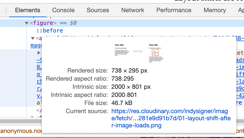
I advise using the Intrinsic Size (which is the actual size of the image source) and the browser will then scale these down to the rendered size when you use CSS to change these.

Quick Tip: If, like me, you can’t remember whether it’s width and height or height and width, think of it as X and Y coordinates so, like X, width is always given first.

If you have responsive images and use CSS to change the image dimensions (e.g. to constrain it to a max-width of 100% of the screen size), then these attributes can be used to calculate the height — providing you remember to override this to auto in your CSS:

img {
  max-width: 100%;
  height: auto;
}

All modern browsers support this now, though didn’t until recently as covered in my article. This also works for <picture> elements and srcset images (set the width and height on the fallback img element), though not yet for images of different aspect-ratios — it’s being worked on, and until then you should still set width and height as any values will be better than the 0 by 0 defaults!

This also works on native lazy-loaded images (though Safari doesn’t support native lazy loading by default yet).

The New aspect-ratio CSS Property

The width and height technique above, to calculate the height for responsive images, can be generalized to other elements using the new CSS aspect-ratio property, which is now supported by Chromium-based browsers and Firefox, but is also in Safari Technology Preview so hopefully that means it will be coming to the stable version soon.

So you could use it on an embedded video for example in 16:9 ratio:

video {
  max-width: 100%;
  height: auto;
  aspect-ratio: 16 / 9;
}
<video controls width="1600" height="900" poster="...">
    <source src="/media/video.webm"
            type="video/webm">
    <source src="/media/video.mp4"
            type="video/mp4">
    Sorry, your browser doesn't support embedded videos.
</video>

Interestingly, without defining the aspect-ratio property, browsers will ignore the height for responsive video elements and use a default aspect-ratio of 2:1, so the above is needed to avoid a layout shift here.

In the future, it should even be possible to set the aspect-ratio dynamically based on the element attributes by using aspect-ratio: attr(width) / attr(height); but sadly this is not supported yet.

Or you can even use aspect-ratio on a <div> element for some sort of custom control you are creating to make it responsive:

#my-square-custom-control {
  max-width: 100%;
  height: auto;
  width: 500px;
  aspect-ratio: 1;
}
<div id="my-square-custom-control"></div>

For those browsers that don’t support aspect-ratio you can use the older padding-bottom hack but, with the simplicity of the newer aspect-ratio and wide support (especially once this moves from Safari Technical Preview to regular Safari), it is hard to justify that older method.

Chrome is the only browser that feeds back CLS to Google and it supports aspect-ratio meaning that will solve your CLS issues in terms of Core Web Vitals. I don’t like prioritizing the metrics over the users, but the fact that the other Chromium and Firefox browsers have this and Safari will hopefully soon, and that this is a progressive enhancement means that I would say we’re at the point where we can leave the padding-bottom hack behind and write cleaner code.

Make Liberal Use Of min-height

For those elements that don’t need a responsive size but a fixed height instead, consider using min-height. This could be for a fixed height header, for example and we can have different headings for the different break-points using media queries as usual:

header {
  min-height: 50px;
}
@media (min-width: 600px) {
  header {
    min-height: 200px;
  }
}
<header>
 ...
</header>

Of course the same applies to min-width for horizontally placed elements, but it’s normally the height that causes the CLS issues.

A more advanced technique for injected content and advanced CSS selectors is to target when expected content has not been inserted yet. For example, if you had the following content:

<div class="container">
  <div class="main-content">...</div>
</div>

And an extra div is inserted via JavaScript:

<div class="container">
  <div class="additional-content">.../div>
  <div class="main-content">...</div>
</div>

Then you could use the following snippet to leave the space for additional content when the main-content div is rendered initially.

.main-content:first-child {
   margin-top: 20px; 
 }

This code will actually create a shift to the main-content element as the margin counts as part of that element so it will appear to shift when that is removed (even though it doesn’t actually move on screen). However, at least the content beneath it will not be shifted so should reduce CLS.

Alternatively, you can use the ::before pseudo-element to add the space to avoid the shift on the main-content element as well:

.main-content:first-child::before {
   content: '';
   min-height: 20px;
   display: block;
 }

But in all honesty, the better solution is to have the div in the HTML and make use of min-height on that.

Check Fallback Elements

I like to use progressive enhancement to provide a basic website, even without JavaScript where possible. Unfortunately, this caught me out recently on one site I maintain when the fallback non-JavaScript version was different than when the JavaScript kicked in.

The issue was due to the "Table of Contents" menu button in the header. Before the JavaScript kicks in this is a simple link, styled to look like the button that takes you to the Table of Contents page. Once JavaScript kicks in, it becomes a dynamic menu to allow you to navigate directly to whatever page you want to go to from that page.

I used semantic elements and so used an anchor element (<a href="#table-of-contents">) for the fallback link but replaced that with a <button> for the JavaScript-driven dynamic menu. These were styled to look the same, but the fallback link was a couple of pixels smaller than the button!

This was so small, and the JavaScript usually kicked in so quickly, that I had not noticed it was off. However, Chrome noticed it when calculating the CLS and, as this was in the header, it shifted the entire page down a couple of pixels. So this had quite an impact on the CLS score — enough to knock all our pages into the “Needs Improvement” category.

This was an error on my part, and the fix was simply to bring the two elements into sync (it could also have been remediated by setting a min-height on the header as discussed above), but it confused me for a bit. I’m sure I’m not the only one to have made this error so be aware of how the page renders without JavaScript. Don’t think your users disable JavaScript? All your users are non-JS while they're downloading your JS.

Web Fonts Cause Layout Shifts

Web fonts are another common cause of CLS due to the browser initially calculating the space needed based on the fallback font, and then recalculating it when the web font is downloaded. Usually, the CLS is small, providing a similarly sized fallback font is used, so often they don’t cause enough of a problem to fail Core Web Vitals, but they can be jarring for users nonetheless.

Unfortunately even preloading the webfonts won’t help here as, while that reduces the time the fallback fonts are used for (so is good for loading performance — LCP), it still takes time to fetch them, and so the fallbacks will still be used by the browser in most cases so doesn’t avoid CLS. Saying that, if you know a web font is needed on the next page (say you’re on a login page and know the next page uses a special font) then you can prefetch them.

To avoid font-induced layout shifts altogether, we could of course not use web fonts at all — including using system fonts instead, or using font-display: optional to not use them if not downloaded in time for the initial render. But neither of those are very satisfactory, to be honest.

Another option is to ensure the sections are appropriately sized (e.g. with min-height) so while the text in them may shift a bit, the content below it won’t be pushed down even when this happens. For example, setting a min-height on the <h1> element could prevent the whole article from shifting down if slightly taller fonts load in — providing the different fonts don’t cause a different number of lines. This will reduce the impact of the shifts, however, for many use-cases (e.g. generic paragraphs) it will be difficult to generalize a minimum height.

What I’m most excited about to solve this issue, are the new CSS Font Descriptors which allow you to more easily adjust fallback fonts in CSS:

@font-face {
  font-family: 'Lato';
  src: url('/static/fonts/Lato.woff2') format('woff2');
  font-weight: 400;
}

@font-face {
    font-family: "Lato-fallback";
    size-adjust: 97.38%;
    ascent-override: 99%;
    src: local("Arial");
}

h1 {
    font-family: Lato, Lato-fallback, sans-serif;
}

Prior to these, adjusting the fallback font required using the Font Loading API in JavaScript which was more complicated, but this option due out very soon may finally give us an easier solution that is more likely to gain traction. See my previous article on this subject for more details on this upcoming innovation and more resources on that.

Initial Templates For Client-side Rendered Pages

Many client-side rendered pages, or Single Page Apps, render an initial basic page using just HTML and CSS, and then “hydrate” the template after the JavaScript downloads and executes.

It’s easy for these initial templates to get out of sync with the JavaScript version as new components and features are added to the app in the JavaScript but not added to the initial HTML template which is rendered first. This then causes CLS when these components are injected by JavaScript.

So review all your initial templates to ensure they are still good initial placeholders. And if the initial template consists of empty <div>s, then use the techniques above to ensure they are sized appropriately to try to avoid any shifts.

Additionally, the initial div which is injected with the app should have a min-height to avoid it being rendered with 0 height initially before the initial template is even inserted.

<div id="app" style="min-height:900px;"></div>

As long as the min-height is larger than most viewports, this should avoid any CLS for the website footer, for example. CLS is only measured when it’s in the viewport and so impacts the user. By default, an empty div has a height of 0px, so give it a min-height that is closer to what the actual height will be when the app loads.

Ensure User Interactions Complete Within 500ms

User interactions that cause content to shift are excluded from CLS scores. These are restricted to 500 ms after the interaction. So if you click on a button, and do some complex processing that takes over 500 ms and then render some new content, then your CLS score is going to suffer.

You can see if the shift was excluded in Chrome DevTools by using the Performance tab to record the page and then finding the shifts as shown in the next screenshot. Open DevTools go to the very intimidating (but very useful once you get a hang of it!) Performance tab and then click on the record button in the top left (circled on the image below) and interact with your page, and stop recording once complete.

You will see a filmstrip of the page in which I loaded some of the comments on another Smashing Magazine article so in the part I’ve circled, you can just about make out the comments loading and the red footer being shifted down offscreen. Further down the Performance tab, under the Experience line, Chrome will put a reddish-pinkish box for each shift and when you click on that you will get more detail in the Summary tab below.

Here you can see that we got a massive 0.3359 score — well past the 0.1 threshold we’re aiming to be under, but the Cumulative score has not included this, because Had recent input is set to Uses.

Ensuring interactions only shift content within 500 ms borders on what First Input Delay attempts to measure, but there are cases when the user may see that the input had an effect (e.g. a loading spinner is shown) so FID is good, but the content may not be added to the page until after the 500 ms limit, so CLS is bad.

Ideally, the whole interaction will be finished within 500ms, but you can do some things to set aside the necessary space using the techniques above while that processing is going on so that if it does take more than the magic 500 ms, then you’ve already handled the shift and so will not be penalized for it. This is especially useful when fetching content from the network which could be variable and outside your control.

Other items to watch out for are animations that take longer than 500ms and so can impact CLS. While this might seem a bit restrictive, the aim of CLS isn’t to limit the “fun”, but to set reasonable expectations of user experience and I don’t think it’s unrealistic to expect these to take 500ms or under. But if you disagree, or have a use case they might not have considered, then the Chrome team is open to feedback on this.

Synchronous JavaScript

The final technique I’m going to discuss is a little controversial as it goes against well-known web performance advice, but it can be the only method in certain situations. Basically, if you have content that you know is going to cause shifts, then one solution to avoid the shifts is to not render it until it’s settled down!

The below HTML will hide the div initially, then load some render-blocking JavaScript to populate the div, then unhide it. As the JavaScript is render-blocking nothing below this will be rendered (including the second style block to unhide it) and so no shifts will be incurred.

<style>
.cls-inducing-div {
    display: none;
}
</style>

<div class="cls-inducing-div"></div>
<script>
...
</script>

<style>
.cls-inducing-div {
    display: block;
}
</style>

It is important to inline the CSS in the HTML with this technique, so it is applied in order. The alternative is to unhide the content with JavaScript itself, but what I like about the above technique is that it still unhides the content even if the JavaScript fails or is turned off by the browser.

This technique can also even be applied with external JavaScript, but this will cause more delay than an inline script as the external JavaScript is requested and downloaded. That delay can be minimized by preloading the JavaScript resource so it’s available quicker once the parser reaches that section of code:

<head>
...
<link rel="preload" href="cls-inducing-javascript.js" as="script">
...
</head>
<body>
...
<style>
.cls-inducing-div {
    display: none;
}
</style>
<div class="cls-inducing-div"></div>
<script src="cls-inducing-javascript.js"></script>
<style>
.cls-inducing-div {
    display: block;
}
</style>
...
</body>

Now, as I say, this I’m sure will make some web performance people cringe, as advice is to use async, defer or the newer type="module" (which are defer-ed by default) on JavaScript specifically to avoid blocking render, whereas we are doing the opposite here! However, if content cannot be predetermined and it is going to cause jarring shifts, then there is little point in rendering it early.

I used this technique for a cookie banner that loaded at the top of the page and shifted content downwards:

This required reading a cookie to see whether to display the cookie banner or not and, while that could be completed server-side, this was a static site with no ability to dynamically alter the returned HTML.

Cookie banners can be implemented in different ways to avoid CLS. For example by having them at the bottom of the page, or overlaying them on top of the content, rather than shifting the content down. We preferred to keep the content at the top of the page, so had to use this technique to avoid the shifts. There are various other alerts and banners that site owners may prefer to be at the top of the page for various reasons.

I also used this technique on another page where JavaScript moves content around into “main” and “aside” columns (for reasons I won’t go into, it was not possible to construct this properly in HTML server-side). Again hiding the content, until the JavaScript had rearranged the content, and only then showing it, avoided the CLS issues that were dragging these pages' CLS score down. And again the content is automatically unhidden even if the JavaScript doesn’t run for some reason and the unshifted content is shown.

Using this technique can impact other metrics (particularly LCP and also First Contentful Paint) as you are delaying rendering, and also potentially blocking browsers' look ahead preloader, but it is another tool to consider for those cases where no other option exists.

Conclusion

Cumulative Layout Shift is caused by content changing dimensions, or new content being injected into the page by late running JavaScript. In this post, we’ve discussed various tips and tricks to avoid this. I’m glad the spotlight the Core Web Vitals have shone on this irritating issue — for too long we web developers (and I definitely include myself in this) have ignored this problem.

Cleaning up my own websites has led to a better experience for all visitors. I encourage you to look at your CLS issues too, and hopefully some of these tips will be useful when you do. Who knows, you may even manage to get down to the elusive 0 CLS score for all your pages!

More Resources

Improving The Performance Of An Online Store (Case Study)

Every front-end developer is chasing the same holy grail of performance: green scores in Google Page Speed. Tangible signs of work well done are always appreciated. Like the hunt for the grail, though, you have to question whether this is really the answer you are looking for. Real-life performance for your users and how the website “feels” when you’re using it should not be discounted, even if it costs you a point or two in Page Speed (otherwise, we would all just have a search bar and unstyled text).

I work at a small digital agency, and my team mostly works on big corporate websites and stores — page speed comes into the discussion at some point, but usually by that time the answer is that a huge rewrite would be needed to truly achieve anything, an unfortunate side effect of size and project structure in corporations.

Working with jewellerybox on its online store was a welcome change of pace for us. The project consisted of upgrading the shop software to our own open-source system and redoing the shop’s front end from scratch. The design was made by a design and UX agency that also handled the HTML prototype (based on Bootstrap 4). From there, we incorporated it into the templates — and for once, we had a client obsessed with performance of the website as well.

For the launch, we mostly focused on getting the new design out the door, but once the website’s relaunch went live, we started focusing our attention on turning the red and orange scores to greens. It was a multi-month journey full of difficult decisions, with a lot of discussions about which optimizations were worth pursuing. Today, the website is much faster and ranks highly in various showcases and benchmarks. In this article, I’ll highlight some of the work we did and how we were able to achieve our speed.

Online Stores Are A Bit Different

Before we get into details, let’s take a short moment to talk about how online stores are different from many other websites (if you already know this, we’ll meet up with you in the next section). When we talk about an e-commerce website, the main pages you’ll have are:

  • the home page (and “content” pages),
  • category and search pages,
  • product detail pages,
  • the cart and checkout (obviously).

For this article, we will focus on the first three and the performance adjustments for these. The checkout is its own beast. There you will have a lot of extra JavaScript and back-end logic to calculate the prices, plus several service calls to get the appropriate shipping provider and price estimates based on the country being shipped to.

This is obviously in addition to the validation of the forms fields that you’ll need to record the billing and shipping addresses. Add to that the payment provider drop-in, and you have yourself some pages that no one will want to touch once they have been properly tested and work.

What is the first thing you think of when you imagine an online store? Images — lots and lots of product images. They are basically everywhere and will dominate your design. Plus, you will want to show many products to get people to buy from you — so a carousel it is. But wait! Do people click on the products in it? We can find out by putting some tracking on the carousel. If we track it, we can optimize it! And suddenly, we have external, AI-powered product carousels on our pages.

The thing is, a carousel will not be the last speed-penalizing element that you add to the page to showcase more products in the hopes of attracting more sales. Of course, a shop needs interactive elements, be it product image zooming, some videos, a countdown to today’s shipping deadline, or a chat window to get in contact with customer support.

All of these are very important when you measure conversions directly as revenue. Plus, every few months, someone on the team will spot some cool new functionality that could be added, and so the complexity and JavaScript start to accumulate, even though you started out with the best of intentions to keep it lean.

And while you can usually cache the full page of an article, the same is not true of many shop pages and elements. Some are user-specific, like the shopping cart in the header or the wish list, and due to the personal nature of the data, they should never be cached. Additionally, if you have physical goods, you are dealing with live inventory: During the Christmas rush especially, you will need the information about inventory to be precise and up to date; so, you’ll need a more complex caching strategy that allows you to cache parts of the page and combine everything back together during the server-side rendering.

But even in the planning phases, traps await. In a design — and often also the prototype phase — you will be working with finely crafted product names and descriptions, all nearly uniform in length, and ideal product images. They look amazing! The only problem? In reality, product information can be very different in length which can mess up your design. With several thousand products, you cannot check each one.

Therefore, it helps if designers or the people doing the prototype test with very short and very long strings to make sure the design still fits. Similarly, having information appear twice in the HTML, once for desktop and once for mobile, can be a huge issue for a shop — especially if it is complex information like product details, the shopping cart, or facets for the filters on a product category page. Keeping those in sync is hard to do — so, please help a fellow developer out and don’t do it.

Another thing that should never be an afterthought and should be incorporated from the prototype stage onward is accessibility. Several tools out there can help you with some of the basics, from having alternative text for all images and icons with a function, to color contrast, to knowing which ARIA attributes to use where (and when not to). Incorporating this from the start is a lot easier than later on, and it allows everyone to enjoy the website you are working on.

Here is a tip: If you haven’t seen people use a screen reader or navigate with just a keyboard, videos on this can be easily found on YouTube. It will change your understanding of these topics.

Back to performance: Why is it so important to improve the performance of a shop again? The obvious answer is that you want people to buy from you. There are several ways you can affect this, and the speed of your website is a big one. Studies show that each additional second of loading time has a significant impact on the conversion rate. Additionally, page speed is a ranking factor for search and also for your Google Ads. So, improving performance will have a tangible effect on the bottom line.

Practical Things We Did

Some performance bottlenecks are easy to identify, but a thorough improvement is a longer journey, with many twists and turns. We started off with all of the usual things, such as rechecking the caching of resources, seeing what we could prefetch or load asynchronously, ensuring we are using HTTP/2 and TLSv1.3. Many of them are covered in CSS-Tricks’ helpful overview, and Smashing Magazine offers a great PDF checklist.

First Things First: Things Loaded On All Pages

Let’s talk about resources, and not just CSS or JavaScript (which we will cover later). We started off by looking at things shared across multiple screens, each of which can have an impact. Only after that did we focus on page types and the issues unique to them. Some common items were the following.

Icon Loading

As on so many websites, we use several icons in our design. The prototype came with some custom icons that were embedded SVG symbols. These were stored as one big svg tag in the HTML head of the page, with a symbol for each of the icons that was then used as a linked svg in the HTML’s body. This has the nice effect of making them directly available to the browser when the document loads, but obviously the browser cannot cache them for the whole website.

So we decided to move them to an external SVG file and preload it. Additionally, we included only the icons we actually use. This way, the file can be cached on the server and in the browser, and no superfluous SVGs will need to be interpreted. We also support the use of Font Awesome on the page (which we load via JavaScript), but we load it on demand (adding a tiny script that checks for any <i> tags, and then loading the Font Awesome JavaScript to get any SVG icons it finds). Because we stick to our own icons above the fold, we can run the entire script after the DOM has loaded.

We also use emoji in some places for colorful icons, something none of us really thought about but which our content editor, Daena, asked for and which are a great way to show icons with no adverse effect on performance at all (the only caveat being the different designs on different operating systems).

Font Loading

Like on so many other websites, we use web fonts for our typography needs. The design calls for two fonts in the body (Josefin Sans in two weights), one for headings (Nixie One), and one for specially styled text (Moonstone Regular). From the beginning, we stored them locally, with a content delivery network (CDN) for performance, but after reading the wonderful article by Simon Hearne on avoiding layout shifts with font loading, we experimented with removing the bold version and using the regular one.

In our tests, the visual difference was so little that none of our testers were able to tell without seeing both at the same time. So, we dropped the font weight. While working on this article and preparing a visual aid for this section, we stumbled upon bigger differences in Chromium-based browsers on the Mac and WebKit-based ones on high-resolution screens (yay, complexity!). This led to another round of discussions on what we should do.

After some back and forth, we opted to keep the faux bold and use -webkit-text-stroke: 0.3px to help those particular browsers. The difference from using the actual separate font weight is slight, but not enough for our use case, where we use almost no bold font, only a handful of words at a time (sorry, font aficionados).

There is a drawback, however: This means that the initial page rendering on the server-side could be slower unless cached. For this reason, we are currently working on alternative ways to inject the results after the page has loaded and rendering a placeholder at first.

Second Up: Optimizing JavaScript — An Uphill Battle Against External Foes

The carousel brings us to the second big area we focused on: JavaScript. We audited the JavaScript that we had, and the majority is from libraries for different tasks, with very little custom code. We optimized the code that we had written ourselves, but obviously there is only so much you can do if it is just a fraction of your overall code — the big gains lie in the libraries.

Optimizing stuff in libraries or taking out parts you don’t need is, in all likelihood, a fool’s errand. You don’t truly know why some parts are there, and you will never be able to upgrade the library again without a lot of manual work. With that in mind, we took a step back and looked at which libraries we use and what we need them for, and we investigated for each one whether a smaller or faster alternative exists that fits our needs just as well.

In several cases, there was! For example, we decided to replace the Slick slider libary with GliderJS, which has fewer features but all the ones we need, plus is faster to load and has more modern CSS support! In addition, we took a lot of the self-contained libraries out of the main JavaScript file and started loading them on demand.

Because we are using Bootstrap 4, we are still including jQuery for the project but are working on replacing everything with native implementations. For Bootstrap itself, there is a bootstrap.native version on GitHub without the jQuery dependency that we now use. It is smaller in size and runs faster. Plus, we generate two versions of our main JavaScript file: one without polyfills and one with them included, and we swap in the version with them when the browser needs them, enabling us to deliver a streamlined main version to most people. We tested a “polyfill-on-demand” service, but the performance didn’t meet our expectations.

One last thing on the topic of jQuery. Initially, we loaded it from our server. We saw performance improvements on our testing system when loading it via the Google CDN, but Page Speed Insights complained about performance (I wonder who could solve that), so we tested hosting it ourselves again, and in production it was actually faster due to the CDN we use.

Lesson learned: A testing environment is not a production environment, and fixes for one might not hold true for the other.

Third Up: Images — Formats, Sizes, And All That Jazz

Images are a huge part of what makes an online store. A page will usually have several dozen images, even before we count the different versions for different devices. The jewellerybox website has been around for almost 10 years, and many products have been available for most of that time, so original product images are not uniform in size and styling, and the number of product shots can vary as well.

Ideally, we would like to offer responsive images for different view sizes and display densities in modern formats, but any change in requirements would mean a lot of conversion work to be done. Due to this, we currently use an optimized size of product images, but we do not have responsive images for them. Updating that is on the road map but not trivial. Content pages offer more flexibility, and there we generate and use different sizes and include both WebP and fallback formats.

Having so many images adds a lot of weight to the initial payload. So, when and how to load images became a huge topic. Lazy-loading sounds like the solution, but if applied universally it can slow down initially visible images, rather than loading them directly (or at least it feels like that to the user). For this reason, we opted for a combination of loading the first few directly and lazy-loading the rest, using a combination of native lazy-loading and a script.

For the website logo, we use an SVG file, for which we got an initial version from the client. The logo is an intricate font in which parts of the letters are missing, as they would be in an imperfect print done by hand. In large sizes, you’d need to show the details, but on the website we never use it above 150 by 30 pixels. The original file was 192 KB in size, not huge but not super-small either. We decided to play with the SVG and decrease the details in it, and we ended up with a version that is 40 KB in size unzipped. There is no visual difference at the display sizes we use.

Last But Definitely Not Least: CSS

Critical CSS

CSS figures hugely in Google’s Chrome User Experience Report (CrUX) and also features heavily in the Google Page Speed Insights report and recommendations. One of the first things we did was to define some critical CSS, which we load directly in the HTML so that it is available to the browser as soon as possible — this is your main weapon for fighting content layout shifts (CLS). We opted for a combination of automated extraction of the critical CSS based on a prototype page and a mechanism with which we can define class names to be extracted (including all sub-rules). We do this separately for general styles, product page styles, and category styles that are added on the respective page types.

Something we learned from this and that caused some bugs in between is that we have to be careful that the order of CSS is not changed by this. Between different people writing the code, someone adding an override later in the file, and an automatic tool extracting things, it can get messy.

Explicit Dimensions Against CLS

To me, CLS is something Google pulled out of its hat, and now we all need to deal with it and wrap our collective heads around it. Whereas before, we could simply let containers get their size from the elements within them, now the loading of those elements can mess with the box size. With that in mind, we used the “Performance” tab in the Developer Tools and the super-helpful Layout Shift GIF Generator to see which elements are causing CLS. From there, we looked not only at the elements themselves, but also at their parents and analyzed the CSS properties that would have an impact on the layout. Sometimes we got lucky — for example, the logo just needed an explicit size set on mobile to prevent a layout shift — but other times, the struggle was real.

Pro tip: Sometimes a shift is caused not by the apparent element, but by the element preceding it. To identify possible culprits, focus on properties that change in size and spacing. The basic question to ask yourself is: What could cause this block to move?

Because so many images are on the page, getting them to behave correctly with CLS also caused us some work. Barry Pollard rightly reminds us of as much in his article, “Setting Height and Width on Images Is Important Again”. We spent a lot of time figuring out the correct width and height values (plus aspect ratios) for our images in each case to add them to the HTML again. As a result, there is no layout shift for the images anymore because the browser gets the information early.

The Case Of The Mysterious CLS Score

After removing a lot of the big CLS issues near the top of the page, we hit a roadblock. Sometimes (not always) when looking at Page Speed or Lighthouse, we got a CLS score of over 0.3, but never in the “Performance” tab. The Layout Shift GIF Generator sometimes showed it, but it looked like the whole page container was moving.

With network and CPU throttling enabled, we finally saw it in the screenshots! The header on mobile was growing by 2 pixels in height due to the elements within it. Because the header is a fixed height on mobile anyway, we went with the simple fix and added an explicit height to it — case closed. But it cost us a lot of nerves, and it shows that the tooling here is still very imprecise.

This Isn’t Working — Let’s Redo It!

As we all know, mobile scores are much harsher for Page Speed than for desktop, and one area where they were particularly bad for us was on product pages. The CLS score was through the roof, and the page also had performance issues (several carousels, tabs, and non-cacheable elements will do that). To make matters worse, the layout of the page meant that some information was being shuffled around or added twice.

On desktop, we basically have two columns for the content:

  • Column A: The product photo carousel, sometimes followed by blogger quotes, followed by a tabbed layout with product information.
  • Column B: The product name, the price, the description, and the “add to basket” button.
  • Row C: The product carousel of similar products.

On mobile, though, the product photo carousel needed to come first, then column B, then the tabbed layout from column A. Due to this, certain information was duplicated in the HTML, being controlled by display: none, and the order was being switched with the flex: order property. It definitely works, but it isn’t good for CLS scores because basically everything needs to be reordered.

I decided on a simple experiment in CodePen: Could I achieve the same basic layout of boxes on desktop and in mobile by rethinking the HTML and using display: grid instead of flexbox, and would that allow me to simply rearrange the grid areas as needed? Long story short, it worked, and it solved CLS, and it has the added benefit that the product name now comes much sooner in the HTML than it did before — an added SEO win!

At some point, the things you should try become non-obvious because you don’t think they should make a huge difference, but sometime afterward you realize that they do. More than that, what this project taught us again is how important it is to have performance and the metrics for it in mind from the very beginning, from envisioning the design and coding the prototype to the implementation in the templates. Small things neglected early on can add up to huge mountains you have to climb later on to undo.

Here are some of the key aspects we learned:

  • Optimizing JavaScript is not as effective as loading it on demand;
  • Optimizing CSS seems to gain more points than optimizing JavaScript;
  • Write CSS classes with CLS and extraction of critical CSS in mind;
  • The tools for finding CLS problems aren’t perfect yet. Think outside the box and check several tools;
  • Evaluate each third-party service that you integrate for file size and performance timing. If possible, push back on integration of anything that would slow everything down;
  • Retest your page regularly for CrUX changes (and especially CLS);
  • Regularly check whether all of your legacy support entries are still needed.

We still have things on our list of improvements to make:

  • We still have a lot of unused CSS in the main file that could be removed;
  • We’d like to remove jQuery completely. This will mean rewriting parts of our code, especially in the checkout area;
  • More experiments need to be conducted on how to include the external sliders;
  • Our mobile point scores could be better. Further work will be needed for mobile especially;
  • Responsive images need to be added for all product images;
  • We’ll check the content pages specifically for improvements they may need, especially around CLS;
  • Elements using Bootstrap’s collapse plugin will be replaced with the native HTML details tag;
  • The DOM size needs to be reduced;
  • We will be integrating a third-party service for faster and better search results. This will come with a large JavaScript dependency that we will need to integrate;
  • We’ll work on improving accessibility both by looking at automated tools and by running some tests with screen readers and keyboard navigation ourselves.

Further Resources