Create Amazing Free Frontend Tables, Graphs, and Charts with Forminator and wpDataTables

Turning form data into insightful tables, graphs, and charts just got easier with the introduction of wpDataTables Integration for Forminator Forms.

This add-on to our popular 5-star Forminator plugin will allow you to create responsive, sortable tables & charts based on Forminator’s form, quiz, and poll submissions from your WordPress site’s frontend.

This feature is great for:

  • Public Directories –  The Forminator form collects the data and displays it in a searchable, sortable table.
  • Data Dashboards – Similar to above, this can have different charts and tables.
  • Quiz Leadership Board – Use to create a leadership board to display the quiz score of everyone who has taken the quiz and sorted based on their rank (number of correct answers).
  • Polls – Can be used to display the poll data in a graph when a poll has ended and you can have changed the original poll to draft state.

And it’s all free and easy to do!

In this article we’ll show you just how easy, by creating a simple data table that draws straight from an existing Forminator form.

More specifically, we’ll look at how to get this collaboration set up for your WordPress site and show you how to:

We’ll then show off a few bonus examples of other tables and charts that are possible.

By the end of this article, you’ll see how Forminator and wpDataTables cannot be (table)topped!

Install These Plugins and Follow Along

To get started, you’ll need to install three plugins. It’s a bit different than other installs because this uses an addon plugin to function.

First off, it’s pretty obvious, but you’ll need Forminator. You can also use the Pro version of Forminator (the same goes for wpDataTables), but it’s not required.

forminator image
None of this happens without Forminator.

You’ll also need to download wpDataTables AND the addon plugin, wpDataTables Integration for Forminator Forms.

Image of Forminator and wpDataTables.
wpDataTables addon is the next crucial element.

Got all three? Great! Once installed and activated, you’ll be ready to go.

Let’s go ahead and…

Create a New Table

To create a new table, you’ll be hopping into wpDataTables to do so. Simply go to wpDataTables from the WordPress menu and click on Create Table.

You can do this from the dashboard or menu.

Where you create a table at in wpDataTables.
There are two places to create a table.

You’ll then want to select the Create a data table linked to an existing data source option and hit Next.

Where you create a data table linked to an existing data source.
This option is one of the first ones at the top.

WPDataTables lets you create tables from Excel, CSV, JSON, XML, serialized PHP arrays, and even MySQL-query-based tables.

As we’re creating a new table using Forminator, however, at the new screen, you’ll select Forminator Form from the Input data source type.

Where you implement Forminator.
It’s easy to spot in the dropdown.

Oh did I mention you’ll need an existing Forminator form, quiz, or poll to draw from?

If you need help with this, here are a few of our previous form building posts to help you out:

Next, choose what form, poll, or quiz you’d like to use to create a table where it says Choose a Forminator Form.

This area shows you all the forms you have available that were created in Forminator.

For this article, I’ll go with one that I created called wpDataTables Test Form.

Where you choose a Forminator form.
I have several options to pick from, but I’ll go with an example I created just for this article.

It’s worth noting that the form, poll, or quiz you want to use must have at least one submission stored in your database, or you won’t be able to create a table with it.

If there are no submissions, you’ll get an error message indicating that the table in the data source has no rows.

Error message you get when a table has no rows.
Uh-oh! No rows. This is the error message that you’ll get.

With that being said, the next step in the process is to Choose fields to show as columns.

This pulls up every field you have in the Forminator form that you chose to use. Select the fields that you want to show as columns.

Choose all of the fields at once or individually.

When it comes to supported form fields, there’s a ton of them. You can include:

  • Name (Single and Multiple)
  • Email
  • Phone
  • Address
  • Website
  • Input
  • Textarea
  • Number
  • Radio
  • Checkbox
  • Calculations
  • Select (Single and Multiple)
  • Datepicker (Calendar, Dropdowns, and Text input)
  • Timepicker ( Dropdowns and Number input)
  • File Upload (Single and Multiple)
  • Post Data
  • Hidden Field
  • Currency
  • Paypal
  • Stripe
  • E-Signature (only available in Forminator PRO)

Something to keep in mind is that fields like reCaptcha, HTML, Page break, Section, and GDPR Approval are excluded from tables.

Once you have all of your fields set, click Save Changes. It will give you the opportunity to…

Adjust Options and Settings

These other options and settings allow you to customize the new table even further!

Keep in mind that some of these additional settings are only available with the Pro version of wpDataTables; however, most are available for the free version.

Here’s a rundown of what all can be tweaked and settings:

  1. Data Source
  2. Display
  3. Sorting and Filtering
  4. Table Tools
  5. Placeholders
  6. Customize
  7. Forminator Settings

Let’s take a look at each one in more detail.

1. Data Source: This is the initial screen we just went over where you Input Data Source Type for Forminator. You can always revisit this area if you want to change the source and fields.

The data source tab.
This is the same tab that we went over previously.

2. Display: You can adjust the layout of your table for the frontend display.

There are options, such as Table Title, Info Block, Pagination, Scrollable, and more.

The display tab.
Want a table title? Do that and more in this area.

There are many different adjustments in this section, so be sure to check out this area and change accordingly.

3. Sorting and Filtering: This tab gives you options to allow your users to filter and sort the data that’s on your frontend display. Check the boxes of what you’d like to include.

Sorting and filtering tab.
Note that advanced custom filters are a Pro feature only.

4. Table Tools: Here is where you can enable copy & save options in your table. Once enabled, the dropdown gives you options for print, PDF, CSV, and more.

The dropdown menu reveals all of your options.

When saved, your users will have your selected options to choose from.

5. Placeholders: This is a Pro option, and all of the features for the placeholders category cannot be used with tables generated from Forminator data.

6. Customize: This is a table styling option that is only available for Pro.

7. Forminator Settings: An option area for Forminator, where you can filter by entry ID range and entry date.

The Forminator settings tab.
Filter by entry ID range and entry date.

Once you have all of your settings configured, you can copy the shortcode.

This works on any page, post, or acceptable widget. When pasted on your WordPress site, you’ll be all set!

The shortcode that you use for wpDataTable
Click the icon next to the shortcode to copy it automatically.

If you ever need to adjust or change anything, you can always go back to this area and alter accordingly.

View a Table Preview and Setup Columns

Now that you have the foundation set up with the data source, the Table preview and columns setup will appear.

Here, you can view what your table will look like, sort by the number of entries, search, and edit.

The table preview.
You can see all of the entries in the form so far.

By clicking on the gear icon in each category is where Column Settings is found.

In this area, you have the option to change column positions, rename displayed header, add cell content suffix, and more.

Each category has customization options.

You can create so many options and variations with wpDataTables and Forminator, so it may take several attempts to perfect your table.

Examples of Tables and Charts

Beyond the table we just created, here’s a look at a couple more examples of what can be created.

You’re able to set up a pie chart…

A look at a pie chart.
Pie, anyone?

…a colorful bar chart.

A graph with poll results.
The results are in.

There are also line charts, bubble charts, donut charts, and more that can be created!

Various charts.
There are many charts to choose from.

As you can see, there are a ton of possibilities when it comes to customization.

To check out some more examples, view our documentation. And for more insight on creating pie charts and graphs, be sure to explore wpDataTables extensive documentation.

At the (Table) Top of Their Game

Image of forminator working on a table.
Forminator is enjoying a seat at the table.

The dynamic table duo of Forminator and wpDataTables puts them at the top of their game when creating tables!

They’re easily customized, edited, and enabled for the perfect table(s) for your WordPress site (for free!).

Be sure to implement all of the covered features in this article for yourself with Forminator and wpDataTables.

Your WordPress tables will be set!

How to Add a Watermark in Google Documents

Microsoft Word includes a useful “Insert Watermark” feature to help you easily add your brand’s logo image or a text stamp that fades behind the content of every page in the document. A company’s policy may require employees to add watermarks to indicate if any document is in draft stage or if the document is confidential and not meant for external distribution.

Microsoft Word Watermark

Insert Watermarks in Google Docs

Unlike Microsoft Word, there’s no built-in support for Watermarks in Google Docs but there’s a simple workaround - create a faded image with the text of your watermark and place that image behind the text of your document pages. Here’s how:

1. Create the watermark stamp

Launch MS Paint on your computer and create a simple watermark image in landscape mode with dark gray text. Please use a bold font like Impact with large font size as the large image can always be resized inside Google Docs but not vice-versa.

I’ve also added some ready-to-use image stamps on Canva and Imgur.

Upload Watermark Image

2. Upload Watermark to Google Docs

Inside Google Docs, go to the Insert menu, choose the Image submenu and select Upload from Computer. Upload the watermark image that you saved in the previous step to Google Docs.

3. Open Image Options

Right-click the uploaded image inside Google Docs and choose Image Options from the contextual menu.

Watermark Diagonal Image

4. Change Rotation

Expand the Image Options sidebar and, under the Size & Rotation section, set the angle to around 320° to make the watermark diagonal.

5. Send the Image Behind Text

  • Under the text wrapping section, choose Behind Text to send the watermark image behind the content of your document.
  • Under Position, choose the Fixed position option with the layout set as Center. This will position your watermark image right in the center of the page.
  • Under the Adjustments section, set the transparency level to around 80% to fade the watermark image in the background.

The Watermark Effect in Documents

Here’s how the final watermark effect will look like in your Google Document.

Watermark in Document

Tip: You can use Document Studio to generate PDF files from Google Forms and the watermarks would be also show up in your PDF document.

A Guide To Undoing Mistakes With Git (Part 2)

In this second part of our series on "Undoing Mistakes with Git", we’ll bravely look danger in the eye again: I’ve prepared four new doomsday scenarios — including, of course, some clever ways to save our necks! But before we dive in: take a look at the check out previous articles on Git for even more self-rescue methods that help you undo your mistakes with Git!

Let’s go!

Recovering a Deleted Branch Using the Reflog

Have you ever deleted a branch and, shortly after, realized that you shouldn’t have? In the unlikely event that you don’t know this feeling, I can tell you that it’s not a good one. A mixture of sadness and anger creeps up on you, while you think of all the hard work that went into that branch’s commits, all the valuable code that you’ve now lost.

Luckily, there’s a way to bring that branch back from the dead — with the help of a Git tool named "Reflog". We had used this tool in the first part of our series, but here’s a little refresher: the Reflog is like a journal where Git notes every movement of the HEAD pointer in your local repository. In other, less nerdy words: any time you checkout, commit, merge, rebase, cherry-pick, and so on, a journal entry is created. This makes the Reflog a perfect safety net when things go wrong!

Let’s take a look at a concrete example:

$ git branch
* feature/login
master

We can see that we currently have our branch feature/login checked out. Let’s say that this is the branch we’re going to delete (inadvertently). Before we can do that, however, we need to switch to a different branch because we cannot delete our current HEAD branch!

$ git checkout master
$ git branch -d feature/login

Our valuable feature branch is now gone — and I’ll give you a minute to (a) understand the gravity of our mistake and (b) to mourn a little. After you’ve wiped away the tears, we need to find a way to bring back this branch! Let’s open the Reflog (simply by typing git reflog) and see what it has in store for us:

Here are some comments to help you make sense of the output:

  • First of all, you need to know that the Reflog sorts its entries chronologically: the newest items are at the top of the list.
  • The topmost (and therefore newest) item is the git checkout command that we performed before deleting the branch. It’s logged here in the Reflog because it’s one of these "HEAD pointer movements" that the Reflog so dutifully records.
  • To undo our grave mistake, we can simply return to the state before that — which is also cleanly and clearly recorded in the Reflog!

So let’s try this, by creating a new branch (with the name of our "lost" branch) that starts at this "before" state SHA-1 hash:

$ git branch feature/login 776f8ca

And voila! You’ll be delighted to see that we’ve now restored our seemingly lost branch! 🎉

If you’re using a Git desktop GUI like "Tower", you can take a nice shortcut: simply hit CMD + Z on your keyboard to undo the last command — even if you’ve just violently deleted a branch!

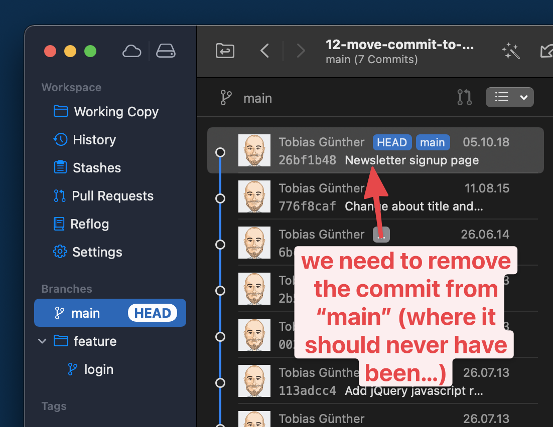
Luckily, these types of problems can be easily corrected. Let’s roll up our sleeves and get to work.

The first step is to switch to the correct destination branch and then move the commit overusing the cherry-pick command:

$ git checkout feature/login
$ git cherry-pick 776f8caf

You will now have the commit on the desired branch, where it should have been in the first place. Awesome!

But there’s still one thing left to do: we need to clean up the branch where it accidentally landed at first! The cherry-pick command, so to speak, created a copy of the commit — but the original is still present on our long-running branch:

This means we have to switch back to our long-running branch and use git reset to remove it:

$ git checkout main
$ git reset --hard HEAD~1

As you can see, we’re using the git reset command here to erase the faulty commit. The HEAD~1 parameter tells Git to "go back 1 revision behind HEAD", effectively erasing the topmost (and in our case: unwanted) commit from the history of that branch.

And voila: the commit is now where it should have been in the first place and our long-running branch is clean — as if our mistake had never happened!

Editing the Message of an Old Commit

It’s all too easy to smuggle a typo into a commit message — and only discover it much later. In such a case, the good old --amend option of git commit cannot be used to fix this problem, because it only works for the very last commit. To correct any commit that is older than that, we have to resort to a Git tool called "Interactive Rebase".

First, we have to tell Interactive Rebase which part of the commit history we want to edit. This is done by feeding it a commit hash: the parent commit of the one we want to manipulate.

$ git rebase -i 6bcf266b

An editor window will then open up. It contains a list of all commits after the one we provided as a basis for the Interactive Rebase in the command:

Here, it’s important that you don’t follow your first impulse: in this step, we do not edit the commit message, yet. Instead, we only tell Git what kind of manipulation we want to do with which commit(s). Quite conveniently, there’s a list of action keywords noted in the comments at the bottom of this window. For our case, we mark up line #1 with reword (thereby replacing the standard pick).

All that’s left to do in this step is to save and close the editor window. In return, a new editor window will open up that contains the current message of the commit we marked up. And now is finally the time to make our edits!

Here’s the whole process at a glance for you:

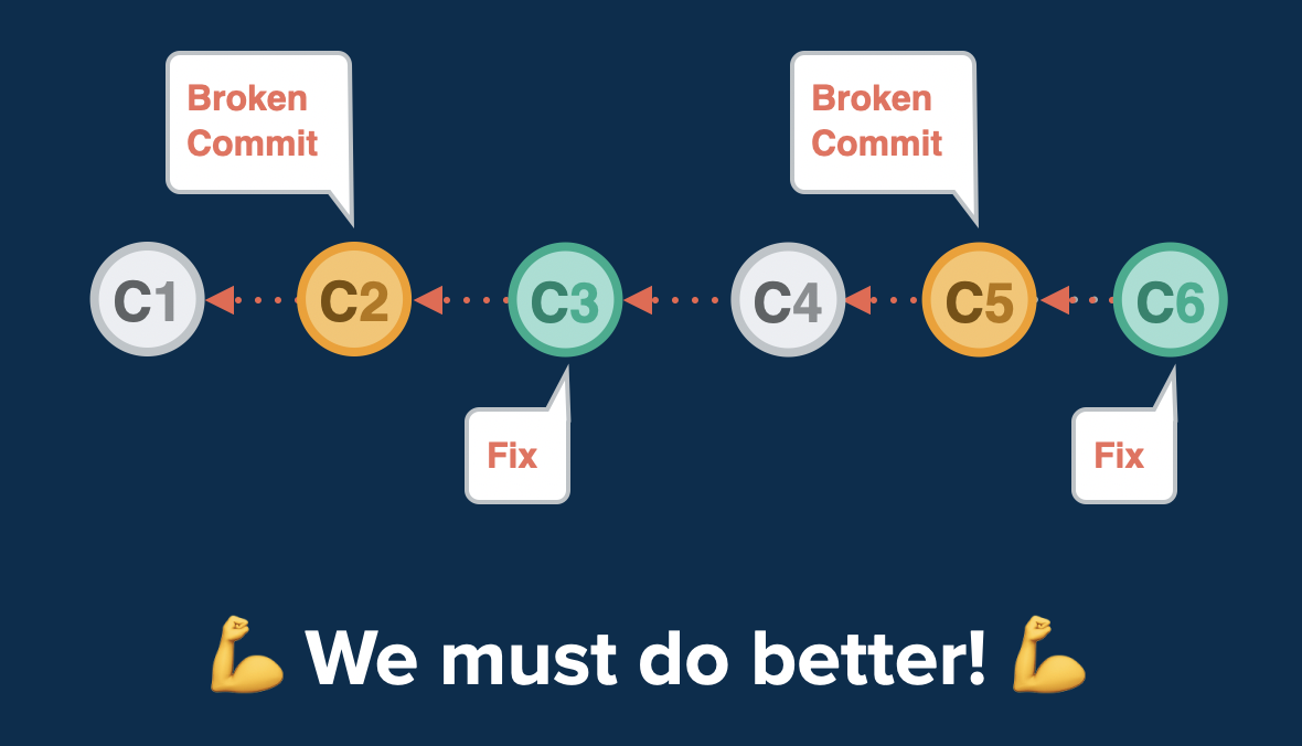
This is where fixup comes in. It allows you to still make this correcting band-aid commit. But here comes the magic: it then applies it to the original, broken commit (repairing it that way) and then discards the ugly band-aid commit completely!

We can go through a practical example together! Let’s say that the selected commit here is broken.

Let’s also say that I have prepared changes in a file named error.html that will solve the problem. Here’s the first step we need to make:

$ git add error.html
$ git commit --fixup 2b504bee

We’re creating a new commit, but we’re telling Git this is a special one: it’s a fix for an old commit with the specified SHA-1 hash (2b504bee in this case).

The second step, now, is to start an Interactive Rebase session — because fixup belongs to the big toolset of Interactive Rebase.

$ git rebase -i --autosquash 0023cddd

Two things are worth explaining about this command. First, why did I provide 0023cddd as the revision hash here? Because we need to start our Interactive Rebase session at the parent commit of our broken fellow.

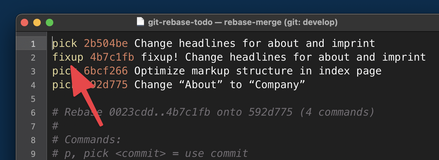
Second, what is the --autosquash option for? It takes a lot of work off our shoulders! In the editor window that now opens, everything is already prepared for us:

Thanks to the --autosquash option, Git has already done the heavy lifting for us:

  1. It marked our little band-aid commit with the fixup action keyword. That way, Git will combine it with the commit directly above and then discard it.
  2. It also reordered the lines accordingly, moving our band-aid commit directly below the commit we want to fix (again: fixup works by combining the marked-up commit with the one above!).

In short: There’s nothing to do for us but close the window!

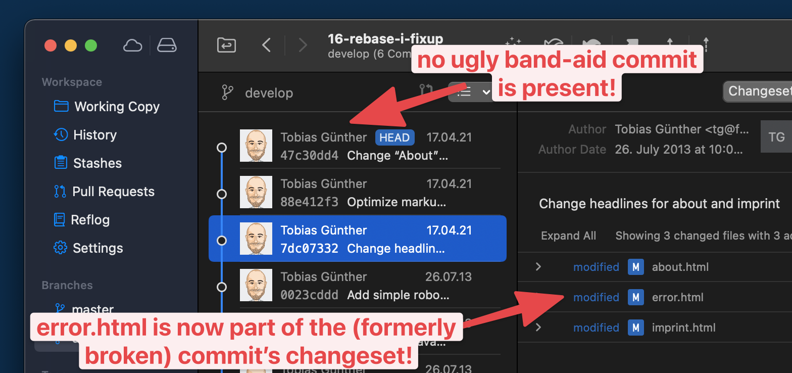
Let’s take a final look at the end result.

  • The formerly broken commit is fixed: it now contains the changes we prepared in our band-aid commit.
  • The ugly band-aid commit itself has been discarded: the commit history is clean and easy to read — as if no mistake had occurred at all.

Knowing How to Undo Mistakes is a Superpower

Congratulations! You are now able to save your neck in many difficult situations! We cannot really avoid these situations: no matter how experienced we are as developers, mistakes are simply part of the job. But now that you know how to deal with them, you can face them with a laid-back heart rate. 💚

If you want to learn more about undoing mistakes with Git, I can recommend the free "First Aid Kit for Git", a series of short videos about exactly this topic.

Have fun making mistakes — and, of course, undoing them with ease!

A New Way To Reduce Font Loading Impact: CSS Font Descriptors

Font loading has long been a bugbear of web performance, and there really are no good choices here. If you want to use web fonts your choices are basically Flash of Invisible Text (aka FOIT) where the text is hidden until the font downloads or Flash of Unstyled Text (FOUT) where you use the fallback system font initially and then upgrade it to the web font when it downloads. Neither option has really “won out” because neither is really satisfactory, to be honest.

Wasn’t font-display Supposed To Solve This?

The font-display property for @font-face gave that choice to the web developer whereas previously the browser decided that (IE and Edge favored FOUT in the past, whereas the other browsers favored FOIT). However, beyond that it didn’t really solve the problem.

A number of sites moved to font-display: swap when this first came out, and Google Fonts even made it the default in 2019. The thinking here was that it was better for performance to display the text as quickly as you can, even if it’s in the fallback font, and then to swap the font in when it finally downloads.

I was supportive of this back then too, but am increasingly finding myself frustrated by the “hydration effect” when the web font downloads and characters expand (or contract) due to differences between the fonts. Smashing Magazine, like most publishers, makes use of web fonts and the below screenshot shows the difference between the initial render (with the fallback fonts), and the final render (with the web fonts):

Now, when put side by side, the web fonts are considerably nicer and do fit with the Smashing Magazine brand. But we also see there is quite some difference in the text layout with the two fonts. The fonts are very different sizes and, because of this, the screen content shifts around. In this age of Core Web Vitals and Cumulative Layout Shifts being (quite rightly!) recognized as detrimental to users, font-display: swap is a poor choice because of that.

I’ve reverted back to font-display: block on sites I look after as I really do find the text shift quite jarring and annoying. While it’s true that block won’t stop shifts (the font is still rendered in invisible text), it at least makes them less noticeable to the user. I’ve also optimized by font-loading by preloading fonts that I’ve made as small as possible by self-hosting subsetted fonts — so visitors often saw the fallback fonts for only a small period of time. To me, the “block period” of swap was too short and I’d honestly prefer to wait a tiny bit longer to get the initial render correct.

Using font-display: optional Can Solve FOIT And FOUT — At A Cost

The other option is to use font-display: optional. This option basically makes web fonts optional, or to put differently, if the font isn’t there by the time the page needs it, then it's up to the browser to never swap it. With this option, we avoid both FOIT and FOUT by basically only using fonts that have already been downloaded.

If the web font isn’t available then, we fall back to the fallback font, but the next page navigation (or a reload of this page) will use the font — as it should have finished downloading by then. However, if the web font is that unimportant to the site, then it might be a good idea to just remove it completely — which is even better for web performance!

First impressions count and to have that initial load without web fonts altogether seems a little bit too much. I also think — with absolutely no evidence to back this up by the way! — that it will give people the impression, perhaps subconsciously, that something is “off” about the website and may impact how people use the website.

So, all font options have their drawbacks, including the option to not use web fonts at all, or using system fonts (which is limiting — but perhaps not as limiting as many think!).

Making Your Fallback Font More Closely Match Your Font

The holy grail of web font loading has been to make the fallback font closer to the actual web font to reduce the noticeable shift as much as possible, so that using swap is less impactful. While we never will be able to avoid the shifts altogether, we can do better than in the screenshot above. The Font Style Matcher app by Monica Dinculescu is often cited in font loading articles and gives a fantastic glimpse of what should be possible here. It helpfully allows you to overlay the same text in two different fonts to see how different they are, and adjust the font settings to get them more closely aligned:

Unfortunately, the issue with the font style matching is that we can’t have these CSS styles apply only to the fallback fonts, so we need to use JavaScript and the FontFace.load API to apply (or revert) these style differences when the web font loads.

The amount of code isn’t huge, but it still feels like a little bit more effort than it should be. Though there are other advantages and possibilities to using the JavaScript API for this as explained by Zach Leatherman in this fantastic talk from way back in 2019 — you can reduce reflows and handle data-server mode and prefers-reduced-motion though that (note however that both have since been exposed to CSS since that talk).

It’s also trickier to handle cached fonts we already have, not to mention differences in various fallback styles. Here on Smashing Magazine, we try a number of fallbacks to make the best use of the system fonts different users and operating systems have installed:

font-family: Mija,-apple-system,Arial,BlinkMacSystemFont,roboto slab,droid serif,segoe ui,Ubuntu,Cantarell,Georgia,serif;

Knowing which font is used, or having separate adjustments for each and ensuring they are applied correctly can quickly become quite complex.

A Better Solution Is Coming

So, that’s a brief catch-up on where things stand as of today. However, there is some smoke starting to appear on the horizon.

Excited for the CSS "size-adjust" descriptor for fonts: reduce layout shifts by matching up a fallback font and primary web font through a scale factor for glyphs (percentage).

See https://t.co/mdRW2BMg6A by @cramforce for a demo (Chrome Canary/FF Nightly with flags) pic.twitter.com/hEg1HfUJlT

— Addy Osmani (@addyosmani) May 22, 2021

As I mentioned earlier, the main issue with applying the fallback styling differences was in adding, and then removing them. What if we could tell the browser that these differences are only for the fallback fonts?

That’s exactly what a new set of font descriptors being proposed as part of the CSS Fonts Module Level 5 do. These are applied to the @font-face declarations where the individual font is defined.

Simon Hearne has written about this proposed update to the font-face descriptors specification which includes four new descriptors: ascent-override, descent-override, line-gap-override and advance-override (since dropped). You can play with the F-mods playground that Simon has created to load your custom and fallback fonts, then play with the overrides to get a perfect match.

As Simon writes, the combination of these four descriptors allowed us to override the layout of the fallback font to match the web font, but they only really modify vertical spacing and positioning. So for character and letter-spacing, we’ll need to provide additional CSS.

But things seem to be changing yet again. Most recently, advance-override was dropped in favor of the upcoming size-adjust descriptor which allows us to reduce layout shifts by matching up a fallback font and primary web font through a scale factor for glyphs (percentage).

How does it work? Let’s say you have the following CSS:

@font-face {
  font-family: 'Lato';
  src: url('/static/fonts/Lato.woff2') format('woff2');
  font-weight: 400;
}

h1 {
    font-family: Lato, Arial, sans-serif;
}

Then what you would do is create a @font-face for the Arial fallback font and apply adjustor descriptors to it. You’ll get the following CSS snippet then:

@font-face {
  font-family: 'Lato';
  src: url('/static/fonts/Lato.woff2') format('woff2');
  font-weight: 400;
}

@font-face {
    font-family: "Lato-fallback";
    size-adjust: 97.38%;
    ascent-override: 99%;
    src: local("Arial");
}

h1 {
    font-family: Lato, Lato-fallback, sans-serif;
}

This means that when the Lato-fallback is used initially (as Arial is a local font and can be used straight away without any additional download) then the size-adjust and ascent-override settings allow you to get this closer to the Lato font. It is an extra @font-face declaration to write, but certainly a lot easier than the hoops we had to jump through before!

Overall, there are four main @font-face descriptors included in this spec: size-adjust, ascent-override, descent-override, and line-gap-override with a few others still being considered for subscript, superscript, and other use cases.

Malte Ubl created a very useful tool to automatically calculate these settings given two fonts and a browser that supports these new settings (more on this in a moment!). As Malte points out, computers are good at that sort of thing! Ideally, we could also expose these settings for common fonts to web developers, e.g. maybe give these hints in font collections like Google Fonts? That would certainly help increase adoption.

Now different operating systems may have slightly different font settings and getting these exactly right is basically an impossible task, but that’s not the aim. The aim is to close the gap so using font-display: swap is no longer such a jarring experience, but we don’t need to go to the extremes of optional or no web fonts.

When Can We Start Using This?

Three of these settings have already been shipped in Chrome since version 87, though the key size-adjust descriptor is not yet available in any stable browser. However, Chrome Canary has it, as does Firefox behind a flag so this is not some abstract, far away concept, but something that could land very soon.

At the moment, the spec has all sorts of disclaimers and warnings that it’s not ready for real-time yet, but it certainly feels like it’s getting there. As always, there is a balance between us, designers and developers, testing it and giving feedback, and discouraging the use of it, so the implementation doesn’t get stuck because too many people end up using an earlier draft.

Chrome has stated their intent to make size-adjust available in Chrome 92 due for release on July 20th presumably indicating it’s almost there.

So, not quite ready yet, but looks like it’s coming in the very near future. In the meantime, have a play with the demo in Chrome Canary and see if it can go a bit closer to addressing your font loading woes and the CLS impact they cause.