How to Convert Column Number (e.g. 28) to Column Letter (e.g. AB) in Google Sheets

Google Sheets includes built-in functions for converting cell references in A1 notation to row and column numbers and another function for converting column alphabets (like AA) into the column index (26 in this case).

=ADDRESS(23, 28, 4) - Returns the A1 style notation of the cell whose row number is 23 and column number is 28.

=COLUMN(C9) - Returns the column number of a specified cell C9 where column A corresponds to 1 and column AA corresponds to 27.

Column Numbers in A1 Notation

Get A1 Notation with JavaScript

If you are working with the Google Sheets API, you may sometimes needs to calculate the A1 notation style reference of a cell whose row and column numbers are known in the JSON data of the sheet.

For container bound Google Sheets, the getA1Notation() method can return the range address in A1 Notation.

const sheet = SpreadsheetApp.getActiveSheet();
const range = sheet.getRange(1, 2);
Logger.log(range.getA1Notation());

If you are not using the Spreadsheet service, you can also compute the A1 notation reference of a cell using simple JavaScript.

/**
 *
 * @param {number} row - The row number of the cell reference. Row 1 is row number 0.
 * @param {number} column - The column number of the cell reference. A is column number 0.
 * @returns {string} Returns a cell reference as a string using A1 Notation
 *
 * @example
 *
 *   getA1Notation(2, 4) returns "E3"
 *   getA1Notation(2, 4) returns "E3"
 *
 */
const getA1Notation = (row, column) => {
  const a1Notation = [`${row + 1}`];
  const totalAlphabets = "Z".charCodeAt() - "A".charCodeAt() + 1;
  let block = column;
  while (block >= 0) {
    a1Notation.unshift(
      String.fromCharCode((block % totalAlphabets) + "A".charCodeAt())
    );
    block = Math.floor(block / totalAlphabets) - 1;
  }
  return a1Notation.join("");
};

This is equivalent to =ADDRESS() function of Google Sheets.

Get Column Number from A1 Notation

The next function takes the cell reference in A1 notation and returns the column number and row number of any cell in the spreadsheet.

/**
 *
 * @param {string} cell -  The cell address in A1 notation
 * @returns {object} The row number and column number of the cell (0-based)
 *
 * @example
 *
 *   fromA1Notation("A2") returns {row: 1, column: 3}
 *
 */

const fromA1Notation = (cell) => {
  const [, columnName, row] = cell.toUpperCase().match(/([A-Z]+)([0-9]+)/);
  const characters = "Z".charCodeAt() - "A".charCodeAt() + 1;

  let column = 0;
  columnName.split("").forEach((char) => {
    column *= characters;
    column += char.charCodeAt() - "A".charCodeAt() + 1;
  });

  return { row, column };
};

This is equivalent to the =ROW() and =COLUMN() functions available in Google Sheets.

Happy June Vibes For Your Screen (2021 Desktop Wallpapers Edition)

There’s an artist in everyone. Some bring their creative ideas to life with digital tools, others capture the perfect moment with a camera, or love to grab pen and paper to create little doodles or pieces of lettering. And even if you think you’re far away from being an artist, well, it might just be hidden somewhere deep inside of you. So why not explore it?

Since more than ten years, our monthly wallpapers series is the perfect opportunity to do just that: to challenge your creative skills and break out of your daily routine to do something just for fun, fully immersing yourself in the creative process.

For this post, folks from across the globe once again took on the challenge and designed beautiful and unique wallpapers to cater for some good vibes on your screens. All of them come in versions with and without a calendar for June 2021 and can be downloaded for free. At the end of this post, we also compiled some wallpaper goodies from our archives that are just too good to be forgotten. A big thank-you to everyone who shared their designs with us — this post wouldn’t exist without you. Happy June!

  • You can click on every image to see a larger preview,
  • We respect and carefully consider the ideas and motivation behind each and every artist’s work. This is why we give all artists the full freedom to explore their creativity and express emotions and experience through their works. This is also why the themes of the wallpapers weren’t anyhow influenced by us but rather designed from scratch by the artists themselves.

Submit a wallpaper!

Did you know that you could get featured in our next wallpapers post, too? We are always looking for creative talent! Join in! →

Mother Nature

“Rain, fog, and winter jackets have been our companions for the last couple of weeks, but we are challenging the gloomy weather with this colorful, vibrant, picturesque calendar design. Spring is the most wonderful time of the year, intense, powerful, and vivid. We hope to summon sunny June with our desktop wallpaper - join us!” — Designed by PopArt Studio from Novi Sad, Serbia.

Reef Days

“June brings the start of summer full of bright colors, happy memories, and traveling. What better way to portray the goodness of summer than through an ocean folk art themed wallpaper. This statement wallpaper gives me feelings of summer and I hope to share that same feeling with others.” — Designed by Taylor Davidson from Kentucky.

Happy Father’s Day

“Whatever you call them, Pa, Dad, Daddy, Pops, they all have one thing in common: they are our superheroes. So, to honor superhero fathers this Father’s Day, we created this super calendar for you to enjoy.” — Designed by Ever Increasing Circles from the United Kingdom.

Bikini Season

“June reminds me of growing up on the lake. For me, this month is the official start of bikini season! I wanted to create this wallpaper to get everyone excited to put on their favorite suit and find their favorite body of water.” — Designed by Katie Ulrich from the United States.

Summer Party

Designed by Ricardo Gimenes from Sweden.

Happy Squatch

“I just wanted to capture the atmosphere of late spring/early summer in a fun, quirky way that may be reflective of an adventurous person during this time of year.” — Designed by Nick Arcarese from the United States.

Dancing In The Summer Moonlight

“If you’re happy and you know it - show some dance moves - because summer is finally here!” — Designed by ActiveCollab from the United States.

Love Yourz

“J Cole is one of the most inspiring hip hop artists and is known for his famous song ‘Love Yourz’. With all of the negativity and hate we have been having the past year, this is a message to remind people to love your life (love yourz) because there is no such thing as a life that is better than yours.” — Designed by James from Pennsylvania.

Made For Greatness

“Inspiring to more than mediocrity.” — Designed by Katherine Bollinger from the United States.

Summertime

Designed by Ricardo Gimenes from Sweden.

This Is How You Start The Day

“When I think of June, I think of what summer items make you happy. For the 21+ club, summer means grabbing a drink with your friends on a hot summer day. The preferred drink of the summer is bottomless mimosas! And what better time to start drinking than the beginning of the day (responsibly of course)!” — Designed by Carolyn Choates from the United States.

Under The Starlight

“After being cooped up inside for so long, everyone needs a little nature break! And what’s more calming than a crackling campfire on a cool midsummer night, looking up at the shining stars and full moon!” — Designed by Hannah Basham from the United States.

Oldies But Goodies

Ready for more? Below you’ll find a little best-of from past June wallpapers editions. Enjoy! (Please note that these designs don’t come with a calendar.)

Summer Coziness

“I’ve waited for this summer more than I waited for any other summer since I was a kid. I dream of watermelon, strawberries, and lots of colors.” — Designed by Kate Jameson from the United States.

Wildlife Revival

“In these turbulent times for men, we are witnessing the extraordinary rebirth of nature, especially of the wildlife around the planet. Maybe this situation is a blessing in disguise? Either way, one thing is for sure, this planet is the home that we share with all other forms of life and it is our obligation and sacred duty to protect it.” — Designed by LibraFire from Serbia.

Summer Is Coming

“Imagine a sunny beach and an endless blue sea. Imagine yourself right there. Is it somewhere in Greece? The Mediterranean? North Africa? Now turn around and start wandering through those picturesque, narrow streets. See all those authentic white houses with blue doors and blue windows? Feel the fragrance of fresh flowers? Stop for a second. Take a deep breath. Seize the moment. Breathe in. Breathe out. Now slowly open your eyes. Not quite there yet? Don’t worry. You will be soon! Summer is coming…” — Designed by PopArt Studio from Serbia.

Solstice Sunset

“June 21 marks the longest day of the year for the Northern Hemisphere — and sunsets like these will be getting earlier and earlier after that!” — Designed by James Mitchell from the United Kingdom.

Ice Creams Away!

“Summer is taking off with some magical ice cream hot air balloons.” — Designed by Sasha Endoh from Canada.

Deep Dive

“Summer rains, sunny days and a whole month to enjoy. Dive deep inside your passions and let them guide you.” — Designed by Ana Masnikosa from Belgrade, Serbia.

The Call Of Koel

“The peak of summer is upon us, and June brings scorching heat to most places in India. Summer season in my state also reminds me of the bird songs, especially the Koel bird. A black bird with a red eye, this bird’s elegant voice rings through the trees on hot summer afternoons. This June, I have created a wallpaper to give life to this experience — the birds singing in scorching heat give us some respite!” — Designed by Anuja from India.

Oh, The Places You Will Go!

“In celebration of high school and college graduates ready to make their way in the world!” — Designed by Bri Loesch from the United States.

Bauhaus

“I created a screenprint of one of the most famous buildings from the Bauhaus architect Mies van der Rohe for you. So, enjoy the Barcelona Pavillon for your June wallpaper.” — Designed by Anne Korfmacher from Germany.

Join The Wave

“The month of warmth and nice weather is finally here. We found inspiration in the World Oceans Day which occurs on June 8th and celebrates the wave of change worldwide. Join the wave and dive in!” — Designed by PopArt Studio from Serbia.

Flamingood Vibes Only

“I love flamingos! They give me a happy feeling that I want to share with the world.” — Designed by Melissa Bogemans from Belgium.

Shine Your Light

“Shine your light, Before the fight, Just like the sun, Cause we don’t have to run.” — Designed by Anh Nguyet Tran from Vietnam.

Summer Surf

“Summer vibes.” — Designed by Antun Hirsman from Croatia.

Ice Cream June

“For me, June always marks the beginning of summer! The best way to celebrate summer is of course ice cream, what else?” — Designed by Tatiana Anagnostaki from Greece.

Lavender Is In The Air!

“June always reminds me of lavender — it just smells wonderful and fresh. For this wallpaper I wanted to create a simple, yet functional design that featured — you guessed it — lavender!” — Designed by Jon Phillips from Canada.

Strawberry Fields

Designed by Nathalie Ouederni from France.

Start Your Day

Designed by Elise Vanoorbeek from Belgium.

Pineapple Summer Pop

“I love creating fun and feminine illustrations and designs. I was inspired by juicy tropical pineapples to celebrate the start of summer.” — Designed by Brooke Glaser from Honolulu, Hawaii.

<img loading="lazy" decoding="async" src="https://cloud.netlifyusercontent.com/assets/344dbf88-fdf9-42bb-adb4-46f01eedd629/16db22ee-c7f8-47a3-856c-992c82cd61f9/june-16-pineapple-summer-pop-preview-opt.png" alt="Pineapple Summer Pop"

Nine Lives!

“I grew up with cats around (and drawing them all the time). They are so funny… one moment they are being funny, the next they are reserved. If you have place in your life for a pet, adopt one today!” — Designed by Karen Frolo from the United States.

Google Documents – How to Replace Text in Header and Footer

The upcoming release of Document Studio includes support for adding markers in the header, footer and the footnotes section of your Microsoft Word template. The add-on will automatically replace this placeholder text with actual values sourced from Google Sheets or Google Forms.

Header and footer in Google Docs

This Apps Script snippet uses the Google Docs API to find and replace multiple blocks of text in the header and footer section of your Google Document. The header and footer sections are children of the parent DOCUMENT section.

const replaceHeaderFooter = () => {
  // Returns the document with the specified ID
  const doc = DocumentApp.openById("DOCUMENT ID");

  // Retrieves the headers's container element which is DOCUMENT
  const parent = doc.getHeader().getParent();

  for (let i = 0; i < parent.getNumChildren(); i += 1) {
    // Retrieves the child element at the specified child index
    const child = parent.getChild(i);

    // Determine the exact type of a given child element
    const childType = child.getType();

    if (childType === DocumentApp.ElementType.HEADER_SECTION) {
      // Replaces all occurrences of a given text in regex pattern
      child.asHeaderSection().replaceText("{{Company}}", "Digital Inspiration");
    } else if (childType === DocumentApp.ElementType.FOOTER_SECTION) {
      // Replaces all occurrences of a given text in regex pattern
      child.asFooterSection().replaceText("{{Copyright}}", "© Amit Agarwal");
    }
  }

  // Saves the current Document.
  // Causes pending updates to be flushed and applied.
  doc.saveAndClose();
};

If the current document doesn’t include an header section, the getHeader() function will return null so you may wish to include additional checks to determine whether a document has an header or footer.

How to Schedule a Google Meeting with Google Calendar and Apps Script

This Apps Script sample shows how you can programmatically schedule video meetings inside Google Meet with one or more participants using the Google Calendar API. It can be useful for teachers who wish to schedule regular meetings with their students but instead of manually creating meeting invites, they can easily automate the whole process for the entire class.

Schedule Google Meeting

Setup Google Meeting with Apps Script

Give your meeting a title, the start date, the meeting duration, the list of attendees and how often you wanted to be reminded of the upcoming Google meeting. A new meeting event will be added to your Google Calendar and you’ll also be provided with a Google Meet link that you share with your students and colleagues through mail merge.

const createGoogleMeeting = () => {
  // The default calendar where this meeting should be created
  const calendarId = "primary";

  // Schedule a meeting for May 30, 2021 at 1:45 PM
  // January = 0, February = 1, March = 2, and so on
  const eventStartDate = new Date(2021, 4, 30, 13, 45);

  // Set the meeting duration to 45 minutes
  const eventEndDate = new Date(eventStartDate.getTime());
  eventEndDate.setMinutes(eventEndDate.getMinutes() + 45);

  const getEventDate = (eventDate) => {
    // Dates are computed as per the script's default timezone
    const timeZone = Session.getScriptTimeZone();

    // Format the datetime in `full-date T full-time` format
    return {
      timeZone,
      dateTime: Utilities.formatDate(
        eventDate,
        timeZone,
        "yyyy-MM-dd'T'HH:mm:ss"
      ),
    };
  };

  // Email addresses and names (optional) of meeting attendees
  const meetingAttendees = [
    {
      displayName: "Amit Agarwal",
      email: "amit@labnol.org",
      responseStatus: "accepted",
    },
    { email: "student1@school.edu", responseStatus: "needsAction" },
    { email: "student2@school.edu", responseStatus: "needsAction" },
    {
      displayName: "Angus McDonald",
      email: "assistant@school.edu",
      responseStatus: "tentative",
    },
  ];

  // Generate a random id
  const meetingRequestId = Utilities.getUuid();

  // Send an email reminder a day prior to the meeting and also
  // browser notifications15 minutes before the event start time
  const meetingReminders = [
    {
      method: "email",
      minutes: 24 * 60,
    },
    {
      method: "popup",
      minutes: 15,
    },
  ];

  const { hangoutLink, htmlLink } = Calendar.Events.insert(
    {
      summary: "Maths 101: Trigonometry Lecture",
      description: "Analyzing the graphs of Trigonometric Functions",
      location: "10 Hanover Square, NY 10005",
      attendees: meetingAttendees,
      conferenceData: {
        createRequest: {
          requestId: meetingRequestId,
          conferenceSolutionKey: {
            type: "hangoutsMeet",
          },
        },
      },
      start: getEventDate(eventStartDate),
      end: getEventDate(eventEndDate),
      guestsCanInviteOthers: false,
      guestsCanModify: false,
      status: "confirmed",
      reminders: {
        useDefault: false,
        overrides: meetingReminders,
      },
    },
    calendarId,
    { conferenceDataVersion: 1 }
  );

  Logger.log("Launch meeting in Google Meet: %s", hangoutLink);
  Logger.log("Open event inside Google Calendar: %s", htmlLink);
};

Also see: Generate Add to Calendar Links

Google Meeting with Recurring Schedule

The above code can be extended to create meetings that occur on a recurring schedule.

You need to simply add a recurrence attribute to the meeting event resource that specifies the recurring event in RRULE notation. For instance, the following rule will schedule a recurring video meeting for your Maths lecture every week on Monday, Thursday for 8 times.

{
  ...event,
  recurrence: ["RRULE:FREQ=WEEKLY;COUNT=8;INTERVAL=1;WKST=MO;BYDAY=MO,TH"];
}

Here are some other useful RRULE examples:

  • FREQ=WEEKLY;BYDAY=MO,TU,WE,TH,FR - Occurs every week except on weekends
  • FREQ=MONTHLY;INTERVAL=2;BYDAY=TU - Occurs every Tuesday, every other month
  • INTERVAL=2;FREQ=WEEKLY - Occurs every other week
  • FREQ=WEEKLY;INTERVAL=2;BYDAY=TU,TH;BYMONTH=12 - Occurs every other week in December on Tuesday and Thursday
  • FREQ=MONTHLY;INTERVAL=2;BYDAY=1SU,-1SU - Occurs every other month on the first and last Sunday of the month

Adding A Commenting System To A WYSIWYG Editor

In recent years, we’ve seen Collaboration penetrate a lot of digital workflows and use-cases across many professions. Just within the Design and Software Engineering community, we see designers collaborate on design artifacts using tools like Figma, teams doing Sprint and Project Planning using tools like Mural and interviews being conducted using CoderPad. All these tools are constantly aiming to bridge the gap between an online and a physical world experience of executing these workflows and making the collaboration experience as rich and seamless as possible.

For the majority of the Collaboration Tools like these, the ability to share opinions with one another and have discussions about the same content is a must-have. A Commenting System that enables collaborators to annotate parts of a document and have conversations about them is at the heart of this concept. Along with building one for text in a WYSIWYG Editor, the article tries to engage the readers into how we try to weigh the pros and cons and attempt to find a balance between application complexity and user experience when it comes to building features for WYSIWYG Editors or Word Processors in general.

Representing Comments In Document Structure

In order to find a way to represent comments in a rich text document’s data structure, let’s look at a few scenarios under which comments could be created inside an editor.

  • Comments created over text that has no styles on it (basic scenario);
  • Comments created over text that may be bold/italic/underlined, and so on;
  • Comments that overlap each other in some way (partial overlap where two comments share only a few words or fully-contained where one comment’s text is fully contained within text of another comment);
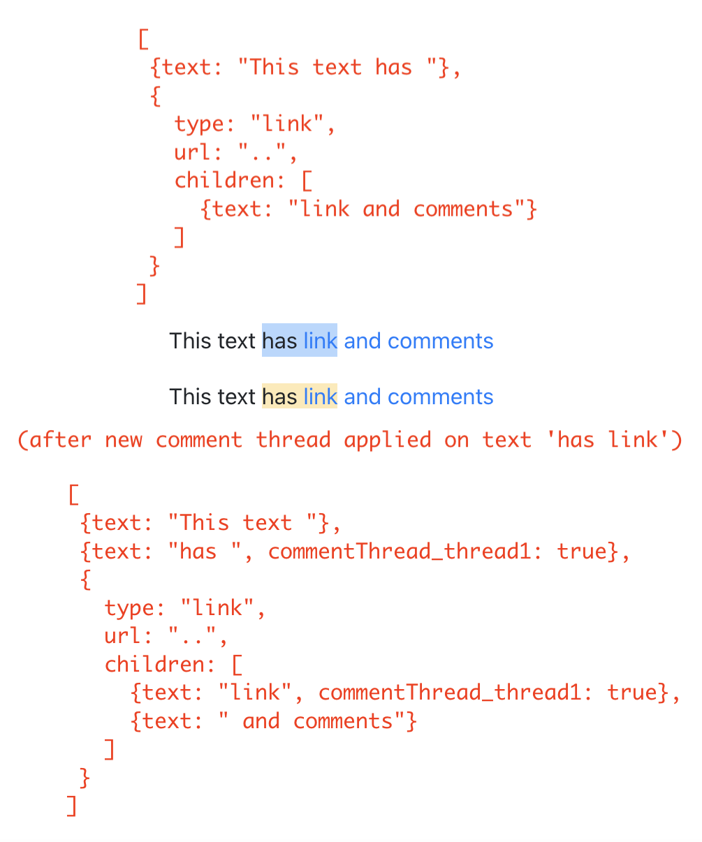
  • Comments created over text inside a link (special because links are nodes themselves in our document structure);
  • Comments that span multiple paragraphs (special because paragraphs are nodes in our document structure and comments are applied to text nodes which are paragraph’s children).

Looking at the above use-cases, it seems like comments in the way they can come up in a rich text document are very similar to character styles (bold, italics etc). They can overlap with each other, go over text in other types of nodes like links and even span multiple parent nodes like paragraphs.

For this reason, we use the same method to represent comments as we do for character styles, i.e. “Marks” (as they are so called in SlateJS terminology). Marks are just regular properties on nodes — speciality being that Slate’s API around marks (Editor.addMark and Editor.removeMark) handles changing of the node hierarchy as multiple marks get applied to the same range of text. This is extremely useful to us as we deal with a lot of different combinations of overlapping comments.

Comment Threads As Marks

Whenever a user selects a range of text and tries to insert a comment, technically, they’re starting a new comment thread for that text range. Because we would allow them to insert a comment and later replies to that comment, we treat this event as a new comment thread insertion in the document.

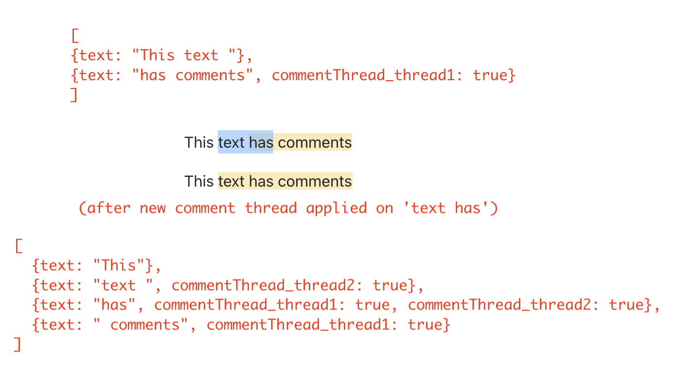
The way we represent comment threads as marks is that each comment thread is represented by a mark named as commentThread_threadID where threadID is a unique ID we assign to each comment thread. So, if the same range of text has two comment threads over it, it would have two properties set to the truecommentThread_thread1 and commentThread_thread2. This is where comment threads are very similar to character styles since if the same text was bold and italic, it would have both the properties set to truebold and italic.

Before we dive into actually setting this structure up, it’s worth looking at how the text nodes change as comment threads get applied to them. The way this works (as it does with any mark) is that when a mark property is being set on the selected text, Slate’s Editor.addMark API would split the text node(s) if needed such that in the resulting structure, text nodes are set up in a way that each text node has the exact same value of the mark.

To understand this better, take a look at the following three examples that show the before-and-after state of the text nodes once a comment thread is inserted on the selected text:

Highlighting Commented Text

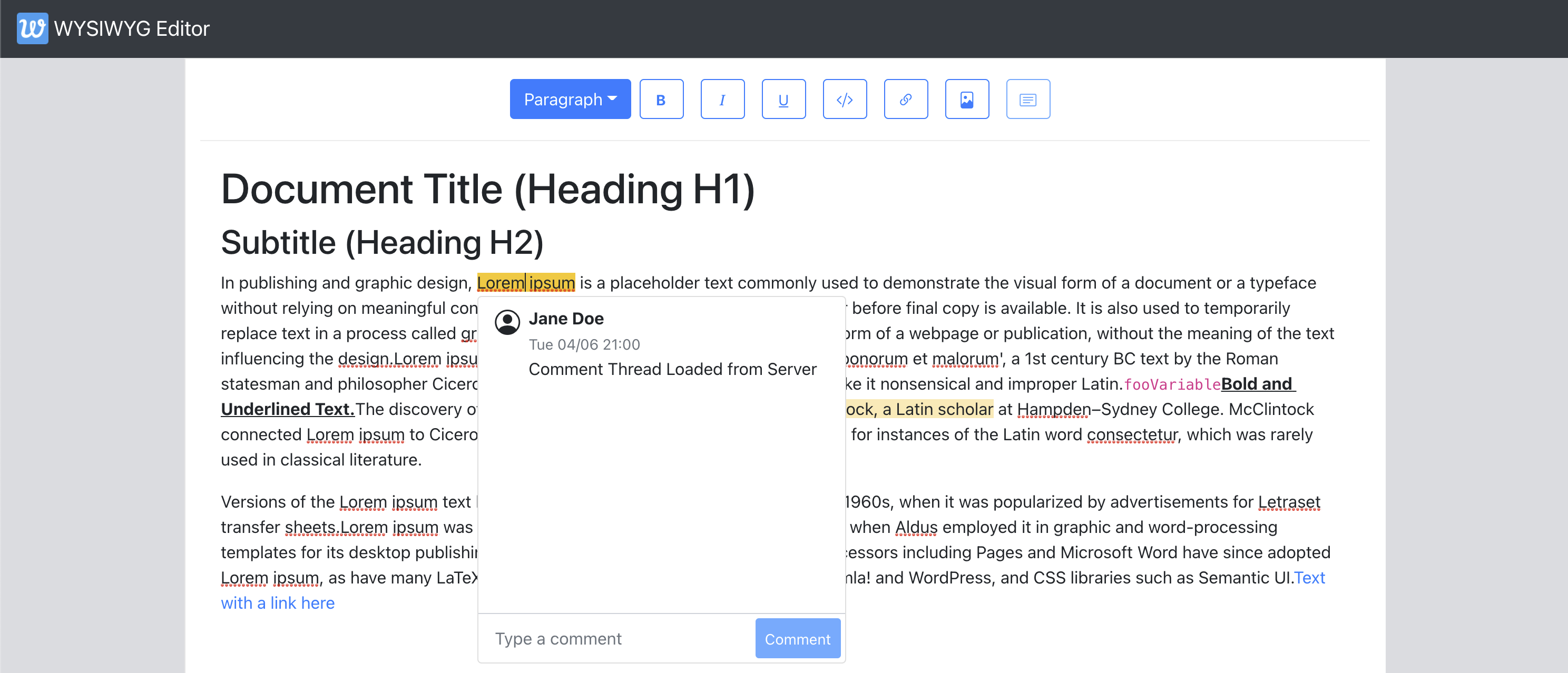
Now that we know how we are going to represent comments in the document structure, let’s go ahead and add a few to the example document from the first article and configure the editor to actually show them as highlighted. Since we will have a lot of utility functions to deal with comments in this article, we create a EditorCommentUtils module that will house all these utils. To start with, we create a function that creates a mark for a given comment thread ID. We then use that to insert a few comment threads in our ExampleDocument.

# src/utils/EditorCommentUtils.js

const COMMENT_THREAD_PREFIX = "commentThread_";

export function getMarkForCommentThreadID(threadID) {
  return `${COMMENT_THREAD_PREFIX}${threadID}`;
}

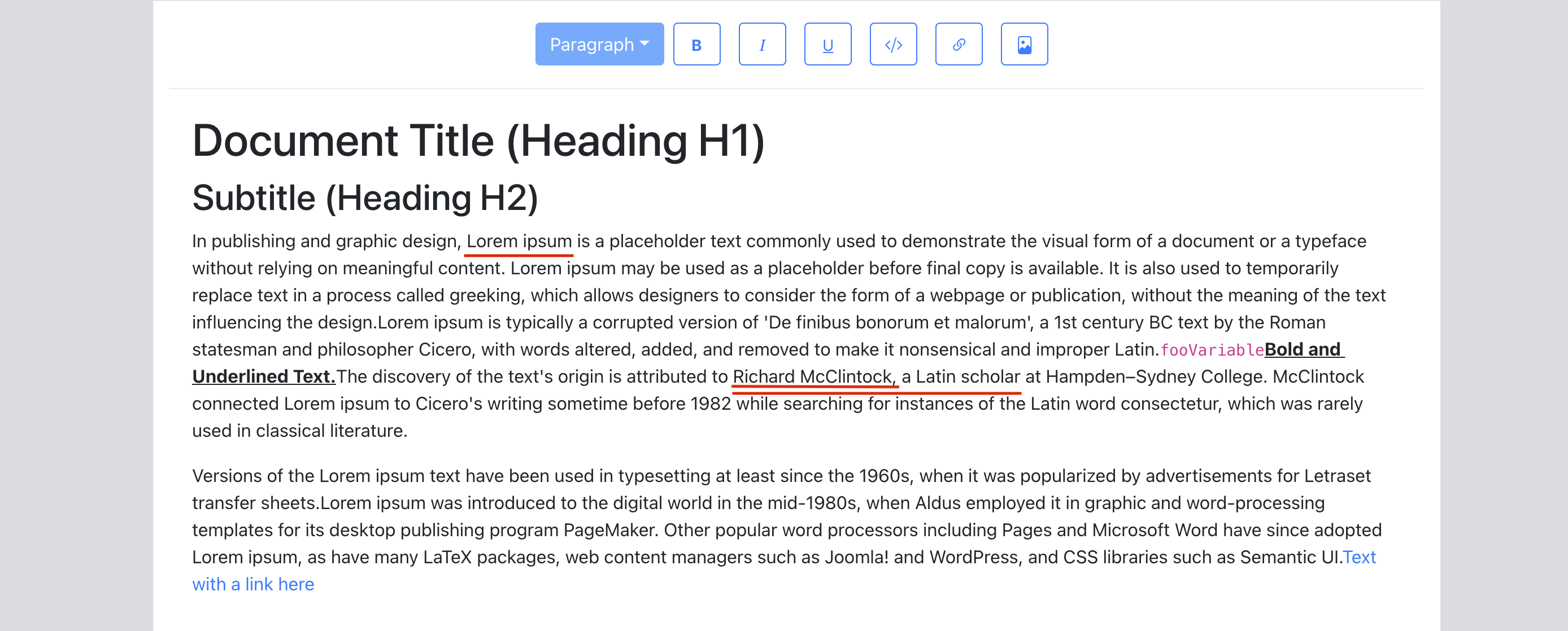
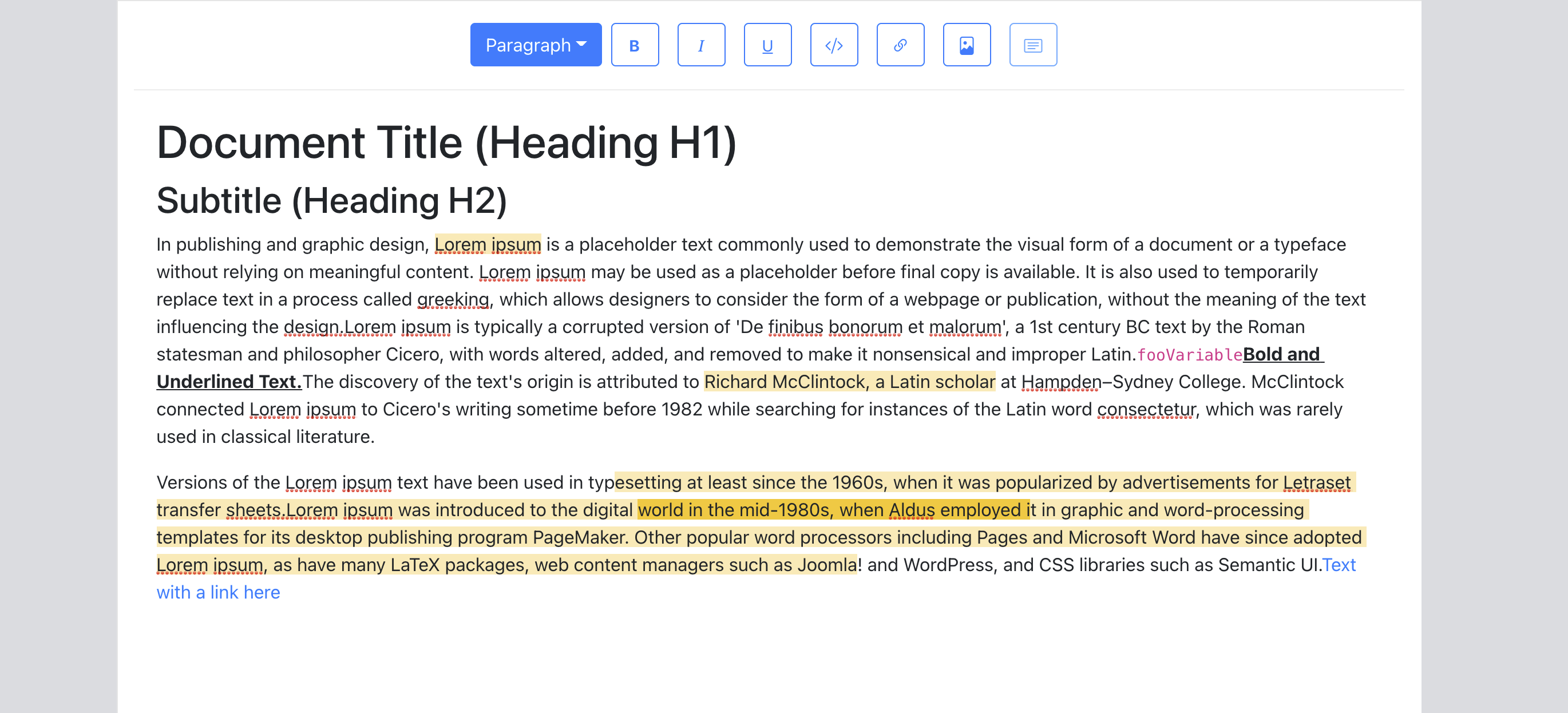
Below image underlines in red the ranges of text that we have as example comment threads added in the next code snippet. Note that the text ‘Richard McClintock’ has two comment threads that overlap each other. Specifically, this is a case of one comment thread being fully contained inside another.

# src/utils/ExampleDocument.js
import { getMarkForCommentThreadID } from "../utils/EditorCommentUtils";
import { v4 as uuid } from "uuid";

const exampleOverlappingCommentThreadID = uuid();

const ExampleDocument = [
   ...
   {
        text: "Lorem ipsum",
        [getMarkForCommentThreadID(uuid())]: true,
   },
   ...
   {
        text: "Richard McClintock",
        // note the two comment threads here.
        [getMarkForCommentThreadID(uuid())]: true,
        [getMarkForCommentThreadID(exampleOverlappingCommentThreadID)]: true,
   },
   {
        text: ", a Latin scholar",
        [getMarkForCommentThreadID(exampleOverlappingCommentThreadID)]: true,
   },
   ...
];

We focus on the UI side of things of a Commenting System in this article so we assign them IDs in the example document directly using the npm package uuid. Very likely that in a production version of an editor, these IDs are created by a backend service.

We now focus on tweaking the editor to show these text nodes as highlighted. In order to do that, when rendering text nodes, we need a way to tell if it has comment threads on it. We add a util getCommentThreadsOnTextNode for that. We build on the StyledText component that we created in the first article to handle the case where it may be trying to render a text node with comments on. Since we have some more functionality coming that would be added to commented text nodes later, we create a component CommentedText that renders the commented text. StyledText will check if the text node it’s trying to render has any comments on it. If it does, it renders CommentedText. It uses a util getCommentThreadsOnTextNode to deduce that.

# src/utils/EditorCommentUtils.js

export function getCommentThreadsOnTextNode(textNode) {
  return new Set(
     // Because marks are just properties on nodes,
    // we can simply use Object.keys() here.
    Object.keys(textNode)
      .filter(isCommentThreadIDMark)
      .map(getCommentThreadIDFromMark)
  );
}

export function getCommentThreadIDFromMark(mark) {
  if (!isCommentThreadIDMark(mark)) {
    throw new Error("Expected mark to be of a comment thread");
  }
  return mark.replace(COMMENT_THREAD_PREFIX, "");
}

function isCommentThreadIDMark(mayBeCommentThread) {
  return mayBeCommentThread.indexOf(COMMENT_THREAD_PREFIX) === 0;
}

The first article built a component StyledText that renders text nodes (handling character styles and so on). We extend that component to use the above util and render a CommentedText component if the node has comments on it.

# src/components/StyledText.js

import { getCommentThreadsOnTextNode } from "../utils/EditorCommentUtils";

export default function StyledText({ attributes, children, leaf }) {
  ...

  const commentThreads = getCommentThreadsOnTextNode(leaf);

  if (commentThreads.size > 0) {
    return (
      <CommentedText
      {...attributes}
     // We use commentThreads and textNode props later in the article.
      commentThreads={commentThreads}
      textNode={leaf}
      >
        {children}
      </CommentedText>
    );
  }

  return <span {...attributes}>{children}</span>;
}

Below is the implementation of CommentedText that renders the text node and attaches the CSS that shows it as highlighted.

# src/components/CommentedText.js

import "./CommentedText.css";

import classNames from "classnames";

export default function CommentedText(props) {
  const { commentThreads, ...otherProps } = props;
  return (
    <span
      {...otherProps}
      className={classNames({
        comment: true,
      })}
    >
      {props.children}
    </span>
  );
}

# src/components/CommentedText.css

.comment {
  background-color: #feeab5;
}

With all of the above code coming together, we now see text nodes with comment threads highlighted in the editor.

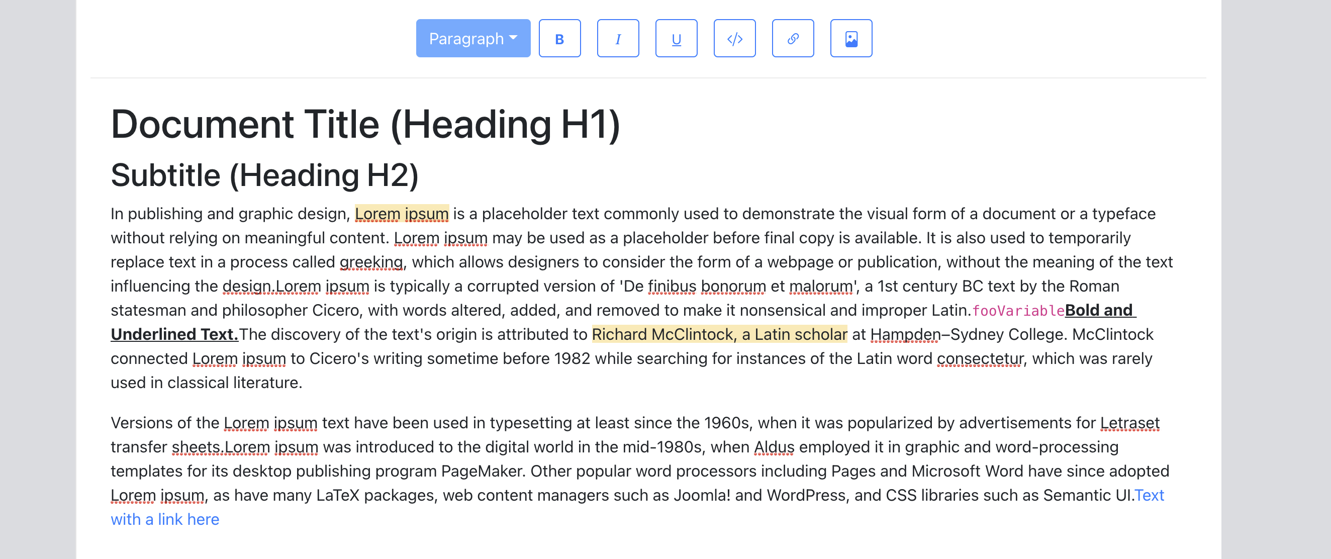
Note: The users currently cannot tell if certain text has overlapping comments on it. The entire highlighted text range looks like a single comment thread. We address that later in the article where we introduce the concept of active comment thread which lets users select a specific comment thread and be able to see its range in the editor.

UI Storage For Comments

Before we add the functionality that enables a user to insert new comments, we first setup a UI state to hold our comment threads. In this article, we use RecoilJS as our state management library to store comment threads, comments contained inside the threads and other metadata like creation time, status, comment author etc. Let’s add Recoil to our application:

> yarn add recoil

We use Recoil atoms to store these two data structures. If you’re not familiar with Recoil, atoms are what hold the application state. For different pieces of application state, you’d usually want to set up different atoms. Atom Family is a collection of atoms — it can be thought to be a Map from a unique key identifying the atom to the atoms themselves. It’s worth going through core concepts of Recoil at this point and familiarizing ourselves with them.

For our use case, we store comment threads as an Atom family and then wrap our application in a RecoilRoot component. RecoilRoot is applied to provide the context in which the atom values are going to be used. We create a separate module CommentState that holds our Recoil atom definitions as we add more atom definitions later in the article.

# src/utils/CommentState.js

import { atom, atomFamily } from "recoil";

export const commentThreadsState = atomFamily({
  key: "commentThreads",
  default: [],
});

export const commentThreadIDsState = atom({
  key: "commentThreadIDs",
  default: new Set([]),
});

Worth calling out few things about these atom definitions:

  • Each atom/atom family is uniquely identified by a key and can be set up with a default value.
  • As we build further in this article, we are going to need a way to iterate over all the comment threads which would basically mean needing a way to iterate over commentThreadsState atom family. At the time of writing this article, the way to do that with Recoil is to set up another atom that holds all the IDs of the atom family. We do that with commentThreadIDsState above. Both these atoms would have to be kept in sync whenever we add/delete comment threads.

We add a RecoilRoot wrapper in our root App component so we can use these atoms later. Recoil’s documentation also provides a helpful Debugger component that we take as it is and drop into our editor. This component will leave console.debug logs to our Dev console as Recoil atoms are updated in real-time.

# src/components/App.js

import { RecoilRoot } from "recoil";

export default function App() {
  ...

  return (
    <RecoilRoot>
      >
         ...
        <Editor document={document} onChange={updateDocument} />

    </RecoilRoot>
  );
}
# src/components/Editor.js

export default function Editor({ ... }): JSX.Element {
  .....

  return (
    <>
      <Slate>
         .....
      </Slate>
      <DebugObserver />
   </>
);

function DebugObserver(): React.Node {
   // see API link above for implementation.
}

We also need to need to add code that initializes our atoms with the comment threads that already exist on the document (the ones we added to our example document in the previous section, for instance). We do that at a later point when we build the Comments Sidebar that needs to read all the comment threads in a document.

At this point, we load our application, make sure there are no errors pointing to our Recoil setup and move forward.

Adding New Comments

In this section, we add a button to the toolbar that lets the user add comments (viz. create a new comment thread) for the selected text range. When the user selects a text range and clicks on this button, we need to do the below:

  1. Assign a unique ID to the new comment thread being inserted.
  2. Add a new mark to Slate document structure with the ID so the user sees that text highlighted.
  3. Add the new comment thread to Recoil atoms we created in the previous section.

Let’s add a util function to EditorCommentUtils that does #1 and #2.

# src/utils/EditorCommentUtils.js

import { Editor } from "slate";
import { v4 as uuidv4 } from "uuid";

export function insertCommentThread(editor, addCommentThreadToState) {
    const threadID = uuidv4();
    const newCommentThread = {
        // comments as added would be appended to the thread here.
        comments: [],
        creationTime: new Date(),
        // Newly created comment threads are OPEN. We deal with statuses
        // later in the article.
        status: "open",
    };
    addCommentThreadToState(threadID, newCommentThread);
    Editor.addMark(editor, getMarkForCommentThreadID(threadID), true);
    return threadID;
}

By using the concept of marks to store each comment thread as its own mark, we’re able to simply use the Editor.addMark API to add a new comment thread on the text range selected. This call alone handles all the different cases of adding comments — some of which we described in the earlier section — partially overlapping comments, comments inside/overlapping links, comments over bold/italic text, comments spanning paragraphs and so on. This API call adjusts the node hierarchy to create as many new text nodes as needed to handle these cases.

addCommentThreadToState is a callback function that handles step #3 — adding the new comment thread to Recoil atom . We implement that next as a custom callback hook so that it’s re-usable. This callback needs to add the new comment thread to both the atoms — commentThreadsState and commentThreadIDsState. To be able to do this, we use the useRecoilCallback hook. This hook can be used to construct a callback which gets a few things that can be used to read/set atom data. The one we’re interested in right now is the set function which can be used to update an atom value as set(atom, newValueOrUpdaterFunction).

# src/hooks/useAddCommentThreadToState.js

import {
  commentThreadIDsState,
  commentThreadsState,
} from "../utils/CommentState";

import { useRecoilCallback } from "recoil";

export default function useAddCommentThreadToState() {
  return useRecoilCallback(
    ({ set }) => (id, threadData) => {
      set(commentThreadIDsState, (ids) => new Set([...Array.from(ids), id]));
      set(commentThreadsState(id), threadData);
    },
    []
  );
}

The first call to set adds the new ID to the existing set of comment thread IDs and returns the new Set(which becomes the new value of the atom).

In the second call, we get the atom for the ID from the atom family — commentThreadsState as commentThreadsState(id) and then set the threadData to be its value. atomFamilyName(atomID) is how Recoil lets us access an atom from its atom family using the unique key. Loosely speaking, we could say that if commentThreadsState was a javascript Map, this call is basically — commentThreadsState.set(id, threadData).

Now that we have all this code setup to handle insertion of a new comment thread to the document and Recoil atoms, lets add a button to our toolbar and wire it up with the call to these functions.

# src/components/Toolbar.js

import { insertCommentThread } from "../utils/EditorCommentUtils";
import useAddCommentThreadToState from "../hooks/useAddCommentThreadToState";

export default function Toolbar({ selection, previousSelection }) {
  const editor = useEditor();
  ...

  const addCommentThread = useAddCommentThreadToState();

  const onInsertComment = useCallback(() => {
    const newCommentThreadID = insertCommentThread(editor, addCommentThread);
  }, [editor, addCommentThread]);

return (
    <div className="toolbar">
       ...
      <ToolBarButton
        isActive={false}
        label={<i className={bi ${getIconForButton("comment")}} />}
        onMouseDown={onInsertComment}
      />
    </div>
  );
}

Note: We use onMouseDown and not onClick which would have made the editor lose focus and selection to become null. We’ve discussed that in a little more detail in the link insertion section of the first article.

In the below example, we see the insertion in action for a simple comment thread and an overlapping comment thread with links. Notice how we get updates from Recoil Debugger confirming our state is getting updated correctly. We also verify that new text nodes are created as threads are being added to the document.

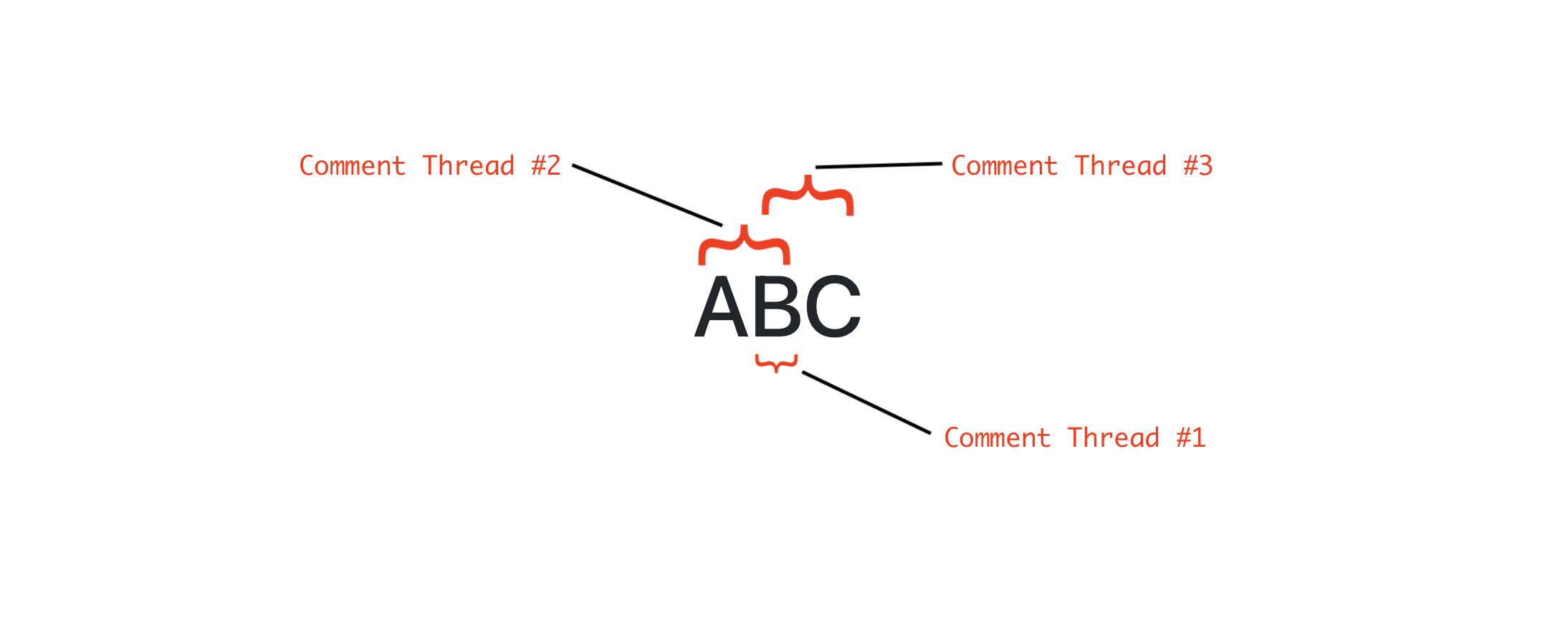
In the above example, the user inserts the following comment threads in that order:

  1. Comment Thread #1 over character ‘B’ (length = 1).
  2. Comment Thread #2 over ‘AB’ (length = 2).
  3. Comment Thread #3 over ‘BC’ (length = 2).

At the end of these insertions, because of the way Slate splits the text nodes with marks, we will have three text nodes — one for each character. Now, if the user clicks on ‘B’, going by the shortest length rule, we select thread #1 as it is the shortest of the three in length. If we don’t do that, we wouldn’t have a way to select Comment Thread #1 ever since it is only one-character in length and also a part of two other threads.

Although this rule makes it easy to surface shorter-length comment threads, we could run into situations where longer comment threads become inaccessible since all the characters contained in them are part of some other shorter comment thread. Let’s look at an example for that.

Let’s assume we have 100 characters (say, character ‘A’ typed 100 times that is) and the user inserts comment threads in the following order:

  1. Comment Thread # 1 of range 20,80
  2. Comment Thread # 2 of range 0,50
  3. Comment Thread # 3 of range 51,100

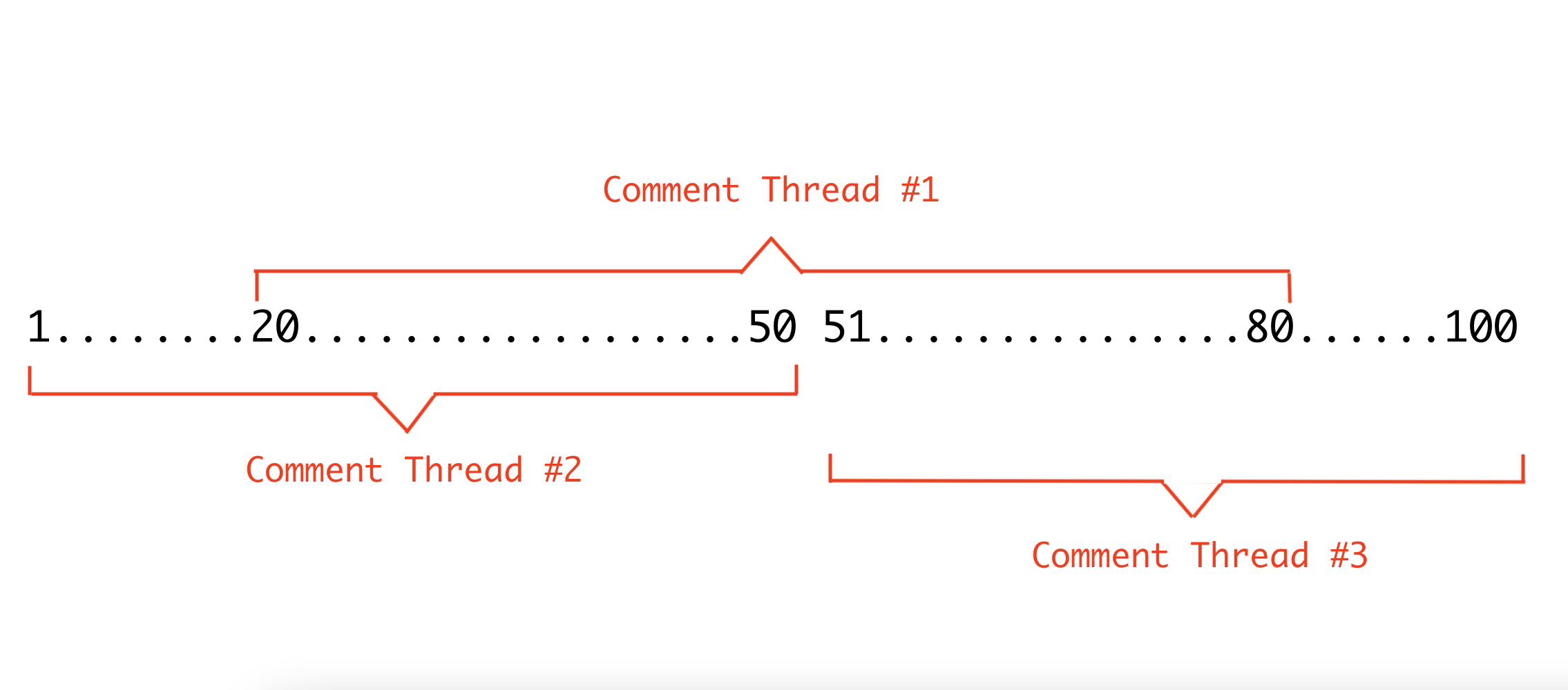
As you can see in the above example, if we follow the rule we just described here, clicking on any character between #20 and #80, would always select threads #2 or #3 since they are shorter than #1 and hence #1 would not be selectable. Another scenario where this rule can leave us undecided as to which comment thread to select is when there are more than one comment threads of the same shortest length on a text node.

For such combination of overlapping comments and many other such combinations that one could think of where following this rule makes a certain comment thread inaccessible by clicking on text, we build a Comments Sidebar later in this article which gives user a view of all the comment threads present in the document so they can click on those threads in the sidebar and activate them in the editor to see the range of the comment. We still would want to have this rule and implement it as it should cover a lot of overlap scenarios except for the less-likely examples we cited above. We put in all this effort around this rule primarily because seeing highlighted text in the editor and clicking on it to comment is a more intuitive way of accessing a comment on text than merely using a list of comments in the sidebar.

Insertion Rule

The rule is:

“If the text user has selected and is trying to comment on is already fully covered by comment thread(s), don’t allow that insertion.”

This is so because if we did allow this insertion, each character in that range would end up having at least two comment threads (one existing and another the new one we just allowed) making it difficult for us to determine which one to select when the user clicks on that character later.

Looking at this rule, one might wonder why we need it in the first place if we already have the Shortest Comment Range Rule that allows us to select the smallest text range. Why not allow all combinations of overlaps if we can use the first rule to deduce the right comment thread to show? As some of the examples we’ve discussed earlier, the first rule works for a lot of scenarios but not all of them. With the Insertion Rule, we try to minimize the number of scenarios where the first rule cannot help us and we have to fallback on the Sidebar as the only way for the user to access that comment thread. Insertion Rule also prevents exact-overlaps of comment threads. This rule is commonly implemented by a lot of popular editors.

Below is an example where if this rule didn’t exist, we would allow the Comment Thread #3 and then as a result of the first rule, #3 would not be accessible since it would become the longest in length.

In this example, let’s assume we don’t wait for intersection to become 0 and just stop when we reach the edge of a comment thread. Now, if the user clicked on #2 and we start traversal in reverse direction, we’d stop at the start of text node #2 itself since that’s the start of the comment thread A. As a result, we might not compute the comment thread lengths correctly for A & B. With the implementation above traversing the farthest edges (text nodes 1,2, and 3), we should get B as the shortest comment thread as expected.

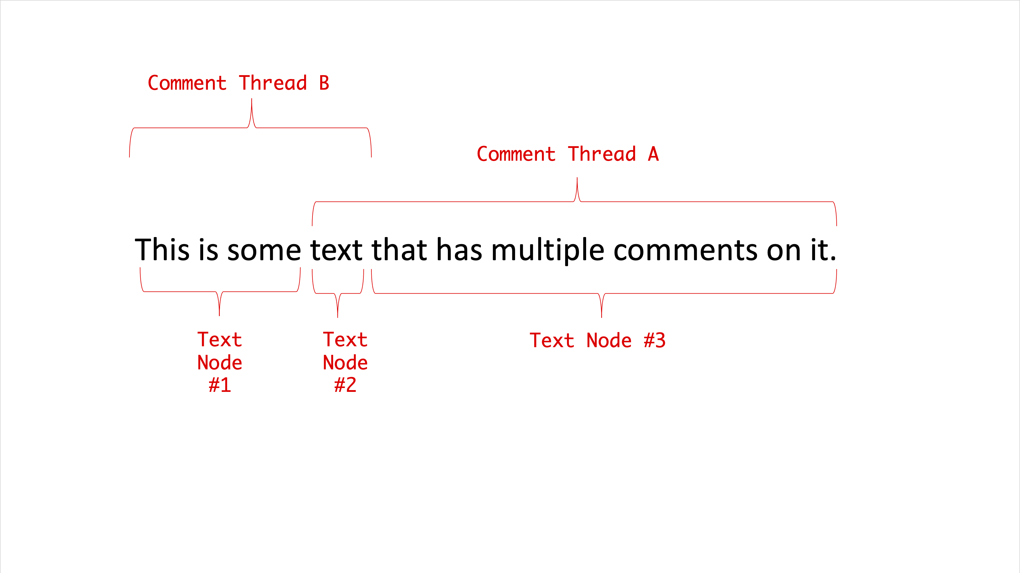
To see the implementation visually, below is a walkthrough with a slideshow of the iterations. We have two comment threads A and B that overlap each other over text node #3 and the user clicks on the overlapping text node #3.

Now that we have all the code in to make selection of comment threads work, let’s see it in action. To test our traversal code well, we test some straightforward cases of overlap and some edge cases like:

  • Clicking on a commented text node at the start/end of the editor.
  • Clicking on a commented text node with comment threads spanning multiple paragraphs.
  • Clicking on a commented text node right before an image node.
  • Clicking on a commented text node overlapping links.

Now that our state is correctly initialized, we can start implementing the sidebar. All our comment threads in the UI are stored in the Recoil atom family — commentThreadsState. As highlighted earlier, the way we iterate through all the items in a Recoil atom family is by tracking the atom keys/ids in another atom. We’ve been doing that with commentThreadIDsState. Let’s add the CommentSidebar component that iterates through the set of ids in this atom and renders a CommentThread component for each.

# src/components/CommentsSidebar.js

import "./CommentSidebar.css";

import {commentThreadIDsState,} from "../utils/CommentState";
import { useRecoilValue } from "recoil";

export default function CommentsSidebar(params) {
  const allCommentThreadIDs = useRecoilValue(commentThreadIDsState);

  return (
    <Card className={"comments-sidebar"}>
      <Card.Header>Comments</Card.Header>
      <Card.Body>
        {Array.from(allCommentThreadIDs).map((id) => (
          <Row key={id}>
            <Col>
              <CommentThread id={id} />
            </Col>
          </Row>
        ))}
      </Card.Body>
    </Card>
  );
}

Now, we implement the CommentThread component that listens to the Recoil atom in the family corresponding to the comment thread it is rendering. This way, as the user adds more comments on the thread in the editor or changes any other metadata, we can update the sidebar to reflect that.

As the sidebar could grow to be really big for a document with a lot of comments, we hide all comments but the first one when we render the sidebar. The user can use the ‘Show/Hide Replies’ button to show/hide the entire thread of comments.

# src/components/CommentSidebar.js

function CommentThread({ id }) {
  const { comments } = useRecoilValue(commentThreadsState(id));

  const [shouldShowReplies, setShouldShowReplies] = useState(false);
  const onBtnClick = useCallback(() => {
    setShouldShowReplies(!shouldShowReplies);
  }, [shouldShowReplies, setShouldShowReplies]);

  if (comments.length === 0) {
    return null;
  }

  const [firstComment, ...otherComments] = comments;
  return (
    <Card
      body={true}
      className={classNames({
        "comment-thread-container": true,
      })}
    >
      <CommentRow comment={firstComment} showConnector={false} />
      {shouldShowReplies
        ? otherComments.map((comment, index) => (
            <CommentRow key={comment-${index}} comment={comment} showConnector={true} />
          ))
        : null}
      {comments.length > 1 ? (
        <Button
          className={"show-replies-btn"}
          size="sm"
          variant="outline-primary"
          onClick={onBtnClick}
        >
          {shouldShowReplies ? "Hide Replies" : "Show Replies"}
        </Button>
      ) : null}
    </Card>
  );
}

We’ve reused the CommentRow component from the popover although we added a design treatment using showConnector prop that basically makes all the comments look connected with a thread in the sidebar.

Now, we render the CommentSidebar in the Editor and verify that it shows all the threads we have in the document and correctly updates as we add new threads or new comments to existing threads.

# src/components/Editor.js

return (
    <>
      <Slate ... >
       .....
        <div className={"sidebar-wrapper"}>
          <CommentsSidebar />
            </div>
      </Slate>
    </>
);

We now move on to implementing a popular Comments Sidebar interaction found in editors:

Clicking on a comment thread in the sidebar should select/activate that comment thread. We also add a differential design treatment to highlight a comment thread in the sidebar if it’s active in the editor. To be able to do so, we use the Recoil atom — activeCommentThreadIDAtom. Let’s update the CommentThread component to support this.

# src/components/CommentsSidebar.js

function CommentThread({ id }) {

const [activeCommentThreadID, setActiveCommentThreadID] = useRecoilState(
    activeCommentThreadIDAtom
  );

const onClick = useCallback(() => {
setActiveCommentThreadID(id); }, [id, setActiveCommentThreadID]); ... return ( <Card body={true} className={classNames({ "comment-thread-container": true, "is-active": activeCommentThreadID === id,
})} onClick={onClick} > .... </Card> );

If we look closely, we have a bug in our implementation of sync-ing the active comment thread with the sidebar. As we click on different comment threads in the sidebar, the correct comment thread is indeed highlighted in the editor. However, the Comment Popover doesn’t actually move to the changed active comment thread. It stays where it was first rendered. If we look at the implementation of the Comment Popover, it renders itself against the first text node in the editor’s selection. At that point in the implementation, the only way to select a comment thread was to click on a text node so we could conveniently rely on the editor's selection since it was updated by Slate as a result of the click event. In the above onClick event, we don’t update the selection but merely update the Recoil atom value causing Slate’s selection to remain unchanged and hence the Comment Popover doesn’t move.

A solution to this problem is to update the editor’s selection along with updating the Recoil atom when the user clicks on the comment thread in the sidebar. The steps do this are:

  1. Find all text nodes that have this comment thread on them that we are going to set as the new active thread.
  2. Sort these text nodes in the order in which they appear in the document (We use Slate’s Path.compare API for this).
  3. Compute a selection range that spans from the start of the first text node to the end of the last text node.
  4. Set the selection range to be the editor’s new selection (using Slate’s Transforms.select API).

If we just wanted to fix the bug, we could just find the first text node in Step #1 that has the comment thread and set that to be the editor’s selection. However, it feels like a cleaner approach to select the entire comment range as we really are selecting the comment thread.

Let’s update the onClick callback implementation to include the steps above.

const onClick = useCallback(() => {

    const textNodesWithThread = Editor.nodes(editor, {
      at: [],
      mode: "lowest",
      match: (n) => Text.isText(n) && getCommentThreadsOnTextNode(n).has(id),
    });

    let textNodeEntry = textNodesWithThread.next().value;
    const allTextNodePaths = [];

    while (textNodeEntry != null) {
      allTextNodePaths.push(textNodeEntry[1]);
      textNodeEntry = textNodesWithThread.next().value;
    }

    // sort the text nodes
    allTextNodePaths.sort((p1, p2) => Path.compare(p1, p2));

    // set the selection on the editor
    Transforms.select(editor, {
      anchor: Editor.point(editor, allTextNodePaths[0], { edge: "start" }),
      focus: Editor.point(
        editor,
        allTextNodePaths[allTextNodePaths.length - 1],
        { edge: "end" }
      ),
    });

   // Update the Recoil atom value.
    setActiveCommentThreadID(id);
  }, [editor, id, setActiveCommentThreadID]);

Note: allTextNodePaths contains the path to all the text nodes. We use the Editor.point API to get the start and end points at that path. The first article goes through Slate’s Location concepts. They’re also well-documented on Slate’s documentation.

Let’s verify that this implementation does fix the bug and the Comment Popover moves to the active comment thread correctly. This time, we also test with a case of overlapping threads to make sure it doesn’t break there.

With the bug fix, we’ve enabled another sidebar interaction that we haven’t discussed yet. If we have a really long document and the user clicks on a comment thread in the sidebar that’s outside the viewport, we’d want to scroll to that part of the document so the user can focus on the comment thread in the editor. By setting the selection above using Slate’s API, we get that for free. Let’s see it in action below.

With that, we wrap our implementation of the sidebar. Towards the end of the article, we list out some nice feature additions and enhancements we can do to the Comments Sidebar that help elevate the Commenting and Review experience on the editor.

Resolving And Re-Opening Comments

In this section, we focus on enabling users to mark comment threads as ‘Resolved’ or be able to re-open them for discussion if needed. From an implementation detail perspective, this is the status metadata on a comment thread that we change as the user performs this action. From a user’s perspective, this is a very useful feature as it gives them a way to affirm that the discussion about something on the document has concluded or needs to be re-opened because there are some updates/new perspectives, and so on.

To enable toggling the status, we add a button to the CommentPopover that allows the user to toggle between the two statuses: open and resolved.

# src/components/CommentThreadPopover.js

export default function CommentThreadPopover({
  editorOffsets,
  selection,
  threadID,
}) {
  …
  const [threadData, setCommentThreadData] = useRecoilState(
    commentThreadsState(threadID)
  );

  ...

  const onToggleStatus = useCallback(() => {
    const currentStatus = threadData.status;
    setCommentThreadData((threadData) => ({
      ...threadData,
      status: currentStatus === "open" ? "resolved" : "open",
    }));
  }, [setCommentThreadData, threadData.status]);

  return (
    <NodePopover
      ...
      header={
        <Header
          status={threadData.status}
          shouldAllowStatusChange={threadData.comments.length > 0}
          onToggleStatus={onToggleStatus}
        />
      }
    >
      <div className={"comment-list"}>
          ...
      </div>
    </NodePopover>
  );
}

function Header({ onToggleStatus, shouldAllowStatusChange, status }) {
  return (
    <div className={"comment-thread-popover-header"}>
      {shouldAllowStatusChange && status != null ? (
        <Button size="sm" variant="primary" onClick={onToggleStatus}>
          {status === "open" ? "Resolve" : "Re-Open"}
        </Button>
      ) : null}
    </div>
  );
}

Before we test this, let’s also give the Comments Sidebar a differential design treatment for resolved comments so that the user can easily detect which comment threads are un-resolved or open and focus on those if they want to.

# src/components/CommentsSidebar.js

function CommentThread({ id }) {
  ...
  const { comments, status } = useRecoilValue(commentThreadsState(id));

 ...
  return (
    <Card
      body={true}
      className={classNames({
        "comment-thread-container": true,
        "is-resolved": status === "resolved",
        "is-active": activeCommentThreadID === id,
      })}
      onClick={onClick}
    >
       ...
</Card> ); }

Conclusion

In this article, we built the core UI infrastructure for a Commenting System on a Rich Text Editor. The set of functionalities we add here act as a foundation to build a richer Collaboration Experience on an editor where collaborators could annotate parts of the document and have conversations about them. Adding a Comments Sidebar gives us a space to have more conversational or review-based functionalities to be enabled on the product.

Along those lines, here are some of features that a Rich Text Editor could consider adding on top of what we built in this article:

  • Support for @ mentions so collaborators could tag one another in comments;
  • Support for media types like images and videos to be added to comment threads;
  • Suggestion Mode at the document level that allows reviewers to make edits to the document that appear as suggestions for changes. One could refer to this feature in Google Docs or Change Tracking in Microsoft Word as examples;
  • Enhancements to the sidebar to search conversations by keyword, filter threads by status or comment author(s), and so on.

Useful VS Code Extensions For Front-End Developers

We spend so much time in our text editors, and every now and again we encounter those little frustrating issues that slow us down. Perhaps finding the right file takes too long, or finding a matching closing bracket becomes a long-winded adventure on its own.

Let’s fix all these annoyances for good. In this post, we look into useful VS Code extensions for front-end development, from fine productivity boosters to advanced debugging helpers.

Table of Contents

Below you’ll find quick jumps to specific extensions that you might need. Scroll down for a general overview. Or skip the table of contents.

Automating Log Messages

When it comes to log messages, the turbo-console-log extension has got your back. It automates the operation of writing meaningful log messages and inserts them automatically.

All you need to do is select the variable which you want to debug, press Ctrl + Alt + L, and the log message will be inserted in the next line. Keyboard shortcuts let you comment, uncomment, or delete all log messages from the current document.

Keeping Bundle Size Under Control

We all know that performance matters, but in practice, it can be quite a challenge not to lose it out of sight when you’re in the flow of writing code. To keep your bundle size under control, the Import Cost extension lets you immediately know if you’re importing a hefty package into your project.

Import Cost isn’t a bundle analysis tool but was built with the idea to help you find possible performance bottlenecks before you ship them to your users. To do so, it gives you instant feedback by displaying the size of an imported third-party library as you’re importing it, right next to your line of code. A handy little helper.

Code Formatting, Automated

When writing code, a lot of time goes into formatting. Prettier automates the task for you. It removes all original styling and ensures that the outputted code conforms to a consistent style.

Prettier parses your code and re-formats it with its own rules, taking the maximum line length into account and wrapping the code when necessary. You decide if you want to apply it to all languages or alternatively you can define the ones you prefer to format manually. Also a great solution for teams who struggle finding a common style guide.

Useful Code Snippets (React, Vue, TypeScript, jQuery)

Are you tired of typing the snippets you frequently need over and over again, always from scratch? Here are some handy little helpers to ease the job. For Vue, be sure to check out Sarah Drasner’s Vue.js VS Code Snippets extension. It was built for real-world use and focuses on developer ergonomics instead of cataloguing API definitions.

Burke Holland provides you with a collection of essential React snippets and commands that he selected from his day-to-day React use. And if you’re looking for Angular snippets, John Papa has got you covered. His extension adds snippets for Angular for TypeScript and HTML to your VS Code setup.

These two might also come in handy: The JavaScript code snippets extension by Charalampos Karypidis contains snippets in ES6 syntax and supports both JavaScript and TypeScript. And, last but not least, Don Jayamanne’s jQuery code snippets feature over 130 jQuery snippets. Once installed, just type jq to get a list of all of them.

Speaking of snippets: If you prefer a good snippets library over defining them yourself from scratch, these collections have got your back:

Write Your Own Code Snippets

There are a lot of code snippet plugins for different languages out there, but have you ever wondered how to define your own snippets in VS Code? Maurice Borgmeier summarized everything you need to know to get started.

Another great article on the topic comes from Rob O’Leary. He dives deeper into when and why to use snippets, takes a closer look at different types of snippets, how VS Code handles them, and, last but not least, how to write your own, of course.

Code Screenshots, The Fancy Way

Let’s be honest, taking good-looking screenshots of code can be a challenge. Polacode is here to change that.

Described as "Polaroid for your code", Polacode lets you take and edit screenshots of your code directly in VS Code. You can resize the code’s container by dragging the corner and use commands to control the image appearance. A great solution to make the code you’ve spent so many hours on shine in the best light — in blog posts or presentations, for example.

Human-Friendly Comments

How do you handle comments? If your code requires a lot of explanations, it might be a good idea to make those usually grayed-out comments more human-friendly, so that it’s easier to see at a glance if a comment alerts you of a deprecated method, for example, or if it’s a todo your teammate left for you.

The VS Code extension Better Comments helps you do just that, categorizing annotations into alerts, queries, todos, highlights, and more. Commented-out code can also be styled to make it clear it shouldn’t be there.

Chrome Debugging Inside VS Code

Do you use Chrome and find yourself switching back and forth between the browser and your editor when debugging? Then you might want to give the VS Code Chrome debugger a try. It helps you debug client-side JavaScript code that runs in Chrome directly from VS Code.

The debugger connects to Chrome over its Chrome Debugger protocol where it maps files loaded in the browser to the files you have open in VS Code. So without leaving the editor, you can set breakpoints in your source code, set up variables to watch, and see the full call stack when debugging. A little tool to make your debugging routine more straightforward.

DevTools For VSCode Extension

Wouldn’t it be cool to have DevTools integrated into your code editor so that you don’t need to switch back and forth between the two? If you’re using VSCode and Edge, a small extension makes it possible.

The extension shows the browser’s Elements and Network tool inside VSCode, giving you the ability to see the runtime HTML structure, alter styling and layout, perform diagnostics, and debug your project — without leaving the editor. By the way, Rachel Weil shared some handy DevTools tips for working with Chromium-based browsers like Edge and Chrome at SmashingConf San Francisco a few weeks ago. Be sure to tune into the recording to take your DevTools skills to the next level.

File Management Utils for VS Code

A lot of time is usually spent on organizing and managing files. File Utils makes the task more convenient.

The extension enables you to create, duplicate, move, rename, and delete files and directories with just a handful of commands. It also supports brace extension which automatically generates arbitrary strings strings to set up your document structure.

Adding Tags To Files In Your Editor

In large projects, finding one specific variant of a component, or just the right file requires you to know the file that you are actually looking for. But what if you could add bookmarks or labels to specific files, so you could find them faster?

File Ops VS Code Extension allows you to tag and alias files, and then quickly switch between them. You can also quickly list all tags just in case you lose track of them, view all files from the current directory and switch between .css and .js files in the same folder. You can also take a look at the video explaining how it all works. Now that will come in handy!

Folder Icons In VS Code

Custom file and folder icons in VS Code? Yes, please! To help you maneuver your workspace more easily, even if a lot of files and folder are involved, the VS Code Icons Team released an extension that brings icons to your editor. From “access” to “zip”, “Android” to “www”, the collection is sure to have the file and folder icons you need.

The project-specific icons toggle feature and project auto-detection will automatically detect the type of project you have opened in your workspace and prompt you to toggle the icons accordingly. It’s also possible to use custom icons, if you prefer.

Monospaced Fonts For Coding

Programming fonts are certainly the workhorses in typography. They need to offer great readability, enable quick text scanning, and prevent eye strain even when a developer looks at the code for hours. To help you find a programming font that meets your needs, Chris Coyier curates Coding Fonts, a selection of more than 30 (mostly free) monospaced fonts that all match this criteria.

To make the decision easier, each font comes with a short description, an overview of all characters, and HTML, CSS, and JavaScript code examples in both day and night mode. Mostafa Gaafar maintains a similar list of fonts for developers with the option to also view the code examples in different color schemes. To add custom fonts to VS Code, you’ll need to define the font in “Settings”.

Git Supercharged

A useful extension to supercharge the Git capabilities built into VS Code is GitLens. To better understand the code you’re working on, GitLens lets you glimpse into whom, why, and when a line or code block was changed.

The extension visualizes code authorships at a glance, helps you seamlessly navigate and explore Git repositories, gain valuable insights via comparison commands, and more. Everything you need to know about your codebase right at your fingertips, without leaving the editor.

Git History In VS Code

Viewing and searching git log along with the graph and details, viewing a previous copy of the file you’re working on, searching the history, comparing branches and commits — these are just a few of the features that the Git History extension offers to streamline your workflow.

Speaking of Git: Another VS Code extension worth taking a closer look at when working with Git is Git Graph: It lets you view a Git graph of your repository and easily perform Git actions from the graph.

Highlight Annotations In Your Code

Do you sometimes forget to review the to-dos you’ve added while coding? The TODO Highlight extension reminds you that there are notes or things that need your attention before you publish to production.

The keywords TODO and FIXME are preconfigured, but you can customize the configuration to your liking if you prefer. A command highlights the open comments for you right in your code or as a list of all annotations. A great little reminder.

Highlighting Matching Brackets And Tags

An intense coding session strains the eyes, so anything that helps cater for more visual clarity is a welcome helper. To take your syntax highlighting to the next level when working with VS Code, you might want to check out the Bracket Pair Colorizer. The extension identifies matching brackets — in colors you define.

Now that you’ve got full control over your brackets, another little detail to watch out for are matching opening and closing tags. VS Code does already come with a tag matching feature, but it is rather basic. The Highlight Matching Tag extension does the work more thoroughly, matching tags anywhere — from tag attributes to inside strings — and even highlighting the path from tag to tag in the status bar. Extensive styling options let you customize how tags are highlighted. HTML and JSX are officially supported.

Revealing Harmful Characters

Zero-width spaces and non-joiners, non-breaking spaces, left and right double quotation marks — when coding, some characters can be harmful because they are invisible or looking like legitimate ones. Gremlins Tracker finds them for you.

Gremlins Tracker uses a color scheme to alert you of harmful, potentially harmful, and less harmful characters. Lines that include such a character are marked with a Gremlins icon, and moving the cursor over the character gives you a hint of the potential issue. If you like, you can add new gremlins characters or override them for a specific language.

Highlighting Indentation

Indentation is key to ensure your code can be scanned quickly. A handy little plugin that makes indentations even more readable is Indent-Rainbow. It colorizes the indentation in front of your text alternating four different colors on each step and marking those lines where the indentation is not a multiple of the tab size.

While error highlighting is useful, there are instances where it might get in your way. When dealing with RegEx patterns, for example. Luckily, Indent-Rainbow lets you turn off error highlighting on those, just like on comment lines, and, if you like, you can even skip it for entire languages.

Visualizing Stacking Contexts

Do you have difficulties spotting stacking contexts when using z-index? You’re not alone! If you sometimes find yourself setting a z-index to a billion on an element and it’s not moving forward in your stacking order, CSS Stacking Contexts is for you.

The extension makes stacking contexts visible in CSS and SCSS so that you can confidently use small values when writing z-index declarations. Additionally, it will also tell you when a z-index declaration has no effect and offer quick fixes.

Custom Colors To Tell Workspaces Apart

If you frequently have multiple VS Code instances open and struggle to tell them apart, Peacock might be worth taking a closer look at: the extension subtly changes the color theme of your workspace.

But it’s not only when working on multiple projects at once where Peacock shines. It also comes in handy when using VS Live Share or VS Code’s Remote features and you quickly want to identify your editor.

IntelliSense: AI-Assisted Development Features

The IntelliCode extension provides AI-assisted development features for Python, TypeScript/JavaScript and Java developers in Visual Studio Code, with insights based on understanding your code context combined with machine learning.

Providing AI-assisted IntelliSense, the extension shows you recommended auto-completion items for your code context at the top of the completions list. When it comes to overloads, it doesn’t cycle through the alphabetical list of member but presents you the most relevant one first. No more hunting through the list yourself.

Recording Guided Onboarding For Your Codebase

A large codebase can feel intimidating. CodeTour attempts to change that. The extension allows you to record and play back guided walkthroughs of your codebases, directly within the editor. Think of it as a table of contents that makes it easier to onboard or re-board to new project or feature area, to visualize bug reports, or understand the context of a code review.

To create a code tour, you can annotate lines of code (Markdown is supported) and navigate as many files as you need, and the recorder captures the sequence. The tours can be checked into a repo or exported to a “tour” file so that anyone can replay it without having to clone any code. Handy!

From GitHub To VS Code, In One Second

Once you’ve discovered a snippet of code on GitHub, what if you want to start working with it in your project immediately? Instead of cloning the repo and finding that file that you need, you can use Github1s. Just add 1s after github in the URL, press Enter, and the repo, or a single file, will open straight in VS Code.

You can also use a bookmarklet to quickly switch between github.com and github1s.com, access private repositories and there are plenty of browser extensions that are listed on the project page as well. If you need an alternative, Gitpod is a slightly more advanced option, which also allows you to start an online development environment, run parallel workspaces and work on the codebase collaboratively.

Pets For Your VS Code

Ever wanted to pep up your VS code editor? Well, how about adding a cat, dog, snake, rubber duck or even good ol’ Clippy? All you need to do is install vscode-pets and run the vscode-pets.start command in order to see the panel. Once you’ve chosen a pet, its fur color and size, lean back and watch them interact with you!

From throwing a ball and playing catch with your pet (run vscode-pets.throw-ball) to adding additional pets (run vscode-pets.spawn-pet), you’re coding workflow is bound to be anything but boring! The creator, Anthony Shaw, is open for ideas and discussion and welcomes feedback anytime.

Speed Up JavaScript / TypeScript Prototyping

If you’re looking for a way to speed up your JavaScript prototyping process, Quokka is for you. The rapid prototyping playground lives in your editor and gives prototyping, learning, and testing JavaScript and TypeScript a speed boost.

Runtime values are updated and displayed in your IDE next to your code, as you type. To get you up and running right away, there’s no config required, all you need to do to start experimenting is opening a new Quokka file. Happy prototyping!

Use A Remote Machine As Your Dev Environment

There’s a variety of reasons why you might want to use a remote machine with an SSH server as a development environment. Because you need faster or more specialized hardware than your local machine, for example, or to debug an application running somewhere else, such as a customer site or an application in the cloud. To simplify development and troubleshooting, the Remote - SSH extension helps you do just that.

The extension runs commands and other extensions directly on the remote machine, so you won’t need any source code on your machine. Instead, you can open any folder on the remote machine and work with it just as you normally would, taking full advantage of VS Code’s full feature set. Handy!

Compile Sass In Real Time

A real-time Sass compiler with live browser reload? Live Sass extension has got you covered. It helps you compile/transpile your SASS/SCSS files to CSS files in real time.

Features include customizing the file location of the exported CSS as well as its style and extension name, there’s a quick status bar control, you can exclude specific folders in the settings, and autoprefix is supported, too.

Tips And Tricks Nobody Bothered To Tell You

Are you really making full use of the powerful features VS Code has to offer? Burke Holland and Sarah Drasner claim you don’t, so to change that, they share all the best things about VS Code that nobody ever bothered to tell you.

From automatically updating HTML img tags with the correct size of the image to using font ligatures for better readability when coding or log points to log information out from your application, “VS Code Can Do That?!” features 36 valuable tips that’ll make your workflow even more efficient.

Wrapping Up

There are literally hundreds of VS Code extensions out there, and we hope that some of the ones listed here will prove to be useful in your day-to-day work — and most importantly help you avoid some time-consuming, routine tasks. Happy coding, everyone!

Further Reading

How To Build And Launch Powerful Responsive Websites With Editor X

As designers, we are used to having a lot of creative freedom within our tools. We intuitively select, move and fine-tune things until they look just right. Once the work leaves the design tool, we give away this level of control to an unpredictable, diverse, and fluid browser environment. There, some of our decisions suddenly will need to be refined, and as we want to introduce changes, we need to dive into code. Or explain these changes clearly and unambiguously, to avoid misunderstandings down the line. The latter part can be frustrating for all parties involved.

While web builders have been around for a long time, it wasn’t until recently that they became practical for professional use. Closing the gap between design and code has become the north star for many companies, and often this issue is seen as the most critical pain point that every team attempts to solve in their own way.

In this article, we’ll look into Editor X, a sophisticated platform for professionals and agencies to build websites, driven by an ambitious goal to close the gap for good.

What’s Editor X?

Chances are high that you’ve stumbled upon web builders in the past — often with a grain of skepticism and doubt about the outcome of these tools. Many of such builders heavily rely on pre-made templates with some level of customization. Editor X goes far beyond that by providing a platform for professional designers and agencies to create web experiences with a wide variety of flexible components and a series of advanced features.

The best way to find out what Editor X is capable of would be to build something with it and in this article, we’ll create a website from scratch.

Editor X follows well-established patterns and anyone with design experience will feel comfortable with it within a few minutes. For the most part, we’ll repeat the same workflow of adding elements, moving them across the canvas, and adjusting their properties.

On the top left side, we have toggles for panels that will help us add elements, navigate layers and manage pages. Then at the center of our workspace is the canvas, where we’ll directly interact with the design of the page. You’ll notice that the canvas is also resizable, which allows us to easily experiment with different viewports. Whenever we select anything from the canvas, we’ll see the Inspector panel open on the right.

The earlier the entire team is involved in the conversation about a new design, the more issues can be resolved early. Often you’d need to take a screenshot and paste it on Slack, or use another tool to discuss a design via a clickable prototype. On Editor X, you can invite teammates to the project, and assign them individual roles and permissions. There’s also an option to communicate with your team in real-time by leaving comments on the page or on specific components.

Creating The Structure Of The Website

Before we start adding content, we’ll create sections that will serve as a skeleton for our page. Sections in Editor X are essentially large containers that hold our content. As soon as you create a new page, you’ll see a header and footer section already added to the canvas. To add new sections we can click on any existing one and we’ll see a blue “+” icon at the edge of it.

Adding Content And Styling Our Page

Adding elements in Editor X is straightforward. We open the "Add" panel and drag elements into the canvas. Within that panel, we have a wide range of elements, components and entire sections that will become the building blocks for our website.

Every element that we drop on the canvas can be easily moved and aligned. We can also control how elements react to changes in the screen size by using the "Docking" feature. When the screen is being resized, docking options will determine the vertical and horizontal position of elements within different types of containers.

For the right side of our section, we’ll add an image that we’ll replace with our illustration. To make this work, we just need to click on "Change image" and then upload our assets to the media library. You’ll notice that apart from the assets we’ve added, you have direct access to a large library of free stock photos and pre-designed illustrations.

To implement the three steps of our "How it works" section, we’ll use a repeater element with three items and 20px space in between. The repeater is essentially a list of items where the style and layout of the first item are repeated automatically for the rest while the content can be different.

First, we’ll add the title and paragraph within the first item and see them repeat in realtime. Above them, we’ll add a container with a border and a text element inside the container by going to Quick addContainerInspectorDesignCorners.

Now that we have the content of our header, it’s time to start applying some styles to it. We could go the usual route and apply styles element by element, but we can also use the "Theme manager" to create global typography and color styles that will automatically define these changes everywhere. This goes beyond the scope of our page along, so we can use it to match the style across our entire site.

Click on the theme manager icon on the top bar of the editor. From there, we can manage the global text and color styles on the site. We’ll start by changing the background color to #030F1D and the color of our action items to #030F1D. Then we’ll change the headline fonts to Sora and also adjust the typography colors to fit our palette.

This concept goes even further as we can save our themes to a design library that can be used across all the websites we create with the tool. This makes it easy for teams to implement and manage their design systems. Also, imagine working on a series of themes and designs that you might want to reuse across a wide range of your products, or if you want to maintain a series of products for your clients. This could save quite an amount of time — and managed from one central place.

The next section will serve as a showcase of the product. First, we’ll add a headline, sub-headline, and an image element to the canvas and turn them into a stack. Then we’ll dock them to the center and increase the height of the section.

To achieve the overlapping effect we’ll add the particles in two separate image elements and arrange them to appear in the back.

Lastly, we’ll update the colors to match our palette, for the background we’d use #FFECE4, while the color of the sub-headline will be #836153.

Forms are essential for most websites and in our case, we’ll need one to collect the contact information of visitors interested in our product.

To create a form we’ll need to go to the Add panel and select “Contact & Forms”, from there we can see a variety of templates that we can use as a starting point. For our page, we will choose the "contact form" by dragging it to the canvas.

In the last step, we’ll add a menu to our website. With the tool, we can create complex websites with many pages tied together by seamless navigation, but in our case, we only need to navigate between the sections of this specific page. For this purpose, we’ll use a feature called "Anchors". We’ll go over the sections that will be part of our menu and we’ll add an anchor that we’ll later use in the menu settings.

Select any element, then click the "Anchor" section in the Inspector panel on the right side of the editor. Then click on the toggle and simply name the anchor. We’ll repeat this for all sections we’d like to have in the navigation.

Now to add those in the menu, click "Manage menu" and then “Add link”. From there. we need to select the Anchor option and the anchor we want to link.

Making The Site Come To Life

One way to make the site more interactive and distinctive is to add animations to our elements. Of course, we can add animation on the platform as well, and apply it to any element or section on the canvas. To achieve that, we need to select the elements we want to animate, and then click on the Animation icon.

There are plenty of presets that we can use out of the box, but there’s also the option to fine-tune variables such as duration and delay.

In our case, we’d like to add a subtle fade-in animation to all of the headlines and images on the canvas.

Animation showcase (Large preview)

Designing For Different Screen Sizes

It’s common to see mock-ups created for desktop first, or for mobile-first, but in practice, we actually need to be creating both at the same time. The priorities that we define for our content blocks might need to change from one screen size to another, but we need to explore how we can put the right emphasis on the right elements, and choose the right way to position them both on desktop and on mobile. With the tool, we can achieve that by designing for individual breakpoints and using fluid and relative size units of measure.

Obviously, it’s a good idea to add breakpoints only when we need them, so we can add our custom breakpoints as we are previewing the site growing from small to large viewports. Obviously, we can do that without leaving the tool. Whenever we need a breakpoint, we can add them (or edit already existing ones) by clicking on the three-dotted menu next to the breakpoints.

If you’ve used relative sizes till that point, many of the elements will already resize properly. For the rest, we’ll go through the different breakpoints and create design overrides to make sure that everything looks as expected. The changes that we make will be applied to the specific breakpoint range that we’ve selected, and they will cascade down, too.

It’s important to note that we don’t have to rely on the pre-made building blocks alone though. If you need to build in a complex functionality for your projects, you can do it as well. In fact, you can add your own JavaScript, connect to APIs, use npm packages and automate client-to-server interactions with web modules. These features are available via an integrated development platform called Velo.

But for the scope of this article, although we mostly combined a few elements without rewriting or fixing code, the results are quite solid compared to what one would normally expect from a website builder. Overall, the score is quite high on performance and accessibility, especially on desktop, although you might need to optimize your site more for mobile devices.

Wrapping Up

When it comes to web builders, it’s not unusual to be disappointed by the outcome — with plenty of accessibility and performance issues, along with bulky and messy markup, overly specific CSS, and slow JavaScript. When we look into the website creation process on Editor X, it appears to be a platform that has gone quite far to provide a straightforward environment for building good websites, while also including collaboration features, responsive testing, and some components that might need quite a bit of time to prototype or set up otherwise.

If you are working with agencies or organizations where you plan to reuse components, or if you need to set up and maintain sites quickly for a variety of your clients, Editor X could be an interesting option worth considering. It comes along with personal and business plans, support for online payments, eCommerce, domains and storage, online bookings, ticket and event management, as well as video monetization. Chances are high that you’ll find what you need — both for quick prototypes and extensive client work.

You can create an Editor X account for free and test all features, without any strings attached.

Accessible SVGs: Perfect Patterns For Screen Reader Users

While Scalable Vector Graphics (SVGs) were first introduced in the late 90s, they have seen a massive resurgence in popularity in the last decade due to their extreme flexibility, high fidelity, and relative lightness in a world where bandwidth and performance matter more than ever. Advancements in JavaScript and the introduction of CSS media queries such @prefers-color-scheme and @prefers-reduced-motion have extended the functionality of SVGs way beyond their initial use case of simply displaying vector images on a website.

As SVG technology advances, our understanding of how we design and develop SVGs needs to advance as well. Part of that advancement includes considering the impact of such designs and code on actual humans, aka our end users.

This article outlines twelve distinct SVG patterns found “in the wild” and each alternative description announced when accessed by different combinations of operating systems, browsers, and screen readers.

Of course, the following examples are not meant to be an exhaustive list of all the possible patterns being used in the digital sphere, but they do highlight some of the more popular or ubiquitous SVG patterns you might encounter. Continue reading to discover which SVG patterns you should avoid and which patterns are the most inclusive!

Basic Alternative Descriptions Using The <img> Tag

The first group of four patterns utilizes the <img> tag linking out to an SVG file. This is a good choice for basic, uncomplicated images on your website, app, or other digital product. While the drawback to using this pattern is that you cannot easily control many visual elements or animations as an inline SVG, this pattern should render lighter and faster images overall and allow for easier maintenance on SVGs that you use in multiple locations.

Pattern #1: <img> + alt="[words]"

<img role="img" class="fox" alt="What does the fox say?" src="https://upload.wikimedia.org/wikipedia/commons/3/39/Toicon-icon-fandom-howl.svg">

Pattern #2: <img> + role="img" + alt="[words]"

<img role="img" class="fox" alt="What does the fox say?" src="https://upload.wikimedia.org/wikipedia/commons/3/39/Toicon-icon-fandom-howl.svg">

Pattern #3: <img> + role="img" + aria-label="[words]"

<img role="img" class="fox" aria-label="What does the fox say?" src="https://upload.wikimedia.org/wikipedia/commons/3/39/Toicon-icon-fandom-howl.svg">

Pattern #4: <img> + role="img" + aria-labelledby="[ID]"

<p id="caption1" class="visually-hidden">What does the fox say?</p>
<img role="img" aria-labelledby="caption1" class="fox" src="https://upload.wikimedia.org/wikipedia/commons/3/39/Toicon-icon-fandom-howl.svg">

Basic Alternative Descriptions Using The <svg> Tag

The second group of four patterns utilizes the <svg> tag with an inline SVG file. Although adding the SVG code directly into the markup could potentially make the page a bit slower to load, that minor inefficiency will be offset by having more control over the visual elements or animations of your images. By adding your SVG to the HTML directly, you also have more options when it comes to providing image information to your screen reader users.

Pattern #5: <svg> + role="img" + <title>

<svg role="img" ...>
   <title>What does the fox say?</title>
   [design code]
</svg>

Pattern #6: <svg> + role="img" + <text>

<svg role="img" ...>
   <text class="visually-hidden" font-size="0">What does the fox say?</text>
   [design code]
</svg>

Pattern #7: <svg> + role="img" + <title> + aria-describedby="[ID]"

<svg role="img" aria-describedby="fox7" ...>
   <title id="fox7">What does the fox say?</title>
   [design code]
</svg>

Pattern #8: <svg> + role="img" + <title> + aria-labelledby="[ID]"

<svg role="img" aria-labelledby="fox8" ...>
   <title id="fox8">What does the fox say?</title>
   [design code]
</svg>

Extended Alternative Descriptions Using The <svg> Tag

The last group of four patterns utilizes the <svg> tag with an inline SVG file, much like the second group. However, in this case, we are extending the simple alternative descriptions with additional information due to the complexity of the image.

This would be a good pattern choice for more complicated images that need more explanation. However, it is important to keep in mind that there are some people with disabilities — like cognitive disorders — who might benefit from having this additional image information readily available on the screen instead of buried in the SVG code.

Depending on the type and amount of information you need to add to your SVG, you might consider taking a different approach altogether.

Pattern #9: <svg> + role="img" + <title> + <text>

<svg role="img" ...>
   <title>What does the fox say?</title>
   <text class="visually-hidden" font-size="0">Will we ever know?</text>
   [design code]
</svg>

Pattern #10: <svg> + role="img" + <title> + <desc>

<svg role="img" ...>
   <title>What does the fox say?</title>
   <desc>Will we ever know?</desc>
   [design code]
</svg>

Pattern #11: <svg> + role="img" + <title> + <desc> + aria-labelledby="[ID]"

<svg role="img" aria-labelledby="fox11 description11" ...>
   <title id="fox11">What does the fox say?</title>
   <desc id="description11">Will we ever know?</desc>
   [design code]
</svg>

Pattern #12: <svg> + role="img" + <title> + <desc> + aria-describedby="[ID]"

<svg role="img" aria-describedby="fox12 description12" ...>
   <title id="fox12">What does the fox say?</title>
   <desc id="description12">Will we ever know?</desc>
   [design code]
</svg>

See the full CodePen Accessible SVG Pattern Comparison (Fox Version) by Carie Fisher.

SVG Pattern Winners And Losers

By running various screen readers on different combinations of operating systems and browsers, we see definite patterns emerging in the final results table. There are some clear SVG pattern winners and losers, plus a few patterns somewhere in the middle that you could implement as long as you are aware of, and can accept their limitations. Looking over the results table, we can conclude the following:

Basic Alternative Descriptions Using The <img> Tag (Group 1)

Best In Show
  • Pattern 2: <img> + role="img" + alt="[words]"
  • Pattern 3: <img> + role="img" + aria-label="[words]"
Use Caution
  • Pattern 4: <img> + role="img" + aria-labelledby="[ID]"
Not Recommended
  • Pattern 1: <img> + alt="[words]"

Basic Alternative Descriptions Using The <svg> Tag (Group 2)

Best In Show
  • Pattern 5: <svg> + role="img" + <title>
  • Pattern 8: <svg> + role="img" + <title> + aria-labelledby="[ID]"
Use Caution
  • Pattern 7: <svg> + role="img" + <title> + aria-describedby="[ID]"
Not Recommended
  • Pattern 6: <svg> + role="img" + <text>

Extended Alternative Descriptions Using The <svg> Tag (Group 3)

Best In Show
  • Pattern 11: <svg> + role="img" + <title> + <desc> + aria-labelledby="[ID]"

Note: While this pattern is not perfect as it repeated alternative descriptions, it did not ignore any of the elements in the testing, unlike the “use caution” patterns.

Use Caution

  • Pattern 9: <svg> + role="img" + <title> + <text>
  • Pattern 10: <svg> + role="img" + <title> + <desc>
  • Pattern 12: <svg> + role="img" + <title> + <desc> + aria-describedby="[ID]"
Not Recommended
  • None of the patterns in this group completely failed the tests.

Testing Results

See the Pen Testing Results by Carie Fisher.

Wrapping Up

It is important to note that part of interpreting the results of the SVG pattern tests is understanding that creators of each screen reader have a recommended browser(s) that they fully support. This doesn’t mean you shouldn’t or couldn’t use a screen reader on a different browser, this just means that if you do, the results may not be as accurate as if you used the recommended one(s).

The pattern testing for this article did include some combinations of browsers and screen readers that may fall into the “fringe” category, but there are also notes on which combinations of operating systems, browsers, and screen readers are recommended for your own testing. The results of these tests should help you make the best SVG pattern decision possible, based on your pattern needs and constraints.

A reminder that before you settle on a pattern, please make sure you know the basics of how and when to create accessible images and that you fully understand the required alternative information needed for the different image types.

If you need additional help deciding on which pattern to use for your environment, check out the article Good, Better, Best: Untangling The Complex World Of Accessible Patterns to help you navigate the tricky waters of accessible patterns. Armed with all of this information and just a little bit of effort, your SVGs are well on their way to being more inclusive to all.

Editor’s note: You can learn best practices on accessibility with Carie in her upcoming online workshop on Accessible Front-End Patterns — with guidelines, testing tools, assistive technology and inclusive design patterns. Online, and live.

Create Amazing Free Frontend Tables, Graphs, and Charts with Forminator and wpDataTables

Turning form data into insightful tables, graphs, and charts just got easier with the introduction of wpDataTables Integration for Forminator Forms.

This add-on to our popular 5-star Forminator plugin will allow you to create responsive, sortable tables & charts based on Forminator’s form, quiz, and poll submissions from your WordPress site’s frontend.

This feature is great for:

  • Public Directories –  The Forminator form collects the data and displays it in a searchable, sortable table.
  • Data Dashboards – Similar to above, this can have different charts and tables.
  • Quiz Leadership Board – Use to create a leadership board to display the quiz score of everyone who has taken the quiz and sorted based on their rank (number of correct answers).
  • Polls – Can be used to display the poll data in a graph when a poll has ended and you can have changed the original poll to draft state.

And it’s all free and easy to do!

In this article we’ll show you just how easy, by creating a simple data table that draws straight from an existing Forminator form.

More specifically, we’ll look at how to get this collaboration set up for your WordPress site and show you how to:

We’ll then show off a few bonus examples of other tables and charts that are possible.

By the end of this article, you’ll see how Forminator and wpDataTables cannot be (table)topped!

Install These Plugins and Follow Along

To get started, you’ll need to install three plugins. It’s a bit different than other installs because this uses an addon plugin to function.

First off, it’s pretty obvious, but you’ll need Forminator. You can also use the Pro version of Forminator (the same goes for wpDataTables), but it’s not required.

forminator image
None of this happens without Forminator.

You’ll also need to download wpDataTables AND the addon plugin, wpDataTables Integration for Forminator Forms.

Image of Forminator and wpDataTables.
wpDataTables addon is the next crucial element.

Got all three? Great! Once installed and activated, you’ll be ready to go.

Let’s go ahead and…

Create a New Table

To create a new table, you’ll be hopping into wpDataTables to do so. Simply go to wpDataTables from the WordPress menu and click on Create Table.

You can do this from the dashboard or menu.

Where you create a table at in wpDataTables.
There are two places to create a table.

You’ll then want to select the Create a data table linked to an existing data source option and hit Next.

Where you create a data table linked to an existing data source.
This option is one of the first ones at the top.

WPDataTables lets you create tables from Excel, CSV, JSON, XML, serialized PHP arrays, and even MySQL-query-based tables.

As we’re creating a new table using Forminator, however, at the new screen, you’ll select Forminator Form from the Input data source type.

Where you implement Forminator.
It’s easy to spot in the dropdown.

Oh did I mention you’ll need an existing Forminator form, quiz, or poll to draw from?

If you need help with this, here are a few of our previous form building posts to help you out:

Next, choose what form, poll, or quiz you’d like to use to create a table where it says Choose a Forminator Form.

This area shows you all the forms you have available that were created in Forminator.

For this article, I’ll go with one that I created called wpDataTables Test Form.

Where you choose a Forminator form.
I have several options to pick from, but I’ll go with an example I created just for this article.

It’s worth noting that the form, poll, or quiz you want to use must have at least one submission stored in your database, or you won’t be able to create a table with it.

If there are no submissions, you’ll get an error message indicating that the table in the data source has no rows.

Error message you get when a table has no rows.
Uh-oh! No rows. This is the error message that you’ll get.

With that being said, the next step in the process is to Choose fields to show as columns.

This pulls up every field you have in the Forminator form that you chose to use. Select the fields that you want to show as columns.

Choose all of the fields at once or individually.

When it comes to supported form fields, there’s a ton of them. You can include:

  • Name (Single and Multiple)
  • Email
  • Phone
  • Address
  • Website
  • Input
  • Textarea
  • Number
  • Radio
  • Checkbox
  • Calculations
  • Select (Single and Multiple)
  • Datepicker (Calendar, Dropdowns, and Text input)
  • Timepicker ( Dropdowns and Number input)
  • File Upload (Single and Multiple)
  • Post Data
  • Hidden Field
  • Currency
  • Paypal
  • Stripe
  • E-Signature (only available in Forminator PRO)

Something to keep in mind is that fields like reCaptcha, HTML, Page break, Section, and GDPR Approval are excluded from tables.

Once you have all of your fields set, click Save Changes. It will give you the opportunity to…

Adjust Options and Settings

These other options and settings allow you to customize the new table even further!

Keep in mind that some of these additional settings are only available with the Pro version of wpDataTables; however, most are available for the free version.

Here’s a rundown of what all can be tweaked and settings:

  1. Data Source
  2. Display
  3. Sorting and Filtering
  4. Table Tools
  5. Placeholders
  6. Customize
  7. Forminator Settings

Let’s take a look at each one in more detail.

1. Data Source: This is the initial screen we just went over where you Input Data Source Type for Forminator. You can always revisit this area if you want to change the source and fields.

The data source tab.
This is the same tab that we went over previously.

2. Display: You can adjust the layout of your table for the frontend display.

There are options, such as Table Title, Info Block, Pagination, Scrollable, and more.

The display tab.
Want a table title? Do that and more in this area.

There are many different adjustments in this section, so be sure to check out this area and change accordingly.

3. Sorting and Filtering: This tab gives you options to allow your users to filter and sort the data that’s on your frontend display. Check the boxes of what you’d like to include.

Sorting and filtering tab.
Note that advanced custom filters are a Pro feature only.

4. Table Tools: Here is where you can enable copy & save options in your table. Once enabled, the dropdown gives you options for print, PDF, CSV, and more.

The dropdown menu reveals all of your options.

When saved, your users will have your selected options to choose from.

5. Placeholders: This is a Pro option, and all of the features for the placeholders category cannot be used with tables generated from Forminator data.

6. Customize: This is a table styling option that is only available for Pro.

7. Forminator Settings: An option area for Forminator, where you can filter by entry ID range and entry date.

The Forminator settings tab.
Filter by entry ID range and entry date.

Once you have all of your settings configured, you can copy the shortcode.

This works on any page, post, or acceptable widget. When pasted on your WordPress site, you’ll be all set!

The shortcode that you use for wpDataTable
Click the icon next to the shortcode to copy it automatically.

If you ever need to adjust or change anything, you can always go back to this area and alter accordingly.

View a Table Preview and Setup Columns

Now that you have the foundation set up with the data source, the Table preview and columns setup will appear.

Here, you can view what your table will look like, sort by the number of entries, search, and edit.

The table preview.
You can see all of the entries in the form so far.

By clicking on the gear icon in each category is where Column Settings is found.

In this area, you have the option to change column positions, rename displayed header, add cell content suffix, and more.

Each category has customization options.

You can create so many options and variations with wpDataTables and Forminator, so it may take several attempts to perfect your table.

Examples of Tables and Charts

Beyond the table we just created, here’s a look at a couple more examples of what can be created.

You’re able to set up a pie chart…

A look at a pie chart.
Pie, anyone?

…a colorful bar chart.

A graph with poll results.
The results are in.

There are also line charts, bubble charts, donut charts, and more that can be created!

Various charts.
There are many charts to choose from.

As you can see, there are a ton of possibilities when it comes to customization.

To check out some more examples, view our documentation. And for more insight on creating pie charts and graphs, be sure to explore wpDataTables extensive documentation.

At the (Table) Top of Their Game

Image of forminator working on a table.
Forminator is enjoying a seat at the table.

The dynamic table duo of Forminator and wpDataTables puts them at the top of their game when creating tables!

They’re easily customized, edited, and enabled for the perfect table(s) for your WordPress site (for free!).

Be sure to implement all of the covered features in this article for yourself with Forminator and wpDataTables.

Your WordPress tables will be set!

How to Add a Watermark in Google Documents

Microsoft Word includes a useful “Insert Watermark” feature to help you easily add your brand’s logo image or a text stamp that fades behind the content of every page in the document. A company’s policy may require employees to add watermarks to indicate if any document is in draft stage or if the document is confidential and not meant for external distribution.

Microsoft Word Watermark

Insert Watermarks in Google Docs

Unlike Microsoft Word, there’s no built-in support for Watermarks in Google Docs but there’s a simple workaround - create a faded image with the text of your watermark and place that image behind the text of your document pages. Here’s how:

1. Create the watermark stamp

Launch MS Paint on your computer and create a simple watermark image in landscape mode with dark gray text. Please use a bold font like Impact with large font size as the large image can always be resized inside Google Docs but not vice-versa.

I’ve also added some ready-to-use image stamps on Canva and Imgur.

Upload Watermark Image

2. Upload Watermark to Google Docs

Inside Google Docs, go to the Insert menu, choose the Image submenu and select Upload from Computer. Upload the watermark image that you saved in the previous step to Google Docs.

3. Open Image Options

Right-click the uploaded image inside Google Docs and choose Image Options from the contextual menu.

Watermark Diagonal Image

4. Change Rotation

Expand the Image Options sidebar and, under the Size & Rotation section, set the angle to around 320° to make the watermark diagonal.

5. Send the Image Behind Text

  • Under the text wrapping section, choose Behind Text to send the watermark image behind the content of your document.
  • Under Position, choose the Fixed position option with the layout set as Center. This will position your watermark image right in the center of the page.
  • Under the Adjustments section, set the transparency level to around 80% to fade the watermark image in the background.

The Watermark Effect in Documents

Here’s how the final watermark effect will look like in your Google Document.

Watermark in Document

Tip: You can use Document Studio to generate PDF files from Google Forms and the watermarks would be also show up in your PDF document.

A Guide To Undoing Mistakes With Git (Part 2)

In this second part of our series on "Undoing Mistakes with Git", we’ll bravely look danger in the eye again: I’ve prepared four new doomsday scenarios — including, of course, some clever ways to save our necks! But before we dive in: take a look at the check out previous articles on Git for even more self-rescue methods that help you undo your mistakes with Git!

Let’s go!

Recovering a Deleted Branch Using the Reflog

Have you ever deleted a branch and, shortly after, realized that you shouldn’t have? In the unlikely event that you don’t know this feeling, I can tell you that it’s not a good one. A mixture of sadness and anger creeps up on you, while you think of all the hard work that went into that branch’s commits, all the valuable code that you’ve now lost.

Luckily, there’s a way to bring that branch back from the dead — with the help of a Git tool named "Reflog". We had used this tool in the first part of our series, but here’s a little refresher: the Reflog is like a journal where Git notes every movement of the HEAD pointer in your local repository. In other, less nerdy words: any time you checkout, commit, merge, rebase, cherry-pick, and so on, a journal entry is created. This makes the Reflog a perfect safety net when things go wrong!

Let’s take a look at a concrete example:

$ git branch
* feature/login
master

We can see that we currently have our branch feature/login checked out. Let’s say that this is the branch we’re going to delete (inadvertently). Before we can do that, however, we need to switch to a different branch because we cannot delete our current HEAD branch!

$ git checkout master
$ git branch -d feature/login

Our valuable feature branch is now gone — and I’ll give you a minute to (a) understand the gravity of our mistake and (b) to mourn a little. After you’ve wiped away the tears, we need to find a way to bring back this branch! Let’s open the Reflog (simply by typing git reflog) and see what it has in store for us:

Here are some comments to help you make sense of the output:

  • First of all, you need to know that the Reflog sorts its entries chronologically: the newest items are at the top of the list.
  • The topmost (and therefore newest) item is the git checkout command that we performed before deleting the branch. It’s logged here in the Reflog because it’s one of these "HEAD pointer movements" that the Reflog so dutifully records.
  • To undo our grave mistake, we can simply return to the state before that — which is also cleanly and clearly recorded in the Reflog!

So let’s try this, by creating a new branch (with the name of our "lost" branch) that starts at this "before" state SHA-1 hash:

$ git branch feature/login 776f8ca

And voila! You’ll be delighted to see that we’ve now restored our seemingly lost branch! 🎉

If you’re using a Git desktop GUI like "Tower", you can take a nice shortcut: simply hit CMD + Z on your keyboard to undo the last command — even if you’ve just violently deleted a branch!

Luckily, these types of problems can be easily corrected. Let’s roll up our sleeves and get to work.

The first step is to switch to the correct destination branch and then move the commit overusing the cherry-pick command:

$ git checkout feature/login
$ git cherry-pick 776f8caf

You will now have the commit on the desired branch, where it should have been in the first place. Awesome!

But there’s still one thing left to do: we need to clean up the branch where it accidentally landed at first! The cherry-pick command, so to speak, created a copy of the commit — but the original is still present on our long-running branch:

This means we have to switch back to our long-running branch and use git reset to remove it:

$ git checkout main
$ git reset --hard HEAD~1

As you can see, we’re using the git reset command here to erase the faulty commit. The HEAD~1 parameter tells Git to "go back 1 revision behind HEAD", effectively erasing the topmost (and in our case: unwanted) commit from the history of that branch.

And voila: the commit is now where it should have been in the first place and our long-running branch is clean — as if our mistake had never happened!

Editing the Message of an Old Commit

It’s all too easy to smuggle a typo into a commit message — and only discover it much later. In such a case, the good old --amend option of git commit cannot be used to fix this problem, because it only works for the very last commit. To correct any commit that is older than that, we have to resort to a Git tool called "Interactive Rebase".

First, we have to tell Interactive Rebase which part of the commit history we want to edit. This is done by feeding it a commit hash: the parent commit of the one we want to manipulate.

$ git rebase -i 6bcf266b

An editor window will then open up. It contains a list of all commits after the one we provided as a basis for the Interactive Rebase in the command:

Here, it’s important that you don’t follow your first impulse: in this step, we do not edit the commit message, yet. Instead, we only tell Git what kind of manipulation we want to do with which commit(s). Quite conveniently, there’s a list of action keywords noted in the comments at the bottom of this window. For our case, we mark up line #1 with reword (thereby replacing the standard pick).

All that’s left to do in this step is to save and close the editor window. In return, a new editor window will open up that contains the current message of the commit we marked up. And now is finally the time to make our edits!

Here’s the whole process at a glance for you:

This is where fixup comes in. It allows you to still make this correcting band-aid commit. But here comes the magic: it then applies it to the original, broken commit (repairing it that way) and then discards the ugly band-aid commit completely!

We can go through a practical example together! Let’s say that the selected commit here is broken.

Let’s also say that I have prepared changes in a file named error.html that will solve the problem. Here’s the first step we need to make:

$ git add error.html
$ git commit --fixup 2b504bee

We’re creating a new commit, but we’re telling Git this is a special one: it’s a fix for an old commit with the specified SHA-1 hash (2b504bee in this case).

The second step, now, is to start an Interactive Rebase session — because fixup belongs to the big toolset of Interactive Rebase.

$ git rebase -i --autosquash 0023cddd

Two things are worth explaining about this command. First, why did I provide 0023cddd as the revision hash here? Because we need to start our Interactive Rebase session at the parent commit of our broken fellow.

Second, what is the --autosquash option for? It takes a lot of work off our shoulders! In the editor window that now opens, everything is already prepared for us:

Thanks to the --autosquash option, Git has already done the heavy lifting for us:

  1. It marked our little band-aid commit with the fixup action keyword. That way, Git will combine it with the commit directly above and then discard it.
  2. It also reordered the lines accordingly, moving our band-aid commit directly below the commit we want to fix (again: fixup works by combining the marked-up commit with the one above!).

In short: There’s nothing to do for us but close the window!

Let’s take a final look at the end result.

  • The formerly broken commit is fixed: it now contains the changes we prepared in our band-aid commit.
  • The ugly band-aid commit itself has been discarded: the commit history is clean and easy to read — as if no mistake had occurred at all.

Knowing How to Undo Mistakes is a Superpower

Congratulations! You are now able to save your neck in many difficult situations! We cannot really avoid these situations: no matter how experienced we are as developers, mistakes are simply part of the job. But now that you know how to deal with them, you can face them with a laid-back heart rate. 💚

If you want to learn more about undoing mistakes with Git, I can recommend the free "First Aid Kit for Git", a series of short videos about exactly this topic.

Have fun making mistakes — and, of course, undoing them with ease!

A New Way To Reduce Font Loading Impact: CSS Font Descriptors

Font loading has long been a bugbear of web performance, and there really are no good choices here. If you want to use web fonts your choices are basically Flash of Invisible Text (aka FOIT) where the text is hidden until the font downloads or Flash of Unstyled Text (FOUT) where you use the fallback system font initially and then upgrade it to the web font when it downloads. Neither option has really “won out” because neither is really satisfactory, to be honest.

Wasn’t font-display Supposed To Solve This?

The font-display property for @font-face gave that choice to the web developer whereas previously the browser decided that (IE and Edge favored FOUT in the past, whereas the other browsers favored FOIT). However, beyond that it didn’t really solve the problem.

A number of sites moved to font-display: swap when this first came out, and Google Fonts even made it the default in 2019. The thinking here was that it was better for performance to display the text as quickly as you can, even if it’s in the fallback font, and then to swap the font in when it finally downloads.

I was supportive of this back then too, but am increasingly finding myself frustrated by the “hydration effect” when the web font downloads and characters expand (or contract) due to differences between the fonts. Smashing Magazine, like most publishers, makes use of web fonts and the below screenshot shows the difference between the initial render (with the fallback fonts), and the final render (with the web fonts):

Now, when put side by side, the web fonts are considerably nicer and do fit with the Smashing Magazine brand. But we also see there is quite some difference in the text layout with the two fonts. The fonts are very different sizes and, because of this, the screen content shifts around. In this age of Core Web Vitals and Cumulative Layout Shifts being (quite rightly!) recognized as detrimental to users, font-display: swap is a poor choice because of that.

I’ve reverted back to font-display: block on sites I look after as I really do find the text shift quite jarring and annoying. While it’s true that block won’t stop shifts (the font is still rendered in invisible text), it at least makes them less noticeable to the user. I’ve also optimized by font-loading by preloading fonts that I’ve made as small as possible by self-hosting subsetted fonts — so visitors often saw the fallback fonts for only a small period of time. To me, the “block period” of swap was too short and I’d honestly prefer to wait a tiny bit longer to get the initial render correct.

Using font-display: optional Can Solve FOIT And FOUT — At A Cost

The other option is to use font-display: optional. This option basically makes web fonts optional, or to put differently, if the font isn’t there by the time the page needs it, then it's up to the browser to never swap it. With this option, we avoid both FOIT and FOUT by basically only using fonts that have already been downloaded.

If the web font isn’t available then, we fall back to the fallback font, but the next page navigation (or a reload of this page) will use the font — as it should have finished downloading by then. However, if the web font is that unimportant to the site, then it might be a good idea to just remove it completely — which is even better for web performance!

First impressions count and to have that initial load without web fonts altogether seems a little bit too much. I also think — with absolutely no evidence to back this up by the way! — that it will give people the impression, perhaps subconsciously, that something is “off” about the website and may impact how people use the website.

So, all font options have their drawbacks, including the option to not use web fonts at all, or using system fonts (which is limiting — but perhaps not as limiting as many think!).

Making Your Fallback Font More Closely Match Your Font

The holy grail of web font loading has been to make the fallback font closer to the actual web font to reduce the noticeable shift as much as possible, so that using swap is less impactful. While we never will be able to avoid the shifts altogether, we can do better than in the screenshot above. The Font Style Matcher app by Monica Dinculescu is often cited in font loading articles and gives a fantastic glimpse of what should be possible here. It helpfully allows you to overlay the same text in two different fonts to see how different they are, and adjust the font settings to get them more closely aligned:

Unfortunately, the issue with the font style matching is that we can’t have these CSS styles apply only to the fallback fonts, so we need to use JavaScript and the FontFace.load API to apply (or revert) these style differences when the web font loads.

The amount of code isn’t huge, but it still feels like a little bit more effort than it should be. Though there are other advantages and possibilities to using the JavaScript API for this as explained by Zach Leatherman in this fantastic talk from way back in 2019 — you can reduce reflows and handle data-server mode and prefers-reduced-motion though that (note however that both have since been exposed to CSS since that talk).

It’s also trickier to handle cached fonts we already have, not to mention differences in various fallback styles. Here on Smashing Magazine, we try a number of fallbacks to make the best use of the system fonts different users and operating systems have installed:

font-family: Mija,-apple-system,Arial,BlinkMacSystemFont,roboto slab,droid serif,segoe ui,Ubuntu,Cantarell,Georgia,serif;

Knowing which font is used, or having separate adjustments for each and ensuring they are applied correctly can quickly become quite complex.

A Better Solution Is Coming

So, that’s a brief catch-up on where things stand as of today. However, there is some smoke starting to appear on the horizon.

Excited for the CSS "size-adjust" descriptor for fonts: reduce layout shifts by matching up a fallback font and primary web font through a scale factor for glyphs (percentage).

See https://t.co/mdRW2BMg6A by @cramforce for a demo (Chrome Canary/FF Nightly with flags) pic.twitter.com/hEg1HfUJlT

— Addy Osmani (@addyosmani) May 22, 2021

As I mentioned earlier, the main issue with applying the fallback styling differences was in adding, and then removing them. What if we could tell the browser that these differences are only for the fallback fonts?

That’s exactly what a new set of font descriptors being proposed as part of the CSS Fonts Module Level 5 do. These are applied to the @font-face declarations where the individual font is defined.

Simon Hearne has written about this proposed update to the font-face descriptors specification which includes four new descriptors: ascent-override, descent-override, line-gap-override and advance-override (since dropped). You can play with the F-mods playground that Simon has created to load your custom and fallback fonts, then play with the overrides to get a perfect match.

As Simon writes, the combination of these four descriptors allowed us to override the layout of the fallback font to match the web font, but they only really modify vertical spacing and positioning. So for character and letter-spacing, we’ll need to provide additional CSS.

But things seem to be changing yet again. Most recently, advance-override was dropped in favor of the upcoming size-adjust descriptor which allows us to reduce layout shifts by matching up a fallback font and primary web font through a scale factor for glyphs (percentage).

How does it work? Let’s say you have the following CSS:

@font-face {
  font-family: 'Lato';
  src: url('/static/fonts/Lato.woff2') format('woff2');
  font-weight: 400;
}

h1 {
    font-family: Lato, Arial, sans-serif;
}

Then what you would do is create a @font-face for the Arial fallback font and apply adjustor descriptors to it. You’ll get the following CSS snippet then:

@font-face {
  font-family: 'Lato';
  src: url('/static/fonts/Lato.woff2') format('woff2');
  font-weight: 400;
}

@font-face {
    font-family: "Lato-fallback";
    size-adjust: 97.38%;
    ascent-override: 99%;
    src: local("Arial");
}

h1 {
    font-family: Lato, Lato-fallback, sans-serif;
}

This means that when the Lato-fallback is used initially (as Arial is a local font and can be used straight away without any additional download) then the size-adjust and ascent-override settings allow you to get this closer to the Lato font. It is an extra @font-face declaration to write, but certainly a lot easier than the hoops we had to jump through before!

Overall, there are four main @font-face descriptors included in this spec: size-adjust, ascent-override, descent-override, and line-gap-override with a few others still being considered for subscript, superscript, and other use cases.

Malte Ubl created a very useful tool to automatically calculate these settings given two fonts and a browser that supports these new settings (more on this in a moment!). As Malte points out, computers are good at that sort of thing! Ideally, we could also expose these settings for common fonts to web developers, e.g. maybe give these hints in font collections like Google Fonts? That would certainly help increase adoption.

Now different operating systems may have slightly different font settings and getting these exactly right is basically an impossible task, but that’s not the aim. The aim is to close the gap so using font-display: swap is no longer such a jarring experience, but we don’t need to go to the extremes of optional or no web fonts.

When Can We Start Using This?

Three of these settings have already been shipped in Chrome since version 87, though the key size-adjust descriptor is not yet available in any stable browser. However, Chrome Canary has it, as does Firefox behind a flag so this is not some abstract, far away concept, but something that could land very soon.

At the moment, the spec has all sorts of disclaimers and warnings that it’s not ready for real-time yet, but it certainly feels like it’s getting there. As always, there is a balance between us, designers and developers, testing it and giving feedback, and discouraging the use of it, so the implementation doesn’t get stuck because too many people end up using an earlier draft.

Chrome has stated their intent to make size-adjust available in Chrome 92 due for release on July 20th presumably indicating it’s almost there.

So, not quite ready yet, but looks like it’s coming in the very near future. In the meantime, have a play with the demo in Chrome Canary and see if it can go a bit closer to addressing your font loading woes and the CLS impact they cause.

How to Speed Up and Optimize Avada for Free Using Our Smush and Hummingbird Plugins

Avada is already one of the most popular premium WordPress themes available. We’re going to make it even better by enhancing it with our free optimization tools ― Smush and Hummingbird.

It’s not uncommon for WordPress sites built with Avada to experience page loading slowdowns. This can happen for a variety of reasons, including data-heavy images, lack of caching, CDN quality, and a “host” of other tangibles. (Pun intended.)

This is where two of our optimization plugins shine. Smush and Hummingbird can make a serious impact when it comes to getting (and keeping) your site running at optimum speed.

With a fresh Avada install, we’re going to tweak some settings and run a few tests to see just how much of a (loading time) difference Smush and Hummingbird can make on an Avada themed site.

We’ll also present some additional suggestions that can improve Avada’s overall speed on your site.

When we’re done, you’ll have some great knowledge and resources in your arsenal to get your Avada site to operate lightning fast.

Feel free to jump ahead to any of the article sections:

Keep reading to check out our process, and the measurable results.

Avada Theme Testing Setup

Avada website builder.
”Avada is the Swiss army knife of WordPress themes.” – Collis Ta’eed, CEO of Envato

Avada. Is. Everywhere. With over six million users, it’s the number one selling WordPress theme on ThemeForest.

Have you wanted to use this popular theme builder for your site, but were concerned about the loading latency that often occurs? We’ve been there, and can tell you there is an easy ― and free! ― way to make great strides in improvement.

Let’s look at what we’ll be doing to accomplish this.

Procedure

Note: We’ve indicated below which steps involve no cost vs. some cost.

  1. Install Avada Theme Builder & theme on a clean WP site (requires Avada theme license.)
  2. Tweak Avada optimization settings (no cost)
  3. Install Smush; optimize settings (no cost)
  4. Install Hummingbird; optimize settings (no cost)
  5. Turn on CDN in Hummingbird (requires Hummingbird Pro)
  6. Turn on FastCGI in the Hub (via WPMU DEV Hosting)
  7. Run speed tests, after each step above (no cost)
  8. Repeat entire procedure again, using a different Avada theme (no cost if you’ve already purchased Avada theme license.)

Parameters

  • We’ll be using a clean foundation, meaning, our site will be built on a brand new WordPress installation.
  • Theme configurations and options will be kept static after initial installation.
  • My hosting is the Bronze plan, through WPMU DEV Managed WordPress hosting.
  • My region is USA/East.
  • Plugins are Smush and Hummingbird only.
    (If you’re using our hosting, you will see the WPMU DEV Dashboard plugin, as it’s automatically installed on sites hosted by us.)
  • GTmetrix speed testing done using their default server location (Vancouver, Canada), and default browser (Chrome Desktop).

Particulars

Sites hosted by WPMU DEV will install the Pro versions of Smush & Hummingbird. To mirror non-pro versions of the plugins, I conducted all of my initial tests with the Pro features disabled.

Hummingbird optimization uses different types of caching and compression features on sites. Page, Gravatar, and RSS caching were disabled. Most hosts, including WPMU DEV, typically turn on browser caching and GZip compression by default. Since we can’t turn these off without impacting other settings, they’ll remain on during our tests.

Finally, as we’ve mentioned in other optimization articles, please note that no one will have the exact same results, because of the variables inherent to each element. Your geographical region, the size of your media library, your hosting provider, all paint part of the picture using very different brushstrokes. But no matter your particular site environment, you are bound to see marked improvement with this process.

Alright, let’s hit the track.

Hitting Peak Speeds Using Smush & Hummingbird with Avada

In preparation for this process, let’s make our tool kits match, like sisters on picture day. (Was it only my mom who did that with us?) If you haven’t already, download the Avada Website Builder. You’ll also need the Smush & Hummingbird plugins (both of which are free), but we’ll add those a little later.

For our speed measurement tools, we’ll be using Google PageSpeed Insights and GTmetrix, so you might want to open those two sites now.

Make sure you are starting on a new WP site, with no new pages or posts created, and no optional plugins or add-ons activated.

Next, install the Avada website builder. There are two additional Avada plugins required ― Core, and Builder ― so we’ll go ahead and install them as well.

Avada Core & Builder plugins.
Avada’s Core and Builder plugins must be installed to use the theme builder.

Theme 1 ― Avada Spa

Time to make our actual theme selection. For this first test, we’ll use Avada Spa. It doesn’t require any additional plugins, but has a fair number of images, so it seems like a good one to try. It’s tucked into the pre-built library in the Avada dashboard, and installation is a few simple clicks.

Avada Spa import screen.
Select only the content you want to import during theme installation.

With our theme installed and applied, and before we start tweaking or adding anything, we should get an initial snapshot of our speed.

GPSI 74
GPSI gives us a fair to middlin score.
GTM C-67-95
GTM is on a par with Google for our initial speed test.

Both scores fall in the “7Os” or “C” range. We can definitely do much better.

I want to look into Avada’s built-in optimization settings, make some adjustments there, and see if we get page speed improvements.

Avada built in Optimizer screen
A snippet of Avada’s built-in optimization menu.

From the Options/Performance menu tab, here are the changes I made:

Performance

  • Image Lazy Loading >> from None to Avada
  • Font Face Rendering >> from Block to Swap All
  • Preload Key Fonts >> from Icon Fonts to All
  • Load Stylesheet in Footer >> from Off to On

Dynamic CSS & JS

  • Load Media-Queries Files Asynchronously >> from Off to On

With all changes saved, we’ll check our speed.

GPSI 77
Double sevens, so we tapped up a smidge.
GTM C-71-85
A bit of a wash per GTM, with performance going up and structure going down.

Let’s try the first of our optimization plugins, and activate Smush.

Smush banner
Smush is our user’s choice, award winning, and benchmark tested image optimizer.

Upon navigating to the Smush dashboard, you should be greeted with the quick setup wizard. These settings include: Auto Compression, EXIF Metadata, Full Size Images, Lazy Load, and Usage Data.

Here’s what each feature does:

  • Auto Compression ― will automatically optimize new image uploads, so you don’t have to do each one manually.
  • EXIF Metadata ― will strip camera settings from your images, helping reduce file size. (Don’t worry; it won’t strip SEO metadata).
  • Full Size Images ― will compress your original full size images. (Note: by default, it stores copies of your originals, in case you ever want to revert back.)
  • Lazy Load ― will stop offscreen images from loading until a visitor scrolls to them.
  • Usage Data ― will let our designers gain insight into what features need improvement. (Your personal data will never be tracked.)

Go ahead and run through each screen, leaving default settings on. (Allowing Usage Data will help towards the functionality of future versions of the plugin, but if it makes you uncomfortable in the least, leave it off.)

Smush bulk smush now button
Smush makes suggestions to maximize image compression.

Once the wizard completes, the dashboard will reflect how many images could use compressing. Hulk smash that Bulk Smush Now button!

What do our image optimization stats look like now, Mdm. Smush?

Bulk Smush now
54 images smushed, saving 3.2 mb. Smushing like a champ!

Let’s see how much that lightened the (page) load, and do our speed tests again.

GPSI 85
That’s a pretty good jump! Almost ten points.
GTM B-76-88
“B”it by bit, we’re on an upward trajectory.

Time to kick things into high gear, and have Hummingbird alight on the scene.

Hummingbird banner
Hummingbird is everything you need to get your site running fast.

After installing and activating Hummingbird, going to the dashboard will activate another quick setup wizard. This time, she’ll just suggest running a performance test, which is exactly what we want to do.

Once the test is complete, you’ll get a notification letting you know.

The dashboard shows us the score from the performance test.

Hummingbird performance test 83
83 is not too shabby! We’re already flying, but we’ve yet to hit our highest altitude.

Hummingbird provides lists and a chart of assorted metrics and audits that were rated during the performance test.

Hummingbird performance test 83 pie
Hummingbird tracks six metrics in the Performance section of the Lighthouse report.

She also provides additional score metrics called Audits. These separate issues into the categories of: Opportunities, Diagnostics, and Passed Audits ― all recommendations for improving your performance score.

Opportunities are basically color-coded alerts. Yellow indicates a mild to moderate issue, and Red means the issue is significantly impacting performance.

In this performance evaluation, Hummingbird has indicated that I have 3 Opportunities, which as least one of is high priority (red squoval).

To resolve these Opportunities, click on any alert row, and it will display:

  • a detailed description of the issue
  • a list of specific assets involved
  • step-by-step instructions on how to resolve the issue
Hummingbird diagnostic opportunities what to do
You don’t have to go digging through pages of instructions or do mad googling; Hummingbird spells everything out for you on any flagged issues.

It’s a good idea to address these, and that’s what I’ll do now. Once you’ve made the fixes, you can move on to the next step… asset optimization.

From the left menu bar, choose Asset Optimization. Click Automatic, and make sure the Speedy slider is ON.

Hummingbird asset optimization auto speedy fix
Set your Asset Optimization to Speedy & Automatic for a performance boost.

Of note: when you’re in Automatic mode, Hummingbird auto-detects newly added plugin and theme files and optimizes them for you, but won’t remove any old files from a plugin or theme that was removed. This is to avoid conflicts and issues, and why it’s recommended to re-check files on occasion ― so everything remains in sync.

Ok, time for some speed testing.

GPSI 91 theme 1
Woohoo! That pushed us up into the 90’s.
GTM B-83-92
“B”hold our continually rising numbers.

Great scores! One more thing we can still do… let’s turn on the CDN in Hummingbird. From the same Asset Optimization page, move the WPMU DEV CDN slider to ON (it will turn blue).

Let’s run our speed tests again.

GPSI 94
The heat is on! We’re cranked up to 94.
GTM B-85-87
High school me wishes this had been my grade in AP History.

We could stop here and be perfectly happy campers. However, I’ll throw one more log on the fire, by tweaking a setting through my WPMU DEV hosting.

Turning on FastCGI through WPMU DEV’s hosting Hub.

Time to put the pedal to the metal and get some new test scores.

GPSI 97
Nearing perfection with a score of 97 in GPSI.
GTM A-92-96
Yes! We finally got our “A”.

Alright, I’m super stoked about that. Let’s move on to our second round of testing by installing a different theme.

Theme 2 ― Avada Classic

For our second test environment, we’re going to use Avada Classic. It requires the additional WooCommerce plugin to be installed, so will add an interesting element which could possibly affect page load speeds.

Before we actually change themes, let’s roll back to our original test environment. If you have WPMU DEV’s hosting, turn off FastCGI from the Hub. In Hummingbird, turn off CDN Asset Optimization. Then deactivate both the Hummingbird & Smush plugins.

We also need to revert the Avada Performance optimizations back to their defaults, via the Options/Performance tab, Reset All.

Once again from the Avada Dashboard, let’s navigate to the pre-built themes. Make sure you select all the components you installed for Avada Spa; then click Remove. Once that process completes, head to the Classic theme (it’s the first one), and install/activate it.

Avada Classis theme
The extremely popular WooCommerce plugin is required for Avada’s Classic theme.

Prior to making any changes or adjustments, let’s get our initial speed test scores.

GPSI 78
Not bad for our baseline.
GTM C-70-73
I “C” you, and I will raise you 20. (At least!)

Ok, that’s respectable, but we want superb. Let’s adjust some of Avada’s built-in settings again.

I’m making the same optimizations as I did last time, but with one addition: Avada’s PWA plugin (primarily a caching app, under development at Google). Once PWA is installed and activated, I’ve got some choices now under Options for Progressive Web App. I’m switching it ON, leaving the pre chosen settings as is, and saving changes.

PWA on with default settings
To enable PWA settings in Avada, you must first install its plugin.

Let’s see how much of an impact those tweaks made in speed scores…

GPSI 82
Ok, not a mind blowing uptick, but an increase nonetheless.
GTM C-75-89
This is also a higher score ― we’ll take it!

With the Avada optimizations under our belt, let’s reactivate Smush.

Your Smush settings will remain as we last had them. Because our new theme added new images to the media library, we need to let Smush do her thing.

You’ll already see the savings from bulk compression in her dashboard. We didn’t have to actively smush the images added to the media library with this theme, because we had previously told Smush to automatically compress our images on upload. And that’s exactly what she did.

Smush bulk saving theme 2
With Smush on duty, carrying out her pre-specified tasks requires no prompting.

Alright, time for another round of speed tests.

GPSI 87
The needle is still climbing.
GTM B-82-89
Can still “B” better, but we’re going in the right direction.

Even better scores than with our initial theme at this point. Of course, we can get them higher. Time to let our rapidly-fluttering-winged friend grace us with her presence. Reactivate Hummingbird, and run a performance test.

Hummingbird performance test 87
Hummingbird’s 87 is a great score.

While I’m pleased with her score, it’s not as good as it can get. I see she has listed three Opportunities, and at least one is substantial (code red). I’m going to go in and fix what she’s recommending, and I suggest you do the same if you have issues indicated in Opportunities.

Hummingbird diagnostic opportunities what to do
Hummingbird’s at-the-ready fixing instructions are as simple as click, read, do.

Time for our speed tests.

GPSI 91 theme 2
We’re in the upper echelon…
GTM B-85-91
Slowed to a crawl, but we’re still moving up.

With our next tweak, we should see those markers go up even more.

In Hummingbird, go to Asset Optimization/Assets, and click the Re-Check Files button. While she’s checking, turn CDN to ON again (from the running pop up). She’ll tell you how many assets are found; click the “Got it” button. After her scoring, click Activate.

Before we do speed tests, I’d like to run another Hummingbird Performance test, and see how it’s improved since we made all those optimizations.

Hummingbird performance test 98
87 to 98! I’d call that a stellar improvement.

Let’s see if that bumped up our speed scores.

GPSI 96
96 deserves a happy dance!
GTM B-87-94
”B” still my heart. Performance is on the rise.

We could call it a day and have great responsiveness with these scores. But I’m gonna do that one last leap, and turn on the static server cache from my hosting Hub.

One final test… and survey says??

GPSI 99
Pretty near perfect. BTW, can anyone see 99 and not hear Toto in their head?
GTM A-95-97
Fan-humming-smush-tastic!!

Okay, this is the best score I’ve seen yet. I’m gonna do a victory lap!! Before I get carried away with the checkered flag, I just want to share a serious thought on continued testing.

There will be slight variances if we were to test randomly going forward, as none of the elements are truly static. But you shouldn’t see any significant dips in page loading time, with all of the tweaks we’ve put into play.

Tips for Overall Speed Gains in Avada

This has been an eye-opening experience. Avada can most definitely ramp up the pace when used in tandem with Smush and Hummingbird. Even though we fine tuned numerous settings, there are some things you should always consider when it comes to getting and maintaining optimal speed on your site.

They are:

  • Choose a theme that’s more minimalistic (i.e., “light”)
  • Delete plugins that are old or no longer being used
  • Enable caching
  • Minify and Defer CSS & JavaScript
  • Use a CDN
  • Fix broken links
  • Optimize your images
  • Update your Hosting Plan

That last one can really make a night and day difference. Make sure your hosting provider has a good reputation, and is shown to be fast and reliable. (WPMU DEV hosting plans provide solid, fully dedicated WordPress site hosting, backed by Digital Ocean.)

Quick note regarding CDN as it applies to our plugins: the settings for the image CDN are located in Smush Pro, while the web object settings are in Hummingbird Pro.

Fast & Furiously Optimized

You’ve got all the tools at your disposal now. As your site grows, and you continue to add content and increase your traffic, you should regularly test and reassess your optimization settings.

As you’ve seen, Smush and Hummingbird are both free, feature-packed optimization tools that will increase your speed. But regardless of what you use, continue to make adjustments so your page loads are never a deterrent to visitors or clients.

Make Avada your own, and site speed your silver bullet.

CSS Container Queries: Use-Cases And Migration Strategies

When we write media queries for a UI element, we always describe how that element is styled depending on the screen dimensions. This approach works well when the responsiveness of the target element media query should only depend on viewport size. Let’s take a look at the following responsive page layout example.

However, responsive Web Design (RWD) is not limited to a page layout — the individual UI components usually have media queries that can change their style depending on the viewport dimensions.

You might have already noticed a problem with the previous statement — individual UI component layout often does not depend exclusively on the viewport dimensions. Whereas page layout is an element closely tied to viewport dimensions and is one of the topmost elements in HTML, UI components can be used in different contexts and containers. If you think about it, the viewport is just a container, and UI components can be nested within other containers with styles that affect the component’s dimensions and layout.

Even though the same product card component is used in both the top and bottom sections, component styles not only depend on the viewport dimensions but also depend on the context and the container CSS properties (like the grid in the example) where it’s placed.

Of course, we can structure our CSS so we support the style variations for different contexts and containers to address the layout issue manually. In the worst-case scenario, this variation would be added with style override which would lead to code duplication and specificity issues.

.product-card {
    /* Default card style */
}

.product-card--narrow {
   /* Style variation for narrow viewport and containers */
}

@media screen and (min-width: 569px) {
 .product-card--wide {
     /* Style variation for wider viewport and containers */
  }
}

However, this is more of a workaround for the limitations of media queries rather than a proper solution. When writing media queries for UI elements we are trying to find a “magic” viewport value for a breakpoint when the target element has minimum dimensions where the layout doesn’t break. In short, we are linking a “magical” viewport dimension value to element dimensions value. This value is usually different from than viewport dimension and is prone to bugs when inner container dimensions or layout changes.

The following example showcases this exact issue — even though a responsive product card element has been implemented and it looks good in a standard use-case, it looks broken if it’s moved to a different container with CSS properties that affect element dimensions. Each additional use-case requires additional CSS code to be added which can lead to duplicated code, code bloat, and code that is difficult to maintain.

In case you are using a browser that doesn’t support container queries, an image showcasing the intended working example will be provided alongside the CodePen demo.

Working With Container Queries

Container queries are not as straightforward as regular media queries. We’ll have to add an extra line of CSS code to our UI element to make container queries work, but there’s a reason for that and we’ll cover that next.

Containment Property

CSS contain property has been added to the majority of modern browsers and has a decent 75% browser support at the time of writing this article. The contain property is mainly used for performance optimization by hinting to the browser which parts (subtrees) of the page can be treated as independent and won’t affect the changes to other elements in a tree. That way, if a change occurs in a single element, the browser will re-render only that part (subtree) instead of the whole page. With contain property values, we can specify which types of containment we want to use — layout, size, or paint.

There are many great articles about the contain property that outline available options and use-cases in much more detail, so I’m going to focus only on properties related to container queries.

What does the CSS contentment property that’s used for optimization have to do with container queries? For container queries to work, the browser needs to know if a change occurs in the element’s children layout that it should re-render only that component. The browser will know to apply the code in the container query to the matching component when the component is rendered or the component’s dimension changes.

We’ll use the layout​ and style​ values for the contain​ property, but we’ll also need an additional value that signals the browser about the axis in which the change will occur.

  • inline-size
    Containment on the inline axis. It’s expected for this value to have significantly more use-cases, so it’s being implemented first.
  • block-size
    Containment on block axis. It’s still in development and is not currently available.

One minor downside of the contain property is that our layout element needs to be a child of a contain element, meaning that we are adding an additional nesting level.

<section>
  <article class="card">
      <div class="card__wrapper">
          <!-- Card content -->       
      </div>
  </article>
</section>
.card {
   contain: layout inline-size style;
}

.card__wrapper {
  display: grid;
  grid-gap: 1.5em;
  grid-template-rows: auto auto;
  /* ... */
}

Notice how we are not adding this value to a more distant parent-like section and keeping the container as close to the affected element as possible.

“Performance is the art of avoiding work and making any work you do as efficient as possible. In many cases, it’s about working with the browser, not against it.”

— “Rendering Performance,” Paul Lewis

That is why we should correctly signal the browser about the change. Wrapping a distant parent element with a contain property can be counter-productive and negatively affect page performance. In worst-case scenarios of misusing the contain property, the layout may even break and the browser won’t render it correctly.

Container Query

After the contain property has been added to the card element wrapper, we can write a container query. We’ve added a contain property to an element with card class, so now we can include any of its child elements in a container query.

Just like with regular media queries, we need to define a query using min-width or max-width properties and nest all selectors inside the block. However, we’ll be using the @container keyword instead of @media to define a container query.

@container (min-width: 568px) {
  .card__wrapper {
    align-items: center;
    grid-gap: 1.5em;
    grid-template-rows: auto;
    grid-template-columns: 150px auto;
  }

  .card__image {
    min-width: auto;
    height: auto;
  }
}

Both card__wrapper and card__image element are children of card element which has the contain property defined. When we replace the regular media queries with container queries, remove the additional CSS classes for narrow containers, and run the CodePen example in a browser that supports container queries, we get the following result.

In this example, we’re not resizing the viewport, but the <section> container element itself that has resize CSS property applied. The component automatically switches between layouts depending on the container dimensions. (Large preview)

See the Pen Product Cards: Container Queries by Adrian Bece.

Please note that container queries currently don’t show up in Chrome developer tools, which makes debugging container queries a bit difficult. It’s expected that the proper debugging support will be added to the browser in the future.

You can see how container queries allow us to create more robust and reusable UI components that can adapt to virtually any container and layout. However, proper browser support for container queries is still far away in the feature. Let’s try and see if we can implement container queries using progressive enhancement.

Progressive Enhancement & Polyfills

Let’s see if we can add a fallback to CSS class variation and media queries. We can use CSS feature queries with the @supports rule to detect available browser features. However, we cannot check for other queries, so we need to add a check for a contain: layout inline-size style value. We’ll have to assume that browsers that do support inline-size property also support container queries.

/* Check if the inline-size value is supported */
@supports (contain: inline-size) {
  .card {
    contain: layout inline-size style;
  }
}

/* If the inline-size value is not supported, use media query fallback */
@supports not (contain: inline-size) {
    @media (min-width: 568px) {
       /* ... */
  }
}

/* Browser ignores @container if it’s not supported */
@container (min-width: 568px) {
  /* Container query styles */
}

However, this approach might lead to duplicated styles as the same styles are being applied both by container query and the media query. If you decide to implement container queries with progressive enhancement, you’d want to use a CSS pre-processor like SASS or a post-processor like PostCSS to avoid duplicating blocks of code and use CSS mixins or another approach instead.

See the Pen Product Cards: Container Queries with progressive enhancement by Adrian Bece.

Since this container query spec is still in an experimental phase, it’s important to keep in mind that the spec or implementation is prone to change in future releases.

Alternatively, you can use polyfills to provide a reliable fallback. There are two JavaScript polyfills I’d like to highlight, which currently seem to be actively maintained and provide necessary container query features:

Migrating From Media Queries To Container Queries

If you decide to implement container queries on an existing project that uses media queries, you’ll need to refactor HTML and CSS code. I’ve found this to be the fastest and most straightforward way of adding container queries while providing a reliable fallback to media queries. Let’s take a look at the previous card example.

<section>
      <div class="card__wrapper card__wrapper--wide">
          <!-- Wide card content -->       
      </div>
</section>

/* ... */

<aside>
      <div class="card__wrapper">
          <!-- Narrow card content -->        
      </div>
</aside>
.card__wrapper {
  display: grid;
  grid-gap: 1.5em;
  grid-template-rows: auto auto;
  /* ... */
}

.card__image {
  /* ... */
}

@media screen and (min-width: 568px) {
  .card__wrapper--wide {
    align-items: center;
    grid-gap: 1.5em;
    grid-template-rows: auto;
    grid-template-columns: 150px auto;
  }

  .card__image {
    /* ... */
  }
}

First, wrap the root HTML element that has a media query applied to it with an element that has the contain property.

<section>
  <article class="card">
      <div class="card__wrapper">
          <!-- Card content -->        
      </div>
  </article>
</section>
@supports (contain: inline-size) {
  .card {
    contain: layout inline-size style;
  }
}

Next, wrap a media query in a feature query and add a container query.

@supports not (contain: inline-size) {
    @media (min-width: 568px) {
    .card__wrapper--wide {
       /* ... */
    }

    .card__image {
       /* ... */
    }
  }
}


@container (min-width: 568px) {
  .card__wrapper {
     /* Same code as .card__wrapper--wide in media query */
  }

  .card__image {
    /* Same code as .card__image in media query */
  }
}

Although this method results in some code bloat and duplicated code, by using SASS or PostCSS you can avoid duplicating development code, so the CSS source code remains maintainable.

Once container queries receive proper browser support, you might want to consider removing @supports not (contain: inline-size) code blocks and continue supporting container queries exclusively.

Stephanie Eckles has recently published a great article on container queries covering various migration strategies. I recommend checking it out for more information on the topic.

Use-Case Scenarios

As we’ve seen from the previous examples, container queries are best used for highly reusable components with a layout that depends on the available container space and that can be used in various contexts and added to different containers on the page.

Other examples include (examples require a browser that supports container queries):

Conclusion

Once the spec has been implemented and widely supported in browsers, container queries might become a game-changing feature. It will allow developers to write queries on component level, moving the queries closer to the related components, instead of using the distant and barely-related viewport media queries. This will result in more robust, reusable, and maintainable components that will be able to adapt to various use-cases, layouts, and containers.

As it stands, container queries are still in an early, experimental phase and the implementation is prone to change. If you want to start using container queries in your projects today, you’ll need to add them using progressive enhancement with feature detection or use a JavaScript polyfill. Both cases will result in some overhead in the code, so if you decide to use container queries in this early phase, make sure to plan for refactoring the code once the feature becomes widely supported.

References

How to Use PayPal Subscriptions API with Node.js

Our Google add-on store uses PayPal Subscriptions with Digital Goods to process recurring payments and the invoices are sent to customers through Document Studio.

There are two steps.

  1. Customers makes the payment and completes the order on our website.
  2. PayPal sends a BILLING.SUBSCRIPTION.ACTIVATED webhook to a serverless function.
  3. The function (running on Firebase, Google Cloud) verifies the subscription and checks if the status is active.
  4. It invokes the Apps Script API to complete the order.

The cloud function was previously using the official PayPal SDK for Node.js but it has been recently deprecated and no longer supports the new PayPal subscriptions API endpoints. Migrating from the PayPal Node SDK to your own solution is relatively simple and involves two steps:

1. Get the PayPal Access Token

const { default: axios } = require("axios");

const getPayPalAccessToken = async () => {
  const client_id = "PayPal Client ID goes here";
  const client_secret = "PayPal Client Secret goes here";
  const options = {
    url: "https://api-m.paypal.com/v1/oauth2/token",
    method: "POST",
    headers: {
      Accept: "application/json",
      "Accept-Language": "en_US",
      "Content-Type": "application/x-www-form-urlencoded",
    },
    auth: {
      username: client_id,
      password: client_secret,
    },
    params: {
      grant_type: "client_credentials",
    },
  };
  const { status, data } = await axios(options);
  return data.access_token;
};

If you are planning to test your integration with your PayPal sandbox account instead of the production version, replace api-m.paypal.com in the requests with api-m.sandbox.paypal.com and use the sandbox client secret credentials.

2. Verify PayPal Subscription

A successful request returns the HTTP 200 OK status code and a JSON response body.

const { default: axios } = require("axios");

const verifyPayPalSubscription = async (subscription_id) => {
  const token = await getPayPalAccessToken();
  const options = {
    method: "GET",
    url: `https://api-m.paypal.com/v1/billing/subscriptions/${subscription_id}`,
    headers: {
      Authorization: `Bearer ${token}`,
      Accept: "application/json",
    },
  };
  const { status, data = {} } = await axios(options);
  if (status === 200) {
    const { subscriber: { email_address } = {}, status } = data;
    return status === "ACTIVE";
  }
  return false;
};

Once the PayPal Subscription is found to be active, an HTTP request is made to the Google Apps Script API that sends the invoice and license to the customer. Learn more.