The 4 Fundamental Steps of Conversion Optimization

Once upon a time, I was sitting in my office looking over data for one our new clients and reviewing the conversion project roadmap. The phone rang and on the other end was the VP of marketing for a multi-billion-dollar company. It is very unusual to get an unannounced call from someone at his level, but he had an urgent problem to solve. A good number of his website visitors were not converting.

His problem did not surprise me. We deal with conversion rates optimization every day.

He invited me to meet with his team to discuss the problem further. The account would be a huge win for Invesp, so we agreed on a time that worked for both us. When the day came, our team went to the company’s location.

We started the discussion, and things did NOT go as I expected. The VP, who led the meeting, said, “we have a conversion problem.”

“First-time visitors to our website convert at a rate of 48%. Repeat visitors convert at 80%!”

I was puzzled.

Not sure what exactly puzzled me. Was it the high conversion numbers or was it the fact that the VP was not happy with them. He wanted more.

I thought he had his conversion numbers wrong. But nope. We looked at his analytics, and he was correct. The numbers were simply amazing by all standards. The VP, however, had a different mindset. The company runs thousands of stores around the US. When someone picks up the phone and calls them, they convert callers at a 90% rate. He was expecting the same conversion rate for his online store.

Let’s face it. A typical e-commerce store converts at an average of 3%. Few websites are able to get to anywhere from 10 to 18%. These are considered the stars of the world of conversion rates.

The sad truth about a website with 15% conversion rate is that 85% of the visitors simply leave without converting. Money left on the table, cash the store will not be able to capture. Whatever way you think about it, we can agree that there is a huge opportunity, but it is also a very difficult one to conquer.

The Problem with Conversion Optimization

Most companies jump into conversion optimization with a lot of excitement. As you talk to teams conducting conversion optimization, you notice a common thread. They take different pages of the website and run tests on them. Some tests produce results; others do not. After a while, the teams run out of ideas. The managers run out of excitement.

The approach of randomly running tests on different pages sees conversion rate optimization in a linear fashion. The real problem is that no one shops online in a linear fashion. We do not follow a linear path when we navigate from one area of the website to the next. Humans most of the time are random, or, at least, they appear random.

What does that mean?

The right approach to increase conversion rates needs to be systematical, because it deals with irrational and random human behavior.

So, how do you do this?

The Four Steps to Breaking to Double Digits Conversion Rates

After ten years of doing conversion optimization at Invesp, I can claim that we have a process that works for many online businesses. The truth is that it continues to be a work in progress.

These are the four steps you should follow to achieve your desired conversion rate:

Create Personas for Your Website

I could never stop talking about personas and the impact they have on your website. While most companies talk about their target market, personas help you translate your generalized and somewhat abstract target market data into a personalized experience that impacts your website design, copy and layout.

Let’s take the example of a consulting company that targets “e-commerce companies with a revenue of 10 million dollars or more.” There are two problems with this statement:

  • The statement is too general about the target market (no verticals and no geography, for example)
  • I am not sure how to translate this statement into actionable items on my website or marketing activity

You should first think about the actual person who would hire the services of this consulting company. Most likely, the sales take place to:

  • A business owner for a company with annual revenue from 10 to 20 million dollars.
  • A marketing director for a company with annual revenue from 20 to 50 million dollars.
  • A VP of marketing for a company with annual revenue over 50 million dollars.

Now, translate each of these three different cases into a persona.

So, instead of talking about a business owner for a company that is generating annual revenue from 10 to 20 million dollars, we will talk about:

John Riley, 43 years old, completed his B.A. in physics from the University of Michigan-Ann Arbor. He is a happy father of three. He started the company in 2007 and financed it from his own pocket. His company generated 13.5 million dollars of revenue in 2014 and expects to see a modest 7% increase in sales in 2015. John is highly competitive, but he also cares about his customers and thinks of them as an extended family. He would like to find a way to increase this year’s revenue by 18%, but he is not sure how to do so. He is conservative when it comes to using new marketing techniques. In general, John does not trust consultants and thinks of them as overpaid.

This is an oversimplification of the persona creation process and its final product. But you get the picture. If you are the consulting company that targets John, then what type of website design, copy and visitor flow would you use to persuade him to do business with you?

What data points do you use to create personas for your website? I would start with this:

  • Market research
  • Demographical studies
  • Usability studies
  • Zip code analysis
  • Existing customer surveys
  • Competitive landscape
  • AB and Multivariate testing data

A website or a business should typically target four to seven personas.

Add Traffic Sources

So, you have the personas. These personas should impact your design, copy and visitor flow.

But how?

Let’s start by looking at analytics data. Look for a period of six months to one year and see the top traffic sources/mediums. If your website has been online for a while, then you will probably have hundreds of different sources. Start with your top 10 traffic sources/medium and create a matrix for each of the personas/traffic source/landing pages:

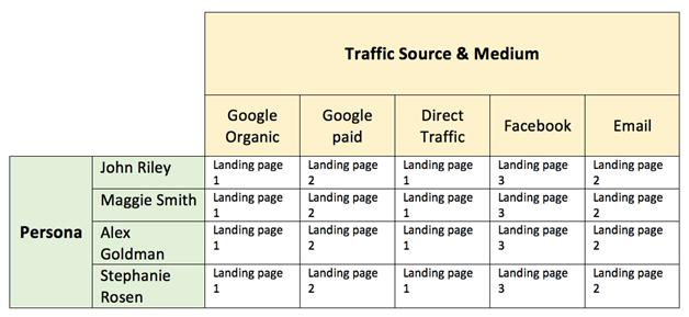
Now, your job is to evaluate each top landing page for each traffic source through the eyes of your website personas. For each page, you will answer eight questions.

The persona questions: Eight questions to ask

  • What type of information would persona “x” need to see to click on to the next page on the website?
  • What would be the top concerns persona “x” have looking at the page?
  • What kind of copy does persona “x” need to see?
  • What type of trigger words are important to include on the page for persona “x”?
  • What words should I avoid for persona “x”?
  • What kind of headline should I use to persuade persona “x” to stay on my website?
  • What kind of images should I use to capture persona “x” attention?
  • What elements on the page could distract persona “x”?

As you answer these questions for each of the personas, you will end up with a large set of answers and actions. The challenge and the art will be to combine all these and make the same landing page work for all different personas. This is not a small task, but this is where the fun begins.

Consider the Buying Stages 

You thought the previous work was complex? Well, you haven’t seen anything just yet!

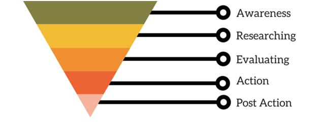
Not every visitor who lands on your website is ready to buy. Visitors come to your website in different buying stages, and only 15-20% are in the action stage. The sequential buying stages of a visitor are:

  • Awareness stage (top of the sales funnel)
  • Research stage
  • Evaluating alternatives
  • Action stage
  • Post action

A typical buying funnel looks like this:

How does that translate into actionable items on your website?

In the previous exercise, we created a list of changes on different screens or sections of your website based on the different personas. Now, we are going to think about each persona landing on the website in one of the first four buying stages.

Instead of thinking of how to adjust a particular screen for John Riley, now you think of a new scenario:
Persona “x” is in the “evaluating alternatives” stage of the buying funnel. He lands on a particular landing page. What do I need to adjust in the website design and copy to persuade persona “x” to convert?

Our previous table looks like this now:

Next, answer all eight persona-questions again, based on the different buying stages.

Test your different scenarios

This goes without saying; you should NEVER introduce changes to your website without actually testing them. You can find plenty of blogs and books out there on how to conduct testing correctly if you are interested in learning more about AB testing and multivariate testing.

For a start, keep the five No’s of AB testing in mind:

1. No to “Large and complex tests”

Your goal is NOT to conduct large AB or multivariate tests. Your goal is to discover what elements on the page cause visitors to act a specific way. Break complex tests into smaller ones. The more you can isolate the changes to one or two elements, the easier it will be to understand the impact of different design and copy elements on visitors’ actions.

2. No to “Tests without a hypothesis”

I can never say it enough. A test without a good hypothesis is a gambling exercise. A hypothesis is a predictive statement about a problem or set of problems on your page and the impact of solving these problems on visitor behavior.

3. No to “Polluted data”

Do not run tests for less than seven days or longer than four weeks. In both scenarios, you are leaving yourself open to the chance of inconsistent and polluted data. When you run a test for less than seven days, website data inconsistencies you are not aware of may affect your results. So, give the test results a chance to stabilize. If you run a test for more than four weeks, you are allowing external factors to have a larger impact on your results.

4. No to “Quick fixes”

Human psychology is complex. Conversion optimization is about understanding visitor behavior and adjusting website design, copy and process to persuade these visitors to convert. Conversion optimization is not a light switch you turn on and off. It is a long-term commitment. Some tests will produce results and some will not. Increases in conversion rates are great but what you are looking for is a window to visitor behavior.

5. No to “Tests without marketing insights”

Call it whatever you like: forensic analysis, posttest analysis, test results assessment. You should learn actionable marketing insights from the test to deploy across channels and verticals. The real power of any testing program lays beyond the results.

If you follow the steps outlined in this blog, you will have a lot to do.

So, happy testing!

About the author: This guide was written by Khalid Saleh. He is the CEO of Invesp, a conversion optimization software and services firm with clients in 11 different countries.

Categories: 

Powered by WPeMatico

10 Tools To Help Protect Your Blog From Content Theft

This is a guest contribution from Adam Connell, blogger at Bloggingwizard.com.

If you write or publish a blog, you’ll inevitably experience the gut-wrenching feeling of content theft at some point in the life of your blog. It’s not fair but it’s now just part of the world of online content.

What can you do to protect the content you slaved over?

There is no 100% fool-proof way to protect your content, but you can make it more difficult for content thieves to steal your work and to punish them when they do.

I’m going to share some ways you can protect your content from theft and give you some resources to use to defend it against thieves and scrapers.

Padlock on door and your blog content!

How Do You Know If Your Content Has Been Stolen? 

Posting a copyright notice on your blog is a deterrent, albeit a small one. A copyright notice lets would-be content thieves know that you understand your rights to the fruits of your labor and that you intend to protect them. Nevertheless, not everyone is going to be deterred by your copyright notice.

The following online tools can be used to discover whether your content has been stolen or not. What you do after that is another story.

Google Alerts

Google Alerts are simple e-mail alerts you can establish by notifying Google that you want to keep tabs on certain keywords or phrases. Copy a unique phrase in your blog post or the title of your post and ask Google to send you an e-mail any time it is published elsewhere on the Web.

Use a plagiarism checker

There are several plagiarism checkers online. All of them have their benefits. Grammarly is a proofreading service and grammar checker, but it will also check your text against plagiarism. Plagium is another one. However, unlike Grammarly, you can check an entire URL to see if your content has been plagiarized.

While Grammarly and Plagium both are good services, Copyscape is more recognized. Like Plagium, you can check an entire URL for plagiarism, and you can put a “Protected By Copyscape” notice on your blog, which should scare away a few content scrapers.

All three services have a free service level and a premium paid service for high volume users.

Small Steps To Protecting Your Content From Theft

While Google Alerts and plagiarism checkers can tell you that someone has used your content without your permission, there are other things you can do to protect your content.

These are small steps that help you maintain a little control over your content and ensure that you at least get attribution should someone use your content without your approval.

WordPress SEO by Yoast

This WordPress plugin is useful if you are using the standalone WordPress software. The plugin has a feature that allows you to add some code to your RSS feed so that if your post is republished elsewhere, then an automatic link will be inserted pointing back to your website.

Some blogs use scraper software to automatically republish content from around the Web. No human is looking at these posts. If your blog is included among the URLs added to the scraper script, then you’ll at least get a link back. Don’t count on that link being very valuable, but it is there.

Tynt

Tynt is a service that provides code for you to insert into your web pages and will also tell you how many times your content has been copied and pasted. When someone copies and pastes your content, Tynt will add a link back to your website.

Google Authorship

Google Authorship is a content marketing strategy that associates your name or brand with your content in Google’s search index. By implementing Google Authorship you are increasing your chances of retaining control over your content by having your photo image appear next to your content in the search rankings.

While that won’t stop content thieves from scraping your content, it will make it easier to prove the content is yours and it will be easier to have stolen content removed when you file a DMCA (Digital Millennium Copyright Act) complaint. Learn more about Google Authorship here.

What You Should Do If Your Content Has Been Stolen

It is not always necessary to confront a content thief. You have to determine if there’s any real damage to your content being stolen.

First, ask yourself if the person is profiting from your content. If they are, then that’s a red flag. Secondly, ask if your reputation may be damaged by someone claiming that content. And thirdly, ask if it’s worth your trouble to pursue the content thief. Sometimes it is and sometimes it isn’t.

So let’s say that you determine you want to pursue the content thief and have them remove your content. Your first step should be to send them a friendly letter by e-mail, or by using their contact form, and asking them to remove your content. Alternatively, you can ask them to link back to your website.

If that doesn’t work, then you’ll have to take other measures.

You can start by finding out where their website is being hosted and contact the hosting company. Let the hosting company know that they are hosting a website that is stealing content. Under the Digital Millennium Copyright Act, the hosting company is obligated to prevent access to websites that have infringed on someone’s copyright.

WhoIsHostingThis.com

You need to find out who is hosting the website that stole your content. That’s where Who Is Hosting This comes in. Once you know who is hosting the website, you can then send a DMCA request to the hosting company to have the website taken down.

Remove content from Google

To have content removed from Google’s search index, you’ll have to file a DMCA request with Google.

One Final Step To Combatting Plagiarism: Creative Commons

As I noted earlier, copyright notices are small deterrents. The same goes for Creative Commons.

However, Creative Commons licenses are becoming more acceptable and more popular. If people know that you don’t mind them using your content for benevolent purposes, they are more likely to respect your right to that content and its privileges.

Creative Commons

You can learn about the various Creative Common licenses on the Creative Commons website.

It’s a wild Web out there

Be diligent in protecting your content and you will reap the benefits of it for a long time to come.

What sort of experiences have you had with content theft? Whether you have successfully stopped people from stealing your content or not, we’d love to hear about it.

Adam Connell is an internet marketing and SEO nut from the UK. He can be found blogging over at Bloggingwizard.com, where he talks about marketing, social media, SEO and a few other topics. Follow him on Twitter @adamjayc.

10 Tools To Help Protect Your Blog From Content Theft
http://www.problogger.net/archives/2013/07/24/10-tools-to-help-protect-your-blog-from-content-theft/
http://www.problogger.net/archives/category/miscellaneous-blog-tips/feed/
@ProBlogger» Miscellaneous Blog Tips
Blog Tips to Help You Make Money Blogging – ProBlogger
http://www.problogger.net/wp-content/plugins/podpress/images/powered_by_podpress_large.jpg

How to Promote Yourself without Coming Across as a Jerk

How to Promote Yourself without Coming Across as a Jerk
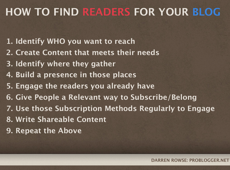
The thing about blogging is that it’s not just blogging – you have to push your work out to others in order to be read. It’s an aspect of the job that is so intimidating for some that it totally holds them back from reaching their blog’s full potential. But without it, your blog is one of millions begging for attention and not getting it. “Build it and they will come” unfortunately doesn’t work here!

I was recently asked by a reader how to tackle this head on:

I’ve been blogging now for a few months and have built up an archive of posts that I think are useful for those who might find them – but I’m struggling with one big question – how to get people to read!
 
I’ve listened to some of your episodes on growing readership and understand the techniques I probably need to use – but my problem is that I’m scared to start.
 
More specifically my issue is that I don’t want to get too self promotional and come across as a complete jerk by over doing it and always be in people’s faces. Can you help?

In today’s episode of the ProBlogger podcast, I do just that.

The thing is, you do have to promote yourself, there’s really no way around it. From episode 33 to 37 of the podcast, we talked about finding readers but I guess what Samantha is asking is how do you do it the right way? In this episode I discuss the best ways of showcasing your expertise without coming across as a know-it-all.

I also touch on how to work to the best of your ability, why you should focus on exchanges rather than just broadcasting, what topic you should lead your blog with, where you should admit your knowledge deficits, the usefulness of storytelling, and more – including why you shouldn’t go overboard with the modesty thing. It’s all about what I think the secret to being a good influencer is and how it can make a difference between promoting yourself and promoting yourself so much you turn others off.

You can listen to this episode in the player below or over on the episode 55 shownotes.

I’d love to know – what are your favourite self-promotion tips? And is it something you struggle with, like Samantha does?

The post How to Promote Yourself without Coming Across as a Jerk appeared first on @ProBlogger.

How to Promote Yourself without Coming Across as a Jerk
http://www.problogger.net/archives/2015/10/23/how-to-promote-yourself-without-coming-across-as-a-jerk/
http://www.problogger.net/archives/category/blog-promotion/feed/
@ProBlogger » Blog Promotion
Blog Tips to Help You Make Money Blogging – ProBlogger
http://www.problogger.net/wp-content/plugins/podpress/images/powered_by_podpress_large.jpg

Powered by WPeMatico

How to Back Up and Move a WordPress Blog

This guest post is by Caimin Jones of Genius Startup.

Sometimes you’ll need to move your blog from one host to another. It’s a bit of a pain and might seem a daunting task if you’ve never done it before.

But transferring a site is a fairly straightforward process that you can do yourself with an FTP program and this step-by-step guide.

Before trying the DIY method, it’s worth checking to see whether your new hosting company offers a site transfer service for new customers. Many do—but check whether there’s a cost involved. I’ve seen free services for this, but I’ve also seen prices around $300!

If you just need to learn how to make a simple backup of your posts, and don’t need to move hosts, take a look at this ProBlogger post.

But if you’re ready to back up and move your blog, let’s do it.

What you need to begin

To get stated, you’ll need:

  1. an FTP program (two good, free ones are FileZilla or FireFTP which works as a Firefox add-on)
  2. the FTP login information for your current host
  3. the FTP login information for your new host
  4. the MySQL username, password, and host name for your new server
  5. the nameserver information for your new host—there are usually two host names, sometimes more
  6. the login details for the registrar with which your domain name is registered.

It’s best to move hosts during a quiet time of the week for your blog, which probably means over the weekend. Check that support is available at your new host, and have the number handy. If something doesn’t work as it should, you’ll be glad you don’t have to go looking for that phone number.

Two preliminary steps to make life easier

If you’re using a cache plugin like Total Cache or WP Super Cache, deactivate and completely remove the plugin before you start the move process.

Cache plugins store file settings on the server, and these will be different for your new host, so you need to do a new install for those types of plugins. Most other types of plugins won’t need to be re-installed using the process I’m outlining here.

Secondly, it’s highly recommended go to your domain registrar or hosting company and lower the TTL value on your domain to something like 300 seconds, or the lowest value allowed.

TTL stands for Time To Live. It’s the number of seconds browsers should wait before refreshing the DNS information that connects domain names with web servers. Setting it to a low value means you won’t have to wait more than a few minutes for your host switching to take effect.

You’ll find the TTL as a setting under a DNS Zone file. For example, it looks like this in Media Temple:

TTL settings

And it looks like this in Go Daddy:

TTL settings GoDaddy

Make sure you change the TTL at least 12 hours before you plan to switch web hosts, so that the newer, faster refresh time has updated around the internet.

Making the move

Step 1. Install WordPress on the new hosting company

If the new host has a one-click install feature, use that to install WordPress—you’ll save yourself quite a bit of time and hassle.

If you have to install it manually, take a look at the official installation guide.

Step 2. Back up the database

The easiest way to make a complete database backup is to install the WP-DBManager plugin .

Once it’s installed, go to Database > Backup Database and click the Backup button. If you have a lot of posts or comments, this might take a few seconds.

When you see the message that the backup has been created, go to Database > Manage Backup DB and check the backup file is definitely there.

Step 3. Back up all the files from your old server

Using your FTP program, log in to your old host and navigate to your wp-content directory. Download everything in that directory to your computer.

At this stage you have a complete copy of your entire blog—and you’re halfway there.

Downloading the copy

Step 4. Upload your files to the new server

Now, it’s back to your FTP program. Log in to the new server and navigate to the wp-content directory.

Before you take the next step, double-check that you really are logged in to the new server and not the old one.

Now delete everything in the wp-content directory.

Then upload everything in the wp-content copy on your computer to your new host.

Step 5. Change nameservers

You’re nearly there! Now you need to log in to your domain name registrar and change the nameservers to those of your new hosting company.

Changing the nameservers

Changes to domain nameservers can take a few hours or more to propagate through the internet, so it may be a while before your blog is being served from its new home. However, if you followed the tip to reduce the TTL value before you began, you’ll only need to wait a few minutes for the changes to take effect.

Sep 6. Make the finishing touches

Visit your blog homepage and refresh it every few minutes until you see the WordPress install page (if you manually installed WordPress) or an empty blog using the standard theme (if you used a one-click install option).

Don’t panic! Log in to the Admin area and go to Database > Manage BackupDB. You should see the backup file you made on your old server. Select it and click Restore.

Now check your blog homepage and you should see a fully working blog, with posts, comments, theme, and plugins working correctly.

If everything looks good, you can now reinstall your cache plugin, if you were using one. I’d also say you’ve also earned a glass of your favorite beverage!

Caimin Jones is founder of Genius Startup which gives bloggers and small startups no fluff, practical strategies to build a successful web business.

The post How to Back Up and Move a WordPress Blog appeared first on ProBlogger.

How to Back Up and Move a WordPress Blog
https://problogger.com/how-to-back-up-and-move-a-wordpress-blog/
http://www.problogger.net/archives/category/blog-networks/feed/
Blog Networks – ProBlogger
Blog Tips to Help You Make Money Blogging – ProBlogger
https://problogger.com/wp-content/uploads/powerpress/problogger_podcast-891.jpg

Powered by WPeMatico

Collective #337


C337_MailIt

Mailit

Mailit is a drop-in microservice for sending emails over a REST API.

Check it out


C337_NoniNoni

Noni Noni

Inspired by his daughters love for drawing, Jongmin Kim created this great app that visualizes pictures and letters in 3D.

Check it out


Collective #337 was written by Pedro Botelho and published on Codrops.

Content Creation vs Content Promotion: Where is the Balance?

A few days ago we published a post on ProBlogger titled ‘Forget about Marketing: Concentrate on Blogging‘, which led to some interesting discussion on Twitter and in the comments.

I love the points author Nicholas Whitmore made in the post but I wanted to give a few thoughts, based on my own experience, on developing great content and promoting your blog.

Nicholas wrote some great arguments for focusing your energy on writing great content as the central way of growing your blog. He writes:

“When you write and publish awesome content on your blog, good things will come your way.”

I completely agree with this sentiment. As a blogger your #1 focus needs to be on producing content that is useful, engaging and of as high a quality as possible. Without it, all the marketing you might do will be wasted as you’ll just be directing people to something that is of no value to them.

As Nicholas goes on to write:

“When you write and publish boring content then spend hours on end building links to it, trying to force people to your website, good things will never come.”

Again, I agree with the sentiment expressed here.

However, on Twitter a discussion among some of my followers highlighted that some bloggers differ quite a bit on how much effort should be put into promoting a blog vs developing content for it.

  • On one hand, there were certainly people who felt that if you build a great blog that it markets itself.
  • On the other hand, there were people who felt that if you didn’t get out there and market your blog you ran the risk of all your hard work in developing great content going completely unseen.

While I think we all agree that the content on your blog needs to be of a very high focus, I’m also of the belief that if a blogger wants to grow their readership they also need to put effort into promoting that blog.

I like the idea of the marketing being taken care of by your visitors, if you have good enough blog post. In my experience, there are things you can do to promote your blog to help speed the process up, without compromising the quality of your posts.

In the early days of my own current blogs (here on ProBlogger and at dPS) I estimate I probably spent almost as much time writing content as I did working on growing the readership. In fact, I’m sure there were some weeks where I did spend considerably more time promoting my blog than writing content!

In short, I don’t see marketing and creating content as mutually exclusive – both are really important to me.

How did I grow my readership (or market my blogs)?

I recorded a webinar last year on this very topic with a load of tips in it. You can listen to it and see the slides here so I won’t rehash all of that but here’s a summary slide of the points I talked through.

Screen Shot 2013-06-18 at 1.53.20 PM.png

You can see that my process actually talks about the content that you develop as being a part of finding readers for your blog (both in points 2 and 8). But by getting off your blog to promote what you do you are certainly able to significantly grow your blog.

For me, I’d say that the balance of creating content and promoting has changed over the life of my blogs over the years. This is probably partly because the life cycle of a blog but also due to my own personal circumstances and how much time I have available to work.

That said , I would always prioritise both on a daily basis… and would probably also add in that I prioritise other things too such as ‘engaging with readers/building community’ and also a focus upon ‘monetization’ (without which I can’t sustain what I do).

Where is the Balance of Promotion and Content Creation for You?

I’d love to hear how others get this balance right in your blogging?

Content Creation vs Content Promotion: Where is the Balance?
http://www.problogger.net/archives/2013/06/19/content-creation-vs-content-promotion-where-is-the-balance/
http://www.problogger.net/archives/category/miscellaneous-blog-tips/feed/
@ProBlogger» Miscellaneous Blog Tips
Blog Tips to Help You Make Money Blogging – ProBlogger
http://www.problogger.net/wp-content/plugins/podpress/images/powered_by_podpress_large.jpg

Dealing With Loud And Silent Burnout


Many of us struggle silently with mental health problems and many more are affected by them, either directly or indirectly. It’s {Geek} Mental Help Week and we would like to help raise awareness with a couple of articles exploring these issues. – Ed.

We’ve all experienced that burnout moment. It’s that moment when we’ve got nothing left to give but keep trying anyway, when we’re left without much more than a shell to live in and motions to go through.

Dealing With Loud And Silent Burnout

We’re fried and broken and wish desperately for our work to make sense, for our energy to come back, for things to be fun and as they were. In such moments all we want is for our work to feel like our work and not like torture.

The post Dealing With Loud And Silent Burnout appeared first on Smashing Magazine.

Dealing With Loud And Silent Burnout
http://www.smashingmagazine.com/2015/10/dealing-with-loud-silent-burnout/
http://rss1.smashingmagazine.com/feed/
Smashing Magazine
For Professional Web Designers and Developers

Powered by WPeMatico

Assessing Mobile Usability With Google Webmaster Tools

Back in 2013, Google officially announced1 that it would begin to penalize websites that provide a faulty user experience on mobile devices. Specific examples included redirecting inner URLs to a home page when viewed in a mobile version of a website, as well as showing 404 errors to people attempting to access pages on mobile.

Toward the end of 2014, a Google spokesperson hinted that the mobile user experience would become a ranking factor2. In January 2015, a number of website owners received messages warning about mobile usability issues on their websites, linking to a section of Webmaster Tools where they could review the problems.

Mobile usability warning sent to owners of sites registered in Webmaster Tools3
Mobile usability warning sent to owners of websites registered with Webmaster Tools. (View large version4)

In this article, we’ll review how to flag mobile issues in Webmaster Tools, explain the most common issues and learn how to assess mobile usability problems on your website based on these flags. Because mobile usability has become a greater priority in Google’s ranking algorithm, ensuring an optimal mobile experience on every website has become more important than ever. See the search results below, where Google has marked a dedicated mobile website (DP Review) and a responsive website (CNET) as being mobile-friendly. The result for PC Magazine lacks this label.

Example results from a Google search on a mobile device5
Results from a Google search on a mobile device. (View large version6)

Taking a look at each URL shows us clear reasons why DP Review and CNET earned mobile-friendly labels and why PC Magazine did not and ranks below the others. Not only does the PC Mag link not go to the proper mobile version of the website (which does exist), but it also delivers a popup promotion with a tiny close button that’s awkward to tap on mobile.

Mobile pages for each search result from the previous image7
Mobile pages for each search result from the previous image. (View large version8)

Setting aside the legitimate mobile issues, not only will people drop off of your website after a poor experience, but also your organic search traffic might decline because rankings can suffer in mobile search results. On the flip side, when you do improve a problematic website, you could see a vast improvement in organic search traffic, as we’ll see in the following example.

My agency built a new website to replace one that had many of the mobile problems we’ll review in this article. The original website contained a number of Flash elements, lacked any viewport configuration, and contained tiny text and touch elements when viewed on a mobile screen. The new website was built in a responsive format, eliminating these issues. Within two months of relaunching, the website saw a 44% increase in new users from organic Google searches on mobile devices, twice the increase seen on desktop. While a number of other factors certainly played a role, such as content refinement, the fact that mobile showed such a significant increase reflects the value Google ascribes to mobile usability.

Finding Mobile Problems In Webmaster Tools

In order to review mobile issues flagged on your website, you’ll first need to install Google Webmaster Tools. While many websites already run Webmaster Tools, some do not, and so here are brief instructions to set up. Navigate to the Webmaster Tools9 page, and log in with your Google account. You’ll see a field to enter your URL. Then, select “Add a Site.”

Next, you’ll need to verify the website. Webmaster Tools will show the various methods of doing so, including uploading an HTML file to your website, adding a meta tag or signing into your domain name’s provider. You can also verify via Google Analytics or Google Tag Manager if either code is in place on your website and you have access to the account. If you’re running a WordPress website, a plugin such as Yoast’s WordPress SEO will allow you to verify Webmaster Tools easily by copying and pasting a number from the meta tag into a field in the plugin.

After setting up Webmaster Tools on your website, you might not see any data in the interface for a few days. Submitting a site map10 could speed up the process of crawling and indexing your website.

You’ll find the “Mobile Usability” section under “Search Traffic” in the left navigation bar. This will show you what errors, if any, have been found on your website. Click any of the error categories to see specific URLs flagged for each.

Mobile-specific warnings in Webmaster Tools11
Mobile-specific warnings in Webmaster Tools. (View large version12)

Google shows mobile issues in six main categories:

  • Flash usage,
  • viewport not configured,
  • fixed-width viewport,
  • content not sized to viewport,
  • small font size,
  • touch elements too close.

To fix these issues, look at the flagged URLs and determine what edits need to be made.

Regarding “Flash usage,” any Flash elements will not render properly on most mobile devices. For example, when I try to access We Choose the Moon13 from an iPhone, it prompts me to download Flash to experience the website. Well, I obviously can’t install Flash on my iPhone, so I can’t experience this website at all on mobile.

This website contains Flash features unviewable on a mobile device14
This website contains Flash features that are unviewable on a mobile device. (View large version15)

Fixing this problem simply means restructuring the website to not include any Flash when served on a mobile device.

“Viewport not configured” means that the website is not scaling properly to the device’s size. See the website below, parts of which are cut off in small browsers.

Site with improperly setup viewport16
A website that is improperly set up for the viewport. (View large version17)

Use the meta viewport tag to ensure that the height and width of the website change based on the size of the phone or tablet’s screen. Inserting the following code into the head of the website will cause it to resize and rearrange elements to fit various screen sizes.

<meta name="viewport" content="width=device-width, initial-scale=1">

In this code, width=device-width will automatically size the width of the website to the size of the window in which it is being viewed. And initial-scale=1 will set the zoom level of the website to 100%, scaling the website to fill the window regardless of the screen’s size. With this attribute in place, content will reflow when the phone or tablet is flipped from vertical to horizontal orientation.

“Fixed-width viewport” refers to pages that are set up to show at a specific pixel width. This is problematic when a website does not properly scale to an unexpected screen size. So, utilizing device-width in the viewport meta tag, as in the previous example, will enable the website to scale based on any device’s screen size.

Site with fixed viewport18
Website with fixed viewport. (View large version19)

For instance, note how the navigation cuts off on the right side of Anthem’s website, shown in the screenshot above. This website includes the viewport meta tag but uses it to define a specific width.

<meta name="viewport" content="width=1100" />

Replacing width=1100 with device-width would cause the website to scale to the width of the browser, fixing the issue. Of course, the developer would likely want to address issues with how elements on the website adapt to changes in size, as well.

“Content not sized to viewport” indicates that the users with small browsers need to scroll from side to side to view elements (as in both the fitness and Anthem examples). This can prove annoying, especially on a phone. Replacing absolute positioning with relative positioning in the CSS would likely help to fix this problem. For example, note how elements in the website below are side by side in a larger browser but stack on top of each other when the browser is smaller.

Scaling the placement of elements on a responsive website based on screen size20
Scaling the placement of elements on a responsive website based on screen size. (View large version21)

“Small font size” flags text too small to easily read on a page. This can occur both from fonts that are too small as well as from insufficient vertical spacing between text. To avoid this, Google recommends22 starting with a base size of 16 CSS pixels and modifying up or down from there.

This website with a small font size is practically illegible on an iPhone without zooming.23
This website with a small font size is practically illegible on an iPhone without zooming. (View large version24)

“Touch elements too close” indicates that a user might have trouble tapping a specific button, navigation element or form field if it’s too small and jammed next to other clickable elements. This problem can cause frustration because a user might select a different button than intended. For example, see how several links in the following image are stacked close together, making it difficult to select a particular one on a phone.

Webite with touch elements too close on a phone25
Website with touch elements too close on a phone. (View large version26)

To fix this problem, put enough space between buttons and links so that even on the smallest devices users will not have trouble selecting one. Adequate spacing is least at least 7 millimeters or 48 CSS pixels27 for these elements. Tweak this spacing to ensure that users do not encounter annoyances on a mobile device. In addition, think about what elements you will actually need to show phone users. In the example shown above, these users likely wouldn’t need to see all of the links and could have a much simpler experience with a few important links.

Beware Of False Flags

In the example shown earlier, I took a closer look at URLs flagged for “Flash usage.” I found that several of these pages include blog posts with embedded YouTube videos, whose content is served within an iframe (via the default embedding code). While these videos do show up as Flash at times, such as when viewed on a desktop page, they appear in HTML5 format on phones, playing with no problem. Ironically, even though it owns YouTube, Google has not picked up on the fact that YouTube changes the format of videos served when embedded on websites, depending on the device.

So, be sure to actually check the flagged pages to see whether issues are indeed legitimate. Keep in mind that Google’s automated crawling might not always show 100% accurate results. Although you can’t keep warnings about these pages from showing up, you could select an issue and choose to recheck the live version. Over time, Google will likely refine its methods for testing to filter out false flags.

Don’t Rely Completely On Google

On the other hand, don’t expect Google to pick up all potential problems with mobile usability. Just because you don’t see any errors, your website might not necessarily appear perfectly on all mobile devices. Test your website thoroughly across multiple devices and browsers to ensure a positive experience with website speed, appearance and interactivity.

Keep an eye on mobile metrics in Google Analytics to find potential usability issues. A key report to watch is found in “Audience” → “Mobile” → “Overview,” showing data for mobile, tablet and desktop traffic and engagement. For example, watch to see whether a high percentage of users on mobile devices are bouncing, especially if this number is much higher than for the desktop. Also, look at the average session duration for mobile devices to see whether the experience seems abnormally short or long. Overly brief or lengthy time spent on a website could indicate that people are either leaving right away out of frustration or are confused, taking too long to find what they wanted.

In addition, use heatmapping tools such as CrazyEgg28 and HotJar29 to analyze website usage beyond what Google’s tools can tell you. All of these tools show how users interact with mobile specifically, including data such as where they click and how far they scroll. This data could reveal problems, such as users not scrolling all the way to the bottom on a long mobile page or not clicking buttons that appear too small on a mobile device.

For instance, based on heatmap data, we discovered that few users on phones were scrolling down to a form on a particular landing page. We then added functionality to allow users to tap a button at the top, causing the page to immediately scroll to the form. Afterward, we experienced an increase in form submissions.

Google Webmaster Tools is a helpful starting point for analyzing mobile issues on your website. If you receive warnings, don’t ignore them. Take time to look at the problems and identify opportunities to improve your website’s mobile usability. Ultimately, your goal is to make the website the best experience possible for mobile users, not just to obsess over your rankings in Google. However, Google will reward positive user experiences.

Final Notes

(da, al, ml)

Footnotes

  1. 1 http://googlewebmastercentral.blogspot.com/2013/06/changes-in-rankings-of-smartphone_11.html
  2. 2 http://searchengineland.com/google-may-add-mobile-user-experience-ranking-algorithm-205382
  3. 3 http://www.smashingmagazine.com/wp-content/uploads/2015/03/01-message-opt.jpg
  4. 4 http://www.smashingmagazine.com/wp-content/uploads/2015/03/01-message-opt.jpg
  5. 5 http://www.smashingmagazine.com/wp-content/uploads/2015/03/02-mobile-results-opt.jpg
  6. 6 http://www.smashingmagazine.com/wp-content/uploads/2015/03/02-mobile-results-opt.jpg
  7. 7 http://www.smashingmagazine.com/wp-content/uploads/2015/03/03-mobile-page-examples-opt.jpg
  8. 8 http://www.smashingmagazine.com/wp-content/uploads/2015/03/03-mobile-page-examples-opt.jpg
  9. 9 https://www.google.com/webmasters/tools/
  10. 10 https://support.google.com/sites/answer/100283?hl=en
  11. 11 http://www.smashingmagazine.com/wp-content/uploads/2015/03/04-mobile-usability-warnings-opt.jpg
  12. 12 http://www.smashingmagazine.com/wp-content/uploads/2015/03/04-mobile-usability-warnings-opt.jpg
  13. 13 http://www.wechoosethemoon.org
  14. 14 http://www.smashingmagazine.com/wp-content/uploads/2015/03/05-flash-site-opt.jpg
  15. 15 http://www.smashingmagazine.com/wp-content/uploads/2015/03/05-flash-site-opt.jpg
  16. 16 http://www.smashingmagazine.com/wp-content/uploads/2015/03/06-viewport-problems.jpg
  17. 17 http://www.smashingmagazine.com/wp-content/uploads/2015/03/06-viewport-problems.jpg
  18. 18 http://www.smashingmagazine.com/wp-content/uploads/2015/03/07-fixed-width-opt.jpg
  19. 19 http://www.smashingmagazine.com/wp-content/uploads/2015/03/07-fixed-width-opt.jpg
  20. 20 http://www.smashingmagazine.com/wp-content/uploads/2015/03/08-site-scaling-opt.jpg
  21. 21 http://www.smashingmagazine.com/wp-content/uploads/2015/03/08-site-scaling-opt.jpg
  22. 22 https://developers.google.com/speed/docs/insights/UseLegibleFontSizes
  23. 23 http://www.smashingmagazine.com/wp-content/uploads/2015/03/09-small-font-opt.jpg
  24. 24 http://www.smashingmagazine.com/wp-content/uploads/2015/03/09-small-font-opt.jpg
  25. 25 http://www.smashingmagazine.com/wp-content/uploads/2015/03/10-touch-elements-opt.jpg
  26. 26 http://www.smashingmagazine.com/wp-content/uploads/2015/03/10-touch-elements-opt.jpg
  27. 27 https://developers.google.com/speed/docs/insights/SizeTapTargetsAppropriately
  28. 28 http://crazyegg.com
  29. 29 http://hotjar.com
  30. 30 https://www.distilled.net/training/mobile-seo-guide/
  31. 31 http://www.thesempost.com/new-google-mobile-algo-google-begins-reducing-visibility-non-mobile-friendly-sites-received-warnings/
  32. 32 http://searchengineland.com/google-mobile-friendly-ranking-factor-runs-real-time-page-page-basis-216100
  33. 33 http://webdesign.tutsplus.com/articles/quick-tip-dont-forget-the-viewport-meta-tag–webdesign-5972
  34. 34 http://blogs.bing.com/webmaster/2014/11/20/bing-and-mobile-friends/

The post Assessing Mobile Usability With Google Webmaster Tools appeared first on Smashing Magazine.

Assessing Mobile Usability With Google Webmaster Tools
http://www.smashingmagazine.com/2015/03/25/assessing-mobile-usability-google-webmaster-tools/
http://www.smashingmagazine.com/feed/?#
Smashing Magazine
For Professional Web Designers and Developers

Powered by WPeMatico

Automatic license renewals: twenty months later

About twenty months ago, while sitting on a couch in Auckland, New Zealand, my team and I flipped the switch to enable automatic renewals for AffiliateWP. Two months later we did the same thing for Easy Digital Downloads and Restrict Content Pro. This was a move that we had been working towards for nearly a year and it’s one that we believed would fundamentally change the position of the company over the next one to two years. Now that it has been twenty months, maybe we can answer the question: were we right? Did it make a significant impact for us or was it all futile hopes?

Historically we, like many other online product companies, have struggled with low renewal rates. All of our products are sold with annual licenses that should be renewed each year so long as the products are in continued use. Renewal revenue is a critically important part of growing any online business because it reduces the expensive process of customer acquisition. Your revenue isn’t purely a factor of how many new customers you obtain, it’s a combination of your new customer acquisition and your existing customer retention. If you have great customer retention, you can grow your annual revenue year after year without having to rely on increasing the number of new customers acquired year over year.

Our goal with implementing automatic renewals was three-fold:

  1. Reduce friction and effort for customers. Easy systems == happier customers.
  2. Increase renewal revenue by reducing the number of “forgotten” renewals.
  3. Provide a predictable revenue stream we could rely on and adequately forecast against.

Let’s start determining if we were successful by looking at some previous year stats.

Easy Digital Downloads

Here are some quick stats on our previous years with Easy Digital Downloads:

  • Total revenue in 2014: $474,622.54
  • Total revenue in 2015: $561,269.06
  • Renewal revenue 2015: $80,799.26
  • Total revenue 2016: $597,352.61
  • Renewal revenue 2016: $139,850.03

In 2015 we brought in $80,799.26 in renewal revenue. That’s revenue from existing customers that renewed their license keys. This number means only 14.4% of our total revenue in 2015 came from renewals. Ouch. While $80,000 isn’t a small number and is a nice addition to our annual income, it’s abysmally small when you recognize how few customers were coming back and purchasing renewals.

Our 2016 renewal revenue was higher at $139,850.03 but still only accounted for 23.41% of our total revenue that year.

AffiliateWP

For AffiliateWP, we have pretty similar patterns between 2014 and 2016.

  • Total revenue in 2014: $119,651.50
  • Total revenue in 2015: $379,078.36
  • Renewal revenue 2015: $19,774.60
  • Total revenue 2016: $491,890.90
  • Renewal revenue 2016: $62,827.80

For 2015, our renewal revenue accounted for only 5.22% of our total annual income. This is super drastic, though it does look worse on the surface before realizing part of the reason the renewal revenue was so low was because 2015 saw incredible growth for AffiliateWP. We more than tripled our 2014 revenue by bringing in a lot of new customers so our new customer acquisition was rapidly out pacing our existing customer base from 2014.

In 2016, we saw $62,827.80 in income from renewals, accounting for 12.77% of our revenue that year.

Restrict Content Pro

Again, Restrict Content Pro shows pretty similar patterns of abysmally low renewal income ratios.

  • Total revenue in 2014: $67,211.75
  • Total revenue in 2015: $83,806.60
  • Renewal revenue 2015: $10,460.30
  • Total revenue 2016: $157,486.89
  • Renewal revenue 2016: $21,706.60

In 2015, we brought in $10,460.30 from renewals, accounting for 12.48% of the year’s revenue. And in 2016 we saw $21,706.60 in renewals, or 13.78% of the total revenue that year.

Easy Digital Downloads in 2017

Automatic renewals for Easy Digital Downloads were enabled on March 30, 2016, which means the first payments to be processed by the resulting subscriptions would occur on March 30, 2017. This is important because it means the first three months of 2017 had the same manual renewals as previous years. Based on speculations, automatic renewals should dramatically increase the amount of revenue that comes from renewals.

Did it?

  • Total revenue so far in 2017, January 1 to August 1: $463,835.92
  • Renewal revenue so far in 2017, January 1 to August 1: $166,716.98
  • Revenue from auto renewals in 2017, March 30 to August 1: $90,297.20

Thus far, 35.94% of our Easy Digital Downloads revenue has come from renewals. That’s 12.53% more than in 2016, so a really good sign that automatic renewals are having a significant effect.

Of the $166,716.98 in renewal revenue, $90,297.20 of it was from automatic renewal payments processed with subscriptions. So 19.47% of our total revenue in 2017 has come from automatic renewals. That’s pretty good on the surface, but actually it’s really good. Why? Simple: automatic renewals didn’t start processing until the beginning of the second quarter of 2017 and yet it has already accounted for nearly 20% of our total yearly revenue.

If we look at March 30 to August 1, the time period that automatic renewals have been processing, we see that renewal revenue accounted for 38.72% of our revenue.

Here’s a graph that shows monthly license renewals for 2017. Can you see the point when automatic renewals began processing?

AffiliateWP in 2017

Automatic renewals for AffiliateWP began processing on January 21, 2017, so most of 2017 has included automatic renewals, unlike Easy Digital Downloads and Restrict Content Pro.

  • Total revenue so far in 2017, January 1 to August 1: $443,996.90
  • Renewal revenue so far in 2017, January 1 to August 1: $101,453.35
  • Revenue from auto renewals in 2017, January 21 to August 1: $89,686.40

22.85% of our 2017 revenue has come from renewals, and 20.2% was from automatic renewals. Just 2.65% came from manual renewals.

In 2017 we have had $101,453.35 in renewal revenue. In 2016 we had just $62,827.80. We’ve nearly doubled our renewal revenue and there are still four complete months left in 2017. Obviously some of that increase is due to natural growth, which we’ve continued to see for AffiliateWP, but it’s still a significant increase that I believe is largely attributed to automatic renewals.

If we exclude the first 20 days of January, we find that renewals have accounted for 24.20% of our revenue in 2017.

Here’s a graph showing license key renewals over time for AffiliateWP:

I don’t think I need to point out when automatic renewals were enabled.

Restrict Content Pro in 2017

The numbers for Restrict Content Pro in 2017 do share similarities with the other two products but it has one significant difference that needs to be noted. Throughout 2016 and 2017, one of our primary focuses has been to revitalize Restrict Content Pro and bring it back to a strong position within our product portfolio. I’ve written about these efforts and the results so far previously. I mention this because much of the growth Restrict Content Pro has seen in the last 20 months can be attributed to automatic renewals and extensive revitalization work.

  • Total revenue so far in 2017, January 1 to August 1: $184,686.45
  • Renewal revenue so far in 2017, January 1 to August 1: $28,503.85
  • Revenue from auto renewals in 2017,  March 30 to August 1: $16,165.80

In 2017, 15.43% of our revenue has come from renewals. 8.75% of that was from automatic renewals. This is an increase over previous years but not too terribly drastic. It is, however, still significant when we recognize that automatic renewals did not begin processing until the beginning of the first quarter of 2017.

If we look at March 30 to August 1, the time period that automatic renewals have been processing, we see that renewal revenue accounted for 19.22% of our revenue.

The graph below shows the growth of license renewals overtime. There is a pretty distinct increase in April that continues through the end of July. That increase is the result of automatic renewals.

Wrap up

I think the numbers mostly speak for themselves and really show that automatic renewals are having a significant impact on the financial state of the company. I look forward to seeing whole-year numbers after we’ve had automatic renewals processing for more than just a few months.

Restrict Content Pro’s 2017 revenue has already passed that of 2016, AffiliateWP is less than a month away from beating 2016, and Easy Digital Downloads is two months away from surpassing 2016. There are still four complete months left in 2017 and one of those includes our historically best month: November.

We need to make an important note here regarding the price increase we did at the end of 2016 and early 2017. The price increase did not affect any existing subscriptions, so the majority of the renewals we’ve seen so far in 2017 have been at the previous, lower price. So even though our renewal revenue is mostly at a lower price point than new sales, the percentage of the total that renewals account for is still significantly higher that it was previously. Once we are seeing the majority of renewals come in at the new, higher price, we’ll see even more significant results.

There are a number of really excellent effects automatic renewals have contributed to, but there are two in particular that I would like to highlight.

First is the ability to reliably forecast our expected revenue month-to-month. We now have a reliable data set that provides us with much more accurate predictions for future revenue, and that is incredibly valuable, especially when making decisions about company investments and weighing risks.

Second is our profit margin. One of downsides to increasing revenue through new customer acquisition is the added support and development burden that entails. The burden of adding $10,000 per month from new customers is not minimal at all. In fact it can be a real challenge. One of the reasons companies hire new employees is to help meet the demand brought on by the new customers. This often creates an endless cycle of growing your expenses as quickly as your revenue. Adding $10,000 to your monthly income doesn’t make much difference if you also add $10,000 in new expenses each month simply to help manage that new $10,000 you brought in.

Renewal revenue, however, doesn’t require the same maintenance that new revenue does. In other words, if we earn $100 from a new customer, it is likely that we will have to spend $80 helping that customer. If, however, we earn $80 in renewal revenue from an existing customer, we most likely won’t spend more than $20-30 helping them, if that. The reasoning is simple: renewing customers cost significantly less because the maintenance for them has already been done.

Existing customers are so much cheaper than new customers, so it only makes sense that we should do the very best we possibly can to increase the revenue generated from those existing customers. If we do that, our profit margins will get better and better, and that is precisely what we have seen.

Our previous years have all been profitable in the end, sometimes not very profitable but profitable nonetheless. 2017, however, has seen a completely new trend. We are not only showing profit every month, we are showing monthly profit that is greater than all previous annual profits, and we’re seeing it every single month but one so far. Which month didn’t see that level of profit? January, right before automatic renewals began taking place. Coincidence? Absolutely not.

I’ve previously mentioned that I believed transitioning to automatic renewals would likely be one of the best things we ever did. Today I’m more confident of that prediction than ever.

Inspiration for Menu Hover Effects

Today we’d like to share some menu hover effects with you. We hope this set inspires you and gives you some ideas for your next project. The effects are either powered by CSS only or with the help of anime.js. Some also use Charming, for individual letter effects.

The first style is a recreation of the link hover effect seen on The Feebles with a slight adaption. The effect “Dustu” got inspired by the link hover effect seen on Flambette.

Attention: We are using some modern CSS techniques and properties for the demos (grid, flexbox) so please view them in a modern browser.

This demo is kindly sponsored by FullStory.

Example Menu Hover Effect

The structure for the menus depends on the effect but let’s have a look at the one that was inspired by the beautiful The Feebles website. We call it “Adsila”:

<nav class="menu menu--adsila">
	<a class="menu__item" href="#">
		<span class="menu__item-name">Artists</span>
		<span class="menu__item-label">Explore all artists' portfolios</span>
	</a>
	<a class="menu__item" href="#">
		<span class="menu__item-name">Exhibitions</span>
		<span class="menu__item-label">Discover their stories</span>
	</a>
	<a class="menu__item" href="#">
		<span class="menu__item-name">Schedule</span>
		<span class="menu__item-label">View our event calendar</span>
	</a>
	<a class="menu__item" href="#">
		<span class="menu__item-name">Mission</span>
		<span class="menu__item-label">Read our mission statement</span>
	</a>
	<a class="menu__item" href="#">
		<span class="menu__item-name">The Gardens</span>
		<span class="menu__item-label">Get to know our eco village</span>
	</a>
	<a class="menu__item" href="#">
		<span class="menu__item-name">Buy Tickets</span>
		<span class="menu__item-label">Purchase event tickets online</span>
	</a>
	<a class="menu__item" href="#">
		<span class="menu__item-name">Contact</span>
		<span class="menu__item-label">Get in touch and find us</span>
	</a>
</nav>

We have the following common styles for all the menus:

.menu {
	position: relative;
	z-index: 10;
}

.menu__item {
	position: relative;
	display: block;
	outline: none;
	margin: 0 0 1.5em;
	line-height: 1;
}

.menu__item-name,
.menu__item-label {
	position: relative;
	display: inline-block;
}

.menu__item-name {
	font-size: 1.25em;
}

.menu__item-label {
	margin: 0 0 0 0.5em;
}

“Adsila” has these specific styles:

.menu--adsila {
	font-size: 1.15em;
	font-family: 'Nunito', sans-serif;
}

.menu--adsila a {
	color: #272727;
}

.menu--adsila .menu__item {
	margin: 0 0 1em;
}

.menu--adsila .menu__item-name {
	padding: 0 0.35em;
	font-weight: bold;
	line-height: 1.4;
	transition: color 0.5s;
	transition-timing-function: cubic-bezier(0.2,1,0.3,1);
}

.menu--adsila .menu__item-name::before {
	content: '';
	position: absolute;
	z-index: -1;
	width: 100%;
	height: 50%;
	left: 0;
	bottom: 0;
	opacity: 0.3;
	transform: scale3d(0,1,1);
	transform-origin: 0% 50%;
	transition: transform 0.5s;
	transition-timing-function: cubic-bezier(0.2,1,0.3,1);
}

.menu--adsila .menu__item-label {
	font-size: 1em;
	letter-spacing: 0.05em;
	transform: translate3d(-0.5em,0,0);
	transition: transform 0.5s, color 0.5s;
	transition-timing-function: cubic-bezier(0.2,1,0.3,1);
}

.menu--adsila .menu__item-label::before {
	content: '';
	position: absolute;
	z-index: -1;
	width: 25%;
	height: 1px;
	left: 0.05em;
	top: 1.25em;
	opacity: 0.3;
	transform: scale3d(0,1,1);
	transform-origin: 100% 50%;
	transition: transform 0.5s;
	transition-timing-function: cubic-bezier(0.2,1,0.3,1);
}

.menu--adsila .menu__item:nth-child(odd) .menu__item-name::before,
.menu--adsila .menu__item:nth-child(odd) .menu__item-label::before {
	background: #fe628e;
}

.menu--adsila .menu__item:nth-child(even) .menu__item-name::before,
.menu--adsila .menu__item:nth-child(even) .menu__item-label::before  {
	background: #6265fe;
}

/* Hover */

.menu--adsila .menu__item:nth-child(odd):hover,
.menu--adsila .menu__item:nth-child(odd):focus {
	color: #fe628e;
}

.menu--adsila .menu__item:nth-child(even):hover,
.menu--adsila .menu__item:nth-child(even):focus {
	color: #6265fe;
}

.menu--adsila .menu__item:hover .menu__item-name::before,
.menu--adsila .menu__item:focus .menu__item-name::before,
.menu--adsila .menu__item:hover .menu__item-label::before,
.menu--adsila .menu__item:focus .menu__item-label::before {
	transform: scale3d(1,1,1);
}

.menu--adsila .menu__item:hover .menu__item-label,
.menu--adsila .menu__item:focus .menu__item-label {
	transform: translate3d(0,0,0);
}

.menu--adsila .menu__item:hover .menu__item-label::before,
.menu--adsila .menu__item:focus .menu__item-label::before {
	transition-timing-function: ease;
	transform-origin: 0% 50%;
}

We have added a slight variation to the effect by moving the label a bit and showing a line left to the label. As you can see, we don’t use different colors for each item but rather, we distinguish the even and the odd ones.

We hope you enjoy these styles and find them inspirational.

References and Credits

Inspiration for Menu Hover Effects was written by Mary Lou and published on Codrops.