But First, A Word From Our Sponsors…

Yesterday Google shared they see greater mobile than desktop search volumes in 10 countries including Japan and the United States.

3 years ago RKG shared CTR data which highlighted how mobile search ads were getting over double the CTR as desktop search ads.

The basic formula: less screen real estate = higher proportion of user clicks on ads.

Google made a big deal of their “mobilepocalypse” update to scare other webmasters into making their sites mobile friendly. Part of the goal of making sites “mobile friendly” is to ensure it isn’t too ad dense (which in turn lowers accidental ad clicks & lowers monetization). Not only does Google have an “ad heavy” relevancy algorithm which demotes ad heavy sites, but they also explicitly claim even using a moderate sized ad unit on mobile devices above the fold is against their policy guidelines:

Is placing a 300×250 ad unit on top of a high-end mobile optimized page considered a policy violation?

Yes, this would be considered a policy violation as it falls under our ad placement policies for site layout that pushes content below the fold. This implementation would take up too much space on a mobile optimized site’s first view screen with ads and provides a poor experience to users. Always try to think of the users experience on your site – this will help ensure that users continue to visit.

So if you make your site mobile friendly you can’t run Google ads above the fold unless you are a large enough publisher that the guidelines don’t actually matter.

If you spend the extra money to make your site mobile friendly, you then must also go out of your way to lower your income.

What is the goal of the above sort of scenario? Defunding content publishers to ensure most the ad revenues flow to Google.

If you think otherwise, consider the layout of the auto ads & hotel ads Google announced yesterday. Top of the search results, larger than 300×250.

If you do X, you are a spammer. If Google does X, they are improving the user experience.

@aaronwall they will personally do everything they penalize others for doing; penalties are just another way to weaken the market.— Cygnus SEO (@CygnusSEO) May 5, 2015

The above sort of contrast is something noticed by non-SEOs. The WSJ article about Google’s new ad units had a user response stating:

With this strategy, Google has made the mistake of an egregious use of precious mobile screen space in search results. This entails much extra fingering/scrolling to acquire useful results and bypass often not-needed coincident advertising. Perhaps a moneymaker by brute force; not a good idea for utility’s sake.

That content displacement with ads is both against Google’s guidelines and algorithmically targeted for demotion – unless you are Google.

How is that working for Google partners?

According to eMarketer, by 2019 mobile will account for 72% of US digital ad spend. Almost all that growth in ad spend flows into the big ad networks while other online publishers struggle to monetize their audiences:

Facebook and Google accounted for a majority of mobile ad market growth worldwide last year. Combined, the two companies saw net mobile ad revenues increase by $6.92 billion, claiming 75.2% of the additional $9.2 billion that went toward mobile in 2013.

Back to the data RKG shared. Mobile is where the growth is…

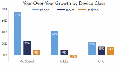
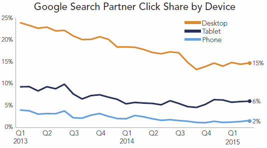
…and the smaller the screen size the more partners are squeezed out of the ecosystem…

The high-intent, high-value search traffic is siphoned off by ads.

What does that leave for the rest of the ecosystem?

It is hard to build a sustainable business when you have to rely almost exclusively on traffic with no commercial intent.

One of the few areas that works well is perhaps with evergreen content which has little cost of maintenance, but even many of those pockets of opportunity are disappearing due to the combination of the Panda algorithm and Google’s scrape-n-displace knowledge graph.

.@mattcutts I think I have spotted one, Matt. Note the similarities in the content text: pic.twitter.com/uHux3rK57f— dan barker (@danbarker) February 27, 2014

Even companies with direct ad sales teams struggle to monetize mobile:

At The New York Times, for instance, more than half its digital audience comes from mobile, yet just 10% of its digital-ad revenue is attributed to these devices.

Other news websites also get the majority of their search traffic from mobile.

Why do news sites get so much mobile search traffic? A lot of it is navigational & beyond that most of it is on informational search queries which are hard to monetize (and thus have few search ads) and hard to structure into the knowledge graph (because they are about news items which only just recently happened).

If you look at the organic search traffic breakdown in your analytics account & you run a site which isn’t a news site you will likely see a far lower share of search traffic from mobile. Websites outside of the news vertical typically see far less mobile traffic. This goes back to Google dominating the mobile search interface with ads.

Mobile search ecosystem breakdown

  • traffic with commercial intent = heavy ads
  • limited commercial intent but easy answer = knowledge graph
  • limited commercial intent & hard to answer = traffic flows to news sites

Not only is Google monetizing a far higher share of mobile search traffic, but they are also aggressively increasing minimum bids.

As Google continues to gut the broader web publishing ecosystem, they can afford to throw a few hundred million in “innovation” bribery kickback slush funds. That will earn them some praise in the short term with some of the bigger publishers, but it will make those publishers more beholden to Google. And it is even worse for smaller publishers. It means the smaller publishers are not only competing against algorithmic brand bias, confirmation bias expressed in the remote rater documents, & wholesale result set displacement, but some of their bigger publishing competitors are also subsidized directly by Google.

Ignore the broader ecosystem shifts.

Ignore the hypocrisy.

Focus on the user.

Until you are eating cat food.

Categories: 

Powered by WPeMatico

5 Intellectual Property Laws about the Internet Bloggers Need to Know

This is a guest contribution from  JT Ripton, a Freelance writer from Tampa.

An image depicting IP Law

Image via Flickr by auggie tolosa

Intellectual property law protects much of the content that you enjoy on the internet. Though you aren’t always required to pay to enjoy this content, that doesn’t make it free for all types of use. Since many intellectual property laws haven’t yet been adapted specifically for the Internet, here’s a rundown of the basics you can use to safely guide your decisions.

Photos and Images are Not Free for Use

Quick and simple searches like Google Images make it seem like the Internet is overflowing with free photos and images. However, copyright law protects most of these photos. If you’re looking for images you can post on your blog, you need to look for those with a Creative Commons license. You can also pay for rights to use certain images.

Creative Commons Licenses Come in Different Forms

Creative Common licenses give you access to various forms of intellectual property. There are many different types of Creative Commons licenses. Before using something that’s protected under this type of license, you must carefully look at it to decide exactly how you can use the image. Some licenses allow commercial use while others do not. Some allow you to alter an image while others stipulate that it must stay in its original form. Attribution is typically required.

Most Movies, Music, and Television are Protected

Although there are many sites where you can get access to movies, television shows, and music for free, these downloads are typically illegal. Though the sites themselves are not violating any laws, you are if you share or download copyrighted material. You can legally view some movies and shows online, but you cannot download them. Network sites often show recent episodes of popular shows and sites like Netflix and Hulu offer access to movies and shows with a paid subscription.

Plagiarism Isn’t Just for School Papers

You undoubtedly learned about the dangers of plagiarism in high school and college, but these laws’ importance doesn’t end when you’re finished writing term papers and dissertations. Whether you have a blog yourself or you write for others, you cannot reproduce another’s intellectual property and take credit for it as your own. Cite your sources, use quotation marks when needed, and try to limit your works to your own unique ideas as much as possible. Referencing another article and quoting from a book are fine. Reposting an entire article or chapter of a published piece are not.

Permission Trumps All

When in doubt about a work, simply ask for permission to use it. Just as the Internet make it easy to find works, so too does it make it easy to contact creators. Many will gladly give you the necessary permissions when requested.

The Internet is a great forum for sharing everything from thoughts and ideas to your original photos, films, and musical works. However, it’s essential that you always think about who has the rights to the content in question and act so that you do not violate them.

JT Ripton is a Freelance writer from Tampa, FL, he writes about several of his interests including, blogging, all things tech, and useful tips and idea’s for a myriad of things. He likes to write to inform and intrigue.

5 Intellectual Property Laws about the Internet Bloggers Need to Know
http://www.problogger.net/archives/2013/08/16/5-intellectual-property-laws-about-the-internet-bloggers-need-to-know/
http://www.problogger.net/archives/category/miscellaneous-blog-tips/feed/
@ProBlogger» Miscellaneous Blog Tips
Blog Tips to Help You Make Money Blogging – ProBlogger
http://www.problogger.net/wp-content/plugins/podpress/images/powered_by_podpress_large.jpg

Set Your Blog for Success With These Simple Tactics

This is a guest contribution from freelance writer, Ayelet Weisz.

Blogging is hard work.

You need to come up with fresh, quality materials on a regular basis, promote them, connect with readers, network with peers and mentors – and that’s before you even see a single dollar for your effort.

I’ve put together some simple business tactics to help you set your blog for success, so you can live the pro blogger dream.

Set Inspiring (But Realistic) Goals

Now that you’re your own boss, you’ve got to set up internal motivation. The biggest success stories didn’t get there with someone telling them what to do every five minutes.

Dreaming goals

Mark Aplet – Fotolia.com

A great way to keep yourself motivated is to set up goals. Of course, I don’t just mean any goal. Making a million dollars by the end of your first year as a blogger might not be the most realistic goal you could think of.

The truth is, you have no way of knowing what will happen by the end of your first year, and you have no control over of others’ choices – Will they read your blog? Will they buy your products?

However, you can eliminate some of these unknown factors by conducting research about the possibilities your market contains – and you can increase the chances of realising your dreams by setting a different type of goal.

Focus on what kind of content you’ll write, how much content you’ll write, how you’ll promote it and when.

Focus on numeral items, like 8 posts a months on your blog and 8 guest posts that you’ll pitch to big blogs. Don’t set a goal of publishing 8 guest posts, only of submission. If someone says no, you’ll still have the confidence boost of reaching your goal. Then, you can exceed it by pitching that guest post to an additional blog.

Track Your Progress

The next step is to get the gold stars out track your progress. Write down what you are doing, what your productivity rate has been and notice what times a day or situations support you in getting more work done.

Set a meeting with yourself – be it once a week, once a month or once a quarter – to see how well you did, to discover your strong points. It’s important to be honest on where you need to be more accountable or get support.

Encourage yourself to ask questions, to say “I don’t know”, to ask for help. Sometimes, that help will come in the form of adjusting your expectations or re-shaping your schedule. Embrace your humanity as you embrace your new blogging journey.

Give yourself time, be gentle – and leverage your failures

Starting a new venture is never easy. Acquiring an abundance of new skills and tools takes determination, focus and accountability.

You will make mistakes.

Give yourself a time of grace and don’t be hard on yourself. People around you might pressure you. They could be your friends and family members, they could love you and want the best for you – and they might not believe your blog is what’s best for you. If it takes you time to monetize your blog, and it probably will, they’ll doubt it even more.

Don’t get carried away with that. It will take time. Embrace it as an opportunity to show yourself you can do the impossible.

Support yourself through this time. Join professional online and offline groups, share your challenges with people who understand rather than with people who don’t, and plan ahead financially.

It might work best for you to save a few months’ or a year’s worth of salary, then take that time off paid employment and market like there’s no tomorrow. Alternatively, it might be best for you to start building your blog slowly, as you keep a part time or full time job.

Expect to make mistakes. 

These mistakes will be your guiding points to grow your blog even more as you go on. They could be transformed into guest posts on big blogs, case studies you can use to show your expertise (and how you turned failure to success) – and they can even turn you into a good mentor one day!

If nothing else, you’ll be able to look back one day and have a really good laugh. You’ll also be able to see how far you’ve come.

Socialise

Starting out at the blogsphere can be intimidating.People already know each other and the job.Friendships and communities have already been formed. Relationships with influencers are being shaped and re-shaped every single day.

Linked

Image copyright stock.xchng user lusi

This experience becomes easier once you feel there’s someone you could turn to. You, of course, need to have communication tools and the courage to connect when entering a new environment.

If you’re fearful about connecting with industry members, start small. Post comments on their blogs, then connect with them on Twitter or Facebook. Join online communities and reach out to one person at a time in a personal message.

Ask for their help, or offer a solution to a challenge they brought up. If they happen to just start out as you are, perhaps you could be a force of empowering support to one another, sharing tips and encouraging each other when one loses sight of the light at the end of the tunnel.

Maybe you’ll even find you have additional interests in common!

Did you face any of these challenges when you were starting out? How did build your blog? Or perhaps you’re just starting out and picked up some great tips for the road ahead. Share your story!

Ayelet Weisz (www.AyeletWeisz.com) is an enthusiastic freelance writer, blogger and screenwriter, who focuses on business, technology, travel and women’s issues. Get her free report, 48 Must-Live Israeli Experiences, on her travel blog, and connect with her on Twitter.

Set Your Blog for Success With These Simple Tactics
http://www.problogger.net/archives/2013/06/11/set-your-blog-for-success-with-these-simple-tactics/
http://www.problogger.net/archives/category/miscellaneous-blog-tips/feed/
@ProBlogger» Miscellaneous Blog Tips
Blog Tips to Help You Make Money Blogging – ProBlogger
http://www.problogger.net/wp-content/plugins/podpress/images/powered_by_podpress_large.jpg

Collective #342


C342_PaintAPI

Using the Paint Timing API

The Paint Timing API arrived in Chrome 60 and Jeremy Wagner shows how to use it to capture metrics on when a page begins painting.

Read it


C342_Puppeteer

Puppeteer

Puppeteer is a Node library which provides a high-level API to control headless Chrome over the DevTools Protocol. It can also be configured to use full (non-headless) Chrome.

Check it out


Collective #342 was written by Pedro Botelho and published on Codrops.

Comics of the Week #403

Every week we feature a set of comics created exclusively for WDD.

The content revolves around web design, blogging and funny situations that we encounter in our daily lives as designers.

These great cartoons are created by Jerry King, an award-winning cartoonist who’s one of the most published, prolific and versatile cartoonists in the world today.

So for a few moments, take a break from your daily routine, have a laugh and enjoy these funny cartoons.

Feel free to leave your comments and suggestions below as well as any related stories of your own…

Sure, blame the designer

No rest for the married


Olympic style feedback

Can you relate to these situations? Please share your funny stories and comments below…

LAST DAY: Zelda – A Beautiful and Classy Script Font – only $7!

Source

3 Ways to Get More Subscribers for Your Blog

I have hundreds of readers coming to my blog every day – but nobody ever subscribes to my newsletter. Help!?!

This request came in via email today and I thought I’d share my reply with the 3 suggestions I offered.

—–

Thanks for the question – I suspect you’re not alone with this problem. While a lot can probably be written on the topic, let me suggest 3 things I’ve found helpful increasing subscriber numbers.

Note: the #1 thing I did to building subscriber numbers on Digital Photography School was introduce a lightbox subscriber box. I spoke about this in my 10 Things I Wish I Knew About Blogging webinar so I won’t rehash it here.

1. Ask People to Subscribe

This sounds a little too simple to be effective but I’m amazed how many people do subscribe once you mention you’ve got a newsletter. I’m also amazed how many of our regular and loyal readers don’t know we even have a newsletter, despite it being promoted around the blog.

Some semi-regular calls to subscribe can be very effective.

You can do this in a number of ways, including:

  • Writing a dedicated blog post, every now and again, explaining you have a newsletter and the benefits of subscribing.
  • Mentioning your newsletter in passing in your blog posts. I don’t mean every single post, but a mention now and then will work wonders.
  • Promoting your newsletter across social media. I regularly mention our newsletters on Twitter, when I’m writing a newsletter and when it goes out.

The key to remember, when mentioning your newsletter regularly, is to find fresh ways to talk about it. Don’t just have the same tweet to subscribe every 2nd day.

  • Mention something that is in the next newsletter, that you won’t get anywhere else.
  • Mention that you’ve just hit a milestone number of subscribers to build social proof.
  • Mention that it’s a milestone newsletter. We recently sent out 250th on dPS and made a bit of a big deal about it.

2. Start a Series

Announce that you’re going to be doing a series of posts, on your blog, on a topic that you know will really be useful to your readers.

I remember the first time I announced that I was going to run the 31 Days to Build a Better Blog series (the series that later became the eBook by the same name) I was amazed at how many people subscribed to my blog over the next 24 hours.

I was signalling to readers that I was going to do something that would serve them and in doing so, created anticipation among my readers. This anticipation (as I’ve written about in the past) is a key reason people will subscribe to your blog.

3. Place Calls to Subscribe in ‘Hot Zones’

One last tip is to identify some ‘hot zones’ on your blog, to place calls to subscribe. These zones are either places that your readers will be looking or pages that they’ll be visiting.

Let me suggest a couple:

1. Under Posts

I’m not currently doing this on my blogs, as I use the space under my blog posts for other things, but I’ve found over the years that the area under your blog post (and directly above comments) is a ‘hot zone’ where readers often look for what to do next.

Put yourself in the position of a reader. You’ve read the post and have found it useful. This is the perfect time to ask readers to subscribe because they’re hopefully feeling satisfied, stimulated and helped in some way.

A bold call to subscribe can work wonders here.

2. On Hot Posts

Dig into your blogs analytics package and identify which posts are the most read posts on your blog.

You’ll probably find that these posts are receiving traffic from search engines and are likely being read by first time readers to your blog – people that are often quick to leave again once they’ve got what they’re searching for.

These posts are a real opportunity to make your blog a little more sticky and to hopefully call some of those first time readers to subscribe.

You can do this either by adding a call to subscribe directly to the posts – or you might like to link from these posts to a ‘sneeze page’ (see below).

3. Sneeze Pages

Screen Shot 2013 06 20 at 1 25 12 PMLet me show you a page on dPS, which is a page that generates a large number of subscribers. It is our Photography Tips for Beginners page.

This page is a page in which I link to 33 of the best articles in our archives for beginner photographers. It is a page that ‘sneezes’ readers deep into our archives to good quality content.

It is a great page for driving traffic and getting readers deep into the site but you’ll also note we have a couple of strong calls to subscribe on that page. People click those calls to action like crazy because they can see on the page that we’ve created a heap of useful content.

We link to this sneeze page prominently in the navigation areas all around the site to drive traffic to it and regularly promote the page on social media (as I write this it has received over 90,000 ‘pins’ on Pinterest for example).

Take home lesson – create a sneeze page with a strong call to action to subscribe and drive as much traffic to it as you can!

Note: Sneeze pages are written about on day 18 of 31 Days to Build a Better Blog.

How Have You Increases Subscribers to Your Blog?

I have barely scratched the surface here on how to increase subscribers to a blog and would love to hear your suggestions and experiences on the topic in comments below.

What has worked for you?

3 Ways to Get More Subscribers for Your Blog
http://www.problogger.net/archives/2013/06/21/3-ways-to-get-more-subscribers-for-your-blog/
http://www.problogger.net/archives/category/miscellaneous-blog-tips/feed/
@ProBlogger» Miscellaneous Blog Tips
Blog Tips to Help You Make Money Blogging – ProBlogger
http://www.problogger.net/wp-content/plugins/podpress/images/powered_by_podpress_large.jpg

Inspiring Everyday Graphic Design


The most inspirational things are often right in front of us. It might be the typography on a book cover, the colors of your favorite music album, the opening titles in that movie you saw yesterday. To celebrate all those little moments of inspiration, we have compiled some resources for you which honor the beauty of graphic design and the ideas behind it. Perfect to squeeze into a short coffee break. Enjoy!

Book Cover Archive

We learned not to judge a book by its cover, but, honestly, there is nothing quite like browsing through a bookstore, soaking up covers, their colors, their typefaces, their layouts, every little detail. The variety is endless, and sometimes you’re lucky and find a little piece of art shining through the sheer mass.

The post Inspiring Everyday Graphic Design appeared first on Smashing Magazine.

Powered by WPeMatico

5 Techniques for Spotting Mistaks Before They Go Live

Launching a new website can be exciting and nerve-wracking at the same time. You want to show off what you’ve been building, what you’ve learned, and the creative solutions you’ve come up with. You can already taste that first celebratory taco. You go live.

At first, you get a lot of comments from your friends saying, “Hey, that looks great!” Then the bug reports come in. A feature isn’t working as intended. A bit of CSS is playing merry hell with the live content in ways you couldn’t foresee. A link is broken. And worst of all: you have typos. So many typos.

Okay, most of the time, it won’t be as bad as all that. Veteran designers and developers usually have processes in place to reduce the amount of errors that go live. New designers usually build smaller sites, so the number of errors is reduced in any case. Still, if you’re new to web design, and you want to spend as little time fixing things post-launch as possible, we can help.

1. Follow a Checklist

As you are the designer and/or developer, you are the first and last line of defense against mistakes. However, even the best of us can just plain forget things. One of the easiest ways to avoid this is to use a pre-launch checklist for every website you build. The checklist would include things like making sure all of the links work, making sure the contact forms work as intended, making sure your hosting is set up right, and so on.

You can write your own checklist, and as you develop your own way of working through projects, you might want to. In the meantime, you can adapt any number of pre-made checklists to your projects. Here are a couple to get you started:

And there are a few more here: 45 Incredibly Useful Web Design Checklists and Questionnaires

2. Get More Eyeballs

For clarity’s sake (and because this is the Internet) these eyeballs should remain attached to their original owners. What you want to do is get some people who aren’t experts in computing, be they relatives, friends, or passing salesmen, and direct their eyeballs at your design, before you launch. Get some basic user testing in by asking these people to perform basic tasks on your site.

This has the double benefit of providing you with some usability testing data, as well as an easy way to find out if anything important is broken. After they’ve followed the main calls to action, ask them to click around on anything they find interesting, to help you check other links.

3. Hire Professional Eyeballs

This may not be feasible for projects with smaller budgets, but if you have the money, it couldn’t hurt to hire a professional or two. For example, you could hire another designer to check for common bugs, peek at the source, and so on. Have them test how the layout handles on their devices, and give you feedback.

If you want to take this further, there are services that will test your site under myriad conditions, in all sorts of browsers, on all sorts of devices. Given that most of us lack a browser testing lab, and these services generally aren’t expensive, they can be worth it.

Here are some of the more popular options (as defined by Google search results):

Lastly, consider hiring a proofreader and/or editor, if your website is text-heavy. They can drastically help you to improve the quality and clarity of your writing, as well as help you to avoid the dreaded typos.

4. Take a Break Before Launch

One of the biggest contributors to screwing up is stress. Launching websites can be stressful, especially if you’ve been working on the same thing, day in and day out. For future projects, it might be a good idea to schedule in a break before launch time. And I mean a proper break, as in one day as a bare minimum. Giving your brain time to think about other things is a known and proven tactic for creativity, but it also works for spotting mistakes.

Take that time off, come back, and run through your pre-flight checklist when you’re rested, and can think straight. Your brain, your heart, your users, and your clients will thank you.

5. Validation and Linting

If you’re developing the site yourself, you can take advantage of services that help you clean up, or “lint”, your code by pointing out problems in your HTML, CSS, or JavaScript. How you do this will depend on what text editor you’re using. Just about every major text editor (Sublime Text, Atom, Brackets, etc.) has a number of plugins to help you with this. There’s no one right tool for this job, so you’re going to have to do some Googling.

You should also run your HTML and CSS through the validating services provided by the W3C. These services won’t catch every bug, but they can help point out potential problems in your markup.

Conclusion

So what happens if you do all of these things, and still miss a few things at launch? Realistically, the world just keeps on turning. We’re imperfect creatures, and we’ll never get everything right, all of the time. And that’s fine. When mistakes are inevitably spotted in your newly-launched site, fix them fast and move on.

Constant perfection will have to wait until our robot overlords get here.

LAST DAY: Zelda – A Beautiful and Classy Script Font – only $7!

Source

How to Create (and Sell) Products People Actually Want to Buy

This week offers a mix of inspiration, clarity, purpose … and some good, old-fashioned results-oriented copywriting. On Monday, I shared some of the practical, repeatable steps you can use to create an online course that people actually want to buy. (That’s a fun thing to do, by the way, and I totally recommend it.) Brian
Read More...

The post How to Create (and Sell) Products People Actually Want to Buy appeared first on Copyblogger.

4 Ways To Design a Perfect Split Screen Homepage

One screen divided in two.

The split screen technique has long been known in the film industry, with early examples dating back to the silent movies days of the early 20th century, and it is still a popular device in by film and tv today.

A split-screen layout is in use when full-screen elements are divided into two or more vertical parts. A scene from the film “Scott Pilgrim vs the World”

However, this is a relatively new technique for the web design industry. Split screens only became popular around mid-2016 and now we have more and more websites which use this design pattern. There are a few reasons why this design pattern became so popular:

  • It has a nice aesthetic quality. When executed correctly it can offer users a wonderful viewing experience.
  • It’s a good choice for responsive frameworks. Split-screen design can be adapted for a variety of screens, even small ones. When it comes to smaller screens, such as mobile displays, the panels can be stacked.
  • It helps guide navigation. Using simple design techniques, you can draw the user’s attention to a specific part of the screen or encourage them to click.

When Split Screen Works The Best

Split-screen is especially good when you have two things to promote. For example, when a site offers two entirely opposite variations. This approach allows designers to give prominence to both things and allow the user to quickly select between them.

One screen, two messages in Dropbox Guides

When You Should Avoid Split Screen

Split-screen designs don’t expand well as the content grows, therefore it is not recommended to apply them to content-heavy layouts. It’s important to keep the screens simple because complex split screens make the UI look overloaded with information. That’s why split-screen layout would be a perfect fit for minimalist website designs.

How to Decide if Split Screen is Good For You

If you’re considering a split-screen technique for your website, I advise you to ask yourself a few questions:

  • Is it suitable for your content?
  • Will there be enough negative space to make the layout work?
  • Will your users appreciate the layout or it will confuse them?
  • Will it be OK to split your users’ attention in half?

The most important thing to keep in mind that content is king and split-screen should be a simple way to deliver your message to people.

Design Techniques For Split Screens

1. Pair Vibrant Color and Dramatic Typography

Thanks to Flat and Material Design, vibrant colors and dramatic typography are big trends now. Vibrant colors are visually stimulating and dramatic typography enhances the text content. Simply combine the two and you will create a visually interesting design. Baesman has done this masterfully. They gave equal importance to both elements while, at the same time, allowing the user to choose between them quickly.

Bright colors and interesting typography pairs can add interest

2. Draw User Attention to the CTA Button

Much more than a simple graphic trend, splitting the screen into two distinct parts provides an original way to guide the user through your site. It’s a great option when you want to create a bigger focal point for calls to action. In the example below, you can see how negative space creates a vertical divide to give equal weighting to two different options.

Vertical divide allows emphasis on two different CTAs without favoring either

3. Create Visual Flow Between “Screens”

When split screen represents a single object, it’s important to establish a connection between content containers. One possible way to do that is by using a color. Simply duplicate a distinct color to establish visual flow between two screens. This works particularly well with a brand color or hue with a lot of contrast. Using color it’s possible to communicate a stronger connection between two pieces of content.

Another possible way to create a strong connection is layering a single element such as text copy across screens:

Overlapping text connects two screens

Last but not least you can use a colored overlay for this purpose:

Consider the left part of the screen

4. Use Animation To Encourage Users To Act

Fine animation and interactive effects encourage users to click. Look at the design used for the “Chekhov is Alive” site below. The design begs you to click to find your character.

Conclusion

It takes approximately three seconds for a visitor to make a decision regarding your website. Consequently, your layouts should always be visitor-friendly if you want to reduce bounce rates. Split-screen technique can help you with that. Split-screen designs are a fun, functional, and responsive way to create an engaging design.

LAST DAY: Zelda – A Beautiful and Classy Script Font – only $7!

Source

Content Marketing – Secrets From an Entrepreneur Who Has Used It to Build a Successful Business

Content Marketing – Secrets From an Entrepreneur Who Has Used It to Build a Successful BusinessI’m really excited about this episode of the ProBlogger Podcast, as today I am sharing my interview with Dan Norris: serial entrepreneur and founder of WP Curve (which gives bloggers access to WordPress developers for unlimited small jobs). Dan recently spoke at the Australian ProBlogger event as part of the Small Business Bootcamp, which we ran in partnership with Telstra Business, and his session was one of the highest-rated of the whole weekend.

In today’s episode, we talk about content marketing, how to differentiate yourself from millions of others doing the same thing as you are, and how to scale your business. Dan also gives insight into how he came to start WPCurve and what they offer to bloggers who need quick WordPress tweaks and peace of mind.

We also discuss what exactly is content marketing (and why bloggers need to care about it), examples of people doing it just right, and how you at home can do it too. We talk about what mistakes Dan sees bloggers making, how he tracks metrics, niches, storytelling, monetization, and his top tips to get eyeballs on your content.

You can find the show notes to episode 64 of the ProBlogger podcast here – we’d love to hear your feedback on our chat!

Further Reading:

  • The 6-Step Guide for Crafting an Effective Content Marketing Channel Plan
  • Content Marketing Smart – Why Your Blog Article is Just the Beginning
  • The Step-by-Step Method to Making Your Content Shareable on Social Media
  • 6 Actionable Content Promotion Strategies You Can Use Today
  • Stand out from the Crowd: Simplicity Tips from Amy Lynn Andrews


The post Content Marketing – Secrets From an Entrepreneur Who Has Used It to Build a Successful Business appeared first on @ProBlogger.

Content Marketing – Secrets From an Entrepreneur Who Has Used It to Build a Successful Business
http://www.problogger.net/archives/2015/11/24/content-marketing-secrets-from-an-entrepreneur-who-has-used-it-to-build-a-successful-business/
http://www.problogger.net/archives/category/blog-promotion/feed/
@ProBlogger » Blog Promotion
Blog Tips to Help You Make Money Blogging – ProBlogger
http://www.problogger.net/wp-content/plugins/podpress/images/powered_by_podpress_large.jpg

Powered by WPeMatico

Transform Photos into Art with Deep Learning

Life is like a camera. If things don’t work out, you can take another shot. But if you get that perfect picture, you will want to capture the moment and, perhaps, transform it into a work of art.

Have you ever seen art so beautiful and resonating that you wish you could transform your favorite photos into that style? Or perhaps you are a frontend developer or designer seeking an easier way to turn your images into something that’s more appealing, or fits the theme for a special occasion or unique scenario? Maybe you have been tasked to come up with a fun photo booth for a birthday party that enables attendees to transform their photos into a style of art they like? Check out the before and after of the photos below as an example:

Before (left) and after (right)

Before (left) and after (right)

Existing platforms like Instagram and Prisma enable users to upload images, apply different  filters and effects, then produce an image with a very unique style and artistic look. However, you may want to build a similar application that provides more flexibility for the type of art, as well as the kinds of images users can upload.

With Cloudinary, developing a platform that enables you turn photos into art is a breeze. All you need to do is add the style_transfer effect to any delivered image while specifying the image ID of the source artwork as its overlay and activating the Neural Artworks addon.

Source artwork (left), target photo (center), and style transfer result (right)

A Closer Look at Style Transfer with Cloudinary

Cloudinary is a cloud-based image and video management service that includes server or client-side upload, on-the-fly manipulations, quick content delivery network (CDN) delivery and a variety of asset management options.

The style transfer effect applies a complex deep learning algorithm—based on the VGG 16 neural network—that extracts artistic styles from a source image and applies them to the content of a target photograph.

Cloudinary’s algorithm takes advantage of Xun Huange and Serge Belongie’s enhancement on the Gatys algorithm, which make it possible to use any image for both source and target, and still deliver a good quality style transfer in real time, using a single feed-forward neural network.

Cloudinary’s implementation is much faster than other available services, not limited to pre-learned images, and even supports high-resolution outputs that are out of scope for similar services.

How to Implement Style Transfer

To apply this effect, simply specify the public ID of the source artwork as an image overlay (l_ in URLs) and style_transfer as the overlay effect (e_style_transfer in URLs). The target photograph is the public ID of the image to deliver. For example:

http://res.cloudinary.com/demo/image/upload/w_700,h_700,c_fill/e_style_transfer,l_sailing_angel/golden_gate.jpg
http://res.cloudinary.com/demo/image/upload/e_style_transfer,l_davinci_mona_lisa/golf_sand_st.jpg

Source Artwork (left), target photo (center), and result of the style transfer effect (right)

But wait, there’s more!

You can include the Boolean preserve_color option or adjust the style_strength of the effect like so:

Artwork (left), target photo (center), default style transfer (right)

Preserve Original colors in Style transfer (left), adjust Style Strength to 60 in Style transfer (right)

Give Style Transfer a Try

Back to the task you’ve been assigned—creating a photo booth with effects for a birthday party. Here’s a cool, simple app that demonstrates how style transfer works.

See the Pen Style Transfer Demo by Cloudinary (@Cloudinary) on CodePen.

You can start making yours by signing up for a free Cloudinary account and activating the Neural Artworks add-on. There is comprehensive documentation available to show how you can take advantage of style transfer in your applications.

You no doubt have a lot of ideas about how to turn your photos into art. With Cloudinary, it’s easy to make your vision a reality.


[– This is a sponsored post on behalf of Cloudinary –]

LAST DAY: Zelda – A Beautiful and Classy Script Font – only $7!

Source