Your WordPress editor is about to get a makeover! While the details aren’t complete yet, we know that soon, the way we edit our content in WordPress is going to change. It’s called the Gutenberg Editor, and the time has come for you to prepare for it.
Typically when you log into your website, you go to a Post, Page, or other “thing” to add or edit text, images, and more. Central to your website experience is a the big blank Text Editor. Most of the stuff you want to show your users goes into this Text Editor. If your site has a bit more customization, you’ll have extra meta boxes to add extra bits of information and content. Whether it’s for SEO or linking to related resources, these meta boxes aren’t always displayed in the editor where they show up in your content. Heck, sometimes they don’t even show up in your content at all.
When you think about, it’s not the most intuitive way to deal with your content. How did we end up here? Years ago, the WordPress admin interface was revolutionary, if you wanted to publish and still own your content. Instead of having to learn HTML, you could simply enter a username/password, write, and show the world—totally friction-less. Just type, publish, and it went live.
As website complexity has grown and site owners have figured out how visitors use websites, our understanding of content has expanded well beyond just a wall of text and a picture. Content, these days, can be relationships to other posts and products, supporting images, sales pipelines, tutorials, forms, and a billion other things. Essentially, web publishing has outgrown the humble Text Editor view. WordPress agencies and plugin developers have been dealing with this by bolting on meta boxes as needed.
WordPress core developers see this Frankenstein approach as problematic. The solution is Gutenberg. Named after Johannes Gutenberg, who invented a printing press with movable type more than 500 years ago, the Gutenberg Editor is very much beta software. Each point (0.0.x) release of Gutenberg has significant changes and improvements over the previous, so it’s difficult at this point to see where it will end up. Because the developers are seeking active feedback, each update polishes the user experience a bit more. However, we’re still months from Gutenberg being part of WordPress core. So, expect many more changes before all the dust settles.
Gutenberg is an attempt to make the editing experience feel a bit more logical. This is accomplished by treating everything as a block. Ideally, this will make the task of creating content much more intuitive (and heck maybe even fun?). One of the biggest changes that hasn’t been accounted for in Gutenberg is what to do with all of the “legacy meta boxes.” In some cases, they’ll make sense as a block that is added to the content. But some meta isn’t necessarily something you’ll need to display. That kind of content doesn’t fit in the Gutenberg block model.
We expect Gutenberg will ship in WordPress 5.0. That’ll probably be in the second quarter of 2018. In the meantime, it will be important to stay on top of both WordPress core and plugin updates as some of the groundwork for dealing with Gutenberg will be laid before it’s available in the backend. Start thinking about the metadata you use in your posts. Unlike when Facebook changes the interface, WordPress is giving us a huge amount of notice. If you need help in either of these areas, reach out to experts at Maintainn. They’re actively preparing for Gutenberg and are fluent in all things WordPress.
Creating amazing, thoughtfully designed websites for a kindergarten (or preschool as most call it) can be challenging. That’s why we’ve trawled through hundreds of WordPress themes created for this exact purpose, and found the most...
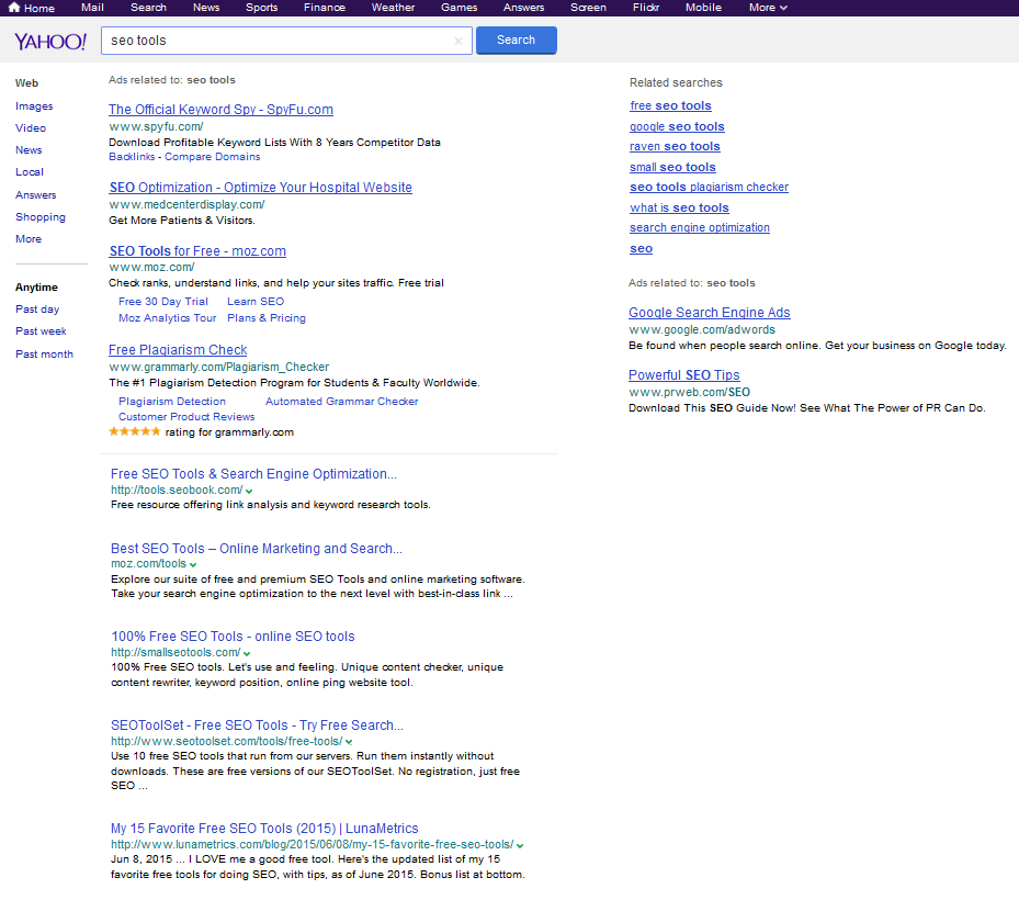
I am uncertain to what degree they are testing search results from Google, but on some web browsers I am seeing Yahoo! organics and ads powered by Bing & in other browsers I am seeing Yahoo! organics and ads powered by Google. Here are a couple screenshots.
Bing Version
Google Version
Comparing The SERPs
Notable differences between the versions:
search provider
Bing
Google
top ad color
purple
blue
top ad favicon
yes
no
clickable ad area
all
headline
ad label
right of each ad near URL
once in gray above all ads
ad URL redirect
r.msn.com
google.com
ad units above organics
5
4
ad sitelinks
many
fewer
ad star rating color
blue
yellow
Yahoo! verticals like Tumblr & Answers
mixed into organic results
not mixed in
footer “powered by Bing” message
shown
missing
When the Google ads run on the Yahoo! SERPs for many keywords I am seeing many of the search arbitrage players in the top ads. Typically these ads are more commonly relegated to Google.com’s right rail ad positions.
The Google Yahoo! Search Backstory
Back in 2008 when Yahoo! was fighting to not get acquired they signed an ad agreement with Google, but it was blocked by the DOJ due to antitrust concerns. Unless Google loses Apple as a search partner, they are arguably more dominant today in general web search than they were back in 2008. Some have argued apps drastically change the way people search, but Google has went to great lengths to depreciate the roll of apps & suck people back into their search ecosystem with features baked into Google Now on tap & in-app keyword highlighting that can push a user from an app into a Google search result.
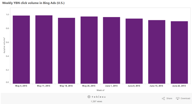
A little over a year ago Yahoo! launched Gemini to begin rebuilding their own search ad network, starting with mobile. In their Q1 report, RKG stated “Among advertisers adopting Gemini, 36% of combined Bing and Yahoo mobile traffic was served by Yahoo in March 2015.”
When Yahoo! recently renewed their search deal with Microsoft, Yahoo! was once again allowed to sell their own desktop search ads & they are only required to give 51% of the search volume to Bing. There has been significant speculation as to what Yahoo! would do with the carve out. Would they build their own search technology? Would they outsource to Google to increase search ad revenues? It appears they are doing a bit of everything – some Bing ads, some Yahoo! ads, some Google ads.
Bing reports the relative share of Yahoo! search ad volume they deliver on a rolling basis: “data covers all device-types. The relative volume (y-axis) is an index based on average traffic in April, therefore it is possible for the volume to go above 1.0. The chart is updated on a weekly basis.”
If Yahoo! gives Google significant share it could create issues where users who switch between the different algorithms might get frustrated by the results being significantly different. Or if users don’t care it could prove general web search is so highly commoditized the average searcher is totally unaware of the changes. The latter is more likely, given most searchers can’t even distinguish between search ads and organic search results.
A cynic might question how much actual choice there is if on many searches the logo is different but the underlying ads & organic results are powered by Google, and an ex-Google executive runs Yahoo!.
“Any customer can have a car painted any colour that he wants so long as it is black.” – Henry Ford
FullStory helps you build incredible online experiences by capturing every click, swipe, and scroll, then replaying sessions with pixel-perfect clarity.
Cboard is an augmentative and alternative communication (AAC) web application, allowing users with speech and language impairments (autism, cerebral palsy) to communicate by symbols and text-to-speech. By Shay Cojocaru.
A Node queue API for generating PDFs using headless Chrome. Comes with a CLI, S3 storage and webhooks for notifying subscribers about generated PDFs. By Esben Petersen.
Chrome Beta and Chrome Dev can now be installed on the same Windows computer as stable Chrome and run simultaneously, allowing developers to more easily test their site across multiple versions of Chrome.
I love digital business. Nothing else can match it for the freedom, the flexibility, the ability to make a living while only occasionally putting pants on. But. Sadly, it just isn’t true that you can wave your hands around, say a few magic words, and turn the internet into your ATM. The internet has no Read More...
Animated page elements are super common on landing pages and startup websites. But they’re not always talked about in design circles because the idea of “animate on view” isn’t covered a lot.
I use the phrase scroll-to-view because it seems like an accurate description. Basically as you scroll down the page new animated elements come into view.
It’s not a technique that works for every website but it does add a nice touch into certain layouts. And I’ve curated some of my favorites here to showcase how these scroll-to-view animations work and why you might try using them yourself.
1. Tomorrow Sleep
On the Tomorrow Sleep website you’ll notice a few fairly benign animated effects. These fade different pieces of text and CTAs into view all around the layout.
What’s interesting is how most of the images and background areas are fully visible even on first scroll. Many websites use fading animation to display images and screenshots while keeping the text visible.
This minor difference helps draw attention to the text as it fades into view. A great way to capture attention from visitors browsing along.
2. Twist
Another technique I often see is targeting most of the page’s content for on-scroll animations.
For example the Twist app homepage includes varying page segments and blocks of text that animate in & out of view on scroll. These have a very soft fading effect so they’re noticeable yet not too harsh.
Some visitors may be annoyed by the delay but I don’t think it’s too long. Plus it only animates one time so if you hit the bottom of the page all animations are done.
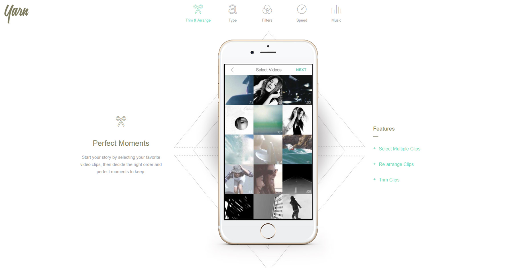
3. Yarn App
For much more complex animations check out the Yarn App lander. This one has multi-part animations and even elements that come into view from different angles.
Some of the screenshot demo images animate upwards while the accompanying text/BG patterns animate down into view. This alternating style is pretty unique and not something I see often.
However the landing page is also incredibly simple and there isn’t much else here to grab attention. In this case varying animations work nicely.
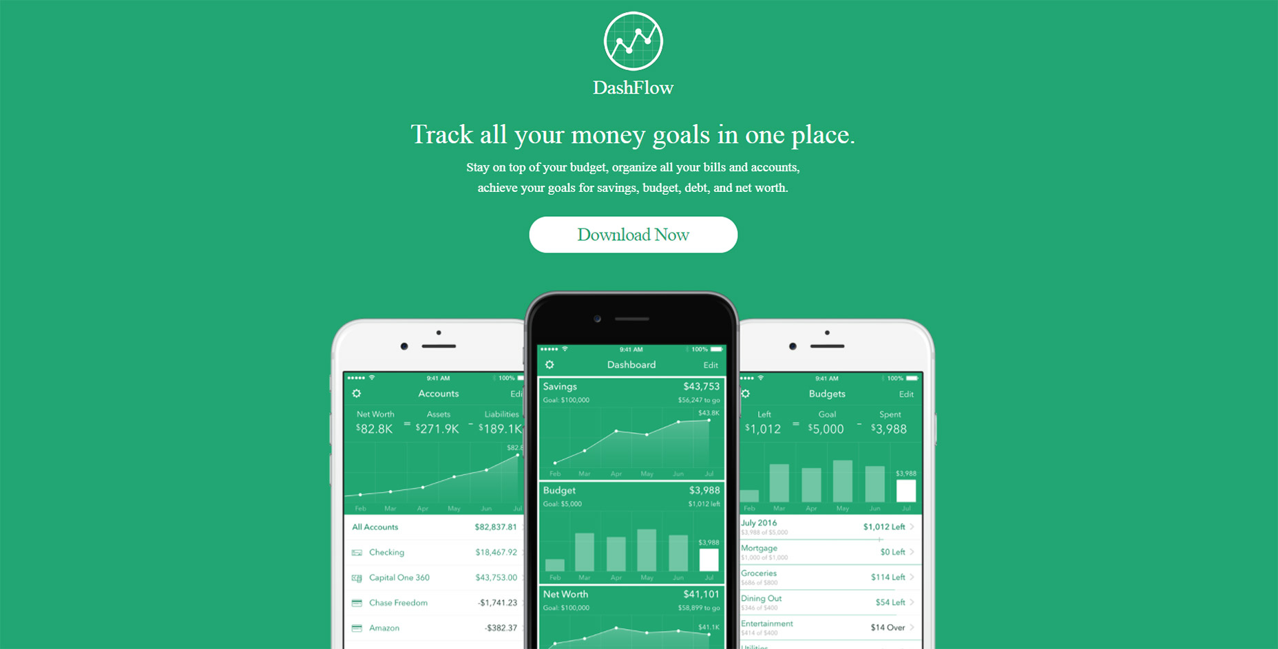
4. DashFlow
Out of all these examples I think DashFlow uses the most common animation techniques.
This lander animates images and text into view all in one sitting. It’s real simple and uses a single-column layout so all content flows straight down in a linear path.
Nothing inherently special about this design beyond the very clear-cut method of animating items on scroll. A great style if you have a similar website and want to keep the animations simple.
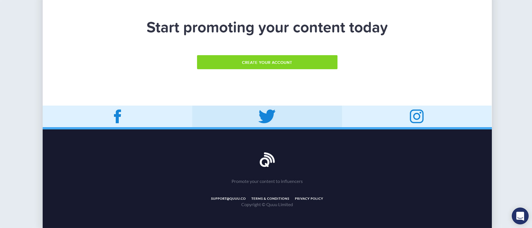
5. Quuu Promote
Quuu Promote keeps animations to the bare minimum and only uses them in CTA areas.
I can’t say if this increases conversions but that does seem to be the goal. When you first load the page the very top header animates into view with a tilting animation on the CTA.
As you scroll down you’ll notice the rest of the page is pretty static. But at the bottom there’s one final CTA above the footer that also animates & runs the same tilting animation.
Goes to show you can have on-scroll animation effects that don’t run across the entire page.
6. Qonto
The homepage for Qonto has an interesting take on scroll-to-view animation. It uses the same type of animation across the entire website and animates individual items into view from the side.
For the majority of the page this includes icon sections that have a small graphic above some content explaining the app’s features. Not too subtle yet not overly overt either.
Plus you can find a few other animation styles in the header along with some BG images that fade into view. This page is just a gorgeous example of what web animation can do.
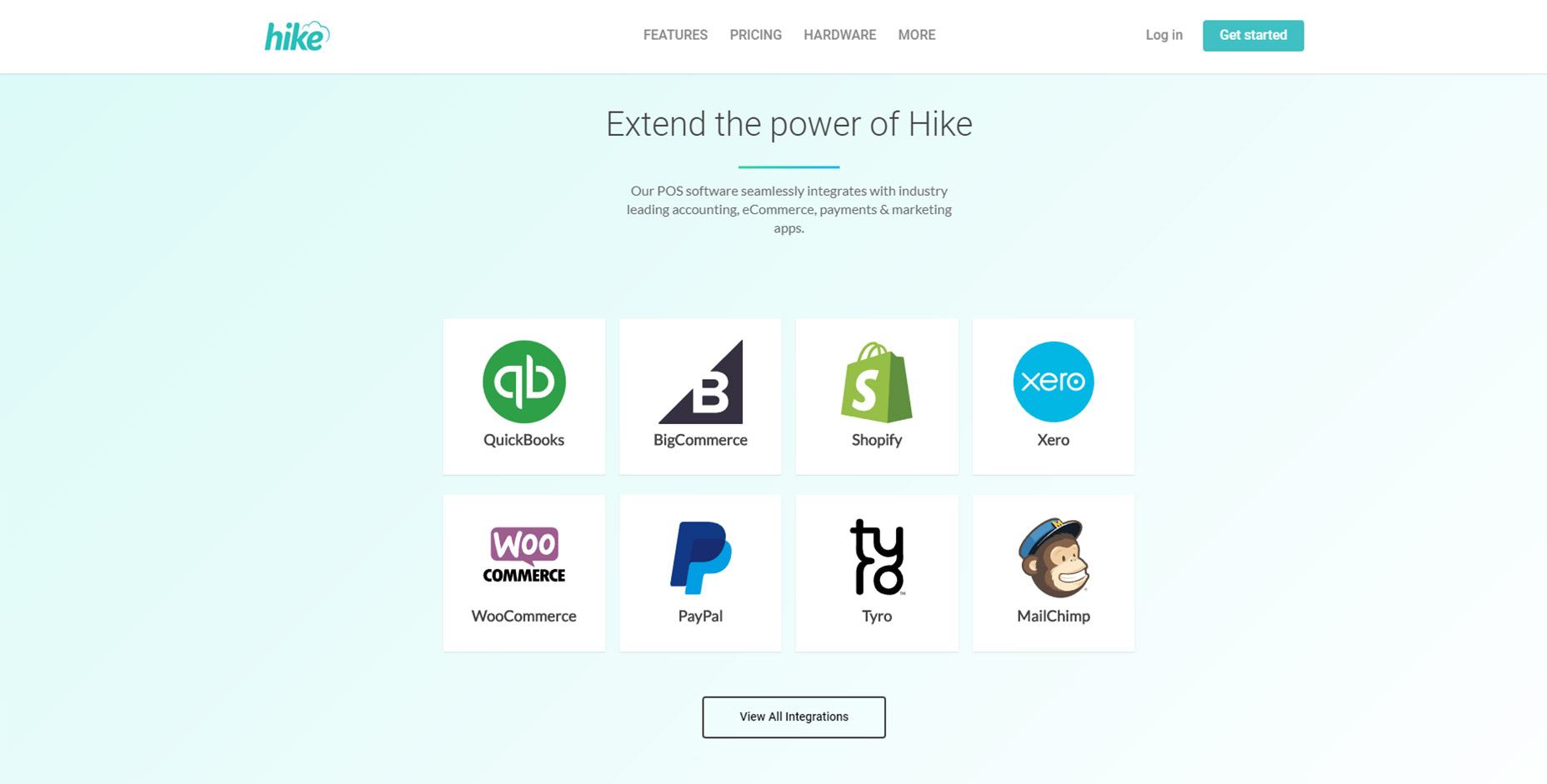
7. Hike
For an example of subtle animations check out Hike.
Their page alternates between animated elements and fixed elements. But the animation effects are fast so you don’t feel annoyed waiting for viewable content.
This is my preference for any scroll-to-animation effect. It’s always a beautiful technique but the timing needs to be quick and to the point. Nobody wants to wait around for content to come into view and Hike clearly understands this.
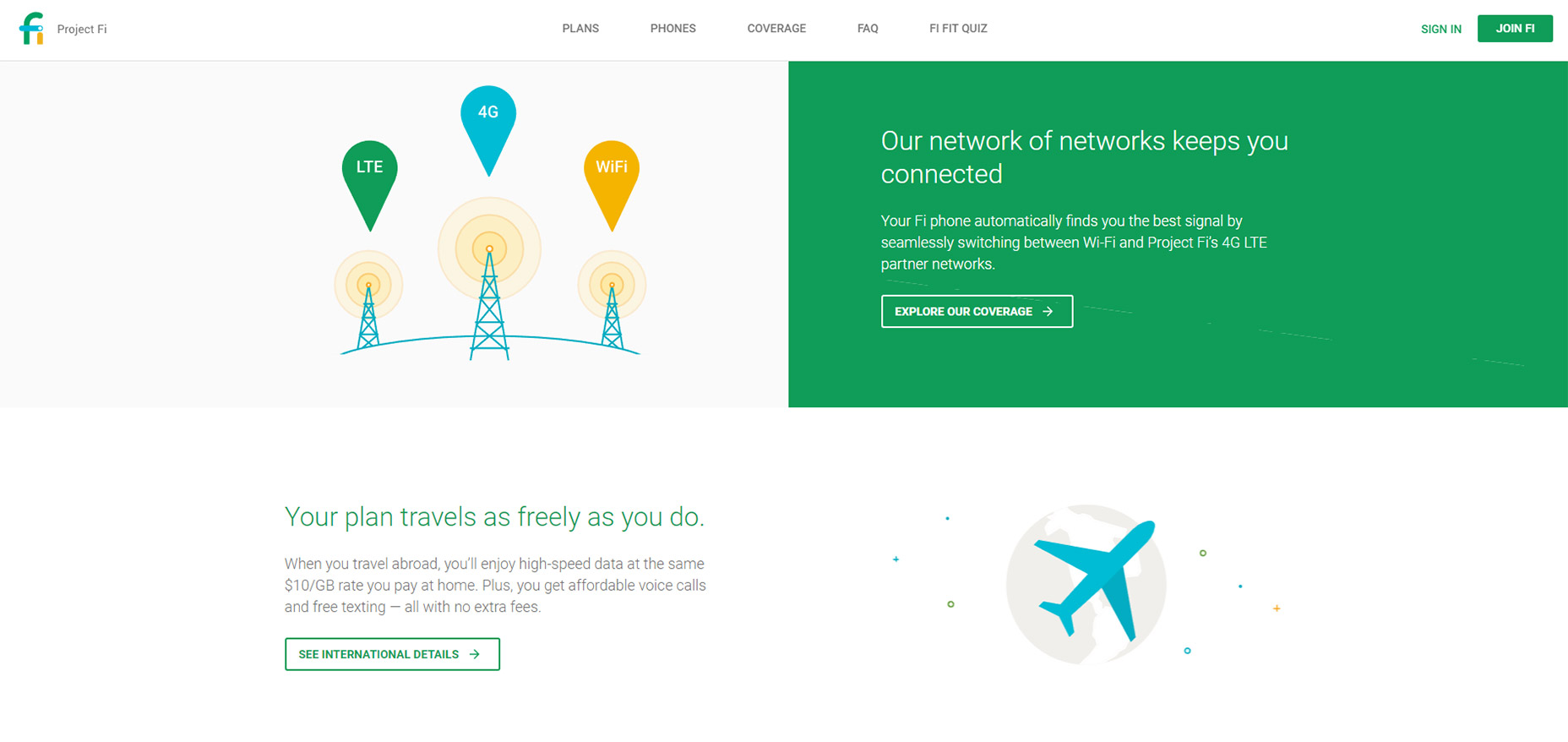
8. Project Fi
If there’s anyone who knows great UX it’s Google. And across all their products they have a ton of landing pages, Project Fi being one example with some fantastic animations.
These only apply to icons and they don’t fade into view, but rather pop up from lower on the page. As you scroll you’ll find icons that slide up into view for each small section.
It’s a pretty subtle effect but it adds some life into the design. And it’s based solely on the viewer’s position on the page so if you scroll to the top & move back down you’ll be greeted by the same animation effects.
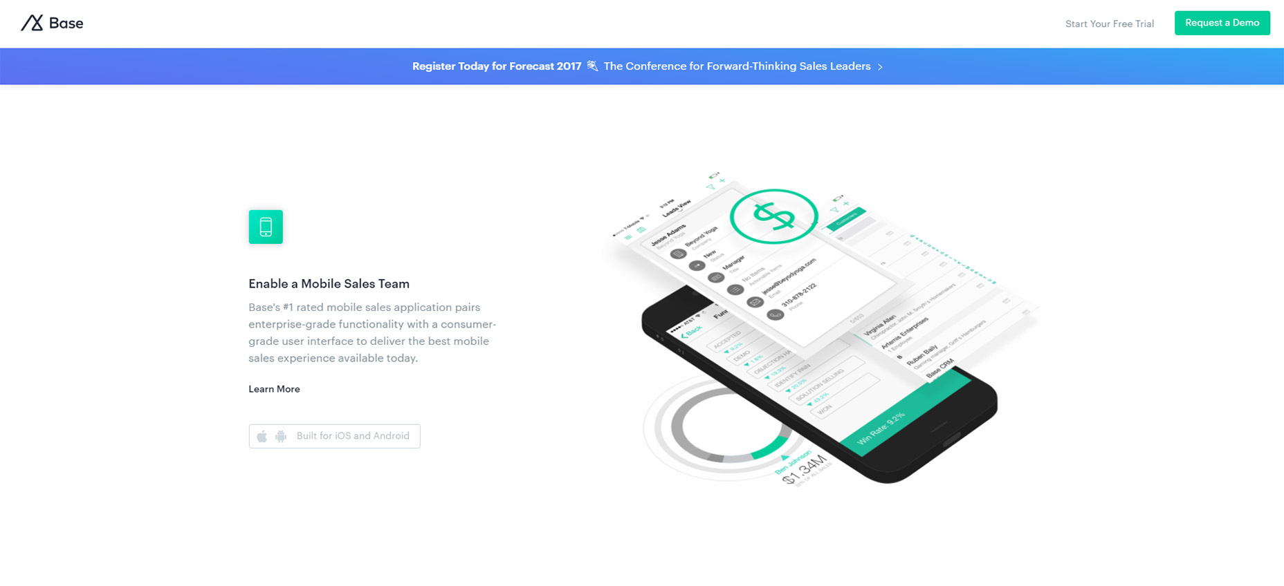
9. Base
The Base CRM homepage is an excellent example of simple animation at work. This site uses custom animation effects to move images up and into the viewer’s eye line.
Based on the number of landing pages I see daily this is very typical of what I expect. It’s not really a complex animation to recreate and it doesn’t affect the experience too much either.
One thing I wish is that the animations would load a bit faster. But beyond that I think this is a prime example of animating images on scroll with a very clean layout to boot.
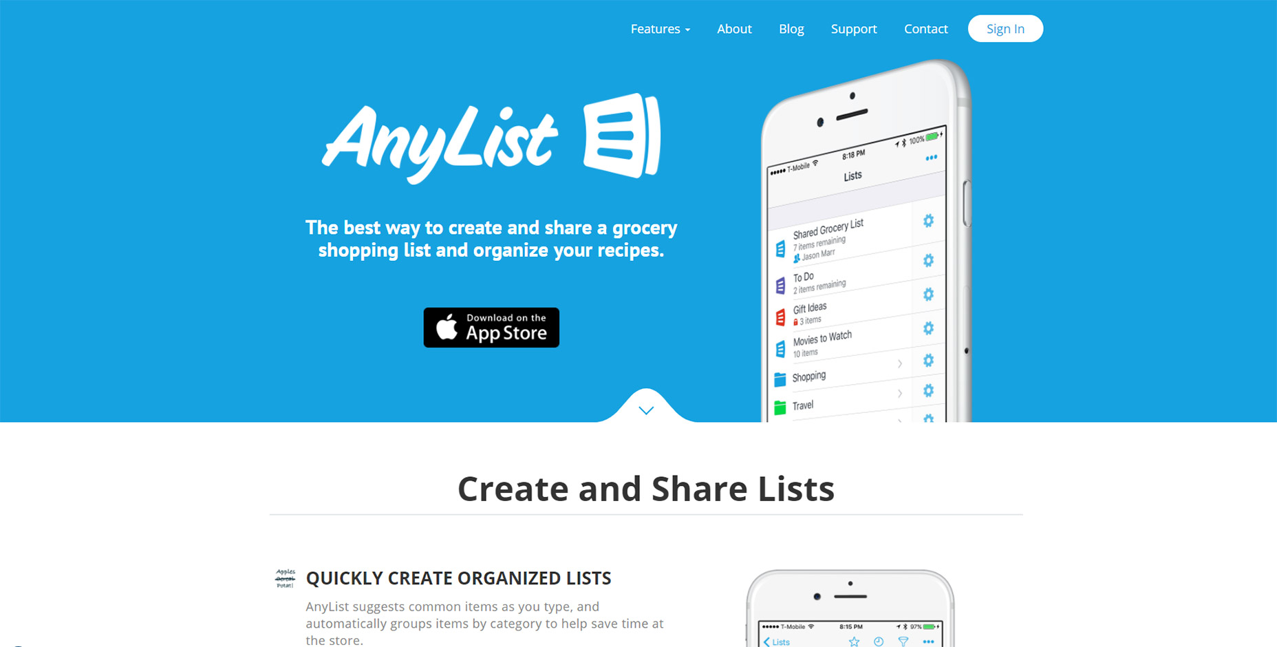
10. AnyList
All the best mobile applications have their own websites for promotion. And the best ones usually have some pretty snazzy animation styles.
AnyList mixes a few different techniques together on one page. Their header image animates up from beneath the cut-off area but it’s the only “moving” animation on the page.
Everything else just fades into view and it all uses a pretty quick load time for the animation. These techniques are used elsewhere on the site which gives it a more cohesive feel.
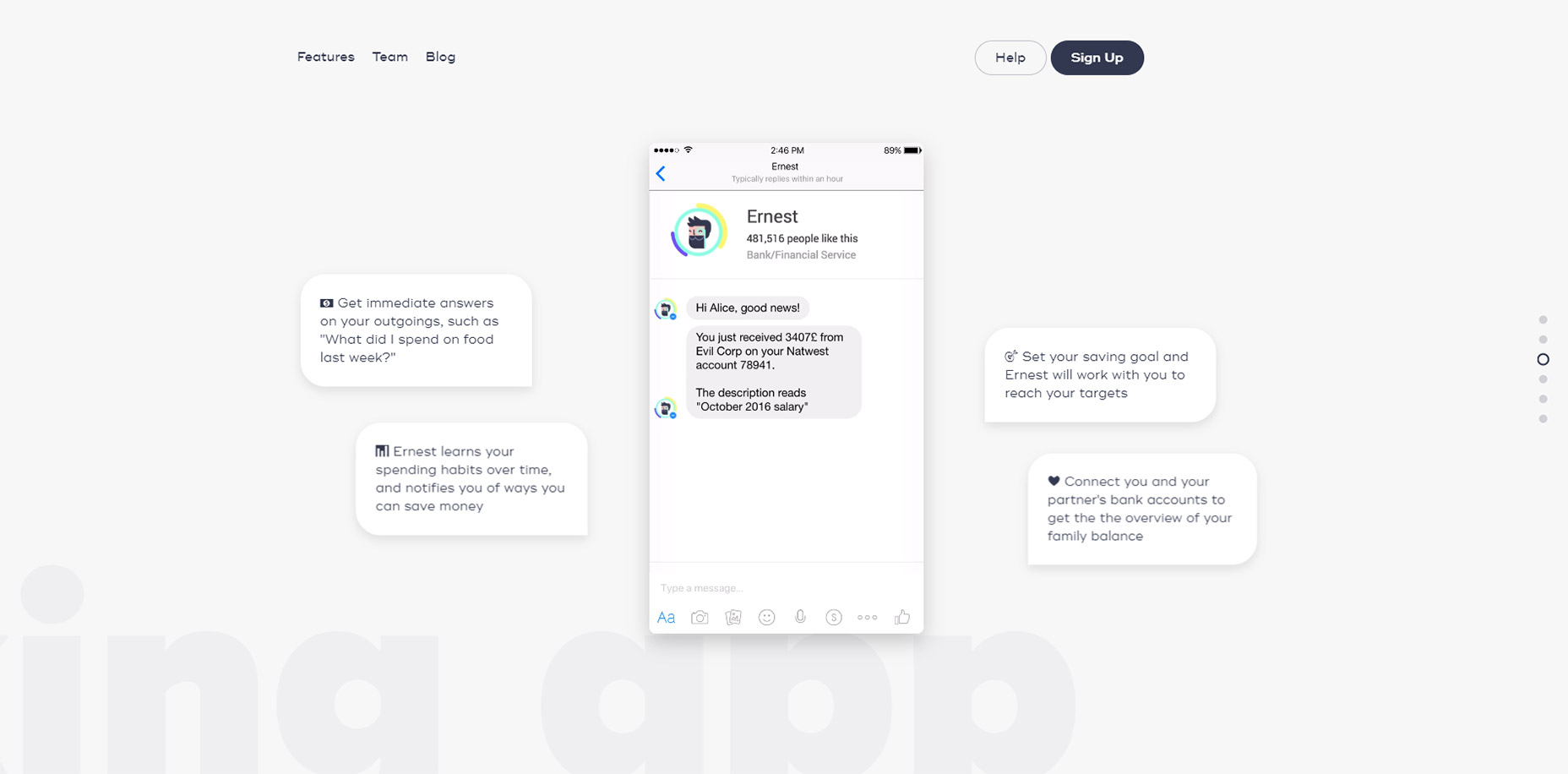
11. Ernest
The page style for Ernest is a little different than other landing pages I’ve covered.
These vary based on the direction you’re scrolling whether you move up or down, and at what speed. They also vary with intensity based on the different sections of the page.
You can navigate using the side dot navigation menu and this quickly jumps around the page to different areas. It’s one of the few techniques you’ll often see on parallax pages and it certainly helps Ernest stand out from the crowd.
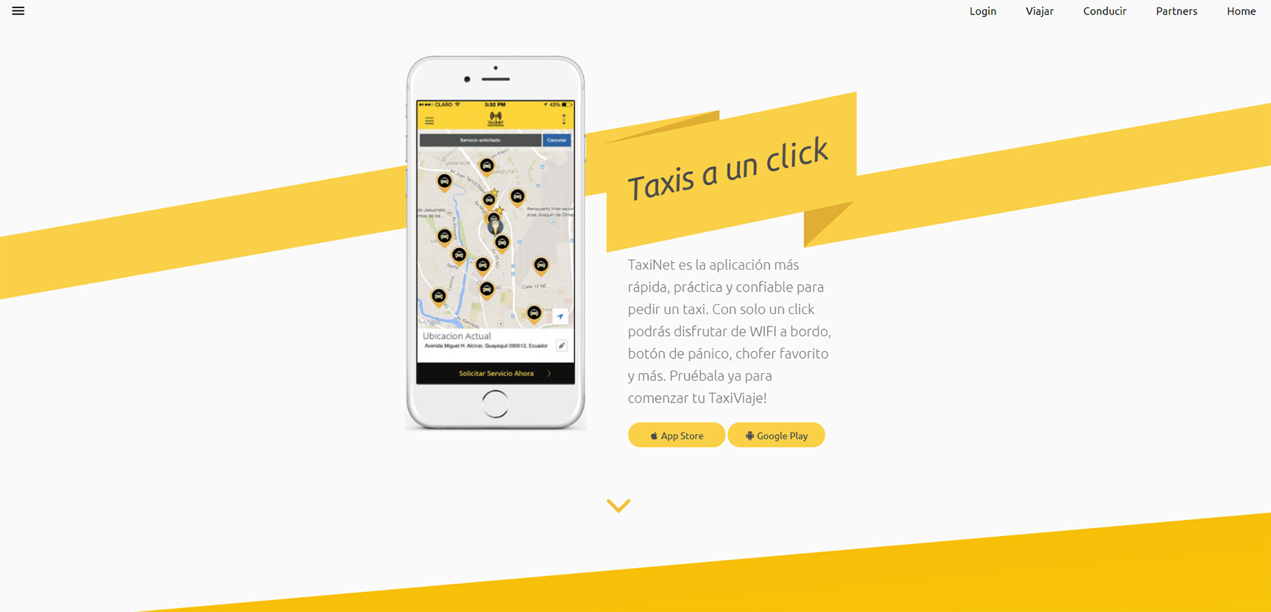
12. TaxiNet
To catch a glimpse of full-page animations in action take a look at the TaxiNet website.
It’s a smorgasbord of scroll-based animation effects tied to icons, text, images, and even background styles. Individual page background colors animate into view with the user, definitely not a typical technique but certainly an interesting one.
If you like this style you could absolutely apply a similar approach to your own landing page. Just make sure you keep the animations snappy and quick because nobody wants to wait around for your neat animations to load.
But if you do ‘em right these scroll-to-view elements add a nice effect to any landing page.
I’ve said for a long time … writers are magicians. We make something out of nothing. We take syllables and turn them into dreams, sights, sounds. Calls to action and detailed plans for shenanigans. And as every magician knows, if you want to perform magic … you have to know a thing or two about Read More...
In the first part of this series we set up the front end with a Service Worker, a `manifest.json` file, and initialized Firebase. Now we need to create our database and watcher functions.
Log into Firebase and click on Database in the navigation. Under Data you can manually add database references and see changes happen in real-time.
Make sure to adjust the rule set under Rules so you don't have to fiddle with authentication during testing.
{
  "rules": {
    ".read": true,
    ".write": true
  }
}
Watching Database Changes with Cloud Functions
Remember the purpose of all this is to send a push notification whenever you publish a new blog post. So we need a way to watch for database changes in those data branches where the posts are being saved to.
With Firebase Cloud Functions we can automatically run backend code in response to events triggered by Firebase features.
Set up and initialize Firebase SDK for Cloud Functions
To start creating these functions we need to install the Firebase CLI. It requires Node v6.11.1 or later.
npm i firebase-tools -g
To initialize a project:
Run firebase login
Authenticate yourself
Go to your project directory
Run firebase init functions
A new folder called `functions` has been created. In there we have an `index.js` file in which we define our new functions.
Import the required Modules
We need to import the Cloud Functions and Admin SDK modules in `index.js` and initialize them.
The Firebase CLI will automatically install these dependencies. If you wish to add your own, modify the `package.json`, run npm install, and require them as you normally would.
Set up the Watcher
We target the database and create a reference we want to watch. In our case, we save to a posts branch which holds post IDs. Whenever a new post ID is added or deleted, we can react to that.
exports.sendPostNotification = functions.database.ref('/posts/{postID}').onWrite(event => {
  // react to changes
}
The name of the export, sendPostNotification, is for distinguishing all your functions in the Firebase backend.
All other code examples will happen inside the onWrite function.
Check for Post Deletion
If a post is deleted, we probably shouldn't send a push notification. So we log a message and exit the function. The logs can be found in the Firebase Console under Functions → Logs.
First, we get the post ID and check if a title is present. If it is not, the post has been deleted.
In the last article we saved a device token in the updateSubscriptionOnServer function to the database in a branch called device_ids. Now we need to retrieve these tokens to be able to send messages to them. We receive so called snapshots which are basically data references containing the token.
If no snapshot and therefore no device token could be retrieved, log a message and exit the function since we don't have anybody to send a push notification to.
const getDeviceTokensPromise = admin.database()
  .ref('device_ids')
  .once('value')
  .then(snapshots => {

      if (!snapshots) return console.log('No devices to send to.')

      // work with snapshots
}
Create the Notification Message
If snapshots are available, we need to loop over them and run a function for each of them which finally sends the notification. But first, we need to populate it with a title, body, and an icon.
Videos have become a popular way to reach out to target audiences for bloggers today. This is the exact reason why so many bloggers are opting for video blogging. So, you want to become a...
You know those the little notification windows that pop up in the top right (Mac) or bottom right (Windows) corner when, for example, a new article on our favorite blog or a new video on YouTube was uploaded? Those are push notifications.
Part of the magic of these notifications is that they can appear even when we're not currently on that website to give us that information (after you've approved it). On mobile devices, where supported, you can even close the browser and still get them.
Article Series:
Setting Up & Firebase (You are here!)
The Back End (Coming soon!)
Push notification on a Mac in Chrome
A notification consists of the browser logo so the user knows from which software it comes from, a title, the website URL it was sent from, a short description, and a custom icon.
We are going to explore how to implement push notifications. Since it relies on Service Workers, check out these starting points if you are not familiar with it or the general functionality of the Push API:
You are free to choose the back-end system which suits you best. I went with Firebase since it offers a special API which makes implementing a push notification service relatively easy.
In this part, we'll only focus on the front end, including the Service Worker and manifest, but to use Firebase, you will also need to register and create a new project.
Implementing Subscription Logic
HTML
We have a button to subscribe which gets enabled if 'serviceWorker' in navigator. Below that, a simple form and a list of posts:
Now we can initialize Firebase using the credentials given under Project Settings → General. The sender ID can be found under Project Settings → Cloud Messaging. The settings are hidden behind the cog icon in the top left corner.
Firebase offers its own service worker setup by creating a file called `firebase-messaging-sw.js` which holds all the functionality to handle push notifications. But usually, you need your Service Worker to do more than just that. So with the useServiceWorker method we can tell Firebase to use our own `service-worker.js` file as well.
Now we can create a userToken and a isSubscribed variable which will be used later on.
Notice the function initializePush() after the Service Worker registration. It checks if the current user is already subscribed by looking up a token in localStorage. If there is a token, it changes the button text and saves the token in a variable.
Here we also handle the click event on the subscription button. We disable the button on click to avoid multiple triggers of it.
Update the Subscription Button
To reflect the current subscription state, we need to adjust the button's text and style. We can also check if the user did not allow push notifications when prompted.
Let's say the user visits us for the first time in a modern browser, so he is not yet subscribed. Plus, Service Workers and Push API are supported. When he clicks the button, the subscribeUser() function is fired.
Here we ask permission to send push notifications to the user by writing messaging.requestPermission().
The browser asking permission to send push notifications.
If the user blocks this request, the button is adjusted the way we implemented it in the updateBtn() function. If the user allows this request, a new token is generated, saved in a variable as well as in localStorage. The token is being saved in our database by updateSubscriptionOnServer().
Save Subscription in our Database
If the user was already subscribed, we target the right database reference where we saved the tokens (in this case device_ids), look for the token the user already has provided before, and remove it.
Otherwise, we want to save the token. With .once('value'), we receive the key values and can check if the token is already there. This serves as second protection to the lookup in localStorage in initializePush() since the token might get deleted from there due to various reasons. We don't want the user to receive multiple notifications with the same content.
function updateSubscriptionOnServer(token) {

    if (isSubscribed) {
        return database.ref('device_ids')
                .equalTo(token)
                .on('child_added', snapshot => snapshot.ref.remove())
    }

    database.ref('device_ids').once('value')
        .then(snapshots => {
            let deviceExists = false

            snapshots.forEach(childSnapshot => {
                if (childSnapshot.val() === token) {
                    deviceExists = true
                    return console.log('Device already registered.');
                }

            })

            if (!deviceExists) {
                console.log('Device subscribed');
                return database.ref('device_ids').push(token)
            }
        })
}
Unsubscribe User
If the user clicks the button after subscribing again, their token gets deleted. We reset our userToken and isSubscribed variables as well as remove the token from localStorage and update our button again.
Below that we add all events around handling the notification window. In this example, we close the notification and open a website after clicking on it.
Another example would be synchronizing data in the background. Read Google's article about that.
Show Messages when on Site
When we are subscribed to notifications of new posts but are already visiting the blog at the same moment a new post is published, we don't receive a notification.
A way to solve this is by showing a different kind of message on the site itself like a little snackbar at the bottom.
To intercept the payload of the message, we call the onMessage method on Firebase Messaging.
The last step for this part of the series is adding the Google Cloud Messaging Sender ID to the `manifest.json` file. This ID makes sure Firebase is allowed to send messages to our app. If you don't already have a manifest, create one and add the following. Do not change the value.
{
  "gcm_sender_id": "103953800507"
}
Now we are all set up on the front end. What's left is creating our actual database and the functions to watch database changes in the next article.
As I’ve said before, overcoming perfectionism is not an excuse to publish sloppy or uninspired writing. Content that works for your business is not only clear, accurate, and educational, it also gives insight into your values. And if it doesn’t contain aspects that make it memorable, it’s not going to work. Of course, memorable content Read More...
Screen space is a precious resource on mobile. To meet the challenge of small screen space while still making navigation accessible, designers often rely on hiding navigation behind the hamburger icon, a prime example of hidden navigation. In this article, we’ll see why hidden navigation creates bad UX and what alternatives are available for designers.
Why the Hamburger Menu Is Bad For UX
On mobile, visible navigation is used 1.5x more than hamburger
If you’re working on digital products, you’ve probably already read dozens of articles describing how the hamburger menu on mobile hurts UX metrics. The main downside is its low discoverability, and this is backed up by actual numbers. In qualitative studies, NNGroup found that hidden navigation is less discoverable than visible or partially visible navigation. This means that when navigation is hidden, users are less likely to use navigation. Hamburger menus drive engagement down, slow down exploration and confuse people.
So What Should We Use Instead?
While there is no hard-and-fast rule for mobile apps and websites, a general recommendation is to use either visible—the main navigation options are shown in a visible navigation bar—or combo navigation, where some of the main navigation options are visible and some are hidden under an interactive element.
1. Tab Bar
If you have a limited number of top-level destinations in your website or app, a tabbed navigation might be the solution. When a menu is visible at the top or bottom, it’s basically advertising that a navigation is there and people are able to see the navigation options right from the start.
Tabs seem to be the simplest navigation pattern. However, a few things should be considered when designing this type of navigation:
Tab bar allows 5 or fewer navigation options to display.
One of the options should always be active and should be visually highlighted by, for example, using a contrasting color.
The first tab has to be the home page and the order of the tabs should relate to their priority or logical order in the user flow.
It’s better to use icons together with labels for each navigation option. Icons without labels work only for common actions, like a magnifying glass icon for search, and for interfaces that the users use frequently (e.g. Instagram).
Tip: In order to save screen space, the navigation bar could be hidden/revealed on downward and upward scrolling.
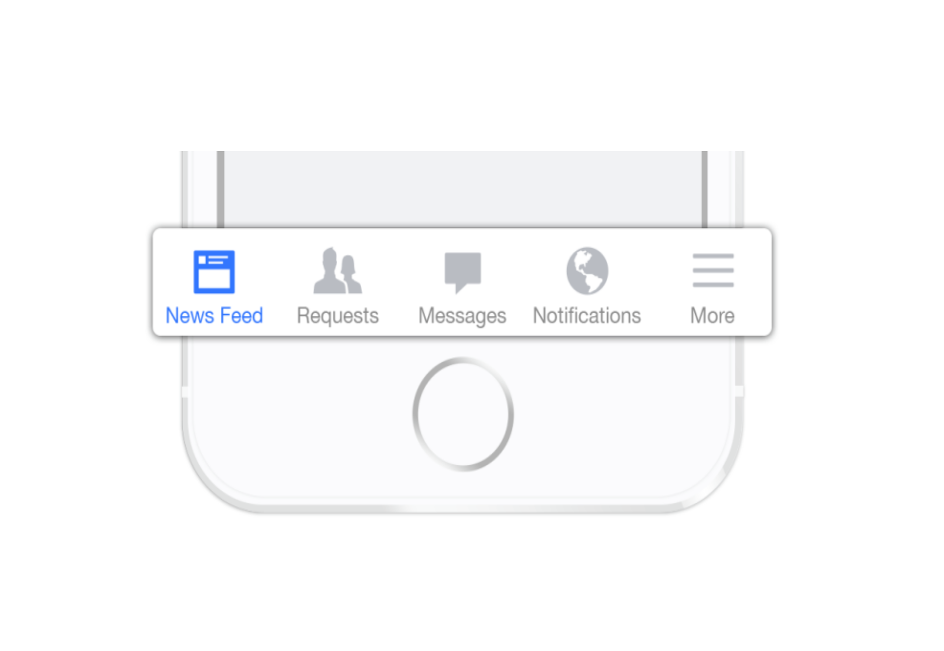
2. Tab Bar With “More” Option
When you have more than 5 top-level destinations, a practical solution might be to show the 4 prioritized sections and have a 5th element as a list of remaining options.
The design principles for this solution are basically the same as for Tab bar. There’s just one exception: the last element is the ‘more’ item.
The ‘more’ item can work as a dropdown menu or even link to a separate navigation page with the remaining sections. From the first glance this solution isn’t much better than the hamburger menu, since it also hides content and its label doesn’t say too much about what’s hidden behind it. If you correctly prioritize navigation options, however, a majority of your users will have 4 or 5 visible top-priority navigation options on the screen all the time so the navigation experience for them will be improved.
3. Progressively Collapsing Menu
Progressively collapsing menu, also known as the “Priority+” pattern, is a menu that adapts to the screen width. It shows as much of the navigation as possible and puts everything else under a “more” button. Basically, this pattern is a sophisticated version of the ‘Tab bar + more’ navigation where the number of navigation options hidden behind the “more” menu depends on the available screen space. The flexibility of this solution provides a better user experience than a ‘static’ ‘Tab bar + more’.
Similar to the previous two patterns, this is another approach for longer lists. If you have a number of navigation options without a big distinction in priorities, for example music genres, you can list all the items in a scrollable view. By making the list scrollable you allow users to move from side-to-side.
The downside of this solution is that still only the top few items are visible without scrolling and all the remaining ones are out of the sight. This is, however, an acceptable solution when the users are expected to explore the content, for example news categories, music categories or in an online store.
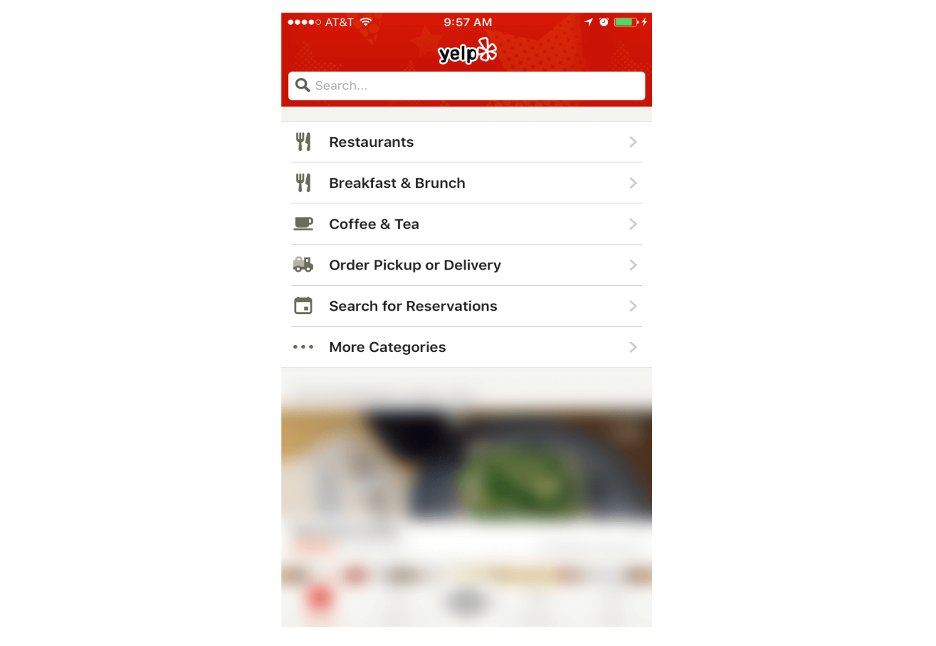
5. Full-Screen Navigation
While with other patterns mentioned in this article, the struggle is to minimize the space that the navigation systems take up, the full-screen pattern takes the exact opposite approach. This approach usually devotes the home page exclusively to navigation. Users incrementally tap or swipe to reveal additional menu options as they scroll up and down.
This pattern works well in task-based and direction-based websites and apps, especially when users tend to limit themselves to only one branch of the navigation hierarchy during a single session. Funnelling users from broad overview pages to detail pages helps them to home in on what they’re looking for and to focus on content within an individual section.
Full-screen navigation in Yelp
Using full-screen navigation, designers can organize large chunks of information in a coherent manner and reveal information without overwhelming the user. Once the user makes their decision about where to go, then you can dedicate the entire screen space to content.
Conclusion
With navigation patterns for mobile, there isn’t a one-size-fits-all solution; it always depends on your product, on your users, and on the context. However, the foundation of every well-designed navigation is information architecture: clear structure, priorities, and labels based on your users’ needs. Helping users navigate should be a top priority for every app designer. Both first-time and returning users should be able to figure out how to move through your app with ease.
As part of my daily routine traveling to work, I take the subway.
As I sit in my little part of the train, I can’t help but overhear the conversations around me. Dialogues, actually – the majority aren’t very conversational.
One in particular was a guy telling his girlfriend about issues he was going through at his workplace. How he was afraid that he was going to lose his job as he was having a major character clash with his supervisor.
The girl nodded a few times, then when the guy had finished she launched straight into a speech about her hair appointment later in the week.
No questions about her partner’s supervisor, or what was causing the clash. No comforting words.
Simply waiting until the talking had stopped and then into her own details.
It’s a common theme.
I’ve watched couples go through the motions of conversation but not really conversing.
I’ve sat in on business meetings before where someone is talking and you can clearly see who’s listening around the table and who isn’t.
And then they wonder why instructions weren’t carried out properly, or key points were missed.
So why aren’t we listening properly?
Have our attention spans really been eroded so much by incidental noise around us that we can no longer focus on the words behind the spoken ones?
Do we need to have something repeated to us before it really sinks in?
I’m not perfect – I know in the past I’ve been guilty of having selective hearing. Probably still am, if you ask my wife.
It’s something I had to work on, particularly when I went into business for myself. If I didn’t listen properly it was my livelihood.
With all the communication tools we have at our disposal today, perhaps we are distracted.
Perhaps the choice has made us lazier at filtering what’s noise and what’s important filler. Perhaps there’s a finer line than ever before between the two.
Whatever it is, one thing is clear – we aren’t listening as well as we’re hearing a lot of the time.
What’s your take? Are we listening less or am I off base? What’s your solution?
Conversations of Distraction originally appeared on Danny Brown – – all rights reserved.
Website security has never been more critical. Hackers, ransomware, and denial of service attacks are all concerns for modern business websites. Nothing will erode your audience’s trust in you faster than visiting your website and getting a security warning, or having Google flash a “You can’t trust this site” message in your search results. Even Read More...
When it comes to being an author, the relative simplicity of setting up a WordPress website to just jump in and start writing and publishing online can be awesome, but some of the themes can...
Last week I spent time with a young blogger who was completely stalled with her blog (for the purpose of this post I’ll call her Sally).
Sally’s blogging had started with a bang and had put together 3 great months of content and had started to build a readership but then it suddenly all came to a halt.
I arranged to catch up for coffee to see what had happened and see if there was a way to get her moving again and she told me a story that I’m sure many readers will find familiar.
Paralysed by Comparisons
The reason Sally started blogging was that she had been a reader of another reasonably well known blogger. She had been so inspired by this established blogger that she simply had to start her own blog – which she did.
The problem that brought Sally’s blog to a grinding halt started a few weeks after her blog began when Sally began to compare her fledgling blog with her hero’s blog.
It started innocently enough with her noticing that this others blogger’s design just seemed to flow much better than Sally’s. However in the coming days and weeks Sally started to compare other things too.
Her hero seemed to blog with more confidence, she got more comments, she had a larger Twitter following, she was more active on Pinterest, she was getting some great brands advertise on her blog, she was invited to cool events…
Once Sally started comparing she couldn’t stop. She told me that she would sit down to work on her blog and end up on her hero’s blog and social media accounts – for hours on end – comparing what they were doing.
On one hand Sally knew it wasn’t a fair comparison – she had only been blogging by this stage for a couple of months and her hero had been blogging for over 4 years… but logic was clouded out by jealousy and Sally found her blogging beginning to stall.
She started second guessing herself. She would work for days on blog posts – hoping to perfect them to the standard of her hero only to get to the point of publishing them and trashing them instead for fear of them not being up to scratch.
Days would go by between posts and then weeks. Sally’s blog began to stall… and then it died completely.
The Comparison Trap
Sally isn’t the only blogger to fall into the trap of comparing oneself with others – in fact I’ve heard this story (or variations of it) numerous times. If I’m honest, it’s something that at times I’ve struggled with too.
I remember in the early days of my own blogging comparing my style of writing with other bloggers that I admired who wrote in a much more academic, heavy style of writing. I tried to emulate this over and over again and never felt I hit the benchmark that they set.
The temptation was to give up – but luckily I found my more informal and conversational voice through experimentation and persistance.
Comparing Is Never Fair
As I chatted with Sally last week a theme emerged in our conversation – the comparisons were simply not fair.
Sally knew this on some levels but needed to hear it again.
Her hero had been blogging for years. Sally had been blogging for months.
Not only that – Sally was comparing herself to tiny snapshots of this other blogger.
She could see her hero’s Twitter follower numbers, how many comments she was getting, how many times she Pinned on Pinterest and the instagram photos of this blogger at glamorous events – but she didn’t really have the full picture of this other blogger.
She didn’t know how many hours that blogger worked, she didn’t know whether that other blogger had people working for her, she didn’t know if that other blogger was actually happy with her blog or life and she certainly didn’t see the instagrams of that other bloggers boring, dull or hard moments of life.
I’m not saying the other blogger is hiding anything or doing anything wrong – just that the comparisons Sally was making were of everything Sally knew about herself (and her insecurities) with tiny edited snapshots of the life and work another person.
Run You Own Race
Sally is a remarkable person. I’d love to tell you her real name and story because she’s overcome some amazing things in her life, has some unique perspectives to share and has an inspirational story to tell.
My encouragement to Sally (and to us all) is run her own race. Yes she’s running beside others that at times seem to be running faster or with more flare… but nobody else around her has her unique personality, set of experiences or skills.
Nobody else can blog like Sally – so the sooner she gets comfy in her own skin the better.
Don’t Fall Into This Trap That Could Destroy Your Blog http://www.problogger.net/archives/2013/09/04/dont-fall-into-this-trap-that-could-destroy-your-blog/ http://www.problogger.net/archives/category/miscellaneous-blog-tips/feed/ @ProBlogger» Miscellaneous Blog Tips Blog Tips to Help You Make Money Blogging – ProBlogger http://www.problogger.net/wp-content/plugins/podpress/images/powered_by_podpress_large.jpg


 Animated page elements are super common on landing pages and startup websites. But they’re not always talked about in design circles because the idea of “animate on view” isn’t covered a lot.


 Screen space is a precious resource on mobile. To meet the challenge of small screen space while still making navigation accessible, designers often rely on hiding navigation behind the hamburger icon, a prime example of hidden navigation. In this article, we’ll see why hidden navigation creates bad UX and what alternatives are available for designers.
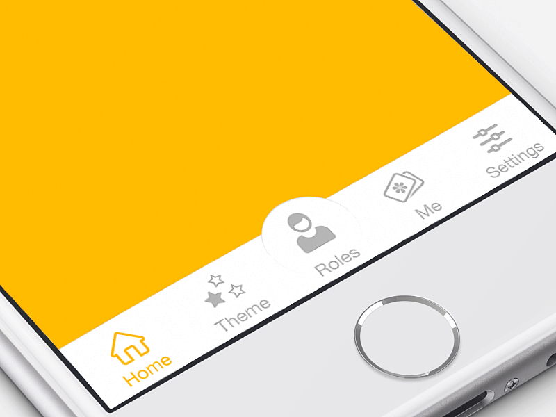


 Last week I spent time with a young blogger who was completely stalled with her blog (for the purpose of this post I’ll call her Sally).