Videos have become a popular way to reach out to target audiences for bloggers today. This is the exact reason why so many bloggers are opting for video blogging. So, you want to become a...
You know those the little notification windows that pop up in the top right (Mac) or bottom right (Windows) corner when, for example, a new article on our favorite blog or a new video on YouTube was uploaded? Those are push notifications.
Part of the magic of these notifications is that they can appear even when we're not currently on that website to give us that information (after you've approved it). On mobile devices, where supported, you can even close the browser and still get them.
Article Series:
Setting Up & Firebase (You are here!)
The Back End (Coming soon!)
Push notification on a Mac in Chrome
A notification consists of the browser logo so the user knows from which software it comes from, a title, the website URL it was sent from, a short description, and a custom icon.
We are going to explore how to implement push notifications. Since it relies on Service Workers, check out these starting points if you are not familiar with it or the general functionality of the Push API:
You are free to choose the back-end system which suits you best. I went with Firebase since it offers a special API which makes implementing a push notification service relatively easy.
In this part, we'll only focus on the front end, including the Service Worker and manifest, but to use Firebase, you will also need to register and create a new project.
Implementing Subscription Logic
HTML
We have a button to subscribe which gets enabled if 'serviceWorker' in navigator. Below that, a simple form and a list of posts:
Now we can initialize Firebase using the credentials given under Project Settings → General. The sender ID can be found under Project Settings → Cloud Messaging. The settings are hidden behind the cog icon in the top left corner.
Firebase offers its own service worker setup by creating a file called `firebase-messaging-sw.js` which holds all the functionality to handle push notifications. But usually, you need your Service Worker to do more than just that. So with the useServiceWorker method we can tell Firebase to use our own `service-worker.js` file as well.
Now we can create a userToken and a isSubscribed variable which will be used later on.
Notice the function initializePush() after the Service Worker registration. It checks if the current user is already subscribed by looking up a token in localStorage. If there is a token, it changes the button text and saves the token in a variable.
Here we also handle the click event on the subscription button. We disable the button on click to avoid multiple triggers of it.
Update the Subscription Button
To reflect the current subscription state, we need to adjust the button's text and style. We can also check if the user did not allow push notifications when prompted.
Let's say the user visits us for the first time in a modern browser, so he is not yet subscribed. Plus, Service Workers and Push API are supported. When he clicks the button, the subscribeUser() function is fired.
Here we ask permission to send push notifications to the user by writing messaging.requestPermission().
The browser asking permission to send push notifications.
If the user blocks this request, the button is adjusted the way we implemented it in the updateBtn() function. If the user allows this request, a new token is generated, saved in a variable as well as in localStorage. The token is being saved in our database by updateSubscriptionOnServer().
Save Subscription in our Database
If the user was already subscribed, we target the right database reference where we saved the tokens (in this case device_ids), look for the token the user already has provided before, and remove it.
Otherwise, we want to save the token. With .once('value'), we receive the key values and can check if the token is already there. This serves as second protection to the lookup in localStorage in initializePush() since the token might get deleted from there due to various reasons. We don't want the user to receive multiple notifications with the same content.
function updateSubscriptionOnServer(token) {

    if (isSubscribed) {
        return database.ref('device_ids')
                .equalTo(token)
                .on('child_added', snapshot => snapshot.ref.remove())
    }

    database.ref('device_ids').once('value')
        .then(snapshots => {
            let deviceExists = false

            snapshots.forEach(childSnapshot => {
                if (childSnapshot.val() === token) {
                    deviceExists = true
                    return console.log('Device already registered.');
                }

            })

            if (!deviceExists) {
                console.log('Device subscribed');
                return database.ref('device_ids').push(token)
            }
        })
}
Unsubscribe User
If the user clicks the button after subscribing again, their token gets deleted. We reset our userToken and isSubscribed variables as well as remove the token from localStorage and update our button again.
Below that we add all events around handling the notification window. In this example, we close the notification and open a website after clicking on it.
Another example would be synchronizing data in the background. Read Google's article about that.
Show Messages when on Site
When we are subscribed to notifications of new posts but are already visiting the blog at the same moment a new post is published, we don't receive a notification.
A way to solve this is by showing a different kind of message on the site itself like a little snackbar at the bottom.
To intercept the payload of the message, we call the onMessage method on Firebase Messaging.
The last step for this part of the series is adding the Google Cloud Messaging Sender ID to the `manifest.json` file. This ID makes sure Firebase is allowed to send messages to our app. If you don't already have a manifest, create one and add the following. Do not change the value.
{
  "gcm_sender_id": "103953800507"
}
Now we are all set up on the front end. What's left is creating our actual database and the functions to watch database changes in the next article.
As I’ve said before, overcoming perfectionism is not an excuse to publish sloppy or uninspired writing. Content that works for your business is not only clear, accurate, and educational, it also gives insight into your values. And if it doesn’t contain aspects that make it memorable, it’s not going to work. Of course, memorable content Read More...
Screen space is a precious resource on mobile. To meet the challenge of small screen space while still making navigation accessible, designers often rely on hiding navigation behind the hamburger icon, a prime example of hidden navigation. In this article, we’ll see why hidden navigation creates bad UX and what alternatives are available for designers.
Why the Hamburger Menu Is Bad For UX
On mobile, visible navigation is used 1.5x more than hamburger
If you’re working on digital products, you’ve probably already read dozens of articles describing how the hamburger menu on mobile hurts UX metrics. The main downside is its low discoverability, and this is backed up by actual numbers. In qualitative studies, NNGroup found that hidden navigation is less discoverable than visible or partially visible navigation. This means that when navigation is hidden, users are less likely to use navigation. Hamburger menus drive engagement down, slow down exploration and confuse people.
So What Should We Use Instead?
While there is no hard-and-fast rule for mobile apps and websites, a general recommendation is to use either visible—the main navigation options are shown in a visible navigation bar—or combo navigation, where some of the main navigation options are visible and some are hidden under an interactive element.
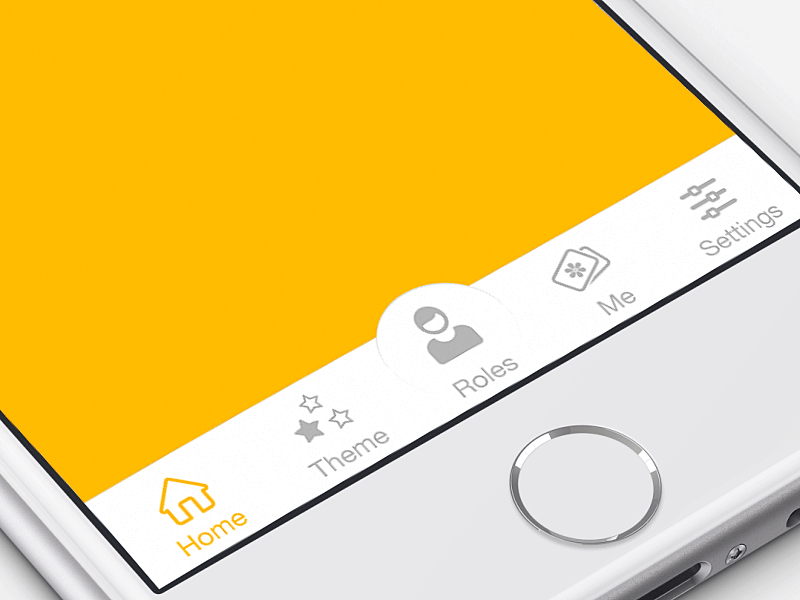
1. Tab Bar
If you have a limited number of top-level destinations in your website or app, a tabbed navigation might be the solution. When a menu is visible at the top or bottom, it’s basically advertising that a navigation is there and people are able to see the navigation options right from the start.
Tabs seem to be the simplest navigation pattern. However, a few things should be considered when designing this type of navigation:
Tab bar allows 5 or fewer navigation options to display.
One of the options should always be active and should be visually highlighted by, for example, using a contrasting color.
The first tab has to be the home page and the order of the tabs should relate to their priority or logical order in the user flow.
It’s better to use icons together with labels for each navigation option. Icons without labels work only for common actions, like a magnifying glass icon for search, and for interfaces that the users use frequently (e.g. Instagram).
Tip: In order to save screen space, the navigation bar could be hidden/revealed on downward and upward scrolling.
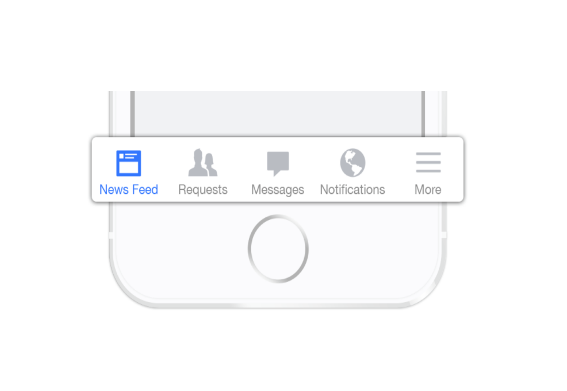
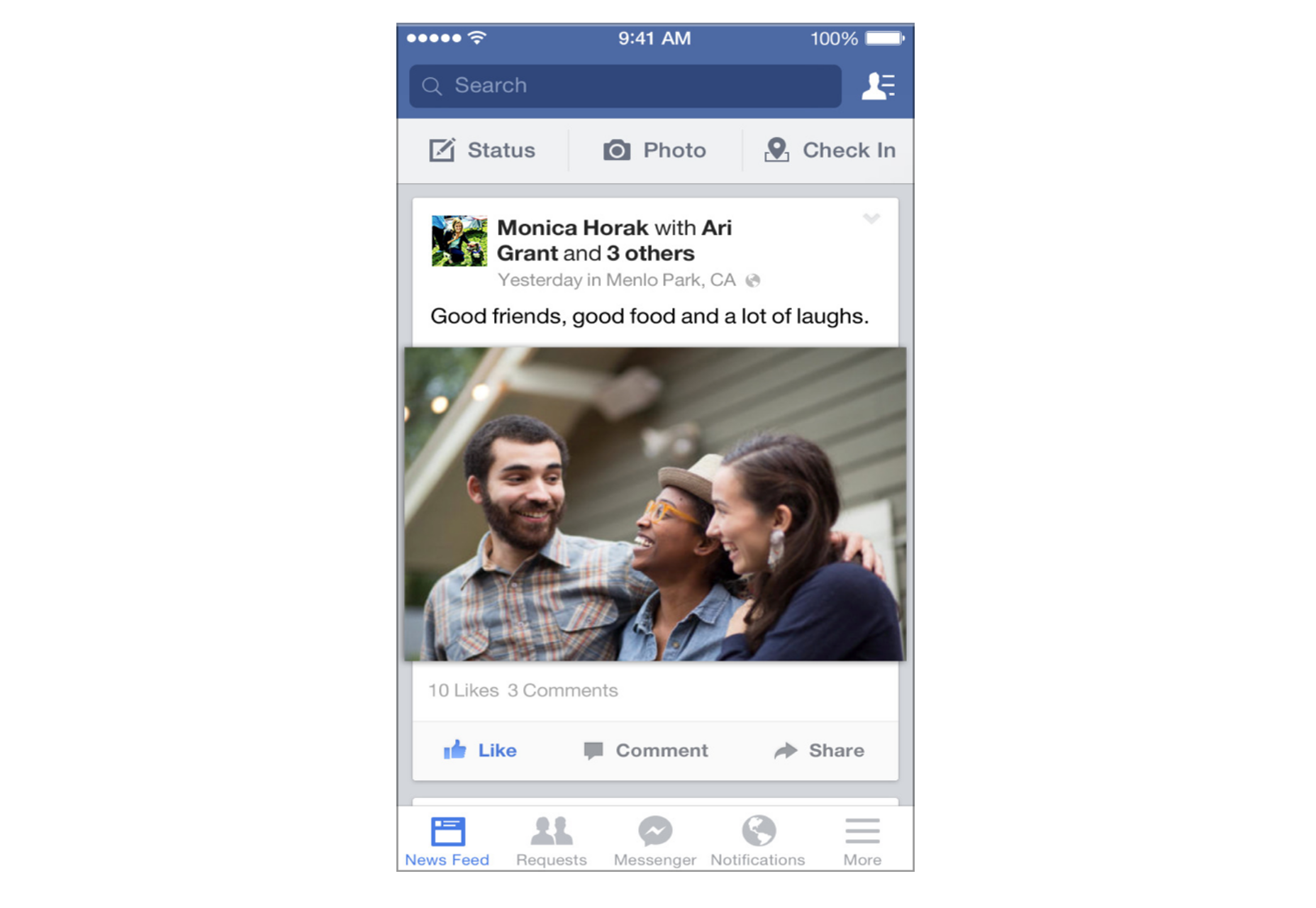
2. Tab Bar With “More” Option
When you have more than 5 top-level destinations, a practical solution might be to show the 4 prioritized sections and have a 5th element as a list of remaining options.
The design principles for this solution are basically the same as for Tab bar. There’s just one exception: the last element is the ‘more’ item.
The ‘more’ item can work as a dropdown menu or even link to a separate navigation page with the remaining sections. From the first glance this solution isn’t much better than the hamburger menu, since it also hides content and its label doesn’t say too much about what’s hidden behind it. If you correctly prioritize navigation options, however, a majority of your users will have 4 or 5 visible top-priority navigation options on the screen all the time so the navigation experience for them will be improved.
3. Progressively Collapsing Menu
Progressively collapsing menu, also known as the “Priority+” pattern, is a menu that adapts to the screen width. It shows as much of the navigation as possible and puts everything else under a “more” button. Basically, this pattern is a sophisticated version of the ‘Tab bar + more’ navigation where the number of navigation options hidden behind the “more” menu depends on the available screen space. The flexibility of this solution provides a better user experience than a ‘static’ ‘Tab bar + more’.
Similar to the previous two patterns, this is another approach for longer lists. If you have a number of navigation options without a big distinction in priorities, for example music genres, you can list all the items in a scrollable view. By making the list scrollable you allow users to move from side-to-side.
The downside of this solution is that still only the top few items are visible without scrolling and all the remaining ones are out of the sight. This is, however, an acceptable solution when the users are expected to explore the content, for example news categories, music categories or in an online store.
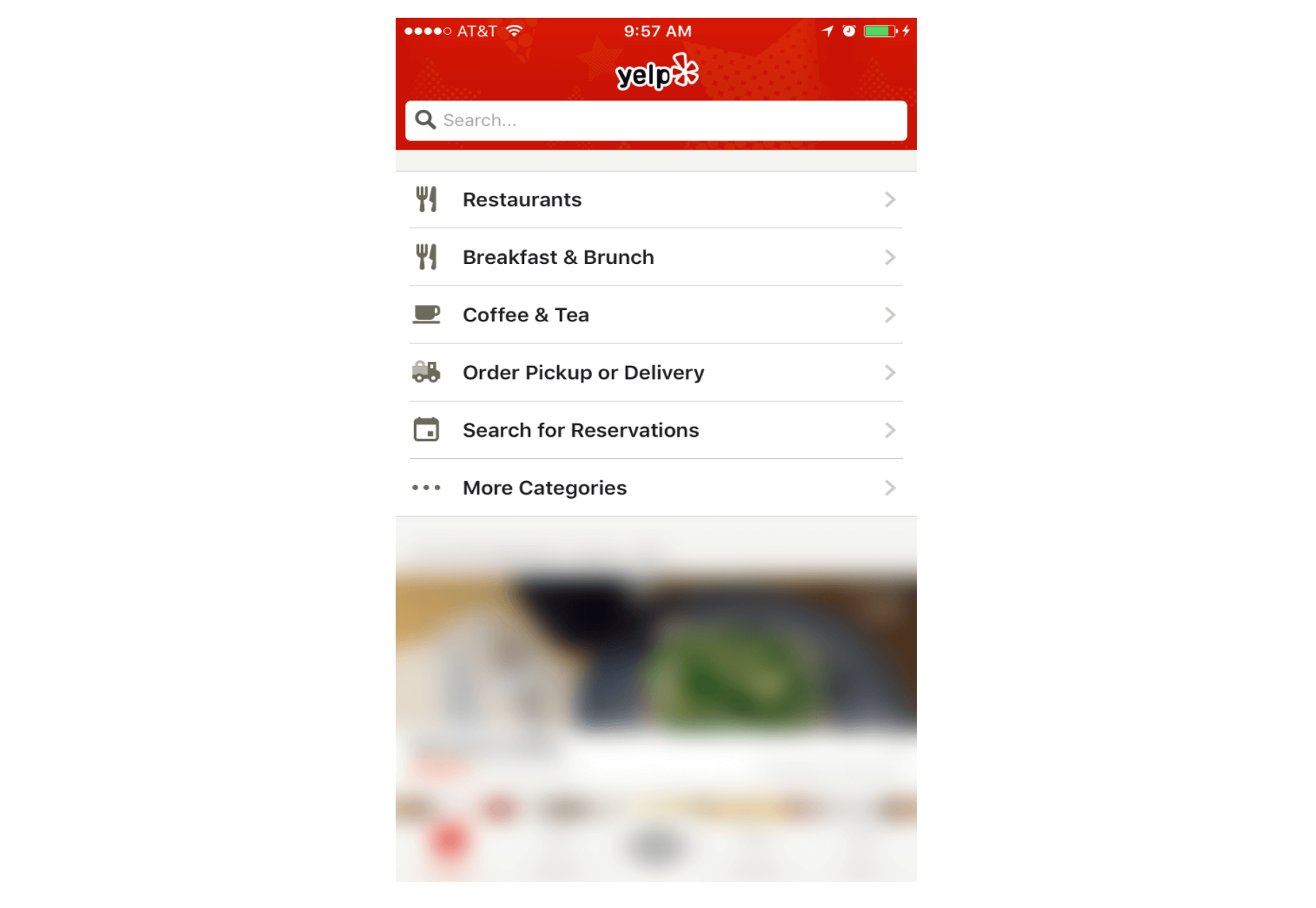
5. Full-Screen Navigation
While with other patterns mentioned in this article, the struggle is to minimize the space that the navigation systems take up, the full-screen pattern takes the exact opposite approach. This approach usually devotes the home page exclusively to navigation. Users incrementally tap or swipe to reveal additional menu options as they scroll up and down.
This pattern works well in task-based and direction-based websites and apps, especially when users tend to limit themselves to only one branch of the navigation hierarchy during a single session. Funnelling users from broad overview pages to detail pages helps them to home in on what they’re looking for and to focus on content within an individual section.
Full-screen navigation in Yelp
Using full-screen navigation, designers can organize large chunks of information in a coherent manner and reveal information without overwhelming the user. Once the user makes their decision about where to go, then you can dedicate the entire screen space to content.
Conclusion
With navigation patterns for mobile, there isn’t a one-size-fits-all solution; it always depends on your product, on your users, and on the context. However, the foundation of every well-designed navigation is information architecture: clear structure, priorities, and labels based on your users’ needs. Helping users navigate should be a top priority for every app designer. Both first-time and returning users should be able to figure out how to move through your app with ease.
As part of my daily routine traveling to work, I take the subway.
As I sit in my little part of the train, I can’t help but overhear the conversations around me. Dialogues, actually – the majority aren’t very conversational.
One in particular was a guy telling his girlfriend about issues he was going through at his workplace. How he was afraid that he was going to lose his job as he was having a major character clash with his supervisor.
The girl nodded a few times, then when the guy had finished she launched straight into a speech about her hair appointment later in the week.
No questions about her partner’s supervisor, or what was causing the clash. No comforting words.
Simply waiting until the talking had stopped and then into her own details.
It’s a common theme.
I’ve watched couples go through the motions of conversation but not really conversing.
I’ve sat in on business meetings before where someone is talking and you can clearly see who’s listening around the table and who isn’t.
And then they wonder why instructions weren’t carried out properly, or key points were missed.
So why aren’t we listening properly?
Have our attention spans really been eroded so much by incidental noise around us that we can no longer focus on the words behind the spoken ones?
Do we need to have something repeated to us before it really sinks in?
I’m not perfect – I know in the past I’ve been guilty of having selective hearing. Probably still am, if you ask my wife.
It’s something I had to work on, particularly when I went into business for myself. If I didn’t listen properly it was my livelihood.
With all the communication tools we have at our disposal today, perhaps we are distracted.
Perhaps the choice has made us lazier at filtering what’s noise and what’s important filler. Perhaps there’s a finer line than ever before between the two.
Whatever it is, one thing is clear – we aren’t listening as well as we’re hearing a lot of the time.
What’s your take? Are we listening less or am I off base? What’s your solution?
Conversations of Distraction originally appeared on Danny Brown – – all rights reserved.


 Screen space is a precious resource on mobile. To meet the challenge of small screen space while still making navigation accessible, designers often rely on hiding navigation behind the hamburger icon, a prime example of hidden navigation. In this article, we’ll see why hidden navigation creates bad UX and what alternatives are available for designers.