The value of online consumer reviews includes seeing both positive and negative reviews. That’s why preserving the right to voice such opinions matters. Read the full article at MarketingProfs
Powered by WPeMatico

Tips, Expertise, Articles and Advice from the Pro's for Your Website or Blog to Succeed
The value of online consumer reviews includes seeing both positive and negative reviews. That’s why preserving the right to voice such opinions matters. Read the full article at MarketingProfs
Powered by WPeMatico
If it’s Friday it must be Friday Five time, our weekly roundup of five stories from one specific topic. This week it’s Social Media.
Examining the Current State of Social Marketing (Infographic)
Social media may be an integrated and essential part of most marketing strategies, but measuring the return on the investment and taking action based on social media insights still presents a challenge to many marketing teams. An infographic from Morrison Foerster examines the current landscape of social marketing, and the challenges marketers still face.
Read the full story on Adweek.
How Social Media Marketing Is Set to Change in 2016
Hard to believe the first month of 2016 is nearly over (didn’t it just begin?) and even as I type this, tactics, strategies and options in the world of social media are changing. I know as a small business owner you’re not only on the lookout for the most effective use of your digital marketing dollars, you’re also looking to easily digest the latest offerings to see how they may benefit you. Here is a breakdown on what to expect in 2016.
Read the full story on Business 2 Community.
10 ways brands are using social media marketing for good
Using social platforms like Twitter, Instagram, and Facebook to promote philanthropic content is an effective way to engage consumers and humanize your brand.
Asking questions, running contests, sharing pictures, promoting products and services; there are many ways for brands to attract attention on Twitter, Facebook, Instagram, and the like. Included among this list of ways to get people to sit up and take notice on social media is to show the softer side of your brand and declare your support of a worthy charitable organization.
Read the full story on ClickZ.
The Impact of Big Data on Social Media Marketing Strategies
The amount of information now available to crunch and parse in the service of analyzing absolutely anything is massive—and growing every second. In the face of this sheer overwhelm of data, an individual business owner or social media marketer can feel powerless to make any sense of it, let alone productive use of it. But as with any shift in the tide or evolutionary leap, a smart adjusting of strategy can help even the smallest of small fries to compete with the big guns and harness this unwieldy data deluge to work for them.
Read the full story on Tech.co.
The 5-Minute Social Media Competitive Analysis
We’ve talked about why you should monitor your competitor’s marketing, and how to set up a monitoring dashboard to do so. But really, all that data you’re collecting on competitors is worthless if you don’t know what to do with it. Smart data needs to lead to smart decisions.
And that means doing more than just hoarding competitor mentions in your dashboard. You need to sit down, dig in, and get analytical. Monitoring your competitors isn’t enough—you need to sit down and analyze the data.
Read the full story on Search Engine Journal.
Social media has of course become a ubiquitous part of every marketer’s arsenal. To understand how to fully leverage the power of social media download the Modern Marketing Essentials Guide to Social Marketing.
Powered by WPeMatico
In the first part of the case study about Mail.Ru Group product design unification, I described our first approach — a mobile web framework. Aside from creating a unified visual style and interaction principles for a dozen services, we’ve also transformed our design process from the classic “prototype → design mock-up → HTML → implementation” approach for every screen, to a modern and more efficient framework-based approach.

In this second part I’ll show how we have improved the same technology to embody larger versions of these products and made our “Bootstrap on steroids” more powerful. In the spring of 2012, our business unit acquired 11 content-based projects: Auto, Events Guide, Health, Horoscopes, Kids, Lady, Moto, News, Sports, TV, and Weather. Many of them are very successful in their market niche in Russia; however, they each have their own history, often with outsourced designs that led to inconsistencies.
The post Product Design Unification Case Study, Part 2: “Burger-Driven” Framework appeared first on Smashing Magazine.
Product Design Unification Case Study, Part 2: “Burger-Driven” Framework
http://www.smashingmagazine.com/2015/07/17/product-design-unification-case-study-part-2-burger-driven-framework/
http://rss1.smashingmagazine.com/feed/
Smashing Magazine
For Professional Web Designers and Developers
Powered by WPeMatico
our accounts are 100% geniune .. we will also give you trick to make 100 $ in few days from blogs. 🙂 we will make google adsense account for u only Rs 500 g…
KingSize KingSize is a clean, modern, popular Fullscreen photography WordPress theme. It is a responsive theme with full-screen layout that photographers can take advantage of to display their photographs and work. It is a wonderful...
The post 20 of the Best Photography WordPress Themes appeared first on 85ideas.com.
Starting up a new WordPress site is easy, thanks to the simplicity of the platform, but making it reach the popularity level you planned off, is a totally different thing. You’ve to look at a...
The post 10 Ways to Drive Traffic to a New WordPress site appeared first on 85ideas.com.
http://thegoodstuffalways.blogspot.com/2013/07/google-adsense-tutorial-for-beginners.html If you want to know How to make a FREE Profitable Blog Click Here h…
The lowly form input. It’s been a part of HTML for as long as HTML has had a formal specification1; but before HTML5, developers were hamstrung by its limited types and attributes. As the use of smartphones and their on-screen keyboards has flourished, however, inputs have taken on a new and incredibly important role — but they’re also riddled with browser and device inconsistencies.
The eight original input types were brilliant in their simplicity. (Well, OK, maybe <input type="image"> hasn’t aged very well.)
Think about it: By inserting a single element in your markup, you can tell any web browser to render an interaction control, and you can completely modify that interaction – from a text field to a checkbox to a radio button – by simply changing a keyword. Now imagine a world where creating these interactions means also creating custom interaction controls, and you begin to realize how taken for granted inputs really are.
Unfortunately, even Tim Berners-Lee and Co. couldn’t have anticipated the strain that mobile devices and interaction-hungry web applications would place on these original concepts for user input.
That’s what the HTML 5.0 specification2 was intended to solve, by expanding the concept of the text input to allow for specific data types, such as numbers and email addresses, as well as rich interactions, such as task-specific on-screen keyboards and date- and color-pickers. Most were designed with graceful degradation at their core, adding enhancements to supported browsers while falling back nicely to basic text inputs in older ones.
Or at least that was the intention. In the real world, many of these new inputs and attributes — even seemingly innocuous types like <input type="number"> — don’t always behave as you might expect.
While not as fierce as battles of yore, input types are the cause of a new small-scale browser war. Despite the existence of standards, browser and device manufacturers have cherry-picked input feature support and taken different approaches to implementing these enhanced interactions.
Take date. Using <input type="date"> is a godsend to any front-end developer who has ever had to add a JavaScript-based date-picker to a website… or at least it would be if all browsers supported it. Desktop versions of Chrome and most mobile browsers display a native date-picker:
 3
3date input type in Chrome for iOS and Mac (View large version4)However, as of Firefox 36 and Internet Explorer (IE) 11, that same input type defaults to a plain ol’ text field, forcing developers to use polyfills5 or to continue building JavaScript-based date-picker solutions instead.
 6
6date input type defaults to a plain text field in Firefox 36. (View large version7)The lack of date input support in Firefox seems at odds with the vendor’s overall support for these more visually and functionally advanced input types. For example, the range input type (<input type="range">), which emerged from the same crop of proposed features as date, has been supported since Firefox 23 and IE 108.
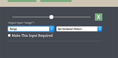 9
9range input type since version 23. (View large version10)In fact, IE’s implementation, although not the most visually attractive, has some added utility, allowing you to see incremental divisions within the range, as well as its current numeric value on mouse drag.
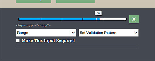 11
11range input type shows incremental divisions and its current numeric value on mouse drag. (View large version12)We’re used to dealing with mixed browser support for emerging features. But when it comes to inputs, there’s a bigger problem: Even when an input feature is supported, it’s not always implemented in the same way across browsers or mobile platforms. Developers now have to take all of the following aspects of an input into account:
step attributerequired attributetype, pattern and step values all contribute to the format you’re expecting, and is this true across all browsers on mobile and desktop?Imagine a situation in which you need to add a required input field for currency, and you want to display the best possible keyboard experience across all devices. “Simple,” you think, adding <input type="number" required> to your form. This works great for Android:
 13
13number input type. (View large version14)In iOS, your keyboard would be improved (the top row will show numbers):
 15
15number input type contains the number keys. (View large version16)But that’s still not the fancy 10-key keyboard Android gives you. To achieve something similar in iOS, you need to set a pattern attribute with a value of [0-9]*:
<input type="number" pattern="[0-9]*" required>
In iOS, this combination gives us this:
![Setting the pattern attribute to [0-9]* prompts iOS to display a number pad.](http://fuelyourblog.com/wp-content/uploads/2015/05/05-number-pattern-ios-example-opt-small.jpg) 17
17pattern attribute to [0-9]* prompts iOS to display a number pad. (View large version18)I believe this implementation to be a fundamentally shortsighted decision on Apple’s part. Not only does it ignore the input’s type altogether, it’s also based on a pattern that’s hardcoded into the OS, which means that if you alter that pattern in any way, you will lose the keyboard enhancement entirely in iOS.
In our currency example, this creates a problem, but not where you might expect. A required input with a number type and a pattern of [0-9]* will give us great results across mobile, but it’s easy to forget that these decisions also affect desktop browsers. On desktop, we can’t control the user’s keyboard, and if they enter a special character (such as a comma or dollar sign, which are both plausible for currency), both the type and the pattern will cause it to fail client-side validation. (In older versions of Chrome, decimals also cause validation errors, although adding step="any" solves this issue.) You can see the problem here:
 19
19This leaves developers in a bit of a lurch. We can choose to enhance one mobile OS experience at the expense of the other, enhance both of our mobile experiences at the expense of desktop, or enhance our desktop experience at the expense of mobile. And none of these options would make our stakeholders very happy.
Although currency is one of the most illustrative examples, almost any input that needs to allow for alphanumeric content with special characters can cause some of the heartburn that comes with using these new input types and patterns. This includes social security numbers, phone numbers or any number that could be entered in an unknown format, such as a bank account number. For this next example, let’s examine one that’s often overlooked: US ZIP codes.
Without giving them much thought, ZIP codes seem relatively simple: most people immediately think of them as a five-digit number. So, we can just use <input type="number">, right? Wrong, for two reasons.
The more obvious reason is the extended US ZIP code format (i.e. 12345-6789). Although it may be less common, allowing our users to enter it this way is still important. And we also need to keep non-US users in mind, because several countries (including Canada and the UK) use letters and other special symbols in their postal code formats. Semantically, ZIP codes aren’t numbers: They’re numerical codes — you’d never refer to a certain ’90s teen television drama as “Beverly Hills Ninety Thousand Two Hundred Ten.”
The second reason is a little subtler: some ZIP codes on the far east coast of the US begin with a zero.
If you’re validating these fields, special characters will immediately cause a validation issue, and in many browsers (including old versions of Chrome), so will that leading zero. That means not being able to use a number input type and, therefore, no enhanced keyboard for Android.
Android users may be out of luck, but can we still enhance for iOS? If you want to validate the field, the answer again is no, caused in large part by Apple’s decision to base its enhanced keyboard on a single hardcoded validation pattern. If we want to use <input type="text" pattern="[0-9]*"> (the hardcoded pattern that triggers iOS’s 10-key keypad), our users won’t be able to enter special characters or letters. Even if you disregard non-US users and use a pattern that allows for extended ZIP codes, such as <input type="text" pattern="(d{5}([-]d{4})?)">, you’re still not going to get back that enhanced iOS experience that would benefit users.
These currency and postal code examples also don’t take into account support for other attributes that can be slapped on form inputs, such as autocapitalize, autocomplete and autocorrect. Autocapitalize and autocorrect are features created by Apple that work in iOS and Safari but aren’t officially part of the HTML specification and will fail W3C validation. Autocomplete, on the other hand, is part of the official specification, but as of version 34, Chrome ignores and overrides this attribute by default21 to support its built-in form autofill functionality.
It probably goes without saying, but also very little can be done to support users who install third-party keyboards on their devices. After all, if your user’s on-screen keyboard looks like two video-game joysticks or a rotary telephone22, then you will very likely be unable to reliably control how it responds to advanced input types and attributes.
As with most standards issues, there are workarounds, and there are problems with the workarounds. The one I’ve seen advocated most frequently for dealing with numbers and currency is the use of <input type="tel">, which creates the closest thing we’ve got to a cross-platform 10-key keyboard solution:
 23
23tel will display a 10-key keypad on both iOS and Android. (View large version24)This does produce a 10-key keypad on Android and iOS, without enforcing a pattern on desktop. But as you can see by this keyboard’s secondary screen, it’s also clearly not a best practice:
 25
25tel input type’s secondary keyboard is telephone-specific. (View large version26)Do we really want to present users with a phone keypad that includes keys for “pause” and “wait” when they aren’t actually entering a phone number? And what happens to our websites if mobile platforms and browsers change the way telephone inputs are handled?
The second most common solution I’ve seen is to use JavaScript to strip special characters from inputs27 as our users enter content into them. This will get the job done, but it’s arguably not a good user experience. Users might be confused when the text they enter doesn’t appear on screen, or appears momentarily and then disappears.
Both of these solutions hark back to the days of using star and underscore CSS hacks28 to sidestep odd behaviors in old browsers (especially IE 6) — and we shouldn’t go there again. These hacks are a conscious decision to sidestep standards and best practices to complete the task at hand, without giving much thought to what will happen to our code base as browser support matures and feature implementations evolve.
Another solution may be on the horizon in the form of the WHATWG’s proposed inputmode attribute29. By using this attribute, developers could declare a specific state that hints at which input mechanism would be most helpful, with a predefined fallback state. For example, <input inputmode="tel"> would fall back to a numeric state if a device’s keyboard doesn’t support telephone input, and <input inputmode="numeric"> would display a number keyboard but also allow for negative numbers and a thousands separator. Unfortunately, support for this proposed attribute is still extremely limited30, and just like input types and patterns, we’ll have to wait and see if it’s implemented consistently across all browsers and devices.
For now, adhere to each input type’s intended purpose if you want to future-proof as much as possible. Assume that the rules for what triggers specific keyboards and behaviors on all platforms and browsers can — and will — change.
If you do use these newfangled input types and patterns, then test, test and test again, on as many devices as you can get your hands on. I created Input Type Sandbox31, a utility for trying out different combinations of types, patterns and attributes, for exactly this purpose.
Not shying away from discussing this up front with stakeholders is also important. It’s willful ignorance to think they’ve never used an enhanced keyboard on their mobile device and that they wouldn’t want the same experience on their own website. I can say from personal experience that if your website’s forms are lengthy, you’ll save hours of explanation and rework if stakeholders are made aware of the possibilities and limitations of form inputs from the beginning.
The real issue here has nothing to do with the wonderful new abilities that HTML5 inputs give to us developers; the patchwork of support and implementation are the problem.
The only true solution is for all browser vendors and device manufacturers to operate from the same playbook. Specifically, we need to demand the following:
type and not the validation pattern, as iOS does. But what matters is not the method, but consistency.Tracking every browser vendor and device manufacturer’s plans for supporting this patchwork of types and patterns is tricky, although we can glean some information from their bug-tracking and support websites. For example, Microsoft says <input type="date"> will be supported32 in its upcoming Spartan browser. This leaves Firefox as the lone holdout, despite a Bugzilla ticket33 that’s been open since 2012. I can’t find any official comment on whether Mozilla plans to add support anytime soon.
I also wasn’t able to find any information on Apple’s plan to enhance or alter its keyboard inputs for iOS, although its “Text Programming Guide for iOS34” still recommends (inaccurately, I believe) using its notorious hardcoded <[0-9]*> pattern for ZIP codes.
In the near future, I expect most of these inconsistencies will be resolved, and we can once again start taking these glorious form inputs for granted all over again. But until that happens, let’s all agree to stick to the standards and best practices that have gotten us so far in the first place.
(og, al, ml, il)
The post Form Inputs: The Browser Support Issue You Didn’t Know You Had appeared first on Smashing Magazine.
Form Inputs: The Browser Support Issue You Didn’t Know You Had
http://www.smashingmagazine.com/2015/05/05/form-inputs-browser-support-issue/
http://www.smashingmagazine.com/feed/?#
Smashing Magazine
For Professional Web Designers and Developers
Powered by WPeMatico
Did you know you have a superpower? No, I’m not talking about super-strength, sticking to walls or pushing metal claws out of your forearms (although you might have those as well, for all I know).
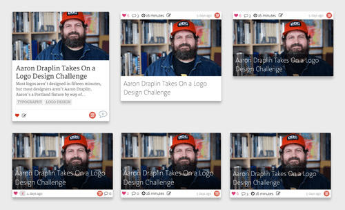
If you work on the web — which I assume you do if you’re reading this — your superpower is side projects. Unlike your regular job, where you have to listen to your boss or please your client, a side project lets you take on an alternate identity, one of which you’re in charge and no one can stop you.
The post How To Run A Side Project: Screenings Case Study appeared first on Smashing Magazine.
How To Run A Side Project: Screenings Case Study
http://www.smashingmagazine.com/2015/09/screenings-side-project-case-study/
http://rss1.smashingmagazine.com/feed/
Smashing Magazine
For Professional Web Designers and Developers
Powered by WPeMatico
Snapchat isn’t just for teens. Columnist Laurie Keith explains why it’s time for marketers to jump on board and deliver content in a unique way.
Please visit Marketing Land for the full article.
Powered by WPeMatico
What’s going on in the industry? What new techniques have emerged recently? What insights, tools, tips and tricks is the web design community talking about? Anselm Hannemann is collecting everything that popped up over the last week in his web development reading list so that you don’t miss out on anything. The result is a carefully curated list of articles and resources that are worth taking a closer look at. — Ed.

One thing we should learn to embrace more this year is to enjoy the good things and focus more on the positive news than on the negative. I started to learn more ES6 this year and have scheduled 1 to 2 small learning modules of ES6 and 1 to 2 accessibility features I don’t know yet to study each week. Currently, this works out great.
The post Web Development Reading List #120: Safari 9.1, Chakra Core Open Sourced, ES6 Object Shorthand Syntax appeared first on Smashing Magazine.
Powered by WPeMatico
How do you know if the technology you choose is the right fit for your company? Columnist Loretta Jones discusses what you should consider before making a decision on your marketing tools.
Please visit Marketing Land for the full article.
Powered by WPeMatico
When someone lands on a page of your site what do you want that person to do? Where do you want them to look? What information do you want your visitors to notice and in what order?
Ideally, you want people to see your most important information first and your next most important information second. You want potential customers to see the copy that will convince them to buy before they see the “Buy Now” button. You want people to be presented with the right information at the right time, and one way to do that is to control the flow of your composition1.
Compositional flow determines how the eye is led through a design: where it looks first, where it looks next, where the eye pauses, and how long it stays.
Note: This is the sixth post in a series on design principles. You can find the first five posts in the series here:
A couple of articles back in this series I talked about visual direction7 and I mentioned Rudolph Arnheim’s structural net. You should read that post for details, but the general idea is that in a rectangular canvas the center and the four corners of the canvas act as magnets to pull the eye. Along with these natural focal points, there are axes running between them and your eye moves along them from focal point to focal point.
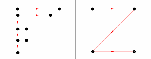
Arnheim’s structural net is not the only pattern that suggests where and how the eye naturally moves through a composition. The Gutenberg diagram, the F-pattern layout, and Z-pattern layout all suggest how a viewer’s eye will move and they assume a natural flow to a design.
Note: These patterns are described for languages that are read left to right. Adjust for other reading directions.
 8
8I’m sure you’ve seen eye tracking studies and discussions of the above patterns before. What rarely gets mentioned is how these patterns describe text-heavy pages10. They describe how our eye moves through columns of text.
The F-pattern is often mentioned in combination with search results pages. Why is that? It’s because search results pages are text-heavy pages presented as lists of bite-sized information to scan. An F-pattern is a natural way to scan these pages.
 11
11Add hierarchy, direction, movement and rhythm, and the flow through your design won’t follow the patterns above. The patterns fall away in the presence of design.
They’re still useful because you can take advantage of the patterns and place important information where the eye would naturally fall to increase the visual prominence of the information. You can take advantage of these natural patterns, but do understand they describe text-heavy pages only.
A viewer’s eye will move through a composition in some way regardless of whether or not you control the movement. You might as well control the movement.
You might have seen the word “storytelling” appear more and more often in discussions about design and conversion optimization. Compositional flow can help you tell your story by presenting information in the right order.
Flow is about movement and direction, and leading the eye from one part of a composition to another in the direction you want it to move. You create flow through a combination of visual weight and visual direction.
Elements of greater visual weight (focal points) pull the eye and become resting places. Other elements impart direction and move your eye from one point to another through visual cues such as arrows and lines.
Flow starts with your dominant element, which should be the entry point into your composition. From there you provide directional cues for the eye to follow through your design.
The most obvious directional cue is an arrow pointing at something. An image of a face looking in one direction is another strong and easy directional cue. Others include.
You’ll notice lines feature in the list above. Showing direction is one of the primary characteristics of lines. Lines can also be used to cut off motion in one direction by being perpendicular to that motion. When this happens they act as barriers, stopping or possibly reversing the path the eye was following.
Create direction and movement through the items mentioned above. Add elements that serve as barriers to change the direction the eye is moving. Create open paths in empty space to allow easy movement through and between your positive design elements.
On a micro level you want the path the eye follows to align well with whatever action you want someone to take. For example, it makes sense to place the button to search after the form field, because the natural process is to fill in the field and then click the button. Placing the button first would move your visitor in one direction until the end, when they have to move all the way back to the start.
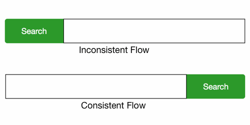 13
13It makes more sense to have arrows point to the thing you want someone to look at instead of away from that thing. You’re creating flow even when the arrows point away, but not a flow that makes any sense to achieve the goals of the site.
 15
15Movement is closely related to direction. Motion implies a direction and direction implies movement. If you want someone to look to the right, one way is to have something on the page move to the right. The eye will follow it.
There are several types of movement.
Animation can be used to create literal movement on the page. Dominance, focal points and hierarchy create static movement. When elements that impart direction and movement are added between focal points you create compositional flow.
The same list of directional cues I presented earlier are used to show movement through a composition.
Rhythm can help control the pace of flow in a composition; it’s patterned movement. Rhythmic patterns are built from elements and the intervals between them, and just as your ear will follow along with the rhythm of a song, your eye will follow rhythm created visually.
A pattern and a rhythm will exist as soon as you add multiple elements to the page. Two of anything implies a structure. It’s going to be there no matter what you do so, again, you should learn to control it.
Repetition creates flow and rhythm through the repeated elements. When the eye sees a red circle it notices other red circles in the composition and seeks to establish a pattern. In addition to repetition you can use alternation and gradation to create rhythm.
Rhythm is created both through the elements the eye follows and the intervals between them. Changes to either alter the pattern. Variations in the pattern add interest. Emphasis of something in the pattern can break the rhythm and pause the flow momentarily.
There are three primary types of rhythm:
 17
17Any of the above types of rhythm can be used to create movement and compositional flow. Which you would choose depends on the specifics of your design: if the design is trying to communicate consistency, a regular rhythm is probably best; if the design is trying to communicate something more natural and organic, a flowing rhythm would likely be preferred.
The further along we get in this series, the more gestalt principles contribute to the design principles we’re looking at.
Dominance and focal points create areas in your design that pull the eye. Similarity and contrast are used to create pattern and rhythm.
All the gestalt principles that connect or show commonality among elements will help lead the eye from one element in the group to the others.
Uniform connectedness leads the eye through the thing that connects the elements. Elements with a common fate appear to move in the same direction carrying the eye along with them. The principle of continuation is specifically about continuing to move in one direction.
Let’s take a look at screenshots from a few sites and think about how their designs flow and move, and what kind of rhythm they might have.
As I’ve mentioned previously in the series, this is my opinion. You might look at these same screenshots and see a different flow and rhythm than I do. That’s fine. It’s more important for both of us to think critically about the designs we see than it is for us to agree about what we think.
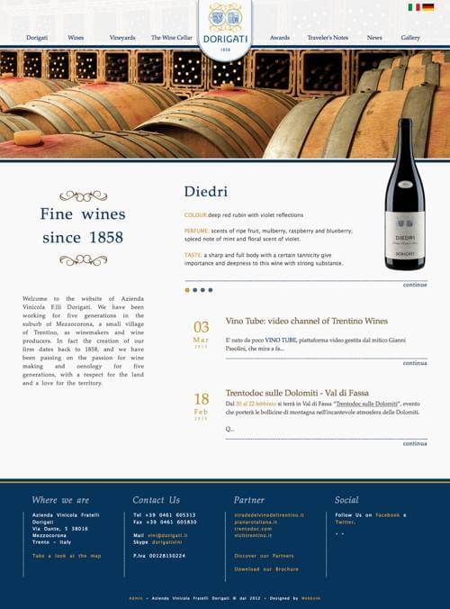
When I look at the Dorigati home page19 my eye is quickly drawn to the hero image of wine barrels at the top of the page. It doesn’t take long to be pulled from here to focal points like the site logo and the image of the wine bottle to the right.
 20
20There’s a strong implied diagonal flow between the logo and bottle, and your eye likely flows back and forth between them. Think how quickly that connects the company name with the products the site offers.
The curve at the bottom of the logo appears to point downward leading your eye to the name of the wine being presented. Notice that the heading to the left and the name of the wine are the same blue and similar to the blue in the logo. The repetition of color creates a rhythm and flow through all three items.
The rhythm of color is used again with the gold headings down the page and the decorative flourishes to the left. A similar color is used for the dates. While the interval can vary depending on the length of the text in each entry, it’s fairly predictable and a regular rhythm.
The wine bottle also serves to connect the header with the main content, creating a vertical flow through the hero image and serving as a bridge across it. Without the image of the wine bottle it requires more effort for your eye to cross the horizontal lines that create barriers to movement.
There’s a strong horizontal flow at the top of the Dress Responsively home page22. The navigation and text both lead your eye horizontally and make it very easy to scan left and right across the header.
 23
23My eye tends to start with the “YOU DECIDE” text and easily moves right and left where it can take in the logo, navigation, and the remaining text in the header.
Notice at the end of “YOU DECIDE” your eye is also pulled down. There’s a repetition of rectangular and orange shapes that creates a vertical rhythm. The shape of the “WTH?” button is echoed in the mostly rectangular “548 votes” shape and the “SEE DETAILS” button below the text. This vertical flow is strengthened by a strong vertical line that’s created by aligning the left edge of these shapes with the text between them.
The orange color repeats itself as text in both the header and also further down the page (not shown in the screenshot). Having encountered the color repetition at the top of the page, your eye follows it down the page increasing the vertical flow.
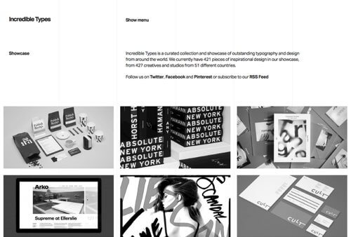
The header of the Incredible Types home page25 also has a horizontal flow due to the shape of the lines and block of text. The light grid lines create a subtle pull down and also create a regular rhythm horizontally across the page.
 26
26Below the header is a grid of images. Notice how the gutters (both horizontal and vertical) between images provide a channel for your eye to move through. They help your eye flow from image to image in either direction. They also create a regular rhythm in both directions.
 28
28In the footer, text is grouped into two rows and four columns once again creating both horizontal and vertical flow and rhythm. I think the horizontal flow stronger than the vertical and so my eye tends to move left and right more than up and down, but the flow exists in both directions.
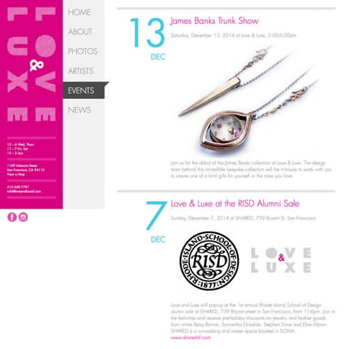
The Events page on the Love &Luxe site30 is another design that shows both horizontal and vertical flow.
 31
31The pink in the left column draws my eye and creates vertical flow through its shape. Note how the site name is rotated so it too creates a vertical flow. The contrast in color with the menu next to it creates a strong vertical line where the two meet.
The text at the bottom of this column repeats, creating a vertical rhythm as you read one block then the one below it. However, the horizontal nature of the lines changes the flow to horizontal and moves your eye to the right.
The dark background behind the current menu items creates an even stronger horizontal flow because your eye is drawn to the contrast. The triangle it displays at its top-right corner points to the right.
On the right, in the main content, the color and size of the dates creates a regular vertical rhythm through repetition. The screenshot only shows two of these, but they continue further down the page. The pink headlines work to reinforce the rhythm created by the repeating blue dates.
The horizontal lines between each entry stop the vertical flow momentarily, keeping you in each entry a little longer. The rhythm of the repeating colors in the dates and headlines pulls you further down the page once you’re ready to cross the horizontal line and move to another entry.
The images naturally change with each entry, but the one in this screenshot directs your eye down and to the left diagonally.
You have a lot of control over where people look when they’re viewing a webpage you’ve designed. On a text-heavy and graphic-light page, a visitor’s eye likely follows something like a Z-pattern or F-pattern across and down the page.
However, as soon as you design page elements and add graphics, those patterns no longer apply. Your visitor’s eye will follow the flow, movement and rhythm you create.
Think about the priority of the information you’re communicating. Think if it would be more useful when seen in a specific order. Think about where on the page you want someone to look first, second, and third.
Then create visual cues to lead them through the page in the order you think best. Add a line for someone to follow, or create one by aligning various elements. Repeat a color or text size to create a rhythm for the eye to follow. Present images of moving objects to direct the eye.
Don’t leave it to a default pattern to lead your visitor’s eye. Create compositional flow through the page and lead them yourself.
There’s one last topic I want to share with you in this series on design principles, and that’s balance. I’ll talk about compositional balance in general and then walk you through the four different types of balance (symmetrical, asymmetrical, radial and mosaic) you can create.
(og, ml)
The post Design Principles: Compositional Flow And Rhythm appeared first on Smashing Magazine.
Design Principles: Compositional Flow And Rhythm
http://www.smashingmagazine.com/2015/04/29/design-principles-compositional-flow-and-rhythm/
http://www.smashingmagazine.com/feed/?#
Smashing Magazine
For Professional Web Designers and Developers
Powered by WPeMatico
http://AffiliatesBible.com/bonus Adsense Firestorm – Adsense Google Tutorial. Learn how to maximize your Adsense earnings with a simple WordPress plugin.

This post originally appeared on Agency Post. To read more content like this, subscribe to Agency Post.
What makes a team truly great?
Is it the mix of personalities? Is it how teams are measured and rewarded? Does the team leader ultimately determine their success?
There is a lot of research and opinion on what ingredients are necessary to build a high-performing team because it is one of the most difficult things to do — you are essentially forcing people together — but it’s one of the biggest drivers of success in an organization. A poor performing team can negatively impact an entire organization, not to mention be the cause for missing goals or revenue targets.
Weekdone created the below infographic detailing some of the defining characteristics of great teams. Learn what you should look for in a high-performing team and how to recruit to create your own.


![]()
Powered by WPeMatico
Augmented reality is generally considered to be very hard to create. However, it’s possible to make visually impressive projects using just open source libraries. In this tutorial we’ll make use of OpenCV in Python to detect circle-shaped objects in a webcam stream and replace them with 3D Earth in Three.js in a browser window while using WebSockets to join this all together.

We want to strictly separate front-end and back-end in order to make it reusable. In a real-world application we could write the front-end in Unity, Unreal Engine or Blender, for example, to make it look really nice. The browser front-end is the easiest to implement and should work on nearly every possible configuration.
The post Simple Augmented Reality With OpenCV, Three.js and WebSockets appeared first on Smashing Magazine.
Powered by WPeMatico
Video ini menjelaskan cara mendaftar di Google Adsense dengan mudah, sehingga mendapatkan Iklan Bukan hanya Google Search Custom tetapi iklan lain, dan juga …