It began, as many things do, with a silly conversation. In this case, I was talking with our Front End Technology Competency Director (aka "boss man") Mundi Morgado.
It went something like this…
Mundi Morgado I want you to build a visual screen reader.
Nathan Smith Who what now?
Mundi Morgado I want a CSS library that allows you to see the structure of a document. It shouldn't use class so that you're forced to focus on semantics. Also, make it theme-able.
Nathan Smith Sure, let me see what I can come up with.
Fast-forward a week, and we've got what we are now calling:
Trashy.css: The throwaway CSS library with no class
Why throwaway? Well, it's not really meant to be a fully fledged, production-ready style framework. Rather, it's like training wheels for document semantics, with some bumper lanes (think: bowling) to keep you on the right track.
It's part of our ongoing effort at TandemSeven to promote code literacy throughout our organization. As more of our UX designers are beginning to share responsibility for the accessibility and semantics of a project, it makes sense that we would build in such a way that allows UX and development to be more collaborative.
There are four main aspects to Trashy.
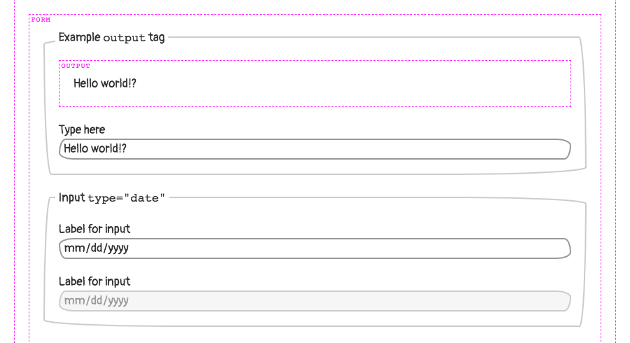
Trashy: "Basic"
First is the base trashy.css file, which applies a passably basic look and feel to the majority of common HTML elements. Check out this example of a basic page.
Trashy: "Boxes"
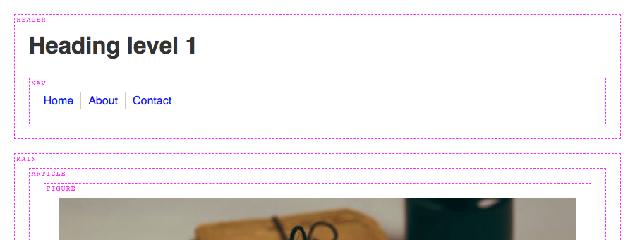
Second, there is trashy.boxes.css. This visually distinguishes otherwise invisible semantic elements, such as: header, main, nav, etc. That way, one can see where those elements are (or aren't) as a page is being authored. Here’s a page with semantic boxes outlined.
Trashy: "Theme"
Thirdly, theming is possible via trashy.theme.css. This is mostly just an example — inspired by PaperCSS) — of how to make UI look "hand drawn," to prevent observers from being too fixated on the look and feel, rather than the semantics of a document. Here’s the example theme in action.
Trashy: "Debug"
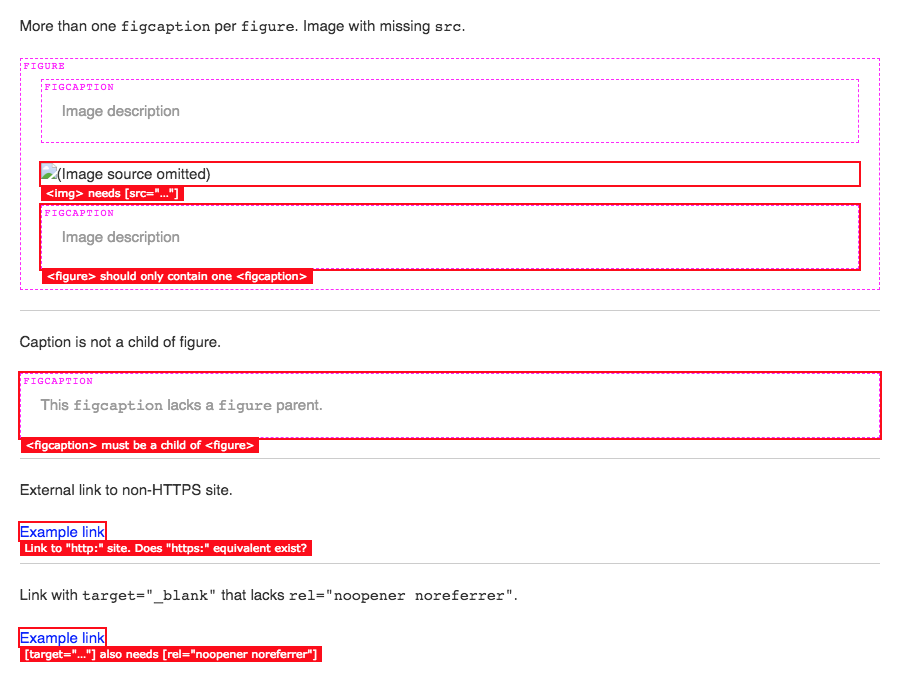
Lastly, there is a trashy.debug.css file that highlights and calls out invalid and/or problematic markup. Here’s a gnarly example of "everything" going wrong on a single HTML page. This was inspired by a11y.css, though it diverges in what is considered noteworthy.
For instance, we call out "div-itis" when multiple div:only-child have been nested within one another. We're also opinionated about type="checkbox" being contained inside of a <label>. This is for maximum click-ability within an otherwise dead whitespace gap, between a checkbox (or radio) and its textual label.
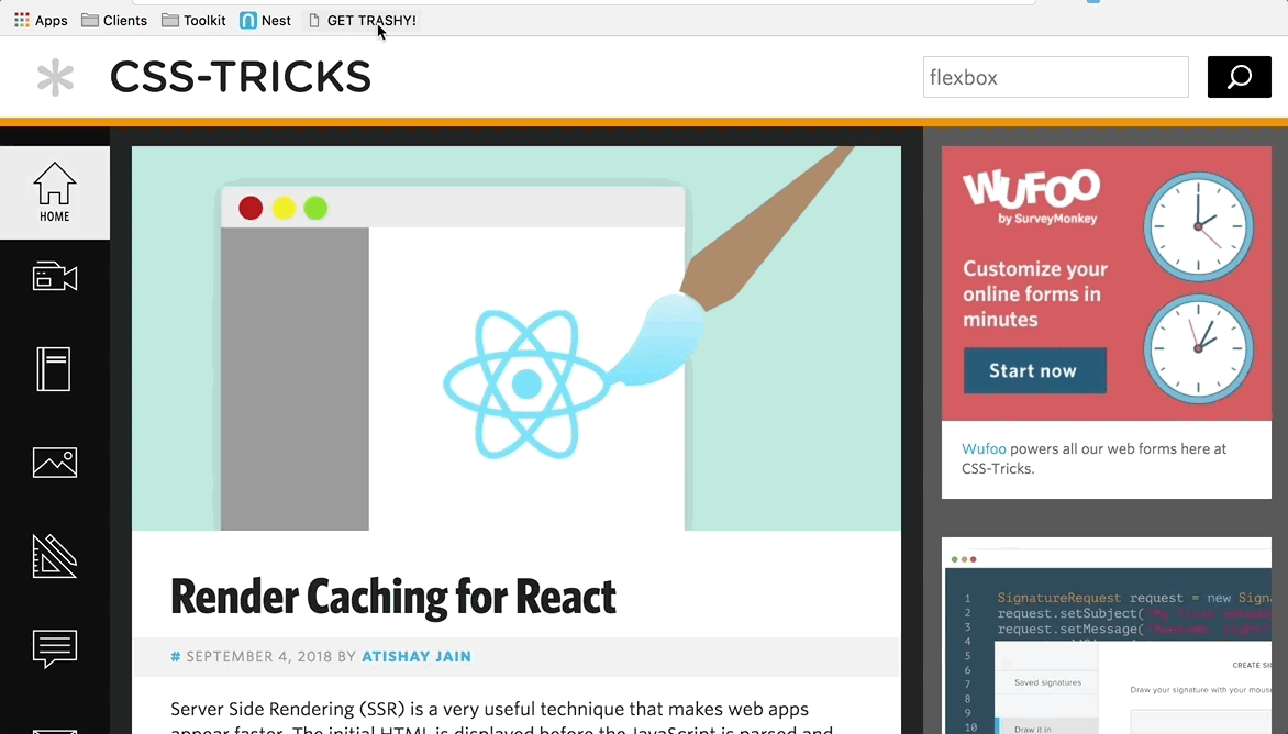
Any or all of these CSS files can be applied individually or in conjunction with one another. There is also a bookmarklet (labeled "GET TRASHY!") on the Trashy home page you can use to get results for any webpage.
The bookmarklet will remotely pull in:
sanitize.css
trashy.css
trashy.boxes.css
trashy.debug.css
Our "reset" - Sanitize.css
A quick word on Santitize.css: It was created by my coworker Jonathan Neal (author of Normalize.css), as a way to have a semi-opinionated CSS "reset." Meaning, it puts in a lot of defaults that we find ourselves writing as developers anyway, so it makes for a good starting point.
Technically speaking
Okay, so now that we’ve covered the "why," let’s dig into the "how."
Basically, it all revolves around using (abusing?) the ::before and ::after pseudo elements. For instance, to show the name of a block level tag, we’re using this CSS.
Semantic tags (using ::before)
Here is an abbreviated version of the trashy.boxes.css file, for succinctness. It causes the <section> tag to have a dashed border, and to have its tag named displayed the top left corner.
Likewise, here’s a snippet of code from the trashy.debug.css file that drives the markup warning messages. This particular example causes <script> tags to be displayed, which may be further optimized or need the developer’s attention: inline JavaScript and/or external src without async.
In the case of inline JS, we set the font-size and line-height to 0 because we’re making the element visible. We yank the text off the page via text-indent: -99999px just to make sure it doesn’t show up. We wouldn’t want that random JS code displayed alongside legit page content.
(Please don’t ever do this for "real" content. It’s just a hack, mkay?)
To get our error message to show up though, we have to set the font-size and line-height back to non-zero values, and remove our text-indent. Then, with a bit more absolute positioning, we ensure the message is visible. This lets us see, amidst the rest of the page content, whereabouts to check (via DOM inspector) for the <script> insertion point.
Note: Some scripts do need to be loaded synchronously. You wouldn’t want your "app" code to load before your "framework" code. Heck, some inline JS is probably fine too, especially if you’re doing some super speed optimization for the critical rendering path. These warnings are "dumb" in the sense that they match only via CSS selectors. Take ‘em with a grain of salt, your mileage may vary, etc.
JS bookmarklet
The aforementioned JS bookmarklet finds all <link rel="stylesheet"> and <style> tags in the page, and causes them to be ineffective. This allows us to add in our own CSS to take over, so that the only styles applied are those provided directly via Trashy.
The magic is accomplished by setting rel="stylesheet" to rel="". If an external stylesheet is not identified as such, even if it’s cached, the browser will not apply its styles to the page. Similarly, we destroy the contents of any inline <style> tags by setting the innerHTML to an empty string.
This leaves us with the tags themselves still intact, because we still want to validate that no <link> or <style> tags are present within <body>.
We also check that there aren’t too many <style> tags being used in the <head>. We allow for one, since it could be used for the critical rendering path. If there’s a build process to generate a page with consolidated inline styles, then it’s likely they’re being emitted through a single tag.
<a href="javascript:(
  function (d) {
    var f = Array.prototype.forEach;
    var linkTags = d.querySelectorAll('[rel=\'stylesheet\']');
    var styleTags = d.querySelectorAll('style');

    f.call(linkTags, function (x) {
      x.rel = '';
    });

    f.call(styleTags, function (x) {
      x.innerHTML = '';
    });

    var newLink = d.createElement('link');

    newLink.rel = 'stylesheet';

    newLink.href =
      'https://t7.github.io/trashy.css/css/bookmarklet.css';

    d.head.appendChild(newLink);
  }
)(document);">
  GET TRASHY!
</a>
That pretty much covers it. It's a simple drop-in to help you visualize your document semantics and debug possibly problematic markup.
I have also found it to be super fun to use. A quick click of the bookmarklet on any given site usually yields lots of things that could be improved upon.
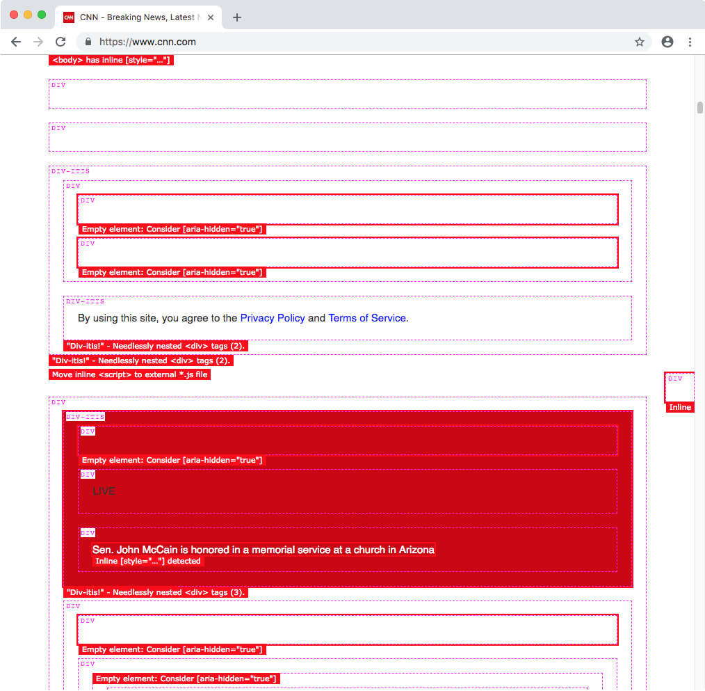
For instance, here's what CNN's site looks like with Trashy applied…
P.S. Call security!
If you try this with Twitter’s site, you might wonder why it doesn’t work. We were initially perplexed by this, too. It has to do with the site's Content Security Policy (CSP). This can be used to disallow CSS and/or JavaScript from being loaded externally, and can whitelist safe domains.
This can be set either at the server level, or by a <meta> tag in the <head>.
In the case of Twitter, it’s emitted from the server. Even if it were in the HTML, destroying it has no effect on the actual browser behavior. It’s locked in.
Okay, so...
Can’t you insert your own security meta tag and override it?
You’d think so. But, thankfully, no. Once a CSP been accepted by the browser for that page, it cannot be overridden. That’s probably a good thing, even though it ruins our fun.
I suppose that’d be like wishing for more wishes. It’s against the genie rules!
Earlier this year, a man drove his car into a lake after following directions from a smartphone app that helps drivers navigate by issuing turn-by-turn directions. Unfortunately, the app’s programming did not include instructions to avoid roads that turn into boat launches.
From the perspective of the app, it did exactly what it was programmed to do, i.e. to find the most optimal route from point A to point B given the information made available to it. From the perspective of the man, it failed him by not taking the real world into account.
The same principle applies for accessibility testing.
Designing For Accessibility And Inclusion
The more inclusive you are to the needs of your users, the more accessible your design is. Let’s take a closer look at the different lenses of accessibility through which you can refine your designs. Read article →
Automated Accessibility Testing
I am going to assume that you’re reading this article because you’re interested in learning how to test your websites and web apps to ensure they’re accessible. If you want to learn more about why accessibility is necessary, the topic has been covered extensively elsewhere.
Automated accessibility testing is a process where you use a series of scripts to test for the presence, or lack of certain conditions in code. These conditions are dictated by the Web Content Accessibility Guidelines (WCAG), a standard by the W3C that outlines how to make digital experiences accessible.
For example, an automated accessibility test might check to see if the tabindex attribute is present and if its value is greater than0. The pseudocode would be something like:
Failures can then be collected and used to generate reports that disclose the number, and severity of accessibility issues. Certain automated accessibility products can also integrate as a Continuous Integration or Continuous Deployment (CI/CD) tool, presenting just-in-time warnings to developers when they attempt to add code to a central repository.
These automated programs are incredible resources. Modern websites and web apps are complicated things that involve hundreds of states, thousands of lines of code, and complicated multi-screen interactions. It’d be absurd to expect a human (or a team of humans) to mind all the code controlling every possible permutation of the site, to say nothing of things like regressions, software rot, and A/B tests.
Automation really shines here. It can repeatedly and tirelessly pour over these details with perfect memory, at a rate far faster than any human is capable of.
However…
Automated accessibility tests aren’t a turnkey solution, nor are they a silver bullet. There are some limitations to keep in mind when using them.
Thinking To Think Of Things
One of both the best and worst aspects of the web is that there are many different ways to implement a solution to a problem. While this flexibility has kept the web robust and adaptable and ensured it outlived other competing technologies, it also means that you’ll sometimes see code that is, um, creatively implemented.
The test suite is only as good as what its author thought to check for. A naïve developer might only write tests for the happy path, where everyone writes semantic HTML, fault-tolerant JavaScript, and well-scoped CSS. However, this is the real world. We need to acknowledge that things like tight deadlines, unfamiliarity with the programming language, atypical user input, and sketchy 3rd party scripts exist.
For example, the automated accessibility testing site Tenon.io wisely includes a rule that checks to see if a form element has both a label element and an aria-label associated with it, and if the text strings for both declarations differ. If they do, it will flag it as an issue, as the visible label may be different than what someone would hear if they were navigating using a screen reader.
If you’re not using a testing service that includes this rule, it won’t be reported. The code will still “pass”, but it’s passing by omission, not because it’s actually accessible.
State
Some automated accessibility tests cannot parse the various states of interactive content. Critical parts of the user interface are effectively invisible to automation unless the test is run when the content is in an active, selected, or disabled state.
By interactive content, I mean things that the user has yet to take action on, or aren’t present when the page loads. Unopened modals, collapsed accordions, hidden tab content and carousel slides are all examples.
It takes sophisticated software to automatically test the various states of every component within a single screen, let alone across an entire web app or website. While it is possible to augment testing software with automated accessibility checks, it is very resource-intensive, usually requiring a dedicated team of engineers to set up and maintain.
Just having the presence of ARIA does not guarantee that it will automatically make something accessible. Unfortunately, and in spite of its first rule of use, ARIA is commonly misunderstood, and consequently abused. A lot of off-the-shelf code has this problem, perpetuating the issue.
For example, certain ARIA attributes and values can only be applied to certain elements. If incorrectly applied, assistive technology will ignore or misreport the declaration. Certain roles, known as Abstract Roles, only exist to set up the overall taxonomy and should never be placed in markup.
<button role="command">Save</button>

<!-- Never do this -->
To further complicate the issue, support for ARIA is varied across browsers. While an attribute may be used appropriately, the browser may not communicate the declared role, property, or state to assistive technology.
There is also the scenario where ARIA can be applied to an element and be valid from a technical standpoint, yet be unusable from an assistive technology perspective. For example:
<h1 aria-hidden=“true”>
  Tired of unevenly cooked asparagus? Try this tip from the world’s oldest cookbook.
</h1>
Headings — especially first-level headings — are vital in communicating the purpose of a page. If a person is using assistive technology to navigate, the aria-hidden declaration applied to the h1 element will make it difficult for them to quickly determine the page’s purpose. It will force them to navigate around the rest of the page to gain context, an annoying and labor-intensive process.
Some automated accessibility tests may scan the code and not report an error since the syntax itself is valid. The automation has no way of knowing the greater context of the declaration’s use.
This isn’t to say you should completely avoid using ARIA! When authored with care and deliberation, ARIA can fix the gaps in accessibility that sometimes plague complicated interactions; it provides some much-needed context to the people who rely on assistive technology.
Much-Needed Context
As the soggy car demonstrates, computers are awful at understanding the overall situation of the outside world. It’s up to us humans to be the ultimate arbiters in determining if what the computer spits out is useful or not.
Debunking
Before we discuss how to provide appropriate context, there are a few common misunderstandings about accessibility work that need to be addressed:
Second, accessibility is more than just screen readers. The rules outlined in the Web Content Accessibility Guidelines ensure that the largest number of people can read and operate technology, regardless of ability or circumstance.
For example, the rule that stipulates a website or web app needs to be able to work regardless of device orientation benefits everyone. Some people may need to mount their device in a fixed location in a specific orientation, such as in landscape mode on the arm of a wheelchair. Others might want to lie in bed and watch a movie, or better investigate a product photo (pinch and pull zooming will also be helpful to have here).
Third, disabilities can be conditional and can be brought about by your environment. It can be a short-term thing, like rain on your glasses, sleep deprivation, or an allergies-induced migraine. It can also be longer-term, such as a debilitating illness, broken limb, or a depressive episode. Multiple, compounding conditions can (and do) affect individuals.
That all being said, many accessibility fixes that help screen readers work properly also benefit other assistive technologies.
Get Your Feet Wet
Knowing where to begin can be overwhelming. Consider Michiel Bijl’s great advice:
“Before you release a website, tab through it. If you cannot see where you are on the page after each tab; you're not finished yet. #a11y
Tab through a few of the main user flows on your website or web app to determine if all interactive components’ focus states are visually apparent, and if they can be activated via keyboard input. If there’s something you can click or tap on that isn’t getting highlighted when receiving keyboard focus, take note of it. Also pay attention to the order interactive components are highlighted when focused — it should match the reading order of the site.
If you need a baseline to compare your testing to, Dave Rupert has an excellent project called A11Y Nutrition Cards, which outlines expected behavior for common interactive components. In addition, Scott O’Hara maintains a project called a11y Styled Form Controls. This project provides examples of components such as switches, checkboxes, and radio buttons that have well-tested and documented support for assistive technology. A clever reader might use one of these resources to help them try out the other!
With that out of the way, I’m going to share a fourth myth with you: not every assistive technology user is a power user. Like with any other piece of software, there’s a learning curve involved.
In her post about Aaptiv’s redesign, Lisa Zhu discovers that their initial accessibility fix wasn’t intuitive. While their first implementation was “technically” correct, it didn’t line up with how people who rely on VoiceOver actually use their devices. A second solution simplified the interaction to better align with their expectations.
Don’t assume that just because something hypothetically functions that it’s actually usable. Trust your gut: if it feels especially awkward, cumbersome, or tedious to operate for you, chances are it’ll be for others.
Dive Right In
While not every accessibility issue is a screen reader issue, you should still get in the habit of testing your site with one. Not an emulator, simulator, or some other proxy solution.
If you find yourself struggling to operate a complicated interactive component using basic screen reader commands, it’s probably a sign that the component needs to be simplified. Chances are that the simplification will help non-assistive technology users as well. Good design benefits everyone!
The same goes for navigation. If it’s difficult to move around the website or web app, it’s probably a sign that you need to update your heading structure and landmark roles. Both of these features are used by assistive technology to quickly and efficiently navigate.
Both of these are sidebars, but only one of them is semantically described as such. A computer doesn't know what a sidebar is, so it's up to you to tell it.
Another good thing to review is the text content used to describe your links. Hopping from link to link is another common assistive technology navigation technique; some screen readers can even generate a list of all link content on the page:
“Think before you link! Your "helpful" click here links look like this to a screen reader user. ALT = JAWS links list”
When navigating using an ordered list devoid of the surrounding non-link content, avoiding ambiguous terms like “click here” or “more info” can go a long way to ensuring a person can understand the overall meaning of the page. As a bonus, it’ll help alleviate cognitive concerns for everyone, as you are more accurately explaining what a user should expect after activating a link.
How To Test
Each screen reader has a different approach to how it announces content. This is intentional. It’s a balancing act between the product’s features, the operating system it is installed on, the form factor it is available in, and the types of input it can receive.
The Browser Wars taught us the folly of developing for only one browser. Similarly, we should not cater to a single screen reader. It is important to note that many people rely exclusively on a specific screen reader and browser combination — by circumstance, preference, or necessity’making this all the more important. However, there is a caveat: each screen reader works better when used with a specific browser, typically the one that allows it access to the greatest amount of accessibility API information.
All of these screen readers can be used for free, provided you have the hardware. You can also virtualize that hardware, either for free or on the cheap.
Automate
Automated accessibility tests should be your first line of defense. They will help you catch a great deal of nitpicky, easily-preventable errors before they get committed. Repeated errors may also signal problems in template logic, where one upstream tweak can fix multiple pages. Identifying and resolving these issues allows you to spend your valuable manual testing time much more wisely.
It may also be helpful to log accessibility issues in a place where people can collaborate, such as Google Sheets. Quantifying the frequency and severity of errors can lead to good things like updated documentation, opportunities for lunch and learn education, and other healthy changes to organizational workflow.
The two most popular screen readers on Windows are JAWS and NVDA.
JAWS
JAWS (Job Access With Speech) is the most popular and feature-rich screen reader on the market. It works best with Firefox and Chrome, with concessions for supporting Internet Explorer. Although it is pay software, it can be operated in full in demo mode for 40 minutes at a time (this should be more than sufficient to perform basic testing).
Windows comes bundled with a built-in screen reader called Narrator. It works well with Edge, but has difficulty interfacing with other browsers.
Apple
macOS
VoiceOver is a powerful screen reader that comes bundled with macOS. Use it in conjunction with Safari, first making sure that full keyboard access is enabled.
iOS
VoiceOver is also included in iOS, and is the most popular mobile screen reader. Much like its desktop counterpart, it works best with Safari. An interesting note here is that according to the 2017 WebAIM screen reader survey, a not-insignificant amount of respondents augment their phone with external hardware keyboards.
Android
Google recently folded TalkBack, their mobile screen reader, into a larger collection of accessibility services called the Android Accessibility Suite. It works best with Mobile Chrome. While many Android apps are notoriously inaccessible, it is still worth testing on this platform. Android’s growing presence in emerging markets, as well as increasing internet use amongst elderly and lower-income demographics, should give pause for consideration.
If you do not require the use of assistive technology on a frequent basis then you do not fully understand how the people who do interact with the web.
Much like traditional user testing, being too close to the thing you created may cloud your judgment. Empathy exercises are a good way to become aware of the problem space, but you should not use yourself as a litmus test for whether the entire experience is truly accessible. You are not the expert.
If your product serves a huge population of users, if its core base of users trends towards having a higher probability of disability conditions (specialized product, elderly populations, foreign language speakers, etc.), and/or if it is required to be compliant by law, I would strongly encourage allocating a portion of your budget for testing by people with disabilities.
“At what point does your organisation stop supporting a browser in terms of % usage? 18% of the global pop. have an #Accessibility requirement, 2% people have a colour vision deficient. But you consider 2% IE usage support more important? Support everyone be inclusive.”
This isn’t to say you should completely delegate the responsibility to these testers. Much as how automated accessibility testing can detect smaller issues to remove, a first round of basic manual testing helps professional testers focus their efforts on the complicated interactions you need an expert’s opinion on. In addition to optimizing the value of their time, it helps to get you more comfortable triaging. It is also a professional courtesy, plain and simple.
There are a few companies that perform manual testing by people with disabilities:
We also need to acknowledge the other large barrier to accessible sites that can’t be automated away: poor user experience.
User experience can make or break a product. Your code can compile perfectly, your time to first paint can be lightning quick, and your Webpack setup can be beyond reproach. All this is irrelevant if the end result is unusable. User experience encompasses all users, including those who navigate with the aid of assistive technology.
If a person cannot operate your website or web app, they’ll abandon it and not think twice. If they are forced to use your site to get a service unavailable by other means, there’s a growing precedent for taking legal action (and rightly so).
As a discipline, user experience can be roughly divided into two parts: how something looks and how it behaves They’re intrinsically interlinked concepts — work on either may affect both. While accessible design is a topic unto itself, there are some big-picture things we can keep in mind when approaching accessible user experiences from a testing perspective:
How It Looks
The WCAG does a great job covering a lot of the basics of good design. Color contrast, font size, user-facing state: a lot of these things can be targeted by automation. What you should pay attention to is all the atomic, difficult to quantify bits that compound to create your designs. Things like the words you choose, the fonts you use to display them, the spacing between things, affordances for interaction, the way you handle your breakpoints, etc.
“A good font should tell you: the difference between m and rn the difference between I and l the difference between O and 0.”
It’s one of those “an ounce of prevention is worth a pound of cure” situations. Smart, accessible defaults can save countless time and money down the line. Lean and mean startups all the way up to multinational conglomerates value efficient use of resources, and this is one of those places where you can really capitalize on that. Put your basic design patterns — say collected in something like a mood board or living style guide — in front of people early and often to see if your designed intent is clear.
How It Behaves
An enticing color palette and collection of thoughtfully-curated stock photography only go so far. Eventually, you’re going to have to synthesize all your design decisions to create something that addresses a need.
Behavior can be as small as a microinteraction, or as large as finding a product and purchasing it. What’s important here is to make sure that all the barriers to a person trying to accomplish the task at hand are removed.
If you’re using personas, don’t create a separate persona for a user with a disability. Instead, blend accessibility considerations into your existing ones. As a persona is an abstracted representation of the types of users you want to cater to, you want to make sure the kinds of conditions they may be experiencing are included. Disability conditions aren’t limited to just physical impairments, either. Things like a metered data plan, non-native language, or anxiety are all worth integrating.
“When looking at your site's analytics, remember that if you don't see many users on lower end phones or from more remote areas, it's not because they aren't a target for your product or service. It is because your mobile experience sucks. As a developer, it's your job to fix it.”
User testing, ideally simulating conditions as close to what a person would be doing in the real world (including their individual device preferences and presence of assistive technology), is also key. Verifying that people are actually able to make the logical leaps necessary to operate your interface addresses a lot of cognitive concerns, a difficult-to-quantify yet vital thing to accommodate.
We Shape Our Tools, Our Tools Shape Us
Our tool use corresponds to the kind of work we do: Carpenters drive nails with hammers, chefs cook using skillets, surgeons cut with scalpels. It’s a self-reinforcing phenomenon, and it tends to lead to over-categorization.
Sometimes this over-categorization gets in the way of us remembering to consider the real world. A surgeon might have a carpentry hobby; a chef might be a retired veterinarian. It’s important to understand that accessibility is everyone’s responsibility, and there are many paths to making our websites and web apps the best they can be for everyone. To paraphrase Mikey Ilagan, accessibility is a holistic practice, essential to some but useful to all.
Used with discretion, ARIA is a very good tool to have at our disposal. We shouldn’t shy away from using it, provided we understand the how and why behind why they work.
The same goes for automated accessibility tests, as well as GPS apps. They’re great tools to have, just get to know the terrain a little bit first.


