Today is Labor Day in the U.S., a time to celebrate the potency and dignity of work — and the...
The post Happy Labor Day! appeared first on Copyblogger.

Tips, Expertise, Articles and Advice from the Pro's for Your Website or Blog to Succeed

Today is Labor Day in the U.S., a time to celebrate the potency and dignity of work — and the...
The post Happy Labor Day! appeared first on Copyblogger.
After reading the title of this article, it might seem like it’s jumping the gun, but with retailers turning on holiday music and putting out holiday-related displays earlier and earlier every year, your consumers are primed to start thinking about the holidays earlier, too. In fact, a study done by the Tampa Bay Times revealed that in-store shoppers were exposed to holiday music as early as October 22 in 2017.

Of course, e-commerce handles the holiday season a bit differently than brick-and-mortar. It’s not really necessary to announce promotions or run sales in late October or early November. However, that doesn’t mean you should wait until the last minute to prepare your mobile website for the holidays.
In this article, I’m going to give you a quick rundown of what happened during the 2017 holiday sales season and, in particular, what role mobile played in it. Then, we’re going to dig into holiday design and marketing tactics you can use to boost sales through your mobile website for the 2018 holiday season.
Recommended reading: How Mobile Web Design Affects Local Search (And What To Do About It)
Before we get started, I want to quickly add a disclaimer:
This particular section focuses on e-commerce statistics because this kind of data is readily available. Something like the total number of page visits, subscribed readers, and leads generated... well, it’s not.
So, although I only use data to express how important mobile was to 2017 holiday sales, keep in mind that the tips that follow pertain to all websites. Even if your site doesn’t expressly sell goods or services, blogs and other content-driven sites can take advantage of this, too!
Now, let’s take a look at the numbers:
The National Retail Federation calculated the total amount of retail sales--online and in-store--to be $691.9 billion between November and December, a 5.5% bump from 2016.
Adobe put the total amount of e-commerce sales during that same timeframe at $108.15 billion in 2017.

Adobe takes it even further and breaks down the share of revenue by device:

While smartphone and tablet sales still trail those on desktop, there are a couple interesting things to note here. For starters, desktop revenue has mostly flatlined year-over-year whereas mobile continues to grow. In addition, there’s an interesting disparity between how much traffic comes from each device and what percentage of revenue it generates:

Pay close attention to desktop and smartphone. As you can see, more visits stem from smartphones than any other device and, yet, desktop leads the way in conversions:

Is this indicative of a lack of trust in smart devices to handle purchases?
In all likelihood, it probably isn’t. Data from other sources indicates that on holidays, in particular, mobile reigns supreme in terms of visits and conversions:
Also, let’s not forget to take into account the strengths of mobile devices within the shopper’s experience. According to the four micro-moments as defined by Google, a large number of mobile users commonly search for the following:
The second and third are clearly indicative of a searcher’s desire to find something outside their devices (and their homes) to spend money on. That might even be so for the fourth, though it could also be an indication that they want to do their research on mobile and complete the purchase on desktop.
Either way, we know that smartphones tend to be a primary facilitator in the customer’s journey and not something that’s putting an end to the shopping experience as a whole.
Recommended reading: Designing For Micro-Moments
While the overall numbers indicate that desktop is the leading platform for holiday sales, it’s not a universal rule that can be applied to each and every day in November and December. This is why your own data will have to play a big role in the design choices you make for your mobile site this season.
You have to admit, no matter how stressed or unhappy you might feel around the holidays, there is something nice about encountering just the right hint of holiday “cheer”. And that’s one of the keys to doing this right: finding the right amount of holiday flavor to infuse into your website.
Before we get into what you can do to spruce up your mobile web design, I want to remind you that security and speed are critical elements to check off your list before November gets here. These might not be in your realm of responsibilities, but that doesn’t mean you shouldn’t keep an eye on them.
If you’re doing all this design work in anticipation of boosting conversions over the holidays, don’t let it all be for nothing by forgetting about performance and security essentials. To protect your site from potentially harmful traffic surges, start with this front-end performance checklist. With regards to security, you can use these security improvement tips.
Now, let’s talk about the five ways in which you can prepare your mobile website for the 2018 holiday season:
If your website has been live and actively doing business for more than a year, you need to start with the data from 2017. Using Google Analytics and your CRM platform, locate answers to the following questions:
Google Analytics allows you to divvy up traffic based on technology in a number of ways:
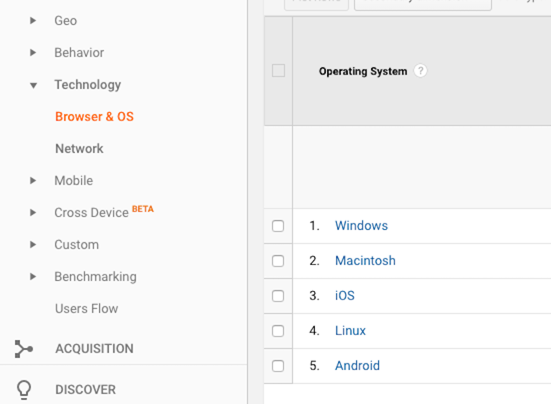
Under Browser & OS, you can sort visitors by browser:

There is a small tab at the top of the table for “Operating System”. Click that to reveal which OS were used:
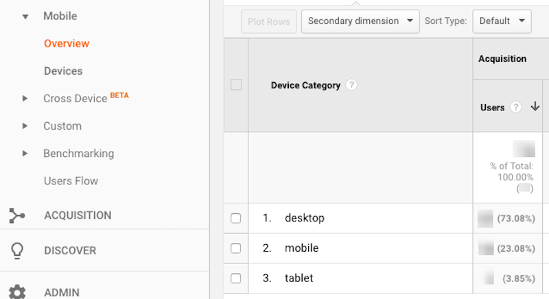
You can use the Mobile → Overview tab to look at the simple breakdown between desktop, mobile, and tablet users.
Really, your goal here is to weed out desktop users so you can focus strictly on mobile traffic as you assess the following data points.
Every website’s holiday traffic history will look a little different. Take mine, for example:

My business really isn’t affected by the holidays at all... except that I know things are going to be super quiet on and around Thanksgiving and the major holidays in December. This is still important information for me to have.
For businesses that directly sell products or services through their site or content-based sites that plan publication schedules based on traffic, you’ll likely see a different trajectory in terms of highs and lows.
Again, for some of you, the matter of sales is irrelevant if you don’t offer any through your site. For everyone else, however, use the Google Analytics Conversions tab along with sales logged through your payment gateway or CRM to check this number.
Just remember that you have to activate the Conversions module in Google Analytics if you want it to track that data. If you didn’t remember last year, put it in place for this year.
Much of this has to do with how you promote holiday-related events, promotional offers or content through your website. If you consistently market around the holidays from November 1 to the end of the year, you should see relatively steady traffic and sales.
Some days, of course, may be slower than others (like during workdays or earlier in the season), so it’s good to get a sense for the ebb and flow of your site’s holiday traffic. On the other hand, your website might be a major draw only on special sales days and the holidays themselves, so you can use this data to harness your energy for a big push on the days when it’ll have the greatest impact.
Try to identify patterns, so you can plan your design and marketing strategy accordingly.
At some point, your site is going to see a dip in activity. There are some businesses that embrace this.
Let’s use Xfinity as an example. Around mid-November of last year, this is the holiday-centric message the top of the home page was pushing:

A month later, on December 9, any mention of the holidays was gone and replaced by a promotion of the upcoming Olympic Winter Games.

One can only assume that a major sporting event like the Olympics helps Xfinity sign more subscribers than trying to capture last-minute sales for the holidays.
Logically, this makes sense. December is a busy time for families. They’re planning travel, purchasing gifts and running around town in preparation for the upcoming celebrations. Most people probably don’t have time to set up a new cable or Internet package and wait around for Xfinity to configure it then.
Bottom line: it’s okay if your holiday-related traffic and sales drop off earlier than December 31. Study your data and let your user behavior guide you in your mobile design and promotion strategy.
It’s actually not enough to identify the most popular sources of mobile traffic for your site. Sure, you want to know if organic SEO and social media promotional efforts worked to bring traffic to it… but it won’t really matter if those visitors abandoned the site without taking action.
When you start digging through the ways in which you acquired mobile visitors, make sure to review the sources and keywords used against other telling metrics, like:
This will give you a good sense for what sources — e.g. keywords, PPC ads, social media content, promotional backlinks from other sites — that attracted high-quality leads to it during the holiday season.
One more thing to look at is what exactly performed the best between November and December with mobile visitors.
Did you run a pop-up promoting free shipping that was dismissed by most mobile visitors, but greatly taken advantage of by those on desktop? Did your custom home page banner touting an upcoming Black Friday sale get more clicks than the home page banner otherwise does at other times of the year? And what pathway resulted in the most conversions?
Dig into what exactly it was that appealed to your mobile visitors. Then, as you work on this year’s plan, focus on reproducing that success.
The navigation plays two important roles on a website:
When reviewing your navigation in the context of holiday traffic, you must ensure that it fulfills both of these roles.
Let’s look at two websites that provide relevant links during the holidays while also streamlining the visitors’ journey from entry to holiday-related pages.
Food52 is an online hub for people who enjoy cooking. You can buy kitchen gadgets from the site and peruse a whole bunch of content related to food and cooking.
I want to call out a number of things Food52 does especially well in terms of navigation:
One other thing I’d like to point out is the navigation itself:

There are a number of things you’ll notice:
L.L.Bean is another website that handles mobile navigation well.

As you can see, there are four buttons located within the mobile header:
Once a mobile user expands the hamburger navigation, they encounter this:
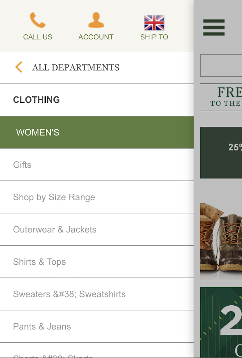
As you can see, “Call Us” is the first option available within the mobile navigation. Again, with people in a rush and trying to get purchases done right over the holidays, having a direct line of communication to the company is important. The account link and “Ship To” personalization are also nice touches as these icons keep conversion top-of-mind.
Now, looking down the navigation, you’ll see this is a pretty standard mega menu. However, take note that at the very top of this category (as is the case for all others) appears a page for “Gifts”. This is not something you see the rest of the year, so that’s another holiday-related touch meant to streamline searches and sales.
Here is everything you need to know to optimize conversions at mobile checkout. If I can add an additional two cents to this matter, though, I’d like to briefly talk about add-ons at checkout… but only around the holidays.
Typically, I believe that a fully streamlined checkout process is essential to capturing as many conversions as possible on mobile devices. It’s hard enough typing out all that information (if it doesn’t auto-populate) and trusting that devices and websites will keep payment information secure.
However…
When it comes to designing the checkout for holiday shoppers, I think it’s at least worth experimenting with add-ons. For example:
Nordstrom doesn’t even wait for visitors to get to the checkout to promote this.
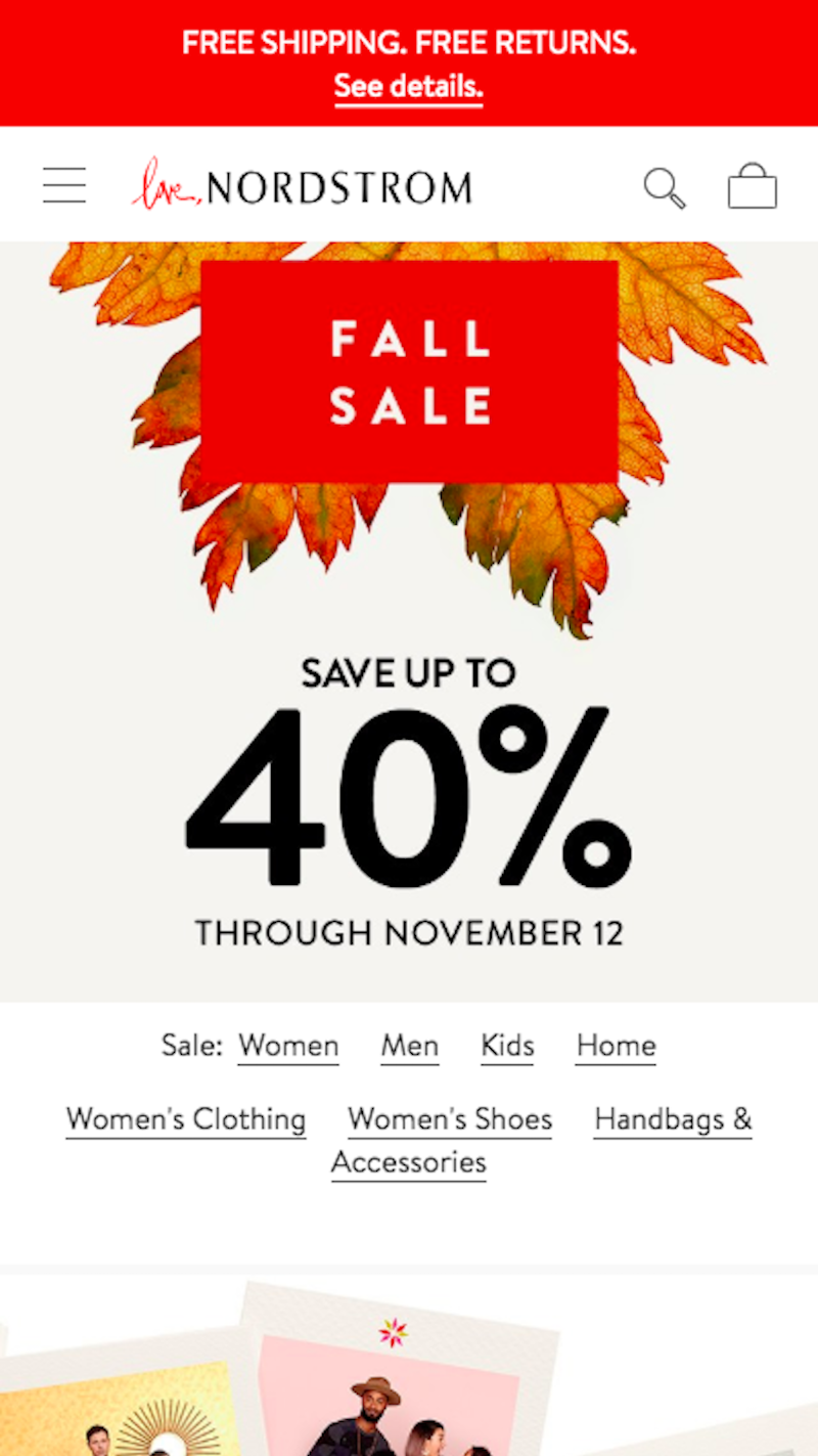
The very top of the site has a sticky bar promoting the free shipping and returns offer. This way, visitors are already in the mindset that they can get their Black Friday purchases or holiday gifts for even cheaper than planned.
Fitbit has another example of this I really like:

The top-half of the Fitbit homepage gets visitors into the mindset that there are cost savings galore here. Not only are items on sale, but certain orders come with free and expedited shipping. And the site clearly states when the sale ends, which will keep customers from getting upset if gifts don’t arrive on time. (It will also probably motivate them to get their shopping done sooner if they want to cash in on the sale.)
So all appropriate expectations regarding pricing and shipping are set right from the very get-go, making checkout go more smoothly.
I know that some may argue these will be bad for UX (and normally I’d join them), but I don’t see them as distractions during the holidays. This is an expensive and busy time of year.
Anything you can add to checkout that says, “Hey, we’re thinking about you and want to make this holiday season go just a little more smoothly” would go over well with your users.
Images are a tricky thing this time of year. You want to use them to appeal to holiday-minded visitors, but you don’t want to overdo it because images add a lot of pressure to your server. You need your site running fast, so be smart about what you do with them.
That said, images can go a long way in communicating to visitors that your site and business are ready to spread some holiday cheer without having to ever explicitly say it. This might be the ideal choice for those of you who design websites for global audiences. Perhaps you’d rather use an image that evokes a festive feeling because you don’t want to unintentionally offend anyone who doesn’t celebrate the holiday your copy calls express attention to.
Here is a great example from Uncommon Goods:

I wouldn’t necessarily say the images used here are festive, but there are unique elements that evoke a certain association with the holidays. Like the color green used within the photos. Or the partial glances of what appear to be snow globes. They’re seasonal elements, but not necessarily relegated to Christmas, Hanukkah or Kwanzaa.
Then, there’s the United States Postal Service (USPS) website. Granted, this website targets visitors within the United States, but it remains mindful of the differences in religions practiced and holidays celebrated.

The message remains neutral as does the image itself. The USPS is simply trying to help people quickly and festively send holiday cards, gifts and other items to distant relatives and friends.
The factor of speed is a big one when it comes to designing the customer journey. While the navigation cuts down on any unnecessary steps that might be taken when visitors can afford a more leisurely pace, your design should expedite the rest.
In other words:
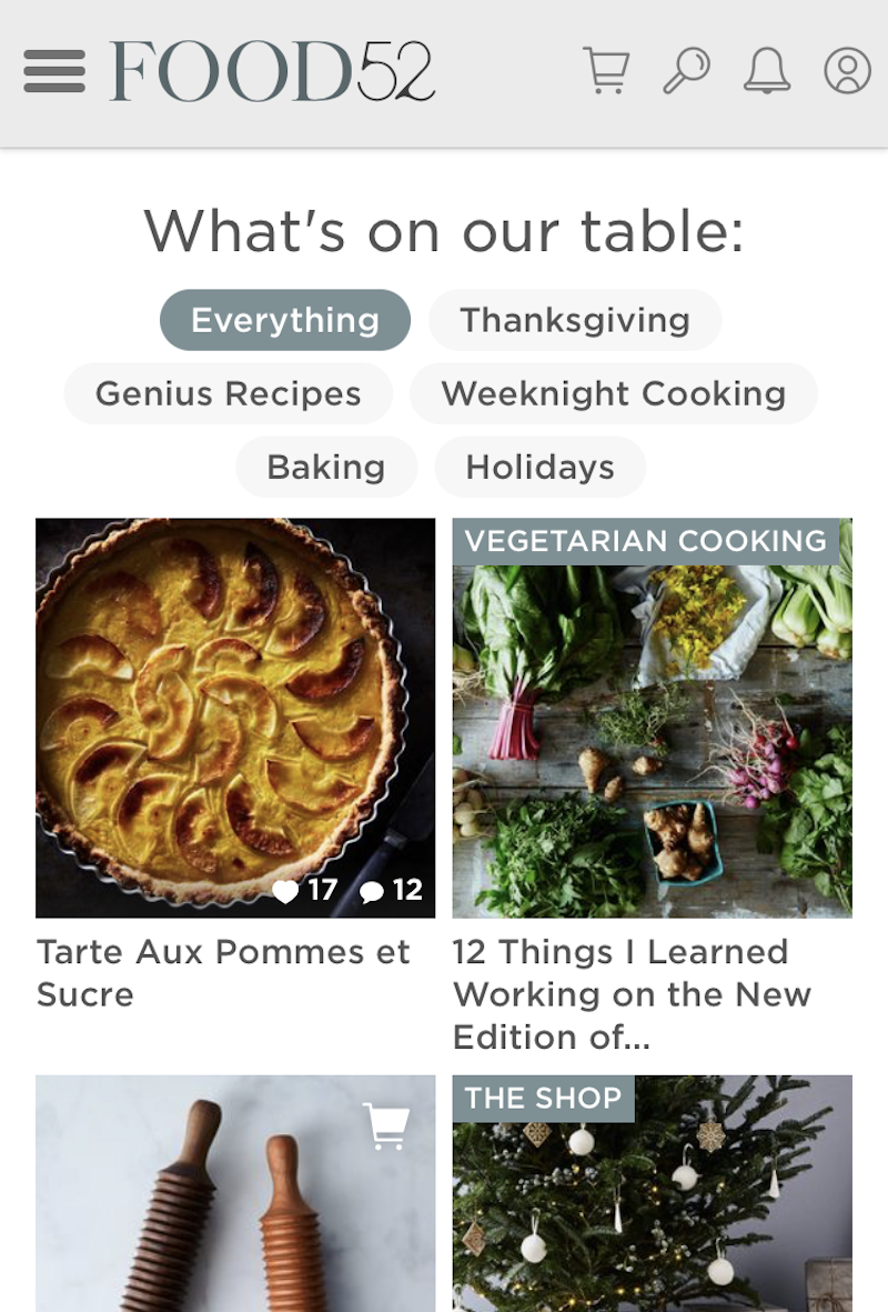
Below is another example from the Food52 website from the holidays. As you can see in this snippet, two kinds of holiday-related content are promoted. What’s cool about them, though, is that it’s not necessarily in-your-face.

The relish recipe could easily be used any time of the year. However, because pomegranates are often considered a winter food, this falls into the category of holiday-related content. The second post is more blatant about attracting holiday readers.
The final element in this screenshot is also worth taking note of. To start, it appears they’ve customized the copy specifically for this time of year. All it takes is one addition of the word “joyfully” to let visitors know that Food52 took time to make its site just a little more festive.
I also want to give them kudos for including a newsletter subscription box here and in other key areas of the site.
If the research from Adobe is right and only about half of mobile visitors convert, then this is a smart design choice. This way, Food52 can collect visitor information on mobile and contact them later. When interested visitors receive the reminder at a more convenient time and place, they can hop onto their desktop or other preferred device and finish the conversion process.
Another site which I think handles the customer journey optimization well is Cracker Barrel.

Cracker Barrel doesn’t overdo it when it comes to designing for the holidays. Instead, it’s developed a series of calls-to-action that set certain types of visitors on the right path.
The first one features an image of what looks like a holiday feast with the CTA “Order Heat N’ Serve”. That’s brilliant. If people are taking the time to visit this site right before Thanksgiving, it’s probably to see if they can get help preparing their major feast… which it appears they can.
The second section sort of looks festive, though I’d still say they play it safe with choice of color, texture and gift card image. With a CTA of “Buy Gift Cards”, they’re now appealing to holiday shoppers. Not only can you get a whole feast conveniently prepared by Cracker Barrel, but you can buy gifts here, too.
Sometimes designing for the holidays isn’t about the blatant use of snowflake imagery or promoting recipes for cooking a turkey. Sometimes it’s about understanding what your users’ particular needs are at that time and helping setting them on that exact journey right away.
I understand that there are ways to add a dancing Santa to a site or to spruce up pop-ups with animated text and images, but I think subtler is better.
It’s kind of like the whole holiday music and decorations thing. How many times have you gone to your local drug store at the end of October for the purposes of getting Halloween candy, only to be met by an entire aisle full of holiday decorations? Or maybe you entered a department store like Macy’s in November, thinking you’ll beat the crazy holiday crowds. And, yet, holiday music is already playing. It’s overkill.
If you want to impress mobile visitors with your website around the holidays, focus on making this a worthwhile experience. Optimize your server for high volumes of traffic, put extra security in place, reorganize the navigation and add some small festive touches to your design that call attention to the most relevant parts of your site at this time of year.
 (ra, yk, il)
Why reinvent the wheel designing elements that already have free designs online? Blockquotes remain a staple of text-heavy websites and they come in so many distinct styles.
I’ve curated my top picks for the best free blockquotes you can find. Every one of these designs uses pure CSS code so they’re easy to replicate.
Perhaps the most unique and stylish quote of this entire post is this literature circular quote.
It rests on a bright orange background so this may not be practical for your typical layout. But with some minor color adjustments it would look nice on a white background regardless of the layout.
The most spectacular part is that every element is created with pure CSS including the rounded circle pattern. It’s a truly pragmatic blockquote that also pushes the boundaries of CSS.
For tamer examples check out these blockquote patterns created by developer Derek Wheelden.
This again relies purely on CSS3 with different classes for each blockquote. The last of the 3 has the footer element to cite the quote source. It’s an optional feature that some people like, certainly not necessary for a simple website though.
It goes to show how much you can achieve with unique fonts and some minor CSS tweaks.
It might be hard to believe but this notepaper blockquote is created entirely with CSS3 code. No background images, no vectors, just CSS gradients and transforms.
I can’t say how many people would find this design useful. It’s a fantastic notecard that really does replicate the style of paper. But regardless of how it can be used, this design is beyond incredible and it proves how far CSS has come.
The HTML is fully semantic with modern blockquotes and this should work in all modern browsers. A magical use of web technology if I’ve ever seen it.
Sometimes it makes sense to include a photo of the person being quoted. This may sound tough but you can clone these blockquotes by Andrew Wright to get this effect on your site.
Andrew’s pen uses placeholders for images so they do look a little… basic. But there’s nothing to stop you from changing some colors, updating the fonts, and adding a photo to spice up your quotes.
A very simple design and pretty easy to restyle on your own.
This is by far my favorite blockquote because it really can work on any website. Developer Harm Putman uses the cite attribute from the blockquote to populate a citation at the bottom.
I really like the dividing bars that clearly separate the blockquote from the rest of the content. This includes a small quotation mark icon fixed in the middle to let the user know this is a clearly a quote.
Sleek, elegant, and simple. Three traits that work well in any website.
For a darker approach check out this greyed blockquote that can double as a pullquote if resized.
It has a pretty clean design using Font Awesome blockquotes and lively text. I think it’d look a lot better with a stronger font but it’s certainly legible with anything you use.
I consider this as a solid “base” for building on top of and styling your own blockquote from there.
This design by Luke Watts is more of a pullquote than a blockquote. The quoted text pulls to the side of the body text, but it still draws attention with bright colors and quotation marks.
It’s called an automatic quote because it adds the quote marks into the design via CSS. So you can just wrap your text in the proper tag and it’ll automatically style it with quotations. Pretty sweet!
However as a blockquote this would be fairly basic. I think this works best as a pull quote and does its job well.
You can do a lot with CSS box shadows to create depth and clarity. This raised blockquote by Lukas Dietrich is pretty simple and real easy to clone.
It has one background color and a pretty clear box shadow near the bottom. This also uses a custom Google font called Bitter for the upright quotation marks.
If you have a darker layout or if you’re willing to adjust the drop shadow a bit then this quote style can fit almost any web project.
These alternating quotes by Tommy Hodgins prove that you don’t need much to create fantastic blockquotes.
By adding a small grey border to one side you separate the text from the rest of the page. It will clearly stand out against the page body which and makes browsing any page a whole lot easier.
Plus the alternating styles let you add these with any orientation you like.
Last but not least I found this cool material blockquote using similar colors and styles from Google’s material design rules.
The background icon is what really makes this stand out and feel like a true blockquote. I do think the font color is a tad light, but this can always be adjusted for use in your own website.
This is the coolest material-style blockquote you’ll find and it’s totally free.
All of these blockquote styles are fantastic but certainly not the only ones. You can find many more online with lots of variety to pick from. So if you’re looking to browse more check out the blockquote tag on CodePen to see what else is out there.
Day 1. Your site is now live. It is the best thing ever. Install Google Analytics. Remember to write a privacy page and disclaimer page about Analytics and cookies. Sit glued to your Analytics account for the rest of the day tweaking every aspect in the Analytics console. Oh yeah, while we’re at it, don’t forget to add the site to Google search console too. Great. Done. Sit back and relax. Have a beer. You have done well young Padawan.
Day 2. Enthusiastically dive into your Analytics account. “Hmm, not many views today. Ok I will give it some time.”
Day 3. Open Analytics. “Oh I have a couple of clicks. No, wait – those were me. Doh.” Hound a bit on social media about how great your site is… Check back on Analytics.
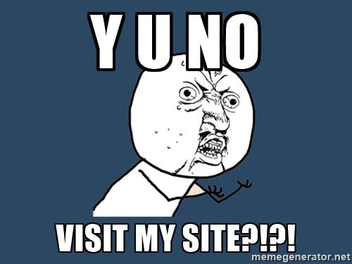
Day 4. WHY YOU NO VISIT MY SITE?!?!?!?
Day 5. Distress, sadness, and an overwhelming feeling of failure. “Maybe I’m not cut out for this web design lark?”
You are in this for the long haul and I am afraid to say there are no easy routes to success here. I am here to tell you it’s going to be tough. Perhaps tougher than you think. Have you got what it takes to succeed? Good! I admire your determination. Now, read on and find out about tried and tested ways to get traction for your website.
No matter how innovative the product or service is, or how asthetically pleasing the design, if people are not visiting your website the simple fact is – it is a dead website. The thing is though, you think your site is brilliant, and do you know what? It probably is! But who cares?! Who knows about it? Why should a perfect stranger be interested in it?
You could use social media or send out press releases, but with so many brands clamouring for attention, those messages can often have little effect.
Again, it could be visually the best thing ever, but if there is no content, nothing of real substance, it is a dead website. Content is everything. Think carefully about headlines for page articles. Keyword research will help you a little here but use it as a guide only.
If your site is not primarily a blog, think about adding a blog section. It can be tough and hard work, but a blog is very important . Write at least 1 or 2 articles about your field every week. Let the world know you are an expert in your field. If you are not an expert, give them another reason to visit. Matthew Inman gets visitors by making people laugh. It might not work for everybody, but it sure worked for him. (5 million monthly views).
Give people what they want. Make your ‘about page’ about the visitor, not about you, i.e. written with them in mind. Enlist the help of a skilled copywriter if you feel out of your comfort zone. Most web designers probably are in this regard. They can make a site work well and look nice, analysing the code in depth. As for writing about themselves and their business in a compelling and engaging way, that’s another matter entirely.
Get your site indexed. Submit your url to Google. You should also consider submitting it to Bing and Yahoo as well. You don’t necessarily have to do this as the search engines will pick up your website in time. However, this step will often speed up the process. (We give Google particular attention as they are the biggest player with over 70% of the world’s market share of search.)
Submit a sitemap in the Google search console and check that there are no issues with the site and that your site has a robots.txt file.
Keep calm. Frantically changing things around too soon won’t do you any favours in the search results, especially if it is a newly registered domain. Give it some time. Keep drip feeding new, quality articles periodically over the next couple of weeks.
1) Write for your users, not for robots. It’s ok to listen to SEO advice but if you are not careful your articles will lose their appeal and become spammy and your readers will not appreciate it. This has been said before, and many so called SEO experts that have fixated on certain things are having to constantly re-evaluate their approach.
If you want your site to do well in the long term, filling your page and site with spam is not going to work. Google is constantly looking at this. Do it right and you will be rewarded. Write content for your user first, and for search engines second.
2) Avoid any tool that says it is easy, quick, or cheap. Anyone making you promises in that regard will only do you harm in the long run.
Here are some top tips from people at the top of their game who have either tried this or witnessed first hand what happens when people do. These are not just my words, they are things that have been proven to work.
1) Invest in a short, aesthetically pleasing video.
“If there’s one thing every startup should invest in, it should be a short, aesthetically pleasing video that explains exactly how its product works. As a journalist covering startups, I guarantee no amount of selling a concept over the phone is as effective as a well-produced video that clearly communicates the benefit of the app or software. If there’s a good video, I almost always embed it in my article. Bonus points if it’s funny.” Omar Akhtar is the senior editor for The Hub, based in San Francisco
2) Write an article for a popular online resource in a similar field. Often you will get a credit and link to your website.
3) Offer something for FREE: Like an ebook, website template or plugin (maybe you have some code for a project that never saw the light of day) and then aggressively promote it. It will definitely attract a lot of new visitors. For web designers, try to get a free theme featured on WordPress.org and make sure to link to your website, or create a free theme in a niche that people are looking for and feature it prominently directly on your site. It will help immensely.
4) Submit your page to StumbleUpon. Be prepared to expect a high bounce rate, but it can create interest (sometimes a lot of interest at once). That said, it can be very hit and miss, so there are no guarantees here. People have also reported success with their paid results, but here we are particularly looking at organic methods.
Let’s face it, there are not many overnight sensations when it comes to a website. There may be the odd exception of course, but if you are like the vast majority of us, it is going to take time. Try to avoid the temptation to take shortcuts – to the dark side you will stray!
Ok, there is nothing new here. It has all been said before many times, but it is worth repeating. Be determined, and your hard work will pay off. 3-6 months of following the above advice and your site is bound to be getting relevant traffic and traction.
