20+ Deliciously Dark Website Designs
Dark website designs are where it’s at. Don’t believe me? They’ve become increasingly popular over the past year. Dark designs are thought to be easier on eye strain and make for a more pleasant viewing experience. They can also add atmosphere to your site.
As more and more websites have shifted to dark mode in 2020, we thought it imperative to highlight some designs that really capture the concept of dark designs well. What follows is a list of over 20 delightfully dark website designs you’ll definitely want to check out.
Serge Thoraval: Atelier
The Serge Thoraval: Atelier website doesn’t just offer a dark design — it also features some really interesting effects. From a mouse hover effect when the site is loading to transition effects when you scroll down the page, this site sets itself apart.

Basilico
This site offers a dark design that makes each portfolio piece really stand out. Plus, when you hover over each item, they color shift and descriptive text scrolls across it from right to left.

Big Drop Inc
Big Drop Inc has a combination of light and dark designs that are both appealing and effective.

DevArt
DevArt is another site with a dark design that helps to make the artwork it features stand out. It’s also easier on the eyes than sites with brighter backgrounds.

Creative Park
The Creative Park website offers up a delightfully dark design that allows the subject of photos to really stand out. It also has some really interesting transition effects for changing slides, clicking links, and opening menus.

Olivia Restaurant
The Olivia Restaurant website mimics the mood inside of the restaurant itself — dark, cozy, and inviting.

3D Hubs
The 3D Hubs website leverages its dark design to make the components it features stand out. This also works well for displaying video and individual items the company offers.

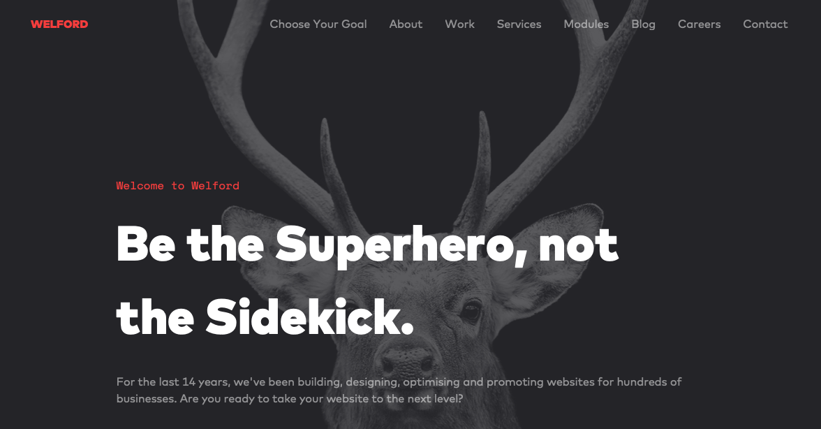
Welford Media
Welford Media is a web design firm that uses a dark design on its website to engage visitors. This design choice allows the company’s tagline stand out at a glance and builds immediate interest.
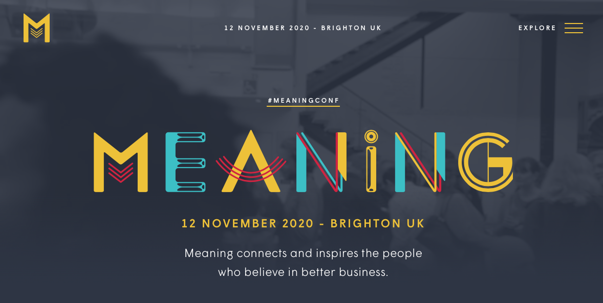
Meaning 2020
The website for the Meaning 2020 Conference has a dark design as well. The gray background allows the colorful logo to stand out and offers a subdued backdrop onto which videos and photos are placed.
Rich Brown
This is a website dedicated to the work of Rich Brown, an art director and UX/UI designer. The site itself features a dark design onto which video backgrounds play seamlessly.

Artem Pivovarov
The design on this website is super interesting. Artem Pivovarov has a dark design with a prominent photo background. It also has interactive elements in this background that react on hover.

Formigari Srl
Formigari Srl is another site you should check out for dark design inspiration. It highlights videos and photos on a deep gray background that makes the entirety of the content feel immersive.

Canvas United
Still another site you should check out is Canvas United. This site is for a New York-based digital agency that provides some cool transition effects and an immersive experience.

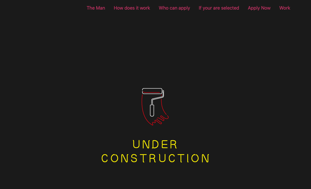
The Kennedys
The Kennedys website currently features an under construction sign that’s set on a dark background.
Resoluut
The Resoluut website offers a dark purple background with images that appear as though they’re hovering on top of it. There is a lot of play with depth of field here.

Fantassin
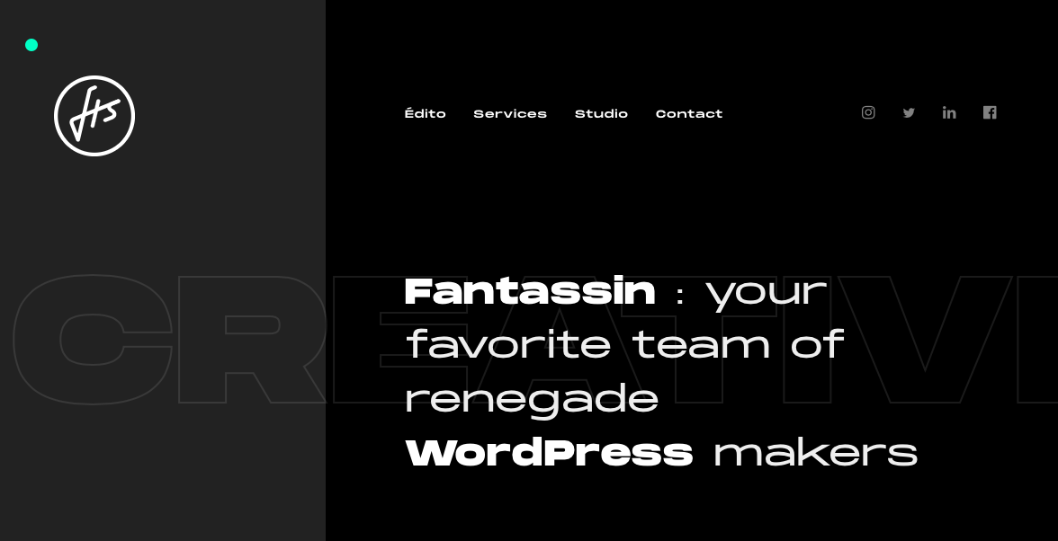
Still another option is the Fantassin website, which features a dark background and tons of cool scroll effects that draw the eye further down the page.
Cody Petts Studio
The Cody Petts Studio website highlights the work of Cody Petts, including print and packaging designs as well as photography. It’s dark, gritty, and extremely compelling.

Kazuma Kurata
The design for the Kazuma Kurata website offers a dark background that’s intimately inviting. It makes the colorful Aspects of featured photos stand out even more. The design and function of the site make it clear why it’s deserving of its AWWWARDs Nominee status.

Bachoy
The Bachoy website highlights a creative and tech studio. The dark design featured here uses a cool spotlight hover effect and interesting interactions with photos as you scroll down the page.

Agency Legend
The Agency Legend website has a truly appealing site that takes advantage of superhero motifs to increase engagement.

Arara
Last on our list is the website for Arara, which offers battery-free bicycle lights. This site is dark but not brooding, and instead uses the darker background to make the bright colors featured in images and videos “pop.”

Dark Website Designs Can Serve You Well
As you can see from the examples listed above, dark website designs can really take the overall look of your website to the next level — whatever that means for you. Whether you want to make colors look more vibrant, ease eye strain, or provide a mood, dark designs offer flexibility in both form and function. Have fun playing with them!
Page Parenting Guide: How To Set Up An Index of WordPress Child Pages
Creating child pages in WordPress is simple to do. The only problem is, creating a child page doesn’t do anything for the front end of your blog and your viewers. You can’t just easily check a box or two and display child pages automatically on the parent page. This leaves your homepage, well… childless. Read on for the simple solution.
Parental Guidance Recommended
This article is rated PG, meaning that — like a parent — I’ll be offering some guidance on how you can better index your child pages with the help of some free WordPress plugins.
More specifically, showing you how to get a list of Child Pages to appear both on a Parent Page, and also in your sidebar.
By the time you read this article, you’ll have a nice idea of several options to set up your WordPress site and child pages.
From there you’ll be able to make a grown-up decision on what works best.
Having an option to showcase your child pages on your website is important if you have some vital information that you want prominently displayed.
Why?
If you don’t, many viewers might not realize a lot of what you want them to see is accessible.
If child pages are in the future for you, your life, er — website — is about to change.

Good Parenting Means Good Plugins
Like a good parent, a good plugin can raise your child pages to be well-displayed.
Not only that, but they can also simplify the process, assist with customization, and – as you’ll see – much more.
These free child page plugins each have various features and benefits. I’ll be going over all of them in detail.
Plus, I have a “bonus” plugin that I’ll mention that deals with a child of a different magnitude.
CC Child Pages

CC Child Pages by Caterham Computing is a simple plugin that can display child pages on your homepage with a shortcode.
It’s so easy to use, even a child can add child pages to their WordPress website.
Everything is achieved by using a shortcode. The shortcode is relatively simple and can be used wherever you’d like the child pages to appear (e.g. the homepage).

Example of child pages shortcode. The child pages are displayed in responsive boxes, which include a page title, excerpt, and even a “Read more…” link.
I like how you can choose your layout with this plugin. It can be 1, 2, 3 or 4 columns.
If you choose to go with a three or four-column layout, it will resize to two columns on mobile devices, which makes them easy to read when viewing on the go.

Example of a one-column layout. You can also choose the depth of pages to be displayed. All of this can be configured as a widget in the Sidebar area.

As you can see, there are a lot of options. This is where you can add the shortcode, exclude pages, show siblings pages, and choose the depth. Once you have edited it how you’d like, it’s ready to go! You just paste the shortcode wherever you want to display it on your site.

Another example of what it can look like on your website. Though there’s not a ton of customization options, the simplicity of this plugin makes it efficient and does the job.
With over 10,000 downloads and a solid 5-star review, this plugin has what it takes to add your child pages to your WordPress site.
Advanced Sidebar Menu

Advanced Sidebar Menu by OnPoint Plugins is another basic and easy to use free plugin for child pages on your site.
It uses the parent and child relationship of your WordPress pages or categories and generates menus in specific areas.
You just assign a page or category to a parent and the plugin does the rest for you.
This plugin has solid reviews along with good support.
Let’s check it out!
To set it up, it’s all located in the widgets area from your dashboard.

Advanced categories menu. Here you can add a title, display the highest level parent category, display menu, and use built-in styling.
Everything is located here and there are no additional places to customize.
Once you have configured it the way you want, it’s ready to go.

Example of what the child pages on your website can look like. It is as simple as that.
There’s not much when it comes to additional customization, but like our previous plugin, it might not be necessary to suit your needs.
They have an option to Go Pro, which features advanced styling, priority support, custom link text, excluding pages, and more.
However, for just the basics, the free version does the trick.
Though there are not many advanced options, if you have some CSS knowledge, you can customize as much as you’d like in your theme’s style sheet.
This plugin is great when it comes to including a clean and usable menu for child pages.
It’s nice to be able to feature only what you want and have full control over your options. Plus, the ease of use makes for a quick fix when adjusting your website.
Content Views - Post Grid & List for Wordpress

The Content Views – Post Grid & List for WordPress by Content Views is a fantastic option for anyone looking for an extremely easy fix for adding child pages or grids for posts.
It’s a well-updated plugin that’s 100% responsive and mobile-friendly. I love how you can customize almost every Aspect of the pages; including arranging by keyword, images, recent pages, and more.
The layout of this plugin in your dashboard is a breeze to figure out.
It gives you an option for either a page or post right in the dashboard under Content Type.
Everything is clearly labeled and you can quickly set up your child pages however you’d like.
From the dashboard, you can choose what to include, exclude, and limit. There are also more advanced options for sorting and display.

The dashboard for adding a new view for a child page or post. The Display Settings has all the options you need for setting it up the way you want it to look.
You have options for layout, format, and field settings. It also goes as far as allowing you to set up excerpts, HTML tags, pagination, opening child pages in the current tab or a new tab, and more.

The display settings area. Once you have your child pages display all set up — you’re all set!
There’s a simple shortcode to embed it into your website. You can use it in a widget or for a theme file. They give you both options.

Code options. When you save your new view, it’s listed on the dashboard. You can easily retrieve the code from there, too.

Views from the dashboard. Want to see it in action? Here is a quick set up I created from a basic WordPress website.

The child pages featured below the parent page. Like a lot of the other plugins, there is a Pro option. If you upgrade, you can get advanced customization options, more layouts, and options for Google Adsense.
I found the free version suitable as-is. The clean layout, design, and ease of functionality make this a pretty amazing free plugin for child pages.
Child Theme Configurator

I told you I had a “bonus” — and this is it.
The Child Theme Configurator by Lilaea Media is something else to consider. It goes beyond just pages and tackles child themes.
I think it’s worth including because sometimes users want to edit a child theme. Or, you might not even be aware that this is an option for your WordPress site.
And since we’re talking about child stuff, well…why not include it?
Let’s dive in and take a look.
Once uploaded into your dashboard, you have four options to choose from:
- Creating a new child theme.
- Configuring an existing child theme.
- Duplicating an existing child theme.
- Resetting an existing child theme.

The child theme configurator. One great quality of this plugin is how it’s step-by-step. There’s no overly complicated language or confusion, making configuring very simple.

The next step is setting up a theme. You can customize however you’d like.

This includes where to save the stylesheet, ensuring plugins work with specific themes, and verifying the theme directory.

Selecting parent theme stylesheet handling. This plugin has a lot to offer and it’s worth exploring for yourself if you’re interested in child themes.

The child theme example I set up. There is an upgrade option that includes customizable plugin stylesheets, quick preview, color palettes, new styles, adding child theme files, and tutorials.
Depending on your skill level, it might be worth the upgrade. The free version is quite impressive as is.
Prefer To Take The Coding Route?
Now even though we’re mostly talking plugins in this article, with a little bit of coding knowledge, you don’t need a plugin to create child pages that are displayed on your homepage.
An example of this is adding the below code to your theme’s sidebar.php file.
Code for setting up child pages.
From there, you can edit accordingly by resizing, adding fonts, colors, etc.
Of course, if this is a bit too complicated and CSS isn’t your thing (by the way, we can help you with that), a plugin is the easiest way to go.
Plus, a plugin can give you more options for functionality, displays, and features.
(No) Problem Child
To avoid problems with your site’s viewers seeing your content, a great child page plugin will do the trick. As you can see, you have a lot of options.
Each plugin is uniquely different, but they all make setting up child pages on a parent page much easier than, let’s say, parenting.
And if you need babysitting, we have 24/7 support, hosting, and security to keep your WordPress site and child plugins in good hands.
These Responsive Web Design Trends for 2020 are Worth Paying Attention To

Does Your Choice Of Web Host Impact Your Site’s Security?
Does Your Choice Of Web Host Impact Your Site’s Security? Read More →
How to Add Custom Fonts in WordPress
Do you want to add custom fonts in WordPress? Custom fonts allow you to use beautiful combination of different fonts on your website to improve typography and user experience.
Apart from looking good, custom fonts can also help you improve readability, create a brand image, and increase time users spend on your website.
In this article, we will show you how to add custom fonts in WordPress using Google Fonts, TypeKit, and CSS3 @Font-Face method.
Note: Loading too many fonts can slow down your website. We recommend choosing two fonts and use them across your website. We’ll also show you how to properly load them without slowing down your website.
Before we look at how to add custom fonts in WordPress, let’s take a look at finding custom fonts that you can use.
How to Find Custom Fonts to Use in WordPress
Fonts used to be expensive, but not any more. There are many places to find great free web fonts such as Google Fonts, Typekit, FontSquirrel, and fonts.com.
If you don’t know how to mix and match fonts, then try Font Pair. It helps designers pair beautiful Google fonts together.
As you are picking your fonts, remember that using too many custom fonts will slow down your website. This is why you should select two fonts and use them throughout your design. This will also bring consistency to your design.
Video Tutorial
If you don’t like the video or prefer the written guide, then please continue reading.
Adding Custom Fonts in WordPress from Google Fonts
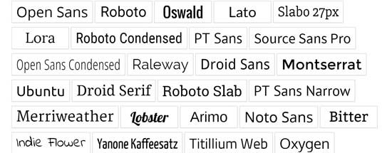
Google Fonts is the largest, free, and most commonly used font library among website developers. There are multiple ways you can add and use Google Fonts in WordPress.
Method 1: Adding Custom Fonts Using Easy Google Fonts Plugin
If you want to add and use Google Fonts on your website, then this method is by far the easiest and recommended for beginners.
First thing you need to do is install and activate the Easy Google Fonts plugin. For more details, see our step by step guide on how to install a WordPress plugin.
Upon activation, you can go to Appearance » Customizer page. This will open the live theme customizer interface where you’ll see the new Typography section.
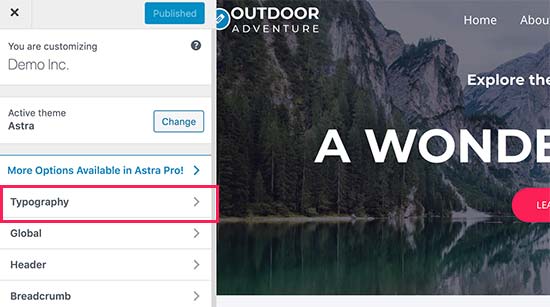
Clicking on Typography will you show different sections of your website where you can apply Google Fonts. Simply click on ‘Edit Font’ below the section you want to edit.
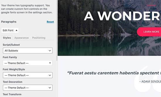
Under the font family section, you can choose any Google Font you want to use on your website. You can also choose font style, font size, padding, margin, and more.
Depending on your theme, the number of sections here could be limited and you may not be able to directly change font selection for many different areas of your website.
To fix this, the plugin also allows you to create your own controls and use them to change fonts on your website.
First, you need to visit Settings » Google Fonts page and provide a name for your font control. Use something that helps you quickly understand where you will be using this font control.
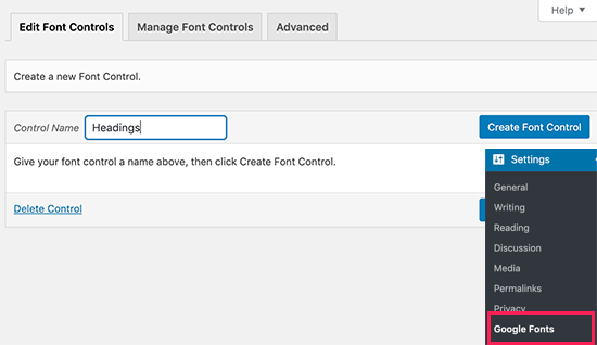
Next, click on the ‘Create font control’ button and then you will be asked to enter CSS selectors.
You can add HTML elements you want to target (for instance, h1, h2, p, blockquote) or use CSS classes.
You can use Inspect tool in your browser to find out which CSS classes are used by the particular area you want to change.
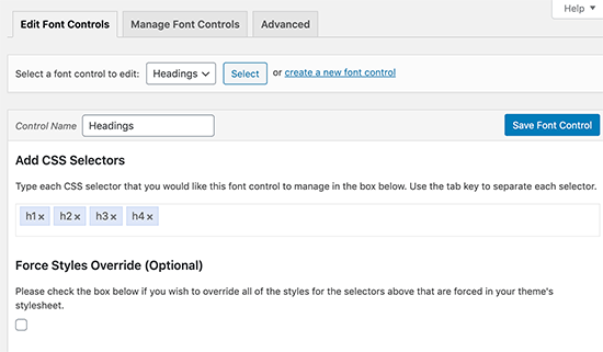
Now click on the ‘Save font control’ button to store your settings. You can create as many font controllers as you need for different sections of your website.
To use these font controllers, you need to head over to Appearance » Customizer and click on the Typography tab.
Under Typography, you will now see a ‘Theme Typography’ Option as well. Clicking on it will show your custom font controls you created earlier. You can now just click on the edit button to select the fonts and appearance for this control.
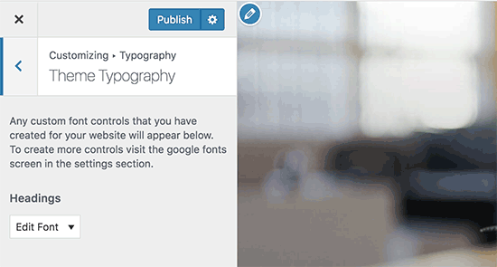
Don’t forget to click on the save or publish button to save your changes.
Method 2: Manually Add Google Fonts in WordPress
This method requires you to add code to your WordPress theme files. If you haven’t done this before, then see our guide on how to copy and paste code in WordPress.
First, visit the Google fonts library and select a font that you want to use. Next, click on the quick use button below the font.
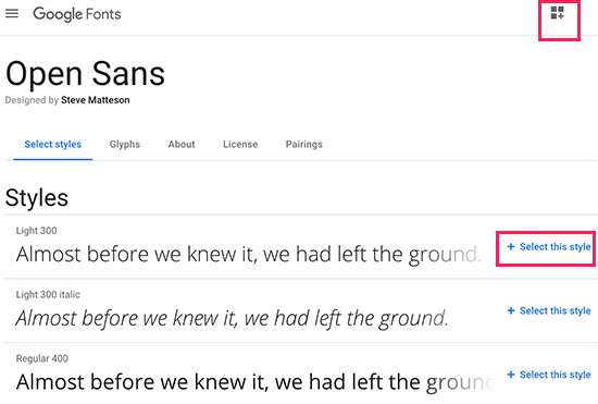
On the font page, you’ll see the styles available for that font. Select the styles that you want to use in your project and then click on the sidebar button at the top.
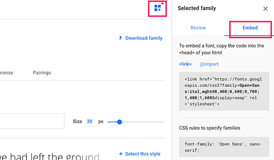
Next, you will need to switch to the ‘Embed’ tab in the sidebar to copy the embed code.
There are two ways you can add this code to your WordPress site.
First, you can simply edit your theme’s header.php file and paste the code before the <body> tag.
However, if you are unfamiliar with code editing in WordPress, then you can use a plugin to add this code.
Simply install and activate the Insert Headers and Footers plugin. For more details, see our step by step guide on how to install a WordPress plugin.
Upon activation, go to Settings » Insert Headers and Footers page and paste the embed code in the ‘Scripts in header’ box.
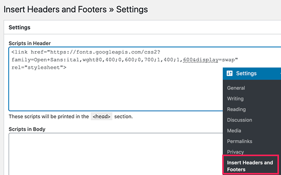
Don’t forget to click on the Save button to store your changes. The plugin will now start loading the Google Font embed code on all pages of your website.
You can use this font in your theme’s stylesheet like this:
.h1 site-title {
font-family: 'Open Sans', Arial, sans-serif;
}
For more detailed instructions see our guide on how to add Google fonts in WordPress themes.
Adding Custom Fonts in WordPress Using Typekit
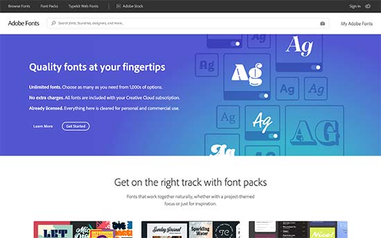
Typekit by Adobe Fonts is another free and premium resource for awesome fonts that you can use in your design projects. They have a paid subscription as well as a limited free plan that you can use.
Simply signup for an Adobe Fonts account and visit the browse fonts section. From here you need to click on the </> button to select a font and create a project.
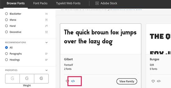
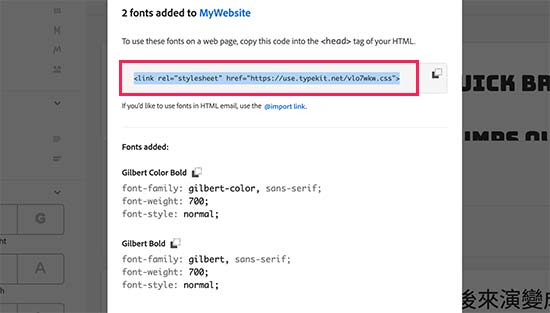
Next, you’ll see the embed code with your project ID. It will also show you how to use the font in your theme’s CSS.
You need to copy and paste this code inside the <head> section of your website.
There are two ways you can add this code to your WordPress site.
First, you can simply edit your theme’s header.php file and paste the code before the <body> tag.
However, if you are unfamiliar with code editing in WordPress, then you can use a plugin to add this code.
Simply install and activate the Insert Headers and Footers plugin.
Upon activation, go to Settings » Insert Headers and Footers page and paste the embed code in the ‘Scripts in header’ box.
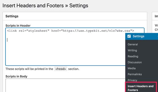
That’s all, you can now use the Typekit font you selected in your WordPress theme’s stylesheet like this:
h1 .site-title {
font-family: gilbert, sans-serif;
}
For more detailed instructions check out our tutorial how to add awesome typography in WordPress using Typekit.
Adding Custom Fonts in WordPress Using CSS3 @font-face
The most direct way of adding custom fonts in WordPress is by adding the fonts using CSS3 @font-face method. This method allows you to use any font that you like on your website.
First thing you need to do is download the font that you like in a web format. If you do not have the web format for your font, then you can convert it using the FontSquirrel Webfont generator.
Once you have the webfont files, you would need to upload it on your WordPress hosting server.
The best place to upload the fonts is inside a new “fonts” folder in your theme or child theme‘s directory.
You can use FTP or File Manager of your cPanel to upload the font.
Once you have uploaded the font, you need to load the font in your theme’s stylesheet using CSS3 @font-face rule like this:
@font-face {
	font-family: Arvo;
	src: url(http://www.example.com/wp-content/themes/your-theme/fonts/Arvo-Regular.ttf);
	font-weight: normal;
}
Don’t forget to replace the font-family and URL with your own.
After that you can use that font anywhere in your theme’s stylesheet like this:
.h1 site-title {
font-family: "Arvo", Arial, sans-serif;
}
Loading fonts directly using CSS3 @font-face is not always the best solution. If you are using a font from Google Fonts or Typekit, then it is best to serve the font directly from their server for optimal performance.
That’s all, we hope this article helped you add custom fonts in WordPress. You may also want to checkout our guide on how to use icon fonts in WordPress and how to change the font size in WordPress.
If you liked this article, then please subscribe to our YouTube Channel for WordPress video tutorials. You can also find us on Twitter and Facebook.
The post How to Add Custom Fonts in WordPress appeared first on WPBeginner.
Currying in CSS
Funny timing on this I was just looking at the website for Utopia (which is a responsive type project which I hate to admit I don't fully understand) and I came across some CSS they show off that looked like this:
:root {
  --fluid-max-negative: (1 / var(--fluid-max-ratio) / var(--fluid-max-ratio));
  --fluid-min-negative: (1 / var(--fluid-min-ratio) / var(--fluid-min-ratio));

  ...
}
See anything weird there? That code is using mathematical operators, but there is no calc() function wrapped around it.
Just as my curiosity set in, Trys Mudford, a creator of Utopia, blogged it:
The value after the
:in the CSS custom property does not have to be valid CSS. It won’t cause any errors, nor invalidate the custom property. It won’t be evaluated in the browser until used, or more specifically, placed in acalc()function.
Here's a contrived example:
:root {
  --padding: 1rem;

  /* These are meaningless alone */
  --padding-S: var(--padding) / 2;
  --padding-L: var(--padding) * 2;
}

.module--large {
  /* But they evaluate once they are in a calc() */
  padding: calc(var(--padding-L));
}
In my limited understanding, currying is like functions that return functions. I suppose this is sorta like that in that the alternate padding properties above are sort of like derivative functions of the main padding function (if you can call it that), and you only call them and execute them as needed.
The post Currying in CSS appeared first on CSS-Tricks.
How To Create An XML Sitemap For Your WordPress Website
How To Create An XML Sitemap For Your WordPress Website Read More »
10+ Examples of Responsive Websites That Got It Right
When designing a new website, there’s a long list of specifications and requirements you have to fulfill. It’s just the nature of web design these days. And at the top of that list sits responsive web design.
Thankfully, high-quality WordPress themes like BeTheme make it insanely easy to check off all the technical requirements you’re expected to meet — including responsive design. But why does it matter so much?
Well, for starters, more than half of all website traffic takes place on mobile according to data from StatCounter.
While desktop has put up a good fight for a couple years, mobile has prevailed as the winner. It will continue to do so, too, considering how much more convenient it is to access the web from the palm of one’s hand.
Plus, Google has made it clear that it rewards responsive web designs and mobile-friendly websites with better search rankings, so there’s no hiding from it now.
Responsive web design is a must.
Just keep in mind that following the rules for good mobile design doesn’t mean you ignore desktop users. By prioritizing the mobile experience, you can design more beautiful and efficient websites for all users.
Let’s look at some examples that demonstrate how to do this well.
Responsive web designs that encourage leaner desktop experiences
Just because you have more space to work with when designing for desktop users doesn’t mean you need to make the most of every pixel.
In fact, as Internet-enabled devices have grown smaller in size, it’s encouraged many designers to create leaner and more efficient experiences on desktop.
Take the website for designer/developer Rob Grabowski, for example.
This is how his website appears on a mobile screen:

With minimized logo and navigation out of the way, this allows the focus to remain on his photo and welcome message. Desktop visitors encounter the same thing:

This consistency in design is great because it enables visitors to seamlessly transition from viewing a website on one device to another (which happens often).
Mobile web designs that improve the decision-making process
Consumers today struggle with an overabundance of choice. It might be easier to find that thing or service they’re looking for, but that doesn’t make choosing between similar options any easier.
One of the benefits of responsive design is that it forces web designers to create websites in a modular fashion so that, as the screen size shrinks, each section falls in line beneath the others.
In turn, this makes it easier for customers to review options one-by-one. BeRepair, one of the 500+ pre-built sites from BeTheme, demonstrates this point really well:

This is one of the services offered. Notice how the responsive layout allows the visitor to really focus on the details before them and not get distracted by too much information.
This works well for other types of websites. Take, for instance, the BeRestaurant pre-built desktop site:

It’s a great-looking restaurant website. The mobile counterpart looks just as great, but minimizes the distractions so the core elements can really shine:

Rather than try to fit the menu to the right of the food images, the responsive website maintains the integrity of the original design by tucking it into the hamburger menu icon in the top-right.
Again, this is all about giving your visitors the ability to pause and really focus on the key actions you’re asking them to take. A navigation bar in full view would only distract from that.
Responsive designs that cut out the excess
Think about the last time you went to an art gallery or museum and the kinds of paintings you encountered:
- The landscape murals that have a central focus but beautiful details surrounding it.
- The portraits with a singular focus that’s chock-full of intimate details.
What’s cool about responsive websites is that they allow us to display the same web page in both formats.
Desktop screens thereby display landscape murals and mobile screens display portraits. But it’s important to know where the excess is in the desktop view so you can trim it back enough to make the mobile experience worthwhile.
For instance, this is the desktop site for BeITService:

This is a great looking hero banner on the home page. It’s well-balanced, the colors are carefully chosen, and the message is crystal-clear.
This is a good example of how smart designers have become when it comes to choosing responsive images for websites.
Here’s that same image and banner from above, but now displayed on mobile:

The image may not appear in full, but there’s nothing lost in this translation from desktop to mobile. What’s more, the message remains front and center.
Culturally Connected does something similar:

On desktop, it shows an elaborate background graphic that enhances the overall design. On mobile, however, it turns into this:

Even with the image now reduced and placed at the bottom, it’s still a striking design that allows the message to really shine through.
Another great example is BeTutor. This is how the desktop version looks like:

Here we have the main title and some more info using smaller text. In order not to cramp the mobile view, the design omits the extra content and focuses on the primary message:

The mobile view stays uncluttered without loosing any of the important subject matter that reveals the type of service offered.
Responsive websites that leverage their space
While a small screen requires reducing content in most of the cases, some responsive web designs leverage the space and use the different ratio to their advantage.
Take 1987 Masters for example:

While the desktop version focuses on their main tagline, the mobile version makes use of the vertical space and shows more content, giving the mobile visitor an option to learn more about the company right away:

So a mobile design don’t necessarily have to show less content in order to work well.
The mobile screen ratio allows for making use of the vertical space, like it’s shown in this example of BeCosmetics. Check out the desktop view:

The mobile view has more vertical space so the introductory content can be shown along with the button that invites the user to explore all products:

Once again, these examples demonstrate that less space doesn’t need to mean less useful content for the mobile website user.
Responsive websites that enhance readability
When laying out text on a desktop website, you have to be careful about how much you show to a reader at once. Put too many words on a line or not include enough spacing between letters, and your visitors might skip reading it altogether.
It’s a tricky balance to maintain and usually requires visual elements to balance out the text. Take, for example, the BeDanceSchool site:

Thanks to the funky designs and eye-catching graphics around the text, it’s easy for visitors to focus on the content and read it all the way through.
This won’t work on mobile though, which is why it’s important to understand the strengths of each screen size. Here you can see how that same text from above should be handled on mobile:

The design is paired back immensely so that all the visitor can see is the content. But that’s okay because the text is still beautifully styled which helps keep attention.
That said, text presented to mobile visitors doesn’t always have to be so heavily styled. If you select the right font size and type, you can create something that’s readable and engaging just as Base Coat does:

Just be mindful of the vertical length of text on mobile. While it might be easy to see where it ends on desktop, it can seem daunting on mobile if it appears to go on and on.
Mobile sites that put a spotlight on visual content
Responsive web designs aren’t just useful for websites with lots of text. Because of the way content responds to smaller screen sizes, visual storytelling elements look great on mobile, too.
Here’s what visitors see on the BeBand website on desktop:

Mobile screens don’t have the ability to play with balance as in the example above, but they do have the ability to shine a spotlight on the images you’ve chosen:

Websites that contain eye-catching images like this one would certainly benefit from responsive web design.
It’s not just static images that this works with either. The Scott Resort, for example, invites first-time visitors to watch a video:

Regardless of what kind of device the visitor is on, the video automatically conforms to the width of the screen.
This is the video on desktop:

And this is the video on mobile:

With a mobile responsive design, you really allow your content to adapt to the device and experience your users want.
Mobile responsive sites that collect more leads
Although more website traffic comes from mobile devices, it’s still quite difficult to get mobile users to convert as much as they do on desktop. That’ll come with time, but we’re not there just yet.
In the meantime, your responsive site needs to be prepared to capture leads whenever it can to improve those conversion rates.
Let’s take a look at how this works.
This is the pre-built site for BeClub:

This “Newsletter” section stands out beautifully on the homepage. And because it’s so convenient (e.g. it’s light on text and requires only one field be filled out), it’s likely to get a ton of subscribers.
This is how that same subscriber form appears on mobile:

Again, it’s really well done — and the smaller, dedicated space on mobile might be an even more effective way to catch the attention of potential subscribers.
So, if you can design your responsive site to collect visitors’ email addresses, you’ll empower them to reconnect with your website from their preferred device. As a result, you can increase the number of conversions it gets.
Responsive web designs for the win
When WordPress users go looking for a theme to design their website with, they look for qualities like:
- Ease of use
- Cost efficiency
- Features
- Customizability
- Overall design quality
It’s easy to take responsive web designs for granted because we see them everywhere, but, the truth is, not every WordPress theme is built with the mobile user in mind.
BeTheme is different. Each of its 500+ pre-built sites comes with mobile responsiveness baked in.
So, when you use BeTheme, you can spend less time stressing over how to make your website look like the responsive designs above and more time getting your new website online and in front of consumers.
10+ Examples of Responsive Websites That Got It Right was written by Bogdan Sandu and published on Codrops.
How to Install a WordPress Plugin – Step by Step for Beginners
After installing WordPress, the first thing every beginner needs to learn is how to install a WordPress plugin.
In simple words, WordPress plugins are like apps for your WordPress website. They allow you to add new features to WordPress like a contact form, slideshow, shopping cart, and more.
There are thousands of free and paid plugins available for WordPress. In this step by step guide, we will show you how to install a WordPress plugin.
Before You Start
If you are using WordPress.com, then you cannot install plugins.
We often get complaints from users saying that they can’t see the plugins menu in their WordPress dashboard. It is because you are using WordPress.com, which has its limitations.
You cannot install plugins on WordPress.com unless you upgrade to their business plan. On the other hand, you can install any plugin you want on your self hosted WordPress.org website right out of the box (See the differences between self hosted WordPress.org vs WordPress.com).
If you want to switch from WordPress.com to WordPress.org, then read our tutorial on how to properly move from WordPress.com to WordPress.org.
That being said, now let’s take a look at how to install a WordPress plugin on your website.
How to Install a WordPress Plugin
To make it easy, we have created a video tutorial on how to install a WordPress plugin that you can watch below.
However, if you just want to follow text-instructions, then you can follow our step by step tutorial on how to install a WordPress plugin.
We have covered all three methods: installing a WordPress plugin using search, uploading a WordPress plugin, and manually installing a WordPress plugin using FTP.
Ready? Let’s get started.
Install a Plugin using WordPress Plugin Search
The easiest way of installing a WordPress plugin is to use the plugin search. The only downside of this option is that a plugin must be in the WordPress plugin directory which is limited to only free plugins.
First thing you need to visit the Plugins » Add New page inside your WordPress admin area.
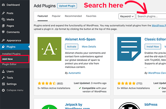
You will see a screen like the one in the screenshot above. Find the plugin by typing the plugin name or the functionality you are looking for. After that, you will see a bunch of listings like the example below:
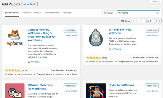
You can pick the plugin that is best for you. Since in our search, we were looking for WPForms which is the best WordPress contact form plugin, we’ll click the ‘Install Now’ button next to it.
WordPress will now download and install the plugin for you. After this, you’ll notice the ‘Install Now’ button will change into the ‘Activate’ button.
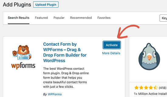
A WordPress plugin can be installed on your site, but it will not work unless you activate it. So go ahead and click on the activate button to start using that plugin on your WordPress site.
That’s all, you have successfully installed your first WordPress plugin.
The next step is to configure the plugin settings. These settings will vary for each plugin therefore we will not be covering that in this post.
Install a Plugin using the WordPress Admin Plugin Upload
Paid WordPress plugins are not listed in the WordPress plugin directory. These plugins cannot be installed using the first method.
That’s why WordPress comes with the upload method to install such plugins. We will show you how to install WordPress plugins using the upload option in the admin area.
First, you need to download the plugin from the source (which will be a zip file). Next, you need to go to WordPress admin area and visit Plugins » Add New page.
After that, click on the ‘Upload Plugin’ button on top of the page.
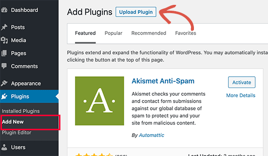
This will reveal the plugin upload form. Here you need to click on the ‘Choose File’ button and select the plugin file you downloaded earlier to your computer.
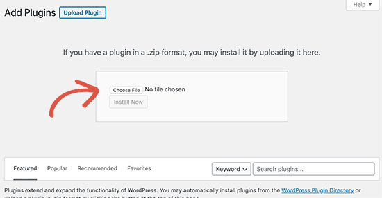
After you have selected the file, you need to click on the ‘Install Now’ button.
WordPress will now upload the plugin file from your computer and install it for you. You will see a success message like this after the installation is finished.
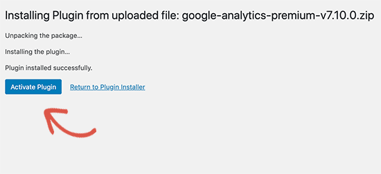
Once installed, you need to click on the Activate Plugin link to start using the plugin.
You would have to configure the settings to fit your needs. These settings will vary for each plugin therefore we will not be covering that in this post.
Manually Install a WordPress Plugin using FTP
In some rare cases, your WordPress hosting provider may have file restrictions that could limit your ability to install a plugin from the admin area.
In this situation, your best bet is to install the plugin manually using FTP.
The FTP manager method is the least friendly for beginners.
First you will need to download the plugin’s source file (it will be a zip file). Next, you need to extract the zip file on your computer.
Extracting the plugin zip file will create a new folder with the same name. This is the folder that you need to manually upload to your website using a FTP client.
You would need to access your host through the FTP manager. If you do not have your FTP username and password, then contact your WordPress hosting provider and ask them.
Open the FTP client on your computer and connect to your website using the login credentials provided by your web host. Once connected, you need to go to the /wp-content/plugins/ folder on your website.
Next, upload the folder you extracted from the zip file to the /wp-content/plugins/ folder on your web server.
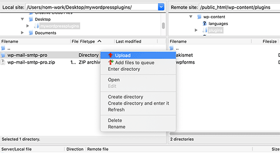
After uploading the files, you need to visit the WordPress admin area and click on the Plugins link in the admin menu. You’ll see your plugin successfully installed on the plugins page.
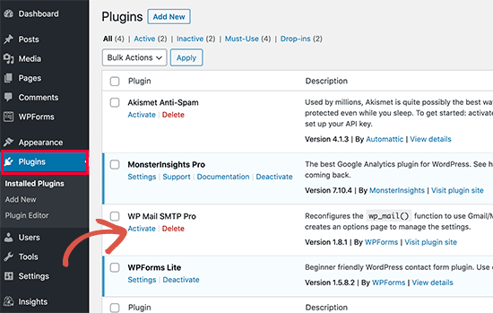
You need to click on the Activate link below the plugin to start using it.
Upon activating, you may need to configure the plugin settings. WordPress plugins come with their own settings which differ from one plugin to another so we will not describe them here.
FAQs About Installing WordPress Plugins
As a beginners you may have few questions about installing WordPress plugins. As the largest WordPress resource site, we have heard all of them.
Here are some of the most frequently asked questions about installing WordPress plugins.
1. How do I find the best WordPress plugins to install on my website?
There are more than 55,000 WordPress plugins on the free WordPress plugin directory alone. Many more are available as premium plugins. This makes it a bit difficult for beginners to find the best plugin for the feature they need.
We have compiled a list of all the essential WordPress plugins that most WordPress websites need.
We also have a detailed tutorial on choosing the best WordPress plugin where we show you what to look for when looking for a plugin.
2. What is the difference between installed and active plugins?
WordPress allows you to install a plugin and not use it at all. In order to use a plugin on your site, you need to ‘Activate’ it.
You can see active plugins by visiting the ‘Plugins’ page in the WordPress admin area. They will be highlighted with a blue background.
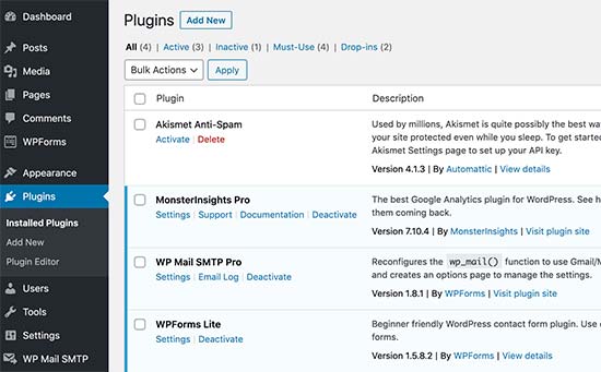
Plugins with the white background are installed on your website but not active.
3. Should I delete inactive plugins?
If you are not using a plugin, then it is recommended to delete it from your website. For more on this topic, see our article on why should you delete inactive plugins in WordPress.
4. How many plugins I can install in WordPress?
You can install as many WordPress plugins as you need. It is not the number of plugins that affect your website speed, but the quality of those plugins. For more information, see our article on how many WordPress plugins you should install.
5. How do I uninstall a WordPress plugin
You can uninstall a WordPress plugin by visiting the Plugins page in the WordPress admin area. If the plugin you want to remove is currently active, then first you’ll need to deactivate it. After that, you can simply click on the delete link to remove it from your website.
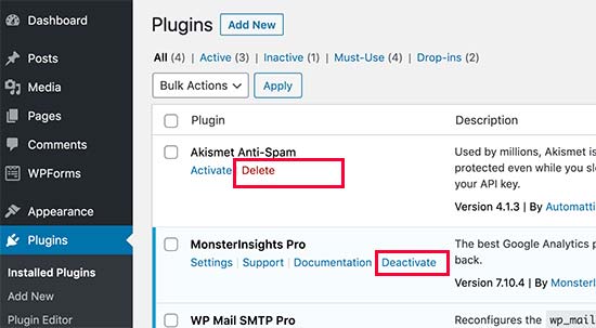
For more detailed instructions, see our guide on how to properly uninstall a WordPress plugin.
We hope this helped you learn how to install WordPress plugins.
You may also want to see our plugins category where we write about the best WordPress plugins that you can use to accomplish whatever you’re looking to do. Each of those articles comes with step-by-step instructions on how to set up individual plugins.
If you liked this article, then please subscribe to our YouTube Channel for WordPress video tutorials. You can also find us on Twitter and Facebook.
The post How to Install a WordPress Plugin – Step by Step for Beginners appeared first on WPBeginner.
How To Get a Free Domain Name (And Why We Never Do)
There are no free, 100% free domain names any more. Freenom is still around, but its free domain name services are shut down. That was the last truly free source of top level domain names that I know about. But what about the “free domain names” offered by web hosting […]
The post How To Get a Free Domain Name (And Why We Never Do) appeared first on .
Is There a WordPress Plugin for Everything?
WordPress plugins are great. Not only that, they are basically a necessity for any website, offering tons of features and functionalities to your website you would not have otherwise. What you may not be aware of, however, is that presently there are over 55,000 WordPress plugins for you to choose from. How’s that for overwhelming?! […]
The post Is There a WordPress Plugin for Everything? appeared first on WPArena.
How to Improve Security on WordPress Websites for Optimal Performance
WordPress is a tool that was initially used by bloggers, but over the years, it has become a very popular website builder and is used by many website owners and companies. It has proven itself to be an excellent content managing platform. Its popularity is attributed to the ease with which it can be used […]
The post How to Improve Security on WordPress Websites for Optimal Performance appeared first on WPArena.
How many CSS properties are there?
Tomasz Łakomy posted a joke tweet about naming all the CSS attributes and Tejas Kumar replied with a joke answer, going as far as making an npm module. You can even run a terminal command to see them:
npx get-all-css-propertiesYou'll get 259 of them. The source code uses the website quackit.com for the data, which I'd never heard of. 🤷♂️
I would have probably looked at MDN, where some quick querySelectorAll handiwork in the console yields a different number: 584. But ooops, that's full of selectors, at-rules, and other stuff. Their reference only lists 72, but says it's incomplete.
W3Schools lists 228 of them. HTML Dog lists 125. Our almanac has 176, and I know we omit stuff on purpose (e.g. we file margin-left under margin instead of making its own entry).
520 distinct property names from 66 technical reports and 66 editors' drafts.
The post How many CSS properties are there? appeared first on CSS-Tricks.
How to Manage Multiple WordPress Websites (Do It the Easy Way With These 5 Tools)
How to Reduce HTTP/S Requests in WordPress
 Here’s a story you’ll love if you want to speed up your WordPress site. The other day I built a shiny website. I went all out and added WooCommerce, Google Tag Manager, OneSignal, helpdesk, Yoast, live radio (oh yes I did), Cookie Notice, social media, and a bunch of other plugins. Just like you, I […]
The post How to Reduce HTTP/S Requests in WordPress appeared first on WPExplorer.


