monica.css

Featured Imgs 23

Monica Dinculescu:

I don’t want every possible padding and margin and colour and flexbox configuration in the world. I just want the ones that I know I end up using in every project. So here is monica.css: my very own CSS framework, which I copy paste at the beginning of every CSS file and take it from there.

I love it when people make their own CSS starter. I like Sanitize, but even that feels like a bit much for most things I poke around at. If I was making one for myself, I'd probably steal some of this stuff from Monica. I'd definitely pull the margin off body as I find myself writing that line a lot. I'd probably steal some of that [class] stuff from Andy's. My center class would probably just be text-align and I'd give myself some other centering class for my other favorite centering: display: grid; place-items: center;.

I love how everyone agrees on box-sizing.

Direct Link to ArticlePermalink

The post monica.css appeared first on CSS-Tricks.

Solving Sticky Hover States with @media (hover: hover)

Category Image 052

Mezo Istvan does a good job of covering the problem and a solution to it in a blog post on Medium¹.

If you tap on something that has a :hover state but you don't leave the page then, on a mobile device, there is a chance that :hover state "sticks." You'll see this with stuff like jump-links used as tabs or buttons that trigger on-page functionality.

button:hover {
  border: 3px solid green; /* might stick! */
}

The solution, or trick, is a new(ish) "CSS4" media query that allows you only to apply styles on devices with hover capability.

@media (hover: hover) {
  button:hover {
    border: 3px solid green; /* solves sticky problem */
  }
}

Your typical touch screen mobile device will fail that media query, the style won't apply, and you'll avoid the sticky problem.

Support is solid, so not much worry there.

  1. It almost feels like we have to apologize to linking to things on Medium lately. I have no idea what you're going to experience when you get there. Will you just be able to read it? Will it be a teaser where you have to log in to read more? Will it be behind a paywall? I have no idea. In this case, hopefully, this link post has enough info in it that isn't not blocking you from learning anything.


Direct Link to ArticlePermalink

The post Solving Sticky Hover States with @media (hover: hover) appeared first on CSS-Tricks.

CSS4 is a Bad Idea

Featured Imgs 23

Louis Lazaris, reacting to the idea of CSS4:

The reason “CSS3” worked is because it was real. It was the successor to “CSS2.1”. Everything after CSS2.1 was considered to be under the umbrella of “CSS3”.

The gist is that CSS4 isn't real, so won't work, and we don't need it anyway. Perhaps I overestimate the power of marketing, but I'd wager Louis underestimates it a bit. When an idea takes hold, basis in truth or not, it has tremendous power and money follows. See: politics and pet rocks.

Amelia Bellamy-Royds pointed out that there is a real thing we could point to, and those are "CSS Snapshots" that the working group produces that could be marketed as yearly versions. Like we have ES2019, we could have CSS2020.

Direct Link to ArticlePermalink

The post CSS4 is a Bad Idea appeared first on CSS-Tricks.

Full Stack Panic

Category Image 052

A new podcast from Sean Fioritto inspired by Joel Califa's term "Full Stack Anxiety".

... the little voice in your head says ... “I should know all of this. Do I even know what I'm doing?” Why do web developers the world over feel like this?

There is an episode with Joel talking about it as well as other interesting angles like an episode with psychologist Dr. Sherry Walling.

The overall vibe is that of catharsis in that, hopefully, none of this matters as much as it seems like it might. I'd like to think we try to deliver that, through a bit of levity, on ShopTalk Show as well.

Oh hey and Panic started a podcast too, a must-subscribe from me as a long-time fan of all their interesting work.

Direct Link to ArticlePermalink

The post Full Stack Panic appeared first on CSS-Tricks.

Woodworking SVG (and Other Real Life Encounters)

Category Image 052

Eric Meyer does his woodworking math in SVG.

I’ve been hand-coding SVG schematics to figure out how thing should go together, and as a by-product, guide me in both material buying and wood cutting.

This might sound hugely bespoke and artisanally overdone, but they’re not that complicated, and as a major benefit, the process has helped me understand SVG a little bit better.

Letterpress

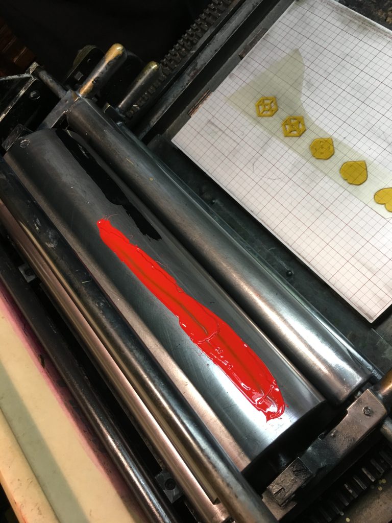
This all reminds me of my own SVG-meeting-real-life scenario. Years back, when I had access to a letterpress shop, I had some SVG converted into printable plates to make fun little bits of art.

First I did a little SVG shape morphing to get some in-progress morphs:

Then I used those SVGs in Illustrator to create a design, which I sent off to a special company to make me a letterpress plate out of polymer.

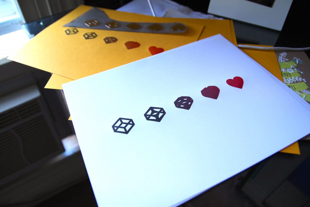
Then I used that plate to print the designs

Which turned out pretty cool!

Direct Link to ArticlePermalink

The post Woodworking SVG (and Other Real Life Encounters) appeared first on CSS-Tricks.

Flexible Captioned Slanted Images

Category Image 052

The end result of Eric Meyer's tutorial on creating this row of slanted images is pretty classy. But it's more about the journey than the destination (there isn't even really an isolated demo for it). Eric does an amazing job at talking it through like a thought process.

We did that recently, only ours was sort of fake/generic which Eric's was for a real-world design.

  • This is a row of boxes, so flexbox. Eric pondered if grid would have been as good or better of a choice since the widths are known and either can be made to accept more/less boxes without adjustment. I agree it's a tough call here.
  • Since the image dimensions being manipulated, object-fit is a must, and the less-used object-position is used here to help with a focal point.
  • The captions are just pushed to the bottom of the boxes naturally by the images.
  • The slanting is done with clip-path, but it involves some trickery. The boxes need to be enlarged to clip without leaving blank space, then pulled together with negative margin. Percentages are used all around to keep things flexy.
  • Still more tweaks are needed to keep from clipping the captions, and then there is still opportunity for more clever design bits.

Sad that this is probably the last time I'll link to 24 ways.

Direct Link to ArticlePermalink

The post Flexible Captioned Slanted Images appeared first on CSS-Tricks.

Min and Max Width/Height in CSS

Featured Imgs 23

Here's a nice deep dive into min-width / min-height / max-width / max-height from Ahmad Shadeed. I like how Ahmad applies the properties to real-world design situations in addition to explaining how it works. In the very first demo, for example, he shows a button where min-width is used as a method for (trying to) make sure a button has space on its sides. It works if the text is short enough, and fails when the text is longer. That's the kind of "CSS thinking" that is fundamental to this trade.

Direct Link to ArticlePermalink

The post Min and Max Width/Height in CSS appeared first on CSS-Tricks.

The Design Squiggle

Category Image 052

I think we all have an intuitive understanding that, at the beginning of projects that require our creativity (be it design or code), things feel uncertain and messy. Then, as we go, things tend to straighten out. There is still some wiggling and setbacks, but by the end, we find a single solution and ship it.

Apparently this feeling has a logo: The Design Squiggle

The Process of Design Squiggle by Damien Newman, thedesignsquiggle.com

It comes from Damien Newman who says that a client gave him 30 seconds to sell them on the value of design, and this did the trick.

I find it a little funny to take this little concept and give it such a grandiose presentation. A dedicated website! A story with a boatload of name dropping! Very specific attribution instructions! But hey, I don't have any famous doodles, and I gotta admit, this does a great job of expressing a complex thing quite quickly.

Reminds me of a boss a buddy of mine had who claims to have invented the Curiously Strong motto for Altoids, and didn't mind telling people about it.

Direct Link to ArticlePermalink

The post The Design Squiggle appeared first on CSS-Tricks.

Re-creating the ‘His Dark Materials’ Logo in CSS

Featured Imgs 23

The text logo has a slash cut through the text. You set two copies on top of one another, cropping both of them with the clip-path property.

What's interesting to me is how many cool design effects require multiple copies of an element to do something cool. To get the extra copy, at least with text, we can sometimes use a pseudo-element. For more elaborate content, there is an element() function in CSS, but it's limited to a prefixed property in Firefox. Still, it enables awesome stuff, like making a mini-map of long content.

You can style it differently with a pseudo-element, which was useful here. Might be cool to see a way to clone elements on a page and apply styling all through CSS... someday.

See the Pen
His Dark Materials TV series logo with CSS
by Michelle Barker (@michellebarker)
on CodePen.

Direct Link to ArticlePermalink

The post Re-creating the ‘His Dark Materials’ Logo in CSS appeared first on CSS-Tricks.

Water.css

Featured Imgs 23

It's notable that Water.css was the #1 clicked thing from Louis Lazaris' Web Tools Weekly in 2019. It's from a 13-year old developer named Felix!

It's just a little bit of CSS you apply to class-free semantic HTML to give it nice basic responsive styles — the perfect kind of thing for a Pen when you are just tossing some markup together and want it to look nice.

Direct Link to ArticlePermalink

The post Water.css appeared first on CSS-Tricks.

Is it better to use ems/rems than px for font-size?

Category Image 052

The answer used to be absolutely yes because, if you used px units, you prevented the text from being resized by the user at all.

But browser zoom is the default method for making everything bigger (including text) these days and it works great even if you use px.

But... Kathleen McMahon really digs into this and finds that it's still worth setting all your type (both font-size and line-height) in relative units because:

  1. setting type in px prevents browser settings from making font size adjustments (which some people definitely use) and
  2. setting type in relative units maintains greater design fidelity as users use browser zoom (which a lot of people definitely use).

Direct Link to ArticlePermalink

The post Is it better to use ems/rems than px for font-size? appeared first on CSS-Tricks.