How to Easily Create a Responsive Vertical Rhythm with CSS


Tips, Expertise, Articles and Advice from the Pro's for Your Website or Blog to Succeed

There’s some new units I was totally unaware of from the Level 4 spec for CSS values! The lh unit is “equal to the computed value of line-height” and rlh is the same only of the root element (probably the <html> element) rather than the current element.
Why would that be useful? Šime Vidas’ has a strong point:

.inline-icon {
  display: inline-block;
  width: 1lh;
  height: 1lh;
}
The post `lh` and `rlh` units appeared first on CSS-Tricks.
Lots of CSS changes over the past two days (clear your browser cache to experience them!) and a new homepage to boot.
Whatcha think of the homepage changes? Does it do a good job explaining what DaniWeb is all about?
Scrollbars are natural progress meters. How far the scrollbar is down or across is how much progress has been made scrolling through that element (often the entire page). But, they are more like progress indicators than meters, if you think of a meter as something that “fills up” as you go.
We can use some CSS trickery to make the scrollbar fill up as we go.
This will only work with -webkit- vendor-prefixed scrollbar-styling properties. In other words, these are non-standard. The standardized scrollbar styling properties are scrollbar-width and scrollbar-color, which can’t pull this kind of thing off, but are probably a safer bet in the long run. Still, the vendor-prefixed versions probably aren’t going anywhere, so if you consider this a weird form of progressive enhancement, that’s probably fine.
Essentially, it’s hanging a huge box-shadow off the top of the scrollbar thumb — or off the side if it’s a horizontally scrolling element.
:root {
  --shadow: #43a047;
  --scrollbarBG: #eee;
  --thumbBG: #66bb6a;
}
::-webkit-scrollbar {
  width: 16px;
}
::-webkit-scrollbar-track {
  background: var(--scrollbarBG);
}
::-webkit-scrollbar-thumb {
  background-color: var(--thumbBG);
  box-shadow: 0 -100vh 0 100vh var(--shadow), 0 0 15px 5px black;
}I first saw this in a Pen by Myk.
That example didn’t differentiate the thumb part of the scrollbar at all, which makes it more meter-like, but also harder to use. My demo has a slightly different color thumb.
No! Aside from it being super weird and non-standard. Safari flips it’s lid and I have no idea how to fix it.

I do happen to have a favorite CSS trick that is highly related to this though.
Cool, here you go.
The post CSS Scrollbar With Progress Meter appeared first on CSS-Tricks.
I linked up Water.css not long ago as an interesting sort of CSS framework. No classes. No <h2 class="is-title">. You just use semantic HTML and get styles. Is that going to “scale” very far? Probably not, but it sure is handy for styling things quickly, where — of course — you’re writing semantic HTML but don’t need to care tremendously about the look, other than it should look as decent as it can with low effort.
This week I saw MVP.css making the rounds. Same idea. There are a bunch more!
Even Foundation, while being a big honkin’ framework, does some pretty decent stuff classless-ly™.
The post No-Class CSS Frameworks appeared first on CSS-Tricks.
Chase McCoy wrote a nifty post about the “gap problem” when making a grid of items. His argument might be summarized like this: how should we space elements with margins in CSS? He notes that the gap property isn’t quite ready for prime time when it comes to using it with flexbox, like this:
.grid {
  display: flex;
  gap: 10px;
}
Right now, using gap with flexbox is only supported in Firefox and I’ve already caught myself forgetting about that in a few projects. So watch out for that.
Anyway, the part about Chase’s blog post that I love is where he mentions Andy Bell’s technique for creating a responsive layout with no media queries, like this:
.grid {
  display: grid;
  grid-gap: 10px;
  grid-template-columns: repeat(auto-fill, minmax(150px, 1fr));
}
This CSS is doing the following:
The nifty thing about all this is that our grid is now effectively responsive because of minmax — if you resize the browser, then the grid will snap down into fewer columns, just like this:
No media queries at all! Although sure, there’s a few other ways that you could get this to work but I think this is neat not just because we’re avoiding media queries — instead, it’s because it teaches us to think in a new way when designing and building components.
Chase continues:
With this technique, instead of using breakpoints to specify the screen size where your items should stack, you specify the minimum size an element should be before it stacks. I like this because it encourages developers to think about responsive design in terms of behaviors instead of screen sizes.
“Behaviors instead of screen sizes” is such a great way to think about component design! A lot of the problems I’ve encountered when making components for a design system is when I’ve been thinking about screen sizes — mobile, tablet, desktop, etc. — and trying to make those components fit within those constraints.

Thinking in behaviors is always more effective because there are so many things that can impact a component beyond what screen or device width we’re working with. Perhaps we want that component to fit inside another component. Or we want to align some helper text to the side of it for comparison.
Either way, thinking about behaviors instead of screen sizes isn’t really going to be fully impossible until we have container queries, as Chris writes:
Container queries are always on the top of the list of requested improvements to CSS. The general sentiment is that if we had container queries, we wouldn’t write as many global media queries based on page size. That’s because we’re actually trying to control a more scoped container, and the only reason we use media queries for that now is because it’s the best tool we have in CSS. I absolutely believe that.
The post Thinking in Behaviors, Not Screen Sizes appeared first on CSS-Tricks.
CSS Grid provides us with a powerful layout system for websites. The CSS-Tricks guide gives you a comprehensive overview of Grid’s properties with layout examples. What we’re going to do here is a reverse approach to show you the smallest possible set of grid properties you need to know to meet most of your layout needs.
These five properties will get you up and running:
display (for the grid value)grid-template-columnsgrid-gapgrid-auto-flowgrid-column / grid-rowHere’s how simple it is. Let’s assume you want to implement the following layout for small, medium and large screens.


This is the markup we’ll be working with:
<!-- Stuff before -->

<nav class="container-nav">
  <ul>
    <li></li>
    <li></li>
    <li></li>
    <li></li>
    <li></li>
    <li></li>
    <li></li>
    <li></li>
    <li></li>
  </ul>
</nav>

<div class="container-main">
  <section class="item item-type-a"></section>
  <section class="item item-type-b"></section>
  <section class="item item-type-b"></section>
  <section class="item container-inner">
    <section class="item-inner"></section>
    <section class="item-inner"></section>
    <section class="item-inner"></section>
    <section class="item-inner"></section>
    <section class="item-inner"></section>
  </section>
</div>

<!-- Stuff after -->
If we apply a few baseline styles, this is what we get, which is already sufficient for small screens:
Now we can get into the grid properties!
First, we need to determine which parts of the page should be aligned with grid layouts. It is possible to define a single grid layout for the whole page. However, for websites with a very complex structure (e.g. news websites), handling a large grid quickly becomes complicated to wrangle. In this case, I recommend breaking things down into several, independent grid containers.
Like this:

Where do you draw the line between what is and isn’t a grid? Here’s a personal rule of thumb I follow:
If the layout in a particular part of the page does not fit into the grid of an adjacent or surrounding part of the page, make that part its own grid container.
I have drawn the grid lines into the page section with the class .container-main in the following image You may notice that the section with the .container-inner class from the markup does not fit exactly into the grid of rows.

Here’s another possible layout where the small sections fit into the surrounding grid if a finer line raster is chosen. A separate grid container is not absolutely necessary here.

To kick this off, let’s .container-main into a grid container. This is the basic building block for CSS Grid — turning an element into a grid container with the display property:
.container-main {
  display: grid;
}
We’ll want to do the same with our other grid containers:
.container-inner {
  display: grid;
}

.container-nav {
  display: grid;
}Next, we’re going to define the number of columns we need in each grid container and how wide those columns should be. My guideline for the number of columns: use the smallest common multiple of the maximum number of columns required for the different screen sizes.
How does that work? The .container-main element has a total of two columns on medium-sized screens. If we take that and multiply it by the number of columns on large screens (three), we get a total of six columns.
We can do the same for our navigation, the .container-inner element. There are three columns on medium-sized screens, which we multiple by one column on large screens to get a total of three columns.
The .container-nav element provides no number of columns. In this case, the grid system should automatically adjust the number of columns to the number of menu elements. It’s common to add or remove items in a navigation, and it’d be great if it responded accordingly, which is something grid can help us with a little later on.
OK, so we defined the number of columns for each grid container. Let’s use the grid-template-columns property to set those into place. But, first a couple of minor details:
grid-template-columns property is only used on the grid container. In other words, you won’t find it being used (at least correctly) on a grid item inside the container.fr) unit. I’d highly suggest checking out Robin’s overview because it’s unique to grid and does an amazing job doing calculations to decide how grid elements fit inside a grid container.We need six equal-width columns in .container-main. We can write that like this:
.container-main {
  display: grid;
  grid-template-columns: 1fr 1fr 1fr 1fr 1fr 1fr;
}
Or, we can turn to the repeat() function to simplify it into something more readable:
.container-main {
  display: grid;
  grid-template-columns: repeat(6, 1fr);
}
Let’s take that knowledge and apply it to our .container-inner element as well, which we decided needs three columns.
.container-inner {
  display: grid;
  grid-template-columns: repeat(3, 1fr);
}By default, grid uses all the space it has in a grid container to fit in grid items. Having elements flush next to one another might be a design requirement, but not for the particular layout we’re making. We want some breathing room between things!
We have the grid-gap property for that. Again, this is a property that’s just for grid containers and what it does is create vertical and horizontal spacing between grid items. It’s actually a shorthand property that combines the vertical spacing powers of grid-row-gap and horizontal spacing powers of grid-column-gap. It’s handy that we’re able to break things out like that but, in times like this where we’re working with the same amount of spacing in each direction, the shorthand grid-gap is much nicer to write.
We want 20px of space between grid items in .container-main, 10px of space in .container-inner, and 5px of space in .container-nav. No problem! All it takes is a one-liner on each grid container.
.container-main{
  display: grid;
  grid-template-columns: repeat(6, 1fr);
  grid-gap: 20px;
}

.container-inner {
  display: grid;
  grid-template-columns: repeat(3, 1fr);
  grid-gap: 10px;
}

.container-nav {
  display: grid;
  grid-gap: 5px;
}Now it is time to put the layout into the shape we want it!
First is the grid-column property, which allows us to extend a grid item across n columns, where n is the number of columns to span. If you’re thinking this sounds an awful lot like the rowspan attribute that lets us extend cells across multiple rows in HTML tables, you wouldn’t be wrong.
It looks like this when we use it on a grid .item in our .container-main element, and on the .inner-item elements in .container-inner:
.item {
  grid-column: span 6;
}

.item-inner {
  grid-column: span 3;
}
What we’re saying here is that each item span six rows in our main container and three rows in our inner container — which is the total number of columns in each container.
An interesting thing about CSS Grid is that we are able to name the lines of the grid. They come with implicit names out of the box but naming them is a powerful way to distinguish between the starting and ending lines for each column on the track.
We can change the number of columns and rows the items should span at different breakpoints:
@media screen and (min-width: 600px) {
  .item-type-b {
    grid-column: span 3;
  }

  .item-inner {
    grid-column: span 1;
  }
}

@media screen and (min-width: 900px) {
  .item {
    grid-column: span 2;
    grid-row: span 2;
  }

  .item-type-b{
    grid-row: span 1;
  }

  .item-inner{
    grid-column: span 3;
  }
}CSS Grid places elements one row after the other. This is why the result in our example looks like this at the moment:

A column-by-column placement can be achieved by setting the grid-auto-flow property to column (row is the default value). Our layout will profit from column-wise placement in two cases. First, it makes our menu items finally appear in a horizontal orientation. Secondly, it brings the elements of the container class into the desired grouping.
The grid system allows us to work under the motto, “make as many specifications as necessary, but as few as possible.” We’ve only covered a few of the specifications necessary to turn elements into a CSS grid container and the items inside it into grid items for the sake of showing just how little you need to know to build even complex layouts with CSS Grid.
CSS Grid supports additional use cases where:
If the first case applies, then it’s worth considering the following additional grid options:
grid-template-columns, you can have the grid system automatically determine the width of individual columns with the auto keyword or adapt it to the existing content with the settings min-content, max-content, or fit-content.repeat, auto-fill, auto-fit, and minmax. Even media queries can become redundant and these tools help make things flexible without adding more media queries.Here are a couple of articles on the topic that I recommend: Becoming a CSS Grid Ninja! and Auto-Sizing Columns in CSS Grid: auto-fill vs. auto-fit.
If the second case applies, CSS Grid offers even more settings options for you:
px or %) using the grid-template-columns property. In addition, the property grid-template-rows is available to define the number and width of rows, should there be a specific number of them. grid-column and grid-row (or use the properties grid-column-start, grid-column-end, grid-row-start, or grid-row-end).And we haven’t even gotten into CSS Grid alignment! Still, the fact that we can accomplish so much without even broaching that topic shows how powerful CSS Grid is.
The post 4 CSS Grid Properties (and One Value) for Most of Your Layout Needs appeared first on CSS-Tricks.
Creating child pages in WordPress is simple to do. The only problem is, creating a child page doesn’t do anything for the front end of your blog and your viewers. You can’t just easily check a box or two and display child pages automatically on the parent page. This leaves your homepage, well… childless. Read on for the simple solution.
This article is rated PG, meaning that — like a parent — I’ll be offering some guidance on how you can better index your child pages with the help of some free WordPress plugins.
More specifically, showing you how to get a list of Child Pages to appear both on a Parent Page, and also in your sidebar.
By the time you read this article, you’ll have a nice idea of several options to set up your WordPress site and child pages.
From there you’ll be able to make a grown-up decision on what works best.
Having an option to showcase your child pages on your website is important if you have some vital information that you want prominently displayed.
Why?
If you don’t, many viewers might not realize a lot of what you want them to see is accessible.
If child pages are in the future for you, your life, er — website — is about to change.

Like a good parent, a good plugin can raise your child pages to be well-displayed.
Not only that, but they can also simplify the process, assist with customization, and – as you’ll see – much more.
These free child page plugins each have various features and benefits. I’ll be going over all of them in detail.
Plus, I have a “bonus” plugin that I’ll mention that deals with a child of a different magnitude.

CC Child Pages by Caterham Computing is a simple plugin that can display child pages on your homepage with a shortcode.
It’s so easy to use, even a child can add child pages to their WordPress website.
Everything is achieved by using a shortcode. The shortcode is relatively simple and can be used wherever you’d like the child pages to appear (e.g. the homepage).

The child pages are displayed in responsive boxes, which include a page title, excerpt, and even a “Read more…” link.
I like how you can choose your layout with this plugin. It can be 1, 2, 3 or 4 columns.
If you choose to go with a three or four-column layout, it will resize to two columns on mobile devices, which makes them easy to read when viewing on the go.

You can also choose the depth of pages to be displayed. All of this can be configured as a widget in the Sidebar area.

Once you have edited it how you’d like, it’s ready to go! You just paste the shortcode wherever you want to display it on your site.

Though there’s not a ton of customization options, the simplicity of this plugin makes it efficient and does the job.
With over 10,000 downloads and a solid 5-star review, this plugin has what it takes to add your child pages to your WordPress site.

Advanced Sidebar Menu by OnPoint Plugins is another basic and easy to use free plugin for child pages on your site.
It uses the parent and child relationship of your WordPress pages or categories and generates menus in specific areas.
You just assign a page or category to a parent and the plugin does the rest for you.
This plugin has solid reviews along with good support.
Let’s check it out!
To set it up, it’s all located in the widgets area from your dashboard.

Here you can add a title, display the highest level parent category, display menu, and use built-in styling.
Everything is located here and there are no additional places to customize.
Once you have configured it the way you want, it’s ready to go.

It is as simple as that.
There’s not much when it comes to additional customization, but like our previous plugin, it might not be necessary to suit your needs.
They have an option to Go Pro, which features advanced styling, priority support, custom link text, excluding pages, and more.
However, for just the basics, the free version does the trick.
Though there are not many advanced options, if you have some CSS knowledge, you can customize as much as you’d like in your theme’s style sheet.
This plugin is great when it comes to including a clean and usable menu for child pages.
It’s nice to be able to feature only what you want and have full control over your options. Plus, the ease of use makes for a quick fix when adjusting your website.

The Content Views – Post Grid & List for WordPress by Content Views is a fantastic option for anyone looking for an extremely easy fix for adding child pages or grids for posts.
It’s a well-updated plugin that’s 100% responsive and mobile-friendly. I love how you can customize almost every Aspect of the pages; including arranging by keyword, images, recent pages, and more.
The layout of this plugin in your dashboard is a breeze to figure out.
It gives you an option for either a page or post right in the dashboard under Content Type.
Everything is clearly labeled and you can quickly set up your child pages however you’d like.
From the dashboard, you can choose what to include, exclude, and limit. There are also more advanced options for sorting and display.

The Display Settings has all the options you need for setting it up the way you want it to look.
You have options for layout, format, and field settings. It also goes as far as allowing you to set up excerpts, HTML tags, pagination, opening child pages in the current tab or a new tab, and more.

Once you have your child pages display all set up — you’re all set!
There’s a simple shortcode to embed it into your website. You can use it in a widget or for a theme file. They give you both options.

When you save your new view, it’s listed on the dashboard. You can easily retrieve the code from there, too.

Want to see it in action? Here is a quick set up I created from a basic WordPress website.

Like a lot of the other plugins, there is a Pro option. If you upgrade, you can get advanced customization options, more layouts, and options for Google Adsense.
I found the free version suitable as-is. The clean layout, design, and ease of functionality make this a pretty amazing free plugin for child pages.

I told you I had a “bonus” — and this is it.
The Child Theme Configurator by Lilaea Media is something else to consider. It goes beyond just pages and tackles child themes.
I think it’s worth including because sometimes users want to edit a child theme. Or, you might not even be aware that this is an option for your WordPress site.
And since we’re talking about child stuff, well…why not include it?
Let’s dive in and take a look.
Once uploaded into your dashboard, you have four options to choose from:

One great quality of this plugin is how it’s step-by-step. There’s no overly complicated language or confusion, making configuring very simple.

You can customize however you’d like.

This includes where to save the stylesheet, ensuring plugins work with specific themes, and verifying the theme directory.

This plugin has a lot to offer and it’s worth exploring for yourself if you’re interested in child themes.

There is an upgrade option that includes customizable plugin stylesheets, quick preview, color palettes, new styles, adding child theme files, and tutorials.
Depending on your skill level, it might be worth the upgrade. The free version is quite impressive as is.
Now even though we’re mostly talking plugins in this article, with a little bit of coding knowledge, you don’t need a plugin to create child pages that are displayed on your homepage.
An example of this is adding the below code to your theme’s sidebar.php file.
Code for setting up child pages.
From there, you can edit accordingly by resizing, adding fonts, colors, etc.
Of course, if this is a bit too complicated and CSS isn’t your thing (by the way, we can help you with that), a plugin is the easiest way to go.
Plus, a plugin can give you more options for functionality, displays, and features.
To avoid problems with your site’s viewers seeing your content, a great child page plugin will do the trick. As you can see, you have a lot of options.
Each plugin is uniquely different, but they all make setting up child pages on a parent page much easier than, let’s say, parenting.
And if you need babysitting, we have 24/7 support, hosting, and security to keep your WordPress site and child plugins in good hands.
Do you want to add custom fonts in WordPress? Custom fonts allow you to use beautiful combination of different fonts on your website to improve typography and user experience.
Apart from looking good, custom fonts can also help you improve readability, create a brand image, and increase time users spend on your website.
In this article, we will show you how to add custom fonts in WordPress using Google Fonts, TypeKit, and CSS3 @Font-Face method.
Note: Loading too many fonts can slow down your website. We recommend choosing two fonts and use them across your website. We’ll also show you how to properly load them without slowing down your website.
Before we look at how to add custom fonts in WordPress, let’s take a look at finding custom fonts that you can use.
Fonts used to be expensive, but not any more. There are many places to find great free web fonts such as Google Fonts, Typekit, FontSquirrel, and fonts.com.
If you don’t know how to mix and match fonts, then try Font Pair. It helps designers pair beautiful Google fonts together.
As you are picking your fonts, remember that using too many custom fonts will slow down your website. This is why you should select two fonts and use them throughout your design. This will also bring consistency to your design.
If you don’t like the video or prefer the written guide, then please continue reading.
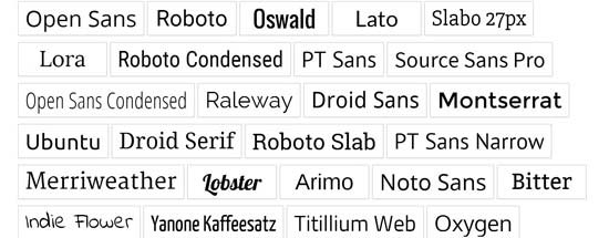
Google Fonts is the largest, free, and most commonly used font library among website developers. There are multiple ways you can add and use Google Fonts in WordPress.
If you want to add and use Google Fonts on your website, then this method is by far the easiest and recommended for beginners.
First thing you need to do is install and activate the Easy Google Fonts plugin. For more details, see our step by step guide on how to install a WordPress plugin.
Upon activation, you can go to Appearance » Customizer page. This will open the live theme customizer interface where you’ll see the new Typography section.

Clicking on Typography will you show different sections of your website where you can apply Google Fonts. Simply click on ‘Edit Font’ below the section you want to edit.
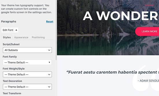
Under the font family section, you can choose any Google Font you want to use on your website. You can also choose font style, font size, padding, margin, and more.
Depending on your theme, the number of sections here could be limited and you may not be able to directly change font selection for many different areas of your website.
To fix this, the plugin also allows you to create your own controls and use them to change fonts on your website.
First, you need to visit Settings » Google Fonts page and provide a name for your font control. Use something that helps you quickly understand where you will be using this font control.
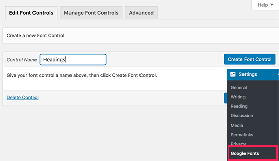
Next, click on the ‘Create font control’ button and then you will be asked to enter CSS selectors.
You can add HTML elements you want to target (for instance, h1, h2, p, blockquote) or use CSS classes.
You can use Inspect tool in your browser to find out which CSS classes are used by the particular area you want to change.
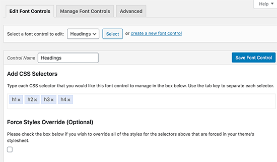
Now click on the ‘Save font control’ button to store your settings. You can create as many font controllers as you need for different sections of your website.
To use these font controllers, you need to head over to Appearance » Customizer and click on the Typography tab.
Under Typography, you will now see a ‘Theme Typography’ Option as well. Clicking on it will show your custom font controls you created earlier. You can now just click on the edit button to select the fonts and appearance for this control.
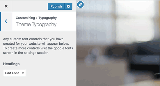
Don’t forget to click on the save or publish button to save your changes.
This method requires you to add code to your WordPress theme files. If you haven’t done this before, then see our guide on how to copy and paste code in WordPress.
First, visit the Google fonts library and select a font that you want to use. Next, click on the quick use button below the font.
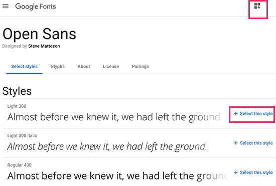
On the font page, you’ll see the styles available for that font. Select the styles that you want to use in your project and then click on the sidebar button at the top.
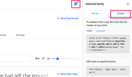
Next, you will need to switch to the ‘Embed’ tab in the sidebar to copy the embed code.
There are two ways you can add this code to your WordPress site.
First, you can simply edit your theme’s header.php file and paste the code before the <body> tag.
However, if you are unfamiliar with code editing in WordPress, then you can use a plugin to add this code.
Simply install and activate the Insert Headers and Footers plugin. For more details, see our step by step guide on how to install a WordPress plugin.
Upon activation, go to Settings » Insert Headers and Footers page and paste the embed code in the ‘Scripts in header’ box.
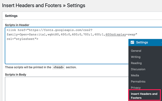
Don’t forget to click on the Save button to store your changes. The plugin will now start loading the Google Font embed code on all pages of your website.
You can use this font in your theme’s stylesheet like this:
.h1 site-title {
font-family: 'Open Sans', Arial, sans-serif;
}
For more detailed instructions see our guide on how to add Google fonts in WordPress themes.
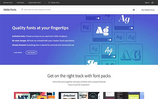
Typekit by Adobe Fonts is another free and premium resource for awesome fonts that you can use in your design projects. They have a paid subscription as well as a limited free plan that you can use.
Simply signup for an Adobe Fonts account and visit the browse fonts section. From here you need to click on the </> button to select a font and create a project.
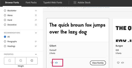
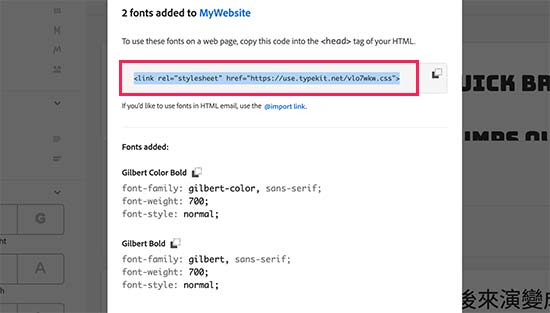
Next, you’ll see the embed code with your project ID. It will also show you how to use the font in your theme’s CSS.
You need to copy and paste this code inside the <head> section of your website.
There are two ways you can add this code to your WordPress site.
First, you can simply edit your theme’s header.php file and paste the code before the <body> tag.
However, if you are unfamiliar with code editing in WordPress, then you can use a plugin to add this code.
Simply install and activate the Insert Headers and Footers plugin.
Upon activation, go to Settings » Insert Headers and Footers page and paste the embed code in the ‘Scripts in header’ box.
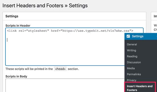
That’s all, you can now use the Typekit font you selected in your WordPress theme’s stylesheet like this:
h1 .site-title {
font-family: gilbert, sans-serif;
}
For more detailed instructions check out our tutorial how to add awesome typography in WordPress using Typekit.
The most direct way of adding custom fonts in WordPress is by adding the fonts using CSS3 @font-face method. This method allows you to use any font that you like on your website.
First thing you need to do is download the font that you like in a web format. If you do not have the web format for your font, then you can convert it using the FontSquirrel Webfont generator.
Once you have the webfont files, you would need to upload it on your WordPress hosting server.
The best place to upload the fonts is inside a new “fonts” folder in your theme or child theme‘s directory.
You can use FTP or File Manager of your cPanel to upload the font.
Once you have uploaded the font, you need to load the font in your theme’s stylesheet using CSS3 @font-face rule like this:
@font-face {
	font-family: Arvo;
	src: url(http://www.example.com/wp-content/themes/your-theme/fonts/Arvo-Regular.ttf);
	font-weight: normal;
}
Don’t forget to replace the font-family and URL with your own.
After that you can use that font anywhere in your theme’s stylesheet like this:
.h1 site-title {
font-family: "Arvo", Arial, sans-serif;
}
Loading fonts directly using CSS3 @font-face is not always the best solution. If you are using a font from Google Fonts or Typekit, then it is best to serve the font directly from their server for optimal performance.
That’s all, we hope this article helped you add custom fonts in WordPress. You may also want to checkout our guide on how to use icon fonts in WordPress and how to change the font size in WordPress.
If you liked this article, then please subscribe to our YouTube Channel for WordPress video tutorials. You can also find us on Twitter and Facebook.
The post How to Add Custom Fonts in WordPress appeared first on WPBeginner.
Funny timing on this I was just looking at the website for Utopia (which is a responsive type project which I hate to admit I don't fully understand) and I came across some CSS they show off that looked like this:
:root {
  --fluid-max-negative: (1 / var(--fluid-max-ratio) / var(--fluid-max-ratio));
  --fluid-min-negative: (1 / var(--fluid-min-ratio) / var(--fluid-min-ratio));

  ...
}
See anything weird there? That code is using mathematical operators, but there is no calc() function wrapped around it.
Just as my curiosity set in, Trys Mudford, a creator of Utopia, blogged it:
The value after the
:in the CSS custom property does not have to be valid CSS. It won’t cause any errors, nor invalidate the custom property. It won’t be evaluated in the browser until used, or more specifically, placed in acalc()function.
Here's a contrived example:
:root {
  --padding: 1rem;

  /* These are meaningless alone */
  --padding-S: var(--padding) / 2;
  --padding-L: var(--padding) * 2;
}

.module--large {
  /* But they evaluate once they are in a calc() */
  padding: calc(var(--padding-L));
}
In my limited understanding, currying is like functions that return functions. I suppose this is sorta like that in that the alternate padding properties above are sort of like derivative functions of the main padding function (if you can call it that), and you only call them and execute them as needed.
The post Currying in CSS appeared first on CSS-Tricks.
Have you ever clicked on an image on a webpage that opens up a larger version of the image with navigation to view other photos?
Some folks call it a pop-up. Others call it a lightbox. Bootstrap calls it a modal. I mention Bootstrap because I want to use it to make the same sort of thing. So, let’s call it a modal from here on out.
Why Bootstrap? you might ask. Well, a few reasons:
Here’s where we’ll end up:
Let’s go through that, bit by bit.
Let’s start with the markup for a grid layout of images. We can use Bootstrap’s grid system for that.
<div class="row" id="gallery">
  <div class="col-12 col-sm-6 col-lg-3">
    <img class="w-100" src="/image-1">
  </div>
  <div class="col-12 col-sm-6 col-lg-3">
    <img class="w-100" src="/image-2">
  </div>
  <div class="col-12 col-sm-6 col-lg-3">
    <img class="w-100" src="/image-3">
  </div>
  <div class="col-12 col-sm-6 col-lg-3">
    <img class="w-100" src="/image-4">
  </div>
</div>
Now we need data attributes to make those images interactive. Bootstrap looks at data attributes to figure out which elements should be interactive and what they should do. In this case, we’ll be creating interactions that open the modal component and allow scrolling through the images using the carousel component.
About those data attributes:
data-toggle="modal" and data-target="#exampleModal" to the parent element (#gallery). This makes it so clicking anything in the gallery opens the modal. We should also add the data-target value (#exampleModal) as the ID of the modal itself, but we’ll do that once we get to the modal markup.data-target="#carouselExample" and a data-slide-to attribute to each image. We could add those to the image wrappers instead, but we’ll go with the images in this post. Later on, we’ll want to use the data-target value (#carouselExample) as the ID for the carousel, so note that for when we get there. The values for data-slide-to are based on the order of the images.Here’s what we get when we put that together:
<div class="row" id="gallery" data-toggle="modal" data-target="#exampleModal">
  <div class="col-12 col-sm-6 col-lg-3">
    <img class="w-100" src="/image-1.jpg" data-target="#carouselExample" data-slide-to="0">
  </div>
  <div class="col-12 col-sm-6 col-lg-3">
    <img class="w-100" src="/image-2.jpg" data-target="#carouselExample" data-slide-to="1">
  </div>
  <div class="col-12 col-sm-6 col-lg-3">
    <img class="w-100" src="/image-3.jpg" data-target="#carouselExample" data-slide-to="2">
  </div>
  <div class="col-12 col-sm-6 col-lg-3">
    <img class="w-100" src="/image-4.jpg" data-target="#carouselExample" data-slide-to="3">
  </div>
</div>
Interested in knowing more about data attributes? Check out the CSS-Tricks guide to them.
This is a carousel inside a modal, both of which are standard Bootstrap components. We’re just nesting one inside the other here. Pretty much a straight copy-and-paste job from the Bootstrap documentation.
Here’s some important parts to watch for though:
data-target of the gallery element.data-target of the images in the gallery.Here’s the markup for the modal with our attributes in place:
<!-- Modal markup: https://getbootstrap.com/docs/4.4/components/modal/ -->
<div class="modal fade" id="exampleModal" tabindex="-1" role="dialog" aria-hidden="true">
  <div class="modal-dialog" role="document">
    <div class="modal-content">
      <div class="modal-header">
        <button type="button" class="close" data-dismiss="modal" aria-label="Close">
          <span aria-hidden="true">×</span>
        </button>
      </div>
      <div class="modal-body">

      <!-- Carousel markup goes here -->


      <div class="modal-footer">
        <button type="button" class="btn btn-secondary" data-dismiss="modal">Close</button>
      </div>
    </div>
  </div>
</div>
We can drop the carousel markup right in there, Voltron style!
<!-- Modal markup: https://getbootstrap.com/docs/4.4/components/modal/ -->
<div class="modal fade" id="exampleModal" tabindex="-1" role="dialog" aria-hidden="true">
  <div class="modal-dialog" role="document">
    <div class="modal-content">
      <div class="modal-header">
        <button type="button" class="close" data-dismiss="modal" aria-label="Close">
          <span aria-hidden="true">×</span>
        </button>
      </div>
      <div class="modal-body">

      <!-- Carousel markup: https://getbootstrap.com/docs/4.4/components/carousel/ -->
      <div id="carouselExample" class="carousel slide" data-ride="carousel">
          <div class="carousel-inner">
            <div class="carousel-item active">
              <img class="d-block w-100" src="/image-1.jpg">
            </div>
            <div class="carousel-item">
              <img class="d-block w-100" src="/image-2.jpg">
            </div>
            <div class="carousel-item">
              <img class="d-block w-100" src="/image-3.jpg">
            </div>
            <div class="carousel-item">
              <img class="d-block w-100" src="/image-4.jpg">
            </div>
          </div>
          <a class="carousel-control-prev" href="#carouselExample" role="button" data-slide="prev">
            <span class="carousel-control-prev-icon" aria-hidden="true"></span>
            <span class="sr-only">Previous</span>
          </a>
          <a class="carousel-control-next" href="#carouselExample" role="button" data-slide="next">
            <span class="carousel-control-next-icon" aria-hidden="true"></span>
            <span class="sr-only">Next</span>
          </a>
        </div>
      </div>

      <div class="modal-footer">
        <button type="button" class="btn btn-secondary" data-dismiss="modal">Close</button>
      </div>
    </div>
  </div>
</div>
Looks like a lot of code, right? Again, it’s basically straight from the Bootstrap docs, only with our attributes and images.
This isn’t necessary, but if the images in the carousel have different dimensions, we can crop them with CSS to keep things consistent. Note that we're using Sass here.
// Use Bootstrap breakpoints for consistency.
$bootstrap-sm: 576px;
$bootstrap-md: 768px;
$bootstrap-lg: 992px;
$bootstrap-xl: 1200px;


// Crop thumbnail images.
#gallery {
  img {
    height: 75vw;
    object-fit: cover;

    @media (min-width: $bootstrap-sm) {
      height: 35vw;
    }

    @media (min-width: $bootstrap-lg) {
      height: 18vw;
    }
  }
}


// Crop images in the coursel
.carousel-item {
  img {
    height: 60vw;
    object-fit: cover;

    @media (min-width: $bootstrap-sm) {
      height: 350px;
    }
  }
}You may have noticed that the markup uses the same image files in the gallery as we do in the modal. That doesn’t need to be the case. In fact, it’s a better idea to use smaller, more performant versions of the images for the gallery. We’re going to be blowing up the images to their full size version anyway in the modal, so there’s no need to have the best quality up front.
The good thing about Bootstrap’s approach here is that we can use different images in the gallery than we do in the modal. They’re not mutually exclusive where they have to point to the same file.
So, for that, I’d suggest updating the gallery markup with lower-quality images:
<div class="row" id="gallery" data-toggle="modal" data-target="#exampleModal">
  <div class="col-12 col-sm-6 col-lg-3">
    <img class="w-100" src="/image-1-small.jpg" data-target="#carouselExample" data-slide-to="0">

  <!-- and so on... -->
</div>The site where I’m using this has already themed Bootstrap. That means everything is already styled to spec. That said, even if you haven't themed Bootstrap you can still easily add custom styles! With this approach (Bootstrap vs. plugins), customization is painless because you have complete control over the markup and Bootstrap styling is relatively sparse.
Here’s the final demo:
The post Creating a Modal Image Gallery With Bootstrap Components appeared first on CSS-Tricks.
Let’s create a pure CSS effect that changes the color of a text link on hover… but slide that new color in instead of simply swapping colors.

There are four different techniques we can use to do this. Let’s look at those while being mindful of important things, like accessibility, performance, and browser support in mind.
Let’s get started!
At the time of writing, the background-clip: text property is an experimental feature and is not supported in Internet Explorer 11 and below.
This technique involves creating knockout text with a hard stop gradient. The markup consists of a single HTML link (<a>) element to create a hyperlink:
<a href="#">Link Hover</a>We can start adding styles to the hyperlink. Using overflow: hidden will clip any content outside of the hyperlink during the hover transition:
a {
  position: relative;
  display: inline-block;
  font-size: 2em;
  font-weight: 800;
  color: royalblue;
  overflow: hidden;
}
We will need to use a linear gradient with a hard stop at 50% to the starting color we want the link to be as well as the color that it will change to:
a {
  /* Same as before */
  background: linear-gradient(to right, midnightblue, midnightblue 50%, royalblue 50%);
}
Let’s use background-clip to clip the gradient and the text value to display the text. We will also use the background-size and background-position properties to have the starting color appear:
a {
  /* Same as before */
  background-clip: text;
  -webkit-background-clip: text;
  -webkit-text-fill-color: transparent;
  background-size: 200% 100%;
  background-position: 100%;
}
Finally, let’s add the transition CSS property and :hover CSS pseudo-class to the hyperlink. To have the link fill from left to right on hover, use the background-position property:
a {
  /* Same as before */
  transition: background-position 275ms ease;
}
a:hover {
  background-position: 0 100%;
}While this technique does achieve the hover effect, Safari and Chrome will clip text decorations and shadows, meaning they won’t be displayed. Applying text styles, such as an underline, with the text-decoration CSS property will not work. Perhaps consider using other approaches when creating underlines.
This works by using a data attribute containing the same text as the one in the <a> tag and setting the width (filling the text from left-to-right or right-to-left) or height (filling the text from top-to-bottom or bottom-to-top), from 0% to 100% on hover.
Here is the markup:
<a href="#" data-content="Link Hover">Link Hover</a>The CSS is similar to the previous technique minus the background CSS properties. The text-decoration property will work here:
a {
  position: relative;
  display: inline-block;
  font-size: 2em;
  color: royalblue;
  font-weight: 800;
  text-decoration: underline;
  overflow: hidden;
}
This is when we need to use the content from the data-content attribute. It will be positioned above the content in the <a> tag. We get to use the nice little trick of copying the text in the data attribute and displaying it via the attr() function on the content property of the element’s ::before pseudo-element.
a::before {
  position: absolute;
  content: attr(data-content); /* Prints the value of the attribute */
  top: 0;
  left: 0;
  color: midnightblue;
  text-decoration: underline;
  overflow: hidden;
  transition: width 275ms ease;
}
To keep the text from wrapping to the next line, white-space: nowrap will be applied. To change the link fill color, set the value for the color CSS property using the ::before pseudo-element and having the width start at 0:
a::before {
  /* Same as before */
  width: 0;
  white-space: nowrap;
}
Increase the width to 100% to the ::before pseudo element to complete the text effect on hover:
a:hover::before {
  width: 100%;
}While this technique does the trick, using the width or height properties will not produce a performant CSS transition. It is best to use either the transform or opacity properties to achieve a smooth, 60fps transition.
Using the text-decoration CSS property can allow for different underline styles to appear in the CSS transition. I created a demo showcasing this using the next technique: the clip-path CSS property.
For this technique, we will be using the clip-path CSS property with a polygon shape. The polygon will have four vertices, with two of them expanding to the right on hover:

The markup is the same as the previous technique. We will use a ::before pseudo-element again, but the CSS is different:
a::before {
  position: absolute;
  content: attr(data-content);
  color: midnightblue;
  text-decoration: underline;
  clip-path: polygon(0 0, 0 0, 0% 100%, 0 100%);
  transition: clip-path 275ms ease;
}
Unlike the previous techniques, text-decoration: underline must be declared to the ::before pseudo-element for the color to fill the underline on hover.
Now let’s look into the CSS for the clip-path technique:
clip-path: polygon(0 0, 0 0, 0% 100%, 0 100%);The polygon’s vertices of the clip-path property are set in percentages to define coordinates by the order written:
0 0 = top left0 0 = top right100% 0 = bottom right0 100% = bottom leftThe direction of the fill effect can be changed by modifying the coordinates. Now that we have an idea for the coordinates, we can make the polygon expand to the right on hover:
a:hover::before {
  clip-path: polygon(0 0, 100% 0, 100% 100%, 0 100%);
}This technique works pretty well, but note that support for the clip-path property varies between browsers. Creating a CSS transition with clip-path is a better alternative than using the width/height technique; however, it does affect the browser paint.
The markup for this technique uses a masking method with a <span> element. Since we will be using duplicated content in a separate element, we will use aria-hidden="true" to improve accessibility — that will hide it from screen readers so the content isn’t read twice:
<a href="#"><span data-content="Link Hover" aria-hidden="true"></span>Link Hover</a>The CSS for the <span> element contains a transition that will be starting from the left:
span {
  position: absolute;
  top: 0;
  left: 0;
  overflow: hidden;
  transform: translateX(-100%);
  transition: transform 275ms ease;
}
Next, we need to get the <span> to slide the right like this:

To do this, we will use the translateX() CSS function and set it to 0:
a:hover span {
  transform: translateX(0);
}
Then, we will use the ::before pseudo-element for the <span>, again using the data-content attribute we did before. We’ll set the position by translating it 100% along the x-axis.
span::before {
  display: inline-block;
  content: attr(data-content);
  color: midnightblue;
  transform: translateX(100%);
  transition: transform 275ms ease;
  text-decoration: underline;
}
Much like the <span> element, the position of the ::before pseudo-element will also be set to translateX(0):
a:hover span::before {
  transform: translateX(0);
}While this technique is the the most cross-browser compatible of the bunch, it requires more markup and CSS to get there. That said, using the transform CSS property is great for performance as it does not trigger repaints and thus produces smooth, 60fps CSS transitions.
We just looked at four different techniques to achieve the same effect. Although each has its pros and cons, you can see that it’s totally possible to slide in a color change on text. It’s a neat little effect that makes links feel a little more interactive.
The post 4 Ways to Animate the Color of a Text Link on Hover appeared first on CSS-Tricks.
Your site’s Coming Soon page is the perfect canvas to give visitors a sneak peek of what’s to come. The pre-launch or construction stage of a website is also great opportunity to drum up excitement and interest in advance. In this article we’re reviewing some of the best WordPress plugins that can help you do this.
Three, two, one… and we’re “go” for launch…
Soon!
As touched on above, today we’re introducing you to several free WordPress Coming Soon and Under Construction plugins.
All of these plugins can help you with a new pre-launch, or if you need to perform maintenance on your site. If used correctly, best believe they can help your site take off like a rocket (before it’s even live!).
We’ll also demonstrate how to set each plugin up, and introduce you to all of the main features.
The goal being to see what sets each one apart, and helping you decide which plugin will work best for you.
By the time we’re done, you’ll hopefully feel better about launching your site before it’s open, or after construction.
Doing it the right way is important, unlike, well…

As several of these plugins countdown for you, you need to count on them. There are some essential things your coming soon page needs to do.
For example, the page should:
If your site is under construction, there are additional features that should be included:
It’s a fairly simple set of requirements, and the tools we’ll be discussing will help you execute all of them in style.
WAIT! Before we accelerate into examples of plugins, you may be interested in some background resources:
So now you have a good marketing plan, you have a URL, and your website’s being worked on. It’s time to get on the clock. Punch in and we’ll set up the ultimate coming soon page.
Down below you’ll find five free coming soon plugins for WordPress, as well as one of our own premium plugins (which we’d be silly not to mention).
Some function specifically for counting down, others are best for when you’re under construction.
Let’s get to work.

Coming Soon & Maintenance Mode by ColorLib allows you to create coming soon and maintenance pages that are one of a kind.
While it’s operating, you can easily work on your website while the plugin collects your visitors’ emails.
Let’s go ahead and activate this plugin.
By the way… if you’d like to follow along with all of the demonstrations in this post, be sure to visit the plugin’s page and download it. (I know, it goes without saying. But still…)
Once you have it installed, go to Settings and you’ll be taken to the block editor.

All the settings are accessible by clicking the blue pencils, or you can edit them on the left-hand side of the screen.
The General area is where it supports its main function — which is a countdown clock.
You can quickly activate it so it’s displayed on your website by clicking the switch next to Activate Colorlib Coming Soon Page.
Below that is an option for the timer. Simply flip the switch to activate it.
All the features of this plugin are accessible without any advanced CSS needed. It’s easy to adjust the date and time, timezone, and you can even upload a new image in this area.

As we mentioned at the beginning of this article, social sharing is important.
Folks need to share and get the word out about your launch. With that said, there is a tab you can utilize to help get visitors get in tune with your social accounts. You can also keep them posted on your progress.

Also, for more advanced customizations, you can add custom CSS.

As for getting visitors to sign up for updates and to get on your email list, there’s a form already available when this plugin is activated.

You can easily disable or activate it, like anything else on this plugin. If activated, you can integrate it with an email service (e.g. MailChimp).
I like how the form remains hidden while editing the site. It’s only accessible once you’re logged out and you preview your site, or if you use a different browser.

It’s nice how there is currently no upgrade option, so all of the features are instantly available and free.
Overall, what I enjoyed most was the beautiful and responsive designs, the ability to work with all WordPress themes, and the easy setup.
You don’t need much more than what is offered. With plenty of 5-star reviews, we’re down (countdown, that is) with this plugin.

The Countdown, Coming Soon — Countdown & Clock is another simple, easy to use timer and coming soon plugin. It comes with numerous countdown display options (e.g. digital, circle, etc.) and customizable coming soon settings.
On that note, let’s check it out in WP.
When you have the plugin installed, it’s nice that the two main features of it are prominent on your dashboard. You can easily pick between creating a Countdown & Clock or a Coming Soon display.

If you’d like to feature a countdown timer it’s quick and easy to do. There are several varieties to choose from when it comes to look and style.

As you can see, immediately you have some options not available unless you upgrade, such as hiding on mobile devices, scheduling, and more.
But that’s okay. For basic use of creating a timer, you don’t need the upgrade unless there are specific features you wish to include.
You can add a title, date, timezone, and set your clock’s countdown time.
With Countdown Types, you can specify what style of countdown clock you would like.

There are other options to add advanced CSS to the timers and more. However, if you want to keep it simple, none of that is necessary.
Once you have it named and designed how you would like it – simply save the timer. It will then give you a shortcode.

Paste the shortcode on a blog or webpage — and you’re all set.


If you’d like to set the coming soon display up, it’s also very easy to do.
Go to the dashboard and select Coming Soon.
You’ll then want to make sure Enable is turned on. Here you can craft your Headline and Message that you would like displayed on your website.

If all looks well, hit Save Changes and it will display on your website.

Again, this is a very simple plugin. It has the essential features needed for creating a countdown timer and coming soon message.
It’s a bit limited on some of the other features (e.g. an opt-in form), but it’s functional, easy to set up, and works well.

The JQuery T (-) is a basic countdown sidebar widget that requires shortcodes for it to function. You’ll notice the theme of this plugin is all Star Wars based (for example, one of the Force Load CSS options is ‘Jedi’), which we find quite interesting (and out of this world).
It’s not exactly user friendly for anyone looking to quickly set up a countdown timer. However, with a little CSS knowledge, it is easy to use. It’s also highly customizable and the result can look impressive.
This doesn’t come with all of the bells and whistles as some of the other plugins. There’s no opt-in forms, upgrades, or social buttons.
With all that being said, grab a lightsaber, and let’s check it out.
There’s only one page of customization widget options once installed, which makes it nice to have everything in the same spot.

Once here, this is where all of the coding and building of the countdown timer takes place.
What if I don’t have any CSS knowledge? No problem. They’ve made it a breeze to find the shortcode that is needed for your purposes with a link to one of their CSS pages.

Once you have the shortcode that you need, jQuery works as a widget. So, you can move it into the desired area in WordPress.

When it’s added to your site, you can customize the widget even more, if you’d like.

Here is our very basic widget that we just set up.

You can get more advanced with this and have some fun customizing the CSS.

They do have options to upgrade, like an advanced countdown control. All additional features require being purchased.
Overall, it’s a nice free plugin/widget that’s fairly easy to set up and use.
You might find it difficult using some of the CSS without much knowledge of it, however, we also see this as a good opportunity to learn about basic CSS and — like a good Jedi mind trick — you might be surprised with what you can do.

For a free plugin, the Minimal Coming Soon & Maintenance Mode — Coming Soon Page offers a ton of options to ensure your visitors will be excited to visit your website when it’s ready for launch. And you can get it up and running in a matter of minutes.
It doesn’t include a countdown timer, but it’s one of the most customizable options for everything else.
This plugin even has its own themes that can work well with the maintenance mode. However, you don’t necessarily need to use theirs, because it’s also compatible with any other theme in WordPress.
It’s a great choice for simplicity, ease of use (no CSS or coding required), and functionality.
After downloading the plugin, it’s effortless to get moving. Everything is on the page and organized by the following menu tabs:
There is also a tab to upgrade to the PRO version, which offers a lot more options for themes, SEO, design, email, and more.
Starting with the Basic tab.

Here you can enable Maintenance Mode, add Header Text, and Content.
You can set everything up accordingly and include whatever message is best for your viewers. It does come with default text as well, if you’re not sure what to include.

This is an area where you can add keywords, a meta description, enable search engines, and more. It’s nice that they’ve also included an area to enable Google Analytics Tracking ID.

It’s impressive how this plugin has its own themes available.
There are free and PRO themes to choose from. As mentioned, you don’t need to include one of their themes to get this plugin to function, however, these themes were designed to function with the plugin so it’s aesthetically pleasing.

When designing your page, they make it easy to upload a background and foreground image. You can upload your design or use theirs.

The email settings are available with everything else. It’s also extremely simple to incorporate MailChimp or another email service.
Once added, you can include an opt-in form so that your visitors can be contacted with updates.

Your opt-in form can be edited specifically to your liking. And as you can see, you’re given plenty of options to choose from.
You can also get into more advanced settings, which include adding custom CSS and more.
However, we chose to keep it simple.
As you can see below, we added our very own Dev Man and used their default background. This is just a simple example of what you can do with this plugin.

This plugin has a 5-star rating from well over a hundred users, so don’t just take our word for it that this is a nice and easy coming soon option.
Despite missing a timer option, this plugin has everything else you’d want to support your website before you’re up and running.

The Under Construction plugin by WebFactory LTD is another free amazing and simple to use under construction plugin that takes just minutes to install.
We love the fun designs and illustrations they include that can be used for your website while it’s getting ready for take off.
All of the features are bundled in one area, and can all be simply accessed. It has most of the essentials you need for your page, as you’ll soon see.
First, start under Settings to access the main panel.
Since we’re going to be going under construction, the first step is to flip the Under Construction Mode switch to On.
This will ensure visitors will see that it’s being worked on.
In this tab, you can also prevent search engines from indexing the temporary site, automatically set up an end date and time, enable Google Analytics tracking, and reset settings.

To design your under construction page, click over to the Design tab.

This is where you’ll discover a lot of fun, unique, and effective page designs.
Some of them are premium features, which you can get if you upgrade. However, even without upgrading, they have a lot of great options to choose from.
Once you find a design you like, click Activate and you’re in business.
Of course, you’ll want to edit your message. You can do all of that in the Content area.

Here you can edit more than just text. There are shortcode options, multilingual support, and also an area to include your social links and email.

In the Access area, you can include things like whitelisted IP addresses and other URL based options.

And just like that, you can have a custom under construction page up for your visitors.

Though it’s functional, one thing it lacks is opt-in options for your visitors.
You can include your social links and email — which is good. However, it’s always recommended to include an area for visitors to sign up, too. This can be created with some custom CSS.
Here’s a bit more about using Under Construction in the video below.
Now we couldn’t let this post come to an end without giving our very own Branda Pro a cheeky mention…

She’s a plugin that boasts WordPress white label branding, maintenance mode and coming soon landing pages, custom admin bars, and much more.

There’s a TON you can do with customization. And what’s especially great about Branda is that it makes it easy to match your website’s theme or topic.
For this example, we’ll just be looking at the coming soon and under construction features she has on offer.
Once installed, you can quickly access Branda on your dashboard. To start maintenance or coming soon mode, navigate to the Utilities area under Website Mode.


Once here, you can pick Coming Soon, Maintenance, or Off.
The content can all be edited directly below. Even the option for adding all of your social accounts.

Adjusting colors and adding your own custom CSS is also a breeze.

And here’s a look at a finished countdown timer.

Branda Pro is a simple, easy to use plugin that can definitely get the job done when coming soon and maintenance mode is needed for your website.
For WPMU DEV members, she is available now to create maintenance pages, countdowns, and much more. If you are not a member, sign up for a free 30-day trial.
Soon though, there will also be a free option available.
You can check here to keep tabs on what she’s up to, and any updates on when it will be released.
Hopefully, you have some ideas on what works best for your website on your next pre-launch or maintenance.
You can have peace of mind knowing your visitors won’t be turned off by an ugly construction or a 404 error.
It shows your visitors that the website is evolving, up to date, and gives them a chance to connect with you on your social accounts or email.
And with that, when the maintenance is done and the website is open — job well done.
Feel free to punch the clock and take some time to yourself.
I was recently working on a modern take of the blogroll. The idea was to offer readers a selection of latest posts from those blogs in a magazine-style layout, instead of just popping a list of our favorite blogs in the sidebar.
The easy part was grabbing a list of posts with excerpts from our favorite RSS feeds. For that, we used a WordPress plugin, Feedzy lite, which can aggregate multiple feeds into a single time-ordered list — perfect for showcasing their latest offerings. The hard part was making it all look awesome.
The plugin’s default list UI is rather bland, so I wanted to style it to look like a newspaper or magazine website with a mixture of smaller and larger “featured content” panels.
This seems like an ideal case for CSS Grid! Create a grid layout for different layouts, say, one five-column layout and one three-column layout, then use media queries to switch between them at different break points. Right? But do we actually need those media queries — and all the hassle of identifying break points — when we can use grid’s auto-fit options to automatically create a fluid responsive grid for us?
The approach sounded tempting, but when I started introducing column-spanning elements, I ran into trouble with the grid overflowing on narrow screens. Media queries appeared to be the only solution. That is, until I found a workaround!
After looking at several tutorials on CSS Grid, I found that they largely fall into two camps:
I want to make the grid do both: create a fully responsive fluid layout that includes responsively resizing multi-column elements as well.
The beauty is that once you understand the limitations of responsive grids, and why and when column spans break grid responsiveness, it is possible to define a responsive magazine/news style layout in just a dozen lines of code plus one simple media query (or even with no media queries if you are willing to limit your span options).
Here’s a visual showing the RSS plugin right out of the box and what it’ll look like after we style it up.

This magazine-style grid layout is fully responsive with the colored featured panels adjusting dynamically as the number of columns change. The page displays around 50 posts, but the layout code is agnostic as to the number of items displayed. Ramp up the plugin to show 100 items and the layout stays interesting all the way down.
All of this is achieved using only CSS and with only a single media query to deal with a single column display on the narrowest of screens (i.e. smaller than 460px).
Incredibly, this layout only took 21 lines of CSS (excluding global content styling). However, to achieve such flexibility in such a few lines of code, I had to dig deep into the more obscure parts of some of CSS Grid and learn how to work around some of its inherent limitations.
The essential elements of the code that produce this layout is incredibly short and a testament to the awesomeness of CSS Grid:
.archive {
  display: grid;
  grid-template-columns: repeat(auto-fit, minmax(210px, 1fr));
  grid-gap: 32px;
  grid-auto-flow: dense;
}

/* Extra-wide grid-posts */
.article:nth-child(31n + 1) {
  grid-column: 1 / -1;
}
.article:nth-child(16n + 2) {
  grid-column: -3 / -1;
}
.article:nth-child(16n + 10) {
  grid-column: 1 / -2;
}

/* Single column display for phones */
@media (max-width: 459px) {
  .archive {
    display: flex;
    flex-direction: column;
  }
}
The techniques in this article could be used equally well to style any dynamically generated content such as the output from a latest posts widget, archive pages or search results.
I have set up seventeen items displaying a variety of mock content — headlines, images and excerpts — which are all contained in a wrapper
<div class="archive">
  <article class="article">
    <!-- content -->
  </article>

  <!-- 16 more articles -->

</div>
The code that turns these items into a responsive grid is remarkably compact:
.archive {
  /* Define the element as a grid container */
  display: grid;
  /* Auto-fit as many items on a row as possible without going under 180px */
  grid-template-columns: repeat(auto-fit, minmax(180px, 1fr));
  /* A little spacing between articles */
  grid-gap: 1em;
}Notice how the heights of the rows automatically adjust to accommodate the tallest content in the row. If you change the width of the Pen, you will see the items grow and shrink fluidly and the number of columns change from one to five, respectively.
The CSS Grid magic at play here is the auto-fit keyword that works hand-in-hand with the minmax() function that’s applied to grid-template-columns.
We could have achieved the five-column layout alone using this:
.archive {
  display: grid;
  grid-template-columns: repeat(5, 1fr);
}
However, this would create five columns that grow and shrink with different screen widths, but always stay at five columns, resulting in them becoming ridiculously narrow on small screens. The first thought might be to create a bunch of media queries and redefine the grid with different numbers of columns. That would work fine, but with the auto-fit keyword, it is all done automatically.
For auto-fit to work the way we want, we need to use the minmax() function. This tells the browser how small the columns can be squeezed down to followed by the maximum width they can expand to. Any smaller, and it will automatically reduce the number of columns. Any larger, and the number of columns increases.
.archive {
  grid-template-columns: repeat (auto-fit, minmax(180px, 1fr));
}
In this example, the browser will fit in as many columns as it can 180px wide. If there is space left over the columns will all grow equally by sharing the remaining space between them — that’s what the 1fr value is saying: make the columns equal fractions of the available width.
Drag the window out and as the available space increases the columns all grow equally to use up any additional space. The columns will keep growing until the available space allows for an additional 180px column, at which point a whole new column appears. Decrease the screen width, and the process reverses, perfectly adjusting the grid all the way down to a single column layout. Magic!
And you get all this responsiveness out of just one line of code. How cool is that?
So far, we have a responsive grid but all items the same width. For a news or magazine layout we need some content to be featured by spanning two or more columns or even, perhaps, to span all the columns.
To create multi-column spans we can add the column-span feature to the grid items we want to take up more space. For example, if we want the third item in our list to be two columns wide we can add:
.article:nth-child(3) {
  grid-column: span 2;
}
However, once we start adding spans a number of problems can arise. First, gaps may appear in the grid because a wide item may may not fit on the row, so grid auto-fit pushes it onto the next line, leaving a gap where it would have been:

The easy fix is adding grid-auto-flow: dense to the grid element which tells the browser to fill in any gaps with other items, effectively making the narrower content flow around the wider items like this:

Note that the items are now out of order, with the fourth item coming before the third item, which is double the width. There is no way round this as far as I can tell, and it is one of the limitations you have to accept with CSS Grid.
Check out Geoff Graham’s "The Auto-Flowing Powers of Grid’s Dense Keyword” for an introduction to grid-auto-flow: dense with examples of how it behaves.
There are several ways to indicate how many columns an item should span. The easiest is to apply grid-columns: span [n] to one of the items, where n is the number of columns the element will span. The third item in our layout has grid-column: span 2, which explains why it is double the width of other items that only span a single column.
Other methods require you to explicitly define grid lines. The numbering system for grid lines is as follows:

Grid lines can be specified from left-to-right using positive values (e.g. 1, 2, 3) or negative values (e.g. -1, -2, -3) to go from right-to-left. These can be used to place items on the grid using the grid-column property like this:
.grid-item {
  grid-column: (start track) / (end track);
}
So, this gives us additional ways to specify a spanned item. This is especially flexible as either the start or end value can be replaced with the span keyword. For example, the three-column blue box in the example above could be created by adding any of the following to the eighth grid item:
grid-column: 3 / 6grid-column: -4 / -1grid-column: 3 / span 3grid-column: -4 / span 3grid-column: span 3 / -1On a non-responsive (i.e. fixed columns) grid, these all produce the same effect (like the blue box above), however, if the grid is responsive and the number of columns changes, their differences start to become apparent. Certain column spans break the layout with an auto-flowing grid, making the two techniques appear incompatible. Fortunately, there are some solutions which allow us to combine the two successfully.
First, however, we need to understand the problem.
Here are some featured areas created using the notation above:

It all looks good at full-width (five columns) but when resized to what should be two columns, the layout breaks like this:

As you can see, our grid has lost its responsiveness and, although the container has shrunk, the grid is trying to maintain all five columns. To do so, it has given up trying to keep equal-width columns, and the grid is breaking out of the right-hand side of its container, causing horizontal scrolling.
Why is this? The problem comes about because the browser is trying to honor the explicit grid lines we named. At this width, the auto-fit grid should implicitly be displaying two columns, but our grid line numbering system contradicts this by explicitly referring to the fifth grid line. This contradiction leads to the mess. To display our implicit two-column grid correctly, the only line numbers allowed are 1, 2 and 3 and -3, -2, -1, like this:

But if any of our grid items contains grid-column references that lie outside this, such as grid line number 4, 5 or 6 (or -4, -5 or -6), the browser is getting mixed messages. On the one hand, we have asked it to automatic create flexible columns (which should implicitly give us two columns at this screen width) but we have also explicitly referred to grid lines that don’t appear in a two-column grid. When there is a conflict between implicit (automatic) columns and an explicit number of columns, grid always defers to the explicit grid; hence the unwanted columns and horizontal overflow (which has also been aptly named CSS data loss). Just like using grid line numbers, spans can also create explicit columns. So, grid-column: span 3 (the eighth grid item in the demo) forces the grid to explicitly adopt at least three columns, whereas we want it, implicitly display two.
At this point it might seem like the only way forward is to use media queries to change the grid-column values at the width where our layout breaks — but not so fast! That’s what I assumed at first. But after thinking it though a bit more and playing around with various options, I found there are a limited set of workarounds that work all the way down to two columns, leaving just one media query to cover a single column layout for the narrowest screens.
The trick, I realized, is to only specify spans using grid lines that appear in the narrowest grid you intend to display. That is a two-column grid in this case. (We will use a media query to cover the single column scenario for very narrow screens.) That means we can safely use grid lines 1, 2 and 3 (or -3, -2 and -1) without breaking the grid.
I initially thought that meant limiting myself to a maximum span of two columns, using combinations of the following:
grid column: span 2grid-column: 1 /3grid-column: -3 / -1
Which remains perfectly responsive right down to two columns:

Although this works, it is rather limiting from a design perspective, and not particularly exciting. I wanted to be able to create spans that would be three, four or even five columns wide on large screens. But how? My first thought was that I would have to resort to media queries (OMG old habits die hard!) but I was trying to get away from that approach and think differently about responsive design.
Taking another look at what we can do with just 1 to 3 and -3 to -1, I gradually realized that I could mix positive and negative line numbers for the grid column’s start and end values ,such as 1/-3 and 2/-2. At first glance, this does not seem very interesting. That changes when you realize where these lines are located as you resize the grid: these spanned elements change width with the screen size. This opened up a whole new set of possibilities for responsive column spans: items that will span different numbers of columns as the screen gets wider, without needing media queries.
The first example I discovered is grid-column: 1/-1.This makes the item act like a full-width banner, spanning from the first to the last column at all column numbers. it even works down to one column wide!
By using grid-column: 1/-2, a left-aligned nearly-full-width span could be created that would always leave a one column item to the right of it. When shrunk to two columns it would shrink responsively to a single column. Surprisingly, it even works when shrunk to a single column layout. (The reason seems to be that grid will not collapse an item to zero width, so it remains one column wide, as does grid-column: 1/1.) I assumed grid-column: 2/-1 would work similarly, but aligned with the right-hand edge, and for the most part it does, except at one column display when it causes overflow.
Next I tried 1/-3 which worked fine on wider screen, showing at least three columns, and smaller screens, showing one column. I thought it would do something weird on a two-column grid as the first grid line is the same as the grid line with -3. To my surprise, it still displays fine as a single-column item.
After a lot of playing around, I came up with eleven possible grid column values using grid line numbers from the two-column grid. Surprisingly, three of these work right down to single-column layouts. Seven more work down to two columns and would only need a single media query to deal with single column display.
Here is the full list:

auto-fit grid. (Demo)As you can see, although this is a limited subset of every possible responsive span, there are actually a lot of possibilities.
2/-2 is interesting as it creates a centered span which works all the way down to one column! 3/-1 is least useful as it causes overflow even with two-columns.3/-3 was a surprise.By using a variety of grid-column values from this list, it is possible to create an interesting and fully responsive layout. Using a single media query for the narrowest single-column display, we have ten different grid-column span patterns to play with.
The single-column media query is generally straightforward as well. The one on this final demo reverts to using flexbox at smaller screens:
@media (max-width: 680px) {
  .archive {
    display: flex;
    flex-direction: column;
  }

  .article {
    margin-bottom: 2em;
  }
}
Here is the final grid which, as you can see, is fully responsive from one to five columns:

The last trick I used to get my code down to two dozen lines was the :nth-child(n) selector which I used to style multiple items in my grid. I wanted my span styling to apply to multiple items in my feed, so that the featured post boxes appeared regularly throughout the page. To start with I used a comma-separated selector list, like this:
.article:nth-child(2),
.article:nth-child(18),
.article:nth-child(34),
.article:nth-child(50)  {
  background-color: rgba(128,0,64,0.8);
  grid-column: -3 / -1;
}
But I soon found this cumbersome, especially as I had to repeat this list for each child element I wanted to style within each article — such as the title, links and so on. During prototyping, if I wanted to play around with the position of my spanned elements, I had to manually change the numbers in each of these lists, which was tedious and error-prone.
That’s when I realized that I could use a powerful feature :nth-child pseudo-selector instead of a simple integer as I had used in the list above. :nth-child(n) can also take an equation, such as :nth-child(2n+ 2), which will target every second child element.
Here is how I used the :nth-child([formula]) to create the blue full-width panels in my grid which appear at the very top of the page, and is repeated just over half way down:
.article:nth-child(31n + 1) {
  grid-column: 1 / -1;
  background: rgba(11, 111, 222, 0.5);
}
The bit in the brackets (31n + 1 ) ensures that the 1st, 32nd, 63rd, etc. child is selected. The browser runs a loop starting with n=0 (in which case 31 * 0 + 1 = 1), then n=1 (31 * 1 + 1 = 32), then n=2 (31 * 2 + 1 = 63). In the last case, the browser realizes that there is no 63rd child item so it ignores that, stops looping, and applies the CSS to the 1st and 32nd children.
I do something similar for the purple boxes which alternate down the page from right-to-left:
.article:nth-child(16n + 2) {
  grid-column: -3 / -1;
  background: rgba(128, 0, 64, 0.8);
}

.article:nth-child(16n + 10) {
  grid-column: 1 / -2;
  background: rgba(128, 0, 64, 0.8);
}
The first selector is for the right-hand purple boxes. The 16n + 2 makes sure that the styling applies to every 16th grid item, starting with the second item.
The second selector targets the right-hand boxes. It uses the same spacing (16n) but with a different offset (10). As a result, these boxes appear regularly on the right-hand side for grid items 10, 26, 42, etc.
When it comes to the visual styling for these grid items and their contents, I used another trick to reduce repetition. For styles that both boxes share (such as the background-color, for example) a single selector can be used to target both:
.article:nth-child(8n + 2) {
  background: rgba(128, 0, 64, 0.8);
  /* Other shared syling */
}
This will target items 2, 10, 18, 26, 34, 42, 50, and so forth. In other words, it selects both the left- and right-hand featured boxes.
It works because 8n is exactly half of 16n, and because the offsets used in the two separate selectors have a difference of 8 (i.e. the difference between +10 and +2 is 8)
Right now, CSS Grid can be used to create flexible responsive grids with minimal code, but this does come with some significant limitations on positioning elements without the retrograde step of using media queries.
It would be great to be able to specify spans that would not force overflow on smaller screens. At the moment, we effectively tell the browser, “Make a responsive grid, please,” which it does beautifully. But when we continue by saying, “Oh, and make this grid item span four columns,” it throws a hissy-fit on narrow screens, prioritizing the four-column span request rather than the responsive grid. It would be great to be able to tell grid to prioritize responsiveness over our span request. Something like this:
.article {
  grid-column: span 3, autofit;
}
Another issue with responsive grids is the last row. As the screen width changes the last row will frequently not be filled. I spent a long time looking for a way to make the last grid item span (and hence fill) the remaining columns, but it seems you can’t do it in Grid right now. It would be nice if we could specify the item’s start position with a keyword like auto meaning, “Please leave the left-hand edge wherever it falls.” Like this:
.article {
  grid-column: auto, -1;
}
…which would make the left-hand edge span to the end of the row.
The post Responsive Grid Magazine Layout in Just 20 Lines of CSS appeared first on CSS-Tricks.
The problem: you click a jump link like <a href="#header-3">Jump</a> which links to something like <h3 id="header-3">Header</h3>. That's totally fine, until you have a position: fixed; header at the top of the page obscuring the header you're trying to link to!
Fixed headers have a nasty habit of hiding the element you're trying to link to.
There used to be all kinds of wild hacks to get around this problem. In fact, in the design of CSS-Tricks as I write, I was like, "Screw it, I'll just have a big generous padding-top on my in-article headers because I don't mind that look anyway."
But there is actually a really straightforward way of handling this in CSS now.
h3 {
  scroll-margin-top: 5rem; /* whatever is a nice number that gets you past the header */
}
We have an Almanac article on it, which includes browser support, which is essentially everywhere. It's often talked about in conjunction with scroll snapping, but I find this use case even more practical.
Here's a simple demo:
In a related vein, that weird (but cool) "text fragments" link that Chrome shipped takes you to the middle of the page instead, which I think is nice.
The post Fixed Headers and Jump Links? The Solution is scroll-margin-top appeared first on CSS-Tricks.
Pretty notable when a tweet about a flexbox layouts gets 8K+ likes on Twitter!
4 layouts for the price of 1, thanks flex 👍
— Adam Argyle (@argyleink) January 14, 2020
css`
form {
display: flex;
flex-wrap: wrap;
& > input {
flex: 1 1 10ch;
margin: .5rem;
&[type="email"] {
flex: 3 1 30ch;
}
}
}
`
view source on Codepen 👇https://t.co/Q8H5ly2ZIe pic.twitter.com/y6HqxClILZ
That's "native" CSS nesting in use there as well, assuming we get that at some point and the syntax holds.
There was some feedback that the code is inscrutable. I don't really think so, to me it says:
A great use case for flexbox, which is the right layout mechanism when you aren't trying to be super precise about the size of everything.
There is a blog post (no byline 🤷♂️) with a more longwinded explanation.
This reminds me a lot of Tim Van Damme's Adaptive Photo Layout where photos lay themselves out with flexbox. They don't entirely keep their Aspect ratios, but they mostly do, thanks to literally the flexibility of flexbox.
Here's a fun fork of the original.
It's like a zillion layouts for the price of one, and just a few lines of code to boot.
The post Four Layouts for the Price of One appeared first on CSS-Tricks.
Some HTML elements accept width and height as attributes. Some do not. For example:
<!-- valid, works, is a good idea -->
<img width="500" height="400" src="..." alt="...">
<iframe width="600" height="400" src="..."></iframe>
<svg width="20" height="20"></svg>

<!-- not valid, doesn't work, not a good idea -->
<div width="40" height="40"></div>
<span width="100" height="10"></span>
Those attributes are sometimes referred to as presentational attributes. The thing to know about them is that they are overridden by any other styling information whatsoever. That makes them ideal as a fallback.
So, if CSS loads and has a declaration like:
img {
  width: 400px;
}
...that is going to override the width="500" on the <img> tag above. Presentational attributes are the weakest kind of styling, so they are overridden by any CSS, even selectors with very low specificity.
What might be a smidge confusing is that presentational attributes seem like they would have high specificity. These inline styles, for instance, are very strong:
<img style="width: 500px; height: 400px;" src="..." alt="...">Using an inline style (which works on any element, not a select few), we've moved from the weakest way to apply width and height to one of the strongest. Regular CSS will not override this, with a selector of any specificity strength. If we need to override them from CSS, we'll need !important rules.
img {
  width: 400px !important;
}
To reiterate, presentational attributes on elements that accept them (e.g. <img>, <iframe>, <canvas>, <svg>, <video>) are a good idea. They are fallback sizing and sizing information as the page is loading. They are particularly useful on <svg>, which may size themselves enormously in an awkward way if they have a viewBox and lack width and height attributes. Browsers even do special magic with images, where the width and height are used to reserve the correct aspect-ratio derived space in a situation with fluid images, which is great for a smooth page loading experience.
But presentational attributes are also weak and are usually overridden in the CSS.
The post What’s the Difference Between Width/Height in CSS and Width/Height HTML attributes? appeared first on CSS-Tricks.