CSS Snapshot 2020

Featured Imgs 23

I think it’s great that the CSS Working Group does these. It’s like planting a flag in the ground saying this is what CSS looks like at this specific point in time. They do specifically say it’s not for us CSS authors though…

This document collects together into one definition all the specs that together form the current state of Cascading Style Sheets (CSS) as of 2020. The primary audience is CSS implementers, not CSS authors, as this definition includes modules by specification stability, not Web browser adoption rate.

Remember “CSS3”? That was the closest thing we had to a “snapshot” that was designed for CSS authors (and learners). Because CSS3 was so wildly successful, we saw a short round of enthusiasm for CSS4, me included. There is zero marketing panache on that snapshot page, which is exactly what CSS4 would need to succeed. Remember, HTML5 and friends (including CSS3) even had fancy logos!

If someone were to say to me “Chris, when CSS3 came around, I boned up on all that, but I haven’t kept up with CSS since, what should I learn?” I’d say “That’s a damn fine question, developer that has a normal healthy relationship with technology.” But honestly, I might struggle to answer cohesively.

I’d say: Uhm, CSS grid for sure. Custom properties. Clipping and Offset paths I suppose. prefers-reduced-motion. I dunno. There are probably like 100 things, but there is no great single reference point to see them all together.

I’ll work on putting a list together. I don’t think I’ll have the gumption to call it CSS4, but at least I’ll be able to answer that question. Feel free to suggest ideas in the comments.


The post CSS Snapshot 2020 appeared first on CSS-Tricks.

You can support CSS-Tricks by being an MVP Supporter.

Understanding flex-grow, flex-shrink, and flex-basis

Category Image 052

When you apply a CSS property to an element, there’s lots of things going on under the hood. For example, let’s say we have some HTML like this:

<div class="parent">
  <div class="child">Child</div>
  <div class="child">Child</div>
  <div class="child">Child</div>
</div>

And then we write some CSS…

.parent {
  display: flex;
}

These are technically not the only styles we’re applying when we write that one line of CSS above. In fact, a whole bunch of properties will be applied to the .child elements here, as if we wrote these styles ourselves:

.child {
  flex: 0 1 auto; /* Default flex value */
}

That’s weird! Why do these elements have these extra styles applied to them even though we didn’t write that code? Well, that’s because some properties have defaults that are then intended to be overridden by us. And if we don’t happen to know these styles are being applied when we’re writing CSS, then our layouts can get pretty darn confusing and tough to manage.

That flex property above is what’s known as a shorthand CSS property. And really what this is doing is setting three separate CSS properties at the same time. So what we wrote above is the same as writing this:

.child {
  flex-grow: 0;
  flex-shrink: 1;
  flex-basis: auto;
}

So, a shorthand property bundles up a bunch of different CSS properties to make it easier to write multiple properties at once, precisely like the background property where we can write something like this:

body {
  background: url(sweettexture.jpg) top center no-repeat fixed padding-box content-box red;                   
}

I try to avoid shorthand properties because they can get pretty confusing and I often tend to write the long hand versions just because my brain fails to parse long lines of property values. But it’s recommended to use the shorthand when it comes to flexbox, which is…weird… that is, until you understand that the flex property is doing a lot of work and each of its sub-properties interact with the others.

Also, the default styles are a good thing because we don’t need to know what these flexbox properties are doing 90% of the time. For example, when I use flexbox, I tend to write something like this:

.parent {
  display: flex;
  justify-content: space-between;
}

I don’t even need to care about the child elements or what styles have been applied to them, and that’s great! In this case, we’re aligning the child items side-by-side and then spacing them equally between each other. Two lines of CSS gives you a lot of power here and that’s the neatest thing about flexbox and these inherited styles — you don’t have to understand all the complexity under the hood if you just want to do the same thing 90% of the time. It’s remarkably smart because all of that complexity is hidden out of view.

But what if we want to understand how flexbox — including the flex-grow, flex-shrink, and flex-basis properties — actually work? And what cool things can we do with them?

Just go to the CSS-Tricks Almanac. Done!

Just kidding. Let’s start with a quick overview that’s a little bit simplified, and return to the default flex properties that are applied to child elements:

.child {
  flex: 0 1 auto;
}

These default styles are telling that child element how to stretch and expand. But whenever I see it being used or overridden, I find it helpful to think of these shorthand properties like this:

/* This is just how I think about the rule above in my head */

.child {
  flex: [flex-grow] [flex-shrink] [flex-basis];
}

/* or... */

.child {
  flex: [max] [min] [ideal size];
}

That first value is flex-grow and it’s set to 0 because, by default, we don’t want our elements to expand at all (most of the time). Instead, we want every element to be dependent on the size of the content within it. Here’s an example:

.parent { 
  display: flex; 
}

I’ve added the contenteditable property to each .child element above so you can click into it and type even more content. See how it responds? That’s the default behavior of a flexbox item: flex-grow is set to 0 because we want the element to grow based on the content inside it.

But! If we were to change the default of the flex-grow property from 0 to 1, like this…

.child {
  flex: 1 1 auto;
}

Then all the elements will grow to take up an equal portion of the .parent element:

This is exactly the same as writing…

.child {
  flex-grow: 1;
}

…and ignoring the other values because those have been set by default anyway. I think this confused me for such a long time when I started working with flexible layouts. I would see code that would add just flex-grow and wonder where the other styles are coming from. It was like an infuriating murder mystery that I just couldn’t figure out.

Now, if we wanted to make just one of these elements grow more than the others we’d just need to do the following:

.child-three {
  flex: 3 1 auto;
}

/* or we could just write... */

.child-three {
  flex-grow: 3;
}

Is this weird code to look at even a decade after flexbox landed in browsers? It certainly is for me. I need extra brain power to say, “Ah, max, min, ideal size,” when I’m reading the shorthand, but it does get easier over time. Anyway, in the example above, the first two child elements will take up proportionally the same amount of space but that third element will try to grow up to three times the space as the others.

Now this is where things get weird because this is all dependent on the content of the child elements. Even if we set flex-grow to 3, like we did in the example above and then add more content, the layout will do something odd and peculiar like this:

That second column is now taking up too much darn space! We’ll come back to this later, but for now, it’s just important to remember that the content of a flex item has an impact on how flex-grow, flex-shrink, and flex-basis work together.

OK so now for flex-shrink. Remember that’s the second value in the shorthand:

.child {
  flex: 0 1 auto; /* flex-shrink = 1 */
}

flex-shrink tells the browser what the minimum size of an element should be. The default value is 1, which is saying, “Take up the same amount of space at all times.” However! If we were to set that value to 0 like this:

.child {
  flex: 0 0 auto;
}

…then we’re telling this element not to shrink at all now. Stay the same size, you blasted element! is essentially what this CSS says, and that’s precisely what it’ll do. We’ll come back to this property in a bit once we look at the final value in this shorthand.

flex-basis is the last value that’s added by default in the flex shorthand, and it’s how we tell an element to stick to an ideal size. By default, it’s set to auto which means, “Use my height or width.” So, when we set a parent element to display: flex

.parent {
  display: flex;
}

.child {
  flex: 0 1 auto;
}

We’ll get this by default in the browser:

Notice how all the elements are the width of their content by default? That’s because auto is saying that the ideal size of our element is defined by its content. To make all the elements take up the full space of the parent we can set the child elements to width: 100%, or we can set the flex-basis to 100%, or we can set flex-grow to 1.

Does that make sense? It’s weird, huh! It does when you think about it. Each of these shorthand values impact the other and that’s why it is recommended to write this shorthand in the first place rather than setting these values independently of one another.

OK, moving on. When we write something like this…

.child-three {
  flex: 0 1 1000px;
}

What we’re telling the browser here is to set the flex-basis to 1000px or, “please, please, please just try and take up 1000px of space.” If that’s not possible, then the element will take up that much space proportionally to the other elements.

You might notice that on smaller screens this third element is not actually a 1000px! That’s because it’s really a suggestion. We still have flex-shrink applied which is telling the element to shrink to the same size as the other elements.

Also, adding more content to the other children will still have an impact here:

Now, if we wanted to prevent this element from shrinking at all we could write something like this:

.child-three {
  flex: 0 0 1000px;
}

Remember, flex-shrink is the second value here and by setting it to 0 we’re saying, “Don’t shrink ever, you jerk.” And so it won’t. The element will even break out of the parent element because it’ll never get shorter than 1000px wide:

Now all of this changes if we set flex-wrap to the parent element:

.parent {
  display: flex;
  flex-wrap: wrap;
}

.child-three {
  flex: 0 0 1000px;
}

We’ll see something like this:

This is because, by default, flex items will try to fit into one line but flex-wrap: wrap will ignore that entirely. Now, if those flex items can’t fit in the same space, they’ll break onto a new line.


Anyway, this is just some of the ways in which flex properties bump into each other and why it’s so gosh darn valuable to understand how these properties work under the hood. Each of these properties can affect the other, and if you don’t understand how one property works, then you sort of don’t understand how any of it works at all — which certainly confused me before I started digging into this!

But to summarize:

  • Try to use the flex shorthand
  • Remember max, min and ideal size when doing so
  • Remember that the content of an element can impact how these values work together, too.

The post Understanding flex-grow, flex-shrink, and flex-basis appeared first on CSS-Tricks.

You can support CSS-Tricks by being an MVP Supporter.

More on content-visibility

Featured Imgs 25

Back in August 2020, when the content-visiblity property in CSS trickled its way into Chrome browsers, Una Kravets and Vladimir Levin wrote about it and we covered it. The weirdest part is that to get the performance value out of it, you pair it with contain-intrinsic-size on these big chunks of the page where you insert some arbitrary guess at a height. I wrote:

That part seems super weird to me. Just guess at a height? What if I’m wrong? Can I hurt performance? Can (or should) I change that value at different viewports if the height difference between small and large screens is drastic?

Jake Archibald and Das Surma just did a video on all this and it helped clarify that a bit. You can see at about 7:30 in just how confusing it is. Jake used this massive HTML spec page as a demo, and made <section> wrappers around big chunks of HTML, and applied:

section {
  content-visibility: auto; /* this is the thing that delays painting */
  contain-intrinsic-size: 1px 5000px; /* this is the guess at the height of the content, and also saying width doesn't matter */
}

Apparently that 5000px isn’t the height of the element, it’s the size of the content of that element. I guess that matters because it will push that parent element taller by that number, unless the parent element overrides that with a height of its own. The magic comes from the fact that the browser will only paint¹ the first section (where it’s very likely the viewport isn’t over 5000px tall) and defer the painting on the rest. Sorta like lazy loading, but everything rather than media alone. It assumes the next section is 5000px tall, but once the top of it becomes visible, it will actually get painted and the correct height will be known. So assuming your page is just big ass blocks on top of each other, using an extremely large number should work fine there. Godspeed if your site is more complicated than that, I guess.

It’s a good video and you should watch it:

This is yet another thing where you have to inform the browser about your site so that it can Do Performance Good™. It is information that it can figure out by itself, but not until it has done things that have a performance cost. So you have to tell it up front, allowing it to avoid doing certain types of work. With responsive images, if we give images a srcset attribute with images and tell the browser in advance how big they are, including a sizes attribute with information about how our CSS behaves, it can do calculations ahead of time that only download the best possible image. Likewise, with the will-change property in CSS, we can tell the browser when we’re going to be doing movement ahead of time so it can pre-optimize for that in a way it couldn’t otherwise. It’s understandable, but a little tiresome. It’s like we need a stuff-you-need-to-know.manifest file to give browsers before it does anything else — only that would be an additional request!

The accessibility implications are important too. Steve Faulkner did a test applying content-visibility: auto to images and paragraphs:

The content is visually hidden, but in both JAWS and NVDA the hidden <img> is announced but the content of the <p> element is not. This has to do with how the img and the p element content are represented in the browser accessibility tree: The img is exposed in the accessibility tree with the alt text as the accessible name. The content of the p element is not present in the accessibility tree.

He notes that content hidden this way should not be available to screen readers, per the spec. I could see it going either way, like hide it all as if it was display: none, meaning none of it is in the accessibility tree. Or, leave it all in the accessibility tree. Right now it’s a tweener where you might see a bunch of stray images in the accessibility tree without any other context than their alt text. This is an interesting example of new tech going out with more rough edges than you might like to see.

Speaking of alt text, we all know those shouldn’t be empty when they represent important content that needs to be described to someone who can’t see them. They should be like paragraphs, says Dave:

I finally made the simplest of all connections: alt text is like a paragraph. Word pictures. Basic I know, but it helps me contextualize how to write good alt text as well as source order of my code.

I don’t want to be overly negative here! The performance gains for setting up a long-scrolling page with content-visibility is huge and that’s awesome. Being able to inform the browser about what is OK not to paint in two lines of code is pretty nice.

  1. I keep saying “paint” but I’m not sure if that’s really the right term or if it means something more specific. The spec says stuff like “allowing user agents to potentially omit large swathes of layout and rendering work until it becomes needed” (emphasis mine).


The post More on content-visibility appeared first on CSS-Tricks.

You can support CSS-Tricks by being an MVP Supporter.

Full Bleed

Category Image 052

We’ve covered techniques before for when you want a full-width element within a constrained-width column, like an edge-to-edge image within a narrower column of text. There are loads of techniques.

Perhaps my favorite is this little utility class:

.full-width {
  width: 100vw;
  position: relative;
  left: 50%;
  right: 50%;
  margin-left: -50vw;
  margin-right: -50vw;
}

That works as long as the column is centered and you don’t mind having to hide overflow-x on the column (or the body) as this can trigger horizontal overflow otherwise.

There was a little back and forth on some other ideas lately…

Josh Comeau blogged that you could set up a three-column grid, and mostly place content in the middle column, but then have the opportunity to bust out of it:

.wrapper {
  display: grid;
  grid-template-columns:
    1fr
    min(65ch, 100%)
    1fr;
}
.wrapper > * {
  grid-column: 2;
}
.full-bleed {
  width: 100%;
  grid-column: 1 / -1;
}

I think this is clever. I’d probably use it. But I admit there are bits that feel weird to me. For instance…

  • Now everything within the container is a grid element. Not a huge deal, but the elements will behave slightly differently. No margin collapsing, for one.
  • You have to apply the default behavior you want to every single element. Rather than elements naturally stacking on top of each other, you have to select them and tell them where to go and let them stack themselves. Feels a little less like just going with the web’s grain. Then you still need a utility class to do the full bleed behavior.

What I really like about the idea is that it gives you this literal grid to work with. For example, your left spacer could be half the width of the right and that’s totally fine. It’s setting up that space to be potentially used, like Ethan talked about in his article on constrained grids.

Kilian Valkhof responded to the article with this idea:

body > *:not(img):not(video) { 
  position: relative;
  max-width: 40rem;
  margin: auto;
}

Also very clever. This constrains the width of everything (in whatever container, and it wouldn’t have to be the body) except the elements you want to bust out (which could be a utility class there too, and not necessarily images and videos).

Again, to me, this feeling that I have to select every single element and provide it this fundamental information about layout feels slightly weird. Not like “don’t use it” weird, just not something I’m used to doing. Historically, I’m more comfortable sizing and positioning a container and letting the content in that container lay itself out without much further instruction.

You know what I like the most? That we have so many powerful layout tools in CSS and we have conversations about the pros and cons of pulling off exactly what we’re going for.


The post Full Bleed appeared first on CSS-Tricks.

You can support CSS-Tricks by being an MVP Supporter.

How to Create a Sticky Floating Navigation Menu in WordPress

Category Image 091

Recently, one of our users asked us how to create a sticky navigation menu for their site?

Sticky navigation menus stay on the screen as users scroll down the page. This makes the top menu always visible, which is good for user experience because it contains links to the most important sections of your website.

In this article, we’ll show you how to easily create a sticky floating navigation menu in WordPress.

Creating a sticky floating navigation menu in WordPress

What is a Sticky Floating Navigation Menu?

A sticky or floating navigation menu is one that ‘sticks’ to the top of the screen as a user scrolls down. This makes your menu visible to users at all times.

Here’s a sticky menu in action. We’re going to show you how to create a menu exactly like this for your own site:

A sticky navigation menu in action on our demo website

Why and when sticky menus can be useful?

Usually, the top navigation menu contains links to the most important sections of a website. A floating menu makes those links always visible, which saves users from scrolling back to the top. It is also proven to increase conversions.

If you run an online store, then your top navigation menu likely include links to the cart, product categories, and product search. Making this menu sticky, can help you reduce cart abandonment and increase sales.

Some of the best WordPress themes have built-in support for a sticky navigation menu. Simply see your theme settings under Themes » Customize to enable this feature.

If your theme does not have this option, then keep reading, and we’ll show you how to easily create a sticky floating navigation menu in any WordPress theme or WooCommerce store.

Method 1: Add Your Sticky Floating Navigation Menu Using a Plugin

This is the easiest method. We recommend it for all WordPress users, particularly for beginners.

If you haven’t set up your navigation menu yet, go ahead and do that using our instructions on how to add a navigation menu in WordPress.

After that, you need to install and activate the Sticky Menu (or Anything!) on Scroll plugin. For more details, see our step by step guide on how to install a WordPress plugin.

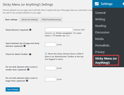
Upon activation, you need to visit the Settings » Sticky Menu (or Anything!) page to configure the plugin settings.

The Sticky Menu plugin's settings page

First you need to enter the CSS ID of the navigation menu that you want to make sticky.

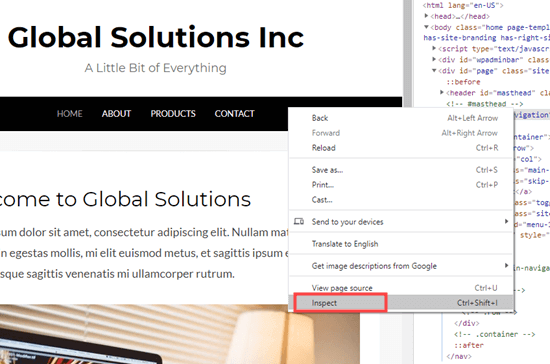
You will need to use your browser’s inspect tool to find the CSS ID used by your navigation menu.

Simply visit your website and take your mouse to the navigation menu. After that, you need to right-click and select Inspect from your browser’s menu.

Inspecting the navigation menu element on your website

This will split your browser screen, and you will be able to see the source code for your navigation menu.

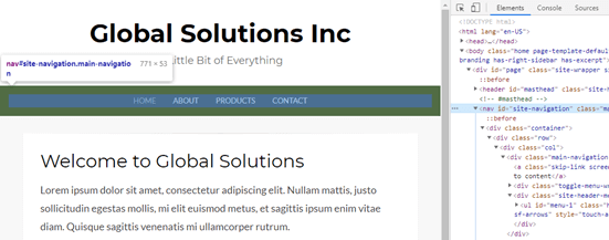
You need to find a line of code that relates to your navigation, or your site header. It will look something like this:

<nav id="site-navigation" class="main-navigation" role="navigation">

If you’re struggling to find it, bring your mouse cursor over the different lines of code in the Inspect pane. The navigation menu will be fully highlighted when you have the right line of code:

Finding the navigation menu ID using the inspect tool

In this case, our navigation menu’s CSS ID is site-navigation.

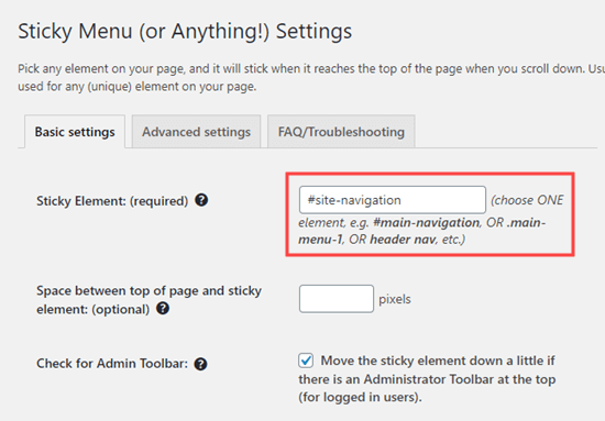
All you need to do is enter your menu’s CSS ID in the plugin settings with a hash at the start. In this case, that’s #site-navigation.

Entering the ID of the element that you want to make sticky (in this case, the navigation menu)

Don’t forget to click the ‘Save Changes’ button at the bottom of the page.

Now, go ahead and check out your sticky menu live on your WordPress website. It should stay on the page as you scroll down, like this:

Viewing the sticky menu on your website

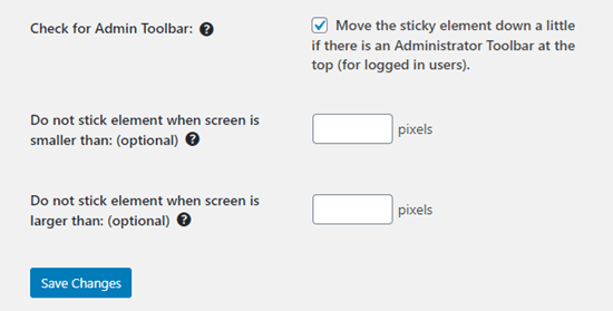
The next option on the plugin’s settings page is to define the space between the top of your screen and the sticky navigation menu. You only need to use this setting if your menu is overlapping an element that you do not want to be hidden. If not, then ignore this setting.

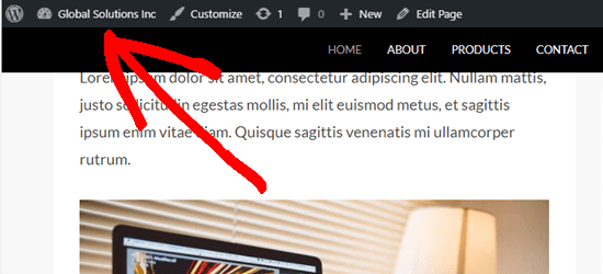
We recommend leaving the box checked next to the option: ‘Check for Admin Bar’. This allows the plugin to add some space for the WordPress admin bar, which is only visible to logged-in users.

Here, you can see that the admin bar on our test site is correctly displaying above the sticky menu:

The WordPress admin bar appears above the sticky menu

The next option allows you unstick the navigation menu if a user is visiting your website using a smaller screen such as a mobile device:

The sticky menu plugin offers further options too

You can test how your site looks on mobile devices or tablets. If you don’t like how it looks, simply add 780px for this option.

Don’t forget to click on the Save Changes button after making any changes to your options.

Method 2: Manually Add a Sticky Floating Navigation Menu

This method requires you to add custom CSS code to your theme. We don’t recommend it for beginners.

We also recommend that you take a look at our guide on how to easily add custom CSS to your WordPress site before you begin.

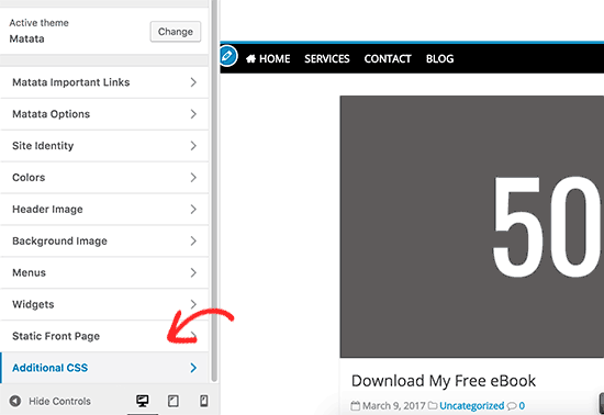
First, you need to visit Appearance » Customize to launch the WordPress theme customizer.

Adding custom CSS in WordPress theme

Next, click on ‘Additional CSS’ in the left pane and then add this CSS code.

#site-navigation {
    background:#00000;
    height:60px;
    z-index:170;
    margin:0 auto;
    border-bottom:1px solid #dadada;
    width:100%;
    position:fixed;
    top:0;
    left:0;
    right:0;
    text-align: center;
}

Note: This will produce a navigation menu with a black background. If you want a different color, change the number next to background. For example, using background: #ffffff will give you a white menu background.

Just replace #site-navigation with the CSS ID of your navigation menu then click on the Publish button at the top of the screen.

Go ahead and visit your website to see your sticky floating navigation menu in action:

A sticky / floating navigation menu created using CSS

What if your navigation menu normally appears below the site header instead of above it? If so, this CSS code could overlap the site title and header or appear too close to it before the user scrolls:

The sticky navigation menu is slightly overlapping the site title

This can be easily adjusted by adding a margin to your header area using some additional CSS code:

.site-branding {
margin-top:60px !important;
}

Replace site-branding with the CSS class of your header area. Now, the sticky navigation menu will no longer overlap your header before the user scrolls down:

There's now room for the title below the sticky navigation menu

We hope this article helped you add a sticky floating navigation menu to your WordPress site. You may also want to see our guide on how to create a custom WordPress theme without writing any code, and our comparison of the best WordPress page builder plugins.

If you liked this article, then please subscribe to our YouTube Channel for WordPress video tutorials. You can also find us on Twitter and Facebook.

The post How to Create a Sticky Floating Navigation Menu in WordPress appeared first on WPBeginner.

Spice Up Your Sites: Customize Your WordPress Multisite Admin Areas With Branda

Category Image 052

Branda is your ultimate tool for customizing your multisite network. Inject a slice of personality into each of your sites’ admin areas and decide whether this power sits with just the Network Admin, or with individual site admins.

In this article, we’re showing you how to manage user access to Branda on your multisite network, and then diving into the features best-suited to customizing your multisite admin.

More specifically, we’ll be covering how to:

1. Control Who Can Access Branda
2. Change Your Module Permissions
3. Personalize Your Sites
4. Choose a Custom Color Scheme
5. Add Notes to Your Admin Footer
6. Customize Your Admin Menu
7. Reorganize Your Admin Bar
8. Add Extra Customization With CSS
9. Customize Your Cookie Notices
10. Create Coming Soon and Maintenance Mode Pages
11. Create Unique Login Screens
12. Customize Your Favicons

1. Control Who Can Access Branda

As a Network Administrator, you can control who has access to Branda.

If you want to be the only one in charge of Branda’s features, you don’t need to do anything, as Branda is hidden from all other users straight out of the box.

If you want to grant your site admins access to Branda, you can do so by heading to Settings > Permissions and checking the box.

Screenshot of user permissions showing only admin ticked
You can give access to any user role from this menu.

If you would rather handpick which users get access to Branda, you can do this by scrolling down and selecting ‘Custom Users’.

You can grant your site admins (plus any other user roles) access to Branda from this menu.

2. Change Your Module Permissions

Branda’s customization options are split up into modules. If you make changes to a module in the Network Admin plugin settings, it will take effect across all of your networked sites.

If you want to give your site admins the ability to override the network customizations, you can do so within the settings menu.

Screenshot of the subsite permissions showing none ticked
Choose individual modules or simply select ‘All’ to give full control.

3. Personalize Your Sites

Whilst the sites of your multisite network may be related and all fall under the same brand, personalizing your admin areas using Branda is an easy way to give them a little bit of personality, rather than feeling like they’re all merging into one.

Simple changes you can make include the color scheme, admin footers, and personalizing the admin menu.

Below is a quick overview of how to do all of these and more.

4. Choose a Custom Color Scheme

You can easily select one of the default color schemes if your only aim is to easily distinguish your admin areas from one another. However, the real magic of Branda lies in the ability to create your own custom color scheme.

You can customize the color of each Aspect of your admin area, right down to the links and hover colors.

If you make these changes as the Network Admin, the color scheme will just change within the Network Admin area.

If you want to apply the same color scheme to all of your sites, you can select ‘Force color scheme’.

Screenshot of the force colour scheme option
You can also set a default color scheme for new users.

If you want your admins to be able to set their own color schemes for their sites/profiles, simply give them access in Settings > Permissions and select the Color Schemes module.

You can add a personalized note in your admin footer using Branda, even on a multisite network.

This can be done either across the network, or per site.

All you need to do is activate the Admin Footer module, then add your message.

Screenshot of the admin footer text option with the message Kirstan's Multisite Network entered
You add your note in the same way whether you do it on one site or across the network.

Your message will then display at the bottom of every page within the admin area.

Screenshot showing a custom footer note of Kirstan';s multisite network.
You can even add images as well as text!

Your admins can choose to change the footer for each individual site – it’s just another way that Branda can help you to differentiate between the sites on your network.

When you’re running a multisite network, you may have differences between your sites which means that the same admin setup across all of them just isn’t practical.

With Branda, you can easily remove, add, and edit the items in your admin menu.

You can easily tidy up the admin menu of each of your sites.

To do this, simply head to the Admin Menu module and select Customize.

There are extensive customization options for each admin item.

You can also add your own custom menu items to ensure that your sites are full of links and shortcuts to make your admin duties run as efficiently as possible.

Branda also offers the power to remove the dashboard link from user profiles which aren’t connected to one of the sites in your network.

Screenshot of the dashboard link checkbox.
This can be done through the Admin Menu module within the Network Admin area.

This means that if someone’s profile isn’t linked to a site, all they will be able to access is their profile screen.

7. Reorganize Your Admin Bar

Just like the admin menu, you admin bar is a valuable tool when it comes to navigating the back-end of your site, helping you to work smoothly and efficiently.

If there are links on it that you only want to make available to certain user roles, you can restrict access within the admin bar module.

Screenshot of the admin bar permission checkboxes.
Uncheck the boxes of the user roles that you don’t want to see the admin bar.

You are then free to customize it in the same way as you did your admin menu, either through the network admin settings or per site.

You can hide specific items, add custom ones, and reorder the whole menu.

Line your links up exactly as you want them.

8. Add Extra Customization with CSS

Whilst Branda is packed full of features to help you tailor your admin area to your needs, there are times where you might need to tweak an extra thing or two.

Adding extra CSS to a site can cause issues if you don’t know exactly what you’re doing, so understandably, this feature is disabled by default for everyone but the Network Admins.

If you want to delegate this power to your site admins, you can do this from the Permissions section of the Settings menu.

If you want to reserve the Custom CSS field for the Network Admins, it can come in handy if you want more control over your site permissions.

For example, you can use it to hide the activate or deactivate buttons of your plugins.

Just remember to remove CSS permissions for other users so that no one can undo your changes!

Adding your own cookie notice is very simple with Branda. You can easily add the same notice to all sites, or if your sites require different wording, you can add them individually.

You can choose your own text, add images, link to your privacy policy, and make changes to the color and design.

Screenshot of a sample cookie message
This is an example of a simple cookie notice created using Branda.

There is also the option to update the version number of the cookie notice, which will force all users to view the notice again, and you have the ability to choose how long cookies are stored for.

If you want your site admins to be able to override the network cookie notice with their own personalized ones for each site, you need to ensure you give them permission by heading to Settings > Permissions.

10. Using Coming Soon and Maintenance Mode

When you’re running a multisite, adding a new site may be a common occurrence.

This means that you might need to enable coming soon mode to ensure that your potential customers know what’s going on, and also to give your SEO a head start by letting Google know you’re on your way.

Branda allows you to design your own unique pages to keep your visitors in the loop.

If you want to do this as the network admin, you can use a standard coming soon page which you could apply across all new sites.

Screenshot of a custom coming soon page using an image of laptops and paperwork planning on a desk
A general image and message can be used across all your sites, but you can still be the one to create it!

Or if you wanted to delegate this power to your site admins, you can have a more personalized page for each site.

Screenshot of a custom login screen for J Smith photography
You can add your own personalized touch to each of your sites to tease your visitors.

The same counts for maintenance mode – you can use the same methods to create front-facing pages which will let your visitors know what’s going on.

All you need to do is head into Branda’s Website Mode, which will allow you to turn each of these modes on and off, as well as customize their designs.

11. Create Unique Login Screens

An easy way to distinguish the sites in your network from each other is through personalized login screens.

Never try to log into the wrong site again!

You can add your own background images, logos, and change the text labels and links.

To create a login screen, head to the Customize Login Screen module and then check out this guide which shows you exactly how to craft the perfect login page.

12. Customizing Your Favicons

Favicons are the little images that display in your site’s browser tab.

Screenshot of WPMU DEV favicons
They usually consist of simple icons or logos.

When running a multisite, Branda gives you the option to have the same icons across all of your sites, or add different ones.

As Network Admin, all you need to do is head to Branda’s Utility section and choose the Images module.

From there, you can upload your own favicon and then choose whether or not your subsites will inherit it.

Screenshot of the menu where you can upload your custom favicons
Select Custom to choose sites and then upload individual favicons for them.

Multisite Customization Made Easy

Branda is fully compatible with your multisite network, meaning that anything you can do on an individual WordPress installation, you can do on your multisite.

In fact, customizing many areas of multisite admin works the same way as customizing a regular WordPress site admin. We’ve covered these extensively in this post.

Once you have the hang of distributing the permissions between your other users, the possibilities are endless. Check out the full documentation to see the full extent of Branda’s powers, and keep an eye on the roadmap to see what new features are on the horizon.

Can you get valid CSS property values from the browser?

Category Image 052

I had someone write in with this very legit question. Lea just blogged about how you can get valid CSS properties themselves from the browser. That’s like this.

That gives you, for example, the fact that cursor is a thing. But then how do you know what valid values are for cursor? We know from documentation that there are values like auto, none, help, context-menu, pointer, progress, wait, and many more.

But where does that list come from? Well, there is a list right in the spec so that’s helpful. But that doesn’t guarantee the complete list of values that any given browser actually supports. There could be cursor: skull-and-crossbones and we wouldn’t even know!

We can test by applying it to an element and looking in DevTools:

Damn.

But unless we launch a huge dictionary attack against that value, we don’t actually know what values it directly in-browser. Maybe Houdini will help somehow in browsers getting better at CSS introspection?

You can also use the CSS object to run tests like CSS.supports(property, value):

Damn.

You’d think we could have like CSS.validValues("text-decoration-thickness") and get like ["<length>", "<percentage>", "auto", "from-font"] or the like, but alas, not a thing.


The post Can you get valid CSS property values from the browser? appeared first on CSS-Tricks.

You can support CSS-Tricks by being an MVP Supporter.

18 Grid Layouts for Building Stunning Websites

Category Image 052

When building a new website, it’s always a good idea to sit down and think about all the content you truly want to feature. If you find that you have a lot to say, grid layouts are always a solid choice. For starters, most are responsive and will automatically adjust orientation based on the screen size each visitor is viewing it on.

But they’re also a good choice because they offer a convenient way to display a lot of information in a condensed space without being overwhelming. What follows is a list of free and premium grid layouts sourced from a variety of places including ThemeForest and CodePen, that offer flexibility and function for your website’s design.

Web Designer Toolbox: Unlimited Downloads Starting at $16.50/Month
Website Kits

Website Kits
16,000+ Web Designs

UX & UI Kits

UX & UI Kits
14,000+ UX & UI Kits

Graphic Assets

Graphic Assets
33,000+ Graphics

DOWNLOAD NOW
Envato Elements


12 Column Grid

Example of 12 Column Grid

Create up to a twelve-column grid with this grid layout template. It’s simple, straightforward but definitely gets the job done.

CSS Grid Layout – Template Areas

See the Pen
CSS Grid Layout – Template Areas
by Mozilla Developers (@mozilladevelopers)
on CodePen.

Another option is this CSS Grid layout. It offers templated areas into which you can add custom content. It also offers multiple fill options.

Roph

Example of Roph

Now here’s a WordPress theme that provides a grid layout you can use in a multitude of ways. It’s designed for portfolio websites and the sky’s the limit for how you can envision using it.

CSS Grid Layout

See the Pen
CSS Grid Layout – New Terminology
by Stacy (@stacy)
on CodePen.

This CSS Grid layout is super simple, but would definitely make it a lot easier to create a custom website capable of conveying a lot of information at once. It also supports lovely hover effects.

Mono

Example of Mono

This is an HTML5 template that offers a stylish grid layout you can use in a variety of ways. With multiple templates, color schemes, and settings to select from, you’re sure to find something that suits your needs here.

CSS Grid Layout with @support Flexbox Fallback

See the Pen
CSS Grid Layout with @support flexbox fallback
by Gustaf Holm (@primalivet)
on CodePen.

Or you could use this CSS Grid layout with a Flexbox fallback that offers interesting effects and an engaging look.

Stash

Example of Stash

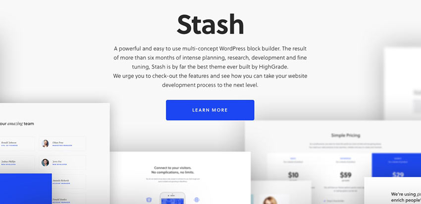
Stash is a WordPress block builder theme that you can use to create a high-quality website for businesses, corporate sites, and e-commerce sites.

Juno

Example of Juno

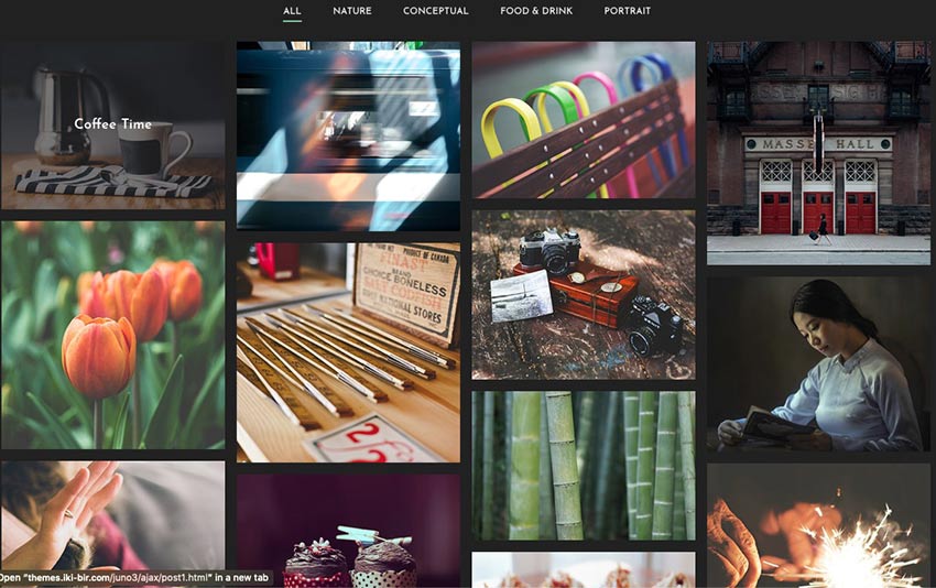
This is such a lovely layout! Juno is an ideal WordPress theme for portfolios and photography websites.

True Masonry with Grid Layout

See the Pen
True Masonry with Grid Layout
by Balázs Sziklai (@balazs_sziklai)
on CodePen.

This is another super simple option that offers a masonry grid layout that you can customize in a variety of configurations.

CSS Grid Layout Demo

See the Pen
CSS Grid Layout Demo 5 – Grid Gap
by Stacy (@stacy)
on CodePen.

Another great option is this CSS Grid layout. Change the width of each column, adjust the number of rows, and change their configuration.

CSS Grid Layout – Blog Post Template

See the Pen
CSS Grid Layout – Blog Post Template
by Stacy (@stacy)
on CodePen.

This is another grid layout template that offers a blog post layout you can use for your HTML-based blog.

Flexbox Grid Layout w/Mobile Menu

See the Pen
Flexbox grid layout w/ Mobile Menu
by Lindsey (@cssgirl)
on CodePen.

Or you can use this Flexbox grid layout for a blog post template. It includes a mobile menu, too.

Magazine Grid Layout Vol. II

See the Pen
Magazine Grid Layout Vol. II
by ilithya (@ilithya)
on CodePen.

If you’re looking to create a publication, this magazine grid layout ought to do the trick.

Content Grid System

See the Pen
Content Grid System (CSS Grid Layout)
by Tobias Gerlach (@Gerlach360)
on CodePen.

Here’s another great option. It’s a content grid system that you can use to display a lot of information at once.

Flex and Grid Demo

See the Pen
Flex and Grid demo
by rachelandrew (@rachelandrew)
on CodePen.

The Flexbox and CSS Grid demo layout is ideal for showcasing info on cards across a portion of your website. Think descriptions of your services or pricing tables.

CSS Grid Layout + Mondrian

See the Pen
CSS Grid Layout + Mondrian = <3
by Toaster (@ToasterCo)
on CodePen.

This grid layout can be used for highlighting content or creating your own work of art. It’s up to you.

Masonry Grid Layout

See the Pen
Masonry Grid Layout
by Marco Biedermann (@marcobiedermann)
on CodePen.

Create something monochromatic and impactful with this masonry grid layout. Use it for a portfolio, to display photography, or to create an experience.

Flex 12 Column Grid

See the Pen
Flex 12 Column Grid
by Nick Else (@nickelse)
on CodePen.

The Flex 12 Column Grid layout is the last one on our list and another solid option. Display as much information as you need in an organized and eye-catching way, easily.

Build Your Best Website Yet with Grid Layouts

And there you have it! Another list completed. We hope it will serve you well. This collection of grid layouts feature selections that are all easy-to-use and nice to look at. Enjoy selecting one that will serve your content well.

Good luck!

CSS Vocabulary

Featured Imgs 25

This is a neat interactive page by Ville V. Vanninen to reference the names of things in the CSS syntax. I feel like the easy ones to remember are “selector,” “property,” and “value,” but even as a person who writes about CSS a lot, I forget some of the others. Like the property and value together (with the colon) is called a declaration. And all the declarations together, including the curly brackets (but not the selector)? That’s a declaration block, which is slightly more specific than a block, because a block might be inside an at-rule and thus contain other complete rule-sets.

Direct Link to ArticlePermalink


The post CSS Vocabulary appeared first on CSS-Tricks.

You can support CSS-Tricks by being an MVP Supporter.

Posters! (for CSS Flexbox and CSS Grid)

Featured Imgs 23

Any time I chat with a fellow web person and CSS-Tricks comes up in conversation, there is a good chance they’ll say: oh yeah, that guide on CSS flexbox, I use that all the time!

Indeed that page, and it’s cousin the CSS grid guide, are among our top trafficked pages. I try to take extra care with them making sure the information on them is current, useful, and the page loads speedily and properly. A while back, in a round of updates I was doing on the guides, I reached out to Lynn Fisher, who always does incredible work on everything, to see if she’d be up for re-doing the illustrations on the guides. Miraculously, she agreed, and we have the much more charismatic illustrations that live on the guides today.

In a second miracle, I asked Lynn again if she’d be up for making physical paper poster designs of the guides, and see agreed again! And so they live!

Here they are:

You better believe I have it right next to me in my office:

They are $25 each which includes shipping anywhere in the world.

The post Posters! (for CSS Flexbox and CSS Grid) appeared first on CSS-Tricks.

New in Chrome: CSS Overview

Featured Imgs 23

Here’s a fancy new experimental feature in Chrome! Now, we can get an overview of the CSS used on a site, from how many colors there are to the number of unused declarations… even down to the total number of defined media queries.

Again, this is an experimental feature. Not only does that mean it’s still in progress, but it means you’ll have to enable it to start using it in DevTools.

  • Open up DevTools (Command+Option+I on Mac; Control+Shift+I on Windows)
  • Head over to DevTool Settings (? or Function+F1 on Mac; ? or F1 on Windows)
  • Click open the Experiments section
  • Enable the CSS Overview option
Screenshot of the Chrome DevTools Experimental Settings window showing the CSS Overview option selected.

And, oh hey, look at that! We get a new “CSS Overview” tab in the DevTools menu tray when the settings are closed. Make sure it’s not hidden in the overflow menu if you’re not seeing it.

Screenshot of the CSS Overview window in Chrome DevTools. It shows an overview of the elements, selectors, styles and colors used on the site, which is CSS-Tricks in this screenshot.
Lovely color palette you got there, Mr. Coyier. 😍

Notice that the report is broken out into a number of sections, including Colors, Font info, Unused declarations and Media queries. That’s a lot of information available in a small amount of space right at our fingertips.

This is pretty nifty though, huh? I love that tools like this are starting to move into the browser. Think about how this can help us not only as front-enders but also how we collaborate with designers. Like, a designer can crack this open and start checking our work to make sure everything from the color palette to the font stack are all in tact.
The post New in Chrome: CSS Overview appeared first on CSS-Tricks.

How to Change the Text Color in WordPress (3 Easy Methods)

Category Image 052

Recently, one of our readers asked if there was an easy way to change the text color in WordPress?

The answer is yes. You can easily change your font color in WordPress across your whole site, or even just for a single word inside your post content.

In this guide, we’ll show you how to easily change the text color in WordPress, step by step.

Easily change text color in WordPress

There are lots of reasons why you might want to change the text color in your posts or pages. Maybe you’d like to emphasize a keyword, or perhaps you want to use colored subheadings on a particular page.

Alternatively, you might want to change the text color across your whole site. Perhaps your theme uses a gray color for text, but you’d rather make it black, or a darker gray, for better readability.

In this tutorial, we’ll be covering the following methods:

Just click one of those links to jump straight to that method.

Method 1. Changing the Text Color Using the Visual Editor

You can use the default WordPress editor to put words, paragraphs, or even subheadings in a different color from your main text.

An example of colored text in a WordPress page

Here’s how you can change your text color using the block editor.

First, you’ll need to edit the post or page that you want to change, or create a new one.

Next, type in your text. You’ll need to create a paragraph block or a heading block as appropriate. For help with this, take a look at our tutorial on how to use the WordPress block editor.

Once your text is in place, you can change the color.

Changing the Text Color of a Block

For this first example, we’re going to change the text color of the whole block.

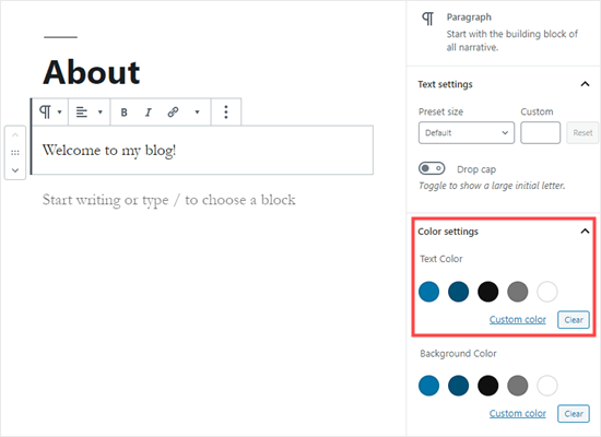
Simply click on the block and the Block Settings panel should open up on the right hand side of your screen. Next, click on the arrow for ‘Color settings’ to expand that tab. You’ll see the text color settings here.

Picking a text color for the whole block in WordPress

Now, you can pick a new color for the text. The visual editor will show you some options based on your theme. You can simply click on one of these to change your text color.

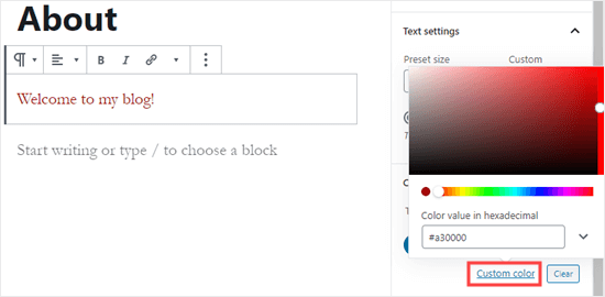
Alternatively, if you have a specific color in mind, click the ‘Custom Color’ link. This will open up a color picker where you can manually select a color. You can also use this to type in a hex code.

Picking a custom text color for your block

If you change your mind and want to go back to the default text color, just click the ‘Clear’ button below the color options:

Setting your block back to the default text color

Pro Tip: If you want to change the background color for a block, you can do that here too.

Changing the Text Color of a Word or Phrase

What if you only want to change the color of one or two words? That’s easy using the block editor as well.

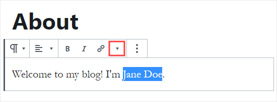
First, you’ll need to highlight the word(s) that you want to change. Then, click the small downward arrow on the content editor toolbar.

Highlight the words that you want to change the color of

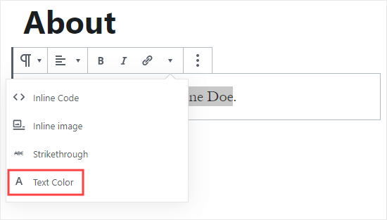
Next, simply click on the ‘Text Color’ link at the bottom of the dropdown list:

Click the 'Text Color' link at the bottom of the dropdown list

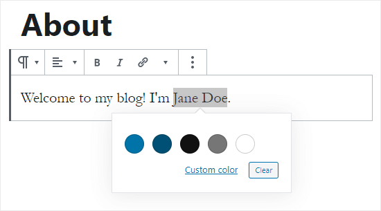
You’ll now see the same color options as for the whole block. Again, you can pick from one of the default options or use the ‘Custom color’ link to select any color you want.

Choose the text color for your highlighted word(s)

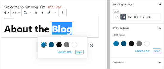
The color options aren’t limited to paragraph blocks. You can also change the text color of heading blocks. As with paragraph blocks, you can set text color for the whole block in the block settings. Alternatively, you can highlight individual words and change their color.

Changing the text color of a heading block in WordPress

Note: You cannot set a background color for heading blocks.

You can also change the text color in a list block, but only by highlighting the word(s) and using the toolbar. There’s no option in the block settings to change the text color for the whole of a list block.

Changing the Font Color Using the Classic Editor

If you’re still using the classic WordPress editor, then you can change the font color using the toolbar.

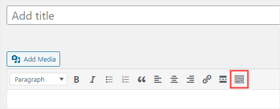
In the classic editor, click on the Toolbar Toggle on the far right. You’ll then see a second row of icons:

Click the Toolbar Toggle button to see the second row of icons

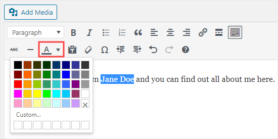
Now, you can select your text and change the font color using the font color dropdown.

Use the text color button in the classic editor

Method 2. Changing the Text Color in the Theme Customizer

What if you want to change the text color across your whole website? Many of the best WordPress themes will allow you to do this using the theme customizer.

For this example, we’re using the OceanWP theme. It’s one of the top free themes available for WordPress.

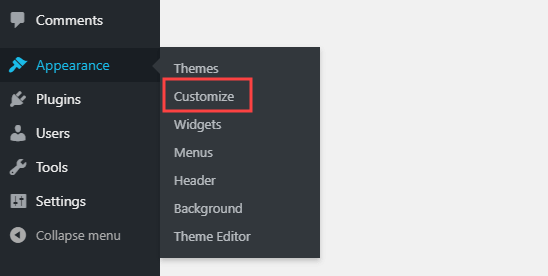
In your WordPress dashboard, go to Appearance » Customize to open up the Theme Customizer.

Go to Appearance then Customize in your WordPress dashboard

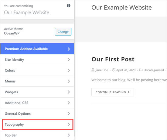
Next, you need to look for an option such as ‘Typography’. The available options, and what they’re called, will vary depending on your theme.

Select 'Typography' or a similar option in the theme customizer

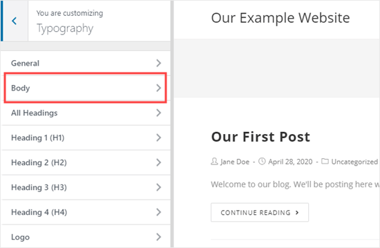
Let’s go ahead and click on the Typography tab, or an equivalent option. Next, look for a setting where you can change the text of your posts and pages. In OceanWP, this is called the ‘Body’ text. You need to click on this, so you’ll can customize the font color and more.

Select the Body text to modify in the customizer

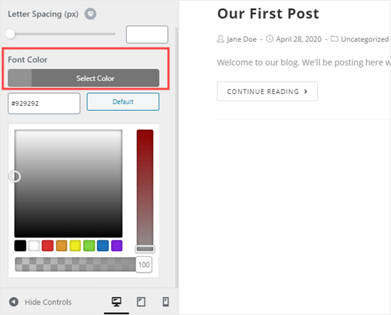
When you click on the Font Color selector, you’ll see a color picker. Choose whatever color you want to use for your text. This will change the text color in all your posts and pages.

Picking the color for your body text using the theme customizer

You can also change your heading colors in a similar way, by using the options to change H1, H2, and so on.

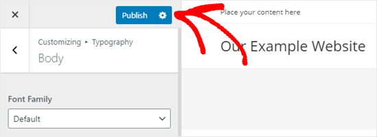
Once you’re happy with your changes, click the ‘Publish’ button at the top of the screen.

Publishing your changes to your website

Tip: Choosing black or dark gray text on a white or very light background is usually best for readability.

Method 3. Changing the Text Color Using CSS Code

What if your theme doesn’t have the option to change the text color?

You can still change font color across a whole site by using the theme customizer. Go to Appearance » Customizer in the WordPress dashboard.

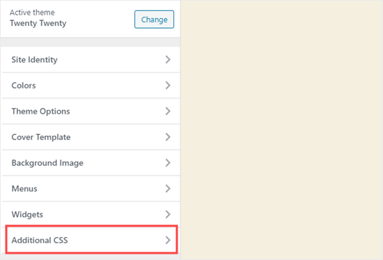
At the bottom of the list of options, you’ll see a tab that reads ‘Additional CSS’.

Open up the Additional CSS section of the theme customizer

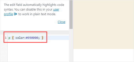
Next, click on the Additional CSS tab, and you’ll see some instructions plus a box where you can enter CSS code.

For starters, you can copy this code into the box. After that, you can change the 6 numbers to the hex code of your chosen color.

p { color:#990000; }

Enter the CSS for changing the paragraph color into the theme customizer

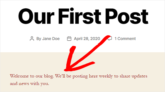
This will change the font color of the regular text in all your posts and pages to dark red (or whatever color you chose), like this:

Text color customized site-wide using CSS code

If you want to change the color of the headings within your post, you can add this code instead:

h2 { color:#990000; }

Again, change the hex code to whatever color you want.

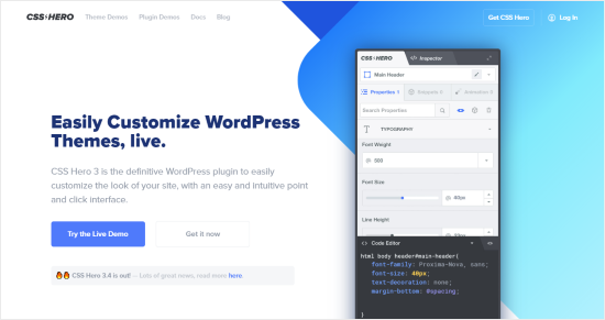
If you’re not familiar with CSS or want a beginner-friendly CSS editor that lets you easily customize the entire styles of your website, then we recommend looking into CSS Hero. It’s a powerful visual editor that lets you customize the styles of your entire site.

CSS Hero plugin

We hope this tutorial helped you learn how to change the text color in WordPress. You might also like our tutorials on how to change the font size in WordPress, and how to add custom fonts in WordPress.

If you liked this article, then please subscribe to our YouTube Channel for WordPress video tutorials. You can also find us on Twitter and Facebook.

The post How to Change the Text Color in WordPress (3 Easy Methods) appeared first on WPBeginner.

Flexbox-like “just put elements in a row” with CSS grid

Category Image 052

It occurred to me while we were talking about flexbox and gap that one reason we sometimes reach for flexbox is to chuck some boxes in a row and space them out a little.

My brain still reaches for flexbox in that situation, and with gap, it probably will continue to do so. It’s worth noting though that grid can do the same thing in its own special way.

Like this:

.grid {
  display: grid;
  gap: 1rem;
  grid-auto-flow: column;
}

They all look equal width there, but that’s only because there is no content in them. With content, you’ll see the boxes start pushing on each other based on the natural width of that content. If you need to exert some control, you can always set width / min-width / max-width on the elements that fall into those columns — or, set them with grid-template-columns but without setting the actual number of columns, then letting the min-content dictate the width.

.grid {
  display: grid;
  gap: 1rem;
  grid-auto-flow: column;
  grid-template-columns: repeat(auto-fit, minmax(min-content, 1fr));
}

Flexible grids are the coolest.

Another thought… if you only want the whole grid itself to be as wide as the content (i.e. less than 100% or auto, if need be) then be aware that display: inline-grid; is a thing.

The post Flexbox-like “just put elements in a row” with CSS grid appeared first on CSS-Tricks.

How to Easily Change the Font Size in WordPress

Category Image 052

Do you want to change the font size in your WordPress posts or pages?

Sometimes, you may want to make a line or a paragraph larger, or you might want to increase the font size of your entire page content.

In this article, we’ll show you how to easily change the font size in WordPress. You’ll learn not only how to change font size in your WordPress posts, but also how to do it across your website.

Change font size in WordPress

Method 1: Using Paragraph Headings

It takes your visitors just a couple of seconds to decide whether they want to stay or leave your website. This gives you very little time to convince them to stay on your website.

Using Headings in your content is a great way to grab user attention.

They allow you to break your posts and pages into sections using different headings (often called “subheadings”).

Headings are great for SEO as well. Search engines give proper headings more weight than normal paragraph text.

How to add a heading in the default WordPress block editor

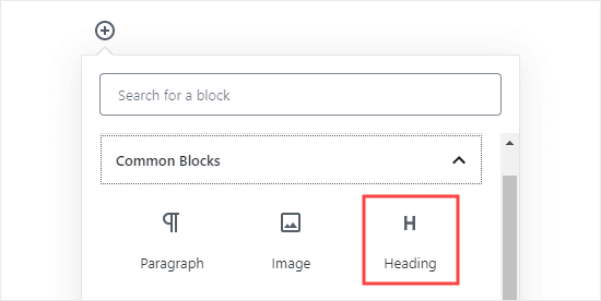
You can add a heading to your posts or pages by simply adding the ‘Heading’ block. You can search for it or find it in the ‘Common Blocks’ section in the WordPress block editor.

Adding a heading block in Gutenberg

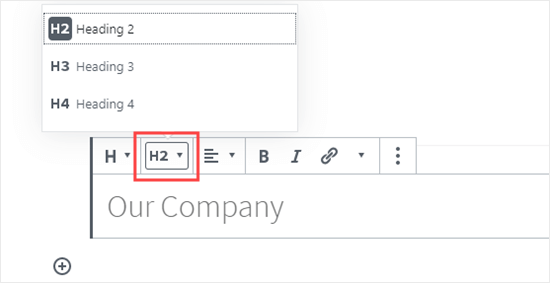
The block will default to Heading 2. Normally, it makes sense to stick with Heading 2 for your subheadings. If you want to change this, then you can simply click on the ‘H2’ drop-down to select a different size.

Selecting your Heading size in the block editor

Alternatively, you can change this in the block settings on the right-hand side of the screen. You can also change the heading’s color there as well.

How to add a heading in the older Classic Editor

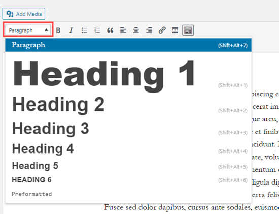
If you are still using the older classic editor in WordPress, then you can add headings using the ‘Paragraph’ drop-down.

Just highlight the text that you want to turn into a heading, click the ‘Paragraph’ drop-down, and select your heading size.

Creating a heading by clicking on the Paragraph drop-down in the classic editor

The sizes and colors of the different Heading styles are controlled by your theme’s stylesheet (style.css).

If you’re using a premium WordPress theme, then you may have the option to change these settings under Appearance » Customize.

Using subheadings in your articles makes it easier for readers to follow what you’re telling them. At the same time, it also makes your WordPress posts SEO friendly.

Method 2: Changing the Size of the Text in the Block Editor

What if you want to have a paragraph or even your whole post in a larger font? You can do this really easily using the default WordPress block editor.

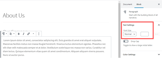
Just click on any paragraph block, then select the font size under ‘Text Settings’ on the right-hand side.

Changing the text size of a paragraph block

You can select from the drop-down, which covers Small, Normal, Medium, Large, and Huge. If you change your mind, then just click the ‘Reset’ button to set your paragraph back to the default text.

There’s also a ‘Custom’ option where you can simply type in the pixel size that you’d like. If you want, you can also set a large Drop Cap to appear at the start of your paragraph.

These options aren’t available in the older classic editor for WordPress. If you want to use them, then think about making the switch. Our tutorial on how to use the new WordPress block editor will help you.

If you are determined to stick with the classic editor, then this next option is for you.

Method 3: Change Font Size Using The TinyMCE Advanced Plugin

TinyMCE Advanced is a WordPress plugin that gives you more control over font sizes and text formatting, as well as a range of other features.

This is particularly useful with the older classic editor, but it also works with the block editor. It adds a new block called “Classic Paragraph” that has all the TinyMCE controls.

To use it, you’ll first need to install and activate the TinyMCE Advanced plugin. If you’re not sure how to do that, check out our step by step guide on how to install a WordPress plugin.

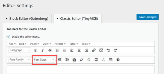
Next, go to Settings » TinyMCE Advanced to configure the editor settings. This is where you can set up the buttons you want to use in the TinyMCE Advanced toolbar.

If you’re using it with the Classic editor, then you should see that TinyMCE has the ‘Font Size’ drop-down enabled by default in the second row of icons.

You can move it to the first row by dragging it upwards if you want.

The font sizes drop-down button on the TinyMCE Advanced menu for the classic editor

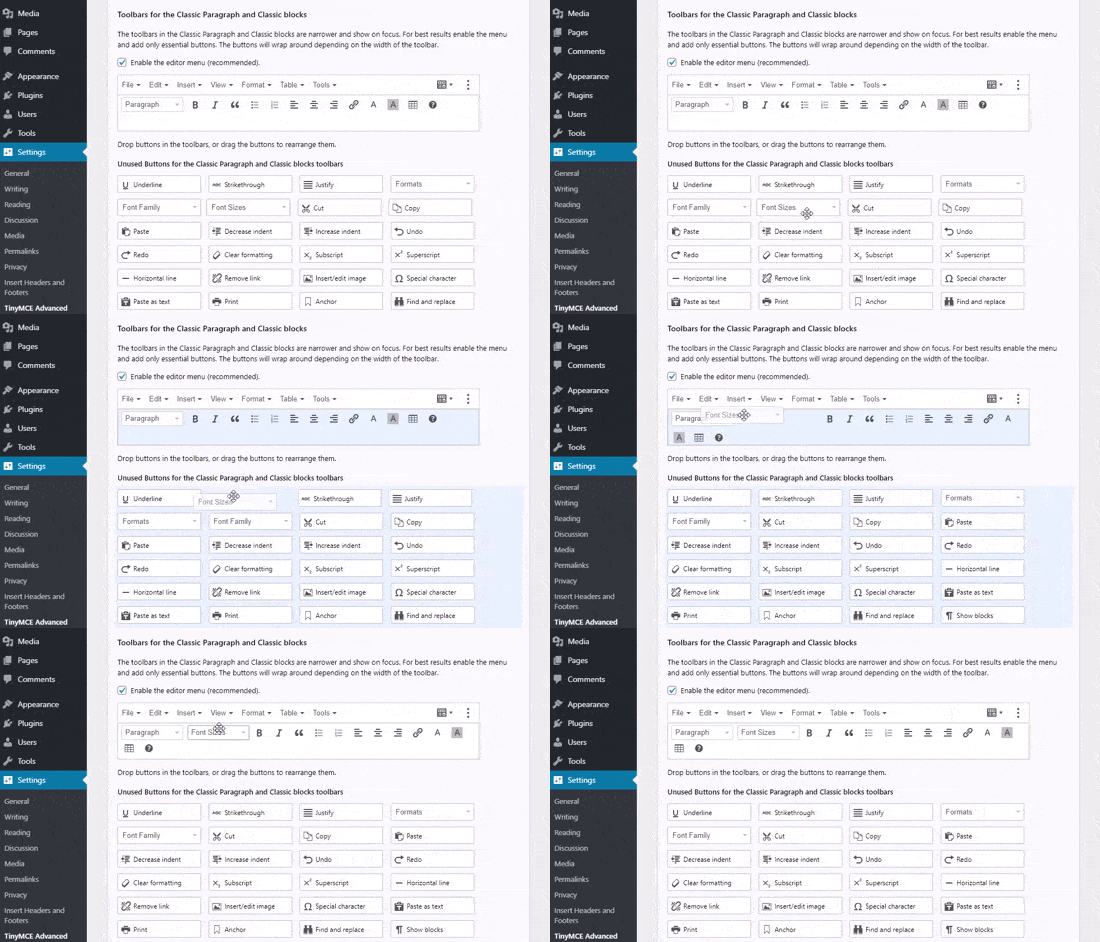
If you’re using the block editor, then you’ll need to scroll down the screen and add the Font Sizes drop-down to the toolbar by dragging and dropping it:

Adding the font sizes button to the TinyMCE Advanced block toolbar

Make sure you click ‘Save Changes’ at the bottom of the screen.

To see the button in action, create a new post or edit an existing one.

In the block editor, you’ll now have the option to add a ‘Classic Paragraph’ block. It will have the TinyMCE Advanced controls, like this:

The Classic Paragraph block in the block editor, added by the TinyMCE Advanced plugin

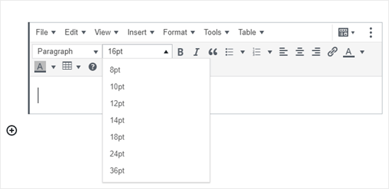
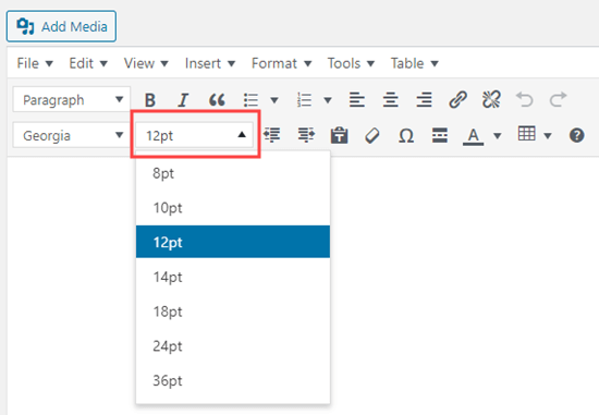
In the classic editor, you’ll see the TinyMCE Advanced toolbars with a font size drop-down:

Changing the font size using the TinyMCE Advanced editor

You can select any font size from the drop-down.

Note: this doesn’t give you as many options as the WordPress block editor, and you can’t type in your own font size.

Method 4: Change Site-Wide Font Size Using CSS

If you are changing font sizes every time you edit a post, then you may want to make it easier by changing it permanently in your theme.

The good news is that you can change the default paragraph size across your whole site. The best way to do this is by using the Theme Customizer under Appearance » Customize.

Some WordPress themes may come with an option for you to change the font size. If you can find this option, then you can use it without writing CSS code.

However, if your theme does not have that feature, then you can add custom CSS to add your own font size rules.

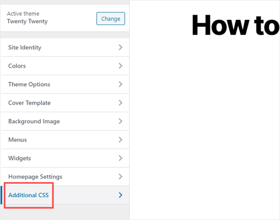
Simply click on the ‘Additional CSS’ option in the theme customizer. This is where you can store all your custom CSS code.

Using the Customizer to add CSS code to your site

Now under the additional CSS text box, simply add your CSS code. In this example, we are changing the font size to ’16px’, you can choose a different font size.

p { 
font-size:16px; 
} 

You’ll immediately see the changes on the preview on the right-hand side of the screen. If you’re happy with the font size, click the ‘Publish’ button at the top of your screen to make it live.

Note: Your custom CSS will only be applied to the theme you’re using. If you later choose to switch to a different WordPress theme, you’ll need to copy and paste it into the Customizer again.

The above code only applies to paragraph text. What if you wanted to change the font size of all h2 sub-headings?

Simply modify the above code to target the h2 element in your theme like this:

h2 { 
font-size:32px; 
} 

You can do the same thing with other headings as well by simply changing h2 to h3, h4, or h5.

We hope this article helped you learn how to easily change the font size in WordPress. You may also want to see our guide on how to use custom fonts in WordPress or our list of the best drag & drop WordPress page builder plugins.

If you liked this article, then please subscribe to our YouTube Channel for WordPress video tutorials. You can also find us on Twitter and Facebook.

The post How to Easily Change the Font Size in WordPress appeared first on WPBeginner.