

Want to give your design a quick facelift? Using new and interesting typography trends might be the answer. Designers are using bold colors, cutouts, gradients, and even customizations to create lettering that stands out.
Changing typefaces or recreating an image or header in a trending style can give a design a fresh look without a full-scale overhaul. Not sure where to start? This list features typography trends with examples to use as inspiration for how to use them.
Here’s a look at the top typography trends this year.
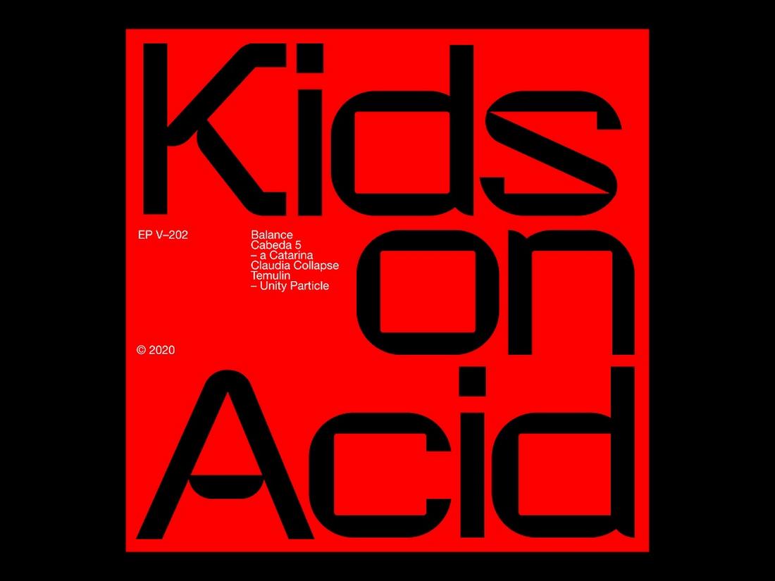
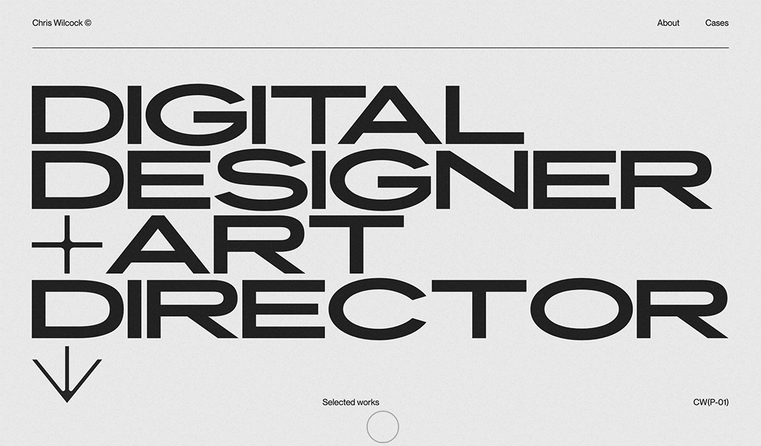
1. Brutalism Typography
Brutalism design is one of the few and rare design trends that survived many decades. This trend dates back to the 1950s. It started out as a design trend in architecture and later inspired many print and digital designs, including graphic design, web design, and even typography.
Brutalist typography is simple and straightforward. There are no fancy typography elements or decorative shapes necessary to convey the idea. It’s simply text with clean, clear-cut letterforms and it gets the job done.
More designers are adopting this design trend to create striking typography for various designs ranging from posters to website headers. It especially works well for bold, raw, and Monochromatic-style designs.
2. Liquid Text

Giving a melting or liquid look to your typography is nothing new. You’ve probably seen it used by food and drink brands. However, there’s a new variant of this trend sweeping across the digital design world.
This new variant of liquid text design only liquefies parts of the letters to create a unique hybrid look. Designers are using this trend in various ways by combining it with other design trends like outline text and retro fonts.
The unique look this trend creates fits perfectly for trendy brands and timely marketing campaigns, especially for fashion and lifestyle branding designs.
3. Ink Traps

Ink trap is a popular technique used in print design when printing in small sizes where corners get removed from letters to trap the ink. So when it gets printed, the ink spreads to those removed areas, preventing the ink from spreading outward.
Ironically, this inspired a new trend in modern digital typography. We are now seeing new fonts being created inspired by ink traps featuring letterforms with deep corners, mimicking the ink trap-style design.
It certainly adds a very unique look to typography and gives a distinctive vibe to titles and headings.
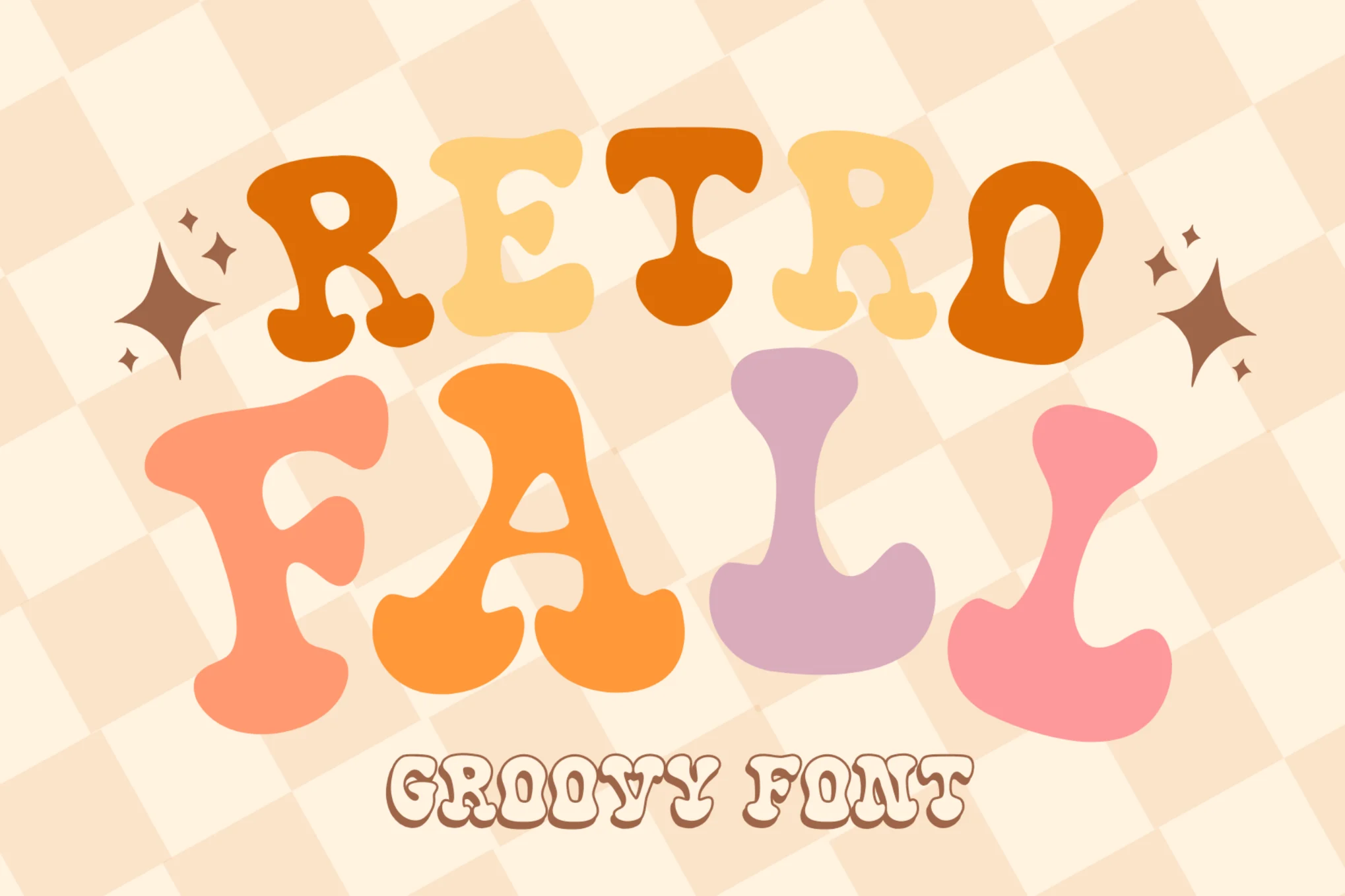
4. Bubbly Text

Bubble fonts and typography are making a comeback. Inspired by typography designs from the groovy 1970s, this bubble text trend can now be seen everywhere.
The fun, creative, and playful look it adds to the text is unmatched. It’s one of the many reasons why designers choose this style to create titles and text for brands with playful vibes.
The bubbly text trend also comes in many different styles and variations, including ones with balloon-style letterforms as well as urban graffiti-style letters.
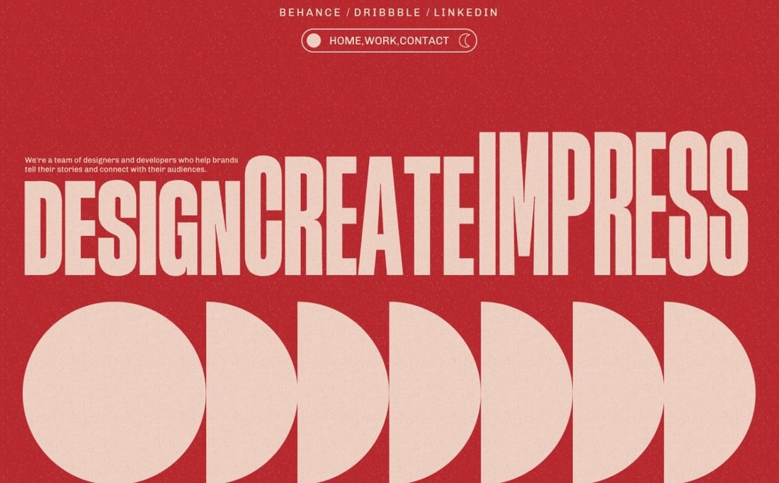
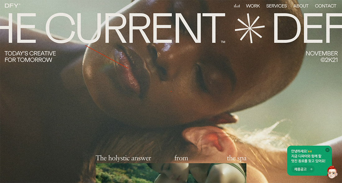
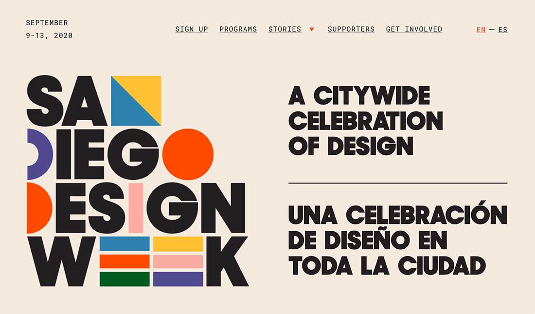
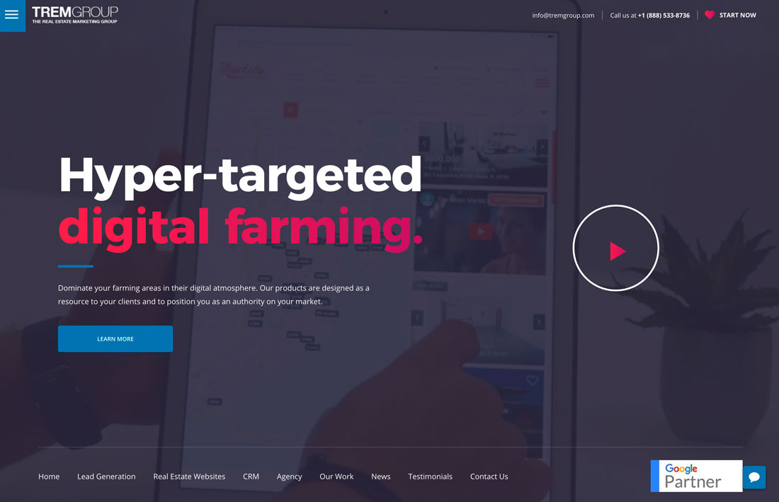
5. Big, Chunky Titles

When it comes to creating titles that instantly grab attention, nothing beats a good old-fashioned big, chunky letter design. That’s part of why this typography trend has survived many decades and is still relevant today.
Designing titles and headings with big, chunky letterforms is the most effective way to craft typography that stands out. This trend also has diverse use cases across various genres. With a slightly playful font, you can make it fit in with a lifestyle brand. Or with a clean-cut letter design, you can use it for a luxury brand.
6. Art Deco Typography
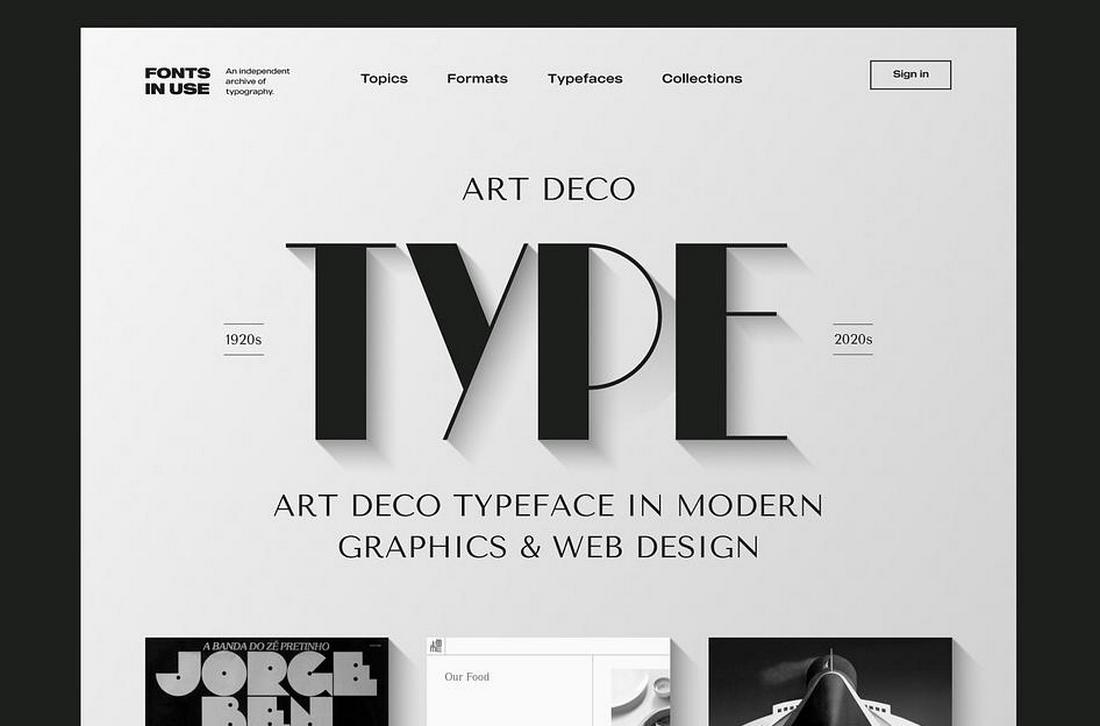
The beautiful symmetrical lines and sharp edges of the Art Deco style completely transform the look and feel of typography. The blend of elegance and sophistication it brings is unmatched by any other design trend. It’s no wonder why this typography trend has survived longer than a century.
Over the past few months, we saw many brands and marketers use the Art Deco trend to their advantage to create typography that evokes a sense of nostalgia and takes people back to a time when things were simpler.
Art Deco typography is also often used in visual storytelling, especially on websites, posters, and packaging designs. Clearly, it’s a trend that will evolve and stay relevant for many more years ahead.
7. Psychedelic Fonts
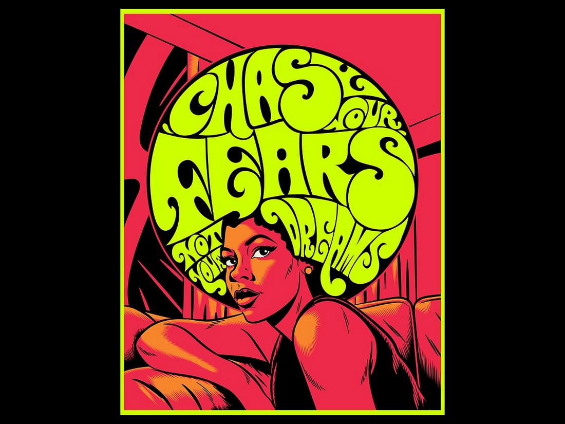
The psychedelic design trend has been a popular choice among designers who seek to break free from the traditional and common ways. And it has now made its way over to typography as well.
The bold shapes, curves, and distorted letters of the psychedelic fonts give logos, titles, and badges a unique look inspired by the aesthetics of the 1960s and the hippy culture. The psychedelic typography trend does a great job of bringing out a chill and relaxing feeling while also mixing a sense of a rebellious vibe.
8. Urban Graffiti Titles
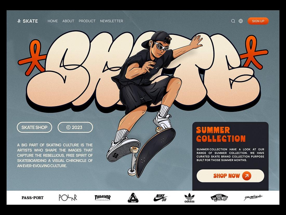
Lately, we’ve been seeing less and less graffiti art out on the streets. Graffiti art is one the purest forms of creative expression, especially the graffiti typography is something that always catches your eye. So we’re glad to see this art form transform into the digital world.
Designers have been using graffiti-style typography with various types of graphic designs over the past few years and it seems to be growing in demand. The main reason for the popularity of this typography trend is its ability to create a bold, urban vibe with a gritty aesthetic. The raw, real-world look of the graffiti typography is quite unmatched.
9. Retro Disco Text
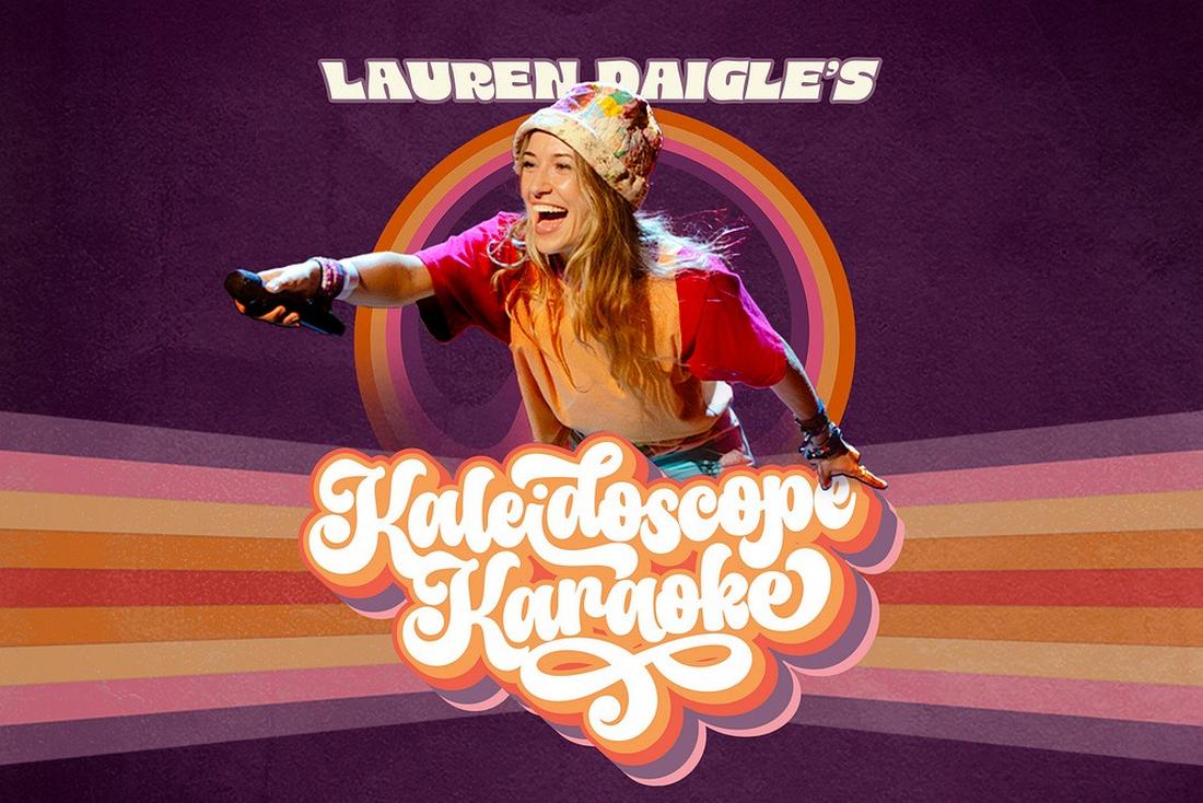
The disco era is a time period that everyone longs for regardless of age. The current revival and popularity of disco-style music among modern musicians prove that even the younger generations are enjoying this trend.
As a result of this newfound desire for the disco era, disco-style retro typography is also making a comeback. Nothing beats this typography trend when it comes to creating titles and text that exude fun and energetic vibes.
The blend of retro rainbow colors, sparking elements, and classic weathered textures make this trend one of the best for designing typography for everything from posters to brand logos and much more.
10. Elegant Royal Fonts
This growing typography trend is the go-to choice among many luxury and high-end brands that seek to convey a sense of authority and class. The way it creates a sophisticated and regal look often adds a Royalty-like vibe to any logo, badge, label, or packaging design.
Often used in combination with gold colors, royal-like ornaments, and stylishly curved letterforms, the royal typography trend often succeeds in enhancing the luxurious feel of various types of designs.
Elegant royal-style fonts are also a great choice for adding an authentic and traditional look to create a timeless feel for any digital and print design.
11. Neo-Futuristic Techno Vibes
When talking about futuristic techno-style designs your mind often goes to neon colors and Cyberpunk-style designs. But that’s not what this new trend is all about. Neo-futuristic techno typography offers a much more gritty and bold vibe for creating a strong futuristic industrial look.
This trend is often seen on modern websites and poster designs as it helps create better visibility for your text and titles. The fonts designed in this style often have sharp letterforms with monospaced characters. It also uses strong contrasting colors to make your text pop with a clean, minimal, and stylish look.
12. 3D Text

The 3D typography trend is evolving beyond just blocky, extruded text into more creative styles with perspective views and unique letterform designs.
With easier access to 3D modeling tools like Blender and new 3D tools in Adobe Illustrator, crafting these unique 3D typography designs is now much easier than ever.
Especially when designing with a retro-futuristic style, the 3D text and typography fit perfectly for creating a more immersive look and feel. This trend will likely evolve beyond this year and last for many more years ahead.
13. Variable Fonts

Variable fonts are slowly gaining in popularity as more designers are choosing the new format for their design projects. There are many benefits to using a variable font in your designs and having flexibility is one of them.
When using variable fonts, you have the flexibility to create unique typography with different styles of letterforms, weights, and features without having to use multiple fonts. Variable fonts come with multiple styles packed into one font.
Designers are now finding unique ways to take advantage of this technology to create incredible typefaces with inventive designs.
14. Rounded Typography

The rounded typography trend has been around for several years. However, designers are now taking this trend to new heights by leveraging the new tools available in design software such as Photoshop and Illustrator.
These new rounded typography designs feature more geometric-style rounded letterforms with a soft and aesthetically pleasing look for big titles and headings. Today, the trend is often used in branding designs and packaging designs.
15. Vertical Text

Usually, we don’t recommend throwing readability out the window but it appears to be the latest trend to take over the design world, especially website designs. This trend will have you tilting your head sideways, literally.
Actually, it’s a clever way to grab attention and engage with the website visitors. It arouses your curiosity and makes you tilt your to read the text.
Designing text and titles sideways in a vertical alignment will also work for banners and posters. You should use large and bold fonts with a clean letter design for this strategy to work more effectively.
16. Unaligned Text
Oftentimes, when designers defy the rules and guidelines, things don’t go well. This new trend is a rare exception where we can disregard the guidelines to make unique typography creations.
Keeping text aligned is an important part of designing typography. This guideline is quite important when designing websites as well as other mediums of digital and print designs. However, breaking this rule seems to be one of the most popular typography trends these days.
We’ve been seeing this unaligned text trend everywhere from websites to posters, album covers, social media posts, and everything in between. Without a doubt, we’ll be seeing it throughout this year too.
17. Mixed Typefaces
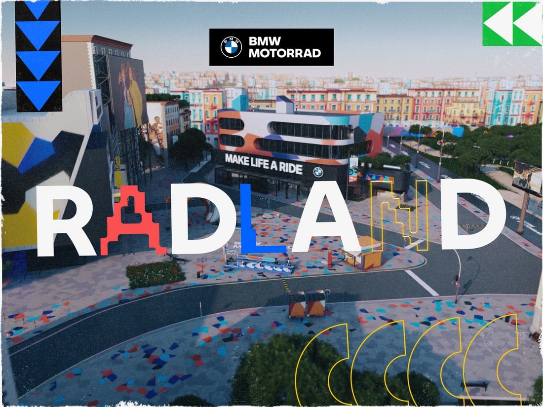
Surely, you must’ve thought about this once or twice while designing fun title designs for projects. Mixing multiple typefaces to design a title sounds fun but we are often afraid to go there. Well, now you have permission to try it out thanks to this new trend.
The BMW Motorrad website uses clever animation to infuse this mixed typeface design in a subtle way. However, you don’t have to go to such extreme levels. You can start by blending a few outline and condensed fonts with your regular typography designs.
Admittedly, we haven’t seen this trend a lot but we hope it will catch on this year.
18. Stretched-Out Titles

We’ve seen ultra-condensed title designs, tall and narrow typography designs, but this new trend combines them together to spawn a new way to craft titles by simply stretching them out as much as you can.
It doesn’t matter which way you stretch it. You can stretch it vertically or horizontally. You could also stretch just a couple of letters while the rest of the letters stay the same. The result will always be something pretty wild.
The good news is you don’t always have to go into free transform mode to stretch your text. There are now fonts out there with stretched-out letter designs made for this new trend.
19. Fullscreen Titles

The title is arguably the most important element of most graphic and web designs. You often try different trends and strategies to try and bring more attention to it. So, why not make it as big as the entire canvas and be done with it?
Well, that’s exactly what this new trend is all about. Basically, you just make the title as big as the screen or the design canvas. You can use tall and bold fonts to grab extra attention as well.
It’s a very simple and easy way to make your typography designs stand out, especially for making bold statements.
20. Pixelated Fonts
Pixelated style of text and typography designs is quite popular among tech brands and startups. It adds a subtle tech-savvy look to any design that’s also relatable and familiar to many people who grew up playing pixel-art video games.
Intentionally adding a pixelated look to text is now much easier with many pixelated fonts to choose from. These fonts come in various styles ranging from the classic 8-bit style to modern pixel art designs.
Whether it’s to add a bit of nostalgia to your designs or to make titles look more playful, this is a typography trend that’s worth keeping an eye out for this year.
21. Neon Outline

This isn’t exactly a new trend but it is something that we are likely to see growing this year. Inspired by the bright neon signs from the 80s and the 90s, this typography design gives a classic retro look to your titles with neon glowing outline letters.
Adopting this trend is also much easier than most other trends on our list. All you have to do is find an outline font and apply a neon glowing effect.
You can add more style and appeal to it with animations. In the above example, the website uses a subtle flickering effect to make the text look more like a glitching neon sign.
22. Thin and Condensed

The next two trends have a very yin and yang feel to them. Here, thin and condensed lettering is gaining popularity. Once taboo, a predominance of high-resolution screens has made this style of typography more readable and easier to work with.
Again, this trend needs just the right words and typeface to be effective and works best when you aren’t delving into exceptionally long blocks of text.
In the example above, thin and condensed lettering perfectly fits the style of the overall design and is complemented on the scroll with a monospaced, highly readable option.
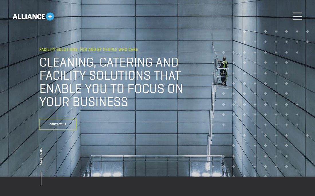
23. Slabs

On the other end of the spectrum from thin typefaces is the use of slabs.
While bold headline options have always been rather popular, many designers have shied away from going all-in with slabs because, like caps, they can seem to scream at users. The trick is to combine spacing, short phrasing, and readable typefaces so that usage is an asset, not a challenge.
What we love about the example above is the use of a smaller slab headline at the bottom of the homepage, with super friendly and soft imagery to balance the weight of the font itself. It highlights the importance of the words in an approachable way.
24. Outline Fonts
Outline fonts are a big deal.
You’ll find this trend mostly in the hero area of web pages for the main copy. While uses vary somewhat there are a few elements that you’ll find almost every time:
- Sans serif typeface
- All caps text for outline letters
- Paired with filled lettering
- Oversized text elements
Outline font options can be a lot of fun to use. You just have to be cautious when it comes to readability. Letters can get lost in background images and videos quickly. So take care with color, contrast, and placement.
And don’t overdo it. An outline font works best for a point of emphasis, not to create your entire message.
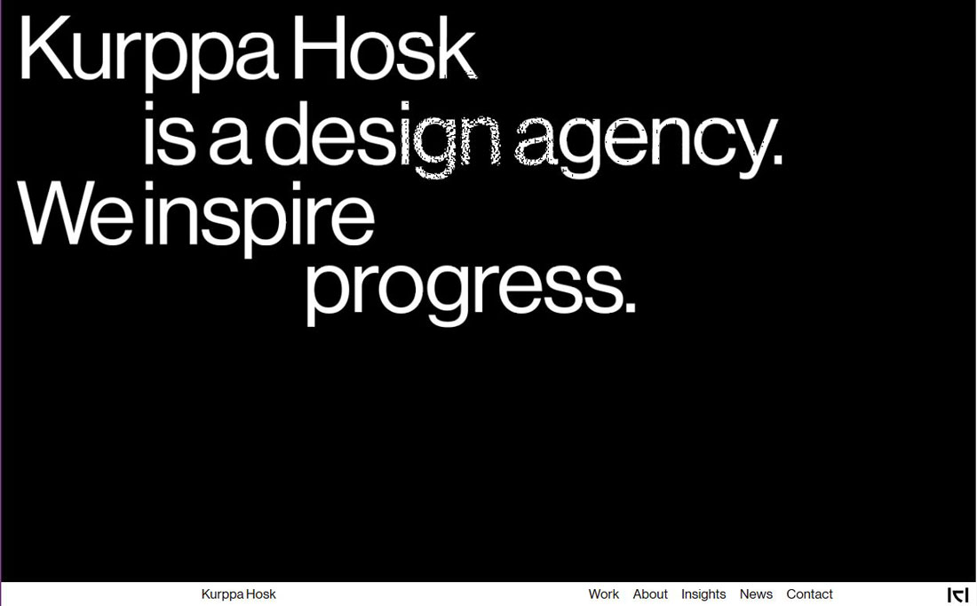
25. “Unreadable” Layers
The next two typography trends and somewhat similar and both break an unexpected rule: They are a bit unreadable. But that’s ok because the rest of the design fills in the blanks and keeps the site interactive.
In this example of the trend, oversized text elements are in a layer behind a foreground element. Every other type element on the screen is highly readable to provide plenty of support for the element that isn’t.
The foreground object also, in the example above, fades in and out over the text so that you can read it back and forth.
The final element that helps pull it all together is the idea that the word isn’t vital to the design. It’s the brand name, which you might know from the logotype, but is less important than what the company/website does.
26. Text That Goes Off the Screen
Following the trend of “unreadable” layers are text elements that lose readability because they animate on and off the screen. This typography effect is all over the place and often paired with an oversized font and just a couple of words that scroll toward the left side of the screen.
This typography trend works best when there’s not a lot of other motion on the screen and the words are readable with just a few seconds of watching. If the text is too complicated, you risk users never figuring out what the words say.
As with the previous example, make sure the supporting text elements provide plenty of information so that people know exactly what the design is about.
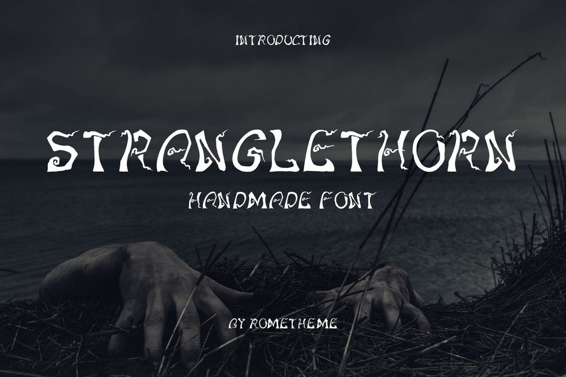
27. Experimental Typefaces
Experimental typefaces are all the rage with expressive and interesting styles that add plenty of personality to design projects. Experimental typefaces come in a lot of different forms – they may include funky shapes or strokes, color, or animation.
The best part about these type-styles is that they can inject a unique, and very specific, vibe into a project.
You can find experimental typefaces from several different foundries or independent type designers. If you want to take a peek at some new experimental options, head over to Typelab.
28. Short, Fat Fonts (Low X-Heights)
Another type style that is trending in a major way is typefaces that have short stature and wide stance. Many of these typefaces feature all-caps character sets, but when they feature lowercase letters, can be identified by a low x-height.
This type style tends to work best when there’s not a lot competing with it on the canvas. It’s also best suited for shorter words or phrases, due to readability.
These short, fat fonts also work best for designs that have a super-modern feel. They are almost futuristic in scope and design in many instances.
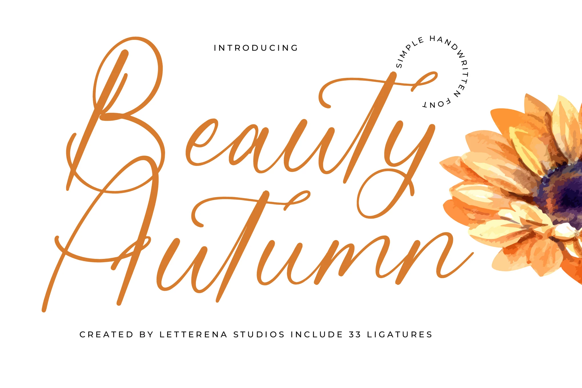
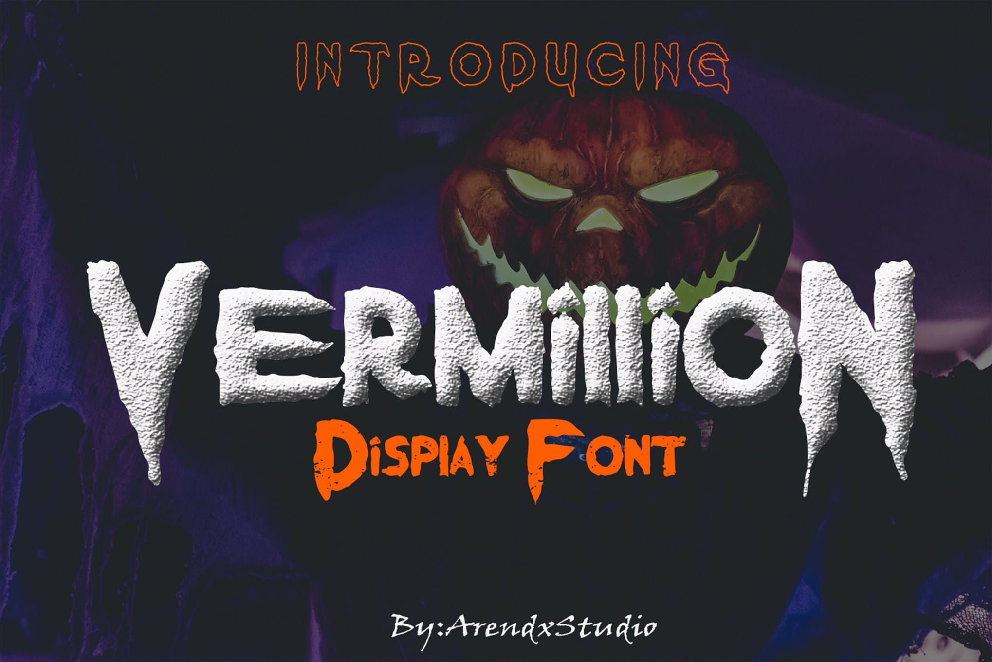
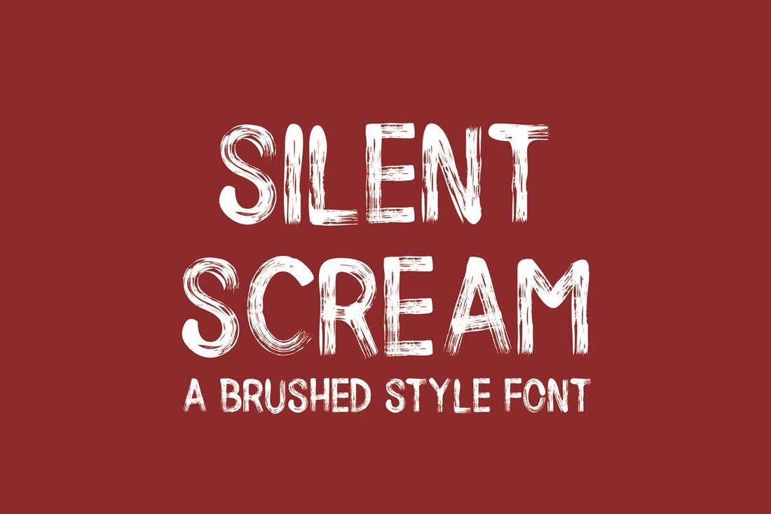
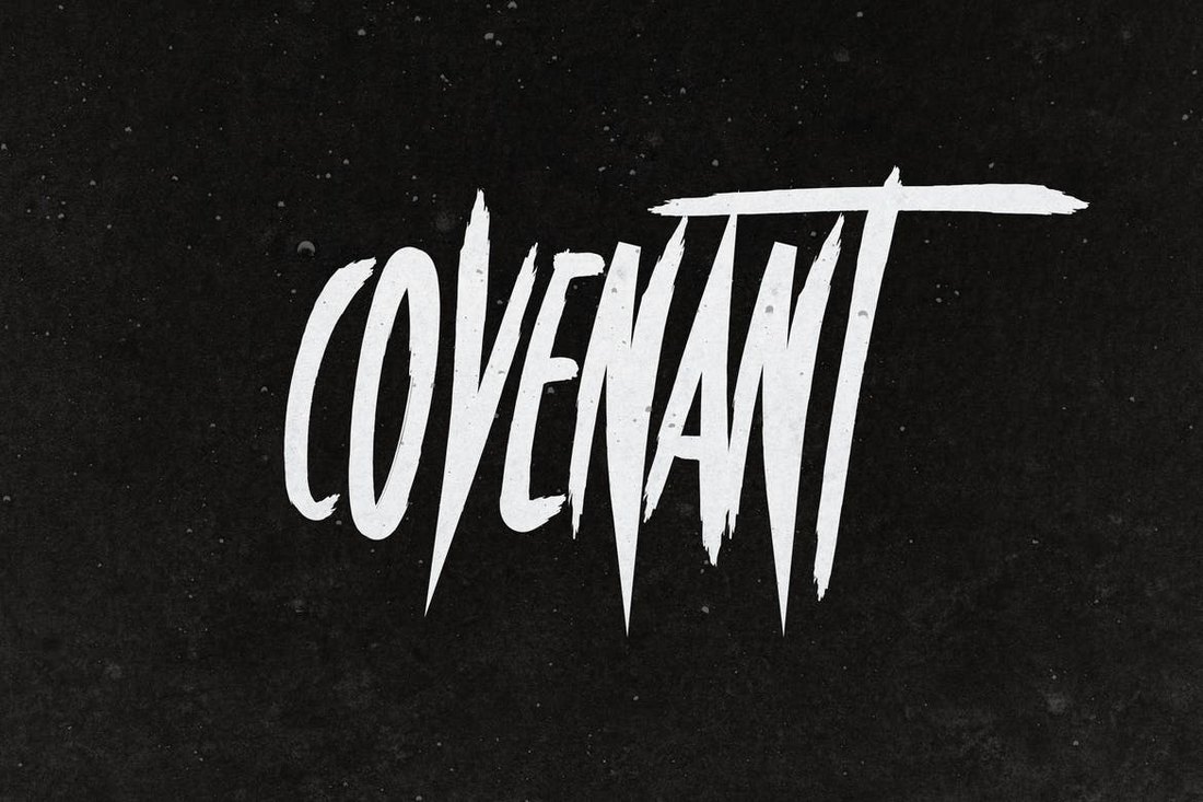
29. Handwriting Styles
The Sharpie marker style is quite popular among website designers when it comes to display typefaces. And there are plenty of handwriting typefaces to choose from so that you get just the right look and feel.
Much of the current handwriting typeface trend is focused on printed letters with upper and lowercase characters with thicker strokes and a bit of roughness to them.
Typefaces might also include little extra embellishments that make certain characters feel even more special. When it comes to handwriting styles with more cursive or script-type designs, you are likely to find long tails and elaborate swashes.
30. Subtle Gradients
Designers just can’t seem to get enough of gradients. (I’ll admit to being one of them!)
Subtle gradients as an accent in typography are the next evolution of this trend.
What’s nice about the trend is that gradients are so subtle that you might not even see them at first. There’s just a slight variance in the color that helps pull the eye across the lettering.
Gradients are best used with thicker typefaces and to accent specific words or phrases.
Be careful not to overdo it too much. A good text gradient maintains consistent contrast across the word so that it’s not jarring to read and so that it stands apart from the background.
31. Animated Typography
One of the biggest overall trends in design is animation. And there’s no reason this can’t apply to typography as well.
More designs are using lettering that moves, shifts, or is impacted by a hover state (such as the example above). All of these techniques can lead to a more interactive, richer user experience.
When animating text, it’s important to consider how and where users will be reading the information (some animated elements such as video don’t work well on all mobile devices yet). Make accommodations so that even if the animation doesn’t work properly, there’s still a worthwhile user experience where messaging is clear.
In that regard, the best text animations often start with lettering that is clear and easy to see. Animation comes into play after a delay or as part of user interaction. This can delight and surprise users (maybe even resulting in more time on-site).
Consider speed carefully with typography animations – if the text moves too fast, users will miss the message completely; if the text moves too slowly, users might click away before reading all of the content. It must be just right. (User testing can help you find an ideal speed.)
32. Stacked Text Blocks
While typography is trending toward being somewhat smaller in size, it still carries just as much weight. Designers are stacking multiple lines of text, particularly in hero headers, for a weighted message with more words.
The trend is important to note because it shows a shift in trying to communicate a little more fully with users and less of an expectation that one word will be enough to entice someone to engage with a design. More information presented in a visually engaging way can be a better solution that leads to more user engagement.
The key considerations when it comes to stacking multiple lines of text are to find a typeface that is readable when used with more letters (or even when used in all caps, which is a popular option), has adequate linespacing so that lines are easy to distinguish and that breaks in the copy are logical. When stacking text, there should be a distinct flow from line to line that’s both obvious in how to read the words and that users should move to the next line of copy before any other part of the design.
Because of challenges with line breaks and ease of reading, text stacks are often on one side of the screen so that the designer has more control. This structure can also create harmony between a text element and another visual on the screen for an asymmetrical balance that’s appealing to look at.
33. Color Fonts and Type
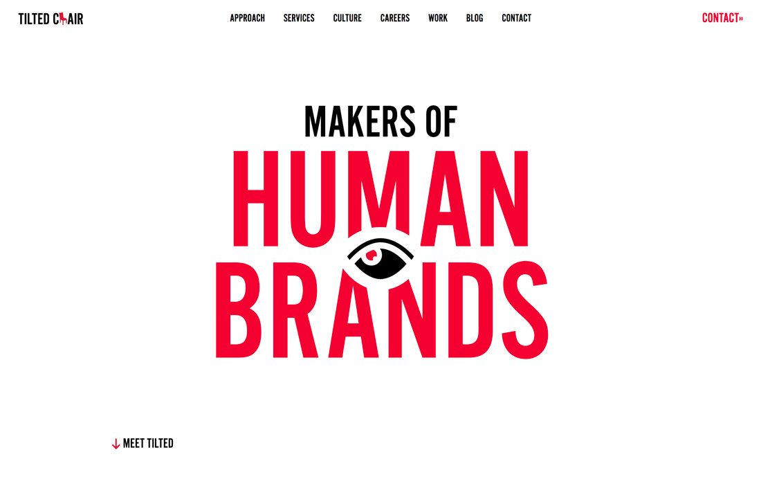
Color fonts are a class of type of their own and have popped up all over the place. They’re more popular than many originally expected and have fun applications in design projects.
You can read all about color fonts here in our beginner’s guide. The concept of color fonts has opened up more projects to color in typography overall as well.
While there was a lot of black and white text in more minimalist styles, colors are roaring back. Many designers are using bright color typography with minimal styles, such as the Tilted Chair, above. Color can add extra visual interest and emphasis on the words in color.
Bright options, such as the red in the example, help draw the eye and serve as a great springboard for messaging, building brand identity, and drawing users into the design.
34. Cutouts and Overlays
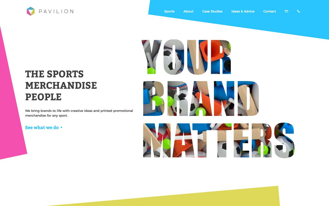
Layered effects are a great way to make a design look a lot less flat. Doing it with typography can be a nice option.
Cutouts and overlays refer to text elements that have no color fill. A cutout allows whatever is in the background layer to show through the type design, such as the animated sports imagery in the example above. An overlay is often transparent lettering over a background so that you can see the background through letters while still reading them.
Both of these techniques have a lot of visual interest and can be fun to create. They work best with large lettering, not many words, and a display typeface.
Overlays work great with photos, textures, or even video backgrounds. Just make sure to avoid a lot of other design effects when using this technique. (You don’t want to overwhelm the user.)
35. Layering with Other Elements
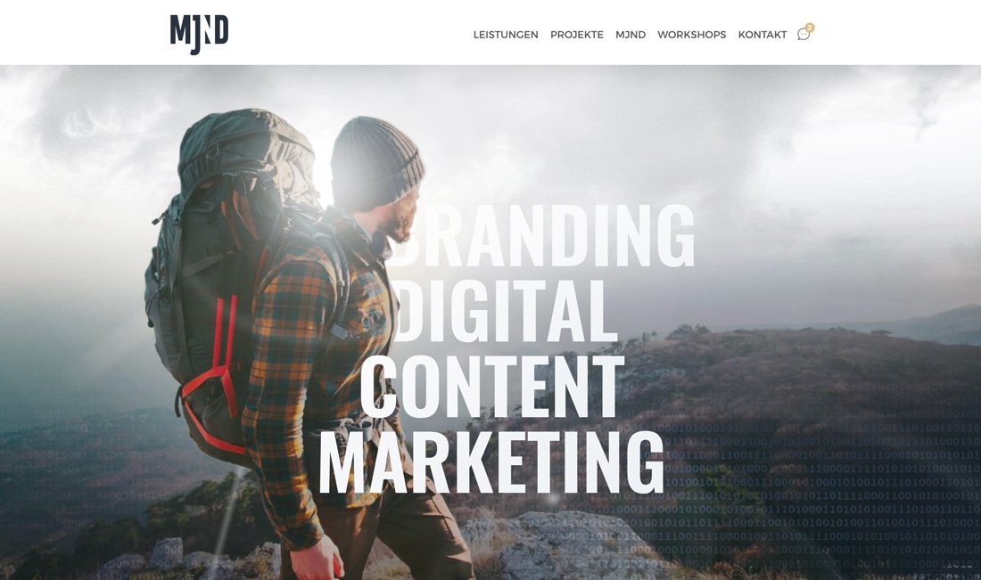
In most projects, text elements and other elements are kept fairly separate. But that idea has changed quite a bit and designers aren’t shying away from allowing text and other elements to overlap. The end result can be pretty cool and actually help users focus on the words on the screen a little more.
While the most common uses of the typography trend in practice are text elements that overlap boxed images or color, MJND kicks it up a notch. This design merges the person in the image with typography so that it is cut out around him (like the person is walking into the words).
This is a technique that comes from print design where it is more popular – and quite honestly easier to execute – and can create a stunning display. The trick is having the right image and maintaining the readability of every single letter. (Be careful not to create unintended words because of missing character strokes or parts.)
36. “Overdone” Effects
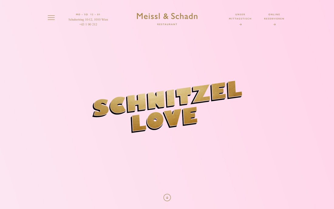
It’s not often that “overdone” is used favorably when talking about any design technique. But when it comes to the overdone typography trend, it can work.
This type trend has a retro feel and is characterized by text and text effects that are so over the top that you must read the words. There are outlines and shadows and bevels and fades and crazy colors. No effect is off the table.
And the more effects you pile on, the more users might look. This style works best with a simple design scheme, such as Schnitzel Love, above.
Conclusion
When using these trends in your designs, remember to carefully analyze your brand style and target audience to ensure they match the message your designs are conveying.
Be sure to bookmark and follow our Trends category to stay on top of all kinds of design trends.


 Björn Ottosson: I worked for many years in the game industry on game engines and games like FIFA, Battlefield, and Need for Speed. I've always been interested in technology and its interaction with the arts. I’m an engineer, but I’ve always held both of these interests.


