60+ Best Website Color Schemes for 2025

Featured Imgs 23

Does it ever seem like certain website color schemes just get all the attention? As with every other aspect of web design, there are color schemes that tend to trend more than others. Bright colors, stark palettes, and even some mismatching schemes are elements of color that are trending.

Here’s a look at some of the best website color schemes (in no particular order). For each, we’re also sharing the color codes that make up the key elements of the design, so it’s easy to play around with these color schemes yourself too!

One of the biggest trends in color schemes that you might notice is the use of dark dominant colors and backgrounds and shades of gold and bright red or pink hues for accents. This dark/light combo is an evolution of black and red in many minimal designs from a few years ago with a more modern touch.

Here are some great examples of color choices done right, to inspire your next project.

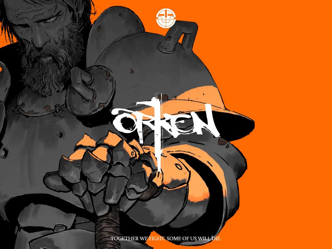
1. ORKEN

#FF6B01#FFFFFF#353535
ORKEN

It’s incredible to see what you can truly achieve with a simple color scheme consisting of just three basic colors. The key here is choosing high-contrasting colors that complement each other and allow you to highlight specific objects and text more effectively.  In this example, the orange does an impressive job of highlighting the other two colors. And it achieves that goal without sacrificing the allure or overall aesthetic of the website.

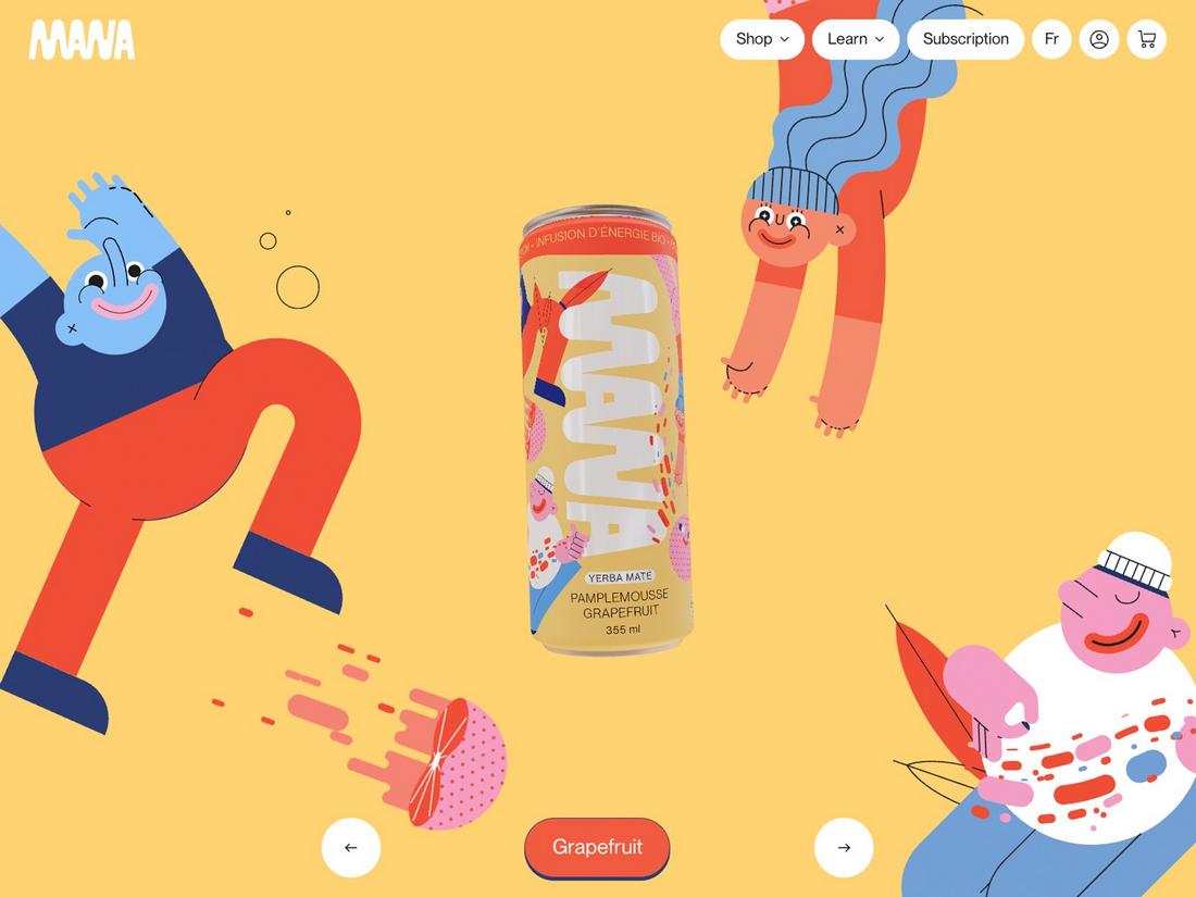
2. Mana Yerba Mate

#FFD372#F15B42#F49CC4#2C3D73#7CAADC
Mana Yerba Mate

This website shows that you don’t have to restrict yourself to a limited color palette to create an aesthetically pleasing design. Simply put, this color scheme is all over the place with multiple shades of blue and red colors. But the real hero is the bright yellow background that brings them all together by offering all the other colors an effective canvas.

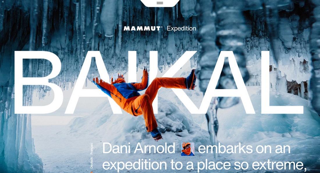
3. Mammut Expedition Baikal

#6793AC#114AB1#E4580B
Mammut Expedition

If you add a bright color, like orange in this example, to a relatively dark background, it will instantly pop. Designers used to hate this approach to creating websites that unnecessarily highlight one object above all else. However, it works wonders for specific types of websites that aim to do just that. Like highlighting the importance of safety and even safety products, as you can see throughout this website.

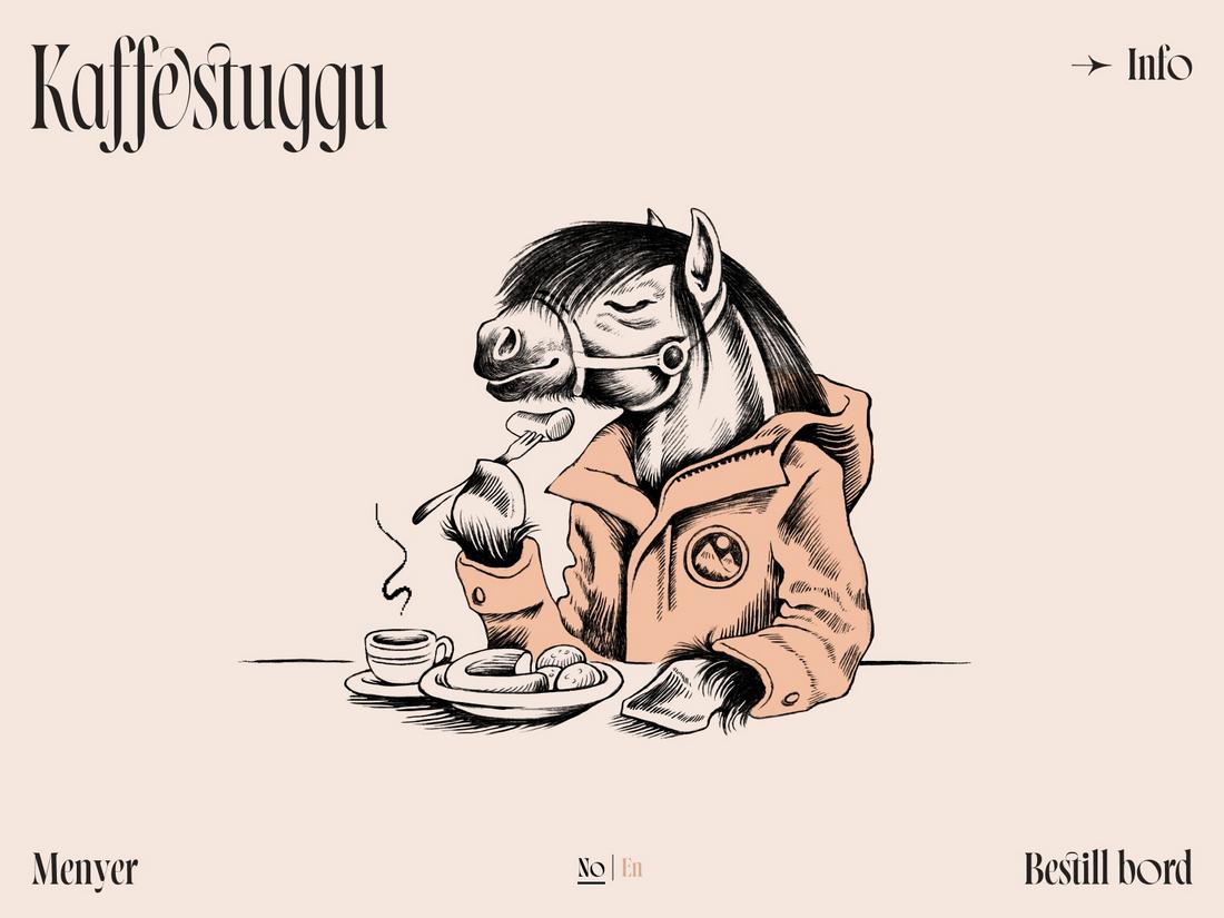
4. Kaffestuggu

#F5E7DE#F2BFA4
Kaffestuggu

The subtle, soft pastel color schemes have been a popular trend over the past few years and it’s websites like this that show why it’s so effective. For this website, showcasing its long traditional ways of its business was an important part of the overall aesthetic and the designer achieves that through this soft and subtle color scheme. You will immediately feel a sense of calm and peacefulness when exploring websites like this and it can only be done with this style of color scheme.

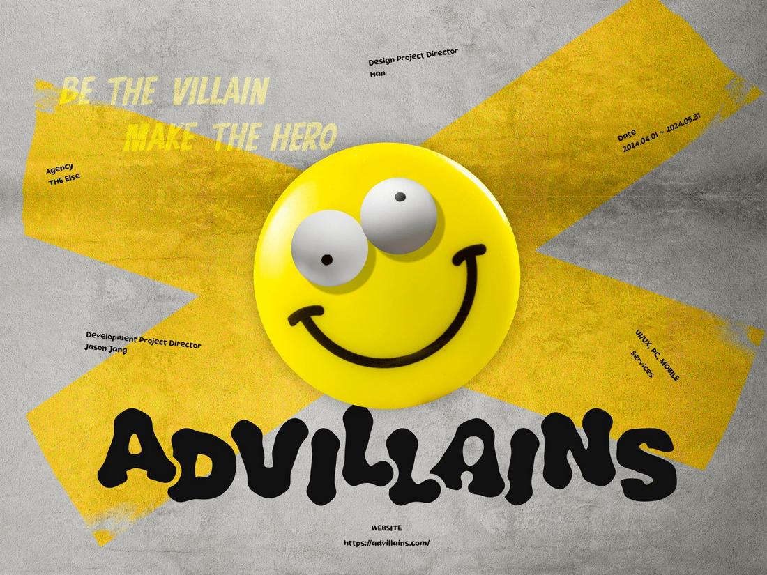
5. Advillains

#ECC232#FFE900#BDBCB8
Advillains

When it comes to marketing, advertising, and showcasing creativity in general, nothing works better than the color yellow. In this example, the marketing agency Advillains has picked to follow that same traditional path by choosing just yellow, gray, and black to create a stunningly attractive and edgy look for their website. The site uses this same color scheme across the entire website and it works perfectly.

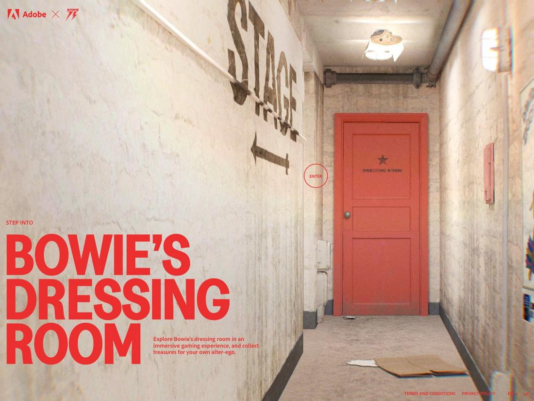
6. Adobe X Bowie

#F02F34#E7D3BB
Adobe X Bowie

Big brand websites, like Adobe, often go for very bold and edgy looks with highly contrasting vibes. At first sight, this may seem like a website promoting a horror movie or video game, and the color scheme works for that type of design too. However, it also works well for creating immersion, especially when the goal is to give the audience a sense of going back in time and exploring an entirely different era.

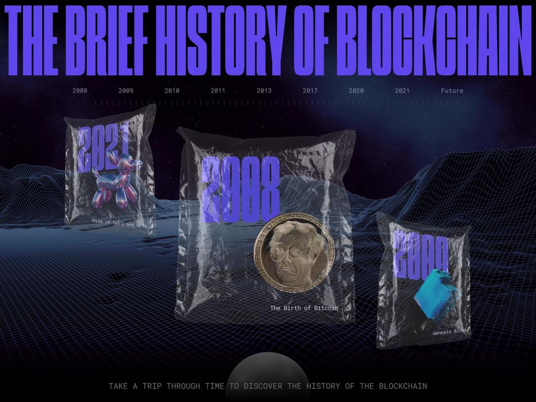
7. History of Blockchain

#6552D0#17203D
History of Blockchain

For technology-centric websites and designs, darker color schemes are often the go-to choice. This website uses just two colors and does a brilliant job of creating a well-balanced website design with plenty of contrast between the background and the foreground objects. Especially on some sections of the website that feature bright neon-colored animations, this color scheme shines in giving the spotlight away to those objects when needed. And that should be the main goal of an effective color scheme.

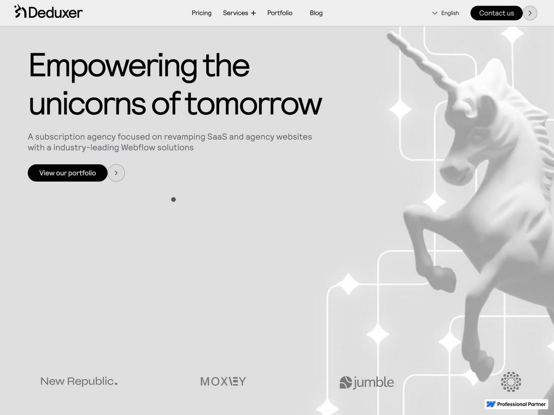
8. Deduxer Studio

#6552D0#A5A5A5
Deduxer Studio

When in doubt, you can never go wrong with the classic black and gray look. It’s a timeless look that will last a lifetime and never go out of style. The subtle, aesthetic, and high-end vibe this color scheme is able to create can’t be achieved with any other color combination. The Deduxer Studio website is a great example that shows how to use this color scheme correctly.

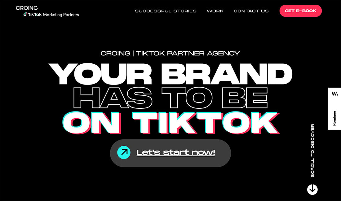
9. TikTok Marketing Partners

#000000#74f0ed#ea445a
best website color

Have you ever looked at a brand or website and thought, “those colors don’t match?” … but it is ok? That’s exactly what you get with this trendy color scheme from TikTok. It’s trendy in part because of the brand itself and the dominant usage of the platform. But we are also starting to see a lot of other websites and companies adopt similar color patterns.

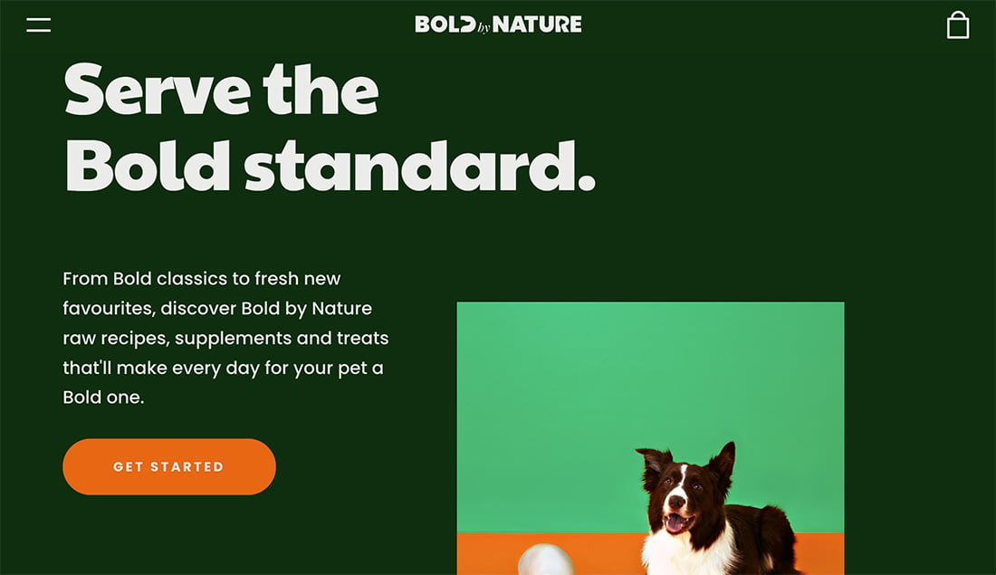
10. Bold by Nature

#172d13#d76f30#6bb77b
best website color

With a dark green background, this is a twist on dark mode. The pair of accent colors, lighter green and orange are a good balance that keeps this color combination light and easy to read and understand. It’s a good idea to use brighter colors when you choose a dark background for ease of readability and to set the right tone for the project.

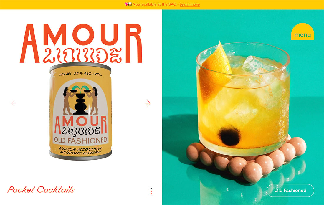
11. Amour

#5ac3b0#de5935#f7cd46
best website color

Amour has another interesting trio of colors that you might not expect together, but work exceptionally well. Not the similarity between the red and green to TikTok, but with a golden yellow and white background to really change the entire feel of how these colors come into play. If you click through to this site, you’ll see this grouping of colors shift and change in the animation to match the cans, but the design never loses its core color palette.

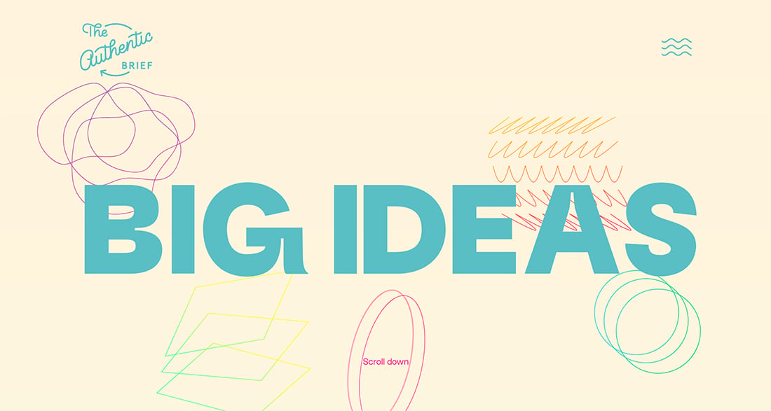
12. The Authentic Brief

#fdf5df#5ebec4#f92c85
best website color

Pastel color palettes are making a return with soft, yet engaging, hues that create balance and harmony. Here, the beige and blue are delightful with a few brighter accent colors to help move the eye around the design. Just be aware that you can run into contrast issues with softer palettes so make sure your background and foreground colors have enough variation.

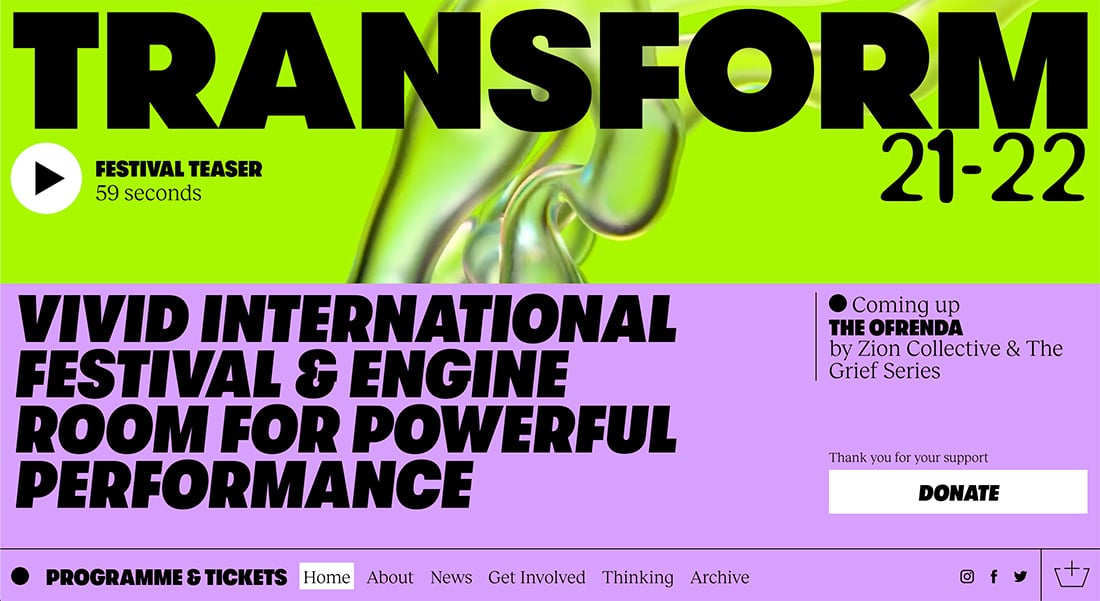
13. Transform Festival

#abf62d#d6a3fb
best website color

Bright, almost garish neons, can have quite an impact as this color scheme shows. While lime green is considered by some as a neutral color, it is anything but when paired with a bright purple and bold, slab typography. Everything about this color and aesthetic screams “look at me!”

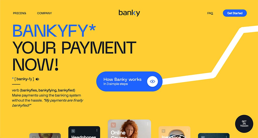
14. Bankyfy

#fecd45#2568fb
best website color

Golden hues with brighter blues are an in-demand color scheme because of the bright light feel that’s easy to read and understand. (This color scheme can be inverted as well for a different, but equally interesting palette.) The nice thing here is that the blue helps instill a sense of trust with the inviting tone of yellow.

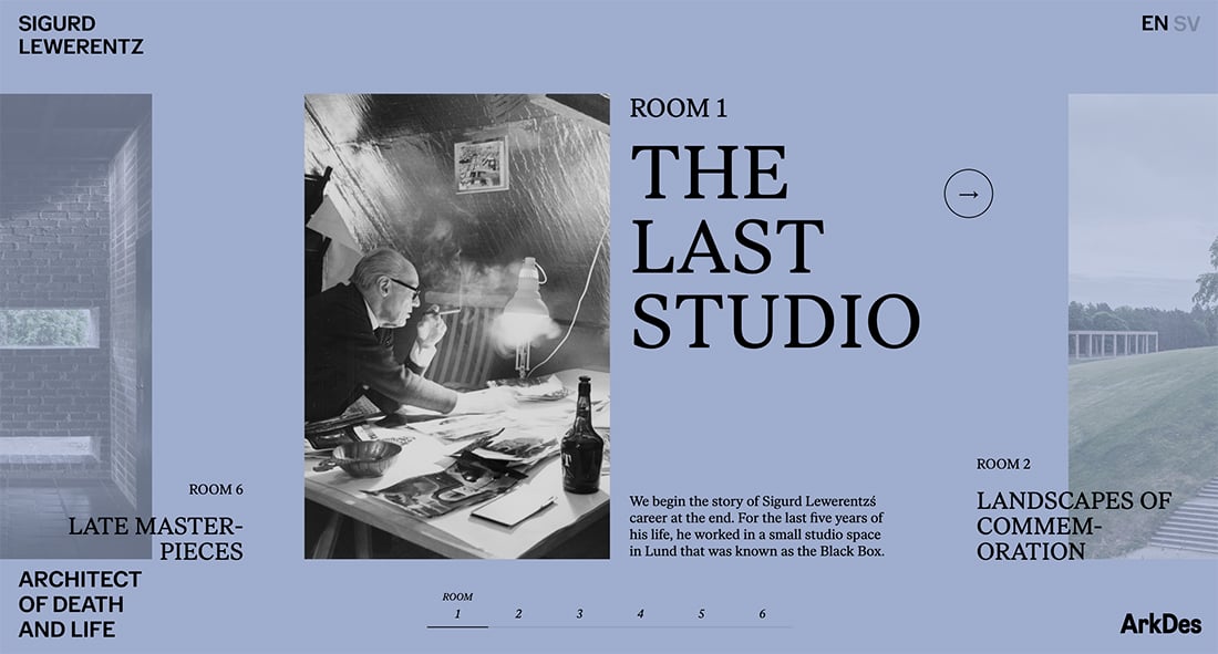
15. Sigurd Lewerentz

#a0aecd#000000#ffffff
best website color

The design for Sigurd Lewerentz is subtle and interesting. It pulls the foundational black and white elements together with a gray blue that serves as both a background color and overlay for elements that aren’t activated on the screen. This modern color scheme merges a couple of recent color trends – black and white palettes and a muted or pastel theme.

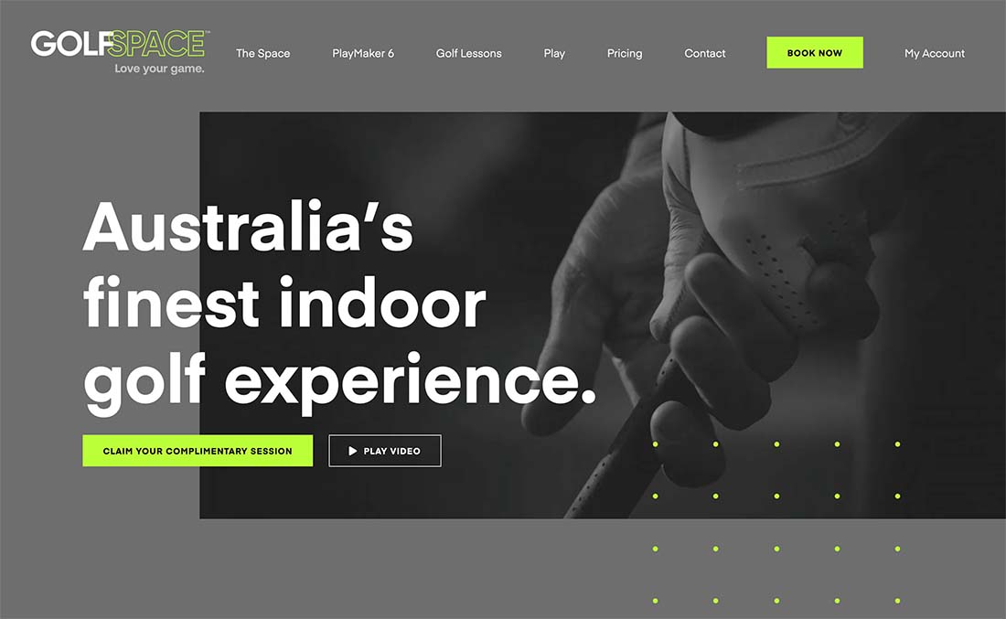
16. GolfSpace

#6e6e6e#bcfd4c
best website color

Another beautiful color scheme with black and white (and gray) elements combines them with a lime green accent for emphasis and a modern touch. The deep gray background with bright green isn’t something you might immediately put together, but once you see it in action these colors are a brilliant pair. (It’s the new twist on the yellow and gray options that were the Pantone Colors of the Year in 2021.)

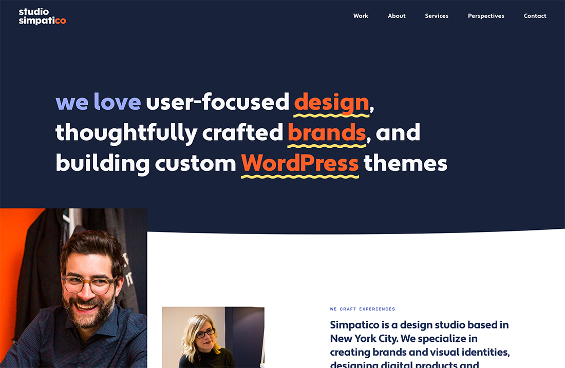
17. Studio Simpatico

#1a2238#9daaf2#ff6a3d#f4db7d
best website color

Studio Simpatico takes navy and red to the next level with additional accent colors for a wider palette that’s striking. Each color has a purpose – key for palettes with a lot of options – and similar color saturation makes it all mesh. Each of the accent colors has a similar feel that’s in the mid-tone range without being too dull or bright.

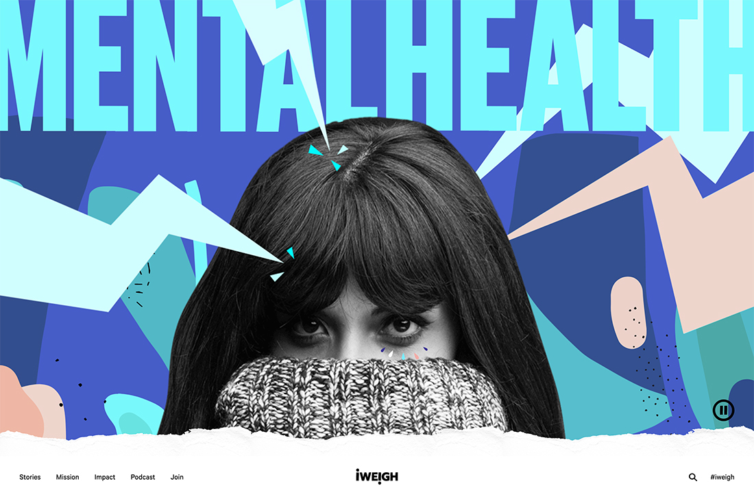
18. I Weigh Community

#9cf6fb#e1fcfd#394f8a#4a5fc1#e5b9a8#ead6cd
best website color

Bright and brilliant might be the best ways to describe this website color scheme from I Weigh Community. The three-color scheme explodes into six great options with the use of tints of each shade. The result is simply stunning without overwhelming you with color. This is a technique that more designs could take advantage of for a modern look with plenty of colors.

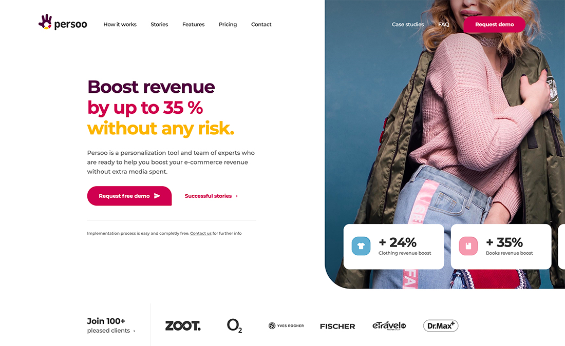
19. Persoo

#490b3d#bd1e51#f1b814
best website color

Persoo uses a color combination that you probably wouldn’t try without seeing it first. The distinct color trio has a somewhat feminine vibe and feels kind of light at the same time. The color choices are disruptive for the website because financial and e-commerce-based tools often stick to a safe color palette based on blue tones.

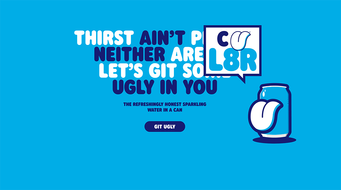
20. Ugly Drinks

#00abe1#161f6d
best website color

Mono-blue schemes never fade out of fashion. This dark-on-light blue combination from Ugly Drinks shows that blue can be fun, too. The simple color background is fun and makes the rest of the design easy to read and understand. It’s also a distinct look that differs from a proliferation of white or photo backgrounds and hero headers among many website designs.

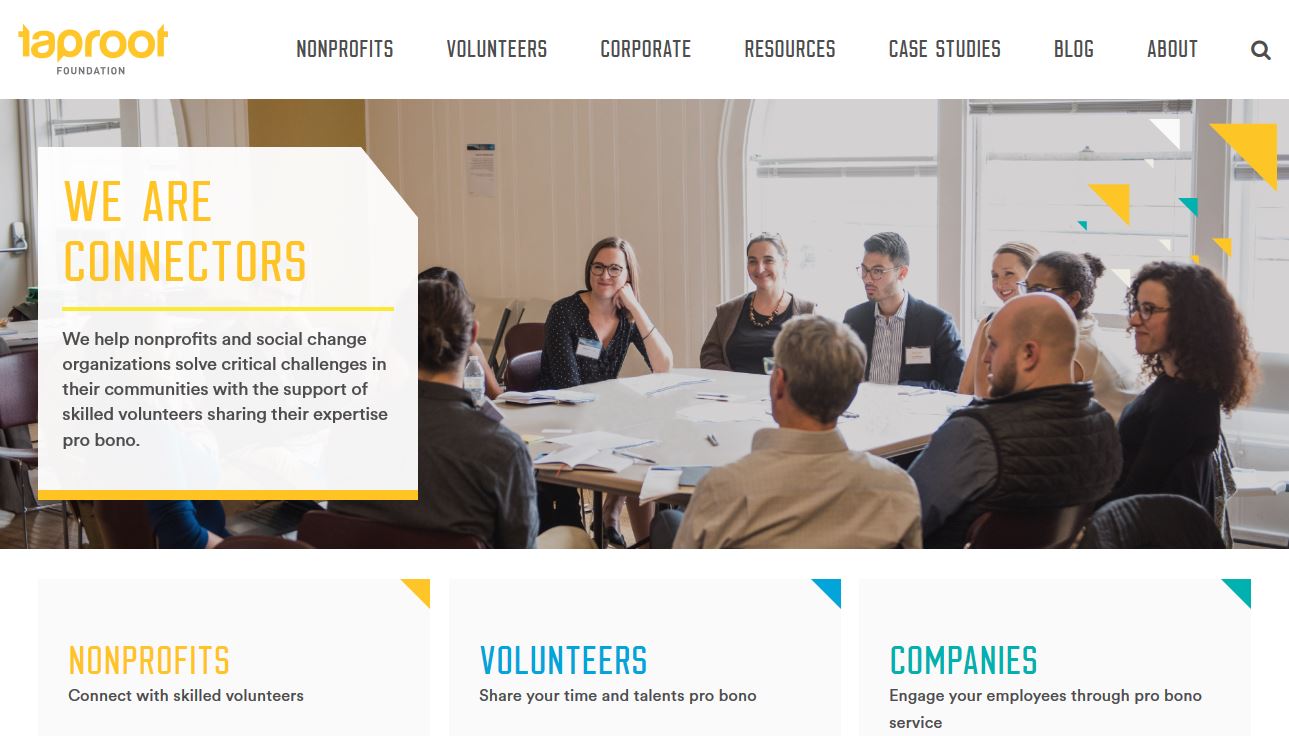
21. Taproot Foundation

#00a9d8#0d9edf#259b9a
best website color

Taproot Foundation uses one of the best, most colorful website color schemes out there. The combination of yellow, blue, and kelly green work together to explain the different facets of the group that helps nonprofits. It’s not a website color scheme that you see that often but bright color with a white background is a majorly trendy option.

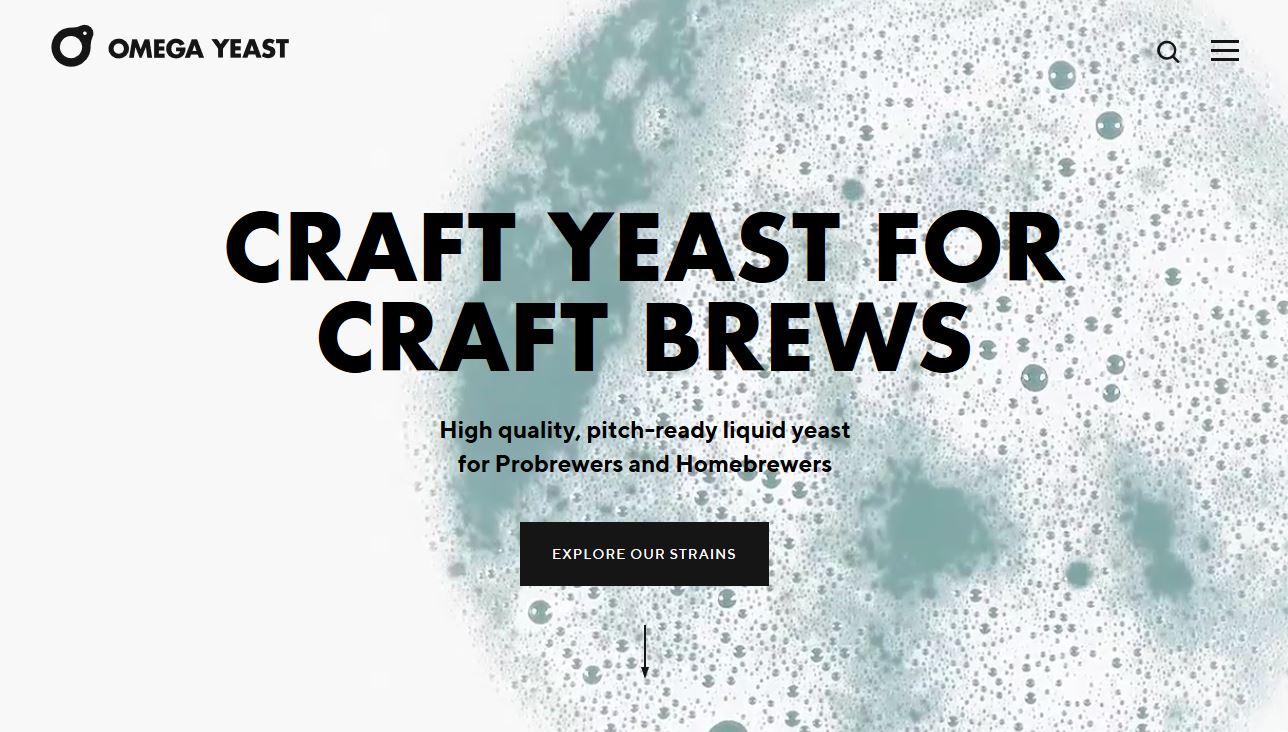
22. Omega Yeast

#f7f7f7#7da2a9
best website color

Omega Yeast doesn’t look like it has a color palette beyond black and white at first glance, but this website design does something that is a big idea in color trends. The color scheme is rooted in the main image – in this case, a video – rather than a background or colorful user interface elements. This trend in color is becoming more common because designers are using full-screen images to tell a brand story.

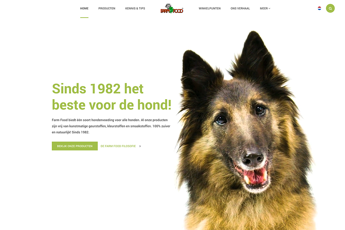
23. Farm Food

#ffffff#a7bc5b#8da242
best website color

Farm Food uses a simple, natural palette with a white minimal style background with bright olive greens to draw attention. Further, the palette has a monotone feature with light and dark olive elements. (It is easiest to see this color change in the hover state of the button.) This might not be a color pair that you come to first, but it’s striking.

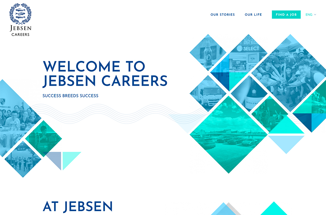
24. Jebsen Careers

#3fd2c7#99ddff#00458b
best website color

Jebsen Careers uses muted blues and greens to create amazing color overlays and design elements with more saturated colors. The combination works great on a white background and shows what you can do by working with variations of the same color. The navy used for text elements and the logo further enhances overall color use.

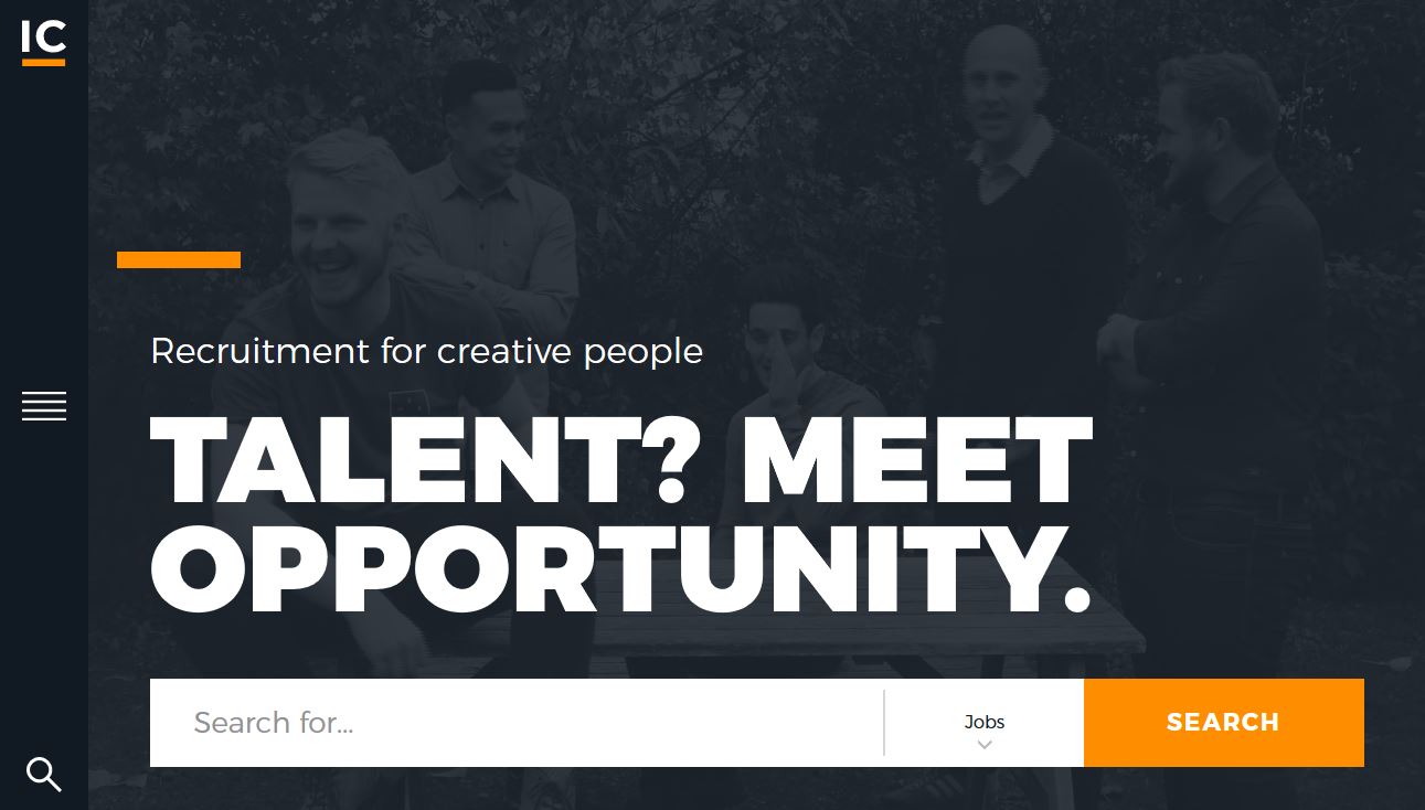
25. IC Creative

#fb8122#1d2228#e1e2e2
best website color

IC Creative uses a dark color overlay – black that isn’t truly black – with a bright accent color and plenty of white to create an inviting scene. Color overlays in almost every hue are a major trend in website color and a rich black option such as the one here is a nice way to give other content plenty of room on the screen. Just note the oversized headline and bright accents and calls to action.

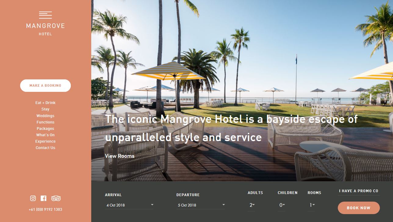
26. Mangrove Hotel

#d48166#373a36##e6e2dd
best website color

While bright color palettes have practically ruled website design for a few years, there’s a shift back to more muted palettes for some projects. The fleshy tone of Mangrove Hotel is warm and compliments the content well. (This same color has also been appearing in some Twitter marketing communications.)

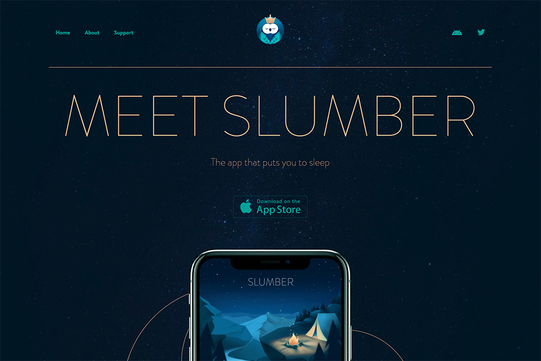
27. Slumber

#051622#1ba098#deb992
best website color

Slumber makes great use of Pantone’s color of the year – Classic Blue – in-app imagery and dark tones in the background and logo. The pairing with gold and green is super trendy, and elegant, and follows along with the night and sleep theme.

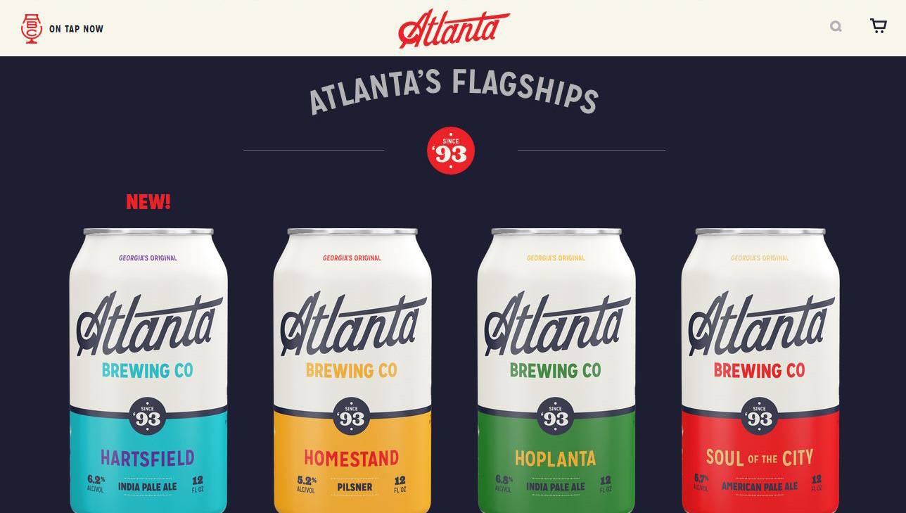
28. Atlanta Brewing

#e40c2b#1d1d2c#f7f4e9#3cbcc3#eba63f#438945

Atlanta Brewing also uses a dominant red with plenty of other accent colors. Note that the palette is not only part of the website design, but also extends to the product packaging as well. They have a pretty wide palette with primary colors as the base and a rich black-and-white background.

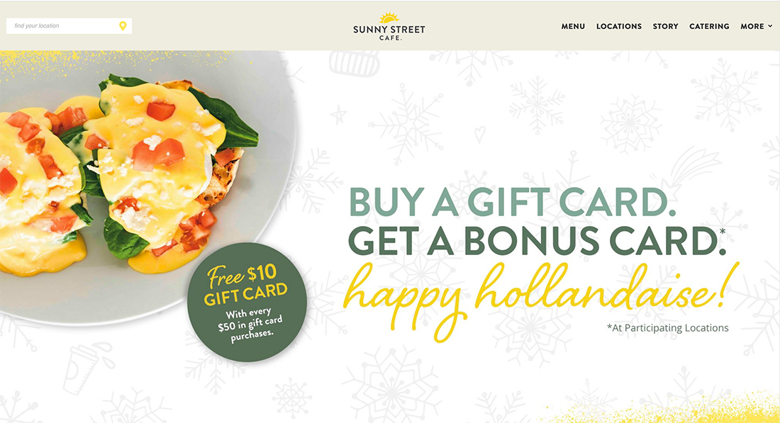
29. Sunny Street Cafe

#5c6e58#8aa899#f2d349
best website color

Sunny Street Café is bright with a color palette that perfectly matches the images and language in the design. Greens and yellows together are an unusual combination, but it feels friendly and just right to the design of this breakfast and lunch spot. The color theme also brings out the food imagery nicely.

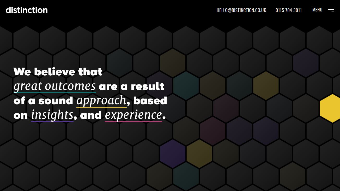
30. Distinction

#000000#181818#2cccc3#facd3d#5626c4#e60576
best website color

Distinction uses the same all-black base for its color palette with a rainbow of accent colors. If you want a wide-ranging color palette, this is the way to use the trend effectively.

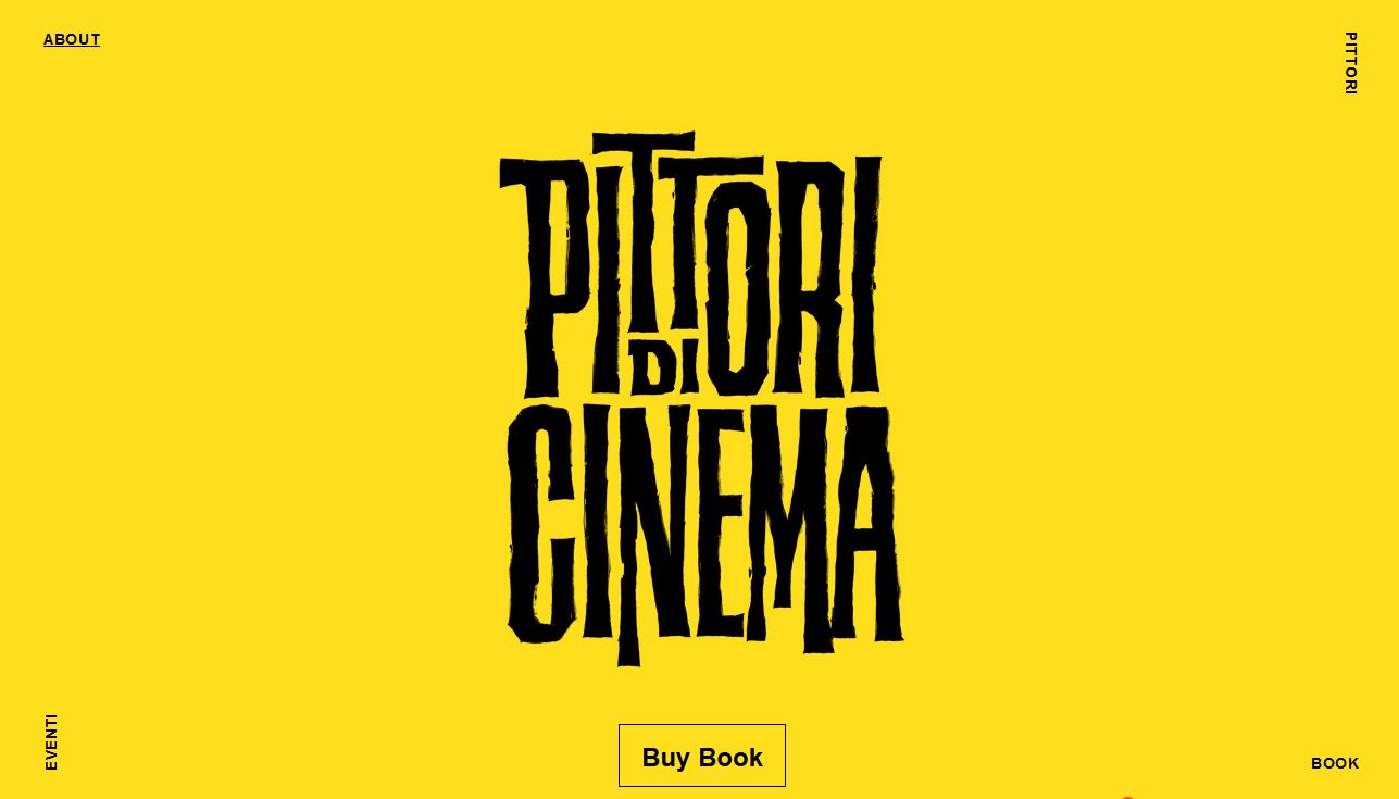
31. Pittori di Cinema

#fdd935#000000
best website color

Minimalism can be in full color as well, as evidenced by Pittori di Cinema. The bright yellow scheme with black is a common high-color minimalism option. The brighter the color palette for this style, the more on-trend it seems to be.

32. We (Heart) UX

#e1f2f7#ef0d50#eb3a70#e5bace
best website color

We (Heart) UX uses a simple color palette with a pale blue background – a lovely choice – and shades of pinkish red for the main art element. Pulling together these colors with a funky geo style is trendy, modern, and just plain fun to look at.

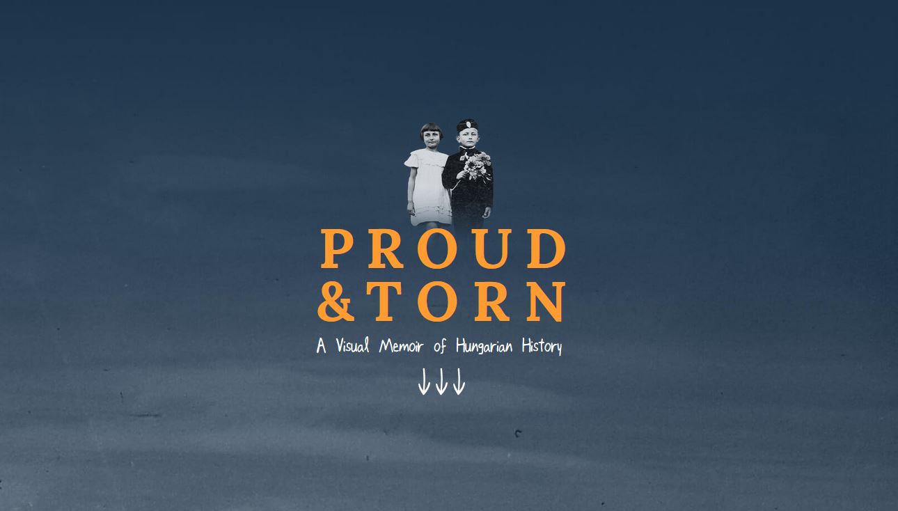
33. Proud & Torn

#1f3044#fb9039#646c79
best website color

Proud & Torn uses the same jewel-tone concept with a slightly more muted color combination. The more subtle color palette helps create visual interest for a website that features a lot of colorless images.

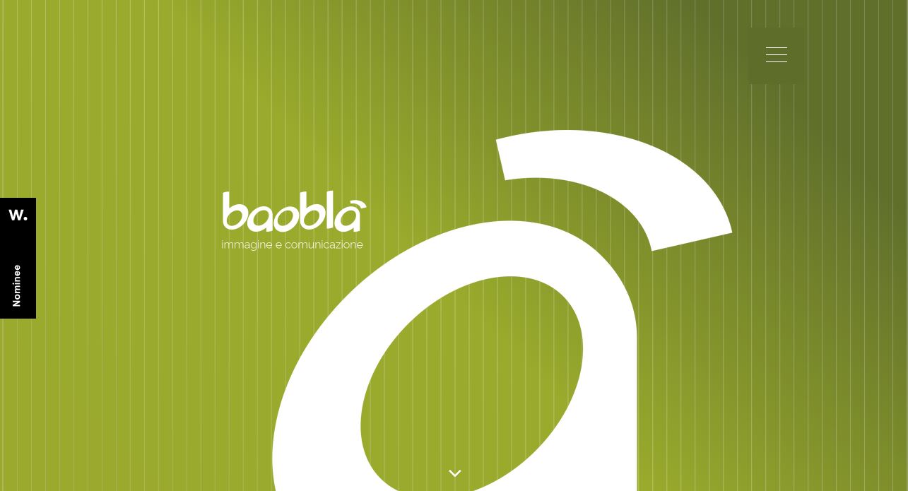
34. Baobla

#56642a#849531#92a332
best website color

Baobla features a fun gradient in a monotone color scheme. This style of color palette is ideal for new brands or product identities or if you are looking to make a lot of impact with a bold hue.

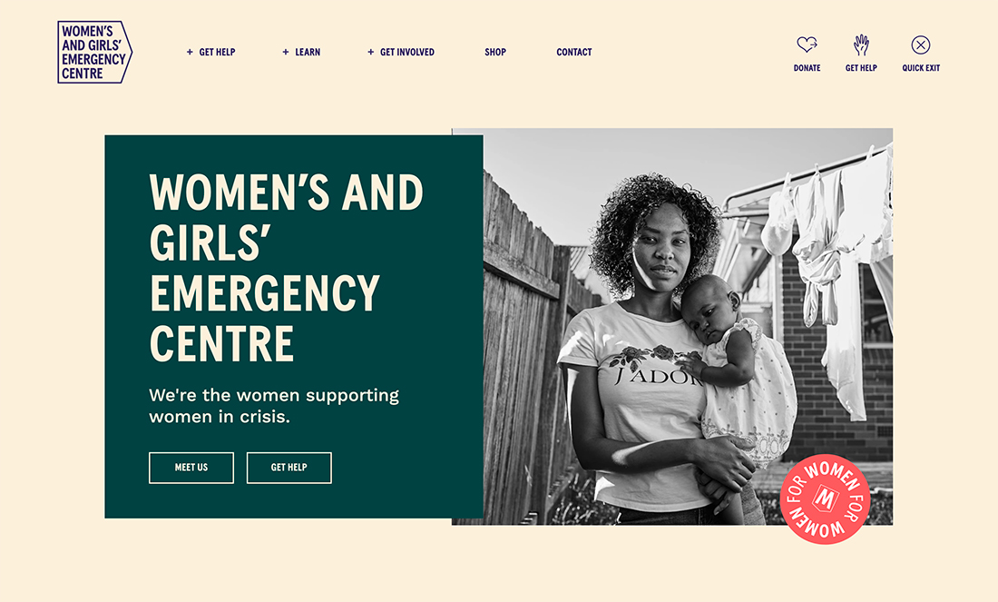
35. Women’s and Girls’ Emergency Centre

#faf0dc#0b4141#ff6864
best website color

Women’s and Girls’ Emergency Centre picked a color palette that isn’t overly feminine, helping give more strength to its message with bold color. The color choices are high in contrast and easy on the eyes and in terms of readability. The bright accent choice is trendy and adds emphasis to that element.

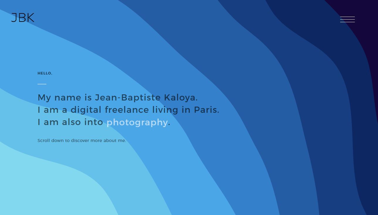
36. Jean-Baptiste Kaloya Portfolio

#150734#0f2557#28559a#3778c2#4b9fe1#63bce5#7ed5ea
best website color

Jean-Baptiste Kaloya turns probably the most popular color in website design into a monotone palette of its own with varying degrees of blue. Also, note the soft gradients on the lighter blues.

37. Igor

#000000#fefefe#fdee30
best website color

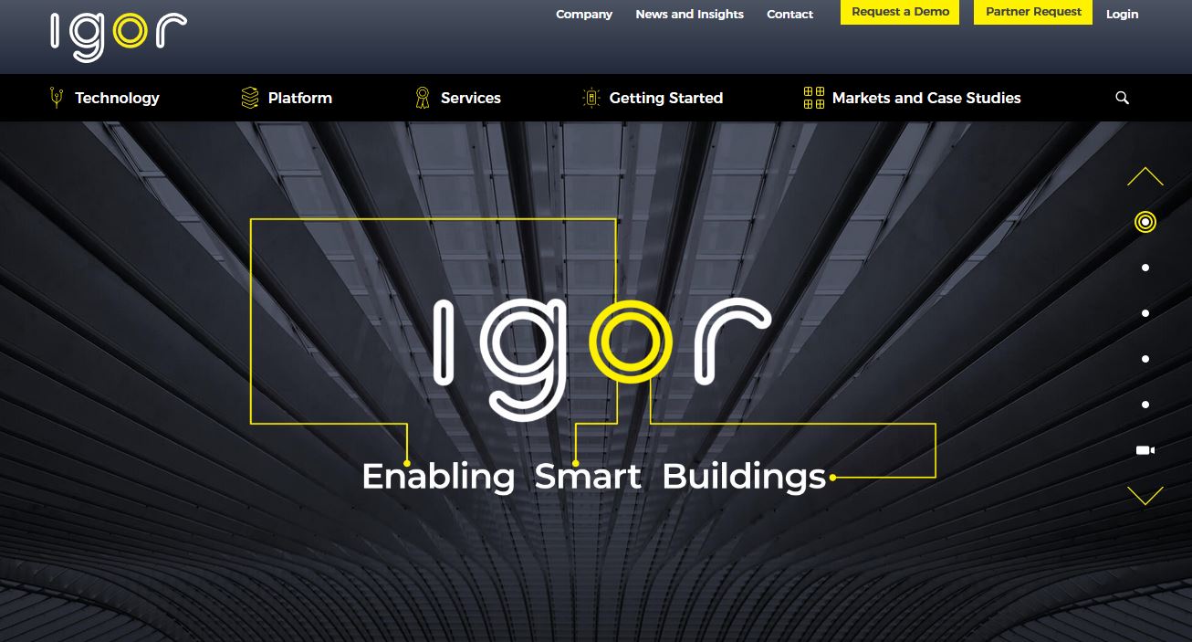
Igor showcases what is probably the most popular website color palette of 2019 – black, white, and yellow. This color palette, although seen in varying hues, is widely popular. This combination is probably one of the most appealing.

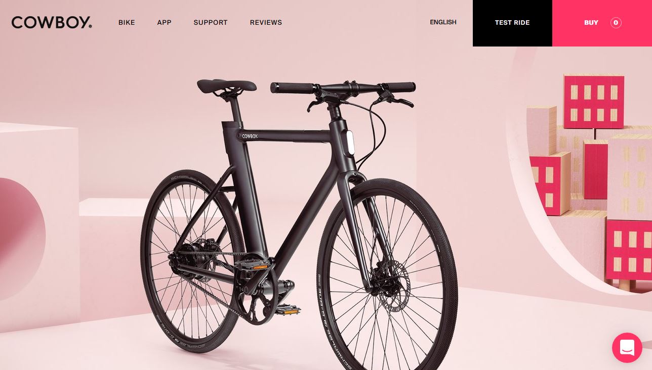
38. Cowboy Bike

#000000#fa255e#c39ea0#f8e5e5
best website color

Cowboy Bike uses a black and bright color palette that’s an immediate attention-getter. While most sites use black only for text, this design actually incorporates it into the bright, monotone palette.

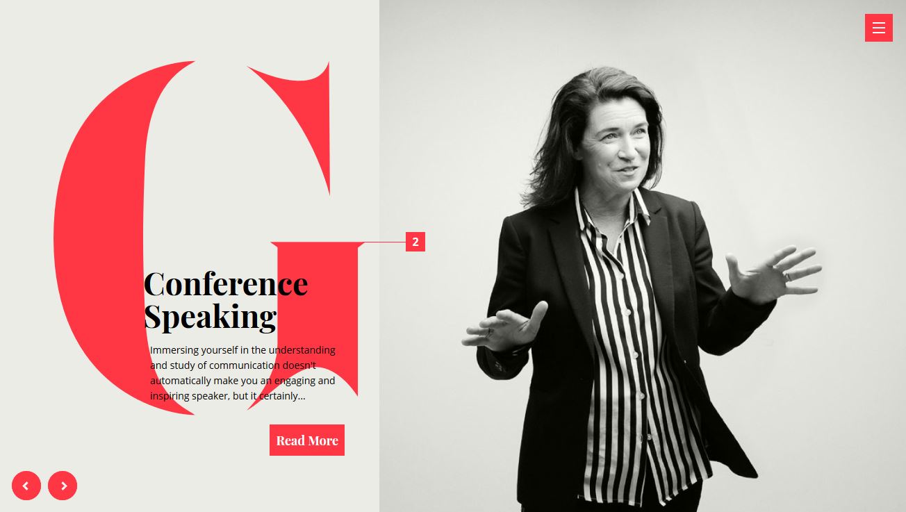
39. Gabrielle Dolan

#e8eae3 #373833 #fa2742
best website color

Gabrielle Dolan’s website uses the gray-white-bright color palette trend. With a distinct lack of color for most of the design, the bright color seems to jump off the screen. It creates just the right focal area and amount of contrast, which is why this is a trending color scheme option.

40. Pixel Pantry

#9e15bf#4ac6d2
best website color

Pixel Pantry uses a distinct color pair to show off this trend – purple and teal. The combination of these two colors to create a palette is nearly unreal. You’ll find variations of this scheme almost everywhere you turn.

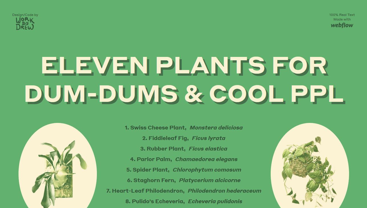
41. Eleven Plants

#5daa68#3f6844#faf1cf
best website color

Eleven Plants uses an all-neutral color scheme that’s harmonious and easy to look at. The green matches the content well and the color combinations are simple and charming.

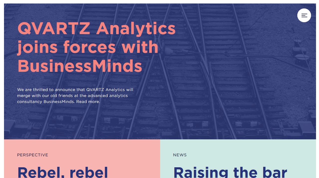
42. Qvartz

#ee7879#2a3166#f4abaa#cae7df
best website color

Qvartz uses one of the most unexpected trending colors of the year in a way that mimics many other projects. With pink text, pink color blocks, and a mashup of bold and softer colors, this palette is somewhat feminine but not too much so.

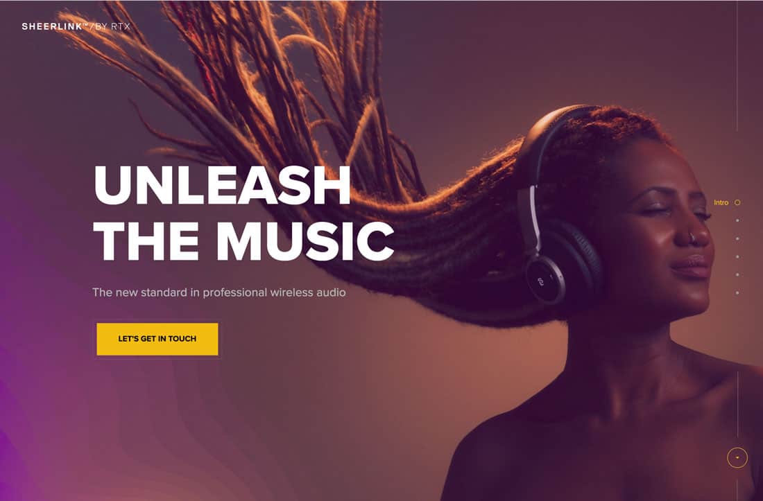
43. Sheerlink by RTX

#4a2c40#e9bd43#7d3780
best website color

Sheelink By RTX uses a modern gradient and bold coloring to bring attention to its product. The colors are deep and moody and the maroon-purple has a distinct sense of regality and mystery.

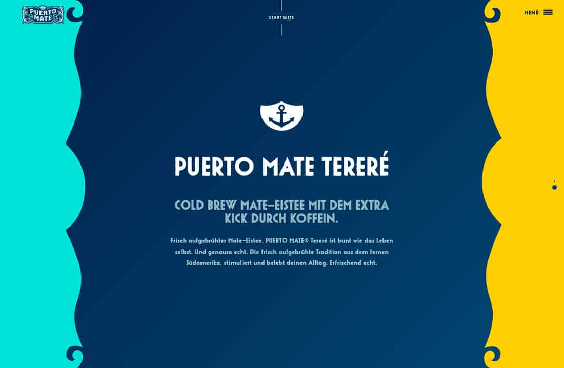
44. Puerto Mate

#5ce0d8#01345b#ffcf43
best website color

Puerto Mate uses trending colors that are bold without being overpowering. Because the center panel is navy the outside bright colors feel a little less “in your face”. (Just imagine flipping these hues into different locations in the design.)

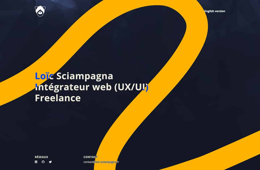
45. Loic Sciampagna Portfolio

#141824 #ffb600#0049ff
best website color

Loic Sciampagna’s portfolio uses one of the best combinations of blue and yellow you’ll find. The contrasting hues are simple, elegant, and engaging with the simple touch of light, brighter blue.

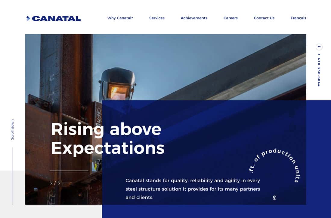
46. Canatal

#182978 #6688cc #acbfe6
best website color

Canatal uses its triple blue brand colors well in this design. It’s an example of how to use a monotone color palette without being boring.

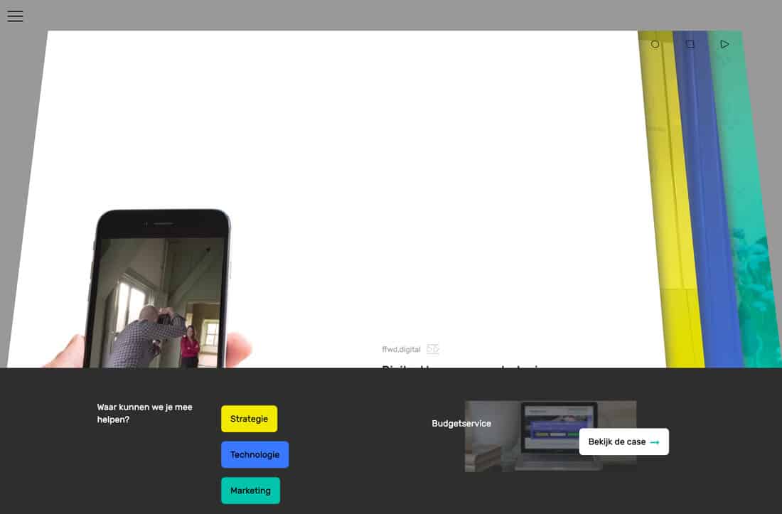
47. FFWD Digital

#f1e821#487afa#23c0ad
best website color

FFWD Digital uses brights stylishly and classically. On paper, using this trio of colors on a dark and light background might seem awkward, but here, it’s seamless and lovely.

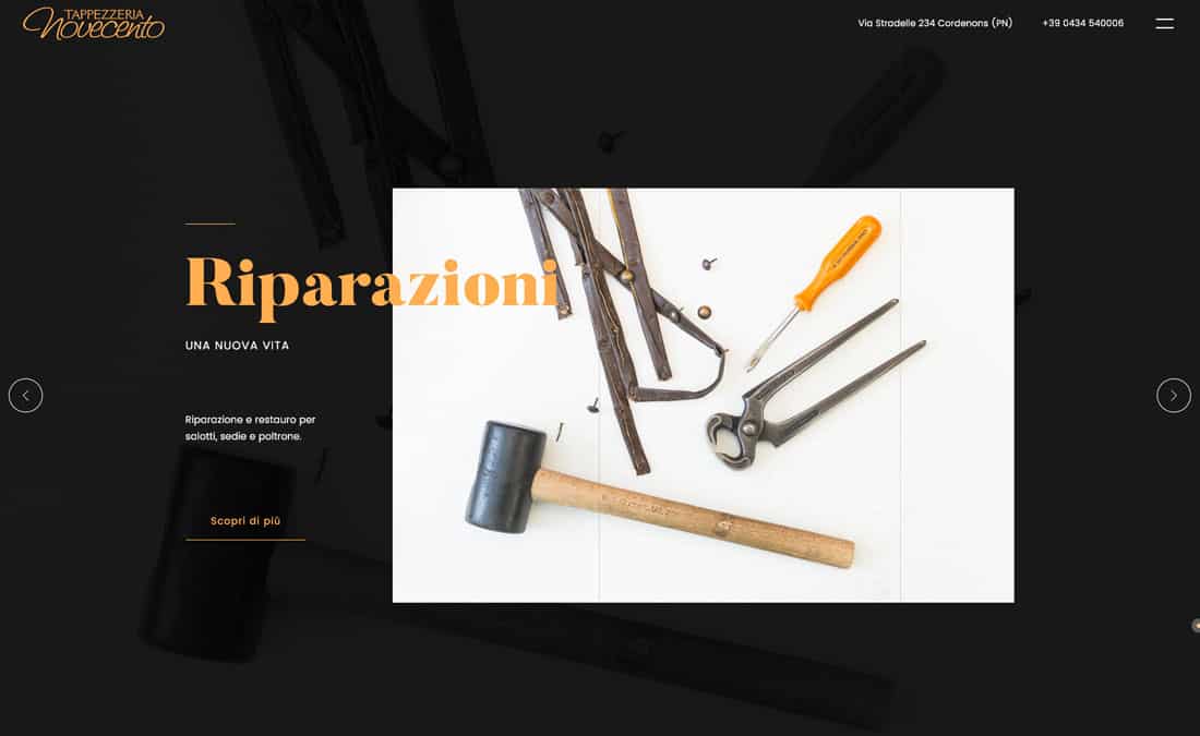
48. Tappezzeria Novecento

#191919#fab162
best website color

Tappezzeria Novecento uses a color scheme that most would shy away from – and it works. The bright combination of orange and black is simple and engaging. The colors contrast just enough so that everything is easy to read. It’s also a nice touch that the brand colors are also in the images.

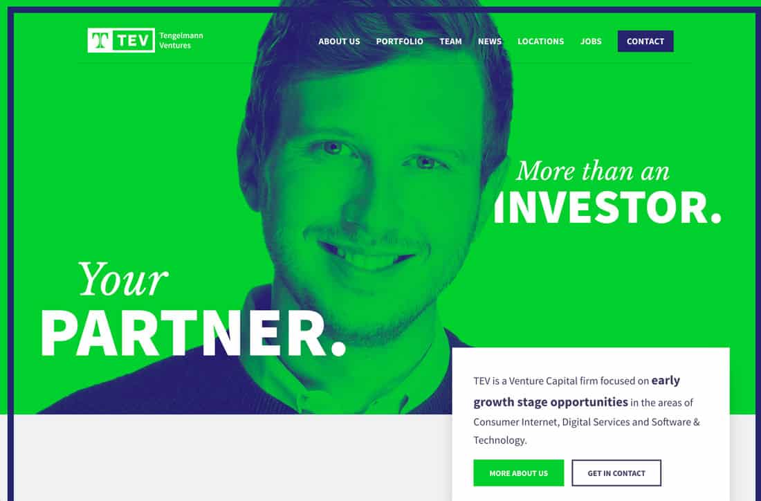
49. Tev

#252669#4ecb4a
best website color

Tev is anything but boring with a lime background and duotone color overlay. It’s bold and the green makes you think money – just what the site is designed to do.

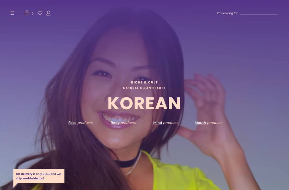
50. Niche & Cult

#4e3883#ffddcc
best website color

Niche & Cult uses soft hues for a beauty brand with a more feminine feel. The soft pink is reminiscent of some skin tones and a blank canvas for makeup while the bright purple matches the mood of the site.

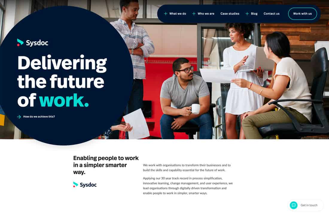
51. Sysdoc

#001730#4ad7d1#fe4a49
best website color

Sysdoc creates a new spin on a basic palette of red, blue, and green with brighter, less saturated options for red and green. The palette is strong and soft and matches almost any other set of elements.

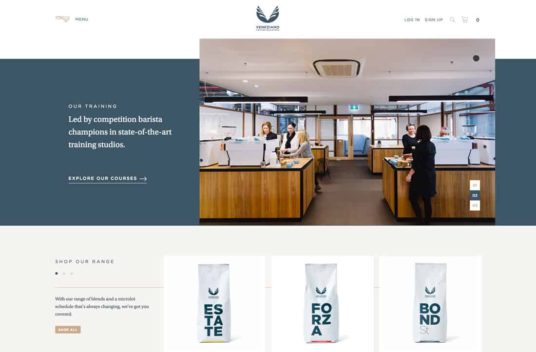
52. Veneziano Coffee Roasters

#f6f4f2#425664#c6ad8f
best website color

Veneziano Coffee Roasters goes back to a more muted palette with a gray-blue and gold combination that’s subtle and classy. The colors pair well with the website’s imagery and create just the right feel.

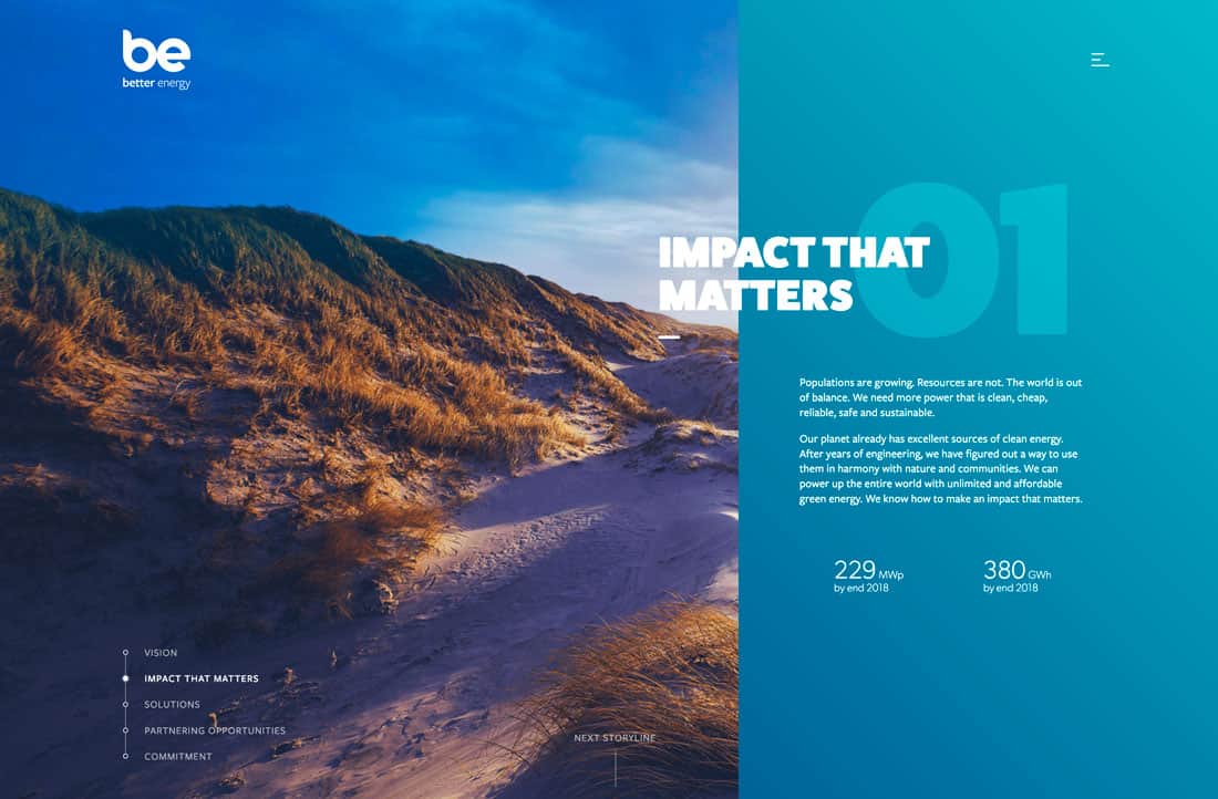
53. Better Energy

#11abc1#df3062#f5b935#4bac3f
best website color

Better Energy uses bright colors associated with nature – taken from corresponding imagery – to create a fun palette to tell the story of something that might not be super interesting to talk about.

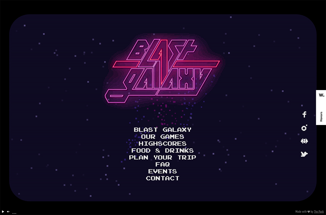
54. Blast Galaxy

#0f0c24#a350a3#c1436d
best website color

We couldn’t get through a roundup of cool color trends without looking at an 80s palette. Everything from the 1980s seems to be trending and that includes the colors used for Blast Galaxy, a commonly observed combination of blue, purple, and pink with a neon glow.

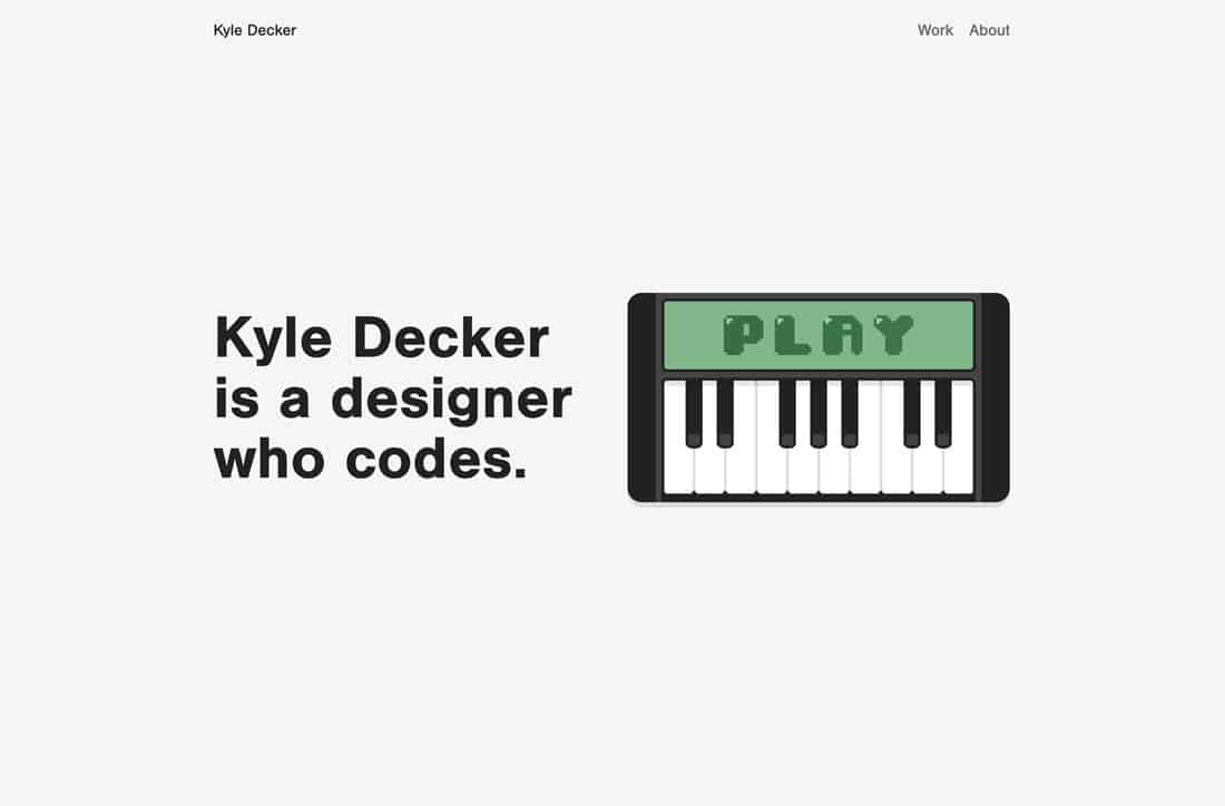
55. Kyle Decker Portfolio

#f5f5f5#8db48e#4d724d
best website color

Kyle Decker’s portfolio is another website with a color scheme that shines because it is so simple. It uses a combination of neutrals and only one true color to focus the eyes of the user.

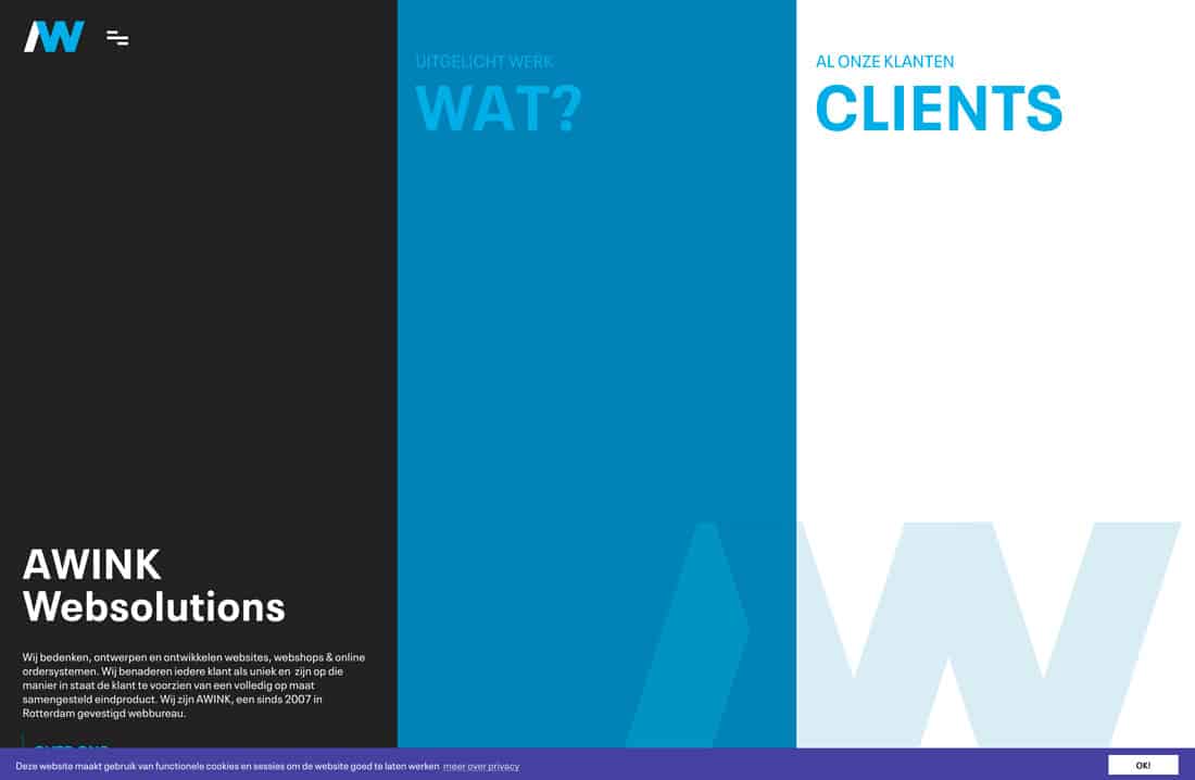
56. Awink

#212221#1181b2#ddedf4#44449b
best website color

Awink Websolutions also uses a monotone color schedule with varying hues of blue. (Blues are a popular option when it comes to monotone options.) This one is just a little different thanks to the deeper, darker accents. Plus, dark and light screen areas almost play an optical illusion, making you think there are more colors here than there are.

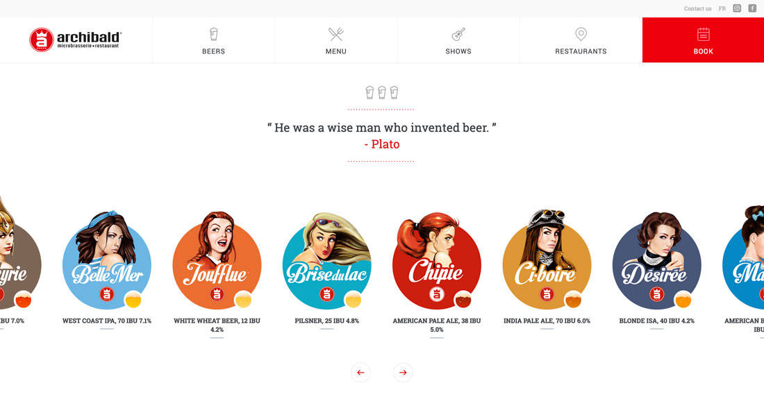
57. Archibald Microbrewery

#d81c23#4fa8c2#d97441#d29849
best website color

Archibald Microbrewery uses a rainbow of colors, but the palette is surprisingly beautiful. With colors all in similar saturations and following a theme visually, it comes together pretty seamlessly.

58. Indegy

#45af2a#3fddc1#d56c06
best website color

Indegy uses a bright green against plenty of photos and high color. The simple color, paired mostly with gray and white, adds a modern touch to the design and helps direct users through the content. (There are also teal and orange accents for subtle pops of brightness in other places.)

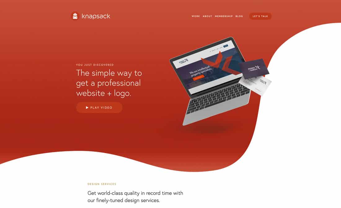
59. Knapsack

#ad4328#b65741
best website color

Knapsack uses a bright red color scheme with gradients to add interest to a color that can be tough to use. This works because there aren’t a lot of high-energy visuals competing with the bright palette.

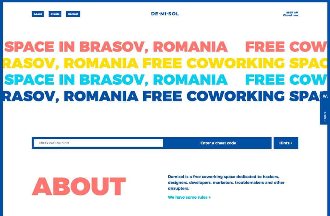
60. Demisol

#16519f#f07e74#f8dd2e#4fcbe9
best website color

Demisol uses too many colors and too many big elements, and it’s fabulous anyway. Sometimes playing with color is an experiment; test it out and see if it works.

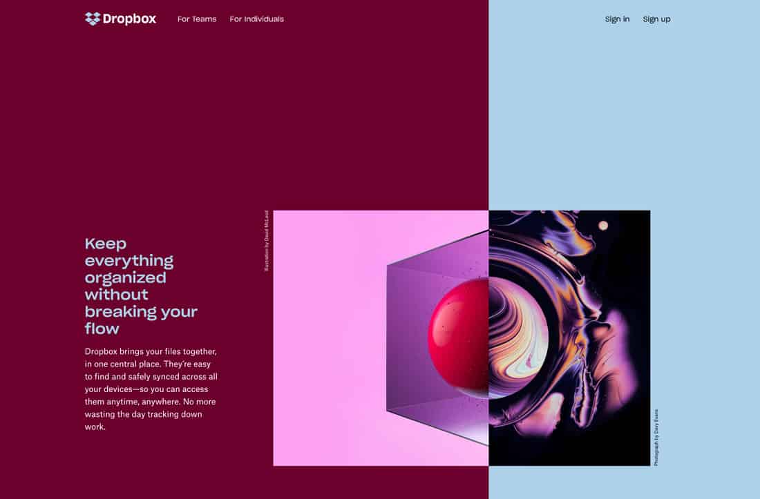
61. Dropbox

#61082b#b4d0e7
best website color

Dropbox has another one of those color schemes that shouldn’t work … but it does. The contrast between the deep maroon and baby blue establishes great eye movement across the split screen. The colors work equally well as text elements on the opposite color. Once more, it proves that sometimes you just have to try color options out and see how they work.
You can use text-wrap: balance; on icons

Featured Imgs 23

Terence Eden on using text-wrap: balance for more than headings:

But the name is, I think, slightly misleading. It doesn’t only work on text. It will work on any content. For example – I have a row of icons at the bottom of this page. If the viewport is too narrow, a single icon might drop to the next line. That can look a bit weird.

Heck yeah. I may have reached for some sort of auto-fitting grid approach, but hey, may as well go with a one-liner if you can! And while we’re on the topic, I just wanna mention that, yes, text-wrap: balance will work on any content. — just know that the spec is a little opinionated on this and make sure that the content is fewer than five lines.

There’s likely more nuance to come if the note for Issue 6 in the spec is any indication about possibly allowing for a line length minimum:

Suggestion for value space is match-indent | <length> | <percentage> (with Xch given as an example to make that use case clear). Alternately <integer> could actually count the characters.


You can use text-wrap: balance; on icons originally published on CSS-Tricks, which is part of the DigitalOcean family. You should get the newsletter.


from CSS-Tricks https://ift.tt/HNUpGaR
Gain $200 in a week
via Read more

20+ Halloween Pumpkin Carving Ideas for Graphic Designers

Featured Imgs 23

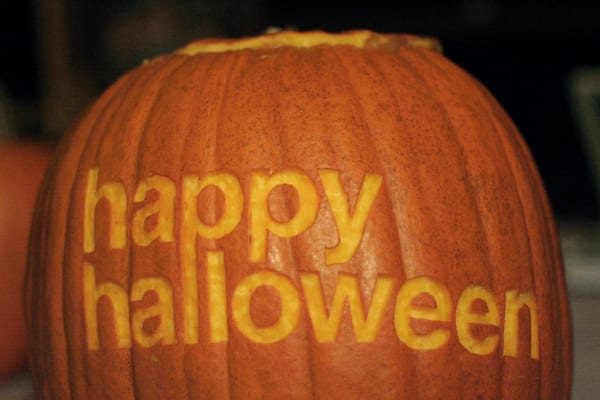
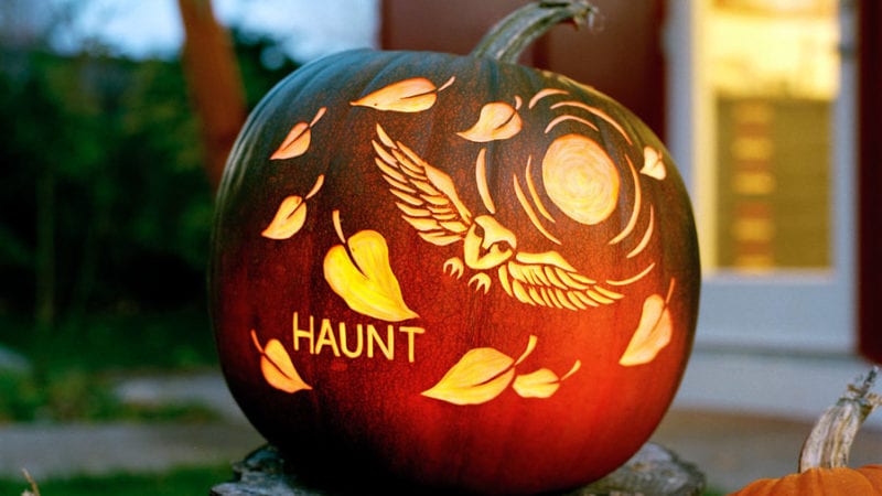
The spookiest day of the year is right around the corner. Take your Halloween pumpkin game up a notch by showing off your graphic design skills with a custom carving, and get inspired with these Halloween pumpkin ideas!

It’s not too late to find the perfect pumpkin at a local patch and spend some quality time (along or with your family) crafting a carving that no one else on your street will have. Not sure where to start? Here’s we’ve collected 20 creative Halloween pumpkin carving ideas, from simple scenes to iconic graphic design elements to a few customized spooks.

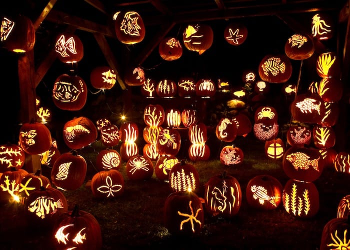
1. Show Off Your Skills

pumpkin carving idea

Design a carving that isn’t a traditional Jack-o-Lantern. You can carve almost any scene that strikes your fancy with the right tools.

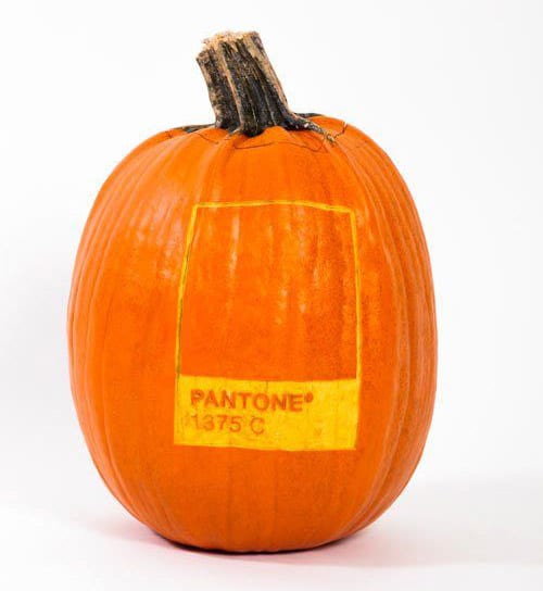
2. Pantone Pumpkin

pumpkin carving idea

Show off a little design humor with a Pantone-inspired carving that shows your favorite orange hue.

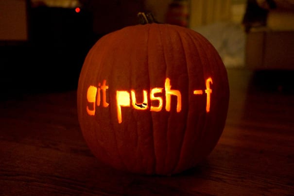
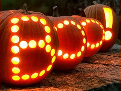
3. Geek Out

pumpkin carving idea

Show your code humor with a clever line that only designers and developers will understand.

4. Group Gourds

pumpkin carving idea

Come up with a creative way to create multiple carvings that connect using several pumpkins together.

5. Carve a Logo

pumpkin carving idea

Show your love for Adobe or WordPress with a logo carving.

6. Dedicate to a Special Character

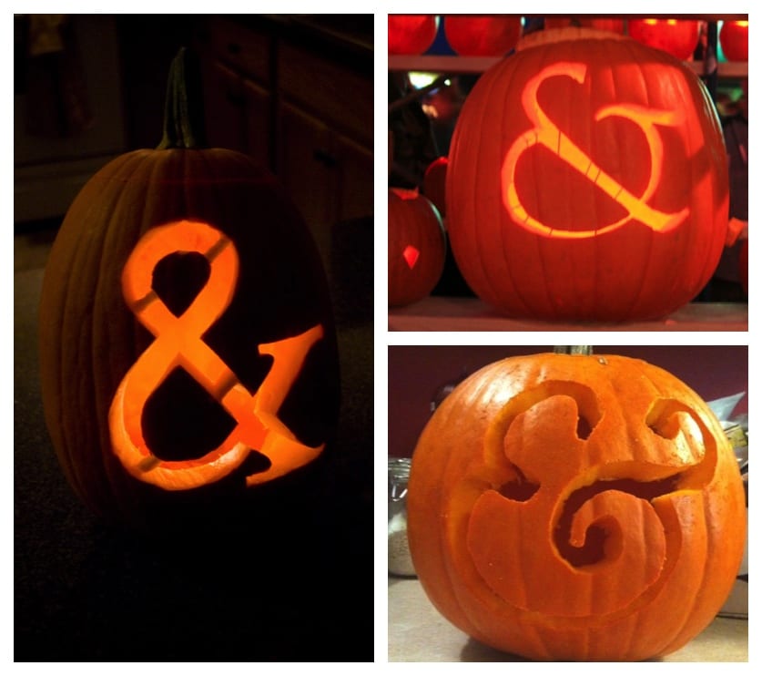
pumpkin carving idea

Everyone has a favorite letterform or type element — mine is the ampersand — carve it creatively or using your favorite font.

7. Try a Trendy Element

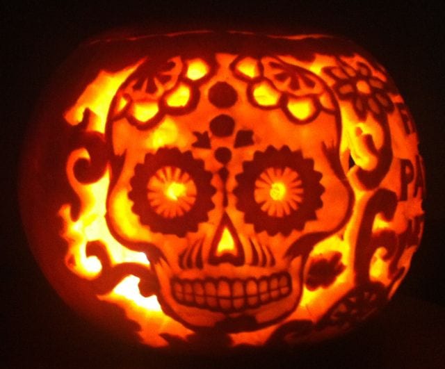
pumpkin carving idea

It seems like sugar skull images are everywhere this season. Go trendy and carve one of your own.

8. Craft a Fictional Character

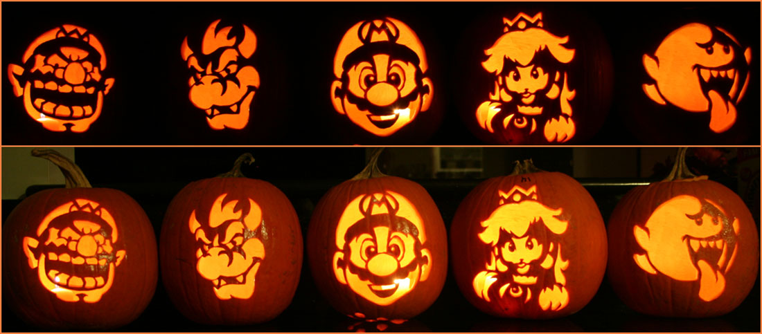
pumpkin carving idea

From star of horror movies to video game heroes, use your pumpkin carving skills to create a replica of your favorite fictional character.

9. Try Something Unexpected

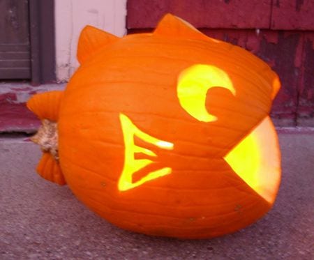
pumpkin carving idea

Most pumpkin carvings feature designs on a round, head-on canvas. Turn the pumpkin around and cut out parts of it to create new shapes for a different spin on the carving, such as the fish, above.

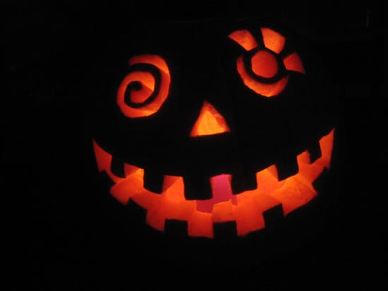
10. Be Silly

pumpkin carving idea

Try a silly pumpkin carving design instead of creepers. This more family- and kid-friendly option might just be a hit at your house.

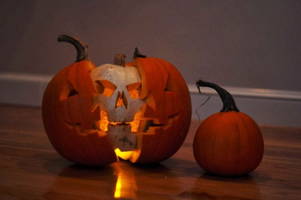
11. Take Advantage of Mistakes

pumpkin carving idea

Admit it, there’s been a time or two when you dropped the pumpkin and smashed it a little or when the carving just went a bit awry. Make the most of it with a double-pumpkin design and turn that mishap into a happy accident.

12. Pumpkins Plus Other Elements

pumpkin carving idea

Take your carving to the next level with add-ons. Organic elements are a natural fit, such as the greenery above. But you can also add lights or other materials for a mixed-media Halloween decoration.

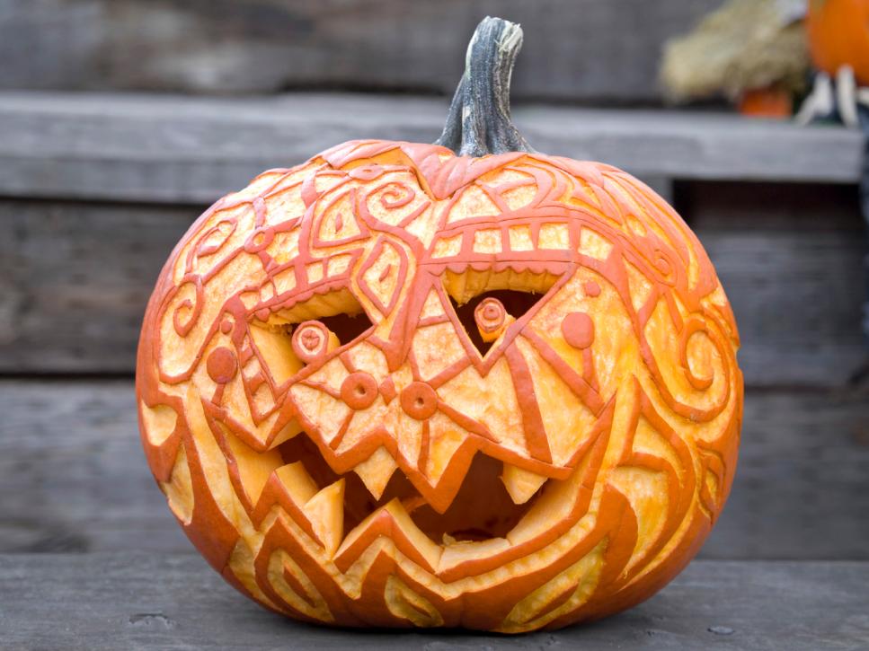
13. Tattoo-Style Carving

pumpkin carving idea

One of the more recent trends in pumpkin carving is to create a design with cuts all the way through the flesh of the pumpkin as well as carving partially through the outer shell. (This can allow varying amounts of light to shine through and accommodate more intricate patterns.)

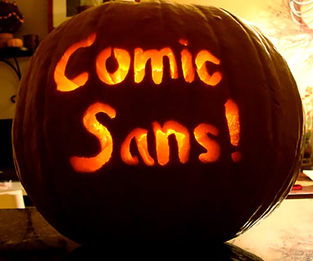
14. Make It Scary

pumpkin carving idea

Get in the holiday spirit with an absolutely scary design, such as the homage to Comic Sans above.

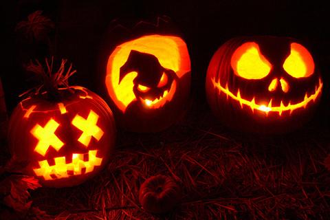
15. Use a Creepy Character

pumpkin carving idea

Or you can highlight the scary season with a character that’s actually creepy, such as a ghoul, goblin or less-than-friendly face.

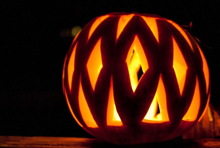
16. Carve a Cool Pattern

pumpkin carving idea

Rather than focusing on just one side of the pumpkin, develop a pattern or texture that can be incorporated all the way around. (It’s a great chance to use a trendy geometric shape.)

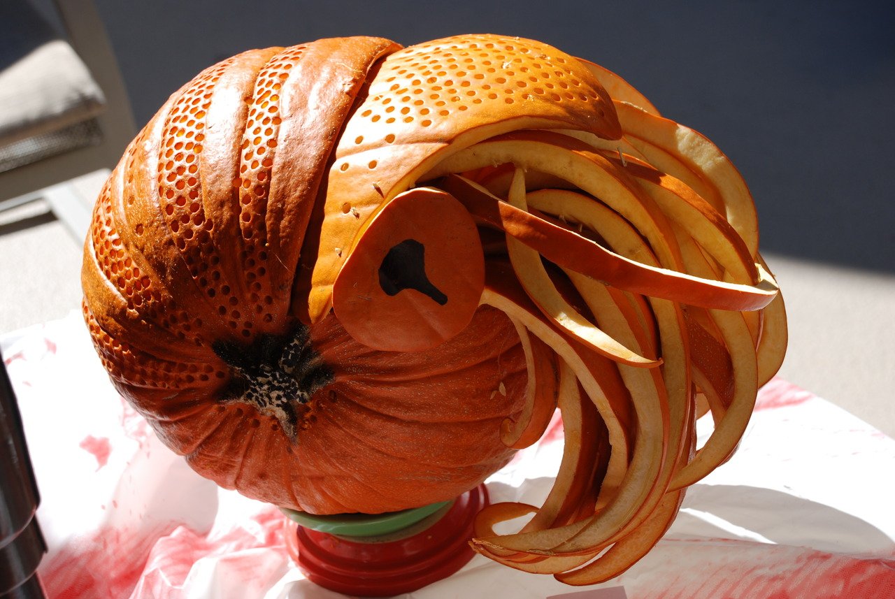
17. Think in Theory

pumpkin carving idea

Go beyond a simple carving with a pumpkin concept that uses a lot of imagination. Note how the example above mimics the golden ratio in the shape of a nautilus.

18. Highlight a Fav Font

pumpkin carving idea

Show off your design skills with a special message featuring your favorite font. Who said a carving has to be a picture? Words are OK, too.

19. Think About Lighting

pumpkin carving idea

If you plan to put a candle your pumpkin make sure the carving is designed to let that light shine through. Create a design that will look great in the dark, even if you can’t see the pumpkin itself.

20. Stick with a Classic

pumpkin carving idea

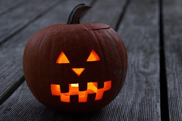
Just because you can go crazy with pumpkin carving doesn’t mean you have to. Sometimes the best idea is the most simple, classic one. Carve a classic Jack O Lantern with and put a candle inside to light the way for trick or treaters.

How Do You Carve a Custom Pumpkin Design?

Turn your design into a template for a custom Halloween pumpkin graphic design carving. Here’s how you do it:

  • Create the design in Photoshop or Illustrator. Make sure to use plenty of thick lines between cut areas or you might end up with a butchered pumpkin. The easiest designs include full cutouts. The most complicated entail carvings that require more detailed cuts on thin lines or elements.
  • Print the design at a size to match your pumpkin. An outline design is sufficient and easiest to work with.
  • Transfer the design to the pumpkin for carving by covering the back of the paper with graphic or charcoal, taping the paper to the pumpkin and then tracing the design. Other options include adding a sheet of tracing paper between the printed design and pumpkin before tracing or attaching the design to the pumpkin and then “tracing” the design to the orange orb by poking holes in the paper through to the pumpkin as a carving guide.
  • Remove the paper from the pumpkin and then carve it using the outline guide you’ve created. Just make sure to cut the top off and scoop all the seeds out first. It will make for much easier (and cleaner) carving.

Images from Google search. Design Shack did not actually carve these pumpkins (all our fingers are intact). Click the images for source links, information and more.

20+ Best Fonts Similar to Comic Sans

Featured Imgs 23

Love it or hate it, Comic Sans is one of the most iconic and recognizable fonts out there. Known for its casual, playful style, it’s often used in informal settings or for designs that need a touch of fun.

However, while its charm is undeniable, Comic Sans isn’t always the perfect fit for every project. If you’re looking for a similar font that captures the same lighthearted vibe but with a more refined touch, you’ve come to the right place.

In this post, we’ve rounded up the best fonts similar to Comic Sans to give you the same playful feel while adding a bit more style and versatility. These fonts maintain the friendly, approachable look of Comic Sans but offer variations that are better suited for professional designs, children’s projects, educational materials, and more.

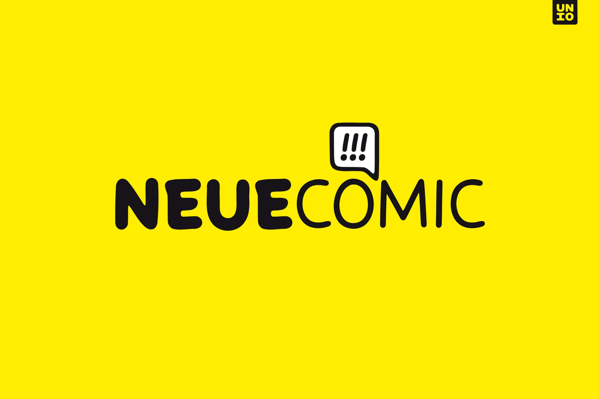
Neue Comic

Neue Comic

Neue Comic is a rounded typeface that reinterprets the whimsical charm of Comic Sans with a fresh, modern twist. Designed to optimize both fun and functionality, Neue Comic boasts seven weight options and corresponding obliques. This new font, with its rhythmic, legible design, strikes a harmonious balance between whimsical ’90s nostalgia and contemporary sophistication, challenging the notion that playfulness can’t be refined in typography.

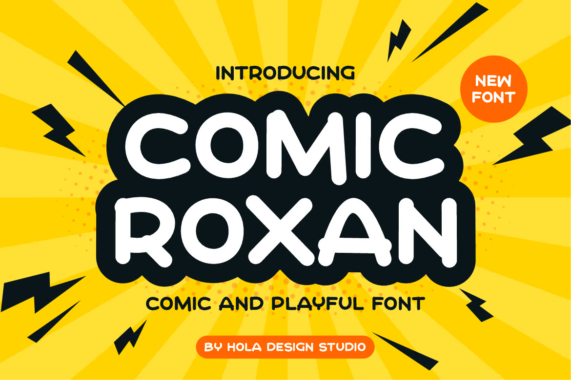
Comic Roxan

Comic Roxan

Check out Comic Roxan, an engaging and versatile font similar to Comic Sans. This distinctive typeface is ideal for a myriad of designs including movie scenes, posters, album covers, logos, and more. With OTF, TTF, and WOFF formats included, Comic Roxan is a flexible tool, ready to add fresh creativity to your design palette.

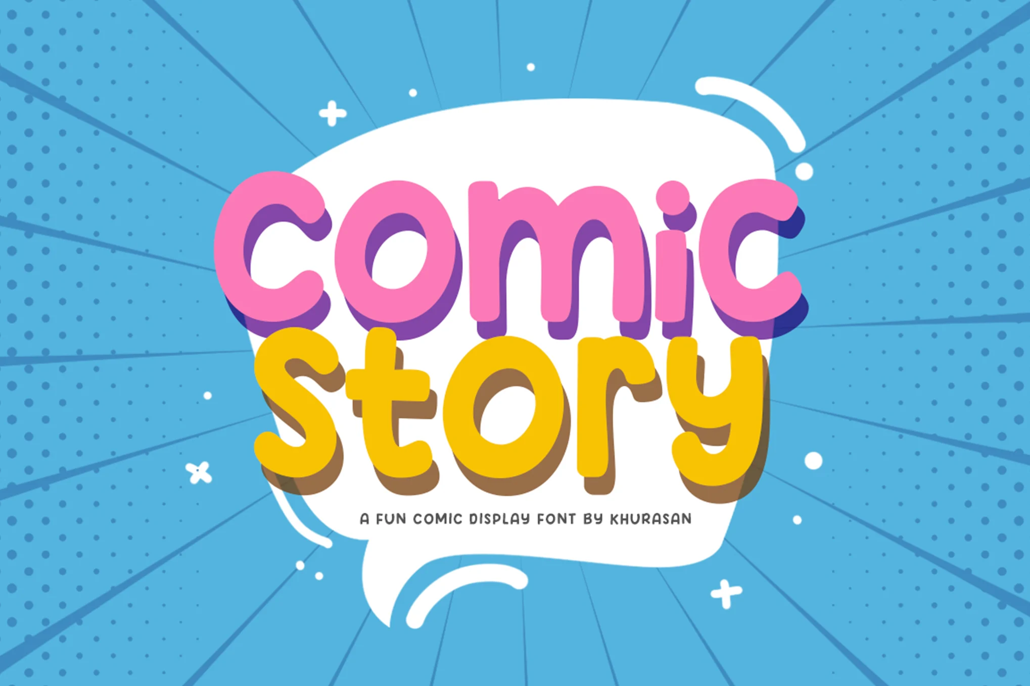
Comic Story

Comic Story

Comic Story is a lively display typeface perfect for fun, light-hearted projects. Its cheerfulness adds a certain charm to logos, branding, greeting cards, posters, and other designs. The files include Comic Story.ttf and Comic Story.otf. This engaging typeface encourages you to put your heart into your work and enjoy the creative process.

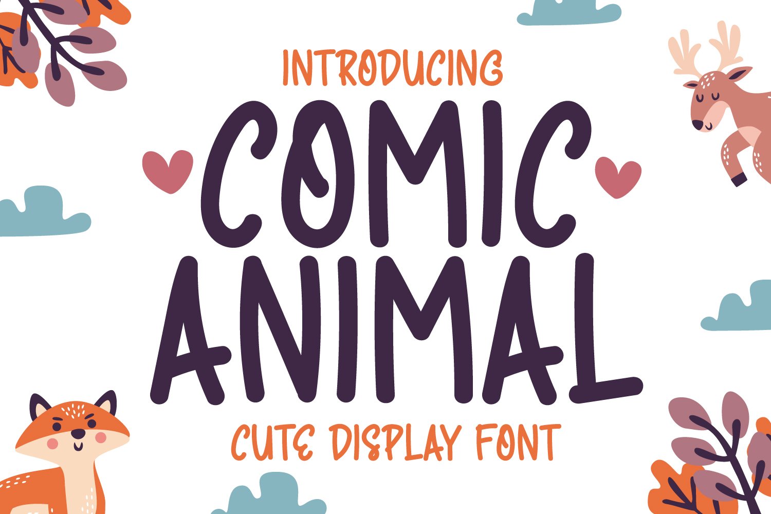
Comic Animal

Comic Animal

Comic Animal is a whimsical handwriting display font. Perfectly adaptable for any design project, this font exudes a charming simplicity and trends. Available in OTF, TTF, WOFF, and WOFF2 formats, it’s a versatile favorite that could quickly become your standard choice across various design occasions.

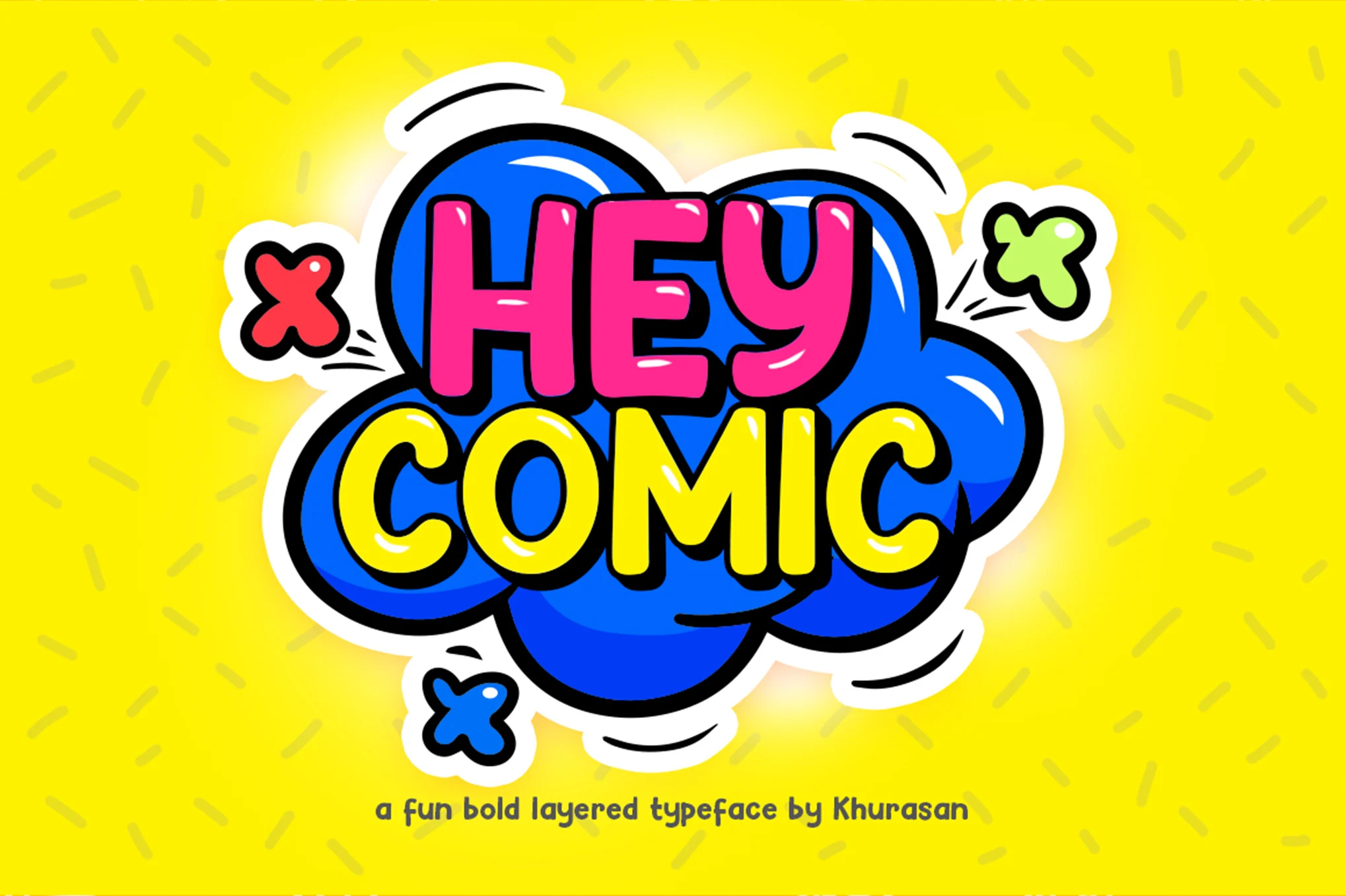
Hey Comic

Hey Comic

Hey Comic is a bold, cheerful font perfect for creating a fun, engaging atmosphere in your projects. Ideal for logos, branding, greeting cards, or posters, this versatile font offers multilingual support. Both standard and extrude versions are included. Created with heart and passion by Khurasan, it adds a playful touch to any design.

Comic Mode

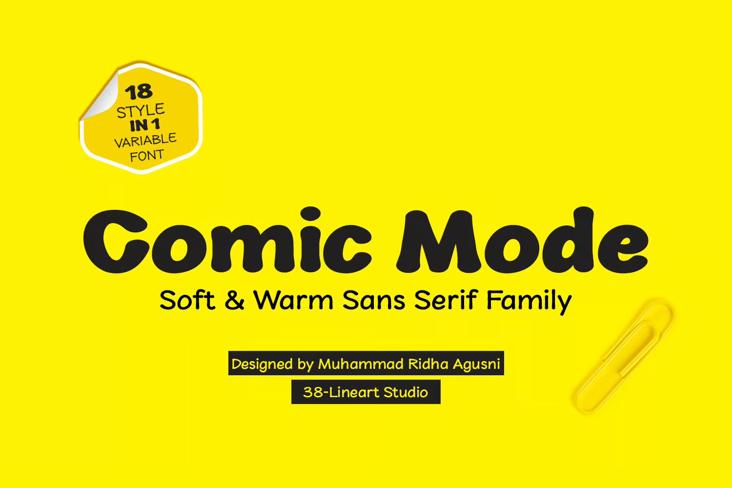
Comic Mode

Comic Mode is a whimsical yet formal sans serif font that comes in nine weight variations. Perfect as a refined alternative to Comic Sans, its distinctive style is shaped by a blend of technical typography and relaxed handwriting. From thin and round to black and elliptical shapes, its diversity is extended with the addition of oblique styles, culminating in 18 different styles.

Coming Sans

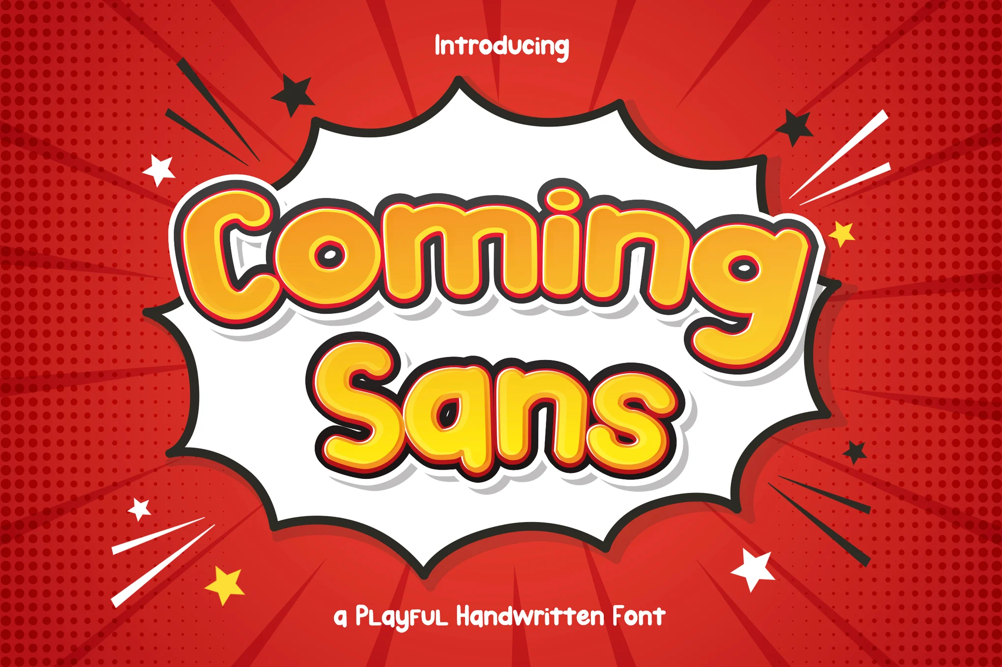
Coming Sans

Coming Sans is a cheerful, versatile font that evokes a playful comic book feel. Ideal for a range of uses such as children’s storybooks, comic-themed designs, and catchy headlines, this font inspires lighthearted creativity. It includes uppercase, lowercase, symbols, punctuation, numerals, ligature, alternate, and multilingual support, available in OTF, TTF, WOFF, and WOFF2 formats.

Comic Speeds

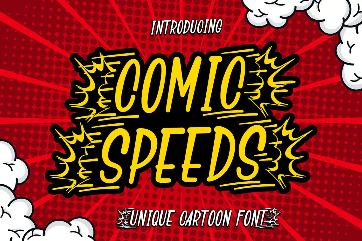
Comic Speeds

Comic Speeds is a playful, distinctive display font reminiscent of comic sans. What sets it apart are the alternate characters featuring ‘speed’ effects that make it perfect for cartoon-based creative endeavors. It’s recommended for logos, social media posts, product packaging, special events, and more.

Mindy

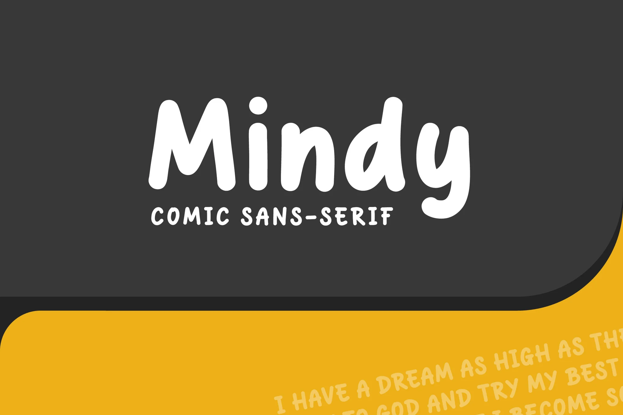
Mindy

Meet Mindy, a comic display font with a rounded, bold style reminiscent of Comic Sans. This versatile font is ideal for everything from children’s book titles and comic books to posters, social media content, and branding for kids’ items. The zip file includes Mindy in OTF, TTF, WOFF and WOFF2 formats, perfect for all your creative needs.

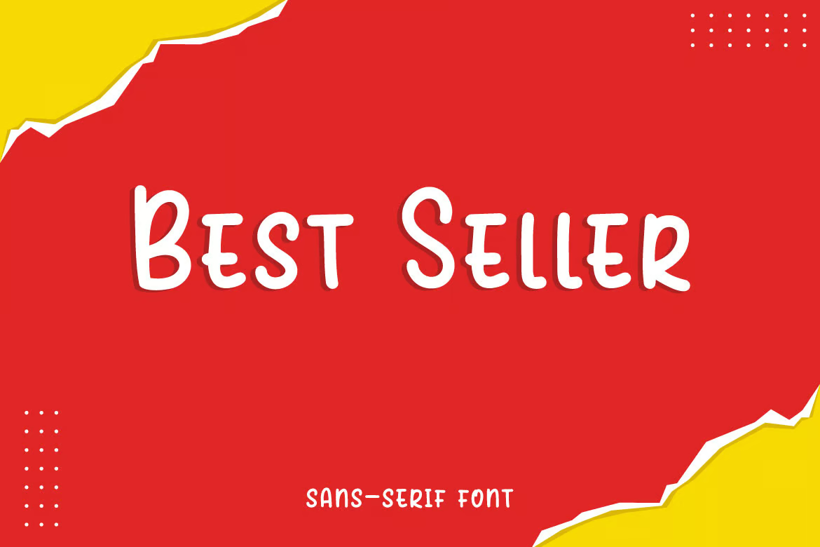
Best Seller

Best Seller

Best Seller, a minimalist sans serif font, serves as a valuable creative asset. Reminiscent of Comic Sans in style, it can enhance everything from children’s books and flyers to book titles, advertisements, and so much more. The download includes useable formats such as OTF, TTF, WOFF, and WOFF2, making it a versatile choice for your design project needs.

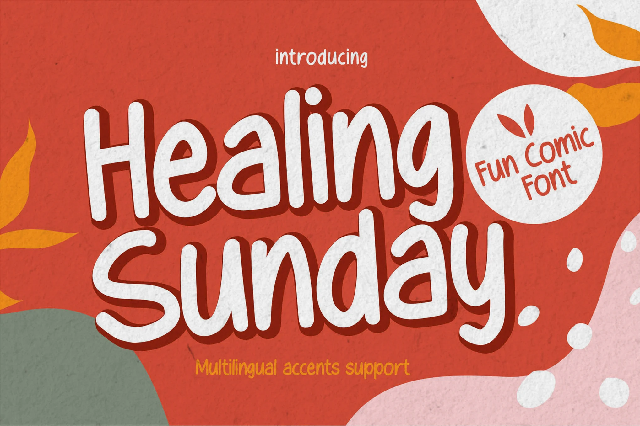
Healing Sunday

Healing Sunday

Healing Sunday is a playful, textured font reminiscent of handwriting that adds authenticity to any creative project. Perfect for logos, invitations, advertisements, or packaging, this hand-drawn font brings a natural touch and detailed beauty to designs. It’s accessible in most design software, including Adobe Illustrator and Microsoft Word.

Lemondy

Lemondy

Experience the quirkiness of Lemondy, a playful font inspired by hand-drawn sketches. Excellent for headlines and titles, it adds a dash of fun to book covers, comic texts, packaging labels, merchandise, and children’s books. It features uppercase letters, numbers, punctuation and supports multiple languages.

Kidster

Kidster

Kidster is a captivating comic display font that emulates a handmade look, similar to Comic Sans. This versatile font can be used on a variety of platforms from book titles and news headlines to posters, cards, banners and flyers. Appreciated for its scalability, Kidster comes in a convenient zip file with four formats: OTF, TTF, WOFF and WOFF2.

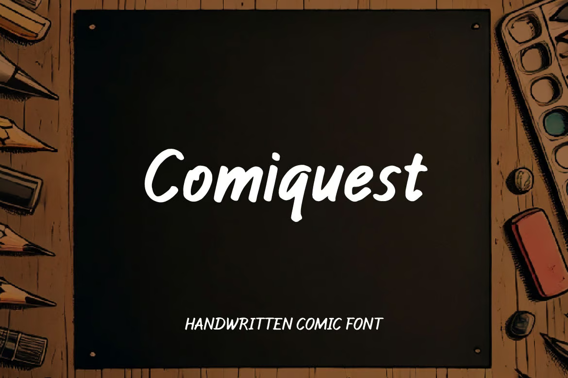
Comiquest

Comiquest

Comiquest is a delightfully versatile handwritten comic font. Perfectly blending casual charm with modern simplicity, this font gives your creative endeavors a unique, personal touch. It suits branding, logos, invitations, and posters impeccably and maintains a polished appearance. With its accessible and stylish feel, Comiquest is sure to enhance your design work.
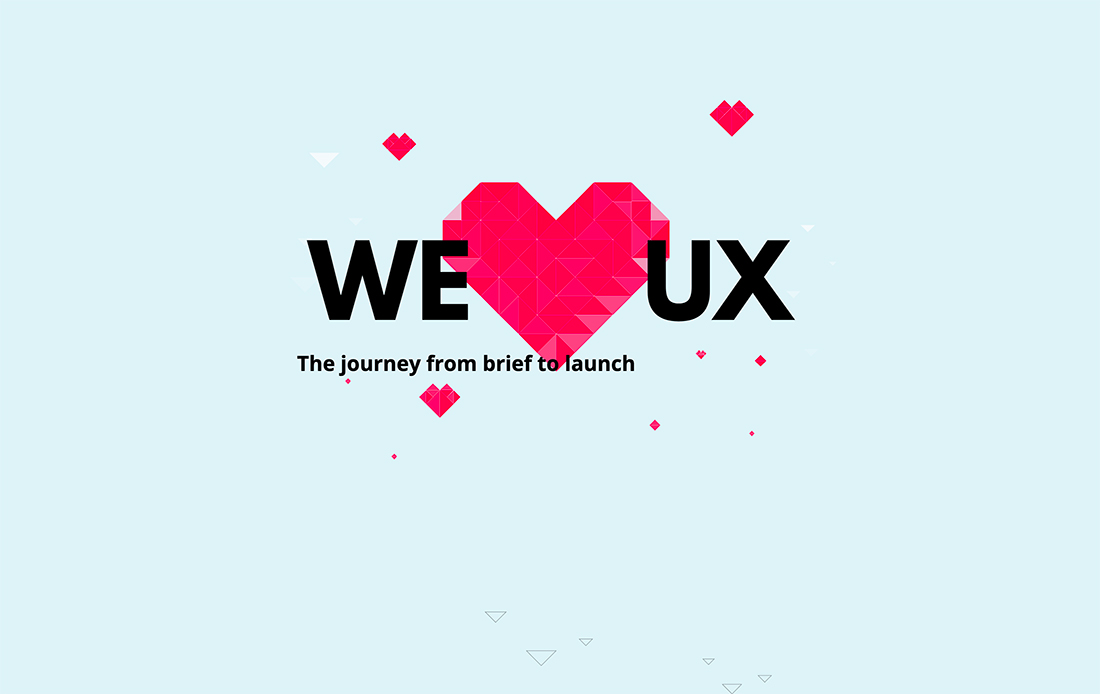
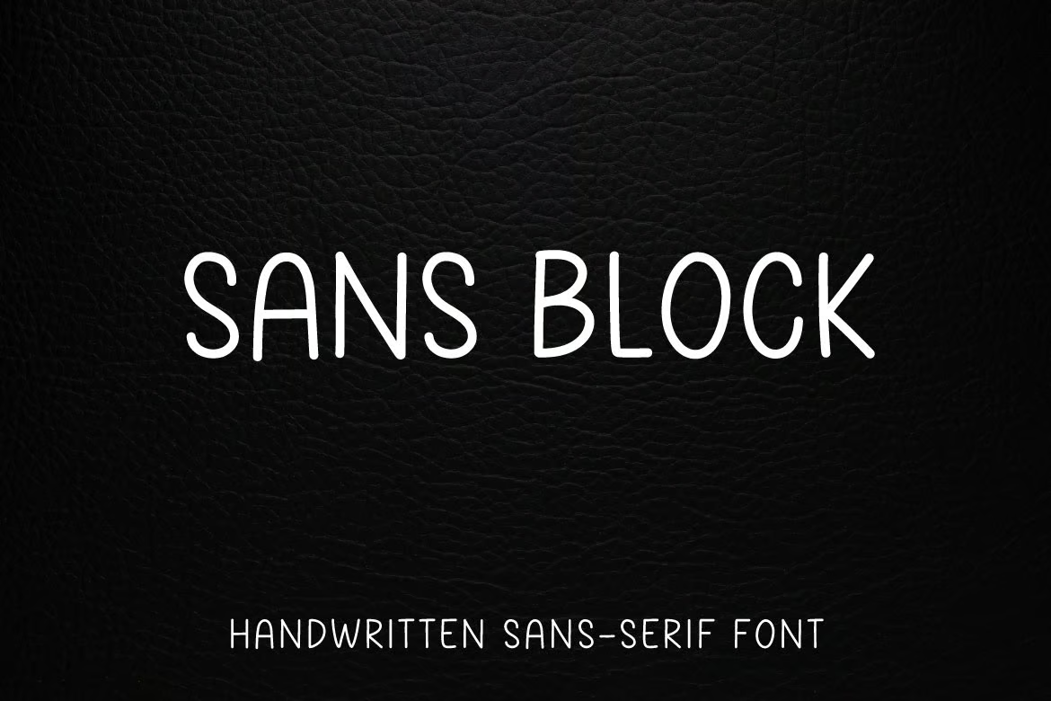
Sans Block

Sans Block

Sans Block is a delightfully casual handwritten font! Use it to infuse a fun, laid-back vibe into anything – from comic books to advertisements, posters, book titles, school flyers and even social media content. The downloadable zip file comes packed with Sans Block OTF, TTF, and a webfont-TT. It’s your perfect partner to design something truly awesome!

Basmety

Basmety

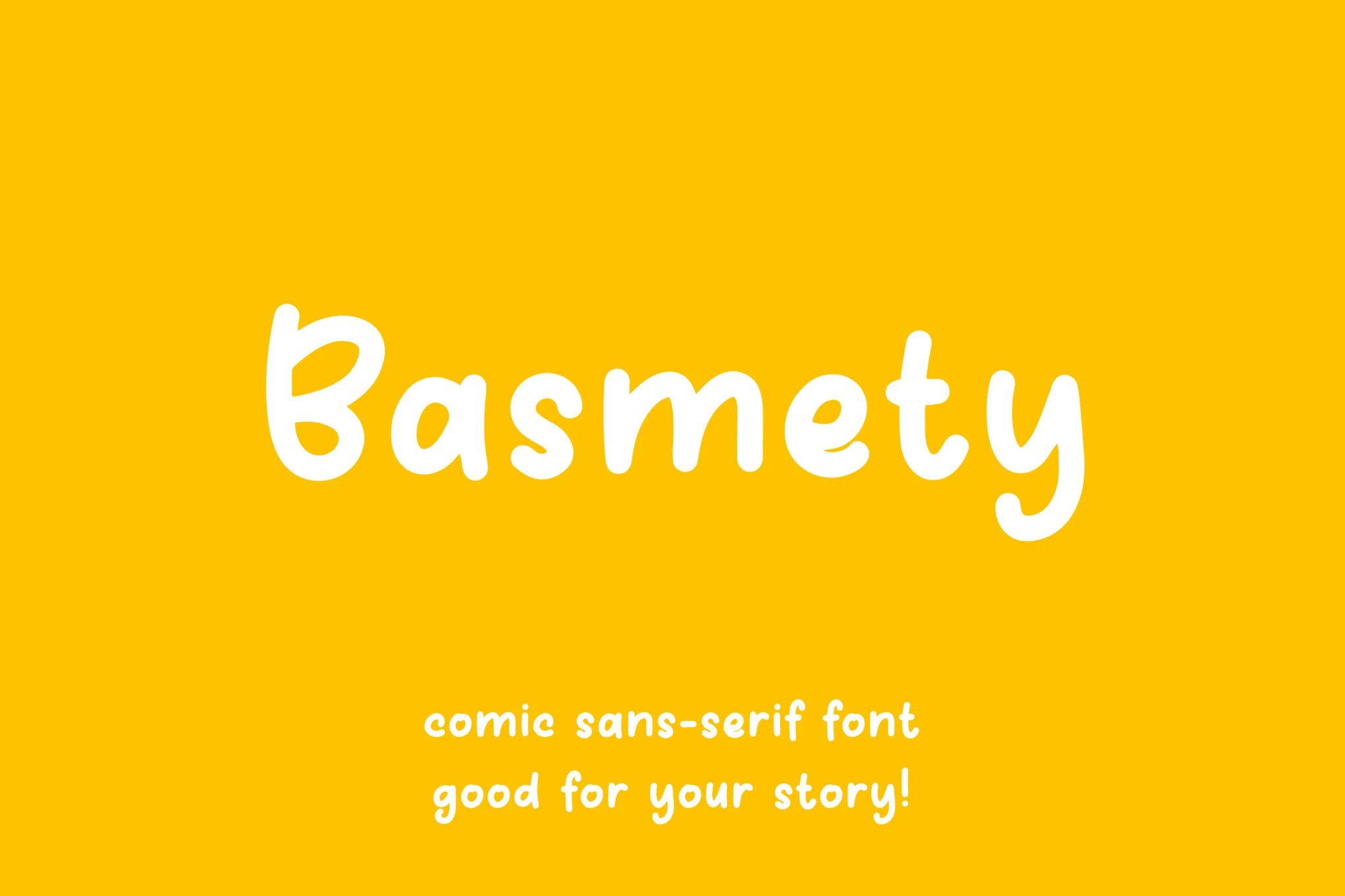
Meet Basmety, a cheerful comic display font that brings joy to every word. Ideal for a range of uses from comic books and classroom settings, to kids’ products and social media content, Basmety livens up any text with its playful style. The downloadable zip file comes with OTF, TTF, WOFF, and WOFF2 formats.

Ant Rich

Ant Rich

Ant Rich is a whimsical comic font that’s perfect for lending an air of playful simplicity to your work. Ideal for projects ranging from flyers and book titles to social media content and logos, it’s easily incorporated into your design due to the included OTF, TTF, WOFF, and WOFF2 formats.
Free Fonts Like Comic Sans

Comic Story

This creative and playful font also features a letter design similar to Comic Sans. It is designed with fun and children’s designs in mind. You can use it to add beautiful titles to your packaging designs, posters, book covers, and much more.

Comic Cheese

Comic Cheese is another creative font similar to Comic Sans. This font also has a playful letter design inspired by comic books. The font is most suitable for designing titles and headings for all kinds of fun, entertaining, and playful design projects.

GOLDSTEP

Featuring tall and condensed letterforms, this free font shares many similarities with the iconic Comic Sans font. It has the same playful and funny-looking letter design as the Comic Sans and comes with a set of all-caps letters.

Comic Panels

If you prefer to use a unique font with a playful look, this free font is perfect for your projects. Comic Panels is a free font inspired by Comic Sans and it features playful letters with a handwriting style.

Erik Sans

Erik Sans is another free font similar to Comic Sans. It features the same playful and quirky letter design as the Comic Sans font but with its own unique decorative elements. This font will surely add a creative look to your designs.

Clamp it! VS Code extension

Featured Imgs 23

There’s a lot of math behind fluid typography. CSS does make the math a lot easier these days, but even if you’re comfortable with that, writing the full declaration can be verbose and tough to remember. I know I often have to look it back up, despite having written it maybe a hundred times.

Silvestar made a little VS Code helper to abstract all that. Type in the target values you’re aiming for and the helper expands it on the spot.

He says ChatGPT did the initial lifting before he refined it. I can get behind this sort of AI-flavored usage. Start with an idea, find a starting point, look deeper at it, and shape it into something incredibly useful for a small, single purpose.


Clamp it! VS Code extension originally published on CSS-Tricks, which is part of the DigitalOcean family. You should get the newsletter.


from CSS-Tricks https://ift.tt/o3hqbgx
Gain $200 in a week
via Read more

Clarifying the Relationship Between Popovers and Dialogs

Featured Imgs 23

The difference between Popovers (i.e., the popover attribute) and Dialogs (i.e., both the <dialog> element and the dialog accessible role) is incredibly confusing — so much that many articles (like this, this, and this) have tried to shed some light on the issue.

If you’re still feeling confused, I hope this one clears up that confusion once and for all.

Distinguishing Popovers From Dialogs

Let’s pull back on the technical implementations and consider the greater picture that makes more sense and puts everything into perspective.

Line diagram connecting the popover attribute to six types of accessible roles, including dialog.

The reason for this categorization comes from a couple of noteworthy points.

First, we know that a popover is content that “pops” up when a user clicks a button (or hovers over it, or focuses on it). In the ARIA world, there is a useful attribute called aria-haspopup that categorizes such popups into five different roles:

  • menu
  • listbox
  • tree
  • grid
  • dialog

Strictly speaking, there’s a sixth value, true, that evaluates to menu. I didn’t include it above since it’s effectively just menu.

By virtue of dialog being on this list, we already know that dialog is a type of popover. But there’s more evidence behind this too.

The Three Types of Dialogues

Since we’re already talking about the dialog role, let’s further expand that into its subcategories:

Lone diagram connecting the popover attribute to six accessible roles, including dialog, which is broken out into three categories.

Dialogs can be categorized into three main kinds:

  • Modal: A dialog with an overlay and focus trapping
  • Non-Modal: A dialog with neither an overlay nor focus trapping
  • Alert Dialog: A dialog that alerts screen readers when shown. It can be either modal or non-modal.

This brings us to another reason why a dialog is considered a popover.

Some people may say that popovers are strictly non-modal, but this seems to be a major misunderstanding — because popovers have a ::backdrop pseudo-element on the top layer. The presence of ::backdrop indicates that popovers are modal. Quoting the CSS-Tricks almanac:

The ::backdrop CSS pseudo-element creates a backdrop that covers the entire viewport and is rendered immediately below a <dialog>, an element with the popup attribute, or any element that enters fullscreen mode using the Fullscreen API.

That said, I don’t recommend using the Popover API for modality because it doesn’t have a showModal() method (that <dialog> has) that creates inertness, focus trapping, and other necessary features to make it a real modal. If you only use the Popover API, you’ll need to build those features from scratch.

So, the fact that popovers can be modal means that a dialog is simply one kind of popover.

A Popover Needs an Accessible Role

Popovers need a role to be accessible. Hidde has a great article on selecting the right role, but I’m going to provide some points in this article as well.

To start, you can use one of the aria-haspopup roles mentioned above:

  • menu
  • listbox
  • tree
  • grid
  • dialog

You could also use one of the more complex roles like:

  • treegrid
  • alertdialog

There are two additional roles that are slightly more contentious but may do just fine.

  • tooltip
  • status

To understand why tooltip and status could be valid popover roles, we need to take a detour into the world of tooltips.

A Note on Tooltips

From a visual perspective, a tooltip is a popover because it contains a tiny window that pops up when the tooltip is displayed.

I included tooltip in the mental model because it is reasonable to implement tooltip with the Popover API.

<div popver role="tooltip">...</div>

The tooltip role doesn’t do much in screen readers today so you need to use aria-describedby to create accessible tooltips. But it is still important because it may extend accessibility support for some software.

But, from an accessibility standpoint, tooltips are not popovers. In the accessibility world, tooltips must not contain interactive content. If they contain interactive content, you’re not looking at a tooltip, but a dialog.

You’re thinking of dialogs. Use a dialog.

Heydon Pickering, “Your Tooltips are Bogus”

This is also why aria-haspopup doesn’t include tooltiparia-haspopup is supposed to signify interactive content but a tooltip must not contain interactive content.

With that, let’s move on to status which is an interesting role that requires some explanation.

Why status?

Tooltips have a pretty complex history in the world of accessible interfaces so there’s a lot of discussion and contention over it.

To keep things short (again), there’s an accessibility issue with tooltips since tooltips should only show on hover. This means screen readers and mobile phone users won’t be able to see those tooltips (since they can’t hover on the interface).

Steve Faulkner created an alternative — toggletips — to fill the gap. In doing so, he explained that toggletip content must be announced by screen readers through live regions.

When initially displayed content is announced by (most) screen readers that support aria-live

Heydon Pickering later added that status can be used in his article on toggletips.

We can supply an empty live region, and populate it with the toggletip “bubble” when it is invoked. This will both make the bubble appear visually and cause the live region to announce the tooltip’s information.

<!-- Code example by Heydon -->
<span class="tooltip-container"> 
  <button type="button" aria-label="more info" data-toggletip-content="This clarifies whatever needs clarifying">i</button> 
  <span role="status"> 
    <span class="toggletip-bubble">This clarifies whatever needs clarifying</span> 
  </span>
</span>

This is why status can be a potential role for a popover, but you must use discretion when creating it.

That said, I’ve chosen not to include the status role in the Popover mental model because status is a live region role and hence different from the rest.

In Summary

Here’s a quick summary of the mental model:

  • Popover is an umbrella term for any kind of on-demand popup.
  • Dialog is one type of popover — a kind that creates a new window (or card) to contain some content.

When you internalize this, it’s not hard to see why the Popover API can be used with the dialog element.

<!-- Uses the popover API. Role needs to be determined manually -->
<div popover>...</div>

<!-- Dialog with the popover API. Role is dialog -->
<dialog popover>...</dialog>

<!-- Dialog that doesn't use the popover API. Role is dialog -->
<dialog>...</dialog>

When choosing a role for your popover, you can use one of these roles safely.

  • menu
  • listbox
  • tree
  • grid
  • treegrid
  • dialog
  • alertdialog

The added benefit is most of these roles work together with aria-haspopup which gained decent support in screen readers last year.

Of course, there are a couple more you can use like status and tooltip, but you won’t be able to use them together with aria-haspopup.

Further Reading


Clarifying the Relationship Between Popovers and Dialogs originally published on CSS-Tricks, which is part of the DigitalOcean family. You should get the newsletter.

35+ Text Effects and Animated Typography Templates for Premiere Pro

Featured Imgs 23

If you’re looking for ways to make your titles and headings look good in your video projects, you’ve come to the right place.

Today, we bring you a collection of Premiere Pro text effects and animated typography templates that you can use to create mind-blowing text animations.

The best part is that these templates and presets are made by professional designers. So you don’t have to spend hours trying to find the right combinations. All you have to do is download the template, import it in Premiere Pro, and add the effect to your project timeline.

You’ll find some cool and creative Premiere Pro text effects in this collection, unlike anything you’ve seen before. Be sure to download them all below.

Top Pick

Trendy Premiere Pro Text Effect Templates

Trendy Premiere Pro Text Effect Templates

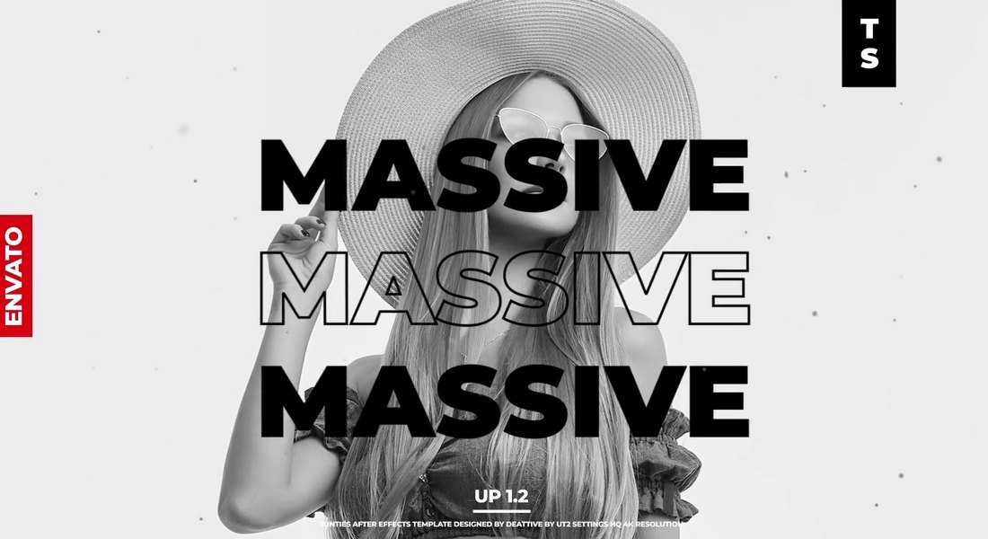
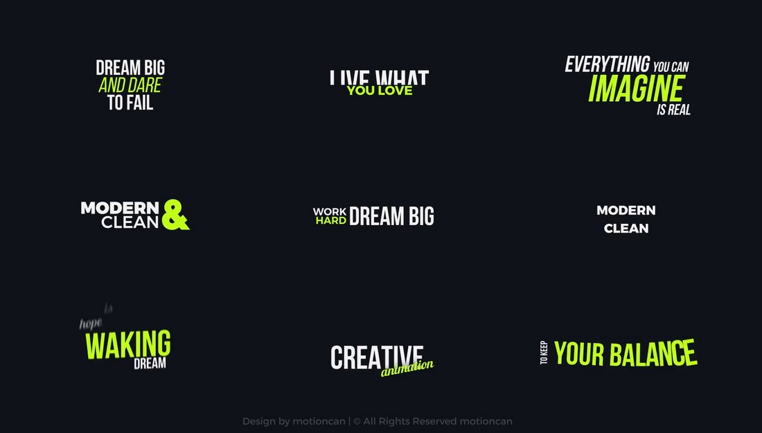
This is a bundle full of trendy and stylish text effects you can use to add attention-grabbing animations to your titles and headings to make more professional-looking videos.

There are multiple styles of text animations in this pack that are most suitable for fashion and lifestyle-themed videos, as well as many other types of videos.

Why This Is A Top Pick

The typography animations in this template kit have modern and trendy designs that will instantly attract the attention of your viewers. They are quite easy to customize as well.

100 Cinematic Titles for Premiere Pro

This is a massive collection of Premiere Pro title templates that offers a hundred unique cinematic-style text animation templates. Ideal for adding a professional touch to your videos, these templates are designed to help make your editing process quicker and easier. Utilize these to enhance storytelling in your projects.

Retro 80s Text Animations for Premiere Pro

Another creative collection of text templates for Premiere Pro that adds a retro touch to your work. These stylish animations help breathe life into your text, taking your video project back to the vibrant 80s era. It’s a fun and easy way to enhance your visual storytelling.
Cyber Tech Title Animations for Premiere Pro

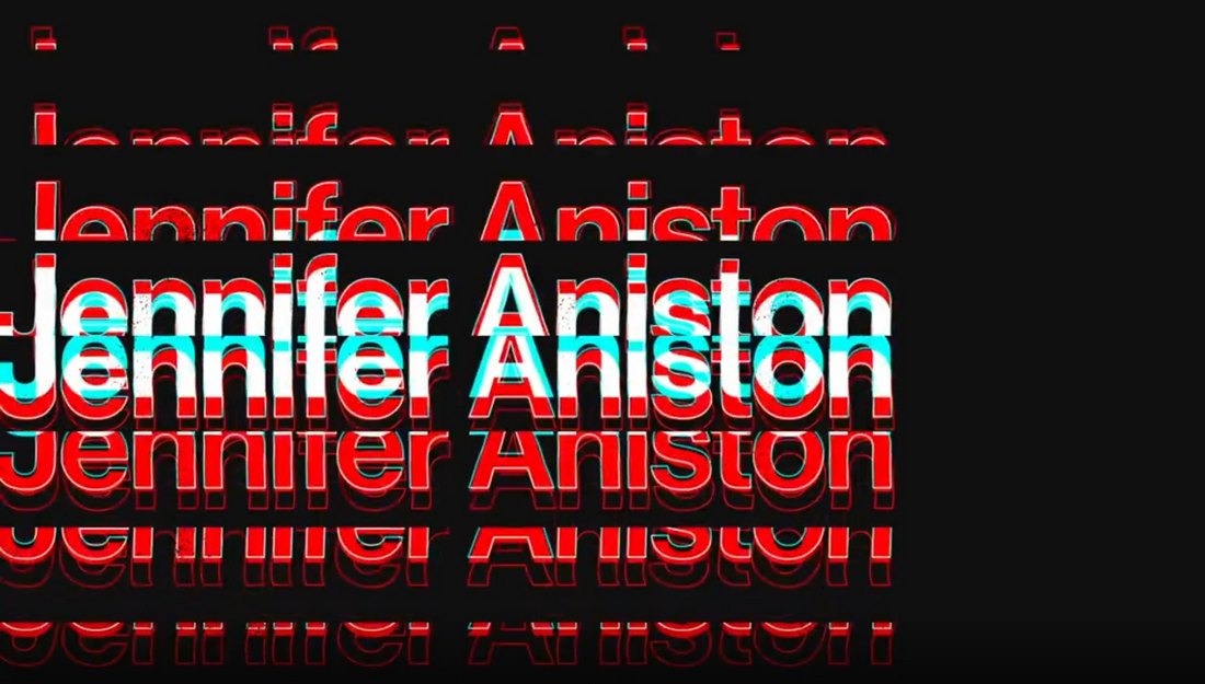
A stylish text template for Premiere Pro that unveils your title through high-end, cyberpunk-style animations. With full-controller features, you can easily personalize aspects like position and scale. No need for After Effects, just import the “MOGRT” file and you’re set. Ideal for Esports videos, tech shows and sci-fi films.

9 Sale Promo Typography Animations for Premiere Pro

This Premiere Pro template kit makes creating text animations seamless, especially for beginners. This user-friendly package includes a helpful video tutorial and offers a full HD resolution. It’s easily customizable and compatible with Premiere Pro CC 2018 and higher, as well as After Effects CC 2022.

Liquid Text Animations for Premiere Pro

Another captivating Premiere Pro template featuring liquid-style animations. It incorporates fluid-like animations to enhance your text, transforming it into an engaging visual experience. This template is ideal for those looking to give their Premiere Pro projects a unique touch without being overly sales-centric.

Trendy Kinetic Typography Premiere Pro Templates

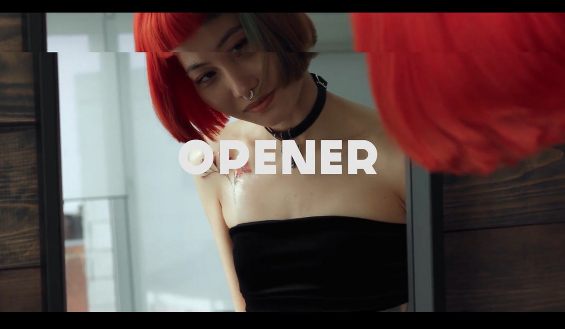
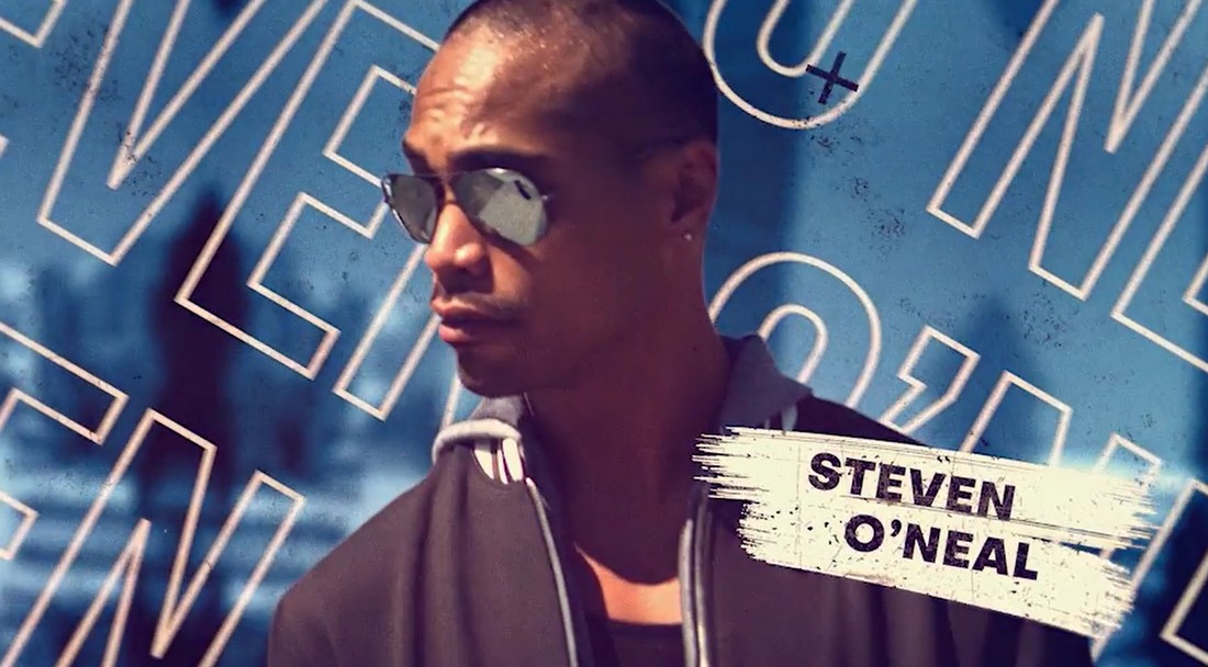
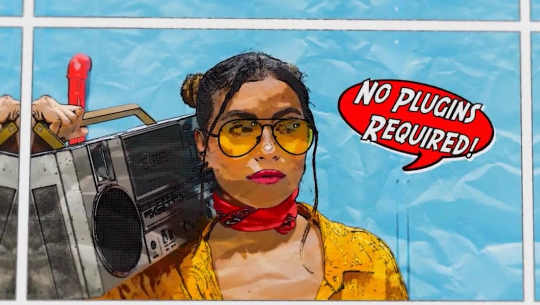
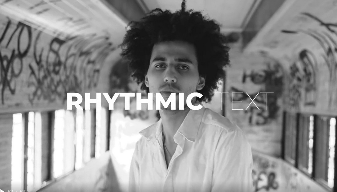
This Premiere Pro template pack offers dynamic text animations to enrich your content with lively visuals. These templates work wonders for various purposes, such as marketing, education, entertainment, travel, and music videos. With ten kinetic titles, 4K resolution, color controls, and a fast render, these templates require no plugins.

Titles With 3D Elements Premiere Pro Text Effects

Titles With 3D Elements Premiere Pro Text Effects

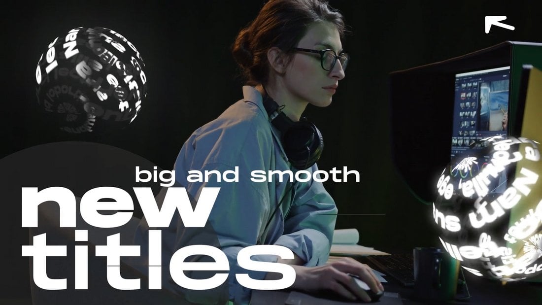
This is a unique template kit for Premiere Pro that features stylish text effects with 3D elements. There are multiple title scenes in this template pack for you to add cool and creative intros for your videos. They all feature adaptive designs with up to 4K resolution.

Stylish Titles Premiere Pro Text Effect Templates

Stylish Titles Premiere Pro Text Effect Templates

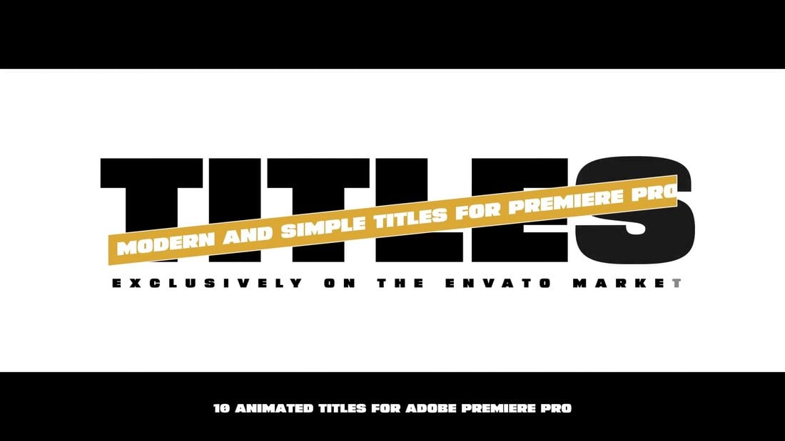
If you’re looking for a title template with a minimal and clean design, this Premiere Pro template is perfect for your project. It includes multiple text effects with modern animations and easily customizable elements.

Original Text Styles for Premiere Pro

Original Text Styles for Premiere Pro

Choose from 5 cool Premiere Pro text effects to add colorful and attractive titles to your videos. Each text effect in this template kit is different from the others. They are perfect for promo videos, social media videos, YouTube intros, and much more.

Kinetic Animated Premiere Pro Text Effects

Kinetic Animated Premiere Pro Text Effects

This Premiere Pro template features some of the coolest text effects we’ve seen. It includes 10 different animated text effects with editable colors and text. You can also adjust the duration and animation effects to your preference.

Free Large Text Block Premiere Pro Text Effect

Free Large Text Block Premiere Pro Text Effect

Another free text effect for Premiere Pro. This template comes with a big text block with simple transition animations. It’s ideal for adding attractive intros and titles for your videos.

8 Modern Premiere Pro Text Effect Templates

8 Modern Premiere Pro Text Effect Templates

With 8 different text effects to choose from, this Premiere Pro template kit will help you craft the best titles for your video projects. Each text effect in this bundle has fully customizable elements and is compatible with up to 4K resolution.

Miscellaneous Text Animations for Premiere Pro

Miscellaneous Text Animations for Premiere Pro

A collection of modern text effects for Premiere Pro. There are 10 trendy text animations included in this template pack for you to use in your social media promos, YouTube videos, and business videos. It includes free fonts and a tutorial as well.

Shadow Lower Thirds for Premiere Pro

Shadow Lower Thirds for Premiere Pro

These Premiere Pro text effects are ideal for crafting unique lower-thirds for documentaries, movie credits, and various other videos. It comes with 7 different lower thirds designs with easily customizable text, colors, and fonts.

Adaptive Premiere Pro Text Effect Templates

Adaptive Premiere Pro Text Effect Templates

Using text effects and titles with adaptive designs is important when you are designing content for multiple platforms. The Premiere Pro templates in this bundle are designed with that goal in mind. They feature stylish text effects and animation with smooth adaptive layouts.

Free Burning Animation Premiere Pro Text Effect

Free Burning Animation Premiere Pro Text Effect

This free animated text effect is perfect for adding a cool title for your fun and playful videos. It features a fire blast effect for in-and-out animations with animated cartoon flames on the text.

Monochrome Animated Typography Slides for Premiere Pro

Monochrome Animated Typography Slides for Premiere Pro

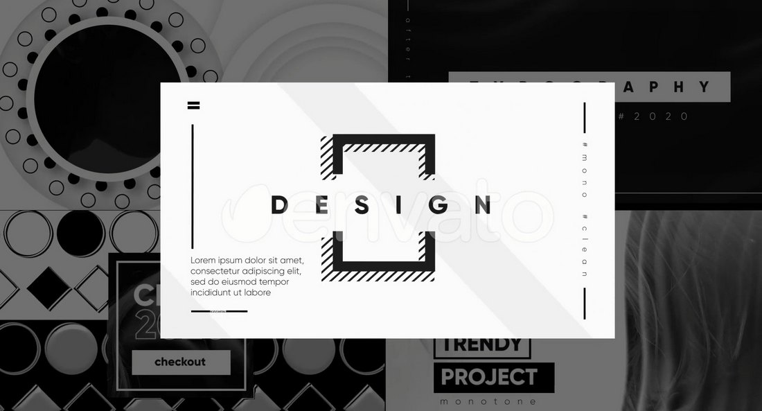
With this Premiere Pro template kit, you get a two-in-one kind of deal. It includes a set of typography slide designs that also features cool text animations. The template will allow you to instantly add a cool-looking title scene or opening scene to your videos with just a few clicks.

Motion Type – Premiere Pro Text Effects

Motion Type - Premiere Pro Text Effects

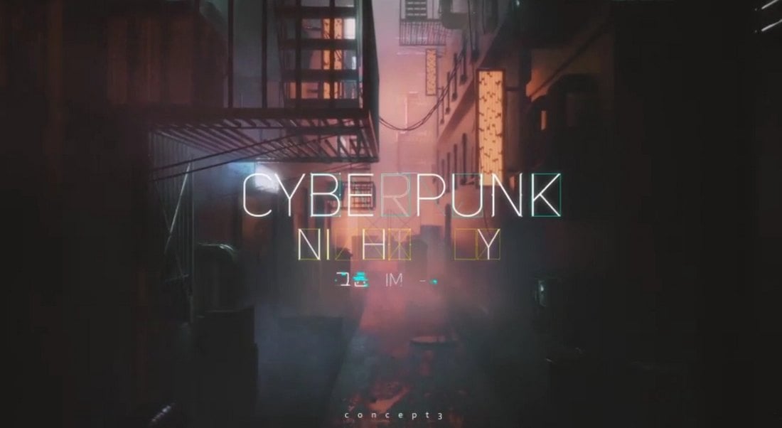
The text effects in this template kit have some of the most amazing designs we’ve seen. There are many different types of effects, including cyberpunk-style text animations, colorful typography effects, subtle text animations, and more. There is a total of 20 different text effects in this pack for any type of project you have.

Motion Styles – Text Effects & Animations For Premiere Pro

Motion Styles - Text Effects & Animations For Premiere Pro

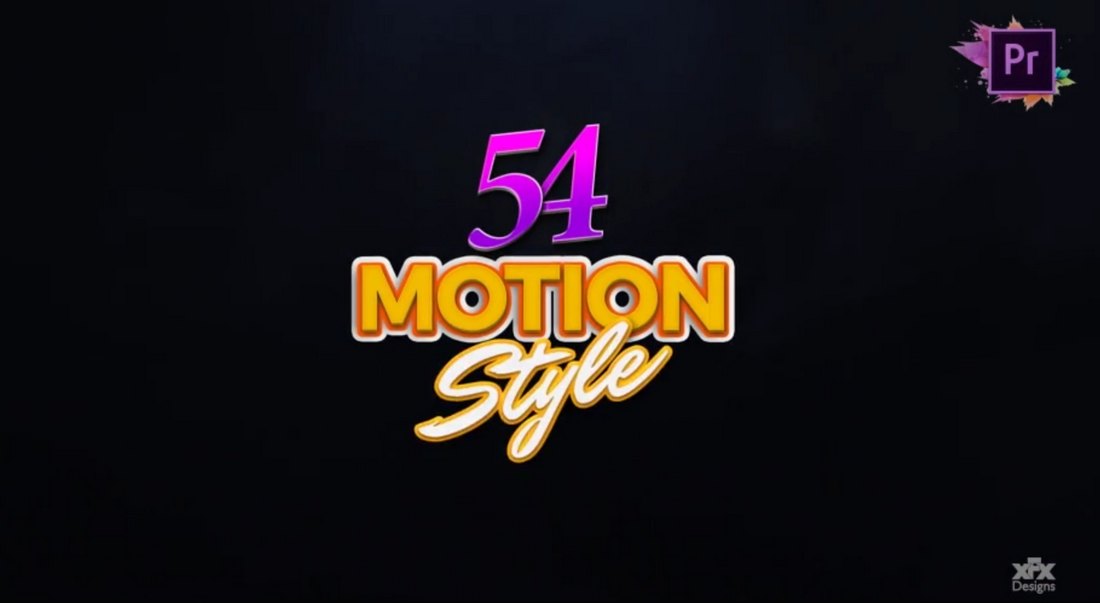
If you’re looking for colorful and creative text effects to add a bit of style to your videos, then this Premiere Pro template pack is for you. It includes 54 trendy text effects with vibrant designs and attractive animations. They are perfect for social media videos as well as YouTube vlogs and business promos as well. You can use them by simply dragging and dropping them into your timeline.

Text Animation Toolkit – 122 Premiere Pro Text Effects

Text Animation Toolkit - 122 Premiere Pro Text Effects

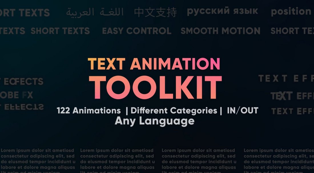
This is a complete text animation toolkit that features more than 120 different text effects. The effects in this pack have simple and subtle animations. And they are ideal for business and professional video projects. The best part is that these animations are fully compatible with any type of font or language. And it includes both in and out animations.

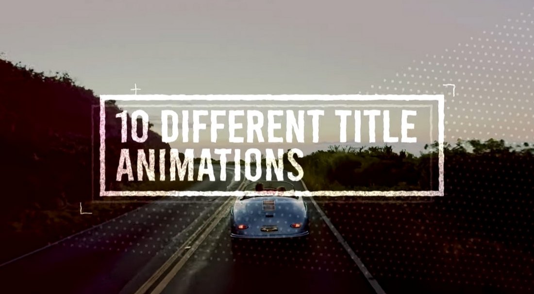
10 Free Texture Title Animations for Premiere Pro

10 Free Texture Title Animations for Premiere Pro

If you’re low on budget, you can grab this text animations pack for free. It includes a set of unique title animations with textured designs. Perfect for making your YouTube vlogs and social videos look more creative.

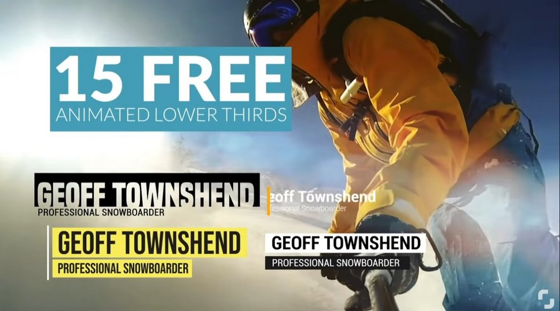
15 Free Animated Lower-Third Premiere Pro Templates

15 Free Animated Lower-Third Premiere Pro Templates

With these free Premiere Pro text animations, you can create stylish lower-thirds for your videos. They are especially useful when making documentary-style videos as well as for adding credits and titles too.

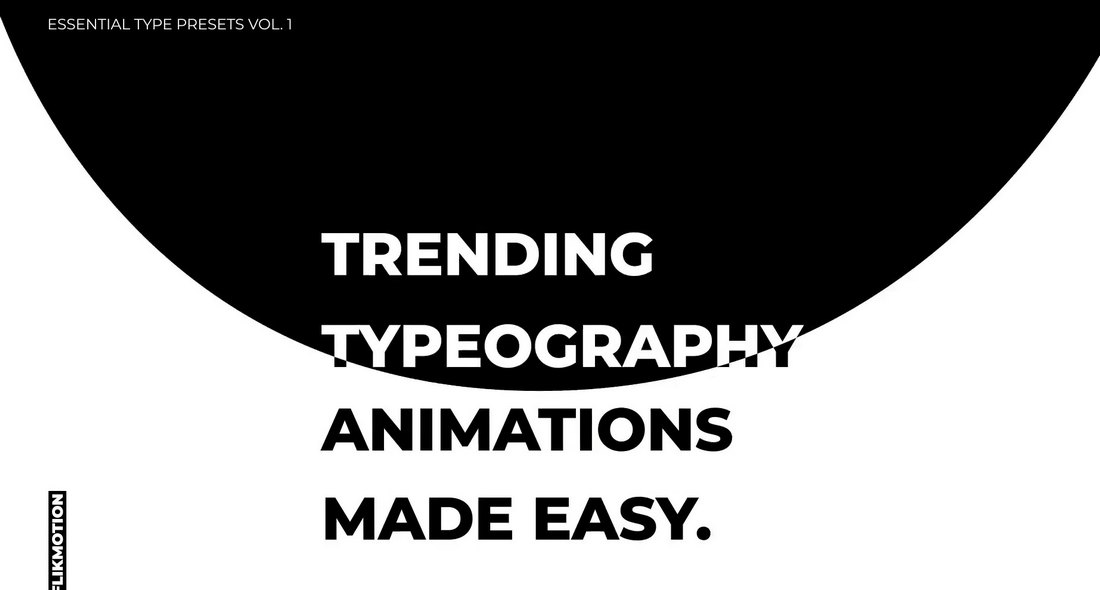
Essential Typography Premiere Pro Text Effects

Essential Typography Premiere Pro Text Effects

You’ll find clean and professional typography animations in this bundle of Premiere Pro text effects. You can use them to create titles for promo videos, lower thirds for business videos, social media clips, and more. Each text animation preset is easily customizable so you can adjust settings to your preference as well.

Stomp Typography – Fast Premiere Pro Text Animations

Stomp Typography - Fast Premiere Pro Text Animations

This Premiere Pro text animations pack comes with a set of fast-paced text effects. They feature stomp-style text animations that allow you to create titles and text with quick animations. You can choose from multiple styles of effects. These are especially suitable for short Instagram and TikTok videos and YouTube videos.

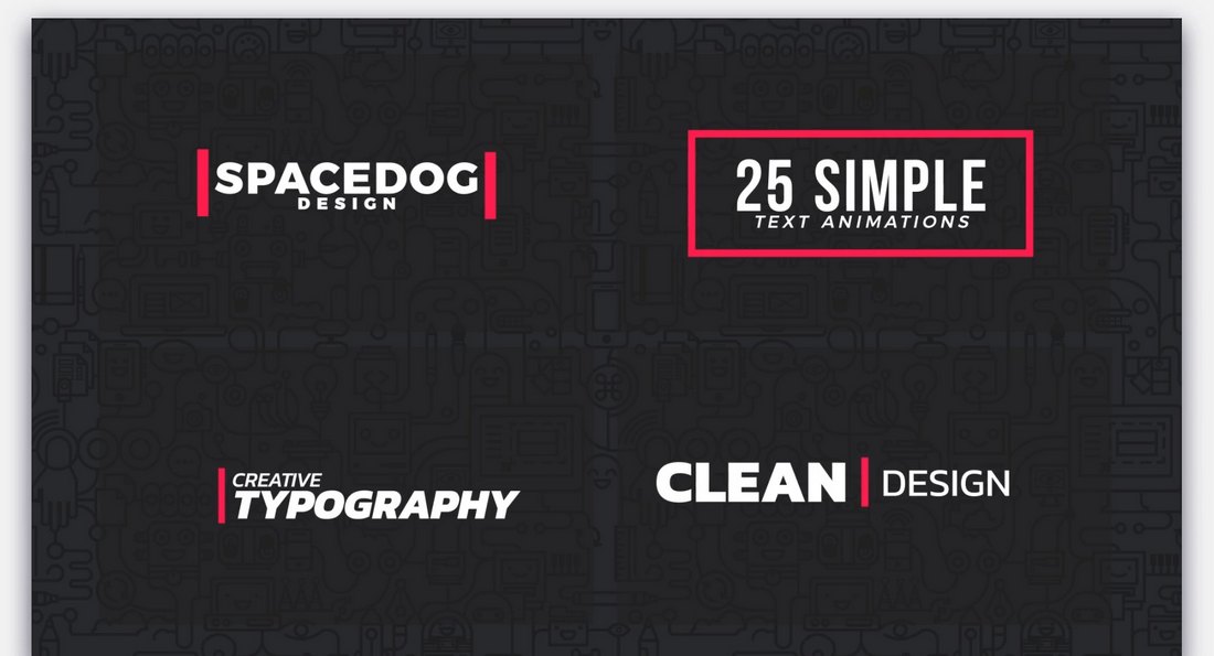
25 Simple Motion Text Animations for Premiere Pro

25 Simple Motion Text Animations for Premiere Pro

Looking for simple and classy text animations for business videos? Then this bundle of Premiere Pro templates is for you. There are 25 different text effects included in this pack. They all feature simple and professional text animations suitable for business events and promo videos.

40 Kinetic Titles & Text Effects for Premiere Pro

40 Kinetic Titles & Text Effects for Premiere Pro

Another collection of simple text effects. The text effects in this collection feature kinetic-style animations. There are 40 unique animations with different styles of effects to choose from. Of course, they are easily customizable to your preference as well.

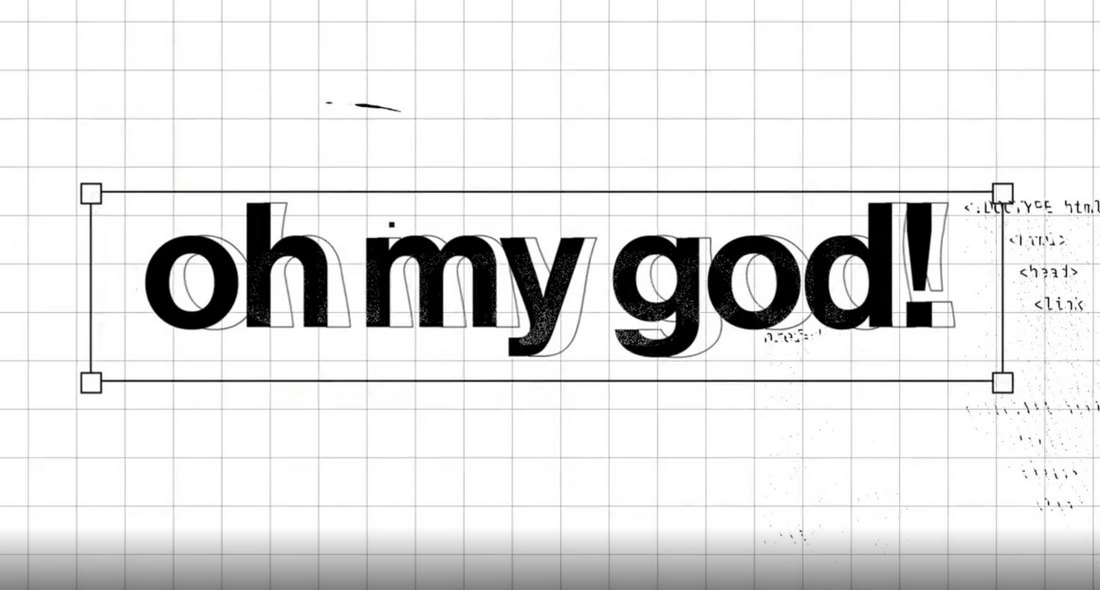
Project-x – Glitch & Distortion Text Effects for Premiere Pro

Project-x - Glitch & Distortion Text Effects for Premiere Pro

The glitch text effect is one of the most popular effects used in modern videos, especially in YouTube videos. If you want to add the same stylish effects to your text and titles, grab this bundle. It includes 30 different glitch and distortion text effects that are perfect for technology, gaming, and many other trendy videos.

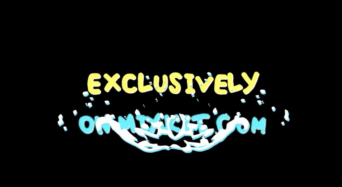
Free Paint Splash Premiere Pro Text Effect Animation

Free Paint Splash Premiere Pro Text Effect Animation

A creative text effect animation featuring colorful paint splash design. This simple yet beautiful animation will fit in perfectly with your creative DIY and educational videos. It’s free to download as well.

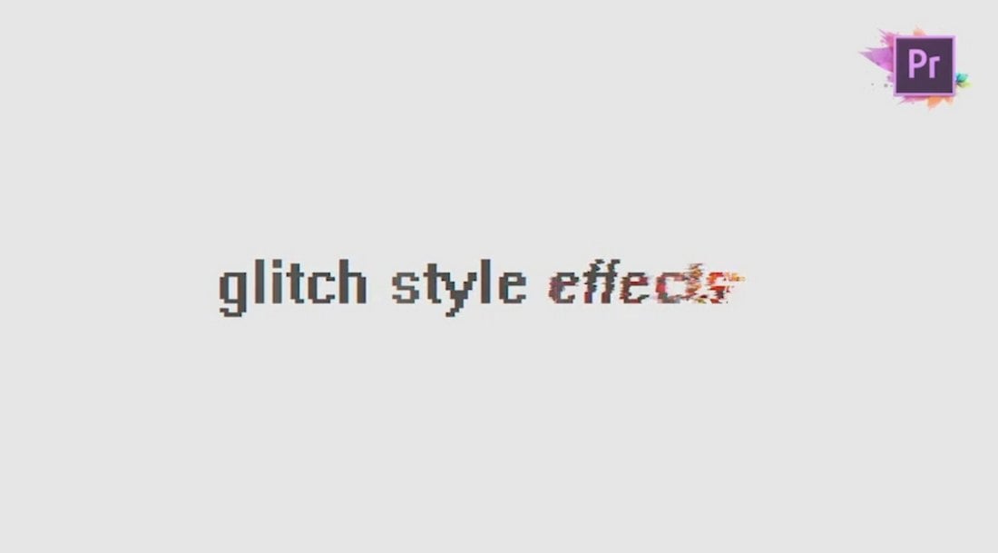
Free Faded Glitch Title Animation for Premiere Pro

Free Faded Glitch Title Animation for Premiere Pro

Another simple glitching text effect. You can use this one for free with your personal and professional videos. The template can also be customized and used to create title scenes or typography slides.

Fresh Typography – Premiere Pro Text Effects & Slides

Fresh Typography - Premiere Pro Text Effects & Slides

This Premiere Pro template kit features typography slides that you can use to add stylish titles and typography scenes to your videos. They also come with unique text effects and animations as well. The dynamic design of these templates offers an opportunity for you to experiment with different styles of text animations.

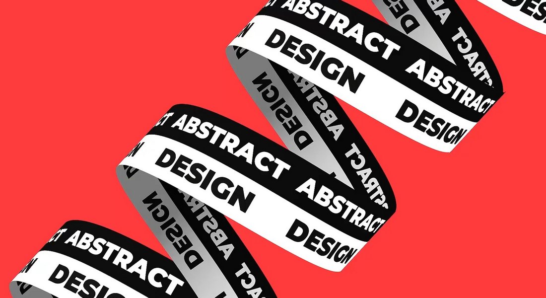
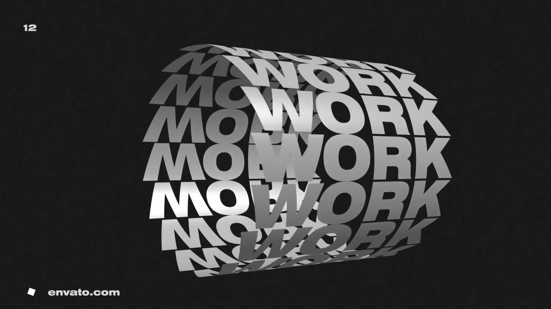
Abstract Typography – Unique Premiere Pro Text Effects

Abstract Typography - Unique Premiere Pro Text Effects

If you’re looking for unique and uncommon text animations to make your videos stand out, this text effects toolkit is perfect for you. It comes with lots of cool animations with 3D-like text effects. With these text effects, your videos will definitely grab the attention of your audience.

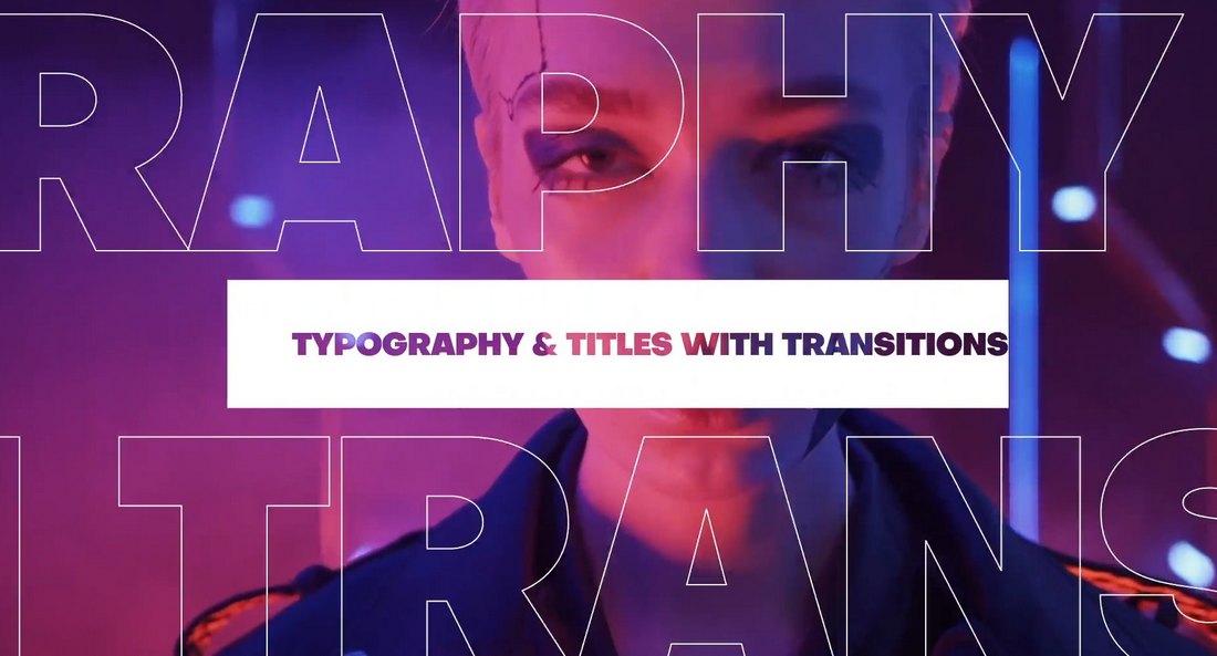
Premiere Pro Text Transitions with Animated Titles

Premiere Pro Text Transitions with Animated Titles

These text effect templates allow you to create modern transitions with text and titles. The text transition effect is a commonly used animation in social media videos, especially on Instagram. There are many different styles of effects in this pack for you to make all kinds of social media promos and videos.

Just Typography – Premiere Pro Text Effects Pack

Just Typography - Premiere Pro Text Effects Pack

This bundle lets you choose from many different text effects to create professional and business videos. The effects feature simple and clean text animations. And they can be easily customized to your preference to create your own text effects as well.

Chaotic Typography – Premiere Pro Text Effect Templates

Chaotic Typography - Premiere Pro Text Effect Templates

Just as the name suggests, this Premiere Pro text effects bundle includes some chaotic and unusual text animations, unlike anything we’ve seen before. The weirdness of the animations actually makes them quite unique and interesting to look at. So they might help you get the attention of your viewers.

This is Black – Premiere Pro Typography Animations

This is Black - Premiere Pro Typography Animations

This Premiere Pro text effect template features cool animations with 3D-like designs. They are easily editable and you can use them to create eye-catching text animations for social media videos, as well as corporate and business videos.

Free Colorful Glitch Text Animation for Premiere Pro

Free Colorful Glitch Text Animation for Premiere Pro

If you can’t get enough of the glitch text animations, be sure to grab this one too. It features a unique glitching effect with a colorful design. You can easily customize the text and animation effect to your preference.

Free Typing Text Effect Premiere Pro Template

Free Typing Text Effect Premiere Pro Template

This is a simple and free text effect for Premiere Pro. It features a minimal animation that makes your text appear with a typing effect. The animation is most suitable for corporate and business videos.

How To Animate Text in Premiere Pro

Premiere Pro comes with a set of default presets in the Effects library you can use to animate text and titles. These are easy to use and feature simple animations.

But the problem is these animations and effects are used by everyone. So if you want to make your videos stand out, you need to find unique text effects for Premiere Pro.

We recommend grabbing a unique Premiere Pro text effect from our collection above. It doesn’t matter if it’s a free template or a premium one, you just need to find a preset with a cool animation.

Import that preset in Premiere Pro and you can animate your text quite easily.

Or, if you prefer to create your own text effects, you can follow this step-by-step tutorial to learn how to craft Premiere Pro text effects.

20+ Best Fonts Similar to Roboto

Featured Imgs 23

Roboto’s clean, modern, and highly readable style has made it a popular choice for digital and print designs alike. But sometimes, you might want a font that offers a similar vibe with a slightly different character or a unique twist to make your projects stand out.

In this collection, we’ve rounded up the best fonts that are similar to Roboto and capture the same sleek and versatile appeal while bringing their own distinct qualities.

Whether you’re working on a website, mobile app, or branding project, these fonts provide the same professional and contemporary look that Roboto is known for, but with subtle variations in letterforms and styles.

You’ll find fonts that are ideal for body text, headlines, and user interfaces, offering plenty of options to match the tone and feel of your design. Have a look.

Futuru

Futuru

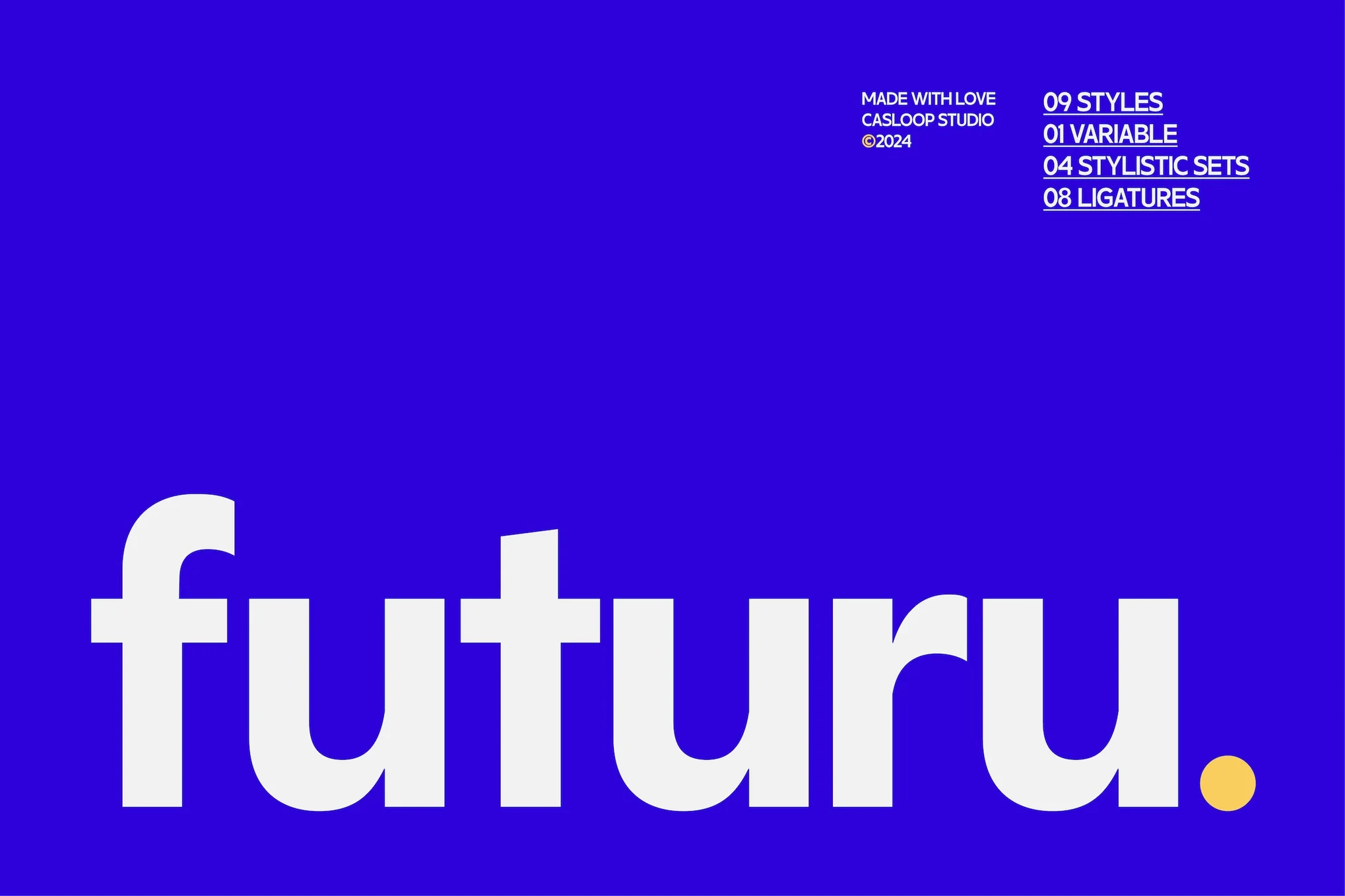
Futuru, a geometric sans-serif font, combines classic elegance with modern design to provide a unique solution for multiple design needs. This distinctive font delivers a sleek, professional feel perfect for branding or digital projects. With its legibility, versatility, and multilingual support, Futuru is ideal for both corporate use and creative projects.

Physis

Physis is a refined neo-grotesk typeface, reminiscent of Switzerland’s Golden Age of graphic design. Cleaner, elegant, and featuring generous spacing, Physis serves as a versatile font option for both screen and editorial projects. Its flexible family offers five weights from Light to Black, coupled with matching slanted forms for added variety.

Helixa

Helixa

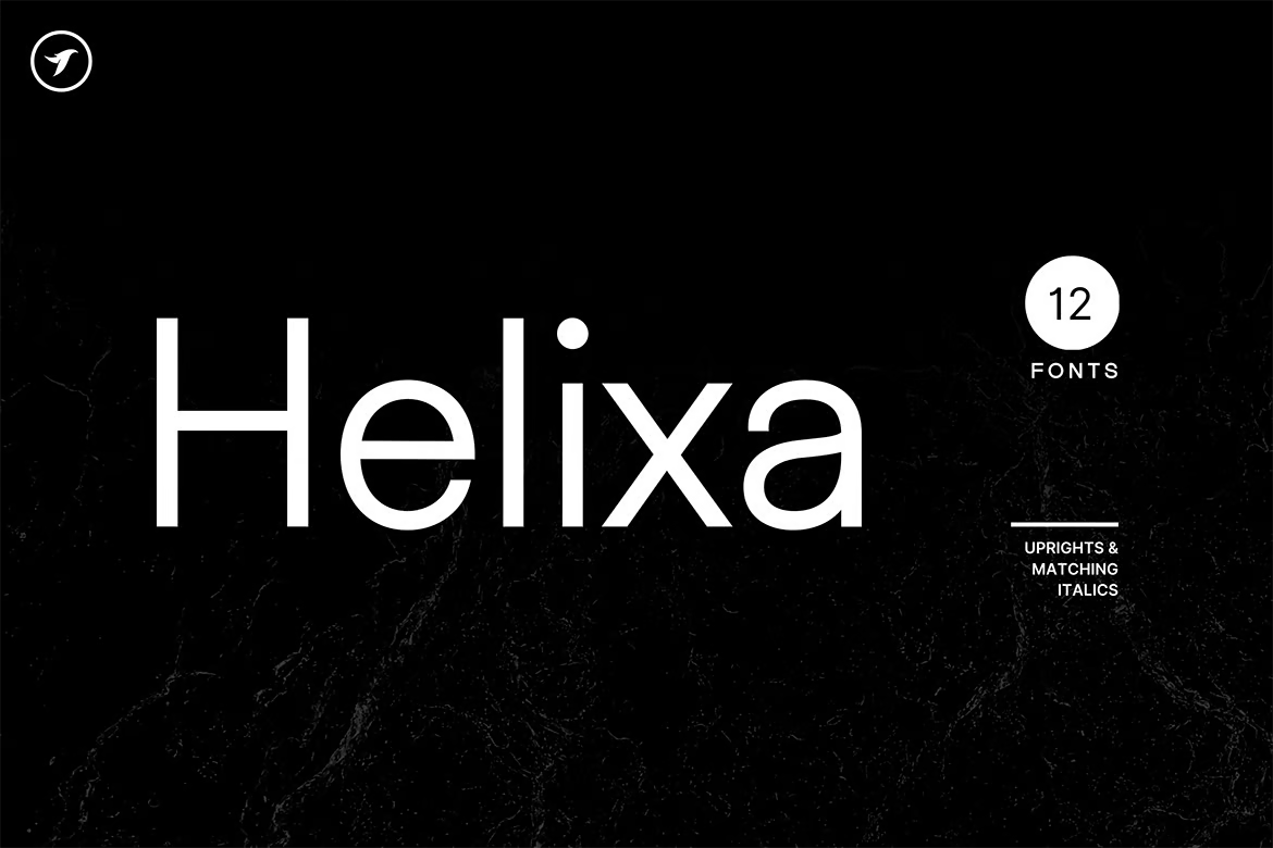
Helixa is a stylish and versatile neo-grotesque typeface, perfect for making an impact in branding, logotypes and marketing materials, both in print and online. With 12 fonts, each with seven upright weights and Italic equivalents, and a total of 300 glyphs, it offers extensive language support. Its clean design and modern look make it an enduring choice for all design needs.

Osande TXT

Osande TXT

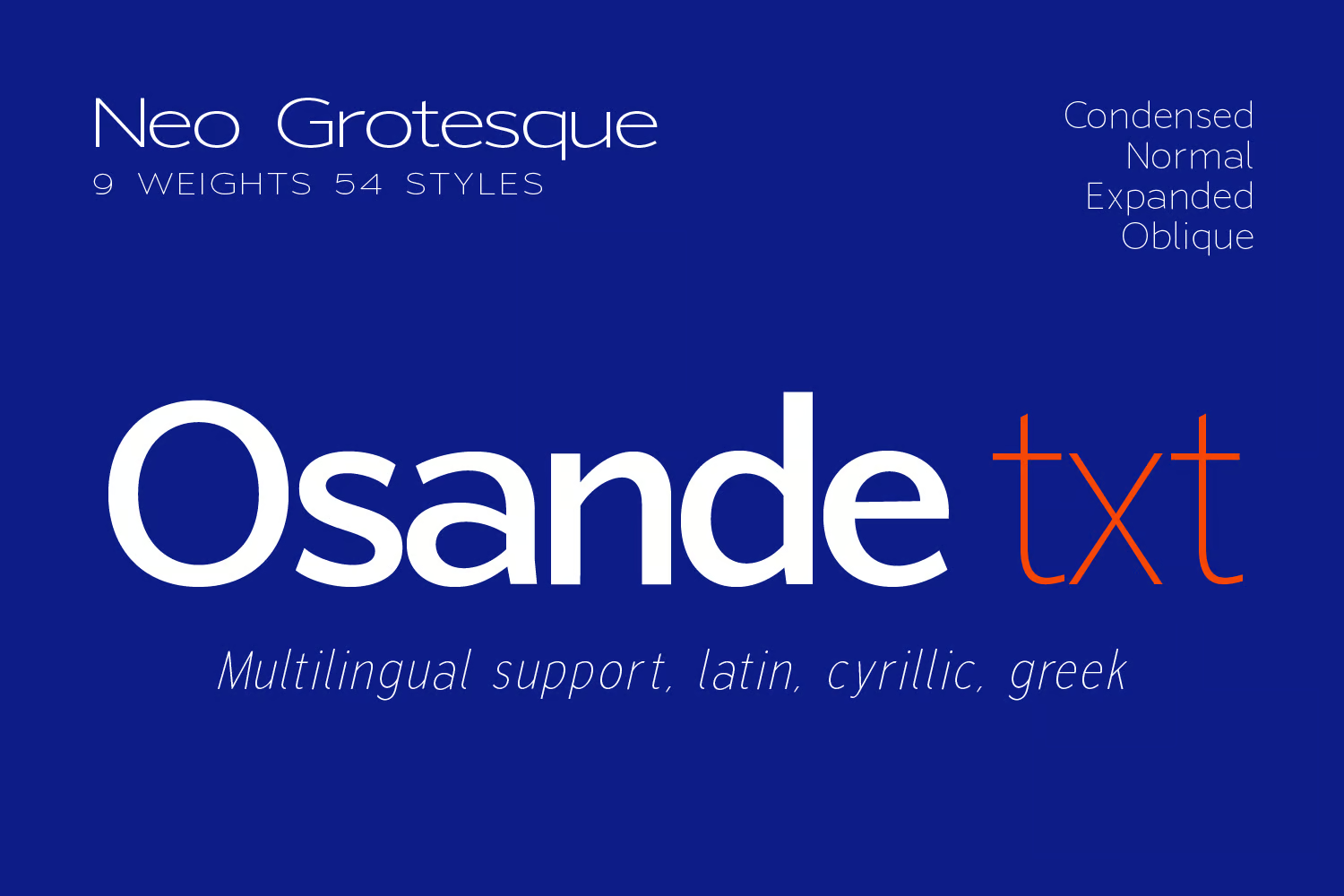
Osande TXT is a dynamic neo-Grotesque Sans font family, inspired by the modern Osande Pro. Its features include a large x-height, intriguing yet simple forms, and a low contrast with a condensed width. Offering enhanced characters and comprehensive language support, it’s an adaptable choice for assorted body text or display designs.

Vistol

Vistol

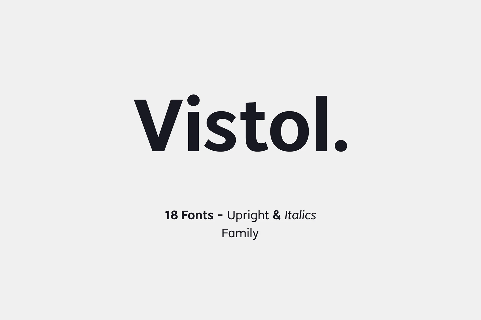
Vistol, with its Roboto-like style, presents a neo-grotesque sans-serif font family perfect for various applications. It boasts 18 weights, European language support, and features an array of symbols. Exceptional for print, packaging, editorial and branding needs, its low-stroke contrast ensures readability even in smaller sizes. The font family comes with 18 OTF fonts, including upright and italic versions.

Orion Pro

Orion Pro

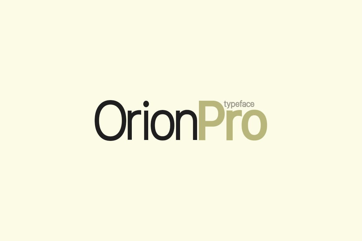
Orion Pro, a modern Sans-Serif typeface, is inspired by celebrated Swiss fonts. This versatile pack, produced by Fontastica and distributed by Designova, comes with 12 diverse fonts. With its sleek style, it’s perfect for branding, logotypes, and other print and web purposes.

Black Pro

Black Pro

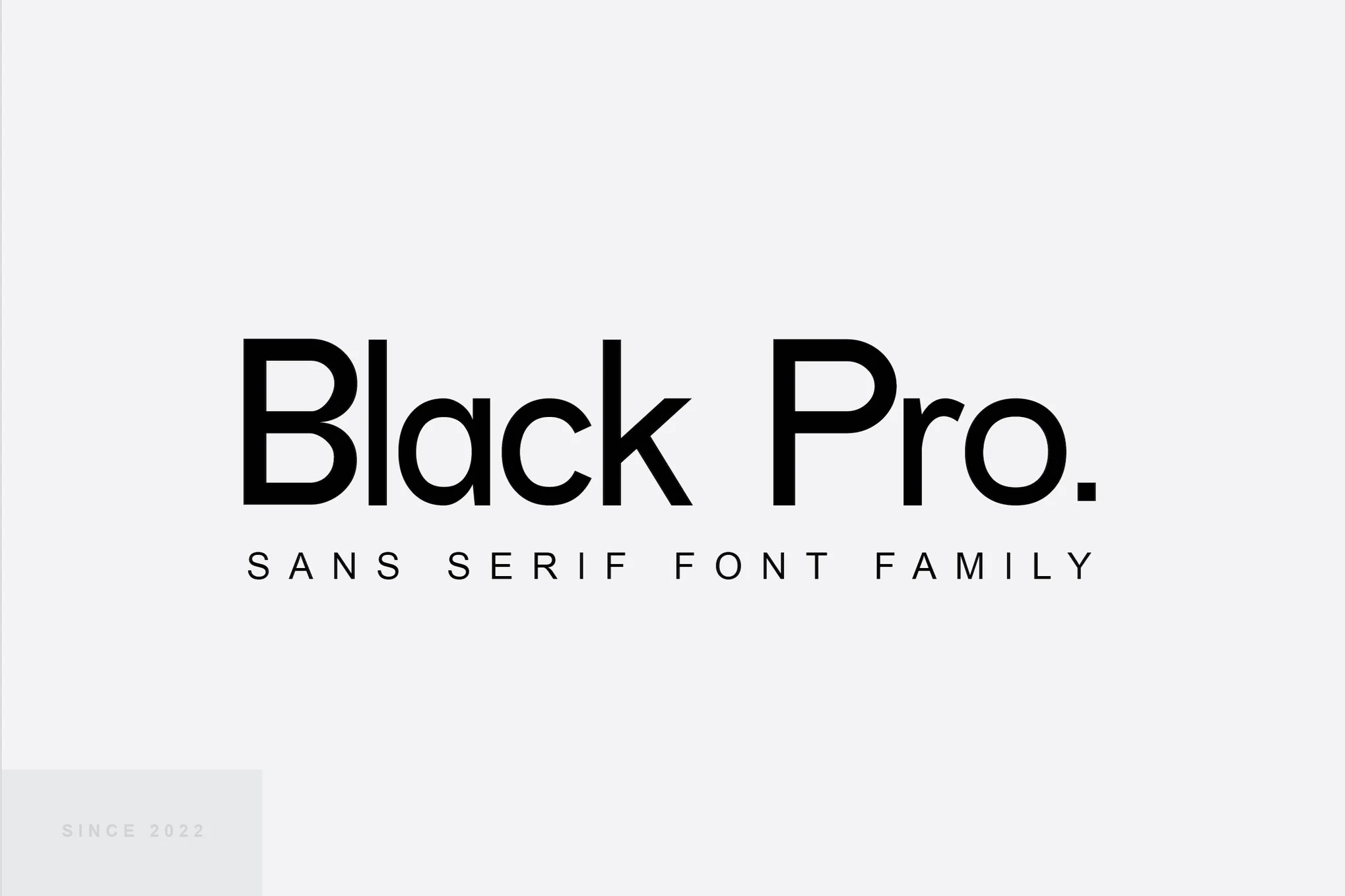
Explore the adaptable and geometric nature of the Black Pro sans serif font family. This modern typeface, with its clean lines and professional aesthetic, is perfect for branding, headlines, and editorial design. Its various weights and styles improve readability and aesthetics, making it suitable for a wide range of design projects, from corporate branding to creative pursuits.

VISIA Duo

VISIA Duo

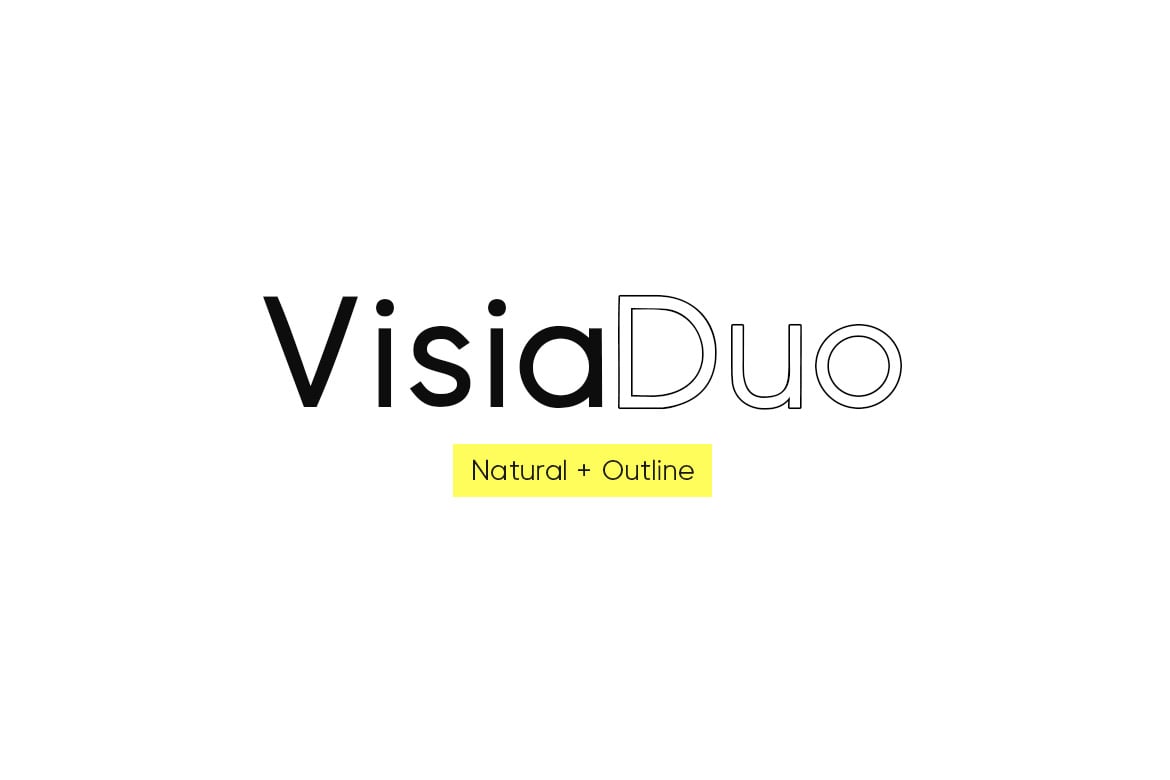
VISIA Duo is an elegant font family consisting of 8 font weights, including outline version. It shares similarities with the Roboto font and consists of ‘Natural’ and ‘Outline’ versions of the VISIA Pro Geometric Sans-Serif typeface, each in four variations: Regular, Bold, Italic, and Bold Italic. The files come in OTF, TTF, and Web Font formats.

Kinetica

Kinetica

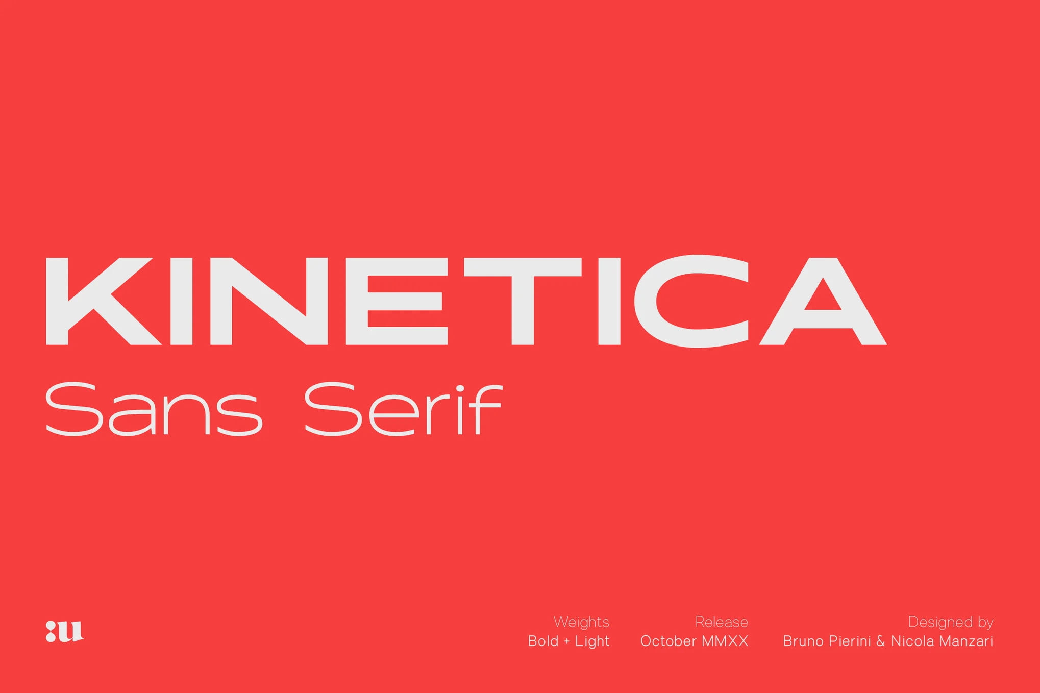
Kinetica is a dynamic typeface, influenced by movement and globalization. It’s a versatile font with two weights – Light and Bold, each with matching obliques. Ideal for headlines or large-format prints, Kinetica easily adapts to branding, social media, or editorial design tasks. With built-in support for multiple languages based on the Latin alphabet, it’s a minimalistic, yet eye-catching addition to your font library.

Osande Pro

Osande Pro

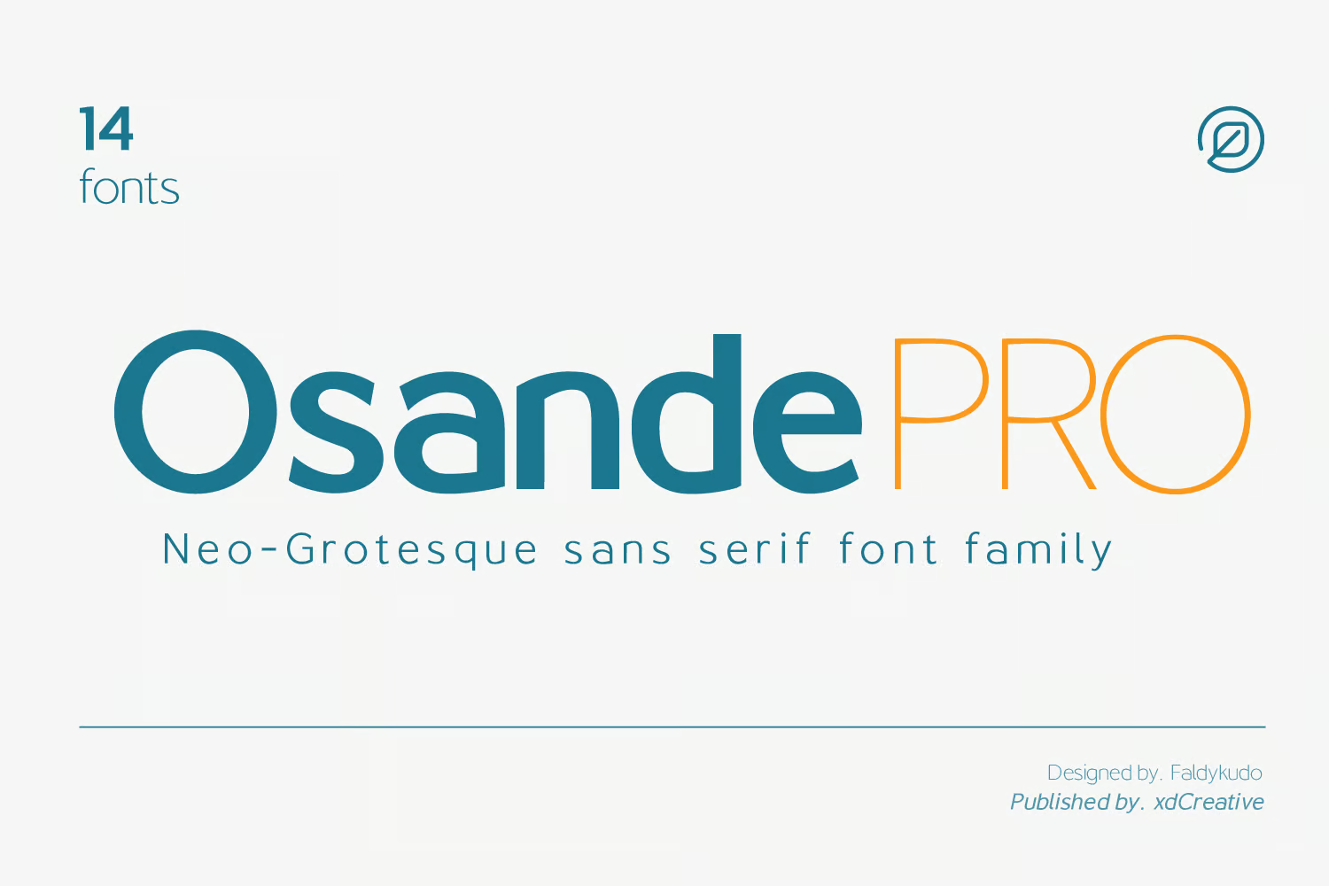
Osande Pro, inspired by the modern sans serif design, mirrors the simplicity of Roboto with a unique neo-Grotesque touch. It boasts a total of three forms – italics, obliques, and upright – each offering seven distinct weights for flexibility. This versatile font, compatible with a broad range of projects, comes packed with 245 glyphs and supports Basic Latin, English letters, West European diacritics, and more.

JUST Sans

JUST Sans

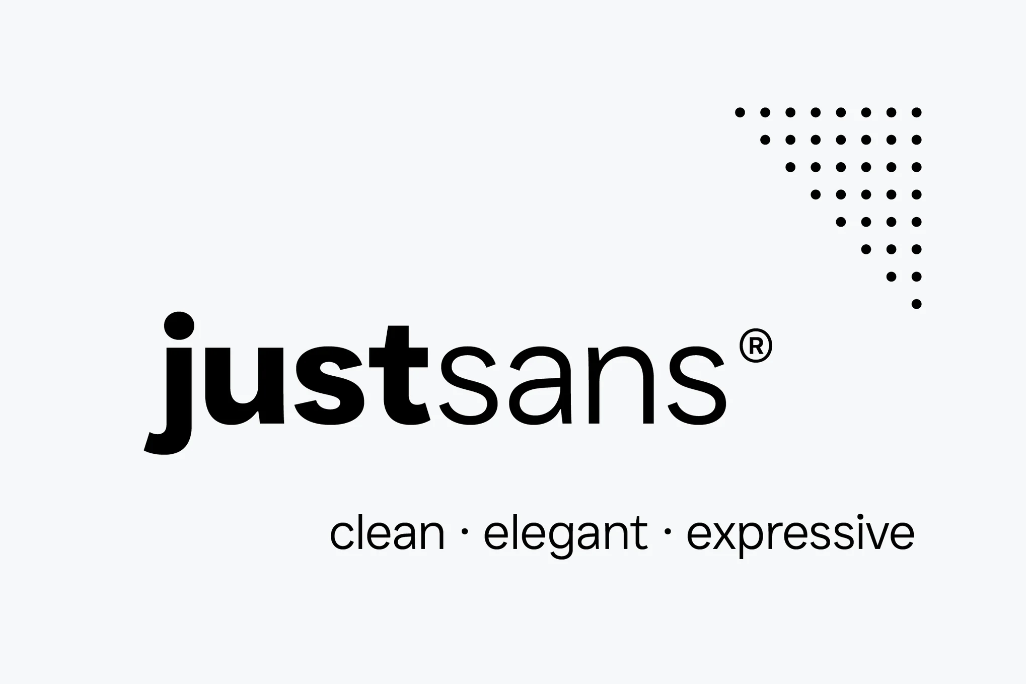
JUST Sans is a versatile and modern geometric sans serif typeface boasting endearing warmth. It fuses neutrality and expressiveness, sophistication and approachability. With its wide, open-air characters and sharp, gripping terminals, the font embodies a contemporary elegance. The package offers seven weights, extensive Latin language support, adjusted kerning, and clear web fonts suitable for various design-based applications.

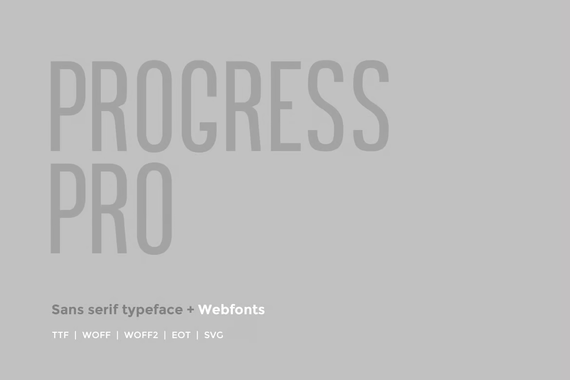
Progress Pro

Progress Pro

Explore your creativity with Progress Pro, a contemporary sans-serif typeface designed by Richard Mayer. Perfect for film posters, headlines, logo designs, and big banners, this font is a modern twist on classic, decorative typography. With the inclusion of OTF, TTF, and web fonts, it offers versatility for all your design needs.

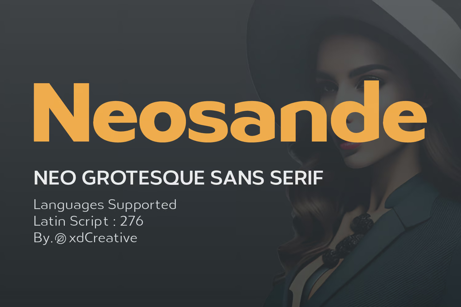
Neosande

Neosande

Neosande, designed by Faldykudo in 2023, is a versatile, sleek, and legible neo-grotesque sans serif typeface. Offering a range of weights, high legibility, and support for multiple languages, it’s ideal for various applications like branding, web design, advertising, and editorial design. The typeface’s simple, clean lines give it a professional, stylish, and modern appeal.

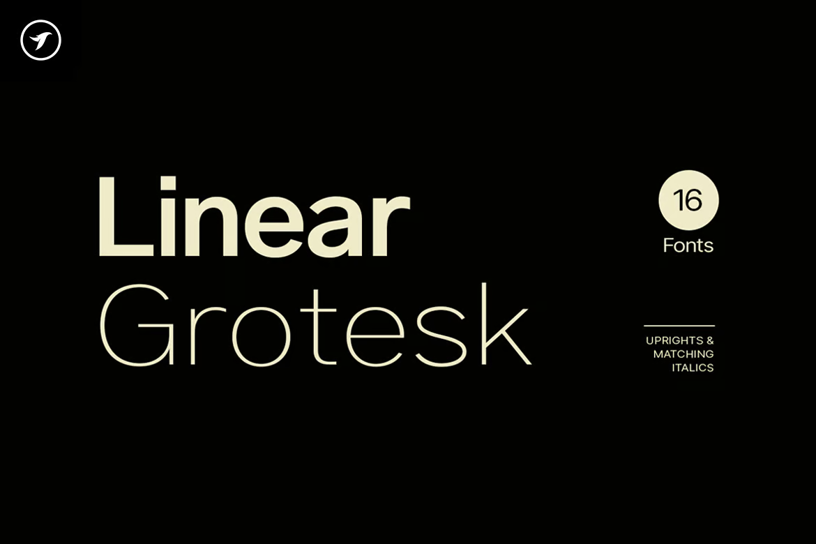
Linear Grotesk

Linear Grotesk

Linear Grotesk is a beautifully handcrafted, classic sans-serif typeface available in 16 variations. Ideal for graphic and web design, print or display, this typeface also suits branding, marketing graphics, and editorial design. This comprehensive package is designed for simplicity and readability and includes OTF, TTF, and Web Fonts, as well as an HTML and CSS WebFont preset and demo.

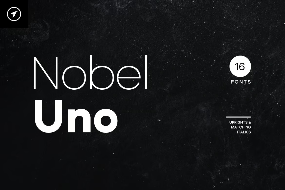
Nobel Uno

Nobel Uno

Nobel Uno is a clean, modern sans-serif typeface ideal for contemporary design projects. As the fourth font from the advanced Uno class families, it presents 16 fonts with upright weights and matching italics. Equipped with an extended character set featuring 386 glyphs, Nobel Uno supports over 120 languages which makes it suitable for diverse applications including graphic design, branding, web, and editorial design.

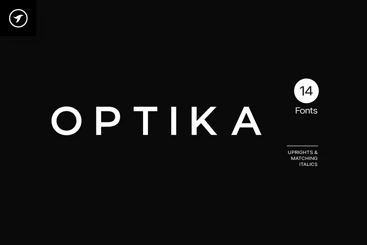
Optika

Optika

Optika is a sleek, modern Sans-Serif typeface perfect for all design needs. This all-around typeface stands out in logotypes, headlines, and branding. Handcrafted with Western European, Central European, and South Eastern European sets, Optika includes 394 glyphs and 14 fonts, coming in seven weights for both upright and italic.

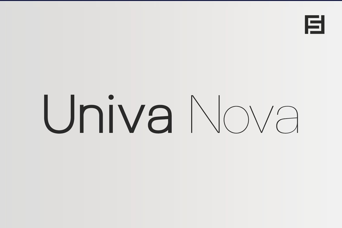
Univa Nova

Univa Nova

Univa Nova, a minimalist typeface, offers elegant design and superior usability. Ideal for graphic and web design, textual presentations, and various marketing graphics, its attributes extend to enhanced letter-spacing optimal for headlines and logotypes. Developed with OpenType features, it supports Western and Central European language sets.

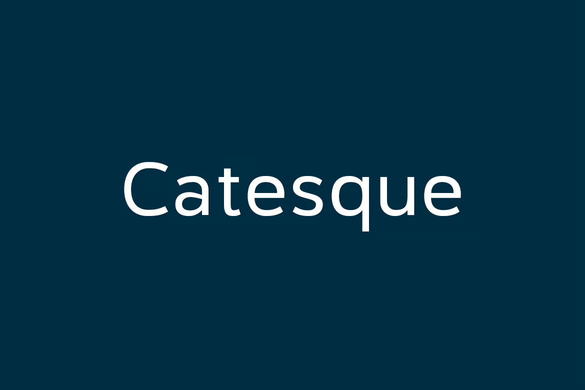
Catesque

Catesque

Catesque, a versatile and dynamic font, is excellent for both large-scale designs and smaller text applications. Its five weights range from light to black, accommodated by matching italics and various alternate characters that add unique characters to your design work. This font further supports numeric designs with specialized numeral features.
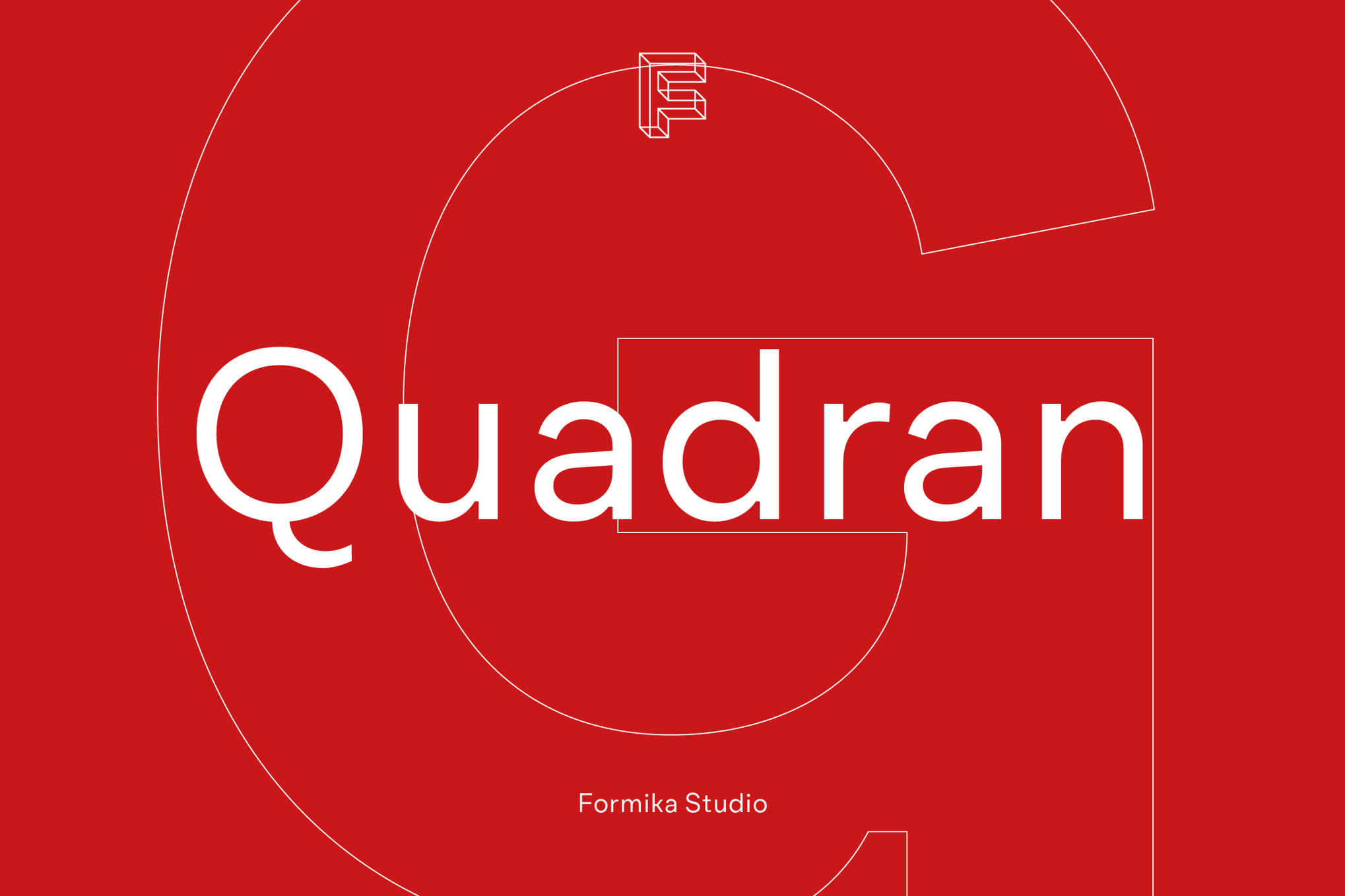
Quadran

Quadran

Quadran is a modern, geometric grotesque type family with a tailored character, suited for today’s design trends. The unique double storey “g” adds a classic touch. With weights ranging from ExtraLight to Black, extensive language support, and a variety of OpenType features, Quadran is versatile across small and medium text sizes. It’s perfect for editorial fashion magazines, website headings, signage, logos, and more.

Free Fonts Like Roboto

Roboto Flex

Roboto Flex is a unique, free font you can use to design stylish titles and headings. It comes with minimal and stylistic characters that improve upon the design of Roboto’s original design. The font is free for commercial use.

Roboto Serif

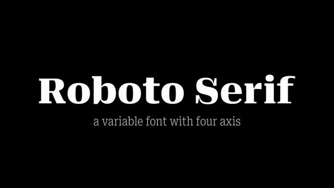
What if Roboto was a serif font? Well, you don’t have to imagine it. With this free font, you can craft serif typography with letterforms that are quite similar to Roboto. This font is completely free for commercial use.

Phlatt Grotesk

Phlatt Grotesk is another free font that is inspired by Roboto. It features a simple and professional letter design that will fit perfectly with your business and corporate-themed design projects. It’s free for commercial use.

Host Grotesk

This free font is also perfect for designers looking for a Roboto alternative. It comes with a clean and simple letter design with subtle stylistic elements. You can use this font for free with both personal and commercial projects.

The AI-Powered Classroom: Shaping the Future of Education with Artificial Intelligence

Featured Imgs 23

Artificial Intelligence (AI) is revolutionizing various sectors, and education is no exception. The integration of AI into the classroom is transforming how educators teach and how students learn. By harnessing AI’s capabilities, educational institutions can create more personalized, efficient, and engaging learning experiences. In this blog, we’ll explore how AI is shaping the future of …

The post The AI-Powered Classroom: Shaping the Future of Education with Artificial Intelligence first appeared on Lucid Softech.

40+ Best Flow Chart Templates for Word & PowerPoint 2024

Featured Imgs 23

When it comes to streamlining a process, nothing beats a good old-fashioned flow chart. They are especially useful in presentations for showcasing your projects, ideas, and products as well.

In this post, we bring you some of the best flow chart templates for PowerPoint and Word for presenting your workflows in visual form.

Whether you’re designing a flow chart for a PowerPoint presentation or for a brochure, these templates will help you craft visually appealing flow charts without any design skills.

Grab a template from our collection below and start editing.

flow chart template word, flow chart template powerpoint, flow chart template powerpoint free,, ms word flow chart template, flow chart word template

Top Pick

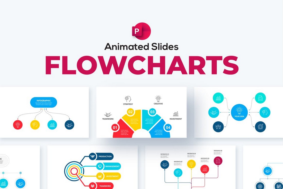
Animated Flowchart Infographics for PowerPoint

Animated Flowchart Infographics for PowerPoint

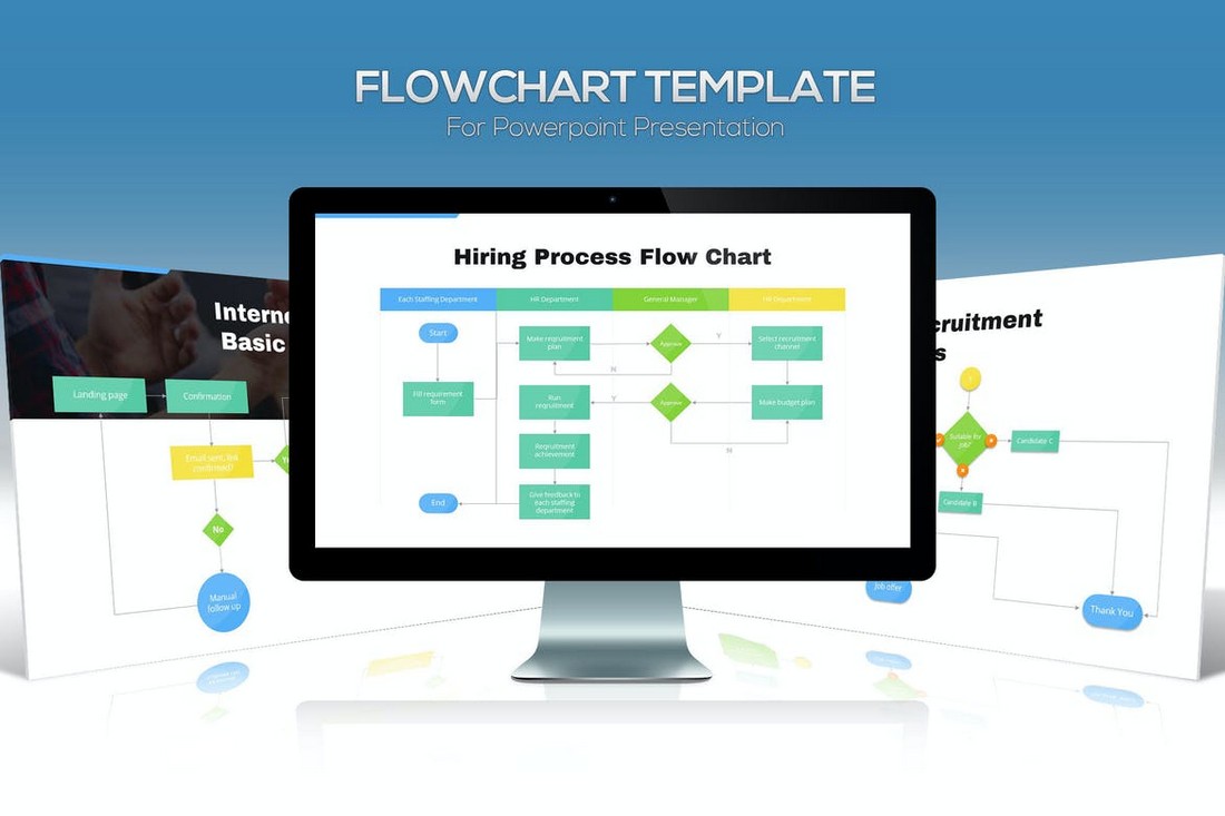
This PowerPoint template comes with many different styles of flowchart infographic designs you can use in various types of business, educational, conferences, and event presentations.

There are 26 unique flow chart designs included in this template and they are available in dark and light color themes. You can also customize its colors using 50 XML color schemes.

Why This Is A Top Pick

What makes these flow charts most useful is their customizability. You can easily edit them to enter your own data and change colors however you like. These slides are also fully animated as well.

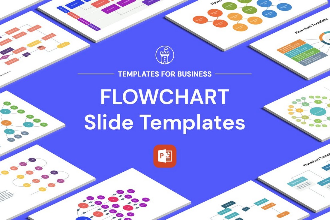
Flowcharts Pack for PowerPoint

flow chart template powerpoint

If you’re looking for an effective flowchart PowerPoint template, the above-featured product is well worth checking out. It contains 22 unique slides, handmade infographics, free fonts, unlimited color options, and so much more.

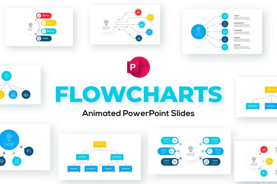
Animated Flowchart PowerPoint Template

flow chart template powerpoint

This flowchart PowerPoint template is an excellent contender for your cash if you truly value standing out from the pack. It consists of a range of slides that can be fully molded to your specific requirements. Do check it out.
Flow Chart PowerPoint Presentation Template

Flow Chart PowerPoint Presentation Template

This flow chart PowerPoint template offers an intuitive, modern design for your flowchart-related presentations. With over 30 customizable slides, you can effectively illustrate complex sequences, procedures, or hierarchies in an attractive, professional format.

Rectic Flowchart Infographic PowerPoint Template

Rectic Flowchart Infographic PowerPoint Template

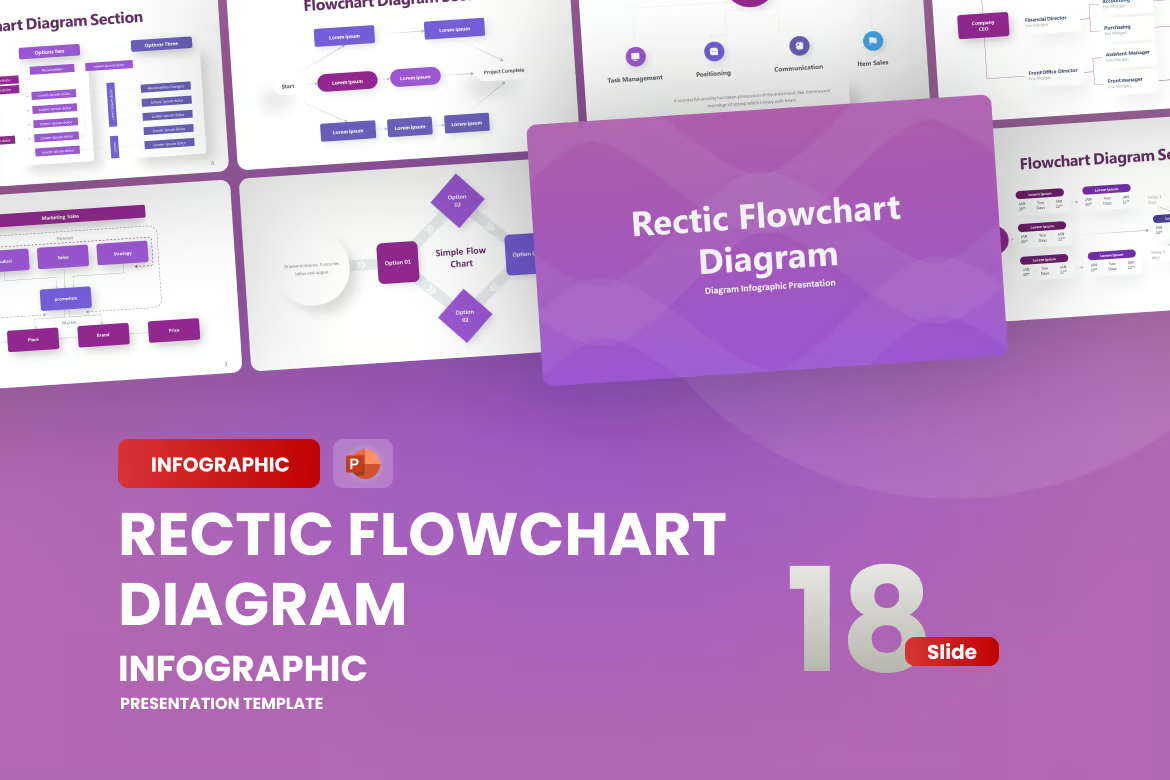
This is a professional flow chart PowerPoint template, equipped with over 15 unique slides and 90+ customization options. This package includes features such as handmade infographics, a free icon pack, and an easy-to-follow help guide. Perfect for guiding your business development stages with a sophisticated touch.

Creative Flow Chart PowerPoint Presentation

Creative Flow Chart PowerPoint Presentation

Check out this vibrant and dynamic creative flow chart PowerPoint template. It includes over 15 unique slides and 90+ XML files, with options for both light and dark backgrounds. The slides are fully customizable, complete with handmade infographics and a free icon pack.

Flowchart Infographics PowerPoint Template

Flowchart Infographics PowerPoint Template

A modern and sleek way to boost your business presentations. Ideal for corporate and personal projects, its clean design and versatile style impress audiences with ease. It’s easy customization and master slide layouts help to clearly and effectively communicate ideas, making it an essential tool for client or stakeholder engagement.

Flowchart Diagram PowerPoint Template

Flowchart Diagram PowerPoint Template

A fantastic flow chart PowerPoint template for creating vibrant and professional presentations easily. Perfect for business pitches, academic research, or creative projects, this editable diagram template will add value to your content. Features include a customizable color scheme and font theme, and place holder images.

Colorful Flowchart PowerPoint Template

Colorful Flowchart PowerPoint Template

This is a vibrant, modern-style infographic presentation template, perfect for a variety of uses including pitch decks, business presentations, finance reports, and lookbook slides. The template features 25 unique slides, a light background, and a widescreen format. All graphics are resizable and editable with a simple drag and drop feature.

Modern Flow Chart PowerPoint Presentation

Modern Flow Chart PowerPoint Presentation

This flow chart PowerPoint template helps unearth the complexities of your workflow in a sleek, modern design. Built for effortless customization and featuring more than 30 editable, high-resolution slides, it facilitates the visualization of process sequences, operational steps, and more, all in 16:9 aspect ratio.

Simple Flow Chart Diagram PowerPoint Infographics

Simple Flow Chart Diagram PowerPoint Infographics

A resourceful flow chart PowerPoint template that can dramatically enhance your presentations. It features a minimalist design with 27 unique slides, master slides, editable charts, mockup devices, and clean modern typography. The design is versatile and suitable for any presentation.

Flowcharts Animated PowerPoint Templates

Flowcharts Animated PowerPoint Templates

This PowerPoint template comes bundled with a collection of various styles of flow charts. There are 20 different slides in this template with flow chart layouts you can use to effectively visualize data and workflows. The slide is available in light and dark color themes as well as 50 different XML color schemes to choose from.

Multipurpose PowerPoint Flow Chart Templates

Multipurpose PowerPoint Flow Chart Templates

If you find yourself designing flow charts for presentations more often, this is a PowerPoint template that you must keep on your devices. This template comes with 63 different slides featuring unique flow chart designs and infographics. You can customize them quite easily and change colors using 25 pre-made color schemes.

Flow Chart Templates for PowerPoint Presentations

Flow Chart Templates for PowerPoint Presentations

You can use this PowerPoint template to create beautifully animated flow charts for your presentations. They are a great alternative for boring static flow chart designs and allows you to present your data step by step with cool animations. The template includes 20 different flow chart slides with easily editable designs.

Timelines – PowerPoint Infographics Slides

Timelines - PowerPoint Infographics Slides

Timelines are also a type of flow chart you can use to streamline the process of your projects as well as showcase different stages of products. This PowerPoint template comes with 33 timeline slide designs you can use to create such impressive slides. The slides are available in 12 pre-made color schemes and include editable vectors and infographics as well.

Flowchart Diagrams for PowerPoint Presentation

Flowchart Diagrams for Powerpoint Presentation

With 28 professionally designed flow charts to choose from, this template is a perfect choice for designing high-quality slideshows for various presentations. The flow charts in this template feature very clean and modern designs that are most suitable for corporate and business presentations. The slides are fully animated and feature light and dark color themes.

Free Agency Process Flowchart Template for Word

Free Agency Process Flowchart Template for Word

This is a free Word template that features a flow chart design you can use to create a visual process for your agency projects and plans. It’s available in MS Word and Google Docs formats.

Business Flow Chart PowerPoint Infographics

Business Flow Chart PowerPoint Infographics

The flow charts in this PowerPoint template are designed with business presentations in mind. There are over 20 unique flow chart designs with various styles of layouts. You can edit and customize them to add your data in just a few clicks.

Arrow Flow Charts PowerPoint Template

Arrow Flow Charts PowerPoint Template

This PowerPoint template comes with a bunch of flow chart infographics that use arrow-shaped designs. These are ideal for designing flow charts related to sales, growth, and projections. It includes 20 unique slides in 90 color schemes.

Puzzle Animated Flowchart PowerPoint Template

Puzzle Animated Flowchart PowerPoint Template

You’ll find some unique styles of infographic designs in this PowerPoint template. They feature puzzle-style charts and graphs with various designs, including some that can be used as flow charts. There are 28 slides in this template.

Free Strategy Map Flow Charts for PowerPoint

Free Strategy Map Flow Charts for PowerPoint

You can download this PowerPoint template for free to access a collection of strategy map-style flow chart infographics. It has 30 different slides with fully customizable chart designs. It comes in Google Slides format too.

Free App Process Flowchart Template for Word

Free App Process Flowchart Template for Word

You can use this template to design a visual process to streamline your mobile app designs and developments. The template is available in MS Word, Google Docs, and Apple Pages formats for free.

Business Infographics PowerPoint Template

flow chart template powerpoint

This PowerPoint template provides you with flowcharts, diagrams, graphs, timelines, roadmaps, and a range of other data visualization tools to make your upcoming presentation a success. It contains animated slides, and twenty plus color schemes.

My Slides – PowerPoint Flowchart Template

flow chart template powerpoint

If you’re wanting a PowerPoint template that helps you translate important information into a visual context, look no further than My Slides. It connsits of 74 slides with eye-catching animations, handmade infographics, free fonts, and more.

Infographics & Flow Chart PowerPoint Templates

Infographics & Flow Chart Powerpoint Templates

If you use colorful designs in your slideshows to grab the attention of your audience, this flow chart and infographics template will come in handy. It includes various PowerPoint slides for flow charts, timelines, diagrams, charts, and much more with colorful designs. There are 22 color schemes to choose from as well.

Dazero – Timeline & Infographic PowerPoint Template

Dazero - Timeline & Infographic Powerpoint Template

Dazero is a PowerPoint template designed for professional use. It includes 30 unique slides featuring nothing but various styles of timeline slides, flow charts, graphs, and charts. This template will help you craft beautiful charts for your presentations without effort.

Flowchart & Diagram Templates for PowerPoint

Flowchart & Diagrams for PowerPoint Template

This is one of the most sophisticated and useful flow chart PowerPoint templates on our list. It comes with a whopping 2200 slides with all kinds of charts and diagrams. With this template, you’ll have plenty of choices when it comes to finding the right chart design for visualizing your data. Each slide can be easily customized to your preference.

Flowchart Slides PowerPoint Templates

Flowchart Slides PowerPoint Templates

A collection of flow chart templates for PowerPoint. This kit includes 25 unique flow chart slides with fully editable layouts. You can edit these charts without having to use any graphics editing software. The slides are available in 5 pre-made color schemes as well.

Flowchart & Timeline Templates for PowerPoint

Flowchart & Timeline Templates for PowerPoint

If you’re using timelines in your presentations, this is a PowerPoint template that you must have in your toolkit. It includes many different styles of timeline designs, most of which you can customize to use as flow charts. There are 30 unique slides in 10 different color schemes to choose from, making a total of 300 slides.

Free Medical Process Word Flowchart Template

Free Medical Process Word Flowchart Template

A clean and simple flowchart template you can customize using MS Word. This template is designed with medical projects in mind but you can use it for other purposes as well.

Arcama – PowerPoint Flowchart Template

flow chart template powerpoint

Arcama is a modern, and professional PowerPoint template that features more than 200 individual slides with maps, timelines, charts, and flowchart elements. It’s an excellent contender for your cash and will pay for itself many times over.

Free MS Word Flow Chart Template

Free MS Word Flow Chart Template

This free MS Word flow chart template offers a blank layout for you to design your own flow charts using Word or Apple Pages. The template is perfect for crafting quick diagrams for various projects.

Diagrams & Flow Charts Animated PowerPoint Template

Diagrams & Flow Charts Animated PowerPoint Template

We couldn’t help but add this template to our list. It features a collection of beautiful diagrams you can use in your business and professional PowerPoint presentations. The template comes with 18 diagram slides that are available in 50 different XML color schemes. Each object in the slides is fully editable as well.

Organizational Hierarchy Chart for PowerPoint

Organizational Hierarchy Chart for PowerPoint

This PowerPoint template is most useful for visualizing the organizational hierarchy for corporations and businesses. It includes 50 unique slides with various flow chart layouts and diagrams you can edit and customize however you like. The templates are also available in 10 pre-made color schemes.

Gantt Chart PowerPoint Templates

Gantt Chart PowerPoint Templates

The Gnatt chart is a useful chart used in project management. While it’s technically not a flow chart, it’s quite useful in creating charts for project management presentations. Be sure to add it to your collection. The template includes 30 unique slides in 10 color schemes.

Company Hierarchy Flow Chart PowerPoint Templates

Company Hierarchy Flow Chart PowerPoint Templates

Another PowerPoint template featuring flow charts for visualizing company hierarchy. This template also includes 30 unique slides with easily customizable designs. They are available in 5 different color schemes with editable shapes.

Time Management Charts PowerPoint Slides

Time Management Charts PowerPoint Slides

Planning a presentation about time management? Then be sure to grab this template. It features 30 unique slides with creative charts you can use to visualize time management processes. There are slides representing various concepts like 80/20 Rule, POSEC, ALPEN, and much more as well.

Free Linear Flowchart Slides for PowerPoint

Free Linear Flowchart Slides for PowerPoint

A free PowerPoint template featuring beautiful linear flow charts. The infographics in this template are easily editable to your preference. It includes 30 unique slides PPT and Google Slides formats.

Free Gradient Flowchart Infographics for PowerPoint

Free Gradient Flowchart Infographics for PowerPoint

A beautifully designed collection of flowcharts for PowerPoint. The charts in this template feature gradient colors to make them extra attractive. There are many unique slides in this template you can use free of charge.

Free Doodle Flowchart PowerPoint Template

Free Doodle Flowchart PowerPoint Template

This free PowerPoint template includes lots of creative flowchart designs featuring doodle-style layouts. They are ideal for school and educational projects. The template comes with 30 different slides.

For more inspiration, explore our best infographic PowerPoint templates collection.

5 Tips For Using Flowcharts In Presentations

If you’re going to use flowcharts in presentations, make sure to follow these tips to get the most out of your designs.

1. Maintain Clarity

Use clear symbols and connectors in your flowcharts. Keep labels concise, avoiding jargon. This clarity ensures that your audience can follow the flowchart smoothly, without confusion, helping them stay focused on your message.

2. Highlight Key Points

Emphasize critical steps or decision points using color or bold lines. This draws attention to key elements, guiding your audience’s focus and aiding comprehension. Visual cues enhance the effectiveness of your flowcharts.

3. Keep it Simple

Don’t overcrowd your flowchart with too much information. Stick to the main steps or stages, presenting only what’s necessary for your message. This simplicity prevents overwhelming your audience and maintains a clean and organized presentation.

4. Narrate the Flow

As you present, talk through the flowchart step by step. Explain each connection, decision, or process. This narration provides context and ensures your audience understands the flow’s significance within your presentation’s broader context.

5. Add Callouts for Details

If a step in your flowchart requires additional explanation, use callout boxes or annotations. This allows you to provide in-depth information without cluttering the main flowchart, ensuring your audience gets a comprehensive understanding.

60+ Best Adobe Premiere Pro Intro Templates (Free & Premium)

Featured Imgs 23

Every video starts with an intro scene but not all video intros look great. However, you’ll never have to worry about it when using professional Premiere Pro intro templates to create your opening scenes.

The intro is arguably the most important part of a video. It’s what captivates the viewer and keeps them watching for the entire duration of the video. Whether you’re a videographer making professional films or making vlogs on YouTube, you should always pay careful attention to perfecting the intro scene. Especially if you want to grab the audience’s attention from the beginning.

In this post, we feature some of the best Premiere Pro intro templates you can use to create all kinds of intro scenes without an effort. There are templates for YouTube videos, promotional videos, sports videos, and much more. And all of them are made by professionals.

Grab a template and start customizing.

Holographic Opener Intro for Premiere Pro

This Premiere Pro intro is a cutting-edge template that can make your project pop with striking 3D visuals and customizable holographic colors. It features a bold 3D elements with dynamic black HUD elements, 8 text placeholders, and a logo spot. With built-in color controls, it’s easy to adapt this edgy opener to mirror your brand’s style.

Podcast Show Opener Intro for Premiere Pro

Boost your podcast with this stylish Premiere Pro intro template. It’s designed to make content customization a breeze, with all features editable through the Essential Graphics panel. Functioning on Premiere Pro 2024 and above, this 4K resolution template requires no plugins and includes handy text and video tutorials.

Percussion Short Intro for Premiere Pro

This is a flexible intro template, perfect for short openers. It’s compatible with Premiere Pro CC2023+ and allows for both image and video usage, with easy customization and color-changing capabilities. This 13-second, 4K resolution asset includes a video tutorial and requires no plugins.

Modern Collages Premiere Pro Intro Template

This Premiere Pro intro injects a unique style into any project. The template includes a creative collage design, perfect for adding depth and dynamism to your introduction. Easy to use and versatile, it is a valuable tool that can elevate the aesthetic appeal of your content.

Y2K Bold Identity Premiere Pro Intro Template

This is a vibrant, retro-styled Premiere Pro intro that can boost your project’s visual appeal. It offers six customizable text fields, a dedicated logo spot, and intuitive color control for a perfect fit. With its 3D models, checkerboard patterns, bold typography, and smooth animations, this template brings new life into vintage designs.

Ink Flow Opener Premiere Pro Template

Ink Flow Opener Premiere Pro Template

This stylish Premiere Pro intro template offers a unique take on openers with its trendy ink-style graphics and animations. Ideal for adding a touch of sophistication and finesse to your video projects, this intro template will surely enhance your videos and grab the attention of your audience.

Urban Freeze Frame Premiere Pro Template

Urban Freeze Frame Premiere Pro Template

This is an inventive Premiere Pro intro template that employs edgy freeze-frame animations and it’s perfect for content with an urban theme. Ideal for adding an unconventional punch to your intro sequences, this template is a must-try for those seeking a unique approach to their content creation.

Extreme Sports Premiere Pro Intro Template

Extreme Sports Premiere Pro Intro Template

A unique Premiere Pro intro template perfect for enhancing sports-related videos. This template gives your content that professional edge, transforming your footage into engaging multimedia experiences. Easy to use within Adobe Premiere Pro, it’s an ideal option for those looking to captivate their audience with dynamic sports-themed visuals.

Multiscreen Opener Premiere Pro Intro Template

Multiscreen Opener Premiere Pro Intro Template

A dynamic Premiere Pro intro template that features a unique split-screen design. This is perfect for those who want to display multiple visuals at once or tell a story from different perspectives. It brings a sophisticated and professional feel to any video project, boosting its overall production value and appeal.

Travel Opener Premiere Pro Intro Template

Travel Opener Premiere Pro Intro Template

This is a modern Premiere Pro intro template specially designed for travel vlogs and videos. Highly adaptable and user-friendly, this template will add a distinct touch to your content, making it engaging and visually impressive. Ideal for capturing and presenting your travel memories in a unique and stylish way.

Colorful Rolling Intro for Premiere Pro

Colorful Rolling Intro for Premiere Pro

An engaging, upbeat intro template that comes to life with vivid animations and a modern design aesthetic. Ideal for adding some excitement to your video project, it offers an easy way to make your work pop. This third-party asset comes highly recommended for its bold appeal and user-friendly approach.

Education Blog Intro for Premiere Pro

Education Blog Intro for Premiere Pro

This is a fantastic Premiere Pro intro template for crafting intros for education-based videos. The template allows you to create slick, professional-grade intros that engage viewers and set the tone for informative, educational content. This is a must-have tool for anyone working in educational video production.

Modern Stylish Intro for Premiere Pro

Modern Stylish Intro for Premiere Pro

A contemporary and trendy intro template that one can leverage to make remarkable first impressions. This stylish asset promises to add a new layer of sophistication to your introductory clips, with its modern design keeping your audience hooked from the get-go.

Photo Opener for Premiere Pro

Photo Opener for Premiere Pro

A compelling intro template specifically designed for showcasing a photo slideshow. Adaptable and straightforward to use, this resource is ideal for adding an engaging visual narrative to your presentations. Crafted by experts, it becomes an efficient tool for enhancing your storytelling, offering a remarkable way to bring your shots to life.

YouTuber Intro for Premiere Pro

YouTuber Intro for Premiere Pro

Be ready to catch your audience’s attention with this Premiere Pro intro template. Perfect for helping you create a memorable introduction to your videos, it’s designed with YouTubers in mind. Offering a sleek and modern design, you can customize it to reflect your own style.

Urban Intro – Premiere Pro Template

urban intro - premiere pro intro template

Modern and trendy videos should have upbeat intros that match the look and feel of the video. That’s why this Premiere Pro intro template is perfect for urban style videos. This template is fully customizable and comes with color controls and 12 image placeholders for creating an attractive intro scene.

Rhythm Typography – Premiere Pro Intro Template

rhythm - premiere pro intro template

Typographic intros are quite popular among many YouTubers and Instagram users. They fit in well with trendy videos, especially with product promotion clips. If you’re making promotional videos for Instagram, Facebook, or YouTube, this intro template is perfect for you. The template features an energetic typographic animation you can easily customize to your preference.

YouTube Intro – Premiere Pro Template

youtube - premiere pro intro template

Keeping your intros short is also important when making clips for YouTube and other social networking channels. This template is ideal for such videos as it comes with a quick and easy intro scene. The intro is only 9 seconds long and features a creative animation with brush strokes and customizable text. It includes 8 text placeholders and 3 different color presets.

Clean & Energy – Premiere Pro Intro Template

clean energy - premiere pro intro template

If you’re looking for a more energetic and rhythmic intro scene to make your videos more appealing to younger audiences, this Premiere Pro template is for you. It includes 27 text and image placeholders for creating unique intros for various videos. You can also customize it to create shorter intros as well. The creative masking of media inside text makes this intro stand out from the crowd.

Stylish Intro – Premiere Pro Template

stylish - premiere pro intro template

This intro template will come in handy for fashion and lifestyle brands, especially for making promotional videos for social media. The template features multiple intro scenes featuring different designs. All of which can be easily customized using Premiere Pro to change colors and text to your preference.

Cartoon Ink – Free Premiere Pro Intro Template

cartoon ink - free premiere pro template

This is a free Premiere Pro intro template you can use with your personal projects. It features a colorful ink design with attractive splashing effects. The template includes media and text placeholders and it’s easily customizable as well.

Ink & Water – Free Premiere Pro Intro Template

ink and water - free premiere pro template

Another free Premiere Pro template featuring a unique scene that makes your intro scenes appear with ink in water-like effect. It also includes editable text placeholders and media placeholders.

Splash Intro Template for Premiere Pro

Splash Intro Template for Premiere Pro

This intro template features a sleek and modern design that’s perfect for making intros for business and professional videos. It has bright colors and stylish animations to attract the attention of the audience as well. You can also choose from multiple styles of intro designs.

Stylish Hip Hop Opener Premiere Pro Intro Template

Stylish Hip Hop Opener Premiere Pro Intro Template

Inspired by hip hop culture, this Premiere Pro intro template lets you design eye-catching openers and intro scenes for various types of videos. It’s especially suitable for social media promos, TikToks, and even YouTube video intros. The template includes colorful shapes and animations.

Stomp Opener Intro Template for Premiere Pro

Stomp Opener Intro Template for Premiere Pro

Looking for a simple and minimal intro template? Then be sure to try out this Premiere Pro template. It features a simple design with stomp-style animations. You can also fully customize the design to change colors, text, fonts, and backgrounds.

Fashion Vlog Opener & Premiere Pro Intro Template

Fashion Vlog Opener & Premiere Pro Intro Template

This Premiere Pro intro template allows you to design openers and intros for YouTube vlogs. You can also use it to create intro scenes for Instagram promos and TikTok videos as well. It’s especially suitable for fashion brands and influencers.

Free Creative Modern Opener for Premiere Pro

free creative opener template

You can create a simple opener or intro scene for your vlogs and social media videos using this Premiere Pro template. It includes fully editable text and simple animations. And it’s free to download.

Rock Stomp Intro Template for Premiere Pro

Rock Stomp Intro Template for Premiere Pro

This intro template comes with a stylish stomp slide design that lets you create intros for various styles of videos. You can use it to create promo videos, YouTube videos, social media clips, and more.

Upbeat Intro & Opener Template for Premiere Pro

Upbeat Intro & Opener Template for Premiere Pro

If you want to add a fast and upbeat intro scene to your videos, this Premiere Pro template is perfect for you. It features a modern and colorful intro design with upbeat animations. It comes in Full HD format with editable color controls.

Dream Pursuit – Event Opener Template for Premiere Pro

Dream Pursuit - Event Opener Template for Premiere Pro

This Premiere Pro template will allow you to create beautiful intros for your event promo videos. It includes multiple styles of intro scenes with colorful shapes and animations for promoting events. There are 25 intros and each scene is 5 seconds long.

Transition Logo Intro Template for Premiere Pro

Transition Logo Intro Template for Premiere Pro

With this intro template, you can add a quick and simple logo reveal scene to your videos. It comes in 3 different styles featuring a colorful animation. The templates are also available in both vertical and horizontal sizes so you can use them to create intros for Instagram and TikTok as well.

Free Nature Intro Transition Template for Premiere Pro

free opener transition template

This is a simple transition template for Premiere Pro that works perfectly for making a quick intro animation for your videos. It has a nature-themed design so it’s ideal for lifestyle, travel, and outdoor videos.

Dynamic Opener – Premiere Pro Intro Template

Dynamic Opener - Premiere Pro Intro Template

A fast and dynamic opener template for designing a unique intro scene for your project. This template features a multipurpose design you can use with various types of videos. It includes 34 media placeholders and 8 text placeholders.

Rhythmic Fast Intro – Premiere Pro Template

Rhythmic Fast Intro - Premiere Pro Template

Use this Premiere Pro template to craft a subtle and modern intro for your video. This template comes with 14 placeholders for adding videos and images. As well as 7 text placeholders for adding titles.

Dynamic Freeze Intro – Premiere Pro Template

Dynamic Freeze Intro - Premiere Pro Template

This is a modern intro template that features a stylish animation. It includes an incredible design that includes a freeze-frame background where you can customize the intro animation with overlay text and media. It’s a must-have template for video editors.

Pop Art Opener – Premiere Pro Intro Template

Pop Art Opener - Premiere Pro Intro Template

With this intro template, you can transform your opening scene to look like an intro from a comic book movie. It lets you add 15 photos or videos and 16 text titles using easily editable placeholders.

Energetic Sport Intro – Premiere Pro Template

Bring the energetic and heart-pumping vibes of sports to your project with this template that has virtually everything you need to create a kickass intro video. A product that will pay for itself many times over!

YouTube Vlog Intro Pack – Premiere Pro Template

If you are a YouTuber looking for an extensive pack to create a dynamic intro video for your travel, review, unboxing, fashion, or cooking channel, this template will come in very handy. Do check it out!

Modern Urban Intro – Premiere Pro Template

Next up is a modern urban intro template that comes with a range of video and text placeholders making customization a piece of cake, plus a video tutorial to help you use the template in the best way possible.

Fast Intro – Free Premiere Pro Template

Take your videos to next level using this fast-paced, highly energetic intro template providing a surprising amount of flexibility and creative control in your hands. A great template that deserves a spot in your editor’s toolkit!

Travel Intro – Free Premiere Pro Template

Showcase your holidays, festivals, wedding, and travel pictures in style with this gorgeously designed intro template. It’s very easy to customize and the best part is that it’s available for free download.

Kinetic Motion – Free Premiere Pro Intro Template

Kinetic Motion - Free Premiere Pro Intro Template

A quick and simple opener template for crafting a minimal intro scene for your videos. This template is free to use and it features fast animations and text placeholders for you to easily customize the template.

Modern Freeze Frame – Premiere Pro Intro Template

Modern Freeze Frame - Premiere Pro Intro Template

Another modern Premiere Pro intro template featuring the creative freeze-frame layout. This template is also easily customizable. And it includes 25 placeholders for media and 11 text title placeholders with animations.

Fashion Opener – Premiere Pro Intro Template

Fashion Opener - Premiere Pro Intro Template

Design a professional intro scene for your lifestyle, fashion, and glamour videos using this Premiere Pro template. The template comes with a trendy animation design with plenty of text and media placeholders to showcase your content.

Street Urban Intro – Premiere Pro Template

Street Urban Intro - Premiere Pro Template

This intro template is ideal for crafting intros for lifestyle videos. It’s especially suitable for modern fashion brands and businesses. The template features 4 media placeholders, 4 text placeholders, and another placeholder for the logo.

Grunge Old Poster – Premiere Pro Intro Template

Grunge Old Poster - Premiere Pro Intro Template

Add a classic vintage look to your videos using this creative intro template. It allows you to easily create a grunge poster-style intro scene for your creative videos. It comes with 15 media placeholders and 24 text placeholders.

Inspire Travel – Free Premiere Pro Intro Template

Inspire Travel - Free Premiere Pro Intro Template

If you’re working on a travel vlog or a YouTube travel video, this free template will help craft the perfect intro for your project. It includes 20 media placeholders as well as 18 text placeholders.

Draw Colorful Opener – Premiere Pro Template

draw colorful - premiere pro intro template

Trendy fashion and lifestyle videos require a more colorful and creative approach when making opening scenes. This Premiere Pro intro template will allow you to create such a unique intro for your social media videos and promotions. The template features multiple intros you can easily customize to your preference.

Sports Opener – Premiere Pro Intro Template

sports - premiere pro intro template

This Premiere Pro intro template is made just for creating energetic opening scenes for sports related videos. Although, it can also be customized to create intros for eSports and other types of videos as well. The template includes 13 placeholders for including either videos or images. As well as 9 placeholders for text and titles.

Quick Vlog Intro – Premiere Pro Template

quick vlog - premiere pro intro template

If you’re a vlogger, this Premiere Pro template will allow you to create a stylish intro scene for your videos by showcasing some of the clips from your videos. It’s a simple intro template featuring placeholders for videos and images. The template lets you choose from 14 media placeholders and 8 text placeholders to create your own unique openers.

Fast Intro – Premiere Pro Template

fast intro - premiere pro intro template

This quick Premiere Pro intro template is perfect for video editors who love fast intros. It features a very short and simple intro scene you can use to make quick video introductions. The template comes with multiple designs, media placeholders, and customizable text for personalizing the design of the intro as well.

Dynamic Urban – Premiere Pro Intro Template

dynamic urban - premiere pro intro template

A simple yet modern intro template for designing intro scenes for urban style videos. This template features a dynamic flow that allows you to attract the attention of your audience with a quick intro. It also includes 14 media placeholders, color control, and 9 text placeholders for easily customizing the intro to your preference.

Colorful Fashion – Premiere Pro Intro Template

colorful fashion - premiere pro intro template

This colorful and beautiful intro template is made specifically for fashion and lifestyle businesses. It includes 17 placeholders where you can show off your products with videos and images. And include titles with 6 text placeholders. This intro scene is perfect for social media promo videos and ads.

Grunge Opener – Free Premiere Pro Intro Template

grunge intro - free premiere pro template

A free intro template featuring a classic grunge-style effect. This template features fast transition effects to feature multiple images or videos with a quick intro scene. It’s free to use with your personal and commercial projects.

Urban Glitch – Free Premiere Pro Intro Template

glitch intro - free premiere pro template

This creative and free Premiere Pro template is ideal for making intro scenes for trendy social media videos and YouTube vlogs. The template is easily customizable and features a glitch effect with quick transitions.

Stomp Intro – Premiere Pro Template

stomp - premiere pro intro template

Stomp openers are another popular type of intro design used by many video editors. This Premiere Pro template features a similar intro featuring a typographic stomp opening scene. It comes loaded with editable text placeholders, colors, and much more as well.

Travel Video Intro – Premiere Pro Template

travel - premiere pro intro template

If you’re working on a travel video or a vlog, this Premiere Pro intro template will allow you to create an eye-catching opening scene for your video. The template includes 26 media placeholders where you can feature both images and videos. It also has text placeholders as well. Everything can be customized using Premiere Pro without any plugins.

Dynamic Glitch Intro – Premiere Pro Template

dynamic glitch - premiere pro intro template

This creative intro template features a unique glitch effect that lets you transition from intro to video content in a different way. The template is ideal for modern lifestyle videos as well as YouTube videos. It includes 17 media placeholders and 7 text placeholders with editable colors.

Flat Logo Intro – Premiere Pro Template

flat logo - premiere pro intro template

If you’re looking for a template to create a simple intro scene featuring a logo, this Premiere Pro template is for you. It features a minimal opening scene design featuring flat colors and creative animation effects. The template includes 5 different intro designs you can choose from.

Clean Dynamic Intro – Premiere Pro Template

clean dynamic - premiere pro intro template

You can create a dynamic intro scene using this modern intro template. It comes packed with several intro designs. Including image and video placeholders as well as text placeholders. The template is fully customizable as well.

Big Stretch – Free Premiere Pro Intro Template

big stretch - free premiere pro template

A simple and modern Intro template for designing quick openers. This free Premiere Pro template is perfect for making a basic intro scene for any kind of video. It includes 9 title placeholders and 4 media placeholders.

Corporate Opener – Free Premiere Pro Intro Template

corporate intro - free premiere pro template

If you’re working on a video showcasing a corporate brand or business, this free template is perfect for making a quick intro scene without an effort. It features 15 media placeholders with 28 text placeholders.

Don’t forget to check out our best Premiere Pro title templates collection.

25+ Presentation Design Trends for 2025: Create PowerPoint PPTs With Impact

Featured Imgs 23

Looking to knock your next presentation out of the park? Start with one of these design trends that will help you create a PowerPoint presentation with a lot of impact.

Here are some trending examples of current trends and techniques for delivering a modern presentation. From big, bold colors, to photo stories and big backgrounds. There’s no excuse for picking a standard design and delivering a stale, tired presentation anymore. Your audience expects more!

The best thing? If you like any of the examples here, you can download each one from Envato Elements!

1. Big, Bold Typography

Big, Bold Typography

Nothing grabs attention like a big title with bold letters. That’s exactly what this presentation design trend is all about. To try this design trend, all you have to do is make your titles and headings look bigger on each slide and arrange the content around those big text elements.

The main goal of this approach is to quickly capture your audience’s attention with a big, splashy title. Once you have their attention, persuading them to read the rest of the content on the slide is much easier.

Remember to use a sans-serif font with a clean letter design. A slightly condensed font with all-caps letters would be the perfect choice for this.

2. Aesthetic Vibes

Aesthetic Vibes

Beautiful aesthetic slide designs have been a common choice among specific presentations. Especially when it comes to creating slideshows related to fashion, lifestyle, beauty, and luxury brands, a classy and elegant look does a perfect job of creating a charming vibe across the presentation.

Soft browns, light creamy colors, elegant botanical greens, and pastel colors are common in these aesthetic-style presentation designs. Of course, the slide layouts play an important role too. Make sure to keep a consistent and clean look across the slideshow.

3. Gradient Color Schemes

Gradient Color Schemes

Marketers and designers are slowly moving away from the usual, traditional, and boring corporate-style slide designs and adopting more colorful and vibrant color schemes when designing presentations.

It’s quite a welcome change that makes slideshows look much more attractive and stand out from the crowd. One of the most popular looks in this new trend is using gradient colors for backgrounds and shapes. They do wonders for highlighting the text elements as well as for conveying creativity, inclusivity, and overall an energetic and fun vibe.

4. Retro and Groovy

Retro and Groovy

Being able to create informative presentations combined with a sense of nostalgia and fun is the main reason why this trend has been popular over the past few months. Designers who use this trend often go for various styles of retro-themed looks. Cool 90s vibes, 80s neon color palettes, and 70s groovy psychedelic-style designs are among just a few.

A retro and groovy presentation design is not just about making slideshows look fun but they can also be a tool for storytelling and evoking emotions. This makes this an effective trend to be used in presentations related to marketing and promoting brands.

5. Neon Colors

Neon Colors

Bright, neon colors are proving to be one of the most effective design trends for presentations. The way these neon color schemes are able to create a vibrant and energetic vibe across each slide layout is unmatched by any other color scheme.

What makes this color trend more effective is how it’s able to attract the viewer’s attention and point them toward the most important parts of each and every slide in a presentation. Neon colors are often effective for technology-related slideshows as well as for presentations targeting younger audiences.

The key to creating a great neon color scheme is picking a good balance of colors for accents and backgrounds that don’t overwhelm the viewers with color overload.

6. High Contrast Colors

High Contrast Colors

Another popular color trend in presentation design is the high contrast color schemes. This trend is quite similar to the neon colors trend but instead of using those bright electric hues, this trend uses a combination of colors that create a strong contrast between the background and foreground elements.

Whether it’s black and gold or white and orange, these highly contrasting color schemes are commonly used in marketing and creative agency presentations to make certain elements clearly visible and text easier to read.

The slideshows that use this style of color scheme make the slides easier to see from every corner of a large conference hall, making it especially effective for reaching a large audience.

7. Modern Geometric

Modern Geometric

Geometric shapes in presentation designs are nothing new. However, designers have been finding unique ways to utilize geometric shapes and elements to create uncommon slides with decorative elements.

This trend inspired designers to find creative ways to arrange various shapes to design modern art-like dynamic objects to add a bold and aesthetic vibe to slideshows. Modern brands and agencies have embraced this new style of presentation to set themselves apart from the competition.

8. Doodle Infographics

Doodle Infographics

Infographics play a big role in almost every presentation. They not only help present data in a more user-friendly way but also help add authenticity by backing your claims. However, most viewers are tired of seeing the same old basic pie charts and bar graphs in every slideshow. That’s why these new doodle infographic designs have been highly sought after in the past few months.

Doodle-style infographics and illustrations help add a touch of personality and a joyful look that makes looking at data much more fun and engaging. It gives you the perfect chance to deliver hard statistics and information in an optimistic way.

9. Soft Pastel Colors

Soft Pastel Colors

This beautiful presentation trend shines the brightest when it comes to lifestyle, fashion, and travel-focused slideshows. Adding light, soft, and simple pastel colors gives presentations a gentle and soothing aesthetic that invites audiences with an appealing look.

One of the best things about using soft pastel colors is its flexibility. You can pair these colors with many other objects like hand-drawn illustrations, handwriting fonts, and photography to add a much friendlier and soothing vibe to the overall look of the slideshow.

10. Double Exposure

Double Exposure

The double exposure trend is still alive and has finally made its way over to presentation designs. We’ve been seeing many creative and unique use cases of the double exposure trend in many business and agency presentations as it helps add an extra layer of sophistication to slide designs.

Double-exposure graphics are not just about aesthetic visuals, they also help with storytelling. It allows you to merge images to create unique concepts to symbolize ideas and convey your messages in an emotionally engaging way.

11. Asymmetrical Layouts

Asymmetrical Layouts

This design trend encourages designers to break away from the usual grid and column-based presentation slide designs and experiment with new layout styles.

Creating asymmetrical slide layouts allows you to use your creativity and imagination to create experimental content designs by placing text, images, and shapes on the slides in an unconventional way. This approach often creates more stimulating presentations and a unique experience for the audience with each slide.

12. Full-bleed Images

Full-bleed Images

Using full-bleed images that expand across the entire slide is a design strategy that allows you to create more impactful and emotional presentations that convey a strong message.

This design trend involves using large images as backgrounds to create more visual-centric slides. While it’s quite effective in photography, studio, and portfolio presentations, the key to creating a balanced slideshow is to only include a few full-bleed image slides among other normal slides.

13. Overlapping Elements

Overlapping Elements

Creating slides with overlapping elements, also known as slide layering, is an innovative trend that offers a more dynamic look for modern presentations.

It involves creating slides with objects that overlap with one another. Like text and shapes that overlap with images. Or content blocks that seem out of place. These slides look much more unique and stimulating than most other styles of presentation designs.

14. Flowing Shapes

One way to make your PowerPoint presentation design stand out is to use flowing shapes. Too often, templates focus on all blocks and rectangles. With a set of flowing shapes, your presentation design will have an immediate impact.

When thinking about this style use a couple of different shapes and build on them. Ovals and circles are rather nice and partial shapes that extend off the screen and provide another option for these shapes with flow and movement.

Use shapes with a bright color or consider tints with a more subtle impact.

The trick to flowing shapes is to use them in such a way that they create visual flow toward text and other important messaging elements in the design. Plan accordingly!

15. Colorful Text Blocks

If you are working on a presentation design and don’t have a lot of great images, colorful text blocks can be a fun way to show information without feeling too bland.

There are a couple of ways to make this presentation design trend your own:

  • Use color for text blocks that’s part of your brand palette.
  • Use colors that are unique to a specific theme or project.
  • Include limited imagery with color blocks for additional interest.
  • Make sure the color block and text element has high contrast and is easy to read.
  • Use your brand font palette for an even more custom look and feel.

16. Dark Mode

Dark mode isn’t just for website design. It’s one of those design trends that has crept into almost every facet of design, including presentations.

While this style looks very trendy and modern, it can present some challenges.

Reverse type can be difficult to read in some situations or lighting. Consider bumping up font sizes larger than you normally would. Don’t feel like dark has to mean black. Experiment with other dark color palettes for the base, such as purple or navy.

As long as the overall design has plenty of contrast and is readable, dark mode can be a fun and striking presentation design option.

17. Gray

If dark mode is a little too dramatic for your PowerPoint presentations, consider an all-gray aesthetic. Gray has a calming feel, is visually pleasing, and is generally easy to read.

You can pair gray with colorful images or accents or go for a full-mode look, such as the example above, with black and white images and just a small hint of color.

This design scheme is trendy and quite elegant for presentations.

18. Image Overlays

There are generally mixed feelings about how to use images in presentation design. Some people love full-screen large image slides, while others argue that images can get in the way of messaging.

In the middle is this trend – use images with a color overlay. This allows plenty of room for images and text elements with a softer, more subtle feel.

Image overlays can also create a nice element of design and color consistency to help carry a presentation visually from start to finish.

19. High Color

High-color designs have been popular for a while in other design arenas, and are bleeding over into presentation design now. This style has a very distinct feel with bold, bright, or even more pastel palettes with a lot of color.

It’s not for everyone or every type of presentation message.

But if you are looking for a lighter, more fun style, this presentation design trend can be a good place to start. Use your brand colors for maximum impact here.

20. Minimal Monotone

On the other end of the high-color spectrum is choosing a monotone color palette for your presentation design. Monotone does not have to mean low color, but you are working with one predominant hue.

The teal choice in the example above is elegant and modern. It has a fresh feel that works nicely with the minimal outline of the rest of the design. Minimal aesthetics with monotone color palettes are the perfect compliments.

21. Muted Images

If you are looking to make an impact with the presentation design and want to try something totally different, consider muting the images so that they almost fade into the background.

This design style can be a great way to use imagery so that the words on each presentation slide are the true focus. Go a step further and use interesting shapes to direct the eye through slides using this trending style.

22. Blocky Design

If you want to go for a modern and trendy look and love the feel of geometric shapes, consider a blocky design. Using colored blocks, squares, or rectangles, you can create interesting shapes and configurations that make your PowerPoint presentation dazzle.

This is a true high-design style that can take a lot of effort and is best for smaller slide decks. It might also be easier to design if you start with a template, such as in the example above.

The blocky design style also works well with another trend already featured here – monotone color palettes. A single-color design helps hold all the pieces together for a unified presentation design.

23. Photo Stories

A presentation design that uses photos to tell stories is a highly engaging and trendy way to share information. To make the most of this presentation design style, create a template with big image areas that pair with simple text elements.

Keep it interesting with photos of different shapes, sizes, and placements in the design. By pairing text elements with image shapes and sizes, you can create a lot of visual interest with a unified style that does not look repetitious.

A photo story presentation design often doesn’t need a lot of other design elements to work beautifully. All ow images to tell your story and keep other design techniques – color, typography, graphics, and icons – to a minimum.

24. Big Backgrounds

It’s not something we are used to seeing regularly in PowerPoint presentation design – big, bold backgrounds that carry throughout. When done well, an interesting background can make up for a lack of other visual content to help propel a presentation design.

In the example above, the background is made from a simple color palette with blurred shapes. It’s bold and interesting but doesn’t overpower the overall design. That’s the trick to using a style such as this – create interest without overwhelming it.

25. Clean and Simple

It seems a little weird to call this a trend because clean and simple are the most classic of design styles. But it’s trending because it always works. When in doubt, a simple design for a presentation can be just the ticket.

When creating a clean and simple design, think about developing reusable pieces that you can carry throughout the presentation, such as the shape of a photo or the color of a box. Stick to typefaces that further push this theme with a simple sans serif.

25+ Coffee & Paper Cup Mockups & Templates

Featured Imgs 23

Showcasing your coffee brand or cafe concept with style requires the right visuals, and that’s where coffee and paper cup mockups come in handy.

Whether you’re designing a new logo, creating packaging for a coffee brand, or crafting marketing materials for a cafe, mockups can help you present your ideas in a realistic and professional way. In this post, we’ve put together a collection of the best paper cup mockups that will elevate your design projects and make your presentations stand out.

These mockups offer a variety of styles, from minimalistic paper cup designs to elegant coffee cup templates, suitable for different branding themes and aesthetics. Whether you’re aiming for a cozy, rustic feel or a sleek, modern look, you’ll find mockups that perfectly match your vision. They’re also easy to customize, allowing you to quickly add your logo, artwork, or branding to create stunning visuals in no time. Go ahead and start downloading!

Stylish Coffee Cup Mockup

Stylish Coffee Cup Mockup

This is an easily customizable, well-organized paper cup mockup that lets you design your own coffee cup. The mockup lets you modify every aspect, including logo color and design, to your liking. The file package comes with Photoshop (PSD) files that you can easily edit and customize with just a few clicks.

Editable Coffee Paper Cup Mockup

Editable Coffee Paper Cup Mockup

This is a customizable coffee cup mockup that’s compatible with Photoshop CS6 to CC. It utilizes smart layers to produce a realistic focus blur, enhancing the professionalism and appeal of your designs. With a size of 2560 x 1440px and a resolution of 300dpi, this tool can help elevate your creative process.

Modern Coffee Cup Mockup

Modern Coffee Cup Mockup

A versatile coffee cup mockup with a contemporary feel. It offers high-resolution images (3000 x 2000px, 300 DPI) with realistic shadows and textures. It’s user-friendly with a smart object layer for simple customization. This mockup caters well to different platforms, including social media, brochures, and advertising.

Creative Coffee Cup Mockup Scene

Creative Coffee Cup Mockup Scene

This is a high-quality, easy-to-use coffee cup mockup that allows you to visualize your design ideas in an organized way. Featuring changeable backgrounds and color adjustments at an impressive 5000 x 3500 pixel resolution, it helps refine your design before development.

Spilled Coffee Cup Mockup

Spilled Coffee Cup Mockup

Boost your presentation with this realistic coffee cup mockup. This unique package includes 24 PSD files with varied shoots and angles for optimal customization. With features like changeable background, automatic perspective, 15 unique textures, and easy-to-use Smart Objects, it allows for quick and simple adjustments.

Coffee Cup Mockup PSD

Coffee Cup Mockup PSD

A user-friendly coffee cup mockup designed for Photoshop. It encompasses well-structured PSD files offering a changeable background colour, a 3000×2000 px size and 300 dpi. Furthermore, it’s equipped with smart objects for easy use, and a PDF help file for additional guidance.

Trendy Coffee Cup Mockup

Trendy Coffee Cup Mockup

This is a highly versatile coffee cup mockup for various branding projects. Boasting a stylish scene and a Smart Object feature, making design adjustments is as easy as dragging and dropping. You can effortlessly recolor with solid color layers, and the high-resolution (300 dpi) makes it perfect for commercial use.

Paper Coffee Cup Mockups

Paper Coffee Cup Mockups

Upgrade your branding with this high-quality coffee cup mockup! Designed for realism and versatility, this creative asset allows you to effortlessly integrate your designs with various display options. With pixel-perfect clarity, customization flexibility, and a user-friendly experience, this mockup is perfect for professionals seeking to impress clients or enhance marketing materials.

Hand Holding Coffee Cup Mockup

Hand Holding Coffee Cup Mockup

A high-resolution coffee cup mockup compatible with Photoshop and Affinity Designer. Its 3000 x 2000 pixel image showcases a hand-held coffee cup template, providing a realistic and relatable canvas for your design projects. It will help yo offer a realistic sneak peek at the product’s potential presentation.

Minimal Coffee Cup Mockup

Minimal Coffee Cup Mockup

A simplistic yet adaptable coffee cup mockup that’s perfect for giving your design a realistic showcase. The automated system provided by 3 organized PSDs allows for easy editing and updating of content. It includes editable screen design and background color features. Please note, some images depicted in the preview don’t come with the final file.

Coffee Cup with Doughnut Mockup

This paper cup mockup is perfect for showcasing your logo designs. Its clean, simple set-up, with easy-to-edit Smart Objects, makes customization a breeze. You can conveniently alter the background color to complement your design. Boasting well-structured layers and vibrant RGB colors, this creative asset is both user-friendly and visually splendid.

Simple Coffee Cup Mockup

Simple Coffee Cup Mockup

This mockup presents an elegantly minimalistic design for your brand design presentations. Equipped with a photorealistic style and smart object feature, customization is just a few clicks away. With dimensions of 3000×2000 pixels, organized layers, and easy background color changing feature, it offers great practicality to your design process.

Multiple Coffee Cup Mockups

Multiple Coffee Cup Mockups

An incredibly versatile paper cup mockup for all your design needs. It comes with three photorealistic styles for physical design adjustments. Utilizing smart object feature, you can effortlessly replace and alter the mockup within moments. It boasts a 4000×2500 pixel 300DPI resolution, organized layers, adjustable shadow colors, changeable backgrounds, and a helpful user guide.

Unique Coffee Cup Mockup

Unique Coffee Cup Mockup

This paper cup mockup offers an inventive way to showcase your design. This high-quality asset features distinct layers for objects and backgrounds, a smart layer for ease of branding, and isolated shadows. Its detailed 4000 x 3000-pixel display with 300 dpi, ensures crisp outcomes. The pack includes three PSD files and a useful guide.

Kraft Paper Coffee Cup Mockup

Kraft Paper Coffee Cup Mockup

An easy-to-use paper cup mockup for crafting your ideal coffee cup design. The high-resolution mockup (4000 x 3000px) lets you customize everything from the cup and cap colors to the background. It’s excellent for both light and dark designs and features organized, named layers for easy navigation.

Woman Holding Coffee Cup Mockup

Woman Holding Coffee Cup Mockup

This is a versatile paper cup mockup available in 3 well-organized PSD files, customizable to your specific needs. With all backgrounds included and a smart object system, you can easily modify this mockup by placing your own design, color, logo and so much more.

Stylish Coffee Cup Mockup Scene

Stylish Coffee Cup Mockup Scene

A customizable paper cup mockup, perfect for showcasing your design or branding. This mockup includes a paper coffee cup, a decorative coffee cup, and a cupcake with an editable topper. Beyond just moving the objects around, you can adjust their colors and shadows, and even modify the background.

Organic Coffee Cup Mockup

Organic Coffee Cup Mockup

This is a versatile dpaper cup mockup offering three editable mockups in one PSD file. It’s perfect for showcasing your branding or packaging designs on customizable, organic coffee cups. With changeable background colors and high-resolution imagery (4000 x 3000 pixels at 300 dpi), this kit empowers you to create stunning, realistic presentations for your coffee or tea products.

Customizable Coffee Cup Mockup PSD

Customizable Coffee Cup Mockup PSD

A high-quality paper cup mockup that features photorealistic styles, 3000 x 2000 pixel resolution, and the convenience of organized layers and folders. Its unique smart object feature lets you modify your design in mere seconds, while its changeable background color lends extra flexibility.

Realistic Coffee Cup Mockup Scene

Realistic Coffee Cup Mockup Scene

This is an excellent paper cup mockup for showcasing your designs in a sophisticated manner. This highly customizable asset includes meticulously designed smart-objects and masks that cater to your design needs, even letting you alter the color for most scene objects, thereby promoting an impeccably eye-catching, photo realistic display of your creativity.

Modern Coffee Cup Mockup Scene

Modern Coffee Cup Mockup Scene

This mockup offers a striking and professional approach to presenting your designs. Rendered in high resolution, this mockup features editable objects, light, and shadow layers, perfect for those seeking quality and precision. Its simplified editing capabilities via smart objects make it user-friendly, while its adaptability for web and print design further enhances its utility.

Take Away Coffee Cup Mockup

Take Away Coffee Cup Mockup

Get your hands on this creative paper cup mockup, the perfect tool to showcase your unique coffee cup designs. This high-quality asset not only depicts the cool vibe of takeaway coffee, but also showcases your designs in two unique scenes. Thanks to user-friendly customization features, you can swiftly change designs and adjust takeaway handle colors to suit your brand aesthetic.

Free Coffee Cup Mockups

Free Single Paper Cup Mockup (PSD)

This free paper cup mockup features a very realistic-looking design with a photorealistic background that will add an extra layer of professionalism to your design presentations. It’s free to download and use with your personal projects.

Free Coffee Cup in Hand Mockup

Featuring a real photo and beautiful scenery, this free mockup allows you to showcase your coffee cup designs as it’s being held by a hand. The mockup is easily customizable with Photoshop as well.

Free Paper Espresso Cup Mockup (PSD)

This free espresso cup mockup is perfect for creative design presentations. It allows you to showcase your designs both with and without the lid. The mockup is easily editable and comes in PSD format.

Free Paper Coffee Cup Mockup (PSD)

Showcase your coffee cup design in a realistic look using this free mockup template. It features a fully editable mockup design with smart objects and editable backgrounds.

Free Paper Coffee Cup on Floor Mockup (PSD)

Another free and customizable paper cup mockup for showcasing coffee branding designs. This free mockup is fully customizable. You can change the colors, backgrounds, and place your design in one click using smart objects.

Unleash the Power of Scroll-Driven Animations

Featured Imgs 23

I’m utterly behind in learning about scroll-driven animations apart from the “reading progress bar” experiments all over CodePen. Well, I’m not exactly “green” on the topic; we’ve published a handful of articles on it including this neat-o one by Lee Meyer published the other week.

Our “oldest” article about the feature is by Bramus, dated back to July 2021. We were calling it “scroll-linked” animation back then. I specifically mention Bramus because there’s no one else working as hard as he is to discover practical use cases where scroll-driven animations shine while helping everyone understand the concept. He writes about it exhaustively on his personal blog in addition to writing the Chrome for Developers documentation on it.

But there’s also this free course he calls “Unleash the Power of Scroll-Driven Animations” published on YouTube as a series of 10 short videos. I decided it was high time to sit, watch, and learn from one of the best. These are my notes from it.


Introduction

  • A scroll-driven animation is an animation that responds to scrolling. There’s a direct link between scrolling progress and the animation’s progress.
  • Scroll-driven animations are different than scroll-triggered animations, which execute on scroll and run in their entirety. Scroll-driven animations pause, play, and run with the direction of the scroll. It sounds to me like scroll-triggered animations are a lot like the CSS version of the JavaScript intersection observer that fires and plays independently of scroll.
  • Why learn this? It’s super easy to take an existing CSS animation or a WAAPI animation and link it up to scrolling. The only “new” thing to learn is how to attach an animation to scrolling. Plus, hey, it’s the platform!
  • There are also performance perks. JavsScript libraries that establish scroll-driven animations typically respond to scroll events on the main thread, which is render-blocking… and JANK! We’re working with hardware-accelerated animations… and NO JANK. Yuriko Hirota has a case study on the performance of scroll-driven animations published on the Chrome blog.
  • Supported in Chrome 115+. Can use @supports (animation-timeline: scroll()). However, I recently saw Bramus publish an update saying we need to look for animation-range support as well.
@supports ((animation-timeline: scroll()) and (animation-range: 0% 100%)) {
  /* Scroll-Driven Animations related styles go here */
  /* This check excludes Firefox Nightly which only has a partial implementation at the moment of posting (mid-September 2024). */
}
  • Remember to use prefers-reduced-motion and be mindful of those who may not want them.

Core Concepts: scroll() and ScrollTimeline

Let’s take an existing CSS animation.

@keyframes grow-progress {
  from {
    transform: scaleX(0);
  }
  to {
    transform: scaleX(1);
  }
}

#progress {
  animation: grow-progress 2s linear forwards;
}

Translation: Start with no width and scale it to its full width. When applied, it takes two seconds to complete and moves with linear easing just in the forwards direction.

This just runs when the #progress element is rendered. Let’s attach it to scrolling.

  • animation-timeline: The timeline that controls the animation’s progress.
  • scroll(): Creates a new scroll timeline set up to track the nearest ancestor scroller in the block direction.
#progress {
  animation: grow-progress 2s linear forwards;
  animation-timeline: scroll();
}

That’s it! We’re linked up. Now we can remove the animation-duration value from the mix (or set it to auto):

#progress {
  animation: grow-progress linear forwards;
  animation-timeline: scroll();
}

Note that we’re unable to plop the animation-timeline property on the animation shorthand, at least for now. Bramus calls it a “reset-only sub-property of the shorthand” which is a new term to me. Its value gets reset when you use the shorthand the same way background-color is reset by background. That means the best practice is to declare animation-timeline after animation.

/* YEP! */
#progress {
  animation: grow-progress linear forwards;
  animation-timeline: scroll();
}

/* NOPE! */
#progress {
  animation-timeline: scroll();
  animation: grow-progress linear forwards;
}

Let’s talk about the scroll() function. It creates an anonymous scroll timeline that “walks up” the ancestor tree from the target element to the nearest ancestor scroll. In this example, the nearest ancestor scroll is the :root element, which is tracked in the block direction.

Showing the relationship between an element and its scrolling ancestor.

We can name scroll timelines, but that’s in another video. For now, know that we can adjust which axis to track and which scroller to target in the scroll() function.

animation-timeline: scroll(<axis> <scroller>);
  • <axis>: The axis — be it block (default), inline, y, or x.
  • <scroller>: The scroll container element that defines the scroll position that influences the timeline’s progress, which can be nearest (default), root (the document), or self.

If the root element does not have an overflow, then the animation becomes inactive. WAAPI gives us a way to establish scroll timelines in JavaScript with ScrollTimeline.

const $progressbar = document.querySelector(#progress);

$progressbar.style.transformOrigin = '0% 50%';
$progressbar.animate(
  {
    transform: ['scaleX(0)', 'scaleY()'],
  },
  {
    fill: 'forwards',
    timeline: new ScrollTimeline({
      source: document.documentElement, // root element
      // can control `axis` here as well
    }),
  }
)

Core Concepts: view() and ViewTimeline

First, we oughta distinguish a scroll container from a scroll port. Overflow can be visible or clipped. Clipped could be scrolling.

Diagram showing scrollport, scroll container, and scrollable overflow.

Those two bordered boxes show how easy it is to conflate scrollports and scroll containers. The scrollport is the visible part and coincides with the scroll container’s padding-box. When a scrollbar is present, that plus the scroll container is the root scroller, or the scroll container.

Diagram showing the root scroller.

A view timeline tracks the relative position of a subject within a scrollport. Now we’re getting into IntersectionObserver territory! So, for example, we can begin an animation on the scroll timeline when an element intersects with another, such as the target element intersecting the viewport, then it progresses with scrolling.

Bramus walks through an example of animating images in long-form content when they intersect with the viewport. First, a CSS animation to reveal an image from zero opacity to full opacity (with some added clipping).

@keyframes reveal {
  from {
    opacity: 0;
    clip-path: inset(45% 20% 45% 20%);
  }
  to {
    opacity: 1;
    clip-path: inset(0% 0% 0% 0%);
  }
}

.revealing-image {
  animation: reveal 1s linear both;
}

This currently runs on the document’s timeline. In the last video, we used scroll() to register a scroll timeline. Now, let’s use the view() function to register a view timeline instead. This way, we’re responding to when a .revealing-image element is in, well, view.

.revealing-image {
  animation: reveal 1s linear both;
  /* Rember to declare the timeline after the shorthand */
  animation-timeline: view();
}

At this point, however, the animation is nice but only completes when the element fully exits the viewport, meaning we don’t get to see the entire thing. There’s a recommended way to fix this that Bramus will cover in another video. For now, we’re speeding up the keyframes instead by completing the animation at the 50% mark.

@keyframes reveal {
  from {
    opacity: 0;
    clip-path: inset(45% 20% 45% 20%);
  }
  50% {
    opacity: 1;
    clip-path: inset(0% 0% 0% 0%);
  }
}

More on the view() function:

animation-timeline: view(<axis> <view-timeline-inset>);

We know <axis> from the scroll() function — it’s the same deal. The <view-timeline-inset> is a way of adjusting the visibility range of the view progress (what a mouthful!) that we can set to auto (default) or a <length-percentage>. A positive inset moves in an outward adjustment while a negative value moves in an inward adjustment. And notice that there is no <scroller> argument — a view timeline always tracks its subject’s nearest ancestor scroll container.

OK, moving on to adjusting things with ViewTimeline in JavaScript instead.

const $images = document.querySelectorAll(.revealing-image);

$images.forEach(($image) => {
  $image.animate(
    [
      { opacity: 0, clipPath: 'inset(45% 20% 45% 20%)', offset: 0 }
      { opacity: 1; clipPath: 'inset(0% 0% 0% 0%)', offset: 0.5 }
    ],
    {
      fill: 'both',
      timeline: new ViewTimeline({
        subject: $image,
        axis: 'block', // Do we have to do this if it's the default?
      }),
    }
  }
)

This has the same effect as the CSS-only approach with animation-timeline.

Timeline Ranges Demystified

Last time, we adjusted where the image’s reveal animation ends by tweaking the keyframes to end at 50% rather than 100%. We could have played with the inset(). But there is an easier way: adjust the animation attachment range,

Most scroll animations go from zero scroll to 100% scroll. The animation-range property adjusts that:

animation-range: normal normal;

Those two values: the start scroll and end scroll, default:

animation-range: 0% 100%;

Other length units, of course:

animation-range: 100px 80vh;

The example we’re looking at is a “full-height cover card to fixed header”. Mouthful! But it’s neat, going from an immersive full-page header to a thin, fixed header while scrolling down the page.

@keyframes sticky-header {
  from {
    background-position: 50% 0;
    height: 100vh;
    font-size: calc(4vw + 1em);
  }
  to {
    background-position: 50% 100%;
    height: 10vh;
    font-size: calc(4vw + 1em);
    background-color: #0b1584;
  }
}

If we run the animation during scroll, it takes the full animation range, 0%-100%.

.sticky-header {
  position: fixed;
  top: 0;

  animation: sticky-header linear forwards;
  animation-timeline: scroll();
}

Like the revealing images from the last video, we want the animation range a little narrower to prevent the header from animating out of view. Last time, we adjusted the keyframes. This time, we’re going with the property approach:

.sticky-header {
  position: fixed;
  top: 0;

  animation: sticky-header linear forwards;
  animation-timeline: scroll();
  animation-range: 0vh 90vh;
}

We had to subtract the full height (100vh) from the header’s eventual height (10vh) to get that 90vh value. I can’t believe this is happening in CSS and not JavaScript! Bramus sagely notes that font-size animation happens on the main thread — it is not hardware-accelerated — and the entire scroll-driven animation runs on the main as a result. Other properties cause this as well, notably custom properties.

Back to the animation range. It can be diagrammed like this:

Visual demo showing the animation's full range.
The animation “cover range”. The dashed area represents the height of the animated target element.

Notice that there are four points in there. We’ve only been chatting about the “start edge” and “end edge” up to this point, but the range covers a larger area in view timelines. So, this:

animation-range: 0% 100%; /* same as 'normal normal' */

…to this:

animation-range: cover 0% cover 100%; /* 'cover normal cover normal' */

…which is really this:

animation-range: cover;

So, yeah. That revealing image animation from the last video? We could have done this, rather than fuss with the keyframes or insets:

animation-range: cover 0% cover 50%;

So nice. The demo visualization is hosted at scroll-driven-animations.style. Oh, and we have keyword values available: contain, entry, exit, entry-crossing, and exit-crossing.

Showing a contained animation range.
contain
Showing an entry animation range.
entry
Showing an exit animation range.
exit

The examples so far are based on the scroller being the root element. What about ranges that are taller than the scrollport subject? The ranges become slightly different.

An element larger than the scrollport where contain equals 100% when out of range but 0% before it actually reaches the end of the animation.
Just have to be aware of the element’s size and how it impacts the scrollport.

This is where the entry-crossing and entry-exit values come into play. This is a little mind-bendy at first, but I’m sure it’ll get easier with use. It’s clear things can get complex really quickly… which is especially true when we start working with multiple scroll-driven animation with their own animation ranges. Yes, that’s all possible. It’s all good as long as the ranges don’t overlap. Bramus uses a contact list demo where contact items animate when they enter and exit the scrollport.

@keyframes animate-in {
  0% { opacity: 0; transform: translateY: 100%; }
  100% { opacity: 1; transform: translateY: 0%; }
}
@keyframes animate-out {
  0% { opacity: 1; transform: translateY: 0%; }
  100% { opacity: 0; transform: translateY: 100%; }
}

.list-view li {
  animation: animate-in linear forwards,
             animate-out linear forwards;
  animation-timeline: view();
  animation-range: entry, exit; /* animation-in, animation-out */
}

Another way, using entry and exit keywords directly in the keyframes:

@keyframes animate-in {
  entry 0% { opacity: 0; transform: translateY: 100%; }
  entry 100% { opacity: 1; transform: translateY: 0%; }
}
@keyframes animate-out {
  exit 0% { opacity: 1; transform: translateY: 0%; }
  exit 100% { opacity: 0; transform: translateY: 100%; }
}

.list-view li {
  animation: animate-in linear forwards,
             animate-out linear forwards;
  animation-timeline: view();
}

Notice that animation-range is no longer needed since its values are declared in the keyframes. Wow.

OK, ranges in JavaScript.:

const timeline = new ViewTimeline({
  subjext: $li,
  axis: 'block',
})

// Animate in
$li.animate({
  opacity: [ 0, 1 ],
  transform: [ 'translateY(100%)', 'translateY(0)' ],
}, {
  fill: 'forwards',
  // One timeline instance with multiple ranges
  timeline,
  rangeStart: 'entry: 0%',
  rangeEnd: 'entry 100%',
})

Core Concepts: Timeline Lookup and Named Timelines

This time, we’re learning how to attach an animation to any scroll container on the page without needing to be an ancestor of that element. That’s all about named timelines.

But first, anonymous timelines track their nearest ancestor scroll container.

<html> <!-- scroll -->
  <body>
    <div class="wrapper">
      <div style="animation-timeline: scroll();"></div>
    </div>
  </body>
</html>

Some problems might happen like when overflow is hidden from a container:

<html> <!-- scroll -->
  <body>
    <div class="wrapper" style="overflow: hidden;"> <!-- scroll -->
      <div style="animation-timeline: scroll();"></div>
    </div>
  </body>
</html>

Hiding overflow means that the element’s content block is clipped to its padding box and does not provide any scrolling interface. However, the content must still be scrollable programmatically meaning this is still a scroll container. That’s an easy gotcha if there ever was one! The better route is to use overflow: clipped rather than hidden because that prevents the element from becoming a scroll container.

Hiding oveflow = scroll container. Clipping overflow = no scroll container. Bramus says he no longer sees any need to use overflow: hidden these days unless you explicitly need to set a scroll container. I might need to change my muscle memory to make that my go-to for hiding clipping overflow.

Another funky thing to watch for: absolute positioning on a scroll animation target in a relatively-positioned container. It will never match an outside scroll container that is scroll(inline-nearest) since it is absolute to its container like it’s unable to see out of it.

We don’t have to rely on the “nearest” scroll container or fuss with different overflow values. We can set which container to track with named timelines.

.gallery {
  position: relative;
}
.gallery__scrollcontainer {
  overflow-x: scroll;
  scroll-timeline-name: --gallery__scrollcontainer;
  scroll-timeline-axis: inline; /* container scrolls in the inline direction */
}
.gallery__progress {
  position: absolute;
  animation: progress linear forwards;
  animation-timeline: scroll(inline nearest);
}

We can shorten that up with the scroll-timeline shorthand:

.gallery {
  position: relative;
}
.gallery__scrollcontainer {
  overflow-x: scroll;
  scroll-timeline: --gallery__scrollcontainer inline;
}
.gallery__progress {
  position: absolute;
  animation: progress linear forwards;
  animation-timeline: scroll(inline nearest);
}

Note that block is the scroll-timeline-axis initial value. Also, note that the named timeline is a dashed-ident, so it looks like a CSS variable.

That’s named scroll timelines. The same is true of named view timlines.

.scroll-container {
  view-timeline-name: --card;
  view-timeline-axis: inline;
  view-timeline-inset: auto;
  /* view-timeline: --card inline auto */
}

Bramus showed a demo that recreates Apple’s old cover-flow pattern. It runs two animations, one for rotating images and one for setting an image’s z-index. We can attach both animations to the same view timeline. So, we go from tracking the nearest scroll container for each element in the scroll:

.covers li {
  view-timeline-name: --li-in-and-out-of-view;
  view-timeline-axis: inline;

  animation: adjust-z-index linear both;
  animation-timeline: view(inline);
}
.cards li > img {
   animation: rotate-cover linear both;
   animation-timeline: view(inline);
}

…and simply reference the same named timelines:

.covers li {
  view-timeline-name: --li-in-and-out-of-view;
  view-timeline-axis: inline;

  animation: adjust-z-index linear both;
  animation-timeline: --li-in-and-out-of-view;;
}
.cards li > img {
   animation: rotate-cover linear both;
   animation-timeline: --li-in-and-out-of-view;;
}

In this specific demo, the images rotate and scale but the updated sizing does not affect the view timeline: it stays the same size, respecting the original box size rather than flexing with the changes.

Phew, we have another tool for attaching animations to timelines that are not direct ancestors: timeline-scope.

timeline-scope: --example;

This goes on an parent element that is shared by both the animated target and the animated timeline. This way, we can still attach them even if they are not direct ancestors.

<div style="timeline-scope: --gallery">
  <div style="scroll-timeline: --gallery-inline;">
     ...
  </div>
  <div style="animation-timeline: --gallery;"></div>
</div>
Illustrating the relationship between a scroll target and container when they are not ancestors, but siblings.

It accepts multiple comma-separated values:

timeline-scope: --one, --two, --three;
/* or */
timeline-scope: all; /* Chrome 116+ */

There’s no Safari or Firefox support for the all kewword just yet but we can watch for it at Caniuse (or the newer BCD Watch!).

This video is considered the last one in the series of “core concepts.” The next five are more focused on use cases and examples.

Add Scroll Shadows to a Scroll Container

In this example, we’re conditionally showing scroll shadows on a scroll container. Chris calls scroll shadows one his favorite CSS-Tricks of all time and we can nail them with scroll animations.

Here is the demo Chris put together a few years ago:

That relies on having a background with multiple CSS gradients that are pinned to the extremes with background-attachment: fixed on a single selector. Let’s modernize this, starting with a different approach using pseudos with sticky positioning:

.container::before,
.container::after {
  content: "";
  display: block;
  position: sticky;
  left: 0em; 
  right 0em;
  height: 0.75rem;

  &::before {
    top: 0;
    background: radial-gradient(...);
  }
  
  &::after {
    bottom: 0;
    background: radial-gradient(...);
  }
}

The shadows fade in and out with a CSS animation:

@keyframes reveal {
  0% { opacity: 0; }
  100% { opacity: 1; }
}

.container {
  overflow:-y auto;
  scroll-timeline: --scroll-timeline block; /* do we need `block`? */

  &::before,
  &::after {
    animation: reveal linear both;
    animation-timeline: --scroll-timeline;
  }
}

This example rocks a named timeline, but Bramus notes that an anonymous one would work here as well. Seems like anonymous timelines are somewhat fragile and named timelines are a good defensive strategy.

The next thing we need is to set the animation’s range so that each pseudo scrolls in where needed. Calculating the range from the top is fairly straightforward:

.container::before {
  animation-range: 1em 2em;
}

The bottom is a little tricker. It should start when there are 2em of scrolling and then only travel for 1em. We can simply reverse the animation and add a little calculation to set the range based on it’s bottom edge.

.container::after {
  animation-direction: reverse;
  animation-range: calc(100% - 2em) calc(100% - 1em);
}

Still one more thing. We only want the shadows to reveal when we’re in a scroll container. If, for example, the box is taller than the content, there is no scrolling, yet we get both shadows.

Shadows on the top and bottom edges of the content, but the content is shorter than the box height, resulting in the shadow being in the middle of the box.

This is where the conditional part comes in. We can detect whether an element is scrollable and react to it. Bramus is talking about an animation keyword that’s new to me: detect-scroll.

@keyframes detect-scroll {
  from,
  to {
     --can-scroll: ; /* value is a single space and acts as boolean */
  }
}

.container {
  animation: detect-scroll;
  animation-timeline: --scroll-timeline;
  animation-fill-mode: none;
}

Gonna have to wrap my head around this… but the general idea is that --can-scroll is a boolean value we can use to set visibility on the pseudos:

.content::before,
.content::after {
    --vis-if-can-scroll: var(--can-scroll) visible;
    --vis-if-cant-scroll: hidden;

  visibility: var(--vis-if-can-scroll, var(--vis-if-cant-scroll));
}

Bramus points to this CSS-Tricks article for more on the conditional toggle stuff.

Animate Elements in Different Directions

This should be fun! Let’s say we have a set of columns:

<div class="columns">
  <div class="column reverse">...</div>
  <div class="column">...</div>
  <div class="column reverse">...</div>
</div>

The goal is getting the two outer reverse columns to scroll in the opposite direction as the inner column scrolls in the other direction. Classic JavaScript territory!

The columns are set up in a grid container. The columns flex in the column direction.

/* run if the browser supports it */
@supports (animation-timeline: scroll()) {

  .column-reverse {
    transform: translateY(calc(-100% + 100vh));
    flex-direction: column-reverse; /* flows in reverse order */
  }

  .columns {
    overflow-y: clip; /* not a scroll container! */
  }

}
The bottom edge of the outer columns are aligned with the top edge of the viewport.

First, the outer columns are pushed all the way up so the bottom edges are aligned with the viewport’s top edge. Then, on scroll, the outer columns slide down until their top edges re aligned with the viewport’s bottom edge.

The CSS animation:

@keyframes adjust-position {
  from /* the top */ {
    transform: translateY(calc(-100% + 100vh));
  }
  to /* the bottom */ {
    transform: translateY(calc(100% - 100vh));
  }
}

.column-reverse {
  animation: adjust-position linear forwards;
  animation-timeline: scroll(root block); /* viewport in block direction */
}

The approach is similar in JavaScript:

const timeline = new ScrollTimeline({
  source: document.documentElement,
});

document.querySelectorAll(".column-reverse").forEach($column) => {
  $column.animate(
    {
      transform: [
        "translateY(calc(-100% + 100vh))",
        "translateY(calc(100% - 100vh))"
      ]
    },
    {
      fill: "both",
      timeline,
    }
  );
}

Animate 3D Models and More on Scroll

This one’s working with a custom element for a 3D model:

<model-viewer alt="Robot" src="robot.glb"></model-viewer>

First, the scroll-driven animation. We’re attaching an animation to the component but not defining the keyframes just yet.

@keyframes foo {

}

model-viewer {
  animation: foo linear both;
  animation-timeline: scroll(block root); /* root scroller in block direction */
}

There’s some JavaScript for the full rotation and orientation:

// Bramus made a little helper for handling the requested animation frames
import { trackProgress } from "https://esm.sh/@bramus/sda-utilities";

// Select the component
const $model = document.QuerySelector("model-viewer");
// Animation begins with the first iteration
const animation = $model.getAnimations()[0];

// Variable to get the animation's timing info
let progress = animation.effect.getComputedTiming().progress * 1;
// If when finished, $progress = 1
if (animation.playState === "finished") progress = 1;
progress = Math.max(0.0, Math.min(1.0, progress)).toFixed(2);

// Convert this to degrees
$model.orientation = `0deg 0deg $(progress * -360)deg`;

We’re using the effect to get the animation’s progress rather than the current timed spot. The current time value is always measured relative to the full range, so we need the effect to get the progress based on the applied animation.

Scroll Velocity Detection

The video description is helpful:

Bramus goes full experimental and uses Scroll-Driven Animations to detect the active scroll speed and the directionality of scroll. Detecting this allows you to style an element based on whether the user is scrolling (or not scrolling), the direction they are scrolling in, and the speed they are scrolling with … and this all using only CSS.

First off, this is a hack. What we’re looking at is expermental and not very performant. We want to detect the animations’s velocity and direction. We start with two custom properties.

@keyframes adjust-pos {
  from {
    --scroll-position: 0;
    --scroll-position-delayed: 0;
  }
  to {
    --scroll-position: 1;
    --scroll-position-delayed: 1;
  }
}

:root {
  animation: adjust-pos linear both;
  animation-timeline: scroll(root);
}

Let’s register those custom properties so we can interpolate the values:

@property --scroll-position {
  syntax: "<number>";
  inherits: true;
  initial-value: 0;
}

@property --scroll-position-delayed {
  syntax: "<number>";
  inherits: true;
  initial-value: 0;
}

As we scroll, those values change. If we add a little delay, then we can stagger things a bit:

:root {
  animation: adjust-pos linear both;
  animation-timeline: scroll(root);
}

body {
  transition: --scroll-position-delayed 0.15s linear;
}

The fact that we’re applying this to the body is part of the trick because it depends on the parent-child relationship between html and body. The parent element updates the values immediately while the child lags behind just a tad. The evaluate to the same value, but one is slower to start.

We can use the difference between the two values as they are staggered to get the velocity.

:root {
  animation: adjust-pos linear both;
  animation-timeline: scroll(root);
}

body {
  transition: --scroll-position-delayed 0.15s linear;
  --scroll-velocity: calc(
    var(--scroll-position) - var(--scroll-position-delayed)
  );
}

Clever! If --scroll-velocity is equal to 0, then we know that the user is not scrolling because the two values are in sync. A positive number indicates the scroll direction is down, while a negative number indicates scrolling up,.

Showing values for the scroll position, the delayed position, and the velocity when scrolling occurs.

There’s a little discrepancy when scrolling abruptly changes direction. We can fix this by tighening the transition delay of --scroll-position-delayed but then we’re increasing the velocity. We might need a multiplier to further correct that… that’s why this is a hack. But now we have a way to sniff the scrolling speed and direction!

Here’s the hack using math functions:

body {
  transition: --scroll-position-delayed 0.15s linear;
  --scroll-velocity: calc(
    var(--scroll-position) - var(--scroll-position-delayed)
  );
  --scroll-direction: sign(var(--scroll-velocity));
  --scroll-speed: abs(var(--scroll-velocity));
}

This is a little funny because I’m seeing that Chrome does not yet support sign() or abs(), at least at the time I’m watching this. Gotta enable chrome://flags. There’s a polyfill for the math brought to you by Ana Tudor right here on CSS-Tricks.

Showing values for the scroll position, the delayed position, the velocity, the scroll direction, and the scroll speed when scrolling occurs.

So, now we could theoretically do something like skew an element by a certain amount or give it a certain level of background color saturation depending on the scroll speed.

.box {
  transform: skew(calc(var(--scroll-velocity) * -25deg));
  transition: background 0.15s ease;
  background: hsl(
    calc(0deg + (145deg * var(--scroll-direction))) 50 % 50%
  );
}

We could do all this with style queries should we want to:

@container style(--scroll-direction: 0) { /* idle */
  .slider-item {
    background: crimson;
  }
}
@container style(--scroll-direction: 1) { /* scrolling down */
  .slider-item {
    background: forestgreen;
  }
}
@container style(--scroll-direction: -1) { /* scrolling down */
  .slider-item {
    background: lightskyblue;
  }
}

Custom properties, scroll-driven animations, and style queries — all in one demo! These are wild times for CSS, tell ya what.

Outro

The tenth and final video! Just a summary of the series, so no new notes here. But here’s a great demo to cap it off.


Unleash the Power of Scroll-Driven Animations originally published on CSS-Tricks, which is part of the DigitalOcean family. You should get the newsletter.

85+ iPhone PSD Mockups (Free + Premium) 2024

Featured Imgs 23

An iPhone mockup graphic is the perfect way to demonstrate your app, website, or user interface. We’ve collected dozens of the best iPhone mockup PSDs and vectors, in all shapes and sizes, for your next project.

A well-designed mockup can make your app or website interface stand out from the crowd, and it’s the perfect way to present your design to a client. Our iPhone mockup picks vary between photograph-based PSDs, or vectors that can scale to any size. Some are free, some cost a few dollars, but all of them are a great way to showcase your app.

We’ve also collected a mix of iPhone mockups for different versions of the phone — from the iPhone 7, to the iPhone 16, covering every type of device.

How to Customize Your iPhone Mockup

Before we dive into our list of iPhone mockups, it’s worth offering a quick reminder on how to work with these graphics, and how to customize a mockup. We’ve written a great guide on how to customize an iPhone or iPad mockup which will walk you through the process step-by-step!

iPhone 16 Pro Mockup

iPhone 16 Pro Mockup

This is a fantastic iPhone 16 Pro mockup for displaying your designs in a professional, realistic 3D format. With its dark backdrop, PSD Photoshop compatibility and smart object layers, this high-resolution template makes swapping in your designs a breeze.

Creative iPhone 16 Mockup

Creative iPhone 16 Mockup

This iPhone 16 mockup is a versatile template that includes PSD files with neatly organized layers. The quality is impeccable, and the design is entirely customizable to your needs. Its smart object facility allows a seamless transition of your designs onto the mockup.

Blue iPhone 16 Mockup

Blue iPhone 16 Mockup

A high-quality, highly customizable iPhone 16 mockup. With its meticulously arranged layers and smart-object functionality, you can effortlessly incorporate your own designs. The asset boasts an impressive resolution of 3000 x 2000 px with 300 dpi ensuring stunning visuals.

iPhone 16 Mockup Pack

iPhone 16 Mockup Pack

This is an exceptional iPhone 16 mockup pack for UI designers, offering a unique platform to exhibit their designs. It contains 80 high-quality mockups in 4 diverse colors (Black Titanium, Desert Titanium, Natural Titanium, White Titanium), set over 20 scenes.

Aesthetic iPhone 16 Mockup

Aesthetic iPhone 16 Mockup

A set of four professionally designed iPhone 16 mockups, suitable for showcasing your unique designs. These high-resolution mockups come in a PSD Photoshop format, featuring smart-object capabilities for swift and easy editing. They offer an organized layout, allowing for customization of background colors and lighting.

Elegant iPhone 16 Mockup

Elegant iPhone 16 Mockup

This iPhone 16 mockup pack provides a sophisticated way for showcasing your design concepts with ease. Offered in a high-resolution PSD Photoshop format, smart-object features allow for effortless swapping between your creations. With customizable lighting, shadow, and background color options, these assets amplify the realism of your 3D display.

Editable iPhone 16 Mockup

Editable iPhone 16 Mockup

A professional, user-friendly iPhone 16 mockup kit perfect for testing design concepts before final implementation. It comes with four Photoshop files for easy editing and is of high resolution (3000×2000 px). This asset provides an engaging visual aid for branding presentations, strengthens your brand message, and leaves a memorable impression with viewers.

iPhone 16 Pink Mockup

iPhone 16 Pink Mockup

This is a versatile iPhone 16 mockup kit ideal for professionally presenting your designs. It contains four high-resolution (4500 x 3000px, 300 dpi) PSD Photoshop files with smart-object features, enabling easy and quick design replacement. Its organized layers and customizable background colours cater to both bright and dark designs, and offer adjustable lighting.

Modern iPhone 16 Pro Mockups

Modern iPhone 16 Pro Mockups

This iPhone 16 mockup pack is perfect for displaying your designs professionally in a realistic 3D format. These high-resolution PSD files (4500x3000px at 300 DPI) are well-organized and come with smart-object features for effortless design replacement. You also have the option to change the background color.

iPhone 16 Charging Mockup

iPhone 16 Charging Mockup

This iPhone 16 mockup offers a high-resolution depiction of the stylish iPhone 16, terrific for exhibiting apps, websites, or other digital concepts. It’s user-friendly with changeable backgrounds and organized layers for easy editing.

Mockup of iPhone 15 Pro

Mockup of iPhone 15 Pro

The “Mockup of iPhone 15 Pro” is a creative asset presenting super-realistic, ultra-HD, vector-based PSD mockups for iPhones from versions X to 15 Pro. With 30 PSD files included, it effortlessly wraps your app designs onto the phone using smart objects, making your artwork seem realistic in an instant. Use this brilliant tool to enhance your UI design presentation for clients.

Grasly – iPhone 15 Mockups

Grasly - iPhone 15 Mockups

The Grasly – iPhone 15 Pro mockups provide high-quality, easy-to-use assets for showcasing your designs. They flaunt a minimalistic style in high resolution (6400×4800 pixels), allowing for a distinct, modern presentation. With full customization, you can change colors to suit your needs, add your designs via Smart Objects, and ultimately refine the appeal of your project.

Clean iPhone 15 Mockup

Clean iPhone 15 Mockup

The Clean iPhone 15 Mockup is a high-quality, versatile asset for presenting your app, UI, UX, template, or logo designs in an authentic context. Fully customizable in PSD Photoshop format, it offers smart-object features for swift design replacement. Edit background colors, light settings, and enjoy 3000 x 2000 px resolution at 300 DPI. Please note, only the mockup is provided, not the preview image.

Pro iPhone 15 Mockup

Pro iPhone 15 Mockup

The Pro iPhone 15 Mockup is a visual prototype that enables you to see how your final design might look, assisting in refining the design before actual development. With high-resolution images, easy-to-edit smart objects and organized layers in Adobe Photoshop files, this mockup offers a simple yet effective way to visually translate your ideas.

Simple iPhone 15 Mockup

Simple iPhone 15 Mockup

Looking for a practical tool to present your design ideas? Consider the Simple iPhone 15 Mockup, a convenient and editable template that lets you preview your concepts as they would look on an actual device. It includes five Adobe Photoshop files, easily customized through Smart Objects and with high-resolution effects. The organized layers and included PDF help file make it simple to use, enabling you to effortlessly bring your design previews to life. Enjoy creating with this straightforward mockup.

iPhone 14 Pro Max Mockup

iPhone 14 Pro Max Mockup

Looking for a shiny new iPhone 14 to showcase your designs? Then be sure to grab this mockup kit. It includes a floating mockup of the new iPhone 14 Pro Max in 4 different color schemes, deep purple, gold, silver, and space black.

iPhone 14 Mockup Templates Kit

iPhone 14 Mockup Templates Kit

If you want to showcase your designs from multiple angles and views, this mockup bundle is for you. It includes mockups of the new iPhone 14 device in several different angles and in fully customizable PSD format.

iPhone 14 Pro Screen Mockups

iPhone 14 Pro Screen MockUps

This is a big collection of iPhone 14 Pro mockup templates that show a close-up view of the device screen. It’s perfect for showing off your designs. There are 18 different iPhone mockups in this pack.

iPhone 14 Pro White Case Mockups

iPhone 14 Pro White Case Mockups

Working on cover designs for iPhone 14? Then grab this mockup kit to showcase and promote your designs to your audience. It includes 10 different mockups showing the back side of the iPhone 14 in various views and angles.

Minimal iPhone 14 Pro Mockup

Minimal iPhone 14 Pro Mockup

This iPhone 14 mockup kit features 5 different mockup templates, including ones showing the front, side, and back views of the device. The templates are available in fully editable PSD files.

Multipurpose iPhone 14 Mockups

Multipurpose iPhone 14 Mockups

With this mockup pack, there are so many different styles of mockups for you to choose from. It features the new iPhone 14 device from 14 different angles. Each mockup comes with smart object to let you customize the mockup with just a few clicks.

Free iPhone 14 Pro Mockup

Free iPhone 14 Pro Mockup

This free iPhone 14 Pro mockup comes in 4 different color versions featuring the official colors of the Apple device. The mockups are available in high-resolution PSD, Sketch, and Figma formats.

Free iPhone 14 Dynamic Island Mockup

Free iPhone 14 Dynamic Island Mockup

The Dynamic Island is the most unique feature of the iPhone 14. With this mockup kit, you can showcase all the creative things your app or designs can do with the Dynamic Island. The mockup is free to download.

Stylish iPhone 13 Mockups PSD

Stylish iPhone 13 Mockups

This mockups bundle comes with a set of high-resolution iPhone 13 mockups featuring many different styles of isometric scenes. There are 6 different mockups included in this pack that comes in PSD file format and in 4K resolution. You can change the background and edit the layouts with just a few clicks as well.

Colorful iPhone 13 Pro Mockup Templates

Colorful iPhone 13 Pro Mockup Templates

If you want to show off your products and designs using iPhone devices with different color variations, this mockup kit is a must-have for you. It includes the new iPhone 13 Pro in 5 official colors. As a bonus, you’ll get a clay-style iPhone mockup template as well.

Trendy iPhone 13 Mockup Templates

Trendy iPhone 13 Mockup Templates

This iPhone mockups collection has some of the most creative and stylish mockups we’ve seen. It includes 5 unique mockups that allow you to show off your designs in beautiful scenes and environments. They are especially perfect for social media campaigns.

Outdoors iPhone PSD Mockups

Outdoors iPhone PSD Mockups

A collection of photo-realistic iPhone mockups featuring beautiful outdoor backgrounds. This pack features 6 different mockups that are based on real photos. They feature a woman holding an iPhone. The templates come in portrait and landscape-style scenes as well.

Free iPhone 13 Mockup Templates

Free iPhone 13 Mockup Templates

This is a free iPhone 13 mockup template that features both front and back views of the device. It also includes the device in all 5 official color variants. And you can easily customize the templates to your preference.

9K iPhone 13 Pro Mockup PSD

9K iPhone 13 Pro Mockup PSD

If you’re looking for a high-resolution iPhone mockup for a big project, you probably won’t find a better mockup than this one. It features an iPhone 13 mockup in 9K resolution. And it comes fully equipped with smart objects and separated shadows.

Credit Card & iPhone Mockup Template

Credit Card & iPhone Mockup Template

A great iPhone mockup you can use in your eCommerce-themed design presentations. This mockup includes an iPhone next to a credit card. You can use both to show credit card and app designs. And it features editable colors too.

iPhone Cases Mockup Template

iPhone Cases Mockup Template

This mockup is great for showcasing your iPhone case designs. It includes multiple devices in the scene where you can show off different variations of your case designs. A must-have mockup for DIY crafters and Etsy sellers.

iPhone 13 Pro Max Mockup PSD

Phone 13 Pro Max Mockup PSD

A collection of 4 stylish iPhone mockups featuring the new iPhone 13 Pro Max device. The bundle features multiple views of the device in creative scenes. You can also change the colors, shadows, and rearrange objects to your preference.

Free iPhone 13 Pro Mockups PSD

Free iPhone 13 Pro Mockups PSD

Another free iPhone mockup featuring the new iPhone 13 Pro model. This mockup comes in 4 different mockups with 4 official color versions of the device. Each mockup can be customized with Photoshop, Sketch, and Figma.

iPhone 12 Pro Max Mockup Template

iPhone 12 Pro Max Mockup Template

Show off your new designs and app screens on the latest iPhone 12 Pro Max using this mockup. This beautiful iPhone 12 mockup comes in both black and blue models. The realistic design will make your portfolio look even more authentic as well.

Modern iPhone Mockup Template

Showcase your iPhone design using this modern and stylish mockup template that allows you to skate through the editing process- thanks to the smart object layer. Just drop in your design, hit save and you’re good to go!

Isometric iPhone 12 Mockup Template

Isometric iPhone 12 Mockup Template

If you’re looking for a high-resolution mockup template, this iPhone 12 mockup will come in handy. It’s available in 5K resolution featuring an isometric view of the device. It’s perfect for website headers and even big billboard designs.

iPhone 12 Mockup Templates – 21 Scenes

iPhone 12 Mockup Template - 21 Scenes

This is a bundle of iPhone 12 mockups that feature 21 scenes with different views and angles of the device. The mockups are all available in 5K resolution PSD files. You can easily edit the mockup using smart objects as well.

iPhone PSD Mockups

iphone mockup

Here we have an amazing Photoshop collection containing iPhone 12 Pro, iPhone 11, and iPhone X mockups in incredibly realistic settings. You can use these mockups to elevate your UI designs and make a solid impression on your clients.

Minimal Flat Design Smartphones Mockup

This is an all-in-one mockup template that will come in handy when you’re showcasing your app screens or designs across multiple device types. It includes mockups of iPhone X, Samsung S9, Xiaomi 2, One Plus, and Google Pixel, all in the same place.

The size of the graphic is huge – 6000 × 6000px, making it suitable for a wide range of uses. Plus, the PSD file features vector elements making the designs easily scalable to any size as well. This one stands out from lots of the others in this roundup, as it features a range of phones and devices. It’s a great mockup for the latest iPhone, but also for various other phone makes and models as well.

iPhone X Plus PSD Mockup

iphone mockup

Create beautiful designs using this iPhone X mockup with one-click easy-to-use settings. It comes with a smart object functionality that will make you skate through the editing process. But don’t just go by our words, take this mockup for a spin, and see for yourself.

Free iPhone 12 PSD Mockup

iphone mockup psd

Next in our list of the best iPhone mockups is this modern and innovative option that will help present your designs in the best way possible. Available in PSD format, the mockup comes with a range of colors, allowing you to choose the one that best suits your vision.

Professional iPhone Mockup PSD Collection

Iphone mockup

If you’re searching for high-resolution, easy-to-edit iPhone mockups that produce photorealistic results, this PSD template is well worth checking out. A perfect choice for developers, and designers, this iPhone mockup template is a worthy contender for your cash.

iPhone 11 Pro Mockup

iPhone 11 Pro Mockup

Showcase your designs using the all-new iPhone 11 Pro with this mockup set. It includes the new handset in 4 different color versions. The mockup is also available in Photoshop, Sketch, and Adobe XD versions as well.

iPhone 11 Pro Mockup Scene

iPhone 11 Pro Mockup Scene

Another new iPhone 11 Pro mockup. This mockup comes with lots of additional elements in separate layers. You can use them to make a creative mockup scene. The template features smart objects for easy editing as well.

Creative iPhone 11 Pro Mockup

Creative iPhone 11 Pro Mockup

You can use this mockup to showcase multiple screens of your app or website designs in one place. It’s also suitable for website designs as well. This mockup also features the new iPhone 11 Pro device with smart objects.

Professional iPhone Mockups

Profesisonal iPhone Mockups

A set of professional and minimal mockups featuring the iPhone X. It includes 7 different mockup templates with various layouts. They are perfect for creative website designs and portfolios.

Free iPhone 11 Pro Max Mockup

Free iPhone 11 Pro Max Mockup

This is a free mockup template featuring the new iPhone 11 Pro Max. This template is designed with app presentations in mind. You can also use it to make website headers as well.

iPhone XS MAX Isometric Mockup

iPhone XS MAX Isometric Mockup

A minimalist flat design inspired mockups of the new iPhone XS Max. This mockup features an isometric view of the device and it comes in colored designs. The mockup is available in 3 different styles and in both Photoshop and Illustrator file formats.

New iPhone XS Mockup

New iPhone XS Mockup

A showcase mockup of the latest iPhone XS. This mockup is perfect for showcasing your app screens on a website header, social media cover, or a portfolio. You can easily customize the PSD files to replace the screens and resize the devices.

iPhone XS Vector Mockup

iPhone XS Vector Mockup

A fully customizable vector mockup of the new iPhone XS. This mockup comes to you as a completely vector-based mockup with a customizable background. You can edit the screen with just one-click using smart objects as well.

Free iPhone Dark Mode Mockup

iphone mockup psd

For a dark, and moody vibe, consider this iPhone mockup for showcasing your app design in a professional yet creative manner. The mockup oozes elegance, and luxury, and is certainly one of our favorite choices when it comes to the best iPhone mockups.

iPhone XR Mockups

iPhone XR Mockups

An iPhone XR mockup with perspective view. Featuring easily customizable PSD file with smart object, this mockup is perfect for showcasing your app screens on a website design or a portfolio website.

Free iPhone Mockup PSD Pack

This pack includes a well-structured PSD file with high-resolution mockups in multiple colors. The mockups are editable, so you can change both the backgrounds and transparency. Excellent for presentations and hero images.

Just drop your designs in the smart object, and you’re all set! They’re super high-res, at 2,400 x 1,800px. Free to use for both personal and commercial projects.

Not all free mockups are created equal, and this one really stands out. It’s pixel-perfect, has no usage restrictions, and has a bunch of different styles and configurations to get just the look you’re after.

Realistic iPhone Mockup

Realistic iPhone X Mockup

Another professional iPhone X mockup template for showcasing your designs and presentations. The mockup is available in 6 different styles and in 4500×3000 px resolution PSD files.

7 iPhone X Mockups

7 iPhone X Mockups

A collection of iPhone X mockups featuring different styles of views and angles of the device, including a close-up look at the device. The bundle includes 7 mockups in PSD files.

PSD Mockup iPhone XS & XS Max

PSD Mockup iPhone XS & XS Max

This bundle includes 12 different mockups of the new iPhone XS and the XS Max devices. It features PSD mockups that can be easily customized with smart objects and changeable backgrounds.

iPhone X Mockup PSD

The latest edition to join the iPhone family, iPhone X is truly a beauty. This new mockup is designed to help you showcase your work using a creatively placed duo of iPhone X devices. It’s perfect for designing a beautiful website header image or a landing page.

Free iPhone 12 Mockup Template

This gorgeous mockup template is specifically designed for iPhone 12 featuring 4 scenes with distinct perspectives to present your designs to your clients in an impressive and effective manner. Test it out yourself!

10 Authentic iPhone X Mockups

This bundle comes with 10 iPhone X mockups featuring several different angles and views of the latest smartphone. It allows you to present your various designs in different ways using photorealistic mockup templates.

Stylish iPhone Mockup Template

Impress your clients with this stylish iPhone mockup template that has everything you need to make your project look realistic. It features well-organized layers, changeable background and object color, and a lot more.

iPhone 12 Isometric Mockup Template

Check out this fantastic isometric mockup template for iPhone 12 that will help your designs stand out. It comes in high-resolution and allows you to tweak the color, and graphics with just a few easy mouse clicks.

iPhone 8 Mockup

A customizable mockup template featuring a stack of iPhone 8 devices. The specialty of this mockup is that it allows you to turn on and off many of its features, including fingerprints, glowing display, shadows, change backgrounds, and much more.

iPhone X Mockup Set

Yet another professionally designed iPhone X mockup featuring a tilted perspective of the new smartphone. This mockup pack also comes with 9 different scenes you can use with your various design projects from website design to product showcases and more.

Flexible iPhone Mockups

Mockup templates usually feature limited customizable features. This one is an exceptional mockup that comes with flexible features, which even allows you to change the color of the device to your preference.

iPhone X Mockup Office Style

A pack of iPhone X mockups featuring an office environment. This mockup will come in handy for showcasing your designs and projects related to creative and business work. It includes 14 different mockup PSD files.
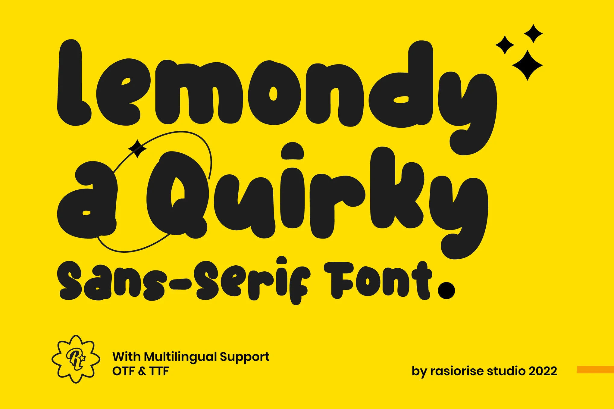
Free iPhone 11 Mockup Template

Next up is a treat for all visual designers out there. This iPhone 11 mockup template comes with 2 scenes with different perspectives and views. The iPhone is placed on a concrete slab. The best part is that the template is available for free download.

iPhone X – 4K Mockups

The iPhone X mockups in this bundle come in 4K resolution. They’re perfect for print campaigns and high-resolution website designs. The PSD file also comes fully layered for easy customization.

iPhone 7 Plus Realistic PSD Mockups

A set of highly creative iPhone 7 mockups that features a beautiful and a creative environment. This pack comes with 15 different PSD mockup files featuring different scenes and perspectives of the device.

iPhone 7 Plus Mockup 6

This mockup features a natural background of a coffee shop environment. It’s ideal for presenting your website and other types of designs related to restaurants, coffee shops, and hotels.

Colorful iPhone Mockups With Hand

A bundle of 14 iPhone mockups that shows the device being held by a hand. These mockups also come with 14 colorful backgrounds as well as retina-ready resolution.

iPhone 7 & 7+ Mockups

iphone-7-7-plus-mockups

You’ll find mockups for both iPhone 7 and iPhone 7 Plus in this bundle, in all 5 colors (Jet Black, Black, Gold, Rose Gold, Silver). The bundle includes 15 PSD files featuring 4 different angles of the devices.

iPhone 7 Mockups Pack

iphone-7-mockups-pack

This bundle includes mockups of the new iPhone 7, featuring all 5 colors and 4 different views of the device along with a few ready-made combinations.

iPhone 7 / Android S7 PSD Mockup

iphone-7-android-s7-psd-mockup-06

If you’re promoting an app or a product that works on both iOS and Android platforms, this mockup will definitely come in handy because it includes both iPhone 7 and Samsung Galaxy S7 mockups, in 8 different variations.

iPhone 7 Case + Device Mock-Up

iphone-7-case-device-mock-up

Another beautiful iPhone 7 case mockup, featuring all 5 color variations and changeable background.

iPhone 7+ Mockup – High Resolution

iphone-7-mock-up-high-resolution

A high-resolution iPhone 7 Plus mockup that will fit in with almost any type of a background.

iPhone 7 Silver PSD Mockup

iphone-7-silver-psd-mockup

This realistic iPhone 7 mockup features the Silver color model of the latest Apple handset.

iPhone 7 Mockup Flying Black

iphone-7-mockup-flying-black

A stylish mockup of the true black iPhone 7, including views of both front and back of the device.

iPhone 7 Mockup

iphone-7-mock-up

An iPhone 7 mockup pack featuring 7 templates, including outdoor and in-car environments.

iPhone 7 Jet Black Mockup

iphone-7-jet-black-mockup

This mockup showcases the iPhone 7 as it’s being held by a man.

iPhone 7 Duo Mockup

iphone-7-duo-mockup

This mockup bundle includes PSD mockups of the both iPhone 7 and 7 Plus, with the ability to turn on or off shadows and reflections.

iPhone 7 Mockup Isometric White

iphone-7-mockup-isometric-white

An iPhone 7 mockup that looks perfect for UX design and web design projects.

iPhone Office Work Station Mockup

uxplmn5cxgsf3wl2camo6ocdvm8bojvncjmndyink6gvaxtl37grfyqs9vusyu8a-o

A gorgeous photo of a home office workstation, complete with Keyboard, Phone, Headphones, Stationary and Office Supplies.

iPhone Vector Templates

1 (1)

Simple outline iPhone Mockups. What else can we say? Beautiful, simple, and sleek.

8 Natural iPhone Mockups

1 (1)

There are eight different mockups in the ZIP file for you to download and put your screenshots on, from a vareity of different scenarios and settings.

25+ Best Gym, Fitness, & Yoga Fonts

Featured Imgs 23

When it comes to designing for the fitness industry, the right typography can make a powerful impact. Whether you’re creating a logo for a gym, a flyer for a yoga class, or social media graphics for a fitness brand, the right font sets the tone and energizes your design.

In this post, we’ve curated a selection that captures the strength, agility, and calmness associated with these active lifestyles. You’ll find fonts that embody the intensity of a gym workout, the elegance of a yoga studio, and everything in between. Each font is chosen for its ability to communicate a distinct vibe, helping you build a strong visual identity that resonates with fitness enthusiasts.

From bold and dynamic fonts that convey power and movement to sleek, modern styles for a clean and professional look, these fonts offer something for every type of fitness project. Have a look.

Seeker – Wide Gym & Fitness Font

Seeker - Wide Gym & Fitness Font

Seeker is an expansive and trendy gym and fitness font encapsulating the spirit of athleticism and urban chic. Designed to invoke a feeling of dynamism, power and modern aesthetics, its broad range of styles and features make it suitable for sports brands, fitness products, trendy packaging labels, distinctive logos, posters, and fashion brands.

NCL Monster Beast – Gym Sport Font

NCL Monster Beast - Gym Sport Font

This is a versatile gym sports font, perfect for workout-related projects. Expertly crafted for large and small point sizes, it enhances any project, be it headlines, billboards, or logos. Offering a rich set of 1,340 glyphs in 4 styles, it supports 79 languages.

Gednner – Modern Gym & Fitness Font

Gednner - Modern Gym & Fitness Font

Gednner is a bold and authentic gym and fitness font suitable for a variety of branding projects such as logo design, t-shirt printing, or esports. Provided in both otf and ttf formats, this modern Sans Display Font also offers uppercase characters, ligatures, and alternatives, enabling versatility in a wide range of creative contexts.

Boldye – Fitness & Gym Font

 Boldye - Fitness & Gym Font

Boldye is a fitness-style font inspired by the robust style of the Reebok logo. It offers striking edgy letters with strong curves — perfect for sports-themed branding and logos. The font offers access to a multitude of unique alternatives and ease-of-use ligatures via its Open Type feature.

Spot Light – Bold Gym & Fitness Font

Spot Light - Bold Gym & Fitness Font

Spot Light is an expressive display sports font known for its visual elegance and smoothness. Its clear curves and distinct ligatures make your work captivating and professional. Versatile for both large and small sizes, it’s perfect for a range of applications from logos to product packaging, for a variety of business sectors.

Gymer – Sport & Fitness Font

Gymer - Sport & Fitness Font

Gymer is an innovative typography option dedicated to the fitness and athletic sectors. Perfect for designing logos, badges or any other sport-related visual elements, it includes OpenType Font (OTF) and TrueType Font (TTF) formats. Its sleek design portrays a dynamic and energetic vibe, reflecting the essence of fitness in every character.

Pro Dunex – Gym & Fitness Font

Pro Dunex - Gym & Fitness Font

Pro Dunex offers a sleek blend of speed and visual elegance, with clean curves and distinctive ligatures. Optimized for a variety of sizes, this versatile font is ideal for numerous projects, from logos and branding to product packaging and posters. With multilingual support and a range of typographic options included, Pro Dunex is ideal for businesses across a range of sectors.

Kantata Aksara – Ethnic Yoga Font

Kantata Aksara - Ethnic Yoga Font

Kantata Aksara blends the grace of Indian culture into a unique and stylish display typeface. This font is versatile, finding its place in anything from cultural logos and yoga merchandise to product packaging and magazine content. With expansive features including uppercase and lowercase letters, numbers, punctuation, alternates, and multi-language support, Kantata Aksara enhances any project with an ethnic touch.

Uwaisyahm – Elegant Yoga Font

Uwaisyahm - Elegant Yoga Font

Uwaisyahm is a dynamic and authentic typeface that draws inspiration from Muslim movie posters. Crafted by hand for a natural, handmade feel, the font will catch your eye with its clean lines, and vibrant character set of 205 characters. Ideal for logos, labels, t-shirt prints, product packaging, promotional materials, and more.

KAIVALYA – Clean Yoga Font

KAIVALYA - Clean Yoga Font

KAIVALYA is a clean yoga font by ikiiko that beautifully merges tradition and style. This culturally inspired serif typeface, with its multitude of stylistic alternatives, is perfect for yoga-related uses, beauty products, magazine spreads, and creating elegant logos. It comes with uppercase, lowercase, numbers, punctuation, and multilingual support in both TTF and OTF formats.

Royoga – Elegant Serif & Yoga Font

Royoga - Elegant Serif & Yoga Font

Royoga is a striking display font that stands out in various contexts, making it a versatile choice for branding projects. Perfect for creating unique logos, sporty poster designs, and more, this elegant serif and yoga-inspired font comes in three formats: OTF, TTF, and WOFF, catering to all your design needs.

Unalome – Sacred Yoga Font

Unalome - Sacred Yoga Font

Unalome yoga font marries spiritual symbolism with the art of typography, creating a unique and meaningful font, perfect for personal and spiritual growth themes. Individual characters are imbued with qualities derived from the Unalome symbol, used in Buddism to represent the path to enlightenment.

Besrage – Groovy & Yoga Font

Besrage - Groovy & Yoga Font

Imbue your branding projects with authenticity and boldness using the Besrage font. This groovy, yoga-themed display font shines in various contexts, such as posters, logos, sports, and many more. Included formats are: OTF, TTF, and WOFF. The Besrage Font offers the unique blend of grooviness and tranquility, making it an essential creative asset for your toolkit.

Zesant – Modern Yoga Font

Zesant - Modern Yoga Font

Zesant is a stylish and fluid san serif yoga font featuring a multitude of ligatures. This versatile typeface, suitable for creating striking logos and distinctive titles, offers compatibility with a range of other fonts and projects. Zesant supports multiple languages and is PUA encoded. It is wonderfully user-friendly and comes in OTF, TTF, and WOFF formats.

Gymans – Bold Gym Font

Gymans - Bold Gym Font

Gymans is an original and compelling choice for various design projects. From clothing labels to movie titles, album covers, and logos, its distinctiveness can enhance your work. The package includes OTF, TTF, and WOFF formats, giving you the flexibility and convenience to utilize it as desired.
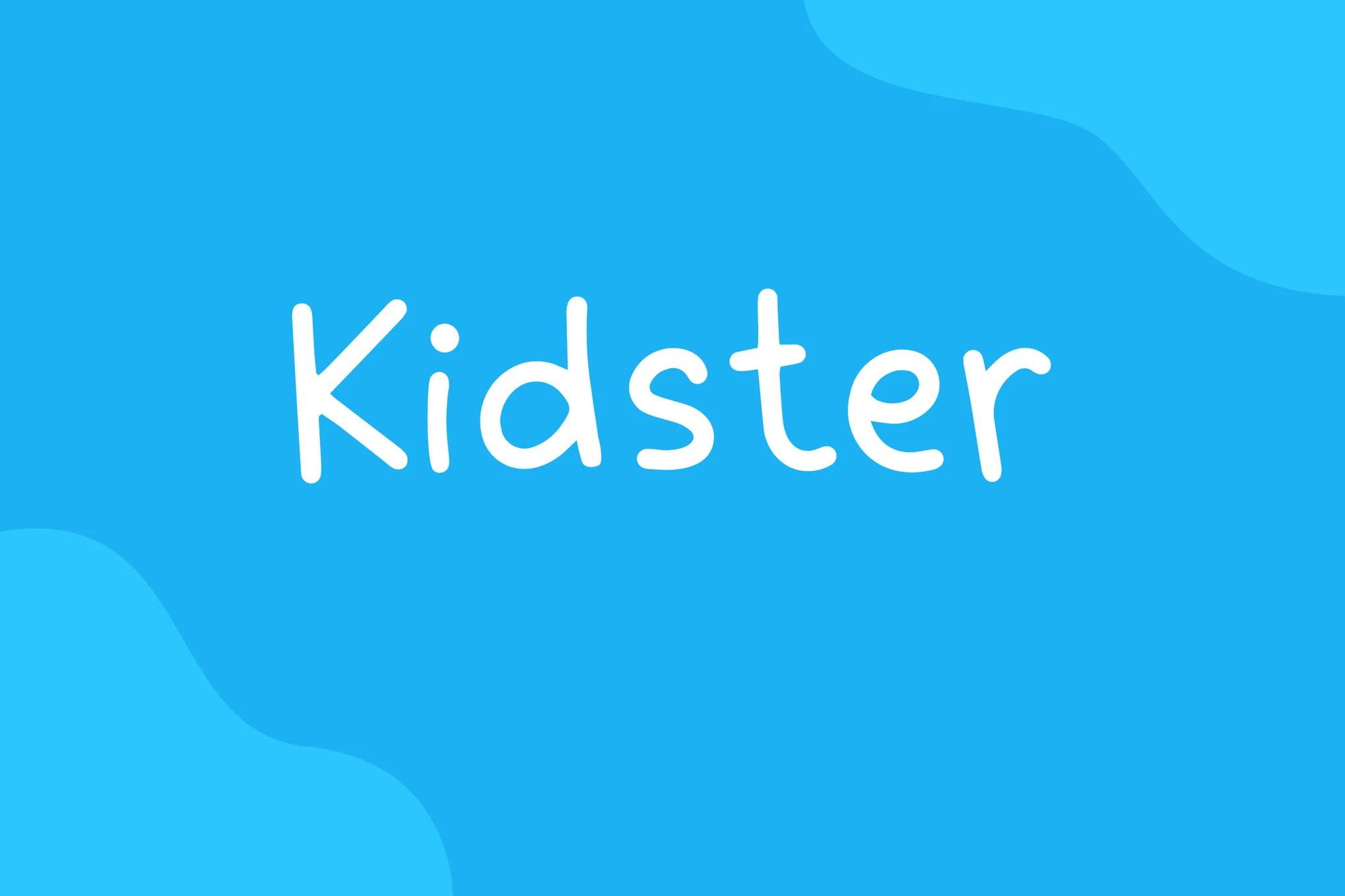
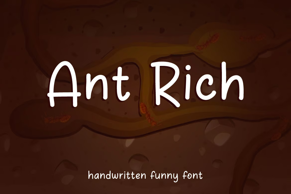
Soulder – Gym Font

Soulder - Gym Font

This is a strikingly unique font perfect for various design requirements. Its versatility lends well to labeling, movie scenes, posters, titles, album covers, logos, and much more. With high accessibility formats like OTF, TTF, and WOFF included, it ensures a user-friendly experience that enhances your design aesthetics.

Grind – Demolished Gym Font

Grind - Demolished Gym Font

Grind is a striking display typeface that embodies power and resilience. This big and bold font exudes a masculine, rugged charm that instantly captures attention. It’s the perfect choice for striking headlines or to inject a dose of strength and determination into your project.

Sprokice – Gym Font

Sprokice - Gym Font

Sprokice is an innovative, genuine display font perfect for various branding projects, such as logo creation, t-shirt printing, or esport applications. Its contemporary design stands out in numerous contexts, offering uppercase characters in both otf and ttf formats.

Sport Master – Sport & Gym Font

Sport Master - Sport & Gym Font

Sport Master is an authentic and robust gym font perfect for diverse branding projects, from sports logos to other designs. Its confident display stands out in multiple contexts. The package offers regular and italic styles, available in .OTF, .TTF, and .WOFF formats, ensuring a perfect fit for various usage scenarios.

Madrisc – Gym & Sport Font

Madrisc - Gym & Sport Font

Madrisc is an assertive gym and sport font that brings any sport-inspired project to life with its striking appeal. Ideal for sports designs, jerseys, logos, movie titles, game covers, and more, it makes any work stand out. Its features include uppercase, lowercase, numbers, punctuation, and multilingual capabilities.

Body Shape – Fitness & Gym Font

Body Shape - Fitness & Gym Font

Body Shape is a distinct typography style for use in various designs like clothing labels, movie scenes, posters, album covers, and logos, among others. It’s ready-to-use and comes in OTF, TTF, and WOFF formats, allowing for flexibility and creativity in your design endeavors.

Vaghiro – Gym & Sport Font

Vaghiro - Gym & Sport Font

Vaghiro is a versatile and unique typeface that’s perfect for a range of uses including labeling, movie titles, posters, album covers, and logos. This font, available in OTF, TTF and WOFF formats, brings a fresh and edgy aesthetic that’s particularly suited to gym and sports-themed designs.

Free Fitness & Yoga Fonts

Metashift – Free Fitness Font

This free font features a stylishly bold and creative letter design that will help you design attractive logos, titles, and headings for your fitness and gym-themed design projects. The font includes both uppercase and lowercase characters. And it’s free for personal use.

Hafespace- Free Sports & Gym Font

Hafespace is a bold and modern font that’s perfect for designing all kinds of typography related to sports and gym centers. The font has all-caps letters with a stylishly unique design. It’s free to use with personal projects.

Menseal – Free Fitness Font

This font is also free to download and it comes with a simple and clean letter design. This font is most suitable for fitness-related branding designs, especially for masculine titles and headings. The font is free for personal use.

Yogaclass – Free Script Font

Craft a beautifully elegant title for your yoga class flyer or poster with this free script font. The font features elegantly curved letters with an elegant look and feel. It’s free to use with personal projects.

Yogaday – Free Script Yoga Font

This free font is also made with yoga and wellness typography designs in mind. It’s ideal for making headings, titles, logos, and business cards for your business. The font is free to download and use with personal projects.