Zoom Stops Facebook SDK Use after Data Sharing Exposed
Zoom has updated its iOS app to stop sending specific data to Facebook. Zoom's announcement came after Motherboard reported that data such as timezone, city, device details, and time of app open were sent to Facebook without users' knowledge.
How a Bot Built in Teneo Can Make Proactive Suggestions and Offers
Sometimes we want our bot to give some extra information that the user did not explicitly request, such as special deals, promotions, and more. In Teneo, this can be achieved using prompt triggers.
Prompt triggers are tested after the normal flow execution, right before the response is given. If a prompt trigger matches, the flow containing this trigger will be executed and the resulting output will be added to the response. In the example below, the first part of the bot answer comes from the ‘User wants to order coffee’ flow, while the second, highlighted, part comes from a flow that has a prompt trigger:
4 CSS Grid Properties (and One Value) for Most of Your Layout Needs
CSS Grid provides us with a powerful layout system for websites. The CSS-Tricks guide gives you a comprehensive overview of Grid’s properties with layout examples. What we’re going to do here is a reverse approach to show you the smallest possible set of grid properties you need to know to meet most of your layout needs.
These five properties will get you up and running:
display(for thegridvalue)grid-template-columnsgrid-gapgrid-auto-flowgrid-column/grid-row
Here’s how simple it is. Let’s assume you want to implement the following layout for small, medium and large screens.


This is the markup we’ll be working with:
<!-- Stuff before -->

<nav class="container-nav">
  <ul>
    <li></li>
    <li></li>
    <li></li>
    <li></li>
    <li></li>
    <li></li>
    <li></li>
    <li></li>
    <li></li>
  </ul>
</nav>

<div class="container-main">
  <section class="item item-type-a"></section>
  <section class="item item-type-b"></section>
  <section class="item item-type-b"></section>
  <section class="item container-inner">
    <section class="item-inner"></section>
    <section class="item-inner"></section>
    <section class="item-inner"></section>
    <section class="item-inner"></section>
    <section class="item-inner"></section>
  </section>
</div>

<!-- Stuff after -->
If we apply a few baseline styles, this is what we get, which is already sufficient for small screens:
Now we can get into the grid properties!
Use display: grid to divide the page into independent layout containers
First, we need to determine which parts of the page should be aligned with grid layouts. It is possible to define a single grid layout for the whole page. However, for websites with a very complex structure (e.g. news websites), handling a large grid quickly becomes complicated to wrangle. In this case, I recommend breaking things down into several, independent grid containers.
Like this:

Where do you draw the line between what is and isn’t a grid? Here’s a personal rule of thumb I follow:
If the layout in a particular part of the page does not fit into the grid of an adjacent or surrounding part of the page, make that part its own grid container.
I have drawn the grid lines into the page section with the class .container-main in the following image You may notice that the section with the .container-inner class from the markup does not fit exactly into the grid of rows.

Here’s another possible layout where the small sections fit into the surrounding grid if a finer line raster is chosen. A separate grid container is not absolutely necessary here.

To kick this off, let’s .container-main into a grid container. This is the basic building block for CSS Grid — turning an element into a grid container with the display property:
.container-main {
  display: grid;
}
We’ll want to do the same with our other grid containers:
.container-inner {
  display: grid;
}

.container-nav {
  display: grid;
}
Use grid-template-columns to define the required columns
Next, we’re going to define the number of columns we need in each grid container and how wide those columns should be. My guideline for the number of columns: use the smallest common multiple of the maximum number of columns required for the different screen sizes.
How does that work? The .container-main element has a total of two columns on medium-sized screens. If we take that and multiply it by the number of columns on large screens (three), we get a total of six columns.
We can do the same for our navigation, the .container-inner element. There are three columns on medium-sized screens, which we multiple by one column on large screens to get a total of three columns.
The .container-nav element provides no number of columns. In this case, the grid system should automatically adjust the number of columns to the number of menu elements. It’s common to add or remove items in a navigation, and it’d be great if it responded accordingly, which is something grid can help us with a little later on.
OK, so we defined the number of columns for each grid container. Let’s use the grid-template-columns property to set those into place. But, first a couple of minor details:
- The
grid-template-columnsproperty is only used on the grid container. In other words, you won’t find it being used (at least correctly) on a grid item inside the container. - The property accepts a bunch of different values that both define the number of columns and how wide they should be. The one we’re interested in here is the fractional (
fr) unit. I’d highly suggest checking out Robin’s overview because it’s unique to grid and does an amazing job doing calculations to decide how grid elements fit inside a grid container.
We need six equal-width columns in .container-main. We can write that like this:
.container-main {
  display: grid;
  grid-template-columns: 1fr 1fr 1fr 1fr 1fr 1fr;
}
Or, we can turn to the repeat() function to simplify it into something more readable:
.container-main {
  display: grid;
  grid-template-columns: repeat(6, 1fr);
}
Let’s take that knowledge and apply it to our .container-inner element as well, which we decided needs three columns.
.container-inner {
  display: grid;
  grid-template-columns: repeat(3, 1fr);
}
Use grid-gap to add spacing between grid items
By default, grid uses all the space it has in a grid container to fit in grid items. Having elements flush next to one another might be a design requirement, but not for the particular layout we’re making. We want some breathing room between things!
We have the grid-gap property for that. Again, this is a property that’s just for grid containers and what it does is create vertical and horizontal spacing between grid items. It’s actually a shorthand property that combines the vertical spacing powers of grid-row-gap and horizontal spacing powers of grid-column-gap. It’s handy that we’re able to break things out like that but, in times like this where we’re working with the same amount of spacing in each direction, the shorthand grid-gap is much nicer to write.
We want 20px of space between grid items in .container-main, 10px of space in .container-inner, and 5px of space in .container-nav. No problem! All it takes is a one-liner on each grid container.
.container-main{
  display: grid;
  grid-template-columns: repeat(6, 1fr);
  grid-gap: 20px;
}

.container-inner {
  display: grid;
  grid-template-columns: repeat(3, 1fr);
  grid-gap: 10px;
}

.container-nav {
  display: grid;
  grid-gap: 5px;
}
Use grid-column and grid-row to determine the size of the individual grid items
Now it is time to put the layout into the shape we want it!
First is the grid-column property, which allows us to extend a grid item across n columns, where n is the number of columns to span. If you’re thinking this sounds an awful lot like the rowspan attribute that lets us extend cells across multiple rows in HTML tables, you wouldn’t be wrong.
It looks like this when we use it on a grid .item in our .container-main element, and on the .inner-item elements in .container-inner:
.item {
  grid-column: span 6;
}

.item-inner {
  grid-column: span 3;
}
What we’re saying here is that each item span six rows in our main container and three rows in our inner container — which is the total number of columns in each container.
An interesting thing about CSS Grid is that we are able to name the lines of the grid. They come with implicit names out of the box but naming them is a powerful way to distinguish between the starting and ending lines for each column on the track.
We can change the number of columns and rows the items should span at different breakpoints:
@media screen and (min-width: 600px) {
  .item-type-b {
    grid-column: span 3;
  }

  .item-inner {
    grid-column: span 1;
  }
}

@media screen and (min-width: 900px) {
  .item {
    grid-column: span 2;
    grid-row: span 2;
  }

  .item-type-b{
    grid-row: span 1;
  }

  .item-inner{
    grid-column: span 3;
  }
}
Using grid-auto-flow to control the placing of the elements
CSS Grid places elements one row after the other. This is why the result in our example looks like this at the moment:

A column-by-column placement can be achieved by setting the grid-auto-flow property to column (row is the default value). Our layout will profit from column-wise placement in two cases. First, it makes our menu items finally appear in a horizontal orientation. Secondly, it brings the elements of the container class into the desired grouping.
The final result
Conclusion: More or less specification?
The grid system allows us to work under the motto, “make as many specifications as necessary, but as few as possible.” We’ve only covered a few of the specifications necessary to turn elements into a CSS grid container and the items inside it into grid items for the sake of showing just how little you need to know to build even complex layouts with CSS Grid.
CSS Grid supports additional use cases where:
- We want to make even fewer specifications in order to instead rely more on automatic positioning.
- We want to make even more specifications in order to determine more details of the resulting layout.
If the first case applies, then it’s worth considering the following additional grid options:
- When creating the grid with
grid-template-columns, you can have the grid system automatically determine the width of individual columns with the auto keyword or adapt it to the existing content with the settingsmin-content,max-content, orfit-content. - You can let the grid system automatically determine the number of required columns with the help of
repeat,auto-fill,auto-fit, andminmax. Even media queries can become redundant and these tools help make things flexible without adding more media queries.
Here are a couple of articles on the topic that I recommend: Becoming a CSS Grid Ninja! and Auto-Sizing Columns in CSS Grid: auto-fill vs. auto-fit.
If the second case applies, CSS Grid offers even more settings options for you:
- You can explicitly specify the width of the columns in the unit of your choice (e.g.
pxor%) using thegrid-template-columnsproperty. In addition, the propertygrid-template-rowsis available to define the number and width of rows, should there be a specific number of them. - You can also define specific column or row numbers for positioning as values for
grid-columnandgrid-row(or use the propertiesgrid-column-start,grid-column-end,grid-row-start, orgrid-row-end).
And we haven’t even gotten into CSS Grid alignment! Still, the fact that we can accomplish so much without even broaching that topic shows how powerful CSS Grid is.
The post 4 CSS Grid Properties (and One Value) for Most of Your Layout Needs appeared first on CSS-Tricks.
How They Fit Together: Transform, Translate, Rotate, Scale, and Offset
Firefox 72 was first out of the gate with “independent transforms.” That is, instead of having to combine transforms together, like:
.el {
  transform: translate(10px, 10px) scale(0.95) rotate(10deg);
}
…we can do:
.el {
  rotate: 10deg;
  scale: 0.95;
  translate: 10px 10px;
}
That’s extremely useful, as having to repeat other transforms when you change a single one, lest remove them, is tedious and prone to error.
But there is some nuance to know about here, and Dan Wilson digs in.
Little things to know:
- Independent transforms happen first. The
transformproperty happens last and stacks on top of what has already been done, which can get confusing¹. - They all share the same
transform-origin. - The
offset-*properties also effectively moves/rotates elements. Those happen after independent transforms and beforetransform.
- Claus Colloseus wrote in to fix some issues in this post and clarify just how confusing this can be. For example,
rotate: 45deg; transform: rotate(-45deg);will do nothing as both of them will apply and effectively cancel each other out. So shouldn’ttranslate: 50px 0; rotate: 45deg; transform: translate(-50px, 0) rotate(-45deg);also all cancel out? No, because of the ordering, the end result is liketranslate(14.6447px, -35.3553px).
Direct Link to Article — Permalink
The post How They Fit Together: Transform, Translate, Rotate, Scale, and Offset appeared first on CSS-Tricks.
How to Work with Clients During a Crisis
When a crisis such as COVID-19 comes along, it can throw so much of our daily lives into disarray. Routines are disrupted, plans are changed and everyone scrambles to adjust.
For your web design clients, this is a time of great uncertainty. Some, especially small businesses, may be in a fight for survival.
This is when a website can serve as a lifeline. Business owners can use it as a means to share important information. And, unlike the chaos of social media, visitors will be able to easily find out what they need to know. They’ll also be able to come back time and again to check for the latest updates.
All of this can mean a lot of extra work for web designers. And the emergency nature of these tasks can pile stress on top of an already-demanding job.
So, how do you deal with it? Here are some ways to both help your clients and yourself during a crisis.
The Freelance Designer Toolbox
Unlimited Downloads: 500,000+ Web Templates, Icon Sets, Themes & Design Assets
All starting at only $16.50 per month
Try to Remain Calm
It’s really hard to do your job when you feel panicked or overwhelmed. But that feeling is also understandable. Your inbox is full, your phone won’t stop ringing. Anyone would get frazzled in this type of circumstance.
Still, you have things to do. The first step in all of this is to take a deep breath and realize that you’re going to be O.K. You’ll undoubtedly feel stress, but you have the ability to get through the tough times.
It may also help to think about the fact that others are going through the exact same thing. You aren’t in this alone. Knowing that virtually everyone is being impacted can help put things in perspective.
In addition, it’s worth taking a moment to think about how you are helping. The fact that you’re making even a small difference for your clients (and their customers) is something to be proud of.

Organize and Communicate
Clients will come to you with requests to add emergency info – and they’ll want it done quickly.
To cope, you’ll need to come up with a process for handling these tasks. Perhaps it’s first-come, first-serve. Or maybe you want clients to fill out a support ticket to help keep track of everything. Whatever your preference, it’s important to have a way to manage things in a way that makes sense for you.
Then, once you have a process that you’re comfortable with, it’s important to let your clients know. Send an email newsletter out that outlines what you’re doing. Also make mention of how the situation could affect the timeline for getting things done.
People tend to be more understanding of policies and procedures when they know about it ahead of time. Communicating your plan will allow your clients to know what to expect.

Streamline Tasks
While every client’s needs are different, there are probably a number of similarities. If you look closely enough, you might just find some ways to use them in order to increase efficiency.
For example, if all or most of your clients are running WordPress, that’s something to take advantage of. The technical similarity means that you could use a similar process for posting information. It might be a helpful plugin or the use of a feature such as custom fields.
In addition, there might be certain design elements and code snippets that could be reused. Having even a basic template in hand means that you won’t have to reinvent the wheel for each client.
This could be a huge help in crossing items off of your ever-growing to-do list. That, in turn, makes for happy clients and a bit less stress in your life.

Remember the Human Element
Above all, a crisis is a time for people to work together towards a common goal. Web designers have a positive and productive role to play.
Customer service is always a big deal. It’s a defining factor in the success of your business. But it is especially appreciated during a difficult time of crisis. It’s important to keep that in mind when interacting with others.
Handling yourself with professionalism and empathy is the right thing to do. It will also help strengthen your bond with clients.
There will always be periods of time that are challenging. Look at them – not just with concern – but as an opportunity to be your very best.
15+ Ways to Prevent Burnout (Today and in the Future)
Louis’ Top 10 Book Series for Kids (aged 6-10)
Creating a Pencil Effect in SVG
Scott Turner, who has an entire blog "Exploring procedural generation and display of fantasy maps", gets into why vector graphics seems on these surface why it would be bad for the look of a pencil stroke:
Something like this pencil stroke would require many tens of thousands of different elements. Basically each little blob of gray in that image would be separately defined.
But, SVG filters to the rescue.
It's all about <feTurbulence>.
Direct Link to Article — Permalink
The post Creating a Pencil Effect in SVG appeared first on CSS-Tricks.
How to use CSS Scroll Snap
Nada Rifki demonstrates the scroll-snap-type and scroll-snap-alignCSS properties. I like that the demo shows that the items in the scrolling container can be different sizes. It is the edges of those children that matter, not some fixed snapping distance.
I like Max Kohler's coverage as well, which includes a demo where the snapping can happen in multiple directions.
This is one of those things where, if you didn't know about it, it's worth a solid golf clap for CSS.
Direct Link to Article — Permalink
The post How to use CSS Scroll Snap appeared first on CSS-Tricks.
Font Awesome Releases New COVID-19 Awareness Icons
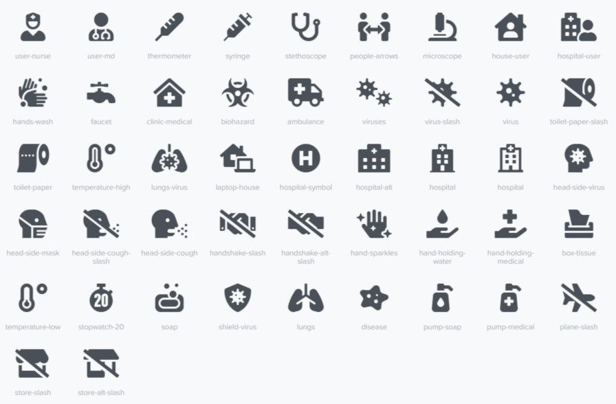
On Monday, the Font Awesome team launched a new set of icons to promote awareness around COVID-19. The solid icons available in the Font Awesome 5.13 update are all available for free and are open-source. The regular, light, and duotone versions of the icons are a part of the pro package.
The goal of the new icons is to help websites and apps boost awareness around the global pandemic. The latest update adds 47 new icons that range from medical use to promoting hygienic practices such as hand washing. Some icons represent viruses and social/physical distancing. There is even a couple of toilet paper icons thrown in for good measure. Apparently, those are necessary in today’s world of mass panic buying.
“Based on recommendations from The World Health Organization and others, you’ll find symbols to communicate good hygiene and social distancing,” wrote Jory Raphael, Icon Design Lead at Font Awesome. “While we can’t be on the front lines like brave medical professionals across the globe, we hope these icons aid in communicating some of the most important things people can do to protect themselves and their communities.”
The icons were originally requested two weeks ago on the Font Awesome GitHub repository. The design team moved quickly to make them available. There are additional icon tickets for liquid soap and a bar of soap open.
Like all Font Awesome icons, the new icons are available as part of the font package or for download as individual SVG files.
The fonts may come in handy for website owners, designers, and developers who are building sites or pages with content related to COVID-19. Icons can add context to content or focus attention where needed.
Users of the Font Awesome WordPress plugin should have immediate access to the new icons if needed. The plugin relies on the external Font Awesome CDN or Font Awesome kits. Users can also choose which version of the library of icons they wish to use, which includes the latest release.
If you know of any other icon sets or resources for designers and developers related to COVID-19, please share them in the comments.
Maintaining Performance
Real talk from Dave:
I, Dave Rupert, a person who cares about web performance, a person who reads web performance blogs, a person who spends lots of hours trying to keep up on best practices, a person who co-hosts a weekly podcast about making websites and speak with web performance professionals… somehow goofed and added 33 SECONDS to their page load.
This stuff is hard even when you care a lot. The 33 seconds came from font preloading rather than the one-line wonder of font-display.
I also care about making fast websites, but mine aren't winning any speed awards because I'll take practical and maintainable over peak performance any day. (Sorry, world)
Direct Link to Article — Permalink
The post Maintaining Performance appeared first on CSS-Tricks.
Top reasons to go for a responsive web design
As there is an exponential growth in the number of mobile and tablet, it is important for the brands to ensure that their website design is user responsive and makes it easy for them to navigate easily. Listed below are the top reasons for choosing responsive web design: Mobile Usage Is on The Rise As […]
The post Top reasons to go for a responsive web design appeared first on designrfix.com.
How to Repeat Text as a Background Image in CSS Using element()
There’s a design trend I’ve seen popping up all over the place. Maybe you’ve seen it too. It’s this sort of thing where text is repeated over and over. A good example is the price comparison website, GoCompare, who used it in a major multi-channel advertising campaign.

Nike has used it as well, like in this advertisement:

I couldn’t help but wonder how I would implement this sort of design for the web. I mean, we could obviously just repeat the text in markup. We could also export the design as an image using something like Photoshop, but putting text in images is bad for both SEO and accessibility. Then there's the fact that, even if we did use actual text, it’s not like we’d want a screen reader speak it out.
Versatility
Versatility
Versatility
Versatility
OK, stop already!
These considerations make it seem unrealistic to do something like this on the web. Then I found myself pining for the long-existing, yet badly supported, element() feature in CSS. It enables the use of any HTML element as a background image, whether it be a single button element, or an entire <div> full of content.
According to the spec:
The element() function only reproduces the appearance of the referenced element, not the actual content and its structure. Authors should only use this for decorative purposes.
For our purposes, we’d be referencing a text element to get that repeating effect.
Let’s define an ID we can apply to the text element we want to repeat. Let’s call it #thingy. Note that when we use #thingy, we’ve got to prefix the element() value with -moz-. While element() has been supported in Firefox since 2010, it sadly hasn’t landed in any other browser since.
.element {
  background-image: -moz-element(#thingy);
}
Here’s a somewhat loose recreation of the Nike advertisement we saw earlier. Again, Firefox is required to see the demo as intended.
See how that works conceptually? I placed an element (#versatility) on the page, hid it by giving it zero height, set it as the background-image on the body, then used the background-repeat property to duplicate it vertically down the page.
The element() background is live. That means the background-image appearance on the thing using it will change if the referenced HTML element changes. It’s the same sort of deal when working with custom properties: change the variable and it updates everywhere it’s used.
There are, of course, other use cases for this property. Check out how Preethi used it to make in-page scrolling navigation for an article. You could also use a HTML canvas element as a background if you want to get fancy. One way I’ve used it is to show screenshots of pages in a table of contents. Vincent De Oliveira, has documented some wildly creative examples. Here's an image-reflection effect, if you’re into retro web design:
Pretty neat, right? Again, I wish I could say this is a production-ready approach to get that neat design effect, but things are what they are at the moment. Actually, that’s a good reminder to make your voice heard for features you’d like to see implemented in browsers. There are open tickets in WebKit and Chromium where you can do that. Hopefully we’ll eventually get this feature in Safari-world and Chrome-world browsers.
The post How to Repeat Text as a Background Image in CSS Using element() appeared first on CSS-Tricks.
How to mirror api result using file_get_contents but the output is pretty
Hello everone my name is reidho i have a problem with my code, i want to mirroring a api output from somesite using file_get_contents but the results is not like the original.
Original Result :

My Mirroring Result :

The Code :
$ping = "https://api.hackertarget.com/nping/?q=8.8.8.8";
$pingkeluar   = file($ping);
foreach ($pingkeluar as $pingnya) {
echo " $pingnya ";
}Coronavirus Disrupts Google Chrome Development
Last week, Google announced Coronavirus-related delays to Chrome OS release dates. Those delays have now changed to abandonment (or version skipping). Jason Kersey, Chrome Director of Technical Program Management, made the following announcement in the Chromium Dev Google Group:
Making a “Plugin Options Page” With Gutenberg Components
View Custom Fields Meta Box in Gutenberg Block Editor
I get bunches of emails asking what happened to the "Custom Fields" meta box on the "Edit Posts" screen. They're hidden by default with the new Block Editor, so questions like, "do I need to install a plugin to get them back again?" No you don't. To view the Custom Fields for any post click the three dots in the upper-right corner of the screen, and then go to Options. There you will find a checkbox to enable Custom Fields (under "Advanced Panels"). Scroll down the page and you will see the Custom Fields meta box.
Direct link to article | View post at DigWP.com


