Essential Security Tools for Web Developers and Designers
Whether you’re designing a simple website or building complex web applications, security needs to be a priority from day one. Cyber threats like data breaches, cross-site scripting (XSS), and SQL injections are becoming more sophisticated, targeting every weakness they can find.
Fortunately, various security tools exist to help developers and designers safeguard their projects and ensure users enjoy a seamless and secure experience. This article will explore essential security tools that should be part of every developer’s toolkit.
1. OWASP ZAP

OWASP ZAP is an open-source tool that identifies vulnerabilities in web applications. It scans for security weaknesses like SQL injection, cross-site scripting (XSS), and authentication flaws. OWASP ZAP offers automated and manual testing options, making it useful throughout the development lifecycle. Developers can also integrate it into their CI/CD pipelines, catching vulnerabilities before they reach production.
By using OWASP ZAP early and often, development teams can adopt a proactive approach to security, preventing common attacks from slipping through the cracks. It also provides detailed reports that guide developers on mitigating issues, ensuring every code change aligns with security best practices.
2. Burp Suite
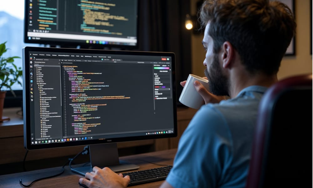
Burp Suite is a powerful tool designed for web application security testing. It provides developers with tools to inspect HTTP requests, manipulate data, and simulate attacks. Burp Suite’s automated scanner detects vulnerabilities, while its manual tools allow security experts to perform deep-dive testing on complex issues.
The platform’s modular nature makes it easy to customize testing processes. With features like Intruder for brute-force testing and Repeater for request manipulation, Burp Suite offers flexibility for both automated and manual testing. These capabilities help developers address logic flaws, broken authentication, and access control issues that automated scanners might miss.
3. VPN
Remote work becoming the new norm, VPNs are essential for developers who need secure access to servers, platforms, and databases from various locations. A reliable VPN ensures that online activities remain encrypted and private, helping prevent data leaks and unauthorized access. By using industry-standard AES-256 encryption and specialized protocols, VPNs provide a secure option for accessing sensitive environments—even on public Wi-Fi.
VPNs can also mask IP addresses, allowing developers to test web applications from multiple regions without compromising security. With a global network of servers, VPNs offer access to geo-restricted content and tools, enabling seamless and secure workflows regardless of the developer’s location. For example, services like AstrillVPN offer features tailored for developers, enhancing both privacy and functionality across diverse use cases.
4. Nmap
Nmap is a well-known tool for network discovery and auditing. It helps developers identify open ports, running services, and network misconfigurations that attackers could exploit. Nmap’s comprehensive scans offer insights into the entire network infrastructure, making it easier for developers to secure their systems proactively.
Using Nmap during the early stages of development ensures that potential entry points are identified and secured before launch. It’s also a valuable tool for periodic security audits, keeping infrastructure resilient against evolving threats.
5. Acunetix
Acunetix is a web vulnerability scanner that fits perfectly into DevOps workflows and offers continuous security monitoring. It automates the detection of vulnerabilities like SQL injection, XSS, and broken authentication and generates detailed reports for quick remediation. Acunetix supports CI/CD integration, making it a great fit for teams practicing agile development.
This tool stands out for its speed and accuracy, which helps developers keep up with tight release schedules while ensuring robust security. Its seamless integration into development environments allows teams to detect issues without slowing their workflow.
6. Wireshark

Wireshark is a go-to tool for analyzing network traffic and troubleshooting security issues. It provides deep insights into how data travels between a web application and its backend systems, enabling developers to detect bottlenecks, data leaks, or malicious activities. Wireshark captures and inspects data packets in real-time, allowing teams to identify and respond to anomalies quickly.
Wireshark ensures that communication channels remain secure and efficient for developers working on complex web applications. Its robust filtering options allow users to pinpoint specific traffic flows, making it an indispensable tool for network analysis and security debugging.
7. Metasploit
Metasploit enables developers to adopt an attacker’s mindset by simulating real-world cyberattacks. It provides a library of known exploits that can be used to test applications and systems, helping teams assess how well their defenses will perform under pressure. Metasploit’s penetration testing framework is essential for anyone serious about security, as it gives developers a clear understanding of their application’s vulnerabilities before malicious actors can exploit them.
8. Web Application Firewalls (WAFs)
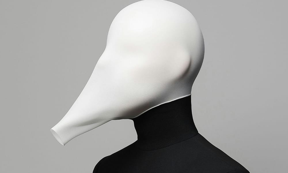
WAFs act like gatekeepers, monitoring incoming traffic and blocking anything that looks suspicious. By filtering HTTP requests, tools like AWS WAF protect against the most common web attacks, including SQL injection and XSS. For developers managing high-traffic websites or online platforms, WAFs ensure that malicious traffic never reaches the application’s backend, maintaining performance while keeping attackers at bay.
9. Secure Coding Practices and Code Reviews
Secure coding practices are the foundation of any secure web application. Developers should sanitize inputs, use parameterized queries to prevent SQL injection and apply access control mechanisms to restrict unauthorized access. Embedding security principles into the codebase from the start ensures that vulnerabilities are minimized.
Regular code reviews, both automated and manual, are essential to catch security flaws early. Developers can also use Static Application Security Testing (SAST) tools to identify vulnerabilities during development, keeping code secure throughout the project lifecycle.
10. GitGuardian
GitGuardian is a crucial tool for developers working with code repositories. It continuously scans repositories for exposed credentials, such as API keys, tokens, or passwords that may have been accidentally committed. With GitGuardian, developers can avoid the risk of attackers exploiting leaked secrets, ensuring that sensitive information stays protected. It also provides real-time alerts, enabling teams to act when potential exposures are detected immediately.
11. Snyk: Manage Open-Source Vulnerabilities
Snyk specializes in finding vulnerabilities within open-source libraries and dependencies. Modern web applications rely heavily on open-source components, so Snyk helps developers identify and patch vulnerabilities early. It integrates with DevOps tools, offering continuous monitoring to ensure dependencies remain secure throughout development cycles.
12. Security Audits and Continuous Testing: Stay One Step Ahead
Regular security audits and continuous testing play a crucial role in safeguarding digital environments. By incorporating automated testing tools alongside thorough manual audits conducted at regular intervals, organizations can swiftly identify and address emerging risks. This proactive strategy not only aids teams in adhering to established security standards but also serves as a preventive measure, ensuring that minor security concerns do not escalate into significant incidents that could jeopardize sensitive information or disrupt operations. Such diligence fosters a culture of security awareness and resilience within the organization.
13. Two-Factor Authentication (2FA)
Two-factor authentication is a simple yet powerful way to protect accounts from unauthorized access. By requiring users to provide two verification forms, like a password and a code sent to their phone, 2FA ensures that attackers can’t gain access even if passwords are compromised. Developers should implement 2FA wherever sensitive data or user information is involved, adding an extra layer of security to the application.
14. Regular Security Audits and Continuous Testing
Security isn’t something you set up once and forget, it requires continuous monitoring and improvement. Regular security audits help identify vulnerabilities introduced through updates or changes in the infrastructure. Continuous testing ensures that applications remain compliant with security standards and are ready to face new threats as they emerge. With automated scanning tools and periodic manual testing, developers can avoid potential risks and maintain a strong security posture.
In today’s digital landscape, web security is essential for developers and designers building everything from simple sites to complex applications. This article explores top security tools, including OWASP ZAP, Burp Suite, and GitGuardian, that help identify vulnerabilities, secure sensitive data, and protect against cyber threats like SQL injection and cross-site scripting. By integrating these tools into development workflows, teams can ensure a seamless, secure user experience and maintain robust defenses against evolving threats. Whether you’re a seasoned developer or just starting, these tools provide the foundation for building safer, more resilient web applications.
The post Essential Security Tools for Web Developers and Designers appeared first on CSS Author.
20+ Best Calligraphy Brushes for Procreate, Photoshop & More
Today, we bring you a unique collection of calligraphy brushes for Procreate and Photoshop that are ideal for everything from wedding invitations and branding to social media graphics.
Whether you’re a professional calligrapher, a designer, or someone who simply loves creating beautiful lettering, these brushes offer the perfect blend of traditional calligraphy charm and modern digital convenience.
With the right brush, you can easily craft stunning hand-lettered artwork, logos, invitations, and more, all from your iPad or computer.
This collection features a variety of calligraphy brushes designed to mimic real brushstrokes, ink, and pen textures, giving you the freedom to explore different styles—from classic script to modern lettering.
Each brush set is tailored for a seamless digital experience, allowing for precise control and smooth flow that feels just like working with traditional tools. Have a look.
Procreate Calligraphy Brushes
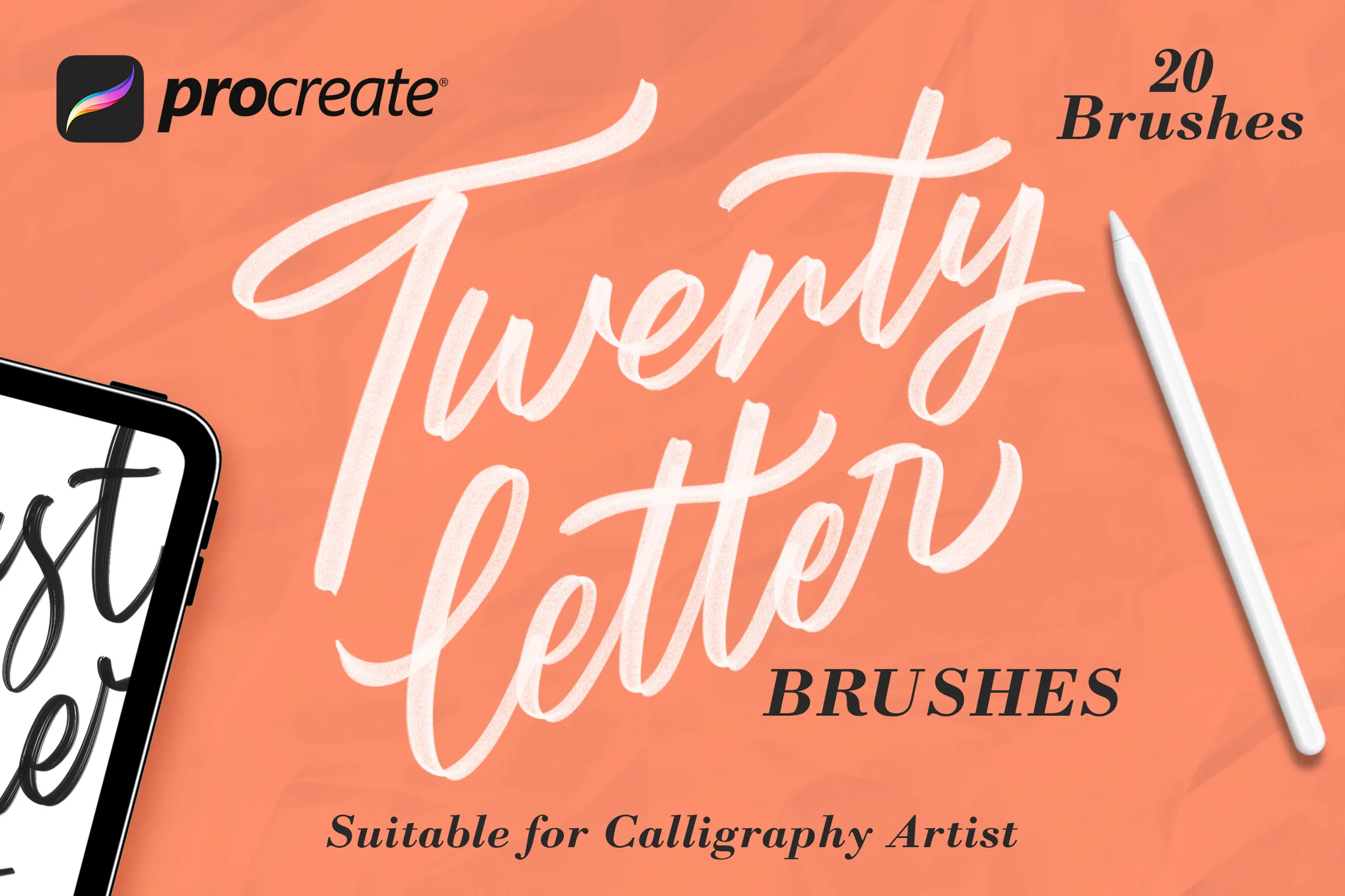
Twentyletter – Procreate Calligraphy Brushes
This Procreate calligraphy brush pack offers a range of 20 smooth, easy-to-use brushes ideal for crafting calligraphy lettering for logos, illustrations, and more. Convenient for users of all skill levels, these brushes can be seamlessly imported into your Procreate brushes panel via Files App, transforming your iPad into a versatile digital art studio.
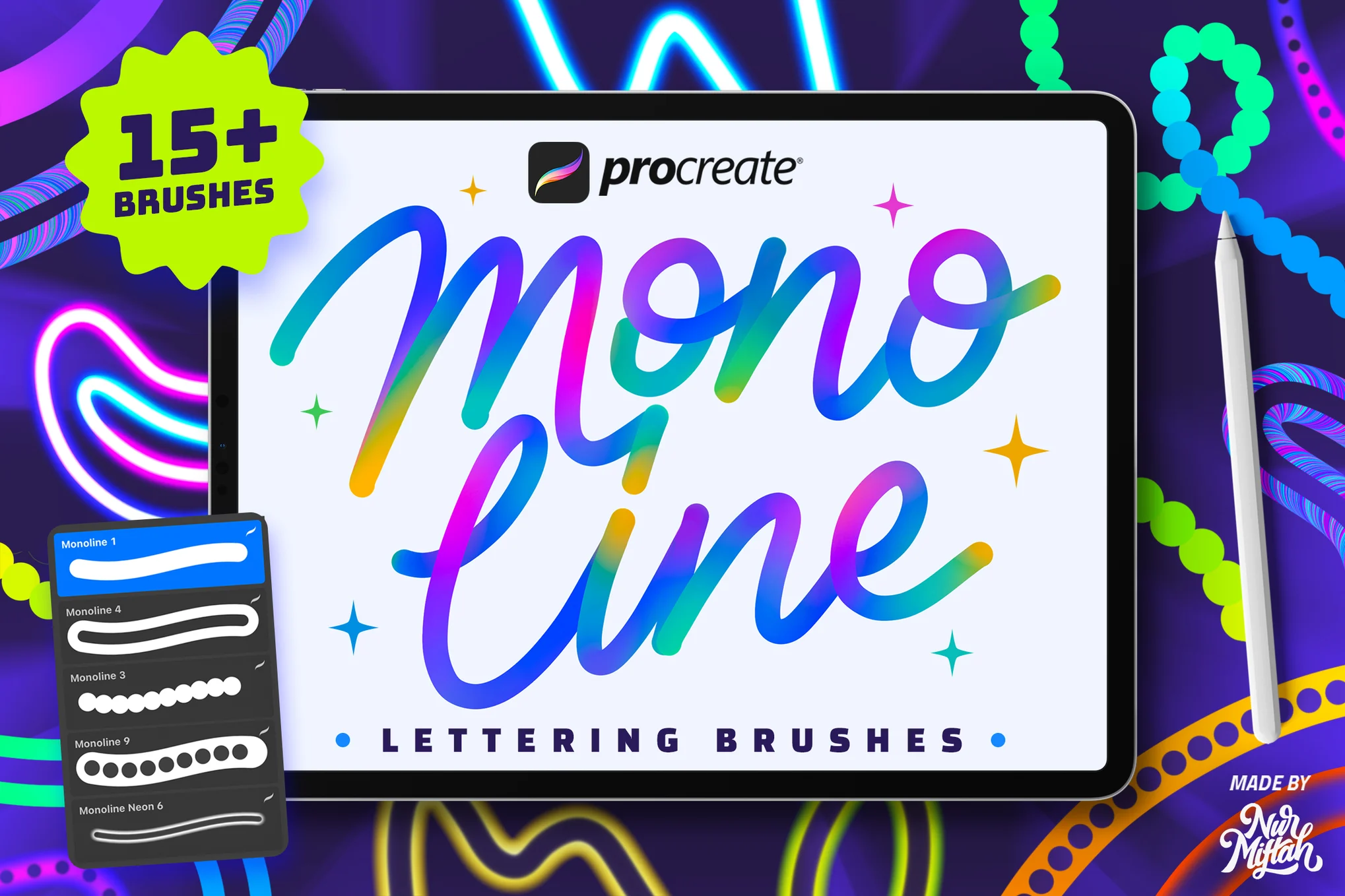
Procreate Monoline Calligraphy Brushes
This is a set of over 15 brushes specially crafted for the Procreate app. They offer a wide range of colors and neat effects like neon and rainbow in each stroke, making it the perfect tool for design, lettering, digital art, logo creation, and social media. These user-friendly brushes are compatible with Procreate 5X and earlier versions.
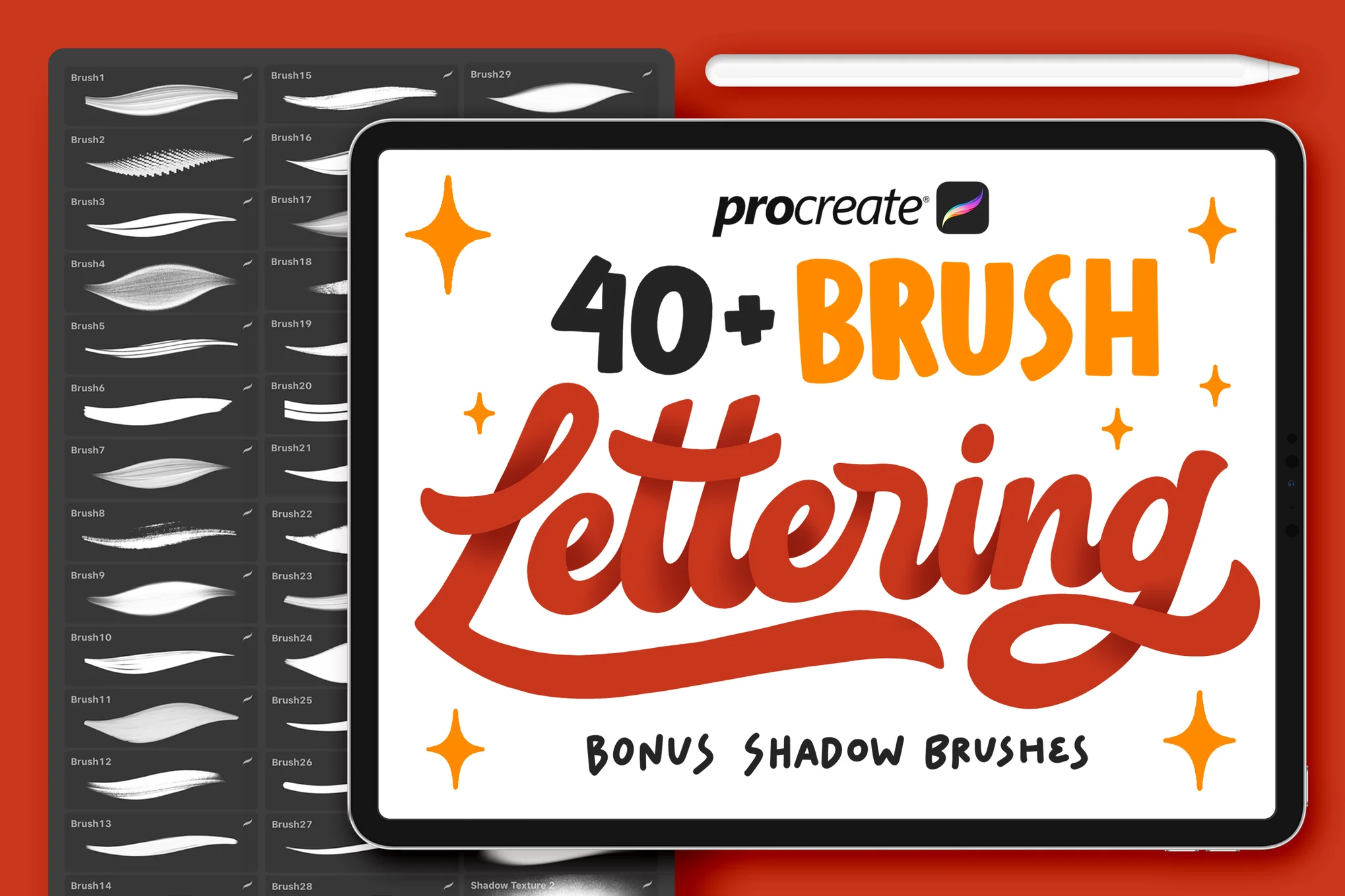
40+ Procreate Calligraphy & Lettering Brushes
This Procreate calligraphy brush pack provides a diverse variety of styles and textures for use in the iOS app, including lettering, calligraphy, ribbon, shawl, Japanese, modern, monoline, signature, spray, fire, and shadow brushes. It is important to note that these brushes are not compatible with Photoshop or other applications.
Firstype – Procreate Lettering Brushes
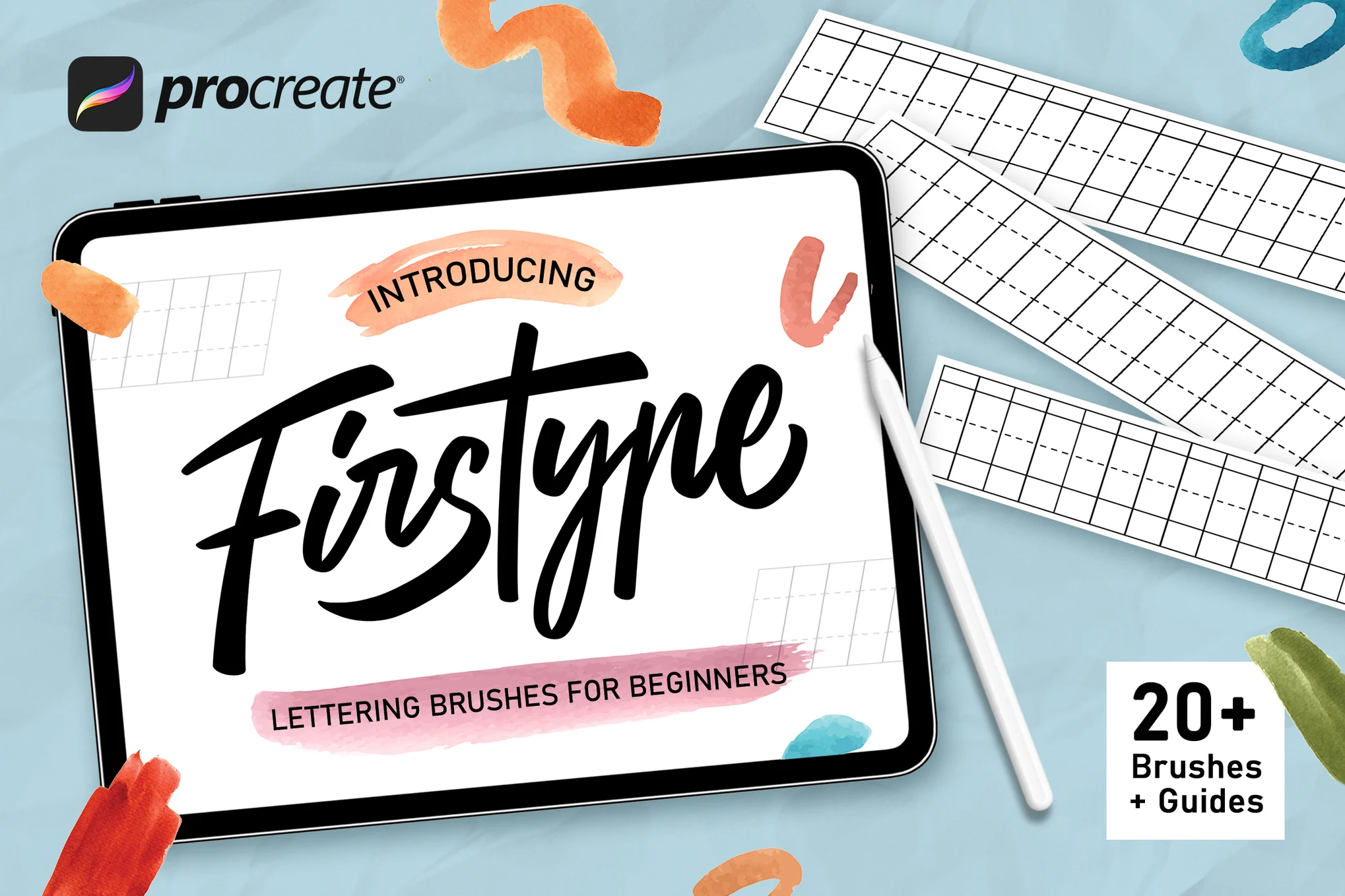
Firstype Procreate calligraphy brush set is specifically designed for beginners using the iOS app, Procreate, and contains over 20 different types of brushes including Calligraphy, Watercolour, and Blackletter. They are great for expanding your skills in lettering, calligraphy, and typography design. The package also includes six guides for lettering.
10 Procreate Lettering & Calligraphy Brushes
Another versatile set of Procreate calligraphy brushes perfect for digital lettering artisans. From refined calligraphy to playful lettering, these Procreate brushes provide a broad spectrum of possibilities, allowing your creative expression to flow effortlessly.
Procreate Blackletter Calligraphy Brush
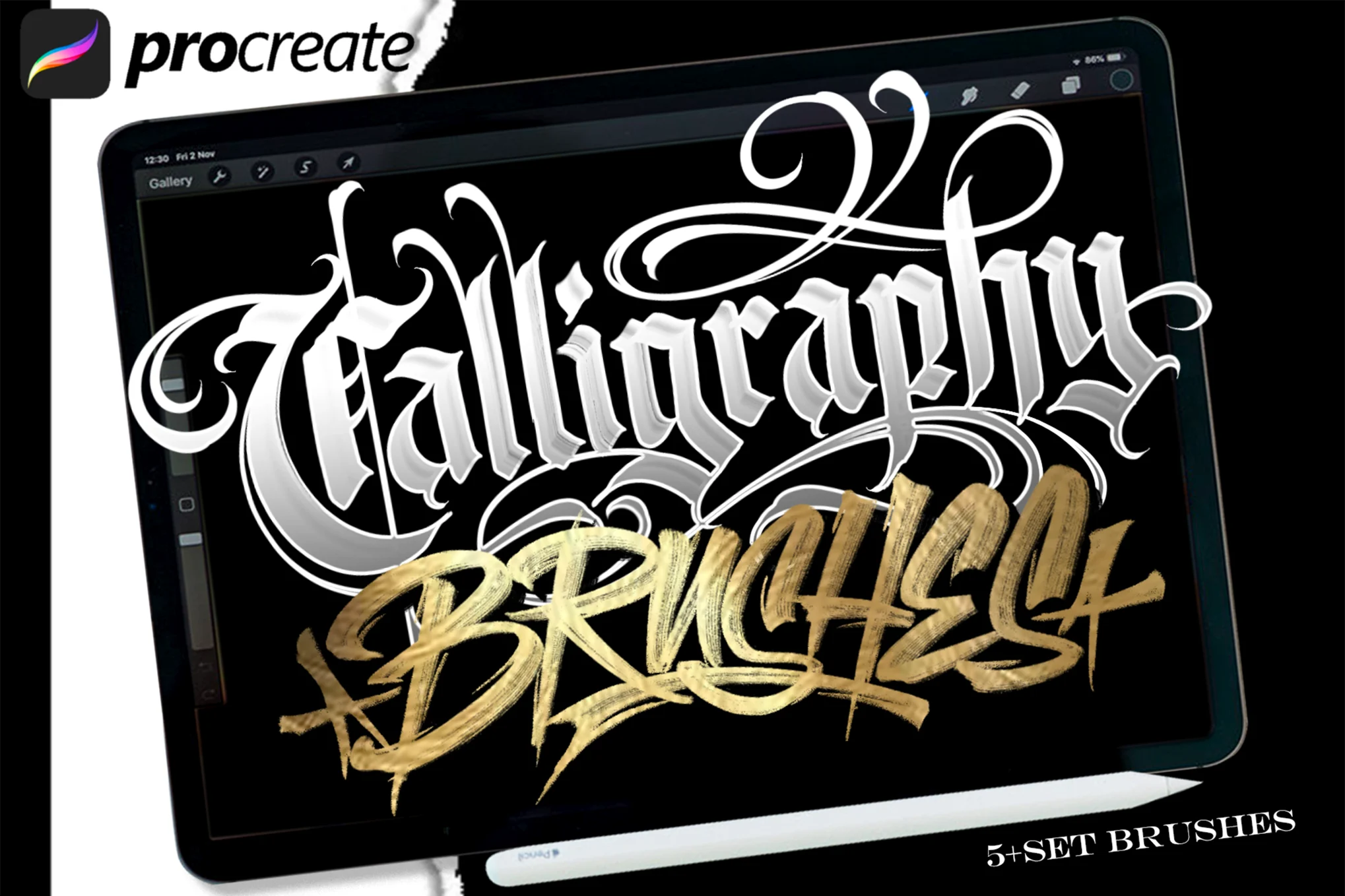
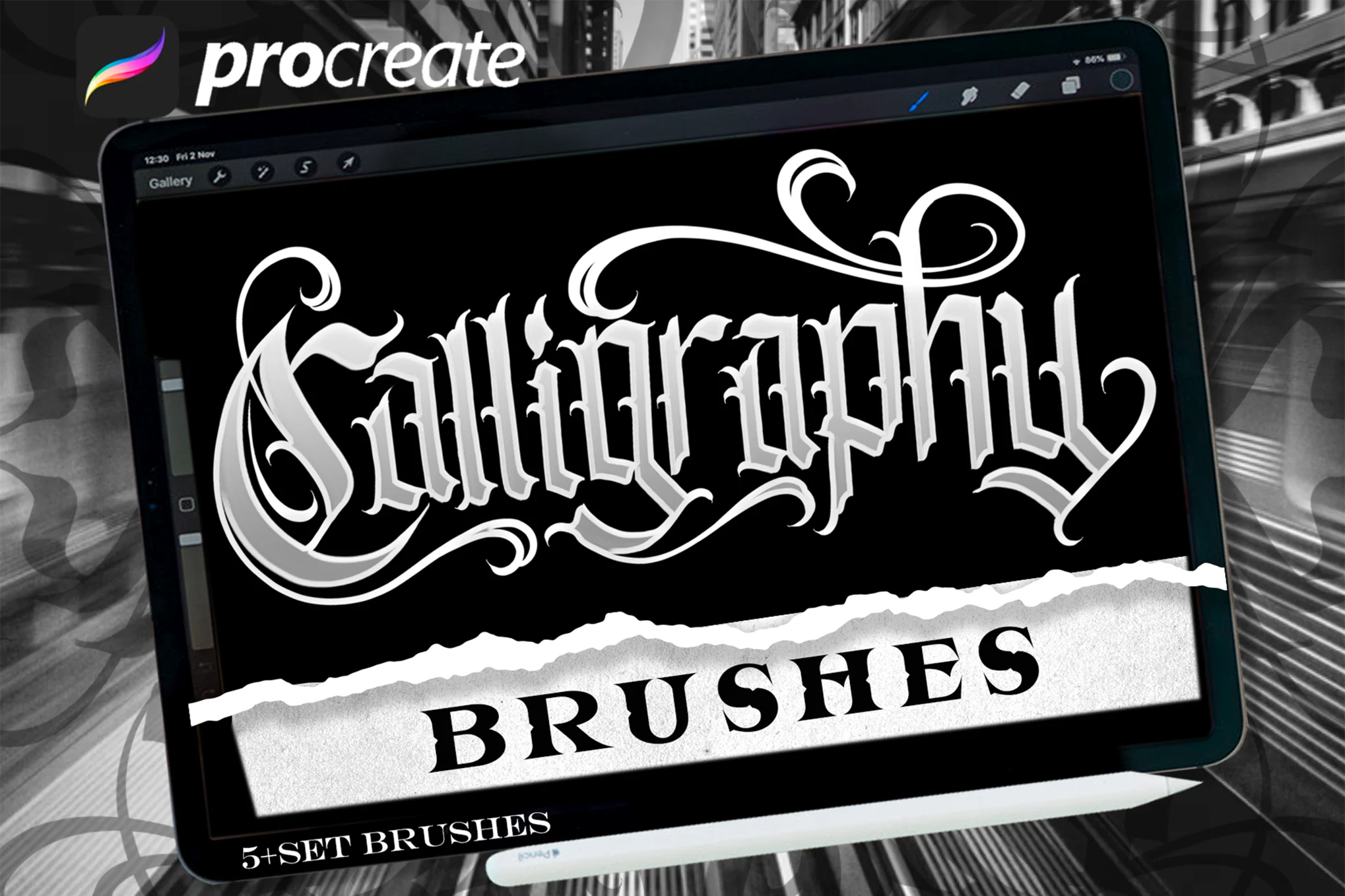
This is a creative Procreate calligraphy brush set that has been carefully crafted for lettering artists seeking to merge the analog and digital realms. The set comes with six uniquely designed brushes, enabling you to create vivid lettering designs, posters, flyers, and more with remarkable authenticity.
10 Lettering Brushes for Procreate
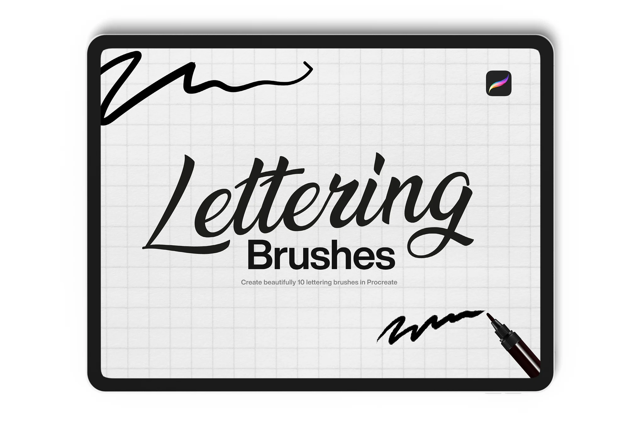
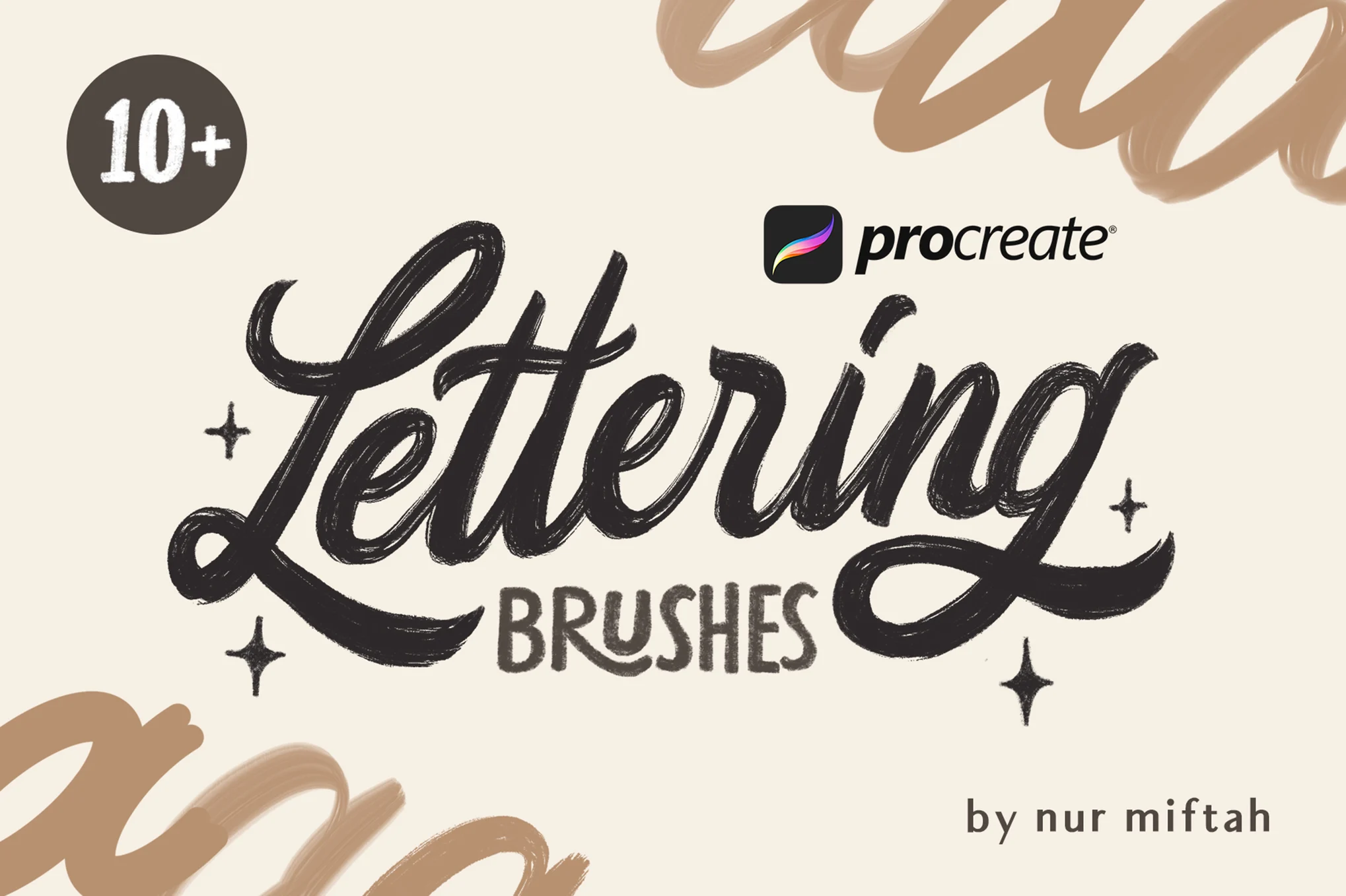
A useful Procreate brush pack for anyone interested in calligraphy. With ten distinct, smooth brushes, you can transform your iPad into a canvas for beautiful lettering. This means you get to enjoy the freedom and versatility of Procreate Brushes while achieving stunning lettering effects easily and efficiently.
Procreate Chalk Lettering Brushes
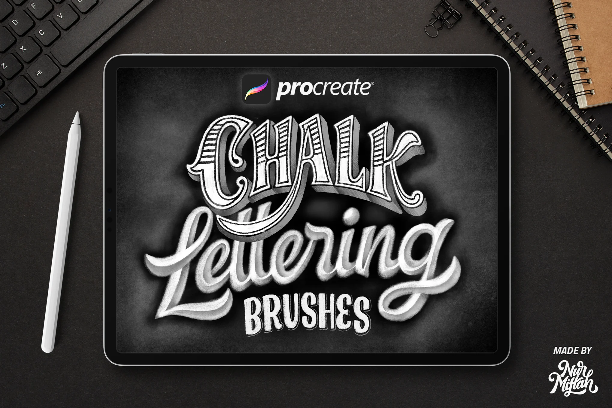
This is a unique set of Procreate calligraphy brushes designed to replicate the distinct texture of chalk strokes. They offer a wide variety of chalk brushes including coarse chalk, wet chalk, dusty chalk, and chalk eraser. Ideal for lettering and blackboard-like illustrations, they’re perfect for creating educational content, cafe menus, decorations, or lettering artwork.
Procreate Blackletter Calligraphy Brush 2
A fantastic Procreate calligraphy brush set for digital lettering enthusiasts. This versatile brush set enables users to effortlessly create analog-style artwork digitally using iPad Pro and Apple Pencil. Whether it’s calligraphic designs, posters, or flyers, these handmade, high-quality brushes offer a limitless scope for your creative expression.
Procreate Lettering Brushes
This is a diverse set of brushes exclusively designed for Procreate. Their simplicity makes them a great choice for both beginners and professionals. Excellent for various tasks such as font creation, lettering, logo development, and even designing stationery, the pack includes textured, monoline, calligraphy, and signature brushes. Compatible with Procreate 5 and prior versions, they are ready for you to enjoy.
Dry Marker Brushes for Procreate
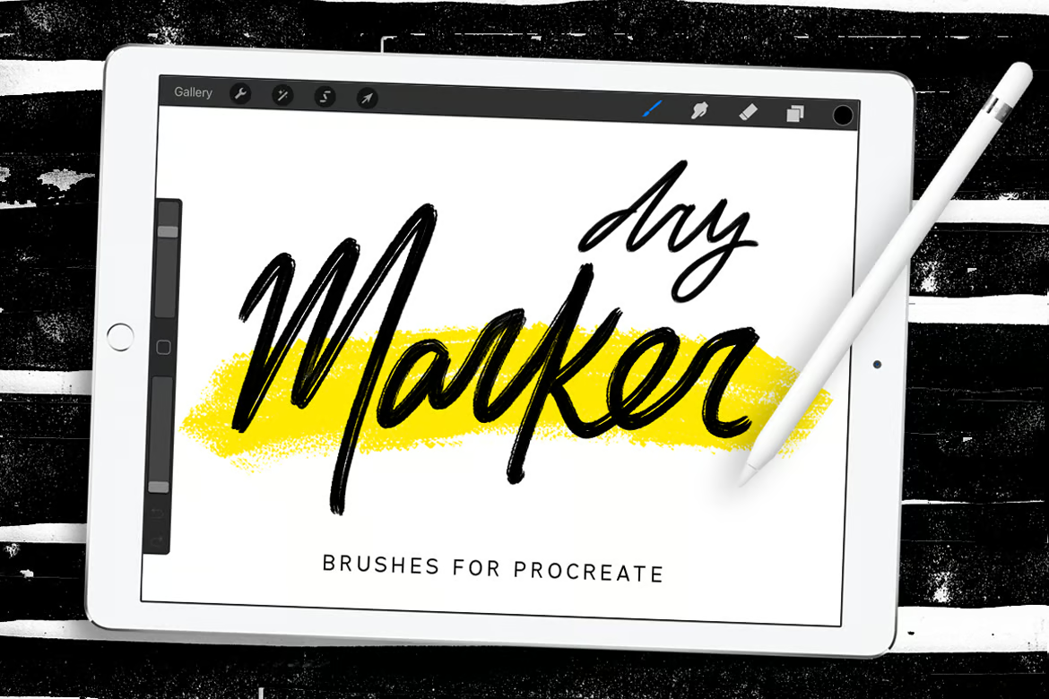
An exceptionally curated set of 15 high-quality, original brushes designed for diverse styles and effects. Ideal for crafting quotes, lettering, fonts, and graphics, these brushes also come with a bonus Procreate-specific calligraphy brush. The set, which requires an iPad Pro, Apple Pencil, and Procreate App to use, is designed solely for Procreate.
Photoshop Calligraphy Brushes
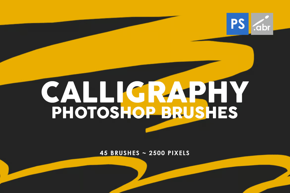
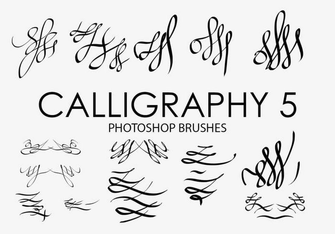
45 Calligraphy Photoshop Stamp Brushes
This calligraphy brush pack offers a unique touch to any digital project. They’re compatible with all versions of Photoshop and feature a high resolution of 2500 pixels. These versatile brushes are not simply tools, but creative assets that can bring a special charm to photos, print templates, and social media content.
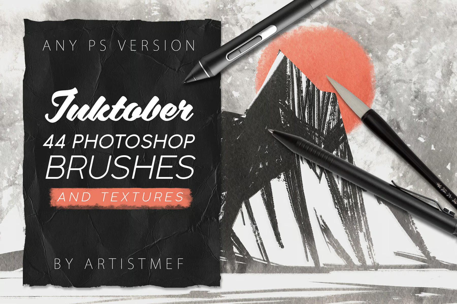
Inktober – 44 Photoshop Brushes Pack
The Inktober Photoshop brushes pack is an eclectic set of ink brushes designed for digital artists. Inside you’ll find a diverse range of brushes perfect for line art, calligraphy, painting, as well as specialized effects like spray, wet edge, and grunge. It imitates numerous painting styles, from pen drawings to Chinese art, and includes 15 bonus textures.
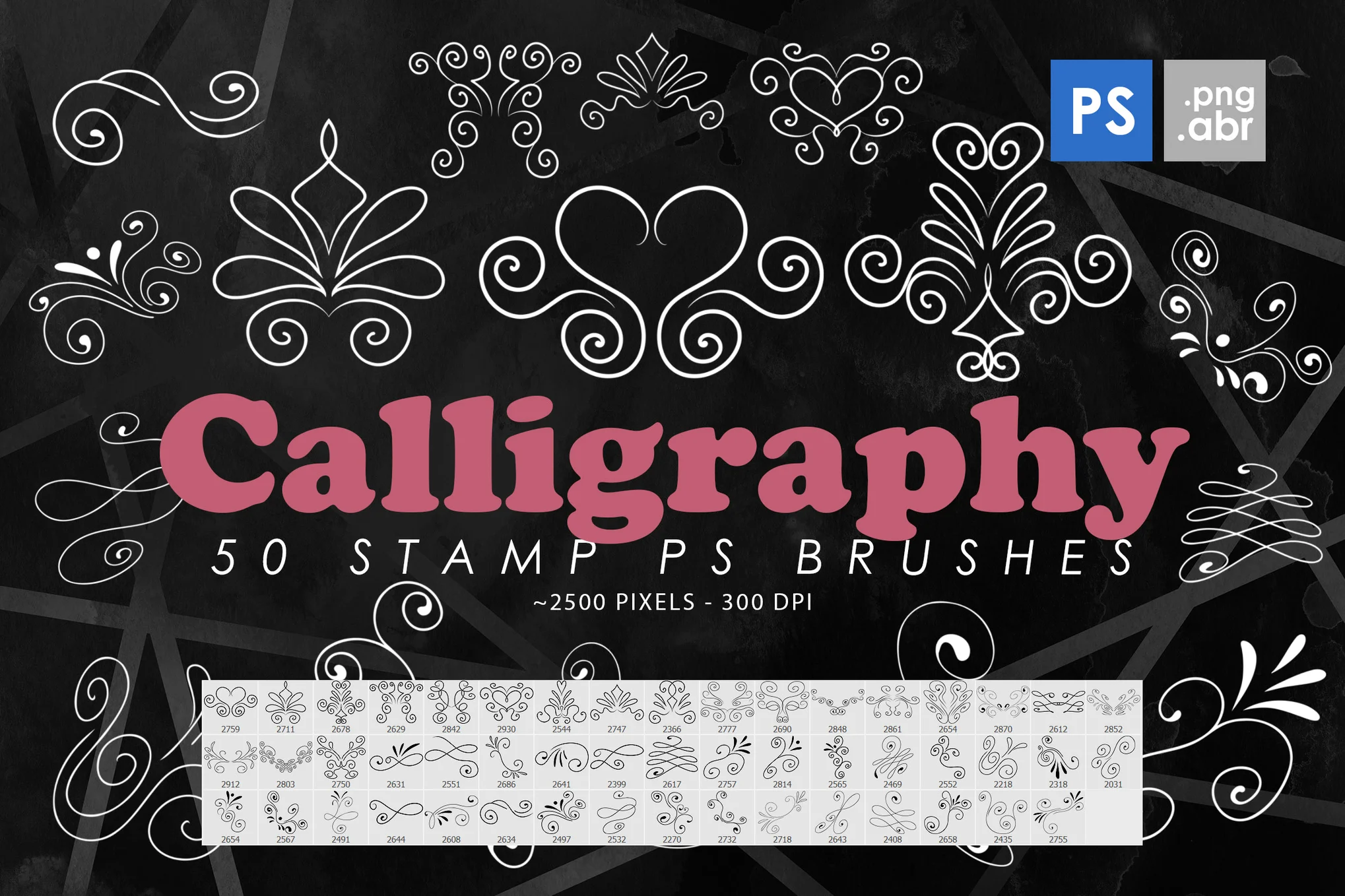
50 Calligraphy Photoshop Stamp Brushes
A versatile calligraphy brush pack perfect for a variety of projects. These high-resolution brushes (2500 pixels) can be used as clipart or decorative elements in print and web-based designs, as well as on posters and cards. Included is a selection of 50 unique brushes in .ABR format and 50 isolated .PNG images.
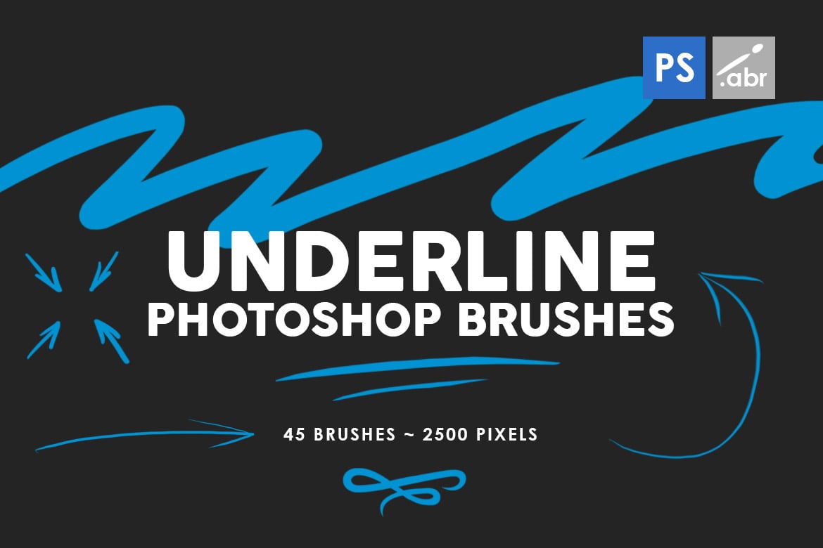
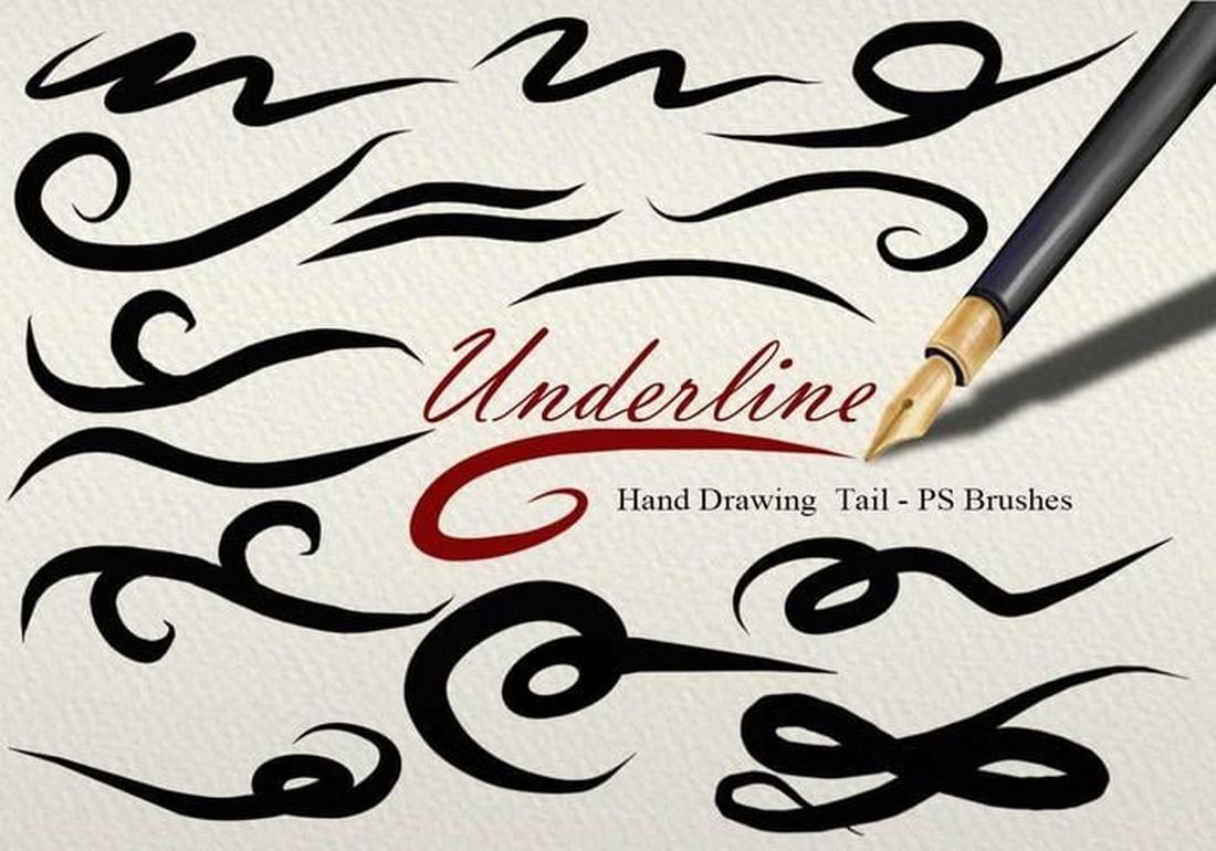
45 Underline Photoshop Stamp Brushes
Enhance your projects with this underline Photoshop stamp brush pack, compatible with all versions of Photoshop from CS2 to CC. With a generous size of 2500 pixels, these high-resolution brushes can be a game changer in adding ornamental value to photos, print templates, and even social media content.
Illustrator Calligraphy Brushes
Illustrator Hand Lettering Brushes
This Illustrator brush pack is perfect for those who find hand-drawn typography a tad challenging. These tools are excellent for both calligraphy and drawing. Each brush has a unique texture which mimics real-life brush strokes and can be adjusted in terms of color, thickness, and length. The set includes a whopping 74 brushes, each grouped and named for easy usage.
Japan ProBrush – Illustrator Brush Pack
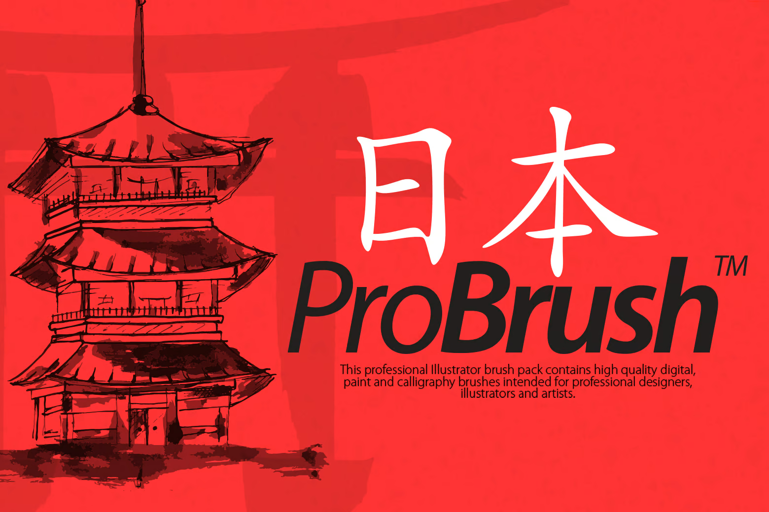
Japan ProBrush is an Illustrator brush pack ideal for creating Japanese-style calligraphy. This pack, compatible with Adobe Illustrator CS3 and above, features 39 high-quality digital, ink, and Asian calligraphy brushes. Included in the pack are 14 ProBrush Japan Brush, 14 ProBrush Japan Digital, and 11 ProBrush Watercolor REALISTIC brushes, providing professional designers, illustrators, and artists with versatility and precision in their digital creations.
Free Calligraphy Brushes
Free Valentine Calligraphy Photoshop Brushes
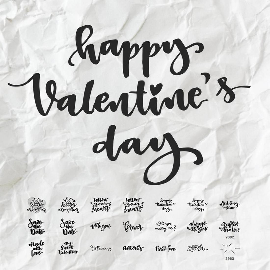
This is a collection of creative calligraphy-style stamp brushes you can use in Photoshop to craft romantic typography designs for Valentine’s Day greeting cards and various other designs. The brushes are free to download.
55 Free Calligraphy Photoshop Brushes
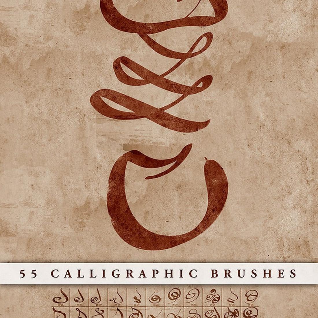
This free calligraphy brush pack for Photoshop includes 55 different brushes for crafting unique calligraphy lettering for your design projects. It’s free to use with commercial projects.
Free Unique Calligraphy Brushes for Photoshop
A collection of 15 unique calligraphy brushes for Photoshop. This bundle includes multiple styles of calligraphy designs to make your lettering designs look more authentic.
Free 26 Underline Tail PS Brushes
This is a collection of underline and tail brushes for Photoshop. You can use these to add a creative and decorative touch to your graphic designs. There are 26 different brushes included in this pack.
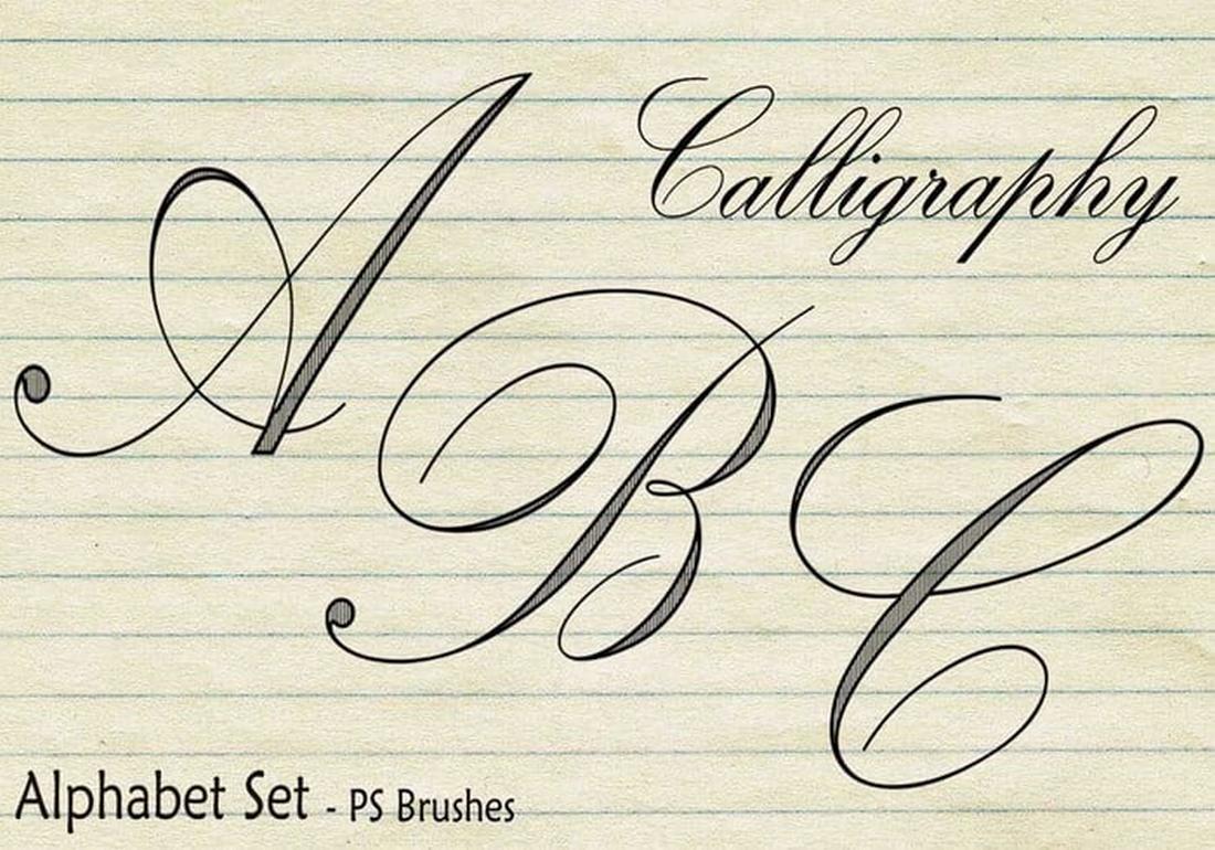
Free 20 Calligraphy Alphabet Set PS Brushes
This is a free calligraphy brush pack for Photoshop that includes the alphabet in calligraphy style. You can use this brush pack to craft beautiful calligraphy lettering without any prior experience in calligraphy art.
Designing For Gen Z: Expectations And UX Guidelines
Every generation is different in very unique ways, with different habits, views, standards, and expectations. So when designing for Gen Z, what do we need to keep in mind? Let’s take a closer look at Gen Z, how they use tech, and why it might be a good idea to ignore common design advice and do the opposite of what is usually recommended instead.
This article is part of our ongoing series on UX. You can find more details on design patterns and UX strategy in Smart Interface Design Patterns 🍣 — with live UX training coming up soon. Free preview.

When we talk about Generation Z, we usually refer to people born between 1995 and 2010. Of course making universal statements about a cohort where some are adults in their late 20s and others are school students is at best ineffective and at worst wrong — yet there are some attributes that stand out compared to earlier generations.
Gen Z is the most diverse generation in terms of race, ethnicity, and identity. Research shows that young people today are caring and proactive, and far from being “slow, passive and mindless” as they are often described. In fact, they are willing to take a stand and break their habits if they deeply believe in a specific purpose and goal. Surely there are many distractions along that way, but the belief in fairness and sense of purpose has enormous value.

Their values reflect that: accessibility, inclusivity, sustainability, and work/life balance are top priorities for Gen Zs, and they value experiences, principles, and social stand over possessions.
What Gen Z Deeply Cares About
Gen Z grew up with technology, so unsurprisingly digital experiences are very familiar and understood by them. On the other hand, digital experiences are often suboptimal at best — slow, inaccessible, confusing, and frustrating. Plus, the web is filled with exaggerations and generic but fluffy statements. So it’s not a big revelation that Gen Zs are highly skeptical of brands and advertising by default (rightfully so!), and rely almost exclusively on social circles, influencers, and peers as main research channels.

They might sometimes struggle to spot what’s real and what’s not, but they are highly selective about their sources. They are always connected and used to following events live as they unfold, so unsurprisingly, Gen Z tends to have little patience.
And sure enough, Gen Z loves short-form content, but that doesn’t necessarily equate to a short attention span. Attention span is context-dependent, as documentaries and literature are among Gen Z’s favorites.
Designing For Gen ZMost design advice on Gen Z focuses on producing “short form, snackable, bite-sized” content. That content is optimized for very short attention spans, TikTok-alike content consumption, and simplified to the core messaging. I would strongly encourage us to do the opposite.
We shouldn’t discount Gen Z as a generation with poor attention spans and urgent needs for instant gratification. Gen Zs have very strong beliefs and values, but they are also inherently curious and want to reshape the world. We can tell a damn good story. Captivate and engage. Make people think. Many Gen Zs are highly ambitious and motivated, and they want to be challenged and to succeed. So let’s support that. And to do that, we need to remain genuine and authentic.
Remain Genuine And Authentic
As Michelle Winchester noted, Gen Zs have very diverse perspectives and opinions, and they possess a discerning ability to detect disingenuous content. That’s also where mistrust towards AI comes into play, along with AI fatigue. As Nilay Patel mentioned on Ezra Klein Show, today when somebody says that something is “AI-generated”, usually it’s not a praise, but rather a testament how poor and untrustworthy it actually is.
Gen Z expects better. Hence brands that value sincerity, honesty, and authenticity are perceived as more trustworthy compared to brands that don’t have an opinion, don’t take a stand, don’t act for their beliefs and principles. For example, the “Keep Beauty Real” campaign by Dove (shown below) showcases the value of genuine human beauty, which is so often missed and so often exaggerated to extremes by AI.

Gareth Ford Williams has put together a visual language of closed captions and has kindly provided a PDF cheatsheet that is commonly used by professional captioners. There are some generally established rules about captioning, and here are some that I found quite useful when working on captioning for my own video course:
- Divide your sentences into two relatively equal parts like a pyramid (40ch per line for the top line, a bit less for the bottom line);
- Always keep an average of 20 to 30 characters per second;
- A sequence should only last between 1 and 8 seconds;
- Always keep a person’s name or title together;
- Do not break a line after conjunction;
- Consider aligning multi-lined captions to the left.
On YouTube, users can select a font used for subtitles and choose between monospaced and proportional serif and sans-serif, casual, cursive, and small-caps. But perhaps, in addition to stylistic details, we could provide a careful selection of fonts to help audiences with different needs. This could include a dyslexic font or a hyper-legible font, for example.
Additionally, we could display presets for various high contrast options for subtitles. This gives users a faster selection, requiring less effort to configure just the right combination of colors and transparency. Still, it would be useful to provide more sophisticated options just in case users need them.
Support Intrinsic Motivation
On the other hand, in times of instant gratification with likes, reposts, and leaderboards, people often learn that a feeling of achievement comes from extrinsic signals, like reach or attention from other people. The more important it is to support intrinsic motivation.
As Paula Gomes noted, intrinsic motivation is characterized by engaging in behaviors just for their own sake. People do something because they enjoy it. It is when they care deeply for an activity and enjoy it without needing any external rewards or pressure to do it.

Typically this requires 3 components:
- Competence involves the need to feel capable of achieving a desired outcome.
- Autonomy is about the need to feel in control of your own actions, behaviors, and goals.
- Relatedness reflects the need to feel a sense of belonging and attachment to other people.
In practical terms, that means setting people up for success. Preparing the knowledge and documents and skills they need ahead of time. Building knowledge up without necessarily rewarding them with points. It also means allowing people to have a strong sense of ownership of the decisions and the work they are doing. And adding collaborative goals that would require cooperation with team members and colleagues.
Encourage Critical Thinking
The younger people are, the more difficult it is to distinguish between what’s real and what isn’t. Whenever possible, show sources or at least explain where to find specific details that back up claims that you are making. Encourage people to make up their mind, and design content to support that — with scientific papers, trustworthy reviews, vetted feedback, and diverse opinions.
And: you don’t have to shy away from technical details. Don’t make them mandatory to read and understand, but make them accessible and available in case readers or viewers are interested.
In times where there is so much fake, exaggerated, dishonest, and AI-generated content, it might be just enough to be perceived as authentic, trustworthy, and attention-worthy by the highly selective and very demanding Gen Z.
Good Design Is For EveryoneI keep repeating myself like a broken record, but better accessibility is better for everyone. As you hopefully have noticed, many attributes and expectations that we see in Gen Z are beneficial for all other generations, too. It’s just good, honest, authentic design. And that’s the very heart of good UX.
What I haven’t mentioned is that Gen Z genuinely appreciates feedback and values platforms that listen to their opinions and make changes based on their feedback. So the best thing we can do, as designers, is to actively involve Gen Z in the design process. Designing with them, rather than designing for them.
And, most importantly: with Gen Z, perhaps for the first time ever, inclusion and accessibility is becoming a default expectation for all digital products. With it comes the sense of fairness, diversity, and respect. And, personally, I strongly believe that it’s a great thing — and a testament how remarkable Gen Zs actually are.
Wrapping Up- Large parts of Gen Z aren’t mobile-first, but mobile-only.
- To some, the main search engine is YouTube, not Google.
- Some don’t know and have never heard of Internet Explorer.
- Trust only verified customer reviews, influencers, friends.
- Used to follow events live as they unfold → little patience.
- Sustainability, reuse, work/life balance are top priorities.
- Prefer social login as the fastest authentication method.
- Typically ignore or close cookie banners, without consent.
- Rely on social proof, honest reviews/photos, authenticity.
- Most likely generation to provide a referral to a product.
- Typically turn on subtitles for videos by default.
- Designing for Gen Z, by Designlab
- Designing For Gen Z (Case Study), by Michelle Winchester
- Intrinsic vs. Extrinsic Motivation, by Paula Gomes
- Shopping Habits For Gen Z, by Sara Karlovitch
- 10 Gen Z Insights To Improve Your CX, by Telus
- Millennials vs. Gen Z Expectations, by Zendesk
I’ve just launched “How To Measure UX and Design Impact” 🚀 (8h), a new practical guide for UX leads to measure UX impact on business. Use the code 🎟 IMPACT to save 20% off today. And thank you for your kind and ongoing support, everyone! Jump to details.
70+ Best Portrait Photoshop Actions & Effects
Retouching and enhancing portrait photos is a time-consuming task, and starting from scratch with every photo can be frustrating. Using a portrait Photoshop Action can save time, and give you a beautiful result with a few clicks. Let’s dive into some of the best portrait Photoshop Actions available today.
These Photoshop Actions help you save time and improve your workflow when editing a portrait photo. You can use them to instantly retouch photos, add makeup, enhance colors, add effects, adjust toning, and much more with just a single click.
Say hello to a faster, simpler workflow (and some impressive end results!). And if you’re looking for more advice and guidance on using these, our Photoshop Actions feature is a great place to start.
We’re also sharing our tips for editing portrait photos to help give you a head start.
Skin Retouching Photoshop Actions
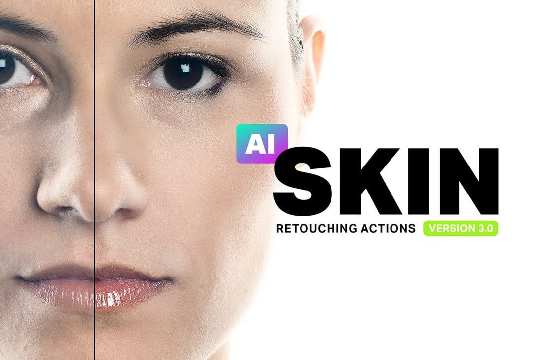
Skin retouching is a complicated process. You can’t get that job done with just one Photoshop action. Which is why this pack comes bundled up with 34 retouching Photoshop actions.
It includes PS actions for everything from airbrushing to skin toning, enhancing lips, teeth whitening, and much more.
Why This Is A Top Pick
This complete bundle is a must-have for portrait photo editors as it’ll drastically improve your workflow of enhancing photos and all levels of skin retouching with simple, one-click Photoshop actions.
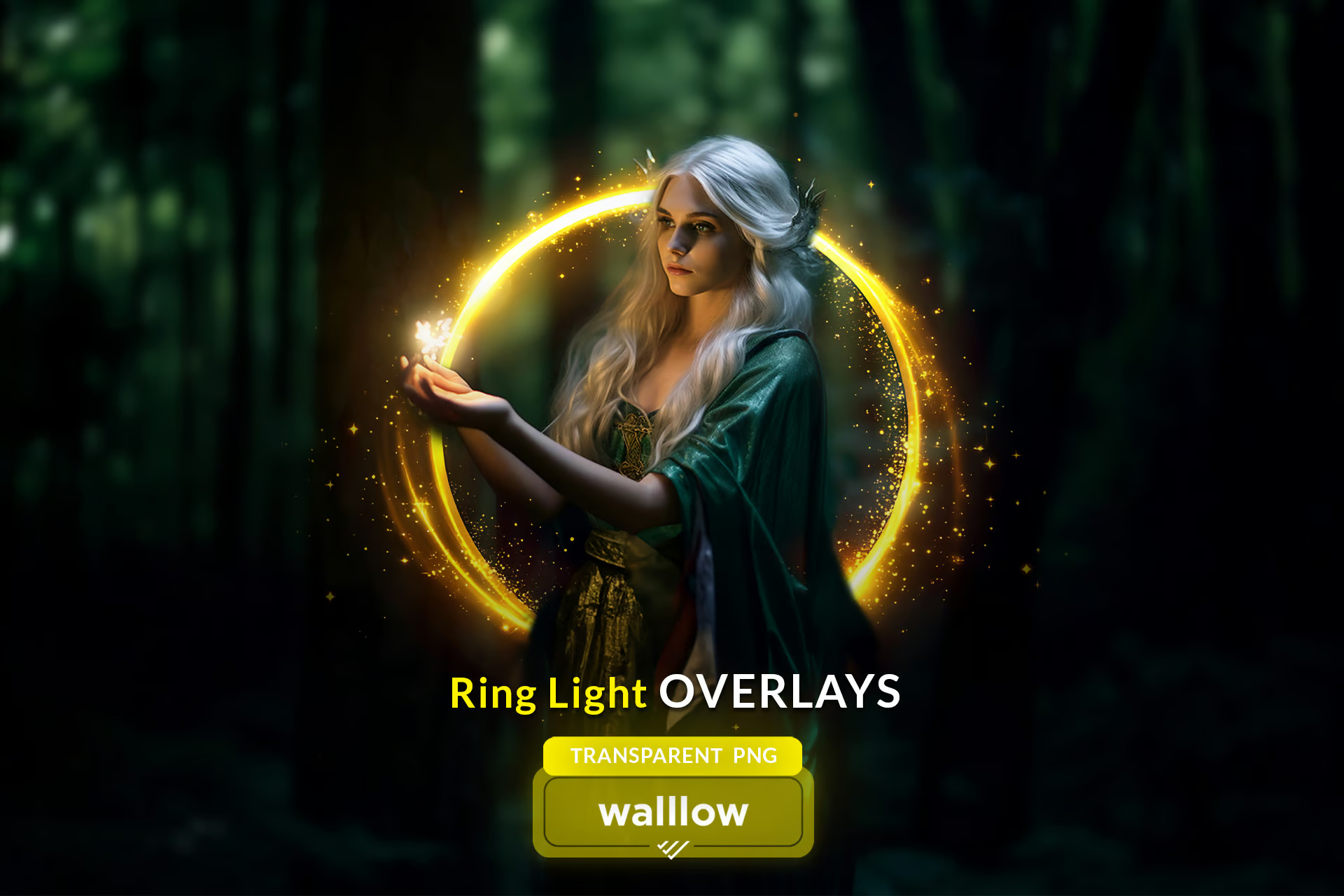
Shine Ring Light Effect Photo Overlays
This is a distinct set of 15 high-resolution gold ring light overlays designed to add flawless shine and bokeh effects to your photos. Ideal for maternity portraits, holiday snaps, and more, these overlays are compatible with any software that supports layering, including Photoshop and Canva.
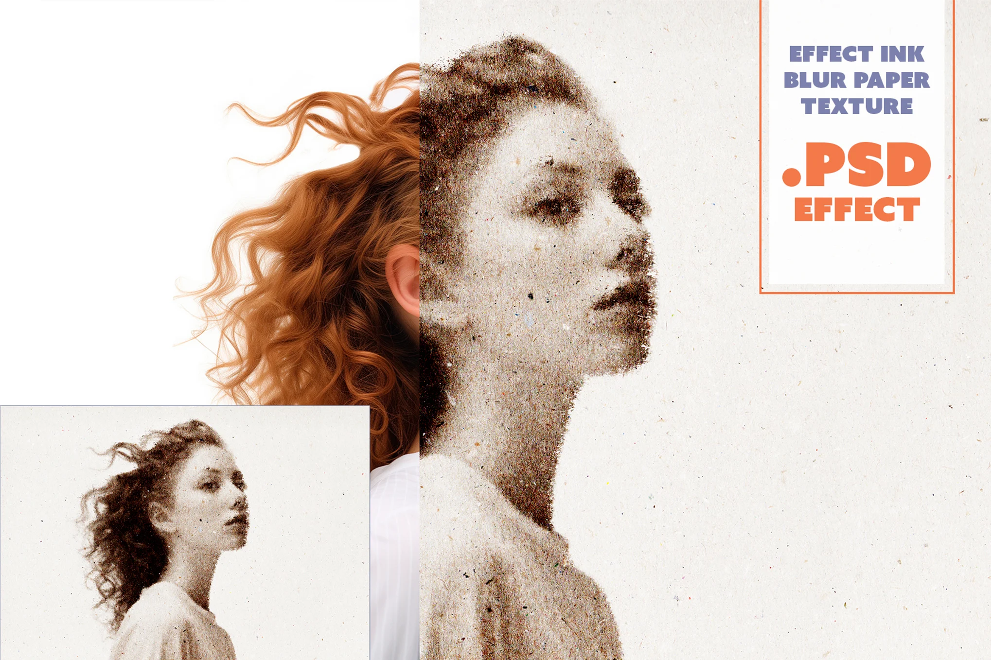
Ink Blur Paper Texture Photo Effect
Ink Blur is a versatile Photoshop portrait effect perfect for graphic designers, photographers, and digital artists. It elevates your photos with a unique paper texture effect adding a unique aesthetic. This high-resolution layered PSD file, requiring nothing more than Photoshop CS6 or higher, allows for easy customization on its smart object layers.
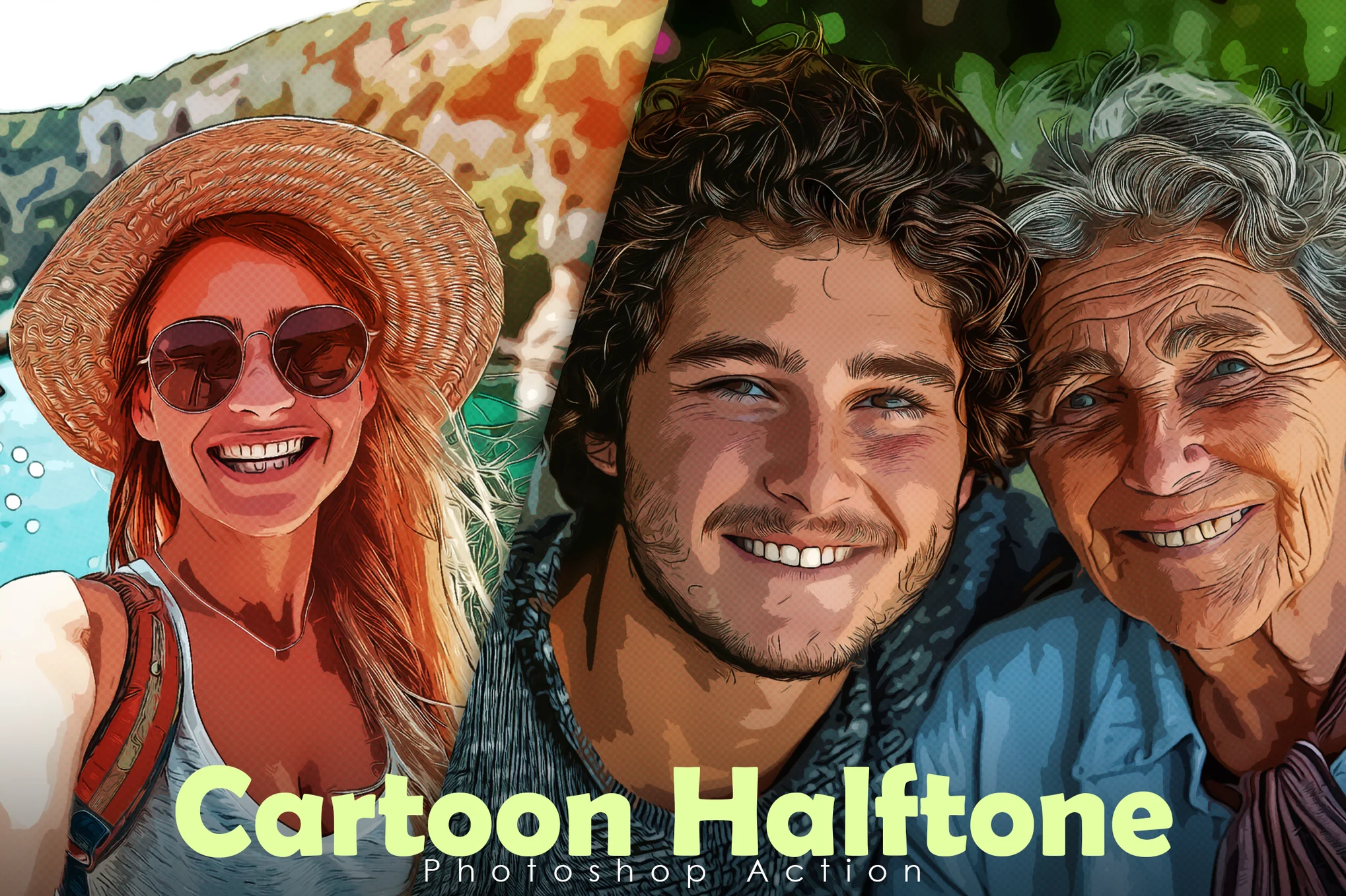
Cartoon Halftone Portrait Photoshop Action
A creative cartoon-style halftone portrait effect for Photoshop. It allows you to apply impressive effects to your photographs with just one click. Ideal for Photoshop CC and higher, it let’s you easily customize the effect to match different types of photos.
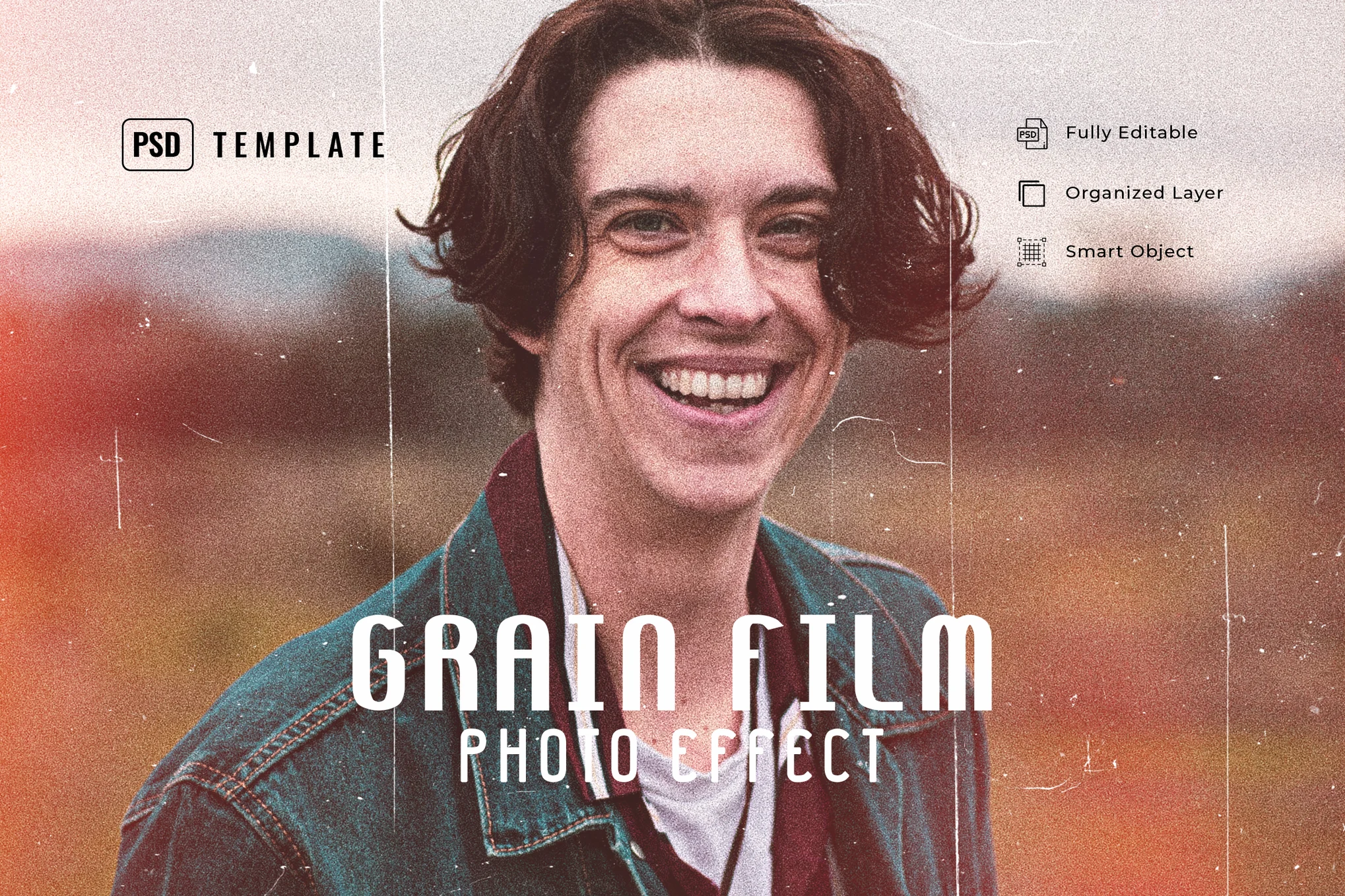
Grain Film Photo Effect PSD
An innovative Photoshop template that transforms your portrait photos with a vivid and classic vintage look. This PSD template excellently incorporates grain film effects into your photos. It caters to diverse shots, be it fashion, lifestyle, blogging, or moody product images.
Light Leaks Effect for Portraits
This is a versatile Photoshop effect meant to give images a distinctive look to your photos. It’s great for injecting energy and glamour into photos, with realistic-looking light leak effects. The template is especially effective on photos with a resolution of 1000px to 3000px and works beautifully on a variety of photo types, from fashion to blogging.
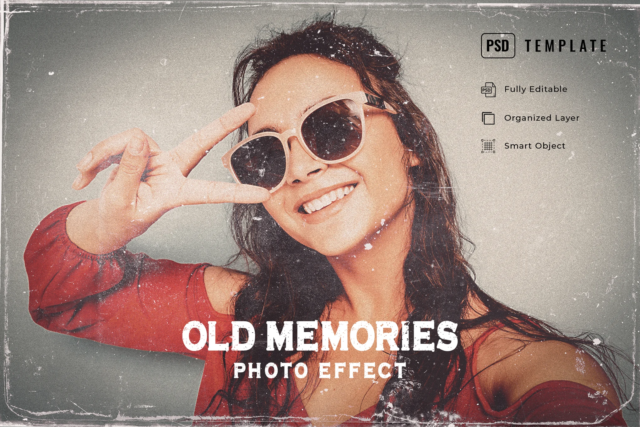
Old Memories Photo Effect PSD
This is a versatile Photoshop template designed to give your photos a vintage effect. Ideal for shots ranging from 1000 px – 3000 px resolution, this effect can be easily customized as well. It’s perfect for giving your graphic designs and photos a classic and old-school look and feel.
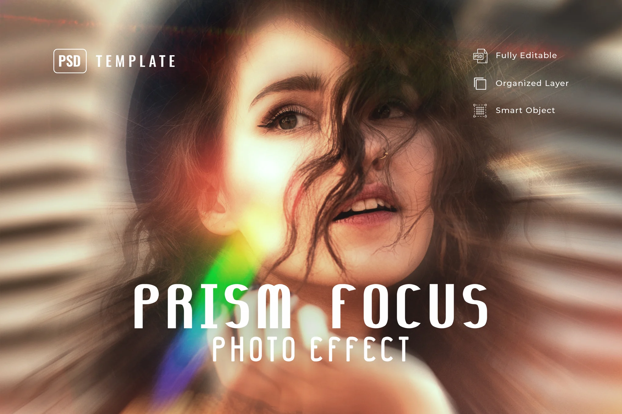
Prism Focus Photo Effect for Photoshop
The prism focus PSD effect enhances your photos with an energetic prism focus effect. This versatile feature transforms your images into a unique effect that’s perfect for fashion, lifestyle, blogging, and product photography. The effect is best used on photos between 1000 px and 3000 px.
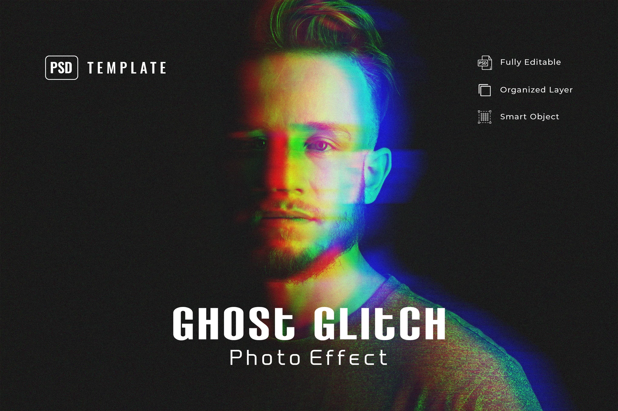
Ghost Glitch Photo Effect PSD Template
This is a dynamic Photoshop template intended to transform photos with a ghost-like glitching effect. It’s versatile, effective for various photos ranging from fashion to moody product shots. For optimal results, use with photos of 1000 px – 3000 px resolution.
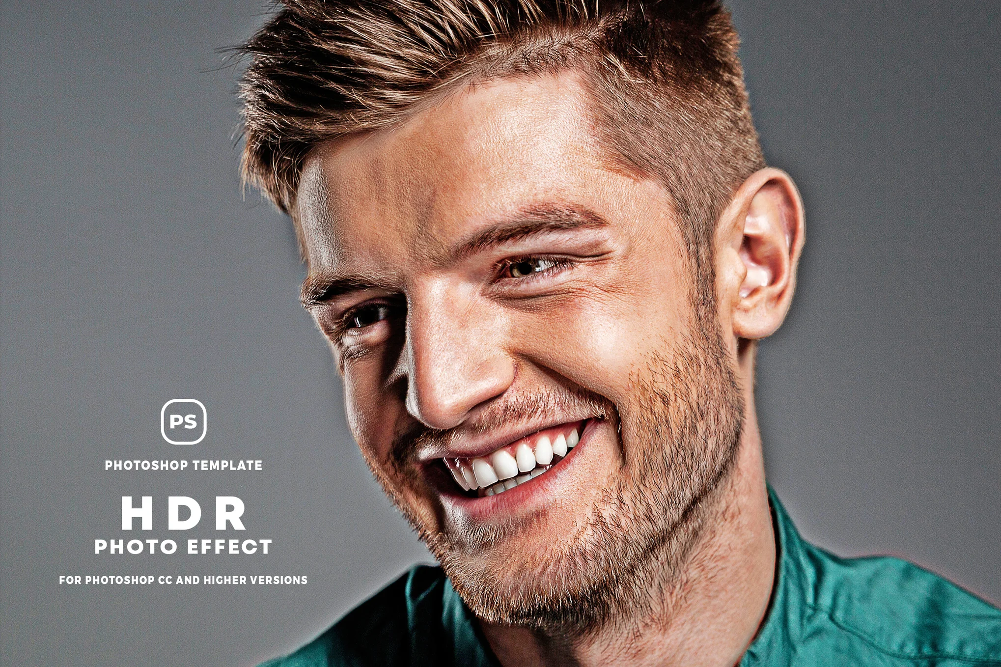
HDR Portrait Photo Effect PSD
A dynamic Photoshop template designed to convert your pictures into vibrant, HDR photographs. It allows you to easily add an HDR-like look to your portrait to give a more professional look and feel. For best results, apply it to photos between 1000 to 3000 px resolution.
Hotspot Remover AI Photoshop Action
This is a handy tool for photo editing and retouching. Using AI, it quickly identifies and removes any bright spots or glare from your photos, offering flawless results. Ideal for photographers and designers, it enhances the quality and speed of your work process. The effect requires the ‘Generative Fill’ feature in Adobe Photoshop versions CC 2023 and later.
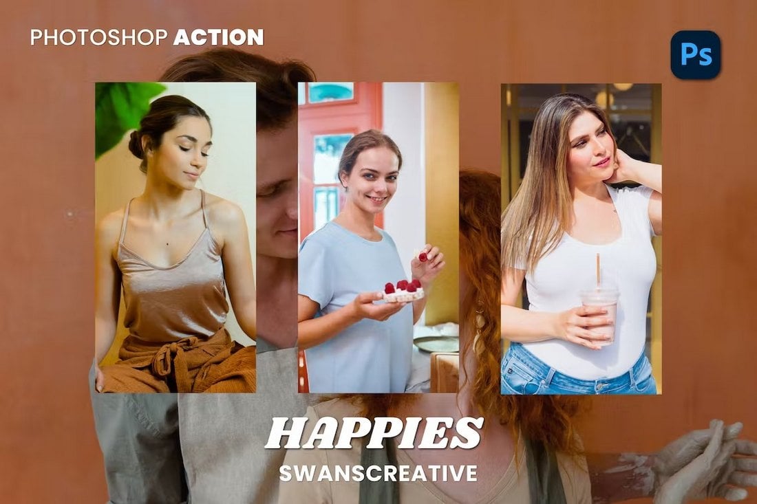
Happies – Bright Portrait Photoshop Action
This collection of Photoshop actions allows you to transform your ordinary portrait photos with a bright and vibrant look. There are 10 different PS actions in this bundle especially optimized to enhance the exposure and colors of your photos with just a single click.
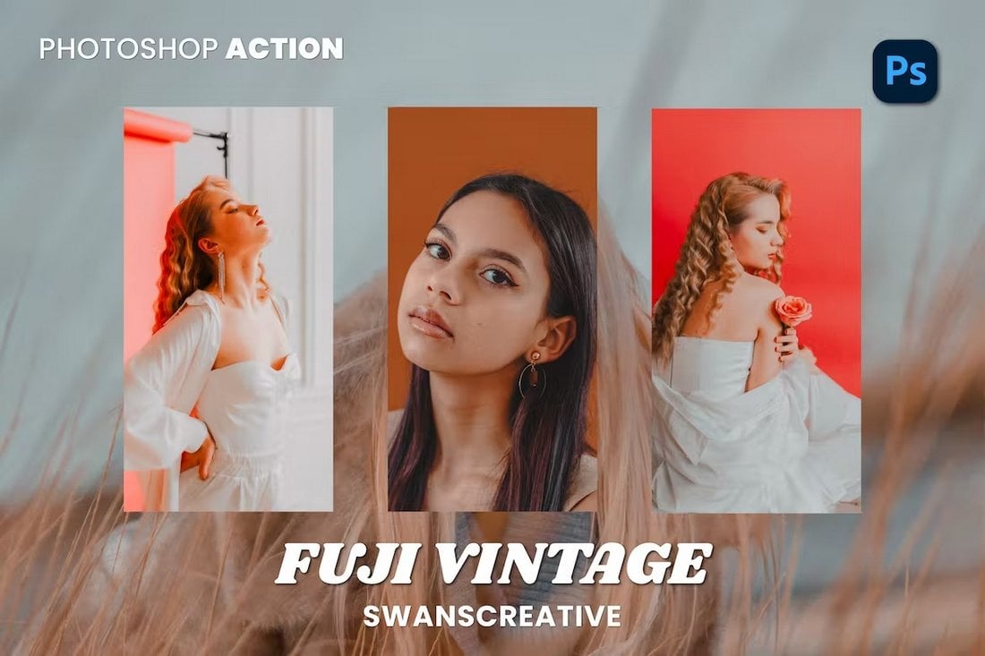
Fuji – Vintage Photoshop Action for Portraits
This pack also comes with high-quality Photoshop actions especially made for portrait photos. It has 10 actions that are compatible with Photoshop CS3 and higher. These effects have subtle Fuji film-style vintage looks that are ideal for classic portraits and selfies.
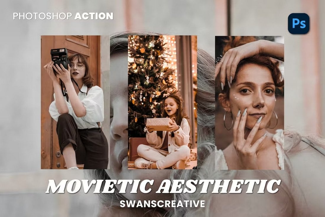
Movietic Aesthetic Portrait Photoshop Action
If you want to add a vintage movie-style look to your photos, this Photoshop actions bundle is for you. It instantly adds a color filter that turns your photos into stills from a vintage film. These are great for Instagram selfies as well.
Republic Aesthetic Photoshop Action for Portraits
Add a classic aesthetic look to your selfies and portrait photos with this collection of Photoshop actions. It includes 10 actions with subtle effects that will make your photos look more professional and creative.
Film Wash – Free Portrait Photoshop Action
This free Photoshop action does exactly what its name suggests. It adds a nostalgic look to your portrait photos with a washed-out film effect. The action is most suitable for outdoor photos.
Warmer – Photoshop Action for Portraits
This Photoshop action features a very bright and warm effect that completely changes the way your portraits look. It seems to work surprisingly well for outdoor portraits, especially for sunny and beach-themed photos.
Color Glitch PSD Photo Effect for Portraits
This Photoshop photo effect allows you to easily add a glitching effect to your portrait photos. It comes as a PSD template with smart object layers for easy editing. This template will help you craft amazing effects for graphic design projects.
Nostalgic – Portrait Photoshop Action
The amazing vintage-style effect features in this Photoshop action are designed by a group of professional photographers. It lets you apply an instant filter to give a nostalgic look and feel to your portrait photos.
Dreamy Haze PSD Photo Effect for Portraits
Another Photoshop photo effect template with a unique design. This effect features an effect that combines glitching and hazy effects to create a beautiful dreamy look for portraits. The PSD template is very easy to customize as well.
Free Warm & Airy Portrait Photoshop Actions
You can download this Photoshop actions pack for free to easily enhance your portraits, selfies, and Instagram photos. It includes multiple PS actions with warm and airy effects. They are ideal for optimizing outdoor photos.
Oceania – Portrait Photoshop Actions
Oceania is a collection of professionally crafted Photoshop actions you can use to optimize your portraits, travel, and social media photos. It includes 5 different actions with various color styles and effects. The actions work with Photoshop CS4 and higher.
Glamour Photography – Portrait Photoshop Actions
This is a set of 15 different Photoshop actions that are designed for improving your fashion photography and portraits. The actions create non-destructive effects that are also easily customizable to your preference.
10 Portrait Photoshop Actions
Check out this set of 10 orange and teal Photoshop actions for portrait photography that will help you create memorable pictures in just a matter of a few minutes. It’s. a great time-saving tool that deserves a spot in your Photoshop toolkit.
Digital Portrait Photoshop Action
This digital portrait Photoshop action is a must-have for every graphic designer and photographer. It will bring out your artistic side, and help you create stunning artwork. Grab it right now!
Black & White Portrait Photoshop Actions
Our next option provides you with 10 black and white Photoshop actions that will add a touch of vintage charm to your portraits. The product comes with a step-by-step instruction manual helping you make the most of the effects.
Portrait Series Photoshop Actions
Whether you are looking to add a subtle touch or a more dramatic effect to your portraits, this collection of 10 Photoshop actions can be of great help. The actions are non-destructive and compatible with Photoshop CS4 and newer. A great collection worth having in your arsenal!
Freya – Portrait Photoshop Actions
Perfectly suited for portrait, wedding and event photography, Freya is a fully-automated set of five photoshop actions designed to improve the overall appearance and mood of your pictures. It offers gorgeous non-destructive and customizable skin tones with soft matte touch tranforming your images into stellar shots.
Master – Portrait Photoshop Action
Kickstart editing portraits with this fine-tuned and one-of-a-kind Photoshop action. It converts your photos into amazing-looking portraits in just one click and is non-destructive enabling you to get back 100% of your original photo.
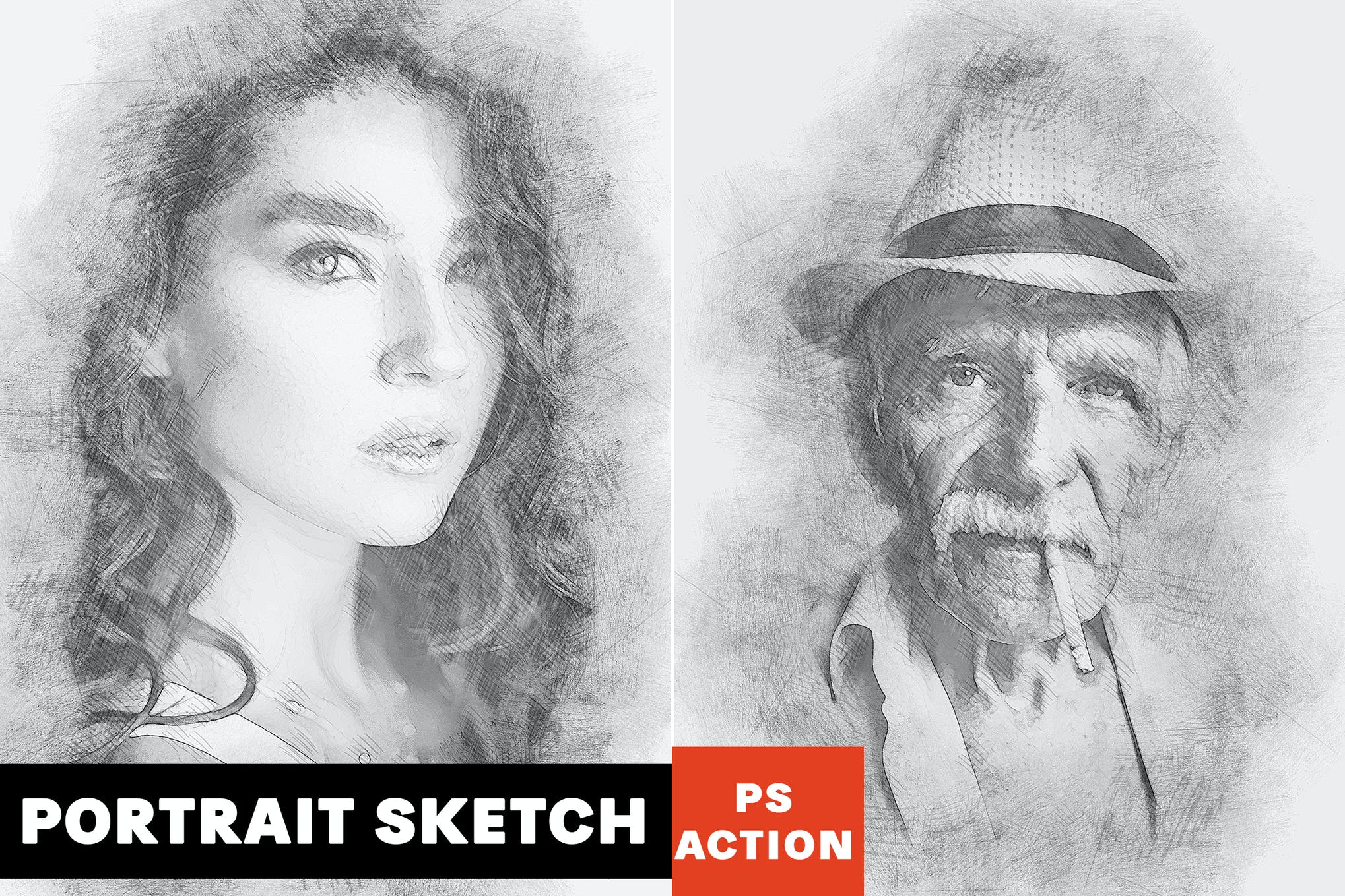
Sketch Portrait Photoshop Action
Wanting to achieve a professional artistic sketch effect for your images? Look no further than our next option featuring fully customizable colors, layers and other elements. It also comes with a video tutorial to help you make the most of the pencil sketch effect.
50 Free Portrait Photoshop Actions
Give your images a beautiful finish with the collection of 50 Photoshop actions in just a couple of minutes. Its not just super easy to create stunning portrait effects but also a lot of fun to play around with all the customizable features.
Portrait Into Text Photoshop Actions
Tranform and pin your portraits to lines of relevant wording in just a couple of seconds, thanks to this remarkably unique Portrait Photoshop action that does a great job with both black and white and colored images. A great choice for people looking to go bold, and fearless with their next visual project.
6 Free Grainy Portrait Photoshop Actions
Next up we have a fantastic set of six portrait Photoshop actions that will give a nice grainy touch to your photos. These are fast editing actions and will change the mood of your images in just a few seconds. This set of actions is compatible with Photoshop CS3 to CC.
50 High Contrast Portrait Photoshop Actions
A massive bundle full of 50 different Photoshop actions. This pack includes many types of effects that help you adjust and optimize the contrast of your photos while giving them a unique look. The actions work with RAW and JPEG images.
Infrared IR – Portrait Photoshop Actions
Another collection of unique portrait Photoshop actions that feature a stylish infrared effect. This pack comes with 12 different effects that give your photos a gothic vibe with an infrared effect.
HDR Portrait Photoshop Action
Give your photos an HDR effect without sweating over endless hours to create the look from scratch. This Photoshop action allows you to bring nice HDR effects to your images in just a few clicks of the mouse. Plus, with a range of customization options you get at your fingertips, you’ll have a great time playing around with all the amazing features.
Duotone Portrait Photoshop Action
Want to make your Insta feed interesting and scroll-worthy? Check out this collection of modern, and trendy duotone Photoshop actions perfectly suited for portrait, street, and closeup photography. This freebie is up for grabs on CreativeTacos.
Oil Painting – Portrait Photoshop Actions
This collection of Photoshop actions lets you turn your photos into oil paintings. It includes 10 different Photoshop actions featuring all kinds of oil painting effects for giving a comic-book look to your portrait photos.
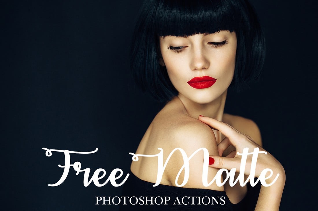
Free Matte Film Photoshop Actions
The film look is a popular effect widely used in portrait photography. This bundle comes with a set of Photoshop actions that features a mix of both film and matte effects that create a unique look in portraits.
The pack includes 3 different Photoshop actions with various strengths of the effect. You can apply the action with just one click and customize the effect to your preference afterward as well.
High-quality free portrait Photoshop actions are hard to find. This is one of the actions that truly stand out from the crowd as it features a professional-quality effect you can download and use with both personal and commercial projects for free.
10 Free Matte Photoshop Actions
This is a bundle of free Photoshop actions featuring matte effects. It includes 10 different effects you can use to improve the tone and mood of your portraits.
Scarlet – Fantasy Photoshop Actions
Scarlet is a creative duo of Photoshop actions that will allow you to create a fantasy film-like effect in your portrait photos. The actions work best with outdoor photos with natural sunlight. And they are compatible with Photoshop CS4 and higher.
Nighty – Portrait Photoshop Actions
Give your photos a dark and gritty look and feel using this set of Photoshop actions. This pack includes 9 different actions featuring various effects. They are perfect for improving all types of photography.
Wanderlust – Portrait & Lifestyle Photoshop Actions
Wanderlust is a set of 3 unique Photoshop actions that are designed to help enhance portraits and lifestyle photos. These actions will optimize your photos to adjust the mood and tone and make them look more professional.
Free Christmas Portait Photoshop Actions
Brighten up your Christmas portraits, and winter photographs in just one click with the help of this carefully crafted set of Photoshop actions. The actions are high-quality, and non-destructive allowing you to retain 100% of the original photo.
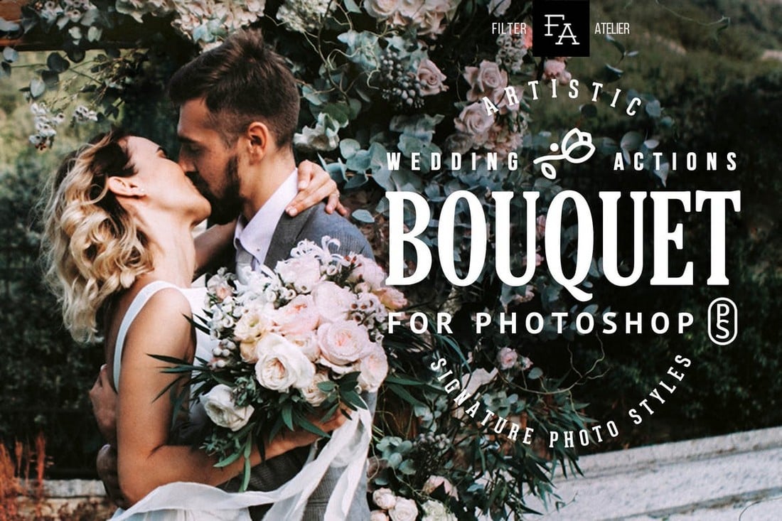
Bouquet – Wedding Actions for Photoshop
Bouquet is a set of Photoshop actions specially designed for wedding photography. They work well with all types of wedding photos, including outdoor landscapes and portraits. It features 6 different actions with various effects.
Free Matte Photoshop Actions
This is a free Photoshop action that allows you to give a stylish film-like matte look to your portrait photos. This action works with Photoshop CS3 and higher, including Photoshop CC.
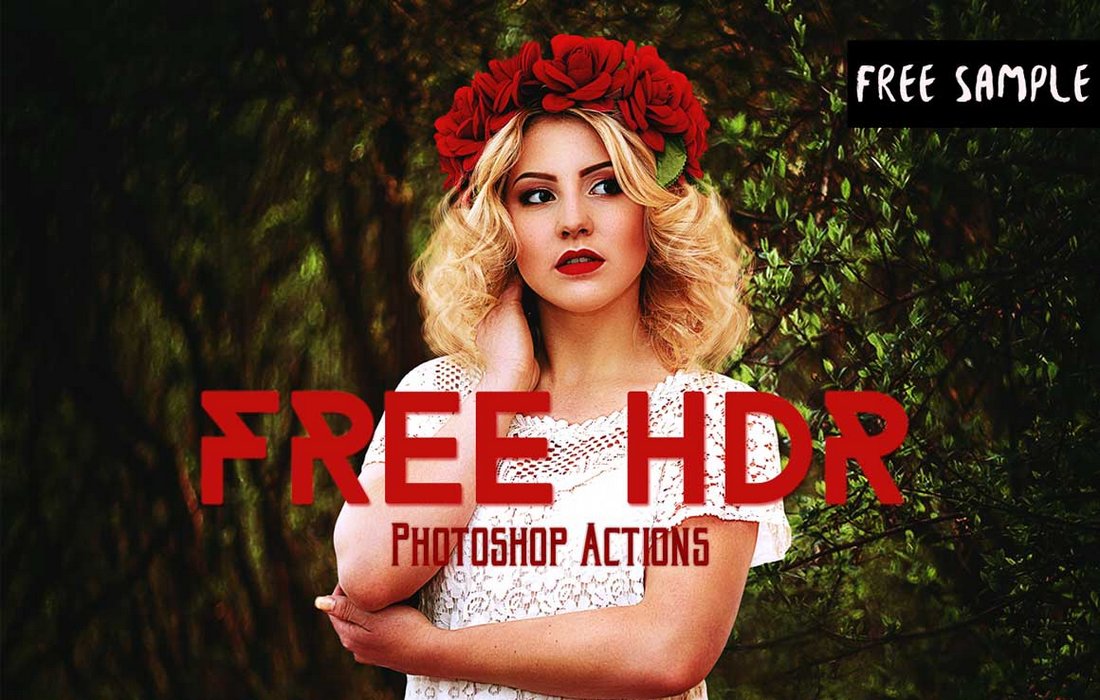
Free HDR Photoshop Actions
A bundle of free HDR Photoshop actions that will make your portraits look as if they were shot with a high-quality DSLR camera. It includes 3 different presets you can apply with just one-click.
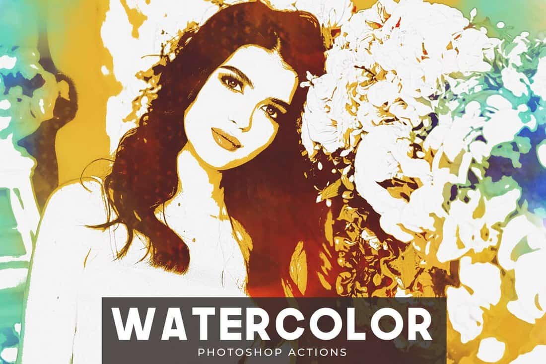
Watercolor – Portrait Photoshop Actions
If you’re not a fan of oil painting effects, you can use this pack of Photoshop actions to make your photos look like watercolor paintings. The actions are compatible with Photoshop CS3 and higher.
Pinhole Halftone – Portrait Photoshop Actions
This collection of Photoshop actions comes with 2 different versions you can use for both low and high-resolution images. The actions create an old-school pinhole halftone effect.
Duotone – Portrait Photoshop Actions
The duotone effect is quite popular among all kinds of graphic designers. This pack comes with multiple duotone effects you can use to give an authentic duotone look to your photos almost instantly.
Free Moody Portrait Photoshop Actions
Warm, chocolaty, and moody, these Photoshop actions will add high-contrast, and professional tones to your pictures, taking them to a new level of brilliance. The actions are non-destructive and provide you with an excellent way to perfect your everyday photos.
Free Soft Bright Portrait Photoshop Actions
Here we have a set of Photoshop actions for portrait photography that will brighten up your shots, and give them a soft, dream-like glowy look. The actions can be fully customized to match your vision, and are computable with Photoshop CS3, CS4, CS5, CS6, and CC.
Tone Collection – CameraRaw Portrait Photoshop Actions
This is a set of filters you can use to quickly adjust and optimize the toning of your portrait photos. The pack includes presets for Photoshop actions as well as Camera RAW. It’s compatible with Photoshop CS5 and higher.
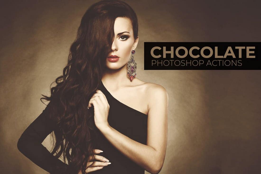
Chocolate – Portrait Photoshop Actions
This bundle of Photoshop actions is perfect for fashion and glamor portraits and photoshoots. It comes with a set of 10 unique Photoshop actions that create unique filter effects.
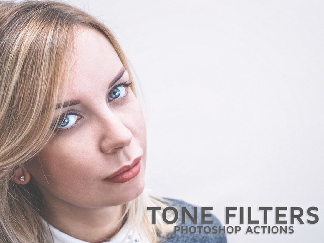
Free Tone Filter Photoshop Actions
A set of 3 unique Photoshop actions that feature high-quality toning effects. These will help you instantly improve the tone of your portraits without an effort.
Film Look Free Photoshop Action
With this free Photoshop action, you’ll be able to make your portrait photos look like a scene out of a movie. The action is compatible with all types of images and its customizable as well.
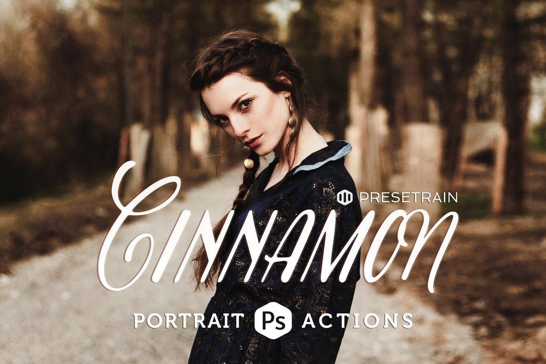
Cinnamon Portrait Actions
This bundle comes with a set of 6 unique toning Photoshop actions with a fantasy effect. It’s ideal to be used with portrait and fashion photos taken in outdoor natural light settings. You can the actions to adjust the photos taken in low-contrast settings, adding an atmospheric tone, and more.
Caramel Wedding Photoshop Action
Caramel is a pack of Photoshop actions especially designed for wedding portraits. It comes with 2 different actions to improve your post-processing workflow by quickly adjusting the photos taken in natural light and outdoors. The actions also generate adjustment layers for customizing the effects to your preference.
22 Soft Pastel Photoshop Actions
This bundle of Photoshop actions includes several stylish pastel effects for adding a colorful and hipster vibe to your portrait photos. It comes with 22 actions, all of which are non-destructive and fully-customizable.
Frequency Separation Photoshop Actions
Frequency separation is a technique used in Photoshop when airbrushing the skin of portrait photographs. This actions pack automate that process to get it done with just one-click. The frequency separation action is available in several different styles and versions, including 8-Bit, 16-Bit, and 32-Bit versions.
Double Light Photoshop Action
This stunning Photoshop action is perfect for adding a unique visual effect to your portrait photos and posters. The double light effect mixes two colors to give your portraits a sci-fi themed vibe. The action allows you to choose from 10 different color FX settings as well.
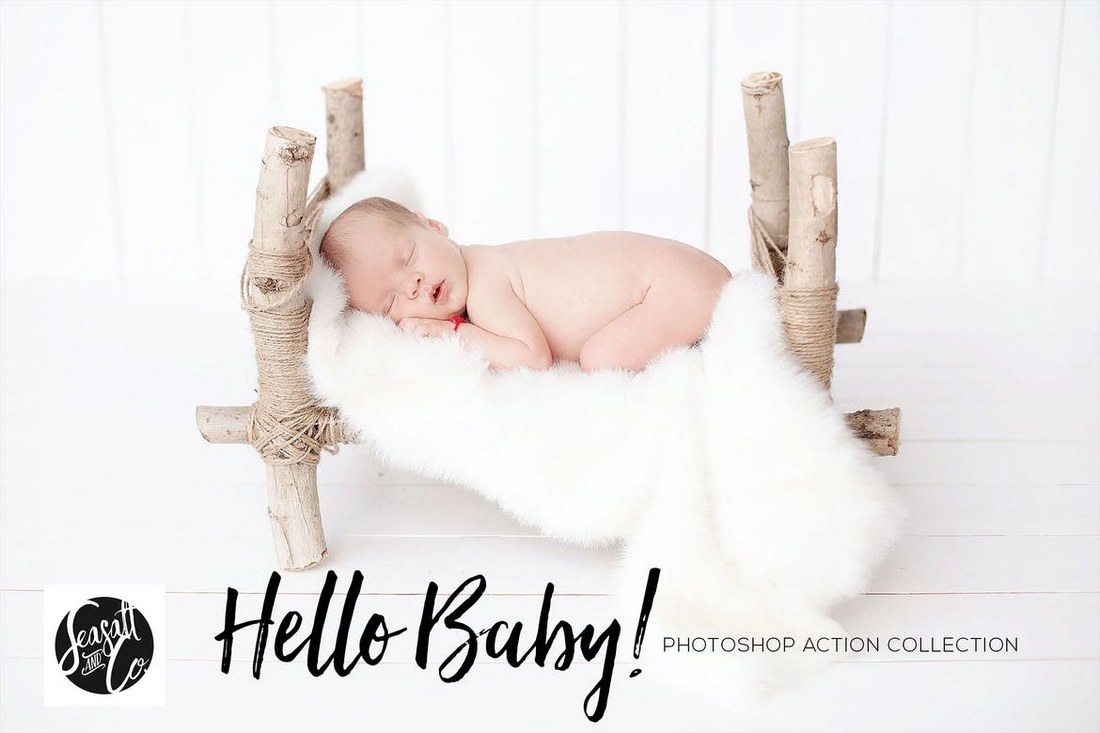
Hello Baby! Collection
When talking about portrait photography, baby portraits is something we can never forget. This pack of Photoshop actions is made specifically for making your baby photos extra adorable. It includes over 40 unique Photoshop actions for enhancing your baby photos, including foundation actions, retouching actions, workflow actions, artistic toning, and more.
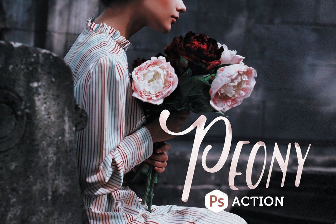
Peony Photoshop Action
Peony is a set of 2 Photoshop actions made for outdoor and fashion portraits. It allows you to instantly adjust and enhance photos by giving them a rich toning effect. It will even give your dull photos a better color depth, especially for greens and flowers.
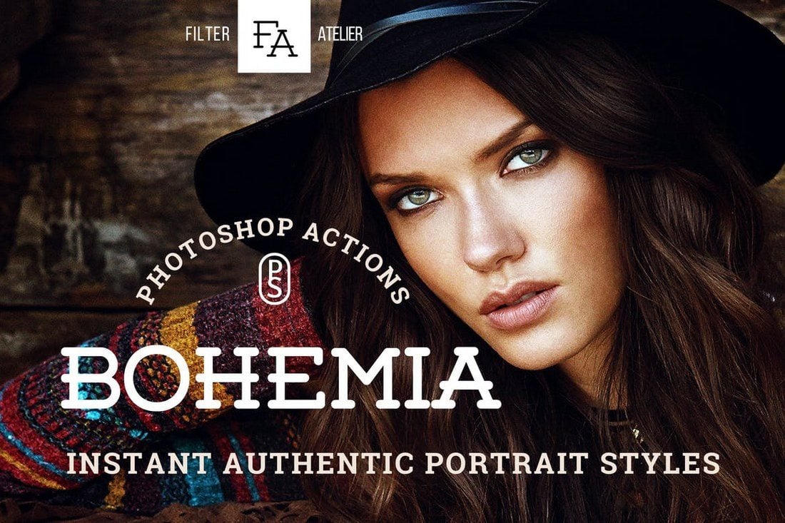
Bohemia Photoshop Actions
This bundle of Photoshop actions includes 5 unique actions that help you to achieve a boho-style effect for your portrait and fashion photos. It’s perfect for giving your photos a hipster look.
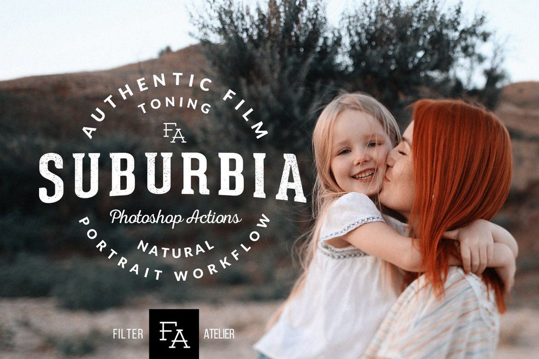
Suburbia Photoshop Actions
Suburbia is a collection of Photoshop actions that will help adjust the toning of your portrait and outdoor photos. It includes 6 different actions for giving rustic, soft, contrast, and other styles of effects for your photography.
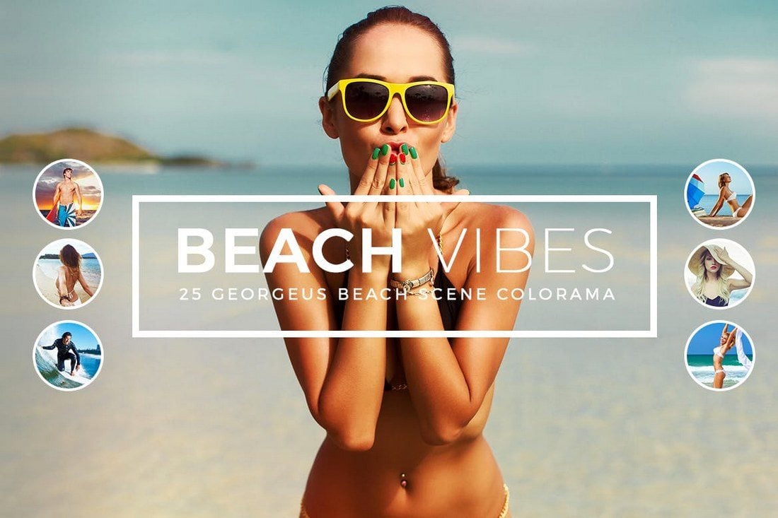
Beach Vibes Photoshop Actions
If you’re a photographer or a designer who works with lots of beach photography, this bundle of Photoshop actions will come in handy. It includes 21 presets for enhancing and adding visual effects for your beach and bright light outdoor photos.
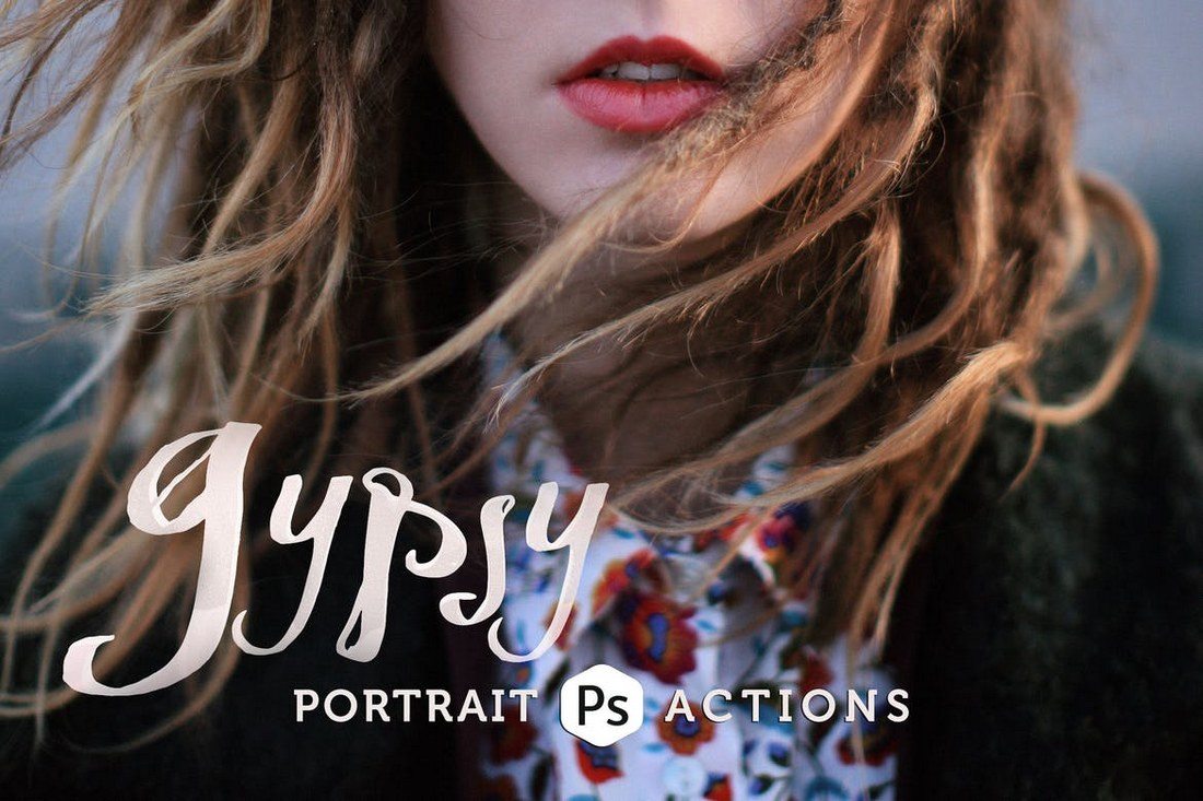
Gypsy Portrait Photoshop Actions
This collection comes with 4 different Photoshop actions for giving cinematic effects for your portrait photos. You can use the actions to give moody and cold effects as well as adjusting the tone of your photos.
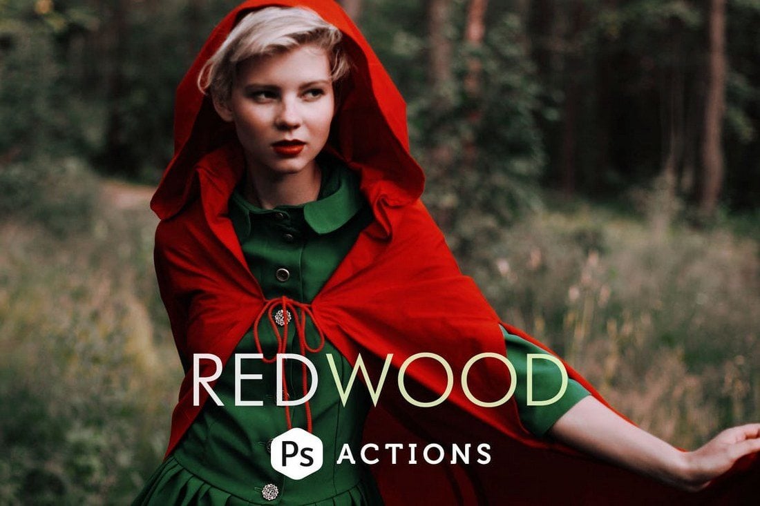
Redwood Fairytale Photoshop Actions
Redwood is a set of 3 unique Photoshop actions designed to give your outdoor portrait photos a fantasy-themed effect. It includes a morning haze effect, a twilight haze effect, and an evening sunset effect.
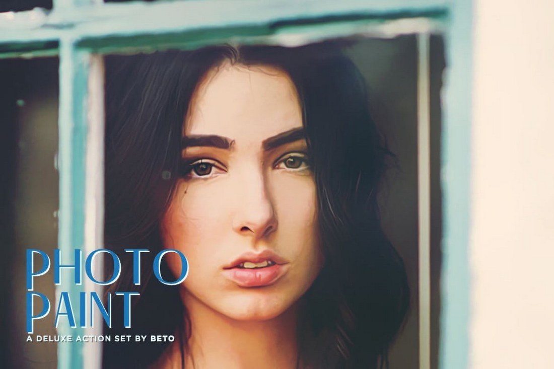
Photo Paint Action
This is a collection of 5 Photoshop actions that allows you to turn your portrait photos into paintings. Each action in this pack will give a different style of a painting effect with various brush stroke intensity. It also includes a sharpening action and 3 noise actions as an added bonus.
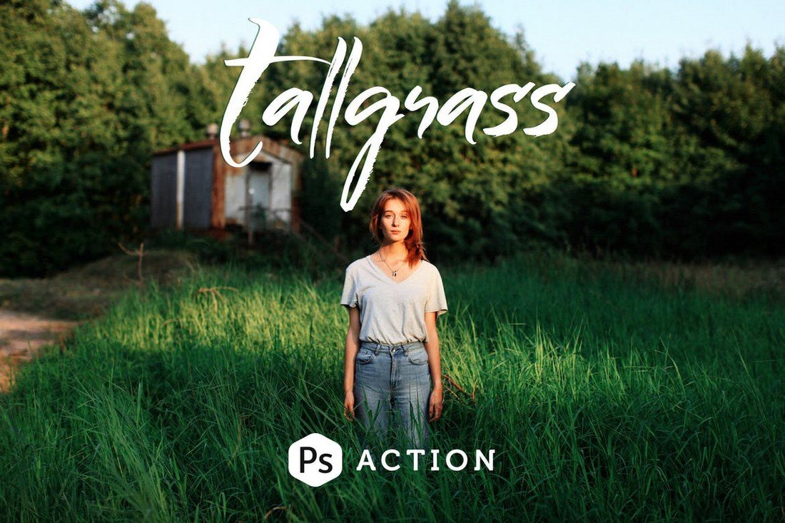
Tallgrass Photoshop Action
Tallgrass comes with 2 Photoshop actions for enhancing your portrait photos, especially outdoor and travel photography. It will help enhance the color depth and tune the greens to achieve a stunning visual effect.
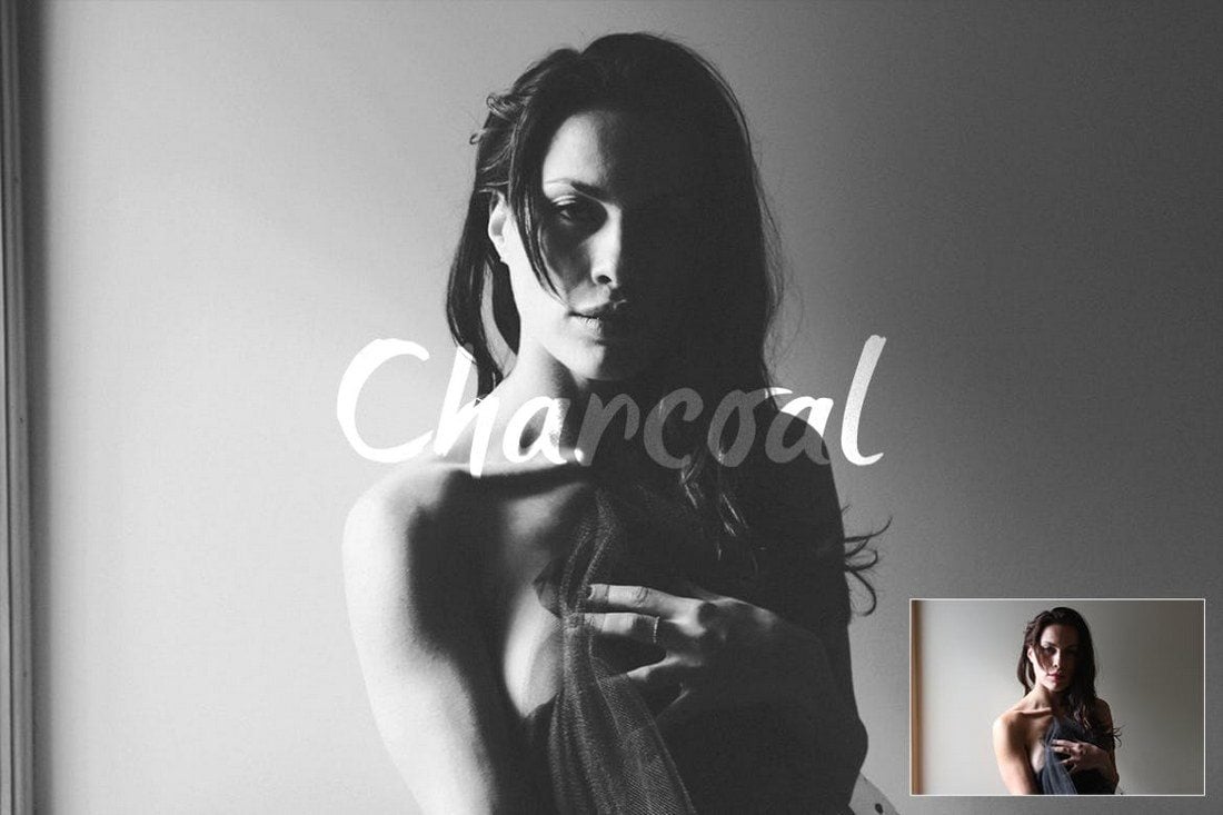
Charcoal Action
This Photoshop action pack includes 3 different actions for achieving the perfect black and white effect for your portrait photos. It will allow you to enhance your photos with a soft charcoal black and white effect to give them a retro and classic vibe.
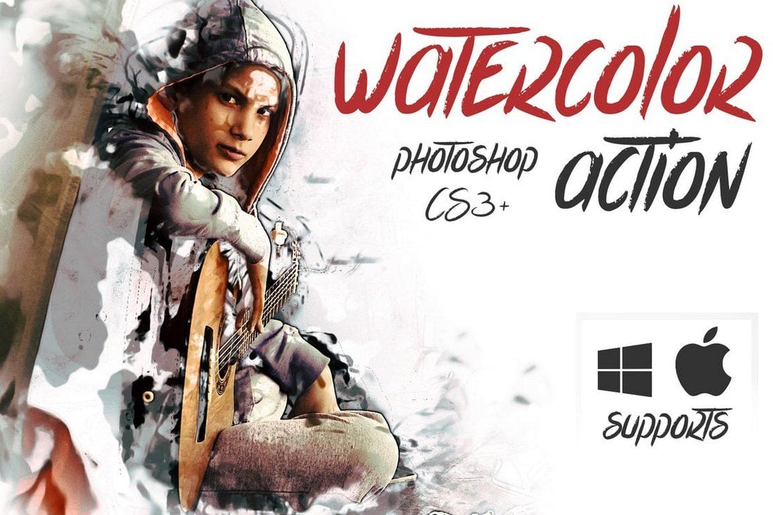
Watercolor Action
Another Photoshop action that turns turn your photos into watercolor paintings. This action allows you to choose from 5 different color options to give a realistic watercolor painting effect to your portrait photos.
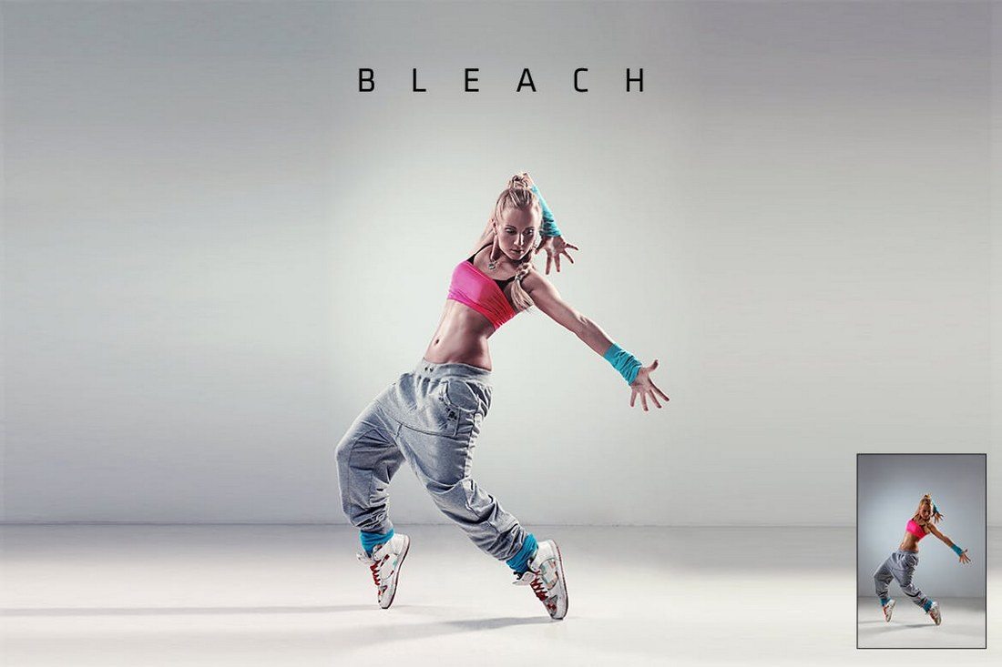
Bleach Action
Bleach action comes in 2 variations that allow you to instantly improve your portrait photos to bring out more detail and color. It’s specially designed for photos taken in studios and photos with low exposure.
Cinematic Photoshop Actions
This is a bundle of 25 Photoshop actions, which includes 19 cinematic effects actions and 6 toning adjustment actions. The effects in this pack have been designed inspired by movies such as the 300, Life Of Pi, Matrix, and Skyfall to help you achieve the same movie-like effects.
50 Film Noir PS Actions Bundle
A massive bundle of 50 different Photoshop actions containing different styles of cinematic and film noir effects. All of the actions in this pack are crafted to perfection by an award-winning photographer. It includes 30 cinematic color enhancing actions and 20 B&W color actions.
Retouch – Portrait Effects Photoshop Action
Wanting an all-in-one Photoshop Action that can meet all your photo editing needs? The Retouch Bundle has you covered. With 50 Portrait Photoshop Actions, you can adjust tone, soften skin, refine details, and much more without having any prior experience with the software.
Golden – Photoshop Portrait Actions
If you are a blogger looking for a set of Photoshop Actions that can help your everyday pictures make an impression, our next option is your best bet. This bundle of actions and presets has virtually everything you might need to achieve with your portraits. It’s compatible with both Photoshop and Lightroom.
Flowerage – Photoshop Portrait Actions
Here we have a set of 24 portrait effects Photoshop Actions that are exclusively created for natural light portraiture, wedding, and art photography. The presets are fully customizable and compatible with both Adobe Lightroom and Photoshop.
Digital Painting – Portrait Effects Photoshop Action
Transform your photos into digital paintings with our next Photoshop Action that contains exhaustive techniques and brushes, editable masks, canvas colors, backgrounds, and a range of other super amazing features.
3 Tips for Editing Portrait Photos
If you’re new to editing portrait photos, these tips will help you get a better understanding of how the editing process works.
1. Try to Use RAW Images
As you know, JPG is a file format that uses compression to try and reduce the size of your images while preserving the quality of the image. As a result, the JPG file format sacrifices some data and quality elements captured by the sensor of your camera in exchange for convenience.
This is why most professional photographers use the RAW file format. This format captures photos in much higher quality without affecting the quality of the image whatsoever. Even most modern smartphones now have the option to enable RAW file format.
Use it whenever you can to capture high-quality images so when you edit them in Photoshop, you’ll have a much better and uncompressed image to work with.
2. Master the Art of Toning
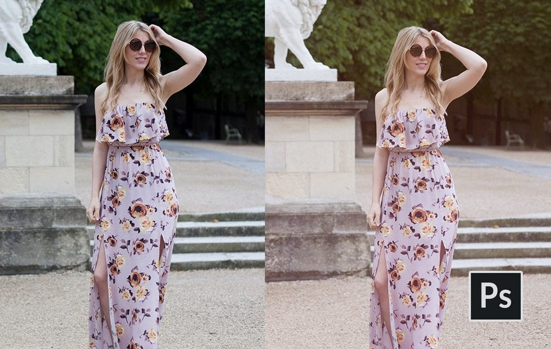
Toning is the process of adjusting the color balance, brightness, and contrast, and saturation levels to achieve the perfect balance in your photos. This process usually differs from one photo to another based on certain conditions like lighting conditions and camera settings. When it comes to portraits, this also applies to skin toning as well.
Whichever process you follow to set the mood with toning, always remember to use adjustment layers in Photoshop to create non-destructive adjustments. This way you’ll be able to easily edit or revert your changes however you like.
3. Don’t Overuse the Healing Brush
Healing brush is a handy tool in Photoshop that is widely used when editing portrait photos to get rid of things like pimples, freckles, and more. However, most designers make the mistake of taking it too far and using these tools to make photos look unrealistically flawless.
This is not what Photoshop is made for. Remember to preserve the natural look of the portraits while you improve the photos. Know your limits especially when using tools like healing brush and clone stamp.
The Photoshop actions in our list are designed to automate some of these basic adjustments. They are quite useful if you’re new to photo editing.
Tooltip Best Practices
In this article, I try to summarize the best practices mentioned by various accessibility experts and their work (like this, this, and this) into a single article that’s easy to read, understand, and apply.
Let’s begin.
What are tooltips?
Tooltips are used to provide simple text hints for UI controls. Think of them as tips for tools. They’re basically little bubbles of text content that pop up when you hover over an unnamed control (like the bell icon in Stripe).

If you prefer more of a formal definition, Sarah Highley provides us with a pretty good one:
A “tooltip” is a non-modal (or non-blocking) overlay containing text-only content that provides supplemental information about an existing UI control. It is hidden by default, and becomes available on hover or focus of the control it describes.
She further goes on to say:
That definition could even be narrowed down even further by saying tooltips must provide only descriptive text.
This narrowed definition is basically (in my experience) how every accessibility expert defines tooltips:
- A tooltip is a popover.
- Tooltips must not contain interactive content.
Heydon Pickering takes things even further, saying: If you’re thinking of adding interactive content (even an ok button), you should be using dialog instead.
In his words:
You’re thinking of dialogs. Use a dialog.
Two kinds of tooltips
Tooltips are basically only used for two things:
- Labeling an icon
- Providing a contextual description of an icon
Heydon separates these cleanly into two categories, “Primary Label” and “Auxiliary description” in his Inclusive Components article on tooltips and toggletips).

Labeling
If your tooltip is used to label an icon — using only one or two words — you should use the aria-labelledby attribute to properly label it since it is attached to nothing else on the page that would help identify it.
<button aria-labelledby="notifications"> ... </button>
<div role="tooltip" id="notifications">Notifications</div>
You could provide contextual information, like stating the number of notifications, by giving a space-separated list of ids to aria-labelledby.

<button aria-labelledby="notifications-count notifications-label">
  <!-- bell icon here -->
  <span id="notifications-count">3</span>
</button>

<div role="tooltip" id="notifications-label">Notifications</div>
Providing contextual description
If your tooltip provides a contextual description of the icon, you should use aria-describedby. But, when you do this, you also need to provide an accessible name for the icon.
In this case, Heydon recommends including the label as the text content of the button. This label would be hidden visually from sighted users but read for screen readers.
Then, you can add aria-describedby to include the auxiliary description.
<button class="notifications" aria-describedby="notifications-desc">
  <!-- icon for bell here -->
  <span id="notifications-count">3</span>
  <span class="visually-hidden">Notifications</span>
</button>

<div role="tooltip" id="notifications-desc">View and manage notifications settings</div>
Here, screen readers would say “3 notifications” first, followed by “view and manage notifications settings” after a brief pause.
Additional tooltip dos and don’ts
Here are a couple of additional points you should be aware of:
Do:
- Use
aria-labellebdyoraria-describedbyattributes depending on the type of tooltip you’re building. - Use the
tooltiprole even if it doesn’t do much in screen readers today, because it may extend accessibility support for some software. - Open tooltips on
mouseoverorfocus, and close them onmouseoutorblur. - Allow a mouse user to move their mouse over the tooltip content without dismissing the tooltip.
- Allow a keyboard user to close the tooltip on the
Escapebutton, per WCAG Success Criterion 1.4.13.
Don’t:
- Don’t use the
titleattribute. Much has been said about this so I shall not repeat them. - Don’t use the
aria-haspopupattribute with thetooltiprole becausearia-haspopupsignifies interactive content whiletooltipshould contain non-interactive content. - Don’t include essential content inside tooltips because some screen readers may ignore
aria-labelledbyoraria-describedby. (It’s rare, but possible.)
Tooltip limitations and alternatives
Tooltips are inaccessible to most touch devices because:
- users cannot hover over a button on a touch device, and
- users cannot focus on a button on a touch device.
The best alternative is not to use tooltips, and instead, find a way to include the label or descriptive text in the design.
If the “tooltip” contains a lot of content — including interactive content — you may want to display that information with a Toggletip (or just use a <dialog> element).
Heydon explains toggletips nicely and concisely:
Toggletips exist to reveal information balloons. Often they take the form of little “i” icons.

These informational icons should be wrapped within a <button> element. When opened, screen readers can announce the text contained in it through a live region with the status role.
<span class="tooltip-container">
  <button type="button" aria-label="more info">i</button>
  <span role="status">This clarifies whatever needs clarifying</span>
</span>
Speaking anymore about toggletips detracts this article from tooltips so I’ll point you to Heydon’s “Tooltips and Toggletips” article if you’re interested in chasing this short rabbit hole.
That’s all you need to know about tooltips and their current best practices!
Further reading
- Clarifying the Relationship Between Popovers and Dialogs (Zell Liew)
- Tooltips and Toggletips (Inclusive Components)
- Tooltips in the time of WCAG 2.1 (Sarah Higley)
- Short note on
aria-label,aria-labelledby, andaria-describedby(Léonie Watson) - Some Hands-On with the HTML Dialog Element (Chris Coyier)
Tooltip Best Practices originally published on CSS-Tricks, which is part of the DigitalOcean family. You should get the newsletter.
from CSS-Tricks https://ift.tt/g4QyuXm
Gain $200 in a week
via Read more
Top 10 Intro Templates for Premiere Pro to Boost Your Videos
Ever notice how a standout video starts strong, pulling you in within those first few seconds? That’s the power of a well-crafted intro. For anyone on a mission to up their video game—be it editors, YouTubers, influencers, or marketers—your choice of intro templates for Premiere Pro is a golden ticket to making an impression that sticks. And here’s the thing: crafting an effective video intro is less about intricate animations and more about hooking your audience right from the get-go.
Whether you’re after free intro templates for Premiere Pro or exploring some next-level options, the perfect intro template sets the tone, adds consistency to your brand, and builds that initial connection with viewers. Just picture your intro as the warm handshake before the deep dive into your content.
In this list, you’ll find a mix of visually striking and adaptable templates designed to make your content stand out—without overcomplicating things. From sleek typography-driven designs to high-energy motion graphics, these templates aim to elevate your content in a way that’s simple, effective, and easy to use.
See also
Underlined Animation Title Premiere Pro Template

Corporate Opener Premiere Pro Template

Travel Vlog Intro Title Template

Fashion Glitch Opener

Premiere Pro Title Template

Advance Titles Mogrt Template for Adobe Premiere

Split Frame Opener

Lyrics Titles Premiere Pro Template

Clean Title Animation Pack for Premiere Pro

Intro Showreel for Premiere Pro Template (Premium)

Animated Titles Templates for Premiere Pro

Titles Kinetic Typography Premiere Pro Template

Modern Intro Premiere Pro Template (Premium)

Nature Intro Transition Template

Premiere Pro Sports Intro Template (Premium)

Street Opener

Intro – Paper Cut Premiere Pro Templates (Premium)

Media Replacement Fitness Intro Template

Halloween Intro Skeleton Dance for Premiere Pro (Premium)

Sport Action Opener

The post Top 10 Intro Templates for Premiere Pro to Boost Your Videos appeared first on CSS Author.
75+ Best Free Final Cut Pro (FCP) Templates, Plugins, Titles & Transitions
Final Cut Pro is one of the best tools you can use for video editing, especially if you’re a Mac user. With the help of templates and plugins, you can create amazing video projects using the software.
There are so many amazing Final Cut Pro templates and plugins out there. And we handpicked some of the best templates for this list. You’ll find many different types of plugins, title templates, transition effects, social media templates, and much more in the collection.
We’ve included a couple of premium options, but the best part is that almost all these templates and plugins are free to download. You can even use some of the templates with commercial projects for free. Most of the templates are also compatible with Apple Motion as well.
Have a look and start downloading.
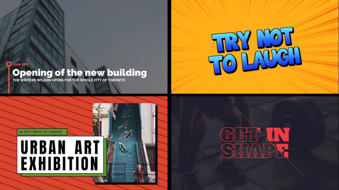
Modern Typography Titles Pack for FCPX
Whether you’re a professional video editor or a YouTuber working on vlogs, you’ll often have to work with different styles of videos. These videos also require different types of title designs. This bundle is made just for creators like you to help you tackle different types of projects. It includes many different types of title scenes that are compatible with both Final Cut and Apple Motion.
Dynamic Opener – Final Cut Pro Intro Template
Looking for a modern and dynamic opener for a client project? Then this template is perfect for you. It features multiple styles of dynamic openers with attractive animations you can use to add creative title scenes to your video projects.
30 Motion Titles – Apple Motion & Final Cut Pro Templates
If you’re looking to create a more professional title scene with a minimalist design, this bundle of templates will be a better choice for you. It includes 30 different title designs that can be customized to your preference. They will work great on both Apple Motion and Final Cut Pro X.
30 Corporate Titles – Final Cut Pro X Templates
Featuring a collection of minimal and clean title designs, this Final Cut Pro title templates collection is made to cover all sorts of business and corporate videos. It includes 30 different title scenes with various animation styles. As well as lower-thirds templates. You can easily change the colors, text, and parameters however you like.
Colorful Liquid Slideshow Final Cut Pro Template
This colorful Final Cut Pro slideshow template will help you design beautiful presentations for various types of video projects from adverts to social media promos and more. There are multiple styles of slide layouts in this template with liquid-style shapes and animations. And you can fully customize them to your preference.
Smooth Letter Slideshow Free Final Cut Pro Template
You can download this Final Cut Pro template for free to design elegant and stylish slideshows for modern businesses. It has a set of dynamic slides with 14 placeholders for images or videos. There are also placeholders for text and titles too.
Fashion Photo Slideshow Free Final Cut Pro Template
This FCP slideshow template can be used to design modern and cool presentations for fashion and design-related topics. You can use it to make quick promo videos for social media as well. The template is free to download and use.
Web Promotions Free Final Cut Pro Template
If you’re working on a promotional video to advertise your brand or product online, this free Final Cut Pro template will help you make an attractive video. It features 8 unique scenes with trendy animations, 12 media placeholders, and 48 text placeholders.
Ransom Notes – Free Final Cut Pro Title Template
This is a fun and creative title template for Final Cut Pro that features letters with paper cutout styles. It makes the title look like a ransom note. The template is free to download.
Free Fashion Type Photo Presentation FCPX
This is a stylish slideshow template for Final Cut Pro that allows you to create trendy photo slideshow videos to promote fashion and apparel brands. It’s ideal for other types of videos too. You just have to make a few adjustments here and there.
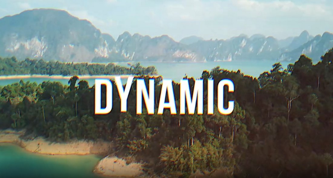
Free Dynamic Title Final Cut Pro Template
This is a dynamic and creative title template for Final Cut Pro. It features several different styles of bold and attractive title designs available in multiple aspect ratios. All free to download and use.
Free Gradient Shape Title for Final Cut Pro
Another colorful and stylish title template for Final Cut Pro. This template is also free to download and it features a modern design filled with shapes and colors. It’s ideal for business promo videos.
Free Painter Style Lower Third FCPX
This is a free lower-third template for Final Cut Pro. It features a creative design with painting-themed elements. The background of the text has a paint-brush-like texture to give it a more unique look and feel.
Free Cut-Off Title Box for Final Cut Pro
This title template for Final Cut Pro comes with a modern design with a full-screen layout. It shows your title as if it’s been cut off by the screen. And you get to fully customize the text, font, and colors to your preference too.
Free Polaroid Style Slideshow FCPX
This free Final Cut Pro slideshow template is perfect for creating a simple and fun photo slideshow. It features a polaroid-style slide design with multiple variations to choose from.
Free Creative Text Line Story FCPX
With this free Final Cut Pro template, you can create a stylish and modern Story to promote your Instagram channel. It features an easily editable layout with a text and video placeholder.
Free Boxed Shape Logo Reveal FCPX
Another free Final Cut Pro template for adding a simple logo reveal to your videos. It has a minimalist design with a boxed-shaped text logo placeholder. It’s perfect for business and creative videos.
Free Broadcaster Style Lower Third
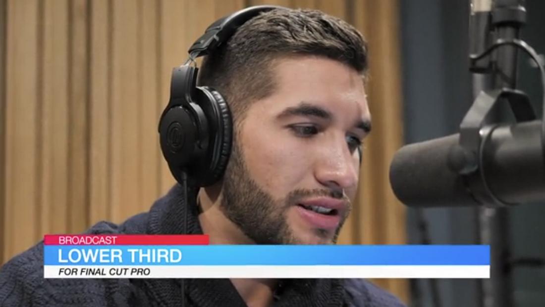
If you want to add simple lower-thirds to your videos to add a professional look, this free Final Cut Pro lower-third template is perfect for you. It has three lines of text with editable colors and fonts.
Free Colorful Glitch Opener FCPX
Use this free Final Cut Pro template to create a trendy opener for your videos with a glitching effect. You can easily replace the background video and customize the text as well.
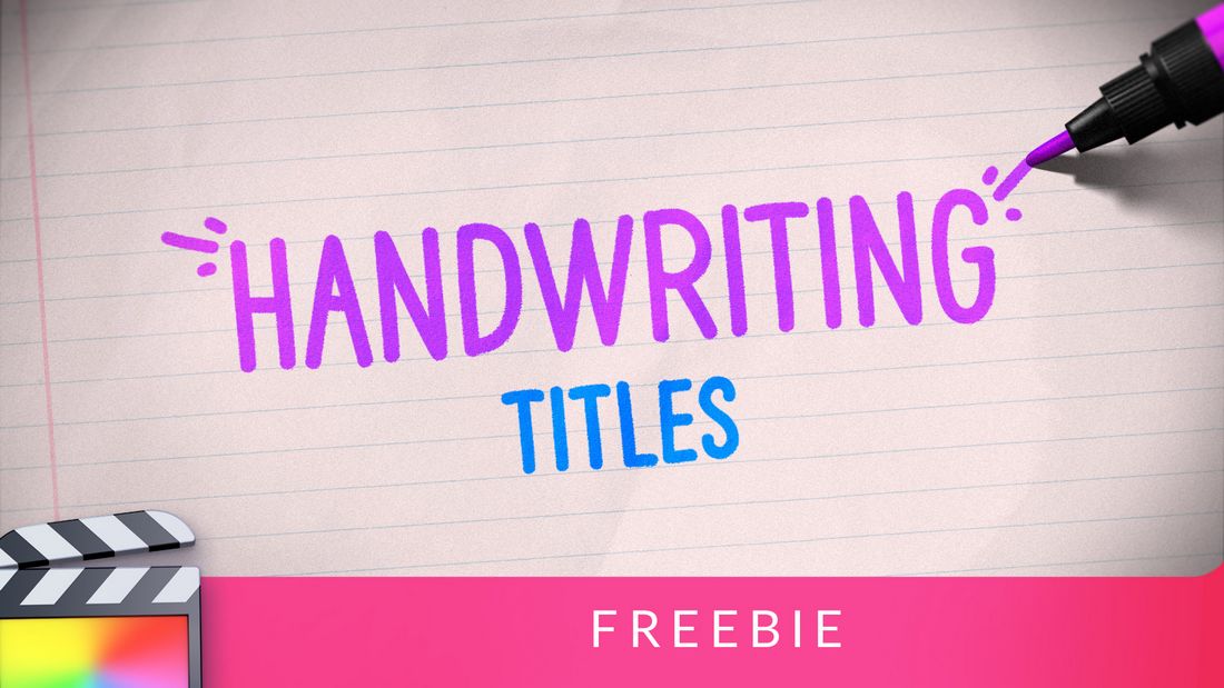
Handwriting Titles – Free Final Cut Pro Title Template
Make your video titles look like handwritten text with the help of this free Final Cut Pro template. It features a creative lettering design and animations to make intros and title scenes look more creative.
Free Lyrics Video Creator 2 For Final Cut Pro
This is a must-have template for creating music videos and lyric videos in Final Cut Pro. It makes things much easier to add lyrics to your music videos. And it’s free to use.
Free Text Message Plugin For Final Cut Pro
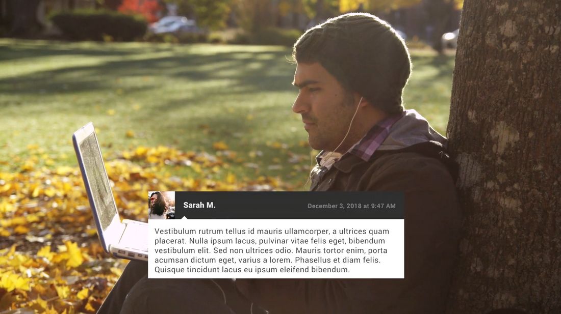
Add text blocks to your videos in the style of text messages. This free Final Cut Pro template lets you add simple text blocks that look like messages popping up on the screen.
Camera Movements – Free Final Cut Pro Template
This free Final Cut Pro template includes multiple studio-quality camera movement effects to make your videos look more professional and unique. They are easy to use and perfect for enhancing all types of videography.
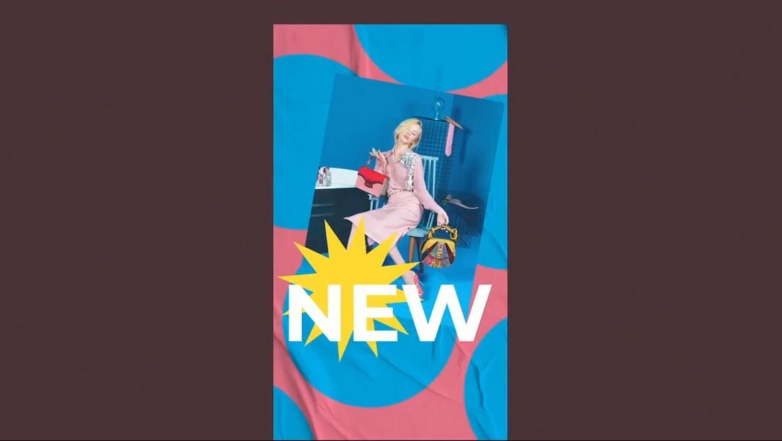
Snap To It – Free Final Cut Pro Instagram Story Templates
You can use this FCP template to design amazing Instagram Story clips to attract more attention. It includes 5 unique Instagram Story templates with creative animations, effects, and colorful designs. You can fully customize them to change colors and media too.
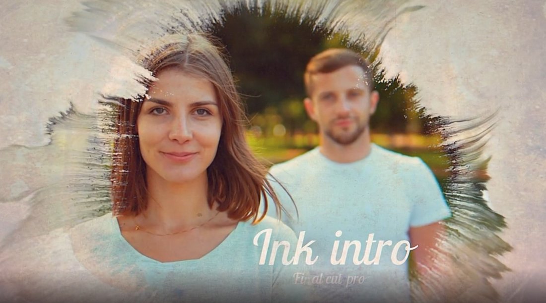
Wet Ink Opener – Free Final Cut Pro Template
This is a unique opener template for Final Cut Pro that features creative wet ink-style transition effects. It will allow you to create beautiful openers for photo album videos as well as for making channel intros and logo stings.
Light Leak Motion – Free Final Cut Pro Opener Template
Want to add a unique opener to your social media promo video? Then be sure to grab this free Final Cut Pro template. It features a simple design with a light leak effect that opens to titles and logo reveals.
Shape Filter Opener – Free Final Cut Pro Template
This free Final Cut Pro template is perfect for making openers for corporate business and event promo videos. It features a stylish animated shape with bold headings.
Fullscreen Glitch – Free Final Cut Pro Title Template
Make a big and bold title scene for your YouTube and creative videos with this free Final Cut Pro title template. It includes a fullscreen title design featuring a glitch effect.
YouTube Subscribe – Free Final Cut Pro Template
You can use this free Final Cut Pro template to add a subscribe notification bar to your YouTube videos. It’s fully animated and includes space for adding channel branding and profile icons as well.
10 Free Openers for Final Cut Pro X
This is a collection of 10 openers for Final Cut Pro X. It includes several attractive intro designs you can use to create title scenes for your videos. Each opener can be easily customized to your preference. And the templates are compatible with FCPX 10.4.7 and higher.
Company Profiles Free Final Cut Pro Template
This free Final Cut Pro template includes 6 fully animated slides for showcasing your company and team. It’s ideal for making company profile videos for startups and small businesses.
Free Lightning Elements Pack for Final Cut Pro
Lightning effects are commonly used in YouTube and social media videos to make content more entertaining. This free Final Cut Pro template pack gives you 12 different lightning effects to help make your video more fun and entertaining.
Free Creative Instagram Stories Final Cut Pro Templates
You can use this Final Cut Pro template pack to create professional-looking Instagram stories to generate more engagement. It includes 8 free Instagram story templates with animations and editable designs.
Free App Promo Video Template for Final Cut Pro
This free Final Cut Pro template is perfect for making promo videos for showcasing your mobile apps and features. The video template includes multiple slides with different styles of animations.
Free Animated YouTube End Screen for Final Cut Pro
Add a simple and animated end screen for your YouTube videos with this free Final Cut Pro template. It features a gradient color background with an easily customizable design.
mVertical Free Final Cut Pro Plugin
This Final Cut Pro plugin will be quite useful for social media content creators. It allows you to easily adjust your vertically shot videos for a wide-angle view by adding a blurred background.
mVertigo Free Dolly Zoom Effects for FCPX
With this free Final Cut Pro effect, you can add a cool dolly zoom effect to your videos. You can even use it on photos to create amazing animations. It works simply by drag and drop and offers controls for customization as well.
Free Adjustment Layer Plugin for Final Cut Pro X
A free adjustment layer kit for Final Cut Pro. Using this freebie, you can easily color grade videos to add a cinematic visual style to stock footage. It works with Final Cut Pro X 10.4 and higher.
10 Free Smooth Final Cut Pro Transitions
This is a collection of free transitions for Final Cut Pro. It features 10 different transition effects with a variety of styles. You can use them with both professional and creative videos.
Free Final Cut Pro Slideshow Template
If you’re working on a slideshow design in Final Cut Pro, this free template will help you design a professional slide without effort. It features a clean and modern design with fully customizable elements.
Free Pixel Grid Glitch Promo Final Cut Pro Template
You can use this free Final Cut Pro template to create a cool promo video. It features a colorful glitch effect with unique transition animations. Of course, you can fully customize the design to your preference as well.
Free Social Media Links for Final Cut Pro X
Direct your audience to your Instagram, Twitter, Tumblr and Youtube handles, and boost your social media presence with the help of this remarkably unique Final Cut Pro template available for you to download at no cost at all. Grab it now!
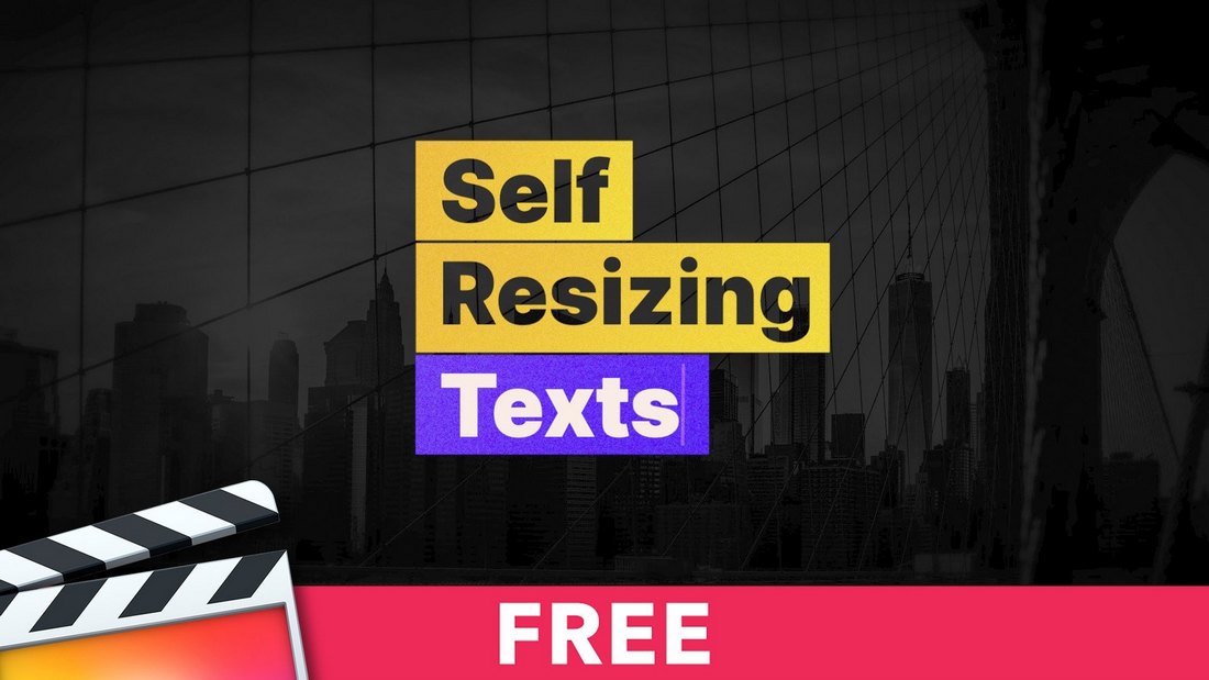
Self Resizing Texts – Free FCPX Templates
A creatively animated text template featuring a text resizing effect. This template is perfect for showcasing quotes and descriptions, especially for social media videos. It’s compatible with all video sizes including square, portrait, and Instagram stories as well.
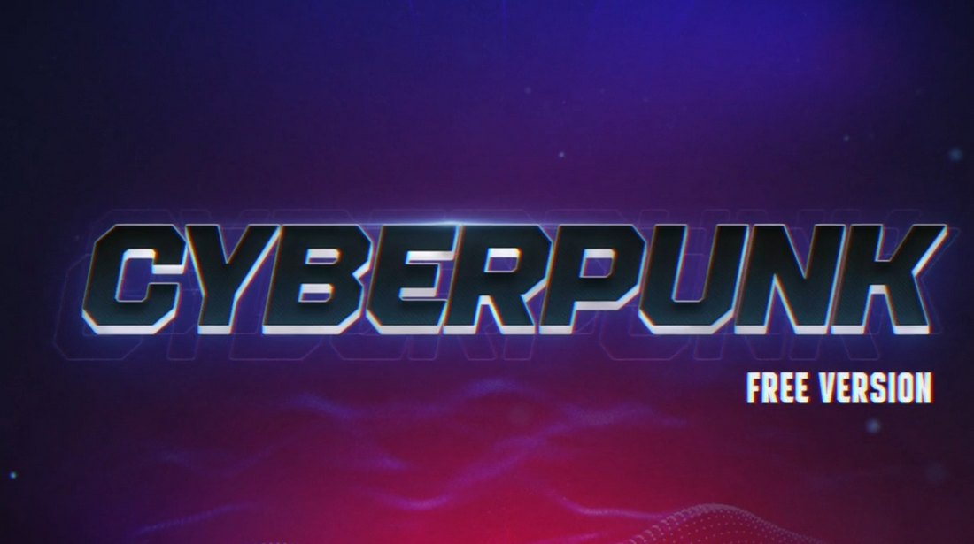
Cyberpunk Effects – Free Final Cut Pro Template
This bundle includes 4 unique transition effects featuring various Cyberpunk-style designs. There are glitch animations, neon lights, and everything you need to add a futuristic Cyberpunk vibe to your videos.
Free Animated Grids Final Cut Pro Template
You can use this free FCP template to create a grid animation scene for your video. It includes 20 grid animations that are ideal for everything from photo slideshows to business showcase videos and much more.
Free Final Cut Pro Bouncy Text Animations
Next up, we have a free Final Cut Pro template that equips you with 30 in and out bouncy text animations, ensuring you never run out of choices when it comes to sprucing up your footage. This template is a must-have in an FCPX editor’s toolkit.
Sketch Reveal Free Final Cut Pro Template
Add a cartoon sketch-style transition animation to your videos using this free FCP template. It also comes with 7 title placeholders, 7 logo reveals, and 6 transition effects packed into one bundle. All for free.
Free Text Message Templates for Final Cut Pro
You can use this free template to create a text messaging scene with creative animations and video content. It’s perfect for creating fun and entertaining videos for social media content and promotions.
Music Player – Free Final Cut Pro Template
If you upload audio content on video platforms like YouTube and Tiktok, use this template to add a video player to your song compilations and soundtrack videos. It’s free to use and easily customizable with Final Cut Pro X.
Free Final Cut Pro Fast Zoom Transitions
If you’re looking for some cool zoom transitions to add to your videos, this free Final Cut Pro template is well worth checking out. It comes with 7 dynamic zoom rotation in and out transitions with incredibly unique filters that are sure to boost the overall appeal of your promo, movie, or presentation.
Silhouette Openings – Free FCPX Templates
Create a stylish silhouette-style title scene with this free FCP template. It comes in 3 different aspect ratios including portrait and square. You can use it in both Final Cut Pro X and Apple Motion 5.
Simple Transitions – Free Final Cut Pro Template
If you’re tired of using the same old default transitions in Final Cut Pro, these transition effects will definitely come in handy. This pack features a set of creative transition effects you can add to your own video projects. The effect is customizable and it’s available in different styles as well.
Free Final Cut Pro Unique Typography
Ideal for fashion events, promos, slideshows, and Youtube videos, this bundle of 14 stylishly designed animated titles should be at the top of your list when looking for the best free Final Cut Pro templates. We recommend you take this resource for a spin!
Free Final Cut Pro 3D White Logo
If you’re after a neat, and minimal logo template that comes without any bells and whistles, this 3D design is the one to go for. This template can be used as a quick introduction to your videos and comes with various placeholders making customization a piece of cake for you.
MixKit Final Cut Logo Reveal Templates
Give your brand the attention it deserves in your next video project, by incorporating a logo reveal from this collection of 9 free logo templates for Final Cut Pro. Professionally designed by talented creators, each template on Mixkit is free to download and use in your next commercial project. Simply add your logo and brand colors to easily make these templates your own.
Glitch Sport – Free Final Cut Pro Transitions
Sports and workout videos need to feature more energetic and trendy transitions that attract the right audience. This is a pack of free transitions you can use in Final Cut Pro to achieve that goal. The bundle includes a set of stylish transitions with 10 editable layers covered with a glitching effect. Perfect for your YouTube videos.
Beautiful Slideshow – Free Final Cut Pro Template
Sometimes a simple slideshow design can go a long way to make your video albums and photo slideshows look more unique and professional. This template has the same vibe. It features a simple slideshow design featuring light leaks. There are 10 image placeholders and 10 text layers you can easily edit to your preference.
Bright Summer – Free Final Cut Pro Slideshow
Looking for a more colorful and trendy slideshow template? Then grab this free Final Cut Pro template. It comes with 17 media placeholders where you can feature both photos and videos. It’s easily customizable and it’s perfect for making clips and slideshows for social media.
Movie Pop – Free Final Cut Pro X Title Plugin
Movie Pop is an amazing free plugin you can use with Final Cut Pro X. Using the plugin, you can create incredible title scenes for your videos, just like the ones you see in Hollywood movies. The plugin is also quite easy to use. The download page has links to tutorials as well.
Template Pop – 24 Free Final Cut Pro X Titles
Template Pop is a collection of Final Cut Pro title templates you can use for free with your video projects. This bundle includes 24 different title designs featuring various styles of scenes, angles, and styles. You can edit each template to change text and colors to your preference.
Sign Pop – 50 Free Animated Icons for FCP
This is a bundle full of creative and animated icons for Final Cut Pro. These adorable icons are perfect for adding a bit of creativity and quirkiness to your YouTube and Instagram clips. They are also great for making kid-friendly videos. This pack includes 50 different animated icons.
Photo Slideshow – Free Final Cut Pro Template
Using this free Final Cut Pro template, you’ll be able to create an old-school photo slideshow. It features Polaroid-style media placeholders that flip down to reveal the next slide. It includes 14 media placeholders and it works with both FCP and Apple Motion.
Free Final Cut Pro Intro Templates
Looking for an intro template to create a modern opening scene for your videos? Then this template is perfect for you. It features a stylish design with a creative animation. You can use it as an intro scene or even a title scene. It’s suitable for corporate and business videos as well.
12 Free Animated Call-Outs for FCP & Apple Motion
Callouts can be a great feature you can add to your product promotion videos to describe product features. With this free Final Cut Pro template, you can add professional-looking callouts to your own videos without an effort. It actually comes with 12 different styles of callout designs and you can use them in Apple Motion or FCP.
Live – Free Title & Lower Thirds for Final Cut Pro
With this collection of Final Cut Pro templates, you’ll be able to craft both titles and lower-thirds for your videos with ease. It includes a stylish title template and a lower-third template. Both feature modern designs with easily customizable text and colors.
Cartoon FX – Free Final Cut Pro Effects
This is a bundle full of amazing effects you can add to your videos in Final Cut Pro. It features a set of cartoon-style visual effects. When used properly, they’ll add a unique look to your videos. It includes multiple styles of effects suitable for different types of videos.
Social Media Slideshow – Final Cut Pro Template Free
Just as the name suggests, this Final Cut Pro template features a slideshow design that’s most suitable for social media videos. It includes a stylish slideshow with multiple image placeholders for featuring your photos. You can customize it using FCP or Apple Motion.
10 Basic Lower Thirds – Free Final Cut Pro Templates
If you’re a YouTuber or a social media influencer, you’ll find this collection of lower thirds templates to be quite useful. This pack includes 10 lower-third templates with various styles of designs. They are perfect for adding simple titles for different kinds of videos.
10 Free Flat Transitions for Final Cut Pro
This bundle includes a collection of very colorful and beautiful transition effects featuring flat color designs. There are circles, squares, and many other styles of transition styles. You can use them with various videos to add more entertaining transitions.
Tile Pop – Flipping Tile Free FCP Transition
Tile Pop is a free transitions template for Final Cut Pro. It features a very stylish effect that uses a tile flipping animation to transition from one scene to the next. The effect is available in multiple styles as well.
50 Free Animated Backgrounds for Final Cut Pro
Coming up with a stylish background for various scenes in your videos can be tough when you have a blank canvas. But, with the help of this pack of backgrounds, you won’t have to worry about it again. This bundle includes 50 unique backgrounds with animated gradients. And it’s totally free.
4 Essential Free Titles & Lower Thirds for FCP
Whether you’re working on a corporate video, a casual social media clip, YouTube video, or even a hipster-style fashion video, this pack of Final Cut Pro templates has titles and lower-thirds to cover all those types of videos and more. It’s fully customizable and comes with in and out animations as well.
Free Instagram Stories Final Cut Pro Templates
Looking for a way to create unique Instagram stories to stand out from the crowd? Then use this free Final Cut Pro template kit to create attractive Instagram stories. This pack includes multiple Insta story templates in different aspect ratios to fit all types of screens.
Super Starter Kit – Free Final Cut Pro Templates
If you’re new to video editing or just getting started on YouTube, this starter kit is perfect for you. It’s a complete kit that includes many different kinds of Final Cut Pro templates. Such as transitions, titles, lower-thirds, Instagram stories, and much more for creating all kinds of videos.
Social Titles – Free FCP Title Templates
This is a collection of modern title templates for Final Cut Pro. It includes 12 different title scenes fully animated to fit modern videos. The titles are especially suitable for social media video clips for adding quotes as well as for YouTube videos.
YouTube Like Notification – Free FCP Template
Getting your viewers to click subscribe and hit the notification bell on YouTube is not easy. Maybe adding small visual aid could help convince your fans. Use this template to add a YouTube Like and subscribe animation to your videos. You can easily remove the background of this clip to add the icons as an overlay on your videos.
Check out our best Final Cut Pro title templates collection to create a great title scene for your videos.
30+ Video Marketing Trends for 2025
Almost every marketing prediction, resource, or how-to guide includes the same advice: video needs to be part of your strategy. But what type of video marketing is most important right now?
From super-short (micro) video clips, to live video on social media, to full-production ads and stories, we’re going to look at some of the top video marketing trends for the year and how you can incorporate them into your design and marketing plans.
And here’s why it matters, U.S. adults spent 149 minutes per day watching digital video in 2021 and that number is only expected to rise.
Let’s dive in, and embrace video as the new marketing channel you need to get right!
1. AI-Assisted Videos
The entire marketing industry was revolutionized within a few months with the rise of AI-powered tools. A video production that took days or weeks to complete now only takes a few hours. A video that required a thousand-dollar budget now only requires a subscription to a couple of AI tools.
The entire process of creating videos can now be done with the help of AI. From creating the script with ChatGPT to generating voiceovers, stock videos, music, images, and even editing can be done with AI.

Some aspects of this process are not perfect. For example, generating stock videos still needs a little bit of improvement. But you won’t have to wait too long. Even Adobe is working on its next-gen generative AI that supports creating entire videos with text prompts, which will be available this year.
With the help of AI tools, every marketer will be capable of taking on bigger projects and be more efficient than ever before. It will surely have a big impact on the video marketing industry in 2024.
2. Branded Video Podcasts
Podcasts have been growing in popularity over the years very slowly and today they are one of the most effective mediums of marketing and promotions. As a result, they soon transitioned from audio-only medium to video format, especially with Spotify and YouTube introducing support for video podcasts.
Brands are now taking advantage of this new video marketing format by producing their own branded video podcasts. Wix, Shopify, and Microsoft Xbox are among the many brands that now have active podcasts to talk about their products, services, and success stories.
These long-form video podcasts are more than just about promotions. They are also about sharing deep and meaningful conversations with the people in charge of the company and giving the audience insights into what goes behind the scenes in an entertaining way.
3. Podcast Clips
A side benefit of producing a video podcast is how you can repurpose it to create content for other platforms like TikTok, Instagram, and YouTube. Some of the most popular and successful types of content on these platforms have been short clips taken from podcast interviews as they make people stop and listen to tips and advice from influential people.
If you look closer, you’ll notice that every podcast channel now has a separate clips channel where they share short-form clips from their podcast episodes in the form of TikToks, Instagram stories, or YouTube shorts. This offers a simple, low-effort way to reach audiences on different platforms while also boosting engagement.
4. Event Livestreams
For a long time, annual conferences, product reveals, and special events from big companies were limited to the press. If we wanted to know what the new iPhone looked like or what kind of new features we could expect to see in the new Photoshop update, we had to wait until a press outlet published a story about it. But not anymore.
Event live streams were popularized by Apple a few years ago. Their over-the-stop and engaging style of live-streaming events were watched by millions of people around the world. Many other companies followed this strategy to livestream their own events online for everyone to see.
Now, even small startups and brands host special events to announce their latest products and updates. This has proven to be an effective approach to reach a wider audience across different platforms.
5. Personal Interviews and Tours
Exclusive office tours and behind-the-scenes videos are nothing new. Many big corporations have been doing it for years. Recently we saw a new trend in this marketing strategy where key employees and CEOs give more meaningful interviews and tours of their personal lives.
Mark Zuckerberg gave a very personal interview where he not only shared insights into his day-to-day life and his newfound hobbies but also detailed his plans for future products. IBM also offered influencers a tour of its innovative quantum computer. Elon Musk continued to provide tours of SpaceX to content creators. And it looks like more brands and companies are starting to follow this trend, now more than ever.
6. Daily Life Vlogs
Encouraging employees to share their daily life around the office environment is another effective video marketing strategy that promotes brands in a subtly indirect but more meaningful way.
Typing “day in my life” into the search bar on any video-based social media platform will show you thousands of videos created by employees of various types of companies. While most of these videos aren’t produced by brands, giving employees the freedom to create these videos helps promote brands and their work culture to the world.
This style of indirect marketing videos is much more effective at connecting with an audience than even Superbowl ads. As they help build trust, loyalty, and confidence on a personal level.
7. Edgy Brand Videos
Videos revealing the deepest secrets of brands and their marketing strategies are one of the most refreshingly unique video marketing trends we’ve been seeing over the past few months.
Popularized by independent and smaller startups, like Nothing, these edgy videos skip the traditional formats of “official” and “professional” video content to build trust and connect with audiences in a creative way.
One of the videos made by Nothing, the UK-based smartphone maker, revealed how they tricked the media to reveal their latest product by pretending to leak information. Their YouTube channel has many other videos challenging the practices used by competitors and comparing products as well.
8. Short Film Commercials
.embed-container { position: relative; padding-bottom: 56.25%; height: 0; overflow: hidden; max-width: 100%; margin-bottom:20px; } .embed-container iframe, .embed-container object, .embed-container embed { position: absolute; top: 0; left: 0; width: 100%; height: 100%; }
Many brands have been making adverts disguised as short films. For a long time, these were only made by big corporations and brands such as BMW, Marriot, Coca-Cola, and Porsche. Today, it’s much easier and cheaper to develop such short film commercials.
Brands are now commissioning influencers and content creators to make long-form adverts disguised as short film-style videos. These influencers create interesting, engaging, and entertaining videos that seamlessly integrate products and brands within the story.
Rather than buying ad spots in YouTube videos or blatantly sponsoring TikTok videos, funding a short film-style video makes sense for a brand to promote products in a more natural and seamless way, while also supporting content creators at the same time.
9. Seamless Loop
.embed-container { position: relative; padding-bottom: 56.25%; height: 0; overflow: hidden; max-width: 100%; margin-bottom:20px; } .embed-container iframe, .embed-container object, .embed-container embed { position: absolute; top: 0; left: 0; width: 100%; height: 100%; }
Contrary to popular belief, TikTok and YouTube shorts aren’t always about recreating awkward dances and reacting to funny videos. Content creators are now much smarter and more creative when it comes to making more entertaining videos.
One of the popular trends on these short video platforms is the seamless looping video. These videos are brilliantly designed to make the clip playable endlessly, over and over again. And they are quite mesmerizing to watch.
A few brands have been utilizing this trend to their advantage by making seamless loop videos that have users staring at the screen for a long time. And we will likely see more marketers incorporating this strategy into their video marketing campaigns this year.
10. Behind-the-scenes videos
The behind-the-scenes videos are one of the tried and true methods of marketing and promoting a brand. However, most marketers aren’t taking advantage of this video marketing method.
Giving your audience and customers a behind-the-scenes look at a brand and how it operates is an effective way of building trust, loyalty, and transparency. Many big brands have done this in the past. However, that old approach no longer interests the younger audiences.
Now, you have to be more creative and engaging when creating quick behind-the-scenes videos for platforms like TikTok, YouTube shorts, and Instagram Reels. There’s plenty of opportunity here for marketers to capitalize on.
11. Influencer Explainer Videos
.embed-container { position: relative; padding-bottom: 56.25%; height: 0; overflow: hidden; max-width: 100%; margin-bottom:20px; } .embed-container iframe, .embed-container object, .embed-container embed { position: absolute; top: 0; left: 0; width: 100%; height: 100%; }
We went through a series of trends related to explainer videos in the past, from whiteboard explainers to animation explainers, motion graphics explainers, and more. The latest trend, however, may not surprise you at all.
The newest trend in explainer videos is influencer explainers. These videos involve getting influencers to create more in-depth explainer videos that dive deep into a product and its features.
These are not product reviews or feature overviews. These explainers are more focused and detailed, similar to online courses and tutorials. Influencers such as Thomas Frank does these types of videos quite brilliantly. Some of his videos are an hour long and yet they get millions of views.
It’s an effective video marketing strategy for two reasons: They don’t push a product forcefully, instead, they promote how to use it. The second benefit is these videos are more authentic than paid reviews or adverts.
12. “Shorts”
YouTube Shorts launched in late 2020 and has been steadily growing in popularity. It’s the vertical format, short form answer to video with a style that’s a lot like TikTok or Instagram Reels.
Shorts have more than 5 trillion views. So, it’s pretty obvious that this style is trending.
These videos are only a few seconds and tell a quick story. Much of the content is user generated but it has some value for marketing as well. Common video topics include pranks, silly animals, and how-tos. The latter might be the most useful for video marketing.
13. Trending Audio
Another video marketing trend that’s been fueled by TikTok and Instagram is trending audio clips on videos. These sound clips might include popular songs, voiceovers, or other sound effects that the video tries to match.
These videos can get a lot of play and may also trend with other elements such as hashtags.
For video marketing purposes, trending sound can be a quick way to hop on a trend and generate engagement, but you will have a very limited time window to act and get your video posted before the trend fades again.
14. Sequential Storytelling
YouTube, a Google company, has put a lot of time and effort into what makes great video content. Their research shows that videos with sequential storytelling – something with a beginning, middle, and end – perform better and create more effective ads.
It’s not that surprising when you think about it. With the rise of streaming television and YouTube as an entertainment platform where users watch more and longer-form videos, the narrative format is more important than ever.
This is a trend that works for YouTube and almost anywhere else you plan to use video content. It works for short and long videos as well. The common denominator is that you just have to remember to tell a story that will resonate with audiences.
From YouTube:
“Video ad sequencing updates the traditional model, allowing you to serve up a planned sequence of ads that tell a story to customers across their purchase journey. New technology makes sequencing manageable and offers gains for marketers. It’s proven to be more memorable than the 30-second ad spot.”
So what does this mean? You can tell a single story across multiple videos, picking up where you left off in one and starting again in another. Keep building the video story over time.
15. User-Generated Video
User-generated video has long been popular with social media but it is everywhere you look. Even video that’s not user-generated often has that authentic look to it.
Think about many of the videos you’ve watched recently – from dances on TikTok to commercials – almost every other video looks like something someone did on the fly. There’s less perceived production and more of a look-at-what-I-just-made feel to it.
Even one of the most famous “user-generated” movies is making a comeback with a Blair Witch sequel (Escape Blair Witch) in late 2021.
16. Interactive Video
Interactive video comes in a lot of forms. It could be virtual reality or a game or accompanying elements, links, or options on a website or with a shared post.
One thing is trending though – you have to give users something to do once they’ve watched the video. Continue the engagement. Don’t let it stop with a view. Users who stick with you and watch a video are already engaged with your brand and content and are even more likely to continue that engagement. Keep the connection with an interactive opportunity.
The key to making interactivity work is to ensure that it aligns with the video itself. The link or next action should be intuitive and interesting.
Take note of how Maybelline, above, layers video behind a box that includes a call to action. This simple layering of elements can help keep users engaging with content longer thanks to a video hook. When you think of videos and interactivity, consider ways outside of AR and VR to implement them.
17. TikTok Style
If you have scrolled any social media feed, almost every video is using the fun, fast, energetic style made popular on TikTok. These short videos explain or tell about one thing with crazy dance moves, funny jingles, and stunts or pranks.
This silly and fun style is carrying over into marketing as well. (The Washington Post has a popular TikTok account that “sells” the news in this format.)
The trick to this video style is a marriage of information and entertainment. And it’s harder than it looks. To make the most of it for true marketing purposes, you should plan to storyboard ideas first.
18. Longer-Format Video
Some videos seem to be getting shorter and shorter, but longer format videos are on the rise. People are getting more used to watching full-length videos online, from social media clips and interviews that last several minutes to full episodic videos on YouTube.
The trick to longer-format video is that it has to be good. (Think of getting sucked into those recipe demos on Facebook. They might last 2 minutes but you want to see the finished food.)
Did you know that longer videos can actually result in higher engagement rates? A study by Twentythree.net found that videos longer than 15 minutes account for 50 percent of all video engagement, but only 8 percent of content. Think about that for a minute. You can produce fewer, longer videos and get greater results.
Subaru took its popular “Dog Tested” campaign to YouTube, showing outtakes from the ad campaign. The behind-the-scenes video is one minute long and the channel has more than 318,000 subscribers. (Think about it: These are people that looked for a commercial to watch online.)
19. Educational and Training Content
From FAQs to learning how to use a new product to online learning in a university setting, educational and training content is one of the most in-demand types of video content.
According to a report by Wyzowl, 68% of consumers prefer watching videos to learn about new products or services. That is more than reading articles, infographics, ebooks, and manuals, or seeing presentations combined.
If you are struggling with what type of video content to produce, this is the place to start. Create something that helps users better understand who you are, what you do, or your service or product offerings. And share it!
20. More Live “Stories”
Live “stories” aren’t just for Instagram. They are taking over all kinds of video formats in public and more private spaces, such as web chatting or conferences.
In-the-moment video creates an authentic connection with users that they like.
According to Livestream, 80% of audiences said they would rather watch live video from a brand than read a blog post, and 82% preferred live video to social media posts.
So, if you aren’t going live, it might be time to think about it. Just remember to keep the video succinct and to the point and make sure the video and audio quality is good. The No. 1 reason viewers turn away from live video is poor quality.
And if the video includes timeless content, consider flagging or highlighting it so that it can be replayed later.
21. More Personal Video Interactions
You can thank the pandemic for this video marketing trend, but more people are interacting individually or in groups using live video chat.
Zooming has become a verb that refers to this type of video. And it will spill over to person-to-person marketing. From styles and recorded videos that look like video chats to actually scheduling chats for sales purposes, expect a lot more person-to-person interaction using video.
22. Soundless Optimization
Social media has changed the game when it comes to video marketing. A significant number of users are watching without sound.
There are plenty of reasons for this from not wanting co-workers to hear what’s on the screen next to them, to watching a video in public places on phones, to general annoyance at audio. But you need to create video for those who don’t want to listen.
Captioning and on-screen instructions or information are vital to ensure that video content fully reaches the audience. This can impact the way you record video for marketing and how you edit for playback.
The good news is that optimizing for soundless playback can actually help make video content accessible to more people. We’ve got a guide to accessibility for you here, and it includes some tools for captioning video.
23. Less Production
Highly produced video is out – unless you are making a movie – and quick action, blog-style video is in. The rise in video on social media and YouTube has changed the value of production for viewers.
The other reason for this trending video marketing technique? It’s fast, agile, and adaptable.
Rather than sending a simple tweet, people can engage with each other online using video messaging. Think of how many more video requests you are getting, though direct message feeds (such as LinkedIn) to public channels (Facebook and Instagram).
24. Vlogging vs. Blogging
Vlogging on YouTube (and other video sources) is the new blogging. Video diaries, reviews, and tutorials are a great way to help people find your product or service.
Plus, it is a growing marketing segment.
Vlogging is getting more mainstream all the time with tools such as Instagram TV and the do-it-yourself nature of these videos. You don’t have to have high-end equipment to tell a video story online, just a phone, an inexpensive microphone, editing software (or an app), and YouTube.
25. Vertical Video
Some of you are going to cringe: vertical video is here to stay (for a while anyway).
You can thank Instagram Stories and TV for that. But Facebook and YouTube also support vertical video. And think about how you actually hold your phone – it’s vertically.
Square videos are also gaining some popularity, although not to the same degree.
It’s all about where you plan to post and share. Horizontal video is still best for websites being viewed on wide-screen monitors and video ad formats (although some of those are more square). Vertical video is the thing for social media.
26. Super Short Video Ads
What if your video ad finishes playing before the “skip” option pops up? It kind of ensures that all the content will be seen.
Super short (or micro) video ads are catching on.
The challenge is creating something cool enough to click in 6 to 10 seconds. But short-form video ads can tease users just enough to make them want more. Use fast-paced or highly engaging visuals to grab users and lure them to your website with this video marketing trend.
27. Searchable Video
If you are creating video, make sure Google can find it. The search engine giant is crawling video and results will show in search and video search results.
The better information you provide, the better it will look when people find video content from search. Google has plenty of information on how to structure video content to make the most of search.
While this trend has less to do with video content, it has a great impact on your overall marketing efforts. If you are spending the time to create video, take a few extra minutes to make sure it will get seen by as many people as possible.
28. Shoppable Video Content
Videos have slowly been creeping into e-commerce. And not just for online reviewers.
Shoppable videos are short video clips that allow users to click (tap) and buy instantly. They don’t have to leave the video to make the conversion.
You essentially mimic the experience of a website (think about your hero header or key b-roll elements) so shoppers can make a purchase without leaving social media or the website they are on. You are probably seeing these videos all the time — they commonly pop up in between Instagram Stories from people you follow.
Shoppable content is growing. The format is simple: Create a video showcasing a product or service and then allow users to swipe-to-buy using Instagram or Snapchat ads.
29. Less Production
Video marketing trends used to always focus on production and cinematography. Not anymore.
Today’s video marketing is all about creating authentic content that people trust. They should think it is real – overly polished video might not seem as approachable or realistic.
The good news is that this is easier for you. Much of the video content on social media is actually produced on tablets and phones. Plus, you won’t feel bad about using a low-budget option only a handful of times before moving on to something else.
30. Optimize for Different Channels
The type, size, and format of video can impact how engaging it is to different sets of users. The days where you can create one clip and use it everywhere are gone.
Think about it: Sound vs. no sound, horizontal vs. vertical orientation, shoppable link or not, and the list goes on. You need a clip for each specific platform to get the best results possible.
Editing software will be your best friend here because you can take the same basic piece of video and crop, edit, and export by channel. It’s worth the time to get the highest engagement rates possible.
Conclusion
Even if you aren’t a videographer, figuring out how video will incorporate into marketing and design plans is important. It will likely continue to grow as part of your online strategy.
Use video in website designs, in social media, and as stand-alone advertising to engage with users in a way that they find highly engaging.
Brochure Design Ideas & Inspiration for 2025
Almost every designer has created a brochure at some point. And there’s a strong possibility you’ll be asked to design another! Whether it’s for a client or to promote your own business, there’s an art to designing a brochure.
And then there’s an added challenge: brochure design isn’t just for print anymore. Digital brochures are just as popular as hard-copy versions. It’s quite common for clients to request a printed brochure with a digital shareable file of the same design.
Don’t sweat this design challenge though. We’ve put together some classic and modern tips so you can create a brochure design that looks great, and is easy to read.
Pastel Colors
Using pastel colors in brochure design can create a soft, calming, and approachable look. Pastels, such as light pinks, baby blues, and mint greens, add a touch of elegance and sophistication to the design, making it suitable for brands aiming to evoke a gentle and welcoming feel.
These colors are often associated with a minimalistic approach, providing an airy and light atmosphere that allows content to shine without being overwhelming.
Pairing pastels with clean, white space and delicate typography can enhance the overall aesthetic, giving the brochure a refined and polished appearance. The use of pastel gradients or subtle illustrations can add depth to the design while keeping the visual impact light and refreshing.
Vibrant and Colorful
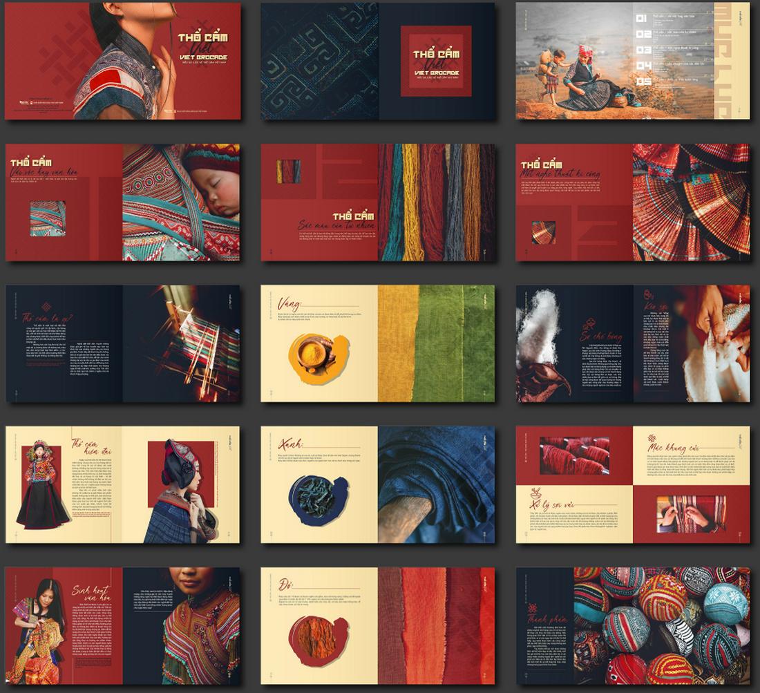
A vibrant and colorful brochure design can instantly capture attention and make a strong visual impact. By using bold hues and dynamic color combinations, this style adds energy and excitement, making it suitable for brands that want to project a lively and youthful image.
Bright colors can effectively highlight key information, draw the eye to important sections, and make the content more engaging.
To create a cohesive design, choose a color scheme that complements the brand’s identity while ensuring contrast is used effectively to maintain readability. Incorporating patterns, color-blocking, or vivid gradients can add visual interest and variety, preventing the design from feeling flat or monotonous.
High Contrast Highlights
High contrast highlights in brochure design create a dramatic and eye-catching effect by matching dark and light colors. This style uses sharp contrasts, such as black and white or other opposing color pairs, to draw attention to specific elements and add a sense of boldness to the layout.
High-contrast designs are effective in emphasizing important content and making headlines or key visuals pop against the background.
Incorporating high-contrast highlights can also enhance the legibility of text and improve the overall visual hierarchy. By carefully balancing contrasting elements, designers can guide the viewer’s eye through the brochure in a deliberate and impactful way. Using textured backgrounds or geometric shapes can add depth to the design while maintaining the bold contrast effect.
Vintage Aesthetics
Vintage aesthetics in brochure design offer a nostalgic and timeless appeal by drawing inspiration from past eras. This style can include elements such as retro typography, faded colors, and distressed textures that give the brochure an authentic, aged look.
Vintage designs often evoke a sense of history and tradition, making them ideal for brands that want to convey authenticity, heritage, or a handcrafted quality. This approach works well for businesses in industries like antiques, craft products, specialty food and beverage, or any field where a sense of nostalgia can enhance the brand narrative.
To achieve a vintage look, use a muted color palette with tones like sepia, dusty pink, or olive green, and pair them with classic fonts reminiscent of the chosen era. Adding illustrations or vintage-inspired patterns can further enhance the aesthetic, creating a design that feels cohesive and well-thought-out.
Gradient Accents
Gradient accents add a modern and dynamic touch to brochure designs by blending colors seamlessly to create a sense of depth and movement. Using gradients as background elements, overlays, or highlights can make the design feel more sophisticated and visually interesting.
Gradients work particularly well in tech, creative industries, or any brand that wants to convey a forward-thinking and innovative image. They can be used subtly to add texture or more boldly to create striking focal points that guide the viewer’s attention.
The versatility of gradient accents allows designers to experiment with different color combinations, from subtle monochromatic transitions to bold, contrasting color shifts.
Common Brochure Shapes and Sizes
The first step in creating a brochure design is to consider shape, size, medium, and folds. All these tactile properties of brochure printing contribute to the style of design you choose and how combining text, images and other elements comes together.
When it comes to creating brochures, common options include:
- Tri-fold: Three panels on the front and back, stacked vertically or horizontally printed on common paper sizes such as 8.5 inches by 11 inches (or A4) or 11 inches by 17 inches (or A3).
- Half-fold: This style works best for a mini-booklet style with a front, back, and inside spread.
- Die-cut: Brochures with cut-out panels, shapes, and styles are often printed on thick stock and come in almost any size. They are characterized by multiple cut elements so that at least some part of the brochure isn’t rectangular.
- Multi-page: The more pages a brochure has, the more likely it is to become a booklet. These are almost always in a standard size (8.5 by 11 or A4) and include some binding.
- Square: The shape has become popular thanks to usage online and square designs often include a custom paper size. It can be a little more expensive, but quite attractive.
Make sure to take into consideration print versus digital publishing. It is common for brochures to live in both physical and online spaces. While some brochure styles don’t need adjustments other than converting a file to PDF, some print jobs don’t render well digitally. (Tri-fold brochures can look especially strange.)
When it comes to shifting a print brochure to digital, consider making each page or fold of the brochure a separate page in the digital version. Order them in the way the content should be read. This will make the brochure easier to read regardless of format.
Creative Brochure Design Inspiration
What’s great about designing a brochure is that you can get creative with effects and textures.
- Foil: Shiny lettering or feature for a certain portion of the design
- Spot UV: A special gloss or matte finish on part of the design
- Letterpress: Printing that makes an imprint on certain parts of the design, such as the brochure above)
- Folds: Bi- and tri-folds aren’t the only option, interesting fold patterns can encourage user engagement
- Paper: Paper types with different textures can set the tone of a project
- Die Cuts: Cutting out parts of the design so something else shows through creates a send of mystery
Modern, Trendy Styles
Some trends in brochure design include using high-color options, plenty of sleek typography, and simple images. Many of the same things that are popular in other areas of design apply to brochures as well.
Modern, trendy brochure design techniques that always look great include:
- Creative use of whitespace, that’s not actually white, such as the Silkroad brochure (above) that’s printed on black
- Elegant design themes that mix simple typography and great imagery with a few stunning effects, such as the Real Estate brochure (above)
- Minimal aesthetics with plenty of white space, such as White (above)
- High-color designs, including color blocking on alternating folds, pages, or panels, like DIHK (above)
- Use of oversized typography, that makes lettering a key element of the design, such as Hamat Property Company (above)
Blocky Design Elements
Blocky design styles are back and trending in a major way with brochure designs. A big contributor to this might be some carryover from card styles in web design or a movement to use more color.
Block options can make it easy to use color in interesting ways while maintaining readable text elements. Blocks can also be used to create groups of content for weight or single blocks with high-impact color or size.
The other nice thing about using blocky design elements is they work in almost any color with any type of content, making this a universally appealing option.
Designs That Translate to Digital Well
While print design elements and website design elements have always crossed over somewhat, there’s a big push to create brochure designs that are easy to use online as well. This usage might include websites or social media images or elements.
When it comes to brochure design trends, the usability of elements across platforms is a must-have skill and technique that you should take into consideration.
Some things to note when thinking about design crossover include shape, color options, and size and placement of words. When done right, the branding and images carry across print and digital platforms for consistent branding and a one-stop design solution for projects.
Geometric Shapes
Geometric shapes can add a lot of pop to a brochure design, including the cover. The right combination of shapes can serve to lead the eye through the design, help create focus on key content, or serve as a primary visual device.
In some of the most trendy uses, geometric shapes are paired with a monotone color palette for a unified look and feel.
These brochure designs may or may not contain other image elements, and this style can be a preferred technique when you don’t have a lot of other images to work with. You can also opt for smaller or black-and-white images with geo shapes because they can help create enough visual interest to carry the design.
When working with geometric shapes in a brochure design, try to pick a consistent shape and use it throughout. Consider different variations such as filled shapes or outlines to add a little extra pizazz.
Landscape Orientation
Sometimes the most modern and trendy part of a print design is the paper, publishing techniques used or orientation. While portrait-style brochures are the norm, using a landscape orientation can make your design stand out a little more.
It can also provide a totally different tactile experience for the person who gets the brochure.
Choose a landscape orientation for the design if it works with your content and images. While these brochures can look amazing, they get tricky if you force the concept with the wrong type of content.
Another bonus: Landscape orientations for print brochures can work exceptionally well as viewable PDF brochures in a digital format as well since each page mimics a desktop screen orientation.
Bold Color Choices
Color can play an important role in brochure design. It can also be complicated.
When it comes to bold colors and bleeds, it takes just the right mix and printing to get a stellar outcome. Take particular care with folds and mixes to ensure that your design comes out right every time.
When it comes to actual color, neons and bright hues are popular styles. They can be fun, engaging, and stand out. The goal of bold color choices in brochure design is to draw an audience to the printed product and keep them looking at it once it is picked up.
Portfolio as a Brochure
If you want to make an impact, consider turning your portfolio or website into a printed brochure.
There are different ways to do it – type foundries have been doing it for decades – but your main goal should be to create just the right impression. Showcase work and pieces that look great in a printed format. This tangible item can be a great leave-behind for networking events or job interviews.
Infographics with Flow
Infographics are a great brochure option because they can help explain what your messaging is about. Infographics are also highly visual and engaging.
There are two routes to take:
- Detail, in-depth graphics, like the first two examples above)
- Simple, graphics and images to convey meaning, such as the third example above
All are equally effective and can provide energy and understanding to content. Brochures can contain infographics that stand on their own or as a part of an overall design scheme.
Highly Visual, Image-Based Designs
When it comes to creating a brochure design, highly visual elements with images and color are trending. (These styles are especially popular for brochure designs that will only be shared digitally.)
High color, high image designs can work great and be quite impactful in print also. Just make sure to check with your printer to ensure that colors, images, and bleeds will work well with the paper and printing selections you have made and adjust if needed.
When it comes to brochure designs with a lot of color and imagery, look for visual elements that are easy to understand at the size displayed. Images shouldn’t be overly complicated and communicate a single message. (Note the Realcraft example above, which uses a lot of color and imagery, but the image is of a single element.)
Typography-Driven Brochure Design Ideas
A great way to handle a brochure design without a lot of images or other “designed” art elements is with “big type”. Fun oversized lettering can provide impact, and help users know exactly what the brochure is all about.
Get creative with type choices and the way you create words. Interesting word breaks for long words (such as on syllable per line), titling, color, and different alignments can add a lot of visual draw to lettering.
When choosing to design a brochure featuring only lettering, take care to include plenty of white space and a defined type hierarchy so that the eye travels easily through the content.
Minimal Design is Great for Printing
When it comes to printed brochures, less is more.
Minimal design styles are popular with brochures because there’s less to worry about when it comes to printing and quality control. Avoid reverse type and you don’t have to worry about the readability of light text on dark backgrounds. Go for a white background or canvas and there’s less ink to worry about smearing.
Minimal styles give you a little more choice with paper stock as well. You can actually use lighter-weight paper when you don’t have as much happening with the overall print job.
Finally, minimal design styles are classic and modern. They never seem to go out of style.
Conclusion
Ready to get started? We’ve got even more tips to help you create a great brochure design. Or, if you’re short on time, consider starting with a brochure design template!
35+ Best Earthy & Nature Fonts 2025
Fonts with a serene and earthy vibe are an excellent choice for giving a more authentic and grounded look to your typography designs. And that’s exactly the theme of this fonts collection.
In this post, we are showcasing some of the best nature fonts with earthy, rugged, and organic looks. These are must-have fonts for reminding the digital world of the beauty of nature.
When crafting logos, headings, and typography for eco-friendly brands, outdoor-themed businesses, or organic products, your choice of font will go a long way to establishing authority and authenticity.
You’ll find plenty of incredible nature fonts here for all those types of design projects. Be sure to download the free nature fonts as well.
Beauty Nature – Beautiful Script Font
Combined with an intricate design and elegantly flowing letters, this font gives you an opportunity to craft typography designs that stands out from the crowd. It features a collection of leaf-themed swashes that creates a nature-inspired look for your title and heading designs. The font includes regular and italic styles as well as multilingual support.
LUPINES – Cute Handwriting Nature Font
Lupines is a cute handwriting font that features nature-themed thin letters with a narrow design. This font is perfect for designing typography for labels, badges, and flyers related to nature and the environment. It includes a set of foliage, floral, and nature-themed shapes as a bonus in EPS format as well.
Branch Font – Creative Earthy Font
An aptly named font with an earthy and natural vibe. Branch font comes with a set of letters that look like tree branches. It will surely add a more creative and nature-themed look to your typography, especially for floral wedding invitations, greeting cards, and logos.
Zaitun – Bold Nature-Themed Font
This font features a very natural-looking letter design with a marker pen-style feel. The thick letters with uneven strokes give a very unique look to each of its characters as well. The font is an ideal choice for crafting logos and branding designs for nature-themed businesses and products.
Bonfire – Handcrafted Earthy Font
Bonfire is a handcrafted font featuring a rough textured design that gives off a very earthy vibe. It will go along perfectly with title and heading designs related to nature, outdoor, and adventure-themed projects. The font comes in regular and rough styles and it only includes all-caps letters.
Botanical – Free Hand Drawn Nature Font
You can download this font for free to craft beautiful nature-themed text. It features a botanical-inspired design with hand-lettered characters. It has serif all-caps letters with a set of alternates. The font is free for personal use only.
Tropical Jungle – Nature Font
Unleash your wild side with the Tropical Jungle nature-themed font. Bold and playful, this font is inspired by nature’s splendor in South America, Africa, and Asia’s tropical rainforests. From monkeys swinging through the trees to butterflies dancing between flowers, each of the 500+ glyphs encapsulates these joyful scenes.
Agetya – Decorative Serif Font
Agetya is a nature-themed typeface perfect for creating standout quotes, logos, and magazine headers, among other items. Delivered in TTF, OTF and WOFF formats, it offers an array of uppercase and lowercase options, ligatures, alternates, numerals, punctuations, and two versions: regular and outline.
Natures – Decorative Earthy Font
This is a unique display font adorned with floral motifs. Featuring standard characters and punctuation, this font bestows an organic, artistic look to your typography. Perfect for nature-themed designs, wedding invitations, or eco-friendly products, it adds a touch of natural beauty to your work.
Branchy – Creative Nature Font
Branchy is a marvelously unique, nature-inspired display font featuring handcrafted letters entwined with branch-like elements. This bold, fun font adds an elegant, distinctive flair to projects from branding to posters, packaging to artistic designs. The decorative nature makes it ideal for headlines.
Balmy Morning – Earthy Font Duo
Balmy Morning is a delightful, earth-toned script font featuring delicate floral adornments within each character. Ideal for invitations, greeting cards, and brand logos, this font offers whimsical elegance to your designs. It includes Balmy Morning Color in SVG-OTF format, Block, and Script in OTF format.
Naturel – Handwritten Nature Font
Naturel is a captivating, handwritten display font inspired by the beauty of nature. With its smooth, flowing characters and handcrafted appeal, it perfectly complements eco-friendly branding, rustic invitations, and artisanal packaging. Its versatility suits various platforms from digital to print, effortlessly attracting attention to your designs.
Da Bamboo – Modern Decorative Font
Da Bamboo is a modern decorative font that perfectly blends nature-inspired aesthetics with a contemporary twist. Ideal for a range of uses, from branding and packaging to posters and invitations, its sophisticated and unique characters add an organic touch to any design project.
Quokky – Condensed Fun Nature Font
Quokky is a playful nature-themed font. It’s perfect for many creative uses, from flyers to quotes, posters, packaging, and more. Its features include uppercase, numbers, punctuation, multiple language support, private use area encoding, and OpenType format.
World Madly – Nature Themed Font
World Madly is a uniquely delightful and quirky nature-themed typeface. It exhibits a playful charm with its distinctive rounded and condensed letters, and boasts ten varied environmentally-inspired alternatives. Ideal for designs themed around Earth Day, green initiatives, or simply expressing your love for the planet, this font can add a touch of eco-consciousness to your projects.
Earthbound – Organic Nature Font
Earthbound is a rustic and inviting font that channels the quiet beauty of rural landscapes. Evoking the idyllic charm of country life, this typeface imbues your projects with authenticity, warmth, and simplicity. With its handcrafted lettering and gentle rounded edges, Earthbound is ideal for crafting signs, packaging, or invites with a nostalgic and earthy appeal.
Restless – Free Brush Script Nature Font
This font comes with a very natural-flowing brush lettering design. It takes inspiration from nature-themed elements and has both uppercase and lowercase letters. This font is also free for personal use.
Nature Force – Calligraphy Nature Font
The earthy nature of this font will add an extra natural look to your calligraphy-style typography designs. It’s especially perfect for greeting cards and smooth poster titles, magazine covers, and website headers. The font includes lots of ligatures and multilingual support as well.
The Virnature – Nature Script Font
When you combine nature with elegance, you will get a result that looks just like this. Virnature is a classy script font that features a beautifully flowing letter design. This font has an ideal look for crafting nature-inspired logos, titles, and headings for wine bottle labels, greeting cards, posters, and much more.
Earth Tone – Organic Earthy Font Family
This is a family of sans-serif fonts that feature beautiful organic letter designs. It has fonts with light, regular, and bold weights with natural hand-crafted look and feel. These fonts are perfect for everything from eco-friendly brand designs to custom t-shirts, quotes, and product labels.
Secret Nature – Creative Nature Font
A very creative script font featuring floral-themed decorative elements. This font is a perfect fit for designing beautiful titles for greeting cards and wedding invitations. The font includes uppercase and lowercase characters with decorative leaves illustrations.
EARTH – Nature-Themed Display Font
Another nature-inspired display font with stylish decorative elements. This font is most suitable for crafting typography for movie posters, book covers, and various other entertaining designs. It’s especially great for enchanting and fantasy-themed projects.
Monique Script – Free Nature Font
This beautiful script font also has a stylish letter design with a simple and natural vibe. It’s ideal for crafting signature-style logos for brands as well as for business cards. It’s free to use with personal projects.
Adhellia – Free Script Earthy Font
Adhellia is a script font with a casual look and feel. It includes a set of bold characters with an earthy vibe. The font is especially suitable for modern logos and packaging designs. You can use it freely with personal designs.
The Moot Jungle – Nature Font
With a touch of authenticity and wild variations in letter design, this font will help you craft unique and attractive typography designs for various types of projects. It includes lots of fantastic alternate characters for adding that extra special decorative elements to your logo, title, and heading designs. The font includes over 700 glyphs.
Pine Jungle – Decorative Nature Font
Pine Jungle is a creative display font that features a set of characters that’s been crafted to depict a pine forest. Each letter in this font features pine trees with a starry sky. You craft stylish t-shirts, book covers, and posters with this font. It includes all-caps letters only.
Black Ground – Rustic Earthy Font
This font features a rustic design with a strong rugged letter design. Using the font, you can design bold titles and headings with a masculine look. Especially for men’s fashion brands, luxury watches, high-end lifestyle products, and more. The font includes uppercase and lowercase characters with alternates.
Earth Elements – Handwritten Nature Font
A unique nature-themed font with a rough letter design. This font features a creative handwritten look with textured letters. It’s been designed by hand with real oil crayons. The font comes with a lot of additional elements, including ligatures, hand-painted backgrounds, textures, and more.
Pretty Garden – Unique Earthy Font
Pretty Garden is a pretty font indeed. It has a beautiful earthy design featuring handcrafted letters. It will instantly add a personal touch to your text while making them look natural and creative. There are 3 styles of fonts included in this pack, script, sans, and serif fonts. As a bonus, there’s a doodle dingbat font as well.
Nature – Free Script Nature Font
This free nature font is perfect for adding a natural look to your graphic designs. It has script letters with swirly strokes and swashes. It goes perfectly with product tags and greeting cards. The font is free to use with personal projects.
Sunflower Signature – Free Earthy Font
This font takes inspiration from sunflowers and offers you a gorgeous-looking set of letters to craft beautiful and romantic titles. It’s a signature-style font with earthy vibes that includes uppercase and lowercase characters. It’s free for personal use.
Bristol – Creative Nature Font
Bristol is a creative and decorative nature font inspired by the city in the UK. It features a set of unique carved letters with floral-themed elements. The font is a perfect choice for branding designs related to healthy foods, natural products, outdoor brands, and more.
Arthicoke – Decorative Nature-Themed Font
Arthicoke is another decorative font that comes with a nature-inspired letter design. This font has beautiful swirly edges that add a playful and casual feel to every letter. It’s ideal for product labels, packaging designs, and overall adding a fresh vibe to your graphic designs. The font includes ligatures and alternates too.
Refresh Screen – Nature-Themed Font Family
A family of brush fonts featuring hand-crafted letter designs. The condensed and narrow design of this font will allow you to craft trendy titles and headings for posters, banners, flyers, and more. The font comes in 5 styles that pair quite well together.
Verdant – Botanical Nature Earthy Font
This font has the perfect look for crafting logos, badges, and label designs for brands related to beauty products. The font features letters with beautiful botanical and floral elements. It’s ideal for nature-themed luxury branding designs as well.
Bottania – Handwritten Nature Font
Bottania is a handwritten font featuring thick letters with a nature-themed design. The font has charming and uneven strokes across all of its letters that add an authentic look to typography designs. It includes both uppercase and lowercase letters.
Nature Quest – Playful Nature Font
This font is made for all your fun, creative, and playful typography designs. It has a set of cartoon-style letters with a nature-inspired design. It’s especially great for crafting fun titles for designs related to kids and school projects.
You can find more great fonts for your inspiration in our best business and corporate fonts collection.
Icon Design in 2025: The Key Trends
Icons might be one of the most important – and underrated – examples of design in your portfolio. Here’s a look at icon design with some inspiring examples.
Icon elements are shown almost everywhere, but sometimes get produced as an afterthought. That shouldn’t be the case. Great icon design can be distinctive and add finesse and flair to a project.
Let’s take a look at what’s new, and what’s hot in icon design!
Y2K Icons
Y2K icons draw inspiration from the late ’90s and early 2000s, incorporating elements like metallic textures, vibrant gradients, and iridescent effects. The style often combines 3D shapes, futuristic typography, and playful motifs, evoking a sense of nostalgia for the digital culture of that era.
This trend appeals to a younger audience that finds nostalgia in the early digital age, but it can also be used to add a quirky or dynamic look to branding, apps, and websites. The juxtaposition of early internet culture with contemporary design techniques offers endless possibilities for creative expression.
For effective Y2K icon design, focus on balancing nostalgia with contemporary usability. While the style is visually distinct, it’s essential to keep icons recognizable and functional, especially for digital interfaces. Incorporate familiar shapes and symbols but give them a futuristic update through textures and lighting effects.
Pixel Art Icons
Pixel art icons bring back the charm of vintage video games and retro digital aesthetics, appealing to those who appreciate the lo-fi, pixelated look of early computer graphics. This trend embraces the limitations of pixel-based designs to create playful, nostalgic icons that feel authentic and relatable.
The pixel art style often features a limited color palette and chunky, grid-like shapes that are easy to recognize, making it ideal for applications, games, and even websites that want to add a touch of retro fun.
The resurgence of pixel art icons is partly due to the ongoing fascination with retro gaming and vintage computing. It provides an opportunity to infuse a sense of nostalgia into contemporary digital experiences.
With careful planning and creativity, pixel art icons can stand out as a fresh, vintage-inspired trend while adding a playful and nostalgic touch to modern digital designs.
Glassmorphism Icons
Glassmorphism, characterized by its frosted glass-like appearance, continues to gain traction in the icon design world. Glassmorphic icons often feature semi-transparent layers, subtle blurs, and reflective surfaces that mimic the look of glass. The trend creates a sense of depth and elegance, making icons appear to float on the screen.
Incorporating gradients and light reflections can further amplify the glassmorphism effect, making icons appear dynamic and visually captivating. Designers can use a variety of colors, from soft pastels to bold neon tones, layered over frosted backgrounds to achieve different visual impacts.
To implement glassmorphism effectively, you should focus on maintaining balance and contrast to ensure icons remain clear and distinguishable. Too much transparency or excessive layering can make icons difficult to understand, especially for users with visual impairments.
Retro Groovy Icons
Retro groovy icons take inspiration from the bold and colorful styles of the ’60s and ’70s, featuring curved shapes, psychedelic patterns, and playful illustrations. This trend brings a fun, vibrant vibe to icon design, using bright colors and swirling patterns that evoke the spirit of the era.
You can experiment with lively color schemes, combining pastel tones with saturated hues to create eye-catching icons. Adding textured details or hand-drawn elements can also enhance the groovy effect, making icons feel more authentic and dynamic.
This trend works especially well when paired with organic shapes and fluid lines, giving the icons a sense of movement and life. The style’s playful nature can help communicate a brand’s personality while still delivering functional iconography. When creating retro groovy icons, it’s important to balance vintage inspiration with modern usability.
Isometric Icons
Isometric icons offer a unique, three-dimensional perspective by using angled viewpoints to represent objects or scenes. This style gives icons a sense of depth and realism, while still maintaining a clean, graphic look. Isometric icons are perfect for illustrating complex concepts, technical subjects, or even entire environments in a compact, easy-to-understand format.
The trend is often used in infographics, mobile apps, and dashboards to convey detailed information with a visually appealing approach. This style allows you to create miniature worlds or detailed objects with precision, making the icons suitable for projects that require more than flat graphics can offer.
To maximize the impact of isometric icons, focus on using consistent angles and lighting to maintain a cohesive look. Too much variation can make the icons feel disjointed or chaotic.
Thick Line Icons
Line icons have been a big trend for quite some time. It’s something you see almost daily when browsing the web. The new take on this design trend is line icons with thick lines, as opposed to the thin styles that have been dominant.
Thick line icons are a little big trickier to work with because they need some space and size to render well. You can use them as a single color design element or filled with color and for almost any type of design need.
Thick line icons are probably best suited for oversized use and can be a fun theme option for a design project.
3D Icons
Everywhere you look, there are big, bold bubble-style three-dimensional icons in web projects. We like this icon trend because it is a lot of fun and includes a great deal of personality.
You can create 3D icons in almost any style, but the illustrated bubbles are the ones that are drawing a lot of attention as a design trend that we expect to see a lot more of.
These icons can be almost any size – from small to giant – and include animation (or not). What’s great about icons in this 3D style is that they are pretty flexible and can integrate with the rest of your planned design scheme.
The one thing to keep in mind is that this style has a light feel, so it might not work with super serious content.
Google-Style Icons
You probably recognize the look and feel of icons using primary colors and simple shapes as being a lot like the icons for Google’s family of products. And that style is trending for other projects as well.
These icons feature a flat style with a distinct color family that’s used throughout the icon set. Most icons use a few colors, although some are single color.
This icon style works for any size element, but is actually most effective for smaller icons because the design can be a little flat – literally – in oversized usage.
Fully-Illustrated Icons
Icons have been pretty simple for the most part for a while, but more designers are experimenting with fully-illustrated icon styles that are beautiful and engaging. These more complex icon elements are often used at larger sizes and contribute even more to the overall story of a design.
As with the example above, this style is perfect for a design with a more childlike tone or for icon elements that can show more of a creative flair.
Color, scale, size, and design consistency are important to keep in mind with this style so that your icon set looks like it is should go together.
Icon Doodles
Those stray doodles in the corner of your notebook might just be your next neat icon set. Doodle-style icons that have imperfect styles feel authentic and interesting and are a great accent for a project such as a personal portfolio.
The fun thing about doodle icons is that they can make a design feel a little more unique. Just the visual element of a doodle implies spontaneity and individuality. Use these concepts to your advantage when thinking about how to use this style best.
Don’t forget to play with colors and subtle adjustments between icons as well to really play up the unique, individualized nature of this design trend.
Pop-Art Style Icons
On the other end of the icon design spectrum is pop-art style icons, which are colorful, elaborate, and a little over-the-top.
Pop-art elements are a lot of fun and can inject plenty of personality into a project. The trickiest thing here is to not let color overwhelm the icon set individually or collectively. These icons can work best in a design without a lot of other dramatic color or effects.
The other trick to using this style of icon is to consider oversized usage with plenty of space around them. Let the art of each icon shine through.
Hand Drawn Icons
Hand drawn icons are not only a trendy style, but they also create a more intimate, authentic feel for a design project. Styles for these icons can vary widely, from simple shapes and lines to full-color icons.
The best part of hand drawn styles is that you don’t actually have to draw them yourself. There are plenty of hand drawn icon sets available so you can find just the right style, even if you aren’t feeling overly artistic.
Icons with Depth
Creating depth in icon design is somewhat tricky, but more designers are using this trend with oversized icon sets. Using shadows and geometry to create just the right shape combinations with an element that adds an almost three-dimensional effect.
These styles are quite fun and sometimes use hints of trends that have come and gone such as long shadows.
These icons tend to be on the more complex side and are best suited for use where the icons are fairly large or work in combination with another element, such as text for a logo.
Icons with Hover States
When it comes to icons for the web, one of the most popular techniques is to pair a set of icons in such a way that creates a hover state or animation. This might include using an icon that with a color fill and then not or almost creating a button around an icon.
If you plan to use some sort of hover state with an icon, it is important to think about this in the icon design phase. Not all icons or icon sets are optimized for this technique. Look for a complete icon set with variations that make creating a hover state that much easier.
And don’t try to get too complicated here. An elaborate icon can get lost with a hover state. This works best for simple icon pairs.
Simplified Icons
Even websites and designs that previously featured complex icon styles are moving to more stripped down and simplified icons.
What’s nice about them is that each icon portrays an identifiable thing, but the representation isn’t always 100% literal. Icon designers may take liberty with shapes or lines to create icon shapes that are the most simple version of the item it represents.
Line Icons with Color Shapes
Line icons are always a popular choice, thanks to a versatile style that looks good with almost any other design element. The trend adds just a little more visual interest with a pop of color, often in the form of a circle or square, behind the line icon.
The color shape might fill a part of the line icon design, but more often than not it’s just floating in the background. This tiny bit of visual interest can tie an icon set together, emphasize a brand color, or just freshen up an older site of line icons.
The tricky part of the icon design is placement and size of the color shape element. If it’s too big or too bright in color, it can take away from the icon. If the shape is too small, you risk it looking like a mistake.
While there’s no perfect size, most of the icons using this trend keep the color shape to about one-quarter of the full size of the icon.
Abstract Icon Shapes
Not sure what icon represents your content? An abstract icon shape might be the answer.
More designers are creating abstract style icons for use across websites. The nice thing about this style – and trend in general – is that abstract styles create a sense of whimsy and wonder that matches some of the bigger overall trends in design.
The key to working with abstract shapes is to make sure you aren’t replicating something by mistake and that icons truly are abstract. (Don’t try to create icons that are similar to your logo, for example, they might just look like errors.) For something that really matches, use the same color palette for icons and brand materials.
Icons with Background Icons
Some trending icons have icons of their own. Seriously!
For more elaborate uses of icons – we’re not taking tiny favicons here – icons can be stacked and layered to create more of an art element.
This trend often uses color and shading to differentiate between the main focal icon and background icons. The primary icon is often full color or a filled icon. The background icons are almost always line style and might have light color palettes.
You can create this effect with many premade icon kits by mixing and matching icons in different ways. Create depth and visual interest with icons of a similar theme and stick to just a handful of elements to keep the scene from getting too busy. Don’t be afraid to use and reuse elements and use the same icons (alternating line and filled) in backgrounds and foregrounds.
Two-Color Icons
Another icon design trend that builds on popular line icon styles is to create two-color elements.
Two-color icons can build on your existing color palette or brand colors or combine almost any other color pair. When designing using the icon trend, look for color pairs that will stand out from the background on which you plan to use them.
When it comes to the design, pick a primary color for most of the icon. Use a secondary color to accent an element of the icon. (Think of using the primary color for 70% to 80% of the design and the secondary color for the rest.)
This creates an accent in the icon design that will help draw the eye into the design element, and hopefully, surrounding content as well.
Bright Color
Bright color choices have been a big deal in all aspects of design. That is no different with icons. A bright color is an enticing way to draw the eye to the icon.
Color is being used in a few different ways when it comes to the icon design trend:
- As a background with a white or black line-style icon
- For full color icon elements with a more realistic look
- For icon elements with a more flat, gradient or super-bright design
Popular color choices in the bright family include yellows, blues, greens, and purples. These colors tend to be on the bright side and crafting a color palette with three to five hues for an icon set is popular.
Not sure where to start? Material Palette showcases colors that are a big part if the color icon design trend.
Icons in Logos
Take note of how many logos feature icons. Once you start thinking about it, not seeing all the little icons in logo design will be tough.
What’s nice about an icon in a logo is that it works with the brand name, and with some time and brand equity can stand alone. Think about the example above, Spotify. Even though the music provider hasn’t been around all that long (in the scope of brands), the circle with three lines is highly identifiable.
The icon works in color and without – a key of a strong icon – and can stand alone or with lettering. This versatility makes it easy to see why icons are a popular element in logo design.
Circles
Circles are one of the most harmonious shapes. And when it comes to icon design, they are rather popular. From icons that are contained inside a sphere to circles within objects, creating a design mark using circles can establish just the right feel for users.
(Want to know more about circles in design? We’ve got that here.)
Part of the influence of circle in icon design might connect back to some of the guidelines set forth by Google with Material Design. All those circular buttons are perfect for tapping on mobile phones. And that same philosophy applies to icon design. (Just think how often an icon is a touchable or clickable element.)
The part that can be a little trick about this icon trend is meshing circles in all the places where other shapes are used. App icons tend to be square; social media profiles are circular (and square).
When creating a round icon, make sure that the content of the icon design is easy to understand at small sizes, because you must shrink it often to fit in other places.
Line Style Icon Design
Line style icons seem to be the trend that never gets old.
Part of the reason is that this icon style can work practically anywhere on any background type. Many of the popular, downloadable icon packs often include a line style design because of this versatility.
It’s easy to see this in the example above. Each icon is easy to see and understand at practically any size.
Simple Elements and Representations
As with most other design trends in 2025, simplicity is part of icon design as well. Simple shapes and geography combine to create almost over simplistic representations for icons.
The result is a quite an artful design that makes users look.
In the example using food icons above, each icon uses the common thread of a circle in the icon. This can be the overall shape of the icon itself or a part of the icon design. This shape connects each icon to one another in the project.
Icons with Gradients
The gradient color trend that has become one of the dominant themes of 2019 is a factor in icon design as well. From simple gradients in line strokes (such as the example above) to full gradient coloring to white icons on a gradient background, this color scheme is popular.
That might be what’s so appealing about the use of gradients in icons (and overall) – there are so many different ways to use the trend. You can add a gradient and still not have a project that looks just like something else.
Focus on Simple Coloring
Icon designers are taking the opposite approach with color as well and sticking to simple, more limited, more basic color palettes for these small design elements.
Using a limited palette is a great idea. With a design that’s so small, too much color or detail can overwhelm the space quickly and cause strain on the eye.
You don’t want users to have to think about what the icon is or what color means. Limiting the amount of detail – including elaborate coloring – can make each individual icon a little easier to see and understand. This is most important with icons that will be used at the smallest sizes.
Everything App Style
One of the reasons that icons have grown in popularity so much is that we are already designing them for almost everything. From app icons to app-style icons for favicons or desktop icons, this style is practically everywhere.
App-style icons have a distinct style almost of their own. This includes:
- Square in shape
- Rounded edges
- Colored background (usually one color)
- Simple shape inside icon
- Plenty of contrast between icon and background color
- No text or lettering
Thick, Uniform Strokes
Not only are line-style icons popular, but icons with thick line strokes are especially popular.
Designed often for single-color applications, these icons are frequently used in white or black on top of color or photo backgrounds.
Icons with thick, uniform strokes are most frequently used on their own, such as a cart icon or contact icon. They aren’t often used in a collection of icons.
Flat Icons Remain Popular
While much of the hard focus on flat design has evaporated, icon design is still pretty flat (or at least almost flat).
This is likely due to the super-simple nature of flat design and the idea that this look can integrate with a number of other styles fairly easily.
Even looking at some of the icon design examples and trends featured here, you’ll see that many of them are flat. (Line style icons are almost always flat, for example.)
Emoji Icons
Emojis have almost become their own language – a more visual form of communication that’s getting more generally accepted all the time.
Icons design is also taking on an emoji-esque flair. These icons are identifiable because of a focus on the head shape of a person or creature. (The Star Wars-inspired emoji icons above are a great example of how to have fun with icon design.)
This style of the icon could work great for a contact page or for representing people or personas in a design.
How to Design a Better Icon
Crafting a good icon or set of icons is more than just hopping on to some of the latest trends in icon design. Because of the small size of icons, attention to detail and precision are an important part of the design process.
Simple rules still hold true for icon design in 2019. Pair these guidelines with some of the trending ideas above to create something you’ll love:
- Start with a grid
- Build with geometry
- Create a unique shape
- Give icons plenty of room
- Stick to your brand colors
- Use consistent divots
- Design for the smallest size you need
- Don’t decorate
Icon Design Guidelines
A good way to keep up with what’s “in” is by looking at graphics standards and style guides. Each time Apple or Google changes their approach so does everyone else. Partially because they have to and partially because the new style is often reflective of the times and trends in icon design.
You can find guidelines here:
Conclusion
Icons are a useful design tool. From use as app icons to website marks or favicons to divots that can be used in a logo or throughout a design project, the icon is a mark that’s here to stay.
Approach icon design in the same way you would almost any other project, but really think about simplicity and size. Icons are made to look at quickly and are often small. This can have a great impact on the design.
20+ Professional Doctor Letterhead Formats and Templates for Immediate Use
In the medical world, it’s not just about what you say but how you say it—right down to the letterhead you use. Think of your letterhead as your professional handshake; it’s often the first visual cue patients, hospitals, and partners receive. Done well, it radiates trust and competence. Done poorly? Let’s just say it might be a case of “wrong prescription.”
Whether you’re introducing new services, sending patient reports, or communicating with other healthcare professionals, your letterhead is an extension of your practice’s reputation. So, how do you strike the right balance between sleek professionalism and that touch of approachability? It all starts with the design basics—getting your doctor letterhead format just right and possibly exploring a free doctor letterhead template if you’re just dipping a toe in. But more than just visuals, your letterhead should reflect your brand’s unique pulse.
In this guide, we’ll dive into some practical steps to make sure every document that leaves your office is on-brand and on-point. Because at the end of the day, your letterhead isn’t just paper. It’s your practice, distilled.
See also
Free Gradient Doctor’s Prescription Template

Free Doctor Letterhead Templates

Doctor’s Letterhead Template

Doctor’s Letterhead Templates

Free Medical Letterhead Template

Abstract Hospital Doctor Letterhead Template

Pharmacist Prescription Template

Medical Healthy Letterhead (Premium)

Medical Doctor Healthcare Service Letterhead Template

Black White Medical Classy Noble Caduceus Letterhead (Premium)

Medical Professionals Letterhead Template

Medical Letterhead (Premium)

Doctor Prescription Letterhead Template

Blue Modern Doctor Letterhead Template (Premium)

The post 20+ Professional Doctor Letterhead Formats and Templates for Immediate Use appeared first on CSS Author.
The Best Free SEO Tools for 2024: Essential Resources for Optimal Performance
Search Engine Optimization (SEO) is crucial for driving organic traffic to your website and improving your online visibility. While premium SEO tools can be powerful, there are many free tools available that offer significant value and can help you optimize your website effectively. In 2024, leveraging these free resources can help you stay competitive without …
Continue reading "The Best Free SEO Tools for 2024: Essential Resources for Optimal Performance"
The post The Best Free SEO Tools for 2024: Essential Resources for Optimal Performance first appeared on Lucid Softech.
Elementor Review
If you’re aiming to create a professional-looking website without diving into complex coding, Elementor is a widely popular choice. This WordPress page builder comes packed with features that make web design accessible to everyone, from complete beginners to experienced developers. With its drag-and-drop functionality, pre-built templates, and endless customisation options, Elementor Pro makes it easy […]
The post Elementor Review first appeared on WPArena and is written by Editorial Staff.
The Best Business Letterhead Examples to Make a Lasting Impression
Every first impression counts, and when it comes to business correspondence, a thoughtfully crafted letterhead is like a firm handshake. It’s not just decoration; it’s a visual ambassador for your brand, setting the tone for every piece of communication that comes through. Picture it: a sleek, branded letterhead landing on your desk, already whispering professionalism, trust, and creativity before you even begin reading. That’s the power of a well-designed letterhead. It frames your words with a professional edge and, most importantly, a memorable personality.
So, why does letterhead matter so much? A good letterhead subtly communicates the essence of your brand. For a law firm, it might convey a sense of reliability and clarity, while a hotel’s letterhead might feel inviting and sophisticated, nodding to the hospitality it represents. For each industry, the design can emphasize distinct qualities, whether it’s a clean, corporate style for consultancy firms or a splash of color and flair for creative agencies.
And here’s the best part—finding inspiration isn’t hard. To make the process easier, we’ve curated some of the best examples across various industries, blending style with function. You’ll find two free-to-download templates in each category for those who want something stylish without breaking the bank, along with one premium option for those looking to invest a bit more in a unique touch.
Let’s get into the list, where each example shows how letterhead design can be more than just a header—it can become an extension of your brand’s voice.
See also
Business Letterhead Templates
Law Firm
Free Simple Global Law Firm Letterhead Template

Free Flat Law Firm Letterhead Template

Free Law Firm Letterhead Template

Code of Laws and Gavel Letterhead Template

Simple Law Firm Letterhead Template (Premium)

Law Firm Branding (Premium)

Hotel , Restaurant
Hotel Letterhead Format Template

Modern Hotel Letterhead Templates

Food & Restaurant Letterhead Template

Luxury Hotel Letterhead Template

Light Taupe Minimalist Hotel Letterhead Template (Premium)

Charity and Nonprofit Organizations
Free Minimalist Charity NGO Letterhead Template

Free Nonprofit Letterhead Template

Free Charity Letterhead Template

Church Stationery Branding Template (Premium)

Furniture
Free Flat Interior Design Company Letterhead Template

Comfort Chair Letterhead Template

Furnibest – Furniture Corporate Identity (Premium)

Construction
Free Gradient Construction Project Letterhead Template

Building Construction Letterhead Template

Sample Construction Letterhead Templates

Construct – Minimalist Word Letterhead (Premium)

Fashion Designer
Free Minimal Clothing Boutique Letterhead Template

Modern Fashion Clothing Store Letterhead Template

Floral – Minimal Fashion Stationery (Premium)

Real Estate
Free Real Estate Letterhead Templates

Real Estate Letterhead Design Template

Real Estate Agency Letterhead Template (Premium)

Security Systems
Cyber Security Tech Company Letterhead Template

Letterhead Design for Hawk Security Services (Premium)

Educational
Free Realistic Private School Letterhead Template

Free University Letterhead Template

Graduates Letterhead Template

Elementary School Principal Letterhead Template (Premium)

Hospital
Free Flat Design Hospital Care Letterhead Template

Minimalist Linear Medical Center Letterhead Template

Monochrome Modern Hospital Letterhead Template (Premium)

Accountant
Free Financial Accounting Letterhead Template

Computation Letterhead Template

Letterhead Design for Accounting (Premium)

Gardening & Landscaping
Garden and Landscaping Services Company Letterhead Template

Gardening Business Letterhead Template

Garden & Landscape Design Letterhead Template (Premium)

Digital Marketing
Digital Marketing Agency Letterhead Template

Marketing Agency Letterhead Template

Digital Marketing Agency Corporate Business Letterhead Template (Premium)

Medical Practice
Medical Letterhead Template

Realistic Medical Center Letterhead Template

Blue Modern Doctor Letterhead Template (Premium)

Graphic Designer
Free Flat Design Graphic Designer Template

Free Graphic Design Letterhead Template

Consultancy
Free Flat Design Consultancy Letterhead Template

Tax Consulting Service Letterhead Template

Small Business Consulting Letterhead Template (Premium)

Architectural Firm
Articbuilt Architecture Studio Letterhead Template

Architect Service Letterhead Template

Corporate Letterhead
Free Corporate Letterhead Design PSD

Free Letterhead Template

The post The Best Business Letterhead Examples to Make a Lasting Impression appeared first on CSS Author.
Benefits of DevOps for Modern Software Development

Over the last ten years, software development has seen significant changes. These were mostly driven by advancements in technology and increasing demands for faster and more efficient delivery.
The adoption of cloud computing has been a key factor in this transformation, as it provided developers with scalable resources that allow for faster iterations and quicker market entry without heavy initial investment.
Additionally, the introduction of virtual private networks and the possibility to use VPN free trial have become crucial for improving security, especially for global teams. Such tools have enabled developers to protect data by encrypting transfers and masking IP addresses.
Among all these advances, the introduction of DevOps seems to have brought the biggest changes. This system merges development and operations teams, breaking down traditional silos and significantly shortening the development lifecycle.
Accordingly, it would be interesting to take a better look at how software development has been changed and improved by DevOps.
The Shift to DevOps

DevOps facilitates a cohesive work environment where code changes are perfectly integrated and deployed.
This system leverages automation for continuous integration and continuous delivery (CI/CD), ensuring that new code is rigorously tested and promptly released into production environments. The result is a reduction in the time required to move from coding to deployment.
With DevOps, software updates and new features are deployed with greater frequency. This responsiveness is critical in adapting quickly to market changes or user feedback.
Such practices integrate well with agile methodologies, which focus on iterative development, frequent feedback, and the flexibility to adapt to changing requirements.
Key Technologies in DevOps
Docker is a foundational platform in this respect. This technology ensures that applications are packaged in containers, allowing them to be deployed consistently across various computing environments.
In the realm of automation, Jenkins and GitLab CI stand out. These tools automate the steps in software building, testing, and deployment workflows, which is something that enables frequent updates and maintaining high standards of quality without sacrificing speed.
Version control systems like Git are indispensable in DevOps environments. Git allows multiple developers to work on the same codebase without interfering with each other’s tasks. It tracks every change by each contributor and merges changes in a controlled manner.
The Benefits of DevOps
Having in mind what was mentioned above, it has become pretty clear that DevOps has introduced numerous benefits. Some of them, however, stand out more than others.
Reduced Development Cycles
By integrating development and operations teams, DevOps eliminates many traditional bottlenecks, facilitating a smoother, faster workflow. Automation of repetitive tasks further speeds up this process, freeing developers to focus on more strategic work that adds value to the project.
Improved Quality Assurance
Quality assurance gains a new dimension in DevOps environments. Automated testing ensures continuous scrutiny of the code as it is developed. This allows teams to identify and address bugs much earlier than traditional methods.
Enhanced Team Collaboration
This approach fosters a culture of shared responsibilities and goals. The enhanced collaboration leads to better communication, more innovative problem-solving, and a cohesive team environment.
Challenges and Considerations
The transition to this methodology might also involve certain challenges and considerations that organizations must address to fully harness its potential.
- Cultural Resistance : Adopting DevOps can meet resistance from teams accustomed to traditional development and operations models.
- Solution : Organizations can mitigate this resistance through effective communication and comprehensive training programs.
- Security concerns : The accelerated development cycles in DevOps can sometimes result in security oversights, as rapid deployment may prioritize speed over thorough security checks
- Solution : To address this, integrating security practices directly into the DevOps pipeline is essential. This approach ensures that security considerations are embedded from the outset and throughout the lifecycle of the project, rather than being an afterthought.
- Continuous integration and deployment issues: Continuous integration and deployment are central to DevOps but can introduce complexities, especially in larger projects with multiple dependencies.
- Solution : Regularly reviewing and updating deployment practices can help in identifying and resolving potential issues early on.
Conclusion
DevOps has truly transformed software development. By promoting collaboration, automation, and continuous improvement, it addresses the demands of modern software projects. While challenges exist, the benefits of faster delivery, improved quality, and enhanced teamwork make DevOps an essential strategy for today’s development teams
The post Benefits of DevOps for Modern Software Development appeared first on CSS Author.
Left Half and Right Half Layout – Many Different Ways
A whole bunch of years ago, we posted on this idea here on CSS-Tricks. We figured it was time to update that and do the subject justice.
Imagine a scenario where you need to split a layout in half. Content on the left and content on the right. Basically two equal height columns are needed inside of a container. Each side takes up exactly half of the container, creating a distinct break between one. Like many things in CSS, there are a number of ways to go about this and we’re going to go over many of them right now!
Update (Oct. 25, 2024): Added an example that uses CSS Anchor Positioning.
Using Background Gradient
One simple way we can create the appearance of a changing background is to use gradients. Half of the background is set to one color and the other half another color. Rather than fade from one color to another, a zero-space color stop is set in the middle.
.container {
  background: linear-gradient(
    to right,
    #ff9e2c 0%,
    #ff9e2c 50%,
    #b6701e 50%,
    #b6701e 100%
  );
}
This works with a single container element. However, that also means that it will take working with floats or possibly some other layout method if content needs to fill both sides of the container.
Using Absolute Positioning
Another route might be to set up two containers inside of a parent container, position them absolutely, split them up in halves using percentages, then apply the backgrounds. The benefit here is that now we have two separate containers that can hold their own content.
Absolute positioning is sometimes a perfect solution, and sometimes untenable. The parent container here will need to have a set height, and setting heights is often bad news for content (content changes!). Not to mention absolute positioned elements are out of the document flow. So it would be hard to get this to work while, say, pushing down other content below it.
Using (fake) Tables
Yeah, yeah, tables are so old school (not to mention fraught with accessibility issues and layout inflexibility). Well, using the display: table-cell; property can actually be a handy way to create this layout without writing table markup in HTML. In short, we turn our semantic parent container into a table, then the child containers into cells inside the table — all in CSS!
You could even change the display properties at breakpoints pretty easily here, making the sides stack on smaller screens. display: table; (and friends) is supported as far back as IE 8 and even old Android, so it’s pretty safe!
Using Floats
We can use our good friend the float to arrange the containers beside each other. The benefit here is that it avoids absolute positioning (which as we noted, can be messy).
In this example, we’re explicitly setting heights to get them to be even. But you don’t really get that ability with floats by default. You could use the background gradient trick we already covered so they just look even. Or look at fancy negative margin tricks and the like.
Also, remember you may need to clear the floats on the parent element to keep the document flow happy.
Using Inline-Block
If clearing elements after floats seems like a burden, then using display: inline-block is another option. The trick here is to make sure that the elements for the individual sides have no breaks or whitespace in between them in the HTML. Otherwise, that space will be rendered as a literal space and the second half will break and fall.
Again there is nothing about inline-block that helps us equalize the heights of the sides, so you’ll have to be explicit about that.
There are also other potential ways to deal with that spacing problem described above.
Using Flexbox
Flexbox is a pretty fantastic way to do this, just note that it’s limited to IE 10 and up and you may need to get fancy with the prefixes and values to get the best support.
Using this method, we turn our parent container into a flexible box with the child containers taking up an equal share of the space. No need to set widths or heights! Flexbox just knows what to do, because the defaults are set up perfectly for this. For instance, flex-direction: row; and align-items: stretch; is what we’re after, but those are the defaults so we don’t have to set them. To make sure they are even though, setting flex: 1; on the sides is a good plan. That forces them to take up equal shares of the space.
In this demo we’re making the side flex containers as well, just for fun, to handle the vertical and horizontal centering.
Using Grid Layout
For those living on the bleeding edge, the CSS Grid Layout technique is like the Flexbox and Table methods merged into one. In other words, a container is defined, then split into columns and cells which can be filled flexibly with child elements.
CSS Anchor Positioning
This started rolling out in 2024 and we’re still waiting for full browser support. But we can use CSS Anchor Positioning to “attach” one element to another — even if those two elements are completely unrelated in the markup.
The idea is that we have one element that’s registered as an “anchor” and another element that’s the “target” of that anchor. It’s like the target element is pinned to the anchor. And we get to control where we pin it!
.anchor {
  anchor-name: --anchor;
}

.target {
  anchor-position: --anchor;
  position: absolute; /* required */
}
This sets up an .anchor and establishes a relationship with a .target element. From here, we can tell the target which side of the anchor it should pin to.
.anchor {
  anchor-name: --anchor;
}

.target {
  anchor-position: --anchor;
  position: absolute; /* required */
  left: anchor(right);
}Isn’t it cool how many ways there are to do things in CSS?
Left Half and Right Half Layout – Many Different Ways originally published on CSS-Tricks, which is part of the DigitalOcean family. You should get the newsletter.
from CSS-Tricks https://ift.tt/Cru3PaJ
Gain $200 in a week
via Read more
