Not everyone can afford to buy premium PowerPoint templates to create their slideshows. But, that doesn’t mean you have to settle for a default template. There are dozens of incredible free PowerPoint templates to try out!
A great thing about the design community is that there are designers out there who willingly share their amazing work for free of charge, including gorgeous free PowerPoint templates.
To help you save some money, we scoured the web and handpicked a collection of the best free PowerPoint templates with modern and professional designs that you can use to make various types of presentations. Good luck with your presentation!
Just looking for a stylish free Powerpoint Template? No problem. Let’s dive into our collection of the best free PowerPoint templates!
What Type of Free PowerPoint Template Do You Need?
We’ve broken our collection down into different categories, so you can quickly find just the right PPT template for your project! Almost of all of these PPT templates are free, but at the start of each section you’ll see one or two premium ones, just so you have that option to choose as well.
- Professional PowerPoint Templates
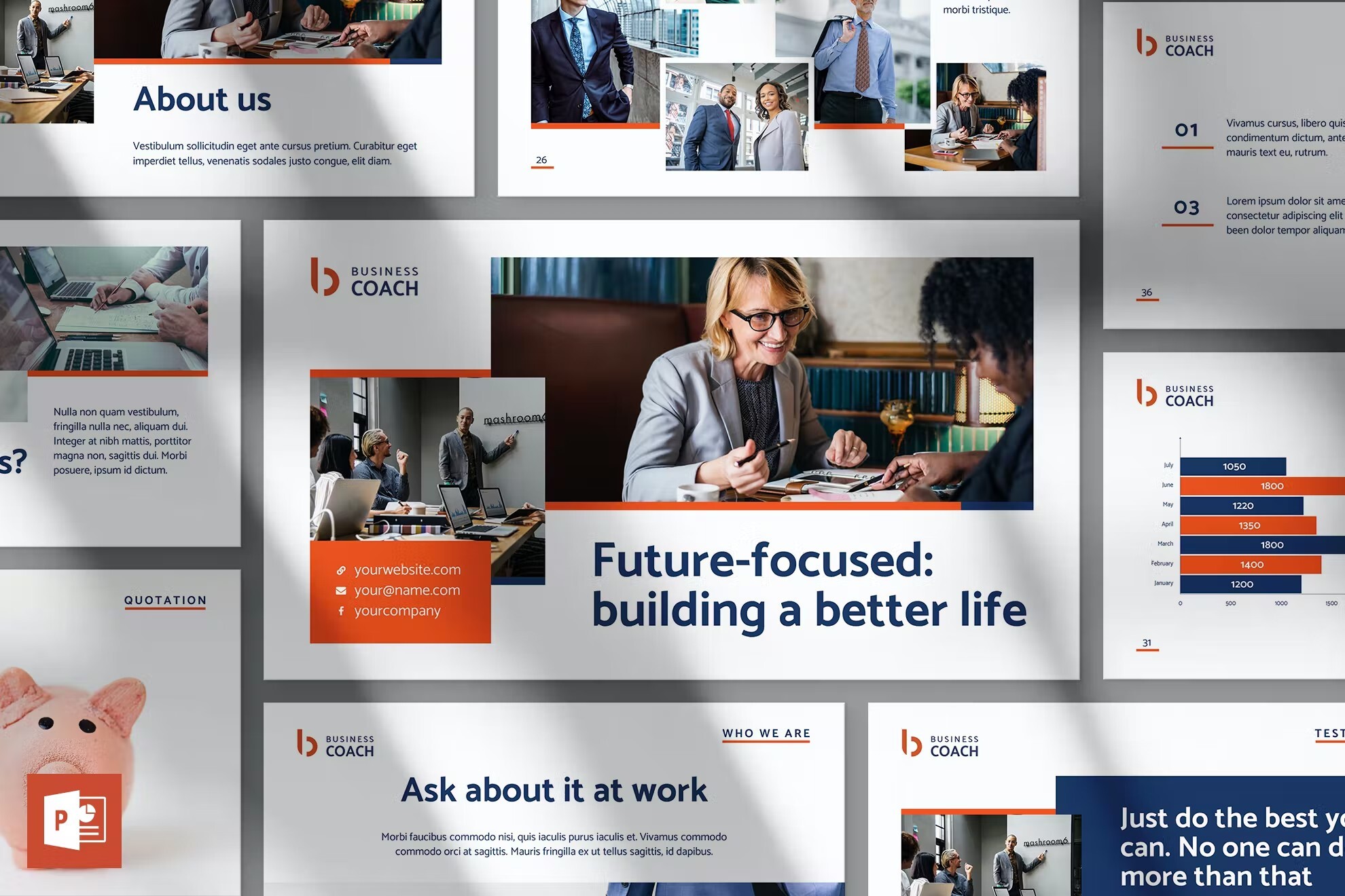
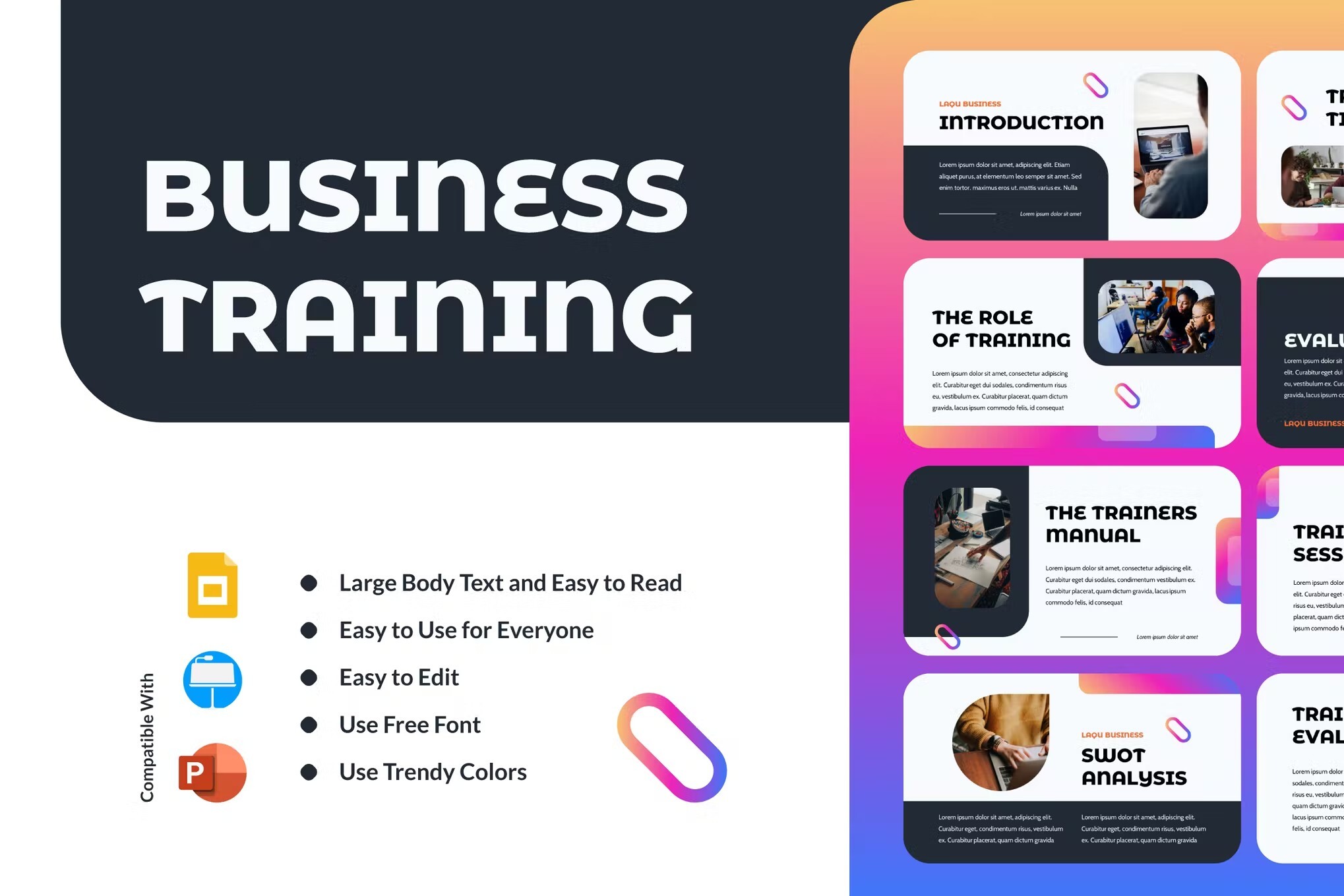
- Business PowerPoint Templates
- Animated PowerPoint Templates
- Modern PowerPoint Templates
- Creative PowerPoint Templates
- Pitch Deck PowerPoint Templates
- Medical PowerPoint Templates
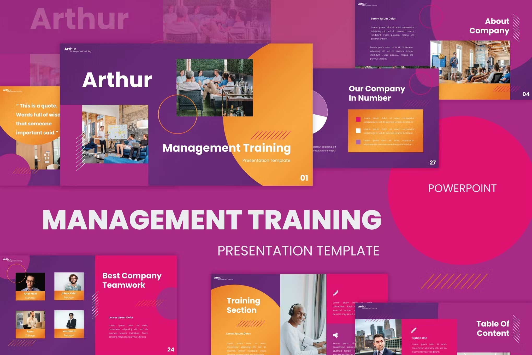
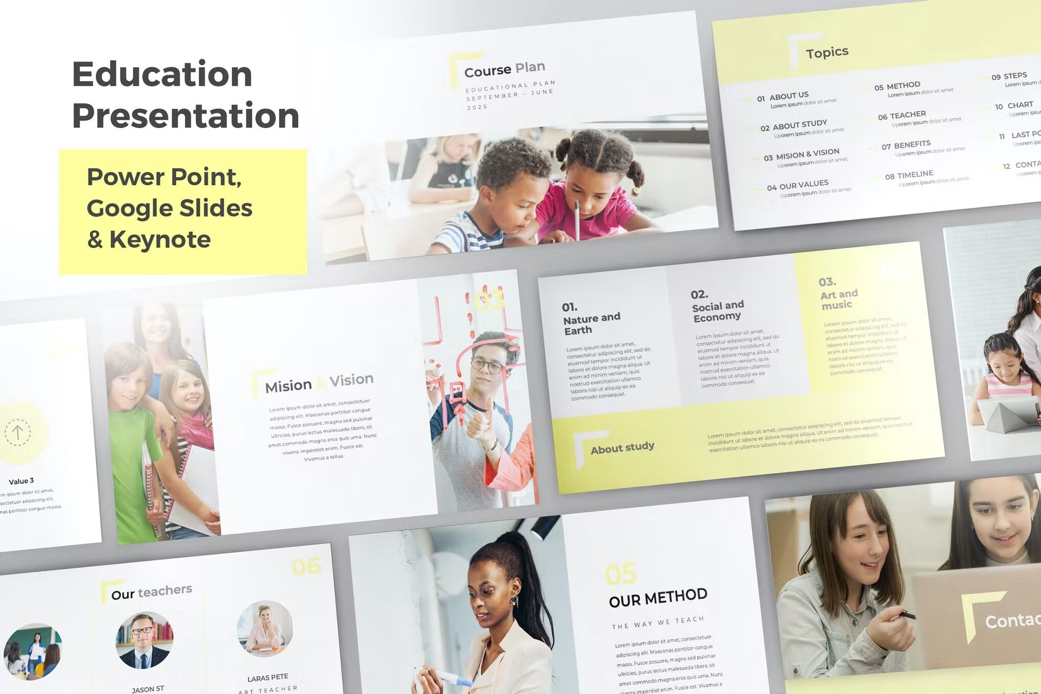
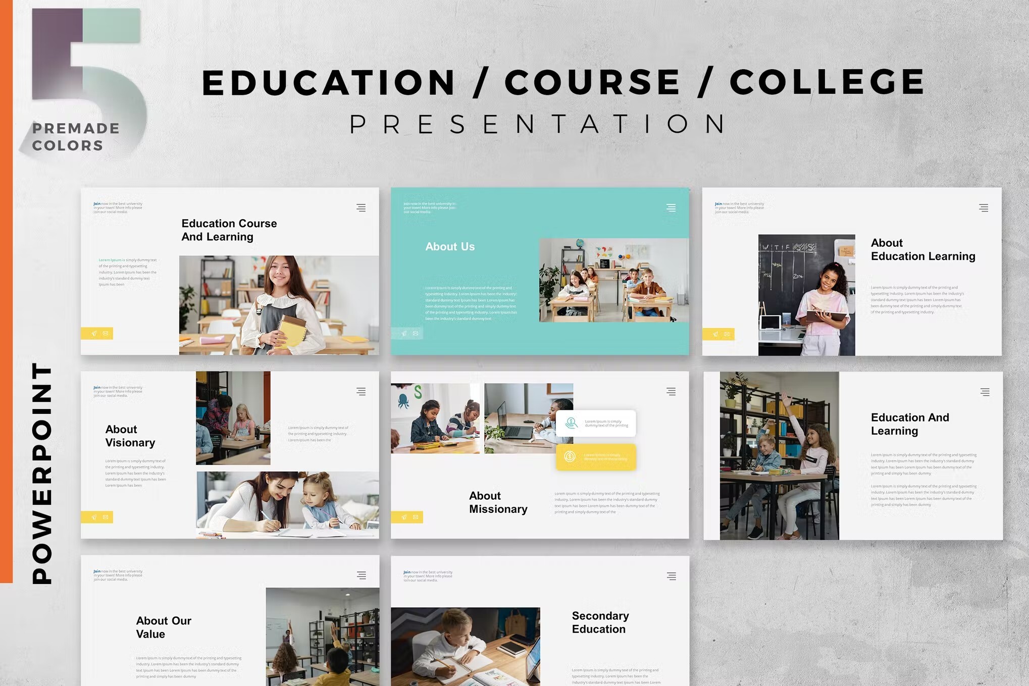
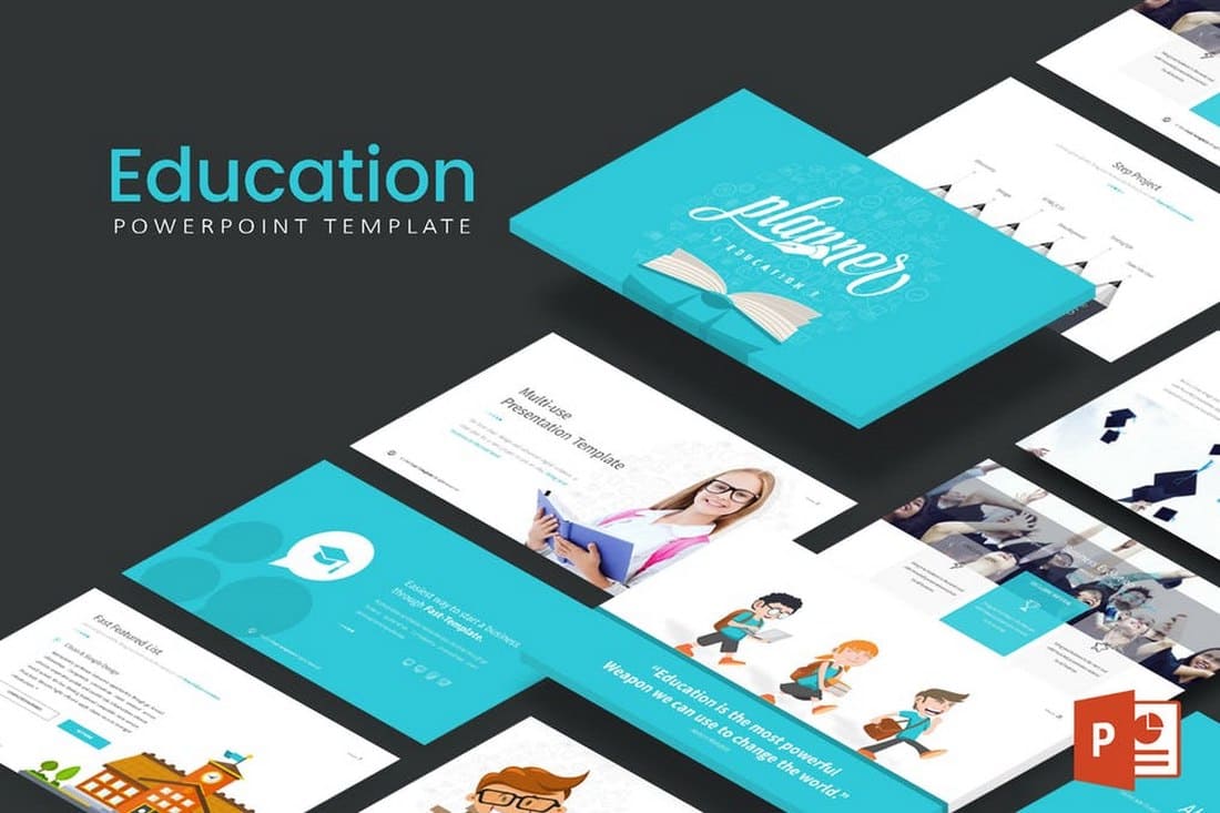
- Teacher & Education PowerPoint Templates
- Church & Christian PowerPoint Templates
- Infographic PowerPoint Templates
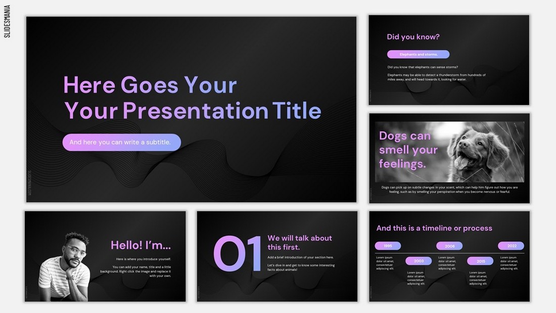
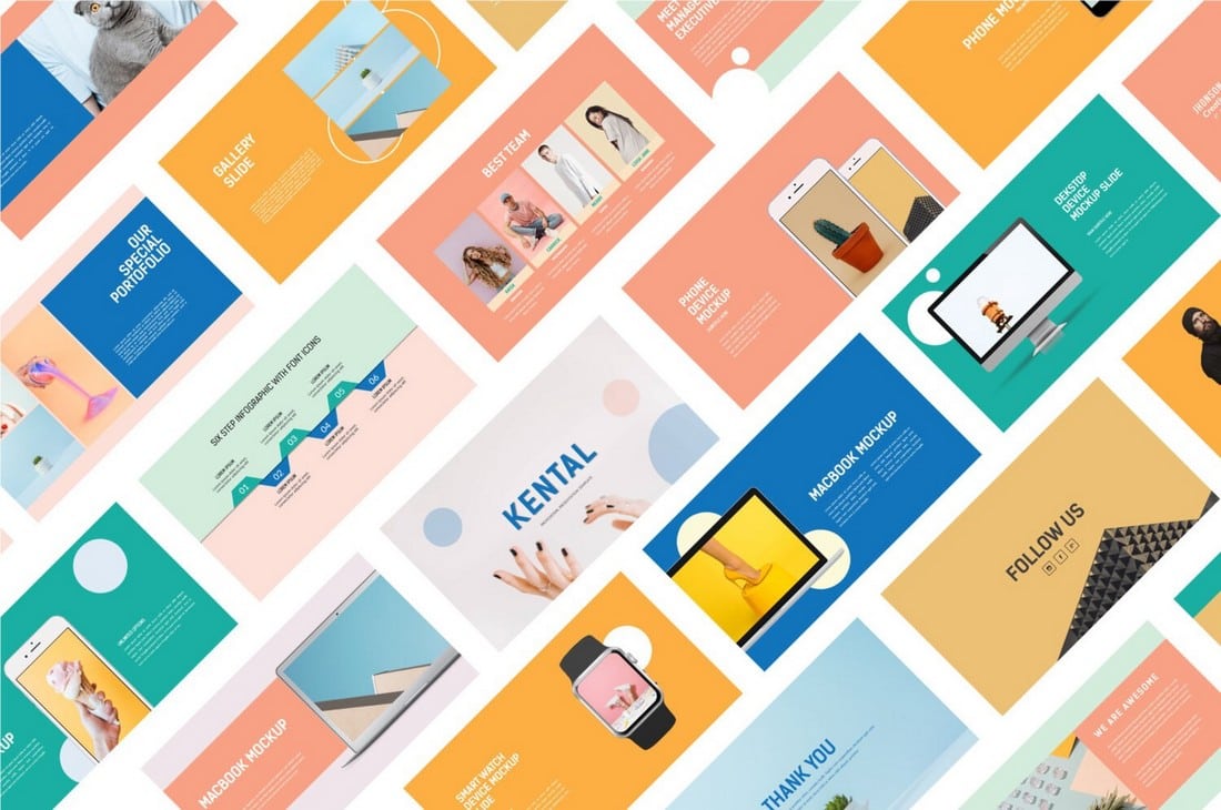
Free Professional PowerPoint Templates
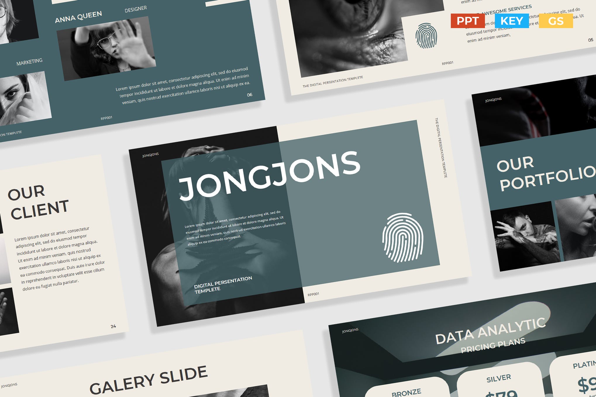
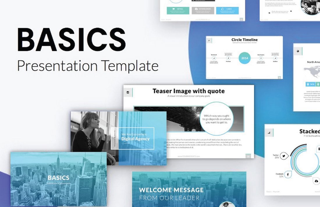
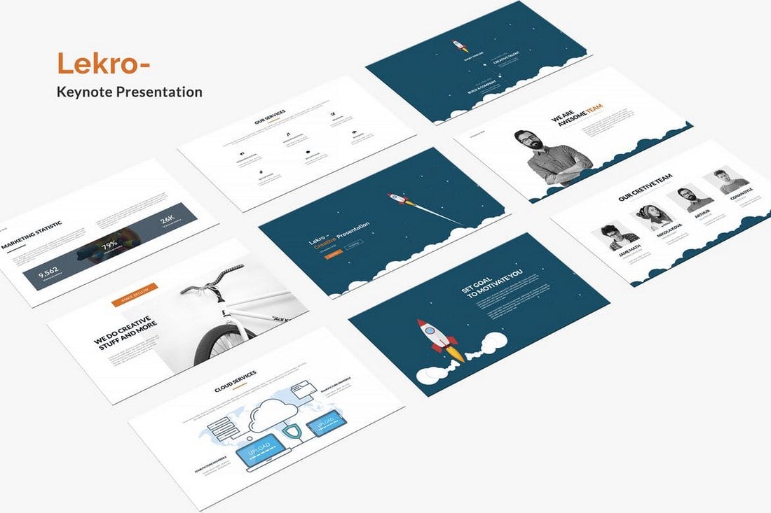
Selfone – Free Professional Presentation Template
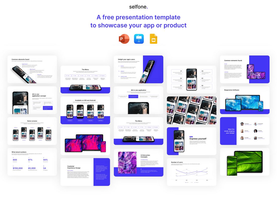
Selfone is an amazing presentation template that features lots of useful slides with professional and modern designs. There are 32 unique slides in this template and it’s ideal for making various types of slideshows for businesses, brands, and creatives. It comes in PowerPoint, Keynote, and Google Slides formats too.
Free Consulting Presentation PowerPoint Template

This free PowerPoint template is great for creating presentations for consultants. It features a set of modern and stylish slides featuring image placeholders, shapes, and editable graphics.
Free Geometric Professional Presentation Template

The colorful geometric shapes are what make this PowerPoint template one of the best on our list. This template is also available in Google Slides and Keynote formats. And you can use the free version of the template to create a basic slideshow for your professional project.
Ash – Free Professional PowerPoint Template
Ash is a modern and stylish PowerPoint template featuring a dark color theme. This template is made with professionals in mind and it’s especially suitable for event and product presentations. The free version of the template can be used to create a simple presentation.
Free Artificial Intelligence PowerPoint Template

This free PowerPoint template is ideal for making professional presentations for showcasing startups, ideas, and products related to artificial intelligence. The template features 7 unique slides with creative charts, timelines, and more.
Free Tech Slides PowerPoint Presentation Template

You can use this PowerPoint template to design attractive slideshows for technology-themed presentations. It comes with 10 different slide layouts with gradient colors, editable shapes, and text. You can also download it in Google Slides format.
Hendrix – Free Dark Professional PowerPoint Template
Another free and professional PowerPoint template with a dark theme. This template comes in both PowerPoint and Google Slides versions. You can easily customize the slide layouts to create various types of presentations.
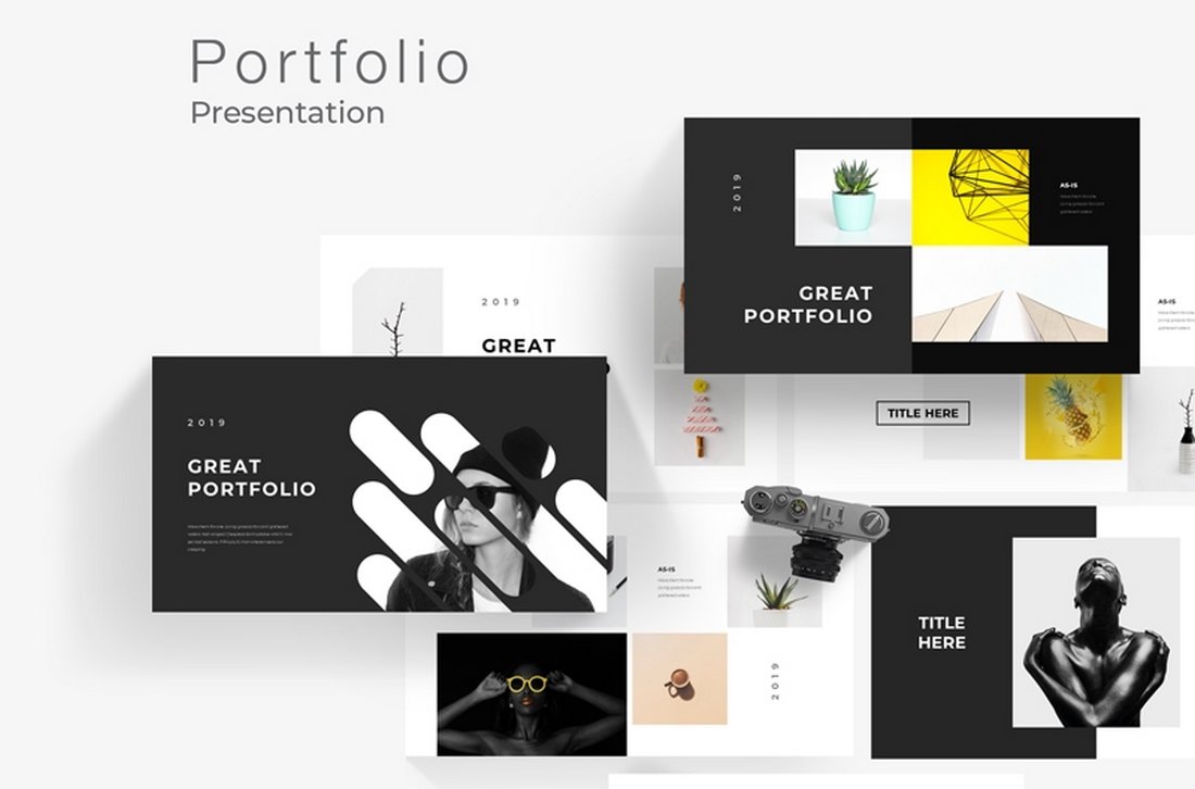
Pro Portfolio PPT Template
Every business needs a presentation template for showcasing their portfolio. This PowerPoint template is perfect for that task. It comes with 50 unique slides featuring a minimalist design that effectively highlights your portfolio in every slide. The template also includes editable vector graphics, infographics, and icons.
Aesthic – Free Multipurpose PowerPoint Template
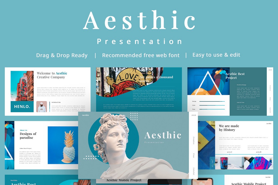
It’s hard to believe that this PowerPoint template is free to download. The modern and unique design of this presentation gives it a truly professional look. It’s perfect for creating presentations for showcasing your portfolio, creative projects, and more.
Dolor – Free Professional Presentation Template
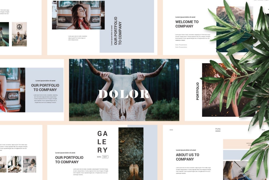
This free PowerPoint template also comes with modern and professional slide design. It uses a perfect combination of visuals and minimalism to create a very attractive slide layout. You can use it for free with your creative projects.
Kitulah – Free Dark Professional PowerPoint Template
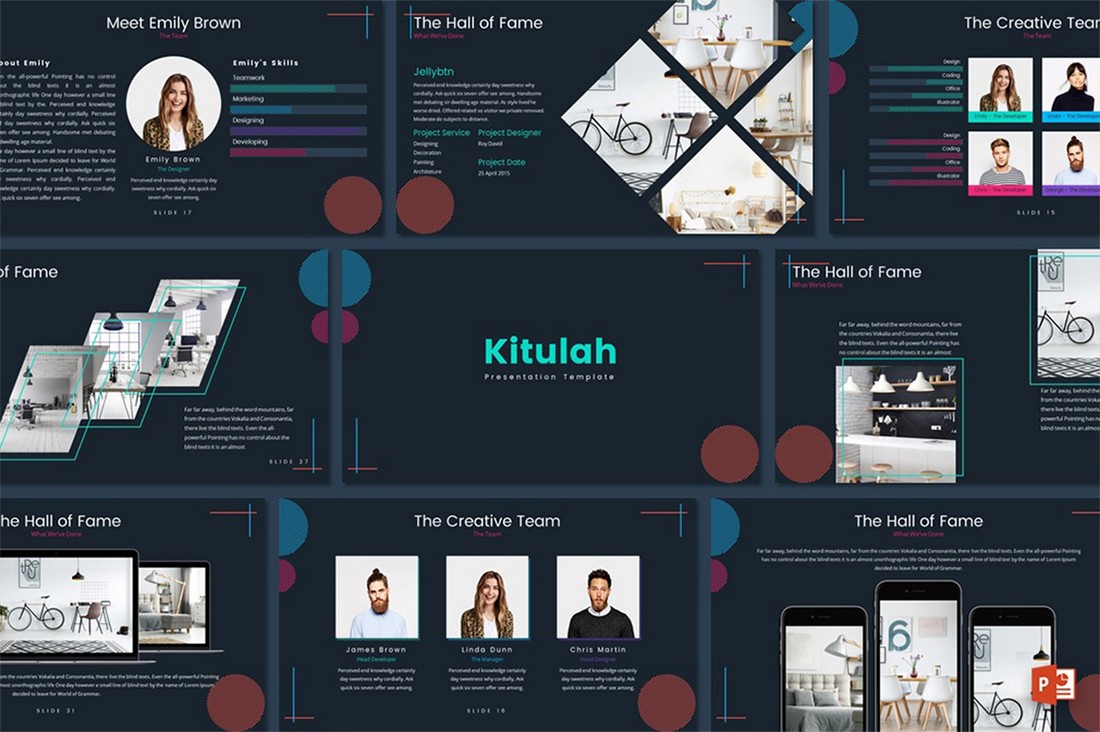
The dark color theme of this PowerPoint template adds an elegant look to this entire presentation design. It’s perfect for creating slideshows for modern brands and startups.
DSGN – Free Lookbook Presentation Template
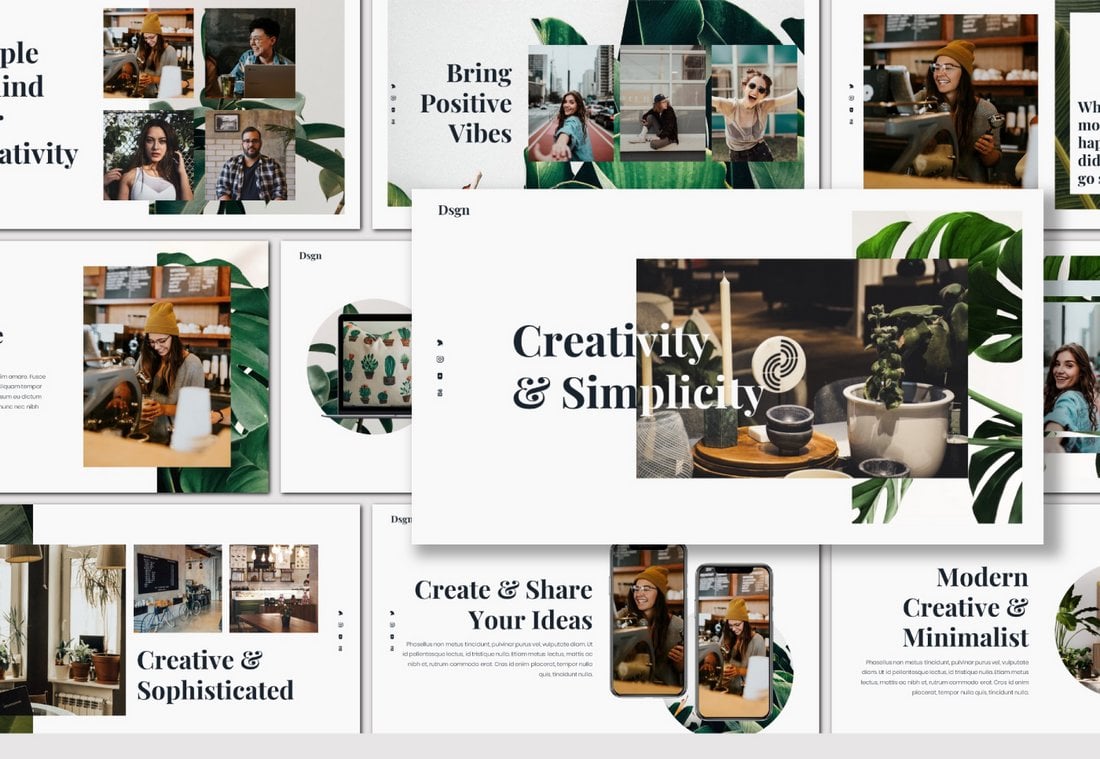
This free PowerPoint template comes with 90 unique slide layouts you can use to make slideshows for creative portfolios, photography, and fashion related presentations. The template is also available in 5 color schemes and it’s free to use with your personal projects.
Enable – Free Modern PowerPoint Template
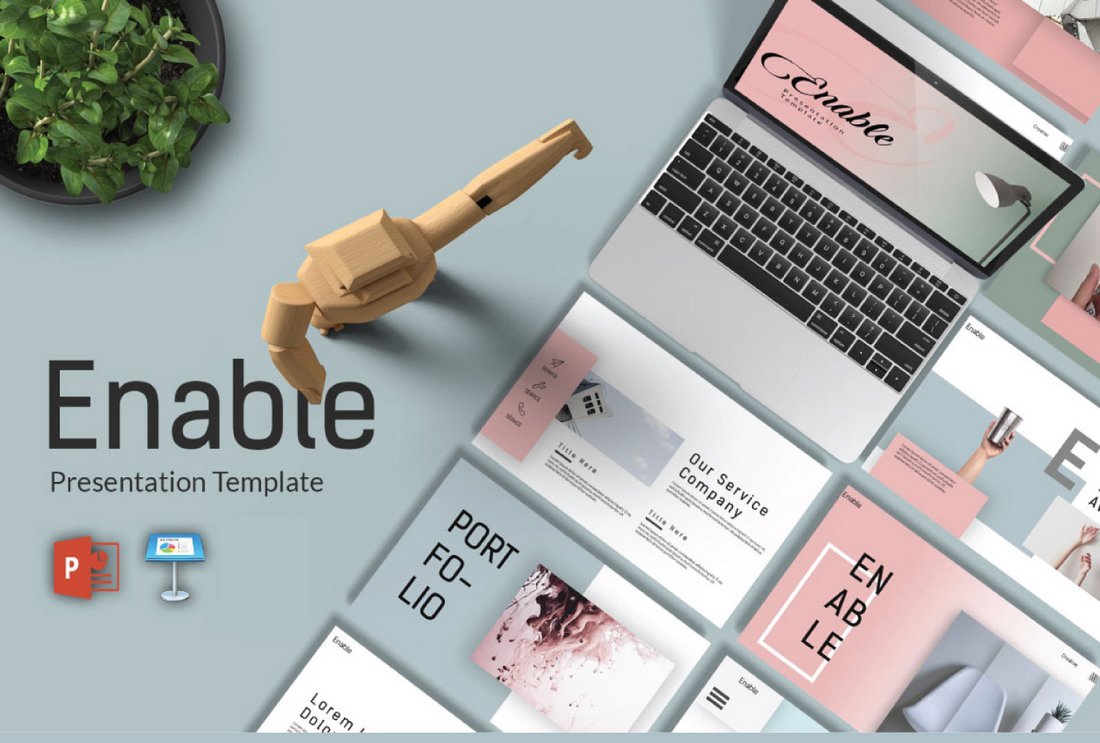
Enable is a modern PowerPoint template featuring a set of minimal slide designs that are most suitable for making creative and business-related presentations. The template comes with an easily editable design and image placeholders for easily replacing the images.
Look – Free Fashion PowerPoint Template
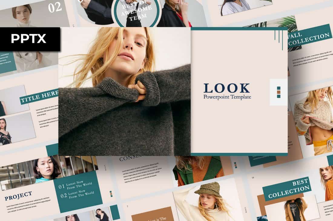
Look is an elegant PowerPoint template that features a highly visual design that’s most suitable for making fashion and photography related presentations. The template includes 55 unique slides and comes in two different colors.
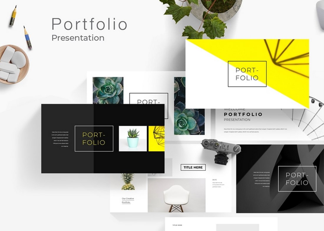
Free Creative Portfolio PowerPoint Template
If you’re looking for a stylish PowerPoint template to create a simple portfolio to showcase your work and services, this free template is perfect for you. It includes 20 unique slides that are designed to make highly visual slideshows filled with large images.
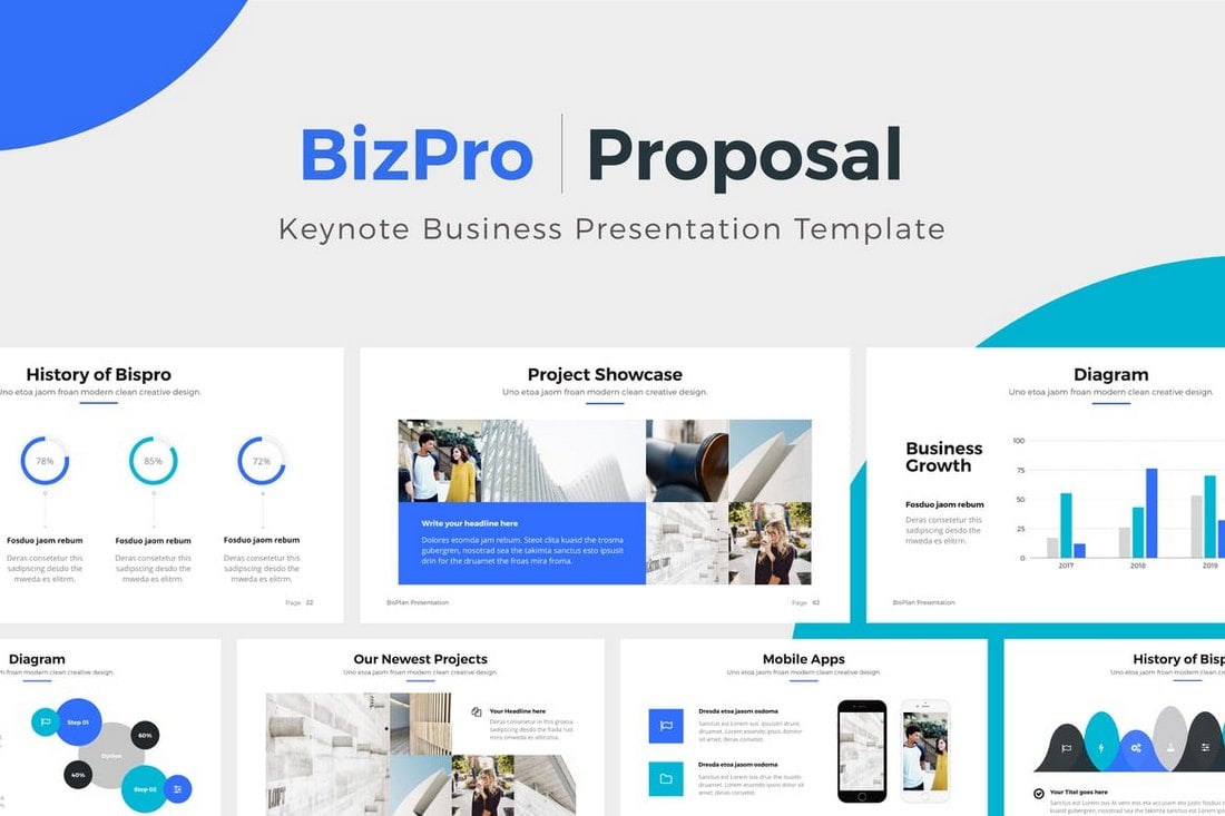
Project Proposal – Free Professional PowerPoint Template

This is a professional PowerPoint template you can use for free to create proposals for various client and freelance projects. This template includes 19 unique slides with an icon pack, illustrations, and much more.
Resume Presentation – Free PowerPoint Template

This minimal PowerPoint template is ideal for showcasing your portfolio and resume. It comes with 14 unique slides with editable vector graphics and image placeholders. The template is available in Google Slides version as well.
Free Modern Portfolio PowerPoint Template
Another free portfolio PowerPoint template with a set of creative slides. This template also includes 20 unique slides with editable layouts, image placeholders, icons, and much more.
Wagner – Free Multipurpose PowerPoint Template

Wagner is a multipurpose PowerPoint template that comes with a modern and stylish design that allows you to design all kinds of presentations. Each slide in the template is fully customizable and features editable vector shapes and elements as well.
Minimal – Simple Free PowerPoint Template
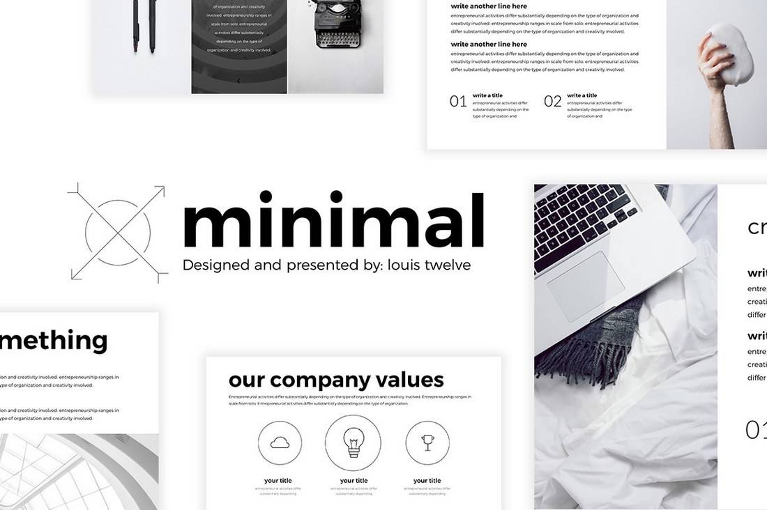
This minimal free PowerPoint template is perfect for crafting slideshow for presenting personal portfolio as well as creative agency presentations. The template is fully customizable as well.
Xara – Free PowerPoint Template
Xara is a modern PowerPoint template most suitable for making minimal slideshows for business and corporate presentations. It includes 9 unique slides with editable layouts, graphics, and charts.
Red White – Free PowerPoint Template
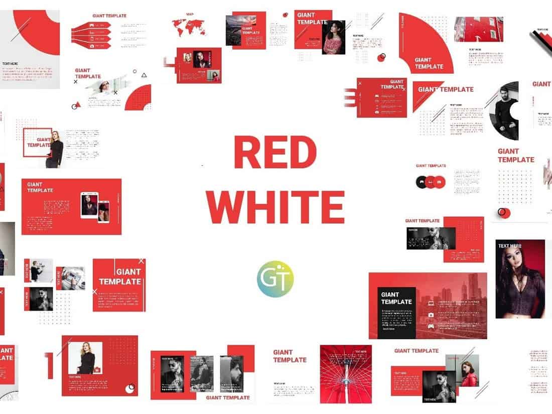
Red White is a modern free PowerPoint presentation template you can use to make slideshows for businesses, brands, and creatives. The template includes 30 unique slides with editable designs.
Free Business PowerPoint Templates
Business Cost Analysis – Free PowerPoint Template

This is a creative PowerPoint template you can use to present your business cost analysis during meetings. It features colorful slides with attractive illustrations across 35 different slide designs.
Project Proposal – Free PowerPoint Template

A simple, minimal, and clean PowerPoint template for creating professional business presentations. It’s designed with project proposal slideshows in mind. You can fully customize each slide to your preference.
Monthly Strategy Meeting – Free PowerPoint Template

Use this free PowerPoint template to create a fun and playful presentation for your monthly business strategy meetings. The template includes more than 30 slides with beautiful illustrations.
Construction Company Profile – Free PowerPoint Template
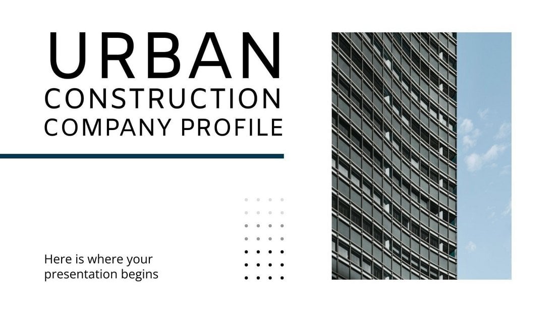
This free business PowerPoint template is made with construction companies in mind. It features 30 slides with modern designs and plenty of space for showcasing your properties with photos.
Business Action Plan – Free PowerPoint Template

A highly minimalist and free PowerPoint template for business presentations. This template is ideal for creating an effective action plan for your company. The template includes 20 slides.
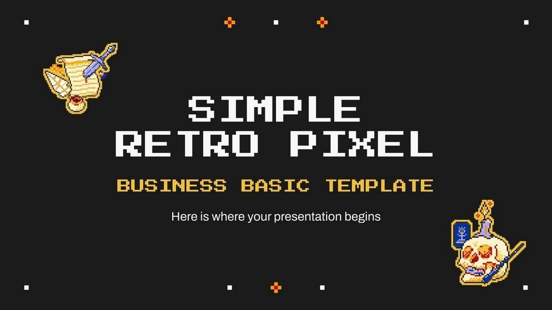
Free Retro Pixel Business PowerPoint Template
This is a free PowerPoint template that comes with colorful and creative slide designs inspired by retro-themed pixel graphics. It includes many stylish slide designs with dark color themes for creating attractive presentations for business meetings.
Free Geometric Shapes Marketing Plan for PowerPoint
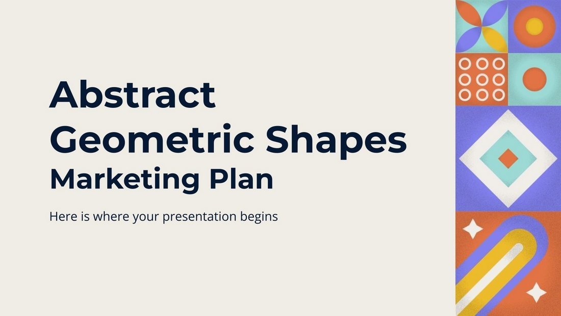
This free PowerPoint template comes with a set of slides full of colorful geometric shapes and patterns. It’s designed with marketing agencies in mind and you can use it to create attractive marketing plans for your business meetings.
Free Content Strategy Meeting PowerPoint Template

Create the perfect presentation for your content strategy meetings with this free PowerPoint template. It includes many beautiful slide layouts featuring gradient color backgrounds and image placeholders. You can fully customize each slide to your preference.
Free Abstract Shapes Business PowerPoint Template
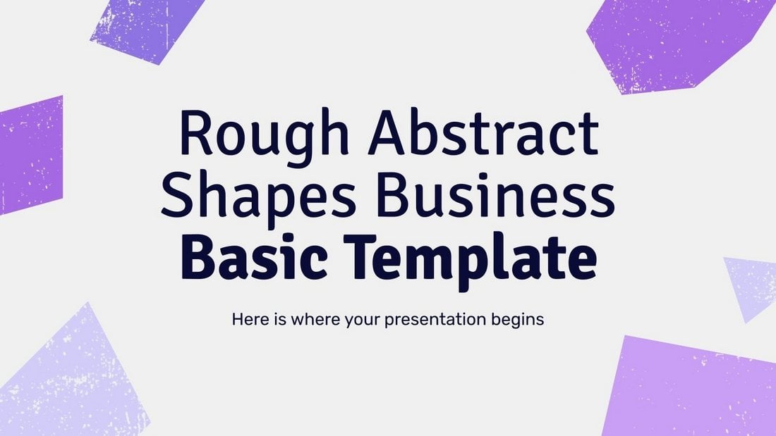
You can download this PowerPoint template for free to create modern business presentations. It has a set of minimalist slides featuring abstract shapes with rough textures.
Free Morph Business Plan PowerPoint Template
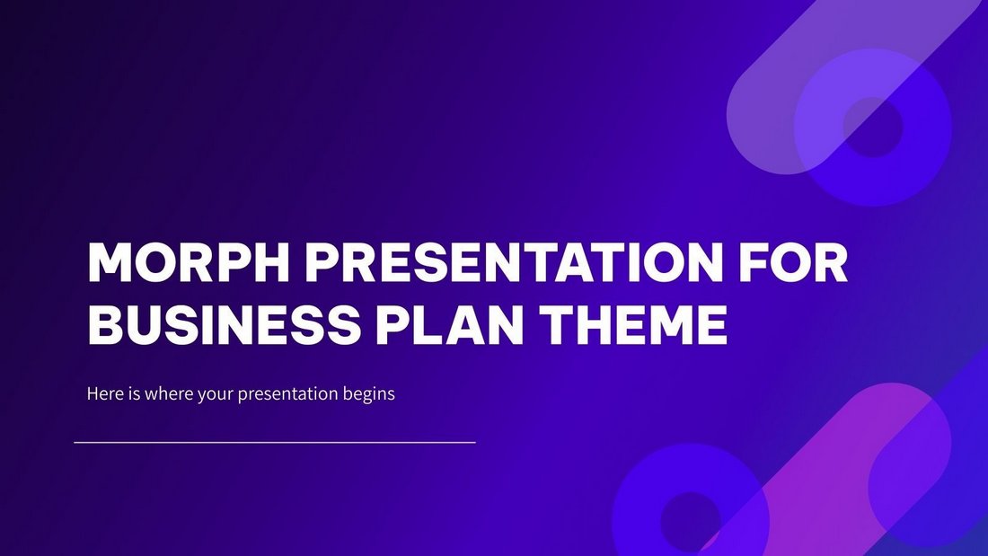
This free PowerPoint template comes with more than 40 slides featuring modern backgrounds and trendy content layouts. It’s especially perfect for creating business plan slide decks and presentations.
Free Company Profile Powerpoint Template
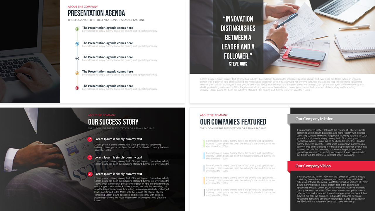
This free company profile PowerPoint template provides a comprehensive overview of your organization in a 20-slide presentation. Designed to showcase a brand’s identity, it covers the company’s journey, from establishment to its current successes, capturing its mission, vision, and values. With customizable slides, the template features a Presentation Agenda, Financial Reports, Business SWOT Analysis, Gantt chart, various graphical charts, and a Company Timeline.
Cranford – Free Business Presentation PPT
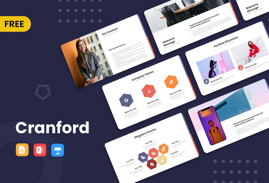
Cranford is a free PowerPoint template that includes a set of professional slide layouts. It’s most suitable for making modern business and agency slideshows. It comes in Google Slides and Keynote formats too.
Howard – Free Business PowerPoint Template
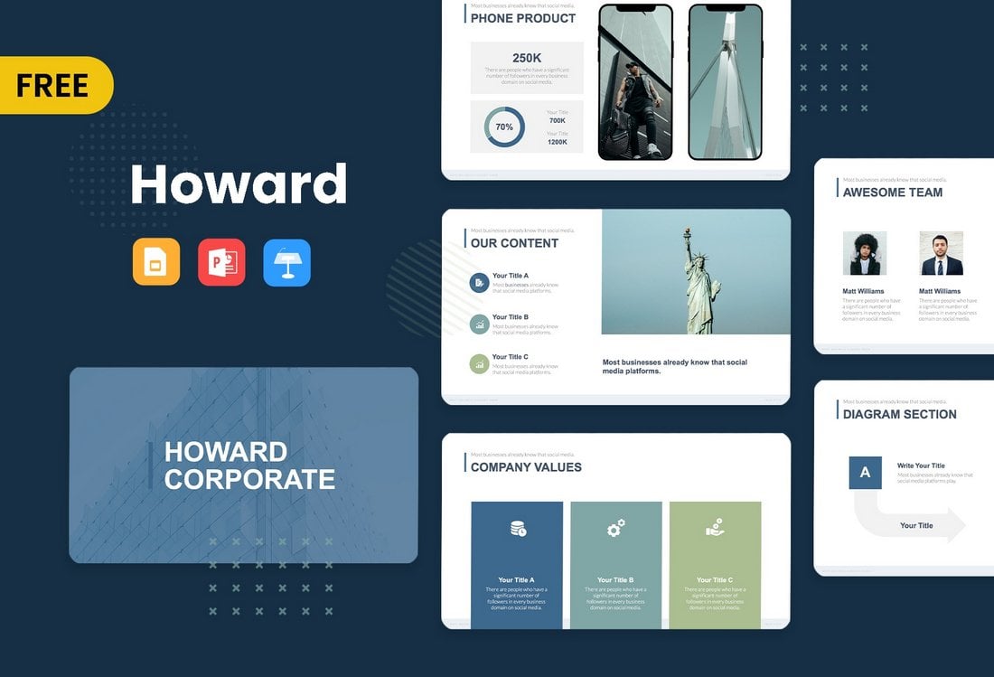
This PowerPoint template is also available in multiple formats. You can use it to create presentations for small businesses as well as corporate brands. There are 8 unique slides in this template.
Merville – Free Business PowerPoint Template
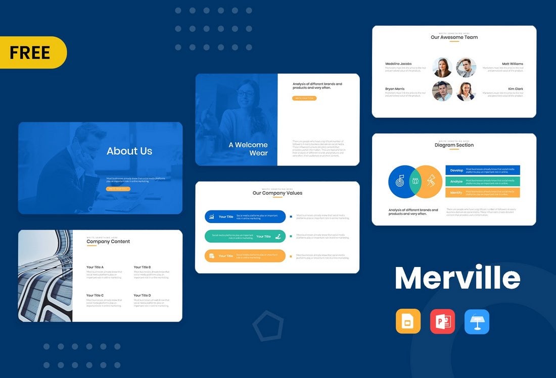
Merville is a free PowerPoint template that includes very professional-looking slides. It has highly visual slides with easily editable designs. The template is suitable for all types of business presentations.
Free Business Meeting PowerPoint Template

This is a creative PowerPoint template that comes with a set of beautiful slides. There are 24 unique slides in this template with editable graphs, timelines, mockups, and more. It’s available in Google Slides version too.
Free Creative Agency PowerPoint Template
This is a huge PowerPoint template that includes more than 100 different slides. Of course, the full version comes at a price. But if you scroll all the way down on the page, you’ll find a free version of the template that’s also pretty great for making a simple business presentation.
Free 2022 Marketing Plan Infographic PowerPoint Template
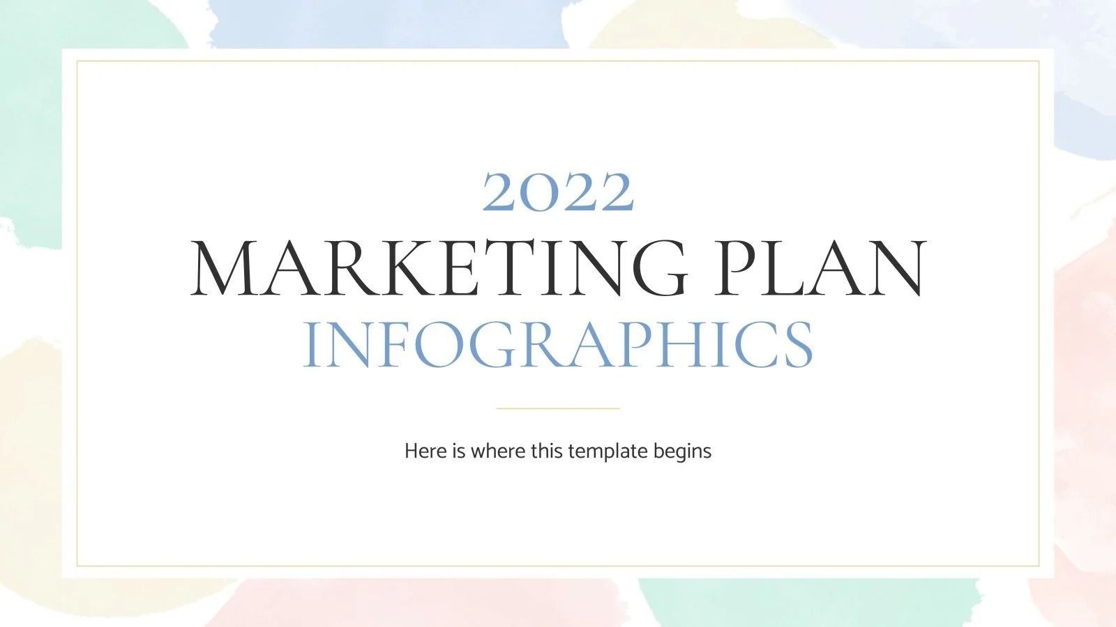
This is a must-have presentation template for marketing agencies and businesses. It includes creative infographic slides you can use to showcase your marketing plan and the performance of your campaigns. It includes 32 slides and it’s available in Google Slides format too.
Free Electric Scooter Company Profile PPTX
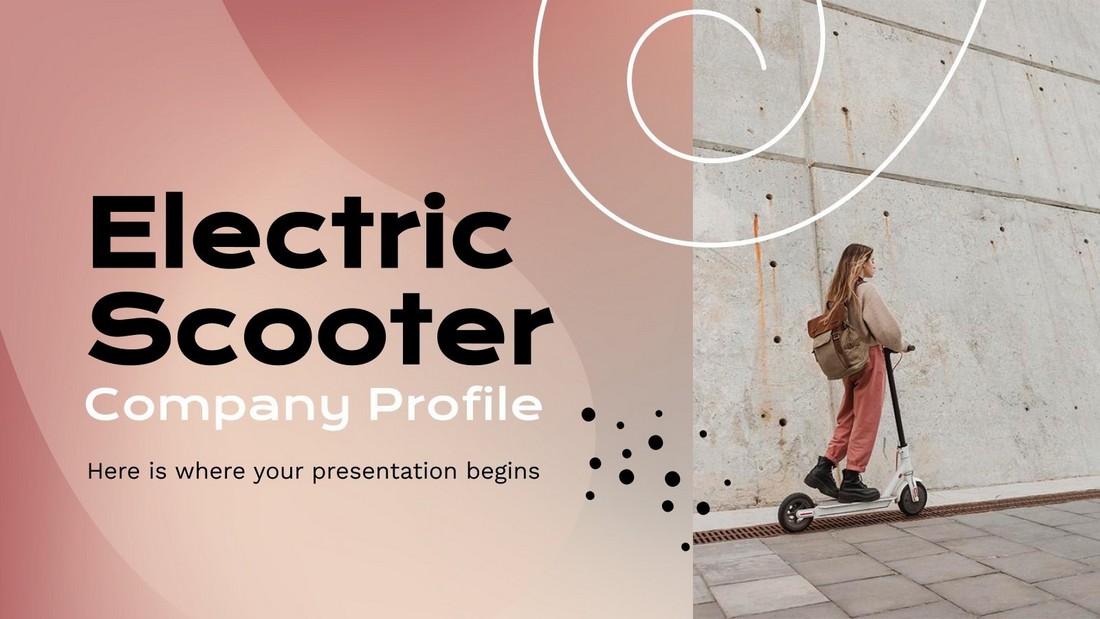
This free PowerPoint template is ideal for making company profiles. It’s especially perfect for making company profile presentations for startups and modern brands. The template includes 28 fully customizable slides with free icons and graphics.
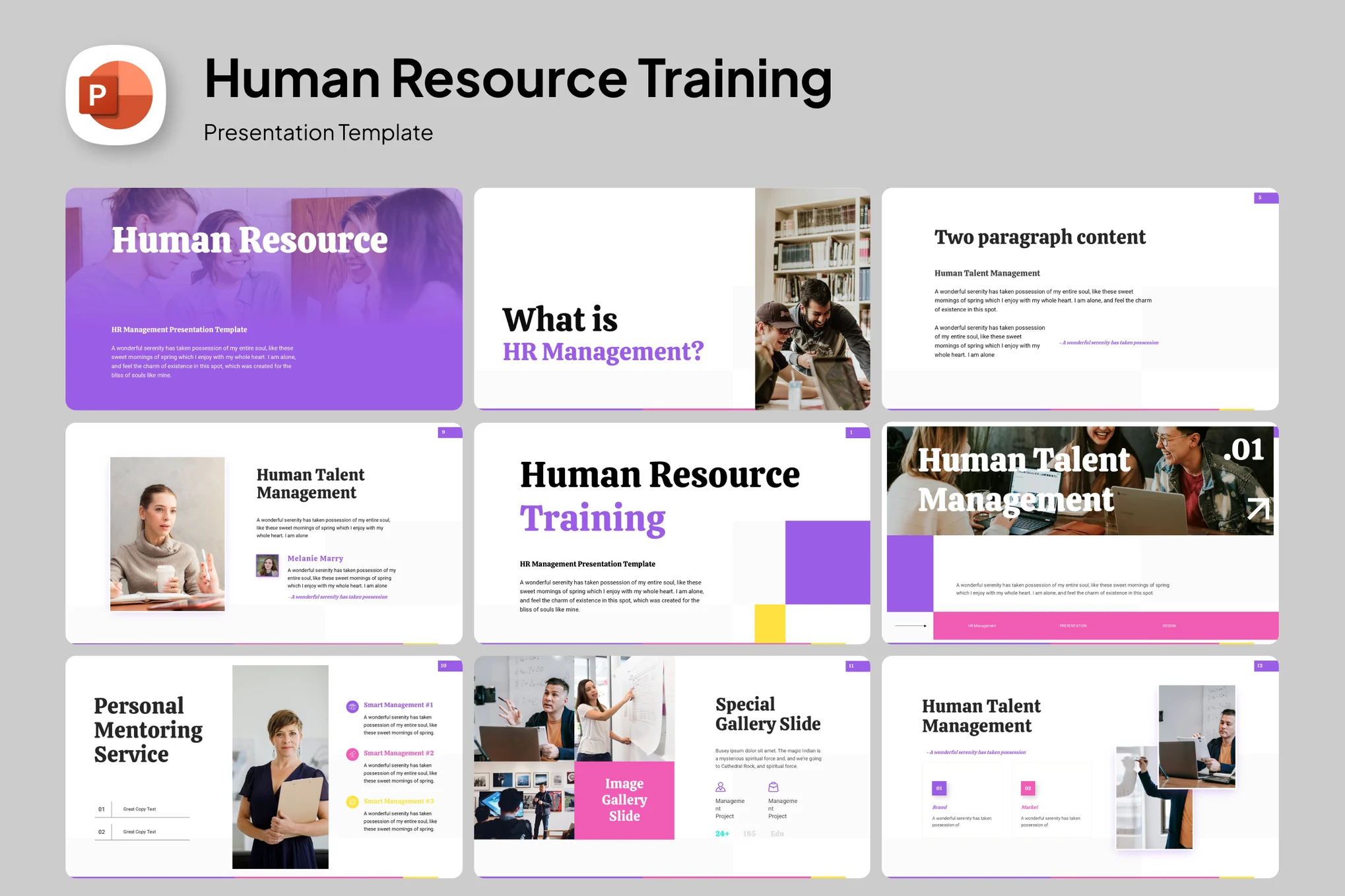
Free Human Resource Meeting PowerPoint Template
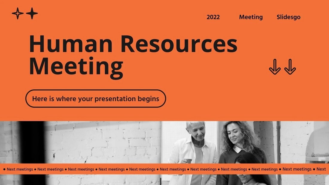
This PowerPoint template comes with a set of professional slide designs you can use to create presentations for human resource meetings for all kinds of businesses. There are 24 unique slides included in this template and it comes in Google Slides format as well.
Free Gradient Corners Business PowerPoint Template
The elegant design of this PowerPoint template makes it a perfect choice for making business presentations. The template features 7 unique slides with colorful blue gradient corner designs.
Free Simple Business Executive PowerPoint Template
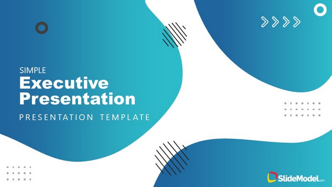
You can use this free PowerPoint template to make simple presentations for corporate brands and businesses. The template includes 8 editable slides with professional layouts. It comes in Google Slides version as well.
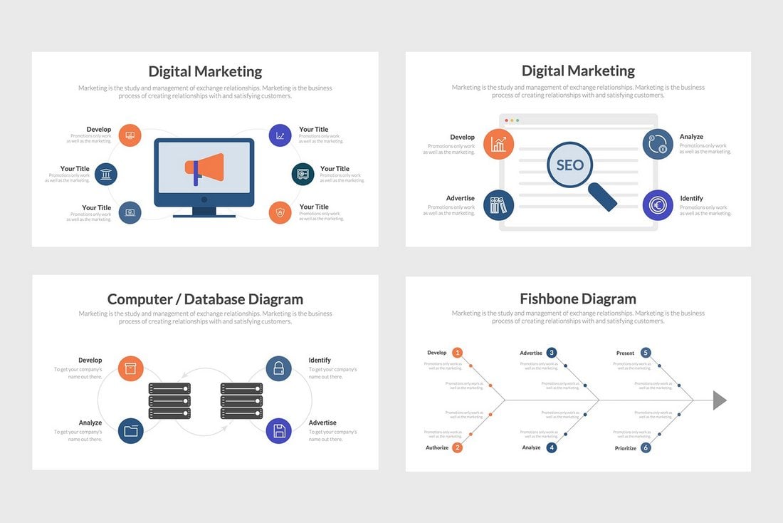
Digital Marketing Strategy PowerPoint Template
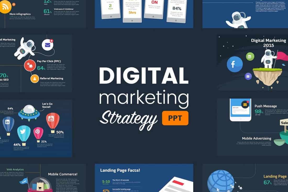
Using a creative and bold design in your PowerPoint slideshow is a great way to capture attention and make your presentation stand out. This beautifully designed PowerPoint template will help you achieve that goal. It comes with more than 40 slides that feature a unique design made specifically for marketing presentations. It’s also available in 2 different color themes.
Bara – Free Modern Business PowerPoint Theme
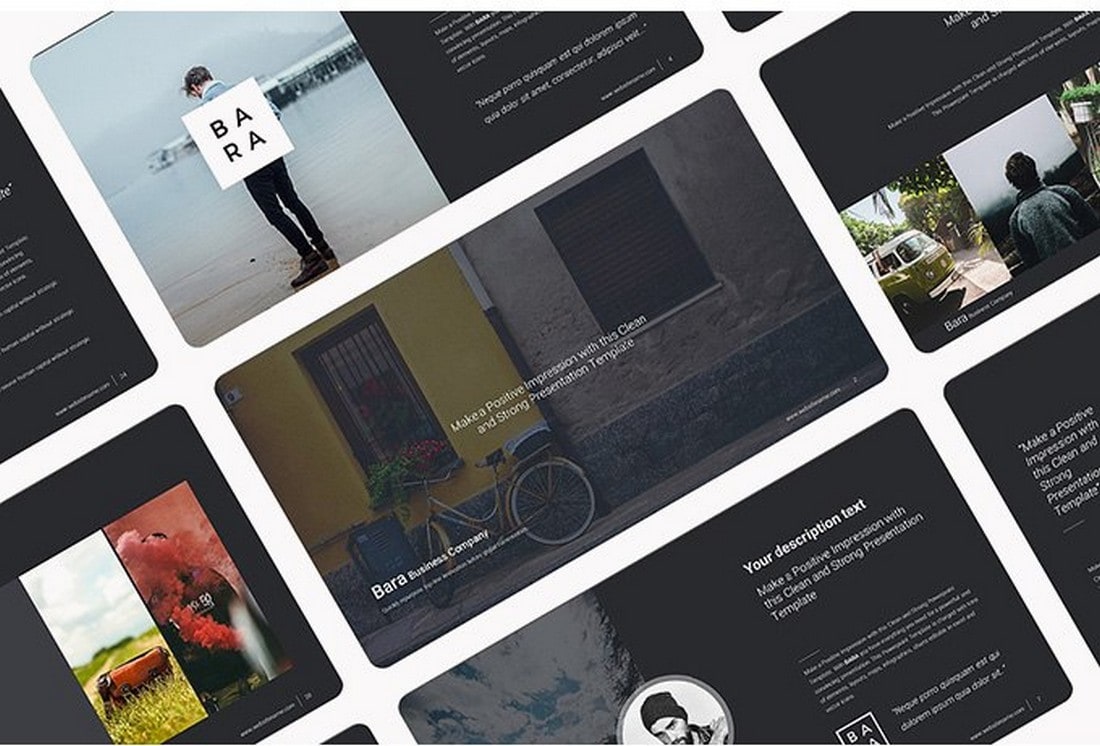
Bara is the perfect free PowerPoint template for creating business presentations. It features a modern design and comes with easily editable slide layouts. In addition, it’s available in Keynote version as well.
Clifton Free Business Presentation Template
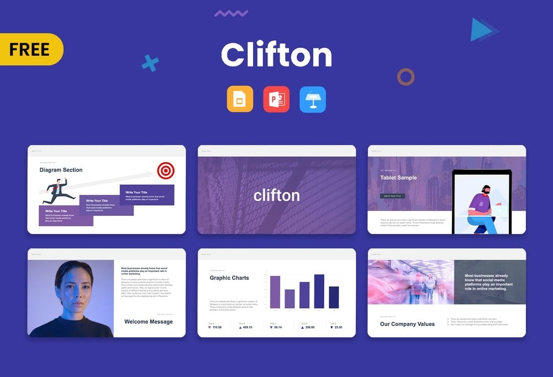
This modern and free presentation template comes in multiple formats. You can use it to create a stylish presentation to promote business services, brands, and products as well.
Barnwell Free Business Presentation Template
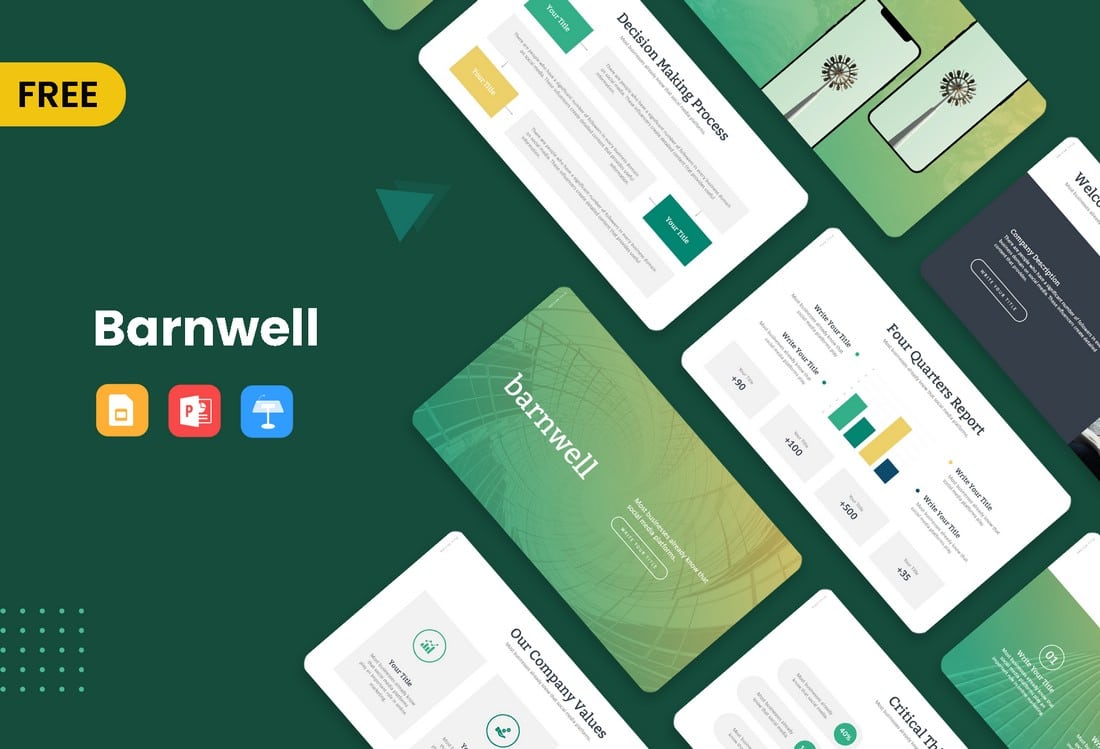
Barnwell is a simple yet effective presentation template for creating business and agency slideshows. This template comes in multiple formats including PowerPoint, Keynote, and Google Slides.
Free Onboarding Meeting PowerPoint Template

This free PowerPoint template is perfect for creating a presentation for your new hire onboarding meetings. It includes 33 different slide layouts with easily editable designs. The template comes in the Google Slides version as well.
Free Multipurpose PowerPoint Presentation Template
You can use this PowerPoint template to design clean and minimalist presentations for various business meetings. It includes 27 different slide designs you can customize to your preference.
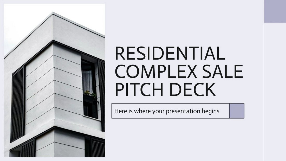
Free Construction & Real Estate PowerPoint Template

If you’re preparing a presentation for a construction project or a real estate property, this PowerPoint template will come in handy. There are 19 unique slides in this template made specifically with construction and real estate businesses in mind.
Future – Free Business PowerPoint Template
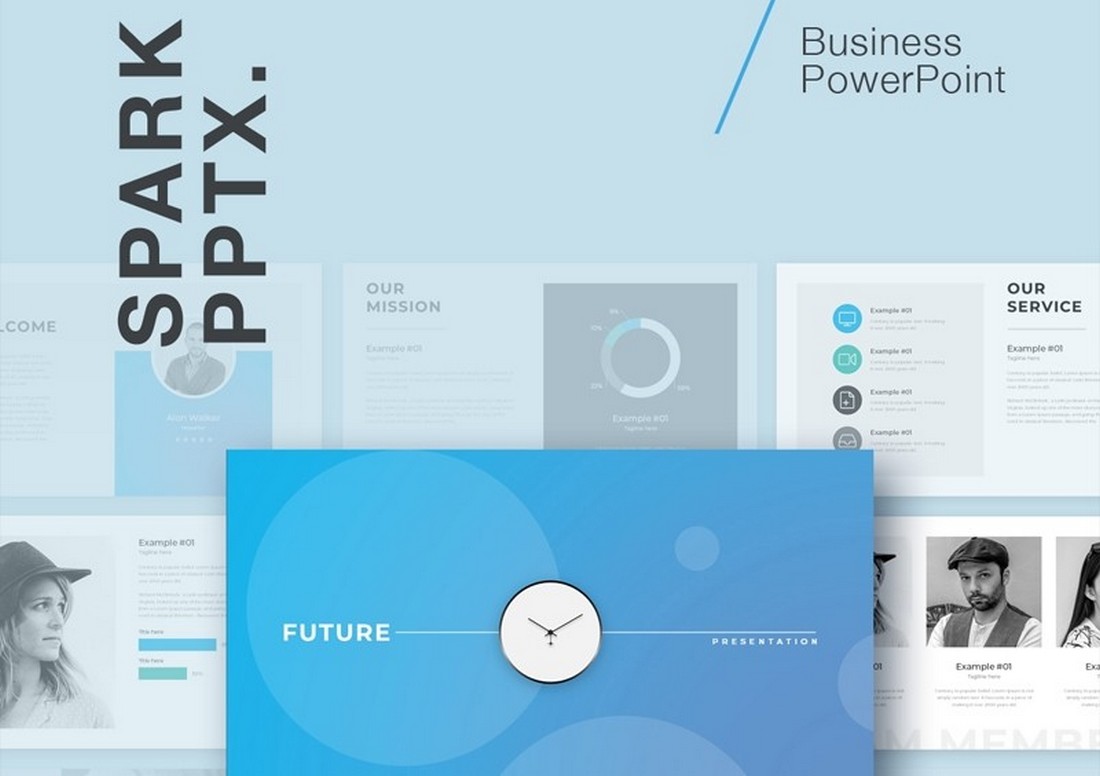
A simple and clean PowerPoint template for making professional and business presentations. This template comes with 25 unique slide layouts featuring minimalist designs. Each slide is fully customizable and features master slide layouts as well.
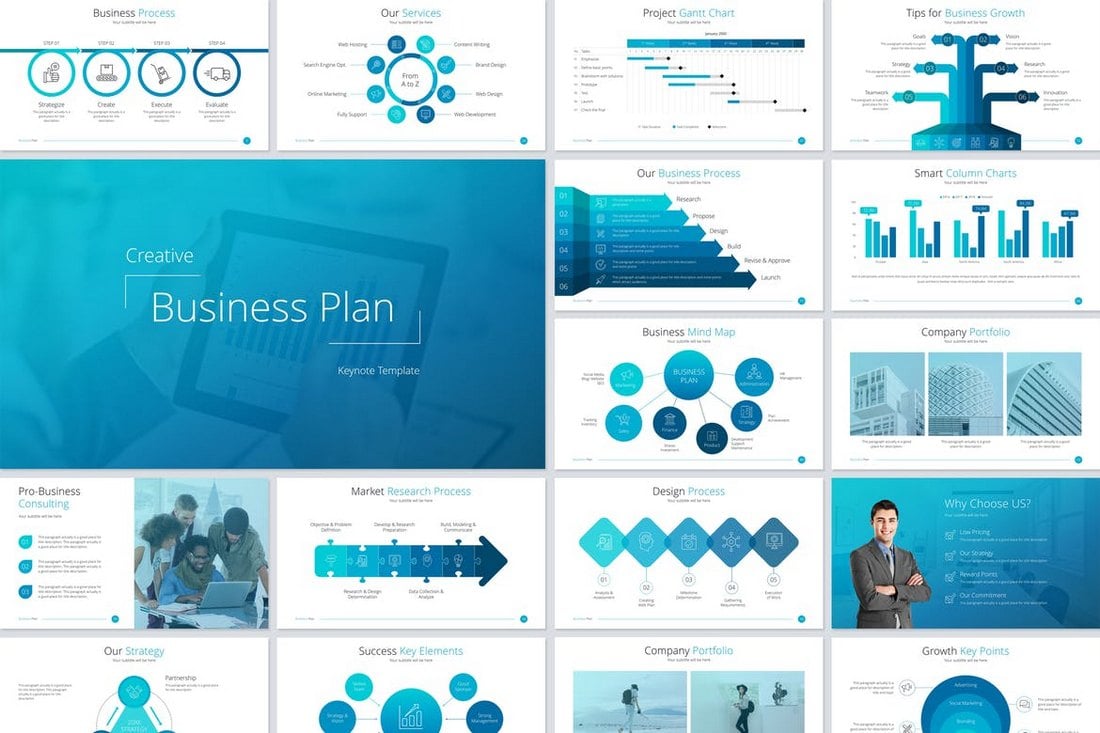
Business Plan Free Powerpoint Presentation
This free PowerPoint template is a great choice for making slideshows for presenting your business plans and strategies in meetings. It includes 20 unique slides. You’ll need to signup for a free account on the website to download the file.
SEO Proposal – Free PowerPoint Template

This creative PowerPoint template is designed specifically for digital markers and agencies. You can use this to craft an effective slideshow that wins over your marketing clients. It’s free to download and use.
Conference Pitch Deck PowerPoint Template
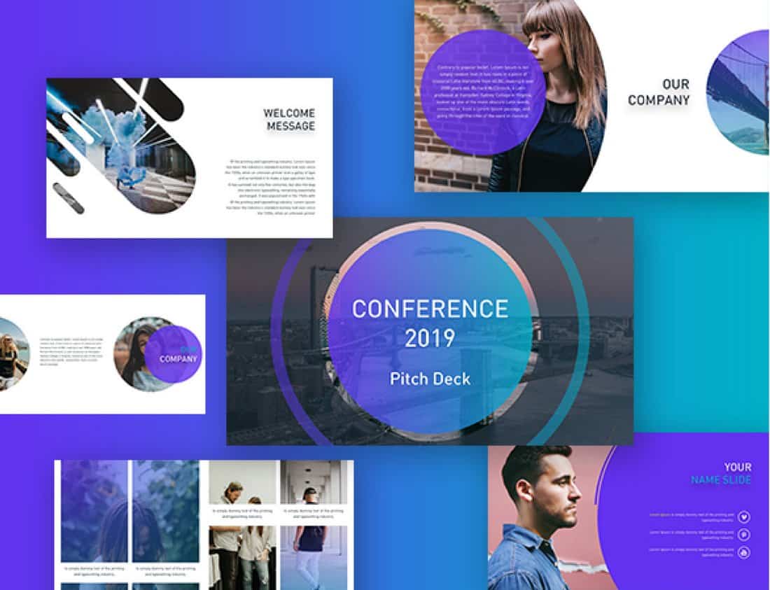
This is a pitch deck PowerPoint template featuring a set of slides made for designing slideshows for business and conference presentations. It includes customizable vectors, diagrams, shapes, and lots more as well.
Annul Report – Free Business PowerPoint Template
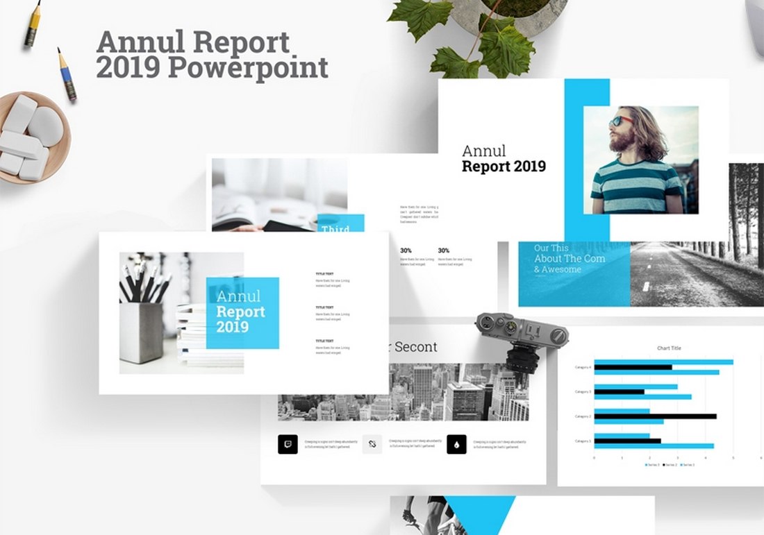
A free business PowerPoint template you can use to create annual report presentations for various projects and companies. This template includes 22 unique slides with easily customizable layouts.
Beexey – Free Business PowerPoint Template
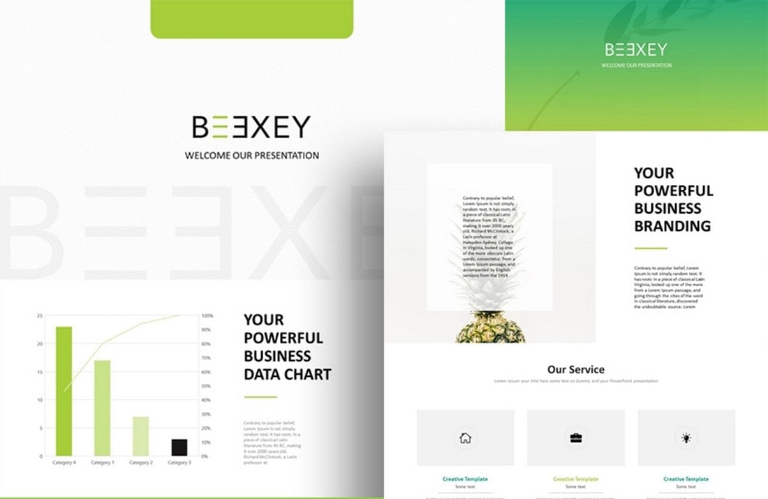
Another modern PowerPoint template specially made for businesses and agencies. This template features 20 unique slides with icons, editable graphics, and animations.
Vision – Free Business PowerPoint Template
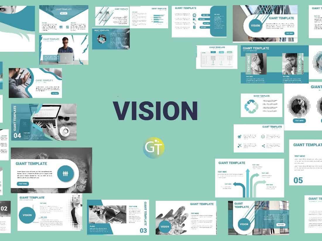
Vision is a modern PowerPoint template you can use to design business and corporate presentations. The free template comes in multiple styles and color versions, which you can download individually to your preference.
Casper – Free PowerPoint Presentation Template
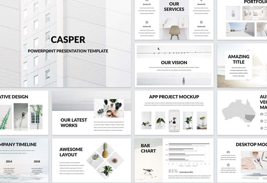
Casper is a creative and minimalist PowerPoint template you can use to create presentations for startups and personal portfolios. The template includes 60 unique slides featuring transition animations, infographics, and more.
Minta – Business Free PowerPoint Template
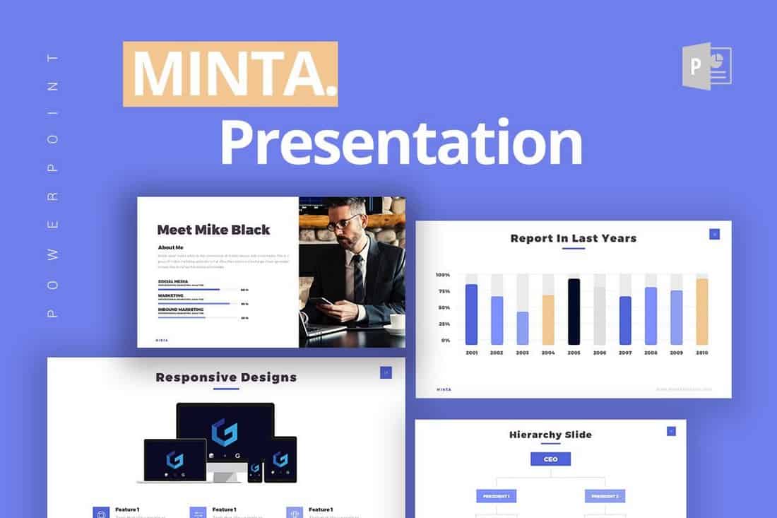
Minta is a free PowerPoint template most suitable for making slideshows for presentations related to business and marketing. It comes with 21 unique and customizable slides in widescreen layout.
Business Report Free PowerPoint Template
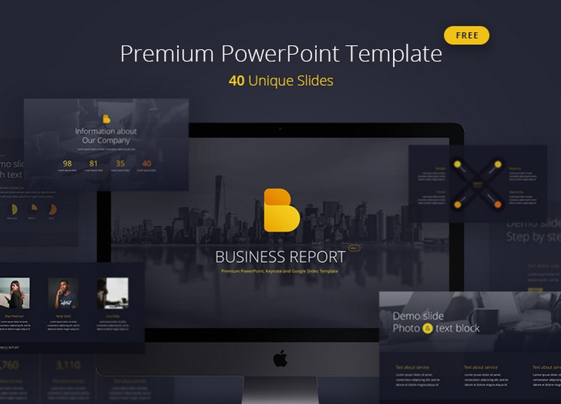
Business Report is a professional PowerPoint template featuring 40 unique slides. The template is available in 5 color schemes and in both animated and static versions.
Annual Report – Free PowerPoint Template

Another great free PowerPoint template made specifically for making annual report presentations. It’s most suitable for corporate and business presentations. The template is free to use with personal and business projects.
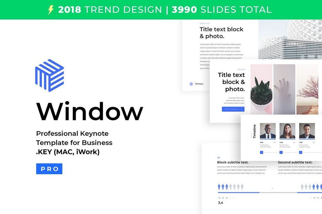
Window – Free PowerPoint Template
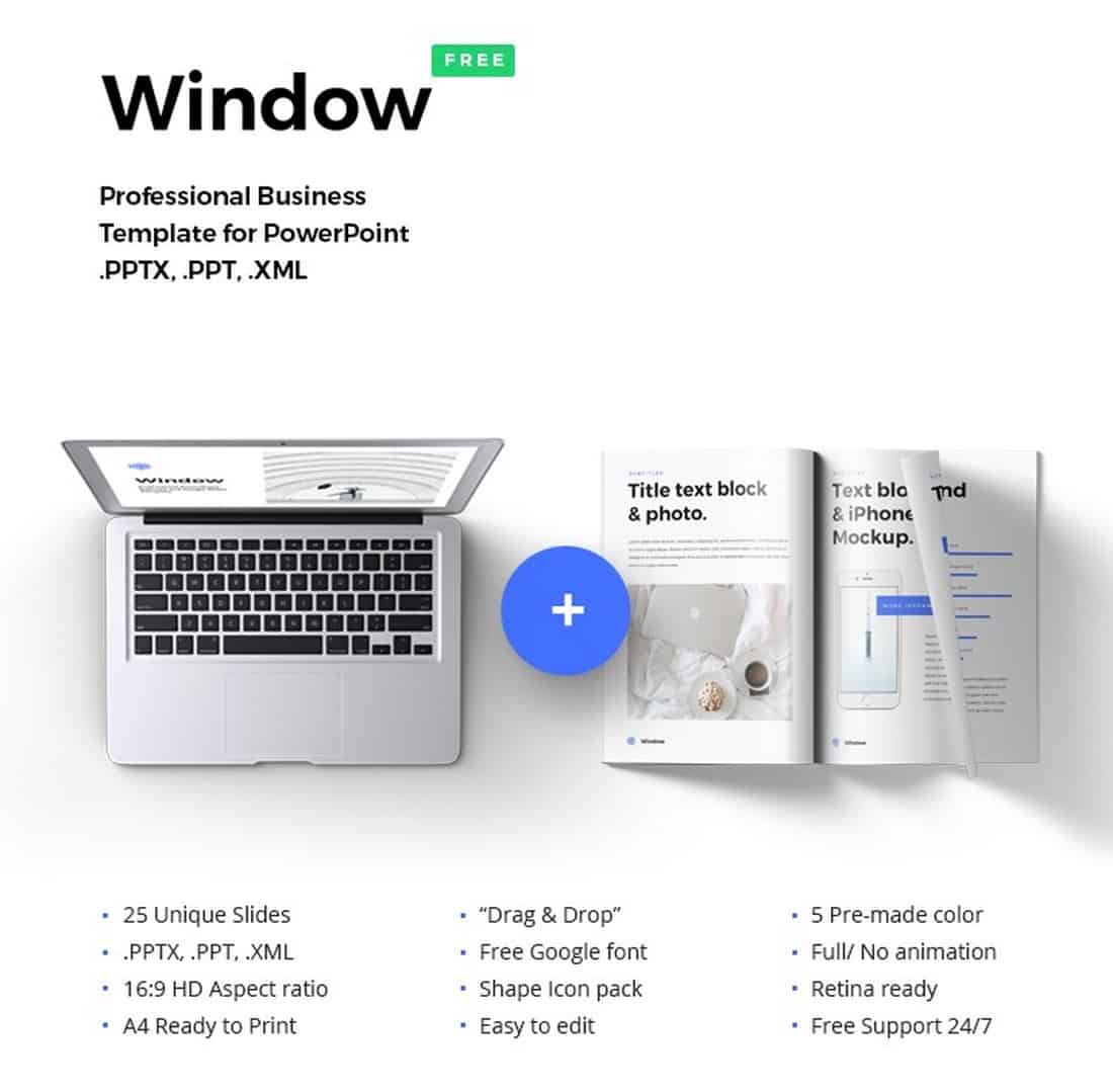
Window is a creative and minimalist PowerPoint presentation template most suitable for startups and creative agencies. The template comes with 25 unique slides filled with stylish designs and its available in 5 pre-made color schemes.
Modern Business Free PowerPoint Template
This is a free PowerPoint template you can use to craft a slideshow for a modern small business or a startup. The template features 12 unique slides featuring retina-ready and beautiful designs.
Seattle – Simple PowerPoint Presentation Template
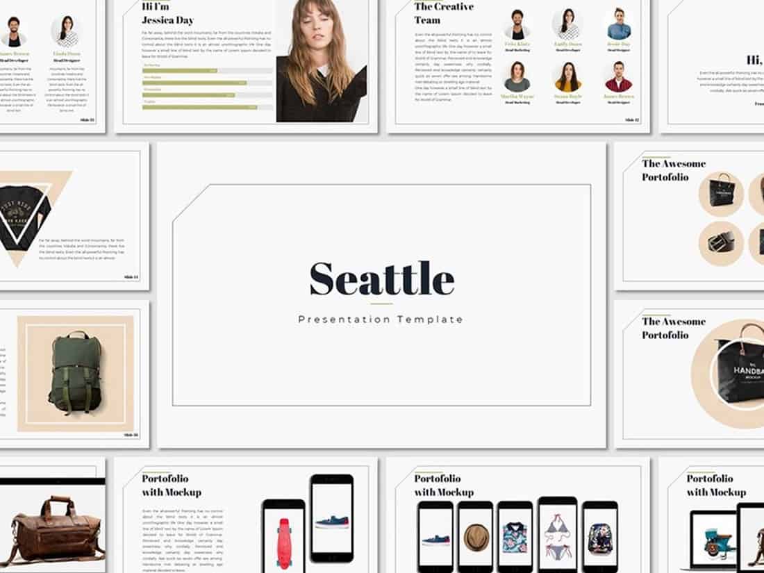
Seattle is a clean and simple PowerPoint presentation template that includes a set of unique slides featuring stylish graphics, shapes, and elements. You can easily customize the template to your preference as well.
Free Animated PowerPoint Templates
Shining – Creative Animated PowerPoint Template
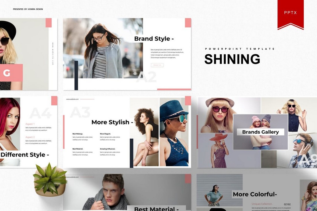
Shining is an animated PowerPoint template that comes with 30 unique slides. The slides are available in 5 different color schemes. It also features master slide layouts, animations, editable graphics, illustrations, and much more as well.
Lookbook – Free Pastel PowerPoint Template
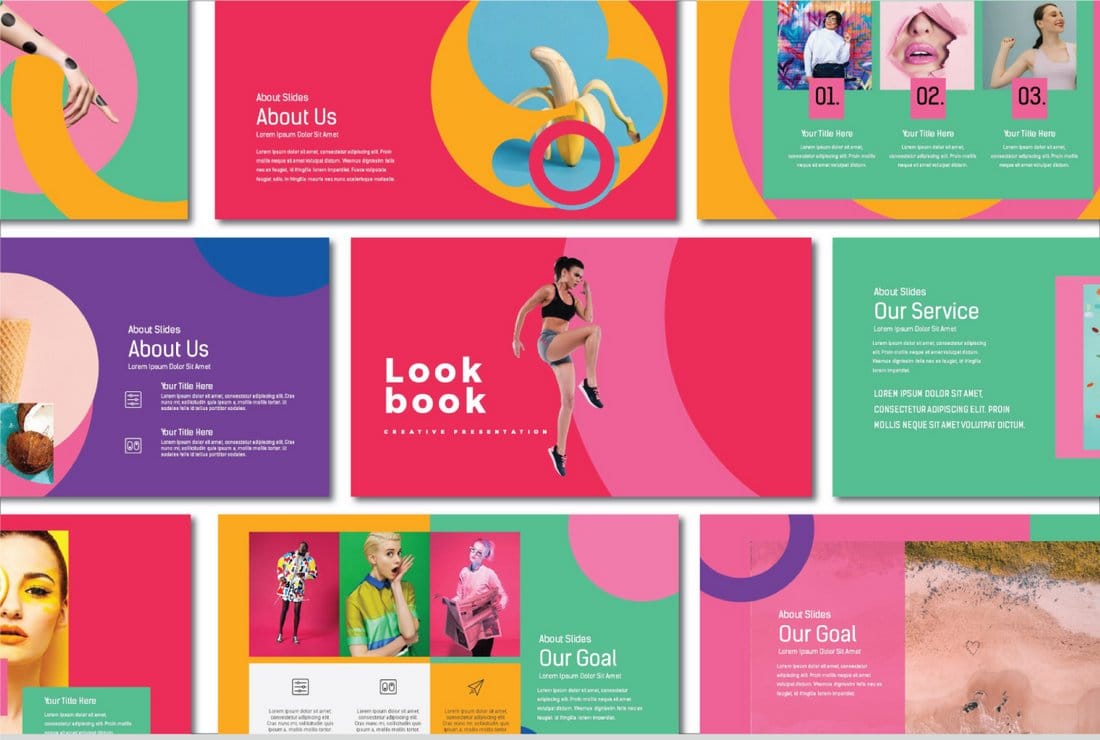
Lookbook is a colorful free PowerPoint template that features a set of creative slides with attractive pastel colors. This template is perfect for showcasing professional and agency portfolios. All the slides can be easily customized to change colors as well.
Voodoo – Free Animated PowerPoint Template
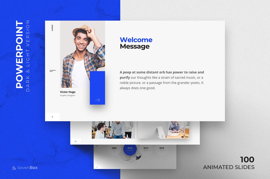
VooDoo is a highly professional PowerPoint template that features more than 10 unique slide designs, which feature transition animations and much more. It’s also available in both light and dark color designs.
Dark Red – Free Elegant Black Powerpoint Template
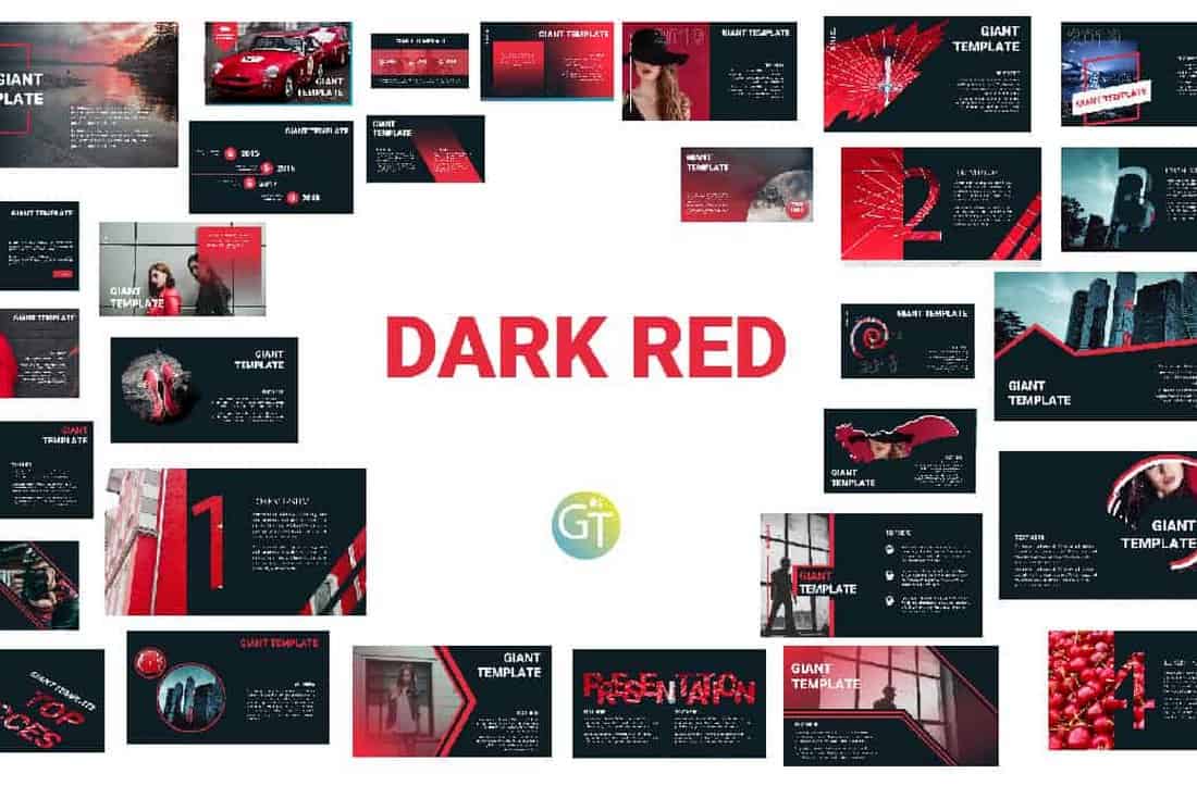
This professional, yet free, PowerPoint template comes with an elegant color theme that effectively highlights its content. The template is free to download and can be customized to your preference.
Stasia – Free PowerPoint Template
Stasia is a creative and free PowerPoint template you can use with your creative and professional presentations. It comes with 13 unique slides featuring editable graphics, charts, and lots of other elements.
Free Modern PowerPoint Templates
Free Modern & Minimal PowerPoint Template
You can download this PowerPoint template for free to make beautiful slideshows for company profile, portfolio, and various other professional presentations. It includes 30 unique slides with animations and transitions.
Slide Pro – Free Modern Presentation Template
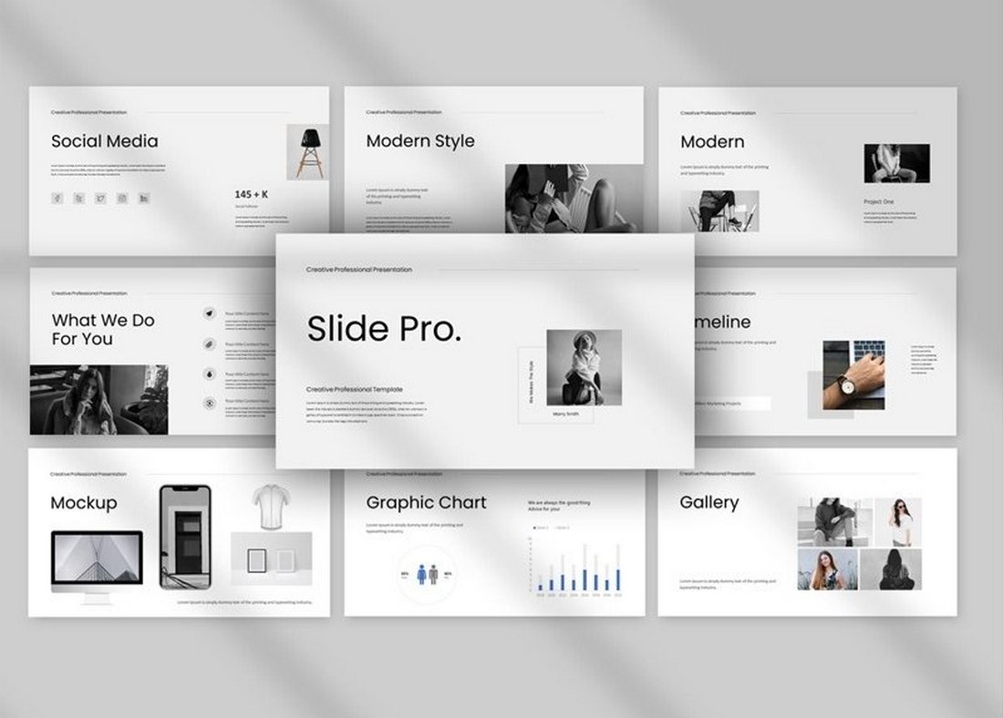
The minimal and clean design of this presentation template makes it an ideal choice for modern brands and design agencies. The template has 30 different slides with editable graphics and image placeholders.
Free Project Proposal PowerPoint Presentation Template
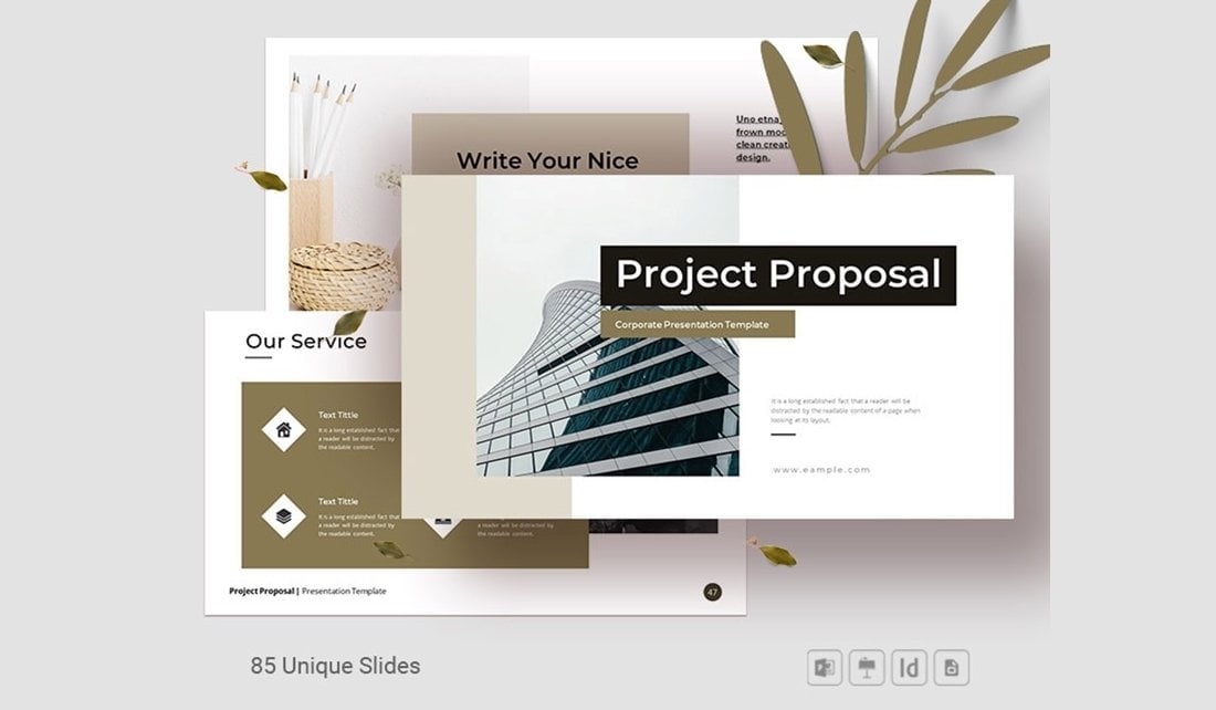
Design professional-looking project proposals that win clients using this free PowerPoint template. It features 85 different slides with fully customizable layouts. The template includes transition animations as well.
UNCO – Simple Modern PowerPoint Template
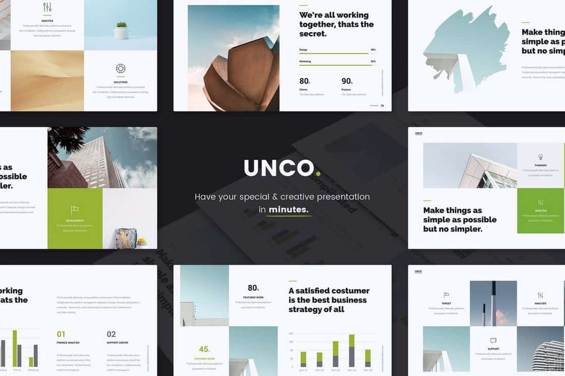
This modern business PowerPointe presentation template comes with more than 60 unique slides filled with editable vector shapes, graphics, icons, and so much more for making attractive presentations for all kinds of businesses. The template also includes lots of charts and graphs you can use to visualize data and make more compelling arguments.
Pale Dawn – Free Modern Fashion PowerPoint Template
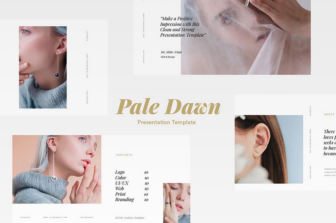
Pale Dawn is a very modern PowerPoint template you can use to craft presentations to promote fashion and lifestyle products. The template comes with lots of customizable slides in PowerPoint and Keynote formats.
Mass Media – Free Agency Presentation Template

This free PowerPoint template is made specifically for marketing and media agencies. The template includes 25 unique slide layouts featuring editable shapes, colors, and fonts. It’s available in Google Slides version as well.
Heimat – Free Modern Business Presentation Template
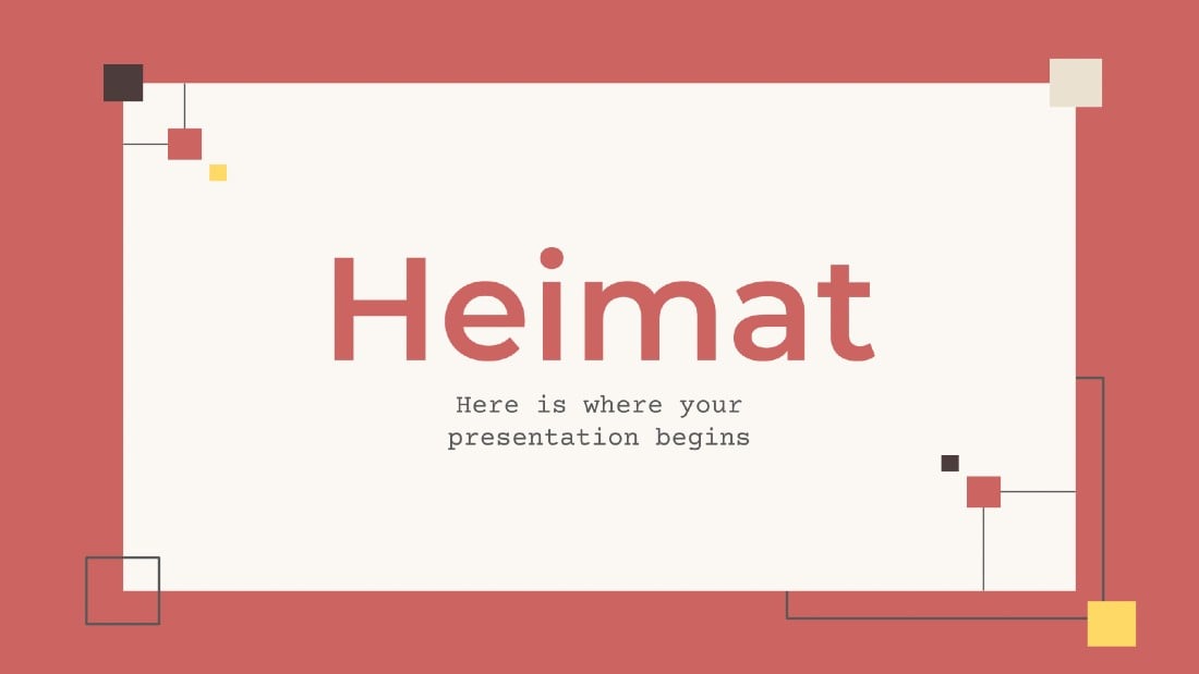
If you’re looking for a simple PowerPoint design with a minimal content layout, this template will come in handy. It lets you choose from 33 unique slides for crafting attractive presentations for showcasing projects and plans.
Born-Ink – Free Modern Event PowerPoint Template
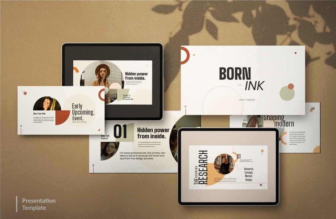
Featuring 10 unique slide designs, this modern PowerPoint template will allow you to design effective presentations for creative agencies as well as fashion brands. The template is free to use with your personal projects.
XGDragon – Modern Presentation Template
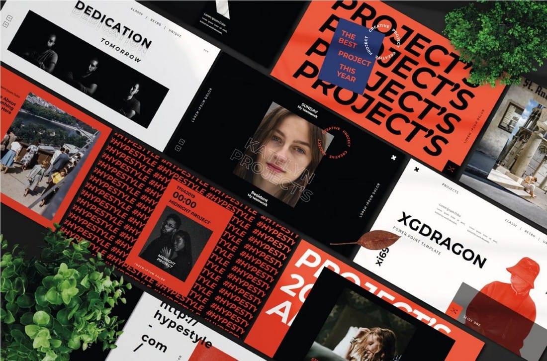
This free template comes with lots of unique slide designs for promoting modern brands through creative design. The template is ideal for creating a lookbook-style presentation and it’s free to use with commercial projects.
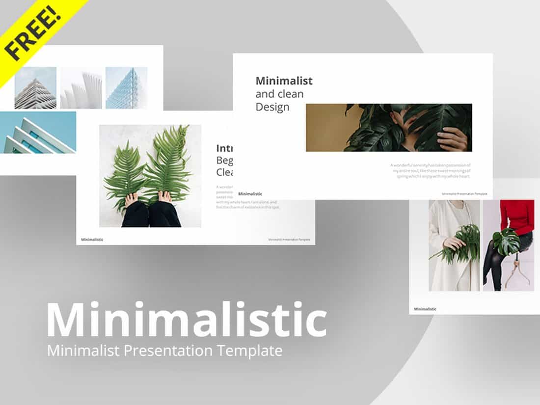
Minimalistic – Free Clean PowerPoint Template
A highly minimalist and clean PowerPoint presentation that’s most suitable for making creative and professional slideshows. The template features an easily editable design, changeable colors, and editable vectors as well.
Air – Clean Free PowerPoint Template
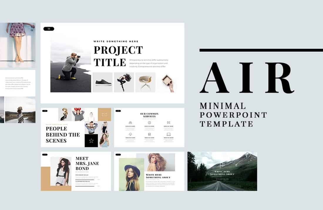
Air is a minimal and free PowerPoint template featuring creative slides full of images and icons. It includes 60 different slides in Full HD resolution. All of the graphics and shapes in the template are also editable as well.
Neue Free Minimal PowerPoint Template
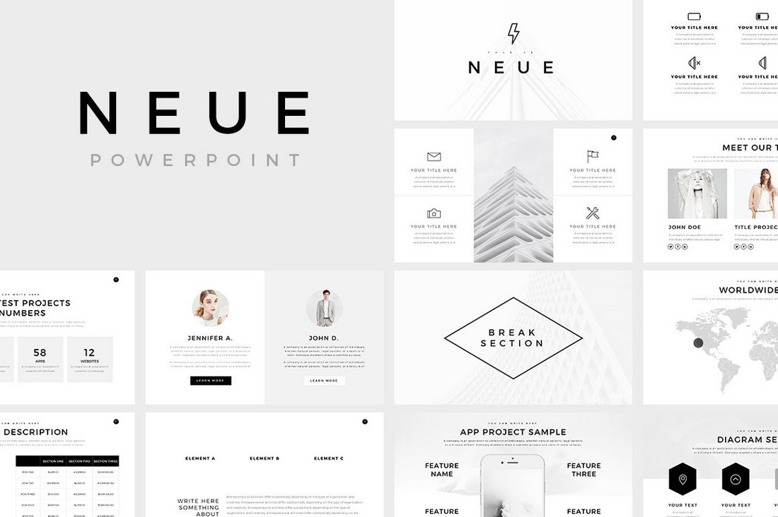
Neue is a free PowerPoint template with a minimalist design. This makes it a perfect choice for crafting creative and business presentations. The free versions of the template include multiple slides you can use with your personal projects.
TAHU – Free PowerPoint Presentation Template
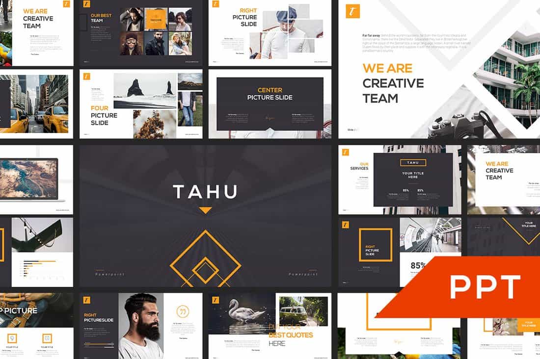
This free PowerPoint template comes with a set of creative slides you can use to design professional and business presentations. It includes many different types of slides for crafting effective slideshows, including slides for showcasing services, timelines, portfolio, and more.
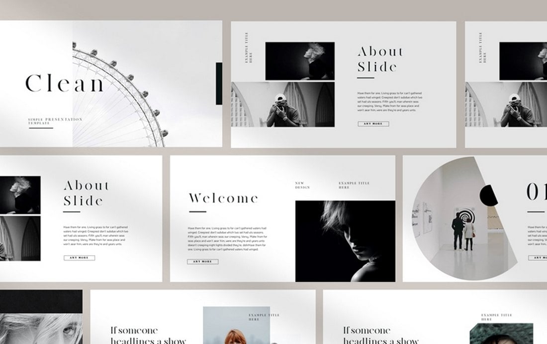
Clean – Free PowerPoint Presentation Template
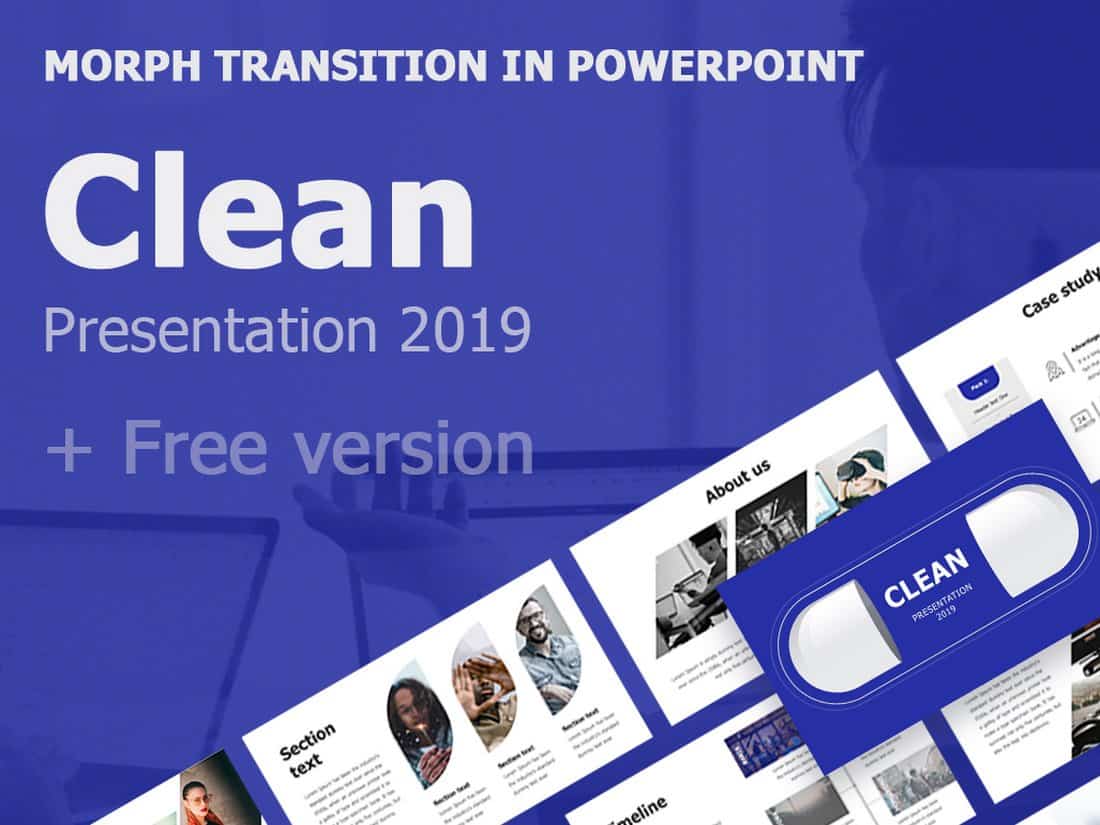
Just as the name suggests, this free PowerPoint template features a minimal and clean design with lots of white space. It’s perfect for making professional slideshows with a content-focused design. The template is easily editable as well.
Duotone – Modern Free PowerPoint Template
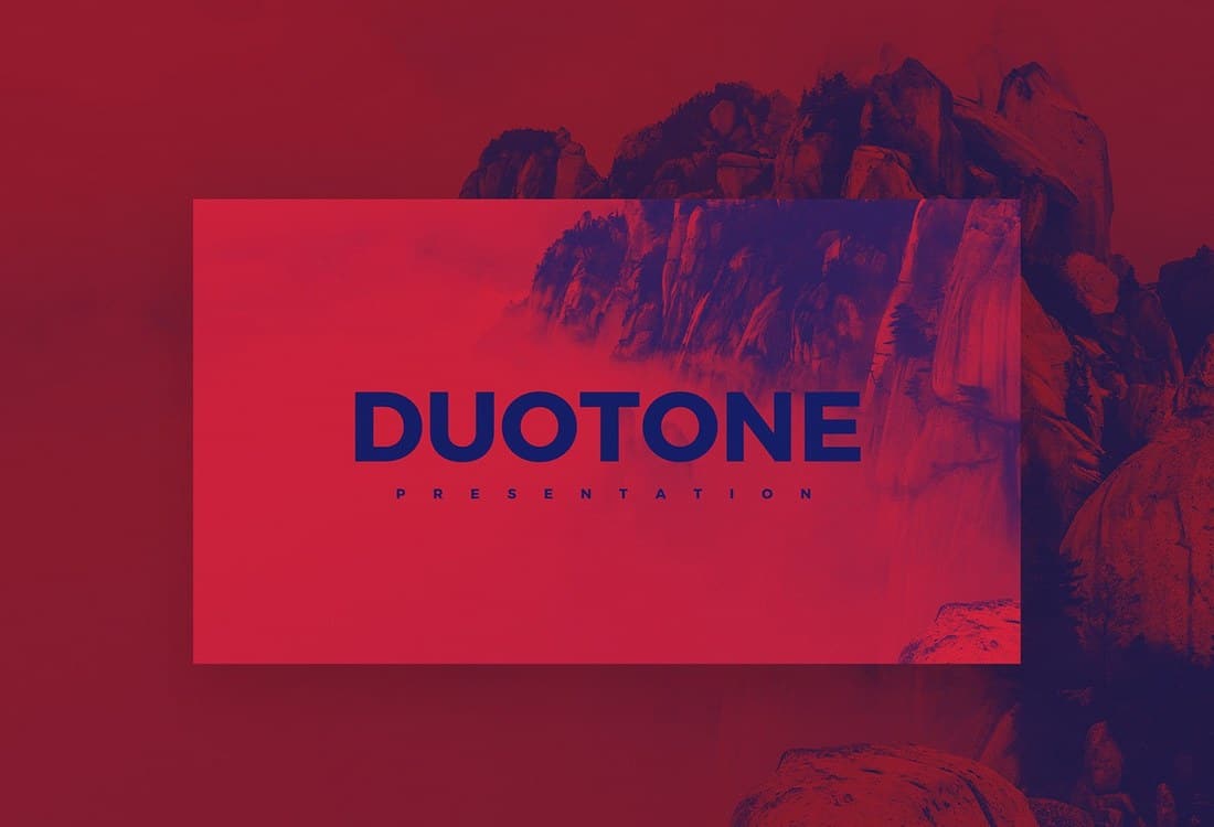
Duotone is a modern and colorful PowerPoint template that features a set of attractive slides with a creative duotone color effect. This template is most suitable for making presentations for creative brands and professionals. It’s available in both PowerPoint and Keynote versions and includes 18 unique slides.
London – Minimal Free PowerPoint Template
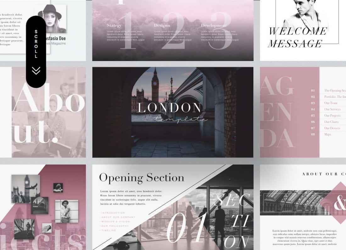
London is an elegant and a minimalist free PowerPoint template that comes with 21 unique slides with easy to customize drag and drop image placeholders. You can use this template to make all kinds of business and creative presentations.
Modern Minimal Free Powerpoint Template
This free PowerPoint template includes a set of creative slides featuring colorful designs. You can easily customize all the slides in the template however you like to change fonts, colors, and images as well.
Style – PowerPoint Presentation Template
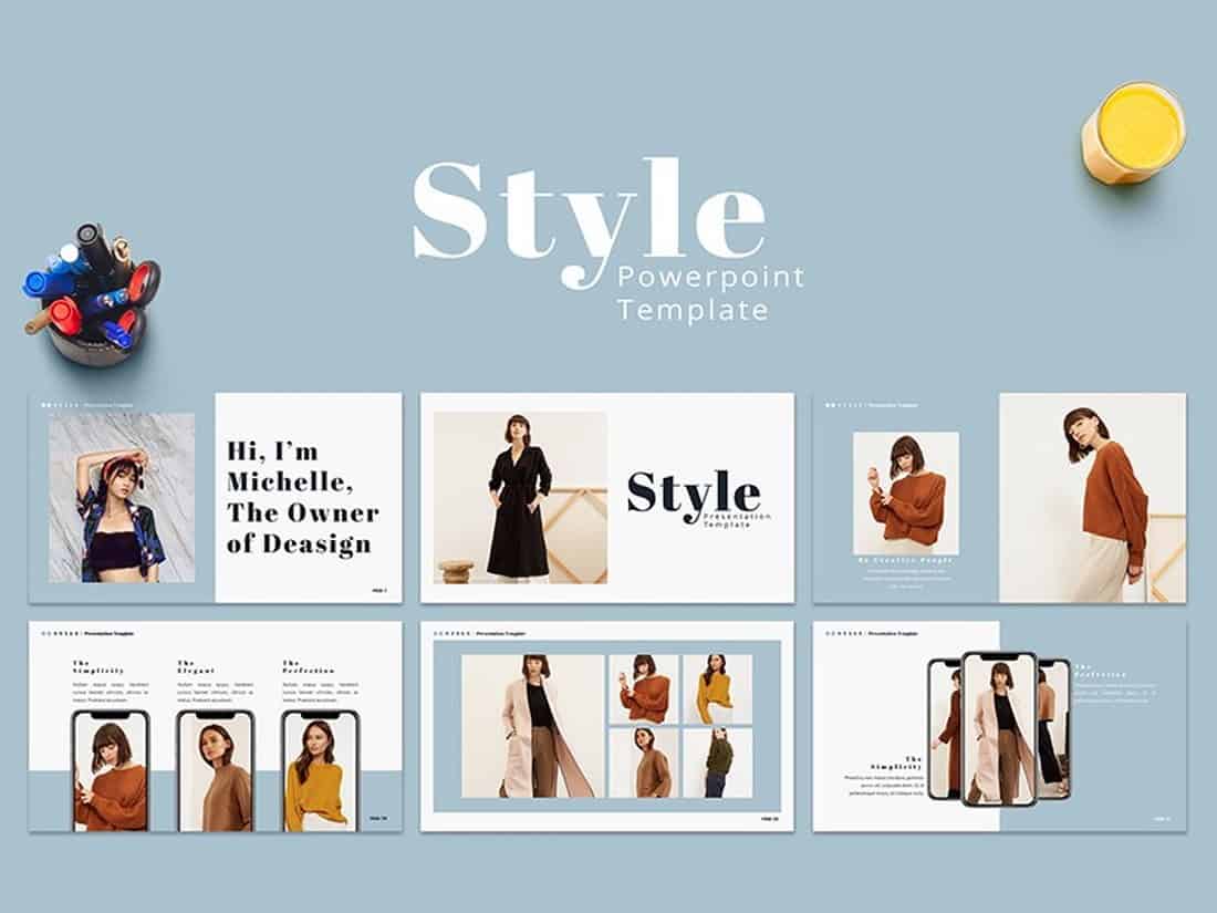
Style is a PowerPoint presentation template designed for making lookbook-style slideshows for showcasing fashion designs. It’s perfect for promoting fashion catalogs. The template is free to use with your personal projects.
Free Creative PowerPoint Templates
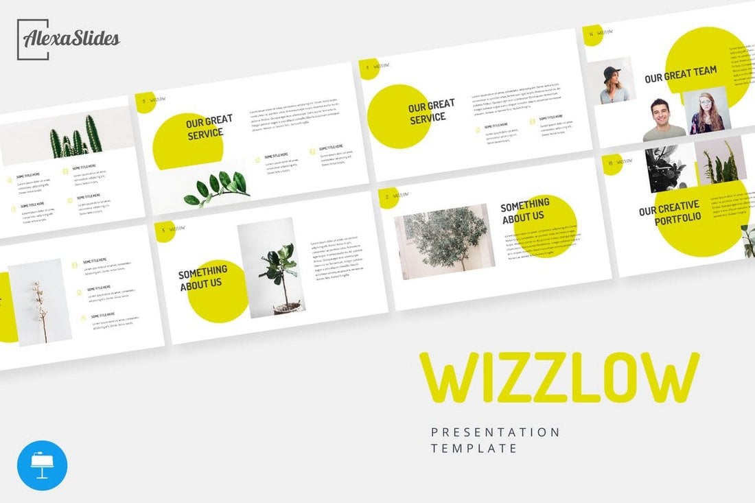
Color Fun – Creative PowerPoint Template
Just as the name suggests, this PowerPoint template comes filled with colorful slides that will allow you to design unique and cheerful presentations to showcase your products, designs, and ideas. The template includes 50 unique slides with unlimited color options to customize the design however you want.
FUN Tastic – Free Creative PowerPoint Template
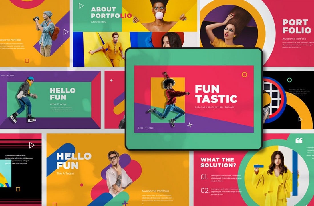
This bright and colorful PowerPoint template offers a great set of slides for you to create more fun and entertaining presentation. It includes lots of creative slide designs in Full HD resolution. And you can customize them to your preference as well.
Free Neomorph PowerPoint Template
If you’re a fan of the Neomorphism design trend, this PowerPoint template is a perfect match for you. It features a bold slide design with shapes, buttons, and icons inspired by Neomorphic design. The free version of the template includes 10 unique slides.
GMTRY – Free Geometric Presentation Template
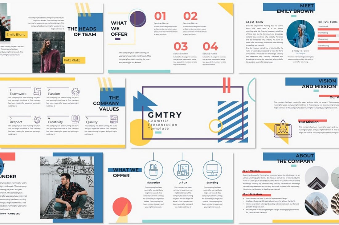
This free PowerPoint template features one of the most creative slide designs on our list. The creative use of geometric shapes to design its colorful and attractive slides is simply perfect. The template is free to use with personal projects.
Curato – Free Creative Portfolio PowerPoint Template

A bright and colorful PowerPoint template filled with shapes and styles. It’s perfect for showing off your best work in a portfolio. The template includes 37 unique slides with easily editable layouts.
Emotion Flashcard – Free Creative PowerPoint Template
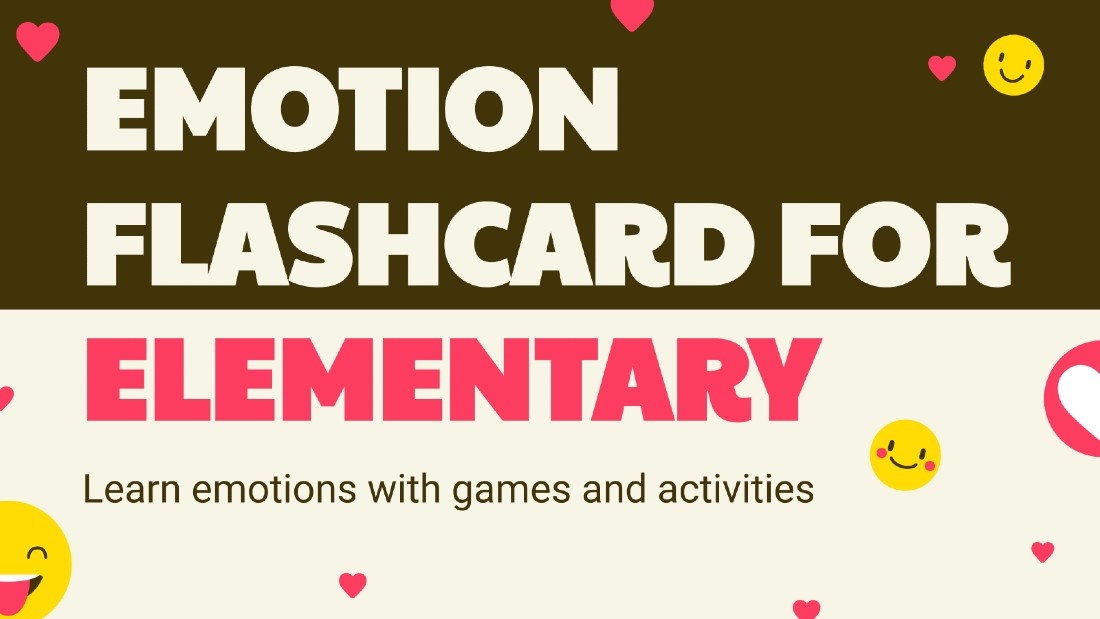
This PowerPoint template comes with a set of creative and fun slides. It uses a lot of emoticons throughout the presentation to help you discuss emotions and mental health in a very creative way.
Kental – Free Minimal PowerPoint Template
Kental is another free PowerPoint template that comes with colorful slide design. All of the slides in this template features pastel colors and comes with master slide layouts as well. This template is most suitable for creative fashion and design presentations.
Free Giant Doodles Newsletter PowerPoint Template
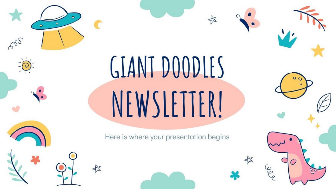
Filled with lots of colorful doodles and illustrations, this PowerPoint template comes with 28 creative slide layouts you can customize however you like. It’s available in Google Slides version as well.
Free Creative PowerPoint Presentation Template
This is a free demo for a premium PowerPoint template. It includes several creative slides you can repurpose to create your own unique presentations.
Free Stylish Botanical PowerPoint Template
The nature-inspired botanical theme gives this presentation template a very unique look and feel. It’s perfect for creating presentations for modern fashion and lifestyle brands.
Colors – Stylish Free PowerPoint Template
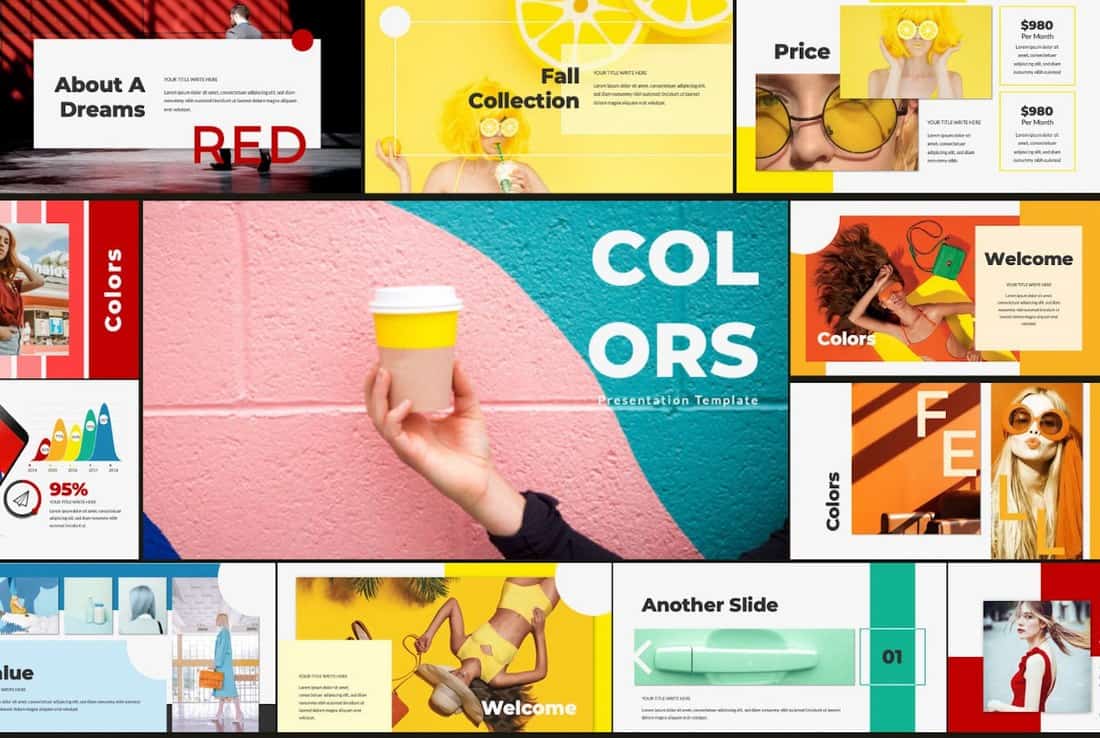
Just as the name suggests, this free PowerPoint template comes with a beautiful set of slides filled with lots of colors. It’s ideal for making creative slideshows for event and entertainment related presentations as well as many others. And it includes 60 creative slides.
Happy Holi – Creative Free Powerpoint Template

Happy Holi is a beautiful and creative PowerPoint template that comes with a colorful set of slides. Despite being named after a festival, the slides in the template feature a multipurpose design you can use to craft business, creative, and many other professional presentations.
Every – Clean & Simple PowerPoint Template
Every is an elegant PowerPoint template featuring modern slide designs. It comes in both PowerPoint and Keynote file formats. Each template includes 15 unique slides in Full HD resolution.
Creative – Free Minimal PowerPoint Template
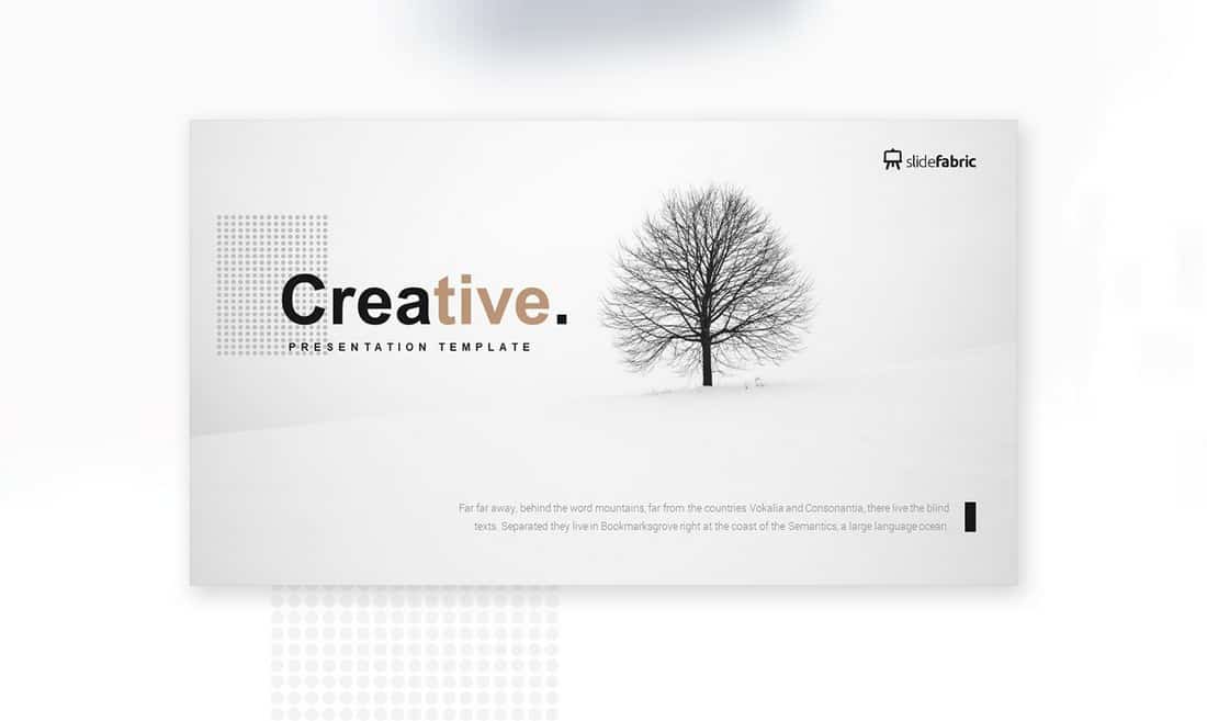
This minimalist PowerPoint template comes with a creative design making it a great choice for presenting your personal portfolios and professional work. The template features drag and drop image placeholders and editable objects.
Mifridix – Free PowerPoint Presentation Template
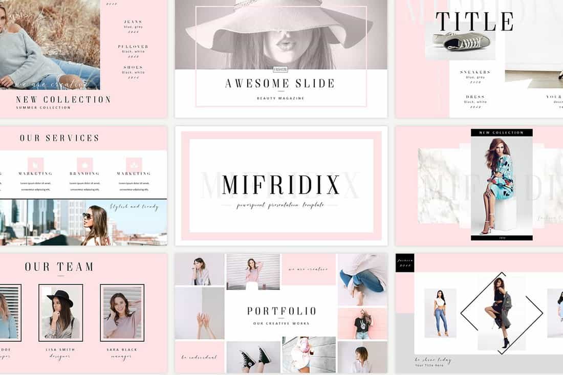
This free PowerPoint template comes with a beautiful and feminine slide design. Which makes it the perfect choice for crafting presentations for fashion brands, beauty products, and others.
BRONX – Free PowerPoint Presentation Template
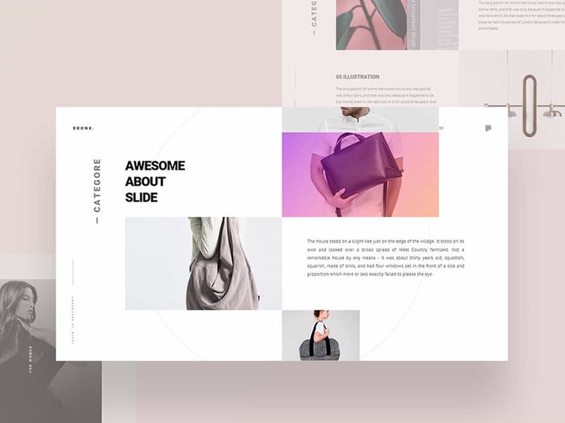
Bronx is a creative PowerPoint presentation template that includes a modern and customizable design. You can use this template to create presentations with PowerPoint, Keynote, or even Google Slides.
Free Pitch Deck PowerPoint Templates
Free PowerPoint Pitch Deck Template

You can use this PowerPoint template for making creative pitch deck slideshows. It includes colorful slides with cool illustrations and shapes to give each slide a unique look and feel. There are 19 unique slides and they come in Keynote format as well.
Sales Pitch Deck Free PowerPoint Template
Create a bold and professional pitch deck for your agency using this free PowerPoint template. It has 20 unique slides with free fonts and icon packs. The template is especially suitable for real estate agencies.
Free PowerPoint Pitch Deck Infographics
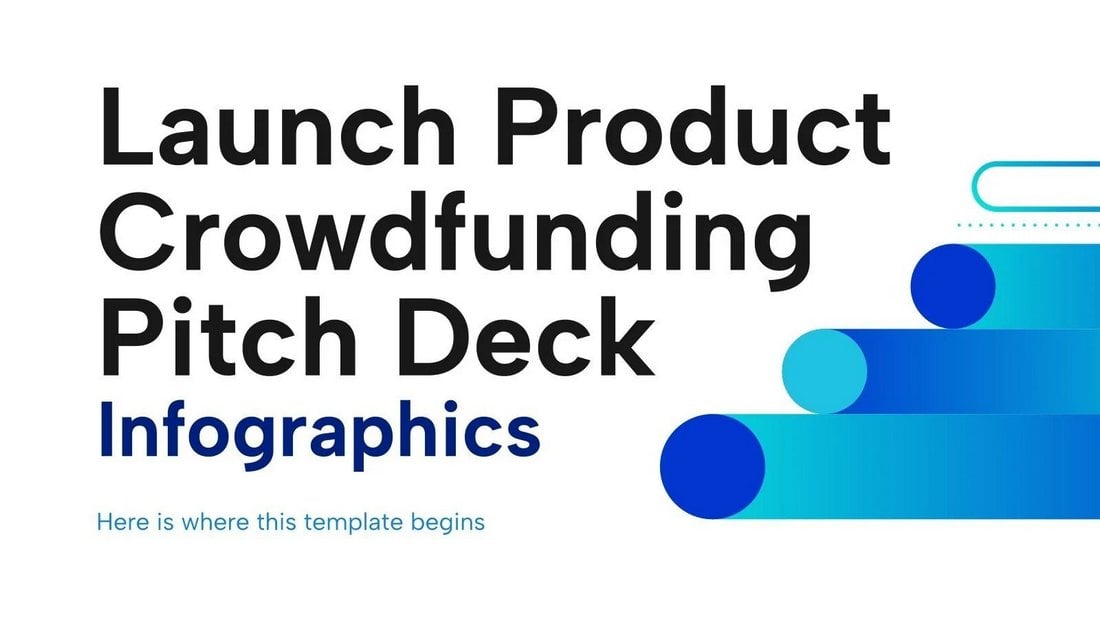
You can use this free PowerPoint template to showcase stats and data related to your product launches. It includes 32 infographic slides with various styles of layouts. They are all fully customizable.
Free Corporate Pitch Deck PowerPoint Template

This pitch deck presentation is made with corporate brands and agencies in mind. It features a set of professional slides with easily editable layouts. There are 20 unique slides in this template.
Free Business Opportunity PowerPoint Pitch Deck
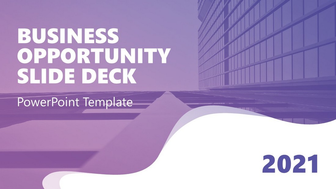
You can create an attention-grabbing pitch deck to present your business ideas and startups with this free PowerPoint template. It features 12 unique slide layouts with beautiful gradient designs. And the template can be easily customized to your preference.
Pitch Werk Template
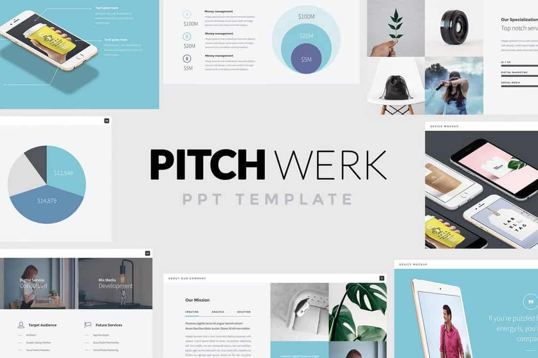
Pitch Werk is a creative PowerPoint template featuring a set of stylish slides made for modern startups. It includes more than 100 unique slides which are also available in 5 different premade color schemes. The template also comes with lots of useful elements such as pricing tables, device mockups, maps, and much more.
Sneakers Shop – Free PowerPoint Pitch Deck Template

If you’re working on a pitch deck for a sneaker startup or even an eCommerce store for a fashion product, this template is perfect for creating a winning presentation. It includes 32 unique slides.
Comersa Free Pitch Deck Presentation Template
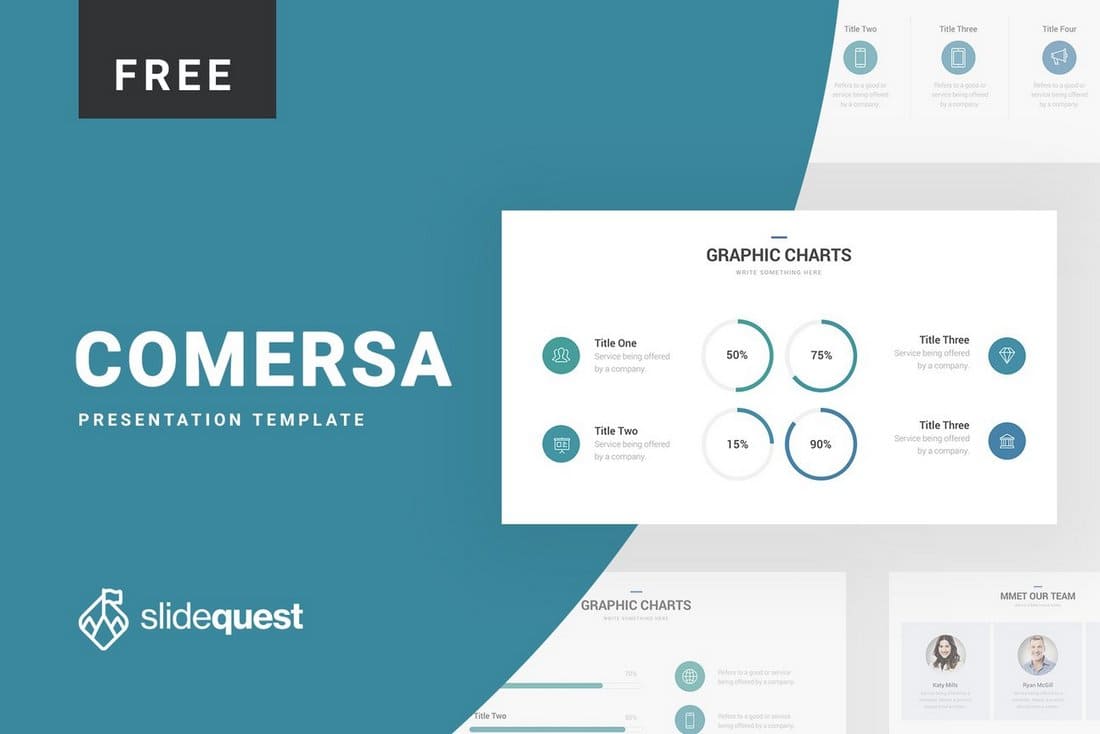
Comersa PowerPoint template comes with a designed made specifically for crafting slideshows for business-related presentations. The template is available in PowerPoint, Keynote, and Google Slides versions as well.
Pitch Deck – Free PowerPoint Presentation Template

This is the perfect free PowerPoint presentation template you can use to create pitch decks for startups, creatives, and freelancers. The template includes 22 unique slides and it’s available both with and without slide animations.
Free Conference Pitch Deck Powerpoint Template

This free PowerPoint template is perfect for making a pitch deck for speeches and presentations you give at events and conferences. The template features a set of easily editable slide layouts with modern designs.
Free Medical PowerPoint Templates
Free Mental Health Workshop PowerPoint Template

You can create an effective presentation to promote good mental health in the workplace with this free template. It includes 22 unique slide layouts you can use to showcase the importance of maintaining good mental health and suggest your ideas in meetings.
Modern Medical PowerPoint Template
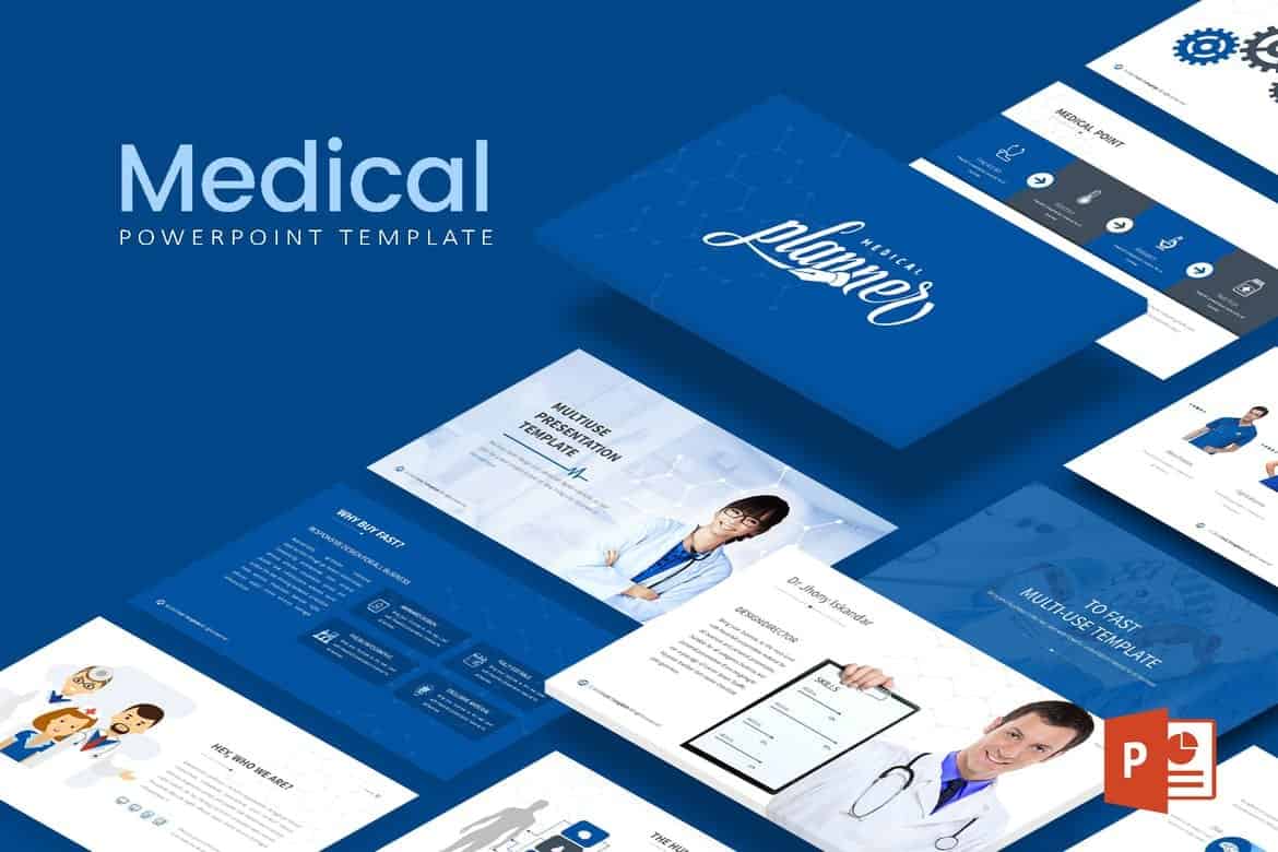
This PowerPoint template comes with 30 unique slides featuring clean and modern designs. It also lets you choose from 5 different premade color schemes for designing various styles of slideshows. It’s perfect for making presentations for all kinds of businesses and events.
World After Corona Virus – Free PowerPoint Template

If you’re working on a presentation to talk about the recent global pandemic, this template will help you design a more compelling slideshow. It includes 31 unique slide layouts with editable graphics and icons.
Free Mental Health Thesis Presentation Template

This is the perfect presentation template you can use to talk about mental health topics. It features 23 unique slides with easily editable designs. The template is also available in Google Slides version.
Free Medical Presentation Template
This is a multipurpose PowerPoint template you can use to create different types of presentations related to medicine and medical facilities. The template includes editable graphics and master slide layouts as well.
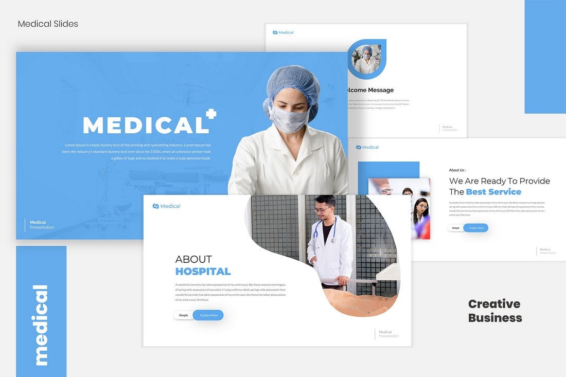
Medical – Free PowerPoint Template
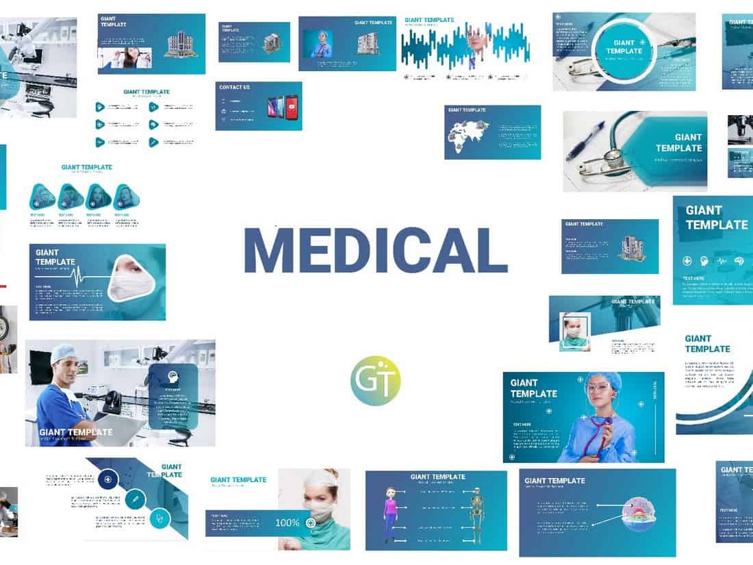
If you’re working on a presentation for a medical related business or brand, this free PowerPoint presentation template will come in handy. The template includes 30 unique slides filled with plenty of image placeholders and graphics.
Clinical Case – Free Medical PowerPoint Template

This free and creative PowerPoint template comes in both PowerPoint and Google Slides versions. It includes 24 beautiful slide designs filled with colorful illustrations and content formatting.
Healthcare Center – Free Medical PowerPoint Template

Healthcare Center is a professional and free PowerPoint template designed for medical centers and healthcare businesses. The template includes 23 unique slide design you can use to create an effective presentation.
Free Teachers & Education PowerPoint Templates
Free Social Studies for Elementary PowerPoint Template
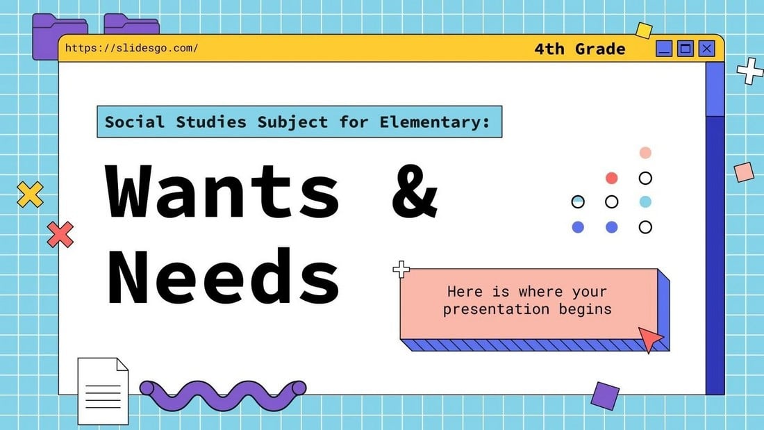
This educational PowerPoint template is designed for making presentations for educating social studies subjects. The template includes 35 different slides with colorful designs that will easily attract the attention of your students.
Free Elementary School PowerPoint Template
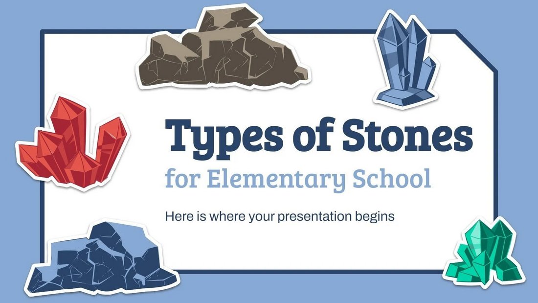
This PowerPoint template features the perfect design for making fun educational presentations for kids. It’s designed for showcasing different types of stones and it comes with lots of colorful illustrations. There are 35 different slides in this template.
Free Chinese Language Day PowerPoint Template

Use this free PowerPoint template to teach the Chinese languages to kids. It features a beautiful slide design filled with adorable illustrations and colorful shapes. There are 35 unique slides included in the template with fully editable layouts.
School Bundle – Free Education PowerPoint Template
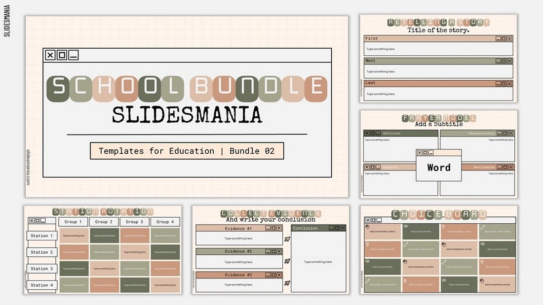
If you’re looking for a creative PowerPoint template to grab the attention of your students during presentations, this free template is for you. It features a creative design across 15 different useful slide layouts.
Daniel’s Thesis – Free Education PowerPoint Template

This colorful and creative PowerPoint template is perfect for creating attractive presentations to showcase your thesis, assignments, projects, and much more. The template features 24 unique slides filled with colorful graphics, shapes, and elements.
Academy at the City – Free Education PowerPoint Template

A professional PowerPoint template for promoting your school, academy, and institutions. While the template is designed with education establishments in mind, you can use it to create business presentations as well. The template includes 24 unique slides.
Education – Simple PowerPoint template
This is a professional PowerPoint template that includes 30 unique slide designs. Each slide is also available in 5 different color schemes. It also features editable vector graphics, image placeholders, and icons for crafting entertaining presentations more easily.
Math Lesson – Free PowerPoint Presentation Template

This free and creative PowerPoint template is designed for teachers for making their lessons look more engaging and fun for students. The template comes packed with creative illustrations and graphics as well.
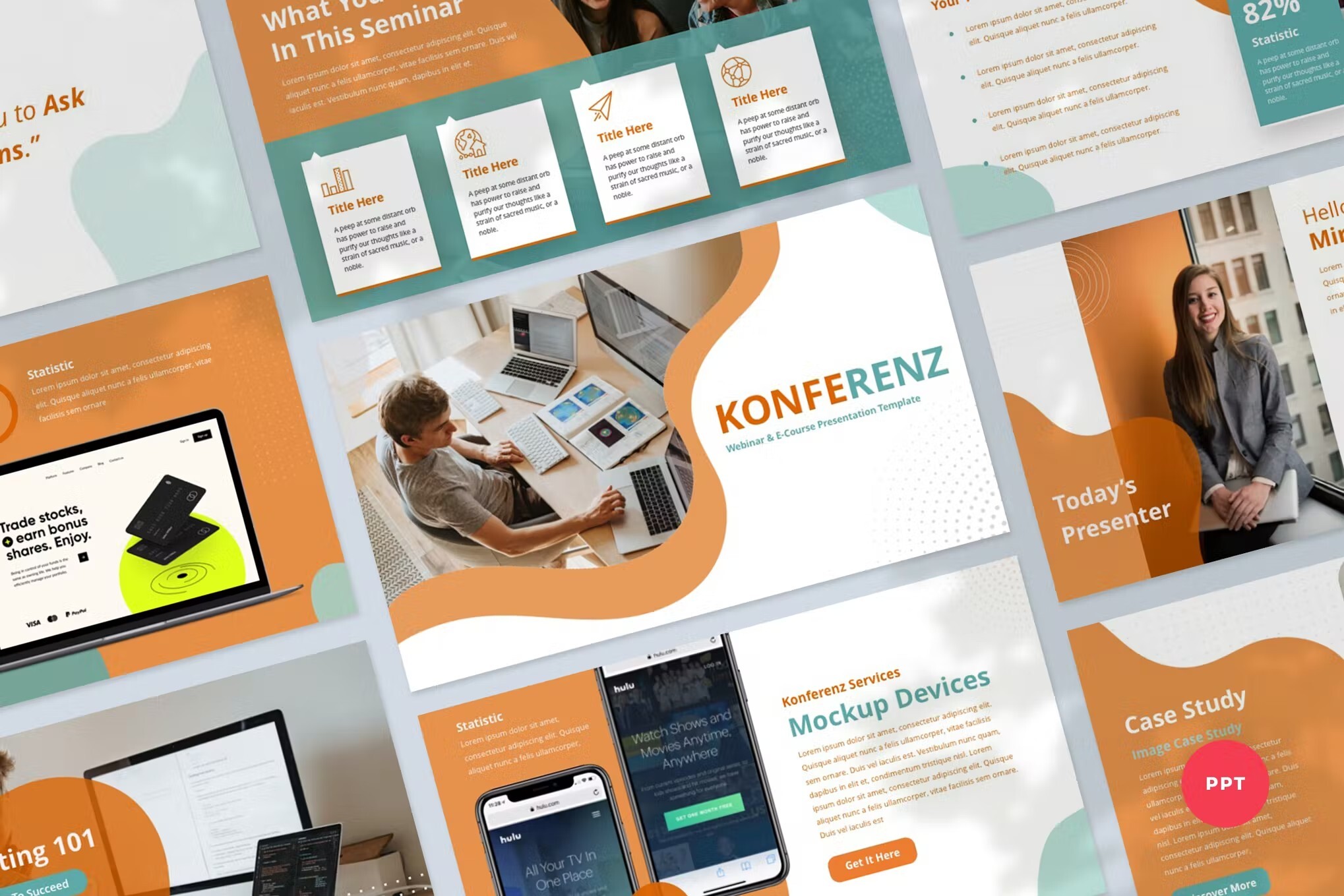
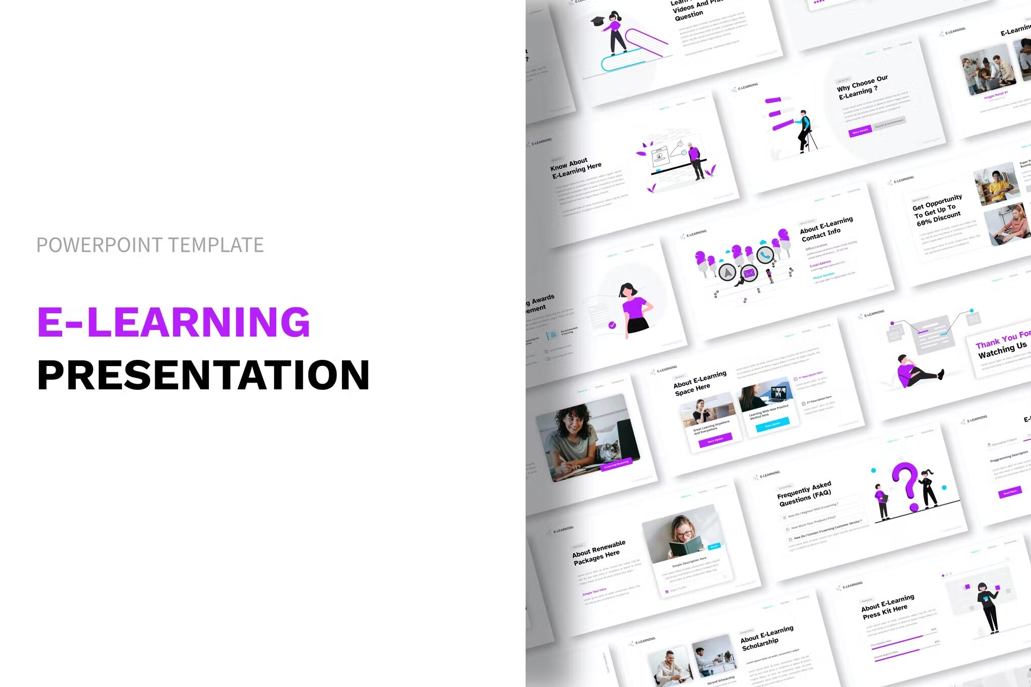
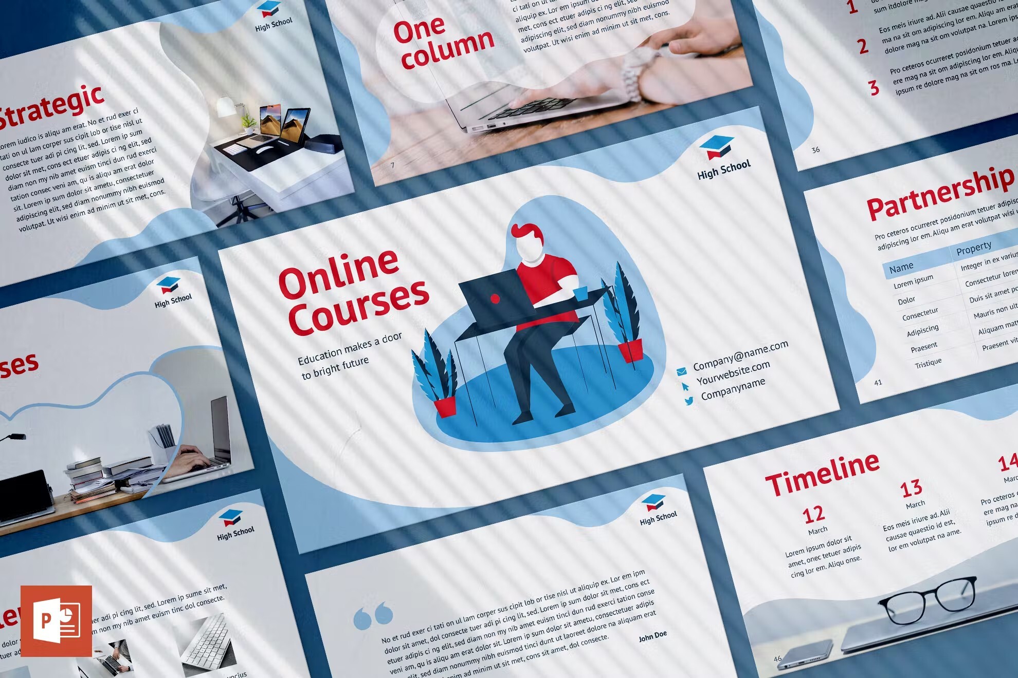
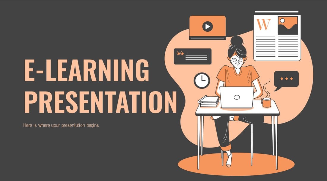
E-Learning – Free Teachers PowerPoint Template
Another free PowerPoint template that’s most suitable for making presentations to promote your online learning programs and courses. The template comes with 17 unique slide layouts that you can easily customize to your preference.
Master’s Thesis – Free Education PowerPoint Template
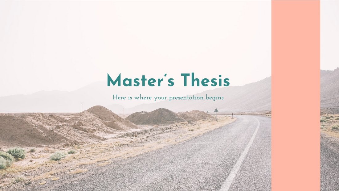
This free PowerPoint template comes with 12 unique and editable slides you can use to effectively showcase and present your thesis projects to an audience. The template is also available in Google Slides version as well.
Free Interactive Education PPT for Teachers
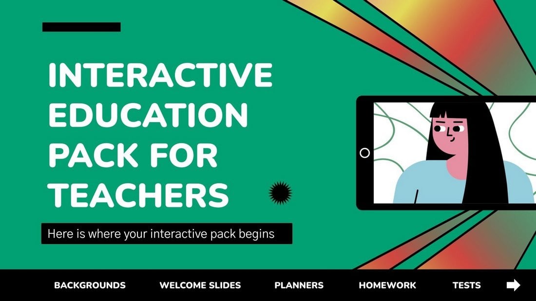
This PowerPoint template is designed with teachers in mind. It features 44 different slides you can use to create various educational presentations for classes. The slides are fully customizable and include graphs, charts, and infographics as well.
Online Notebook – Free Education PowerPoint Template
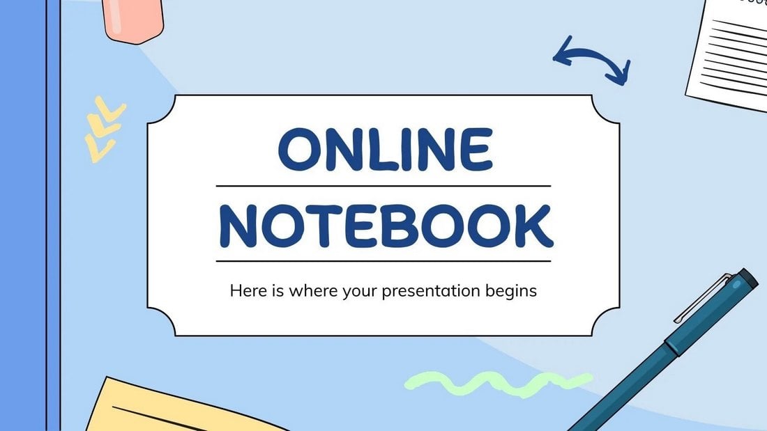
A free PowerPoint template you can use to create a notebook-style presentation. Both teachers and students can use this template to create notes for classes and subjects. There are 30 slide layouts in this template.
Free English Language Grammar Rules PPT
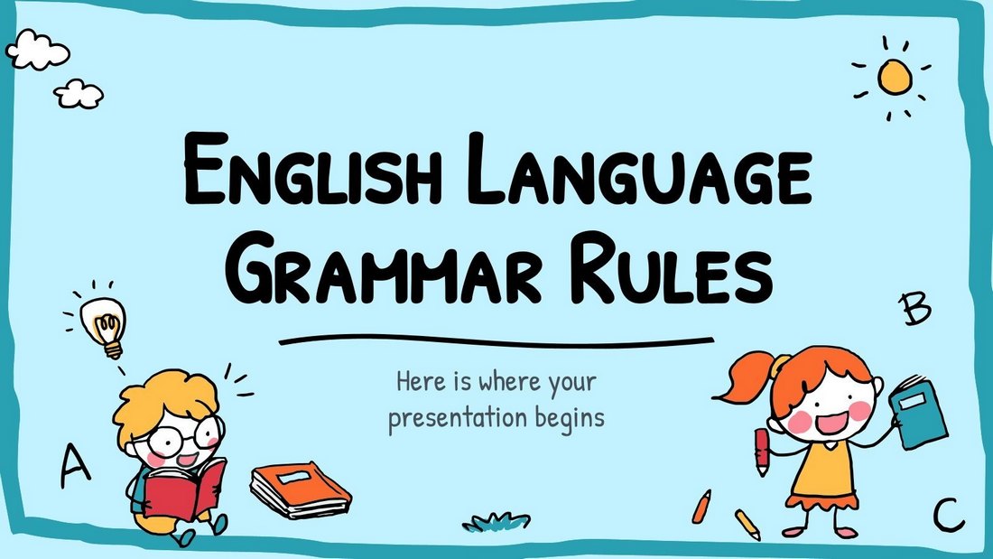
Grammar can be a boring subject to talk about. But with this colorful PowerPoint template, you can present your lessons in a more entertaining way. It includes 41 unique slides filled with adorable illustrations.
Colorful Light Bulbs Free Education PowerPoint Template
This colorful PowerPoint template has lightbulbs all over the slides. You can use it to create presentations to teach various subjects and topics. There are 39 slides in this template. And it’s available in the Google Slides version as well.
Free Church PowerPoint Templates
Free Christian Church PowerPoint Template

A beautiful presentation template made with churches in mind. It has 20 unique slide layouts with colorful and minimal designs. The template is ideal for showcasing your Christian Church projects.
Free Church Conference Powerpoint Template

A modern and elegant PowerPoint template designed specifically for making presentations for church events and conferences. The template comes with 23 slide layouts with easily editable designs and image placeholders.
Religion Lesson – Free PowerPoint Presentation

A free PowerPoint template designed for educating students and audiences on various religious topics. It can also be used to deliver religious speeches and presentations as well. It includes 17 unique slides. Even though the template features slide designs with multiple religions, you can easily replace the images of your choice as well.
Free Infographic PowerPoint Templates
8 Free Charts PowerPoint Templates
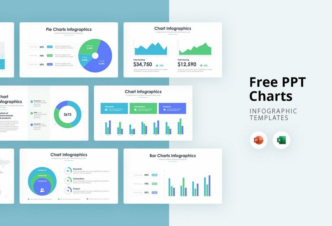
This template includes 8 customizable charts infographics for you to use in your presentations. The template includes pie charts, bar charts, and infographics too. It’s also available in Excel format.
12 Free Infographics Slides for PowerPoint
There are 12 different infographic slides to choose from in this PowerPoint template. They are ideal for both business and research presentations. The template is free to use.
Free Internal Motivation Infographics PowerPoint Template
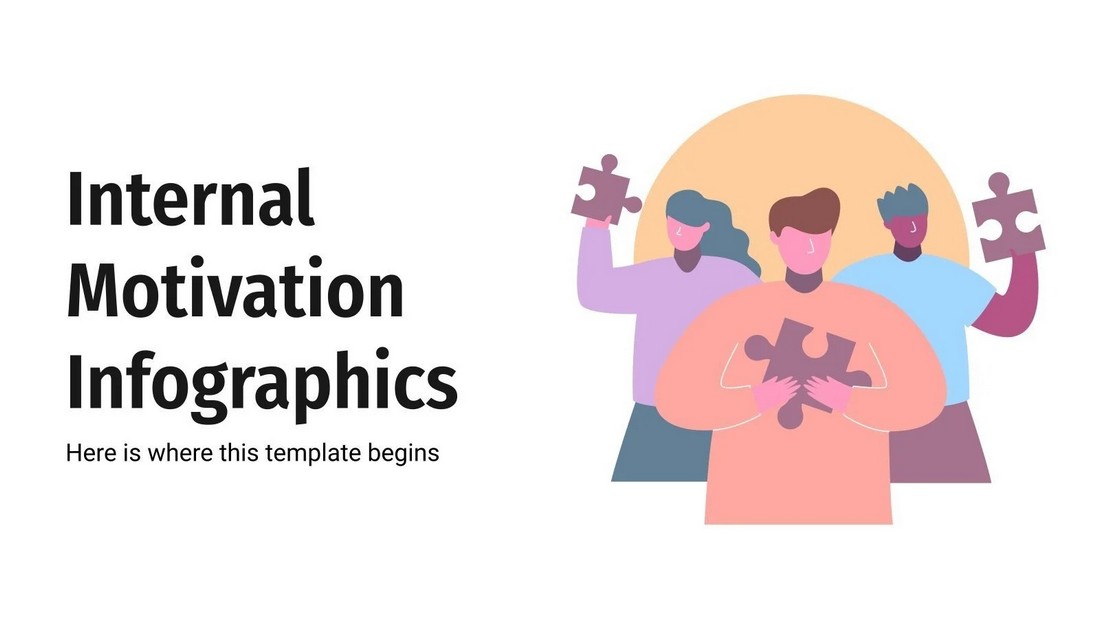
This free PowerPoint template includes 31 unique slide designs with infographics. They are designed for visualizing stats and information for motivating your teams and employees.
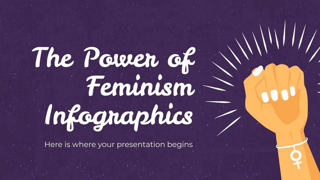
The Power of Feminism Infographics PowerPoint Template
You can use this free PowerPoint template to create attractive infographic slides to promote the power of feminism. It includes more than 30 unique slide designs. And you can customize them in Google Slides as well.
PPTx Infographics
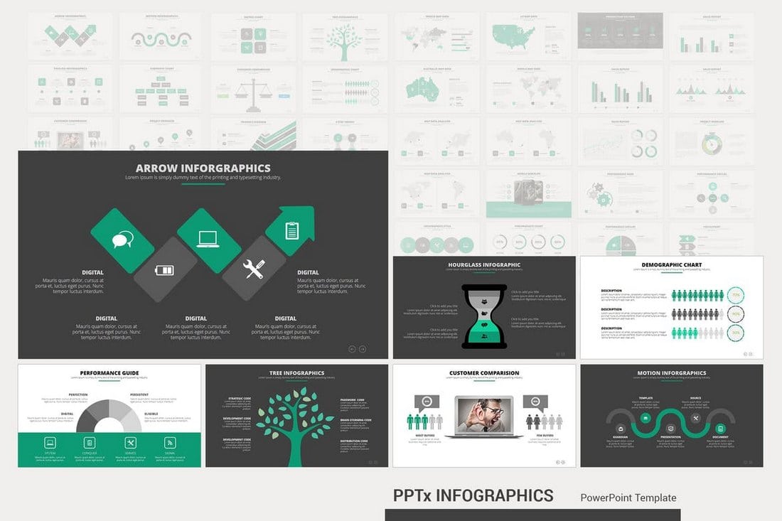
This Powerpoint presentation template also includes 50 unique infographic slides. The slides are also available in light and dark themes as well as unlimited color options for customizing the shapes, text, and icons of the slides.
Epsilon – Free Business PowerPoint Template
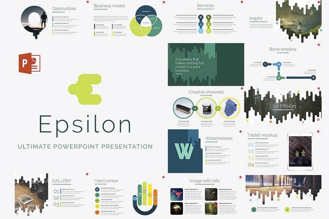
Epsilon is a free PowerPoint template made for small businesses. You can use it to create powerful business presentations using its slides full of charts and graphs. The template can be easily customized with multiple color options and icons.
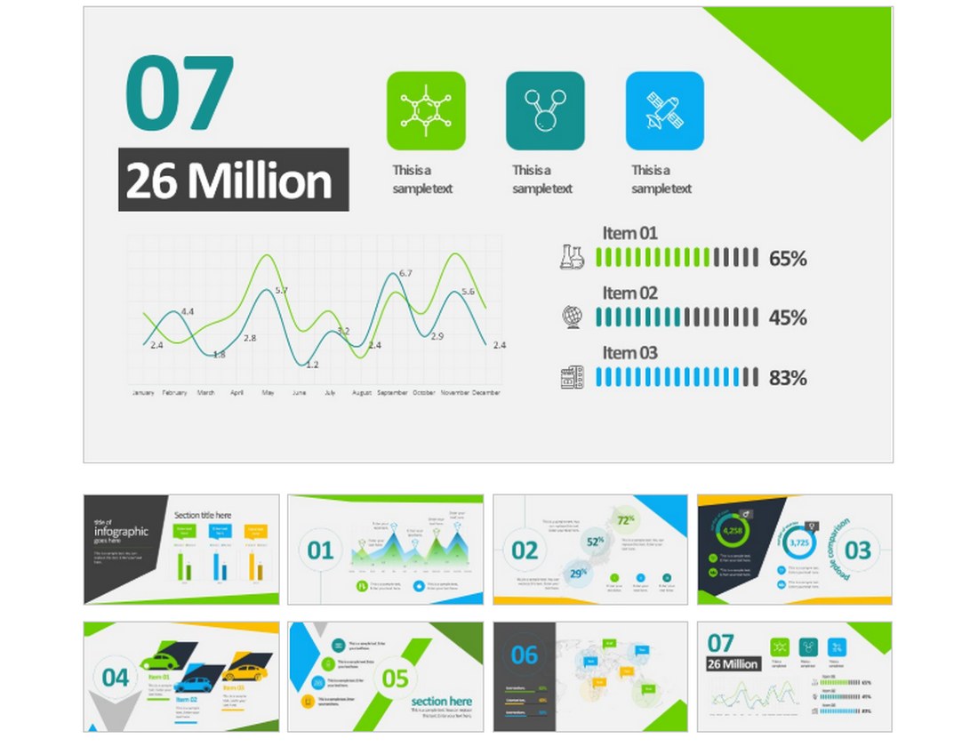
Free Business Infographics PowerPoint Template
This free PowerPoint template comes with lots of editable infographics you can use to visualize your data. The template includes 8 unique slide designs that are easily customizable. It’s also available in Google Slides version as well.