The Ultimate Data Migration Checklist: Ensure a Smooth Transition Every Time

Featured Imgs 23

Data migration isn’t just a buzzword – it’s a high-stakes operation that can propel businesses into the future. 

Did you know that nearly 60% of data migration projects run over schedule? Even stranger, research shows that 83% of migrations lead to unforeseen downtime, costing millions! 

Whether you’re moving data from old systems or migrating to the cloud, the key to avoiding these pitfalls is meticulous preparation. That’s where a data migration checklist becomes invaluable. 

Master Your Data Migration: The Ultimate 9-Step Checklist for Flawless Transitions

In today’s data-driven world, the ability to seamlessly move and transform vast amounts of information can make or break a business

From Fortune 500 companies to nimble startups, these steps have guided countless successful migrations, turning potential disasters into triumphs:

  1. Pre-Migration Planning
  2. Data Assessment and Preparation
  3. Technology and Infrastructure
  4. Security and Compliance
  5. Migration Process Design
  6. Testing and Validation
  7. Execution and Monitoring
  8. Post-Migration Activities
  9. Ongoing Data Management

Before we dive into the steps in detail, check out our free data migration template to streamline your process and ensure nothing is overlooked.

FREE DATA MIGRATION TEMPLATE

1. Pre-Migration Planning

Proper planning is the foundation of a successful data migration. This phase involves:

  1. Assess your current data landscape
    • List all databases, spreadsheets, and other data repositories.
    • Categorize data as structured, unstructured, or semi-structured.
    • Quantify the amount of data to be migrated.
  2. Define clear objectives
    • Set specific migration goals
    • Establish success criteria and define measurable outcomes
  3. Build your migration team
    • Identify key roles (project manager, data architect, and database administrator)
    • Assign responsibilities and define them clearly
  4. Choose your migration strategy
    • Big Bang: Move all data at once, typically during a planned downtime.
    • Trickle: Gradually migrate data in phases while both systems operate in parallel.
    • Hybrid: Combine aspects of both approaches based on data criticality and system dependencies.

2. Data Assessment and Preparation

Before moving your data, it’s crucial to understand its current state and prepare it for migration. Proper data preparation can significantly reduce errors and inconsistencies in the migrated data.

  1. Conduct a data audit
    • Analyze data quality
    • Identify redundant or obsolete data
    • Document data relationships
  2. Clean and standardize your data
    • Remove duplicates
    • Correct inaccuracies
    • Standardize formats
  3. Map your data
    • Create source-to-target mapping
    • Identify required data transformations
    • Document business rules

3. Technology and Infrastructure

Selecting the right technology and setting up the necessary infrastructure are critical to the success of your data migration. 

  1. Evaluate your tech stack
    • Assess current systems and Review their capabilities and limitations 
    • Verify that the new system can handle the data structure and volume.
    • Plan for necessary upgrades
  2. Select migration tools
    • Consider data volume and complexity
    • Evaluate automation capabilities 
    • Assess cost and licensing
  3. Set up your testing environment
    • Create a replica of the production environment
    • Ensure isolation to prevent any impact on production data during testing
  4. Plan for capacity
    • Assess network bandwidth and ensure sufficient capacity for data transfer during migration.
    • Evaluate storage needs, both for the migrated data and any temporary storage required.
    • Ensure adequate CPU and memory for data transformation and validation tasks.

4. Security and Compliance

Data security and regulatory compliance should be at the forefront of your migration strategy. 

  1. Identify and secure sensitive data
    • Classify data based on sensitivity
    • Use role-based access control (RBAC) to restrict data access.
    • Use data masking or tokenization
  2. Implement encryption measures
    • Encrypt data in transit by using secure protocols like HTTPS or SFTP
    • Use at-rest encryption when data is stored in the new system.
    • Manage encryption keys: Implement a robust key management system.
  3. Ensure regulatory compliance
    • Identify relevant regulations
    • Map compliance requirements
    • Implement necessary controls
  4. Establish backup and recovery procedures
    • Create full backups
    • Test restore procedures
    • Implement point-in-time recovery

5. Migration Process Design

Designing a robust migration process is crucial for ensuring a smooth and successful data transition. 

A well-designed process acts as a roadmap for your migration, helping you minimize risks and manage unexpected issues.

  1. Develop a detailed migration plan
    • Create a timeline with milestones
    • Allocate resources
    • Establish a communication strategy
    • Identify and plan for potential risks
  2. Establish data validation rules
    • Define acceptable data quality thresholds
    • Create rules for data integrity checks
    • Set up automated validation processes
  3. Design error handling procedures
    • Define error categories and severity levels
    • Establish escalation pathways
    • Create detailed error logs for analysis
  4. Plan your rollback strategy
    • Define rollback triggers
    • Document step-by-step rollback procedures
    • Assign responsibilities for rollback decisions

6. Testing and Validation

Thorough testing and validation are essential to ensure data accuracy and integrity.

  1. Perform test migrations
    • Start with a small data subset
    • Gradually increase data volume and complexity
    • Simulate production conditions
  2. Validate data integrity
    • Compare source and target data
    • Check for lost or corrupted data
    • Verify data relationships are maintained
  3. Conduct User Acceptance Testing (UAT)
    • Involve key stakeholders
    • Verify functionality in the new environment
    • Confirm data accessibility and usability
  4. Perform performance testing
    • Measure data transfer speeds.
    • Assess system responsiveness under load
    • Identify and address bottlenecks

7. Execution and Monitoring

The execution phase is where your careful planning and preparation come to fruition. Vigilant monitoring and quick issue resolution are key to a successful data transition.

  1. Conduct final pre-migration checks
    • Verify all systems are ready
    • Confirm team members are in place.
    • Double-check backup systems.
  2. Implement the migration
    • Follow your migration plan step-by-step
    • Maintain clear communication throughout the process
    • Document any deviations from the plan
  3. Monitor in real-time
    • Use monitoring tools to track progress
    • Watch for error messages or anomalies
    • Be prepared to pause or roll back if necessary
  4. Perform post-migration validation
    • Run comprehensive data checks
    • Verify system functionality
    • Confirm data accessibility for end-users

8. Post-Migration Activities

After the migration is complete, several important activities ensure the long-term success of your new data environment. 

This phase involves thorough system checks, addressing any remaining data issues, providing user training, and documenting the entire migration process for future reference and improvements.

  1. Conduct a thorough system check
    • Verify all systems are operational
    • Check integration points between systems.
    • Monitor system performance
  2. Address any data discrepancies
    • Investigate inconsistencies
    • Implement corrections as needed
    • Document all changes made.
  3. Provide user training
    • Train users on new systems or interfaces
    • Create user guides and documentation
    • Set up a support system for user queries.
  4. Document the process
    • Create a comprehensive migration report
    • Note lessons learned.
    • Archive all project documentation

9. Ongoing Data Management

Data migration is not a one-time event but part of an ongoing data management strategy. 

This final phase focuses on establishing processes and practices to maintain the quality and value of your data over time, ensuring that the benefits of your migration are sustained and maximized.

  1. Implement data governance policies
    • Establish data ownership and stewardship
    • Define data quality standards
    • Create processes for ongoing data maintenance
  2. Set up data quality monitoring
    • Implement automated data quality checks
    • Establish regular data audits
    • Create dashboards for data quality metrics
  3. Plan for future migrations
    • Anticipate future data needs
    • Stay informed about emerging technologies
    • Regularly review and update your data strategy

By following this comprehensive checklist, you’ll be well-prepared to handle your data migration project efficiently and effectively, minimizing risks and ensuring a smooth transition to your new data environment.

Best Practices for a Successful Data Migration

Navigating the complex waters of data migration can be daunting, but fear not! We’ve compiled a treasure trove of expert tips to guide you toward success. Think of these best practices as your trusty compass, helping you chart a course through potential storms and towards the calm seas of a successful migration.

1. Start Small, Dream Big

Imagine you’re planning to run a marathon. You wouldn’t start by attempting all 26.2 miles on day one, right? The same principle applies to data migration. 

Begin with a small, manageable subset of your data – perhaps a single department or non-critical database. This mini-migration serves as your training ground, allowing you to:

  1. Identify potential issues early on
  2. Refine your processes without high-stakes
  3. Build team confidence and expertise

As you successfully complete these smaller migrations, you’ll be better equipped to tackle larger, more complex data sets. Remember, every great journey begins with a single step!

2. Backup, Backup, Backup: Your Safety Net

Picture this: you’re walking a tightrope high above a city. Wouldn’t you feel more confident with a safety net below? In the world of data migration, regular backups are your safety net. Here’s why they’re crucial:

  1. Protection against data loss: If something goes wrong, you can always restore from your backup
  2. Peace of mind: Knowing you have a fallback allows your team to work more confidently
  3. Compliance requirements: Many industries require data backups as part of regulatory compliance

3. Assemble Your Dream Team: Cross-Functional Collaboration

Data migration isn’t a solo sport – it’s a team effort. Imagine your migration as a blockbuster movie production. You need more than just tech experts (your “special effects team”). You also need:

  1. Business Analysts: Your “scriptwriters” who understand the story your data tells
  2. End Users: The “audience” who will ultimately interact with the migrated data
  3. Legal/Compliance Officers: Your “producers” ensuring everything follows the rules
  4. Project Managers: The “directors” keeping everything on track and on budget

By involving diverse perspectives at every stage, you’ll catch potential issues early, ensure the migrated data meets everyone’s needs, and create buy-in across the organization.

4. Communicate, Communicate, Communicate

Clear communication is the oil that keeps the gears of your migration project running smoothly. Think of it as the GPS system guiding your entire team:

  1. Regular Updates: Keep all stakeholders informed of progress, challenges, and wins
  2. Clear Expectations: Ensure everyone knows their role and the project timeline
  3. Open Channels: Create easy ways for team members to ask questions or raise concerns
  4. Celebrate Milestones: Acknowledge achievements to keep morale and motivation high

Remember, in the world of data migration, there’s no such thing as over-communication!

Common Pitfalls to Avoid During Data Migration

Even the most seasoned captains can run into unexpected storms. By knowing the common pitfalls in advance, you can steer your data migration ship safely to its destination. 

Let’s explore some of the hidden reefs that could shipwreck your project – and how to avoid them.

The Ultimate Data Migration Checklist

1. The Planning Paradox: Rushing to “Just Get It Done”

Imagine building a house without a blueprint. Chaos, right? The same goes for data migration. Insufficient planning is like setting sail without a map – you might move, but you’re likely to get lost. Here’s how to avoid this pitfall:

  1. Take the time to thoroughly assess your current data landscape
  2. Clearly define your migration objectives and success criteria
  3. Create a detailed project plan with realistic timelines
  4. Involve all stakeholders in the planning process to ensure nothing is overlooked

Remember: Time spent planning is not time wasted – it’s an investment in your project’s success.

2. The Testing Trap: “It Worked on My Machine!”

Picture this: You’ve spent months on your migration, everything looks perfect in your test environment, but when you go live – chaos ensues. This is the testing trap, and it’s all too common. To avoid it:

  1. Test early and often throughout the migration process
  2. Use real-world data scenarios, not just ideal cases
  3. Involve end-users in testing to catch usability issues
  4. Perform stress tests to ensure your new system can handle peak loads

Remember, thorough testing isn’t just about finding bugs – it’s about building confidence in your migration.

3. The Silent Spiral: When Communication Breaks Down

In the world of data migration, silence isn’t golden – it’s a warning sign. Poor communication can lead to misaligned expectations, missed deadlines, and frustrated team members. Combat this by:

  1. Establishing clear communication channels from day one
  2. Holding regular check-ins with all stakeholders
  3. Creating a system for quickly escalating and addressing issues
  4. Encouraging open feedback and questions throughout the process

Think of good communication as the soundtrack to your migration movie – it should be ever-present, setting the tone for success.

4. The Data Quality Dilemma: “Garbage In, Garbage Out”

Migrating bad data is like packing up trash when you move houses – you’re just relocating the problem. Many projects falter because they don’t address data quality issues before migration. Avoid this by:

  1. Conducting a thorough data quality assessment early in the process
  2. Cleaning and standardizing data before migration
  3. Establishing data governance policies to maintain quality post-migration
  4. Using the migration as an opportunity to improve overall data quality

Remember, your migration is only as good as the data you’re moving. Make quality a top priority!

Ensure Your Data Migration Triumphs with This Checklist

A successful data migration requires meticulous planning, thorough testing, and vigilant execution. By following this comprehensive checklist, you can avoid common pitfalls such as insufficient preparation, poor communication, and data quality issues. 

From pre-migration assessment and data preparation to post-migration optimization, each step is designed to minimize risk and ensure your business transitions smoothly. Remember, starting small, backing up your data, and involving cross-functional teams are key to a flawless migration. Implement these strategies, and you’ll turn a daunting process into a seamless transformation that drives efficiency and innovation for your business.

Highlighting Over a Decade of Innovation and Contribution to the WordPress Community

Featured Imgs 23

WordCamp US, which is wrapping up today in Portland, marks another milestone in WordPress’ ongoing evolution. The event brought together enthusiastic WordPress users from near and far and featured insightful sessions, workshops, and vibrant discussions, all highlighting the exciting momentum within the WordPress community. WordPress thrives thanks to a broad spectrum of developers, builders, agencies,

The post Highlighting Over a Decade of Innovation and Contribution to the WordPress Community appeared first on WP Engine.

AI and SEO: Empowering the Digital Success of Tomorrow, Today

Featured Imgs 23

Recent advancements in artificial intelligence (AI) have sparked a new wave of innovation across numerous industries, and search engine optimization (SEO) is no exception.  With breakthroughs in natural language processing, machine learning, and most recently, generative AI technology, AI is reshaping the way businesses approach SEO strategies, helping them navigate the ever-evolving digital landscape with

The post AI and SEO: Empowering the Digital Success of Tomorrow, Today appeared first on WP Engine.

CSSWG Minutes Telecon (2024-09-18)

Featured Imgs 23

For the past two months, all my livelihood has gone towards reading, researching, understanding, writing, and editing about Anchor Positioning, and with many Almanac entries published and a full Guide guide on the way, I thought I was ready to tie a bow on it all and call it done. I know that Anchor Positioning is still new and settling in. The speed at which it’s moved, though, is amazing. And there’s more and more coming from the CSSWG!

That all said, I was perusing the last CSSWG minutes telecon and knew I was in for more Anchor Positioning when I came to the following resolution:

Whenever you are comparing names, and at least one is tree scoped, then both are tree scoped, and the scoping has to be exact (not subtree) (Issue #10526: When does anchor-scope “match” a name?)

Resolutions aren’t part of the specification or anything, but the strongest of indications about where they’re headed. So, I thought this was a good opportunity not only to take a peek at what we might get in anchor-scope and touch on other interesting bits from the telecon.

Remember that you can subscribe and read the full minutes on W3C.org. :)

What’s anchor-scope?

To register an anchor, we can give it a distinctive anchor-name and then absolutely positioned elements with a matching position-anchor are attached to it. Even though it may look like it, anchor-name doesn’t have to be unique — we may reuse an anchor element inside a component with the same anchor-name.

<ul>
   <li>
	<div class="anchor">Anchor 1</div>
	<div class="target">Target 1</div>
   </li>
   <li>
	<div class="anchor">Anchor 2</div>
	<div class="target">Target 2</div>
   </li>
   <li>
	<div class="anchor">Anchor 3</div>
	<div class="target">Target 3</div>
   </li>
</ul>

However, if we try to connect them with CSS,

.anchor {
  anchor-name: --my-anchor;
}

.target {
  position: absolute;
  position-anchor: --my-anchor;
  position-area: top right;
}

We get an unpleasant surprise where instead of each .anchor having their .target positioned at its top-right edge, they all pile up on the last .anchor instance. We can see it better by rotating each target a little. You’ll want to check out the next demo in Chrome 125+ to see the behavior:

The anchor-scope property should make an anchor element only discoverable by targets in their individual subtree. So, the prior example would be fixed in the future like this:

.anchor {
  anchor-name: --my-anchor;
  anchor-scope: --my-anchor;
}

This is fairly straightforward — anchor-scope makes the anchor element available only in that specific subtree. But then we have to ask another question: What should the anchor-scope own scope be? We can’t have an anchor-scope-scope property and then an anchor-scope-scope-scope and so on… so which behavior should it be?

This is what started the conversation, initially from a GitHub issue:

When an anchor-scope is specified with a <dashed-ident>, it scopes the name to that subtree when the anchor name is “matching”. The problem is that this matching can be interpreted in at least three ways: (Assuming that anchor-scope is a tree-scoped reference, which is also not clear in the spec):

  1. It matches by the ident part of the name only, ignoring any tree-scope that would be associated with the name, or
  2. It matches by exact match of the ident part and the associated tree-scope, or
  3. It matches by some mechanism similar to dereferencing of tree-scoped references, where it’s a match when the tree-scope of the anchor-scope-name is an inclusive ancestor of the tree-scope of the anchor query.

And then onto the CSSWG Minutes:

TabAtkins: In anchor positioning, anchor names and references are tree scoped. The anchor-scope property that scopes, does not say whether the names are tree scoped or not. Question to decide: should they be?

TabAtkins: I think the answer should be yes. If you have an anchor in a shadow tree with a part involved, then problems result if anchor scopes are not tree scoped. This is bad, so I think it should be tree scoped

<khush> sounds pretty reasonable

<fantasai> makes sense to me as far as I can understand it :)

This solution of the scope of scoping properties expanded towards View Transitions, which also rely on tree scoping to work:

khush: Thinking about this in the context of view transitions: in that API you give names and the tree scope has to be the same for them to match. There is another view transitions feature where I’m not sure if the spec says it’s tree scoped

khush: Want to make sure that feature is covered by the more general resolution

TabAtkins: Proposed more general resolution: whenever you are comparing names, and at least one is tree scoped, then both are tree scoped, and the scoping has to be exact (not subtree)

So the scope of anchor-scope is tree-scoped. Say that five times fast!

RESOLVED: whenever you are comparing names, and at least one is tree scoped, then both are tree scoped, and the scoping has to be exact (not subtree)

The next resolution was pretty straightforward. Besides allowing a <dashed-ident> that says that specific anchor is three-scoped, the anchor-scope property can take an all keyword, which means that all anchors are tree-scoped. So, the question was if all is also a tree-scoped value.

TabAtkins: anchor-scope, in addition to idents, can take the keyword ‘all‘, which scopes all names. Should this be a tree-scoped ‘all‘? (i.e. only applies to the current tree scope)

TabAtkins: Proposed resolution: the ‘all‘ keyword is also tree-scoped in the same way sgtm +1, again same pattern with view-transition-group

RESOLVED: the ‘all‘ keyword is tree-scoped

The conversation switched gears toward new properties coming in the CSS Scroll Snap Module Level 2 draft, which is all about changing the user’s initial scroll with CSS. Taking an example directly from the spec, say we have an image carousel:

<div class="carousel">
  <img src="img1.jpg">
  <img src="img2.jpg">
  <img src="img3.jpg" class="origin">
  <img src="img4.jpg">
  <img src="img5.jpg">
</div>

We could set the initial scroll to show another image by setting it’s scroll-start-target to auto:

.carousel {
  overflow-inline: auto;
}

.carousel .origin {
  scroll-start-target: auto;
}

As of right now, the only way to achieve this is using JavaScript to scroll an element into view:

document.querySelector(".origin").scrollIntoView({
  behavior: "auto",
  block: "center",
  inline: "center"
});

The last example is probably a carousel that is only scrollable in the inline direction. Still, there are doubts as far when the container is scrollable in both the inline and block directions. As seen in the initial GitHub issue:

The scroll snap 2 spec says that when there are multiple elements that could be scroll-start-targets for a scroll container “user-agents should select the one which comes first in tree order“.

Selecting the first element in tree-order seems like a natural way to resolve competition between multiple targets which would be scrolled to in one particular axis but is perhaps not as flexible as might be needed for the 2d case where an author wants to scroll to one item in one axis and another item in the other axis.

And back to the CSSWG minutes:

DavidA: We have a property we’re adding called scroll-start-target that indicates if an element within a scroll container, then the scroll should start with that element onscreen. Question is what happens if there are multiple targets?
DavidA: Propose to do it in reverse-DOM order, this would result in the first one applied last and then be on screen. Also, should only change the scroll position if you have to.

After discussing why we have to define scroll-start-target when we have scroll-snap-align, the discussion went on the reverse-DOM order:

fantasai: There was a bunch of discussion about regular vs reverse-DOM order. Where did we end up and why?
flackr: Currently, we expect that it scrolls to the first item in DOM order. We probably want that to still happen. That is why the proposal is to scroll to each item in sequence in reverse-DOM order.

So we are coming in reverse to scroll the element, but only as required so the following elements are showing as much as possible:

flackr: There is also the issue of nearest…
fantasai: Can you explain nearest?
flackr: Same as scroll into view
fantasai: ?
flackr: This is needed with you scroll multiple things into view and want to find a good position (?)
fantasai: You scroll in reverse-DOM order…when you add the spec can you make it really clear that this is the end result of the algorithm?
flackr: Yes absolutely
fantasai: Otherwise it seems to make sense

And so it was resolved:

Proposed resolution 2: When scroll-start-target targets multiple elements, scroll to each in reverse DOM order with text to specify priority is the first item

Lastly, there was the debate about the text-underline-position, that when set to auto says, “The user agent may use any algorithm to determine the underline’s position; however it must be placed at or under the alphabetic baseline.” The discussion was about whether the auto value should automatically adjust the underlined position to match specific language rules, for example, at the right of the text for vertical writing modes, like Japanese and Mongolian.

fantasai: The initial value of text-underline-position is auto, which is defined as “find a good place to put the underline”.
Three options there: (1) under alphabetical baseline, (2) fully below text (good for lots-of-descenders cases), (3) for vertical text on the RHS
fantasai: auto value is defined in the spec about ‘how far down below the text’, but doesn’t say things about flipping. The current spec says “at or below”. In order to handle language-specific aspects, there is a default UA style sheet that for Chinese and Japanese and Korean there are differences for those languages. A couple of implementations do this
fantasai: Should we change the spec to mention these things?
fantasai: Or should we stick with the UA stylesheet approach?

The thing is that Chrome and Firefox already place the underline on the right in vertical Japanese when text-underline-position is auto.

The group was left with three options:

<fantasai> A) Keep spec as-is, update Gecko + Blink to match (using UA stylesheet for language switch)
<fantasai> B) Introduce auto to text-emphasis-position and use it in both text-emphasis-position and text-underline-position to effect language switches
<fantasai> C) Adopt inconsistent behavior: text-underline-position uses ‘auto‘ and text-emphasis-position uses UA stylesheet

Many CSSWG members like Emilio Cobos, TabAtkins, Miriam Suzanne, Rachel Andrew and fantasai casted their votes, resulting in the following resolution:

RESOLVED: add auto value for text-emphasis-position, and change the meaning of text-underline-position: auto to care about left vs right in vertical text

I definitely encourage you to read at the full minutes! Or if you don’t have the time, you can there’s a list just of resolutions.


CSSWG Minutes Telecon (2024-09-18) originally published on CSS-Tricks, which is part of the DigitalOcean family. You should get the newsletter.

Autumn & Fall Design Inspiration + Tips

Featured Imgs 23

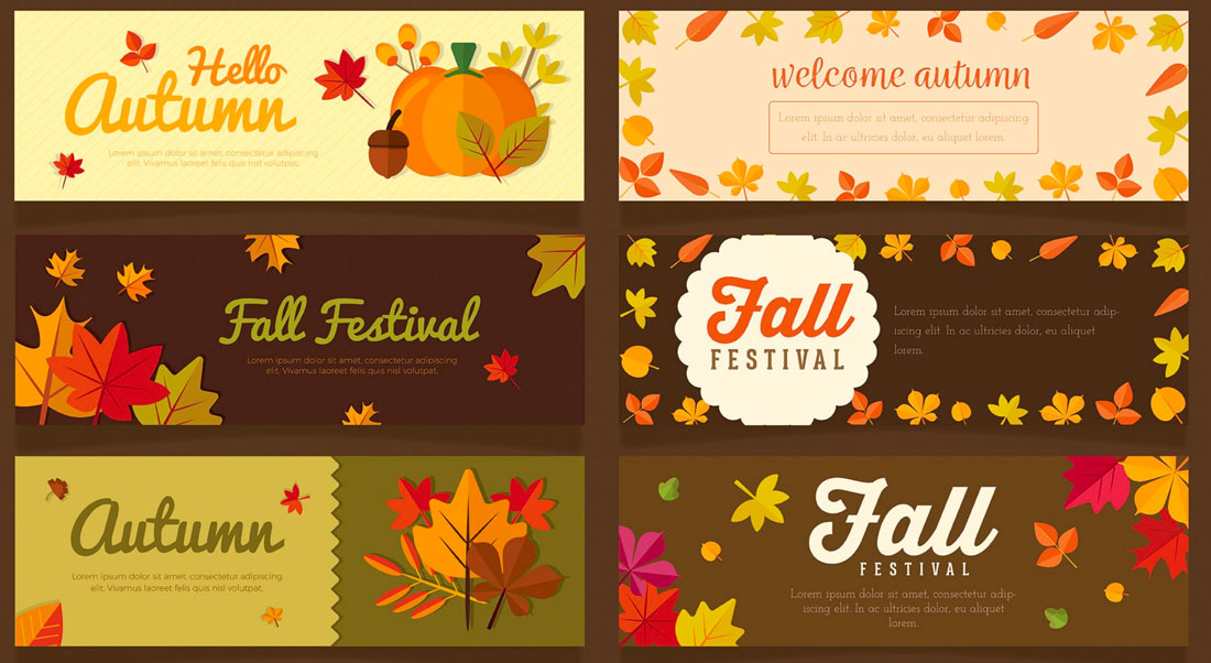
Do you change your design style seasonally? Even if you don’t plan major refreshes every time the weather changes, there are some advantages to using seasonal changes as a time to evaluate and think about design elements that might need a little tweaking.

Autumn can be one of the most inspiring times to make some of these changes. With deep colors, crisper air and that sense of energy that comes with cooler days, you might be inspired to add a touch of fall design to your projects.

Not sure where to start on your fall design refresh? We have plenty of tips, tools and design inspiration.

Switch Up Your Color Palette

fall design tips

A warm color palette matches the season well.

Fall is the perfect time to try a new selection of colors for your base palette or to accent the design.

Two great options for fall include switching to a more monotone color scheme – pick one hue and really make the most of it.

The other option is to consider a switch to warmer colors. A warm color palette matches the season well and can add new life to a project that’s been cool in color.

What’s a warm color? Warm colors occupy one half of the color wheel and are the hues that are reminiscent of the sun or fire. Reds, oranges, yellows, and pinks are warm colors. (You can learn all about warm colors here.)

Tackle a Design Trend

fall design tips

If you haven’t already implemented some of the biggest design trends of the year into projects, consider a trendy refresh for fall.

Sometimes the season can inspire a design change that’s not connected to anything, but merely a chance to mix things up and try something new. Here are a few hot design ideas to try:

  • Brutalism: This trend is the epitome of minimalism but is in no way subtle. It features almost harsh designs with distinct elements and lack of embellishment.
  • Gradients: Color gradients – from backgrounds to overlays – have been one of the biggest trends of the past 18 months. They are everywhere! Use a gradient for fall by picking a warm color combination.
  • 3D Design: With some many projects rooted in virtual and augmented reality, it’s no surprise that 3D elements are growing in popularity. This also applies to 3D text. It’s a fun trend that’s not that hard to implement.
  • Hand Drawn Elements: A specialty element that you create by hand (or has that look) can add a special touch to a project, giving it a more custom feel. Hand drawn elements can include icons, illustrations or typography.

Add Subtle (Seasonal) Animation

fall design tips

Falling leaves, a jack-o-lantern with glowing eyes or any number of other simple animations can add a fall touch to a website design.

Simple animations are an easy season add-on element that you can deploy for a short time and then remove later. They can also be that little special something that delights a user when they least expect it.

A seasonal animation can also tell users that your site is modern and current because it uses a timely design element.

Change Some of the Language

Sometimes the best element to switch up with the season is the copy. Good copywriting can help you use seasonal language or even plays on words to create just the right vibe.

Consider this: “Fall for this great deal!”

If the autumn season is already top of mind. The phrase might be clever or entice users to think about a deal or promo featured in the website design.

Pair fall language with other divots of autumn in the design for a simple, and timely refresh.

Create an Autumn Pop-Up

fall design tips

Along those same lines, you can consider a pop-up or dialog box that has a fall theme. This add-on element doesn’t require changes to the overall scheme since it is an extra design item, not a facelift of an existing one.

Use the imagery and language of the season to create a fall-inspired design that users will love.

Play On Fall Events

fall design tips

Creating a fall design theme can be as easy as playing up fall events. From football and tail-gating to holidays such as Halloween to hyping back to school season, each of these events provides a great opportunity to help visitors get in an autumnal state of mind.

Whether you choose to go with a blatant theme or use more subtle touches for the season, these elements – like many of the others featured as fall inspiration tips – create a distinct sense of timeliness that helps the design feel fresh.

Switch Up the Photography

fall design tips

Simply adding a photo to the homepage with a season feel – people in long sleeves and jackets rather than shorts and tanks – can establish an autumn mood.

Take advantage of the golden hour when it comes to lighting, which can also help set the tone for longer days and cooler air.

Seasonal photography helps put the user into the image you are creating. It helps them see themselves in the way pictured and hopefully create a stronger emotional connection that can result in more clicks and overall engagement with the design.

Look for images that have a seasonal feel with outdoor scenes that show leaves or autumn colors in the background or even event-based imagery with kids playing football or dressed for Halloween. You can see that many of these tips can be combined to create a complete fall design project.

Conclusion

Now here’s the catch to using fun fall design techniques: Don’t forget to swap them out at the end of the season if they are indeed seasonal. Some of these ideas weren’t tied to autumn per se.

It’s a good idea to consider ways to refresh and reinvigorate design projects with each new season, and fall-specific designs can be a fun (and somewhat festive) option.

Responsive Logo Design: A Beginner’s 101 Intro

Featured Imgs 23

Have you noticed how logo designs have gotten progressively simpler lately? Even some of the biggest brands with iconic logos revamped their logos by making them simpler and more minimal.

If you look closer, you’ll also notice that most brands now have multiple logos. The logo you see on the website is not the same one used on a mobile app. This is all part of the responsive logo design practice, which is an important aspect of designing logos today.

In this quick 101 intro, we introduce you to the concept of responsive logo design and why every logo designer must follow this practice when creating logos.

What is Responsive Logo Design?

what is responsive logo design

Responsive logo design is a practice designers use to create simple, scalable, and flexible logos that come in multiple forms and can be used across various platforms. A responsive logo looks good whether it’s used on a website, packaging design, large billboard, or even a small mobile device.

With a responsive logo, brands are able to create multiple variants of their logo that are dedicated to serving different audiences on various platforms. Most brands these days have at least three or four logo variants that are served across digital and print mediums.

Why it’s Important

The main goal of making a logo design responsive is to make the logos clearly visible on smaller platforms like mobile devices.

When you create complex logos with so many intricate details, it’s too difficult to transform the logo into a tiny icon on a small mobile screen. Most of the details, colors, and typography get lost and often make the logos look distorted.

This is why responsive logo designs utilize simpler designs and come in multiple variants.

Examples of Responsive Logo Design

Examples of Responsive Logo Design

In this image from 99Designs, you can see the different logo variants used by popular brands, starting with the full-scale logo and all the way down to a tiny icon.

You’ll notice how the logo design gets simpler with each variant with fewer design elements and details. Even the most complex wordmarks get stripped down into a simple symbol.

The Responsive Logos website has more great examples. It’s an interactive website you can explore to see some of the best and most popular responsive logo designs. You can see the logos change by resizing the browser screen.

How to Design Responsive Logos

There are four important aspects every responsive logo design needs to cover: scalability, flexibility, adaptability, and consistency. Here’s how you design a logo that fits all those key aspects.

1. Understand the Use Cases

Understating how and where you use your logo is the first step to creating an effective responsive logo. It’s crucial to design a logo that’s consistent across different platforms. To do that, you must explore the many use cases of your brand and products as well as where your audience comes from.

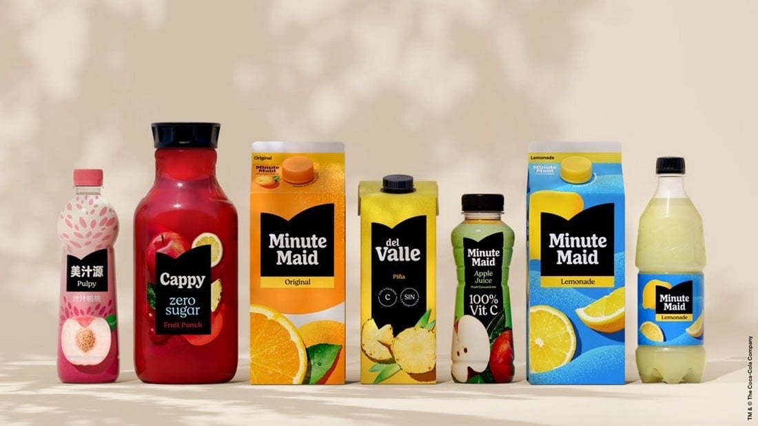
Minute Maid rebrand

Designing a responsive logo that looks great on mobile platforms and social media is not enough. If your brand has a physical product, you also have to make sure the logo fits perfectly with the packaging designs.

There are many aspects to figuring out the use cases of your logo. And that is also the key to knowing how many logo variants you need to create in order to make it responsive.

2. Create Logo Variants

A responsive logo comes in multiple variants. The logo you create for the packaging design won’t look the same as an icon in the mobile app. Creating multiple styles of logos for each platform is the solution.

dunkin after 1

Think responsive-first when designing a logo. Know how many variants you need to create and understand where the logos will be used. It will help create a much more consistent logo design, rather than creating a logo first and then trying to convert it into a responsive design.

3. Scalability is Key

A responsive logo can be scaled up or scaled down without losing its quality and clarity. That’s not just about designing logos in vector format. It also involves creating logo variants that can be used anywhere.

uber after 2

For example, a logo variant you create for a mobile app icon should also be able to be used on a large billboard to promote that app. And it’s your job to ensure that the logo variant looks good when enlarged as it does when shrunk down to a small favicon.

4. Colors and Fonts Matter

The color palette you use for your responsive logo is also important. Ensuring the logo looks consistent across different digital platforms can be tough, especially when different devices have different types of displays and graphical settings. The same applies to typography.

fanta old vs new logo

It’s one of the reasons why most brands nowadays use highly minimalist and simplified logo designs using a very limited color palette.

5. Use a Minimalist Design

Pringles old vs new logo

A simple, minimalist logo design is much easier to scale. It will provide you with more opportunities to create logo variants that look great no matter how small or big it gets. A simple logo will also look more consistent and they are easier to recognize.

10 Tips for Effective Responsive Logo Design

Follow these tips to create better responsive logos that will stand the test of time.

1. Prioritize Legibility

Ensure your logo remains legible at smaller sizes. Avoid intricate details or overly complex typography that may become difficult to read when the logo is scaled down. Test your logo at various sizes to confirm that text and symbols remain clear.

2. Consider Horizontal and Vertical Variants

Create both horizontal and vertical versions of your logo to accommodate different layouts. A horizontal logo might work better in a website header, while a vertical version could be more suitable for a mobile app icon or social media profile.

3. Focus on the Core Symbol or Icon

When designing a responsive logo, consider how the core symbol or icon can stand alone without text. This approach is especially useful for creating icons or favicons that need to be recognizable even without accompanying brand text.

4. Use Adaptive Color Palettes

Consider how your logo’s colors will adapt to different backgrounds and environments. A responsive logo should work well in both color and monochrome formats. Ensure the logo remains visually appealing and recognizable in various color schemes.

5. Incorporate Fluid Design Principles

Fluid design allows logos to adjust naturally to different contexts. Consider how your logo’s elements can shift, resize, or rearrange based on screen size. This flexibility ensures your logo looks great on any platform without compromising its integrity.

6. Maintain Brand Consistency

While adapting your logo for different sizes and formats, ensure it remains consistent with your brand identity. All versions of the logo should share the same color palette, typography, and core design elements to maintain a cohesive brand image across all touchpoints.

7. Simplify Typography

When incorporating text into your logo, choose fonts that are clean and easily readable at smaller sizes. Avoid overly decorative fonts that may lose clarity when scaled down. Consider using a single, bold typeface that aligns with your brand’s aesthetic.

8. Leverage Negative Space

Negative space can enhance the adaptability of your logo. Clever use of negative space can help simplify your design while maintaining its visual impact. This can be particularly effective in creating a logo that remains striking, even when reduced in size.

9. Use Grid Systems

Designing your logo within a grid system can help maintain balance and proportion, making it easier to create responsive versions. Grids ensure that elements align perfectly, which is crucial when resizing your logo for different screen sizes.

10. Adapt for Social Media

Your responsive logo should be optimized for social media platforms, where square and circular formats are common. Ensure your logo looks great as a profile picture or icon by testing it within these shapes and making necessary adjustments.

Conclusion

This is only the beginning of a new evolution for logo design. As new devices like mixed reality headsets and new technologies are introduced, you will have to adopt new ways to create logo designs even for the virtual worlds and beyond.

Who knows, you might even have to create 3D versions of logos with interactive elements in the near future. As long as you create simple logos that are adaptable, you will make each logo design future-proof.

How to Understand (+ Improve) Your Website’s Carbon Footprint

Featured Imgs 23

Every time you visit a website, watch a YouTube video, or comment on a Facebook post, you make a contribution to global carbon emissions. This includes your own websites as well.

The Internet and the devices we use contribute 3.7% of global greenhouse emissions. That is the same amount contributed by the airline industry around the world and it’s expected to double in 2025.

Saving the environment and the world starts with you. One of the most important steps you can take to achieve that goal is to reduce your website’s carbon footprint.

In this post, we will walk you through the process of how a website contributes to global carbon emissions and what you can do to improve it.

What is a Website’s Carbon Footprint?

what is carbon footprint

The global carbon dioxide emissions are the leading cause of global warming. As human activities release more carbon dioxide into the atmosphere, it absorbs more of the Sun’s heat and accelerates the global warming process.

The massive data centers and server farms where your website is hosted also contribute to global carbon emissions. Every time someone visits your website, these servers have to consume more power to run your website. The heavier and more complex your website gets, the more carbon it will emit.

Why Should You Care?

Why should you bother to improve your tiny website’s carbon footprint when there are giant websites like Facebook, TikTok, and YouTube contribute more to global carbon emissions? Because change starts with you!

If you decide to make a small improvement to your website to reduce its carbon footprint, you will have made the future a better place for you and the future generations. As small as it may be, your actions can make a difference.

What Contributes to a Website’s Carbon Footprint?

Website's Carbon Footprint

There are a few things that contribute to a website’s carbon footprint. These are some of the biggest factors to consider.

Ungreen Hosting Providers

When building a website, you will often search for the cheapest and most affordable web hosting provider to get your website up and running as quickly as possible. However, this is not the best way to reduce your website’s carbon footprint.

Not every web hosting provider is environmentally friendly. Most hosting service providers are able to offer cheaper prices by using data centers that don’t run on renewable energy. And that is the biggest contributor to your website’s carbon footprint.

Large Files and Media

Websites with large image files, videos, and even fancy animations will also affect the carbon footprint. Whenever your website has to display a large image file, the servers will have to consume more power to process those requests.

Third-Party Integrations

Third-party apps that you have integrated with your website will also make a big impact on your website’s carbon footprint. If you’re using plugins or services to track metrics, show widgets, or add additional services, they will not only affect your website’s carbon emissions but also contribute to the carbon footprint of those third-party websites as well.

Scripts and Unorganized Code

The animations, widgets, buttons, and forms on your website all use various scripts to function. These complex code and scripts require extra computation power to run and they will add more to your site’s carbon footprint.

What is Your Website’s Carbon Footprint?

carbon footprint test

There is a very simple way to measure your website’s carbon footprint. You can go to the Website Carbon Calculator website and test it out.

While the results this website provides may not be 100% accurate, you can use it to have a rough understanding of how big of a carbon footprint your site has.

How to Reduce Your Website’s Carbon Footprint

Here are a few things you can do to lower your website’s carbon footprint.

1. Use Environmentally-Friendly Web Hosting

Choosing an environmentally friendly web hosting provider is the best way to reduce your website’s carbon footprint. Most web hosting providers proudly claim their hosting infrastructure is powered by renewable energy. However, the percentage of renewable energy also matters.

For example, Kinsta uses Google Cloud Platform for its infrastructure, promising a platform powered by 100% renewable energy.

Most platforms won’t disclose this information but you can use a site like Green Web Foundation to find out which hosting providers offer green web hosting services.

2. Optimize Media Files

Optimizing your images, videos, and other media files will also help reduce the energy required to deliver them to website visitors.

You can start by switching to a more lightweight image file format like WebP instead of using JPG. You can also compress videos to lower file sizes or host them on platforms that are powered by renewable energy.

3. Minify Scripts & Code

Getting rid of unnecessary scripts, third-party plugins, and code also helps. The plugins that add popups, banner ads, animations, and various other widgets will only make your website perform worse.

You can also minify your website’s scripts and code to optimize page loading speeds and reduce power consumption.

4. Reduce Unnecessary Crawling & Bots

When you add third-party services to your website that involve tracking visitors and stats, they will send website crawlers and bots more often, which also consumes server resources.

For example, Google Analytics adds lots of scripts and sends more crawlers to your website, making your website slower and consuming more power. Switching to a lightweight alternative will make a big difference.

5. Use a CDN

By using a Content Delivery Network (CDN), you can deliver your website to visitors around the world more efficiently. It will not only make your website perform faster but also help reduce the stress on hosting servers.

6. Use a Clean, Minimal Design

Using a website design with a light and minimal design will also help improve the carbon footprint. A design that uses fewer buttons, animations, and elements will consume less power to display for each visitor.

In Conclusion

Even if you can’t implement all these improvements to your website, consider making at least one or two changes. The tiniest change you make, like adding a dark mode to your website, will help reduce carbon emissions by lowering the power consumption of mobile devices and monitors.

As Mahatma Gandhi once said: “Be the change that you wish to see in the world.”

Embracing Introversion In UX

Featured Imgs 23

I place myself firmly in the category of being an introvert when it comes to my role as a UX researcher. I love the process of planning and executing research. I have never felt a need to be the loudest or most talkative person in a meeting. I contribute after I have developed something worth saying (or have a really bad joke worked up).

I also love interviews and usability testing, where I interact with users and engage in meaningful conversation. And then I am exhausted. I love speaking about the findings of research and sharing the spotlight with my colleagues during a presentation, and then I want to go to bed underneath the conference room table. I facilitate workshops with ease but have trouble mustering up the energy required to attend what often feels like mandatory post-workshop socializing.

In truth, I have sometimes felt introverted tendencies set me back at work, particularly as a consultant who needs to build relationships to keep the work flowing (in theory). An example would be getting called out by a manager in my junior days for not engaging in as many networking activities as I could have been with some of our clients. My defense of feeling overstimulated, overwhelmed, and uninterested in socializing fell on deaf ears.

I think we have grown in our understanding of introverts and what they need to be high performers, particularly since Susan Cain’s 2013 best-selling book Quiet: The Power of Introverts in a World That Can’t Stop Talking was released.

This article aims to celebrate the power of introversion in UX research and design. We’ll debunk common misconceptions, explore the unique strengths introverted researchers and designers bring to the table, and offer practical tips for thriving in a field that sometimes seems tailored for extroverts. My goal is to build on some of the work on UX and introversion that already exists. I’ve cited other articles where appropriate and shared the resources I’ve found on UX and introversion at the end of this article.

Introversion is not the same thing as being shy, just as extroversion isn’t the same thing as being brash. For simplicity and the sake of this article, I am going to use the following definitions provided by de Jongh & de la Croix:

“Extroverts get energy from interaction with others and like to share ideas with others to help develop their thinking, whereas introverts need to recharge on their own after much social contact and prefer to share ideas only when they are fully formed.”

There are many potential reasons one could have introvert or extrovert tendencies (McCulloch 2020), and these come on a scale where one might lean or introvert or extrovert depending on the occasion. Those who straddle the middle ground of introversion and extroversion are considered ambiverts.

As Jonathan Walter notes in a series of articles on introverts and UX, many UX professionals find themselves drawn to the field because of their introverted nature. Introversion, often misunderstood as shyness or social awkwardness, is simply a preference for internal reflection and processing. It’s about drawing energy from solitude and finding fulfillment in deep thought and meaningful connections.

As UX is clearly a space where introverts are drawn, there is already a decent amount of literature aimed at introverted UX practitioners. In writing this article, I wanted to differentiate from what is already out there, as well as extend.

I wanted to include some personal stories of introverts who aren’t myself and work in UX. To do this, I went to LinkedIn and asked people to send me personal anecdotes. My post, at least by my standards, was well received, with over 100 reactions and a dozen people sending me direct messages sharing anecdotes. I was even introduced to Tim Yeo, who has recently released a book on introverts in the workplace. I’ll be sharing some of the stories people shared with me over LinkedIn, where appropriate (and with their permission), throughout this article to help draw the connections to real life.

First, let’s talk a little about what we know about measuring if you (or others) are introverted, extroverted, or in between.

Measuring Introversion & Extroversion: Self-Assessment Tools

Understanding where you and your team members fall on the introversion-extroversion spectrum can be invaluable for tailoring your approach to work, collaboration, and personal development. Reinoud de Jongh and Anne de la Croix, two medical school professors, write that medical educators should know where they fall on the introversion — extroversion spectrum to deliver great teaching experiences. I’d extend this to UX practitioners, including UX managers, UX researchers, and designers. If we collaborate with others, we will benefit from knowing where we fall on this scale.

While there’s no single definitive test, here are a few simple and accessible tools that can offer insights:

  1. Online Quizzes: Numerous online quizzes and assessments are available, often based on established personality frameworks like the Myers-Briggs Type Indicator (MBTI) or the Big Five personality traits. These quizzes can provide a general sense of your tendencies and preferences. Popular options include:
    • 16Personalities: Offers a free, comprehensive assessment based on the MBTI.
    • Truity: Provides a variety of personality tests, including the Big Five and Enneagram.
    • Verywell Mind: Offers a quiz specifically focused on introversion and extroversion.
  2. Reflection and Journaling: Take some time to reflect on your daily experiences and interactions. Ask yourself the following questions:
    • What activities energize me vs. drain me?
    • Do I prefer to work alone or in groups?
    • How do I recharge after a long day?
    • Do I prefer deep conversations with a few people or socializing with a larger group?
  3. Observation: Pay attention to your behavior and reactions in different social settings. Notice what triggers your stress response and what environments make you feel most comfortable and productive.
  4. Professional Assessment: If you’re seeking a more in-depth analysis, consider consulting a career coach or psychologist who specializes in personality assessment. They can administer standardized tests and provide personalized feedback and guidance.
    • Multidimensional Introversion-Extroversion Scales (MIES): This scale specifically focuses on the multifaceted nature of introversion and extroversion. It measures several sub-traits associated with each dimension, such as social engagement, assertiveness, enjoyment of social interaction, and preference for solitude. Professional psychologists often reference this test, which can be accessed freely here, but might be best done with the guidance of a professional.

There’s no right or wrong answer when it comes to introversion or extroversion. You might even find some folks are ambiverts who display different personalities in different settings. You can’t force your teammates to take these types of tests. But if you are able to get buy-in, it can be a fun activity to see who considers themselves more introverted or more extroverted. The goal is to understand your own preferences and tendencies and those of your colleagues so you can create a work environment that supports your well-being and maximizes your potential.

Introverts’ Super Powers

The idea that UX is an extrovert’s game couldn’t be further from the truth. As Jeremy Bird notes in his article on the strengths of introverts in design, it’s a field that demands a wide range of skills, including deep listening, empathy, observation, analysis, and creativity — all of which introverts excel at. With so much information already available from articles on UX and introversion noted in the biography below, I’m going to briefly highlight the commonly accepted strengths of introverts.

Deep Listening

Introverts are often exceptional listeners. In user interviews, they give participants the space to fully express their thoughts and feelings, picking up on subtle cues and nuances that others might miss. This active listening leads to a deeper understanding of user needs and motivations, which is crucial for both research and design.

One practitioner shared their experience on LinkedIn:

“In a nutshell, being introverted gives a natural advantage in giving the user space to tell their story. I’m more likely to embrace pauses that others may feel are awkward, but this allows users to either double down on their point or think of another point to add (“lightbulb” moment).”

— Dominique S. Microsoft User Research via LinkedIn

Empathy

Many introverts possess a high degree of empathy. They can easily put themselves in users’ shoes, feeling their frustrations and celebrating their successes. This empathy fuels user-centered design, ensuring that products and services are not only functional but also emotionally resonant.

Observational Skills

Introverts are naturally observant. They notice details in user behavior, interface interactions, and environmental context that others might overlook.

Thoughtful Analysis

Introverts often prefer to process information internally, engaging in deep, solitary reflection before sharing their insights. This leads to well-considered and insightful findings and well-crafted data-informed design.

Independent Work

Introverts tend to thrive in independent work environments. As Heather McCulloch notes, teachers should allow introverted students to work independently or in pairs. This way, they can focus deeply on research tasks, design problems, or data analysis without the distractions that come with constant collaboration.

Now that we’ve covered the commonly recognized strengths introverts bring to the table, let’s cover some common hurdles and explore effective strategies for overcoming them that empower introverts to thrive.

Potential Challenges (And How To Overcome Them)

Being introverted can bring up some challenges when it comes to doing things that require a lot of social energy. However, many introverts in UX find ways to push beyond their natural tendencies to meet the demands of their profession. One UX practitioner shared their experience on LinkedIn:

“I’ve been extremely introverted all my life, but have always been able to proceed beyond my introverted boundaries because of a commitment to (perceived) duty. My passion for synergizing user needs, business needs, and the assorted bevy of constraints that arise helps me downplay and overlook any challenges arising from my tendency to be withdrawn.”

— Darren H. MS UXD via LinkedIn

Networking

Introverts might initially feel overwhelmed in networking situations or workshops due to the continual social interaction and the need to navigate unfamiliar environments and interact with new people, which can be particularly daunting for those who prefer solitude or small-group conversations.

  • Researchers & Designers: Building professional relationships can be challenging for introverts. Large conferences or networking events can feel overwhelming. Small talk can feel forced and inauthentic.
    • Solutions for researchers and designers:
      • Focus on quality over quantity: Instead of trying to meet as many people as possible, focus on building a few meaningful connections.
      • Utilize online communities: Connect with other UX professionals on platforms like LinkedIn or Twitter. Engage in discussions, share your insights, and build relationships virtually before meeting in person.
      • Attend smaller events: Look for niche conferences or meetups focused on specific areas of interest. These tend to be more intimate and less overwhelming than large-scale events.
      • Leverage existing relationships: Don’t be afraid to ask a colleague or mentor to introduce you to someone new.

Presenting Work and Public Speaking

Introverts may initially avoid presenting because they tend to prefer avoiding the spotlight. They may also worry about being judged or scrutinized by others.

  • Researchers: May feel anxious about presenting research findings to stakeholders, especially if they have to do so in front of a large audience.
  • Designers: Can struggle with pitching design concepts or justifying their decisions to clients or colleagues, fearing criticism or pushback.

For the introvert, you might not like this, but you need to get comfortable presenting, and the sooner you do, the better.

Solutions for researchers and designers:

  • Practice, practice, practice
    The more you rehearse your presentation or pitch, the more comfortable you’ll feel. Practice in front of a mirror, record yourself or ask a trusted friend for feedback.
  • Use visual aids
    Slides, mockups, or prototypes can help you illustrate your points and keep your audience engaged.
  • Focus on clear communication
    Structure your presentation logically, use simple language, and avoid jargon. Speak slowly and confidently, and make eye contact with your audience.
  • Build confidence over time
    Start with small presentations or informal feedback sessions. As you gain experience and positive feedback, your confidence will naturally increase.

I’ve personally found presenting in front of a large anonymous crowd to be less intimidating than smaller, intimate meetings where you might know a few people mixed in with a few strangers. In the end, I always remind myself I am supposed to be the expert on what I’ve been asked to present or that my job is to clearly state the outcome of our research to stakeholders hungry to see the relevance of their work. The audience wants to support you and see you succeed. I take confidence in that. I’m also exhausted after giving a presentation where I’ve left it all on the floor.

Now, let’s move on to topics beyond what I’ve found covered in existing articles on UX and introversion and cover workshop facilitation and managing group dynamics.

Managing Group Dynamics

Introverts may find group dynamics challenging, as they often prefer solitary activities and may feel overwhelmed or drained by social interactions. In group settings, introverts may have difficulty asserting themselves, sharing their ideas, or actively participating in discussions. They may also feel uncomfortable being the center of attention or having to make decisions on the spot.

Additionally, introverts may struggle to build relationships with their peers in a group setting, as they may be hesitant to initiate conversations or join in on group activities. These challenges can make it difficult for introverts to fully engage and contribute in group settings, leading to feelings of isolation and exclusion.

One UX designer responding over LinkedIn eloquently shared their experience with communication challenges:

“Introversion can sometimes create challenges in communication, as my thoughtful nature can be misinterpreted as shyness or disinterest. To step out of my shell, I need to build trust with those around me before I can feel truly comfortable. However, I don’t see this as the worst thing in the world. Instead, I view it as an opportunity to identify areas where I need to improve and learn to advocate for myself more effectively in the future. In embracing both the strengths and challenges of being an introvert, I’ve found that my introverted nature not only enhances my work as a designer but also drives continuous personal and professional growth, ultimately leading to better outcomes for both myself and my team.”

— Arafa A. via LinkedIn
  • Challenge: Large groups can be overwhelming, and introverted facilitators might find it difficult to assert control or manage dominant personalities who may derail the discussion.
  • Solutions:
    • Clear Ground Rules: Establish explicit ground rules at the beginning of the workshop to ensure respectful communication and equal participation.
    • Assertive Communication: Practice techniques like “broken record” or “fogging” to politely but firmly redirect the conversation when necessary.
    • Partner with a Co-Facilitator: Collaborate with an extroverted colleague who can complement your strengths. They can take the lead in managing group dynamics and energizing participants.

Managing group dynamics covers a broad number of situations UX professionals face on a daily basis. Let’s get a little more specific and focus on how introverted UXers can thrive as workshop facilitators.

Facilitating Workshops

If you’re an introverted UX professional who shies away from leading workshops, it’s time to reconsider. Here are some of the reasons introverts can be perfect workshop facilitators:

  1. Preparation:
    • Introverts tend to be meticulous planners. We thrive on preparation and often go above and beyond to ensure a workshop is well-structured, organized, and aligned with learning objectives. This thoroughness translates to a smooth, well-paced session that instills confidence in participants.
  2. Thoughtful Facilitation:
    • Introverts are known for their active listening skills. We genuinely want to hear what others have to say and create a safe space for diverse perspectives to emerge. We ask thoughtful questions, encourage reflection, and facilitate meaningful discussions that lead to deeper understanding.
  3. Empathy & Connection: We’ve already discussed in the section on superpowers how introverts excel at empathy and connection.
  4. Observation Skills: We’ve already discussed in the section on superpowers how introverts excel at observational skills.
  5. Comfort with Silence:
    • Introverts understand the power of silence. We’re not afraid to pause and allow reflection after asking a question or during a brainstorming session. This creates space for deeper thinking and prevents premature conclusions or groupthink.

We’ve reviewed many of the challenges introverts might face in their daily work life. Let’s turn our attention to a more recent phenomenon, at least in terms of its widespread availability as an option for many UX professionals: remote work.

Working Remotely

Increased telecommuting offers a unique opportunity for some introverts. Introverts, who often find comfort in solitude and derive energy from spending time alone, sometimes find the constant socialization and bustle of open-plan offices overwhelming and draining.

Remote work provides introverts with an opportunity to control their surroundings and create a workspace that promotes focus, productivity, and creativity. Remote work allows introverts to communicate and collaborate on their own terms. Introverts often prefer one-on-one interactions over large group meetings, and remote work makes it easier for them to engage in meaningful conversations with colleagues and clients.

Potential Challenges For Introverts Working Remotely

While remote work has been a game-changer for many introverts, it is important to acknowledge that it is not without its challenges. Introverts may miss the camaraderie and social connections of an in-person workplace, and they may need to make a conscious effort to stay connected with colleagues and maintain a healthy work-life balance.

Introverts working remotely may need to develop strategies for self-advocacy and communication to ensure that their voices are heard and their contributions are valued in a virtual work environment.

  • Isolation and Disconnect: The lack of face-to-face interaction can lead to feelings of isolation and detachment from the team.
  • Communication Barriers: Virtual communication can be less nuanced, making it harder to convey complex ideas or build rapport with colleagues.
  • Meeting Overload: Excessive video calls can be exhausting for introverts, leading to burnout and decreased productivity.
  • Limited Non-Verbal Cues: Virtual interactions lack the subtle body language and facial expressions that introverts rely on to understand others’ perspectives.

Overcoming Challenges: Strategies For Introverts Working Remotely

Introverted remote employees can implement some of these strategies and tactics to enhance their productivity, reduce burnout, and maintain a positive work environment:

  • Proactive Communication: Initiate regular check-ins with colleagues and managers, both for work-related updates and casual conversations.
  • Schedule Breaks: During long virtual meetings, take short breaks to recharge and refocus.
  • Advocate for Your Needs: If you’re feeling overwhelmed by meetings or social interactions, don’t hesitate to speak up and suggest alternatives, such as asynchronous communication or smaller group discussions.
  • Build Virtual Relationships: Participate in virtual social events, share personal anecdotes in team channels, and find opportunities to connect with colleagues on a personal level.
  • Embrace Video Calls (Strategically): While video calls can be tiring, they can also be valuable for building rapport and understanding non-verbal cues. Use them strategically for important discussions or when you need to connect with a colleague on a deeper level.

Implementing what we’ve covered in this section will help to reduce the likelihood of frustration from both remote working introverts and their colleagues.

Tips For Introverted UX Researchers And Designers

We’ve covered a lot of ideas in this article. If you find yourself nodding along as an introvert or perhaps coming to the realization you or someone on your team is more introverted, this section and the next will end this article on a high note, introducing some actionable tips for introverted researchers and designers, and their managers and teammates, to create a more comfortable and successful working environment for introverts to thrive alongside their extroverted colleagues.

Self-Care

Everyone needs to engage in an appropriate amount of self-care to feel their best. For an introvert, this is often done in solitude, particularly after engaging in a day or week full of social interaction. Some tips that could apply to anyone but are of particular relevance to introverts include the following:

  • Schedule downtime: Block out time in your calendar for quiet reflection and recharging after meetings or social interactions. This could be a walk in nature, reading a book, or simply sitting in silence.
  • Honor your energy levels: Pay attention to when you’re feeling drained. Don’t be afraid to decline invitations or reschedule meetings if you need time to recharge.
  • Create a calming workspace: Surround yourself with things that promote relaxation and focus, such as plants, calming music, or inspiring artwork.

Play To Your Strengths

Introverts know themselves best and have spent a lifetime reflecting on who they are and what makes them wake up happy to go to work. As such, introverts may have a high awareness of their strengths. This allows an introvert to do the following:

  • Identify your unique talents: Are you a meticulous researcher, a creative problem-solver, or a passionate user advocate? Focus on tasks and projects that align with your strengths.
  • Communicate your preferences: Let your manager or team know what type of work you thrive in. Perhaps you prefer to work independently on research tasks or focus on the visual aspects of design.
  • Build on your skills: Seek opportunities to develop your existing skills and acquire new ones. This could involve taking online courses, attending workshops, or seeking mentorship from experienced researchers and designers.

Communication

Introverts might hesitate to speak up when the room is crowded with unknown future friends. However, anyone, introverted or not, needs to be their own best advocate when it comes to making colleagues and management aware of how to create the best workplace environment to thrive in:

  • Advocate for your needs: Don’t be afraid to speak up and ask for what you need to succeed. This could involve requesting a quiet workspace, suggesting alternative meeting formats, or simply letting your team know when you need some time to yourself.
  • Develop your communication skills: Even though you may prefer written communication or one-on-one conversations, it’s important to be able to communicate effectively in various settings. Practice public speaking, participate in team discussions, and learn to articulate your ideas clearly and confidently.

It’s essential for introverts to advocate for their needs and communicate their preferred work styles to their colleagues and managers. One UX professional shared their experience on LinkedIn:

“I do my best work when I have time to think and prepare vs. on-demand thinking, speaking, & decision making. So, I ask for agendas, context, and pre-reads to help me make the most impact in meetings. When I shared this fact, it really helped my outgoing teammates, who never thought that others might operate differently than they do. I got feedback that this was a learning experience for them, and so I have continued to share this fact with new teammates to set expectations and advocate for myself since I find it to be an extrovert-centered business world.”

— Anonymous UXer on LinkedIn

Another LinkedIn UXer provided additional tactics for how they navigate communication styles and expectations, particularly in a fast-paced or extrovert-dominated environment.

“The longer I work with people in a creative capacity, the more I recognize the power of delay. Plenty of introverts are also high-achieving people pleasers (raises hand 🙋🏻). This has caused stress over the years when working with extroverts or verbal processors because there can be a perceived sense of urgency to every thought or ask.
[slowing things down] can look like using certain phrases to help slow down the implied urgency to allow me to more thoughtfully process the ask:
  • “Ah, interesting! Could you say more about that?”
  • “Can you clarify the ‘why’ behind this for me? I want to make sure I’ve got it right.”
  • “How does this support our goals for < x project / user >?”
And if the ask comes through asynchronously via email or Slack, I ask myself the following:
  1. Was this sent during working hours?
  2. Am I the only one who can answer this question / address this issue?
  3. Can I provide a short response that lets the person know their message was seen and that it’s on my radar?”
— Kait L. UXer via LinkedIn

Group Dynamics

Introverts may not initially thrive when it comes to group dynamics. They might wish to observe the group before deeply engaging. They can find it difficult to assert themselves in a group setting and may feel overwhelmed by the constant need for social interaction.

Additionally, introverts may find it harder to contribute to discussions or be slower to form meaningful connections with others in a group. The extroverted nature of group dynamics can be draining for introverts, and they may require more time to recharge after being in a group setting.

  • Prepare in advance: Gather your thoughts, jot down key points, or even practice your delivery. This can help you feel more confident and articulate in group settings.
  • Take breaks: If a meeting is dragging on, step out for a few minutes to recharge. A quick walk or a moment of solitude can do wonders for your energy levels.
  • Seek one-on-one interactions: If you’re struggling to be heard in a group, try scheduling separate meetings with key stakeholders to share your insights or design concepts in a more intimate setting.
  • Utilize virtual collaboration tools: If in-person meetings are particularly draining, suggest using tools like Slack, Miro, or Figma for asynchronous collaboration and feedback.

Introverts often find creative ways to navigate the challenges of large group settings. One UX researcher shared their experience on LinkedIn:

“I have a monthly meeting with many employees (50+) to go over survey results. I realized it was super awkward for me just to wait as people joined the meeting. I tried to make small talk about upcoming weekend plans or what people had done over the weekend, but engagement was still pretty low, and I was not equipped enough to carry on conversations. I decided to fill the time with memes. I would search for user research memes and tie them into why user research is important. More people started coming to my meetings just to see the meme! As time went on, I became known as the meme person. While I can’t necessarily say if that’s a good thing — brand awareness is powerful! At least people know user research exists and that we’re fun — even if it all started from being awkward and introverted.”

— Anonymous LinkedIn UXer

Guidance For Moving Up As An Introverted Researcher Or Designer

I turned to Tim Yeo to provide some insight into how introverts can best prepare for moving up the career ladder. Tim provided some tactical advice focusing on teamwork and people skills:

“Practice your people skills. If you, as an individual, could do it all on your own, you would’ve probably done it already. If you can’t, then you need to work with people to bring your creation to life. It takes a team.”

Tim also shared the strategic reason behind the importance of leaders having excellent people skills:

“We also like to believe that higher management is always more sure, more right, and has all the answers. In my experience, the reality is almost the opposite. Problems get fuzzier, messier, and more complex the higher up the organization you go. Making decisions with incomplete, imperfect information is the norm. To operate successfully in this environment requires steering people to your worldview, and that takes people skills.”

You can find some additional information on ways for introverts (and extroverts) to gain people skills in some of the references listed at the end of this article.

Let’s move on and wrap up with some tips for those who are working alongside introverts.

Tips For Managers And Colleagues of Introverts

If you are a manager of a team consisting of more than yourself, you likely have an introvert among your team. Tim Yeo states, “Research from Susan Cain’s book, Quiet, shows that 1/3 to 1/2 of our population identify as quiet or introverted.”

Therefore,

“If you work in a diverse team, it follows that 1/3 to 1/2 of your team are quiet. So if you don’t create a space for quiet ones to be heard, that means you are missing out on 1/3 to 1/2 of ideas.”

UX managers of teams, including introverts and extroverts, should engage in some of the following suggested practices to create an inclusive work environment where everyone feels valued, heard, and able to contribute effectively to the team’s success. UX managers can use these tips to foster a diverse and productive team dynamic that drives innovation and creativity.

  • Flexibility
    • Offer communication options: Not everyone thrives in the same communication environment. Provide alternatives to large meetings, such as email updates, one-on-one check-ins, or asynchronous communication tools like Slack.
    • Embrace different work styles: Recognize that not everyone is most productive in a bustling office environment. Allow for flexible work arrangements, such as remote work or flexible hours, to accommodate different needs and preferences.
  • Value Diversity
    • Recognize the strengths of introverts: Introverts bring a unique perspective and valuable skills to the table. Encourage their contributions, celebrate their successes, and create an environment where they feel comfortable sharing their ideas.
    • Foster inclusivity: Make sure everyone on the team feels heard and valued, regardless of their personality type. Encourage open communication, active listening, and mutual respect.
  • Create Safe Spaces
    • Provide quiet spaces: Designate areas in the office where people can go to work independently or simply decompress.
    • Encourage breaks: Remind your team to take regular breaks throughout the day to recharge. This could involve stepping outside for fresh air, taking a short walk, or simply closing their eyes for a few minutes of meditation.
  • Professional Development
    • Offer tailored training: Provide opportunities for introverted researchers and designers to develop their communication and presentation skills in a supportive environment. This could involve workshops, coaching, or mentorship programs.

As a bonus, if you’re an introverted UX Manager and you are managing a team composed of introverts and extroverts, remember to encourage a variety of communication channels for your team members. You might default to your preferred style of communication but recognize that different team members may prefer different communication channels.

Some extroverted team members might enjoy brainstorming in large meetings, and introverted team members might prefer to contribute their ideas through written channels such as email, chat, or discussion boards.

Encouraging a variety of communication channels ensures that all team members feel comfortable sharing their thoughts and ideas.

Tim Yeo provided this list of tactics for encouraging and engaging introverts in participating in discussion:

  • Sharing the agenda before the meeting (so your quiet teammates, who are amazing preppers, by the way, can prepare and be ready to contribute).
  • Using a mix of silent and think-out-loud activities in meetings (so people who process information differently can all perform).
  • Give a heads-up before you call on a quiet colleague to speak.
  • Offer to be a thinking partner (when your quiet colleague appears to be stuck on a piece of work).

Now, let’s move on to focus on some tips for managing remote workers.

Recommendations For Managers And Teams Working Remotely

Managers and colleagues play a crucial role in creating a supportive and inclusive environment for introverted researchers and designers on dispersed teams. Here are some strategies to consider:

  1. Intentional Communication
    • Asynchronous First: Prioritize asynchronous communication methods (email, project management tools, shared documents) for brainstorming, feedback, and routine updates. This gives introverts time to process information and craft thoughtful responses.
    • One-on-One Check-Ins: Schedule regular one-on-one meetings with introverted team members to build rapport, discuss their concerns, and offer individualized support.
    • Mindful Meeting Management: Be mindful of meeting frequency and duration. Consider alternatives to video calls when possible, such as shared documents or asynchronous communication channels. When video calls are necessary, ensure they have a clear agenda and purpose.
  2. Creating Virtual Water Cooler Moments
    • Casual Communication Channels: Set up dedicated IM channels or virtual spaces for non-work-related conversations, allowing for informal social interaction and team bonding.
    • Virtual Social Events: Organize virtual coffee chats, game nights, or team-building activities to foster camaraderie and connection outside of work-related tasks.
    • Collaborative Tools: Utilize virtual whiteboards or shared documents for brainstorming sessions, encouraging participation and idea generation from all team members.
  3. Cultivating Empathy and Understanding
    • Education and Awareness: Share articles or resources about introversion with the team to foster understanding and appreciation for different personality types.
    • Open Dialogue: Encourage open conversations about communication styles and preferences, creating a safe space for everyone to express their needs.
    • Celebrate Strengths: Highlight the unique contributions that introverted team members bring to the table, such as their deep listening skills, thoughtful analysis, and ability to advocate for users.
  4. Leadership Support
    • Model Inclusive Behavior: Managers should lead by example, demonstrating respect for different communication styles and creating opportunities for all team members to contribute.
    • Provide Resources: Offer training or workshops on effective virtual communication and collaboration, tailoring them to the needs of introverted team members.
    • Check-In Regularly: Regularly touch base with introverted team members to gauge their well-being, address any concerns, and offer support.

Managers and teams can implement these strategies to create a work environment that values and empowers introverted researchers and designers, enabling them to thrive and make significant contributions to the team’s success.

Conclusion

We create a more inclusive and productive environment when we understand and appreciate the unique needs and preferences of introverts. Whether you’re an introverted UXer navigating the challenges of remote work or a manager looking to foster a diverse and engaged team, the strategies and insights shared in this article can help you unlock the full potential of introverted talent.

“The superpower of introspection that comes with introversion has enabled me to reflect on my behaviours and engineer myself to become more of an omnivert — able to adapt to different situations.

Being self-aware and working hard to ladder up through increasingly more challenging experiences has taken me from an introvert who was too concerned to tweet to an active leader in the community, delivering seminars, speaking at an international conference and now running a mentorship program for hundreds of UX professionals across the globe.”

— Chris C. UX Master Certified, via LinkedIn

Introversion is not a weakness to be overcome but a valuable asset to be embraced. We build stronger teams, foster innovation, and ultimately deliver more meaningful and impactful user experiences when we create a culture that celebrates both introverted and extroverted strengths. The best solutions often emerge from a blend of diverse perspectives, including the quiet voices that deserve to be heard.

In closing, I’d like to use the words of Tim Yeo, who provides us with some inspiration and positive reinforcement of who we are as introverts:

“You are enough. The world may continue to favour the extrovert ideal, but pretending to be someone you are not will never feel right. Know that there is a different path to have impact at work where you don’t have to pretend to be someone you are not. That path comes from tiny habits, done well, accumulated over time.”

[You can learn more about tiny habits in Tim’s book The Quiet Achiever]

Biography And Additional Resources


Gain $200 in a week
from Articles on Smashing Magazine — For Web Designers And Developers https://ift.tt/98A3ICK


Re-Working the CSS Almanac

Featured Imgs 23

Getting right to it: the CSS-Tricks Almanac got a big refresh this week!

I’m guessing you’re already familiar with this giant ol’ section of CSS-Tricks called the Almanac. This is where we publish references for CSS selectors and properties. That’s actually all we’ve published in there since the beginning of time… or at least since 2009 when most of the original work on it took place. That might as well be the beginning of time in web years. We might even call it Year 1 BR, or one year before responsive.

You don’t need me telling you how different writing CSS is today in the Year 14 AR. Quite simply, the Almanac hasn’t kept pace with CSS which is much, much more than properties and selectors. The truth is that we never really wanted to touch the Almanac because of how it’s configured in the back end and I’m pretty sure I spotted a ghost or two in there when I poked at it.

Visiting the Alamanc now, you’ll find a wider range of CSS information, including dedicated sections for pseudo class selectors, functions, and at-rules in addition to the existing properties and selectors sections. We’ve still got plenty of work to do filling those in (you should help!) but the architecture is there and there’s room to scale things up a little more if needed.

The work was non-trivial and as scary as I thought it would be. Let me walk you around some of what I did.

The situation

We’re proudly running WordPress and have since day one. There’s a lot of benefit to that, especially as templating goes. It may not be everyone’s favorite jam, but I’m more than cool with it and jumped in — damn the torpedoes!

If you’re familiar with WordPress, then you know that content is largely sliced up into two types: pages and posts. The difference between the two is fairly minimal — and nearly indistinguishable as they both employ the same editing interface. There are nuances, of course, but pages are largely different in that they are hierarchal, meaning they’re best for establishing parent-child page relationships for a nicely structured sitemap. Posts, meanwhile, are more meta-driven in the sense that we get to organize things by slapping tags on them or dropping them into a category group or whatever custom taxonomy we might have in reach.

The Almanac is built on pages, not posts. Pages are boss at hierarchy, and the Alamanc is a highly structured area that has a typical sitemap-like flow, and it just so happens to follow alphabetical order. For example, an entry for a CSS property, let’s say aspect-ratio, goes: Almanac → Properties → A → Aspect Ratio.

That doesn’t sound like a bad thing, right? It’s not, but pages are tougher to query in a template than posts, which have a lot more meta we can use for filtering and whatnot. Pages, on the other hand, not so much. (Well, not obviously so much.) They’re usually returned as structured objects because, you know, hierarchy. But it also means we have to manually create all of those pages, unlike tags and categories that automatically generqte archives. It feels so dang silly creating an empty page for the letter “A” that’s a child of the “Properties” page — which is a child of the Almanac itself — just so there’s a logical place to insert properties that begin with the letter A. And that has to happen for both properties and selectors.

The real problem is that the Almanac simply tapped out. We want to publish other CSS-y things in there, like functions and at-rules, but the Almanac was only ever built to show two groups. That’s why we never published anything else. It’s also why general selectors and pseudo-selectors were in the same bucket.

Expanding the place to hold more content was the scope I worked with, knowing that I’d have some chances to style things along the way.

One template to rule them all

That’s how things were done. The original deal was a single template used for the Almanac index and the alphabetical pages that list selectors and properties. It was neat, really. The page first checked if the current page is the Almamac page that sits atop the page hierarchy. If it is that page, then the template spits out the results for selectors and properties on the same page, in two different columns.

Previous version of the Almanac showing a large Almanac heading, a sub navigation with jump links to alphabetical letters, and the selector and properties lists.

The query for that is quite impressive.

<?php
function letterOutput($letter, $selectorID, $propertyID) {
  $selector_query = new WP_Query(array(
    'post_type' => 'page',
    'post_status' => 'publish',
    'post_parent' => $selectorID,
    'posts_per_page' => -1,
    'orderby' => 'title',
    'order' => "ASC"
  ));

  $html = '<div class="almanac-group">';
  $html .= '<div class="group-letter"><a id="letter-' . $letter . '">' . $letter . '</a></div>';
  $html .= '<div class="group-list">';

  while ($selector_query->have_posts()) : $selector_query->the_post();

    $html .= '<details id="post-' . get_the_id() . '" class="link-item"><summary>';
    $html .= '<h2><code>';
    $html .= get_the_title();
    $html .= '</code></h2>';
    $html .= '</summary>';
    $html .= get_the_excerpt();
    $html .= '<pre rel="CSS" class="almanac-example"><code class="language-css">';
    $html .= get_post_meta(get_the_id(), 'almanac_example_code', true);
    $html .= '</code></pre>';
    $html .= '<a class="button" href="' . get_the_permalink() . '">Continue Reading</a>';
    $html .= '</details>';
endwhile;
  
  $html .= "</div>";
  $html .= "</div>";

  return $html;
}

That’s actually half the snippet. Notice it’s only marked up for a $selector_query. It loops through this thing again for a $property_query.

From there, the function needs to be called 26 times: one for each letter of the alphabet. It takes three parameters, namely the letter (e.g. A) and the page IDs for the “A” pages (e.g. 14146, 13712) that are children of the selectors and properties.

<?php 
  echo letterOutput("A", 14146, 13712);
  // B, C, D, E F, G, etc.
?>

And if we’re not currently on the index page? The template spits out just the alphabetical list of child pages for that particular section, e.g. properties. One template is enough for all that.

Querying child pages

I could have altered the letterOutput() function to take more page IDs to show the letter pages for other sections. But honestly, I just didn’t want to go there. I chose instead to reduce the function to one page ID argument instead of two, then split the template up: one for the main index and one for the “sub-sections” if you will. Yes, that means I wound up with more templates in my WordPress theme directory, but this is mostly for me and I don’t mind. I can check which sub-page I’m on (whether it’s a property index, selector index, at-rules index, etc.) and get just the child pages for those individually.

The other trouble with the function? All the generated markup is sandwiched inside a while()statement. Even if I wanted to parse the query by section to preserve a single template architecture, it’s not like I can drop an if() statement anywhere I want in there without causing a PHP fatal error or notice. Again, I had no interest in re-jiggering the function wholesale.

Letter archives

Publishing all those empty subpages for the letters of each section and then attaching them to the correct parent page is a lot of manual work. I know because I did it. There’s certainly a better, even programmatic, way but converting things from pages to posts and working from that angle didn’t appeal to me and I was working on the clock. We don’t always get to figure out an “ideal” way of doing things.

It’s a misnomer calling any of these letter pages “archives” according to WordPress parlance, but that’s how I’m looking at the child pages for the different sections — and that’s how it would have been if things were structured as posts instead of pages. If I have a section for Pseudo-Selectors, then I’m going to need individual pages for letters A through Z that, in turn, act as the parent pages for the individual pseudos. Three new sections with 26 letters each means I made 78 new pages. Yay.

You get to a letter page either through the breadcrumbs of an Almanac page (like this one for the aspect-ratio property) or by clicking the large letter in any of the sections (like this one for properties).

We’ve never taken those pages seriously. They’re there for structure, but it’s not like many folks ever land on them. They’re essentially placeholders. Helpful, yes, but placeholders nonetheless. We have been so unserious about these pages that we never formally styled them. It’s a model of CSS inheritance, tell you what.

Page for the letter A in the Almanac's properties section. The first four alphabetical properties are displayed as large links.
Yup, you can stop gushing now. 😍

This is where I took an opportunity to touch things up visually. I’ve been working with big, beefy things in the design since coming back to this job a few months ago. Things like the oversized headings and thick-as-heck shadows you see.

Updated design for the letter A.

It’s not my natural aesthetic, but I think it works well with CSS-Tricks… and maybe, just maybe, there’s a tear of joy running down Chris Coyier’s face because of it. Maybe.

Another enhancement was added to the navigation displayed on the main index page. I replaced the alphabetical navigation at the top with a nav that takes you to each section and now we can edit the page directly in WordPress without having to dev around.

The old version of the almanac header above the new version.
Before (top) and after (bottom)

The only thing that bothers me is that I hardcoded the dang thing instead of making it a proper WordPress menu that I can manage from the admin. [Adds a TODO to his list.]

Since I freed up the Alamanc index from displaying the selector and property lists in full, I could truly use it as an index for the larger number of sections we’re adding.

There may be a time when we’ll want to make the main page content less redundant with the navigation but I’ll take this as a good start that we can build up from. Plus, it’s now more consistent with the rest of the “top-level” pages linked up in the site’s main menu as far as headers go and that can’t be bad.

Oh yeah, and while we’re talking about navigating around, the new sections have been added to the existing left sidebar on individual Almanac pages to help jump to other entries in any section without having to return to the index.

Yes, that’s really how little content we have in there right now!

Quickly reference things

The last enhancement I’ll call out is minor but I think it makes a positive difference. If you head over to any subpage of the index — i.e., Selectors, Properties, Pseudos, Functions, At-Rules — a snippet and high-level definition is available for each item at the ready without having to jump to the full page.

We’ve always been big on “get to the examples quickly” and I think this helps that cause quite a bit.

“You could’ve also done [x]…”

Yeah, lots more opportunities to tighten things up. The only goal I had in mind was to change things up just enough for the Almanac to cover more than selectors and properties, and maybe take some styling liberties here and there. There’s plenty more I wanna do and maybe we’ll get there, albeit incrementally.

What sort of things? Well, that hardcoded index navigation for one. But more than that, I’d like to keep pushing on the main page. It was serving a great purpose before and I pretty much wiped that out. It’d be good to find a way to list all of the entries — for all sections — the way we did when it was only twe sections. That’s something I plan to poke at.

And, yes, we want to cover even more CSS-y items in there, like general terminology, media and user preference queries, possibly specifications… you get the idea. The Almanac is a resource for us here on the team as much as it is for you, and we refer to it on the daily. We want it flush with useful information.

That’s all.

You can stop reading now and just head on over to the Almanac for a virtual stroll.


Re-Working the CSS Almanac originally published on CSS-Tricks, which is part of the DigitalOcean family. You should get the newsletter.


from CSS-Tricks https://ift.tt/JfRN06L
Gain $200 in a week
via Read more

25+ Best Fall Fonts (Autumn + Fall Color Fonts)

Featured Imgs 23

Fall is an enchanting season full of cozy vibes. It’s a time for weddings, festivals, and new fashion trends. It’s also a time to refresh your fall font collection. And we’ve got the perfect picks just for you.

With the autumn season approaching, you will be seeing an increase in demand for wedding invitation designs, poster designs for fall festivals, and ad campaigns for new seasonal offerings from fashion brands.

To help you prepare for these upcoming design projects, we handpicked a collection of beautiful fall-themed fonts. There are many different styles of fall fonts in this collection with script, serif, and sans designs.

Have a look and be sure to download the free fonts as well.

Autumn – Unique Fall Font

Autumn - Unique Fall Font

This is one of the most unique and elegant fonts on our list. It also features a classy letter design with an autumn-themed vibe that creates a beautiful look for your logos, branding, and various other typography designs. The font comes with lots of alternate characters to help you craft more original-looking text and logos.

Croffle – Playful Serif Fall-Themed Font

Croffle – Playful Serif Fall-Themed Font

Croffle is a serif font that features a retro-style letter design inspired by vintage typography. The font has a playful fall-themed design that allows you to evoke a cozy and nostalgic feel through different types of designs. It’s perfect for packaging designs, labels, posters, and much more.

Autumn Romans – Modern Fall Font

Autumn Romans - Modern Fall Font

This font comes with a simple and clean look that gives you the freedom to create many different types of typography designs. It has a flexible and versatile letter design with uneven strokes that will fit right in with everything from greeting cards to logo designs, poster titles, and even social media posts.

November – Fall-Themed Signature Script Font

November - Fall-Themed Signature Script Font

November is a cursive script font that comes with beautiful curves and a natural flowing design. It will make your seasonal marketing campaigns much prettier and more attractive. The font is also ideal for designing wedding invitations as well as quotes for social media and t-shirts.

Autumn Field – Handwriting Fall Font

Autumn Field - Handwriting Fall Font

The stylish signature-style handwriting letter design gives this font a very professional and classy feel. It also uses autumn as its theme to create that same cozy and warm vibe. It has uppercase and lowercase letters with lots of alternates and stylistic characters, making it a total of over 350 glyphs.

Cotta – Free Elegant Fall Font

Cotta - Free Elegant Fall Font

Cotta isn’t exactly a fall font but it has all the elements to be the perfect fall-themed font. It has elegant curves, stylish serif letters, and a classy look to make your titles look much more attractive. The font is free for personal and commercial use.

Roses Bolero – Free Fall Font

Roses Bolero - Free Fall Font

This font is also free to download. It has an elegant letter design with unique strokes and lines. The font is ideal for bold titles and headings. The font is free to use with commercial projects.

Falling Dried – Modern Autumn Font

Falling Dried - Modern Autumn Font

Falling Dried is not just another autumn font. It actually has a clean and minimalist design that makes the font much more suitable for modern branding and graphic design projects such as event invitations, logos, and magazine covers. The tall and narrow lettering is what gives this font its own identity.

Savo Bawdy – Cursive Fall-Themed Font

Savo Bawdy - Cursive Fall-Themed Font

Savo Bawdy is a cursive script font featuring a handcrafted letter design. It has a unique and playful look with a mix of the fall season vibes across all of its characters. The font is ideal for wedding invitations, greeting cards, packaging designs, and other graphic design projects.

Samberia – Modern Script Fall Font

Samberia - Modern Script Fall Font

If you’re looking for a modern script font for a fall-themed design, this font is perfect for your project. It features a modern calligraphy-style letter design that is ideal for all sorts of fall season designs, especially for fall fashion and clothing brands, invitations, flyers, and more.

Maple Memories – Autumn-Themed Script Font

Maple Memories - Autumn-Themed Script Font

Maple Memories features the perfect look for designing beautiful and romantic greeting cards and wedding invitations. The font features smooth calligraphy handwritten letters that will give a personalized look to your typography designs. The font includes swashes and extensive multilingual support as well.

Fall Season – Handwritten Autumn Font

Fall Season – Handwritten Autumn Font

A simple, clean, and minimal fall font with tall and narrow letters. This handwritten font will make sure your autumn-themed designs look more playful as well as elegant. It includes both uppercase and lowercase letters with ligatures and alternate characters.

Badger Valley – Free Autumn Font

Badger Valley - Free Autumn Font

Badger Valley is a free autumn-themed font you can use to add a gorgeous look to your title designs. The font is great for promotional campaigns, posters, and advertisements too. It’s free for personal use only.

Blushing – Free Autumn Font

Blushing - Free Autumn Font

This free font has a cute and trendy letter design that has a modern look and feel. It’s ideal for calligraphy-style typography designs. The font is free to use with personal projects.

Billy Holiday – Handwritten Autumn Font

Billy Holiday - Handwritten Autumn Font

Billy Holiday is an autumn-themed handwritten font that you can also use as a signature font for crafting beautiful logos, business cards, and product labels. It’s especially perfect for fall fashion designs, seasonal promos, and packaging designs too.

Start Autumn – Playful Fall Font

Start Autumn - Playful Fall Font

This font comes with a very fun and playful letter design that accurately represents the theme of the fall season. It has serif letters with thick strokes that are made for crafting big titles and headings. The font is ideal for poster titles, festival banners, flyers, and everything in between.

Zaida Autumn – Beauty Autumn Font

Zaida Autumn - Beauty Autumn Font

The classy and elegant look of this font makes it easily stand out from the crowd. It has very unique strokes with smooth curves. You can use it to design all sorts of fall-themed typography, especially for fashion and beauty brands.

Thankful Sunday – Fall-Themed Font Duo

Thankful Sunday - Fall Themed Font Duo

Thankful Sunday is a pair of fall-themed fonts. It includes a casual sans serif font and a playful script font. As a bonus, it comes with lots of doodles featuring all sorts of fall-themed illustrations. You can combine them together with the font duo to create unique designs.

Cute Maple – Adorable Fall Font

Cute Maple - Adorable Fall Font

This is arguably the cutest font on our list. It has a fun and adorable letter design that is especially suitable for kids-themed design projects. You can use it for greeting cards, school posters, festivals, and more.

Autumnal – Free Fall Font

Autumnal - Free Fall Font

Autumnal is a free fall-themed font with a fun handwritten letter design. It has uneven strokes with a true hand-crafted look. The font is perfect for custom t-shirts, labels, posters, and packaging designs. It’s free for personal use.

Better Autumn – Free Fall Font

Better Autumn - Free Fall Font

You can download this for free to craft playful titles and cute headings for your autumn-themed designs. The font has unique characters with fun shapes as well. You can use it freely with your personal projects.

Savor Fall – Creative Autumn Font

Savor Fall - Creative Autumn Font

Savor Fall is a creative autumn-style font with thick letters. This font is most suitable for crafting big and bold titles, especially for banners and posters. It’s ideal for promoting fall festivals and events too.

Pear Leaves – Autumn-Themed Font

Pear Leaves - Autumn Themed Font

A lovely script font with an autumn-themed letter design. This font has a hand-crafted look that will give a more personalized look to your text and titles. You can use it to design greeting cards and invitations with a more human touch.

Warm Autumn – Cute Fall Font

Warm Autumn - Cute Fall Font

This fall font captures the true fun and warm feeling of the season through its cute and friendly character design. This is a handwritten font that comes with a versatile look that will fit in with everything from logo designs to fall catalogs and more.

My Autumn – Fall-Themed Handwriting Font

My Autumn - Fall-Themed Handwriting Font

Even though it’s not exactly a fall-themed font, we love the handwriting design of its letters. This font is perfect for crafting business cards, logos, and various other branding designs. It includes swashes and multilingual support.

Turning Leaf – Fall Title Font

Turning Leaf - Fall Title Font

Turning Leaf is a bold title font that comes with block letters. It’s great for crafting big titles for posters and banners, especially for fall-themed events and festivals. The font includes a set of all-caps letters.

Autumn Wind – Signature Script Fall Font

Autumn Wind - Signature Script Fall Font

A beautiful signature-style script font for professional typography designs. While it has the right look for branding designs you can also use it to promote your fall fashion trends, new clothing lineups, and seasonal offers too.

For more great fonts, check out our best luxury and elegant fonts collection.

Designing for Mental Health Week: Templates, Graphics & More

Featured Imgs 23

Mental Health Week is about encouraging open conversations and reducing stigma, and thoughtful design plays a key role in delivering that message effectively.

In this post, we bring you a collection of graphics and templates for designing more attractive posters, flyers, and banners related to World Mental Health Day. In addition to templates for flyers and posters, you’ll also find social media graphics and visual aids that can help spread awareness across different platforms.

From calming color schemes to approachable fonts, the templates featured in this collection are designed to capture attention while maintaining a compassionate tone.

Whether you’re aiming for something bold and eye-catching or subtle and soothing, these templates offer a variety of styles to suit your event’s needs.

Mental Health Day Flyer Template

Mental Health Day Flyer Template

This is a professionally prepared digital asset designed for crafting flyers to spread awareness for World Mental Health Day. It comes neatly arranged with easy-to-edit layouts, making it ideal for projects around mental health. This A4-sized template includes multiple files in AI and EPS formats and comes with Instagram post and story options, although images are not included.

Creative Mental Health Day Flyer

Creative Mental Health Day Flyer

Another creative flyer template designed for efficiently creating eye-catching mental health-related materials. With options for print and digital use, this package comes with customizable Adobe Illustrator, Photoshop, and EPS files. The flyer displays your information clearly and connects with your audience on Instagram.

Mental Health Week Flyer Template

Mental Health Week Flyer Template

This template allows you to easily promote your event with its clear and efficient design. It’s fully customizable, featuring easy text and image replacement. It comes with Instagram posts and story variations for effective social media outreach. Along with the template, you get Adobe Illustrator, Adobe Photoshop, and EPS files for advanced users.

Mental Health Event Poster Template

Mental Health Event Poster Template

This is a fully customizable template compatible with Adobe Photoshop and Illustrator. It transforms flyers into cool, enjoyable visuals. The template features layered Photoshop and Ai CC Files, smart object photos, a 3mm bleed setting, A4 print size, 300 DPI, and CMYK color mode. It also offers a free font.
Mental Health Day Flyer Ai & EPS Template

Mental Health Day Flyer Ai & EPS Template

An elegantly organized and easy-to-customize flyer perfect for conveying crucial information to your audience. This versatile design is available in international A3 and A4 sizes, 300 DPI CMYK with included bleed, and comes in Ai and EPS formats with alternate colors.
World Mental Health Day Poster Template

World Mental Health Day Poster Template

This is a versatile template for creating compelling mental health week flyers. Ideal for use with Adobe Photoshop or Illustrator, it’s customizable and straightforward to use, featuring smart object photos, a 3mm bleed setting, and a free font link. Designed in A4 print size with 300 DPI and CMYK color mode, this template makes creating appealing mental health awareness materials a breeze.

Modern Mental Health Day Flyer

Modern Mental Health Day Flyer

A convenient solution for conveying information to an audience. It includes a neatly laid out, easily editable flyer template that is compatible with both Ai and EPS formats, available in A3 and A4 sizes with alternative colors. Features such as well-organized layers, customizable design, free fonts, and more.

Simple Mental Health Day Flyer

Simple Mental Health Day Flyer

This is a versatile and user-friendly flyer template, perfect for your World Mental Health Day campaign. Compatible with Adobe Illustrator and Photoshop, it features a fully editable, 100% vector illustration and supports .EPS 10 and CC files. Provided in A4 size with CMYK color at 300 DPI, it’s print-ready and comes with documentation.

Retro World Mental Health Flyer Template

Retro World Mental Health Flyer Template

A professionally designed, easy-to-customize flyer template emphasizing mental health awareness. With its vintage vibe, the template provides AI & PSD files, 300 dpi CMYK resolution for print quality, editable fonts, and effortless color changeability. The layers are well-organized and the used fonts are noted for user convenience.

Mental Healthy Flyer & Instagram Post

Mental Healthy Flyer & Instagram Post

This is an editable, multipurpose flyer template suitable for various mediums such as social media posts, event covers, posters, or health seminars. Cleverly designed for the World Mental Health Day Event, it’s presented in a clean, minimalist style that’s easy to customize. It offers seamless resizing, inclusive of A4 and 1080x1080px Instagram Post sizes, and is print-ready with its CMYK 300 DPI setting.

World Mental Health Day Flyer Set

World Mental Health Day Flyer Set

This is a suite of customizable templates perfect for enhancing mental health awareness campaigns. Able to be edited using Adobe Illustrator or Photoshop, these designs offer separate layers for texts, pictures, and graphics, and support high resolutions of 300 DPI. Please note, fonts, photography and mockups are not included. Sizes include flyer (8,27×11,69 in) and Instagram-friendly dimensions.

Mental Health Counseling Template

Mental Health Counseling Template

This is a versatile template ideal for promoting equality and mental health awareness. It includes an A3 high-resolution single-sided flyer and Instagram-compatible files, all customizable in vector formats. Provided in .ai and .eps files, this package is a comprehensive solution for vibrant, compelling event promotions and communications.

Mental Health Anxiety Infographic Template

Mental Health Anxiety Infographic Template

This a high-quality vector illustration perfect for designing infographics related to mental health. This 100% customizable illustration showcases a variety of images including a pink brain, a game stick controller, and an anxious character. The colors and text are also fully editable.

Mental Health PowerPoint Templates

BriveMind – Mental Health PowerPoint Template

BriveMind - Mental Health PowerPoint Template

BriveMind offers a mental health PowerPoint Template with a modern and functional design. It comes packed with unique layouts, infographics, graphs, and icons that can enhance your presentations. It’s suitable for diverse business needs including market reviews, funding requests, product reviews, and educational training.

Mental Health PowerPoint Illustrations

Mental Health PowerPoint Illustrations

This is a dynamic, multipurpose PowerPoint Template designed specifically for mental health presentations. Its modern, animated slides and included illustrations are completely customizable to suit your specific needs. The template is versatile, providing an ample number of slides for a comprehensive presentation and supports a 16:9 HD display. Included in the ZIP file are PPT, PPTX, and PDF versions.

Mindfulnes – Mental Health PowerPoint Template

Mindfulnes - Mental Health PowerPoint Template

The Mindfulness is an easily adaptable mental health PowerPoint Template perfect for various projects. It comes with impressive features like resizable and editable graphics, master slides, wide screen ratio, and a picture placeholder.

Wellness Mental Health PowerPoint Template

Wellness Mental Health PowerPoint Template

A creative and illustratively engaging PowerPoint template for conveying important mental health discussions. With 25 unique, fully editable slides and a clean light background, it’s perfect for business events, community projects, and more. While it features easy drag-and-drop image customization.

Mental Health PowerPoint Presentation Template

Mental Health PowerPoint Presentation Template

A user-friendly PowerPoint template that allows you to create an engaging and informative presentation with ease. It features over 50 unique slides, compatible with Microsoft PowerPoint, and boasts Full HD resolution. The design aesthetics are eye-catching, and all slides are fully customizable.

Warm Mental Health PowerPoint Template

Warm Mental Health PowerPoint Template

This is a versatile PowerPoint template crafted with care and professionalism. Its 20 unique slides are designed with a strong emphasis on readability and usability, simplifying presentation creation. The template’s modern, multi-purpose design accommodates various presentation needs and features editable graphics, free web fonts, and easy drag and drop functionality.

Mental Health Awareness PowerPoint Template

Mental Health Awareness PowerPoint Template

This is a stylish and modern PowerPoint template, ideal for mental health-related presentations. The template includes over 30 unique, widescreen slides that feature graphic components that are both resizable and easy to edit. Drag-and-drop picture placeholders also come as part of the package, including main files, a help guide, and an icon pack.

Free Mental Health Week Templates

Free Mental Health Day Flyer

Free Mental Health Day Flyer

This is a free flyer template you can use to design an attractive promo flyer to spread the word about Mental Health Day events. The template comes in PSD format and it’s free to use in your personal projects.

Free World Mental Health Day Flyer

Free World Mental Health Day Flyer

This free mental health flyer also comes with a beautiful design featuring a creative illustration. The template is fully customizable and you can even change the text, colors, and fonts using Photoshop.

Free Mental Health Week Poster Template

Free Mental Health Week Poster Template

Another free poster template for mental health-related events. This poster template also comes in PSD format and includes an easily editable design. It’s available in A4 size.

Free World Mental Health Graphic

Free World Mental Health Day Template

You can use this free graphic to create unique posters, flyers, and brochures of your own to promote Mental Health Week and various other events. The template is available in EPS vector format.

Free Mental Health Day Graphic

Free Mental Health Day Graphic

This free graphic template is also free to download and it includes a fully editable design for creating various posters, flyers, and designs related to mental health awareness. The template comes in EPS format.

Python Libraries for Data Engineers Guide

Featured Imgs 23

Data, data, and some more data. As businesses are swimming in the ocean of information, data engineers have become the lifeguards with their trusty flotation device — Python.

Python is a versatile language that quickly becomes the go-to tool for data wizards everywhere. Why?

It’s simple enough for beginners yet powerful enough to tackle the most complex data challenges. But Python’s real superpower lies in its vast ecosystem of libraries.

If you’re a data engineer, developer, or anyone looking to optimize their data engineering processes using Python, let us introduce you to the key Python libraries that will make your life a whole lot easier.

Pandas

Want a personal assistant who can organize, clean, and analyze your data in the blink of an eye? That’s Pandas for you.

This library is a powerhouse of data manipulation and analysis in Python. It will turn your messy datasets into well-behaved tables faster than you can say “spreadsheet.”

Key features:

  • DataFrame and Series data structures for efficient data handling
  • Powerful data alignment and integrated indexing
  • Tools for reading and writing data between in-memory data structures and various file formats
  • Intelligent data alignment and missing data handling

Real-world applications:

  • Cleaning and preprocessing large datasets
  • Time series analysis and financial data modeling
  • Creating data pipelines for ETL (Extract, Transform, Load) processes
  • Ad-hoc data analysis and exploration

NumPy

NumPy is fundamental for scientific computing in Python. It provides support for large, multi-dimensional arrays and matrices, along with a collection of mathematical functions to operate on these arrays.

Key features:

  • Efficient multi-dimensional array object
  • Broadcasting functions for performing operations on arrays
  • Tools for integrating C/C++ and Fortran code
  • Linear algebra, Fourier transform, and random number capabilities

Real-world applications

  • Implementing machine learning algorithms
  • Signal and image processing
  • Financial modeling and risk analysis
  • Scientific simulations and computations

PySpark

When your data gets too big, PySpark steps in, it’s the Python API for Apache Spark that enables big data processing and distributed computing at scale.

Key features:

  • Distributed data processing with Resilient Distributed Datasets (RDDs)
  • SQL and DataFrames for structured data processing
  • MLib for distributed machine learning
  • GraphX for graph computation

Real-world applications:

  • Processing and analyzing large-scale log files
  • Real-time data streaming and analysis
  • Building and deploying machine learning pipelines on big data
  • Graph processing for social network analysis

Dask

Dask brings the power of multicore and distributed parallel execution for analytics to enable performance at scale for large datasets and computations.

Key features:

  • Parallel computing through task scheduling
  • Scaled pandas DataFrames
  • Integrations with existing Python libraries
  • Dynamix task graphs for complex workflows

Real-world applications:

  • Scaling existing pandas, NumPy, and scikit-learn workflow
  • Processing datasets larger than memory
  • Parallel and distributed machine learning
  • Interactive data analysis on large datasets

SQLAlchemy

SQLAlchemy is a SQL toolkit and Object-Relational Mapping (ORM) library that provides a full suite of well-known enterprise level persistence patterns.

Key features:

  • Efficient and high-performing database access
  • Database schema creation, manipulation, and querying
  • ORM for translating Python classes to database tables
  • MSupport for multiple database systems

Real-world applications:

  • Building database-backed applications
  • Creating and managing complex database schemas
  • Implementing data warehousing solutions
  • Automating database migrations and versioning

Lxml

At a glance, XML looks like alphabet soup, but Lxml knows how to make sense of it all. It’s fast, it’s powerful, and it makes XML processing a breeze.

Key features:

  • Fast XML parsing and generation
  • Support for XPath and XSLT
  • Pythonic API for tree traversal and manipulation
  • Validation against DTDs and XML schema

Real-world applications:

  • Parsing and processing XML-based data feeds
  • Web scraping and HTML parsing
  • Generating XML reports and documents
  • Integrating with XML-based APIs and services

For more detailed information on XML processing with Python, you can refer to this post on XML conversion using Python from Sonra.

Why is Python ideal for data engineering?

So, why has Python become the darling of data engineers everywhere? It’s not just because of its cool name (though that doesn’t hurt).

The real reason is its versatility, which allows engineers to tackle diverse tasks within a single ecosystem, from data extraction and transformation to analysis and visualization.

Python has a straightforward syntax and is a very readable language. It reduces the learning curve for a beginner.

Despite being easy to use, Python offers a powerful and compelling ecosystem of libraries. For data engineers, it’s like having a toolbox where every tool is your favorite. Need to crunch numbers? There’s a library for that. Want to automate workflows? Done.

And let’s not forget about Python’s amazing community. It’s huge and helpful. If you’re facing a problem, chances are someone in the Python community has already solved it and shared the solution.

Automating data engineering tasks with Python

In the past decade, the use of Python has significantly increased due to its capability to automate boring stuff. Python is well able to streamline complex data workflows and increase productivity.

Data engineers use libraries like Apache Airflow and Perfect to approach task scheduling and pipeline management. These tools allow for the creation of dynamic, scalable, and maintainable data pipelines using Python code.

With Airflow, you can create data workflows that look like flowcharts (called Directed Acyclic Graphs or DAG). It is used for complex ETL processes. Prefect takes things up a notch, offering even more flexibility and observability.

Want to learn more?

Hungry for more Python goodness? Check out these articles:

Conclusion

The Python libraries we discussed in the article form the backbone of modern data engineering practices. It offers powerful tools to tackle complex data challenges efficiently. 

Data engineers can use these libraries to streamline workflows, improve data processing capabilities, and build strong and scalable data pipelines. 

If you’re a data engineer, we’ll encourage you to be more interested in Python libraries. Play around, experiment, and see how they can transform your data engineering projects. 

Remember, Python is not a language of the past; it’s a language of the future. The more you fall in love with this, the more you’ll be able to conquer those complex and large datasets that are yet to come.

Pandas Visualization

Pandas visualization

Source

Code snippet: Importing Pandas for plotting

import pandas as pd
import matplotlib.pyplot as plt

df = pd.read_csv('data.csv')

df.plot(kind = 'scatter', x = 'Duration', y = 'Maxpulse')

plt.show() 

Source

PySpark Visualization

PySpark Visualization

Source

Code snippet: # How many passengers tipped by various amounts

# Look at a histogram of tips by count by using Matplotlib

ax1 = sampled_taxi_pd_df['tipAmount'].plot(kind='hist', bins=25, facecolor='lightblue')
ax1.set_title('Tip amount distribution')
ax1.set_xlabel('Tip Amount ($)')
ax1.set_ylabel('Counts')
plt.suptitle('')
plt.show()

Source

The post Python Libraries for Data Engineers Guide appeared first on CSS Author.

35+ Best Professional Business Report Templates (Word, PPT, InDesign)

Featured Imgs 23

A modern and professional design is a must-have for every business report. But what exactly does a professional business report look like?

To help you find inspiration for your business report design, we gathered a collection of the best business report templates. These templates are made by professional designers and they all feature stylish and modern designs.

You can also download and edit them to easily create business reports without having to start from scratch. There are templates in this collection in Adobe InDesign, Microsoft Word, and PowerPoint formats. And we divided the list into 3 different sections to make it easier for you to find them.

Use the quick links below to jump to each section:

InDesign Business Report Templates

With Adobe InDesign, you can design more flexible and professional brochures for your business projects. These templates will help you get a head start in your brochure designs.

Annual Business Report Template

Annual Business Report Template

This InDesign template comes with a stylish and modern design to help you craft a professional report to showcase the business progress, stats, and data related to your yearly review. It has 16 unique pages with grid-based layouts. And you can fully customize the template to your preference as well.

Professional Business Report Template

Professional Business Report Template

You can design an attractive and professional business report or annual report using this InDesign template. It lets you choose from 20 different pages to craft a brochure filled with visuals, charts, and graphs. The template has changeable colors, backgrounds, and free fonts.

Creative Annual Business Report Template

Creative Annual Business Report Template

Use this brochure template to design more modern-looking annual and business reports. There are 16 unique pages in this template with stylish designs. You can also fully customize each page to match your business branding. It’s available in both A4 and US Letter sizes too.

Red Corporate Annual Report for InDesign

Red Corporate Annual Report for InDesign

This is a slick, professional InDesign template for presenting yearly businesses’ performances. Easily customizable, it’s designed in an eye-pleasing modern style to clearly display financial data, achievements, and future projections, bolstering investment appeal.

Bold Annual Report InDesign Template

Bold Annual Report InDesign Template

A versatile, 28-page template, compatible with Adobe InDesign CS4 and onward. The A4-sized layout is easy to customize with your own logo and brand colors. It includes a cover on the Master Page, separate layers for text and images, and paragraph and character styles.

Creative Annual Report InDesign Template

Creative Annual Report InDesign Template

This InDesign template merges style with professionalism through a refined layout, lively graphics, and purposeful typography. It makes presenting financial data and achievements engaging and compelling. Adjustable to match your needs, this template is immediately available after purchase, easy to edit, print-ready, and incorporates a free font.

Corporate Annual Report InDesign Template

Corporate Annual Report InDesign Template

This is a professional and comprehensive InDesign template to outline a company’s yearly performance concisely. With its modern design, this template showcases essential financial data, achievements, and goals in an attractive manner. This 12-page, A4 size template, which features editable content and uses CMYK color mode, is a perfect asset for businesses intending to boost investor confidence and credibility.

Minimal Annual Report InDesign Template

Minimal Annual Report InDesign Template

A professional, polished InDesign template that’s perfect for presenting a company’s financial data, accomplishments, and strategic plans. With its sleek design and modern typography, this template is designed for visual appeal, clarity, and easy customization.

Simple Corporate Annual Report for InDesign

Simple Corporate Annual Report for InDesign

This is a professional, modern template perfect for summarizing your company’s yearly performance. With this visually appealing and fully customizable 12-page asset, you can clearly highlight financial data, achievements, and future objectives. It’s a valuable tool to boost investor confidence and showcase your business success.

Professional Report Brochure Template

Professional Report Brochure Template

This professional report template is most suitable for designing brochures for corporate companies and agencies. It has a clean and traditional page design that has all the necessary layouts for making a complete and fully detailed business report. The template includes 36 page designs.

Colorful Business Report Template

Colorful Business Report Template

If you prefer to take a more creative and colorful approach to your business report design, this template is perfect for you. It has a beautiful page design with trendy layouts. There are 12 different pages in this template featuring editable colors, fonts, and text. It comes in A4 size.

Elegant Annual Business Report Template

Elegant Annual Business Report Template

This is one of the most elegant and beautiful business report templates on our list. It features a stylish page design that will surely make your brochures stand out. And it’s especially suitable for high-end brands and businesses. The template comes with 16 pages in A4 and US Letter sizes.

Modern Professional Business Report Template

Modern Professional Business Report Template

You can design a bold business report with a dark color theme using this professional InDesign template. It includes 20 unique page layouts with highly visual and modern designs. Of course, you can easily change the colors, fonts, and backgrounds to your preference as well.

Exeelo – Professional Report Template

Exeelo - Professional Report Template

This InDesign template has 28 different page designs with multipurpose layouts. You can use it to make all kinds of business brochures, including various types of business reports. The template has editable colors, paragraph styles, and easy-to-replace image placeholders.

Company Report Professional Template

Company Report Professional Template

This business report template uses a unique metallic color theme that adds a very sophisticated look to the design. It also has modern pages with simple paragraph styles and formatting. There are 24 page layouts included in the template. Use it to design bold business reports for modern brands.

Clean Annual Business Report Template

Clean Annual Business Report Template

Looking to make a minimal, clean, and professional business report brochure? Then start with this template. It gives you 20 unique pages with clean and minimal designs to help create attractive business reports for all kinds of projects. It features organized layers and free fonts too.

Minimal Business Report Template PDF

Minimal Business Report Template PDF

This brochure template comes with a minimalist page design and it’s available in InDesign and PDF formats. The template has 40 page layouts that you can customize to change fonts, colors, and more.

MS Word Business Report Templates

Microsoft Word is easy to use and it’s one of the most accessible software for professionals. Use these templates to create professional-looking business reports using your favorite word processor.

Annual Report Template Word & INDD

Annual Report Template Word & INDD

This brochure template is ideal for making annual reports for modern brands and businesses. It comes in both MS Word and InDesign formats with fully customizable page layouts. There are 24 different pages to choose from and each page has easily editable text, changeable colors, and image placeholders.

Business Report Template Word

Business Report Template Word

A business report template with a simple and minimal design. This Word template includes 20 unique page designs that have clean layouts to effectively showcase stats and data related to your business. It’s available in A4 and US Letter sizes as well.

Business Annual Report Word Template

Business Annual Report Word Template

With 16 beautifully designed pages, this annual report template allows you to make brochures that will look more attractive and professional. It has color themes and easily customizable design elements to help you create branded brochures for all types of businesses.

Dark Gradient Annual Financial Report for Word

Dark Gradient Annual Financial Report for Word

This Word template is perfect for your company’s financial reporting. The user-friendly design makes it easy to use and customize according to your needs. Available in MS Word and Canva formats, it features over 30 editable pages, changeable colors, texts, and images.

Annual Report Brochure Word Template

Annual Report Brochure Word Template

A sleek, professional Word template perfect for creating thorough annual reports. It’s carefully designed, fully customizable, and available in various formats including Adobe InDesign, Microsoft Word, and PDF. With 20 unique layouts and adaptable text, colors, and images, this template simplifies the presentation of your company’s yearly performance.

Minimal Annual Report Word Template

Minimal Annual Report Word Template

This Word template offers a professional layout for business reports. Easy to customize, this template boasts engaging photos, clear financial graphics, and streamlined narratives. Offering 20 distinct layouts, it includes organised layers and auto page numbering.

Simple Annual Report Word Template

Simple Annual Report Word Template

A professionally crafted, easy-to-customize Word template ideal for presenting your company’s yearly progress. With areas for engaging narratives, eye-catching images, and clear financial data, it ensures your report is comprehensive and compelling. It’s compatible with Adobe InDesign and Microsoft Word, and available in both A4 and US Letter formats.

Modern Business Report Template Word

Modern Business Report Template Word

Make modern business reports with a classic design using this Word brochure template. It features a traditional page design with a highly customizable layout. There are 48 different pages to choose from. And you can use it to make bold and attractive annual reports as well.

Professional Report Word Template

Professional Report Word Template

A clean and minimal business report template for Microsoft Word. This template has a design that’s most suitable for corporate business brochures. It has classic content formatting that gives a professional look to each page. The template comes with 16 unique pages.

Simple Business Report MS Word & InDesign

Simple Business Report MS Word & Indesign

Another minimalist business report template with a simple page design. This brochure template is ideal for business annual reports. And it has 24 flexible pages that you can customize using Word or InDesign. Everything from the colors to fonts and backgrounds is editable.

Annual Report Word Brochure Template

Annual Report Word Brochure Template

A professional MS Word brochure template that’s ideal for designing annual reports for modern businesses. This template has 16 page layouts. And it’s compatible with both older and new versions of Microsoft Word. The template is available in InDesign format too.

PowerPoint Business Report Templates

PowerPoint is one of the most versatile software there is. With these templates, you can create business report slideshows for presentations as well as printable documents.

Business Report PowerPoint Template

Business Report PowerPoint Template

This PowerPoint template has everything you need to make all types of business reports. It has charts, graphs, infographics, and more to design modern and colorful slides for your business report presentations. You can also customize the colors, edit the graphics, and change backgrounds to your preference too.

Maua – Aesthetic PowerPoint Business Report Template

Maua - Aesthetic PowerPoint Business Report Template

Maua is a beautiful PowerPoint template with an aesthetic feel. It includes 30 unique slides that are designed for making business reports with a stylish design. This template is ideal for businesses in the fashion, beauty, and lifestyle industries.

Planen – Business Report PowerPoint Template

Planen - Business Report Powerpoint Template

Another modern business report template for PowerPoint. This template comes with a professional slide design to showcase all your data and information in one place. There are 30 fully customizable slides in this template, which feature transition animations, image placeholders, editable graphics, and much more.

Venio – Stylish Business Report PowerPoint Template

Venio - Stylish Business Report PowerPoint Template

The stylish and fresh slide design of this template will surely set your presentations apart from the rest. This template has 30 slides with trendy designs. Each slide is filled with colors and cool content formatting designs. You can also edit them to change the colors and fonts too.

Financial Report PowerPoint Template

Financial Report Powerpoint Template

Grab this PowerPoint template to design professional presentations to showcase your business financial reports. There are 130 slides in this template that are available in 50 color schemes as well as in light and dark themes. It includes lots of infographics, charts, and graphs as well.

Neocore – Annual Report PowerPoint Template

Neocore Annual Report Powerpoint Template

You can use this PowerPoint template to design a professional presentation to showcase your business’s annual reports. It has 40 different slides with clean designs to include all the stats, data, and information related to the yearly review.

Corporate Report PowerPoint Template (500 Slides)

Corporate Report PowerPoint Template 500 Slides

This is a massive PowerPoint template that includes 500 unique slides. It’s designed for making business reports for corporate brands and companies. The slides feature minimal layouts with editable charts, text, graphics, and free fonts.

20+ Best Square Fonts for Blocky Designs

Featured Imgs 23

Square fonts, known for their geometric precision and modern aesthetic, are perfect for projects that require a strong, edgy look.

Whether you’re working on branding, posters, website headers, or packaging, these blocky fonts deliver a clean, impactful design that stands out. They evoke a sense of strength, stability, and contemporary style, making them a favorite for tech brands, gaming designs, and any project aiming for a futuristic or industrial feel.

In this post, we’ve compiled the best square fonts that combine boldness with versatility. Each font offers something unique, whether it’s ultra-sharp edges for a striking appearance or more rounded, minimalist styles for a subtler approach. Have a look.

Higrah – Bold Square Font

Higrah - Bold Square Font

Higrah is a distinctive monospace font with a square letter design. It comes with a robust, masculine aesthetic, thanks to its unique capitalization and character styles. Higrah’s square lettering can be customized to your design preferences, providing accuracy and uniqueness to your work. Ideal for titles, logos, book covers, and more.

Trones – Techno Sci-Fi Font

Trones - Techno Sci-Fi Font

Trones, a futuristic techno sci-fi font, adds an innovative charm to your projects, ideally suited for futuristic-themed designs. Providing comprehensive features like uppercase, lowercase, numerals, punctuations, and multilingual support, this font is easy to use and adaptable.

Black Square – Tall Square Font

Black Square - Tall Square Font

Black Square is a striking and genuine display font that can add a bold edge to any branding initiative like logos, posters, sports merchandise, and more. Adaptable in various backdrops, it’s available in three formats: OTF, TTF, and WOFF, making it a versatile creative asset for design projects.

Delimo – Square Letters Font

Delimo - Square Letters Font

Delimo is a playful, contemporary square display font with bold strokes and eye-catching ligatures. It comes with multiple formats, accommodating 100+ languages for a versatile range of applications. Use it for logo designs, social media, movie or book titles, or pair it with script or serif for contrast in longer text.

TAMPOOL – Creative Square Font

TAMPOOL - Creative Square Font

TAMPOOL is a dynamic creative square font with a blocky appeal. The identical, robust shape of each character lends your text a powerful impact, making it ideal for sports-themed posters, motivational prints, t-shirts, headlines, and more. Try TAMPOOL font to amplify your message and leave a lasting impression.

Pocky Block – Cool Block Letter Font

Pocky Block - Cool Block Letter Font

Introduce a daring edge to your designs with Pocky Block, a crisp and modern block letter font. Offering a sporty and assertive vibe, it’s perfect for projects themed around sports, adventure, or the future. With two styles – Regular and Slanted, and over 100+ ligatures for dynamic textual design – this bold font brings energy to stickers, posters, logos and more.

The Tide – Modern Block Letter Font

The Tide - Modern Block Letter Font

The Tide is a modern block-letter font inspired by surf and beach culture. Ideal for aquatic-themed games, posters, or YouTube covers, this font captures the rebel energy and carefree philosophy of the surfer lifestyle. The Tide font family offers basic Latin characters, numbers, and punctuation.

Quabork – Futuristic Square Font

Quabork - Futuristic Square Font

With Quabork, a futuristic square font, transport yourself into a neon-drenched, pixelised space. It’s not simply a font, but an embodiment of retro-gaming arcade culture, radiating bold, blocky strokes that resemble neon lights and pulsating energy. Fully equipped with precision, Quabork comes in several formats, making it widely adaptable across platforms.

Kibrom – Urban Block Letter Fonts

Kibrom - Urban Block Letter Fonts

Showcase the vibrant pulse of city life with Kibrom, a collection of urban block letter fonts. Kibrom draws inspiration from the gritty reality of street culture, helping your work reflect the raw, unapologetic spirit of urban landscapes. Ideal for murals and gig posters, these blocky fonts will make your creations pop.

Block Qlock – Thick & Condensed Font

Block Qlock - Thick & Condensed Font

Block Qlock is a robust, original display font that lends itself well to various branding projects, from logos to sports merchandise and even posters. Adaptable across different contexts, it offers OTF, TTF, and WOFF formats for comprehensive coverage. With its distinct thick and condensed design, Block Qlock brings a unique edge to your creative expression.

KARL zone – Modern Block Letter Font

KARL zone - Modern Block Letter Font

The KARL Zone asset offers a modern block letter font that encapsulates power, speed and resilience. This bold, square font provides high impact and graphic aesthetics without compromising legibility. It’s perfect for larger prints (above 72pt), making it ideal for magazine headlines, posters, gym ads, music covers, or anywhere you want to command attention.

Knob – Modern Square Font

Knob - Modern Square Font

Presenting Knob, a modern square font with a fat and bold style that’s perfect for enhancing your designs. Ideal for use on mediums such as posters, magazines, books, vinyl, CDs, and flyers, this display typeface will make your messages stand out. The package includes otf and ttf files for convenience.

Black Block – Gaming Font

Black Block - Gaming Font

Black Block is a lively, bold font designed specifically for entertaining projects. Its blocky structure makes it the perfect fit for creating fun video games, interactive kids apps, engaging board games or even educational school materials. This unique, square font instinctively adds a playful touch to any project.

Greks Webol – Block & Bold Font

Greks Webol - Block & Bold Font

The Greks Webol is a distinct, bold display font that brings an authentic edge to your branding projects. Whether for logos, posters, or sports collateral, its blocky aesthetic works beautifully across a range of uses. The font includes uppercase and lowercase types, ligatures, numerals, punctuations, multilingual support, and an extended character set. Formats offered are OTF, TTF, and WOFF.

Lock Block – Block Display Font

Lock Block - Block Display Font

Lock Block is another square font featuring a block style display font that amplifies the robustness in design work. Crafted with geometric shapes, its powerful aesthetic is ideal for eye-catching headlines or posters. It houses three styles including regular, extrude, and shadow, and provides multilingual support.

Urban Blocking – Block Letter Font

Urban Blocking - Block Letter Font

Urban Blocking is a unique, dual-font aesthetic that masterfully blends the boldness of display type with the expressiveness of brush lettering. Its block-style uppercase letters have a bold, commanding presence, counterbalanced by the lively strokes and textured edges of the brush font. These versatile fonts come with features like ligatures, stylistic sets, and multilingual support, and are suited for various design projects such as headlines, logos, and printed media.

BLOKEE – Modern Blockletter Font

BLOKEE - Modern Blockletter Font

Check out BLOKEE, a modern blockletter font that’s eye-catching due to its bold and striking character. With its full block upper case and striped cut lower case, BLOKEE adds a strong and effective touch to your posters. Embrace its simplicity and strength to make your presentations stand out.

ASHOKA – Classic Square Font

ASHOKA - Classic Square Font

ASHOKA, a classic square font, delivers a unique 80s feel that commands attention and incites intrigue. More than just a standard Sans-Serif, this striking font gives a bold edge to headlines, logos, and business materials. Ideal for use in mature, provocative projects, this font enhances everything from economic posters to YouTube thumbnails.

Porcine Bosk – Modern Block Letter Font

Porcine Bosk - Modern Block Letter Font

The Porcine Bosk typeface is a modern block letter font with a unique wooden texture. It is versatile and perfect for various applications such as headlines, posters, logos and web designs. Designed by Michel Iona, this Sans Serif font has a classic and decorative appeal. The pack comes with OTF, TTF, and web fonts, and even includes a font demo page.

Goblock – Heavy Square Letters Font

Goblock - Heavy Square Letters Font

Goblock is a powerful font that adds a bold touch to your branding. Crafted with robust strokes and detailed characters, this fat, striking font leaves a memorable impression. It strikes the perfect balance between strength and authority. Featuring Latin glyphs, uppercase and lowercase letters, numerals, punctuation, and multilingual support, it’s versatile for any use.

Glubby – Fun Display Font

Glubby - Fun Display Font

Glubby is a distinctive display font that is sure to add a delightfully playful touch to your creative projects. Ideal for children-themed designs like posters, book covers, and headlines, this font, with its chunky and bold look, can turn large titles and letterings into kid-friendly texts. From English to Italian and Finnish, Glubby’s language versatility further enhances its appeal.

Bob – Chunky Square Letter Font

Bob - Chunky Square Letter Font

Bob is a chunky square-letter font that loves the spotlight. Ideally suited for large-scale uses like posters and prints, Bob boasts about 200 glyphs, comfortably accommodating basic Latin and more. Make room for Bob and let him add a bold and spacious edge to your projects.

Free Square Fonts

Angle Square – Free Block Letter Font

Angle Square - Free Block Letter Font

This font comes with a unique square-shaped letter design that will make your typography look modern and creative. The font features blocky letterforms and bold strokes. It’s free to use with personal projects.

Square Technocrat – Free Square Font

Square Technocrat - Free Square Font

This free square font comes in multiple styles. It includes blocky letters featuring narrow and condensed designs as well as in multiple weights. This font is free to use with your personal projects.

Double Square – Free Block Font

Double Square - Free Block Font

Double Square is another free block letter font you can use to craft stylish personal projects. This font also comes with square-shaped characters but also with unique textured designs.

Iamblock – Free Square Letter Font

Iamblock - Free Square Letter Font

This free block font is perfect for adding a creative look to your trendy design projects. It includes strong extruded characters with square-shaped letterforms. The font only includes uppercase letters. The font is free to use with commercial projects.

Block Stereo – Free Square Font

Block Stereo - Free Square Font

Block Stereo is another free font that comes with square letters. This font includes letterforms with stylish geometric shapes and an edgy look. It’s perfect for poster titles, flyers, banners, and much more. It’s free to use with personal and commercial projects.