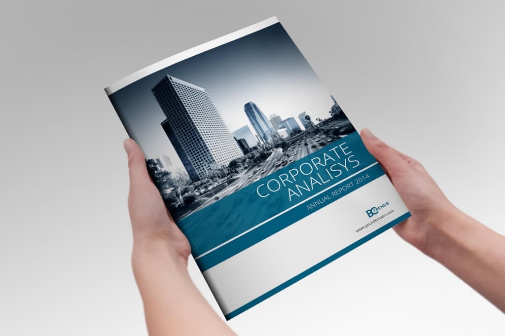
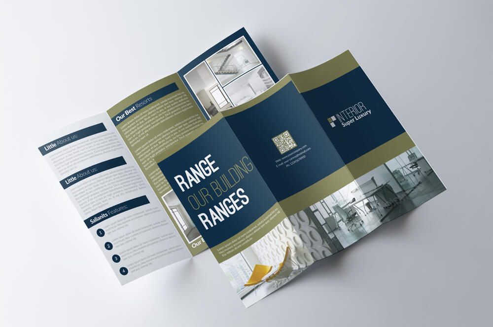
Contrary to popular belief, condensed and narrow fonts don’t make your text cramped or crowded. You just have to know the appropriate time and place to use the font. Condensed fonts are widely used these days for headlines and portraying bold messages, and when deployed in the right place, they can give stunning impact!
It takes a lot of testing and experimenting to find the perfect font for a design, but our tips for choosing and working with condensed and narrow fonts will help get you off to a great start!
What is a Condensed or Narrow Font?
A condensed or a narrow font is a typeface that features characters with narrow widths but it also refers to fonts with taller character designs as well. Condensed fonts also have much narrower space between characters than a regular font.
While many designers recommend not to use condensed fonts in body text, these fonts are a popular choice in designing large headlines and titles, especially in posters, website headers, banners, and even in book covers and business cards.
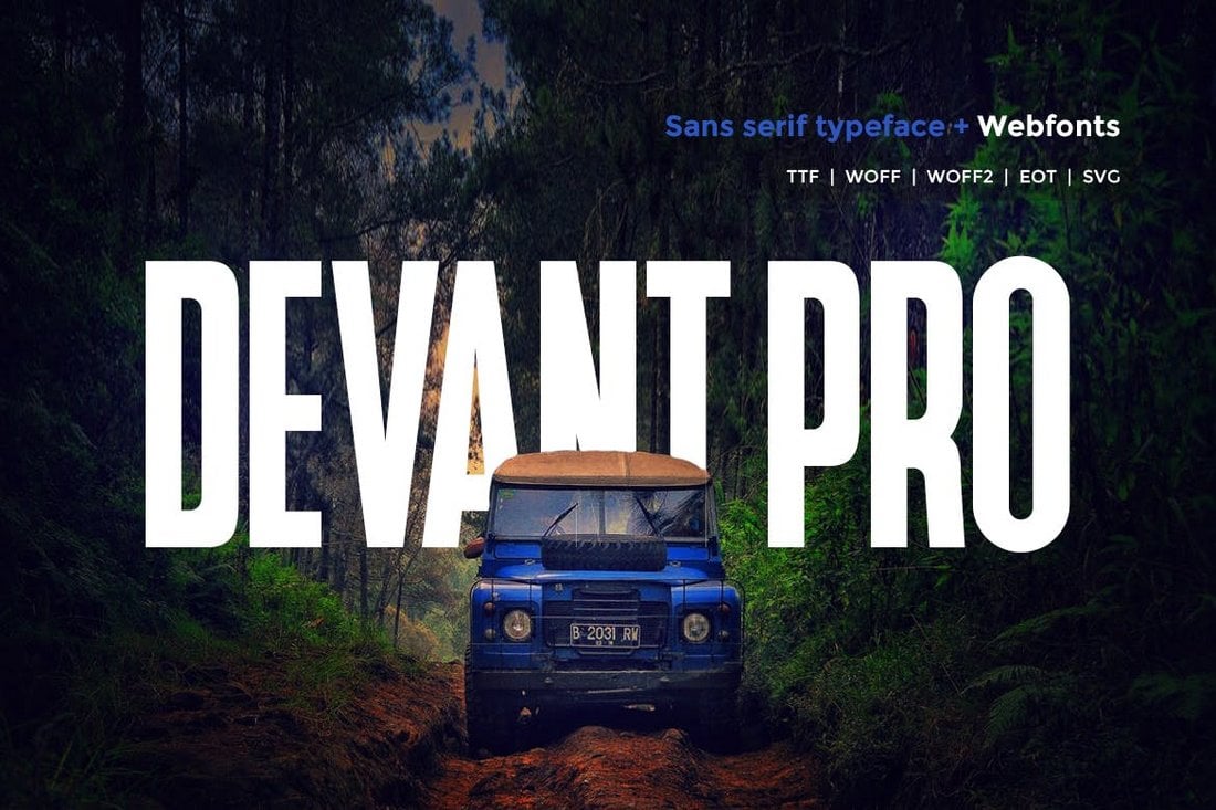
Top Pick
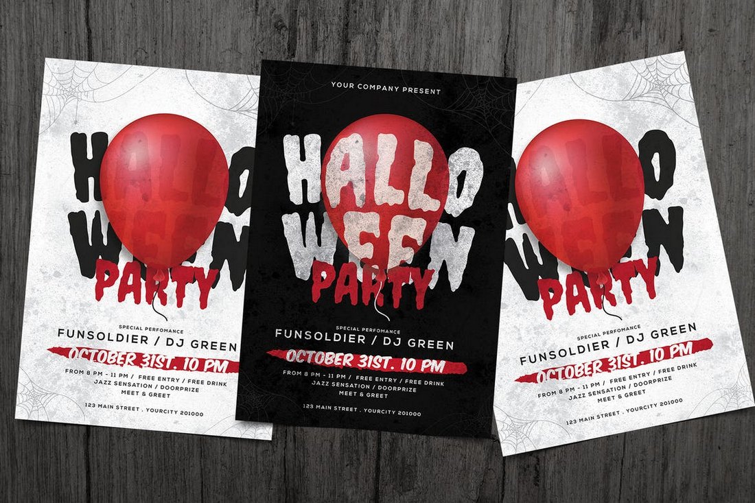
Devant Pro is a modern condensed narrow font that features a big and bold design, making it perfect for website headers, posters, banners, flyers, and much more.
The font will definitely come in handy when designing bold titles for both digital and print designs. It’s also available in OTF and TTF as well as Web Font versions.
Why This Is A Top Pick
The thick narrow design of this font will allow you to design more attractive and attention-grabbing titles and headlines in your designs. The web fonts will also be quite useful when using the font in your website designs as well.
Hornset is a condensed sans-serif font that fuses modern design with precision. Exceptionally sleek, it’s made to leave an impression — fitting more into less space without compromising on clarity or style. Ideal for bold headlines, minimalist posters, or refined branding, Hornset’s clean lines and balanced proportions provide versatility.
Grace is a beautifully condensed bold font that radiates elegance and bears a classic touch. It comes with a rich offering of ligatures and supports multiple languages, covering Latin Western Europe. Its versatile design accommodates numbers, punctuation, and exhibits multilingual support, making it ideal for various designs.
Norgate is a modern condensed font with a sleek, minimalist design. Perfect for contemporary projects, its tall and dense letters are particularly suited for digital media, posters, and typography. Features include uppercase, foreign support, numbers, and punctuation.
MTC Kraveline is a bold, condensed display typeface, perfect for grabbing attention with its striking, compact design. This unique font, equipped with Latin plus glyph set to support 200+ languages, ties a modern aesthetic with vintage undertones, making it an exceptional choice for impactful headlines and displays.
Marghote is a Sharp Condensed Font with a bold and simple design, adding a minimalist touch to your work. Its grotesk style makes it versatile for modern designs across various media, from fashion to typography and magazines. It comes with easy installation and comprehensive accessibility.
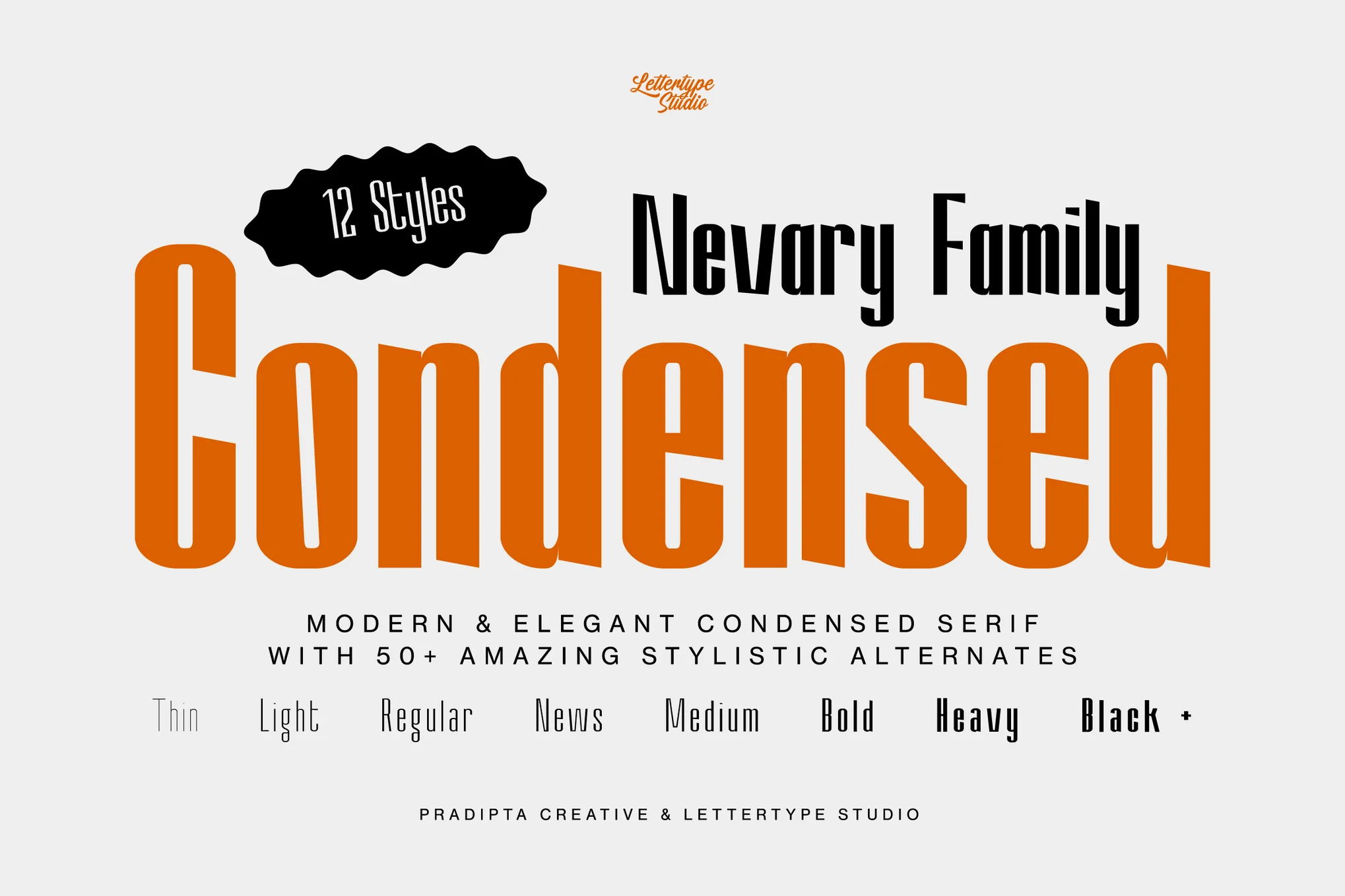
Nevary is an exquisite, modern sans-serif font by Diki Pradipta Tri Atmojo with a unique condensed design, perfect for lending a professional edge to any project. This font family has a sleek, bold, and contemporary feel, ideal for headline creation. It features over 12 varying styles, 50+ unique alternates, and comprehensive multilingual support.
Comparison Display is a unique condensed typeface. It provides a dynamic blend of expanded uppercase letters in bold and sleek, condensed lowercase letters. This font really shines in crafting attention-grabbing posters, distinctive brands, and unforgettable logos. It is multilingual with included characters for punctuation and numerals.
Rasedron is a modern and sleek sans serif ligature logo font, perfect for creating eye-catching logos and branding materials. The design includes distinctive ligatures and an extensive character set, ensuring versatility in usage. Its minimalist aesthetic complements contemporary design trends, while its clarity remains even in smaller sizes.
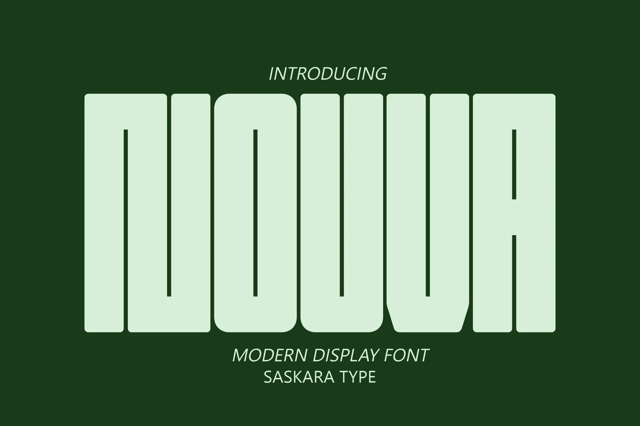
NOUVA is a fashionable, modern Sanserif font with a decorative touch. It’s sleek, dynamic, and perfect for creating punchy logos, labels, flyers, brochures, and signage. Great for any project with a modern feel, NOUVA also offers uppercase, lowercase, punctuation, and multilingual support. You’ll receive the font in OTF, TTF, WOFF, and WOFF2 formats.
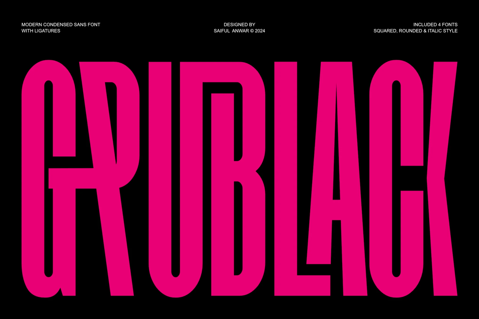
Grublack is a modern condensed sans font, perfect for multiple design applications. It’s sleek, contemporary, and versatile with a wide collection of expertly crafted ligatures, adding fluid beauty to your typography. It has multilingual support and comes in a range of styles including regular, italic, and rounded.
This font comes with a cool condensed letter design with a funky look and feel. It features letters with unique design elements that will help add a personalized look to your typography. The font is perfect for everything from website headers to custom T-shirts, and more.
This is a condensed font family that includes a range of font weights. There is a total of 9 different fonts in this family, featuring thin to black weights. Each font has tall and narrow letters that are perfect for crafting big bold titles.
A minimal and stylish font for designing modern typography. This font features unique characters with a narrow letter design. It has all-caps letters so it’s most suitable for designing titles, headings, labels, and logos.
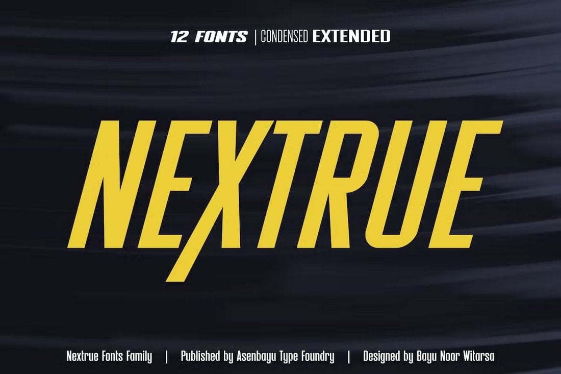
Nextrue is another condensed font family that comes with a selection of different styles of fonts. The bundle includes 12 different fonts featuring condensed, extended, and slant styles. Each font has clean-cut letters for designing attractive titles for posters, websites, social media, and more.
You can download this tall and narrow font for free to design giant titles and headings for your design projects. The font includes all-caps letters with multilingual support.
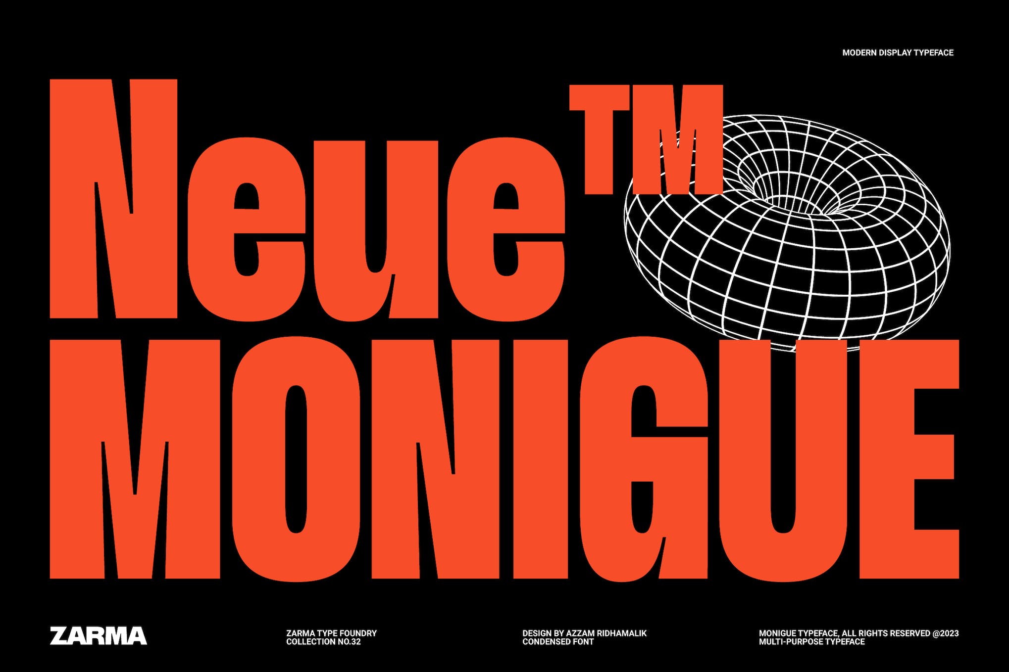
Monigue, a condensed sans serif font, offers a bold, modern aesthetic with a 2000s-inspired design. Ideal for stand-out posters, striking website headers, and clean interfaces, its strength shines at display sizes, making it perfect for impactful logo design.
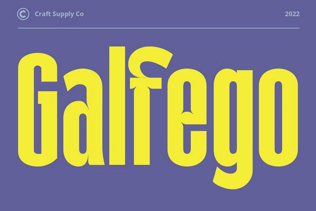
Galber is a bold, condensed typeface that makes a strong impression. It has a modern allure and impactful design, perfect for projects that require a striking touch. Ideal for brand identity, packaging, poster design, or greeting cards, Galber is sure to make your design projects stand out.
Braked is a versatile condensed font family featuring multiple typefaces. With its playful and authentic design, it can be used in a variety of branding projects, from logos to branding designs. Available in .otf and .ttf file formats and with features including uppercase, lowercase, multilingual support, and ligature, it’s a great asset to have in your creative toolbox.
QIKOBER is an expertly crafted typeface with a playful design. Ideal for large point sizes yet still effective on smaller scales, it is perfect for a range of applications such as headlines, branding and logos. It features distinct styles including regular, slanted, and outline fonts.
The Hakobi is a transformational display font, marked by its compact design and bold style. It’s visually striking and delivers a strong, confident message, making it an ideal choice for high-impact projects such as posters or movie titles and more.
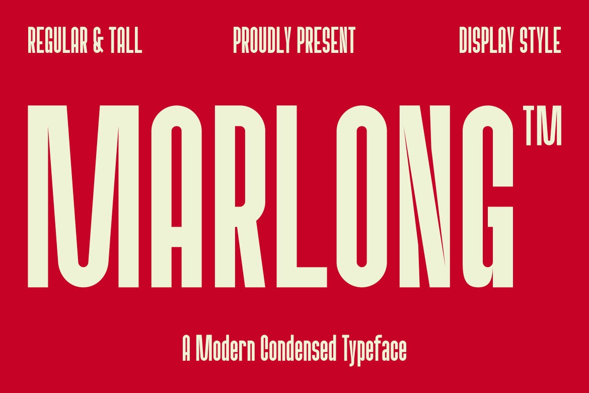
Marlong is a modern, condensed font with a bold and authentic design. Ideal for various branding projects, its versatility shines in numerous contexts, from logos to product design templates. Marlong supports uppercase, lowercase, and multilingual inputs, and ligatures.
Grosin is a unique font radiating an Art Deco vibe. Boasting unique ligatures and glyphs, this display typeface is ideal for magazine layouts, logos, invitations, quotes, blog headers, posters, and advertisements. Grosin includes uppercase and lowercase characters, ligature characters, and supports multiple languages.
HS Monsnow is an innovative, condensed display font with an experimental letter design that adds authenticity and style to any project. Whether for magazines, movies, posters, prints, personal branding, promotions, logos, or product packaging, this versatile font is ready to elevate your designs.
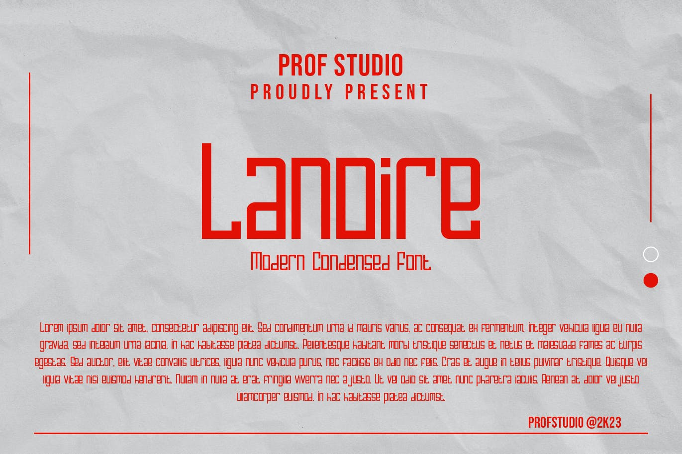
Lanoire is an inclusive and stylish font, tailored for modern branding, headlines, and displays. Offering a full A-Z character set, numerals, and punctuations, it comes in OTF and TTF formats, neatly compressed in a ZIP archive, ready to give your projects an appealing and fresh touch.
Check out Bonnaco, a stunningly classic condensed font. This authentic font, available in both regular and condensed styles, boasts a bold design which makes it ideal for a plethora of branding tasks like logo creation or branding design projects.
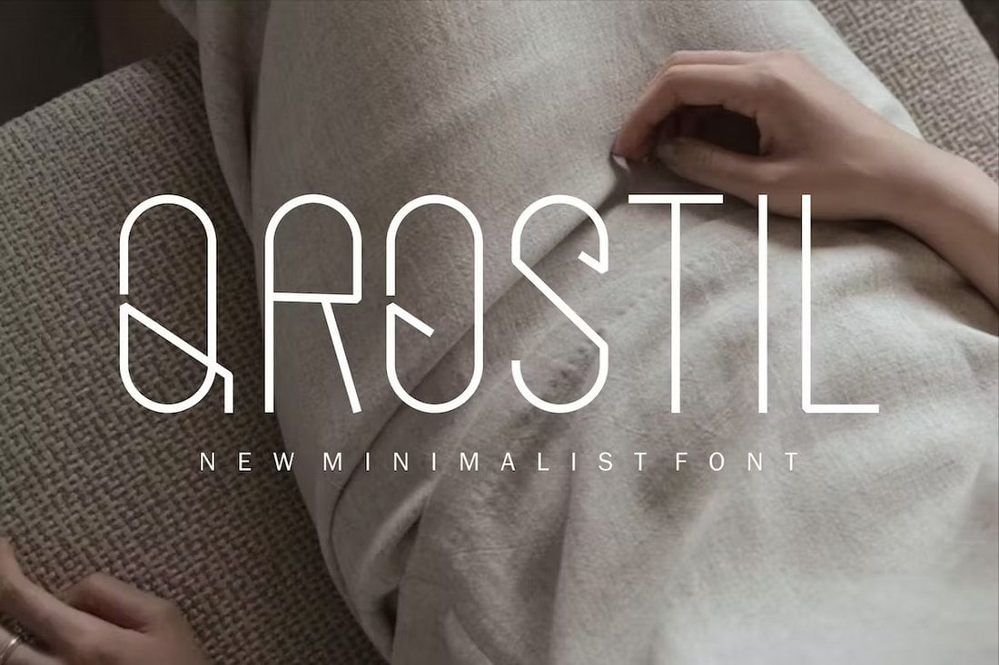
Kurdis is a unique condensed font featuring a geometric letter design. This font has tall and narrow letters that gives it a very creative look and feel. It’s great for designing logos as well as titles for posters and banners.
This font will surely remind you of popular logo designs for luxury brands. It has a set of stylish serif letters with a condensed design featuring an elegant look and feel. The font is perfect for everything from logos to branding designs and more.
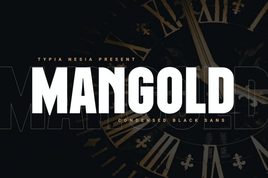
Mangold is a bold font with a condensed letter design. This font has thick and heavy lettering to make your titles and headings look much more visible. It’s especially great for typography designs related to sports and gaming.
This font has a very unique letter design that gives it a fun and quirky look. It features tall and narrow letters with rounded edges. The font uses an attractive style of letter designs as well. There are both uppercase and lowercase letters too.
Mouzambik is a free font you can use in your personal projects. It has a stylish letter design with an extra condensed and narrow spacing. The font is great for bold title and heading designs.
Another modern condensed font with a stylish letter design. This font is perfect for crafting branding designs for modern agencies and businesses. It features unique style of letters that will make your typography designs stand out from the crowd.
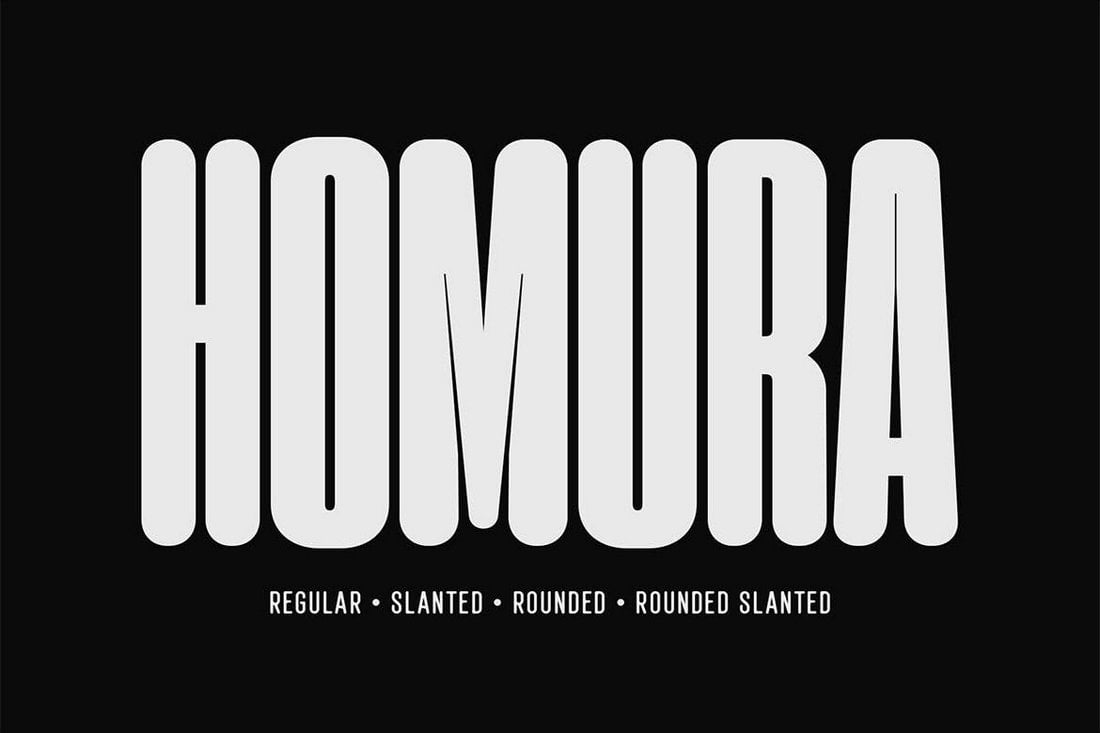
Homura is a narrow font made for creative designers. It comes in rounded, slanted, and regular styles. Its unique design will allow you to give a fun and trendy look to your projects. The font has lots of stylistic alternate characters too.
The uncommon design of this font lettering will make your titles and headings look much more attractive. Boksura is a display font with a narrow letter design. It’s great for T-shirts, magazine titles, book covers, and more.
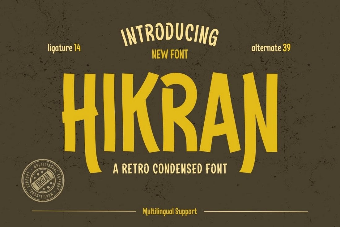
Hikran is another unique condensed font that features a letter design inspired by retro-style typography. It’s most suitable for crafting casual and fun titles and headings. The font includes 39 alternates and 14 ligatures.
You can download this font for free to craft cool and creative titles for your personal projects. It has thin and narrow letters that will fit perfectly for posters and flyer designs.
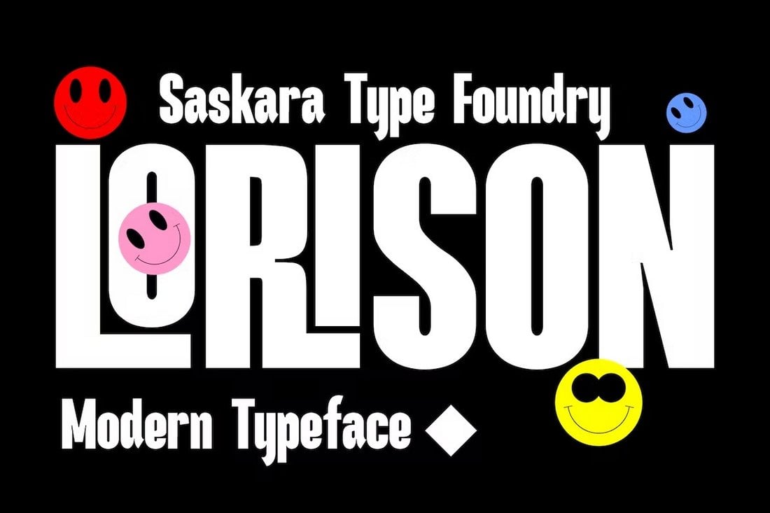
Lorison is a unique font that comes with a set of fun and casual characters. It has a beautifully modern letter design that will fit in perfectly with your fun custom T-shirts, posters, signage, and more.
This condensed font comes with a classic letter design that resembles typography from vintage signs and posters. It has tall and condensed letters that are ideal for bold titles and headings. The font comes in 3 different weights.
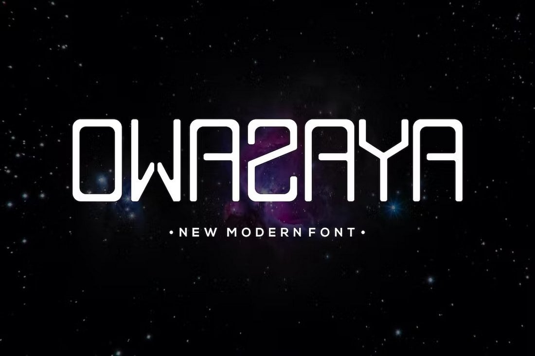
If you’re looking for a modern and futuristic font with condensed letters, this font is perfect for you. It includes a set of all-caps letters featuring a stylish and condensed design. The font is most suitable for logos, labels, and packaging designs.
The classic vintage design adds a unique and traditional look to this narrow font. It will make your logos and label designs look much more original. The font includes both uppercase and lowercase letters alongside alternates and ligatures.
Fitalia is a free condensed font that comes with a clean and minimal design. This font is ideal for designing big headings and titles for professional projects. The font includes all-caps letters and it’s free for commercial use.
This font bundle comes with two different fonts that go perfectly well together. It includes a condensed sans-serif font and a script handwritten font. When combined, they will help you craft amazing designs. Of course, you can use them separately as well.
Silver Crown is one of the most stylish condensed fonts you’ll find on our list. It features a set of beautiful characters, including stylistic alternates and ligatures, for designing logos, badges, and more.
Hochland is a narrow font that comes with a set of thick and bold characters. It’s most suitable for crafting poster titles, product labels, and bold website headers. The font includes both uppercase and lowercase letters.
Featuring a mix of art-deco style and elegant luxury design elements, Louvre is a beautiful condensed for that’s perfect for all sorts of high-end branding design. It comes with a very unique letter design that will look amazing on logos, website headers, T-shirt designs, business cards, and much more.
Nordin is a creative sans serif font that features an uncommon letter design. The narrow condensed look also adds another unique look to the font design. It’s ideal for crafting business cards for creative agencies and businesses. As well as for designing titles and headings for websites and blogs.
This is a family of condensed fonts that include 20 different weights. It features a minimal letter design that’s ideal for crafting headings and text with a modern look. The font is free to use with personal projects.
Yanice is a modern display font that features a semi-condensed letter design. This font has a clean-cut look that will fit in nicely with all kinds of professional design projects from branding designs to stationery designs, logos, labels, website headers, and everything in between.
This font comes with a beautiful design mixed with handwritten script and condensed letter designs. It’s simply perfect for all your personalized design projects, including greeting cards, wedding invitations, and even T-shirts.
Ceddil is a creative font with chunky letters. This font also has a narrow letter design that will make your poster titles and headings look even more attractive. It features both uppercase and lowercase letters with the same thick letter design.
Luxury and elegance is written all over this stylish serif font that features tall and narrow letter designs. It’s a great choice for branding designs, logos, product labels, and even social media posts. The font comes in 4 different weights.
You can download and use this font family for free, even in client and commercial projects. It includes 5 different font weights that have clean, simple, and condensed letters. As well as more than 400 glyphs.
Another condensed serif font you can use with all your modern and luxury designs. This design is ideal for classy branding designs and it’s especially perfect for jewelry business and wedding-themed designs.
A unique font with a letter design inspired by Japanese typography and culture. This font has a narrow condensed design alongside its uncommon letters. The font includes uppercase and lowercase characters.
If you want to design big bold titles that instantly grab attention, be sure to use this font in your designs. It has a set of all-caps letters with chunky and narrow letters. It also includes an alternate character set as well.
This font is perfect for giving a hand-crafted look and feel to your designs. It includes tall and narrow letters with a handwritten look. The font features all-caps letters that are ideal for big titles and headings.
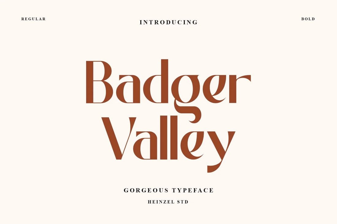
Badger Valley is an elegant font with a narrow letter design. It’s great for modern branding and digital designs. The font is free to use with your personal projects.
Ramose is a beautiful experimental font featuring a highly condensed letter design. If you’re interested in experimenting with a new font design, this one is a great place to start. It comes in 4 different styles as well.
This is an elegant and stylish font you can use to craft designs for luxury and fashion brands. It’s especially suitable for designing social media posts for promoting high-end products. The font features lots of alternates and ligatures.
Eirene is a trendy handwritten font featuring a feminine design. It has a set of tall and narrow letters. This font is perfect for crafting greeting cards, social media posts, wedding invitations, and much more.
If you’re looking for a font with a bold and chunky design, this font is perfect for you. It features a set of bold characters with narrow spacing. You can craft beautiful headings for websites, titles for posters, and even cool logos with this font.
Another free font to use with your personal projects. This font features an elegant letter design with slightly narrow spacing. The font looks great on website headers and magazine designs.
This bold and big display font is a great choice for crafting titles for various print and digital designs. It’s especially suitable for sports and fitness-related designs. The font features a condensed letter design that comes in 4 different styles.
A unique narrow display font you can use to craft everything from creative logos to bold titles. This font comes with lots of glyphs, alternates, ligatures, and much more. It comes in OpenType and TrueType formats as well.
Eugerie is a modern font that also takes inspiration from classic typography designs. It’s a condensed typeface that is ideal for giving a cute and feminine look to your designs. The font includes both uppercase and lowercase letters.
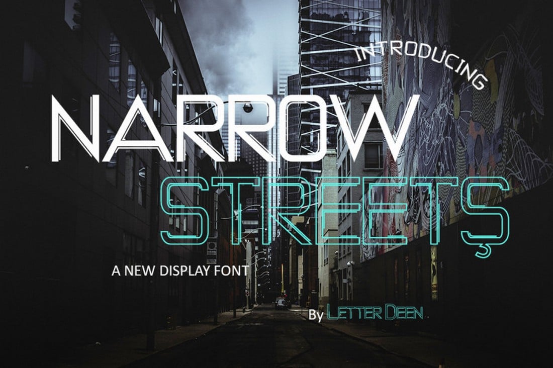
Narrow Streets is a bold display font featuring a narrow lettering design. This font is great for crafting titles for modern flyers and posters. The font is free to use with your personal projects.
This bold and narrow font aims to help you cover all types of professional branding designs with its clean and precise set of characters. The font will fit in perfectly with your poster designs, book covers, promo ads, and more.
Here we have Drustic Daily, a sans-serif condensed font that offers a range of design possibilities. It offers a vintage and old design that you will agree is eye-catching, and comes with the standard uppercase and lowercase letters, contextual alternates, ligatures and much more.
Perfect for your upcoming projects, Moonstaire is a clean and modern condensed font that can be used for invitation cards, home decore book title, fashion or beauty promotional headline, editorial, website design and more.
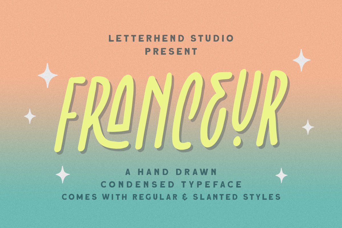
If you are looking for a font option with natural handwriting feel, consider Franceur, a stunning typeface design that excels when used for logos, labels, posters, flyers, and other branding and corporate identity materials.
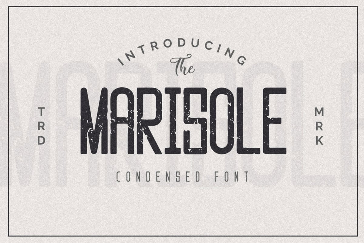
Check out Marisole, a simple and eye-catching font that you’ll be hard-pressed to pass up. It has everything you’d want in a great looking condensed font, plus it’s available for free. What’s not to love about that?
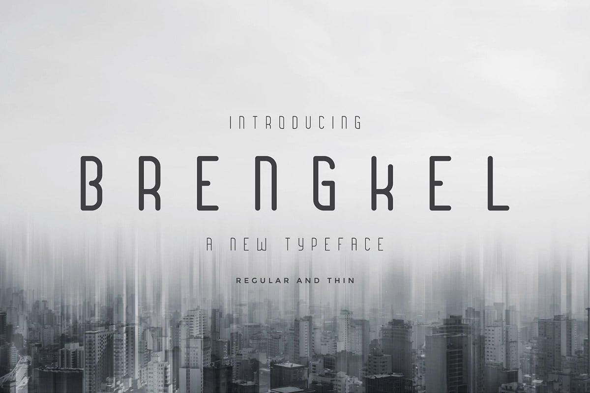
If you are wanting to get your hands on a font that looks beautiful and doesn’t skimp on features, You can’t go wrong with Brengkel. We wholeheartedly recommend you to check out this free font design pronto.
Looking for a condensed font with creative lettering? Then this font is perfect for you. It features a set of unique characters in a narrow style with rounded edges. The font includes both uppercase and lowercase letters as well as in OTF and TTF formats.
This is a free condensed font that comes with a beautiful and elegant letter design. With tall and narrow spacing. It’s perfect for crafting simple posters and flyers. The font is free to use with your personal projects.
Nailhead is a modern condensed font featuring a clean-cut lettering design. It comes with a mix of vintage elements as well. Making it a great choice for label, badge, and signage design works. Nailhead is an OTF font with more than 250 glyphs.
Just by looking at this font, you can tell it’s a perfect fit for luxury branding designs. Whether you’re making a logo for a fashion brand, poster for a high-end product, or a website header for a jewelry shop, this font will make them all look more professional.
Beaver is a very creative narrow font that features a handwritten letter design. This font is perfect for crafting titles for posters, flyers, banners, and other designs related to fun and entertaining projects.
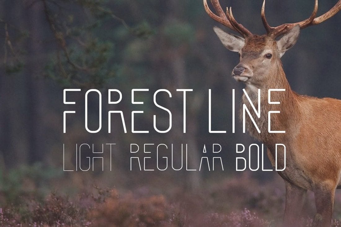
This is a unique family of fonts that features a compressed narrow design. It comes in light, regular, and bold font weights. As well as in OTF and TTF formats. The font is most suitable for title and heading designs. And it comes in a serif version as well.
Calama is a clean and minimal font that features a condensed letter design. This font includes uppercase and lowercase letters. And you can use it completely free with your personal and commercial projects.
Edingu is an elegant condensed font that features a modern design that’s ideal for professional, luxury, and branding designs. The font is available in 3 different styles, including regular, rounded, and italic styles.
Conquest is a bold serif font with a slightly condensed design. It’s most suitable for making titles and headings related to sports and entertainment-related brands. The font is available in both sans-serif and slab serif designs as well.
This fun and quirky condensed font is a great choice for crafting posters, greeting cards, book covers, and more related to children of all ages. The font includes ligatures, glyphs, and much more.
Genuine is a modern condensed font featuring a bold and stylish letter design. This font is ideal for designing website headers and posters. The font is free to use with personal and commercial projects.
Efesto is another free font with a tall and narrow design. This font is also completely free to use with your commercial and client projects. It includes both regular and italic font styles.
This modern font family features multiple fonts with different weights and styles. Including italic and outline designs. All of the typefaces have narrow condensed character designs as well.
Argon is the perfect font you can use to design logos and titles for modern businesses. The font features a set of unique narrow letters unlike any other font on our list. It also comes in 4 different weights.
This elegant font pair includes both a narrow sans serif font and a bold serif font. Two of which go really well together. You can use both fonts to design titles or even design paragraphs.
A bold and narrow sans-serif font for designing headings and titles. This font is most suitable for posters, website headers, and title designs. It comes in multiple weights and includes both uppercase and lowercase letters as well.
Alvaro is a beautiful free sans-serif font that features a condensed design. This font also has a vintage feel to it. And it’s ideal for badge and label designs. It’s free to use with your personal projects.
Parkia is a family of condensed fonts that include typefaces in various styles and font weights. You can use this font with different types of professional and creative projects as well as print designs.
This elegant and condensed font is a great choice for designing logos, website headers, and flyers for luxury and high-end brands. The font includes all-caps letters along with punctuations and numbers.
Sprout features a tall and narrow design that makes it a great font for crafting all kinds of designs, including greeting cards, website headers, posters, social media posts, and much more.
Tallios font comes with a narrow design and stylish rounded edges. It’s most suitable for crafting social media posts, quotes, posters, and T-shirt designs. The font includes both uppercase and lowercase letters.
Gatsby is an elegant condensed font you can use for all kinds of professional, business, and branding designs. It seems particularly more suitable for luxury brands and fashion-related design projects.
Calcio font features a highly condensed design that gives it a narrower look. The font is best for creating titles, headers, and posters. It includes both uppercase and lowercase letters and symbols.
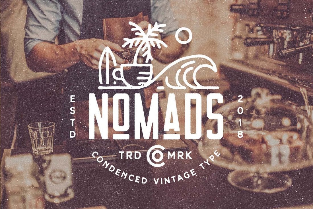
Nomads is a condensed font that comes with a vintage design. It’s best for crafting badges, labels, and logos for vintage-themed businesses and brands. The font comes in Regular, Rounded, and Vintage styles.
Chillvornia font comes with a unique handcrafted design with decorative letters. The font is perfect for designing modern-vintage badges, posters, titles, and headers.
Nordams is a family of condensed fonts that comes with various styles and weights. It includes 12 different font styles in 5 different weights ranging from thin outline to bold and more in between.
This free font is available in 18 different styles you can use with various types of projects, including banners, posters, website headers, and much more. It’s free to use with your personal and commercial projects.
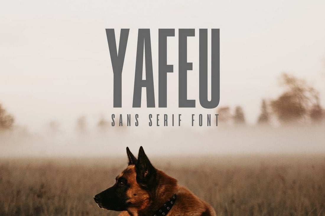
Yafeu is a bold narrow font you can use to design different types of print and digital creations, including posters, banners, flyers, and website headers. The font includes uppercase, lowercase letters, numbers, and punctuations.
Sabang Island features a unique design that will surely make your designs stand out from the crowd. The font comes in clean and rough styles, both of which includes uppercase and lowercase characters and numbers.
Just as the name suggests, this free condensed font features an elegant design that you normally see in glamorous and luxury brand designs.
The tall and narrow design of this font makes it a great choice for making logos, titles, and headlines for fashion and luxury design projects. The font, however, is free to use only with personal projects.
This free font has all the elements of professional font design. Even though it’s only free for personal projects, designers, artists, and photographers can still use it with portfolio designs and social media designs to make their creations look more professional.
Manufaktur is a massive font family that comes with a total of 60 fonts. It includes fonts in 5 weights and 3 styles, all of which also ranging from 3 widths from condensed to expanded.
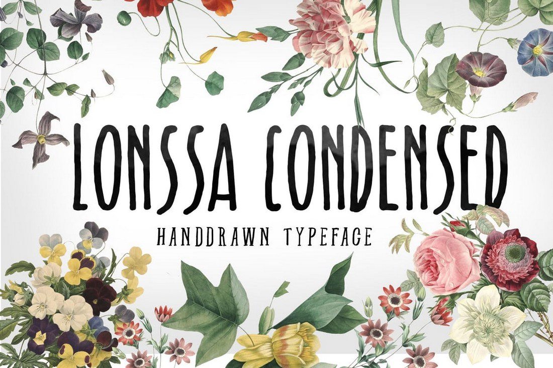
Lonssa is a gorgeous condensed font that comes with a stylishly narrow design. It’s perfect for feminine product design as well as your lifestyle blog headers, book covers, greeting cards, wedding invitations, and more.
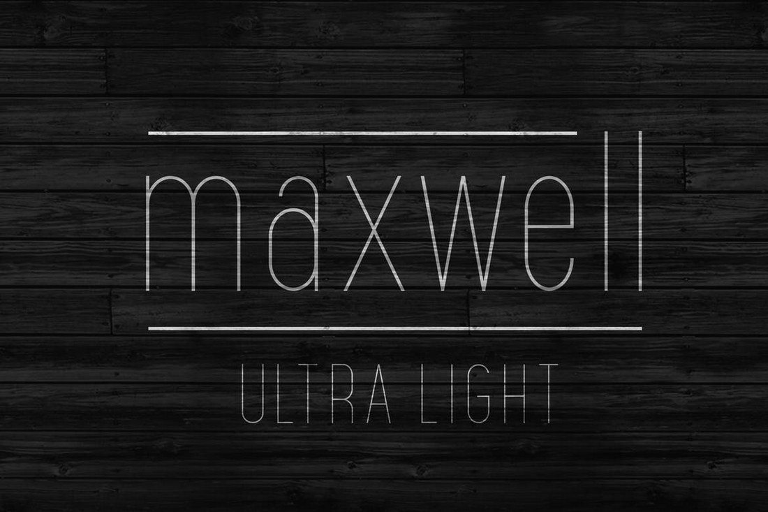
Maxwell is a minimalist narrow font that features a mixed modern-retro design inspired by the text and sign designs from the 1950s. This font comes in both uppercase and lowercase letter versions with alternative characters and glyphs.
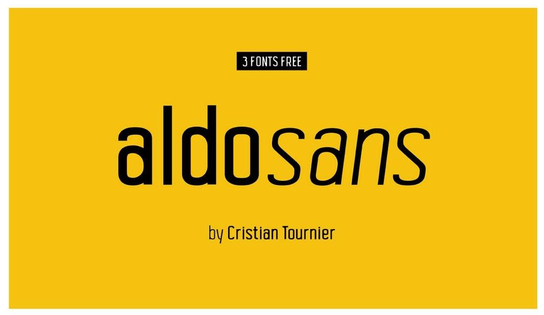
Aldo Sans is a creative condensed font that features 3 different styles, including regular, bold, and italic styles. The font is free to use with personal and commercial projects.
Calibre is another tall and narrow condensed font that is most suitable for decorative designs and crafting titles for posters. You can use it for free with your personal projects.
This is font will fit in nicely with all of your website header designs, logotypes, badges, and signage designs. The tall and bold design of the font will certainly make your text stand out. It has been designed with “the principle of octagonal form”
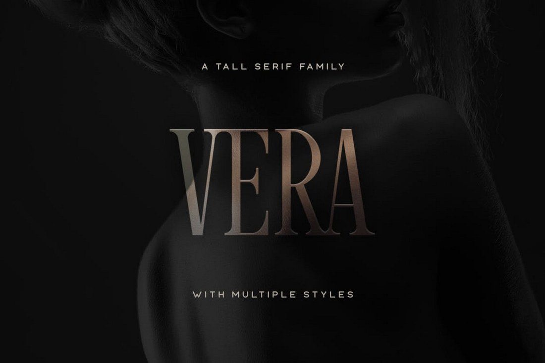
A font made specifically for luxury brands and high-end products, Vera is ideal for showing off authority and class. Vera features a design similar to the font used by Vogue and it comes in rough, regular, and oblique versions.
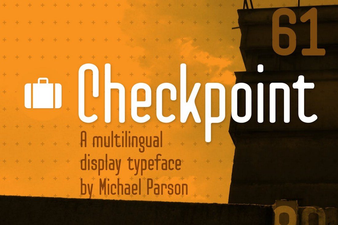
Checkpoint is a professional multilingual font you can use with almost any type of design work, including logos, signage, banners, posters, and much more. The font also comes in several different versions ranging from light to bold.
This highly creative brush font also features a narrow condensed design. It supports multiple languages and comes in several font variations. It’s great to use with your greeting card designs, social media posts, and poster designs.
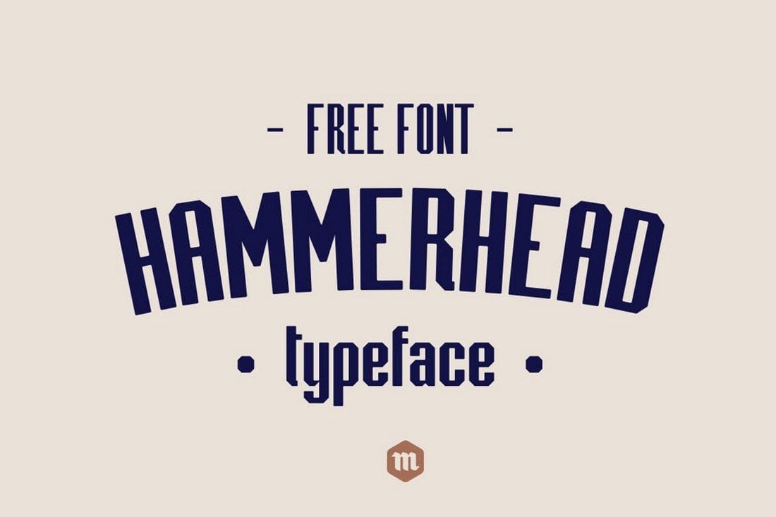
Hammerhead is a big, bold, and condensed font that you can use for vintage and retro-themed designs, including logotypes, signage, website headers, banners, and posters. The font includes both uppercase and lowercase letters and comes with 252 glyphs.
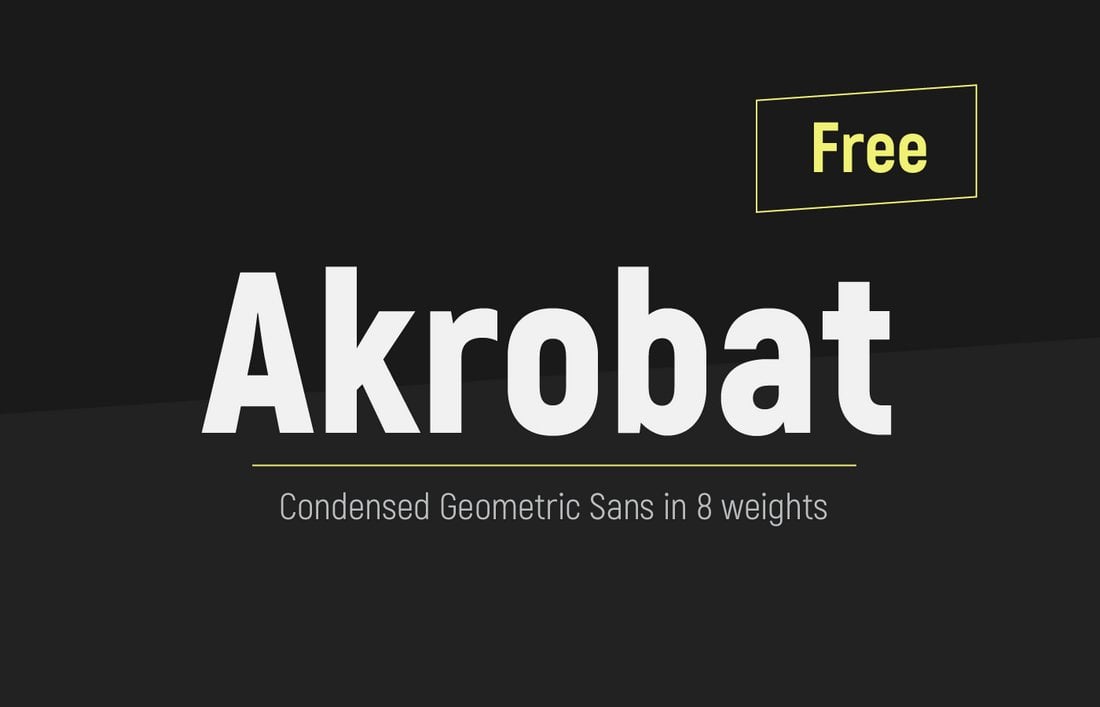
Akrobat is an elegant condensed font you can use with all kinds of print and digital designs, including flyers, posters, banners, and social media posts. The font is available in multiple weights and supports multilingual characters as well.
Calima is a free creative condensed font with rounded character design. This font also features a geometric design and it’s free to use with personal and commercial projects.
A brush font featuring a stylish condensed design. This font features a mix of both modern and vintage design elements that will add a unique attractiveness to your various design works.
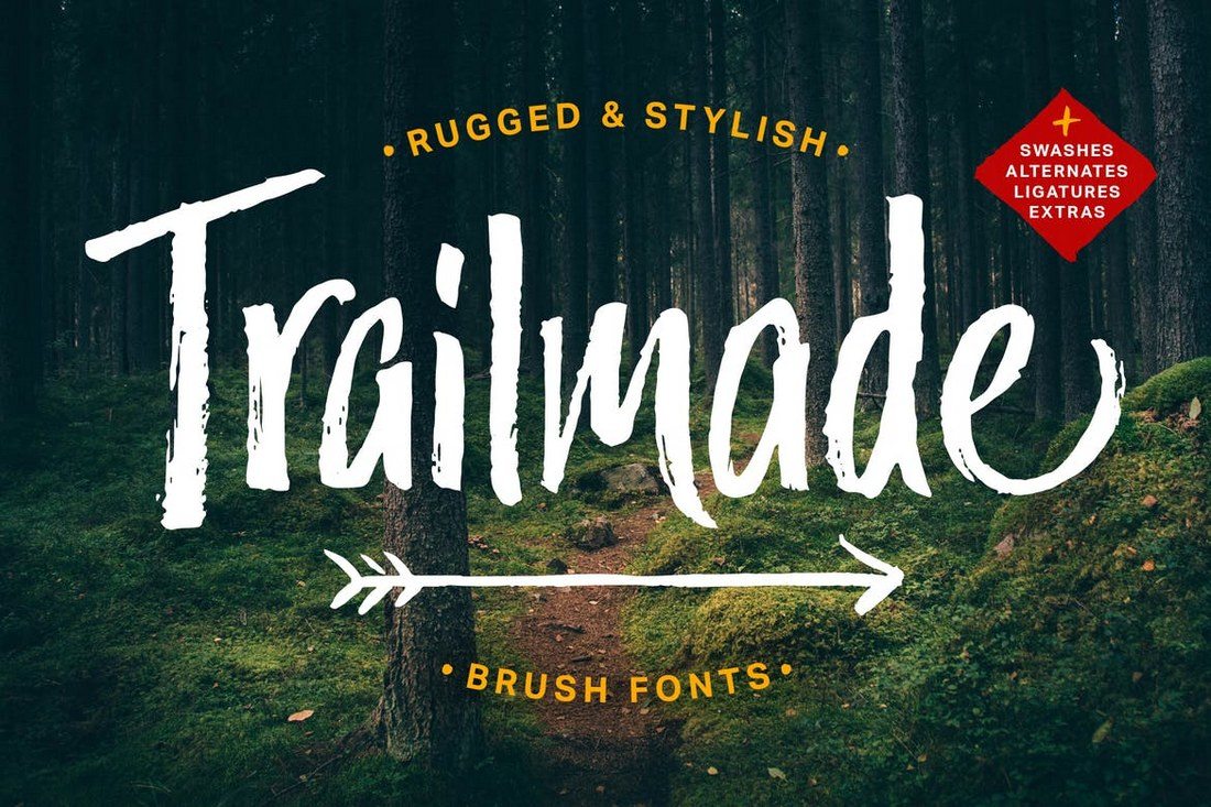
A yet another brush that comes with a truly natural look and a rugged design. The font is available in several different styles and it includes swashes, automatic double-letter ligatures, and more handcrafted design elements.
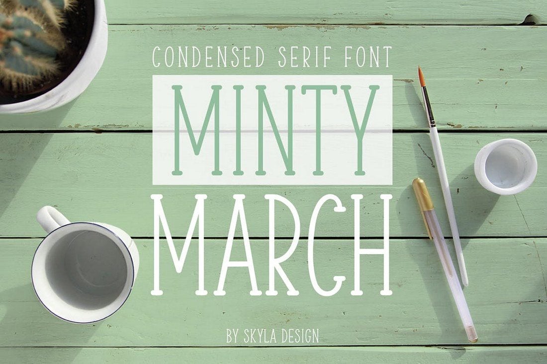
This is the type of font that you usually see on greeting cards and wedding invitations. Minty March is a condensed font that also doubles as a serif font. It includes both uppercase and lowercase letters with numbers, ligatures, and more.
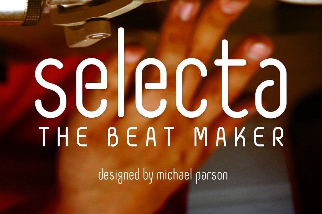
Selecta is a rounded sans serif condensed font that’s perfect for poster and website header designs. The font also features a professional design that makes it suitable for logotypes and branding work as well.
This unique font features a design inspired by the details seen in the Italy’s Stile Liberty. It’s been designed as a “tribute to Italy of the early twentieth century,” which makes it the perfect font to be used with your vintage and classic themed designs.
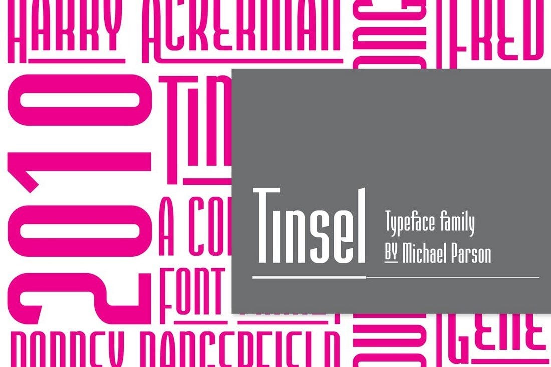
Tinsel is a family of fonts that features several condensed typefaces. You can use the font for branding work like letterheads, logotypes, business cards, and other professional designs.
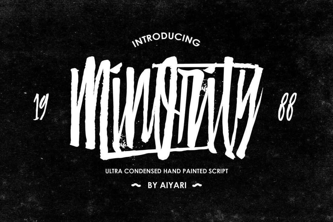
This font features an ultra-condensed script design that aims to give your text a natural hand-painted look. It will go along great with T-Shirt designs, logos, and other creative design work.
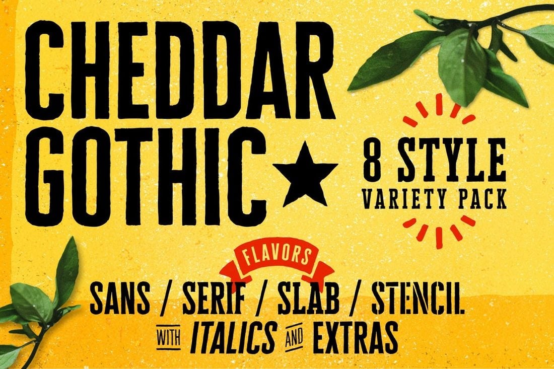
This beautiful and hand-drawn condensed font family includes 8 unique typefaces, including Sans, Serif, Slab, Stencil, and more. Each font in this family comes with 92 matching catchword and icon glyphs, which makes this the perfect font for designing logos and signage.
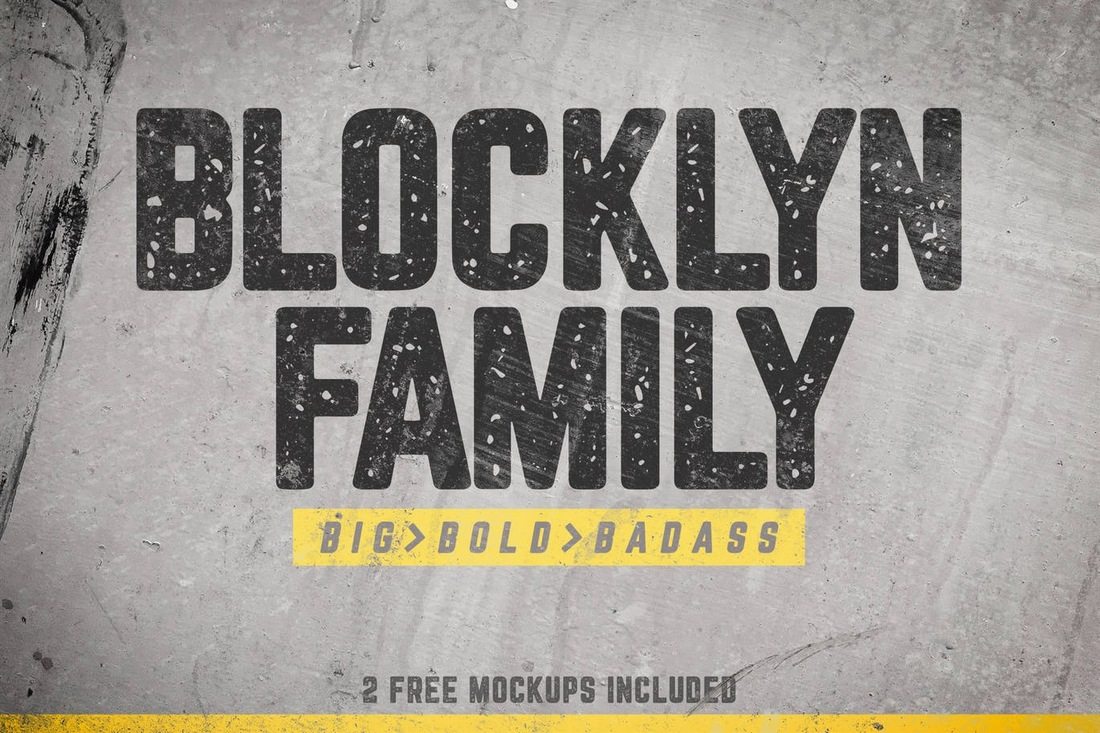
Blocklyn is a great font for showing your titles and mission statements in big bold text. The font family features 4 typefaces Condensed, Condensed Italic, Grunge, and Grunge Italic. It also comes with 2 bonus PSD mockup templates as well.
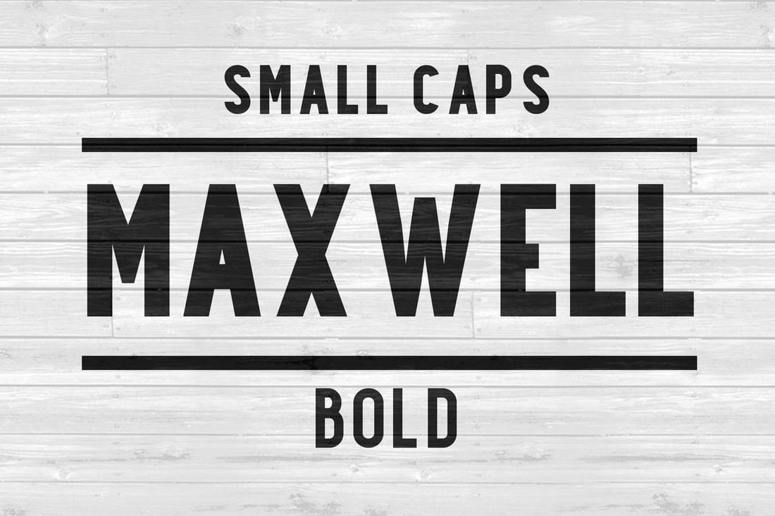
Inspired by retro fonts from the 1950’s, the Maxwell Sans font features two typefaces: Regular and small caps. The clean and minimal design of this font makes it best for both headline and body text.
This condensed web font comes with a creative touch and unique design. The font is available in three versions: light, regular, and bold. It seems ideal for website headers, titles, and even logo designs.
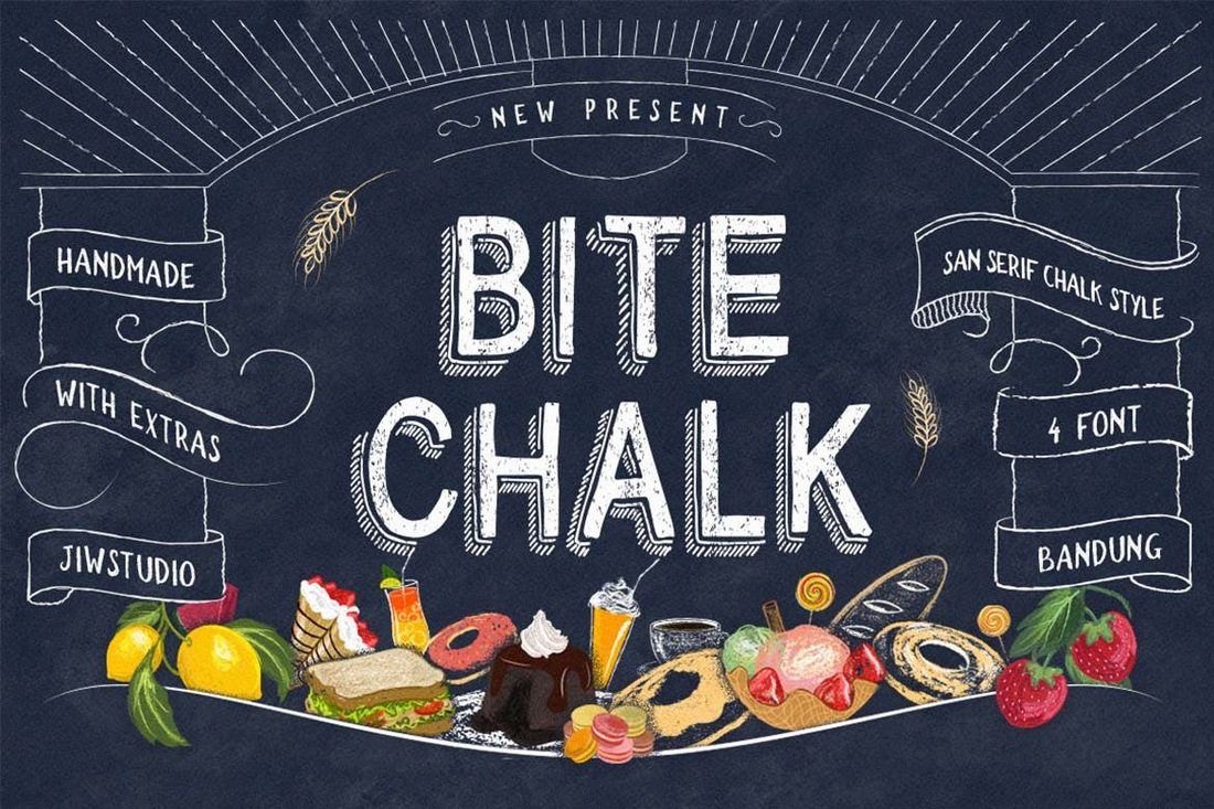
BiteChalk font will make your text look as if they were drawn on a blackboard. This font comes in 4 typefaces, including regular, bold, normal, and slim. It’s a unique font you can use for designing restaurant menu boards, signage, posters, T-Shirt designs, and much more.
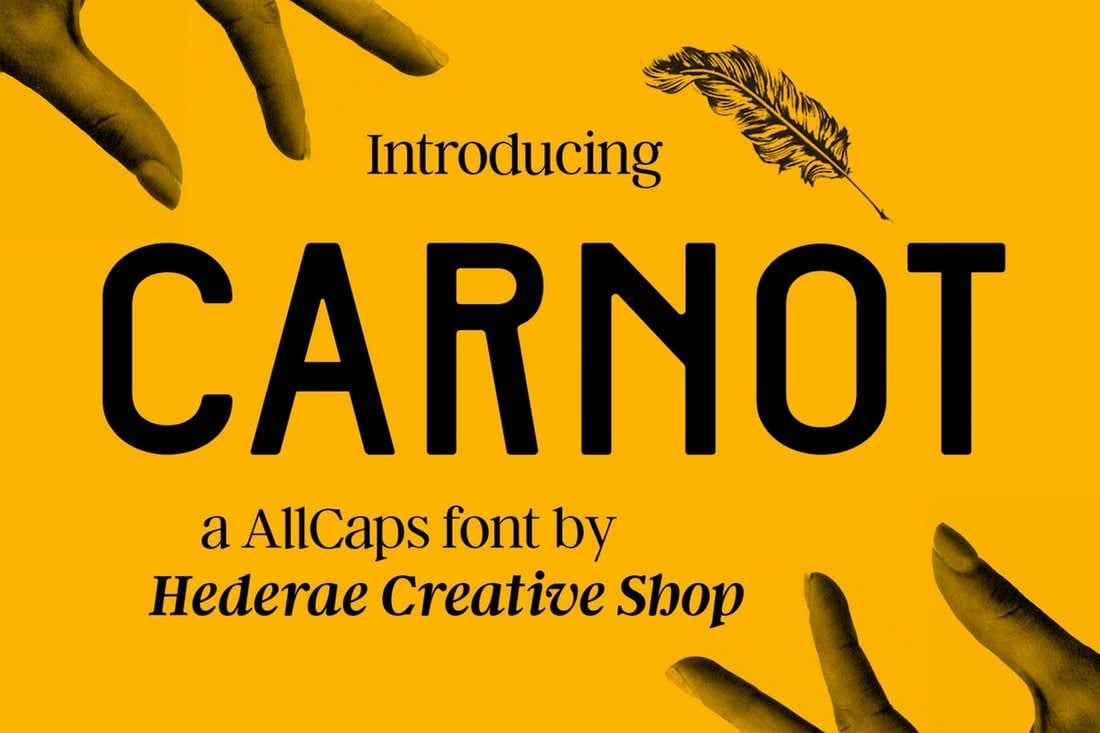
This all-caps grotesque type font features a minimal and an elegant design for making your logotypes, magazine, and poster design look more professional than ever. Carnot font also supports over 20 different languages.
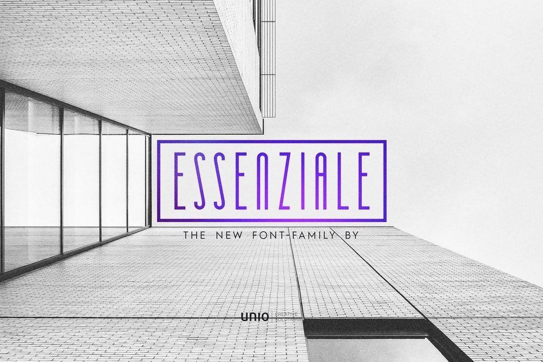
Essenziale is a minimalist and an ultra-condensed font family that comes in 8 versions, including Bold, Slab, Slab Bold weights, and more. Each font in this family features unique characters, making a total of 412 glyphs in the font family.
This is a professional condensed serif typeface that’ll make your text looks like something you usually see on modern magazines and corporate websites. The Global font is perfect for your formal and commercial designs.
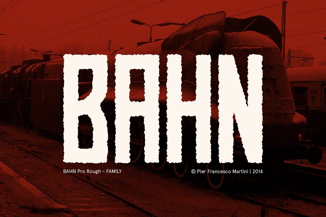
Bahn is a rough font that’ll go along nicely with your entertainment and playful designs. This condensed and vintage-style font comes in 3 weights and 228 glyphs.
At first sight, you can see this font being used for a logo, signage, or a header design. The bold retro design of the font makes it perfect for such designs. The font comes in both uppercase and lowercase versions.
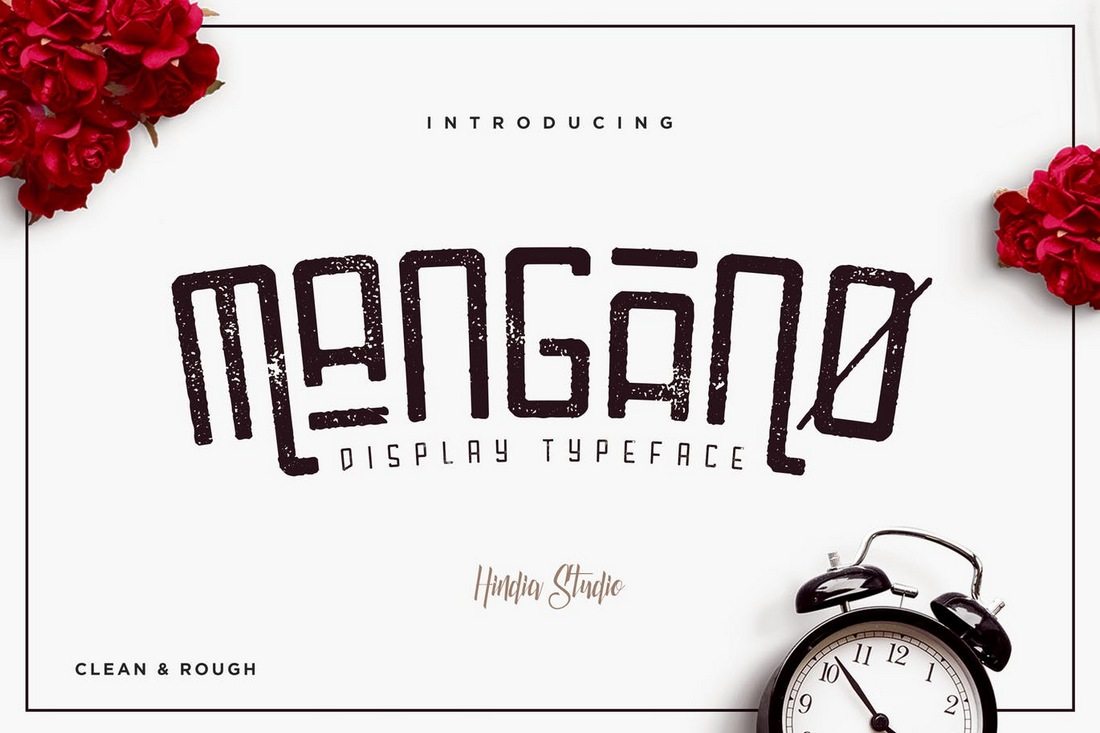
Mangano features both a clean and rough worn off design with a mixed modern/vintage look. It comes in uppercase and lowercase versions for creating signage, logos, T-Shirt designs, and more.
This slightly rounded multilingual sans-serif typeface supports spanish, portuguese, german, danish, french, and a number of other languages. The modern look of this typeface makes it ideal for any type of design work.
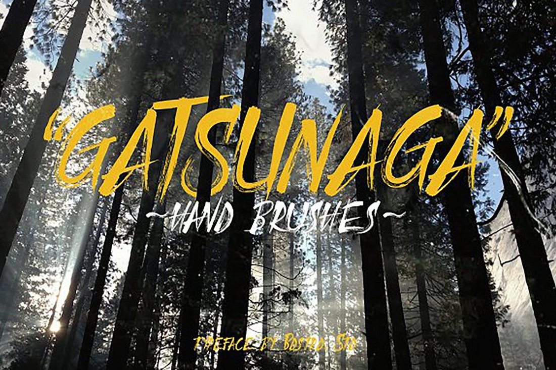
Gatsunaga is a condensed brush font that features a design inspired by a samurai sword strikes. Hence the sharp edges and precise flow of the font design. It looks perfect for book covers and movie posters.
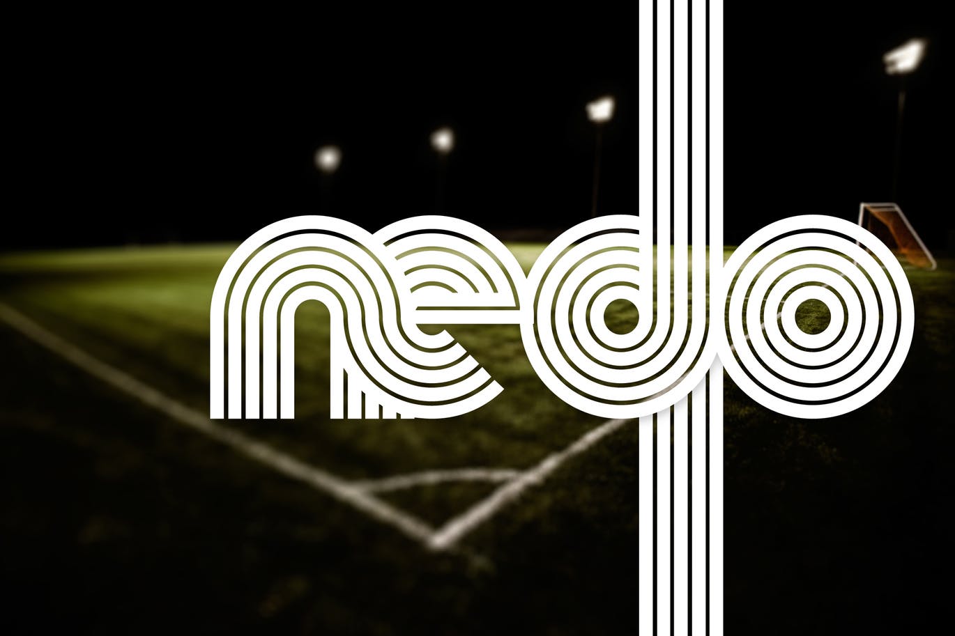
Nedo is a display font that features both normal and condensed versions. The retro look of this typeface makes it the best choice for neon signs, T-Shirt designs, and logo designs.
The designer of this font has put a serious thought into crafting each letter in this Neo-Grotesque sans typeface in precision. The font comes in both normal and condensed versions.
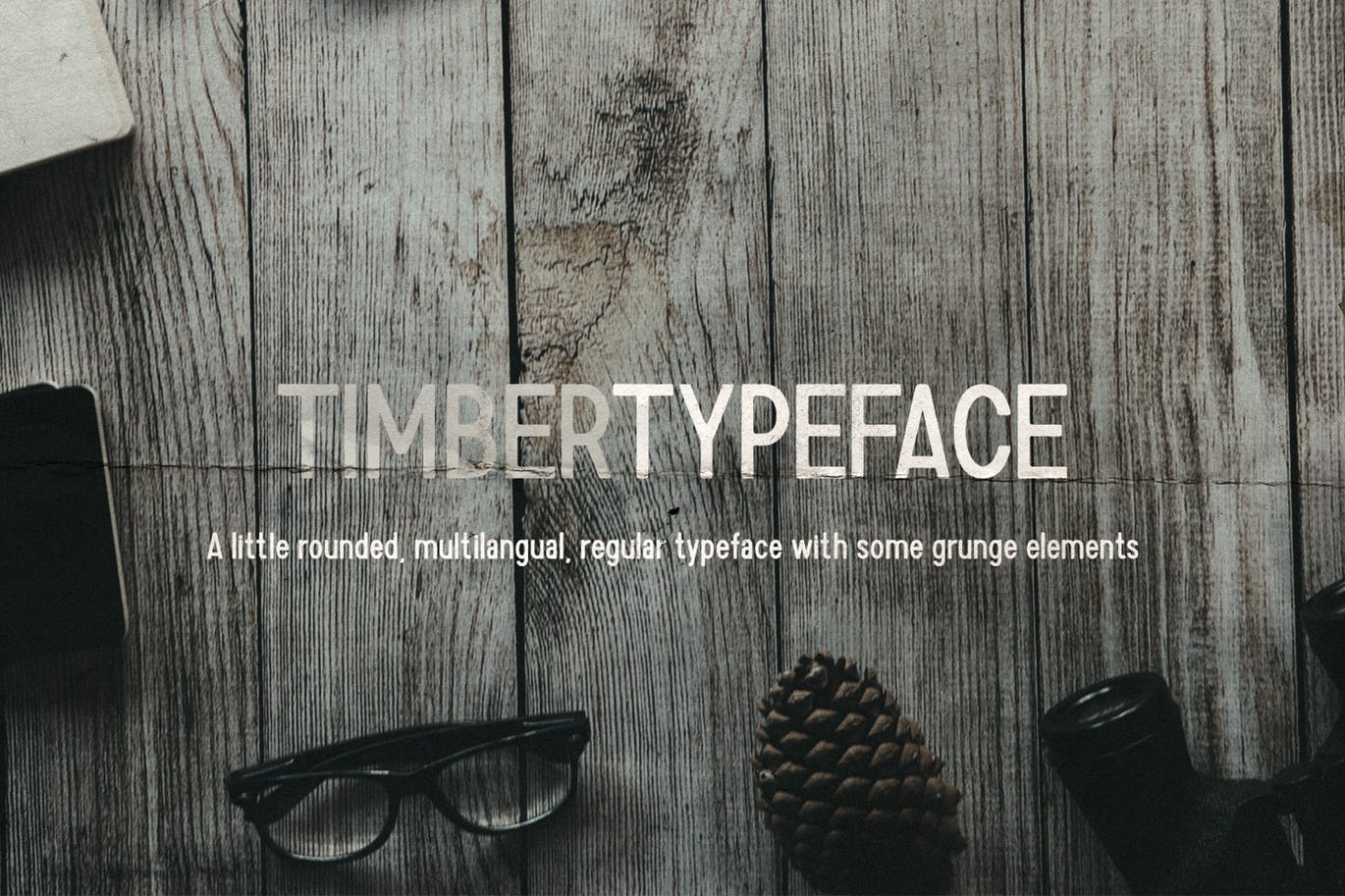
This font looks great for crafting social media content and website headers. The Timber typeface features an old vintage look along with grunge elements.
Amorie is a hand-drawn font that comes in a number of weight, styles, and glyphs. This font will help add a little human touch to your digital graphic designs.
This is yet another handwritten condensed sans serif font that includes 300+ glyphs and comes in .otf, .ttf, and web font versions. It’ll look great with your header and poster designs.
Hipstetic is a font family that features a mixed design of hipster and vintage looks. It comes in 4 different font variants and 100 glyphs. Perfect for book covers, website headers, signage, and more.
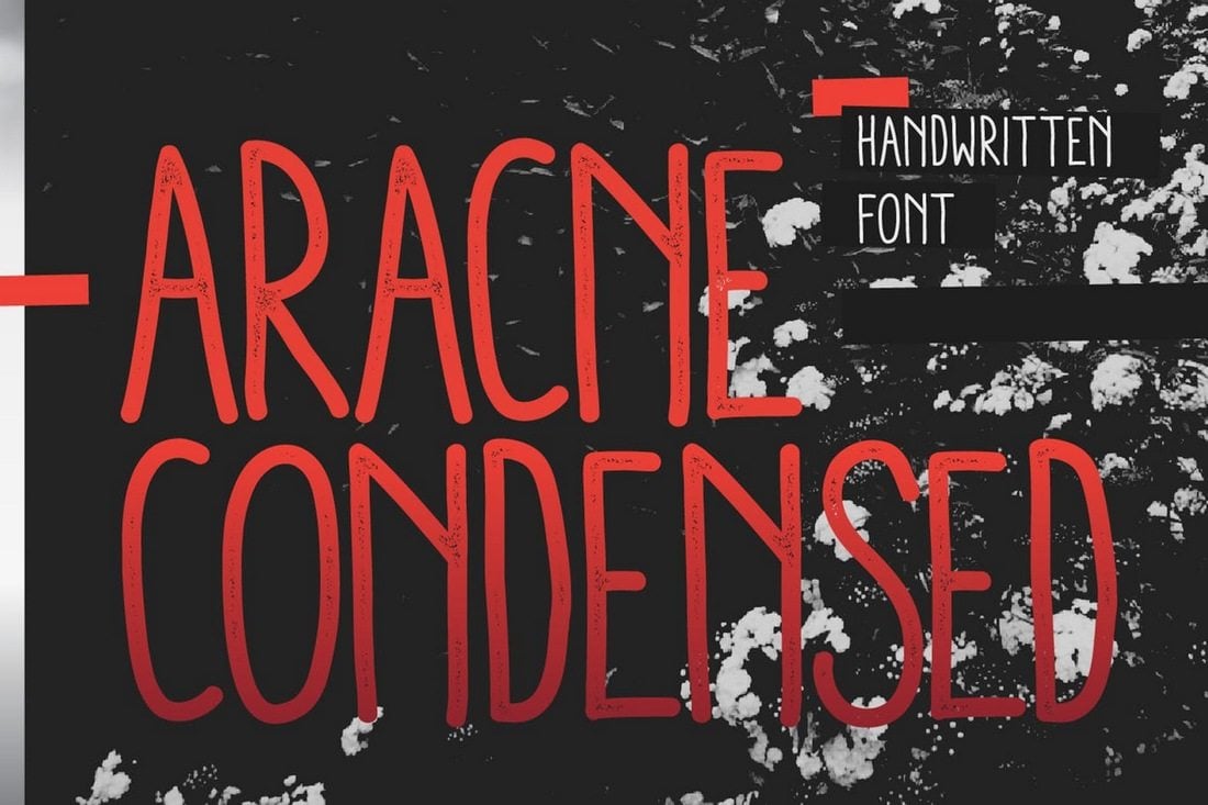
Aracne is a handwritten font that features slightly scrawled letterforms with a natural look. It also comes in regular, condensed and ultra condensed styles to fit in with different types of design work.
This hand-drawn font pack comes in 5 font families and with 2 graphic ornament fonts, each with its own different styles and weights. This font pack has everything you need for crafting restaurant menus, quotes, signage, logos, headers, and much more.
The Gratelos font consists of the best parts of both the vintage and modern into a single style. One of the exciting features of this font is that it pairs perfectly with any modern sans serif font such as Montserrat, among others. It is an amazing display font, which comes with uppercase characters, and that makes it best suited for large display sizes including, headlines, logos, advertising, packaging, and more.
Uniser is a one-of-kind, carefully handcrafted bold script font. Because of its casual charm, the font appears amazingly down-to-earth, readable, and, ultimately, incredibly versatile. The font is PUA encoded- meaning you can access all of the glyphs and swashes easily.
Designed by Kulokale Studio, Howard is a modern and elegant serif font. It comes in two versions- Regular and italic. This stylistic font is best suited for titles, headlines, advertising, packaging, logotypes, and more. To use the stylistic alternates of this font, you’ll require professional design software such as Adobe Illustrator, Photoshop, InDesign, or Inkscape.
A modern and elegant sans-serif font, Parginer is a stylish font created to suit your every need. This font comes with a family of 10 fonts and matching italics. It includes regular, condensed, expanded, italic, expanded italic, semi-expanded italic, and more. You can use this font with ease in your titles, headlines, advertising, logotypes, editorial design, among other projects.
Barstrip is a modern serif font that is a perfect fit for sleek and elegant titles, headlines, custom logotype designs, and more. It is a beautiful typeface, and it comes with upper and lowercase characters, numerals, and a large range of punctuations. Interestingly, the bold version of the font gives more impact and helps the font stand out on busier backgrounds and designs requiring a stronger text presence.
5 Tips for Using Condensed + Narrow Fonts
Condensed fonts are quite different from other types of fonts. When used right, they fit in well with almost any type of design. Here are a few tips on proper condensed fonts usage.
1. Use Sans-Serif Fonts
Condensed and narrow fonts are often used in creative and modern designs, especially for crafting titles and subheadings. However, they are also a great choice for paragraphs and body text as well.
The key is to choose the right condensed font. Since condensed fonts have narrow spacing, they tend to make long paragraphs a bit hard to read. As a result, it’s a good practice to use condensed sans-serif fonts for paragraphs to improve readability and reduce clutter.
2. Create Big and Bold Titles
Condensed fonts are best used for titles and headings. Especially when you’re trying to capture the user’s attention with a big bold title, a narrow font is a perfect choice for achieving that goal. Go as big as you want and create designs that turns more heads.
3. Find the Right Font Pair
Unlike when using regular fonts styles, you need to pick and pair fonts more carefully when using condensed fonts. Finding the perfect secondary font to match the narrow designs of your title font will require some effort.
When looking for a font to pair with a condensed font, you don’t need to find another condensed font. In fact, a regular sans-serif font often pairs well with a narrow font. You can use fonts with different styles and weights as well. Find a pair that makes it easier to differentiate between titles and paragraphs.
4. Pick a Font Family
It’s always a good idea to pick up a font family when using condensed fonts as they include the font in multiple styles and different weights. This way you can use the same style of font for both your titles and subheadings using variations of weights.
5. Use Fonts That Match the Design Theme
Even condensed and narrow fonts come in various styles and designs. For example, there are condensed fonts with fun and quirky designs that are most suitable for designs yoy make for children. Then there are fonts with elegant serif designs that are perfect for luxury brands.
When choosing condensed and narrow fonts, consider using fonts that match the overall theme of your design or project.
Once you’ve found the best condensed font for your titles, then comes the challenge of finding a matching font for body text. Keep exploring Envato Elements to find the right font combination for your design projects. And have a look at our modern serif fonts and script fonts selections for more inspiration.


