Tim Kadlec:
One particular pattern [for loading non-critical CSS] I’ve seen is the preload/polyfill pattern. With this approach, you load any stylesheets as preloads instead, and then use their onload events to change them back to a stylesheet once the browser has them ready.
So you're trying to make your stylesheet more async, but it causes two big problems:
- You've kicked up the priority of the downloading higher than any other asset.
- You've blocked the HTML parser too (because of the polyfill as an inline script).
Firefox does something fancy to avoid problem #2 in this particular case, but it affects every other browser.
I've never had good luck with fancy techniques to trick the browser into theoretically better downloading/rendering patterns. I'm kind of a stylesheets in the head, scripts at the end of the body kinda guy, but I know the web is a complicated place. In fact, in a quick peek, I see that Jetpack is inserting an inline script into my <head>, so that would affect my loading too, except they load it with an obfuscated type until later scripts execute and change it, probably to avoid this exact problem.
Anyway, Tim's advice:
• If you’re using loadCSS with the preload/polyfill pattern, switch to the print stylesheet pattern instead.
• If you have any external stylesheets that you’re loading normally (that is, as a regular stylesheet link), move any and all inline scripts that you can above it in the markup
• Inline your critical CSS for the fastest possible start render times.
The print pattern being:
<link rel="stylesheet" href="/path/to/my.css" media="print" onload="this.media='all'">
Direct Link to Article — Permalink
The post When CSS Blocks appeared first on CSS-Tricks.


 WordPress can throw you quite the curveball as a beginner. One minute everything is working well, and the next, you’re stuck with a stubborn error. While most WordPress errors are easy to fix, at times, your only option is to reinstall the whole thing from scratch. Other times, you’re not even at fault. A hacker […]
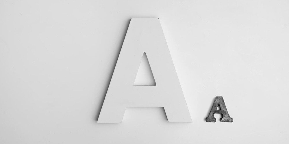 Why make your blog boring using standard fonts? Let your blog talk about your vibrant personality and the topics you cover with a wide variety of custom fonts. Custom fonts are a nice feature that allows your blog to look preferable to others. Let’s face it; we all love blogs and sites with the right […]