Recreating the Classic Wedding WordPress Theme Homepage With the Block Editor

Category Image 052

I simply do not understand it. For at least the better part of a decade, theme authors have asked for the tools to create more complex layouts with WordPress. They have asked for the ability to allow end-users to more easily recreate their demos. They have wanted methods to bypass the “restrictive” theme review guidelines.

Over the past couple of years, WordPress has consistently delivered features that theme authors have asked for. Yet, themes that use them are few and far between.

During my weekly perusal of the latest themes to land in the directory, a new wedding theme caught my attention last week. Of course, I downloaded, installed, and activated it only to find that I had no idea how to recreate the homepage design. There were no instructions. The theme options in the customizer seemed to make little sense. Nearly all of the decorative images were non-existent in the theme folder.

Did I need to upgrade to the pro version to get what was in the screenshot? There seems to be a plan for such a version, but it is not available yet.

Screenshot of the Classic Wedding WordPress theme.
Classic Wedding theme screenshot.

I am no rookie, but I was stuck. I liked the simplicity of the design. However, I could not imagine setting up a wedding site with this theme. From a user’s standpoint, it should not take more than a few mouse clicks. After that point, it should only be a matter of customizing the content.

I recognize that there is still a sort of love/hate divide for the block editor in the inner WordPress community. However, theme authors are not doing any favors for the overall WordPress user base by not taking advantage of the tools available.

So, I recreated the Classic Wedding theme homepage from scratch. Using the block editor. With a theme that supports it.

Creating a Wedding Homepage

My goal was simple. There was no demo to work from, and all I had to go on was an 800-pixel wide screenshot from the theme page on the author’s site. Like I recreated the Music Artist homepage several weeks ago, I wanted to do the same for Classic Wedding. With a couple of exceptions, which could have been handled by the theme, I was successful.

Because Classic Wedding does not support the block editor itself, I could not recreate its homepage via the block editor while using the theme. It was not happening — I tried. I knew that the Eksell WordPress theme had a “canvas” template that allowed users to edit the entire page, so it was an easy choice.

I also loaded the Kaushan Script and Lora fonts to more closely match the original theme. This was unnecessary for the experiment, but I wanted my recreation to at least look somewhat similar.

I immediately knew that I would have one hurdle to overcome. The theme used an image that overlapped both the section above and below it. This requires margin controls, particularly the ability to add negative margins. Unfortunately, this is a missing component of the block editor today. It does not mean that theme authors cannot do it with custom block styles or patterns. It simply means that end-users are unable to control it from the interface.

Because I did not want to spend my time writing the code for this, I leaned on my usual safety net, the Editor Plus plugin. While it can be a little clunky sometimes and feel like overkill, it does include those missing features like margin options.

Using the Editor Plus plugin, adding a negative margin to an image in the WordPress block editor.
Adding negative margin to an image.

I used px units there because it was easy. In a real-world project, % or rem would have been better. But I was just doing a quick proof-of-concept.

Everything else in the content area was straightforward. I needed a Cover block with an Image, Heading, Paragraph, and Button tucked inside. I needed a Group block as a container for Image, Heading, and Paragraphs in the bottom section.

Because the theme did not package its decorative images — again, how would users recreate the homepage without them? — I opted for a simple striped SVG background instead of the flowers in the original. Since I already had Editor Plus installed, I added an SVG from Hero Icons as the main background.

Content area of a wedding homepage design with a hero header, overlapping image, and text.
Wedding page content recreation.

My original idea was to recreate the “content” part of the homepage only. However, it was a bit boring on its own. Therefore, I transformed everything into a Columns block and added the sidebar. I recreated the primary elements using the Image, Heading, Paragraph, and Navigation blocks. Then, I added a Social Icons block for fun.

Full wedding page design with sidebar and wedding photos/content on the right.
Full wedding homepage design.

I did hit one snag with the Navigation block. WordPress does not currently offer a method of centering each link in the list when using the vertical block variation. I had to write a couple of lines of CSS to make this happen. This seems like an oversight and one area where the block editor failed to meet my expectations. Of course, this could be handled on the theme side of things.

Overall, this was a relatively simple project. However, this experiment added some complexities that were not present when I recreated the Music Artist homepage. Margin controls and vertical Navigation block alignments are must-haves. Using a third-party plugin and writing custom CSS is not ideal, and these were requirements to make this happen straight from the editor.

All of this is possible from the theme end. Each piece of this design could have been packaged as a block pattern. The overlapping image effect would have made for a neat block style. I just wish that theme authors would start utilizing the features that are being hand-fed to them.

Themes Team Removes Outdated CSS Guidelines, Adds Stricter Requirement for Links in Content

Best Wordpress Themes 1

In yesterday’s twice-monthly meeting, the WordPress Themes Team made a couple of important changes to the official theme directory guidelines. They removed a requirement of some CSS classes that have long been sitting on the chopping block. They also implemented the third stage in their long-term plan to make all WordPress themes accessibility-ready.

For years, theme authors have needed to either style several WordPress classes via CSS or add empty, unused selectors. It was a bit irritating for authors who fell in the latter group. The list includes several classes like .sticky (for sticky posts) and .bypostauthor (for post author comments). Now, styling these classes are optional.

The one question mark in this decision is probably around the classes for handling left, right, and center alignment. While the newer block editor stylesheet does support these classes on the front end, it could leave end-users in the dust if they are using the classic editor and a theme author decides to drop support. Any images in posts could become misaligned. Theme authors should test this and consider any problems before deciding to remove these from their stylesheets. For the other classes, those are mostly design decisions.

This change will not be official until the Theme Check plugin is updated to allow themes without these classes through the system.

The second big change is the reignition of the push toward creating more accessible themes in the directory. All themes in the directory are now required to distinguish links in “content” areas via an underline.

The full guideline is as follows:

When links appear within a larger body of block-level content, they must be clearly distinguishable from surrounding content (Post content, comment content, text widgets, custom options with large blocks of texts).

Links in navigation-like contexts (e.g., menus, lists of upcoming posts in widgets, grouped post meta data) do not need to be specifically distinguished from surrounding content.

The underline is the only accepted method of indicating links within content. Bold, italicized, or color-differentiated text is ambiguous and will not pass.

While this is a simple change, it is a bold one. Thus far, there has not been any pushback from theme authors on the announcement post or in the team meeting. However, some may be expected as the news trickles through the theme design community.

The one question that arose about the requirement was whether theme authors could add an option to allow end-users to opt-out of this behavior. The team said this was allowed as long as the underlined links were enabled by default.

The Road to Accessibility

Decorative image of people walking along a crosswalk with cars stopped in the background.

In July 2019, the Themes Team made a commitment to push theme authors to make their themes more accessible. It was not a switch they were going to flip overnight. Instead, the team made a goal of implementing a new accessibility-related requirement every two months or so. These periods would give both theme authors and reviewers ample time to familiarize themselves with each change.

This is the third requirement added to the guidelines since the team implemented the plan. The team started with some low-hanging fruit and added a requirement that themes ship with a skip-to-content link. That guideline addition went over relatively smoothly. The team quickly added a new guideline requiring that visitors be able to navigate menus via keyboard.

That second guideline landed in August 2019. From the outside looking in, the project was initially going well. However, until yesterday, the team had not added any new accessibility guidelines. Over a year had passed, and the plan seemed to be grinding to a halt. Accessibility advocates were probably wondering what happened.

In a discussion with the Themes Team reps a few months ago, they were not sure when they would implement the next guideline. The project was not going as planned.

“We have not added anything else above that because theme authors are still not releasing themes with working implementations of skip links and usable keyboard navigation,” said team representative William Patton at the time. “When those two things become habitual it will be time to introduce another Aspect as a requirement. The fact that this has taken so long for authors to get this right probably indicates that we need to do better at guiding them to resources to learn how to do it and why it is important. Perhaps that is a better avenue to pursue than looking to implement additional asks of them.”

Team rep Carolina Nymark shared similar sentiments. She mentioned that underlined links were up next on the list. However, they did not have a deadline in mind yet.

“Skip links and keyboard navigation are still a headache to some extent for some authors,” said Ganga Kafle, a team representative. He said that theme authors who regularly submit themes are doing so with these requirements in mind. However, keyboard navigation remains the biggest pain point, particularly on mobile views.

“But almost all the themes we get are with skip links working properly,” he said. “That is a good thing so far. The new requirement is not so huge and tough. And I think we need to add such small things in a timely manner.”

For now, the team seems to be picking up where they left off. There is still a long path to go before the project is complete.

The best thing that theme authors can do right now is to follow all of the optional accessibility guidelines. This will prepare them for a future in which they are all required.

How to Create a Sticky Floating Navigation Menu in WordPress

Category Image 091

Recently, one of our users asked us how to create a sticky navigation menu for their site?

Sticky navigation menus stay on the screen as users scroll down the page. This makes the top menu always visible, which is good for user experience because it contains links to the most important sections of your website.

In this article, we’ll show you how to easily create a sticky floating navigation menu in WordPress.

Creating a sticky floating navigation menu in WordPress

What is a Sticky Floating Navigation Menu?

A sticky or floating navigation menu is one that ‘sticks’ to the top of the screen as a user scrolls down. This makes your menu visible to users at all times.

Here’s a sticky menu in action. We’re going to show you how to create a menu exactly like this for your own site:

A sticky navigation menu in action on our demo website

Why and when sticky menus can be useful?

Usually, the top navigation menu contains links to the most important sections of a website. A floating menu makes those links always visible, which saves users from scrolling back to the top. It is also proven to increase conversions.

If you run an online store, then your top navigation menu likely include links to the cart, product categories, and product search. Making this menu sticky, can help you reduce cart abandonment and increase sales.

Some of the best WordPress themes have built-in support for a sticky navigation menu. Simply see your theme settings under Themes » Customize to enable this feature.

If your theme does not have this option, then keep reading, and we’ll show you how to easily create a sticky floating navigation menu in any WordPress theme or WooCommerce store.

Method 1: Add Your Sticky Floating Navigation Menu Using a Plugin

This is the easiest method. We recommend it for all WordPress users, particularly for beginners.

If you haven’t set up your navigation menu yet, go ahead and do that using our instructions on how to add a navigation menu in WordPress.

After that, you need to install and activate the Sticky Menu (or Anything!) on Scroll plugin. For more details, see our step by step guide on how to install a WordPress plugin.

Upon activation, you need to visit the Settings » Sticky Menu (or Anything!) page to configure the plugin settings.
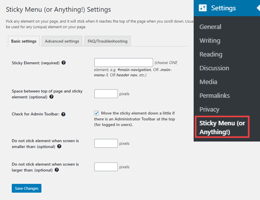
The Sticky Menu plugin's settings page

First you need to enter the CSS ID of the navigation menu that you want to make sticky.

You will need to use your browser’s inspect tool to find the CSS ID used by your navigation menu.

Simply visit your website and take your mouse to the navigation menu. After that, you need to right-click and select Inspect from your browser’s menu.
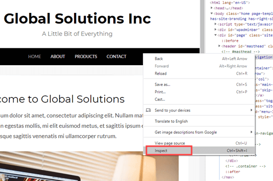
Inspecting the navigation menu element on your website

This will split your browser screen, and you will be able to see the source code for your navigation menu.

You need to find a line of code that relates to your navigation, or your site header. It will look something like this:

<nav id="site-navigation" class="main-navigation" role="navigation">

If you’re struggling to find it, bring your mouse cursor over the different lines of code in the Inspect pane. The navigation menu will be fully highlighted when you have the right line of code:
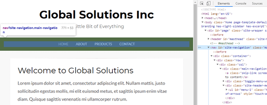
Finding the navigation menu ID using the inspect tool

In this case, our navigation menu’s CSS ID is site-navigation.

All you need to do is enter your menu’s CSS ID in the plugin settings with a hash at the start. In this case, that’s #site-navigation.
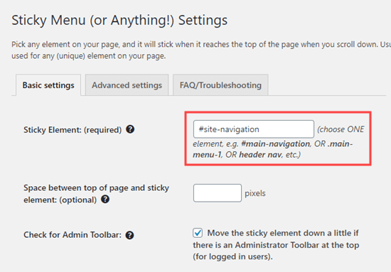
Entering the ID of the element that you want to make sticky (in this case, the navigation menu)

Don’t forget to click the ‘Save Changes’ button at the bottom of the page.

Now, go ahead and check out your sticky menu live on your WordPress website. It should stay on the page as you scroll down, like this:

Viewing the sticky menu on your website

The next option on the plugin’s settings page is to define the space between the top of your screen and the sticky navigation menu. You only need to use this setting if your menu is overlapping an element that you do not want to be hidden. If not, then ignore this setting.

We recommend leaving the box checked next to the option: ‘Check for Admin Bar’. This allows the plugin to add some space for the WordPress admin bar, which is only visible to logged-in users.

Here, you can see that the admin bar on our test site is correctly displaying above the sticky menu:
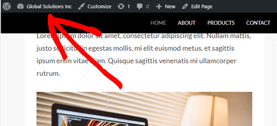
The WordPress admin bar appears above the sticky menu

The next option allows you unstick the navigation menu if a user is visiting your website using a smaller screen such as a mobile device:
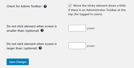
The sticky menu plugin offers further options too

You can test how your site looks on mobile devices or tablets. If you don’t like how it looks, simply add 780px for this option.

Don’t forget to click on the Save Changes button after making any changes to your options.

Method 2: Manually Add a Sticky Floating Navigation Menu

This method requires you to add custom CSS code to your theme. We don’t recommend it for beginners.

We also recommend that you take a look at our guide on how to easily add custom CSS to your WordPress site before you begin.

First, you need to visit Appearance » Customize to launch the WordPress theme customizer.
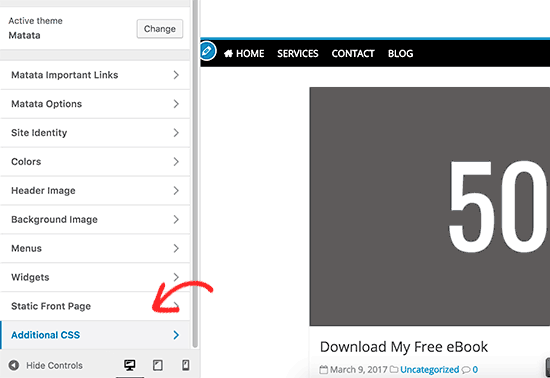
Adding custom CSS in WordPress theme

Next, click on ‘Additional CSS’ in the left pane and then add this CSS code.

#site-navigation {
    background:#00000;
    height:60px;
    z-index:170;
    margin:0 auto;
    border-bottom:1px solid #dadada;
    width:100%;
    position:fixed;
    top:0;
    left:0;
    right:0;
    text-align: center;
}

Note: This will produce a navigation menu with a black background. If you want a different color, change the number next to background. For example, using background: #ffffff will give you a white menu background.

Just replace #site-navigation with the CSS ID of your navigation menu then click on the Publish button at the top of the screen.

Go ahead and visit your website to see your sticky floating navigation menu in action:

A sticky / floating navigation menu created using CSS

What if your navigation menu normally appears below the site header instead of above it? If so, this CSS code could overlap the site title and header or appear too close to it before the user scrolls:

The sticky navigation menu is slightly overlapping the site title

This can be easily adjusted by adding a margin to your header area using some additional CSS code:

.site-branding {
margin-top:60px !important;
}

Replace site-branding with the CSS class of your header area. Now, the sticky navigation menu will no longer overlap your header before the user scrolls down:

There's now room for the title below the sticky navigation menu

We hope this article helped you add a sticky floating navigation menu to your WordPress site. You may also want to see our guide on how to create a custom WordPress theme without writing any code, and our comparison of the best WordPress page builder plugins.

If you liked this article, then please subscribe to our YouTube Channel for WordPress video tutorials. You can also find us on Twitter and Facebook.

The post How to Create a Sticky Floating Navigation Menu in WordPress appeared first on WPBeginner.

WordPress Themes Directory Adds New “Delist” Status for Non-Compliant Themes

Best Wordpress Themes 1

In August, following the suspension of the popular Astra theme, WordPress Meta contributors opened a ticket to add a new “delisting” status for non-compliant themes. Astra’s infraction, breaking the directory’s ban on affiliate links, put more than a million users at risk of not getting theme updates just as WordPress 5.5 was on deck for release. This week the team committed a patch for a delist status that will temporarily hide a theme from search, while still making it available directly. Alex Shiels outlined how the new status will work:

  • Delist is only available from a published state.
  • Relist will set the status back to publish.
  • Delisted themes are excluded from site search.

While a full suspension may seem like the best retributive action when theme authors violate directory guidelines, the necessity for users to be able to continue to get updates outweighs throwing the book at the author, especially for a first-time offense. A delisting policy is more restorative in that it seeks to maintain the connection that users have with the theme’s author instead of merely imposing a penalty that might ultimately have a negative impact on everyone involved.

In the past, the Themes Team has been limited on available actions for responding to violations. Ionut Neagu, CEO of ThemeIsle, had his company’s popular Zerif Lite theme suspended from the directory in 2016 for a five-month period that left 300,000+ users without maintenance and security updates. It also resulted in a 63% decline in the company’s revenue for that theme, since ThemeIsle was using WordPress.org as the primary channel for distribution.

Neagu remarked on how the new “delist” status provides a less severe transition back into the directory for popular themes:

The practice of delisting is something that’s already been done by other companies in similar situations. For instance, delisting is what Google does all the time when they find a website that doesn’t comply. Then, the website is allowed to come back and appear on the ranking pages again when the issues are fixed.

In the end, I think this is a move in the right direction and an improvement to the process of what happens with a problematic theme.

Despite the controversial decision that slashed ThemeIsle’s revenue from $120k/month to $45k/month in 2017, the company continued to support the theme, as well as new products, with WordPress.org as the main place to find them. Neagu reported that when the theme was reinstated, its revenue continued to be hard hit. It lost momentum and was unable to ride the wave of its initial success. Astra faired much better in the aftermath of its violation, given its short-lived suspension.

WordPress Themes Team member Alexandru Cosmin requested the ticket for adding the delisting status receive prompt attention, as the team is set to introduce some new policies and requirements that are tied to it. The patch was committed and then reverted temporarily to review how it impacted theme trac tickets, but the bugs appear to be unrelated to the patch.

The volunteer Themes Team has essentially been the de facto guardians of the WordPress.org marketplace that sends millions of dollars to theme authors, and they perform a great service to the community. But in the interest of supporting and accelerating the growth of the WordPress ecosystem, the team needs to adopt policies that create a more restorative path for violators, instead of obstructing the growth of products where issues have been quickly resolved.

Should WordPress Themes Add a Top-Level Admin Menu Item?

Featured Imgs 08

WordPress has almost always provided a top-level admin menu item for themes. It is clearly labeled “Appearance.” It is the single location that all WordPress users know to visit to modify any appearance-related things for their WordPress site. However, there is a movement within the Themes Team to allow themes to place an additional top-level menu link in the admin. The big question: should this idea move forward?

When the Themes Team (originally called the Theme Review Team) was formed, its members created a set of guidelines that would be shaped and reshaped over the years. They were a set of living guidelines that could always be changed with the times.

One of the oldest guidelines required that themes must place any custom admin pages under the Appearance menu item. It made sense. WordPress provided a standard location for any theme-related pages. The custom header and background features lived under Appearance. Widgets, also defined by the current theme, were housed as a sub-page. Eventually, WordPress’s custom nav menu system came along and was — you guessed it — situated under Appearance. The core developers even put the customizer link in the same place.

For over a decade, there was a well-defined standard. Sure, commercial themes outside of the official directory would sometimes break the mold. However, themes from the directory followed the pattern.

Now, the Themes Team is proposing that themes should be able to break from tradition.

The discussion arose after a question of whether themes should be able to add a custom panel to the block editor sidebar, which is not allowed.

“To keep the editor free from clutter, advertising and upsell, with the customizer being used less, and no dashboard widgets being allowed, can we give theme authors a better place to include their information, and limit upsell to that area?” wrote Carolina Nymark in last week’s team meeting notes.

The proposal seems to settle on the idea that themes will lose visibility as WordPress moves toward full-site editing and the customizer becomes less important. The customizer is not an ideal place for anything but theme options, but that notion seems to have been overlooked in the discussion. Nevertheless, the original guideline that disallowed themes from creating top-level menu items preceded the advent of the customizer by several years. Advertising, documentation, plugin recommendations, and similar pages were always allowed under the existing Appearance menu. The usefulness of the customizer was never a necessary part of that conversation.

Ultimately, the question should be about what is best for users. There is no data to support making the change or sticking with the status quo. However, we do have a standard that has existed for years.

The Proposed Guidelines

The proposal would create several new guidelines for theme authors to follow and reviewers to check, assuming the theme created a top-level admin menu item:

  • No admin menu priority may be used.
  • No UI or color changes are allowed for the menu item.
  • The title must be kept short and not include spam.
  • No more than three sub-pages.
  • Child themes are limited to one sub-page or can remove the parent’s pages and add its own.

Some of these make sense and follow along with existing guidelines, such as not spamming or changing the admin UI. However, others could be problematic.

If moving forward with the proposal, setting a menu item priority should be required rather than not allowed. If anything, it would make sense to require a specific priority to place the custom menu item immediately after the existing Appearance item. This would at least group them together by default. If changing the place where users are accustomed to seeing theme-related pages, it is probably best not to break too far from the standard location.

No more than three sub-pages? Surely there will be a theme with a top-level admin menu item that needs four sub-pages at some point. If giving theme authors the freedom to take up valuable real estate in the admin, a limit of three sub-pages seems like a rule to fix the mistake of allowing the top-level item in the first place. It is an arbitrary number at best. There would be no reason to cap it once making the guideline change. It also adds one more item that the team will need to police.

The limitation of sub-pages for child themes seems just as arbitrary. No such limitation exists when placing sub-pages under the standard Appearance screen.

The entire proposal is little more than extra work on a team that is already strained for resources.

Instead of the simple rule that has existed for years, the proposal adds a new rule with several sub-rules. If the team desires the extra work, I suppose this point doesn’t matter.

The Elephant in the Room

There is one Aspect of this discussion that everyone knows about but few are willing to broach. Underneath all the guidelines from the Themes Team and whether most theme authors support a particular decision is how this affects the financial bottom line. When we talk about visibility of a theme’s admin pages, we are primarily talking about providing another avenue for commercial upsells.

Some of this discussion on visibility is shrouded in concepts such as surfacing end-user documentation or adding a visible readme for the user’s benefit. These are legitimate concerns, especially when theme developers have watched tickets to address such downfalls seemingly dwindle into obscurity over the years. Whether a top-level admin menu item makes sense for exposing theme documentation might be worth discussing, but there is no world in which this would be the primary use case.

The topic of visibility rests on the idea of upselling the pro version of the theme, add-ons, or other services.

Far too many plugins already go overboard, creating a billboard of the WordPress admin. One of the things users could almost be assured of is that themes from the official directory were constrained enough that they were not the hot mess that plugins have become as of late. However, that could all change.

Do we really want an extra top-level admin menu item that will be, for all intents and purposes, to advertise?

Maybe it doesn’t matter in the end. Users are so accustomed to the clutter produced by the dozens of plugins on their sites. One more may not matter at this point.

Or, should we be having a different conversation altogether? If this ultimately boils down to advertising, are there ways we can open this up for theme authors while still creating a user experience that keeps the WordPress admin free of clutter?

Global and Component Style Settings with CSS Variables

Featured Imgs 23

The title of this Sara Soueidan article speaks to me. I’m a big fan of the idea that some CSS is best applied globally, and some CSS is best applied scoped to a component. I’m less interested in how that is done and more interested in just seeing that conceptual approach used in some fashion.

Sara details an approach where components don’t have too much styling by default, but have CSS custom properties applied to them that are ready to take values should you choose to set them.

For each pattern, I’ve found myself modifying the same properties whenever I needed to use it — like the font, colors (text, background, border), box shadow, spacing, etc. So I figured it would be useful and time-saving if I created variables for those properties, define those variables in the ‘root’ of the component, and ‘pass in’ the values for these variables when I use the pattern as I need. This way I can customize or theme the component by changing the property values in one rule set, instead of having to jump between multiple ones to do so.

Direct Link to ArticlePermalink

The post Global and Component Style Settings with CSS Variables appeared first on CSS-Tricks.

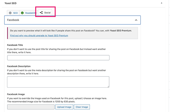
How to Add Facebook Open Graph Meta Data in WordPress Themes

Category Image 091

Do you want to add Facebook Open Graph meta data to your WordPress themes?

Open Graph metadata helps Facebook and other social media websites get meta data about your posts pages. It also allows you to control how your content appears when shared on Facebook.

In this article, we will show you how to easily add Facebook open graph metadata in WordPress themes. We’ll share three different methods, so you can choose one that works best for you.

Add Facebook open graph meta data in any WordPress theme

Method 1. Adding Facebook Open Graph Meta Data with All in One SEO

All in One SEO is a popular WordPress SEO plugin used by over 2 million websites. It allows you to easily optimize your website for search engines as well as social platforms like Facebook and Twitter.

First, you need to install and activate the All in One SEO plugin. For more details, see our step by step guide on how to install a WordPress plugin.

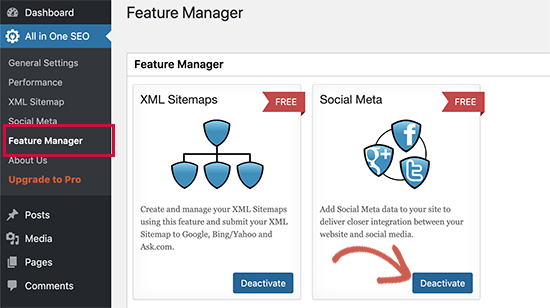
Upon activation, you need to visit All in One SEO » Feature Manager page. From here you need to activate the ‘Social Meta’ feature.

Enable Social Meta feature in All in One SEO

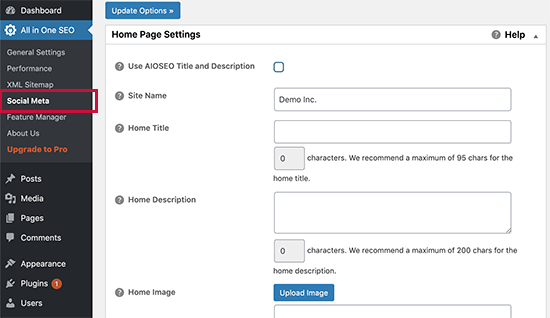
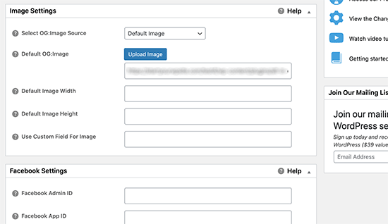
Next, you need to visit All in One SEO » Social Meta page. From here, you can simply fill in the fields to enter your Facebook meta data.

Social meta page allows you to enter Facebook Open Graph meta data

You can start by providing title, image, and description for your homepage.

Below that you can set a default image to be used if an article doesn’t have an open graph image. You can also provide the width and height of the image.

Set default Open Graph image

Need help choosing image sizes? See our complete social media cheat sheet for ideal image sizes that you can use on all social media platforms including Facebook.

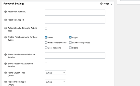
If your website is using a Facebook App or has a Facebook page, then you can provide your Facebook app ID in the next section. This allows you to get data for Facebook insights.

Facebook app settings

Optionally, you can also adjust settings for Twitter and run a scan to avoid duplicate Open Graph tags on your site.

Once you are done, don’t forget to click on the ‘Update Options’ button to store your changes.

Now that you have set site-wide open graph meta tags, the next step is to add open graph meta data for individual posts and pages.

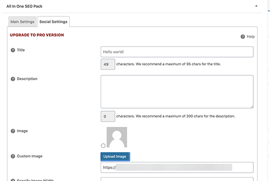
By default, All in One SEO will use your post title and description for open graph title and description. You can also manually set the Facebook thumbnail for each page and post.

Simply edit the post or page and scroll down to the All in One SEO section below the editor. From here, switch to the Social tab and fill out open graph meta data. You can set the social media image here as well as title and description.

Open graph settings for posts and pages

Method 2. Set Facebook Open Graph Meta Data using Yoast SEO

Yoast SEO is another excellent WordPress SEO plugin that you can use to add Facebook open graph meta data into any WordPress site.

First thing you need to do is install and activate, the Yoast SEO plugin. For more details, see our step by step guide on how to install a WordPress plugin.

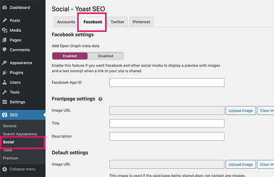
Once activated, you need to go to SEO » Social and simply check the box next to Add Open Graph meta data.

Enable Facebook Open Graph

You can save your settings or continue and configure other Facebook social options on the screen.

You can provide a Facebook app ID if you use one for your Facebook page and insights. You can also change your homepage Open Graph meta title, description, and image.

Lastly, you can set a default image to be used when no image is set for a post or page.

Yoast SEO also allows you to set Open Graph metadata for individual posts and pages. Simply edit a post or page and scroll down to the SEO section below the editor.

Set open graph meta data for post and pages

From here, you can set Facebook thumbnail for that particular post or page. If you don’t set a post title or description, then the plugin will use your SEO meta title and description.

You can now save your post or page and the plugin will store your Facebook open graph meta data.

Method 3. Manually Add Facebook Open Graph Meta Data into Your WordPress Theme

This method requires you to edit your theme files, so make sure that you back up your theme files before making any changes.

After that simply copy and paste this code in your theme’s functions.php file, or in a site-specific plugin.

//Adding the Open Graph in the Language Attributes
function add_opengraph_doctype( $output ) {
		return $output . ' xmlns:og="http://opengraphprotocol.org/schema/" xmlns:fb="http://www.facebook.com/2008/fbml"';
	}
add_filter('language_attributes', 'add_opengraph_doctype');

//Lets add Open Graph Meta Info

function insert_fb_in_head() {
	global $post;
	if ( !is_singular()) //if it is not a post or a page
		return;
        echo '<meta property="fb:app_id" content="Your Facebook App ID" />';
        echo '<meta property="og:title" content="' . get_the_title() . '"/>';
        echo '<meta property="og:type" content="article"/>';
        echo '<meta property="og:url" content="' . get_permalink() . '"/>';
        echo '<meta property="og:site_name" content="Your Site NAME Goes HERE"/>';
	if(!has_post_thumbnail( $post->ID )) { //the post does not have featured image, use a default image
		$default_image="http://example.com/image.jpg"; //replace this with a default image on your server or an image in your media library
		echo '<meta property="og:image" content="' . $default_image . '"/>';
	}
	else{
		$thumbnail_src = wp_get_attachment_image_src( get_post_thumbnail_id( $post->ID ), 'medium' );
		echo '<meta property="og:image" content="' . esc_attr( $thumbnail_src[0] ) . '"/>';
	}
	echo "
";
}
add_action( 'wp_head', 'insert_fb_in_head', 5 );

Note: Remember to change the Site Name where it says “Your Site Name Goes Here”. After that, change the default image URL with the image of yours. You also need to add your own Facebook app ID, If you don’t have a Facebook app, then you can remove the Facebook app ID line from the code.

We would recommend putting an image with your logo there, so if your post does not have a thumbnail, then it pulls your site’s logo.

That’s all you need to do. As soon as you save your functions.php file (or site-specific plugin) it will start showing Facebook open graph metadata in the WordPress header.

We hope this article helped you add Facebook open graph meta data in WordPress. You may also want to see our pick of the best social media plugins for WordPress to grow your social following, and our troubleshooting guide on how to fix the Facebook incorrect thumbnail issue in WordPress.

If you liked this article, then please subscribe to our YouTube Channel for more WordPress video tutorials. You can also find us on Twitter and Facebook.

The post How to Add Facebook Open Graph Meta Data in WordPress Themes appeared first on WPBeginner.

PHP and WordPress Version Checks Coming to Themes

Category Image 052

PHP and WordPress version checks are coming to the WordPress theme system — finally. The feature was pulled into core WordPress three days ago. It will prevent end-users from installing or activating a theme that is incompatible with their current version of PHP or WordPress. The change is slated to land in WordPress 5.5.

This feature has long been on many theme authors’ wish lists, particularly PHP version checking. Plugins authors gained the ability to support specific PHP versions starting with WordPress 5.2. However, theme authors were left feeling like the second-class citizens they usually are when it comes to the addition of core features, waiting patiently as plugin authors received the new and shiny tools they were looking forward to.

Previously, the code for manually handling version checking within individual themes was more complex than in plugins. Theme authors needed to run compatibility checks after theme switch and block theme previews in the customizer using two different methods, depending on the user’s WordPress version. That is assuming theme authors were covering all their bases.

Users had no real way of knowing whether a theme would work on their site before installing and attempting to activate it. It was a poor user experience, even when a theme gracefully failed for the end-user.

This user experience has also held back some theme authors from transitioning to newer versions of PHP. For years, many were supporting PHP 5.2. Slowly, some of these same authors are now making the move toward newer features up to PHP 5.6, which is now the minimum that WordPress supports. However, not many have made the jump to PHP 7 and newer.

Until now, there has been no mechanism for letting the user know they need to upgrade their PHP to use a particular theme.

Some theme authors may choose to continue supporting older versions of PHP, such as 5.6, for a potentially wider user base. However, developers who want to switch to newer features can now do so with the support of the core platform.

Changes for Users

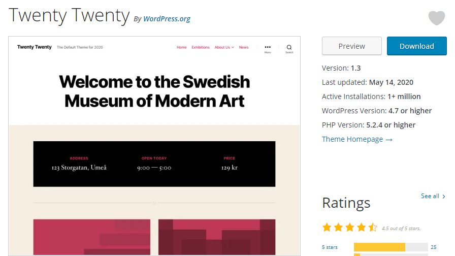
Twenty Twenty theme page from WordPress.org theme repository.
New WordPress and PHP versions added to Twenty Twenty theme.

Users who are browsing the WordPress theme directory may begin to notice new information available for some themes. Similar to plugins, visitors should see a WordPress Version and PHP Version listed for some themes. For example, the Twenty Twenty theme now lists the following minimum requirements:

  • WordPress Version: 4.7 or higher
  • PHP Version: 5.2.4 or higher

Not all themes will have these numbers listed yet. It will take some time before older themes are updated with the data required to populate these fields.

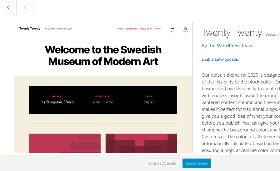
In WordPress 5.5, the admin interface for themes will change. When attempting to install or activate a theme, WordPress will prevent such actions. If a user searches for a theme that has an incompatible WordPress or PHP version, the normal installation button will be replaced with a disabled button that reads “Cannot Install.” If a theme is installed but not activated, the activation link will similarly be replaced with a disabled “Cannot Activate” button. Users will also not be allowed to live preview incompatible themes.

Attempting to activate Twenty Twenty theme without PHP support.
Cannot activate Twenty Twenty theme with incompatible PHP version.

The feature works the same from within the customizer interface as it does via the themes screen in the WordPress admin.

Changes for Theme Authors

The WordPress Themes Team recently announced two new required headers for theme authors to place in their style.css files. The first required field is Tested up to, which is the latest version of WordPress the theme has been tested against. The second is a Requires PHP field, which is the minimum PHP version the theme supports.

It is unclear is why the team decided to require those two fields but not the Requires at least field, which represents the minimum WordPress version needed. Most likely, theme authors will want to place all three headers in their themes.

Theme authors who will still support versions of WordPress earlier than 5.5 will want to continue using their old compatibility checks. However, this is the first step in phasing such code out.