50 Easy Drawing Ideas

Featured Imgs 24

Have you ever found yourself searching for what shall I draw?  If you have been doing line work, realistic portrait sketches, or urban sketching and would like to try something different, you are at the right place. Get your creative juices flowing with this list of easy drawing ideas for beginners and experts alike, regardless...

The post 50 Easy Drawing Ideas appeared first on .

How to Make a Portfolio Website Quickly? Read in This Article

Fotolia Subscription Monthly 4688624 Xl Stock

If you want to share your create talents with the world having a portfolio website gives you the most effective way to do so.

If you don’t have the time or the wherewithal to build one from scratch and you don’t want to spend a fortune to putting one together, your best approach will be to find an affordable website-building tool that will do the heavy lifting for you.

If you look for a cheap and easy solution your portfolio website could come up short in terms of quality or performance or might lack a feature you really want it to have.

Your creations can speak for themselves. They are impressive. Your portfolio website needs to be equally impressive to gain your visitors and potential clients or customers attention and trust.

There are certain features to look for in your search for a fast and affordable website builder. We’ll use the Portfoliobox portfolio-builder solutions to demonstrate what some of these features are and how you can best take advantage of them.

5 Portfolio Website Building Features that are Time Savers and Performance Boosters

A portfolio website should serve to impress its visitors and boost your business and/or reputation. A poorly built one can do just the opposite. It can be a detriment.

That is why it is so important to find a portfolio builder you can put your trust in. Here are 5 time-saving and quality-enhancing features you should look for to ensure the finished product will meet your objectives.

Let’s start with:

  1. Template mix-and-match page building

A theme-based website builder can be a real time saver but only if you can find a theme that can easily be customized to give you the layout and look and feel want. If it cannot, you could end up spending time doing a ton of customizing or deciding to start from scratch.

You want your portfolio website to reflect your unique creative abilities – at a minimum. The most promising way to do this is to look for a website builder (preferably a portfolio website builder) that allows you to mix and match templates to achieve what you want.

By doing so, you won’t have to worry about

  • Allowing someone else to impose constraints on your site’s content
  • Spending hours customizing a theme to achieve the correct look and feel
  • Designing your portfolio website from scratch

Take Portfoliobox for example. You start with a black slate (not the same as starting from scratch) and build your site’s pages a section at a time.

Since there’s plenty of variety as to what each section template will look like, you should easily find examples that align well with what you expect your portfolio, testimonial, contact, and other pages to look like.

Filling in details can be faster that customizing and is usually more satisfying.

  1. All-in-one pricing and affordable and transparent monthly plans

When you’re in a hurry to create a website quickly and you come across a website builder that claims you can use if for “free”, or offers an “affordable” plan, life seems good.

Or maybe it doesn’t.

When it gets down to incorporating all the features you want and need, you suddenly discover that they are only available if you sign up for an upgrade. Even then, you may not get everything you need.

That’s not the case with every portfolio website builder, but to be certain you’ll get the features you need you should look for transparent upfront pricing.

That’s the best way to avoid an unpleasant surprise. Portfoliobox provides an excellent example of transparent upfront pricing.

Portfoliobox offers three pricing plans, Light, Pro, and Pro Plus  (Pro is free for students). You can also select monthly pricing if it will work best for you.

The features of each of these plans are broken out, so you can see what’s included and what’s not:

  • A custom domain name (on Pro plans)
  • Web hosting and unlimited bandwidth
  • SSL certification
  • A mobile responsive website editor
  • Image storage and protection
  • eCommerce functionality is included in the platform
  • SEO tools
  • 24/7 customer support (chat)
  1. Four strategic business features for creatives

You obviously want to use a website builder that enables you to create an impressive online portfolio. But if you plan to offer products or services your site also needs to do an impressive job of streamlining your business dealings.

Your website builder should feature such things as:

Right-click disabling – if you want to protect your online work from theft. With Portfoliobox, this is done by toggling the Disable Right-Click feature as shown below.


Private client galleries – which will give you a fast and secure way to send artwork, photos, web designs, or whatever you are selling to your clients or customers.

There are other tools to create private client galleries, but why take the time and trouble to set up and coordinate with another platform when you can create one within Portfoliobox.

In addition to only having to upload and transfer your work once, this Portfoliobox feature also lets you manage your portfolio and your client/customer collaboration from a single platform.

Image watermarking – protects your work from thieves. It also streamlines your business dealings with your clients in that it enables you to make sure that clients have approved and paid for your products before they can put them to use.

Portfoliobox makes image watermarking easy and you can apply the feature to any client gallery.

Third-party integration – is another time-saving tool to look for.

With the third-party integration feature your portfolio builder can pull files into your website from a image or video editing platform.

  1. eCommerce integration

This is another example of the benefits of having your portfolio folder and being able to conduct business on the same platform. There are more than a few website builder solutions that feature eCommerce integration, but most place an emphasis on product pages as opposed to creating outstanding client portfolio galleries.

The Portfoliobox solution also avoid having to configure separate eCommerce settings since eCommerce is built right into the platform.

There are no add-ons needed either. It’s as easy as adding the store as a new page, choosing the template you want, and uploading your products.

  1. Timely customer service

A few website builders provide users with an FAQ page, most supply decent user documentation, and a some give you detailed documentation along with tutorial videos. Still, when you find yourself having to troubleshoot a website issue, wouldn’t you rather have a real person giving you expert advice when you most need it?

Attempting to troubleshoot a website problem on your own could take time, and the downtime you’re experiencing could cost potential business. The Portfoliobox platform offers the support you need when you need it.

When you’re on one of Portfoliobox’s Pro plans, you can go to the chat widget at the bottom of the screen to access instant customer support 24/7.

Building an impressive creative portfolio website the fast, affordable, and intuitive way  

While there is no shortage of website builders out there that feature portfolio-building tools, Portfoliobox was built specifically for creatives who need a tool for building a website whose main attraction is an attention-getting portfolio and doing so quickly.

Portfoliobox just happens to be one of the best website builders for creatives out there. Website builders that have all the features outlined in this post are rare, and that is especially true for the business oriented features.

Portfolio is fast and easy to use, and its affordable pricing plans are transparent, so you know you’re getting what you need to get your portfolio website up and running in no time at all.

Read More at How to Make a Portfolio Website Quickly? Read in This Article

7 Tips for Negotiating a Work-from-Home Arrangement with Your Boss

Featured Imgs 24

According to a 2019 LinkedIn survey, roughly half of employees work from home at least one day a week, while 82% want to have the option of doing so. There are plenty of companies that offer flexible work arrangements already, including Amazon, Lionbridge, Dell, Hilton, Working Solutions, Williams-Sonoma, Xerox, Salesforce, and American Express. Whether you’re […]

The post 7 Tips for Negotiating a Work-from-Home Arrangement with Your Boss appeared first on WPArena.

What Is The Importance Of Having Backup And Disaster Recovery Plans For Small Business

Featured Imgs 24

Living in a digital era, one can not afford to lose data at the hands of natural disasters, human error, or cyber-attack, which makes it necessary to have backup and disaster recovery plans. In short, these plans keep the businesses safe whenever any trouble occurs. Losing data for every business is bad, but the small […]

The post What Is The Importance Of Having Backup And Disaster Recovery Plans For Small Business appeared first on WPArena.

20+ Deliciously Dark Website Designs

Featured Imgs 30

Dark website designs are where it’s at. Don’t believe me? They’ve become increasingly popular over the past year. Dark designs are thought to be easier on eye strain and make for a more pleasant viewing experience. They can also add atmosphere to your site.

As more and more websites have shifted to dark mode in 2020, we thought it imperative to highlight some designs that really capture the concept of dark designs well. What follows is a list of over 20 delightfully dark website designs you’ll definitely want to check out.

UNLIMITED DOWNLOADS: 400,000+ Fonts & Design Assets

Starting at only $16.50 per month!


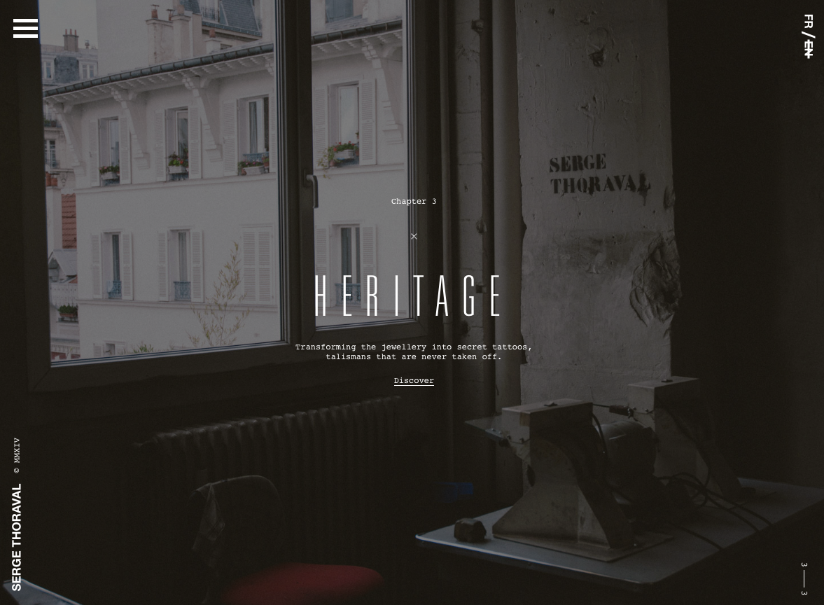
Serge Thoraval: Atelier

The Serge Thoraval: Atelier website doesn’t just offer a dark design — it also features some really interesting effects. From a mouse hover effect when the site is loading to transition effects when you scroll down the page, this site sets itself apart.

Dark Website Designs - Atelier

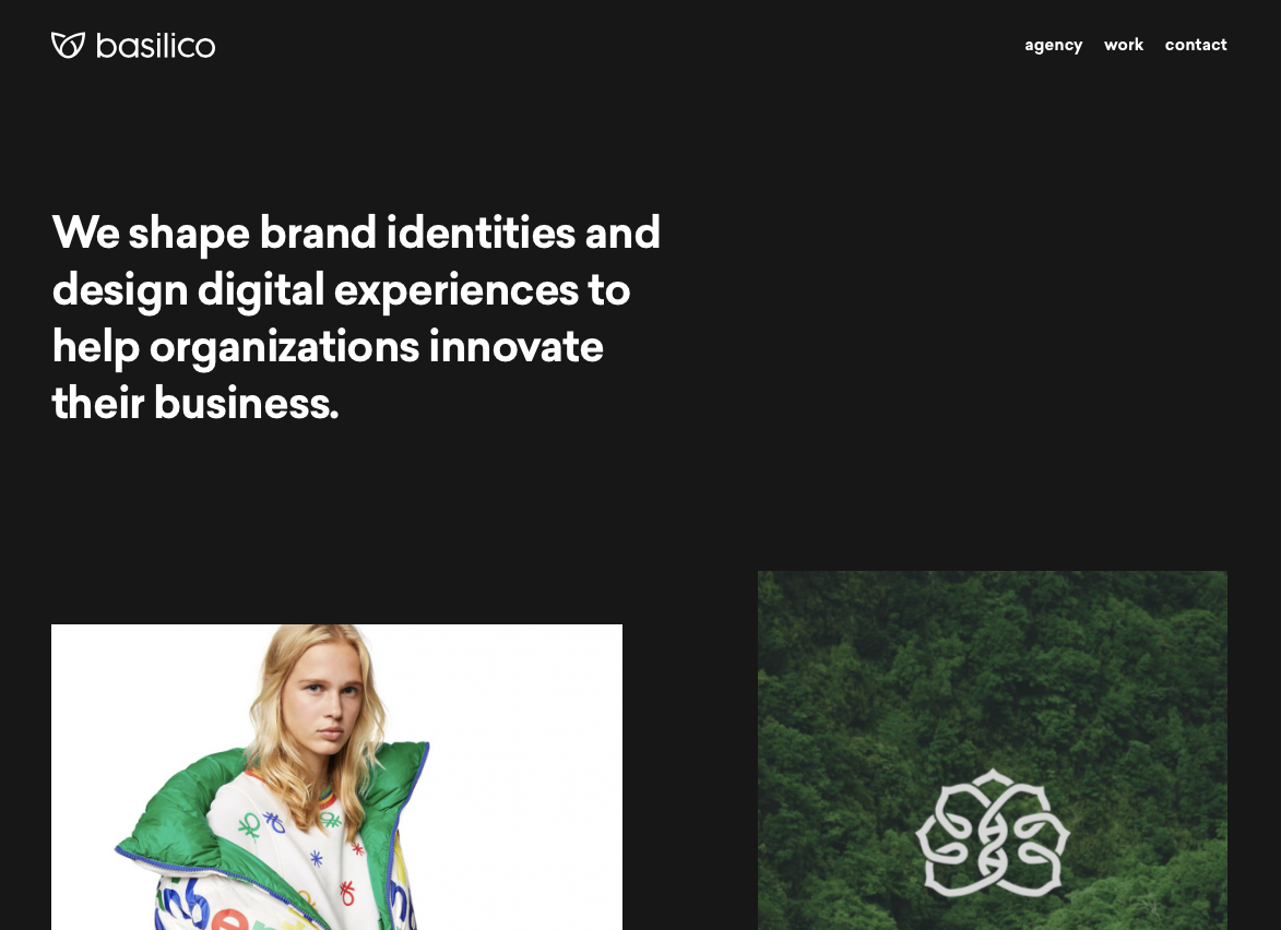
Basilico

This site offers a dark design that makes each portfolio piece really stand out. Plus, when you hover over each item, they color shift and descriptive text scrolls across it from right to left.

dark website designs - Basilico

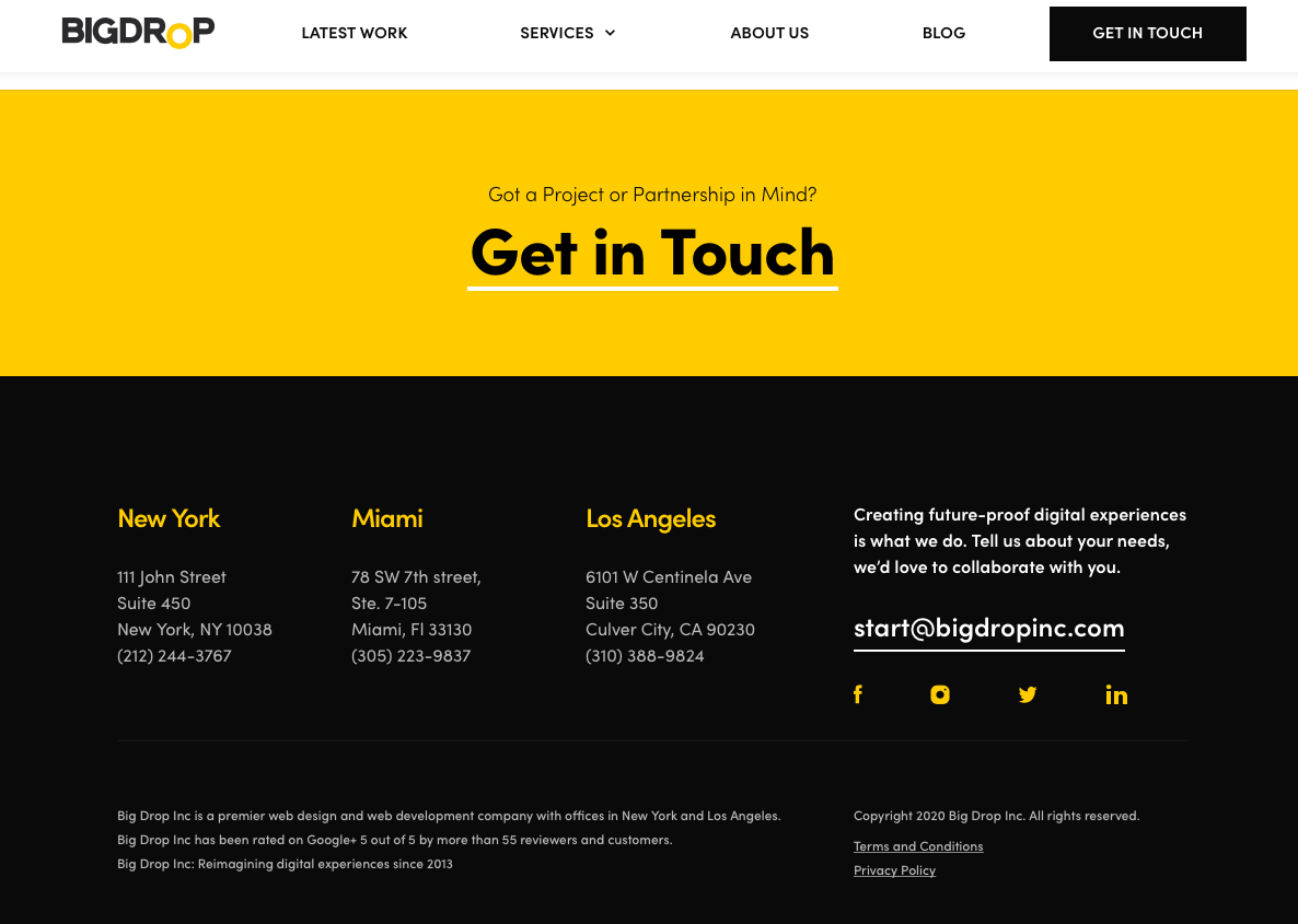
Big Drop Inc

Big Drop Inc has a combination of light and dark designs that are both appealing and effective.

dark website designs - Big Drop Inc

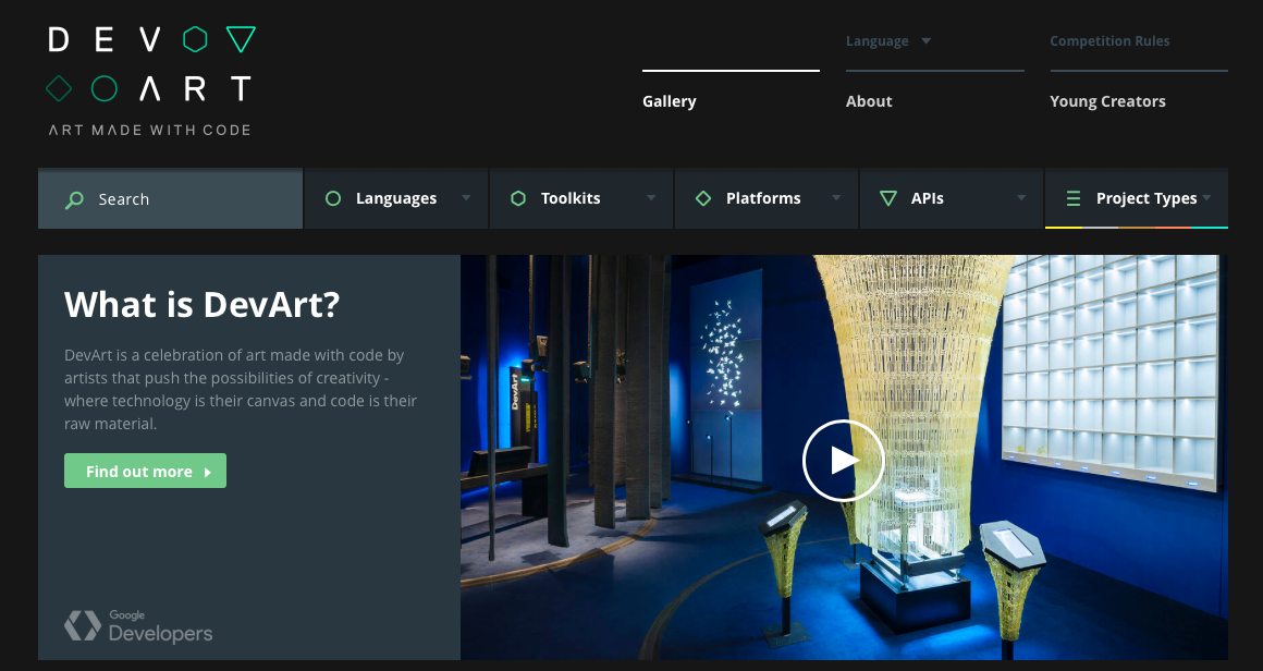
DevArt

DevArt is another site with a dark design that helps to make the artwork it features stand out. It’s also easier on the eyes than sites with brighter backgrounds.

dark website design - DevArt

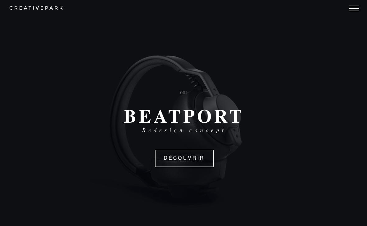
Creative Park

The Creative Park website offers up a delightfully dark design that allows the subject of photos to really stand out. It also has some really interesting transition effects for changing slides, clicking links, and opening menus.

dark website designs - Creative Park

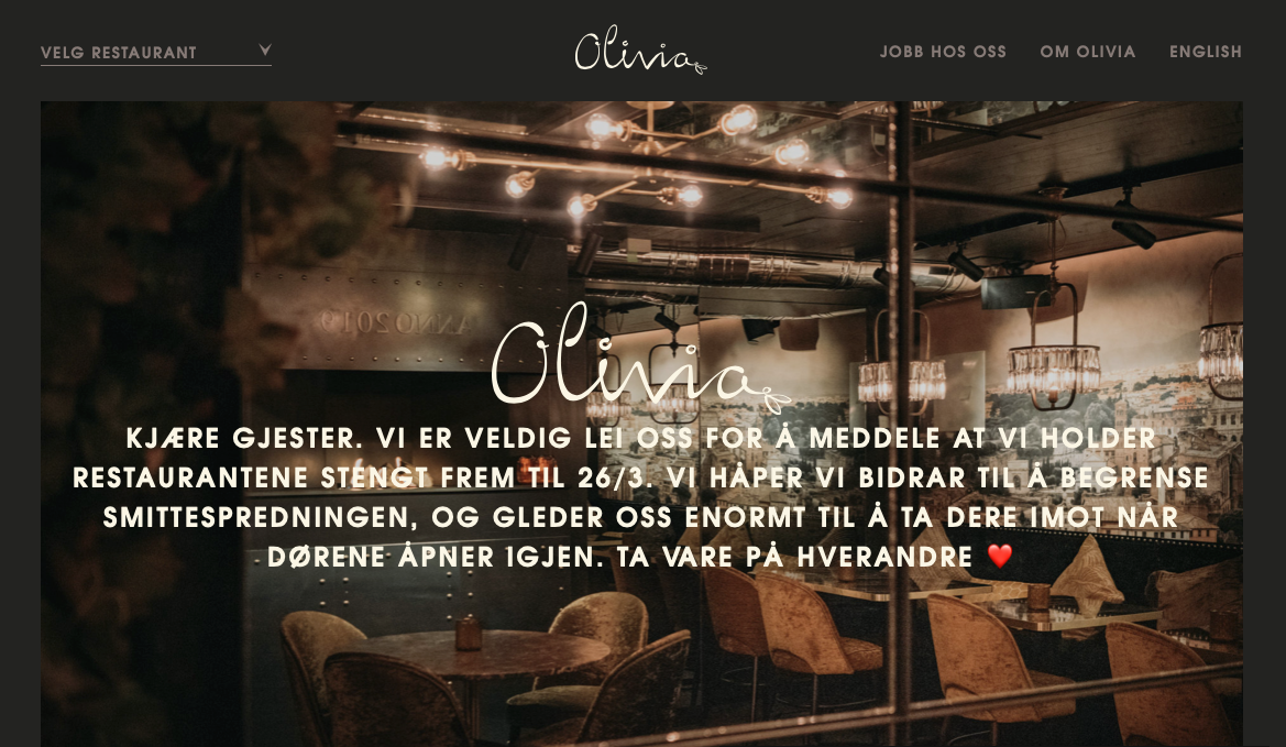
Olivia Restaurant

The Olivia Restaurant website mimics the mood inside of the restaurant itself — dark, cozy, and inviting.

dark website designs - Olivia Restaurant

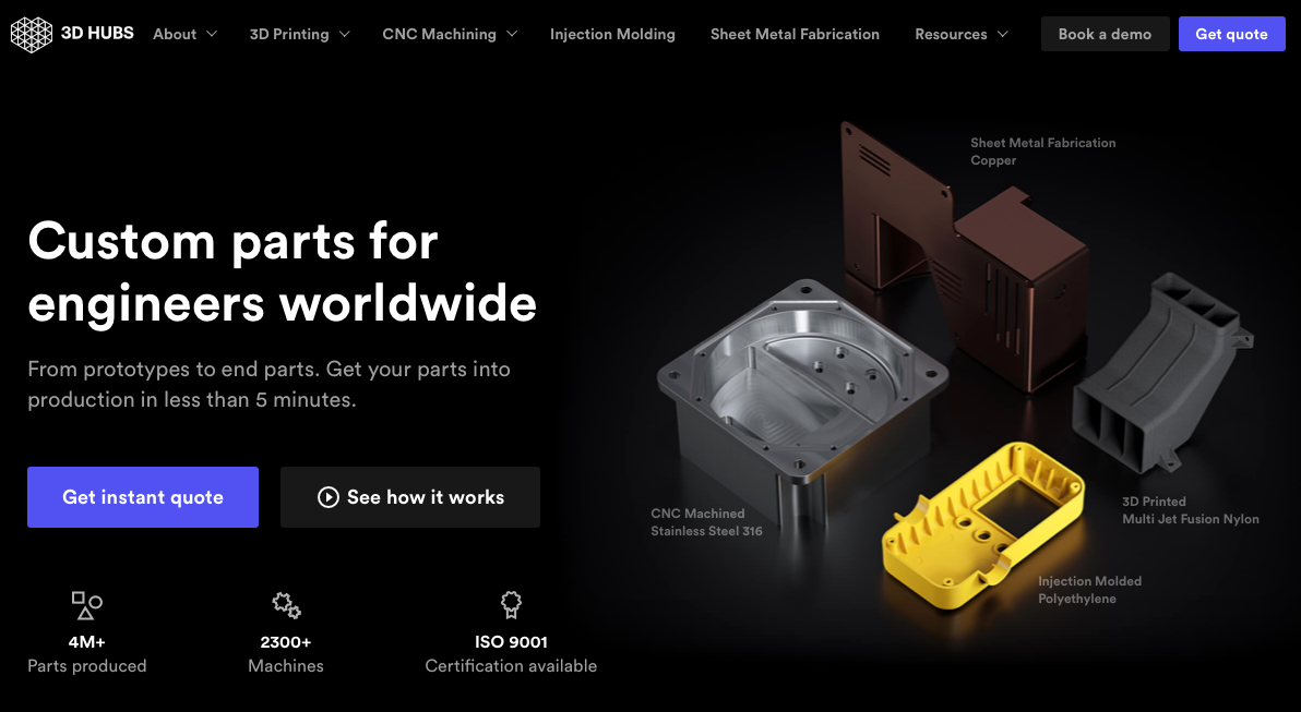
3D Hubs

The 3D Hubs website leverages its dark design to make the components it features stand out. This also works well for displaying video and individual items the company offers.

dark website designs - 3D Hubs

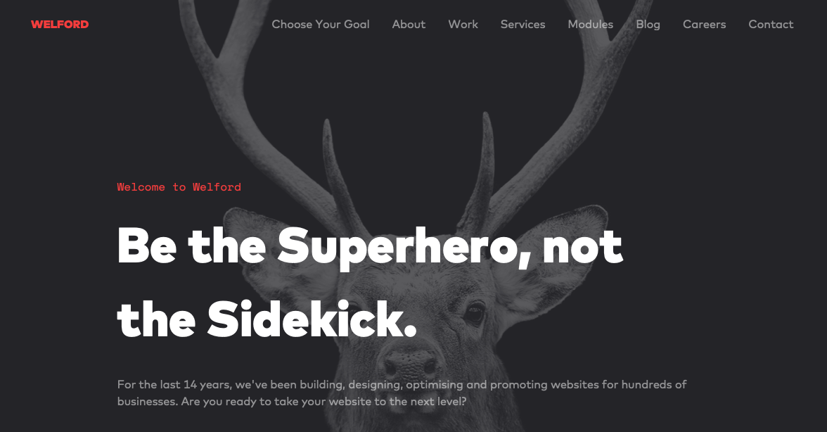
Welford Media

Welford Media is a web design firm that uses a dark design on its website to engage visitors. This design choice allows the company’s tagline stand out at a glance and builds immediate interest.

dark website designs - Welford Media

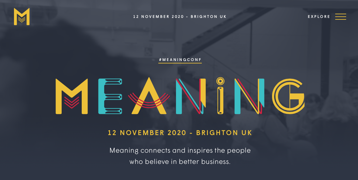
Meaning 2020

The website for the Meaning 2020 Conference has a dark design as well. The gray background allows the colorful logo to stand out and offers a subdued backdrop onto which videos and photos are placed.

dark website designs - Meaning 2020

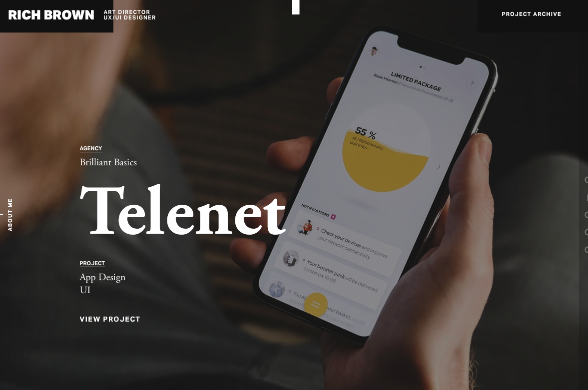
Rich Brown

This is a website dedicated to the work of Rich Brown, an art director and UX/UI designer. The site itself features a dark design onto which video backgrounds play seamlessly.

dark website designs - Rich Brown

Artem Pivovarov

The design on this website is super interesting. Artem Pivovarov has a dark design with a prominent photo background. It also has interactive elements in this background that react on hover.

dark website designs - Artem Pivovarov

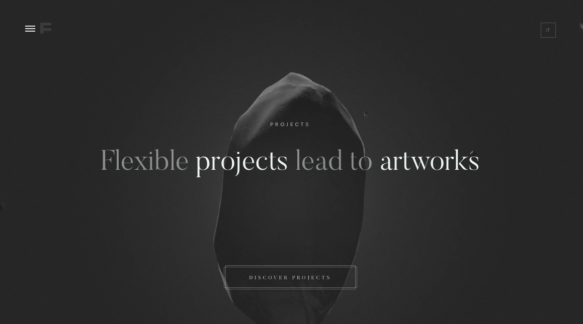
Formigari Srl

Formigari Srl is another site you should check out for dark design inspiration. It highlights videos and photos on a deep gray background that makes the entirety of the content feel immersive.

Formigari Srl

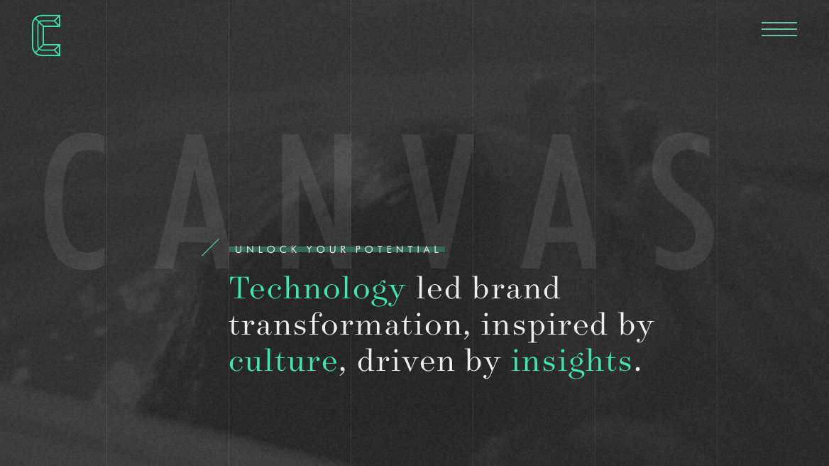
Canvas United

Still another site you should check out is Canvas United. This site is for a New York-based digital agency that provides some cool transition effects and an immersive experience.

Canvas United

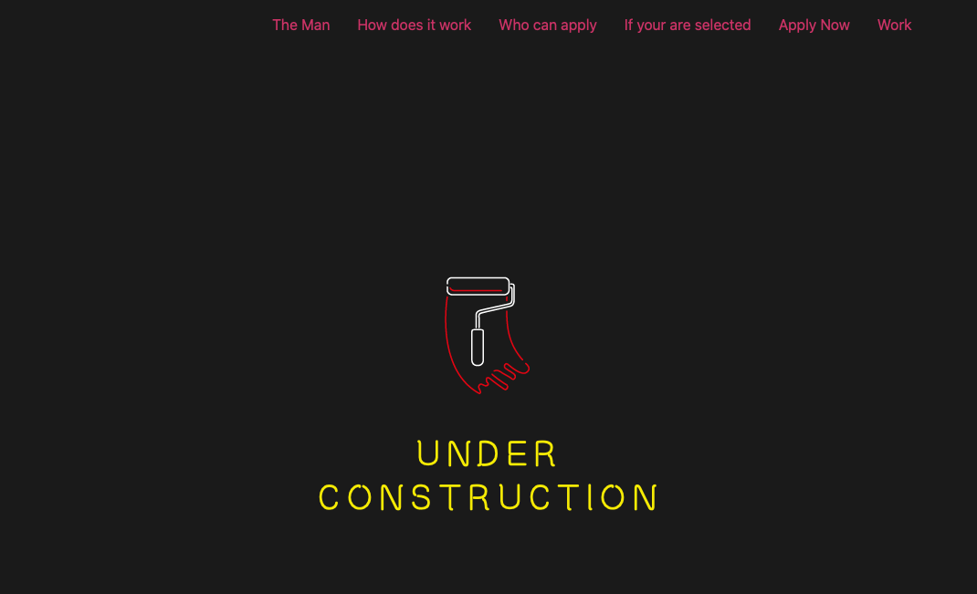
The Kennedys

The Kennedys website currently features an under construction sign that’s set on a dark background.

The Kennedys

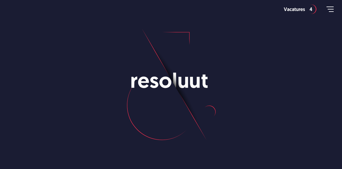
Resoluut

The Resoluut website offers a dark purple background with images that appear as though they’re hovering on top of it. There is a lot of play with depth of field here.

Resoluut

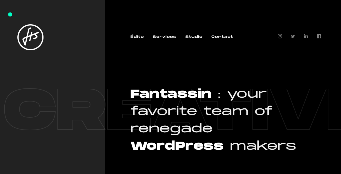
Fantassin

Still another option is the Fantassin website, which features a dark background and tons of cool scroll effects that draw the eye further down the page.

Fantassin

Cody Petts Studio

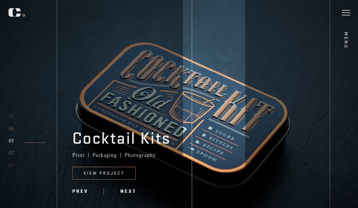
The Cody Petts Studio website highlights the work of Cody Petts, including print and packaging designs as well as photography. It’s dark, gritty, and extremely compelling.

Cody Petts Studio

Kazuma Kurata

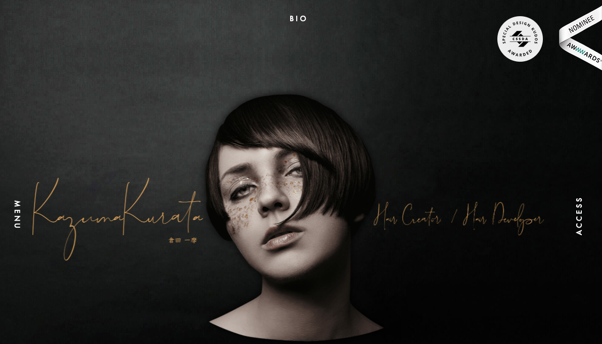
The design for the Kazuma Kurata website offers a dark background that’s intimately inviting. It makes the colorful Aspects of featured photos stand out even more. The design and function of the site make it clear why it’s deserving of its AWWWARDs Nominee status.

Kazuma Kurata

Bachoy

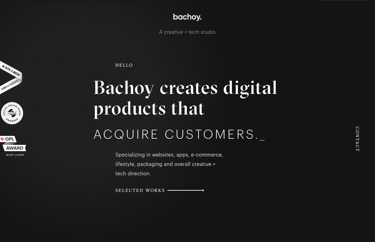
The Bachoy website highlights a creative and tech studio. The dark design featured here uses a cool spotlight hover effect and interesting interactions with photos as you scroll down the page.

Bachoy

Agency Legend

The Agency Legend website has a truly appealing site that takes advantage of superhero motifs to increase engagement.

Agency Legend

Arara

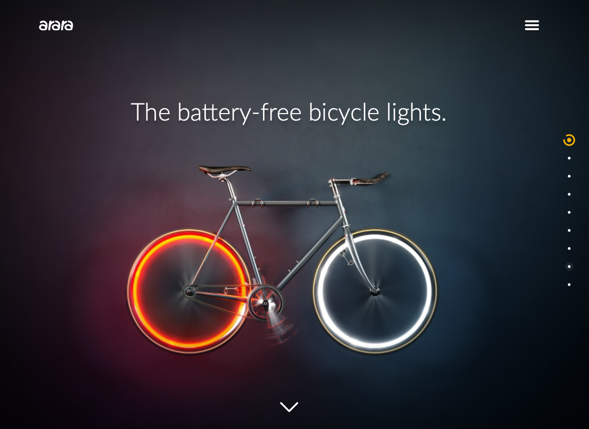
Last on our list is the website for Arara, which offers battery-free bicycle lights. This site is dark but not brooding, and instead uses the darker background to make the bright colors featured in images and videos “pop.”

Arara

Dark Website Designs Can Serve You Well

As you can see from the examples listed above, dark website designs can really take the overall look of your website to the next level — whatever that means for you. Whether you want to make colors look more vibrant, ease eye strain, or provide a mood, dark designs offer flexibility in both form and function. Have fun playing with them!

Simple Tips on How to perfect your eLearning

Featured Imgs 24

Indeed, eLearning is one of technology’s biggest wins in education. Simply put, eLearning allows students to learn or train using digital devices. This allows learning to take place anywhere and at any time. ELearning advances itself to most industries and with gamification, simulations and personalization, it’s able to support every type of training sufficiently. Have […]

The post Simple Tips on How to perfect your eLearning appeared first on WPArena.