I saw in the release notes for Safari Technical Preview 122 that it has support for a color-contrast() function in CSS. Safari is first out of the gate here. As far as I know, no other browser supports this yet and I have no idea when stable Safari will ship it, or if any other browser ever will. But! It’s a very good idea! Any native tool to get us to ship more accessible interfaces (of which color contrast is a part) is cool by me. So let’s attempt to get it to work.
I had to ask around about this, but just because this is a pre-release browser, it doesn’t mean all these features are active by default. Just as Chrome Canary has feature flags you have to turn on, so does Safari Technical Preview. So, I had to flip it on like this:
The release notes don’t have any information about how to actually use color-contrast(), but fortunately web searching turns up a spec (it’s part of Color Module 5), and MDN has a page for it with very basic syntax information.
This is how I understand it:
That example above is a little silly, because it will always return white — that has the most contrast with black. This function actually gets useful when one or more of those color values is dynamic, meaning very likely it is a CSS custom property.
The function returns a color, so the top use-case, I would guess, is going to be setting a color based on a dynamic background. So…
Here’s a demo from Dave where he’s not just setting the text color in the parent, but the color of links as well, and the links have a different set of colors to choose from. Play with the HSL sliders (in Safari Technology Preview, of course) to see it work.
Just picking two colors that have enough contrast is easy enough (although you’d be surprised how often it’s screwed up by even those of us with good intentions). But oh wow does it get complicated quick with different situations, let alone having a bunch of color variations, or god forbid, arbitrary combinations.
Here’s a video of me playing with Dave’s tester so you can see how the colors update at different places.
There are some Unicode characters that some browsers just decide they are going to turn into emojis for you. I couldn’t tell you why exactly, but here’s what I see:
Chrome on the left. Safari in the simulator on top and to the right.
Those text Unicode characters (▶, ↩, and, ❤) show up as text in Chrome, then iOS Safari turns them into emojis. Notice how when they are text, I have the ability to change their color, but not when they are turned to emoji.
Those characters above might turn into emojis for you also. They look like text in my WordPress editor. Shrug.
This came up for me because I was helping someone with their website and they didn’t like the “red diamonds” that were showing up. I didn’t seen them as red until I looked on my phone.
Worked on a little site refresh for someone, and they didn't like how the diamond characters they use on many pages are RED. I'm like… red? They should be just normal text-color characters. But no, iOS Safari turns them into red emoji things. Or is something else happening? pic.twitter.com/Z0MJWgUHzv
A couple of people pointed out to me that if you use this (︎︎︎) before the character it will “request it to be rendered as text.” Here’s the spec on that. I couldn’t get it to work though. Here’s my test:
What I see on iOS:
I read in some sporatic threads that font-family: monospace would also prevent the emoji conversion, but that didn’t work for me either.
Let it be an emoji, but force the color anyway.
If you can select the element, even if the characters go emoji, you could force them to a color. Here’s an example from Andrew Walpolea:
Preethi Sam blogged that you can also use text-shadow to do the same:
The problem in my case was that there was no selector to use! The diamonds I was having trouble with were on hundreds of random posts in the database.
Screw it
I just gave up and ran a MySQL search/replace on the whole database (via Better Search Replace) to get rid of them.
Let’s say someone asks you to add a double border to some random geometric SVG shapes. For some reason, you can’t use any graphic editor — they need to be generated at runtime — so you have to solve it with CSS or within the SVG syntax.
Your first question might be: Is there anything like stroke-style: double in SVG? Well, the answer is not yet and it’s not that easy. But I’ll attempt it anyway to see what methods I can uncover. I’ll explore the possibilities of three different basic shapes: circle, rectangle, and polygon. Pointing the ones that can keep a transparent color in the middle of the two lines.
Spoiler alert: all the results have their downsides, at least with CSS and SVG, but let me walk you through my intents.
The simple solutions
These don’t work with all shapes, but they are the easiest of the solutions.
outline and box-shadow
The CSS properties outline and box-shadow only apply to the bounding box of the shape or SVG, and so both are great solutions only for squares and rectangles. They also allow flexible colors using custom properties.
It only takes two lines of CSS with outline, plus it keeps the background color visible through the shape.
🙁 Solution only for one shape.
✅ Simple code
✅ Borders are smooth
✅ Transparent background
box-shadow only needs one line of CSS, but we have to make sure that each shape has its own SVG as we can’t apply box-shadow directly to the shapes. Another thing to consider is that we have to apply the color of the background in the declaration.
🙁 Solution only for one shape
✅ Simple code
✅ Borders are smooth
🙁 No transparent background
SVG gradients
SVG radial gradients only work on circles ☺️. We can directly apply the gradient on the stroke, but it’s better to use variables as we have to declare the colors many times in the code.
🙁 Solution only for one shape
✅ Simple code
🙁 Borders are smooth
🙁 No transparent background
Solutions for all shapes
These will work with all shapes, but the code could become bloated or complex.
filter:drop-shadow()
Finally, one solution for all shapes! We must have each shape in its own <svg> since the filter won’t apply directly to the shapes. We are using one declaration in CSS and have flexible colors using variables. The downside? The borders don’t look very smooth.
✅ One solution for all shapes
✅ Simple code
🙁 Borders look pixelated
🙁 No transparent background
SVG filters
This is a very flexible solution. We can create a filter and add it to the shapes through SVG’s filter attribute. The complicated part here is the filter itself. We’ll need three paintings, one for the outside border, one for the background flood, and the last one to paint the shape on the front. The result looks better than using drop-shadow, but the borders are still pixelated.
✅ One solution for all shapes
🙁 Complex code
🙁 Borders look pixelated
🙁 No transparent background
Reusing shapes
There are a couple of possible options here.
Option 1: Transforms
This solution requires transforms. We place one figure over the other, where the main figure has a fill color and a stroke color, and the other figure has no fill, a red stroke, and is scaled and repositioned to the center. We defined our shapes on the <defs>. The trick is to translate half of theviewBoxto the negative space so that, when we scale them, we can do it from the center of the figure.
✅ One solution for all shapes
🙁 Duplicated code
✅ Borders are smooth
✅ Transparent background
Option 2: <use>
I found a clever solution in the www-svg mailing list by Doug Schepers that uses SVG <use>. Again, it requires defining the shapes once and referring to them twice using <use>. This time the main shape has a bigger stroke. The second shape has half the stroke of the main shape, no fill, and a stroke matching the background color.
✅ One solution for all shapes
🙁 Duplicated code
✅ Borders are smooth
🙁 No transparent background
Here are the full results!
Just so you have them all in one place. Let me know it you can think of other possible solutions!
At first, there were flexboxes (the children of a display: flex container). If you wanted them to be visually separate, you had to use content justification (i.e. justify-content: space-between), margin trickery, or sometimes, both. Then along came grids (a display: grid container), and grids could have not-margin not-trickeried minimum gaps between grid cells, thanks to grid-gap. Flexboxes did not have gaps.
Now they can, thanks to the growing support of gap, the grid-gap successor that isn’t confined to grids. With gap, you can gap your grids, your flexboxes, and even your multiple columns. It’s gaptastic!
Gap with Grid
Let’s start where gap is the most robust: CSS Grid. Here’s a basic grid setup in HTML and CSS:
That places the grid cells at least 1em apart from each other. The separation distance can be greater than that, depending on other conditions beyond the scope of this post, but at a minimum they should be separated by 1em. (OK, let’s do one example: gap’s gaps are in addition to any margins on the grid cells, so if all the grid items have margin: 2px;, then the visual distance between grid cells would be at least 1em plus 4px.) By default, changes to the gap size causes resizing of the grid items, so that they fill their cells.
This all works because gap is actually shorthand for the properties row-gap and column-gap. The gap: 1em is interpreted as gap: 1em 1em, which is shorthand for row-gap: 1em; column-gap: 1em;. If you want different row and column gap distances, then something like gap: 0.5em 1em will do nicely.
Gap with Flexbox
Doing the same thing in a flexbox context gives you gaps, but not in quite the same way they happen in grids. Assume the same HTML as above, but this CSS instead:
The flexboxes are pushed apart by at least the value of gap here, and (thanks to flex-wrap) wrap to new flex lines when they run out of space inside their flex container. Changing the gap distance could lead to a change in the wrapping of the flex items, but unlike in Grid, changing gaps between flex items won’t change the sizes of the flex items. Gap changes can cause the flex wrapping to happen at different places, meaning the number of flex items per row will change, but the widths will stay the same (unless you’ve set them to grow or shrink via flex, that is).
Gap with Multi-Column
In the case of multicolumn content, there is bit of a restriction on gap: only column gaps are used. You can declare row gaps for multicolumn if you want, but they’ll be ignored.
section {
  columns: 2;
  gap: 1em;
}
Support
Support for gap, row-gap, and column-gap is surprisingly widespread. Mozilla’s had them since version 61, Chromium since version 66, and thanks to work byIgalia’s Sergio Villar, they’re coming to Safari and Mobile Safari soon (they’re already in the technology preview builds). So if your grid, flex, or multicolumn content needs a bit more space to breathe, get ready to fall into the gap!
File this under stuff you don’t need to know just yet, but I think the :has CSS selector is going to have a big impact on how we write CSS in the future. In fact, if it ever ships in browsers, I think it breaks my mental model for how CSS fundamentally works because it would be the first example of a parent selector in CSS.
Before I explain all that, let’s look at an example:
div:has(p) {
  background: red;
}
Although it’s not supported in any browser today, this line of CSS would change the background of a divonly if it has a paragraph within it. So, if there’s a div with no paragraphs in it, then these styles would not apply.
That’s pretty handy and yet exceptionally weird, right? Here’s another example:
div:has(+ div) {
  color: blue;
}
This CSS would only apply to any div that directly has another div following it.
The way I think about :has is this: it’s a parent selector pseudo-class. That is CSS-speak for “it lets you change the parent element if it has a child or another element that follows it.” This is so utterly strange to me because it breaks with my mental model of how CSS works. This is how I’m used to thinking about CSS:
/* Not valid CSS, just an illustration */
.parent {
  .child {
    color: red;
  }
}
You can only style down, from parent to child, but never back up the tree. :has completely changes this because up until now there have been no parent selectors in CSS and there are some good reasons why. Because of the way in which browsers parse HTML and CSS, selecting the parent if certain conditions are met could lead to all sorts of performance concerns.
Putting those concerns aside though, if I just sit down and think about all the ways I might use :has today then I sort of get a headache. It would open up this pandora’s box of opportunities that have never been possible with CSS alone.
Okay, one last example: let’s say we want to only apply styles to links that have images in them:
a:has(> img) {
  border: 20px solid white;
}
This would be helpful from time to time. I can also see :has being used for conditionally adding margin and padding to elements depending on their content. That would be neat.
Although :has isn’t supported in browsers right now (probably for those performance reasons), it is part of the CSS Selectors Level 4 specification which is the same spec that has the extremely useful :not pseudo-class. Unlike :has, :notdoes have pretty decent browser support and I used it for the first time the other day:
ul li:not(:first-of-type) {
  color: red;
}
That’s great I also love how gosh darn readable it is; you don’t ever have to have seen this line of code to understand what it does.
Another way you can use :not is for margins:
ul li:not(:last-of-type) {
  margin-bottom: 20px;
}
So every element that is not the last item gets a margin. This is useful if you have a bunch of elements in a card, like this:
CSS Selectors Level 4 is also the same spec that has the :is selector that can be used like this today in a lot of browsers:
:is(section, article, aside, nav) :is(h1, h2, h3, h4, h5, h6) {
  color: #BADA55;
}

/* ... which would be the equivalent of: */
section h1, section h2, section h3, section h4, section h5, section h6,
article h1, article h2, article h3, article h4, article h5, article h6,
aside h1, aside h2, aside h3, aside h4, aside h5, aside h6,
nav h1, nav h2, nav h3, nav h4, nav h5, nav h6 {
  color: #BADA55;
}
So that’s it! :has might not be useful today but its cousins :is and :not can be fabulously helpful already and that’s only a tiny glimpse — just three CSS pseudo-classes — that are available in this new spec.
Yesterday, Happy Prime owner and engineer Jeremy Felt released Shortnotes, a plugin for writing notes from the WordPress editor. The intention is for users to create short pieces of content, such as that found on Twitter, Instagram, and similar social networks. However, it does not come with a front-end posting interface, at least not in version 1.0.
The plugin works just like the post and page editor. It should be straightforward for most users.
While the Shortnotes plugin is relatively bare-bones for now, it serves as a foundation of something that could be more. Part of what makes social networks appealing is the ease of publishing quick content. Publishing notes through the plugin requires visiting the WordPress admin, clicking “Add New,” writing the content, publishing, and clicking a new link to view it on the front end. A quick-publishing interface either through a Dashboard widget or a front-end form would be a useful addition.
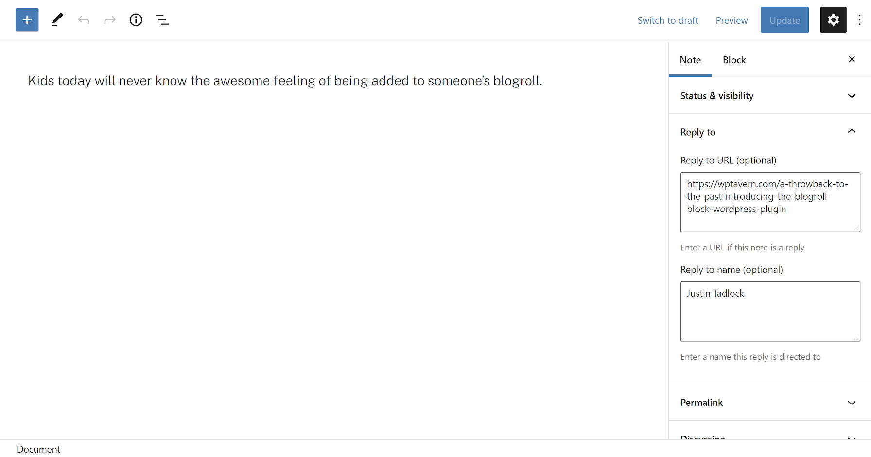
Note post type in the block editor.
Some new concepts that not all users may be familiar with are the “Reply to URL” and “Reply to name” fields. These are semantic fields for creating a note in reply to another post or person on the web. The plugin will automatically output this reply link on the front end.
The plugin integrates with the Webmention plugin. A Webmention is a standardized protocol for mentions and conversations across the web. The goal is a decentralized social “network” of sorts where everyone owns and controls their content. It is an alternative to what IndieWeb calls the “corporate” web in which large tech companies have control.
When entering a Reply to URL, Shortnotes will automatically send that URL through the Webmentions plugin system. It will also parse URLs in the post content as webmentions if they exist.
Users may also notice that the note title field is missing. This is intentional. The plugin automatically generates titles. They are needed for the <title> tag, which tools like search engines use.
The idea is for titles to not appear as part of the theme layout. Because most themes are not coded to check for post-type support before displaying them, there is a high chance that a user’s theme will output the auto-generated title on the front end. For now, that means editing a bit of theme code for those who do not want them to appear. Felt has an example of how he modified this for his site’s custom Twenty Twenty-One child theme. In the long run, as more themes begin supporting the upcoming site editor, users will be able to make this customization directly in the WordPress admin.
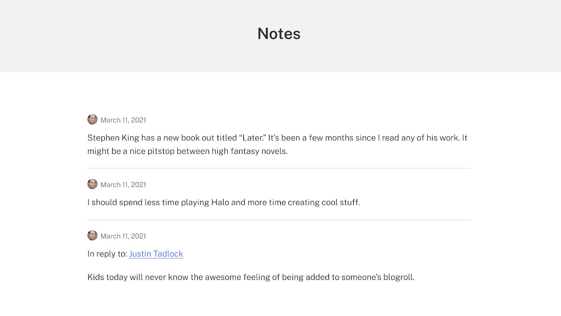
With a few tweaks like removing the title and some minor CSS adjustments, I was able to create a clean Notes archive page using the Genesis Block theme:
Modified notes archive.
One of my interests in checking this project out was diving into a real-world example of a plugin that limited which blocks could be used with the editor. The notes post type only allows the Paragraph, Image, and Gallery blocks. Again, the idea is to replicate the feel of what you can do on social networks. Overall, this feature worked as it should, limiting the notes to a subset of blocks.
However, I ran across a bug with the block editor. All block patterns, regardless of what blocks they contained, appeared in the inserter. Clicking on one containing a disallowed block would not insert it into a post. However, the editor did add a pop-up note that it had. There is a GitHub issue for this bug that has seen little movement since it was opened in June 2020.
Felt created a plugin to solve this called Unregister Broken Patterns. It removes any patterns that contain blocks that a post type does not support. At best, it is a temporary measure and needs to be addressed in WordPress.
WordPress 5.7 “Esperanza” was released today, named for Esperanza Spalding, an American jazz bassist who became an accomplished singer, songwriter, and composer in her early 20’s.
Versions 9.3 – 9.9 of the Gutenberg plugin are rolled into this update, bringing hundreds of enhancements and bug fixes that make working in the block editor more efficient and enjoyable.
One of the highlights is the new drag-and-drop capabilities in the block inserter. Users can now drag blocks and block patterns directly into the post content area, making page building even faster.
Many of the user-facing editor enhancements in this release give the user more control when using existing blocks:
Full height alignment: Blocks such as the Cover block now can have an option to expand to fill the entire viewport.
Buttons block: The Buttons block now supports vertical alignments, and you can set the width of a button to a preset percentage.
Social Icons block: You can now change the size of the icons in the Social Icons block.
Font size in more places: You can now change the font size in the List and Code blocks
This release also improves the UI for block variations to include the icon and description for the variation in the block inspector and a new dropdown to allow for switching between variations. Reusable blocks have been updated to be saved at the same time the post is saved. Quite a few more improvements have been added in version 10.1 of the Gutenberg plugin, which is not yet included core. If you use Reusable blocks frequently, you may want to install the plugin to take advantage of the expanded UI.
Theme and plugin developers who want to better match the admin color scheme can easily reference the new standardized shades to make their products more at home in the WordPress admin. WordPress’ existing core classes have also been updated with the new color palette so plugin authors can use them to work within the new standardized palette.
One of the most exciting technical enhancements in 5.7 is a new one-click migration from HTTP to HTTPS. WordPress can now detect if the user’s hosting environment has support for HTTPS and update with the click of a button, handling mixed content rewrites where possible. This feature is available on the Site Health recommendations screen.
WordPress 5.7 continues the ongoing cleanup after the update to jQuery 3.5.1, which will eventually result in the removal of jQuery Migrate plugin. It fixes numerous jQuery deprecations in external libraries, cleaning up many JQMIGRATE warnings.
Developers may also be interested in the new filter-based Robots API included in 5.7. It enables the central management of the content of the robots meta tag injected into the page, and includes a setting to toggle whether search engines are allowed to display large media from the site. By default, a max-image-preview:large robots directive which will be injected into the robots meta tag based on the new setting.
Version 5.7 also includes native support for lazy loading iframes, a follow-up to WordPress’ support for lazy loading for images that came in 5.5. This should improve loading for pages that include embeds and other types of iframes.
Check out the WordPress 5.7 field guide for technical details on everything new in this release. This update is the result of work from 481 volunteer contributors who collaborated on 250 tickets on Trac and more than 950 pull requests on GitHub.
It’s always mind blowing for me to see the impact WordPress makes on the global economy.
MemberPress, the leading WordPress membership and course platform, announced today that they have passed the milestone of $1 billion dollars in creator earnings.
This is a conservative estimate and likely MemberPress creators have earned way more than that.
With the digital acceleration from last year, they are estimating that MemberPress site creators are projected to earn over $600 million dollars in 2021 alone.
For those who don’t know, I invested in MemberPress in 2018 as part of our WPBeginner Growth Fund.
It’s been an exciting journey to work alongside with Blair Williams, founder & CEO of MemberPress.
The impact our users (website creators) are making through their online courses and membership sites is truly humbling to watch.
Last year, MemberPress launched an easy to use online course builder that works on top of the WordPress block editor. This makes it easy for non-techy website owners to create courses, add lessons, manage access control, and more.
The team also added a Classroom mode to offer a distraction-free learning experience that’s focused on content consumption and course completion rate. This immersive learning mode works with all WordPress themes.
They also made significant improvements to add drip content in WordPress, ability to gift memberships, added PDF invoices, integrations with PushEngage, and more.
I also got a sneak peek of some big features they’re working on, and it’s going to be an exciting 2021.
Basically if you want to restrict access to any type of premium content in WordPress, then you should use MemberPress.
Final Thoughts on WordPress & Creator Economy
The WordPress economy and indirectly the creator economy is huge. In the State of Word for 2020, Matt Mullenweg, co-founder of WordPress shared that WooCommerce facilitated over $20 billion in sales in 2020.
Other third-party online course platforms like Teachable reported that course creators earned over $456.7 million in 2020. Thinkific is also estimating their course creators to earn around $550 million in 2021.
MemberPress is estimating that creators using MemberPress will surpass estimated $600 million in sales in 2021, and this is a conservative estimate.
The creator economy has been on the rise since I started WPBeginner in 2009, but it’s never been stronger than right now.
If you have the knowledge and passion for teaching others, then you can start a very successful online business today.
The combination of YouTube, membership platforms, and social networks for building community provide a unique opportunity for anyone who has a desire to succeed.
As a content creator myself, it’s extremely rewarding for me to see others succeed in their online journey.
I want to congratulate Blair and the MemberPress team in their role for building a robust platform that supports thousands of creators find success online.
Here’s to an amazing 2021!
P.S. If you have a WordPress product that’s empowering website owners to succeed online and want to work with us, then I would love to chat with you. Click here to learn more about WPBeginner Growth Fund.
In this week’s news, Chrome tackles focus rings, we learn how to get “donut” scope, Global Privacy Control gets big-name adoption, it’s time to ditch pixels in media queries, and a snippet that prevents annoying form validation styling.
Chrome will stop displaying focus rings when clicking buttons
Chrome, Edge, and other Chromium-based browsers display a focus indicator (a.k.a. focus ring) when the user clicks or taps a (styled) button. For comparison, Safari and Firefox don’t display a focus indicator when a button is clicked or tapped, but do only when the button is focused via the keyboard.
The focus ring will stay on the button until the user clicks somewhere else on the page.
Some developers find this behavior annoying and are using various workarounds to prevent the focus ring from appearing when a button is clicked or tapped. For example, the popular what-input library continuously tracks the user’s input method (mouse, keyboard or touch), allowing the page to suppress focus rings specifically for mouse clicks.
A more recent workaround was enabled by the addition of the CSS :focus-visible pseudo-class to Chromium a few months ago. In the current version of Chrome, clicking or tapping a button invokes the button’s :focus state but not its :focus-visible state. that way, the page can use a suitable selector to suppress focus rings for clicks and taps without affecting keyboard users.
:focus:not(:focus-visible) {
  outline: none;
}
Fortunately, these workarounds will soon become unnecessary. Chromium’s user agent stylesheet recently switched from :focus to :focus-visible, and as a result of this change, button clicks and taps no longer invoke focus rings. The new behavior will first ship in Chrome 90 next month.
The enhanced CSS :not() selector enables “donut scope”
I recently wrote about the A:not(B *) selector pattern that allows authors to select all A elements that are not descendants of a B element. This pattern can be expanded to A B:not(C *) to create a “donut scope.”
For example, the selector article p:not(blockquote *) matches all <p> elements that are descendants of an <article> element but not descendants of a <blockquote> element. In other words, it selects all paragraphs in an article except the ones that are in a block quotation.
The donut shape that gives this scope its name
The New York Times now honors Global Privacy Control
Announced last October, Global Privacy Control (GPC) is a new privacy signal for the web that is designed to be legally enforceable. Essentially, it’s an HTTP Sec-GPC: 1 request header that tells websites that the user does not want their personal data to be shared or sold.
The DuckDuckGo Privacy Essentials extension enables GPC by default in the browser
The New York Times has become the first major publisher to honor GPC. A number of other publishers, including The Washington Post and Automattic (WordPress.com), have committed to honoring it “this coming quarter.”
Does The Times support the Global Privacy Control (GPC)?
Yes. When we detect a GPC signal from a reader’s browser where GDPR, CCPA or a similar privacy law applies, we stop sharing the reader’s personal data online with other companies (except with our service providers).
The case for em-based media queries
Some browsers allow the user to increase the default font size in the browser’s settings. Unfortunately, this user preference has no effect on websites that set their font sizes in pixels (e.g., font-size: 20px). In part for this reason, some websites (including CSS-Tricks) instead use font-relative units, such as em and rem, which do respond to the user’s font size preference.
Ideally, a website that uses font-relative units for font-size should also use em values in media queries (e.g., min-width: 80em instead of min-width: 1280px). Otherwise, the site’s responsive layout may not always work as expected.
For example, CSS-Tricks switches from a two-column to a one-column layout on narrow viewports to prevent the article’s lines from becoming too short. However, if the user increases the default font size in the browser to 24px, the text on the page will become larger (as it should) but the page layout will not change, resulting in extremely short lines at certain viewport widths.
If you’d like to try out em-based media queries on your website, there is a PostCSS plugin that automatically converts min-width, max-width, min-height, and max-height media queries from px to em.
In 2017, Peter-Paul Koch published a series of three articles about native form validation on the web. Part 1 points out the problems with the widely supported CSS :invalid pseudo-class:
The validity of <input> elements is re-evaluated on every key stroke, so a form field can become :invalid while the user is still typing the value.
If a form field is required (<input required>), it will become :invalid immediately on page load.
Both of these behaviors are potentially confusing (and annoying), so websites cannot rely solely on the :invalid selector to indicate that a value entered by the user is not valid. However, there is the option to combine:invalid with :not(:focus) and even :not(:placeholder-shown) to ensure that the page’s “invalid” styles do not apply to the <input> until the user has finished entering the value and moved focus to another element.
The CSS Selectors module defines a :user-invalid pseudo-class that avoids the problems of :invalid by only matching an <input> “after the user has significantly interacted with it.”
Firefox already supports this functionality via the :-moz-ui-invalid pseudo-class (see it in action). Mozilla now intends to un-prefix this pseudo-class and ship it under the standard :user-invalid name. There are still no signals from other browser vendors, but the Chromium and WebKit bugs for this feature have been filed.
Here’s a nice simple demo from Moritz Gießmann on animating the triangle of a <details> element, which is the affordance that tells people this thing can be opened. Animating it, then is another kind of affordance that tells people this thing is opening now.
The tricks?
Turn off the default triangle: details summary::-webkit-details-marker { display:none; }. You can’t animate that one.
This is the March 2021 edition of “This Month in WordPress with CodeinWP.” In this edition, we are going to talk about a much-awaited feature coming in WordPress 5.7, Gutenberg 10.0, the 100th release of the block editor, Elementor Pro’s new pricing plans, and the first beta for Easy Digital Downloads 3.0.
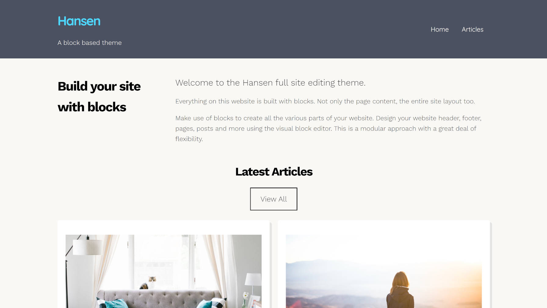
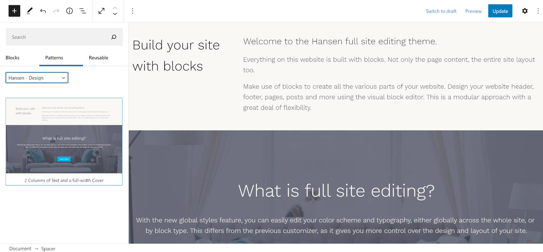
Earlier today, the WordPress theme directory welcomed its fourth block-based theme. Built by UXL Themes, Hansen is one of the more stylish projects capable of working with the site editor in the Gutenberg plugin. The theme author also stepped it up a notch and included several block patterns.
UXL Themes has done just that. Most patterns that we have seen thus far have been built primarily for post or page content. The Hansen theme takes that idea a step further and creates patterns for different site sections.
Want to try a different look for the header? Just remove the old one and swap in another header pattern.
Inserting the dark header pattern.
How about changing the look of your blog posts page? The theme comes with two and three-column patterns for outputting the latest posts.
Inserting a two-column blog posts pattern.
It also packages a Content and Sidebar pattern that is more suitable for single posts and pages.
I am still undecided on whether the patterns or template parts system is the ideal solution for this. Right now, patterns have a cleaner UI overall and can be categorized. Template parts might be easier to switch, but there is no way to group them (e.g., header templates, footer templates, etc.). Regardless of what becomes the de facto standard in the long term, we need more theme authors like UXL Themes experimenting with these concepts, seeing what works, and gathering user feedback.
The theme does not add much in the way of content patterns. However, it does include one named “2 Columns of Text and a Full-Width Cover.” While it is a bit of a mouthful, the name does fully describe what it does. This is also the pattern in use for the homepage in the theme’s demo. However, the demo has a slight modification, adding a custom latest posts section.
Hansen content-related pattern.
Hansen is more than just its patterns. The theme generally looks pretty good too. It has a bit more pizazz than we have seen from some other block-based experiments. Like the recently-released Phoenix theme, developers are becoming more comfortable moving beyond the bare-bones block-based designs from previous months.
These themes are obviously not on par with what one could build on more mature systems. However, Gutenberg’s FSE system is inching forward. The theme authors who are experimenting now are paving the way for the next generation of themes, which I am excited to see.
The Hansen theme also includes several block styles. Most are geared toward blocks that users would typically use in the site editor. I have not seen such an approach in previous block-based themes.
Two of the styles are for mobile navigation. The Mobile Friendly style displays a horizontal nav menu on desktop while switching to a hamburger-flydown on mobile devices. The Mobile Style alternative retains the mobile layout on all screen sizes.
There is a Box Shadow style for the Query Loop block, which adds a shadow to each post. In the future, I hope to see WordPress provide box-shadow options for this instead of themes relying on block styles. Nevertheless, it is a welcome addition for the moment.
Box Shadow style for the Query Loop block.
The No Bottom Margin style allows users to remove bottom margin from Columns. I assume the theme author used this to address the common issue of nested blocks and their bottom margins adding on top of each other. I do not like this as a style because it gives the user the responsibility of fixing a design issue that should be taken care of under the hood. Generally, the problem stems from tackling spacing in design using a bottom margin instead of a top margin. It can be corrected in either case, but going with a top-margin approach is easier.
Outside of that one stylistic issue, the other downside to the theme is that it is not well-suited to long-form content out of the box. The content area stretches too wide for the default font size, making for uncomfortable reading. The theme includes a Narrow Width style for the Group block that corrects this. However, it would ideally be the reverse, with the content defaulting to a narrower width. Whenever a user wants to write a long-form blog post, they would need to wrap it in a Group block and apply the Narrow Width style. The more common use case should be the default.
Overall, I love the experimentation. Hansen is one of the best themes for playing around with the site editor in Gutenberg right now.
Zach takes a look at some fundamental HTML+CSS usage for fluid, responsive images. Most of it, I’d say, is what you’d expect, but things get weird when srcset gets involved.
I poked my way through, and in addition to the weird thing Zach noted, wanted to add one more thing. Let’s start like this:
<img src="./img.jpg" alt="" />
With no other CSS involved, this renders at the “intrinsic size” of the image. Say the original image is 400px wide, it renders 400px wide.
We should be putting width and height attributes on images, because it allows the browser to make space for them even before they are downloaded (even when they are fluid, which is super cool). So:
Also nothing terribly weird there. Even if we slap max-width: 100% in the CSS, that’ll do what we want: preserving space, behave fluidly, and not growing bigger than it should.
But let’s hold off on the max-width: 100% thing for a second. If we just use srcset and set up multiple sources.
That won’t render at 200px or 400px—it’ll actually render at 100vw, believe it or not. I think that’s because that’s the default sizes value. I normally think of the sizes attribute as not information about anything to do with actual layout, but just information for the browser to choose a source. But that’s not true here. It really does effect layout (in all browsers I tested). Here’s proof:
See the little one below it where all I change is the sizes.
Anyway that’s not what Zach honed in on, but it’s similar. Let’s put back the responsible thing and add in width and height attributes.
No more blowout (with or without sizes) but now we have a new weird problem. This is basically like saying max-width: 200px. Even though we have sources that are wider than 200px, we’ve capped the width at 200px. Zach puts it like:
Using max-width: 100% constrains the image to the container, but be careful when you use this with srcset—it may cap smaller than you want when using [width]! Pair with width: auto to fix this.
Zach’s final snippet is this, which I think reigns in all the weirdness:
What’s so cool about :focus-visible? It’s all about the blue focus ring that displays around elements that are in focus. It’s sort of a happy medium between loving the outline for accessibility purposes (gotta know what element is selected when tabbing on a keyboard) but not-really-loving how it looks (gotta have everything follow brand).
The strategy has largely been an all-or-nothing choice between using a custom outline when any element is in :focus (great, but that means for both keyboard tabbing and mouse clicks) or ditching the outline altogether (not great, like ever). :focus-visible accomplishes the same thing as :focus, but uses a browser’s knowledge of user inputs (or heuristics) to determine whether the focus is coming from a keyboard or a mouse.
(Are a browser’s heuristics perfect at determining the input? That depends. Things get murky once we start factoring in things like touch interactions.)
That means, we get to remove the default focus ring (yay!) for the right types of interactions (double yay!) and display our own custom styles while we’re at it (triple yay!). Allow me to pluck Andy Adams’ fine example straight from our almanac. Note that :focus-visible cannot remove the focus ring like :focus can, so the two are used together:
Chrome implemented :focus-visibleback in 2018. Firefox had it’s own prefixed version, :-moz-focusring, prior to this implementation. Safari? Go vote for the feature!
This is the February 2021 edition of “This Month in WordPress with CodeinWP.” Hey, everyone! We hope this year has been going great for you all so far. We’re back with a new edition of the WordPress news to let you know how the first month of the year went for WordPress.
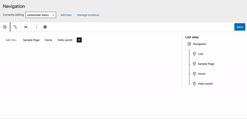
If you haven’t played around with Gutenberg’s experiments lately, the Navigation block is getting some exciting updates. Version 9.0 was released today with drag-and-drop support added to the list view of navigation items.
Manage Locations has been rewritten and is now a popover.
Add New form has been rewritten and now appears inline in the toolbar.
Automatically Add Pages checkbox and Delete menu button has been rewritten and now appears in the block inspector.
The screen is starting to take shape but is still very much a work in progress. If you want to test it, you can enable it under Gutenberg > Experiments.
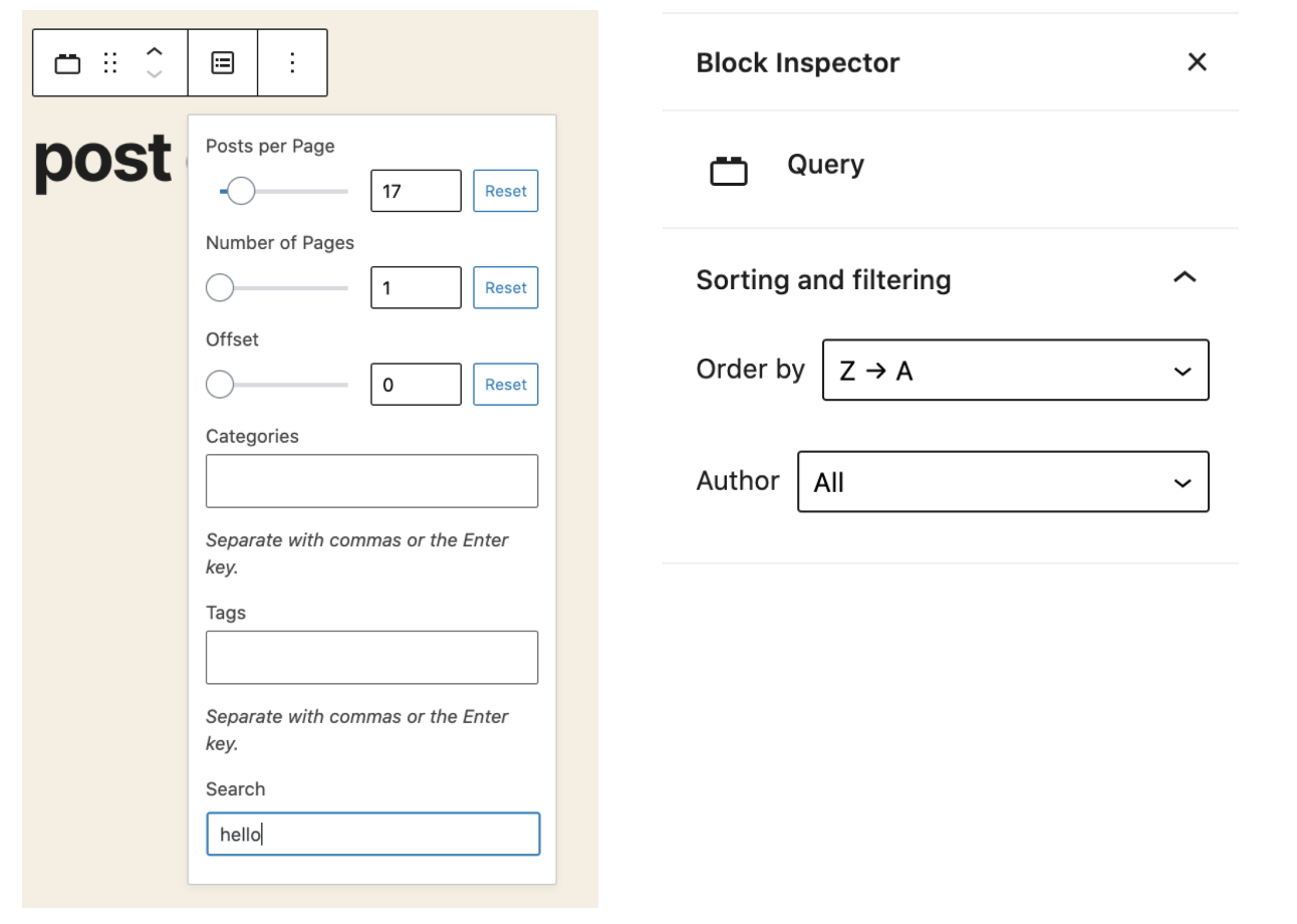
The Query block was another main focus fr the 9.0 release. It is taking a giant leap forward with new features like search, filtering by author, support for order/order by (date + title), and tags. This block should be tested locally and is still behind the __experimentalEnableFullSiteEditing flag since it requires full site editing blocks to display queried content.
Other notable UI enhancements include a new drag handle added to block toolbar for drag-and-drop capability. (It is not visible on the top toolbar). Blocks can be dragged to other areas of a post as an alternative to using the up/down arrows.
On Friday, June 26, Gutenberg Times will be holding a live Q&A on block-based themes and full-site editing. The Zoom webinar will begin at 18:00 UTC and last for around one hour, depending on how many questions are asked by viewers.
The target audience of the event will be theme developers or anyone interested in designing using the upcoming system that relies on blocks to build the entire front end. To attend, viewers should register via Zoom. By registering, Zoom will send viewers reminders about the event and allow them to ask questions to the panel. The session will also be streamed live via the Gutenberg Times YouTube Channel.
Birgit Pauli-Haack, the owner of Gutenberg Times, is hosting the event. The following developers from the WordPress theming community will join her on the panel:
Eileen Violini – Design Engineer at Sidetrack Studio and Customer Success Engineer at CastosHQ.
Carolina Nymark – WordPress Themes Team representative and creator of the Full Site Editing Course.
Kjell Reigstad – Designer at Automattic who works on the Gutenberg project.
“I find the four-people-Brady-Bunch-on-screen format the most appealing and gives people the opportunity to get their questions answered,” said Pauli-Haack.
Friday’s event will begin with a five-minute demo from Reigstad. The goal is to show how theme authors can create a page header and footer by taking those concepts and applying them to a block-based theme. It is an introduction point that theme authors can use in their existing themes without starting from scratch.
The second part of the event will center on answering questions that Nymark often gets from other developers, such as how to put block code within template files. Reigstad will be showcasing demos based on those questions.
“After that, it’s all about the audience questions that I will read and the panel answers,” said Pauli-Haack. “The discussion and demo are all conversation starters. In other Q&As, after introductions, I had my own questions, and then made it all about the audience questions.”
Potential viewers can watch past Q&A events from the Gutenberg Times archive to get a feel for the format.
There is no set direction for the event beyond showing the initial demos. Pauli-Haack wants to put the audience in the driver’s seat and allow the discussion to go wherever it needs to go. The panel is open to exploring all Aspects of building themes with blocks, and it is a good opportunity for theme authors to communicate with developers who are at the forefront of the transition into full-site editing.
“I have the feeling it will be more about how to transition from the old way to the new way and how all the pieces fit together,” she said. “Beyond the demos, there probably won’t be many code examples. We will discuss the resources out there and how to approach them.”
Gutenberg Times is in its third year of sharing information about the Gutenberg project. Pauli-Haack describes it as her passion project. “The goal has been to collect all the fragmented information while Gutenberg was in beta before the release in Dec 2018,” she said. However, the site has continued going beyond its initial phase. Pauli-Haack has been holding live Q&As since 2018 on the site.


