Do you want to allow blog users to moderate comments in WordPress?
If your site gets a lot of comments, then it can be difficult to moderate them all. One solution is creating a separate user role so that other people can manage the comments for you.
In this article, we will show you how to allow blog users to easily moderate comments on your WordPress blog.
Why Allow Blog Users to Moderate Comments in WordPress?
Comment moderation can take a lot of time and effort, especially for big blogs that get lots of comments. If you are slow to approve comments or delete spam, then visitors may stop interacting with you.
By giving blog users the power to moderate comments, you can combat spam and deliver a better experience for your visitors.
These users might be members of your customer support team, your community manager, or even an active and trusted commenter on your WordPress blog.
By default, WordPress doesn’t let you create a user who is only responsible for moderating comments. With that being said, let’s see how you can easily allow blog users to moderate comments using a WordPress plugin.
Simply use the quick links below to jump straight to the method you want to use.
Method 1: Add a Comment Moderator Role to Specific Users
The Comment Moderation Role plugin allows you to quickly and easily give a comment moderator role to specific users. This plugin creates a new WPB Comment Moderator role that enables the user to approve, decline, or edit comments on any post without giving them access to other parts of the WordPress dashboard.
The first thing you need to do is install and activate the plugin. For more details, see our step-by-step guide on how to install a WordPress plugin.
Upon activation, you will have access to a new user role called ‘WPB Comment Moderator’.
To assign this role to an existing user, simply go to Users » All Users. Then, check the box next to that person’s username.
After that, simply open the ‘Change role to…’ dropdown menu and select the ‘WPB Comment Moderator’ role.
You can then go ahead and click on ‘Change’.
Now, this person will have access to the WordPress comment moderation panel.
You can also create a new user and assign them the comment moderator role. To do this, simply go to Users » Add New and enter the person’s information, such as their email address.
Next, you need to open the ‘Role’ dropdown and select ‘WPB Comment Moderator’.
When you are happy with the information you have entered, just click on the ‘Add New User’ button.
Now, this person can log in to their account and see a comment moderation dashboard, similar to the image below.
As you can see, this person can only moderate comments and edit their profile. All other WordPress admin dashboard features are hidden.
Method 2: Add Comment Moderation Capabilities to Any User Role
You can also add the comment moderation permission to a user role or even create a completely new user role for managing your site’s comments.
This is a great choice if you want to allow multiple people to moderate comments.
For example, you might create a comment moderation team or give your site’s Contributors permission to moderate comments. This makes it easy for guest bloggers to interact with their readers.
The easiest way to edit user permissions in WordPress is by using the Members plugin. This free plugin allows you to customize the permissions for every user role and even create completely new roles.
The first thing you need to do is install and activate Members. For more details, see our step-by-step guide on how to install a WordPress plugin.
Upon activation, go to the Members » Roles page to see all the different user roles on your WordPress website.
To start, you can add the comment moderation permission to any existing user role.
To do that, simply hover over that role and then click on the ‘Edit’ link when it appears.
The left column shows all the different types of content, such as reusable blocks and WooCommerce products. Simply click on a tab, and you will see all the permissions for that content type.
To allow users to moderate comments, you need to select the ‘General’ tab in the left-hand menu. Then, find ‘Moderate Comments’ and check the ‘Grant’ box.
With that done, simply click on ‘Update’ to save your changes. Now, anyone with this user role can moderate your website’s comments.
Another option is to create a new user role by going to Members » Add New Role. You can now type in a title for the new role, such as Community Manager, Comment Moderator, or something similar.
After that, you can add the comment moderator permission to this role by following the same process described above. To give this role additional permissions, simply check any of the other ‘Grant’ boxes.
Do you want to add footnotes to your WordPress blog posts?
If you are writing an article that references research or contains a lot of complex information, then you may want to use footnotes in your content. These are little numbered marks in a text that provide additional context to a sentence or paragraph.
In this article, we will show you how to add simple and elegant footnotes to your WordPress blog posts, step by step.
Why Add Footnotes to Your WordPress Blog Posts?
If you run an educational blog, publish research, or cover news stories, then footnotes are a great way to give more context to your content. You can use them to add comments, highlight important facts, or insert citations to academic sources on your website.
A footnote typically appears as a small, superscript number within the main body of your text. The actual footnote content is then placed at the bottom of the page or appears as a tooltip to distinguish it from the main content.
Here is an example:
Besides providing clarity and transparency for your readers, footnotes can make your WordPress website look more professional and trustworthy. They show that you have done your research and have the sources to support your claims.
The WordPress.org editor now has a built-in footnote feature that you can easily use to insert additional context.
This guide will show you how to add WordPress footnotes to your blog posts or pages using two methods. One is with using the Footnotes block in the Gutenberg editor, and the other is with a plugin.
You can use the links below to jump to a specific method:
Method 1: Add WordPress Footnotes With the Gutenberg Editor
This method is best for people who want to use simple footnotes and don’t want to install a plugin for this purpose.
To use the WordPress Footnotes block, you will need to open the Gutenberg block editor for a new or existing post or page.
After that, just highlight a word in your content that you want to add the footnote to. In the block toolbar, click the dropdown arrow and select ‘Footnote.’
You will now be redirected to the bottom of the page, where the Footnotes block has been added automatically. Here, you can type in your extra information.
Additionally, you can customize the block’s color, typography, dimensions, and border using the settings in the right-hand panel.
Feel free to repeat this step to include as many footnotes as needed.
When you preview your WordPress site, there should be a footnote link to the sentence you highlighted earlier.
If you click on the hyperlink, it will bring you to the bottom of the page with the footnote.
Here, you can also click the hyperlinked arrow to go back to the section where the footnote is assigned.
While this method is fairly simple for beginners, it doesn’t offer tons of customization options. If you are looking for more ways to change the footnote appearance, then just continue to the next method.
Method 2: Add WordPress Footnotes With a Plugin
Another method of creating footnotes is to use the free Modern Footnotes plugin. Unlike the Footnotes block, it offers a lot more options to modify the footnote appearance.
For example, you can make the footnote appear as a tooltip, as well as extra information at the bottom of the page.
The first thing you will do is install the Modern Footnotes plugin. For more information about plugin installation, check out our guide on how to install a WordPress plugin.
Configuring the Modern Footnotes Plugin Settings
With the plugin installed, you can now go to Settings » Modern Footnotes. This is where you can configure the footnote settings to your preferences.
Let’s go through each setting one by one.
‘Desktop footnote behavior’ lets you select how the footnote should behave when the website is being viewed on a desktop computer.
You can make the footnote appear when a cursor hovers over the tooltip or when the user clicks on the tooltip. Alternatively, the footnote can expand below the footnoted text.
Which one you choose is up to your preferences. That said, the footnote will expand below the text by default on mobile screens.
Besides that, you can also check the ‘Make footnote content appear in web browser’s native tooltip when hovering over footnote number’ box if needed. This means the footnote will appear in the browser’s tooltip rather than in the plugin’s when the cursor hovers over the text.
We recommend switching this setting off if you choose the tooltip option for the desktop footnote behavior. Otherwise, you will have two tooltips for the same footnote, which readers may find annoying.
Below, you can also choose to display the footnote list at the bottom of the posts. This way, the reader can see all of the additional information in one place.
You may also want to enable this feature when the blog post is syndicated through RSS feeds.
Scrolling down, you can opt to insert a heading for your footnote list and choose a heading tag for it. This helps separate the actual content of your blog post from the footnotes. You can write something like References, Footnotes, Citations, or Additional Information.
If you want to add some custom CSS to modify the footnote text, feel free to insert it in the ‘Modern Footnote Custom CSS’ box.
Last but not least, you can customize the Modern Footnotes shortcode if you don’t want to use the built-in version. Make sure to enter the shortcode without the brackets.
Once you are happy with the settings, just click ‘Save Changes.’
Adding Footnotes Using the Modern Footnotes Plugin
Now that you’ve configured the Modern Footnotes settings, let’s insert some footnotes into your content. Go ahead and open the block editor for a new or existing post or page.
There are two ways to add a footnote. One is with a shortcode, which is what we recommend.
First, find the sentence you want to insert a footnote. Then, right next to that sentence, type in the following shortcode:
[mfn]Insert your footnote here[/mfn]
Make sure to replace the text between the brackets with your information.
We also suggest putting the shortcode within the same block as the sentence, right next to the text, without any space in between, just like in the example below. Otherwise, the footnote may look disconnected from the text.
The other method is to type your footnote text next to the sentence you want to add the footnote to. Make sure there’s no space between the footnote text and the sentence.
In the example below, we want to add a footnote containing an academic citation for the sentence that begins with ‘Studies suggest…’
Next, highlight the footnote and click the down-arrow button in the toolbar. After that, select ‘Add a Footnote.’
The drawback with the second method is it can be hard to track which lines of text have been given a footnote and which ones haven’t when you are editing the content. That’s why we recommend the shortcode method.
When you preview the blog post, you will see that there is now a number next to the sentence. If you use the tooltip option, this is what the footnote will look like:
On the other hand, the footnote will appear below the text if you use the expandable formatting.
Here’s what it looks like when you click on the number:
Finally, if you choose to display all of the footnote content at the bottom of the post, you can scroll down to find everything there.
Bonus Tip: Use WordPress Custom Fields to Add More Information to Your Content
Besides footnotes, another way to provide extra information in your WordPress posts and pages is by using custom fields.
WordPress custom fields are metadata used to insert additional information into a post or page. For example, if you run a blog with multiple authors, then you may want to display your contributors’ names on the blog post, not just your own.
We will show you how to add custom fields using the block editor and some plugins, including WPCode. This plugin offers a safe and easy way to add code snippets to your WordPress website, even if you are a beginner.
I don’t know about you, but I write these three declarations many times in my CSS:
ul {
  padding: 0;
  margin: 0;
  list-style-type: none;
}
You might yell at me and say I can just put those in my CSS resets. I wish I could, but I don‘t want to and I’ll tell you why in a second.
User agents set values to those properties in a list for a purpose, and that is to make lists more readable. These are the default styles in chromium browsers for a <ul> element:
So, without adding any class in HTML or style in CSS, we get those for free. That‘s a nice thing and I don‘t want to lose it. But I would appreciate it if I could make the browser understand that there is very high chance I don’t want that default feature in cases where I add a class to the element.
So here is a quick solution to reset a <ul> element that has a class:
If you are OK adding more weight to the selector, you are good to go. But I’m not OK with it, personally. For example, I don’t want to put the element’s name in my CSS most of the times due to a separation of concerns principle. Or, if you are following BEM methodology, problems will most certainly arise as this conflicts with it.
So what can we do?
The solution
A few months ago, I learned about some hot selectors, including :is() and :where(). One thing about these two functional pseudo selectors, is that they can change specificity, giving us the power to nullify or increase that specificity.
The key about :where() is that it always has 0 specificity. So we can get rid of our problem very easily like this:
:where(ul[class]) {
  list-style: none;
}

.list {
  list-style: square; /* Now this works like a charm! */
}
With the power of this selector, libraries can give us style with no specificity. So there would be no specificity to compete with when we as authors write CSS.
Demo
In the following demo, you can remove :where() to see what we talked about in action:
A user wrote in the other day asking us to add this PostCSS plugin: postcss-px-to-viewport. We’re always happy to consider them as needed, and this one looks pretty neat and pretty popular.
It also blows my mind a little bit. All you do is size things in traditional units like px and it turns them into viewport units instead, making the entire UI scale together. You could just use viewport units yourself, but I guess this means you get to keep using units you have more muscle memory and a mental model for, yet get this result.
Above is me in Debug Mode checking out the weird result!
One reason I bring it up is to note the special way that options are passed to the PostCSS plugin:
That’s just passing two of the many options this plugin supports. Any PostCSS plugin we offer that supports options works in this same format. For example, if you want to customize Autoprefixer, you can do that the same way.
The name zero-width space is antithetical, but it’s not without uses. In text, maybe you’d use it around slashes because you want to be sure the words are treated individually but not have any physical space around the slash:
That’s an image. WordPress was being weird about it and not escaping it even when in a code block.
That’s pretty theoretical though—I’ve never once needed to do that. It might be useful in a long word to suggest that it can be broken there… but that’s also rare as we have the soft-hyphen (­) which is designed for that and leaves a typically appropriate hyphen at the break.
What I have needed to do is exactly the opposite: trick a system into thinking a single word is two words. Like on Twitter, if I @username or #hashtag in the text of a tweet, those will be linked up respectively. But I don’t always want that. On CSS Twitter, I might want to refer to a @media query or show an #id-selector. Toss a zero-width space between the symbols and the text and I’m all set.
Get a zero-width space on your clipboard
Here’s a Pen I created ages ago that will help you do that:
There is also a quick trick for doing it from the browser console:
copy('u{200B}')
via:
Twitter tip: To prevent usernames and URLs from being converted to links, interrupt them with a zero-width space.
And for yet another way that may appeal to you, a bookmarklet!
Copy & Paste concern
The danger with the zero-width space is, well, you can’t see it. If someone were to, for example, copy your @media query using the zero-width space trick from a tweet, it won’t work in their code editor (because it will invalidate the rule) and it might be extremely confusing. For that reason, it’s probably good to avoid using it in anything that might be copied as a code example, but probably fine when explicitly trying to not autolink something.
I got this exact question in an email the other day, and I thought it would make a nice blog post because of how wonderfully satisfying this is to do in CSS these days. Plus we can sprinkle in polish to it as we go.
HTML-wise, I’m thinking image, text, image, text, etc.
<img src="..." alt="..." height="" width="" />
<p>Text text text...</p>

<img src="..." alt="..." height="" width="" />
<p>Text text text...</p>

<img src="..." alt="..." height="" width="" />
<p>Text text text...</p>
If that was our entire body in an HTML document, the answer to the question in the blog post title is literally two lines of CSS:
body {
  display: grid;
  grid-template-columns: min-content 1fr;
}
It’s going to look something like this…
Not pretty but we got the job done very quickly.
So cool. Thanks CSS. But let’s clean it up. Let’s make sure there is a gap, set the default type, and reign in the layout.
Earlier today, Ana Segota tweeted and announced via the Anariel Design blog that her company had submitted its second block-based theme to WordPress.org. Clove is a more well-rounded follow-up to her first such theme, Naledi. It is currently under review for inclusion in the official directory, but anyone can give it a test run by snagging the ZIP file from its ticket. Or, just peruse the live demo.
This should officially be the 10th block-based theme to go live in the WordPress.org theme directory (note that a couple by Automattic are not tagged). That is assuming all goes well during the review process.
It has been a long road thus far, but 10 themes with the Full Site Editing tag is a notable milestone. The Q theme by Ari Stathopoulos was the first to land in the directory back in October 2020. Now, eight months later, there is still room for other theme authors to become pioneers in the space. With almost no competition, who will design that first block theme that squeezes its way into the most popular list?
If “practice makes perfect,” Segota is now ahead of the curve by pushing her second theme to the directory. This makes her theme company only one of two with multiple block themes.
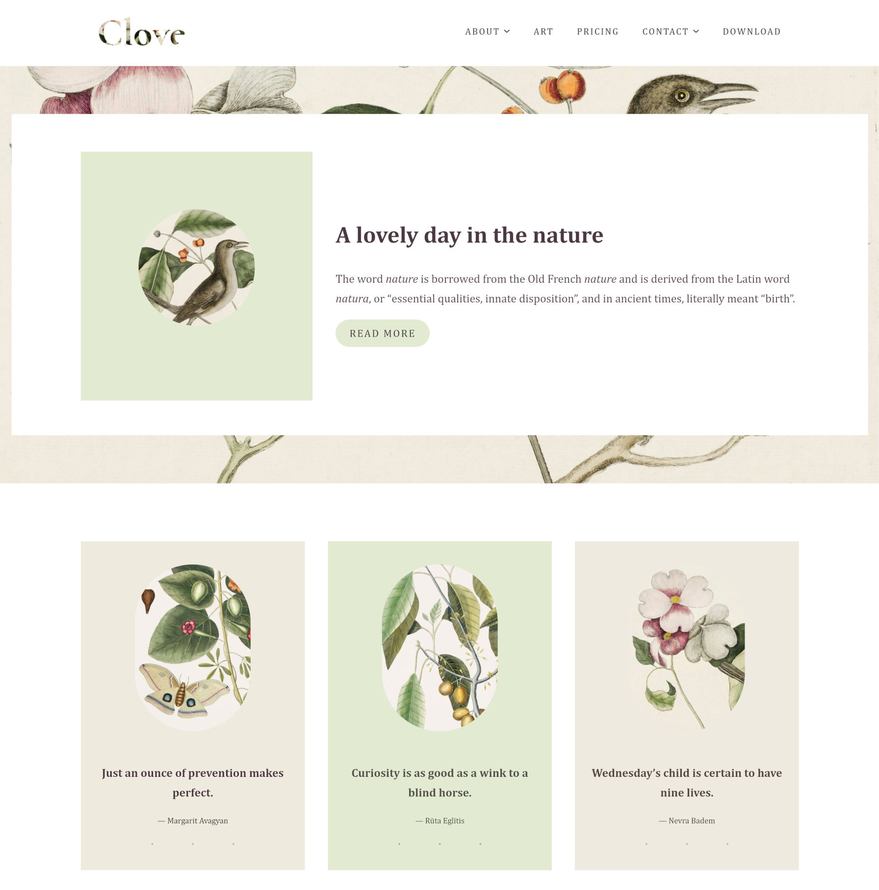
Clove is experimental, as all block themes are. It relies on the ever-shifting parts of the Gutenberg plugin, but it all comes together into a floral, nature-themed design. There are hints of inspiration from Twenty Twenty-One, but it feels more structured, less chaotic.
The design is less of a theme and more of a showcase of block patterns and styles. Even on the template level, it reuses those same elements across each of its seven templates, providing multiple entryways for users to tinker with its features.
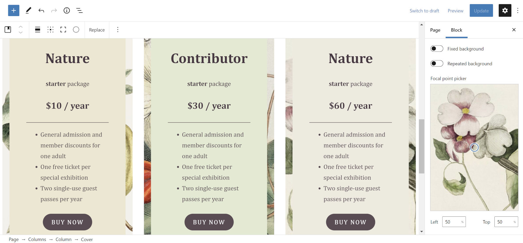
Clove even includes pricing columns. I seem to recall writing about how theme authors could implement them via patterns just over a month ago. Maybe the Anariel Design team came to the same conclusion. Maybe they took my message and ran with it. I like to think the latter is true. Either way, the result is a beautiful, theme-specific pattern — the sort of artistry that is tough to achieve from a plugin.
Customizing the Pricing Columns pattern in the WordPress editor.
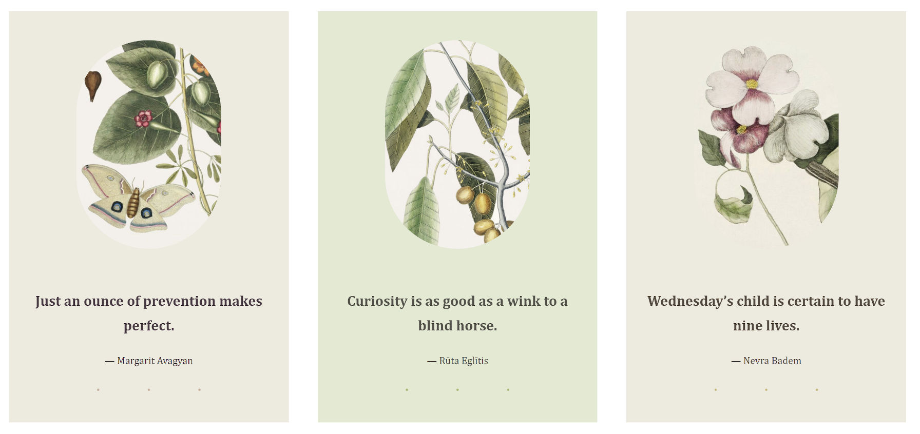
I am less of the fan of the overlapping and uneven columns in some of the designs designs, preferring some of the more-structured patterns, such as Three Quotes Images:
Three-column pattern that showcases images along with quotes.
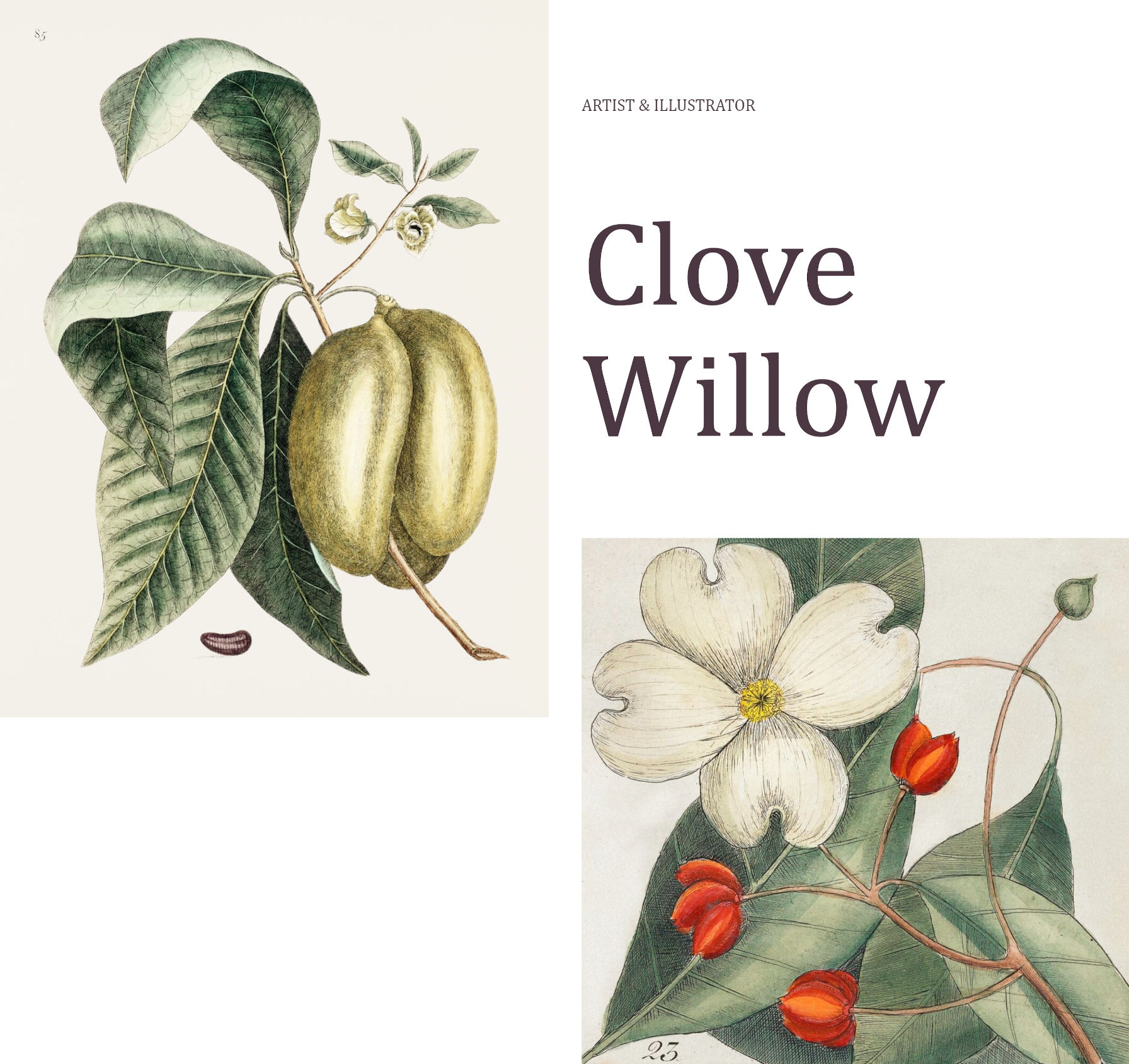
Despite my general dislike of the uneven column style, my favorite piece of the entire theme is the Illustrations page template, which leans into that design method.
The page intro section is an announcement to the world, “Hey, check out my work.”
Illustrations template intro section.
I also like the Illustrations page template’s widgets-like area in the footer. It manages to stuff several blocks in without feeling too crowded. It even showcases a box for artists to highlight their next exhibition.
Illustrations page template footer “widget” area.
The Clove theme also registers 10 block styles for users to choose from. Most of them add different types of borders or frames to various elements. Plus, there is the fun-but-kind-of-an-oddball blob “Shape” for images.
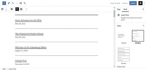
Latest Posts – Dividers
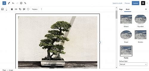
Image – Framed
Image – Shape
Segota was one of several people to submit custom designs to the upcoming block pattern directory. There is some noticeable crossover between her current theme work and submissions, such as the Playful Gallery pattern that did not quite make the cut. Others, like her Recipe design, did. There is still an open invitation for people to contribute.
I am always like a kid in a toy store when a new block theme comes along, reaching out to grab the latest gadget. I want to see more experiments like Clove. Keep them coming, theme authors.
Side note: For people interested in the background-clipped text design used in Clove’s site logo, I opened a ticket to take us one step closer to doing it in the editor. Currently, users must create an off-site image and upload it.
But Bramus took it the rest of the nine yards and looked at all of the table enhancements. Every one of these is great. The kind of thing that makes CSS ever-so-slightly less frustrating.
The CSS image-set() function has been supported in Chromium-based browsers since 2012 and in Safari since version 6. Support recently landed in Firefox 88. Let’s dive in and see what we can and can’t do today with image-set().
Multiple resolutions of the same image
Here’s what the CSS spec has to say about image-set():
Delivering the most appropriate image resolution for a user’s device can be a difficult task. Ideally, images should be in the same resolution as the device they’re being viewed in, which can vary between users. However, other factors can factor into the decision of which image to send; for example, if the user is on a slow mobile connection, they may prefer to receive lower-res images rather than waiting for a large proper-res image to load.
It’s basically a CSS background equivalent to the HTML srcset attribute for img tags. By using image-set we can provide multiple resolutions of an image and trust the browser to make the best decision about which one to use. This can be used to specify a value for three different CSS properties: content, cursor, and most useful of all, background-image.
1x is used to identify the low-res image, while 2x is used to define the high-res image. x is an alias of dppx, which stands for dots per pixel unit.
Chrome/Edge/Opera/Samsung Internet currently require a -webkit- prefix. If you’re using Autoprefixer, this will be handled automatically. Safari no longer requires the prefix but uses an older syntax that requires a url() function to specify the image path. We could also include a regular old background-image: url() to support any browsers that don’t support image-set.
.hero {
  /* Fallback */
  background-image: url("platypus.png");

  /* Chrome/Edge/Opera/Samsung, Safari will fallback to this as well */
  background-image: -webkit-image-set(url("platypus.png") 1x, url("platypus-2x.png") 2x);

  /* Standard use */
  background-image: image-set("platypus.png" 1x, "platypus-2x.png" 2x);
}
Now users on expensive fancy devices will see a super sharp image. Performance will be improved for users on slow connections or with cheaper screens as their browser will automatically request the lower-res image. If you wanted to be sure that the high-res image was used on high-res devices, even on slow connections, you could make use of the min-resolution media query instead of image-set. For more on serving sharp images to high density screens, check out Jake Archibald’s recent post over on his blog.
That’s pretty cool, but what I really want is to be able to adopt the latest image formats in CSS while still catering for older browsers…
New image formats
Safari 14 shipped support for WebP. It was the final modern browser to do so which means the image format is now supported everywhere (except Internet Explorer). WebP is useful in that it can make images that are often smaller than (but of the same quality as) JPG, PNG, or GIF.
There’s also a whole bunch of even newer image formats cropping up. AVIF images are shockingly tiny. Chrome, Opera and Samsung Internet have already shipped support for AVIF. It’s already in Firefox behind a flag. This image format isn’t supported by many design tools yet but you can convert images to AVIF using the Squoosh app built by the Chrome team at Google. WebP 2, HEIF and JPEG XL might also make it into browsers eventually. This is all rather exciting, but we want browsers that don’t support these newer formats to get some images. Fortunately image-set() has a syntax for that.
Using new image formats by specifying a type
Browser support note: The feature of image-set that I’m about to talk about currently has pretty terrible browser support. Currently it’s only supported in Firefox 89.
HTML has supported the <picture> element for years now.
<picture>
  <source srcset="./kitten.avif" type="image/avif">
  <img src="./kitten.jpg" alt="a small kitten">
</picture>
image-set provides the CSS equivalent, allowing for the use of next-gen image formats by specifying the image’s MIME type:
The next-gen image goes first while the fallback image for older browsers goes second. Only one image will be downloaded. If the browser doesn’t support AVIF it will ignore it and only download the second image you specify. If AVIF is supported, the fallback image is ignored.
In the above example we used an AVIF image and provided a JPEG as a fallback, but the fallback could be any widely supported image format. Here’s an example using a PNG.
In Chromium and Safari, specifying the type is not supported yet. That means you can use image-set today only to specify different resolutions of widely-supported image formats but not to add backwards-compatibility when using WebP or AVIF in those browsers. It should be possible to provide both multiple resolutions and multiple image formats, if you are so inclined:
Maybe you don’t need background-image at all. If you want to use modern image formats, you might be able to use the <picture> element, which has better browser support. If you set the image to position: absolute it’s easy to display other elements on top of it.
As an alternative approach to using position: absolute, CSS grid is another easy way to overlap HTML elements.
The website for your design business should not only explain who you are and what you do, but show off the impressive body of work you’ve created. It’s the strongest tool in your sales and marketing arsenal.
But as a web designer, you know how long it can take to build a really great website for a client. If you’re ready to start attracting awesome leads and adding new clients to your business now, you might not want to spend that much time building your portfolio site.
The good news is that you don’t have to.
BeTheme’s new Muffin Builder is like upgrading from a Ford to a Ferrari. You’ll be shocked at how quickly you get your website to the finish line — and with superior results, no less.
Let’s take a closer look:
New Muffin Builder features that’ll knock your socks off
Time is money when you’re a web designer. So, it’s important to build a portfolio site and get it online as soon as possible.
Here are 6 features from the new Muffin Builder (and BeTheme) that will enable you to quickly and painlessly create something you’re proud of and that will undoubtedly impress prospective clients:
Feature #1: A professional-looking portfolio site already built for you
There are certain pages and features every portfolio should have: An attractive home page, convincing client testimonials, a selection of works, and so on.
But just because the structure of your site will mirror other portfolio sites, that doesn’t mean it has to look like everyone else’s.
As of today, BeTheme has over 600 pre-built sites, with dozens of portfolio site options to choose from:
While these portfolio sites might be built for different types of creatives, pay attention to the different styles. Whether you want to give your site a futuristic edge or you want to infuse the design with some femininity, you’ll find the perfect portfolio-equipped site for your business here.
What’s more, each pre-built portfolio site is compatible with Muffin Builder, so you’ll have the added benefit of being able to edit your pre-built site with this powerful website builder.
Feature #2: Intuitive customization options
Realistically, you could have a new portfolio site designed and loaded into WordPress in under a minute with BeTheme.
While each site comes with well-chosen imagery and helpful placeholder text, you’ll still need to customize the content and maybe even tweak the design in order to make it your own.
Once you’re inside the new and improved Muffin Builder, you’ll see how easy this is to do.
The first customization feature to take advantage of is the global settings editor, which you’ll find under Betheme > Theme Options in WordPress:
Quickly update colors, fonts, layouts, and styles and apply them globally to the site from this panel.
To make changes on a smaller scale, use the Muffin Editor within your Pages. The section toolbar will allow you to make adjustments to each container:
You have the same level of control over the content within each block. The settings you find here all depend on what kind of content is in the block. For example:
You have the flexibility to customize your content however you prefer: Use the text editor or take advantage of Muffin Builder’s predefined settings.
Feature #3: Importable and reusable section templates
It’s not just the base of your site that’s already built for you with BeTheme.
Let’s say you’ve imported a great-looking portfolio pre-built site like Portfolio 2:
You like the current layout of the About us page on this site, but you want to add a Google reviews section between the “My offer” and “How I work” sections.
With the Muffin Builder, you can easily import pre-built sections using the icon on the right toolbar or by clicking “Pre-built sections” when you add a new section to the page:
Chances are good that whatever you envisioned adding to the page can be found there. Like this:
As you can see, it’s all placeholder content. That said, the structure and design are taken care of, so all you need to do is fill in the content.
Feature #4: Custom layouts and headers
Pre-built sites are a great starting point. In many cases, you can use them right out of the box.
However, if you want to alter the layout across the site or on a specific page or two, Muffin Builder can help you make those adjustments:
Under the Layouts section in WordPress, set up your custom layout — which includes changing the header, too, if you prefer — and save it.
To apply it to your pages, scroll down below the Muffin Builder on each page and select the layout from the list:
This way, you’re not just empowered to swap out your content for BeTheme’s placeholder content. With Muffin Builder, you get to customize as much or as little of the pre-built site as you want.
Feature #5: Backup and restoration
It’s not uncommon to “sleep on it” and decide you liked the way the site looked or the way you wrote something previously.
Thanks to the Muffin Builder’s revision panel and backups, you can quickly and painlessly roll back your portfolio site.
First, open the revisions panel:
Then choose the revision (if there’s more than one) you want to restore:
If you’ve ever stressed about an update you made to your portfolio and wished you could instantly go back to the way it was before, this new Muffin Builder feature is going to be a lifesaver.
Coming soon: The Front-end builder
If you prefer to design from the front-end of the website, a new Muffin Builder feature will be headed your way the Summer of 2021:
There are a number of reasons why many website builder tools (including WordPress’s own Gutenberg) have a front-end editing experience:
It saves you the trouble of having to switch between the editor and website preview to check your work.
Some people prefer to do their editing within the full context of the website as it’s easier to make decisions when looking at the big picture.
It’s more client-friendly than the typical backend editor, so this feature can empower your clients and other non-tech-savvy users to make tweaks to their sites.
If you’ve been looking for a live visual editor to use in WordPress, this new feature is just around the corner!
The fast and easy way to build a portfolio: BeTheme + Muffin Builder
If you’re looking for a fast and easy way to build your digital portfolio, the solution is obvious:
Start with a beautiful BeTheme pre-built site and then customize it with the intuitive Muffin Builder.
Who knows? This potent combo could end up changing the way you build websites for your clients going forward.
Clipping and masking have been around for a while now in CSS and even have pretty decent browser support. I recently worked on a project that needed to use a clipping technique for tooltips showing above links in text.
Those tooltips have two designs based on their content:
One design is a tooltip that contains plain text against a solid background.
The other design allows an image to cover the entire space.
You might not think the text tooltip requires any clipping at all. A pseudo-element can be positioned at the bottom to add the little notch, right? You are indeed absolutely right! Because the background of the tooltip is a a plain color, there’s really no need for CSS trickery and whatnot.
But clipping the image in the second design is where things get interesting…
Here’s the thought process my mind followed when I started the task.
Idea 1: clip-path & polygon
The CSS clip-path property allows us to define a custom polygon with percentage values to make the path we want. This solution is often enough if the shape of your path is simple enough. In the demo below, I’m using calc() values to make sure the clip is fully responsive, while the little triangle stays the same size no matter how stretched the parent is.
.tooltip {
  clip-path: polygon(
    0% 0%, // Top left point
    100% 0%, // Top right point
    100% calc(100% - 10px), // Bottom right point
    calc(50% + 10px) calc(100% - 10px), // Center right of the triangle
    50% 100%, // Tip of the triangle
    calc(50% - 10px) calc(100% - 10px), // Center left of the triangle
    0% calc(100% - 10px) // Bottom left point
  );
}
This solution is very clean but, in my case, not good enough as I don’t have a straight triangle notch, but rather a custom shape.
Idea 2: clip-path and SVG
Using an SVG path seemed like a good solution. First, you export your SVG clipping path, then use it in your CSS with the url(#clipPathId) value.
Check the demo below. Do you see any issue with the path?
The arrow is stretched based on the image ratio. Since the little notch is part of the whole path shape, it is as stretched as the rectangle part of the path stretches in size.
Idea 3: mask-image
Now here is the thing I discovered with the CSS mask-image property in CSS: You can combine mask layers! Think about it like a background-image in CSS. You can apply multiple gradients or images on a single element. Now, what if you combine all those layers to generate the final mask you need?
This is exactly what we are going to do here with two layers:
A large rectangle that cover the whole block except for a stripe at the bottom (shown in green)
An image of the arrow (shown in pink)
With that solution, the rectangle can stretch according to our tooltip’s dimensions, and the arrow will always keep its fixed size.
All the code and demos below are prefix free and the demos are using Autoprefixer. At the time I’m writing this article, Edge, Chrome & Safari require prefixes.
Just as we would with background properties, we are going to use three different mask properties to define our two layers:
mask-image: This property lets us draw the rectangle with a linear background and the arrow with an inline SVG.
mask-position: The rectangle doesn’t need a position (as it starts from the top-left), but the arrow needs to be positioned at the center-bottom.
mask-repeat: We need to avoid repeating both layers; otherwise, the linear gradient would cover the whole element when it repeats.
Tada! Change the tooltip dimensions or replace the image and the bottom arrow will keep its original ratio.
More complex shapes
Let’s get a little fancy and go deeper with this technique. I was inspired by the iMessage app on iOS and tried to reproduce the same tooltips with this masking technique.
I had to draw more layers for my mask to render every rounded corner:
four circles, one for each corner (shown in red)
one horizontal rectangle (shown in blue)
one vertical rectangle (shown in green)
one SVG for the arrow (shown in yellow)
The full code is going to be a bit longer as we have more layers to draw, but the logic stays the same. The corners are drawn using four radial gradients. To fill the rectangle, we need two rectangles (one vertical, one horizontal) as shown above. And finally, our little arrow that is using an inline SVG.
.tooltip {
  --radius: 25px;
  mask-image:
    radial-gradient(#fff (var(--radius) - 1), #fff0 var(--radius)), /* Top left corner */
    radial-gradient(#fff (var(--radius) - 1), #fff0 var(--radius)), /* Top right corner */
    radial-gradient(#fff (var(--radius) - 1), #fff0 var(--radius)), /* Bottom left corner */
    radial-gradient(#fff (var(--radius) - 1), #fff0 var(--radius)), /* Bottom right corner */
    linear-gradient(#fff, #fff), /* Horizontal gradient */
    linear-gradient(#fff, #fff), /* Vertical gradient */
    url('data:image/svg+xml;utf8,'); /* Bottom right icon */
  mask-position:
    0 0, /* Top left corner */
    100% 0, /* Top right corner */
    0 100%, /* Bottom left corner */
    100% 100%, /* Bottom right corner */
    0 var(--radius), /* Horizontal gradient */
    var(--radius) 0, /* Vertical gradient */
    100% 100%; /* Bottom right icon */
  mask-size:
    (var(--radius) * 2) (var(--radius) * 2),  /* Top left corner */
    (var(--radius) * 2) (var(--radius) * 2),  /* Top right corner */
    (var(--radius) * 2) (var(--radius) * 2),  /* Bottom left corner */
    (var(--radius) * 2) (var(--radius) * 2),  /* Bottom right corner */
    100% calc(100% - #{var(--radius) * 2}), /* Horizontal gradient */
    calc(100% - #{var(--radius) * 2}) 100%, /* Vertical gradient */
    (39px / 2) (25px / 2); /* Bottom right icon */
  mask-repeat: no-repeat;
}
As you see, we can create a version with the arrow on the left or right by using a flipped version of the arrow and positioning it in a different corner. The trick is working fine on tooltips without images too. But like I said at the beginning of this article, you probably don’t need that much CSS if you only have a plain background to style.
If you want to learn more about clipping and masking in CSS, there are lots of other great articles right here on CSS-Tricks worth checking out.
If you’re abhorred by using inline styles, just move that style to the class attribute! And then make sure you have CSS in place that, ya know, does what it says on the box.
First off, it’s a joke, so don’t actually do this. I don’t even mind the occasional inline style for one-off stuff, but this is not that.
To me the weirdest part is that period (.) character. Escaping the more unusual characters with a backslash () feels normal, but what is that period about? UPDATE: It’s because of the space. It’s two classes in the HTML, not one. Derp.
The little period trick there doesn’t work when the following character is a number (e.g. .padding:.1rem;). UPDATE: Because classes that start with a number are invalid. Derp.
You can avoid the escaping and trickery if you go with an attribute selector like [class*="display: flex;"].
This reminds me of Mathias Bynens’ research: CSS character escape sequences. But… that doesn’t seem to work anymore? I wonder if browsers changed or if the tool broke and doesn’t output what it should anymore (e.g. does .color\3A \ #f06d06 look right?).
It wasn’t long ago when I looked at sticky headers and footers in HTML <table>s in the blog post A table with both a sticky header and a sticky first column. In it, I never used position: sticky on any <thead>, <tfoot>, or <tr> element, because even though Safari and Firefox could do that, Chrome could not. But it could do table cells like <th> and <td>, which was a decent-enough workaround.
Sounds like a big effort went into totally revamping tables in the rendering engine in Chromium, bringing tables up to speed. It’s not just the stickiness that was fixed, but all sorts of things. I’ll just focus on the sticky thing since that’s what I looked at.
The headline to me is that <thead> and <tfoot> are sticky-able. That seems like it will be the most common use case here.
That works in all three major browsers. You might want to get clever and only sticky them at certain minimum viewport heights or something, but the point is it works.
I heard several questions about table columns as well. My original article had a sticky first column (that was kind of the point). While there is a table <col> tag, it’s… weird. It doesn’t actually wrap columns, it’s more like a pointer thing to be able to style down the column if you need to. I hardly ever see it used, but it’s there. Anyway, you totally can’tposition: sticky; a <col>, but you can make sticky columns. You need to select all the cells in that column and stick them to the left or right. Here’s that using logical properties…
Matt Mullenweg and Matías Ventura joined WordCamp Europe to chat about what’s happening with the Gutenberg project and celebrate the progress contributors have made over the past four years.
“For me, 2020 was the year that really felt like people started to see the vision of Gutenberg from four or five years ago, when it was very abstract and they saw it as kind of like the old WYSIWYG editor with some extra lines on it or something,” Mullenweg said. “The first 17 or 18 years of WordPress democratized people putting text into a box. Now we’re democratizing design, allowing people to control the boxes.”
Ventura commented on how transformative patterns have been for making page design approachable for users.
“Perhaps it was a smaller part of the roadmap initially but it’s becoming a centerpiece – especially because it allows…world class designers to provide a starting point for users and users get to learn design as they are interacting with themes,” Ventura said. He began his WordPress developer journey by “tinkering with themes,” as many others did, and believes that blocks can unlock a similar experimental learning experience.
“I think we are getting into a chapter where people will be able to tinker with things that were sort of hidden for you in WordPress – more advanced things like queries and loops, that we can now expose through blocks,” Ventura said. “They can be stepping stones for people to learn how to work with WordPress.”
Mullenweg commented on how things that previously would have required a fairly experienced WordPress developer to do, like creating a home page with a column that shows five recent posts from a particular category, and another column that shows featured posts in a different category, you can now do with just a few clicks.
“It’s no code – it’s like expanding the layers of accessibility of what people are able to do with WordPress,” Mullenweg said. “That, to me, is very core to our mission.”
Mullenweg and Ventura debuted a new “Gutenberg highlight” video that covers current and new features coming to the block editor, as it “gets ready to become a site builder.” These kinds of marketing videos are so valuable because users don’t always know what is possible, even if the tools are approachable for anyone to use.
The video demonstrates new design features for different blocks, including the transform live previews, dragging media into container blocks, inline cropping without leaving the editor canvas, the template editor, duotone image filters, more customization options for navigation, improvements to the list view browser, and the new global styles design that is coming soon.
You get a nice-looking design handed to you and it has this nice big hero section, followed by one of those three-up columns right beneath it. You know, like almost every other website you’ve ever worked on.
You bang through the hero section and get to work on the three-column section. It’s time to pull out our trusty friend flexbox! Except, you write display: flex and you get this mess instead of getting the three equal columns you’d expect.
This happens because of how flexbox calculates the base size of an element. You’ve probably read lots of flexbox tutorials, and many of them (including my own) are an overly simplistic example of what flexbox does without really digging into the complex things that flexbox does for us that we take for granted.
I’m positive you’ve seen examples and tutorials that look at something like this, where three divs shrink down around the content that’s inside them:
In other words, we get some block-level elements shrinking down and slotting next to one another. It feels like flex wants things to be as small as possible. But in reality, flexbox actually wants things to be as big as possible.
Wait, what? Flex shrinks things by default — that can’t be right! Right?
As awesome as flexbox is, what it’s doing under the hood is actually a little strange because, by default, it is doing two things at once. It first looks at the content size which is what we would get if by declaring width: max-content on an element. But on top of that, flex-shrink is also doing some work allowing the items to be smaller, but only if needed.
To really understand what’s going on, let’s break those two down and see how they work together.
Diving into max-content
max-content is a pretty handy property value in certain situations, but we want to understand how it works in this particular situation where we are trying to get three seemingly simple equal columns. So let’s strip away flexbox for a moment and look at what max-content does on its own.
The max-content sizing keyword represents the intrinsic maximum width of the content. For text content this means that the content will not wrap at all even if it causes overflows.
Intrinsic might throw you off here, but it basically means we’re letting the content decide on the width, rather than us explicitly setting a set width. Uri Shaked aptly describes the behavior by saying “the browser pretends it has infinite space, and lays all the text in a single line while measuring its width.”
So, bottom line, max-content allows the content itself to define the width of the element. If you have a paragraph, the width of that paragraph will be the text inside it without any line breaks. If it’s a long enough paragraph, then you end up with some horizontal scrolling.
Let’s revisit that overly-simplistic example of three block-level elements that shrink down and slot next to one another. That isn’t happening because of flex-shrink; it’s happening because that’s the size of those elements when their declared width is max-content. That’s literally as wide as they go because that’s as wide as the combined content inside each element.
Here, take a look at those elements without flexbox doing it’s flexbox stuff, but with a width: max-content on there instead:
So, when there’s just a small amount of text, the intrinsic max-content shrinks things down instead of flex-shrink. Of course, flexbox also comes in with it’s default flex-direction: row behavior which turns the flex items into columns, putting them right next to one another. Here’s another look but with the free space highlighted.
Adding flex-shrink to the equation
So we see that declaring display: flex pushes that max-content intrinsic size on flex items. Those items want to be as big as their content. But there is another default that comes in here as well, which is flex-shrink.
flex-shrink is basically looking at all the flex items in a flexible container to makesure they don’t overflow the parent. If the flex items can all fit next to each other without overflowing the flexible container, then flex-shrink won’t do anything at all… it’s job is already done.
But if the flex items do overflow the container (thanks to that max-content intrinsic width thing), the flex items are allowed to shrink to prevent that overflow because flex-shrink is looking out for that.
This is why flex-shrink has a default value of 1. Without it, things would get messy pretty quickly.
Here’s why the columns aren’t equal
Going back to our design scenario where we need three equal columns beneath a hero, we saw that the columns aren’t equal widths. That’s because flexbox starts by looking at the content size of each flex item before even thinking about shrinking them.
Using Firefox’s DevTools (because it’s got some unique flexbox visualizations that others don’t), we can actually see how flexbox is calculating everything.
For simplicity’s sake, as we dive deeper into this, let’s work with some nice round numbers. We can do this by declaring widths on our flex items. When we declare a width on a flex item, we throw that intrinsic size out the window, as we’ve now declared an explicit value instead. This makes figuring out what’s really going on a lot easier.
In the Pen below, we have a parent that’s a 600px wide flexible container (display: flex). I’ve removed anything that might influence the numbers, so no gap or padding. I’ve also switched out the border for an outline so we can still visualize everything easily.
The first and third flex items have a width: 300px and the middle one a width: 600px. If we add that all up, it’s a total of 1200px. That’s bigger than the the 600px available within the parent, so flex-shrink kicks in.
flex-shrink is a ratio. If everything has the same flex-shrink (which is 1 by default), they all shrink at the same rate. That doesn’t mean they all shrink to the same size or by the same amount, but they all shrink at the same rate.
If we jump back into Firefox DevTools, we can see the base size, the flex-shrink and the final size. In this case, the two 300px elements are now 150px, and the 600px one is now 300px.
The two elements that have a base width of 300px become 150px.
The larger element with a base width of 600px becomes 300px.
If we add up all the base sizes of all three flex items (the actual widths we declared on them), the total comes out to 1200px. Our flex container is 600px wide. If we divide everything by 2, it fits! They are all shrinking by the same rate, dividing their own widths by 2.
It’s not often that we have nice round numbers like that in the real world, but I think this does a nice job illustrating how flexbox does what it does when figuring out how big to make things.
Getting the columns to be equal
There are a few different ways to get the three columns we want to be equal in width, but some are better than others. For all the approaches, the basic idea is that we want to get all the columns base size to be the same. If they have an equal base size, then they will shrink (or grow, if we use flex-grow) at an equal rate when flexbox does it’s flex things, and in theory, that should make them the same size.
There are a few common ways to do this, but as I discovered while diving into all of this, I have come to believe those approaches are flawed. Let’s look at two of the most common solutions that I see used in the wild, and I’ll explain why they don’t work.
Method 1: Using flex: 1
One way we can try to get all the flex items to have the same base size is by declaring flex: 1 on all of them:
In a tutorial I made once, I used a different approach, and I must have had 100 people asking why I wasn’t using flex: 1 instead. I replied by saying I didn’t want to dive into the flex shorthand property. But then I used flex: 1 in a new demo, and to my surprise, it didn’t work.
The columns weren’t equal.
The middle column here is larger than the other two. It’s not by a ton, but the whole design pattern I’m creating is just so you have perfectly equal columns every single time, regardless of the content.
So why didn’t it work in this situation? The culprit here is the paddingon the component in the middle column.
And maybe you’ll say it’s silly to add padding to one of the items and not the others, or that we can nest things (we’ll get to that). In my opinion, though, I should be able to have a layout that works regardless of the content that we’re putting in it. The web is all about components that we can plug and play these days, after all.
When I first set this up, I was sure it would work, and seeing this issue pop up made me want to learn what was really going on here.
The flex shorthand does more than just set the flex-grow: 1. If you don’t already know, flex is shorthand for flex-grow, flex-shrink, and flex-basis.
The default values for those constituent properties are:
I’m not going to deep dive flex-basis in this article, as that’s something Robin has already done well. For now, we can think of it like width to keep things simple since we aren’t playing with flex-direction.
We’ve already seen how flex-shrink works. flex-grow is the opposite. If the size of all the flex items along the main axis is smaller than the parent, they can grow to fill that space.
So by default, flex items:
don’t grow;
if they would otherwise overflow the parent, they are allowed to shrink;
their width acts like max-content.
Putting that all together, the flex shorthand defaults to:
.selector {
  flex: 0 1 auto;
}
The fun thing with the flex shorthand is you can omit values. So, when we declare flex: 1, it’s setting the first value, flex-grow, to 1, which basically turns on flex-grow.
The strange thing here is what happens to the values that you omit. You’d expect them to stay at their defaults, but they don’t. Before we get to what happens, though, let’s first dive into what flex-grow even does.
As we’ve seen, flex-shrink allows elements to shrink if their base sizes add up to a computed value that’s bigger than the available width of the parent container. flex-grow is the opposite. If the grand total of the element base sizes is smaller than the value of the parent container’s width, then they will grow to fill the available space.
If we take that super basic example where we have three small divs next to one another and add flex-grow: 1, they grow to fill that leftover space.
But if we have three divs with unequal widths — like those ones we started with — adding flex-grow to them won’t do anything at all. They won’t grow because they’re already taking up all the available space —so much space, in fact, that flex-shrink needs to kick in and shrink them down to fit!
But, as folks have pointed out to me, setting flex: 1 can work to create equal columns. Well, sort of, as we saw above! In simple situations it does work though, as you can see below.
When we declare flex: 1 it works because, not only does this set the flex-grow to 1, but it also changes the flex-basis!
Yup, setting flex: 1 sets the flex-basis to 0%. This overwrites that intrinsic sizing we had before that behaved like max-content. All of our flex-items now want to have a base size of 0!
Looking at the expanded view of the flex: 1 shorthand in DevTools shows us that the flex-basis has changed to 0
So their base sizes are 0 now, but because of the flex-grow, they can all grow to fill up the empty space. And really, in this case, flex-shrink is no longer doing anything, as all the flex items now have a width of 0, and are growing to fill the available space.
FireFox’s DevTools showing an element with flex: 1 has a content size of 0 and is growing to fill the available space.
Just like the shrink example before, we’re taking the space that’s available, and letting all the flex items grow at an equal rate. Since they are all a base width of 0, growing at an equal rate means the available space is equally divided between them and they all have the same final size!
Except, as we saw, that’s not always the case…
The reason for this is because, when flexbox does all this stuff and distributes the space, whether it’s shrinking or growing a flex item, it’s looking at the content size of the element. If you remember back to the box model, we have the content size itself, then the padding, border, and margin outside of that.
And no, I didn’t forget * { box-sizing: border-box; }.
This is one of those strange quirks of CSS but it does make sense. If the browser looked at the width of those elements and included their padding and borders in the calculations, how could it shrink things down? Either the padding would also have to shrink or things are going to overflow the space. Both of those situations are terrible, so instead of looking at the box-size of elements when calculating the base size of them, it only looks at the content-box!
So, setting flex: 1 causes a problem in cases where you have borders or padding on some of your elements. I now have three elements that have a content-size of 0, but my middle one has padding on it. If we didn’t have that padding, we’d have the same math we did when we looked at how flex-shrink works.
A parent that is 600px and three flex items with a width of 0px. They all have a flex-grow: 1 so they grow at an equal rate, and they each end up 200px wide. But the padding mucks it all up. Instead, I end up with three divs with a content size of 0, but the middle one has padding: 1rem. That means it has a content size of 0, plus 32px padding as well.
We have 600 - 32 = 568px to divide equally, instead of 600px. All the divs want to grow at an equal rate, so 568 / 3 = 189.3333px.
And that’s what happens!
But… remember, that’s their content size, not the total width! That leaves us with two divs with a width of 189.333px, and another with a which of 189.333px + 32 = 221.333px. That’s a pretty substantial difference!
I thought this worked for the longest time. Actually, this was supposed to be my final solution after showing that flex: 1 doesn’t work. But while I was writing this article, I realized it also falls into the same problem, but it’s a lot less obvious. Enough so that I didn’t notice it with my eyes.
The elements are all trying to be 100% width, meaning they all want to match the width of the parent, which, again, is 600px (and in normal circumstances, is often much bigger, which further reduces the perceivable difference).
The thing is that 100%includes the padding in the computed values (because of * { box-size: border-box; }, which for the sake of this article, I’m assuming everyone is using). So, the outer divs end up with a content size of 600px, whereas the middle div ends up with a content size of 600 - 32 = 568px.
When the browser is working out how to evenly divide the space, it isn’t looking at how to evenly squish 1800px into a 600px space, but rather it’s looking at how to squish 1768px. Plus, as we saw earlier, flex items don’t shrink by the same amount, but at an equal pace! So, the element with padding shrinks slightly less in total than the others do.
This results in the .card having a final width of 214.483px while the others clock in at 192.75px. Again, this leads to unequal width values, though the difference is smaller than we saw with the flex: 1 solution.
Why CSS Grid is the better choice here
While all this is a little frustrating (and even a little confusing), it all happens for a good reason. If margins, padding, or borders changed sizes when flex gets involved, it would be a nightmare.
And maybe this means that CSS Grid might be a better solution to this really common design pattern.
I’ve long thought that flexbox was easier to pick up and start using than grid, but grid gives you more ultimate control in the long run, but that it’s a lot harder to figure out. I’ve changed my mind on that recently though, and I think not only does grid give us better control in this type of situation, but it’s actually more intuitive as well.
Normally, when we use grid, we explicitly declare our columns using grid-template-columns. We don’t have to do that though. We can make it behave a lot like flexbox does by using grid-auto-flow: column.
Just like that, we end up with the same type of behavior as throwing display: flex on there. Like flex, the columns can potentially be unbalanced, but the advantage with grid is that the parent has total control over everything. So, rather than the content of the items having an impact like they would in flexbox, we only need one more line of code and we can solve the problem:
I love that this is all on the parent selector, and that we don’t have to select the children to help get the layout that we are after!
The interesting thing here is how fr units work. They are literally called “flex units” in the spec, and they work just like flexbox does in dividing up space;. The big difference: they’re looking at the other tracks to determine how much space they have, paying no attention to the content inside those tracks.
That’s the real magic here. By declaring grid-auto-columns: 1fr, we are in essence saying, “by default, all my columns should have an equal width,” which is what we’ve been after from the start!
But what about at small screens?
What I love with this approach is we can keep it super simple:
And just like that, it works perfectly. And by declaring display: grid from the start, we can include the gap to maintain equal spacing, whether the children are rows or columns.
I also find this to be a lot more intuitive than changing the flex-direction within a media query to get a similar result. As much as I love flexbox (and I really do still think it has great use cases), the fact that declaring flex-direction: column creates rows, and vice versa, is a little counter-intuitive at first glance.
And of course, if you prefer rolling without media queries, there is nothing stopping you from taking this to the next level with the help of auto-fit, which would be similar to setting something up with flex-wrap (though not exactly the same):
I realize that we can get around this with flexbox by nesting the element with the padding on it. We’ve done this since we started making layouts using floats, and Bootstrap really hammered home this type of design pattern.
And there is nothing wrong with that. It works! But floats work too, and we’ve stopped using them for layouts as better solutions have been released in recent years.
One of the reasons that I love grid is because we can simplify our markup quite a bit. Just like we ditched floats for a better solution, I’d at least like to people to keep an open mind that maybe, just maybe, grid could be a better, and more intuitive solution for this type of design pattern.
Flexbox still has it’s place, of course
I still love flexbox, but I think its real power comes from times that we want to rely on the intrinsic width of the flex items, such as with navigations, or groups of elements, such as buttons or other items of varying width that you want to go next to one another.
In those situations, that behavior is an asset that makes things like even spacing between unequal items such a breeze! Flexbox is wonderful, and I have no plans to stop using.
In other situations though, when you find yourself fighting with how flexbox is trying to work, maybe you could turn to grid instead, even if it’s not a typical “2d” grid where you’re told you should be using it for.
People often tell me that they struggle to figure out grid because it’s too complicated, and while it can be, as we saw here, it doesn’t have to be.
Are you looking for a way to split long WordPress posts into different pages?
Splitting lengthy content into several pages makes it easier for your visitors to read articles and navigate different sections.
In this article, we will show you how to split WordPress posts into multiple pages, step by step.
Why Split WordPress Posts into Multiple Pages?
If you have blog posts or guides that are lengthy, then setting up post pagination can improve the readability of your content.
It helps to break down the article into different sections and split them into multiple pages. This way, visitors can easily digest your content and read any section they are interested in.
Another benefit of splitting WordPress posts is that it can help increase pageviews and boost ad revenues.
That being said, let’s take a look at how to split WordPress posts into multiple pages. We will cover how to break your WordPress posts into multiple pages without a plugin and using a WordPress plugin.
The easiest way of setting up post pagination is by using the ‘Page Break’ block in your WordPress content editor. You don’t need a WordPress plugin to break up your articles into multiple pages.
First, edit or add a new post on your WordPress website. After that, click the plus (+) button where you want to split your content and add a ‘Page Break’ block.
You should now see a page break line in your content to indicate where the pagination will appear.
If you are using the classic editor, then use the <!––nextpage––> tag to split your content.
Just edit any blog post and go to the ‘Text’ view to enter the tag where you would like to split the content.
You can also use the Alt + Shift + P keys on your keyboard to insert page breaks. To do that, go to the ‘Visual’ view and press the keyboard shortcut keys where you would want to add a page break.
After that, you can preview and publish the blog post. You will now see post pagination at the bottom of the content.
Method 2. Split WordPress Post into Multiple Pages Using a Plugin
Another way to break lengthy content into various pages is by using a WordPress plugin. The benefit of this method is that it will automatically paginate posts when it meets certain criteria.
For this method, we will use the free Automatically Paginate Posts plugin, as it’s easy to use and works with any WordPress theme.
First, install and activate the Automatically Paginate Posts plugin on your WordPress website. For more details, go through our tutorial on how to install a WordPress plugin.
Once the plugin is active on your site, go to Settings » Reading and scroll down to the ‘Automatically Paginate Posts’ section.
You can select the post types to split into different pages. After that, choose whether to split posts by the total number of pages or approximate words per page.
Next, click the ‘Save Change’ button to store your settings.
The plugin will automatically split your content based on your settings. However, you can also add page breaks manually to your content while using the plugin.
We hope this article helped you learn how to split WordPress posts into multiple pages. You may also want to see our guide on the best WordPress page builders to create custom layouts, and our tutorial on how to add web push notifications in WordPress to grow your website traffic.
If you liked this article, then please subscribe to our YouTube Channel for WordPress video tutorials. You can also find us on Twitter and Facebook.
Chrome is experimenting with @container, a property within the CSS Working Group Containment Level 3 spec being championed by Miriam Suzanne of Oddbird, and a group of engineers across the web platform. @container brings us the ability to style elements based on the size of their parent container.
The @container API is not stable, and is subject to syntax changes. If you try it out on your own, you may encounter a few bugs. Please report those bugs to the appropriate browser engine!
You can think of these like a media query (@media), but instead of relying on the viewport to adjust styles, the parent container of the element you’re targeting can adjust those styles.
Container queries will be the single biggest change in web styling since CSS3, altering our perspective of what “responsive design” means.
No longer will the viewport and user agent be the only targets we have to create responsive layout and UI styles. With container queries, elements will be able to target their own parents and apply their own styles accordingly. This means that the same element that lives in the sidebar, body, or hero could look completely different based on its available size and dynamics.
@container in action
In this example, I’m using two cards within a parent with the following markup:
Then, I’m setting containment (the contain property) on the parent on which I’ll be querying the container styles (.card-container). I’m also setting a relative grid layout on the parent of .card-container, so its inline-size will change based on that grid. This is what I’m querying for with @container:
Now, I can query for container styles to adjust styles! This is very similar to how you would set styles using width-based media queries, using max-width to set styles when an element is smaller than a certain size, and min-width when it is larger.
/* when the parent container is smaller than 850px,
remove the .links div and decrease the font size on
the episode time marker */

@container (max-width: 850px) {
  .links {
    display: none;
  }

  .time {
    font-size: 1.25rem;
  }

  /* ... */
}

/* when the parent container is smaller than 650px,
decrease the .card element's grid gap to 1rem */

@container (max-width: 650px) {
  .card {
    gap: 1rem;
  }

  /* ... */
}
Container Queries + Media Queries
One of the best features of container queries is the ability to separate micro layouts from macro layouts. You can style individual elements with container queries, creating nuanced micro layouts, and style entire page layouts with media queries, the macro layout. This creates a new level of control that enables even more responsive interfaces.
Here’s another example that shows the power of using media queries for macro layout (i.e. the calendar going from single-panel to multi-panel), and micro layout (i.e. the date layout/size and event margins/size shifting), to create a beautiful orchestra of queries.
Container Queries + CSS Grid
One of my personal favorite ways to see the impact of container queries is to see how they work within a grid. Take the following example of a plant commerce UI:
No media queries are used on this website at all. Instead, we are only using container queries along with CSS grid to display the shopping card component in different views.
In the product grid, the layout is created with grid-template-columns: repeat(auto-fit, minmax(230px, 1fr));. This creates a layout that tells the cards to take up the available fractional space until they hit 230px in size, and then to flow to the next row. Check out more grid tricks at 1linelayouts.com.
Then, we have a container query that styles the cards to take on a vertical block layout when they are less than 350px wide, and shifts to a horizontal inline layout by applying display: flex (which has an inline flow by default).
This means that each card owns its own responsive styling. This yet another example of where you can create a macro layout with the product grid, and a micro layout with the product cards. Pretty cool!
Usage
In order to use @container, you first need to create a parent element that has containment. In order to do so, you’ll need to set contain: layout inline-size on the parent. You can use inline-size since we currently can only apply container queries to the inline axis. This prevents your layout from breaking in the block direction.
Setting contain: layout inline-size creates a new containing block and new block formatting context, letting the browser separate it from the rest of the layout. Now, we can query!
Limitations
Currently, you cannot use height-based container queries, using only the block axis. In order to make grid children work with @container, you’ll need to add a wrapper element. Despite this, adding a wrapper lets you still get the effects you want.
Try it out
You can experiment with the @container property in Chromium today, by navigating to: chrome://flags in Chrome Canary and turning on the #experimental-container-queries flag.
I hope people think of SVG as a vector format that is good for drawing things. There is plenty more to know, but here’s one more: SVG is good for composition. You draw things at very specific coordinates in SVG and, while they can scale, they tend to stay put. And while SVG is a vector format, you can place raster images onto it. That’s my favorite part of Cassie’s “Swipey image grids” post. The swipey part is cool, but the composition is even cooler.
You’ll need to check this out in Chrome, Edge or Firefox:
Don’t miss Cassie’s interactive examples explaining preserveAspectRatio. That’s a thing I normally think of on the <svg> itself, but is used to great effect on the <image> elements themselves here. It’s like a more powerful object-fit and object-position.


