How to Add Old Post Notification on Your WordPress Blog

Category Image 091

Do you want to add an old post notification in WordPress?

If you have been producing content for some time now, then there is a chance that some of your content may be outdated.

In this article, we’ll show you how to easily add old post notification to your WordPress blog.

Adding old post notice to WordPress

Why Add Old Post Notification to WordPress Blog Posts

Content decay (outdated blog posts) can be a bit of a problem for a growing WordPress blogs.

Depending on your niche, sometimes your content may become irrelevant, incorrect, or inappropriate over a period of time. This may cause a bad user experience, a higher bounce rate, and lower search rankings.

Ideally, you would want to edit those articles and update them with more useful, accurate, and up-to-date information.

But that’s not always possible because your site may have too many old articles, and you may not have enough resources to update them. In that case, adding an old post notification may be helpful for your users.

It will let them know that the content is a bit older, and they should keep this in mind when using the information presented on that page.

Another solution that many blogs use is by simply adding the ‘Last updated date’ instead of the publishing date.

An older article with last updated date

That being said, let’s take a look at how you can add the old post notification in WordPress, and how to display the last updated date on your articles.

Method 1. Display Old Post Notification Using Plugin

This method is easier and recommended for all users that want to display an old post notification.

First, you need to install and activate the DX Out of Date plugin. For more details, see our step-by-step guide on how to install a WordPress plugin.

Upon activation, you need to visit the Settings » Out of Date page to configure plugin settings.

Out of date settings

Here, you need to choose the period and duration. This is the time after which a post will be considered old by the plugin.

Below that you can provide a custom message to display on older posts and enable the notification to be displayed for all old posts. Don’t worry, you’ll be able to hide it for specific posts by editing them.

On the settings page, you can also choose post types, colors for the notification box, and add custom CSS if needed.

Advanced settings for outdated posts

Don’t forget to click on the Save Changes button to store your settings.

You can now visit an old post on your website to see the plugin in action.

Old post notification displayed on an article

Hiding Old Post Notification on Individual Posts

Now let’s say you have an article that is older, but it is still accurate, up-to-date, and has great search rankings. You may want to hide the old post notification there.

Similarly, what if you have updated an old post with new information. The plugin will keep showing old post notification because it uses the post’s published date to determine its age.

To fix this, you can edit the post and scroll down to the ‘Out of Date Notification’ tab under the Post panel of the block editor. From here, simply uncheck the notification option and save your changes.

Hide old post notification

The plugin will now stop showing old post notification on this particular article.

Method 2. Display Last Modified Date for Your Posts

A lot of WordPress websites display the last modified date for their blog posts. Some replace the publish date with the last modified date as well.

The advantage of this method is that it shows users when a post was last updated without showing an old post message.

First, you need to install and activate the WP Last Modified Info plugin. For more details, see our step by step guide on how to install a WordPress plugin.

Upon activation, head over to Settings » WP Last Modified Info page to configure plugin settings.

Last modified settings

On the settings page, you need to turn on the Global display of the last modified info toggle. After that, you can choose how you want to display the modified date.

You can replace the published date, show it before or after the content, or manually insert it into a post.

Below that, you’ll find a bunch of options. If you are unsure, then you can leave them to default.

Don’t forget to click on the Save Settings button to store your changes.

You can now visit your website to see the last updated information for all your blog posts.

Last updated notice

This problem with this method is that it will show the last updated date for all posts including the newer posts.

You can set a time gap under plugin settings. But this gap is only limited to 30 days.

Time gap between published and updated posts

The plugin also provides three blocks that you can manually insert into a post or page to display last modified info.

Add last modified information using blocks

You also have the option to use custom CSS to style your last updated date notice. We used the following custom CSS in the screenshots above.

p.post-modified-info {
    background: #fbffd8;
    padding: 10px;
    border: 1px solid orange;
    font-size: small;
    font-weight: bold;
}

Method 3. Add Old Post Notification Using Code

This method requires you to manually add code to your WordPress theme files. If you haven’t done this before, then take a look at our guide on how to add custom code snippets in WordPress.

Simply copy and paste the following code in your theme’s single.php template.

// Define old post duration to one year
$time_defined_as_old = 60*60*24*365; 

// Check to see if a post is older than a year
if((date('U')-get_the_time('U')) > $time_defined_as_old) {

$lastmodified = get_the_modified_time('U');
$posted = get_the_time('U');

//check if the post was updated after being published
 if ($lastmodified > $posted) {
 
// Display last updated notice
      echo '<p class="old-article-notice">This article was last updated ' . human_time_diff($lastmodified,current_time('U')) . ' ago</p>';   

  } else { 
// Display last published notice 
echo '<p class="old-article-notice">This article was published ' . human_time_diff($posted,current_time( 'U' )). 'ago</p>';

}
}

This code defines old posts to be any articles published at least one year ago.

After that, it checks if a post is older than a year. If it is, then it checks if the post was updated after publication. Then it displays a notice based on those checks.

Here is how it looked on our demo website for post that is old and was never updated.

Last updated information for old post

Here is how it looked for a post that is old, but it was updated after being published.

An old post that is never updated

We customized the old post notification with the following custom CSS.

p.old-article-notice {
    background: #fbffd8;
    padding: 10px;
    border: 1px solid orange;
    font-size: small;
    font-weight: bold;
}

We hope this article helped you learn how to easily display old post notification on your WordPress blog. You may also want to see our WordPress SEO guide or see our pick of the best popular posts plugins for WordPress.

If you liked this article, then please subscribe to our YouTube Channel for WordPress video tutorials. You can also find us on Twitter and Facebook.

The post How to Add Old Post Notification on Your WordPress Blog first appeared on WPBeginner.

WordPress Themes Team Releases New Plugin for Creating Block Themes

Category Image 091
photo credit: Artsy Crafty

Two weeks ago, WordPress theme author Rich Tabor tweeted, “Even with my theme developer hat on, I’m finding it easier and easier to create block themes ~ within ~ WordPress. I’m positive one day (soon) this will be the norm.”

It looks like that day has arrived sooner than expected, as Automattic has had a team working on this capability for awhile. Today, a group of eight full-time sponsored Themes Team contributors released a plugin called Create Block Theme that can create standalone block themes and child themes inside the WordPress admin.

The idea is that users can design their own themes using full-site editing features and then export their finished creation as a theme that can be installed on any other WordPress site. Ben Dwyer shared a video called Designing a theme in the WordPress Editor where designer Beatriz Fialho demonstrated the possibilities. She created a unique new theme using full-site editing features in just a couple of hours.

The plugin offers a variety of exports for different use cases. Users can export their work in the following ways:

  • Export the active theme with user changes included
  • Export a child theme with the active theme as the parent theme
  • Export a clone a new theme based on the active theme with user changes
  • Overwrite the theme files to include the user changes as part of the theme
  • Export a blank theme into the site’s themes directory

All of these export options are available under Appearance >> Create Block Theme.

“This plugin is aimed at theme builders – both designers and developers,” Dwyer said in the announcement. “It is useful for sharing your designs between multiple sites or users. If you’re just building a site for yourself you probably don’t need it.”

I tested the plugin with the child theme option and it worked as expected. I was able to install it on another site with its unique name and template changes instantly applied. The export screen allows users to give the theme a name, description, and author information, which is saved to the new theme’s style.css file.

“At the moment the UI of this plugin is totally separate from Gutenberg,” Dwyer said. “In time we expect more integration with the Site Editor UI, to make it easier to access these features.

It would be helpful if the theme creation options allowed users to upload a unique screenshot that would be packaged with the theme download. I added this as an issue on the plugin’s GitHub repository, where anyone is welcome to contribute.

The Create Block Theme plugin makes designing and authoring a WordPress theme more approachable than ever before. It has the potential to rapidly increase the number of block themes available, if designers understand how to use it and submit their works to the Themes Directory. The Training Team is currently working on a course for Learn WordPress that will teach people how to create block themes using this plugin.

Create Block Theme was released under the WordPress.org plugins account and can be installed by searching for the plugin’s name in quotes.

Gutenberg 13.3 Introduces Experimental Table of Contents Block

Category Image 091

Gutenberg 13.3 was released this week with support for an experimental new Table of Contents block. It is perfect for longform content that is organized by multiple headings within the document. The block automatically detects Heading blocks within the content and will display them with anchor links that jump to each section.

Table of Contents block – video credit: Gutenberg 13.3 release post

Users may select the block without knowing how it works with headings. If the post or page doesn’t contain any headings, the block inserts a message prompting users to start adding Heading blocks in order to display a Table of Contents.

For sites that have registered custom taxonomies, Gutenberg’s Post Terms Block now automatically generates a block variation for each term. That means users can select a block to display all the terms associated with that custom taxonomy.

Other notable additions in 13.3 include the following:

  • Query block now supports a “parent” filter that will display content of children from the defined parent
  • Heading block now supports Font Family controls
  • Save Block List default view preference – allowes users to set a preference for having the Blost Lick view open or closed by default
  • New transforms between the Cover and Media & Text blocks

The latest release also brings dozens of enhancements and bug fixes to preferences, border controls, error messages, tooling, accessiblity, and performance. Check out the release post for the full list of changes.

First Look At The CSS object-view-box Property

Category Image 091

Ahmad Shadeed — doing what he always does so well — provides an early look at the object-view-box property, something he describes as a native way to crop an image in the browser with CSS.

The use case? Well, Ahmad wastes no time showing how to use the property to accomplish what used to require either (1) a wrapping element with hidden overflow around an image that’s sized and positioned inside that element or (2) the background-image route.

But with object-view-box we can essentially draw the image boundaries as we can with an SVG’s viewbox. So, take a plain ol’ <img> and call on object-view-box to trim the edges using an inset function. I’ll simply drop Ahmad’s pen in here:

Only supported in Chrome Canary for now, I’m afraid. But it’s (currently) planned to release in Chrome 104. Elsewhere:

To Shared LinkPermalink on CSS-Tricks


First Look At The CSS object-view-box Property originally published on CSS-Tricks. You should get the newsletter.

One Weird Trick to Try @parcel/css on CodePen

Category Image 091

Ideally, we’d just offer @parcel/css as a CSS processor choice right in our editors. We could absolutely do that, but we’re smack in the middle of a bunch of next-gen CodePen stuff, and we’re keeping our efforts focused there. Never fear, interesting new processors like this will be there along with it. But this CSS processor caught my eye especially because it’s a very fresh, modern, and interesting take on CSS processing. It handles vendor prefixing on its own (something you might otherwise use Autoprefixer for), it handles “syntax lowering” (love that term) for future-syntax CSS (like you’d use postcss-preset-env for), offers scoping, and even has its own built-in minifier, while being super fast. Nice!

So what if you do wanna try it on CodePen? Well, it’s actually possible because they have cleverly released the processor with a Wasm option, not just a backend-language-only thing. So here’s the plan:

  1. Load the processor in the browser as a script (go Wasm go!)
  2. Pull the CSS from the current Pen
  3. Pass that CSS to the in-browser processor we just loaded
  4. Get the transformed CSS
  5. Replace the CSS in the preview with the transformed CSS

Check it:

The post One Weird Trick to Try @parcel/css on CodePen appeared first on CodePen Blog.

Gutenberg 13.2 Adds Persistent User Preferences and a Visualizer for Margin and Padding Controls

Category Image 091

Gutenberg 13.2 was released earlier today. While much of the developer community is gearing up for the WordPress 6.0 release in two weeks, work continues steadily on the plugin, driving future updates. The latest release is not as hefty on enhancements as previous updates but includes around four dozen bug fixes.

Despite a heavy focus on squashing bugs, there are several welcome improvements in the plugin update. Persistent user preferences will make for fewer surprises when opening the editor. New visual updates for block spacing and the Post Comments Form block make it easier to design layouts.

Developers should look at the early work on a new settings hook. This represents one step toward creating the concept of “sections” that can house settings and styles for block instances and descendants. Patterns are a prime example of the necessity of sections. Matias Ventura covered the various uses in a separate open ticket.

The latest release also removes spotlight mode for template parts, and I say, good riddance. The editor already has such a mode for all blocks, and users who prefer it can enable it.

Persistent Editor Preferences

WordPress post editor with the 'welcome to the block editor' modal that pops up when first using it.
Welcome to the editor popup.

Have you ever visited the WordPress editor and noticed the “welcome” popup, despite dismissing it ages ago? Or, logged in with a new browser only to reconfigure settings, such as enabling top toolbar support and turning off fullscreen mode? Annoying, right?

This has been a long-standing issue caused by WordPress storing user preferences in the browser. In Gutenberg 13.2, these preferences are now saved as user metadata in the database and should no longer pose an issue.

Sarah Gooding took a deeper dive into this problem and solution in an earlier post on the Tavern.

Padding and Margin Visualizers

WordPress block editor with a Group block in the content canvas.  Above and below it are boxes that visually represent margin being added to it.
Adding margin to the Group block.

Landing in the pretty-neat-and-nice-to-have category is a new “visualizer” feature for block margin and padding. Essentially, it displays a colored box, representing the space when one of the two options is adjusted. It quickly fades out and returns the canvas to its default look.

I am a fan of this change. It draws the eyes back to the canvas and allows users to visualize how the block spacing is applied.

Comments Form in the Editor

WordPress site editor.  The canvas area displays a comments form as if viewed by a logged-in user.  It has a title, message box, and submit button.
Comments Form Block in the site editor.

The Post Comments Form block was simply a placeholder in the editor in past releases. This did not allow end-users to see how it would look on the front end of their sites.

Gutenberg 13.2 updates this to show something closer to what it will look like on the front end, at least for logged-in users. This also lets the user see how color and typography customizations will be displayed.

This is a two-part change. The Comments Query Loop block now outputs the form within its default template. This way, users and creators will not need to build out each part of the overall comments area.

There is still much work to do for the Post Comments Form block in the long term. It needs a broader selection of design tools for starters. However, it could also use a revamp that provides fine-grain control over the various elements shown for logged-in and logged-out users. That may even mean splitting the form into multiple blocks. For now, the additional visualization will have to suffice.

Margin Support for Separators

WordPress post editor that has two paragraphs separated by a Separator block with large sections of whitespace in between.
Adding top and bottom margin to a Separator block.

The Separator block now supports top and bottom margins. Users can adjust it from the spacing tools in the sidebar.

It is a small change but a welcome one. Users could previously increase the space between a Separator and sibling block through other means, such as setting the margin on the sibling or using a Spacer. However, those were often unintuitive solutions. And decreasing the space sometimes seemed an impossible task.

Looking for outstanding Multipurpose WordPress Themes? Read this

Category Image 091

When it comes to building websites there is probably some truth to the saying that you are only as good as the tools you have. Design experience and an ability to write code can make up for some shortcomings. But what you really want is a WordPress theme that can not only enable you to do excellent work but enable you to build websites quickly and easily as well.

There are good multipurpose themes and not-so-good multipurpose themes. You certainly want to avoid selecting any of the latter.

How can you distinguish between the good and the not-so-good if you don’t have time to do extensive research? And what approach can you take if you have your mind set on investing in a theme that gives you all the flexibility you are ever likely to need. Theme that enables you to power yourself through the building process. The one that gives you an end result that is precisely what you expect, or your client demands – or better?

You can always check out a theme’s sales, ratings, and reviews. But a better approach is to leave things up to those who have the experience and expertise to identify a few top candidates to choose from.

That is where we come in. At least one of the following 8 top multipurpose WordPress themes for 2022 could be the gamechanger you’re looking for.

  1. BeTheme | Responsive Multipurpose WordPress & WooCommerce Theme

This popular multipurpose WordPress theme is the biggest one of them all. BeTheme’s customer-base is large enough (250,000+), but it’s the 40+ core features that give a true picture of how big BeTheme really is.

Be’s most popular features:

1. A Library of 650+ trendy pre-built websites that

  • are customizable and responsive
  • cover all industry sectors and website types and style
  • feature key UX functionalities

2. With BeBuilder, the fastest and most flexible page builder for WordPress you can:

  • import 3,000 pages from Be’s 650+ pre-built websites and customize them to fit your needs
  • drag, drop, and customize everything including 100+ pre-built blocks and 80+ elements
  • set page layout dimensions, positions, and margins and customize backgrounds as you wish

3. With the WooCommerce Builder – an absolute gem

  • you can create shop or single product layouts exactly as you want
  • a host of customer-friendly shopping features and product previews are at your disposal

BeTheme is Elementor ready and is frequently updated. Click on the banner and check out each of Be’s powerful core features.

  1. Total WordPress Theme

Building a website doesn’t have to be hard, and because of Total’s completeness it won’t be. This aptly named multipurpose theme has the tools and design flexibility necessary to make your website building adventures fast, easy, and successful.

48,000+ Total users will agree. They have enjoyed easy access to –

  • 50+ ready to use demos, 8 header styles, 95+ section templates and 75+ post entry cards when they want to get their website building effort off to a rapid start.
  • the WPBakery front-end drag and drop page builder and Total’s 100+ builder elements, 500+ live customizer settings, and built-in font manager when they want to start a page from scratch.
  • Premium plugins like Slider Revolution and Templatera

Total is optimized for speed and is fully compatible with WooCommerce, Gutenberg, and Elementor. Click on the banner; there’s much more to see.

  1. WoodMart

Because it is loaded with features that are not present in most of the other eCommerce oriented theme, WoodMart’s increasing popularity has made it ThemeForest’s most highly-regarded theme.

A quick look at the WoodMart website (click on the banner) should give you all the proof you need.

These features include –

  • highly customizable product page layouts
  • more than 75 premade single-click importable demo websites together with 15 special pages
  • a built-in megamenu that features an intuitive interface and a user-friendly canvas sidebar with shop page filters and widgets
  • an abundance of WooCommerce elements
  • 400+ templates than can also be used for prototyping
  • a full AJAX shop with filters and an AJAX quick shop pagination feature

WoodMart has logged more than 40,000 sales to date and enjoys a 4.95/5-star rating. 

  1. Avada Theme

Avada’s huge following (450,000+) of happy users has made it the #1 best selling theme of all time. Avada’s unique assemblage of powerful website building tools include –

  • 40+ single-click importable demos and 50+ design elements
  • Fusion Page and Theme options that provide virtually unlimited flexibility
  • The Fusion page builder, Fusion slider, and Shortcode Generator

Avada is WooCommerce-ready theme, 100% responsive, and speed optimized.

  1. Uncode – Creative & WooCommerce WordPress Theme

Uncode is a pixel-perfect theme that empowers its users to create pixel-perfect websites. This Envato best seller has logged more than 90.000 sales to date.

Powerful website-building features include –

  • a revved-up Frontend Page Builder that’s a joy to work with
  • a Single Product builder, a wealth of customer-centric design elements and options and other advanced WooCommerce capabilities
  • A Wireframes Plugin with 550+ section templates

Uncode is ideal for creating blog, magazine, and portfolio sites.

6. TheGem – Creative Multi-Purpose & WooCommerce WordPress Theme

TheGem is the best-selling theme on ThemeForest with 60,000 users, which says a lot.

A few examples of what you’ll find in the package:

  • 400+ beautiful pre-built websites and templates for any purpose and niche.
  • Elementor and WPBakery frontend page builders for easy editing & customizing
  • A rich collection of WooCommerce templates and features for creating exceptional online shops.

TheGem Blocks with its 300+ premium pre-designed section templates to speed up your workflow.

  1. Impeka – Creative Multipurpose WordPress Theme

Beginners and advanced users alike find this multipurpose theme an impeccable tool to work with.

With Impeka –

  • You have complete freedom to make your dream of an ideal website happen.
  • Your website will be fast, fully responsive, and professionally optimized for SEO.
  • Your website will be noticed by the right people, and they will get what they are looking for.

You have a choice of Elementor, Gutenberg, or enhanced WPBakery page builder. 

  1. Litho – Multipurpose Elementor WordPress Theme

The fact that Litho is an Elementor WordPress theme says a lot about what you can expect when working with it. With Litho at your fingertips, you can build any website you envision thanks to its Slider Revolution plugin and its host of home pages, creative elements, and templates

  • Litho-created websites are fast, responsive, and SEO friendly

You’ll find the online documentation is highly detailed and extremely helpful, as is Litho’s first-class customer support.

*********

You have your mind set on selecting a theme that gives you all the flexibility you need. Theme that enables you to sail through the website-building process. The one that gives you a product that is precisely what you or your client expects.

The best approach to satisfying that objective is right in front of your nose. Your search should end with the 8 top multipurpose WordPress themes presented here. Choose one that looks like a best bet, and it won’t let you down. It may even turn out to be a gamechanger.

Read More at Looking for outstanding Multipurpose WordPress Themes? Read this

8 Multipurpose WordPress Themes to Use in 2022

Category Image 091

Are you looking for a multipurpose WordPress theme that will best serve your website-building objectives?

You are not the only one. Multipurpose themes tend to be top sellers in that they give users the tools and flexibility needed to build almost any type of website with a minimum of effort, which naturally contributes to their popularity.

Just don’t settle for the first multipurpose theme you come across. Some are poorly coded, although they are definitely in the minority. When you also take into account the fact that not every potential user knows what to look for, the best approach to would be to follow the recommendations of those who are in a position to advise you as to which multipurpose themes would serve you best.

With that in mind, here are 8 top multipurpose WordPress theme picks for 2022.

1. BeTheme: Responsive Multipurpose WordPress & WooCommerce Theme

In terms of size and performance BeTheme is the grandaddy of them all. More than a few of its 250,000+ customers would be happy to tell you how this multipurpose WordPress theme’s 40+ core features have enabled them to create virtually any website type in record time (according to GTMetrix).

Key features:

  • Be’s library of 650+ customizable pre-built websites
  • The new Live Builder – The fastest page builder on the market with its 3000+ importable pages, 100+ pre-built blocks you can access with a single click, and its growing library of 80+ design elements you can add, edit, and move around as you like.
  • Be Builder Woo – with its customer-centric shopping features that will enable you to create any shop or single product layout you have in mind.

As powerful as the above features are, they are just the tip of the iceberg. Grab a cup of coffee, click on the banner, checkout Be Builder and Be’s other core features, and you’ll get a good idea of what BeTheme can do for you.

2. Total WordPress Theme 

Trying to satisfy a fussy, demanding client does not have to be all that difficult if you have a multipurpose theme like Total to work with. Total was designed with ease in website creation in mind.

Total’s design tools, aids, and options make it happen.

  • Each of Total’s 50+ ready-to-use demos, 95+ section templates, 8 header styles, and 75+ post entry cards is designed to help you get any project off to a quick start.
  • Want to start from scratch? Total’s 100+ builder elements, and 500+ customizer settings together with the front-end drag and drop WPBakery page builder will speed things up as well.
  • It’s not just the styling options than make Total a wise choice. This multipurpose theme is optimized for speed, it’s compatible with the most popular plugins, and it’s a developer friendly as well.

Click on the banner to learn more about this high-performance theme.

3. WoodMart

Woodmart enjoys the distinction of being ThemeForest’s best-rated eCommerce theme. It’s loaded with features you won’t find in most other eCommerce-oriented themes, features that allow virtually unlimited customizations and include a drag and drop builder that will help you keep your workflow to a minimum.

Key features include –

  • 75+ premade websites, a 400+ templates, and 15 special pages
  • Woodmart’s intuitive setup wizard
  • A variety of product page display options
  • A full AJAX shop plus a comprehensive collection of AJAX shop filters 

If you are not sure what you want your finished product to look like, WoodMart’s template library will serve admirably as a source for rapid prototyping items. 

Click on the banner to visit the site and see for yourself why Woodmart might be the right choice for you.

4. Uncode – Creative & WooCommerce WordPress Theme

You’ll experience a level of superior performance that can only be achieved through great attention to detail when you choose a leading multipurpose WordPress theme like Uncode.

  • Performance that has been experienced by more than 90.000 buyers.
  • Performance that has made Uncode an Envato best seller with its souped up page builder, advanced WooCommerce capabilities, and Wireframes plugin with its 550+ section templates.

Uncode is ideal for building blog, magazine, and portfolio sites.

5. TheGem – Creative Multi-Purpose & WooCommerce WordPress Theme

What does The Gem have to offer?

  • How about its unique TheGem Blocks tool with 300+ premium pre-designed section templates to speed up design workflow?
  • Or the flexible templates builder for building headers, footers, products etc. with Elementor or WPBakery?
  • Not to forget a rich collection of WooCommerce templates and tools for building online shops.

There’s plenty more included in this Swiss Army knife of multipurpose WordPress themes.

6. Avada Theme

Sales figures mean a lot when you’re looking for a top of the line WordPress theme. When you choose Avada you’ve chosen the #1 best-selling theme of all time.

  • Avada’s Fusion Core features an assemblage of powerful website building tools that include the Fusion Builder, Fusion Slider, and a Shortcode Generator
  • 40+ customizable demos, 50+ design elements, and Fusion Page and Theme options are also featured.

Avada is 100% responsive, speed optimized, and WooCommerce ready.

7. Impeka – Creative Multipurpose WordPress Theme

The name says it all. This impeccably designed WordPress theme is easy for beginners to use yet features those things that advanced designers require to create websites that match their expectations.

  • Impeka-built websites are fast, responsive, SEO optimized, and WooCommerce friendly
  • Impeka users have Elementor, the Gutenberg editor, and an enhanced WPBakery page builder to choose from

Coding and design skills are not required.

8. Litho – Multipurpose Elementor WordPress Theme

This modern, creative, and highly customizable Elementor WordPress theme can be used to build any website type you can envision.

  • It’s ideal for creating any type of business niche, portfolio, blog, or eCommerce site
  • A Slider Revolution plugin is included together with a host of home pages, creative elements, and templates
  • Litho-created websites are fast, responsive, and SEO friendly

The online documentation is excellent, and the customer support is fantastic.

Our intent is to help you do away with any fear and trepidation you may be experiencing in your attempts to find a great multipurpose theme. A theme that not only won’t let you down but will actually be fun and easy to work with.

You don’t have to settle for a multipurpose WordPress theme that “looks like” it might be a good choice.

If you’re not sure what you should be looking for you can relax. Any of these 8 top multipurpose WordPress themes will serve you perfectly well in 2022.

The post 8 Multipurpose WordPress Themes to Use in 2022 appeared first on Codrops.

Munir Kamal Updates and Overhauls the Block Slider Plugin

Category Image 091

A couple of weeks ago, Munir Kamal updated his Block Slider plugin for WordPress. While not as popular as some of the other projects he has spearheaded, such as Editor Plus, he wanted to breathe some fresh life into it.

The original plugin allowed users to insert a slider block and create the slides directly from the post or page editor. The new approach is similar. However, end-users can only edit it from a new “Block Slider” post type.

WordPress block editor with an interface for inserting slides into a slider.
Creating a slide in the block slider.

Existing users should note that the new version breaks compatibility with their old galleries. It would be wise to make a backup to revert to if necessary.

Kamal listed several benefits to the updated approach:

  • A clean and wider slide editing/creation interface. Comparatively, the ‘block’ had less room to work with.
  • The fact we have a separate interface/post type, I took the opportunity to modify it a bit to make the slide creation easier for users.
  • This approach lets users create and manage sliders easily from one place (post type) compared to in-page block.
  • Using the slider to multiple pages/posts is easier with this approach.
  • The best part and the most important reason is that the slider can be used outside Gutenberg editor or anywhere with any page builder using the shortcode (or I could provide more ways to use it in the future).

Depending on the user, some of those can be advantages. However, for others, they are not. For example, not all websites would benefit from a dedicated slider management admin screen. Sometimes, a one-off slider is all that is wanted for something like the front page. The new approach creates more work and adds an unnecessary admin menu for those use cases. For users who add multiple sliders to their sites, it should simplify management.

Kamal touts using the block shortcode anywhere, but this feels like a step back from the earlier version of the plugin. It is now impossible to see what a slider looks like mixed with page content without previewing it on the front end. When laying out a full-page design via the editor, having the live preview can be vital to putting it all together.

“I am working on a block that lets you insert a slider (and maybe do a bit more),” Kamal said when I questioned him on the implementation. “It should be out in the next update soon.”

Overall, the user experience of creating and customizing sliders feels smooth. It is easy to attach new slides via the “Add Slide” button fixed to the bottom of the screen and navigate to others.

WordPress block editor with a Block Slider block that has multiple slides and buttons for navigating it at the bottom of the screen.
Adding multiple image slides.

Other than a minor spacing issue where the right navigation arrow butted against the side of the screen, I had no trouble using it. It worked well in the editor and on the front end.

Block Slider has a commercial version that begins at $29 per year. It includes updates and support for one site. There are also five-site and unlimited tiers for $49 and $99, respectively.

However, most users will likely not need the upgrade. Other than a handful of options, including a carousel view and a few customizations, most features are in the free version. And the plugin does not lack out-of-the-box options.

If anything, the number of settings is almost dizzying. Users who want ultimate customizability should enjoy tinkering with the design tools. Those who prefer a scaled-back interface can always leave the defaults in place. Otherwise, diving into them can be overwhelming.

Kamal shared an intro video to the plugin that barely scratches the surface of what the plugin can do:

I like where Kamal seems to be going with the plugin. His target audience focuses on users who love plenty of options and an easy way to manage their sliders. For one-off use cases, it is best to look elsewhere. Some bits still feel a little rough, like using a shortcode when placing the slider on a page, but that can always be addressed later.

Phi Phan Launches Block Enhancements WordPress Plugin

Category Image 091

WordPress developer Phi Phan has been making small splashes lately, but in a sea of 1,000s of plugins, it is increasingly tough to make a wave. Over the weekend, he released the Block Enhancements plugin, the first pass on a project that he plans to iterate on with new ideas.

WordPress post editor with four different buttons in the content canvas.  The inspector panel shows a set of icon related options and the "fill" color is highlighted for an SVG icon.
Adding icons to buttons with Block Enhancements.

However, this is not his first block-related plugin. Last year, he launched Content Blocks Builder, a plugin that allows developers and users to create blocks from others, patterns, and variations. In February, he released Meta Field Block. He then followed it up with the launch of SVG Block and Block Enhancements last week.

I have quietly tested each as they strolled into the WordPress plugin directory, but they kept getting relegated to the back of the draft posts list. Most seemed like solid plugins at the time, and a reminder from two different people in the past week to check out Phan’s work lit a fire under me. It was time to share what he has been doing with WP Tavern readers.

The SVG Block plugin is a unique take compared to some existing solutions. Users can output the SVG as an image or implement it as a divider.

Phan is not short on ideas for new blocks and enhancements. He rattled off a hefty list of features that he plans to build when questioned.

“A simple separator with an icon,” he noted as an idea. “I’ve tried to support icons in the core/separator, but it requires changing the markup. So I may create a new tiny block just for it. Maybe a wavy divider designer block. I know there are already some on the plugin directory, but they are not fit for some use cases. I’m kind of obsessing with SVG stuff. A ‘toggle’ button block for showing modal, off-canvas, or collapse layout.”

BoldBlocks is his upcoming website, which he will eventually use to promote his plugins. He has yet to launch it—likely because he has been too busy developing new projects.

“[Content Blocks Builder] is my main business focus in the long term,” said Phan. “It’s a tool allowing users to create blocks from other blocks. It helps to create responsive ‘boring’ grid layouts or carousel layouts easily without touching code. I used to create layouts like those with the ACF repeater field, but I didn’t like that kind of workflow in the Gutenberg world anymore. That plugin has many more features than the description on the plugin page, but I’ve not finished rewriting the description and user guides.”

The Block Enhancements Plugin

Block Enhancements is not a block in and of itself. It takes a similar route as EditorsKit and Editor Plus, adding features on top of the system.

The first version of the plugin adds a single feature that allows end-users to stick icons into the core Button, Heading, and List blocks.

WordPress post editor with a Heading and List block in the content canvas. Both have custom icons selected with different fill colors. The inspector panel shows a list of icon-related options.
Inserting icons for the Heading and List blocks.

Maybe the plugin does not offer enough features to grab everyone’s attention, but it is off to a solid start. Phan does not go overboard with the UI, keeping it simple and following WordPress standards. The icons feature had just the right amount of customizability that I never felt like I needed anything more.

While not listed anywhere in the plugin description, the default library looks to be a mix of Ionicons, Bootstrap, and core WordPress icons. In total, there are over 3,500 options for users to choose from.

Popup overlay screen in the WordPress post editor that lists a library of icons in a grid.
Block Enhancements icon library overlay.

If the library does not offer enough choices, the block allows users to directly paste in SVG code.

This is the start of something new, and Phan has already created what looks to be an exciting to-do list for Block Enhancements’ future. Some potential features include:

  • Box-shadow builder.
  • Multi-border design options.
  • 2D transformations via translate, rotate, skew, and scale.
  • Fancy border-radius implementation a la 9elements’ project.
  • Responsive text alignment.
  • Animated reveal effects.
  • Copy/paste styles.
  • Child blocks selector.

If Phan continues iterating on Block Enhancements with these and other features, it will be a plugin to keep an eye on.

How To Build a Timeline Page With Blocks

Category Image 091

Up next in our Building with Blocks series is a quick tutorial on how to build a timeline page. Timelines give brands and organizations a visual way to introduce themselves and feature highlights from their histories. The block editor makes creating a timeline easier than it ever was with legacy plugins.

For this example, I selected the Timeline Block For Gutenberg by Cool Plugins, which is available on WordPress.org. It’s one of just a handful of plugins that offer timeline blocks. It makes it easy to create a responsive timeline that can be customized to match the organization’s brand, with live previews during the creation process.

I used the relatively new Blockpress theme from MotionBlocks, which supports full site editing so users can customize everything directly on the page. I found the theme easy to work with when creating my example website for this project. It also has compatibility with WooCommerce, if you’re selling something on your site. The Timeline Block for Gutenberg plugin will work with any theme that supports the block editor, but I wanted the chance to play around with Blockpress.

This video demonstrates how you can create a timeline in under five minutes.

The first step is to install the theme and plugin. Once both are activated, create a new page that will house the timeline. Click on the block inserter and select Timeline Block.

One convenient feature about the plugin is that it will insert some placeholders, so it’s easy to see how to add new timeline items (“stories”). The easiest thing to do is replace the text and images that are already there and add more stories at the end if you need a longer timeline.

The plugin lets you customize the story heading, description, and primary label colors, and even the line, icon color/background, and story border. This makes it possible to match the colors to a site’s branding. On the individual story settings, you can change the image size and customize the story icon by selecting from the Font Awesome icon collection. The stories can also link to other posts, so it’s flexible to be used for a variety of different purposes in addition to your standard corporate timeline.

How to Customize Your WordPress Theme (Beginner’s Guide)

Category Image 091

Are you looking to learn how to customize your WordPress theme design?

Many WordPress themes come with built-in options to easily customize the design and layout. You can also add more customization options using plugins.

In this article, we’ll show you how to easily customize your WordPress theme and make it your own.

Customizing a WordPress theme for beginners

Following is a list of topics we’ll cover in this guide:

Ready? Let’s get started.

Why Customize Your WordPress Theme

WordPress themes are designed for generic website niches. For instance, there are themes for different types of small business websites, photographers, bloggers, and more.

After picking a theme, you’ll need to customize it to your own requirements.

For instance, you may want to use your own custom logo, brand colors, tweak the layout a little bit, change font sizes, use your own images, and more.

Some of these customizations are necessary to make a website that truly represents your business and brand, and doesn’t just look like everyone else’s.

Depending on which WordPress theme you choose, these options may vary a lot from one theme to another.

For instance, some themes may give you an option to move the sidebar from right to left while others may not even have a sidebar in their layout.

That being said, let’s take a look at how to easily customize your WordPress theme without writing any code, and take it to the next level without breaking your website.

Using the Default Theme Customizer

WordPress came out with a full-site editing experience in WordPress 5.9.

There are currently not very many themes on the market with full support for the new full-site editing feature.

However, we’ll show you how to use it to customize your WordPress theme. We’ll also show you how to use the legacy theme customizer as well as the complete WordPress site builder tool that we recommend for beginners.

Using the Full Site Editor in WordPress to Customize a Theme

If your WordPress theme supports full site editor, then you’ll see the Editor menu under the Appearance option in the WordPress admin sidebar.

Launch new full site editor in WordPress

Clicking on it will launch the full site editor.

This editor is just like the block editor you use to write WordPress posts and pages.

Full site editor

You can add new elements to your templates by adding blocks. Apart from regular blocks, you can also use site-wide blocks like navigation, logo, post query loops, and more.

Each block comes with its own settings, where you can style it differently and change colors, typography, and other options.

Block settings

Your WordPress theme may also provide additional patterns that you can use to quickly create different sections.

You can find these under the Patterns tab.

Add patterns to your layouts

You can edit different areas of your website by clicking on the template name at the top and choosing a different template to edit.

To view more templates, you can click on ‘Browse all templates’ at the bottom.

Borwse templates

This will show you a list of templates available in your theme that you can edit.

Simply click on a template name to open it in the editor.

Select a template to edit

The template will open in the same block editor.

From here, you can edit it any way you want.

Editing posts template

Once you are satisfied with the changes you made to your theme, simply click on the Save button at the top to apply your changes.

Save changes to your theme

The full site editor is a powerful and flexible way to customize your WordPress theme.

However, it is a brand new feature and many WordPress themes don’t support it at the moment.

Using Legacy Theme Customizer in WordPress

If your WordPress theme doesn’t support the full site editor yet, then it will use the legacy theme customizer feature in WordPress.

In that case, you can customize your theme by going to the Appearance » Customize page.

Launching WordPress theme customizer

Clicking on it will launch the Theme Customizer.

You’ll see customization settings on the left side of your screen, and the live preview of your website to the right.

WordPress theme customizer

The editable areas of your website will be highlighted with a pencil icon on the live preview.

You can also expand each option on the left panel to change its settings.

expanded option in theme customizer

The number of options in the left panel will vary from one theme to another.

However, most themes will support the basics like your site’s tagline, widgets, homepage settings, menus, and Additional CSS settings.

For more details, view our guide on how to use the WordPress theme customizer to edit your theme.

Customize Your WordPress Theme with Full Control

The default WordPress theme customization options depend on which WordPress theme you are using.

If your theme supports a feature, you may be able to customize it using customizer or full site editor. This limits your ability to customize a WordPress theme.

What if you want to further customize or even create a custom WordPress theme for your website?

This is where SeedProd comes in.

It is the best WordPress website builder on the market. You can use it to create beautiful website layouts and even create a custom theme without writing any code.

First thing you need to do is install and activate the SeedProd plugin. For more details, see our step by step guide on how to install a WordPress plugin.

Upon activation, you need to enter your license key. You can find this information under your account on the SeedProd website.

After that, you need to choose whether you want to create a custom WordPress theme or create individual pages for your website.

SeedProd can do both and we’ll show you both approaches.

Customize Individual WordPress Pages with SeedProd

This approach is quite flexible and allows you to easily create on-demand page layouts.

For instance, you can design a custom landing page for a product or marketing campaign, or create a thank you page to send visitors after they sign up for your email list.

Simply head over to SeedProd » Landing Pages page and then click on the Add New Landing Page button.

Add new landing page

Next, you need to choose template for your page.

This template is used as an starting point, so you can change everything inside it later on. Alternatively, you can start with a blank canvas.

Select a template

Simply click on a template to continue.

SeedProd will then ask you to provide a title for your page and choose a URL.

Page name and URL

After entering the required information,. click on the Save and Start Editing the Page button.

This will launch the SeedProd page builder interface. This is a drag and drop design tool.

Editing a page layout in SeedProd

To your left, you’ll see blocks and sections that you can add to your page layout with a live editable preview of the page to the right.

You can simply point and click on any element of your page to edit it.

Point and click to edit any element

You can also add new blocks and even complete sections to your layout from the left column.

Add new blocks

SeedProd comes with all the popular web design elements that you’ll need to make your website. It includes contact forms, optin forms, login forms, testimonials, progress bars, accordions, navigation menus, icon box, and a ton more.

It also includes complete support for WooCommerce. You can use WooCommerce blocks to display products anywhere on your website, create a custom check out page, or design a cart page for your online store.

WooCommerce blocks

Once you are satisfied with your page design and layout, you can click on the Save button at the top right.

From here, you can also choose to publish the page or save it as a template.

Save or publish a page

That’s it! You can repeat this process to create more custom pages on your website.

Creating a Custom Theme in WordPress with SeedProd

This approach is highly recommended if you want to create a truly unique design for your blog, business website, or eCommerce store.

With this method, you’ll be designing your own custom WordPress theme from scratch using the same drag and drop page builder.

The best part is that your SeedProd custom theme will work no matter what theme you have installed on your site. That means you don’t need to worry about customizing a standard WordPress theme, but will have total freedom in creating your design.

To get started, simply head over to SeedProd » Theme Bulder page and click on the Themes button.

Create SeedProd theme

SeedProd will now now show you a bunch of starter themes to choose from.

You can completely modify every Aspect of these themes.

Choose theme template

Once you have chosen a theme, SeedProd will generate all the theme templates.

Editing a theme template

Simply click on the Edit Design link below a template file to edit it.

You’ll see a live preview of the template in the right column with an editing panel in the left column.

Simply point and click to edit any item or drop elements from the left column.

Add new block to your template

SeedProd also comes with blocks specific to site-wide editing.

These are dynamic blocks that you can use to display content loop (for blog posts), post title, featured image, and more.

Add template tag blocks

Once you are done making changes to a theme, don’t forget to Save your changes.

Repeat the process to edit other templates to your own liking.

Once you are finished, go to the SeedProd » Theme Builder page and toggle the switch next to the ‘Enable SeedProd Theme’ option to ‘Yes’.

Enable SeedProd theme

SeedProd will now replace your WordPress theme with the custom theme you just created.

To learn more about SeedProd WordPress theme builder, see our tutorial on how to create a custom WordPress theme without writing code.

We hope this article helped you learn how to customize your WordPress theme to your own liking.

You may also want to see our guide on how to create an email newsletter, or see our WordPress SEO guide to optimize your website for more search traffic.

If you liked this article, then please subscribe to our YouTube Channel for WordPress video tutorials. You can also find us on Twitter and Facebook.

The post How to Customize Your WordPress Theme (Beginner’s Guide) first appeared on WPBeginner.

The Archeo WordPress Theme Blends Mayan History With Magazine-Style Block Patterns

Category Image 091

The day has finally arrived when a block theme does something interesting with the featured image on single post views. One of my biggest pet peeves is when themers simply dump it at the top of the content and call it a day.

I nearly always bolt straight for the site editor to remove the single-post featured image upon installing block themes from some authors. However, after installing Archeo, Automattic’s latest, I simply let it be. At least in this instance, the implementation did not make me wonder if we were ever going to get this whole block-based theme venture right.

Single post title on a WordPress post page view.  The date and title are on the left.  The featured image is on the right.
Split-screen post title and featured image.

Perhaps the most impressive thing about the single-post header design is that it works with the limited toolset offered by the current Featured Image block.

If there is one knit-pick I have it is that the post and site titles do not align on the left side of the page, at least on wide-desktop views.

So, the single-post header is well-designed. How does the rest of the theme hold up? I am getting to that, but every now and again, something special about a design catches my eye. And, I cannot wait to let others know about it.

Automattic is the most prolific block theme creator to date. Its Theme Team has rolled out a dozen designs to the WordPress directory over the last year. Many of its initial outings had a familiar feel — tiny variations on a simple base. However, things have livened up recently. Livro, the dark theme that made me dislike dark themes a little less, and Skatepark, a unique experiment in its own right, represented a fresh start after the previous months began to feel stale.

Archeo continues that momentum. The theme is bold when it needs to be while making enough use of whitespace to not overwhelm readers.

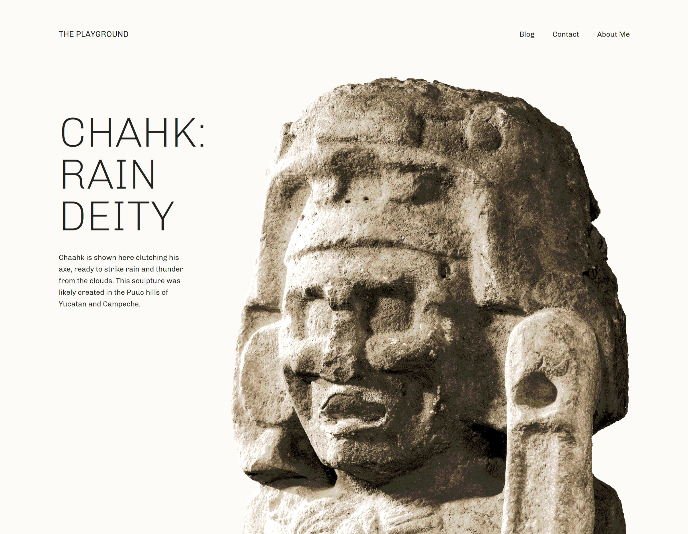
A sculpture of a deity from Mayan culture inside of a a two-column design with text on the left.
Intro section of Archeo’s homepage.

It is one of the few faithful representations of magazine designs that I have seen. No, I am not talking about the muddied term in some circles that confuses it with news design. It reminds me of those stunning feature layouts that would draw a reader into a story as they flipped through the latest gloss-covered print that arrived in the mail. I am a product of my generation and will always have a sense of nostalgia for the dying art form, and I love seeing web-based implementations of it when they work well.

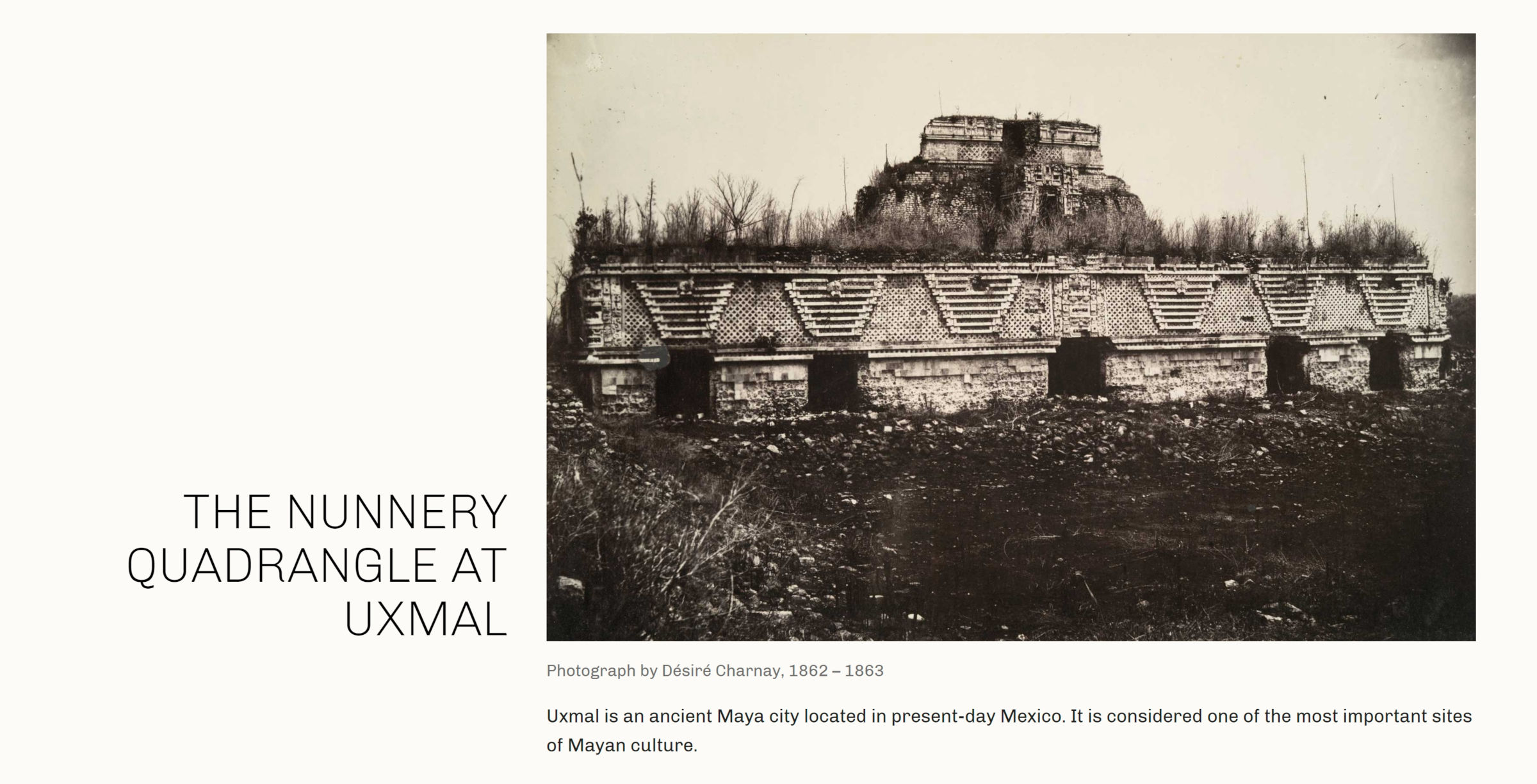
Nearly every one of Archeo’s image-categorized patterns captures that essence of a magazine featured article. The following is one of my favorites.

On the left of a two-column layout sits a large heading.  On the right is an image with a caption.  Underneath is a longer description.
Two-column image pattern with header on the left and additional text.

The theme is described as being inspired by Mayan history and culture. Archeo’s patterns are littered with tidbits of historical text and images that make me want to learn more about the subject. Great design can speak to us in ways that we were not expecting.

As an aside, I would love to see creators who describe their designs as “inspired by” something to provide more insight into the subject via a blog post. For those unfamiliar with whatever that subject may be, it would pull back the curtain a bit, giving us a glimpse into why it was important to the designer.

Archeo is the first theme that I have seen use the upcoming web fonts API expected to land in WordPress 6.0. Users with the Gutenberg plugin installed should see the theme’s only font, Chivo, gracing the front end and editor. Those without the plugin should see their system’s default sans-serif font.

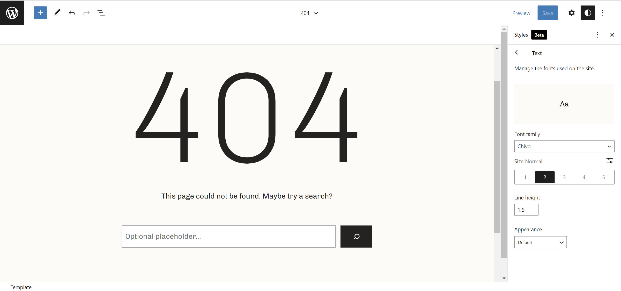
The following screenshot is of the theme’s 404 template and shows the Chivo font:

WordPress site editor open to the 404 template.  In the content canvas is a huge "404" title.
404 page template in site editor.

It looks far better than the default, at least on Windows. I recommend running this theme alongside the Gutenberg plugin for the ideal result.

I am surprised the Theme Team did not include a backward-compatible method of handling web fonts for WordPress 5.9 users. It would not have taken much code: a single hook and a check for whether the wp_webfonts() function exists.

Archeo is now the 59th block theme to land in the WordPress.org directory. I am eager to see more from Automattic’s Theme Team, especially if this will be its minimum standard with future designs.

Gutenberg Contributors Explore Expanding Background Image Block Support and Refining UI for Background Tools

Category Image 091

Background tools in Gutenberg are currently limited to the Cover block, but contributors are working on expanding support so that any block can opt into it. Discussions about the best way to do this have been happening for the past two years and now are gaining some momentum.

“Right now it’s possible to add video backgrounds, colored overlays, etc, to the Cover block alone,” Matias Ventura said in 2019 ticket on the UI for background tools. “It would make sense to extract this and extend to other container blocks (group and columns, for example) as well as expanding the features.”

Gutenberg contributor Andrew Serong has created a draft exploratory PR for adding opt-in, server-rendered background support for blocks, which would save background image values to the block’s style attribute in a backgroundImage key. Serong created the PR as a rough, experimental approach and published a few screenshots of how the inspector controls might fit in. However, Gutenberg designers are working on a more refined design for background support in the editor.

Today, Gutenberg designers Joen Asmussen and Javier Arce published a GitHub issue with their vision for a complete reorganization of background controls that includes layer management, layer reordering, and support for filters/blend modes.

“The core idea is to group all the layers (both overlays and media layer) inside a single sidebar section called Background, abstracting the organization of the Cover Block layers on the canvas and simplifying the block sidebar,” Arce said.

These new designs intersect with the goal of expanding background support for use in other blocks beyond the Cover block. There are many other considerations that splinter out of adding background image support to blocks, which contributors have noted in the discussions. These include features like the ability to add a body background image to block themes, specify a color palette to be used for background colors, and the ability to add multiple background images.

Expanding background image support and refining the UI for background controls is still a little ways off, but the project is starting to make significant steps forward. This will be an exciting addition that will markedly expand users’ ability to customize blocks.

WordPress Community Designers Create the Museum of Block Art

Category Image 091

Anne McCarthy announced the launch of the Museum of Block Art earlier today via the Gutenberg Times blog. The site’s goal is to showcase creative uses of blocks and inspire the WordPress community to push the limits of what is possible with the block editor.

The site showcases 22 pieces of block art from 11 people in the WordPress space. Ann McCarthy, Tammie Lister, Beatriz Fialho, Allan Cole, Rich Tabor, Nick Hamze, Brian Gardner, Javier Arce, Mel Choyce-Dwan, Channing Ritter, and Francisco Vera all contributed to this first outing.

A 6-column grid showcasing various art designs created via the WordPress block editor.
Multiple block art styles.

The concept builds upon an earlier project by Lister. In October 2021, she announced Patternspiration, a site where she created and released a new block pattern every day for the entire month.

“She was showing me those, sharing problems she was running into, the intent around ‘how quickly can I create a pattern/what can I create in 30 minutes per day,’ etc.,” said McCarthy. “I brought it up on a hallway hangout, and the idea just hit me as we were chatting (that’s the moment in the video). I found her approach to be so beyond creative and beautiful compared to some of the necessarily practical items in the block pattern directory.”

The pattern directory on WordPress.org must take a lot of factors into consideration to ensure patterns work across themes for millions of users. This limits what designers can do. However, such limitations are unnecessary on third-party sites.

“I wanted to take it a step further because it felt so compelling to look at something and not have an ‘I bet that was made with WordPress’ feeling that many of us have had,” said McCarthy.

Because the Museum of Block Art allows for more artistry in its showcase, it can also create inconsistent results if end-users blindly copy/paste the code. For example, one of my favorite patterns is the It’s Me (Super Mario) design by Hamze, which brings back at least a decade of childhood memories:

Super Mario "pixelated" image made out of Button blocks in the WordPress editor.
Super Mario block art.

However, it relies on color names that are not likely to exist in every theme. Copying the pattern code and pasting it into the editor should create the correct layout, but the colors might be off.

Other patterns require users to download the correct images and add them to their posts. Abstractions Study No.8 by Cole relies on custom CSS, which is provided via a downloadable Blockbase child theme.

Image of multiple abstract shapes created via WordPress blocks.
Abstract block art.

This sort of hodge-podge of methods is OK for a project like this. The goal is to inspire, not necessarily to make downloadable patterns. When designers experiment and push the boundaries, it can also help evolve the block system’s tools as they report limitations upstream.

Aside from Lister’s Patternspiration work, I had caught Ritter’s blog post in January sharing how she had created block art. At the time, I was unaware that it would be a part of the then-unknown Museum of Block Art project.

WordPress block art made from a gallery of various city images.
City Textures block art.

McCarthy added that she encouraged Ritter to publish the post, noting that it helps to “demystify” how it was done.

“I started pinging people who I thought would be interested in doing it,” said McCarthy of the block art included on the site. “It was all very grassroots and sometimes would just randomly come up in conversation. I tried to keep the ask very small since so much is going in with WordPress and the world. Probably less than half of the people I contacted actually submitted art pieces.”

The initial plan was to launch the site alongside the WordPress 5.9 release. However, it was pushed back as contributors needed more time.

There is no submission form for third-party contributions to the museum. However, McCarthy encourages designers to use the #WPBlockArt hashtag across social media to share their work. It could get picked up for inclusion on the site.

“I’m mainly looking for pieces via the hashtag, but if I see a big demand for folks wanting to submit, I’d be game to open up something more official,” said McCarthy. “This has been a side project on top of 5.9, the FSE Outreach program, etc., so I wanted to be mindful about the opportunity cost of sinking more time into an off-the-wall idea.”

How to Make a “Raise the Curtains” Effect in CSS

Category Image 091

“Raise the curtains” is what I call an effect where the background goes from dark to light on scroll, and the content on top also goes from light to dark while in a sticky position.

Here’s an example where I used the effect on a real-life project:

Want to know how it’s done? I will take you behind the curtain and show you how to raise it, with nothing but HTML and CSS.

Let’s start with the HTML

What we’re making is sort of a simplified “raise the curtain” effect like this:

Showing the raise the curtains effect from dark blue to wheat.
The background and text both change color while scrolling over the element.

I’m keeping things simple for the sake of clarity, but we can stub this out with three elements:

<div class="curtain">
  <div class="invert">
    <h2>Section title</h2>
  </div>
</div>

First, we need a container for the curtain, which we’ll give a .curtain class. Then, inside the .curtain, we have the an .invert child element that will serve as our “sticky” box. And, finally, we have the content inside this box — a good old-fashioned <h2> element for this specific example.

Let’s set up some CSS variables

There are three values we know we’ll need upfront. Let’s make CSS variables out of them so it’s easy to write them into our styles and easily change them later if we need to.

  • --minh – The height of the container
  • --color1 – The light color
  • --color2 – The dark color
:root {
  --minh: 98vh;
  --color1: wheat;
  --color2: midnightblue;
}

Time to draw the curtain

Next, we can define our .curtain element using the following techniques:

  • A linear-gradient for the “split” background
  • min-height for the extra space at the bottom of the container

We use the ::after pseudo-element to add the extra space to the bottom. This way, our “sticky” content will actually stick to the container while scrolling past the ::after element. It’s an illusion.

.curtain {
  /** create the "split" background **/
  background-image: linear-gradient(to bottom, var(--color2) 50%, var(--color1) 50%);
}

/** add extra space to the bottom (need this for the "sticky" effect) **/
.curtain::after {
  content: "";
  display: block;
  min-height: var(--minh);
}

Making sticky content

Next up, we need to make our content “sticky” in the sense that it sits perfectly inside the container as the background and text swap color values. In fact, we already gave the .curtain‘s child element an .invert class that we can use as the sticky container.

Stay with me for a moment — here’s how this is going to play out:

  • position: sticky and top define the stickiness and where it sticks.
  • mix-blend-mode: difference blends the color of the content inside the <h2> element into the .curtain‘s background gradient.
  • display: flex centers the content for presentation.
  • min-height defines the height of the container and allows for the extra space at the bottom.
  • color sets the color of the h2 heading.

Now to put that into CSS code!

.invert {
  /** make the content sticky **/
  position: sticky;
  top: 20px;

  /** blend the content with the contrast effect **/
  mix-blend-mode: difference;

  /** center the content **/
  display: flex;
  align-items: center;
  justify-content: center;
  
  /** set the minimum height of the section **/
  min-height: var(--minh);
}

h2 {
  /** set the color of the text **/
  color: var(--color1);
}

There are many things going on here, so let’s explain each one of them.

First, we have a sticky position that is self-explanatory and flexbox to help center the content. Nothing new or particularly tricky about this.

The content’s height is set using CSS variable and the value is the same height value as the .curtain::after pseudo-element.

The mix-blend-mode: difference declaration blends our content with the background. The difference value is complicated, but you might visualize it like inverted text color against the background. Here’s a nice demo from the CSS-Tricks Almanac showing off the different mix-blend-mode values:

To make the blending work, we need to set the color of our heading. In this case, we’re assigning a light color value (wheat) to the --color1 variable.

“Raise the Curtains” Demo

Gotchas

I experienced a few problems while working out the details of the “raise the curtain” effect. If you want to add images to the “sticky” content, for example, avoid using images that don’t look good when their colors are inverted. Here’s a quick demo where I made a simple SVG and transparent PNG image, and it looks good.

Another gotcha: there’s no way to set mix-blend-mode: difference on specific child elements, like headings, while avoiding the effect on images. I discovered there are several reasons why it doesn’t work, the first of which is that position: sticky cancels the blending.

The same goes when using something like transform: skewY on the container to add a little “tilt” to things. I suspect other properties don’t play well with the blending, but I didn’t go that far to find out which ones.

Here’s the demo without scrolling that removes the troubling properties:

Curtain call!

I enjoyed building this component, and I always love it when I can accomplish something using only HTML and CSS, especially when they work smoothly on every browser.

What will make with it? Is there a different way you would approach a “raise the curtain” effect like this? Let me know in the comments!


How to Make a “Raise the Curtains” Effect in CSS originally published on CSS-Tricks. You should get the newsletter.

6 Creative Ideas for CSS Link Hover Effects

Category Image 091

Creating CSS link hover effects can add a bit of flair to an otherwise bland webpage. If you’ve ever found yourself stumped trying to make a slick hover effect, then I have six CSS effects for you to take and use for your next project.

A default link hover effect above a styled link hover effect with a rainbow underline.

Let’s get right to it!

I know we’re talking about :hover and all, but it can sometimes (but maybe not always) be a good idea lump :focus in as well, as not all interactions are directly from a mouse, but perhaps a tap or keystroke.

This effect applies a box shadow to the inline link, altering the color of the link text in the process. We start with padding all around the link, then add a negative margin of the same value to prevent the padding from disrupting the text flow.

We will use box-shadow instead of the background property since it allows us to transition.

a {
  box-shadow: inset 0 0 0 0 #54b3d6;
  color: #54b3d6;
  margin: 0 -.25rem;
  padding: 0 .25rem;
  transition: color .3s ease-in-out, box-shadow .3s ease-in-out;
}
a:hover {
  box-shadow: inset 100px 0 0 0 #54b3d6;
  color: white;
}

Here’s a fun one where we swap the text of the link with some other text on hover. Hover over the text and the linked text slides out as new text slides in.

Easier to show than tell.

There’s quite a bit of trickery happening in this link hover effect. But the magic sauce is using a data-attribute to define the text that slides in and call it with the content property of the link’s ::after pseudo-element.

First off, the HTML markup:

<p>Hover <a href="#" data-replace="get a link"><span>get a link</span></a></p>

That’s a lot of inline markup, but you’re looking at a paragraph tag that contains a link and a span.

Let’s give link some base styles. We need to give it relative positioning to hold the pseudo-elements — which will be absolutely positioned — in place, make sure it’s displayed as inline-block to get box element styling affordances, and hide any overflow the pseudo-elements might cause.

a {
  overflow: hidden;
  position: relative;
  display: inline-block;
}

The ::before and ::after pseudo-elements should have some absolute positioning so they stack with the actual link. We’ll make sure they are set to the link’s full width with a zero offset in the left position, setting them up for some sliding action.

a::before,
a::after {
 content: '';
  position: absolute;
  width: 100%;
  left: 0;
}

The ::after pseudo-element gets the content from the link’s data-attribute that’s in the HTML markup:

a::after {
  content: attr(data-replace);
}

Now we can transform: translate3d() the ::after pseudo-element element to the right by 200%. We move it back into position on :hover. While we’re at it, we can give this a zero offset n the top direction. This’ll be important later when we use the ::before pseudo-element like an underline below the text.

a::after {
  content: attr(data-replace);
  top: 0;
  transform-origin: 100% 50%;
  transform: translate3d(200%, 0, 0);
}

a:hover::after,
a:focus::after {
  transform: translate3d(0, 0, 0);
}

We’re also going to transform: scale() the ::before pseudo-element so it’s hidden by default, then scale it back up on :hover. We’ll make it small, like 2px in height, and pin it to the bottom so it looks like an underline on the text that swaps in with ::after.

a::before {
  background-color: #54b3d6;
  height: 2px;
  bottom: 0;
  transform-origin: 100% 50%;
  transform: scaleX(0);
}

a:hover::before,
a:focus::before {
  transform-origin: 0% 50%;
  transform: scaleX(1);
}

The rest is all preference! We drop in a transition on the transform effects, some colors, and whatnot to get the full effect. Those values are totally up to you.

View full CSS
a {
  overflow: hidden;
  position: relative;
  display: inline-block;
}

a::before,
a::after {
 content: '';
  position: absolute;
  width: 100%;
  left: 0;
}
a::before {
  background-color: #54b3d6;
  height: 2px;
  bottom: 0;
  transform-origin: 100% 50%;
  transform: scaleX(0);
  transition: transform .3s cubic-bezier(0.76, 0, 0.24, 1);
}
a::after {
  content: attr(data-replace);
  height: 100%;
  top: 0;
  transform-origin: 100% 50%;
  transform: translate3d(200%, 0, 0);
  transition: transform .3s cubic-bezier(0.76, 0, 0.24, 1);
  color: #54b3d6;
}

a:hover::before {
  transform-origin: 0% 50%;
  transform: scaleX(1);
}
a:hover::after {
  transform: translate3d(0, 0, 0);
}

a span {
  display: inline-block;
  transition: transform .3s cubic-bezier(0.76, 0, 0.24, 1);
}

a:hover span {
  transform: translate3d(-200%, 0, 0);
}

This is a pretty popular effect I’ve seen used in quite a few places. The idea is that you use the link’s ::before pseudo-element as a thick underline that sits slightly behind the actual text of the link. Then, on hover, the pseudo-element expands to cover the whole thing.

OK, some base styles for the link. We want no text-decoration since ::before will act like one, then some relative positioning to hold ::before in place when we give that absolute positioning.

a {
  text-decoration: none;
  position: relative;
}

Now let’s set up ::before by making it something like 8px tall so it looks like a thick underline. We’ll also give it absolute positioning so we have control to make it the full width of the actual link while offsetting it so it’s at the left and is just a smidge off the bottom so it looks like it’s subtly highlighting the link. May as well give it z-index: -1 so we’re assured it sits behind the link.

a::before {
  content: '';
  background-color: hsla(196, 61%, 58%, .75);
  position: absolute;
  left: 0;
  bottom: 3px;
  width: 100%;
  height: 8px;
  z-index: -1;
}

Nice, nice. Let’s make it appear as though ::before is growing when the link is hovered. All we need is to change the height from 3px to 100%. Notice that I’m also dropping the bottom offset back to zero so the background covers more space when it grows.

a:hover::before {
  bottom: 0;
  height: 100%;
}

Now for slight transition on those changes:

a::before {
  content: '';
  background-color: hsla(196, 61%, 58%, .75);
  position: absolute;
  left: 0;
  bottom: 3px;
  width: 100%;
  height: 8px;
  z-index: -1;
  transition: all .3s ease-in-out;
}
View full CSS
a {
  text-decoration: none;
  color: #18272F;
  font-weight: 700;
  position: relative;
}

a::before {
  content: '';
  background-color: hsla(196, 61%, 58%, .75);
  position: absolute;
  left: 0;
  bottom: 3px;
  width: 100%;
  height: 8px;
  z-index: -1;
  transition: all .3s ease-in-out;
}

a:hover::before {
  bottom: 0;
  height: 100%;
}

I personally like using this effect for links in a navigation. The link starts in one color without an underline. Then, on hover, a new color slides in from the right while an underline slides in from the left.

Neat, right? There’s a lot of motion happening in there, so you might consider the accessibility implications and wrap it all in a prefers-reduced-motion query to replace it with something more subtle for those with motion sensitivities.

Here’s how it works. We give the link a linear background gradient with a hard stop between two colors at the halfway mark.

a {
  background-image: linear-gradient(
    to right,
    #54b3d6,
    #54b3d6 50%,
    #000 50%
  );
}

We make the background double the link’s width, or 200%, and position it all the way over to the left. That way, it’s like only one of the gradients two colors is showing.

a {
  background-image: linear-gradient(
    to right,
    #54b3d6,
    #54b3d6 50%,
    #000 50%
  );
  background-size: 200% 100%;
  background-position: -100%;
}

The magic happens when we reach for a couple of non-standard -webkit-prefixed properties. One strips the color out of the text to make it transparent. The other clips the background gradient to the text so it appears the text is actually the color of the background.

a {
  background-image: linear-gradient(
    to right,
    #54b3d6,
    #54b3d6 50%,
    #000 50%
  );
  background-size: 200% 100%;
  background-position: -100%;
  -webkit-background-clip: text;
  -webkit-text-fill-color: transparent;
}

Still with me? Now let’s make the link’s faux underline by putting ::before to use. We’ll give it the same color we gave the on the hidden portion of the link’s background gradient and position it under the actual link so it looks like a proper text-decoration: underline.

a:before {
  content: '';
  background: #54b3d6;
  display: block;
  position: absolute;
  bottom: -3px;
  left: 0;
  width: 0;
  height: 3px;
}

On hover, we slide ::before into place, coming in from the left:

a:hover {
 background-position: 0;
}

Now, this is a little tricky. On hover, we make the link’s ::before pseudo-element 100% of the link’s width. If we were to apply this directly to the link’s hover, we’d make the link itself full-width, which moves it around the screen. Yikes!

a:hover::before {
  width: 100%;
}

Add a little transition to smooth things out:

a {
  background-image: linear-gradient(
    to right,
    #54b3d6,
    #54b3d6 50%,
    #000 50%
  );
  background-size: 200% 100%;
  background-position: -100%;
  -webkit-background-clip: text;
  -webkit-text-fill-color: transparent;
  transition: all 0.3s ease-in-out;
}
View full CSS
a {
  background-image: linear-gradient(
    to right,
    #54b3d6,
    #54b3d6 50%,
    #000 50%
  );
  background-size: 200% 100%;
  background-position: -100%;
  display: inline-block;
  padding: 5px 0;
  position: relative;
  -webkit-background-clip: text;
  -webkit-text-fill-color: transparent;
  transition: all 0.3s ease-in-out;
}

a:before {
  content: '';
  background: #54b3d6;
  display: block;
  position: absolute;
  bottom: -3px;
  left: 0;
  width: 0;
  height: 3px;
  transition: all 0.3s ease-in-out;
}

a:hover {
 background-position: 0;
}

a:hover::before {
  width:100%;
}

We can’t do text-decoration-color: rainbow, but we can fake it with a little background magic mixed with linear gradients.

First, we remove the link’s text-decoration:

a {
  text-decoration: none;
}

Now for those gradients. We chain two linear gradients together on the same background property. One gradient is the initial color before hover. The second is the rainbow on hover.

a {
  background:
    linear-gradient(
      to right,
      rgba(100, 200, 200, 1),
      rgba(100, 200, 200, 1)
    ),
    linear-gradient(
      to right,
      rgba(255, 0, 0, 1),
      rgba(255, 0, 180, 1),
      rgba(0, 100, 200, 1)
  );
}

Let’s make the background size a mere 3px tall so it looks like, you know, an underline. We can size both gradients together on the background-size property so that the initial gradient is full width and 3px tall, and the rainbow is zero width.

a {
  background:
    linear-gradient(
      to right,
      rgba(100, 200, 200, 1),
      rgba(100, 200, 200, 1)
    ),
    linear-gradient(
      to right,
      rgba(255, 0, 0, 1),
      rgba(255, 0, 180, 1),
      rgba(0, 100, 200, 1)
  );
  background-size: 100% 3px, 0 3px;
}

Now we can position the background gradients — at the same time on the background-position property — so that the first gradient is fully in view and the rainbow is pushed out of view. Oh, and let’s make sure the background isn’t repeating while we’re at it.

a {
  background:
    linear-gradient(
      to right,
      rgba(100, 200, 200, 1),
      rgba(100, 200, 200, 1)
    ),
    linear-gradient(
      to right,
      rgba(255, 0, 0, 1),
      rgba(255, 0, 180, 1),
      rgba(0, 100, 200, 1)
  );
  background-size: 100% 3px, 0 3px;
  background-position: 100% 100%, 0 100%;
  background-repeat: no-repeat;
}

Let’s update the background-size on hover so that the gradients swap values:

a:hover {
  background-size: 0 3px, 100% 3px;
}

And, finally, a little transition when the hover takes place:

a {
  background:
    linear-gradient(
      to right,
      rgba(100, 200, 200, 1),
      rgba(100, 200, 200, 1)
    ),
    linear-gradient(
      to right,
      rgba(255, 0, 0, 1),
      rgba(255, 0, 180, 1),
      rgba(0, 100, 200, 1)
  );
  background-size: 100% 3px, 0 3px;
  background-position: 100% 100%, 0 100%;
  background-repeat: no-repeat;
  transition: background-size 400ms;
}

Voilà!

Geoff Graham actually covered this same one recently when he dissected Adam Argyle’s slick hover effect. In his demo, a background color enters from the left behind the link, then exits to the right on mouse out.

My version pares down the background so it’s more of an underline.

a {
  position: relative;
}

a::before {
    content: '';
    position: absolute;
    width: 100%;
    height: 4px;
    border-radius: 4px;
    background-color: #18272F;
    bottom: 0;
    left: 0;
    transform-origin: right;
    transform: scaleX(0);
    transition: transform .3s ease-in-out;
  }

a:hover::before {
  transform-origin: left;
  transform: scaleX(1);
}

That’s not the only way to accomplish this! Here’s another one by Justin Wong using background instead:

Geoff also has a roundup of CSS link hover effects, ranging from neat to downright absurd. Worth checking out!

Have a blast linking!

There are a lot of options when it comes to creating your own hover effect for in-line links with CSS. You can even play with these effects and create something new. I hope you liked the article. Keep experimenting!


6 Creative Ideas for CSS Link Hover Effects originally published on CSS-Tricks. You should get the newsletter.

How to Create a Simple Gutenberg Block Plugin

Category Image 091

How to Create a Simple Block PluginDon’t we all love WordPress? The platform has enjoyed massive success since its inception, with developers adding new features constantly. One of the most notable features in recent times is the WordPress block editor, codenamed Gutenberg. Gutenberg offers WordPress users an exciting new way of publishing content and customizing your site. It is incredibly easy […]

The post How to Create a Simple Gutenberg Block Plugin appeared first on WPExplorer.