How to Change the Text Color in WordPress (3 Easy Methods)

Category Image 052

Recently, one of our readers asked if there was an easy way to change the text color in WordPress?

The answer is yes. You can easily change your font color in WordPress across your whole site, or even just for a single word inside your post content.

In this guide, we’ll show you how to easily change the text color in WordPress, step by step.

Easily change text color in WordPress

There are lots of reasons why you might want to change the text color in your posts or pages. Maybe you’d like to emphasize a keyword, or perhaps you want to use colored subheadings on a particular page.

Alternatively, you might want to change the text color across your whole site. Perhaps your theme uses a gray color for text, but you’d rather make it black, or a darker gray, for better readability.

In this tutorial, we’ll be covering the following methods:

Just click one of those links to jump straight to that method.

Method 1. Changing the Text Color Using the Visual Editor

You can use the default WordPress editor to put words, paragraphs, or even subheadings in a different color from your main text.

An example of colored text in a WordPress page

Here’s how you can change your text color using the block editor.

First, you’ll need to edit the post or page that you want to change, or create a new one.

Next, type in your text. You’ll need to create a paragraph block or a heading block as appropriate. For help with this, take a look at our tutorial on how to use the WordPress block editor.

Once your text is in place, you can change the color.

Changing the Text Color of a Block

For this first example, we’re going to change the text color of the whole block.

Simply click on the block and the Block Settings panel should open up on the right hand side of your screen. Next, click on the arrow for ‘Color settings’ to expand that tab. You’ll see the text color settings here.

Picking a text color for the whole block in WordPress

Now, you can pick a new color for the text. The visual editor will show you some options based on your theme. You can simply click on one of these to change your text color.

Alternatively, if you have a specific color in mind, click the ‘Custom Color’ link. This will open up a color picker where you can manually select a color. You can also use this to type in a hex code.

Picking a custom text color for your block

If you change your mind and want to go back to the default text color, just click the ‘Clear’ button below the color options:

Setting your block back to the default text color

Pro Tip: If you want to change the background color for a block, you can do that here too.

Changing the Text Color of a Word or Phrase

What if you only want to change the color of one or two words? That’s easy using the block editor as well.

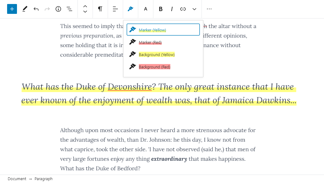
First, you’ll need to highlight the word(s) that you want to change. Then, click the small downward arrow on the content editor toolbar.

Highlight the words that you want to change the color of

Next, simply click on the ‘Text Color’ link at the bottom of the dropdown list:

Click the 'Text Color' link at the bottom of the dropdown list

You’ll now see the same color options as for the whole block. Again, you can pick from one of the default options or use the ‘Custom color’ link to select any color you want.

Choose the text color for your highlighted word(s)

The color options aren’t limited to paragraph blocks. You can also change the text color of heading blocks. As with paragraph blocks, you can set text color for the whole block in the block settings. Alternatively, you can highlight individual words and change their color.

Changing the text color of a heading block in WordPress

Note: You cannot set a background color for heading blocks.

You can also change the text color in a list block, but only by highlighting the word(s) and using the toolbar. There’s no option in the block settings to change the text color for the whole of a list block.

Changing the Font Color Using the Classic Editor

If you’re still using the classic WordPress editor, then you can change the font color using the toolbar.

In the classic editor, click on the Toolbar Toggle on the far right. You’ll then see a second row of icons:

Click the Toolbar Toggle button to see the second row of icons

Now, you can select your text and change the font color using the font color dropdown.

Use the text color button in the classic editor

Method 2. Changing the Text Color in the Theme Customizer

What if you want to change the text color across your whole website? Many of the best WordPress themes will allow you to do this using the theme customizer.

For this example, we’re using the OceanWP theme. It’s one of the top free themes available for WordPress.

In your WordPress dashboard, go to Appearance » Customize to open up the Theme Customizer.

Go to Appearance then Customize in your WordPress dashboard

Next, you need to look for an option such as ‘Typography’. The available options, and what they’re called, will vary depending on your theme.

Select 'Typography' or a similar option in the theme customizer

Let’s go ahead and click on the Typography tab, or an equivalent option. Next, look for a setting where you can change the text of your posts and pages. In OceanWP, this is called the ‘Body’ text. You need to click on this, so you’ll can customize the font color and more.

Select the Body text to modify in the customizer

When you click on the Font Color selector, you’ll see a color picker. Choose whatever color you want to use for your text. This will change the text color in all your posts and pages.

Picking the color for your body text using the theme customizer

You can also change your heading colors in a similar way, by using the options to change H1, H2, and so on.

Once you’re happy with your changes, click the ‘Publish’ button at the top of the screen.

Publishing your changes to your website

Tip: Choosing black or dark gray text on a white or very light background is usually best for readability.

Method 3. Changing the Text Color Using CSS Code

What if your theme doesn’t have the option to change the text color?

You can still change font color across a whole site by using the theme customizer. Go to Appearance » Customizer in the WordPress dashboard.

At the bottom of the list of options, you’ll see a tab that reads ‘Additional CSS’.

Open up the Additional CSS section of the theme customizer

Next, click on the Additional CSS tab, and you’ll see some instructions plus a box where you can enter CSS code.

For starters, you can copy this code into the box. After that, you can change the 6 numbers to the hex code of your chosen color.

p { color:#990000; }

Enter the CSS for changing the paragraph color into the theme customizer

This will change the font color of the regular text in all your posts and pages to dark red (or whatever color you chose), like this:

Text color customized site-wide using CSS code

If you want to change the color of the headings within your post, you can add this code instead:

h2 { color:#990000; }

Again, change the hex code to whatever color you want.

If you’re not familiar with CSS or want a beginner-friendly CSS editor that lets you easily customize the entire styles of your website, then we recommend looking into CSS Hero. It’s a powerful visual editor that lets you customize the styles of your entire site.

CSS Hero plugin

We hope this tutorial helped you learn how to change the text color in WordPress. You might also like our tutorials on how to change the font size in WordPress, and how to add custom fonts in WordPress.

If you liked this article, then please subscribe to our YouTube Channel for WordPress video tutorials. You can also find us on Twitter and Facebook.

The post How to Change the Text Color in WordPress (3 Easy Methods) appeared first on WPBeginner.

Flexbox-like “just put elements in a row” with CSS grid

Category Image 052

It occurred to me while we were talking about flexbox and gap that one reason we sometimes reach for flexbox is to chuck some boxes in a row and space them out a little.

My brain still reaches for flexbox in that situation, and with gap, it probably will continue to do so. It’s worth noting though that grid can do the same thing in its own special way.

Like this:

.grid {
  display: grid;
  gap: 1rem;
  grid-auto-flow: column;
}

They all look equal width there, but that’s only because there is no content in them. With content, you’ll see the boxes start pushing on each other based on the natural width of that content. If you need to exert some control, you can always set width / min-width / max-width on the elements that fall into those columns — or, set them with grid-template-columns but without setting the actual number of columns, then letting the min-content dictate the width.

.grid {
  display: grid;
  gap: 1rem;
  grid-auto-flow: column;
  grid-template-columns: repeat(auto-fit, minmax(min-content, 1fr));
}

Flexible grids are the coolest.

Another thought… if you only want the whole grid itself to be as wide as the content (i.e. less than 100% or auto, if need be) then be aware that display: inline-grid; is a thing.

The post Flexbox-like “just put elements in a row” with CSS grid appeared first on CSS-Tricks.

PHP and WordPress Version Checks Coming to Themes

Category Image 052

PHP and WordPress version checks are coming to the WordPress theme system — finally. The feature was pulled into core WordPress three days ago. It will prevent end-users from installing or activating a theme that is incompatible with their current version of PHP or WordPress. The change is slated to land in WordPress 5.5.

This feature has long been on many theme authors’ wish lists, particularly PHP version checking. Plugins authors gained the ability to support specific PHP versions starting with WordPress 5.2. However, theme authors were left feeling like the second-class citizens they usually are when it comes to the addition of core features, waiting patiently as plugin authors received the new and shiny tools they were looking forward to.

Previously, the code for manually handling version checking within individual themes was more complex than in plugins. Theme authors needed to run compatibility checks after theme switch and block theme previews in the customizer using two different methods, depending on the user’s WordPress version. That is assuming theme authors were covering all their bases.

Users had no real way of knowing whether a theme would work on their site before installing and attempting to activate it. It was a poor user experience, even when a theme gracefully failed for the end-user.

This user experience has also held back some theme authors from transitioning to newer versions of PHP. For years, many were supporting PHP 5.2. Slowly, some of these same authors are now making the move toward newer features up to PHP 5.6, which is now the minimum that WordPress supports. However, not many have made the jump to PHP 7 and newer.

Until now, there has been no mechanism for letting the user know they need to upgrade their PHP to use a particular theme.

Some theme authors may choose to continue supporting older versions of PHP, such as 5.6, for a potentially wider user base. However, developers who want to switch to newer features can now do so with the support of the core platform.

Changes for Users

Twenty Twenty theme page from WordPress.org theme repository.
New WordPress and PHP versions added to Twenty Twenty theme.

Users who are browsing the WordPress theme directory may begin to notice new information available for some themes. Similar to plugins, visitors should see a WordPress Version and PHP Version listed for some themes. For example, the Twenty Twenty theme now lists the following minimum requirements:

  • WordPress Version: 4.7 or higher
  • PHP Version: 5.2.4 or higher

Not all themes will have these numbers listed yet. It will take some time before older themes are updated with the data required to populate these fields.

In WordPress 5.5, the admin interface for themes will change. When attempting to install or activate a theme, WordPress will prevent such actions. If a user searches for a theme that has an incompatible WordPress or PHP version, the normal installation button will be replaced with a disabled button that reads “Cannot Install.” If a theme is installed but not activated, the activation link will similarly be replaced with a disabled “Cannot Activate” button. Users will also not be allowed to live preview incompatible themes.

Attempting to activate Twenty Twenty theme without PHP support.
Cannot activate Twenty Twenty theme with incompatible PHP version.

The feature works the same from within the customizer interface as it does via the themes screen in the WordPress admin.

Changes for Theme Authors

The WordPress Themes Team recently announced two new required headers for theme authors to place in their style.css files. The first required field is Tested up to, which is the latest version of WordPress the theme has been tested against. The second is a Requires PHP field, which is the minimum PHP version the theme supports.

It is unclear is why the team decided to require those two fields but not the Requires at least field, which represents the minimum WordPress version needed. Most likely, theme authors will want to place all three headers in their themes.

Theme authors who will still support versions of WordPress earlier than 5.5 will want to continue using their old compatibility checks. However, this is the first step in phasing such code out.

CSS fix for 100vh in mobile WebKit

Featured Imgs 23

A surprisingly common response when asking people about things they’d fix about anything in CSS, is to improve the handling of viewport units.

One thing that comes up often is how they relate to scrollbars. For example, if an element is sized to 100vw and stretches edge-to-edge, that’s fine so long as the page doesn’t have a vertical scrollbar. If it does have a vertical scrollbar, then 100vw is too wide, and the presence of that vertical scrollbar triggers a horizontal scrollbar because viewport units don’t have an elegant/optional way of handling that. So you might be hiding overflow on the body when you otherwise wouldn’t need to, for example. (Demo)

Another scenario involves mobile browsers. You might use viewport units to help you position a fixed footer along the bottom of the screen. But then browser chrome might come up (e.g. navigation, keyboard, etc), and it may cover the footer, because the mobile browser doesn’t consider anything changed about the viewport size.

Matt Smith documents this problem:

On the left, the browser navigation bar (considered browser chrome) is covering up the footer making it appear that the footer is beyond 100vh when it is not. On the right, the -webkit-fill-available property is being used rather than viewport units to fix the problem.

And a solution of sorts:

body {
  min-height: 100vh;
  /* mobile viewport bug fix */
  min-height: -webkit-fill-available;
}

Does this really work? […] I’ve had no problems with any of the tests I’ve run and I’m using this method in production right now. But I did receive a number of responses to my tweet pointing to other possible problems with using this (the effects of rotating devices, Chrome not completely ignoring the property, etc.)

It would be better to get some real cross-browser solution for this someday, but I don’t see any issues using this as an improvement. It’s weird to use a vendor-prefixed property as a progressive enhancement, but hey, the world is weird.

Direct Link to ArticlePermalink

The post CSS fix for 100vh in mobile WebKit appeared first on CSS-Tricks.

Highlight, Underline, and Control Font Size with RichText Extension

Category Image 052

Last week, Tetsuaki Hamano contributed his first plugin to the official WordPress plugin repository. RichText Extension grants additional options for inline text in the block editor.

RichText is a component in the editor that allows end-users to add and edit text. Typically, users may think of this component when dealing with paragraphs. However, it also applies to headings, lists, quotes, image captions, and any other area where textual content can be added.

Many plugins add settings on the block level. This means when you apply a particular style, it applies to the entire block. Inline text refers to the individual characters and words within the block. By default, WordPress allows end-users to control inline text by adding links, creating italic or bold characters, changing the text color, and more. Superscript and subscript inline options have already landed in the Gutenberg plugin, which should ship with WordPress 5.5.

RichText Extension extends the editor toolbar to add new options for highlighting, underlining, and changing the font size of inline text. It also adds an option to clear all formatting.

Overall, the plugin is a solid outing for a first-time contributor to the plugin directory. With luck, we will get to see more of Hamano’s work in the future.

Plugin Features

The primary feature of RichText Extension is its highlighter option, which allows users to highlight text. The plugin adds a paintbrush icon to the toolbar. Once clicked, it opens four highlighting options. By default, users can add a red or yellow marker effect or background directly behind a piece of text. This feature can be useful for adding a bit of flair to make specific words or characters to stand out.

Screenshot of the RichText Extension plugin's highlighter feature in the editor.
Using the marker highlight in a pullquote.

The plugin also adds a font size option to the toolbar. I am unsure how useful changing the font size for inline text is for the average end-user. Typically, this is best left to the block level. However, there may be some edge cases that others will want to use it for.

Along with the core editor’s inline options in the toolbar’s dropdown menu, RichText extension adds Clear Format and Underline options. The former allows users to clear all inline formatting. The latter underlines text.

Each of the plugin’s features can be configured via the plugin’s settings screen. Users can change the highlight colors, their thickness, and transparency. The four available font sizes can be adjusted. It also allows users to enable or disable each feature.

Screenshot of the RichText Extension WordPress plugin's options page.
RichText Extension’s settings screen.

It would be nice to see the plugin’s highlighting and font-size features use the theme-defined color palette and font sizes, respectively. The plugin could further allow users to define custom colors and sizes outside of those added by the theme.

More than anything, I would like to see a fully-featured plugin tackle every conceivable inline text option with the ability to enable or disable each. This would give end-users ultimate flexibility over how they write their content. Perhaps RichText Extension can be that plugin in the future. Otherwise, another developer may step in and do the job.

How to Easily Change the Font Size in WordPress

Category Image 052

Do you want to change the font size in your WordPress posts or pages?

Sometimes, you may want to make a line or a paragraph larger, or you might want to increase the font size of your entire page content.

In this article, we’ll show you how to easily change the font size in WordPress. You’ll learn not only how to change font size in your WordPress posts, but also how to do it across your website.

Change font size in WordPress

Method 1: Using Paragraph Headings

It takes your visitors just a couple of seconds to decide whether they want to stay or leave your website. This gives you very little time to convince them to stay on your website.

Using Headings in your content is a great way to grab user attention.

They allow you to break your posts and pages into sections using different headings (often called “subheadings”).

Headings are great for SEO as well. Search engines give proper headings more weight than normal paragraph text.

How to add a heading in the default WordPress block editor

You can add a heading to your posts or pages by simply adding the ‘Heading’ block. You can search for it or find it in the ‘Common Blocks’ section in the WordPress block editor.

Adding a heading block in Gutenberg

The block will default to Heading 2. Normally, it makes sense to stick with Heading 2 for your subheadings. If you want to change this, then you can simply click on the ‘H2’ drop-down to select a different size.

Selecting your Heading size in the block editor

Alternatively, you can change this in the block settings on the right-hand side of the screen. You can also change the heading’s color there as well.

How to add a heading in the older Classic Editor

If you are still using the older classic editor in WordPress, then you can add headings using the ‘Paragraph’ drop-down.

Just highlight the text that you want to turn into a heading, click the ‘Paragraph’ drop-down, and select your heading size.

Creating a heading by clicking on the Paragraph drop-down in the classic editor

The sizes and colors of the different Heading styles are controlled by your theme’s stylesheet (style.css).

If you’re using a premium WordPress theme, then you may have the option to change these settings under Appearance » Customize.

Using subheadings in your articles makes it easier for readers to follow what you’re telling them. At the same time, it also makes your WordPress posts SEO friendly.

Method 2: Changing the Size of the Text in the Block Editor

What if you want to have a paragraph or even your whole post in a larger font? You can do this really easily using the default WordPress block editor.

Just click on any paragraph block, then select the font size under ‘Text Settings’ on the right-hand side.

Changing the text size of a paragraph block

You can select from the drop-down, which covers Small, Normal, Medium, Large, and Huge. If you change your mind, then just click the ‘Reset’ button to set your paragraph back to the default text.

There’s also a ‘Custom’ option where you can simply type in the pixel size that you’d like. If you want, you can also set a large Drop Cap to appear at the start of your paragraph.

These options aren’t available in the older classic editor for WordPress. If you want to use them, then think about making the switch. Our tutorial on how to use the new WordPress block editor will help you.

If you are determined to stick with the classic editor, then this next option is for you.

Method 3: Change Font Size Using The TinyMCE Advanced Plugin

TinyMCE Advanced is a WordPress plugin that gives you more control over font sizes and text formatting, as well as a range of other features.

This is particularly useful with the older classic editor, but it also works with the block editor. It adds a new block called “Classic Paragraph” that has all the TinyMCE controls.

To use it, you’ll first need to install and activate the TinyMCE Advanced plugin. If you’re not sure how to do that, check out our step by step guide on how to install a WordPress plugin.

Next, go to Settings » TinyMCE Advanced to configure the editor settings. This is where you can set up the buttons you want to use in the TinyMCE Advanced toolbar.

If you’re using it with the Classic editor, then you should see that TinyMCE has the ‘Font Size’ drop-down enabled by default in the second row of icons.

You can move it to the first row by dragging it upwards if you want.

The font sizes drop-down button on the TinyMCE Advanced menu for the classic editor

If you’re using the block editor, then you’ll need to scroll down the screen and add the Font Sizes drop-down to the toolbar by dragging and dropping it:

Adding the font sizes button to the TinyMCE Advanced block toolbar

Make sure you click ‘Save Changes’ at the bottom of the screen.

To see the button in action, create a new post or edit an existing one.

In the block editor, you’ll now have the option to add a ‘Classic Paragraph’ block. It will have the TinyMCE Advanced controls, like this:

The Classic Paragraph block in the block editor, added by the TinyMCE Advanced plugin

In the classic editor, you’ll see the TinyMCE Advanced toolbars with a font size drop-down:

Changing the font size using the TinyMCE Advanced editor

You can select any font size from the drop-down.

Note: this doesn’t give you as many options as the WordPress block editor, and you can’t type in your own font size.

Method 4: Change Site-Wide Font Size Using CSS

If you are changing font sizes every time you edit a post, then you may want to make it easier by changing it permanently in your theme.

The good news is that you can change the default paragraph size across your whole site. The best way to do this is by using the Theme Customizer under Appearance » Customize.

Some WordPress themes may come with an option for you to change the font size. If you can find this option, then you can use it without writing CSS code.

However, if your theme does not have that feature, then you can add custom CSS to add your own font size rules.

Simply click on the ‘Additional CSS’ option in the theme customizer. This is where you can store all your custom CSS code.

Using the Customizer to add CSS code to your site

Now under the additional CSS text box, simply add your CSS code. In this example, we are changing the font size to ’16px’, you can choose a different font size.

p { 
font-size:16px; 
} 

You’ll immediately see the changes on the preview on the right-hand side of the screen. If you’re happy with the font size, click the ‘Publish’ button at the top of your screen to make it live.

Note: Your custom CSS will only be applied to the theme you’re using. If you later choose to switch to a different WordPress theme, you’ll need to copy and paste it into the Customizer again.

The above code only applies to paragraph text. What if you wanted to change the font size of all h2 sub-headings?

Simply modify the above code to target the h2 element in your theme like this:

h2 { 
font-size:32px; 
} 

You can do the same thing with other headings as well by simply changing h2 to h3, h4, or h5.

We hope this article helped you learn how to easily change the font size in WordPress. You may also want to see our guide on how to use custom fonts in WordPress or our list of the best drag & drop WordPress page builder plugins.

If you liked this article, then please subscribe to our YouTube Channel for WordPress video tutorials. You can also find us on Twitter and Facebook.

The post How to Easily Change the Font Size in WordPress appeared first on WPBeginner.

I’m getting back to making videos

Category Image 052

It’s probably one part coronavirus, one part new-fancy-video setup, and one part “hey this is good for CodePen too,” but I’ve been doing more videos lately. It’s nice to be back in the swing of that for a minute. There’s something fun about coming back to an old familiar workflow.

Where do the videos get published? I’m a publish-on-your-own site kinda guy, as I’m sure you know, so there is a whole Videos section of this site where every video we’ve ever published lives. There is also a YouTube channel, of course, which is probably the most practical way for most people to subscribe. We’re about halfway to Wes Bos-level, so let’s go people!

I had literally forgotten about it, but ages ago when I set this up, I created a special RSS feed for the videos so I could submit it as a video podcast on iTunes. That’s all still there and working! An interesting side note is that this enables offline viewing, as most podcatchers can cache subscriptions. Why build an app when you get the core ability for free, right?

I keep the original videos, of course. On individual video pages, I show a YouTube player that could be somewhat easily swapped out for another player if something crazy happened, like YouTube closes down or drastically changed their business model in some way that makes it problematic to show videos with their player. The originals are stored in an S3 bucket. If you’re an MVP Supporter, I give you the original high-quality download link right on the video pages.

If your curious about my workflow, I’m still using ScreenFlow. I don’t make nearly enough use of it, but it feels good in that it’s fairly easy to use, very reliable and fast, and I can always learn and do more with it. Shooting my screen is easy and a built-in feature of ScreenFlow of course. I also have a Rode Podcaster on a boom arm at my desk so the audio is passable. And I just went through a whole process to use a DSLR camera at my desk too, and I think the quality from that is great. It’s all a little funny because I have this whole sound recording booth as well, with a $1,000 audio setup in there, but I only use that for podcasting. The lighting sucks in there, making it no good for video.

It’s this new desk setup that has inspired me to do more video, and I suspect it will continue! One thing I could really use is a new high quality intro video. Just like a five-second thing with refreshed aesthetics. Anyone do that kind of work?

The post I’m getting back to making videos appeared first on CSS-Tricks.

How to Add Custom Navigation Menus in WordPress Themes

Best Wordpress Themes 1

Do you want to add custom navigation menus in your WordPress theme?

All themes have set locations where you can display a navigation menu. However, by default, you can’t add a menu anywhere else except these pre-defined locations.

In this article, we’ll show you how to add a custom navigation menu to any area of your WordPress theme.

How to add custom navigation menus in WordPress themes

Why Add Custom Navigation Menus in WordPress Themes?

A navigation menu is a list of links pointing to important areas of your website. They make it easy for visitors to find interesting content, which can increase pageviews and reduce bounce rate in WordPress.

The exact location of your menu will vary based on your WordPress theme. Most themes have several options, so you can create different menus and show them in different places.

To see where you can display menus in your current WordPress theme, simply head over to Appearance » Menus and then take a look at the ‘Display location’ section.

The following image shows the locations that are supported by the Astra WordPress Theme.

The menu locations in the popular Astra theme

However, sometimes you may want to show a menu in an area that isn’t listed as a ‘Display location’ in your theme.

With that in mind, let’s take a look at how to create WordPress navigation menus and then add them to your theme. Simply use the quick links below to jump to the method you prefer.

Method 1. Adding a Custom Navigation Menu in Full Site Editing

If you’re using a block theme, then you can add a custom navigation menu using Full Site Editing (FSE) and the block editor. For more details, you can see our article on the best WordPress full-site editing themes.

This method doesn’t work with every theme, and it doesn’t let you customize every part of the menu. If you want to add a completely custom menu to any WordPress theme, then we recommend using a page builder plugin.

If you are using a block-based theme, then head over to Appearance » Editor.

How to launch the FSE

This will launch the full site editor with one of your active theme’s templates already selected.

If you want to add a custom navigation menu to a different template, then click on the arrow in the toolbar and select ‘Browse all templates.’

Changing templates in the Full Site Editor

The site editor will now show all the different templates that are part of your theme.

Simply find the template that you want to edit, and give it a click.

Switching templates in the block-based FSE

The next step is adding a Navigation block to the area where you want to show your menu.

In the top-left corner, click on the blue ‘+’ button.

Adding blocks to your WordPress theme

Now, go ahead and type ‘Navigation’ into the search bar.

When the ‘Navigation’ block appears, simply drag and drop it onto your layout.

The WordPress Navigation block

Next, click to select the Navigation block.

If you’ve already created the menu that you want to display, then click ‘Select Menu’ and make your selection from the dropdown.

Adding a custom navigation menu using FSE

Another option is to click on ‘Create new menu,’ which allows you to build a navigation menu inside the full site editor.

To start with a blank menu, simply click on ‘Start empty.’

Building a menu in the WordPress full site editor

To add items to the new menu, just click on the ‘+’ icon.

This opens a popup where you add any post or page, and decide whether these links should open in a new tab.

How to build a new menu in the block editor

Simply repeat these steps to add more items to the menu.

When you’re happy with how the menu looks, simply click on the ‘Save’ button. Your site will now be using the new template, and visitors can interact with your custom navigation menu.

Method 2. Creating a Custom Navigation Menu in WordPress Using SeedProd (Works With All Themes)

The full site editor is a quick and easy way to add a basic custom menu to block-based themes. However, if you want to add an advanced, fully-customizable menu to any theme, then you’ll need a page builder plugin.

SeedProd is the best WordPress page builder plugin on the market and allows you to customize every part of your navigation menu.

SeedProd comes with over 180 professionally-designed templates that you can use as your starting point. After choosing a template, you can add a custom navigation menu to your site using simple drag and drop.

First, you need to install and activate the SeedProd plugin. For more details, see our step-by-step guide on how to install a WordPress plugin.

Note: There’s also a free version of SeedProd that allows you to create custom navigation menus without writing code. However, in this guide, we’ll be using SeedProd Pro since it has lots more templates for you to choose from.

After activating the plugin, SeedProd will ask for your license key.

SeedProd license key

You can find this information under your account on the SeedProd website. After entering the key, click on the ‘Verify Key’ button.

Once you’ve done that, go to SeedProd » Landing Pages and click on the ‘Add New Landing Page’ button.

SeedProd's page design templates

You can now choose a template for your custom page.

To help you find the right design, all of SeedProd’s templates are organized into different campaign types such as coming soon and lead squeeze campaigns. You can even use SeedProd’s templates to improve your 404 page.

The SeedProd template library

To take a closer look at any design, simply hover your mouse over that template and then click on the magnifying glass icon.

When you find a design that you want to use, click on ‘Choose This Template.’

Choosing a SeedProd template for your WordPress website

We’re using the ‘Black Friday Sales Page’ template in all our images, but you can use any template you want.

After choosing a template, type in a name for that custom page. SeedProd will automatically create a URL based on the page’s title, but you can change this URL to anything you want.

After entering this information, click on the ‘Save and Start Editing the Page’ button.

Creating a new page using SeedProd

Most templates already contain some blocks, which are the core components of all SeedProd page layouts.

To customize a block, just click to select it in the page editor.

The left-hand toolbar will then show all the settings for that block. For example, in the image below, we’re changing the text inside a ‘Headline’ block.

Editing a headline in SeedProd

You can format the text, change its alignment, add links, and more using the settings in the left-hand menu.

To add new blocks to your design, simply find any block in the left-hand menu and then drag it onto your design. If you want to delete a block, then simply click to select that block and then click on the trash can icon.

Removing blocks from a custom layout

Since we want to create a custom navigation menu, drag a ‘Nav Menu’ block onto the page.

This creates a navigation menu with a single default ‘About’ item.

Adding a custom navigation menu to a WordPress layout

To customize this menu item, click to select it in the left-hand menu.

This opens some controls where you can change the text, as well as add the URL for the menu item to link to.

Adding a custom navigation menu to a landing page

By default, the menu item will be a ‘dofollow’ link and open in the same browser window. To change either of these settings, simply use the checkboxes in the ‘URL Link’ section.

In the following image, we’re creating a “nofollow” link that will open in a new window.

Marking a menu item as no-follow

To add more items to the menu, simply click on the ‘Add New Item’ button.

You can then customize each of these items by following the same process described above.

Adding items to a custom navigation menu

The left-hand menu also has settings that change the font size and text alignment.

You can even create a divider, which will appear between each item in the menu.

Creating a divider for your custom navigation menu

After that, go ahead and switch to the ‘Advanced’ tab. Here, you can change the menu’s colors, spacing, typography, and other advanced options.

As you make changes, the live preview will update automatically so you can try different settings to see what looks good in your design.

The SeedProd advanced customization settings

When you’re happy with how the custom menu looks, it’s time to publish it.

Simply click the dropdown arrow next to ‘Save’ and then select ‘Publish.’

How to publish a custom page layout

Your custom navigation menu and the page will now go live on your WordPress blog.

Method 3. Creating a Custom Navigation Menu in WordPress Using Code (Advanced)

If you don’t want to set up a page builder plugin, then you can add a custom navigation menu using code. Normally, you would need to add custom code snippets to your theme’s functions.php file.

However, we don’t recommend this method for anyone but advanced users, and even then, a small mistake in your code could cause a number of common WordPress errors, or break your site completely.

That’s why we recommend using WPCode. It is the easiest and safest way to add custom code in WordPress without having to edit any core WordPress files.

The first thing you need to do is install and activate the free WPCode plugin on your website. For more details, see our step-by-step guide on how to install a WordPress plugin.

Upon activation, go to Code Snippets » Add Snippet in your WordPress dashboard.

Adding a code snippet using the WPCode WordPress plugin

Here, you’ll see all of the different ready-made snippets that you can add to your site.

Since we want to add our own snippet, hover your mouse over ‘Add Your Custom Code,’ and then click ‘Use snippet.’

Adding a custom snippet to your WordPress website

To start, enter a title for the custom code snippet. This can be anything that helps you identify the snippet.

After that, open the ‘Code Type’ dropdown and select ‘PHP Snippet.’

Adding a custom navigation menu using WPCode

Once you’ve done that, simply paste the following snippet into the code editor:

function wpb_custom_new_menu() {
  register_nav_menu('my-custom-menu',__( 'My Custom Menu' ));
}
add_action( 'init', 'wpb_custom_new_menu' );

This will add a new menu location to your theme, called ‘My Custom Menu.’ To use a different name, simply change the above code snippet.

If you want to add more than one new navigation menu to your theme, then simply add an extra line to your code snippet. For example, here we’re adding two new menu locations to our theme, called My Custom Menu and Extra Menu:

function wpb_custom_new_menu() {
  register_nav_menus(
    array(
      'my-custom-menu' => __( 'My Custom Menu' ),
      'extra-menu' => __( 'Extra Menu' )
    )
  );
}
add_action( 'init', 'wpb_custom_new_menu' );

Below the code box, you will see insertion options. If it isn’t already selected, then choose the ‘Auto Insert’ method so the snippet will be automatically inserted and executed on your site.

After that, open the ‘Location’ dropdown and click on ‘Run Everywhere.’

Running a custom code snippet

Then, you’re ready to scroll to the top of the screen and click on the ‘Inactive’ toggle so it changes to ‘Active.’

Finally, go ahead and click on ‘Save’ to make this snippet live.

Inserting a custom navigation menu using the WPCode WordPress plugin

After that, go to Appearance » Menus and look at the ‘Display location’ area.

You should now see a new ‘My Custom Menu’ option.

A custom navigation menu created using the WPCode plugin

You’re now ready to add some menu items to the new location. For more information, please see our step-by-step guide on how to add navigation menus for beginners.

When you’re happy with your menu, the next step is adding it to your WordPress theme.

Adding the custom navigation menu to your WordPress theme

Most website owners show their navigation menu directly under the header section just after the site logo or title. This means the navigation menu is the first thing visitors see.

However, you can display your custom navigation menu anywhere you want by adding some code to the theme’s template file.

In your WordPress dashboard, go to Appearance » Theme File Editor.

In the right-hand menu, select the template that you want to edit. For example, if you want to show the custom navigation menu in your website’s header, then you’ll typically want to select the header.php file.

The WordPress theme file editor

For help finding the right template file, please see our guide on how to find which files to edit in your WordPress theme.

After selecting the template file, you need to add a wp_nav_menu function and specify the name of your custom menu. For example, in the following code snippet we’re adding My Custom Menu to the theme’s header:

wp_nav_menu( array( 'theme_location'=>'my-custom-menu', 'container_class'=>'custom-menu-class' ) );

After adding the code, click on the ‘Update File’ button to save your changes.

Editing the WordPress theme files

Now if you visit your site, you’ll see the custom menu in action.

By default, your menu will appear as a plain bulleted list.

A custom WordPress menu created using code

You can style the custom navigation menu to better match your WordPress theme or company branding by adding custom CSS code to your site.

To do this, go to Appearance » Customize.

Customizing a WordPress theme

In the WordPress customizer, click on ‘Additional CSS.’

This opens a small code editor where you can type in some CSS.

Adding additional CSS to your WordPress theme

You can now style your menu using the CSS class that you added to your theme template. In our example, this is .custom_menu_class.

In the following code, we’re adding margins and padding, setting the text color to black, and arranging the menu items in a horizontal layout:

div.custom-menu-class ul {
    margin:20px 0px 20px 0px;
    list-style-type: none;
    list-style: none;
    list-style-image: none;
    text-align:right;
	display:inline-block;
}
div.custom-menu-class li {
    padding: 0px 20px 0px 0px;
    display: inline-block;
} 

div.custom-menu-class a {
    color:#000;
}

The WordPress customizer will update automatically to show how the menu will look with the new style.

Styling a custom navigation menu

If you’re happy with how the menu looks, then click on ‘Publish’ to make your changes live.

For more information, please see our guide on how to style WordPress navigation menus.

Do More With WordPress Navigation Menus

With WordPress, you can do much more than just show links in a menu. Here’s how to get even more out of your navigation menus:

We hope this ultimate guide helped you learn how to add a custom navigation menu in WordPress. You may also want to see the best ways to increase your blog traffic and how to track website visitors to your WordPress site.

If you liked this article, then please subscribe to our YouTube Channel for WordPress video tutorials. You can also find us on Twitter and Facebook.

The post How to Add Custom Navigation Menus in WordPress Themes first appeared on WPBeginner.

`lh` and `rlh` units

Category Image 052

There’s some new units I was totally unaware of from the Level 4 spec for CSS values! The lh unit is “equal to the computed value of line-height” and rlh is the same only of the root element (probably the <html> element) rather than the current element.

Why would that be useful? Šime Vidas’ has a strong point:

“Vertical Inline Centering” of an icon
.inline-icon {
  display: inline-block;
  width: 1lh;
  height: 1lh;
}

The post `lh` and `rlh` units appeared first on CSS-Tricks.

[David Baron’s] Thoughts on an implementable path forward for Container Queries

Category Image 052

That’s the title of a public post from David Baron, a Principal Engineer at Firefox, with thoughts toward container queries. I know a lot of people have been holding their breath waiting for David’s ideas, as he’s one of few uniquely qualified to understand the ins and outs of this and speak to implementation possibility.

We’re still in the early stages of container queries. Every web designer and developer wants them, the browsers know it, but it’s a super complicated situation. It was very encouraging in February 2020 to hear positive signals about a possible switch-statement syntax that would give us access to an available-inline-size used to conditionally set individual values.

Now we’re seeing a second idea that is also in the realm of the possible.

This ideas uses an @rule instead for the syntax. From the document:

@container <selector> (<container-media-query>)? {
  // ... rules ...
}

So I’m imagining it like:

.parent {
  contain: layout inline-size;
  display: grid;
  grid-template-columns: 100%;
  gap: 1rem;
}
@container .parent (min-width: 400px) {
  grid-template-columns: 1fr 1fr;

  .child::before {
     content: "Hello from container query land!";
   }
}

Except…

  1. I’m not sure if you’d have to repeat the selector inside as well? Or if dropping property/value pairs in there automatically applies to the selector in the @rule.
  2. David says, “The rules can match only that container’s descendants. Probably we’d need support for some properties applying to the container itself, but others definitely can’t.” I’d hope grid properties are a strong contender for something you can change, but I have no idea. Otherwise, I think we’d see people wrapping elements with <div class="container-query"> to get around the “only descendants” limit.

Containment seems to be a very important part of this. Like, if the element isn’t property contained, the container query just won’t work. I don’t know that much about containment, but Rachel has a great deep dive from late last year.

Again, this is super early days, I’m just having fun watching this and none of us really have any idea what will actually make it to browsers.

Direct Link to ArticlePermalink

The post [David Baron’s] Thoughts on an implementable path forward for Container Queries appeared first on CSS-Tricks.

Should the Block Editor Have a Grid System?

Category Image 052

Laying out a webpage design and getting every element aligned perfectly can be a tough job. Even many developers rely on CSS grid frameworks. Granted, with the introduction of the flexbox and grid systems in the CSS language, such frameworks are becoming unnecessary. Whether it is getting the vertical and horizontal rhythm down or simply aligning an image next to a bit of text, page layouts are often done best via some sort of grid system.

This becomes even more apparent when building a page layout visually through the WordPress block editor. The current iteration of the editor does a fine job of being a general content editor while providing the ability to insert various elements into the page.

However, it is not by any means a page builder — yet.

The question is, before we engage in full-site editing, global styles, block patterns, and other upcoming tools, whether a grid system should be a part of the equation. If so, how should that system work? Will it be configurable by theme authors? How will it handle tablet and mobile views? Will the grid be visible to users or a hidden thing in the background?

As more block plugins are released, particularly with those that may have multiple elements that may need to be aligned, it might be time we consider a grid system. Such a system may benefit existing core blocks right now, such as Columns and Media & Text. Or, it may be better as a separate, standalone block.

Including a grid system also has the additional benefit of standardizing on layout-related class names that theme authors can use in their CSS, even outside the content editor. This would bring better compatibility across the board when users inevitably switch themes.

A Starting Point: Layout Grid Block

Screenshot of the Layout Grid block in the block editor with a basic three columns.
Three-column layout with Layout Grid Block.

Automattic, as part of its Block Experiments project, has released the Layout Grid Block plugin. It is essentially a beefed-up version of the core Columns block. The major difference is that column alignment snaps to a specific point in the grid. This grid is also displayed in the background while editing the post.

The tricky thing with grids is not simple alignment in columns in desktop view. It is dealing with how those columns transform on smaller devices like tablets and smartphones. Sometimes that is a guessing game from a theme design perspective because the theme author is not privy to the actual content that needs to be aligned. In turn, designers make best-guess decisions and hope it works for most.

The Layout Grid block has a “Responsive Breakpoints” tab under the block options panel that allows users to configure this based on device. Users can decide how individual columns span the grid. The grid system is based on a varying number of grid sections based on the device:

  • Desktop: 12 Sections
  • Tablet: 8 Sections
  • Mobile: 4 Sections

Imagine wanting to display a simple image with text to the next of it. There are various ways to do this currently in the block editor. Each has its pros and cons, depending on what you want to do. From a user experience and visual standpoint, I love seeing the grid lines in place as I determine how it should be displayed.

Screenshot of a pizza restaurant menu item with the Layout Grid block.
Aligning an image and text on a grid.

Another upside of having a grid system is consistency in design. If users can scale the width of columns based on arbitrary numbers, much like they can now do with the Media & Text block, there is no consistency with sizing items horizontally on the page. A grid system changes that.

Layout Grid Block still needs some polishing at this point. There are some trivial pain points in the UI that could be improved. On the whole, my experience with this block offered a compelling argument for including a grid system in core.

The plugin addresses simple one, two, three, and four columns right now. The grid system in CSS is much more powerful than basic horizontal columns. However, starting with the basics would give us a place to build from.

Should Core Include a Grid?

There is at least one open ticket on the Gutenberg repository for addressing a grid system. Mark Uraine, the author of the ticket, posted seven key questions:

  1. Should the grid system be responsive?
  2. Should there be a default Gutenberg grid system, but allow themes to register their own?
  3. Should the grid system conform to the current structure of Gutenberg blocks, or should it be its own thing that we need to restructure the blocks to in the editor?
  4. Should the grid include gutters?
  5. Should the grid include, or allow, any vertical alignment snaps?
  6. What should the grid be based on? (ie. 12 columns, pixel grid, etc.)
  7. Should the grid allow toggling on/off? And also include a setting to show, or not, when resizing objects in the editor?

The ticket had some solid discussion nearly a year ago but not much as of late. Would you like to see a grid system in the editor? If so, how would you want it to work?

Chatterbox Plugin Uses WordPress Blocks to Show Conversations

Category Image 052

Chatterbox is a new plugin with a fun and creative use for the block editor. It displays chat or text threads using blocks that are styled as conversations. Users can type in a record of a chat, including timestamps, with a live preview in the editor.

Since written conversations are essentially little blocks of text and media, the block editor lends itself nicely to composing and displaying this type of content. The Chatterbox block can be found under Layout Elements in the block inserter. It includes the option to select a style (Inbound, Outbound, or Event) and add a timestamp.

Dave Ryan, a WordPress developer at Bluehost, said he created the plugin in order to test Gutenberg’s Block Context API and borrowed the chat component from Salesforce’s Lightning Design System. He suggested that Chatterbox could be useful for showing demos of chat bots, publishing chat records in news stories, or simply adding an engaging visual display to conversations.

Once the Block Context API matures, Ryan plans to add message background and text colors, message sender with name and avatar, and the ability to override the message sender on a per-message basis for group chats. The next steps beyond that on the roadmap include the following:

  •  Implement Bookends and other SFDS Chat options
  •  Animated chat sequences
  •  Automated animated sequences, using character lengths for timing
  •  Automate hiding of message meta based on adjacent blocks
  •  Message Images
  •  Message Files

Ryan said some of the planned features will rely on new features in the Gutenberg project. Once those have been released he will update Chatterbox to include more customization options. The plugin is available for free on WordPress.org and contributors can find the code on GitHub.

Constrained CSS grids without `max-width`

Featured Imgs 23

Ain’t nothing wrong with max-width, but Ethan makes a point in the last sentence:

Rather than simply defaulting to max-width as a constraint, I can use the empty space around my design, and treat it as a layout tool.

If the space “around” your grid is actually part of the grid, it’s easier to use. Maybe you’d decide to scootch some author information up there after all, or show an ad, or who knows what. It will be more robust if you do it within the established grid.

Direct Link to ArticlePermalink

The post Constrained CSS grids without `max-width` appeared first on CSS-Tricks.

The Contrast Triangle

Category Image 052

Chip Cullen:

Let’s say you’re building a site, and you’re working with a designer. They come to you with some solid designs, and you’re ready to go. You’re also a conscientious front end developer and you like to make sure the sites you build are accessible. The designs you’re working from have some body copy, but you notice that the links inside the body copy are missing underlines.

You are now in The Contrast Triangle.

The “triangle” meaning a three-sided comparison:

  • The contrast between the background and text
  • The contrast between the background and links
  • the contrast between text and links

I would think this matters whether you underline links or not, but I take the point that without underlines the problem is worse.

I’d also argue the problem is even more complicated. You’ve also got to consider the text when it is selected, and make sure everything has contrast when that is the case too. And the hover states, active states, visited states, and focus states. So it’s really like hexacontakaienneagon of contrast or something.

Direct Link to ArticlePermalink

The post The Contrast Triangle appeared first on CSS-Tricks.

CSS Scrollbar With Progress Meter

Category Image 052

Scrollbars are natural progress meters. How far the scrollbar is down or across is how much progress has been made scrolling through that element (often the entire page). But, they are more like progress indicators than meters, if you think of a meter as something that “fills up” as you go.

We can use some CSS trickery to make the scrollbar fill up as we go.

This will only work with -webkit- vendor-prefixed scrollbar-styling properties. In other words, these are non-standard. The standardized scrollbar styling properties are scrollbar-width and scrollbar-color, which can’t pull this kind of thing off, but are probably a safer bet in the long run. Still, the vendor-prefixed versions probably aren’t going anywhere, so if you consider this a weird form of progressive enhancement, that’s probably fine.

What’s the trick?

Essentially, it’s hanging a huge box-shadow off the top of the scrollbar thumb — or off the side if it’s a horizontally scrolling element.

:root {
  --shadow: #43a047;
  --scrollbarBG: #eee;
  --thumbBG: #66bb6a;
}
::-webkit-scrollbar {
  width: 16px;
}
::-webkit-scrollbar-track {
  background: var(--scrollbarBG);
}
::-webkit-scrollbar-thumb {
  background-color: var(--thumbBG);
  box-shadow: 0 -100vh 0 100vh var(--shadow), 0 0 15px 5px black;
}

Demo

I first saw this in a Pen by Myk.

That example didn’t differentiate the thumb part of the scrollbar at all, which makes it more meter-like, but also harder to use. My demo has a slightly different color thumb.

Can I really use this?

No! Aside from it being super weird and non-standard. Safari flips it’s lid and I have no idea how to fix it.

I do happen to have a favorite CSS trick that is highly related to this though.

I want to learn more about styling scrollbars

Cool, here you go.

The post CSS Scrollbar With Progress Meter appeared first on CSS-Tricks.