WordPress Biratnagar Announces Plans for Ujwal Thapa Memorial Scholarship

Featured Imgs 26

Earlier this week, the WordPress Biratnagar Facebook group announced a WordCamp scholarship in honor of Ujwal Thapa. The goal is to honor the legacy left behind by one of Nepal’s leaders both inside and outside of the WordPress community.

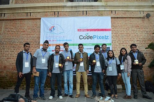
Thapa passed away a month ago at age 44 from complications with COVID-19. He was a political activist, founding the Bibeksheel Nepali party, originally a peaceful movement against corruption and social injustice. He was the co-founder of WordPress Nepal, a group that has grown to 8,000 members. He was also a close friend and mentor to many in the community and helped many more launch careers in the IT industry.

“After the untimely death of WordPress contributor and co-founder of WordPress Nepal Ujwal Thapa in 2021, due to COVID-19, the WordPress Biratnagar community decided on this scholarship,” wrote the WordPress Biratnagar team. “Ujwal was a dedicated patron to the WordPress community in Nepal, and the WordPress Biratnagar decided to pay applause to his memory in this way.”

The scholarship will cover the following:

  • Travel to Biratnagar from within Nepal.
  • Hotel stay for the duration of the event.
  • A ticket to WordCamp Biratnagar.
  • Local transportation.
  • Meals outside the official event.

Nepal is still struggling with getting COVID-19 cases under control at the moment. The CDC lists the country as “very high” risk and recommends avoiding travel. There is no date set for a physical conference, and a WordCamp Biratnagar 2021 event is unlikely. The organizing team may not be able to grant a scholarship until next year at the earliest.

WordCamp Biratnagar lead organizer Ganga Kafle said they are just waiting for the situation to return to normal but cannot be sure when that will happen. While there is no date for the next WordCamp, they are still holding regular meetups.

The group is still discussing the details of the scholarship. Currently, they plan to consult with other community groups within Nepal and the global community. Any help creating and maintaining such a scholarship system would be welcome.

The WordPress Biratnagar team did agree to some guidelines. Once submissions open, applicants must be Nepalese. “We believe that empowering community members is an excellent way to honor his memory and carry on his legacy,” wrote the team in its announcement.

Group leaders mostly agreed to award the scholarship to those meeting the following criteria:

  • People with disabilities.
  • People from lower-income families.
  • Women interested in WordPress.

The group said the selection process would be completely transparent, and the awarded scholarship would be at the discretion of the current WordCamp Biratnagar organizers.

Kafle said the scholarship would also be annual. The team plans to keep this going in honor of Thapa and paying respect to the man who helped jump-start many of their careers and involvement with WordPress.

Add Editor-Only Notes via the Markdown Comment Block WordPress Plugin

Category Image 052

Rich Tabor, the Senior Product Manager of WordPress Experience at GoDaddy, tweeted that he had an idea for a new block at the end of last week. Shortly after, the Markdown Comment Block plugin appeared on WordPress.org.

The plugin is a one-off block. It allows users to enter notes directly into the post editor that will not appear on the front end of the site. Tabor said he came up with the idea when working on an article for building single-block plugins.

There are few things I love more than simple plugins with a tight focus, performing a single function. Markdown Comment Block lands in this category.

The plugin creates a new block that works nearly the same as a typical Paragraph block:

Adding inline comments to the WordPress post editor via the Markdown Comments Block plugin.
Adding inline comments to a post.

Users can change the text color, but they will not have access to the typical Rich Text controls. Those should be unnecessary anyway.

As someone who does long-form writing almost exclusively in Markdown, the block’s use of the double percent-sign syntax for comments intrigued me. Technically, the Markdown spec does not support any sort of special characters for them. It handles HTML comments. However, those appear in the source code on the front end when the document is rendered. I have only seen the %% mark to denote comments in the Inspire Writer app for Windows. Tabor said he had seen the same in Ulysses. The feature also exists in the Iceberg editor for WordPress, which Tabor created alongside Jeffrey Carandang.

The plugin also introduces the %% keyboard shortcut. Typing it directly in the editor will create a new Markdown Comment block.

My primary use case for the plugin would be leaving notes for my later self. However, it could also be handy in users’ publishing flows. The block adds a “Resolve” button to the toolbar. Clicking it deletes the comment.

Clicking the Resolve button for the Markdown Comment block to delete a comment.
Clicking the “Resolve” button will delete the block.

The block itself will not likely offer a robust enough feature set for complex workflows. However, pairing it with a plugin like Post Descriptions could round out the experience for larger teams of writers and copyeditors.

The Post Descriptions plugin allows users to add notes on the post level. These notes appear on the post-management screen, letting other team members know when to check an article. However, it may be hard to provide the full context of what issues need to be resolved before publishing. Markdown Comment Block adds an inline comments system, letting team members pass in-text notes.

Theme developers should appreciate that the block uses CSS custom properties too, which makes it easy to overwrite its default style rules. In moments, I was able to make it match my theme:

Customized output of the Markdown Comment Block.
Custom color, font, and line-height styles.

The --markdown-comment-font-size, --markdown-comment-line-height, and --markdown-comment-color variables are available for theme developers who want to add in support.

The one complaint I had about the block is its title: “Comment.” It is easy to confuse it with the six other comment-related blocks already in the WordPress block list. And, there will only be more in upcoming versions. Giving it a title of “Markdown Comment” would better distinguish it from others.

Clove: A Showcase of Block Patterns by Anariel Design

Category Image 091
Clove theme homepage.

Earlier today, Ana Segota tweeted and announced via the Anariel Design blog that her company had submitted its second block-based theme to WordPress.org. Clove is a more well-rounded follow-up to her first such theme, Naledi. It is currently under review for inclusion in the official directory, but anyone can give it a test run by snagging the ZIP file from its ticket. Or, just peruse the live demo.

This should officially be the 10th block-based theme to go live in the WordPress.org theme directory (note that a couple by Automattic are not tagged). That is assuming all goes well during the review process.

It has been a long road thus far, but 10 themes with the Full Site Editing tag is a notable milestone. The Q theme by Ari Stathopoulos was the first to land in the directory back in October 2020. Now, eight months later, there is still room for other theme authors to become pioneers in the space. With almost no competition, who will design that first block theme that squeezes its way into the most popular list?

If “practice makes perfect,” Segota is now ahead of the curve by pushing her second theme to the directory. This makes her theme company only one of two with multiple block themes.

Clove is experimental, as all block themes are. It relies on the ever-shifting parts of the Gutenberg plugin, but it all comes together into a floral, nature-themed design. There are hints of inspiration from Twenty Twenty-One, but it feels more structured, less chaotic.

The design is less of a theme and more of a showcase of block patterns and styles. Even on the template level, it reuses those same elements across each of its seven templates, providing multiple entryways for users to tinker with its features.

Clove even includes pricing columns. I seem to recall writing about how theme authors could implement them via patterns just over a month ago. Maybe the Anariel Design team came to the same conclusion. Maybe they took my message and ran with it. I like to think the latter is true. Either way, the result is a beautiful, theme-specific pattern — the sort of artistry that is tough to achieve from a plugin.

Nature-themed pricing columns block from the Clove WordPress theme.
Customizing the Pricing Columns pattern in the WordPress editor.

I am less of the fan of the overlapping and uneven columns in some of the designs designs, preferring some of the more-structured patterns, such as Three Quotes Images:

Three columns of images plus quotes, a pattern from the Clove WordPress theme.
Three-column pattern that showcases images along with quotes.

Despite my general dislike of the uneven column style, my favorite piece of the entire theme is the Illustrations page template, which leans into that design method.

The page intro section is an announcement to the world, “Hey, check out my work.”

Page intro section with uneven columns and two nature-based images.
Illustrations template intro section.

I also like the Illustrations page template’s widgets-like area in the footer. It manages to stuff several blocks in without feeling too crowded. It even showcases a box for artists to highlight their next exhibition.

Three columns of blocks that appears like a traditional footer widget area.
Illustrations page template footer “widget” area.

The Clove theme also registers 10 block styles for users to choose from. Most of them add different types of borders or frames to various elements. Plus, there is the fun-but-kind-of-an-oddball blob “Shape” for images.

Segota was one of several people to submit custom designs to the upcoming block pattern directory. There is some noticeable crossover between her current theme work and submissions, such as the Playful Gallery pattern that did not quite make the cut. Others, like her Recipe design, did. There is still an open invitation for people to contribute.

I am always like a kid in a toy store when a new block theme comes along, reaching out to grab the latest gadget. I want to see more experiments like Clove. Keep them coming, theme authors.

Side note: For people interested in the background-clipped text design used in Clove’s site logo, I opened a ticket to take us one step closer to doing it in the editor. Currently, users must create an off-site image and upload it.

A Progress Bar Block Plugin Done Right by the Tiles Team

Wp Plugins

I have been on the hunt for a decent progress bar solution for a while now. Most of them are bundled in large block libraries, requiring me to install another 20 or 30 blocks in which I have no need. Others seem to miss the mark entirely with odd configurations and block options. Some of the remaining plugins still use shortcodes and widgets, but it is 2021. I am looking for a block.

A couple of days ago, the Tiles Progress Block landed in the directory. It seems to be a smaller piece of a larger project named Tiles. I have been keeping an eye on the team’s work since its initial design and patterns framework plugin launched last week. That project is still in beta, and only time will tell if it becomes a competitive project in the block space.

However, the team’s new progress bar block was just what I was looking for. Other than one bug, which I reported to the developer, I found no serious issues.

The plugin does what it says on the tin. It registers a Progress Bar block:

Inserting both a Small and Large progress bar into the block editor.
Small and Large progress bars with default colors.

Out of the box, it includes Small and Large styles, allowing the user to adjust the size of the bar.

Its strength is that — I cannot stress this enough — the block’s content is editable within the editor canvas area. This includes the label and percentage. This is a refreshing change from the many others that require users to jump back into the block options sidebar to change simple text. Because the block uses Rich Text fields for its label and percentage, end-users can use inline formatting tools like bold, italic, and more.

The block also uses the standard typography and color palette controls from core WordPress. This provides access to the theme’s font sizes and colors.

Customizing the output of the Progress Bar Block in the WordPress editor with custom colors.
Adding custom labels, percentages, and colors.

Plus, users can choose wide and full-width layouts, an often overlooked feature in block plugins.

Overall, I am digging this block plugin. If I had one feature request, it would be to add a border-radius option. By default, the progress bar is rounded, but some users might prefer squared corners.

Extending the Block

In theme previews, I almost always see progress bars showcased alongside how much PHP, HTML, and JavaScript the demo’s faux developer has learned. It is rarely a real-world representation of progress bars. How do you quantify how much of a coding language you have mastered? I have been doing this for nearly two decades and cannot answer that.

Progress bars should be of measurable things. For example, steps someone has taken in an online learning course, percentage of total donations received, and any number of things that can be counted are far more realistic.

My favorite use of progress bars also happens to be on my favorite novelist’s website. I like to keep an eye on Brandon Sanderson’s work, looking forward to getting my next literary fix (yes, I am a fanboy).

Screenshot of the progress bars from Brandon Sanderson's website.
Brandon Sanderson’s writing progress.

Currently, Tiles Progress Block does not handle that exact layout. However, because it is built on the block system and does not do anything out of the ordinary, theme authors can change that with custom styles.

And that is just what I did. My Sanderson-esque book progress bars (rough, unpolished code available as a Gist):

Progress bars that move the percentage next to the bar.
Progress bars with custom block style.

The thing I love about the block system is that themers can extend blocks in this way. There is no needless checking for active plugins, loading additional per-plugin stylesheets, or figuring out each plugin’s unique system.

If a block is coded to the current standards, theme authors merely need to hook in with their own styles. Users can then select those styles via the editor and even make them the default.

I want to see more of this from the block plugin ecosystem.

Ujwal Thapa, Co-Founder of the WordPress Nepal Community, Passes Away

Featured Imgs 23

“Here is my resume of professional Failures,” began his LinkedIn profile. On a site where most are apt to share success, Ujwal Thapa started with nearly a two-decade history of dreams that did not quite work out. Or, maybe they did in some ways.

Much of Nepal is reeling from his death today. In the past week, he had been battling multiple health complications from Covid-19. The 44-year-old activist was the founder of the Bibeksheel Nepali political party, originally a peaceful movement that fought against political corruption and social injustice.

However, many Nepali WordPress users will remember him as a co-founder of their community. The WordPress Nepal Facebook group has now grown to nearly 8,000 members.

In a 2015 interview with Nepal Buzz, he noted his proudest WordPress-related achievement as building this community. “That is not just creating tens and hundreds, but thousands of jobs in Nepal, and has the potential to create tens of thousands more, which basically means we are contributing to the nation by creating opportunities where there are none.”

Later in the interview, he said he was a provoker, and he continued to live the remainder of his life in that belief.

“I believe that the easiest way to bring change is to align all the positive people in the same direction,” he said. “So my job is to provoke and bring together people with similar interests, and align them in a similar direction, creating the change that they would never believe could come.”

Thapa founded Digital Max Solutions in 2002, amidst the Nepalese Civil War. At one point, the company had as many as 35 employees. Over 30 eventually moved on to start their own IT businesses. He also created the Entrepreneurs for Nepal Facebook group, which now has over 100,000 members. From May 2013 to October 2019, he served as the Chairperson of the BibekSheel Nepali party.

Many in Nepal’s WordPress community owe him a debt of gratitude for having the vision of building off the core platform. WordPress.org Themes Team representative Ganga Kafle credits at least part of his career and deep involvement with WordPress to Thapa, helping him land an initial internship with Web Experts Nepal.

“Ujwal Thapa is the person who introduced WordPress to me in 2012 in a meetup,” he said. “After that, I was in close relation with him. In 2014, after my graduation, I went to Ujwal and asked him about the internship, and he took me to that office and talked with the boss and finalized for the internship. That’s how I jumped in WordPress, and now I am one of the leads of Themes Team.”

“Once he said to me, ‘WordPress is giving so much things for free, why you hesitate to put Proudly Powered by WordPress?'” Kafle shared of the mentor, referencing the typical credit line in many WordPress site footers. “He was in love with WordPress.”

You can view Thapa’s WordCamp presentations as a speaker and panel moderator via WordPress.tv.

Upgrade Your Publishing Flow with the Post Descriptions WordPress Plugin

Featured Imgs 08

Tom de Visser, a developer from Amsterdam, released the Post Descriptions plugin last week. It was his first submission to the WordPress.org plugin repository. It allows users to write short descriptions on a per-post basis, which are then displayed on the post-management screen.

For an initial outing, it already seems to be a hit with its small user base. It has already racked up several five-star reviews and over 100 active installs. Granted, one of those reviews is from his employer, Mediaversa. While that might not seem like much from the outside looking in, anyone who has created plugins knows that it is a successful launch for an individual developer’s first plugin submission.

The plugin’s goal is simple: leave small notes, reminders, to-dos, or longer descriptions for posts. It could be an ideal solution for a small team, but lone bloggers might need it too.

Post Descriptions works with both the regular WordPress post editor or the classic editor by adding a meta box to the side of the editing screen. Currently, it only allows descriptions for posts or pages. Maybe the developer will add a post-type-support flag or filter hook for custom post types in the future.

Meta box on the post-editing screen for adding a post description.
Posts Descriptions plugin meta box.

Aside from the description input box, users can tick the “Make your description important” checkbox to highlight a particular note. This option gives the text’s display a red color and turns it bold when viewed.

Descriptions are viewable via the post or page management screens. By default, they appear as a “state,” similar to how pending or draft states next to the title. The plugin also displays them under a “Description” column. Users can turn off the state display via the plugin’s settings screen and toggle the extra column via WordPress’s built-in Screen Options tab.

Post states via the Post Descriptions plugin on the post management screen.
Descriptions as post “states.”

One of my favorite features of this plugin is the flexibility of selecting where the notes appear on the post-management screen. Those who prefer one or two words can choose to display them as states. Those who prefer lengthier descriptions can show them in a separate column. Or, do both.

Description column on the post management screen for displaying notes.
Column for displaying post descriptions.

Users can also add descriptions via the Quick Edit link on the post-management screen.

From a user-experience standpoint, it hits some of those sweet spots of usability and simplicity. Under the hood, the code is solid. The developer does not seem to be overthinking things and making the plugin more complicated than necessary.

For small teams, I envision building a labeling system around this plugin that could address workflow issues. Adding short notes like Editor Review, SEO Review, and similar would alert the right team members to sign off on a post.

While the flexibility of displaying notes as either states or descriptions is welcome, it does not account for a third type of user. My ideal workflow would be to have separate inputs for both states and descriptions. I could create a shorter state that gets my team’s attention. Then, if more information is needed, I could add a longer description.

Post management screen displaying short notes as post states and longer ones under a description column.
Idea: Separate state and description text.

The downside in such a system is that it puts yet another input field in front of the end-user. Sometimes the route with the least effort is best. And, for a quick post note plugin, it is tough to beat the plugin’s current solution.

A Laptop and a Dream: Your Home Office Should Meet Your Needs

Featured Imgs 08
A laptop sitting on top of a glass table on a patio. Garden, swing, and trees in the background.

I began my journey into remote work while teaching English as a Second Language (ESL) in South Korea. I was 23 years old at the time. By day, I spent my time wrangling elementary and middle-school kids. At night, I was writing tutorials, building themes and plugins, and taking any work that landed on my [figurative] desk.

My home office was my entire home, a spartan, one-bedroom/living/kitchen apartment. My workstation was a bed with several pillows piled up for back support.

My first client contract was signed, developed, and completed on that bed. I made a mere $300 for creating a per-post thumbnail system for a popular blog (yes, I way undervalued my work). This was long before WordPress launched its featured image system.

I was living the dream. Young and hungry, I took whatever odd jobs I could in preparation for eventually running my own WordPress-related business. Some nights, I would put in eight hours or more. On the weekends, I rarely actually slept in that bed. It had become my office chair. My lap was my desk.

In the back of my mind, I suppose I always thought I would get a proper office. It would have all the bells and whistles like separate monitors for different tasks instead of tabs on a single screen. I would have the best mic and speaker setup — including the kitchen sink.

After nearly a decade and a half, I realized I never needed all of that stuff. My laptop and I got along just fine. Of course, like many people, I tend to get stuck in my ways, looking for any excuse to not change.

When I see articles like “It’s been a year. Here’s what your home office should look like,” written by Kathryn Vasel for CNN Business, I tend to cringe before diving into it. There are some good takes in the article, such as getting natural light, taking breaks, and adjusting your posture.

My idea of “what your home office should look like” is that it should be what makes you feel comfortable with the tools that allow you to do the job. For some folks, that is a laptop and a standing desk. For others, it includes specialized audio and video equipment.

If you can afford it, I would at least recommend getting a good office chair. If you sit at a desk much of the day, skimp on the desk and other tools first.

On the subject of affordability, it is also good to be mindful that a home office is a luxury, a privilege that few have. Like that small-town Alabama boy with his $400 Walmart computer in Korea, sometimes people just have to get by with what they have on hand.

Now, 14 years later, I do have a home office. Like the first, it is spartan. It has the tools I need, and that is what I love about it. I do not spend all day in it. I prefer to move around from spot to spot.

On days like today, those with mid-70s temps (Fahrenheit for all the non-Americans) and a slight breeze in the air, I like to sit on the back patio. I enjoy the birds singing. It is a good time of the year to watch the little ones learn to forage their own food. I keep an eye on the squirrels, making sure their mischievousness is limited to sneaking a few nuts from the bird feeders.

It is also another reason I have always preferred a laptop over a desktop. Its utility allows me to lug it from the couch or desk to a spot outside amid nature.

While much of the world’s workforce is still figuring this whole remote, work-from-home thing out, many in the WordPress community have this down to a science. Or, at least, they know what works for them. I would love to hear and see (share pics in the comments — embeds are enabled) what your home offices are like.

Recreating the Classic Wedding WordPress Theme Homepage With the Block Editor

Category Image 052

I simply do not understand it. For at least the better part of a decade, theme authors have asked for the tools to create more complex layouts with WordPress. They have asked for the ability to allow end-users to more easily recreate their demos. They have wanted methods to bypass the “restrictive” theme review guidelines.

Over the past couple of years, WordPress has consistently delivered features that theme authors have asked for. Yet, themes that use them are few and far between.

During my weekly perusal of the latest themes to land in the directory, a new wedding theme caught my attention last week. Of course, I downloaded, installed, and activated it only to find that I had no idea how to recreate the homepage design. There were no instructions. The theme options in the customizer seemed to make little sense. Nearly all of the decorative images were non-existent in the theme folder.

Did I need to upgrade to the pro version to get what was in the screenshot? There seems to be a plan for such a version, but it is not available yet.

Screenshot of the Classic Wedding WordPress theme.
Classic Wedding theme screenshot.

I am no rookie, but I was stuck. I liked the simplicity of the design. However, I could not imagine setting up a wedding site with this theme. From a user’s standpoint, it should not take more than a few mouse clicks. After that point, it should only be a matter of customizing the content.

I recognize that there is still a sort of love/hate divide for the block editor in the inner WordPress community. However, theme authors are not doing any favors for the overall WordPress user base by not taking advantage of the tools available.

So, I recreated the Classic Wedding theme homepage from scratch. Using the block editor. With a theme that supports it.

Creating a Wedding Homepage

My goal was simple. There was no demo to work from, and all I had to go on was an 800-pixel wide screenshot from the theme page on the author’s site. Like I recreated the Music Artist homepage several weeks ago, I wanted to do the same for Classic Wedding. With a couple of exceptions, which could have been handled by the theme, I was successful.

Because Classic Wedding does not support the block editor itself, I could not recreate its homepage via the block editor while using the theme. It was not happening — I tried. I knew that the Eksell WordPress theme had a “canvas” template that allowed users to edit the entire page, so it was an easy choice.

I also loaded the Kaushan Script and Lora fonts to more closely match the original theme. This was unnecessary for the experiment, but I wanted my recreation to at least look somewhat similar.

I immediately knew that I would have one hurdle to overcome. The theme used an image that overlapped both the section above and below it. This requires margin controls, particularly the ability to add negative margins. Unfortunately, this is a missing component of the block editor today. It does not mean that theme authors cannot do it with custom block styles or patterns. It simply means that end-users are unable to control it from the interface.

Because I did not want to spend my time writing the code for this, I leaned on my usual safety net, the Editor Plus plugin. While it can be a little clunky sometimes and feel like overkill, it does include those missing features like margin options.

Using the Editor Plus plugin, adding a negative margin to an image in the WordPress block editor.
Adding negative margin to an image.

I used px units there because it was easy. In a real-world project, % or rem would have been better. But I was just doing a quick proof-of-concept.

Everything else in the content area was straightforward. I needed a Cover block with an Image, Heading, Paragraph, and Button tucked inside. I needed a Group block as a container for Image, Heading, and Paragraphs in the bottom section.

Because the theme did not package its decorative images — again, how would users recreate the homepage without them? — I opted for a simple striped SVG background instead of the flowers in the original. Since I already had Editor Plus installed, I added an SVG from Hero Icons as the main background.

Content area of a wedding homepage design with a hero header, overlapping image, and text.
Wedding page content recreation.

My original idea was to recreate the “content” part of the homepage only. However, it was a bit boring on its own. Therefore, I transformed everything into a Columns block and added the sidebar. I recreated the primary elements using the Image, Heading, Paragraph, and Navigation blocks. Then, I added a Social Icons block for fun.

Full wedding page design with sidebar and wedding photos/content on the right.
Full wedding homepage design.

I did hit one snag with the Navigation block. WordPress does not currently offer a method of centering each link in the list when using the vertical block variation. I had to write a couple of lines of CSS to make this happen. This seems like an oversight and one area where the block editor failed to meet my expectations. Of course, this could be handled on the theme side of things.

Overall, this was a relatively simple project. However, this experiment added some complexities that were not present when I recreated the Music Artist homepage. Margin controls and vertical Navigation block alignments are must-haves. Using a third-party plugin and writing custom CSS is not ideal, and these were requirements to make this happen straight from the editor.

All of this is possible from the theme end. Each piece of this design could have been packaged as a block pattern. The overlapping image effect would have made for a neat block style. I just wish that theme authors would start utilizing the features that are being hand-fed to them.

2nd Annual Atarim Web Agency Summit Kicks Off March 23

Featured Imgs 23

Atarim is launching its 2nd annual Web Agency Summit in a couple of weeks. The free event will run from March 23 – 26. The goal of the event is to help agencies and freelancers in the WordPress space grow sustainable businesses.

Atarim is the company formerly known as WP Feedback. In February, the business rebranded because its primary product had grown beyond a mere feedback plugin into an across-the-board agency solution.

“While I’m a big fan of WordCamps and a big believer in the value that events can bring to personal growth, we found that most events in our space focus on the technical Aspect of building a website,” said Vito Peleg, Atarim’s founder. “We take a more business-oriented approach. From finding the first clients through building solid recurring revenue and all the way to lessons from some of the biggest agencies in the world at full scale.”

The event has 36 sessions, which are broken down into four categories that focus on:

  • Build: Best practices for performance, SEO, accessibility, and the future of building websites.
  • Expand: Building recurring revenue and maintaining profits.
  • Scale: Project management, completing services, payment, and getting projects unstuck.
  • Thrive: Hiring, community building, profitability at scale, and exit strategies.

Peleg hopes that attendees can glean some knowledge in the sessions while saving years of trial and error.

“All are delivered through our own summit platform, so attendees don’t need to jump around between Zoom calls, YouTube Lives, and Slack channels,” he said. “We brought it all into our own interactive platform.”

Atarim has made several sessions publicly available from 2020’s event. For those on the fence, it should provide insight into the types of talks they can expect.

This year, each session will be running live — last year’s sessions were pre-recorded. This will allow attendees to be involved in real-time. There will also be a designated Q&A time for each session.

The event is free to attend through the last week of March for anyone. However, the sessions will eventually fall behind a paywall, which helps cover costs.

“We offer an All Access Pass for those that want to watch the replays for $97, which is the investment for those that get it before the event,” said Peleg. “This also includes 30+ sessions from last year’s event for a total of 50+ hours of expert advice, specifically designed to help web freelancers and agencies build a solid business.”

Success and Lessons Learned From 2020

Last year’s event kick-started as a response to the changing nature of conferences in the Covid-era. Peleg described the initiative as a way of “licking our own wounds” after his company had planned to attend, sponsor, and have its own retreat at WordCamp Asia in Thailand, which was canceled in 2020.

“This drove me into action, wanting to lift some spirits in the community,” he said. “I didn’t know that we would end up with the biggest event in the WordPress space and have such incredible partners that came along for the ride.”

Last year’s event had 5,725 attendees from 126 countries. In total, they watched 53,945 hours of videos. They also won 1,000s of prizes at sponsor booths that included iPads, board games, and more.

“This was way more than what we expected, and the summit platform even broke on the first day when we were getting more than 240,000 requests to the server in an hour,” said Peleg. “Luckily, there isn’t a better community for something like this to happen. Very quickly, some of the sponsors joined forces with some of the speakers and our team and got us back on the air for a full week of action. While they were working to get this sorted, I was mostly pacing back and forth in my office like a headless chicken, but this year we’ve come prepared, with load balancers, auto-scaling processes, and a much leaner platform to sustain the scale.”

There are no plans to switch to a physical Web Agency Summit in the coming years. For now, the virtual model is working.

“I’m very much looking forward to the return of WordCamps as physical events when [Covid-19] blows over, but I believe that virtual events are here to stay, so for the foreseeable future, once a year, we’ll bring back our summit as a celebration of the business side of the WordPress industry.”

Publish Text, Image, and Gallery Snippets With the Shortnotes WordPress Plugin

Category Image 091

Yesterday, Happy Prime owner and engineer Jeremy Felt released Shortnotes, a plugin for writing notes from the WordPress editor. The intention is for users to create short pieces of content, such as that found on Twitter, Instagram, and similar social networks. However, it does not come with a front-end posting interface, at least not in version 1.0.

The plugin works just like the post and page editor. It should be straightforward for most users.

While the Shortnotes plugin is relatively bare-bones for now, it serves as a foundation of something that could be more. Part of what makes social networks appealing is the ease of publishing quick content. Publishing notes through the plugin requires visiting the WordPress admin, clicking “Add New,” writing the content, publishing, and clicking a new link to view it on the front end. A quick-publishing interface either through a Dashboard widget or a front-end form would be a useful addition.

Notes post type from the WordPress block editor.
Note post type in the block editor.

Some new concepts that not all users may be familiar with are the “Reply to URL” and “Reply to name” fields. These are semantic fields for creating a note in reply to another post or person on the web. The plugin will automatically output this reply link on the front end.

The plugin integrates with the Webmention plugin. A Webmention is a standardized protocol for mentions and conversations across the web. The goal is a decentralized social “network” of sorts where everyone owns and controls their content. It is an alternative to what IndieWeb calls the “corporate” web in which large tech companies have control.

When entering a Reply to URL, Shortnotes will automatically send that URL through the Webmentions plugin system. It will also parse URLs in the post content as webmentions if they exist.

Users may also notice that the note title field is missing. This is intentional. The plugin automatically generates titles. They are needed for the <title> tag, which tools like search engines use.

The idea is for titles to not appear as part of the theme layout. Because most themes are not coded to check for post-type support before displaying them, there is a high chance that a user’s theme will output the auto-generated title on the front end. For now, that means editing a bit of theme code for those who do not want them to appear. Felt has an example of how he modified this for his site’s custom Twenty Twenty-One child theme. In the long run, as more themes begin supporting the upcoming site editor, users will be able to make this customization directly in the WordPress admin.

With a few tweaks like removing the title and some minor CSS adjustments, I was able to create a clean Notes archive page using the Genesis Block theme:

Archives view of notes from the Shortnotes plugin.
Modified notes archive.

One of my interests in checking this project out was diving into a real-world example of a plugin that limited which blocks could be used with the editor. The notes post type only allows the Paragraph, Image, and Gallery blocks. Again, the idea is to replicate the feel of what you can do on social networks. Overall, this feature worked as it should, limiting the notes to a subset of blocks.

However, I ran across a bug with the block editor. All block patterns, regardless of what blocks they contained, appeared in the inserter. Clicking on one containing a disallowed block would not insert it into a post. However, the editor did add a pop-up note that it had. There is a GitHub issue for this bug that has seen little movement since it was opened in June 2020.

Felt created a plugin to solve this called Unregister Broken Patterns. It removes any patterns that contain blocks that a post type does not support. At best, it is a temporary measure and needs to be addressed in WordPress.

Build a Full WordPress Site via Block Patterns With the Hansen Theme

Category Image 091
Front page output of the Hansen WordPress theme.

Earlier today, the WordPress theme directory welcomed its fourth block-based theme. Built by UXL Themes, Hansen is one of the more stylish projects capable of working with the site editor in the Gutenberg plugin. The theme author also stepped it up a notch and included several block patterns.

I have written about how patterns will be a game-changer. I have talked about the need for a UI overhaul to better expose them to users. And I have proposed that theme authors use the pattern system instead of templates, allowing users to build out full sections of their sites at the click of a button.

UXL Themes has done just that. Most patterns that we have seen thus far have been built primarily for post or page content. The Hansen theme takes that idea a step further and creates patterns for different site sections.

Want to try a different look for the header? Just remove the old one and swap in another header pattern.

Header patterns included with the Hansen WordPress theme: dark and light.
Inserting the dark header pattern.

How about changing the look of your blog posts page? The theme comes with two and three-column patterns for outputting the latest posts.

Blog posts patterns included in the Hansen WordPress theme.
Inserting a two-column blog posts pattern.

It also packages a Content and Sidebar pattern that is more suitable for single posts and pages.

I am still undecided on whether the patterns or template parts system is the ideal solution for this. Right now, patterns have a cleaner UI overall and can be categorized. Template parts might be easier to switch, but there is no way to group them (e.g., header templates, footer templates, etc.). Regardless of what becomes the de facto standard in the long term, we need more theme authors like UXL Themes experimenting with these concepts, seeing what works, and gathering user feedback.

The theme does not add much in the way of content patterns. However, it does include one named “2 Columns of Text and a Full-Width Cover.” While it is a bit of a mouthful, the name does fully describe what it does. This is also the pattern in use for the homepage in the theme’s demo. However, the demo has a slight modification, adding a custom latest posts section.

A custom block pattern with two columns and a cover/hero section.
Hansen content-related pattern.

Hansen is more than just its patterns. The theme generally looks pretty good too. It has a bit more pizazz than we have seen from some other block-based experiments. Like the recently-released Phoenix theme, developers are becoming more comfortable moving beyond the bare-bones block-based designs from previous months.

These themes are obviously not on par with what one could build on more mature systems. However, Gutenberg’s FSE system is inching forward. The theme authors who are experimenting now are paving the way for the next generation of themes, which I am excited to see.

The Hansen theme also includes several block styles. Most are geared toward blocks that users would typically use in the site editor. I have not seen such an approach in previous block-based themes.

Two of the styles are for mobile navigation. The Mobile Friendly style displays a horizontal nav menu on desktop while switching to a hamburger-flydown on mobile devices. The Mobile Style alternative retains the mobile layout on all screen sizes.

There is a Box Shadow style for the Query Loop block, which adds a shadow to each post. In the future, I hope to see WordPress provide box-shadow options for this instead of themes relying on block styles. Nevertheless, it is a welcome addition for the moment.

Selecting the Box Shadow style in the block editor for the Query Loop block.
Box Shadow style for the Query Loop block.

The No Bottom Margin style allows users to remove bottom margin from Columns. I assume the theme author used this to address the common issue of nested blocks and their bottom margins adding on top of each other. I do not like this as a style because it gives the user the responsibility of fixing a design issue that should be taken care of under the hood. Generally, the problem stems from tackling spacing in design using a bottom margin instead of a top margin. It can be corrected in either case, but going with a top-margin approach is easier.

Outside of that one stylistic issue, the other downside to the theme is that it is not well-suited to long-form content out of the box. The content area stretches too wide for the default font size, making for uncomfortable reading. The theme includes a Narrow Width style for the Group block that corrects this. However, it would ideally be the reverse, with the content defaulting to a narrower width. Whenever a user wants to write a long-form blog post, they would need to wrap it in a Group block and apply the Narrow Width style. The more common use case should be the default.

Overall, I love the experimentation. Hansen is one of the best themes for playing around with the site editor in Gutenberg right now.

Native Lazy Loading Support for iframes Coming To WordPress 5.7

Featured Imgs 23

Felix Arntz, a WordPress core committer and developer programs engineer at Google, announced upcoming support for lazy loading iframes. The feature is included in the latest WordPress 5.7 beta and will officially ship next month to the larger community.

WordPress has supported lazy loading for images since version 5.5. However, support for iframes was not included in the initial feature set. Browser support for iframes was widespread at the time. However, it had not yet been formalized as part of the HTML Living Standard. Soon thereafter, it was added to the HTML spec, and discussion began anew for adding support into WordPress.

Unlike images, many users are likely unaware that they are using iframes. The primary use case for iframes is with embed blocks or the auto-embed system for users who are on the classic editor. For example, whenever a user adds a YouTube video to their blog post, the underlying code outputs an iframe.

Viewing the source code for an embedded YouTube video in the block editor.
Source code of YouTube embed shows iframe.

These iframes add weight to the page size and hamper loading time.

The opposite of lazy loading is eager loading. This is the default on the web, which loads all resources in bulk. This also often leads to slow-loading webpages when they contain many images or iframes. Lazy loading only loads the image and iframe sources when they appear in a site visitor’s viewport. This speeds up the initial load time of pages.

WordPress will only add the loading="lazy" attribute if an explicit width and height are set for the iframe. This is to avoid the page-shifting effect that happens when the iframe comes into view. Arntz wrote about this effect extensively when he announced support for image lazy loading. The same issue applies to iframes.

“A common user experience problem in modern websites is so-called layout shifting, often caused by slow-loading media resources like images,” he wrote. “By default, only after an image is loaded, the browser can layout the page correctly, which results in the content e.g. below the image to shift. This issue can be easily resolved by providing width and height attributes on img tags, as the browser will use them to determine the Aspect ratio of the image so that it can infer the page layout ahead of actually loading the image.”

There are cases where WordPress will not add the loading attribute, even for oEmbed providers that it supports. The iframe content is not supplied by WordPress. The third-party providers create the HTML and send it back to the individual WordPress site. It is up to those third parties to follow best practices for adding width and height attributes.

“Since WordPress cannot guess the dimensions of the embedded resource, the loading="lazy" attribute will only be added if the oEmbed iframe tag comes with both dimension attributes present,” wrote Arntz.

Currently, the filter applies to the post content, excerpt, and text widgets. Perhaps WordPress will extend this to comment text one day.

Potential Problems With Ads

MaAnna Stephenson, the owner of BlogAid, brought up a concern for users who display ads on their site. There may be scenarios where lazy loading is banned in advertising terms or has a technical conflict.

“Has this been tested with folks who run ads on their site using an ad agency like Mediavine and AdThrive?” she asked. “They cannot have iframes lazy loaded, as the ads use iframes and they have their own lazy load mechanism for delivery.”

The problem is that there is no ideal way to exclude every advertising service and to distinguish them from other types of iframes. From a technical standpoint, it needs to be an all-or-nothing feature.

Handling ads falls squarely into plugin territory. Arntz covered such use cases in the post. Developers can disable lazy loading for iframes wholesale or target specific iframes with basic PHP. It would only take a few lines of code to build a plugin for specific ad services.

Jeff Starr also has a plugin for disabling lazy loading altogether named Disable Lazy Load. That could serve as a stopgap solution until something more specific to users’ needs comes along.

GoDaddy Launches the Hub, a New Site, Project, and Client Management Experience for Web Professionals

Featured Imgs 08
Decorative image representing The Hub by GoDaddy Pro that displays the home screen.

On Monday, GoDaddy officially launched the Hub by GoDaddy Pro, a dashboard that brings together all of its products, pro-specific tools, and solutions. The experience is geared toward website developers and designers, creating a central location to manage their client work.

GoDaddy Pro is not a new service by GoDaddy. The hosting company launched its initial beta in 2015. However, GoDaddy Pro is now offering a fresh experience powered by the Hub. According to Adam Warner, the Global Field Marketing Sr. Manager at GoDaddy, the Hub is being built in collaboration with real-world web designers and developers from their Customer Advisory Board.

The Hub is at hub.godaddy.com. Existing GoDaddy Pro users can opt-in to the new Hub experience. However, they may continue using the legacy experience at pro.godaddy.com. They can also jump between both as needed. Eventually, the Hub will completely replace the legacy experience.

The Hub home screen from GoDaddy Pro.
The Hub home screen.

“You can manage all your client projects, sites, and GoDaddy products from within the Hub,” said Warner. “Your clients’ WordPress sites don’t have to be hosted at GoDaddy. The Hub works with all web hosts. You can run one-click WordPress updates, security checks, backups, and other bulk site maintenance work within the Hub. We’ve seen users save an average of three hours per month, per site.”

The Hub allows web developers to access their clients’ GoDaddy products without needing to pass around credentials. Developers can also send a pre-loaded shopping cart or purchase products on their clients’ behalf.

“This makes it easier, and faster, to get a new project up and running,” said Warner. “You don’t have to worry about your client buying the wrong hosting plan or domain. Project management is integrated into the Hub, so you can keep track of client communications and ensure you’re delivering projects on time.”

Part of this journey began when GoDaddy acquired ManageWP and brought its team over in 2016. The acquisition was anything but popular at the time.

“We built the first version of our GoDaddy Pro site management tools on top of ManageWP Orion,” said Warner. “We added new GoDaddy-specific features, like allowing clients to grant delegated access to manage their GoDaddy products. We also included some premium addons for free on GoDaddy-hosted websites. Just like with ManageWP, sites managed in the Hub can be hosted anywhere, not just at GoDaddy.”

The Hub has an interface that feels more Average Joe than tech savant. I half expected to see call-to-action buttons littering the screen, funneling users to every conceivable GoDaddy product, but none were found. Expectations from the GoDaddy of 10 years ago still linger and die hard. However, the company continues to move beyond its old reputation with its free tools and more recent willingness to give back to the open-source community, including its contribution to Five for the Future.

Site security check with the Hub by GoDaddy Pro.
Running a site security check.

“My goal in joining GoDaddy in 2018 was, and still is, to continue my participation in the WordPress and wider web designer and developer (WD&D) communities in order to listen and return feedback internally on how we can best support freelancers in starting, growing, and streamlining their businesses,” said Warner. “GoDaddy Pro (the legacy tool) already existed when I joined GoDaddy, and my mission was to spread the word and offer suggested enhancements based on real-world conversations with freelancers and their specific needs.”

Creating clients, projects, and sites from within the interface is simple. Performance and security checks went well for the one site I have connected. The tests seemed to be spot on in comparison to other tools I have used.

Performance check output by the Hub from GoDaddy Pro.
Site performance check.

GoDaddy Pro membership is free. However, the Hub will have premium site maintenance tools in the future. Automated security checks, performance checks, backups, and uptime monitoring are currently free. There is no timetable on when they will be behind a paywall. Some of the premium features will have a downgraded free option when the switch is flipped.

“While some adjacent programs (e.g. GoDaddy Reseller program, Pro subscription) may have associated costs or fees, GoDaddy Pro’s integrated project management, site management, and client management tools are free,” said Warner.

The commitment to offering the management tools for free is undoubtedly a good thing. Thus far, I like what I am seeing with the new Hub experience.

Embed Any URL Into WordPress With the Bookmark Card Block

Featured Imgs 08

George Mamadashvili’s Bookmark Card block is the sort of simple plugin that is easy to overlook. It is one of those plugins that suffers from the lack of block discoverability in WordPress at the moment. Like many other one-off blocks, you don’t know you need it until you need it.

The plugin is essentially an embed block, but it is not specific to one website or service like Twitter and YouTube. Instead, it allows users to add a “card” for any URL in their content.

Mamadashvili has previously worked as a developer on several blocks for the Sorta Brilliant brand, which sported some of my favorite block-related plugins, such as Emoji Conbini. Unfortunately, those plugins are no longer in the WordPress directory at the request of the owner, Nick Hamze.

However, Mamadashvili has continued building separately. Yesterday, he launched Toggles, a block for creating FAQs, hiding spoilers, and adding simple accordion elements..

I have had his Bookmark Card block literally bookmarked for a few months, just now finally giving it the overdue trial run that it deserves.

The name of the plugin brings me back a few years. There was once a time when bookmarks were a common feature of the web. Entire sites were dedicated to managing them, and some people created their own bookmark pages on their WordPress sites. Some were mere blogrolls. Others were more advanced galleries with images. Even the “link” post format archive in WordPress has served as a bookmark system.

The idea of bookmarks is about preserving pieces of the web that interests us. So, I opened my dusty old recipe folder in Chrome and started putting together a recipes page for fun, hoping for some inspiration in my culinary pursuits.

Horizontal list of Bookmark Card blocks in the WordPress editor.
Horizontal-style Bookmark Card blocks.

I enjoy this recipe page a lot more than the plain links hidden away in my Google bookmarks. I suppose I could get even more creative and break everything down by category on different pages.

The Bookmark Card block currently ships with two styles. The horizontal style, shown above, places the image to the right of the card content. The default style, shown below, adds the image at the top. Users can also try combinations with other blocks for unique looks, such as adding cards to the Columns block.

Bookmark Card blocks in three columns within the WordPress editor.
Columns of Bookmark Card blocks.

The plugin can be useful in many contexts. Users can add URLs that are not supported via the regular embed blocks. They may also enjoy the shared card style for all of their embedded links.

Future Ideas for the Plugin

The simplicity of Bookmark Card is part of its allure. However, it is also overly simple in some respects. The only option it provides is the choice between a vertical and horizontal card style. This limits its potential, especially if the default design does not match the user’s theme.

The plugin does not need a plethora of options. However, it could use some basics. Text and background colors are a must. Base typography options, such as selecting the font size, would be nice-to-have features. Integration with the Gutenberg plugin’s newer border-radius component would work well with this type of block. Like all blocks I test or use, I also ask that plugin developers add support for wide and full-width alignments.

A few additional styles or layout options would help. For example, a horizontal style that moves the image to the left of the card content would be a good option.

The plugin, which is currently at version 1.0, is a good starting point. However, it could be much better with just a handful of extras in future updates.

Themes Team Removes Outdated CSS Guidelines, Adds Stricter Requirement for Links in Content

Best Wordpress Themes 1

In yesterday’s twice-monthly meeting, the WordPress Themes Team made a couple of important changes to the official theme directory guidelines. They removed a requirement of some CSS classes that have long been sitting on the chopping block. They also implemented the third stage in their long-term plan to make all WordPress themes accessibility-ready.

For years, theme authors have needed to either style several WordPress classes via CSS or add empty, unused selectors. It was a bit irritating for authors who fell in the latter group. The list includes several classes like .sticky (for sticky posts) and .bypostauthor (for post author comments). Now, styling these classes are optional.

The one question mark in this decision is probably around the classes for handling left, right, and center alignment. While the newer block editor stylesheet does support these classes on the front end, it could leave end-users in the dust if they are using the classic editor and a theme author decides to drop support. Any images in posts could become misaligned. Theme authors should test this and consider any problems before deciding to remove these from their stylesheets. For the other classes, those are mostly design decisions.

This change will not be official until the Theme Check plugin is updated to allow themes without these classes through the system.

The second big change is the reignition of the push toward creating more accessible themes in the directory. All themes in the directory are now required to distinguish links in “content” areas via an underline.

The full guideline is as follows:

When links appear within a larger body of block-level content, they must be clearly distinguishable from surrounding content (Post content, comment content, text widgets, custom options with large blocks of texts).

Links in navigation-like contexts (e.g., menus, lists of upcoming posts in widgets, grouped post meta data) do not need to be specifically distinguished from surrounding content.

The underline is the only accepted method of indicating links within content. Bold, italicized, or color-differentiated text is ambiguous and will not pass.

While this is a simple change, it is a bold one. Thus far, there has not been any pushback from theme authors on the announcement post or in the team meeting. However, some may be expected as the news trickles through the theme design community.

The one question that arose about the requirement was whether theme authors could add an option to allow end-users to opt-out of this behavior. The team said this was allowed as long as the underlined links were enabled by default.

The Road to Accessibility

Decorative image of people walking along a crosswalk with cars stopped in the background.

In July 2019, the Themes Team made a commitment to push theme authors to make their themes more accessible. It was not a switch they were going to flip overnight. Instead, the team made a goal of implementing a new accessibility-related requirement every two months or so. These periods would give both theme authors and reviewers ample time to familiarize themselves with each change.

This is the third requirement added to the guidelines since the team implemented the plan. The team started with some low-hanging fruit and added a requirement that themes ship with a skip-to-content link. That guideline addition went over relatively smoothly. The team quickly added a new guideline requiring that visitors be able to navigate menus via keyboard.

That second guideline landed in August 2019. From the outside looking in, the project was initially going well. However, until yesterday, the team had not added any new accessibility guidelines. Over a year had passed, and the plan seemed to be grinding to a halt. Accessibility advocates were probably wondering what happened.

In a discussion with the Themes Team reps a few months ago, they were not sure when they would implement the next guideline. The project was not going as planned.

“We have not added anything else above that because theme authors are still not releasing themes with working implementations of skip links and usable keyboard navigation,” said team representative William Patton at the time. “When those two things become habitual it will be time to introduce another Aspect as a requirement. The fact that this has taken so long for authors to get this right probably indicates that we need to do better at guiding them to resources to learn how to do it and why it is important. Perhaps that is a better avenue to pursue than looking to implement additional asks of them.”

Team rep Carolina Nymark shared similar sentiments. She mentioned that underlined links were up next on the list. However, they did not have a deadline in mind yet.

“Skip links and keyboard navigation are still a headache to some extent for some authors,” said Ganga Kafle, a team representative. He said that theme authors who regularly submit themes are doing so with these requirements in mind. However, keyboard navigation remains the biggest pain point, particularly on mobile views.

“But almost all the themes we get are with skip links working properly,” he said. “That is a good thing so far. The new requirement is not so huge and tough. And I think we need to add such small things in a timely manner.”

For now, the team seems to be picking up where they left off. There is still a long path to go before the project is complete.

The best thing that theme authors can do right now is to follow all of the optional accessibility guidelines. This will prepare them for a future in which they are all required.

Using the Web Stories for WordPress Plugin? You Better Play By Google’s Rules

Wp Plugins
Web Stories for WordPress plugin's dashboard.
Web Stories dashboard screen in WordPress.

What comes as a surprise to few, Google has updated its content guidelines for its Web Stories format. For users of its recently-released Web Stories for WordPress plugin, they will want to follow the extended rules for their Stories to appear in the “richer experiences” across Google’s services. This includes the grid view on Search, Google Images, and Google Discover’s carousel.

Google released its Web Stories plugin in late September to the WordPress community. It is a drag-and-drop editor that allows end-users to create custom Stories from a custom screen in their WordPress admin.

Visual Stories on Search.

The plugin does not directly link to Google’s content guidelines anywhere. For users who do not do a little digging, they may be caught unaware if their stories are not surfaced in various Google services.

On top of the Discover and Webmaster guidelines, Web Stories have six additional restrictions related to the following:

  • Copyrighted content
  • Text-heavy Web Stories
  • Low-quality assets
  • Lack of narrative
  • Incomplete stories
  • Overly commercial

While not using copyrighted content is one of those reasonably-obvious guidelines, the others could trip up some users. Because Stories are meant to represent bite-sized bits of information on each page, they may become ineligible if most pages have more than 180 words of text. Videos should also be limited to fewer than 60 seconds on each page.

Low-quality media could be a flag for Stories too. Google’s guidelines point toward “stretched out or pixelated” media that negatively impacts the reader’s experience. They do not offer any specific resolution guidelines, but this should mostly be a non-issue today. The opposite issue is far more likely — users uploading media that is too large and not optimized for viewing on the web.

The “lack of narrative” guideline is perhaps the vaguest, and it is unclear how Google will monitor or police narrative. However, the Stories format is about storytelling.

“Stories are the key here imo,” wrote Jamie Marsland, founder of Pootlepress, in a Twitter thread. “Now we have an open format to tell Stories, and we have an open platform (WordPress) where those Stories can be told easily.”

Google specifically states that Stories need a “binding theme or narrative structure” from one page to the next. Essentially, the company is telling users to use the format for the purpose it was created for. They also do not want users to create incomplete stories where readers must click a link to finish the Story or get information.

Web Story page from CNN's coverage of John Lennon.
CNN’s Web Story on Remembering John Lennon.

Overly commercial Stories are frowned upon too. While Google will allow affiliate marketing links, they should be restricted to a minor part of the experience.

Closing his Twitter thread, Marsland seemed to hit the point. “I’ve seen some initial Google Web Stories where the platform is being used as a replacement for a brochure or website,” he wrote. “In my view that’s a huge missed opportunity. If I was advising brands I would say ‘Tell Stories’ this is a platform for Story Telling.”

If users of the plugin follow this advice, their Stories should surface on Google’s rich search experiences.

Privacy-Conscious WordPress Plugin Caches and Serves Gravatar Images Locally

Featured Imgs 29

Ari Stathopoulos released his new Local Gravatars plugin last week. The goal of the plugin is to allow site owners to take advantage of the benefits of a global avatar system while mitigating privacy concerns by hosting the images locally.

In essence, it is a caching system that stores the images on the site owner’s server. It is an idea that Peter Shaw proposed in the comments on an earlier Tavern article covering local avatar upload. It is a middle ground that may satisfy some users’ issues with how avatars currently work in WordPress.

“I am one of the people that blocks analytics, uses private sessions when visiting social sites, I use DuckDuckGo instead of Google, and I don’t like the ‘implied’ consents,” said Stathopoulos. “I built the plugin for my own use because I don’t know what Gravatar does, I don’t understand the privacy policies, and I am too lazy to spend two hours analyzing them. It’s faster for me to build something that is safe and doesn’t leave any room for misunderstandings.”

He is referring to Automattic’s extensive Privacy Policy. He said it looks benign. However, he does not like the idea of any company being able to track what sites he visits without explicit consent.

“And when I visit a site that uses Gravatar, some information is exposed to the site that serves them — including my IP,” said Stathopoulos. “Even if it’s just for analytics purposes, I don’t think the company should know that page A on site B got 1,000 visitors today with these IPs from these countries. There is absolutely no reason why any company not related to the page I’m actually visiting should have any kind of information about my visit.”

The Local Gravatars plugin must still connect to the Gravatar service. However, the connection is made on the server rather than the client. Stathopoulos explained that the only information exposed in this case is the server’s IP and nothing from the client, which eliminates any potential privacy concerns.

The Latest Plugin Update

Stathopoulos updated the plugin earlier today to address some performance concerns for pages that have hundreds or more Gravatar images. In the version 1.0.1 update, he added a maximum processing time of five seconds and changed the cache cleanup process from daily to weekly. Both of these are filterable via code.

“Now, if there are Gravatars missing in a page request, it will get as many as it can, and, after five seconds, it will stop,” said Stathopoulos. “So if there are 100 Gravatars missing and it gets the first 20, the rest will be blank (can be filtered to use a fallback URL, or even fall back to the remote URL, though that would defeat the privacy improvement). The next page request will get the next 20, and so on. At some point, all will be there, and there will be no more delays.”

He did point out that performance could temporarily suffer when installing it on a site that has individual posts with 1,000s of comments and a lot of traffic. However, nothing would crash on the site, and the plugin should eventually lead to a performance boost in this scenario. For such large sites, owners could use the existing filter hooks to tweak the settings.

Right now, the plugin is primarily an itch he wanted to scratch for his own purposes. However, if given enough usage and feedback, he may include a settings screen to allow users to control some of the currently-filterable defaults, such as the cleanup timeframe and the maximum process time allowed.

The Growing List of Alternatives

With growing concerns around privacy in the modern world, Local Gravatars is another tool that end-users can employ if they have any concerns around the Gravatar service. For those who are OK with an auto-generated avatar, Pixel Avatars may be a solution.

“I’ve seen some of them, and they are wonderful!” Stathopoulos said of alternatives for serving avatars. “However, this plugin is slightly different in that the avatars the user already has on Gravatar.com are actually used. They can see the image they have uploaded. The user doesn’t need to upload a separate avatar, and an automatic one is not used by default.”

He would not mind using an auto-generated avatar when commenting on blogs or news sites at times. However, Stathopoulos prefers Gravatar for community-oriented sites.

“My Gravatar is part of my online identity, and when I see, for example, a comment from someone on WordPress.org, I know who they are by their Gravatar,” he said.

WP Agency Summit Begins Its Second Annual Virtual Event October 12

Featured Imgs 23

Jan Koch, the founder and host of WP Agency Summit, is kicking off his second annual event on October 12. The five-day event will feature 37 speakers from a wide range of backgrounds across the WordPress industry. It is a free virtual event that anyone can attend.

“The focus for the 2020 WP Agency Summit is showing attendees how to bring back the fun into scaling their agencies,” said Koch. “It is all about reducing the daily hustle by teaching how to successfully build and manage teams, how to work with enterprises (allowing for fewer customers but bigger projects), how to build sustainable recurring revenue, and how to position your agency to dominate your niche.”

This year’s event includes three major changes to make the content more accessible to a larger group of people. Each session will be available between October 12 – 16 instead of the previous 48-hour window that attendees had to find time for in 2019.

After the event has concluded, access to the content will be behind a paywall. Koch reduced the price to $77 for lifetime access for those who purchase pre-launch, which will increase to $127 during the event. Last year’s prices ballooned to $497, which meant that it was simply not affordable for many who found it too late.

Some of the proceeds this year are going toward transcribing all the videos so that hearing-impaired users can enjoy the content.

This year’s event will also focus on a virtual networking lounge for attendees. “I’ve seen how well it worked at the WP FeedBack Summit — we even had BobWP record a podcast episode on the fly in that lounge!” said Koch. “I’ve seen many new friendships develop, people connecting with new suppliers or getting themselves booked on podcasts, and sharing experiences about their businesses.”

The lounge will be open during the entirety of the summit, which will allow attendees to jump into the conversation on their own time.

A More Diverse Speaker Lineup

Koch received some backlash for the lack of gender diversity last year. The 2019 event had over 20 speakers from a diverse male lineup. However, only four women from our industry led sessions.

When asked about this issue in 2019, Koch responded, “I recognize this as a problem with my event. The reason I have so much more male than female speakers is quite simple, the current speaker line-up is purely based on connections I had when I started planning for the event. It was a relatively short amount of time for me, so I wasn’t able to build relationships with more female WP experts beforehand.”

The host said he paid attention to the feedback he received. While not hitting the 50/50 split goal he had for 2020’s event, 16 of the 37 speakers are women.

Koch said he strived to get speakers from a wider range of backgrounds. He wanted to bring in both freelancers and multi-million dollar agency owners. He also focused on getting people from multiple countries to represent WordPress agencies.

“I did reach out to around 130 people four months before the event to make new connections,” he said. “The community around the Big Orange Heart (a non-profit for mental well-being) also helped a lot with introducing me to new members of the WP community.”

Koch said he learned two valuable lessons when branching out beyond his existing connections for this year’s event:

Firstly, don’t hesitate to reach out to people you think will never talk to you because they’re running such big companies. For example, I immediately got confirmations from Mario Peshev from Devrix, Brad Touesnard from Delicious Brains, or Marieke van de Rakt from Yoast. When first messaging them, I had little hope they’d set aside time to jump on an interview with me – but they were super supportive and accommodating! The WordPress community really is a welcoming environment if you approach people in a humble way.

Secondly, build connections with sincerity. Do not just focus on what you can get from that connection but how you can help the other person. I know this sounds cheesy and you’ve heard this quite often — but it is true. Once I got the first response from new contacts and explained my goal of connecting fellow WordPress community members virtually, most immediately agreed because they also benefit from new connections and being positioned as a thought-leader in this event.

WP Agency Summit? WP FeedBack Summit?

For readers who recall the Tavern’s coverage of the WP FeedBack Summit earlier this year, the article specifically stated that the WP FeedBack Summit was a continuation of 2019’s WP Agency Summit. The official word at the time from WP FeedBack’s public relations team was the following:

Last year’s event, the WP Agency Summit has been rebranded under the umbrella of WP FeedBack’s brand when Jan Koch the host of last’s year WP Agency Summit joined WP FeedBack as CTO.

Koch said that it was a standalone event and not directly connected to WP Agency Summit but had the same target audience. However, the WP FeedBack Summit did use the previous WP Agency Summit’s stats and data to promote the event.

“The WP FeedBack Summit was hosted under the WP FeedBack brand because I joined their team as CTO in March this year,” he said. “Vito [Peleg] and I had the idea to host a virtual conference around WordPress because of WordCamp Asia being canceled — we wanted to help connect the community online through our summit.

Koch left WP FeedBack soon after the summit ended and is currently back on his own and has a goal of making WP Agency Summit a yearly event.