Can I Email…

Category Image 051

While I’m 85% certain you’ve seen and used Can I Use…, I bet there is only a 13% chance that you’ve seen and used Can I Email…. It’s the same vibe—detailed support information for web platform features—except instead of support information for web browsers, it is email clients. Campaign Monitor has maintained a guide for a long time as well, but I admit I like the design style pioneered by Can I Use….

HTML email is often joked about in how you have to code for it in such an antiquated way (<table> tags galore!) but that’s perhaps not a fair shake. Kevin Mandeville talked about how he used CSS grid (not kidding) in an email back in 2017:

Our Apple Mail audience at Litmus is approximately 30%, so a good portion of our subscriber base is able to see the grid desktop layout.

Where CSS Grid isn’t supported (and for device/window widths of less than 850 pixels), we fell back to a one-column layout.

Just like websites, right? They don’t have to look the same everywhere, as long as the experience is acceptable everywhere.

Me, I don’t do nearly as as much HTML email work as I do for-web-browsers work, but I do some! For example, the newsletter for CSS-Tricks is an RSS feed that feeds a MailChimp template. The email we send out to announce new shows for ShopTalk is similar. Both of those are pretty simple MailChimp templates that are customized with a bit of CSS.

But the most direct CSSin’ I do with HTML email is the templates for CodePen emails. We have all sorts of them, from totally custom templates, to special templates for The Spark and Challenges and, of course, transactional emails.

Those are all entirely from-scratch email templates. I’s very nice to know what kind of CSS features I can count on using. For example, I was surprised by how well flexbox is supported in email.

It’s always worth thinking about fallbacks. There is nothing stopping you from creating an email that is completely laid out with CSS grid. Some email clients will support it, and some won’t. When it is supported, a fancy layout happens. When it is not supported, assuming you leave the source order intelligible, you just get a column of blocks (which is what most emails are anyway) and should be perfectly workable.

Progressive enhancement is almost more straightforward in email where there is rarely any functionality to be concerned with.

Direct Link to ArticlePermalink


The post Can I Email… appeared first on CSS-Tricks.

You can support CSS-Tricks by being an MVP Supporter.

Moving Lines/Blocks of Code with Option ⬆️ and ⬇️

Category Image 052

One of the default keyboard shortcuts I really like from VS Code is the ability to move lines around. I went a long time in my career as a developer never doing this, but once I learned the commands, I use them as naturally as copy and paste. Anytime you’re on a line (or have a selection), you can press Option Up (or Down) and move that line up or down, essentially swapping it with the line above (or below).

It’s very satisfying:

That’s me doing it in CodePen, as we have that feature now with the exact same keyboard command as default VS Code.

From the VS Code docs.

We technically supported this feature before, but it was undocumented (we need to improve the key binding documentation in general). The trick was you needed to have Sublime Text key bindings turned on (you do that in your global Editor Settings), and even then, the keyboard command was different. It turns out that Option Up/Down was already taken, but what it was doing was also undocumented, and could be easily moved. What it was doing was, in the CSS editor only, if your cursor happened to be over a number, Option Up/Down would increment that number by 0.1 in the appropriate direction. Emmet has several of those options, here there are all still working:

Sublime Text still has some additional goodies in it, that I really like, for example Command-Shift-D for duplicating lines. That pairs nicely with these new moving lines commands.

The post Moving Lines/Blocks of Code with Option ⬆️ and ⬇️ appeared first on CodePen Blog.

#314: Team Updates

Featured Imgs 23

Marie and Chris discuss the big round of updates that went out around Team Management. There is a new “admin” role that it took us years of having a Teams product to understand that many teams could actually use. In the end, these updates to how Teams work make them way more useful. Teams can self-manage themselves in a way they never could before, and we’re hoping that makes people much happier with the product, less likely to leave because of something silly like access controls, and reduce support.

Timejumps

  • 00:46 Customer requests for Teams
  • 02:32 Team Management improvement
  • 08:56 New Admin role
  • 10:43 Sponsor: Jetpack
  • 13:05 Easier to transfer teams
  • 15:49 Context switching
  • 20:57 Shared ownership

Sponsor: Jetpack Backup + WooCommerce

Aside from Jetpack Backup just being really easy to use and the most trustworthy way to back up your entire WordPress site, it’s the only backup solution that works with eCommerce (WooCommerce) in the way you really need it to. Say you need to rollback to a version of your site from 4 days ago because something bad happened that hosed the site. Rolling back is a good idea, that’ll get you up and running right away, but when you revert a database back 4 days, that could wipe out all the eCommerce orders and product changes that have happened in that time: not good. Not with Jetpack Backup, it will restore to 4 days ago, but then replay all the orders and product changes, so your store is up to date with reality. Vital.

The post #314: Team Updates appeared first on CodePen Blog.

16px or Larger Text Prevents iOS Form Zoom

Category Image 052

This was a great “Today I Learned” for me from Josh W. Comeau. If the font-size of an <input> is 16px or larger, Safari on iOS will focus into the input normally. But as soon as the font-size is 15px or less, the viewport will zoom into that input. Presumably, because it considers that type too small and wants you to see what you are doing. So it zooms in to help you. Accessibility. If you don’t want that, make the font big enough.

Here’s Josh’s exact Pen if you want to have a play yourself.

In general, I’d say I like this feature. It helps people see what they are doing and discourages super-tiny font sizes. What is a slight bummer — and I really don’t blame anyone here — is that not all typefaces are created equal in terms of readability at different sizes. For example, here’s San Francisco versus Caveat at 16px.

San Francisco on the left, Cavet on the right. Caveat looks visually much smaller even though the font-size is the same.

You can view that example in Debug Mode to see for yourself and change the font size to see what does and doesn’t zoom.


The post 16px or Larger Text Prevents iOS Form Zoom appeared first on CSS-Tricks.

You can support CSS-Tricks by being an MVP Supporter.

Let’s use (X, X, X, X) for talking about specificity

Category Image 052

I was just chatting with Eric Meyer the other day and I remembered an Eric Meyer story from my formative years. I wrote a blog post about CSS specificity, and Eric took the time to point out the misleading nature of it (I remember scurrying to update it). What was so misleading? The way I was portraying specificity as a base-10 number system.

Say you select an element with ul.nav. I insinuated in the post that the specificity of that selector was 0011 (eleven, essentially), which is a number in a base-10 system. So I was saying tags = 0, classes = 10, IDs = 100, and a style attribute = 1000. If specificity was calculated in a base-10 number system like that, a selector like ul.nav.nav.nav.nav.nav.nav.nav.nav.nav.nav.nav (11 class names) would have a specificity of 0111, which would be the same as ul#nav.top. That’s not true. The reality is that it would be (0, 0, 11, 1) vs. (0, 1, 0, 1) with the latter easily winning.

That comma-separated syntax like I just used solves two problems:

  1. It doesn’t insinuate a base-10 number system (or any number system)
  2. It has a distinct and readable look

I like the (X, X, X, X) look. I could see limiting it to (X, X, X) since a style attribute isn’t exactly a selector and usually isn’t talked about in the same kind of conversations. The parens make it more clear to me, but I could also see a X-X-X (dash-separated) syntax that wouldn’t need them, or a (X / X / X) syntax that probably would benefit from the parens.

Selectors Level 3 uses dashes briefly. Level 2 used both dashes and commas in different places.

Anyway, apparently I get the bug to mention this every half-decade or so.


The post Let’s use (X, X, X, X) for talking about specificity appeared first on CSS-Tricks.

You can support CSS-Tricks by being an MVP Supporter.

Swipey Image Grids

Category Image 091

I hope people think of SVG as a vector format that is good for drawing things. There is plenty more to know, but here’s one more: SVG is good for composition. You draw things at very specific coordinates in SVG and, while they can scale, they tend to stay put. And while SVG is a vector format, you can place raster images onto it. That’s my favorite part of Cassie’s “Swipey image grids” post. The swipey part is cool, but the composition is even cooler.

<svg viewBox="0 0 100 100">
  <rect x="30" y="0" width="70" height="50" fill="blue"/>
  <rect x="60" y="60" width="40" height="40" fill="green"/>
  <rect x="0" y="30" width="50" height="70" fill="pink"/>

  <image x="30" y="0" width="70" height="50" href="https://place-puppy.com/300x300"/>
  <image x="60" y="60" width="40" height="40" href="https://place-puppy.com/700x300"/>
  <image x="0" y="30" width="50" height="70" href="https://place-puppy.com/800x500"/>
</svg>

You’ll need to check this out in Chrome, Edge or Firefox:

Don’t miss Cassie’s interactive examples explaining preserveAspectRatio. That’s a thing I normally think of on the <svg> itself, but is used to great effect on the <image> elements themselves here. It’s like a more powerful object-fit and object-position.

Direct Link to ArticlePermalink


The post Swipey Image Grids appeared first on CSS-Tricks.

You can support CSS-Tricks by being an MVP Supporter.

Jenny B Kowalski’s A-Z (and a-z) as Variable Letterforms

Category Image 052

Jenny B Kowalski has been posting a-letter-a-day on Instagram exploring multi-axis variable/responsive letterforms. They are very clever in that one of the axes controls an uppercase-to-lowercase conversion, literally morphing the shape of the letters from an uppercase version to a lowercase version. The other axis is a stroke weight, which also dramatically changes the feel of the letters.

Here’s Q, one of my favorites:

She’s using p5.js, but I don’t see any reason these couldn’t be made into a variable font with custom axes.

OK here’s one more. I find the I/i very clever:


The post Jenny B Kowalski’s A-Z (and a-z) as Variable Letterforms appeared first on CSS-Tricks.

You can support CSS-Tricks by being an MVP Supporter.

Team Management Improvements

Featured Imgs 23

We just rolled out some improvements to how PRO Teams work. We’ve only made teams more functional—there are no changes here that remove any functionality or that require anyone’s immediate attention. Everything is documented in detail in our Teams Management documentation.

Changing Roles

Before, there was just one Team Owner, and they invited members. The Team Owner was the only one who could manage other members. They took up a team seat, and transferring ownership was a pain (usually you had to contact us).

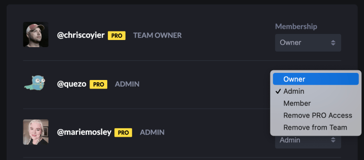
We’ve solved a lot of these pain points. A Team now can have multiple owners (the existing Team Owner can make anyone else already on the team an Owner). They can then step down as Owner or have another Owner remove that access.

All Team Owners have all-powerful access to the Team. But there is another new role…

New Role: Team Admins

Admin is brand new role for PRO Teams. Just like Owners, they can invite members and change the access of anyone (except Owners). This role is for people in your organization that need team administration access, but shouldn’t have access to things like billing history or the ability to outright shut down the team.

Owners & Admins Aren’t Required to Take Up a Team Seat

By default, everyone on the team is granted PRO-level access and features, but they don’t need to stay that way. If you have people that should be responsible for team ownership or admin, but aren’t really developers that need to use CodePen itself, you can choose the option to “Remove PRO Access”. If you do that to an Owner or Admin, they will still be a part of the Team and still have a CodePen account, but will not have any of the PRO features and will not take up a seat on the team.

Filtering

If you have a big team, we now make it easier to find people by adding a name filter as well as a filter for particular roles.

Context is Easier

This used to confuse the heck out of people, even ourselves sometimes. When you went into settings to do Team Management stuff, sometimes it looked like you just couldn’t. But it was because you were in your individual context rather than your Team context. If you switched over to Team context, then you could. We removed that restriction, and now you can manage and and all of your teams regardless of what context you happen to be in at the moment.

Also check out that UI/UX update for context switching. When you switch, your personal avatar remains, just smaller and inside the team avatar.

The post Team Management Improvements appeared first on CodePen Blog.

#313: Conflict

Featured Imgs 23

Being, ya know, human beings with thoughts and emotions trying to build something together, sometimes we clash. There are big clashes. Sometimes those end in drastic changes. We’ve done that. You might have noticed that we’re down to two co-founders actively at the company. There are tiny clashes too, like needing to tell someone when they’ve made a mistake. Medium clashes (this is not a real classification by the way, it’s just how it feels) are when multiple people feel pretty strongly about something and are not in alignment. It’s not much of a clash if one person is at a 3 and the other is at a 9 on the care-o-meter. When you’re both 10’s, it’s a clash of conflict. That happens to us sometimes (again, humans). The tricky part is that conflict resolution is never straightforward. If someone feels strongly that the direction should be A, another feels the direction should be B, sometimes the solution is C for compromise. But sometimes compromise weakens a vision, and resolution needs to be A or B so that the vision itself isn’t weakened.

Are we experts in this? Far from it. Have we thought about it a lot? Ages. Do we have a long way to go in getting better at this? Sure do. The fact that we all still have extremely different temperaments for conflict at all is part of what makes it hard.

Timestamps

  • 01:08 History of conflict at CodePen
  • 02:03 Founder conflict
  • 05:59 Meeting conflict
  • 11:51 Learning to deal with conflict
  • 18:20 Figuring out where the conflict actually is
  • 23:37 Sponsor: Netlify
  • 25:09 How we approached conflict now vs in the beginning
  • 34:47 Honesty in conflict

Sponsor: Netlify

It’s worth reading up on Netlify’s new concept of Distributed Persistent Rendering (DPR) and how that works with On-demand builders. It might just make your existing Jamstack builds way faster and better, or make possible the Jamstack for something you thought could never be.

The post #313: Conflict appeared first on CodePen Blog.

Exploring color-contrast() for the first time.

Category Image 091

I saw in the release notes for Safari Technical Preview 122 that it has support for a color-contrast() function in CSS. Safari is first out of the gate here. As far as I know, no other browser supports this yet and I have no idea when stable Safari will ship it, or if any other browser ever will. But! It’s a very good idea! Any native tool to get us to ship more accessible interfaces (of which color contrast is a part) is cool by me. So let’s attempt to get it to work.

Anybody can download Safari Technical Preview, so I did that.

I had to ask around about this, but just because this is a pre-release browser, it doesn’t mean all these features are active by default. Just as Chrome Canary has feature flags you have to turn on, so does Safari Technical Preview. So, I had to flip it on like this:

The release notes don’t have any information about how to actually use color-contrast(), but fortunately web searching turns up a spec (it’s part of Color Module 5), and MDN has a page for it with very basic syntax information.

This is how I understand it:

That example above is a little silly, because it will always return white — that has the most contrast with black. This function actually gets useful when one or more of those color values is dynamic, meaning very likely it is a CSS custom property.

The function returns a color, so the top use-case, I would guess, is going to be setting a color based on a dynamic background. So…

section {
  background: var(--bg);
  color: color-contrast(var(--bg), white, black);
}

Now we can toss any color at all at --bg and we’ll either get white or black text, depending on what has the most contrast:

That’s extremely cool, even in the most basic use case.

Here’s a demo from Dave where he’s not just setting the text color in the parent, but the color of links as well, and the links have a different set of colors to choose from. Play with the HSL sliders (in Safari Technology Preview, of course) to see it work.

Just picking two colors that have enough contrast is easy enough (although you’d be surprised how often it’s screwed up by even those of us with good intentions). But oh wow does it get complicated quick with different situations, let alone having a bunch of color variations, or god forbid, arbitrary combinations.

Here’s a video of me playing with Dave’s tester so you can see how the colors update at different places.


The post Exploring color-contrast() for the first time. appeared first on CSS-Tricks.

You can support CSS-Tricks by being an MVP Supporter.

Eliminating five top compatibility pain points on the web

Category Image 052

Robert Nyman and Philip Jägenstedt:

Google is working with other browser vendors and industry partners to fix the top five browser compatibility pain points for web developers. The areas of focus are CSS Flexbox, CSS Grid, position: stickyaspect-ratio, and CSS transforms.

[…] The goal in 2021 is to eliminate browser compatibility problems in five key focus areas so developers can confidently build on them as reliable foundations.

I’d say slow clap, but I don’t want to sound sarcastic. Full on, regular clapping.

Ten, fifteen years ago, the job of a web designer and developer was heavily thinking about, planning for, and dealing with cross-browser compatibility. These days, it’s still a thing, but it’s not about dealing with bugs, quirks, and frustrating implementation differences like it was then. It’s more edge-case stuff with more obvious work-arounds. And when we’re thinking about the browser and device landscape, we’re doing it through the lens of meeting our users where they are and embracing that landscape. Doing our best, anyway.

If the powers that be can keep chipping away at compatibility problems, that further cements the web as the correct place to build.

I vote for some kind of proper stab at reliable viewport units in 2022, that somehow sensibly handle scrollbars and other browser chrome.

Direct Link to ArticlePermalink


The post Eliminating five top compatibility pain points on the web appeared first on CSS-Tricks.

You can support CSS-Tricks by being an MVP Supporter.

Text That Sometimes Turns to Emojis

Category Image 091

There are some Unicode characters that some browsers just decide they are going to turn into emojis for you. I couldn’t tell you why exactly, but here’s what I see:

Chrome on the left. Safari in the simulator on top and to the right.

Those text Unicode characters (▶, ↩, and, ❤) show up as text in Chrome, then iOS Safari turns them into emojis. Notice how when they are text, I have the ability to change their color, but not when they are turned to emoji.

Those characters above might turn into emojis for you also. They look like text in my WordPress editor. Shrug.

This came up for me because I was helping someone with their website and they didn’t like the “red diamonds” that were showing up. I didn’t seen them as red until I looked on my phone.

︎︎The “Text Presentation Selector”

A couple of people pointed out to me that if you use this (︎︎&#xFE0E;) before the character it will “request it to be rendered as text.” Here’s the spec on that. I couldn’t get it to work though. Here’s my test:

What I see on iOS:

I read in some sporatic threads that font-family: monospace would also prevent the emoji conversion, but that didn’t work for me either.

Let it be an emoji, but force the color anyway.

If you can select the element, even if the characters go emoji, you could force them to a color. Here’s an example from Andrew Walpolea:

Preethi Sam blogged that you can also use text-shadow to do the same:

The problem in my case was that there was no selector to use! The diamonds I was having trouble with were on hundreds of random posts in the database.

Screw it

I just gave up and ran a MySQL search/replace on the whole database (via Better Search Replace) to get rid of them.

Matias Singers has more on this in “Unicode symbol as text or emoji.”


The post Text That Sometimes Turns to Emojis appeared first on CSS-Tricks.

You can support CSS-Tricks by being an MVP Supporter.
#312: What is CodePen?

Category Image 052

This isn’t actually a podcast actually talking about what CodePen is. Well, it kinda is. But actually it’s Stephen and Chris talking about and planning for what they would say if they only had five minutes (or so) to explain what CodePen is. So we need to hash out what the most important things are, what to lede with, and how to cover all the most vital things with clarity in such a short amount of time. We’ll have to get around to actually trying to shoot a video like this soon!

Timestamps

  • 00:49 How might we explain CodePen on YouTube
  • 06:48 Who’s the audience for our video?
  • 09:10 Sponsor: Jetpack Boost
  • 11:44 What do we need people to know what CodePen is?
  • 14:04 It’s an online editor for what?
  • 17:34 Social is a huge part of CodePen
  • 24:27 What’s our success metric?

Sponsor: Jetpack Boost

Jetpack Boost is a brand spankin’ new plugin from the Jetpack / Automattic gang. Jetpack has some very powerful performance features it offers, like giving you a global CDN for your images and core-WordPress-specific CSS and JavaScript. That particular feature is still a part of the Jetpack core plugin, but many performance-specific features are moving their way over to Jetpack Boost. Like Lazy Image loading (a huge performance win) is now in Jetpack Boost and you can turn it on with the flip of a switch. The most amazing, and brand new, feature of Jetpack Boost is that it does Critical CSS handling for you, which is also a big performance win and very difficult to do by hand.

The post #312: What is CodePen? appeared first on CodePen Blog.

How to Improve CSS Performance

Featured Imgs 25

There is no doubt that CSS plays a huge role in web performance. Milica Mihajlija puts a point on exactly why:

When there is CSS available for a page, whether it’s inline or an external stylesheet, the browser delays rendering until the CSS is parsed. This is because pages without CSS are often unusable.

The browser has to wait until the CSS is both downloaded and parsed to show us that first rendering of the page, otherwise browsing the web would be a terribly visually jerky to browse. We’d probably write JavaScript to delay page rendering on purpose if that’s how the native web worked.

So how do you improve it? The classics like caching, minification, and compression help. But also, shipping less of it, and only loading the bit you need and the rest after the first render.

It’s entirely about how and how much CSS you load, and has very little to do with the contents of the the CSS.

Direct Link to ArticlePermalink


The post How to Improve CSS Performance appeared first on CSS-Tricks.

You can support CSS-Tricks by being an MVP Supporter.

Not Your Typical Horizontal Rules

Category Image 052

The default browser style for <hr> is so weird. It’s basically:

border-style: inset;
border-width: 1px;

The default border-color is black, but the border doesn’t actually look black, because the inset border “adds a split tone to the line that makes the element appear slightly depressed.”

If I kick up the border-width to 40px you can see it more clearly:

I often reset an <hr> to be “just a line” and it always gets me because I’ll try something, like height: 1px with a background at first, but that’s not right. The easier way to clear it is to turn off all the borders then only use border-top or border-bottom. Or, turn off all the borders, set a height, and use a background.

Annnyway… Sara has some of the nicest horizontal rules in town on the current design of her site, and she’s written it all up. Guess what? They aren’t even <hr> elements! It turns out the only styling hook you have is CSS, which wasn’t as adaptive as Sara needed, so she ended up with a <div role="separator"> (TIL!) and inline SVG.

The best way to get the full flexibility of an SVG is by inlining it. But the <hr> element is content-less — it has no opening and closing tags within which you can place other elements.

The only way to work around the limitations of <hr> while preserving semantics for screen reader users is to use a div and provide the semantics of an hr using ARIA.

Direct Link to ArticlePermalink


The post Not Your Typical Horizontal Rules appeared first on CSS-Tricks.

You can support CSS-Tricks by being an MVP Supporter.

Building a Settings Component

Category Image 052

This is a tremendous CSS-focused tutorial from Adam Argyle. I really like the “just for gap” concept here. Grid is extremely powerful, but you don’t have to use all its abilities every time you reach for it. Here, Adam reaches for it for very light reasons like using it as an in-between border alternative as well as more generic spacing. I guess he’s putting money where his mouth is in terms of gap superseding margin!

I also really like calling out Una Kravet’s awesome name for flexible grids: RAM. Perhaps you’ve seen the flexible-number-of-columns trick with CSS grid? The bonus trick here (which I first saw from Evan Minto) is to use min(). That way, not only are large layouts covered, but even the very smallest layouts have no hard-coded minimum (like if 100% is smaller than 10ch here):

.el {
  display: grid;
  grid-template-columns: repeat(auto-fit, minmax(min(10ch, 100%), 35ch));
}

There is a ton more trickery in the blog post. The “color pops” with :focus-within is fun and clever. So much practical CSS in building something so practical! 🧡 more blog posts like this, please. Fortunately, we don’t have to wait, as Adam has other component-focused posts like this one on Tabs and this one on Sidenav.

Direct Link to ArticlePermalink


The post Building a Settings Component appeared first on CSS-Tricks.

You can support CSS-Tricks by being an MVP Supporter.

CSS Is, In Fact, Awesome

Featured Imgs 23

You’ve seen the iconic image. Perhaps some of what makes that image so iconic is that people see what they want to see in it. If you see it as a critique of CSS being silly, weird, or confusing, you can see that in the image. If you see it as CSS being powerful and flexible, you’ve got that too. That’s what Jim Neilsen is saying here, reacting to a presentation by Hidde de Vries:

This is the power of CSS. It gives you options. Use them or don’t.

Want it to overflow visibly? It can. Want it to lop off overflowing content? It can. Want it to stretch? It can. Want it to ellipse? It can. Want it to wrap or not wrap? It can. Want to scale the type to fit? It can. If you love CSS, this is probably exactly why.

Mandy Michael has a great thread on this from a few years back:

Brandon Smith wrote about all this a few years back as well. I remain chuffed that Eric Meyer asked the original creator of the image, Steve Frank of Panic, about it and Steve once stopped by to explain the real origin:

It was 2009 and I’d spent what seemed like hours trying to do something in CSS that I already knew I could do in seconds with tables. I was trying really hard to do it with CSS because that’s what you’re supposed to do, but I just wasn’t very good at it (spoiler alert: I’m still not very good at it).

I do have a slightly better grasp on the concept of overflow now, but at the time it just blew my mind that someone thought the default behavior should be to just have the text honk right out of the box, instead of just making the box bigger like my nice, sensible tables had always done.

Anyway, I just had this moment of pure frustration and, instead of solving the problem properly, I spent 5 minutes creating a snarky mug and went back to using tables. Because that’s my signature move in times of crisis.

So, the original is indeed born out of frustration, but has nonetheless inspired many love letters to CSS. It has also certainly earned its place in CSS infamy, right alongside Peter Griffin struggling with window blinds, as one of the most iconic CSS images ever.

Direct Link to ArticlePermalink


The post CSS Is, In Fact, Awesome appeared first on CSS-Tricks.

You can support CSS-Tricks by being an MVP Supporter.

#310: Front-End Monorepo

Featured Imgs 23

We talked about our transition to a monorepo back in episode 305. This move has all sorts of advantages for us, like the simplicity of having a single repo to pull and be up to date with and linting/formatting code in a consistent way across the entire code base of CodePen.

This time we’ll get into more of the repercussions of the monorepo from a front-end perspective. For example, since a bit part of the point of the monorepo is sharing code across areas of the site, it made sense to yoink out things that are intentionally sharable into top-level folders. For example, we pulled out our component library that way, then had to figure out how best to consume those components across different areas (e.g. how Next.js consumes those components is different than how our Rails app does. We also pulled out things like common utilities, icons, and shared styles, each of them having their own little journey on getting to work just how we wanted them to.

Timestamps

  • 00:30 More Monorepo
  • 01:46 Benefits of monorepo
  • 04:48 Choices we made about the CodePen code
  • 07:06 Problems with combining packages
  • 09:45 What about Next?
  • 15:48 Sponsor: Jetpack
  • 18:04 CP Library of components
  • 23:00 Sharing global styles
  • 27:52 Icon library

Sponsor: Jetpack

Jetpack is celebrating it’s 10th year! Jetpack does a lot, from major search improvements, full site backup, social media integration, speed boosts, and security measures. Take a look at some of those statistics on their landing page. They are really helping WordPress site owners make their sites better and the web writ large.

The post #310: Front-End Monorepo appeared first on CodePen Blog.