Overlay Fact Sheet

Category Image 052

I would hope all our web designer/developer spidey senses trigger when the solution to an accessibility problem isn’t “fix the issue” but rather “add extra stuff to the page.” This Overlay Fact Sheet website explains that. An “Overlay” is one of those “add extra stuff to the page” things, ostensibly for improving accessibility. Except, even though marketing may suggest they are a silver bullet to accessibility, they are… not.

The site does a much better job laying that out than I can, so go check it out. As I write, it’s signed by 352 people, mostly people who are accessibility professionals.

Direct Link to ArticlePermalink


The post Overlay Fact Sheet appeared first on CSS-Tricks.

You can support CSS-Tricks by being an MVP Supporter.

How to describe element’s natural sizing behavior

Category Image 052

PPK:

When introducing width and height I explain that by default width takes as much horizontal space as it can, while height takes as little vertical space as possible. This leads to a discussion of these two opposed models that I excerpt below.

My question is: which names do I give to these models?

The three options:

  • inside-out and outside-in
  • context-based and content-based
  • extrinsic and intrinsic size

There is more context in the post.

I definitely don’t like inside-out and outside-in — they make my head spin. I think I’m gonna vote for extrinsic and intrinsic size. I hear those terms thrown around a lot more lately and the fact that they match the specs is something I like. At the same time, I do feel like context-based and content-based are maybe a smidge more clear, but since they are already abstracted and made up, might as well go with the abstracted and made up term that already has legs.


The post How to describe element’s natural sizing behavior appeared first on CSS-Tricks.

You can support CSS-Tricks by being an MVP Supporter.

Maps Scroll Wheel Fix

Category Image 052

This blog post by Steve Fenton came across my feeds the other day. I’d never heard of HERE maps before, but apparently they are embeddable somehow, like Google Maps. The problem is that you zoom and and out of HERE maps with the scrollwheel. So imagine you’re scrolling down a page, your cursor (or finger) ends up on the HERE map, and now you can’t continue scrolling down the page because that scrolling event is captured by the map and turns into map zooming.

Steve’s solution: put a “coverer” <div> over the map when a scroll event starts on the window, and remove it after a short delay (when scrolling “stops”). That solution resonates with me, as not only have I coded solutions like that in the past for embedded maps, we have a solution like that in place on CodePen today. On CodePen, you can resize the “preview” window, which is an <iframe> of the code you write. If you drag too swiftly, your mouse cursor (or touch event) might trigger movement off of the draggable element, possible onto the <iframe> itself. If that happens, the <iframe> will swallow the event, and the resizing you are trying to do stops working correctly. To prevent this, we put a “covered” <div> over top the <iframe> while you are dragging, and remove it when you stop dragging.

Thinking of maps though, it reminds me Brad Frost’s Adaptive Maps idea documented back in 2012. The idea is that embedding a map on a small screen mobile device just isn’t a good idea. Space is cramped, they can slow down page load, and, like Steve experienced nearly a decade later, they can mess with users scrolling through the page. Brads solution is to serve an image of a map (which can still be API-driven) conditionally for small screens with a “View Map” link that takes them to a full-screen map experience, probably within the map native app itself. Large screens can still have the interactive map, although, I might argue that having the image-that-links-to-map-service might be a smart pattern for any browser with less technical debt.


The post Maps Scroll Wheel Fix appeared first on CSS-Tricks.

You can support CSS-Tricks by being an MVP Supporter.

Two New Editor Fonts from Toshi Omagari

Featured Imgs 23

Toshi Omagari makes fonts. I caught wind of the Codelia release just recently:

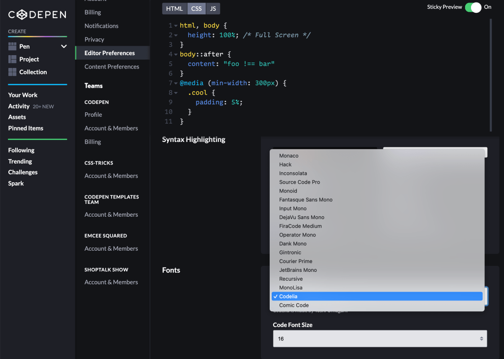
Fortunately, Toshi allowed us to purchase a license to allow you to use it on CodePen! You’ll find those options in your Settings > Editor area.

Codelia

I think Codelia is awfully nice, but in chatting with Toshi, their favorite is actually Comic Code, another coding font they have created.

Comic Code

I was like: No way, surely Comic Code is to jokey and childish to actually code in. But I’ll tell ya, I’ve been using it for about a week now and I’m still finding it fun and perfectly usable.

Looks good eh? Toshi thinks so:

The post Two New Editor Fonts from Toshi Omagari appeared first on CodePen Blog.

Add/Change Address on Receipts

Featured Imgs 23

We don’t ask for your address when you sign up for CodePen PRO. We don’t need it, as we don’t need to send you anything and we don’t really adjust anything based on your location. But it’s entirely understandable that you might want your address on a receipt of purchase. We get that request all the time. Now, rather than any sort of work-around, we allow you to enter an address that we’ll use for putting on those reciepts.

In your Settings > Billing, you’ll find an “Update Address” button.

Now when you open a receipt for any past charge (available always at Settings > Billing), that address will be there:

Note in the screenshot above I’ve clicked into the address area. That area is always editable, so you can manipulate one-off invoices before printing or saving as PDF, as needed.

Need to add a VAT?

Feel free to use one of the address lines for that, like Address 2 or Country. All these fields do is just output onto the receipt, so you can use them for whatever you need.

The post Add/Change Address on Receipts appeared first on CodePen Blog.

Analyze HTML Now Chill About Tabs

Featured Imgs 23

We use a linter called HTMLHint for our “Analyze HTML” feature. So that tool is what gives us the errors you might see when using that feature:

There is a particular rule in HTMLHint named space-tab-mixed-disabled, the purpose of which is to warn you when you are using inconsistent indentation. Like you are allowed to use spaces, or tabs, but not both, which is a good practice for clean code. We had that misconfigured where it wanted only spaces, so if you preferred tabs and set up your editor to use tabs (completely fine, of course), the Analyze HTML feature would bark at you about that. Now if you use tabs, and do so consistently, Analyze HTML will be chill about it.

The post Analyze HTML Now Chill About Tabs appeared first on CodePen Blog.

How to Animate the Details Element

Category Image 091

Here’s a nice simple demo from Moritz Gießmann on animating the triangle of a <details> element, which is the affordance that tells people this thing can be opened. Animating it, then is another kind of affordance that tells people this thing is opening now.

The tricks?

  1. Turn off the default triangle: details summary::-webkit-details-marker { display:none; }. You can’t animate that one.
  2. Make a replacement triangle with the CSS border trick and a pseudo element.
  3. Animate the new triangle when the state is open: details[open] > summary::before { transform: rotate(90deg); }.

This only animates the triangle. The content inside still “snaps” open. Wanna smooth things out? Louis Hoebregts’ “How to Animate the Details Element Using WAAPI” covers that.

Here’s a fork where I’ll combine them just because:

I see Moritz put the cursor: pointer; on the summary as well like Greg Gibson suggests.


The post How to Animate the Details Element appeared first on CSS-Tricks.

You can support CSS-Tricks by being an MVP Supporter.

Code Folding of Sass

Category Image 052

The .sass variant of Sass isn’t nearly as popular as SCSS. If I had to guess, it would be because SCSS is totally compatible with CSS in that any valid CSS file is a valid SCSS file, which makes SCSS easier to transition to both in terms of coding and the mental shift.

But anyway, the .sass variant is still kinda cool. It doesn’t use curly braces ({}) or semicolons (;) so it can be a little easier on the eyes, perhaps. It uses “white space” indentation, so like:

body
  background: red 
  margin: 1rem

What’s new around here is that you can now code fold that on CodePen, which never used to work. Here it is in action:

Hopefully this is useful to all y’all that like the .sass syntax.

The post Code Folding of Sass appeared first on CodePen Blog.

Privacy Toggle in Context Menu

Category Image 052

It used to be that in order to change a Pen, Project, or Collection from public to private (or vise versa), you had to open it directly and edit it there. Now, you can make that change from anywhere you see them in grid, be it in the Your Work section, your profile, or anywhere else you see something you own.

If you have a bunch of things you need to toggle, this should be much faster, particularly in list view.

Privacy is a PRO feature, so if you aren’t PRO, you’ll see a message like this:

The post Privacy Toggle in Context Menu appeared first on CodePen Blog.

CSS Border Font

Featured Imgs 23

Every letter in this “font” by Davor Suljic is a single div and drawn only with border. That means employing some trickery like border-radius with exotic syntax like border-radius: 100% 100% 0 0 / 37.5% 37.5% 0 0; which rounds just the top of an element with a certain chillness that works here. Plus, using pseudo-elements. I love all the wacky variations with colors, shadows, and border styles, leaning into the limits of CSS.

Drawing things with CSS has long fascinated people. Icons are a popular choice (famously, Nicolas Gallagher’s Pure CSS GUI icons from 2010), since we can draw so many shapes with CSS without even needing to lean on the all-powerful clip-path.

But as Lynn Fisher has taught us, a single div is barely a limitation at all.

Direct Link to ArticlePermalink


The post CSS Border Font appeared first on CSS-Tricks.

You can support CSS-Tricks by being an MVP Supporter.

Hiding Content Responsibly

Featured Imgs 25

We’ve covered the idea of hiding things in CSS many times here, the most recent post being Marko Ilic’s “Comparing Various Ways to Hide Things in CSS” which did a nice job of comparing different techniques which you’d use in different situations. Hugo “Kitty” Giraudel has done something similar in “Hiding Content Responsibly” which looks at 10 methods—and even those, you could say, aren’t totally comprehensive.

Does this mean CSS is messy and incomprehensible? Nah. I feel like all the methods are logical, have good use cases, and result in good outcomes. Allow me to do a have a pretend conversation walking through my thought process here.

I need to hide this thing completely. For everyone.

No problem, use display: none;.

I need to hide this thing, but only hide it for screen readers, not visually. (For example, an icon that has no additional meaning for screen readers, as there is an accessible label nearby.)

No problem, that’s what the aria-hidden attribute is for.

I need to hide this thing, but only visually, not for screen readers. (For example, the contents of non-active tabs.)

No problem, use a .sr-only class. That leaves it accessible but hides it visually until you remove that class.

Oops, I actually want to hide this thing visually, but I still want it to take up physical space, not collapse. (For example, say a button has a loading spinner icon that is only needed when performing an action. The size of the button should factor in the size of that icon all the time, not just when the spinner is visible. That way, there’s no layout shifting when that icon comes and goes.)

No problem, use transform: scale(0) which will visually collapse it, but the original space will remain, and will leave it accessible to screen readers.

Oh nice, I could transition the transform, too, I suppose. But actually, that transition doesn’t fit my site well. I just want something I can fade out and fade in.

The opacity property is transitional, so transition that between 0 and 1 for fades. The good news is that visibility is also transitional. When fading out, use visibility: hidden, and when fading in, use visibility: visible to hide and unhide the thing from screen readers.


That’s not entirely comprehensive, but I find that covers 95% of hiding cases.


The post Hiding Content Responsibly appeared first on CSS-Tricks.

You can support CSS-Tricks by being an MVP Supporter.

Recipe websites, data modeling, and user experience

Category Image 052

Simeon Griggs with some nice UX ideas for a recipe website:

  • No math. Swap between units and adjust servings on-the-fly.
  • Offer alternative ingredients.
  • Re-list the ingredient amounts when they’re referenced in the instructions.

I totally agree, especially on that last one:

Of all our improvements I think this is my favourite.

A typical recipe layout contains ingredients with amounts at the start. Then, a bullet point list of instructions to perform the method.

The method though typically does not reference those amounts again, so if you don’t prepare all your amounts ahead of time (which is what you’re probably supposed to do but come on who does that) you’ll have to keep scanning back and forward.

Part of what makes this stuff possible is how you set up the data model. For example, an ingredient might be an Array instead of a String so that you’re set up for offering alternatives right out of the gate.

Direct Link to ArticlePermalink


The post Recipe websites, data modeling, and user experience appeared first on CSS-Tricks.

You can support CSS-Tricks by being an MVP Supporter.

Barebones CSS for Fluid Images

Featured Imgs 23

Zach takes a look at some fundamental HTML+CSS usage for fluid, responsive images. Most of it, I’d say, is what you’d expect, but things get weird when srcset gets involved.

I poked my way through, and in addition to the weird thing Zach noted, wanted to add one more thing. Let’s start like this:

<img src="./img.jpg" alt="" />

With no other CSS involved, this renders at the “intrinsic size” of the image. Say the original image is 400px wide, it renders 400px wide.

We should be putting width and height attributes on images, because it allows the browser to make space for them even before they are downloaded (even when they are fluid, which is super cool). So:

<img src="./img.jpg" alt="" width="400" height="300" />

Also nothing terribly weird there. Even if we slap max-width: 100% in the CSS, that’ll do what we want: preserving space, behave fluidly, and not growing bigger than it should.

But let’s hold off on the max-width: 100% thing for a second. If we just use srcset and set up multiple sources.

<img src="./img.jpg" alt=""
     srcset="./img-200.jpg 200w, ./img-400.jpg 400w" />

BAM, we blow out the width of the thing.

That won’t render at 200px or 400px—it’ll actually render at 100vw, believe it or not. I think that’s because that’s the default sizes value. I normally think of the sizes attribute as not information about anything to do with actual layout, but just information for the browser to choose a source. But that’s not true here. It really does effect layout (in all browsers I tested). Here’s proof:

See the little one below it where all I change is the sizes.

Anyway that’s not what Zach honed in on, but it’s similar. Let’s put back the responsible thing and add in width and height attributes.

<img src="./img.jpg" alt="" width="200" height="137"
     srcset="./img-200.jpg 200w, ./img-400.jpg 200w" />

No more blowout (with or without sizes) but now we have a new weird problem. This is basically like saying max-width: 200px. Even though we have sources that are wider than 200px, we’ve capped the width at 200px. Zach puts it like:

Using max-width: 100% constrains the image to the container, but be careful when you use this with srcset—it may cap smaller than you want when using [width]! Pair with width: auto to fix this.

Zach’s final snippet is this, which I think reigns in all the weirdness:

img {
  max-width: 100%;
}
img[width] {
  width: auto; /* Defer to max-width */
}
img[width][height] {
  height: auto; /* Preserve Aspect ratio */
}

/* Let SVG scale without boundaries */
img[src$=".svg"] {
  width: 100%;
  height: auto;
  max-width: none;
}

Direct Link to ArticlePermalink


The post Barebones CSS for Fluid Images appeared first on CSS-Tricks.

You can support CSS-Tricks by being an MVP Supporter.

You want…

Category Image 052

I’ve been enjoying these little “You want…” style posts. Post titles like that are a little more… forceful for my normal taste, but I like the spirit of sharing a best practice that perhaps isn’t well-known-enough.

Got an idea along these lines? You should blog it! Here or elsewhere.


The post You want… appeared first on CSS-Tricks.

You can support CSS-Tricks by being an MVP Supporter.

Maximally optimizing image loading for the web in 2021

Featured Imgs 25

Malte Ubl’s list for:

8 image loading optimization techniques to minimize both the bandwidth used for loading images on the web and the CPU usage for image display.

  1. Fluid width images in CSS, not forgetting the height and width attributes in HTML so you get proper aspect-ratio on first render.
  2. Use content-visibility: auto;
  3. Send AVIF when you can.
  4. Use responsive images syntax.
  5. Set far-out expires headers on images and have a cache-busting strategy (like changing the file name).
  6. Use loading="lazy"
  7. Use decoding="async"
  8. Use inline CSS/SVG for a blurry placeholder.

Apparently, there is but one tool that does it all: eleventy-high-performance-blog.

My thoughts:

  • If you are lazy loading, do you really need to do the content-visibilty thing also? They seem very related.
  • Serving AVIF is usually good, but it seems less cut-and-dry than WebP was. You need to make sure your AVIF version is both better and smaller, which feels like a manual process right now.
  • The decoding thing seems weird. I’ll totally use it if it’s a free perf win, but if it’s always a good idea, shouldn’t the browser just always do it?
  • I’m not super convinced blurry placeholders are in the same category of necessary as the rest of this stuff. Feels like a trend.

Direct Link to ArticlePermalink


The post Maximally optimizing image loading for the web in 2021 appeared first on CSS-Tricks.

You can support CSS-Tricks by being an MVP Supporter.

Some Typography Blog Posts I’ve Bookmarked and Read Lately

Typography Definitions Cover
  • Font-size: An Unexpectedly Complex CSS Property — From Manish Goregaokar in 2017. Of many oddities, I found the one where font: medium monospace renders at 13px where font: medium sans-serif renders at 16px particularly weird.
  • The good line-height — Since CSS supports unitless line-height, you probably shouldn’t be setting a hard number anyway.
  • Time to Say Goodbye to Google Fonts — Simon Wicki doesn’t mean don’t use them, they mean self-host them. Browsers are starting to isolate cache on a per-domain basis so that old argument that you buy speed because “users probably already have it cached” doesn’t hold up. I expected to hear about stuff like having more control over font loading, but this is just about the cache.
  • My Favorite Typefaces of 2020 — John Boardley’s picks for the past year. Have you seen these “color fonts”? They are so cool. Check out LiebeHeide, it looks like real pen-on-paper.
  • How to avoid layout shifts caused by web fonts — We’ve got CLS (Cumulative Layout Shift) now and it’s such an important performance metric that will soon start affecting SEO. And because we have CSS control over font loading via font-display, that means if we set things up such that font loading shifts the page, that’s bad. I like Simon Hearne’s suggestion that we tweak both our custom font and fallback font to match perfectly. I think perfect fallback fonts are one of the best CSS tricks.
  • How to pick a Typeface for User Interface and App Design? — Oliver Schöndorfer makes the case for “functional text” which is everything that isn’t body text (e.g. paragraphs of text) or display text (e.g. headers). “Clarity is key.”


The post Some Typography Blog Posts I’ve Bookmarked and Read Lately appeared first on CSS-Tricks.

You can support CSS-Tricks by being an MVP Supporter.