My design career began in 2008. The first book that I read on the topic of design was Photoshop Tips And Tricks by Scott Kelby, which was a book about a very popular design tool, but not about user experience (UX) design itself. Back at the time, I didn’t know many of the approaches and techniques that even junior designers know today because they weren’t invented yet, and also because I was just beginning my learning journey and finding my way in UX design. But now I have diverse experience; I’m myself hiring designers for my team, and I know much more.
In my two-part series of articles, I’ll try to share with you what I wish I knew if I was starting my career today.
“If you want to go somewhere, it is best to find someone who has already been there.”
— Robert Kiyosaki
The two-part series contains four sections, each roughly covering one key stage in your beginner career:
- Master Your Design Tools
- Work on Your Portfolio
- Preparing for Your First Interviews: Getting a First Job
- In Your New Junior UX Job: On the Way to Grow
I’ll cover the first three topics in this first article and the fourth one in the second article. In addition, I will include very detailed Further Reading sections at the end of each part.
When you’re about to start learning, every day, you will receive new pieces of evidence of how many things you don’t know yet. You will see people who have been doing this for years and you will doubt whether you can do this, too. But there is a nuance I want to highlight: first, take a look at the following screenshot:
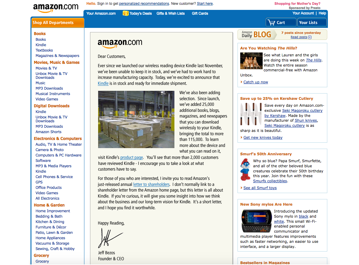
This is the Amazon website in 2008 when I was about to start my design career and received my first paycheck as a beginner designer.
And this is how Amazon looked like even earlier, in 2002:
 Source: versionmuseum.com. (Large preview)
In 2002, Amazon made 3.93 billion US dollars in profits. I dare say they could have hired the very best designers at the time. So today, when you speak to a designer with twenty years of experience and think, “Oh, this designer must be on a very high level now, a true master of his craft,” remind yourself about the state of UX design that existed when the designer’s career was about to start, sometime in the early 2000s!
A lot of the knowledge that I have learned and that is over five years old is outdated now, and the learning complexity only increases every year.
It doesn’t matter how many years you have been in this profession; what matters are the challenges you met in the last few years and the lessons you’ve learned from them.
Are you a beginner or an aspiring user interface/user experience designer? Don’t be afraid to go through all the steps in your UX design journey. Patience and a good plan will let you become a good designer faster than you think.
“The best time to start was yesterday. The next best time is now.”
— H. Jackson Brown, Jr.
This was the more philosophical part of my writing, where I wanted to help you become better motivated. Now, let’s continue with the more practical things and advice!
Getting Started: Master Your Design ToolsWhen I was just beginning to learn, most of us did our design work in Adobe Photoshop.
In Photoshop, there were no components, styles, design libraries, auto layouts, and so on. Every screen was in another PSD file, and even making rounded corners on a rectangle object was a difficult task. Files were “heavy,” and sometimes I needed to wait thirty or more seconds to open a file and check what screen was inside while changing a button’s name or label in twenty separate PSD files (each containing only one design screen, remember?) could take up to an hour, depending on the power of your computer.
There were many digital design tools at the time, including Fireworks — which some professionals considered superior to Photoshop, and for quite a few reasons — but this is not the main point of my story. One way or another, Photoshop back then became very popular among designers and we all absolutely had to have it in our toolset, no matter what other tools we also needed and used.
Now computers are much faster, and our design tools have evolved quite a bit, too. For example, I can apply multiple changes to multiple design screens in just a few seconds by using Figma components and a proper structure of the design file, I can design/prototype responsive designs by using auto-layout, and more.
In one word, knowing your design tool can be a real “superpower” for junior UX designers — a power that beginners often ignore. When you know your tool inside-out, you’ll spend less time on the design routine and you’ll have more time for learning new things.
Master your tool(s) of choice (be it Figma Design or Illustrator, Sketch, Affinity Designer, Canva, Framer, and so on) in the most efficient way, and free up to a couple of extra hours every day for reading, doing tutorials, or taking longer breaks.
Learn all the key features and options, and discover and remember the most important hotkeys so you’ll be working without the need to constantly reach for your mouse and navigate the “web” of menus and sub-menus. It’s no secret that we, designers, mostly learn through doing practical tasks. So, imagine how much time it would save you within a few years of your career!
Also, it’s your chance: developers are rolling out new features for beginner designers and pro designers simultaneously, but junior designers usually have more time to learn those updates! So, be faster and get your advantage!
Getting Started: Work On Your PortfolioYou need to admit it: your portfolio (or, to put it more precisely, the lack of it) will be the main pain point at the start.
You may hear sometimes statements such as: “We understand that being a junior designer is not about having a portfolio...” But the fact is that we all would like to see some results of your work, even if it is your very early work on a few design projects or concepts. Remember, if you have something to show, this would always be a considerable advantage!
I have heard from some juniors that they don’t want to invest time in their portfolio because this work is not payable and it’s time-consuming. But sitting and waiting and getting rejected again and again is also time-consuming. And spending a few of your first career years in the wrong company is also time-consuming (and disappointing, too). So my advice is to spend some time in advance on showcasing your work and then get much better results in the near future.
In case you need some extra motivation, here is a quote from Muhammad Ali, regarded as one of the most significant sports figures of the 20th century:
“I hated every minute of training, but I said to myself, ‘Do not quit. Suffer now and live the rest of your life as a champion.’”
— Muhammad Ali
Ready to fire but have no idea where to start? Here are a few options:
- Find a popular product with a rather difficult-to-use or not very elegant interface and research what the users of this product are complaining about the most. Then, as an exercise, design a few interface screens for this product, with their core features explained, publish them on social media, and tag that company. (This approach may not always work, but it’s worth a try.)
- Sign up for and actively participate in hackathons. As a result, it’s possible that you may get not just a few screens redesigned in Figma but a real working product you can show (and be proud of). Also, you can meet nice people there who may recommend you if you apply for a job at one of the companies they work for.
- Complete UXchallenge challenges and present how you solved them on LinkedIn.
Note: You’re not limited to LinkedIn, of course; you can also use Instagram, Facebook, Behance, Dribbble, and so on. But keep in mind that many recruiters prefer LinkedIn. - Pick up a website that you use often and check whether it meets the “Ten Usability Heuristics for User Interface Design.” Create a detailed report that lists everything that can be (re)designed better. Publish the report on LinkedIn and also send it to the company that made this website. Don’t forget to tell them why you did that report for their website specifically and that you’re learning UX design, practicing, and actively looking for a job.
- Visit some popular developer conferences where you would be one of the only designers attending. Talk to people and propose your help for their startups. Who knows, you may become the co-creator of some future cool startup!
- Choose an area where digitalization hasn’t propagated yet and create a design concept using very modern technologies. For instance, people have been growing plants for thousands of years, but data analysis and visualization dramatically changed the efficiency of that process only lately. The agricultural industry has undergone a remarkable transformation thanks to UX design — a crucial element in ensuring that agricultural applications are not just functional but also intuitive and user-friendly. From precision farming to crop monitoring systems, digital tools have revolutionized the way farmers manage their operations.
Note: You can check the following article for details: “The Evolution of UX Design in Agricultural Applications.”
Don’t wait until someone hands you your chance on a “silver platter.” There are many projects that need the designer’s hands and help but can’t get such help yet. Assist them and then show the results of your work in your first portfolio. It gives you a huge advantage over other candidates who haven’t worked on their portfolios yet!
Preparing For Your First Interviews: Getting A First JobFrom what I’ve heard, getting the first job is the biggest problem for a junior designer, so I will focus on this part in more detail.
Applying For A Job
To reach the goal, you should formulate it correctly. It’s already formulated in this case, but most candidates understand it wrong. The right goal here is to be invited to an interview — not to get an offer right now or tell everything about your life in the CV document. You just need to break through the first level of filtering.
Note: Some of these tips are for absolute beginners. Do they sound too obvious to you? Apologies if so. However, all of them are based on my personal experience, so I think there are no tips that I should omit.
- Send your CV and motivational letter (if required in the job description) from the correct email address. It’s always strange to receive a job application from an email such as ‘sad.batman2006@gmail.com’. Seniors are always responsible for the tasks that junior designers complete, and we want to know that you are a seriously-minded and responsible person to help us do our work. Small details, such as the email address you would use to get in touch, do matter.
- Use your real name. I’ve had cases where people have used different names in their emails and CVs. I think it’s too obvious why this will look very strange, so I won’t spend time describing it in detail.
- Skill representations. Use the well-accepted standards. I have seen some CVs created with the help of services such as CV Maker where skills (level of English, how well you know Figma, Illustrator, and other design tools, and so on) were represented as loaders or diagrams. But there are existing standards, so use them in order to be understood better. For instance, if you describe your level of English knowledge, use the CEFR levels (A1/A2, B1/B2, C1/C2). Don’t make people interpret a diagram instead.
- Check/proofread the text in your email, CV, and portfolio. We expect that you may not know everything about design, but spelling errors don’t demonstrate exactly your desire to learn and your attention to detail. You can use Grammarly or ChatGPT to check your text, but you should not try to substitute your thoughts with some AI-“generated” ideas. Also, make sure to structure well the content of your CV and to format it properly.
- Read the job description carefully, find matches with your skills, and reflect these in the CV. Recruiters cannot review all the CVs thoroughly. Remember, the goal is to break through the first level of filtering — the recruiter is not a designer and can’t evaluate you and your skills. However, the recruiter can decide whether your CV is relevant to the job description, so it’s very important to tweak the CV by making sure you mention all the skills that you possess and that match the ones found in the specific job description.
- Don’t count solely on the job application form posted on the company’s website. There were cases when I had no reply after filling out and submitting the official application form but then got an offer after trying to reach a recruiter from that company directly on LinkedIn or via some other available communication channel. So don’t be shy to get in touch directly.
- Avoid using PDF documents for portfolios or anything else that people need to download before opening. The more time it takes to open and review your portfolio, the less time people will spend checking what’s in it. A link to your portfolio on the web will always work better, and it’s also a much more professional approach! You can use platforms such as Behance (or similar), or you can create your case studies in Figma and paste the shareable link into your CV.
Note: There are many ways to show your portfolio, and Figma is only one of them. For ideas, you can check “Figma Portfolio Templates & Examples” (a curated selection of portfolio templates for Figma). Or even better, you can self-host your portfolio on your own domain and website; however, this may require some more advanced technical skills and knowledge, so you can leave this idea for later.
Completing A Test Task
The test task aims to assess what we can expect from you in the workplace. And this is not just about the quality of your design skills — it’s also about how you will communicate with others and how you will be able to propose practical solutions to problems.
What do I mean by “practical solutions”? In the real world, designers always work within certain limitations (constraints), such as time, budget, team capacity, and so on. So, if you have some bright ideas that are likely very hard to implement, keep these for the interview. The test task is a way to show that you are someone who can define the correct problems and do the proper work, e.g. find the solutions to them.
A few words of advice on how to do exactly that:
- If you have a chance to speak to the target audience, do it, especially if the test task is to make an existing product better. You don’t have to do complete research, but if it’s a popular product that everyone uses, you can ask your friends about their experience of using it. If it’s not, check what people say on Reddit, in reviews on the Apple App Store, or on Google Play. Find video reviews of this product on YouTube and analyze the comments under the video. Also, take a look at similar products and what people say about them. Defining real problems is a key skill for designers.
Note: How can we we conduct UX research when there is no or only limited access to users? Vitaly Friedman outlines a few excellent strategies in his article on this topic: “Why Designers Aren’t Understood.” - Prioritize features that you see and can reflect on in the test task. You can use the Kano model or another framework, but don’t skip this step! It is sometimes puzzling to see candidates spending a lot of time on dark mode UI mockups but failing to work on the required key features instead.
Note: The Kano Analysis model is a tool that enables you to understand how customer emotional responses to products or features can be measured and explored. - If you need more time, say so. It also will show what your behavior will be when working on a real project. Speaking about the problem at the last moment can bring big troubles to the team. Also — happened in my practice in a few cases — it’s strange to hear:
- “I didn’t fully complete the test task because I was busy.”
- OK, if you are too busy (with other things?), then we will have to interview some other candidates.
My advice is to show dedication and focus toward your current job application assignment.
- In some cases, the candidates try to go the “extra mile” by doing more things than were initially asked of them, but with lower quality. Unfortunately, It doesn’t work this way. Instead, you need to do less but better. Of course, there could be exclusions in some cases, like when you do sketching and prototyping, where showing rough ideas is perfectly OK. So, try to find the balance between the volume and quality of your work. Showing many (but weak) mockups in order to impress with the volume of your work (instead of the quality) is not a good idea.
- Sometimes, we ask to redesign a screen as a test task. This is not about using better/shinier UI components. Instead, try to understand the user goals on that screen and then think about the most suitable UI components that you can use to serve these user goals.
Recommendations For The Interview
The interview is the most challenging part because the most optimal way to prepare for it depends on the specific company where you’re applying for the job and the interviewer’s experience. But there are still a few “universal” things you can do in order to increase your chances:
- If I was restricted to giving only one piece of advice, I would say: Be sincere! It’s not an exam, so don’t try to guess the answer if you don’t know it. No one knows everything, and it’s OK — be honest and it will pay off.
- Research the company and the role before the interview. Check the company’s portfolio, cases, products, and so on, and even look up the names and titles of designers working there.
Note: It will help a lot if the company has an About → The Team page on its website; but if not, using LinkedIn will probably help, too.) When you have researched the role in detail, it will help you define which of your skills will be a good match and you could then highlight them during the interview. - The core questions in a UX design interview are not a secret. Usually, it’s about the design phases, your experience, hobbies, motivation, and so on. Work on these questions and clarify the answers before going to the interview. Just write them down and read them out loudly. Try to check how it sounds. Converting your design experience into exact words requires brain energy, especially if somebody in front of you is waiting for the answer, so do it beforehand, and you’ll feel much better prepared — and calmer.
- Listen carefully to the questions you are being asked. Ask the interviewer to clarify if you do not understand a question completely. It’s always weird when the candidate gives an answer that is not related to the question you asked.
- Don’t be late. Do your best to be on time.
- If it’s an online interview, check the time zones, the communication tools, and everything else. There’s nothing worse than starting Zoom (or another app that you know you’ll need) at the last minute and discovering that it needs an urgent update. Precious minutes will be lost during the update process while the other party will be patiently waiting for you to come online. And you better also check your headphones, microphone, camera, and Bluetooth connection before the start of the meeting.
- Similarly, if it’s an in-person interview, plan your trip in advance and add some extra time for something unexpected; better if you arrive early than late. The problem is not only about wasting someone’s time; it’s about your emotional balance. If you are late, you will be nervous and make mistakes that you otherwise wouldn’t.
- Don’t look for a job in the companies of your dreams right from the start. First, pass a few interviews with other companies, get feedback, do some retrospectives, gain some real experience, and be prepared to show your best when you get your chance.
- Be yourself, but also clearly communicate who you are going to be as people with goals and a plan always make a better impression. Most companies don’t hire juniors — they hire future middle-level and senior designers. And if you feel a certain company where you’re applying for a job would not support you in this way, better try another one. The first few years are the foundation of your future career, so do your best to get into a company where you can grow as a designer.
Thank you for following me so far! Hopefully, you have learned your design tools, worked on your portfolio, and prepared meticulously for your first interviews. If all goes according to plan, sooner or later, you’ll get your first junior UX job. And then you’ll face more challenges, about which I will speak in detail in the second part of my two-part article series.
But before that, do check Further Reading, where I have gathered a few resources that will be very useful if you are just about to begin your UX design career.
Further Reading
Basic Design Resources
- “UX Crash Course: 31 Fundamentals,” Joel Marsh
- “UX Crash Course: 30 Stupid Questions,” Joel Marsh
- “UX Crash Course: User Psychology,” Joel Marsh
- “What’s The Perfect Design Process?,” Vitaly Friedman
- “10 Usability Heuristics for User Interface Design,” Jakob Nielsen
- “10 Advanced Tips For A Design Portfolio,” Slava Shestopalov
A List of Design Resources from the Nielsen Norman Group
- Context Methods, Kate Moran and Mayya Azarova
- Design Pattern Guidelines, Samhita Tankala and Alita Joyce
- Design Thinking, Kate Moran and Megan Brown
- DesignOps, Kate Kaplan
- Facilitation, Kate Kaplan
- Information Architecture, Page Laubheimer
- Intranet & Enterprise Design, Kara Pernice
- Lean & Agile, Anna Kaley
- Mobile UX, Raluca Budiu
- Omnichannel & Customer Experience, Kim Salazar
- Personas, Kate Kaplan
- Psychology for UX, Tanner Kohler
- ResearchOps, Kate Kaplan
- Remote Usability Testing, Kate Moran
- Service Design, Sarah Gibbons
- UX Basics, Tim Neusesser
- UX Careers, Taylor Dykes
- UX Mapping Methods, Kate Kaplan
- UX Stakeholders, Sarah Gibbons
- UX Writing, Anna Kaley
- Qualitative Usability Testing, Kate Moran
- Quantitative Research, Kate Moran
- Visual Design in UX, Kelley Gordon