Almost everyone has designed a poster or flier at some point. Whether it was for self-promotion or a client, posters can be a fun way to present a message and do some interesting things with design.
Poster design starts with a common canvas. Common poster sizes are 8.5 by 11-inch letter (or A4), 11 by 17 inches and 22 by 34 inches. Large format poster sizes are commonly 24 inches by 36 inches. Posters can be designed vertically or horizontally, but are most commonly designed with a vertical orientation. Today we’re taking a look at ten useful tips for improving your next poster design!
Without further ado, let’s dive into the poster design tips!
Note: All of the poster designs featured here are pre-made templates from Envato Elements. You can download and use them to create your own poster or flyer designs.
1. Make it Easy to Read from a Distance
The top priority of a poster is generally to expose someone to an event. Key information should be easy to read from a distance to held draw people to the poster and create a hierarchy in the text.
When it comes to poster design you can think of text as having three distinct layers:
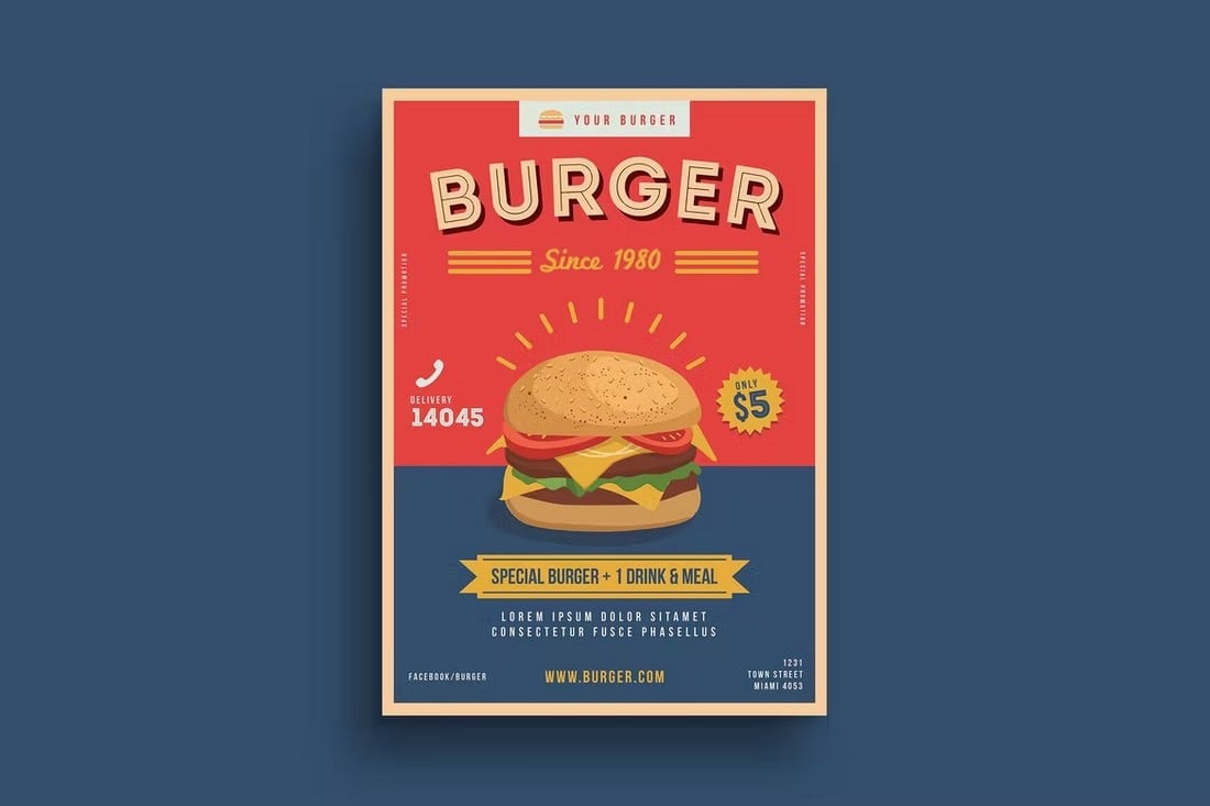
- Headline: This is the main (and largest) text element in the design. It can be in addition to an art element or it can be the art element. Opt for a readable typeface that is interesting and demands attention.
- Details: What, when, where? Answer these questions in the second level of the text. What information does someone need to do what your poster is asking of them? Provide the information here in a concise manner. As for sizing, there are two options – drop the size to about half of the main headline for very clear hierarchy or continue to use a larger size and use another technique for contrast. (The choice often depends on other elements and importance of secondary text.)
- The fine print: This one explains itself. Commonly seen on posters to promote movies, it’s everything else that someone decided needed to be on the poster. Make it small and keep it out of the way.
2. Amp Up the Contrast
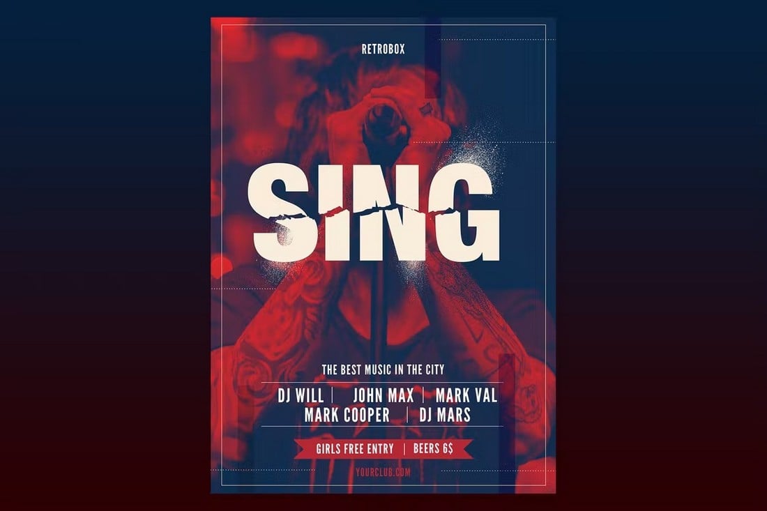
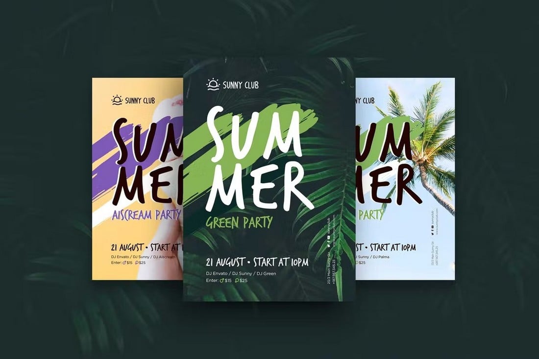
You have one glance to grab someone’s attention with a poster. High contrast between elements can help you do that. Forget a monotone color palette with pale gradients; go bold with color and type options. Poster design is a great time to try a typeface or color palette that might be too “crazy” for other projects. Experiment with it.
Think about a big color background as well. Many times poster designers start with a white canvas. If your printer allows, use a high color background with a full bleed to make your poster stand out from all the rest.
3. Consider Size and Location
This is important: Where is your poster going to be located? This factors in several ways, including the size of the poster (and possibly aspect ratio), visual clutter around the poster and will the people who see it appreciate your call to action?
Knowing where the design will live can help you make choices about how to create it. Not only is visual contrast important within your design, it is an important external factor as well. Think of it this way: If your poster is going to hang on a green wall, you probably want to use a contrasting color scheme so the design does not blend into the environment.
4. Make a Mini Version
While poster design is primarily a print project, create mini versions that can be used in other places as well. Remember one of those basic principles of marketing – a person needs exposure to something 20 times to remember it. The multiple poster versions can help you accomplish just that.
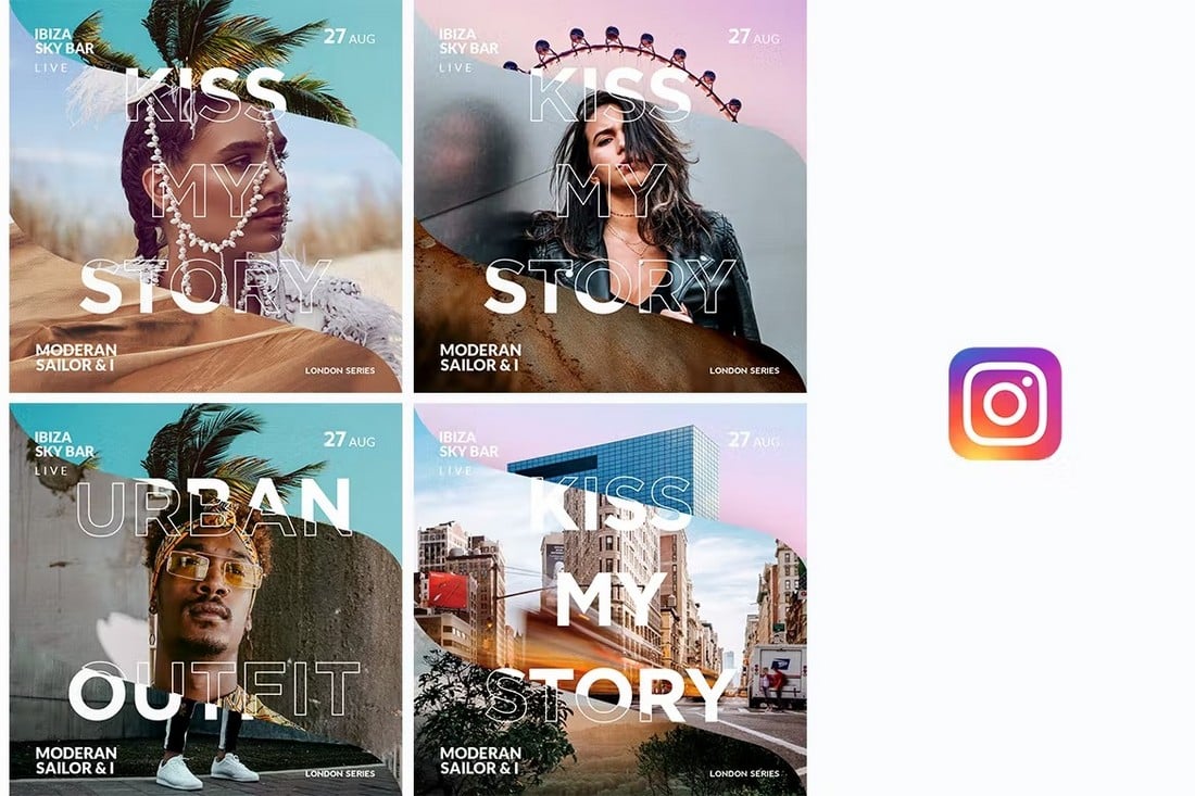
- Scale down an image that can be shared on social media.
- Make a postcard or letter size to hand out.
- Consider making a “poster-version” landing page for your website.
- Create a version that can be sent via email.
5. Use One Big Visual
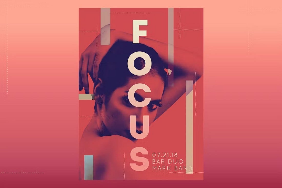
Whether you choose a photo, illustration or text, a dominant image is key. And just like the text, it needs to be readable from a distance.
When designing posters, think tight — close-up crops of faces or elements, single item illustrations, a common scene with a sharp focal point, novelty typography with high intrigue. After you select a visual be careful about layering elements. Type and images need to have enough contrast so that they are independently readable.
6. Use Plenty of Space
When it comes to posters, use exaggerated spacing between elements. It may look a little funny to you at first, but the extra spacing will dramatically increase visual impact and readability at distances.
There are a few places where extra space can work wonders in poster design:
- Between individual letters. Tight kerning can cause letters to blur at distances.
- Between lines of text.
- Around interior margins of the canvas.
- Between elements of different types, such as images and text.
- Around the most important element in the design. What do you want people to see first?
7. Include a Call to Action
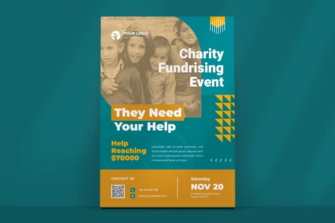
The goal of every poster is to expose people to something. Most of these “touches” involve inviting someone to something, such as a concert or movie or another event. For that reason a call to action is vital. Think of it in the same way you would if designing a call to action for a website or app – give it a high-level of prominence in the design.
The difference from web design is that the call to action might not be as simple. (In websites “sign up” or “email us” are common actions that you can’t get on a poster.) The call to action is often the event information or a contact point in poster design. Once you know what users are supposed to do when they see the poster, then you can design the call to action. (Some designers really like elements such as QR codes to encourage users to scan for information; only use this tool if it is popular in your market.)
8. Create Focus with Typography
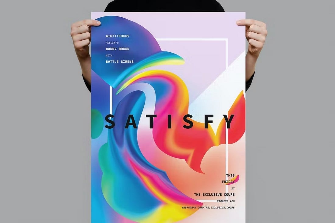
Poster design is one of those places where you can really go crazy with beautiful typography. Some of the best posters are made with type and color, with no images or illustrations.
Keep the same typography principles in mind that you would with any other project – this is not the time to use 10 fonts in one location. But do experiment with bolder, wider, bigger typefaces that you might feel comfortable with otherwise.
Set the tone for the project with these type options. Use type that conveys an appropriate mood for the event. You might find this challenging at first, but it can be a quite invigorating exercise.
9. Use a Cool Printing Technique
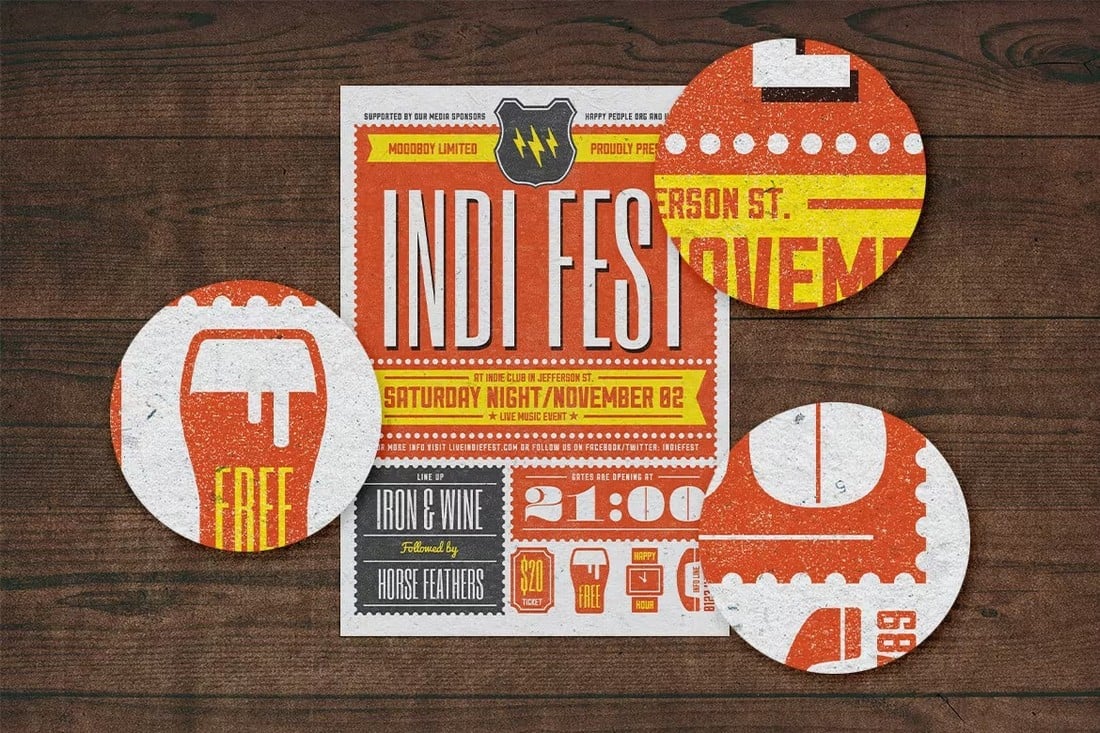
Depending on the location and audience for your poster a cool printing technique might be in order. There are a lot of things you can do on paper that just don’t work on digital projects. This might be the perfect opportunity to try out something like letterpress, screenprinting, foiling or use of a UV layer.
Many of these techniques are often reserved for higher-end projects or events with a certain level of prestige.
Talk to your printer in advance of settling on any special technique to make sure they can make the prints at the size you need. When it comes to printing techniques, there can be budgetary considerations as well. Some printing processes can be pricey; so make sure you have enough wiggle room with the budget before you get started.
10. Have Fun
Poster design is a place where designers can have a lot of fun. While there are plenty of things to think about and consider, this is an area where you can break the rules and go a little crazy with design.
So go for it. Try something that you’ve wanted to do or take the opportunity to learn a new technique or skill. Stretch your imagination to create something new and fresh. The goal of a poster is to grab attention from afar; get creative!
Conclusion
In an age with so much design talk centering around websites and apps, the art of poster design is often an afterthought. Poster design can be fun and give you plenty of room to stretch your design muscles.
Posters can work in a variety of ways for almost any project. They are a great form of promotion and can help expose the masses to your personal, business or client message.


