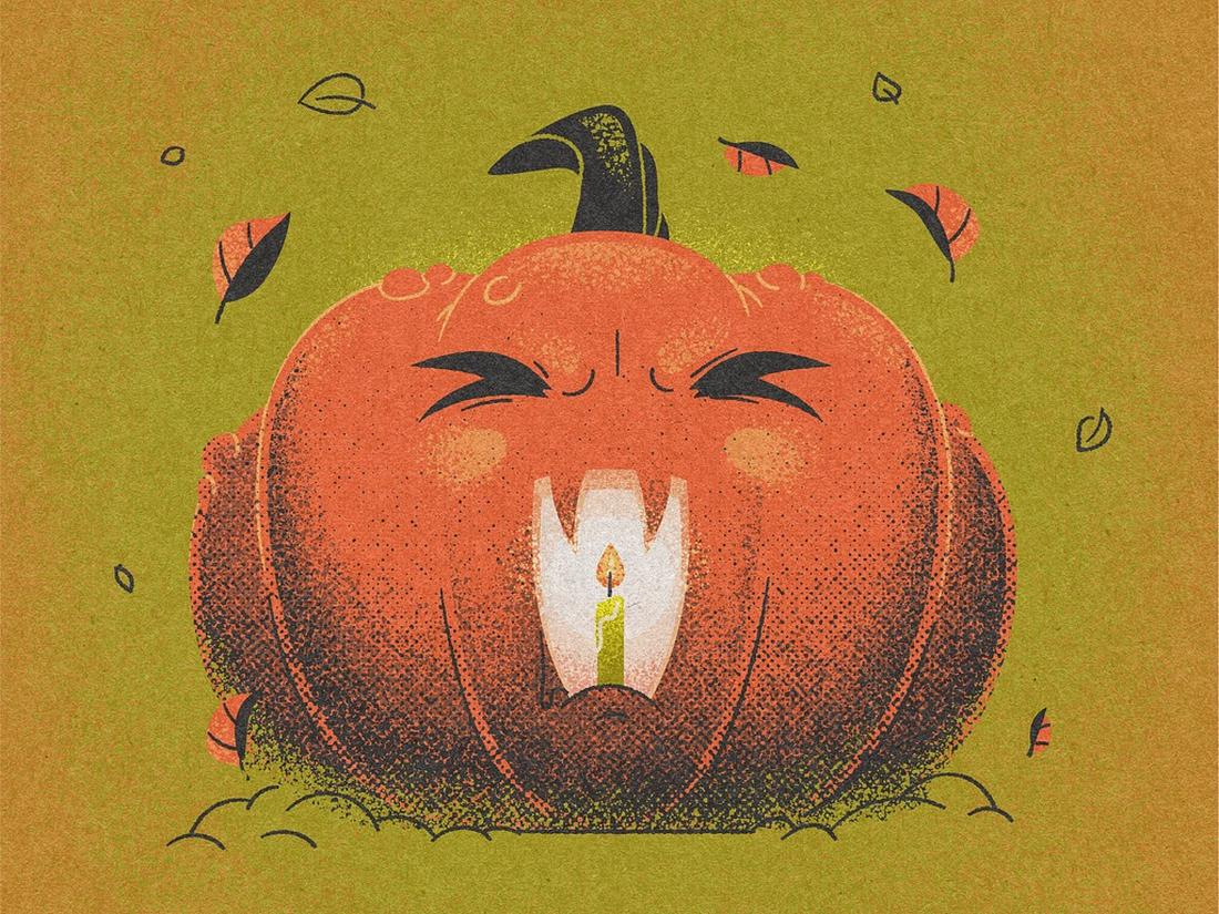
Witches, goblins, and ghouls can make for some pretty amazing design projects. While Halloween might not be top of mind when it comes to design, it’s an opportunity to do something a little different with projects.
Halloween graphic design centers around something that will be around for a short time. It might be different than the typical vibe of a brand or project and often has a theme that’s fun and friendly.
Adding a spooky element to a design can delight users and show that the design is new and timely. It gives users reasons to come back to your projects because they know that it will change again after the holiday. You can use holiday-themed graphic design as a trick to keep users coming back!
1. Create a Themed Design
Using a theme for the overall look of your design is one of the best ways to make it more relatable. For example, you can take inspiration from a popular horror movie to create a themed Halloween graphic design.
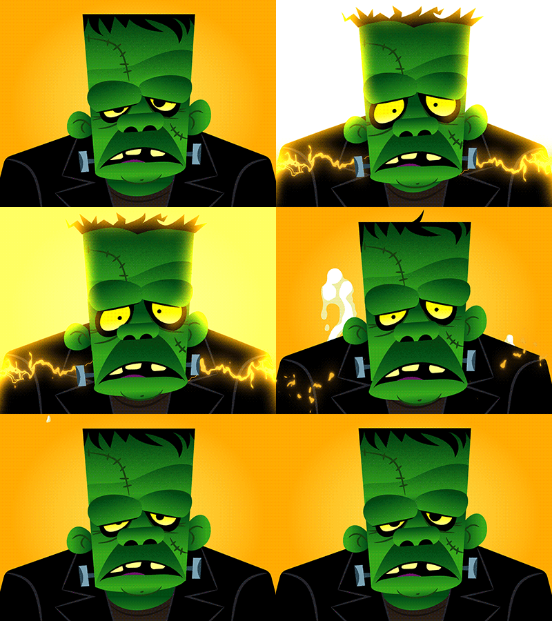
They don’t have to be scary, not at all. You can easily create cute, fun graphic designs using those scary movies as inspiration. The above illustration is a good example of that. If you want to go a step further, use urban legends to create a spooky vibe for your designs that your local audiences can relate to.
Using a theme for your Halloween graphics will help create consistency across all your seasonal designs. All your posters, flyers, banners, and even the online promo graphics will look more familiar, attractive, and memorable.
2. Zombies vs Monsters
When in doubt, go with a zombie or monster theme! These two iconic Halloween themes never fail to impress. Whether it’s a flyer design for a Halloween party or a fun greeting card for children, a zombie or monster theme is always acceptable.
Frankenstein’s monster, Count Dracula, the Grim Reaper, as well as witches, and mummies are just a few of the monsters loved by children and adults alike. And as always, everyone loves a fun slow-walking, brain-eating zombie design.
If you’re struggling to find a theme or an approach for your graphic design, a zombie or monster theme is the safest and most widely recognized trend to use.
3. Use Grungy Textures
Creating a spooky, old, and scary vibe for a graphic design takes a lot of work. One of the most important elements of such a design is textures.
Adding a subtle distressed and grunge-style texture is often the perfect way to create a weird and ghostly look for your design. They will simply transform your designs with a haunted feel.
You can also use other similar textures like dust and scratches to create more eerie-looking backgrounds and designs.
4. Add Overlay Effects
Overlay effects are one of the easiest ways to instantly transform your photos and graphics into all kinds of unique creations. You can also use them to give a Halloween look to your designs as well.
Whether you want to cover your images with a spooky spider web or add a horror-themed border, there are many different types of overlays you can use to achieve a supernatural look for your graphics.
5. Make Use of Text Effects
Crafting a spooky-looking title for your design can be a challenge. It will take you a good amount of time to design a creative title with a Halloween-themed effect. A great way to skip this process is to use a pre-made text effect.
You can find loads of Halloween and horror-themed text effects on the web. These text effect templates are super easy to use and allow you to transform your text with just a few clicks.
6. Use Halloween Patterns
A Halloween-themed pattern is a great choice for designing a cool background for all your Halloween graphic designs, especially for packaging designs, posters, and social media posts.
Patterns filled with spooky pumpkins, friendly ghosts, and cute witches will always grab the attention of kids and audiences of all ages.
7. Create Halloween-themed Characters
A fun way to give a personality to your graphics is to use a Halloween-themed character across all your designs. If your business has a mascot, give it a Halloween-themed spooky makeover. Or use a character from a Horror movie and give them a cute and funny cartoon look.
When designed with bright colors and cartoon effects, these characters will fit right in with your invitations, greeting cards, and even promo campaigns for your brand.
8. Add Halloween Imagery

The easiest way to create a Halloween graphic design is to substitute some of your typical imagery for something with a holiday feel.
- Add images of people in costumes
- Create a Halloween scene for the homepage
- Design a special animation
- Promote a product or service with a spooky special that you can show
9. Switch to a Seasonal Font


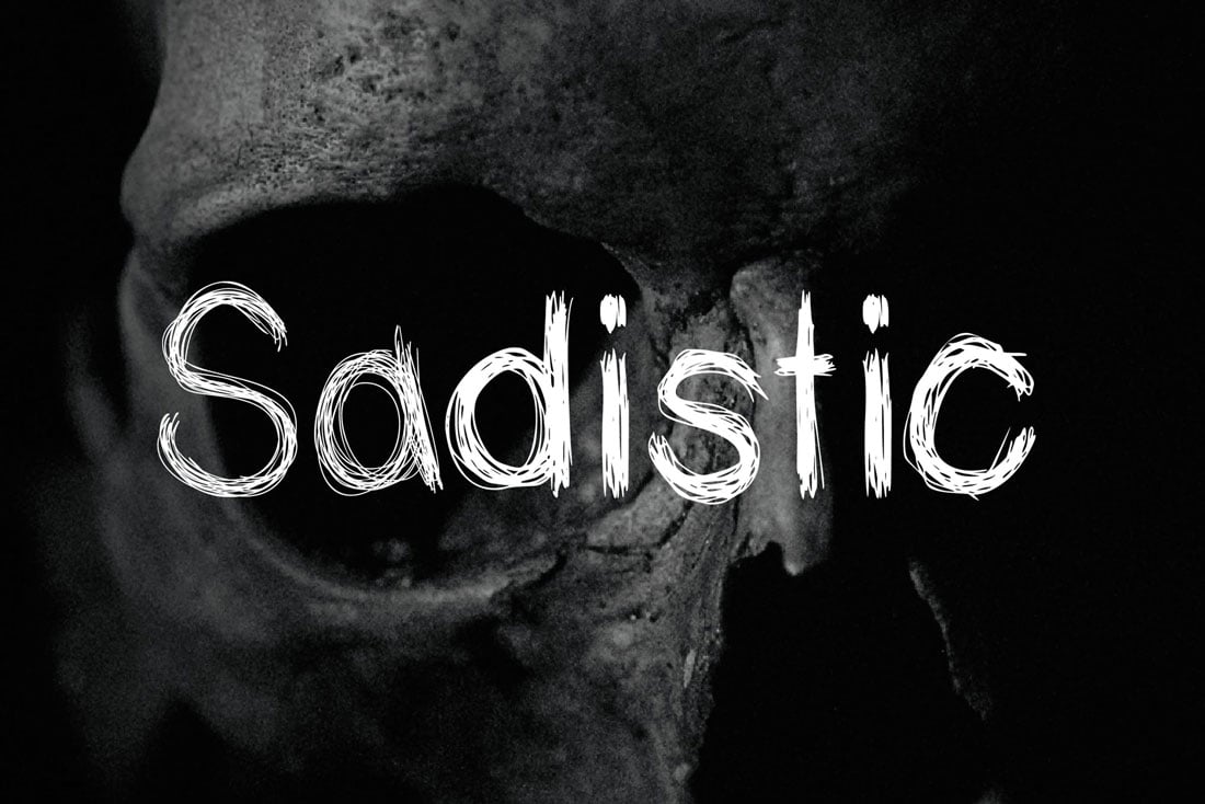
Halloween is the perfect time to use one of those crazy novelty fonts that you just can’t find another excuse for. From scratchy hand-drawn typefaces to lettering that looks like it could be ripped from a horror movie poster, a spooky font option is a less obvious way to create a Halloween scene.
If you are really feeling like tricks and treats, use matching language to create a fun and unique holiday complication.
Here are three Halloween fonts that are a good starting point.
10. Mix Up Your Color Palette

Halloween provides a great opportunity to switch up a color palette for warmer, deeper hues with more jewel tones and dark schemes.
While most people jump right to a bright orange, you don’t have to use a pumpkin-colored palette. Consider deeper oranges and sage greens. Purples, navy and black are equally popular. Don’t discount a deep maroon or brighter blues or greens either.
When in doubt, opt for something that has roots in nature – fall leaves, the night sky, and full moon or even a green-eyed black cat.
11. Substitute Fun Icons or Hover States
When it comes to making tweaks to your design theme for Halloween, consider adjustments to some of the smallest website elements or divots in print projects.
Starting in October, switch the icons to something with a more Halloween look. Add a witch hat to the cart icon or a pumpkin to the phone button. The nice thing is that you don’t have to change every icon in the design to achieve this look. Just subbing a few small elements can create the right amount of charm.
Or surprise users with a simple hover state: Don’t change the icon itself, just adjust the hover action so that that cart magically pops into a bat or ghoul.
The same idea can work on printed materials as well – just make sure not to give them out post-holiday. Trade some of your more common design elements for icons with a seasonal theme.
12. Include a Spooky CTA
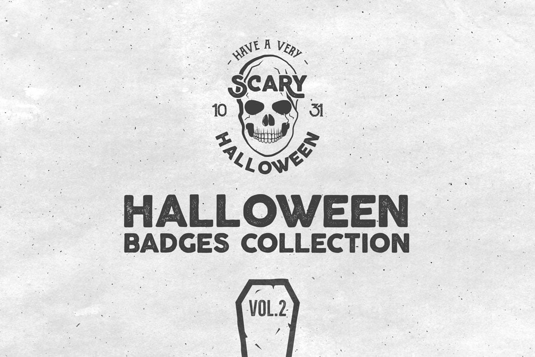
Even the smallest bits of a design can be traded for Halloween elements. Adjust the micro-copy in your call to action button to include a spooky message.
Another idea? A simple pop-up that says “BOO!” and leads website visitors to complete an action.
Sometimes the smallest and simplest changes can be the most effective.
13. Add a Fall Theme

So here’s the biggest issue with a Halloween graphic design theme – it’s short-lived. Most designers don’t want to switch over to holiday elements until October. (And I don’t blame you.)
So do you really want to go through all this fuss for a design change that only lasts 30 days?
Rather than an all-out light-up jack o lanterns theme, try a more fall aesthetic instead. Lump Halloween, the season change and even Thanksgiving into one design cluster. You’ll get a lot more bang for your buck and can switch it now and leave it until the end of November without feeling silly.
14. Have Fun with About Pages
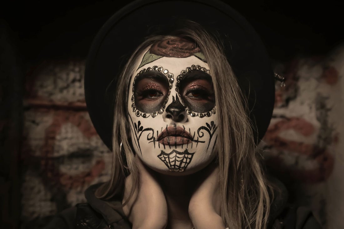
Here’s my go-to Halloween graphic design trick. Have staff (or pets) dress in costumes and change their photos on the About Us page of your website.
Include a promo or social media campaign to drive users to this seasonal content that’s fun and interesting.
Simple, right? Now schedule that staff dress up day!
15. Add an Animation
It might seem old-school but a simple “Happy Halloween” banner or animation can be just the right element to create a holiday theme. Not every project is designed in a way that an all-out change can work effectively.
A simple animation won’t take over the design and can set a nice tone without overwhelming users.
Another option is to incorporate a Halloween message or image into your homepage slider if that’s the type of website design you have. This is another easy change that won’t take a lot of time or planning but can still provide a timely holiday element.
16. Create a Holiday Hero
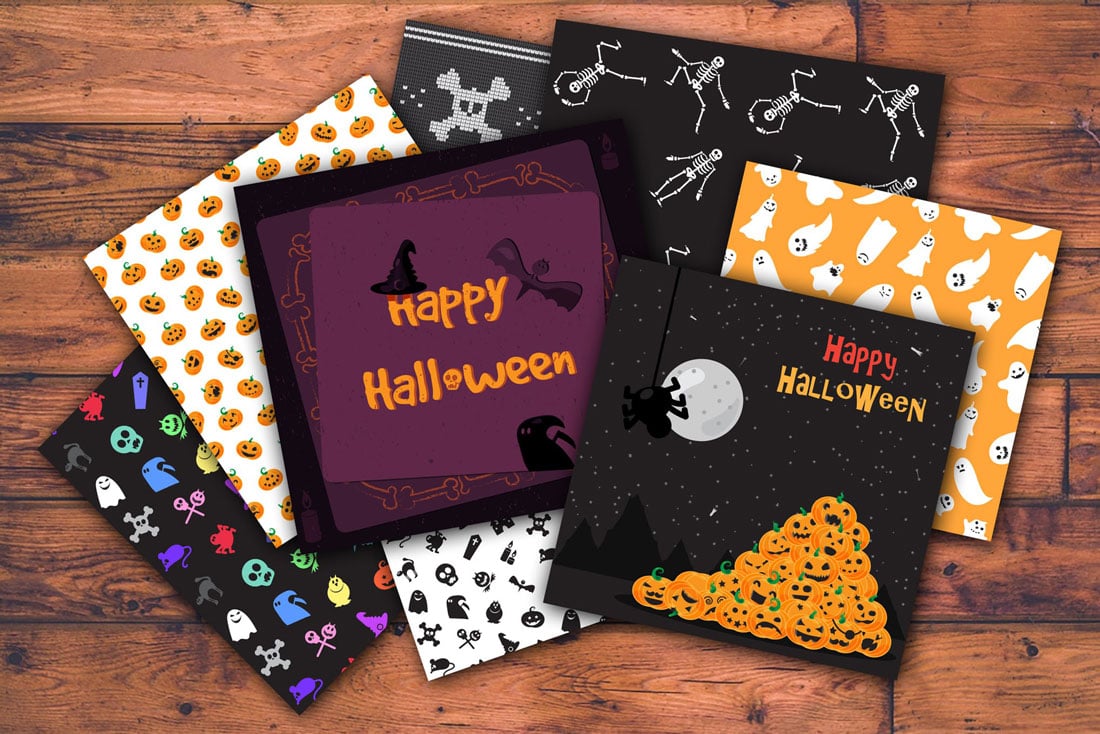
If you can go all out on your website homepage or for a printed project, do it. Use photos, video or illustration to create a Halloween-theme hero header.
This is a pretty large and possibly elaborate use of space so scale back on any other Halloween themed ideas that you might have. Remember one big trick in the design is enough; any type of special imagery or themed design element counts as that trick.
17. Skip the Gore
Finally, Halloween graphic design should be fun and a bit spooky. But avoid gory scenes.
Too much gore or horror-themed elements can turn off some users. (If you know your audience well, there might be a case for using this type of imagery, but those cases are pretty rare.)
When planning for Halloween elements, opt for more friendly characters, skip the horror movie soundtrack or blood and guts and create something that holiday appropriate for the entire audience.
Conclusion
Have you considered swapping out elements for a Halloween graphic design? From small elements like icons or a hover state to full-scale spookiness, this is an opportunity to have fun with the project.
Hopefully, these tricks (and treats) will help jumpstart your imagination. Happy Halloween!


