30 Tips to Learn Web Design in 30 Days

Featured Imgs 23

Is learning the basics of web design still on your “someday” list? Why haven’t you got started yet? We’ve put together 30 tips and resources to help you start learning web design this month (and maybe even find yourself a new career path!)

Graphic designers, print designers, and creatives looking to learn something new or break into website need to quit procrastinating. Every day that you don’t take that first step leaves you one day further behind everyone else!

Follow these steps to begin learning how to create your first website, industry best practices, and much more—all in 30 days!

1. Start a Website

learn web design

The best way to start learning web design is to start doing it. That’s the advice from David Kadavy, author of Design <for> Hackers.

I recommend you start a blog. I started a blog just to have a web design playground, and 7 years later, I launched a best-selling book on the subject. Having a personal project, such as a blog, gives you a place where you can try new things, and your boss won’t fire you if you mess up.

You don’t have to start with a massive website or crazy design; start small. Play with the website, figure out what makes things work. (And make sure to inspect the code, so you can start getting familiar with what’s making your website work.)

Want to get started quickly? First, create your visual sitemap. Then, a website builder like Wix can help to give you a head start with a stylish website design, as you begin to learn the concepts and building blocks of what goes into a website.

2. Read Everything You Can

learn web design

Start reading. Because you are on this blog, you’re probably used to keeping track of what’s happening in the world of design. Keep reading.

Read everything you can about website design, and trends, and techniques, and best practices. Follow designers you admire on social media.

Cast a wide net for your website design reading as well. Read about the basics to learn some code, read about design theory and read tutorials and current articles.

3. Be An Effective Communicator

If you aren’t the most articulate person, brush up on those skills. A big part of website design is communication.

Website designers have to communicate with clients regularly to figure out what problem the design needs to solve; they have to communicate those solutions and implement them as well.

4. Subscribe to Tuts+ & Envato Elements
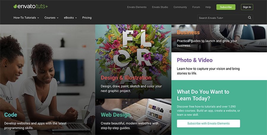
Consider a subscription to Envato Elements, which also gets you access to the excellent Tuts+ learning resource.

Tuts+ publish regular courses on graphic and web design, from basic techniques, through to the latest advanced approaches and developments. It’s completely self-paced, taught by expert instructors. You’ll also get access to Envato Elements, which is a great resource for finding graphics, templates, and more to plug into your web design work.

5. Think in HTML

HTML, or hypertext markup language, is a cornerstone of website design. HTML is the skeleton that helps create the structure of a website and once you can read the language, the world of website design will make a lot more sense.

W3Schools has a great HTML starter tutorial with hundreds of HTML examples that you can play with on the screen to see what happens and exactly how it works. (You might find it more intuitive than you imagined.)

6. Play with Code at Codeacademy
learn web design

While HTML is a good start, you can learn almost any programming language from Codeacademy. The free set of tools teaches you to code using interactive activities and games.

You can pick up a Codeacademy course where and when you need it and start and stop as needed. Pick a subject to learn – web development, programming, data science – or language to focus on – HTML & CSS (a great place to start), Python, Java, SQL, Ruby, and more.

7. Learn to Understand CSS

CSS, or cascading style sheets, define the presentation of a document written in HTML, or XML and SVG.

As defined by Mozilla

CSS describes how elements should be rendered on screen, on paper, in speech, or on other media.

Mozilla also has a great collection of CSS resources to get started, with a solid introduction of how CSS works, including selectors and properties, writing CSS rules, applying CSS to HTML, how to specify length, color, and other units in CSS, cascade and inheritance, box model basics, and debugging CSS. Then modules move on to explain styling text and boxes.

8. Apply Your Design Skills to the Web

If you are already working in a creative or graphic design field, think about the things you already know that you can apply to website design as well. The principles that make something visually appealing don’t change based on medium and all that design theory will come in handy in the digital space as well.

While elements such as learning code might not feel natural, having a design background is a huge bonus. What good is a beautifully coded website if not one wants to interact with it?

9. Pay Attention to Websites You Love

Take note of websites that you love. What about them is appealing to you? (And how can you learn to replicate those elements?) Pay attention to:

  • Typography
  • Navigation
  • Use of images and space
  • Design of forms
  • Animation and scroll effects
  • Color

10. Draw a Wireframe

learn web design

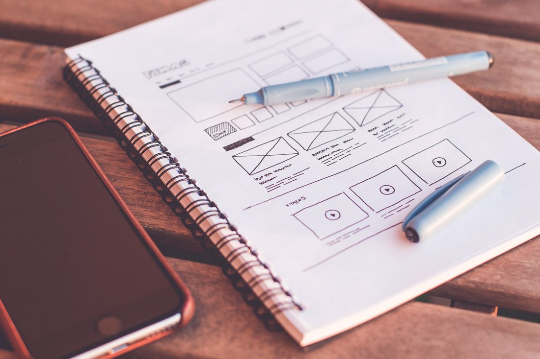
Wireframing is a web designer’s brainstorming.

In its purest form, a wireframe is a sketch of what the website will be. It’s not an outline of aesthetic elements, rather a blueprint of the website. Drawing a wireframe isn’t really about the look of this design, it’s about the information structure therein.

Not sure how to create a wireframe? Digital Telepathy has a guide of best practices to help you learn.

11. Take Some Time to Learn Sketch

learn web design

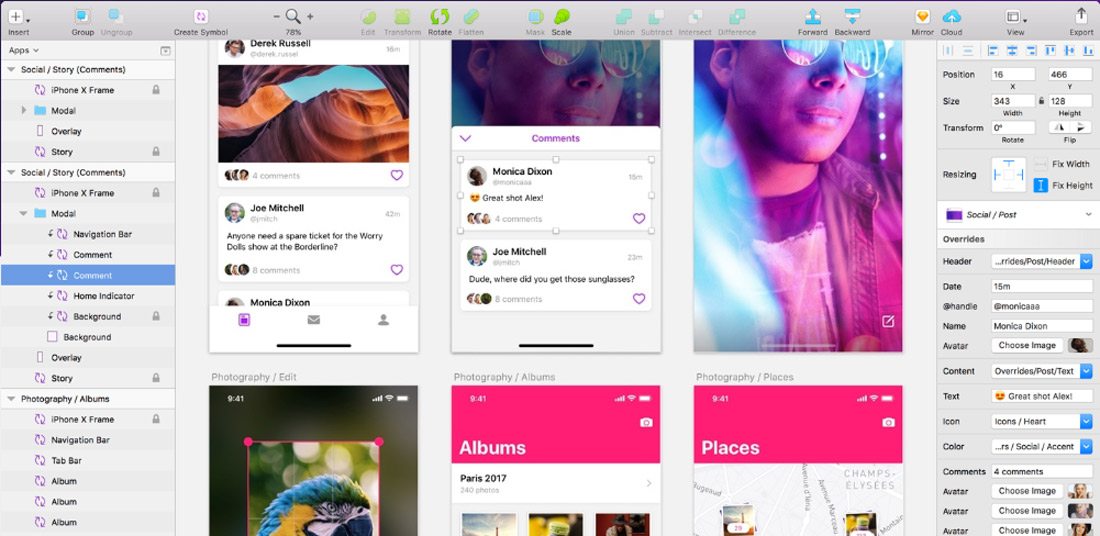
Sketch is a vector-drawing tool for Mac that makes it easy to create design elements. A lot of designers are turning to Sketch to create UI elements and repeating design blocks.

It’s packed with plugins and allows you to export code for easy use and access. It’s one of the most powerful, and popular, tools to come around since Adobe’s Creative Suite and worth your time.

12. Stay Up to Date with Technology

AI, VR, AR, 360-degree video, bots.

It can be hard to keep up with so many new technologies and trend. But you need to make a point to stay on top of these changes.

Tackle them one at a time and start with technologies that are the most directly related to the work you do. If you have a website with online chat, start by learning about bots. Or if you use a lot of video content, play around with 360-degree video.

Elements such as artificial intelligence and virtual or augmented reality are even more complex but are likely to become integrated parts of the website design landscape down the road. At a minimum, you should know what they are and what the potential uses might be.

13. Get Comfortable with SEO

learn web design

While many web designers think an SEO specialist can handle getting a website ready for search engines to read, there’s a lot of design work that’s connected to SEO.

From the way images are uploaded to creating clean code that’s fast to including meta descriptions on pages and elements, the designer should incorporate search thinking into their workflow.

Freelancers, this is vitally important for you as well. Most clients are savvy enough to ask for an SEO-optimized website. If you work alone, you need to know enough to create a solid framework that Google can read (and be able to refer the client to an SEO specialist if more work needs to be done).

14. Play with a Website Builder

A website builder can be a great way to get comfortable with best practices and how to start building and designing websites.

Most of these tools have plenty of templates and allow you to customize elements and even add code snippets. For simple sites, many website builders also have a free plan where you can create a personal portfolio page or basic website that serves as a playground for you.

Then pick apart the pieces within the website builder. Look at how they are designed and coded to get a feel for how it all comes together. You’ll be amazed by what you can figure out just by picking another design apart.

15. Find a Mentor

Is there someone you work with that you admire as a web designer? Take them to lunch and pick their brain about the industry.

Finding a mentor that is willing to work with you and help you think about the field and how to learn web design on your own can be invaluable. And while you can probably find a mentor in an online community, nothing is better than a live person that you can meet face-to-face periodically. (Maybe it is worth having online and in-person mentors.)

16. Join the CodePen Community
learn web design

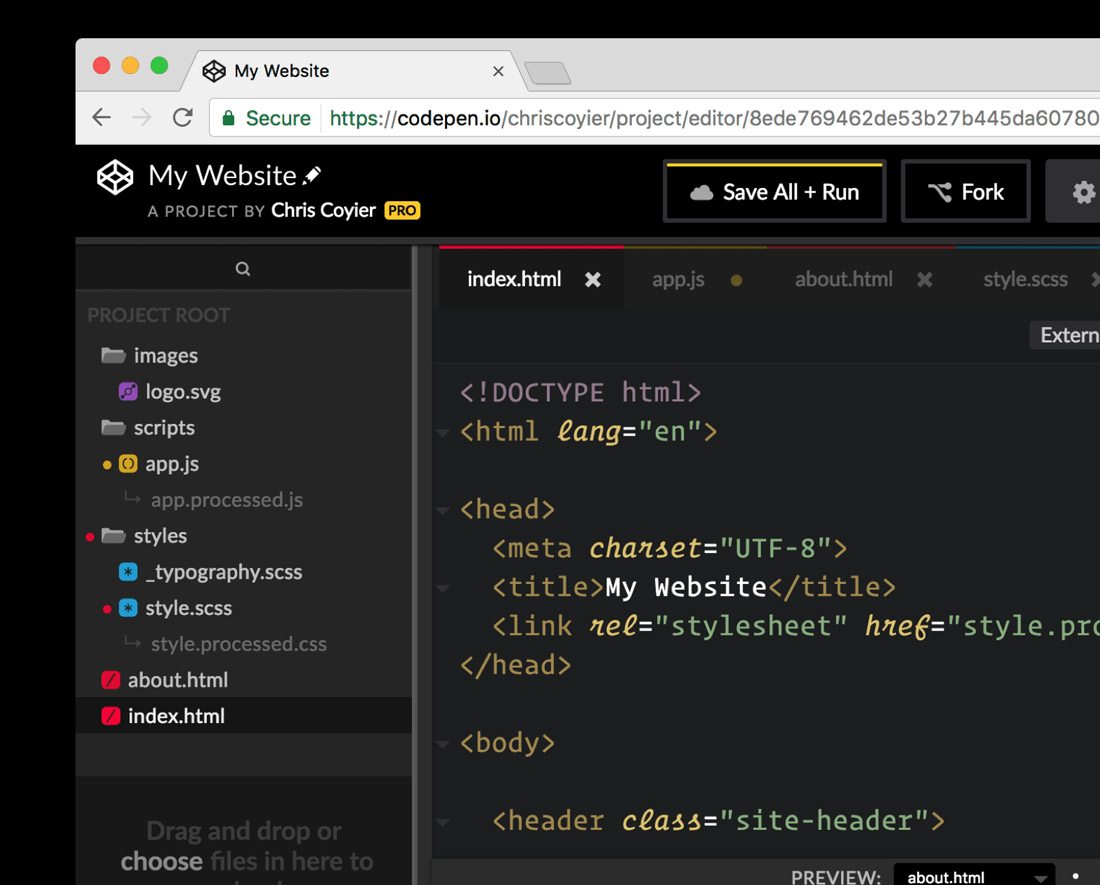
Once you start getting comfortable with some code and programming, you want to join the CodePen community. The open-source community allows you to share and edit code snippets in a social network of sorts.

Here’s a little more from the site’s founders: “CodePen is a social development environment. At its heart, it allows you to write code in the browser, and see the results of it as you build. A useful and liberating tool for developers of any skill, and particularly empowering for people learning to code. We focus primarily on front-end languages like HTML, CSS, JavaScript and preprocessing syntaxes that turn into those things.”

17. Take a Class

For some learners, a more formal classroom setting is best.

There are a ton of classes available – in-person and online – for you to learn web design basics. Start with a local college or online learning hubs such as Udemy or Coursera. Pick up a class at your current ability level and just keep moving forward.

18. Want to Do Something? Google It

For the not-so-traditional-learner, find the answer to the web design problem on Google. There are so many tutorials and videos available that can walk you through almost any problem – and solution.

The key is to search exactly what you need to know and look to a reputable source for the answer. Here’s another tip when it comes to tutorials and videos – more recent content is probably going to give you a better, more complete and more relevant answer. (Remember, some of this stuff is changing fast.)

19. Pay Attention to the User Experience

Nothing can make or break a website like user experience design. You need to plan for it and understand it.

Here’s how the Interaction Design Foundation describes UX design:

User experience (UX) design is the process of creating products that provide meaningful and personally relevant experiences. This involves the careful design of both a product’s usability and the pleasure consumers will derive from using it. It is also concerned with the entire process of acquiring and integrating the product, including aspects of branding, design, usability, and function.

UX designers, or designers who are aware of the process of experience formation, seek to create and shape the factors influencing the process deliberately. To do this, a UX designer will consider the Why, What, and How of product use.

20. Pay Attention to Design Trends

What does a modern website design look like? It’s not a trick question. To design modern websites and user experiences, you need to know what users want and how they are interacting with it. If the last time you downloaded an app or looked at a website on your phone was 2016, you’ve got a lot of ground to make up.

Creating website designs that have modern touches and trends integrated into the design will help your projects stand out. How do you know what’s trending? Keep reading sites like this and pay attention to what other designers are doing. Take note of colors and styles and features that are included in the websites you visit frequently.

21. Create Without Color

learn web design

Start every design without color. A great designer once told me that if your design works in black and white, it will be flawless in color.

That might not always hold, but it is a great starting point.

By creating designs in black and white, you can see where elements contrast and how they play together. You’ve stripped out any emotional associations with color or eye movement that happens because of it. This simplest form of design will give you an idea if something works as a concept before you move on to finalizing it.

22. Learn to Love Google Fonts

learn web design

Google Fonts is your friend.

Regardless of how you feel about Google, the ability to browse, sort and select typefaces that you know will work in website designs is important. You don’t have to think about licensing or if typefaces are compatible with specific browsers or not.

The limitation is that you only have what’s in the Google Fonts library to work with. But if you try you can find something that will fit almost every project. It’ll save you a lot of time in the long run.

23. Pick Apart a UI Kit

Download a user interface or icon kit and pick it apart.

Just as you can inspect the code of a website, look at how design elements are constructed for the web. Take note of the scale and grid, look at the color mixes and how files are organized within Photoshop or Illustrator.

Look for a kit to download that includes elements in multiple formats for high-resolution displays. (Downloading a bunch of JPEGs isn’t going to serve you all that well.)

Then try to build or customize an element or two of your own.

24. Become a Typographer

Modern website design has a strong focus on typography … good typography. From hero headers with giant words to layers of text that draw a user into the design, understanding the principles of how to pair type elements and construct engaging text blocks is vital.

Start with Ellen Lupton’s Thinking with Type. (There’s also a book of the same name.) Lupton is the authority on typography and her information will have you thinking like a typographer in no time.

25. Jump into JavaScript

When you are starting to feel pretty good about dabbling with web design, challenge yourself again to learn JavaScript. After HTML and CSS, it is the most important language of the web.

JavaScript is a tool that allows designers to implement complex things and interaction on web pages. It’s what makes a slider slide or that parallax animation animate.

Learn JS has an interactive tutorial to help you get started.

26. Update Your Portfolio

learn web design

Once you start designing for the web, make sure to update your portfolio with web design projects. This simple action will help you show yourself … and others … that web design is part of your repertoire.

An updated portfolio can help potential clients see what your “style” looks like. Make sure to showcase layouts, colors, typography and different techniques that show what you can do.

27. Challenge Yourself

With so many shortcuts and code snippets to help you fix almost any website issue you are having, don’t get lazy. Remember to challenge yourself continually to learn new skills, new technologies and keep improving your web design game.

The one thing about this field is that it is constantly changing; there’s always something new to learn or try.

28. Maximise Your Experience

Get out there and design. You have to start designing websites to be a web designer.

Start small, but take on projects with others. Ask to join in on a project with a team at work. Tackle a small website for a friend. The more experience you have building websites, the better and faster you will get.

What are you waiting for? Stop procrastinating.

29. Ask for Feedback

Use your network to collect feedback on your website design projects, no matter how small you think they are. Listen to this feedback – even if you don’t like it and see what you can learn.

Aside from visual preference, did the person providing feedback offer suggestions for making the website function better? Could they easily understand the goal of the design? Did they connect with the messaging?

30. Keep Learning New Things

learn web design

To be a great website designer, you just need to keep playing, trying and learning new things. Make a point to network and communicate with others in the field so that you can stay on top of techniques and visual changes that are in-demand.

If you are looking to learn website design, then this is probably already something you regularly do. But this is an evolving field, and it keeps changing almost every day. Just ask anyone who is doing it.

How to Add Categories and Subcategories in WordPress

Featured Imgs 23

Keeping your WordPress website’s content organized is key to offering a smooth user experience, especially as you continue to add more posts. WordPress offers a simple way to manage this through categories and subcategories. These tools help structure your content and also enhance SEO and make it easier for your visitors to find what they’re […]

The post How to Add Categories and Subcategories in WordPress first appeared on WPArena and is written by Editorial Staff.

85+ Best Free Photoshop Actions & Effects 2025

Featured Imgs 23

Photoshop actions are quite useful when optimizing photos, applying effects, and editing graphics. For this collection, we’ve handpicked some of the best free Photoshop actions you can download and use with no price to pay!

Whether you’re a professional designer or a complete beginner, Photoshop actions can help you save a lot of time. Simply put, Photoshop actions pack hours worth of design work into a single-click so that you can achieve professional-level effects without an effort.

In this post, we’re featuring several different types of free Photoshop actions. You’ll find them categorized into different effects and styles below. Have a look and start downloading.

Just looking for a stylish free Photoshop action? No problem. Let’s dive into our collection of the best free Photoshop actions of 2021!

What Type of Free Photoshop Action Do You Need?

We’ve broken our collection down into different categories, so you can quickly find just the right Photoshop action for your project! Almost of all of these Photoshop actions are free, but at the start of each section you’ll see one or two premium ones, just so you have that option to choose as well.

Portrait Photoshop Actions

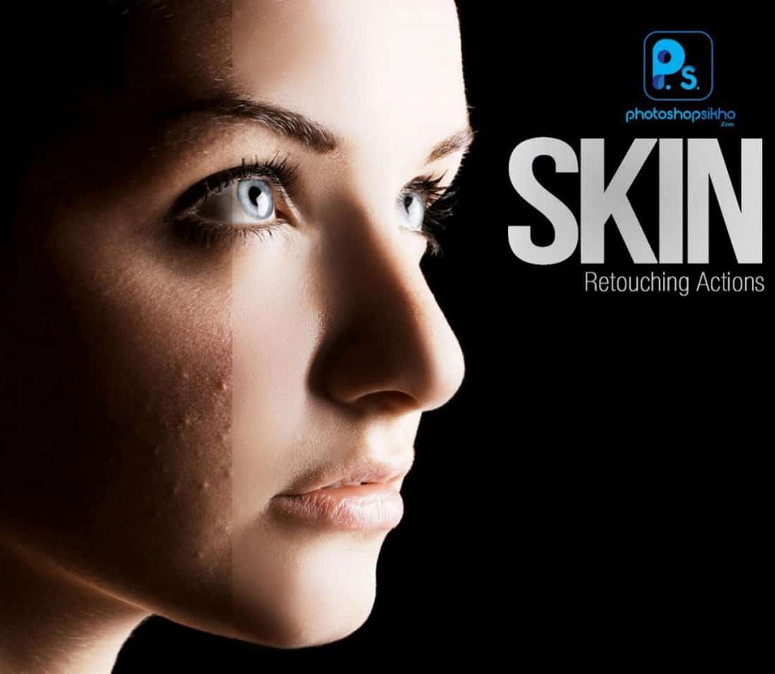
Skin Retouching Photoshop Actions

Skin Retouching Photoshop Actions

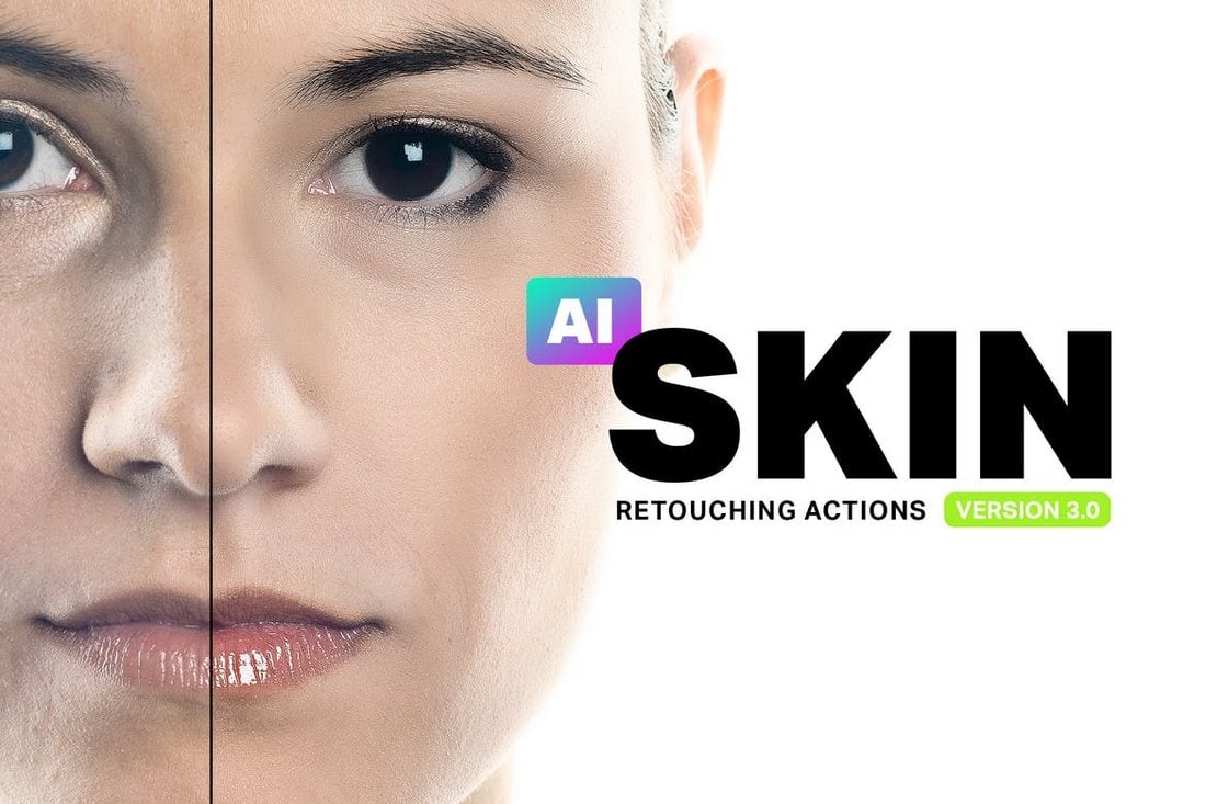
Skin retouching is a complicated process. You can’t get that job done with just one Photoshop action. Which is why this pack comes bundled up with 34 retouching Photoshop actions. It includes PS actions for everything from airbrushing to skin toning, enhancing lips, teeth whitening, and much more.

Free HDR Photoshop Action

Free HDR Photoshop Action

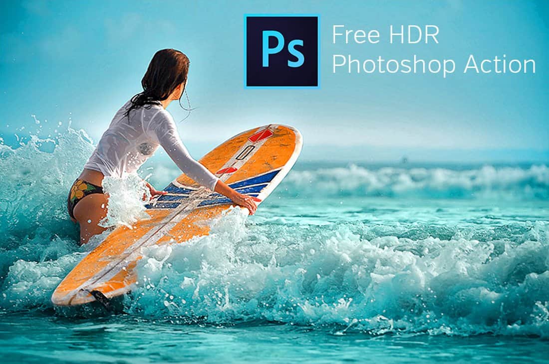
This free HDR Photoshop action allows you to instantly give your photos an authentic HDR-like look to make the photos look more professional. This action will be quite useful for enhancing photos taken in outdoor and natural light conditions, especially including photos taken with smartphones.

40 Free Pastel Effect Photoshop Actions

40 Free Pastel Effect Photoshop Actions

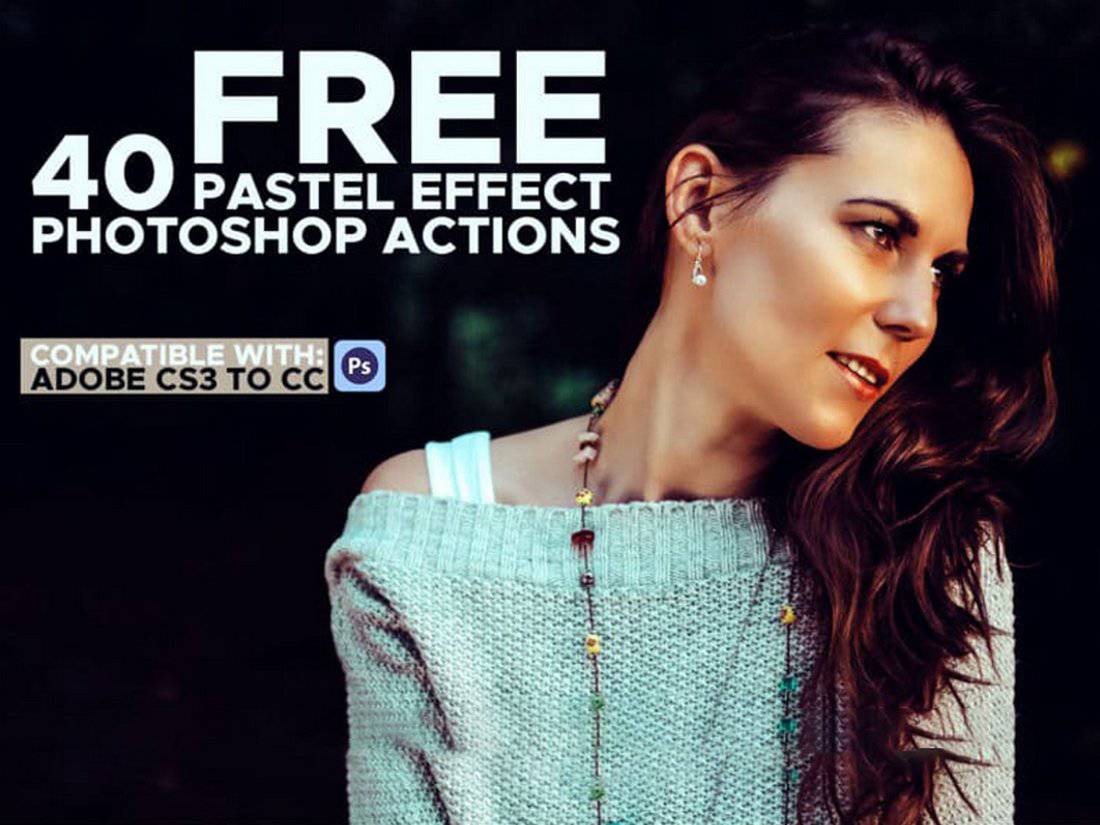
This is a collection of Photoshop actions that allows you to instantly apply beautiful pastel filter effects to your portrait photos to make them look more attractive. It includes 40 different toning effects that are perfect for portrait photographers, graphic designers, and even for optimizing Instagram photos.

Free HDR Portrait Photoshop Actions

Free HDR Photoshop Actions

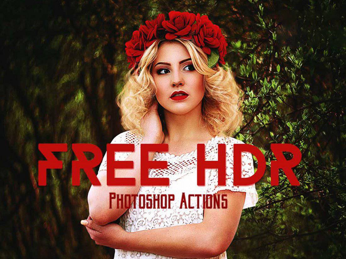
The HDR effect is a popularly used effect in photography that’s quite difficult to achieve. However, with this free Photoshop action, you can create that same effect almost instantly and give a unique HDR look to your portrait photos.

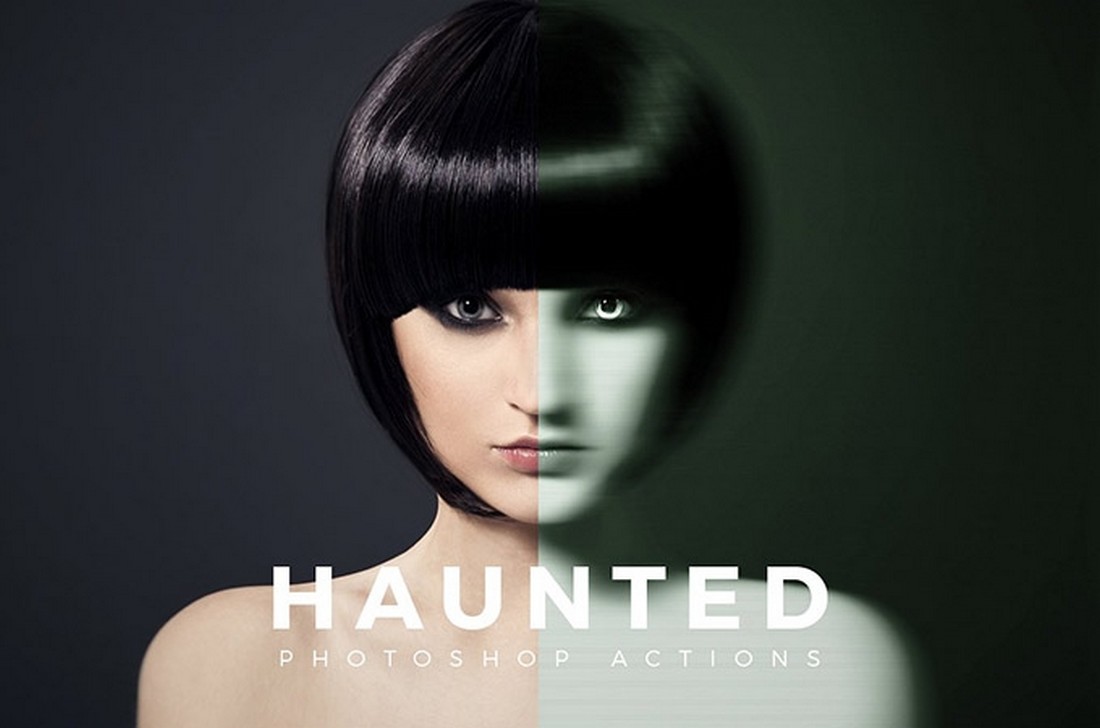
Haunted – Free Photoshop Action

Haunted - Free Photoshop Action

This is a unique Photoshop action that transforms your portrait photos with a spooky, haunted effect. It’s perfect for giving a horror vibe to your photos and especially for creating cool posters.

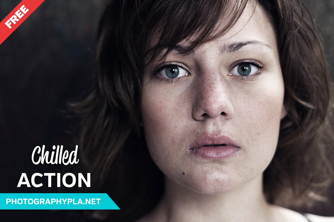
Free Chilled Photoshop Action

Free Chilled Photoshop Action

Use this free Photoshop action to create a cool chilled effect in your portrait photos. It’s perfect for adding a moody look to your selfies as well. The action works with Photoshop CS4 and higher.

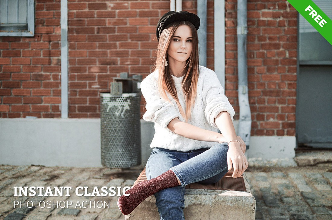
Free Instant Classic Photoshop Action

Free Instant Classic Photoshop Action

Give your portrait photos an instant classic look with this free Photoshop action. It uses a subtle effect to enhance your photos without affecting the original colors and highlights.

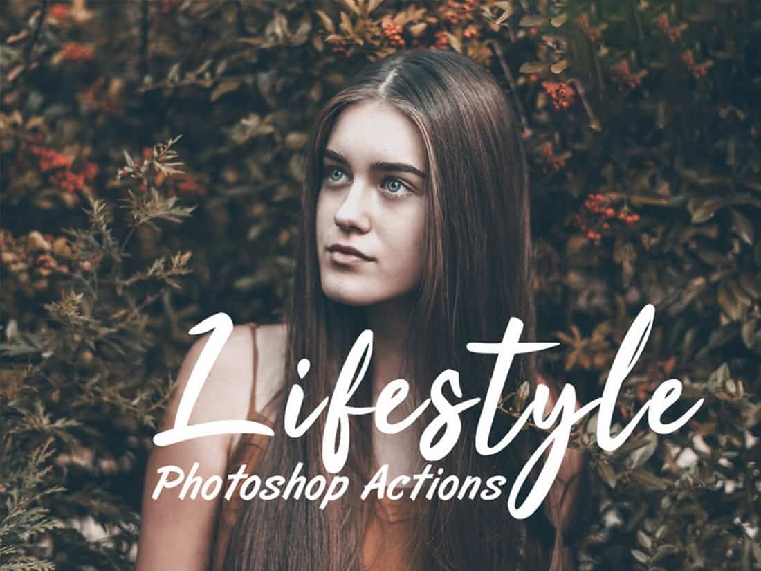
Free Lifestyle Photoshop Actions

Free Lifestyle Photoshop Actions

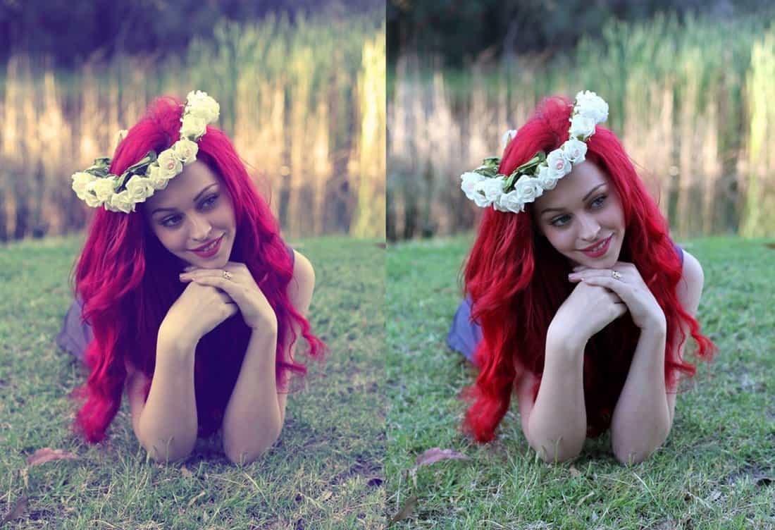
Instagram bloggers and social media users will certainly appreciate this set of free Photoshop actions, which are specially designed for optimizing and enhancing your lifestyle photos.

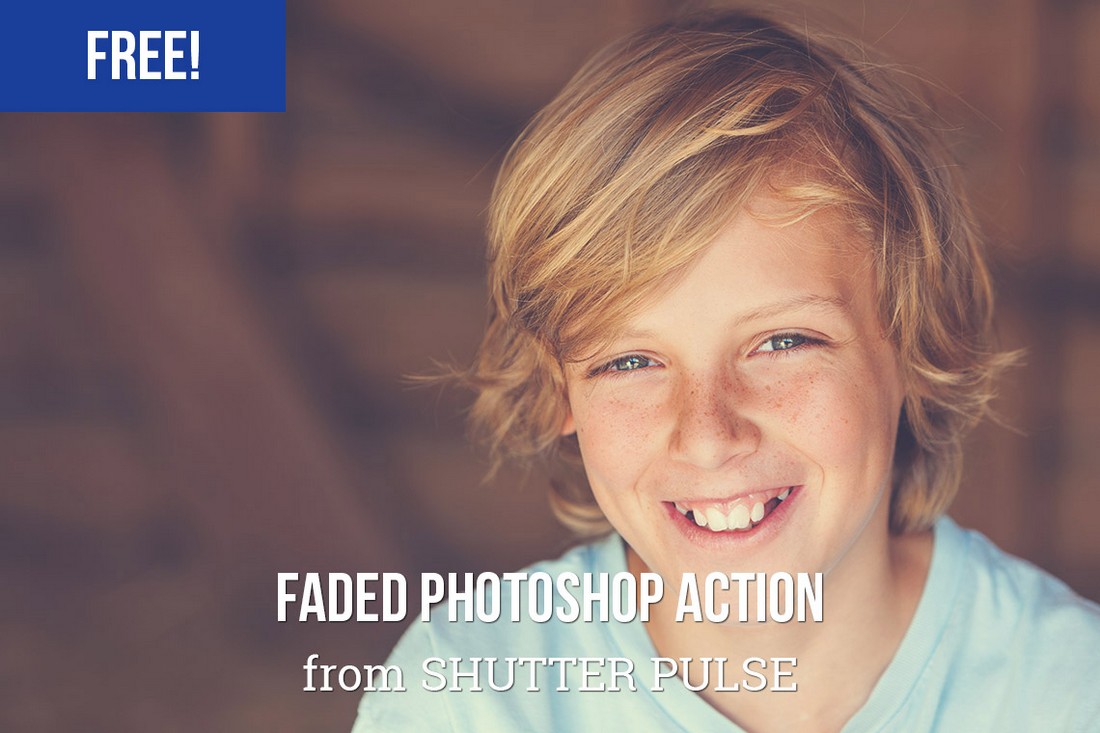
Free Faded Photoshop Action

Free Faded Photoshop Action

This is the perfect effect to use when your portrait photos show off too much vibrance and color. If you want to add a slightly faded look to make the photos look more natural, this free PS action is perfect for you.

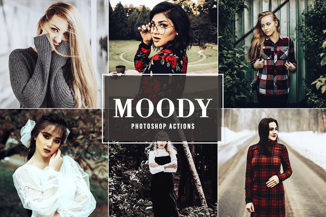
Free Moody Photoshop Actions

Free Moody Photoshop Actions

Add a dark and moody feel to your portrait photos using this free Photoshop action. It features a unique effect that enhances exposure to create a bold new look in your photos.

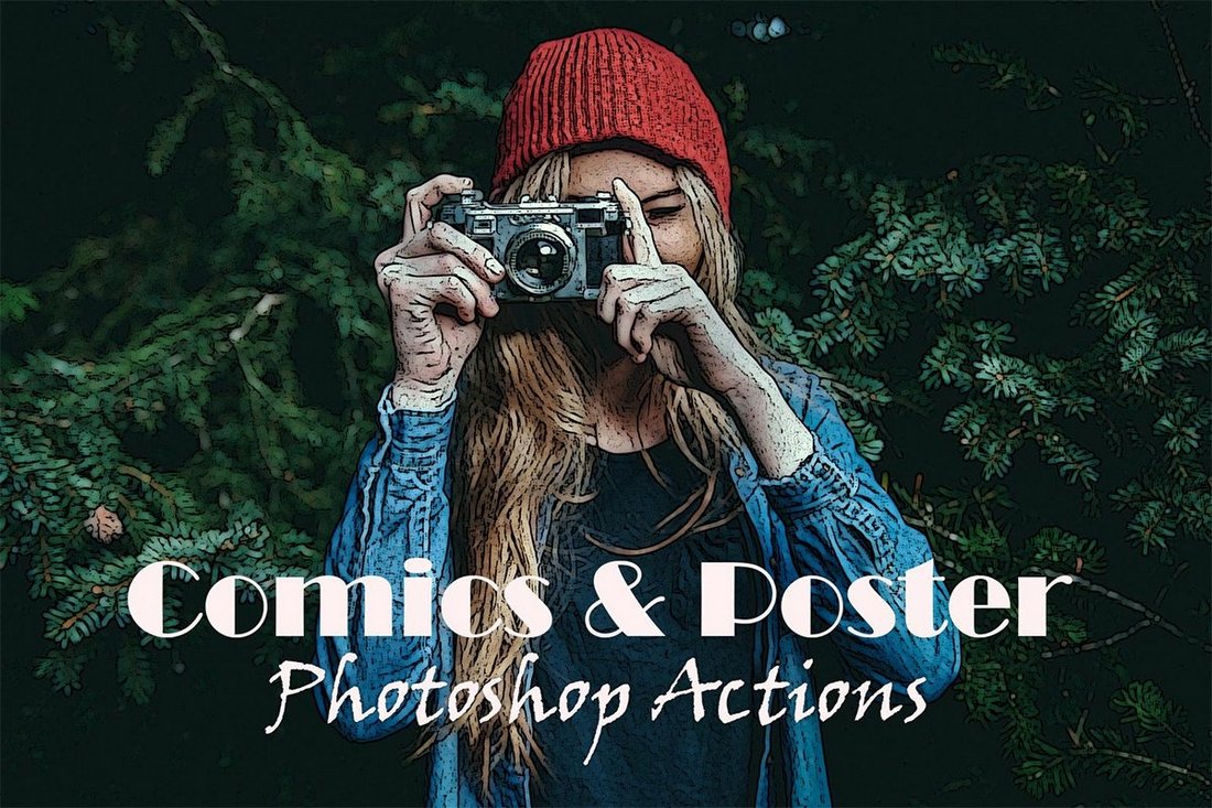
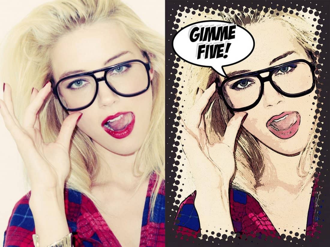
Free Comic Poster Photoshop Actions

Free Comic Poster Photoshop Actions

This free Photoshop action allows you to make your portrait photos look like a page from a comic book. The effect creates a cartoon-style comic book effect that works best with outdoor portrait photos.

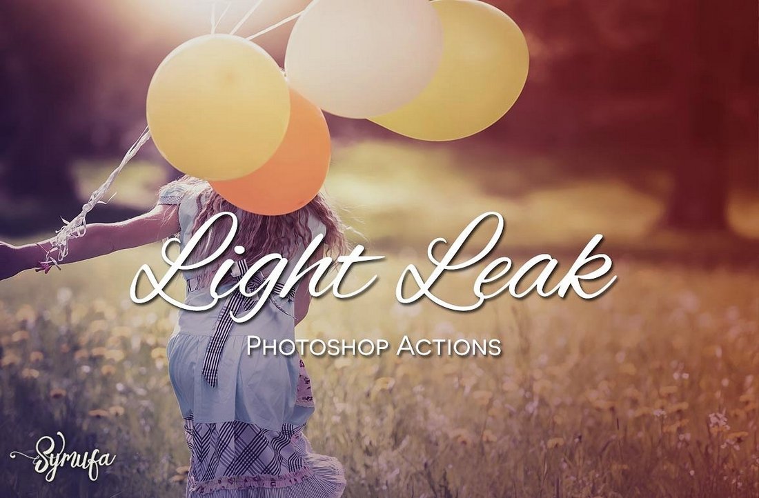
25 Free Light Leaks Photoshop Actions

25 Free Light Leaks Photoshop Actions

A collection of light leaks Photoshop actions for portrait photos. With these effects, you can add realistic light leaks effects to your photos. There are 25 different PS actions in this bundle. All are free to use.

6 Free Photoshop Instagram Actions

6 Free Photoshop Instagram Actions

This is a collection of free Photoshop actions made specifically for enhancing Instagram photos. It includes 6 different actions for optimizing both portrait and landscape photos. It’s ideal for selfie-lovers and travel bloggers.

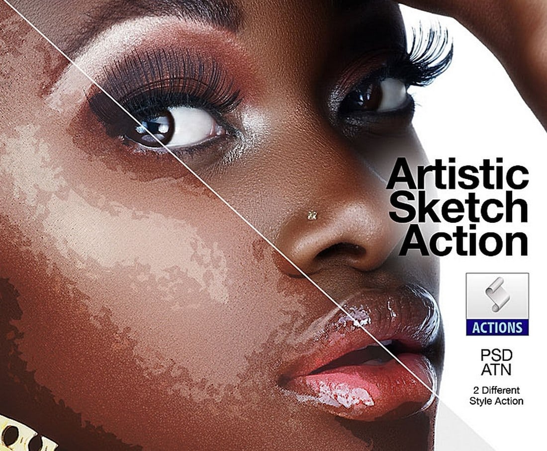
Artistic Sketch Free Photoshop Action

Artistic Sketch Free Photoshop Action

This unique Photoshop action allows you to transform your portrait photos into works of art. It literally makes your portraits look like they were painted by hand. The action is fully customizable as well.

Fantasy – Free Portrait Photoshop Action

Fantasy - Free Portrait Photoshop Action

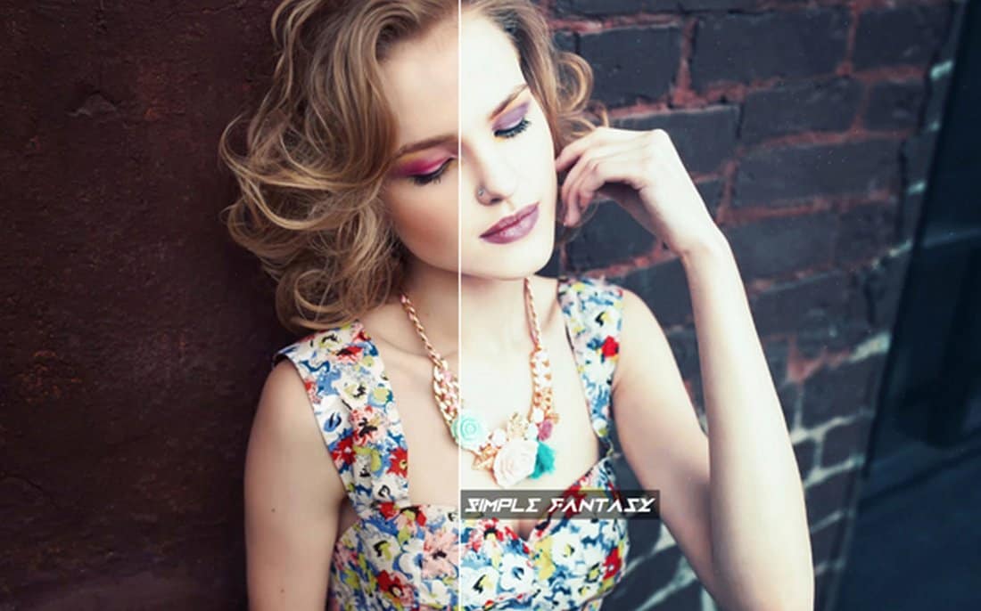
Fantasy is a unique Photoshop action that beautifies your portrait photos with a colorful fantasy-inspired toning effect. This effect is ideal for optimizing your photos for Facebook and Instagram.

Free Skin Retouching Photoshop Action

Free Skin Retouching Photoshop Action

It usually takes hours of careful adjustments and brushing for retouching portrait photos. This is a great free Photoshop action that will help you save a lot of your time. This action automatically does all the basic skin retouching and enhancements with just a few clicks.

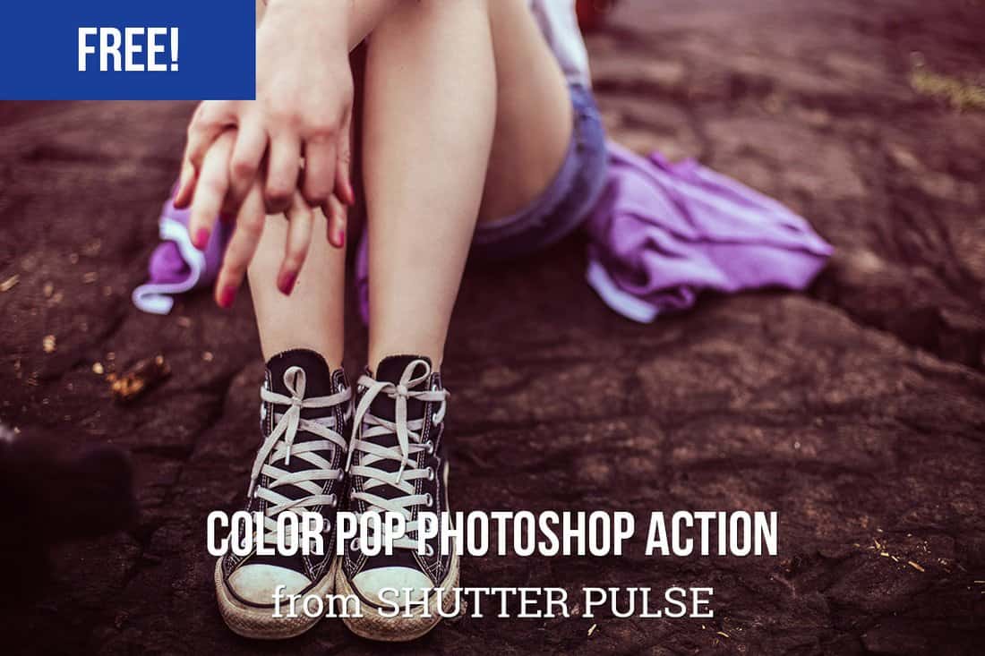
Free Color Pop Photoshop Action

Free Color Pop Photoshop Action

This free Photoshop action allows you to easily bring out the true colors in your ordinary smartphone photos to make them look more bright and colorful.

Shimmer Free Portrait Photoshop Action

Shimmer Free Portrait Photohop Action

Shimmer is a free Photoshop action made for enhancing your portrait photos. The effect automatically adjusts the brightness and contrast of your photos to make them look more authentic and stand out from the crowd.

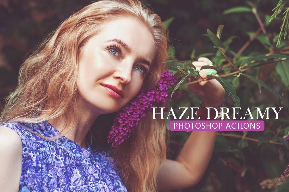
Free Haze Dreamy Photoshop Actions

Free Haze Dreamy Photoshop Actions

Add a dreamy and a colorful moody effect to your portrait photos using this free Photoshop actions pack. It includes 3 different actions you can use with various types of portrait photos.

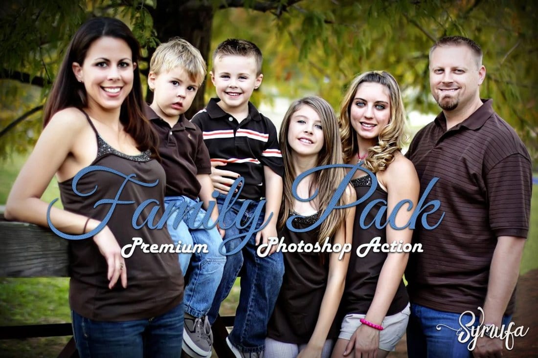
50 Free Family Pack Photoshop Actions

50 Free Family Pack Photoshop Actions

Looking for Photoshop actions to improve your family photos? Well, look no further. This bundle comes with 50 different effects and adjustments for improving your family photos, including portrait and landscape photos.

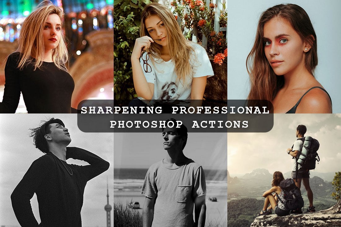
Free Sharpening Professional Photoshop Actions

Free Sharpening Professional Photoshop Actions

A collection of free sharpening Photoshop actions for easily enhancing your photos by adjusting the sharpness. These actions are ideal for improving smartphone photos as well as photos taken with digital cameras.

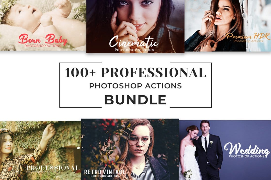
100+ Free Pro Photoshop Actions Bundle

100+ Free Pro Photoshop Actions Bundle

A massive bundle of 100 different Photoshop actions for professionals. The actions in this pack are designed for making adjustments, adding filters, and processing professional photography much easier and quicker.

Filters & Effects Photoshop Actions

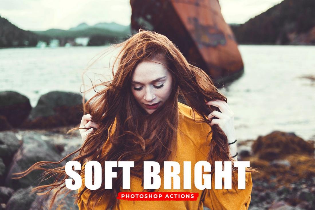
Free Soft Bright Photoshop Actions

Free Soft Bright Photoshop Actions

This is a collection of subtle and soft filters you can use to stylize your photos. It’s especially ideal for enhancing photos for social media, including Instagram. The actions are compatible with Photoshop CS3 and higher.

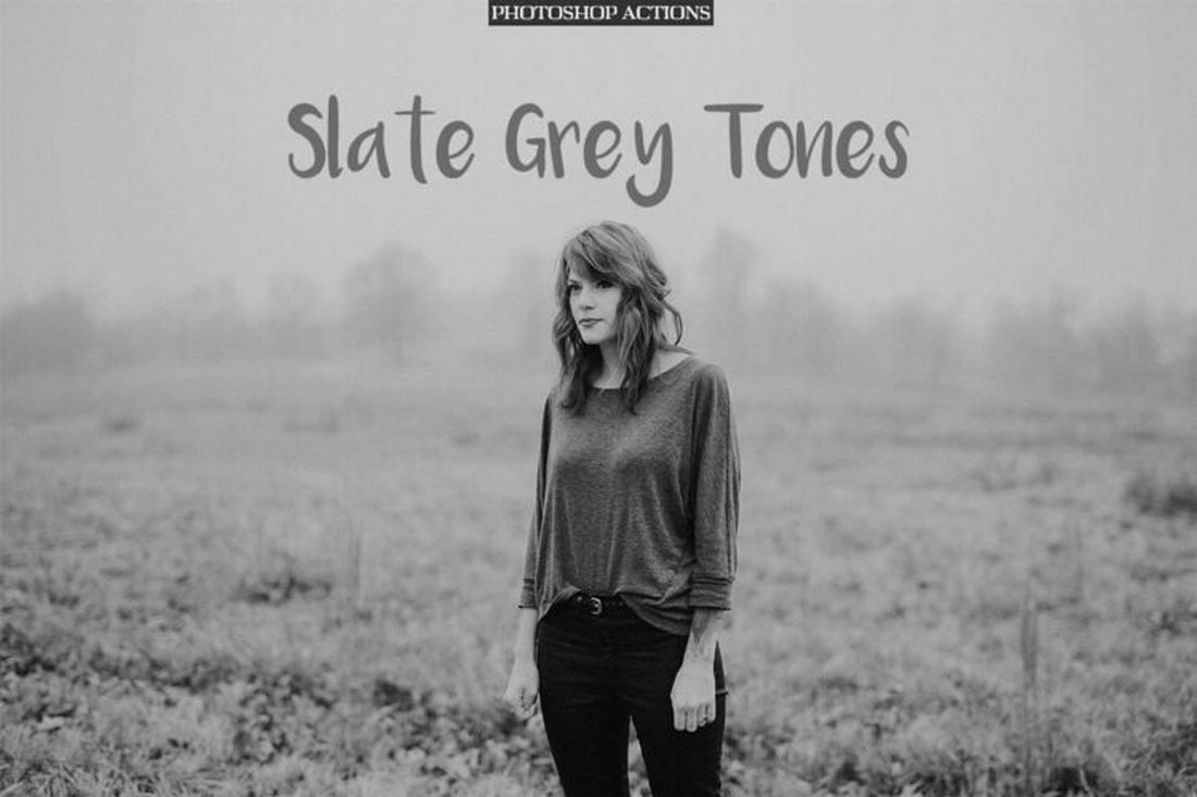
Free Slate Grey Tones Photoshop Actions

Free Slate Grey Tones Photoshop Actions

Give a classic and vintage look to your photos using this free Photoshop action bundle. It includes effects that transforms your photos with an authentic black and white look.

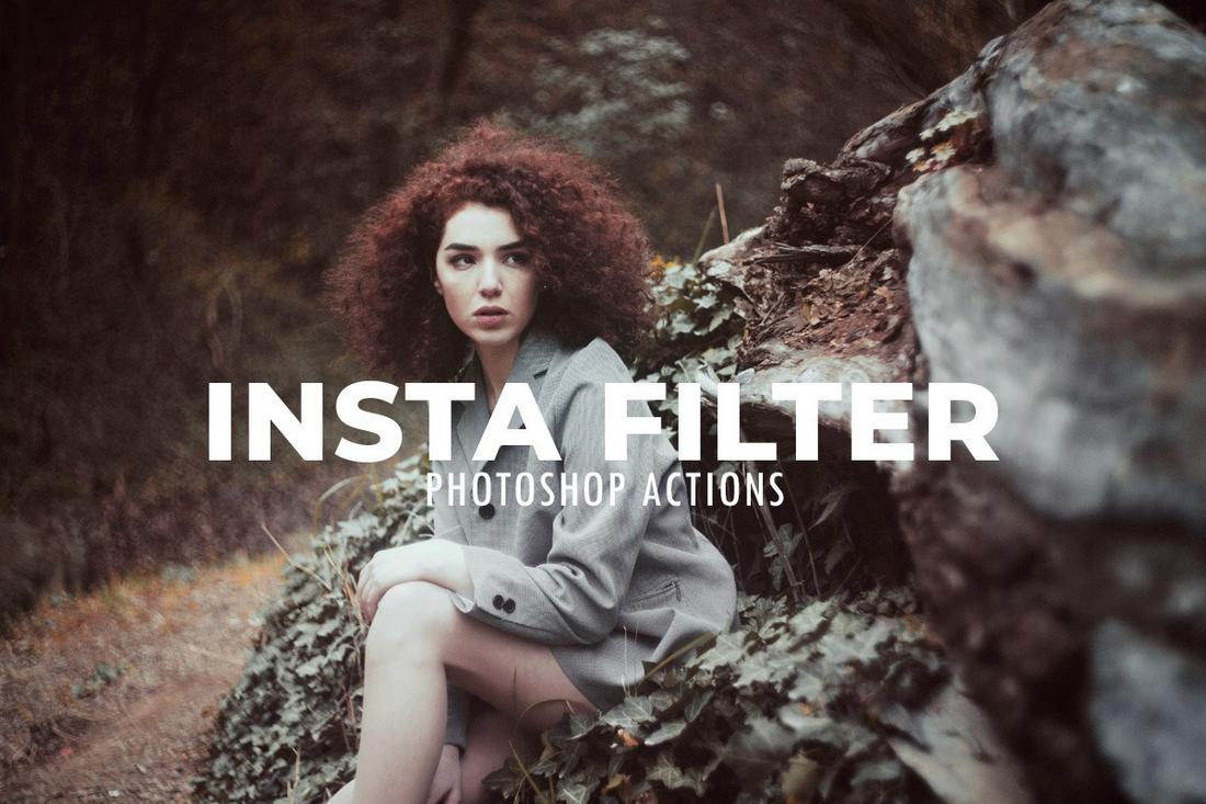
Free Insta Filter Photoshop Actions

Free Insta Filter Photoshop Actions

In this pack, you get access to Photoshop filters and effects inspired by Instagram filters. These are most useful for adding a smooth and professional look to your photos.

Free Double Exposure Photoshop Action

Free Double Exposure Photoshop Action

With this free Photoshop action, you can easily create the double exposure effect without effort. The action is quite easy to use and customize as it creates an effect with organized layers.

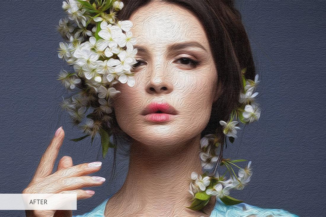
Free Oil Paint Photoshop Action

Free Oil Paint Photoshop Action

Convert your photos into beautiful, artistic oil paintings with this free Photoshop action. It features a simple and easy-to-use effect that generates a subtle oil painting look.

Indie Camera – Free Photography Photoshop Actions

Indie Camera - Free Photoshop Actions

This is a collection of retro-style photo filters that add a classic retro film look to your photos. The pack includes 30 experimental Photoshop actions that work with just one click and let you customize the effect to your preference.

Retro Prime – Free Photo Filters & Actions

Retro Prime - Free Photo Filters & Actions

You can give your photos an authentic and natural retro look with this collection of Photoshop actions. It includes 10 retro filters featuring different styles of retro effects. And it also comes with 5 retro-themed textures.

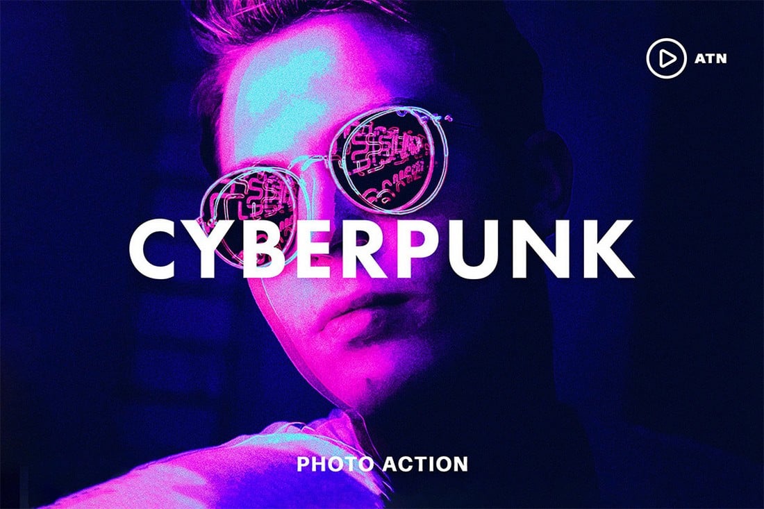
Free Cyberpunk Effect Photoshop Action

Free Cyberpunk Effect Photoshop Action

Create a colorful, vibrant cyberpunk effect using this free Photoshop action. It’s ideal for transforming your portrait photos for posters and cover art. The action is easy to use and includes options for customization.

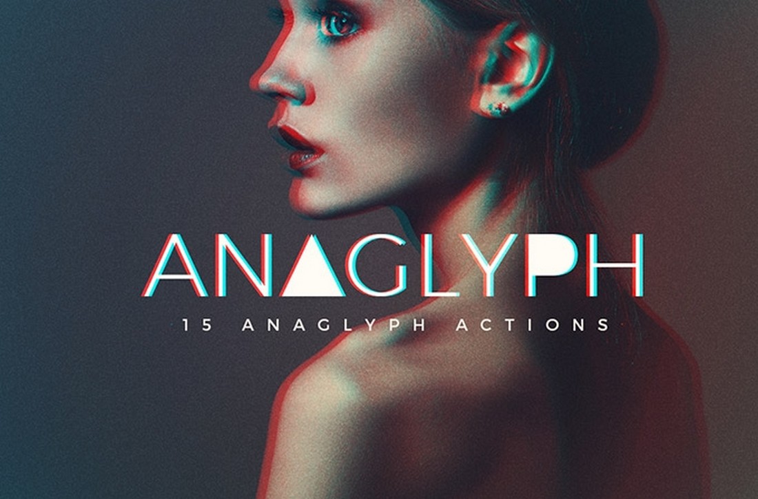
Anaglyph – Free Glitch Effect Photoshop Action

Anaglyph - Free Glitch Effect Photoshop Action

This free Photoshop action allows you to create a trendy glitching effect with just a few clicks. It’s perfect for giving a modern, tech vibe to your graphic designs, text, and photos. You can also fully customize the effect to your preference.

Free Portrait Instagram Filter PS Action

Free Portrait Instagram Filter PS Action

With this free Photoshop action, you can apply an Instagram-style filter to make your portraits look more professional. The moody effect it creates is ideal for giving a vintage look to your Instagram posts.

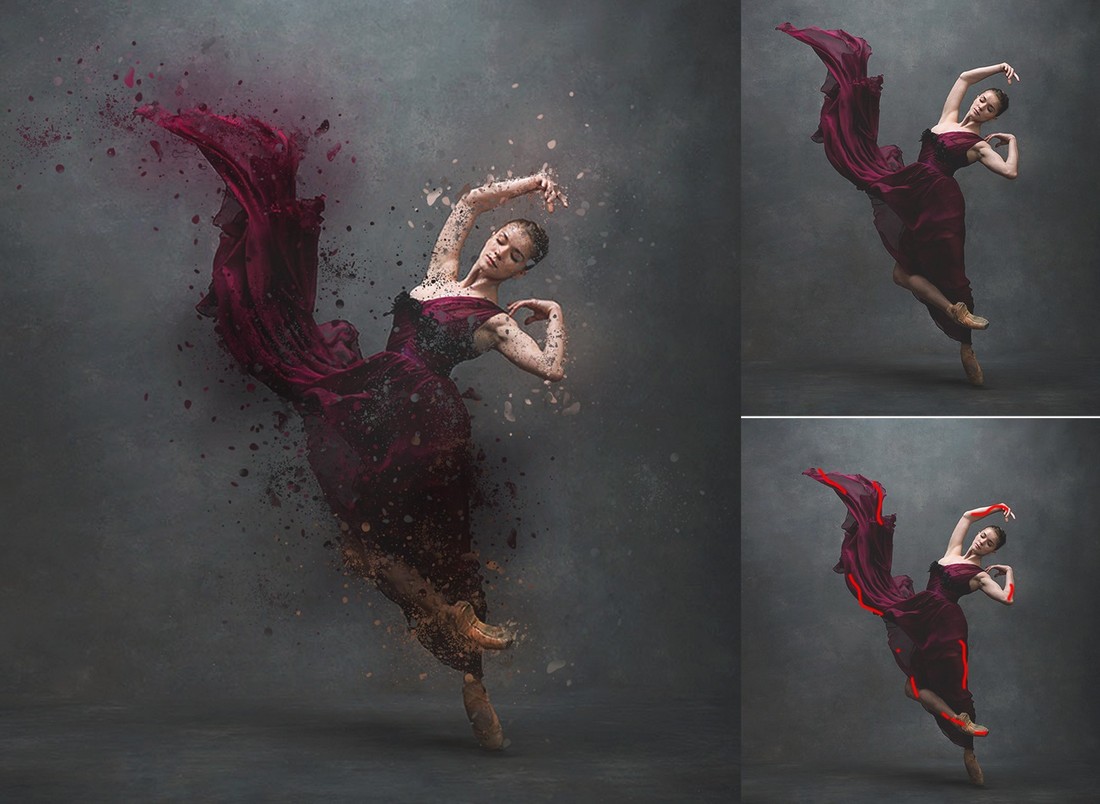
Free Dispersion Effect Photoshop Action

Free Dispersion Effect Photoshop Action

This free Photoshop action lets you create a high-quality dispersion effect with just a few clicks. It’s very easy to use and comes with a free guide to show you how the effect works.

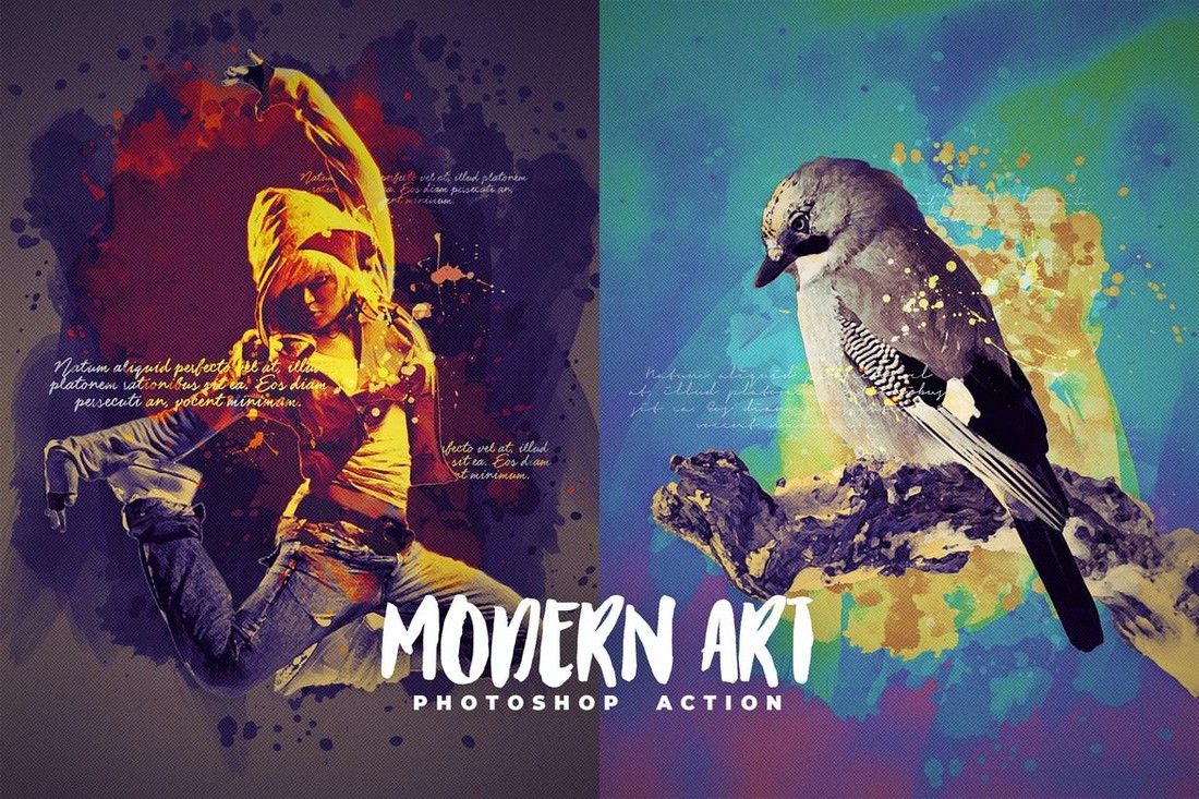
Modern Art Photoshop Action

Modern Art Photoshop Action

If you’re a fan of modern art, you’ll surely be a fan of this Photoshop action as well. It allows you to transform your images into modern works of art by adding various design elements. It also includes more than 40 color presets.

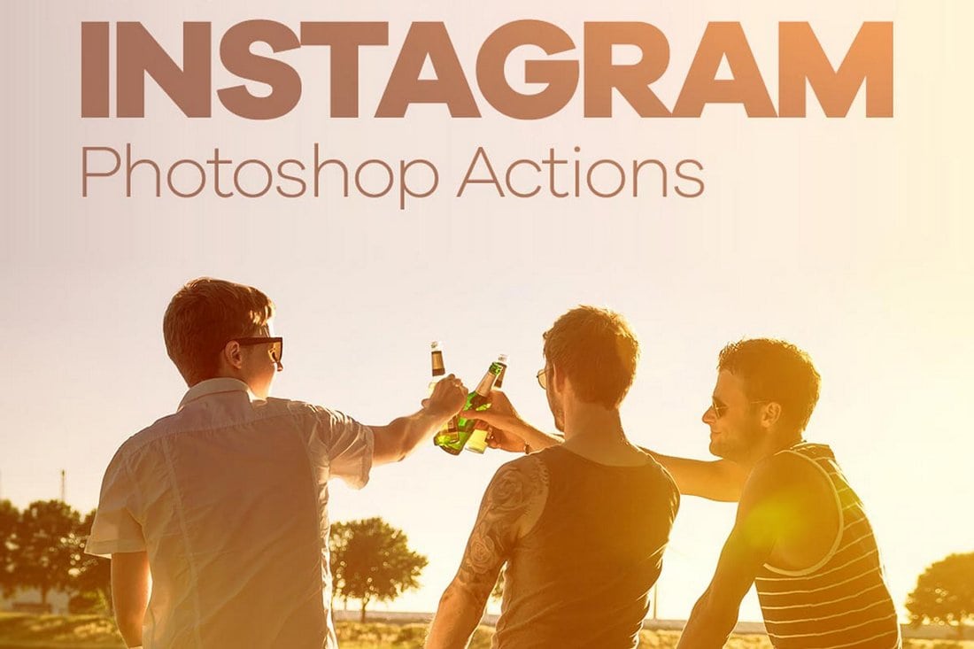
30 Free Instagram Photoshop Actions

30 Free Instagram Photoshop Actions

If you’re looking for colorful and creative filters similar to the ones on Instagram, this free pack of Photoshop actions will come in handy. It includes 30 different filters you can use to improve all kinds of portrait and landscape photos.

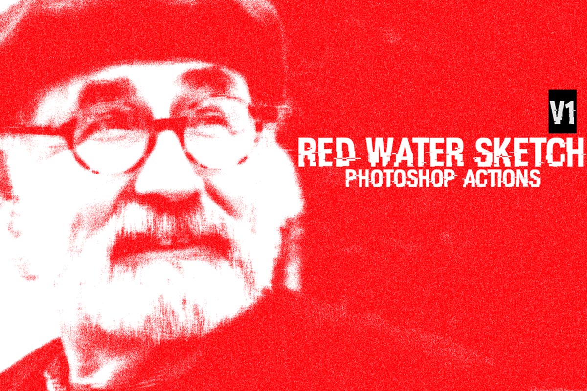
Free Red Water Sketch Photoshop Actions

free photoshop actions

Use this beautiful Photoshop effect and transform your pictures into red watercolor sketch drawings in just a few clicks. It’s a non-destructive filter and works seamlessly with Photoshop CS3 and higher versions.

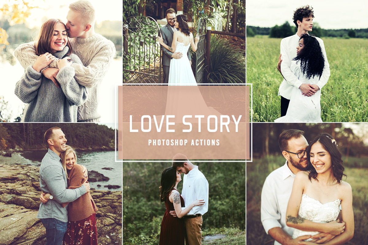
Free Love Story Photoshop Actions

free photoshop actions

Here we have a collection of Photoshop actions consisting of warm, glowing, and moody filters that will give a beautiful romantic feel to your pictures. You can use these effects for indoor, outdoor, wedding, newborn, urban, portrait, travel, and fashion photography.

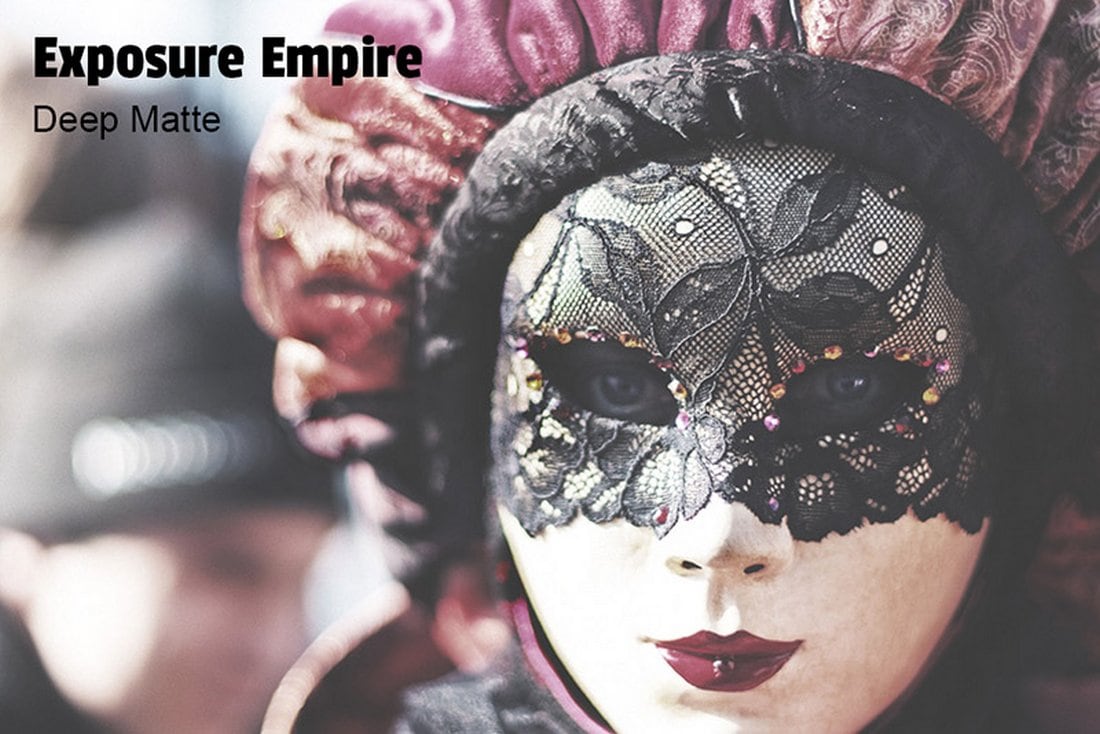
Free Deep Matte Photoshop Action

Free Deep Matte Photoshop Action

A stylish effect for improving your portrait and close-up photos. The free Photoshop action adds a deep matte filter to give your photos more depth and mood. It also includes a Lightroom preset as well.

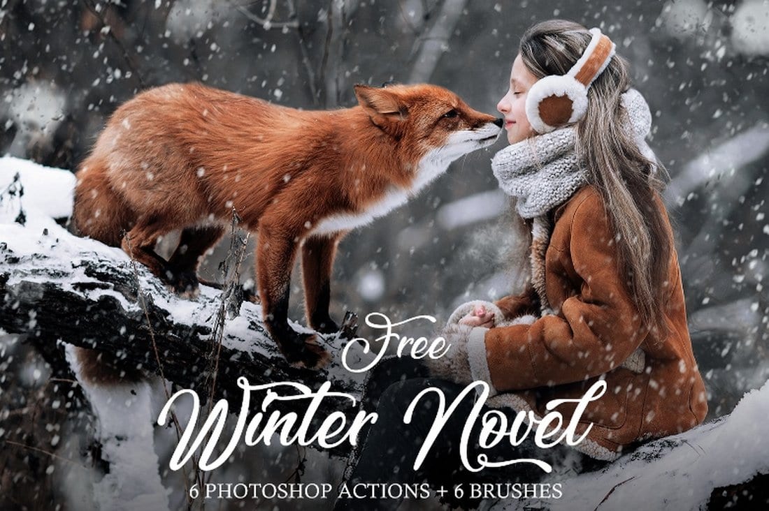
Free Winter Snow Photoshop Actions

Free Winter Snow Photoshop Action

This free Photoshop action is perfect for improving your photos for winter and Christmas-themed designs. It creates a realistic snow effect to give your photos a true Christmassy look. The pack includes 6 different snow actions.

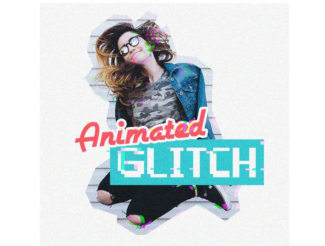
Animated Glitch Photoshop Action

Animated Glitch Photoshop Action

A unique Photoshop action that allows you to turn your photos into an animated GIF with a glitching effect. It’s perfect for creating unique animated graphics for businesses and promotions to attract attention.

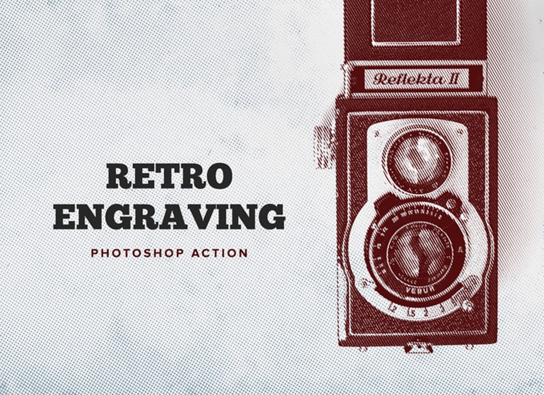
Retro Engraving Free Photoshop Action

Retro Engraving Free Photoshop Action

This free Photoshop action allows you to give a realistic engraved look to your photos. It’s perfect for adding a new look to your graphic designs and abstract photography as well.

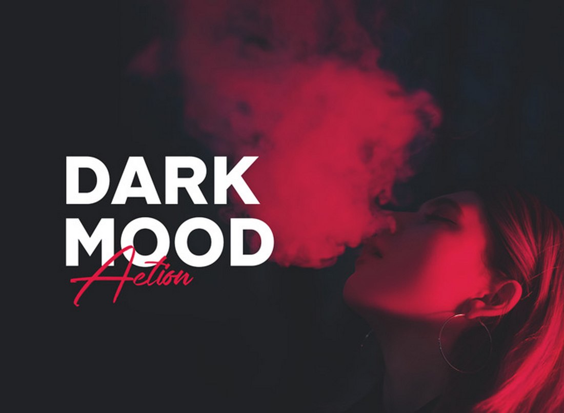
Dark Mood Free Photoshop Action

Dark Mood Free Photoshop Action

Just as the name suggests, this is a Photoshop action you can use to add a dark and moody tone to your portrait photos. It features a fully adjustable effect you can edit to fit different kinds of photos.

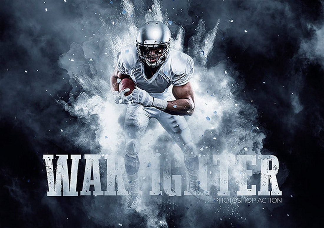
Warfighter Free Photoshop Action

Warfighter Free Photoshop Action

Using this free Photoshop action you’ll be able to add a stylish splash effect to your designs. It’s especially useful for designing posters and flyers. The effect is fully customizable and works with all modern versions of Photoshop.

Comic Art Free Photoshop Action

Comic Art Free Photoshop Action

Give your portrait photos an old-school comic book look and feel using this free Photoshop action. The action simply makes your photos and graphics look like a page out of a retro comic book. And it’s free to download.

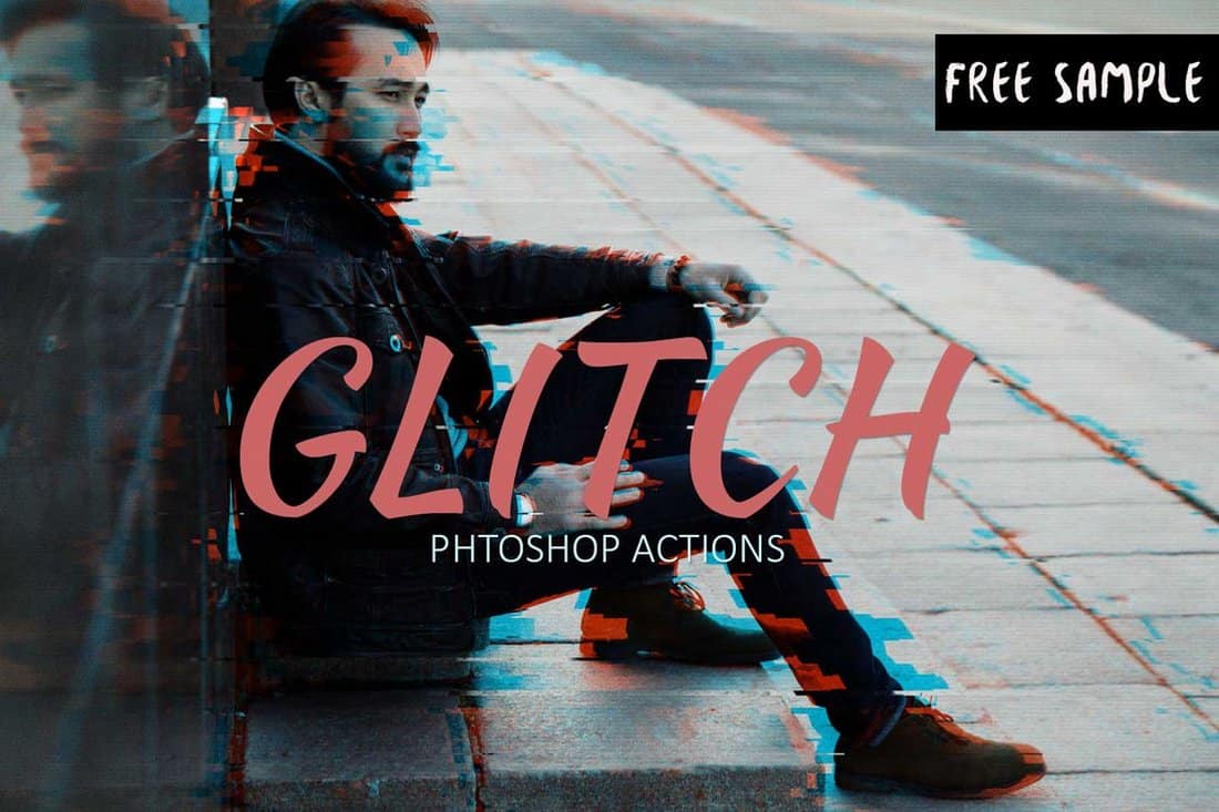
Free Glitch Photoshop Action

Free Glitch Photoshop Action

The retro-themed glitch effect is quite popular in poster and graphic designs. This free Photoshop action lets you create that same effect instantly with just a few clicks. It includes a PSD file and a pattern file you can grab for free to create the effect.

Cinematic Free Portrait Photoshop Action

Cinematic Free Portrait Photoshop Action

Give your portrait photos a cinematic look and feel using this free Photoshop action. It lets you add a creative cinematic toning effect to your portraits to make them look like a scene out of a movie.

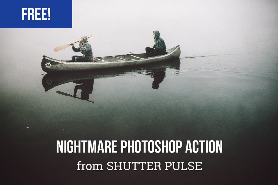
Free Nightmare Photoshop Action

Free Nightmare Photoshop Action

If you’re working on a gloomy or horror-themed design, this free Photoshop action will allow you to add a surreal dark effect to your designs. This action works best with outdoor photos.

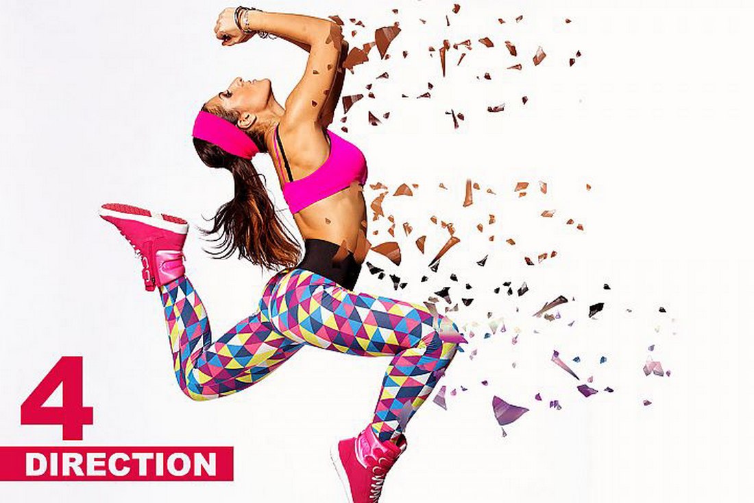
Free Dispersion Photoshop Action

Free Dispersion Photoshop Action

The dispersion effect is a widely used effect in poster and flyer designs. With this free Photoshop action, you can recreate the same effect with just a few clicks. The action even allows you to choose the direction of the dispersion effect as well.

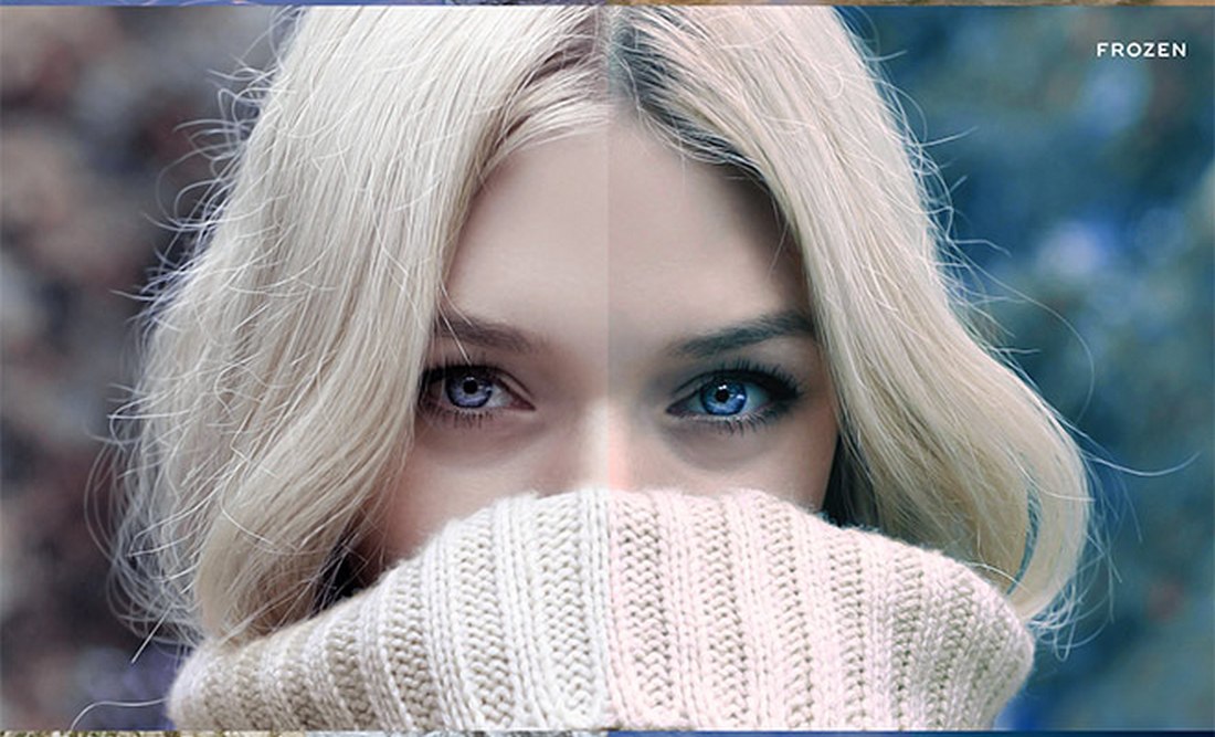
10 Free Winter Blues Photoshop Effect Actions

10 Free Winter Blues Photoshop Effect Actions

A collection of 10 different Photoshop actions featuring winter-themed effects and styles. These actions are perfect for improving your winter portrait and landscape photography.

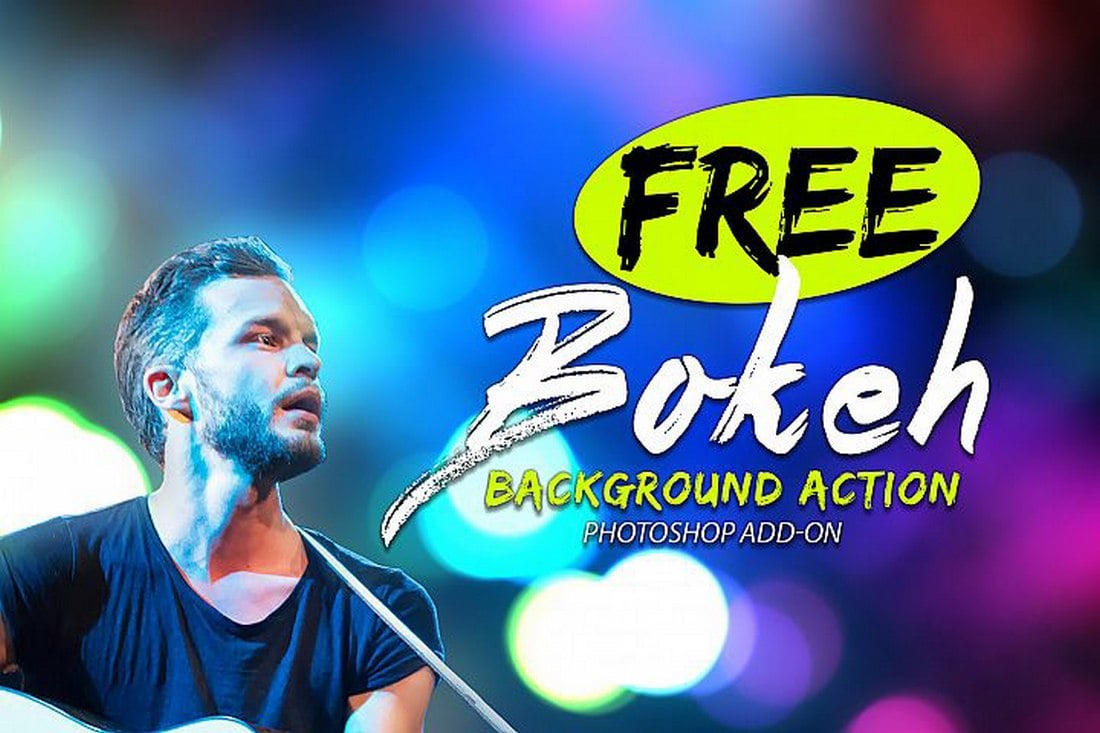
Free Bokeh Photoshop Action

Free Bokeh Photoshop Action

Add a creative bokeh background to your photos using this easy-to-use Photoshop action. The action works with just one click and lets you customize the effect to your preference as well.

Free Cosmic Photoshop Action

Free Cosmic Photoshop Action

This free Photoshop action comes with a creative and colorful effect that will add more beauty and color to your ordinary portrait photos. It will especially come in handy for enhancing your smartphone photos.

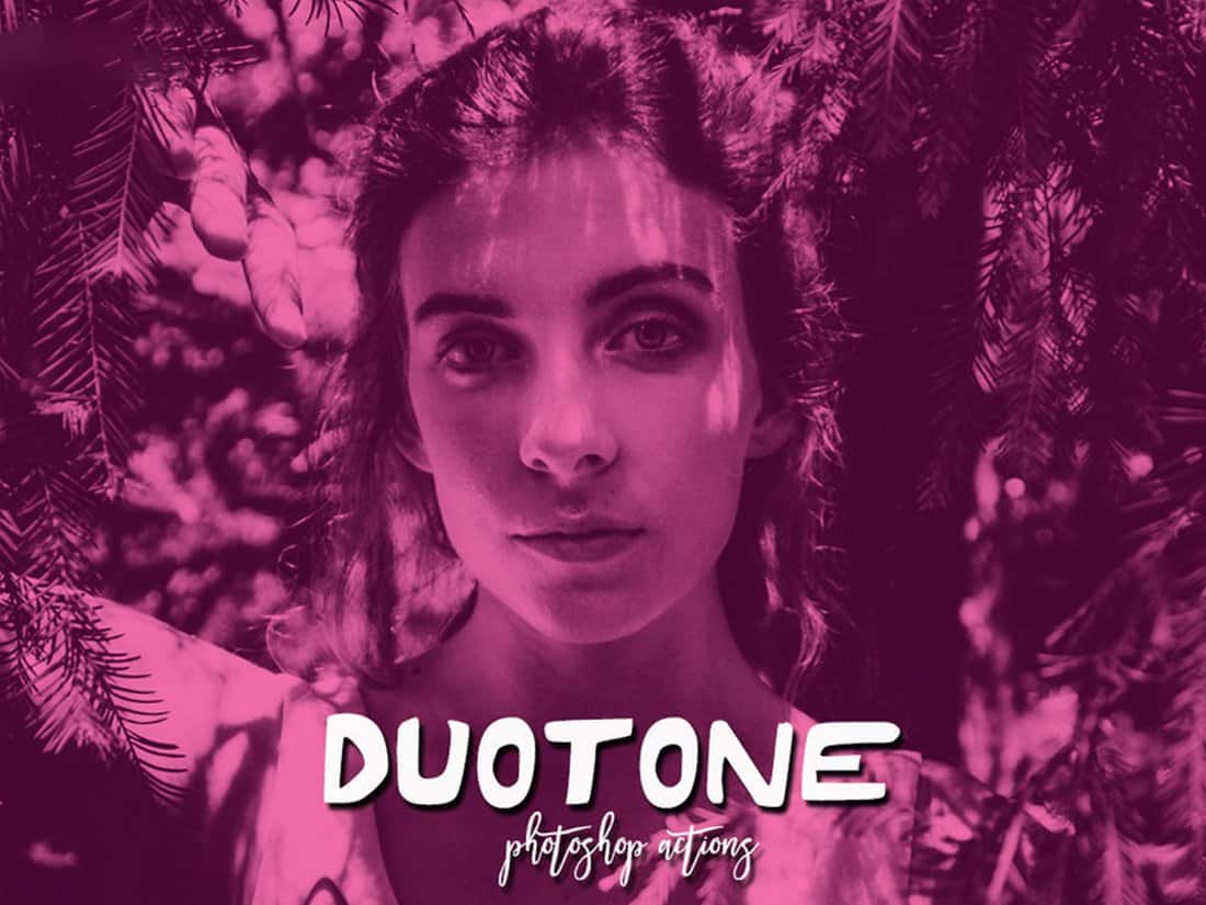
Free Duotone Photoshop Actions

Free Duotone Photoshop Actions

If you’re looking for a way to make your photos look more creative or add a colorful filter like on Instagram, these free Photoshop actions will be useful to you. It includes a set of modern duotone effects that will make your photos look more creative.

EasyComic Free Photoshop Action

EasyComic Free Photoshop Action

With this free Photoshop action, you can completely transform your ordinary photos to make then look like a page out of a comic book. The action is quite easy to use and works with both portrait and landscape photos.

Outdoor & Landscape Photoshop Actions

Free Color Correct Photoshop Action

Free Color Correct Photoshop Action

Easily correct the colors of your outdoor and nature photos with this free Photoshop action. It works wonders for fixing landscape photography, especially for ones shot in bad lighting conditions.

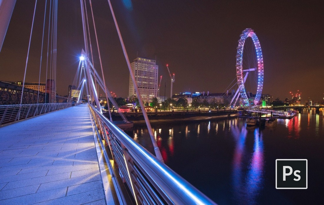
Free Night Glow Photoshop Action

Free Night Glow Photoshop Action

Have you ever wanted to make your night cityscape photos look more vibrant? Then this Photoshop action is for you. It lets you enhance your night street and cityscape photos with a glowing effect.

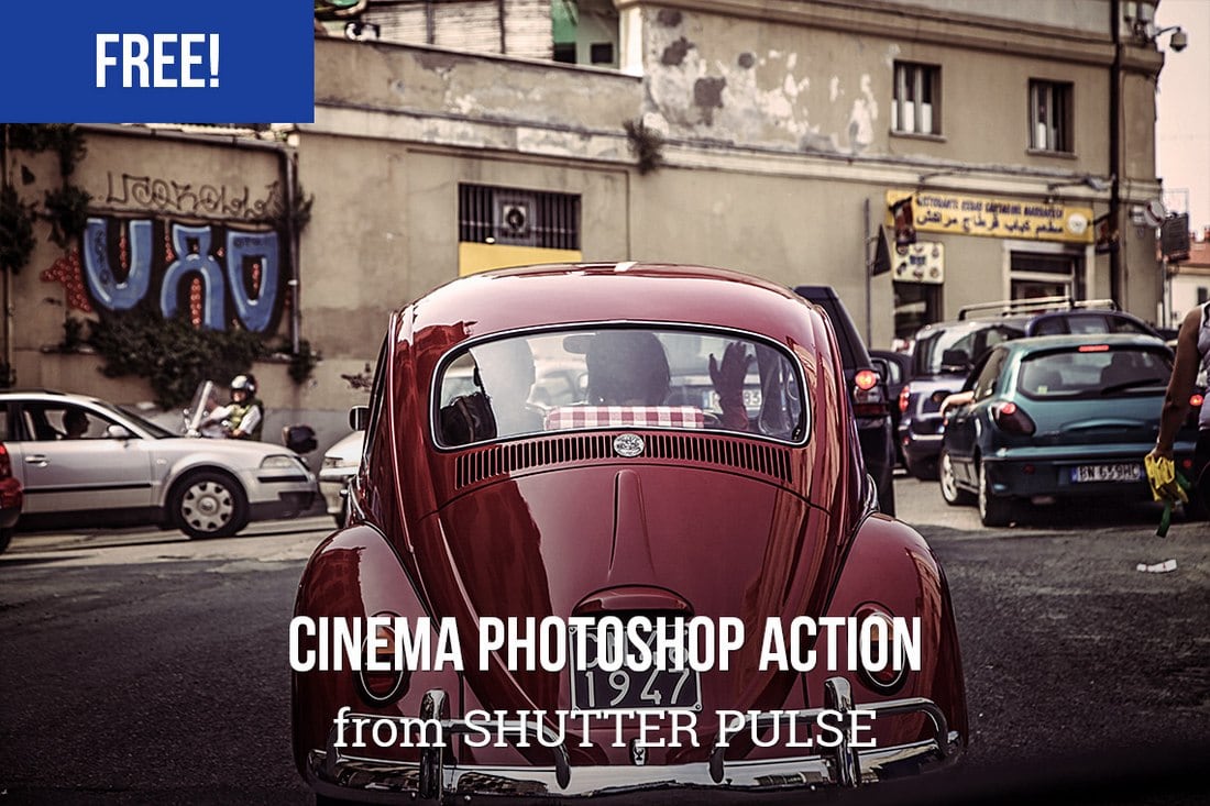
Free Cinema Photoshop Action

Free Cinema Photoshop Action

This beautiful and high-quality Photoshop action will completely transform your outdoor landscape photos by giving them a cinematic look and feel. The effect of the action is adjustable and it’s free to download and use.

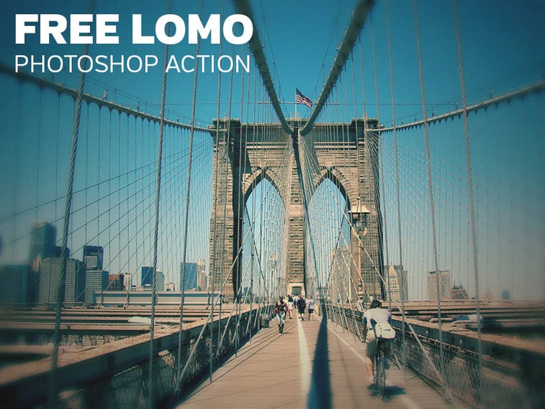
Free Lomo Photoshop Action

Free Lomo Photoshop Action

The Lomography effect is quite popular among professional photographers, which help add a unique look and feel to outdoor and landscape photos. This free Photoshop action allows you to apply the same effect to your photos without a hassle.

Rustic – Free Outdoor Photoshop Action

Rustic - Free Outdoor Photoshop Action

This free Photoshop action allows you to add a beautiful rustic feel to your outdoor photos. It enhances the colors and exposure to make your photography look more professional.

Charming – Free Outdoor Photoshop Action

Charming - Free Outdoor Photoshop Action

You can use this Photoshop action to instantly enhance your outdoor and landscape photos. It’s especially ideal for improving photos shot in low-light conditions.

Natural Light Landscape Photoshop Action

Natural Light Landscape Photoshop Action

Instantly adjust light, contrast, and brightness of your outdoor landscape and nature photography using this free Photoshop action. It’s perfect for making your smartphone photos look more professional.

Into The Jungle Photoshop Actions

Into The Jungle Photoshop Actions

This pack comes with 2 different Photoshop actions that allow you to easily optimize your photos taken in outdoor environments. It automatically adjusts the contrast and toning to make your photos look more natural.

Free Summer Photoshop Actions

Free Summer Photoshop Actions

This is a massive bundle of 50 free Photoshop actions. It includes various styles of actions for adding a summer-themed colorful effect to your photos. Even your photos taken during Winter will look like summer once you process them with this free PS action.

Filmtastic Free Photoshop Action

Filmtastic Free Photoshop Action

This free Photoshop action lets you apply a unique film-inspired toning effect to your outdoor and landscape photos. It’s free to download and use with your personal projects.

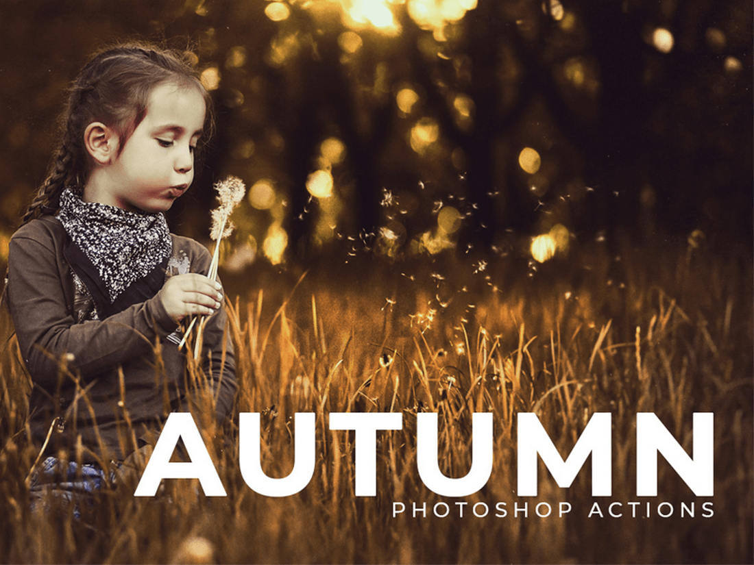
50 Free Autumn Photoshop Actions

50 Free Autumn Photoshop Actions

Another bundle of free Photoshop actions featuring 50 different autumn-inspired effects. These actions are ideal for photos taken in outdoors and low light conditions.

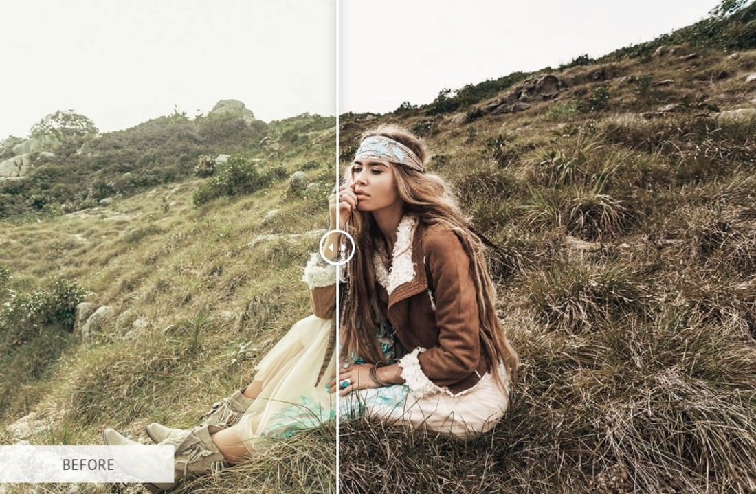
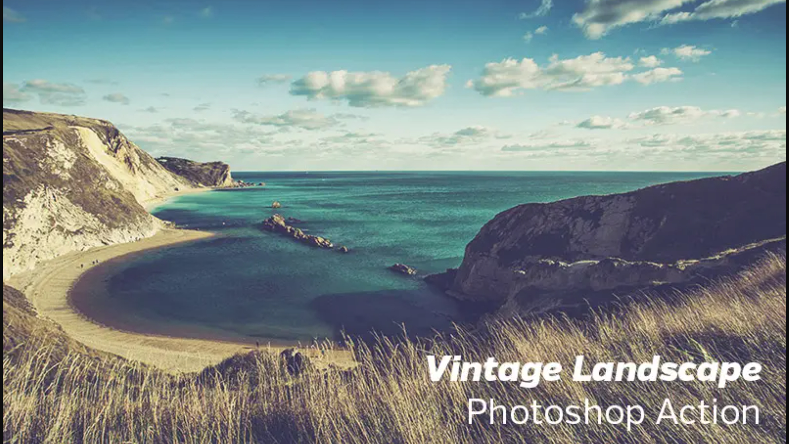
Free Vintage Landscape Photoshop Action

free photoshop actions

Next up we have a Photoshop action created to give your photos a unique vintage look. The action is purpose-built for landscape and outdoor photography but is versatile enough to be easily used for enhancing portrait, lifestyle, urban, and fashion shots.

Wedding Photoshop Actions

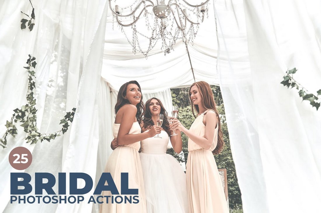
25 Bridal Wedding Photoshop Actions

25 Bridal Photoshop Actions

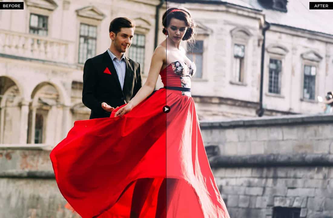
This is a bundle of wedding Photoshop actions that work well for optimizing bridal photos. However, they should work well for enhancing couple and groom photos as well. It includes 25 different Photoshop actions with various effects.

Free Royal Wedding Pro Photoshop Actions

Free Royal Wedding Pro Photoshop Actions

This free wedding-themed Photoshop action features an easy to use effect that optimizes your wedding photos for the best color and contrast ratio. It’s most suitable for enhancing outdoor photos.

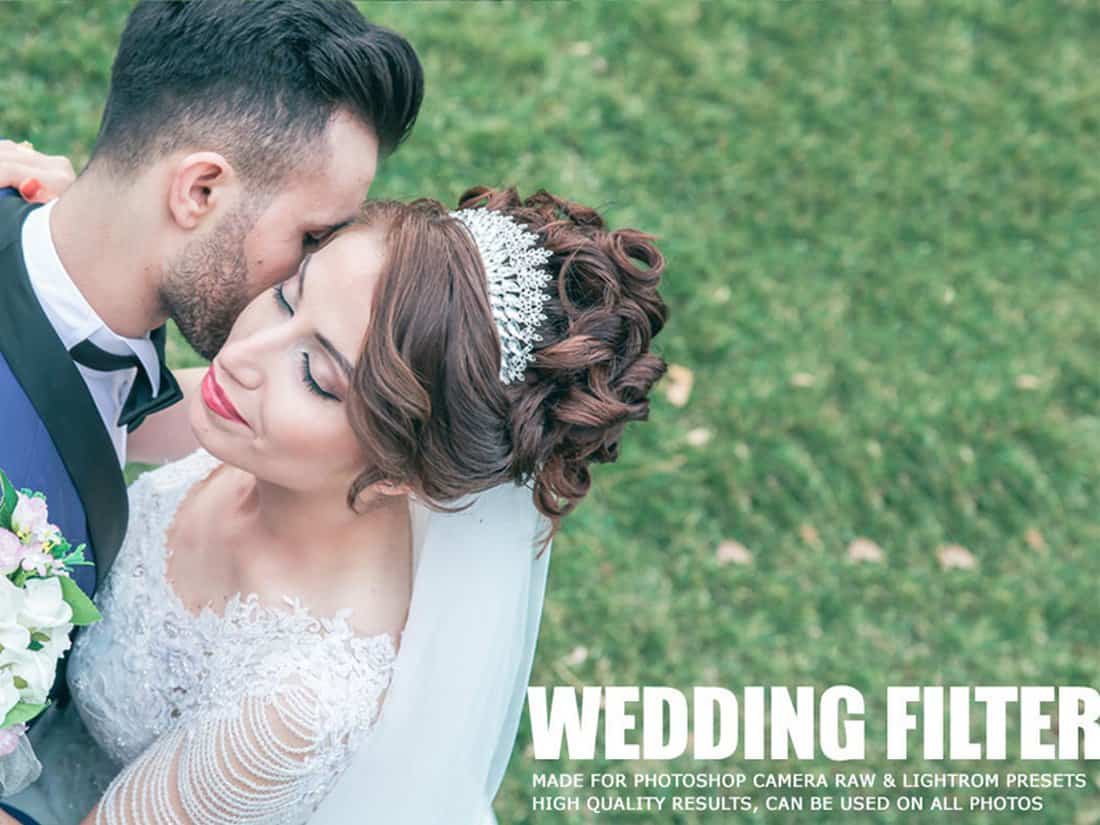
Free Wedding Filter Photoshop Action

Free Wedding Filter Photoshop Action

Make your wedding photos look more colorful and dreamy with this free Photoshop action. It allows you to apply a filter to add a moody look to your outdoor wedding photos.

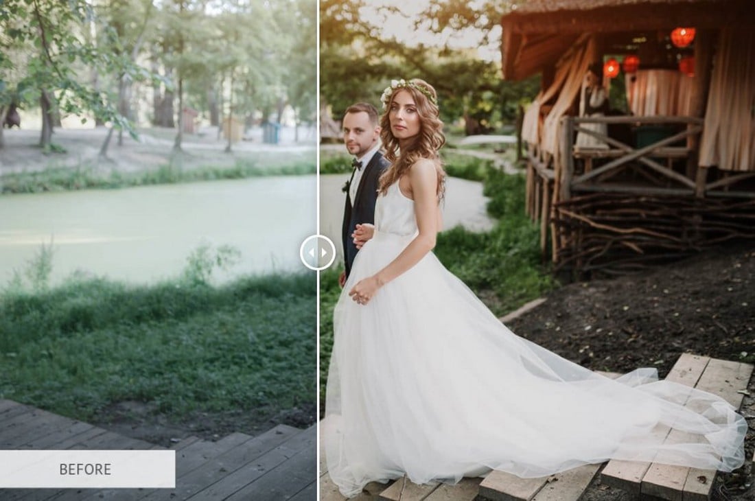
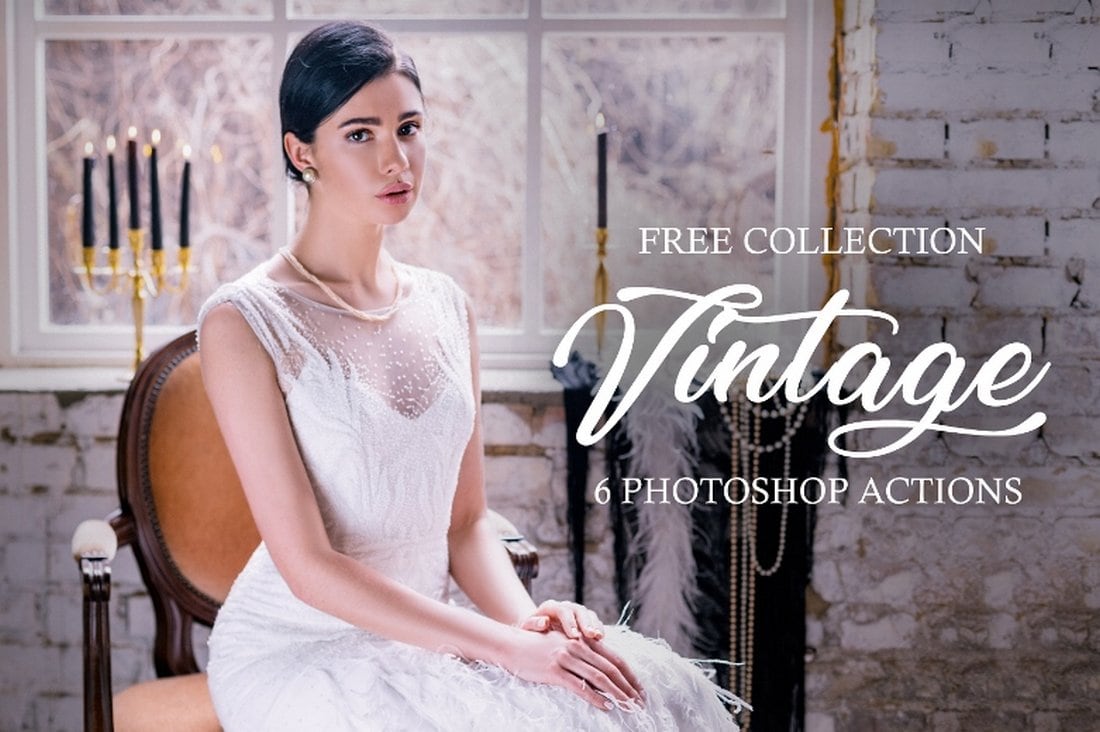
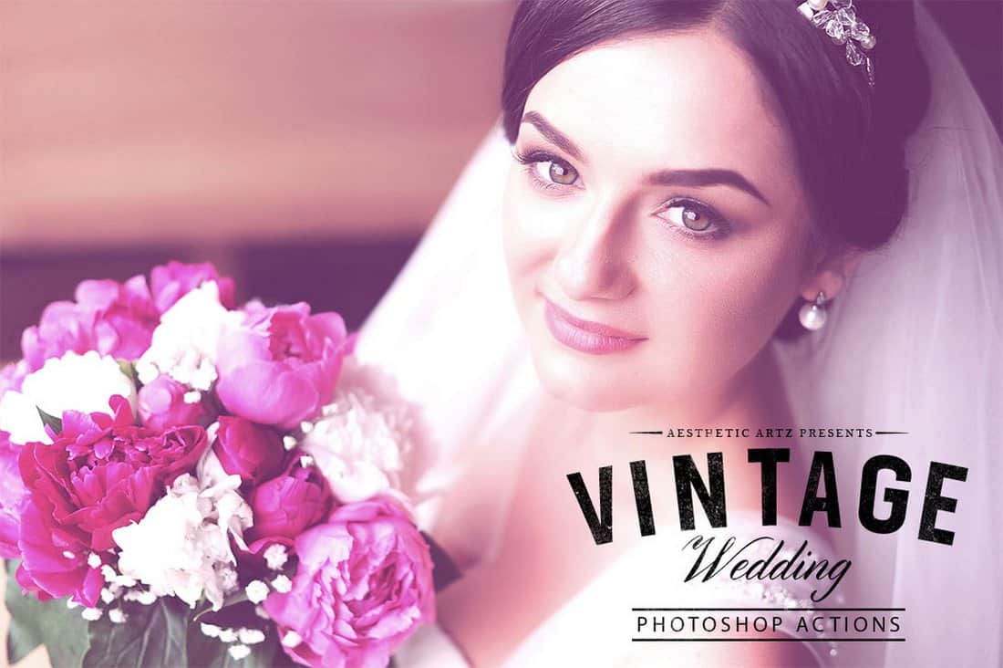
6 Free Vintage Wedding Photoshop Actions

6 Free Vintage Wedding Photoshop Actions

This set of vintage Photoshop actions include 6 different effects featuring matte, HDR, and vintage styles that are perfect for improving wedding photos, fashion photos, portraits, and much more.

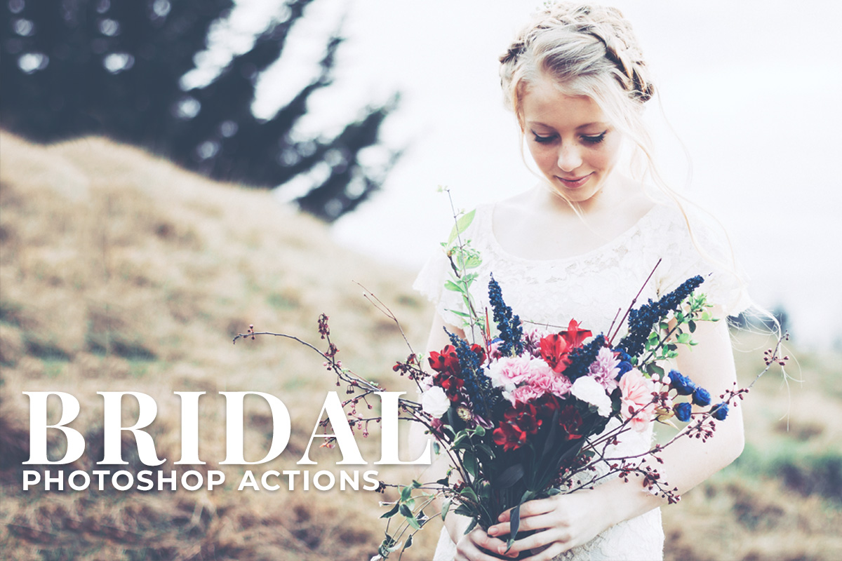
Free Bridal Photoshop Actions

free photoshop actions

This collection of Photoshop actions has been carefully crafted to make your special day photos a lot more special by giving them a beautiful finish. The filters convert your pictures into a magical dream in lightning-fast speed.

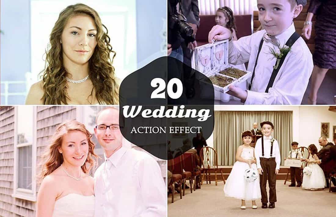
20 Free Wedding Photoshop Actions

20 Free Wedding Photoshop Actions

This is a collection of 20 useful Photoshop actions featuring various effects for enhancing and optimizing different types of wedding photos. It will help make your wedding photos look even more beautiful.

Free Wedding Photoshop Actions

Free Wedding Photoshop Actions

This free Photoshop action is specially crafted for enhancing the tone and contrast of your wedding photos to make them much more beautiful. It includes 10 different filters that you can easily customize to your preference as well.

Free Aesthetic Vintage Wedding PS Action

Free Aesthetic Vintage Wedding PS Action

Another great free Photoshop action for enhancing your wedding photos. It includes a unique toning effect that will make your photos look more vibrant with colors and style.

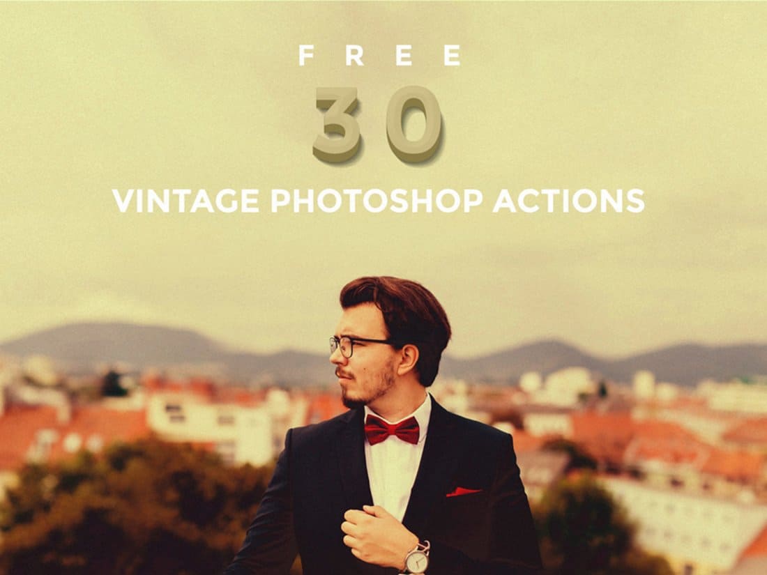
30 Free Vintage Photoshop Actions

30 Free Vintage Photoshop Actions

Give your portrait and landscape wedding photos a more authentic look and feel using this bundle of free Photoshop action. This pack includes 30 different actions that allow you to instantly create a stunning vintage toning effect.

Facebook Fix – Free Wedding Photoshop Action

Facebook Fix - Free Wedding Photoshop Action

This is a multipurpose Photoshop action that can be used to improve all kinds of photos from portraits to wedding photos and more. It’s specially optimized to enhance photos for Facebook. So the ideal image size is 960 pixels.

Black & White Photoshop Actions

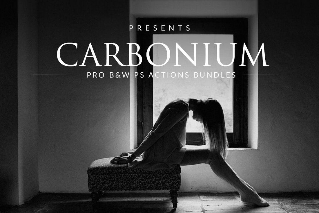
Carbonium – Black & White PS Actions

Carbonium - Black & White PS Actions

Carbonium is a collection of black and white grading actions created by a group of professional photographers. The actions in this pack have been specially optimized to give your photos a unique vintage feel and a classic look. The pack comes with 16 different variations of B&W actions as well.

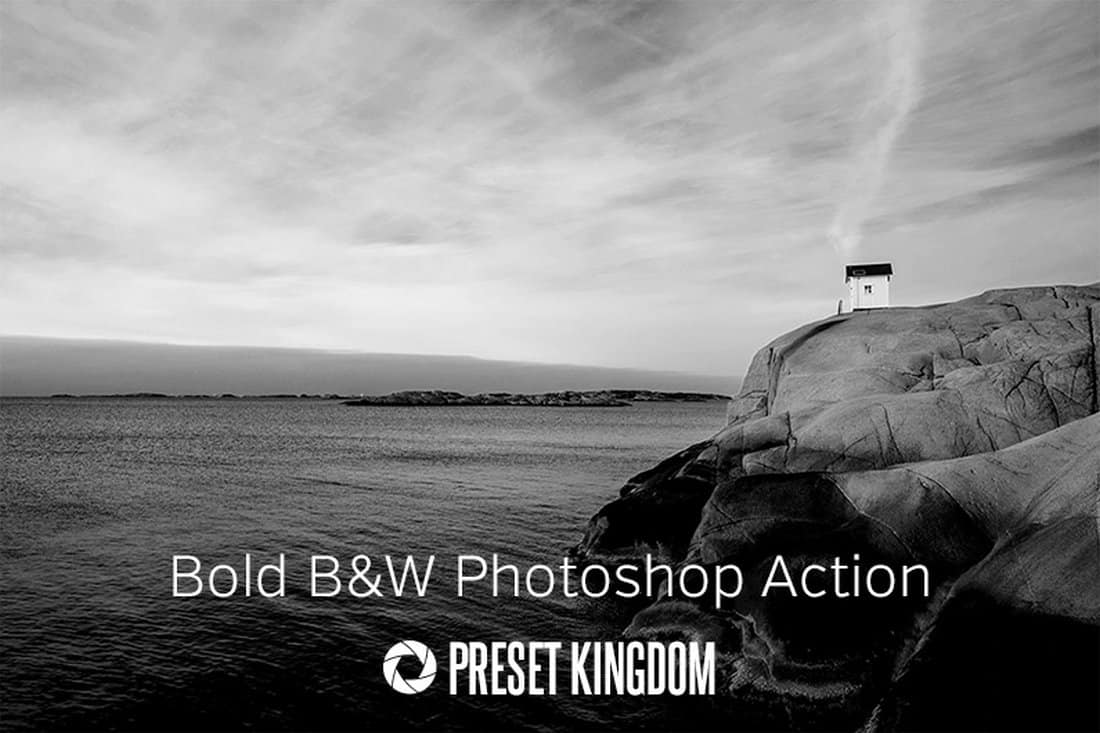
Free Bold Black & White Photoshop Action

Free Bold Black & White Photoshop Action

Creating an authentic black and white effect will be much easier when you have this free Photoshop action installed in Photoshop. This action allows you to instantly create a stylish black and white effect without any effort.

20 Free Black & White Photoshop Actions

20 Free Black & White Photoshop Actions

A set of 20 different black and white transformation effects you can use to optimize various styles of photos. This pack includes several unique styles of B&W effects, including sepia, faded, and high ISO effects.

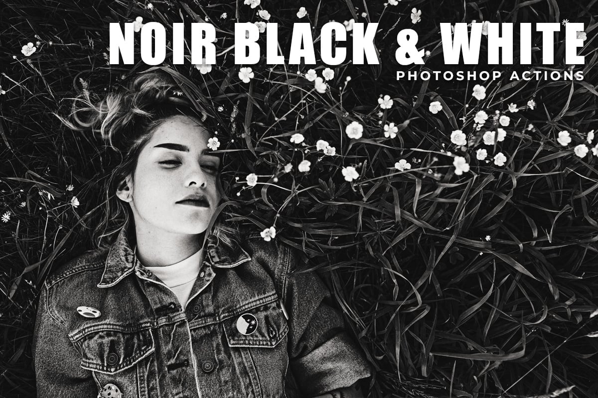
Free Noir Black & White Photoshop Actions

free photoshop actions

Give your photos a classic vintage black and white appearance with the Noir B & W Photoshop actions exclusively designed to take your shots to a whole new level. This is a great freebie, and we wholeheartedly recommend you check it out pronto.

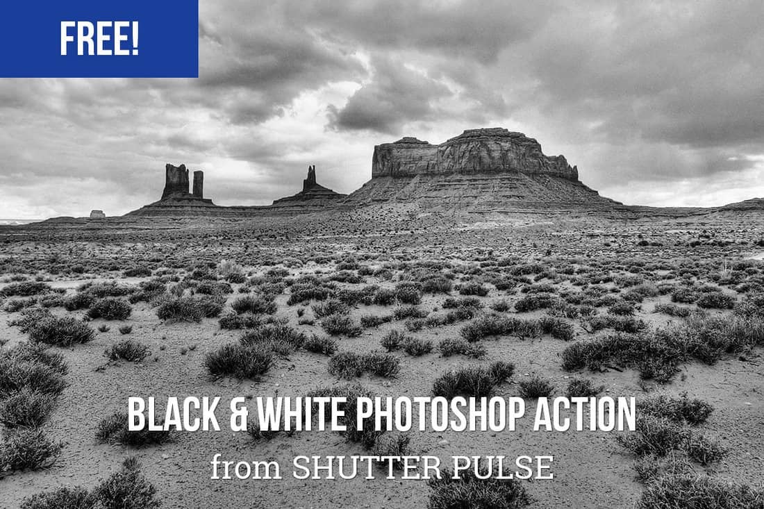
Free High Contrast Black & White Photoshop Action

Free High Contrast Black & White Photoshop Action

This unique black and white Photoshop action auto-adjusts the contrast of your photos to make your landscape and outdoor photos look more amazing with a gritty look and feel.

Free Vintage B&W Photoshop Action

Free Vintage B&W Photoshop Action

Create a unique vintage black and white effect using this free Photoshop action. It also creates the effect with adjustment layers, allowing you to edit the effect to your preference.

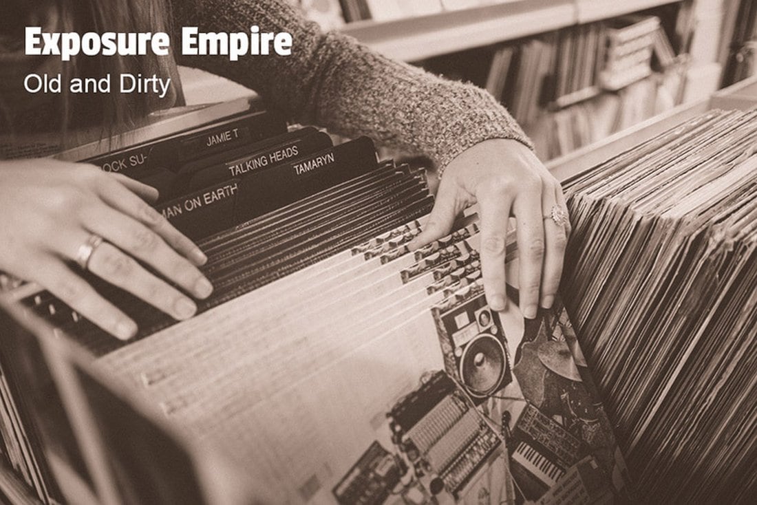
Free Old & Dirty Photoshop Action

Free Old & Dirty Photoshop Action

Using the actions in this pack you’ll be able to give your ordinary photos a stylish black and white effect with a vintage look and feel. It also includes a Lightroom preset version of the effect as well.

Newborn Baby Photoshop Actions

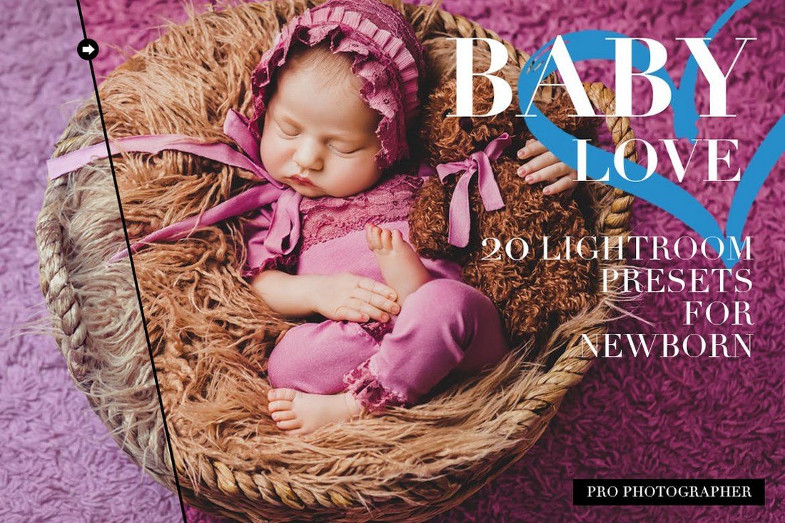
20 Newborn Lightroom Presets

This is a bundle of Lightroom presets that comes with 20 different presets for enhancing your newborn photos and applying stylish effects. It features several effects for improving portrait baby photos, adjusting the eyes, soft skin, adding soft warm effects, transforming to B&W, and more.

Free Born Baby Photoshop Actions

Free Born Baby Photoshop Actions

Make your newborn look even cuter in your photos using this collection of baby Photoshop action. This bundle includes 2 creative actions that can be easily adjusted and customized to many types of photos.

Free Baby Photoshop Actions

Free Baby Photoshop Actions

This is a collection of Photoshop actions specially made for improving newborn photos. It includes various actions for adding effects as well as for retouching the baby skin to make it look much smoother as well.

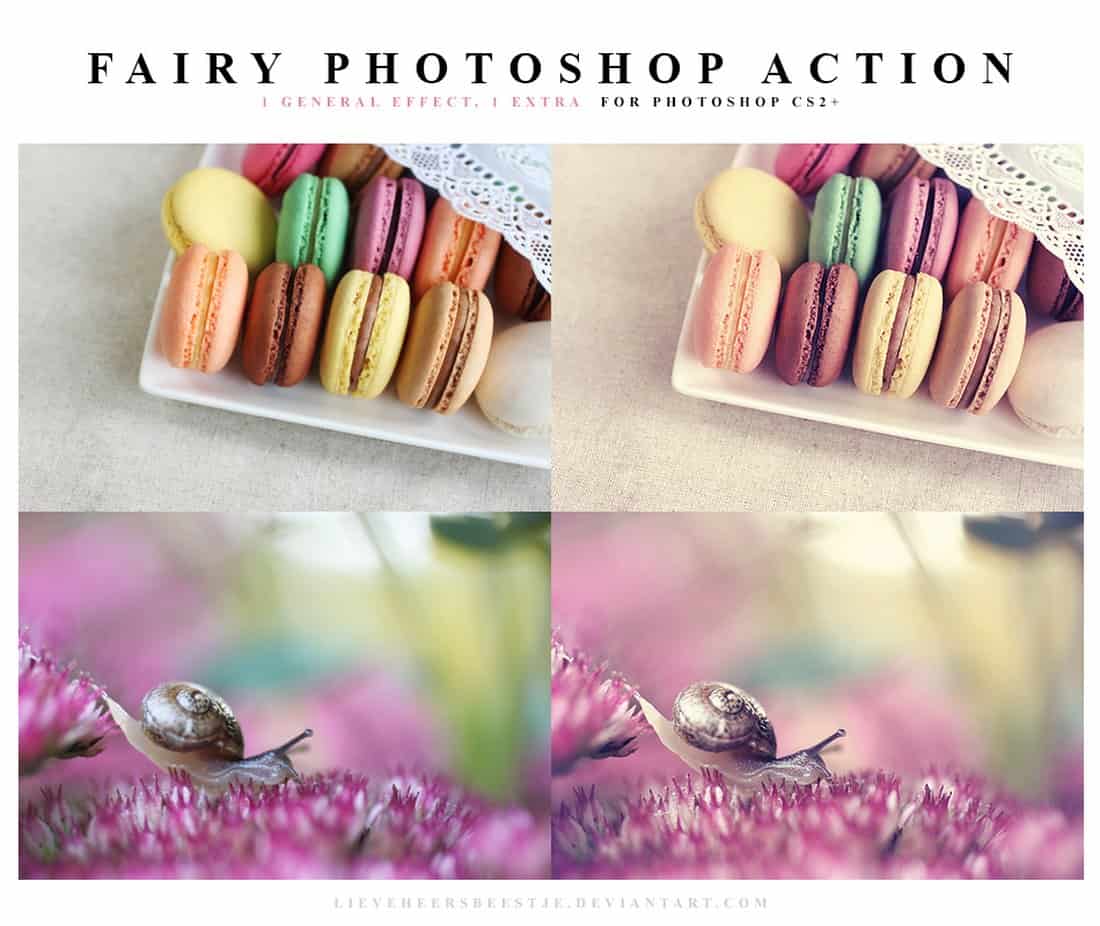
Fairy Free Photoshop Action

Fairy Free Photoshop Action

Even though this Photoshop action isn’t made specifically for babies, it includes a set of natural pastel effects that will allow you to add a beautiful toning effect to your newborn photos.

Free Faded Photoshop Action

free Photoshop action

This free Photoshop action is perfect for enhancing your portrait photos and smartphone selfies. It features a subtle effect that adds a faded filter to your portrait to create a classic film look.

Free HDR Photoshop Action

free Photoshop action

If you want to create a crisp HDR-like look in your object and portrait photography, this free Photoshop action will come in handy. It allows you to optimize and enhance your photos with an HDR filter.

Free Sharpening Photoshop Action

free Photoshop action

This free Photoshop action is quite useful for sharpening photos. If your photos look blurry or unclear, try using this action to sharpen the image. It’s also ideal for enhancing close-up photos.

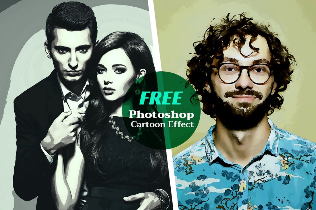
Free Cartoon Effect Photoshop Action

free Photoshop action

You can use this free Photoshop action to turn your portrait photos into old-school paintings. It features a cartoon-themed filter that creates a hand-drawn look in your photos. The action is free to download.

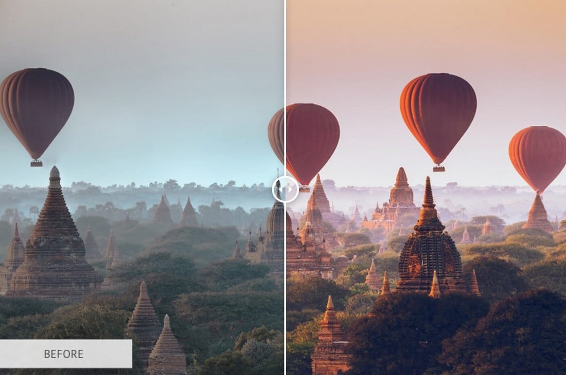
Free Landscape Photoshop Action

free Photoshop action

If you’re a fan of landscape photography, this free Photoshop action will allow you to make your photos look even more professional and colorful. It instantly enhances your outdoor photos with just a few clicks.

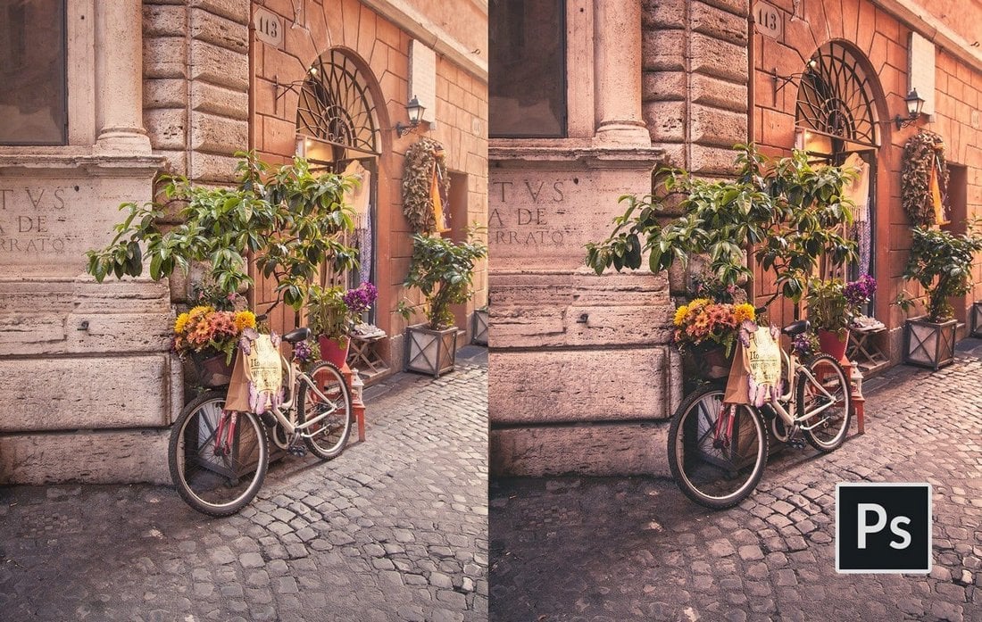
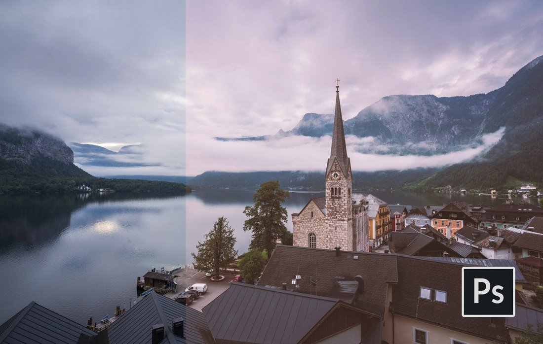
If you’re looking for editable and premium actions that you can customize however you like, be sure to check out our best Photoshop actions collection.<h3

Amazon Dropshipping Demystified: How to Start and Thrive in 2024

Featured Imgs 23

Dropshipping has become a popular business model for entrepreneurs looking to start an online store with minimal upfront investment. Amazon, as one of the largest e-commerce platforms in the world, presents a significant opportunity for dropshippers. However, navigating the complexities of Amazon dropshipping can be challenging. In this guide, we’ll demystify the process, outline the …

The post Amazon Dropshipping Demystified: How to Start and Thrive in 2024 first appeared on Lucid Softech.

Best Free Adobe Premiere Templates to Elevate Your Video Editing Game

Featured Imgs 23

Let’s face it: video editing can be an endless rabbit hole of tweaks and techniques. You’ve got the footage, but turning it into something captivating? That’s the real art! And Adobe Premiere Pro is undoubtedly a powerhouse in the editing world. But who doesn’t love a good shortcut, especially when it’s free? That’s where Adobe Premiere Templates come in—pre-designed, ready-to-use assets that can turn your video from “meh” to “whoa” without hours of fiddling.

Using free Premiere Pro templates isn’t about taking shortcuts; it’s about finding clever ways to streamline your workflow. Imagine you’re on a tight deadline, or maybe you’re looking to impress with a sleek promo video but don’t want to start from scratch. These templates, from transitions to titles, are like tools in a magician’s kit, letting you focus on storytelling while the heavy lifting’s done for you.

Whether you’re hunting for the perfect title slide, a cinematic opener, or some eye-popping transitions, there’s no shortage of free Premiere Pro templates to download. The beauty? You get all the professional polish without the steep price tag. So, go ahead, explore these handpicked gems, and let your creativity take the reins!

Slideshow Templates

Bright Summer Slideshow Premiere Pro Template

Bright Summer Slideshow Premiere Pro Template

Download

City Slideshow Premiere Pro Template

City Slideshow

Download

Liberty Slideshow Premiere Pro Templates

Liberty Slideshow Premiere Pro Templates

Download

Amorous Slideshow

Amorous Slideshow

Download

Gentle Photo Slideshow Premiere Pro Template

Gentle Photo Slideshow Premiere Pro Template

Download

Simple Dynamic Slideshow for Premiere Pro

Simple Dynamic Slideshow for Premiere Pro

Download

The Slideshow (Premium)

The Slideshow

Download

Simple Dynamic Slideshow – Premiere Pro Template

Simple Dynamic Slideshow

Download

Elegant Slideshow (Premium)

Elegant Slideshow

Download

Multiscreen Slideshow Premiere Pro Template

Multiscreen-Slideshow

Download

Creative Presentation Slides for Premiere Pro

Creative Presentation Slides for Premiere Pro

Download

Text Templates for Premiere Pro

Free Film Glitch Title Template for Premiere Pro

Free Film Glitch Title Template for Premiere Pro

Download

Free Animated Titles Templates for Premiere Pro

Free Animated Titles Templates for Premiere Pro

Download

Free Animated Lower Thirds Templates For Premiere Pro

Free Animated Lower Thirds Templates For Premiere Pro

Download

Unique Titles – Premiere Pro Templates

Unique Titles

Download

Free Motion Graphics Templates for Adobe Premiere Pro

Free Motion Graphics Templates for Adobe Premiere Pro

Download

Free Lyrics Titles Template for Premiere Pro

Free Lyrics Titles Template for Premiere Pro

Download

Free Box Titles and Lower Thirds Premiere Pro Template

Free Box Titles and Lower Thirds Premiere Pro Template

Download

Free Cinematic Title Style Library for Premiere Pro

Free Cinematic Title Style Library for Premiere Pro

Download

Echo Titles (Premium)

Echo Titles

Download

Lower Thirds Titles Premiere Pro Template

Lower Thirds Titles Premiere Pro Template

Download

Sport Modern Titles (Premium)

Sport Modern Titles

Download

Horror Trailer Titles Premiere Pro Motion Graphics Template

Horror Trailer Titles Premiere Pro Motion Graphics Template

Download

Modern Titles (Premium)

Modern Titles

Download

Free Premiere Pro Title Collection

Free Premiere Pro Title Collection

Download

Opener and Intro Templates for Premiere Pro

Split Frame Opener – Free Intro Templates for Premiere Pro

Split Frame Opener

Download

Corporate Opener – Intro Templates for Premiere Pro

Corporate Opener

Download

Fast Intro For Premiere Pro

Fast Intro For Premiere Pro

Download

Dynamic Opener (Premium)

Dynamic Opener

Download

Urban Freeze Frame Intro Premier Pro Template

Urban Freeze Frame Intro Premier Pro Template

Download

Rhythm Opener (Premium)

Rhythm Opener

Download

Dynamic Intro Opener

Dynamic Intro Opener

Download

Transition Templates for Premiere Pro

Free Adobe Premiere Transitions Template

Free Adobe Premiere Transitions Template

Download

Transitions

Transitions

Download

Zoom Transition

Zoom Transition

Download

Premium Transitions Zoom Particles for Premiere Pro (Premium)

Premium Transitions Zoom Particles for Premiere Pro

Download

Easy Transition Template for Premiere Pro

Easy Transition Template for Premiere Pro

Download

Torn Paper Transitions V2 (Premium)

Torn Paper Transitions V2

Download

Scatter Text Transition

Scatter Text Transition

Download

The post Best Free Adobe Premiere Templates to Elevate Your Video Editing Game appeared first on CSS Author.

Web-Slinger.css: Like Wow.js But With CSS-y Scroll Animations

Featured Imgs 23

We had fun in my previous article exploring the goodness of scrolly animations supported in today’s versions of Chrome and Edge (and behind a feature flag in Firefox for now). Those are by and large referred to as “scroll-driven” animations. However, “scroll triggering” is something the Chrome team is still working on. It refers to the behavior you might have seen in the wild in which a point of no return activates a complete animation like a trap after our hapless scrolling user ventures past a certain point. You can see JavaScript examples of this on the Wow.js homepage which assembles itself in a sequence of animated entrances as you scroll down. There is no current official CSS solution for scroll-triggered animations — but Ryan Mulligan has shown how we can make it work by cleverly combining the animation-timeline property with custom properties and style queries.

That is a very cool way to combine new CSS features. But I am not done being overly demanding toward the awesome emergent animation timeline technology I didn’t know existed before I read up on it last month. I noticed scroll timelines and view timelines are geared toward animations that play backward when you scroll back up, unlike the Wow.js example where the dogs roll in and then stay. Bramus mentions the same point in his exploration of scroll-triggered animations. The animations run in reverse when scrolling back up. This is not always feasible. As a divorced Dad, I can attest that the Tinder UI is another example of a pattern in which scrolling and swiping can have irreversible consequences.

Scroll till the cows come home with Web-Slinger.css

Believe it or not, with a small amount of SCSS and no JavaScript, we can build a pure CSS replacement of the Wow.js library, which I hereby christen “Web-Slinger.css.” It feels good to use the scroll-driven optimized standards already supported by some major browsers to make a prototype library. Here’s the finished demo and then we will break down how it works. I have always enjoyed the deliberately lo-fi aesthetic of the original Wow.js page, so it’s nice to have an excuse to create a parody. Much profession, so impress.

Teach scrolling elements to roll over and stay

Web-Slinger.css introduces a set of class names in the format .scroll-trigger-n and .on-scroll-trigger-n. It also defines --scroll-trigger-n custom properties, which are inherited from the document root so we can access them from any CSS class. These conventions are more verbose than Wow.js but also more powerful. The two types of CSS classes decouple the triggers of our one-off animations from the elements they trigger, which means we can animate anything on the page based on the user reaching any scroll marker.

Here’s a basic example that triggers the Animate.css animation “flipInY” when the user has scrolled to the <div> marked as .scroll-trigger-8.

<div class="scroll-trigger-8"></div>
<img 
  class="on-scroll-trigger-8 animate__animated animate__flipInY" 
  src="https://i.imgur.com/wTWuv0U.jpeg"
>

A more advanced use is the sticky “Cownter” (trademark pending) at the top of the demo page, which takes advantage of the ability of one trigger to activate an arbitrary number of animations anywhere in the document. The Cownter increments as new cows appear then displays a reset button once we reach the final scroll trigger at the bottom of the page.

Here is the markup for the Cownter:

<div class="header">
  <h2 class="cownter"></h2>
  <div class="animate__animated  animate__backInDown on-scroll-trigger-12">
    <br>
    <a href="#" class="reset">🔁 Play again</a>
  </div>
</div>

…and the CSS:

.header {
  .cownter::after {
    --cownter: calc(var(--scroll-trigger-2) + var(--scroll-trigger-4) + var(--scroll-trigger-8) + var(--scroll-trigger-11));
    --pluralised-cow: 'cows';

    counter-set: cownter var(--cownter);
    content: "Have " counter(cownter) " " var(--pluralised-cow) ", man";
  }

  @container style(--scroll-trigger-2: 1) and style(--scroll-trigger-4: 0) {
    .cownter::after {
      --pluralised-cow: 'cow';
    }
  }
  
  a {
    text-decoration: none;
    color:blue;
  }
}

:root:has(.reset:active) * {
  animation-name: none;
}

The demo CodePen references Web-Slinger.css from a separate CodePen, which I reference in my final demo the same way I would an external resource.

Sidenote: If you have doubts about the utility of style queries, behold the age-old cow pluralization problem solved in pure CSS.

How does Web Slinger like to sling it?

The secret is based on an iconic thought experiment by the philosopher Friedrich Nietzsche who once asked: If the view() function lets you style an element once it comes into view, what if you take that opportunity to style it so it can never be scrolled out of view? Would that element not stare back into you for eternity?

.scroll-trigger {
  animation-timeline: view();
  animation-name: stick-to-the-top;
  animation-fill-mode: both;
  animation-duration: 1ms;
}

@keyframes stick-to-the-top {
  .1%, to {
    position: fixed;
    top: 0;
  }
}

This idea sounded too good to be true, reminiscent of the urge when you meet a genie to ask for unlimited wishes. But it works! The next puzzle piece is how to use this one-way animation technique to control something we’d want to display to the user. Divs that instantly stick to the ceiling as soon as they enter the viewport might have their place on a page discussing the movie Alien, but most of the time this type of animation won’t be something we want the user to see.

That’s where named view progress timelines come in. The empty scroll trigger element only has the job of sticking to the top of the viewport as soon as it enters. Next, we set the timeline-scope property of the <body> element so that it matches the sticky element’s view-timeline-name. Now we can apply Ryan’s toggle custom property and style query tricks to let each sticky element trigger arbitrary one-off animations anywhere on the page!

View CSS code
/** Each trigger element will cause a toggle named with 
  * the convention `--scroll-trigger-n` to be flipped 
  * from 0 to 1, which will unpause the animation on
  * any element with the class .on-scroll-trigger-n
 **/

:root {
  animation-name: run-scroll-trigger-1, run-scroll-trigger-2 /*etc*/;
  animation-duration: 1ms;
  animation-fill-mode: forwards;
  animation-timeline: --trigger-timeline-1, --trigger-timeline-2 /*etc*/;
  timeline-scope: --trigger-timeline-1, --trigger-timeline-2 /*etc*/;
}

@property --scroll-trigger-1 {
  syntax: "<integer>";
  initial-value: 0;
  inherits: true;
}
@keyframes run-scroll-trigger-1 {
  to {
    --scroll-trigger-1: 1;
  }
}

/** Add this class to arbitrary elements we want 
  * to only animate once `.scroll-trigger-1` has come 
  * into view, default them to paused state otherwise
 **/
.on-scroll-trigger-1 {
  animation-play-state: paused;
}

/** The style query hack will run the animations on
  * the element once the toggle is set to true
 **/
@container style(--scroll-trigger-1: 1) {
  .on-scroll-trigger-1 {
    animation-play-state: running;
  }
}

/** The trigger element which sticks to the top of 
  * the viewport and activates the one-way  animation 
  * that will unpause the animation on the 
  * corresponding element marked with `.on-scroll-trigger-n` 
  **/
.scroll-trigger-1 {
  view-timeline-name: --trigger-timeline-1;
} 

Trigger warning

We generate the genericized Web-Slinger.css in 95 lines of SCSS, which isn’t too bad. The drawback is that the more triggers we need, the larger the compiled CSS file. The numbered CSS classes also aren’t semantic, so it would be great to have native support for linking a scroll-triggered element to its trigger based on IDs, reminiscent of the popovertarget attribute for HTML buttons — except this hypothetical attribute would go on each target element and specify the ID of the trigger, which is the opposite of the way popovertarget works.

<!-- This is speculative — do not use -->
<scroll-trigger id="my-scroll-trigger"></scroll-trigger>
<div class="rollIn" scrolltrigger="my-scroll-trigger">Hello world</div>

Do androids dream of standardized scroll triggers?

As I mentioned at the start, Bramus has teased that scroll-triggered animations are something we’d like to ship in a future version of Chrome, but it still needs a bit of work before we can do that. I’m looking forward to standardized scroll-triggered animations built into the browser. We could do worse than a convention resembling Web-Slinger.css for declaratively defining scroll-triggered animations, but I know I am not objective about Web Slinger as its creator. It’s become a bit of a sacred cow for me so I shall stop milking the topic — for now.

Feel free to reference the prototype Web-Slinger.css library in your experimental CodePens, or fork the library itself if you have better ideas about how scroll-triggered animations could be standardized.


Web-Slinger.css: Like Wow.js But With CSS-y Scroll Animations originally published on CSS-Tricks, which is part of the DigitalOcean family. You should get the newsletter.


from CSS-Tricks https://ift.tt/j5oQL0A
Gain $200 in a week
via Read more

Gothic Style Design: A Modern Font & Graphic Trend

Featured Imgs 23

One recent emerging trend is an increased use of gothic styles and themes. This trend captures everything from imagery and color schemes to fonts and overall styling.

It’s an almost natural progression and evolution from all of the dark mode designs we’ve seen in recent years to reversion to gothic style.

Here, we’ll look at gothic style design and how you can make this design trend – potentially – work for you. Whether that’s in a poster, flyer, typographic choice, or a website. Let’s dive in!

What is Gothic Style?

Gothic style derived from architecture in the 18th century and was later applied to graphic design. It is characterized by its use of ornate, intricate details, pointed arches, and vertical lines and is a design style that has ebbed and flowed over time.

In modern graphic design, gothic style design often refers to a contemporary interpretation of this historic design style. You’ll often find bold, blocky, or ornate lettering and graphics with a dark, moody color palette.

Characteristics of the Gothic Style

The first identifier of gothic style is often imagery. If you’ve been watching the Netflix series, “Wednesday,” you are no stranger to this style. There’s a distinct gothic vibe from the title typography to every image promoting the series and therein.

The gothic style has a distinctive influence on graphic design and can be seen in various design elements. Here are some other things to look for in gothic design elements:

  • Ornate and intricate details: Pay special attention to borders, patterns, and typography.
  • Dark color palette: You’ll find a lot of black, gray, and dark red or purple, which can create a sense of drama and mystery.
  • Textures: Stone, metal, or wood to create a sense of authenticity and age.
  • Symbolism and iconography: Symbolic elements, such as crosses, skulls, or gargoyles can be used to convey a sense of power, mystery, or horror.
  • Emphasis on verticality: Vertical lines and forms, which can create a sense of height and grandeur are popular and often come across in visuals such as tall, narrow windows or pointed arches.
  • Rough edges: Sharp lines might be offset by ragged or rough edges for lines, type elements, or even image containers.
  • Gothic typography: Blackletter fonts are a common characteristic of Gothic design, often used in titles, headlines, and logos.

Gothic Fonts

There are two schools of gothic typography – more traditional blackletter or Old English fonts and modern, more experimental styles that pay homage to the old style.

Modern gothic fonts often have sharp, angular shapes and intricate details, which can evoke a sense of mystery, elegance, and sophistication. They are commonly used in branding and advertising for products and services that target a younger, edgier demographic.

Regardless of the time period, almost all of the typography in a gothic style shares some common visual details.

  • Sharp, pointed edges that create a sense of drama and intensity. The letters often have pointed serifs or sharp, triangular shapes.
  • Intricate details with highly decorative loops, swirls, and embellishments to create an ornate appearance.
  • Vertical emphasis with tall, narrow letterforms that create a sense of height and grandeur.
  • Lack of curves focusing on straight lines and sharp angles.
  • Old-world charm that evokes historical roots, feelings of tradition or elegance, and maybe a hint of spookiness.

Tips for Using this Trend Well

The gothic style can be a striking choice, but it isn’t for every type of project. Context is extremely important here; the wrong content with a gothic style can feel off-base and jarring.

There are, though, many ways you can use gothic styles. Use this design trend with content that has historical or traditional themes, gothic-inspired products or services, elements that need high drama, or to create a high-end feel.

Pair gothic images and typefaces with more simple and neutral elements so the design doesn’t get overwhelming.

Remember that gothic doesn’t have to feel “dark.” It can also feel traditional.

The gothic style has a long history and is associated with many different historical periods and artistic movements, so it can be used to evoke a sense of authenticity and tradition.

You’ll find this style is often associated with heavy metal music, establishing that hard-edge connection between the visual aesthetic and the audio. For the same reason, you’ll often find gothic design themes with scary movies and medieval themes.

Gothic design can work exceptionally well for projects that have an intense vibe. Bold shapes and dark color help put extra emphasis on this feeling. Additionally, this can create a sense of authority and power.

Pair gothic images and typefaces with more simple and neutral elements so the design doesn’t get overwhelming. That may include simple complementary textures, backgrounds, images, and body text in a regular sans-serif style.

Finally, you might associate elements of a gothic style with high-end luxury. This can be especially true when gothicism is minimalized but elements are there, such as just using typography in this style. This creates a sense of elegance and sophistication, to help reinforce a brand’s premium status.

Templates with Gothic Styles

Start projects in a gothic style a little bit quicker with a template or font that’s in a gothic style. Here are a few downloadable options from Envato Elements that we love.

Gothic Birthday Invitation

Live Music YouTube Thumbnail

Moustache Party Flyer

Trotont Gothic Font

Cambridge Bold Decorative Gothic Font

Samaz Gothic Vintage Typeface

Conclusion

A gothic style can be a moody and fun way to design something a little differently. Just keep in mind that it may not be suitable in all design contexts. You’ll likely avoid gothic elements in designs aimed at children or those that require a more playful or whimsical aesthetic.

This design trend has come and gone a few times, and it’ll be interesting to see how much staying power it has now.

Automattic vs. WP Engine – The Battle of Titans!

Featured Imgs 23

Throughout the history, mankind has fought battles over battles to gain the most desirous state of their existence i.e. POWER!. Power has enabled its custodians to hold on to resources that are crucial for their survival. The chronicles do explain though that Power always look for more Power! Likewise, we are witnessing a highly uptight […]

The post Automattic vs. WP Engine – The Battle of Titans! first appeared on WPArena and is written by Munazza Shaheen.

40+ Stylish PowerPoint Color Schemes 2025

Featured Imgs 23

Color is an element that can make or break a design, and that rule holds true for presentation design as well. Choosing the right PowerPoint color scheme is super important.

But there’s one extra thing to consider – where your presentation will be given. A PowerPoint presentation can look quite different on a computer or tablet versus on a projected screen.

When it comes to selecting a PowerPoint color scheme, this is an important consideration. We’ve rounded nearly stylish PowerPoint color schemes as inspiration. While darker color schemes might look great close-up on screens, opt for lighter backgrounds (for enhanced readability) for projected presentations.

Note: The last color in each scheme is for the slide background.

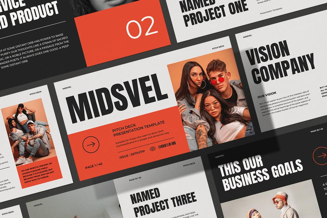
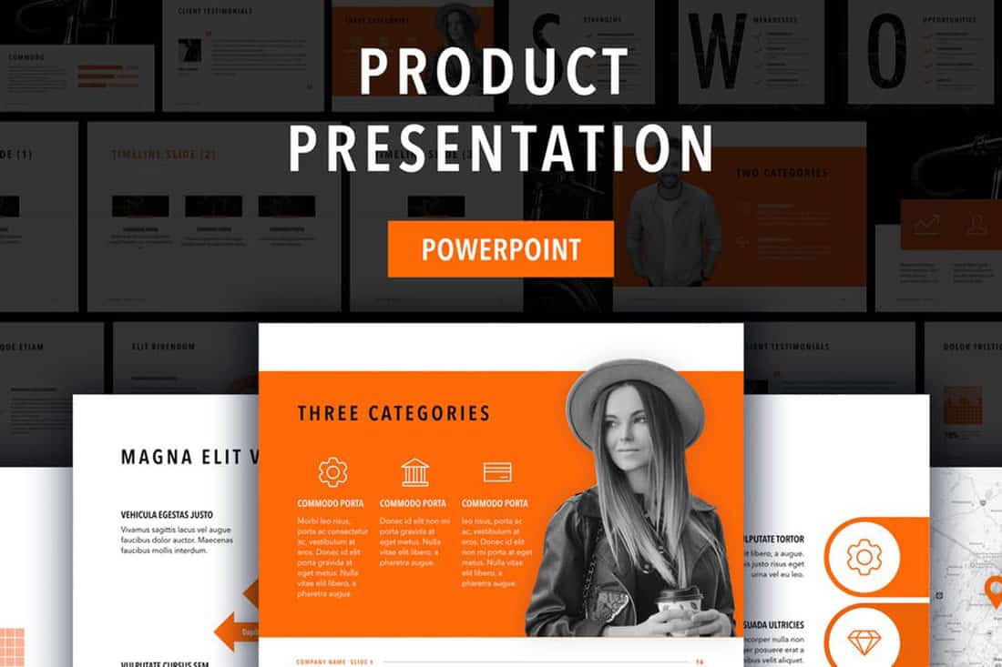
1. Shocking Orange

#E24A32#E5E4E2
Midsvel Pitch Deck - Powerpoint

When it comes to marketing and creative presentations, the orange color is the go-to choice among professionals. It not only works perfectly with both light and dark color pairings but also helps highlight all the important parts of a slide more clearly than any other color.

In this example, the bright orange (identified as Shocking Orange) instantly grabs the attention on top of the white background and makes the black typography highly visible and much easier to read.

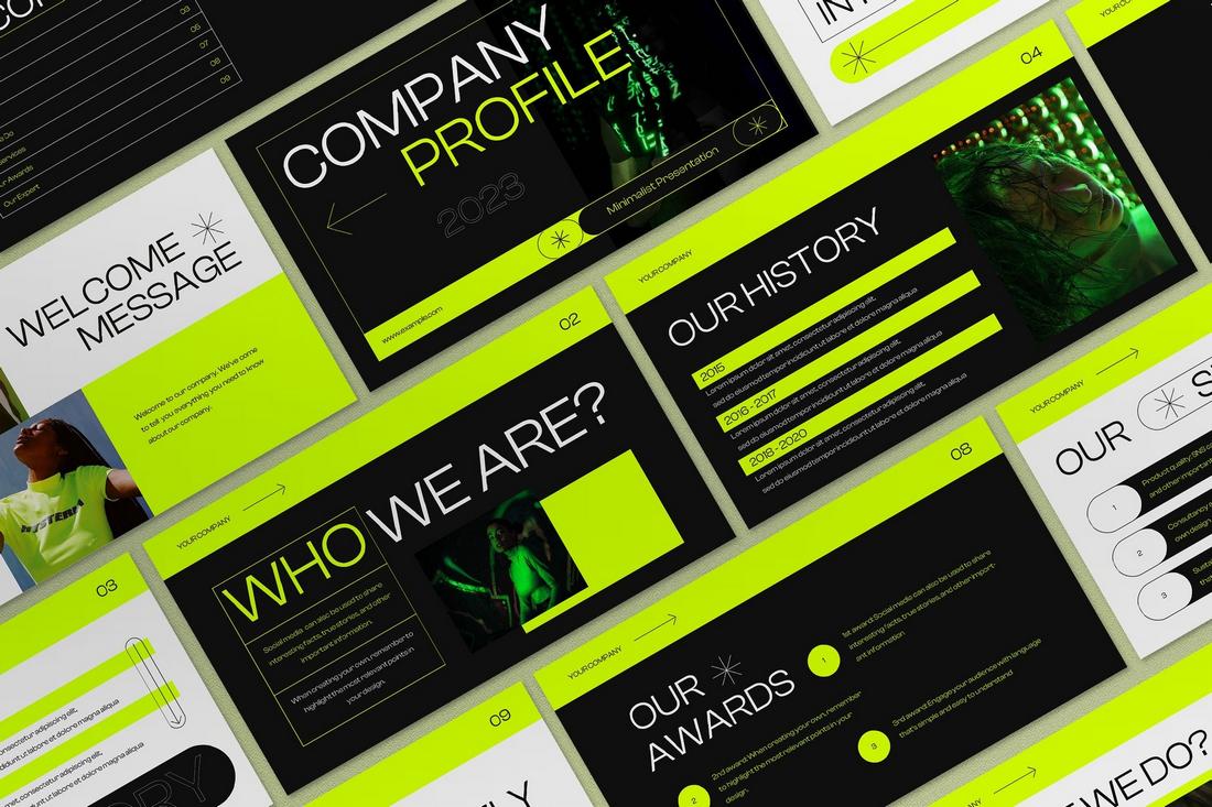
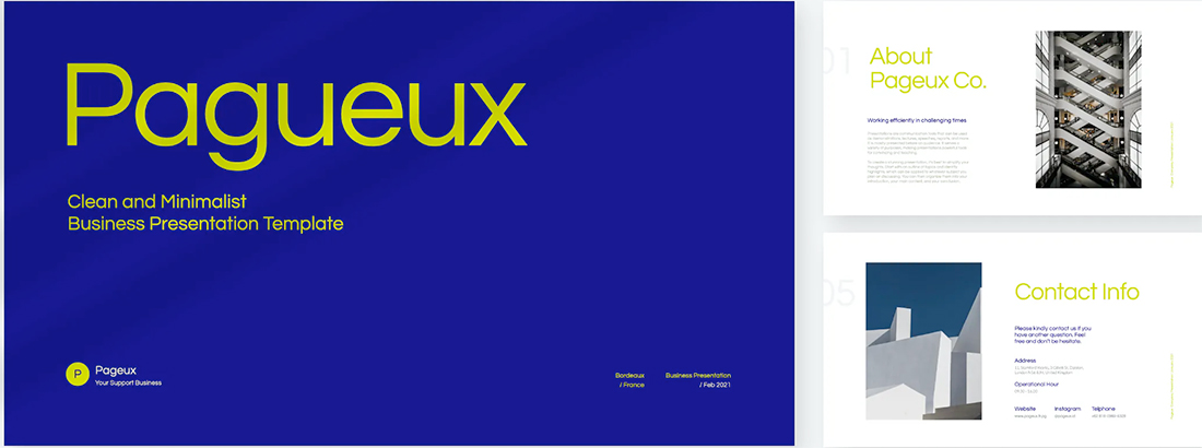
2. Neon Green

#CBF400#0F0F0F#DDDDDD
Neon Minimalist Company Profile Presentation

Neon-themed high-contrast colors are a popular choice among marketers these days as they are quite effective as an accent color. These bright colors instantly pop out, highlighting key objects and text above all else.

Colors like Neon Green work best with a darker background. When you combine it with white color typography, you will come up with a color scheme that delivers results.

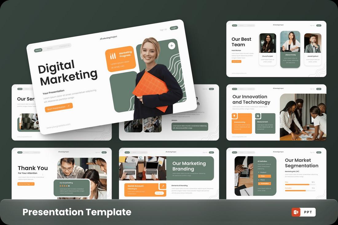
3. Orange and Greyish Turquoise

#FC993E#667C6F#FCFCFC
Marketing Project - Digital Marketing PowerPoint

As we mentioned before, orange color is a popular choice in PowerPoint color schemes. But it doesn’t always have to be the dominating color. Sometimes, when you pair it with another light, secondary color, it gives you a pleasant and soothing color scheme.

In this example, you can see a light orange color being used to highlight the call to actions (CTAs) across the slideshow while a greyish-turquoise color is used to bring balance to the overall look and feel.

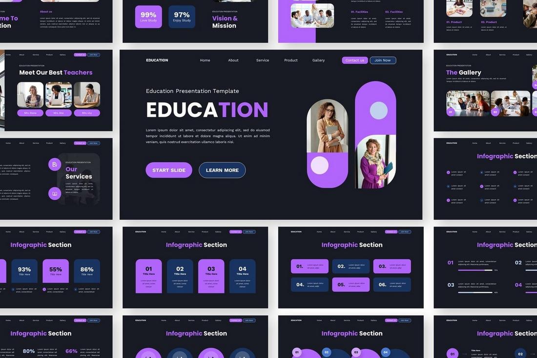
4. Bright Purple and Dark Blue

#B165FB#181B24
Education Powerpoint Templates

When creating a PowerPoint color scheme, choosing the right accent color is the key to achieving a professional vibe for the entire presentation. The important thing is to choose a color that sticks out without taking away the attention from the rest of the elements.

A color scheme with a bright purple accent goes perfectly with a dark background. Then you can add another dark blue to the mix to create another accent color to balance the attention.

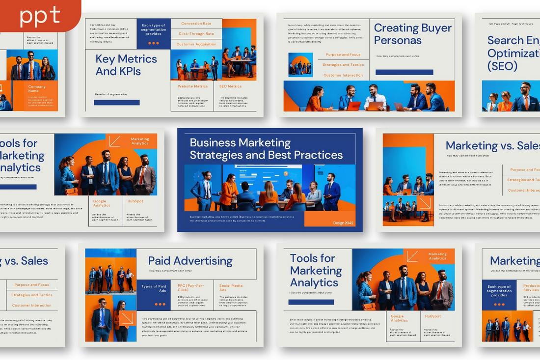
5. Blue and Orange

#224088#F57325#E8E9E3
Marketing Business Presentation - Markup

A great thing about the orange color is how it goes well together with many other colors. It’s the king of accent colors. Blue is another color that comes out on top of the list.

Much like orange, the color blue is a great choice for creating attractive accents. And it works even better when you put those colors together.

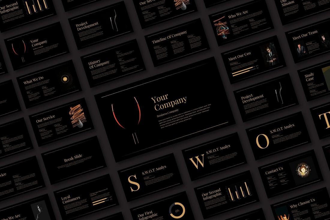
6. Black and Gold

#BF9A4A#000000
Business Presentation - Gold

If your goal is to create a high-end and luxurious vibe across a PowerPoint slideshow, then no other color scheme works better than the simple yet elegant black and gold.

The classic black and gold color combination is considered one of the most iconic color schemes that have been used for decades by everyone from high-end fashion brands to luxury hotels and more. It’s the ideal color pairing for a classic, timeless look.

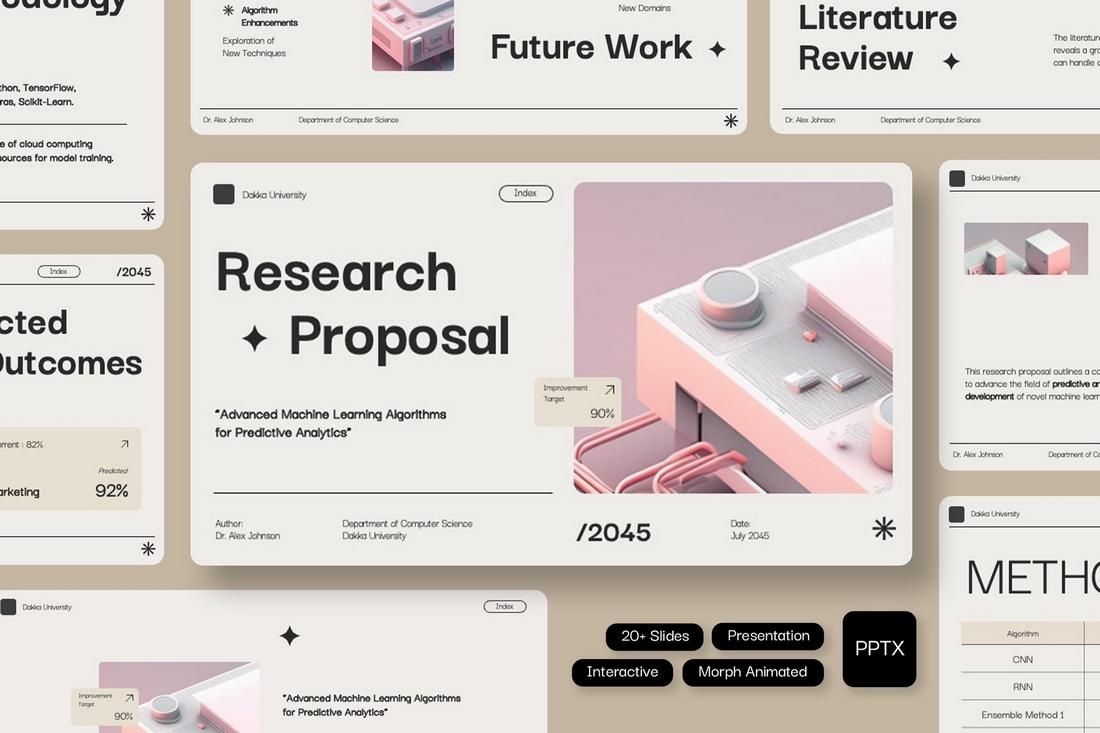
7. Pink and Gray

#FCCBC4#EEEDE9
Dakka - Interactive Research Proposal Powerpoint

If you’re a fan of soft, pastel colors, this color scheme will work wonders for your presentation design. It’s especially an effective choice for lifestyle and fashion-related slideshows.

In this example slideshow design, you will see multiple shades of Pink, sometimes even as gradients, for the accents. This color blends beautifully with the light grayish background.

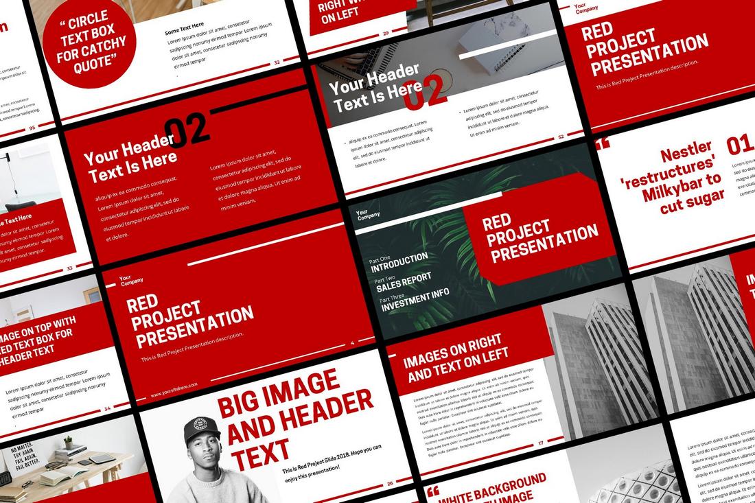
8. Red and White

#C00002#ffffff
red powerpoint template

PowerPoint color schemes don’t always have to be so complicated. Sometimes, a simple basic color combination is more than enough to create a compelling presentation design. This red and white color scheme shows how it’s done.

The color red is often associated with courage and authority. As a result, it is a go-to choice among modern brands and businesses for creating presentations that showcase their dominance in the market.

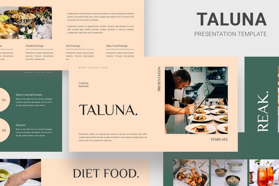
9. Cream and Green

#FFE1C7#40695B
Taluna - Catering Food Powerpoint Templates

This beautiful and soft color combination is a great choice for adding a soothing aesthetic to your presentation. It’s perfect for making PowerPoint slideshows for fashion, lifestyle, and travel-related topics.

In this design, the cream color works in harmony with the green to create a well-balanced look for the entire presentation. The color scheme also makes it much easier to bring more attention to the text and images.

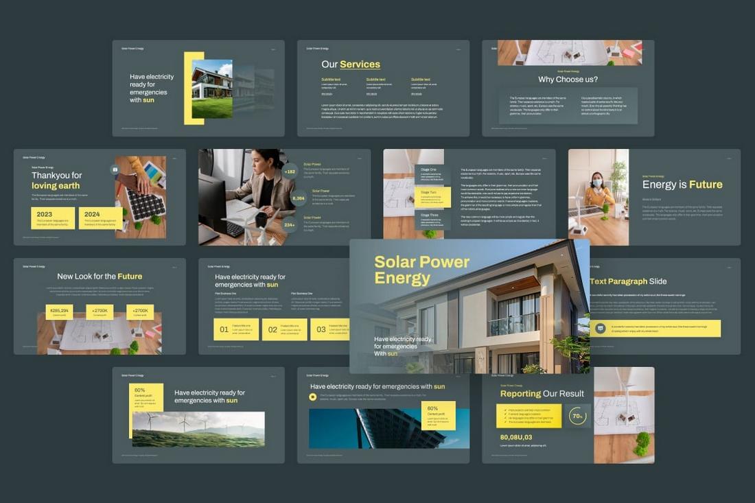
10. Gray and Yellow

#4B5A5F#FBE969
Solar Power Energy PowerPoint

The color yellow is a great choice for accents but with the wrong color combination, it could mean disaster.

The gray color used in the above example is made of a combination of blue and cyan, which gives the design a unique background to effectively highlight the yellow accents without straining the viewer’s eyes.

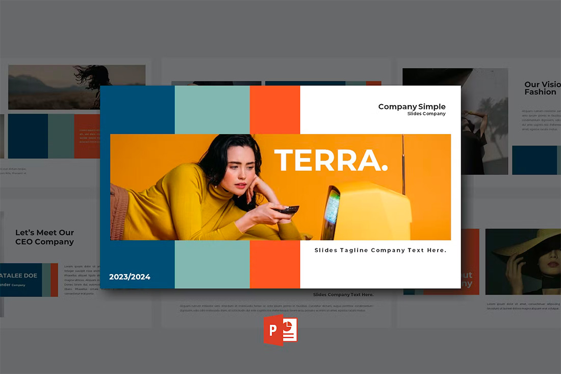
11. Blue, Gray Green & Orange

#044c73#8db6b0#ef6337#ffffff

powerpoint color schemes

With a bright overall scheme that’s easy on the eyes, this color scheme can help you create a modern PowerPoint presentation that’s readable and friendly. You can even tweak the colors somewhat to better work with your brand, if necessary.

The best thing about this color palette is that it lends itself to plenty of different presentation styles and applications.

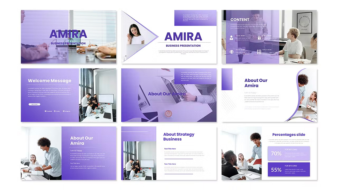
12. Violet Gradient

#5038a6#ddd8f7#ffffff

powerpoint color schemes

Using the first two colors noted above, you can create a dark-to-light monotone gradient that can make for a modern PowerPoint design style.

Take this concept and expand it to any other colors you like for your spin on this modern color scheme.

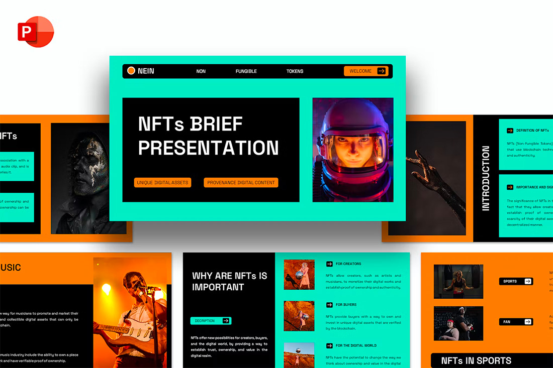
13. Mint and Orange

#21e9c5#ff8513#000000

powerpoint color schemes

On paper, these colors don’t seem to blend all that well, but with the right application min and orange on a black background can work.

Use a pair of colors like this for presentations where you are trying to make a bold statement or impact. This concept is often great for trendy topics or ideas that are a little unconventional.

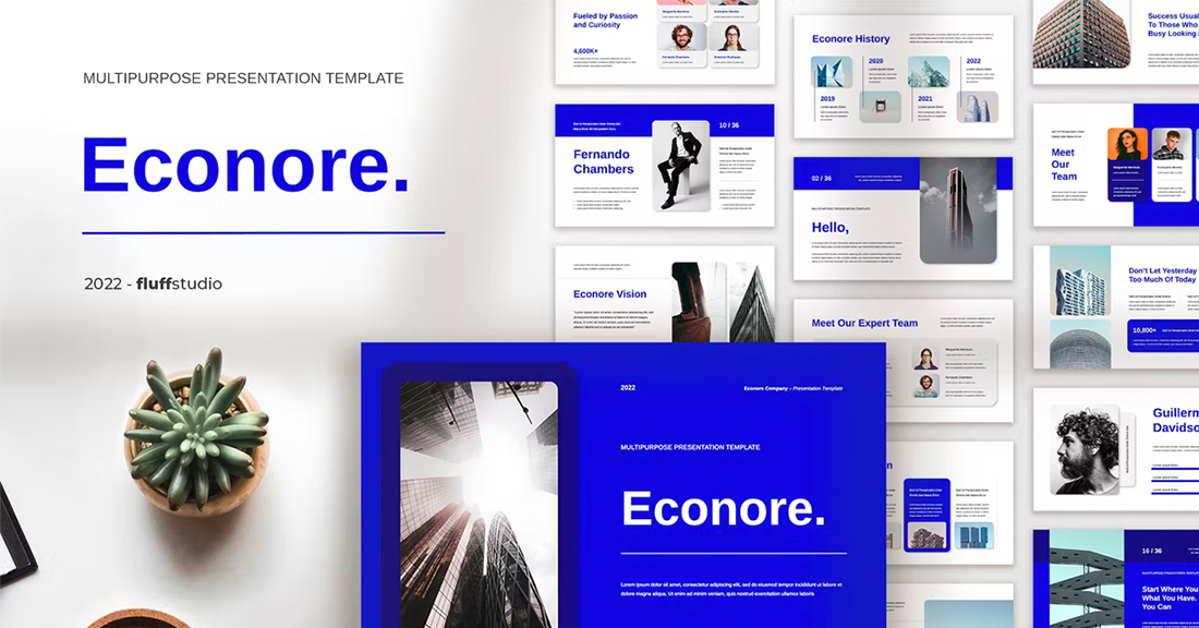
14. Bright Blue and Light

#1007dc#ffffff

powerpoint color schemes

The brighter, the better! Bright blue color schemes are a major trend in PowerPoint design … and for good reason. The color combination creates a bright, light feel with easy readability. Those are two things that pretty much everyone wants in a presentation template design.

The other thing that’s great about a color scheme like this – which focuses on one color – is that it matches practically everything else in the design with ease. It’s great for image-heavy presentations or those where text elements are a key focal point.

15. Teal and Lime

#007c7f#bbd445#eceef0

powerpoint color schemes

Two colors that you might not expect to see paired create a classy combo that’s interesting and engaging. Both teal and lime are considered “new neutrals” and work with a variety of colors easily. (What’s somewhat unexpected is putting them together.)

What’s great about this PowerPoint color scheme is that the extra interest from the hues can help generate extra attention for slides. The template in the example also mixes and matches teal and green primary color blocks to keep it interesting from slide to slide.

16. Colorful Gradients

#00cee6#00ca74#ff9370#000000

powerpoint color schemes

Gradients are a color trend that just keeps reinventing and resurfacing. In the latest iteration, gradients are bright with a lot of color. Designers are working across the color wheel for gradients that have more of a rainbow effect throughout the design, even if individual gradients are more subtle.

What you are likely to see is a variety of different gradients throughout a project with different colors, but maybe a dominant color to carry the theme. Use this for presentation designs that are meant to be more fun, lighter, and highly engaging.

17. Light Blue Minimal

#acdcf9#204458#ffffff

powerpoint color schemes

This color scheme with light blue and a minimal aesthetic is super trendy and so easy to read. You can add a lot of style with a black-and-white style for images or a deep blue accent for header text.

While a pale blue is ideal here, you could also consider experimenting with other pastels and the same overall theme for a modern presentation design.

18. Bright with Dark Background

#ed5b4c#f5ae03#455469

powerpoint color schemes

The combination of bright colors on a dark background can be fun and quite different from the traditional PowerPoint color schemes that are often on white or light backgrounds. This design style for a presentation is bold and engaging but can be a challenge if you aren’t comfortable with that much color.

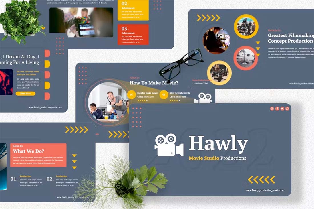
When you use a style like this, it is important to think about the presentation environment to ensure that everything will look as intended. A design like this, for example, can work well on screens, but not as well on a projector or in a large room.

19. Navy and Orange

#06436e#f49415#ffffff

powerpoint color schemes

The navy and orange color combination is stylish and classic for presentation design. To add a fresh touch consider some of the effects such as the template above, with color blocking and overlays to add extra interest.

What makes this color combination pop is the element of contrast between a dark and a bright pair. The navy here is almost a neutral hue and works with almost any other design element.

20. Dark and Light Green

#0b4524#dafae5#ffffff

powerpoint color schemes

A modern take on a monotone color scheme involves using two similar colors that aren’t exactly tints and tones of one another. This pairing of dark green and light (almost minty) green does precisely that.

What’s nice about this color scheme is that the colors can be used almost interchangeably as primary elements or accents. It provides a lot of flexibility in the presentation design.

21. Bright Crystal Blue

#17a7b8#0d525a#ffffff

powerpoint color schemes

Blue presentation color schemes will always be in style. The only thing that changes is the variance of the hue. This pair of blues – a bright crystal blue with a darker teal – works in almost the same way as the pair of greens above.

What’s nice about this color palette though is that the dark color is the accent here. That’s a modern twist on color design for presentations.

22. Blue and Yellow

#164794#ffc100#ffffff

powerpoint color schemes

Blue and yellow are classic pairings and can make for a striking presentation color combination. With a bright white background, these hues stand out in a major way.

What works here is the element of contrast. A darker blue with a brighter yellow creates an almost yin and yang effect with color. The only real caution is to take care with yellow on a white or light background with fonts or other light elements.

23. Teal

#188488#d69500#ffffff

powerpoint color schemes

Teal is a personality-packed color choice. If you are looking for a bold statement with a PowerPoint template, start here.

While the above color scheme also includes a hint of yellow for accents, the teal color option is strong enough to stand alone. You could consider a tint or tone for a mono-look. It also pairs amazingly well with black-and-white images.

Teal is a fun color option that will provide a lot of practical use with your slide deck.

24. Bright Coral

#ff625c#ff7168#ffffff

powerpoint color schemes

This color scheme is one of those that you will either love or hate. The bright coral color is powerful and generates an immediate reaction.

It’s also quite trendy and will stand out from many of the other more bland PowerPoint colors that you may encounter. This is a great option for a startup that wants to present with a bang or a brand that has a similar color in its palette. It may not work so well for more traditional brands or those that are more conservative with their slide designs.

25. Dark Mode Colors

#302146#3b5c58#000000

powerpoint color schemes

A dark mode color scheme might be the biggest trend in all of design right now, and that also applies to presentation design.

This purple and emerald color paired with black with white text looks amazing. It is sleek, modern, and has high visual appeal without having to use a lot of images.

This works best for digital presentations when you don’t have concerns about room lighting to worry about.

If you aren’t ready to jump into dark mode on your own, the Harber template above is a great start with nice color, gradients, and interesting shapes throughout the slide types.

26. Navy and Lime

#120280#bac500#ffffff

powerpoint color schemes

A navy and lime combination is a modern take on colorful neutrals that are anything but boring.

These colors have a nice balance with a white or light background and are fairly easy to use. With so many brands already using blue in their base color palette, this is an option that works and is an extension of existing elements for many brands. (Use your blue and add the lime to it.)

Also, with this color combination, the idea of a minimal overall slide structure is nice so that the power of the colors and impact comes through. They work beside images in full color or black and white.

27. Modern Blue

#1a4e66#e26c22#ffffff

powerpoint color schemes

When you aren’t planning to use brand colors – or maybe as a startup or independent contractor so you don’t have them yet – a modern color combination can add the right flair to a PowerPoint presentation.

The bright grayish-blue in the Lekro PowerPoint template – you can find it here – adds the right amount of color without overwhelming the content. Plus, subtle orange accents help guide the eye throughout this PowerPoint color scheme. https://elements.envato.com/lekro-powerpoint-presentation-67YW3M

28. Blackish and Yellow

#3a3839#fed650#ffffff

powerpoint color schemes

While at first pass, black and yellow might seem like a harsh color combination, it can set the tone for a project that should emanate strength. This PowerPoint color scheme softens the harshness of the duo with a blackish color, that’s grayer and has a softer feel.

Pair this combo on a light background or with black and white images for a stylish, mod look.

29. Orange and White

# ff6908#ffffff

powerpoint color schemes

A bright color can soften the harshness of a stark PowerPoint design. Especially when used for larger portions of the content area, such as background swatches or to help accent particular elements.

The Sprint template makes great use of color with a simple palette – orange and white with black text – but has slide ideas that incorporate the color throughout for something with a more “designed” look to it. (And if you aren’t a fan of the orange, change the color for use with this template to keep the modern feel.)
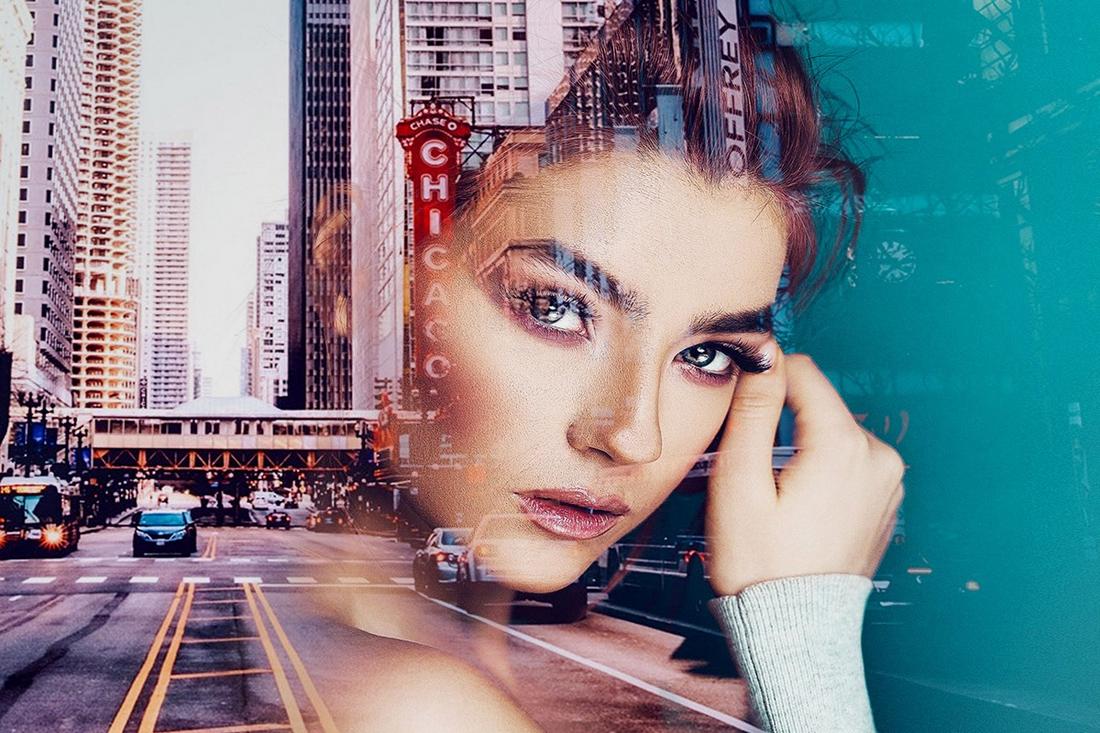
30. Purple

#695c78#08121b#ffffff

powerpoint color schemes

Purple presentations are in. The color, which was once avoided by many in design projects, has flourished with recent color trends.

Because more funky, bright colors are popular, a presentation with a purple focus can be acceptable for a variety of uses. The use in Batagor template has a modern design with a deep header in the featured color, which works best with images that aren’t incredibly bold in terms of color.

31. Blue-Green Gradients

#0784ba#1e997c#ffffff

powerpoint color schemes

Another trending item in color is the use of gradients. This trend can be applied to PowerPOint presentations as well.

Use a blue-to-green gradient for a soft and harmonious color scheme that won’t get in the way of content. Use each hue alone for accents and informational divots throughout the presentation design.
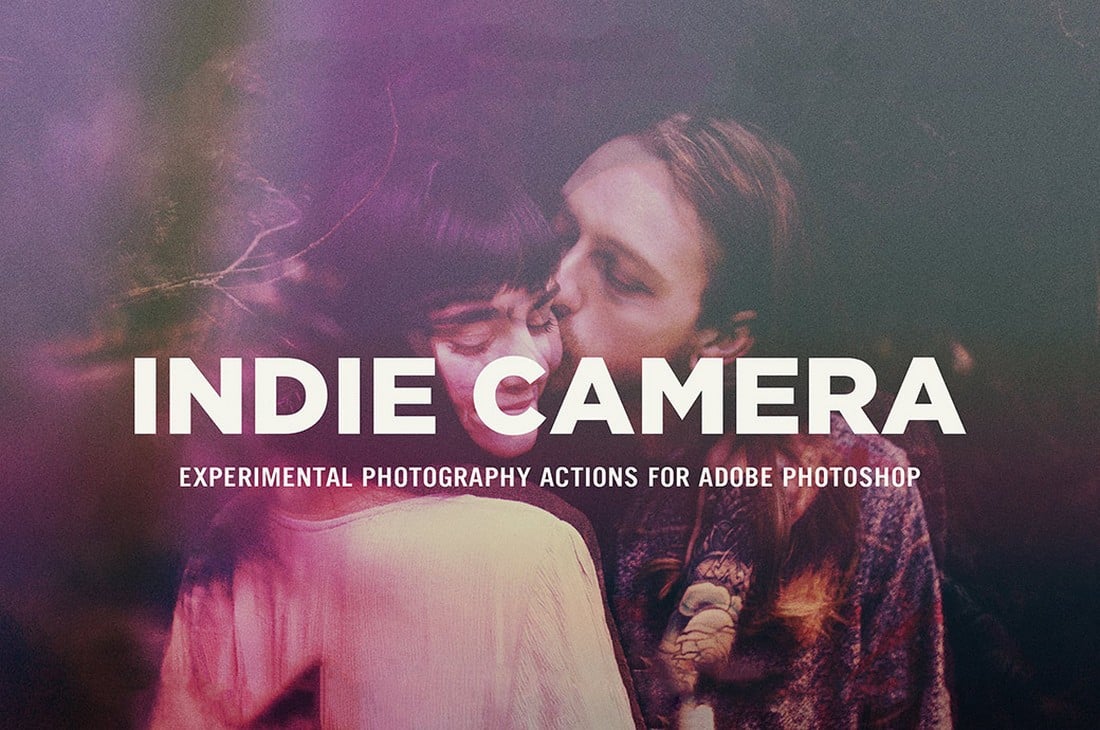
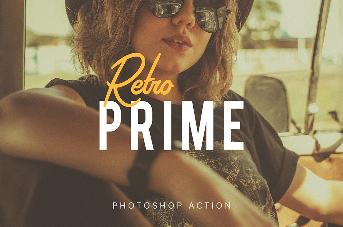
32. Black and White

#ececec#000000#fffff

powerpoint color schemes

Minimalism is a design trend that never goes away. A black-and-white (or gray) presentation screams class and sophistication.

It can also be easy to work with when you don’t want the color to get in the way of your message. And if a design can stand alone without color, you know it works.

33. Reds and Black

# e90039#ff1800#2b2b2d

powerpoint color schemes

If you are designing a presentation for viewing on screens, such as desktops or tablets, a dark background with bright color accents and white text can work well. (This combination gets a lot trickier on projector displays.)

While reverse text and red aren’t always recommended, you can see from the Nova template that they can be a stunning combination. But note, this modern color scheme is best for specific content and audiences.

34. Blue and Pink

#264190#f68484#ffffff

powerpoint color schemes

This color scheme is a spin on Pantone’s colors of the year from 2016. https://designshack.net/articles/graphics/how-to-use-the-pantone-color-of-the-year-in-design-projects/ The brighter, bolder versions of rose quartz and serenity and fun and sophisticated.

The unexpected combo sets the tone with a strong, trustworthy blue and adds softness with the paler pink. The colors work equally well with white or darker backgrounds.

35. Blue and Green

#95a78d#b0dcff#ffffff

powerpoint color schemes

Blue and green accents can help a black or white background come to life in a presentation template. The colors here can work with either background style, based on how you plan to display your presentation.

What’s nice about these colors is that they are pretty neutral – since both are found in nature – and can be used with ease for design or text elements in a PowerPoint color scheme.

36. Beige and Gray

#eddacc#ddded9#ffffff

powerpoint color schemes

If you are looking for a softer color palette, consider beige and gray. These hues can work well on screens or projected, making them a versatile option.

The nice thing about such a neutral palette is that it gives content plenty of room, so that will be the true focus of the presentation.

37. Tints and Tones

#525368#7a7a7a#ffffff

powerpoint color schemes

While the purplish blue-gray in the Business PowerPoint Presentation template is stunning, it represents a greater trend in presentation design. Pick a color – maybe your dominant brand color – and use tints and tones for the presentation color scheme.

By mixing the color with white or black and gray, you’ll end up with a stunning set of color variations that match your messaging.

38. Bold Rainbow

#702e52# f2503b#febe28 #fffff

powerpoint color schemes

While most of the color schemes featured here only include a color or two, bright color schemes with wider color variations are trending.

This distinct “rainbow style” can be somewhat difficult to use without rules for each color. Proceed with caution.

39. Bright Neutrals

#89b374#b5c266#e4e4e4

powerpoint color schemes

Lime green is the brightest “neutral” you might ever use. A fun palette that’s versatile can be a solid foundation for a color palette.

It works exceptionally well in the Rouka PowerPoint template thanks to a pairing with a subtle gray background. Using a light, but not white, background can be great for screens and projected presentations because it takes away some of the harshness of a white background. The subtle coloring is easier on the eyes for reading and viewing.

40. Rich Browns

#90816a#272727#fffff

powerpoint color schemes

Browns aren’t often what comes to mind when thinking of building a color scheme, but rich browns can be a modern option.

Pair a neutral beige-brown with a darker color for an interesting contrast that works with almost any style of content.
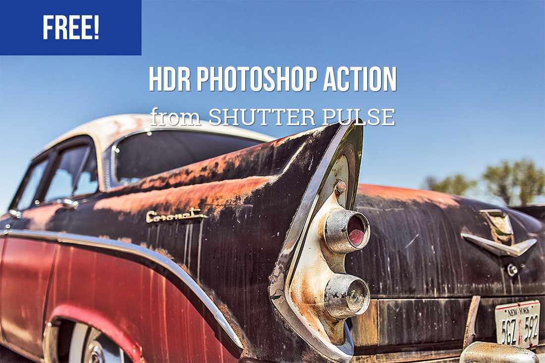
41. Mint Green
#3eb9a5#e9a02f#ffffff

powerpoint color schemes

Go super trendy with a modern and streamlined palette of mint green and gray on white. While this combination can have a minimal feel, it also adds a touch of funkiness to the design.

Add another hint of color – think orange – for extra accents.

42. Dark Gray and Blue

#387490#01acb6#2b2b2d

powerpoint color schemes

It doesn’t get more classy than a combination of grays and blues. This new take on a classic color scheme adds another brighter blue as well to pick up on modern trends.

Just be careful with text using a dark background such as this one. White is probably your best option for typography (and look for a font with thicker strokes!)