10 Tips for Designing Logos That Don’t Suck
So you’re designing a logo. It sounds like an easy enough task, right? Draw a circle, type in the company name and you’re done (I’ve literally heard a designer suggest that very process). Unfortunately, if you’re really worth the money the client is paying you, there’s a lot more to it than that.
There are a million people in the logo design industry today dishing out crappy logos in bulk for crowdsourcing sites. How do you as a serious professional stand out from the crowd and produce quality logos that don’t suck? Read on to find out.
Are you in the middle of a logo design project? Don’t forget to check out our in-depth guide on how to design a logo!
Pro Tip: Logo Templates & Logo Makers
If you’re looking for a quick start with a logo design, experimenting with a logo template can be a great initial step. It can help give you a starting point for your logo design, on which you can build and adapt.
Envato Elements has a collection of over 6,000 logo templates that you can access for a low monthly price of $17 (as well as icons, photos, graphic templates, and more). Here are a few of our favorites!
You could also experiment using a logo maker tool—an online app that asks you a few questions about your business, and suggests logo ideas and concepts that fit your brand.
1. Use a Visual Double Entendre
Some of my favorite logos in the world utilize a technique that I like to call a visual double entendre, which is an overly fancy way to say that it has two pictures wrapped into one through clever interpretation of a concept or idea.
The WinePlace logo below is a perfect example.
This logo takes on the shape of a thumbtack, which suggests “location” or “place,” but it also clearly looks like an upside down wine glass. Logo designs that use this technique come off as clever and memorable. Viewers love the little mind game that you’re playing and are more prone to appreciate a design because of it.
In the past, we’ve put together a post of clever negative space logos like the one below. Check it out if you love this type of logo design as much as I do!
2. Color is Vitally Important
One of the most important considerations for logo design is the color palette. This is not a superficial decision, color carries meanings and communicates ideas.
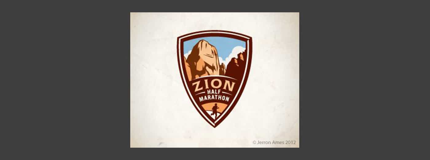
Sometimes you’re pegged to the colors of a brand, but other times you’ll have the freedom to explore. I love the rich palette used in the Zion logo below.
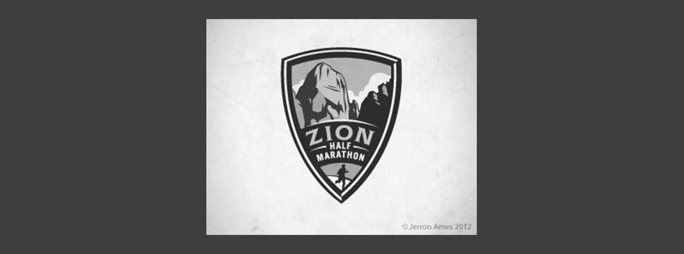
The colors here grab you and pull you in, they bring life to the illustration and give further context to the shape of the landscape. That being said, remember that a good logo is versatile and will still function well in grayscale:
Beyond a grayscale version, I like to also provide clients with a true single color version, using only black and negative space. This would be a little tricky with the logo above, but definitely possible.
Always consider what it is that the logo will be used for and whether or not the various use cases require different versions.
3. Avoid the Cliché
Every few years or so, some new fads come along in logo design. I personally love to study design trends and you might even find me suggesting jumping onto a few bandwagons to keep up with the times, but with logos, I just hate it when a bunch of designers use the same idea over and over.
Should you know about the latest logo design trends and understand what’s good and bad about them? Absolutely. Should you follow them to the letter? Absolutely not.
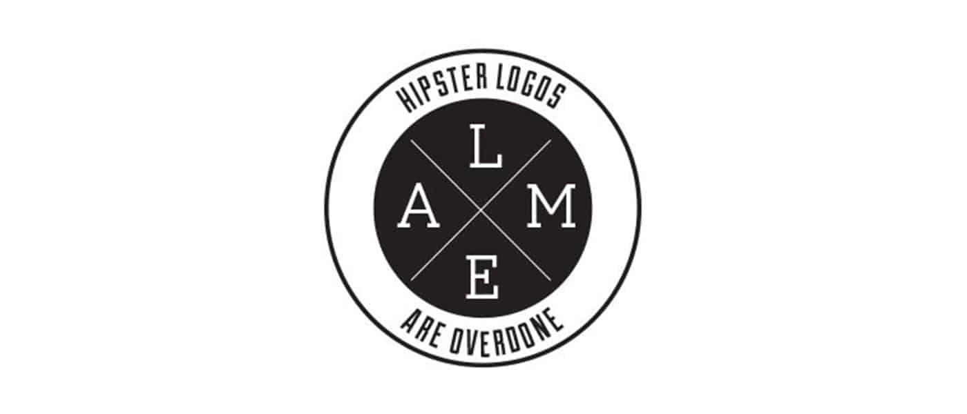
The basic archetype above is being used again and again in logo design right now and it’s getting old fast. Why not use a design that you actually thought up yourself rather than ripping off what everyone else is doing?
We have an entire article dedicated to showcasing logo design clichés, be sure to check it out to make sure you’re not guilty of uninspired logo design.
4. Make it Ownable
I don’t believe that “ownable” is a real word, but you nevertheless hear it quite a bit in marketing (marketers love to make up words). The concept is definitely an important one that ties closely to the previous tip.
Rather than following the herd and using a cliché design, you should instead strive for something that is uniquely recognizable. I’ve always appreciated the Evernote logo in this regard:
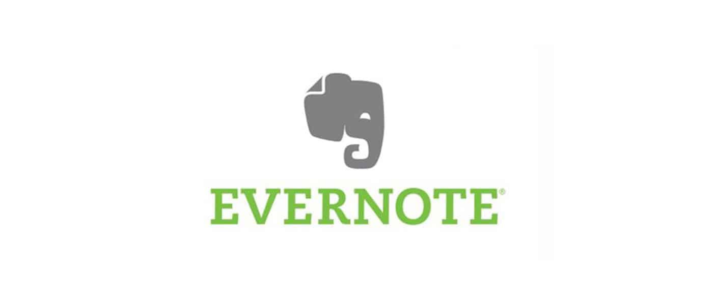
It’s really just an elephant head, which doesn’t sound like a very unique concept. However, the way it’s drawn with the curled trunk and page fold in the ear makes it instantly recognizable.
As you’re designing logos, consider whether or not your design is generic or unique. Is it likely that others will produce something similar? Remember, your first idea is typically your most generic (it’s also everyone else’s first idea). Try filling a notebook page or two with some rough sketches before choosing which ideas to pursue further.
5. Everybody Loves Custom Type
While we’re on the subject of being unique, there’s almost nothing that can give your logo a unique feel quite like some awesome custom lettering.
Too often we see logo design as simply a trip to the font menu to see which typeface makes the company name look best. If someone is paying you to “design” their logo, they probably expect you to put a little more effort into it.
Custom type helps to ensure that your unique logo will stay that way. Lowlife designers will rip off your work in a heartbeat if they discover which typeface you’re using, but it takes some real skill to mimic custom hand-drawn type!
Keep in mind though that if your logo is famous enough, people will always try to rip it off. This certainly holds true for my favorite script logo:
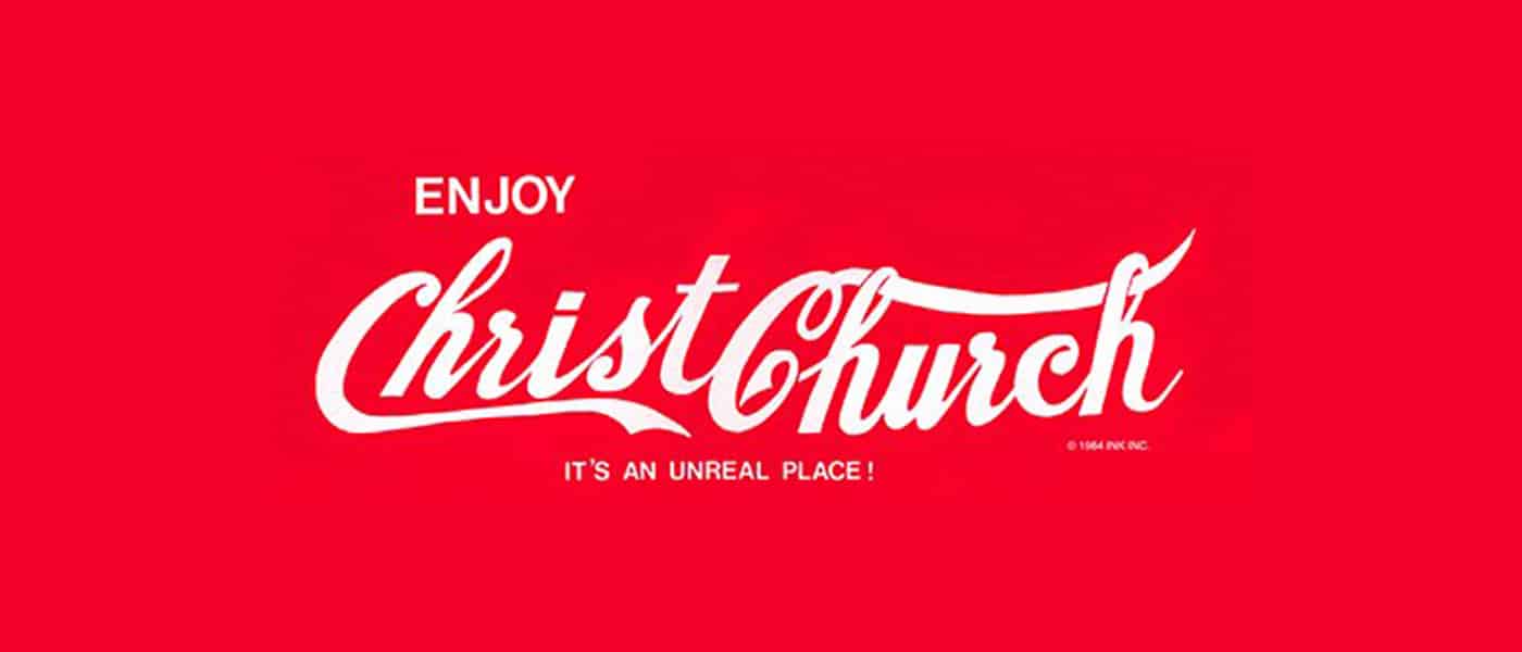
The awesome Coca-Cola script has been stolen countless times in awkward parodies throughout the last few decades.
6. Keep it Simple Stupid
Let’s face it, not everyone can bust out a beautiful, hand-drawn script on a whim. Just because you’re a designer doesn’t mean you’re an awesome illustrator or typographer (though it helps). If you fit this description, fear not, there’s nothing preventing you from making awesome logos.
In this situation, remember these four powerful words: keep it simple stupid! Simple but powerful logos permeate the business world and always prove to be the best icons for standing the test of time.
In considering how to construct one of these types of logos, let’s discuss the Apple logo. The silhouette of an apple is nothing special or memorable:
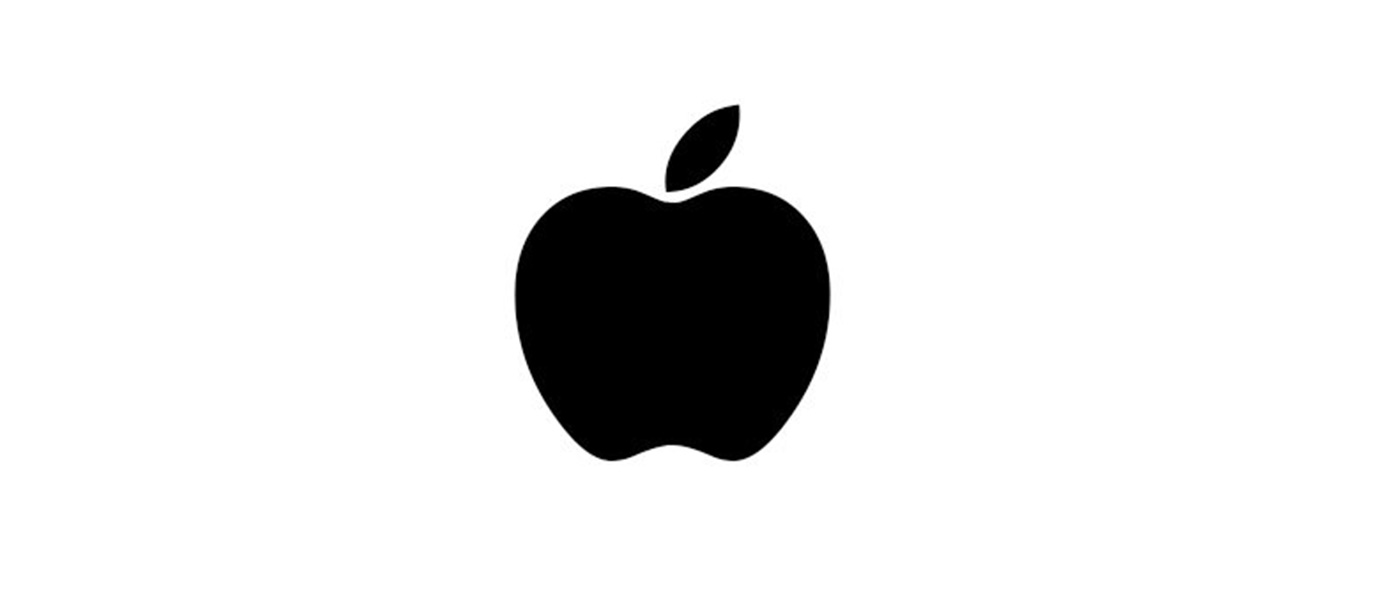
It’s that missing bite that takes it to the next level. It gives the logo character, makes it unique, and drives the meaning deeper (computers and bytes, get it?). Without the bite, the apple is boring, with it, the apple is suddenly iconic.
Always think about how you can go that extra mile and turn your boring logos into unmistakable brand marks.
7. Consider Proportion & Symmetry
Some people can get carried away with discussions of proportion and symmetry (see the new Pepsi logo pitch), but if we strip out the crazy, there’s still some important lessons here. Consider the new Twitter logo as an example:
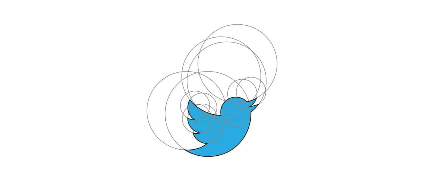
Here circles aren’t used to convince you of some strange cosmic tale that makes no sense, they’re simply used as a guide to create a well balanced logo with consistent curves and arcs.
Despite the fact that the bite seems to violate the symmetry of the Apple logo above, if we dig deeper we can see that there was still a lot of through put into proportion and symmetry here (image source):
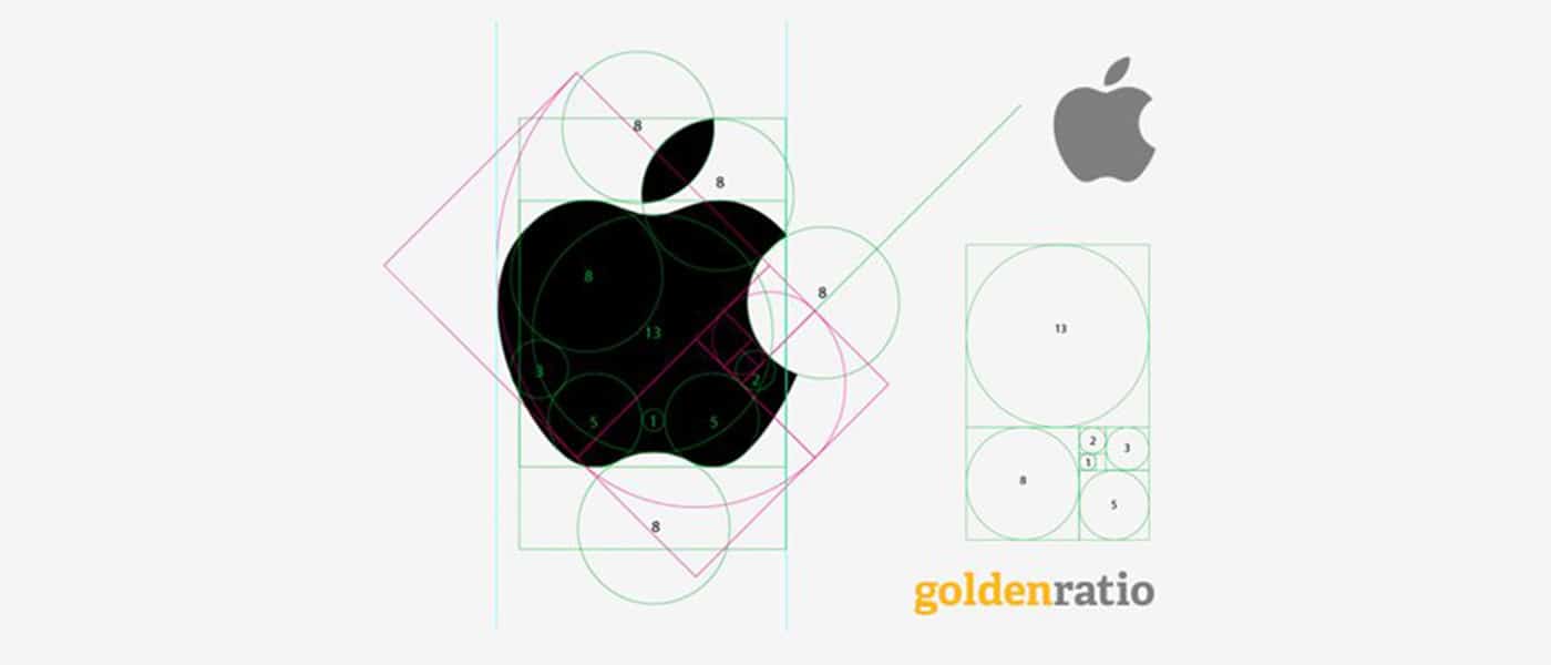
8. Think About Negative Space
Along the same vein as a double entendre is the age-old trick of utilizing the negative space in a logo in some clever way. The industry standard example of this technique is the FedEx logo and its hidden arrow.
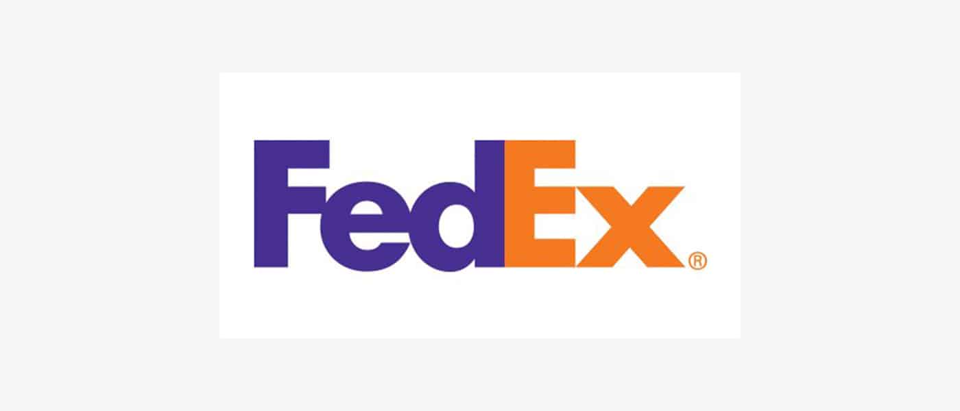
Don’t see it yet? Keep looking, it’s there. That’s what I love about this logo, the use of negative space is so subtle. Most people in the U.S. see the FedEx logo daily or weekly for years as it drives by on the side of countless trucks and they never even notice the arrow.
Logopond is chock full of great logo designs that utilize negative space in a cool way. Check out the example below, which blends together the idea of bull horns and a wine glass.

9. Passive vs. Active
One interesting facet of logo design that I’ve been considering a lot lately is the concept of instilling motion or a sense of activity into a logo. This isn’t always appropriate (such as with the Apple logo), but sometimes it can really give a logo the boost it needs, both from a visual and conceptual standpoint.
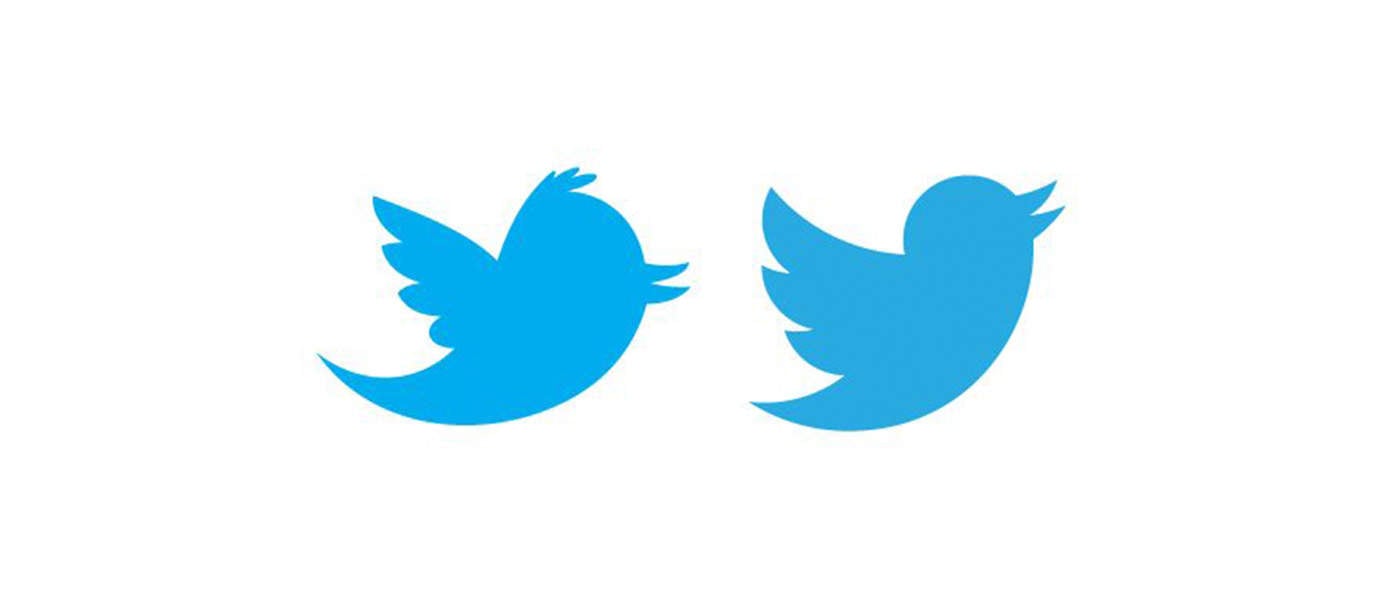
As an example, let’s look again to the Twitter logo. Way back in the early days, the bird went from sitting perched and passive to becoming active and taking flight.
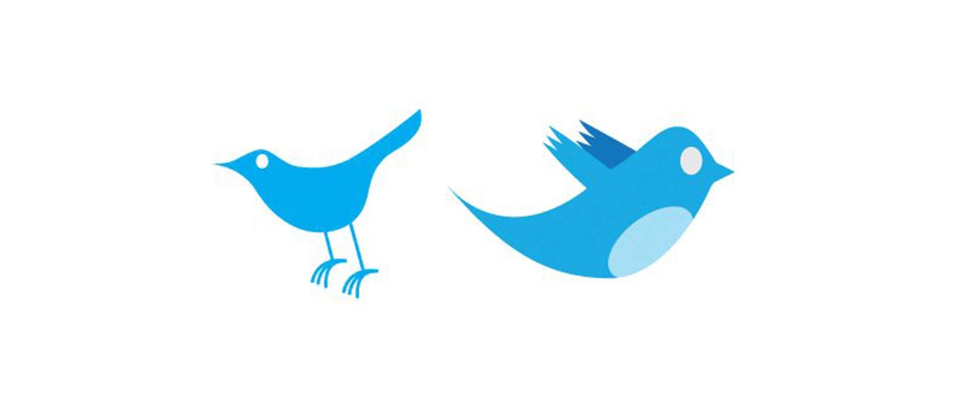
In the most recent iteration, they took this concept even further by pointing the bird in an upward direction to indicate that it’s climbing into the air rather than floating along the same old trajectory.
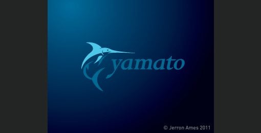
A sense of motion is especially important when it comes to logos with mascots. The image of the marlin below doesn’t depict the fish merely lying still, instead, it’s leaping into the air in a victorious pose.
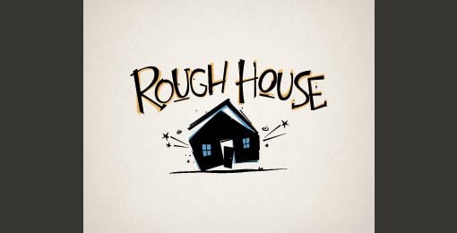
This concept even extends to typically inanimate objects. Consider how much better the logo below portrays the concept of “rough house” by instilling a sense of motion.
10. Know What it Means
Every good logo has a story. Far beyond simply a pretty sketch, strong logos are filled with meaning, both obvious and hidden. We discussed this in several cases above. The FedEx logo’s arrow indicates moving forward and making deliveries, the Apple logo has a “byte” missing, and the Twitter bird is flying in an upward trajectory.
Half the time I wonder if logo designers don’t come up with the meaning after the logo is already produced, but regardless, it’s great when you as a designer can show a client how much thought and reasoning went into the logo that you produced for them.
Clients might think that all they want is something fresh and cool, but if you instead provide a logo that ties into the company’s core values and mission, you’ll blow their minds and they’ll love you for it.
If you’re into hidden logo meanings, check out our post titled “Five Fascinating Things You Didn’t Know About Famous Car Logos.”
Do Your Logos Suck?
Now that you’ve read our tips for designing logos that don’t suck, leave a comment below and let us know what you think of your own work in this area.
Are you an awesome logo designer or is it something that you struggle with? Which of the tips above are useful to you and what tips can you offer to other designers?
The Different (and Modern) Ways to Toggle Content
If all you have is a hammer, everything looks like a nail.
Abraham Maslow
It’s easy to default to what you know. When it comes to toggling content, that might be reaching for display: none or opacity: 0 with some JavaScript sprinkled in. But the web is more “modern” today, so perhaps now is the right time to get a birds-eye view of the different ways to toggle content — which native APIs are actually supported now, their pros and cons, and some things about them that you might not know (such as any pseudo-elements and other non-obvious stuff).
So, let’s spend some time looking at disclosures (<details> and <summary>), the Dialog API, the Popover API, and more. We’ll look at the right time to use each one depending on your needs. Modal or non-modal? JavaScript or pure HTML/CSS? Not sure? Don’t worry, we’ll go into all that.
Disclosures (<details> and <summary>)
Use case: Accessibly summarizing content while making the content details togglable independently, or as an accordion.
Going in release order, disclosures — known by their elements as <details> and <summary> — marked the first time we were able to toggle content without JavaScript or weird checkbox hacks. But lack of web browser support obviously holds new features back at first, and this one in particular came without keyboard accessibility. So I’d understand if you haven’t used it since it came to Chrome 12 way back in 2011. Out of sight, out of mind, right?
Here’s the low-down:
- It’s functional without JavaScript (without any compromises).
- It’s fully stylable without
appearance: noneor the like. - You can hide the marker without non-standard pseudo-selectors.
- You can connect multiple disclosures to create an accordion.
- Aaaand… it’s fully animatable, as of 2024.
Marking up disclosures
What you’re looking for is this:
<details>
  <summary>Content summary (always visible)</summary>
  Content (visibility is toggled when summary is clicked on)
</details>
Behind the scenes, the content’s wrapped in a pseudo-element that as of 2024 we can select using ::details-content. To add to this, there’s a ::marker pseudo-element that indicates whether the disclosure’s open or closed, which we can customize.
With that in mind, disclosures actually look like this under the hood:
<details>
  <summary><::marker></::marker>Content summary (always visible)</summary>
  <::details-content>
      Content (visibility is toggled when summary is clicked on)
  </::details-content>
</details>
To have the disclosure open by default, give <details> the open attribute, which is what happens behind the scenes when disclosures are opened anyway.
<details open> ... </details>Styling disclosures
Let’s be real: you probably just want to lose that annoying marker. Well, you can do that by setting the display property of <summary> to anything but list-item:
summary {
  display: block; /* Or anything else that isn't list-item */
}Alternatively, you can modify the marker. In fact, the example below utilizes Font Awesome to replace it with another icon, but keep in mind that ::marker doesn’t support many properties. The most flexible workaround is to wrap the content of <summary> in an element and select it in CSS.
<details>
  <summary><span>Content summary</span></summary>
  Content
</details>
details {
/* The marker */
summary::marker {
content: "\f150";
font-family: "Font Awesome 6 Free";
}
/* The marker when <details> is open */
&[open] summary::marker {
content: "\f151";
}
/* Because ::marker doesn’t support many properties */
summary span {
margin-left: 1ch;
display: inline-block;
}
}Creating an accordion with multiple disclosures
To create an accordion, name multiple disclosures (they don’t even have to be siblings) with a name attribute and a matching value (similar to how you’d implement <input type="radio">):
<details name="starWars" open>
  <summary>Prequels</summary>
  <ul>
    <li>Episode I: The Phantom Menace</li>
    <li>Episode II: Attack of the Clones</li>
    <li>Episode III: Revenge of the Sith</li>
  </ul>
</details>

<details name="starWars">
  <summary>Originals</summary>
  <ul>
    <li>Episode IV: A New Hope</li>
    <li>Episode V: The Empire Strikes Back</li>
    <li>Episode VI: Return of the Jedi</li>
  </ul>
</details>

<details name="starWars">
  <summary>Sequels</summary>
  <ul>
    <li>Episode VII: The Force Awakens</li>
    <li>Episode VIII: The Last Jedi</li>
    <li>Episode IX: The Rise of Skywalker</li>
  </ul>
</details>
Using a wrapper, we can even turn these into horizontal tabs:
<div> <!-- Flex wrapper -->
  <details name="starWars" open> ... </details>
  <details name="starWars"> ... </details>
  <details name="starWars"> ... </details>
</div>
div {
gap: 1ch;
display: flex;
position: relative;
details {
min-height: 106px; /* Prevents content shift */
&[open] summary,
&[open]::details-content {
background: #eee;
}
&[open]::details-content {
left: 0;
position: absolute;
}
}
}…or, using 2024’s Anchor Positioning API, vertical tabs (same HTML):
div {

  display: inline-grid;
  anchor-name: --wrapper;

  details[open] {

    summary,
    &::details-content {
      background: #eee;
    }

    &::details-content {
      position: absolute;
      position-anchor: --wrapper;
      top: anchor(top);
      left: anchor(right);
    }
  }
}If you’re looking for some wild ideas on what we can do with the Popover API in CSS, check out John Rhea’s article in which he makes an interactive game solely out of disclosures!
Adding JavaScript functionality
Want to add some JavaScript functionality?
// Optional: select and loop multiple disclosures
document.querySelectorAll("details").forEach(details => {
  details.addEventListener("toggle", () => {
    // The disclosure was toggled
    if (details.open) {
      // The disclosure was opened
    } else {
      // The disclosure was closed
    }
  });
});
Creating accessible disclosures
Disclosures are accessible as long as you follow a few rules. For example, <summary> is basically a <label>, meaning that its content is announced by screen readers when in focus. If there isn’t a <summary> or <summary> isn’t a direct child of <details> then the user agent will create a label for you that normally says “Details” both visually and in assistive tech. Older web browsers might insist that it be the first child, so it’s best to make it so.
To add to this, <summary> has the role of button, so whatever’s invalid inside a <button> is also invalid inside a <summary>. This includes headings, so you can style a <summary> as a heading, but you can’t actually insert a heading into a <summary>.
The Dialog element (<dialog>)
Use case: Modals
Now that we have the Popover API for non-modal overlays, I think it’s best if we start to think of dialogs as modals even though the show() method does allow for non-modal dialogs. The advantage that the popover attribute has over the <dialog> element is that you can use it to create non-modal overlays without JavaScript, so in my opinion there’s no benefit to non-modal dialogs anymore, which do require JavaScript. For clarity, a modal is an overlay that makes the main document inert, whereas with non-modal overlays the main document remains interactive. There are a few other features that modal dialogs have out-of-the-box as well, including:
- a stylable backdrop,
- an autofocus onto the first focusable element within the
<dialog>(or, as a backup, the<dialog>itself — include anaria-labelin this case), - a focus trap (as a result of the main document’s inertia),
- the
esckey closes the dialog, and - both the dialog and the backdrop are animatable.Marking up and activating dialogs
Start with the <dialog> element:
<dialog> ... </dialog>It’s hidden by default and, similar to <details>, we can have it open when the page loads, although it isn’t modal in this scenario since it does not contain interactive content because it doesn’t opened with showModal().
<dialog open> ... </dialog>I can’t say that I’ve ever needed this functionality. Instead, you’ll likely want to reveal the dialog upon some kind of interaction, such as the click of a button — so here’s that button:
<button data-dialog="dialogA">Open dialogA</button>Wait, why are we using data attributes? Well, because we might want to hand over an identifier that tells the JavaScript which dialog to open, enabling us to add the dialog functionality to all dialogs in one snippet, like this:
// Select and loop all elements with that data attribute
document.querySelectorAll("[data-dialog]").forEach(button => {
  // Listen for interaction (click)
  button.addEventListener("click", () => {
    // Select the corresponding dialog
    const dialog = document.querySelector(`#${ button.dataset.dialog }`);
    // Open dialog
    dialog.showModal();
    // Close dialog
    dialog.querySelector(".closeDialog").addEventListener("click", () => dialog.close());
  });
});
Don’t forget to add a matching id to the <dialog> so it’s associated with the <button> that shows it:
<dialog id="dialogA"> <!-- id and data-dialog = dialogA --> ... </dialog>And, lastly, include the “close” button:
<dialog id="dialogA">
  <button class="closeDialog">Close dialogA</button>
</dialog>
Note: <form method="dialog"> (that has a <button>) or <button formmethod="dialog"> (wrapped in a <form>) also closes the dialog.
How to prevent scrolling when the dialog is open
Prevent scrolling while the modal’s open, with one line of CSS:
body:has(dialog:modal) { overflow: hidden; }Styling the dialog’s backdrop
And finally, we have the backdrop to reduce distraction from what’s underneath the top layer (this applies to modals only). Its styles can be overwritten, like this:
::backdrop {
  background: hsl(0 0 0 / 90%);
  backdrop-filter: blur(3px); /* A fun property just for backdrops! */
}
On that note, the <dialog> itself comes with a border, a background, and some padding, which you might want to reset. Actually, popovers behave the same way.
Dealing with non-modal dialogs
To implement a non-modal dialog, use:
show()instead ofshowModal()dialog[open](targets both) instead ofdialog:modal
Although, as I said before, the Popover API doesn’t require JavaScript, so for non-modal overlays I think it’s best to use that.
The Popover API (<element popover>)
Use case: Non-modal overlays
Popups, basically. Suitable use cases include tooltips (or toggletips — it’s important to know the difference), onboarding walkthroughs, notifications, togglable navigations, and other non-modal overlays where you don’t want to lose access to the main document. Obviously these use cases are different to those of dialogs, but nonetheless popovers are extremely awesome. Functionally they’re just like just dialogs, but not modal and don’t require JavaScript.
Marking up popovers
To begin, the popover needs an id as well as the popover attribute with the manual value (which means clicking outside of the popover doesn’t close it), the auto value (clicking outside of the popover does close it), or no value (which means the same thing). To be semantic, the popover can be a <dialog>.
<dialog id="tooltipA" popover> ... </dialog>Next, add the popovertarget attribute to the <button> or <input type="button"> that we want to toggle the popover’s visibility, with a value matching the popover’s id attribute (this is optional since clicking outside of the popover will close it anyway, unless popover is set to manual):
<dialog id="tooltipA" popover>
  <button popovertarget="tooltipA">Hide tooltipA</button>
</dialog>
Place another one of those buttons in your main document, so that you can show the popover. That’s right, popovertarget is actually a toggle (unless you specify otherwise with the popovertargetaction attribute that accepts show, hide, or toggle as its value — more on that later).
Styling popovers
By default, popovers are centered within the top layer (like dialogs), but you probably don’t want them there as they’re not modals, after all.
<main>
  <button popovertarget="tooltipA">Show tooltipA</button>
</main>

<dialog id="tooltipA" popover>
  <button popovertarget="tooltipA">Hide tooltipA</button>
</dialog>
You can easily pull them into a corner using fixed positioning, but for a tooltip-style popover you’d want it to be relative to the trigger that opens it. CSS Anchor Positioning makes this super easy:
main [popovertarget] {
  anchor-name: --trigger;
}

[popover] {
  margin: 0;
  position-anchor: --trigger;
  top: calc(anchor(bottom) + 10px);
  justify-self: anchor-center;
}

/* This also works but isn’t needed
unless you’re using the display property
[popover]:popover-open {
    ...
}
*/
The problem though is that you have to name all of these anchors, which is fine for a tabbed component but overkill for a website with quite a few tooltips. Luckily, we can match an id attribute on the button to an anchor attribute on the popover, which isn’t well-supported as of November 2024 but will do for this demo:
<main>
  <!-- The id should match the anchor attribute -->
  <button id="anchorA" popovertarget="tooltipA">Show tooltipA</button>
  <button id="anchorB" popovertarget="tooltipB">Show tooltipB</button>
</main>

<dialog anchor="anchorA" id="tooltipA" popover>
  <button popovertarget="tooltipA">Hide tooltipA</button>
</dialog>

<dialog anchor="anchorB" id="tooltipB" popover>
  <button popovertarget="tooltipB">Hide tooltipB</button>
</dialog>
main [popovertarget] { anchor-name: --anchorA; } /* No longer needed */
[popover] {
margin: 0;
position-anchor: --anchorA; /* No longer needed */
top: calc(anchor(bottom) + 10px);
justify-self: anchor-center;
}The next issue is that we expect tooltips to show on hover and this doesn’t do that, which means that we need to use JavaScript. While this seems complicated considering that we can create tooltips much more easily using ::before/::after/content:, popovers allow HTML content (in which case our tooltips are actually toggletips by the way) whereas content: only accepts text.
Adding JavaScript functionality
Which leads us to this…
Okay, so let’s take a look at what’s happening here. First, we’re using anchor attributes to avoid writing a CSS block for each anchor element. Popovers are very HTML-focused, so let’s use anchor positioning in the same way. Secondly, we’re using JavaScript to show the popovers (showPopover()) on mouseover. And lastly, we’re using JavaScript to hide the popovers (hidePopover()) on mouseout, but not if they contain a link as obviously we want them to be clickable (in this scenario, we also don’t hide the button that hides the popover).
<main>
  <button id="anchorLink" popovertarget="tooltipLink">Open tooltipLink</button>
  <button id="anchorNoLink" popovertarget="tooltipNoLink">Open tooltipNoLink</button>
</main>

<dialog anchor="anchorLink" id="tooltipLink" popover>Has <a href="#">a link</a>, so we can’t hide it on mouseout
  <button popovertarget="tooltipLink">Hide tooltipLink manually</button>
</dialog>

<dialog anchor="anchorNoLink" id="tooltipNoLink" popover>Doesn’t have a link, so it’s fine to hide it on mouseout automatically
  <button popovertarget="tooltipNoLink">Hide tooltipNoLink</button>
</dialog>
[popover] {
margin: 0;
top: calc(anchor(bottom) + 10px);
justify-self: anchor-center;
/* No link? No button needed */
&:not(:has(a)) [popovertarget] {
display: none;
}
}/* Select and loop all popover triggers */
document.querySelectorAll("main [popovertarget]").forEach((popovertarget) => {
/* Select the corresponding popover */
const popover = document.querySelector(`#${popovertarget.getAttribute("popovertarget")}`);
/* Show popover on trigger mouseover */
popovertarget.addEventListener("mouseover", () => {
popover.showPopover();
});
/* Hide popover on trigger mouseout, but not if it has a link */
if (popover.matches(":not(:has(a))")) {
popovertarget.addEventListener("mouseout", () => {
popover.hidePopover();
});
}
});Implementing timed backdrops (and sequenced popovers)
At first, I was sure that popovers having backdrops was an oversight, the argument being that they shouldn’t obscure a focusable main document. But maybe it’s okay for a couple of seconds as long as we can resume what we were doing without being forced to close anything? At least, I think this works well for a set of onboarding tips:
<!-- Re-showing ‘A’ rolls the onboarding back to that step -->
<button popovertarget="onboardingTipA" popovertargetaction="show">Restart onboarding</button>
<!-- Hiding ‘A’ also hides subsequent tips as long as the popover attribute equates to auto -->
<button popovertarget="onboardingTipA" popovertargetaction="hide">Cancel onboarding</button>

<ul>
  <li id="toolA">Tool A</li>
  <li id="toolB">Tool B</li>
  <li id="toolC">Another tool, “C”</li>
  <li id="toolD">Another tool — let’s call this one “D”</li>
</ul>

<!-- onboardingTipA’s button triggers onboardingTipB -->
<dialog anchor="toolA" id="onboardingTipA" popover>
  onboardingTipA <button popovertarget="onboardingTipB" popovertargetaction="show">Next tip</button>
</dialog>

<!-- onboardingTipB’s button triggers onboardingTipC -->
<dialog anchor="toolB" id="onboardingTipB" popover>
  onboardingTipB <button popovertarget="onboardingTipC" popovertargetaction="show">Next tip</button>
</dialog>

<!-- onboardingTipC’s button triggers onboardingTipD -->
<dialog anchor="toolC" id="onboardingTipC" popover>
  onboardingTipC <button popovertarget="onboardingTipD" popovertargetaction="show">Next tip</button>
</dialog>

<!-- onboardingTipD’s button hides onboardingTipA, which in-turn hides all tips -->
<dialog anchor="toolD" id="onboardingTipD" popover>
  onboardingTipD <button popovertarget="onboardingTipA" popovertargetaction="hide">Finish onboarding</button>
</dialog>
::backdrop {
animation: 2s fadeInOut;
}
[popover] {
margin: 0;
align-self: anchor-center;
left: calc(anchor(right) + 10px);
}/*
After users have had a couple of
seconds to breathe, start the onboarding
*/
setTimeout(() => {
document.querySelector("#onboardingTipA").showPopover();
}, 2000);Again, let’s unpack. Firstly, setTimeout() shows the first onboarding tip after two seconds. Secondly, a simple fade-in-fade-out background animation runs on the backdrop and all subsequent backdrops. The main document isn’t made inert and the backdrop doesn’t persist, so attention is diverted to the onboarding tips while not feeling invasive.
Thirdly, each popover has a button that triggers the next onboarding tip, which triggers another, and so on, chaining them to create a fully HTML onboarding flow. Typically, showing a popover closes other popovers, but this doesn’t appear to be the case if it’s triggered from within another popover. Also, re-showing a visible popover rolls the onboarding back to that step, and, hiding a popover hides it and all subsequent popovers — although that only appears to work when popover equates to auto. I don’t fully understand it but it’s enabled me to create “restart onboarding” and “cancel onboarding” buttons.
With just HTML. And you can cycle through the tips using esc and return.
Creating modal popovers
Hear me out. If you like the HTML-ness of popover but the semantic value of <dialog>, this JavaScript one-liner can make the main document inert, therefore making your popovers modal:
document.querySelectorAll("dialog[popover]").forEach(dialog => dialog.addEventListener("toggle", () => document.body.toggleAttribute("inert")));However, the popovers must come after the main document; otherwise they’ll also become inert. Personally, this is what I’m doing for modals anyway, as they aren’t a part of the page’s content.
<body>
  <!-- All of this will become inert -->
</body>

<!-- Therefore, the modals must come after -->
<dialog popover> ... </dialog>Aaaand… breathe
Yeah, that was a lot. But…I think it’s important to look at all of these APIs together now that they’re starting to mature, in order to really understand what they can, can’t, should, and shouldn’t be used for. As a parting gift, I’ll leave you with a transition-enabled version of each API:
- Sliding disclosures
- Popping dialog (with fading backdrop)
- Sliding popover (hamburger nav, because why not?)
The Different (and Modern) Ways to Toggle Content originally published on CSS-Tricks, which is part of the DigitalOcean family. You should get the newsletter.
Affiliate Marketing 2024: How to Launch and Succeed
Affiliate marketing continues to be a lucrative way for individuals and businesses to earn income online by promoting products or services and earning commissions on resulting sales. As we move into 2024, the landscape of affiliate marketing is evolving, presenting new opportunities and challenges. This guide will provide you with a comprehensive overview of how …
Continue reading "Affiliate Marketing 2024: How to Launch and Succeed"
The post Affiliate Marketing 2024: How to Launch and Succeed first appeared on Lucid Softech.
65+ Best DaVinci Resolve Templates 2025 (Free & Pro)
DaVinci Resolve is the go-to video editing software for most professionals. High-quality editing tools, color correction, audio post-production tools, and the ability to use the software for free convinced more people to switch to DaVinci Resolve.
Now, there’s one more reason to use DaVinci Resolve— templates! Thanks to its massive growth, the community around the software doubled in size. With it came more professional-quality templates for you to use in your projects.
In this post, we showcase some of the best DaVinci Resolve templates we’ve found. There are templates for everything from creating intro scenes to adding lower-thirds, titles, and much more.
Check out the templates below, download them all (there are free ones in there), and experience the magic of DaVinci Resolve.
Urban Trendy Opener for DaVinci Resolve
This DaVinci Resolve template will help you design modern and trendy openers for your videos with a stylish urban vibe. It includes cool and attractive animations and effects to add that Extra look to your projects. You can easily customize the template to your preference too.
Liquid Slides DaVinci Resolve Template
A collection of creative slides for DaVinci Resolve. This template comes with multiple styles of slide layouts with liquid-style animations and effects. You can use these in your promo videos and create slideshows as well.
Fast Dynamic Intro Template for DaVinci Resolve
This DaVinci Resolve intro template has fast and dynamic animations that fit perfectly with energetic videos. It’s especially ideal for sports, gym, adventure, and fitness-themed videos. There are 13 media placeholders and 9 text placeholders in this template.
Colorful Opener Intro for DaVinci Resolve
Featuring 7 media placeholders, 6 titles, and a logo placeholder, this DaVinci Resolve has the perfect design for making openers for both business and creative videos. The template has bright and colorful effects too.
Wedding Elegance – Free DaVinci Resolve Template
This is a free DaVinci Resolve template you can use to create beautiful openers and slides for wedding-themed videos. It features sparkling text animations and easily editable media and text placeholders.
Newspaper History – Free DaVinci Resolve Slideshow Template
You can use this free DaVinci Resolve template to design attractive, documentary-style photo slideshows. It features a newspaper-themed design with newspaper backgrounds and editable media placeholders.
Event Promo – Free DaVinci Resolve Template
This free DaVinci Resolve template is perfect for making quick and professional-looking promo videos to promote your events and conferences. The template is easily editable and it’s most suitable for adverts and social media promos.
Fashion Opener DaVinci Resolve Template
This DaVinci Resolve template offers a trendy and stylish way to kick off your fashion videos. It provides engaging, easy-to-edit designs that can be customized to align with your brand’s aesthetic. The template creates a polished, professional look, making it an excellent tool for fashion content creators and enthusiasts alike.
YouTube Collage Slides for DaVinci Resolve
This DaVinci Resolve template adds depth and dynamism to any slideshow and it’s especially perfect for creating YouTube videos. Simple yet engaging, its design caters to a wide range of uses, helping you craft more compelling YouTube presentations in no time.
Creative Scenes for DaVinci Resolve
A meticulously designed slideshow template ideal for all your creative projects. This versatile DaVinci Resolve template delivers high-quality visuals, enabling you to exhibit your content effectively. Simple yet striking, it amplifies your storytelling potential, elevating your projects to new heights.
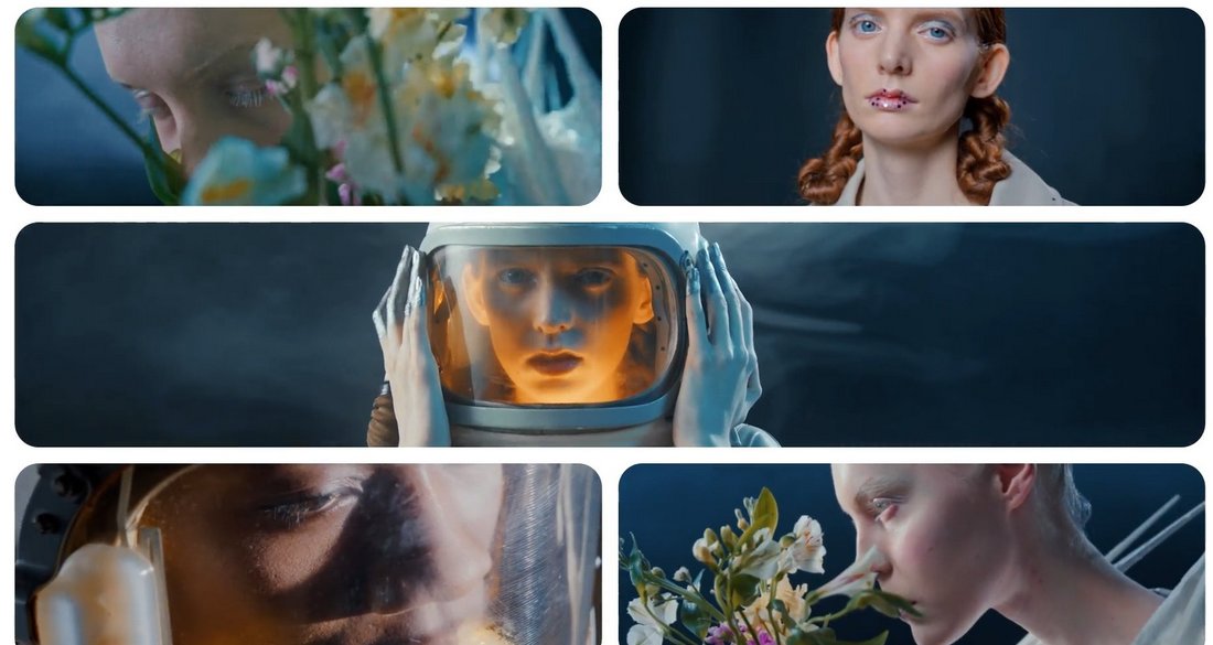
Elegant Slides for DaVinci Resolve
This is a chic-style DaVinci Resolve template designed to enhance your elegant fashion and beauty slideshow videos. It highlights your content with a sophisticated touch with its stylish aesthetic and seamless functionality, it’s an exceptional addition for any DaVinci Resolve user seeking to elevate their video presentations.
News Intro DaVinci Resolve Template
An incredibly resourceful DaVinci Resolve template for producing professional, news-style introductions. This template is designed to facilitate seamless editing while creating high-quality news intros, enhancing the overall appeal of your broadcast.
Summer Sale Promo for DaVinci Resolve
Check out this summer sale promo DaVinci Resolve template for creating cool and breezy promo videos. It’s an excellent tool for crafting dynamic promotional videos, infusing a summery spirit into your sales messages. The template effortlessly helps enhance your visuals, balancing simplicity and engagement in a compelling package.
Travel Slides for DaVinci Resolve
Get your audience’s wanderlust stirring with this travel slideshow DaVinci Resolve template. This slideshow template is perfect for showcasing your travel videos, capturing the essence of every destination beautifully. It comes with professional-grade design features that will enhance and uplift your travel content effortlessly.
Glitch Titles – Free DaVinci Resolve Templates
If you’re looking to add a cool and creative look to your title designs, this free DaVinci Resolve template is made just for you. It comes with a stylishly modern and creative title design with glitch animations. It’s great for tech and gaming-themed videos.
Free Horizontal Split Frame DaVinci Resolve Transition
This is a simple transition animation template for DaVinci Resolve template that features a subtle horizontal split frame animation. The basic and subtle design of this transition makes it a great choice for business, corporate, and professional videos.
Lower Thirds Templates for DaVinci Resolve
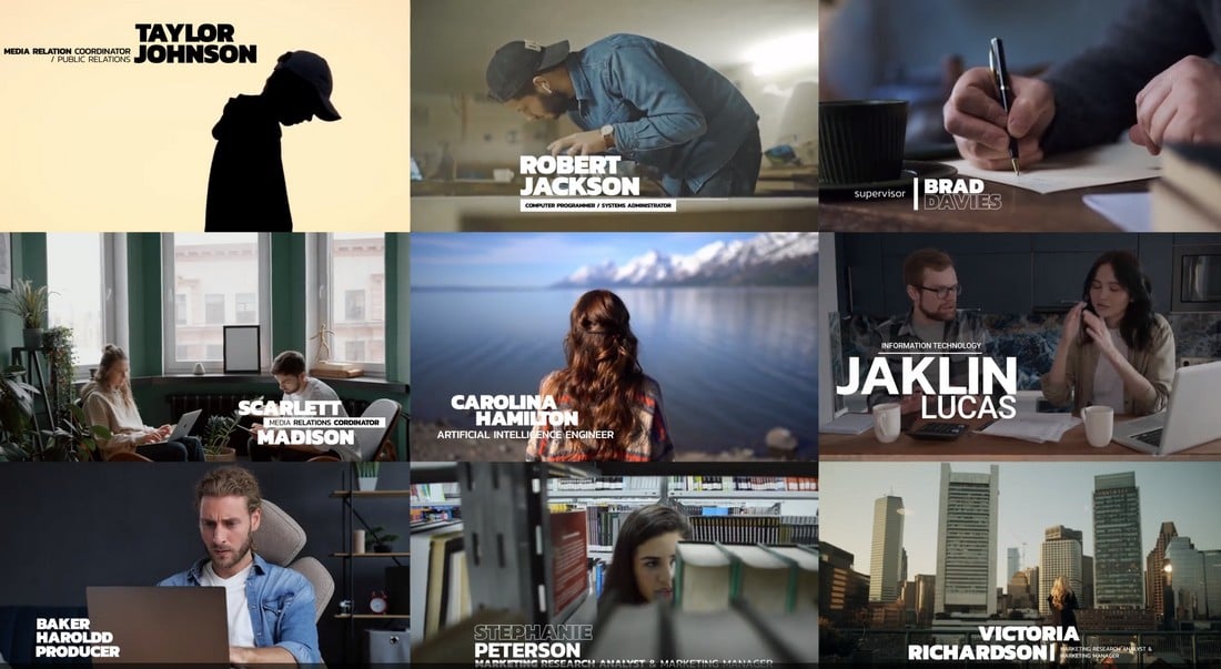
This DaVinci Resolve template features a collection of professional lower-thirds for your video projects. It’s a useful toolkit for applying refined and professional lower-third graphical elements in your video editing process.
Neon Brush Transitions for DaVinci Resolve
This creative DaVinci Resolve transitions pack delivers transitions infused with neon brush effects. Ideal for DaVinci Resolve users wanting to add an artistic flair to their video projects, these transitions truly stand out.
CRT Perspective Transitions for DaVinci Resolve
This collection of DaVinci Resolve transitions provides retro CRT-style effects, adding a distinctive and nostalgic appeal to your videos. They seamlessly blend old-school charm with modern digital editing, making your projects stand out in a creative and engaging way.
3D Lines Transitions for DaVinci Resolve
A unique DaVinci Resolve template for adding cool transitions to your videos. This one features a 3D lines effect that creates a mesmerizing effect. It’s ideal for promo videos, trailers, and even social media videos.
Neon Glitch DaVinci Resolve Transitions
Another creative transition template pack for DaVinci Resolve. This template has a colorful neon glitching effect that bridges your scenes with a trendy animation. It’s perfect for YouTube and Instagram videos.
Tropical Logo Reveal for DaVinci Resolve
This is a logo reveal template for DaVinci Resolve that comes with an attractive CG scene featuring a tropical vibe. The template allows you to reveal your logo with a zoom-in effect in a nature-themed setting.
Zoom Transitions Vol. 01 for DaVinci Resolve
A collection of seamless transition effects for DaVinci Resolve. This bundle includes multiple transitions for DaVinci Resolve featuring different styles of zoom animations. They are very easy to use and customize to fit any type of video.
Free Distort And Twist DaVinci Resolve Transition
This DaVinci Resolve template is free to download. It features a simple twist and blurry distortion effect you can use as a transition in your videos.
Free Animated Lower Third DaVinci Resolve Template
You can add a simple and minimal lower third to your videos with this simple DaVinci Resolve template. It has a subtle animation with a clean look. It’s free to download.
Fast Logo Opener – DaVinci Resolve Template
Whether you’re working on a new YouTube video or a social media promo video, you’ll need a killer opener to get the attention of the audience. This logo opener template will help you achieve that goal. It features 9 media placeholders with 5 text layers that you can easily customize to create a stylish opening scene in DaVinci Resolve.
Hip Hop Intro Template for DaVinci Resolve
Creating the perfect intro sequence for a video can be tough. With this intro template, you’ll be able to get a head start on your project. It gives you a professionally crafted layout with media and text placeholders to create a trendy intro scene for various types of videos.
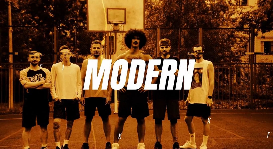
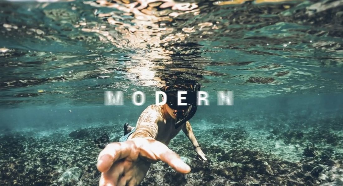
Modern Stylish Intro – DaVinci Resolve Template
With 20 text placeholders and 9 media placeholders, this DaVinci Resolve Intro template allows you to create a modern and stylish intro scene for your videos without effort. It’s perfect for all kinds of lifestyle and creative films and promo videos as well.
Trap Action Opener – DaVinci Resolve Template
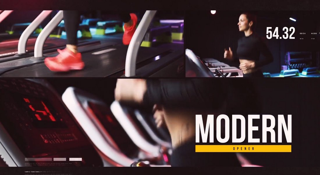
Trap action opener is a unique DaVinci Resolve template that features a very professional design. It includes an upbeat transition animation that will fit in perfectly with sports and fitness videos. The template is fully customizable and it comes with 17 text and 17 media placeholders.
Event Slides Template for DaVinci Resolve
If you’re working on a showcase video for a conference or promo video for an event, this DaVinci Resolve template will help you design a modern slideshow video in just a few steps. The template features multiple slide designs with different animations and layouts. You can mix and match to create your own unique slideshow videos.
Simple Video Mask Title Free DaVinci Resolve Template
Add a simple, minimal, and clean title to your creative videos using this free DaVinci Resolve template. It’s easily customizable and you can edit the text and background to your preference as well.
Modern Titles Templates for DaVinci Resolve
If you want to add modern and trendy titles to your YouTube videos and business videos, this DaVinci Resolve templates pack is for you. It includes multiple title designs with unique designs. They are available in 4K resolution.
Multiscreen – 7 Split Screen DaVinci Resolve Templates
Multiscreen or split-screen frames is a commonly used effect in videos to showcase multiple scenes in one frame. With this DaVinci Resolve template, you can create those effects without effort. There are 7 split-screen templates in this bundle.
300 Transitions Pack for DaVinci Resolve
This bundle of DaVinci Resolve templates will give you more than enough transitions to last a lifetime of video editing. There are 300 different transitions in the collection featuring 11 categories. The transitions are available in up to 8K resolution.
Podcast Audio Visualization DaVinci Resolve Template
Use this DaVinci Resolve template when uploading your podcasts to YouTube or social media platforms in video formats. It adds a cool audio visualization effect to make your podcast videos look more interesting.
Free Logo Reveal & Opener Template for DaVinci Resolve
This is a free DaVinci Resolve template that features a simple design. You can use it to make both logo reveals or openers for your videos. The template includes 8 media placeholders and 6 text placeholders.
Film Burn Transitions for DaVinci Resolve
This bundle of DaVinci Resolve transitions will help add a nostalgic effect to your videos. It includes 40 different transitions featuring film burn effects. There are 20 smooth and 20 dynamic transitions in the bundle.
Trending Titles for DaVinci Resolve
You can add minimalist and cool-looking titles for your videos with this collection of DaVinci Resolve title templates. There are many different styles of title layouts in this pack with trendy designs for you to choose from.
Christmas LUTs DaVinci Resolve Templates
Make your holiday-themed videos look extra festive with this DaVinci Resolve LUTs pack. These LUTs are designed to add a magical and warm filter to your videos. They will instantly transform your everyday videos into a masterpiece.
Cartoon Brushes Logo Opener Pack for DaVinci Resolve
The colorful and creative design of these logo reveal templates makes them the perfect choice for all kinds of kids-themed videos. It features colorful cartoon-style effects for making attractive openers for various videos.
Free Basic Instagram Story Template for DaVinci Resolve
You can use this DaVinci Resolve template to create simple but attractive Instagram story videos. It’s especially great for promoting products and events. The template is free to use.
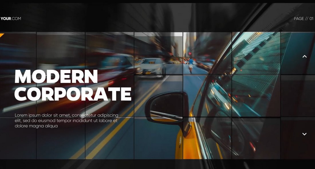
Modern Corporate Intro DaVinci Resolve Template
This DaVinci Resolve template features a modern and energetic slideshow design that you can use to craft intros and promos for various business and corporate videos. You can also customize the template to change text and colors as well.
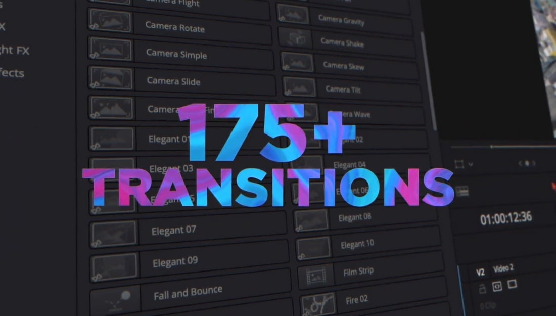
The Ultimate Transitions Pack for DaVinci Resolve
If you’re a fan of experimenting with different types of transition effects in DaVinci Resolve, this bundle is a must-have for you. It includes more than 170 different transition effects in 18 different categories you can use in your video projects.
Travel Broadcast Package for DaVinci Resolve
A bundle of DaVinci Resolve templates designed specifically for travel vlogs and promo videos. It includes a complete collection of titles, intros, backgrounds, transitions, and more for creating professional videos related to travel and tourism.
Fire & Smoke Transitions DaVinci Resolve Templates
With this collection, you can make explosive videos for YouTube and social media by adding cool fiery transition effects or smoke effects. The 2D transitions in this pack are perfect for creative and educational videos as well as for production promos and intro scenes.
Free Instagram Story DaVinci Resolve Template
This is a free DaVinci Resolve template you can use to craft a simple Instagram story video to promote a product. It features a simple drop-in shape animation with a video mask.
Line Drop Lower Third Free DaVinci Resolve Template
You can use this free DaVinci Resolve template to add a simple lower third to your YouTube videos. The template features a subtle animation to add more style as well.
Street Opener – DaVinci Resolve Template
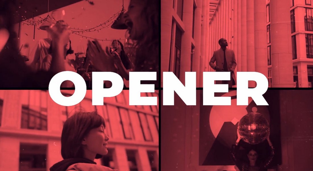
If you want to add a bit of upbeat urban vibe to your videos, this DaVinci Resolve template is the perfect choice for you. It will allow you to easily create a stylish opener for lifestyle, fashion, and modern business videos in just a few minutes. The template can be customized to change colors, media, and text.
Corporate Slideshow – DaVinci Resolve Template
With this DaVinci Resolve template, you can create a modern slideshow presentation video for businesses. It features a simple mosaic transition animation with various effect styles. The template is simply perfect for corporate event and promo videos.
Power Typography Templates for DaVinci Resolve
A big bold title scene is a must-have for every video for instantly grabbing the attention of your viewer. With this collection of typography templates, you won’t have trouble getting that job done. It includes various styles of modern typography designs with cool effects. You can easily add them to your own videos using DaVinci Resolve.
Modern Showreel Opener Template for DaVinci Resolve
Create an energetic showreel opener for your videos using this modern DaVinci Resolve template. It features a stylish slideshow design with 34 media placeholders for adding videos and images. The template is easily customizable to your preference.
Square Photo Slideshow – DaVinci Resolve Template
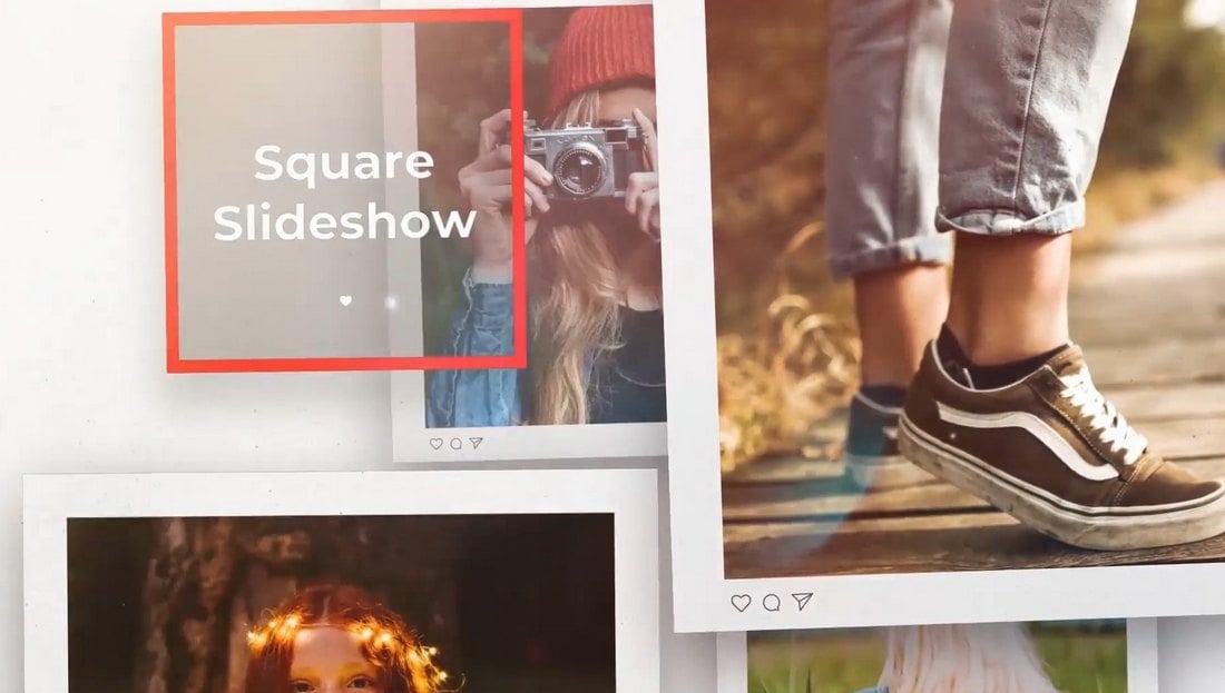
If you want to create a simple photo slideshow video, this DaVinci Resolve template will come in handy. It comes with a simple square photo design similar to Instagram posts. The template is also very easy to customize as it lets you drag and drop your photos to the layout.
YouTube Subscribe Box Free DaVinci Resolve Template
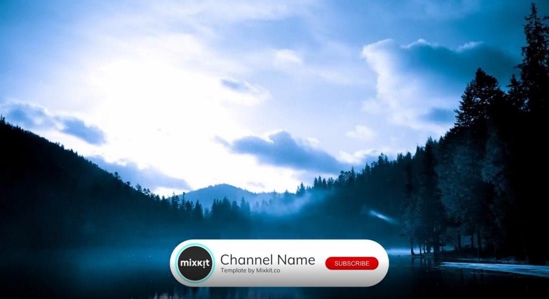
Using this DaVinci Resolve template, you can promote your YouTube channel in your videos by adding a subscribe box. The template features an animated subscribe button as well.
Distort & Twist Transition Free DaVinci Resolve Effect
This is a simple transition effect you can use when producing videos in DaVinci Resolve. It features a fast twist effect that’s suitable for various professional videos.
Dynamic Slideshow Template for DaVinci Resolve
You can use this trendy video template to create a dynamic slideshow with different styles of attractive effects. The template comes with multiple media and text placeholders that you can easily edit however you like. And it works without any additional plugins.
Urban Opener – DaVinci Resolve Intro Template
This opener is perfect for various promo and creative videos. It’s especially suitable for motivational and upbeat YouTube videos. The template features a creative slideshow design with several text and media placeholders for easily adding your own content to the layout.
Photo Memory Slideshow Template for DaVinci Resolve
If you’re working on a photo album video, this DaVinci Resolve template will allow you to add a vintage-themed effect to your video. It also features several transition effects to give your photo slideshows a more professional look and feel.
Event Promo – DaVinci Resolve Template
This DaVinci Resolve video template is made with corporate brands and businesses in mind. It allows you to create a promo video to showcase an event or conference using a modern slideshow design. The template includes editable text layers and media placeholders.
YouTube Endscreens – DaVinci Resolve Templates
The endscreen section in YouTube videos is a useful feature that allows you to promote your other videos to viewers. Of course, the design of this endscreen is also important. With this DaVinci Resolve template kit, you can create a stylishly animated endscreen for your own YouTube channel.
Vertical Split Frame Effect Free DaVinci Resolve Template
Another free DaVinci Resolve template featuring a simple transition effect. This effect is most suitable for YouTube films and videos as it has a subtle vertical split effect.
Dual Line Arrow Callout Free DaVinci Resolve Template
Add callouts to your product promo and showcase videos using this free template. It features a simple design with quick fade-in and fade-out animations.
Motion Title Templates for DaVinci Resolve
This title pack for DaVinci Resolve is perfect for documentary and film projects. It features modern and minimal title designs with subtle animations that will add a professional look to your videos.
Wedding Slideshow – DaVinci Resolve Template
Creating a wedding photo album video will be a walk in the park when you have this DaVinci Resolve template at your side. It features a beautiful slideshow design with creative animation effects and transitions. The template is also easy to customize as it comes with text and media placeholders.
2D FX Liquid Transitions for DaVinci Resolve
With this collection of transition effects, you’ll be able to add cool animated FX transitions between clips. It includes many different liquid-style transition effects that are great for creative video projects.
Modern Big Titles – DaVinci Resolve Templates
You can use this bundle of title templates to easily add bold titles to your videos. This DaVinci Resolve templates collection includes various styles of titles with different animations. They will go along great with all kinds of business, creative, and professional videos.
Real Estate Promo Template for DaVinci Resolve
If you’re working on a promo video for a real estate business, this DaVinci Resolve template will help you add a section to showcase properties in a professional way. The template is easily customizable and comes in Full HD resolution.
Brush Opener – DaVinci Resolve Intro Templates
Grab this opener template to add creative intro scenes for your YouTube and promo videos. The DaVinci Resolve template includes several different styles of brush animations and transition effects.
For more video templates, check out our best Premiere Pro templates collection.
Alternatives To Typical Technical Illustrations And Data Visualisations
Good technical illustrations and data visualisations allow users and clients to, in a manner of speaking, take time out, ponder and look at the information in a really accessible and engaging way. It can obviously also help you communicate certain categories of information and data.
The aim of the article is to inspire and show you how, by using different technical illustrations and data visualisations, you can really engage and communicate with your users and do much more good for the surrounding content.
Below are interesting and not commonly seen examples of technical illustration and data visualisation, that show data and information. As you know, more commonly seen examples are bar graphs and pie charts, but there is so much more than that!
So, keep reading and looking at the following examples, and I will show you some really cool stuff.
Technology
Typically, technical illustration and data visualisations were done using paper, pens, pencils, compasses, and rulers. But now everything is possible — you can do analog and digital. Since the mainstream introduction of the internet, around 1997, data (text, numerical, symbol) has flourished, and it has become the current day gold currency. It is easy for anyone to learn who has the software or knows the coding language. And it is much easier to do technical illustrations and data visualisation than in previous years. But that does not always mean that what is done today is better than what was done before.
What Makes Data And Information Good
- It must be aesthetically pleasing, interesting, and stimulating to look at.
- It must be of value and worth the effort to read and digest the information.
- It must be easy to understand and logical.
- To convey ideas effectively, both aesthetic form and functionality need to go hand in hand, as Vitaly Friedman in his article “Data Visualization and Infographics” has pointed out.
- It must be legible and have well-named and easy-to-understand axes and labels.
- It should help explain and show data and information in a more interesting way than if it were presented in tabular form.
- It should help explain or unpack what is written in any surrounding text and make it come to life in an unusual and useful way.
- It must be easy to compare and contrast the data against the other data.
The Importance Of Knowing About Different Audiences
There are some common categories of audiences:
- Expert,
- Intermediate,
- Beginner,
- Member of the public,
- Child,
- Teenager,
- Middle-aged,
- Ageing,
- Has some prior knowledge,
- Does not have any prior knowledge,
- Person with some kind of disability (vision, physical, hearing, mobility).
Sara Dholakia in her article “A Guide To Getting Data Visualization Right” points out the following considerations:
- The audience’s familiarity with the subject matter of your data;
- How much context they already have versus what you should provide;
- Their familiarity with various methods of data visualisation.
Just look at what we are more often than not presented with.

So, let us dive into some cool examples that you can understand and start using today that will also give your work and content a really cool edge and help it stand out and communicate better.
3D Flow DiagramIt provides a great way to show relationships and connections between items and different components, and the 3D style adds a lot to the diagram.

It’s an effective way to highlight and select information or data in relation to its surrounding data and information.

Being great at showing two categories of information and comparing them horizontally, they are an alternative to typical horizontal or vertical bar graphs.

They are an excellent way to enliven overused 2D pie and bar graphs. 3D examples of common graphs give a real sense of quality and depth whilst enhancing the data and information much more than 2D versions.

This diagram is a good way to show the progression and the journey of information and data and how they are connected in relation to their data value. It's not often seen, but it's really cool.

A stream graph is a great way to show the data and how it relates to the other data — much more interesting than just using lines as is typically seen.

It provides an excellent way to show a map in a different and more interesting form than the typically seen 2D version. It really gives the map a sense of environment, depth, and atmosphere.

It’s a great way to show the data spatially and how the data value relates, in terms of size, to the rest of the data.

A waterfall chart is helpful in showing the data and how it relates in a vertical manner to the range of data values.

It shows the data against the other data segments and also as a value within a range of data.

A lollipop chart is an excellent method to demonstrate percentage values in a horizontal manner that also integrates the label and data value well.

It’s an effective way to illustrate data values in terms of size and sub-classification in relation to the surrounding data.

How To Start Doing Technical Illustration And Data Visualisation
There are many options available, including specialized software like Flourish, Tableau, and Klipfolio; familiar tools like Microsoft Word, Excel, or PowerPoint (with redrawing in software like Adobe Illustrator, Affinity Designer, or CorelDRAW); or learning coding languages such as D3, Three.js, P5.js, WebGL, or the Web Audio API, as Frederick O’Brien discusses in his article “Web Design Done Well: Delightful Data Visualization Examples.”
But there is one essential ingredient that you will always need, and that is a mind and vision for technical illustration and data visualisation.
