Thanksgiving Design Ideas: Flyers, Posters, Graphics & More

Featured Imgs 23

With Thanksgiving just around the corner, it’s the perfect time to start planning your festive designs for events, promotions, or community gatherings.

Whether you’re creating flyers for a local Thanksgiving dinner, posters for seasonal sales, or social media graphics to spread holiday cheer, having the right design elements can make all the difference.

In this post, we’ve put together a collection of Thanksgiving design templates, including flyers, posters, graphics, and more, to help you capture the warmth and joy of the holiday season.

Thanksgiving is all about togetherness, gratitude, and celebration, and your designs should reflect that spirit. From rich autumnal color palettes to cozy, welcoming imagery, these templates and graphics are designed to evoke the essence of the holiday. Have a look.

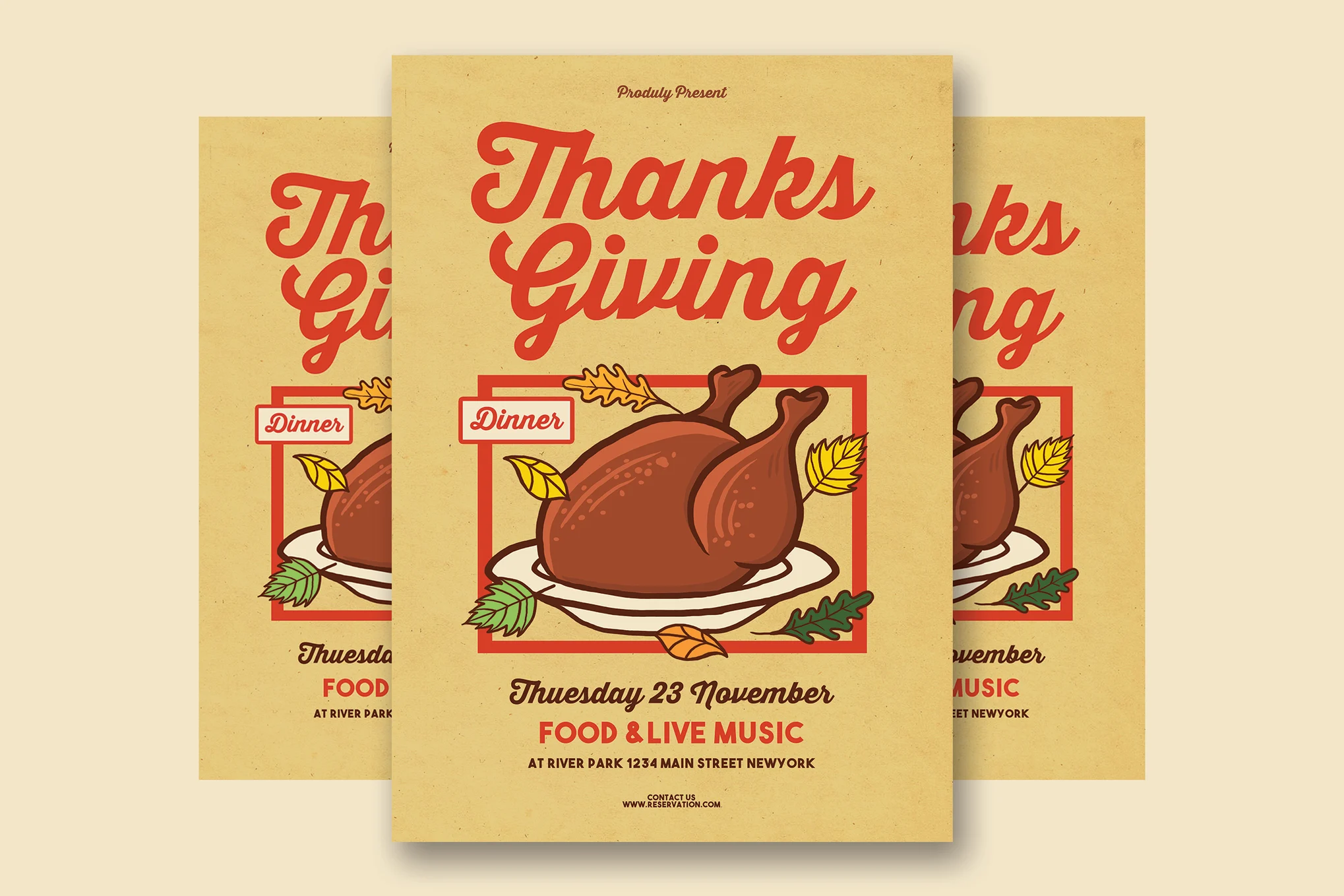
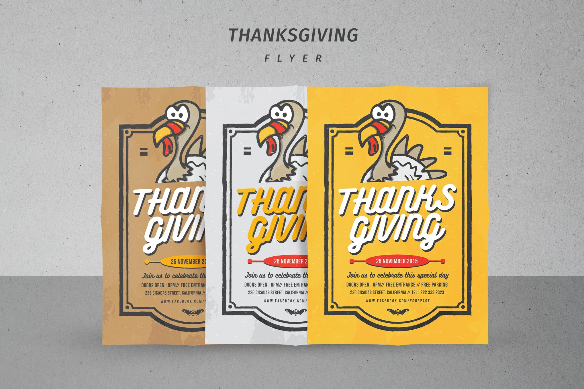
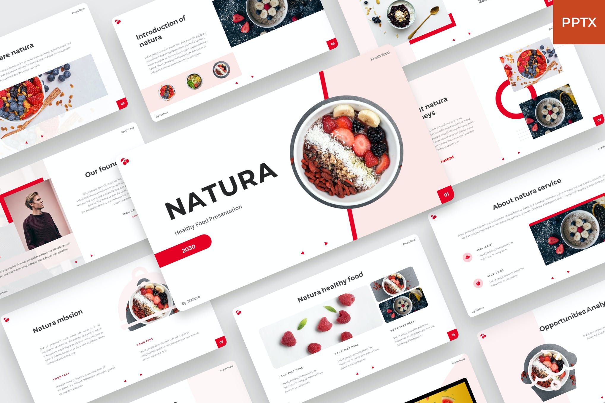
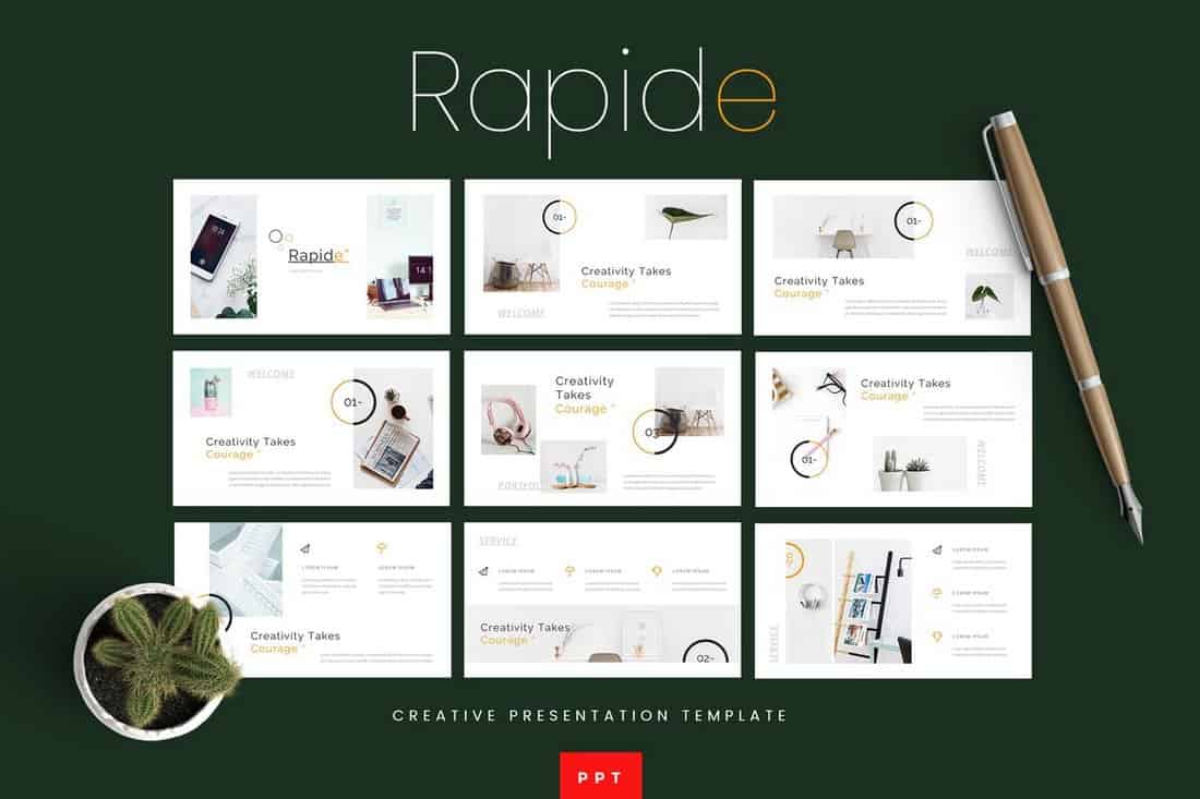
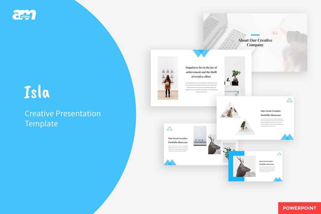
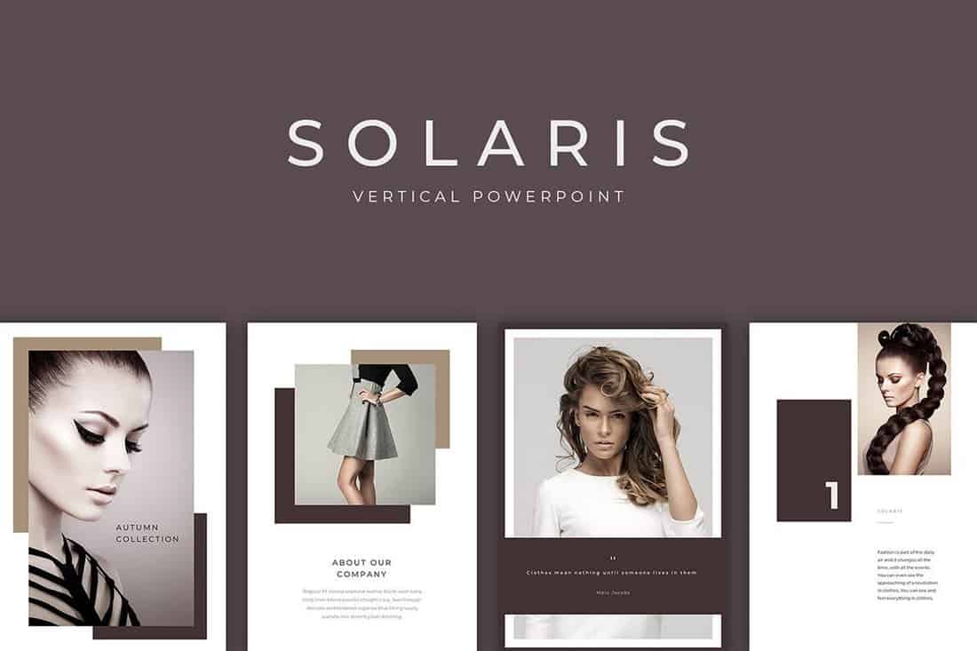
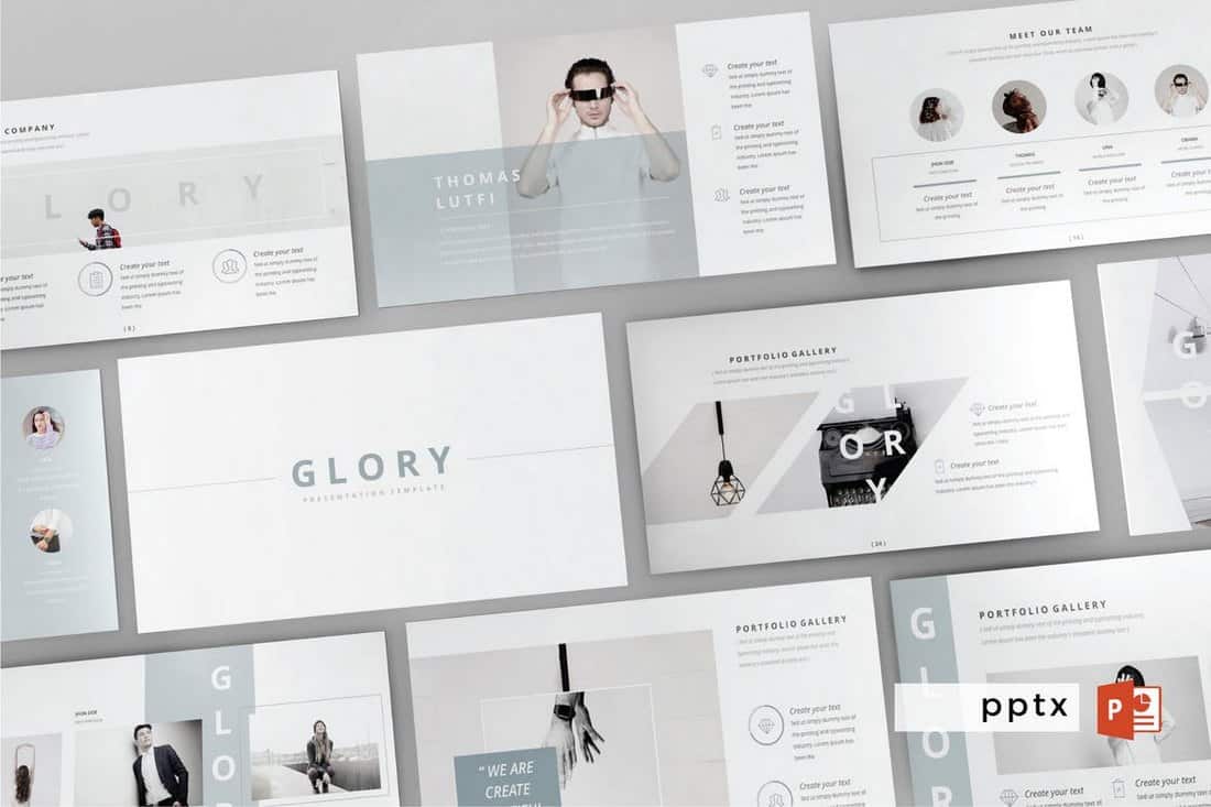
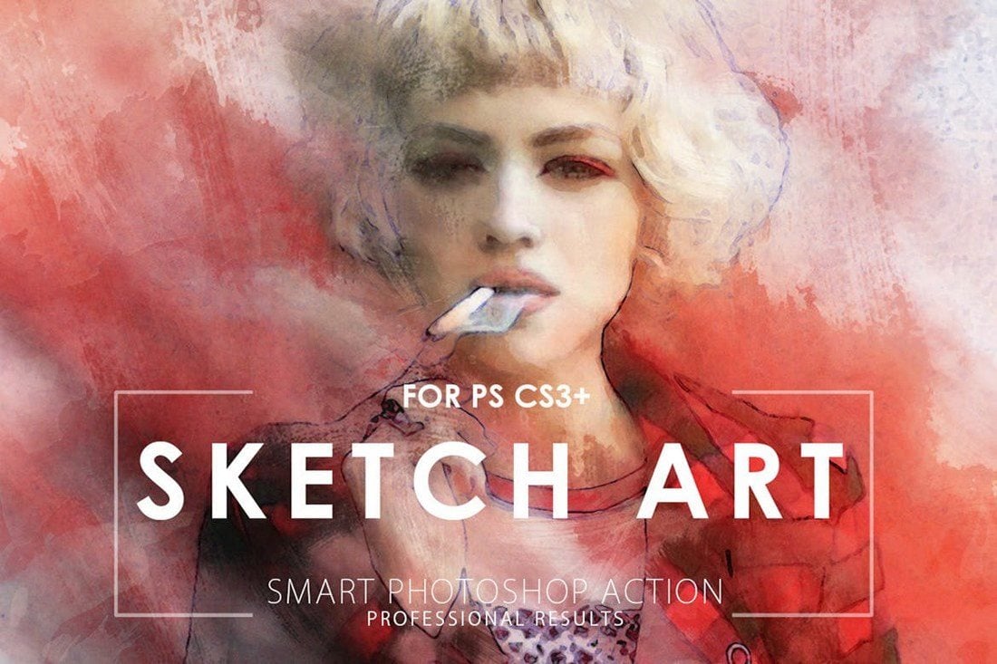
Creative Thanksgiving Flyer Template

Creative Thanksgiving Flyer Template

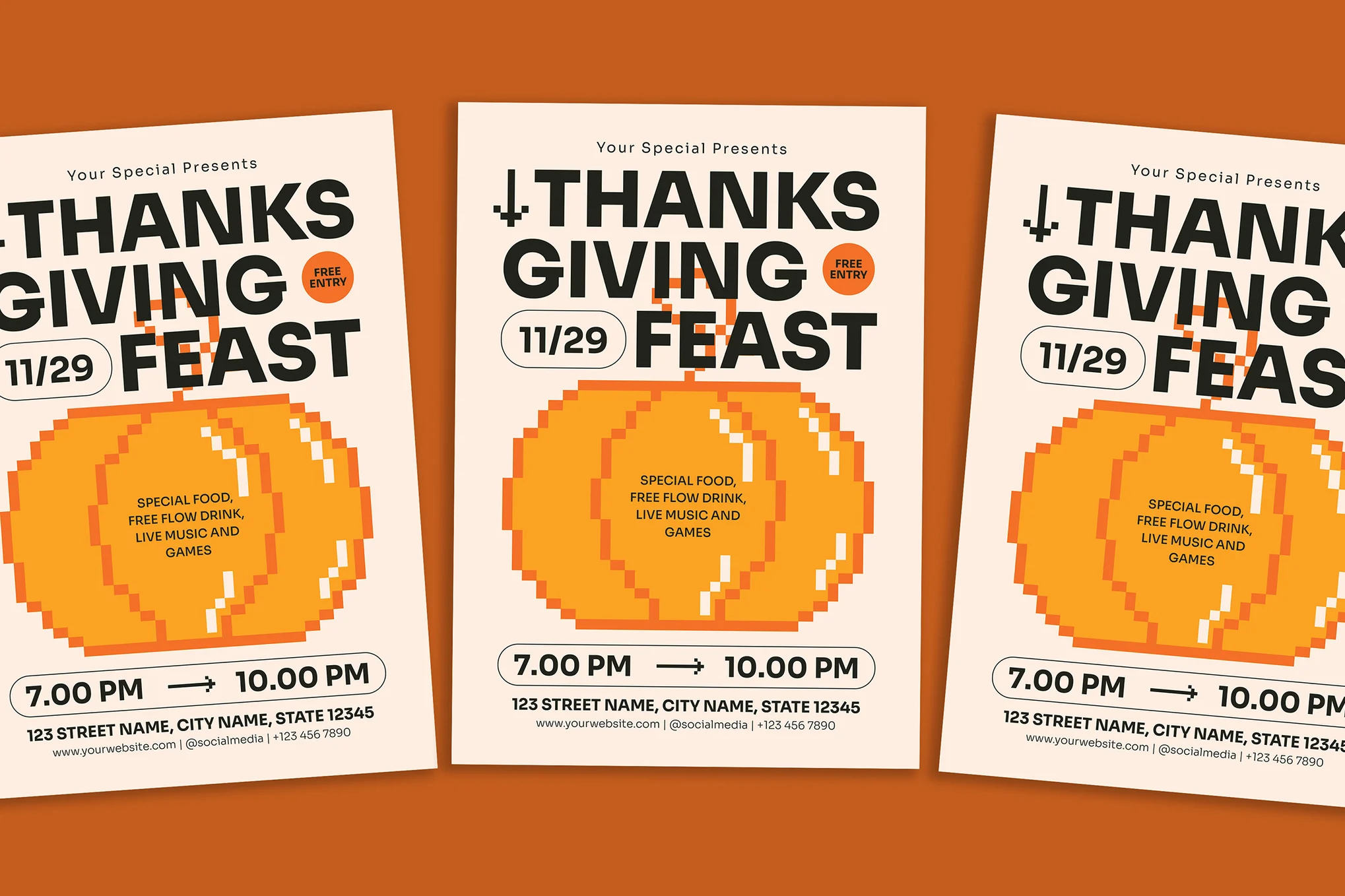
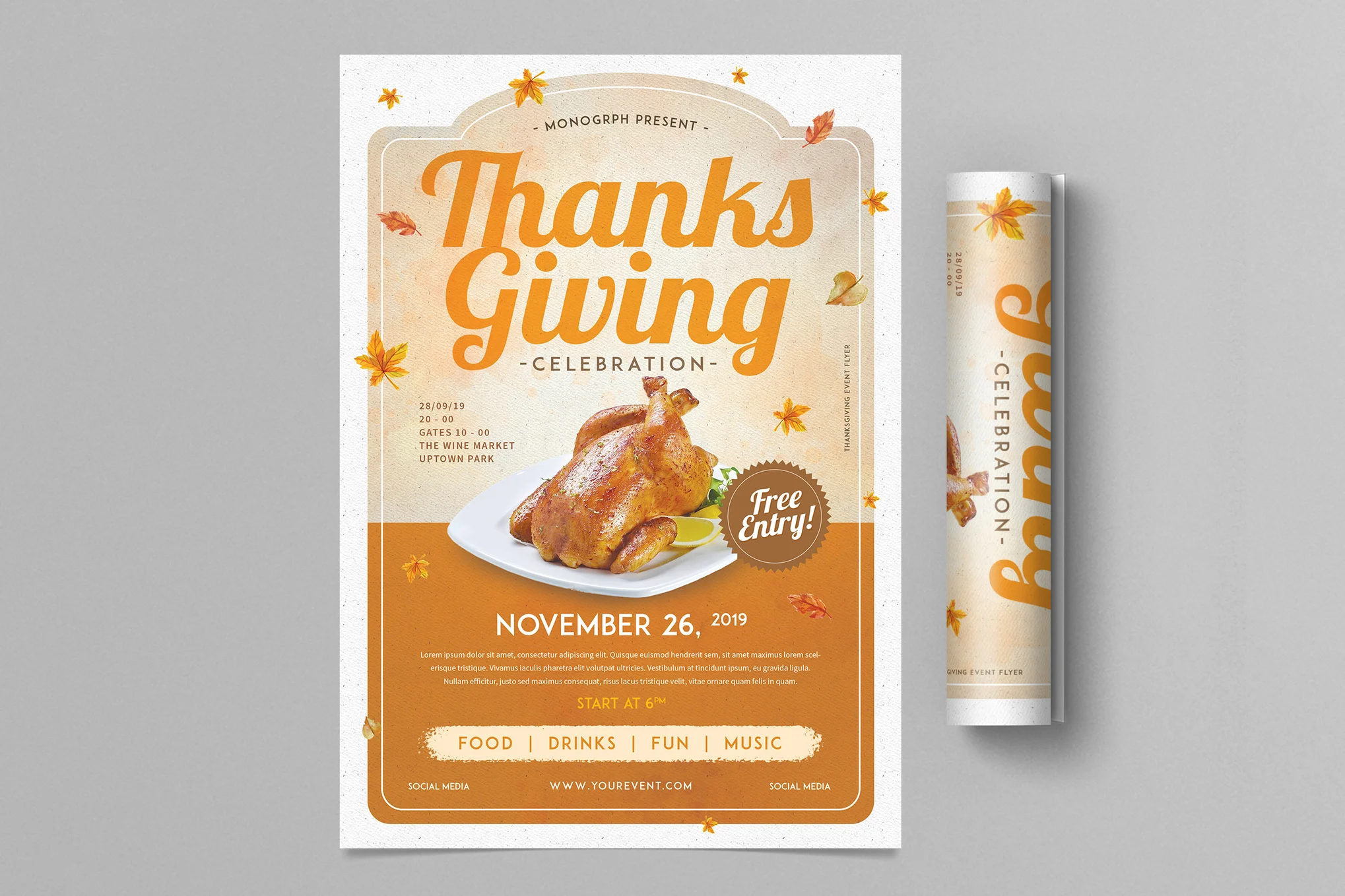
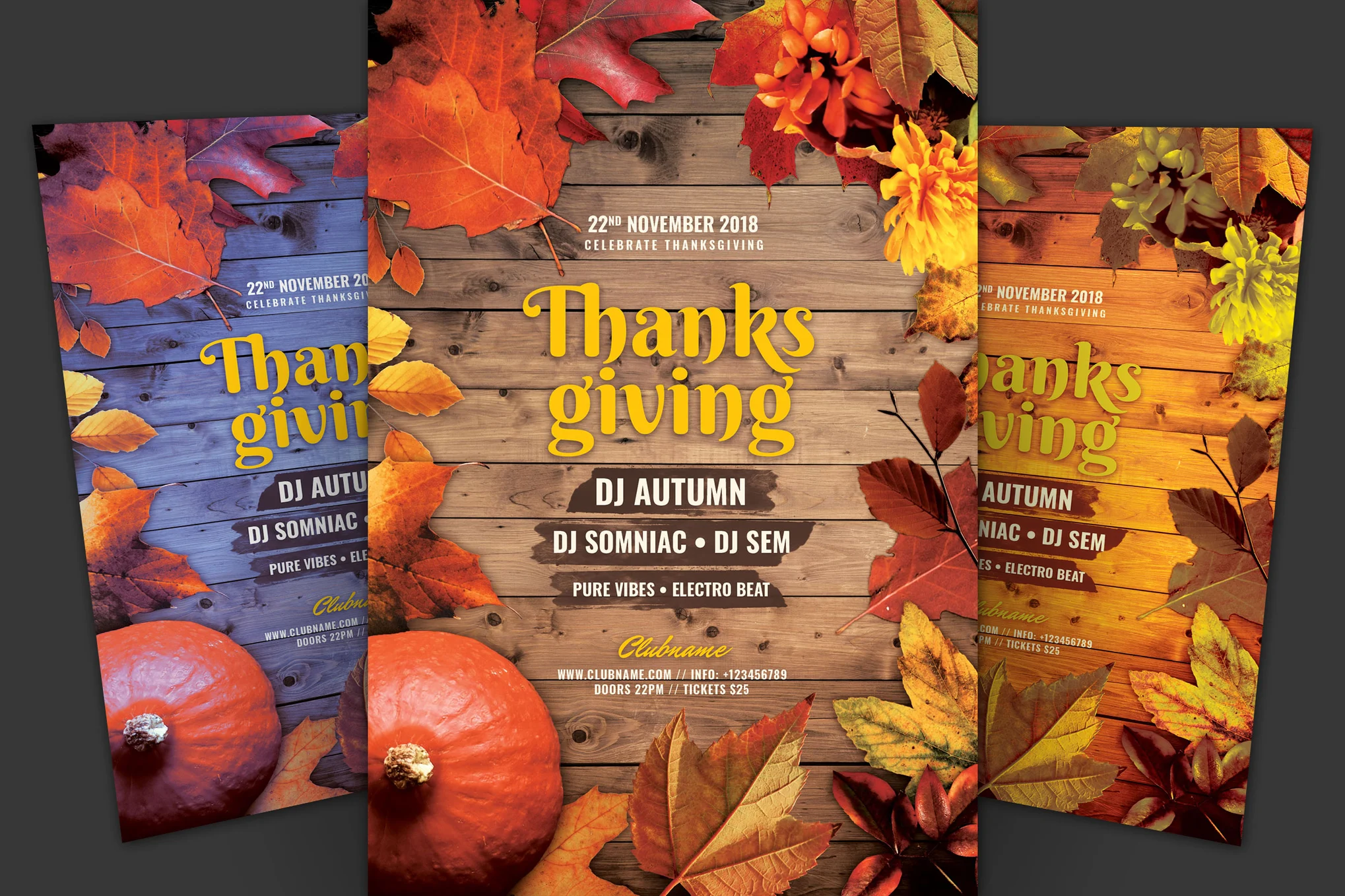
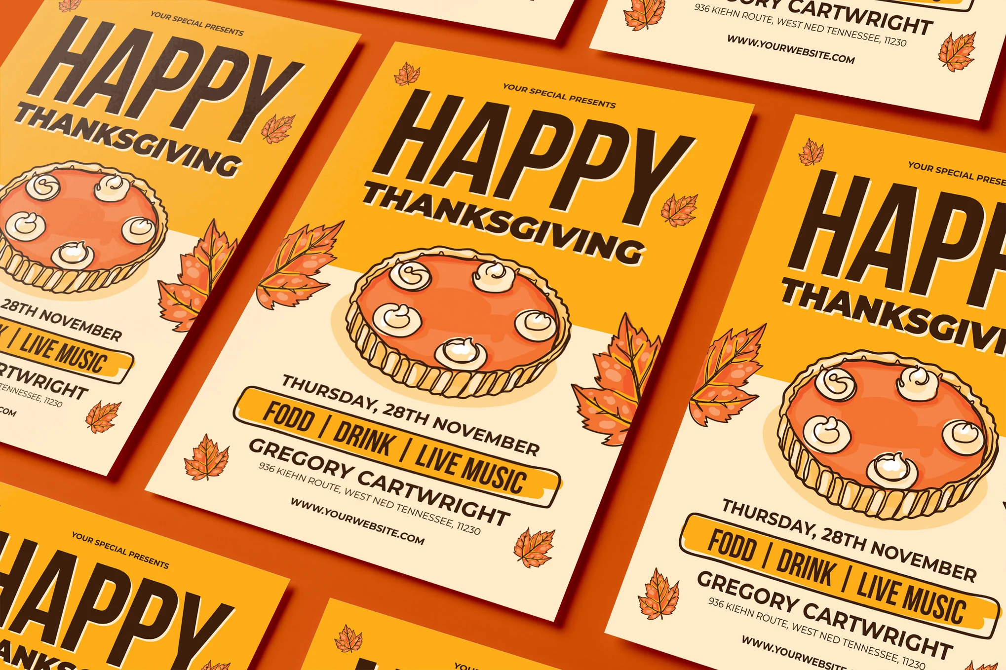
This is a thoughtfully designed, fully editable Thanksgiving flyer in PSD format. Sized at A4 with a 3mm bleed, it’s prepared for professional printing, supporting CMYK colors at a high resolution of 300 dpi. It’s especially perfect for promoting various events and celebrations.

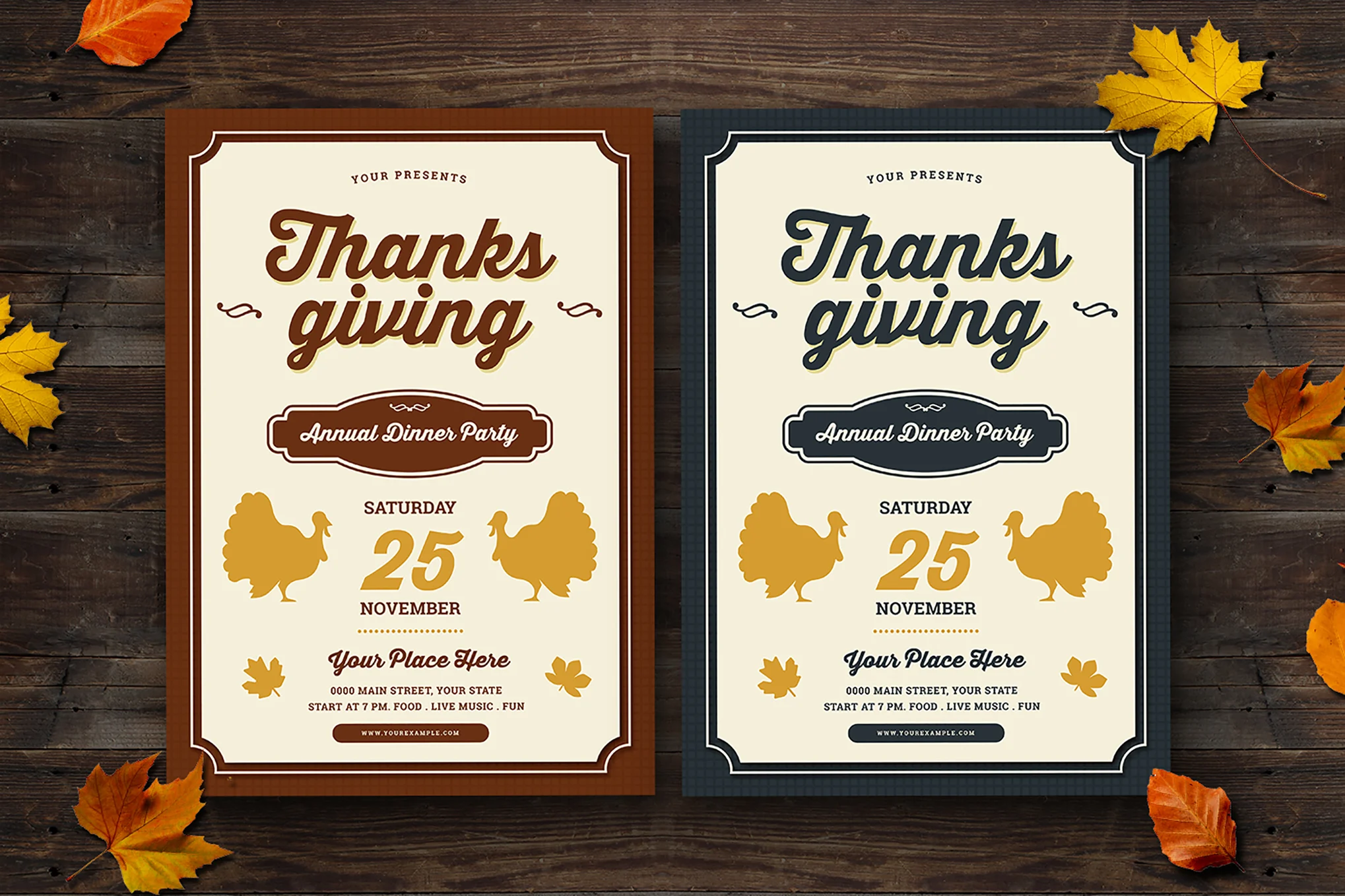
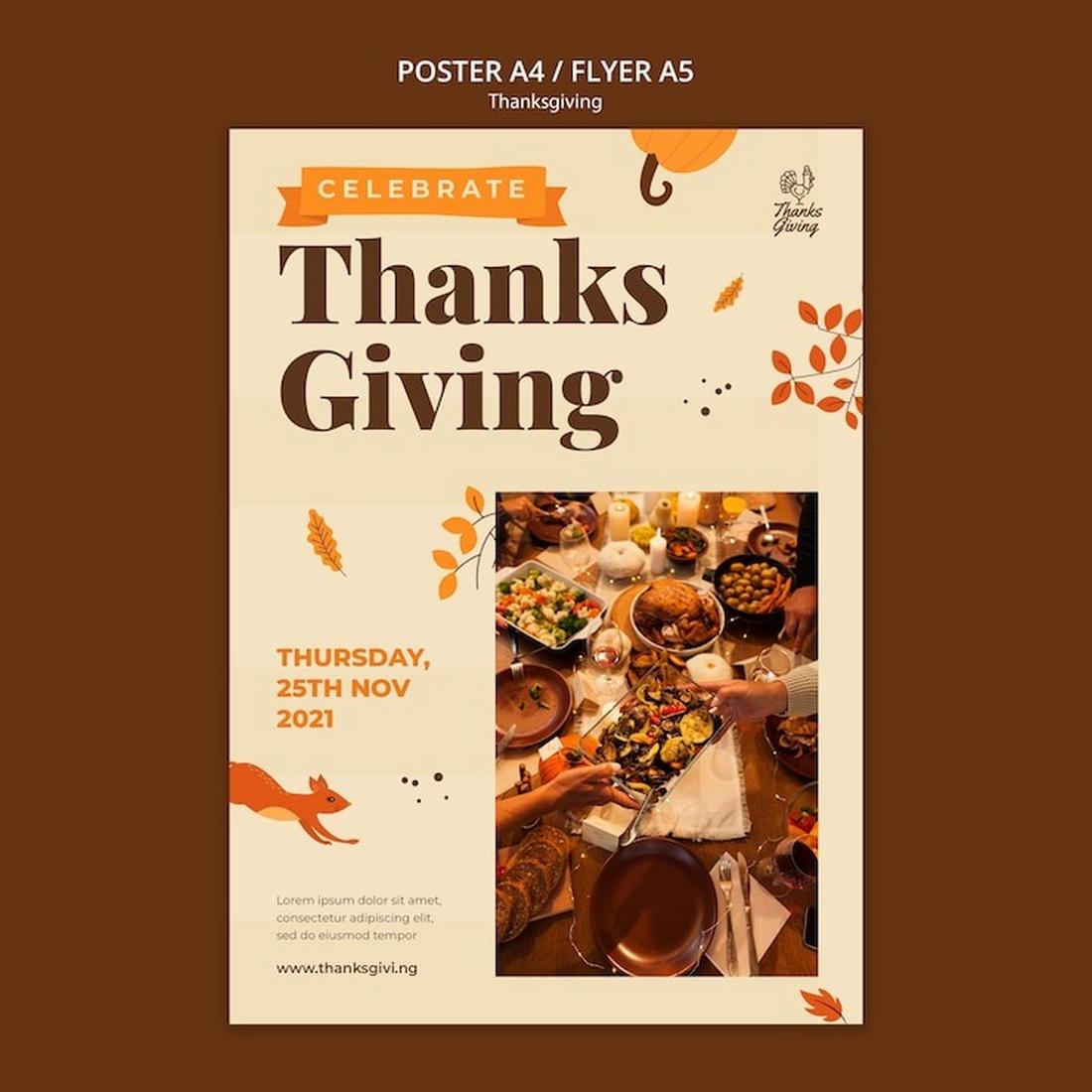
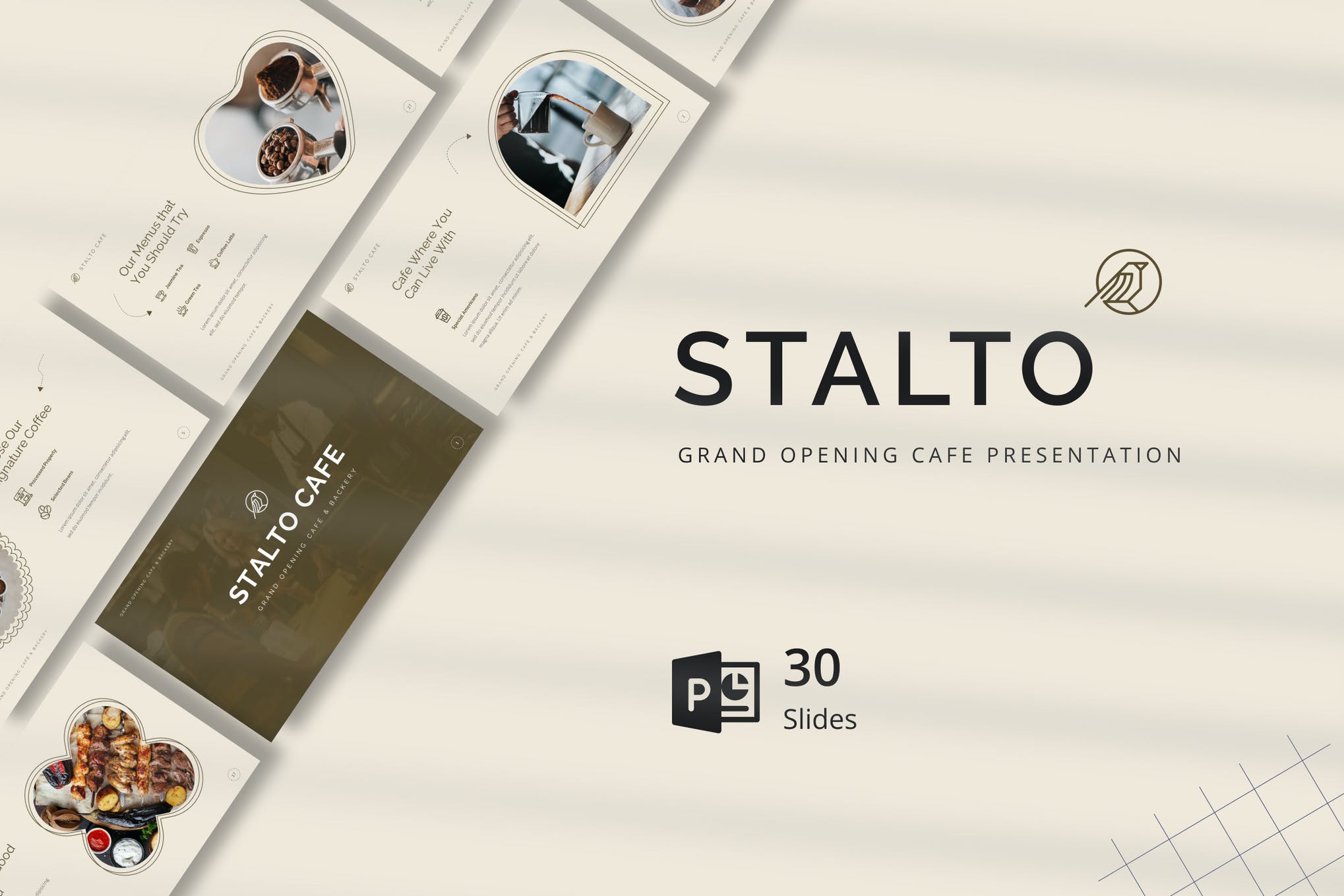
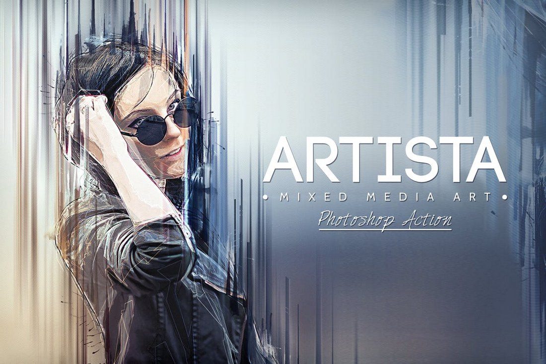
Stylish Thanksgiving Flyer Template

Stylish Thanksgiving Flyer Template

This a versatile Thanksgiving flyer template for promoting your special event. Designed with meticulous attention to detail, this fully editable template offers well-organized layers and top-quality resolution (CMYK 300 DPI). Spanning 21 x 29.7 cm with bleed, the template is compatible with Adobe Illustrator and Photoshop (CS5).

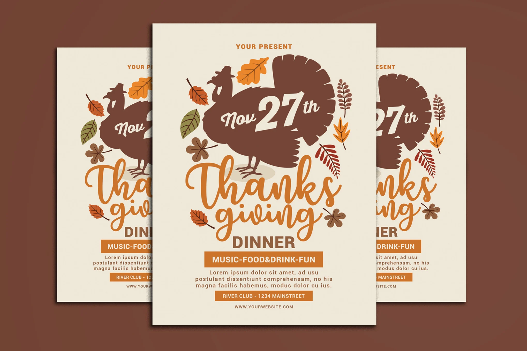
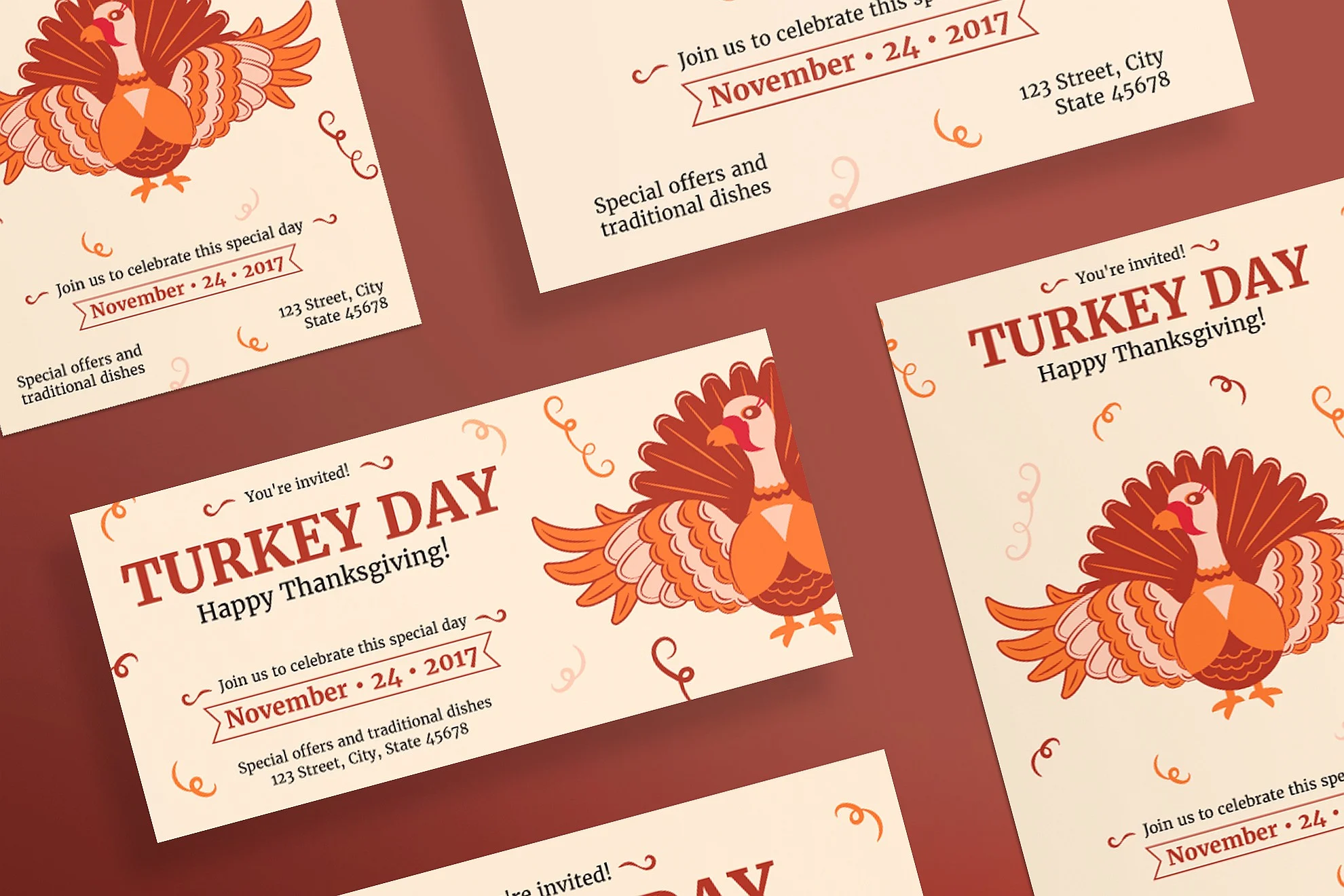
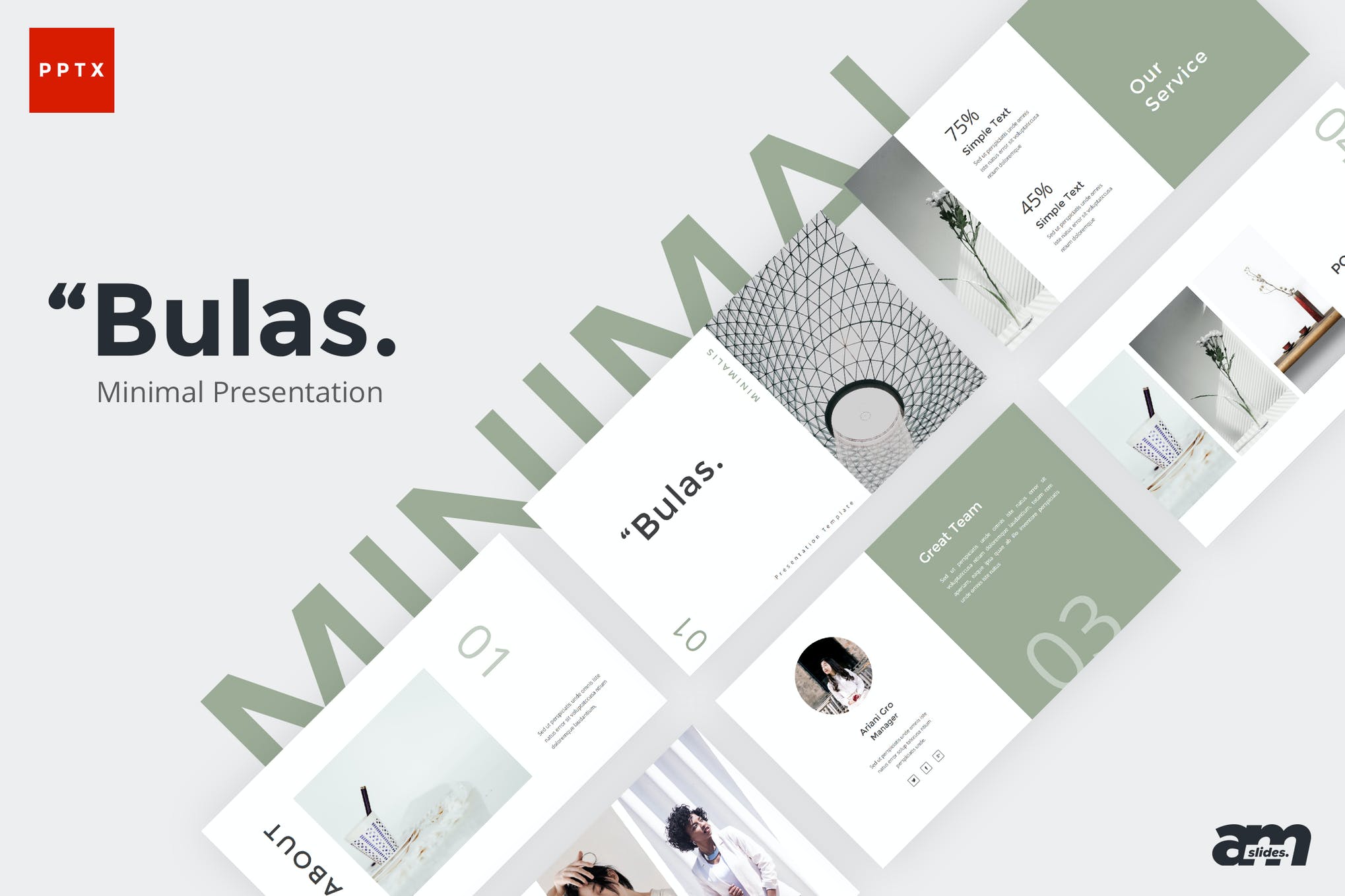
Simple Thanksgiving Flyer Template

Simple Thanksgiving Flyer Template

A minimalist Thanksgiving flyer template with customization options to fit your needs. Its specifications include a Photoshop file (CS5), 8.27 x 11.69 inch dimensions including bleeds, 300 dpi CMYK resolution for print-ready convenience, editable fonts and text, and an easy color-change option.

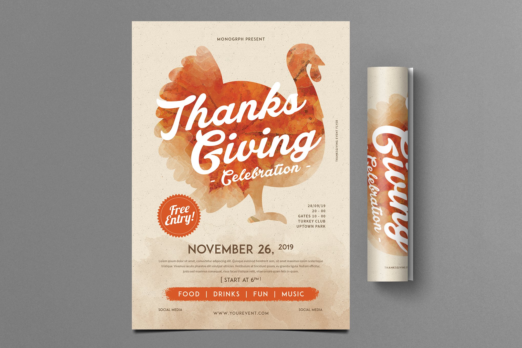
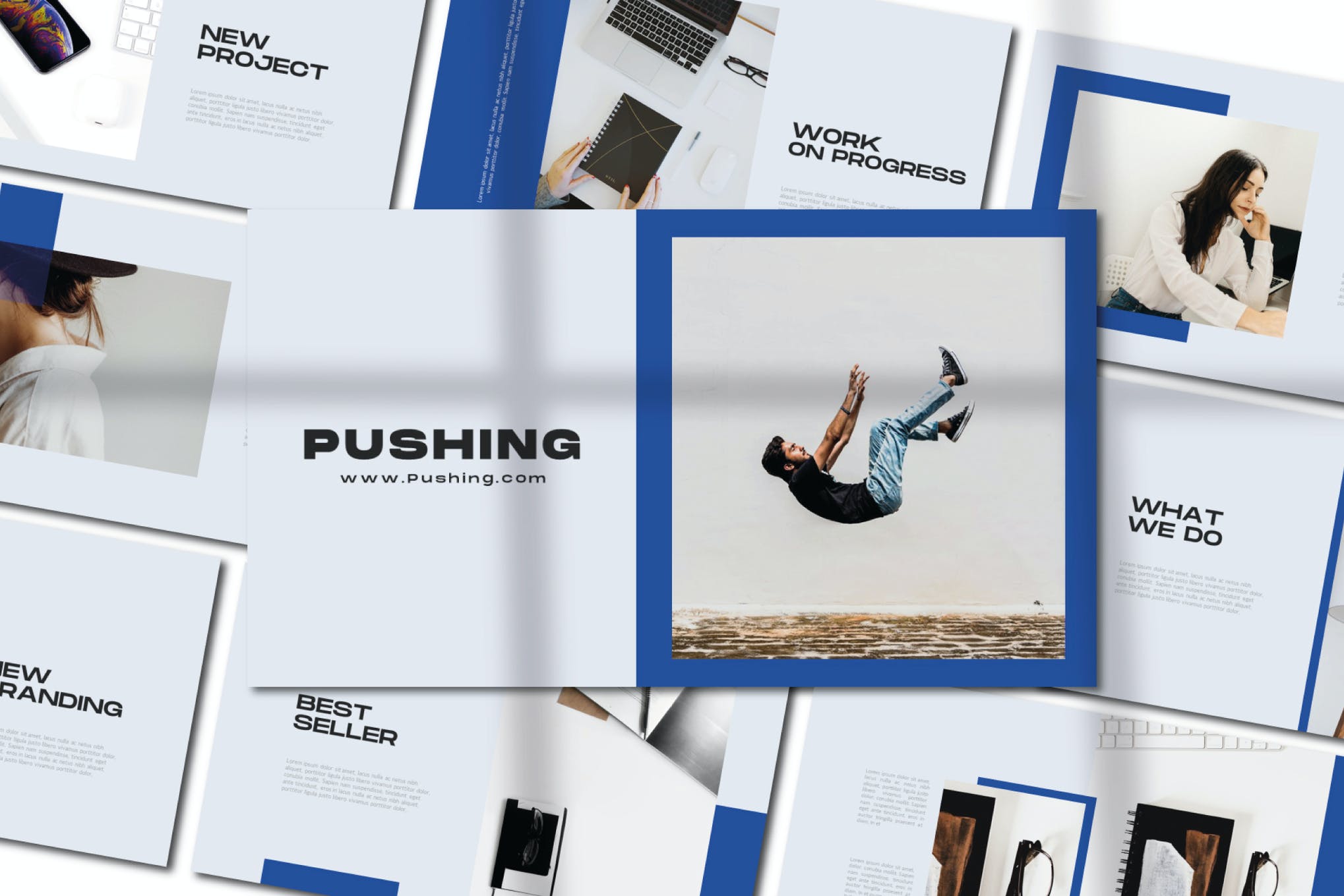
Modern Thanksgiving Flyer & Poster Template

Modern Thanksgiving Flyer & Poster Template

This is a contemporary, easy-to-use Thanksgiving flyer template for business promotions. It comes packaged as a print-ready PSD file neatly organized into layers for straightforward editing. All elements including colors, images, and text can be tailored to suit your needs. An A4 size with extra bleed ensures a professional finish.

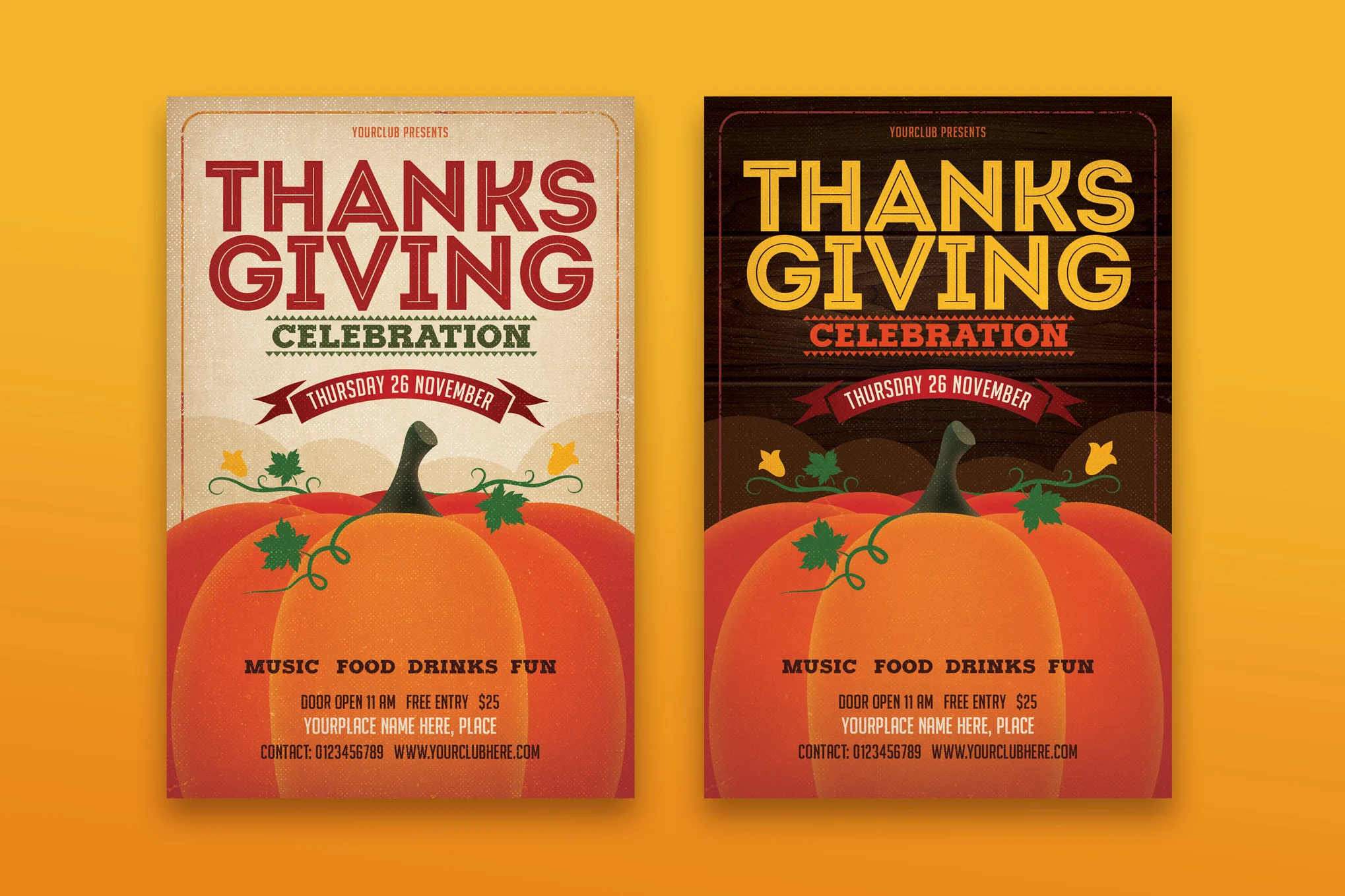
2 Thanksgiving Flyer Templates

2 Thanksgiving Flyer Templates

A perfect pair of flyer templates ideal for Thanksgiving-themed projects. They’re fully layered PSDs, making them easy to edit and customize. Designed in 300 DPI and CMYK colors, they’re print-ready in a 4×6 size.

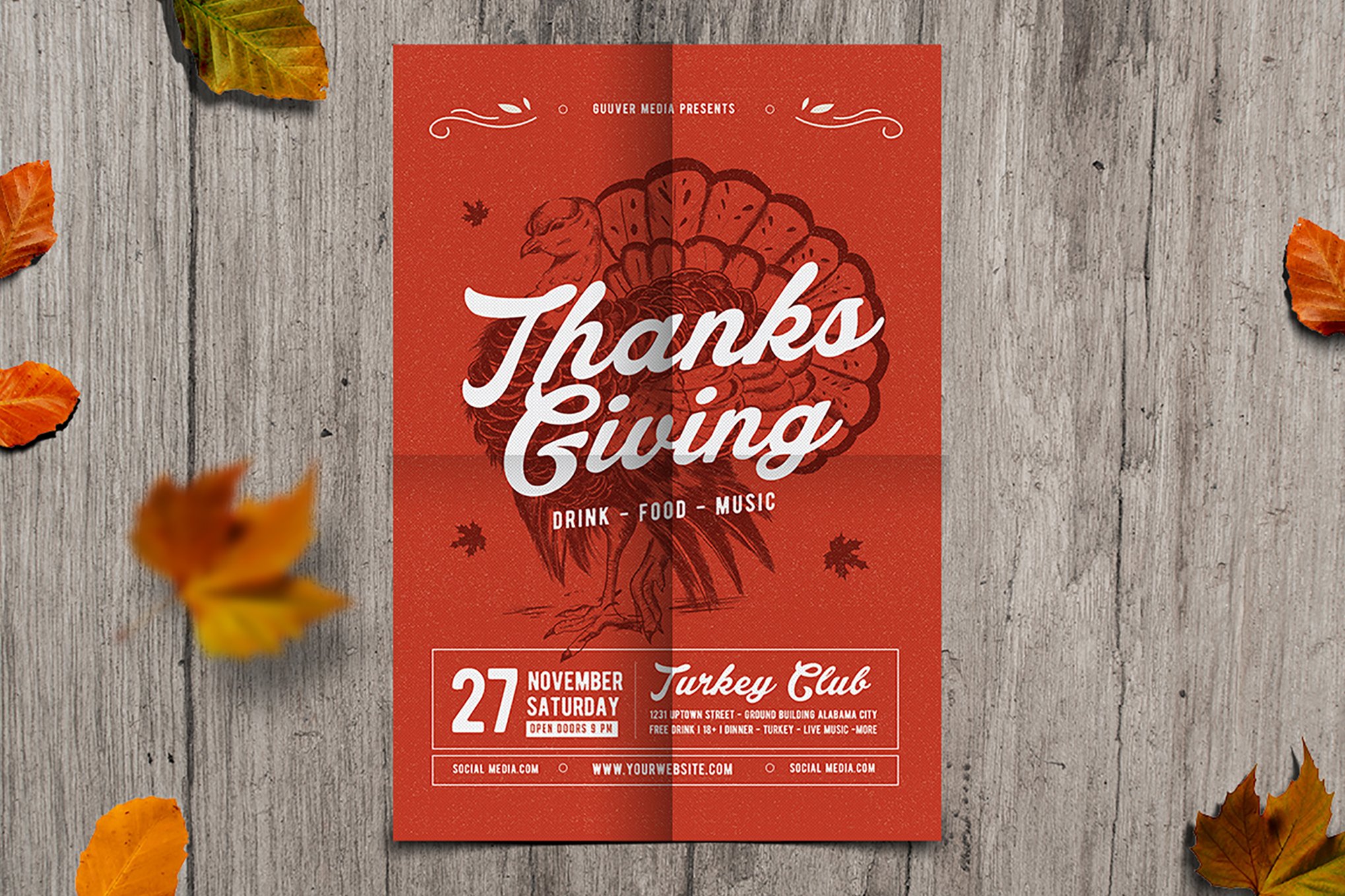
Red Thanksgiving Flyer Template

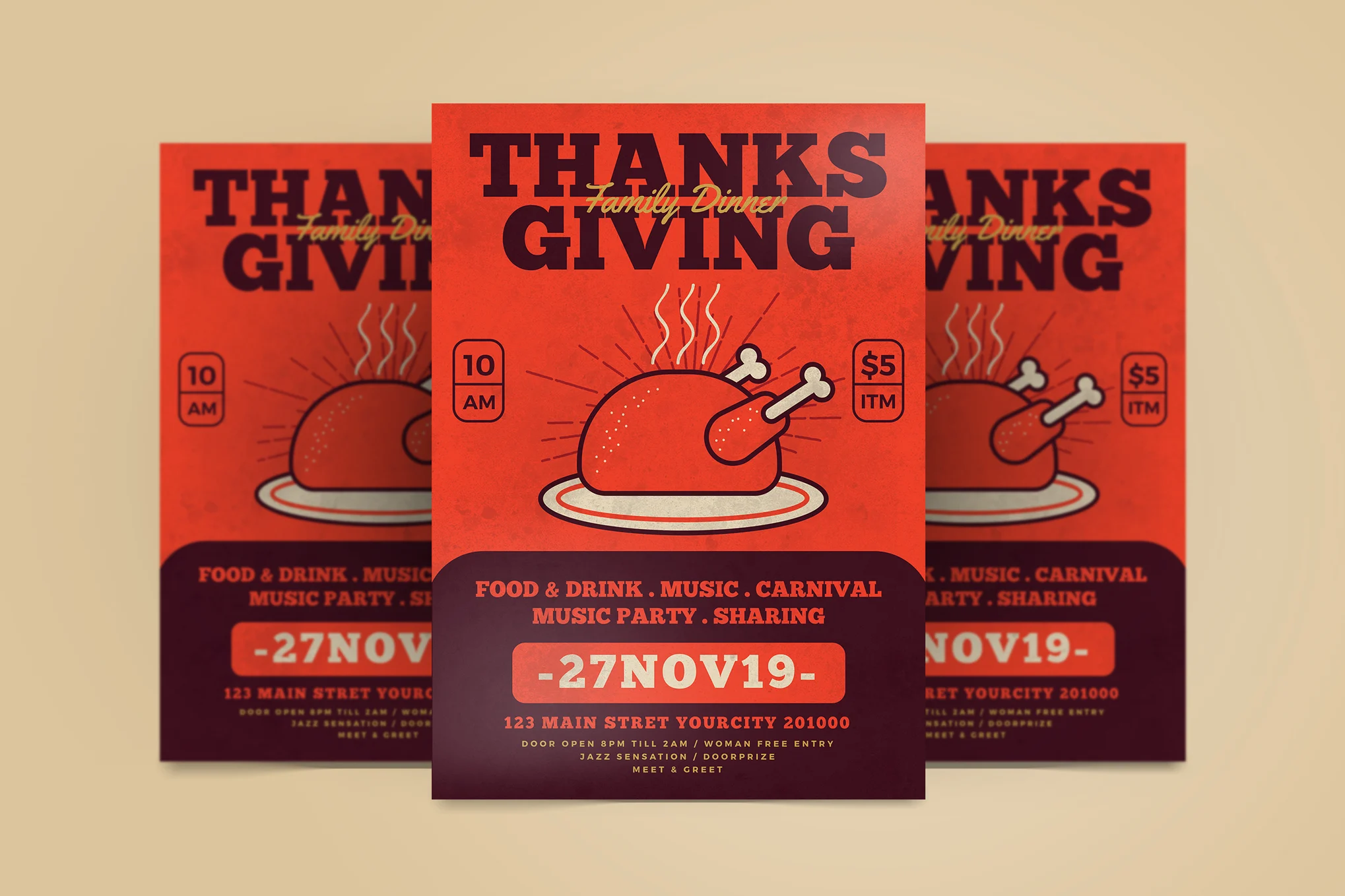
Red Thanksgiving Flyer Template

This is a customizable Thanksgiving flyer template for your special November event planning. With its appealing red theme, and well-organized, fully editable layers, this A4 size PSD file is easy to use. Everything you need is included, even the free font, which can be found in the readme file.

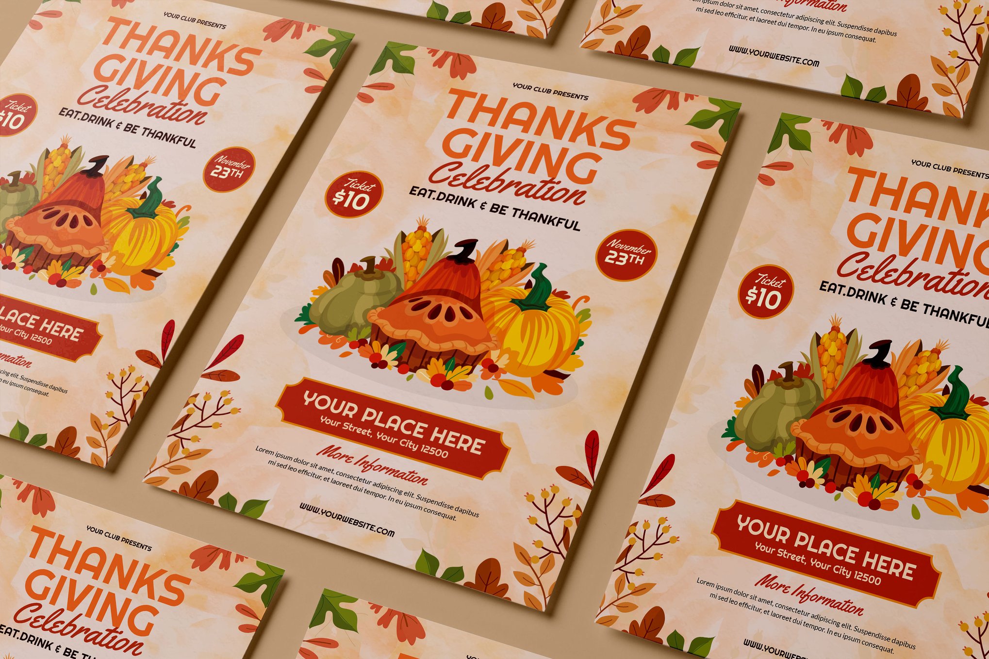
Colorful Thanksgiving Flyer & Poster Template

Colorful Thanksgiving Flyer & Poster Template

Add a splash of color to your Thanksgiving promotions with this vibrant flyer and poster template. It’s simple to customize, with editable text and an easy color change system. The template, which is available in Ai CS 6, CS 3, and Eps files, also boasts organized layers for straightforward editing.

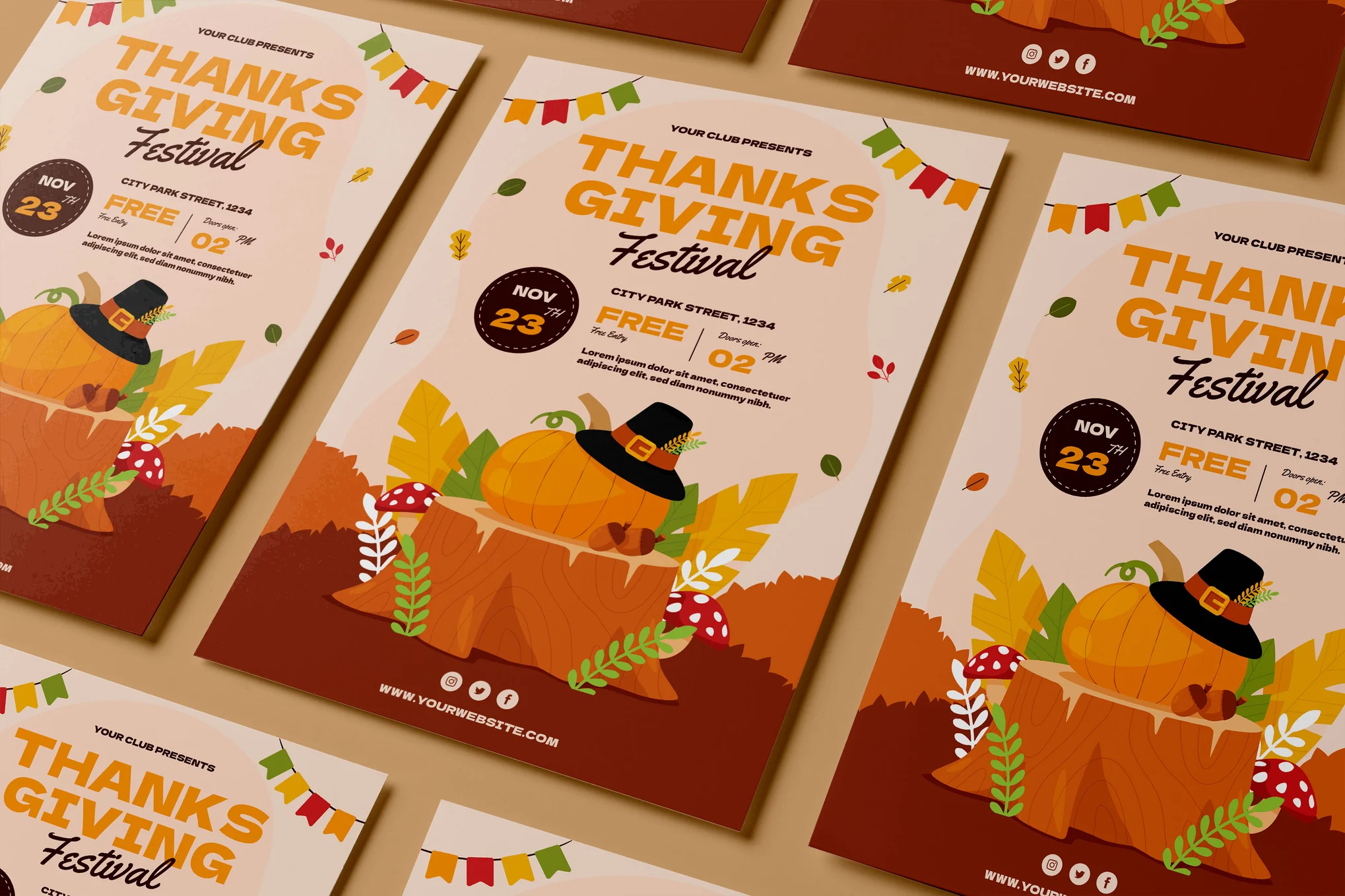
Thanksgiving Festival Flyer Template

Thanksgiving Festival Flyer Template

An easily customizable Thanksgiving flyer template suitable for seasonal promotions. It includes files in AI, PSD, PDF, PNG, EPS formats and features 300 dpi CMYK resolution. The template is a vector at Ai, ideal for print, and allows for editable fonts/text and color changes.

Thanksgiving Event Flyer Template

Thanksgiving Event Flyer Template

This is an ideal flyer template for any Thanksgiving-related event, party, or festival. It offers a customizable, editable, and well-organized PSD and Ai file, conveniently sized to A4 and ready to print. Fonts used in this tastefully designed template are outlined in the readme file and are free for commercial use.

Thanksgiving Celebration Flyer Template

Thanksgiving Celebration Flyer Template

An easily customizable PSD flyer designed for your Thanksgiving festivities. Sized at 8.27 x 11.69 inches (A4) with bleed, its 100% print-ready format includes well-organized layers for straightforward changes to color, image, text, and other elements. It also provides a readme file detailing used fonts.

Thanksgiving Party Flyer Template

Thanksgiving Party Flyer Template

This flyer template is perfect for any fall gathering or Thanksgiving dinner. This Photoshop file is remarkably easy to customize, organized in well-labeled layers and folders. Adjust colors, pictures, elements and text in just a few clicks. It’s print-ready, featuring a 300DPI resolution and multiple color variations.

Happy Thanksgiving Flyer Template

Happy Thanksgiving Flyer Template

Another Thanksgiving flyer template creatively designed for any project. It’s easy to customize with editable fonts/text, adjustable colors, and well-organized layers. The package includes Ai, PSD, PDF, PNG, and EPS files, all in 8.27×11.69 inch dimensions with 300 dpi CMYK resolution, ready for print.

Cute Thanksgiving Poster Template

Cute Thanksgiving Poster Template

Check out this adorable Thanksgiving poster template! It comes well-organized in 3 PSD files, all 100% editable and print-ready. Its size is 8.27 x 11.69 inch, designed in full CMYK 300 DPI. The charming design is entirely vector-based for high-quality results.

Thanksgiving Dinner Party Flyer Template

Thanksgiving Dinner Party Flyer Template

An easily editable Thanksgiving flyer template ideal for your festive gatherings. Provided in both Ai CS6 and Psd formats, it’s fully vectorized and print-ready with sharp 300 DPI CMYK color format, perfectly adaptable to A4 size.

Elegant Thanksgiving Poster Template

Elegant Thanksgiving Poster Template

This Thanksgiving poster template pack offers a modern and sophisticated aesthetic, perfect for promoting any kind of event. This pack includes various flyer and poster sizes, professionally designed in Illustrator and Photoshop. Its customizability and clean design present your work in a visually appealing manner.

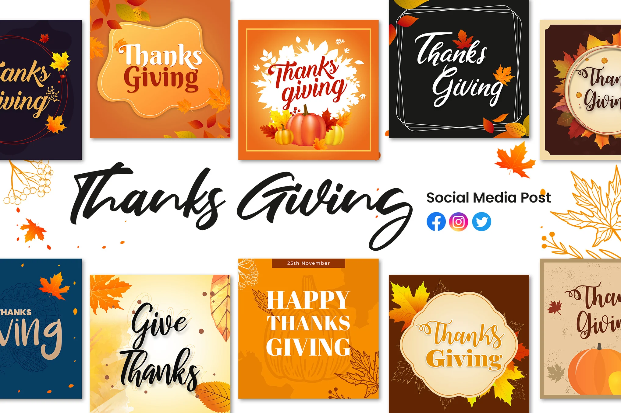
Thanksgiving Social Media Template Kit

Thanksgiving Social Media Template Kit

A creative Thanksgiving-themed social media template pack, perfect for amplifying your festive posts. It includes 10 templates, tailored to fit the dimensions of Facebook, Instagram, and Twitter posts. The kit provides a fully layered PSD file that’s customizable and editable, along with JPG files for reference.

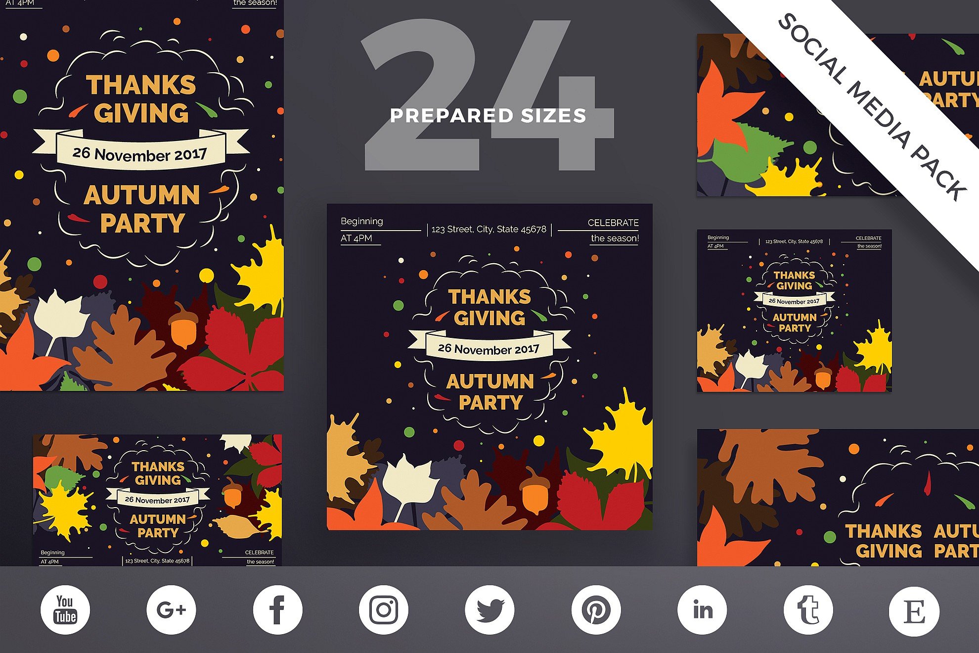
Thanksgiving Party Social Media Template Pack

Thanksgiving Party Social Media Template Pack

Another Thanksgiving social media template pack that offers versatile and professional-grade design templates to help businesses enhance their social media presence. This pack covers 24 different sizes suitable for popular platforms like Facebook, Instagram, Twitter, and more.

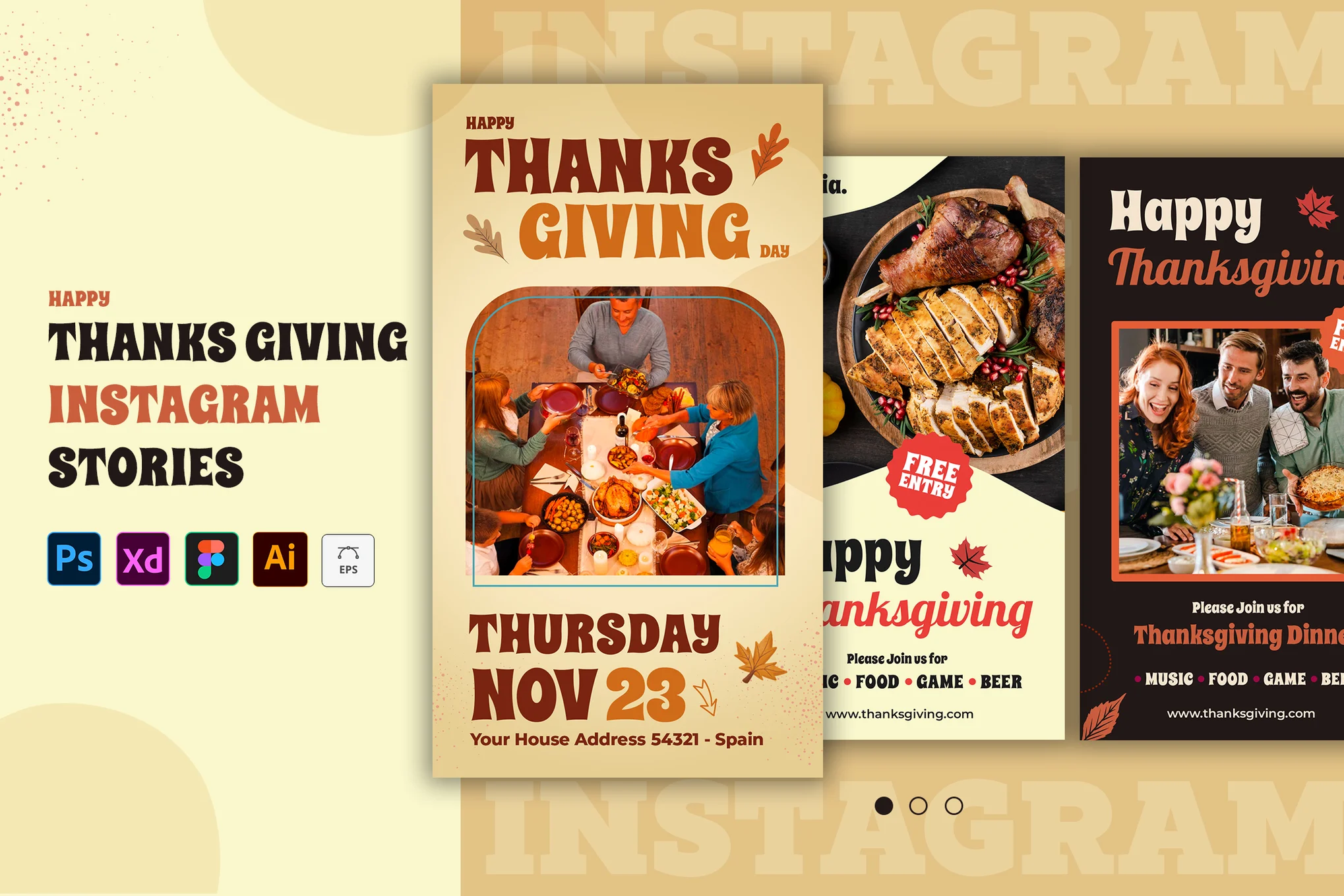
Thanksgiving Instagram Story Templates

Thanksgiving Instagram Story Templates

This Thanksgiving Instagram story template pack is an excellent tool for enhancing your business’s social media presence. Ideal for eCommerce, fashion, or design blogs, the templates are easy to use and adjust- just replace text and images to reflect your brand. Customizable aspects include color, text, images, and overall design.

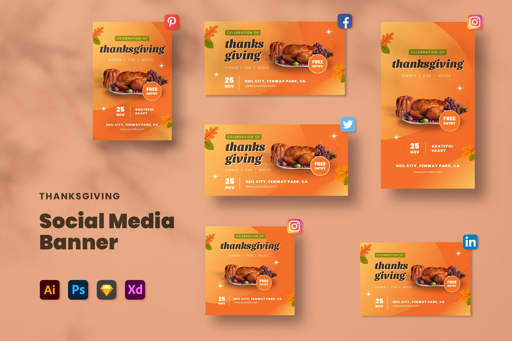
Thanksgiving Day Social Media Banner Templates

Thanksgiving Day Social Media Banner Templates

If you’re looking to spruce up your social media presence this Thanksgiving, consider using this Thanksgiving social media template kit. These easy-to-use, editable templates are perfect for any business or blog, offering high resolution, vector-based designs in multiple sizes appropriate for Instagram, Facebook, Pinterest, Twitter and LinkedIn.

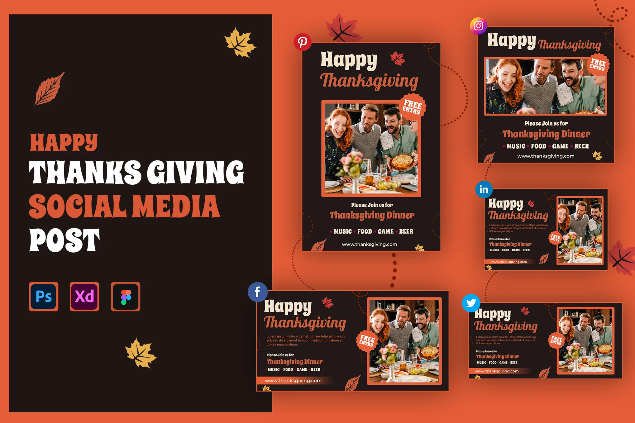
Thanksgiving Social Media Templates Pack

Thanksgiving Social Media Templates Pack

This Thanksgiving social media template kit provides six professionally designed, customizable banner post templates for several social platforms (including Instagram, Facebook, Twitter, Pinterest, and LinkedIn). With editable text and colors and easy image placement, these templates allow your holiday social media ads to shine.

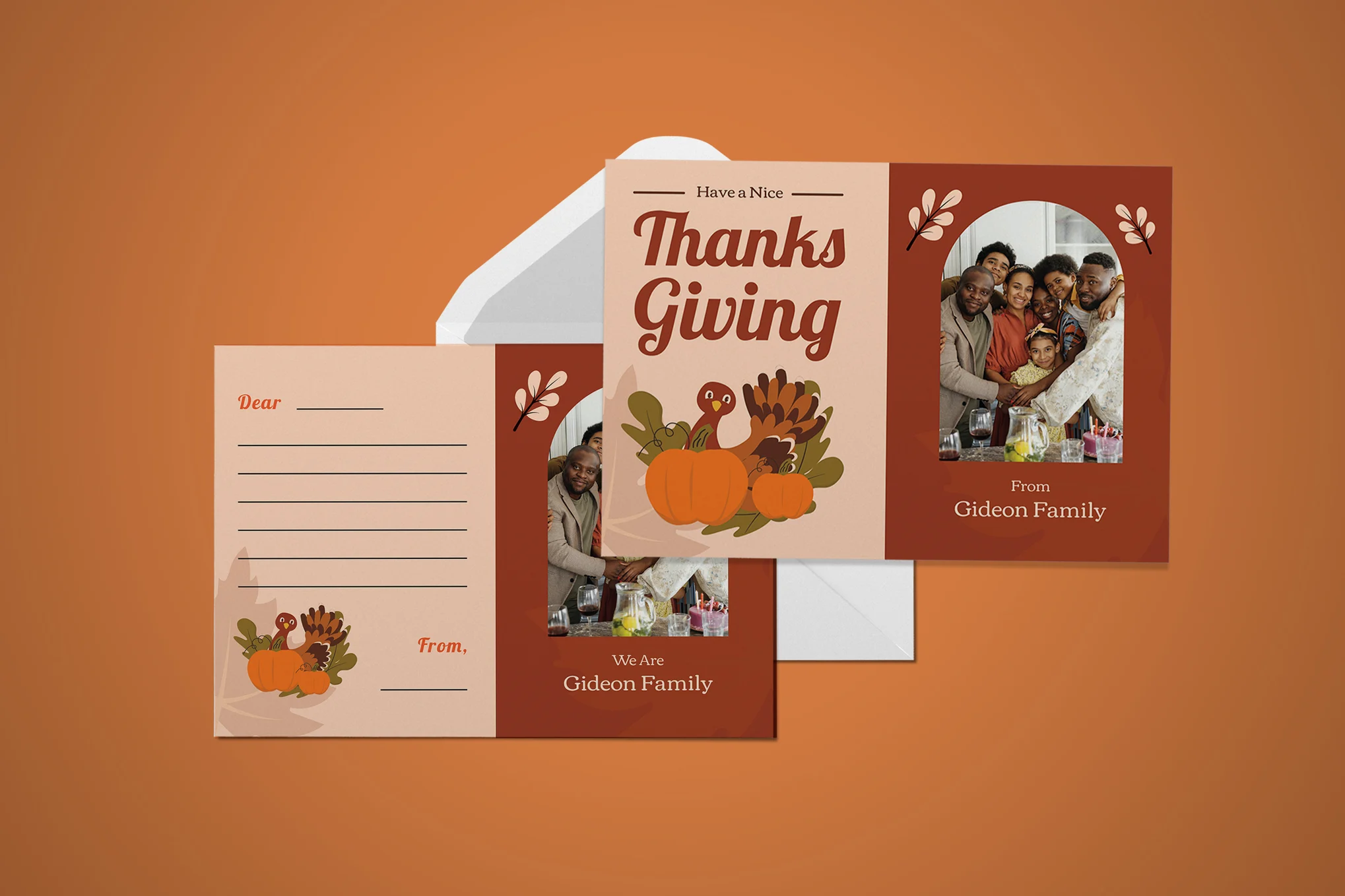
Two-Side Thanksgiving Greeting Card Template

Two-Side Thanksgiving Greeting Card Template

A professionally designed Thanksgiving greeting card template offering a two-sided card design. This versatile kit includes an AI (Adobe Illustrator) file, a PSD (Adobe Photoshop) file, and an EPS file for customization. With a size of 7×5 inches plus bleed, it’s 100% ready to print and neatly arranged in layers.

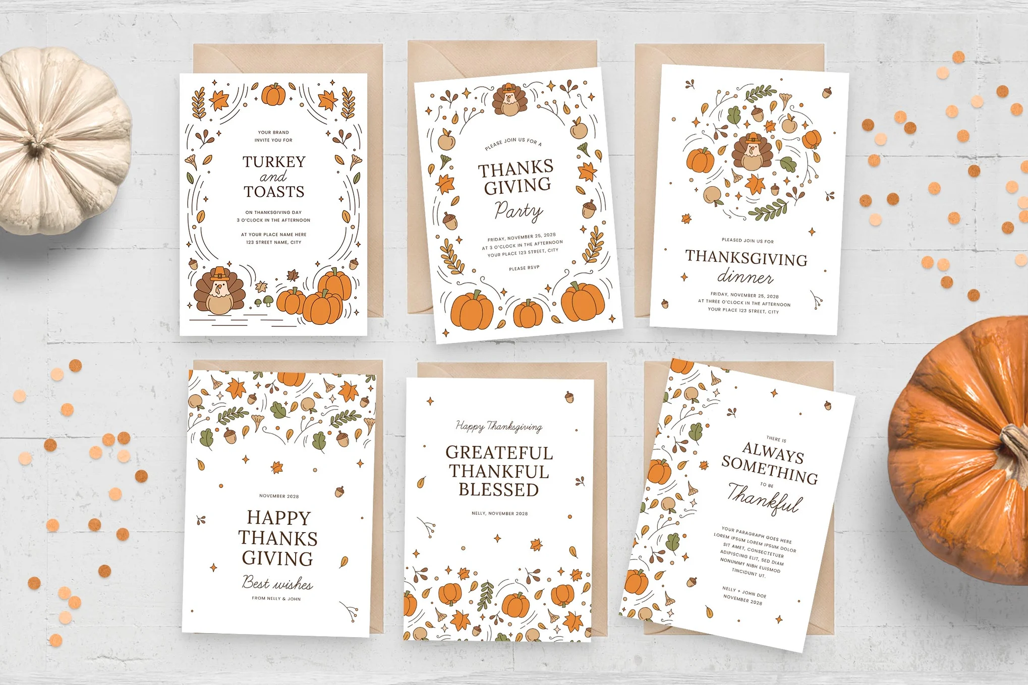
Thanksgiving Greetings Card Templates

Thanksgiving Greetings Card Templates

This is a set of elegantly rustic Thanksgiving greeting card templates that enrich your holiday wishes. Featuring line art borders of autumnal elements and a variety of layouts, it’s perfect for Thanksgiving flyers and invitations. They are provided in Photoshop PSD and Illustrator AI files, these 5×7″ printed size templates.

Free Thanksgiving Flyer Templates

Free Thanksgiving Flyer & Poster Template

This is a free flyer template you can use to promote all kinds of Thanksgiving events, dinner parties, and more. The template comes in PSD format with easily editable elements.

Free Happy Thanksgiving Flyer

Another free Thanksgiving flyer template with a colorful design. It has lots of decorative elements with creative typography and image placeholders to help you craft a more attractive flyer for your event.

Free Simple Thanksgiving Flyer Template

This free PSD template is perfect for your modern Thanksgiving flyer designs. It features a simple layout with minimal decorations and plenty of space to include details about your event.

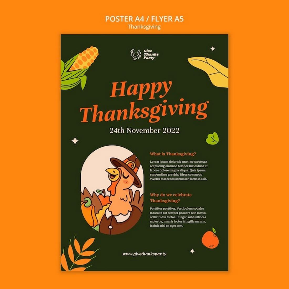
Free Dark Thanksgiving Flyer Template

If you prefer darker designs, this free Thanksgiving flyer template is perfect for your event. It comes with a bold and dark design that effectively highlights you content above all else.

Free Creative Thanksgiving Flyer Template

Another free Thanksgiving flyer template for various events and celebrations. This template also comes in PSD format and it features beautiful hand-drawn illustrations that give the design a hand-crafted look and feel.

Revamping Healthcare Software: Key Strategies for Modernization

Featured Imgs 23

In an era where technology continually transforms every sector, healthcare is no exception. Modernizing healthcare software is crucial to improving patient outcomes, enhancing operational efficiency, and staying competitive in a rapidly evolving industry. Whether you’re dealing with legacy systems or looking to integrate new technologies, revamping healthcare software can be a complex but rewarding endeavor. …

The post Revamping Healthcare Software: Key Strategies for Modernization first appeared on Lucid Softech.

WordPress vs Angular: Choosing the Right Platform for Your Website 

Featured Imgs 23

Building a website can be exciting, but choosing the right platform can be overwhelming. Two popular options are WordPress and Angular, each catering to different needs. So, which one is right for you? Let’s dive into the strengths and weaknesses of each platform. WordPress WordPress is a powerful content management system (CMS) used by millions […]

The post WordPress vs Angular: Choosing the Right Platform for Your Website  first appeared on WPArena and is written by Dilip Kumar.

CSS Tricks That Use Only One Gradient

Featured Imgs 23

CSS gradients have been so long that there’s no need to rehash what they are and how to use them. You have surely encountered them at some point in your front-end journey, and if you follow me, you also know that I use them all the time. I use them for CSS patterns, nice CSS decorations, and even CSS loaders. But even so, gradients have a tough syntax that can get very complicated very quickly if you’re not paying attention.

In this article, we are not going to make complex stuff with CSS gradients. Instead, we’re keeping things simple and I am going to walk through all of the incredible things we can do with just one gradient.

Only one gradient? In this case, reading the doc should be enough, no?

No, not really. Follow along and you will see that gradients are easy at their most basic, but are super powerful if we push them — or in this case, just one — to their limits.

CSS patterns

One of the first things you learn with gradients is that we can establish repeatable patterns with them. You’ve probably seen some examples of checkerboard patterns in the wild. That’s something we can quickly pull off with a single CSS gradient. In this case, we can reach for the repeating-conic-gradient() function:

background: 
  repeating-conic-gradient(#000 0 25%, #fff 0 50%) 
  0 / 100px 100px;

A more verbose version of that without the background shorthand:

background-image: repeating-conic-gradient(#000 0 25%, #fff 0 50%);
background-size: 100px 100px;

Either way, the result is the same:

Pretty simple so far, right? You have two colors that you can easily swap out for other colors, plus the background-size property to control the square shapes.

If we change the color stops — where one color stops and another starts — we get another cool pattern based on triangles:

background: 
  repeating-conic-gradient(#000 0 12.5%, #fff 0 25%) 
  0 / 100px 100px;

If you compare the CSS for the two demos we’ve seen so far, you’ll see that all I did was divide the color stops in half, 25% to 12.5% and 50% to 25%.

Another one? Let’s go!

This time I’m working with CSS variables. I like this because variables make it infinitely easier to configure the gradients by updating a few values without actually touching the syntax. The calculation is a little more complex this time around, as it relies on trigonometric functions to get accurate values.

I know what you are thinking: Trigonometry? That sounds hard. That is certainly true, particularly if you’re new to CSS gradients. A good way to visualize the pattern is to disable the repetition using the no-repeat value. This isolates the pattern to one instance so that you clearly see what’s getting repeated. The following example declares background-image without a background-size so you can see the tile that repeats and better understand each gradient:

I want to avoid a step-by-step tutorial for each and every example we’re covering so that I can share lots more examples without getting lost in the weeds. Instead, I’ll point you to three articles you can refer to that get into those weeds and allow you to pick apart our examples.

I’ll also encourage you to open my online collection of patterns for even more examples. Most of the examples are made with multiple gradients, but there are plenty that use only one. The goal of this article is to learn a few “single gradient” tricks — but the ultimate goal is to be able to combine as many gradients as possible to create cool stuff!

Grid lines

Let’s start with the following example:

You might claim that this belongs under “Patterns” — and you are right! But let’s make it more flexible by adding variables for controlling the thickness and the total number of cells. In other words, let’s create a grid!

.grid-lines {
  --n: 3; /* number of rows */
  --m: 5; /* number of columns */
  --s: 80px; /* control the size of the grid */
  --t: 2px; /* the thickness */

  width: calc(var(--m)*var(--s) + var(--t));
  height: calc(var(--n)*var(--s) + var(--t));
  background:  
    conic-gradient(from 90deg at var(--t) var(--t), #0000 25%, #000 0)
      0 0/var(--s) var(--s);
}

First of all, let’s isolate the gradient to better understand the repetition (like we did in the previous section).

One repetition will give us a horizontal and a vertical line. The size of the gradient is controlled by the variable --s, so we define the width and height as a multiplier to get as many lines as we want to establish the grid pattern.

What’s with “+ var(--t)” in the equation?

The grid winds up like this without it:

We are missing lines at the right and the bottom which is logical considering the gradient we are using. To fix this, the gradient needs to be repeated one more time, but not at full size. For this reason, we are adding the thickness to the equation to have enough space for the extra repetition and the get the missing lines.

And what about a responsive configuration where the number of columns depends on the available space? We remove the --m variable and define the width like this:

width: calc(round(down, 100%, var(--s)) + var(--t));

Instead of multiplying things, we use the round() function to tell the browser to make the element full width and round the value to be a multiple of --s. In other words, the browser will find the multiplier for us!

Resize the below and see how the grid behaves:

In the future, we will also be able to do this with the calc-size() function:

width: calc-size(auto, round(down, size, var(--s)) + var(--t));

Using calc-size() is essentially the same as the last example, but instead of using 100% we consider auto to be the width value. It’s still early to adopt such syntax. You can test the result in the latest version of Chrome at the time of this writing:

Dashed lines

Let’s try something different: vertical (or horizontal) dashed lines where we can control everything.

.dashed-lines {
  --t: 2px;  /* thickness of the lines */
  --g: 50px; /* gap between lines */
  --s: 12px; /* size of the dashes */
  
  background:
    conic-gradient(at var(--t) 50%, #0000 75%, #000 0)
    var(--g)/calc(var(--g) + var(--t)) var(--s);
}

Can you figure out how it works? Here is a figure with hints:

Outline of a rectangle with dashed green borders. Variables for t, g, and s are labeled.

Try creating the horizontal version on your own. Here’s a demo that shows how I tackled it, but give it a try before peeking at it.

What about a grid with dashed lines — is that possible?

Yes, but using two gradients instead of one. The code is published over at my collection of CSS shapes. And yes, the responsive behavior is there as well!

Rainbow gradient

How would you create the following gradient in CSS?

The color spectrum from left to right.

You might start by picking as many color values along the rainbow as you can, then chaining them in a linear-gradient:

linear-gradient(90deg, red, yellow, green, /* etc. */, red);

Good idea, but it won’t get you all the way there. Plus, it requires you to juggle color stops and fuss with them until you get things just right.

There is a simpler solution. We can accomplish this with just one color!

background: linear-gradient(90deg in hsl longer hue, red 0 0);

I know, the syntax looks strange if you’re seeing the new color interpolation for the first time.

If I only declare this:

background: linear-gradient(90deg, red, red); /* or (90deg, red 0 0) */

…the browser creates a gradient that goes from red to red… red everywhere! When we set this “in hsl“, we’re changing the color space used for the interpolation between the colors:

background: linear-gradient(90deg in hsl, red, red);

Now, the browser will create a gradient that goes from red to red… this time using the HSL color space rather than the default RGB color space. Nothing changes visually… still see red everywhere.

The longer hue bit is what’s interesting. When we’re in the HSL color space, the hue channel’s value is an angle unit (e.g., 25deg). You can see the HSL color space as a circle where the angle defines the position of the color within that circle.

3D models of the RGB and HSL color spaces.

Since it’s a circle, we can move between two points using a “short” path or “long” path.

Showing the long and short ends of the hue in a color circle.

If we consider the same point (red in our case) it means that the “short” path contains only red and the “long” path runs into all the colors as it traverses the color space.

Adam Argyle published a very detailed guide on high-definition colors in CSS. I recommend reading it because you will find all the features we’re covering (this section in particular) to get more context on how everything comes together.

We can use the same technique to create a color wheel using a conic-gradient:

background: conic-gradient(in hsl longer hue,red 0 0);

And while we are on the topic of CSS colors, I shared another fun trick that allows you to define an array of color values… yes, in CSS! And it only uses a single gradient as well.

Hover effects

Let’s do another exercise, this time working with hover effects. We tend to rely on pseudo-elements and extra elements when it comes to things like applying underlines and overlays on hover, and we tend to forget that gradients are equally, if not more, effective for getting the job done.

Case in point. Let’s use a single gradient to form an underline that slides on hover:

h3 {
  background: 
    linear-gradient(#1095c1 0 0) no-repeat
    var(--p,0) 100%/var(--p, 0) .1em;
  transition: 0.4s, background-position 0s;
}

h3:hover {
  --p: 100%;
}

You likely would have used a pseudo-element for this, right? I think that’s probably how most people would approach it. It’s a viable solution but I find that using a gradient instead results in cleaner, more concise CSS.

You might be interested in another article I wrote for CSS-Tricks where I use the same technique to create a wide variety of cool hover effects.

CSS shapes

Creating shapes with gradients is my favorite thing to do in CSS. I’ve been doing it for what feels like forever and love it so much that I published a “Modern Guide for Making CSS Shapes” over at Smashing Magazine earlier this year. I hope you check it out not only to learn more tricks but to see just how many shapes we can create with such a small amount of code — many that rely only on a single CSS gradient.

Some of my favorites include zig-zag borders:

…and “scooped” corners:

…as well as sparkles:

…and common icons like the plus sign:

I won’t get into the details of creating these shapes to avoid making this article long and boring. Read the guide and visit my CSS Shape collection and you’ll have everything you need to make these, and more!

Border image tricks

Let’s do one more before we put a cap on this. Earlier this year, I discovered how awesome the CSS border-image property is for creating different kinds of decorations and shapes. And guess what? border-image limits us to using just one gradient, so we are obliged to follow that restriction.

Again, just one gradient and we get a bunch of fun results. I’ll drop in my favorites like I did in the last section. Starting with a gradient overlay:

We can use this technique for a full-width background:

…as well as heading dividers:

…and even ribbons:

All of these have traditionally required hacks, magic numbers, and other workarounds. It’s awesome to see modern CSS making things more effortless. Go read my article on this topic to find all the interesting stuff you can make using border-image.

Wrapping up

I hope you enjoyed this collection of “single-gradient” tricks. Most folks I know tend to use gradients to create, well, gradients. But as we’ve seen, they are more powerful and can be used for lots of other things, like drawing shapes.

I like to add a reminder at the end of an article like this that the goal is not to restrict yourself to using one gradient. You can use more! The goal is to get a better handle on how gradients work and push them in interesting ways — that, in turn, makes us better at writing CSS. So, go forth and experiment — I’d love to see what you make!


CSS Tricks That Use Only One Gradient originally published on CSS-Tricks, which is part of the DigitalOcean family. You should get the newsletter.


from CSS-Tricks https://ift.tt/upZhgGI
Gain $200 in a week
via Read more

Using Multimodal AI Models For Your Applications (Part 3)

Featured Imgs 23

In this third and final part of a three-part series, we’re taking a more streamlined approach to an application that supports vision-language (VLM) and text-to-speech (TTS). This time, we’ll use different models that are designed for all three modalities — images or videos, text, and audio( including speech-to-text) — in one model. These “any-to-any” models make things easier by allowing us to avoid switching between models.

Specifically, we’ll focus on two powerful models: Reka and Gemini 1.5 Pro.

Both models take things to the next level compared to the tools we used earlier. They eliminate the need for separate speech recognition models, providing a unified solution for multimodal tasks. With this in mind, our goal in this article is to explore how Reka and Gemini simplify building advanced applications that handle images, text, and audio all at once.

Overview Of Multimodal AI Models

The architecture of multimodal models has evolved to enable seamless handling of various inputs, including text, images, and audio, among others. Traditional models often require separate components for each modality, but recent advancements in “any-to-any” models like Next-GPT or 4M allow developers to build systems that process multiple modalities within a unified architecture.

Gato, for instance, utilizes a 1.2 billion parameter decoder-only transformer architecture with 24 layers, embedding sizes of 2048 and a hidden size of 8196 in its feed-forward layers. This structure is optimized for general tasks across various inputs, but it still relies on extensive task-specific fine-tuning.

GPT-4o, on the other hand, takes a different approach with training on multiple media types within a single architecture. This means it’s a single model trained to handle a variety of inputs (e.g., text, images, code) without the need for separate systems for each. This training method allows for smoother task-switching and better generalization across tasks.

Similarly, CoDi employs a multistage training scheme to handle a linear number of tasks while supporting input-output combinations across different modalities. CoDi’s architecture builds a shared multimodal space, enabling synchronized generation for intertwined modalities like video and audio, making it ideal for more dynamic multimedia tasks.

Most “any-to-any” models, including the ones we’ve discussed, rely on a few key concepts to handle different tasks and inputs smoothly:

  • Shared representation space
    These models convert different types of inputs — text, images, audio — into a common feature space. Text is encoded into vectors, images into feature maps, and audio into spectrograms or embeddings. This shared space allows the model to process various inputs in a unified way.
  • Attention mechanisms
    Attention layers help the model focus on the most relevant parts of each input, whether it’s understanding the text, generating captions from images, or interpreting audio.
  • Cross-modal interaction
    In many models, inputs from one modality (e.g., text) can guide the generation or interpretation of another modality (e.g., images), allowing for more integrated and cohesive outputs.
  • Pre-training and fine-tuning
    Models are typically pre-trained on large datasets across different types of data and then fine-tuned for specific tasks, enhancing their performance in real-world applications.
Reka Models

Reka is an AI research company that helps developers build powerful applications by offering models for a range of tasks. These tasks include generating text from videos and images, translating speech, and answering complex questions from long multimodal documents. Reka’s models can even write and execute code, providing flexible, real-world solutions for developers.

These are the three main models Reka offers:

  1. Reka Core
    A 67-billion-parameter multimodal language model designed for complex tasks. It supports inputs like images, videos, and texts while excelling in advanced reasoning and coding.
  2. Reka Flash
    A faster model with a 21-billion-parameter, designed for flexibility and rapid performance in multimodal settings.
  3. Reka Edge (PDF)
    A smaller 7-billion-parameter model was built for on-device and low-latency applications, making it efficient for local use and local or latency-sensitive applications.

Reka’s models can be fine-tuned and deployed securely, whether on the cloud, on-premises, or even on-device. Let’s start by testing Reka’s capabilities directly through its playground. This allows us to experiment with its multimodal features without writing any code, providing a hands-on way to see how the models handle various tasks, such as image and video comprehension.

Alright, we’ll kick things off by uploading an image of a diagram outline of the PaliGemma architecture and ask Reka for a detailed explanation.

Can you provide a more detailed explanation of this image?

Here’s what we get from Reka Core:

“This image is a schematic representation of a machine-learning model named PaliGemma. The model appears to be designed for multimodal input, combining both image and text data. At the top, there are two input sources: ‘Image Input’ and ‘Text Input’. The image input is processed by a ‘SigLIP Image Encoder’, which likely stands for a specific type of image encoding technique. The output of this encoder is then subjected to a ‘Linear Projection’, which is a common step in machine learning to transform data into a lower-dimensional space. The text input is directly fed into the model. Both the projected image data and the text input are then concatenated into ‘Concatenated Tokens’, which are then processed by a component labeled ‘Gemma’. The final output of the model is ‘Text Output’, which suggests that the model is designed to generate text based on the input data.”

It’s a clear and detailed breakdown of the PaliGemma architecture. The model accurately identifies image and text inputs, the SigLIP image encoder, and the linear projection step. It also grasps how the image and text inputs are combined and processed to generate text output. I should admit that the response is quite neat, offering a solid explanation of the architecture.

Let’s try a video input instead. We’ll upload the video about Genny, a software, and ask a question to see how well Reka Core handles video comprehension.

What is this video about?
“This video is a screen recording of a group of friends discussing their plans for the weekend.”

Well, it’s not a good answer compared to what LLaVA gave us in the previous article. Now let’s try a longer video, but with the Reka Flash model. The video is about a TTS model called Parler TTS. Instead of asking what the video is about, let’s prompt it like this:

I’m an AI developer, and I’m not sure how this TTS model can help me in my projects. Can you explain how I can use it or what it’s useful for?

Reka Flash generates a solid answer this time:

“Of course! This TTS (Text-to-Speech) model can be incredibly useful for developers, especially those working on projects that involve creating more human-like interactions or providing audio feedback to users. Here are some ways you can leverage this TTS model in your projects:
  1. Accessibility: TTS models can greatly enhance the accessibility of your applications for users with visual impairments or reading difficulties. By providing spoken feedback or narrating content, you can make your applications more inclusive
  2. Voice Assistants: You can integrate this TTS model into voice assistants or chatbots, allowing them to generate more natural-sounding responses. This can improve user experience and make interactions with your bots more engaging.
  3. Multimedia Applications: This TTS model can be used in multimedia applications, such as e-books, educational tools, or games, to provide spoken narration or instructions. This can make the content more engaging and easier to understand.
  4. Audio Notifications: You can use the TTS model to generate audio notifications for your applications, providing users with spoken alerts or reminders. This can be particularly useful for users who may not always have their screens visible.
  5. Language Learning: The TTS model can be used in language learning applications to provide users with correct pronunciation and intonation. It can also generate spoken feedback or narrate lessons, making the learning process more immersive.
  6. Audio Books: You can use the TTS model to generate audio books, allowing users to listen to written content instead of reading it. This can be especially helpful for users who prefer auditory learning or have difficulty reading.
  7. Explainer Videos: The TTS model can be used to generate voiceovers for explainer videos, providing users with spoken narration that explains the content on the screen. This can make the content more engaging and easier to understand.
  8. Audio Feedback: You can use the TTS model to generate audio feedback for users in your applications, such as confirming actions, providing instructions, or giving feedback on their performance. This can make the interactions more natural and intuitive.
In summary, the TTS model can be a valuable tool for developers looking to create more human-like interactions, improve accessibility, and enhance the user experience in various applications.”

It’s a good answer that’s informative and quite practical for developers. Let’s compare what happens when we try the Reka Edge model with a PDF input titled “Meta AI — Responsible Use Guide” (PDF).

As an AI developer, how can I ensure that I am following the responsible AI guidelines outlined in this document?
“To ensure that your use of AI aligns with the principles outlined in this guide, you can follow these steps and best practices:
  1. Familiarize yourself with the principles of responsible AI, such as transparency, accountability, and user empowerment, as outlined in the guide.
  2. Understand the potential impacts of AI on users and society, and be aware of the risks and challenges associated with the development and deployment of AI systems.
  3. Embrace an iterative model-development mindset, continuously striving for improvement and learning from feedback and errors.
  4. Build a responsible AI ecosystem by working with partners, experts, and communities to develop and share best practices, tools, and benchmarking resources.
  5. Follow the guidelines and best practices outlined in the guide for each stage of model development, from data collection and preparation to fine-tuning, evaluation, and deployment.
  6. Consider the specific use case and requirements for your AI system, and tailor your approach accordingly.
  7. Regularly monitor and evaluate the performance and safety of your AI system and make adjustments as needed to ensure it aligns with the principles outlined in the guide.
  8. Be transparent and accountable in your interactions with users and stakeholders, and be open to feedback and suggestions for improvement.
  9. Stay informed about the latest developments and research in the field of AI, and be prepared to adapt your approach as needed to address new challenges and opportunities.
  10. Follow the specific guidelines and best practices outlined in the addendum for Code Llama, such as defining content policies, evaluating and benchmarking models, and addressing input- and output-level risks.”

Reka Edge’s answer is quite thorough and detailed, too!

If you want to dive into coding, start by creating a Reka account and getting an API key. Then you can follow along with this notebook. Try out their Python SDK, and make sure to explore the different models available. It’s a great way to see how these tools work under the hood!

Gemini Models

Gemini 1.5, developed by Google DeepMind, is designed to handle complex tasks efficiently, thanks to the new Mixture-of-Experts (MoE) system. MoE is like packing several specialized models inside one big model. Instead of using the whole network for every task, Gemini 1.5 activates only the parts (or what they call “experts”) that are most relevant. This means Gemini 1.5 can tackle complex tasks with less processing power than a typical monolithic model.

We can explore Gemini’s features in Google AI Studio since it’s already baked right in. We’ll begin by uploading the following image illustrating VLM capabilities.

We’ll ask Gemini to analyze the image and extract details or concepts:

Explain this image. What are the specific details or concepts it represents?
“The image is a flowchart illustrating different types of image understanding tasks with a Vision Language Model.
  • Object Localization: This task aims to identify the precise location of objects within an image. The example question asks, “Is one cat behind another?”
  • Zero-shot Segmentation: This task involves segmenting an image into different regions based on a given label, even if the model has never seen that specific label before. The example question asks to segment “striped cat.”
  • Zero-shot Visual QA: This task requires answering questions about an image, even if the model has not been specifically trained to answer that type of question. The example question asks, “What is the breed of these cats?”
  • One-shot Learning with Instructions: This task involves providing the model with a single example and instruction to learn a new concept and apply it to other images. The example question asks, “Striped cats are called tabby cats. What is the breed of the cats in the image?”

Well, Gemini nailed it — it clearly understood the image and recognized the tasks a VLM handles. This is exactly what you’d expect from a model designed for advanced image analysis.

Now, we’ll upload another image — this time of an Italian dish — and ask Gemini if it can recognize the dishes and list the ingredients needed for them. This type of “food recognition task” will help us test its ability to identify foods and ingredients.

List the different dishes in this image, also from which country, and give me the ingredients I need to make them.
“The image shows an Italian feast with the following dishes:
  1. Seafood Stew: A rich and flavorful stew with seafood like clams, mussels, shrimp, fish, and vegetables in a tomato broth.
  2. Spaghetti with Tomato Sauce: Classic spaghetti pasta tossed in a simple yet flavorful tomato sauce.
  3. Meatballs in Tomato Sauce: Tender and juicy meatballs simmered in a rich tomato sauce.
  4. Lasagna: Layered pasta with meat sauce, cheese, and tomato sauce.
  5. Side Salad: A refreshing side salad with mixed greens, tomatoes, and other vegetables.
  6. Garlic Bread: Toasted bread slices rubbed with garlic and olive oil.
  7. Marinara Sauce: A simple tomato-based sauce.
This is a typical Italian meal with various dishes showcasing the flavors of Italian cuisine.

As for the ingredients, you’ll need tomatoes for many of these dishes, specifically for the sauces and the side salad.”

Well, the model did a good job recognizing the dishes, but it also didn’t give me all the necessary ingredients. Let’s see how it does with videos instead, using the same video we used earlier with the Reka models. This time, the task will focus on action recognition.

What is the purpose of this video, and what key actions or processes are being demonstrated?
“The video is a tutorial about the importance of friendship and how it can impact our lives. It demonstrates the use of a video editing software called “Genmy” to create a video and add text subtitles. The video creator is using Genmy to:
  • Record their voice: This is seen at the top of the screen with the mic icon.
  • Add text to speech: You see the “Text to Speech” option, which is likely being used to generate subtitles or captions for the video.
  • Edit the timeline: They’re working with a video timeline, adding and arranging different elements.
  • Add voice-over: The speaker is adding commentary to the video.
  • Create a visually appealing presentation: They’re using a combination of video footage, text, and voice-over to create an engaging tutorial.”

Well, Gemini gave a clear breakdown of the video, identifying it as a tutorial demonstrating the Genmy video editing software to highlight how it’s used for recording voice, adding text-to-speech, editing video timelines, and allowing voice-over. Impressive!

Let’s upload one more video, the same one we used for Reka about the Parler TTS model, and ask Gemini to analyze and summarize the contents.

Summarize this video and explain how the contents might be relevant or helpful for software engineers.
“This video showcases different voice samples generated by a text-to-speech (TTS) system called “Parler-TTS.” The video highlights various voice characteristics like gender, pace, pitch, and even the simulated environment. For software engineers, this video demonstrates the progress made in TTS technology. These are some insights:
  • Voice Variety: The video shows that Parler-TTS can create diverse voices, potentially useful for applications needing different personas or tones.
  • Fine-grained Control: The video emphasizes the ability to control voice parameters like pace and pitch, showcasing the potential for customizability.
  • Quality and Naturalness: The video focuses on the quality of the generated speech, demonstrating the advancements made in speech synthesis, which is crucial for user experience.”

Nicely done! I can go with that answer. Gemini explains adjusting voice settings, like pitch and speed, and how having different voices can be useful. Gemini also emphasizes the importance of natural, high-quality speech, which is handy for developers working with TTS systems!

Alright, for coding, you can grab the code from Google AI Studio by clicking the Get Code button. You can choose between formatting the code in Python, Swift, and Java, among other languages.

Conclusion

Both Reka and Gemini are strong multimodal models for AI applications, but there are key differences between them to consider. Here’s a table that breaks those down:

Feature Reka Gemini 1.5
Multimodal Capabilities Image, video, and text processing Image, video, text, with extended token context
Efficiency Optimized for multimodal tasks Built with MoE for efficiency
Context Window Standard token window Up to two million tokens (with Flash variant)
Architecture Focused on multimodal task flow MoE improves specialization
Training/Serving High performance with efficient model switching More efficient training with MoE architecture
Deployment Supports on-device deployment Primarily cloud-based, with Vertex AI integration
Use Cases Interactive apps, edge deployment Suited for large-scale, long-context applications
Languages Supported Multiple languages Supports many languages with long context windows

Reka stands out for on-device deployment, which is super useful for apps requiring offline capabilities or low-latency processing.

On the other hand, Gemini 1.5 Pro shines with its long context windows, making it a great option for handling large documents or complex queries in the cloud.

30+ Key Logo Design Trends for 2025

Featured Imgs 23

Need a new logo? Whether you’re starting from scratch or just planning a tweak to a current mark, understanding shifts in logo design trends can help you create a design with a modern touch.

The theme in logo design is to create something simple and distinctive. With so many new websites and brands and companies coming online almost every day, it’s no wonder that logos are trending toward designs that stand out.

Here’s a look at a few logo design trends, and how you can make them work for you (and while you’re at it, be sure to look through our full guide on how to design a logo!)

Bold Minimalism

new lamborghini logo
new paypal logo

One of the key logo design trends that’s been growing in popularity is the bold minimalist logo designs. Over the past couple of years, we saw many brands transition from colorful, creative logos with shapes and intricate details into extremely minimalist designs. And this trend doesn’t appear to be going away anytime soon.

In 2024, we saw several brands adopt this new bold minimalist logo design trend as well. The new Lamborghini and PayPal logos were the most noticeable of them all. Lamborghini switched to a highly minimalist logo after 20 years, ditching its iconic gold-colored symbol. PayPal also removed all of its colors and replaced the instantly recognizable lettermark with a more simplistic design. We will likely see more brand follow this trend in the coming months.

Here’s how to make the most out of this logo design trend:

  • Use fewer colors, shapes, and details in your designs
  • Utilize thin lines and geometric shapes
  • Use simple typography with fewer decorative elements

Responsive Logos

Examples of Responsive Logo Design

One of the main reasons why brands have been adopting the bold minimalism trend is to make their logos responsive and flexible. Unlike the good old days, logos now need to be dynamic enough to be displayed flawlessly across multiple platforms and mediums, including the many different sizes of device screens.

Crafting responsive logos is the answer to this process as it allows brands to create multiple variations of their logos for different platforms. As a result, every reputable and popular brand now has responsive logo designs.

This is a trend that you should study carefully as it will be an important part of your future logo design projects. From now on, every logo you design will need to be responsive!

Here’s how to make the most out of this logo design trend:

  • Craft minimal logos that can be easily displayed across different platforms
  • Design multiple variants of a logo suitable for each platform
  • Design with scalability in mind

Negative Space Designs

bolt negative space logo
reddit negative space logo

The negative space logo design is nothing new. They have been around for decades. But it seems the trend is resurfacing in a new way.

More than a few of the recent logo remakes featured negative space designs. The new Reddit and Bolt logos are the most noticeable pair in the bunch. Many other brands like Propel and Indiana also switched from classic logo designs to more minimal logos with negative space elements.

Negative space logos spark creativity and offer a refreshingly unique look for brands. So this is a logo trend we’re excited to see grow throughout this year.

How to make the most out of this logo design trend:

  • Find clever ways to use negative space to create symbols and shapes
  • Use fonts that with dynamic letterforms

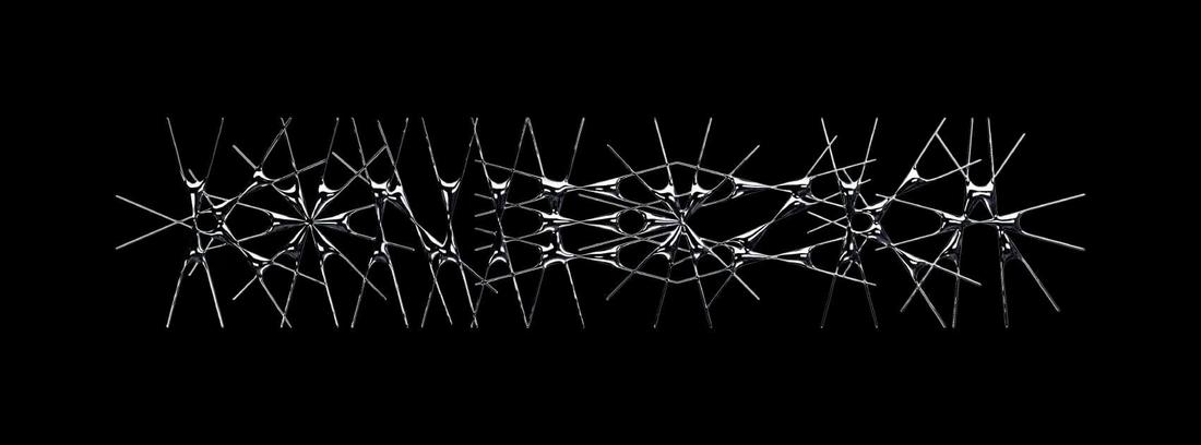
Chaotic Typography

chaotic typogrpahy logo 1
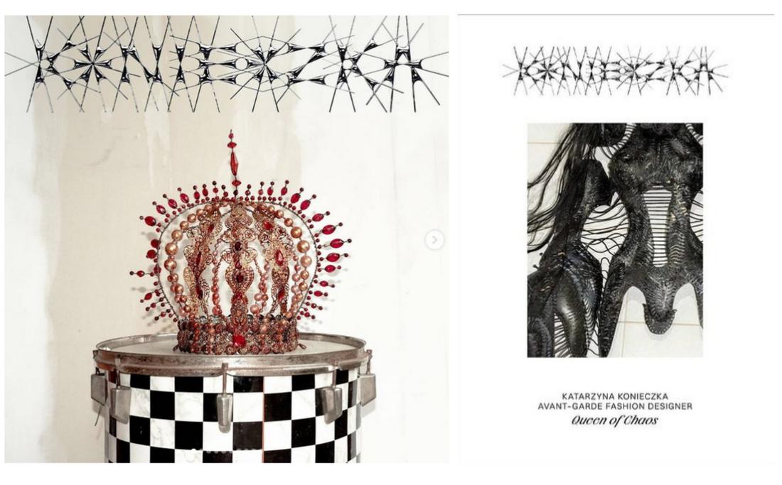
chaotic typogrpahy logo 2

If the text on a design is unreadable, we usually consider it a bad design. But that seems to be changing. This latest logo design trend utilizes chaotic, edgy, and basically unreadable text to create a bold look for brands.

The example above comes from a reputable design studio that has designed the chaotic logo for a fashion brand called Queen of Chaos, which specializes in designing uniquely weird apparel for celebrities like Lady Gaga.

This chaotic typography logo approach would fit perfectly well for brands and companies that seek to create an edgy look.

How to make the most out of this logo design trend:

  • Go crazy with typography and add your own decorative elements
  • Use weird and edgy-looking fonts
  • Use your imagination!

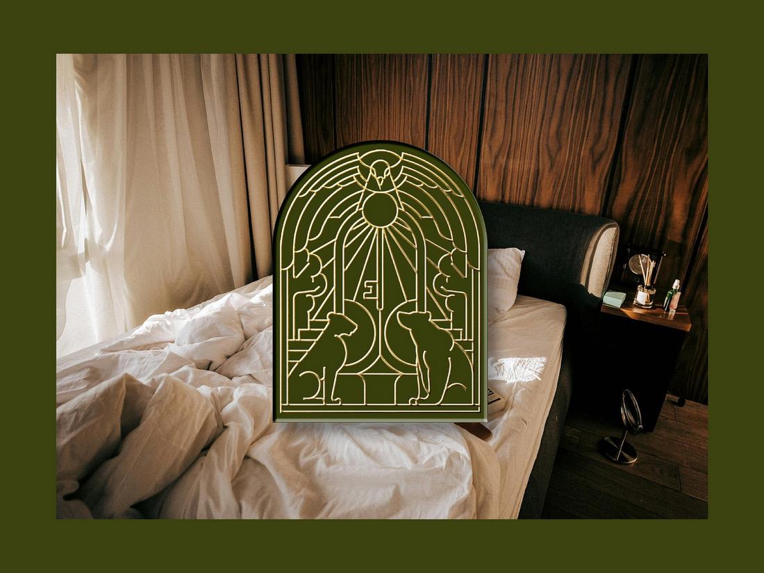
Illustrative Logos

Illustrative Logos

Even though most of the latest trends are all about minimalism and simplicity, we always love to see logos with intricate details and stylish designs. This new logo trend will keep that trend alive and strong for a long time.

It’s great seeing illustrative logos making a comeback. These logos see more complex designs that feature detailed illustrations. They also use creative design trends such as Art Deco and vintage geometric designs to make each logo look much more attractive.

This logo trend is quite popular among luxury and high-end brands, especially in hotel, jewelry, and fashion brands.

Here’s how to make the most out of this logo design trend:

  • Incorporate your line art illustrations into your logo designs
  • Use thin lines, shapes, and outline fonts
  • Utilize gold, black, silver, and other colors to give a luxury vibe to the logo

Dark Color Tones

facebook logo redesign
pepsi logo redesign

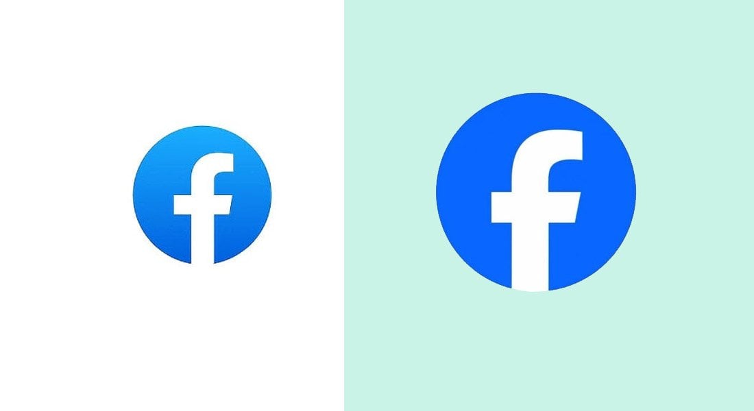
Dark color schemes are making a comeback! There have been many different logo design trends over the past few years with different styles of color themes like flat colors, pastel colors, material design, and more. And we’ve circled back to dark and bright colors once again.

In 2023, we saw several different brands redesigning their logos by changing the color tones. The most notable logo redesign came from Facebook. The company casually changed the color by making the blue color much darker. It was a subtle change but very noticeable.

Pepsi also made rounds in the news with its unexpected brand redesign. Their iconic light blue color was replaced with a much darker blue and with a brighter red. This new redesign came 15 years after its last branding change.

Here’s how to make the most out of this logo design trend:

  • Consider adjusting the tone of your logo’s existing color
  • Use darker color tones in your logo designs
  • Be mindful of the color combinations

Retro 3D Look

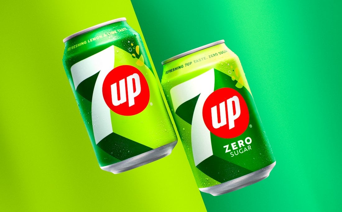
7up logo redesign
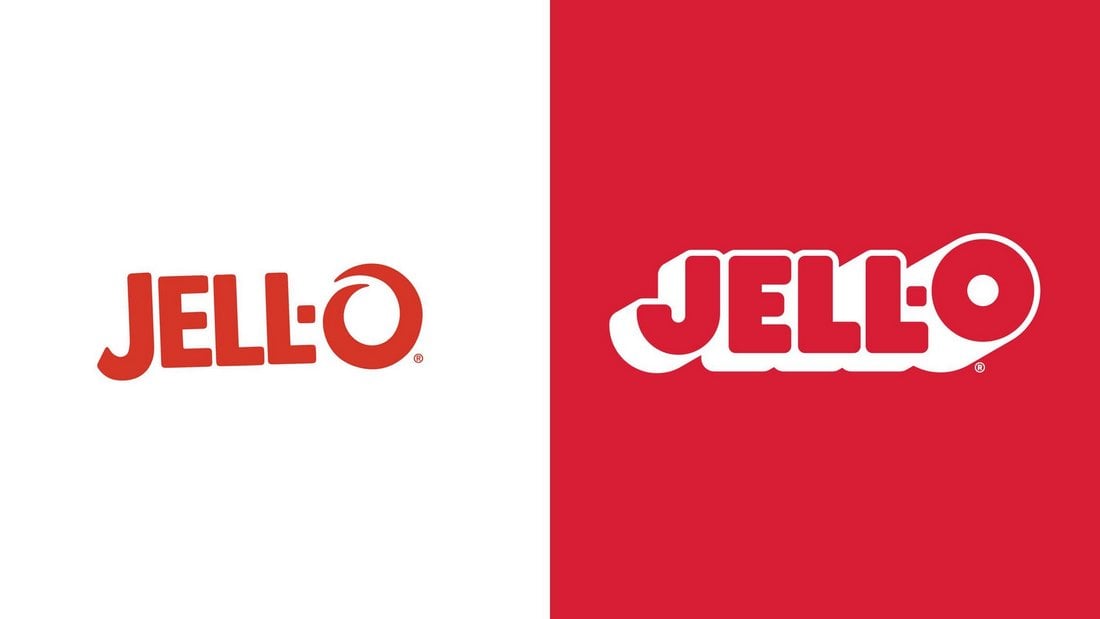
Jell-O redesign

If there’s one logo design trend we can never get tired of it’s classic retro designs. While some brands rushed to redesign their logos with modern looks in 2023, we saw several companies take the opposite approach with their logo redesigns.

7Up’s brand-new retro-themed logo redesign was the most noteworthy one to follow this new trend. It featured a classic retro look with elaborate 3D-like lines that highlighted the logo in an entirely new way.

Several other brands also followed this trend, including the iconic Jell-O. The outdated logo was replaced with a retro 3D look.

This new retro 3D logo trend was mostly adopted by much older brands that have been around for many decades. It is the perfect way to evoke emotions through nostalgia.

Here’s how to make the most out of this logo design trend:

  • Consider using retro color palettes. Find inspiration from classic logo designs from the 1960s and 70s
  • Add elaborate 3D looks to text and objects
  • Aim to make logos look more fun with a bit of nostalgia

Single Color Logo Design

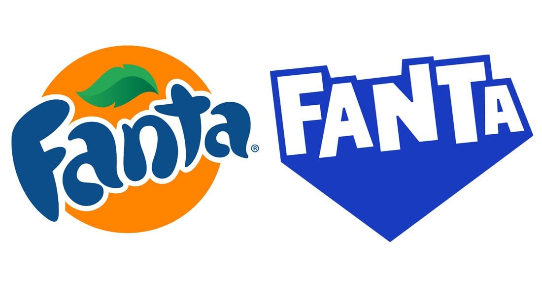
fanta logo redesign
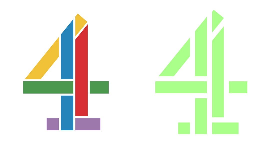
channel 4 redesign

The multicolor logo designs appear to be slowly fading away. Except for a few brands, like Google and eBay, many brands are now switching over to single-color logo designs. Even Google has replaced its multicolor logo with a single-color logo on the dark theme version of the homepage.

Channel 4 replaced its multicolor logo with a single-colored logo design in 2023. Several other brands also adopted this new trend in 2023. Including Wise ( previously Transferwise), Fanta, and Minute Maid.

We can expect to see more brands following this trend this year to replace multicolor logos with single-color designs.

Here’s how to make the most out of this logo design trend:

  • Replace your color palette with a single color that represents the brand
  • Use brighter or darker color tones to make the logo stand out

Edgy Typographic Logos

nokia logo rebrand
x logo redesign

While retro logo designs look cool, it’s not suitable for all types of brands. Especially for tech-related brands, going for a cool and edgy look is the ideal approach. At least that was the case for several tech brands that rebranded with new edgy typography logo designs in 2023.

The X (previously Twitter) logo redesign was the most notable one from the bunch. Following Elon Musk’s acquisition, X’s rebranding of Twitter was quite a radical change. And it saw the cute Twitter bird logo being replaced with a more edgy monogram-style typographic logo.

Nokia also introduced a brand redesign featuring an edgy typographic logo with a very stylish look. We’ll probably see more tech brands following this trend this year as well.

Here’s how to make the most out of this logo design trend:

  • Experiment with edgy and futuristic fonts
  • Think outside the box and try removing parts of letters to achieve a unique look

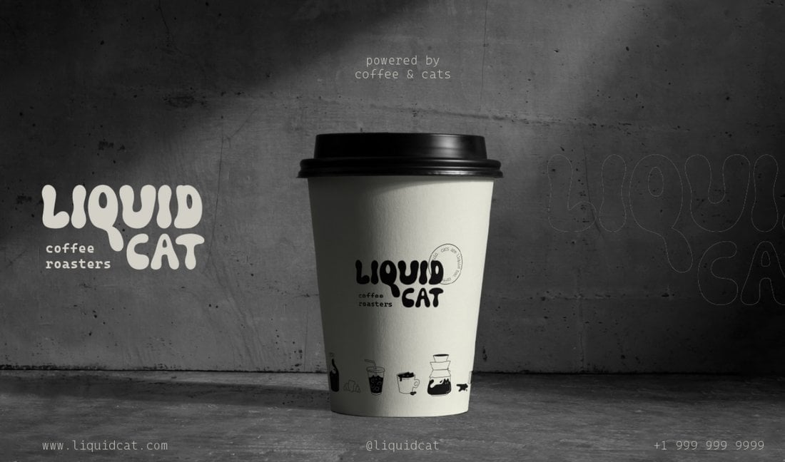
Psychedelic Vibes

psychedelic logo 1
psychedelic logo 2

Typographic logos with psychedelic designs have been trending for a while. We saw a rise in this trend in the past year and it will surely be adopted by more brands this year. And we’re not complaining.

Psychedelic logo designs take inspiration from classic trippy text designs from the 1960s and the 70s. They add a fun and funky look to logo designs to make brands look much more casual and human.

Here’s how to make the most out of this logo design trend:

  • Use fonts with funky and psychedelic designs
  • Manipulate letters to make them look more squiggly and trippy
  • Use retro color palettes with either soft or dark colors

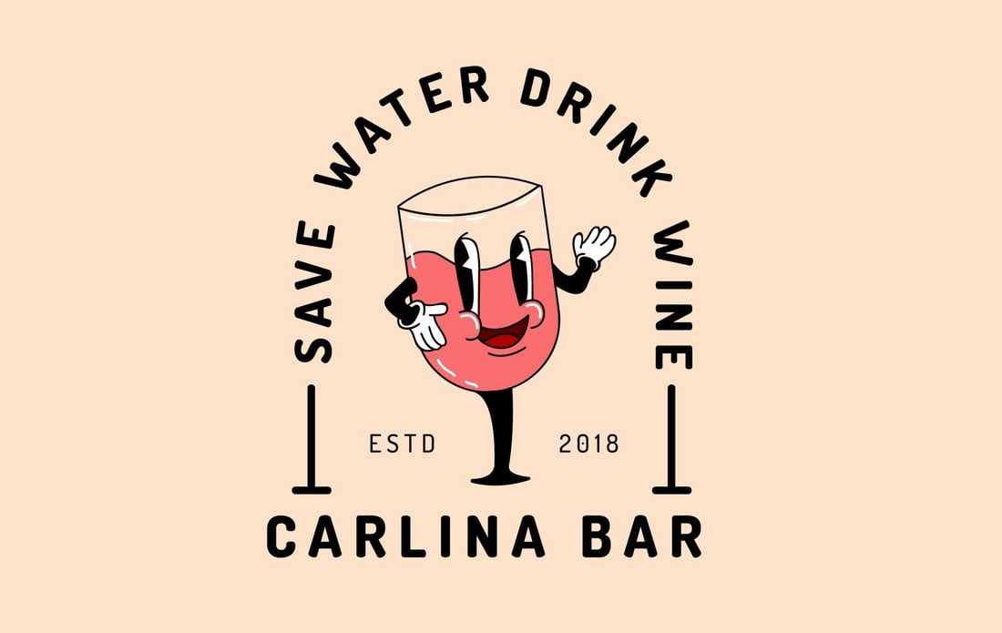
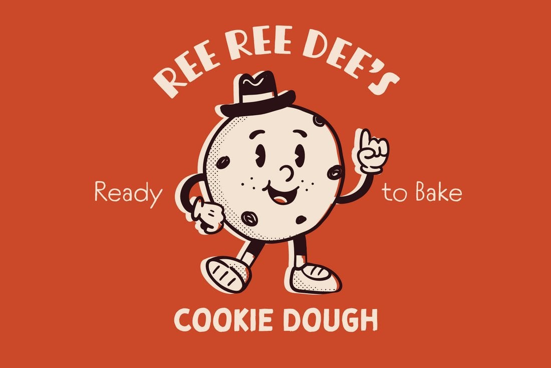
Classic Cartoony Mascots

Classic Mascots 1
Classic Mascots 2

When it comes to mascot logos, nothing beats the classic vintage mascots from the 1930s brands. Those old cartoony mascot logos still look perfect for many different types of brands. And it’s probably why the trend appears to be making a comeback.

Vintage mascot logos are appropriate for various types of brands from food brands to coffee shops, restaurants, and especially for product packaging. They always immediately stand out from the crowd as well.

Here’s how to make the most out of this logo design trend:

  • Consider designing the mascot themed around a product of the brand
  • Find inspiration from classic mascots from the 1930s
  • Use vintage fonts for typography

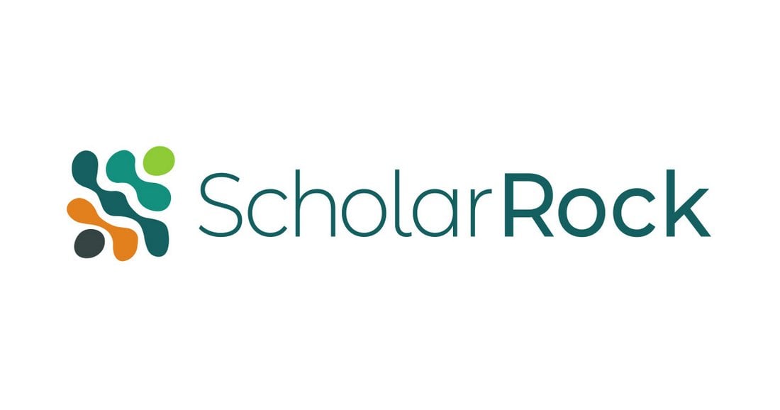
Liquid Blobs

liquid blob logo 1
liquid logo scholar rock

Liquid-style logos often fit perfectly with food and drink brands. However, we’ve been seeing various alternate styles of this trend being used by other types of brands as well.

Liquid-like text and blob-like shapes are the key features of this logo design trend and it perfectly serves a brand that focuses on making a casual and friendly appearance.

When used properly, this trend is also suitable for travel and nature-themed brands.

Here’s how to make the most out of this logo design trend:

  • Use fonts with liquid-style letter designs. Blob, bubble, and psychedelic fonts are ideal
  • Try to incorporate liquid or blob-style shapes or backdrops to logo icons

Circle Icons

logo design trends

logo design trends

Circles are always a trending element in logo design. There are so many nice qualities about a circle that make it a popular option from the shape and meanings to being able to create an icon that works anywhere.

Here, we are seeing more circle icons that can work with text elements or alone to highlight a logo and brand. The thing that stands out here is that text elements are not inside the circle.

Here’s how to make the most out of this logo design trend:

  • Create a circle icon that’s interesting and works well at a small or large size.
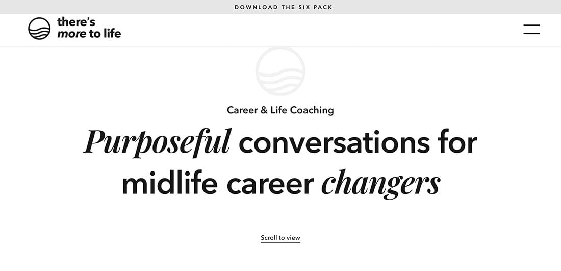
  • Consider line art, such as There’s More to Life, above.
  • Place text outside the circle for added flexibility.

Sideways Orientation

logo design trends

logo design trends

Switch up your brand or add an element of whimsy with a sideways orientation for a logo design.

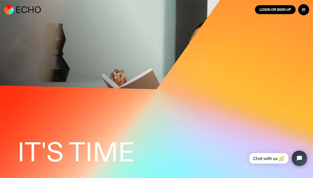
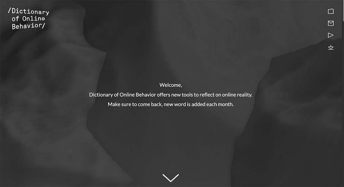
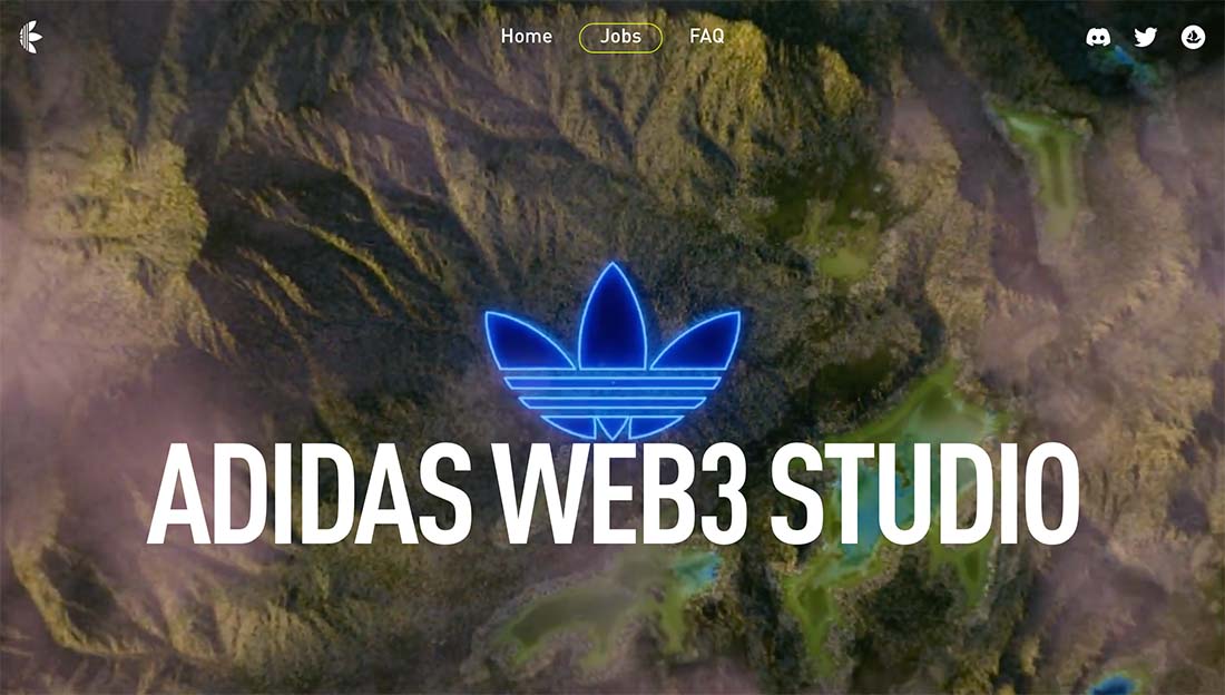
Each of the examples here did it a different way, but all work well as part of this logo design trend. Dictionary of Online Behavior uses a logo design that seems to shrink away from you and isn’t straight-on, Echt uses a logotype that reads from bottom to top on one side, and Adidas Metaverse takes the traditional three-stripes logo and rotates it 90 degrees.

Each different variation is an option if you want to explore logo styles that have a sideways orientation.

Here’s how to make the most out of this logo design trend:

  • Play with type that rotates if you have short words. This can be a lot more tricky for longer brand names.
  • Turn a common mark sideways for an alternative brand style.
  • Consider a subtle twist; you don’t have to completely turn the logo.

Outlined Typefaces

logo design trends

logo design trends

Outline typefaces have been trending in all facets of graphic design for some time and are starting to show up in logos as well. Outlined typefaces can be interesting, help create contrast between text elements, and even provide a lighter feel for a logo.

On the other hand, outline styles can almost get lost if not weighted properly in context with the rest of the design, so it is important to use a typeface that can carry the logo.

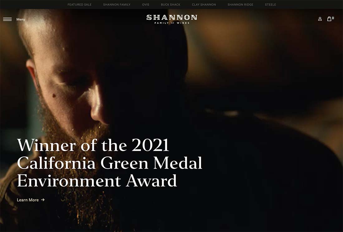
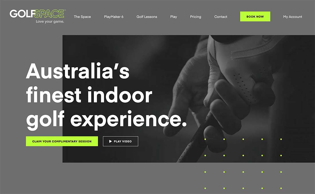
Outlined typefaces can serve as the lettering for an entire logo, such as Shannon (above), or for part of the brand name, such as GolfSpace (above). Both options can look great and provide visual focus.

Here’s how to make the most out of this logo design trend:

  • Pick an outline font that has enough weight for the overall brand feel.
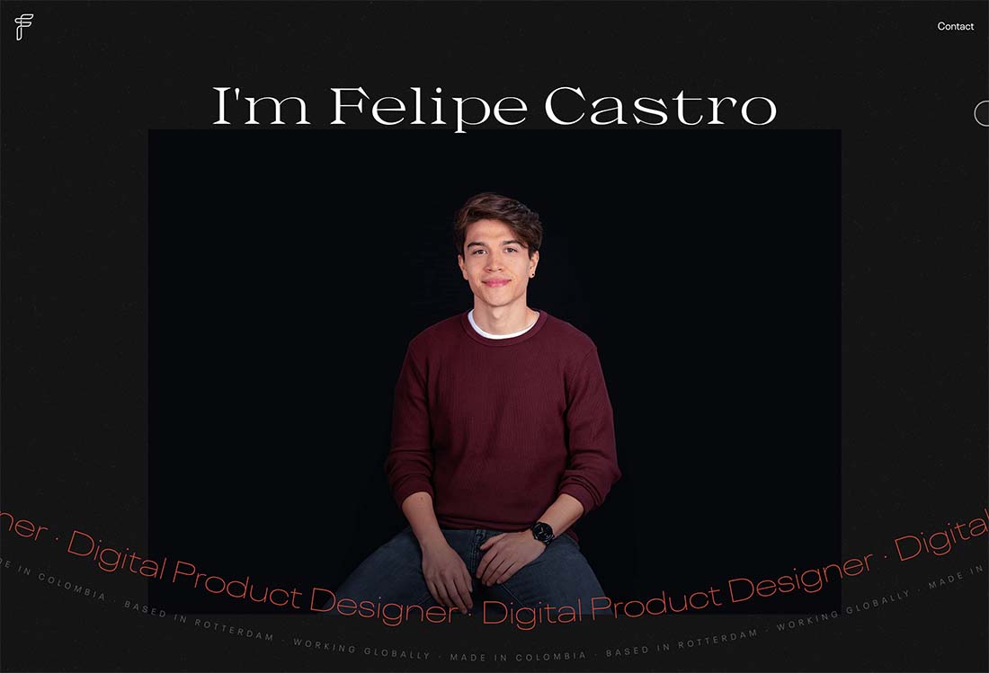
  • Use an outline font for a simple brand icon, such as Felipe Castro (above).
  • Consider the trendiness of this style. If outline fonts fade out of fashion, your logo could look dated and it’s not something you want to redesign regularly in most cases.

Exaggerated Spacing

logo design trends

logo design trends

In almost every industry, there’s a conversation around elements that disrupt and bring attention to different things. That’s what this logo design trend does. Exaggerated spacing – between words, between letters, or between lines of text – makes you look a little longer at the logo design.

There are pros and cons to this style of spacing. While it can look extremely interesting, it can be more difficult to read, putting a greater cognitive load on the user. The exaggerated spacing provides a certain feel that’s lighter but can take up more space for the overall logo. This style has a great deal of variability so you can make it your own, but it can be difficult to use with some other design elements because it is a powerful element on its own.

Use exaggerated spacing in a logo to help create a pause between words or phrases in the name, like a natural speech pattern. It can actually help convey meaning for your brand.

Here’s how to make the most out of this logo design trend:

  • Try to contain the text elements in a container so that they don’t get confused with other parts of the design.
  • Stick to a single typeface if you can to help hold it together.
  • Play with variations of spacing. Does it work better vertically or horizontally? Are the words or phrases understandable?

Custom or Experimental Typefaces

logo design trends

logo design trends

Custom or experimental typefaces can be a lot of fun and really show the personality of a brand, making them a popular – and trendy – design choice for logos.

What’s nice about these styles is that everything about your logo design will feel uniquely custom and yours. The downside is that they can take some time to develop. (But what brand doesn’t take some time to get off the ground?)

Here’s how to make the most out of this logo design trend:

  • Determine how custom you want your logo font to be. Do you want a truly custom typeface or is a more commercially-available experimental design viable?
  • Weigh the pros and cons of typeface features such as color or animation to determine what your needs are. A color font, for example, isn’t the best choice if you foresee needing a one-color logo regularly.
  • Ask for exclusivity if you are determined to have something that’s 100% yours and unique. You can come to an agreement with a type designer about licensing and usage rights.

Simple Logotypes

logo design trends

logo design trends

logo design trends

It’s hard to beat the innate beauty of a simple logotype. These logos use beautiful lettering to pull together brand identity and it’s something that we are seeing a lot more of.

You can almost think of a logotype as a gateway logo for a startup or new company. For many, this is the first envisioning of a brand mark and company name before the business gets truly established. Some of these logos last forever while others eventually evolve.

One of the reasons this trend is so popular may be because of the number of freelancers, entrepreneurs, and small businesses popping up everywhere.

Here’s how to make the most out of this logo design trend:

  • Don’t assume that a logotype is easier, cheaper, or faster to create than other types of logos. Working with just the right lettering can be a challenge.
  • Don’t get hung up on a font or style until you see it with your brand name in print. Some fonts look great and then fall flat due to certain character combinations. Type out the words you plan to use in the font style of your choosing as a starting point. If you hate it, move on.
  • The more elaborate the typeface, the less you need other embellishments. Aim for a logotype that represents the simplicity or complexity and mood and voice of your brand.

Logos That Look Like Buttons

logo design trends

logo design trends

logo design trends

Logos for website design can be a funny thing. One of the trends we are seeing is logos that have a button-style look. This includes square outlining or elements that look click- or tappable.

What’s nice about this trend from a usability perspective is that it further enhances the idea that the logo is a home button in the website design. (So, make sure that the logo does include a home click-action.)

The tricky part is to design a logo that still looks like a brand mark with the button style. You’ll want to use a different color or style of button throughout the design to differentiate the two.

Three ways to try it:

  • Use a ghost or outline style around your logo. This can create the idea of a button and allow the logo to stand on its own as well.
  • Use a button-like element with another text element for an almost yin and yang effect with contrasting styles in the logo design.
  • Use a graphic element, such as an icon, that represents something to click. The example above from Data Shield is a solid example with a “play” button next to the company name. It almost demands to be clicked.

Simplified Logos

logo design trends

logo design trends

logo design trends

All the big brands are doing it. And that’s when most big trends start to steamroll.

There’s a shift to simplify logos with easy-to-understand fonts with clean lines and simple imagery. (Or sometimes, no imagery at all.)

Many times, these logos are evolutions of previous versions that result in some simplification, but new designs can start with a simple outline as well.

Here’s how to make the most out of this logo design trend:

  • Pick a shape or color and stick to this theme.
  • Develop a design that feels true to your brand, and redesigns should carry the essence of the logo being redeveloped.
  • Don’t overthink it; simplicity is key.

Gradients

logo design trends

logo design trends

logo design trends

It seems like we just can’t get enough gradients in design projects. Logo design trends are no exception.

Like the trend above, this is another place where big brands are using gradient options in their logos. And while pinks, purples, and oranges are necessarily part of this trend, it is a popular color palette.

What’s nice about gradients is that they add depth to an image. It can be a little tricky with logo designs because of the variance in size for logo usage. The gradient choice has to look good at huge sizes – such as billboards – and for tiny sizes – such as phone app icons.

Design a gradient that’s interesting but not overwhelming to make the most of this trend.

Three ways to try it:

  • Layer different colors of gradients throughout the logo design for a more elaborate look.
  • Use a gradient pattern within thick lines to create visual interest.
  • Create more of a stacked gradient with an ombre effect, but using a monotone color palette.

Animated Logos

logo design trends

logo design trends

Animated logos are starting to become more of a website staple. Many brands are animating existing logos or creating newer, trendier animated options.

What’s great about an animated logo is that it makes you look. Think about common website patterns: There’s often a logo in the top left corner. Do you even look at it anymore?

Animated logos break up the monotony of this design pattern with a motion that almost forces you to look at the logo. It’s pretty smart when you think about it.

Here’s how to make the most of this trend:

  • Keep the animation simple. Too much movement can have the opposite of the intended effect if the logo is hard to read or understand.
  • Consider speed carefully. Quick animations can be dizzying; slow animations feel off; it takes a lot of practice to find the speed that’s just right.
  • Don’t forget to create your animated logos in color and one-color options.
  • Squares

    logo design trends

    logo design trends

    logo design trends

    The change in shape is natural. With so many circle logos – thanks to social media icon shapes – more logo designs are featuring distinctive squares.

    The change in shape is simple. A square also fits inside a circle logo but looks different. It’s a subtle change that can make a brand or logo stand out.

    Most designers are using squares in a way that stacks elements, such as a square icon or brand mark with typography next to or above it that creates more of a rectangle. When used in those circular icon shapes, the logo drops to just the icon element.

    Ways to make it work for you:

    • Create modular elements that you can mix and match in the logo design.
    • Keep the overall element to a simple icon-style graphic. Overly complex pieces can be tough to break apart or read at small sizes.
    • Don’t forget lettering. It’s easy to create a cool square element, but you need a brand identifier to really make it work in the long run.

    Clean Lines

    logo design trends

    logo design trends

    logo design trends

    Clean lines and geometric patterns can create classic logos that work practically anywhere. There’s a great deal of flexibility in this trending style, which is one reason that it’s so popular.

    Clean lines give this logo variation a classic feel, unlike some of the hand-drawn styles that have trended in the past. These logos are simple and elegant and the concept can be combined with other design trends as well. (Just look back to the Instagram logo, it features gradients and clean lines.)

    How to make clean line logos work for you:

    • Keep imagery and lettering separated. Overlapping can end up making both design elements hard to read.
    • Choose a typeface with a similar stroke width as the line drawing to create harmonious consistency.
    • Don’t be afraid of color. While many line styles, feature one color, you can have more fun and stretch the palette somewhat.

    Small Serif Logotypes

    logo design trends

    logo design trends

    logo design trends

    A logo doesn’t have to be complicated to be elegant and effective. More brands are turning to small serif logotypes to portray who they are.

    When we refer to small serifs, it’s less about the font size and more about the size of strokes used within the type family. This trend is exemplified by characters that include tiny serifs. They are simple, light, and almost fall into the background of the lettering.

    These serifs might be sharp or rounder and as with any logotype are a contributing factor in how the brand should feel to users.

    Small serifs can be a great option because:

    • They are different. With so many sans serif logotypes out there, this style immediately stands out.
    • Serifs communicate a little more about a brand without imagery. These divots can establish mood and feel in a logotype where no other “art” is used.
    • These typefaces are interesting without being hard to read. While simple minimalism has been a trend for a while, there’s a movement toward somewhat more complex design elements.

    Overlapping Elements

    logo design trends

    logo design trends

    logo design trends

    It’s one of those design rules that you don’t expect to be broken with small elements such as logos. But designers are breaking this rule … and it works.

    From big brands like PayPal to smaller studios such as Moxy and Oust, logo designs are using elements that stack and overlap to create depth and visual interest. Overlapping styles tend to work best for logos that have a simple mark or lettering and that are contained to s specific part of the logo.

    PayPal, for example, uses an overlapped letter for its iconic “P” but the word “PayPal does not use this treatment.

    How do you use overlapping logo elements?

    • Pick one element to overlap; too much overlapping can get difficult to understand.
    • Use an overlapping element to create depth. Think about what the design technique does for an understanding of the mark.
    • Use color. This trending technique is made for high-color designs. (You might even consider an overprint style.)

    Intricate Details

    logo design trends

    logo design trends

    logo design trends

    This logo design trend is a fresh take on visual elements after such a long period of minimalism – logos with intricate details.

    From line-style logos has come an extension to more detailed logos with plenty of varying lines, color variations, type choices, and plenty of small elements that bring it all together.

    This logo style can be a lot of work to create, but the result can be pretty amazing and creates a piece of art that is more than a logo. A great intricate design can be used everywhere at any size and maintains that same level of interest.

    These designs beg users to look and then continue to engage with the design, trying to see every hidden stroke and meaning of the brand mark.

    Here’s how you use the intricate detail logo design trend:

    • Take care with color. Too much color in an intricate style can get overwhelming quickly.
    • Make every detail count. The design should not be complicated because it can; it should be complex and intricate because it should be.
    • Pair simple typefaces with complicated artwork for readable balance.

    Lowercase Lettering

    logo design trends

    logo design trends

    logo design trends

    These logos would make e.e. cummings proud. The style features great typography in all lowercase characters.

    With so many designers focusing on typography for their projects, the shift to a type-based logo isn’t that far-fetched. Using all lowercase letters is a little more unusual and can be an attention-grabbing solution.

    The catch is whether this use of your brand or company name meets visual standards and usage.

    Here’s how to make it work for you:

    • Use a beautiful typeface. Any old sans-serif won’t do here.
    • Amp up the contrast between letters and the background to ensure that the smaller stance is seen.
    • Take care with readability. Is the word clear in all lowercase letters?
    • Opt for a heavier weight. Lowercase letters have a little less heft and presence than title or uppercase options. Create that balance with a thicker stroke weight.
    • Give it plenty of room. Whitespace can add weight and visual interest to a simple lowercase logotype.
    • Try it with short and simple words. Too many letters or words without capitals can get a little cumbersome in terms of readability.
    • Don’t crowd it with other elements. Lowercase lettering is the design trick with this logo style. Avoid other effects to maximize its impact.

    Simple Shapes and Lines

    logo design trends

    logo design trends

    logo design trends

    The use of geometric shapes and lines is another popular trend for design projects overall that’s rapidly becoming a logo staple. With clean lines, simple shapes, and splashes of color, geometry is a logo must.

    It’s important to note that many of these shapes are simple and fit into a square or circle format with uniform (or close to it) heights and widths. This initiative could be in part due to the need to have such a shape for common online mediums and logo usage, such as social media profiles.

    Tips to make the most of the logo trend:

    • Don’t overthink it. A bold line or stroke can make simple lettering pop.
    • If you love the idea of a simple shape or geometry, but can’t quite make it work for the main logo, consider this treatment as a secondary option.
    • Give purpose to divots and shapes so that they frame or accent lettering, just dropping elements around a word isn’t quite enough to be effective.

    Flat Design

    logo design trends

    logo design trends

    logo design trends

    Flat design remains a popular logo option because it is so easy to work with. While flat design as a whole is beginning to recede from the trends radar, logos are still using flat treatment.

    Flat logos remain trendy because of how they are used. Many design projects feature full-screen video or images, particularly in website design, in full color. Flat logos often rest on a foreground layer and need to have some separation from the background.

    Even brands that have more ornate logos often create a secondary, flat-style logo for this kind of use.

    Going flat? Get the best result with these tips:

    • Use one (or just a few) colors in the design. Black or white options are the most popular.
    • Stick to simple typography that matches an icon or visual element in the logo.
    • Remember the basics of flat design and don’t feel tempted to add design techniques; simple is better if you want a logo that’s truly flat.
    • Consider a combination of a visual divot and text to tie the logo together.
    • Don’t overthink it. Often there’s not a lot of substance to a flat logo. The logo is often made to fall into the rest of the design.

    Initials

    logo design trends

    logo design trends

    logo design trends

    LOL. OMG. SMH. It seems like the whole world talks in acronyms and initials these days. And logo design is no different.

    While most commonly used for secondary logos, initials are everywhere. While there are three examples above, this collection could have easily included hundreds of designs with a three-letter (or less) logotype.

    Most of these logos feature interesting or custom typography that’s designed to have a personal feel. The logo should speak right to the user and create an instant connection. The idea is further emphasized by the fact that the user needs to know what the letters actually mean (or have the desire to find out).

    Here’s how you do it:

    • For designers or portfolio sites, use your initials to create a logotype that reflects your personality.
    • Add a simple animation to draw more interest to a logo that likely doesn’t carry a lot of visual weight in the design.
    • Consider boxing the letters to add more emphasis.
    • Acronyms and initials for logos are often secondary messaging and are subtle in placement and scale.

    Circles

    logo design trends

    logo design trends

    logo design trends

    Circles are fluid and associated with energy, power, harmony, and infinity. And that’s why the shape is a trending logo design element.

    Circles are also easy to plug into other places where a logo needs to appear, such as social media profiles, and in corner locations on printed designs, such as business cards or letterhead. Like many of the other elements that are trending in logo design, circles have become a more popular shape in website design overall in recent months.

    Here are a few tips for using round logo shapes:

    • Don’t force it. Some words and elements just don’t fit into round shapes.
    • Match the meaning of your brand and the shape. Do the associations match?
    • Use a circle with a harmonious color palette to create a sense of balance between the logo and branding.
    • Don’t get stuck inside the shape; consider elements that break through the perfect roundness of the shape.
    • Opt for lettering that goes outside of the circle, particularly if words are long. (Short words are less of an issue.

    One Color

    logo design trends

    logo design trends

    logo design trends

    Aside from black or white, logos with a single color a wildly popular.

    While it’s not something that you would jump to design, these logos are classically beautiful with a simplicity that showcases the associated brands well. By chance or maybe as a color trend of its own, each of the examples above features a one-color logo style that uses a variant of orange.

    Tips for designing a one-color logo:

    • Think of the design as colorless. Even with black and/or white and one color, use will be much like a true single-color logo.
    • With only one color, the meaning of that hue will speak volumes. Be mindful of color choice.
    • Don’t force too much color. A small swatch in a subtle location can have an impact.
    • Add color in a way that means something. Does it make your logo, brand, or product easier to understand?

    Conclusion

    Logo trends are interesting elements because, while what’s popular is always changing, logos are made to be constant. This creates an innate struggle for designers that are trying to create a logo that’s both modern and will withstand time. (It’s a pretty tall order.)

    For the best chance at longevity, opt for a trend that includes some classic styling and is rooted in design theory. Design a logo that has a great aesthetic quality, is recognizable and readable and you’ll have the best chance at it lasting for years to come.

    Reevaluating Link Building: Its Relevance in 2024

    Featured Imgs 23

    In the ever-changing world of SEO, link building has long been a cornerstone strategy for improving website rankings and driving organic traffic. As we move into 2024, the question arises: Is link building still relevant, and how should businesses approach it in the current digital landscape? In this blog, we’ll explore the evolving role of …

    The post Reevaluating Link Building: Its Relevance in 2024 first appeared on Lucid Softech.

    WPGraphQL Becomes a Canonical Plugin: My Move to Automattic

    Featured Imgs 23

    It’s always a gas when a good person doing good work gets a good deal. In this case, Jason’s viral WPGraphQL plugin has not only become a canonical WordPress plugin, but creator Jason Bahl is joining Automattic as well.

    I’m linking this up because it’s notable for a few reasons:

    Congrats, Jason! I didn’t know you were in Denver — maybe we’ll bump into each other and I can give you a well-deserved high-five. ✋


    WPGraphQL Becomes a Canonical Plugin: My Move to Automattic originally published on CSS-Tricks, which is part of the DigitalOcean family. You should get the newsletter.


    from CSS-Tricks https://ift.tt/bVZYEjO
    Gain $200 in a week
    via Read more

    75+ Best Minimal PowerPoint Templates 2024

    Featured Imgs 23

    Delivering a minimalist PowerPoint presentation can clearly convey your message, and remove any clutter. This collection of modern, minimal PowerPoint templates is a great place to start—they put the focus on you as the speaker, and what you have to convey!

    These files are all fully editable and can be easily tweaked according to your needs. Most come with hundreds of example slides with graphs, tables, images, text, and more. They’re perfect for giving that next presentation a special touch.

    Embrace the minimal design philosophy, choose a stunning PowerPoint template for your next presentation that has clean lines, subtle design, and a simple, professional look-and-feel.

    Top Pick

    Slection – Minimal PowerPoint Template

    Slection - Minimal Powerpoint Template

    Slection is a modern PowerPoint template that comes with a minimal design. This template is perfect for making a presentation for a creative agency, modern business, or a design firm.

    The template includes 30 unique slides and they are all available in 5 different color schemes as well.

    Why This Is A Top Pick

    This template is the perfect example of a minimal PowerPoint presentation design. It has all the right elements of a minimalist slide layout, including the right amount of white space, using colors to highlight the content, and proper use of shapes and images.

    Minimal Powerpoint Template

    Minimal Powerpoint Template

    The Minimal PowerPoint Template provides a modern, versatile solution for both personal and business presentations. Boasting easy editable features that require no additional software, this asset includes over 120 customizable slides, five premade color variations, and handcrafted infographics. Also included are pixel-perfect illustrations and a drag-and-drop picture placeholder. It also offers practical gallery and portfolio slides. With clear instructions provided, you’ll find tailoring your presentation to fit your needs has never been so simple!

    Caprico Minimal Powerpoint

    Caprico Minimal Powerpoint

    The Caprico Minimal PowerPoint Template elevates your presentations with 30 easily editable slides. It offers a 16:9 widescreen ratio, customizable graphics, and recommends using free web fonts for aesthetic consistency. Simply drag, drop, and adjust pictures within placeholders to achieve the desired effect. While previewed images aren’t included, the template itself is accompanied by a useful documentation file. Enjoy!

    Minimalism Powerpoint Template

    Minimalism Powerpoint Template

    The Minimalism Powerpoint Template is a versatile asset perfect for various presentations. The package includes both PPTX & PPT formats with 30 unique slides featuring a modern 16:9 aspect ratio. It also offers neat features such as editable graphics, easy picture replacements, and icon inclusion. Note however, that it does not include images in the download.

    MURO PPT Minimal Template

    MURO PPT Minimal Template

    MURO PPT Minimal Template is a contemporary Powerpoint Template offering a clean, minimal, and modern design. It’s designed in a 1920x1080px format and provides endless possibilities for creativity. Impeccably designed for presentations or portfolio showcases, it enables users to edit effortlessly within their Powerpoint Software. The template includes customizable shapes, icons, maps, all in vector format for easy resizing and color changes, plus 500+ vector line icons.

    Aora – Minimal Powerpoint

    Aora - Minimal Powerpoint

    Aora – Minimal Powerpoint is a uniquely designed, creative and minimalist template. With over 30 slides, its flexible design is perfect for multiple business categories such as startups, design agencies, and branding agencies. All shapes are fully editable and resizable, with a 16:9 aspect ratio. It includes a help file and a PPTX file. Please note, images from the demo are not included in the download.

    Latto – Minimal PowerPoint Template

    Latto Minimal Powerpoint Template

    Latto is a PowerPoint template designed for corporate businesses and agencies. But it comes with a stylishly simple and minimalist slide design. There are many beautiful slides in the template that utilize large images to get your point across more effectively.

    Minimal Business PowerPoint Presentation Template

    Minimal PowerPoint Presentation Template

    Minimalism is all about saying more with less. This template has the perfect design for achieving that goal with your presentations. It has a clean slide design across 24 different layouts. You can also customize them to change colors, fonts, and place your own images.

    Clean & Minimal Presentation Template for PowerPoint

    Clean & Minimal Presentation Template for PowerPoint

    This template comes with 24 unique slides that feature clean and minimal designs with very professional-looking layouts. You can use them to craft presentations for brand promotions, business profiles, and even company profiles.

    Minimal Business Plan PowerPoint Template

    Minimal Business Plan PowerPoint Template

    Design the perfect business plan presentation for your company using this minimal and modern PowerPoint template. It features 81 unique slides with different types of layouts for business-related presentations. There are lots of editable vector graphics in there as well.

    Free Minimal Agency PowerPoint Template

    Free Minimal Agency PowerPoint Template

    This free PowerPoint template features a stylishly minimalist design featuring fewer decorative elements. Each slide puts more focus on your content and makes it easier to explore for the users. It includes 27 unique slides.

    Minimal Business Marketing PowerPoint Template

    Business Marketing PowerPoint Template

    Here we have a simple yet attention-grabbing PowerPoint presentation that’s sure to make an impression. It consists of 80 beautifully designed slides that can be tweaked to your heart’s content. This infographic focused presentation will help you at every stage of your brand development.

    Natura – Multipurpose PowerPoint Template

    NATURA - Healthy food PowerPoint Template

    Natura is a great choice for minimalists looking to stand out from the pack. It has a versatile design that works swimmingly for nearly any business presentation topic. Included are 40 slides, free fonts, vector icons, and editable graphics.

    Stalto – Professional PowerPoint Template

    Stalto - Grand Opening Cafe Presentation

    Stalto is a stunning PowerPoint template designed by professionals in accordance with the latest presentation styles whilst still maintaining an air of minimalism to keep things as elegant as possible. It features 30 customizable slides.

    Bulas – Minimal PowerPoint Template

    Check out Bulas, a minimal and creative Powerpoint template that can be easily put to use for a startup, creative studio, or corporate presentation. It features 30 unique slides, free fonts, and editable texts and graphics.

    Pushing – Impressive PowerPoint Template

    If you are looking for a simple yet eye-catching template that really stands out, consider Pushing, a stunning ppt featuring 60 slides, and seamless compatibility with PowerPoint, Keynote, and Google Slides.

    Anomaly – Neat PowerPoint Template

    Feast your eyes on this gorgeously crafted presentation template perfect for virtually any business or industry under the sun. It features a minimalist, and uncluttered design, and a wealth of features for you to take advantage of.

    Leomord – Free Minimal PowerPoint Template

    Wanting to get your hands on a premium-looking PowerPoint template without spending a penny? You will surely love Leomord, a free ppt option that can be fully customized to suit your needs. Check it out now!

    Neue – Free Minimalistic PowerPoint Template

    Whether you are looking for a template for your next school presentation or pitch deck, Neue has you covered. It provides over 100 clean and multipurpose slides that can be edited to your liking in no time at all.

    Cataleya – Modern PowerPoint Template

    Cataleya - Modern Powerpoint Template

    A beautiful and elegant PowerPoint template for designing minimal presentations for fashion, lifestyle, and travel-related projects. This template comes with 40 unique slides that you can easily edit and customize however you like.

    Business Meeting – Corporate PowerPoint Template

    Business Meeting - Corporate PowerPoint Template

    If you’re preparing a presentation for a business meeting, this template will help you craft professional slides to visualize your key points. There are 30 unique slides included with this template, each featuring clean and minimal designs.

    Adoena – Minimal PowerPoint Template

    Adoena - Minimal Powerpoint Template

    Even though this PowerPoint template has a minimal design it also uses colors quite well to highlight specific parts of each slide. It’s ideal for marketing and agency presentations. The template features 30 slides in 5 different color schemes.

    Basalero – Free PowerPoint Template

    Basalero Business Presentation

    For a free PowerPoint template that exudes simplicity, and elegance, Basalero is an excellent choice. It can be put to use for a range of industries ranging from education, and market research, to business events, and food marketing. Grab it right now!

    Minimus – Simple PowerPoint Template

    minimal powerpoint template

    Minimus is a clean, and modern PowerPoint template that will help you deliver a standout presentation with minimal effort. It consists 32 beautifully designed slides that can be fully customized to your needs, and style.

    Onnera – Elegant PowerPoint Template

    minimal powerpoint template

    Onnera is a multipurpose PowerPoint template that exudes luxury, and elegance in each of its 150 slides. Whether you’re putting together pitch deck, or product launch presentation, Onnera can come in very handy.

    Venture – Startup PowerPoint Template

    minimal powerpoint template

    If you’re looking to get your hands on a clean, and ultra-modern presentation template that presents your startup in the best light possible, Venture is right up your alley. Don’t hesitate to take this wonderful template for a spin.

    Hilonis – Business PowerPoint Template

    minimal powerpoint template

    Hilonis is an excellent contender for your cash if you truly value standing out from the pack. It equips you with a range of slides to customize and make your own. It’s great for business presentation that demands a strictly professional look.

    Ruzeka – Minimal PowerPoint Template

     minimal powerpoint template

    A minimal presentation doesn’t always have to be boring and uninteresting. Check out Ruzeka, a stunning PowerPoint template that will instantly draw your audience’s attention, and keep it there.

    Fruit – Clean & Minimal PowerPoint Template

    Fruit - Clean & Minimal Powerpoint Template

    A modern and minimalist PowerPoint template for all your professional portfolio showcasing needs. This template comes with a total of 150 slides, including 30 unique slides in 5 color schemes. They are perfect for creating slideshows for presenting your agency portfolio.

    Grayscale Portfolio Free Minimal PowerPoint Template

    Grayscale Portfolio Free Minimal PowerPoint Template

    This free PowerPoint template features a classic grayscale design across its entire slideshow. It’s designed or showcasing art and design portfolios. The template includes 25 unique slide layouts.

    Minimal Corporate PowerPoint Template

    Minimal Corporate PowerPoint Template

    Download this template to create professional slideshows for your corporate business presentations. The template comes with a total of 400 slides. It lets you choose from 10 different color schemes. There are animations and image placeholders included with each template.

    Finande – Minimal Agency PowerPoint Template

    Finande - Minimal Agency PowerPoint Template

    If you’re looking for a minimal PowerPoint template featuring a modern design, this template is for you. It allows you to choose from 30 unique slides for creating attractive presentations for agencies and small businesses.

    Elgiot – Clean PowerPoint Template

    Elgiot - Clean Powerpoint Template

    This PowerPoint template is perfect for designing presentations for showcasing products, especially related to technology. The template includes 30 unique slides and they are available in 5 pre-made color schemes.

    Boosto – Simple Financial Report PPT

    Boosto - Simple Financial Report PPT

    Boosto is a minimalist PowerPoint template that comes with a clean and simple design. It’s ideal for finance-related presentations. There are 30 unique slides to choose from and each slide is fully customizable to your preference.

    Pastel Portfolio – Free Minimal PowerPoint Template

    Pastel Company - Free Minimal PowerPoint Template

    This free template comes with a very unusual set of slides that can be used for showcasing creative portfolios. The template includes 26 slides with clean and minimal layouts.

    Lalina – Free PowerPoint Template

    Lalina Powerpoint Template

    Lalina is an elegantly crafted PowerPoint template that features 55 plus custom slides, 16:9 widescreen ratio, free fonts, unlimited color choices, vector objects, and drag and drop functionality. It’s available for free, so get your hands on it right now.

    The Minim – Minimal PowerPoint Template

    The Minim - Minimal PowerPoint Template

    The minim is an ultra-minimalist PowerPoint template that features a set of simple and modern slides. It includes 30 uniques slide layouts. You can select from 5 color schemes to customize the presentation as well.

    Collection – Clean PowerPoint Template

    Collection - Clean Powerpoint Template

    Collection is the perfect PowerPoint template for making fashion, design, and photography presentations. It comes with a total of 150 slides featuring 5 different pre-made color schemes. The template also includes master slide layouts.

    Gabriela – Modern PowerPoint Template

    Gabriela - Modern Powerpoint Template

    This modern PowerPoint template features a set of creative slides with minimal layouts. The template includes 30 easily customizable slides. It also features image placeholders and vector shapes as well.

    Lookbook – Simple PowerPoint Template

    Lookbook -Simple Powerpoint Template

    Lookbook is a simple and minimal PowerPoint template you can use to design presentations for modern startups and agencies. It features 30 unique slides that are available in 5 different color schemes.

    Pattern – Free Modern PowerPoint Template

    Pattern - Free Modern PowerPoint Template

    Pattern is a free PowerPoint template that features a set of modern and minimal slide designs. The free version of the template includes 10 unique slide layouts featuring image placeholders and free fonts.

    Runteria – Minimal PowerPoint Template

    Runteria - Minimal PowerPoint Template

    Minimalism doesn’t always mean adding lots of white space. Sometimes, you can craft minimalist designs using colorful backgrounds as well. This PowerPoint template comes with a colorful design and a minimal content layout. It includes 35 unique slides with customizable content and graphics.

    Jackpot – Minimal PowerPoint Template

    Jackpot - Minimal PowerPoint Template

    A simply clean and minimal PowerPoint template for designing beautiful portfolio presentations. This template features 20 unique slides with image placeholders, editable layouts, and colors. You can also craft your own slides using master slide layouts as well.

    Skinny – Minimal PowerPoint Template

    Skinny - Minimal PowerPoint Template

    This minimal PowerPoint template is ideal for fashion and lifestyle presentations. It includes 20 slides that you can easily customize to your preference. Each slide in the template is designed to look unique and attract attention.

    RUND – Modern Business PowerPoint Template

    RUND - Modern Business Powerpoint Template

    Rundi s a professional PowerPoint template that comes with a clean and elegant design. This template features a minimal yet attractive design for each slide. It includes 30 unique and easily customizable slides in HD resolution.

    Omega – Creative Minimal PowerPoint Template

    Omega - Creative Minimal Powerpoint Template

    Omega is another creative and minimal PowerPoint template you can use to design presentations for design agencies, startups, and modern businesses. The template comes with 30 unique slides in 5 different color schemes, making a total of 150 slides.

    Antbiz – Creative PowerPoint Presentation Template

    Antbiz - Creative Powerpoint Presentation Template

    This modern and elegant PowerPoint template features a stylish yet minimal design that allows you to create attractive presentation slideshows for all kinds of purposes. It includes a total of 30 slides with easily customizable designs, editable vector shapes, free web fonts, and much more.

    SCRET – Minimal PowerPoint Template

    SCRET - Minimal Powerpoint Template

    A minimalist PowerPoint template featuring a creative design. This template comes with a clean design that allows you to effectively highlight your content with minimal colors and content formatting. The template includes 50 unique slides with vector infographics, editable shapes, and more.

    Wizzle – PowerPoint Presentation Template

    Wizzle - Powerpoint Presentation Template

    Wizzle is a creative PowerPoint template you can use to design all kinds of business and professional slideshows. It features 30 unique slides for creating portfolio slides, profile slides, showcase services, and more. The template is available in Full HD resolution.

    Tesla – Minimal Free Keynote & PowerPoint Template

    Tesla - Minimal Keynote Powerpoint Template

    This free PowerPoint template is perfect for making a professional presentation for business events and conferences. The template features a minimal design and it comes in both PowerPoint and Apple Keynote formats as well.

    Altezza – Free Minimal PowerPoint Template

    Altezza - Free Minimal PowerPoint Template

    Altezza is a modern and free PowerPoint template you can use to craft professional presentations. It includes 11 unique slide designs made with master slide layouts. You can easily edit the template to your preference to change colors and fonts.

    Rapide – Modern PowerPoint Presentation Template

    Rapide - Modern Powerpoint Presentation Template

    Rapide PowerPoint template comes with a modern and unique content design. It includes 30 unique slides with a unique image and text formatting that will surely make your presentations stand out from the crowd. It includes editable shapes and image placeholders as well.

    Fina – Business PowerPoint Presentation Template

    Fina - Business Powerpoint Presentation Template

    This elegant and minimal PowerPoint template lets you design creative presentation slideshows for agencies and professionals. It includes 30 unique slides featuring simple and clean designs with editable shapes and graphics.

    Isla – Creative & Clean PowerPoint Template

    Isla - Creative & Clean Powerpoint Template

    Isla is a creative PowerPoint presentation template that features a modern multipurpose design. You can create all kinds of business, marketing, and company profile slideshows with this template. It includes more than 30 unique slides.

    Solaris – Vertical PowerPoint Presentation Template

    Solaris - Vertical PowerPoint Presentation Template

    Verticle slideshow designs allow you to design unique presentations with a clear and clean content design. This PowerPoint template will allow you to create such a modern presentation with a verticle layout. It includes 90 unique slides with verticle designs.

    GLORY – Multipurpose PowerPoint Template

    GLORY - Multipurpose Powerpoint Template

    Glory is a highly minimalist PowerPoint template you can use to craft slideshows for all kinds of business and creative presentations. It comes with 60 unique slides with multipurpose designs, which are also available in 20 different color schemes and in Retina and Full HD resolutions. That’s a total of 1200 slides.

    X – Free Modern Minimal PowerPoint Template

    X - Free Modern Minimal PowerPoint Template

    This is a highly minimalist PowerPoint template that features a clean and simple content design. The template includes 18 different slide designs and it comes in PowerPoint and Keynote file formats.

    Kula – Clean Free PowerPoint Template

    Kula - Clean Free Powerpoint Template

    Kula is the perfect free PowerPoint template for making a simple slideshow for a business or creative presentations. The template lets you choose from various minimal and clean slide layouts as well.

    Light Fashion PowerPoint Presentation Template

    Light Fashion Powerpoint Presentation Template

    This minimal and modern PowerPoint template will help you create more attractive slideshows for presenting clothing and fashion brands. The template features a total of 30 unique slides with clean and simple designs as well as editable shapes and colors.

    Lazvy – Minimalist PowerPoint Template

    Lazvy - Minimalist Powerpoint Template

    Lazvy is a creative PowerPoint template most suitable for making minimal slideshows for business and creative presentations. It includes 30 stylish slides featuring unique content arrangements and colorful shapes.

    Lippitude – Minimal PowerPoint Template

    Lippitude - Powerpoint Template

    This unique and minimalist PowerPoint template comes with more than 50 slides filled with vector elements, icons, graphics, and more. It’s most suitable for creating presentations related to fashion, apparel, and photography.

    HOUSS – Minimal PowerPoint Template

    HOUSS - Powerpoint Template

    Houss PowerPoint template combines elements from both minimalist and modern designs to offer a set of unique slides. It includes 30 slides with easily editable designs and image placeholders.

    Annual Report – Minimal PowerPoint Template

    Annual Report - PowerPoint Template

    Annual Report is a PowerPoint template designed for making marketing and business-related presentations. It comes with a minimal design and with bright colors. The template includes 40 unique slides.

    Wagner – Free Multipurpose PowerPoint Template

    Wagner - Free Multipurpose PowerPoint Template

    Wagner is a professional PowerPoint template you can use free of charge to create slideshows for both personal and commercial presentations. The template includes multiple slide layouts with editable vector graphics.

    GMTRY – Free Geometric Presentation Template

    GMTRY - Free Geometric Presentation Template

    This free PowerPoint template comes with a creative geometric-based design. It includes multiple slides filled with creative shapes and colors while preserving the minimal content layout.

    Novaula – Minimal PowerPoint Template

    Novaula - Powerpoint Template

    Novaula is a clean and minimal PowerPoint template you can use to design presentations for all kinds of projects, including creative, business, and personal presentations. The template features a total of 150 slides in 5 different color schemes.

    HANTUCOFA – Minimal PowerPoint Template

    HANTUCOFA Powerpoint Template

    This PowerPoint template features a highly visual and a minimal design. It comes with 30 unique slides in 50 different premade color files and lots of editable vectors and icons.

    RITS – Minimal PowerPoint Template

    RITS Powerpoint Template

    Rits is a modern PowerPoint template featuring a minimalist design. The template features easily editable slides with image placeholders, editable graphics, icons, infographics, charts, and much more.

    Geolojie – Minimal PowerPoint Template

    Geolojie - Powerpoint Template

    A highly minimalist PowerPoint template for creating modern and professional presentations. This template comes with 30 unique slides that are available in 5 different premade color themes.

    5 Minimal PowerPoint Templates

    This minimalist PowerPoint template comes with a beautiful and a modern design. It includes 30 unique slides in 5 different color variations delivered to you in 5 PowerPoint files. It also includes resizable graphics and infographics as well.

    Annual Report – Free PowerPoint Template

    Annual Report - Free Powerpoint Template

    Working on a presentation to showcase your business annual report? Then use this free template to create an effective PowerPoint presentation. It includes 15 unique slides with editable designs.

    Sampoerna – Minimal PowerPoint Template

    Sampoerna is a presentation template that features lots of visual elements, including large images, icons, graphics, and more. It has over 35 unique slides in many different layouts from gallery slides to portfolios and more.

    KLOE Minimal & Creative Template

    Kloe is a PowerPoint template with a creative design that’s most suitable for fashion and clothing related brand and business promotions. It features more than 120 slides with infographics, charts, icon packs, and timelines.

    Minimal Modern PowerPoint

    Yet another highly minimalist presentation template for creating both business and personal slideshow presentation. This template also includes many different objects, shapes, icons, and more.

    Minimal Gradient PowerPoint Template

    Featuring 20 master slide layouts, this PowerPoint template allows you to craft modern and professional presentations without a hassle. You’ll also get many customizable graphics, charts, diagrams, and tables with the template as well.

    NORS – PowerPoint Template

    Nors is a professionally designed PowerPoint presentation template that features a minimalist design that uses just 2 colors. It includes 130 unique slides with a pack of free icon fonts, device mockups, maps, and lots more.

    Minimal Clean PowerPoint Template

    This minimal and clean PowerPoint presentation is best for business proposal presentations and meetings. The template also includes many different vector graphics, icons, shapes, and more.

    Oskale – Minimal Theme PowerPoint

    Oskale is a stylish PowerPoint template you can use to create beautiful presentations for creative agencies and businesses. This template includes 70 fully-animated slides with editable diagrams, maps, and many other elements.

    Brand Agency PowerPoint Template

    This is the perfect presentation template for creating a modern and minimal slideshow for branding and agency businesses. The clean and bold design used in the slides will certainly help show professionalism.

    Squirrel PowerPoint Template

    Squirrel is a PowerPoint template specially designed for creating business proposal presentations. The template comes with over 50 unique slides featuring charts, graphs, pictorial slides, portfolios, team slides, and much more.

    Orizqi – Brand Identity PowerPoint Template

    minimal powerpoint template

    A minimalist PowerPoint template for designing professional presentations for corporations and brands. This template comes with 40 unique slides you can use to craft brand identity slideshows. It features image placeholders, editable shapes, and vector graphics to let you easily customize the design.

    Startes – Clean PowerPoint Template

    minimal powerpoint template

    This beautiful PowerPoint template comes with a set of clean slide layouts. They are perfect for crafting presentations for modern businesses, creative agencies, and even freelance professionals. It includes 30 slide layouts with editable designs.

    Volo – Creative Agency PowerPoint Template

    minimal powerpoint template

    Volo is a colorful PowerPoint template designed with creative agencies in mind. It can be used to make portfolio presentations and brand profile slideshows for various types of agencies. The template also lets you choose from 30 slide designs to craft the perfect presentation.

    Arknar – Simple & PowerPoint Template

    minimal powerpoint template

    Aknar is another clean and minimal PowerPoint template you can use to design professional presentations. It includes 30 unique slide layouts you can customize to fit your brand and business. The slides feature editable graphics, shapes, and image placeholders as well.

    Minimal B2B Marketing & Sales PowerPoint Template

    minimal powerpoint template

    If you’re a professional working for a B2B brand, this PowerPoint template is a must-have for you. It’s designed with B2B marketing presentations in mind and it comes with more than 60 unique slides with fully editable layouts.

    Nova Minimal PowerPoint Template

    1

    If you’re looking to make a strong professional impact, go with this Nova Minimal PowerPoint Template. It has a very clean, formal look that is perfect for your next big presentation.

    • Price: $20

    Phoenix Minimal PowerPoint Template

    2

    An amazing minimally designed professional template that comes with 115 slides and over 450 vector items included in the pack. So much versatility and choice to work with.

    • Price: $20

    Alveo Minimal PowerPoint Template

    3

    Alveo is a modern and creative minimal PowerPoint template, suitable for personal portfolio, creative agency, designer portfolio, illustrator portfolio, photographer portfolio and more. Its just as easy to customize to fit your needs, replace images and text.

    • Price: $15

    Perfect PowerPoint Presentation

    9

    A modern and clean PowerPoint presentation special for a agency or any type of business.

    • Price: $15

    BenchMarking PowerPoint Template

    10

    A modern and clean PowerPoint presentation, perfect for a agency or any type of business. Easy to change colors, text, photos. Fully editable.

    • Price: $15

    Air Minimal PowerPoint Template

    4

    Air Minimal template is a perfect package for your business proposition. It has a very clean, formal look that is perfect for your next big presentation.

    • Price: $15

    Quantum Minimal PowerPoint Template

    5

    Simplicity is the ultimate sophistication and quantum minimal PowerPoint template holds true to that quote. It comes with 60 plus different slides.

    • Price: $15

    Martik PowerPoint Template

    7

    If you’re looking to make a strong professional impact, go with this modern minimal PowerPoint template. It has a very clean, formal look that is perfect for your next big presentation.

    • Price: $20

    Minus Minimal PowerPoint Template

    8

    This pack contains 60+ unique fully HD slides that you can edit according to your needs.

    • Price: $15

    Wolf Minimal PowerPoint Template

    6

    Wolf is a minimal PowerPoint presentation template suitable for personal portfolio and business presentations.  It’s very easy to customize to fit your needs, replace images and texts.

    • Price: $15

    Pacific PowerPoint Template

    pacific-cover-template-o

    Pacific is a creative presentation template for PowerPoint that focuses on displaying albums and photos.

    • Price: $12

    Eva PowerPoint Presentation

    01_preview-o

    Presentation of the new Eva was created multi-purpose template that will meet the latest design trends, as well as extremely easily customized by any user without any previous knowledge in PowerPoint. Each slide is laid out and easily can be adjusted to suit individual goals. We have created 7 different styles of combinations of fonts and emotional animation layers. Everyone will find the right for yourself.

    • Price: $15

    Simple Flat Style PowerPoint

    1

    A simple and modern PowerPoint presentation template. All slides are fully editable. Easy to change colors, text, photos etc. Perfect for business, corporate and personal use.

    • Price: $10

    Vertex – Minimal Presentation

    2

    A very sleek PowerPoint presentation template with 32 unique slides and 2 different color schemes. It has minimal fade transitions, 16:9 aspect ratio, 1920×1080 resolution and includes .PPTX files.

    • Price: $12

    Clean PowerPoint Template

    3

    A modern and clean PowerPoint presentation special for a agency or any type of business.

    • Price: $10

    5 Tips for Minimal Presentation Design

    Follow these simple tips to make sure your presentation design has a truly minimal look and feel.

    1. Use Lots of White Space

    The heavy use of white space is a key aspect that defines the term minimalism. Whether you’re designing a home interior or a PowerPoint slideshow with a minimal design, you need to craft your content layout around white space.

    Stellar - Powerpoint Template

    In a minimal design, your goal should be to showcase your message by using less content and more white space. It may sound strange but it actually gives your content the spotlight it deserves and grab the attention of the audience.

    2. Pick the Best Fonts

    With plenty of white space surrounding your slide designs, your audience’s eye will instantly go to the titles and the paragraphs of your slides. There’s no use in creating a minimal presentation design if your content isn’t readable.

    Molex - Powerpoint Template

    Make sure to pick a pair of great fonts for your titles and paragraphs that not only makes content easier to read but also improve the user experience.

    3. Use Colors to Your Advantage

    In a minimal design, you are limited to using fewer colors. Most of the time you can only use one or two colors throughout the design. This actually provides a great opportunity for you to take advantage of colors.

    Voreale - Powerpoint Template

    You can use colors in a minimal presentation design to highlight specific parts of your slides such as the key points of your speech, slide titles, metrics, and more. When used properly, it will make your entire presentation more effective and attractive at the same time.

    4. Add Large Images

    Depending on the type of presentation you’re making, you should also use large images and image backgrounds to create a more visually minimalist design to your slides.

    CLEOPATRA - Powerpoint Template

    For example, if you’re making a minimal presentation for fashion design, photography, or showcasing a portfolio, you can use large images to create unique slide designs.

    5. Create a Minimal Content Layout

    The content layout of a presentation design consists of all the elements you’re using in each and every slide, including text, images, shapes, diagrams, and more.

    Greaty - Powerpoint Template

    Since you’re making a minimal presentation design, focus on formatting your content in a way that shows off professionalism. Use shorter sentences, use fewer shapes and colors, and avoid adding lots of images in a single slide.

    Top iPhone 16 Mockups for Designers

    Featured Imgs 23

    You’ve just landed your next project, and the iPhone 16 is at the heart of your design. You’ve got ideas swirling around, but here’s the kicker—you need top-notch mockups to bring those ideas to life. Now, you might be thinking, “Where can I find the perfect iPhone 16 mockups without wasting hours scrolling through endless options?” Don’t worry, I’ve got you covered!

    Let’s dive into the world of iPhone 16 mockups, breaking down exactly how they can boost your workflow, help you create polished designs, and why these mockups matter—especially for designers like you.

    Why iPhone 16 Mockups Matter

    First off, let’s clear something up—mockups aren’t just pretty pictures. They’re essential tools to communicate your design’s vision to clients or teammates. When you present a design using an iPhone 16 Pro mockup or an iPhone 16 Pro Max mockup, it’s like giving your design that final gloss of polish. It tells your client, “This is exactly how your app or website will look in the real world.” Mockups let you:

    • Showcase your design in context : Your designs become more relatable when they’re placed on real devices. Clients can immediately envision the final product.
    • Save time : Instead of tweaking designs across different devices from scratch, you’ve got a pre-built, perfectly proportioned mockup ready to go.
    • Impress clients and teammates : Let’s face it—presentation is half the battle. A sleek iPhone 16 mockup in PSD format can instantly elevate your presentation game, making your work feel professional and real.

    How Mockups Speed Up Your Workflow

    If you’re a web designer who’s crunched for time (and let’s be real, who isn’t?), you understand the importance of efficiency. You don’t want to spend hours perfecting a design only for it to fall flat because the presentation didn’t hit the mark. Here’s where iPhone 16 mockups come in—they do the heavy lifting for you.

    Instead of working from the ground up every time, mockups allow you to:

    • Reuse templates : Once you’ve downloaded your iPhone 16 mockup PSD, you can tweak it for various projects, speeding up your workflow without sacrificing quality.
    • Focus on design, not presentation : With a strong mockup, half the battle is won. You can spend your energy refining your designs rather than stressing about how to showcase them.
    • Consistent output : Mockups provide a level of consistency, ensuring that your designs look great every time. No more worrying about inconsistent image sizes or proportions.

    Choosing the Right iPhone 16 Mockups

    Now, with all that said, not all mockups are created equal. Some will fit perfectly into your workflow, while others might have you banging your head against the desk. Here’s what to look for:

    • Format : Most mockups come in PSD format. This makes it easy for you to drag and drop your designs, swap out backgrounds, and make quick changes.
    • Device angle : Sometimes you want a front-facing view, other times, a 3/4 angle gives your design that extra pop. Choose mockups with various perspectives so you’re covered for different presentation needs.
    • Customizability : The best iPhone 16 Pro Max mockup allows you to tweak things like shadows, highlights, and screen reflections. This level of detail can make or break your final product presentation.

    A Little Humor Along the Way

    I get it—mockups might not seem like the most exciting part of your job. But think of them as the packaging for a gift. Would you hand over a birthday present in a crumpled plastic bag? Probably not. Mockups are like that shiny wrapping paper that makes everyone want to tear into the gift.

    The iPhone 16 Lineup: Pro and Pro Max Mockups

    With the iPhone 16, both the Pro and Pro Max models are packing some serious heat. Whether you’re working with the smaller Pro or the larger Pro Max, having the right mockup is crucial to showing off your designs in the best possible way. You don’t need to go overboard—sometimes simplicity is the best showcase for your design skills. An iPhone 16 Pro mockup gives you a sleek canvas for tighter, more compact designs, while the iPhone 16 Pro Max mockup offers a broader space for more detailed layouts.

    A Word to the Wise: Don’t Overthink It

    Remember, mockups are tools. They’re not the final product, but they’re there to help you sell your design. Don’t spend hours choosing the “perfect” mockup—choose something clean, simple, and that makes your design stand out. At the end of the day, you want your clients and teammates to focus on your design, not the mockup itself. A good mockup fades into the background, allowing your work to take center stage.

    Wrapping Up (With a Bow)

    So, there you have it. Whether you’re designing for a slick app or a responsive website, the right iPhone 16 mockup can make all the difference in how your work is perceived. You’ve got the tools, now go out there and use them! And hey, when your client’s eyes light up during your presentation, you’ll know you’ve done something right.

    That’s your ticket to leveling up your design game with the best iPhone 16 mockups. Whether you need an iPhone 16 Pro mockup or an iPhone 16 Pro Max mockup, you’ve got the insights to pick and use mockups effectively without overthinking the process. Keep things simple, keep them impactful, and most importantly—have fun with it!

    Free High-resolution iPhone 16 Mockups (PSD, Sketch, Figma)

    Free High-resolution iPhone 16 Mockups

    Download

    Free Titanium iPhone 16 Pro Mockup PSD

    Free Titanium iPhone 16 Pro Mockup PSD

    Download

    Free iPhone 16 Pro Max Mockup PSD

    Free iPhone 16 Pro Max Mockup PSD

    Download

    iPhone 16 Mockup PSD

    iPhone 16 Mockup PSD

    Download

    Free iPhone 16 Pro Mockup PSD

    Free iPhone 16 Pro Mockup PSD

    Download

    Free Scene With iPhone 16 Pro Mockups PSD

    Free Scene With iPhone 16 Pro Mockups PSD

    Download

    Free iPhone 16 Mockup PSD

    Free iPhone 16 Mockup PSD

    Download

    Free iPhone 16 Pro Mockup Design (PSD, Sketch, Figma)

    Free iPhone 16 Pro Mockup Design

    Download

    Free Hand Holding iPhone 16 Pro Max Mockup PSD

    Free Hand Holding iPhone 16 Pro Max Mockup PSD

    Download

    Free iPhone 16 Pro – Slab Series Mockup PSD

    Free iPhone 16 Pro Slab Series Mockup PSD

    Download

    Free Photorealistic iPhone 16 Pro Mockup PSD

    Free Photorealistic iPhone 16 Pro Mockup PSD

    Download

    Free iPhone 16 Pro Mockup V1 Front View PSD

    Free iPhone 16 Pro Mockup V1 Front View PSD

    Download

    Free Realistic iPhone 16 Mockup PSD

    Free Realistic iPhone 16 Mockup PSD

    Download

    Luxury iPhone 16 Pro Max Mockup PSD

    Luxury iPhone 16 Pro Max Mockup PSD

    Download

    iPhone 16 Mockup Template PSD

    iPhone 16 Mockup Template PSD

    Download

    Free iPhone 16 Pro Mockups PSD

    Free iPhone 16 Pro Mockups PSD

    Download

    Free iPhone 16 Pro Mockup Design PSD

    Free iPhone 16 Pro Mockup Design PSD

    Download

    The post Top iPhone 16 Mockups for Designers appeared first on CSS Author.

    2024: More CSS At-Rules Than the Past Decade Combined

    Featured Imgs 23

    More times than I can count, while writing, I get myself into random but interesting topics with little relation to the original post. In the end, I have to make the simple but painful choice of deleting or archiving hours of research and writing because I know most people click on a post with a certain expectation of what they’ll get, and I know it isn’t me bombing them with unrelated rants about CSS.

    This happened to me while working on Monday’s article about at-rules. All I did there was focus on a number of recipes to test browser support for CSS at-rules. In the process, I began to realize, geez we have so many new at-rules — I wonder how many of them are from this year alone. That’s the rabbit hole I found myself in once I wrapped up the article I was working on.

    And guess what, my hunch was right: 2024 has brought more at-rules than an entire decade of CSS.

    It all started when I asked myself why we got a selector() wrapper function for the @supports at-rule but are still waiting for an at-rule() version. I can’t pinpoint the exact reasoning there, but I’m certain rthere wasn’t much of a need to check the support of at-rules because, well, there weren’t that many of them — it’s just recently that we got a windfall of at-rules.

    Some historical context

    So, right around 1998 when the CSS 2 recommendation was released, @import and @page were the only at-rules that made it into the CSS spec. That’s pretty much how things remained until the CSS 2.1 recommendation in 2011 introduced @media. Of course, there were other at-rules like — @font-face, @namespace and @keyframes to name a few — that had already debuted in their own respective modules. By this time, CSS dropped semantic versioning, and the specification didn’t give a true picture of the whole, but rather individual modules organized by feature.

    Random tangent: The last accepted consensus says we are at “CSS 3”, but that was a decade ago and some even say we should start getting into CSS 5. Wherever we are is beside the point, although it’s certainly a topic of discussion happening. Is it even useful to have a named version?

    The @supports at-rule was released in 2011 in CSS Conditional Rules Module Level 3 — Levels 1 and 2 don’t formally exist but refer to the original CSS 1 and 2 recommendations. We didn’t actually get support for it in most browsers until 2015, and at that time, the existing at-rules already had widespread support. The @supports was only geared towards new properties and values, designed to test browser support for CSS features before attempting to apply styles.

    The numbers

    As of today, we have a grand total of 18 at-rules in CSS that are supported by at least one major browser. If we look at the year each at-rule was initially defined in a CSSWG Working Draft, we can see they all have been published at a fairly consistent rate:

    Number of at-rules per year in FWPD. They all have been added at an average rate of 1 per year, with the highest being 4 in 2021

    If we check the number of at-rules supported on each browser per year, however, we can see the massive difference in browser activity:

    Number of at-rules per year in FWPD visualized by the browsers that implemented them in a colorful vertical bar chart.

    If we just focus on the last year a major browser shipped each at-rule, we will notice that 2024 has brought us a whopping seven at-rules to date!

    Numbers of at-rules with support in at least one major browsers. There have been seven that gained support in 2024
    Data collected from caniuse.

    I like little thought experiments like this. Something you’re researching leads to researching about the same topic; out of scope, but tangentially related. It may not be the sort of thing you bookmark and reference daily, but it is good cocktail chatter. If nothing else, it’s affirming the feeling that CSS is moving fast, like really fast in a way we haven’t seen since CSS 3 first landed.

    It also adds context for the CSS features we have — and don’t have. There was no at-rule() function initially because there weren’t many at-rules to begin with. Now that we’ve exploded with more new at-rules than the past decade combined, it may be no coincidence that just last week the Chrome Team updated the function’s status from New to Assigned!

    One last note: the reason I’m even thinking about at-rules at all is that we’ve updated the CSS Almanac, expanding it to include more CSS features including at-rules. I’m trying to fill it up and you can always help by becoming a guest writer.


    2024: More CSS At-Rules Than the Past Decade Combined originally published on CSS-Tricks, which is part of the DigitalOcean family. You should get the newsletter.

    80+ Best Watercolor Photoshop Actions & Effects 2024

    Featured Imgs 23

    Whether you’re designing a unique website background, a poster, sketch, or creating an artistic photo composition, using a watercolor Photoshop action can make your design stand out from the crowd.

    A watercolor effect it’s not an easy effect to master when created from scratch. It takes a lot of work, time, and skill to achieve a realistic watercolor effect in Photoshop. The good news is that using a watercolor Photoshop action can help you skip the learning curve and experiment with a watercolor effect in just a few clicks!

    In this collection, we’re featuring some of the best watercolor Photoshop actions you can use to turn your photos into watercolor art, craft amazing backgrounds, and do much more.

    We’ve also collected a set of tips for choosing watercolor Photoshop actions to help you make a decision on what type of action you need.

    Top Pick

    Ink Flow Animation Photoshop Action

    Ink Flow Animation Photoshop Action

    This is a unique Photoshop action you can use to create an animated effect using your photos. The action adds a stylish watercolor-themed flowing ink animation to create a stunning visual.

    The action is fairly easy to use and comes with a video tutorial to teach you how to apply the effect. It’s ideal for making animated GIF and videos for Instagram as well. You can preview the effect here.

    Why This Is A Top Pick

    While there are many creative watercolor Photoshop actions on our list, this action deserves more attention as it features an animated effect that’ll make your designs stand out from the crowd.

    Watercolor Printing Photo Effect PSD

    This is a high-quality watercolor photo effect for Photoshop that enables users to generate stunning, high-quality images with just a few clicks. Offering Smart Object layers, this template offers customizable ease and versatility. By replacing the placeholder, you can add your unique graphics and refine the final composition with adjustment features.

    Creative Watercolor Photo Effect PSD

    Creative Watercolor Photo Effect PSD

    Another watercolor photo effect designed to transform your images into exciting paintings. It offers specific functionalities such as easily editable adjustments, smart object layers, and much more. The effect works best on photos ranging from 1000px to 3000px resolution.

    Vintage Painting Photo Effect PSD

    Vintage Painting Photo Effect PSD

    A high-quality, vintage-style watercolor photo effect for Photoshop. With the ease of smart-object layers, you can transform your graphics magically with only a few clicks. Alongside two PSD files (4500 x 3000 px and 3000 x 4500 px, both 300 dpi), this creative template includes a helpful guide for additional tweaks and finer adjustments.

    Watercolor Splash Photo Effect PSD

    Watercolor Splash Photo Effect PSD

    Explore the world of visual arts with this watercolor photo effect for Photoshop. With this PSD template, you can easily transform your images into high-quality, mesmerizing artwork featuring the unique flair of watercolor splashes. From altering the smart object layers to adjusting the final settings, you get to control every aspect of your design.

    Colorful Watercolor Photo Effect

    Colorful Watercolor Photo Effect

    A dynamic watercolor photo effect for Photoshop for instantly transforming photos. It converts your regular photos into lively caricature effects, adding an energy-filled, oily painting appearance. It’s ideal for photos with a resolution between 1000px and 3000px, and adds a creative touch to various photos.

    Watercolor Painting Effect for Photoshop

    Watercolor Painting Effect for Photoshop

    This is a creative watercolor photo effect that transforms your photos into vibrant, oil-style caricatures. It provides a range of effects including energetic, glamour, portrait, and cartoon styles. Ideal for fashion, lifestyle, or product photos with resolutions between 1000 – 3000 px, it includes a PSD file and help file.

    Watercolor Lifestyle Photoshop Action

    Watercolor Lifestyle Photoshop Action

    A highly useful watercolor-themed Photoshop action designed for photographers and graphic designers. It’s compatible with all photoshop CC versions and greater, offering users an simple way to bring an aesthetic, watercolor look to their photographs with just a click.

    Bold Watercolor Photo Effect PSD

    Bold Watercolor Photo Effect PSD

    This is a stunning watercolor photo effect for Photoshop. In this template, you’ll gain access to a unique, glamorous and realistic watercolor effect that can be applied to any photo or graphic instantly. Provided with clean, well-organized layers and compatibility with 300 DPI projects, it’s extremely user-friendly.

    Classic Watercolor Photo Effect

    Classic Watercolor Photo Effect

    An exceptional Photoshop template that transforms your ordinary photos into beautiful, classic painting-like images in just a few easy clicks. With Smart Object layers for full customization, 2 high-quality PSD files, versatile dimensions, and simple adjustment features to fine-tune your composition, crafting breathtaking designs has never been easier.

    Simple Watercolor Photo Effect PSD

    Simple Watercolor Photo Effect PSD

    This Photoshop template artfully transforms your ordinary pictures into stunning watercolor paintings. Ideal for photos with resolutions from 1000px – 3000px, its filters add a realistic watercolor-themed effect to various image types.

    Real Watercolor Photoshop Action

    Real Watercolor Photoshop Action

    This Photoshop action transforms photos into paintings with a realistic watercolor effect. The action works instantly with just a few clicks. And it comes bundled with brushes and patterns necessary for creating the effect as well.

    Water Color Painting Photoshop Action

    Water Color Painting Photoshop Action

    Once you apply this Photoshop action, you’ll have a hard time telling whether your photo is actually a painting or not. This effect works great for making outdoor landscape photos look like watercolor paintings. It’s compatible with Photoshop CS3 and higher.

    Portrait Watercolor Photoshop Action

    Portrait Watercolor Photoshop Action

    If you’re looking for a watercolor effect to add to your portrait photos, this PS action will come in handy. It features a realistic watercolor effect that’s been specially optimized for portrait photos. It comes in 9 different color variations as well.

    Watercolor Effect Photoshop Template

    Watercolor Effect Photoshop Template

    This is a PSD template you can use to easily apply a watercolor effect to your photos and graphics. The effect is already prepared in the organized layers, all you have to do is replace the photo. No need to apply or configure a PS action.

    Watercolor Art – Free Photoshop Action

    Watercolor Art - Free Photoshop Action

    A free Photoshop action for adding a subtle watercolor effect to your photos. This watercolor effect is simple and most suitable for fashion and wedding photography.

    Watercolor from Photo PSD Template

    Watercolor from Photo PSD Template

    With this Photoshop PSD template, you can add a watercolor effect to any photo with just a few clicks. It comes with organized layers and with smart object layers. It’s simple, easy, and works instantly.

    Painto – Watercolor Photoshop Action

    Painto Watercolor Photoshop Action

    If you want to create abstract art-style watercolor effects for your graphic design projects, this Photoshop action is a must-have for you. It allows you to apply a colorful watercolor effect with only a few clicks.

    Simple Watercolor Photoshop Effect

    Simple Watercolor Photoshop Effect

    This watercolor effect features a subtle and clean look that gives a minimalist painting look to your photos. It’ll work best for interior design, furniture, and modern art-style photography.

    Portrait Painting Photoshop Action

    Portrait Painting Photoshop Action

    This Photoshop action allows you to convert your portrait photos into paintings. It features a fully editable painting effect you can adjust and customize to match your photos to even create a cartoon effect.

    Brush Drawing – Free Watercolor PS Action

    Brush Drawing - Free Watercolor PS Action

    Another free Photoshop action that creates a brush drawing effect. It’s great for giving a watercolor painting-like effect to your portrait photos.

    Photo Into Watercolor Photoshop Effect

    Photo Into Watercolor Photoshop Effect

    This is a convenient, one-click PS template that allows you to effortlessly apply a watercolor effect to your photos, saving time with quick results. Compatible with all Photoshop Versions cc and higher, and every language, all you need to do is replace the smart object with your subject in the provided PSD file.

    Watercolor Photo Effect PSD Template

    Watercolor Photo Effect PSD Template

    This PSD template can make your pictures look like amazing caricatures. This action provides a range of effects such as energetic, oily, painting oil, glamour oil, portrait oil, oil retouch, and cartoon. It’s recommended for photos with 1000px-3000px resolution and can enhance images from fashion, lifestyle, and blogging to moody product shots.

    Sketch Watercolor Photo Effect

    Sketch Watercolor Photo Effect

    This is a versatile PSD template providing a gorgeous watercolor aesthetic for your photos with just a simple click.  It includes a PSD file (3000*2000 px) and a PDF help file and offers easy photo replacement using the smart object feature.

    Abstract Oil Painting Photoshop Action

    Abstract Oil Painting Photoshop Action

    A professional, versatile Photoshop action ideal for photographers and graphic designers. Compatible with all CC Photoshop versions and higher, it effortlessly enhances your photo posts or everyday shots with a simple click to achieve a beautiful aesthetic watercolor look. The pack comes with a .ATN action file, .PAT pattern file, and a helpful .txt file.

    Watercolor Canvas Photo Effect

    Watercolor Canvas Photo Effect

    This is a high-quality watercolor photo effect that comes with a resolution of 5,000 x 3,000 pixels. It’s user-friendly due to easy customization via Smart Object Layers. The background is editable and the PSD file is well-organized with named layers.

    Mixed Watercolor Photo Effect PSD

    Mixed Watercolor Photo Effect PSD

    This PSD template instantly adds a glamorous watercolor effect to your photos or logos. Adjustable to your preference, it works perfectly with 300 DPI projects and even on print. Neatly categorized across layers, it’s user-friendly and easy to navigate.

    Painting Photo Effect PSD Template

    Painting Photo Effect PSD Template

    This is an ingenious PSD template designed to revolutionize your photos with an awe-inspiring watercolor painting effect. It works best with images ranging from 1000 px – 3000 px resolution and adapts well to diverse styles including fashion, lifestyle, blogging, and product shots, ensuring dynamism and flair for your visual content.

    Ink Splatter Photo Effect PSD

    Ink Splatter Photo Effect PSD

    This PSD template will help you craft energetic, oily, and glamorous painting effects for retouching portraits or creating cartoon renditions of your photos. Ideal for photos with 1000 px – 3000 px resolution, it works wonders on a variety of photos, from fashion and lifestyle to moody product shots.

    Colorful Watercolor Painting Effect

    Colorful Watercolor Painting Effect

    This is a creative PSD template designed to revolutionize your photos with its uniquely energetic, caricature, and watercolor painting effects. Especially effective in high-resolution photos, it’s immensely versatile and suitable for various themes including fashion, lifestyle, and product photography.

    Watercolor Pro Photoshop Action

    Watercolor Pro Photoshop Action

    This is an easy-to-use, fully editable Photoshop action created for Photoshop CC 2023+. The PS action features a customizable effect that instantly transforms your photos and designs with a stylish watercolor painting look and feel.

    Realistic Watercolor Painting Photoshop Action

    Realistic Watercolor Painting Photoshop Action

    This simple watercolor painting effect works beautifully with portrait photos. It will allow you to easily transform your photos with a realistic watercolor look and feel. The PS action is compatible with all Photoshop CC versions.

    Oil Painter Photoshop Action

    Oil Painter Photoshop Action

    If you want to change the pace from watercolor designs and add an oil painting look, this PS action is for you. It features a smooth oil painting effect that will make your photos look like a masterpiece.

    Watercolor Effect Photoshop Template PSD

    Watercolor Effect Photoshop Template PSD

    With this Photoshop template, you can instantly add a watercolor look to your photos with just a few clicks. It comes as a PSD template with organized layers. All you have to do is place your photo using the smart objects to apply the watercolor effect.

    Watercolor FX – Photo Effect Photoshop Plugin

    Watercolor FX - Photo Effect Photoshop Plugin

    If you prefer to experiment with effects and craft your own unique watercolor effects, this Photoshop plugin will come in handy. It has all the tools you need to craft different styles of watercolor effects for various types of photos.

    Free Wet Watercolor Effect Photoshop Action

    Free Wet Watercolor Effect Photoshop Action

    This free Photoshop action is ideal for applying simple watercolor effects to your everyday photos. It works best with portrait photos but you can try using it with other photos as well.

    Aquarelle Watercolor Painting Photoshop Action

    Aquarelle Watercolor Painting Photoshop Action

    This is one of the most authentic watercolor Photoshop actions on our list. It allows you to create a watercolor effect in your own photos that will make them look just like a real-life watercolor painting. It works best with landscape photos as well as photos of structures, buildings, and nature.

    Contemporary Watercolor Photoshop Action

    Transform your photos into realistic watercolor artworks in the drop of a hat with our next photoshop action. The action is specifically designed for absolute beginners, is super simple and fun to use, and allows you to create 30 preset color looks. Creating watercolor photo effects has never been easier.

    Iconic Watercolor Photoshop Action

    Perfect for creating artworks including, posters, ad campaigns, flyers, and social media posts, our next photoshop watercolor action has something for every purpose under the sun. It’s fully layered which allows you a lot of creative control plus it’s interesting experimenting with all the layers.

    Aquarelle Watercolor Photoshop Action

    Wanting to achieve that grungy, messy and distressed watercolor look in your pictures? Look no further than the Aquarelle Photoshop action. No professional skills required to create attractive and eye-catching images. Truly a gold standard in the world of watercolor photo effects.

    Vintage Watercolor Photoshop Action

    With the vintage watercolor photoshop effect, you no longer have to wait years and decades for your photographs to achieve that rough worn-out look. Experiement with the stains, unclear edges and water splatters as you see fit and obtain that retro watercolor-like photograph in a couple of minutes.

    Free Watercolor Sketch Photoshop Action

    Transform your images into red watercolor sketch drawings using this unique photoshop action without spending a penny. Get your hands on this freebie, use this filter on your pictures and get ready to receive compliments from friends, family, clients and whosoever sees your beautiful artwork.

    True Watercolor – Unique Photoshop Action

    True Watercolor Photoshop Action

    If you’re looking for a smooth and creative watercolor effect for your portrait photos, this Photoshop action is perfect for you. It features a realistic watercolor effect that uses its own brushes and patterns to create the watercolor look and feel. It includes a video tutorial as well.

    Abstract Art – Watercolor Photoshop Action

    Abstract Art Photoshop Action

    Even though this is not a watercolor effect, it actually creates a watercolor-inspired abstract art effect. This action is most suitable for improving portrait photos and selfies. The action uses the Photoshop oil paint filter to create the effect.

    Palette – Watercolor Painting Photoshop Action

    Palette Photoshop Action

    This Photoshop action is ideal for turning your landscape and nature photos into works of art. It allows you to create a watercolor-themed painting effect using your photos. The Photoshop action also lets you choose from 30 different color schemes of the effect.

    Jazzman – Free Watercolor Photoshop Action

    Jazzman - Free Watercolor Photoshop Action

    Jazzman is a free watercolor Photoshop action that features a creative effect that transforms your photos. The effect this action creates is fully customizable. You can adjust and edit the effect using its layers.

    Painting – Watercolor Photoshop Action

    Painting Photoshop Action

    Inspired by traditional painting styles, this Photoshop action comes with a stylish effect that converts your photos into paintings. The effect uses watercolor-themed brush strokes. The effect can be customized to your preference as well.

    Modern Art – Watercolor Photoshop Action

    Modern Art Photoshop Action

    This Photoshop action allows you to create a watercolor-inspired modern art effect. It will be most useful to designers who work with flyers, posters, and banner designs for adding colorful effects to artworks.

    MixArt 4 – Watercolor Photoshop Action

    MixArt 4 Photoshop Action

    You can use this Photoshop action to create a realistic watercolor effect for portrait photos. It features an effect that makes it look like a half-done painting. The action is compatible with Photoshop CS3 and higher.

    Oil Paint Animation Photoshop Action

    Oil Paint Animation Photoshop Action

    Another unique Photoshop action that allows you to create an animated effect. This action features an oil-painting inspired effect. You can use it to even animate your photos to create video clips and GIFs.

    3 Free Photoshop Watercolor Actions

    3 Free Photoshop Watercolor Actions

    This is a collection of 3 creative watercolor Photoshop actions. Each action is designed for enhancing portrait photos and they feature different styles of watercolor effects. All three actions are free to download.

    Oil Painting Photoshop Actions

    Oil Painting Photoshop Actions

    Even though oil painting and watercolor are two separate mediums, you can still use this professional Photoshop action to create a unique watercolor-like effect with your photos and graphics. It includes 10 different effects with various painting-themed designs.

    Oil Painting Photoshop Action 2

    Oil Painting Photoshop Action 2

    Another high-quality Photoshop action you can use to create an authentic painting effect. This action can be applied with just one-click and also allows you to customize the effect to your preference. The action works with Photoshop CS3 and higher.

    Real Paint FX Photoshop Action

    Real Paint FX Photoshop Action

    This is a unique Photoshop action featuring an effect that makes your photos and graphics look as if they were drawn with real-paint. The bundle comes with the effect in multiple formats, including patterns and textures.

    Acrylic Painting Photoshop Action

    Acrylic Painting Photoshop Action

    If you’re a fan of acrylic painting effects, this Photoshop action will allow you to apply that same look and feel to your own photos. The action is fully customizable and comes with a set of brushes as well.

    Concepter – Plein Air Sketch Photoshop Action

    Concepter - Plein Air Sketch Photoshop Action

    Concepter is a unique Photoshop action that completely transforms your photos into outdoor painting-style sketches (plein air). The effect includes 20 color options to choose from, brushes, and patterns as well. The action works with Photoshop CC 2015 or higher.

    18th Century Painting Photoshop Action

    18th Century Painting Photoshop Action

    This creative Photoshop action allows you to add a vintage painting effect to your photos and images. The action creates an editable effect with organized layers and comes with an additional patterns file as well.

    Digital Art Creative Photoshop Action

    Digital Art Creative Photoshop Action

    A creative Photoshop action that’s ideal for making digital art effects to stylize your photos and illustrations. The action comes with 15 different color styles for you to experiment with and it works with Photoshop CS5 and higher.

    6 Free Photoshop Oil Painting Actions

    6 Free Photoshop Oil Painting Actions

    This is a collection of free Photoshop actions that includes 6 unique oil painting effects. The actions are designed to create various styles of effects including digital painting, drawing on canvas, paint strokes, and more.

    Free Oil Painting Photoshop Actions

    Free Oil Painting Photoshop Actions

    A set of creative oil painting Photoshop actions you can use with your creative and commercial projects. This action is most suitable for adding an oil painting effect to your portrait photos.

    Mix Art 3 – Watercolor Photoshop Action

    Mix Art 3 - Watercolor Photoshop Action

    Mix Art is a creative Photoshop action that combines several different styles such as sketch, painting, and watercolor to create a unique effect. This action is perfect for giving an artistic look to your poster and banner designs.

    True Watercolor Photoshop Action

    True Watercolor Photoshop Action

    If you want to add a truly natural watercolor look to your designs and images, this action will come in handy. It features an authentic watercolor effect that’ll make it hard to tell whether it’s a digital image or a real painting.

    Vibrant Watercolor Effect – Photoshop Action

    Vibrant Watercolor Effect - Photoshop Action

    This Photoshop action allows you to create a stylish watercolor effect to make your photos look more creative. It’s especially more suitable for designing photo albums and wedding albums. The action works with Photoshop CS3 and higher.

    Vintage Painter Photoshop Action

    Vintage Painter Photoshop Action

    Another high-quality Photoshop action featuring a natural watercolor effect. This action creates an amazing watercolor effect by using its own patterns and brushes. It’ll make your photos and graphics look like real-life paintings.

    Painterly – Free Watercolor Photoshop Action

    Painterly - Free Watercolor Photoshop Action

    Painterly is an amazing watercolor painting Photoshop action that allows you to transform your images with just one click. This action is unlike any other action on our list and it’s free to download and use.

    Retro Illustration Photoshop Action

    Retro Illustration Photoshop Action

    Want to give a classic old-school look to your modern photos? Then this action is for you. It allows you to add a vintage look to your photos with just one-click by adding a washed out watercolor effect.

    Sensation – Watercolor Photoshop Action

    Sensation - Watercolor Photoshop Action

    Sensation is a stylish watercolor Photoshop action that features a modern art-style effect. This action creates an effect using natural brush strokes to make your photos look like real paintings.

    Aquarelleum – Urban Sketch Photoshop Action

    Aquarelleum - Urban Sketch Photoshop Action

    This Photoshop action is designed for transforming landscape and scenery photos into watercolor paintings. The action comes with 20 different presets for enhancing many different types of outdoor photos featuring nature and urban scenes.

    Color Sketch – Artistic Photoshop Action

    Color Sketch - Artistic Photoshop Action

    Color sketch is a creative Photoshop action that gives your photos an artistic look. It features an effect featuring a mixed design of sketching and watercolor brush strokes. It’s perfect for portraits and poster designs.

    Watercolor Artist – Free Watercolor Photoshop Actions

    Here we have a set of modern Photoshop actions that allows you to convert your digital photographs into authentic watercolor artworks. These are ideal for a wide range of creative applications.

    Creative Watercolor Photoshop Actions

    Creative Watercolor Photoshop Actions

    This is a creative Photoshop action that allows you to create authentic watercolor effects with your photos and graphics. The action is easily customizable and works with Photoshop CS3 and higher.

    Artistic Watercolor Photoshop Action

    Artistic Watercolor Photoshop Action

    A modern watercolor Photoshop action you can use to add a little bit of artistic touch to your photos. This action will be quite useful in enhancing your portrait photos.

    Watercolor Painting Photoshop Actions

    Watercolor Painting Photoshop Actions

    If you’re looking for a simple Photoshop action to transform your ordinary photos into paintings, then this action will help you get the job done. It creates a fully layered painting effect, which you can easily adjust and customize to your preference.

    Plasticum – Polygonal Art Photoshop Action

    Plasticum - Polygonal Art Photoshop Action

    Plasticum is a unique Photoshop action that creates an artistic effect with polygonal shapes. With a few customizations and color adjustments, you can use this action to create an attractive watercolor effect as well.

    Acrylic Photoshop Action

    Acrylic Photoshop Action

    Another professional Photoshop action featuring an acrylic painting effect. This action is most suitable for adding an additional effect to your portraits. It works with Photoshop CS3 and higher.

    Free Glass Painting Photoshop Actions

    Free Glass Painting Photoshop Actions

    This free Photoshop action creates a unique glass painting effect. It includes 2 different actions that create non-destructive and editable effects.

    Free Oil Painting Photoshop Actions 2

    Free Oil Painting Photoshop Actions 2

    Another set of Photoshop actions featuring oil painting effects. This pack also includes creative Photoshop actions you can use to add a realistic painting effect to your photos.

    Photo Painter Photoshop Actions

    This is a bundle of 5 different Photoshop actions that includes different actions for transforming many types of images, graphics, and designs into artworks. The actions feature unique effects that will make your design look like watercolor and hand-drawn paintings.

    ModernArt 4 Photoshop Action

    This is another unique watercolor Photoshop action that blends the effects of a painting with your real-life photos for achieving the perfectly artistic look. Getting this effect to work is as simple as brushing over the areas for applying the effect and playing the action.

    Perfectum 2 – Watercolor Artist Photoshop Action

    One of the most attractive features of the watercolor effect is how it adds more vibrance and color to your designs and photos. This Photoshop action helps you achieve that with its colorful one-click process. It also includes a video tutorial on how to customize the effect as well.

    Miniaturum – Watercolor Sketch Photoshop Action

    Miniaturum is another professional Photoshop action that creates a realistic watercolor sketch effect. This action is best used with your landscape and outdoor photos. But it will also work well with portraits as well. The best part is this action is that it’s compatible with Photoshop CS3 and above.


    ModernArt 3 Photoshop Action

    This Photoshop action is designed specifically for modern portraits and street photos. The effect adds a watercolor effect with a slightly modern touch for giving your photos a mixed look full of both artistic and modern elements.

    Perfectum – Vintage Watercolor Photoshop Action

    When it comes to watercolor effects, most Photoshop actions try to make your designs look too much like a painting. This effect, however, is not one of those PS actions. This effect gives an authentic look to your artworks and designs to make them look like true watercolor and pencil art. The effect is also customizable and features 20 color presets and options.

    8 Watercolor and Acrylic Painting FX

    A bundle of watercolor effects. This pack comes with 8 different Photoshop actions featuring watercolor effects and acrylic painting effects. It includes textures made with real watercolor paintings. Each action creates effects with non-destructive layers so you can easily edit the effect to your preference.

    Creative Watercolor Action

    This creative watercolor Photoshop action comes with 5 different color options for using with different types of your designs and artworks. The effects mix watercolor and photo effects to give a unique look to your images. The actions are compatible with Photoshop CS3 and above.

    Watercolor and Pencil Action for Photoshop

    An accurately designed Photoshop action that allows you to transform your portrait photos and designs into pieces of art. This action has been crafted by a professional designer to make it as authentic as possible. The effect will give your photos an artistic watercolor painting look like none other.

    Modern Watercolor Photoshop Action

    This is a watercolor Photoshop action that will work with almost any type of an image or design. It simply adds a basic watercolor effect to your designs to specific areas of your preference. All you have to do is brush over the areas you want to apply the effect and play the action.

    Modernum – Watercolor Art Photoshop Action

    Modernum Photoshop action creates a unique watercolor effect full of color and vibrance. The effect features a modern design and even allows you to customize it with using 10 different colors presets and other options.

    Papyrum – Vintage Grunge Photoshop Action

    If you’re looking for a Photoshop action to give your designs an old-school vintage art look, this action will come in handy. It features a watercolor effect that gives a grunge like vintage look to your designs and photos. The action supports 20 colors presets and generates the effect in organized layers.

    Palette Knife Photoshop Action

    This Photoshop action is truly one of a kind. It transforms your photos and graphic designs into palette knife artworks. The amazing part is how accurate and realistic this effect really looks. The effect is also fully editable to your preference.

    Canvas Photoshop Action

    Another simple watercolor Photoshop action that creates a canvas-like effect to make your designs look more like authentic paintings. The effect can be easily customized and it even comes with a tutorial video. The action is compatible with Photoshop CS3 and better.

    Impressionist Photoshop Action

    If you’re looking for a more artistic watercolor effect, this is the best Photoshop action you can use. It completely transforms your photos into paintings by giving them a realistic look. Although, it may not work with all types of photos, especially family and group photos.

    Ultimatum 2 – Oil Knife Painting Photoshop Action

    Watercolor and oil paintings have a close relationship. This Photoshop action is a one that seems to do justice for both. This action features an oil and knife painting effect that gives an amazingly colorful look to designs and photos. It comes with 20 colors presets.

    Posterum – Grunge Painting Photoshop Action

    This watercolor Photoshop action seems to work well with object and product based photos. It adds a natural watercolor effect to your photos that will wow your clients and audience.

    Uniqum – Sketch Painting Photoshop Action

    Uniqum is Photoshop action that comes with a mix of both a sketch and painting effect. It adds a unique look to your photos with a mix of sketch and painting to give them an authentic and unfinished look. The effect is fully customizable with adjustment layers and it includes 10 color presets as well.

    Sketch Art Photoshop Action

    Even though this Photoshop action creates a sketch art effect, it also seems to add certain watercolor painting-like effect to photos as well. You can use this Photoshop action to create unique portrait photo designs, backgrounds, textures, and more.

    Artista – Mixed Media Art Photoshop Action

    Is it a watercolor painting? Digital art? Or a real photo? No one will be able to tell the difference once you apply this effect to your photos. This Photoshop action combines lots of graphical elements to create a unique artistic effect that will make your designs look more original.

    Ultimatum – Digital Art Photoshop Action

    This is technically not a watercolor Photoshop action, but the effect it creates is truly original and it will definitely be helpful for your design work. The one-click Photoshop action creates a unique effect that will make your photos look like digital artworks.

    Photoshop Watercolor Brushes Set

    45 Watercolor Brushes

    Create a unique design and get fun when you paint. You can use these brushes to realize your wildest ideas in design. Brushes are perfect for creating posters, branding and packaging, business cards, logo design, invitations, social media design, greetings cards, pattern design and more.

    Cloudy Watercolor Decorations Set

    Cloudy Watercolor Decorations Set

    The artistic collection includes 40 brushes for Photoshop and 9 bloomy vector illustrations, and we are sure you will have lots of fun having them on your invitations, stationery, cards, t-shirts and so much more!

    Premio – Watercolor Photoshop Action

    photoshop watercolor effects

    Here we have Premio, a Photoshop Action helping you transform your photos into a watercolor masterpiece. It runs perfectly on both PC and Mac and comes with a video tutorial to help you make the most of the watercolor effect.

    Dry Brush Watercolor Photoshop Action

    photoshop watercolor effects

    For a strong and vibrant watercolor effect, you can’t go wrong with the Dry Brush collection of watercolor Photoshop actions. Featuring three individual filters that can be applied to your images instantly with drag and drop functionality, it promises a realistic look that can be used with any kind of photo.

    Mixart – Photoshop Watercolor Effects

    photoshop watercolor effects

    Here we have a series of fully layered and easy-to-use watercolor Photoshop actions that are compatible with Photoshop versions CS3 and higher and feature a non-destructive workflow, plus full supporting documentation to make editing a breeze even if you have no design experience.

    Art Watercolor Photoshop Action

    photoshop watercolor effects

    Next in our selection of the best watercolor Photoshop actions is this super professional action that will turn any photo into a stunning watercolor masterpiece in a single click, and comes with a range of color effects, background textures, and black and white control options to help you achieve the perfect result.

    Architecture Watercolor Photoshop Action

    photoshop watercolor effects

    If you’re looking for a brilliant watercolor Photoshop action to bring your architectural sketches to life, look no further. This amazing Photoshop action has been specifically designed as an architectural design tool and features fully editable layers with customizable colors and textures.

    4 Tips for Choosing Watercolor Photoshop Actions

    Before you start browsing our collection of watercolor actions, be sure to follow these tips to find the best Photoshop actions for your project.

    1. Different Types of Watercolor Photoshop Actions

    There are many different types of watercolor Photoshop actions you can use to create various effects and designs. For example, there are actions that create oil painting effects, grunge watercolor effects, sketch effects, and much more.

    Depending on the style of the watercolor effect you want to create in your designs, you’ll have to be careful to pick the right actions for your images and illustrations.

    2. Pick the Right Action for Your Designs

    Picking the right action for your design is also a challenge when it comes to watercolor actions. Mostly because different watercolor actions are made for different types of images and photos.

    You won’t be able to use the same Photoshop action to add a watercolor effect to a portrait photo and turn an ordinary landscape photo into a watercolor painting. You’ll need to find the appropriate action for each design.

    3. Check for the Additional Resources

    A Photoshop action alone can’t create an authentic watercolor effect. Usually, it requires many additional files such as unique patterns, textures, and brushes that aren’t available on Photoshop by default.

    In such cases, your Photoshop action files will come bundled with additional resources. Make sure to install these extra files as well. Otherwise, your watercolor action won’t work as intended.

    4. Is the Effect Customizable?

    The most important feature to look for when downloading Photoshop actions is to check to see whether the effect is customizable. You should be able to customize the colors and adjust the strength of the watercolor effect after applying it to your photos.

    Check to see if your Photoshop action creates a non-destructive effect with adjustment layers for easier customization.

    Looking for cool backgrounds? Check out our watercolor background textures collection for more.

    Designing for Armistice, Remembrance, and Veterans Day: Tips & Resources

    Featured Imgs 23

    Designing for Veterans Day requires a thoughtful approach to honor those who have served and sacrificed. And the designs that accompany them should reflect that sentiment.

    In this post, we’ll explore tips and resources to help you craft respectful, poignant designs for these important days of remembrance. Whether you’re creating posters, social media graphics, or event materials, it’s essential to strike the right balance between visual impact and meaningful messaging. These templates will help you achieve that goal.

    We also included a few tips to help you create materials that not only catch the eye but also evoke a sense of honor and gratitude. Have a look.

    Veteran Day Flyer Templates Set

    Veteran Day Flyer Templates Set

    This template kit offers easy-to-customize layouts that are well-organized and designed for Veterans Day events. With separate layers for texts, images, and graphics, these templates ensure flexibility and quality. They are perfect for flyers, posters, and Instagram posts as well as stories.

    Bold Veterans Day Flyer Template

    Bold Veterans Day Flyer Template

    Highlight your Veterans Day celebration with these bold flyer templates. This easily editable template is designed to effortlessly deliver your information to your audience. Available in AI and EPS formats, the package includes flyer-sized A4 templates, Instagram post, and story templates.

    Simple Veterans Day Flyer Template

    Simple Veterans Day Flyer Template

    This flyer template is ideal for promoting any event or business on Veterans Day. The design is uncomplicated, ensuring high-quality color output and aesthetic appeal. This ready-to-print A4 size flyer comes with well-organized layers permitting easy customizations in color, image, text, and elements.

    Minimal Veterans Day Flyer Template

    Minimal Veterans Day Flyer Template

    An elegantly streamlined flyer template for Veterans Day. This template, fully editable and available in both AI and PSD files, is meticulously organized with high-quality resolution (CMYK 300 DPI). The print-ready format, sized at 8.27″ x 11.69″, maintains a 100% vector design.

    US Veterans Day Flyer Template

    US Veterans Day Flyer Template

    A user-friendly flyer template that allows easy design and customization. Its package includes PSD and Ai files with a flyer size of 8.27×11.69 inches. It features a fully layered Ai & PSD file that is customizable, editable, and print-ready at a resolution of 300 DPI.

    Creative Veterans Day Flyer Template

    Creative Veterans Day Flyer Template

    This is an adaptable and professionally designed flyer template available in both PSD and AI formats. With its A4 size and 300 DPI CMYK ready-to-print quality, you can conveniently personalize it, tweaking text, images, and colors as needed.

    Modern Veterans Day Flyer Set

    Modern Veterans Day Flyer Set

    A collection of easy-to-customize templates featuring a contemporary design. Included are 3 Adobe Illustrator files (Ai) and 3 Photoshop files (PSD) that create flyers and Instagram posts and stories. They offer adjustable layers and are ready for both print (300 DPI) and social media (72 DPI).

    Veterans Day Event Flyer Template

    Veterans Day Event Flyer Template

    Spotlight your Veterans Day celebration with this military-themed flyer template. Ideal for any armed forces commemoration or memorial events, it’s adaptable for community leaders or military establishments. Available in easy-to-customize Illustrator Ai, Photoshop PSD, and Vector EPS formats, this flyer, poster, or banner template facilitates the promotion of respect and recognition for our valorous veterans.

    US Veterans Day Celebration Flyer & Poster

    US Veterans Day Celebration Flyer & Poster

    This is an easy-to-customize flyer template, perfect for planning your event. The package includes both PSD and Ai files, with a flyer size of 8.27×11.69 inches. Fully layered and editable, it accommodates an A4 artboard size.

    Veterans Day Flyer & Poster Template

    Veterans Day Flyer & Poster Template

    This is a versatile flyer template perfect for honoring military heroes in commemorative events and memorial services. Available in Illustrator Ai, Photoshop PSD, and Vector EPS formats, it lets you create dynamic posters or flyers. The template uses A4 size in CMYK color space.

    Vintage Veterans Day Flyer Template

    Vintage Veterans Day Flyer Template

    This vintage Veterans Day flyer template makes creating a nostalgic, patriotic design simple and easy. The dimensions of this PSD file are 8.27 x 11.69 inches, including bleeds, and it comes with a high print-ready resolution of 300 dpi CMYK. Offering editable text, changeable colors, and well-organized layers.

    Unique Veterans Day Flyer Template

    Unique Veterans Day Flyer Template

    A beautifully designed, easy-to-customize flyer template for Veterans Day. It comes as a well-organized file, facilitating a seamless design experience. Specifications include Ai CS 6, CS 3, and Eps Files, size of 8.27 x 11.69 inches with bleeds, a resolution of 300 dpi CMYK that’s print-ready, editable fonts and text, and easy-to-change colors.

    Red & Blue Veteran Day Celebration Flyer Set

    Red & Blue Veteran Day Celebration Flyer Set

    Highlight your Veterans Day event with this beautiful flyer template kit. This set comes with easy-to-edit templates compatible with Adobe Illustrator and Photoshop. Graphics, text and images are separated into different layers for easy customization.

    Classic Veteran’s Day Flyer Template

    Classic Veteran's Day Flyer Template

    An ideal choice for all veteran-related events or occasions. It comes with a well-organized, customizable PSD and Ai files which are user-friendly. The template has an A4 artboard size and is CMYK-ready for printing.

    Veterans Day Flyer and Poster Templates

    Veterans Day Flyer and Poster Templates

    This template kit offers a collection of minimalistic and professional designs suitable for an array of uses, including promotional events, invitations, businesses, and more. With four flyer and two poster formats available, these templates are easily editable and well-structured, allowing for customizable and efficient use.

    Veteran Day Vector Poster Templates

    Veteran Day Vector Poster Templates

    An excellent template kit designed specifically for Veterans Day announcements. The package includes a single-sided A3 high-res flyer template in both .ai and .eps formats, which is also mirrored in Instagram-friendly story and feed sizes. The templates are customizable in text and color, ensuring your message is presented just the way you want.

    Stylish Veterans Day Flyer Template Set

    Stylish Veterans Day Flyer Template Set

    This is a modern, professionally created flyer template that fits a broad range of projects. Ideal for various businesses, agencies or corporations, it also works for other promotional publishing. The set includes an A4 sized flyer and Instagram post and story sizes. Editable with text tools, the set features organized layers, CMYK 300 DPI, only using free fonts.

    Risograph Veterans Day Flyer Set

    Risograph Veterans Day Flyer Set

    This flyer template kit is perfect for promoting your events and campaigns. This kit includes a unique flyer template, as well as Instagram and Facebook post templates to improve your social media reach. The file is fully customizable with separated text, images, and graphic layers.

    Free Veterans Day Templates & Graphics

    Free Veterans Day Flyer Template

    This simple yet professional flyer template is ideal for creating a modern Veterans Day flyer for your events. It comes in PSD format with fully editable elements, including editable text, colors, and backgrounds.

    Free Veterans Day Invitation Template

    You can use this free template to design the perfect invitation for Veterans Day-related events and conferences. The template has a simple design with an illustration of a soldier and editable text.

    Free Modern Veterans Day Invitation

    This Veterans Day template is also designed for creating invitations for your events. It features a classic-themed design with customizable fonts, colors, and placeholders for images.

    Free Veterans Day Instagram Post Template

    You can use this free template to create a bright and colorful Instagram post to celebrate Veterans Day with your followers. The template is available in PSD format and it’s easily customizable.

    Free Veterans Day Instagram Posts Set

    This bundle has multiple Instagram post layouts to help you find the perfect design to celebrate Veterans Day. It includes 5 different post designs for you to choose from and they are also fully customizable.

    10 Tips for Designing for Veterans Day

    1. Use Patriotic Colors

    Incorporate the traditional patriotic color palette of red, white, and blue. These colors are strongly associated with the American flag and help immediately convey the theme of Veterans Day. Keep the colors balanced and respectful, avoiding overly bright or playful tones.

    2. Choose Respectful Imagery

    Use images that honor veterans, such as flags, military personnel, or memorial symbols like stars or eagles. Be mindful of selecting images that reflect dignity and respect for the service and sacrifice of veterans, avoiding anything too commercial or trivial.

    3. Focus on a Minimalistic Design

    Veterans Day designs should be clean, focused, and respectful. A minimalistic approach ensures the design is dignified and easy to read. Too many flashy elements or busy designs can detract from the significance of the message.

    4. Use Strong Typography

    Opt for classic, bold, and clear fonts. Serif fonts often evoke a sense of tradition and formality, making them a good choice for Veterans Day materials. Keep the text easy to read and avoid overly decorative or casual fonts that might undermine the seriousness of the occasion.

    5. Add a Personal Touch

    Incorporate personal stories, quotes from veterans, or powerful statements about honor, duty, and sacrifice. This can create an emotional connection and enhance the impact of your design. Adding a meaningful quote is a great way to make the design more thoughtful and inspiring.

    6. Incorporate Symbols of Remembrance

    Consider adding symbols like poppies (widely used to honor fallen soldiers) or military medals to your designs. These elements can help convey a message of remembrance and respect. Ensure they are used appropriately and with an understanding of their significance.

    7. Balance Text and Imagery

    Ensure your design strikes a balance between text and imagery. Veterans Day designs should deliver a clear message while also giving visual prominence to images of veterans, the American flag, or military symbols. Avoid overcrowding your design with too much text.

    8. Design for Accessibility

    Ensure your Veterans Day designs are accessible to all audiences. Use high-contrast colors for text and background, readable font sizes, and clear visuals. This will ensure that your message reaches as wide an audience as possible, especially on social media platforms.

    9. Avoid Commercialization

    Veterans Day is about honoring service and sacrifice, so avoid overly promotional or sales-driven messaging in your designs. Focus on gratitude, remembrance, and the values that Veterans Day represents, rather than using the day as a marketing opportunity.

    10. Be Culturally Sensitive

    When designing for Veterans Day, be mindful of cultural sensitivities. Veterans come from diverse backgrounds, so ensure your designs reflect inclusivity and avoid stereotypes. Keep the tone respectful and thoughtful, highlighting unity and honor for all who served.

    Top Figma Plugins Every Webflow Designer Should Use

    Featured Imgs 23

    If you’re like most web designers, you know the constant dance between Figma and Webflow. They’re both essential tools in the design world—one for whipping up UI magic and the other for bringing it all to life. But here’s the thing: even though both are powerful on their own, when they work together seamlessly, that’s when the real magic happens. Enter Figma plugins—your secret sauce to not only save time but to keep your workflow breezy.

    Now, if you’ve ever found yourself staring at your screen, mentally preparing for the jump from Figma to Webflow, you’re not alone. That gap? It can feel like a canyon some days. And that’s exactly why the right plugins are a game-changer.

    Think of them as the backstage crew at a concert—they handle the nitty-gritty so you can focus on delivering the main performance. Whether you’re crafting a custom button design or tweaking your responsive layouts, these plugins take care of the heavy lifting, letting you zero in on what really matters: a streamlined, speedy workflow.But, before you dive headfirst into plugin-land, let me answer a quick question you might have: Do these plugins really make a difference? Short answer: Absolutely.

    Long answer: With Figma plugins, you’re not just speeding things up, you’re removing the friction that typically bogs down the design-to-development process. You’ll shave off minutes, maybe even hours, from your workflow. And when those precious minutes add up? Suddenly, you’ve got more time to focus on the creative stuff rather than the tedious grunt work.

    It’s also worth mentioning that, whether you’re a seasoned pro with eight-plus years of design under your belt or a student just learning the ropes, these plugins are like adding NOS to your design engine. They help you work smarter, not harder—so you can focus on those brilliant, pixel-perfect details that truly make your designs stand out.

    Now, instead of going through the long-winded “how-to” instructions (we’ve all been there, done that), we’ll jump straight into the best plugins you should have on your radar.

    Figma to Webflow

    Figma to Webflow

    Source

    Flowbase Component Library

    Flowbase Component Library

    Source

    Relume

    Relume

    Source

    Colors to Webflow

    Colors to Webflow

    Source

    Webflow Color Importer

    Webflow Color Importer

    Source

    Copy to Webflow

    Copy to Webflow

    Source

    Text to Webflow

    Text to Webflow

    Source

    Webflow Favicon

    Webflow favicon

    Source

    The post Top Figma Plugins Every Webflow Designer Should Use appeared first on CSS Author.

    Smashing Hour With Heydon Pickering

    Featured Imgs 23

    I sat down with Heydon Pickering in the most recent episode of the Smashing Hour. Full transparency: I was nervous as heck. I’ve admired Heydon’s work for years, and even though we run in similar circles, this was our first time meeting. You know how you build some things up in your mind and sorta psyche yourself out? Yeah, that.

    Heydon is nothing short of a gentleman and, I’ll be darned, easy to talk to. As is the case with any Smashing Hour, there’s no script, no agenda, no nothing. We find ourselves getting into the weeds of accessibility testing and documentation — or the lack of it — before sliding into the stuff he’s really interested in and excited about today: styling sound. Dude pulled out a demo and walked me (and everyone else) through the basics of the Web Audio API and how he’s using it to visualize sounds in tons of groovy ways that I now want hooked up to my turntable somehow.


    Smashing Hour With Heydon Pickering originally published on CSS-Tricks, which is part of the DigitalOcean family. You should get the newsletter.


    from CSS-Tricks https://ift.tt/OBZw6XE
    Gain $200 in a week
    via Read more

    100+ Best Condensed & Narrow Fonts of 2024

    Featured Imgs 23

    Contrary to popular belief, condensed and narrow fonts don’t make your text cramped or crowded. You just have to know the appropriate time and place to use the font. Condensed fonts are widely used these days for headlines and portraying bold messages, and when deployed in the right place, they can give stunning impact!

    It takes a lot of testing and experimenting to find the perfect font for a design, but our tips for choosing and working with condensed and narrow fonts will help get you off to a great start!

    What is a Condensed or Narrow Font?

    A condensed or a narrow font is a typeface that features characters with narrow widths but it also refers to fonts with taller character designs as well. Condensed fonts also have much narrower space between characters than a regular font.

    While many designers recommend not to use condensed fonts in body text, these fonts are a popular choice in designing large headlines and titles, especially in posters, website headers, banners, and even in book covers and business cards.

    Top Pick

    Devant Pro – Modern Narrow Font

    Devant Pro – Modern Narrow Font

    Devant Pro is a modern condensed narrow font that features a big and bold design, making it perfect for website headers, posters, banners, flyers, and much more.

    The font will definitely come in handy when designing bold titles for both digital and print designs. It’s also available in OTF and TTF as well as Web Font versions.

    Why This Is A Top Pick

    The thick narrow design of this font will allow you to design more attractive and attention-grabbing titles and headlines in your designs. The web fonts will also be quite useful when using the font in your website designs as well.

    Hornset – Condensed Sans Serif Font

    Hornset - Condensed Sans Serif Font

    Hornset is a condensed sans-serif font that fuses modern design with precision. Exceptionally sleek, it’s made to leave an impression — fitting more into less space without compromising on clarity or style. Ideal for bold headlines, minimalist posters, or refined branding, Hornset’s clean lines and balanced proportions provide versatility.

    Grace – Bold Condensed Font

    Grace - Bold Condensed Font

    Grace is a beautifully condensed bold font that radiates elegance and bears a classic touch. It comes with a rich offering of ligatures and supports multiple languages, covering Latin Western Europe. Its versatile design accommodates numbers, punctuation, and exhibits multilingual support, making it ideal for various designs.

    Norgate – Modern Condensed Font

    Norgate - Modern Condensed Font

    Norgate is a modern condensed font with a sleek, minimalist design. Perfect for contemporary projects, its tall and dense letters are particularly suited for digital media, posters, and typography. Features include uppercase, foreign support, numbers, and punctuation.

    Kraveline – Bold Condensed Font

    Kraveline - Bold Condensed Font

    MTC Kraveline is a bold, condensed display typeface, perfect for grabbing attention with its striking, compact design. This unique font, equipped with Latin plus glyph set to support 200+ languages, ties a modern aesthetic with vintage undertones, making it an exceptional choice for impactful headlines and displays.

    Marghote – Sharp Condensed Font

    Marghote - Sharp Condensed Font

    Marghote is a Sharp Condensed Font with a bold and simple design, adding a minimalist touch to your work. Its grotesk style makes it versatile for modern designs across various media, from fashion to typography and magazines. It comes with easy installation and comprehensive accessibility.

    Nevary – Elegant Condensed Font Family

    Nevary - Elegant Condensed Font Family

    Nevary is an exquisite, modern sans-serif font by Diki Pradipta Tri Atmojo with a unique condensed design, perfect for lending a professional edge to any project. This font family has a sleek, bold, and contemporary feel, ideal for headline creation. It features over 12 varying styles, 50+ unique alternates, and comprehensive multilingual support.

    Comparison Display – Unique Condensed Font

    Comparison Display - Unique Condensed Font

    Comparison Display is a unique condensed typeface. It provides a dynamic blend of expanded uppercase letters in bold and sleek, condensed lowercase letters. This font really shines in crafting attention-grabbing posters, distinctive brands, and unforgettable logos. It is multilingual with included characters for punctuation and numerals.

    Rasedron – Modern Condensed Logo Font

    Rasedron is a modern and sleek sans serif ligature logo font, perfect for creating eye-catching logos and branding materials. The design includes distinctive ligatures and an extensive character set, ensuring versatility in usage. Its minimalist aesthetic complements contemporary design trends, while its clarity remains even in smaller sizes.

    NOUVA – Creative Condensed Font

    NOUVA - Creative Condensed Font

    NOUVA is a fashionable, modern Sanserif font with a decorative touch. It’s sleek, dynamic, and perfect for creating punchy logos, labels, flyers, brochures, and signage. Great for any project with a modern feel, NOUVA also offers uppercase, lowercase, punctuation, and multilingual support. You’ll receive the font in OTF, TTF, WOFF, and WOFF2 formats.

    Grublack – Modern Condensed Sans Font

    Grublack - Modern Condensed Sans Font

    Grublack is a modern condensed sans font, perfect for multiple design applications. It’s sleek, contemporary, and versatile with a wide collection of expertly crafted ligatures, adding fluid beauty to your typography. It has multilingual support and comes in a range of styles including regular, italic, and rounded.

    Galfego – Condensed Sans Serif Font

    Galfego Condensed Sans Serif Font

    This font comes with a cool condensed letter design with a funky look and feel. It features letters with unique design elements that will help add a personalized look to your typography. The font is perfect for everything from website headers to custom T-shirts, and more.

    Psilograph – Extra Condensed Font Family

    Psilograph - Extra Condensed Font Family

    This is a condensed font family that includes a range of font weights. There is a total of 9 different fonts in this family, featuring thin to black weights. Each font has tall and narrow letters that are perfect for crafting big bold titles.

    Qrostil – Minimalist Narrow Font

    Qrostil - Minimalist Narrow Font

    A minimal and stylish font for designing modern typography. This font features unique characters with a narrow letter design. It has all-caps letters so it’s most suitable for designing titles, headings, labels, and logos.

    Nextrue – Modern Condensed Font Family

    Nextrue - Modern Condensed Font Family

    Nextrue is another condensed font family that comes with a selection of different styles of fonts. The bundle includes 12 different fonts featuring condensed, extended, and slant styles. Each font has clean-cut letters for designing attractive titles for posters, websites, social media, and more.

    MD Tall – Free Narrow Fonts

    MD Tall - Free Narrow Fonts

    You can download this tall and narrow font for free to design giant titles and headings for your design projects. The font includes all-caps letters with multilingual support.

    Monigue – Condensed Sans Font

    Monigue - Condensed Sans Font

    Monigue, a condensed sans serif font, offers a bold, modern aesthetic with a 2000s-inspired design. Ideal for stand-out posters, striking website headers, and clean interfaces, its strength shines at display sizes, making it perfect for impactful logo design.

    Galber – Compressed Sans Serif Font

    Galber - Compressed Sans Serif Font

    Galber is a bold, condensed typeface that makes a strong impression. It has a modern allure and impactful design, perfect for projects that require a striking touch. Ideal for brand identity, packaging, poster design, or greeting cards, Galber is sure to make your design projects stand out.

    Braked – Condensed Font Family

    Braked - Condensed Font Family

    Braked is a versatile condensed font family featuring multiple typefaces. With its playful and authentic design, it can be used in a variety of branding projects, from logos to branding designs. Available in .otf and .ttf file formats and with features including uppercase, lowercase, multilingual support, and ligature, it’s a great asset to have in your creative toolbox.

    NCL Qikober – Bold Rounded Condensed Font

    NCL Qikober - Bold Rounded Condensed Font

    QIKOBER is an expertly crafted typeface with a playful design. Ideal for large point sizes yet still effective on smaller scales, it is perfect for a range of applications such as headlines, branding and logos. It features distinct styles including regular, slanted, and outline fonts.

    Hakobi – Condensed Sans Font

    Hakobi - Condensed Sans Font

    The Hakobi is a transformational display font, marked by its compact design and bold style. It’s visually striking and delivers a strong, confident message, making it an ideal choice for high-impact projects such as posters or movie titles and more.

    Marlong – Modern Condensed Font

    Marlong - Modern Condensed Font

    Marlong is a modern, condensed font with a bold and authentic design. Ideal for various branding projects, its versatility shines in numerous contexts, from logos to product design templates. Marlong supports uppercase, lowercase, and multilingual inputs, and ligatures.

    Grosin – Narrow Condensed Font

    Grosin - Narrow Condensed Font

    Grosin is a unique font radiating an Art Deco vibe. Boasting unique ligatures and glyphs, this display typeface is ideal for magazine layouts, logos, invitations, quotes, blog headers, posters, and advertisements. Grosin includes uppercase and lowercase characters, ligature characters, and supports multiple languages.

    HS Monsnow – Experimental Condensed Font

    HS Monsnow - Experimental Condensed Font

    HS Monsnow is an innovative, condensed display font with an experimental letter design that adds authenticity and style to any project. Whether for magazines, movies, posters, prints, personal branding, promotions, logos, or product packaging, this versatile font is ready to elevate your designs.

    Lanoire – Modern Condensed Font

    Lanoire - Modern Condensed Font

    Lanoire is an inclusive and stylish font, tailored for modern branding, headlines, and displays. Offering a full A-Z character set, numerals, and punctuations, it comes in OTF and TTF formats, neatly compressed in a ZIP archive, ready to give your projects an appealing and fresh touch.

    Bonnaco – Classic Condensed Font

    Bonnaco - Classic Condensed Font

    Check out Bonnaco, a stunningly classic condensed font. This authentic font, available in both regular and condensed styles, boasts a bold design which makes it ideal for a plethora of branding tasks like logo creation or branding design projects.

    Kurdis – Condensed Logo Font

    Kurdis - Condensed Logo Font

    Kurdis is a unique condensed font featuring a geometric letter design. This font has tall and narrow letters that gives it a very creative look and feel. It’s great for designing logos as well as titles for posters and banners.

    Levine – Elegant Condensed Font

    Levine - Elegant Condensed Font

    This font will surely remind you of popular logo designs for luxury brands. It has a set of stylish serif letters with a condensed design featuring an elegant look and feel. The font is perfect for everything from logos to branding designs and more.

    Mangold – Bold Condensed Sans Font

    Mangold - Bold Condensed Sans Font

    Mangold is a bold font with a condensed letter design. This font has thick and heavy lettering to make your titles and headings look much more visible. It’s especially great for typography designs related to sports and gaming.

    Foqha – Quirky Condensed Font

    Foqha - Quirky Condensed Font

    This font has a very unique letter design that gives it a fun and quirky look. It features tall and narrow letters with rounded edges. The font uses an attractive style of letter designs as well. There are both uppercase and lowercase letters too.

    Mouzambik – Free Condensed Sans Serif Font

    Mouzambik - Free Condensed Sans Serif Font

    Mouzambik is a free font you can use in your personal projects. It has a stylish letter design with an extra condensed and narrow spacing. The font is great for bold title and heading designs.

    Fredonia – Modern Condensed Font

    Fredonia - Modern Condensed Font

    Another modern condensed font with a stylish letter design. This font is perfect for crafting branding designs for modern agencies and businesses. It features unique style of letters that will make your typography designs stand out from the crowd.

    Homura – Condensed Rounded Font

    Homura - Condensed Rounded Font

    Homura is a narrow font made for creative designers. It comes in rounded, slanted, and regular styles. Its unique design will allow you to give a fun and trendy look to your projects. The font has lots of stylistic alternate characters too.

    Boksura – Stylish Narrow Font

    Boksura - Stylish Narrow Font

    The uncommon design of this font lettering will make your titles and headings look much more attractive. Boksura is a display font with a narrow letter design. It’s great for T-shirts, magazine titles, book covers, and more.

    Hikran – Retro Condensed Font

    Hikran - Retro Condensed Font

    Hikran is another unique condensed font that features a letter design inspired by retro-style typography. It’s most suitable for crafting casual and fun titles and headings. The font includes 39 alternates and 14 ligatures.

    Horse Pro – Free Unique Condensed Font

    Horse Pro - Free Unique Condensed Font

    You can download this font for free to craft cool and creative titles for your personal projects. It has thin and narrow letters that will fit perfectly for posters and flyer designs.

    Lorison – Unique Condensed Fonts

    Lorison - Unique Condensed Fonts

    Lorison is a unique font that comes with a set of fun and casual characters. It has a beautifully modern letter design that will fit in perfectly with your fun custom T-shirts, posters, signage, and more.

    Theridge – Multipurpose Condensed Font

    Theridge - Multipurpose Condensed Font

    This condensed font comes with a classic letter design that resembles typography from vintage signs and posters. It has tall and condensed letters that are ideal for bold titles and headings. The font comes in 3 different weights.

    Owazaya – Modern Condensed Font

    Owazaya - Modern Condensed font

    If you’re looking for a modern and futuristic font with condensed letters, this font is perfect for you. It includes a set of all-caps letters featuring a stylish and condensed design. The font is most suitable for logos, labels, and packaging designs.

    Bosque Line – Vintage Narrow Font

    Bosque Line - Vintage Narrow Font

    The classic vintage design adds a unique and traditional look to this narrow font. It will make your logos and label designs look much more original. The font includes both uppercase and lowercase letters alongside alternates and ligatures.

    Fitalia – Free Condensed Font

    Fitalia - Free Condensed Font

    Fitalia is a free condensed font that comes with a clean and minimal design. This font is ideal for designing big headings and titles for professional projects. The font includes all-caps letters and it’s free for commercial use.

    Highrush – Condensed & Script Font Duo

    Highrush - Condensed & Script Font Duo

    This font bundle comes with two different fonts that go perfectly well together. It includes a condensed sans-serif font and a script handwritten font. When combined, they will help you craft amazing designs. Of course, you can use them separately as well.

    Silver Crown – Elegant Condensed Font

    Silver Crown - Elegant Condensed Font

    Silver Crown is one of the most stylish condensed fonts you’ll find on our list. It features a set of beautiful characters, including stylistic alternates and ligatures, for designing logos, badges, and more.

    HOCHLAND – Bold Narrow Font

    HOCHLAND - Bold Narrow Font

    Hochland is a narrow font that comes with a set of thick and bold characters. It’s most suitable for crafting poster titles, product labels, and bold website headers. The font includes both uppercase and lowercase letters.

    Louvre – Elegant Condensed Font

    Louvre - Elegant Condensed Font

    Featuring a mix of art-deco style and elegant luxury design elements, Louvre is a beautiful condensed for that’s perfect for all sorts of high-end branding design. It comes with a very unique letter design that will look amazing on logos, website headers, T-shirt designs, business cards, and much more.

    Nordin – Condensed Sans Serif Font

    Nordin - Condensed Sans Serif Font

    Nordin is a creative sans serif font that features an uncommon letter design. The narrow condensed look also adds another unique look to the font design. It’s ideal for crafting business cards for creative agencies and businesses. As well as for designing titles and headings for websites and blogs.

    Muller Narrow – Free Condensed Font

    Muller Narrow - Free Condensed Font

    This is a family of condensed fonts that include 20 different weights. It features a minimal letter design that’s ideal for crafting headings and text with a modern look. The font is free to use with personal projects.

    Yanice – Display Semi-Condensed Font

    Yanice - Display Semi Condensed Font

    Yanice is a modern display font that features a semi-condensed letter design. This font has a clean-cut look that will fit in nicely with all kinds of professional design projects from branding designs to stationery designs, logos, labels, website headers, and everything in between.

    Nothing Matters – Script Condensed Font

    Nothing Matters - Script Condensed Font

    This font comes with a beautiful design mixed with handwritten script and condensed letter designs. It’s simply perfect for all your personalized design projects, including greeting cards, wedding invitations, and even T-shirts.

    Ceddil – Creative Narrow Font

    Ceddil - Creative Narrow Font

    Ceddil is a creative font with chunky letters. This font also has a narrow letter design that will make your poster titles and headings look even more attractive. It features both uppercase and lowercase letters with the same thick letter design.

    Moonscape – Unique Condensed Font

    Moonscape - Unique Condensed Font

    Luxury and elegance is written all over this stylish serif font that features tall and narrow letter designs. It’s a great choice for branding designs, logos, product labels, and even social media posts. The font comes in 4 different weights.

    Playen Sans – Free Condensed Font Family

    Playen Sans - Free Condensed Font Family

    You can download and use this font family for free, even in client and commercial projects. It includes 5 different font weights that have clean, simple, and condensed letters. As well as more than 400 glyphs.

    Silkocy – Modern Condensed Serif Font

    Silkocy - Modern Condensed Serif Font

    Another condensed serif font you can use with all your modern and luxury designs. This design is ideal for classy branding designs and it’s especially perfect for jewelry business and wedding-themed designs.

    Wakatta – Japan Style Narrow Font

    Wakatta - Japan Style Narrow Font

    A unique font with a letter design inspired by Japanese typography and culture. This font has a narrow condensed design alongside its uncommon letters. The font includes uppercase and lowercase characters.

    Thomson – Bold Narrow Font

    Thomson - Bold Narrow Font

    If you want to design big bold titles that instantly grab attention, be sure to use this font in your designs. It has a set of all-caps letters with chunky and narrow letters. It also includes an alternate character set as well.

    Nonall – Tall & Narrow Handwritten Font

    Nonall - Tall & Narrow Font

    This font is perfect for giving a hand-crafted look and feel to your designs. It includes tall and narrow letters with a handwritten look. The font features all-caps letters that are ideal for big titles and headings.

    Badger Valley – Elegant Free Narrow Font

    Badger Valley - Elegant Free Narrow Font

    Badger Valley is an elegant font with a narrow letter design. It’s great for modern branding and digital designs. The font is free to use with your personal projects.

    Ramose – Experimental Classic Narrow Serif Font

    Ramose - Experimental Classic Narrow Serif Font

    Ramose is a beautiful experimental font featuring a highly condensed letter design. If you’re interested in experimenting with a new font design, this one is a great place to start. It comes in 4 different styles as well.

    California – Stylish Fashion Condensed Font

    California - Stylish Fashion Condensed Font

    This is an elegant and stylish font you can use to craft designs for luxury and fashion brands. It’s especially suitable for designing social media posts for promoting high-end products. The font features lots of alternates and ligatures.

    Eirene – Girly Narrow Handwritten Font

    Eirene - Girly Narrow Handwritten Font

    Eirene is a trendy handwritten font featuring a feminine design. It has a set of tall and narrow letters. This font is perfect for crafting greeting cards, social media posts, wedding invitations, and much more.

    Mightyline – Bold Condensed Font

    Mightyline - Bold Condensed Font

    If you’re looking for a font with a bold and chunky design, this font is perfect for you. It features a set of bold characters with narrow spacing. You can craft beautiful headings for websites, titles for posters, and even cool logos with this font.

    Badger Valley – Free Narrow Font

    Badger Valley - Free Narrow Font

    Another free font to use with your personal projects. This font features an elegant letter design with slightly narrow spacing. The font looks great on website headers and magazine designs.

    Phoska Dangers – Game Techno Display Font

    Phoska Dangers - Game Techno Display Font

    This bold and big display font is a great choice for crafting titles for various print and digital designs. It’s especially suitable for sports and fitness-related designs. The font features a condensed letter design that comes in 4 different styles.

    Klasvera – Narrow Display Font

    Klasvera - Narrow Display Typeface Font

    A unique narrow display font you can use to craft everything from creative logos to bold titles. This font comes with lots of glyphs, alternates, ligatures, and much more. It comes in OpenType and TrueType formats as well.

    Eugerie – Classic-Modern Condensed Font

    Eugerie - Classic-Modern Condensed Font

    Eugerie is a modern font that also takes inspiration from classic typography designs. It’s a condensed typeface that is ideal for giving a cute and feminine look to your designs. The font includes both uppercase and lowercase letters.

    NARROW STREETS – Free Display Font

    NARROW STREETS - Free Display Font

    Narrow Streets is a bold display font featuring a narrow lettering design. This font is great for crafting titles for modern flyers and posters. The font is free to use with your personal projects.

    Davidas – Modern Condensed Font

    Davidas - Modern Condensed Font

    This bold and narrow font aims to help you cover all types of professional branding designs with its clean and precise set of characters. The font will fit in perfectly with your poster designs, book covers, promo ads, and more.

    Drustic Dialy – Modern Condensed Font

    Here we have Drustic Daily, a sans-serif condensed font that offers a range of design possibilities. It offers a vintage and old design that you will agree is eye-catching, and comes with the standard uppercase and lowercase letters, contextual alternates, ligatures and much more.

    Moonstaire – Modern Condensed Font

    Perfect for your upcoming projects, Moonstaire is a clean and modern condensed font that can be used for invitation cards, home decore book title, fashion or beauty promotional headline, editorial, website design and more.

    Franceur – Cute Condensed Font

    If you are looking for a font option with natural handwriting feel, consider Franceur, a stunning typeface design that excels when used for logos, labels, posters, flyers, and other branding and corporate identity materials.

    Marisole – Free Condensed Font

    Check out Marisole, a simple and eye-catching font that you’ll be hard-pressed to pass up. It has everything you’d want in a great looking condensed font, plus it’s available for free. What’s not to love about that?

    Brengkel – Free Condensed Font

    condensed font

    If you are wanting to get your hands on a font that looks beautiful and doesn’t skimp on features, You can’t go wrong with Brengkel. We wholeheartedly recommend you to check out this free font design pronto.

    Andreas – Condensed Rounded Font

    Andreas - Condensed Rounded Font

    Looking for a condensed font with creative lettering? Then this font is perfect for you. It features a set of unique characters in a narrow style with rounded edges. The font includes both uppercase and lowercase letters as well as in OTF and TTF formats.

    FONTUNA – Free Condensed Font

    FONTUNA - Free Condensed Font Family

    This is a free condensed font that comes with a beautiful and elegant letter design. With tall and narrow spacing. It’s perfect for crafting simple posters and flyers. The font is free to use with your personal projects.

    Nailhead – Bold Modern Condensed Font

    Nailhead - Bold Modern Condensed Font

    Nailhead is a modern condensed font featuring a clean-cut lettering design. It comes with a mix of vintage elements as well. Making it a great choice for label, badge, and signage design works. Nailhead is an OTF font with more than 250 glyphs.

    Aguero Sans – Luxury Sans Serif Narrow Font

    Aguero Sans - Luxury Sans Serif Font

    Just by looking at this font, you can tell it’s a perfect fit for luxury branding designs. Whether you’re making a logo for a fashion brand, poster for a high-end product, or a website header for a jewelry shop, this font will make them all look more professional.

    Beaver – Creative Narrow Font

    Beaver Font - Creative Narrow Font

    Beaver is a very creative narrow font that features a handwritten letter design. This font is perfect for crafting titles for posters, flyers, banners, and other designs related to fun and entertaining projects.

    Legal Obligation – Compressed Font Family

    Legal Obligation - Compressed Font Family

    This is a unique family of fonts that features a compressed narrow design. It comes in light, regular, and bold font weights. As well as in OTF and TTF formats. The font is most suitable for title and heading designs. And it comes in a serif version as well.

    Calama – Free Clean Condensed Font

    Calama - Free Clean Condensed Font

    Calama is a clean and minimal font that features a condensed letter design. This font includes uppercase and lowercase letters. And you can use it completely free with your personal and commercial projects.

    Edingu – Condensed Sans Serif Font Family

    Edingu - Condesend Sans Serif Font Family

    Edingu is an elegant condensed font that features a modern design that’s ideal for professional, luxury, and branding designs. The font is available in 3 different styles, including regular, rounded, and italic styles.

    CONQUEST – Sans & Slab Serif Font

    CONQUEST - Sans & Slab Serif Font

    Conquest is a bold serif font with a slightly condensed design. It’s most suitable for making titles and headings related to sports and entertainment-related brands. The font is available in both sans-serif and slab serif designs as well.

    Story Telling – Fun Condensed Font

    Story Telling - Fun Condensed Font

    This fun and quirky condensed font is a great choice for crafting posters, greeting cards, book covers, and more related to children of all ages. The font includes ligatures, glyphs, and much more.

    Genuine – Free Condensed Font

    Genuine - Free Condensed Font

    Genuine is a modern condensed font featuring a bold and stylish letter design. This font is ideal for designing website headers and posters. The font is free to use with personal and commercial projects.

    Efesto – Free Modern Narrow Font

    Efesto - Free Modern Narrow Font

    Efesto is another free font with a tall and narrow design. This font is also completely free to use with your commercial and client projects. It includes both regular and italic font styles.

    Forever Freedom – Narrow Font Family

    Forever Freedom - Narrow Font Family

    This modern font family features multiple fonts with different weights and styles. Including italic and outline designs. All of the typefaces have narrow condensed character designs as well.

    ARGON – Unique Narrow Display Font

    ARGON - Unique Narrow Display Font

    Argon is the perfect font you can use to design logos and titles for modern businesses. The font features a set of unique narrow letters unlike any other font on our list. It also comes in 4 different weights.

    Norfolk – Creative Font Pair

    Norfolk - Creative Font Pair

    This elegant font pair includes both a narrow sans serif font and a bold serif font. Two of which go really well together. You can use both fonts to design titles or even design paragraphs.

    Due Credit – Bold Narrow Font

    Due Credit - Bold Narrow Font

    A bold and narrow sans-serif font for designing headings and titles. This font is most suitable for posters, website headers, and title designs. It comes in multiple weights and includes both uppercase and lowercase letters as well.

    Alvaro – Free Condensed Sans Serif Font

    Alvaro - Free Condensed Sans Serif Font

    Alvaro is a beautiful free sans-serif font that features a condensed design. This font also has a vintage feel to it. And it’s ideal for badge and label designs. It’s free to use with your personal projects.

    Parkia – Condensed Typeface

    Parkia - Condensed Typeface

    Parkia is a family of condensed fonts that include typefaces in various styles and font weights. You can use this font with different types of professional and creative projects as well as print designs.

    Las Valles – Ultra Condensed Fonts

    Las Valles - Ultra Condensed Fonts

    This elegant and condensed font is a great choice for designing logos, website headers, and flyers for luxury and high-end brands. The font includes all-caps letters along with punctuations and numbers.

    Sprout – Narrow Sans Serif Font

    Sprout - Narrow Sans Serif Font

    Sprout features a tall and narrow design that makes it a great font for crafting all kinds of designs, including greeting cards, website headers, posters, social media posts, and much more.

    Tallios – Narrow Font

    Tallios - Narrow Font

    Tallios font comes with a narrow design and stylish rounded edges. It’s most suitable for crafting social media posts, quotes, posters, and T-shirt designs. The font includes both uppercase and lowercase letters.

    GATSBY – Display Condensed Font

    GATSBY - Display Condensed Font

    Gatsby is an elegant condensed font you can use for all kinds of professional, business, and branding designs. It seems particularly more suitable for luxury brands and fashion-related design projects.

    Calcio – Ultra Condensed Font

    Calcio - Ultra Condensed Font

    Calcio font features a highly condensed design that gives it a narrower look. The font is best for creating titles, headers, and posters. It includes both uppercase and lowercase letters and symbols.

    Nomads – Condensed Font

    Nomads - Condensed Font

    Nomads is a condensed font that comes with a vintage design. It’s best for crafting badges, labels, and logos for vintage-themed businesses and brands. The font comes in Regular, Rounded, and Vintage styles.

    Chillvornia – Condensed Font

    Chillvornia - Condensed Font

    Chillvornia font comes with a unique handcrafted design with decorative letters. The font is perfect for designing modern-vintage badges, posters, titles, and headers.

    Nordams – Narrow Font

    Nordams - Narrow Font

    Nordams is a family of condensed fonts that comes with various styles and weights. It includes 12 different font styles in 5 different weights ranging from thin outline to bold and more in between.

    Morganite – Free Narrow Condensed Font

    Morganite - Free Narrow Condensed Font

    This free font is available in 18 different styles you can use with various types of projects, including banners, posters, website headers, and much more. It’s free to use with your personal and commercial projects.

    Yafeu – Narrow Font

    Yafeu - Narrow Font

    Yafeu is a bold narrow font you can use to design different types of print and digital creations, including posters, banners, flyers, and website headers. The font includes uppercase, lowercase letters, numbers, and punctuations.

    Sabang Island – Condensed Font

    Sabang Island - Condensed Font

    Sabang Island features a unique design that will surely make your designs stand out from the crowd. The font comes in clean and rough styles, both of which includes uppercase and lowercase characters and numbers.

    Gorgeous – Free Condensed Display Font

    Gorgeous - Free Condensed Display Font

    Just as the name suggests, this free condensed font features an elegant design that you normally see in glamorous and luxury brand designs.

    The tall and narrow design of this font makes it a great choice for making logos, titles, and headlines for fashion and luxury design projects. The font, however, is free to use only with personal projects.

    This free font has all the elements of professional font design. Even though it’s only free for personal projects, designers, artists, and photographers can still use it with portfolio designs and social media designs to make their creations look more professional.

    Manufaktur – Font Family

    Manufaktur - Font Family

    Manufaktur is a massive font family that comes with a total of 60 fonts. It includes fonts in 5 weights and 3 styles, all of which also ranging from 3 widths from condensed to expanded.

    Lonssa Condensed Typeface

    Lonssa is a gorgeous condensed font that comes with a stylishly narrow design. It’s perfect for feminine product design as well as your lifestyle blog headers, book covers, greeting cards, wedding invitations, and more.

    Maxwell Sans UltraLight

    Maxwell is a minimalist narrow font that features a mixed modern-retro design inspired by the text and sign designs from the 1950s. This font comes in both uppercase and lowercase letter versions with alternative characters and glyphs.

    Aldo Sans – Free Modern Condensed Font

    Aldo Sans - Free Modern Condensed Font

    Aldo Sans is a creative condensed font that features 3 different styles, including regular, bold, and italic styles. The font is free to use with personal and commercial projects.

    Calibre – Free Narrow Condensed Font

    Calibre - Free Narrow Condensed Font

    Calibre is another tall and narrow condensed font that is most suitable for decorative designs and crafting titles for posters. You can use it for free with your personal projects.

    Glorynight Tall Version

    This is font will fit in nicely with all of your website header designs, logotypes, badges, and signage designs. The tall and bold design of the font will certainly make your text stand out. It has been designed with “the principle of octagonal form”

    Vera Typeface

    A font made specifically for luxury brands and high-end products, Vera is ideal for showing off authority and class. Vera features a design similar to the font used by Vogue and it comes in rough, regular, and oblique versions.

    Checkpoint Display Font

    Checkpoint is a professional multilingual font you can use with almost any type of design work, including logos, signage, banners, posters, and much more. The font also comes in several different versions ranging from light to bold.

    Latinbrush Typeface Family

    This highly creative brush font also features a narrow condensed design. It supports multiple languages and comes in several font variations. It’s great to use with your greeting card designs, social media posts, and poster designs.

    Hammerhead Typeface

    Hammerhead is a big, bold, and condensed font that you can use for vintage and retro-themed designs, including logotypes, signage, website headers, banners, and posters. The font includes both uppercase and lowercase letters and comes with 252 glyphs.

    Akrobat – Free Geometric Condensed Font

    Akrobat - Free Geometric Condensed Font

    Akrobat is an elegant condensed font you can use with all kinds of print and digital designs, including flyers, posters, banners, and social media posts. The font is available in multiple weights and supports multilingual characters as well.

    Calima – Free Rounded Condensed Font

    Calima - Free Rounded Condensed Font

    Calima is a free creative condensed font with rounded character design. This font also features a geometric design and it’s free to use with personal and commercial projects.

    Highest Praise Font

    A brush font featuring a stylish condensed design. This font features a mix of both modern and vintage design elements that will add a unique attractiveness to your various design works.
    Trailmade Font Family

    A yet another brush that comes with a truly natural look and a rugged design. The font is available in several different styles and it includes swashes, automatic double-letter ligatures, and more handcrafted design elements.

    Minty March Condensed Font

    This is the type of font that you usually see on greeting cards and wedding invitations. Minty March is a condensed font that also doubles as a serif font. It includes both uppercase and lowercase letters with numbers, ligatures, and more.

    Selecta

    Selecta is a rounded sans serif condensed font that’s perfect for poster and website header designs. The font also features a professional design that makes it suitable for logotypes and branding work as well.

    Montagna LTD

    This unique font features a design inspired by the details seen in the Italy’s Stile Liberty. It’s been designed as a “tribute to Italy of the early twentieth century,” which makes it the perfect font to be used with your vintage and classic themed designs.

    Tinsel Font Family

    Tinsel is a family of fonts that features several condensed typefaces. You can use the font for branding work like letterheads, logotypes, business cards, and other professional designs.

    Minority Condensed Script Font

    This font features an ultra-condensed script design that aims to give your text a natural hand-painted look. It will go along great with T-Shirt designs, logos, and other creative design work.

    Cheddar Gothic Font Family

    This beautiful and hand-drawn condensed font family includes 8 unique typefaces, including Sans, Serif, Slab, Stencil, and more. Each font in this family comes with 92 matching catchword and icon glyphs, which makes this the perfect font for designing logos and signage.

    Blocklyn Font Family

    Blocklyn is a great font for showing your titles and mission statements in big bold text. The font family features 4 typefaces Condensed, Condensed Italic, Grunge, and Grunge Italic. It also comes with 2 bonus PSD mockup templates as well.

    Maxwell Sans Small Caps Bold

    Inspired by retro fonts from the 1950’s, the Maxwell Sans font features two typefaces: Regular and small caps. The clean and minimal design of this font makes it best for both headline and body text.

    Forest Line Font Condensed

    This condensed web font comes with a creative touch and unique design. The font is available in three versions: light, regular, and bold. It seems ideal for website headers, titles, and even logo designs.

    BiteChalk Typeface

    BiteChalk font will make your text look as if they were drawn on a blackboard. This font comes in 4 typefaces, including regular, bold, normal, and slim. It’s a unique font you can use for designing restaurant menu boards, signage, posters, T-Shirt designs, and much more.

    Carnot All-Caps Font

    This all-caps grotesque type font features a minimal and an elegant design for making your logotypes, magazine, and poster design look more professional than ever. Carnot font also supports over 20 different languages.

    Essenziale – Font Family

    Essenziale is a minimalist and an ultra-condensed font family that comes in 8 versions, including Bold, Slab, Slab Bold weights, and more. Each font in this family features unique characters, making a total of 412 glyphs in the font family.

    Global

    This is a professional condensed serif typeface that’ll make your text looks like something you usually see on modern magazines and corporate websites. The Global font is perfect for your formal and commercial designs.

    BAHN Pro Rough

    Bahn is a rough font that’ll go along nicely with your entertainment and playful designs. This condensed and vintage-style font comes in 3 weights and 228 glyphs.

    Kahuripan

    At first sight, you can see this font being used for a logo, signage, or a header design. The bold retro design of the font makes it perfect for such designs. The font comes in both uppercase and lowercase versions.

    Mangano

    Mangano features both a clean and rough worn off design with a mixed modern/vintage look. It comes in uppercase and lowercase versions for creating signage, logos, T-Shirt designs, and more.

    Berry Typeface

    This slightly rounded multilingual sans-serif typeface supports spanish, portuguese, german, danish, french, and a number of other languages. The modern look of this typeface makes it ideal for any type of design work.

    Gatsunaga

    Gatsunaga is a condensed brush font that features a design inspired by a samurai sword strikes. Hence the sharp edges and precise flow of the font design. It looks perfect for book covers and movie posters.

    Nedo

    Nedo is a display font that features both normal and condensed versions. The retro look of this typeface makes it the best choice for neon signs, T-Shirt designs, and logo designs.

    Hennigar

    The designer of this font has put a serious thought into crafting each letter in this Neo-Grotesque sans typeface in precision. The font comes in both normal and condensed versions.

    Timber Typeface

    This font looks great for crafting social media content and website headers. The Timber typeface features an old vintage look along with grunge elements.

    Amorie SC Font Family

    Amorie is a hand-drawn font that comes in a number of weight, styles, and glyphs. This font will help add a little human touch to your digital graphic designs.

    Wilder

    This is yet another handwritten condensed sans serif font that includes 300+ glyphs and comes in .otf, .ttf, and web font versions. It’ll look great with your header and poster designs.

    Hipstetic Font Family

    Hipstetic is a font family that features a mixed design of hipster and vintage looks. It comes in 4 different font variants and 100 glyphs. Perfect for book covers, website headers, signage, and more.

    Aracne Condensed

    Aracne is a handwritten font that features slightly scrawled letterforms with a natural look. It also comes in regular, condensed and ultra condensed styles to fit in with different types of design work.

    Catalina Anacapa

    This hand-drawn font pack comes in 5 font families and with 2 graphic ornament fonts, each with its own different styles and weights. This font pack has everything you need for crafting restaurant menus, quotes, signage, logos, headers, and much more.

    Gratelos Display Font

    Condensed Display Font

    The Gratelos font consists of the best parts of both the vintage and modern into a single style. One of the exciting features of this font is that it pairs perfectly with any modern sans serif font such as Montserrat, among others. It is an amazing display font, which comes with uppercase characters, and that makes it best suited for large display sizes including, headlines, logos, advertising, packaging, and more.

    Uniser Condensed

    Condensed Display Font

    Uniser is a one-of-kind, carefully handcrafted bold script font. Because of its casual charm, the font appears amazingly down-to-earth, readable, and, ultimately, incredibly versatile. The font is PUA encoded- meaning you can access all of the glyphs and swashes easily.

    Howard Condensed Font

    Condensed Display Font

    Designed by Kulokale Studio, Howard is a modern and elegant serif font. It comes in two versions- Regular and italic. This stylistic font is best suited for titles, headlines, advertising, packaging, logotypes, and more. To use the stylistic alternates of this font, you’ll require professional design software such as Adobe Illustrator, Photoshop, InDesign, or Inkscape.

    Parginer Condensed Sans

    Condensed Display Font

    A modern and elegant sans-serif font, Parginer is a stylish font created to suit your every need. This font comes with a family of 10 fonts and matching italics. It includes regular, condensed, expanded, italic, expanded italic, semi-expanded italic, and more. You can use this font with ease in your titles, headlines, advertising, logotypes, editorial design, among other projects.

    Barstrip Font

    Condensed Display Font

    Barstrip is a modern serif font that is a perfect fit for sleek and elegant titles, headlines, custom logotype designs, and more. It is a beautiful typeface, and it comes with upper and lowercase characters, numerals, and a large range of punctuations. Interestingly, the bold version of the font gives more impact and helps the font stand out on busier backgrounds and designs requiring a stronger text presence.

    5 Tips for Using Condensed + Narrow Fonts

    Condensed fonts are quite different from other types of fonts. When used right, they fit in well with almost any type of design. Here are a few tips on proper condensed fonts usage.
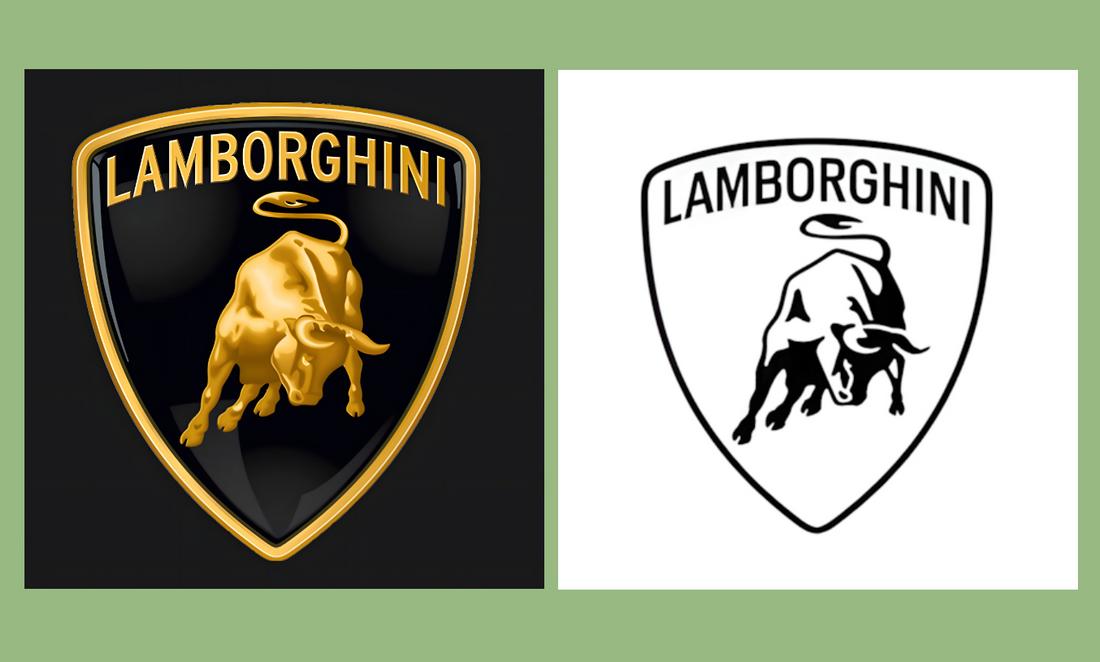
    1. Use Sans-Serif Fonts

    Condensed and narrow fonts are often used in creative and modern designs, especially for crafting titles and subheadings. However, they are also a great choice for paragraphs and body text as well.

    Bw Modelica Ultra Condensed font family

    The key is to choose the right condensed font. Since condensed fonts have narrow spacing, they tend to make long paragraphs a bit hard to read. As a result, it’s a good practice to use condensed sans-serif fonts for paragraphs to improve readability and reduce clutter.

    2. Create Big and Bold Titles

    Robinson Press narrow font

    Condensed fonts are best used for titles and headings. Especially when you’re trying to capture the user’s attention with a big bold title, a narrow font is a perfect choice for achieving that goal. Go as big as you want and create designs that turns more heads.

    3. Find the Right Font Pair

    Unlike when using regular fonts styles, you need to pick and pair fonts more carefully when using condensed fonts. Finding the perfect secondary font to match the narrow designs of your title font will require some effort.

    Gore Regular font family

    When looking for a font to pair with a condensed font, you don’t need to find another condensed font. In fact, a regular sans-serif font often pairs well with a narrow font. You can use fonts with different styles and weights as well. Find a pair that makes it easier to differentiate between titles and paragraphs.

    4. Pick a Font Family

    Okana - Sans Serif Font

    It’s always a good idea to pick up a font family when using condensed fonts as they include the font in multiple styles and different weights. This way you can use the same style of font for both your titles and subheadings using variations of weights.

    5. Use Fonts That Match the Design Theme

    Even condensed and narrow fonts come in various styles and designs. For example, there are condensed fonts with fun and quirky designs that are most suitable for designs yoy make for children. Then there are fonts with elegant serif designs that are perfect for luxury brands.
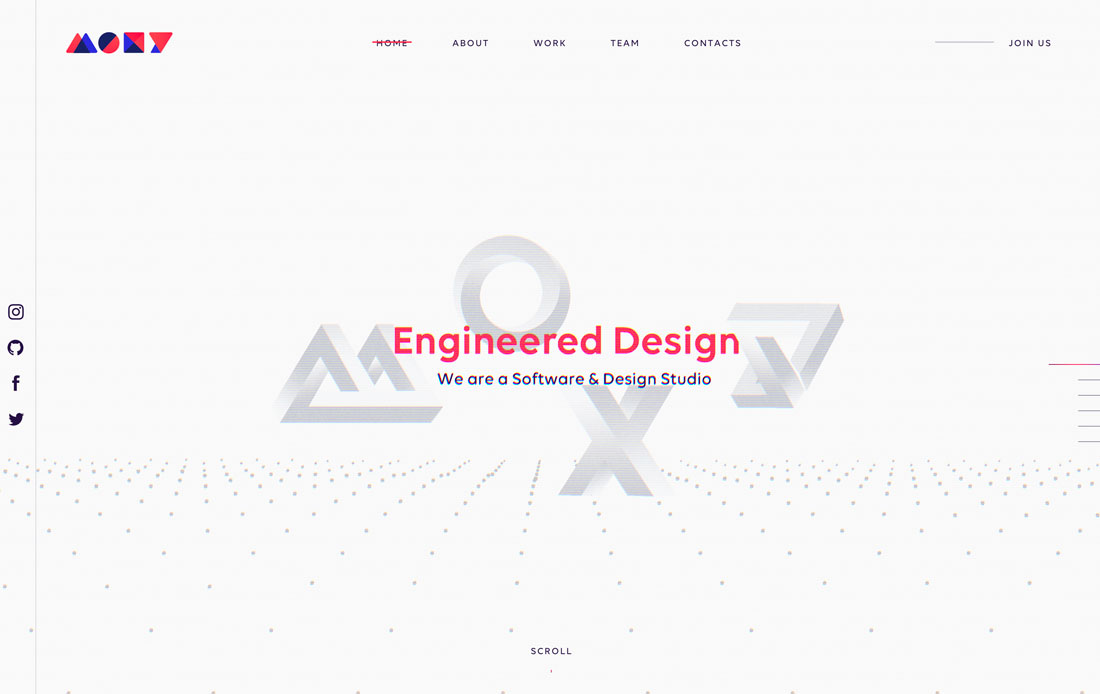
    Minerva Typeface

    When choosing condensed and narrow fonts, consider using fonts that match the overall theme of your design or project.

    Once you’ve found the best condensed font for your titles, then comes the challenge of finding a matching font for body text. Keep exploring Envato Elements to find the right font combination for your design projects. And have a look at our modern serif fonts and script fonts selections for more inspiration.